Articles

The choice of typeface is one of the most critical factors in any design; it gives the text its voice. It can be desperately frustrating to find the right voice for your project, only to discover it’s outside your client’s budget.

Who doesn’t love a free font? There’s no question that something for nothing is an attractive proposition. When it comes to fonts, the problem is that high-quality fonts require months, sometimes years of work; high-quality fonts are expensive to produce; as a result, many free fonts have to cut corners.

However, decreasing costs for font design software and an open-source culture is making the industry more accessible, leading to hundreds of free fonts as good, if not better, than their premium rivals.

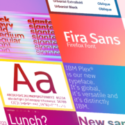
The challenge for designers is where to look. The solution is Typewolf’s Definitive Guide to Free Fonts. This tremendous, 107 page PDF covers everything you need to know to find the best, high-quality free fonts on the web.

Typewolf is one of the most trusted names in digital typography, with an excellent track record of educational guides; you can be sure the suggestions in this guide are second to none.

The guide is split into four sections:

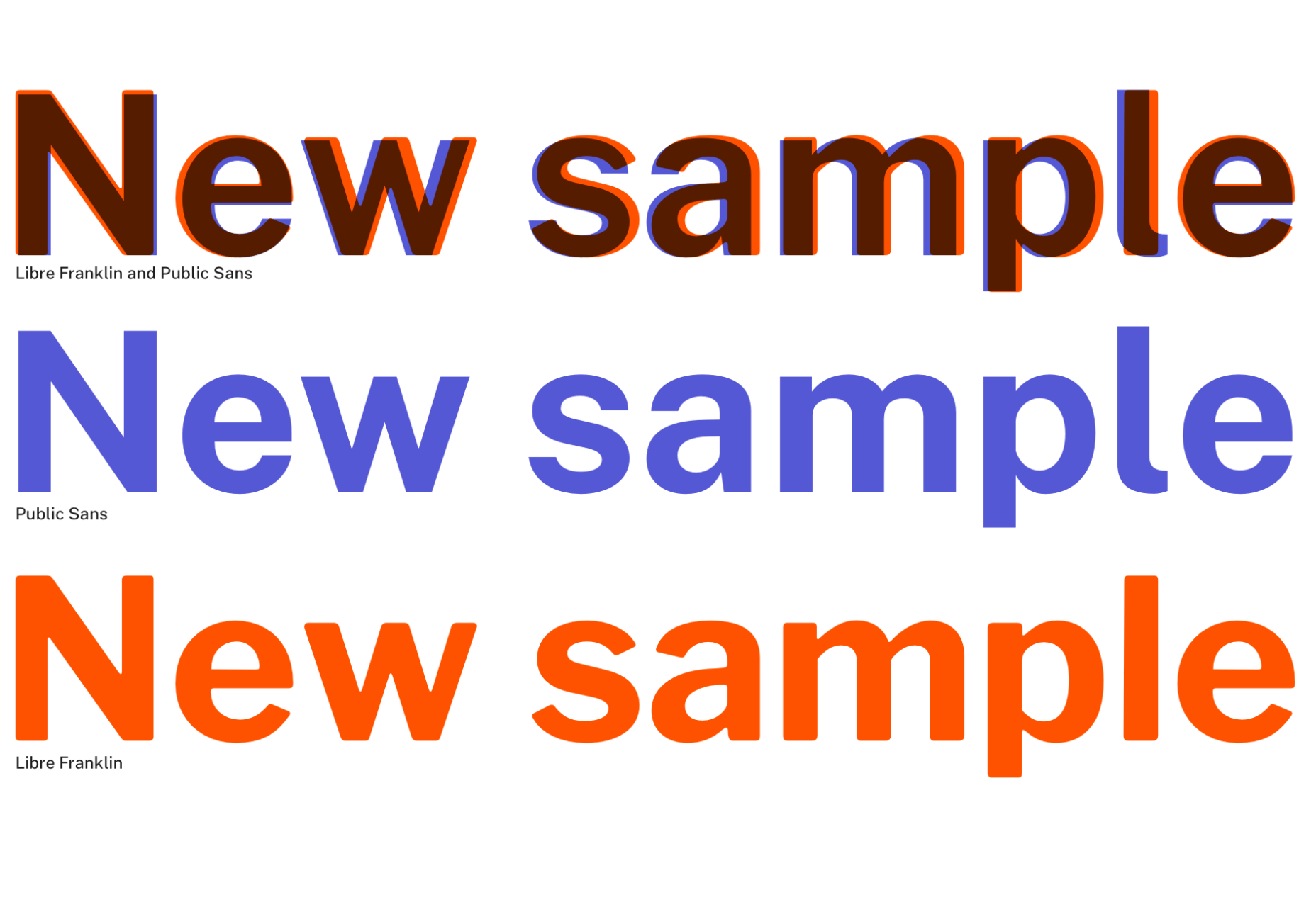
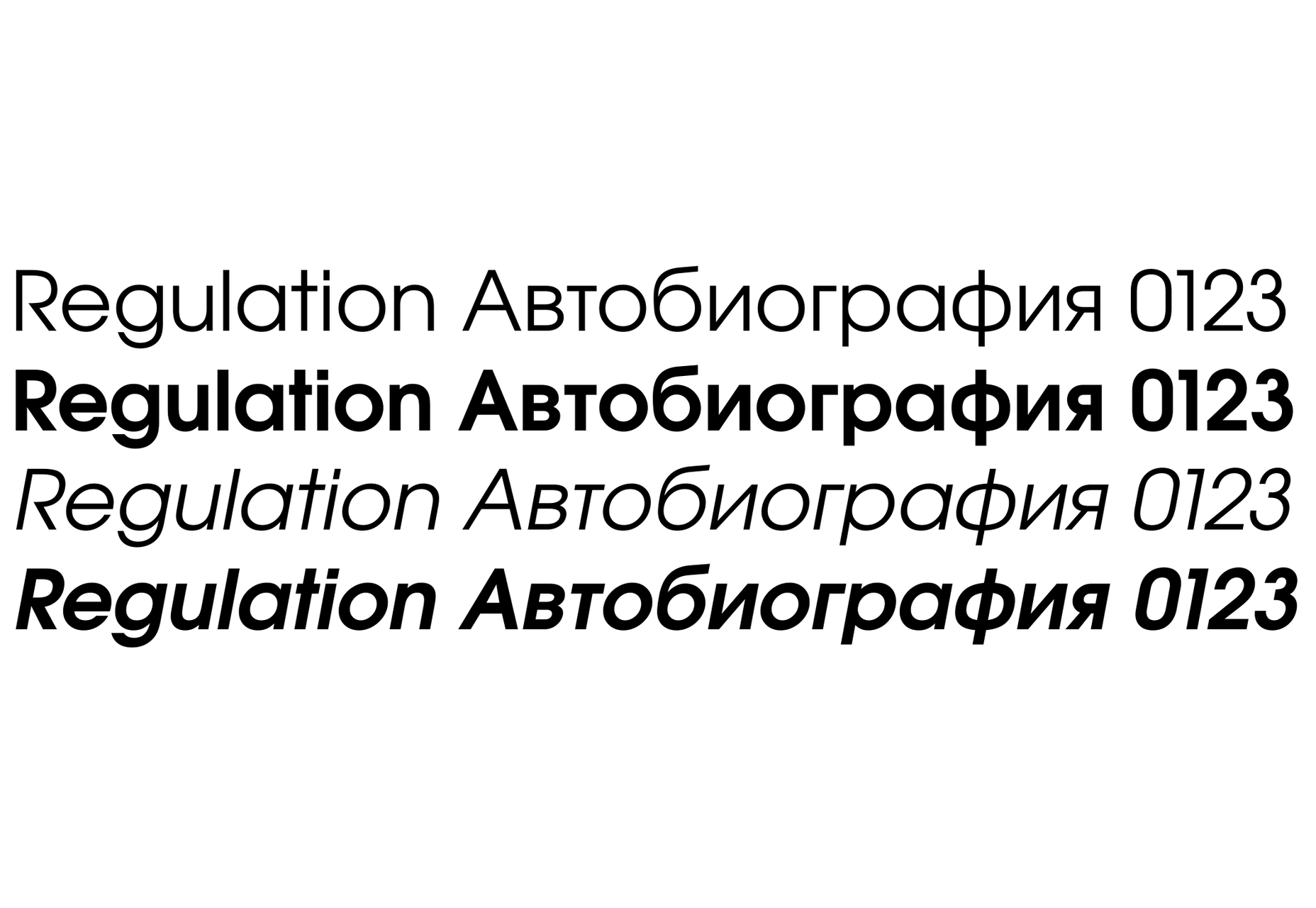
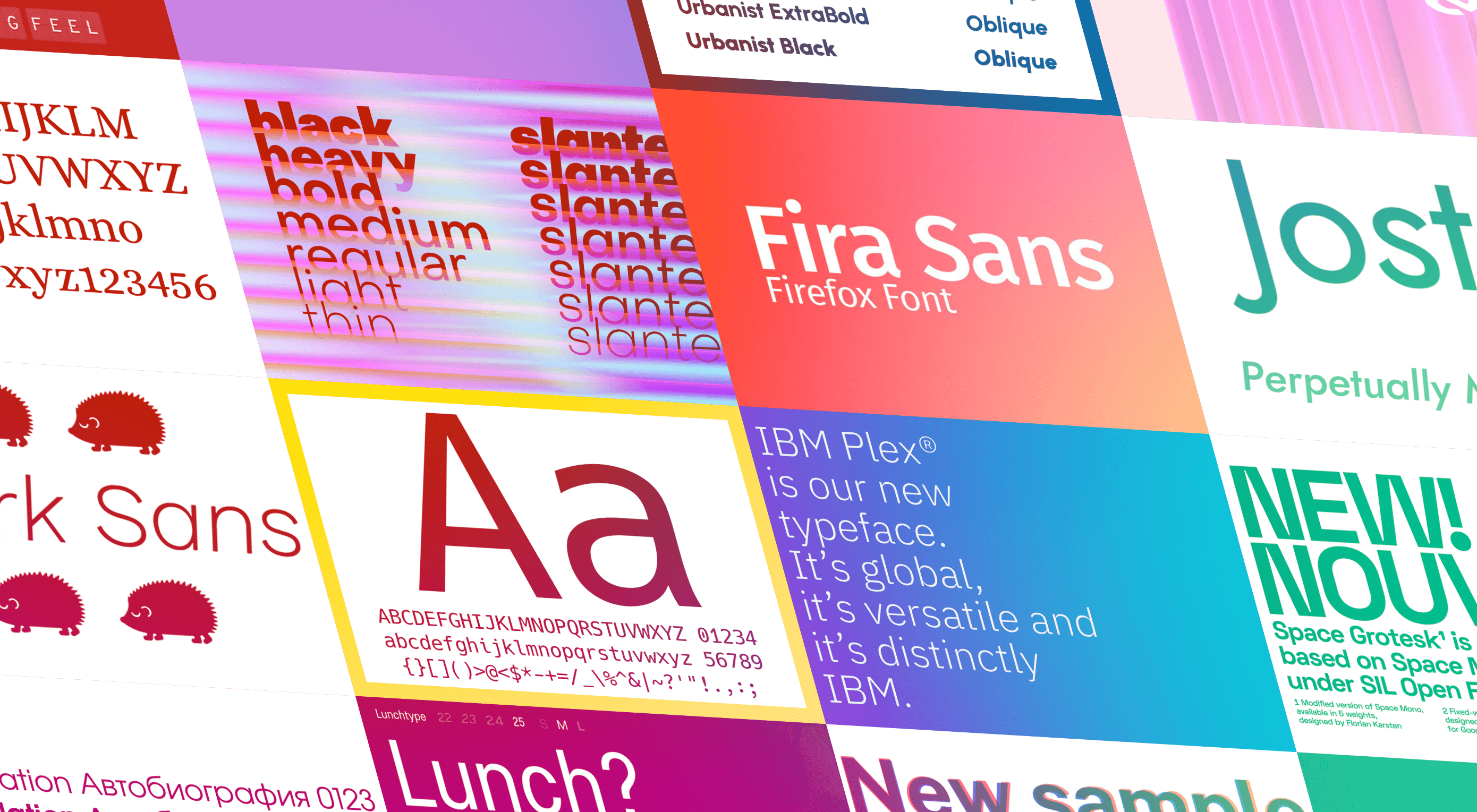
  • Section one covers the closest free alternative to every font on Typewolf. The free alternatives list focuses on the popular, and in many cases, the most expensive fonts used by professional designers. That means you’ll have access to over 1,000 recommendations, all listed alphabetically for easy look-ups. Simply find the premium font you want, and you’ll find the closest free font available listed alongside it. In many cases, there are multiple suggestions to give you some agency.
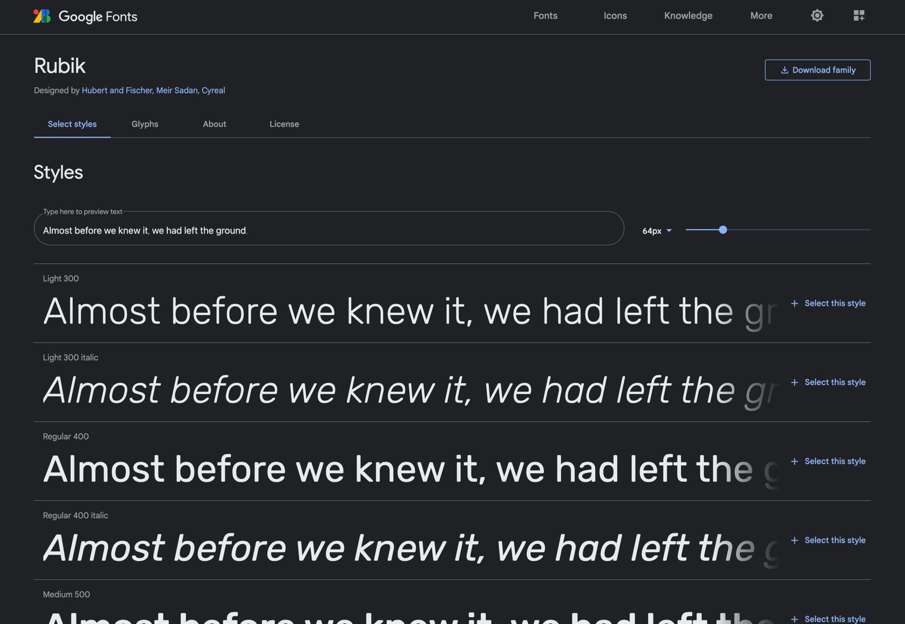
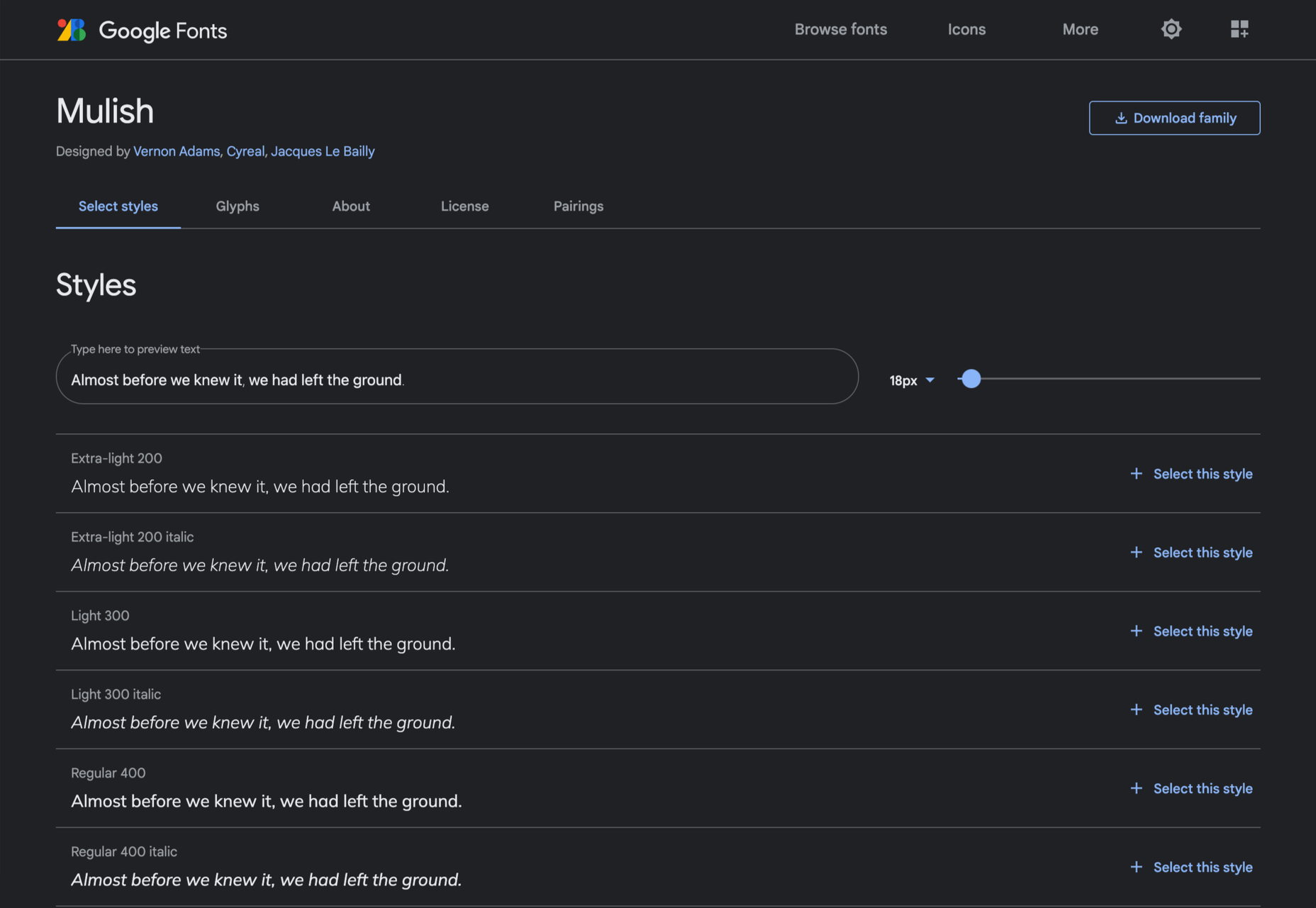
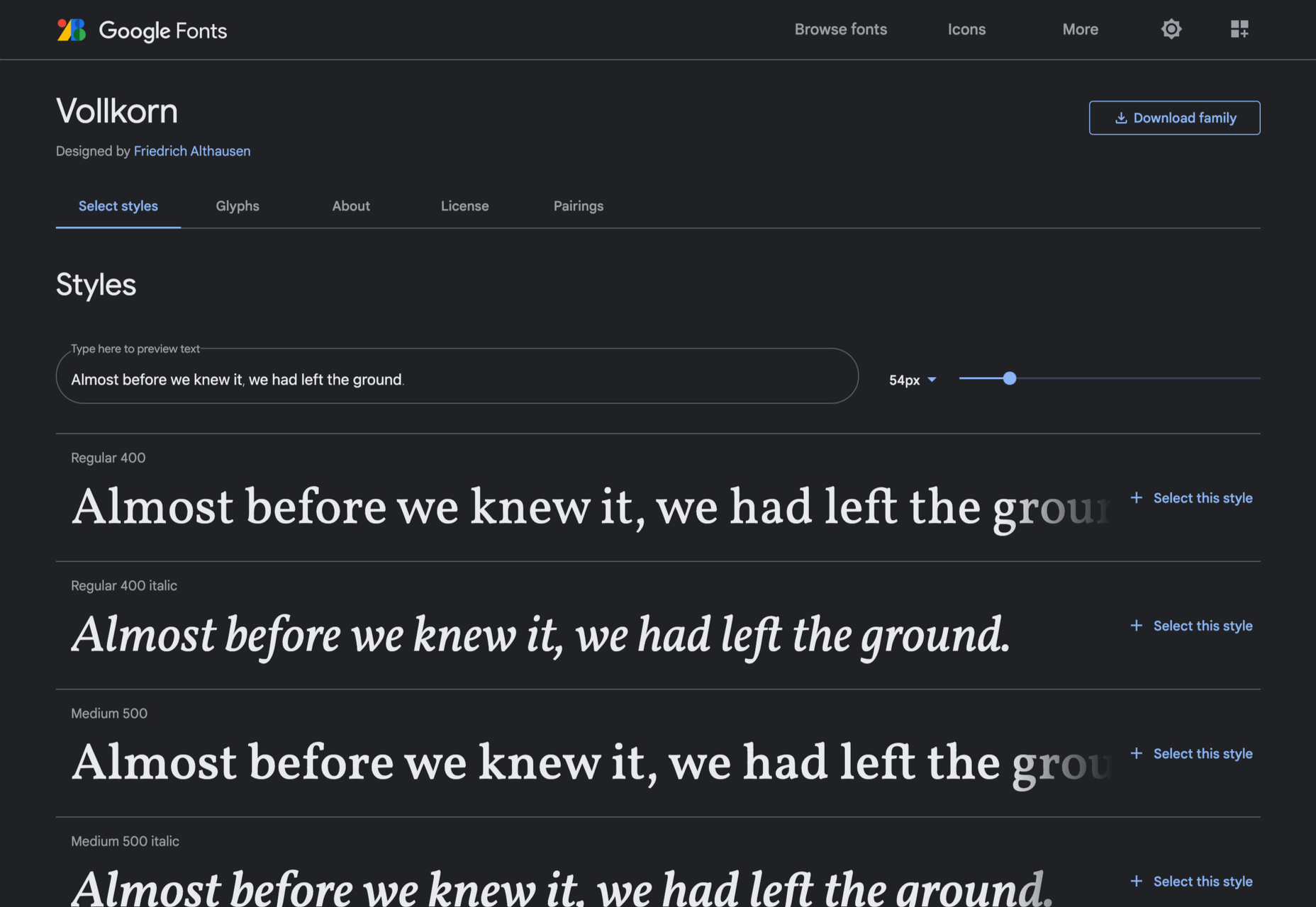
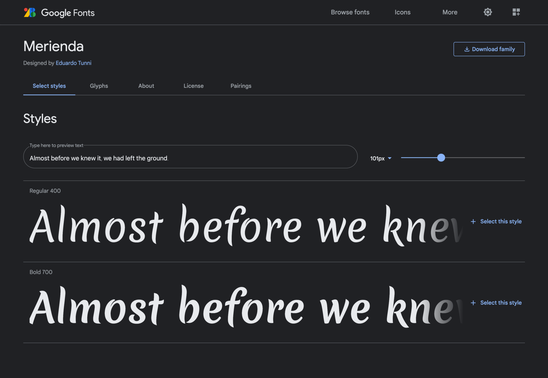
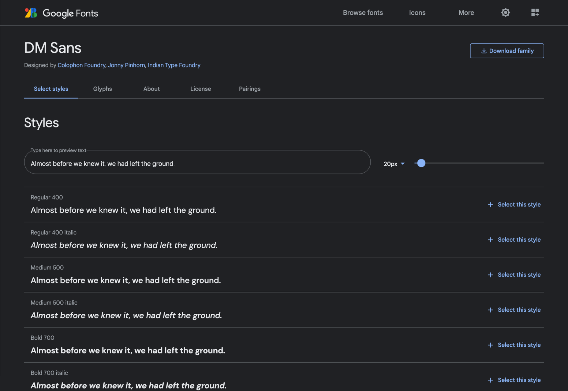
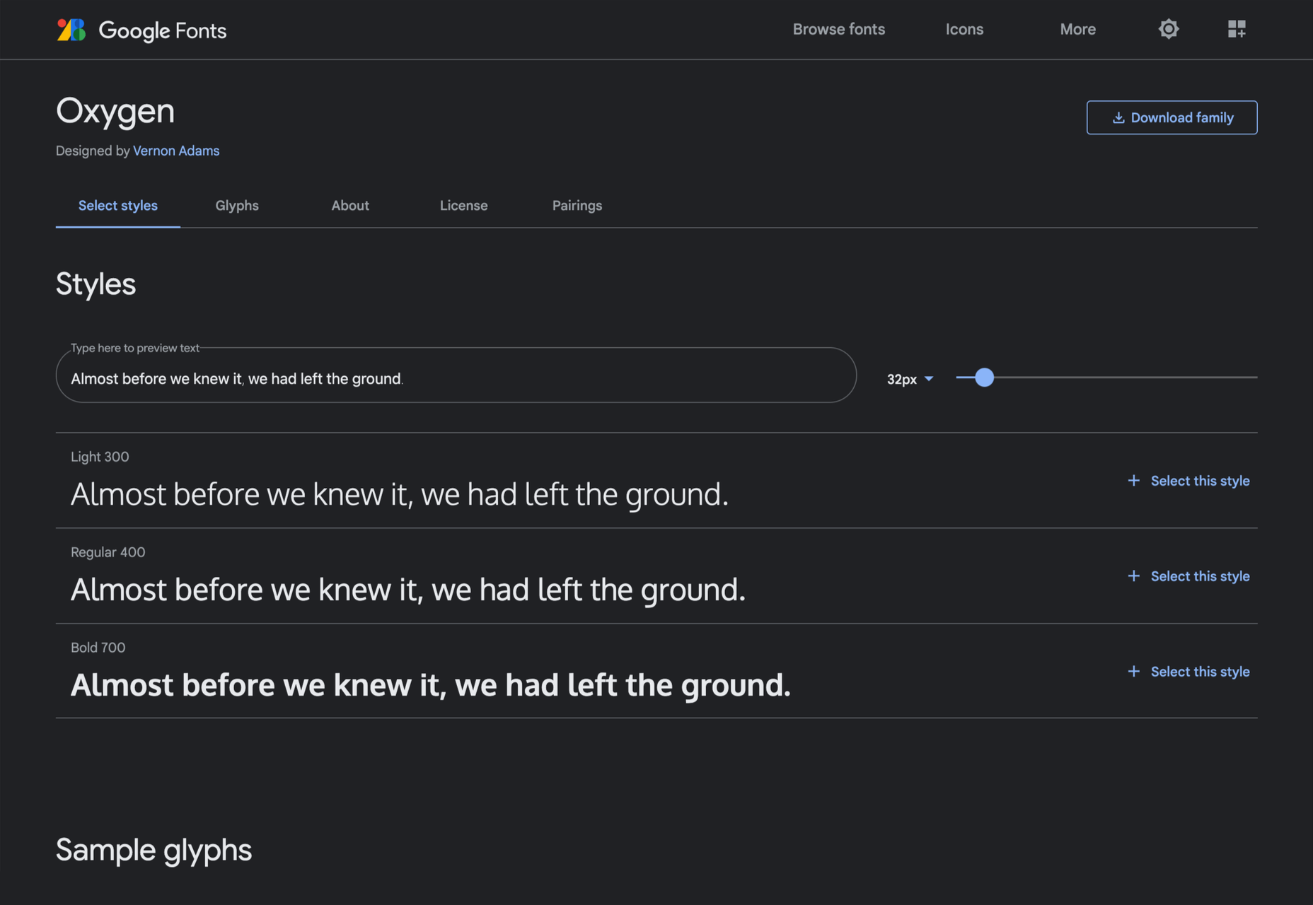
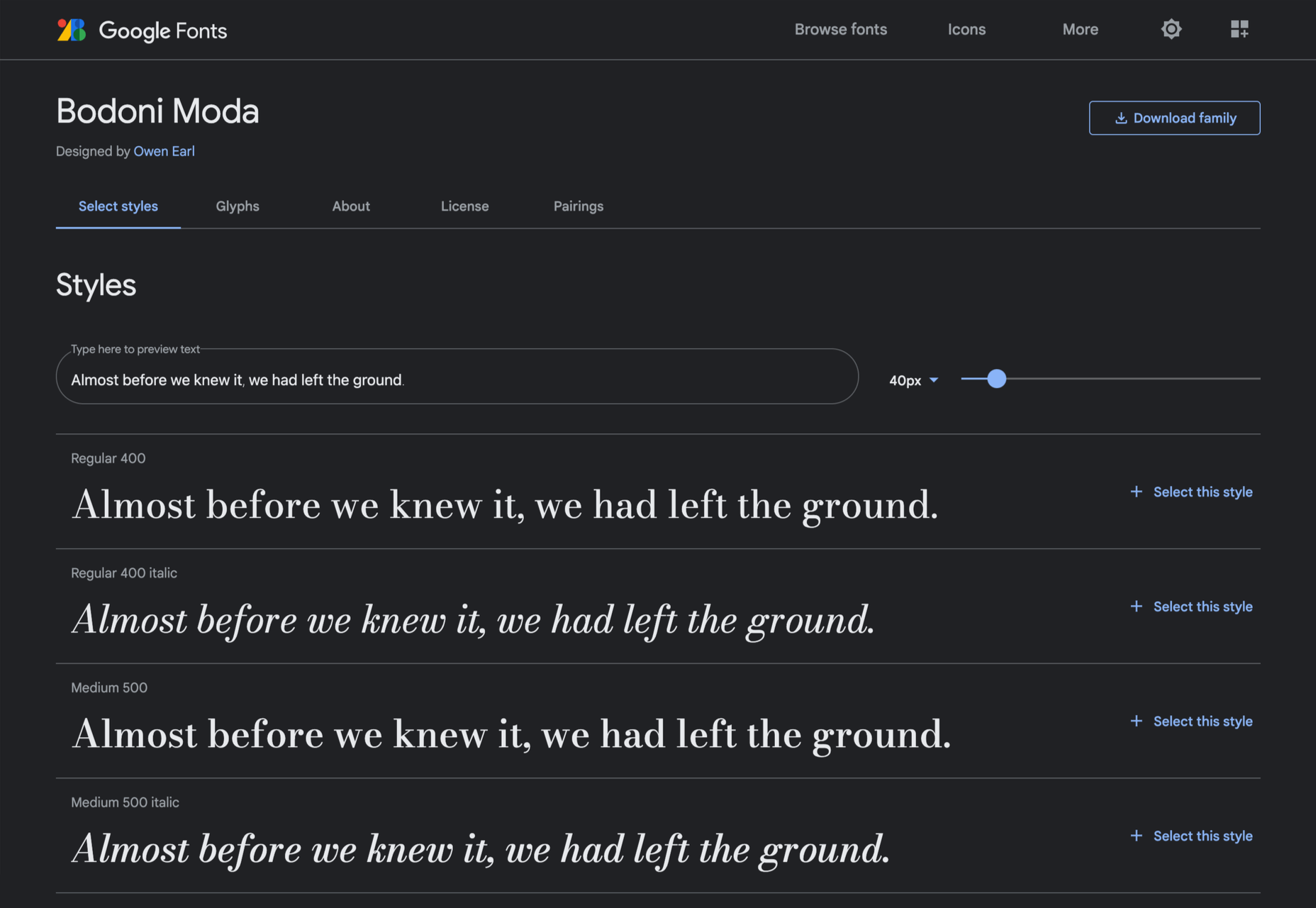
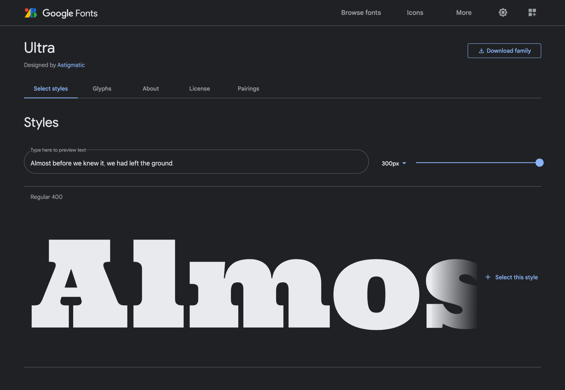
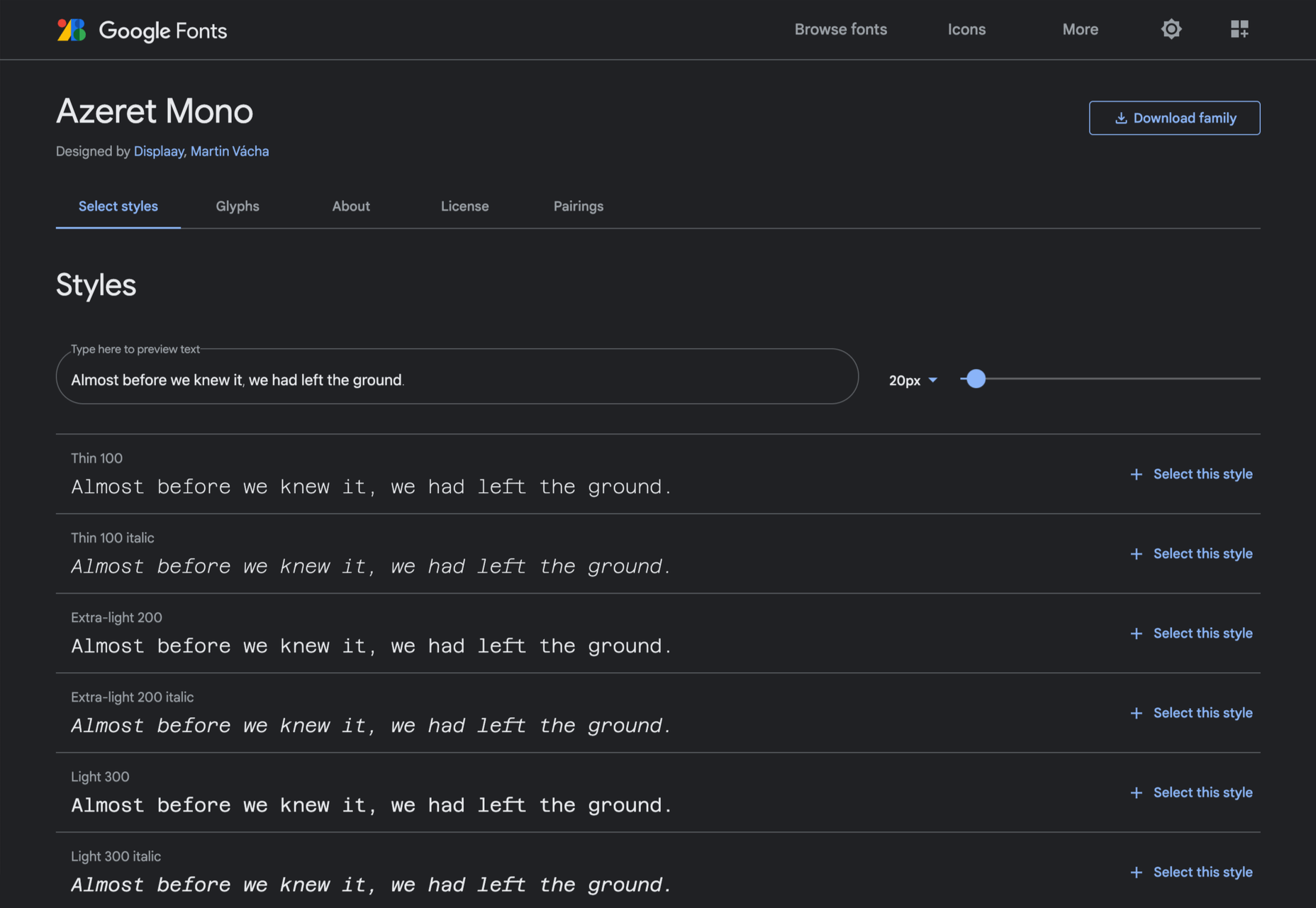
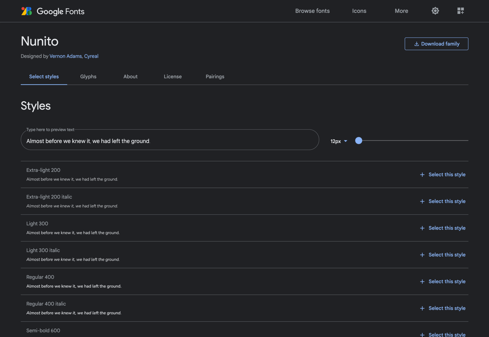
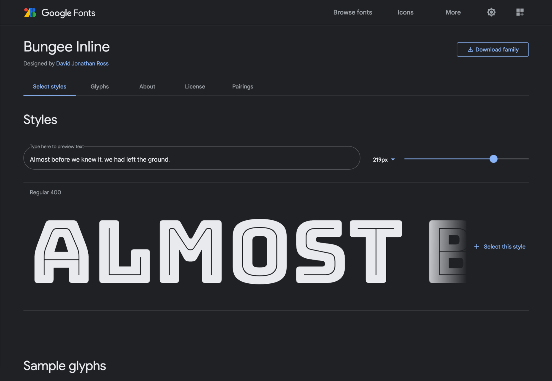
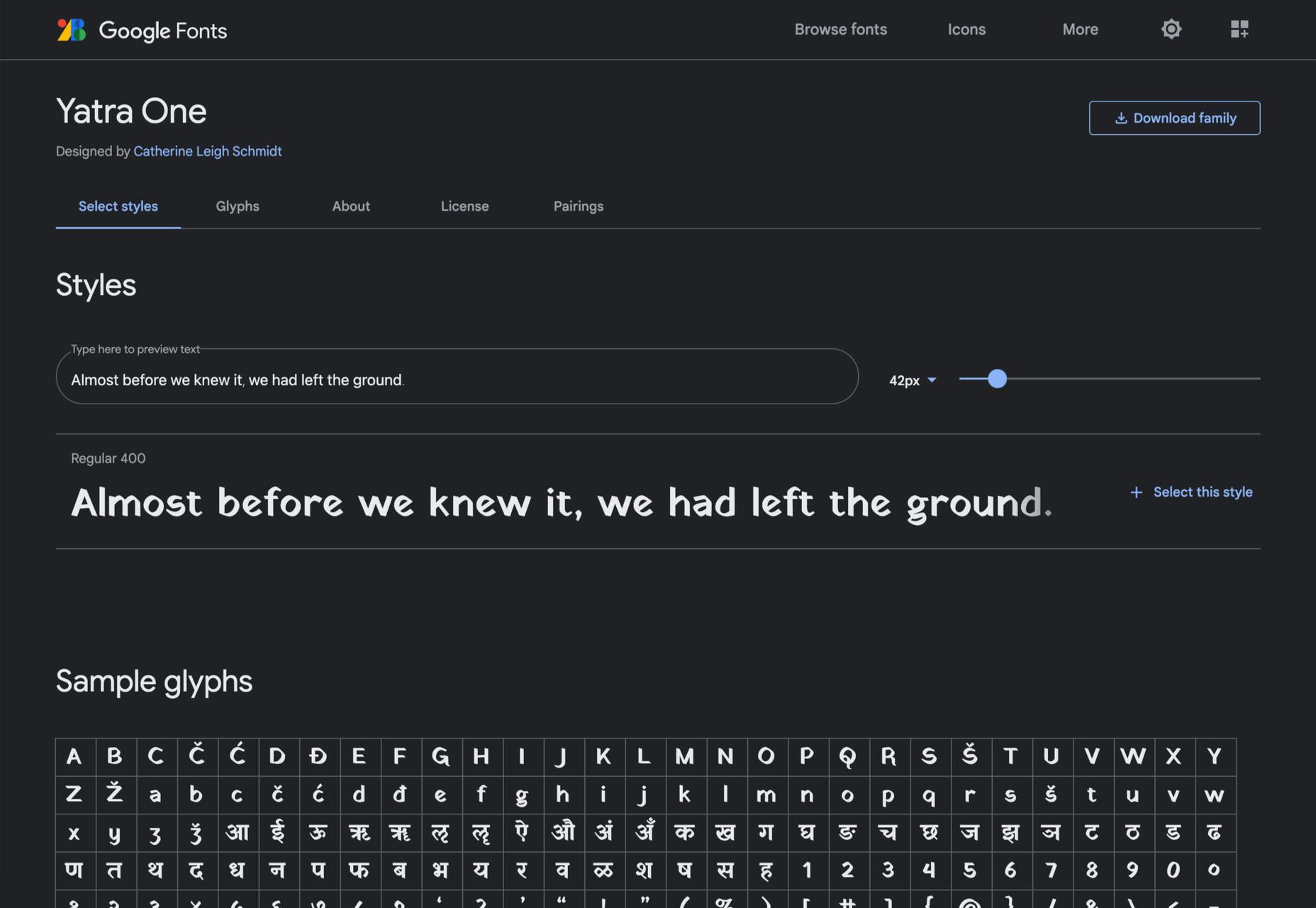
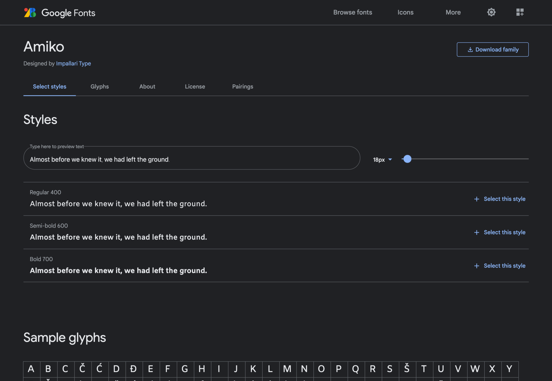
  • Google Fonts is an excellent source of free fonts, but its own recommendations are weak. So the second section of the guide is dedicated to the ten best serif and sans-serif combinations on Google Fonts. The best serif and sans-serif combinations include visual examples, and explanations of why these typefaces complement each other, so you don’t find yourself designing in the dark. This section is excellent for anyone who’s unsure where to start with free fonts and needs to identify an effective pairing quickly.
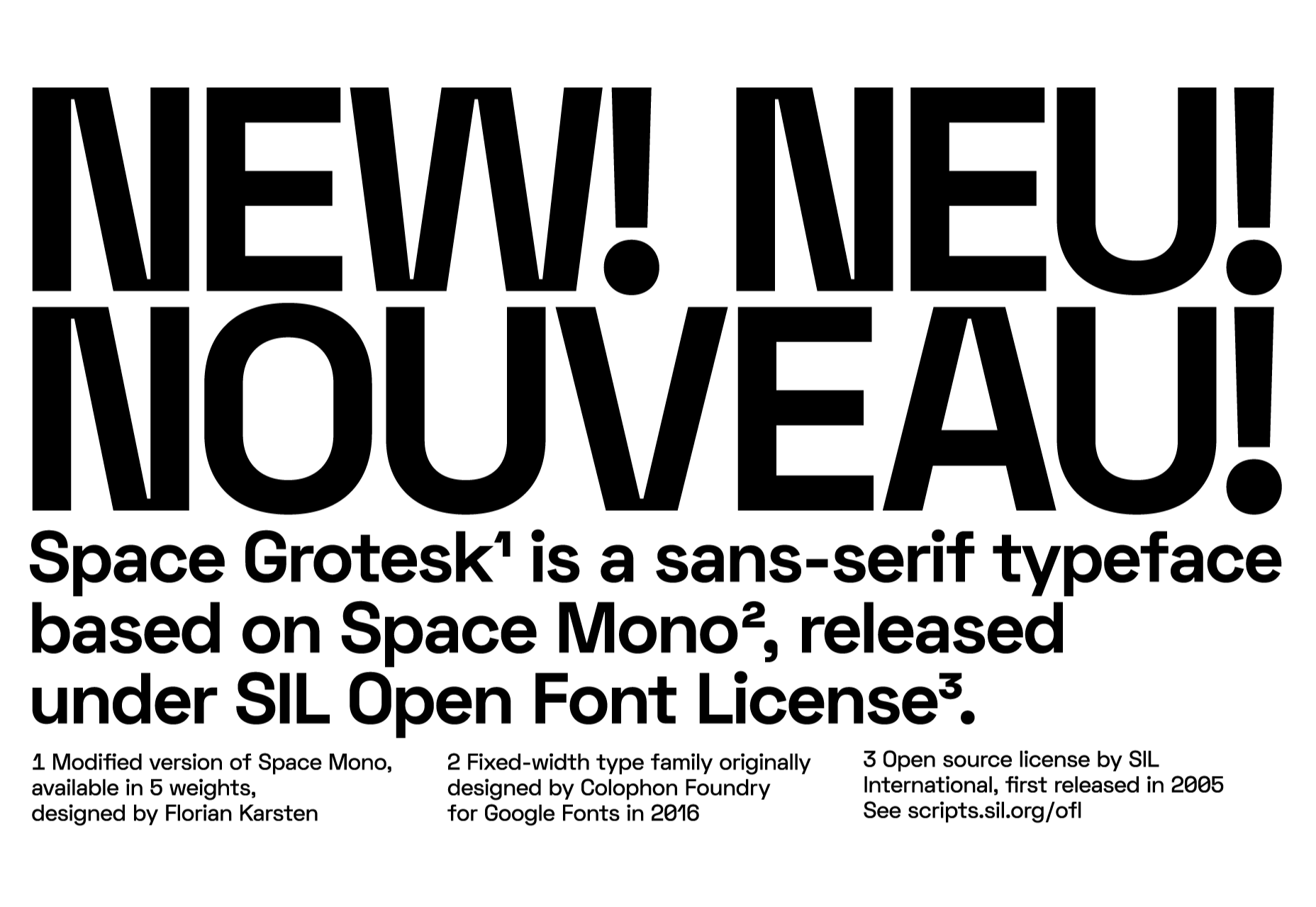
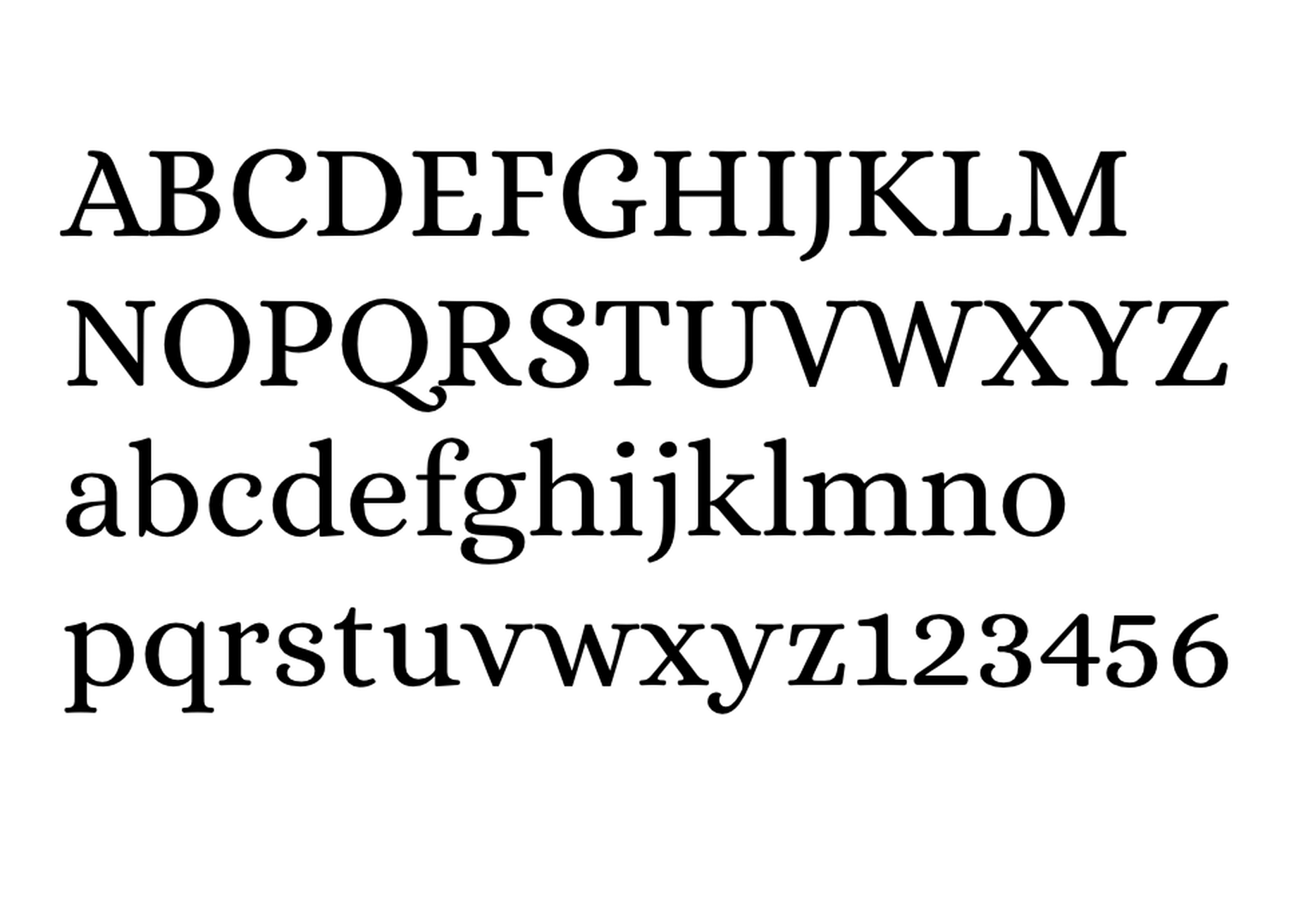
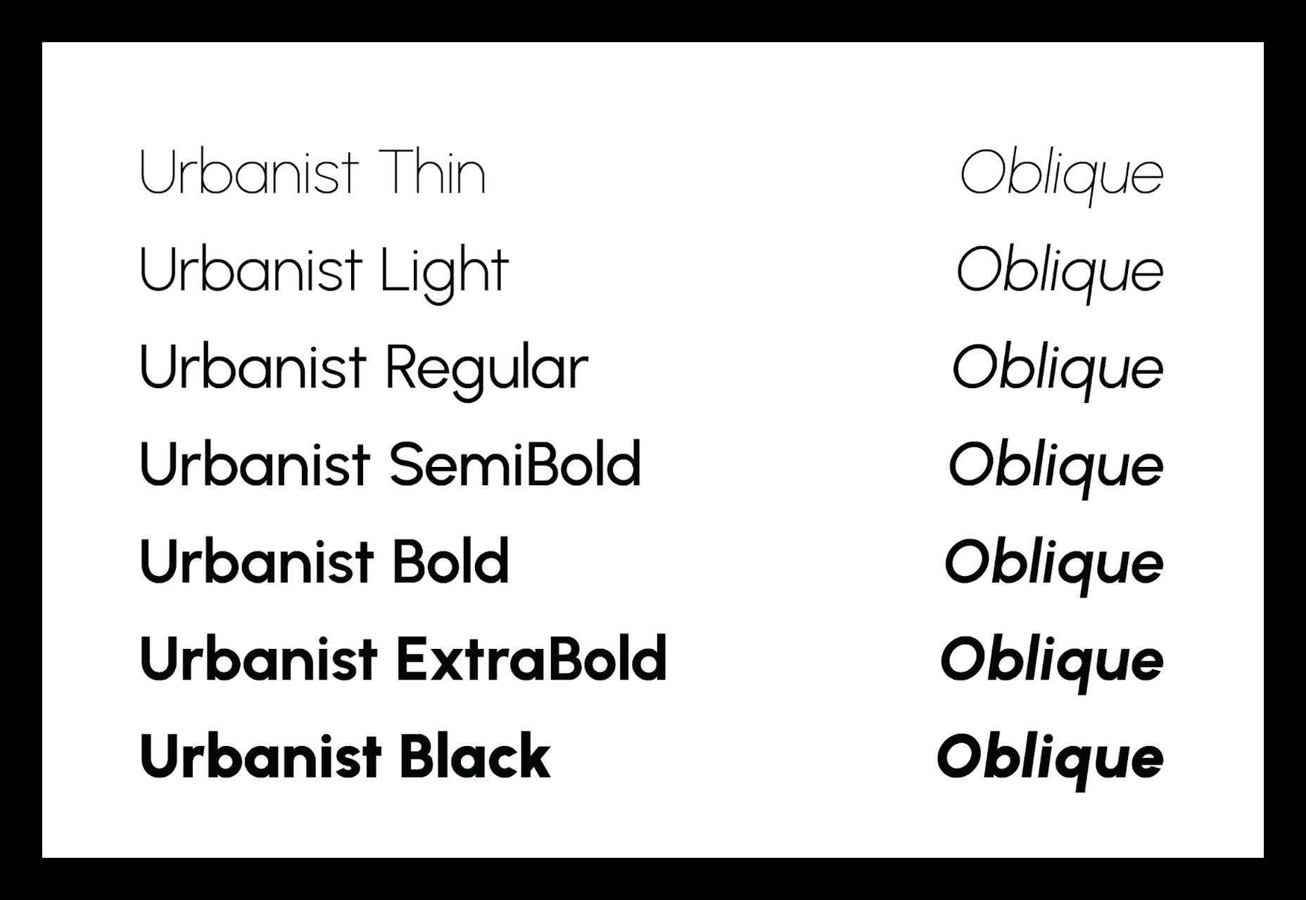
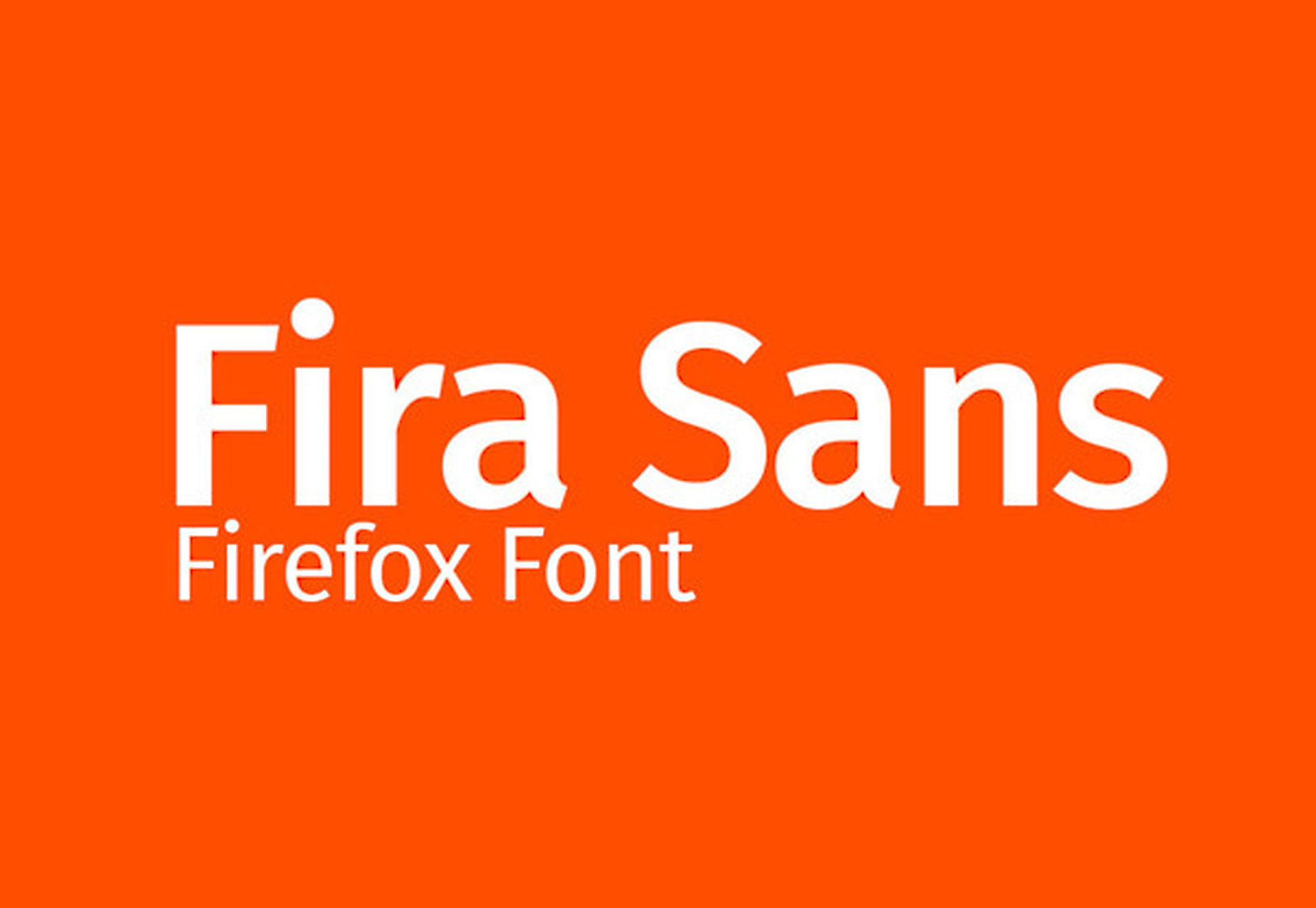
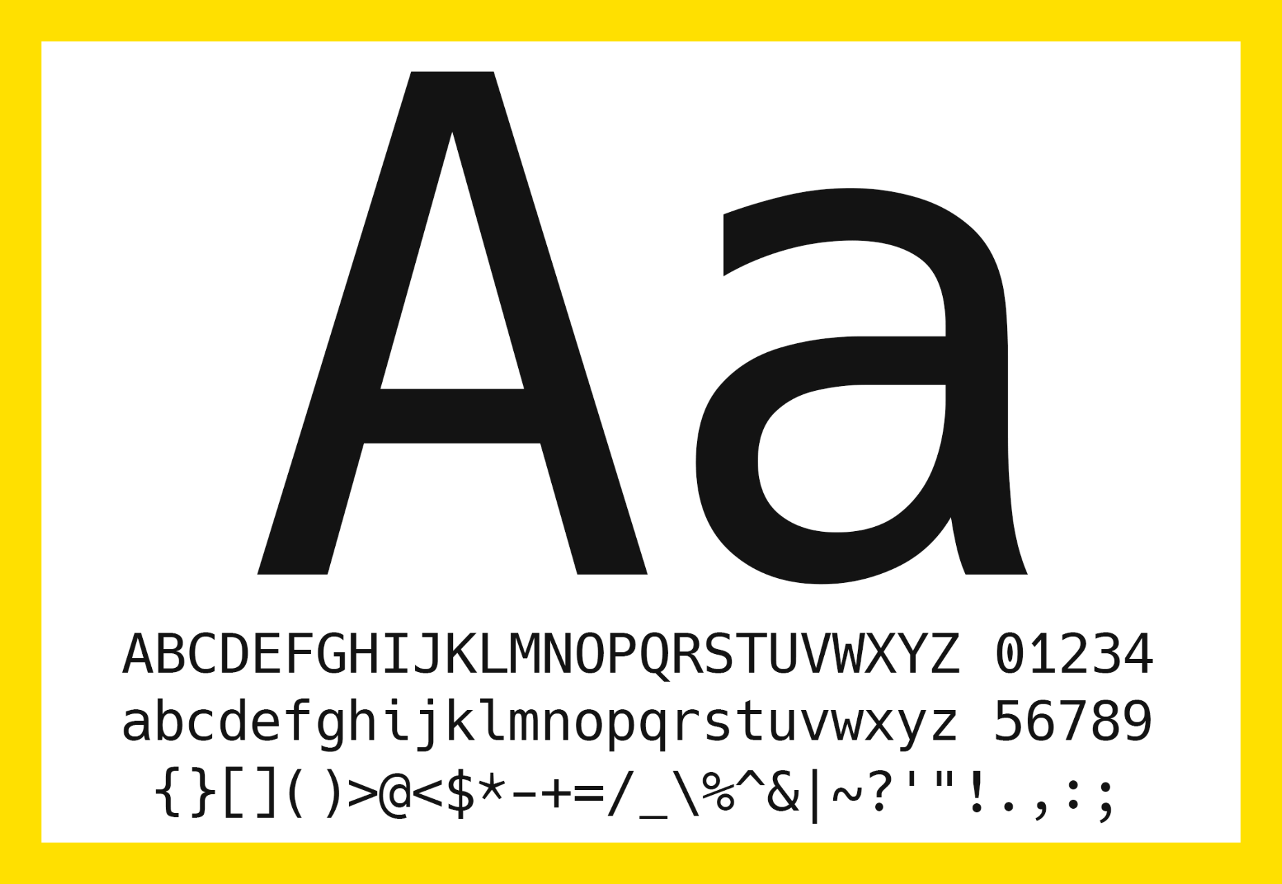
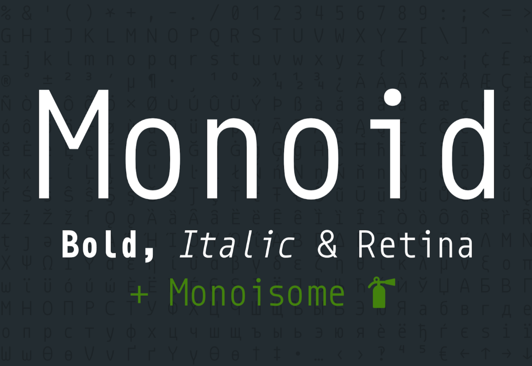
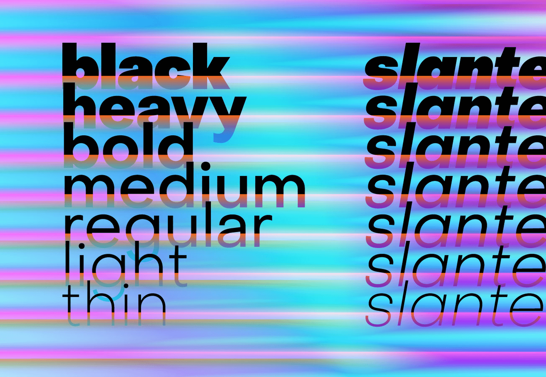
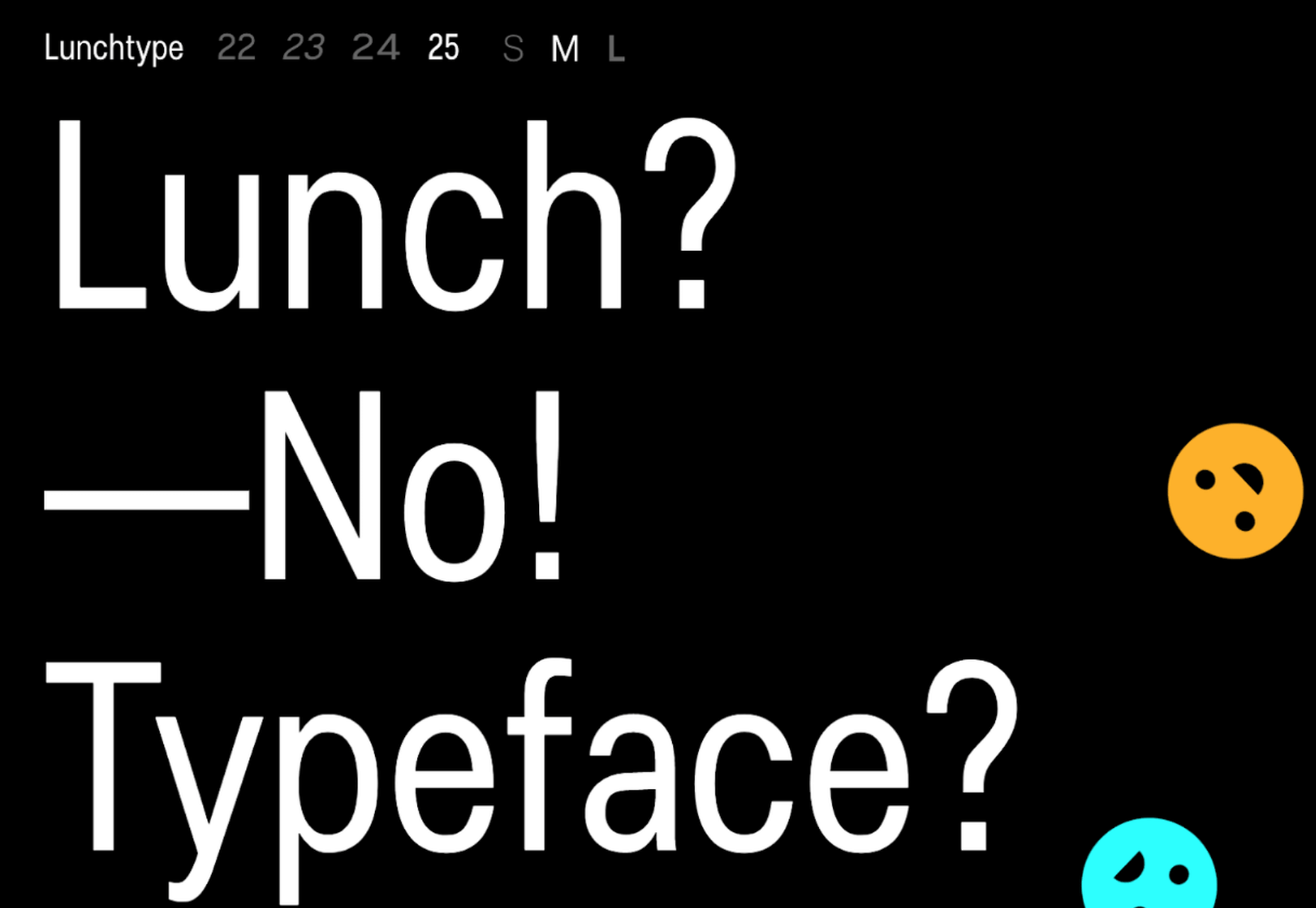
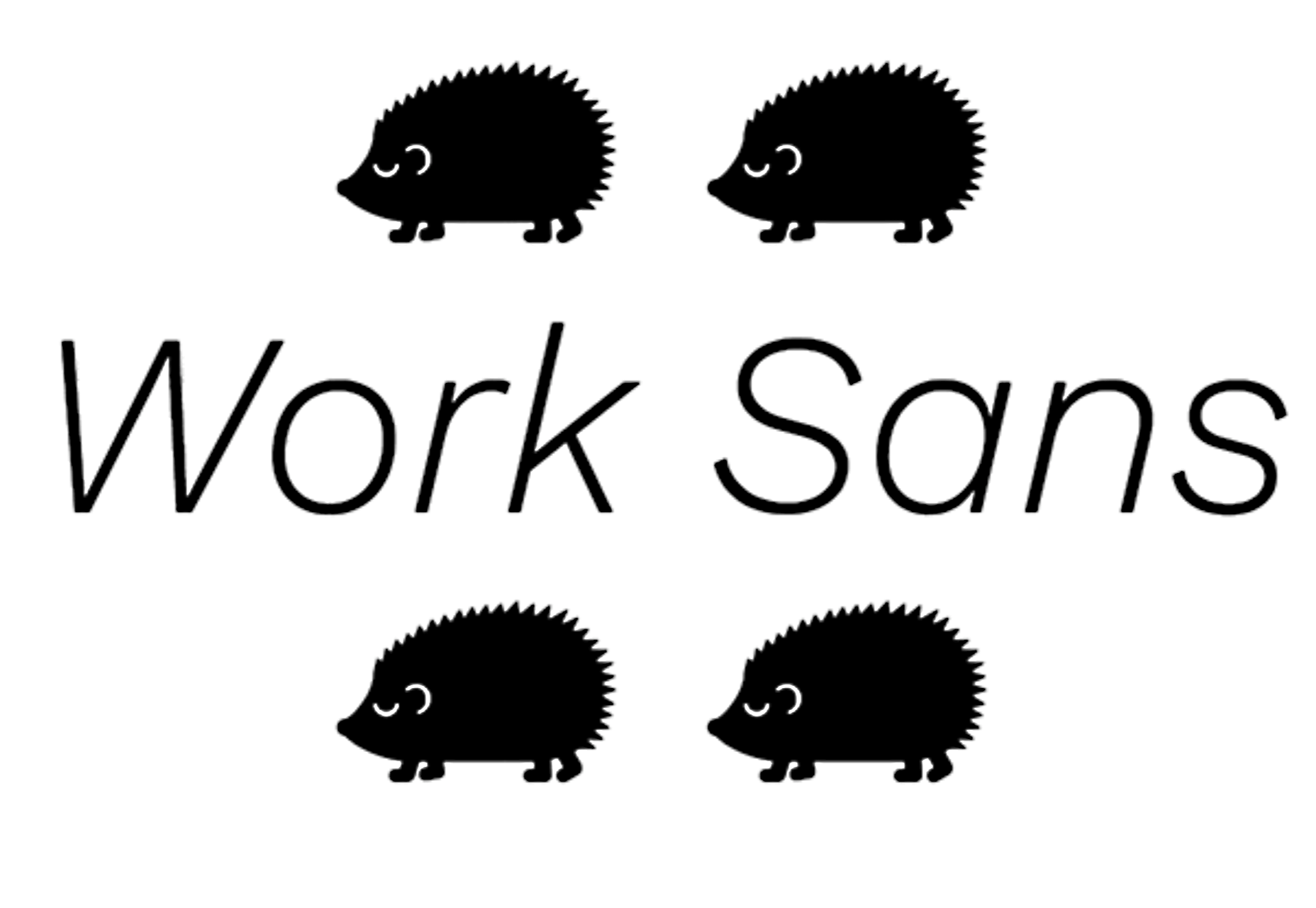
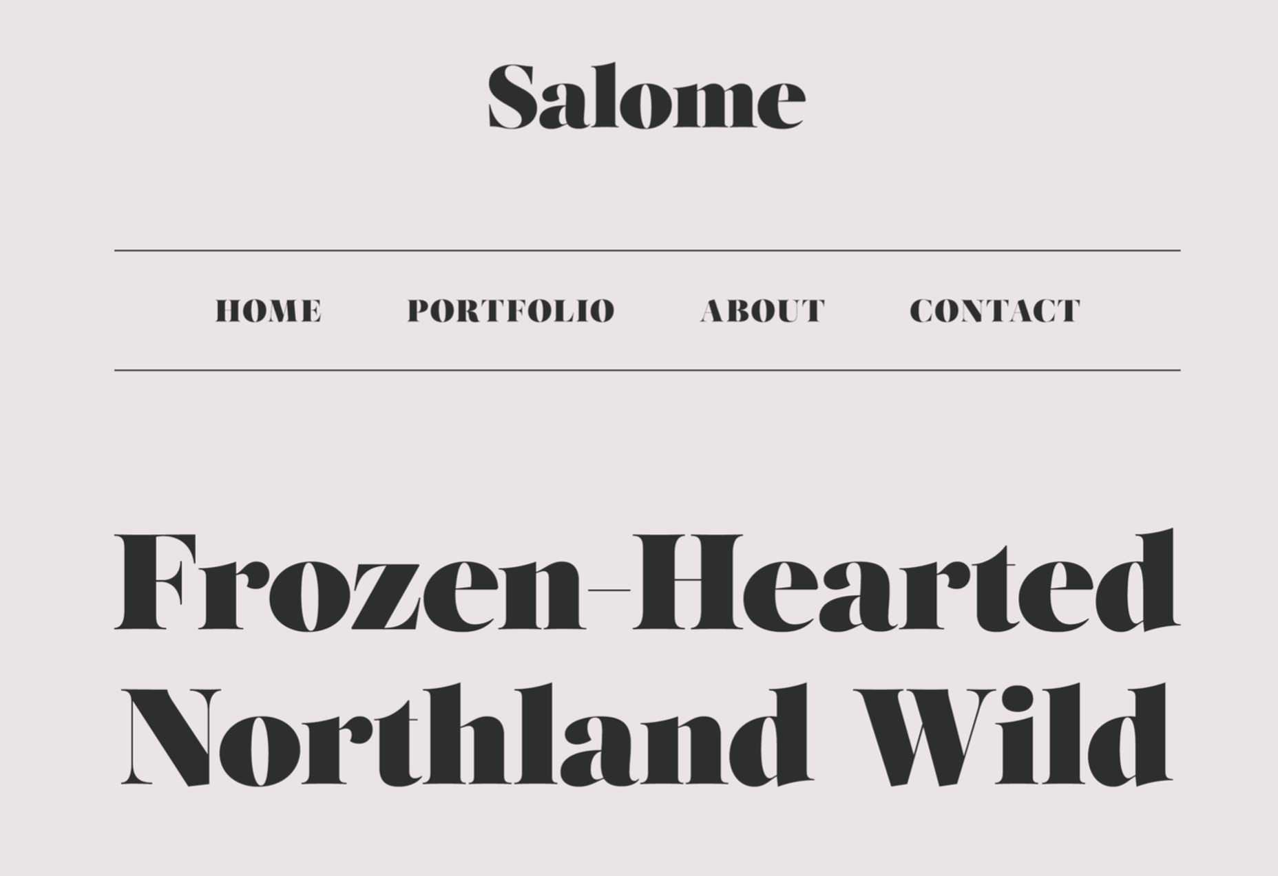
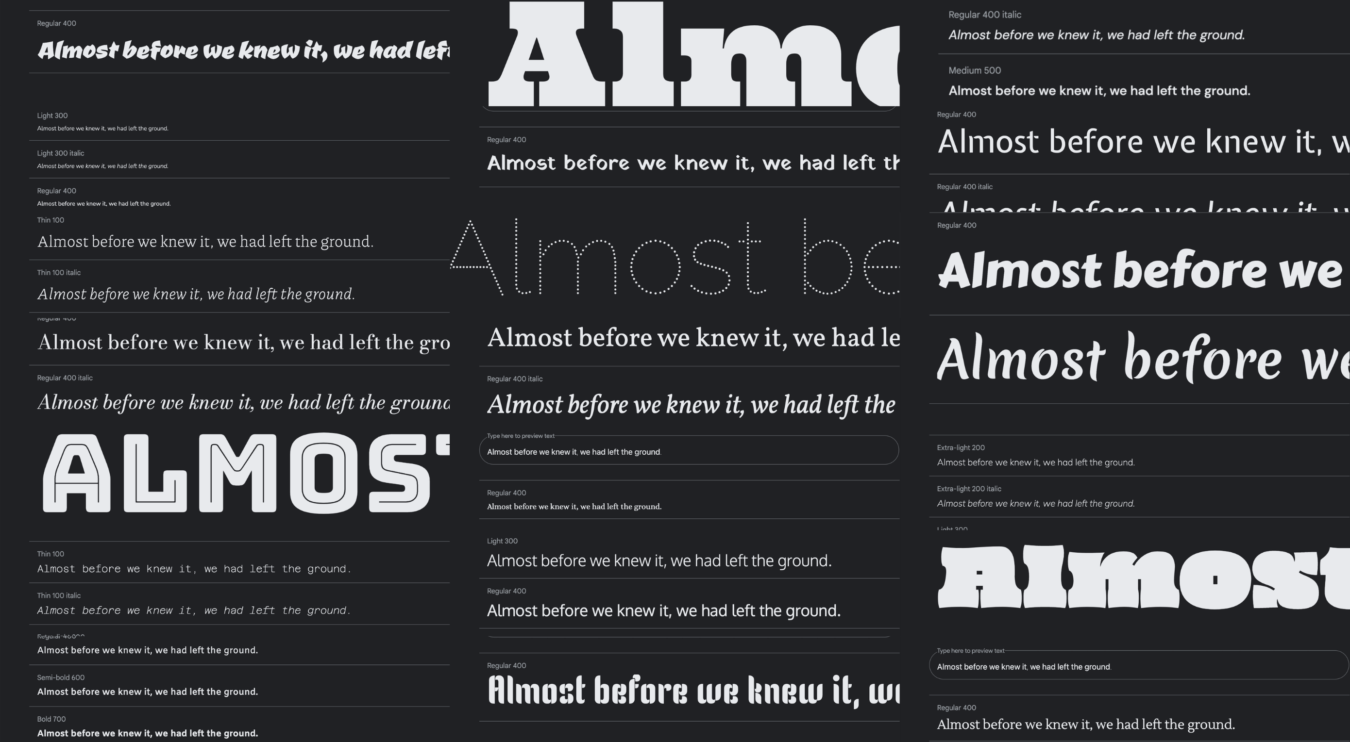
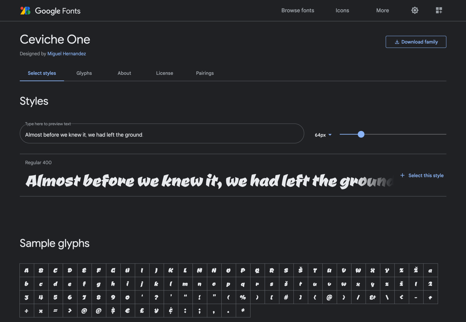
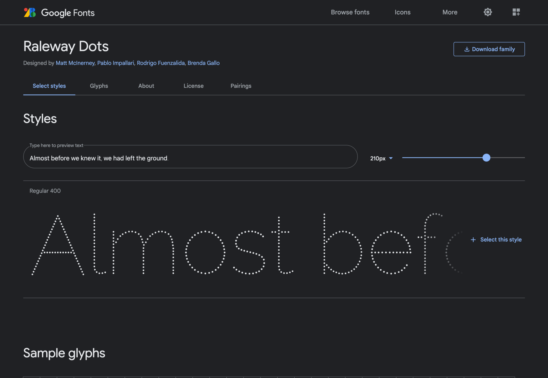
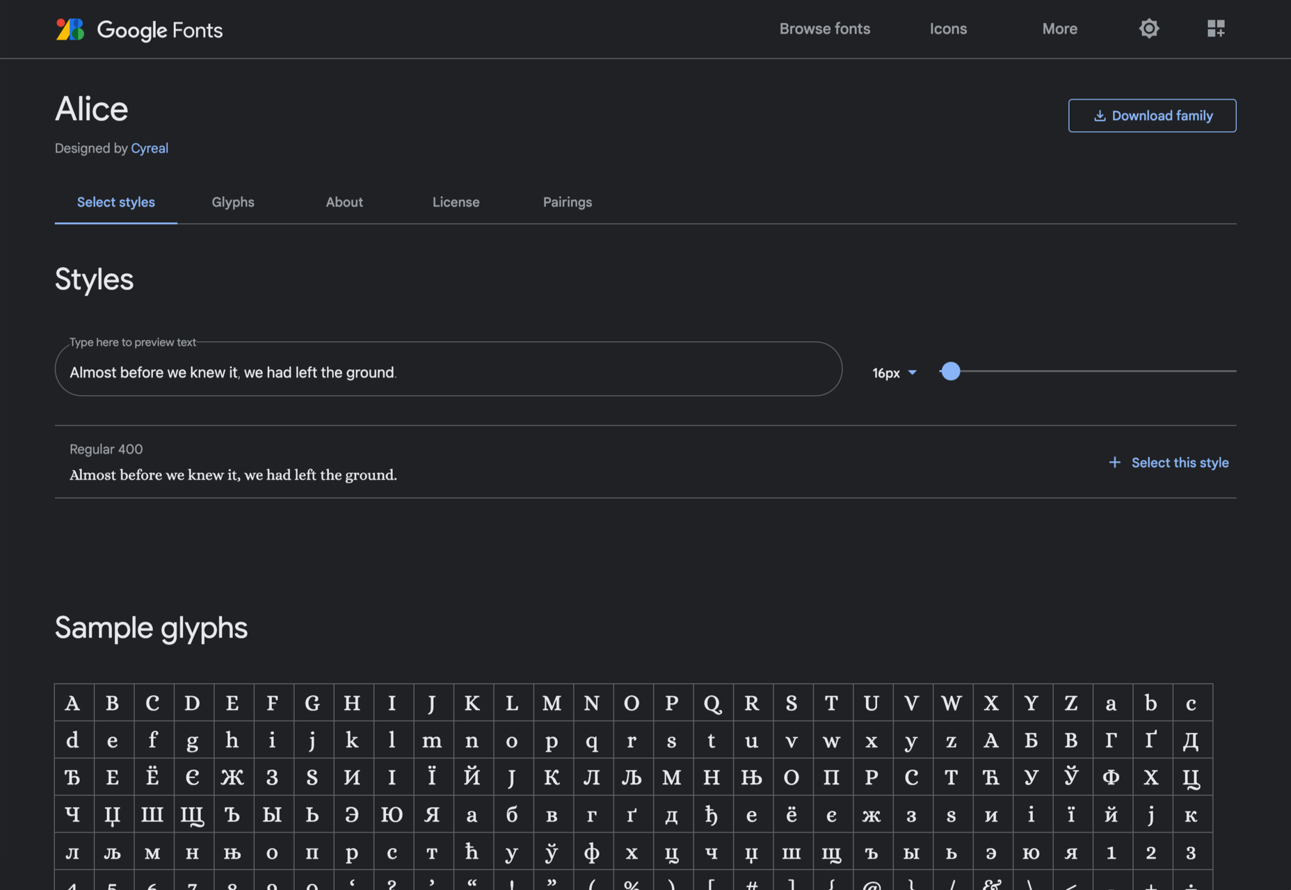
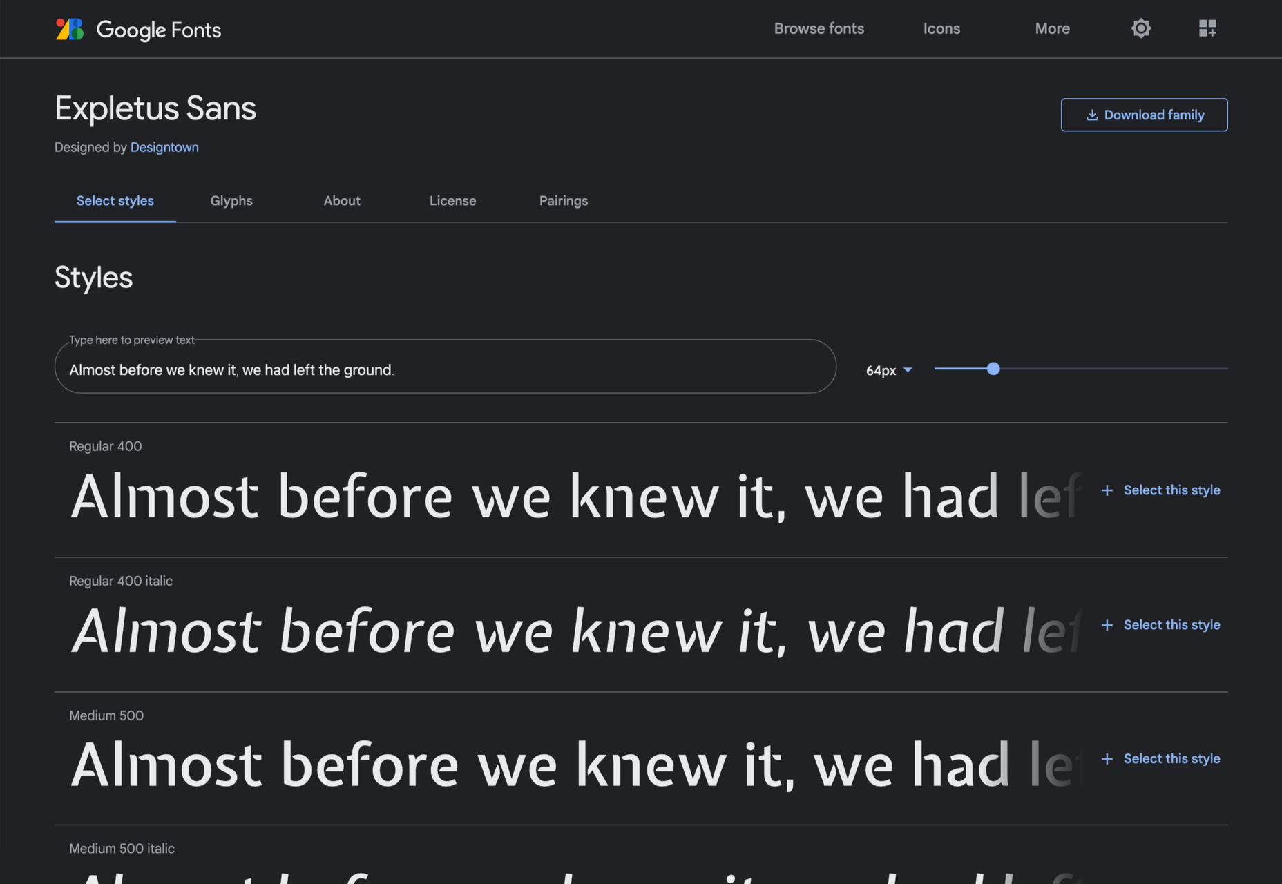
  • As good as Google Fonts is, it’s not the only source of free fonts, and if you only look there, you’ll miss out on some real gems. That’s why section three of this guide introduces the 40 best free fonts that aren’t on Google Fonts. Each font listed is carefully presented to preview it at display and body sizes.
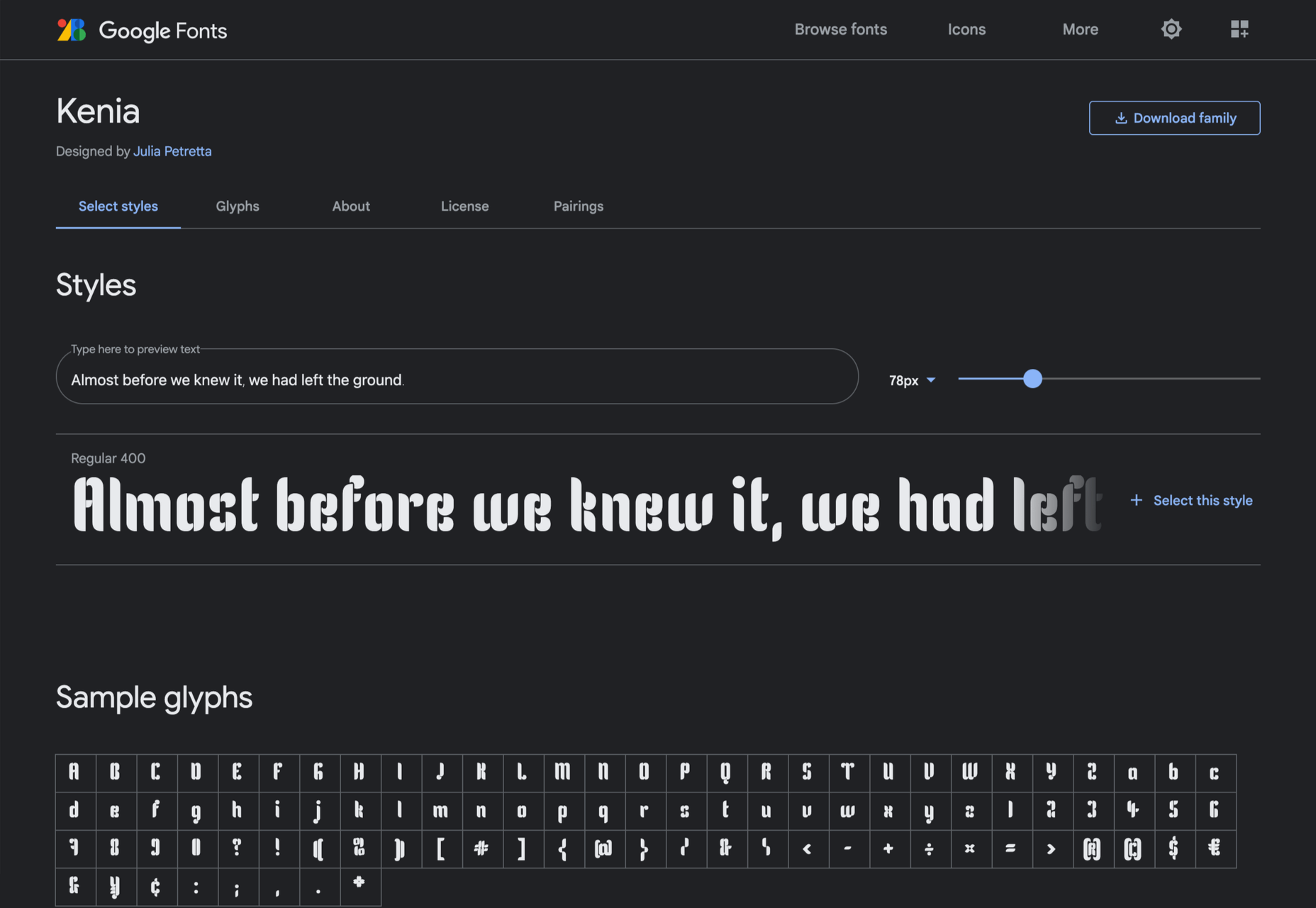
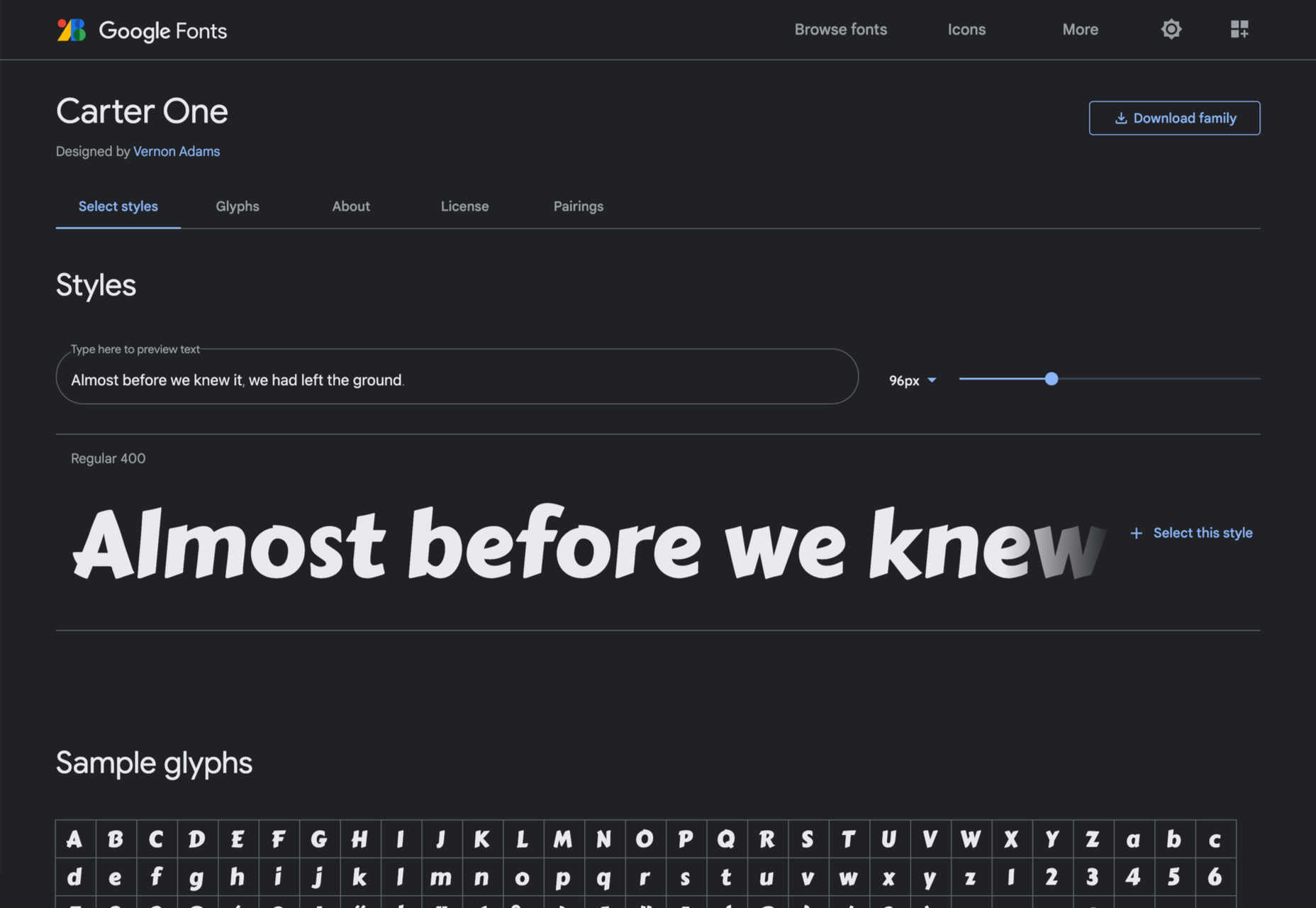
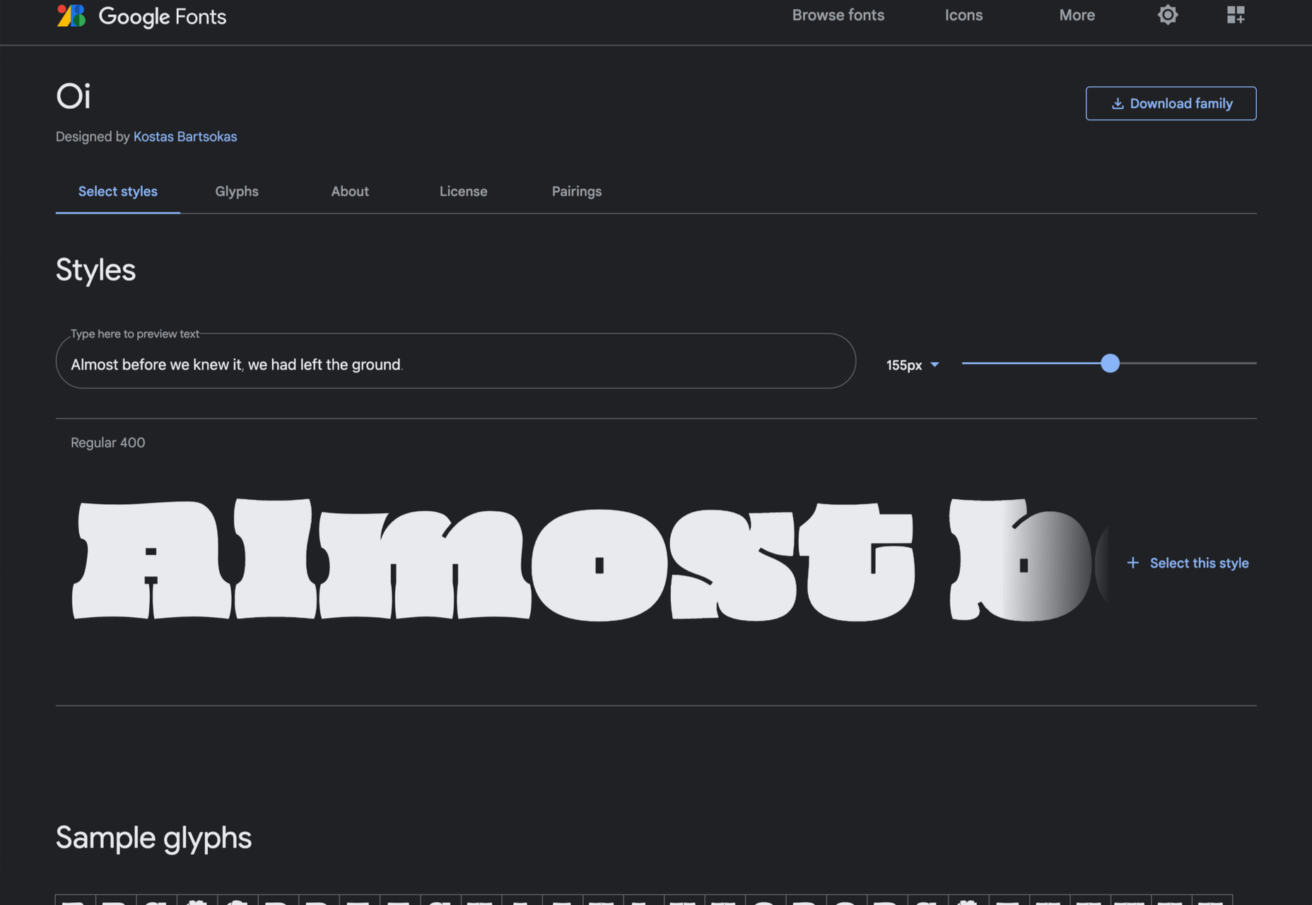
  • Lastly, to finish off this excellent ebook are the ten best free “hipster” fonts. You know the ones: they’re perfect for coffee shops, small-batch brewers, tattoo parlors, and anywhere Rockabilly is still in style.

All told, there are enough recommendations in this guide to last you an entire career. So no matter what you’re looking for, whether it’s a free version of a particular typographic voice or some fresh inspiration, you’ll find it in this essential ebook.

What’s more, you’ll receive lifetime updates for free. With new content added weekly, this ebook will be a source of knowledge and inspiration you return to again and again. Lifetime access means you can re-download the guide every time you have a project that needs free fonts. You’ll also get access to an exclusive section of Typewolf that showcases only free fonts, so you can see how free fonts can be used well.

Every good designer understands the value of high-quality typography, but not every project has the budget to allow you to use premium fonts from top type foundries. This guide helps you leap that hurdle by offering carefully selected, free alternatives. If you’re new to the world of typography, this helpful guide will give you some practical insight on how to locate free fonts for use in your design work.

This guide will save you hours trying to find the suitable typeface for your project, as well as introduce you to some excellent designs that you might not have considered.

You can download Typewolf’s Definitive Guide to Free Fonts today for the bargain price of $39. You could even gift it to the typophile in your life.

Source

The post Typewolf’s Definitive Guide to Free Fonts first appeared on Webdesigner Depot.

Source de l’article sur Webdesignerdepot

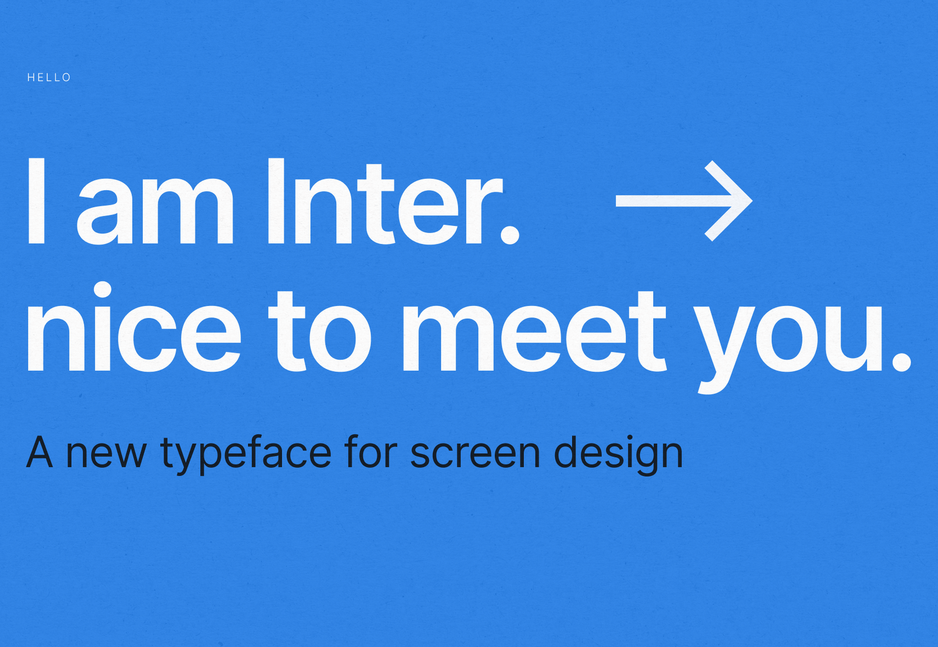
Google Fonts may be the single most significant contribution Google has made to the evolution of the web — yes, more significant than search, advertising, or analytics.

Google Fonts gives every business access to a visual voice with which to distinguish itself. Fonts can be downloaded for use in design software and then embedded using best practices for a consistent experience on the web.

If there’s anything wrong with Google Fonts, it’s that its default listings are based on “Trending,” a self-fulfilling criterion that keeps Noto Sans high up the list, destined to be over-used.

But if you spend a little time lower down the listings, you’ll find some exceptional typefaces that are hardly used. Yes, some of them are highly stylized, but there are also usable sans, serifs, and display fonts worthy of your consideration.

All you have to do is scroll; here’s a selection of some of the treasures you’ll find if you do…

Piazzolla

Piazzolla features dramatic and expressive angular shapes when previewed in large sizes, but its real strength is in setting large amounts of body text.

Mulish

If you’re looking for a solid workhorse sans, look no further than Mulish. Halfway between a humanist and geometric sans, there’s even a variable font version.

Ceviche One

Reminiscent of the cool lettering of 60s advertising, Ceviche One is packed with energy, thanks to the dramatic zig-zag formed along its baseline.

Vollkorn

Released by Friedrich Althausen in 2005, Vollkorn is an excellent typeface for body copy, excelling at small sizes. It now boasts a variable font option.

Merienda

Merienda is a delightfully energetic display script. The bold weight feels more confident, but both weights have a dancing rhythm that brings the page alive.

Raleway Dots

Raleway is a hugely popular — and perhaps overused font — but this dotted version is less known. It’s a simple geometric sans that functions as a display face.

Kenia

Kenia is a wonderful, uncategorizable typeface. The stencil forms result in entirely original letter constructions, and the lowercase s is magnificent.

DM Sans

DM Sans is a low-contrast geometric sans-serif that performs wonderfully well at smaller sizes. It only has three weights, but each comes with a matching italic.

Oxygen

Designed by Vernon Adams as part of the KDE project for GNU+Linux, Oxygen is a very readable sans-serif, with a generous x-height and a hint of pen stroke.

Alice

Ksenia Erulevich’s Alice was inspired by Lewis Carrol’s novel Alice’s Adventures in Wonderland. It presents itself as an Edwardian serif with fanciful flourishes.

Carter One

Carter One uses bold strokes, with a medium amount of contrast, to create a sans-style script. It has dozens of beautiful details like the notch on the lowercase o.

Bodoni Moda

Bodoni Moda is a didone-style serif with strong vertical strokes and high-contrast slab-like serifs. It’s the best variable font in this genre that I’ve found.

Ultra

Ultra is a slab-serif that you won’t even consider for body text. Its sculptural shapes are almost American-western. The counter on the lowercase n is charming.

Azeret Mono

Most mono-spaced fonts fail to inspire; practical they can be, charming they are not. But Azeret Mono bucks that trend, its bold weights being particularly fantastic.

Nunito

It’s tough to find a serious sans-serif with rounded terminals, but Nunito is it. There’s also a Nunito Sans with square terminals, but I love the rounded tips.

Bungee Inline

Designed for signage, Bungee is great for display sizes and works well vertically. There are several versions, but my favorite is this classy inline version.

Oi

Oi is unapologetically loud. A slab-serif that swallows its own detail, the counters and ink traps give it a 3D quality, and the curves feel almost nautical.

Expletus Sans

One of the significant trends in typography is the angled clip of adjoining strokes, creating the effect of shadow. This effect is brilliantly achieved in Expletus Sans.

Lustria

It’s comparatively unusual to find a serif face designed to work well at display sizes. At large sizes, Lustria’s rounded terminals evoke ink spread delightfully.

Yatra One

Yatra One is a Devanagari and Latin typeface that uses the Devanagari brush angle for its strokes, giving the Latin text an unusually slanted, stand-out character.

Amiko

Amiko is a highly legible typeface and excellent at tiny font sizes. It’s perfect as a secondary font if your main font is too fancy for elements like legal notices.

Keep Scrolling

It’s always tempting to leap at the first typeface you find that meets your needs, but if you dig a little deeper into Google Fonts, you’ll find a vast range of typefaces that offer both practicality and character.

Source

The post 21 Exceptional Google Fonts You Probably Haven’t Discovered Yet first appeared on Webdesigner Depot.


Source de l’article sur Webdesignerdepot

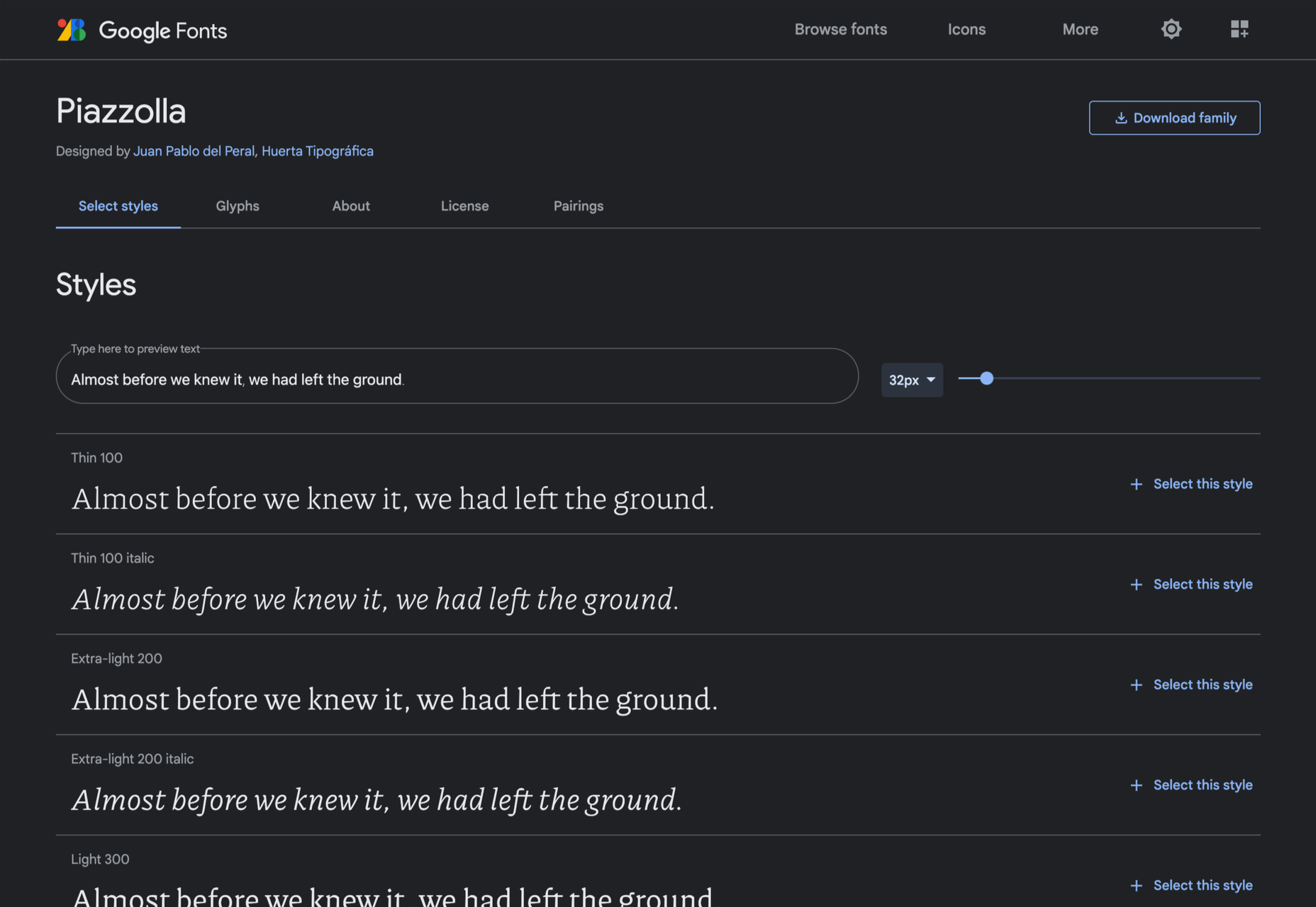
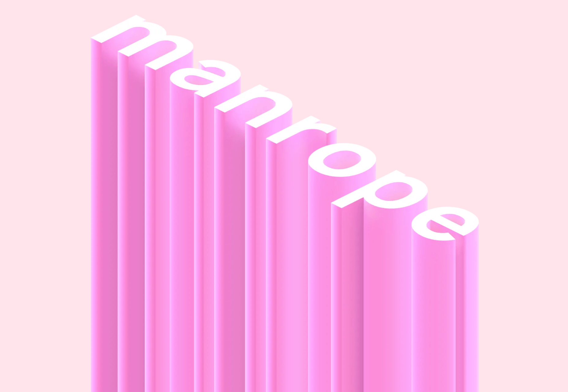
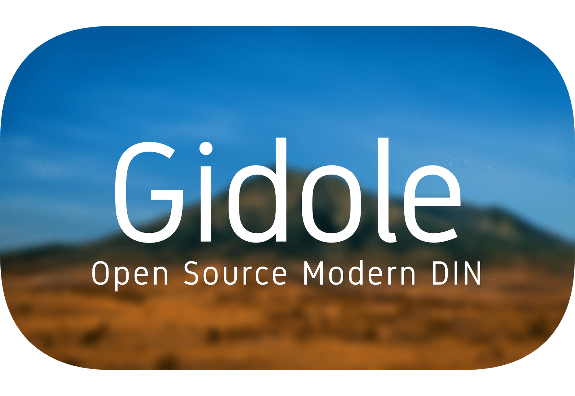
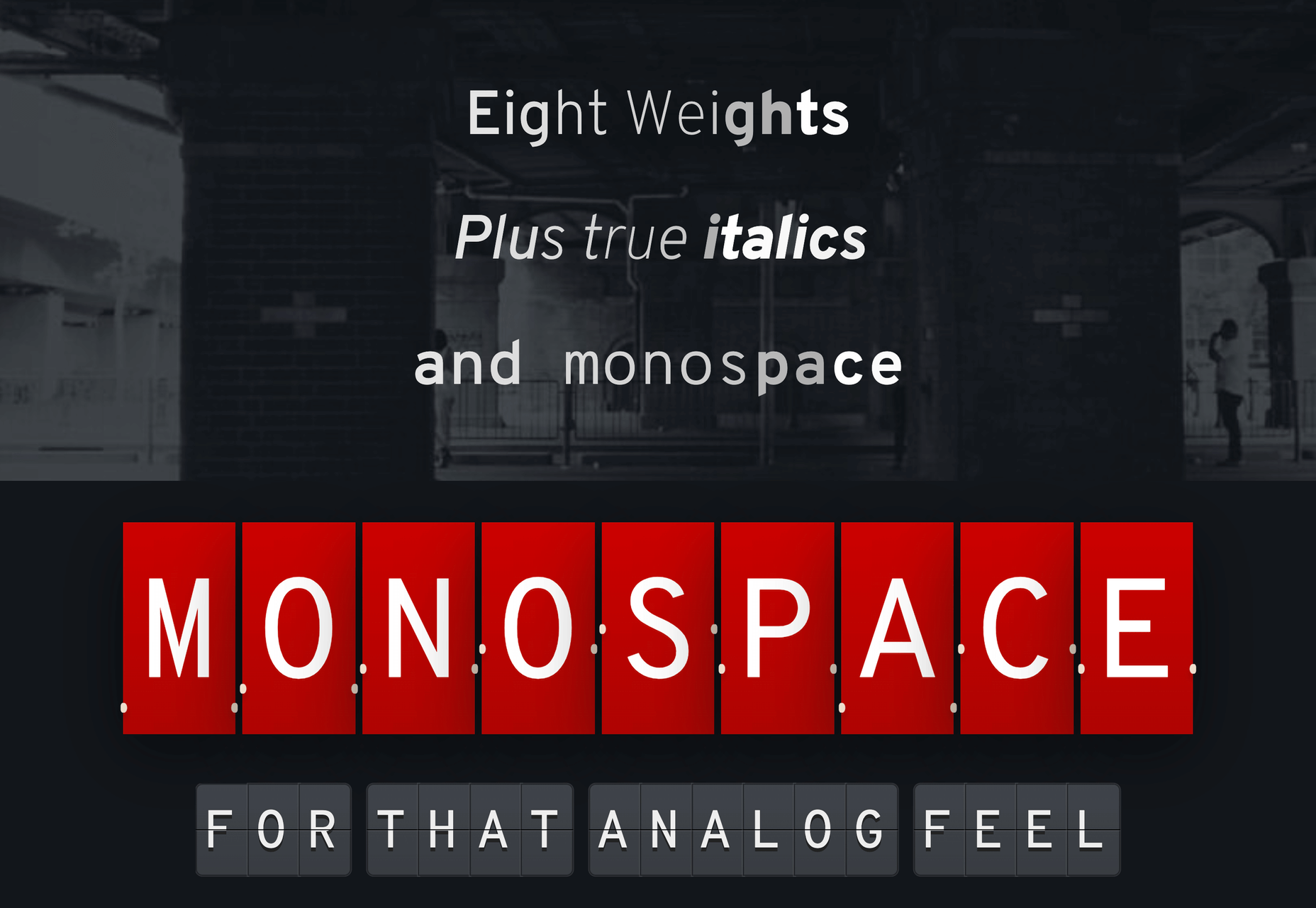
The right typeface can make or break your website. As designers, we will always be naturally drawn towards the premium fonts such as Circular, DIN, or Maison Neue; Before you know it, your website is racking up a font bill larger than your hosting bill.

We’ve put together a list of open-source fonts that will rival your fancy fonts, and might even persuade you to switch them out. All the fonts listed here are completely open-source, which means they’re free to use on both personal and commercial projects.

Manrope

Manrope has sprung onto the font circuit in style, with a website better than most early startups. It’s a variable font, which means you have a flexible range of font weights to choose from in a single font file. Manrope is a personal favorite of mine, it has every ligature you could want, and is fully multi-lingual. It’s a lovely bit of everything as it states on the website: it is semi-condensed, semi-rounded, semi-geometric, semi-din, semi-grotesque.

Gidole

DIN – the font we all love, the font that looks great at every size, and the font that costs quite a bit, especially with a large amount of traffic. Gidole is here to save the day, it’s an open-source version of our favorite – DIN. It’s extremely close to DIN, but designers with a keen eye will spot very few minor differences. Overall, if you’re looking to use DIN, try Gidole out before going live. (There is also a very passionate community around the font on Github)

Inter

Inter is now extremely popular, but we wanted to include it as it’s become a staple in the open-source font world — excellent releases, constant updates, and great communication. If you’re looking for something a bit fancier than Helvetica and something more stable than San Francisco, then Inter is a great choice. The font has now even landed on Google Fonts, making it even easier to install. As of today: 2500+ Glyphs, Multilingual, 18 Styles, and 33 Features… do we need to say more?

Overpass

Overpass was created by Delvefonts and sponsored by Redhat, it was designed to be an alternative to the popular fonts Interstate and Highway Gothic. It’s recently cropped up on large ecommerce sites and is growing in popularity due to its large style set and ligature library. Did we mention it also has a monospace version? Overpass is available via Google Fonts, KeyCDN, and Font Library.

Public Sans

Public Sans is a project of the United States Government, it’s used widely on their own department websites and is part of their design system. The font is based on the popular open-source font Libre Franklin. Public Sans has great qualities such as multilingual support, a wide range of weights, and tabular figures. The font is also available in variable format but this is currently in the experimental phase of development.

Space Grotesk

Space Grotesk isn’t widely known yet, but this quirky font should be at the forefront of your mind if you’re looking for something “less boring” than good old Helvetica. Space Grotesk has all the goodies you can expect from a commercial font such as multiple stylistic sets, tabular figures, accented characters, and multilingual support.

Alice

Alice is a quirky serif font usually described as eclectic and quaint, old-fashioned — perfect if you’re looking to build a website that needs a bit of sophistication. Unfortunately, it only has one weight, but it is available on Google Fonts.

Urbanist

Urbanist is an open-source variable, geometric sans serif inspired by Modernist typography. Designed from elementary shapes, Urbanist carries intentional neutrality that grants its versatility across a variety of print and digital mediums. If you’re looking to replace the premium Sofia font, then Urbanist is your best bet.

Evolventa

Evolventa is a Cyrillic extension of the open-source URW Gothic L font family. It has a familiar geometric sans-serif design and includes four faces. Evolventa is a small font family, generally used across the web for headlines and bold titles.

Fira Sans

Fira Sans is a huge open source project, brought to you, and opened sourced by the same team that makes Firefox. It’s Firefox’s default browser font and the font they use on their website. The font is optimized for legibility on screens. (And it’s on Google Fonts!)

Hack

Building a development website, or need a great code font to style those pesky code-blocks? Then Hack is the font for you. Super lightweight and numerous symbols and ligatures. The whole font was designed for source code and even has a handy Windows installer.

IBM Plex

IBM needs no introduction. Plex is IBM’s default website font and is widely used around the web in its numerous formats Mono, Sans, Serif, Sans-Serif, and Condensed – it has everything you’d need from a full font-family. The whole font family is multi-lingual, perfect for multi-national website designs. (It’s fully open-source!)

Monoid

Another great coding font, Monoid is a favorite of mine for anything code. The clever thing about Monoid is that it has font-awesome built into it, which they call Monoisome. This means when writing code, you can pop a few icons in there easily. Monoid looks just as great when you’re after highly readable website body text.

Object Sans

Object Sans (formally known as Objectivity) is a beautiful geometric font family that can be used in place of quite a few premium fonts out there. The font brings together the top qualities of both Swiss neo-grotesks and geometric fonts. The font works beautifully as large headings but can be used for body content as well.

Lunchtype

Lunchtype has a very interesting back-story, originally designed during the creator’s daily lunchtime during a 100-day project. If you’re looking for something a bit “jazzier” than the typical Helvetica for your project, then Lunchtype is a perfect choice. The family comes with numerous weights as well as a condensed version — enough to fill any lunchbox.

Jost

Inspired by the early 1920’s German sans-serif’s, Jost is a firm favorite in the open-source font world. Jost brings a twist to its closest web designer favorite Futura. When you want a change from the typical Futura, then Jost is a great option with its variable weighting as well as multilingual support.

Work Sans

Work Sans is a beautiful grotesk sans with numerous little eccentricities that may delight or annoy some designers. The font has variable weighting, multilingual support and is optimized for on-screen text use but works perfectly well for print also.

Source


Source de l’article sur Webdesignerdepot