 Want to know which of the top blogging platforms you should consider using this year?
Blogging is still one of the best ways to draw attention to your brand, generate thought leadership, and build your credibility. Research suggests that US internet users spend 3x more of their browsing time on blogs than on email. Additionally, people view about 20 billion blog pages on average each month.
So, how do you join the blogging revolution? You’ll need the right platform.
Essentially, a blogging platform is a CMS (Content Management System) which supports blog creation. Many come with additional tools like SEO support and integrations with email marketing too. There are tons of great blogging platforms out there, which means knowing where to start searching can be tough. To help you, we’ve put together this list of the leading blogging platforms.
What to Look for in a Blogging Platform
Before we sort through our list of the leading blogging platforms, let’s start with a quick overview of what the best blogging solutions typically include. Notably, depending on what you’re going to be using your blog for, you may have other features to prioritize besides those listed here. These features will act as a starting point for your comparisons:
Ease of Use
Uploading, publishing, and sharing your blog shouldn’t be a headache.
There are many website builders out there that seem to have blogging tacked on as an “extra” rather than having it built into the foundations of the software. This often leads to a clunky backend experience when you’re building your site.
If you’re a new blogger or don’t want to spend time messing around with HTML and coding, make sure that your blogging environment is easy to use. The simpler it is to distribute your content, the more likely you’ll stick to your blogging strategy.
Cost and Revenue Opportunities
Many of the top blogging platforms come with a fee to think about. Even if you use an open-source platform for blogging, you still need to consider domain names, hosting, and security costs. Finding the right balance between spend and return on investment is crucial.
Remember, just because a blogging platform is cheap doesn’t mean it’s good value. Similarly, expensive software may not be the best for your business. Ideally, you want something that’s going to deliver a good blogging experience, combined with plenty of opportunities to grow your readership for the lowest possible price.
If you want to get the best return on investment, focus on the kind of monetization options you can access with each platform. Medium, for instance, has a partner program that allows you to earn money on the posts that customers read. Platforms like Wix, WordPress, and Squarespace can all offer earning opportunities too. You can use them to place certain content behind a paywall, create subscriptions, and sell products or services.
Marketing and Growth Tools
Most blogging platforms will come with at least some tools to help you build your online presence. Wix and WordPress integrate with Google marketing, so you can purchase PPC campaigns and track your organic content through an SEO dashboard.
The majority of CMS tools equipped with blogging capabilities also come with integrations for your email marketing service. This ensures you can create automated campaigns that inform your audience whenever a new blog post goes live.
One of the best things about WordPress is how many plugins you can access to boost your readership levels. Access to extra tools like SEO solutions, landing form creators, and pop-ups can all boost your chances of converting and capturing leads.
Custom Branding
If you’re keen to save money on your blogging platform, you might be tempted to start with a free version of a popular service. This is fine when you’re just testing the waters. However, you will need to spend extra if you want to remove the ads that other website builders put on your site. For instance, Wix’s free version will place ads on your pages and show the Wix identity in your footer.
To build your own brand identity, you’re going to need to replace that CMS branding with your own. Look for a blogging service where you can buy your own domain name, customize your themes, and add your own colors, images, and logos into the mix.
While tools like Medium won’t run ads on your campaigns, they also don’t allow you to customize your site to showcase your brand personality. It’s much easier to build a memorable identity when you can control what your site looks like.
Upkeep and Maintenance
This ties in a little with the “ease of use” factor above. Before you invest in any blogging platform, think about how much work it’s going to require. A hosted blogging platform is pretty easy to manage because you don’t have to worry about security and uptime yourself.
Products like Wix and Squarespace will give you access to SSL certificates, patch security issues on your behalf, and handle other complicated site maintenance issues. WordPress and other open-source solutions require you to take more of a hands-on approach. You’ll need to manage your own web hosting and check the security of your site regularly.
Flexibility
This feature is often overlooked in some guides to the best blogging platforms, but it’s also growing increasingly more important in today’s digital age. If you want your website to work for years to come, you need to make sure it’s flexible. This could mean that you look for something that allows you to upload different kinds of content, like written blogs and connecting podcasts.
It could also mean investing in a service that has a lot of integrations and add-on options available. Plugins are fantastic for extending the functionality of your blog without having to move your entire site to another location.
The right plugins can even allow you to transform your blog into a store if you decide to start selling your services or products later.
The Best Blogging Platforms for 2021
Now we’ve covered what to look for in a blogging platform, we can begin to explore some of the top platforms on the market today. We’ve chosen these platforms for their ease of use, flexibility, performance, customization options, and value.
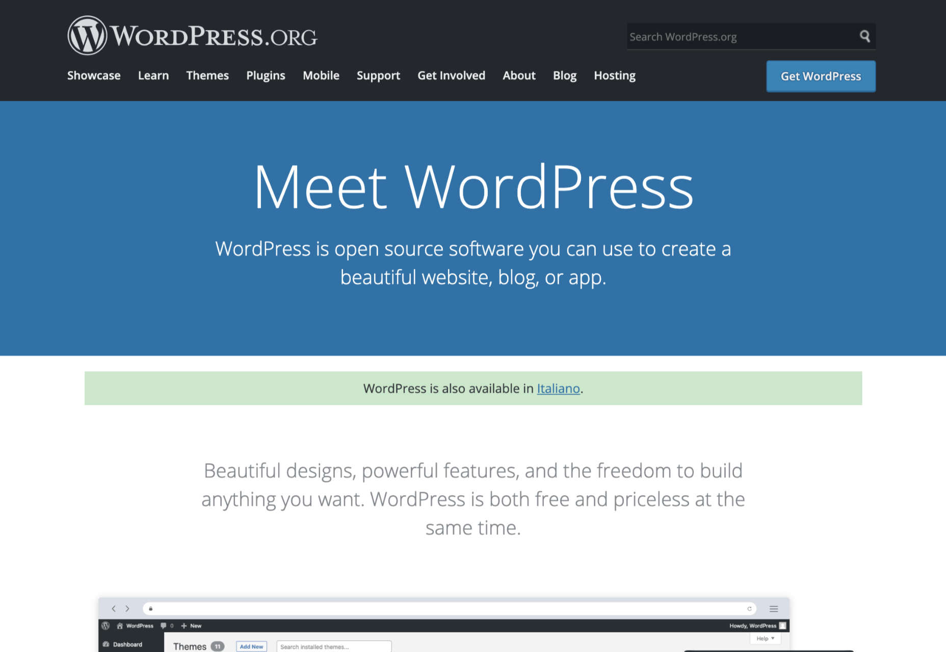
WordPress
The best-known and most popular blogging platform in the world, WordPress is the go-to choice for most bloggers and website creators. Currently, there are around 64 million websites actively using WordPress as their chosen CMS. Usage stats also show that around 400 million people visit WordPress websites every month.
WordPress powers most of the internet as one of the most flexible and easy-to-use platforms around. The biggest decision most users need to make is between WordPress.com and WordPress.org.
You can create a blog for free at WordPress.com, and the company will host your site for you. However, you have to use a subdomain (rather than your own domain) with the free version. You’ll also lose control of your ads with the free package until you upgrade to a premium plan.
A personal plan on WordPress.com starts at about $4 per month, and it removes all ads from your site. The more functionality you need, the more you’ll need to upgrade. WordPress.com is very easy to use and requires minimal initial setup, but it’s not very scalable. There are no custom themes, and you don’t technically “own” your blog this way.
WordPress.org is a different story. With WordPress.org, you’re accessing an open-source blogging platform that allows you to build your site from scratch. You do need to purchase your own domain name and hosting with this service, but the software is free to use.
WordPress.org is a lot more appealing to most bloggers because it’s so customizable. Features include:
- Free and premium themes that you can customize to suit your brand;
- Thousands of plugins to help with security, SEO, subscriptions, and more;
- Gutenberg block editors to make creating and publishing blogs easy;
- Tons of SEO friendly solutions to help you stand out online;
- Access to a huge community of experts;
- Infinite control over your design options;
- Advanced user permissions and roles.
Pricing: WordPress.org is different from most blogging platforms because the foundation technology is free. You just pay for the a-la-carte options, like plugins, hosting, and domain name subscriptions. This means you can choose how expensive your site is going to be.
Pros:
- Extremely easy to use with lots of community support available;
- Free platform (though you do need to pay for the domain and hosting);
- Lots of customization and plugin options to expand site functionality;
- Search engine friendly as-standard, to help you grow;
- Plenty of ways to make your brand stand out.
Cons:
- It can be difficult to control your own website at first;
- You have to manage your own backup and security;
- Extra costs can quickly build up.
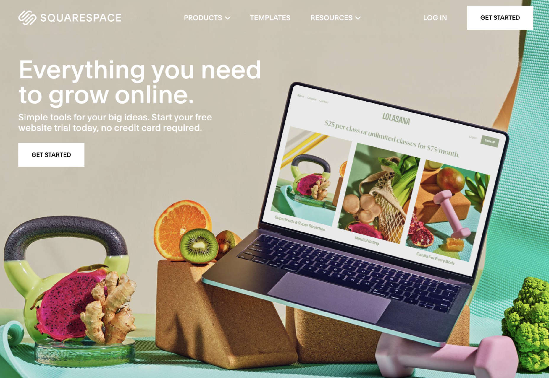
Squarespace
Squarespace is one of the more popular website design and blogging tools for people with a creative streak. Unlike WordPress.org, Squarespace gives you everything you need to build your own website straight out of the box. This includes hosting, the option to purchase your own domain name, and access to a range of beautiful templates.
Squarespace stands out for its focus on small business owners. You can choose from a range of stunning designs and customize them however you choose with a convenient drag-and-drop builder. There’s also a fantastic customer service experience available from Squarespace, with a team that’s ready to help you with anything you need.
Like many other hosted blogging platforms, you start on Squarespace by choosing the templates you like and customizing from there. There are some limitations in what you can do here, particularly if you have a lot of coding knowledge, making Squarespace less appealing to growing companies or larger brands. On the plus side, you do get features like:
- Dedicated blogging templates to get you started;
- Categories, tags, and featured post options;
- Built-in scheduling for your blog posts;
- Contributor roles and permissions;
- Analytics to track your readers’ favorite posts;
- Email marketing tools;
- Social media and SEO solutions built-in;
- Mobile app access.
Pricing: Compared to some of the other leading blogging solutions on the market, Squarespace is also quite affordable. The personal package at $12 per month will power a website with a stunning blog. You can also upgrade to the Business version for $18 per month, or if you decide to start selling your own products through your blog, you can transition to “Basic Commerce” at $26 per month.
Pros:
- Squarespace is easy to use for beginners;
- Fantastic range of stunning templates included;
- SEO, email marketing, and social media marketing included;
- SSL and HTTPS support;
- Access to eCommerce features on some plans;
- Useful analytics tools.
Cons:
- Not very scalable for bigger brands;
- Limited in terms of integrations and customization.
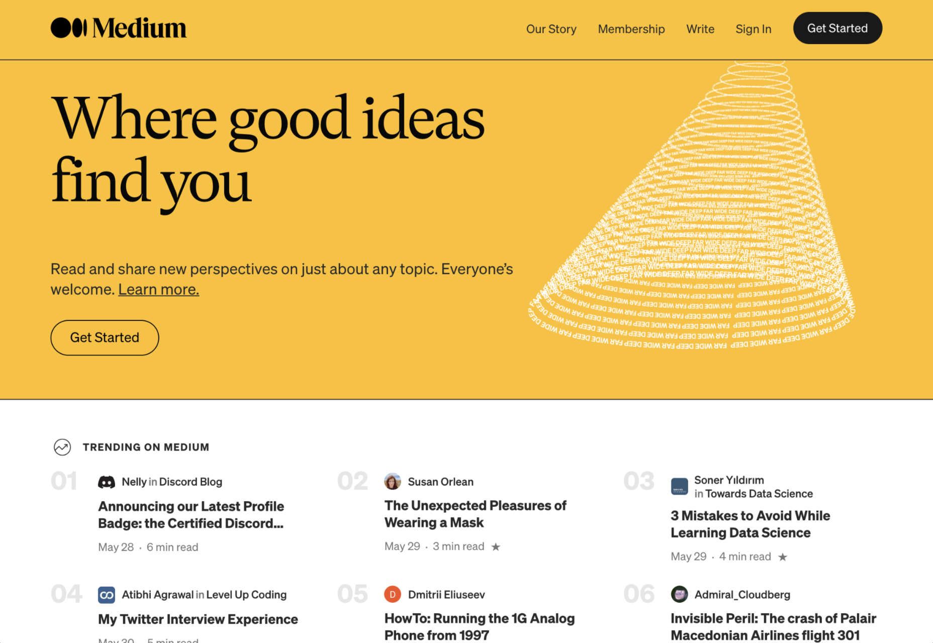
Medium
Medium is a different kind of blogging platform to many of the options mentioned here. This isn’t a tool you can use to build your own websites, like Wix or Squarespace. Instead, it’s a community you join with a monthly membership fee.
Medium comes with a built-in audience, so you can immediately start speaking to customers and generating results from your content. As mentioned above, there’s also a Partner Program, which is free to join. The Partner Program allows you to earn money if people are reading your blogs regularly.
For companies or individuals who just want to generate brand awareness but don’t want to invest in an entire blog-ready website yet, Medium can be a powerful choice. You can easily share posts and view what other people are posting. The biggest downside is that you can’t build an entire community and earn a fortune through your website with Medium.
Medium is more like a social networking site, where you can begin to develop thought leadership than a true space to carve out your piece of the online world. But it does feature things like:
- An easy-to-use environment for publishing content;
- Analytics and insights into your campaigns;
- Some design customization for your blog layout;
- Access to a pre-existing audience of readers;
- Support for monetization in the Partner program;
- Access to picture uploading options;
- Mobile-responsive blog posts.
Pricing: You don’t have to be a paid member of Medium to sign up for the partner program and start publishing blogs. This does make it a pretty good way to enhance your existing blogging strategy if you’re trying to generate more attention online.
Pros:
- Free to use for Partners and creators;
- Excellent for appealing to already-engaged customers;
- Easy to use, with no coding required;
- No requirement to create a website or pay for hosting;
- Communicate with a team of like-minded people.
Cons:
- Limited customization options;
- No ownership over your audience or readership;
- Limitations to how you can make money (no ads).
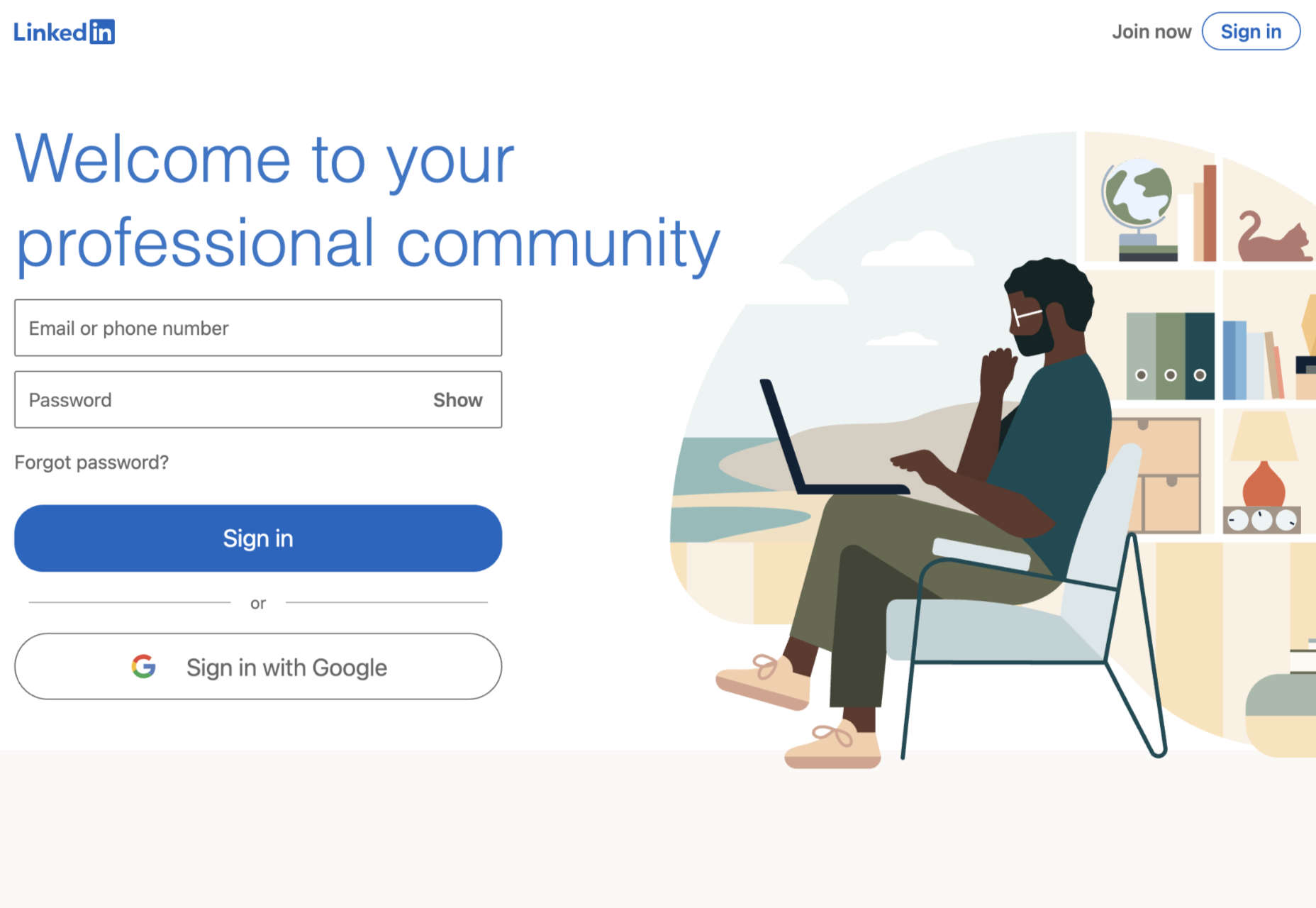
LinkedIn
LinkedIn is among the most popular platforms for professionals in the world. It’s the go-to place for people in search of reliable ways to develop their professional network. Currently, there are around 756 million members on LinkedIn. When they’re not searching for connections with their peers or chatting about work opportunities, they’re checking out the content on the platform.
If you’re keen to develop your position as a thought leader but prefer social media accounts to full websites, LinkedIn is the perfect choice. The more you publish on LinkedIn, the more you’ll attract new people who might want to work with you, invest in your company, or just work as part of your team.
LinkedIn is a great place to generate attention if you’re in the B2B marketplace because most professionals already have their own account. You can also earn social proof by getting people to “endorse” your work. Some of the features of LinkedIn for bloggers include:
- Private messaging for interactions with connections;
- Notifications to help you keep track of valuable content;
- A full profile posting section where you can publish your blogs;
- A convenient network of active B2B professionals;
- Endorsements for social proof;
- A resume and blogging platform in one (you can list your skills);
- Job searching and employee searching features.
Pricing: It’s free to access a basic membership with LinkedIn, but you will be limited on some of the features you can unlock. For instance, you can only send messages to people already in your network, and you’ll have limited analytics. LinkedIn Premium gives you slightly more functionality, with Business accounts starting at around $29.95 per month.
Pros:
- Tons of people ready to read your blogs;
- Great for building your professional network;
- Good environment for thought leadership;
- Access to extra tools like job listings;
- Notifications to keep you on top of relevant posts;
- Engagement options like private messaging;
- Reports and insights.
Cons:
- No access to full website branding;
- Limits to how you can monetize your content;
- You don’t own the site or your traffic.
Wix
Easily one of the most popular website building solutions for beginners, Wix can help you build both a blog and a fully-featured website. You can even design your own store with Wix and start selling products whenever you choose.
Wix is a straightforward site builder which you can use to build a site in a matter of minutes. There are hundreds of website themes to choose from, and you can also add as many customizations as you choose with the convenient drag-and-drop editor. The blog manager section of the CMS is also simple and intuitive, with SEO and analytics built in already.
Wix aims to make jumping into blogging as quick and painless as possible. Elements like comments, social tools, hashtags, and subscriber forms are already available, and you can add further plugins if you choose. There’s also the option to include sharing buttons for social media accounts like Twitter, Facebook, and more. Features of Wix include:
- An extensive range of blog templates;
- Drag-and-drop customization (no coding required);
- Subscriber forms, comments, likes, and categories;
- Social media connections;
- Extra features like store access;
- Analytics and insights;
- Quick and easy blogging interface.
Pricing:
The most basic features of the Wix website builder are free to use. With a free Wix account, you’ll get a subdomain where you can’t choose the name of your own website, unfortunately. However, you can add a custom domain for only $4.50 per month. If you want a full premium plan with Wix, costs start at $8.50 per month and extend to $24.50 per month.
Pros:
- Lots of pre-built blogging themes;
- Easy customization options with no coding skills required;
- Quick and easy to load and publish blogs;
- Connections with social media platforms;
- Access to various third-party apps and integrations;
- Free option for beginners.
Cons:
- Some limitations to the free account;
- Ecommerce features are limited to paid plans;
- Not as scalable for bigger companies.

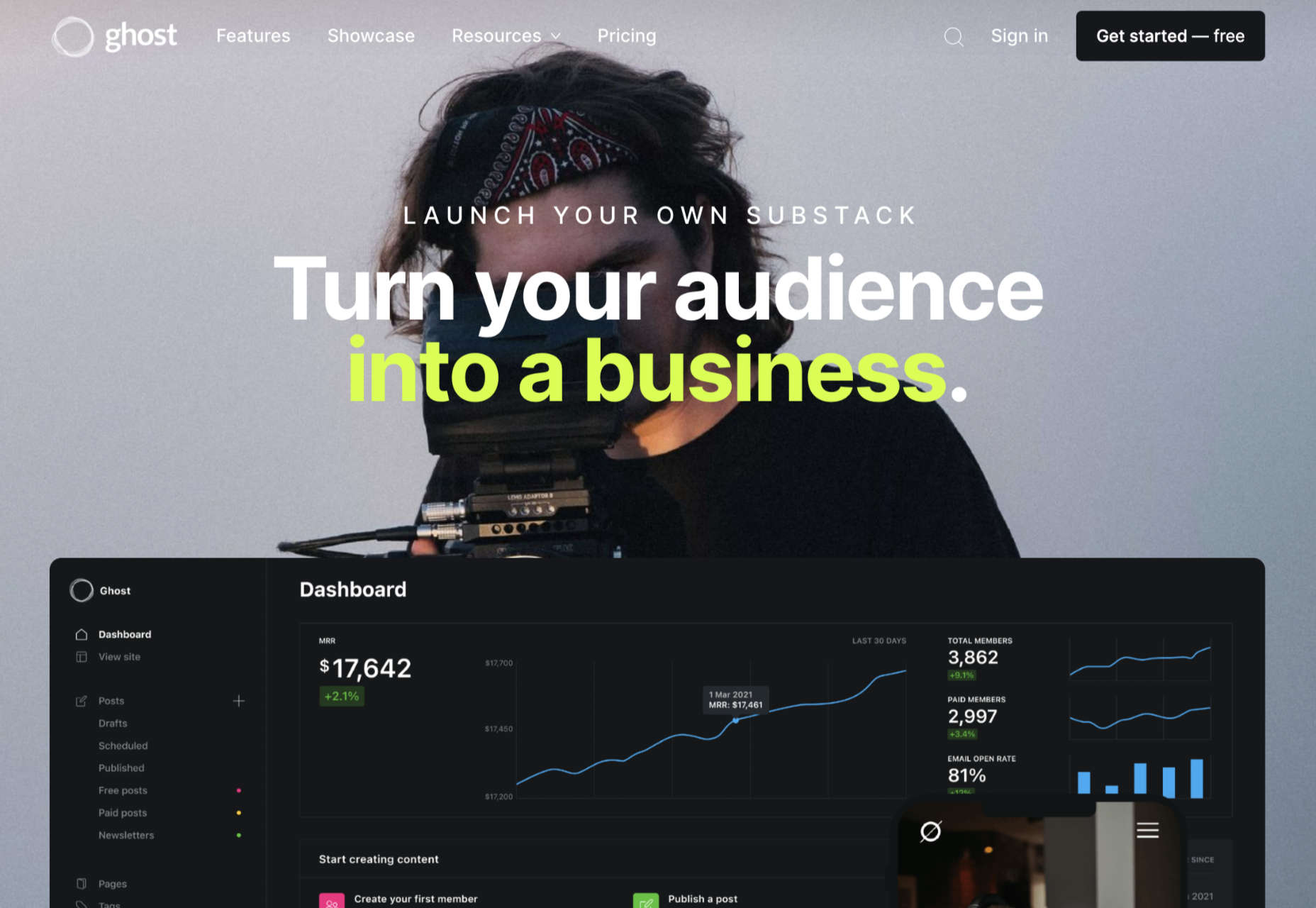
Ghost
Lesser known than some of the options we’ve discussed so far but still brimming with value, Ghost is a minimalist blogging platform that’s all about content creation. Ghost promises a range of ways for you to turn your blogging into a business, with access to customizable templates, newsletter integrations, premium subscriptions, and more.
The dashboard for Ghost is clean and intuitive, with access to simple sections where you can add tags to your posts, create drafts, track published content, and access valuable insights. You’ll have an easy view of important metrics like email open rates and numbers of paid members at a glance. You can also find integrations to make your Ghost experience even better.
Ghost works alongside things like Buffer, Stripe, Twitter, Slack, MailChimp, and many other tools so you can take your blog to the next level. There’s no need for any coding knowledge, and because everything is written in JavaScript, it’s ultra-fast too. Features include:
- Easy-to-use and intuitive interface;
- Blogging and writing focused;
- Clean and clutter-free design;
- Integrations with various powerful tools;
- Super-fast JavaScript coding;
- Lots of templates and customizations;
- Comment, mobile apps, A/B testing, and more;
- Analytics and reporting.
Pricing: There’s a 14-day free trial to get you started with Ghost, then subscriptions start at $9 per month when billed annually for up to 1,000 members, 1 staff user, 2k views per month, and an SSL and CDN. The same plan is $15 per month billed monthly. Prices go all the way up to $199 per month billed annually, or $249 per month for 1 million views per month, 35,000 members, 15 staff users, and a 99.99% uptime SLA.
Pros:
- Focus on writing and blogging;
- Clutter-free and clean backend environment;
- Easy to use and speedy performance;
- Lots of packages to choose from;
- Great integration options.
Cons:
- Some limitations in scalability;
- Complicated setup when installed;
- Not a huge number of themes.
Choosing Your Blogging Platform
Whether you’re blogging because you want to build your personal brand or you’re looking for a way to strengthen sales opportunities for your company, you’re going to need the right blogging platform. The options above are just some of the best blogging solutions available right now.
Remember, do your research and explore the free versions available whenever possible, so you can confidently invest in the software that’s best for you.
Featured image via Unsplash.
Source
The post Top Blogging Platforms Worth Considering in 2021 first appeared on Webdesigner Depot.

Source de l’article sur Webdesignerdepot

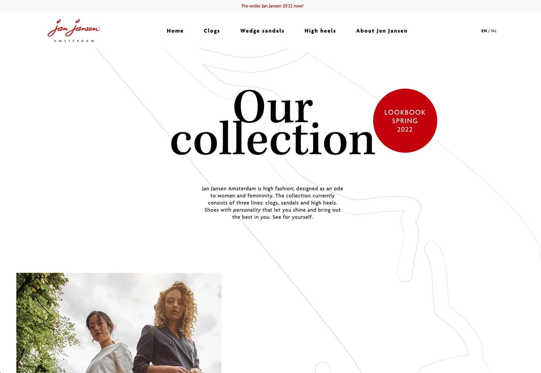
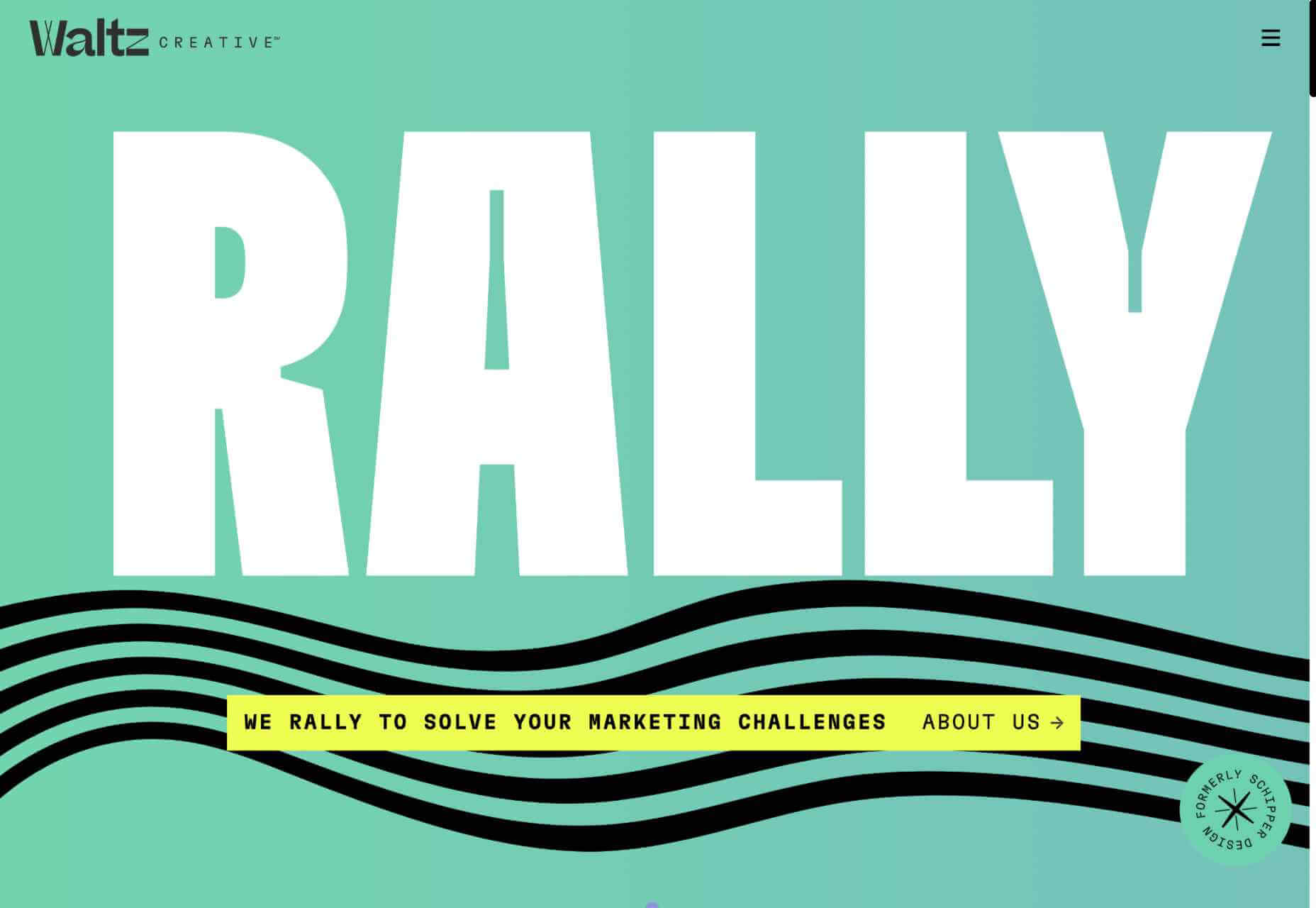
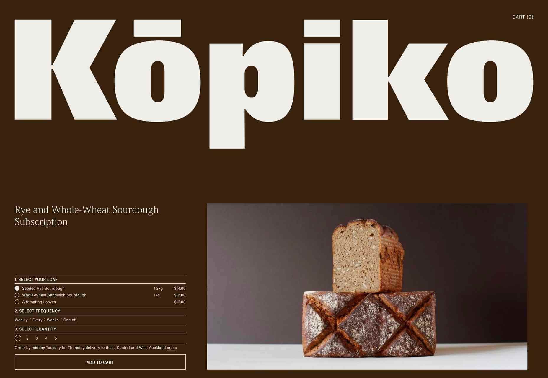
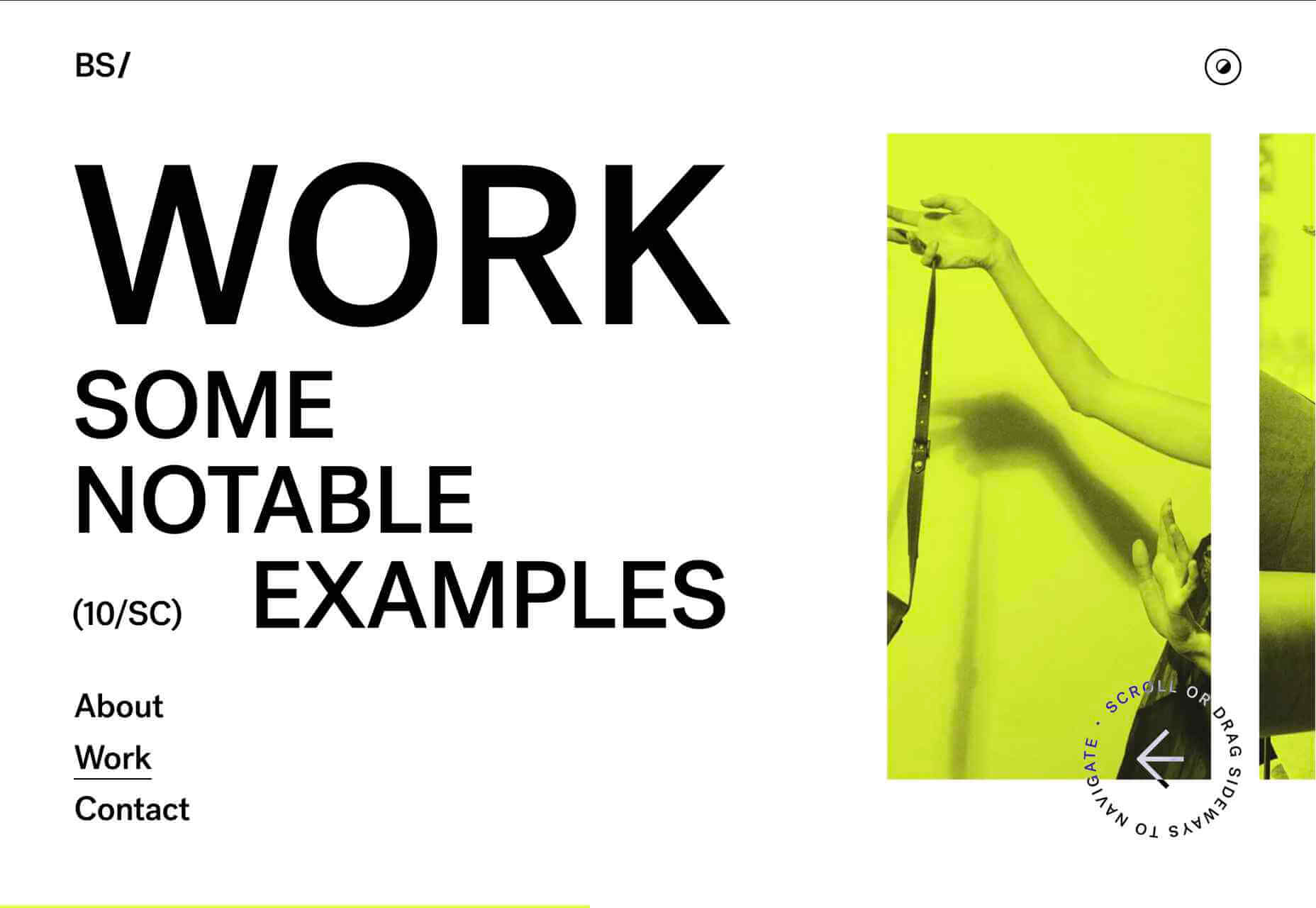
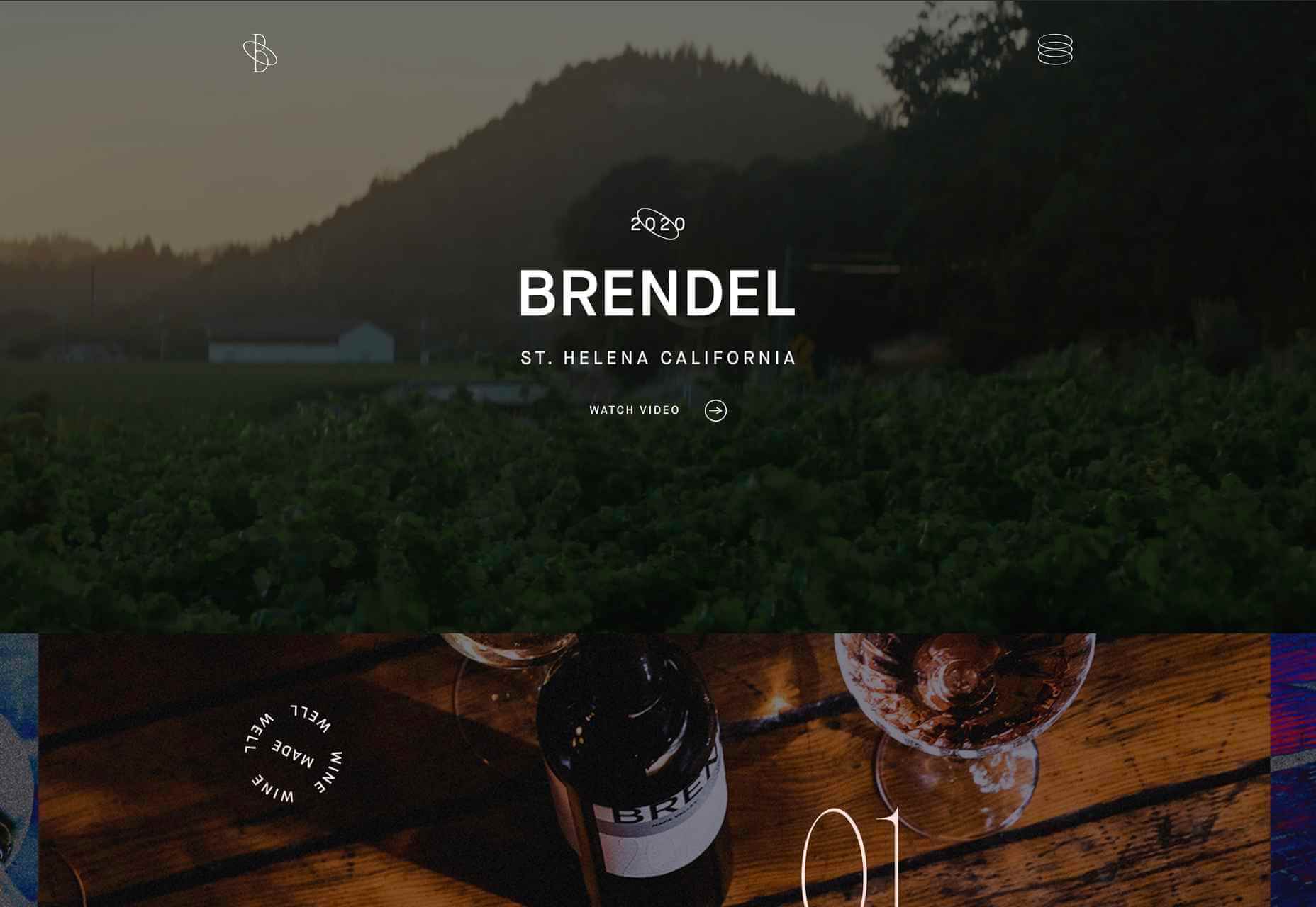
 Design trends on top of design trends. This theme of this month’s collection is trends that seem to build on each other. These examples use multiple trends listed here: hero typography, round buttons, and big branding.


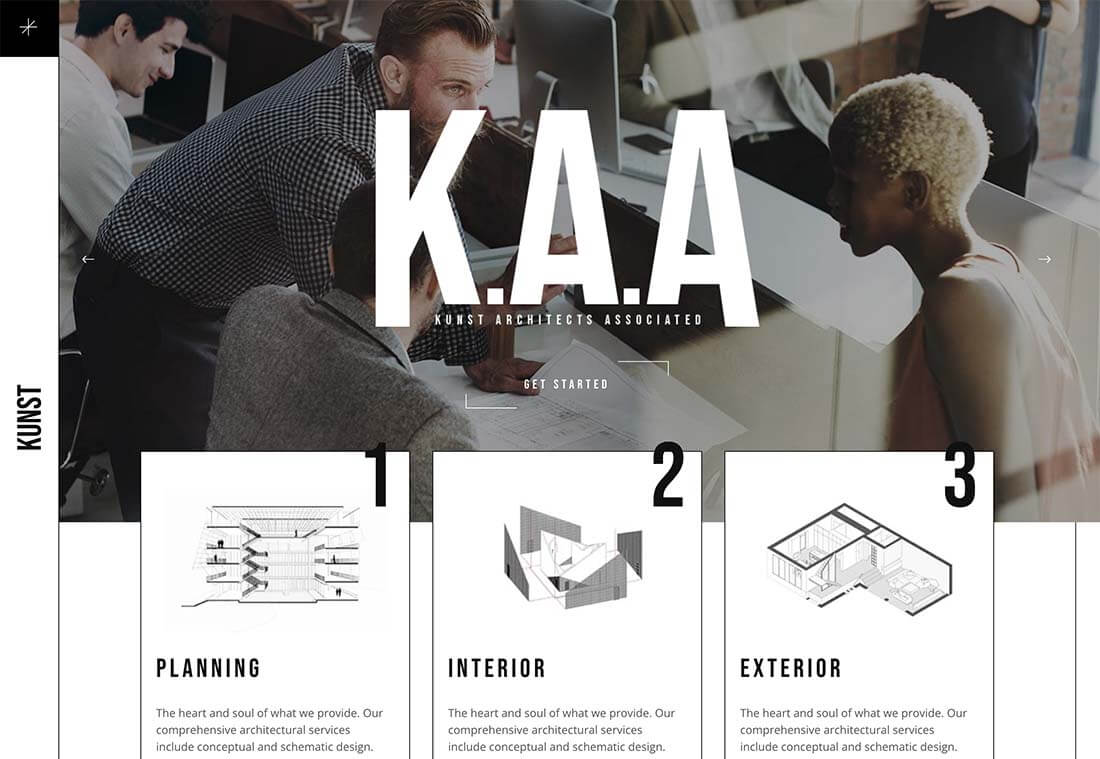
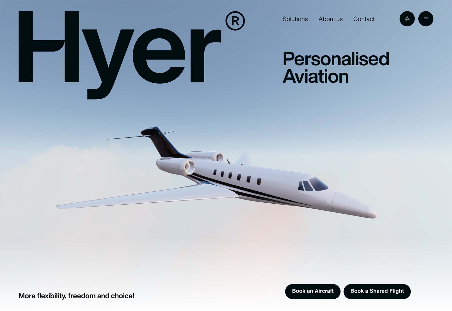

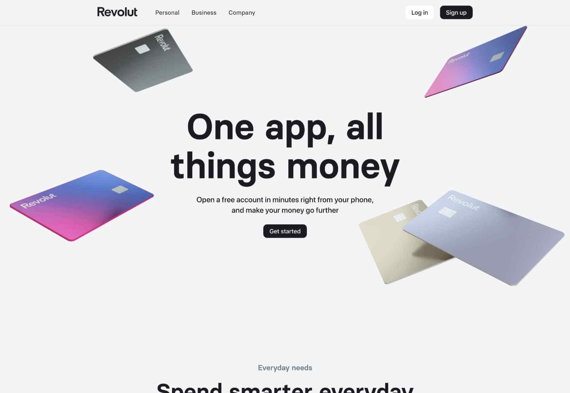
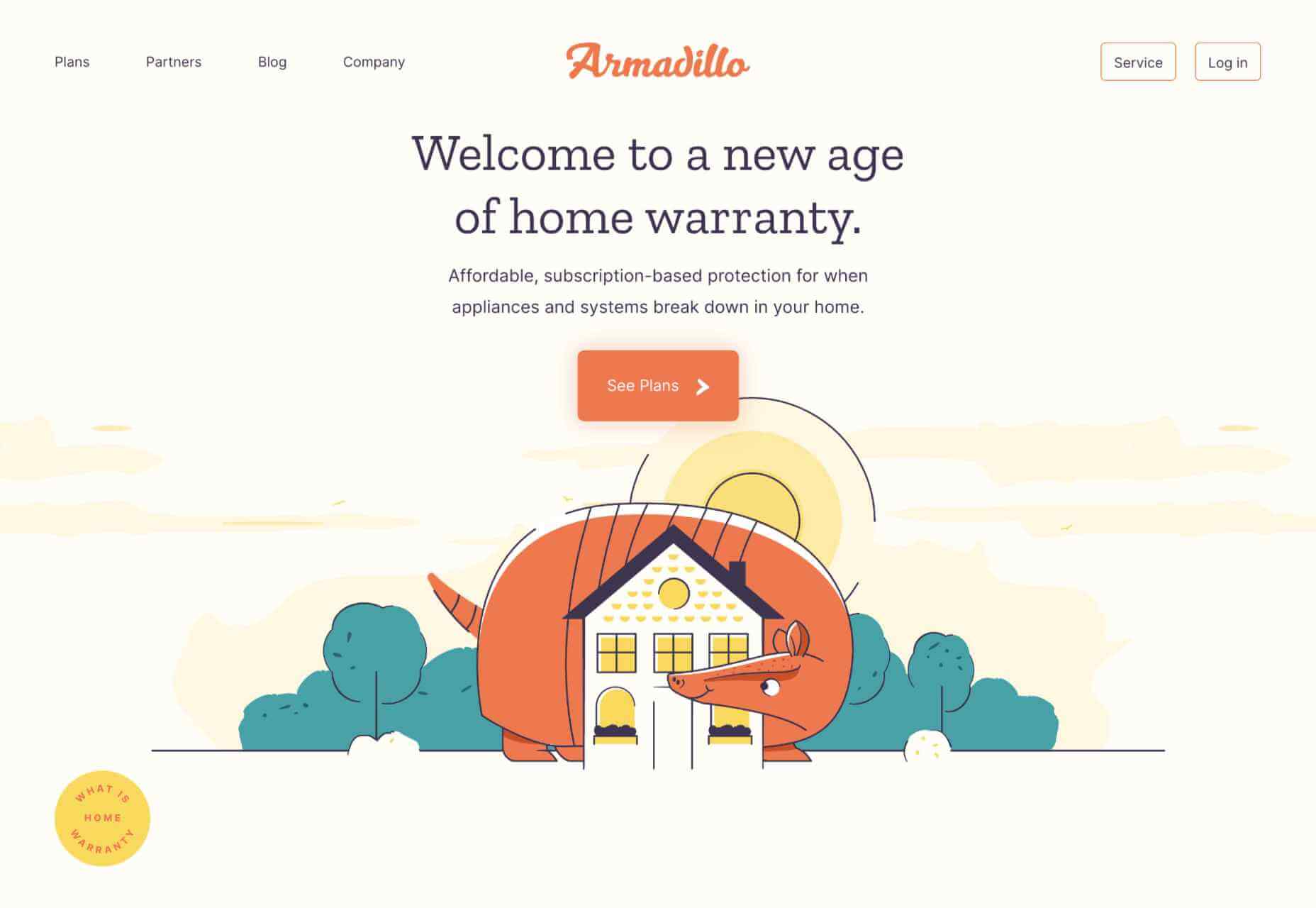
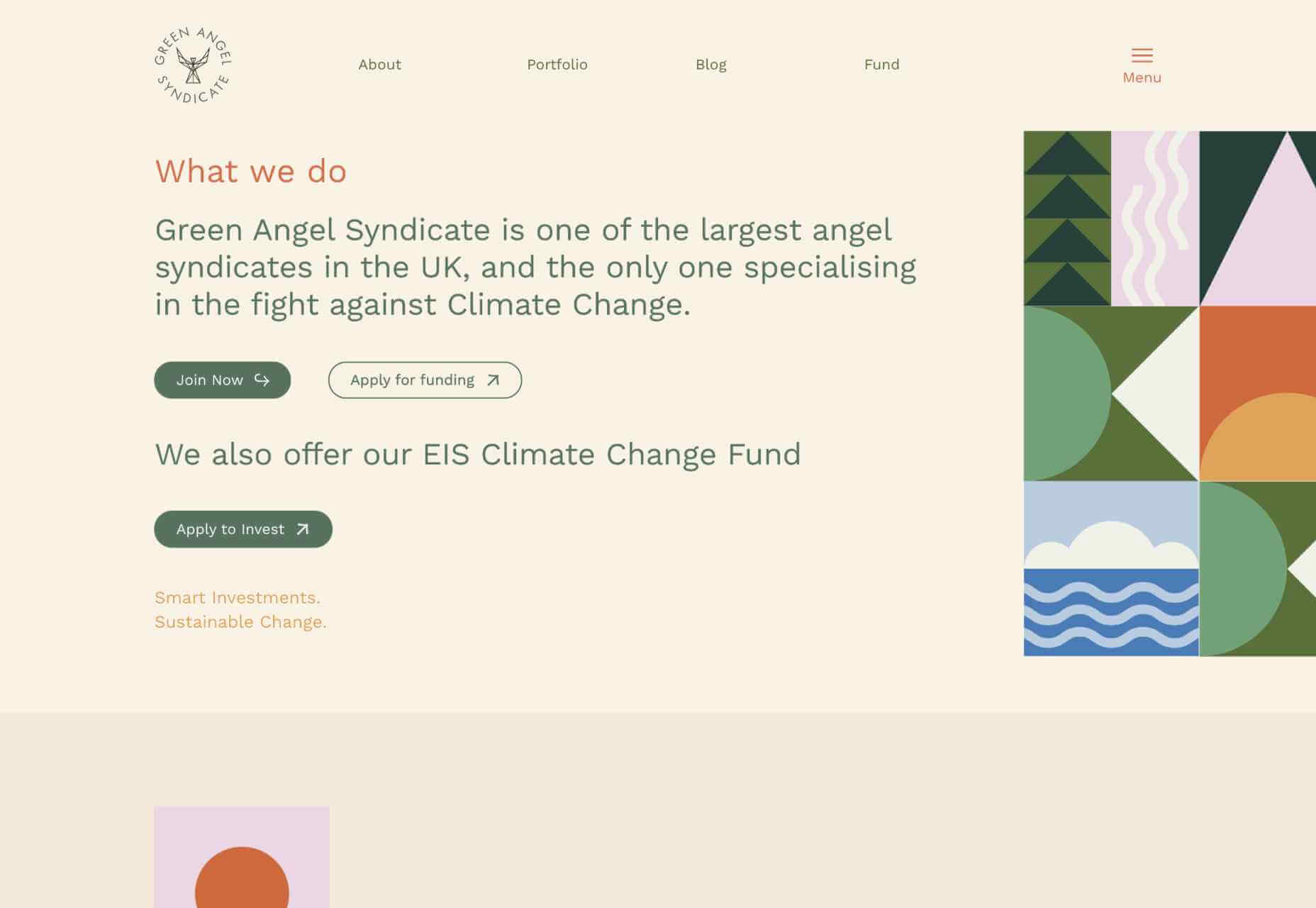
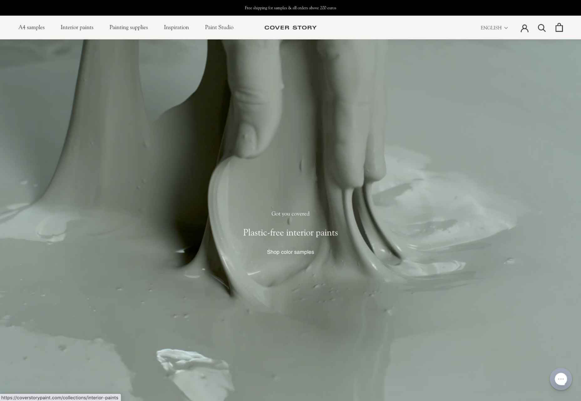
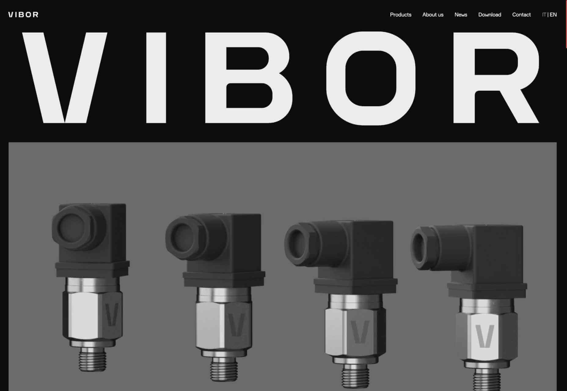
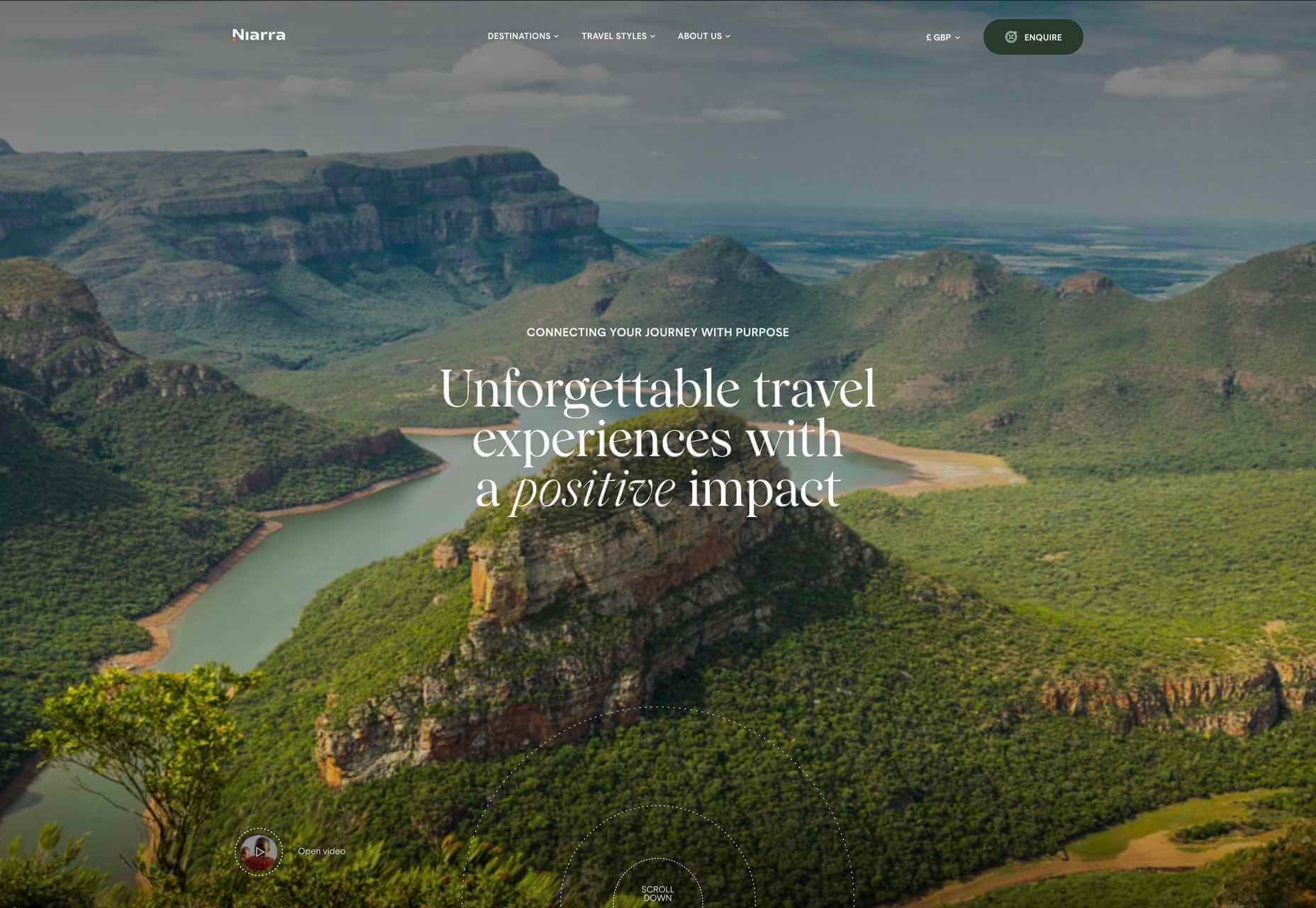
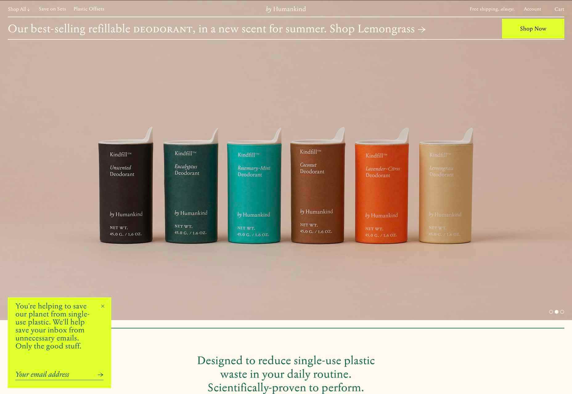
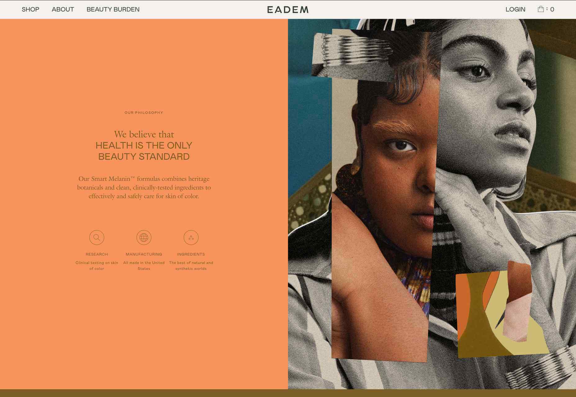
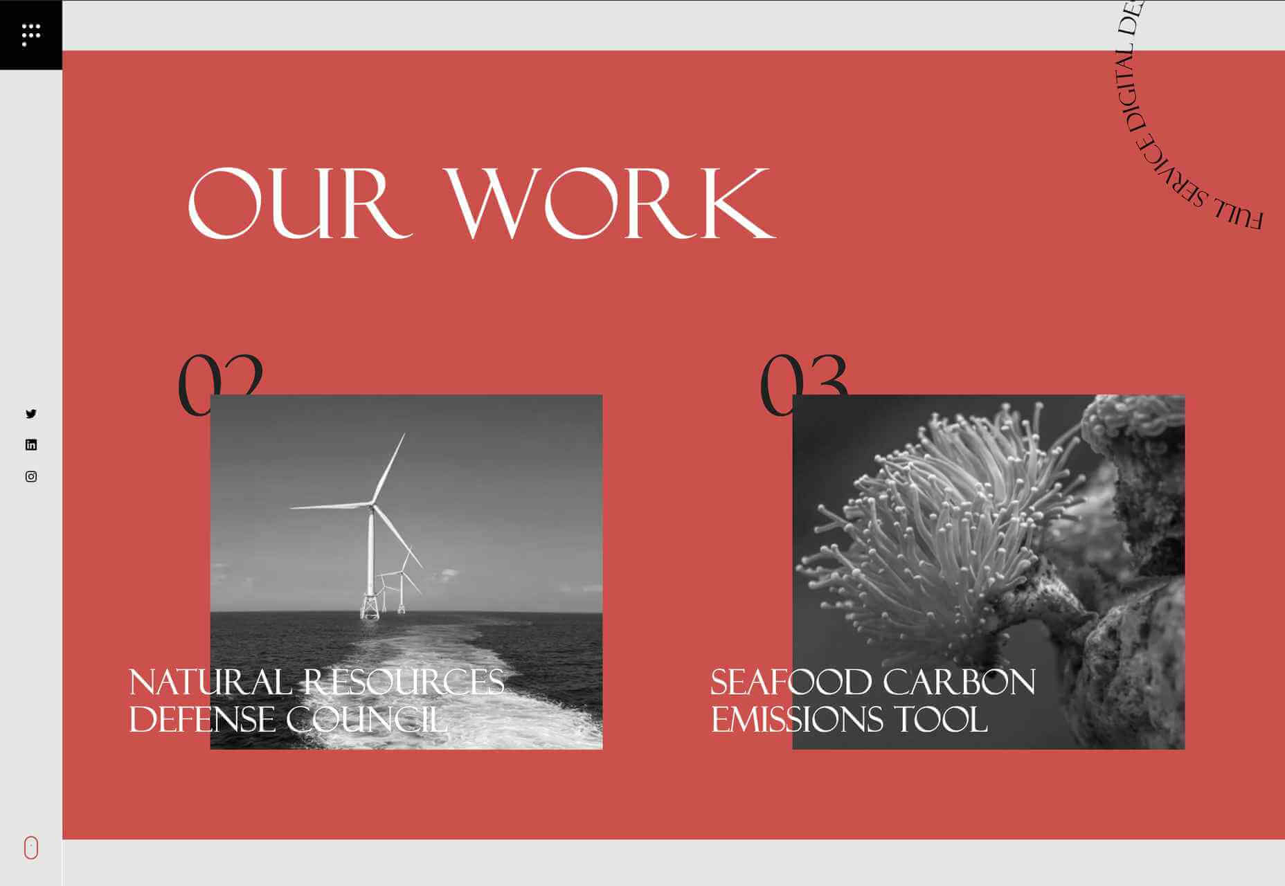
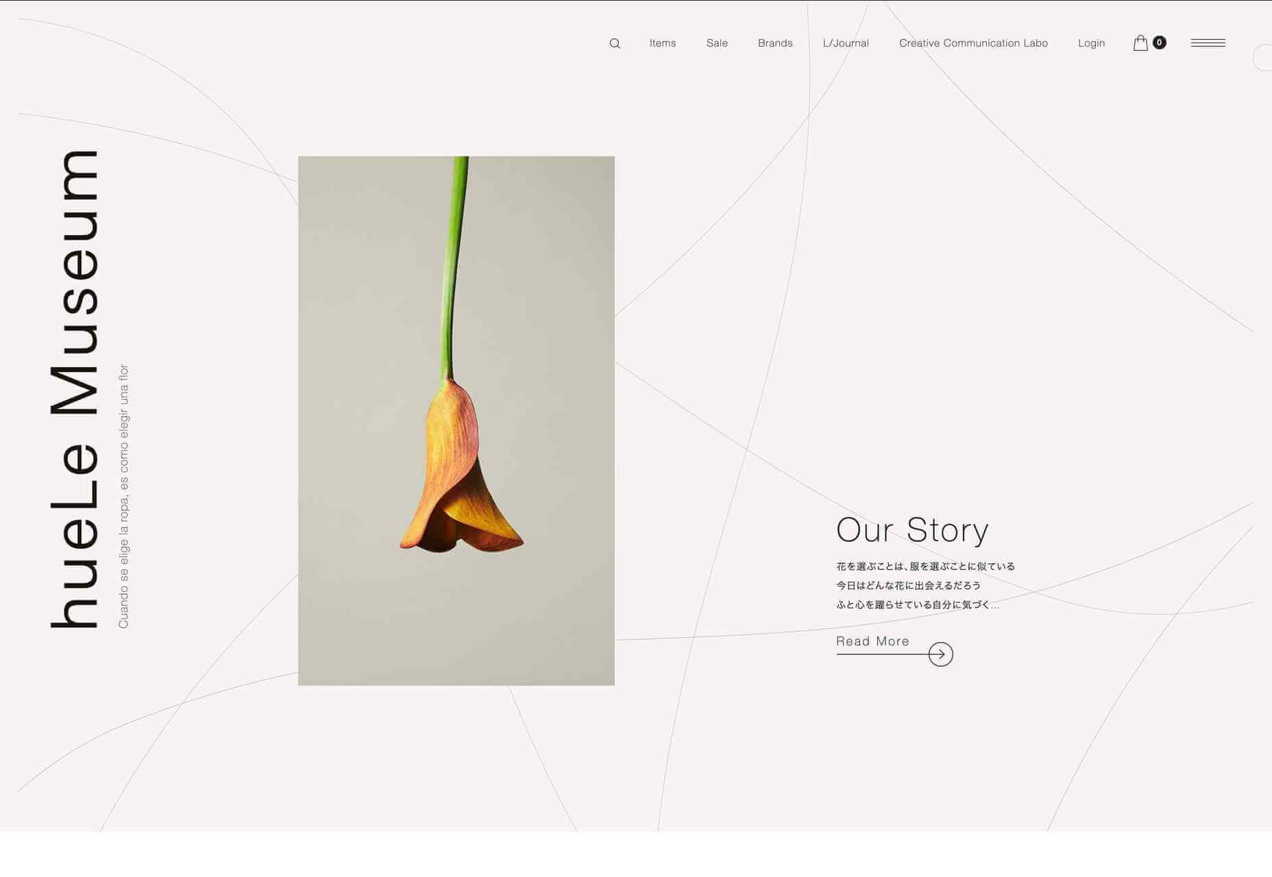
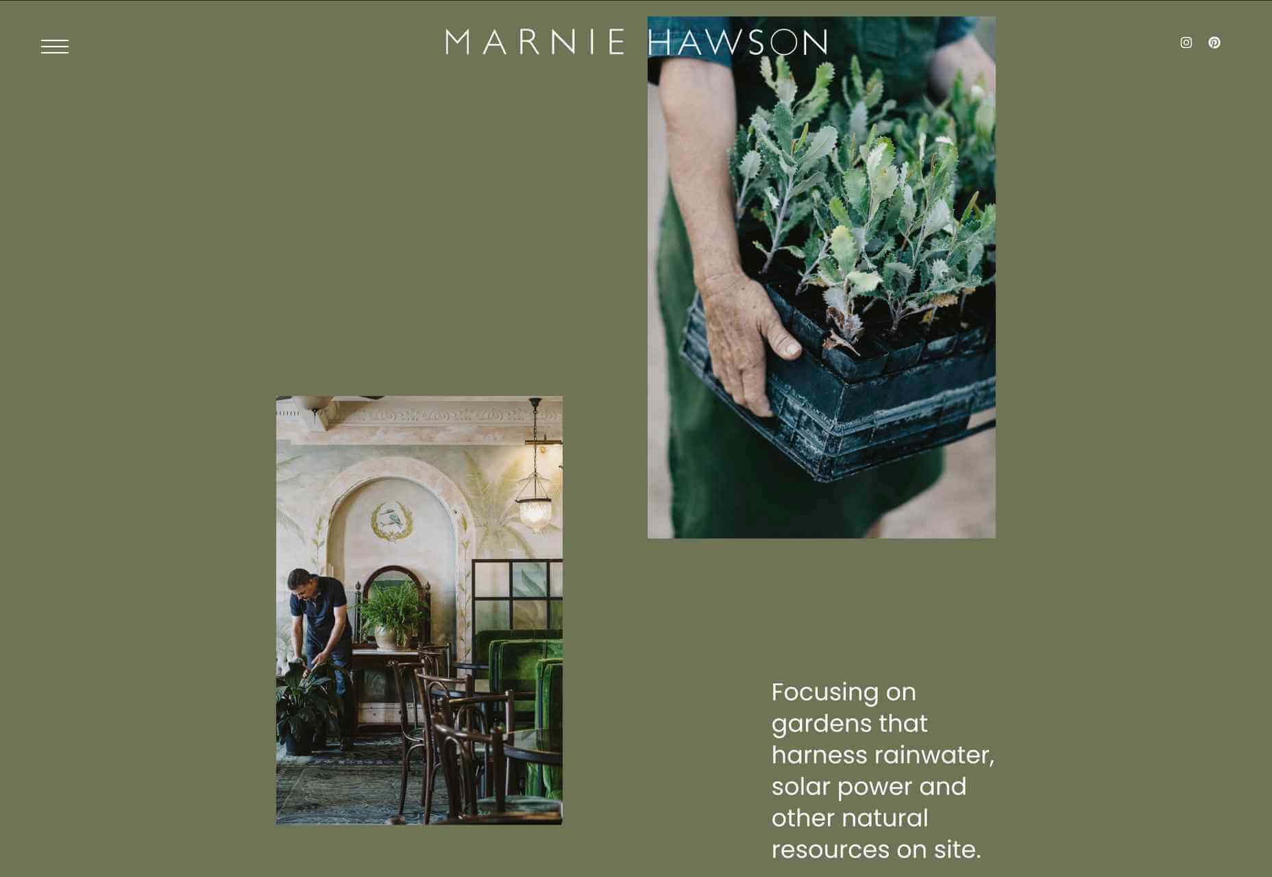
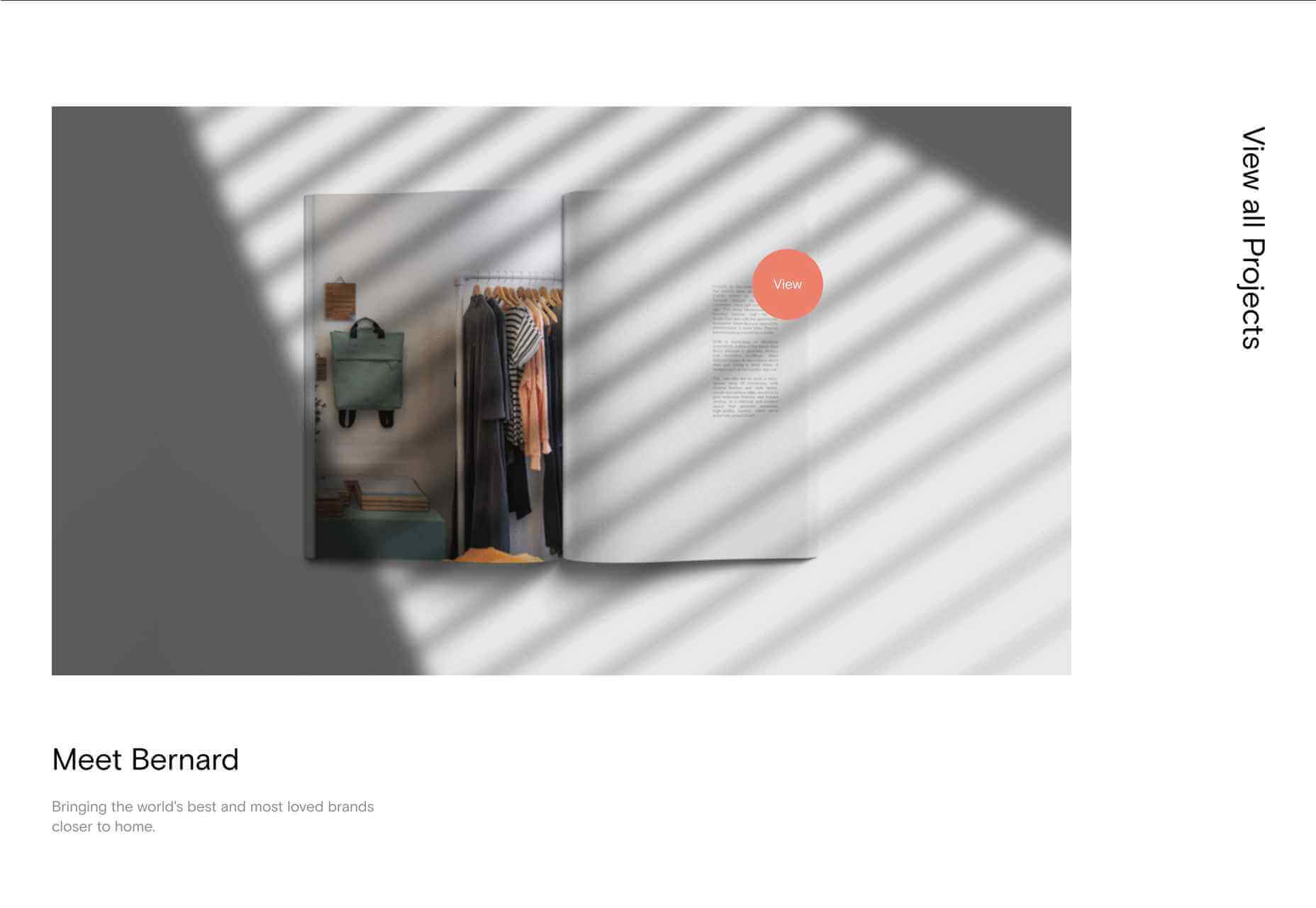
 Welcome to this month’s collection of what’s making the web look good. This time out we’ve got some new brands and some rebrands, and we’ve got some good examples of branding continuity across media.
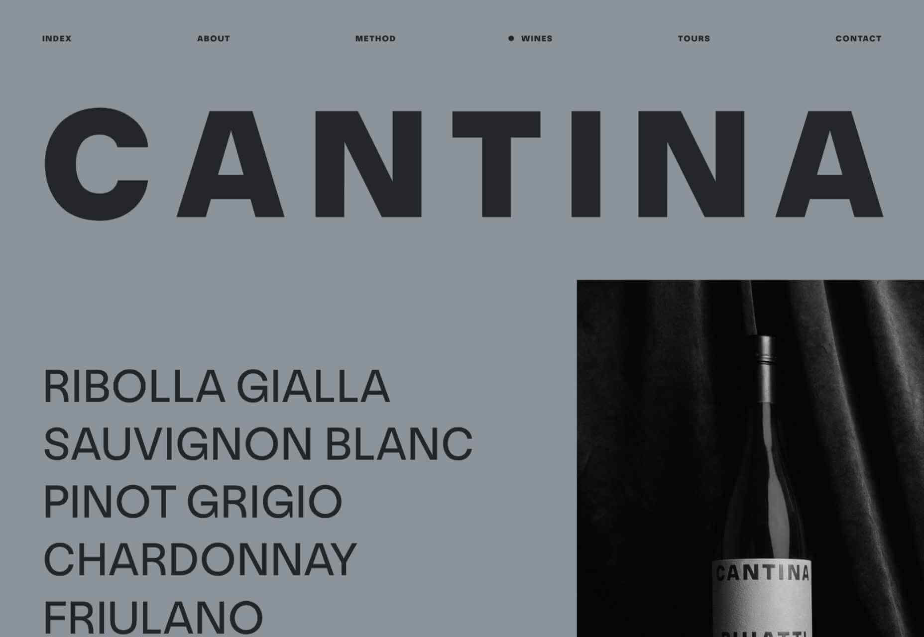


 Since school is back in session, this month’s roundup has a learning focus. In addition to tools, many of the resources include guides, tutorials, and cheat sheets to help make design work easier.


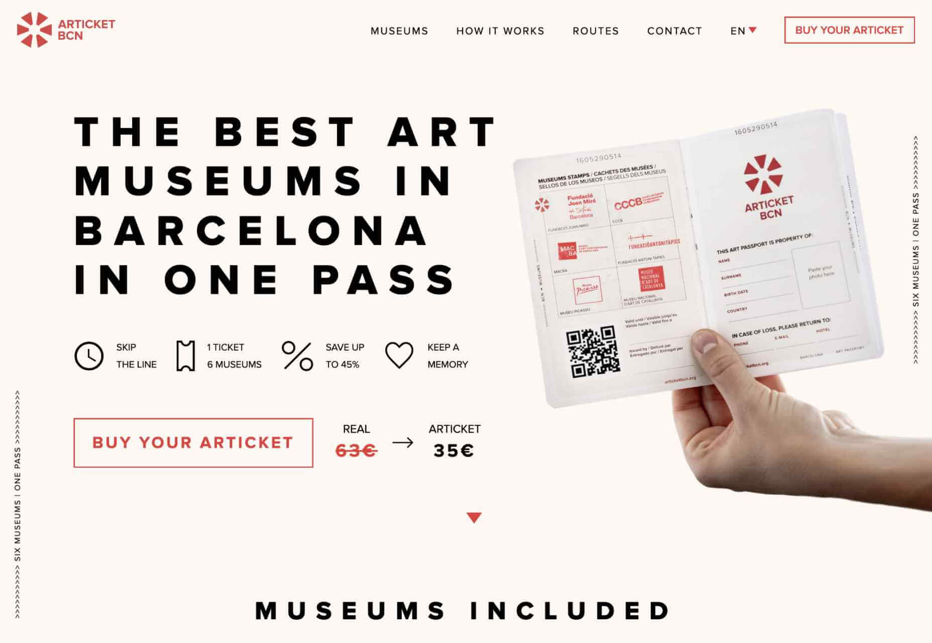
 Often, when designing a website or branding, it is easy to get wrapped up in the details–typography, graphics, color, the grid–and lose the bigger picture. Of course, these things are vitally important, but they are building blocks that go together to form a greater whole.


 Ever since online stores first emerged they’ve faced one big challenge compared to their real world rivals; yes, it’s convenient to shop wherever, whenever you want, and delivery options permitting, buy from anyone anywhere in the world. But it’s a minimal experience compared to the fuller sensory experience of shopping in the real world.


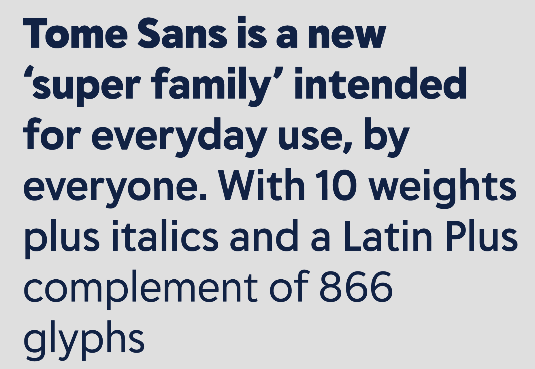
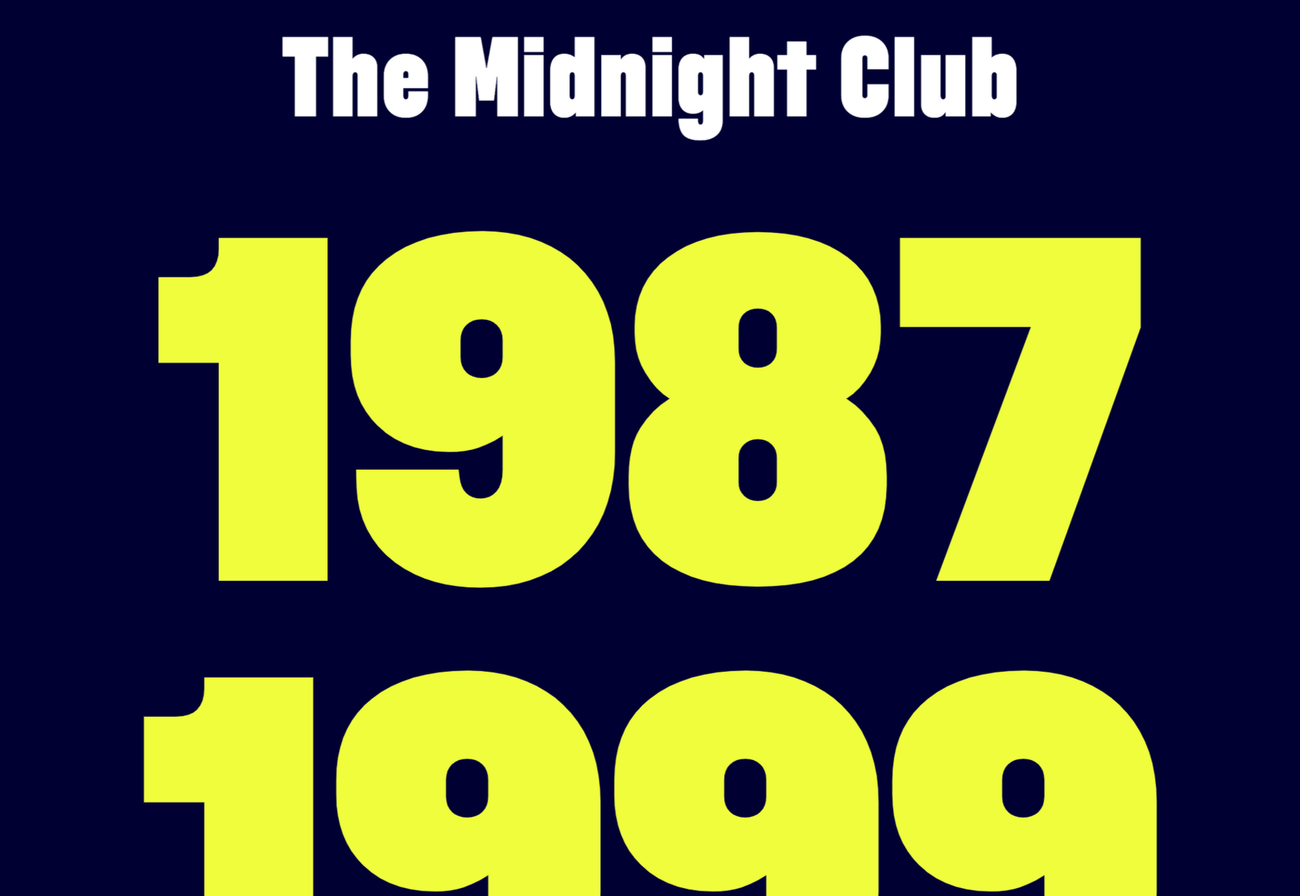
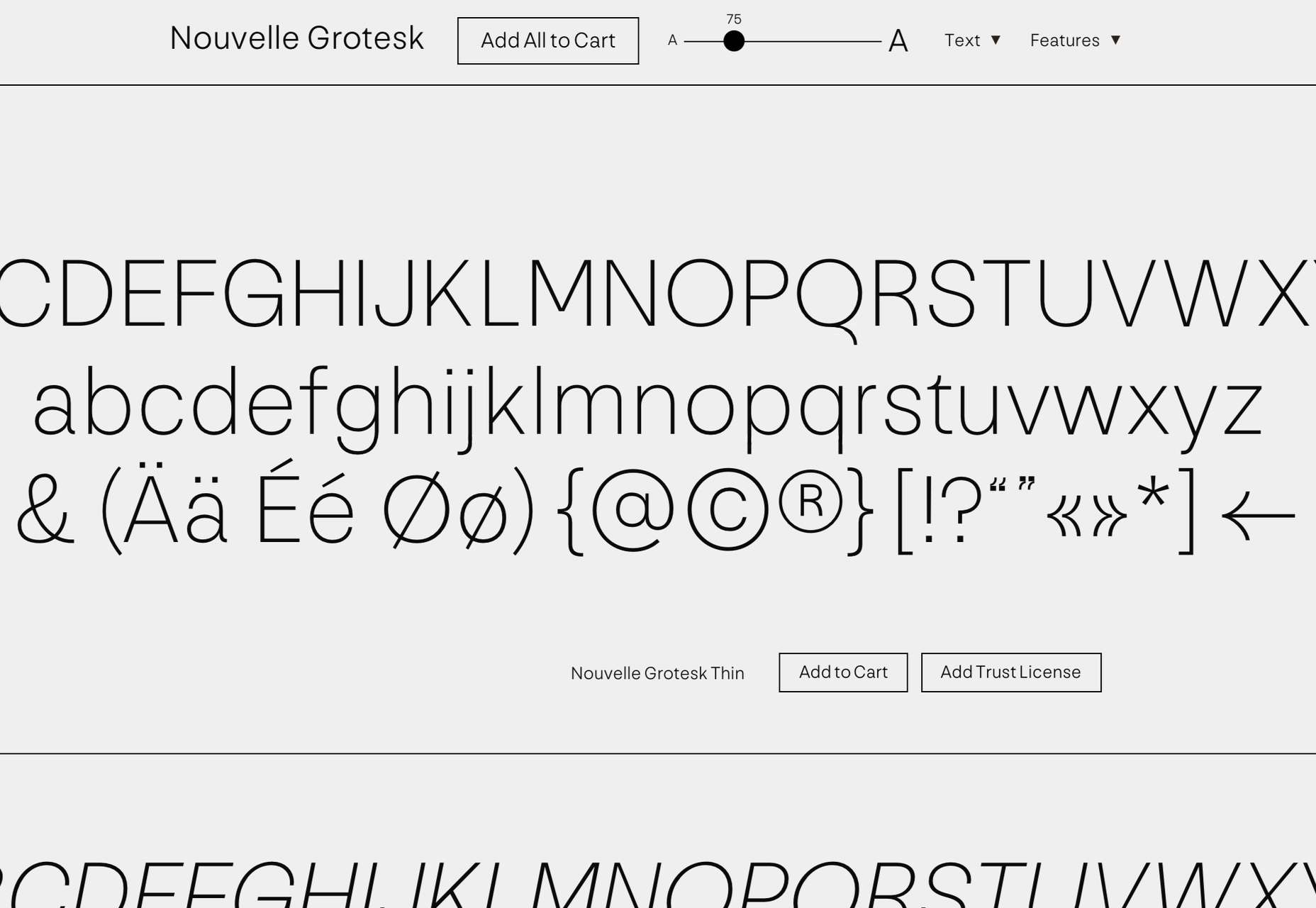
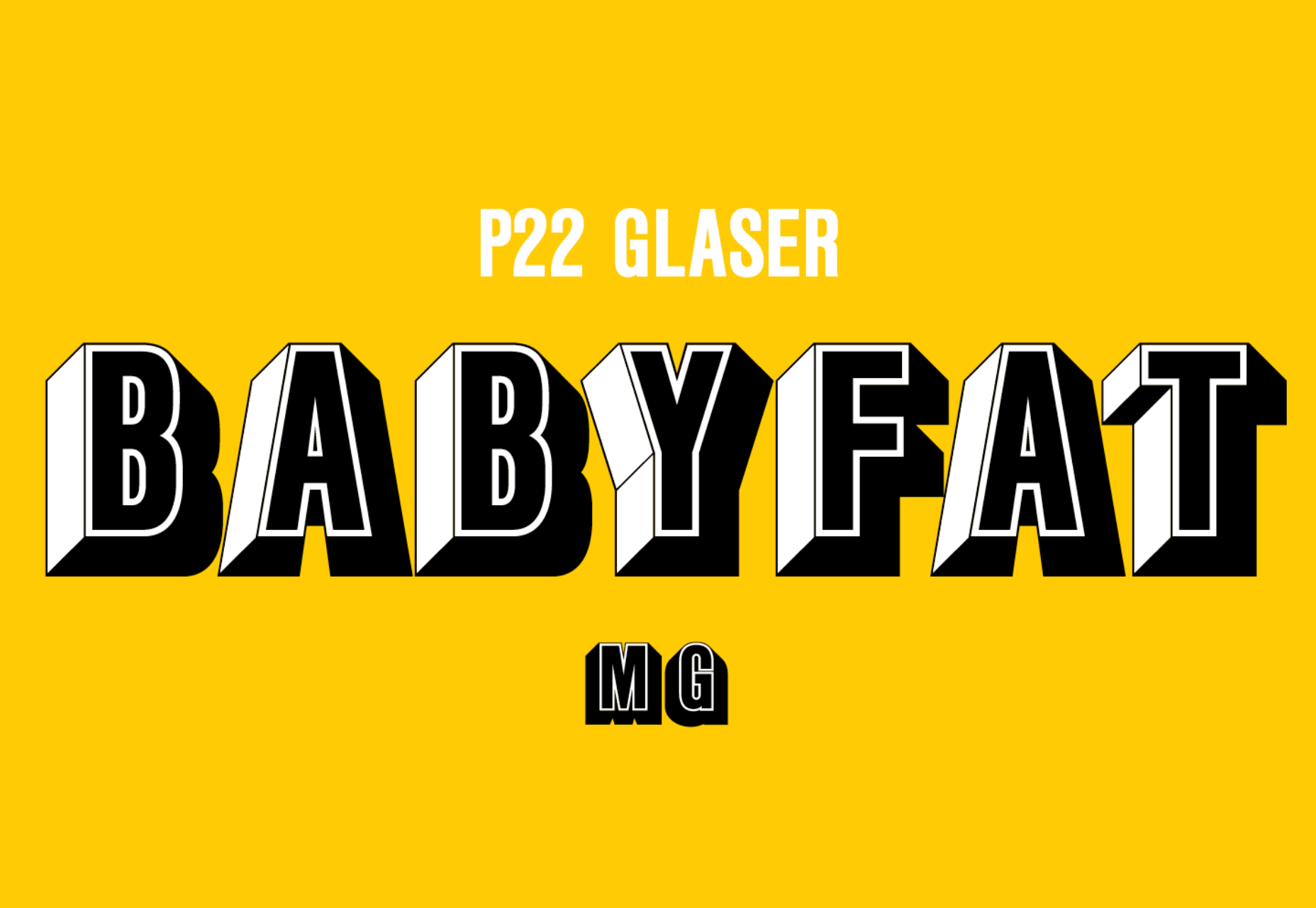
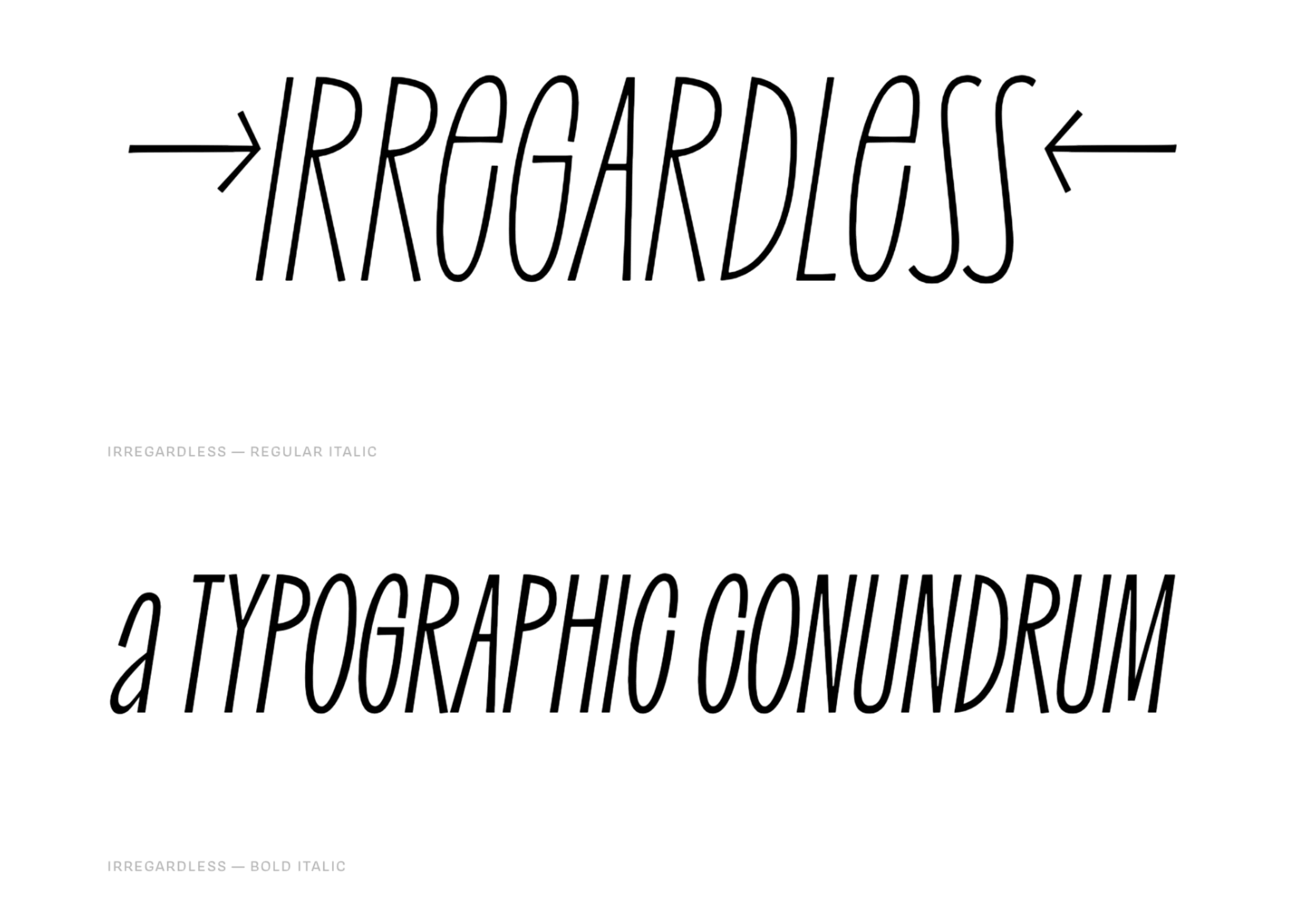
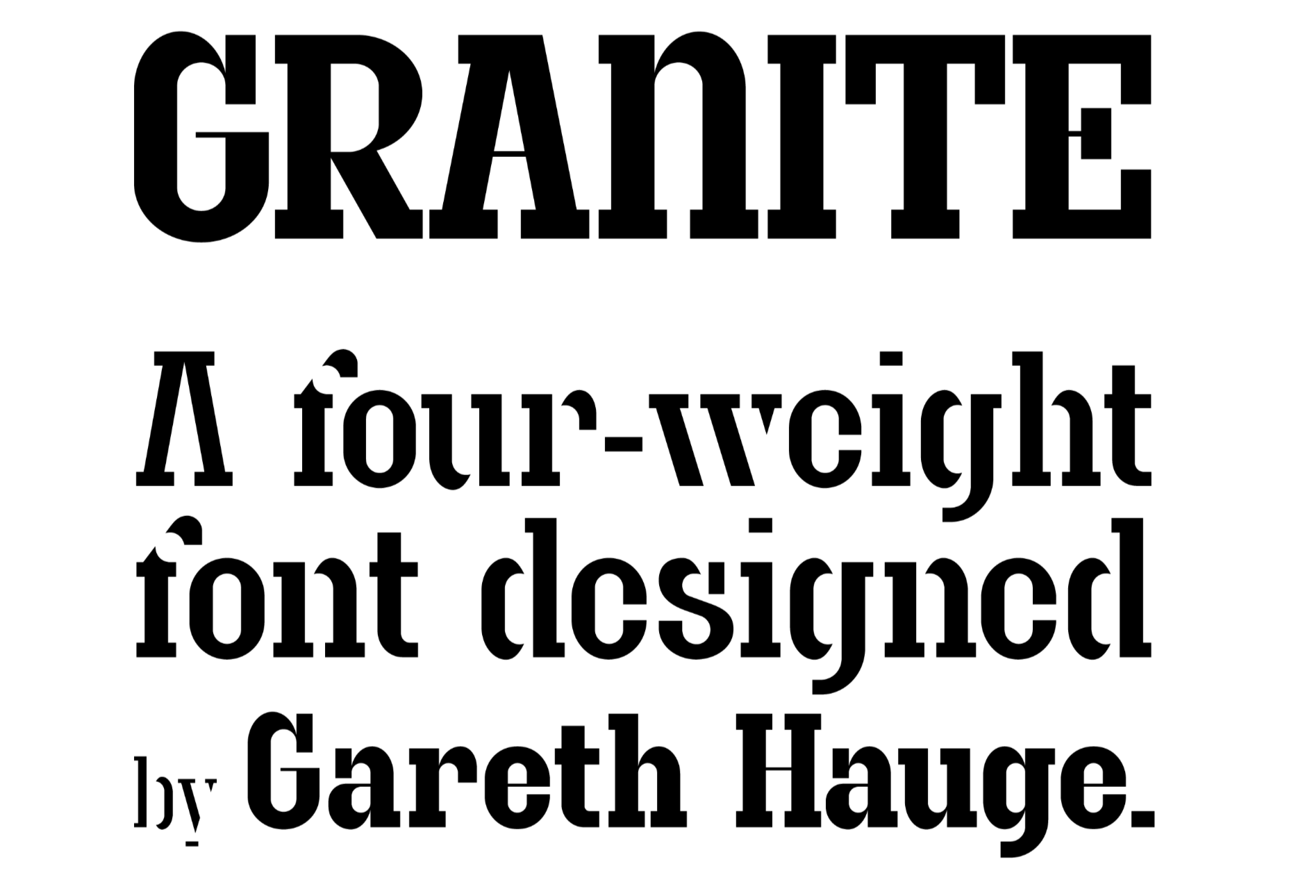
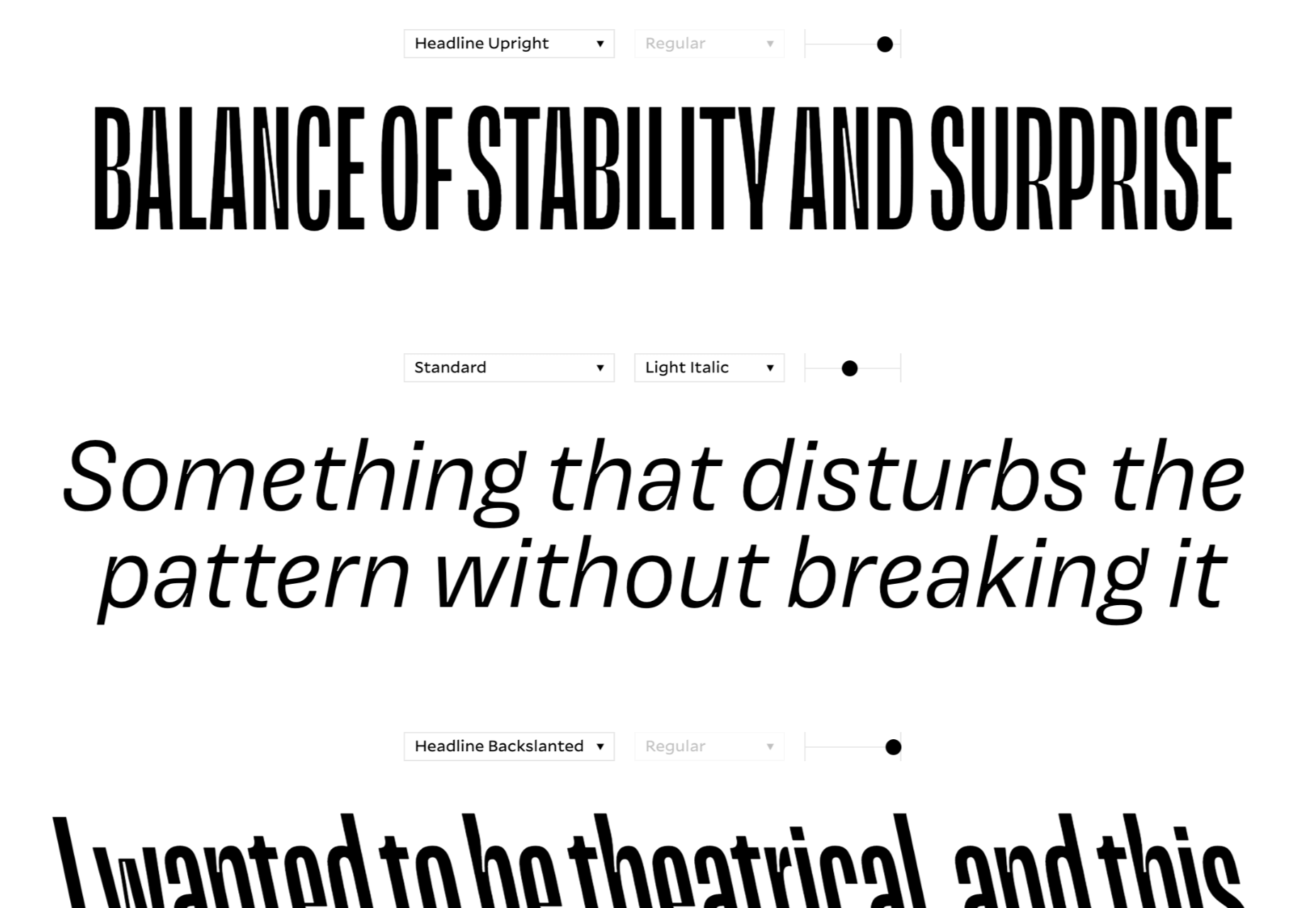
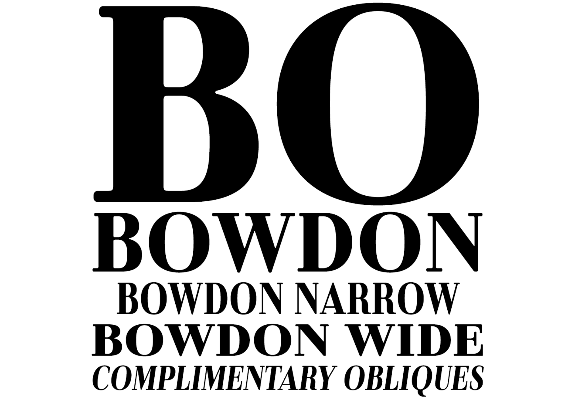
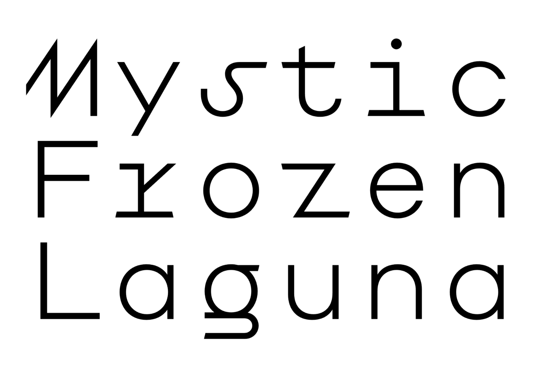
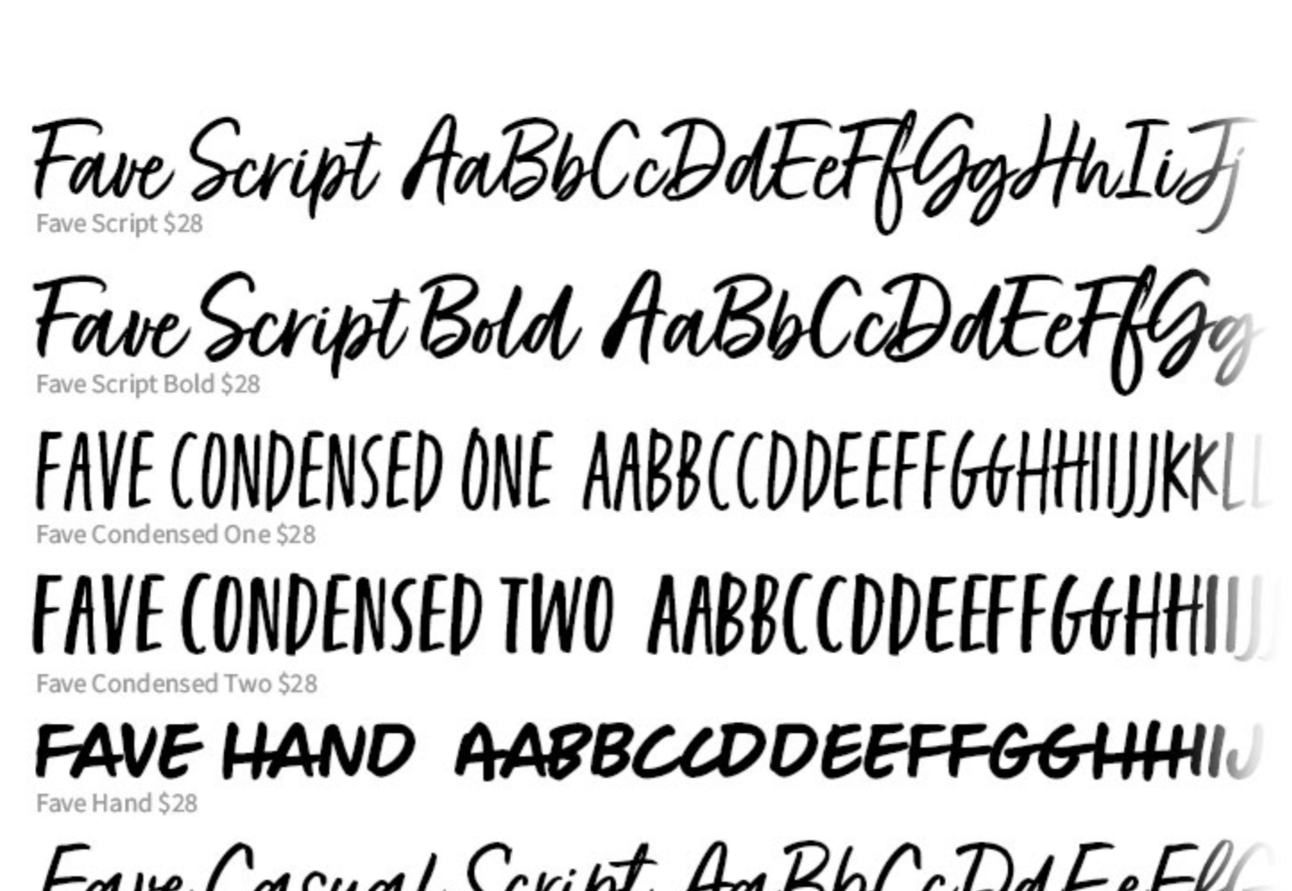
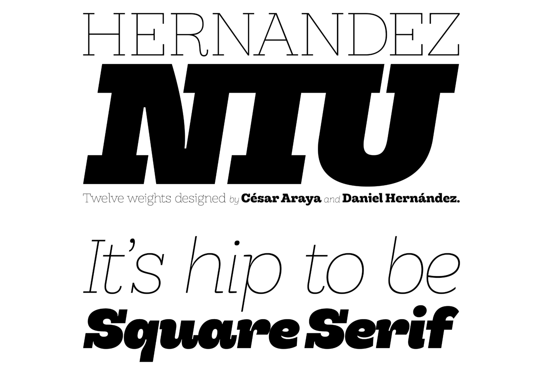
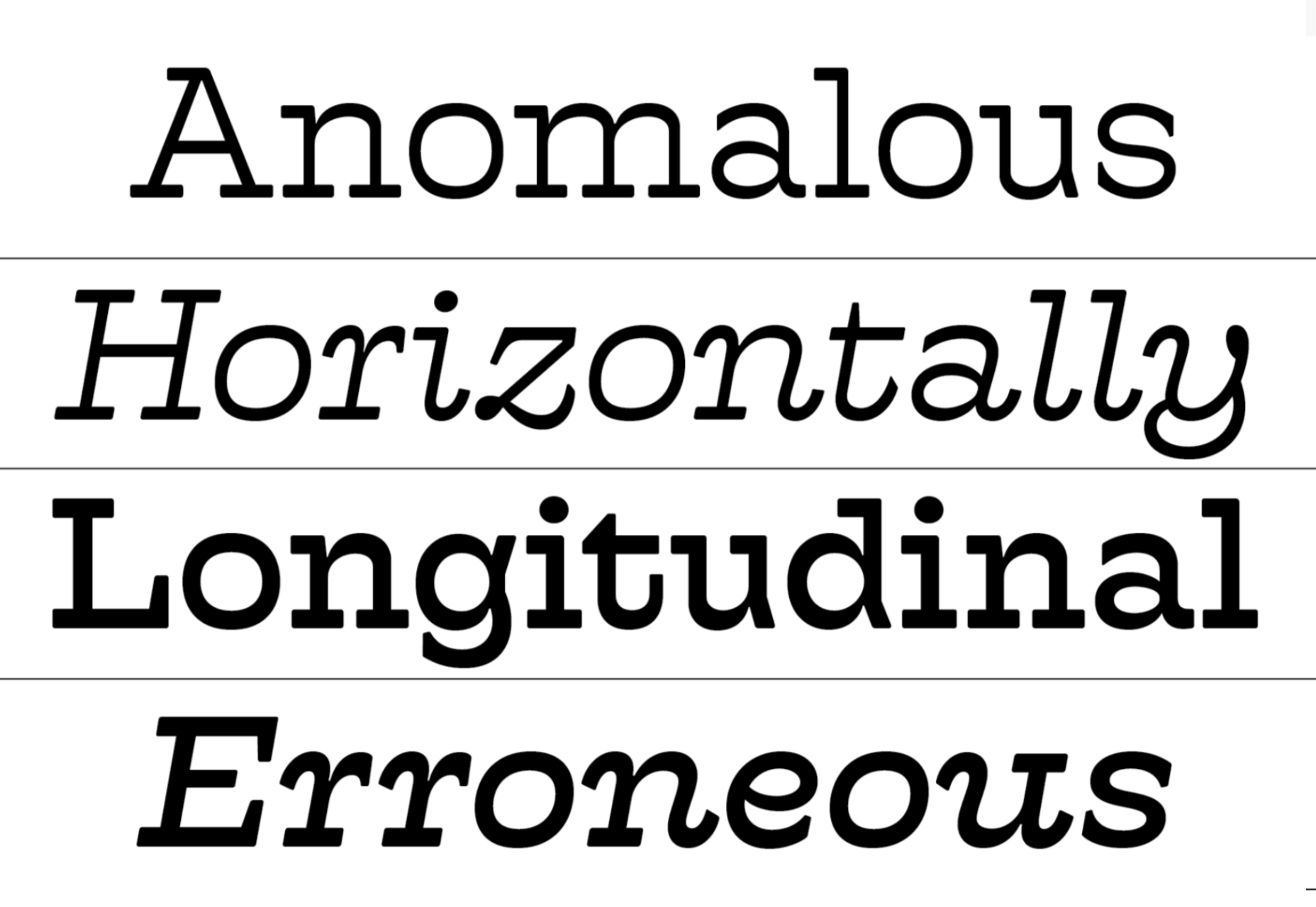
 Welcome to a new series of articles, in which we round up the best new fonts released from some of the top designers on the Web.
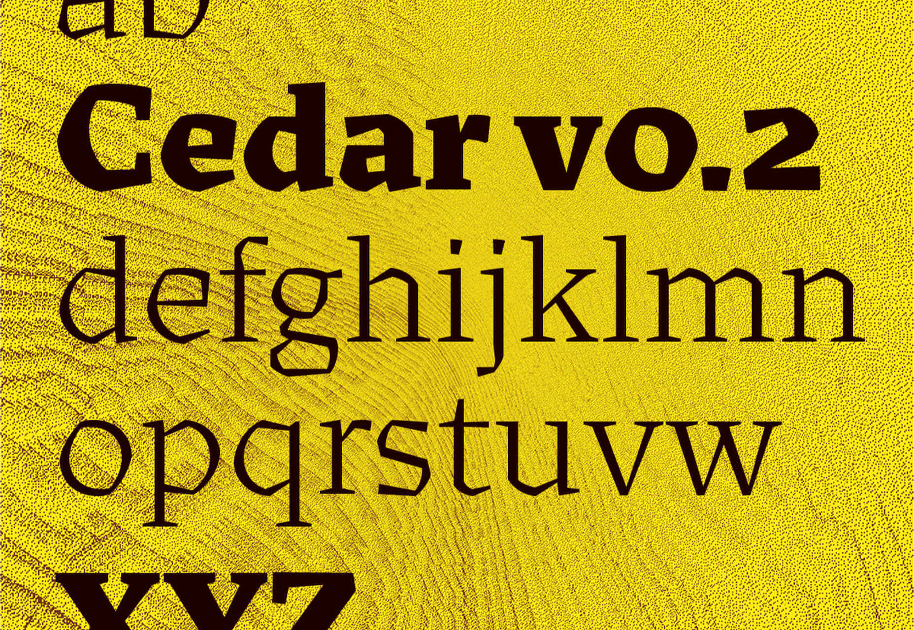


 Do you know logos? Is branding your thing? Then try our fiendishly hard logo quiz…


 User experience design is something that most of us associate with websites. But why isn’t it something we extend beyond the website?