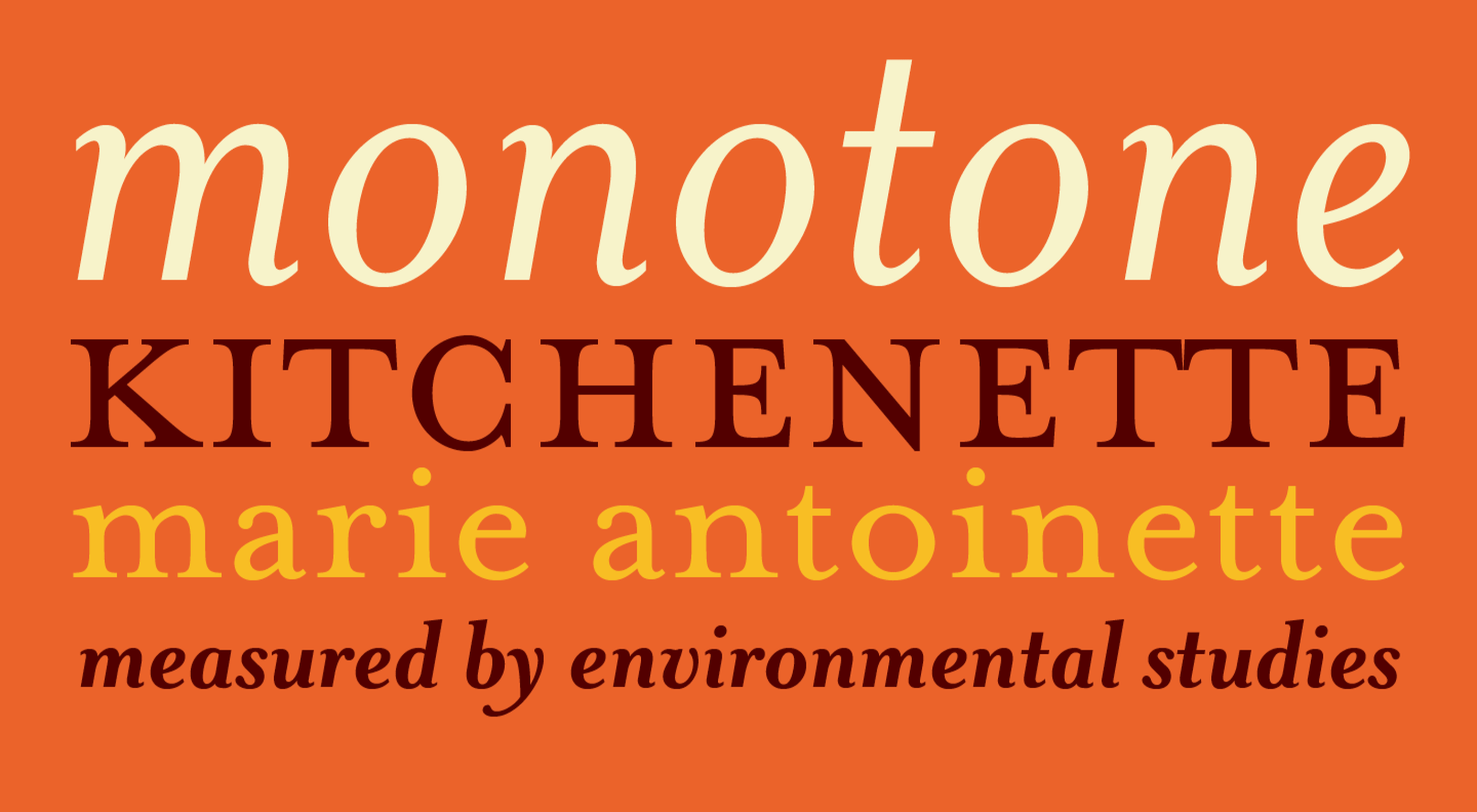
We’re rounding up the week with a fun quiz for anyone who loves fonts. You’ve seen these typefaces used in hundreds of designs — from presidential campaigns, to corporate branding — but do you know who crafted those curves?
We’ll start off with an easy one: Do you know who designed Futura?
https://ankaa-pmo.com/wp-content/uploads/2021/05/quiz-who-designed-that-font.png15292780Service comm.https://ankaa-pmo.com/wp-content/uploads/2017/04/Logo-Ankaa-engineering.pngService comm.2021-04-30 20:45:112021-04-30 20:45:11Quiz: Who Designed That Font?
This month’s collection contains a combination of big and bold, and clean and minimal. Although basic minimalism is still trendy, with lots of white space and greyscale type, we are seeing it softened with color. This is implemented differently, ranging from hints of off-whites in images to gentle pastels as section backgrounds.
Playing around with type and using typefaces with a few characteristic quirks is another way minimalism is being tempered without negating the overall effect. Plus, we’ve got some strong examples of type rules being deliberately broken to good effect. Enjoy!
Crusta C
The new website for seafood company Crusta C makes clever use of the company’s simple logo mark ‘C’ with a cutout video effect.
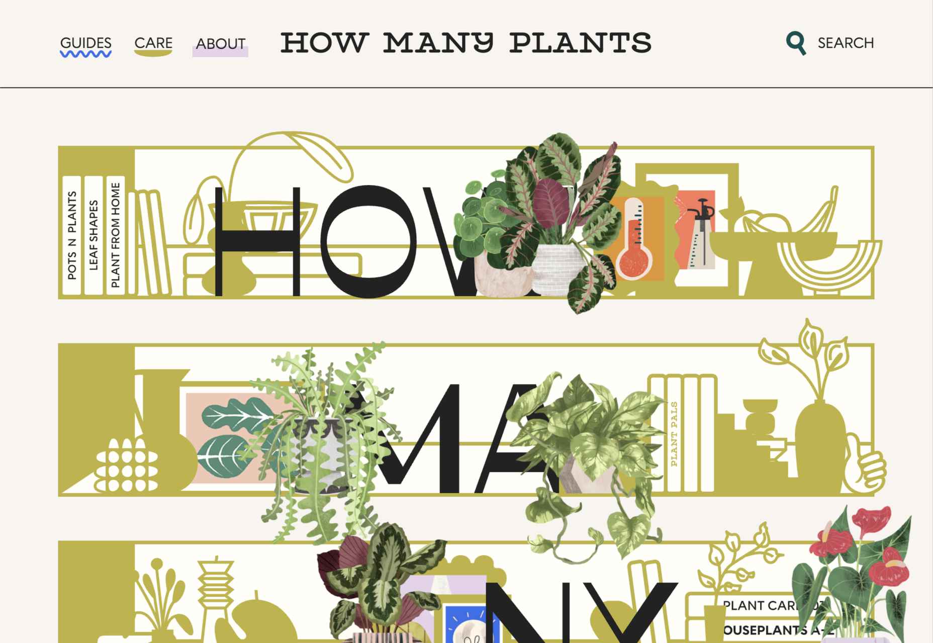
How Many Plants
How Many Plants is a guide to house plants and how to look after them. A good combination of illustration and space gives a friendly but efficient feel.
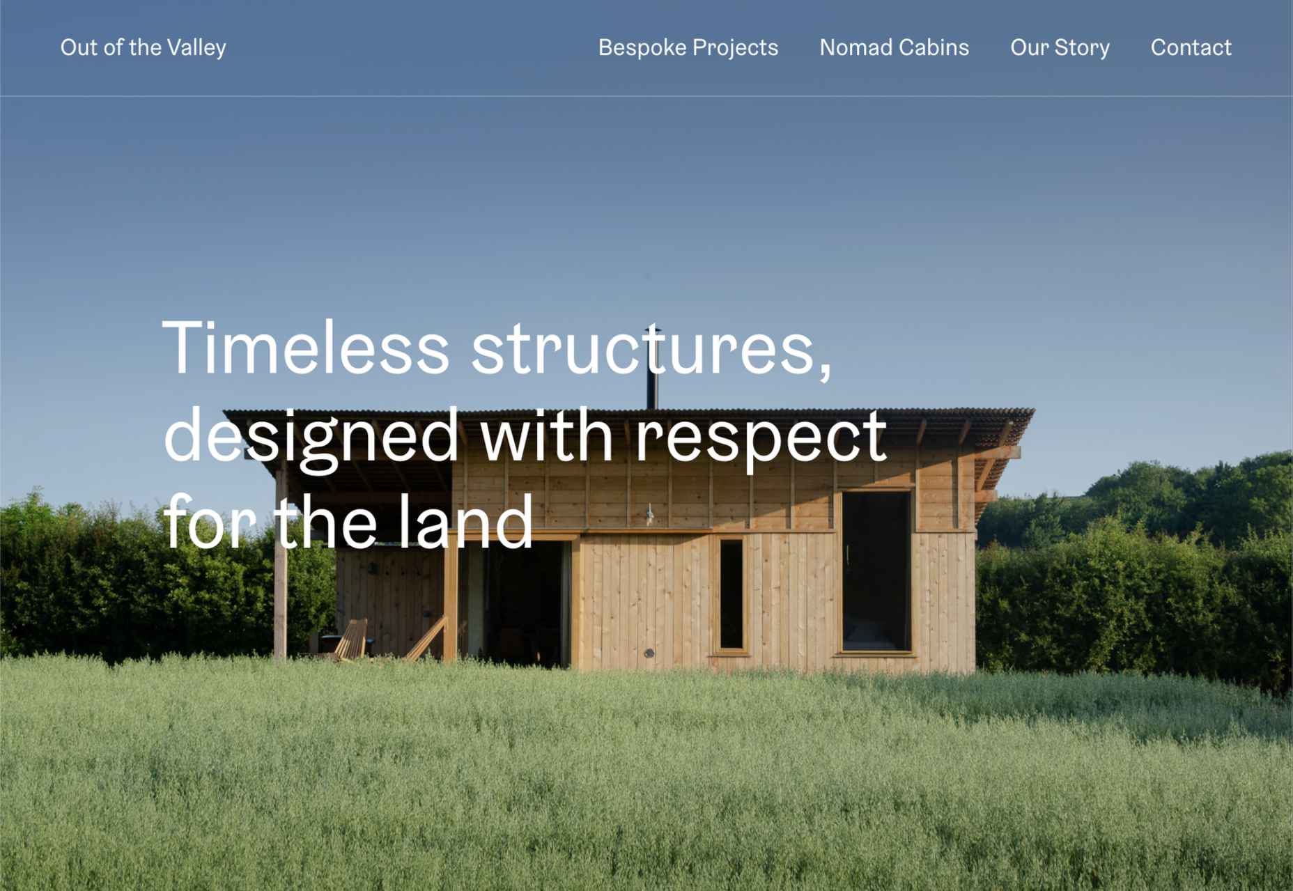
Out of the Valley
Out of the Valley, make bespoke and prefabricated cabins focusing on natural materials and traditional craft. The subtle changes in background color add warmth to the minimal layout.
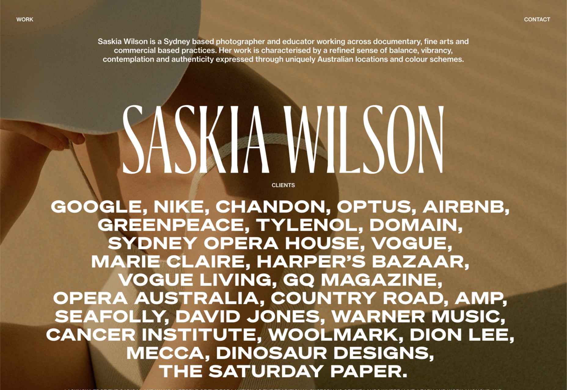
Saskia Wilson
Portfolio site for photographer Saskia Wilson. This is absolute simplicity, with a clear grid and nice, bold type to bare minimum text.
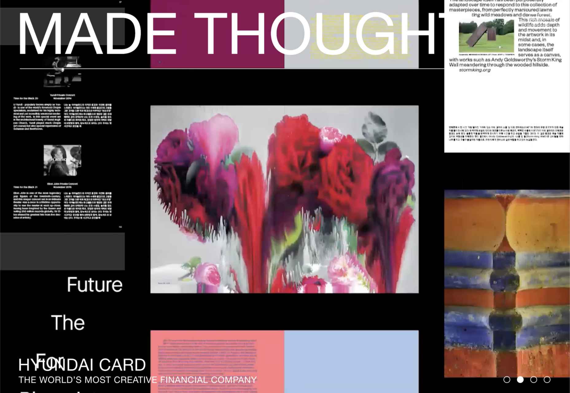
Made Thought
Design studio Made Thought has some pretty prestigious clients; for a designer, it doesn’t get more prestigious than creating a new brand identity for MoMA. Their bold aesthetic and approach explain their success.
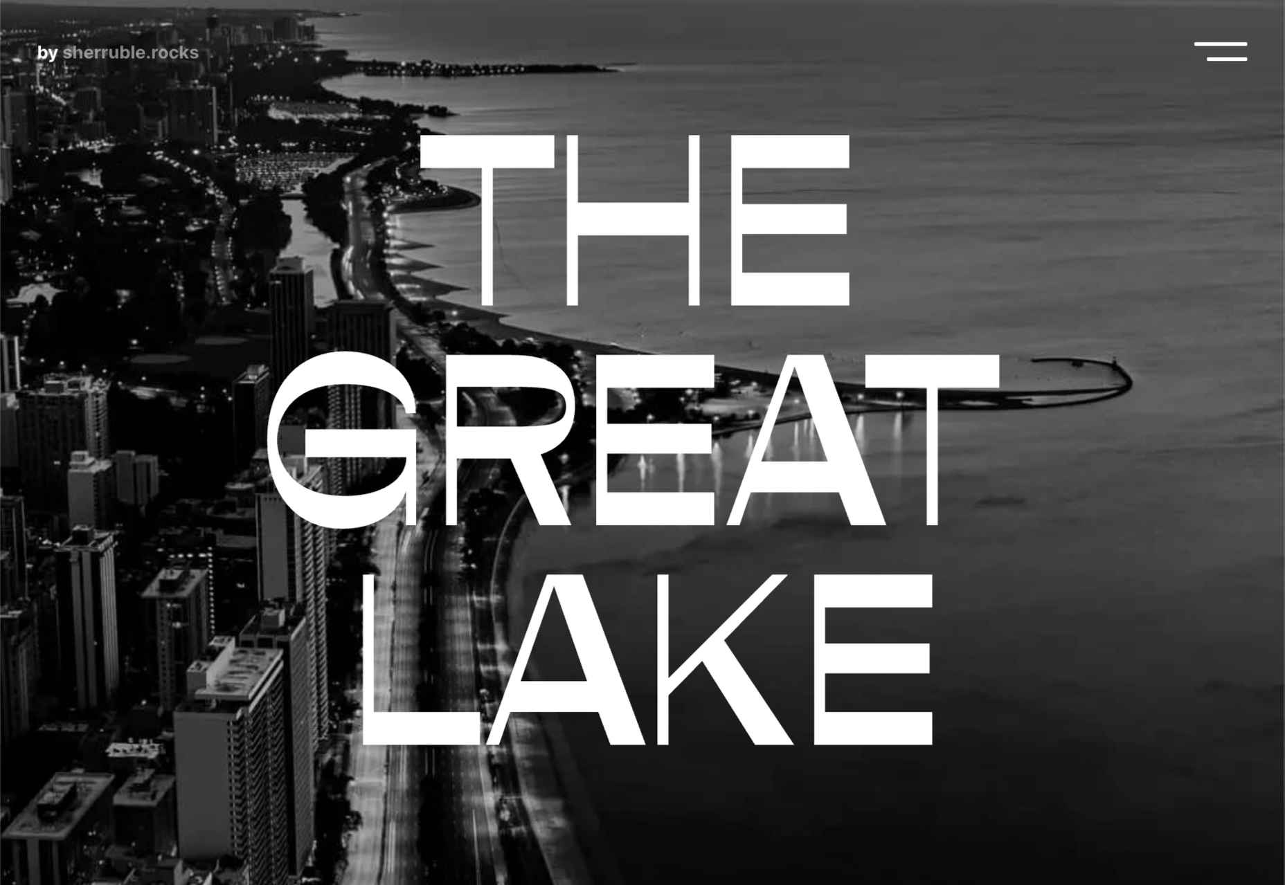
The Great Lake
For-fun sites like The Great Lake are a great way for web creatives to show their skills. This one from designer and front-end developer Anna Sherruble is visually appealing and has some informative content.
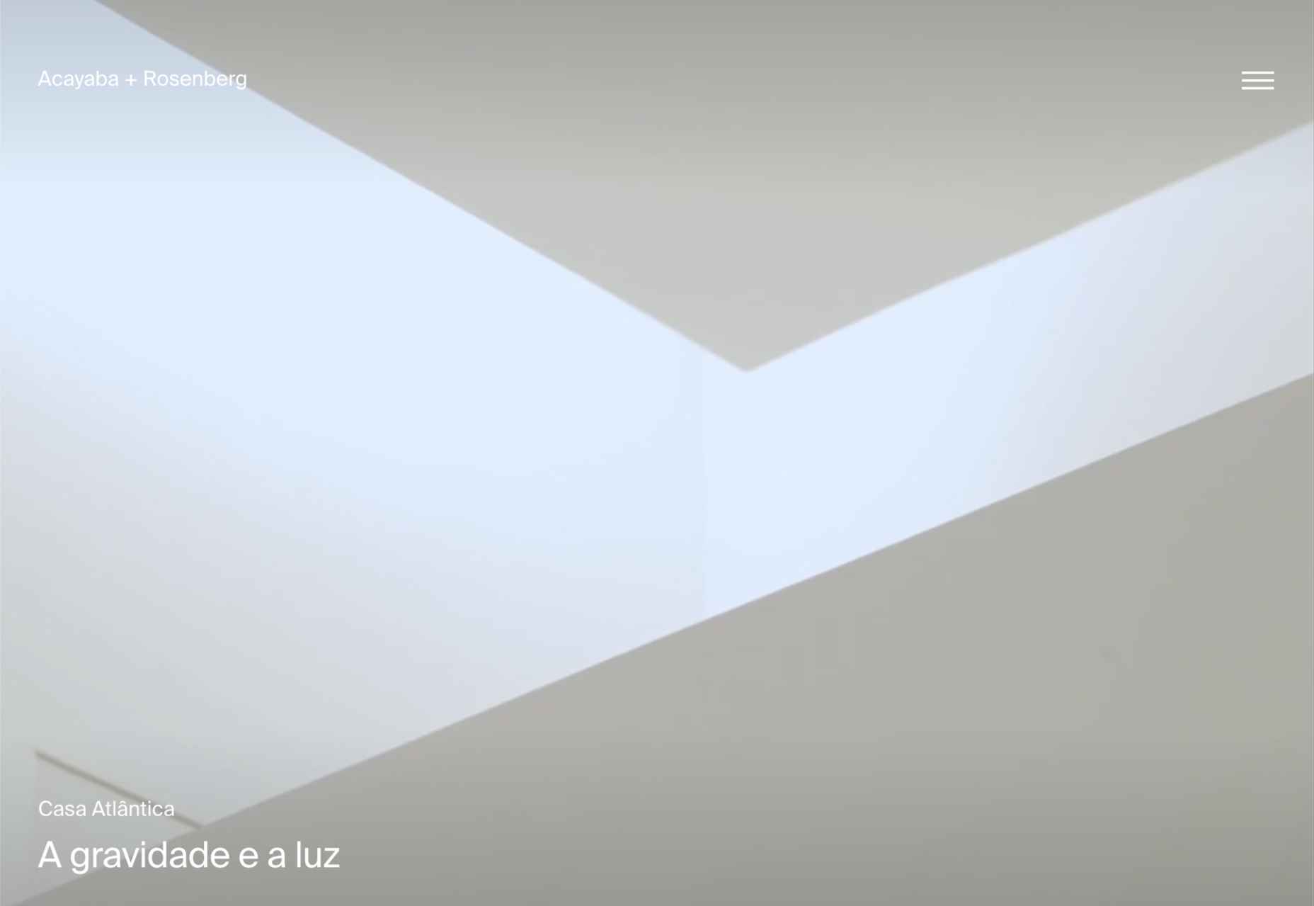
Acayaba + Rosenberg
Architects Acayaba + Rosenberg use carefully curated photography and subtle scrolling animation to pull the user in and create a pleasing browsing experience.
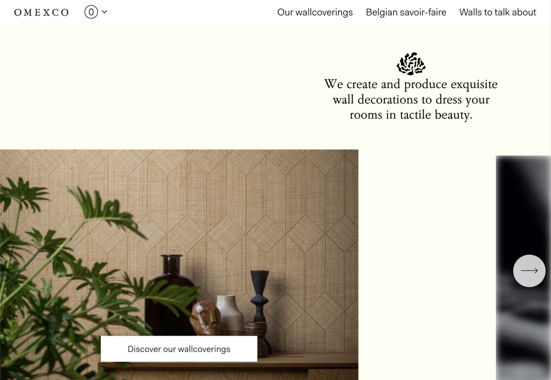
Omexco
Soft colors and a well-ordered grid recreate the feel of a mood board that prevents this site for Omexco from appearing cluttered and overly busy while showcasing multiple products.
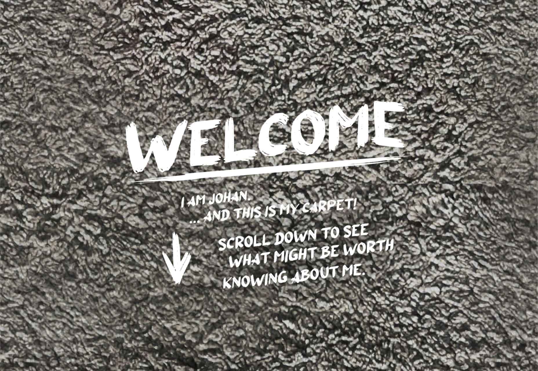
Johan Belin
For his own site, digital creator Johan Belin has opted to show off his skills by creating this single-page site instead of simply showing work. This can be a risky tactic, but it works here.
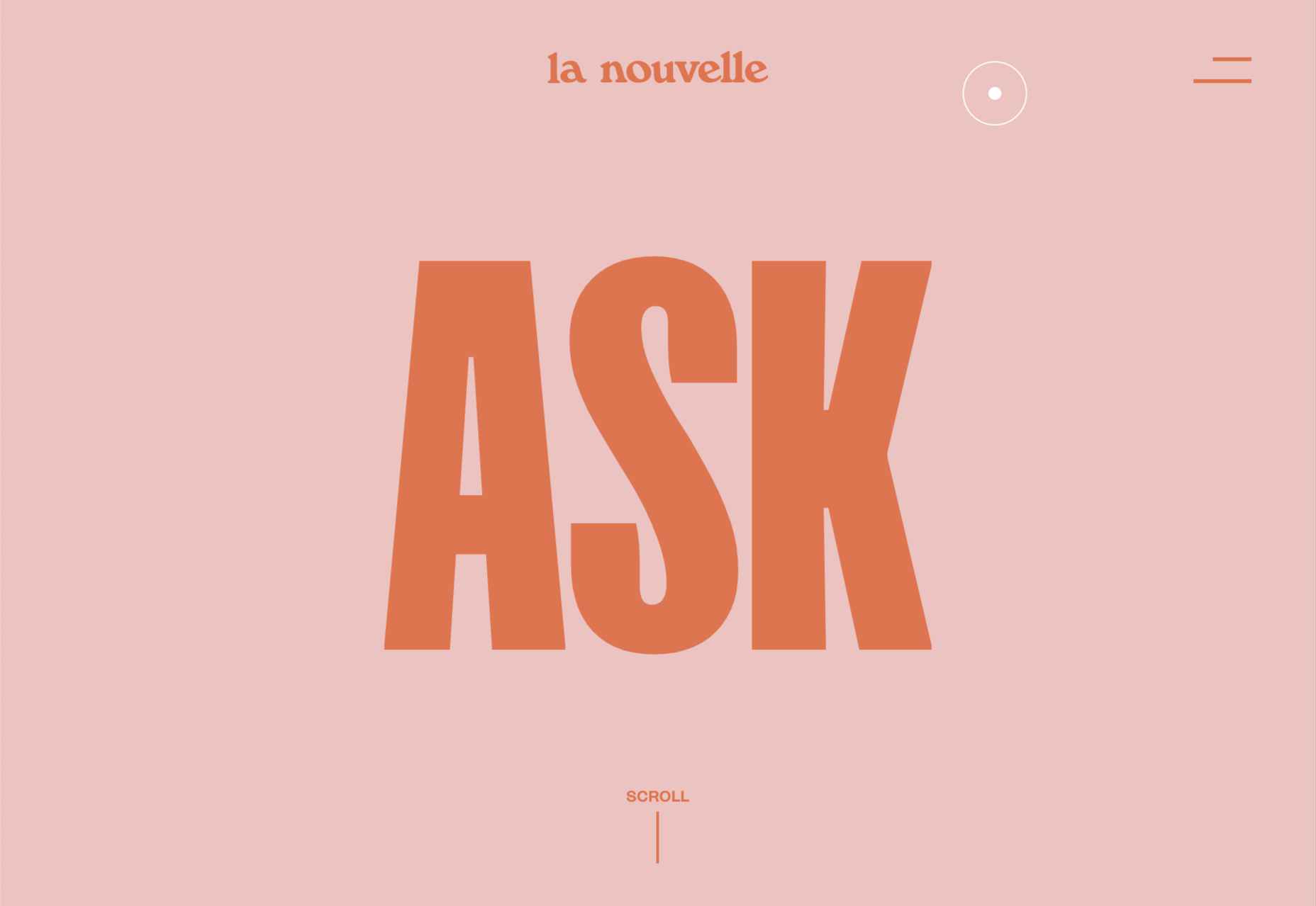
La Nouvelle
A combination of contrasting and complementary color combinations creates freshness in this site for digital agency La Nouvelle.
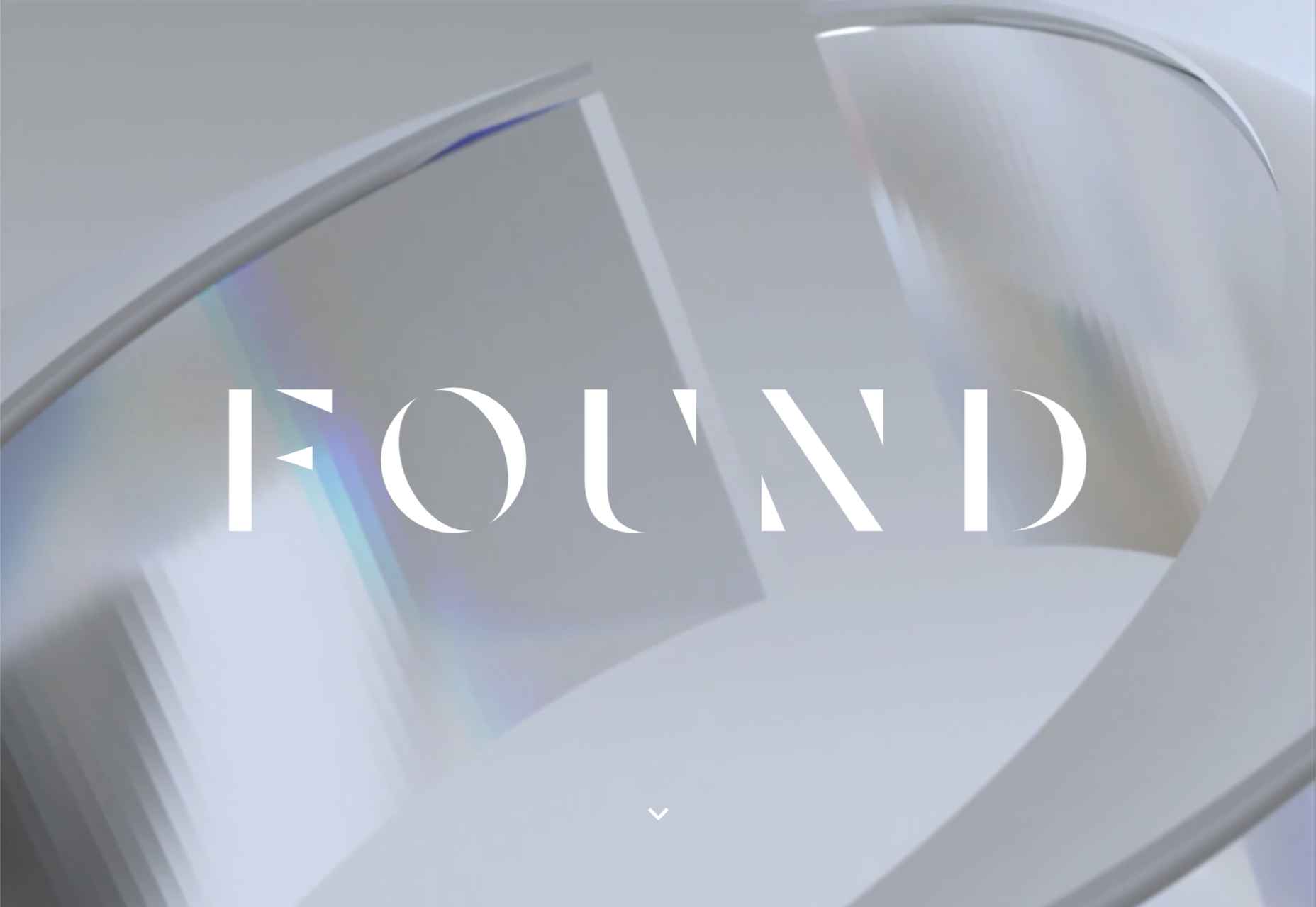
Found
Found Studio’s website uses a very basic grid layout to allow the work to stand out; varying the typeface, weight, and style within sections of text creates individuality.
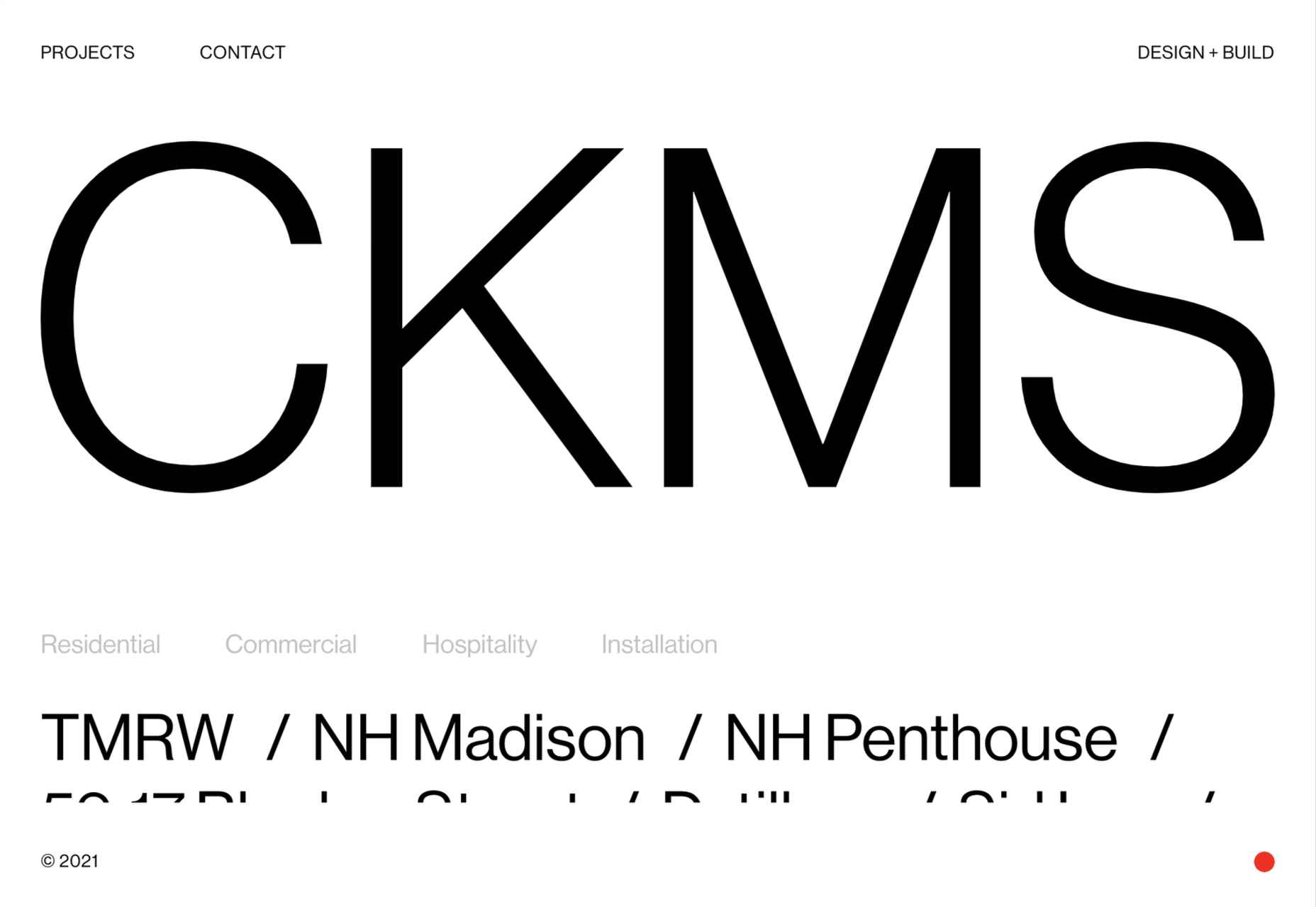
CKMS
CKMS is a design and build company. Their site is minimal but with a few nice little touches, like the background color change button in the bottom right corner.
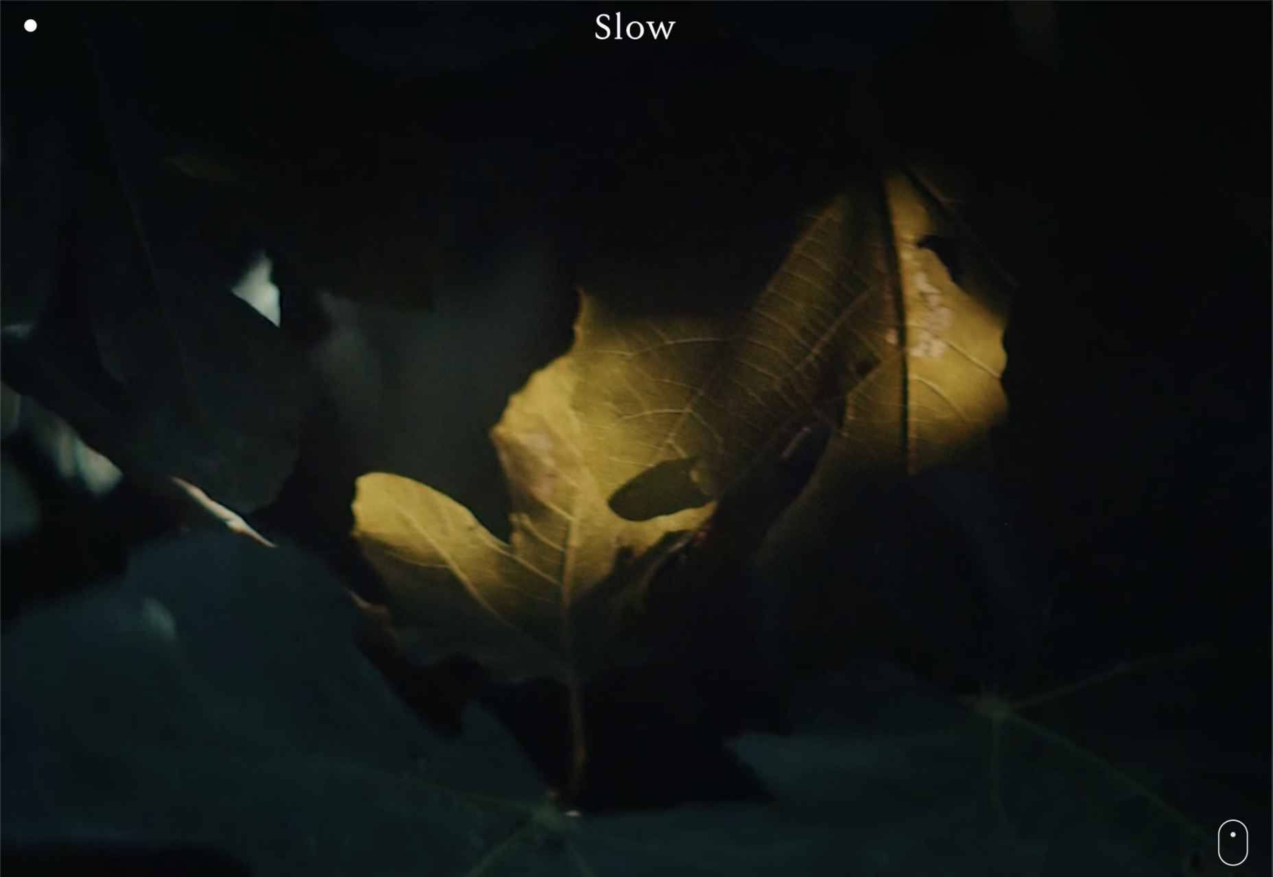
Slow
Slow is a collective of people–largely artists, designers, artisans–aiming to implement and live by the slow movement principles. The design of their site reflects these aims, creating a sense of calm and deliberation.
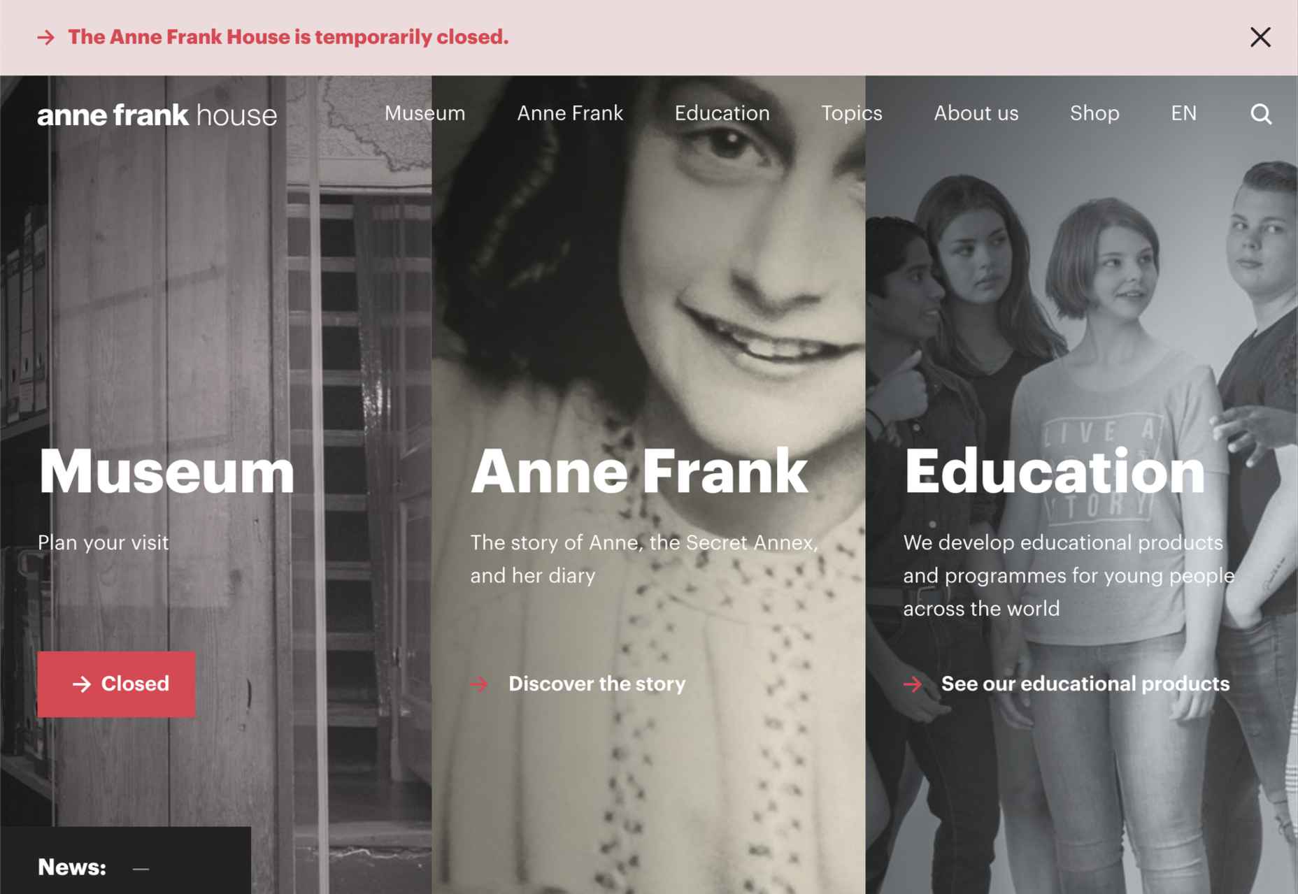
Anne Frank House
Practical information for visiting the Anne Frank House and museum is combined with historical information and educational resources in this thoughtfully structured and visually engaging site.
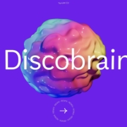
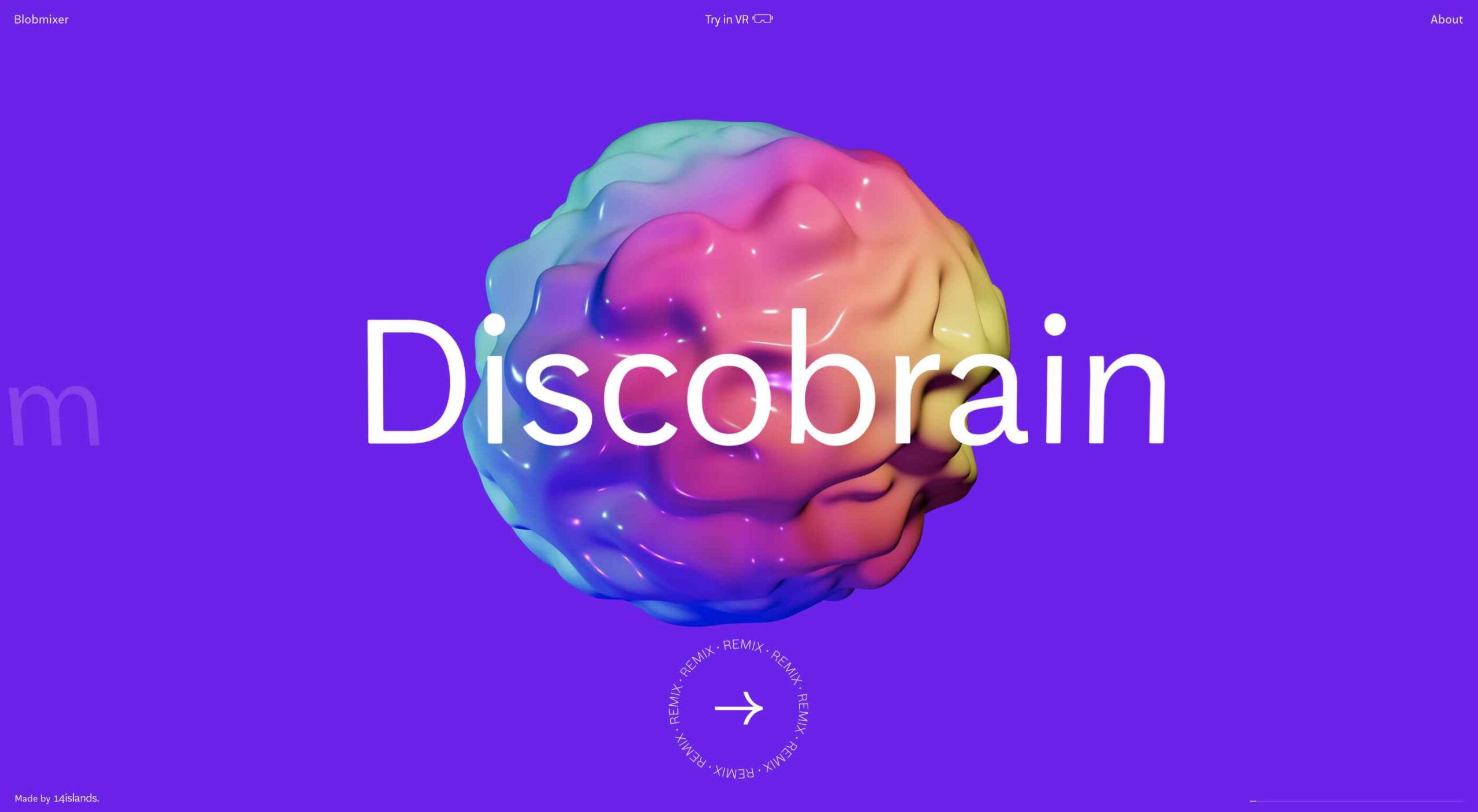
Runway
Runway is a platform for publishing open-source, pre-trained machine learning models, as well as for training your own models aimed at artists and filmmakers. If this site aims to make the user want to try Runway, it succeeds.
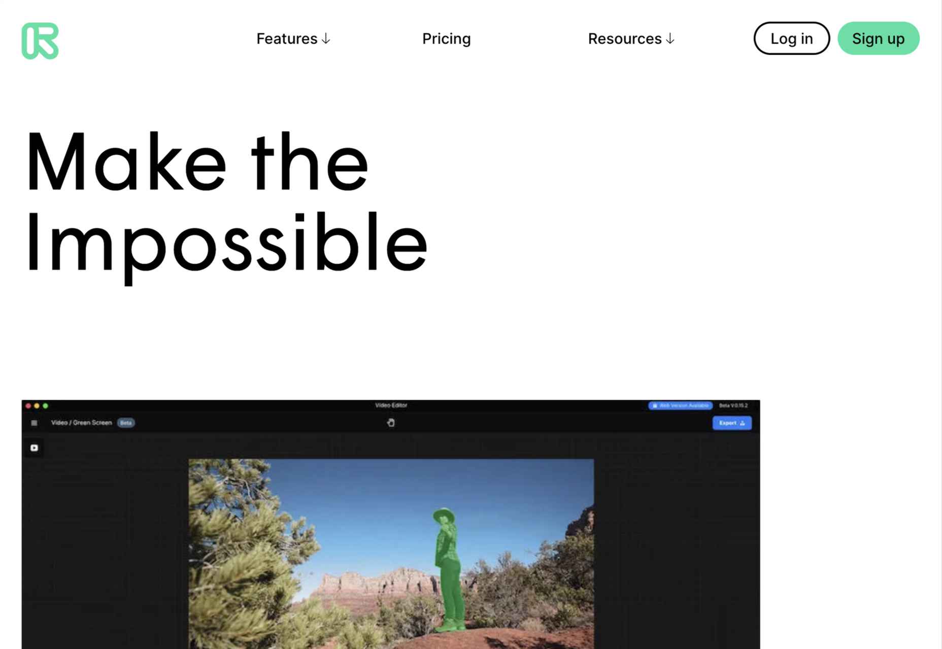
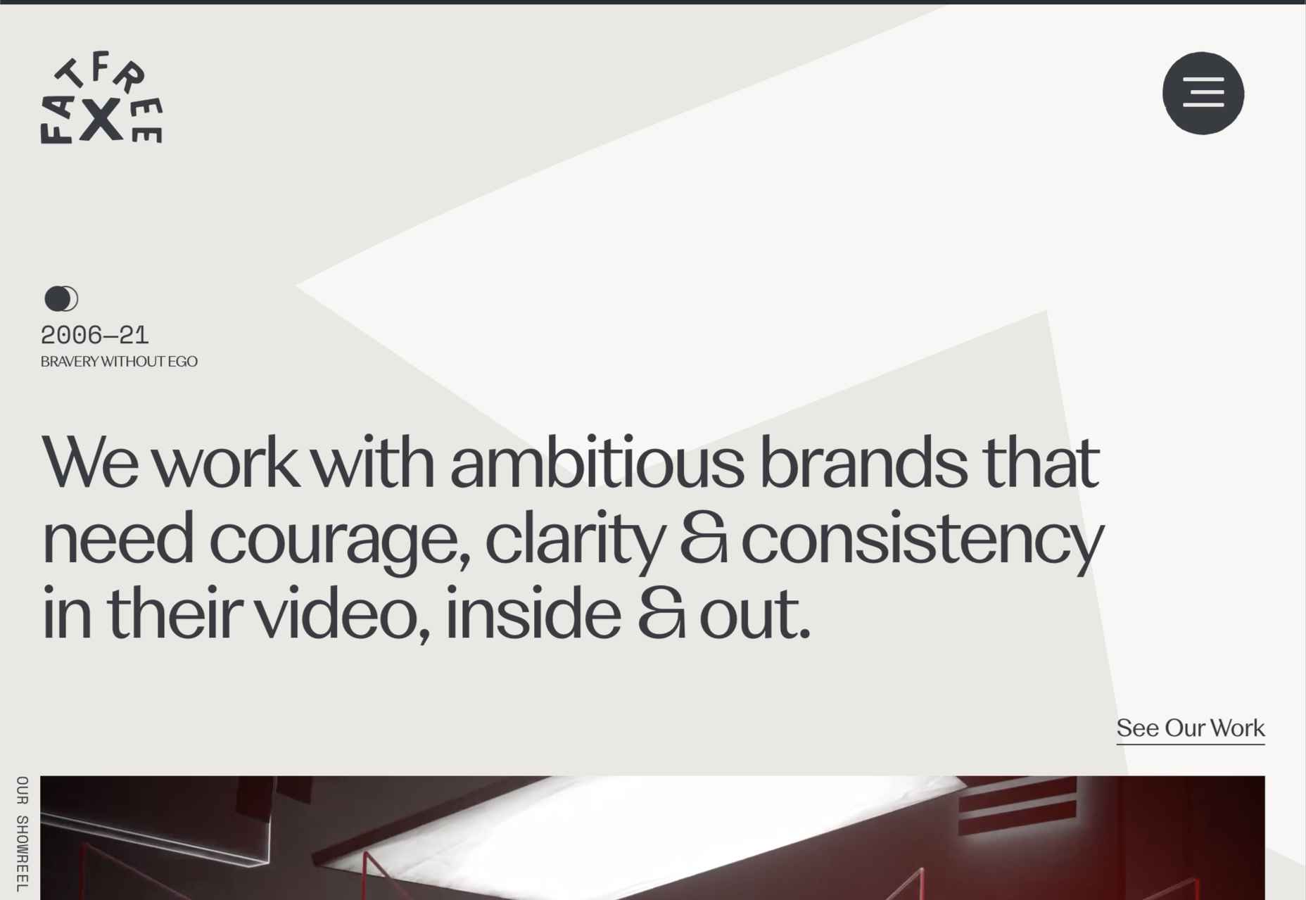
Fat Free
Fat Free video branding agency add warmth to their minimal site with soft color and occasional illustration.
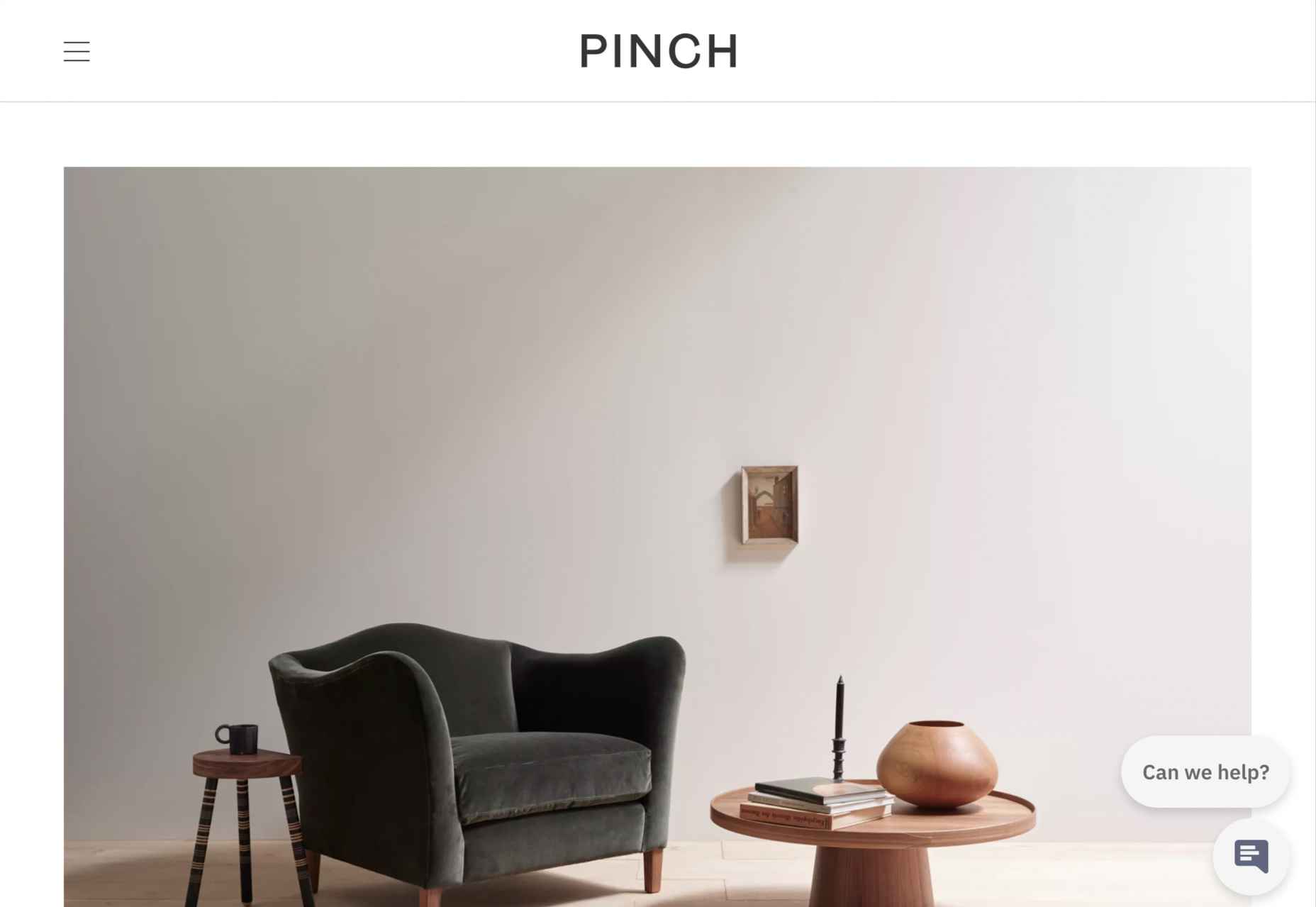
Pinch
The furniture and other interior products produced by Pinch Design aim for a quiet, elegant aesthetic, and their website reflects that with pale grey and generous spacing.
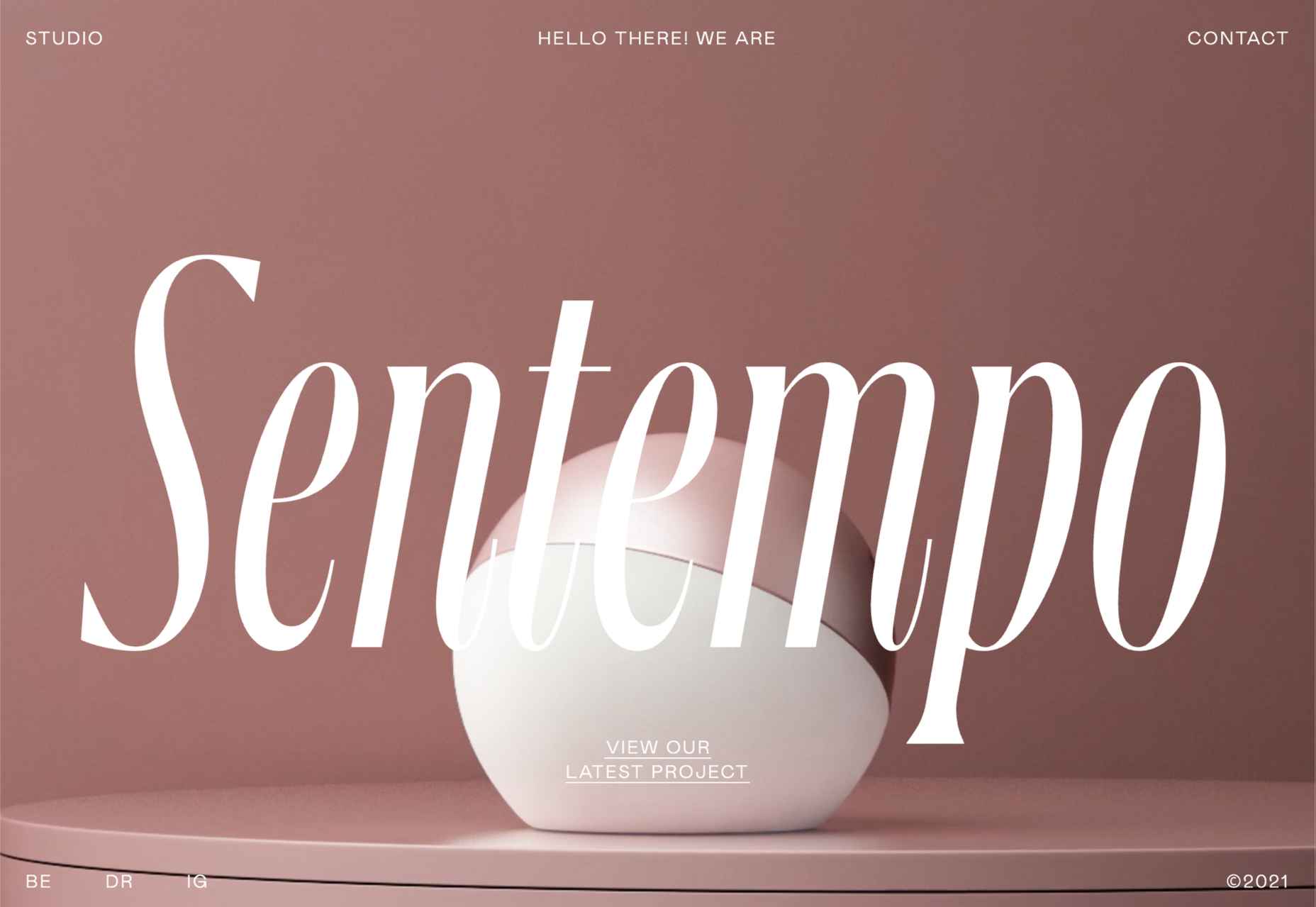
Sentempo
Digital studio Sentempo manages to achieve glossy without being overdone. The star dividers are a nice detail.
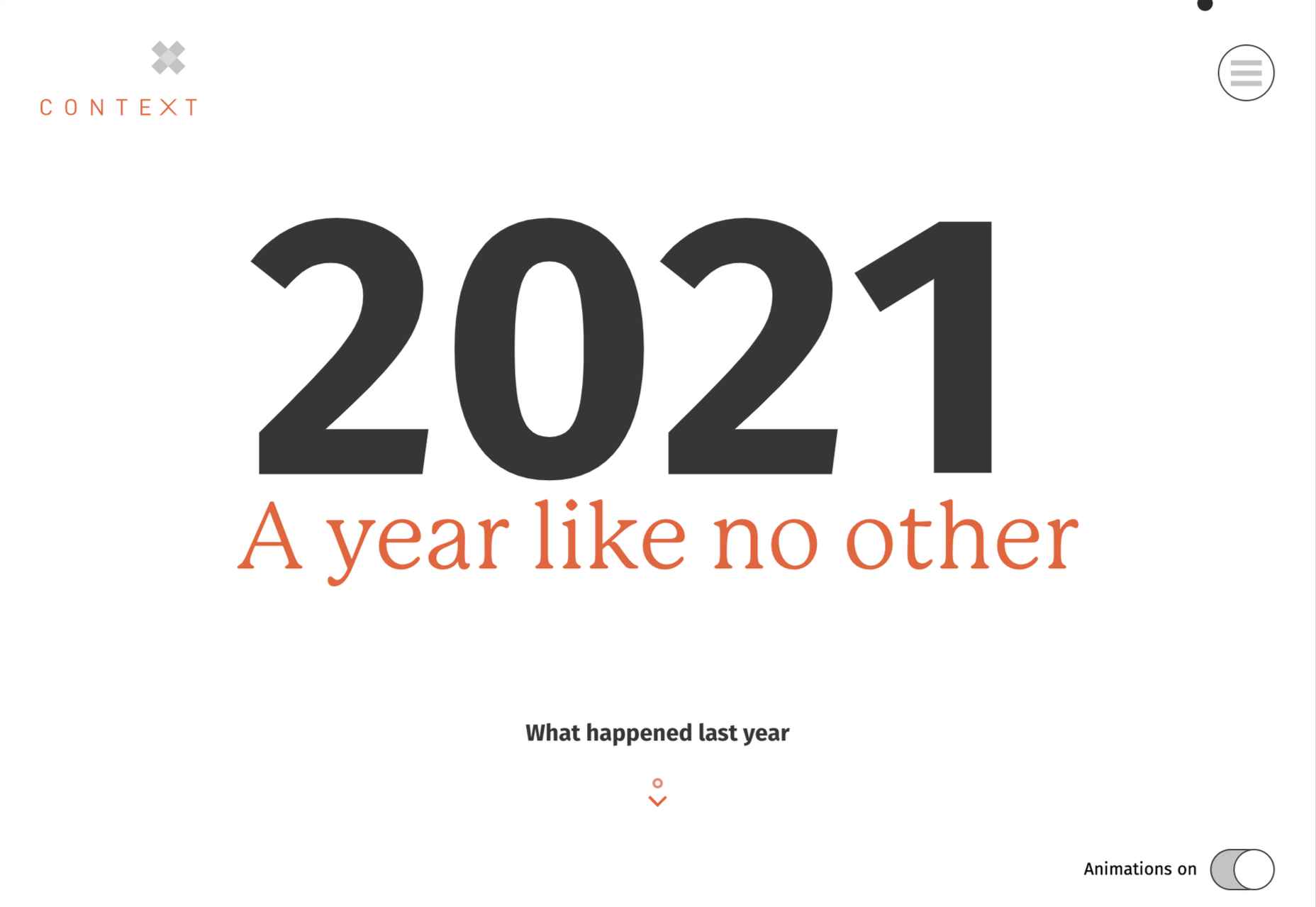
One Year
Many companies, including creative agencies, have come up with ‘what we did/achieved in the last year’ microsites. This one from Context Creative succeeds as a good advert for them.
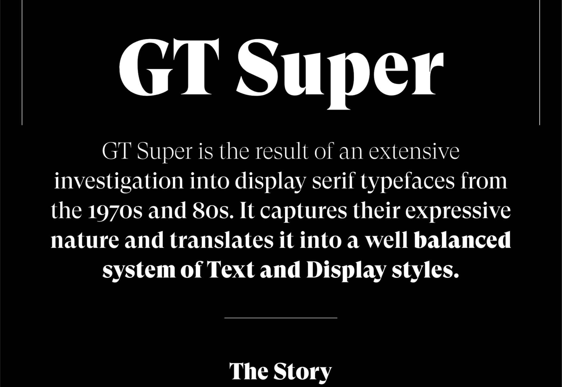
GT Super
This single-page intro to GT Super font has a certain drama in keeping with the font itself and allows you to play around with the size, weight, and style of the font in most sections of the text.
https://ankaa-pmo.com/wp-content/uploads/2021/04/20-best-new-websites-april-2021.jpg14072560Service comm.https://ankaa-pmo.com/wp-content/uploads/2017/04/Logo-Ankaa-engineering.pngService comm.2021-04-26 16:45:252021-04-26 16:45:2520 Best New Websites, April 2021
Ten years ago, people began talking about the “Independent Web.” Although we don’t commonly use the term anymore, that doesn’t mean that it’s not still as vital a topic of discussion today as it was a decade ago.
Today, I want to look at where the term came from, what it refers to today, and why it’s something that all of us in business, marketing, and web design should be thinking about.
What Is The Independent Web?
The Independent Web is a term that was coined back in 2010 by John Battelle.
In “Identity and The Independent Web,” Battelle broaches the subject of internet users losing control of their data, privacy, and decision-making to the likes of social media and search engines.
“When we’re ‘on’ Facebook, Google, or Twitter, we’re plugged into an infrastructure that locks onto us, serving us content and commerce in an automated but increasingly sophisticated fashion. Sure, we navigate around, in control of our experience, but the fact is, the choices provided to us as we navigate are increasingly driven by algorithms modeled on the service’s understanding of our identity.”
That’s the Dependent Web.
This is how Battelle explains the Independent Web:
“There is another part of the web, one where I can stroll a bit more at my own pace, and discover new territory, rather than have territory matched to a presumed identity. And that is the land of the Independent Web.”
In 2010, this referred to websites, search engines, and apps where users and their activity were not tracked. But a lot has changed since then, and many websites that were once safe to peruse without interference or manipulation are no longer.
What Happens When the Dependent Web Takes Over?
Nothing good.
I take that back. It’s not fair to make a blanket statement about Dependent Web platforms and sites. Users can certainly benefit from sharing some of their data with them.
Take Facebook, for instance. Since its creation, it’s enabled people to connect with long-lost friends, stay in touch with distant relatives, enable freelance professionals like ourselves to find like-minded communities, etc.
The same goes for websites and apps that track and use visitor data. Consumers are more than willing to share relevant data with companies so long as they benefit from the resulting personalized experiences.
But the Dependent Web also has a darker side. There are many ways that the Dependent Web costs consumers and businesses control over important things like:
Behavior
If you’ve seen The Social Dilemma, then you know that platforms like Facebook and Google profit from selling their users to advertisers.
That’s right. They’re not just selling user data. They’re selling users themselves. If the algorithms can change the way users behave, these platforms and their advertisers get to cash in big time.
Many websites and apps are also guilty of using manipulation to force users to behave how they want them to.
Personal Data
This one is well-known thanks to the GDPR in the EU and the CCPA in California. Despite these initiatives to protect user data and privacy, the exploitation of personal data on the web remains a huge public concern in recent years.
Content and Branding
This isn’t relevant to websites so much as it is to social media platforms and Google.
Dependent Web platforms ultimately dictate who sees your content and when. And while they’re more than happy to benefit from the traffic and engagement this content brings to their platforms, they’re just as happy to censor or pull down content as they please, just as Skillshare did in 2019 when it deleted half of its courses without telling its course creators.
What’s more, while social media and search engines have become the place to market our businesses, some of our branding gets lost when entering such oversaturated environments.
Income
When algorithms get updated, many businesses often feel the negative effects almost immediately.
For example, Facebook updated its algorithm in 2018 to prioritize “meaningful content.” This pushed out organic business content and pulled regular user content to the top of the heap.
This, in turn, forced businesses to have to pay-to-play if they wanted to use Facebook as a viable marketing platform.
Access
The Dependent Web doesn’t just impact individuals’ experiences. It can have far-reaching effects when one company provides a critical service to a large portion of the population.
When Amazon Web Services burps and half the Internet goes down maybe just maybe it’s not a great idea to have a single company with so much control over what has essentially become our society’s critical infrastructure?
It wasn’t just Amazon’s servers that went down, though. It took out apps and sites like:
1Password
Adobe Spark
Capital Gazette
Coinbase
Glassdoor
Roku
The Washington Post
And there’s absolutely nothing that these businesses or their users could do but sit around and wait… because Amazon hosts a substantial portion of the web.
Innovation
When consumers and businesses become dependent on platforms that predominantly control the way we live and work, it’s difficult for us to stand up for the little guys trying to carve out innovative pathways.
As a result, we really lose the option to choose what we use to improve our lives and our businesses. And innovative thinkers lose the ability to bring much-needed changes to the world because Big Tech wants to own the vast majority of data and users.
How Can We Take Back Control From The Dependent Web?
Many things are happening right now that are trying to push consumers and businesses towards a more Independent Web:
Consumer Privacy Protection: GDPR and CCPA empower consumers to control where their data goes and what it’s used for.
Private Search Engine Usage: Although Google dominates search engine market share, people are starting to use private search engines like Duck Duck Go.
Private Browsing Growth:Over 60% of the global population is aware of what private browsing is (i.e., incognito mode), and roughly 35% use it when surfing the web.
Self-hosted and Open Source CMS Popularity: The IndieWeb community encourages people to move away from Dependent platforms and build their own websites and communities. This is something that Matt Mullenweg, the founder of WordPress, talked about back in 2012.
“The Internet needs a strong, independent platform for those of us who don’t want to be at the mercy of someone else’s domain. I like to think that if we didn’t create WordPress something else that looks a lot like it would exist. I think Open Source is kind of like our Bill of Rights. It’s our Constitution. If we’re not true to that, nothing else matters.”
As web designers, this is something that should really speak to you, especially if you’ve ever met a lead or client who didn’t understand why they needed a website when they could just advertise on Facebook or Instagram.
A Decentralized Web: Perhaps the most promising of all these initiatives are Solid and Inrupt, which were launched in 2018 by the creator of the Web, Tim Berners-Lee.
”The Web was always meant to be a platform for creativity, collaboration, and free invention — but that’s not what we are seeing today. Today, business transformation is hampered by different parts of one’s life being managed by different silos, each of which looks after one vertical slice of life, but where the users and teams can’t get the insight from connecting that data. Meanwhile, that data is exploited by the silo in question, leading to increasing, very reasonable, public skepticism about how personal data is being misused. That in turn has led to increasingly complex data regulations.”
This is something we should all keep a close eye on. Consumers and businesses alike are becoming wary of the Dependent Web.
Who better than the creator of the web to lead us towards the Independent Web where we can protect our data and better control our experience?
https://ankaa-pmo.com/wp-content/uploads/2021/04/what-is-the-independent-web-and-does-it-matter-in-2021.jpg14082560Service comm.https://ankaa-pmo.com/wp-content/uploads/2017/04/Logo-Ankaa-engineering.pngService comm.2021-04-21 16:45:552021-04-21 16:45:55What Is The Independent Web And Does It Matter In 2021?
Have you ever wondered why we’re so amazed by motion? A moving image is more likely to grab your attention than a static one. Motion is exciting and attention-grabbing – plus, it allows us to access more information in a short space of time.
For a while now, companies have been experimenting with all kinds of motion and animation in their design choices. We’ve seen the rise of animated website backgrounds or live-playing videos instead of images on a home page. There are videos and 360-degree pictures on product pages to help people get a better view of certain items and immersive AR experiences on apps.
So why has the power of motion not made its way into the logo design landscape yet?
Sure, there are a few examples of animated logos out there, but they haven’t had the same long-lasting impact as animated websites. Perhaps that’s because people don’t have the right tools to bring their animated logos to life?
Today, we’re going to cover some top tips for live logo design.
1. Understand What “Live Logo” Means
An animated logo or live logo can be a powerful tool in a company’s branding strategy. Although there’s more to a company’s identity than its logo, it’s fair to say that logos make a huge difference to how we feel about brands and their identity.
A powerful logo can make an emotional connection with your target audience and help your brand to thrive in virtually any environment. Live logos, or animated logos, bring more attention to the brand image, by helping a customer to focus on the logo’s action. A live logo might tell a story about what the business does through motion, or just be eye-catching.
The level of animation varies depending on the designer, but it can go all the way from a short video presentation to a few simple moves. The Skype logo is an excellent example of something simple, that multiple designers have played with to great effect.
Today, there are plenty of open-access tools helping to create more immersive animated graphics in the logo design world. Additionally, the types of animation available are becoming more impressive all the time.
2. Explore the Types of Logo Animation
The next stage of properly leveraged live logos, is knowing what kinds of logo animation are available. There are plenty of different styles of animation to explore today, depending on the kind of impact you want to have.
For instance, sometimes the animation you choose will be connected to your business. A vehicle company might have a logo that seems to “drive” into the central space on the screen. An electricity company might choose a logo that pulses like an electric charge. This animated FedEx logo is an excellent example of how animation can show what a business does.
Options for animation might include:
Rotation: Make an emblem stand out by moving it to the sides or allowing it to move on its axis. Rotation gives a logo a sense of 3D space.
Appearance/Disappearance: You can make a logo grow on the screen by bringing to life one pixel at a time, or have it dissolve and disappear in a similar way.
Transformation: Your logo doesn’t have to start out in the shape it’s going to achieve. You might start with a seed that gradually grows into a tree-shaped logo for a gardening company, for example.
Replacement: Another great way to tell a story is to replace a graphic related to the company in question with the logo through an immersive animated experience.
3. Set Goals for the Live Logo
If you’re not sure what kind of animations to experiment with, then it’s a good idea to start with some solid goals. Your goals will give you a direction to move in with your logo choices. An animated logo can be a dynamic and modern way to present a brand to an audience, but it’s only going to be effective when implemented carefully.
Let’s look at some of the goals you can choose for your live logo:
Differentiation: While it’s true that animation and live content is gaining more attention lately, it’s still relatively new as an overall concept. With an animated logo, you could help a brand to create a more unique image for themselves, which sets them apart from the other organisations in the same space.
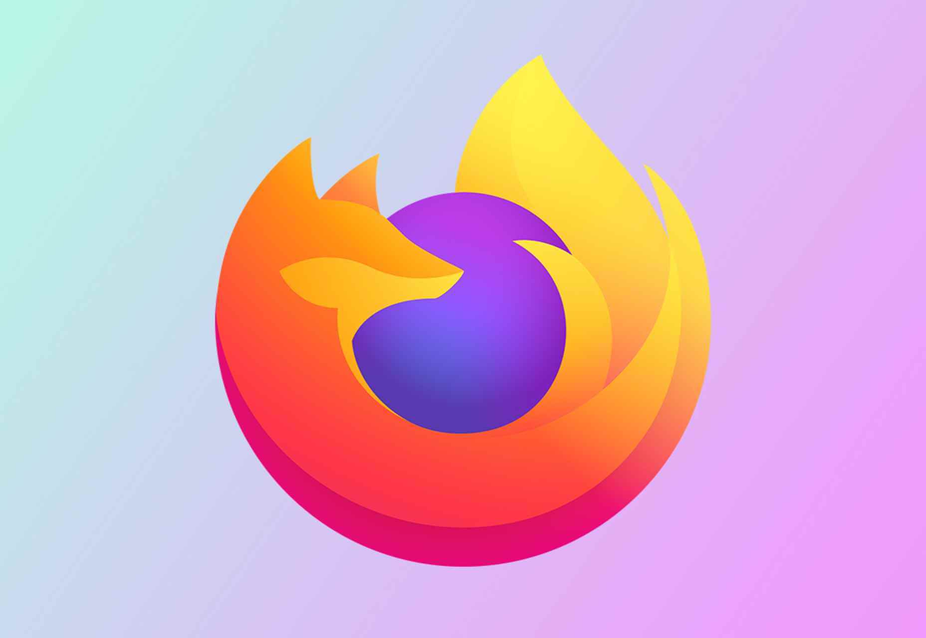
Storytelling: As mentioned above, animated logos can tell a story about what the company or product actually does. In this example for Firefox, for instance, the logo mimics a loading wheel to demonstrate a speedy internet browser.
Brand awareness: Dynamic logos and animations are more likely to capture your audience’s attention than static images. They’re also more of a novel experience, which means that customers might want to share them with other people too.
Memorability: Today’s customers are bombarded by hundreds, if not thousands of logos all the time. They need something special to convince them that one image deserves a spot at the front of their mind. Animation can help to make a business more memorable.
4. Do Your Research
Doing your own research is an excellent way to get some inspiration for a live logo or animation. Ideally, you’ll want to focus on the industry you’re already working in, as this will give you some guidance as to the kind of movement that can attract the most attention from the correct audience.
Watch as intros to brand videos and check out as many live logos as you can. Check out the kind of animations that people use in their videos when they’re showcasing products online. You can learn a lot about what works just by evaluating what other people have done before. Just be careful not to simply copy what you’ve found elsewhere.
The aim of your live animation should be to tell a unique story about the company
The aim of your live animation should be to tell a unique story about the company in question. If you’re not sure how to start with differentiating the image, check out the brand guidelines for the company in question. The guidelines that the company used to choose the right brand colors, fonts, and other visual assets can work just as well for your animation strategy.
Remember, the aim here is to tell a specific story, send a message, or evoke a certain emotion. Don’t make the mistake of designing something that looks cool but doesn’t have much of a purchase. Most human beings will naturally look for the meaning behind the content that they see. If there isn’t anything there, it’ll just lead to confusion.
5. Use Live Logos on Brand Websites
The most obvious way to begin experimenting with animated logos in web design, is to implement live logos into a client’s website. Some companies have a “welcome screen” for their site which uses an animation to introduce visitors to the home page and other navigation options. There are also brands out there who love the impact that animation can have but want to use it more subtly.
In these cases, live logos can be an excellent way to draw the eye to a specific spot on a website, perhaps the area just above the “contact” button that encourages a client to reach out. Crucially, to avoid weighing down the website and distracting visitors, companies and designers will need to make some important choices.
Although it might be tempting to keep the animation looping at all times, just in case someone misses the first round, this requires a lot of extra processing power. Too much animation also makes it harder for businesses to push the focus of their visitors to other points on the website, like landing pages for products, or testimonial pages.
Often, as with most innovative decisions in web-design, the best bet is usually to start small and work your way up. Don’t over-do it with animation on day one. See how the visitors to the website respond first.
6. Find the Right Balance
Animations in a live logo are there to grab attention quickly, and effectively. They shouldn’t go on for too long, or you risk overwhelming your audience before they have a chance to browse the rest of the website or check out other content. A live logo should only be active for a few seconds at most, and in that time, it needs to say something valuable.
Often, the best strategy is to start by building up curiosity, and getting your viewer engaged so that they’re keen to see more. Every frame will count to pull the customer in and make them feel connected to the brand in question.
Make sure that the logo animation is dynamic so that it doesn’t just capture the attention of the viewer but maintain their interest for the full time required. During the motion, the viewer’s brain should be working to figure out what’s going to happen next.
Just like most logo design and graphic animation strategies, the key to success is finding the right balance between clever experiences, and simplicity. You want to do something meaningful that earns your viewer’s attention, but you need to compete with the fact that attention spans are plummeting all the time.
7. Explore Logo Animation in Video
One of the best ways to use logo animation, is to draw interest for a company at the beginning of a video. Video is gaining incredible levels of popularity lately, particularly in a world where you can view video content almost anywhere. Companies are adding videos to their product pages, social media accounts, applications, websites, and so much more .
For the majority of companies, a live logo at the start of a video can help their brand to seem more professional. It’s a reminder to viewers of the brand that they’re learning about with that video content. Plus, a logo at the beginning of a piece of video content can also build on the consistency that companies attempt to create by using the same brand assets in various mediums online.
(Starting a video with an animated logo is great for presentation, but it can also be frustrating to customers in certain pieces of content where they’re looking for quick answers to questions. If an animated logo is more than a couple of seconds long, it may be better placed at the back of a video instead.)
With videos for news reports or announcements where you want to get straight to the point and generate excitement about a new product or service, it can be better to jump straight into action. Ending a video with a live logo keeps the brand image front of mind for the customer for longer, even after the message has ended. On the other hand, ending a video with a logo could increase the chances that customers miss the animation, because they click away from the content too quickly.
If you’re new to adding live logos into videos, consider experimenting with different strategies to see which works best. Different companies might get unique results.
8. Bring Logo Animation to the Real World
Another interesting option for live logo design, could be to step outside of the computer screen for a while. In today’s digitally transforming landscape, it’s becoming more common to see the real and digital worlds converging. Most events and trade-shows come with presentations that rely on digital content, like animated presentations and slide shows.
Depending on the signage solutions available at industry events, companies could even use an animated logo above their booth to draw attention in a cluttered environment. Around 48% of exhibitors agree that a more eye-catching stand or booth is often the most effective way to attract visitors and customers at an event.
Animation and live logos may have started life on the computer screen, but they can appear in much more diverse environments today. Offices could use a live logo in the reception room or lobby to make their on-premises environment more appealing. Retail locations could display ads on digital signage, followed by live logos that work to both separate messages, and keep shoppers entertained when they’re enjoying the bricks-and-mortar experience.
9. Include Live Logos in Brand Signatures
Remember, a live logo doesn’t just have to sit on a company’s app or website until someone discovers it. Sometimes, the right logo can also be a powerful way to “sign off” on a message from a brand or its management team. For instance, email remains to be one of the most valuable tools for business marketing and customer relationship building today.
It’s the third most influential source of content and news for a lot of B2B audiences, and yet, most companies aren’t taking full advantage of what their email marketing software solutions are capable of. If you can display gifs and animated videos in an email (which most software solutions can), then you can also add a live logo to the brand signature.
The important thing to remember is that if you’re going to be adding a signature to a lightweight thing, like an email, it needs to be lightweight too. Don’t make the live logo too long and complicated, or it might prevent the email from loading properly.
Outside of email, don’t forget to consider options for live logos in things like social media profile pictures too. According to experts, around 80% of companies use visual assets in their social media marketing. A live logo is a great way to go beyond the basics with a company’s imagery. Motion grabs attention, and video content is quickly gaining steam on a lot of social media platforms.
Embracing a New World of Live Animation
Designers are only just beginning to scratch the surface of what’s possible with animated logos. For many companies, live logos are an excellent way to capture audience attention and encourage engagement with a brand.
A live logo at the beginning of a video, at the start of an app loading screen, or even at the top of a website can differentiate a company and make them stand out. As technology continues to evolve, and customer expectations continue to expand, the options for live animation could continue to grow. You might even be able to infuse live logos with elements of VR and AR, to impart brand essence in a brand-new digital world.
If you haven’t begun experimenting with live logo design yet, now could be the time to start.
https://ankaa-pmo.com/wp-content/uploads/2021/04/9-tips-for-better-live-logo-design.png15292780Service comm.https://ankaa-pmo.com/wp-content/uploads/2017/04/Logo-Ankaa-engineering.pngService comm.2021-04-14 16:45:092021-04-14 16:45:099 Tips for Better Live Logo Design
A domain name is an essential element of every project, product, and company. It’s central to a brand and has a disproportionately large impact on user experience. Not only that, but it also impacts SEO and ultimately revenue.
Domain names are also one of the most commonly retailed elements in web technology, with most designers hoarding a small empire’s worth of domain names “just in case” the right side-project comes along.
Because so much of the information and advice on domain names is provided by companies selling domain names and is therefore not impartial, we wanted to bust some of the myths you’ll encounter.
Myth 1: Anyone Can Own a Domain Name
In fact, almost no one can own a domain name. As demonstrated by the (probably) annual renewal notices you receive, you are merely renting a domain name.
You pay a registrar, who registers the domain with ICANN (The Internet Corporation for Assigned Names and Numbers) — or an entity to whom ICANN has delegated the responsibility for a particular TLD.
Even when renting a domain, you do not have the right to use it; thousands of UK-based businesses have had .eu domains stripped from them as a result of being removed from the EU.
Myth 2: There’s a Perfect Domain For Every Project
Domains do not have inherent value; they acquire value over time.
25 years ago, if you were building a search engine, the ‘perfect’ domain might have been search.com, find.com, or perhaps look.com — the particularly cynical might have opted for webads.com. You almost certainly wouldn’t have registered google.com because it says nothing about search.
Any domain name can acquire value through longevity, SEO, and branding
google.com acquired its value through a simple, relentless branding strategy and a generous dollop of luck.
Any domain name can acquire value through longevity, SEO, and branding.
Myth 3: Your Domain Name Should Contain Keywords
If you’re at the point of registering a domain name, either your business is new, or your digital strategy is. In either case, you have hopefully carried out keyword research, but without a live site, your keyword research hasn’t been validated. In other words, you don’t know what your keywords are.
Even if you’re confident that you know exactly what your keywords should be at this time, your keywords may change. The pandemic has required most businesses to pivot to some degree. eatoutny.com isn’t much use if legal restrictions have forced you to switch to a delivery business — unless you’ve also registered eatinny.com.
Furthermore, in the area of ecommerce, customers tend to view keyword-heavy domain names as budget options because they are like generic-brand goods. It may be that your business will only ever be a budget option, but it’s not a wise business decision to restrict your options.
There is an SEO benefit to keywords in a domain, but it is minimal and will almost certainly vanish in the next few years — even for EMD (Exact Match Domains) — because it is too close to gaming the system.
Myth 4: You Don’t Need a .com
As frustrating as it may be to seek out a .com you’re happy with, nothing says “late to the party” like a .biz domain.
A .co extension is slightly better in some regions because the .co.** format is commonly used; .co.jp for example. However, .co tends to be typed as .com by users accustomed to the more common format.
nothing says “late to the party” like a .biz domain
It’s possible to opt for pun-based names using regionally specific TLDs like buy.it, or join.in. This kind of strategy will play havoc with your local search strategy because computers don’t understand puns; you’ll potentially do quite well in Italy or India, though.
If you’re registering a domain for a non-profit, then .org is perfectly acceptable. However, carefully consider whether a domain is worth the lost traffic if you can’t also register the .com (because people will type .com).
The one exception is industry-specific TLDs that communicate something about the domain’s contents to a target demographic. For example, .design is a great extension for designers, and .io is fine for an app if it targets developers (i.e., people who understand the joke). You should also register the .com if you can, and if you can’t, carefully consider whom you’re likely to be competing with for SERPs.
This is not to say that anything other than a .com is worthless, just worth less than the .com.
Myth 5: A Trademark Entitles You to Register a Domain
Trademark registration and domain registration are two entirely different processes, and one does not entitle you to the other. This has been legally challenged a few times and fails far more often than it succeeds.
Trademarks are rarely blanket registrations, which means the trademark owner needs to declare the industry in which it will operate; there was no enmity between Apple Inc. and Apple Corp Ltd. until the former moved into music publishing and no one could download the White Album onto their iPod.
There is, however, a limited value in registering a domain that has been trademarked elsewhere. Not least because you will be competing against their SEO, and if they’re big enough to trademark a name, they’ve probably grabbed the .com.
Myth 6: Premium Domains Are a Good Investment
Premium domains are domains that have been speculatively registered in the hope of attracting a huge resale fee. The process is commonly referred to as ‘domain squatting.’
Domain squatters bulk-register domains in the hope that one of them will be valuable to someone. As a result, they are forced to charge exorbitant fees to cover their losses; a premium domain will cost anything from 1000–100,000% of the actual registration cost.
Setting aside the cost — which would be better spent on marketing — premium domains often come with legacy issues, such as a troubled search engine history, that you do not want to inherit.
Myth 7: A Matching Handle Must be Available on Social Media
The business value of a social media account varies from company to company and from platform to platform. Even if it is valuable to you, numerous marketing strategies will accommodate a domain name: prepending with ‘use,’ or ‘get,’ or appending with ‘hq,’ for example.
More importantly, it’s unwise to allow a third-party to define your long-term brand identity; sure, Facebook is huge now, but then so was the T-Rex.
Myth 8: You Need a Domain Name
A domain name is an alias, nothing more. You don’t actually need a domain name — what you need is an IP address, which a domain name makes human-friendly.
Think of domain names as an accessibility issue; humans are less able to read IP addresses than computers, and domains bridge the gap. (See how helpful accessibility is?)
While a domain name is beneficial, question whether a sub-domain or even an IP address would do. Registering a domain is an exciting stage of a project that many people never get past, leaving themselves with a huge collection of domains that they pay an annual fee for, and never actually develop.
What Makes a Good Domain Name
Now we’ve dispelled some of the myths surrounding domain names, let’s look at the key characteristics shared by good domain names:
A Good Domain Name is Brandable
A brandable domain is non-generic. It’s the difference between a sticky-plaster and a band-aid. Unique is good, rare is acceptable, generic is a waste of money.
A Good Domain Name is Flexible
Keep it flexible. Don’t tie yourself to one market or one demographic. Your domain name needs to work now and fifty years in the future.
A Good Domain Name is Musical
Six to 12 characters and two to three syllables is the sweet spot. Names in that range have a musical rhythm our brains find it easier to retain and recall.
A Good Domain Name is Phonetic
There are 44 word sounds in the English language. Other languages have similar totals. If you use a domain name that is pronounced phonetically, it will be easy to communicate.
https://ankaa-pmo.com/wp-content/uploads/2021/03/8-domain-name-myths-every-web-designer-should-know.jpg14082560Service comm.https://ankaa-pmo.com/wp-content/uploads/2017/04/Logo-Ankaa-engineering.pngService comm.2021-03-10 15:45:352021-03-10 15:45:358 Domain Name Myths Every Web Designer Should Know
Looking for something new to get you excited about design work? This list is packed with all kinds of goodies to help you feel inspired and ready to work.
Here’s what new for designers this month.
Top Picks for March
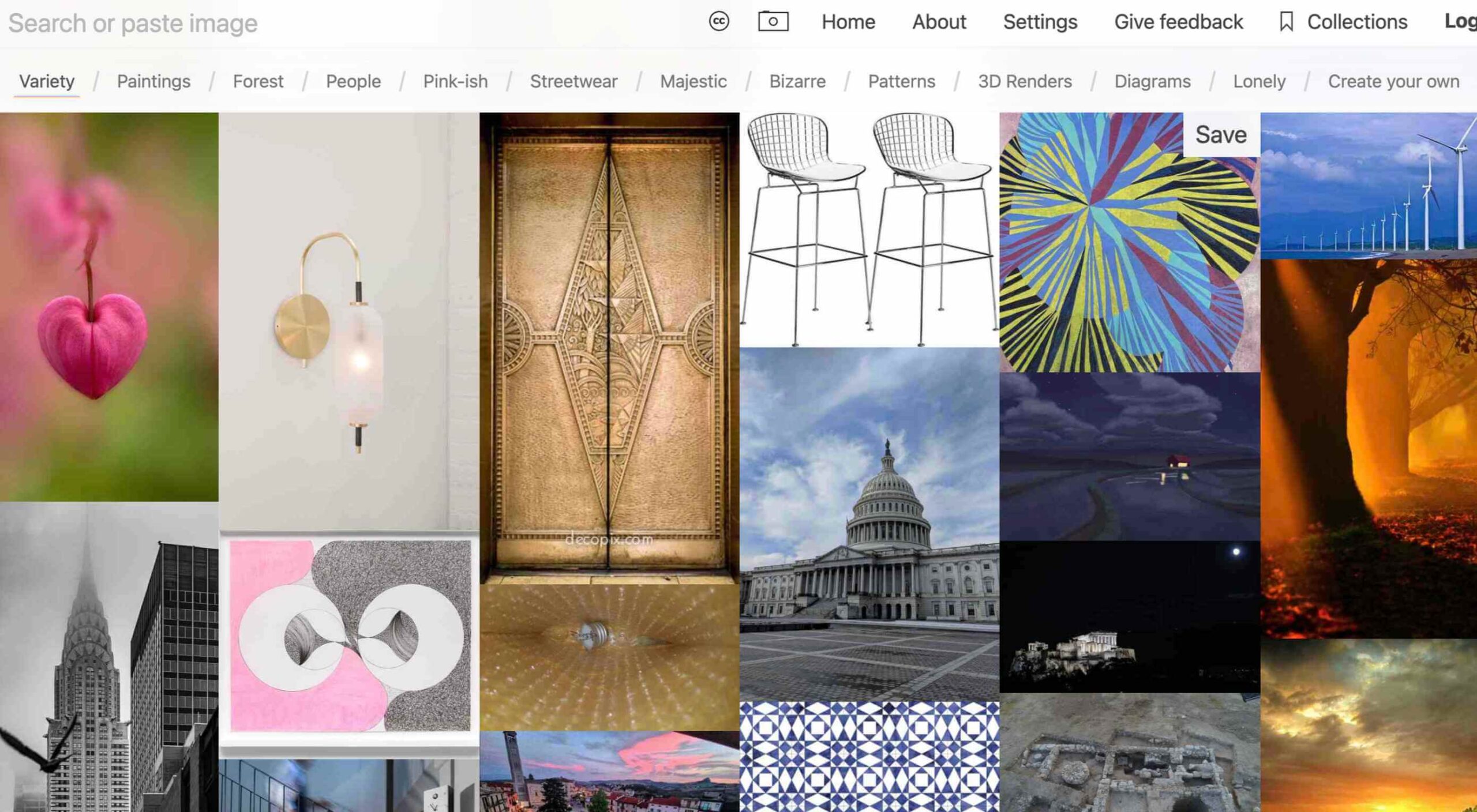
Same Energy
Same Energy, in beta, is a visual search engine. You can search with a minimum number of words or an image. The website is designed to help you find art, photography, decoration ideas, and practically anything. It uses deep learning and algorithms to create images on the home page, and you can create feeds in the same manner. The coolest part of this tool is that it tries to match the visual and artistic style you ask for with image mood and objects.
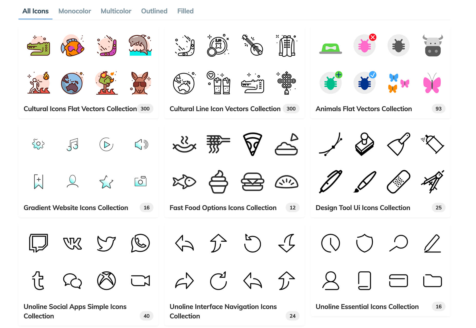
SVG Repo
SVG Repo is a collection of more than 300,000 SVG vectors and icons that you can download and use in projects for free (even commercial use). The site has a powerful search tool to help you find the right image, and the platform is designed so that you can contribute.
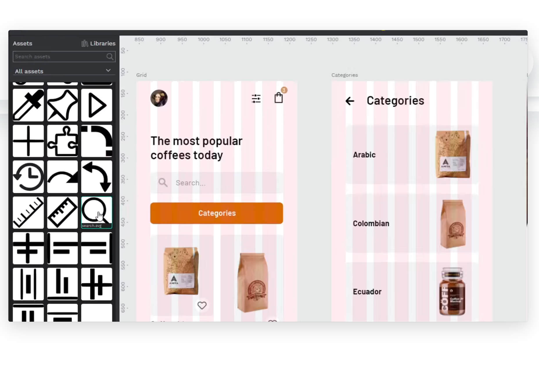
Penpot
Penpot is an open-source design and prototyping platform for cross-domain teams. It is a web-based tool that isn’t dependent on any operating system and works with open web standards. It’s designed to be zippy and interactive so your team can work fast.
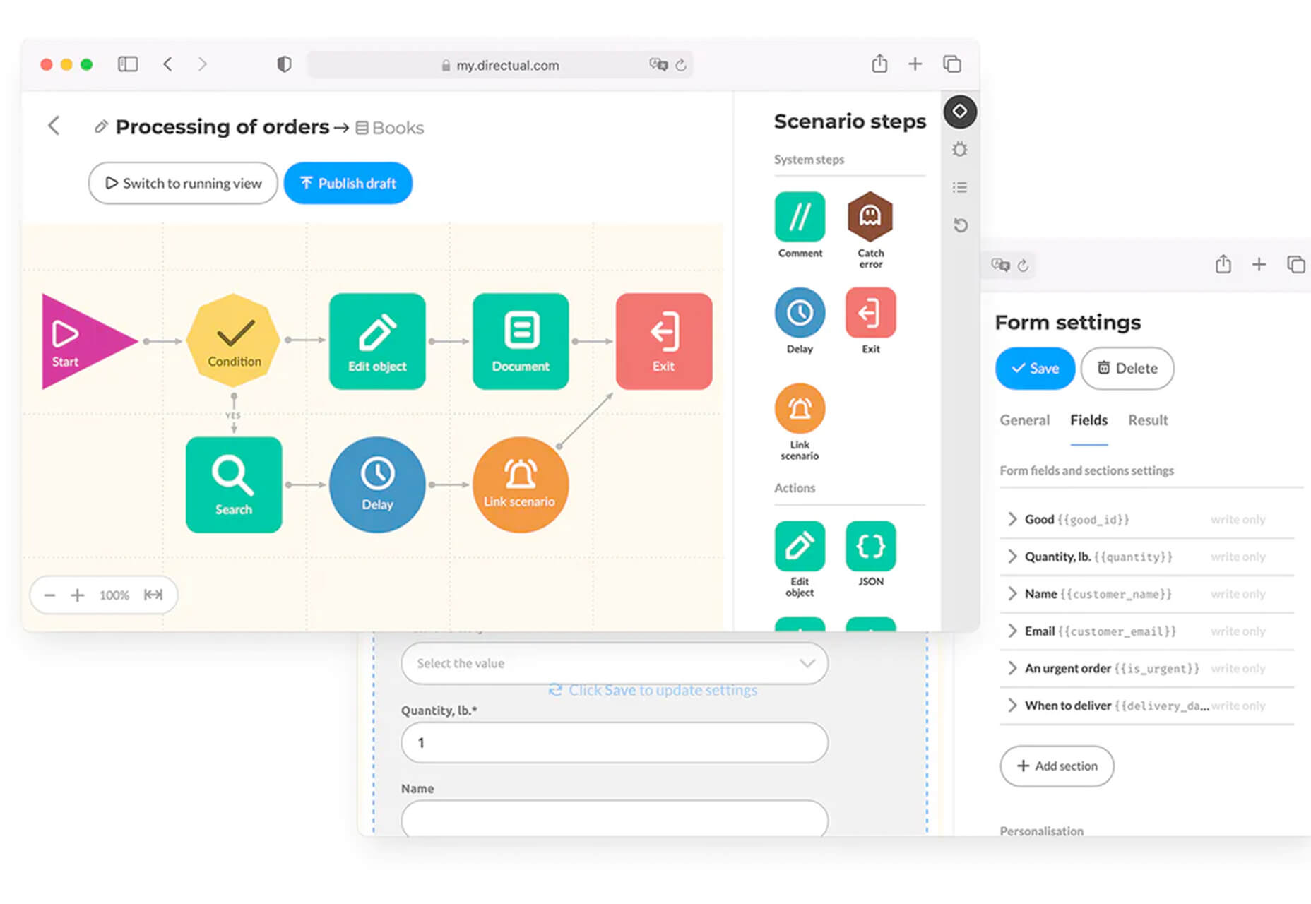
Directual
Directual is a no-code platform for building scalable apps using a visual interface. (Perfect for designers with less development experience.) It includes integrations with other popular tools and is free to use while figuring out how the app works and how you can make it fit your business goals.
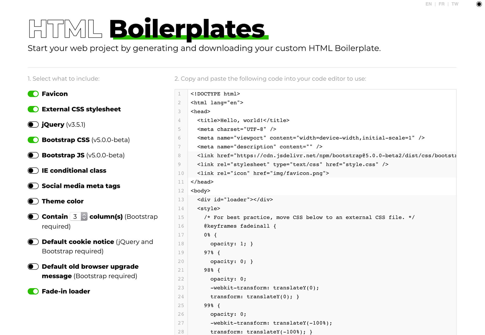
HTML Boilerplates
HTML Boilerplates helps you start web projects by generating a custom HTML boilerplate that you can download. Just choose the elements you want to include and then copy and paste the code into your editor.
6 Productivity Boosters
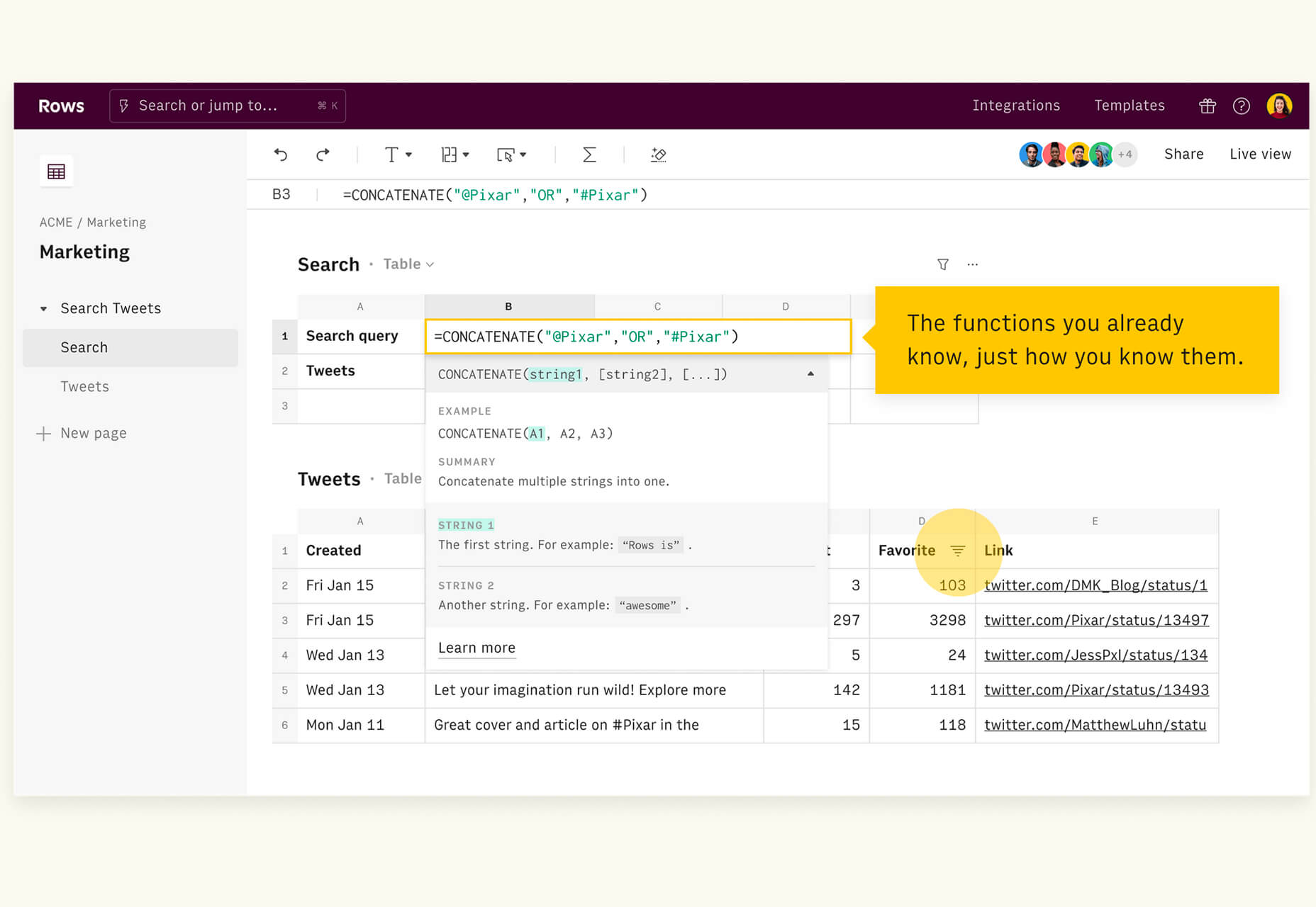
Rows
Rows is a spreadsheet tool with built-in web integrations that’s made for team collaboration. It works with other tools you already use, such as Google Analytics, Twitter, LinkedIn, Mailchimp, and so many others. Without scripts, you can use it to automate workflows, analyze data, share dashboards, and build forms and tools that make work simpler.
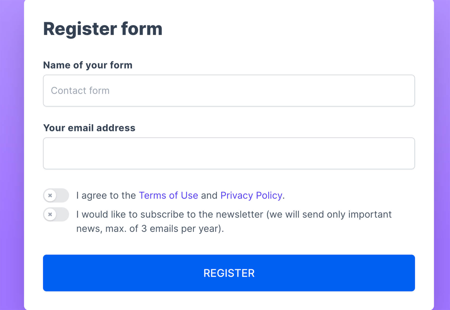
Form.Taxi
Form.taxi is a premium web-based form tool. You can create web forms without code or programming and connect them to your website. The tool then stores information, filters for spam, and notifies you of form submissions.
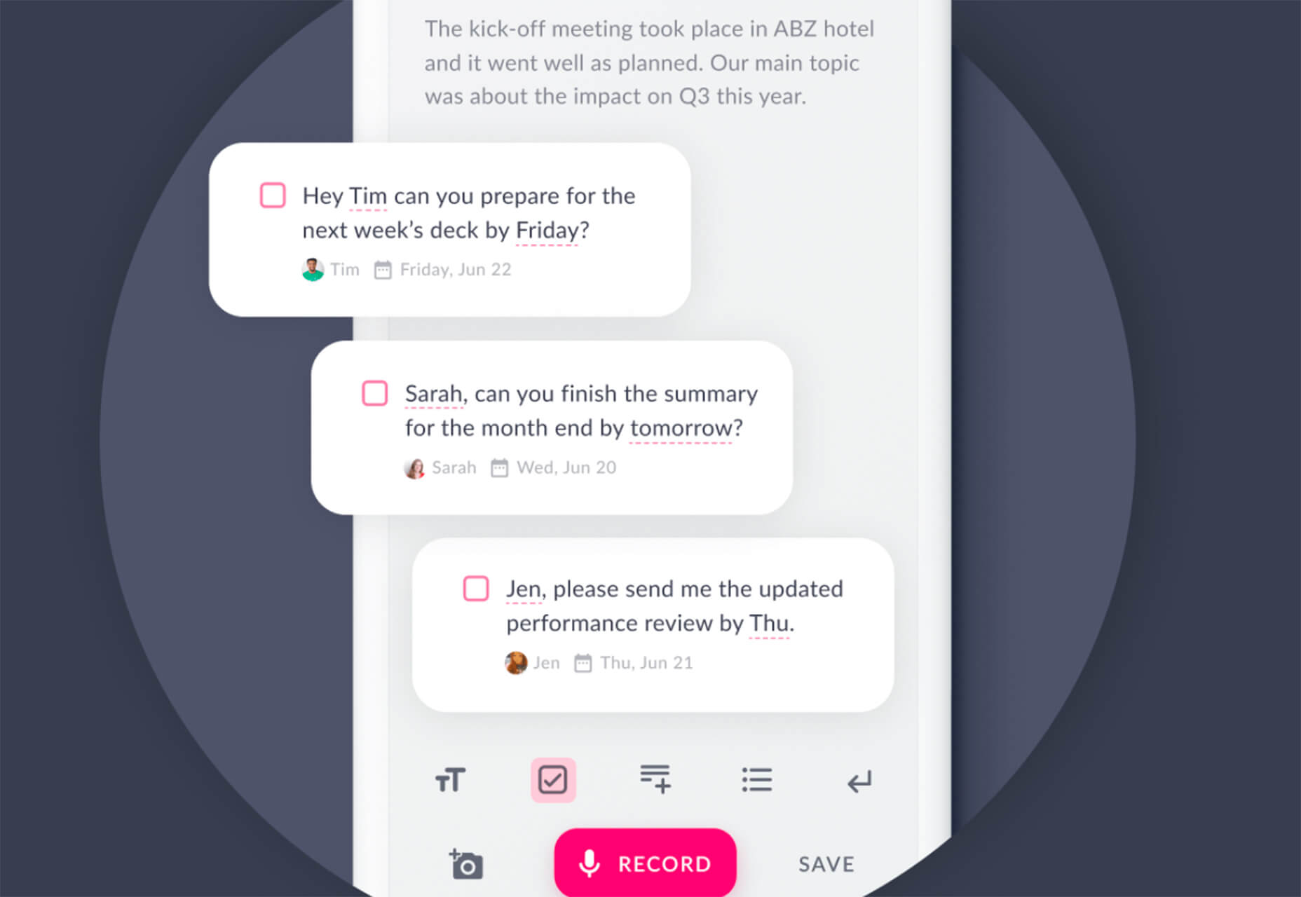
Verbz
Verbz is a voice productivity app that allows you to create notes, assign tasks, make announcements, run standups, or chat. Talk or type, listen or read. It works as your own voice assistant for teams. It’s available in Beta from the App Store, and there’s a waitlist for Android users.
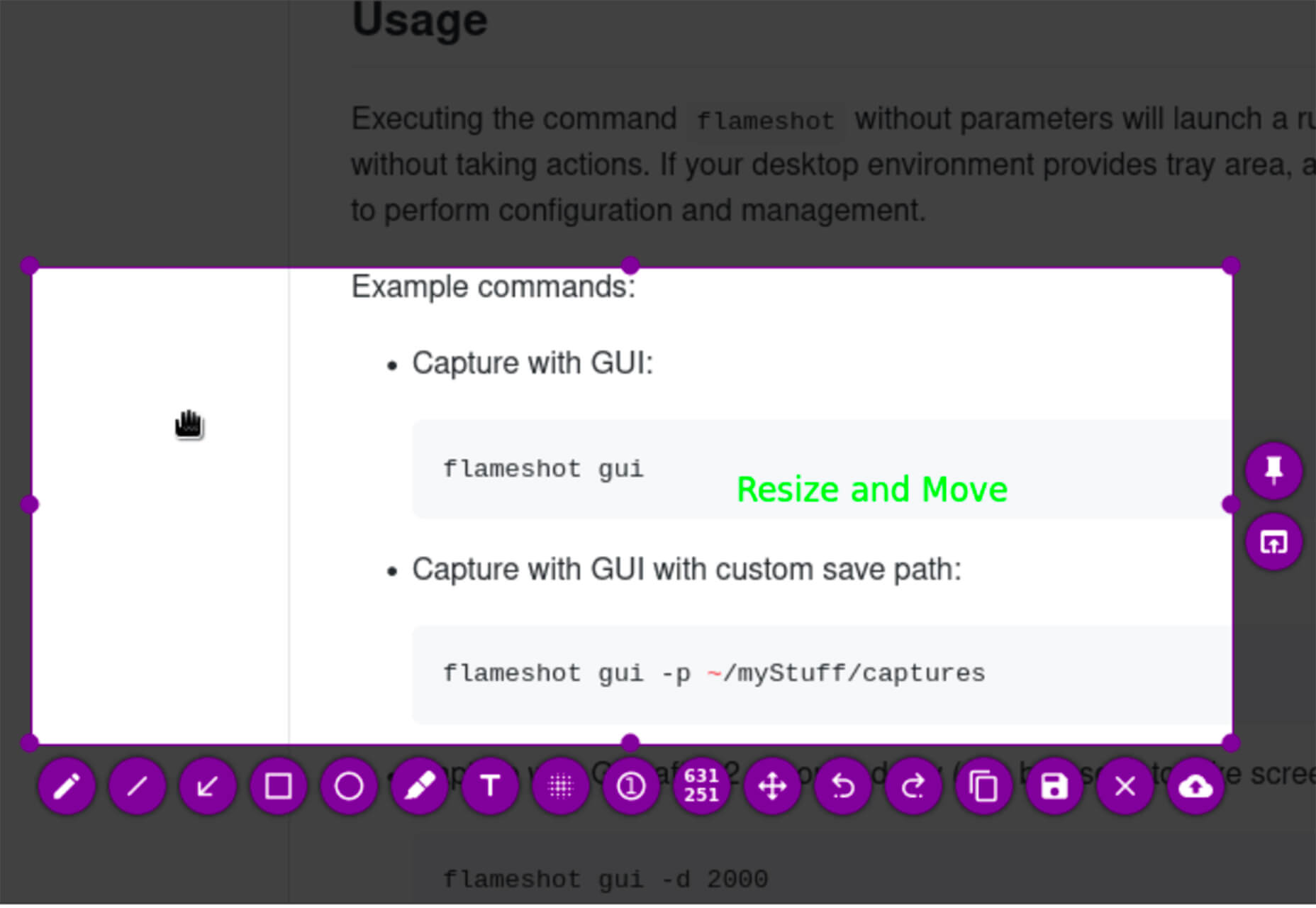
Flameshot
Flameshot is a tool for grabbing screenshots. It has a customizable appearance, is easy to use, and lets you draw and edit screenshots as you work.
Kitemaker
Kitemaker is a collaboration tool for development processes. It can help you keep track of everything from tools such as Slack, Discord, Figma, and Github in one place. It helps you structure projects and keep discussions about work moving forward in one place.
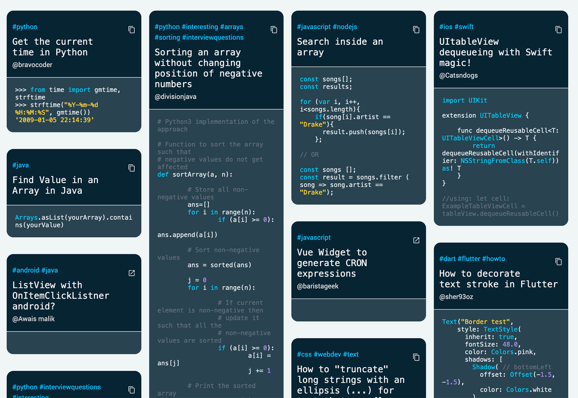
This Code Works
This Code Works is a place to save code snippets that work for when you need them again. You can group and organize snippets and share with others. You might think of it as the “Pinterest of code.”
3 Icons and User Interface Elements
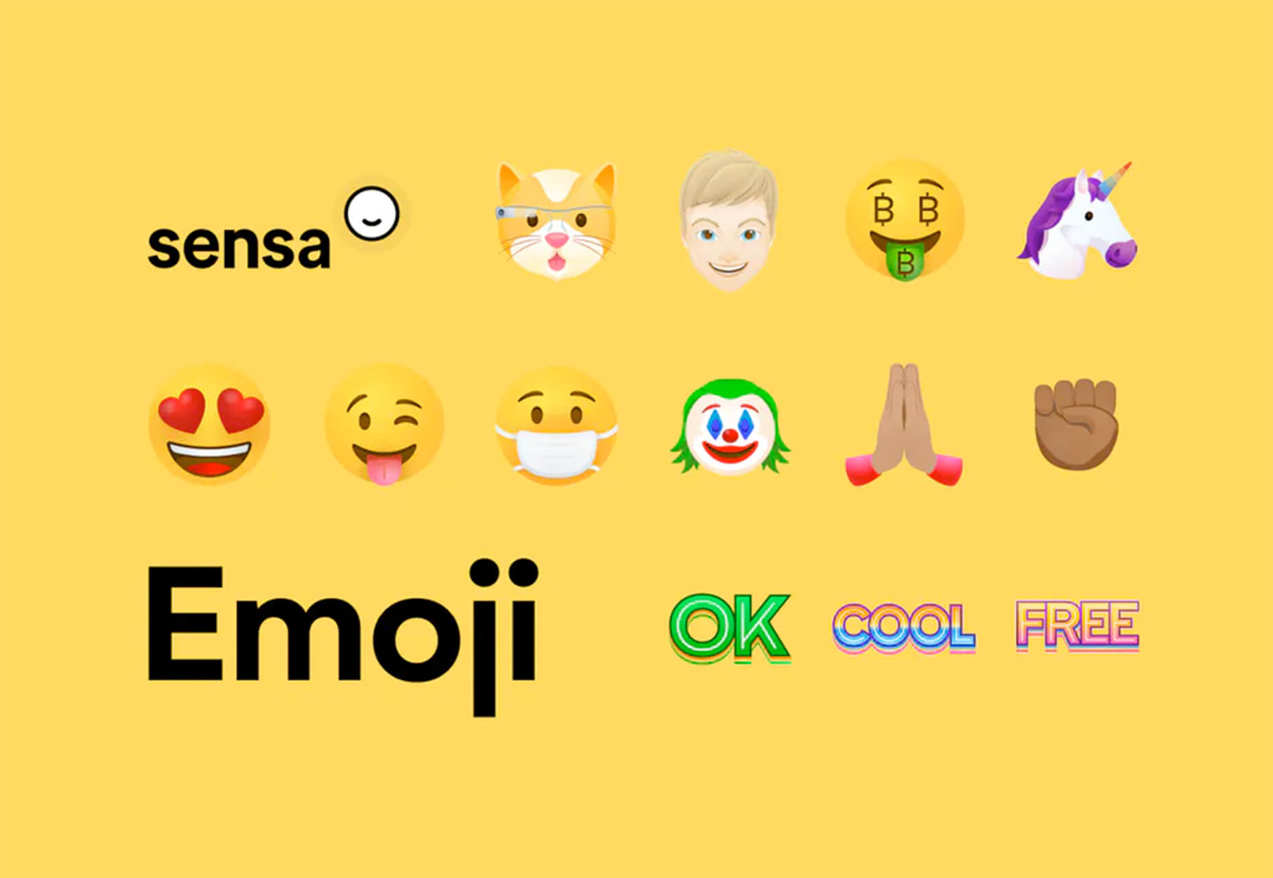
Sensa Emoji
Sensa Emoji is a collection of common emoji icons that you can use in your materials. Every element is fully vector and free to use.
Google Fonts Icons
Google Fonts now supports icons, starting with Material Icons. Choose between outlined, filled, rounded, sharp, or two-tone options in the open-source library.
Toolbox Neumorphism Generator
Toolbox Neumorphism Generator is a design tool that helps developers to generate CSS in the soft UI /neomorphism style for the elements with real-time output.
3 Tutorials and Demos
An Interactive Guide to CSS Transitions
An Interactive Guide to CSS Transitions explains everything you need to know about this great animation tool for website designers. This tutorial digs in with code and examples to help you create more polished animations and is designed for anyone from beginners to experienced designers with some pro tips throughout.
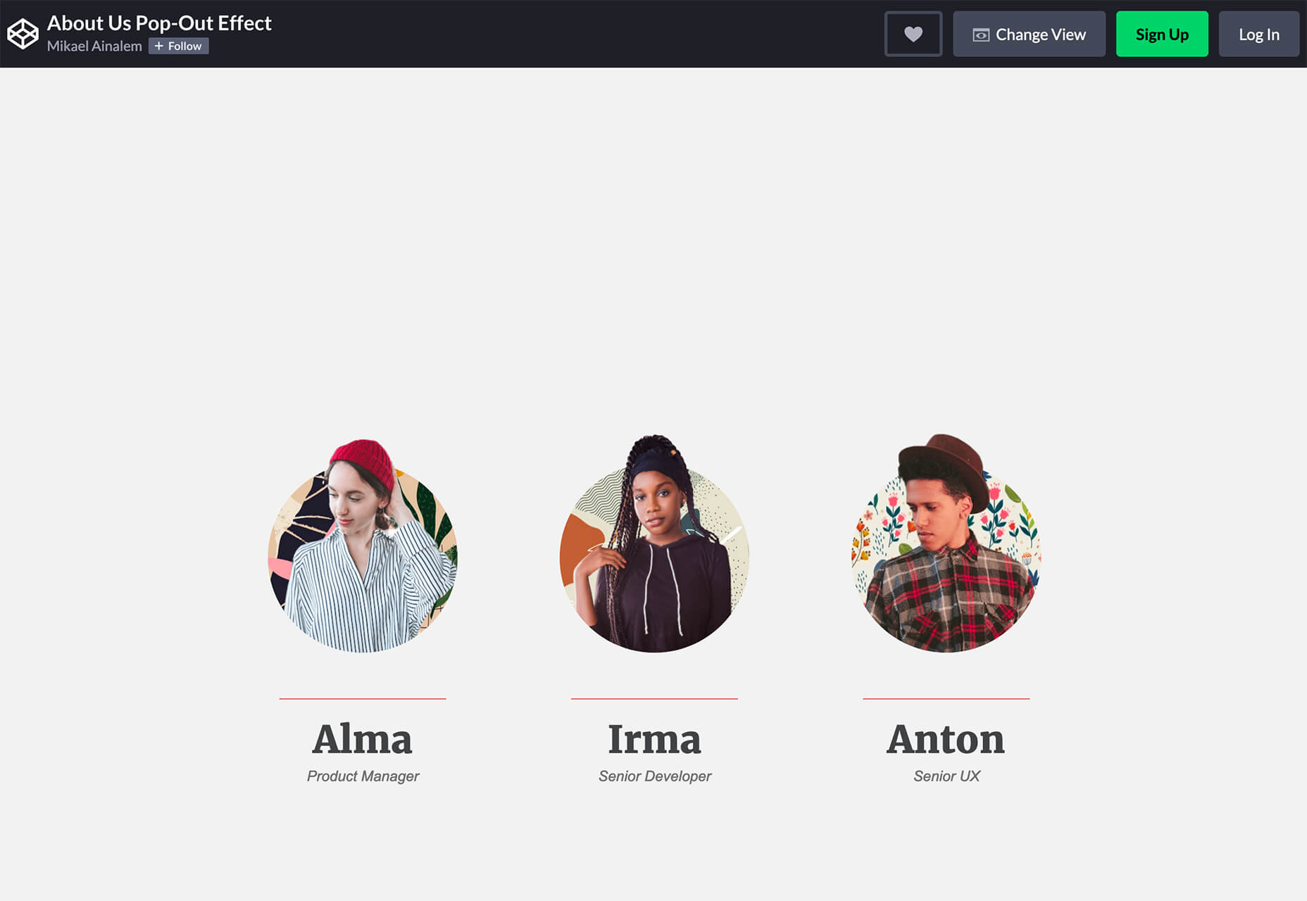
About Us Pop-Out Effect
The About Us Pop-Out Effect adds a special element to any team or contact page with a nifty pop animation. Each person seems to lift out of the circle frame in this pen by Mikael Ainalem.
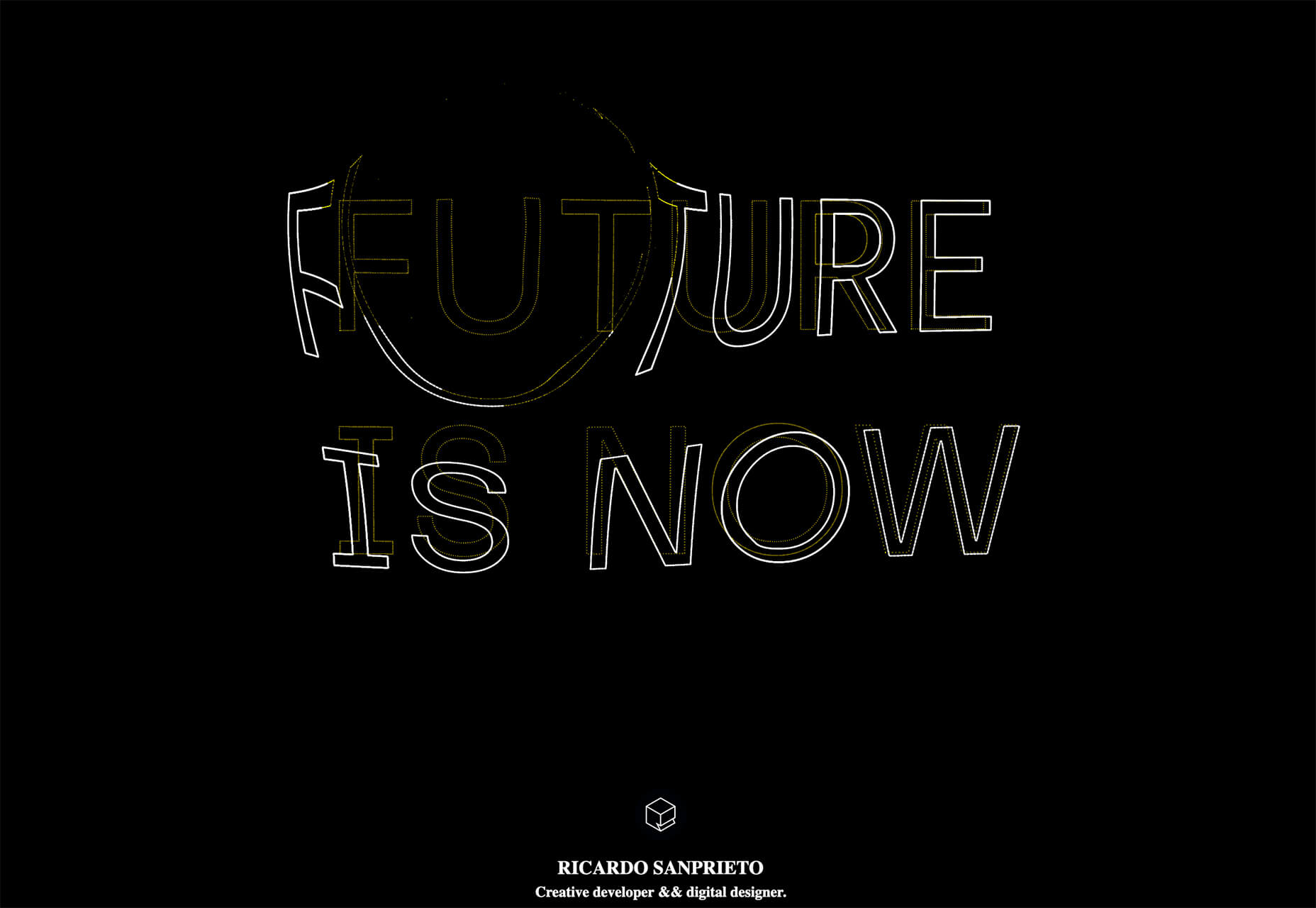
Interactive Particles Text Create with Three.js
Interactive Particles Text Create with Three.js is a web element you could play with all day. Text shifts into particles and follows mouse movement in a fluid motion in the pen by Ricardo Sanprieto.
10 Fresh Fonts and Text Tools
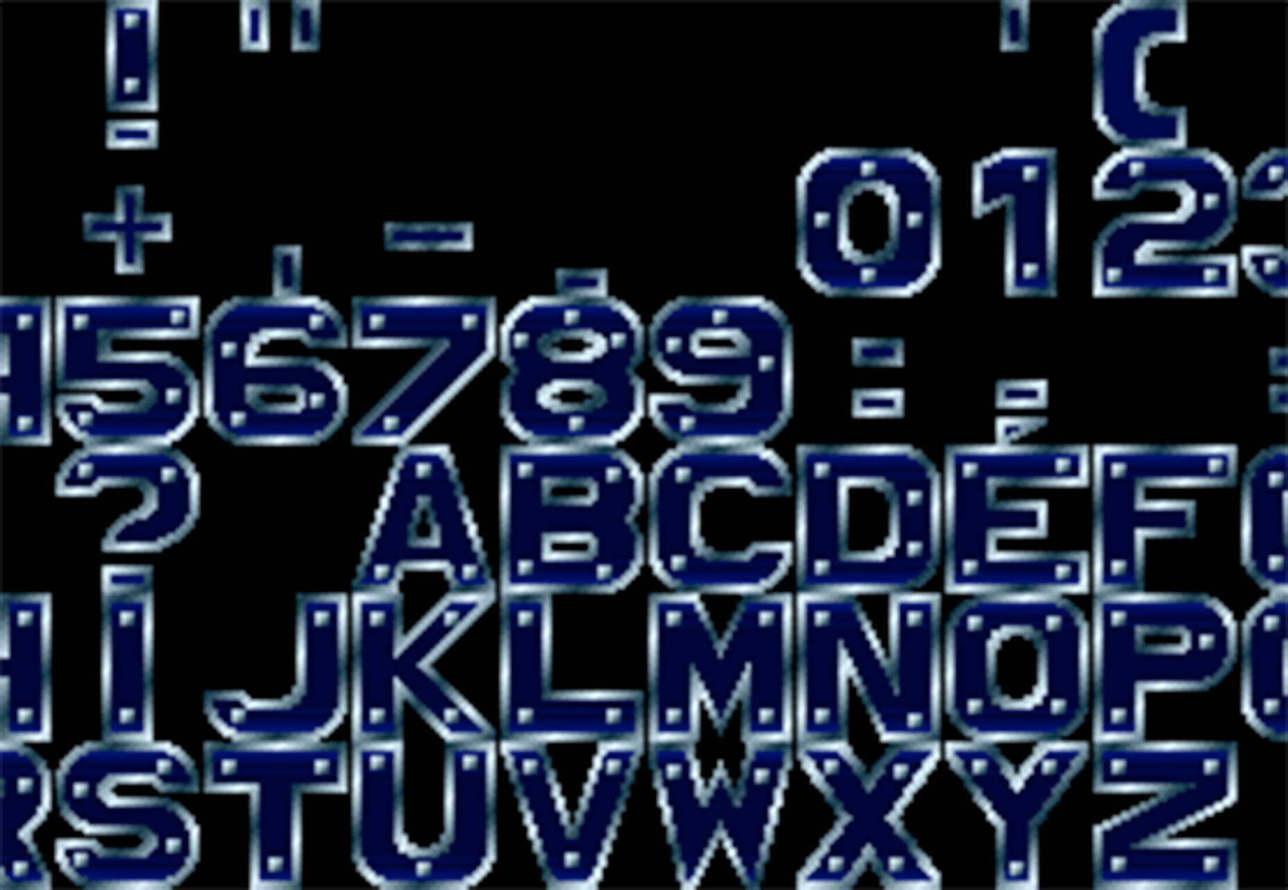
Bitmap Fonts
Bitmap Fonts is a collection of various bitmap typefaces all pulled and stored in a single location. This is the perfect solution if you are looking for a bitmap option.
Uniwidth Typefaces
Uniwidth Typefaces for Interface Design is another collection of fonts for a specific purpose – here universal widths for interface design. Uniwidth fonts are proportionally-spaced typefaces where every character occupies the same space across different cuts or weights. This is both a tutorial on the type style as well as font collection.
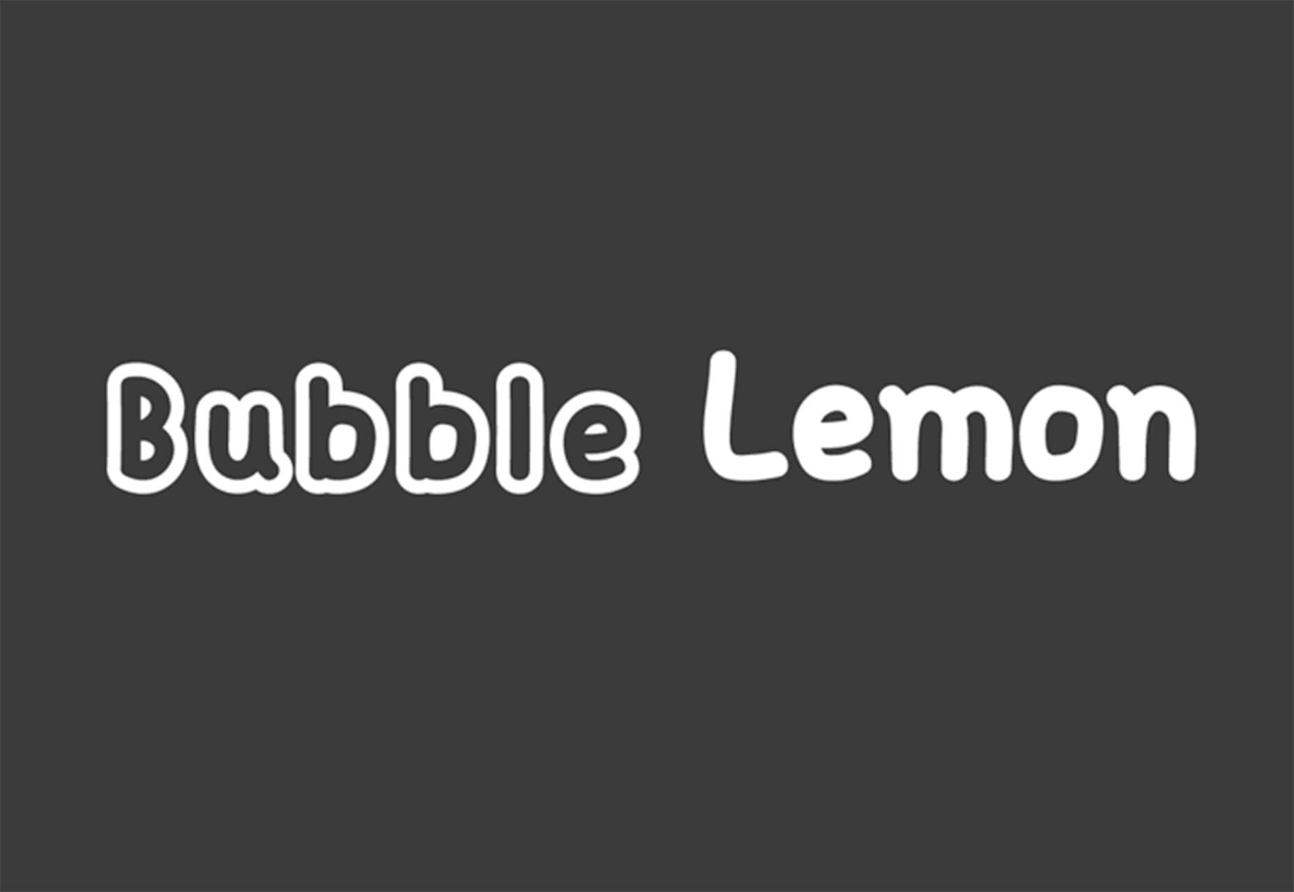
Bubble Lemon
Bubble Lemon is a typeface for projects with a childlike feel. With an outline and regular style, the thick bubble letters look like some of the sketches you may have done in grade school.
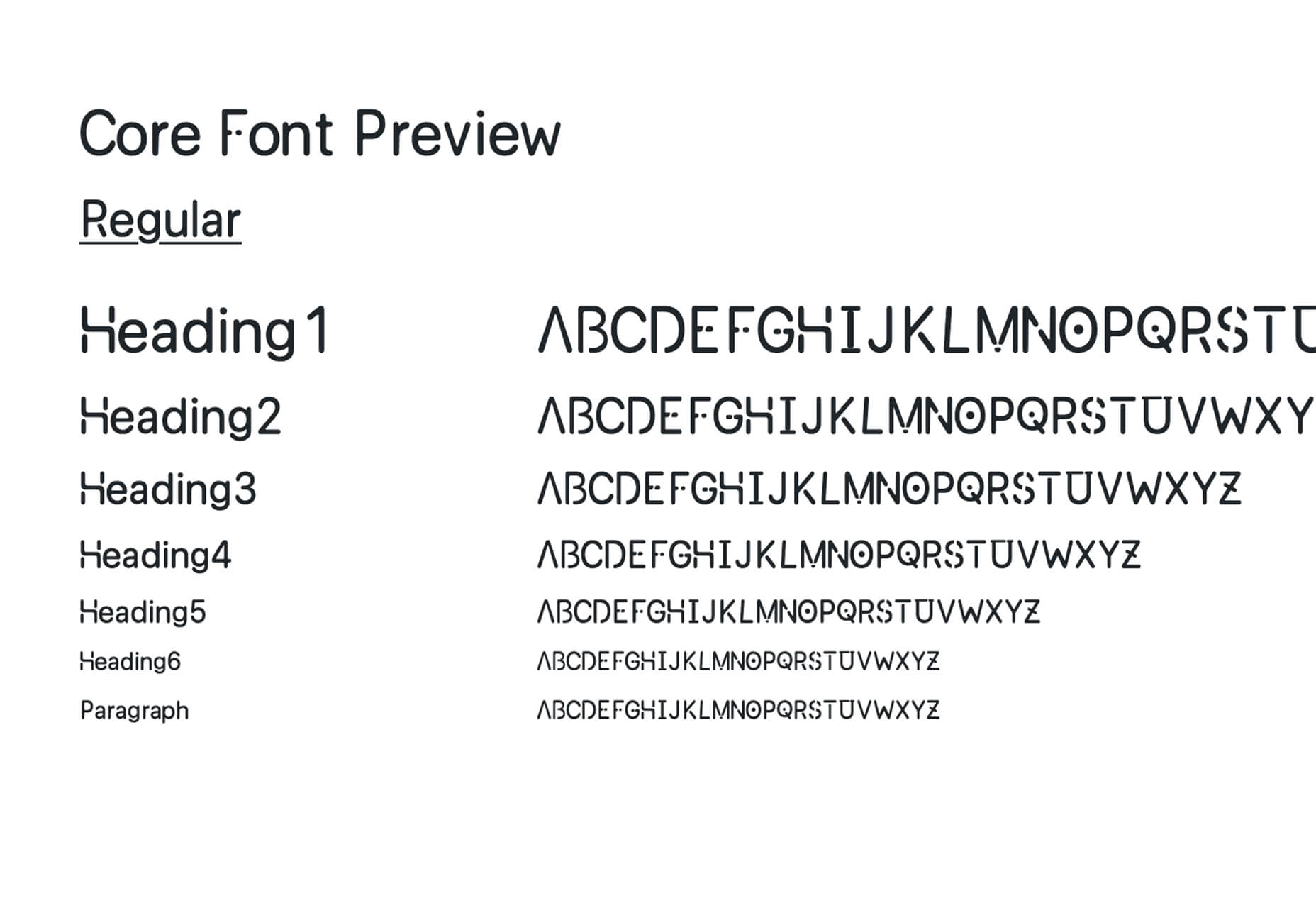
Core Font
Core Font is an open-source project with a funky and modern style. It has a full upper- and lower-case character set, numerals, and a few punctuation marks.
GHEA Aram
GHEA Aram is a superfamily with a Central European flair, according to the type designer. The premium typeface includes everything from light to black italic and even some Armenian ligatures.
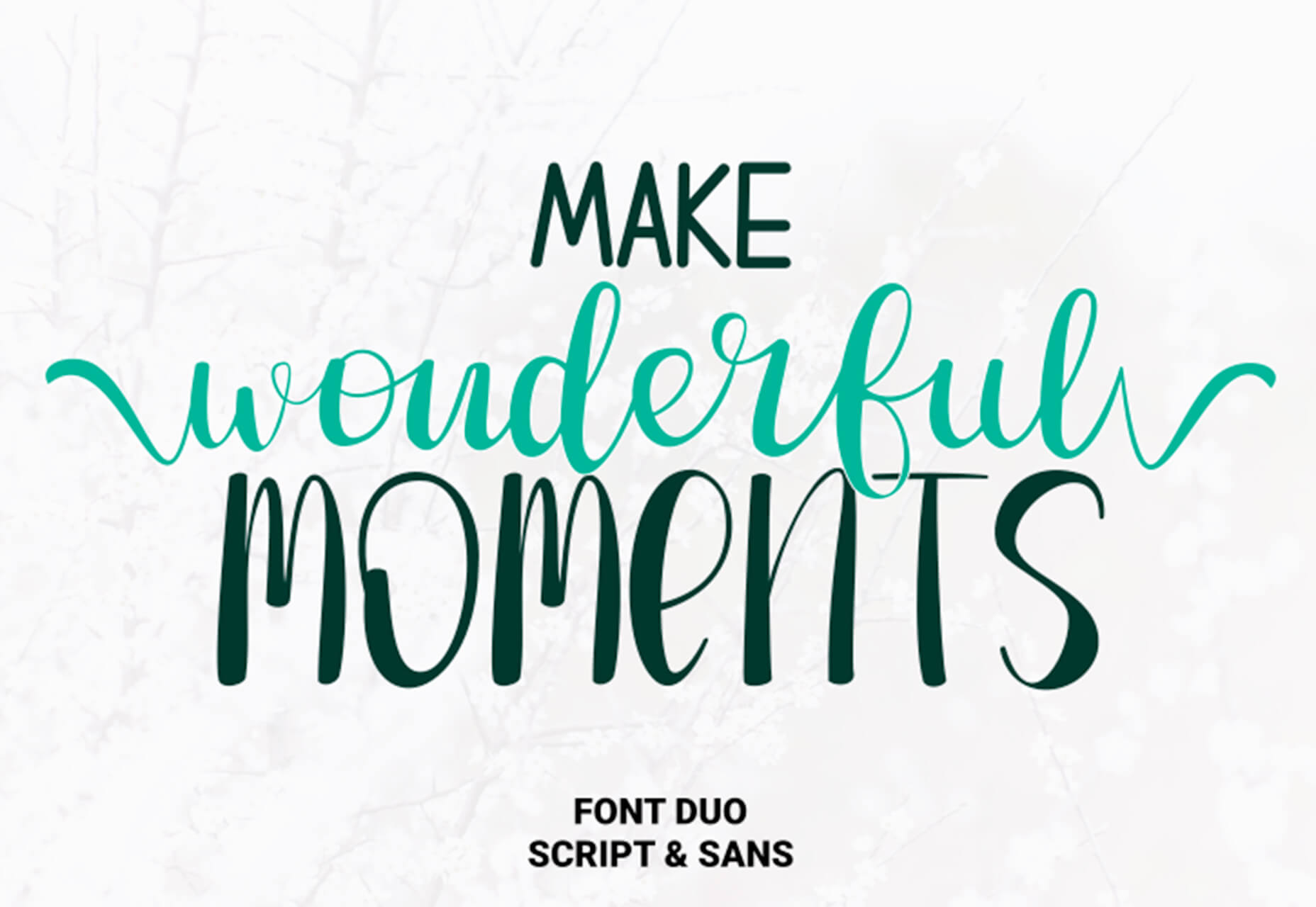
Make Wonderful Moments Duo
Make Wonderful Moments Duo is a script and sans serif font pair with a lighthearted feel and highly readable character set. The regular (sans serif) only has uppercase characters.
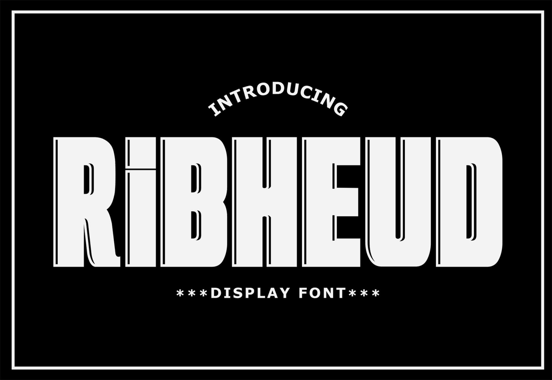
Ribheud
Ribheud is a slab-style display font with a heavy look and strong presence. What makes it interesting is the left-outline/shadow on each character.
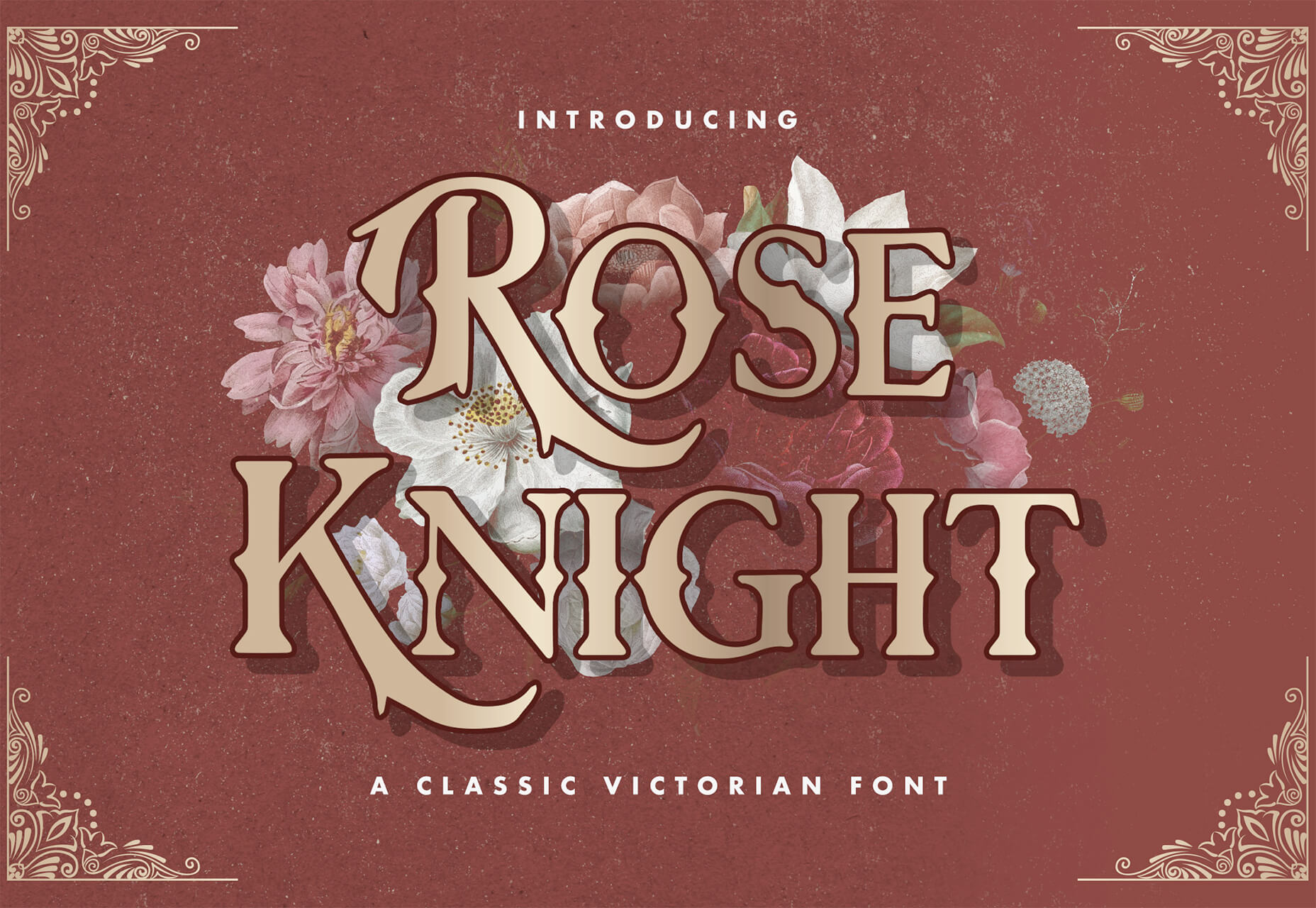
Rose Knight
Rose Knight has an old-style feel that can take on multiple moods, depending on supporting design elements. All of the characters are uppercase with alternates. It could make a fun branding option.
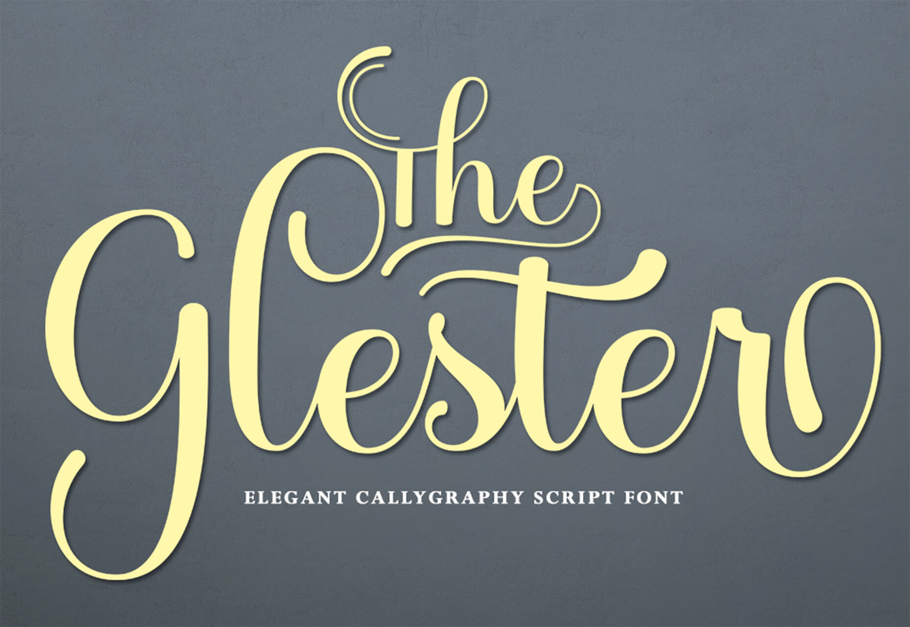
The Glester
The Glester is a beautiful premium typeface in a calligraphic style. The most interesting element of this typeface is all of the extra decorations that allow you to change individual characters (380 glyph alternates).
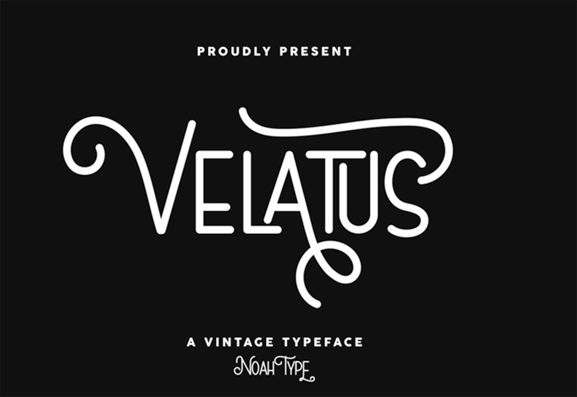
Velatus
Velatus is a vintage-style typeface with plenty of swashes and flourishes that make it unique. It comes with 157 characters and 96 glyphs.
https://ankaa-pmo.com/wp-content/uploads/2021/03/27-exciting-new-tools-for-designers-march-2021.jpg14082560Service comm.https://ankaa-pmo.com/wp-content/uploads/2017/04/Logo-Ankaa-engineering.pngService comm.2021-03-08 11:45:462021-03-08 11:45:4627 Exciting New Tools For Designers, March 2021
Everyday design fans submit incredible industry stories to our sister-site, Webdesigner News. Our colleagues sift through it, selecting the very best stories from the design, UX, tech, and development worlds and posting them live on the site.
The best way to keep up with the most important stories for web professionals is to subscribe to Webdesigner News or check out the site regularly. However, in case you missed a day this week, here’s a handy compilation of the top curated stories from the last seven days. Enjoy!
https://ankaa-pmo.com/wp-content/uploads/2021/03/popular-design-news-of-the-week-march-1-2021-march-7-2021.jpg14072560Service comm.https://ankaa-pmo.com/wp-content/uploads/2017/04/Logo-Ankaa-engineering.pngService comm.2021-03-07 11:45:012021-03-07 11:45:01Popular Design News of the Week: March 1, 2021 – March 7, 2021
This article is brought to you by 4Kdownload.com, a suite of video tools that help you make the most of YouTube, Instagram, Vimeo, and many more popular resources.
YouTube isn’t just for videos of cats snowboarding; it’s also a treasure trove of design tips, freebies, how-tos, career advice, and all-around creative inspiration.
Whether you’re a seasoned design veteran or just taking the first steps along a creative career, there are thousands of videos that will guide your path.
Today, we’ve collected ten of the best YouTube channels for designers, where you’ll find all the guidance you’ll ever want. Enjoy!
AIGAdesign
The first stop for any aspiring designer or grizzled veteran should be AIGAdesign, the official YouTube channel for AIGA, the American Institute of Graphic Arts.
This channel focuses on a huge range of issues that affect designers. You’ll find insightful and high-production-value videos on branding, the design business, the creative process, and the institute’s numerous initiatives.
Adobe
Adobe products are still the go-to tool for most designers, and no list of this type would be complete without a nod to the substantial resources that Adobe plows into its YouTube channel.
Review highlights from MAX, Adobe’s annual conference, learn advanced techniques in Creative Cloud apps like Illustrator and Photoshop, and get a sneak peek at upcoming Adobe products.
Google Design
Google is one of the most influential companies on the web, and not just for SEO. Google’s Design is the megacorp’s creative branch. In addition to releasing design resources like Material Design, they also produce a lot of content on their own YouTube channel to benefit emerging designers.
Look back at Google’s I/O conference sessions, follow guides on how to get the most out of Google resources, and get tips on creativity.
The Futur
The Futur is an online education platform that happens to be streaming via YouTube. It’s a positive, feel-good channel that’s designed to help you make the most of your career.
You’ll find inspiring videos on building a brand, setting up a studio, coping with client demands, and everything else you need to be a professional designer.
Envato Tuts+
Envato Tuts+ is a YouTube channel that concentrates on the practical side of being a designer with plenty of hands-on guides to different applications.
You’ll also find some excellent videos explaining the fundamentals of topics like variable fonts and animation.
Creatnprocess
If you’re already proficient with Adobe Creative Cloud, and you’re looking to push your limits a little, then Creatnprocess will teach you more advanced topics.
It’s a great place to learn the more complex aspects of image manipulation, and there are lots of logo design tutorials.
Sketch Together
If you’re a fan of Pablo Stanley’s design style, then you’ll love his Sketch Together YouTube channel. He has tons of design tutorials, walk-throughs and project case studies, and in-depth discussions with guest designers.
In case the name wasn’t enough of a clue, Sketch Together also has an awesome collection of Sketch videos.
Martina Flor
Martina Flor is an amazing letterer and typeface designer from Berlin, by way of Argentina. As well as running her own studio, she’s an author and educator.
Martina’s YouTube channel is a must-watch for anyone who loves typography and lettering. Her videos include her secrets on how to draw letters.
Pixel & Bracket
Pixel & Bracket is a YouTube channel run by Spencer, a designer from Indianapolis.
You’ll find tons of great Creative Cloud tutorials that are easy to follow. You’ll also find a few videos about Spencer’s experience as a designer and a sprinkling of freebies he’s found on market places.
Will Paterson
Will Paterson is a logo designer whose YouTube channel critiques famous logos, provides product reviews, and offers invaluable branding design tips.
Will’s got some really original ideas for freelancers, and he’s generous with both his advice and his enthusiasm.
Save Your Videos for Watching Offline
With so many awesome videos available, you could watch them all day long and still only scratch the surface.
The best solution is to subscribe to the channels you like the look of, and then download a few videos with a free app like 4K Video Downloader so you can watch them back whenever you like.
With so much to choose from and a seemingly endless lockdown still in effect, now’s the perfect time to learn a new skill, develop your career, or sit back and enjoy some design banter.
This article is brought to you by 4Kdownload.com, a suite of video tools that help you make the most of YouTube, Instagram, Vimeo, and many more popular resources.
If you’re here, then you’re thinking about becoming a web designer and wondering if it’s a smart move.
Honestly, it’s not uncommon to be plagued by doubts and what-ifs when making a big career change, and that’s especially so right now, what with all the uncertainty we’ve faced over the last year.
Here’s some good news: It’s never a bad time to become a web designer, which makes 2021 the perfect time to turn your passion into a career! Here are 8 reasons why:
1. People Are Spending More Time Online Than Ever Before
DoubleVerify surveyed consumers’ digital consumption habits in 2020, and guess what it found? The amount of time people spend online has doubled since the pandemic began. Before 2020, consumers worldwide were spending an average of 3 hours and 17 minutes online every day. Now? The average is 6 hours and 59 minutes.
Needless to say, web designers are in high demand as businesses rush to get in front of these consumers.
2. There’s a Big Freelance Boom Right Now
An Upwork study at the end of 2020 reveals that freelancing grew by 22% (about 2 million workers) since 2019. This now-popular career move is a great option for everyone — from university graduates entering the workforce for the first time to anyone who’s been recently laid off. Heck, if you’re just plain unhappy with the course of your career and want to shake things up, freelancing could be the breath of fresh you need.
3. It’s a Future-Proof Field
In these uncertain times, you’re right to be cautious about jumping into something new. But web design is a career that’ll be around for a long, long time. It’s not just the fact that we’ll always need people to build websites that makes this field future-proof. You could build… Websites. Mobile apps. Web apps. Progressive web apps. You could specialize in… Graphic design. UX design. Web development. You could work for yourself. Build your own agency. Go work for someone else.
There’s a ton of flexibility in how you make a living as a designer. So if your interests change or your industry is impacted, that’s fine. Just pivot!
4. You Can Do It From Anywhere, Anytime
When people are nervous about traveling or living in densely packed cities, that’s not something that should worry you as a web designer. One of the benefits of being a web designer is that you can do it from anywhere you want and on your own schedule.
This is especially nice for anyone who has a family and needs a more effective way of managing it all at once, even when the kids aren’t in school or jobs out in the physical world are diminishing.
5. You’re in the Driver’s Seat
Let’s face it, it can be really stressful working for a company where you have little to no say about what goes on, how it gets done, and how much money you make for all your efforts. This is one of the reasons why freelancing is such an attractive option for many. You get to decide which content management system you build websites with. You get to decide who you work with. You get to set your hours of availability. You make the rules. And you know what? You can change them at any time. It’s all on you.
6. It Can Be a Lot of Fun
There’s some fascinating stuff coming down the line in digital design. For instance, augmented and virtual realities are really starting to pick up speed as ecommerce companies need a better way to allow customers to window-shop and try stuff on digitally.
AI is also bringing a lot of changes to the space. Not only can machine learning and language processing improve the way companies do business online, but they can also improve the way web designers work, too.
7. It Can Also Be Really Rewarding
Because you control your career as a web designer, you get to decide who you build websites for. So, what kinds of causes are you passionate about? Is there an industry you have close ties to and want to give back? This isn’t about working for free. This is about offering your professional design services to people you’re invested in and causes that get you excited.
Not only will it be easier to work for clients like these, but you’ll enjoy it more, too.
8. You Don’t Need to Go to School to Become a Designer
This is a common question for people wanting to leap into web design. While you should have some basic knowledge and skills when you start, you don’t need a degree in design or development to start making money.
One of the beautiful things about becoming a web designer is that you can learn as you go. Here are 5 free courses that’ll help you get to the next level. For instance, you can start as a freelancer, building websites from pre-made templates or themes. As you get more experience and pick up advanced design and coding skills, you can then branch out into specialized fields or areas of expertise.
Ready to Become a Web Designer?
There are many, many reasons to leap into web design in 2021. But are you ready? Before you get started, make sure you have a trusted set of resources to help you with the business side of becoming a web designer. Webdesigner Depot is a good place to start. You’ll learn things like:
And much, much more. When you’re ready, check out this 3-part business branding series where you’ll learn how to kick off your new web design business the right way.
https://ankaa-pmo.com/wp-content/uploads/2021/01/should-you-become-a-web-designer-in-2021.jpg14082560Service comm.https://ankaa-pmo.com/wp-content/uploads/2017/04/Logo-Ankaa-engineering.pngService comm.2021-01-27 11:45:212021-01-27 11:45:21Should You Become a Web Designer in 2021?
Here we are into a brand new year, and although we’re far from out of the woods yet, there is a feeling of renewed hope on many fronts.
In this first collection of the year, we have a mix of retrospectives, brand new ventures, and business as usual. There is an eclectic mix of styles on offer, from glossy and slick to minimalist and brutalist, but all confident and looking to a better world in the year ahead.
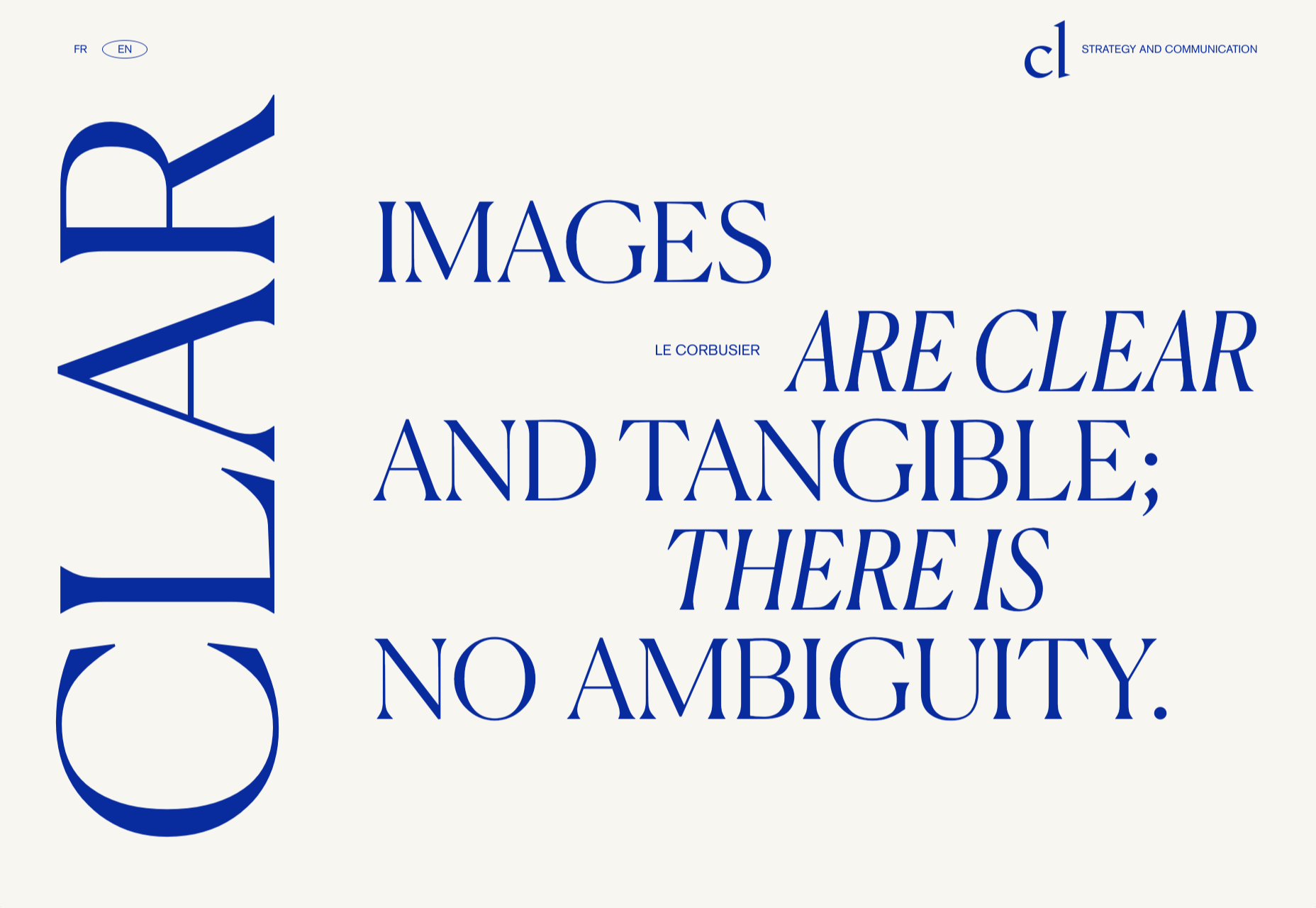
Clar
Brand strategists Clar have a simple but strong site. Aside from a few personnel profile shots and the odd bit of line animation, it is all text. The typography is good, and the use of color holds interest.
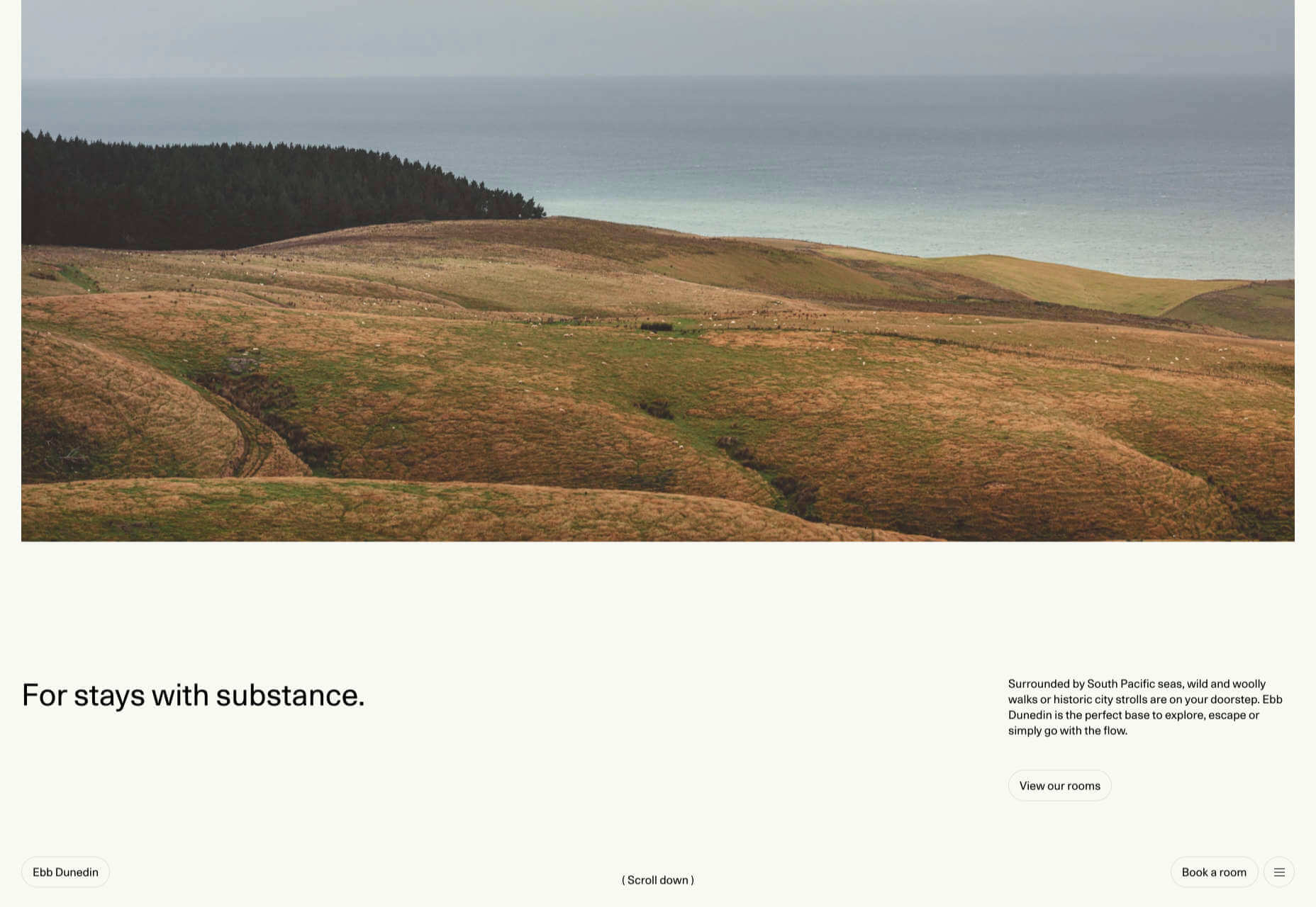
Ebb Dunedin
This boutique hotel, opening in March 2021 (COVID permitting), has bucked the usual luxury hotel trend and bravely gone for a more minimal design style to complement its interiors.
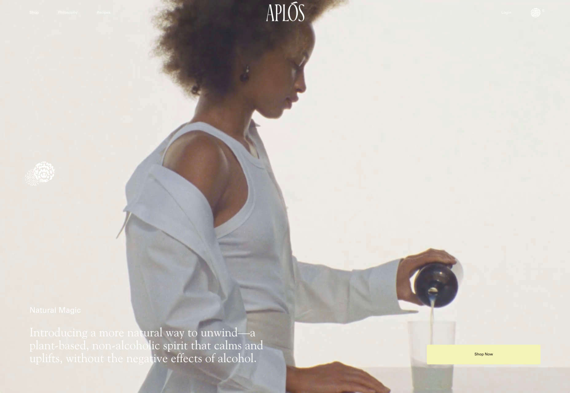
Aplós
Perfect for Dry January, Aplós is a new, non-alcoholic spirit that can be drunk on its own, with a mixer or in a cocktail. The site design and branding aesthetic is sophisticated calm.
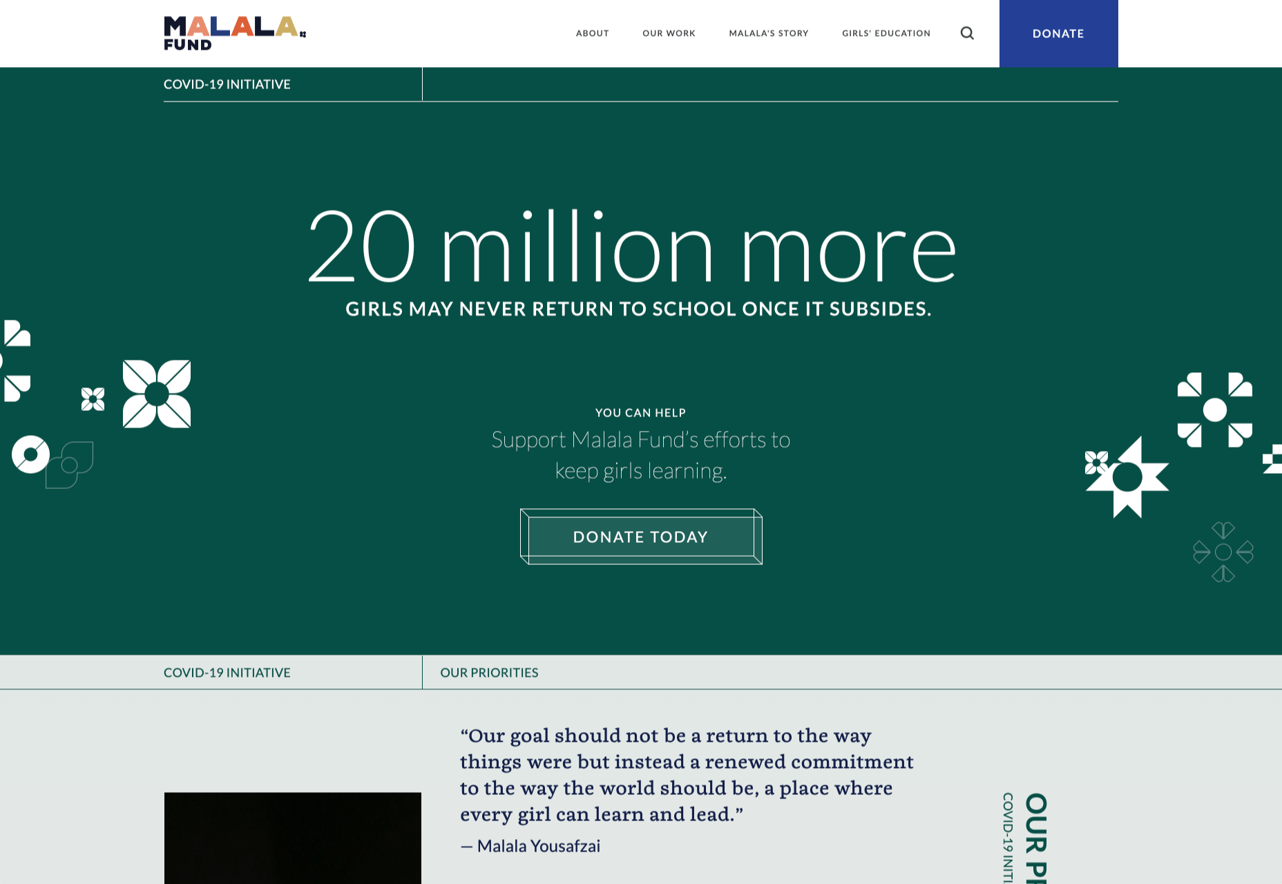
Malala Fund COVID Initiative
Subtle color and simple line decorations keep this site for the Malala Fund’s COVID Initiative clean but warm and appealing.
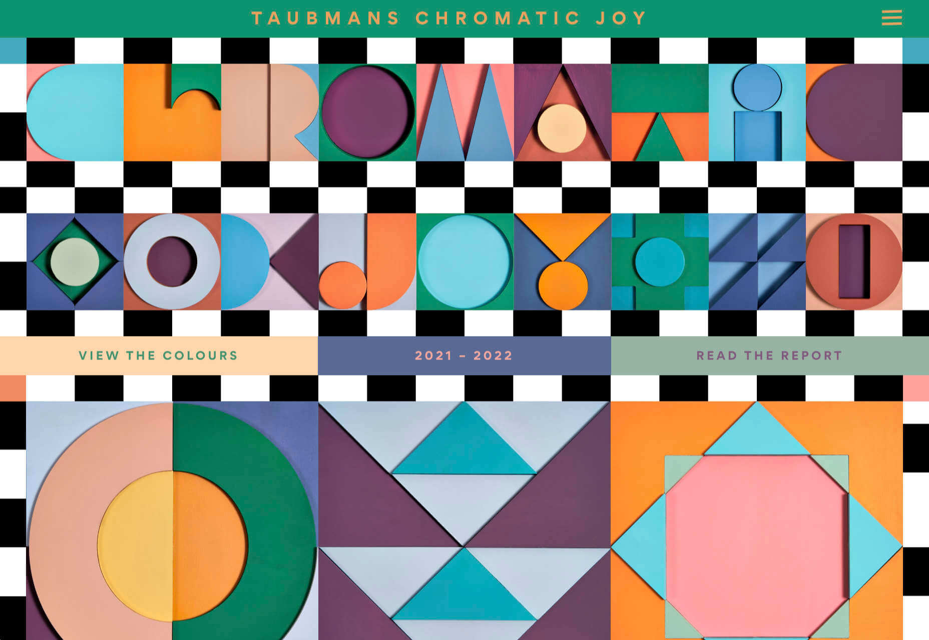
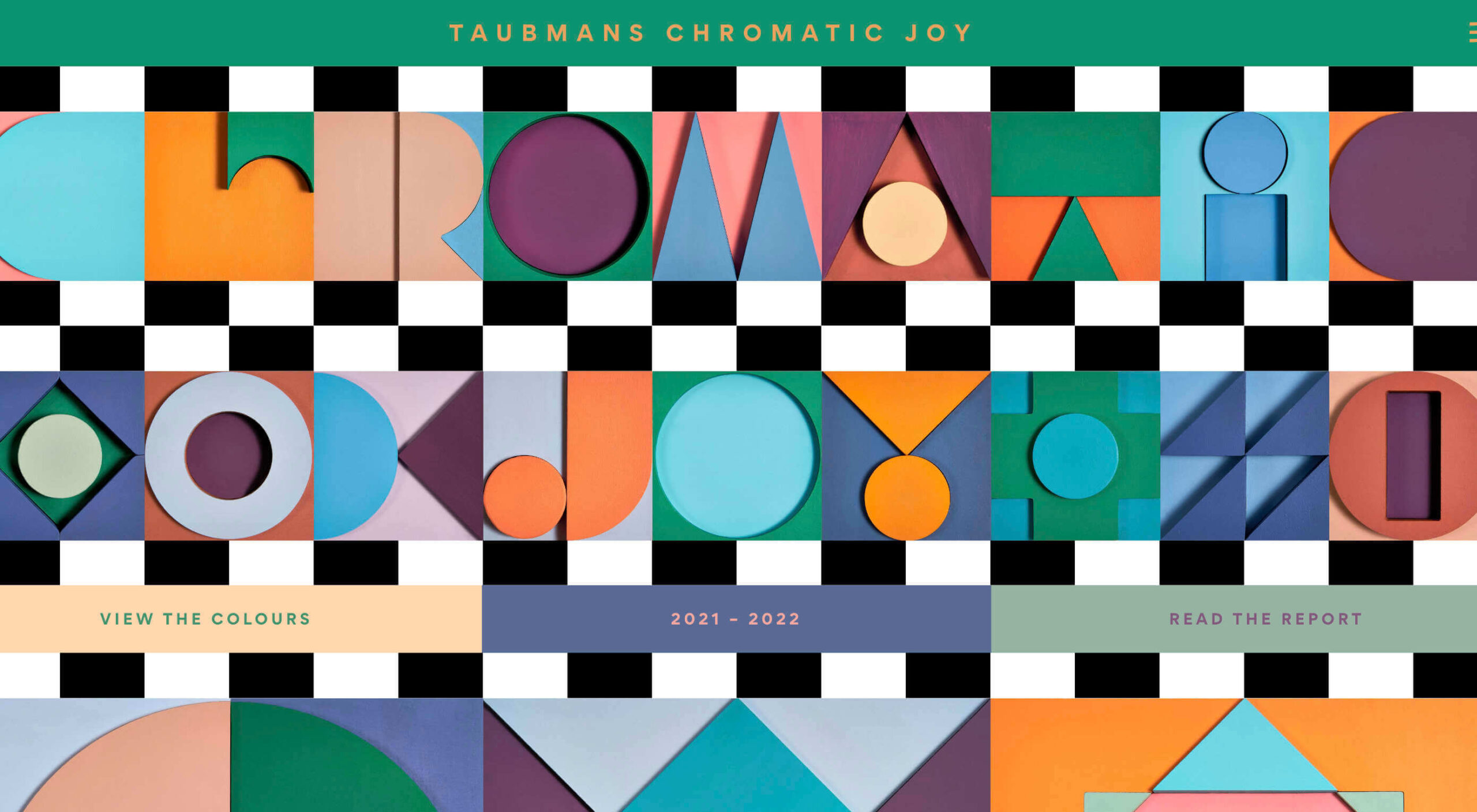
Taubmans Chromatic Joy
This micro-site promoting Taubmans’ new paint color collection is bursting with color and makes a big nod to the Memphis style of the 1980s.
Myriad
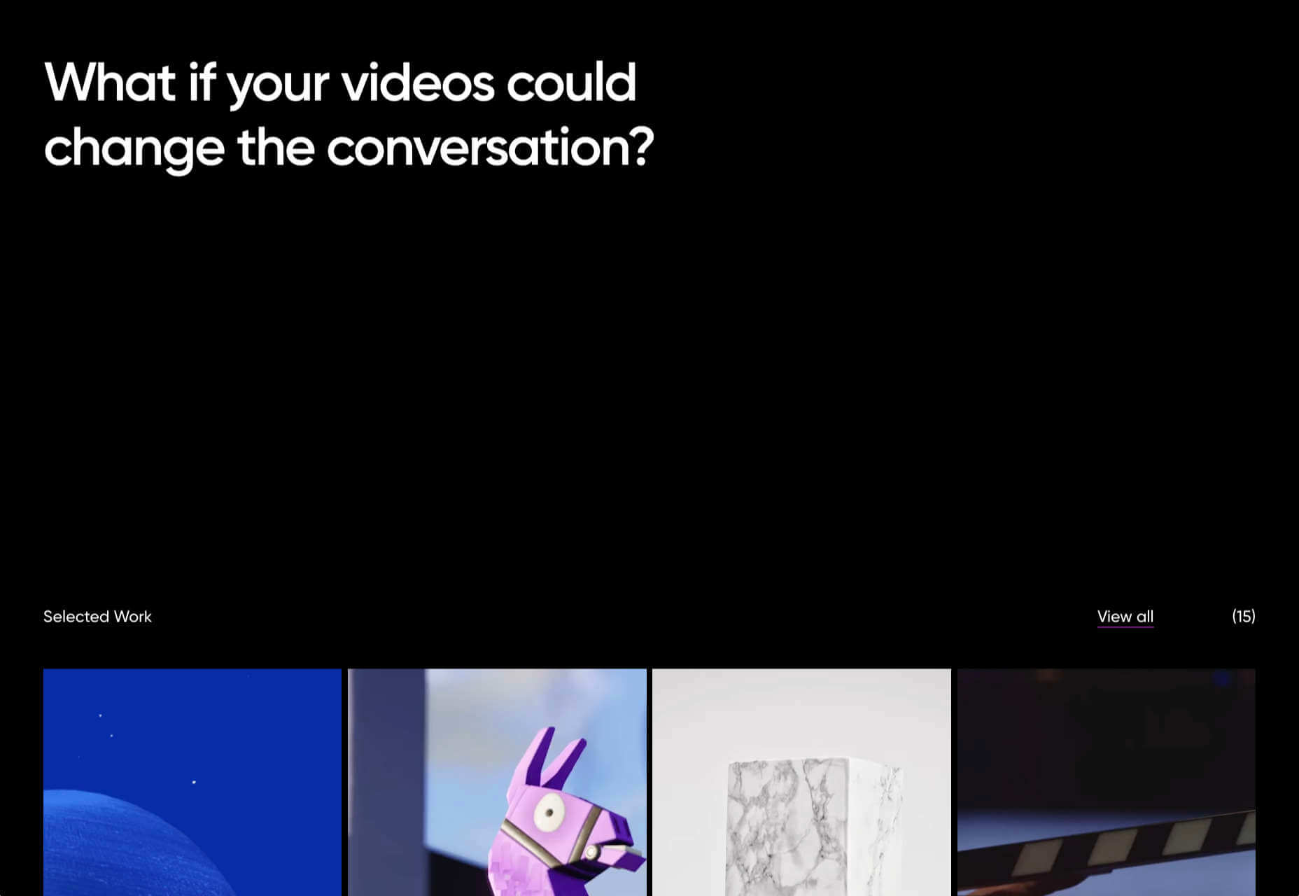
Myriad video production agency’s site uses small amounts of bright colors really well. And they quote Eleanor Shellstrop.
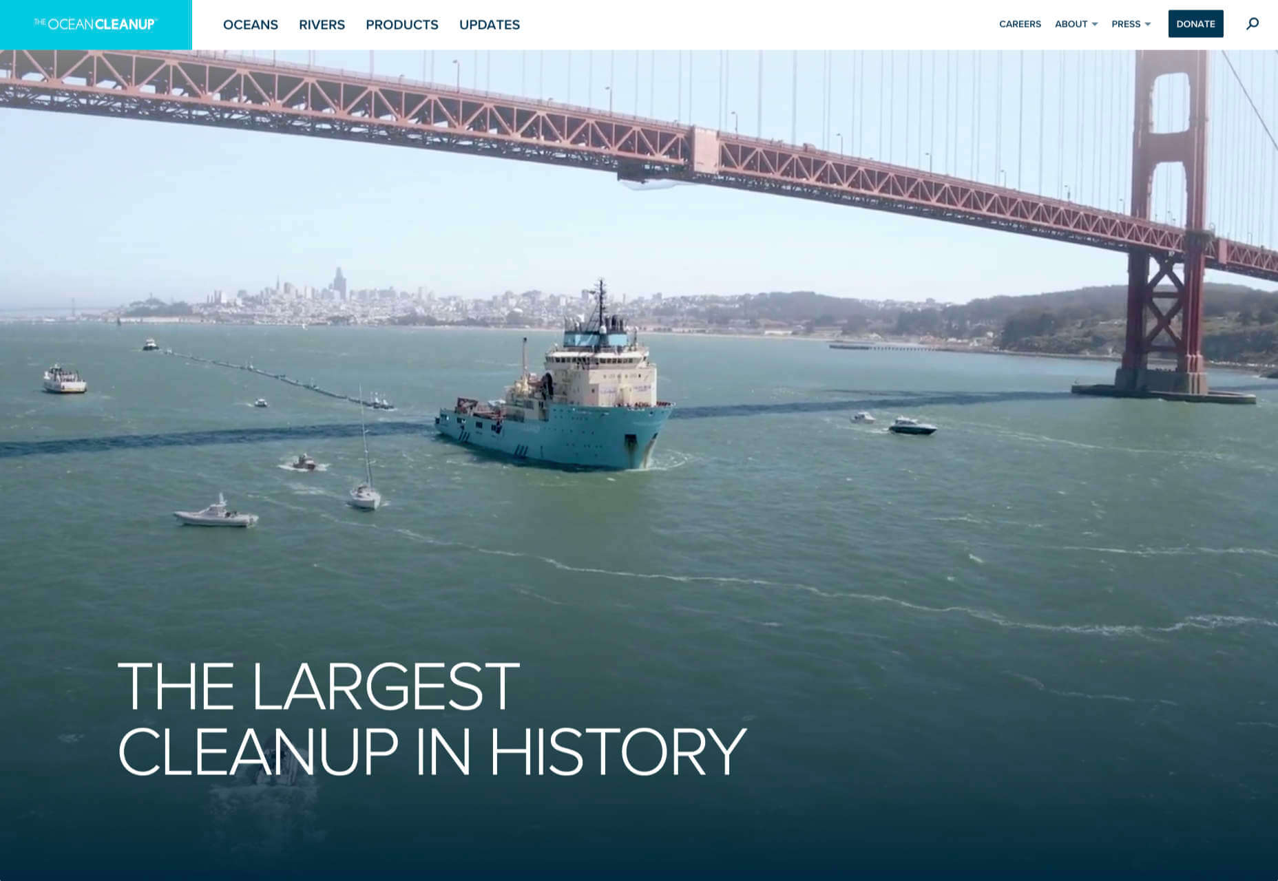
The Ocean Cleanup
Cleaning all the plastic crap out of the oceanic garbage patches is a grim job, but it’s getting done, and The Ocean Cleanup site explains how and why in a not grim way.
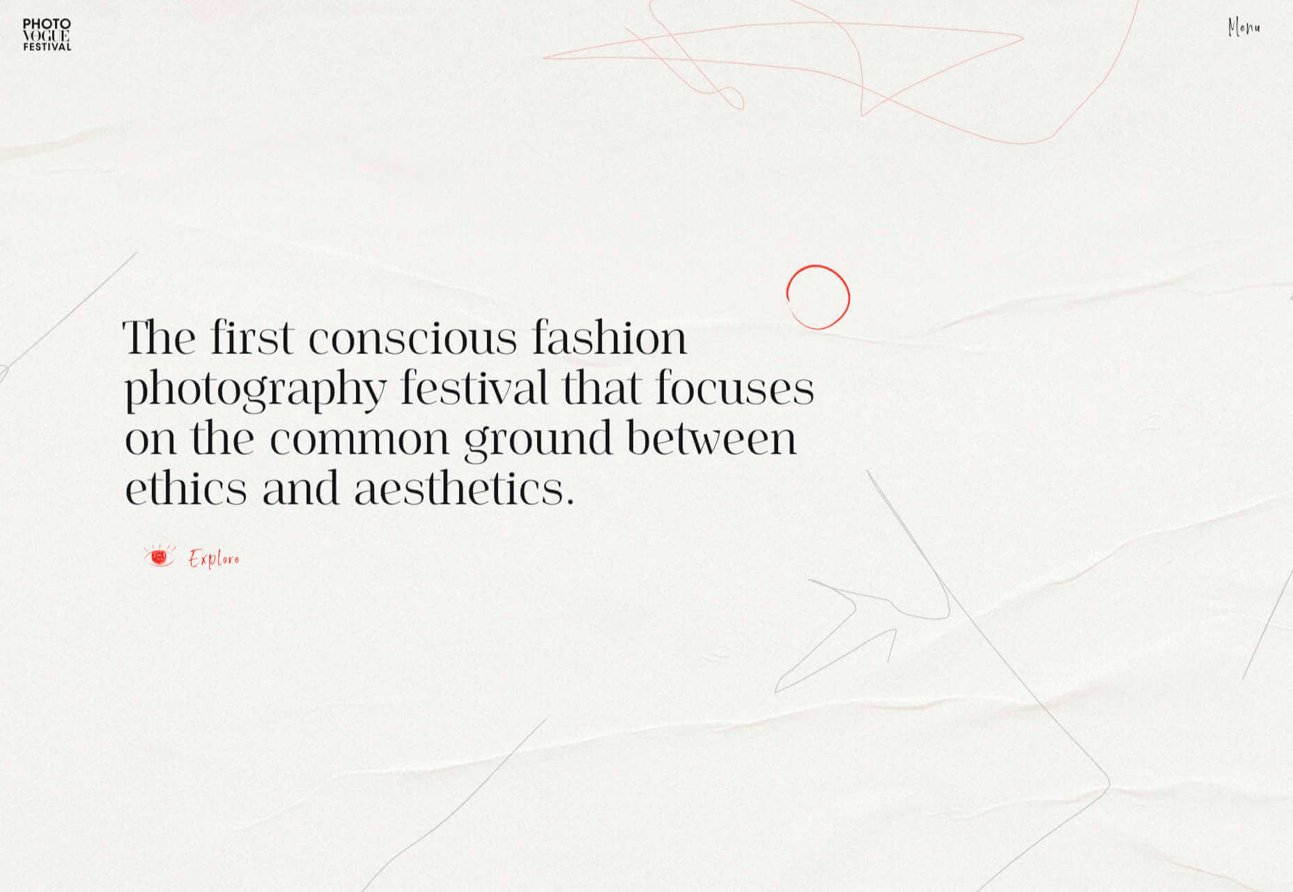
Photo Vogue Festival
This site displaying the work and talks from Vogue Italia’s 2020 Photo Festival mixes a hand-drawn style with clean type and a strong grid.
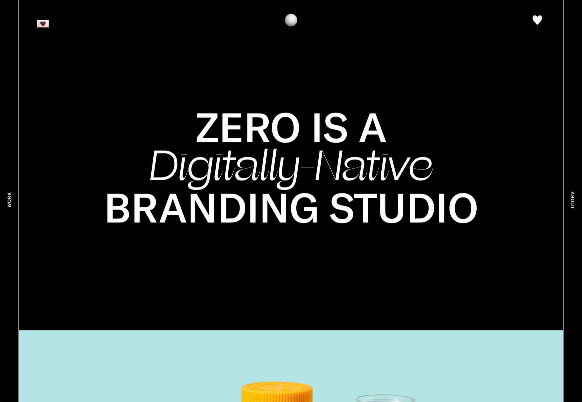
Zero
Zero is a digital branding agency. Their site is glossy with lots of high-quality images, smooth transitions, and a clear structure. The background options are a fun touch.
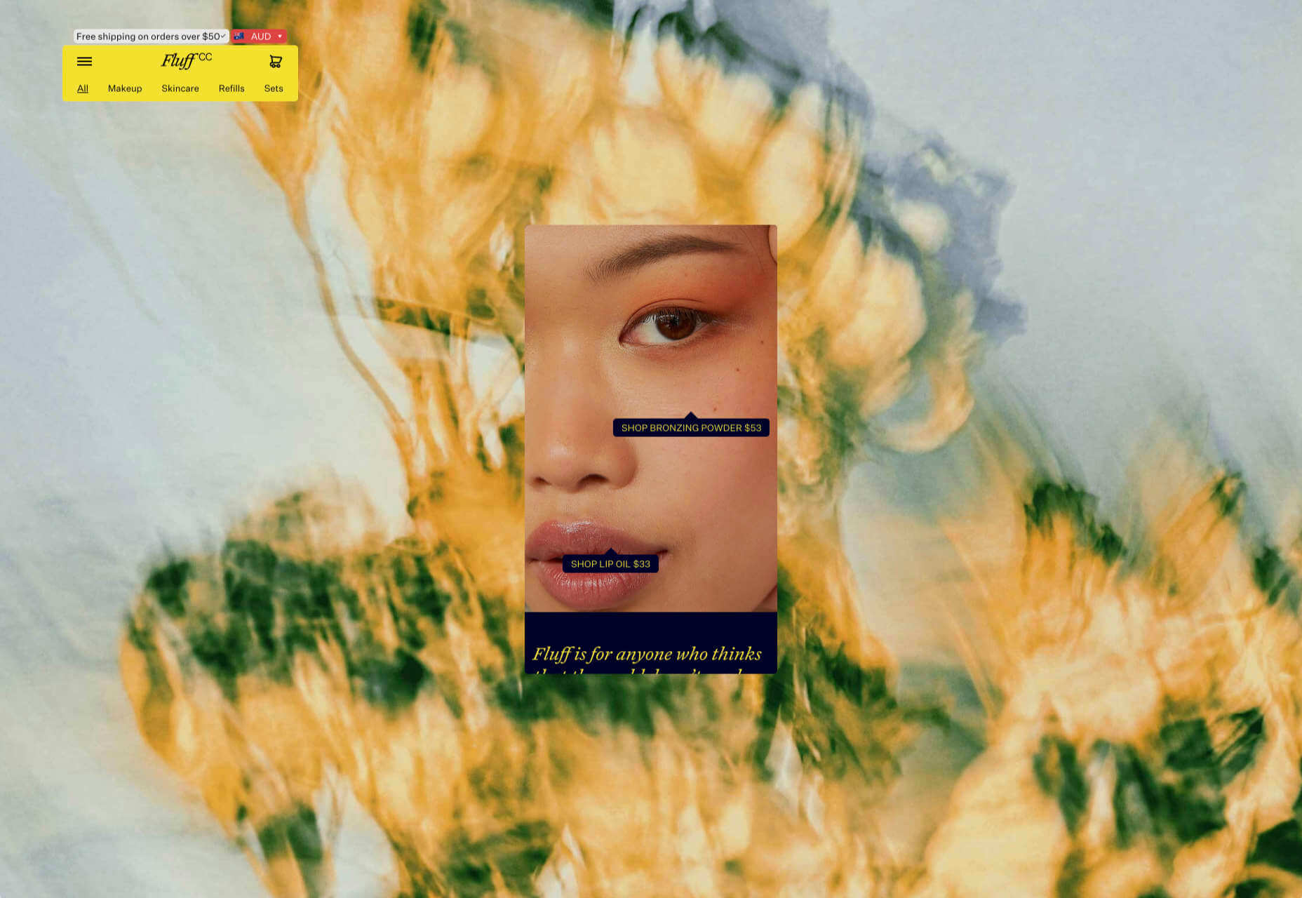
Fluff
This site for cosmetics brand Fluff takes an old school approach to designing for different viewports — sticking a fullscreen background behind your mobile view for desktop sounds like a terrible idea, but here it works.
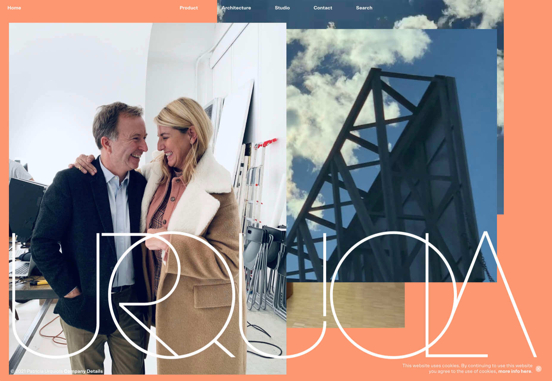
Patricia Urquiola
The new site for Patricia Urquiola design studio is bright, bold, and assured, inspiring confidence.
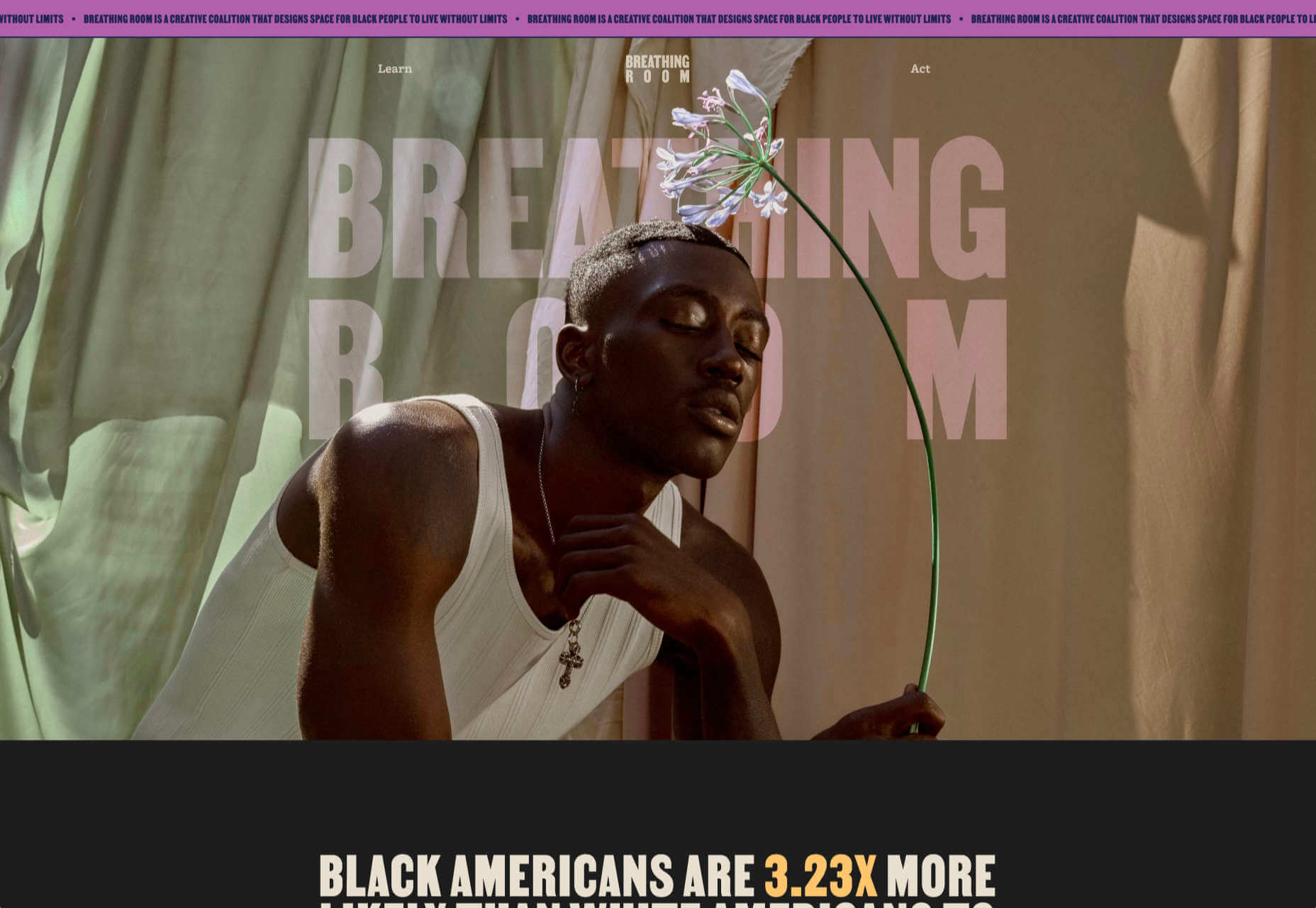
Breathing Room
Breathing Room describes itself as a volunteer creative coalition that designs spaces for black people to live without limits through art, design, and activism. The design radiates confidence and optimism.
A Year in Review
A microsite from Milkshake Studio, highlighting their work over the past year. Some good scrolling animation.
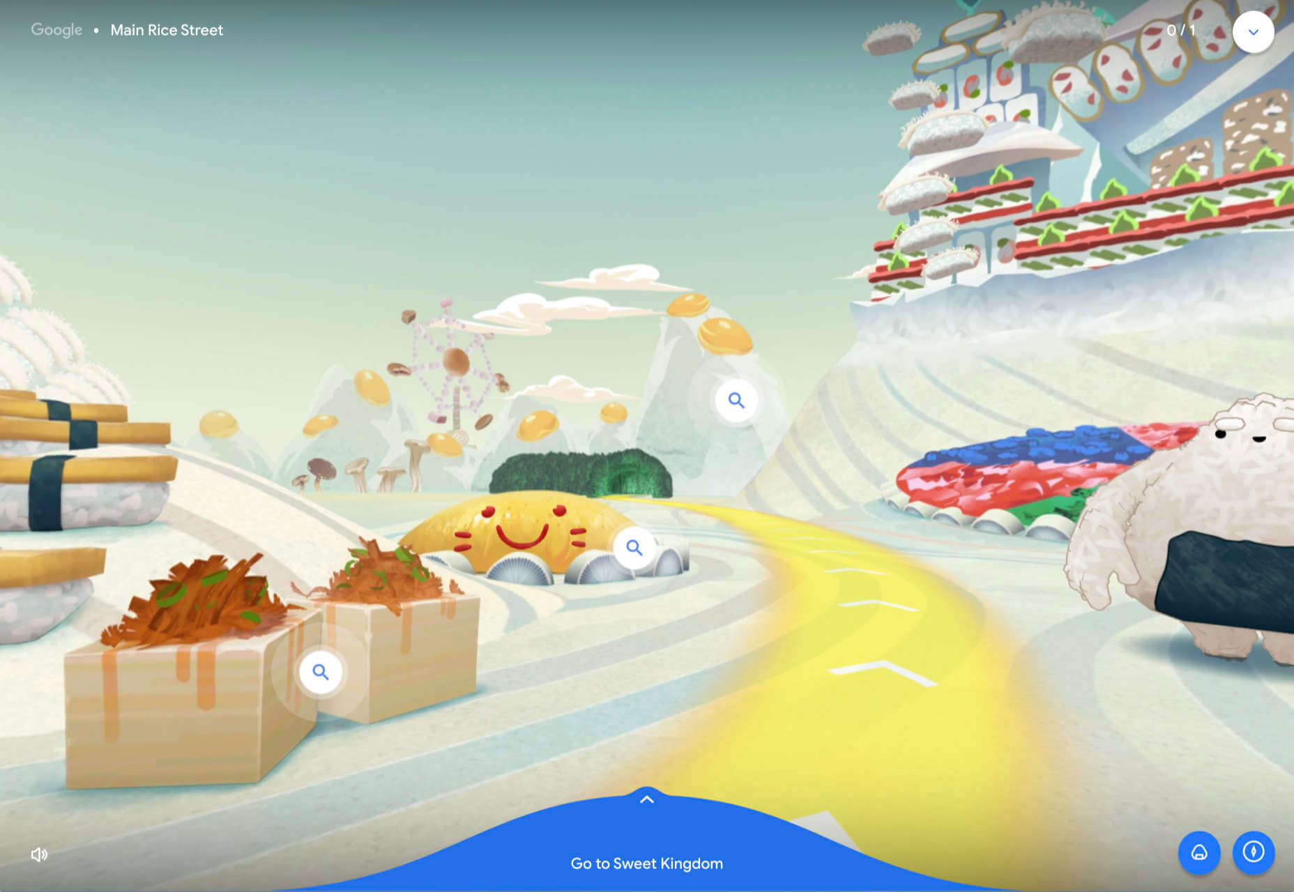
Umamiland
Umamiland is an animated interactive introduction to Japanese food, with links to Google search results for individual items or where to get them.
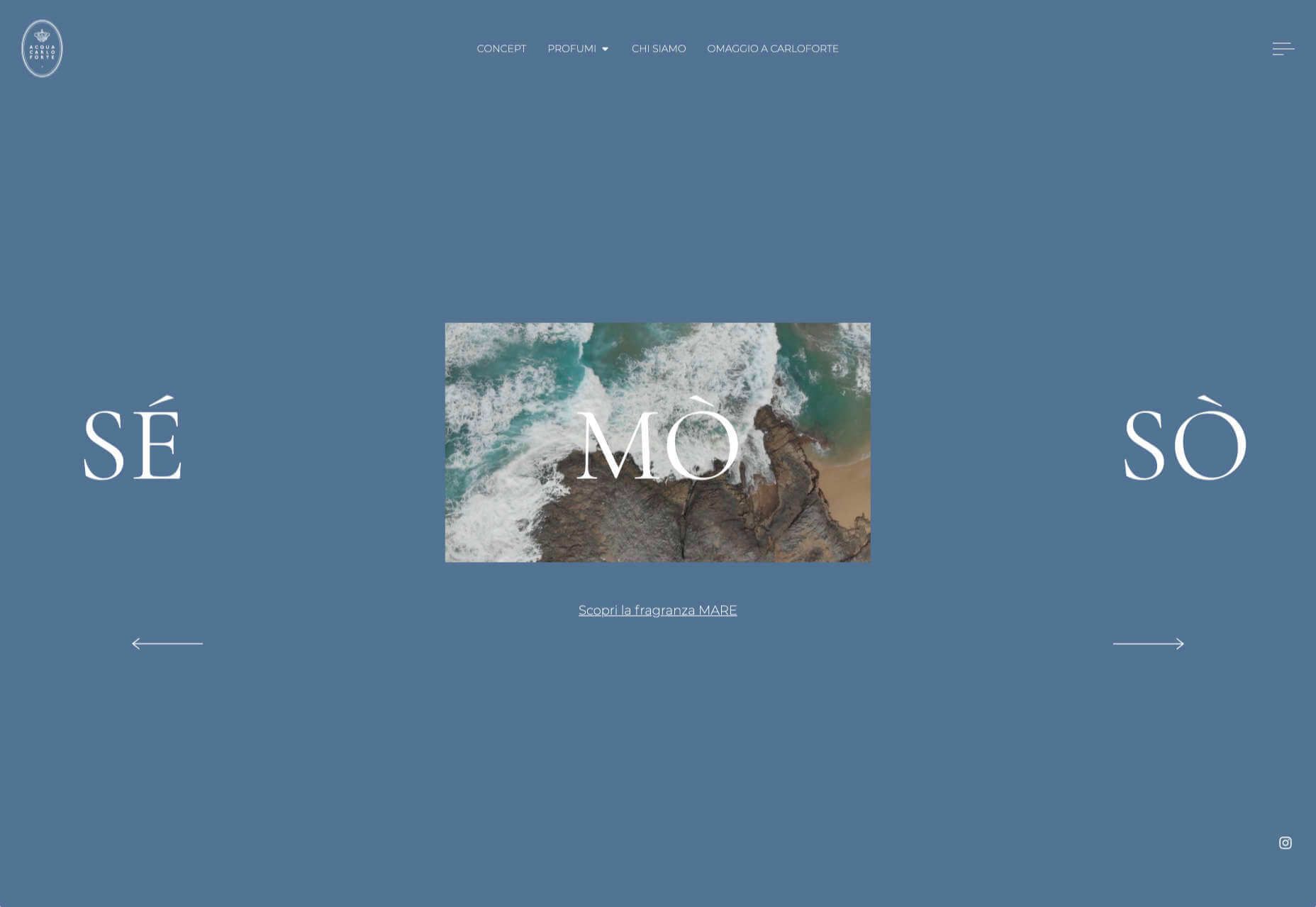
Acqua Carloforte
Carloforte is the town on the island of San Pietro, near Sardinia, and the scents of the island inspire the perfumes of Acqua Carloforte. Cue beautiful photography.
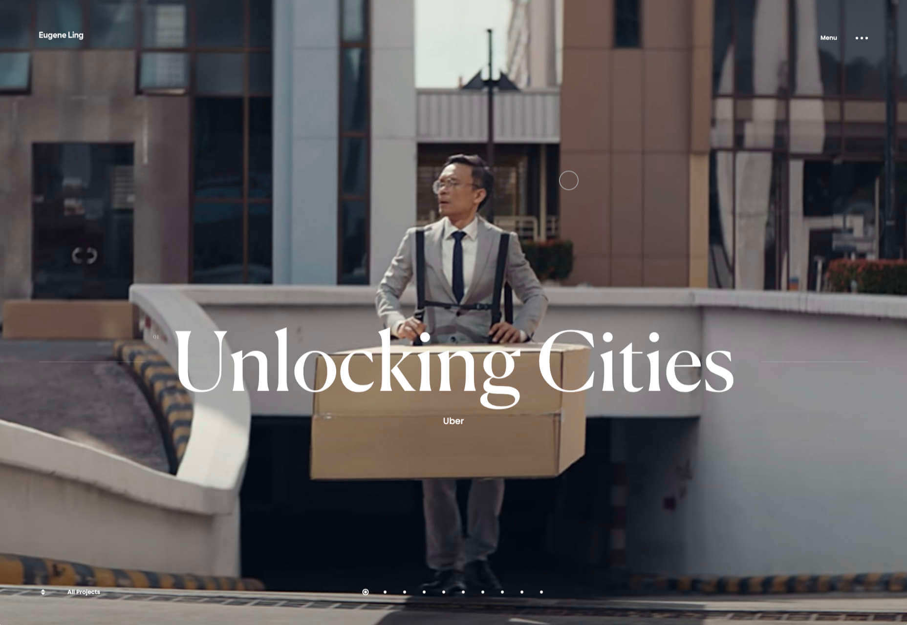
Eugene Ling
Eugen Ling’s portfolio site is simple and straightforward with little or no marketing-speak and a lovely, understated slider transition.
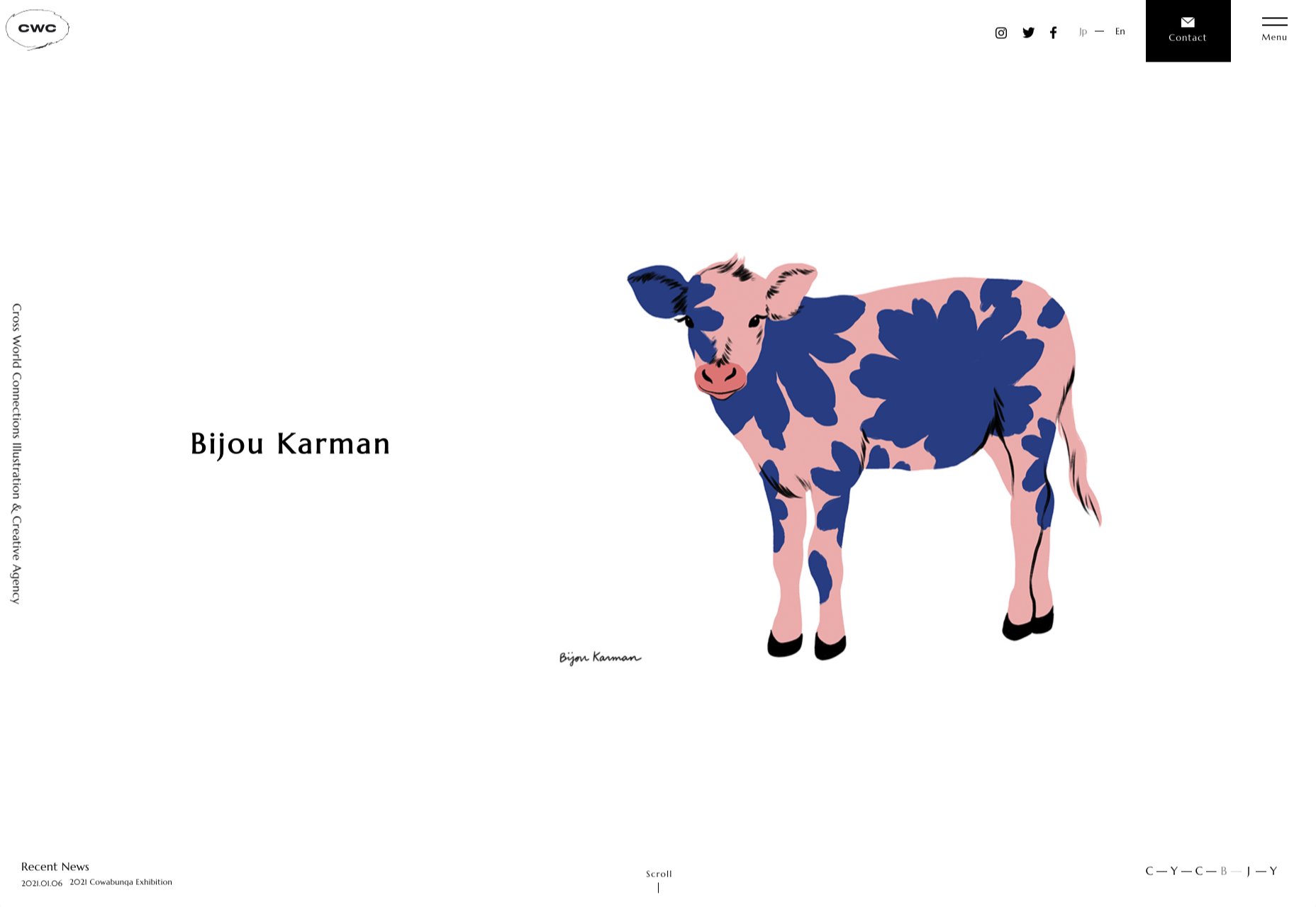
CWC Tokyo
Cross World Connections is an Illustration and Creative Agency based in Japan and represents illustrators from all over the world.
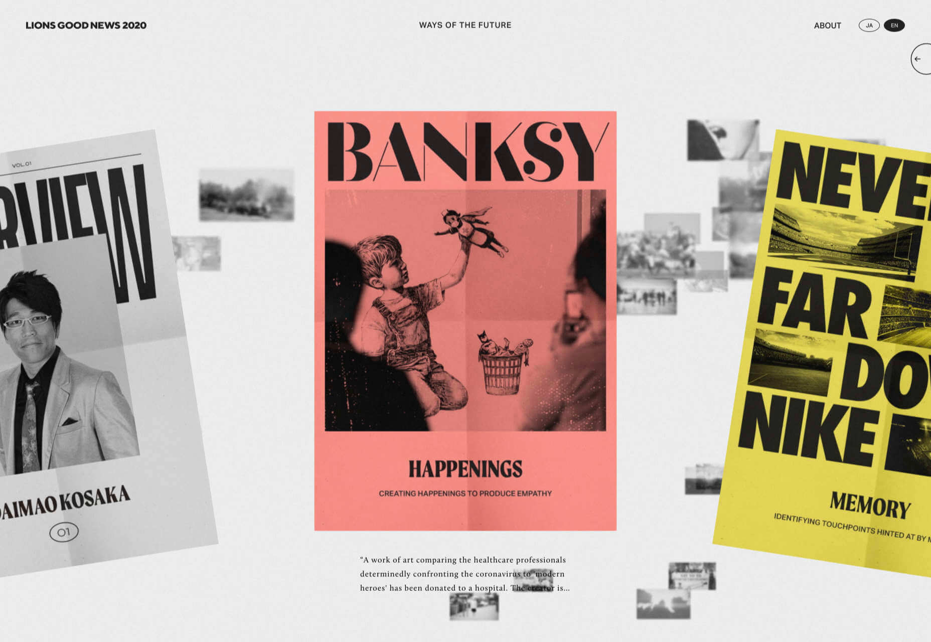
Lions Good News
Following the cancellation of the Cannes Lions Festival of Creativity in 2020, this site was set up to highlight good news in creativity during the pandemic. A carousel of paper flyers forms the main navigation and creates a lo-fi, DIY feel.
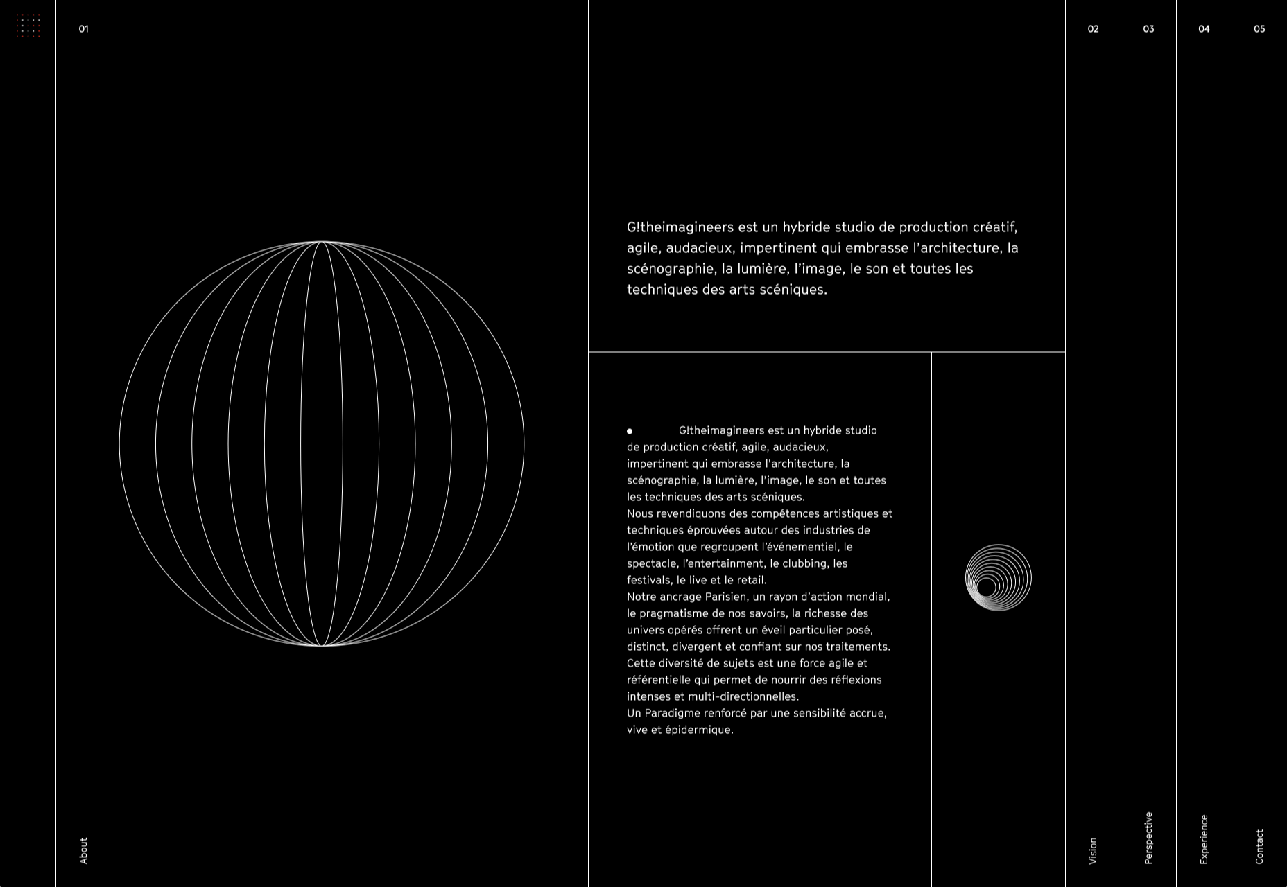
G!theimagineers
G!theimagineers is a production studio for events and entertainment. White lines on black, horizontal concertina navigation, and lots of circles.
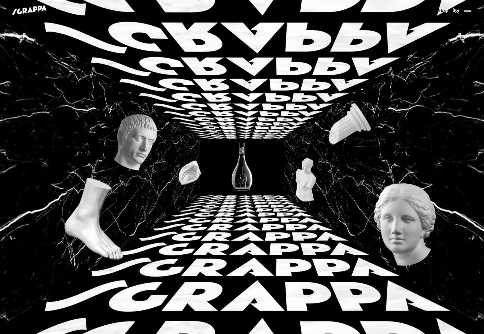
Sgrappa
Sgrappa is handmade grappa with attitude, and this site has an uncompromising, in your face vibe.
https://ankaa-pmo.com/wp-content/uploads/2021/01/20-best-new-websites-january-2021.jpg14082560Service comm.https://ankaa-pmo.com/wp-content/uploads/2017/04/Logo-Ankaa-engineering.pngService comm.2021-01-25 11:45:412021-01-25 11:45:4120 Best New Websites, January 2021
Paramètres des cookies et politique de confidentialité
Comment nous utilisons les cookies
Nous utilisons les cookies pour nous faire savoir quand vous visitez nos sites Web, comment vous interagissez avec nous, pour enrichir votre expérience utilisateur et pour personnaliser votre relation avec notre site Web.
Cliquez sur les différents titres de catégories pour en savoir plus. Vous pouvez également modifier certaines de vos préférences. Notez que le blocage de certains types de cookies peut avoir un impact sur votre expérience sur nos sites Web et les services que nous sommes en mesure d'offrir.
Cookies essentiels sur ce site
These cookies are strictly necessary to provide you with services available through our website and to use some of its features.
Because these cookies are strictly necessary to deliver the website, you cannot refuse them without impacting how our site functions. You can block or delete them by changing your browser settings and force blocking all cookies on this website.
Cookies Google Analytics
Ces cookies recueillent des renseignements qui sont utilisés sous forme agrégée pour nous aider à comprendre comment notre site Web est utilisé ou l'efficacité de nos campagnes de marketing, ou pour nous aider à personnaliser notre site Web et notre application pour vous afin d'améliorer votre expérience.
Si vous ne voulez pas que nous suivions votre visite sur notre site, vous pouvez désactiver le suivi dans votre navigateur ici :
Autres services
Nous utilisons également différents services externes comme Google Webfonts, Google Maps et les fournisseurs externes de vidéo. Comme ces fournisseurs peuvent collecter des données personnelles comme votre adresse IP, nous vous permettons de les bloquer ici. Veuillez noter que cela pourrait réduire considérablement la fonctionnalité et l'apparence de notre site. Les changements prendront effet une fois que vous aurez rechargé la page.
.
Paramètres de Google Webfont Settings :
Google Map :
Vimeo et Youtube :
Politique de confidentialité
Vous pouvez lire nos cookies et nos paramètres de confidentialité en détail sur la page suivante

 We’re rounding up the week with a fun quiz for anyone who loves fonts. You’ve seen these typefaces used in hundreds of designs — from presidential campaigns, to corporate branding — but do you know who crafted those curves?
 This month’s collection contains a combination of big and bold, and clean and minimal. Although basic minimalism is still trendy, with lots of white space and greyscale type, we are seeing it softened with color. This is implemented differently, ranging from hints of off-whites in images to gentle pastels as section backgrounds.
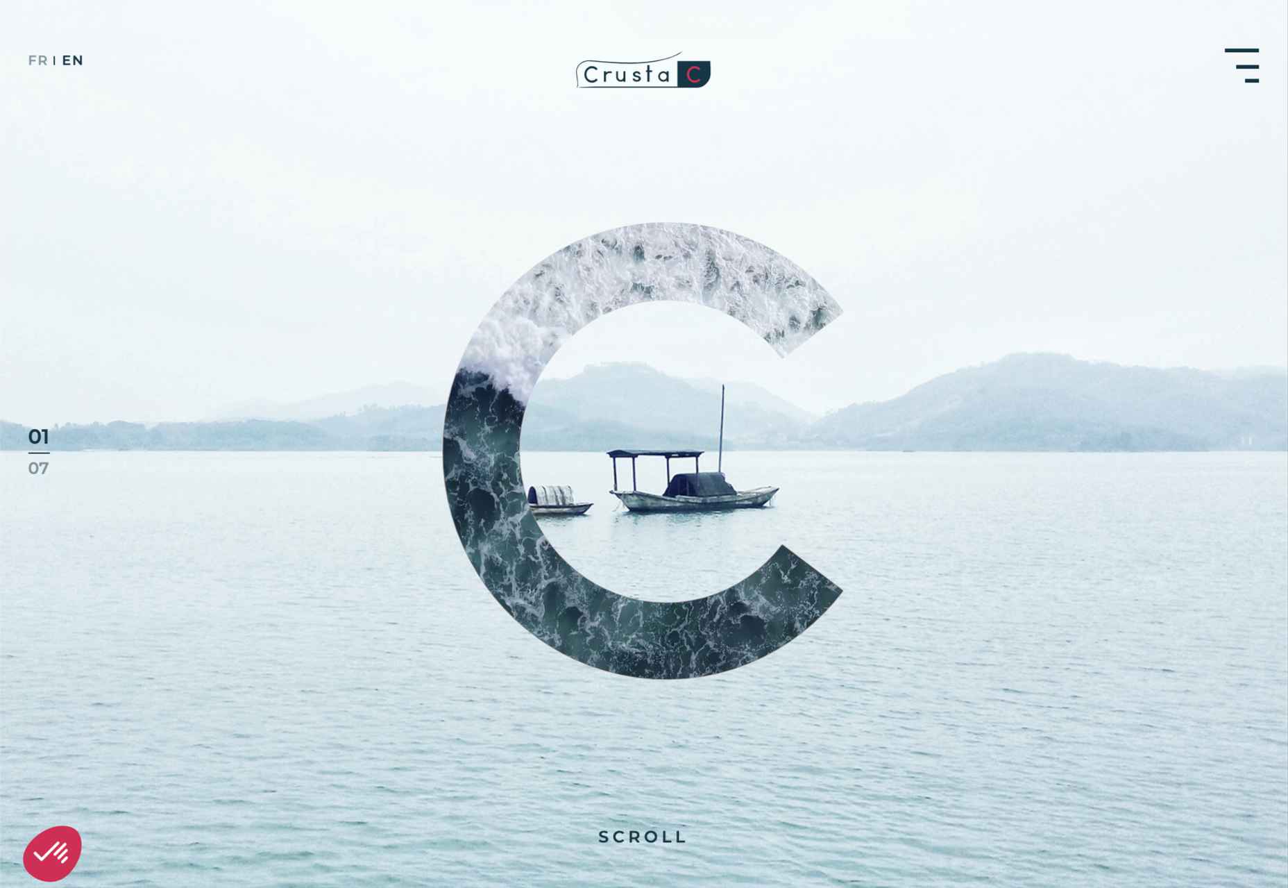

 Ten years ago, people began talking about the “Independent Web.” Although we don’t commonly use the term anymore, that doesn’t mean that it’s not still as vital a topic of discussion today as it was a decade ago.

 A domain name is an essential element of every project, product, and company. It’s central to a brand and has a disproportionately large impact on user experience. Not only that, but it also impacts SEO and ultimately revenue.
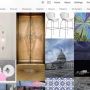
 Looking for something new to get you excited about design work? This list is packed with all kinds of goodies to help you feel inspired and ready to work.
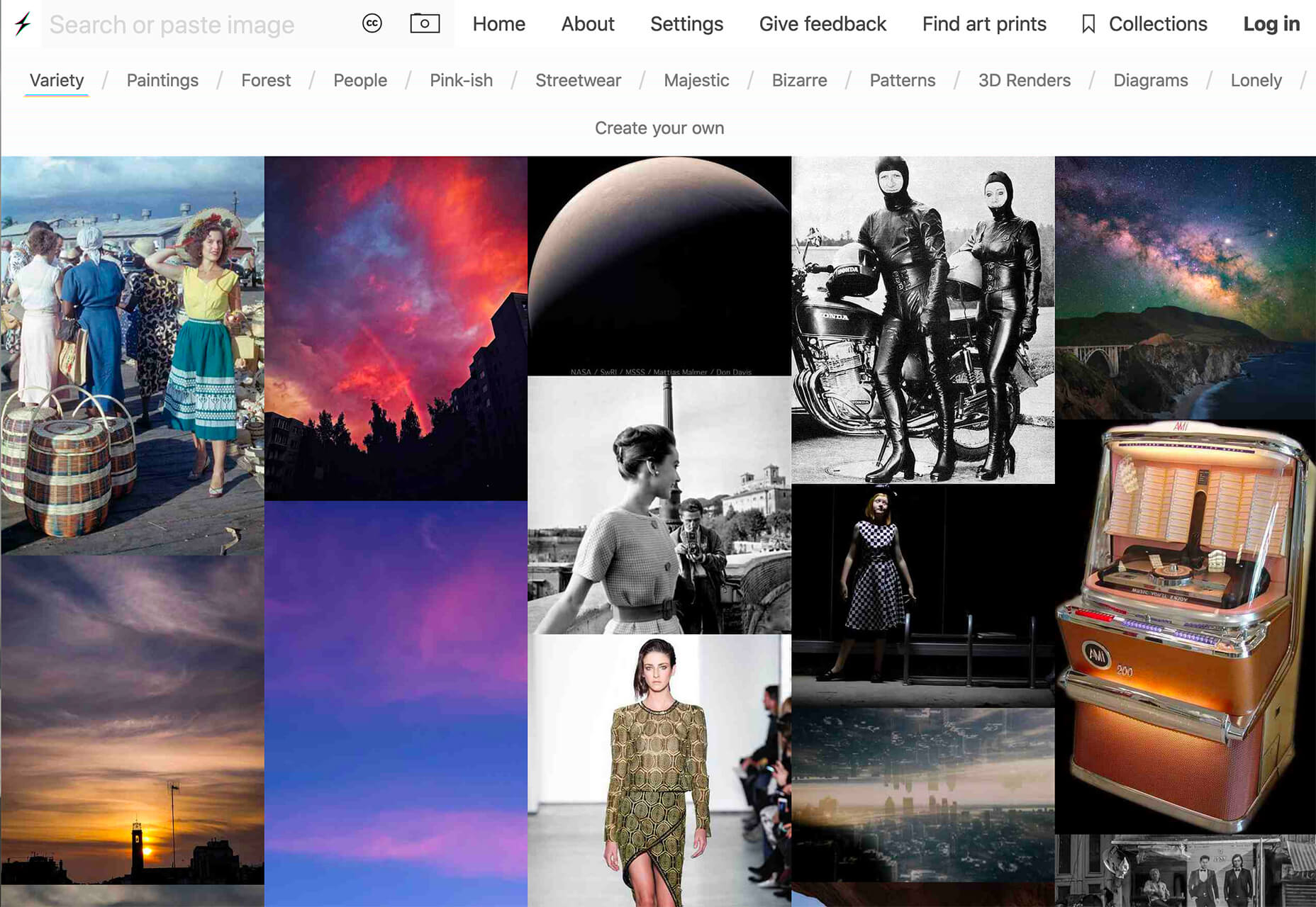
 Everyday design fans submit incredible industry stories to our sister-site,
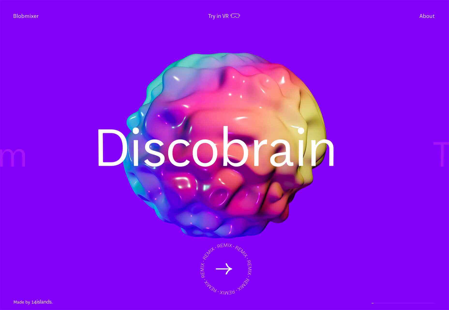


 This article is brought to you by
 If you’re here, then you’re thinking about becoming a web designer and wondering if it’s a smart move.
 Here we are into a brand new year, and although we’re far from out of the woods yet, there is a feeling of renewed hope on many fronts.