
 The design world fluctuates back and forth, swerving between love and hate for different design trends. Sometimes we see a wide range of approaches, and sometimes designers all hop on the same idea.
This month, the web is dominated by animation. Designers are cramming in motion in unexpected ways. And it’s fun to explore. Here are 20 of the best new sites on the web this month. Enjoy!
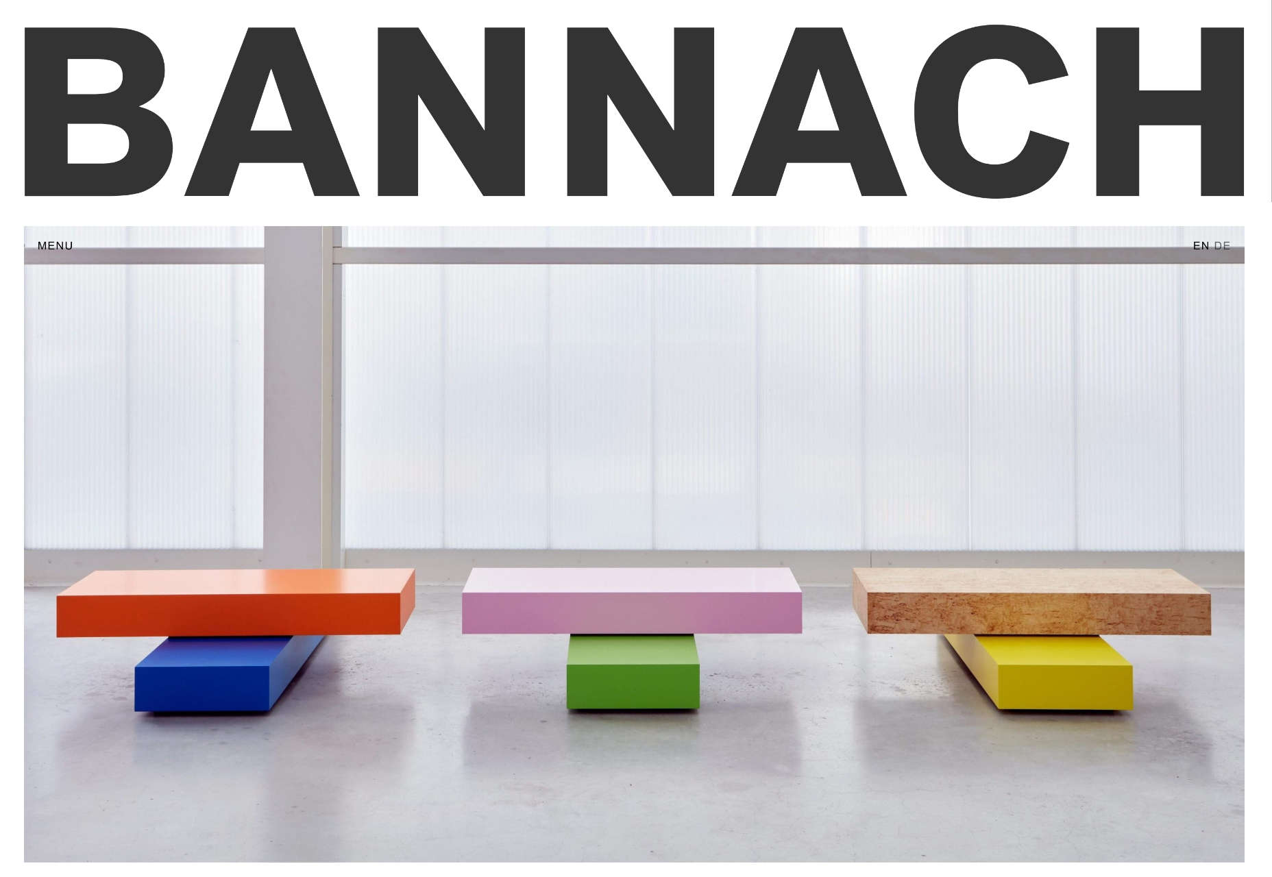
Bannach
Bannach is a German furniture brand. Its products are colorful and geometric, so it makes sense that when you scroll down to the collection, the thumbnails begin as pixel blocks and animate into product photography.
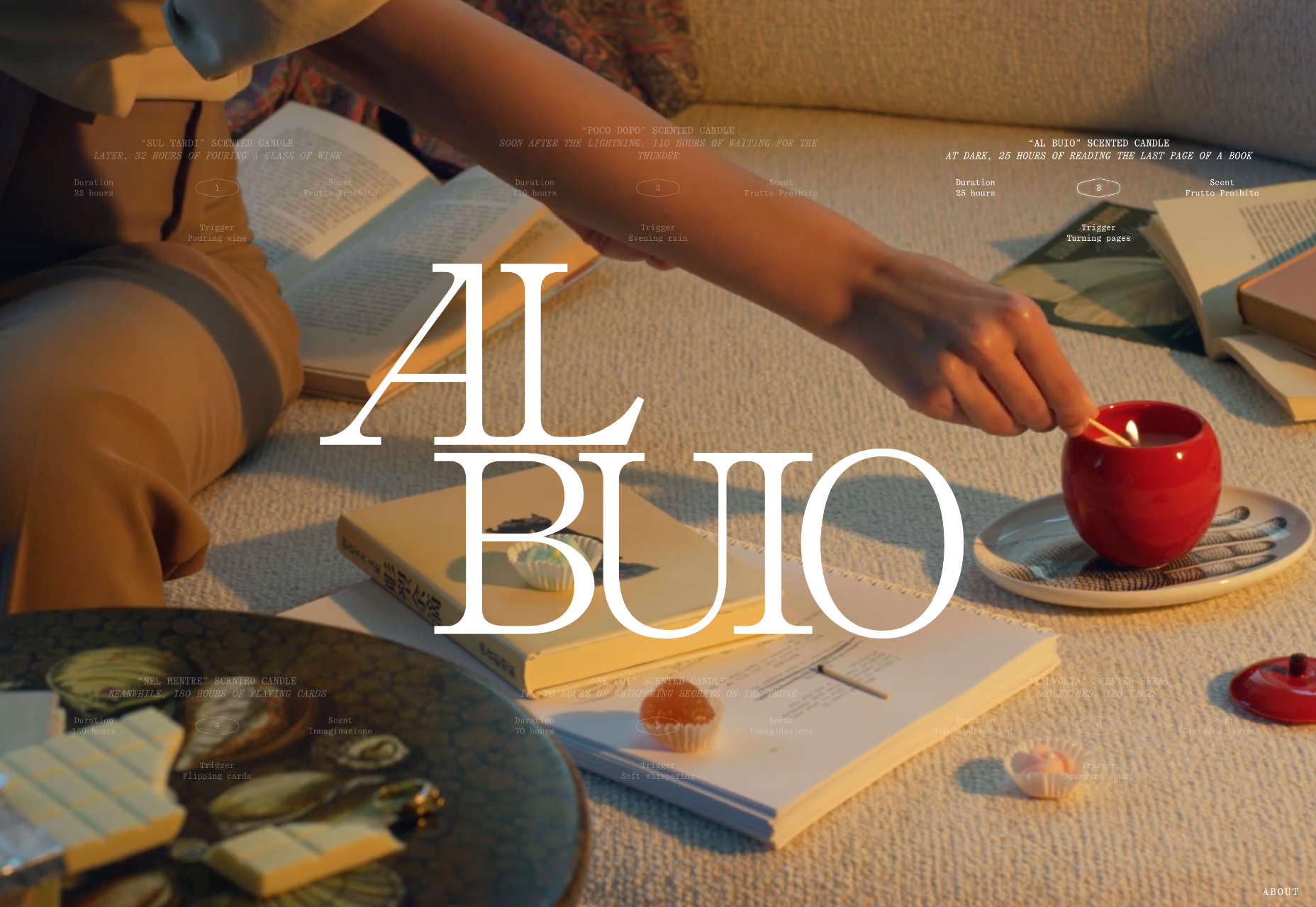
Fornasetti Profumi
Fornasetti Profumi takes a different approach to motion. It uses video to emphasize stillness to promote the calming qualities of its candle products.
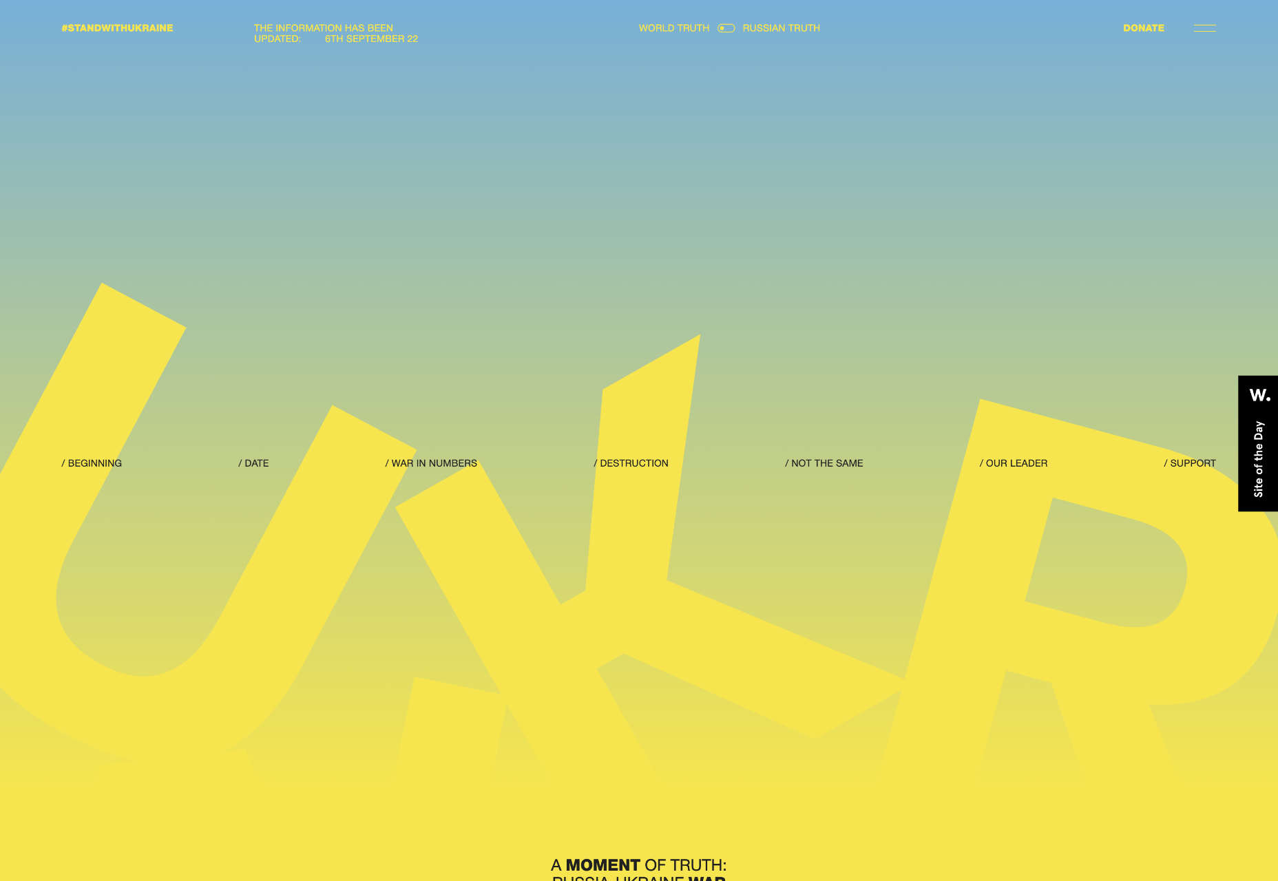
The Other Side of Truth
The Other Side of Truth is a superb exercise in utilizing the web for a cause. It presents facts on the Russia-Ukraine war, but the standout feature is the toggle switch that, instead of light mode-dark mode, toggles facts and Russian state propaganda.
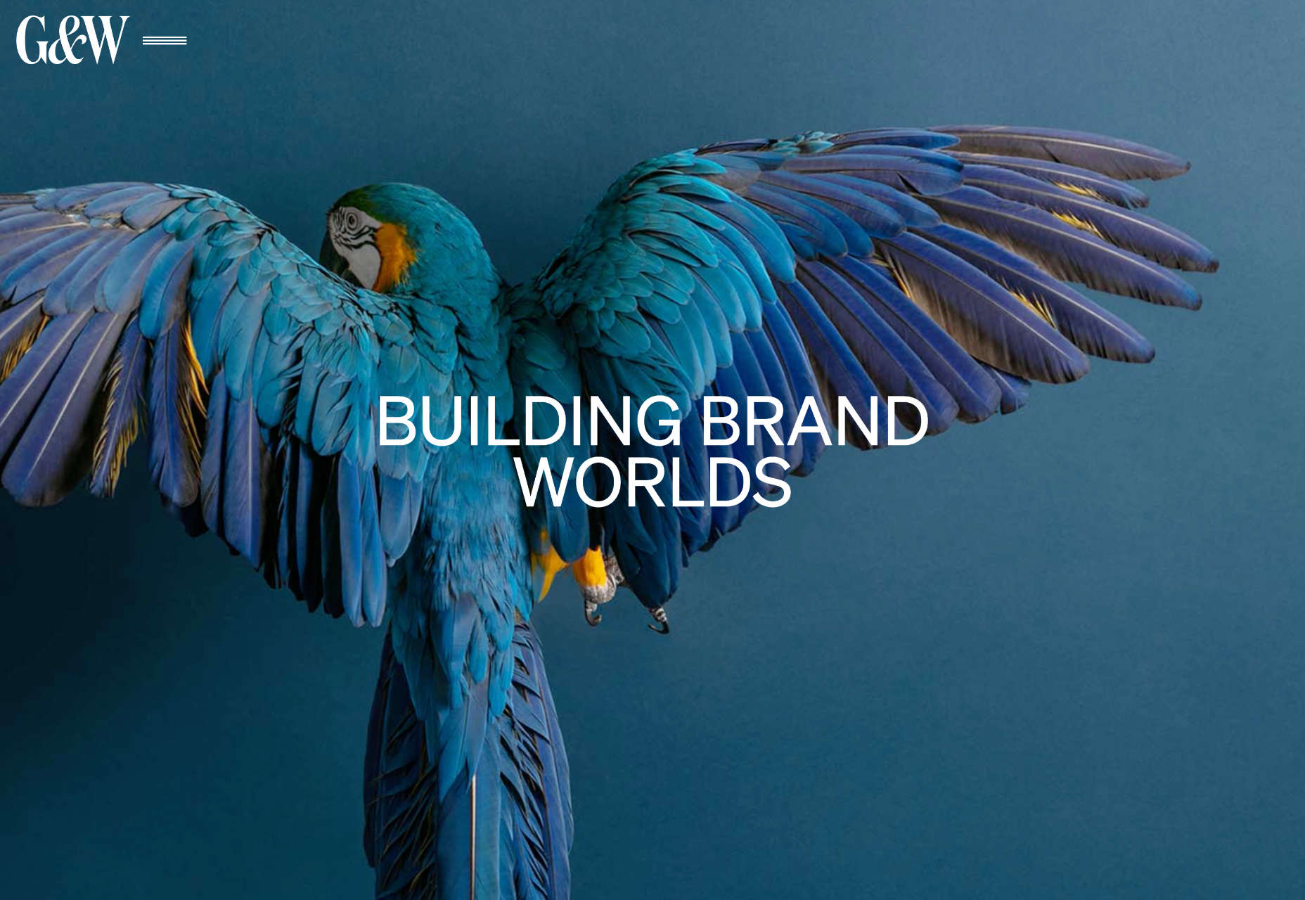
Glasfurd & Walker
Glasfurd & Walker is a portfolio site for a design agency. So far, so standard. However, it sets itself apart because it’s slightly bigger than the browser and swerves left and right with your mouse movement.
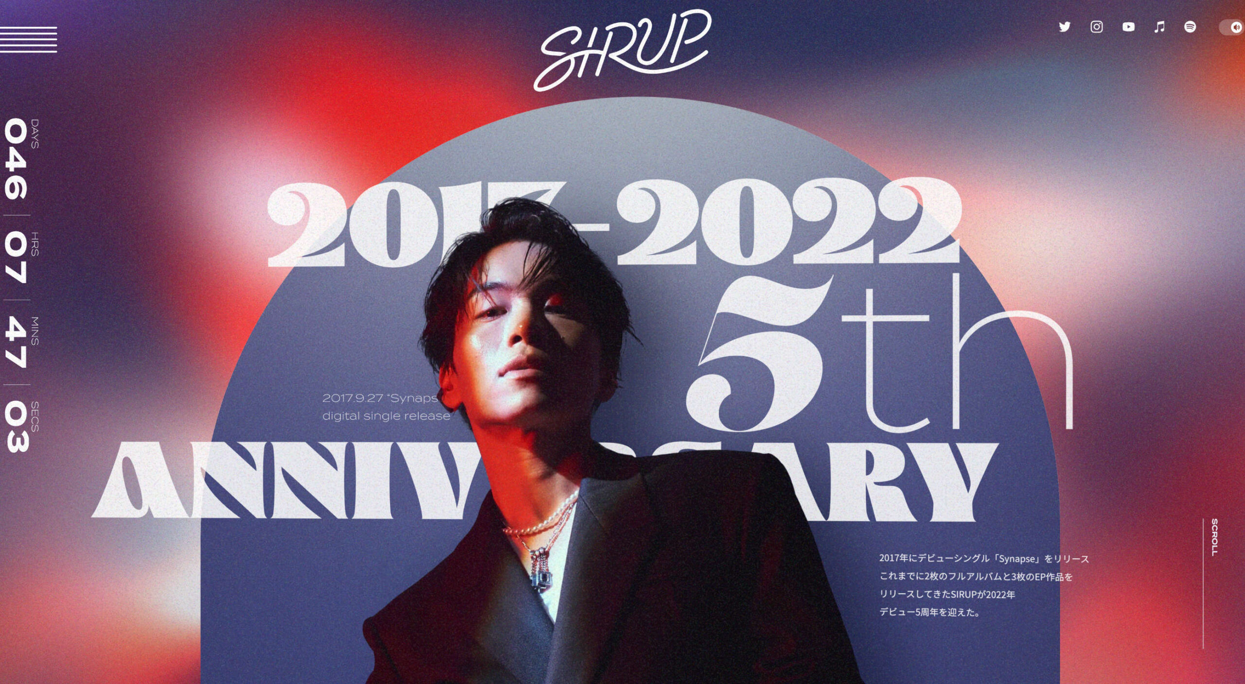
Sirup 5th Anniversary
Sirup is a Japanese singer-songwriter, and to celebrate the fifth anniversary of his first hit single, his record company has put together this awesome maximalist micro-site that uses type, motion, and art direction to capture his style.

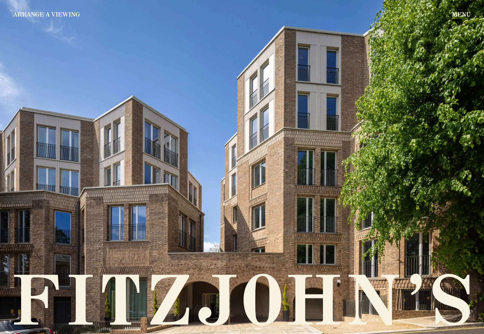
Fitzjohn’s
Fitzjohn’s is a slick site for a new apartment complex in the Hampstead area of London. It uses a refreshing modern color palette and calming animation to take the edge off the frankly ludicrous price tag.
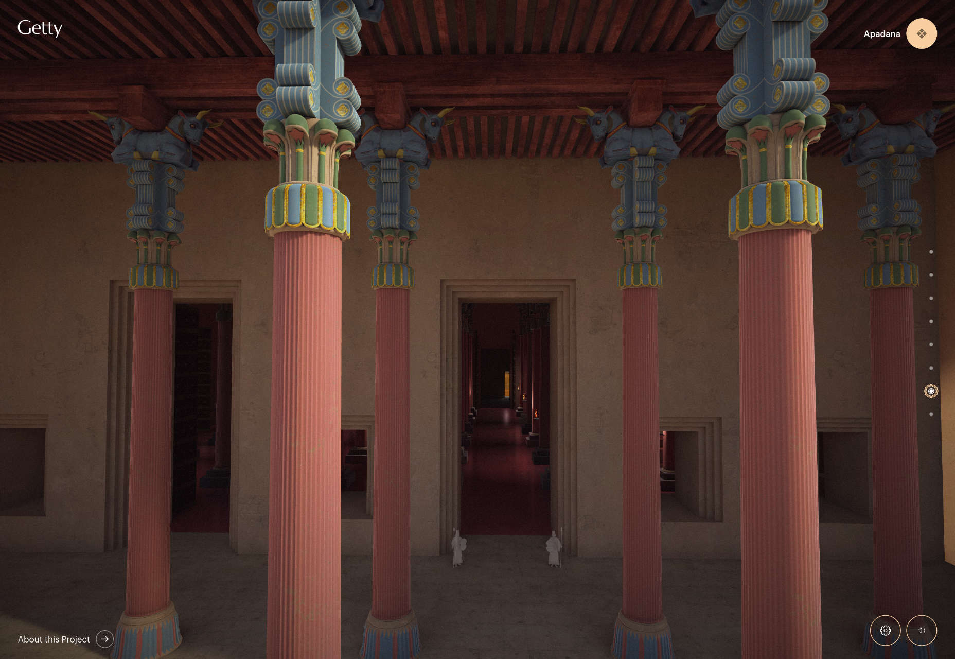
Persepolis Reimagined
Persepolis Reimagined is an awe-inspiring WebGL tour through one of the most important cities in ancient Iran. Make sure you tour it on a large screen. It’s hard not to be wide-eyed with wonder.
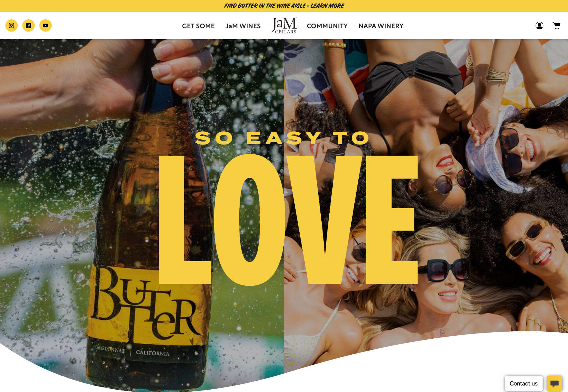
JaM Cellars
JaM Cellars is a Californian wine brand that’s pitching to bachelorette parties. With names like Butter, and Sugar, it’s not the most sophisticated tipple, but yellow, we love a yellow site.
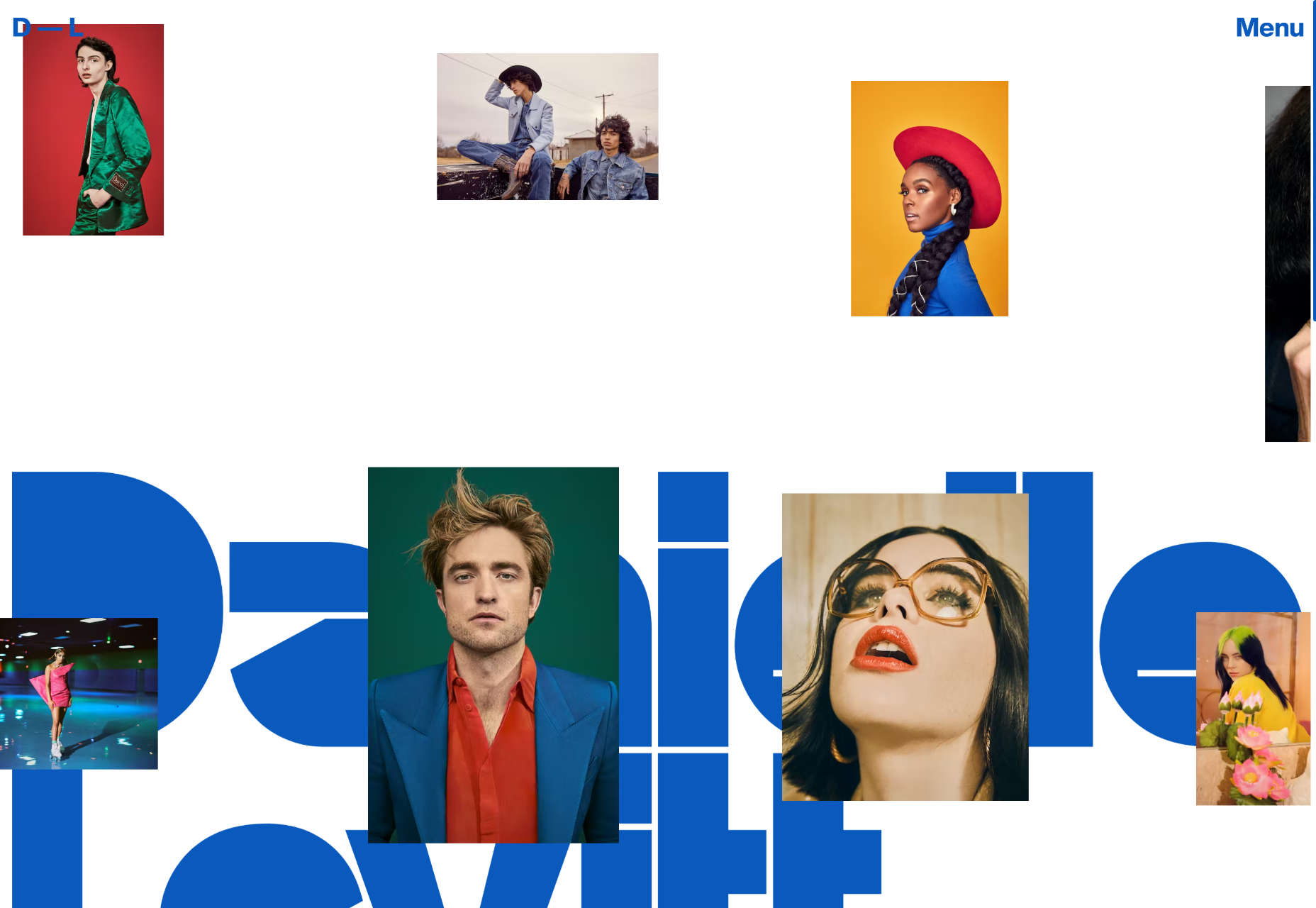
Danielle Levitt
This portfolio site for film director and photographer Danielle Levitt features samples of her best work scrolling past the viewport. There’s a clever switch of thumbnail and background color when you scroll down to the contact details.
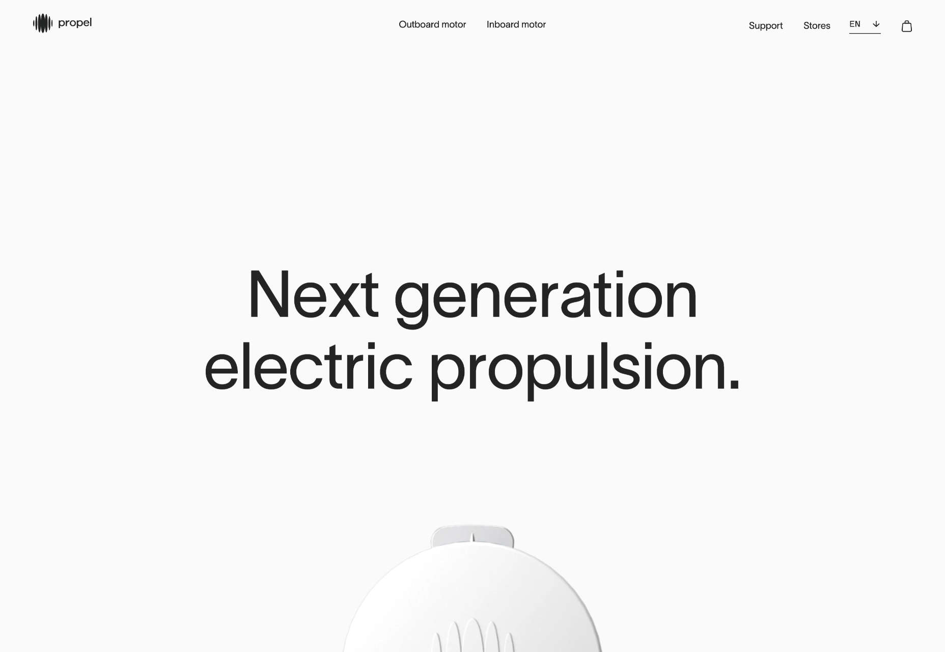
Propel
From total color energy to Apple-levels of minimalism: Propel is a slick, animate-on-scroll site for a marine motor brand selling an outboard and inboard motor. The animated masks on the images are a nice subtle touch.
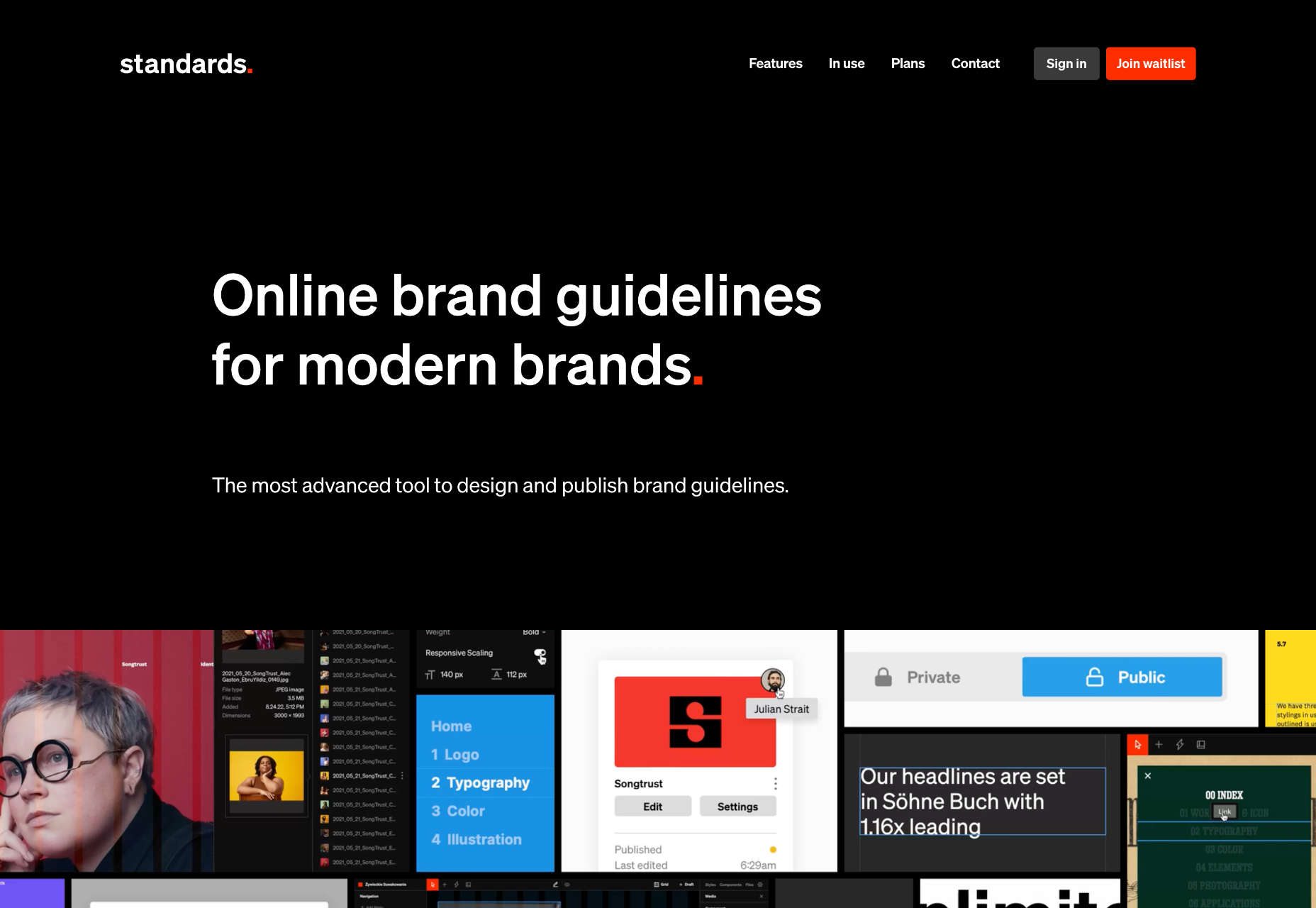
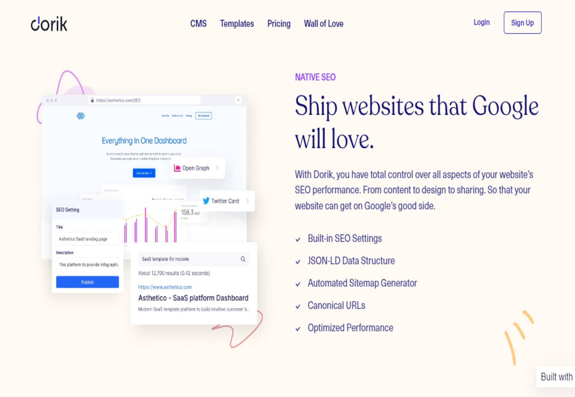
Standards
Standards is a site for a SaaS that helps organizations create, maintain, and share brand guidelines. It uses subtle animation, video of its UI, and compelling copy to sell its approach.
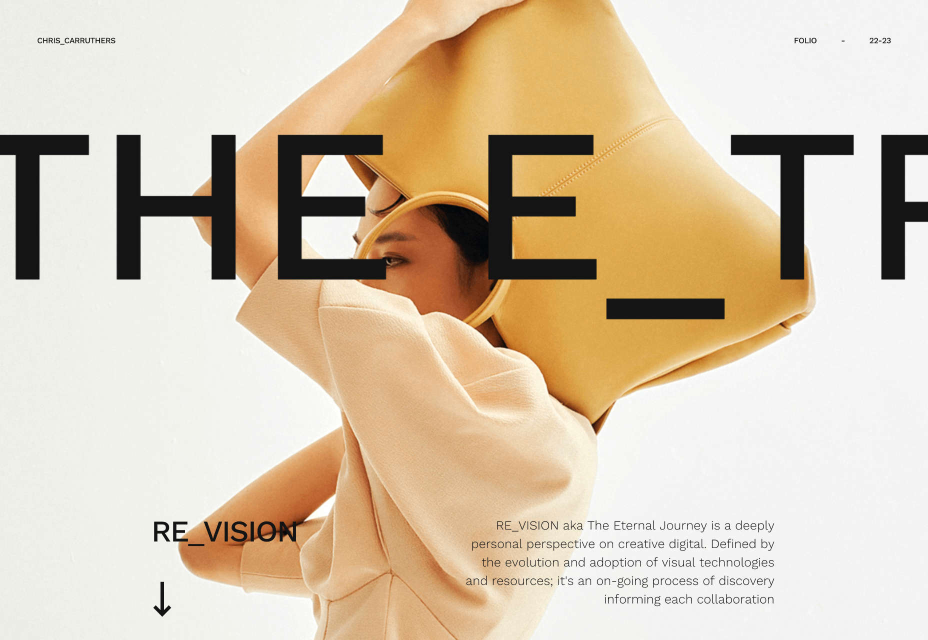
Chris Carruthers
The portfolio site for Chris Carruthers is deliberately self-indulgent with scrolling text, clipped images, and scroll-jacking, but it’s also delightful to peruse.
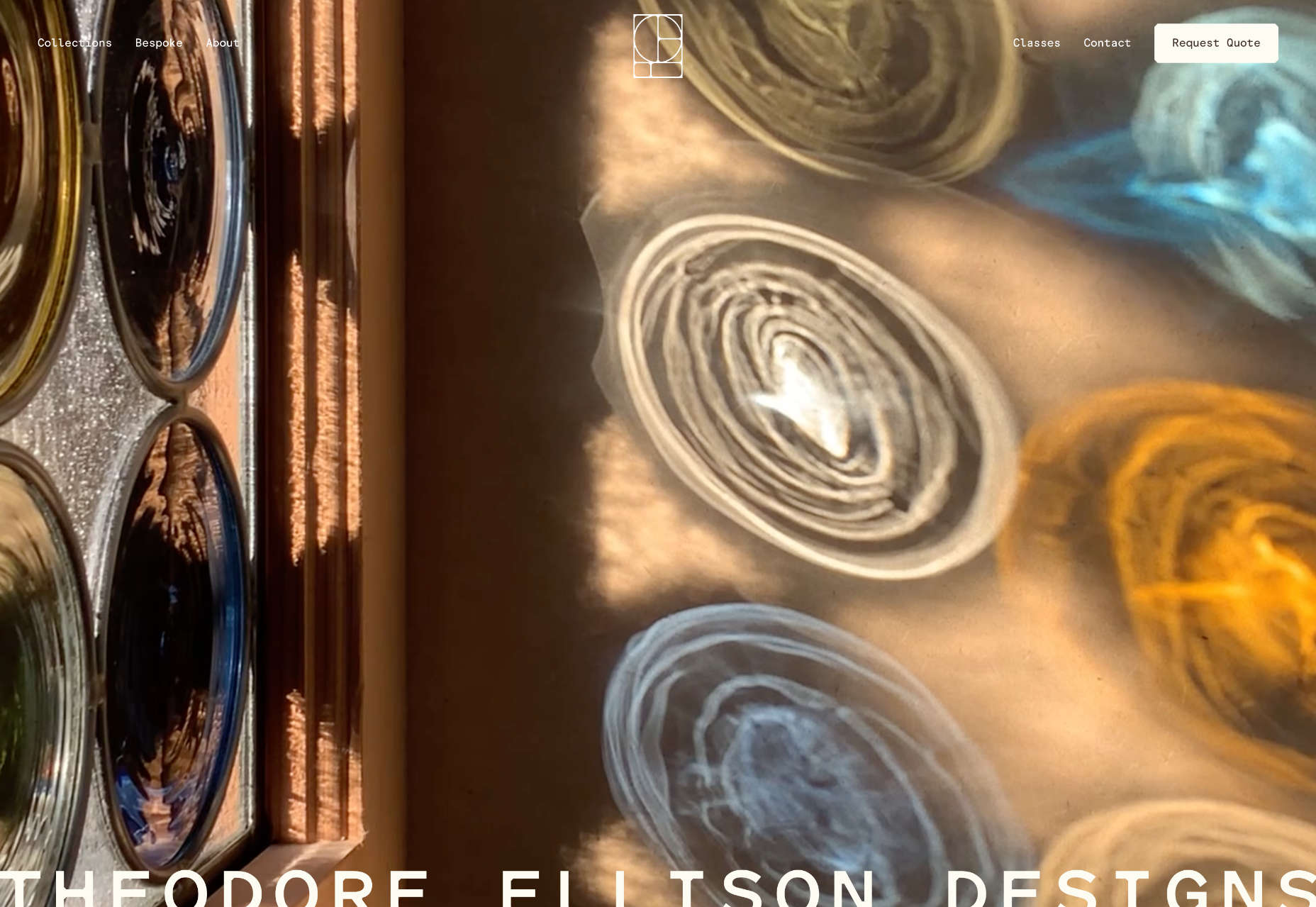
Theodore Ellison Designs
We don’t often see colored glass in real life, but the play of light on stained glass is beautiful. This site for Theodore Ellison Designs uses video to bring the effect to the web.
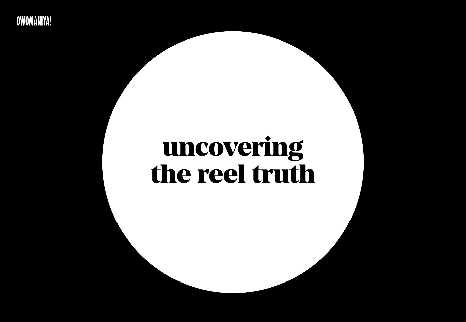
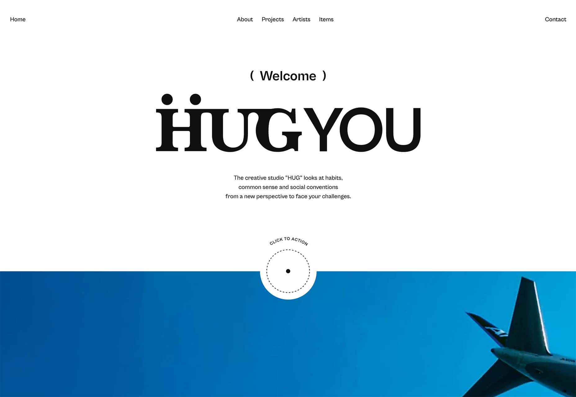
Owomaniya!
The Owomaniya report for 2022 uncovers the state of gender diversity in the Indian entertainment industry. Presented in the style of infographics, the information is brought to life by animation.
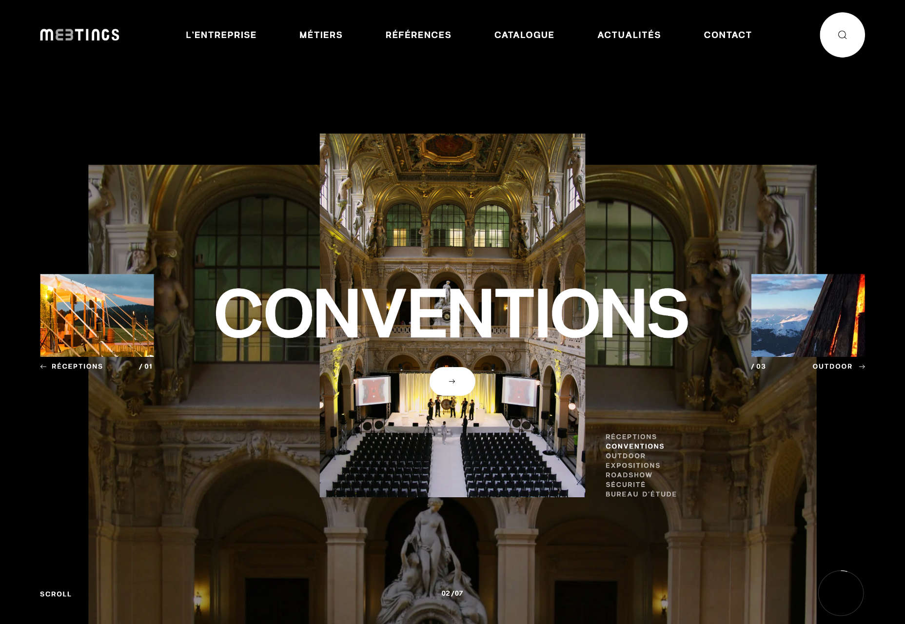
Meetings
Meetings is a French events company. Its site uses an animated collage approach to showcase its services, and animated text to pull you into its content.
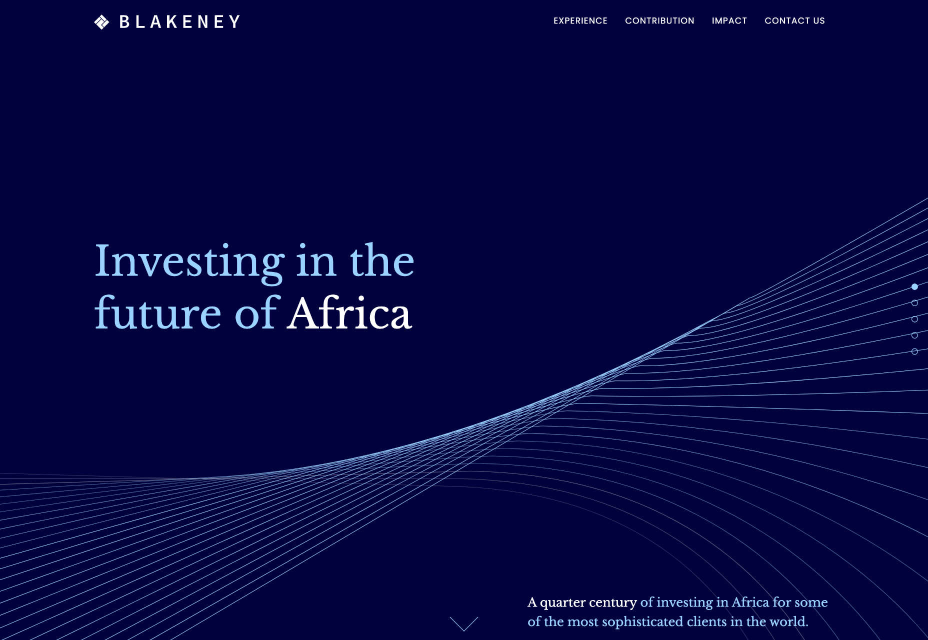
Blakeney
Blakeney invests in African companies on behalf of institutional investors. Its site is typical of the financial industry, but it uses animation to lift it to a higher level of interest.
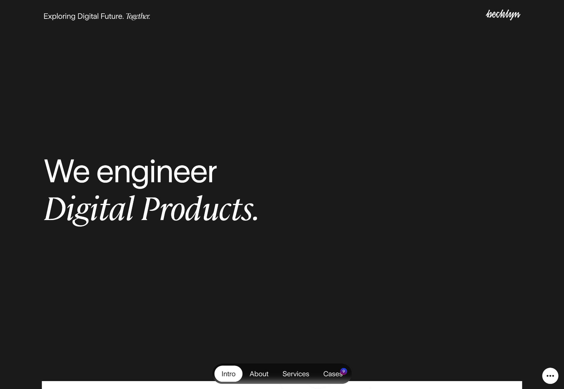
Becklyn
Becklyn is a digital design agency. Its portfolio site uses animated text, expanding image masks, and video to guide us through its site and app design approach.
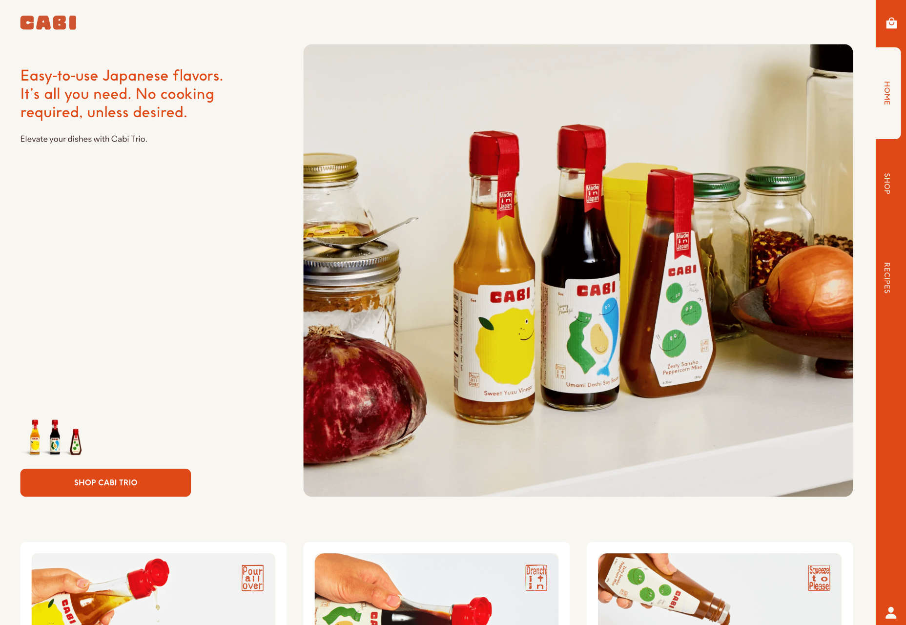
Cabi
Cabi is a brand of Japanese condiments with a typically Japanese feeling site. Bright colors, a slowly scrolling slideshow of dishes, and editorial to pack shot hover effects are a great introduction to the brand.
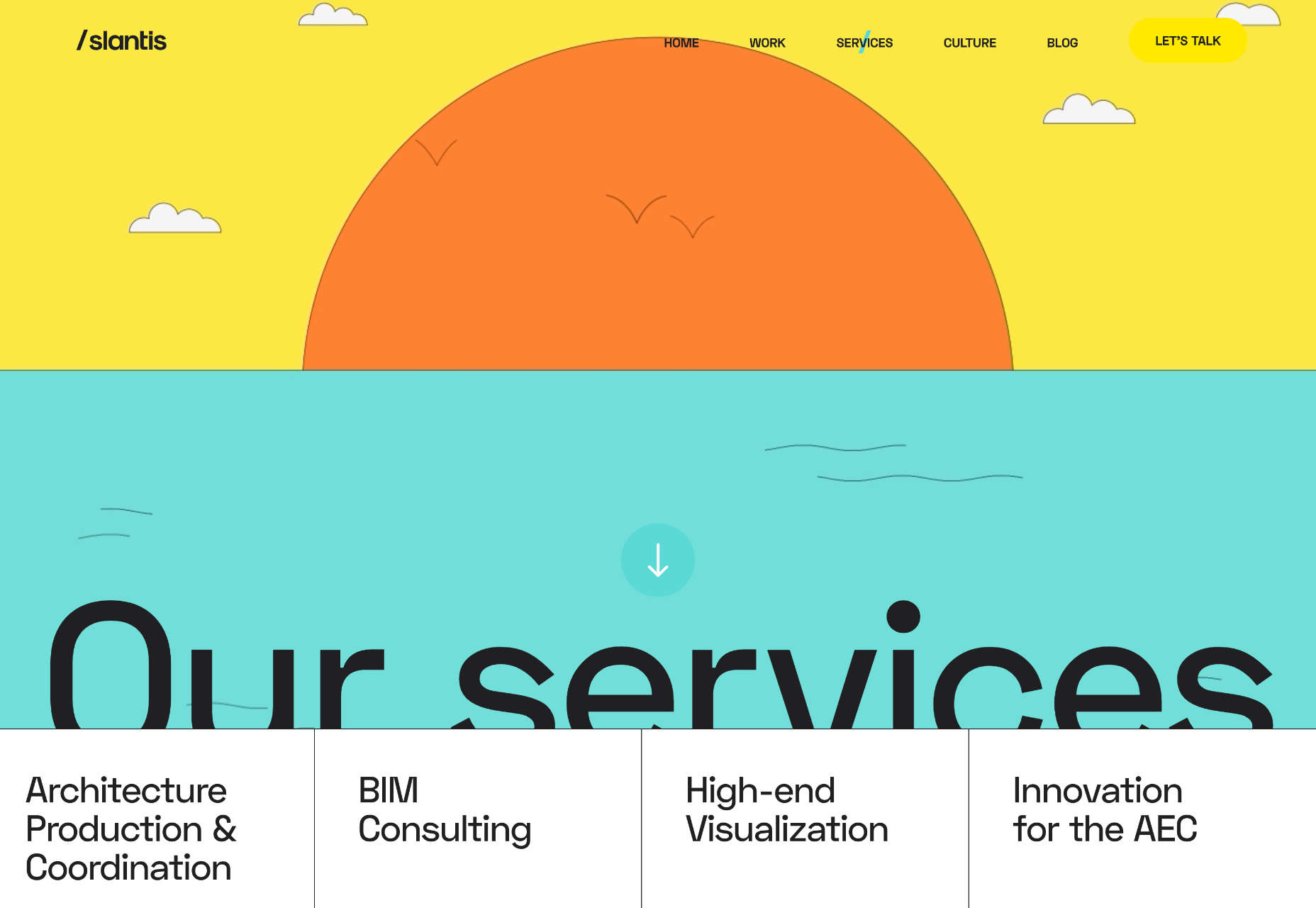
Slantis
Slantis provides building information modeling to architecture and infrastructure providers. Its site uses animation to showcase the types of content it produces for clients.
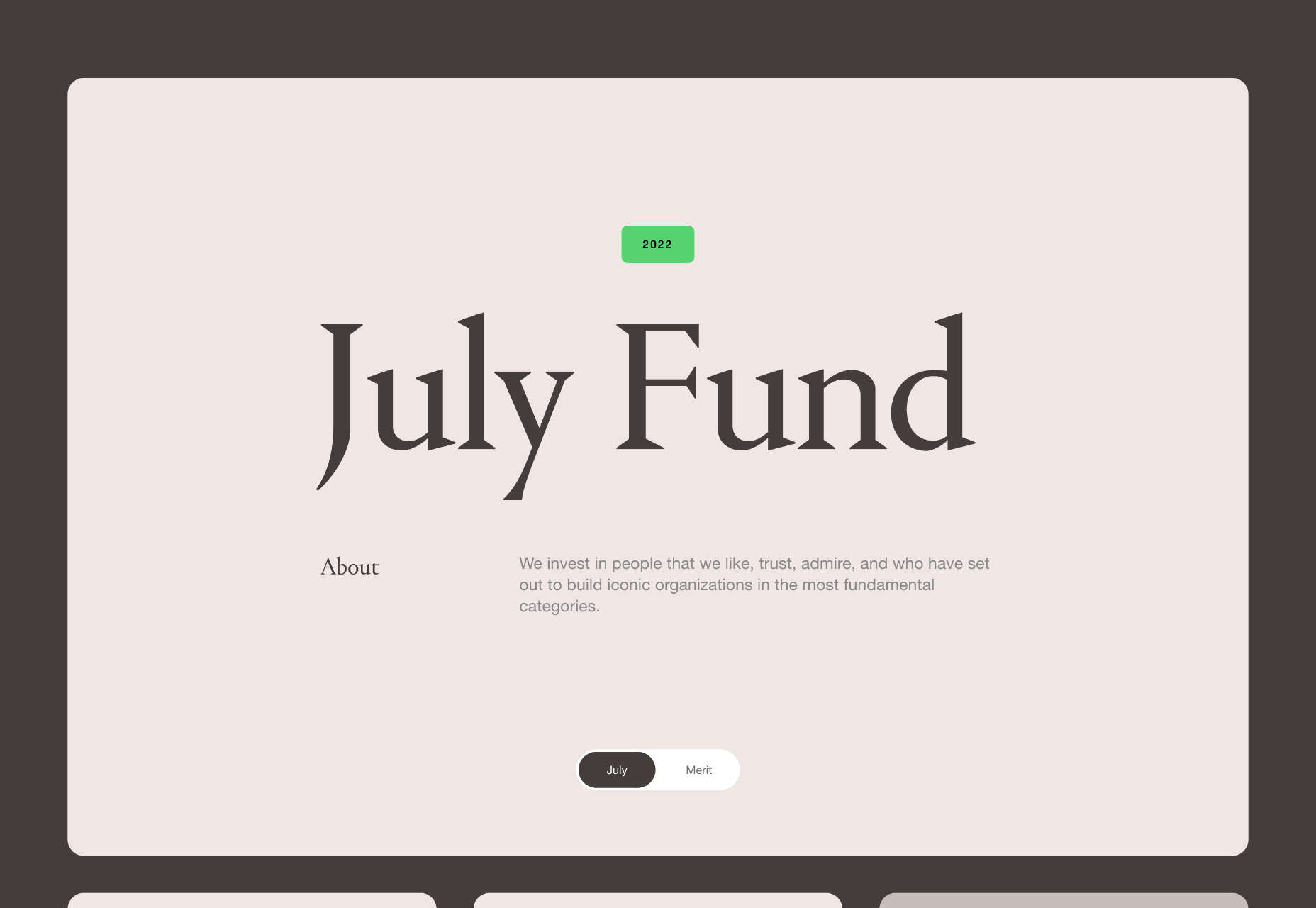
July Fund
July Fund is a venture capital project. It takes an entirely different approach than its competitors by adopting a chaotic but enjoyable card-based design.
The post 20 Best New Websites, October 2022 first appeared on Webdesigner Depot.
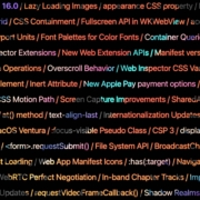
 Apple has released an OS update. Packaged in with it is the latest version of Safari, 16.
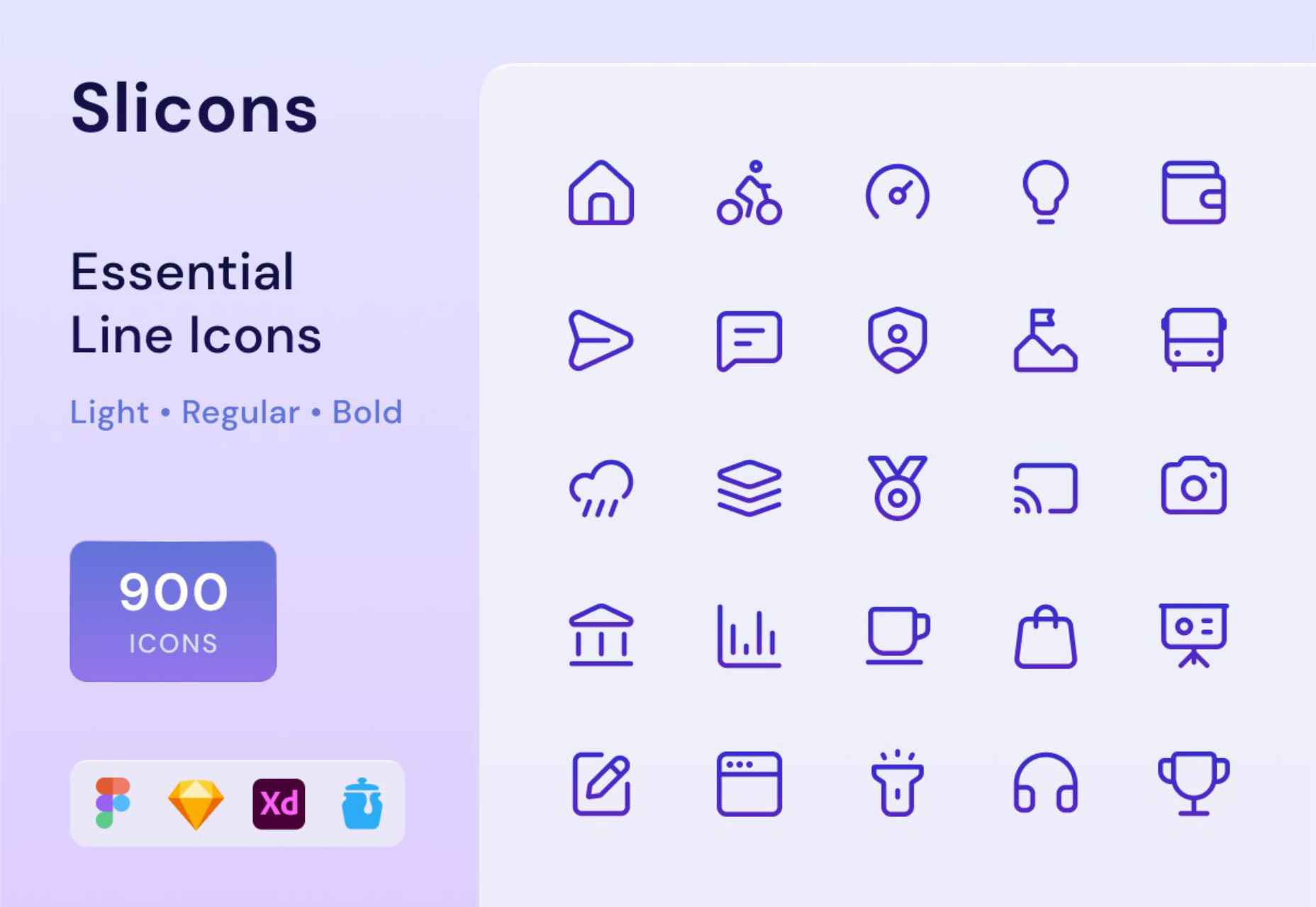
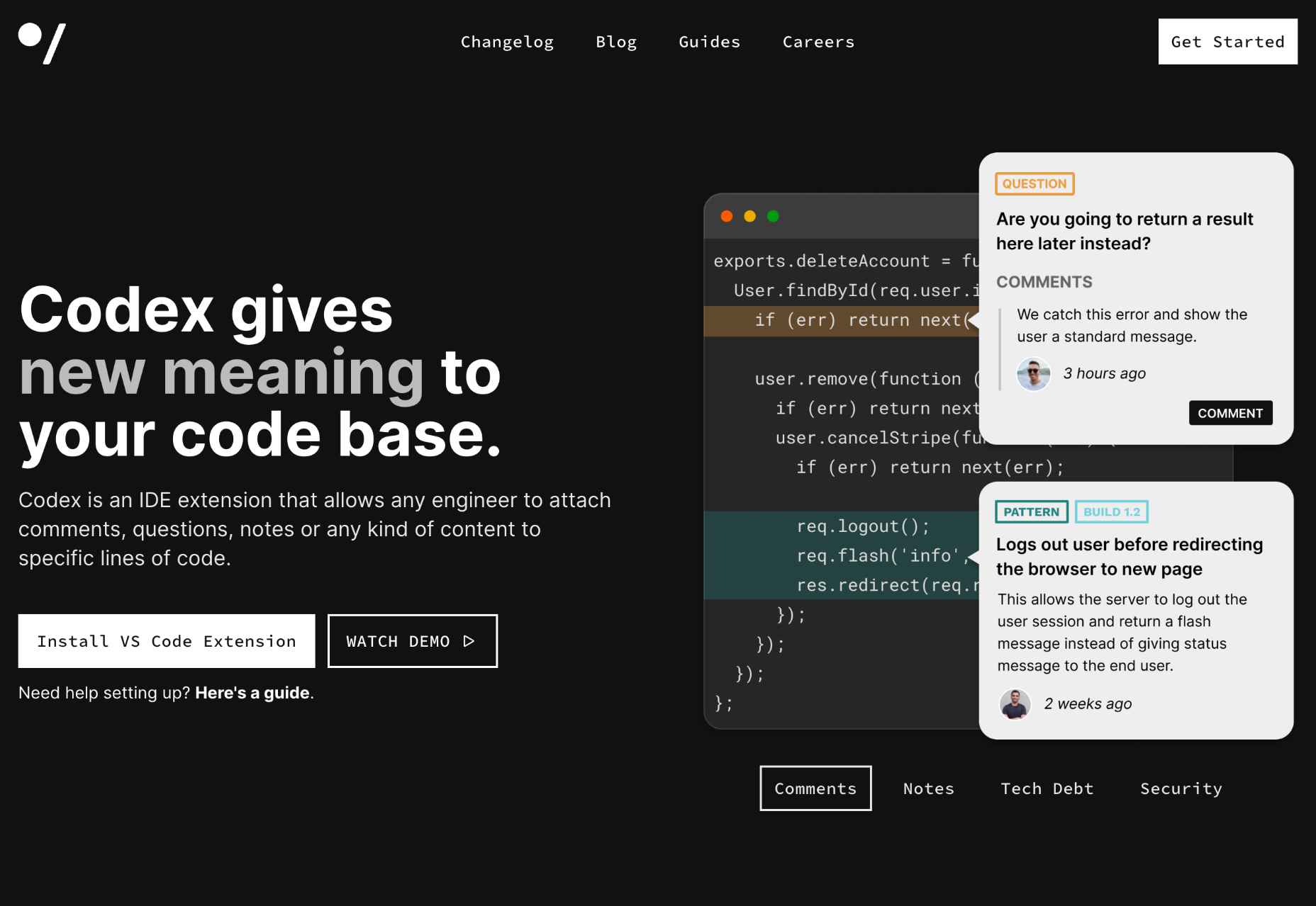
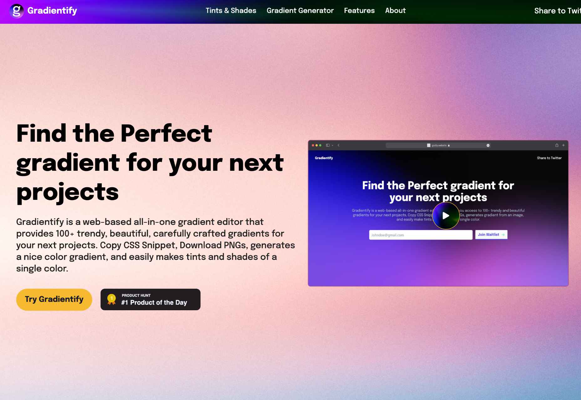
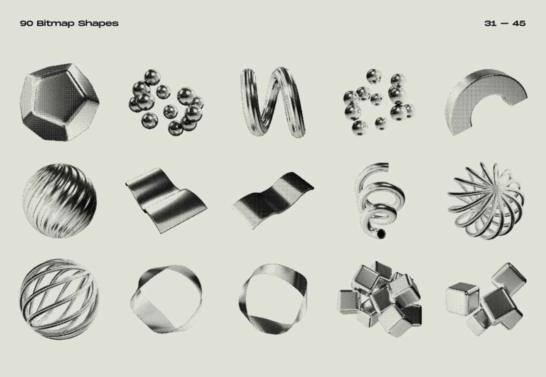
 The Summer’s over, and we’re back at our desks to discover that the web’s best app builders, font designers, asset creators, and developers have been hard at work to deliver this bumper collection of exciting new tools for designers and developers.


 The purpose of a website is to reach new customers and keep current ones engaged. Therefore, customer-first should be at the top of your list for design features. After all, without your clients, your business won’t grow or succeed.
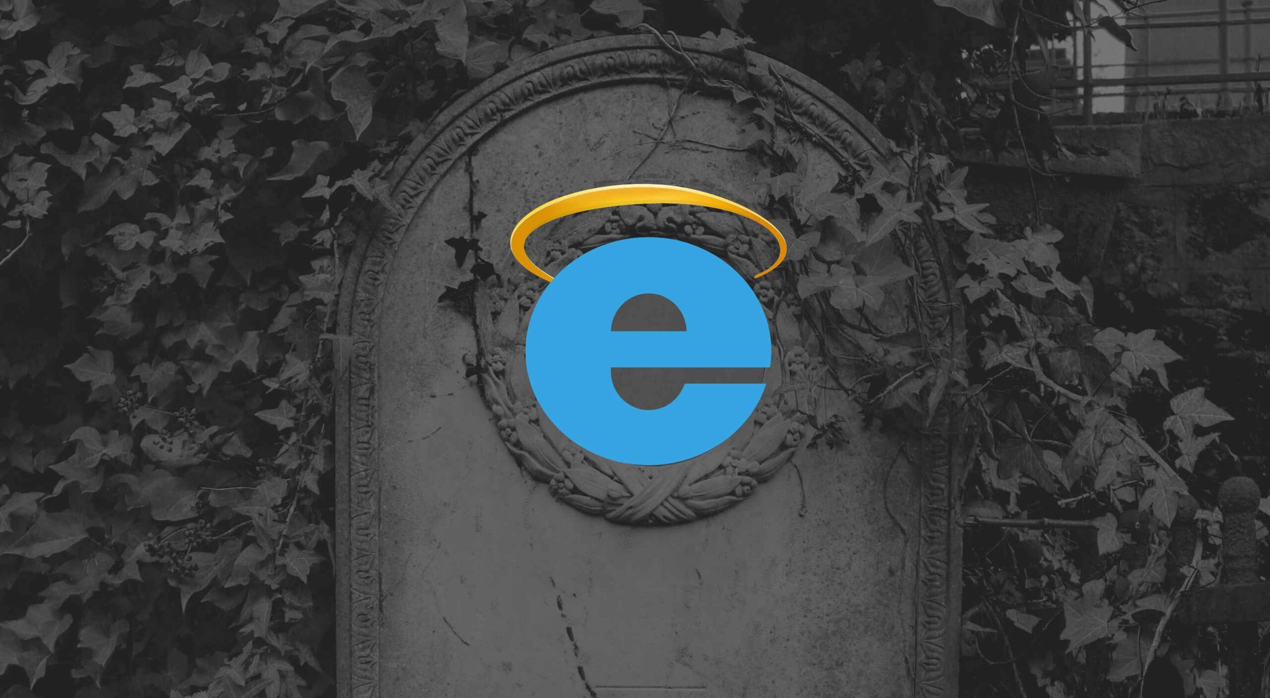 This week, Microsoft officially ended support for Internet Explorer.
 Every day design fans submit incredible industry stories to our sister-site, Webdesigner News. Our colleagues sift through it, selecting the very best stories from the design, UX, tech, and development worlds and posting them live on the site.

 Websites haven’t always been as adaptable as they are today. For

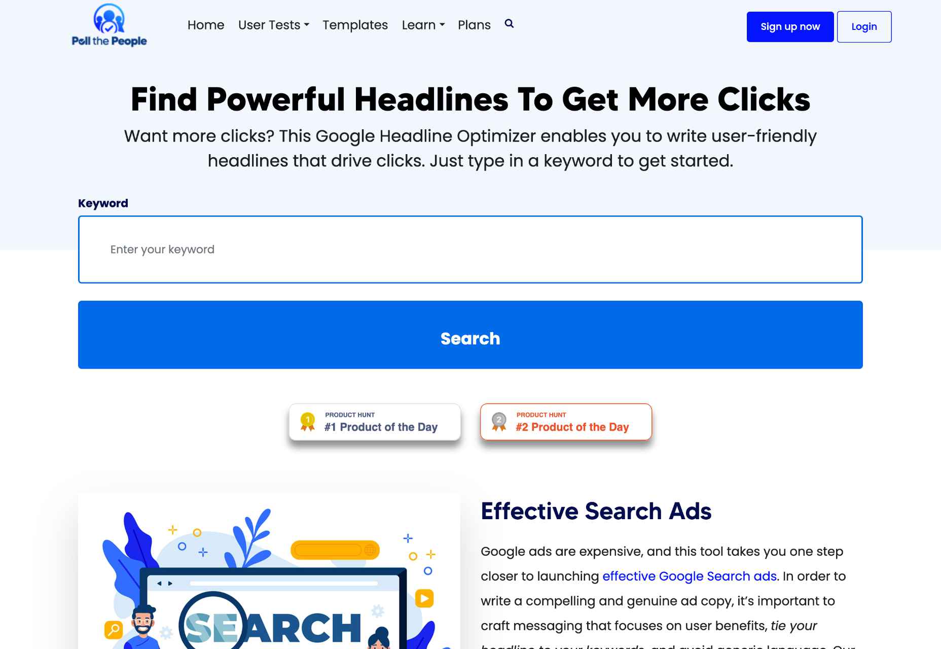
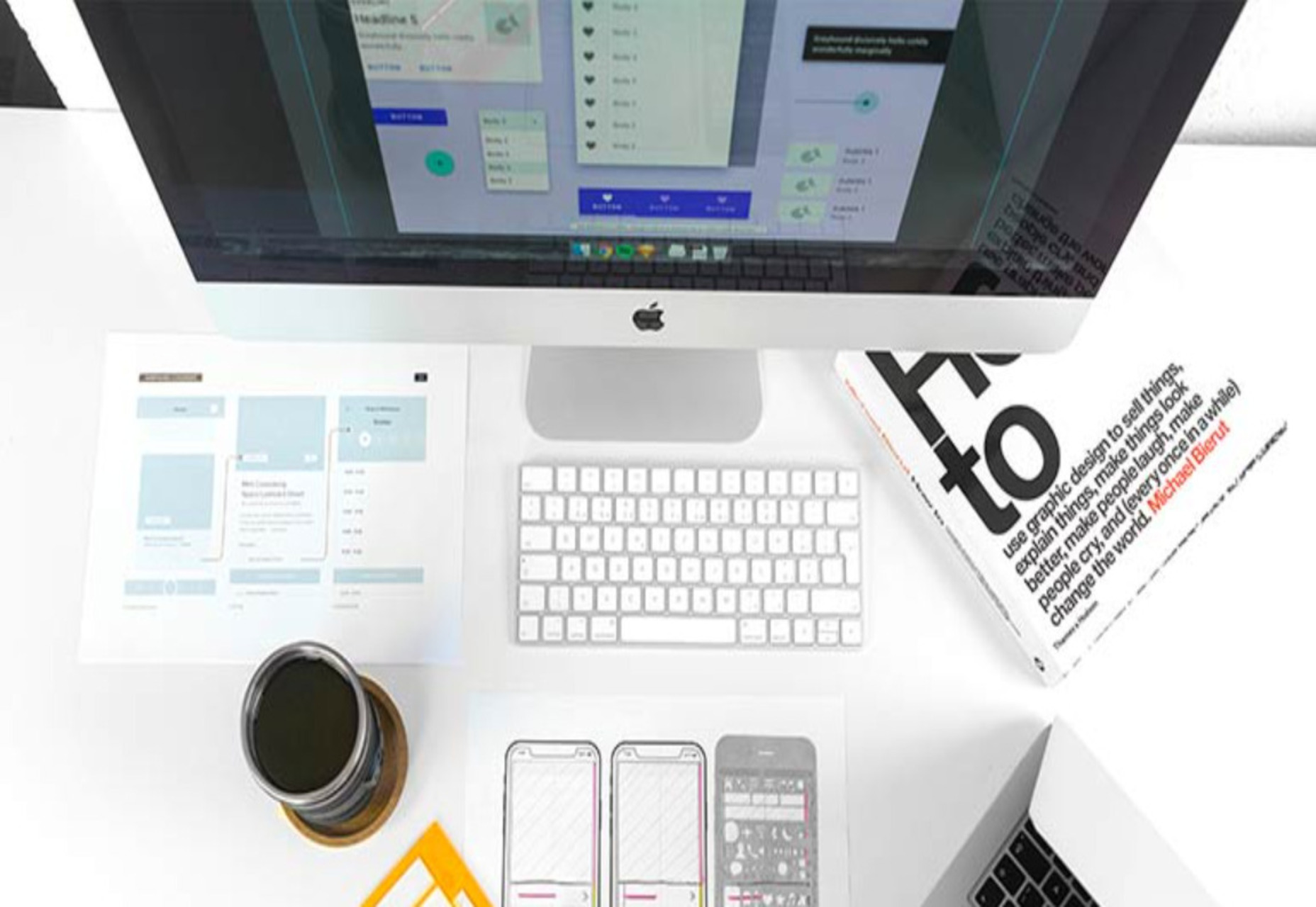
 The underlying theme of this month’s collection of new tools and resources is development. Almost every tool here makes dev a little easier, quicker, or plain fun. There are a few great tutorials in the mix to help you get into the spirit of trying new things and techniques.

