Articles

While a lot of the research for web designers that’s come out this year has to do with COVID-19, we’re starting to see a light at the end of the tunnel. Many of these reports aren’t just looking at the effects of the pandemic on business and marketing today. They’re now looking at what consumers plan to do once the pandemic is gone.

So, I have some very interesting research for you here today. Three of the reports have to do with coronavirus side effects — pertaining to ecommerce, market research, and freelancing — and one of them is just a really great argument against using PDFs on websites.

1. The Digital 2020 Survey Says Ecommerce Growth Will Continue Post-Coronavirus

Obviously, everyone is paying close attention to COVID-19’s impact on the world. For the purposes of the work you do as a web designer, you should be clued into what it’s doing to the business and marketing fields. Because, if those opportunities dry up or companies begin to pivot, you need to be ready to adapt.

The Digital 2020, a joint monthly report from we are social and HootSuite, brings interesting news about the state of ecommerce thanks to COVID-19.
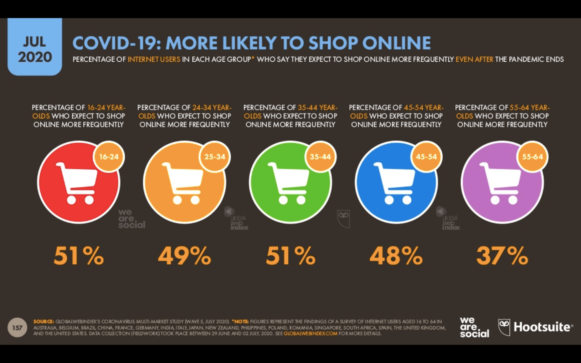
Because the pandemic has forced consumers indoors, online shopping has increased. But, according to about half of those surveyed for this report, this isn’t some temporary solution. They plan on doing more online shopping even after the pandemic ends.

This means that web designers are sitting in an enviable position now and for the foreseeable future. If you’re not already helping businesses sell through their websites, now is the time to do so as more and more businesses are going to need reliable online stores to sell their offerings through.

2. eMarketer Shares Data on Social Listening

When conducting research at the beginning of a design project, what kinds of sources do you turn to for quick and reliable information? Your client provides you with information on their business, industry, and the competition, of course, but what else?

You can conduct user surveys and interviews, but those take time and resources. It also usually means working with clients who have existing businesses and user bases to tap into. Unless you’re working as a UX designer where that’s a big part of the work you do, you might not have the ability to do that level of research.

As reported by Gartner (via eMarketer), leading marketers are now learning about their target audiences through the following channels:
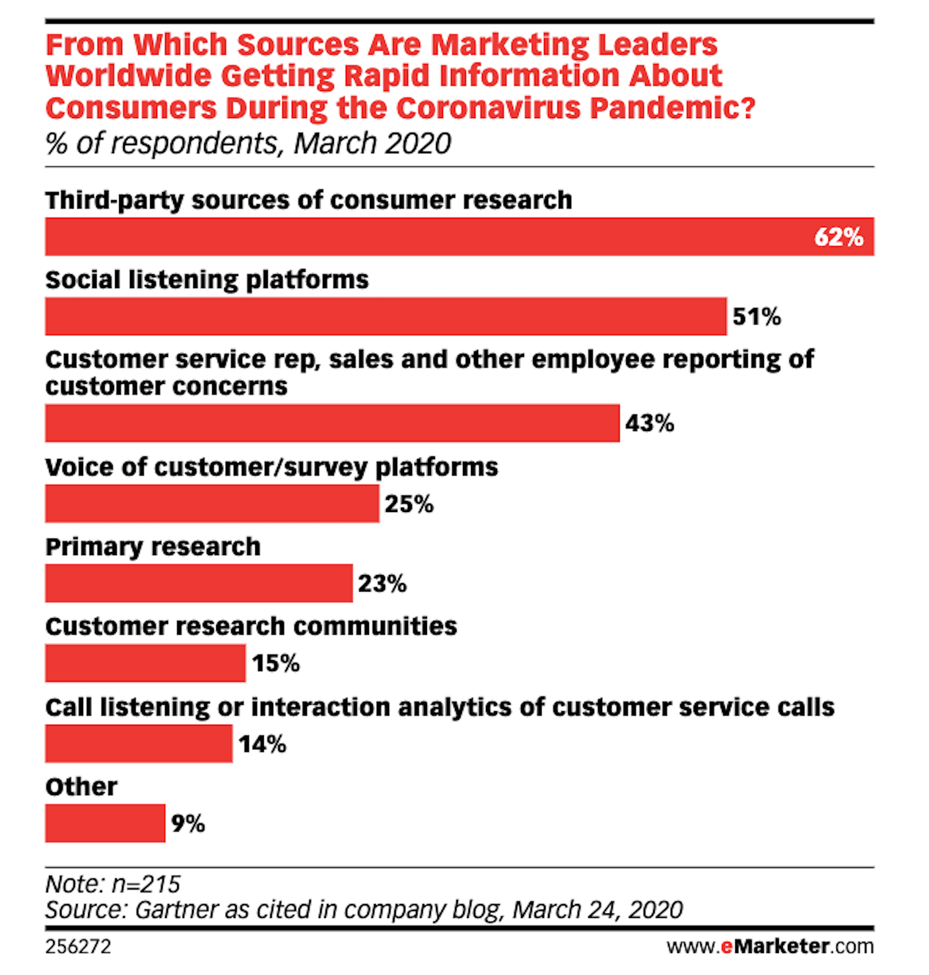
Thanks to the surge of traffic online right now, social listening platforms have become really useful resources for learning about one’s users, with 51% of marketing leaders using them.

If you feel as though your initial research and planning phases could use a boost, I’d recommend taking advantage of one of these social listening tools now.

If you build websites for a specific niche, you can set up keywords/hashtags that are universally relevant to (most of) your clients. By listening in on these conversations regularly, you can become more attuned to what the visitors of your websites actually need and you can proactively build better experiences for them as a result.

3. Upwork Reports Increasing Numbers of Freelancers Entering the Market

The main focus of the Upwork 2020 Future Workforce Report is on how employers are changing their approaches to hiring now and in the near future. And the basic premise is this:

  • It’s long been predicted that more and more of the workforce would be allowed to work remotely.
  • COVID-19 has escalated those predictions to the point where most of the workforce is remote right now.
  • Businesses see the value in remote work arrangements, especially if it enables them to get work done more quickly and cost-effectively by freelancers.

While this is certainly great news for web designers looking for new clients, the report also provides us with this data:
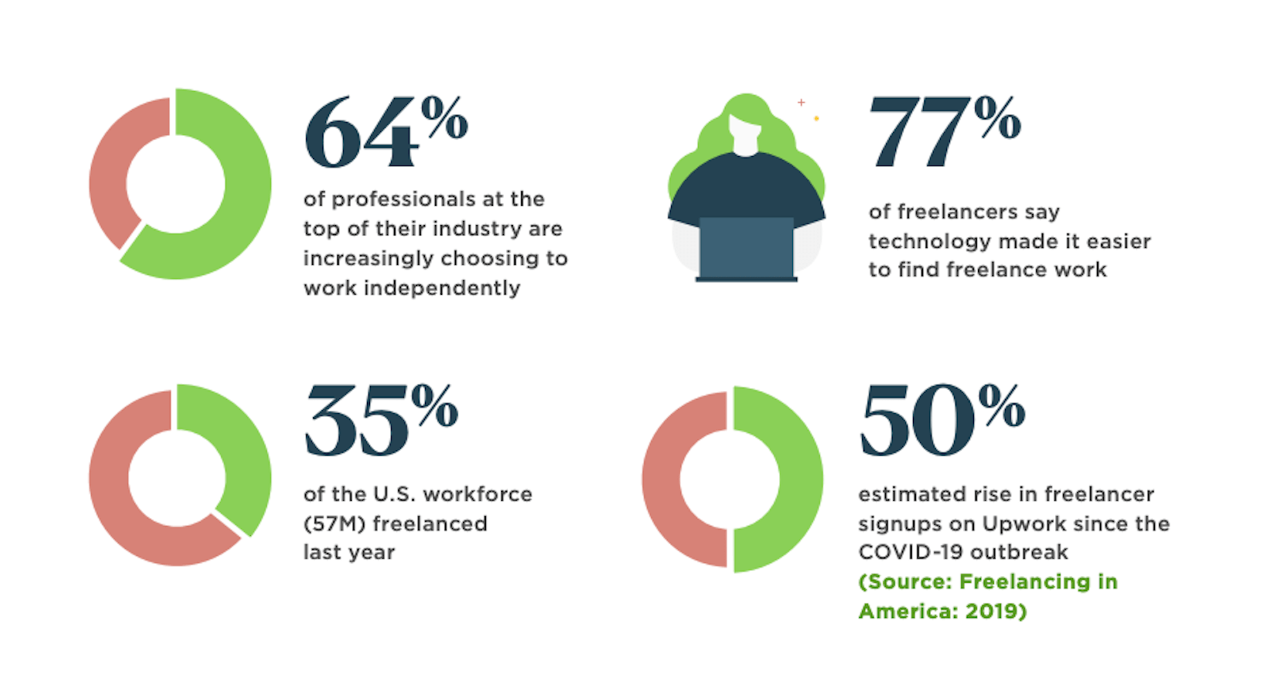
64% of professionals in the top of their field work independently. That statistic alone means you’re up against some tough competition. But there’s also the 50% rise in signups on freelancer marketplaces that should have you worried.

Even though business demand for freelance talent is growing, this unprecedented rise in freelance competition may pose some problems. So, if you’re not already doing everything you can to position yourself as the web designer in your niche, get going on that now so you don’t get drowned out by the rising number of competitors.

4. NNG Says That PDFs Are Unsuitable for the Web

While I don’t have statistics to share with you from the Nielsen Norman Group’s post on why the PDF is “Still Unfit for Human Consumption”, I do have a ton of usability arguments against them that are worth summing up here:

  1. PDFs are written in the style of print documents, which means that strategies we use to design content on websites — like making a page scannable and accessible — don’t apply.
  2. They’re not designed to be as concise or attractive as a web page.
  3. They don’t operate like a website, which disrupts the seamless experience you’ve worked so hard to create when one is opened up from your site.
  4. The website navigation disappears and any sense of orientation (besides the browser “Back” button) goes out the window.
  5. There’s no way to build an internal navigation in a PDF document, save for internal linking or a table of contents.
  6. If they’re formatted for paper sizes, scrolling through them can be difficult for mobile users.
  7. They load more slowly the bigger they get, so unless it’s something like a small and optimized menu, expect visitors to wait for the download to appear.

And those are just the arguments that came from NNG’s researchers. Take some time to read through real user complaints about PDFs and you’ll never want to include one on a client’s website again.

Wrap-Up

Thankfully, the research for web designers and marketers is finally starting to move away from the confusion and speculation we saw a lot of earlier this year.

Just as with anything we do on the web, the more time you give it, the more data you can collect. And, luckily for us, the data suggests that there’s a pretty positive outlook for web designers if they position themselves the right way now.


Featured image via Unsplash.

Source


Source de l’article sur Webdesignerdepot

The common theme in this month’s collection of new tools and resources is “things that help you show off your work.” Many of these tools are made to help you better web products or apps or showcase designs with others.
Here’s what new for designers this month.

Naturaltts

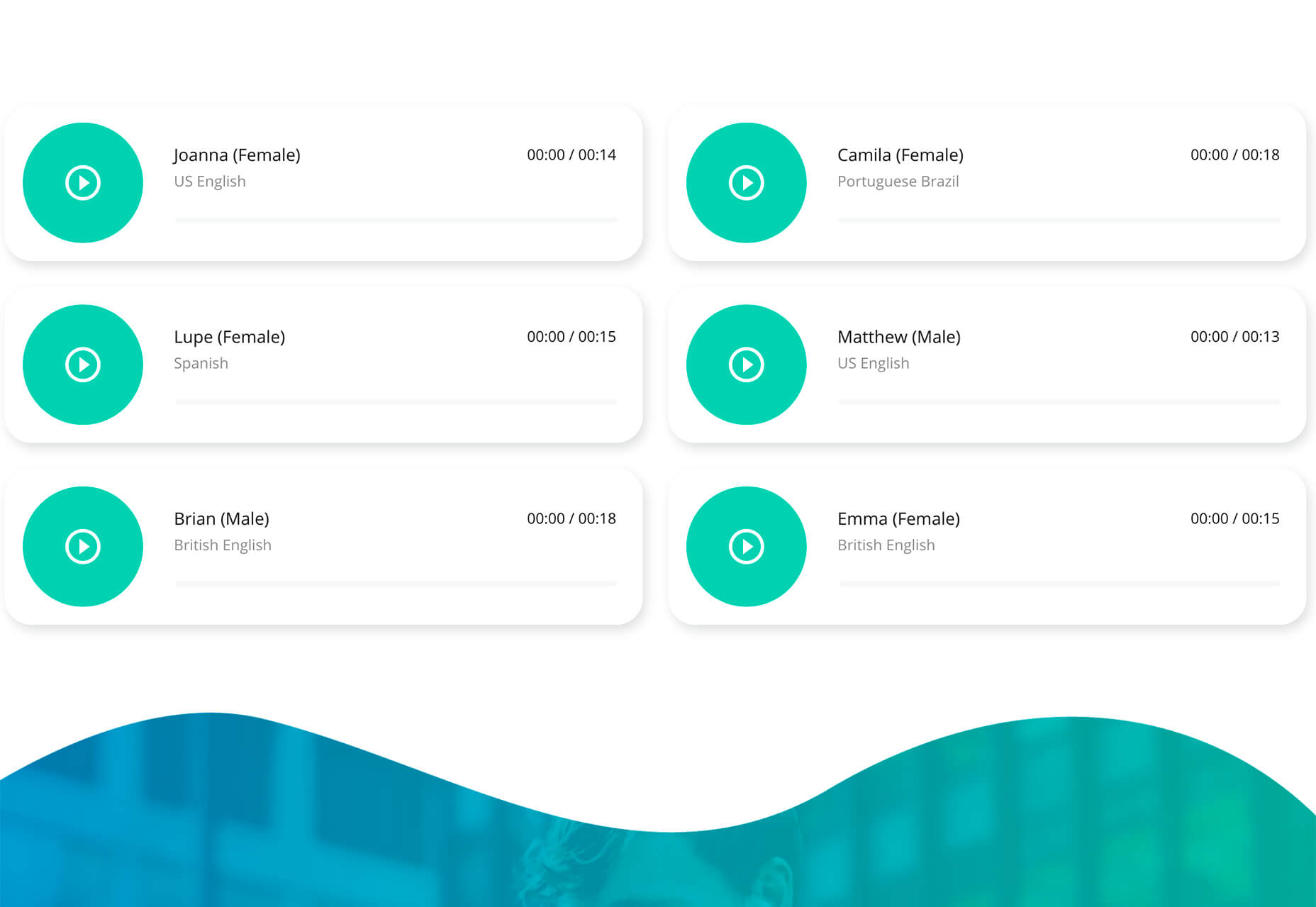
Naturaltts is an online text to speech converter, that allows you to download an mp3 recording. The tool has more than 60 voices to choose from in six languages. There’s a free plan for personal use (based on characters converted) and affordable paid plans for higher volumes and commercial users. One application of this tool is voiceover for videos or tutorials.

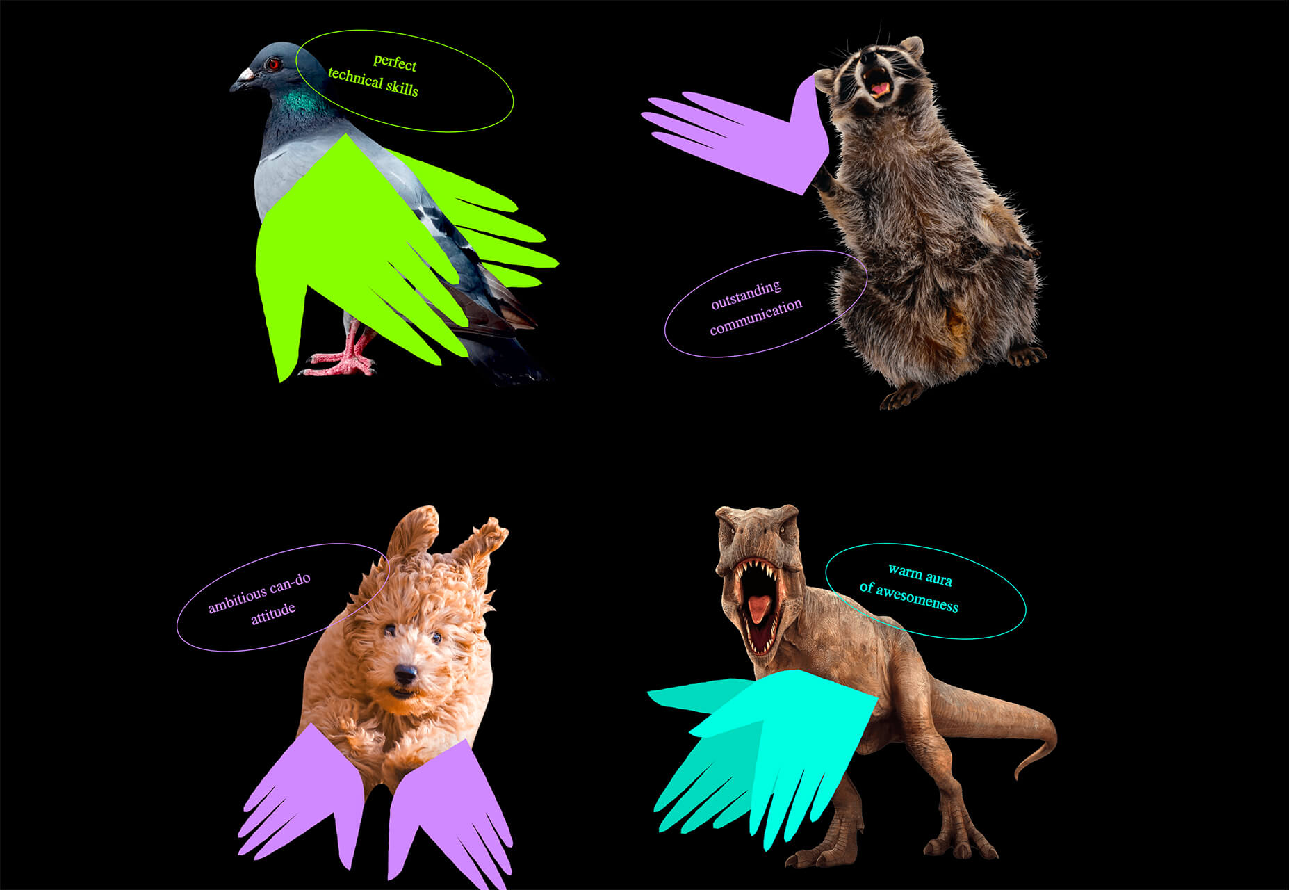
Handz

Handz is a library of hands with different gestures in three-dimensional shapes. The collection includes 12 gestures with nine skin colors, and three different sleeve types. Put all that together and you have 320 potential combinations that you can use for projects. The library is completely free and works in a variety of formats with different tools.

Isoflow

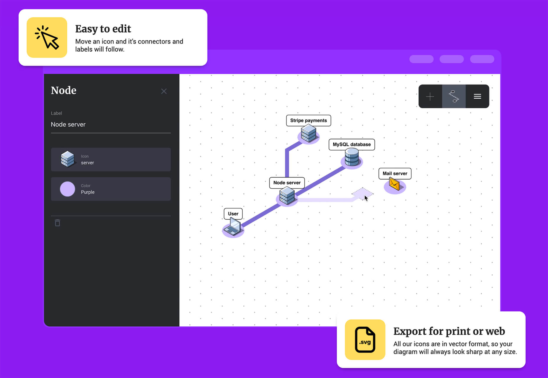
Isoflow allows you to create isometric diagrams for presentations and illustrations with ease. You can edit and then export diagrams for print or website use, thanks to vector rendering.

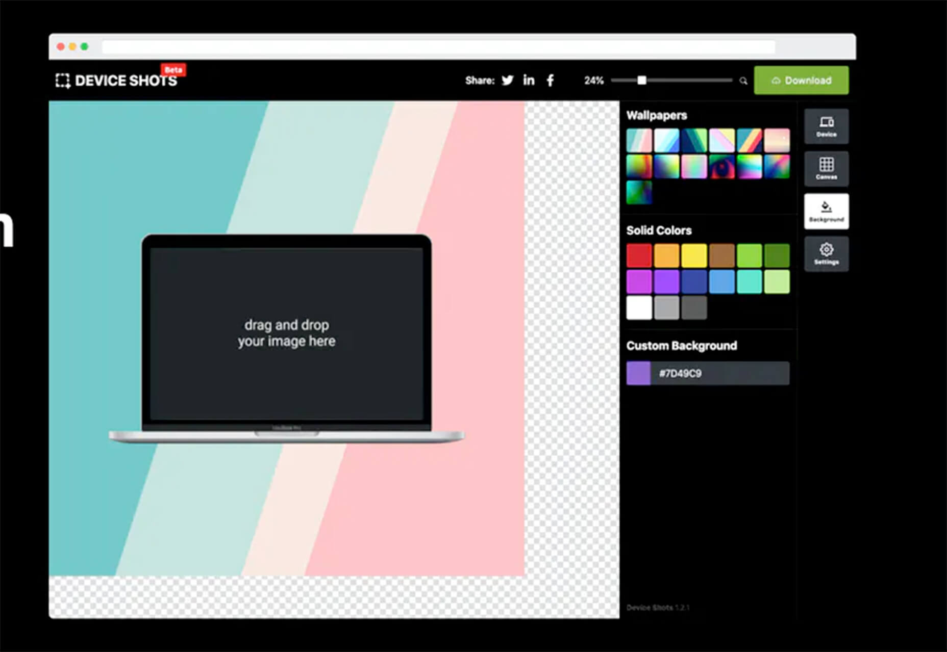
Device Shots

Device Shots is a small web app that helps you generate a high-resolution device mockup using a screenshot of your website or mobile application. It supports almost every device type you can think of and resizes for social media platforms.

Barchartrace

Barchartrace is a simple MIT open source bar chart generator. Use it to create some of the animated charts you see on social media. Just insert your information (upload via CSV file), choose animation settings, and go.

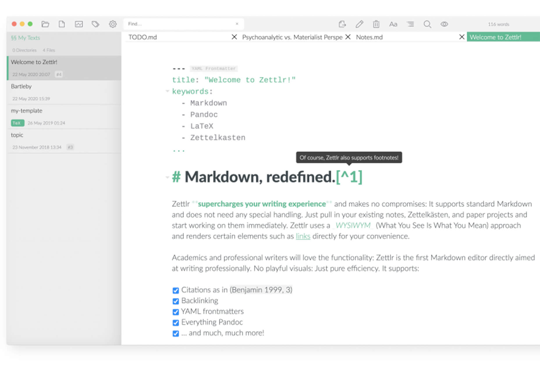
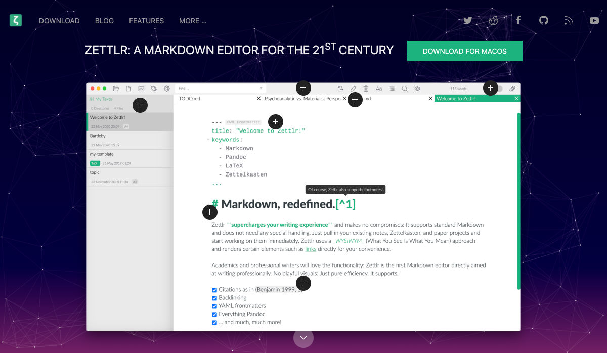
Zettlr Markdown Editor

Zettlr is a free and open source markdown editor for Mac OS. Zettlr supports simple notations, references, includes a dark mode, and tagging. It’s made for note takers who need a tool to amp up their projects, and is used primarily in higher education.

CSS Leaning Card Effect

The CSS Leaning Card Effect replicates the bookshelf feel you get when rectangles lean with a shadow against planes. Lynn Fisher does it in the pen with code that you can see and work on with your own images.

Lemon.io

Lemon.io is a tool that matches you with freelance developers to get projects moving more quickly. You are guaranteed a match in 24 hours and there is no risk if the match doesn’t work out. Just tell Lemon.io what you need and the algorithm will match you with a dev from the database. Prices for development through the platform start at $35 per hour.

Papercups

Papercups is a customer messaging tool that lets you chat in real-time. The customizable widget works with your favorite tools, such as Slack and Gmail, and is free to use. Chat apps are one of the most in-demand website features right now.

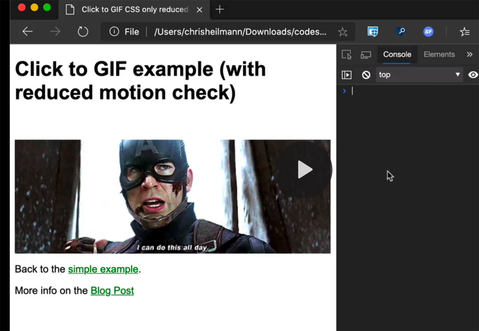
CSS Click to Animate Gif

Christian Heilmann has created a great guide/experiment in pure CSS that adds a play button on top of animated GIFs so that users can control the motion. He developed the concept because GIFs can get overwhelming and annoying. Learn how he did it and see it in action.

3D Book Image Generator

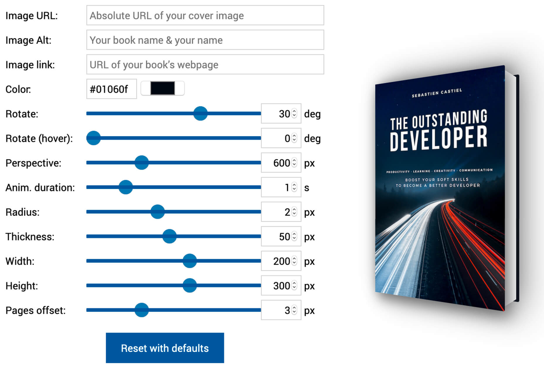
Here’s another little bit of CSS magic with a 3D Book Image Generator. Just input your image and set some specifications and get a 3D book cover image that you can use in projects. (There’s also an accompanying tutorial if you want to learn how to generate the CSS on your own.)

Luckysheet

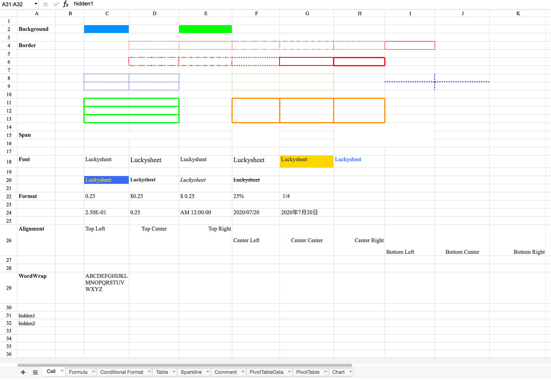
Luckysheet is an online spreadsheet – it’s a lot like Microsoft Excel – with powerful data functions and tools. It’s user-friendly and open source. It even has quite a few built-in mathematical formulas and supports various table types.

RevKit

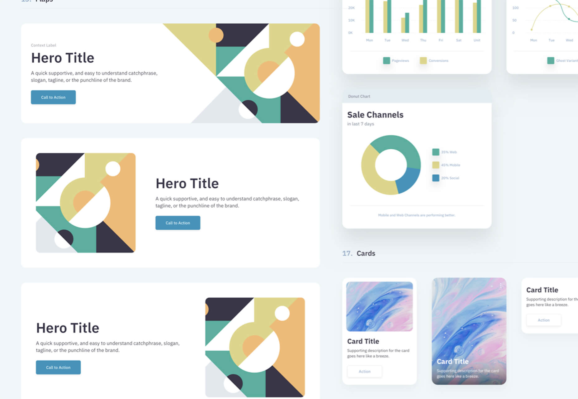
RevKit is a design system UI kit that works with Sketch, Figma, and Adobe XD. It includes plenty of organized components that you can pop right into designs to help get them started faster. It also includes a style guide, elements, and form controls. The download is free.

Card

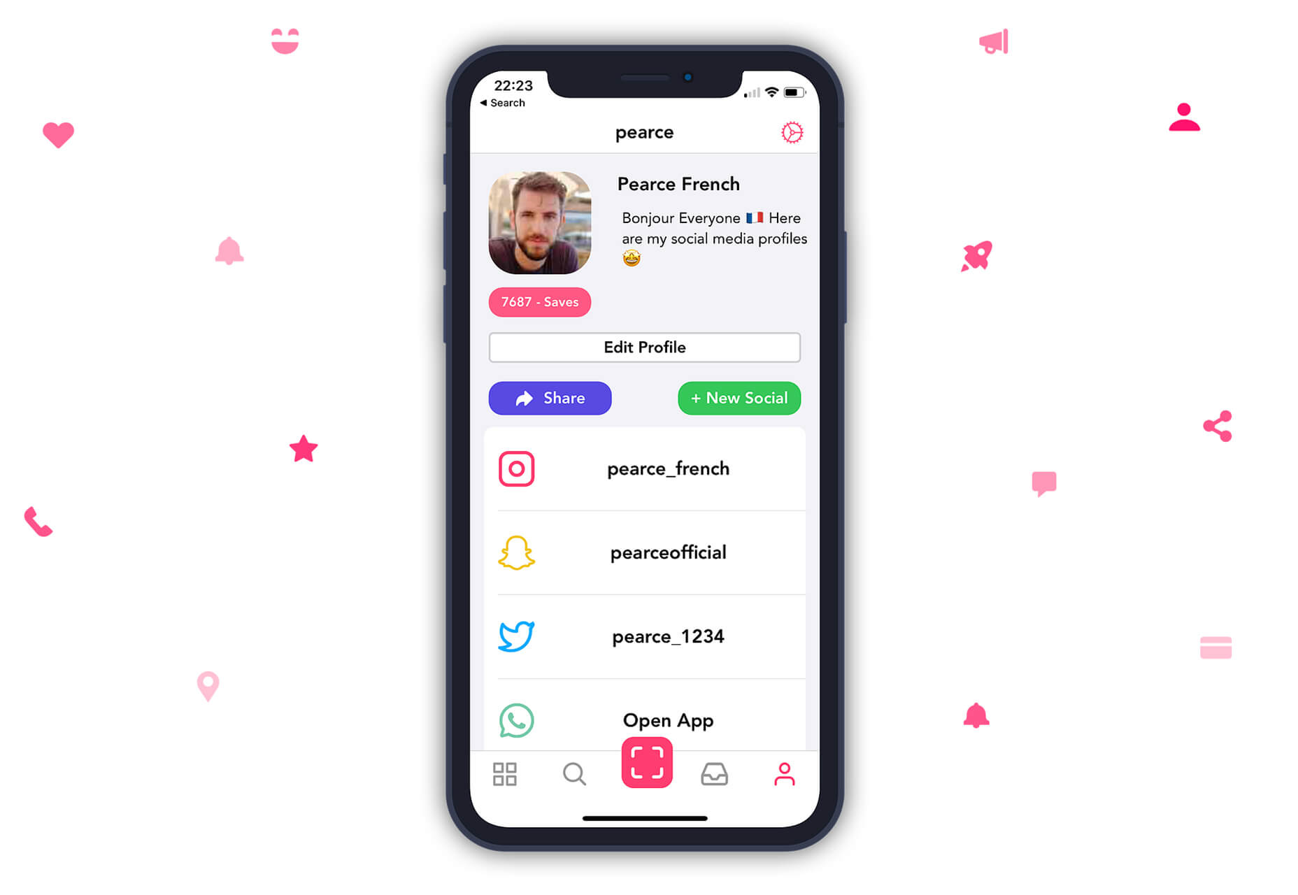
Card allows you to store social media profiles, websites, and files in a customized profile. Share it in one click. Replace awkward contact exchange and multiple usernames with a simple QR code or link.

Scale Nucleus

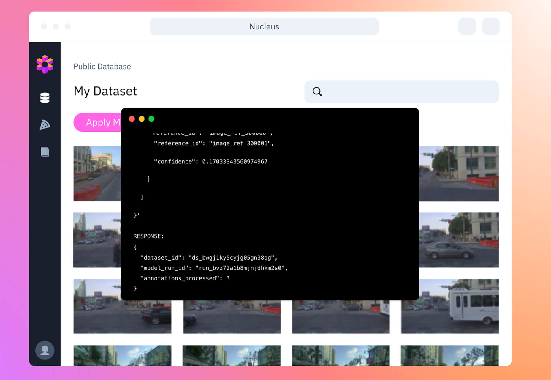
Scale Nucleus helps visualize data, curate interesting slices within your dataset, review and manage annotations, and measure and debug model performance. This tool claims to be “the right way” to develop ML models.

Previewed

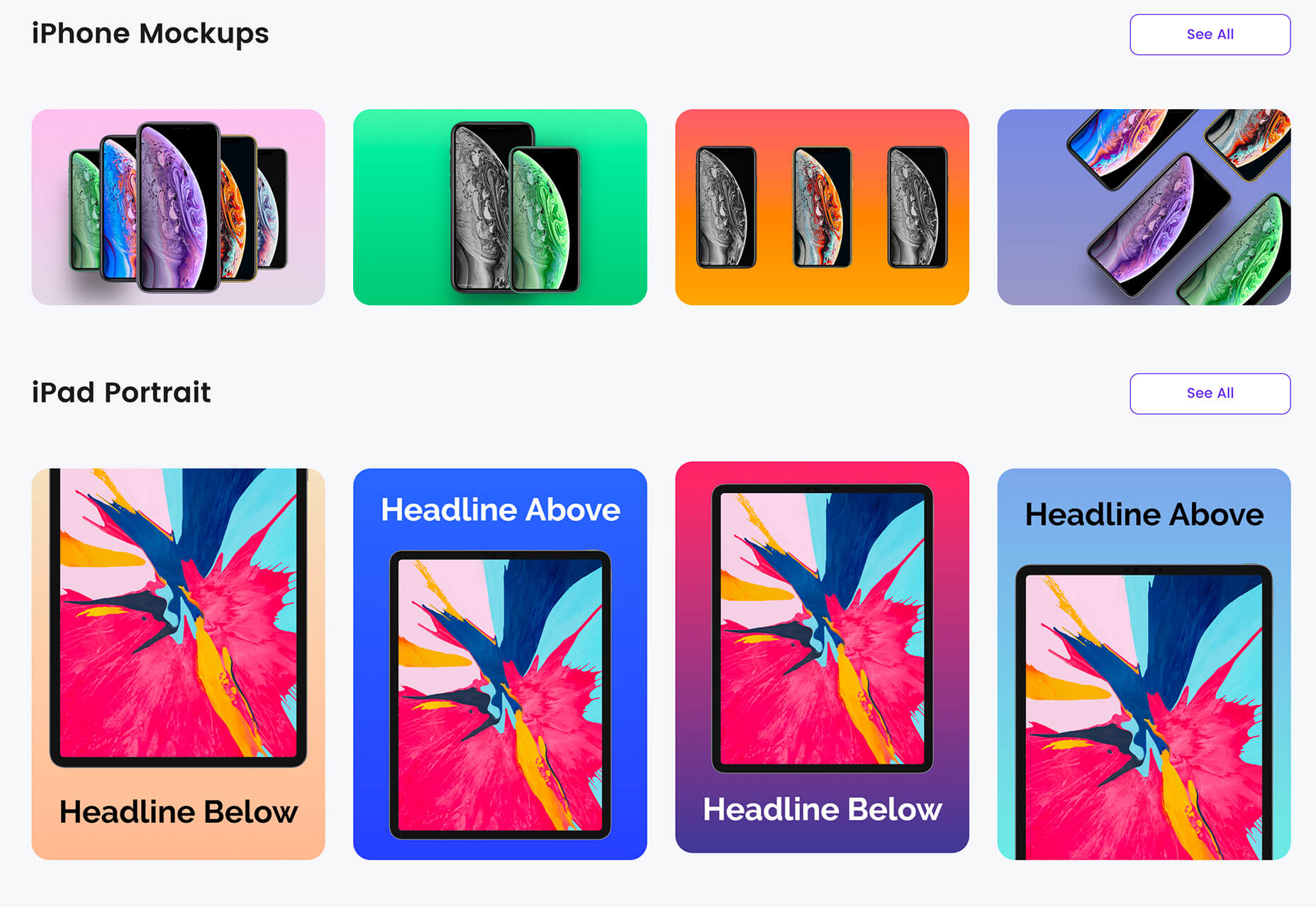
Previewed is a mockup generator to create beautiful promotional graphics for your app. Browse a variety of templates, pick one, customize, and download your design to show off.

NSFW Filter

NSFW Filter is a browser extension that blocks images that aren’t safe for work. The best part is that it runs locally in-browser and doesn’t access any of your data. Plus, it saves you from on-the-job embarrassment.

ColorFlick for Dribbble

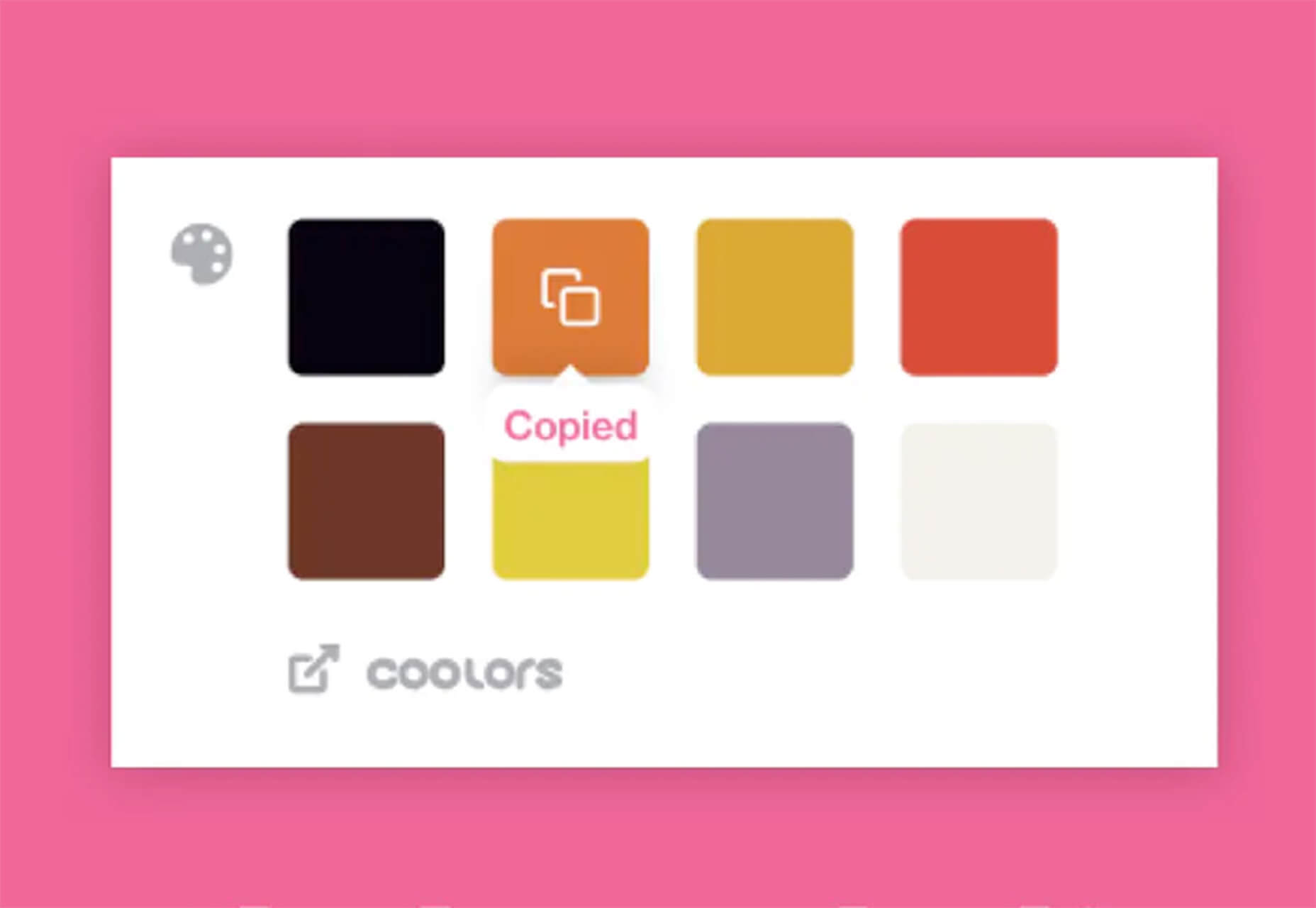
ColorFlick for Dribbble is another browser extension that makes it easy to copy hex codes from the tool to your clipboard with ease. You can also create palettes you can share from your favorite shots using Coolors.

Tabler Icons

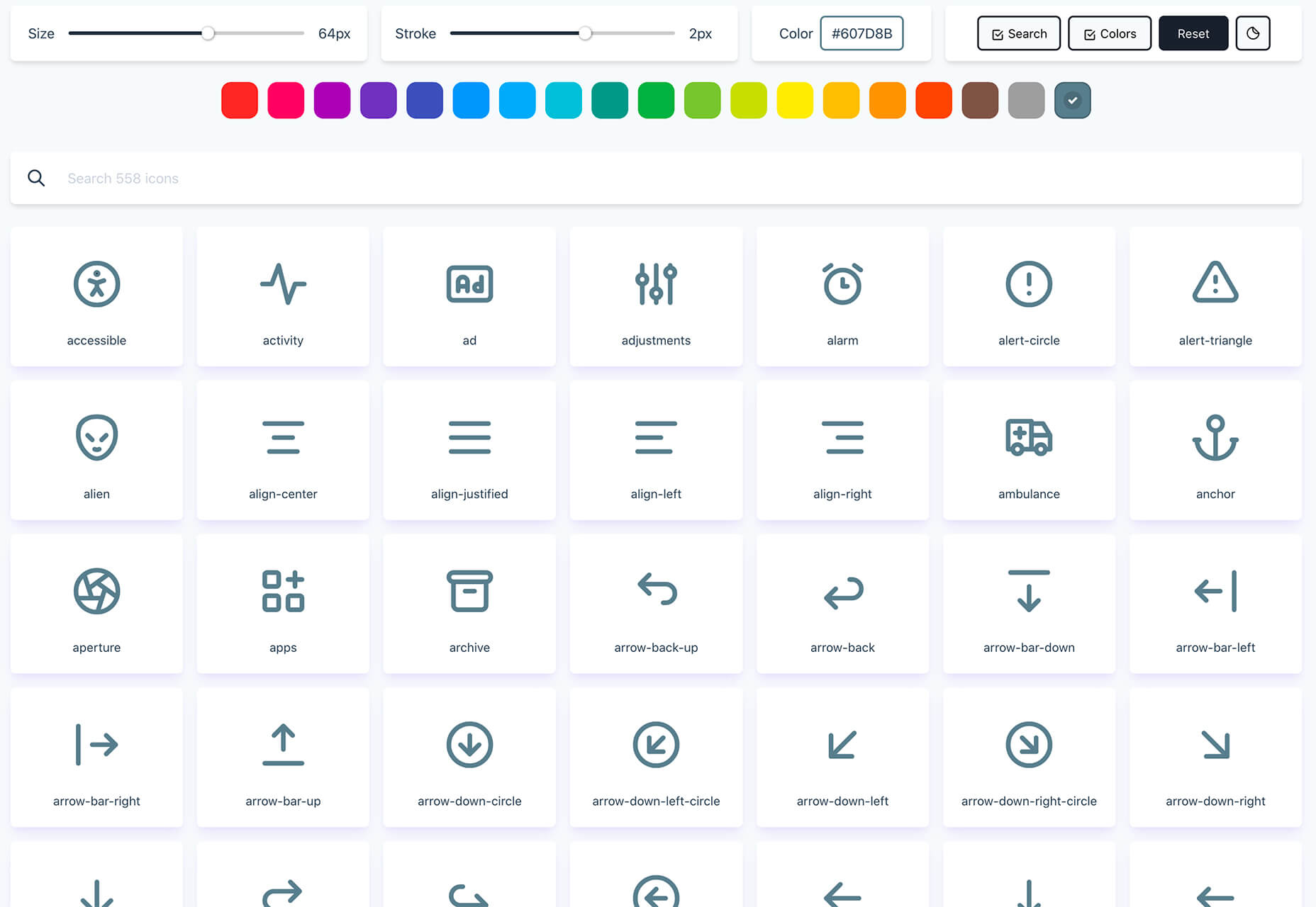
Tabler Icons is a collection of more than 550 SVG icons that you can customize. Change the color, size, or stroke width with on-screen controls and then click to copy the icons you want to use. It’s that simple!

Teenyicons

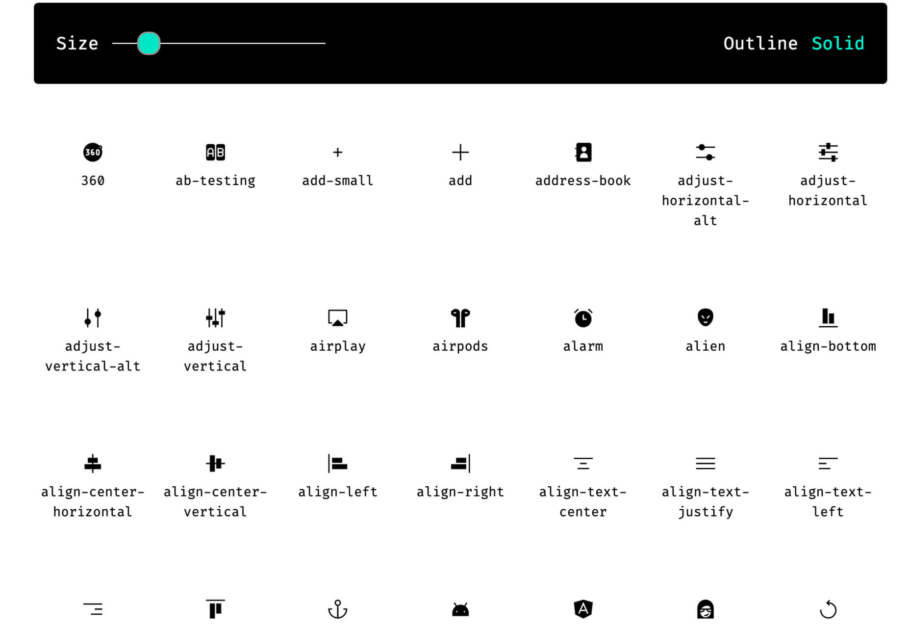
Teenyicons might be some of the cutest icons out there. This collection includes minimal 1px icons in outline or solid fills. And there are plenty of icons to choose from. Adjust the size and grab the ones that you need for projects.

Basicons

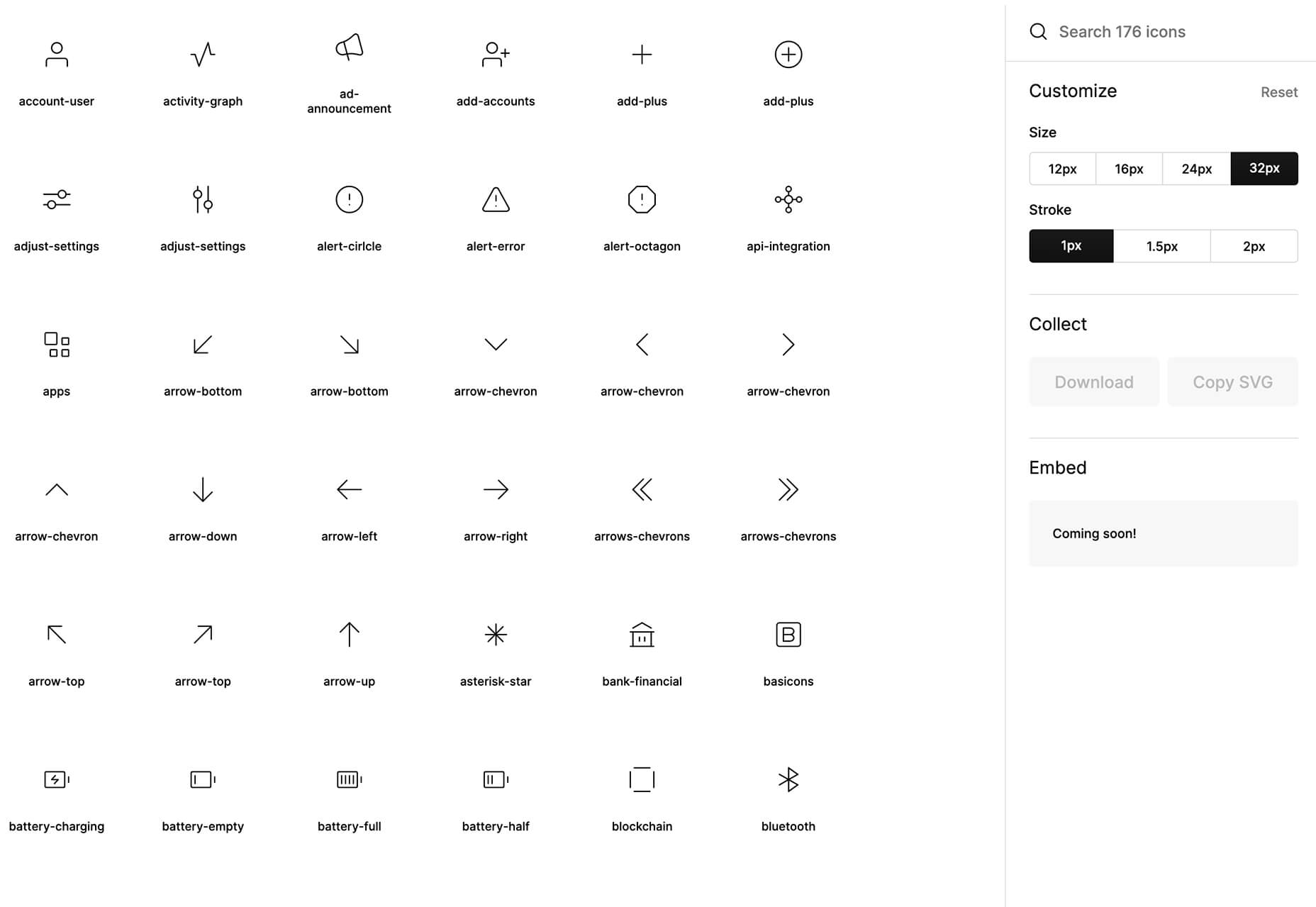
Basicons is a set of simple icons for product design and development. Plus, they are updated weekly.

Chozy Mermaid

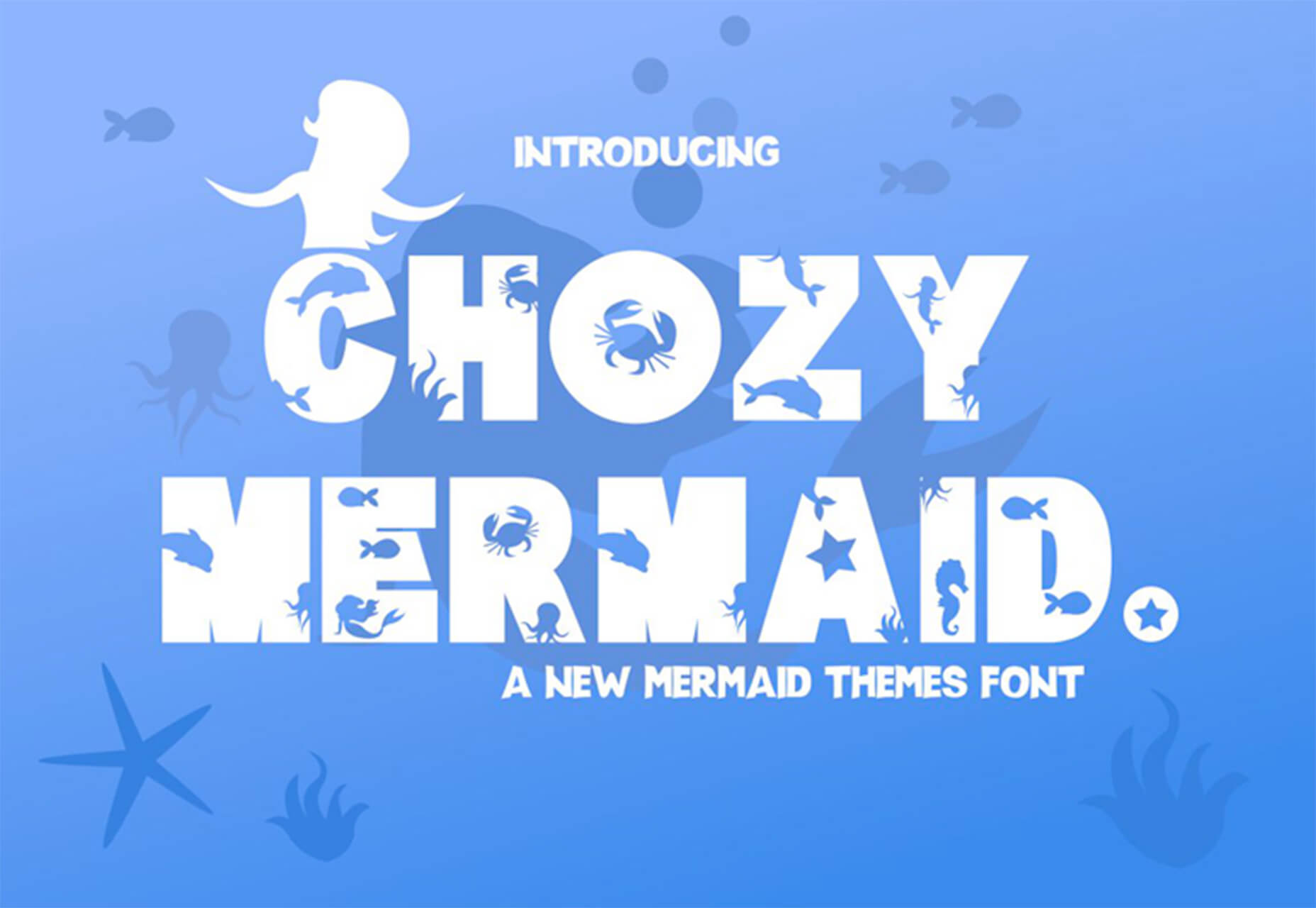
Chozy Mermaid is a super funky novelty typeface to close out summer. The characters feature beach themes within slab characters. It might be hard to find an application for this one, but it is too fun not to share.

Dotuku

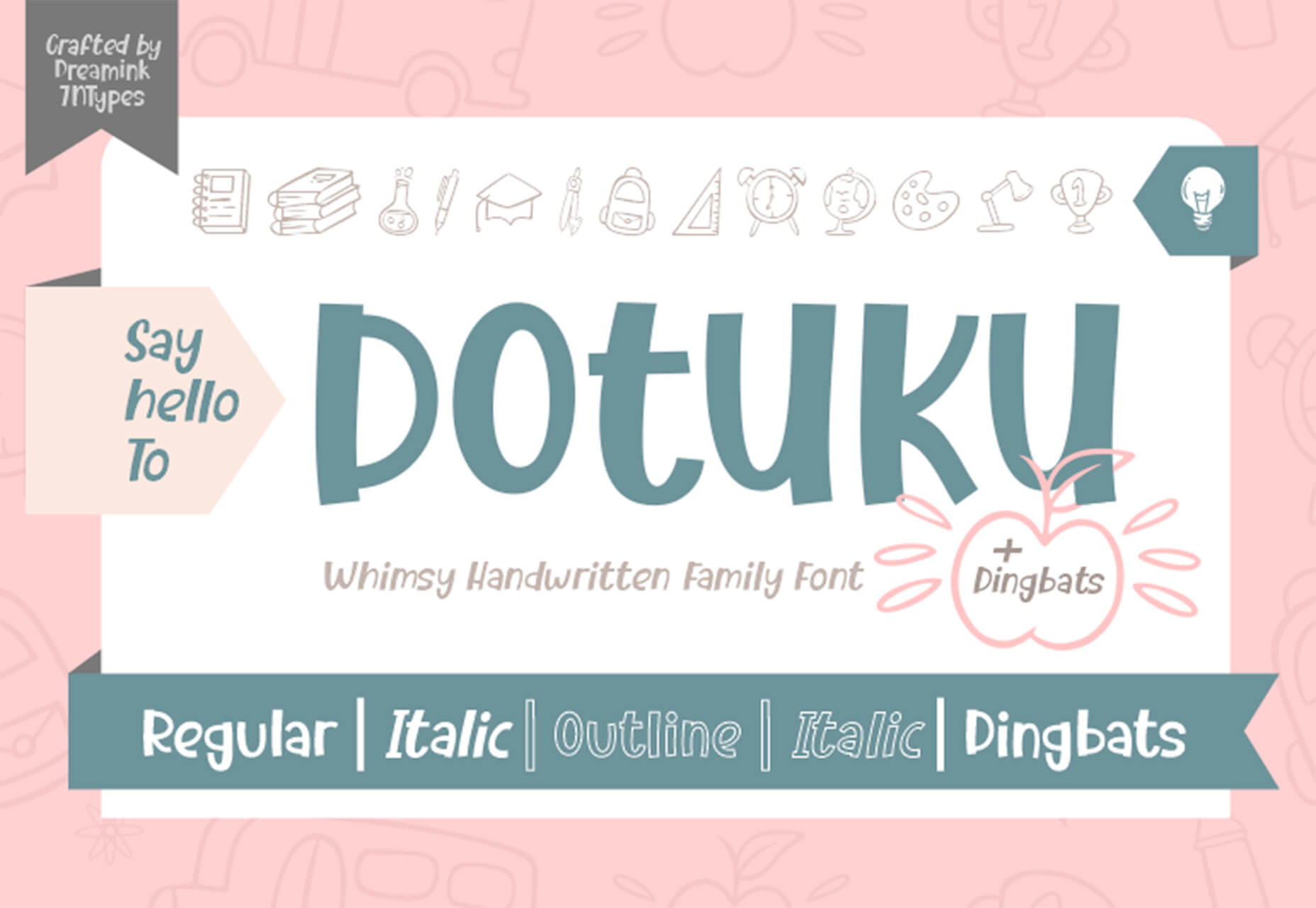
Dotuku is a dingbats font with a back to school theme. The limited character set features filled and outline styles that are perfect for classrooms.

Margin

Margin is a fun retro style typeface with a 1970s vibe. It’s a “chubby serif” with 60 characters and 58 glyphs.

Rollanda

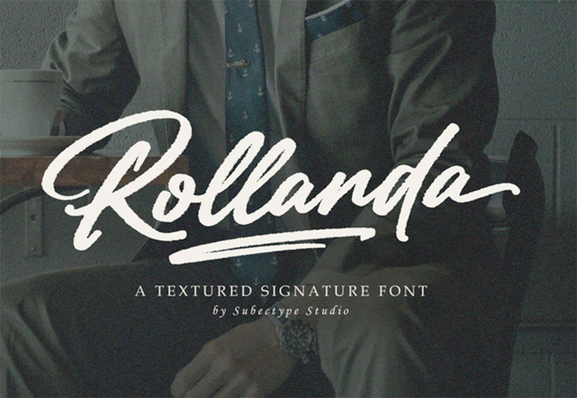
Rollanda is a signature-style script with a thicker weight and rough stroke. The character set is pretty robust.

Source


Source de l’article sur Webdesignerdepot

The right typeface can make or break your website. As designers, we will always be naturally drawn towards the premium fonts such as Circular, DIN, or Maison Neue; Before you know it, your website is racking up a font bill larger than your hosting bill.
We’ve put together a list of open-source fonts that will rival your fancy fonts, and might even persuade you to switch them out. All the fonts listed here are completely open-source, which means they’re free to use on both personal and commercial projects.

Manrope

Manrope has sprung onto the font circuit in style, with a website better than most early startups. It’s a variable font, which means you have a flexible range of font weights to choose from in a single font file. Manrope is a personal favorite of mine, it has every ligature you could want, and is fully multi-lingual. It’s a lovely bit of everything as it states on the website: it is semi-condensed, semi-rounded, semi-geometric, semi-din, semi-grotesque.

Gidole

DIN – the font we all love, the font that looks great at every size, and the font that costs quite a bit, especially with a large amount of traffic. Gidole is here to save the day, it’s an open-source version of our favorite – DIN. It’s extremely close to DIN, but designers with a keen eye will spot very few minor differences. Overall, if you’re looking to use DIN, try Gidole out before going live. (There is also a very passionate community around the font on Github)

Inter

Inter is now extremely popular, but we wanted to include it as it’s become a staple in the open-source font world — excellent releases, constant updates, and great communication. If you’re looking for something a bit fancier than Helvetica and something more stable than San Francisco, then Inter is a great choice. The font has now even landed on Google Fonts, making it even easier to install. As of today: 2500+ Glyphs, Multilingual, 18 Styles, and 33 Features… do we need to say more?

Overpass

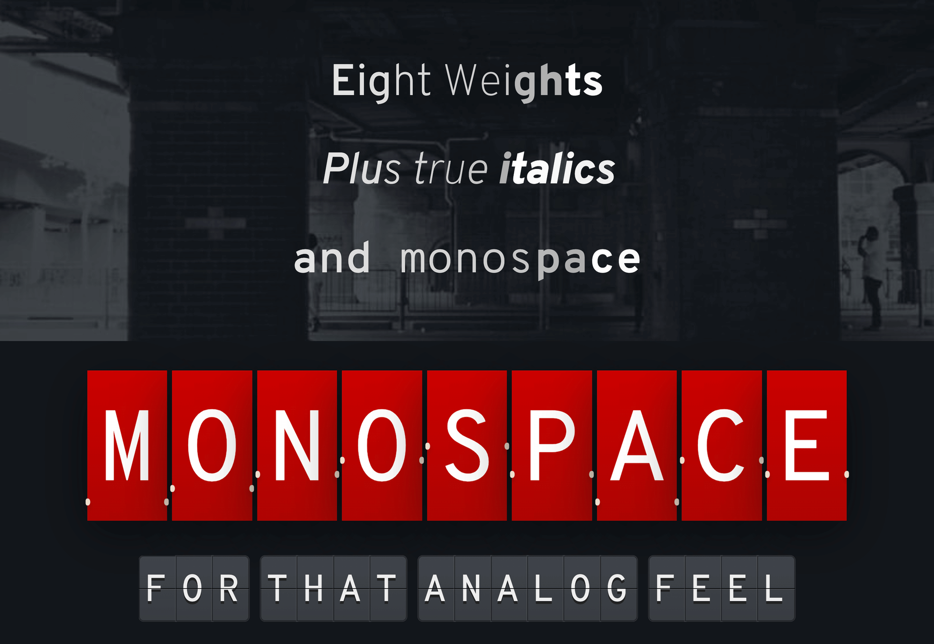
Overpass was created by Delvefonts and sponsored by Redhat, it was designed to be an alternative to the popular fonts Interstate and Highway Gothic. It’s recently cropped up on large ecommerce sites and is growing in popularity due to its large style set and ligature library. Did we mention it also has a monospace version? Overpass is available via Google Fonts, KeyCDN, and Font Library.

Public Sans

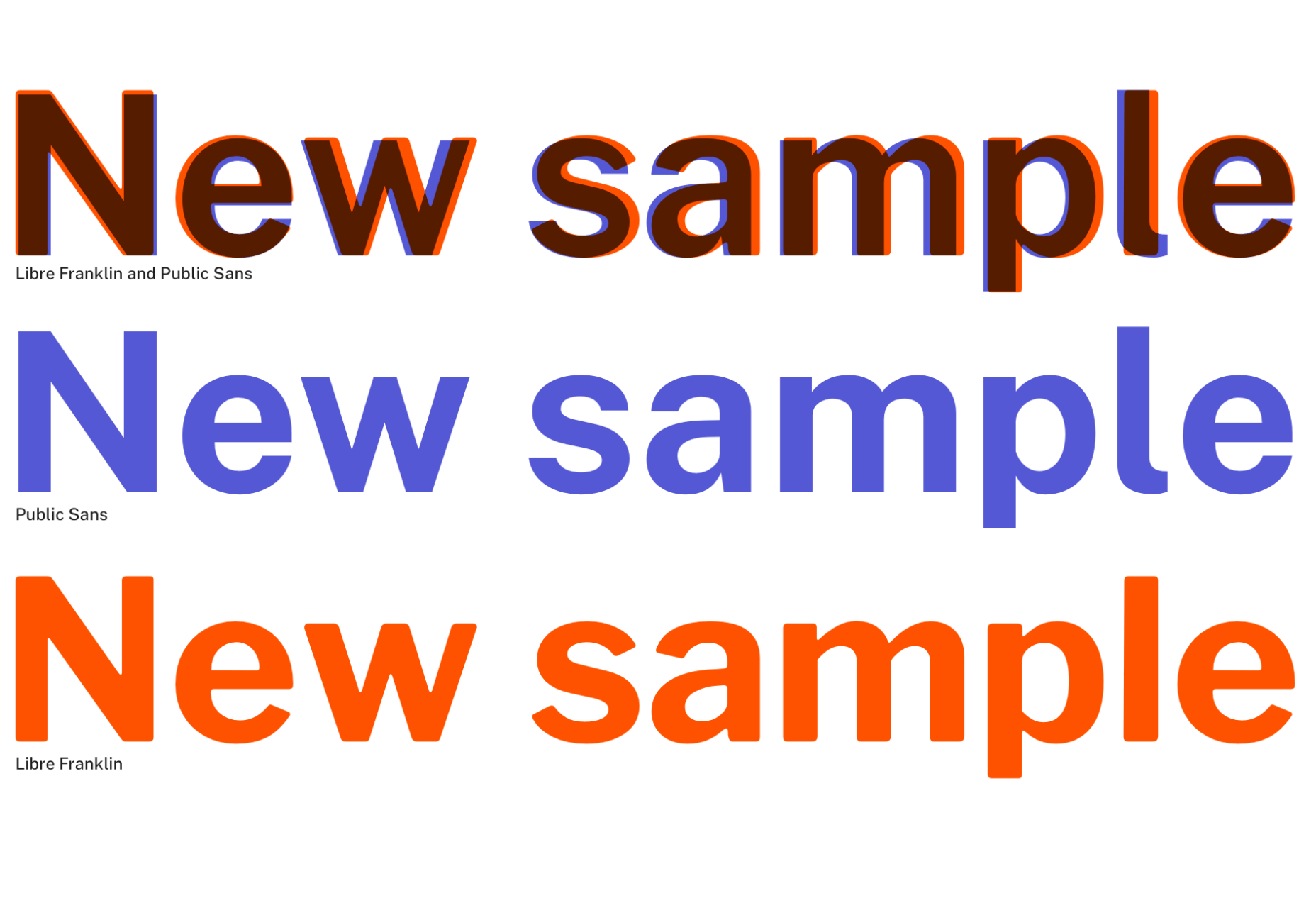
Public Sans is a project of the United States Government, it’s used widely on their own department websites and is part of their design system. The font is based on the popular open-source font Libre Franklin. Public Sans has great qualities such as multilingual support, a wide range of weights, and tabular figures. The font is also available in variable format but this is currently in the experimental phase of development.

Space Grotesk

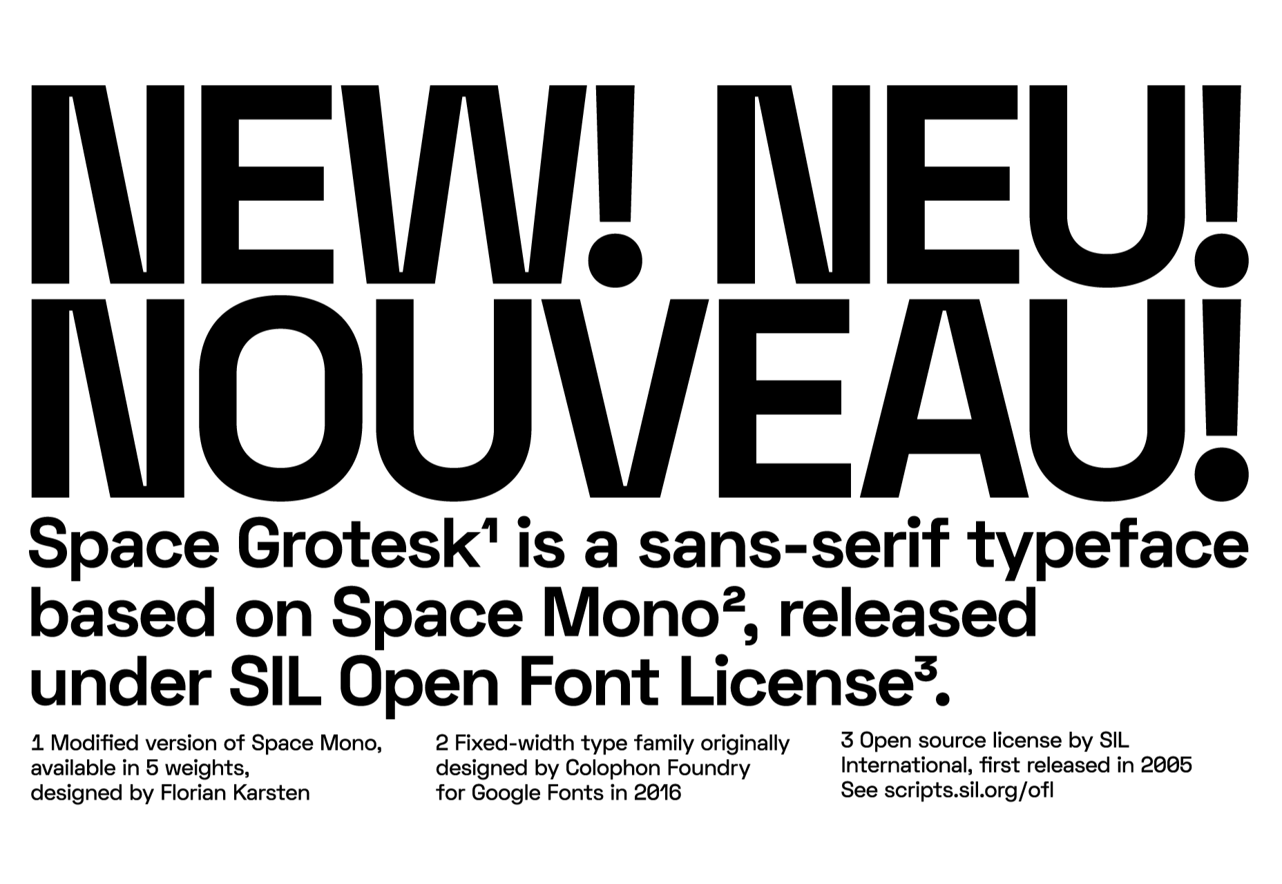
Space Grotesk isn’t widely known yet, but this quirky font should be at the forefront of your mind if you’re looking for something “less boring” than good old Helvetica. Space Grotesk has all the goodies you can expect from a commercial font such as multiple stylistic sets, tabular figures, accented characters, and multilingual support.

Alice

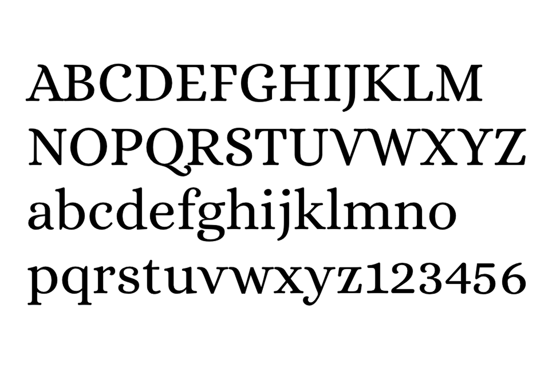
Alice is a quirky serif font usually described as eclectic and quaint, old-fashioned — perfect if you’re looking to build a website that needs a bit of sophistication. Unfortunately, it only has one weight, but it is available on Google Fonts.

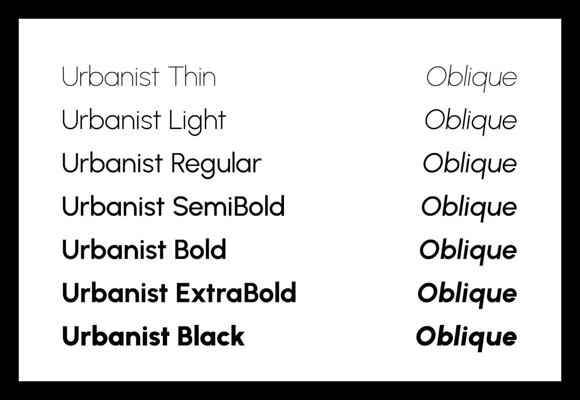
Urbanist

Urbanist is an open-source variable, geometric sans serif inspired by Modernist typography. Designed from elementary shapes, Urbanist carries intentional neutrality that grants its versatility across a variety of print and digital mediums. If you’re looking to replace the premium Sofia font, then Urbanist is your best bet.

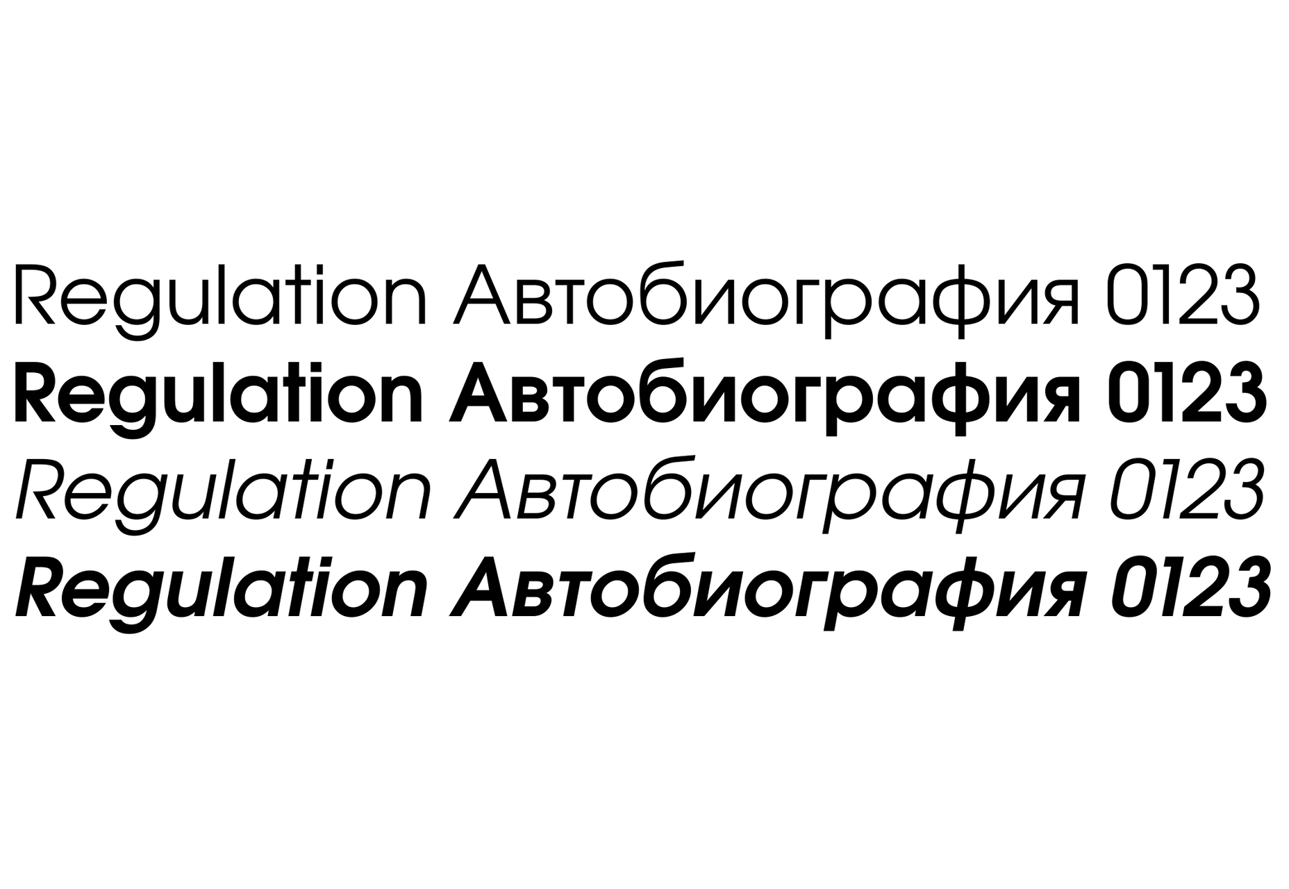
Evolventa

Evolventa is a Cyrillic extension of the open-source URW Gothic L font family. It has a familiar geometric sans-serif design and includes four faces. Evolventa is a small font family, generally used across the web for headlines and bold titles.

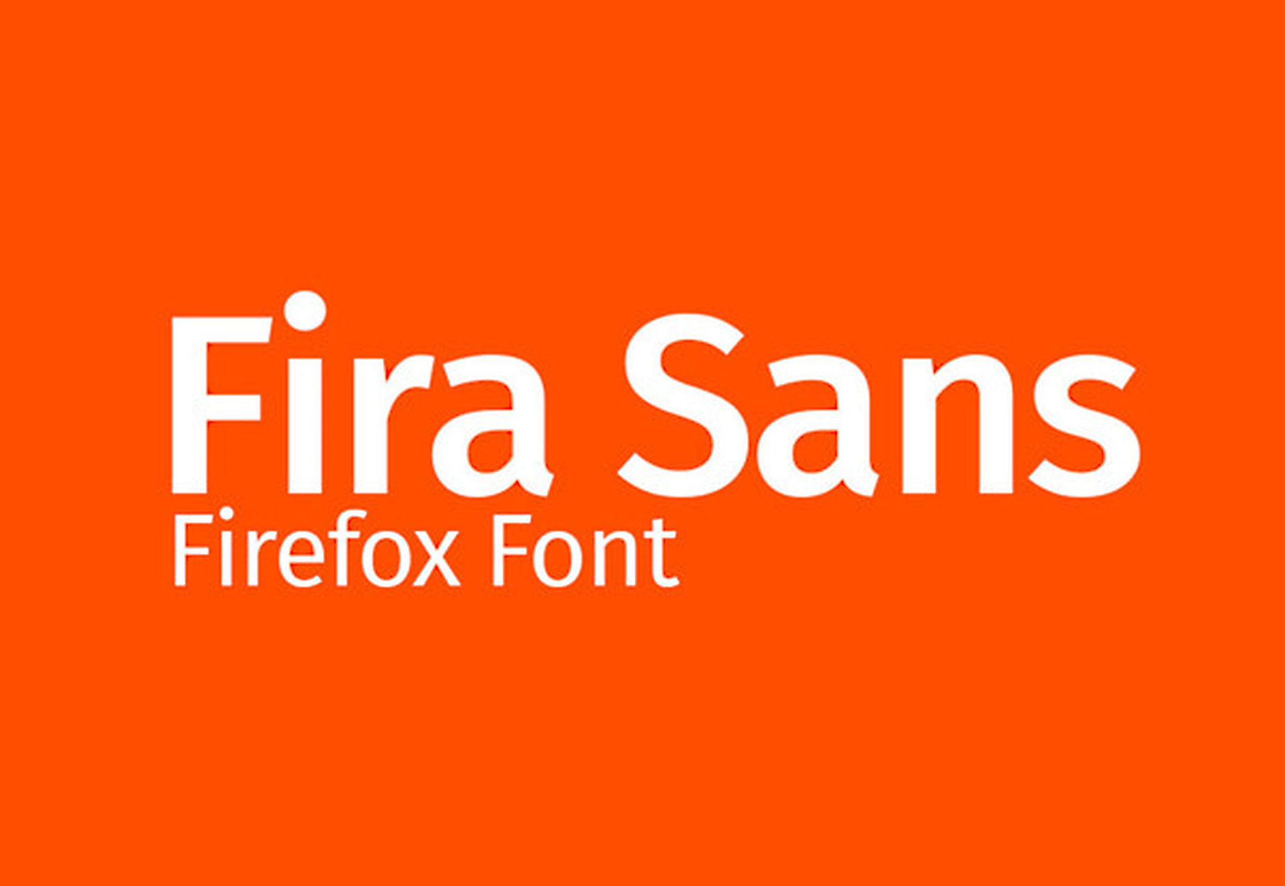
Fira Sans

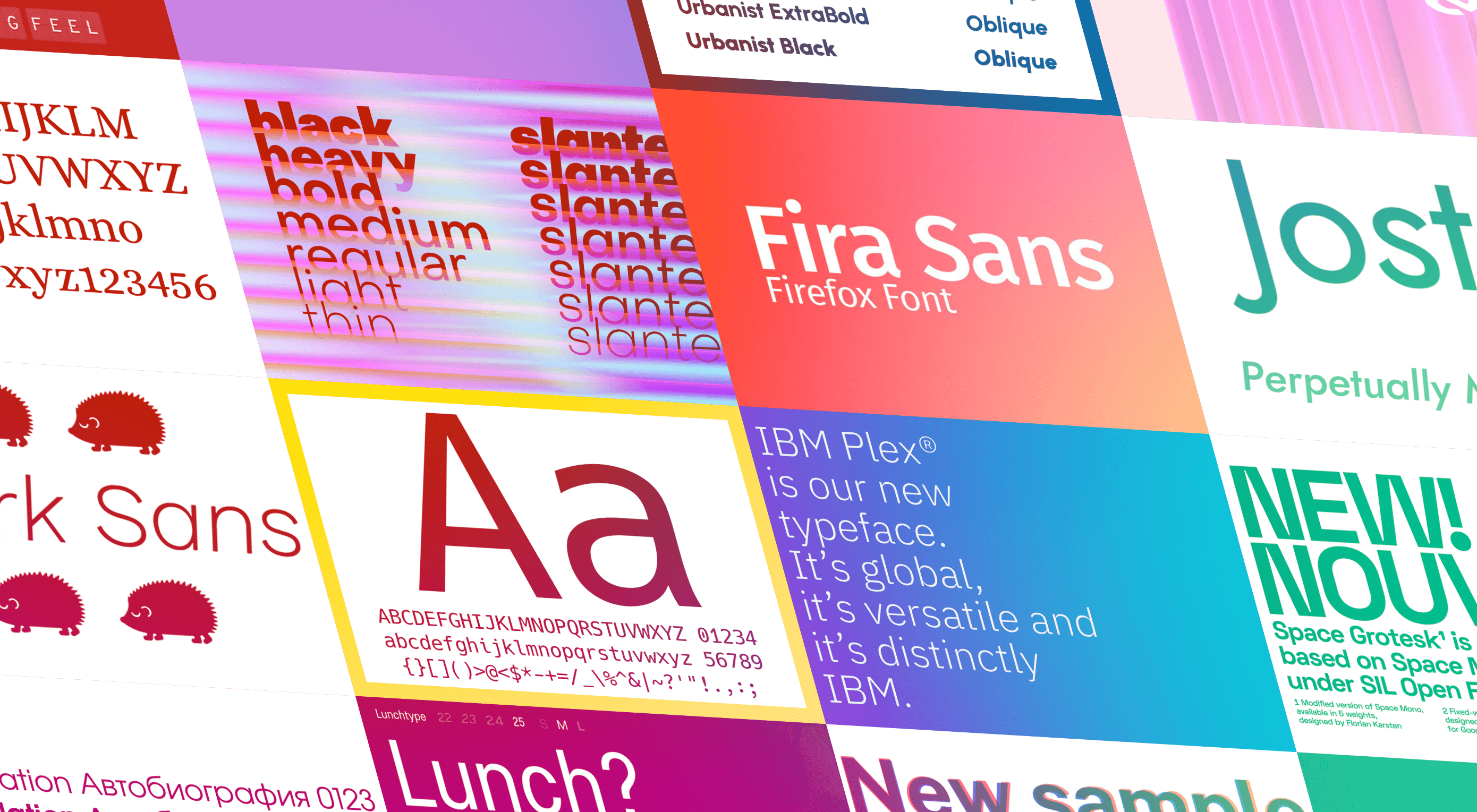
Fira Sans is a huge open source project, brought to you, and opened sourced by the same team that makes Firefox. It’s Firefox’s default browser font and the font they use on their website. The font is optimized for legibility on screens. (And it’s on Google Fonts!)

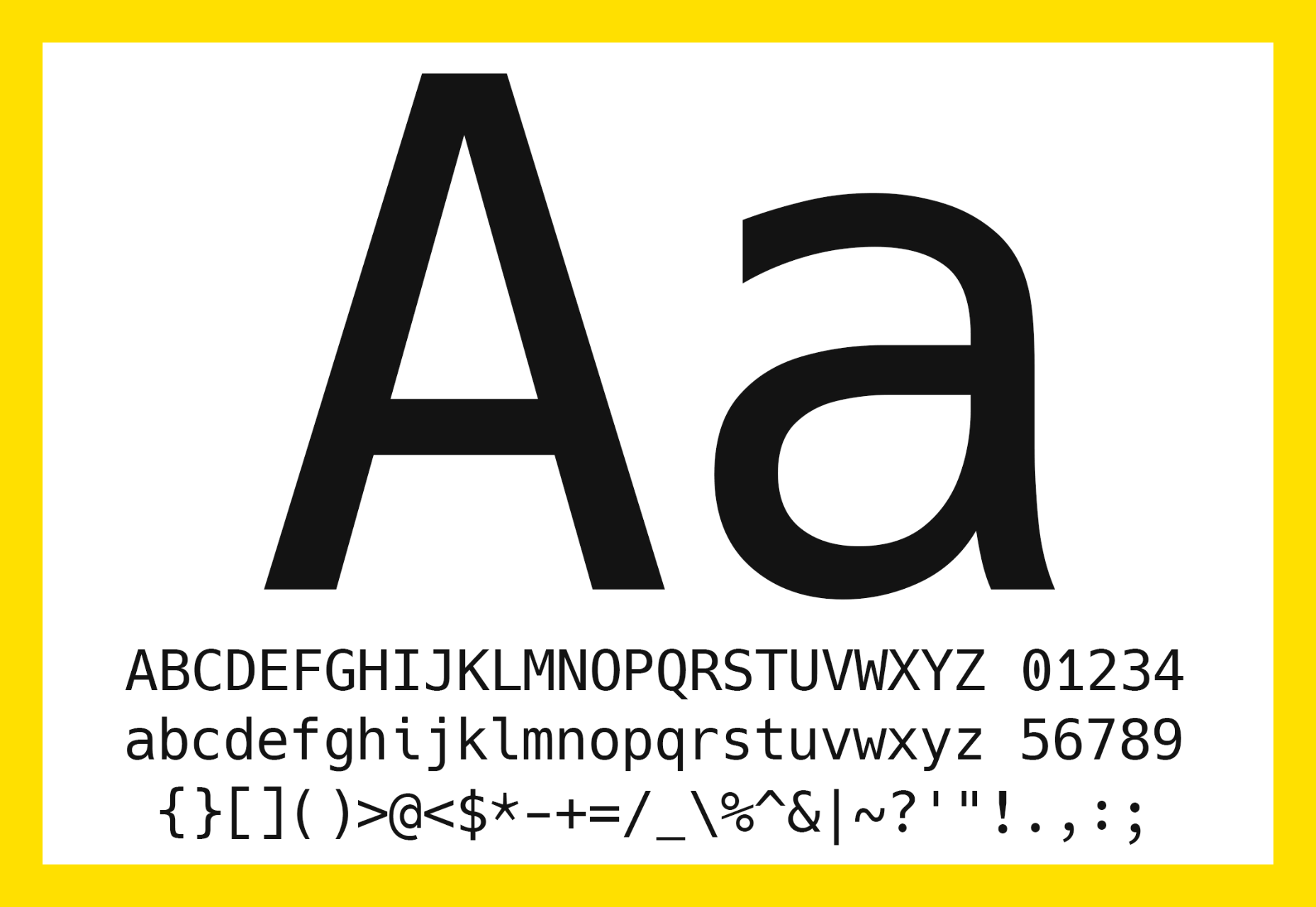
Hack

Building a development website, or need a great code font to style those pesky code-blocks? Then Hack is the font for you. Super lightweight and numerous symbols and ligatures. The whole font was designed for source code and even has a handy Windows installer.

IBM Plex

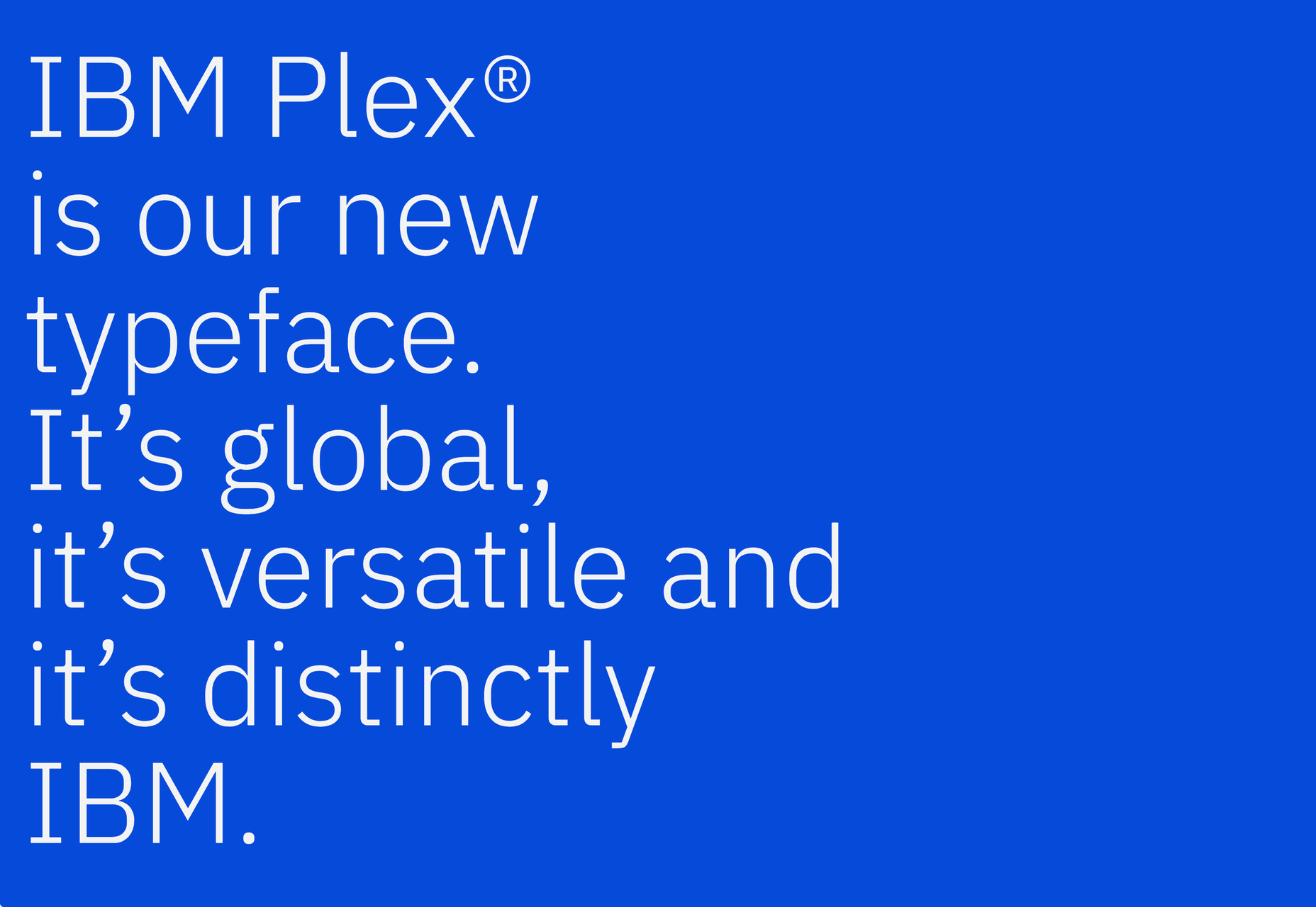
IBM needs no introduction. Plex is IBM’s default website font and is widely used around the web in its numerous formats Mono, Sans, Serif, Sans-Serif, and Condensed – it has everything you’d need from a full font-family. The whole font family is multi-lingual, perfect for multi-national website designs. (It’s fully open-source!)

Monoid

Another great coding font, Monoid is a favorite of mine for anything code. The clever thing about Monoid is that it has font-awesome built into it, which they call Monoisome. This means when writing code, you can pop a few icons in there easily. Monoid looks just as great when you’re after highly readable website body text.

Object Sans

Object Sans (formally known as Objectivity) is a beautiful geometric font family that can be used in place of quite a few premium fonts out there. The font brings together the top qualities of both Swiss neo-grotesks and geometric fonts. The font works beautifully as large headings but can be used for body content as well.

Lunchtype

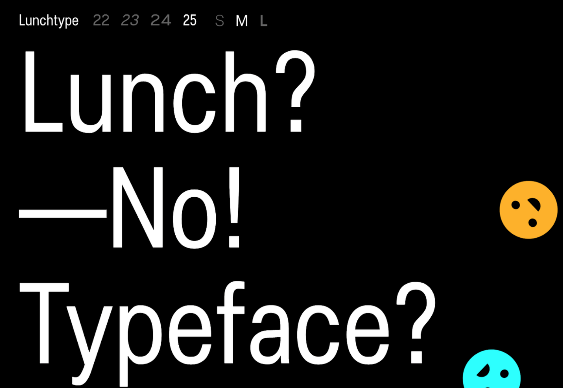
Lunchtype has a very interesting back-story, originally designed during the creator’s daily lunchtime during a 100-day project. If you’re looking for something a bit “jazzier” than the typical Helvetica for your project, then Lunchtype is a perfect choice. The family comes with numerous weights as well as a condensed version — enough to fill any lunchbox.

Jost

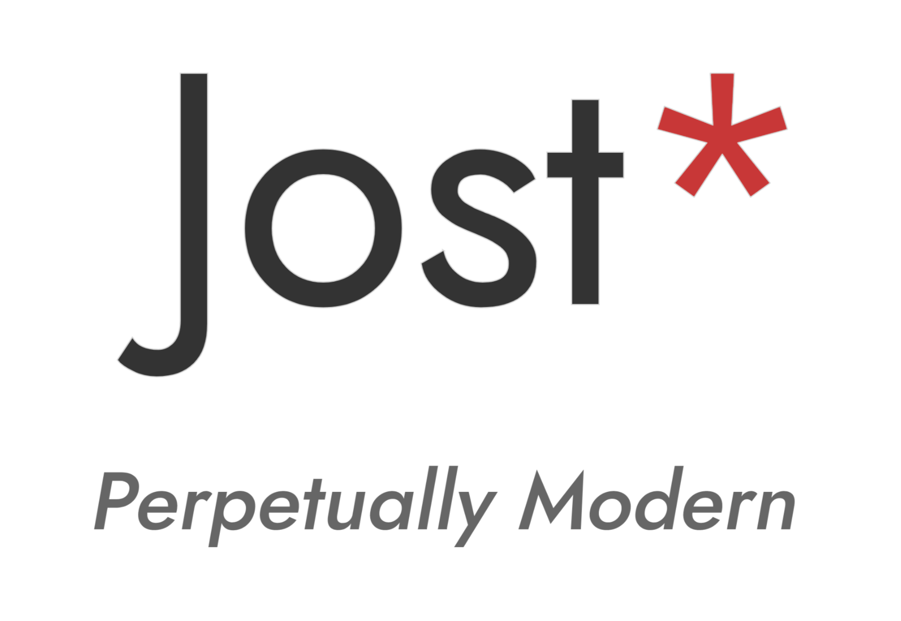
Inspired by the early 1920’s German sans-serif’s, Jost is a firm favorite in the open-source font world. Jost brings a twist to its closest web designer favorite Futura. When you want a change from the typical Futura, then Jost is a great option with its variable weighting as well as multilingual support.

Work Sans

Work Sans is a beautiful grotesk sans with numerous little eccentricities that may delight or annoy some designers. The font has variable weighting, multilingual support and is optimized for on-screen text use but works perfectly well for print also.

Source


Source de l’article sur Webdesignerdepot

Contentful; Webster’s Dictionary defines “contentful” as… not found. Clearly someone made up this word, but that is not necessarily a bad thing.
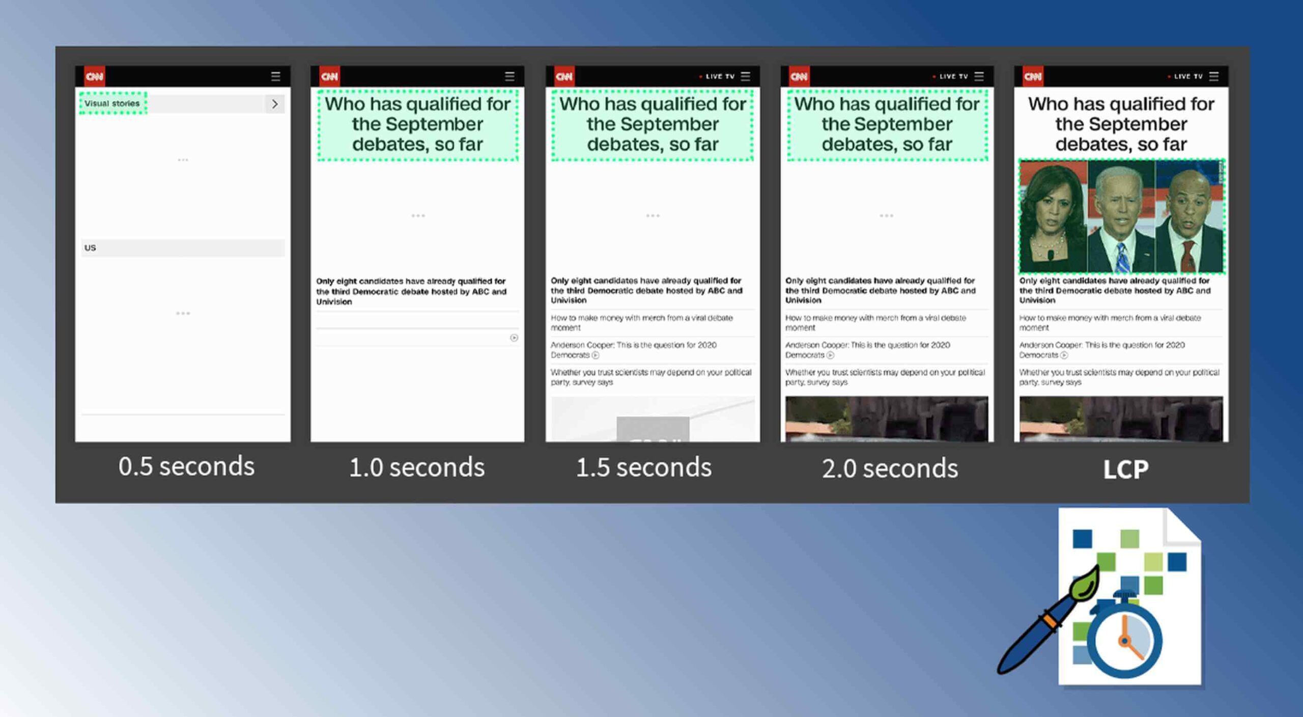
The world of user experience metrics is moving quickly, so new terminology is needed. Largest Contentful Paint (LCP) is one of a number of metrics measuring the render time of content on a web page.

What is Largest Contentful Paint?

Google defines LCP as “the render time of the largest content element visible within the viewport.” For what we are talking about in this blog, we will consider “content” to be an image, typically a JPEG or PNG file. In most cases, “largest” points to a hero image that is “above the fold” and is one of the first images people will notice when loading the page. Applying optimization to this largest content is critical to improving LCP.

It is probably more instructive to view LCP relative to other metrics. For example, First Contentful Paint (FCP) and Visually Complete book end LCP.

Each metric has its pros and cons, but LCP is a happy medium. LCP marks when web page loading starts to have a substantial impact on user experience.

In Google’s opinion, to provide a good user experience, LCP should occur within 2.5 seconds of when the page first starts loading. Poor values are anything greater than 4 seconds.

How Does Largest Contentful Paint Impact Lighthouse Scores and SEO?

LCP is now part of several “Core Web Vitals” scores that Google will measure in its ranking algorithm. Each of the Core Web Vitals represents a distinct facet of the user experience, is measurable in the field, and reflects the real-world experience of a critical user-centric outcome.

In the case of the overall Google Lighthouse score, LCP represents 25% weighting on the performance score of Lighthouse version 6.0. This makes LCP the most important Core Web Vitals metric in determining the performance score.

While Google has indicated that content is still the most important factor in SEO ranking, a better user experience (as measured by Core Web Vitals) will generate higher rankings in a crowded field. If there are many websites competing for the top search engine spots, then Largest Contentful Paint will play a critical factor in rankings.

How to Improve Largest Contentful Paint

Now that you know that LCP is important, what can you do to improve it by making content load faster? Google provides a number of suggestions, but the most effective technique is to optimize content for the device requesting it.

For example, a website includes an 800kb JPEG image that is intended for high resolution desktops. On a smartphone, that would be optimized down to less than 100kb, with no perceptible impact on quality. LCP can improve by more than 60% — or several seconds — through this single optimization.

Find Savings in Largest Contentful Paint by using Image Speed Test

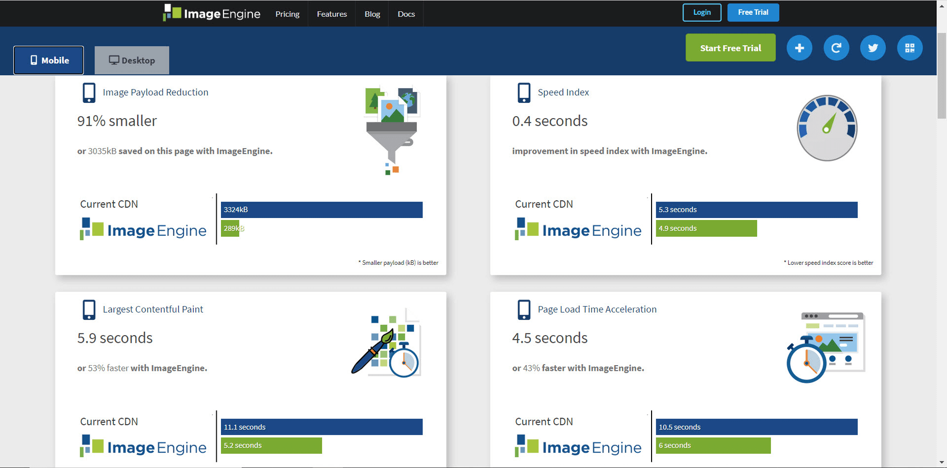
Image Speed Test is a great tool offered by ImageEngine.io that provides an analysis of LCP improvement opportunities. Just paste in the URL of the web page you are interested in optimizing, and the test will show you:

  • Image Payload Reduction
  • Speed Index
  • Largest Contentful Paint
  • Page Load Time (Visually Complete)

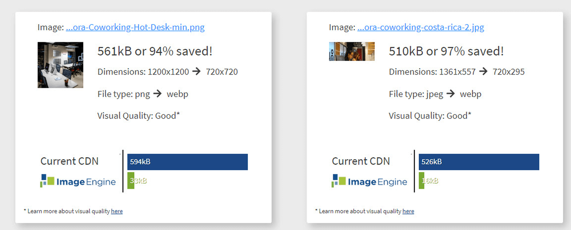
It also provides a video of the web page loading with and without optimizations. Finally, it analyses each image to provide an estimate of payload savings. In this case, the “largest content” on the page is this image. With optimizations, the image payload is reduced by 94%. That delivers a huge improvement in LCP.

How Does ImageEngine Improve LCP

ImageEngine is an image content delivery network (CDN) service that makes image optimization simple. Basically, for each image on the page, the image CDN will:

  1. Detect the device model requesting the web page;
  2. Optimize the image in terms of size, compression, image format;
  3. Deliver via a CDN edge server that is geographically closest to the user.

ImageEngine improves web performance for every image on the page, including the largest. You can learn more about ImageEngine here, and also sign up for a free trial.

Best Practices: Preconnect

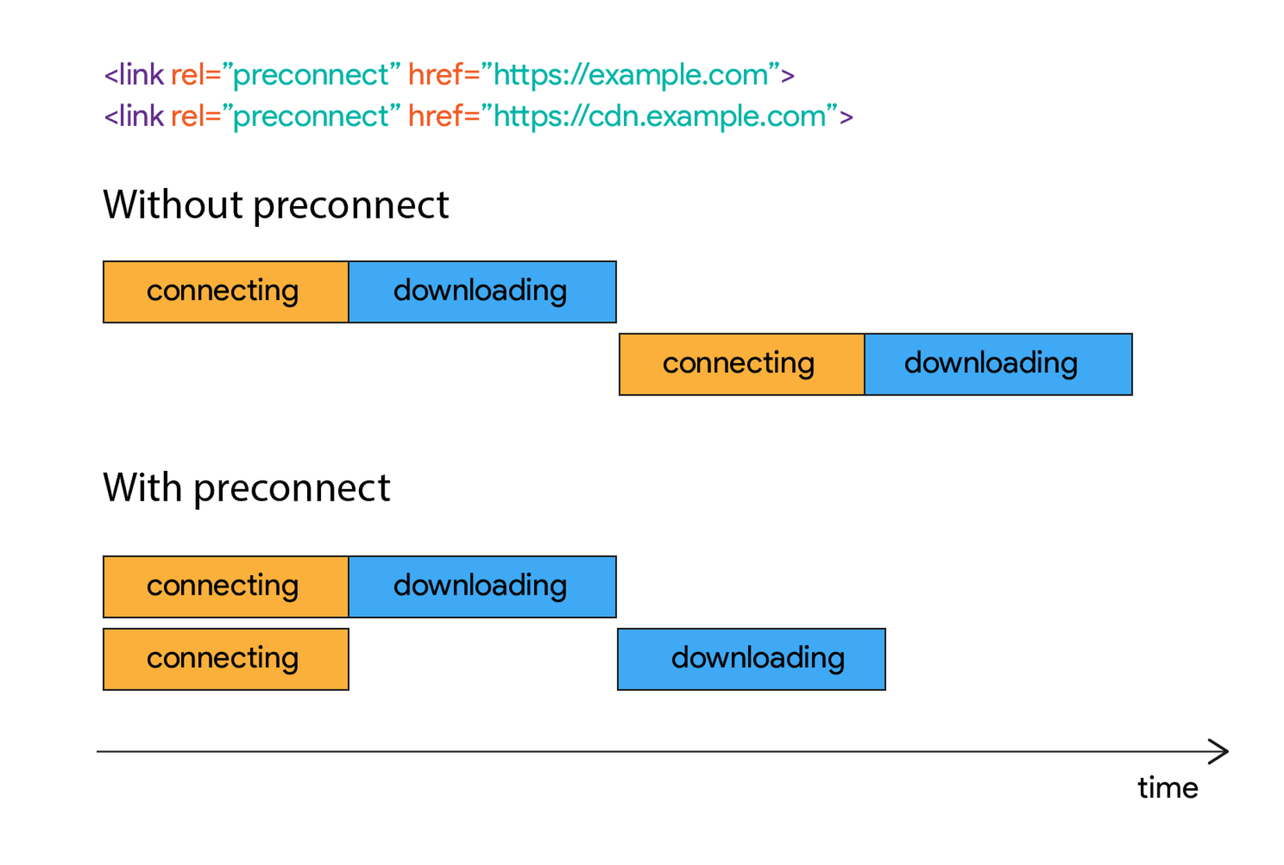
In addition to using an image CDN like ImageEngine, a few other best practices can improve LCP. Using the resource hints to provide a preconnect for your content can streamline the download process.

For example, putting the following link statement in the HTML will accelerate the download process. The link statement will make the browser connect to the third party as early as possible so that download can start sooner. ImageEngine’s optimizations make each image download smaller and faster, but preconnect save time in the connection phase.

Best Practices: Minimize Blocking JavaScript and CSS

When JavaScript or CSS is “blocking” it means that the browser needs to parse and execute CSS and JavaScript in order to paint the final state of the page in the viewport.

Any website today relies heavily on both JavaScript and CSS, which means that it is almost impossible to avoid some render blocking resources. On a general note: be careful with what kind of CSS and JavaScript is referenced inside the <head> element. Make sure that only the strictly necessary resources are loaded in <head>. The rest can be deferred or loaded asynchronously.

When looking to improve the LCP specifically, there are some practices worth looking into more deeply.

Inline Critical CSS

It is not an easy task, but if the browser can avoid making a request to get the CSS needed to render the critical part of the page – usually the “above the fold” part – the LCP is likely to occur earlier. Also you will avoid content shifting around and maybe even a Flash of Unstyled Content (FOUC).

The critical CSS — the CSS needed by the browser to set up the structure and important styles of the part of the page shown above the fold — should in-inlined. This inlined CSS may also refer to background images, which of course should also be served by an Image CDN.

Do Not Use JavaScript to (lazy) Load Images

Many modern browsers natively support lazy loading, without the use of JavaScript. Because images usually are heavily involved in the performance of LCP, it is best practice to leave image loading to the browser and avoid adding JavaScript in order to lazy load images.

Lazy loading driven by JavaScript will add additional latency if the browser first has to load and parse JavaScript, then wait for it to execute, and then render images. This practice will also break the pre-parser in the browser.

If an image CDN is used to optimize images, then the benefits of lazy loading become much smaller. Especially large hero images that are above the fold have a large impact on LCP and will not benefit from being lazy loaded with JavaScript. It is best not to make JavaScript a blocking issue for rendering images, but rather rely on the browser’s own ability to select which images should be lazy loaded.


[– This is a sponsored post on behalf of ImageEngine –]

Source


Source de l’article sur Webdesignerdepot

We are gathered here today….

Today I write in memory of Adobe Flash (née Macromedia), something that a bunch of people are actually too young to remember. I write this with love, longing, and a palpable sense of relief that it’s all over. I have come to praise Flash, to curse it, and finally to bury it.

We’ve been hearing about the death of Flash for a long time. We know it’s coming. December 2020 has been announced as the official timeframe for removal, but let’s be real about this: it’s dead. It’s super-dead. It’s people-are-selling-Flash-game-archives-on-Steam dead.

That last bit actually makes me happy, because Flash games were a huge part of my childhood, and the archives must be preserved. Before I’d ever heard of video cards, frames per second, and “git gud”, I was whiling away many an hour on disney.com, cartoonnetwork.com, MiniClip, Kongregate, and other sites, looking for games.

I think we’ve established in my previous work that even as a missionary kid, I did not have a social life.

The Internet itself gave me a way to reach out and see beyond my house, my city, and my world, and it was wonderful. Flash was a part of that era when the Internet felt new, fresh, and loaded with potential. Flash never sent anyone abuse, or death threats. Flash was for silly animations, and games that my parent’s computer could just barely handle, after half an hour of downloading.

I even built my first animated navigation menus in Flash, because I didn’t know any better. At all. But those menus looked exactly like the ones I’d designed in Photoshop, so that’s what mattered to me, young as I was.

That was a part of Flash’s charm, really.

What Flash Got Right

Flash Brought Online Multimedia into the Mainstream

Funny story, JavaScript was only about a year old when Flash was released. While HTML5 and JS are the de-facto technologies for getting things done now, Flash was, for many, the better option at launch. JS had inconsistent support across browsers, and didn’t come with a handy application that would let you draw and animate whatever you wanted.

It was (in part) Flash that opened up a world of online business possibilities, that made people realize the Internet had potential rivalling that of television. It brought a wave of financial and social investment that wouldn’t be seen again until the advent of mainstream social networks like MySpace.

The Internet was already big business, but Flash design became an industry unto itself.

Flash Was Responsive

Yeah, Flash websites could be reliably responsive (and still fancy!) before purely HTML-based sites pulled it off. Of course, it was called by other names back then, names like “Liquid Design”, or “Flex Design”. But you could reliably build a website in Flash, and you knew it would look good on everything from 800×600 monitors, to the devastatingly huge 1024×768 screens.

You know, before those darned kids with their “wide screens” took over. Even then, Flash still looked good, even if a bunch of people suddenly had to stop making their sites with a square-ish aspect ratio.

Flash Was Browser-Agnostic

On top of being pseudo-responsive, the plugin-based Flash player was almost guaranteed to work the same in every major browser. Back in a time when Netscape and Internet Explorer didn’t have anything that remotely resembled feature parity, the ability to guarantee a consistent website experience was to be treasured. When FireFox and Chrome came out, with IE lagging further behind, that didn’t change.

While the CSS Working Group and others fought long and hard for the web to become something usable, Flash skated by on its sheer convenience. If your site was built in Flash, you didn’t have to care which browsers supported the <marquee> tag, or whatever other ill-conceived gimmick was new and trendy.

Flash Popularized Streaming Video

Remember when YouTube had a Flash-based video player? Long before YouTube, pretty much every site with video was using Flash to play videos online. It started with some sites I probably shouldn’t mention around the kids, and then everyone was doing it.

Some of my fondest memories are of watching cartoon clips as a teenager. I’d never gotten to watch Gargoyles or Batman: The Animated Series as a young kid, those experience came via the Internet, and yes… Flash. Flash video players brought me Avatar: The Last Airbender, which never ever had a live action adaptation.

Anyway, my point: Flash made online video streaming happen. If you’ve ever loved a Netflix or Prime original show (bring back The Tick!), you can thank Macromedia.

What Flash Got Wrong

Obviously, not everything was rosy and golden. If it was, we’d have never moved on to bigger, better things. Flash had problems that ultimately killed it, giving me the chance, nay, the responsibility of eulogizing one of the Internet’s most important formative technologies.

Firstly, it was buggy and insecure: This is not necessarily a deal-breaker in the tech world, and Microsoft is doing just fine, thank you. Still, as Flash matured and the code-base expanded, the bugs became more pronounced. The fact that it was prone to myriad security issues made it a hard sell to any company that wanted to make money.

Which is, you know, all of them.

Secondly, it was SEO-unfriendly: Here was a more serious problem, sales-wise. While we’re mostly past the era when everyone and their dog was running a shady SEO company, search engines are still the lifeblood of most online businesses. Having a site that Google can’t index is just a no-go. By the time Google had managed to index SWF files, it was already too late.

Thirdly, its performance steadily got worse: With an expanding set of features and code, the Flash plugin just took more and more resources to run. Pair it with Chrome during that browser’s worst RAM-devouring days, and you have a problem.

Then, while desktops were getting more and more powerful just (I assume) to keep up with Flash, Apple went and introduced the iPhone. Flash. Sucked. On. Mobile. Even the vendors that went out of their way to include a Flash implementation on their smartphones almost never did it well.

It was so much of a hassle that when Apple officially dropped Flash support, the entire world said, “Okay, yeah, that’s fair.”

Side note: Flash always sucked on Linux. I’m just saying.

Ashes to Ashes…

Flash was, for its time, a good thing for the Internet as a whole. We’ve outgrown it now, but it would be reckless of us to ignore the good things it brought to the world. Like the creativity of a million amateur animators, and especially that one cartoon called “End of Ze World”.

Goodbye Flash, you sucked. And you were great. Rest in peace. Rest in pieces. Good riddance. I’ll miss you.


Featured image via Fabio Ballasina and Daniel Korpai.

Source


Source de l’article sur Webdesignerdepot

You’ve been working away at your latest design project, and the client has given the go-ahead on your lovingly created digital concepts. Now it’s time to bring those designs to life, and you have a developer queued up to do just that.
So your part’s done, right? Not quite. You’re going to want to make sure your developer has the best head start they can in order to create the site as you imagined.

Below are a few tips to make that handover process a little easier.

Communicate to Make It Great

Get Talking

Scheduling a face-to-face meeting with your developer to talk over your project’s specifics and ambitions will help align your expectations and make the intent behind your concepts more clear. It’s quite likely they’ll even ask questions and request assets you haven’t even thought of yet!

It’s not just a one-and-done thing either, your developer’s going to have questions or requirements that arise as the project progresses. Deciding on a communication channel to allow easy discussion will help you both immensely.

Annotating Your Concepts

Developers might seem like magicians with the way they bring your websites to life, but they’re not clairvoyant! Annotating your concepts where advanced functionality is required reduces ambiguity and makes it more likely that your cool, quirky idea is going to make it to production. If it’s a feature that’s particularly unusual, you might want to find an example of a website or code sandbox that does something similar.

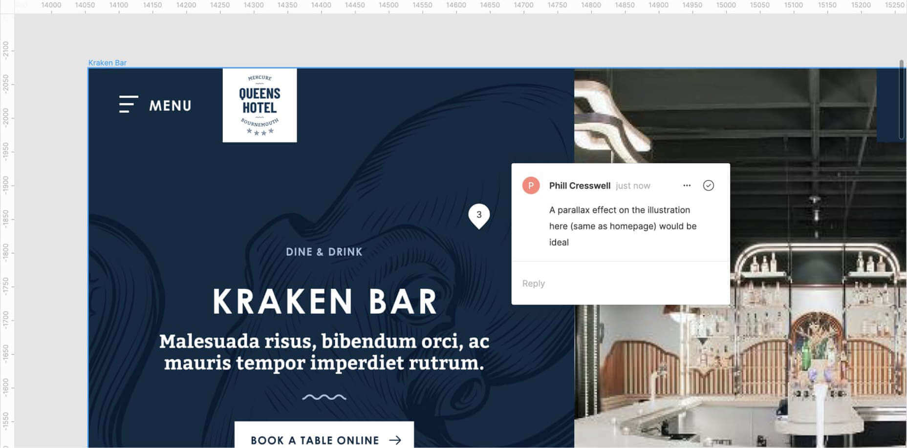
An example of Figma’s comment tool in use to make developer notes.

Figma and Sketch both have comment functionality in order to make annotations a little easier, also allowing multiple parties to comment. If dealing with PDFs, there is also an annotation tool available through Adobe Acrobat.

Specify the Basics

The basis of modern front end development revolves around DRY thinking. Some might argue thinking about code can be pretty dry, but we’re not talking about that – in this case, DRY stands for Don’t Repeat Yourself.  Most developers will tackle a project by starting with defining variables: what colors, font sizes, grid columns… anything that can be reused! Good, consistent design follows this same principle – although it’s a habit that can be hard to get going at first.

Tip: It’s always easier to define variables if this mentality is approached towards the start of the project!  

Colors

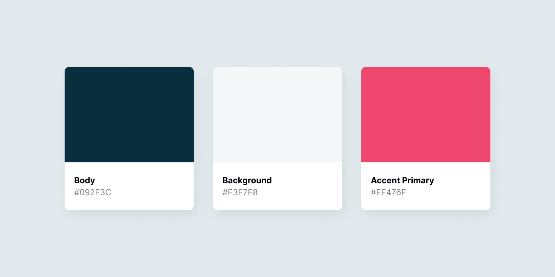
Make a style guide that specifies the colors you’ve used in your designs. Think about their logical applications to help signpost how they might work as a variable – for example, what colors did you use for paragraph text, hyperlinks and backgrounds? Did you consider colors to convey status messaging, such as successes, warnings and errors?

Typefaces

Which fonts have you used for your project? Is there a consistent set of font sizes you used throughout? If you haven’t already, maybe consider a ratio-based type scale – I like to use ModularScale to help with this.

Basic HTML Elements

Think about general styling for these basic html tags:

  • Paragraphs <p>
  • Headings <h1–h6>
  • Bullet lists <ul> and numbered lists <ol>
  • Emphasized text <b>, <strong> and <em>

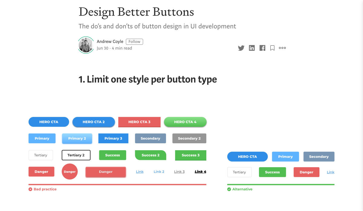
Buttons

How about buttons and links? What should they do when they’re hovered over, focused (using the tab key on a keyboard) or disabled?

Forms Fields and Inputs

What should form fields look like? Is there any validation checking that should occur when a form is submitted?  How about checkboxes and radio buttons?

It’s unlikely that you’re going to be able to cover absolutely every single eventuality – allow your developer to use some common sense to fill in the gaps, and be available to them if they have any questions. In the words of John Maxwell and your aunt’s home office wall sticker, teamwork makes the dream work.

Get Your Favic-on

Favicons are widely recognized as the small icon that appears to the left of the site title on your browser’s tab bar. Nowadays, the application of your site’s favicon is much further reaching, showing up in Google search results and app tiles. There’s also extra theming options available, such as the ability to customize the color of Google Chrome Android’s browser bar color for your site.

Using a generator site such as realfavicongenerator takes the pain out of much of this decision-making, allowing you to upload specific graphics as desired, creating silhouettes of your icon for Windows Metro tiles and macOS Safari pins, and packaging everything into easy-to-use files and code.

 Compress Your Images

Nobody wants to load a 20MB image when they’re on a slow connection or a data plan – it pays dividends to plan ahead and downsize your images so that they’re production-ready for the web. If you’re worried image compression is going to harm your image quality, fear not – you can go a long way with image compression before quality is seriously compromised.

  1. Start by reducing the image resolution – for batch jobs, I use Adobe Photoshop’s image processor script to downsize images to fit 1920 x 1200 pixels
  2. Alternatively, if you’re working on a static project – where specific images will be used only in specific places – you could use your design software (nearly all mainstream UI software allows you to do this now) to export your images at 2x size to support devices with high pixel densities.
  3. I also convert my image color profiles to SRGB to ensure consistency across most modern display types (this one’s optional)
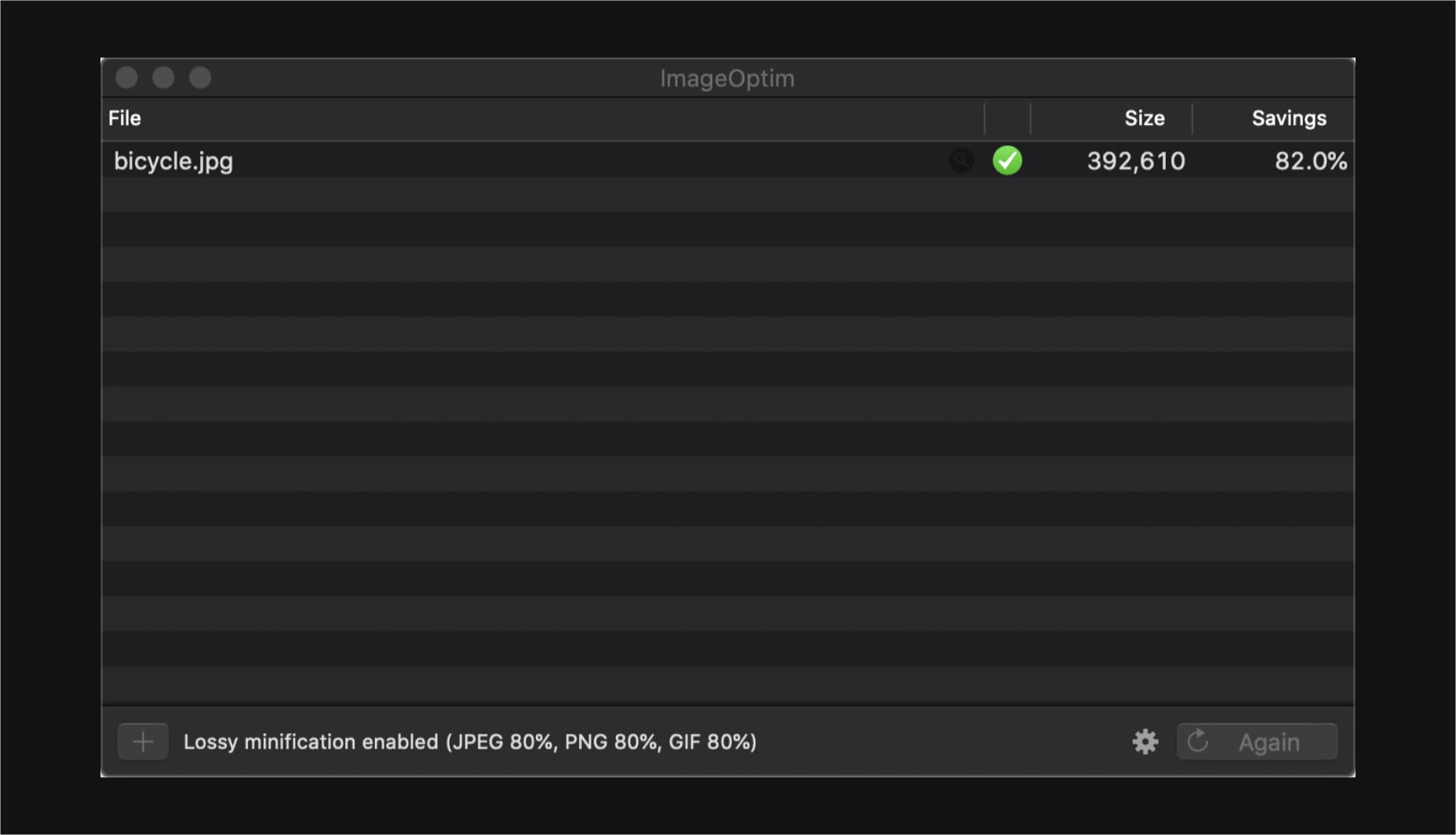
  4. I then take my newly downsized images and run them through imageOptim at 80% quality. Generally I would aim to get my images under 300kb – if there are any that are still significantly over this target once compressed, I’d run these through again at 70% quality (I wouldn’t recommend going lower than this, though).

Don’t forget you can also do this for PNGs! Enabling PNGCrush in imageOptim will let you significantly reduce the size of PNGs… just be ready for it to take a while.

Make Your Vectors SVG-Easy to Use

If your design contains graphics or illustrations you created using vector software, it can be used on the web as an SVG file. Usually, these files will be a lot smaller than JPGs or PNGs. You can export graphics in most (if not all) vector software in this format.

Optionally, you could use imageOptim or SVGOMG to compress the SVG code without sacrificing quality. Your developer might already use a script that does this automatically when processing the site for production, so it may be worth asking ahead.

Get Your Licenses in Check

If you’re using premium fonts, make sure you’ve purchased a webfont license so you can hand over the correct files to the developer. I’d recommend doing this sooner rather than later – although not often, occasionally web versions of fonts can have slightly different bounding boxes to their desktop counterparts, making it a real pain for developers to work with further down the line.

If you’ve been using samples of stock photos (or if you’ve been going crazy lifting whatever you can find on Google Images), make sure everything is kosher before you go live. Make sure you purchase licensed photos, and if certain photos you want to use require attribution, make the developer aware of this.

Source

p img {display:inline-block; margin-right:10px;}
.alignleft {float:left;}
p.showcase {clear:both;}
body#browserfriendly p, body#podcast p, div#emailbody p{margin:0;}

Source de l’article sur

Google removed 500 malicious Chrome extensions from its Web Store after they found to inject malicious ads and siphon off user browsing data to servers under the control of attackers. These extensions were part of a malvertising and ad-fraud campaign that’s been operating at least since January 2019, although evidence points out the possibility that the actor behind the scheme may have been
Source de l’article sur The Hacker News