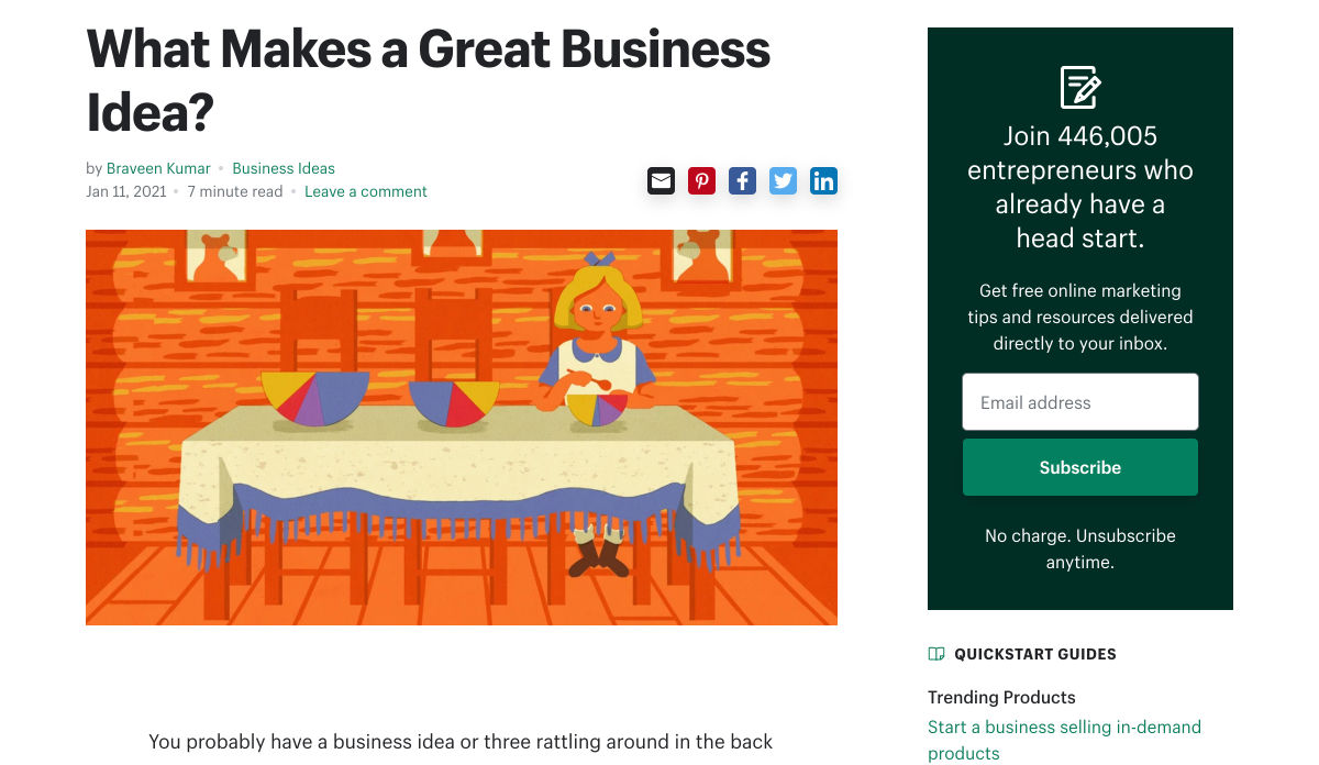
 The ‘need for speed’ is an essential item on every website’s bucket list these days. And why not? Enhanced speed is directly responsible for converting traffic into paying clients.
Anyone in any industry wishes to boost their website’s loading speed, providing an improved user experience. Plus, don’t forget that escalated site speeds also escalates the website’s ranking to more competitive spots on the search engine result pages and improves core web vitals. So, how can this need for speed be achieved? The answer is image optimization.
What is Image Optimization?
Image optimization is a process of delivering superior-quality images in the appropriate format, size, and resolution while keeping them at a compressed size. Image optimization, if done right, improves not only a website’s performance but also certain other metrics like:
- Page loading speed;
- SEO ranking;
- Conversion rate;
- User engagement;
- User experience;
- Resource download time.
However, the image optimization process can be accelerated for better efficiency if some modern tips are followed. ImageEngine, with its years of experience in the image optimization industry, has cherry-picked some tips that can help businesses in the year 2021 and beyond.
Tips for Perfect Image Optimization in 2021
In this article, the top five tips to optimize images have been outlined to help you maximize business opportunities. All the tips included are backed by comprehensive research and years of experience in the image optimization industry.
The Right Format Matters
Selecting the right image format matters a lot in the optimization process because every format is meant to serve a specific requirement.
- JPEG: Best for still images, real-world images, and complex coloring;
- PNG: Best for web images like logos and flat images;
- GIF: Best for low-resolution images, animated graphics, small icons, and simple images — however, it is not advisable to go with GIF format but rather use mp4 or a webp instead;
- TIFF: Best for high-quality and large-size print graphics;
- WebP: A modern image format that offers superior compression while maintaining great quality.
Choosing the right format reduces bandwidth consumption for an improved webpage loading speed. However, a new format has joined the club: AVIF, that covers all the above image formats’ good qualities and surpasses even WebP while maintaining an excellent compression ratio. AVIF provides almost 50% savings in size when compared to JPEG format.
Serving images in the next generation formats like WebP and AVIF is a trending practice these days.
Go for Image Compression
Once the correct format has been selected, it becomes important to reduce the images’ size through a compression method. There are two methods of compressing images:
- Lossless compression: In this compression method, all the unnecessary metadata linked with the images is removed without degrading the quality. The metadata can be erased safely while exhibiting the images on a website or application.
- Lossy compression: In this compression method, the quality of the image is slightly reduced to accomplish a smaller size. The file size obtained in lossy conversion is lower than lossless compression, however, a naked human eye cannot highlight the difference between the original image and the lossy compressed image.
Never Skip the CDN
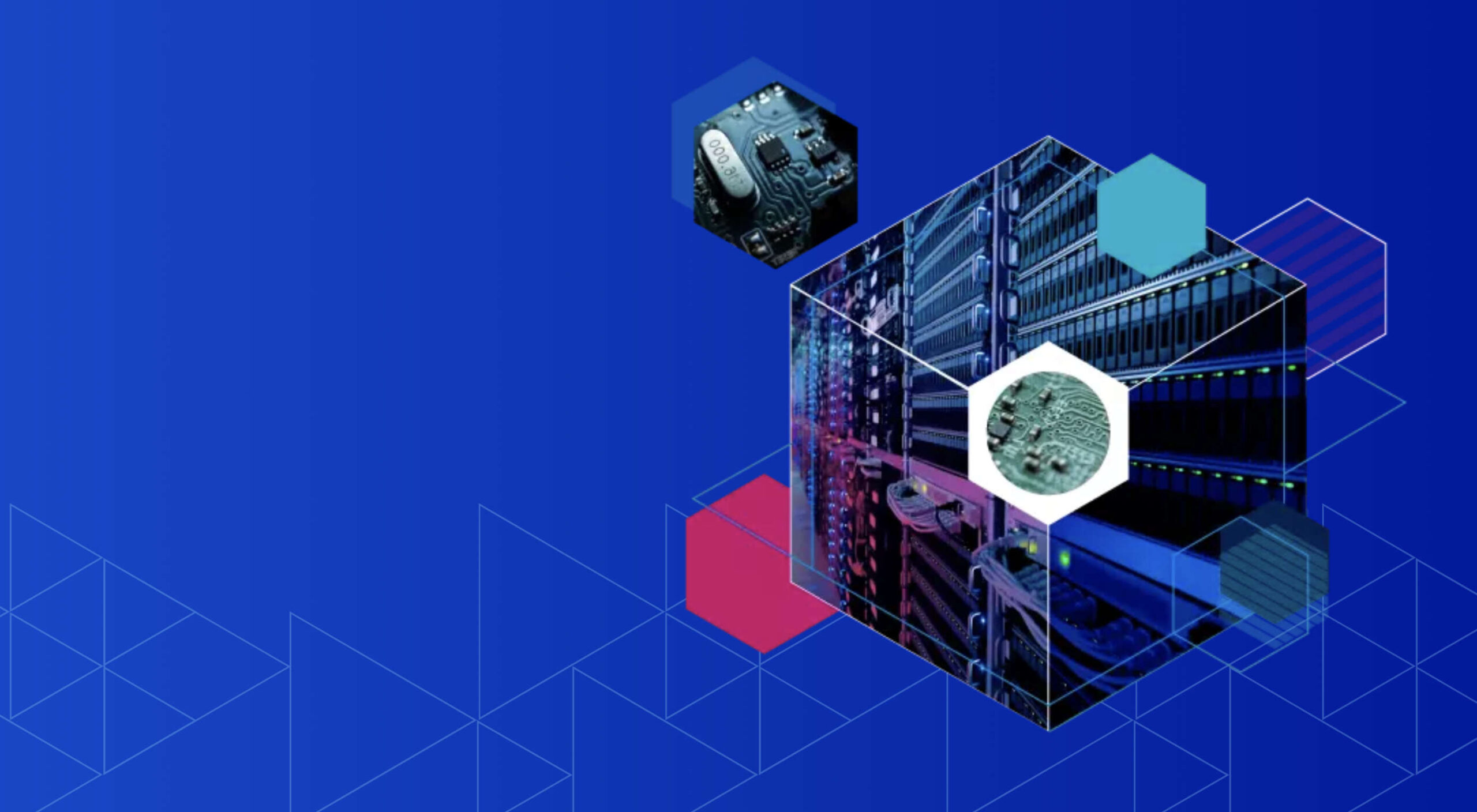
Image optimization and image CDNs are a match made in heaven. Website images not only need to be optimized but have to be delivered fast and easily as well. An optimized image is of no use if it cannot be transported quickly. An image CDN (Content Delivery Network) takes care of this need. It makes the rapid delivery of optimized images possible by reducing the distance between the online visitors and the servers.

The global image CDN also serves a ton of other benefits like:
- Enabling fast global reach via cloud acceleration;
- Audience segmentation (based on device viewport) becomes easy;
- It saves many costs by eliminating the need to invest in separate server providers in different parts of the world;
- Pulls down the load on the server to achieve reduced delivery cost;
- Secure storage capacity.
The carefully engineered image CDN from ImageEngine distinguishes itself from the rest with its unique features listed below:
- The images are optimized to be delivered 30% faster than other CDNs in the market;
- It is easy to integrate and configure ImageEngine CDN;
- The images are automatically optimized to the relevant format as per the user’s viewport size;
- The images can be delivered in next-generation formats such as AVIF and WebP;
- The images delivered have reduced size (irrespective of the format) and outstanding quality at the same time;
- ImageEngine’s extensive global CDN network provides support for HTTP, HTTP/2, WAF, and DDoS protection.
Set-up Browser Caching
The “Leverage Browser Caching” warning displays on the Google PageSpeed Insights tool when there is no caching rule in the place, or the expiration time has been set too low. In simple terms, the warning is a suggestion to improve website speed.
Browser caching instructs the visitor’s browser to save some specific files on the visitor’s local system instead of downloading them repeatedly. For example, a visitor needs to download the logo image of a website on the first visit. However, after every subsequent visit, such a visitor would load the logo file from the website’s local cache, provided that the browser caching has been enabled. The result? Faster loading because the visitor is no longer required to get everything from the website’s server directly. Browser caching can be used for images and many other types of files like statistical resources and object data.
There are many ways to leverage browser caching but simply adding the following lines of code to the .htaccess file is the most effective one:
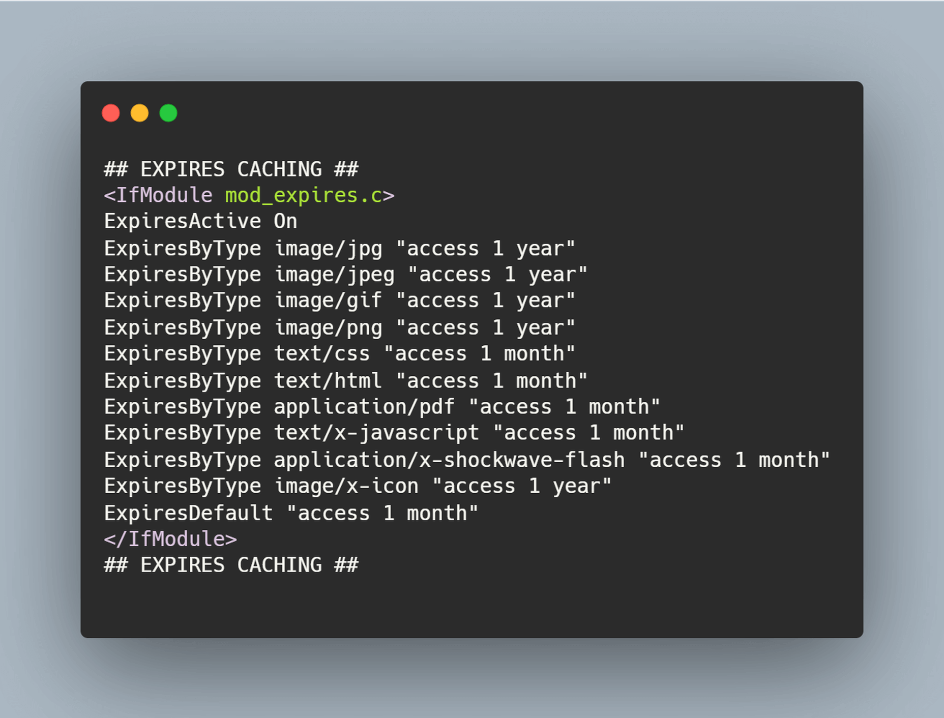
Browser caching stores the images for a decided interval of time for easy and quick accessibility. A custom timeline or industry standards can be followed for this purpose. The timeline in the above-shared code snippet is one year.
The .htaccess file can be found with the help of an FTP program for connecting to the root directory of the website’s server.
Disable Hotlinking
Hotlinking means when an individual or business copies the URL of an image, which belongs to another website, and embeds it on their website. This results in the image being displayed as if it was an owned content. Hotlinking is a next-door neighbor of copyright infringement, but despite this fact, the practice is widespread. In many cases, hotlinking is unintentional, but it can cost the original owner of the image some money. It can even affect the website’s performance if a drain of the server’s resources happens.
Optimize for Flaky Connections
If a website has a lot of content and rich images to offer, but a portion of the users visiting the website doesn’t have a reliable internet connection, then this portion of visitors would not convert. This situation is no different than any lost business opportunity. Not all website visitors have access to fast and reliable internet facilities; therefore, it is recommended to optimize image content for spotty connections.
One trusted way of optimizing the images for slow connections is compressing the images appropriately in real-time. However, even before compressing the images, it is important to determine the network speed of users visiting the page and then categorizing them into buckets based on connection types like 4G, 3G, 2G, or slow 2G.
But ImageEngine simplifies the whole compression process. It fetches and optimizes the images in the right format, dimension, and quality directly from the URL and then delivers such images on the website’s front-end via global image CDN.
Handling Responsive Images
A lot of traffic arrives from mobile devices, and as such, it is important to have the perfect strategy for responsive images.
- If vector-based images are being used, then using SVG format would be a great way to optimize them for any viewport without worrying about sizes because SVG images are resolution-independent.
- Using media queries for background images or images that have been produced via CSS is the best way to display smaller images to mobile devices.
- For inline images, techniques like the srcset attribute or the picture element can be used.
srcset attribute: This attribute can be implemented on the img element for defining the images at different sizes so that the browser can select the best option based on the device characteristics like width.
picture element: This is best to be used if different images are required to be displayed based on the device’s display size.
All the aforesaid discussed options offer different ways of displaying the optimized images to visitors depending on how they view the website. MDN’s responsive image guide and Google developer’s image guide can be referred to for learning more about responsive images and using picture elements or srcset attributes.
Responsive Images
Images are required to be responsive to deliver the right optimal image for every screen size. It enhances the user experience and reduces load time. According to the browser or device in which images are viewed, images of different sizes are displayed, such as full-size, thumbnail, or featured images. To create a responsive image, you need to have different versions of the image.
The problem is to optimize a high-resolution image that looks great with details while displaying it on mobile devices; details can be missed, so instead of shrinking the image details, consider cropping or scaling down the image for mobile devices.
Advantages of responsive images:
- Improve the page loading speed;
- Increase your reach through smartphone responsive design;
- Increase conversion and sales rate with consistent user experience;
- Reduce load over the server and server memory;
- Boost conversations.
Client Hints
The fundamental of Client Hints is simple — the client through a device sends the server some hints regarding the requirement. The server with responsibility serves them with the right resource according to the hint. For example, with hints, browsers ask the server for 600px images for the device layout — the image to be served based on the requested parameter. Even if the client informs that data saver mode is enabled, the server delivers identical images of a lighter version. The browser and server interact through Client Hints, the job becomes readable, shorter with the same functionality.
Client Hints with ImageEngine
ImageEngine delivers images with the required – width, DPR, and Data Saver. The responsive images are created based on client hints about width and DPR and later cover the Data Saver client hint.
Optimize Images For Retina Displays
Apple coined the term “retina displays,” which display clear and densely packed pixels to provide perfect vision from an appropriate viewing distance. Now, most smartphones and desktops deliver users a high crispy viewing experience. Apple with Retina squeezed four times the pixels into the same space to create a density of 326 pixels per inch (PPI), making the displays smooth.
Why Optimize Images for Retina?
The average screen pixel density is quite low, so the web-based standard images need to include 72 PPI to cover a certain height and width.
We need to maintain the appropriate density of pixels. Otherwise, the image will cram or get stretched. As a result, a fuzzy image is created with jagged edges that distract the viewer from your brand. To solve the problem, Retina class displays came into the role. They increased image resolution, optimized high pixel density in small space, and even displayed images decently over large screens.
People these days browse from a different device; most users access images from smartphones rather than desktops. So you need to optimize the image for Retina displays.
Wrapping it up
There are many tips and tricks to optimize images, but of all these tips, using a CDN has proven to be the most effective and long-term solution for many businesses all across the globe. Image CDNs automate the optimization process for a business to focus on its core activities properly. The good thing is that it is not all expensive to integrate image CDN. It is easy to get started with and generates the results in a short space of time.
[– This is a sponsored post on behalf of ImageEngine –]
Source
The post Top 9 Tips For Optimizing Images in 2021 first appeared on Webdesigner Depot.

Source de l’article sur Webdesignerdepot

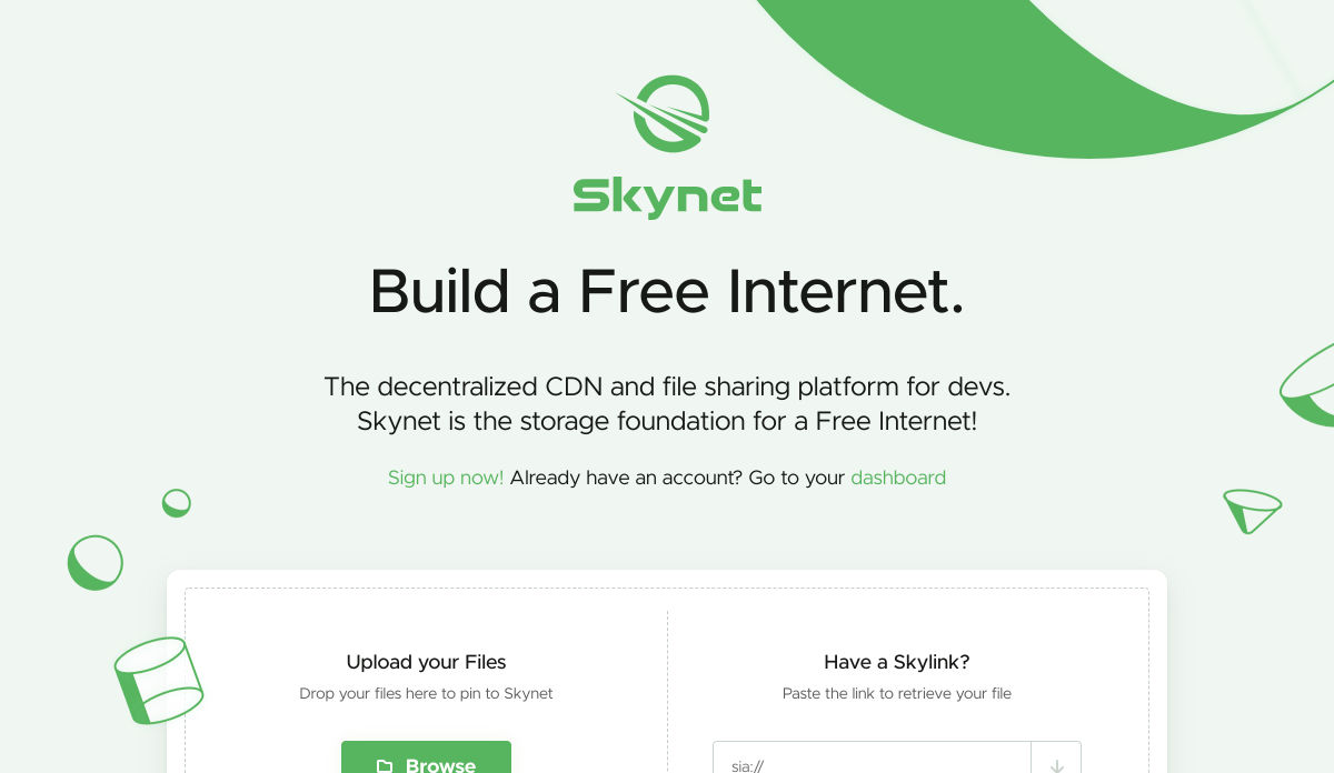
 We tend not to think about it, but the Internet has a physical dimension. It’s a complex network of wires, cables, servers, and technical odds and ends — if you really want to, you can track it down; doing so is particularly easy on small islands because there tends to be a single cable tethering the region to the wider world.


 Every week users submit a lot of interesting stuff on our sister site Webdesigner News, highlighting great content from around the web that can be of interest to web designers.


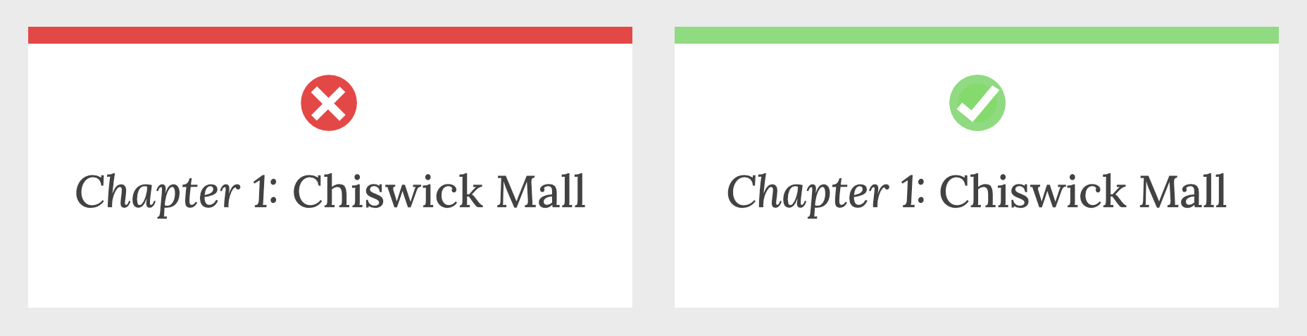
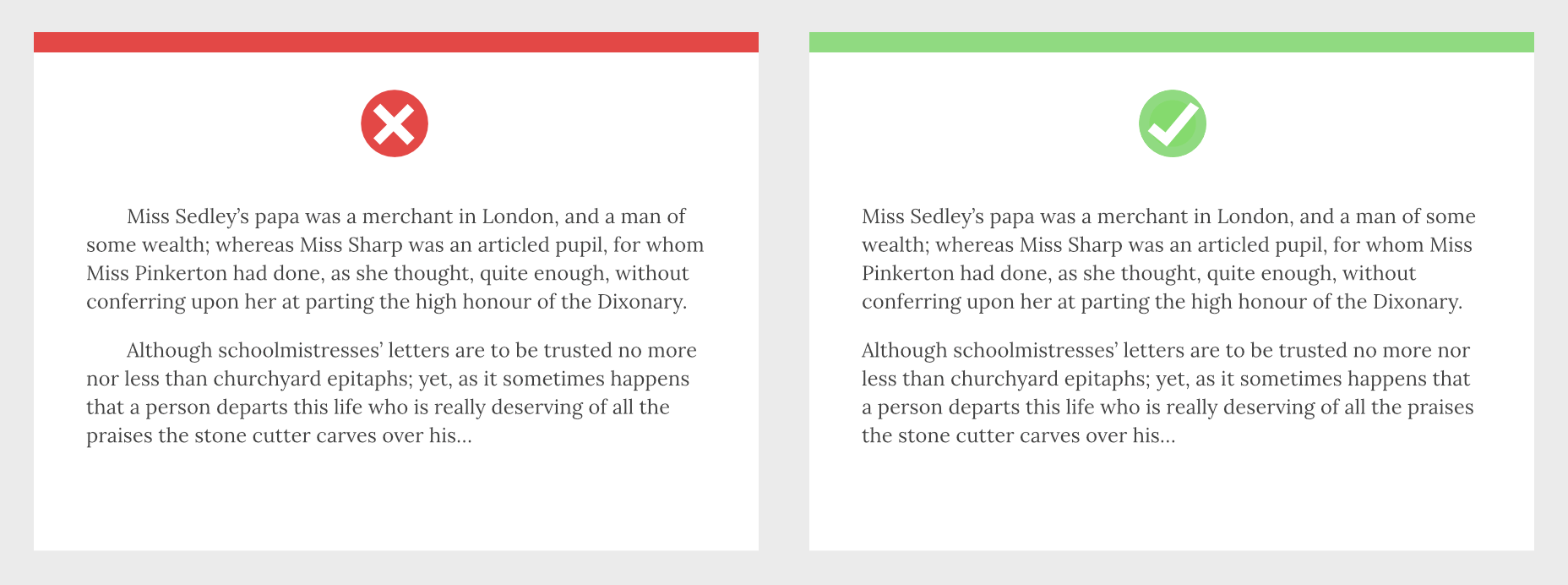
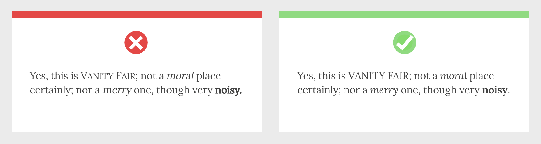
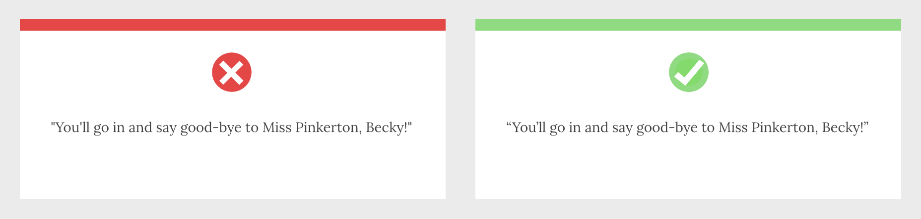
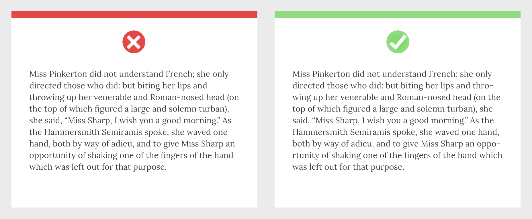
 Typography is one of the most important elements of any site, having a measurably large impact on brand and experience.
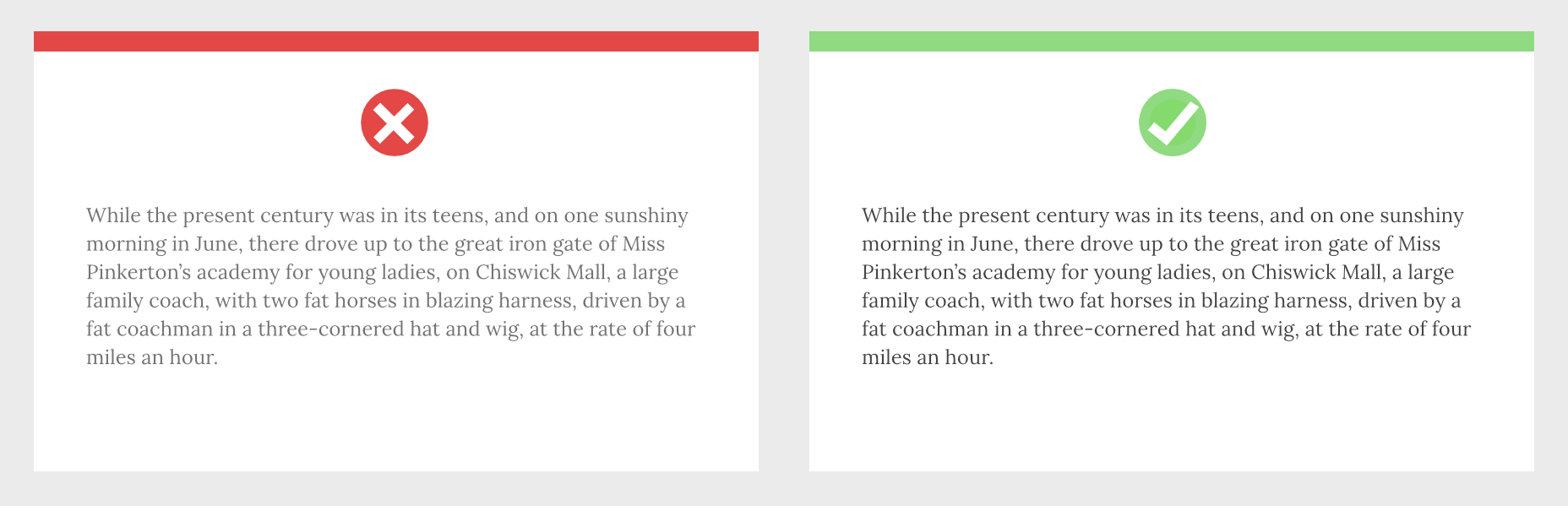


 Every week users submit a lot of interesting stuff on our sister site Webdesigner News, highlighting great content from around the web that can be of interest to web designers.


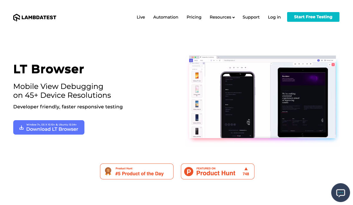


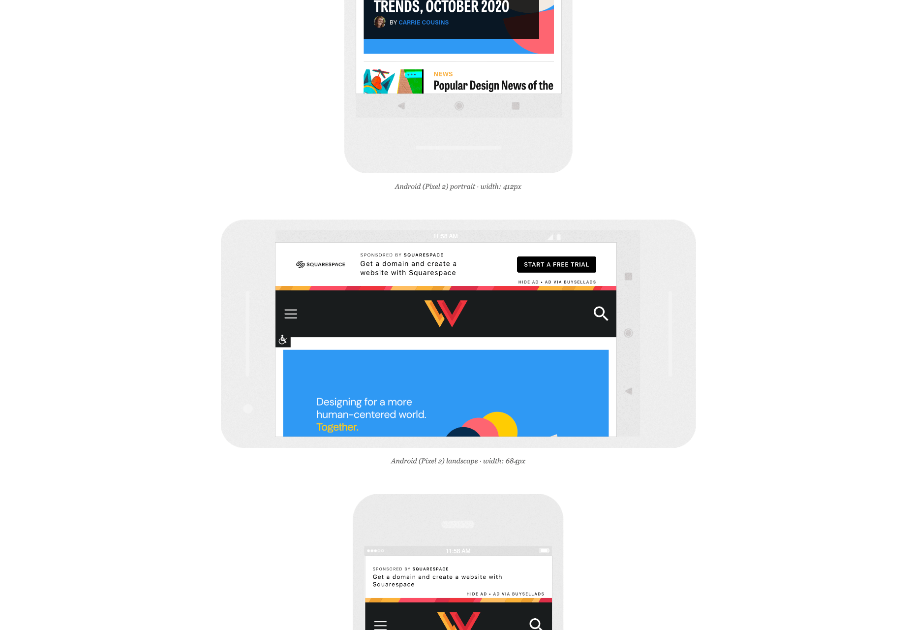
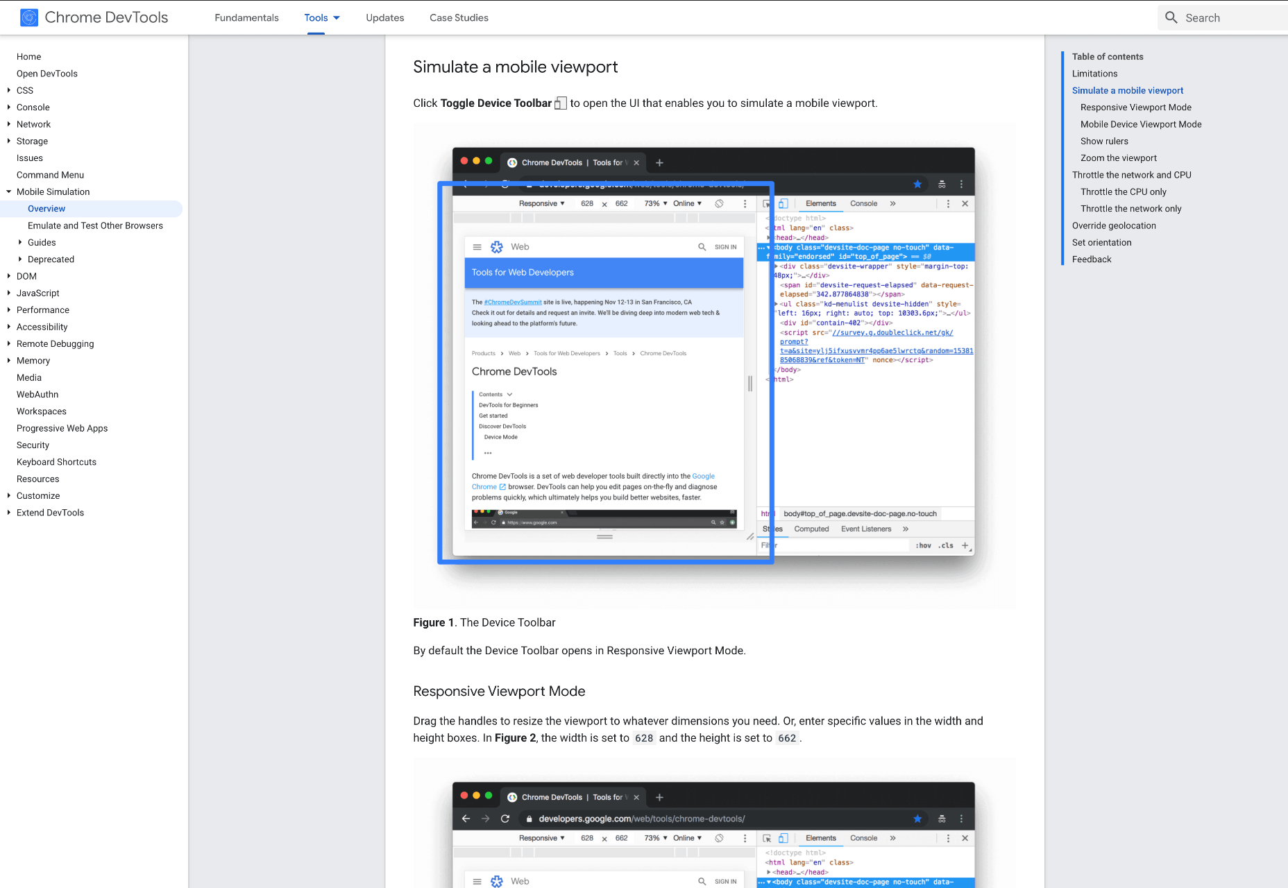
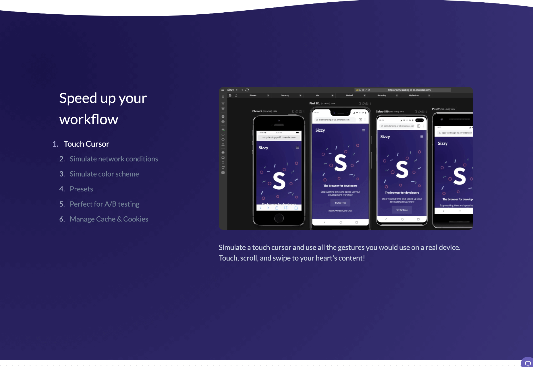
 When creating a website, it’s vital to remember that not only does it need to work and look great on the device you are creating it on, but on all the other devices, it might be used on too.

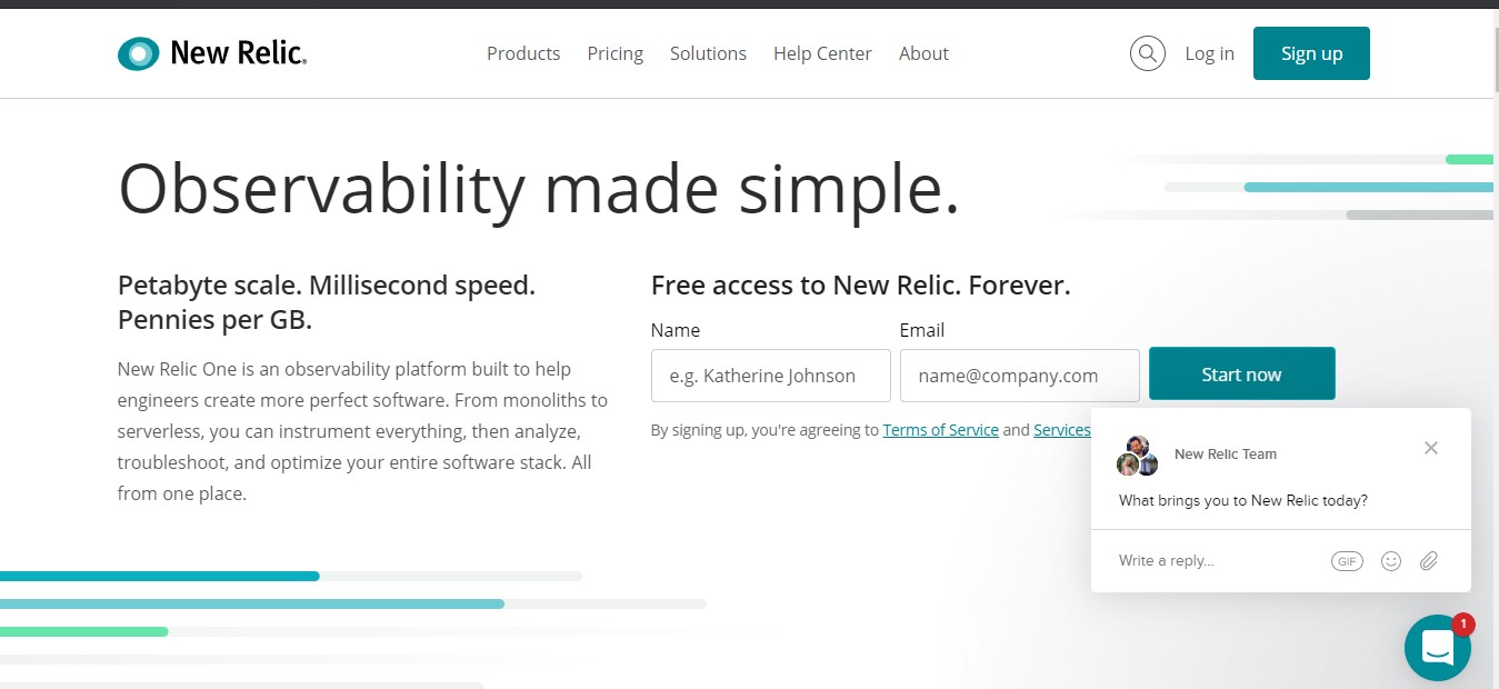
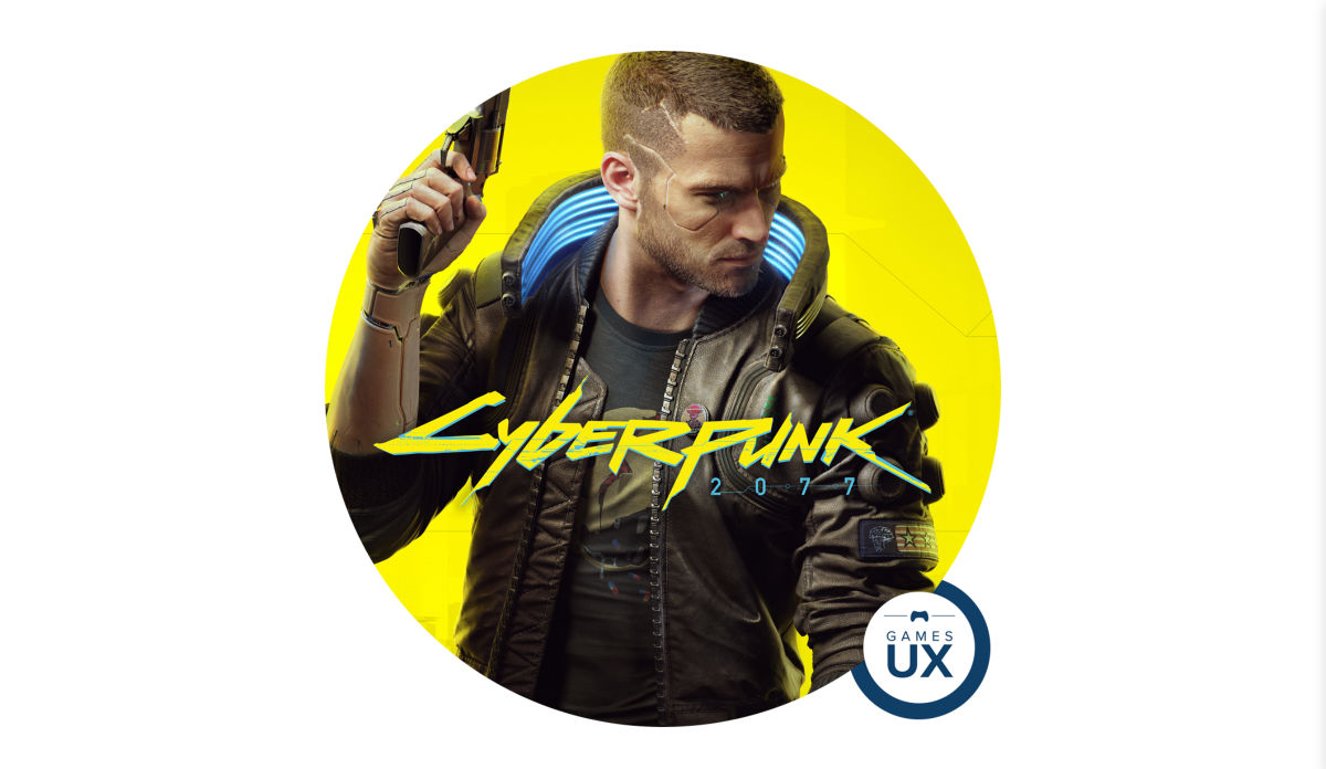
 There are dozens of factors that influence the UX of your site, app, or game. Most of them are beyond your control; user connection speed, end-system resources, even browser technology is all out of your hands. So when you do have the opportunity to influence your project’s infrastructure, you should seize it.