Articles

According to Klipfolio research, users spend on average 52 seconds on a webpage. With minimal time to impress, you must consider how to best help your consumers understand what your product or service does and why they should care about it. It’s not enough to describe your value – great landing pages will go the extra step and show this as well.

One powerful method to do this is by providing a real-life, responsive teaser to show what your product looks like, how it works, and what value it can create. This means incorporating specific elements from your functional, responsive product into the landing page. However, this should be a “mini-product experience” that users can experiment with rather than a freemium version of your product. If done well, the dynamics will pay off in captivating users for longer, increasing their consideration time, and driving your conversion rate as a result.

Building more dynamic landing pages through product experience can change the game completely. These are some strategies to consider.

“Ask & Alter” for Greater Personalization

“Ask & alter” is valuable for services with multiple potential value propositions for different audiences. The simple fix here is to have a pop-up box that asks the visitor which profile they are (and alternatively a few more questions). You can then trigger the page to alter according to their input, ensuring a more customized experience and increasing their chance of conversion. By doing this, you’re taking the onus off the consumer to figure out what’s relevant to them, eliminating any potential confusion.

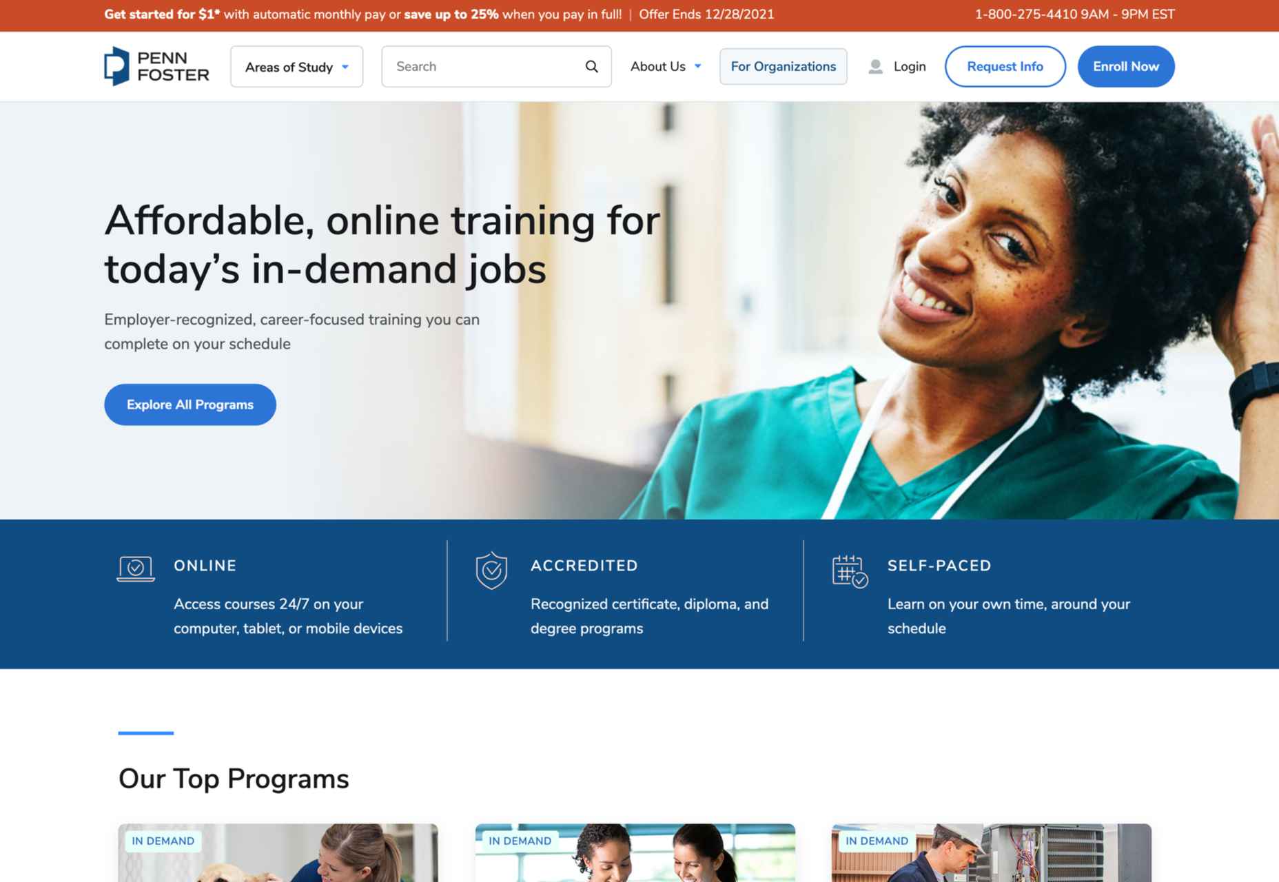
A great example of this is the Penn Foster University website. It has a developed UX optimized for organizations, high school degree seekers, and upskillers alike. Each has an entirely different, carefully designed interface, matching the diverse needs of visitors. For example, while a high schooler might enjoy browsing the career pathways section, an upskiller is likely to search specific career fields. Such distinction is key to consider, as intentional and strategic user experience can raise conversion rates by as much as 400%.

Real-Time Demos to Hook the User

Real-time demos mean that you take a full instance or version of your product that is clickable and responsive and embed it into the flow of your landing page. This way, the user can get a quick “test drive,” and you easily communicate the value that would otherwise be abstract or difficult for the user to imagine or even visualize. Additionally, users always want to know how a product could personally impact them, and live demos offer them a hands-on experience.

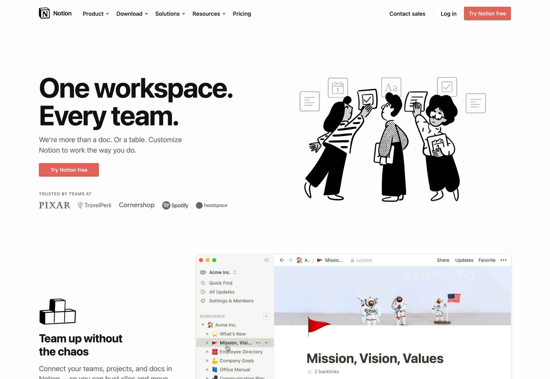
Companies incorporating live demos have proven the power to engage a user’s curiosity and create a strong link with their products or services. Notion, for instance, uses a “templates” section with pre-built pages that can be easily opened and browsed through without needing to register or download anything. This product’s beauty lies in the simplicity and efficiency it offers, rather than overwhelming a user with a self-promotional copy. Even a simple live demo like that can help build considerable trust in the product and encourage users to make a high-value purchase.

Calculators Provide Value

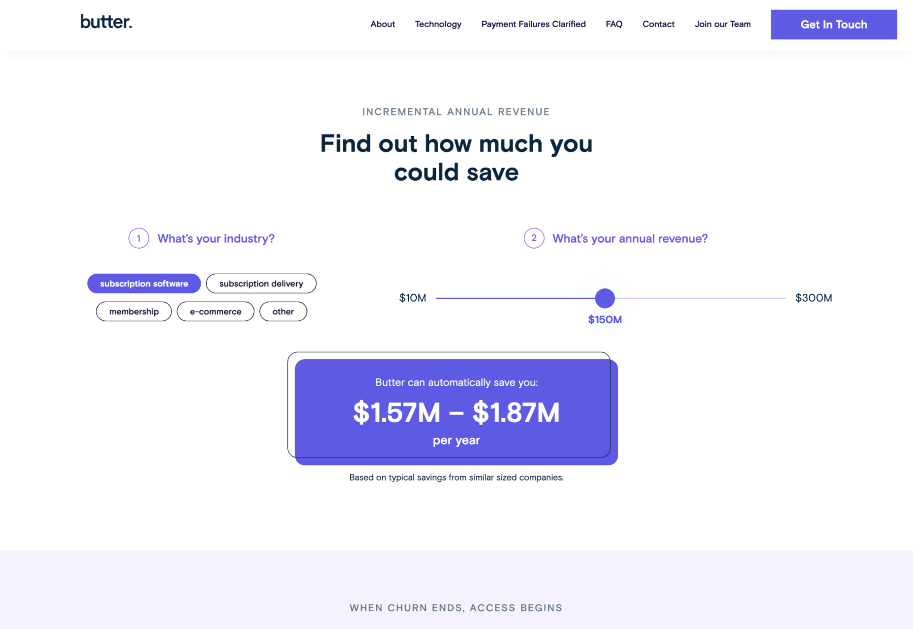
Despite their simplicity, calculators can increase audience engagement by 38%. Their main benefit is undoubtedly providing a personalized solution to users’ actual needs and expectations. ROI and savings calculators can be particularly interesting, especially when they speak of value that isn’t easy to calculate or when the user wouldn’t intuitively know that there are savings to be had by using a particular product.

Butter Payment, uses this tool very effectively. As its customers necessarily don’t know they have an involuntary churn problem that is worth solving for, it uses a calculator on its site to demonstrate the problem and enumerate the value-add to potential customers.

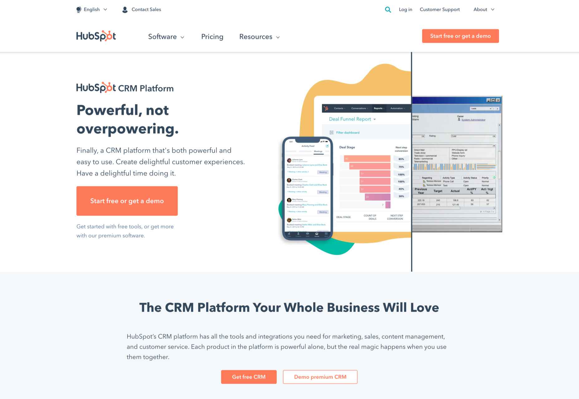
HubSpot, too, has mastered the tool: Its Ad ROI Calculator visually presents the results that its software can bring. Then, HubSpot’s interactive website grader directs the user towards its comprehensive marketing offerings. It is this graphic visualization that companies must adopt to communicate real value.

The Charm of Experiential Interaction

Interactive design is said to drive the responsiveness and real-time interaction of a site through the roof. By incorporating an interactive or experiential page, even if it’s not directly on your landing page, you can craft a unique experience aimed at leaving a lasting, meaningful impression of your product or service.

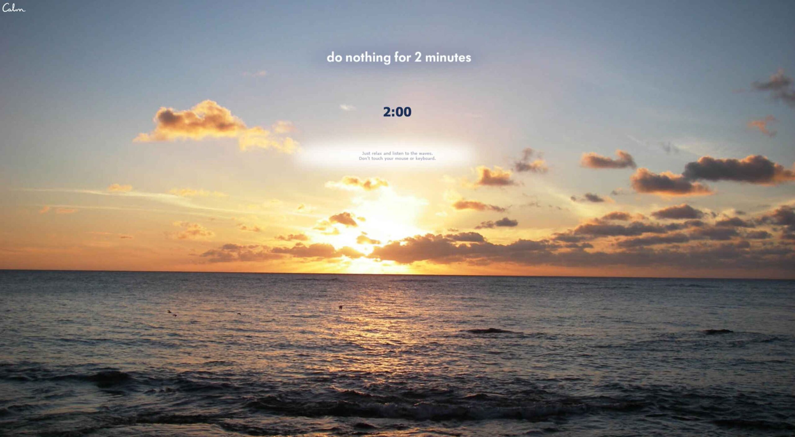
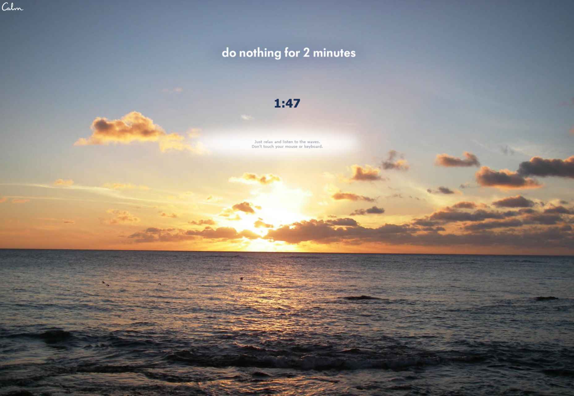
Calm’s “Do Nothing for two minutes” is a simple yet effective way to show users the value of meditation in their daily life and lead them to download the app.

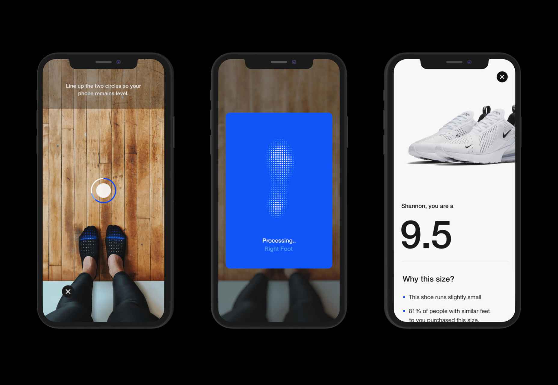
But it works great for consumer products, too: Nike’s Digital Foot Measurement tool is another excellent feature, allowing users to “try shoes on” with their cameras and scan their feet for the right measurement through AR.

Videos are Attention Magnets

Considering that viewers absorb some 95% of the message while watching videos, compared to only 10% when reading text, there’s no reason why you should avoid incorporating videos into your landing pages. Beyond that, videos can be incredibly straightforward: Insert a graphic illustration or real imagery to explain the product, show the step-by-step process, and convey value with raw, unfiltered footage.

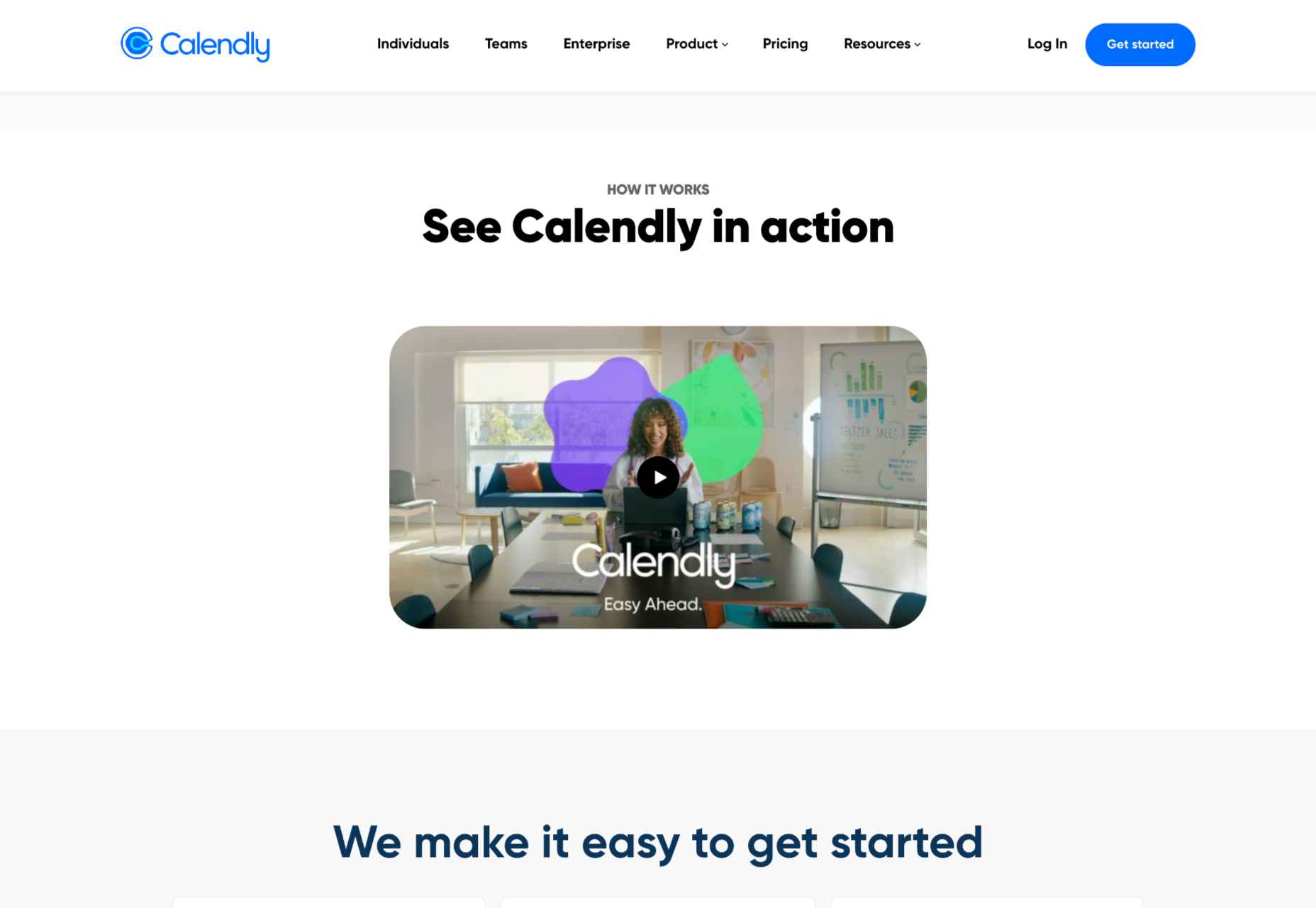
Calendly, for example, has various videos on its landing page, including a 56-second, upbeat, colorful clip showing how simple it is to get started with the product.

Guiding GIFs to Visualize Product Features

As small animations, GIFs represent the perfect middle ground between images and videos. They allow you to show users the value your product adds, providing an engaging glimpse into the actual interface. The small scope of GIFs is both a limitation and a benefit: You can only show a particular feature of your product but can also focus on triggering an exact user emotion.

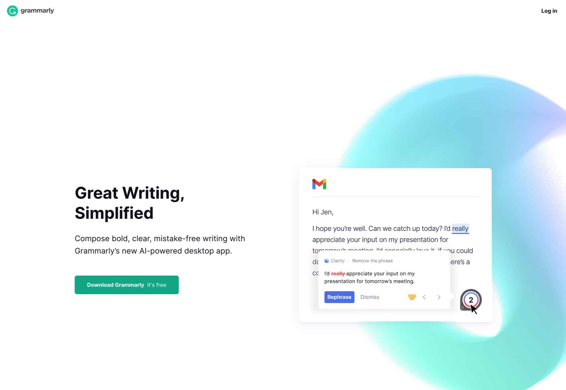
Grammarly, a grammar correction tool, relies on GIFs to give users a taste of their UX. With a quick overview of the product’s functionality across popular platforms, including email and social media, users can see exactly how the product can make their everyday lives easier. And by incorporating GIFs into the right side of the landing page, the scrolling experience of the user isn’t disrupted.

Interactive product experiences can both entertain and tackle pain points, adding dynamics to an otherwise static page. Particularly when customizing based on user attributes, the key benefit of these features is that the users engaging with them are likely the same people interested in the paid product. To ensure that the product experience doesn’t directly compete with the primary offering, clearly differentiate it and guide the user towards a direct call to action.

Source

The post The Case for Building More Dynamic Landing Pages first appeared on Webdesigner Depot.

Source de l’article sur Webdesignerdepot

Every day design fans submit incredible industry stories to our sister-site, Webdesigner News. Our colleagues sift through it, selecting the very best stories from the design, UX, tech, and development worlds and posting them live on the site.

The best way to keep up with the most important stories for web professionals is to subscribe to Webdesigner News or check out the site regularly. However, in case you missed a day this week, here’s a handy compilation of the top curated stories from the last seven days. Enjoy!

63 Open Source Web Development Tools

Worst UI Design Features that Should Be Avoided

Free Logos by Larkef

How to Create a Skeleton Screen Loading Effect

Plasmic – The Headless Page Builder

Exciting New Tools for Designers, Holidays 2021

Logo Design Trends 2022: The Future of Logos

The Ideal Line Length & Line Height in Web Design

An Introduction to UI Sounds

This New Font Breaks the Big, Unspoken Rule in Typefaces

Source

The post Popular Design News of the Week: December 13, 2021 – December 19, 2021 first appeared on Webdesigner Depot.

Source de l’article sur Webdesignerdepot

Every day design fans submit incredible industry stories to our sister-site, Webdesigner News. Our colleagues sift through it, selecting the very best stories from the design, UX, tech, and development worlds and posting them live on the site.

The best way to keep up with the most important stories for web professionals is to subscribe to Webdesigner News or check out the site regularly. However, in case you missed a day this week, here’s a handy compilation of the top curated stories from the last seven days. Enjoy!

Svija – A Website Builder Based on Adobe Illustrator

13 Graphic Design Trends for 2022: Retro Uprise & Bold Ideas

Designers’ Pick: Best Google Fonts for 2022

7 Apps We Couldn’t Live Without in 2021

Mistakes I Made While Learning Web Development as a Beginner

Interactive Vim Exercises

34 HTML Tabs Examples for Web Development

How to Reset a Single Git File and Why

Google Fonts Knowledge

Dark UI Design: Principles and Best Practices

Source

The post Popular Design News of the Week: December 6, 2021 – December 12, 2021 first appeared on Webdesigner Depot.

Source de l’article sur Webdesignerdepot

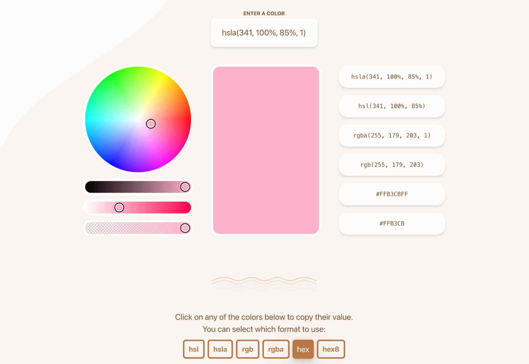
At this time every year, Pantone announces its choice for Color of the Year for the coming 12 months. The last year has been uncertain, to say the least, and although a tentative optimism seems to be piercing the general gloom, it’s difficult to see how that can be expressed in color.

On this occasion, for the first time, Pantone has elected to create a brand new color for its Color of the Year. Normally colors are chosen from Pantone’s extensive swatch books, so this new shade either reflects new beginnings or Pantone’s design team has been underemployed in the last year.

In either case, the shade created for 2022 is Very Peri. It’s a lilac — a bit more blue than violet, but still on the warm end of the spectrum.

The color feels a little retro — like the color of one of Jerry’s shirts in Seinfeld — and also spring-like — fields of bluebells leap to mind.

Pantone describes the color as having a “courageous presence,” but for that, I tend to think of neons; something with a little more saturation.

In fact, looking back over the past few years of Pantone colors, a soft purple (or adjoining shades) has traditionally been a safe choice for Pantone. 2014 was Radiant Orchid (lilac), 2016 was Rose Quartz and Serenity (pastel pink and blue respectively), 2018 was Ultra Violet (purple).

If Pantone was looking for a genuinely “courageous” choice, it should perhaps have reissued 2020’s Classic Blue, and called a do-over on the last couple of years.

Occasionally the Pantone Color of the Year has hinted at something more than a single shade. 2019’s Living Coral felt like attention was being drawn to the horrifying state of our ocean. Designers didn’t adopt the shade en masse, but environmentally conscious design has certainly become more prominent.

As we complain about homogenous design, is it right to even nominate a single color of the year? If what we’re lacking in the design industry is diversity, shouldn’t we ignore a color trend? (The irony of that question is not lost on me.)

In that spirit, rather than dishing out another bland lilac for 2022, Pantone should have presented us with Pure White #FFFFFF. A blank page to do with what we will. That would have been courageous.

Source

The post Pantone Color of the Year 2022 first appeared on Webdesigner Depot.

Source de l’article sur Webdesignerdepot

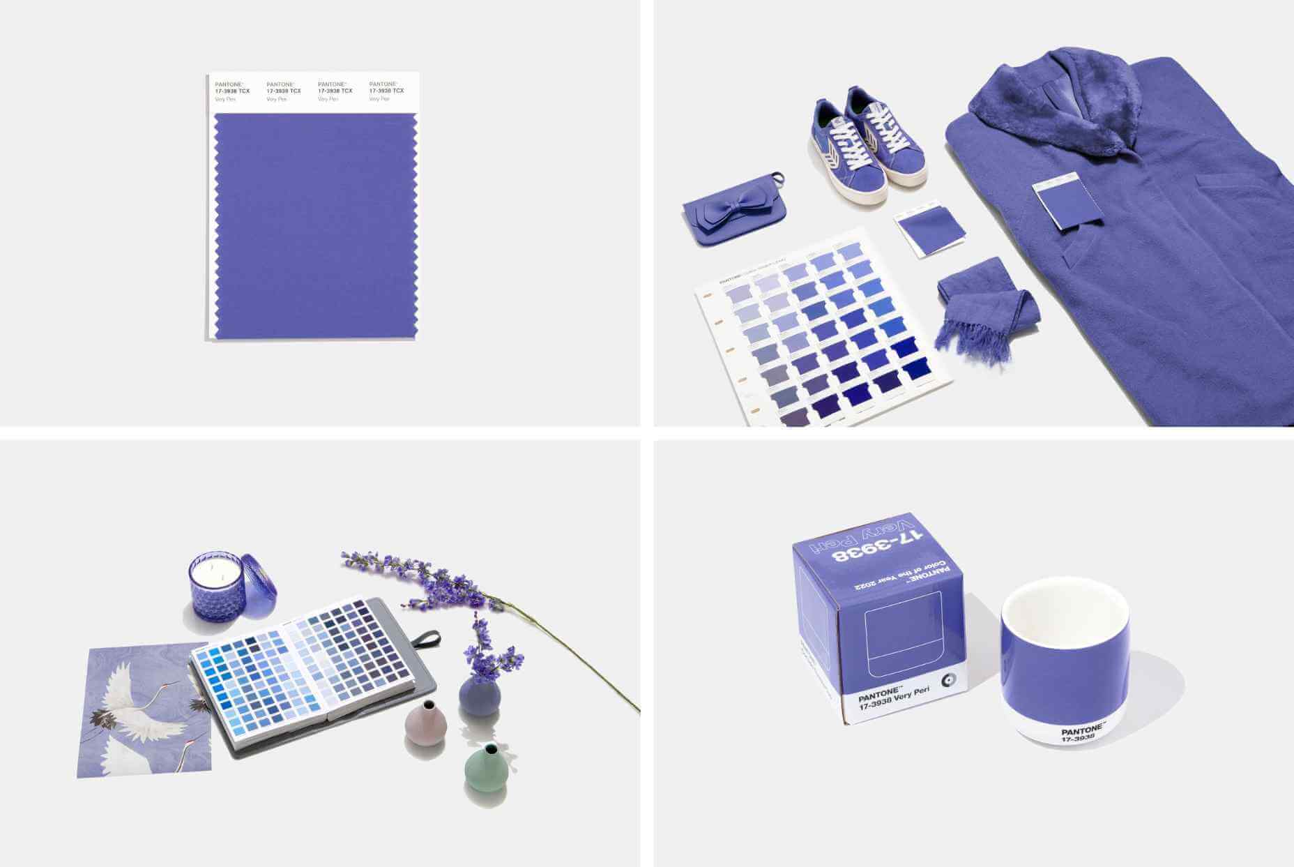
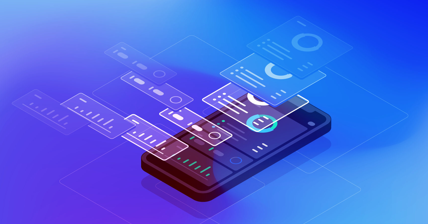
Websites as we know them are going to change very soon. The days of text, images, and basic interactions in a 2D browser window have served us well, but virtual, augmented, and mixed reality experiences are getting better all the time. Developers and designers need to think beyond the browser window and prepare for an immersive future.

Many have been very skeptical about VR and AR in the past because despite grand promises about what they would achieve, they’ve mostly failed to deliver on the scale that the industry hoped for.

But it’s different this time: industry leaders like Meta, Apple, and Microsoft are pursuing a range of different mixed reality projects; they see the opportunity and are dropping hints about what’s next.

In a survey from Perkins Coie LLP and the XR Association, nearly 9 in 10 respondents said that by the year 2025, immersive technologies—including augmented reality, virtual reality, and mixed reality — will be as ubiquitous as mobile devices.

That’s a bold prediction, but it could be our new reality.

Use Cases

VR and AR aren’t a logical fit for every website, and that’s fine. There’s no need to force an immersive experience on something better suited to a standard viewing experience.

But when they’re done right, 3D experiences can add a lot to your website. Check out the demo experience from Mozilla, the 3D tours from Matterport, and the immersive storytelling from Within.

Here are a few areas where these technologies shine:

  • Retail – VR can be used to provide a virtual showroom where customers browse through products. AR can even bring the products into your home by showing you how a piece of furniture will fit in your room, what a painting will look like on your wall, or in Apple’s case, how a product will look on your desk.
  • News – Coverage of events can be enriched by providing a 360-degree view and placing viewers in the center of the story.
  • Training – AR can generate virtual overlays over physical equipment so employees can have hands-on training that’s more effective.

Define Your Platform

Adding immersive experiences to your website will require various skills based on what you’re trying to create. Whether you’re new to web development or are a seasoned developer with many years of experience, the main difference from classic web development is that you’re switching from a 2D to a 3D experience. Development in VR/AR is much closer to developing 3D video games than creating web applications.

First of all, you need to decide on the hardware that you’re building for. Are your viewers mainly using computers, smartphones, or a headset like the Oculus Quest? Each hardware category offers a different set of capabilities for what’s possible.

Next, when we look at 3D engines and frameworks on the market, some big names like Unity, Unreal Engine, and CRYENGINE stand out. Most of these engines were spun out of game development and are based on programming languages like C, C++, or C#. While very powerful, they’re overkill for anyone trying to create a basic immersive web experience.

The good news for web developers is that the WebXR Device API is an open standard specified by the W3C with a JavaScript API that makes immersive experiences possible in the browser. So if you already have a background in web development, you can use your knowledge of JavaScript to get started.

There are some useful frameworks and platforms that make working with WebXR more convenient:

  • A-Frame – A web framework for building 3D experiences.
  • React 360 – A framework for the creation of interactive 360-degree experiences that run in the web browser. As the name already suggests, it builds on React and reuses the concepts you already know.
  • Amazon Sumerian – A managed service that lets you create and run 3D, AR, and VR applications. Since it’s integrated into the AWS ecosystem, it’s also possible to add AI-enabled elements into your generated world.

Create Your Content

No one wants to read long blocks of text in 3D. Since we’re talking about visual experiences, it’s logical that the emphasis should be on creating content that is pleasing to the eye and interesting to look at. What works on a normal website probably isn’t going to feel natural in a 3D environment, so you need to decide what visuals you should create to suit the format.

What high-resolution images and assets do you need? Can you add videos? How about 360-degree videos? Will viewers just be looking at something, or will they be able to interact with it?

You also can’t forget about sound because it’s a critical part of immersive experiences. What music and sounds should you create to make the content come alive?

Not everyone is going to have the latest and greatest device or 5G coverage. The requirements for bandwidth and transmission quality are much higher with 3D content. A few milliseconds of latency can go unnoticed on a typical website, but in a VR/AR setting, it can make the experience laggy or unusable.

Try to optimize your content to be the highest quality it can be within a reasonable file size. If the experience starts to suffer from too many assets downloading at the same time, it’s better to create a more streamlined experience that maintains a high performance rate.

It’s important to consider your hosting infrastructure, as well. This shouldn’t be a big problem, but it is worth mentioning that you need to add new content types to your configurations, and your CDN needs to support these new types, too.

Make Your Content Flexible

When we’re talking about getting your website ready for immersive experiences, we’re not just talking about having people scroll through your regular website in VR. That isn’t compelling for your audience.

The idea is to take some content that’s already on your website and separate it from the presentation layer so you can use it in a 3D environment or any other platform that you want. Classic content management takes place in silos, which means you cannot easily reuse the content from your website.

This separation can be achieved by using a classic database, but if you want developers and content teams to collaborate, a headless CMS is front-end agnostic and more user friendly.

Start Experimenting Today

Building 3D content experiences may seem intimidating, but as we’ve seen, you likely already have the web development skills necessary to get started and try out some different ideas.

What you build today will prepare you for the 3D future of tomorrow.


Featured image via Pexels.

Source

The post How to Prepare for the Immersive Web first appeared on Webdesigner Depot.

Source de l’article sur Webdesignerdepot

In the first part of this series, we have seen all the pre-requisites that are needed to proceed with the hands-on. We will extend the EdgeX Foundry tutorial by Jonas Werner and deploy the EdgeX Foundry services on K3s. We have already learned that K3s will be a good lightweight solution to manage and orchestrate the EdgeX microservices. We will use the Geneva version of EdgeX Foundry.

The scope of this post is to demonstrate an Edge use case that will consume the sensor data e.g. ambient temperature. This sensor data will then be processed by EdgeXFoundry services hosted on K3s. This sensor data will be pushed to a cloud-based MQTT broker called HiveMQ. From here, the data can be stored and processed in the cloud. The configurations and manifests used in these posts are available in this repository.

Source de l’article sur DZONE

Every day design fans submit incredible industry stories to our sister-site, Webdesigner News. Our colleagues sift through it, selecting the very best stories from the design, UX, tech, and development worlds and posting them live on the site.

The best way to keep up with the most important stories for web professionals is to subscribe to Webdesigner News or check out the site regularly. However, in case you missed a day this week, here’s a handy compilation of the top curated stories from the last seven days. Enjoy!

9 Often Overlooked Ways to Make Visitors & Google Love your Website

Accessibility Myths

How to Increase User Empathy and Build Better Products

Cccolor – Clean & Simple Color Picker for Web Designers

The State of UX in 2022

3 Essential Design Trends, December 2021

Vector UI 1.1 – Smart Design System for Figma

JavaScript Reduce Method Made Simple

Glitch Effect on Text in Pure CSS

2021 Design Tools Survey

Source

The post Popular Design News of the Week: November 29, 2021 – December 5, 2021 first appeared on Webdesigner Depot.

Source de l’article sur Webdesignerdepot

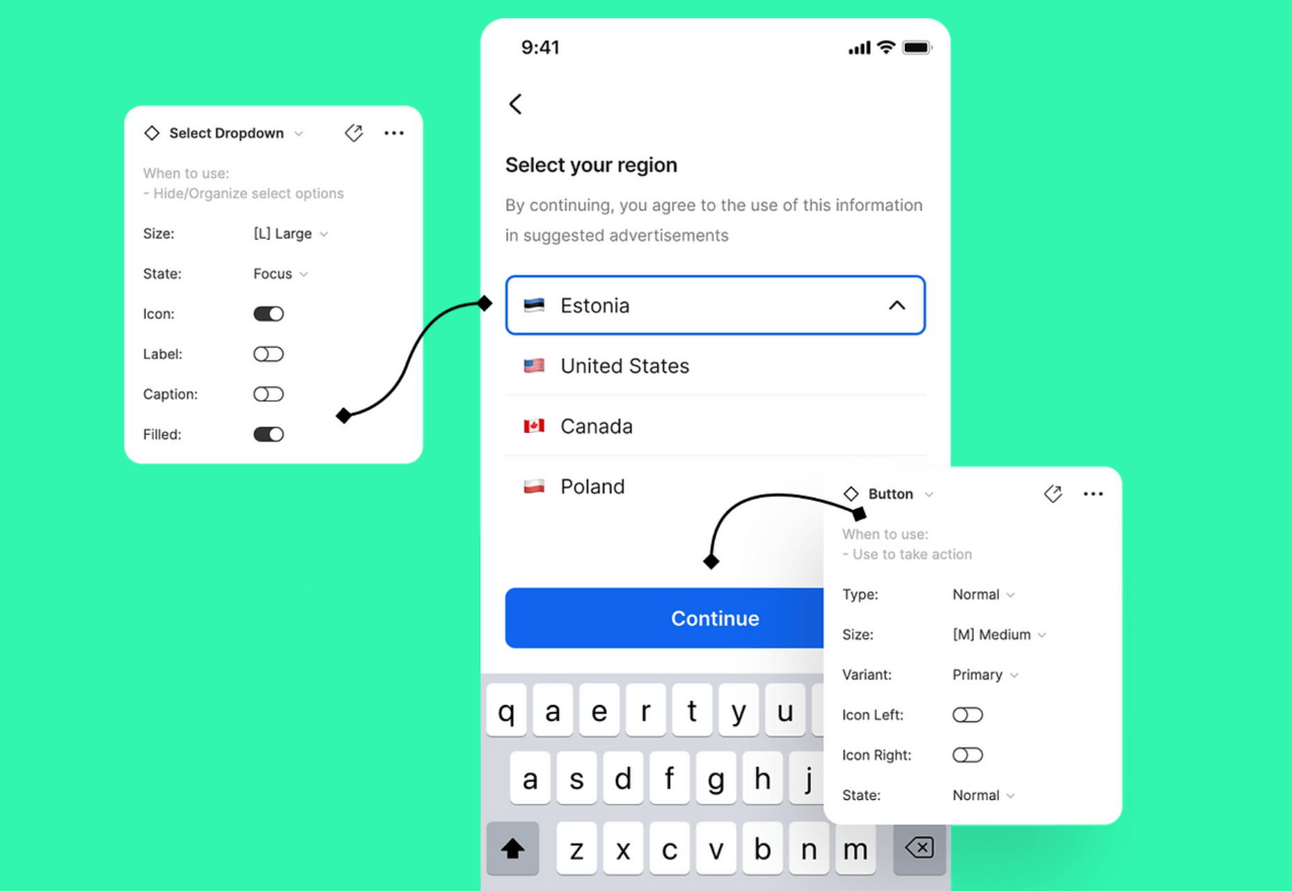
As a UX designer, you get to work on creative, rewarding, even life-changing projects. It’s an industry with flexible working and countless opportunities. All this, and you get paid well too.

It doesn’t matter if you’re not a creative prodigy, or a tech grandmaster; you can learn to become a UX designer with the right mindset, a few tools you pick up along the way, and some committed learning.

By the time you’ve finished reading this post, you’ll be well on your way to designing your new career.

You can do this, let’s get started…

What is a Career in UX like?

Every career is different, but generally speaking, a UX designer works on making a user’s interaction with a product or service (normally websites) as intuitive as possible.

Just as a golf architect designs the layout of a golf course to flow through greens, tees, and holes, with buggy paths for access, and the odd bunker to add a challenge; so a UX designer creates the optimum experience for a site. A golf architect doesn’t need to reinvent the game of golf, and neither does a UX designer need to reinvent websites.

A golf architect will not design a course with a 360-degree sand bunker surrounding a tee (well, they might, but they really really shouldn’t), or a hole too small for a golf ball. In the same way as a UX designer, you’re not going to design an ecommerce site with a cart in the bottom left, a non-existent search feature, or hidden pricing.

The best thing about being a UX designer is that you don’t need to spend years in formal education to get qualified. The flipside is that if you want to be a great UX designer, it’s not a walk in the park.

Every designer is different, but some of the main traits of successful UX designers are: an enjoyment of problem-solving; good listening skills; curiosity; open-mindedness; attention to detail; creativity; communication skills; process-driven; and adaptability.

Before committing to this career path, check out a few podcasts, and read a few blog posts, to dip your toe in the water.

Still interested? Excellent, the next step is…

Getting Certified as a UX Designer

UX design is a practical skill. It’s all well and good knowing the theory, but without practice putting the theory into action no one will give you a chance to prove what you can do. So how do you get practical experience? You get certified, and there are three popular options: online, in-person training, or self-taught.

A good UX syllabus will include portfolio-building projects, tool mastery, networking opportunities, and even 1-2-1 mentorship. As well as learning the fundamentals of UX, you’ll cover user research and strategy, analysis, UI design, and more.

Option A: Online Course

Online courses tend to be much easier on the bank balance, as well as being flexible, which means you can fit them around your current job. You can work at your own pace, and in many cases choose modules that interest you, once you’ve completed the basic introduction.

There are many online course providers, including Coursera, Udemy, Skillshare, and Career Foundry.

Whatever option you choose, it is a good idea to get as broad a perspective as possible, so consider following more than one course — perhaps mix and match a paid course with a free one.

Option B: In-Person Training

This could be a university course, or a local boot camp where you physically sit in with an instructor and classmates.

This is more expensive, but it provides benefits that nothing else does. Firstly, you’ll have classmates you can bounce ideas off, collaborate with, keep motivated, inspired, and accountable. You can also get real-time, intensive coaching and advice from someone who’s been there, done that, bought the T-shirt (and redesigned it so it fits better).

Seach local boot camps and workshops, check out workshops at local conferences, and ask your local college what courses they offer.

Option C: Self-Taught

Being self-taught is the cheapest of all options. Work at your own pace, where, and when you want to. Watch YouTube videos, read blogs, garner information anywhere you can find it.

This option involves a lot of stumbling around in the dark. The biggest challenge is that you don’t know what it is that you don’t know. For this reason, it can pay to follow the syllabus of a local college course, even if you’re not enrolled and don’t attend lectures.

In reality, all education is self-taught to an extent, even the most prescribed courses need self-motivation.

Some of the most in-demand UX designers in the world are self-taught, so why not? Start exploring UX blogs like Nielsen Norman Group articles, Google Design,  UX Planet, and UX Matters.

Mastering UX Tools

Recruiters and hiring managers will seek your technical ability and your experience using popular tools from user research, to wireframing, to prototyping. When you get your first job in UX, the tools you use will be determined by your project manager, so it’s a good idea to have a passing familiarity with the most popular. These will include Maze, Userzoom, Sketch, XD, Figma, Marvel, and Hotjar.

If you’re following a guided course you should get an introduction to at least a couple of important tools. Once you understand one, you can probably pick the others up quite quickly… because, after all… they should be intuitive.

You do not need to know how to code, but understanding the roles, and restrictions of HTML, CSS, and JavaScript is very beneficial. When you get your first UX job, you’ll need to be able to talk about how technologies fit into the plan.

Building a UX Portfolio

Your portfolio is your résumé. The golden ticket. The silver bullet. Amassing a content-rich portfolio is paramount. You don’t need a real-world job to build your portfolio, and you should already have content to add from your course.

You need to demonstrate knowledge of UX tools and processes (what future employers will look for). Case studies that incorporate research, problem-solving, strategy, imagination, and (if possible) results are the best way to do this.

There are a variety of ways of building a portfolio, but the best is taking a real website, and redesigning it. Don’t worry if your first few projects aren’t the best; as long as you demonstrate improvement and growth, that counts for something.

You can showcase your portfolio on sites such as Behance, Dribbble, or preferably create your website.

Landing Your First Job in UX

Start combing the job boards to see which companies are looking for UX designers. There’s a global shortage of qualified UX designers, so if you can’t find anything you’re looking in the wrong place! Make sure your whole network, from your Mom’s hairdresser to the barista at your favorite coffee place know that you’re looking; you never know where a good lead will come from.

Some companies are looking for UX skills as part of other roles. Others are looking for full-time UXers.

Don’t be disheartened if “Junior UX Designer” positions require 2 years of experience; HR just throws this in as a pre-filter. If you think you can do the job, apply anyway, if your portfolio’s good you might get an interview regardless, and if you get an interview they think you’re worth taking the time to meet.

If you don’t get the job, don’t be downhearted. Remember: every time someone else gets a job, that’s one less person you’re competing with for the next job.

Quick Prep on Some Common UX Interview Questions:

  • What’s your interpretation of a UX Designer?
  • What has inspired you to become a UX Designer?
  • How do you take constructive feedback and non-constructive feedback?
  • Who, or what companies, do you look up to in this industry, and why?
  • What’s your process with a new project?

Good Luck!

So, now you know what it takes to get into the field, it’s time to start applying yourself to this newfound and richly rewarding career. As the great writer Anton Chekov said, “Knowledge is of no value unless you put it into practice.” So get out there and practice, practice, practice. Add and add and add to your portfolio.

To become a UX Designer, enroll in a great course, build your portfolio, network, apply for roles, and always be learning. Always be open to new ideas and suggestions. There’s a lot of leg work, but the juice will be worth the squeeze.

Featured image via Unsplash.

The post How to Kickstart Your UX Career in 2022 first appeared on Webdesigner Depot.

Source de l’article sur Webdesignerdepot

_____________________________________________

Another excellent guide to help people to prepare for job interviews to give them the best possible chances of success and not make some common mistakes can be find here : https://www.ireviews.com/interview-resources/

article imageIn our previous article from this series we talked about the example predictive analysis architecture found in an edge medical diagnosis solution for the healthcare industry.

The process was laid out how we approached the use case and how portfolio solutions are the base for researching a generic architecture. It continued by discussion how we approached the use case by researching successful customer portfolio solutions as the basis for a generic architecture.

Source de l’article sur DZONE

Every day design fans submit incredible industry stories to our sister-site, Webdesigner News. Our colleagues sift through it, selecting the very best stories from the design, UX, tech, and development worlds and posting them live on the site.

The best way to keep up with the most important stories for web professionals is to subscribe to Webdesigner News or check out the site regularly. However, in case you missed a day this week, here’s a handy compilation of the top curated stories from the last seven days. Enjoy!

Top Web Design and UI Trends for 2022

WordPress 5.9 Delayed Until January 2022

20 Best New Websites, November 2021

Parallax Powered by CSS Custom Properties

Icons in Pure CSS

How to Make Basic and Advanced Shapes with Pure CSS

2022 Color Trends: The Year’s Top Colors

CasaOS – A Simple, Easy-to-use, Elegant Open-source Home Cloud System

Frontend Store – Buy and Sell Interface Elements

Launching Fig

Source

The post Popular Design News of the Week: November 22, 2021 – November 28, 2021 first appeared on Webdesigner Depot.

Source de l’article sur Webdesignerdepot