 Naturally, there are bad clients out there, but 90% of the time, it’s not really the client who is at fault. Poor communication, a lack of setting expectations, and a failure to qualify clients beforehand is usually the problem.
If you’re dealing with a problematic client, there’s usually not a lot you can do to ‘fix’ things — you should focus on finishing the project as well as you can. However, what you can do is ensure this situation never arises again.
We’ve been taught that the customer is always right. But to be honest, that’s not always the case. It’s your job as a designer and brand consultant to help your client grow their business. Because of that, you may think you have to make every idea a client has — but if these ideas do not serve their business and their brand, you have to speak up! Remember that you were hired for a reason, and that reason is that you can help them build their brand, not because you can design anything they think of.
So, to avoid the ‘difficult’ client scenario, here are a few things you can do.
1. Be Selective With Your Clients
Figure out who your ideal client is and determine that you will only work with them. Ideal clients are usually people who understand you and respect you and your expertise. A client who hires you because they know what you have to offer (i.e., working towards their business goals) will be more receptive to what you present to them — they will also be more receptive when you push back ideas.
you have to be willing to decline projects
Your ideal client is not someone who wants to dictate the whole process to you (clients who already have an idea in their head and want you to make it into reality for them).
This means you have to be willing to decline projects. This can be super difficult — saying no to a paying client always is — but the mental toll of working for a non-ideal client is never worth the money!
Be selective with your clients and ensure you are on the same page before accepting any projects. To work only with your ideal client, you can have a method of qualifying them ahead of time. Some people use questionnaires; others sit down and have a chat with potential clients. If they meet your requirements, that’s great. If not, then let them know it might not be the best fit for both of you. You can also refer them to another freelance designer, who you know would be glad to have their work.
2. Remember: You are NOT an Employee
People usually become freelancers because they have a set of skills that doesn’t tie them down to one employer — you may have even developed this skill set deliberately to avoid being stuck in one office, working for one company!
So don’t forget that you are not an employee. Your clients don’t get to send you to non-productive meetings, have you in the office at certain times, or dictate any other part of your working life to you. As a freelancer, you work for yourself — don’t get caught up in the idea you are ‘employed’ by your clients.
If your client starts acting like an employer, you need to gently remind them that you are a freelancer. They chose to work with you because of your skills and talents, and as long as you deliver it on time and budget, they can’t complain about how you do it!
3. Have a Specific Scope of Work
One of the most frustrating parts of freelancing is over-demanding clients: it happens to us all, but it happens because we let it happen!
When you start a project, define exactly what you will and won’t do as part of a contract. Then, if the client wants more than you said you would give, you can refer them to the scope document and offer the additional work at an extra fee.
Documentation saves you a lot of hassle!
Having a fixed scope for all your work will free you from the ‘demanding client’ problem. Before you start working for them, sit down with them and ask them exactly what they want from your design. That way, you know exactly what you should do and what you should not do. You can then document the services you will provide and get a written confirmation from them. Clients will sometimes forget what they told you before — which is why having written documents to show them is useful.
If they ask for additional services, you can update the document stating these changes and send them a copy. Documentation saves you a lot of hassle! It’s your responsibility to be organized and professional at the end of the day, even with over-demanding clients. Always treat them kindly — never be rude, as this will cause them to give you a bad review and hurt you in the end. Act like a professional from the start, and your clients will treat you as such.
4. Document Agreements
You may find yourself with a client who is forever changing their mind or forgetting the details — so make sure all your agreements with them are documented, and both of you have copies. Just like the scope of work documents, you can refer to these agreements in the future, and it will resolve any issues you have.
5. Set Clear Expectations
You need to set clear expectations both before and after someone becomes your client — tell them what they can expect in the project and what is included and what’s not included. Remember that your time is valuable: you cannot work indefinitely, so it is okay to set limitations in a project. One way to do this is to offer two rounds of revisions on a project. This is more than enough to come out with a design a client is happy with. Most clients will understand these limitations as long as you communicate them from the get-go.
6. Set Benchmarks
Rather than taking your design brief from the client and going off on your own to design everything, set some project milestones or benchmarks. Don’t be that designer who goes radio-silent until the final design is presented (we know, creatives like the idea of the ‘big reveal,’ but remember this is business, and communication is key!).
Benchmarks are important for a few reasons. Firstly, presenting the final design may sometimes work out, but other times, the client doesn’t like it or the direction they had in mind. Secondly, it saves you time – you don’t need to design a whole project only to have to go back and revise it all!
creatives like the idea of the ‘big reveal,’ but remember this is business, and communication is key!
Plan regular check-ins with your client, include them in the process, and ensure you are on the right track.
Take a branding project, for example. You can present to your client two or three logo concepts, providing them with options. This decreases the number of times a client is unhappy with the project’s direction because they can choose which one they want. Remember to make each design unique, rather than just a small variation of the other. Think of them as three different directions to explore with your client, and take it from there.
Ensure each concept you provide is top of your game, too — that way, whatever your client chooses, it will be a great design. Imagine you make two okay concepts and one great concept, and your client chooses the weakest design!
7. Don’t Take Offence
Imagine the scene: you go to a meeting with your client to talk about the final design. You arrive, and as well as your normal contact, the CFO is present at the meeting. They take one look at your design and decide it doesn’t work.
Don’t get mad! For a start, you don’t know if the CFO has the final say on the design, and even if they do, you have an agreed scope of work, and this is now an opportunity to move the goalposts (for a fee) and renegotiate the scope of work. Look at this as an opportunity, not as a setback!
Also, remember that you can’t please everyone all the time. Not everyone will love your designs, and it’s not a personal attack.
8. Match Your Client’s Energy
Think before you open your mouth — communication is crucial in the freelancing world, and you need to be on par with your clients’ energy and vocabulary. Imagine you have just agreed on a project with a new client, and after the meeting, they say, “I cannot wait for you to knock this logo out of the park!” And you reply hesitantly, “I’ll do what I can.”
This has already made your client doubt you, and that’s a red flag. Now your client may leave the meeting wondering if they chose the right designer for the job. What you and your body language need to say is, “Hell, yes! We’re going to knock this logo out of the park!”
This is why matching a client’s energy is so important. If they are aggressive in articulating themselves, you should be, too; obviously within limits — always be professional, but don’t be afraid to sound excited and confident!
9. Be Honest With Yourself
Sometimes, you don’t get on with someone. It happens. We can’t be best friends with all of our clients! If there’s a personality conflict that’s causing problems, it can be impossible to resolve. You may want to have someone else handle the client relationship or transfer the project to another freelancer.
being afraid will never get you anywhere as a freelancer
What makes being a freelancer great is that you actually have all the power — you can fire a client if it’s really not working for you. An employee cannot fire his or her boss. If the relationship between you and your client has turned sour, you hate the work, and it’s causing you too many headaches, you can get rid of them. No one can make you work for someone!
Even if your client represents a huge chunk of your income, don’t be afraid to fire them. There are always more clients — being afraid will never get you anywhere as a freelancer. You also need to remember that your quality of life is just as important as your income! One cannot exist without the other — there’s no point in having a huge paycheck if your sanity is suffering due to it.
Conclusion
‘Difficult’ clients in freelancing do exist, but a lot of the time, you’ll discover they could have been avoided if you, the designer, took a few key steps.
You should always be selective with your clients and ensure they fit your ‘ideal client’ model; if they don’t, you can gently refuse their project and send them on to another designer who is a better fit.
When you do start working with a client, remember they are just that, a client. They are not your boss or employer, and you are a freelancer. They don’t get to dictate your working hours or appearance in meetings. They agreed to work with you, for your skills and talents, as long as you deliver quality work on time, they don’t get to tell you what to do.
Always have a scope of work in a written contract and set expectations before you begin. This saves you hassle later when a client becomes overly demanding. Along the design process, document all agreements in paper and have benchmarks wherein you check-in with your clients.
Finally, take care with how you handle your clients in person – don’t take offense if they don’t like a design, match their energy, so they have no room to doubt you, and if it really just isn’t working due to a personality conflict, remember you are free to leave!
Featured image via Pexels.
Source

Source de l’article sur Webdesignerdepot

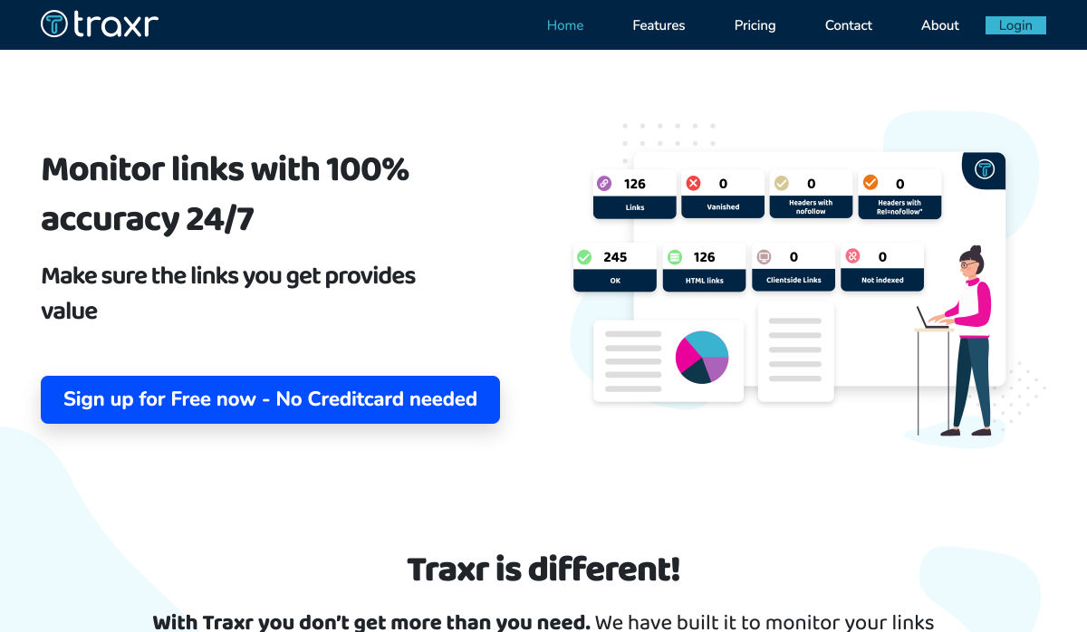
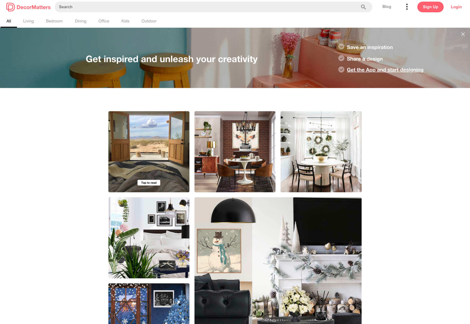
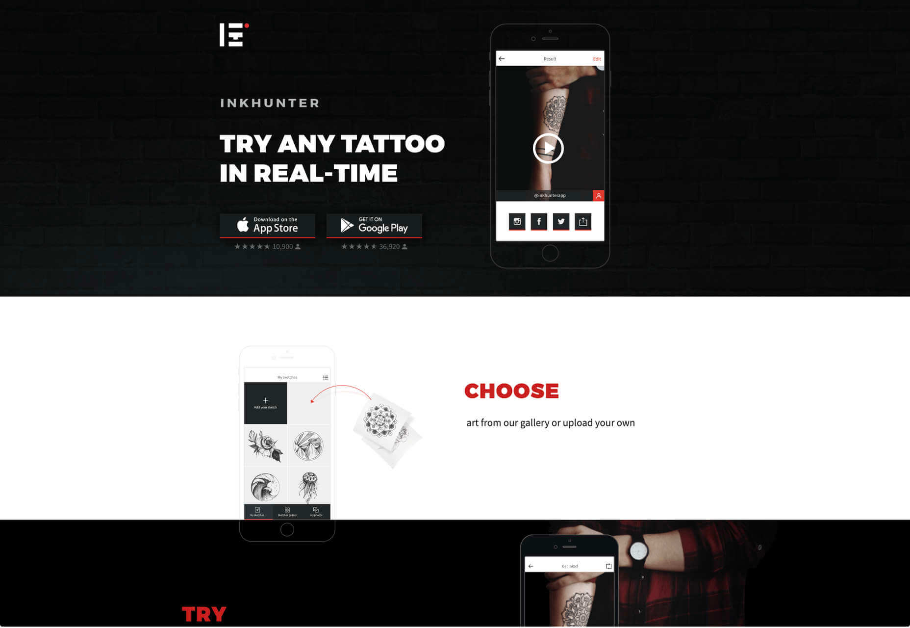
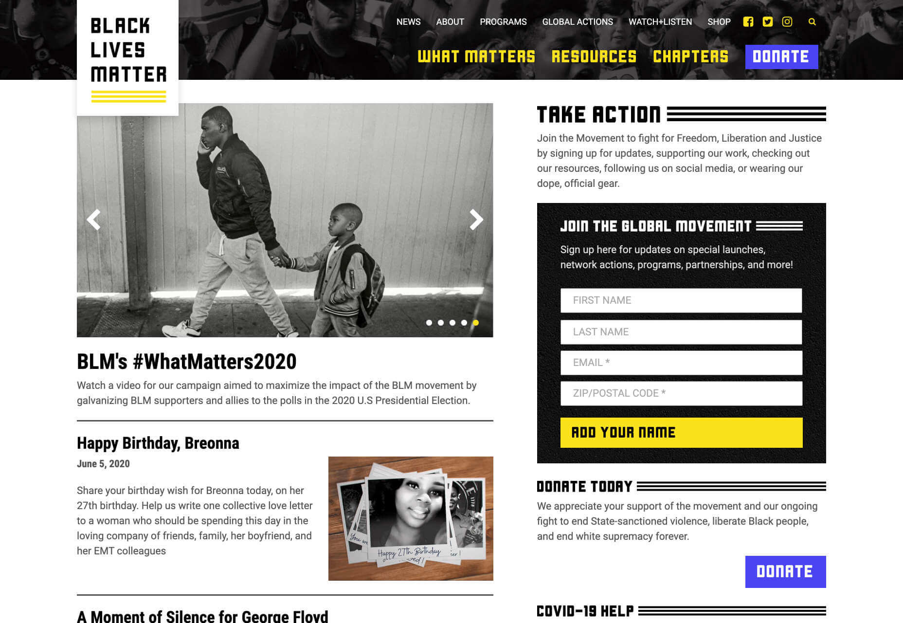
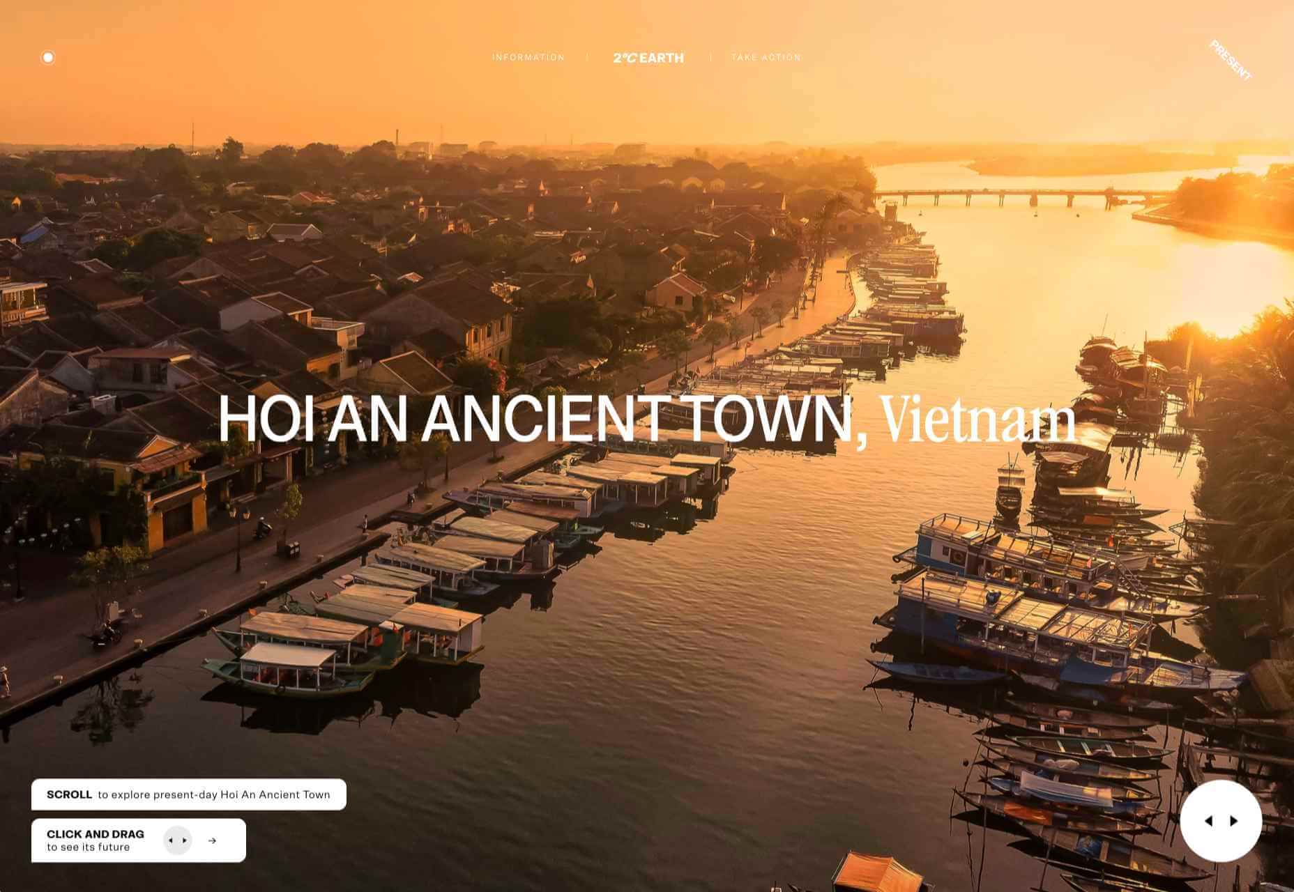
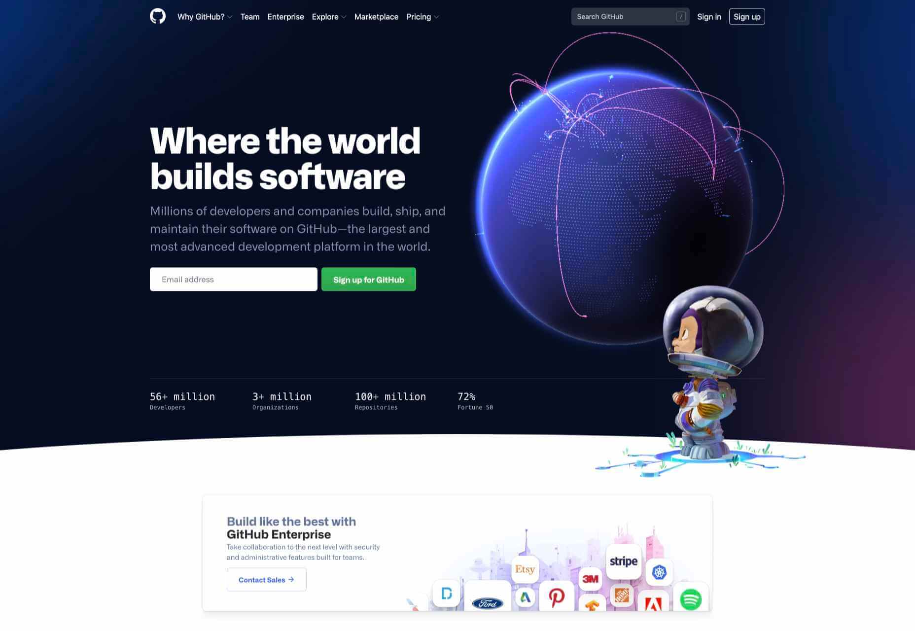
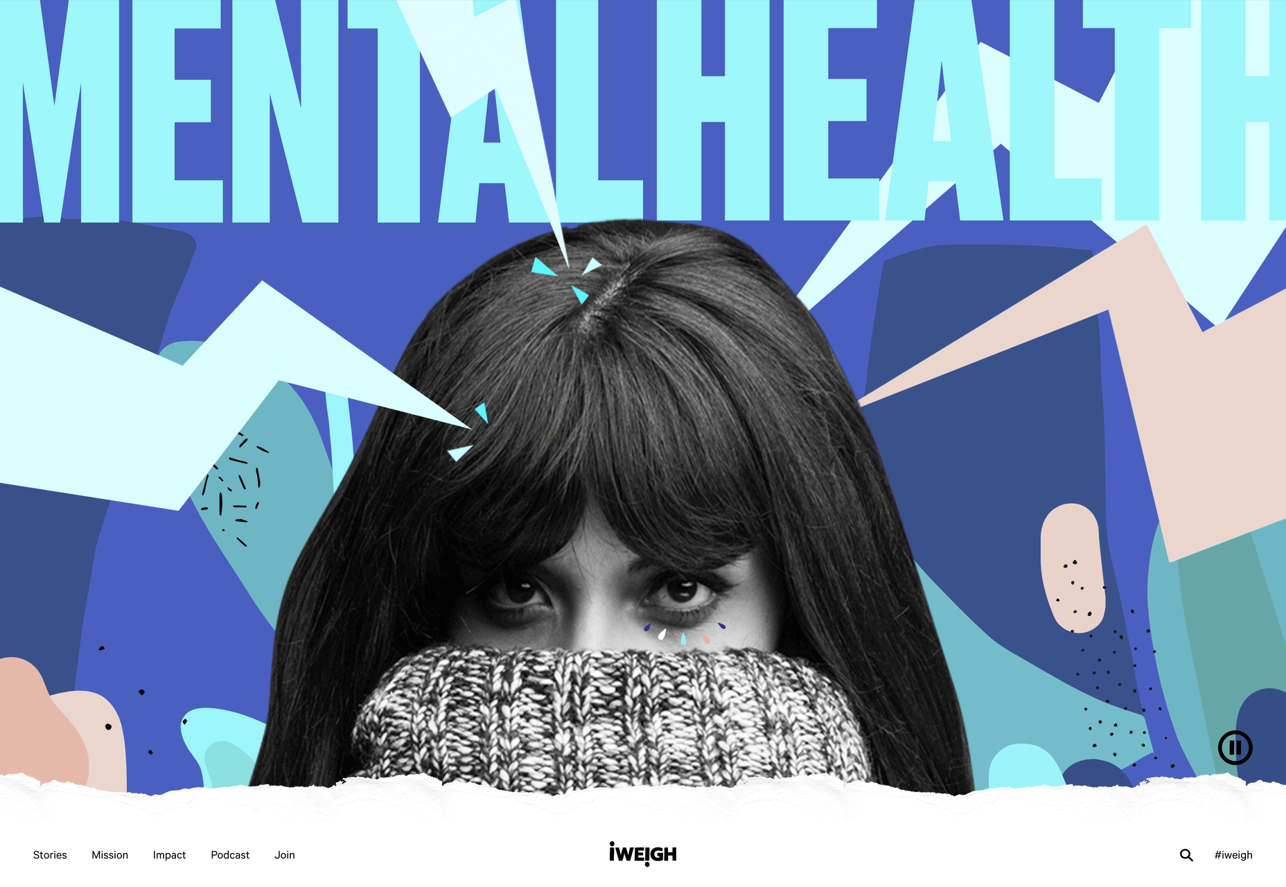
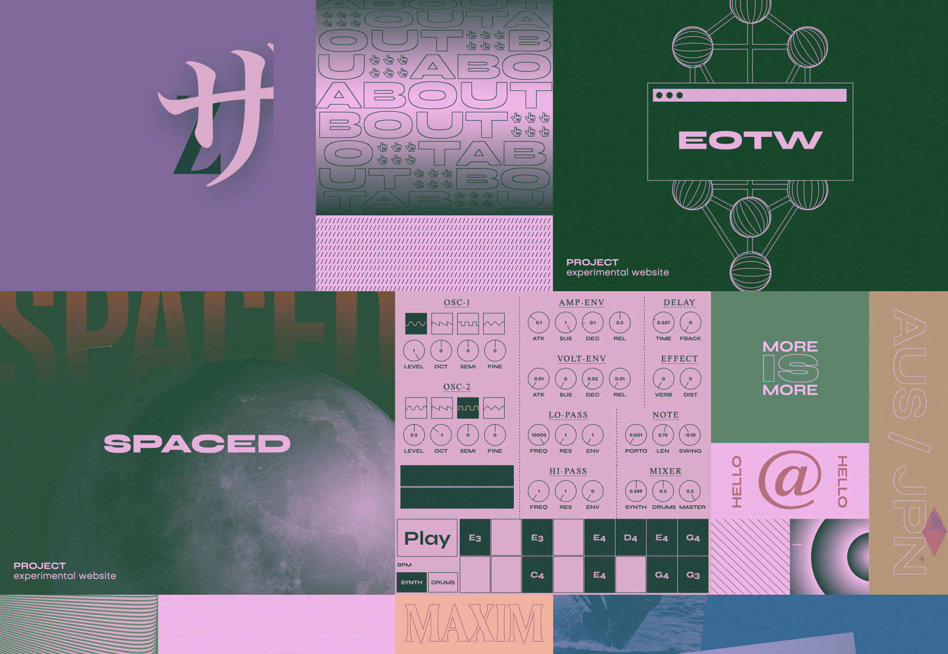
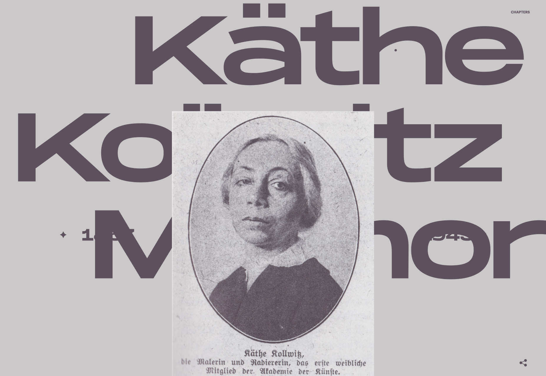
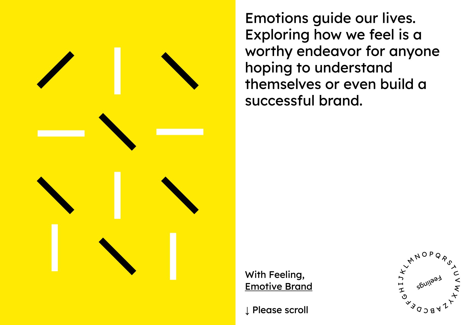
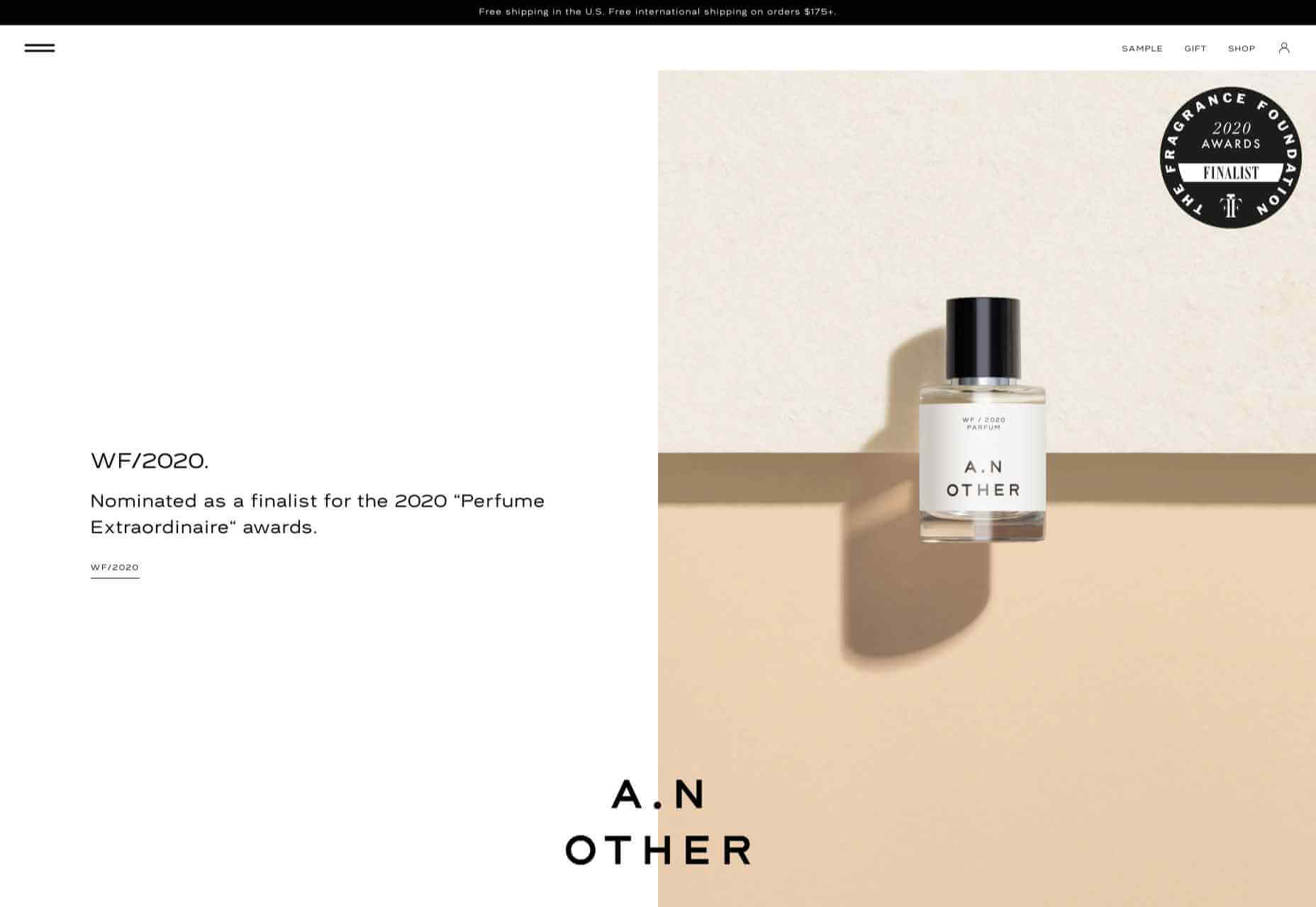
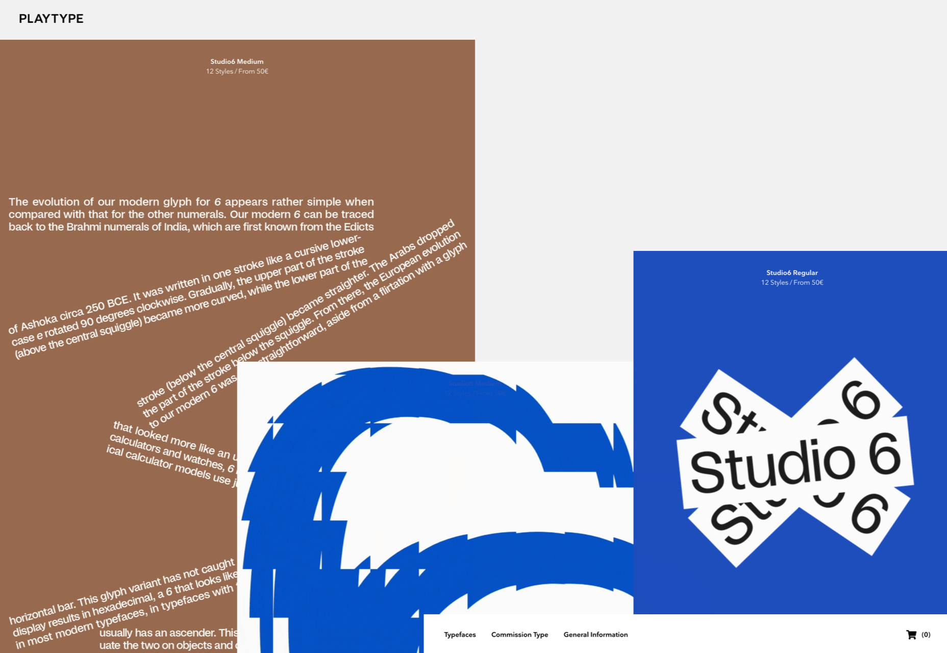
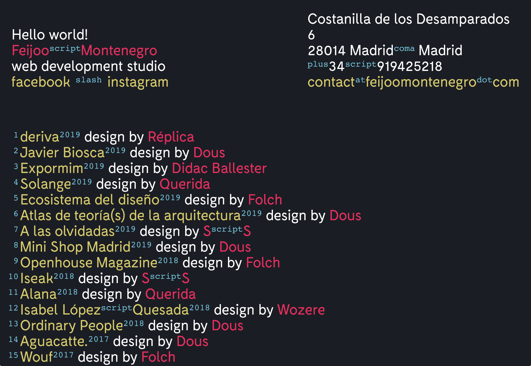
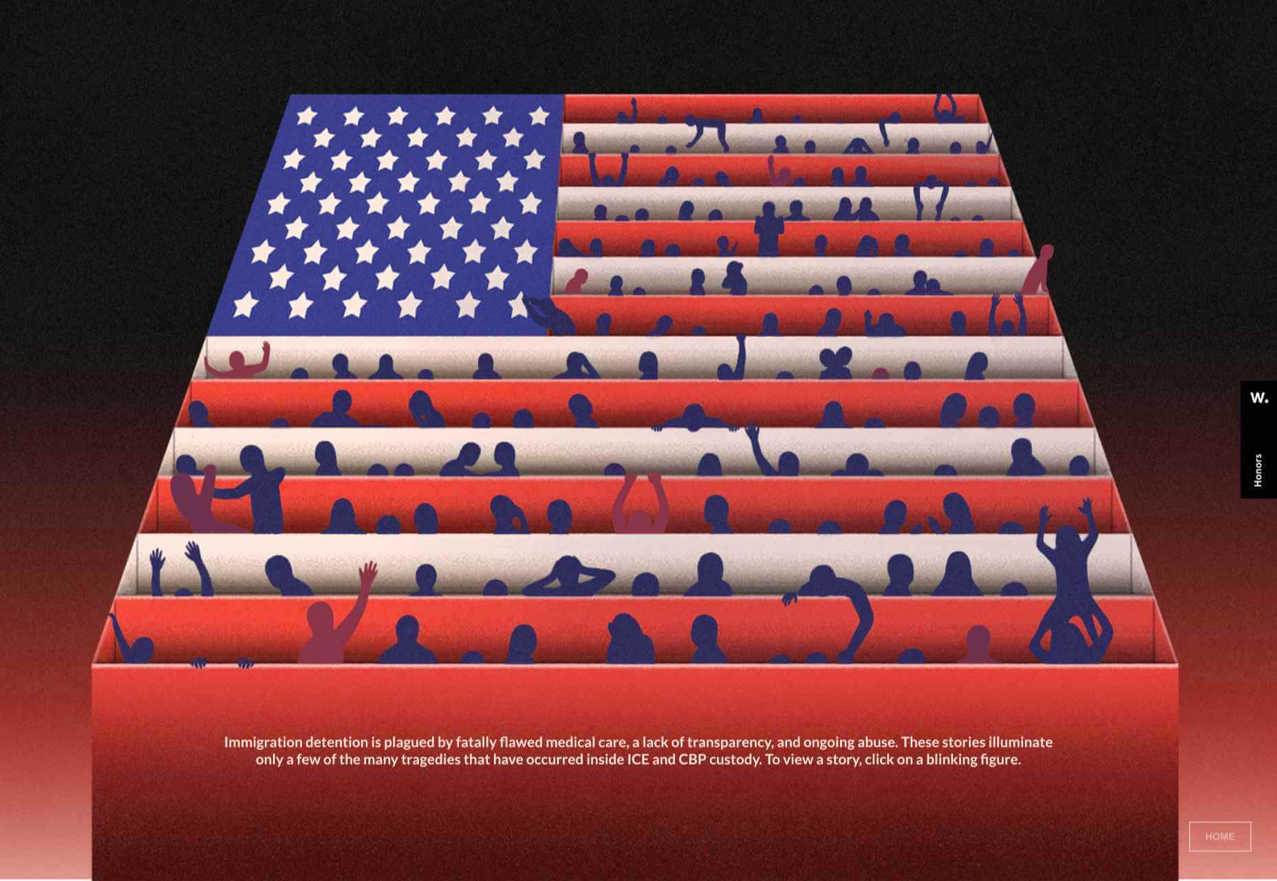
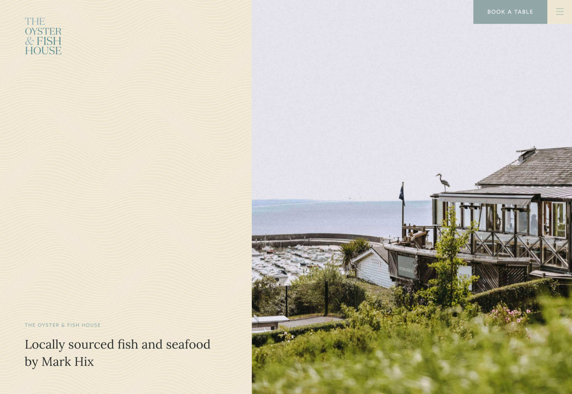
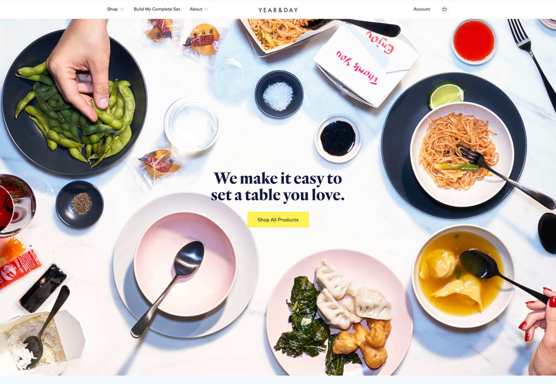
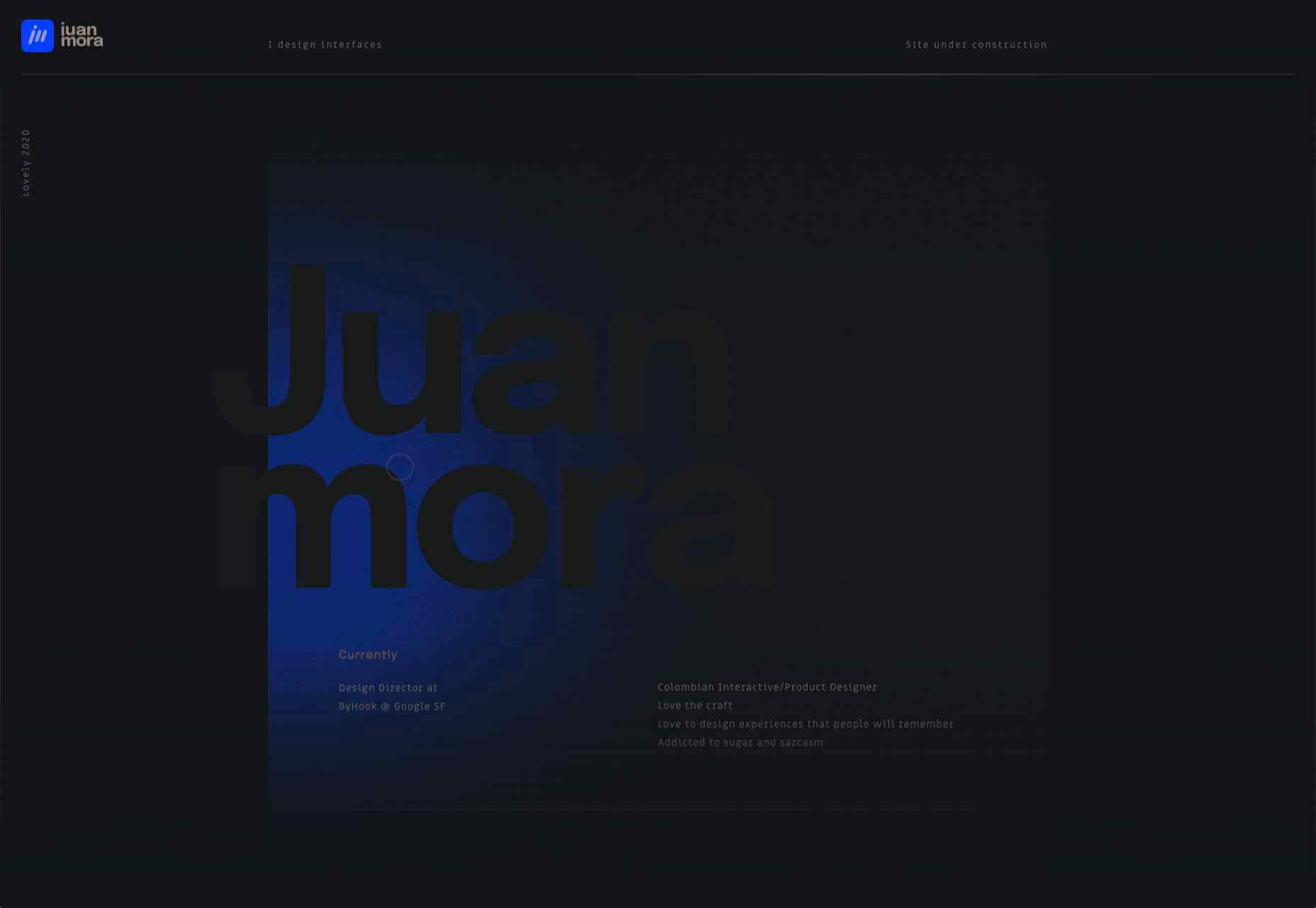
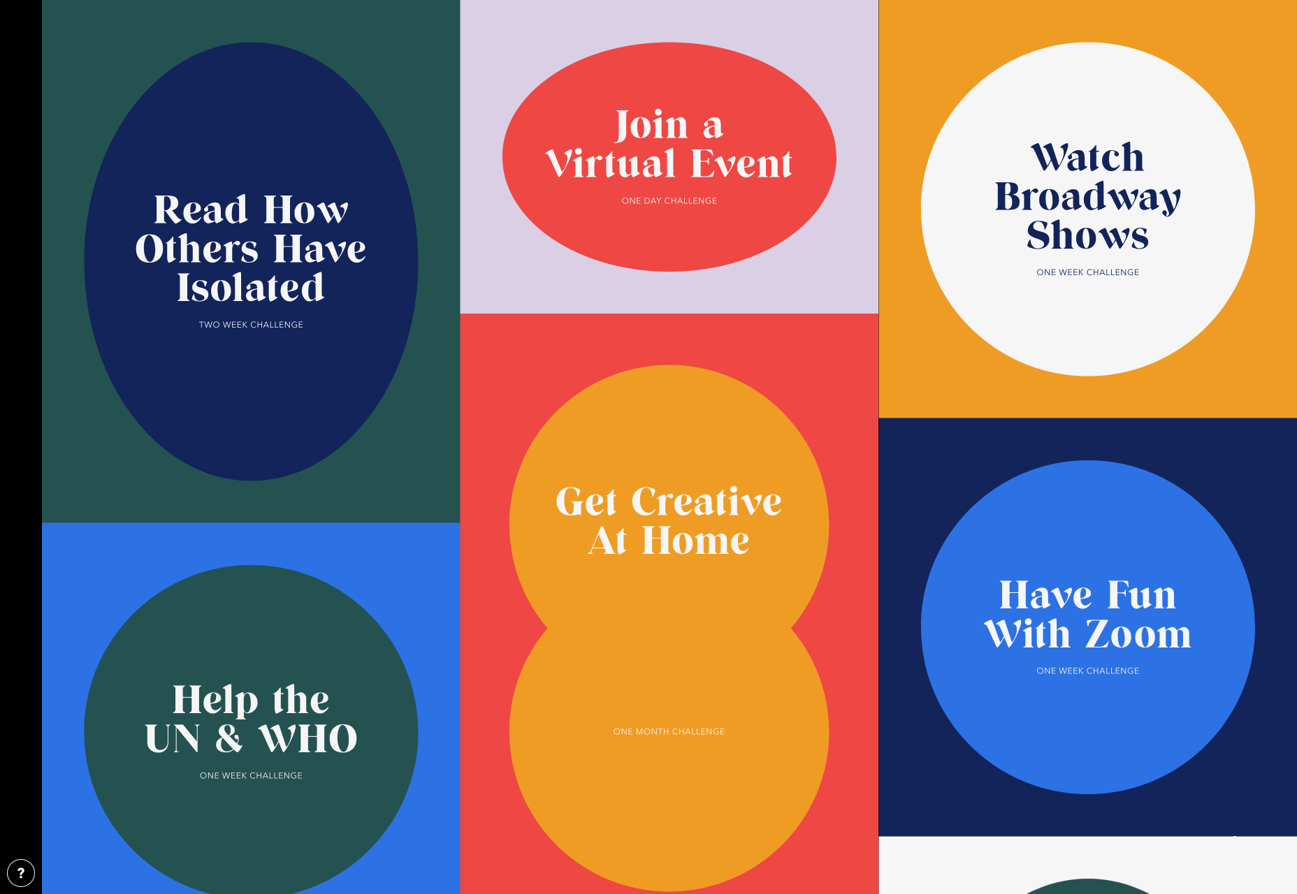
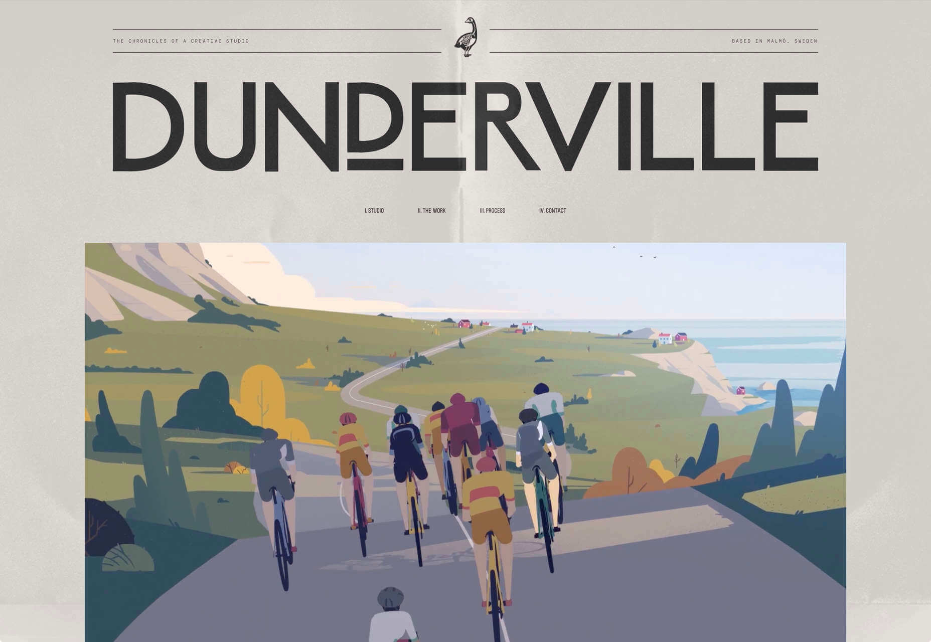
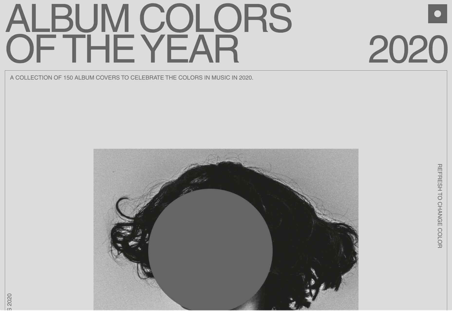
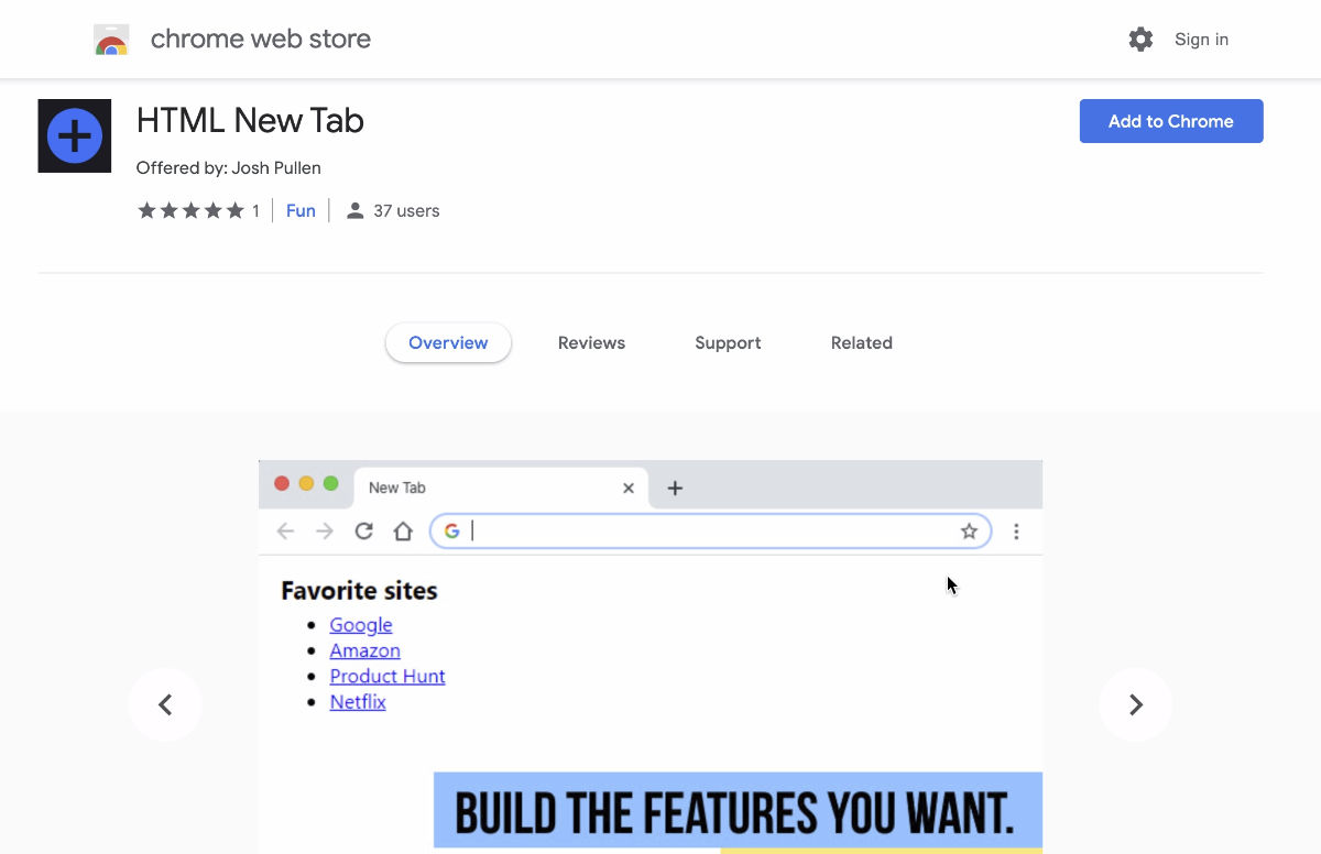
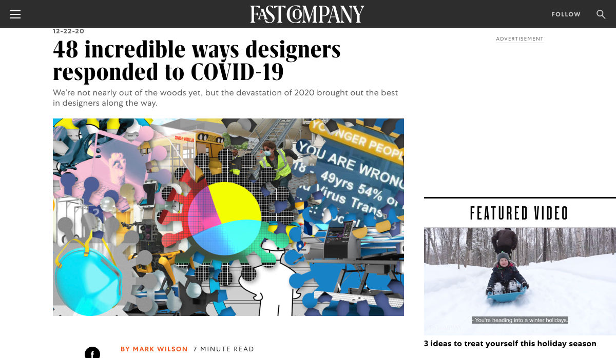
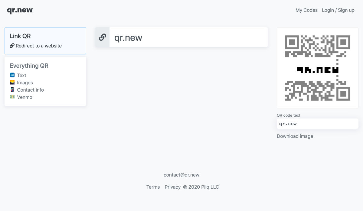
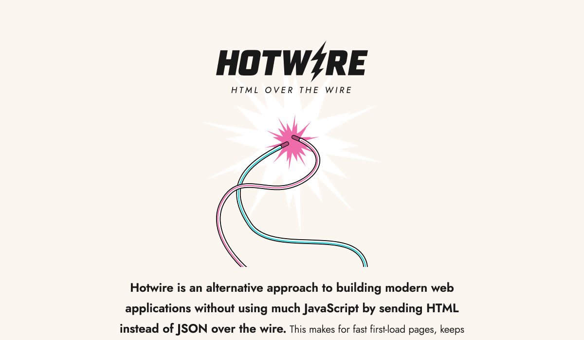
 Every week users submit a lot of interesting stuff on our sister site Webdesigner News, highlighting great content from around the web that can be of interest to web designers.

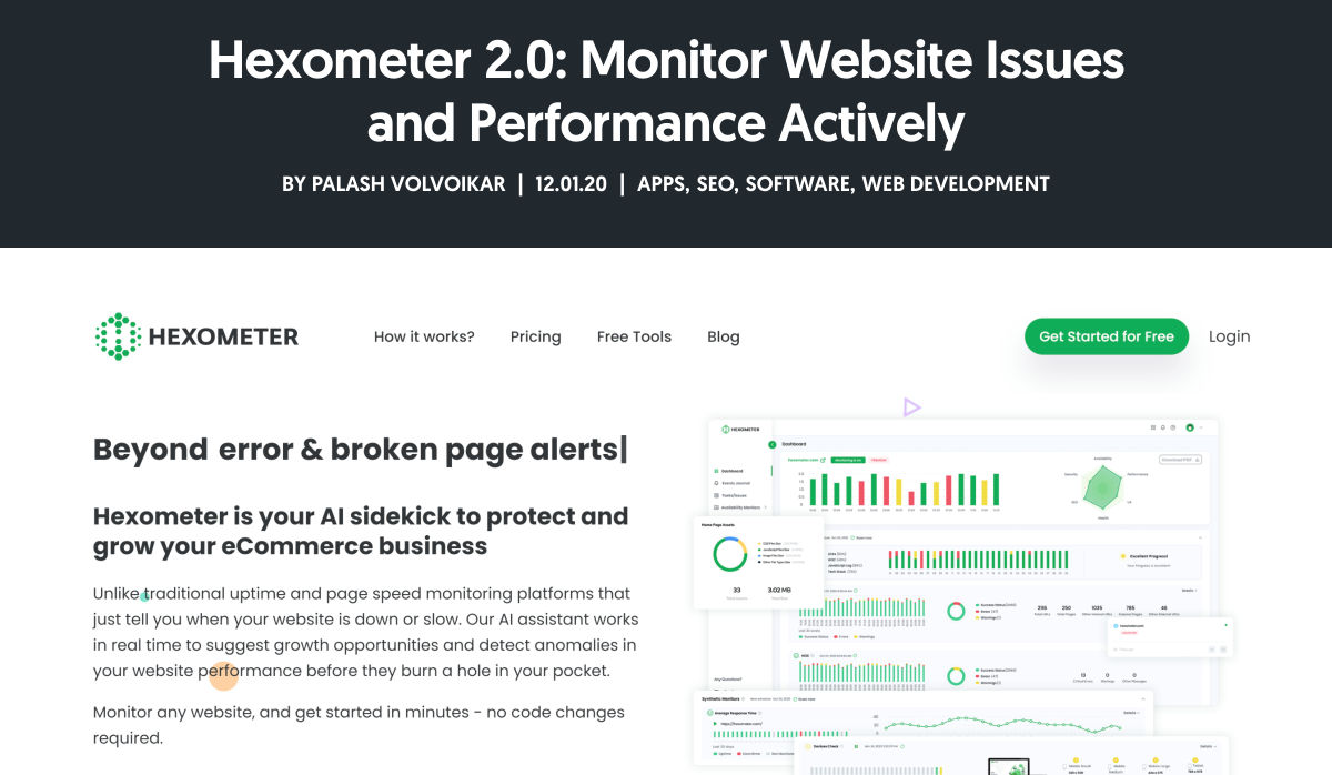
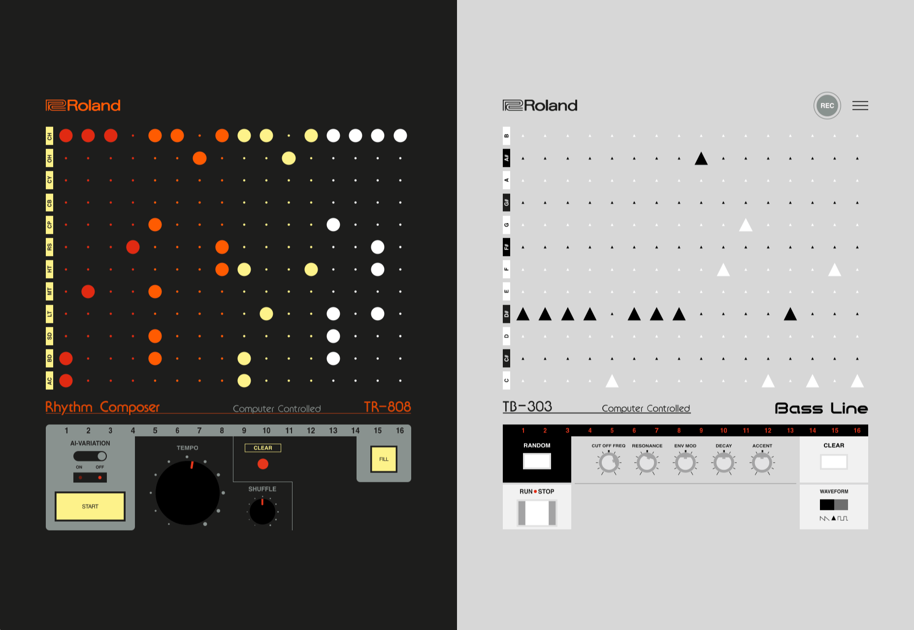
 Every week users submit a lot of interesting stuff on our sister site Webdesigner News, highlighting great content from around the web that can be of interest to web designers.


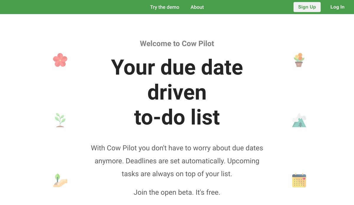
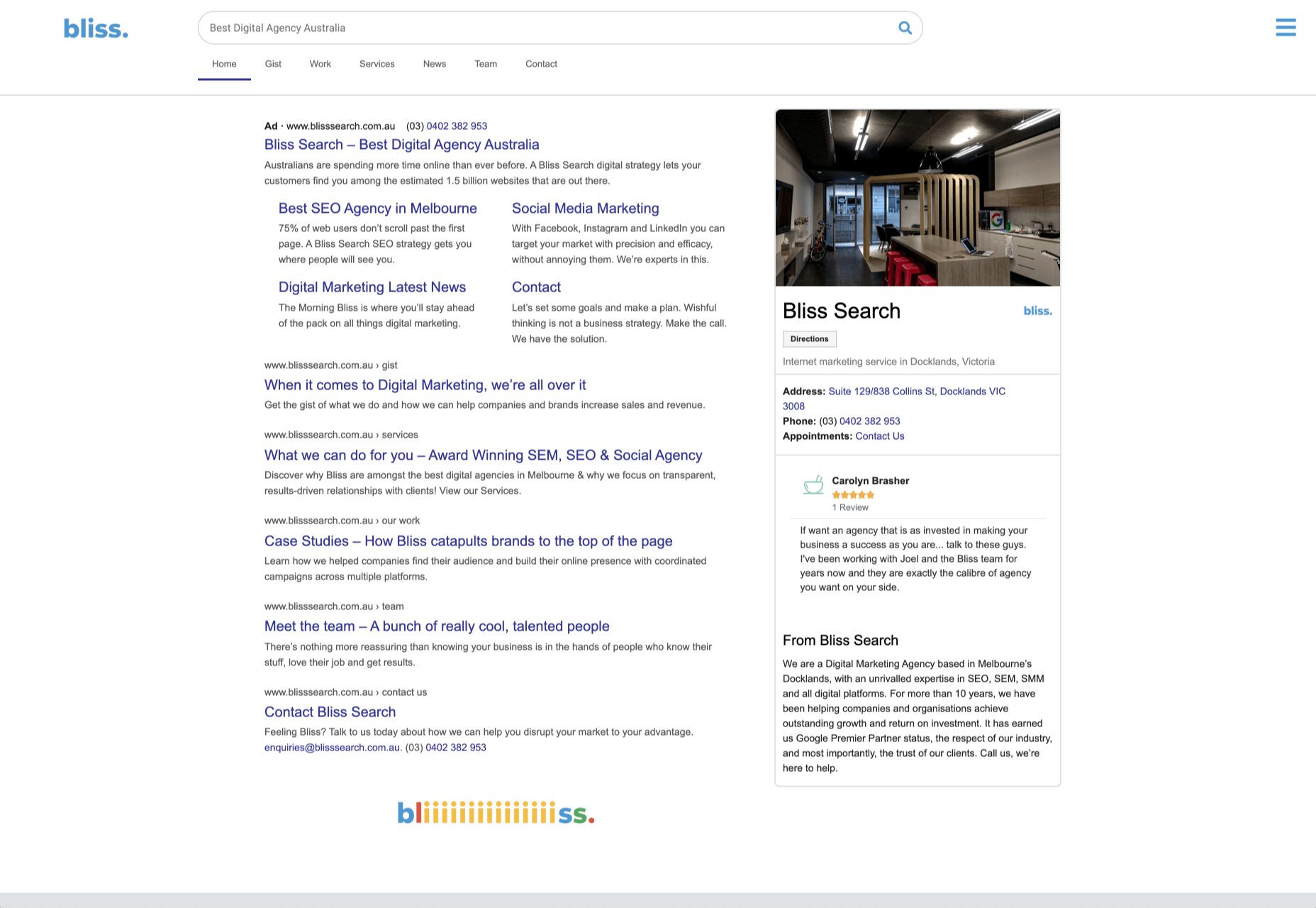
 Every week users submit a lot of interesting stuff on our sister site Webdesigner News, highlighting great content from around the web that can be of interest to web designers.
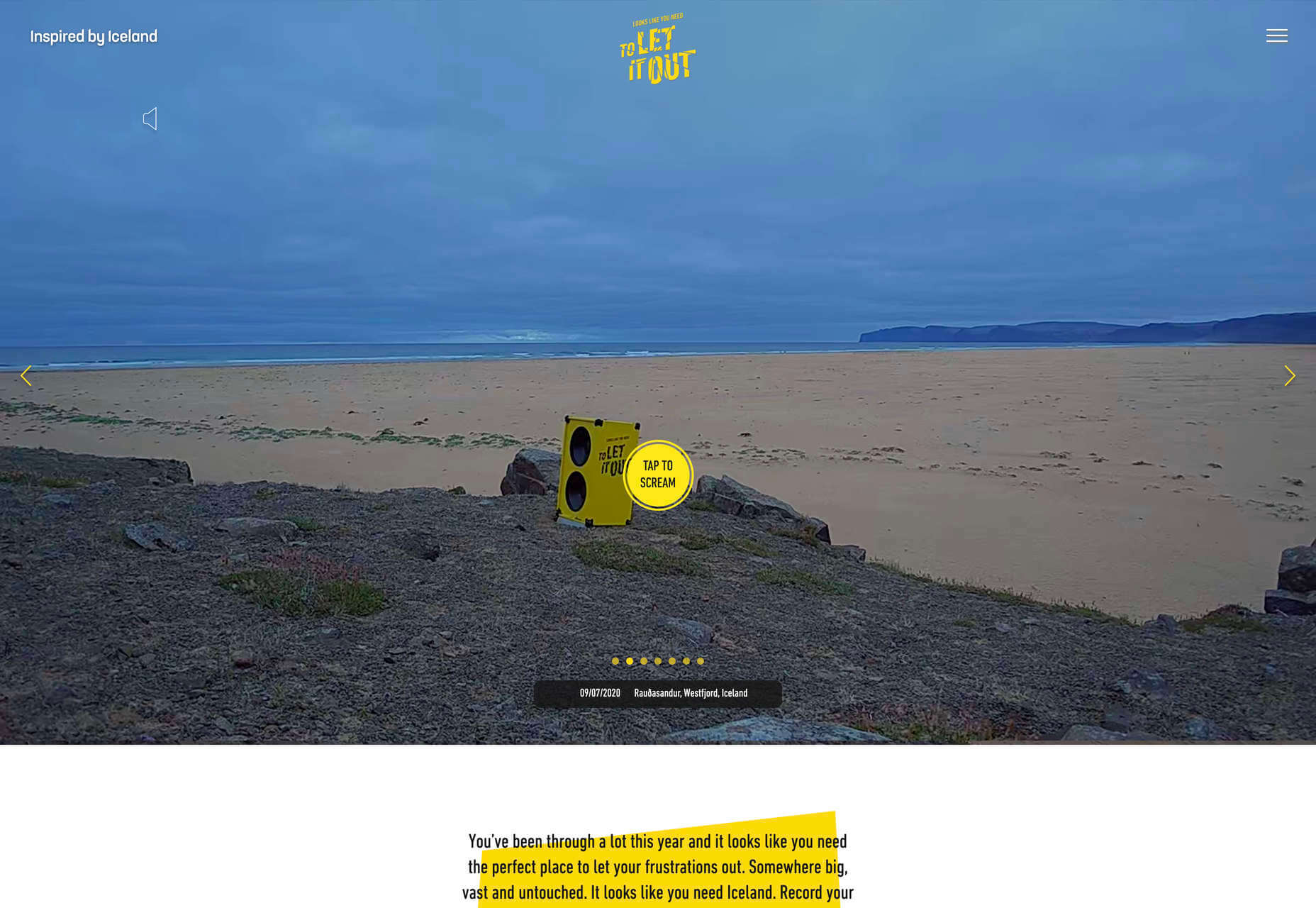
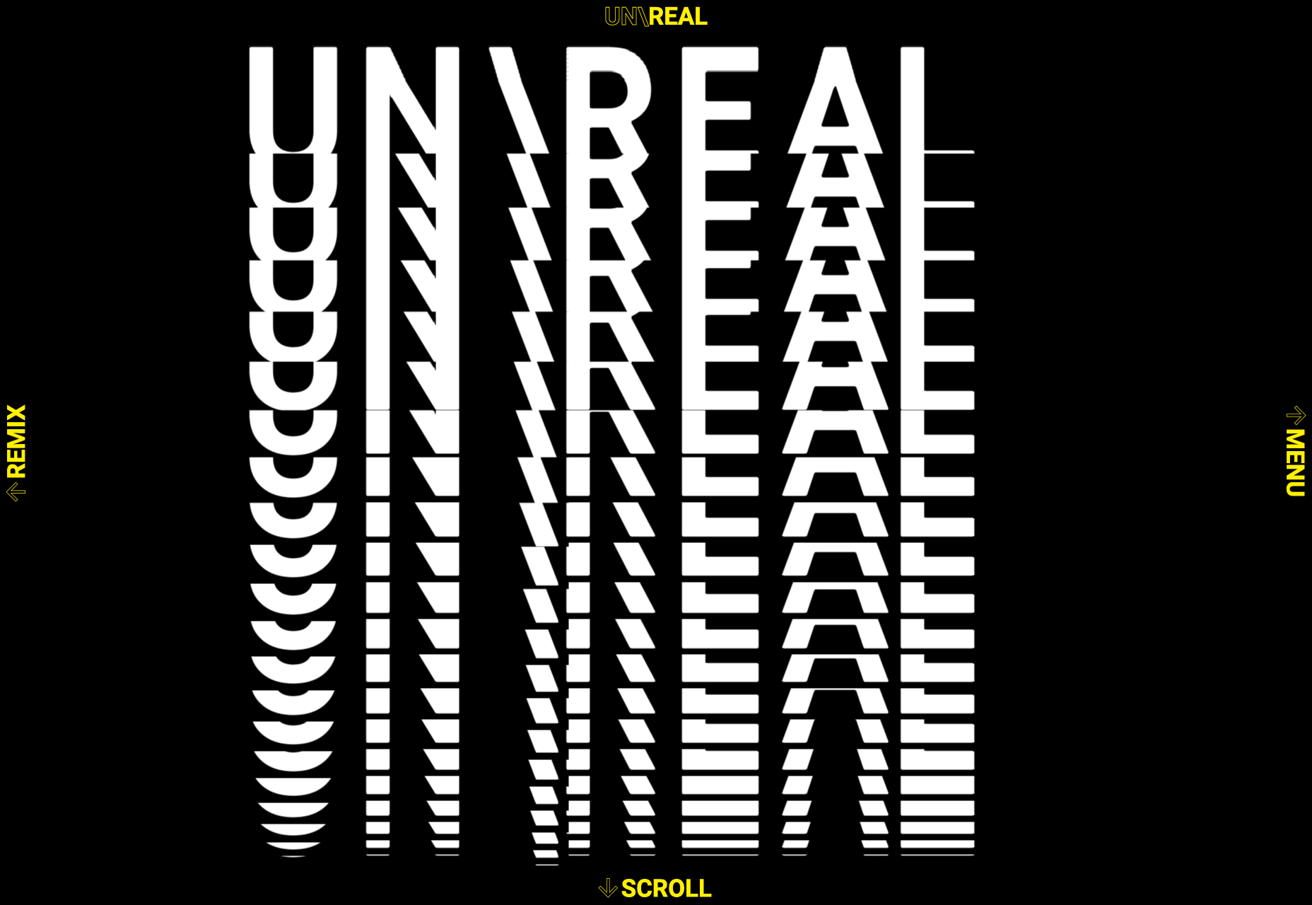
 Over the years, experts have repeatedly discussed the possible impact of mixed realities on web design. Concepts like AR and VR are expected to have the potential to change the way that we interact with websites on a fundamental level.


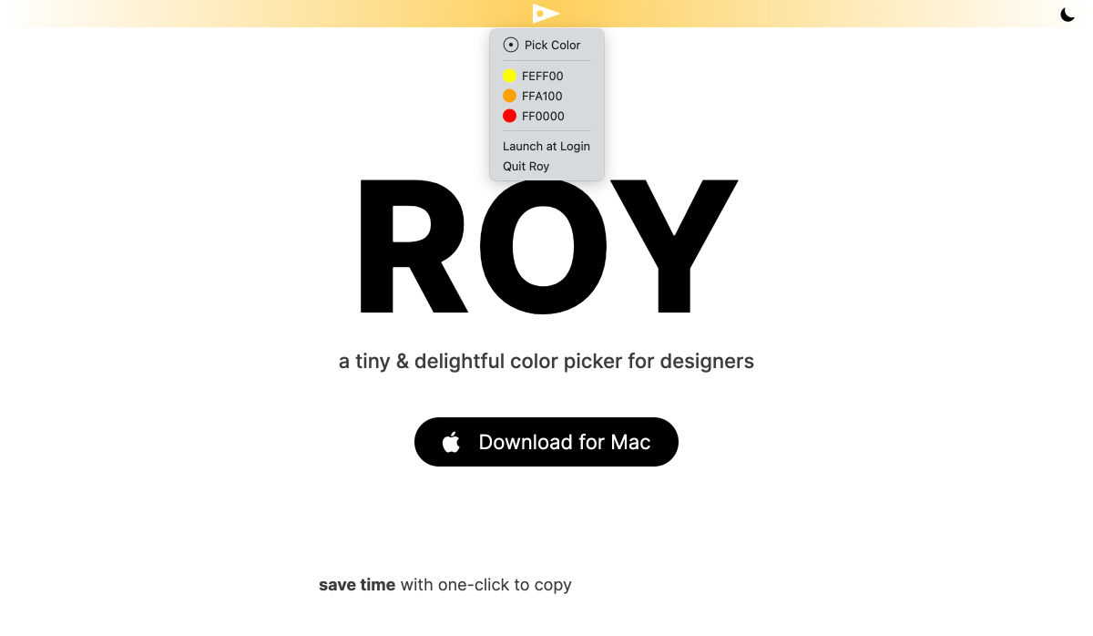
 Every week users submit a lot of interesting stuff on our sister site Webdesigner News, highlighting great content from around the web that can be of interest to web designers.


 Every week users submit a lot of interesting stuff on our sister site Webdesigner News, highlighting great content from around the web that can be of interest to web designers.


 Every week users submit a lot of interesting stuff on our sister site Webdesigner News, highlighting great content from around the web that can be of interest to web designers.