
 Sass – the extended arm of CSS; the power factor that brings elegance to your code.
With Sass, it is all about variables, nesting, mixins, functions, partials, imports, inheritance, and control directives. Sass makes your code more maintainable and reusable.
And now, I will show you how to make your code more structured and organized.
The organization of files and folders is crucial when projects expand. Modularizing the directory is necessary as the file structure increases significantly. This means structuring is in order. Here is a way to do it.
- Divide the stylesheets into separate files by using Partials
- Import the partials into the master stylesheet – which is typically the main.sass file.
- Create a layout folder for the layout specific files
Types of Sass Structures
There are a few different structures you can use. I prefer using two structures — a simple one and a more complex one. Let’s have a look.
Simple Structure
The simple structure is convenient for a small project like a single web page. For that purpose, you need to create a very minimal structure. Here is an example:
- _base.sass — contains all the resets, variables, mixins, and utility classes
- _layout.sass — all the Sass code handling the layout, which is the container and grid systems
- _components.sass — everything that is reusable – buttons, navbars, cards, and so on
- _main.sass — the main partial should contain only the imports of the already mentioned files
Another example of the same simple structure is the following:
- _core.sass — contains variables, resets, mixins, and other similar styles
- _layout.sass — there are the styles for the header, footer, the grid system, etc
- _components.sass — styles for every component necessary for that project, including buttons, modals, etc.
- _app.sass — imports
This is the one I usually use for smaller projects. And when it comes to making a decision of what kind of structure to be used, the size of the project is often the deciding factor.
Why Use This Structure?
There are several advantages why you should use this organisational structure. First of all, the CSS files cache and in doing so, the need to download a new file for every new page visit is decreased. In this way, the HTTP requests decrease as well.
Secondly, this structure is much easier to maintain since there is only one file.
Thirdly, the CSS files can be compressed and thus decrease their size. For a better outcome, it is recommended to use Sass/Less and then do concatenation and minification of the files.
In case files become disorganized, you would need to expand the structure. In such a case, you can add a folder for the components and break it further into individual files. If the project broadens and there is a need for restructuring the whole Sass structure, consider the next, more complex pattern.
The 7-1 Patterned Structure
The name of this structure comes from 7 folders, 1 file. This structure is used by many, as it is considered to be a good basis for projects of larger sizes. All you need to do is organize the partials in 7 different folders, and one single file (app.sass) should sit at the root level handling the imports. Here is an example:
sass/
|
|- abstracts/
| |- _mixins // Sass Mixins Folder
| |- _variables.scss // Sass Variables
|
|- core/
| |- _reset.scss // Reset
| |- _typography.scss // Typography Rules
|
|- components/
| |- _buttons.scss // Buttons
| |- _carousel.scss // Carousel
| |- _slider.scss // Slider
|
|- layout/
| |- _navigation.scss // Navigation
| |- _header.scss // Header
| |- _footer.scss // Footer
| |- _sidebar.scss // Sidebar
| |- _grid.scss // Grid
|
|- pages/
| |- _home.scss // Home styles
| |- _about.scss // About styles
|
|- sections/ (or blocks/)
| |- _hero.scss // Hero section
| |- _cta.scss // CTA section
|
|- vendors/ (if needed)
| |- _bootstrap.scss // Bootstrap
|
- app.scss // Main Sass file
In the Abstract partial, there is a file with all the variables, mixins, and similar components.
The Core partial contains files like typography, resets, and boilerplate code, used across the whole website. Once you write this code, there is no further overwriting.
The Components partial contains styles for all components that are to be created for one website, including buttons, carousels, tabs, modals, and the like.
The Layout partial has all styles necessary for the layout of the site, i.e., header, footer.
The Pages partial contains the styles for every individual page. Almost every page needs to have specific styles that are to be used only for that particular page.
For every section to be reusable and the sass code to be easily accessible, there is the Section/Blocks partial. Also, it is important to have this partial so that you don’t need to search whether particular code is in the home.sass or about.sass files in the Pages partial.
It is a good idea to put each section in a separate .sass file. Thus, if you have two different hero sections, put the code in the same file to know that there you can find the code for the two sections. And if you follow this pattern, you will have the majority of files in this folder.
The Vendors partial is intended for bootstrap frameworks so, if you use one in your project, create this partial.
I recommend you use app.sass as the main folder. Here is how it should look:
// Abstract files
@import "abscracts/all"; // Vendor Files
@import "vendor/bootstrap.scss"; // Core files
@import "core/all"; // Components
@import "components/all"; // Layout
@import "layout/all"; // Sections
@import "sections/all"; // Pages
@import "pages/all";
Instead of having a lot of imports in the file, create an all.sass file in every folder. Each all.sass file should contain all the imports for that folder — and to make it more visible and understandable, create a main file.
Organisation
The biggest benefit of this structure is organisation.You always know where to check if you need to change something specific. For example, if you want to change the spacing on a Section/Block you go directly to the Sections/Blocks folder. That way, you don’t need to search in the folder to find the class in a file.
Facilitation
When the code is structured, the processes are promptly facilitated. They are streamlined and every segment of the code has their own place.
Final Words
Organizing code is essential for developers and together with all other skills, it is the most effective way to improve the functioning of the site. And even though there are multiple ways of organisation and different strategies, opting for simplicity helps you avoid the dangerous pitfalls. And finally, there is no right or wrong choice since everything depends on the developer’s work strategies.
Featured image via Reshot.

 The end of the year tends to be busy for a variety of reasons and it can limit some of the freshness we see in designs during much of the year. Regardless, there are a few trending design elements.


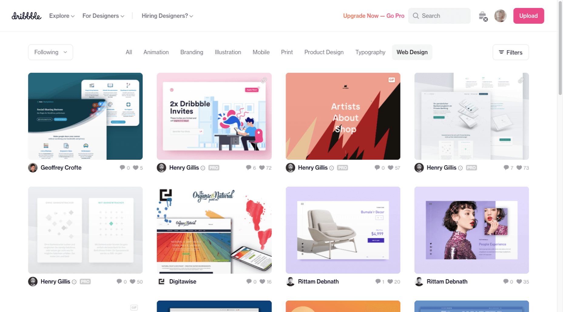
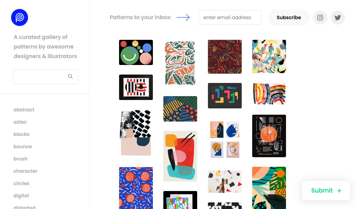
 Every week users submit a lot of interesting stuff on our sister site Webdesigner News, highlighting great content from around the web that can be of interest to web designers.


 The holidays are fast approaching. But that doesn’t mean it’s too late to get a new website online or to make your existing one look festive for the holiday season.


 Every week users submit a lot of interesting stuff on our sister site Webdesigner News, highlighting great content from around the web that can be of interest to web designers.


 You’ve


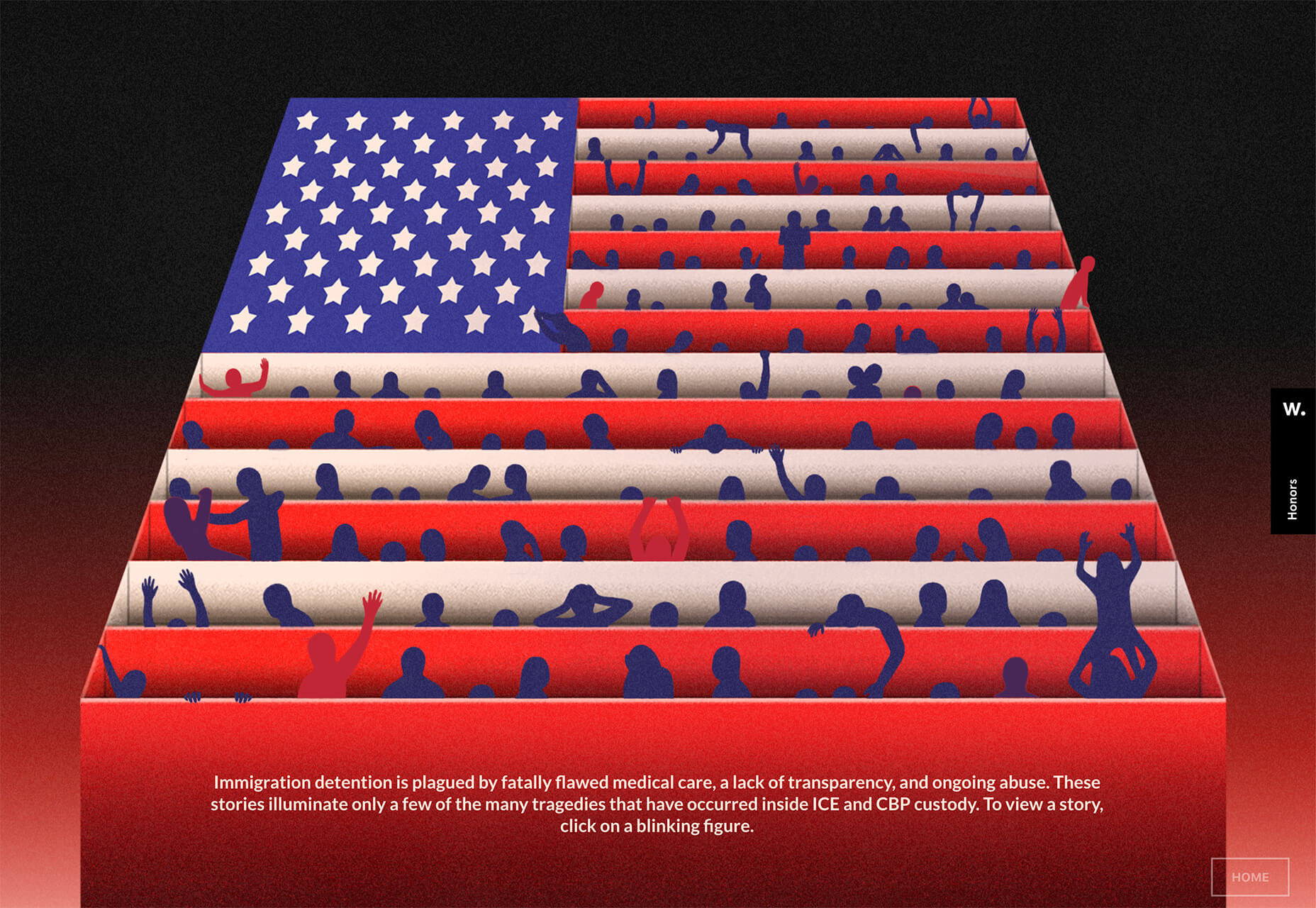
 If you’re interested in a sneak peek of this year’s best Black Friday deals, stick around. You’ll find a few web designers’ favorites, including a stellar deal or two.


 Every week users submit a lot of interesting stuff on our sister site Webdesigner News, highlighting great content from around the web that can be of interest to web designers.


 Every week users submit a lot of interesting stuff on our sister site Webdesigner News, highlighting great content from around the web that can be of interest to web designers.


