Articles

According to Klipfolio research, users spend on average 52 seconds on a webpage. With minimal time to impress, you must consider how to best help your consumers understand what your product or service does and why they should care about it. It’s not enough to describe your value – great landing pages will go the extra step and show this as well.

One powerful method to do this is by providing a real-life, responsive teaser to show what your product looks like, how it works, and what value it can create. This means incorporating specific elements from your functional, responsive product into the landing page. However, this should be a “mini-product experience” that users can experiment with rather than a freemium version of your product. If done well, the dynamics will pay off in captivating users for longer, increasing their consideration time, and driving your conversion rate as a result.

Building more dynamic landing pages through product experience can change the game completely. These are some strategies to consider.

“Ask & Alter” for Greater Personalization

“Ask & alter” is valuable for services with multiple potential value propositions for different audiences. The simple fix here is to have a pop-up box that asks the visitor which profile they are (and alternatively a few more questions). You can then trigger the page to alter according to their input, ensuring a more customized experience and increasing their chance of conversion. By doing this, you’re taking the onus off the consumer to figure out what’s relevant to them, eliminating any potential confusion.

A great example of this is the Penn Foster University website. It has a developed UX optimized for organizations, high school degree seekers, and upskillers alike. Each has an entirely different, carefully designed interface, matching the diverse needs of visitors. For example, while a high schooler might enjoy browsing the career pathways section, an upskiller is likely to search specific career fields. Such distinction is key to consider, as intentional and strategic user experience can raise conversion rates by as much as 400%.

Real-Time Demos to Hook the User

Real-time demos mean that you take a full instance or version of your product that is clickable and responsive and embed it into the flow of your landing page. This way, the user can get a quick “test drive,” and you easily communicate the value that would otherwise be abstract or difficult for the user to imagine or even visualize. Additionally, users always want to know how a product could personally impact them, and live demos offer them a hands-on experience.

Companies incorporating live demos have proven the power to engage a user’s curiosity and create a strong link with their products or services. Notion, for instance, uses a “templates” section with pre-built pages that can be easily opened and browsed through without needing to register or download anything. This product’s beauty lies in the simplicity and efficiency it offers, rather than overwhelming a user with a self-promotional copy. Even a simple live demo like that can help build considerable trust in the product and encourage users to make a high-value purchase.

Calculators Provide Value

Despite their simplicity, calculators can increase audience engagement by 38%. Their main benefit is undoubtedly providing a personalized solution to users’ actual needs and expectations. ROI and savings calculators can be particularly interesting, especially when they speak of value that isn’t easy to calculate or when the user wouldn’t intuitively know that there are savings to be had by using a particular product.

Butter Payment, uses this tool very effectively. As its customers necessarily don’t know they have an involuntary churn problem that is worth solving for, it uses a calculator on its site to demonstrate the problem and enumerate the value-add to potential customers.

HubSpot, too, has mastered the tool: Its Ad ROI Calculator visually presents the results that its software can bring. Then, HubSpot’s interactive website grader directs the user towards its comprehensive marketing offerings. It is this graphic visualization that companies must adopt to communicate real value.

The Charm of Experiential Interaction

Interactive design is said to drive the responsiveness and real-time interaction of a site through the roof. By incorporating an interactive or experiential page, even if it’s not directly on your landing page, you can craft a unique experience aimed at leaving a lasting, meaningful impression of your product or service.

Calm’s “Do Nothing for two minutes” is a simple yet effective way to show users the value of meditation in their daily life and lead them to download the app.

But it works great for consumer products, too: Nike’s Digital Foot Measurement tool is another excellent feature, allowing users to “try shoes on” with their cameras and scan their feet for the right measurement through AR.

Videos are Attention Magnets

Considering that viewers absorb some 95% of the message while watching videos, compared to only 10% when reading text, there’s no reason why you should avoid incorporating videos into your landing pages. Beyond that, videos can be incredibly straightforward: Insert a graphic illustration or real imagery to explain the product, show the step-by-step process, and convey value with raw, unfiltered footage.

Calendly, for example, has various videos on its landing page, including a 56-second, upbeat, colorful clip showing how simple it is to get started with the product.

Guiding GIFs to Visualize Product Features

As small animations, GIFs represent the perfect middle ground between images and videos. They allow you to show users the value your product adds, providing an engaging glimpse into the actual interface. The small scope of GIFs is both a limitation and a benefit: You can only show a particular feature of your product but can also focus on triggering an exact user emotion.

Grammarly, a grammar correction tool, relies on GIFs to give users a taste of their UX. With a quick overview of the product’s functionality across popular platforms, including email and social media, users can see exactly how the product can make their everyday lives easier. And by incorporating GIFs into the right side of the landing page, the scrolling experience of the user isn’t disrupted.

Interactive product experiences can both entertain and tackle pain points, adding dynamics to an otherwise static page. Particularly when customizing based on user attributes, the key benefit of these features is that the users engaging with them are likely the same people interested in the paid product. To ensure that the product experience doesn’t directly compete with the primary offering, clearly differentiate it and guide the user towards a direct call to action.

Source

The post The Case for Building More Dynamic Landing Pages first appeared on Webdesigner Depot.

Source de l’article sur Webdesignerdepot

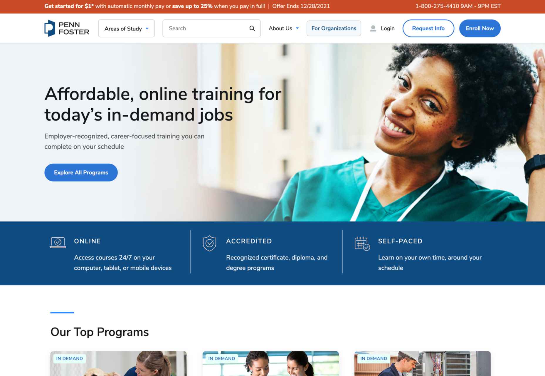
2021 has been both memorable and instantly forgettable. Pop stars were freed from modern-day servitude, some people tried to overthrow democracy, and we all vacationed at home.

Despite the weirdness of the times, the web kept growing, kept changing, and kept on pushing boundaries. We saw a wealth of new sites launch or relaunch with significant updates.

Here are the 50 best sites launched on the web this year. Enjoy!

Crusta C

In April, seafood company Crusta C cleverly used the simple logomark ‘C’ to apply a cutout video effect.

Slow

Slow is a collective of creatives aiming to implement slow movement principles. Its site reflects those aims, creating a sense of calm and deliberation.

hnst

2021 saw tons of brutalist-inspired design. hnst’s take on the style works thanks to the bright red in place of the standard black.

Marram

This site for boutique hotel Marram uses a soft color palette to create an impression of soft golden light and calm.

Levitate

In July, we loved this site for running-blade brand Levitate. The site is clean and light, with a sense of inherent motion in the photography.

Niarra Travel

There’s some beautiful photography on this site for eco-conscious, bespoke travel agency Niarra Travel.

Plunt.co

The core of this site for Plúnt is a combination chooser which feels pleasingly reminiscent of an animal flipbook.

Moth Drinks

Moth makes classic cocktails in a can. The striking black and white graphics and masking effects for its holding page stunned us back in March.

Seed

Selling supplements is hard; people are understandably skeptical. So this site for Seed packs in research and scientific information and avoids the hard-sell.

Wavemaker

Another excellent portfolio site in 2021, this time for creative media agency Wavemaker. The site is uber-confident while still being playful.

Wild Souls

Wild Souls makes nut butters, tahini, and other Greek delicacies. Its site is colorful and warm, and the site typography is soft and appealing.

JUST Egg

JUST Egg produces egg-like food from plant material. The huge photography and bold typography do a great job of making a new concept appealing.

Aalto University

One of the most popular designs of 2021 was Aalto University’s site with its in-depth campus tour. The simple navigation inspired several imitators.

Wisr

Scroll interactions were big in 2021, and Wisr features a Heath Robinson-style machine that ‘runs’ as the user scrolls down the page.

Cevitxef

This site for Cevitxef ceviche restaurant in Bilbao does a great job of making us hungry. Drama is created by oversized text, heavily-styled photography, and lots of movement.

On

The best digital agencies keep their own sites simple, like this site for On digital technology studio that uses black on light blue and adds infinite scrolling.

Acayaba + Rosenberg

We found Acayaba + Rosenberg’s use of architectural photography and subtle scrolling a pleasing browsing experience.

Madre

This site for home linen company Madre uses extraordinary fine-art style still-life photography to enrich a very simple site.

Hyperframe

“Show, don’t tell” is a well-worn mantra. Hyperframe’s site implements it by demonstrating the product’s major selling point on scroll.

Gemini

This exceptional WebGL experiment was built to show what’s possible in the technology. Have a play with the car; it’s a ground-breaking demo.

Felt

In 2021, collaborative mapping tool Felt launched in private beta. Its excellent site does a great job of creating interest while doubling as a recruitment notice.

imNativ

Not every project is exciting, but this excellent site for imNativ uses macro photography to great effect to promote upholstery fabric.

Websmith Studio

Excellently named Websmith Studio uses color to highlight, and the noise effect applied to the background adds subtle interest.

Singita

High-quality photography and a terracotta-based color scheme create an inviting ambiance for Singita, an African eco-tourism and conservation brand.

Fluff

A fullscreen background behind a mobile view for desktop? It sounds like a horrible idea, but this site for cosmetics brand Fluff pulls it off.

Chiwawa

This great site for Chiwawa cantina features wrestling masks, skeletons, and tone-on-tone color to create a lively and distinctly Mexican site.

Nothing

This site for Nothing’s ear(1) earbuds is packed with confidence. Appropriately, it looks even better on mobile.

Chérie Healey

Lots of experts have tried to tell us how to live our lives in the last couple of years, but Chérie Healey’s site manages to stay on the right side of positive without slipping into clichés.

Wayfinder

Wayfinder, a game about our connection to nature using generative code, AI, machine learning, and data mining, could not have been more 2021 if it tried.

Green Angel Syndicate

Not too many investment groups are thought of as ethical, but Green Angel Syndicate specializes in funding companies fighting climate change.

Tether

As the days got darker in the Northern hemisphere, we were wowed by this site for Tether, a cycle safety system using video and illustration to explain its clever approach to bike safety.

Patricia Urquiola

Back in January, we loved the new site for Patricia Urquiola design studio, thanks to its bright, bold colors that we thought inspired confidence.

Headup

Headup’s businesslike approach is created thanks to a pleasing color palette and geometric graphics.

Redwood Empire

For Earth Day on April 22nd, Redwood Empire Whiskey created a microsite promoting a competition styled to match their bottle labels.

GT Super

The one-pager for GT Super has a certain drama in keeping with the font itself and allows you to play around with the size, weight, and style.

Planet of Lana

Due for release in 2022, Planet of Lana is a game from Wishfully Studios, and its teaser page launched back in June has kept us intrigued ever since.

The Longest Road Out

This charming site for The Longest Road Out is a travel map and journal based on the creators’ road trip around Britain, Ireland, and the outlying islands.

Made Thought

Made Thought has a bold aesthetic and approach that explains its outstanding client list.

Miti Navi

Miti Navi makes extraordinary sailing boats. We were attracted to how its site presented a luxury product in an original way.

La Nouvelle

Another powerful digital design agency site was La Nouvelle’s, which used a combination of contrasting and complementary color combinations to catch the eye.

Caleño

Caleño makes non-alcoholic distilled spirits. They relaunched their website in March with bright, joyful colors that reflect the character of the brand.

Capsul’in — Aluminium

This demo site for a coffee pod manufacturer isn’t a site as such, but it demonstrates that even in 2022, there’s room for parallax scrolling.

How Many Plants

Everyone needs a few more houseplants, and How Many Plants is a great guide to how to own and look after them. The illustration style is friendly but efficient.

How & How

One of the most approachable design agency sites of 2021 was How & How’s. It keeps things light and clean, and effective.

The Hiring Chain

Part of a campaign encouraging businesses to employ talented people with Down Syndrome, The Hiring Chain website dispels myths with clearly presented facts.

Virgile Guinard

Back in February, we couldn’t get enough of photographer Virgile Guinard’s portfolio site. Blocks of color pulled from each image hide the image allowing you to focus on one image at a time.

Studio Nanna Lagerman

Studio Nanna Lagermann’s site excels at creating a sense of space and calm. The color palette is soft and neutral. The type is large but clean and sophisticated.

GOOD Meat

Veganism is a growing trend, and one of the sites promoting it with gorgeous colors is this site for lab ‘grown’ meat.

Mama Joyce Peppa Sauce

This one-page site for Mama Joyce Peppa Sauce is big and bold. Click almost anywhere, and two bottles of sauce go into your cart.

Ebb Dunedin

The site bucks the trend for luxury hotel design and instead is styled to complement its interiors. We could have done with time at this boutique hotel in 2021, maybe next year…

Source

The post 50 Best Websites of 2021 first appeared on Webdesigner Depot.

Source de l’article sur Webdesignerdepot

Websites as we know them are going to change very soon. The days of text, images, and basic interactions in a 2D browser window have served us well, but virtual, augmented, and mixed reality experiences are getting better all the time. Developers and designers need to think beyond the browser window and prepare for an immersive future.

Many have been very skeptical about VR and AR in the past because despite grand promises about what they would achieve, they’ve mostly failed to deliver on the scale that the industry hoped for.

But it’s different this time: industry leaders like Meta, Apple, and Microsoft are pursuing a range of different mixed reality projects; they see the opportunity and are dropping hints about what’s next.

In a survey from Perkins Coie LLP and the XR Association, nearly 9 in 10 respondents said that by the year 2025, immersive technologies—including augmented reality, virtual reality, and mixed reality — will be as ubiquitous as mobile devices.

That’s a bold prediction, but it could be our new reality.

Use Cases

VR and AR aren’t a logical fit for every website, and that’s fine. There’s no need to force an immersive experience on something better suited to a standard viewing experience.

But when they’re done right, 3D experiences can add a lot to your website. Check out the demo experience from Mozilla, the 3D tours from Matterport, and the immersive storytelling from Within.

Here are a few areas where these technologies shine:

  • Retail – VR can be used to provide a virtual showroom where customers browse through products. AR can even bring the products into your home by showing you how a piece of furniture will fit in your room, what a painting will look like on your wall, or in Apple’s case, how a product will look on your desk.
  • News – Coverage of events can be enriched by providing a 360-degree view and placing viewers in the center of the story.
  • Training – AR can generate virtual overlays over physical equipment so employees can have hands-on training that’s more effective.

Define Your Platform

Adding immersive experiences to your website will require various skills based on what you’re trying to create. Whether you’re new to web development or are a seasoned developer with many years of experience, the main difference from classic web development is that you’re switching from a 2D to a 3D experience. Development in VR/AR is much closer to developing 3D video games than creating web applications.

First of all, you need to decide on the hardware that you’re building for. Are your viewers mainly using computers, smartphones, or a headset like the Oculus Quest? Each hardware category offers a different set of capabilities for what’s possible.

Next, when we look at 3D engines and frameworks on the market, some big names like Unity, Unreal Engine, and CRYENGINE stand out. Most of these engines were spun out of game development and are based on programming languages like C, C++, or C#. While very powerful, they’re overkill for anyone trying to create a basic immersive web experience.

The good news for web developers is that the WebXR Device API is an open standard specified by the W3C with a JavaScript API that makes immersive experiences possible in the browser. So if you already have a background in web development, you can use your knowledge of JavaScript to get started.

There are some useful frameworks and platforms that make working with WebXR more convenient:

  • A-Frame – A web framework for building 3D experiences.
  • React 360 – A framework for the creation of interactive 360-degree experiences that run in the web browser. As the name already suggests, it builds on React and reuses the concepts you already know.
  • Amazon Sumerian – A managed service that lets you create and run 3D, AR, and VR applications. Since it’s integrated into the AWS ecosystem, it’s also possible to add AI-enabled elements into your generated world.

Create Your Content

No one wants to read long blocks of text in 3D. Since we’re talking about visual experiences, it’s logical that the emphasis should be on creating content that is pleasing to the eye and interesting to look at. What works on a normal website probably isn’t going to feel natural in a 3D environment, so you need to decide what visuals you should create to suit the format.

What high-resolution images and assets do you need? Can you add videos? How about 360-degree videos? Will viewers just be looking at something, or will they be able to interact with it?

You also can’t forget about sound because it’s a critical part of immersive experiences. What music and sounds should you create to make the content come alive?

Not everyone is going to have the latest and greatest device or 5G coverage. The requirements for bandwidth and transmission quality are much higher with 3D content. A few milliseconds of latency can go unnoticed on a typical website, but in a VR/AR setting, it can make the experience laggy or unusable.

Try to optimize your content to be the highest quality it can be within a reasonable file size. If the experience starts to suffer from too many assets downloading at the same time, it’s better to create a more streamlined experience that maintains a high performance rate.

It’s important to consider your hosting infrastructure, as well. This shouldn’t be a big problem, but it is worth mentioning that you need to add new content types to your configurations, and your CDN needs to support these new types, too.

Make Your Content Flexible

When we’re talking about getting your website ready for immersive experiences, we’re not just talking about having people scroll through your regular website in VR. That isn’t compelling for your audience.

The idea is to take some content that’s already on your website and separate it from the presentation layer so you can use it in a 3D environment or any other platform that you want. Classic content management takes place in silos, which means you cannot easily reuse the content from your website.

This separation can be achieved by using a classic database, but if you want developers and content teams to collaborate, a headless CMS is front-end agnostic and more user friendly.

Start Experimenting Today

Building 3D content experiences may seem intimidating, but as we’ve seen, you likely already have the web development skills necessary to get started and try out some different ideas.

What you build today will prepare you for the 3D future of tomorrow.


Featured image via Pexels.

Source

The post How to Prepare for the Immersive Web first appeared on Webdesigner Depot.

Source de l’article sur Webdesignerdepot

We are living in a hyper-digitally dynamic ecosystem. As we are moving towards a digitally dependent future, the need for Digital Resilience is increasing rapidly.

Digital Resilience helps companies by providing several ways for businesses to use digital tools and systems to recover from crises quickly. Today, digital resilience and supply chain resilience no longer imply merely the ability to manage risk. It now means that managing risk means being better positioned than competitors to deal with disruptions and even gain an advantage from them. 

Source de l’article sur DZONE

Jamstack (JAMstack), is one of the most popular (and rapidly growing) tools for app and website creation. A unique ecosystem of functionality, Jamstack promises developers the support they need to create powerful websites and progressive applications. 

For a while, Jamstack was mostly written off as just another buzzword in the developer space. However, today, it’s growing to become a powerful investment for many business leaders. Even big companies are getting involved, like Cloudflare, with Cloudflare pages, and Microsoft with Azure Static Web Apps. Elsewhere, we’ve seen brands like Shopify, PayPal, and Nike getting involved too.

So, what exactly is Jamstack, and is it time you transitioned over? Let’s find out…

What is Jamstack?

Jamstack, otherwise known as “JAMstack,” is the name of a developer ecosystem made up of JavaScript, APIs, and Markup (hence: JAM). The solution is a web development architecture allowing developers to access static website benefits, such as higher security and better performance, while still unlocking dynamic database-oriented CMS.

The Jamstack solution allows companies and developers to build a dynamic website where real assets are pre-rendered static files in a CDN. The dynamic environment runs on JavaScript client-side, through serverless functions. 

For a better insight, let’s compare Jamstack to the LAMP stack development strategy, which originated from the four open-source components many developers used to build sites: Linux, Apache HTTP, MySQL, and PHP.

With LAMP, each user request for a page forces the server to query a database — unless the page is cached — and combine the result with page markup data and plugins. Jamstack websites serve pre-built optimized assets and markup solutions quickly because the files are already compiled on a CDN. There’s no need to query the database. 

Jamstack workflows dramatically reduce cumbersome issues with development and excess maintenance, making them highly appealing to developers. 

What Are the Benefits of Jamstack?

Jamstack won’t be the ideal development tool for everyone, but it has a lot of benefits to offer. By fetching HTML from a CDN, the system doesn’t have to wait for HTML to be combined and returned to clients. The solution also provides an improved developer experience with static methods. 

Using Jamstack, developers can build fantastic static files ready to serve by request, hosted on a global CDN. Some of the biggest benefits of Jamstack include:

  • Performance: Because you’re serving pre-built static files from a CDN directly, you’ll achieve much faster loading times, unmatched by typical server-side rendering options. Because you’re serving static files, you’re also better equipped to handle any traffic spikes you might encounter, with minimal slowdown.
  • User experience: Better website performance significantly improves user experience and website traffic, as well as SEO efforts. User experience has always been a critical factor in ensuring the success of a website, and it’s essential to keeping your customers around for as long as possible. Websites optimized for performance will always delight users. 
  • Security: With Jamstack, there are no servers or databases to worry about. You use third-party solutions to handle these issues for you. The architecture of Jamstack means the back and front end of your development processes are decoupled, and you can rely on APIs to run server-side processes easily. Jamstack also comes with security benefits other approaches can lack. Clear separation of services is essential here. 
  • Hosting and scaling: Scaling and hosting can often be problematic in the development world, but because you’re serving files from a CDN, you’re less likely to encounter issues. CDNs are almost infinitely scalable, so you get excellent extensibility built into your development environment. CDN hosting for static files is also cheaper than traditional hosting, so you can keep costs low. 
  • Maintenance: Jamstack makes it easy to push your front end to the edge rather than managing infrastructure directly. Ditching plugins, databases, and other hosting services can help you to save more time and money on a significant scale. 
  • Developer experience: From a developer perspective, there are tons of benefits from Jamstack. You get the ease of a Github, CI/CD, CDN flow, and auto previews with simple rollback to reduce the need for backups. Local developer environments and the ability to run and debug cloud functions locally are all fantastic.

Does Jamstack Have any Limitations?

In a lot of ways, Jamstack is an innovative and revolutionary solution for development. It can help you to create a far more engaging website and present your company in an incredible way. Of course, that doesn’t mean there are no limitations to be aware of. 

Jamstack is developer-friendly, for instance, but it’s not beginner-friendly. You will need at least some knowledge of web development to start unlocking the benefits. You’ll need to understand things like Vue or React, but you should develop a tool anyone can use with a bit of work.

There’s also a handful of things you can’t pre-generate, like user-specific and real-time data. So, this means you may not be able to use Jamstack effectively on projects requiring these kinds of data. Building an analytics dashboard, for instance, probably isn’t a good idea with Jamstack. Other issues for some developers may include:

  • API complexity: It can be overwhelming to try and find the right solution for your needs among so many different options. Of course, this could also be something you’d say about the WordPress ecosystem and its huge variety of plugins. An API usually won’t break your production website, at least. 
  • Long building processes: If you have a large number of pages, there’s more likely to be an extensive building process to think about. Whenever you make a change to a single page, even a little one, you’ll need to rebuild your entire website. This is a problem if you run into a website with thousands of pages. There are solutions to this problem available, however.
  • Handling dynamics: Going with Jamstack doesn’t mean abandoning your backend. An important part of the approach is accessing serverless functions, which are becoming more effective over time. These serverless functions can also be executed on the edge. The backend parts of your website will require regular maintenance as they scale.

Best Jamstack Tools to Check Out

Now you know the basics of Jamstack, let’s look at some of the tools you can use to design an incredible website or application within the Jamstack environment. 

The Git Tool Landscape

There are tons of tools within the Git ecosystem common among Jamstack developers. Starting with Git itself. Git represents a powerful free, and open-sourced distributed version control system. With this solution, companies can handle everything from small to enterprise-level projects with efficiency and speed. The solution is extremely easy to use and learn, and outclasses a range of tools like Perforce, ClearCase and Subversion. 

GitHub Pages and GitLab pages are two hosting services for Git repositories with built-in services to host static pages from out of your codebase. This makes the two solutions fantastic for when you’re building a Jamstack website. You can access the functionality for free too. 

GitLab gives you a comprehensive DevOps platform to work with, where you can enjoy a comprehensive CI/CD toolchain out of the box. The comprehensive solution, delivered as a single application, changes the way security, development, and Ops teams integrate and collaborate. Gitlab helps to accelerate software delivery on a massive scale.

AWS Amplify

AWS Amplify, created by Amazon Web Services, is a development platform packed full of useful features for people in the Jamstack environment. The Amplify offering aims to reduce the complexities associated with Amazon Web Services for mobile and web deployment. You get 12 months of hosting for free with new accounts, and you get Storage with Amplify too. 

The Amazon Amplify solution dramatically improves the regular AWS workflow, especially if you’re just a novice user. There’s a huge documentation hub to help you too, which is way more convenient than Amazon’s usual documentation solutions. Amplify is still accessed from a somewhat bloated console, however. 

With AWS Amplify, companies can access features like a comprehensive data store to sync data between the cloud and websites. There’s also easy-to-use interface access across all different categories of cloud operations. The service works well with a range of JavaScript central tools. 

Netlify

Netlify is a pioneering solution in the Jamstack environment, allowing users to go dynamic with their websites and applications on their own terms. You can access a range of add-ons and integration, access your favorite tools, and make your own. The flexible environment enables developers to run websites on a multi-cloud infrastructure designed for speed and scale automation. 

Built to be entirely secure from the ground up, Netlify makes it easy to build a site that’s custom-made for performance and deployed directly. You don’t need to worry about managing, scaling and patching web services, which means you can more quickly implement your Jamstack architecture. 

Unlike other large legacy apps, Jamstack projects are neatly separate from your front-end pages and UI from the backend databases and apps with Netlify. Using this service, the entire front-end can be pre-built with highly optimized static assets and pages, and developers can deliver new web projects faster than ever before.

Next.JS

Inspired by the functionality of PHP, Next.JS is a solution for pre-rendered JavaScript modules. The solution allows developers to easily export the components of their apps and perform individual tests to determine how each element works. You can also access a wide range of components and modules from NPM. The Next offering allows developers to save time, removing the need to use webpack bundles and transform with compilers. 

The full solution is extremely intuitive, ensuring developers can create solutions quickly. What’s more, the technology you build will allow you to load only the bundle needed from your JavaScript workflow, rather than all the JavaScript at once. Pre-fetching, one of the features of Next.JS, also picks up where standard code-splitting leaves off, allowing for optimized bundles of code to load seamlessly. 

Next.JS also supports hot-module replacement. This means instead of reloading an entire application when you change the code, you only recreate the modules you’ve altered.

Angular

Probably the most widely-recognized of all the JavaScript frameworks, Angular, designed by Google engineers, appeared first in 2012, offering developers a new way to create dynamic pages. Before this technology, there were other opportunities for creating dynamic pages, but they were nowhere near as convenient or speedy. 

Angular is probably one of the most essential tools companies can use when building a Jamstack website or environment. The front-end web development tool attracts developers from all over the world. Every version is packed with features and constantly upgraded to ensure you can generate the best results. 

Angular extends HTML file functionality with powerful directives, and it requires very little effort to enable these directives too. All you do is add the ng- prefix to your HTML attributes and you’re ready to go. Angular also allows developers to create widgets leveraging editable data with two-way binding. This means developers don’t have to write code that syncs constantly between the model and view. 

With Angular, developers also get access to things like virtual scrolling, which can help with displaying large lists of elements performantly, rendering on the items that fit on the screen to reduce loading times. 

React

Another must-have tool in the JavaScript world for Jamstack, the React solution was launched first in 2013, and has won thousands of customers across the globe thanks to fantastic functionality. Today, the full landscape is maintained by Facebook, along with all the members of the standard developer community. The solution is used by some of the biggest giants in the tech industry, like Netflix, PayPal, and Apple. 

React is a true pioneer in the Jamstack ecosystem, with its sensational approach to simple and straightforward solutions for JavaScript management. You’ll be able to access batched and virtual DOM updates, which makes it easier to unlock components quickly, and write your components the way you see them. There’s also the added benefit that React is compatible with a lot of tools. 

You can build a comprehensive app or website with the help of React, and you’ll have no trouble accessing some of the top features, particularly with plenty of support available from the React community. 

Gatsby

Created from the ground up to improve user experience on a comprehensive level, Gatsby is a static site generator with heavy focus on things like SEO, performance, and accessibility. The solution offers plenty of out-of-the-box features to help developers deliver the most immersive solution for their users, without unnecessary complexity. 

Gatsby users pre-configuration to develop static websites giving developers faster loading pages, stronger code splitting, and server-side rendering. You can also access features like data prefetching, asset optimization, and quick image loading. Gatsby boasts excellent documentation and starter packs to help you get your site up and running more quickly.

The GraphQL data layer of Gatsby also means the system can collect your data from anywhere, including your CMS, JSON, Markdown, and APIs. More than just your standard site generator, this is a tool built specifically with performance in mind. 

Agility CMS

Developing an effective Jamstack website means having access to the right CMS technology. Agility CMS wasn’t the first CMS solution to support Jamstack, but it is one of the better-known options. As one of the first headless CMS solutions to hit the market, the company has quickly captured the attention of a huge range of developers worldwide.

Agility CMS is a Jamstack pioneer, capable of helping developers to build a foundation for any online ecosystem. The technology is an API-first CMS with support for REST APIs, so developers can connect all the third-party apps and front-end frameworks they like.

The technology also gives developers the freedom to code their solutions their way. You don’t have to follow a specific set of guidelines for how content is created, but templates are available to fast-track development. Agility CMS also hosts and abstracts your database, so you don’t have to worry about connection strings, backups, and maintenance. 

With a strong content architecture to help companies manage digital content and a partnership with Gatsby, Agility is ideal for Jamstack development strategies. 

Building Your Jamstack Website

The Jamstack solution is more than just a buzzword in today’s development world. This unique approach to building incredible development experiences delivers an excellent advantage to both developers and their end-users. Fast, scalable, and full of solutions for customization, Jamstack is a powerful way to bring websites to life with simplicity and speed. 

Every day, more companies take advantage of the Jamstack environment, and we’re constantly seeing a wide selection of new tools, APIs and offerings emerging to help enhance the Jamstack landscape too. This environment is definitely worth consideration for any developer looking to significantly speed up their development strategy.


Featured image via Pexels.

Source

The post Is it Time to Transition to JAMStack? first appeared on Webdesigner Depot.

Source de l’article sur Webdesignerdepot

It’s normal to pull up sharp in front of a problem; after all, if there was a known solution, it wouldn’t be a problem. But knowing that it’s normal, doesn’t make encountering problems any less frustrating. So how do we avoid sitting in front of a UX problem for hours, achieving nothing?

That’s what creative problem solving is all about.

In this post, we’ll explore creative problem solving, and how it can help you as a UX designer. Then we’ll analyze how you can solve UX problems in a few, easy-to-remember steps. By the end of this article, you’ll have all the tips you need for UX problem-solving.

What is Creative Problem Solving?

Creative problem solving is a term developed by Alex Osborn, the founder of the Creative Education Foundation. In a nutshell, this term is about overcoming challenges in our work lives through innovative solutions. But, of course, such solutions vary by profession.

For UX designers, creative problem solving is about solving UX problems with efficient tactics, that work. And that’s precisely why UX problem solving is so essential because following a specific method can help us avoid getting stuck.

Whether you are a newbie or an experienced designer, you are probably focused on projects that require you to solve problems. If you have never had a problem before, you must be a superhero; for us mere mortals, here are the steps we need to follow to solve a UX problem:

UX Problem Solving in 5 Easy Steps

Delivering a great UX solution is influenced by two key parameters: user research and creative problem-solving. Suppose you have done your user research and are currently looking for an original solution to a problem. In this case, the methodology below will be handy:

1. Identify the UX Problem

I know this may sound obvious, but think about it. How many times have we lost days because we didn’t identify the real problem? If you are solving the wrong problem, it does not matter if your solution is original and innovative.

That’s why the first thing you need to do is think about the problem. Ask yourself what the real problem is, and then get to work solving it. Identifying the problem may take some time, but it will prove beneficial to your project in the long run.

2. Clarify the UX Problem

Now that you have identified the UX problem, it’s time to demystify it. In this step, you could create a user journey plan. It does not have to be perfect; some low-fidelity sketches are more than enough.

Set a timer and start visualizing your solution on paper. Remember, sketching is not about perfection or fine details. Once you have created a customer journey you are happy with, it’s time to move on to the next step.

3. Use Analytics

UX design isn’t about design per se. It’s also about numbers and data. This is why analytics are critical to UX problem-solving. Once you have gathered some data from users and competitors, it’s time to create patterns. This will help you better understand the problem and change your drafts accordingly.

Numbers and data alone can help you a lot if you combine them with an original idea. However, facts alone are not enough, and your original story will not be compelling without them. So what’s better than combining them?

4. Use Your Feedback

So you have come up with an innovative solution to the UX problem. You have successfully combined this idea with essential data. Unfortunately, your work is not yet done. 

The next step is equally important. Once you have polished your ideas, you should share them with colleagues and/or customers.

It’s not easy to get feedback for your UX mapping, but it’s very constructive and will ultimately make you a better designer.

5. Solve the Problem

The last step is also the most fun. Once you have listened to people’s feedback, you can redesign your original solution. Then you are just one step away from solving the UX problem. Now it’s time to digitally redesign your idea.

This is the step where fine details matter. Creating a high-fidelity wireframe is not easy, but most UX designers have the knowledge and tools to get it done.

UX Problem Solving: Useful Tips and Tricks

Be Methodical

In my opinion, this is the most useful tip when it comes to UX problem-solving. You do not always have to be in a hurry. In the early stages of a project, try not to get distracted by other problems. Focus on finding the real problem.

Once you are sure you have found it, you can move on to finding the best solution. Then move on to the next step and so on. It becomes clear that being methodical is a brilliant tactic.

UX Problem Solving is All about the Ecosystem

UX problem solving is not about fine details. So try to care less about the design and more about the ecosystem you want to create. That will help you gather all the data you need, from user opinions to analytics.

Low-Fidelity vs. High-Fidelity Wireframes

Starting with sketches and low-fidelity wireframes is a brilliant thing to do. Whenever I have tried to start a project directly with high-fidelity wireframes, I have gotten bogged down in details.

For this reason, pen and paper should be your best friends in UX problem-solving. Sketches help you explore different approaches and get the feedback you need.

Explore Different Tools/Approaches

When it comes to solving a UX problem, there is usually one efficient solution. But that is not always the case. In most cases, we have to consider different alternatives and identify more than one critical interaction.

For this reason, feedback is also crucial for UX problem-solving. Your colleagues and customers will help you find the best method. Try to accept criticism and be open when listening to feedback. This way, you will ensure that you will find the best possible solution.

Wrap Up

Solving a UX problem is not easy. However, if you identify the real problem and illustrate different approaches, you will be on the right track. Also, do not neglect to use the data and feedback you collect. The more tools you have in hand, the better UX designer you will be.


Featured image via Unsplash.

Source

The post Creative Problem Solving for UX Designers first appeared on Webdesigner Depot.

Source de l’article sur Webdesignerdepot

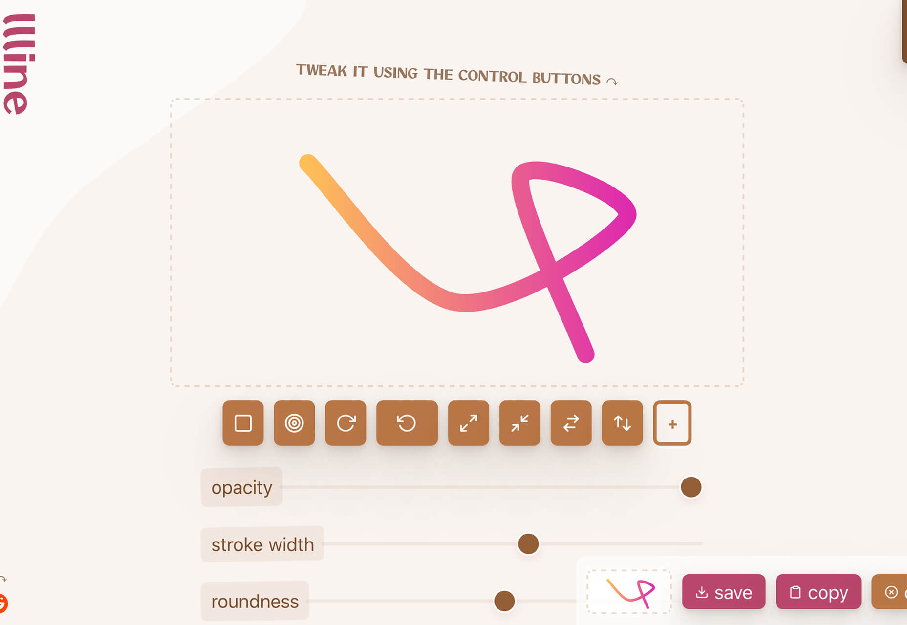
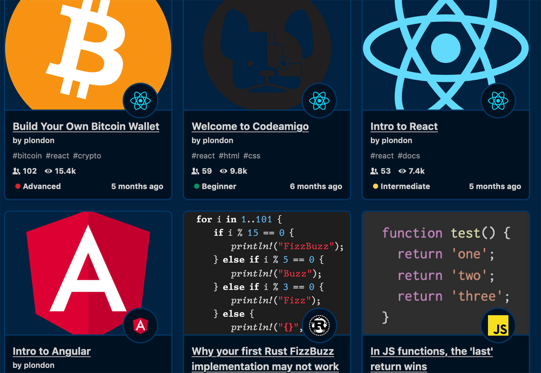
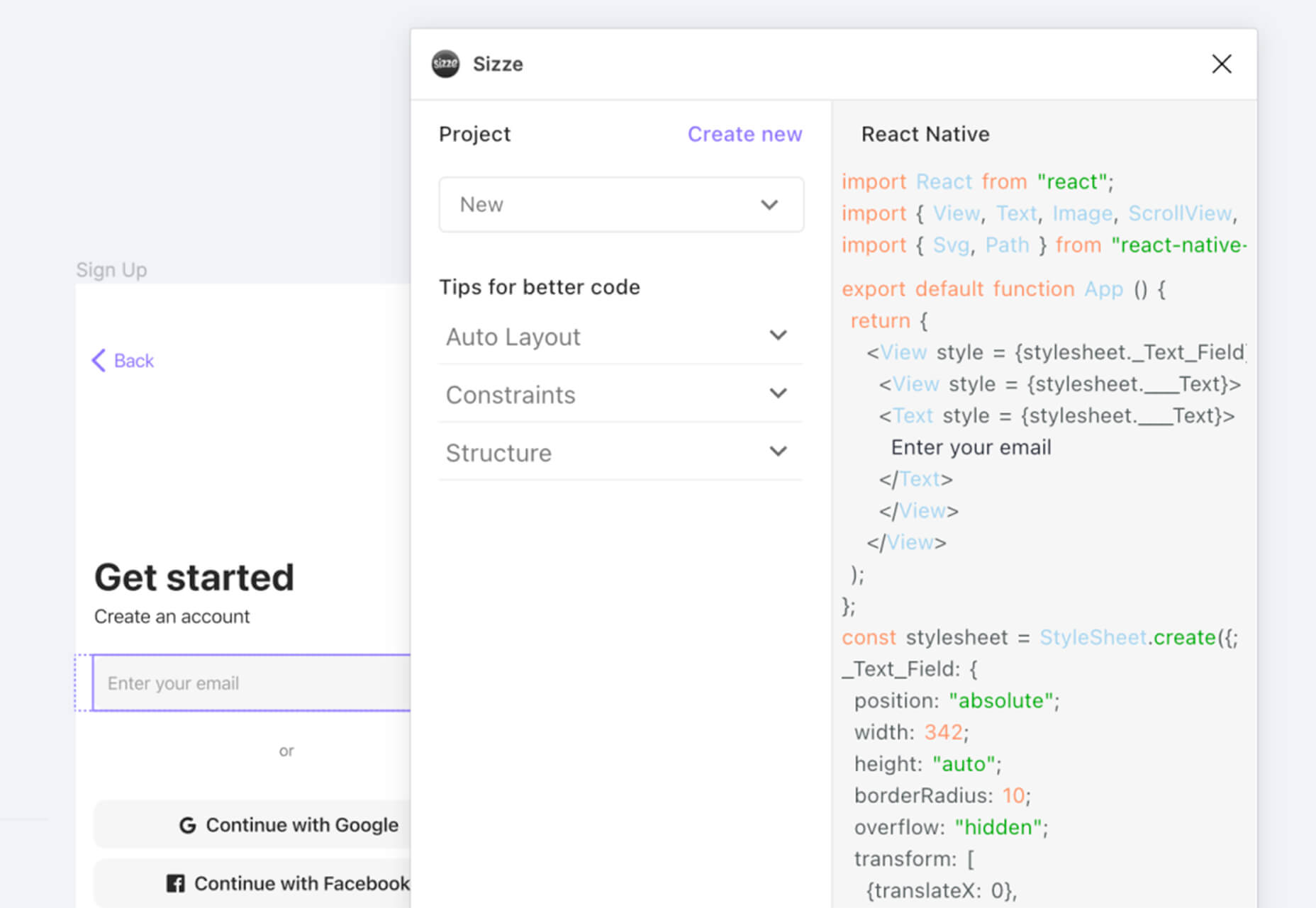
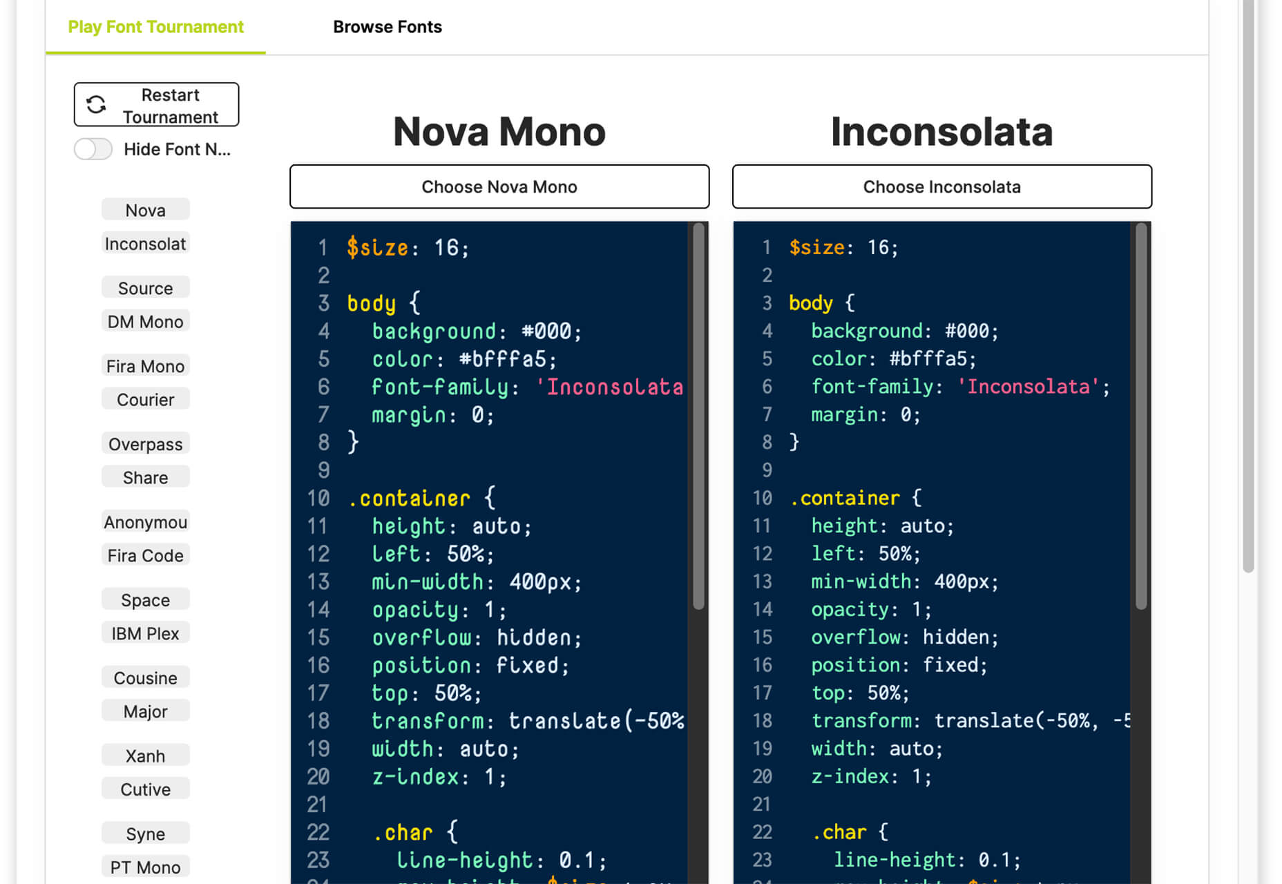
With the holidays fast approaching, there are plenty of fun gifts for you in this roundup of new tools and resources for web designers. Make sure to share anything you find helpful with others to spread additional holiday cheer.

Here’s what is new for designers this month…

Volley

Volley, billing itself as Snapchat for work, is a new way to collaborate with remote teams. The tool addresses the two main problems of remote teams (lack of communication and loneliness) with an async video messaging app with interactive transcriptions neatly organized into workspaces. Volley emphasizes talking over typing (76% of volleys sent are video), doesn’t require you to coordinate schedules (it’s 100% asynchronous), and lives in a threaded conversation with context that’s neatly organized. Plus, the tool is free to use.

Upnext

Upnext is a new type of reading list. It’s designed to help you save, organize, and focus on fantastic content while expanding your knowledge on your favorite topics. You can create playlists with almost any type of content that you can refer to later and follow “thinkers” that you love. Search and filter content, focus on reading, integrate videos, and even highlight and note specific content in your customized library. This brand-new web app has a waitlist that you can join to get access soon.

Startup 5

Startup 5 is a new version of the popular website builder, and it’s a perfect tool to create your online presence. With Startup, it’s fast and easy to get your business online with pre-designed blocks. It includes a visual editor with 150+ blocks with pre-designed and pre-coded elements and styles you can easily customize in a drag and drop interface. It’s an easy tool for building a website quickly without a coding background. Most users can publish a website quickly and easily.

Flatmap

Flatmap generates Mapbox Vector Tiles from geographic data sources like OpenStreetMap. It is memory-efficient so that you can build a map of the world in a few hours on a single machine without any external tools or database. Vector tiles contain raw point, line, and polygon geometries that clients like MapLibre can use to render custom maps in the browser, native apps, or a server. Flatmap packages tiles into an MBTiles (SQLite) file that can be served using tools like TileServer GL or even queried directly from the browser.

Cleanup.Pictures

Cleanup.Pictures is a web-based tool to remove objects, people, text, or other defects from your images before using them in projects. It’s an AI-based alternative to other photo-editing software.

Linkz.ai

Linkz.ai helps you make smart link preview popups for your website to help encourage greater engagement and interaction for links. It works with a line of code you can install quickly and easily, and then you get smart link previews (in two style options) for every link on your site.

Llline

Llline is an SVG generator that helps you create smooth and organic lines and strokes with plenty of customization options for almost any application. This tool helps create graphic elements in just a few clicks, allowing you to add a few points to a canvas and then draw a smooth curve using these points. You can then tweak the resulting SVG graphic by rotating it, changing its color, giving it a gradient, making it a dashed line, and then you can download or copy the SVG markup.

Lorem.Space

Lorem.Space is a valuable placeholder image tool. With just a little bit of code, you can pop cool placeholder images – from movie posters to shoes – right in your website mockup so that the design is easier to visualize. It’s a great solution that’s fun and keeps you from having to put empty boxes throughout the design. And everything can be randomized, so you don’t spend time looking for placeholders.

Huetone

Huetone can help you create more accessible color palettes by making use of the Advanced Perceptual Contrast Algorithm. The contrast ratios and color combinations show on one screen to help you quickly develop palettes and combinations. Plus, the tool has hotkeys that make it easy to change hues, toggle, and adjust quickly. Then you can export everything to Figma.

Rowy

Rowy is an open-source tool to build on the Google Cloud Platform. You can manage Firestore data in a spreadsheet-style user interface, write Cloud Functions in the browser, and connect to third-party platforms.

AdCreative.ai

AdCreative.ai uses artificial intelligence to help create better ad creative. To get started, you upload logos and color files, connect social and other accounts, pick the sizes you need, write text, pick a background, and upload product images, and let the AI do the work. Once you have the creative you like, you can connect to your online ad accounts for easy use. This is a premium tool that’s free to try.

Flowrift

Flowrift is a tool to browse and then copy and customize Tailwind CSS blocks in groups of collections. Filter by block type and then experiment with the options. It even has e-commerce blocks.

Layout Patterns

Layout Patterns is a collection of layout patterns built using modern CSS APIs to help you build common interfaces such as cards, dynamic grid areas, and full-page layouts.

You.com

You.com is a new private search engine that summarizes the web. The tool is in open beta and includes superior privacy choices, actionable results, extensible apps, and personalization through preferred sources.

3D Icons

3D Icons is a fun set of three-dimensional, full-color icons that are free for all uses. (Donations are accepted.) They integrate with pretty much any web design tool you are using and come in four color styles – clay, gradient, color, and premium – so you can get just the right look for your project. Each icon also includes three rendering views – dynamic, side, and isometric.

Arco Design

Arco Design is a comprehensive React UI components library based on the Arco Design system. It includes a customizable theme and more than 60 crafted components that you can use out of the box.

Seekvectors.com

Seekvectors.com is a search tool to find free resources in five different formats, PNG, SVG, JPG, EPS, and AI.

Outline to Single Stroke

Outline to Single Stroke is a tool in the Figma community that works just like the name implies. Select a filled vector on the canvas, and then you can outline it to a single stroke and adjust the line weight if you like.

Codeamigo

Codeamigo is a new self-paced platform to help you learn coding skills. It’s packed with various lessons for different languages and templates and has something for every level from beginner to advanced.

Sizze

Sizze is a Figma to React Native export tool to create app prototypes and instantly export to code.

CodingFont

CodingFont is an excellent game that can help you pick a font to use for coding that you like! If you spend a lot of time looking at code each day, the right font can help reduce eye strain and make the work a little easier to see.

Christmas Revue

Christmas Revue is the first in a trio of holiday typefaces that you can use this season. This SCG color font is fun and perfect for the holidays with exciting glyphs. It is free for personal use only.

Hotsnow

Hotsnow is a fun display font that has interesting fills and shapes in an all-caps character set. It is free for personal use.

Marlwich

Marlwich is a feminine handwriting-style typeface that has the feel of signing a holiday letter or card. It contains upper- and lower-case characters and is only for non-commercial use for free. (A paid option is available for commercial projects.)

Source

The post Exciting New Tools For Designers, December 2021 first appeared on Webdesigner Depot.

Source de l’article sur Webdesignerdepot

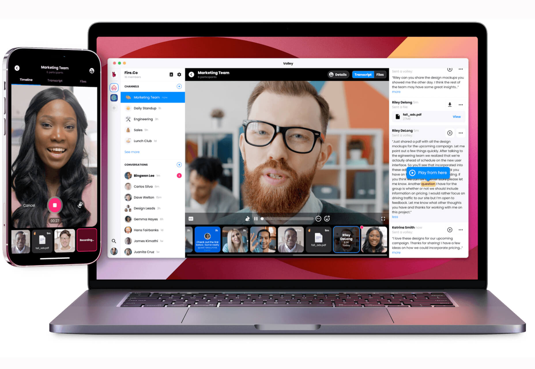
As a web designer, you’re responsible for a lot of things. Your client is relying on you to ensure that their website is user-friendly, accessible, eye-catching, and even good enough on the back-end to capture the attention of the search engines. 

However, what many business leaders and clients don’t realize is that they also have a part to play in ensuring that they get the right results from their site; there’s more to the client and contractor relationship than an exchange of funds. 

Today, we’re going to examine some of the most common mistakes that clients make when they begin working with a website designer for the first time. After all, when a client makes a mistake, it’s up to you to show them how to get back on track. 

Client Mistake 1: Providing Minimal Insight

Creativity, for the most part, is the responsibility of the designer in any web-building project. You know best what you can do for a client. 

When you’re discussing an upcoming project with a business owner, you can walk them through concepts like dark mode design or strategies for digital accessibility. However, you’re still reliant on your client to let you know if there’s anything specific they need. 

An insufficient brief in a web design project usually means that you waste time on a project because you have to go back and forth multiple times, making updates and edits. Getting a brief ironed out properly from day one can reduce misunderstandings and mistakes. 

To get your client started, ask them to share some details like:

  • Who’s the target audience? Do they have a user persona they can share?
  • What specific features does the site need? Landing pages, forms, widgets, etc.?
  • Competitor sites they like: What do they appreciate about those designs?
  • Brand colors and assets: What kind of hues and shades should you use?
  • Technical feature requirements: Does the site need to have its own app, integrate with APIs, or have a checkout solution, for instance?

Client Mistake 2: Underestimating The Workload

Perhaps one of the most common mistakes that clients make when seeking help from a designer is that they have no idea how much work it will take to create the kind of site they want. If they haven’t provided a great brief in the first place, they might not have had a chance to see all the work they’re asking for written down. Walking your client through the brief process can help here. 

On the other hand, if your client has already provided a brief, along with an unrealistic deadline for completion, you might need to have a discussion with them about what you need to do. Walking your client through some of the processes involved in creating their website could give them an insight into how long it will realistically take to bring their ideas to life. 

Additionally, ensuring that your customers fully understand the amount of work you’re taking on could also mean that they can better grasp why you’re charging a certain price for your services. That brings us neatly to the next mistake…

Client Mistake 3: Not Having The Right Budget

Pricing your design services can be a complicated process for web designers. You need to make sure that you’re charging enough to cover the cost of things like essential software and hardware for your company. At the same time, with so many other designers out there, you also need to ensure that your costs are competitive. 

After you’ve gone through the hard work of figuring out what your pricing structure should be, you also need to be capable of justifying that expense to your client. It’s common for many customers to go into their work with a web designer expecting that they’ll be able to get an entire website, blog, and app for less than a couple of hundred dollars. 

Make sure that your client is aware of your pricing immediately to avoid any confusion. If possible, have a pricing page on your website or portfolio which highlights the cost of different packages and precisely what your clients are going to get. 

If your customers can see the value in your services and even equate to an hourly workload or skillset, they might be better equipped to set the proper budget. 

Client Mistake 4: Making Too Many Technology Decisions

You’ll find that you work with many different types of client during your time as a web designer. Sometimes, you’ll have people who come to you not really knowing what they want or need. This means that you may need to spend some time speaking to them about their expectations and discussing what’s possible. 

On the other hand, there’s always a chance that you could work with a client who thinks that they should be making all of the decisions themselves. While it’s true that your client should have some control over things like the style of their website and what features it has, it’s up to you to make technical decisions like what kind of tools you’re going to use. 

If your client tries to dictate everything you do and how you’re going to do it, this could make it difficult for you to deliver your best work. Explain your processes to your customer in advance and find out why they want you to use specific technology. 

For instance, if your client wants to use a specific kind of website builder because they’ve heard it’s “the best,” you can explain what you like most about the product you’re already using. 

Client Mistake 5: Being Too Attached To An Idea

This is a problem that happens in a lot of creative industries. A client goes out and finds something that they like on another website. It might be an attractive landing page or a specific checkout process. They’re so excited by what they see there that they refuse to compromise on that idea when working with their designer – even if the concept isn’t suitable. 

For instance, your client might come to you wanting a website that’s full of dynamic animations and videos. However, if they only have a limited amount of bandwidth from their hosting provider, this could mean that they end up with a slow site that aggravates their customers. 

The best thing you can do when this happens is to present the issue to your client in a way that they can understand. For instance, if you’re worried something will slow down their website, talk to them about how speed is essential to good customer experience. You could even share some page speed stats like: if a page takes more than 3 seconds to load, over half of all visitors will abandon it. 

Seeing the stats for themselves could mean that your clients are more likely to change their minds. 

Client Mistake 6: Working With The Wrong Designer

Finally, one of the biggest mistakes any client can make is working with the wrong website designer. There are a lot of professionals out there, each with their unique skills to offer in things like UX design, ecommerce page creation, and so much more. However, it’s not always easy to know what you need as a business owner getting online for the first time. 

The good news for web design clients is that there’s a lot of information out there that you can use to get informed fast. The bad news for designers is that this means you’re going to need to work at keeping your skills on the cutting edge if you want to attract the widest selection of customers. 

To ensure that you’re more likely to be the right designer for your customers, stay up to date with the latest web design standards, and check out what’s trending in your industry. Webinars, articles, and even TED talks can be an excellent way to brush up your knowledge and make your portfolio much more appealing. 

Strengthen Your Client/Designer Relationships 

Succeeding as a web designer isn’t just about building a robust portfolio full of excellent websites where you can showcase your skills. While it’s true that you need to stay on the cutting edge with your design talents, you also need to make sure that you can create positive relationships with every client that comes to you. 

Like designers, clients can make mistakes too, but not knowing what they want, trying to take too much control, or simply failing to understand the scope of a product. Rather than letting those mistakes hold you back, prove your mettle as a designer by helping your clients navigate these issues. The result will be more streamlined project experiences, happier customers, and better reviews for your company. 


Featured image via Unsplash.

Source

The post Protect Your Design Clients From These 6 Easy Mistakes first appeared on Webdesigner Depot.


Source de l’article sur Webdesignerdepot

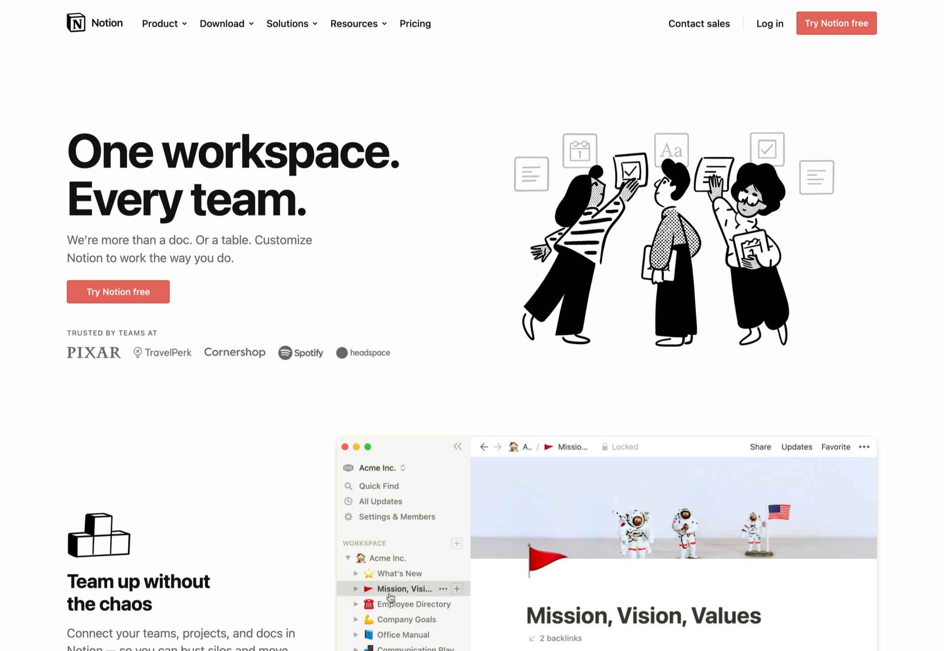
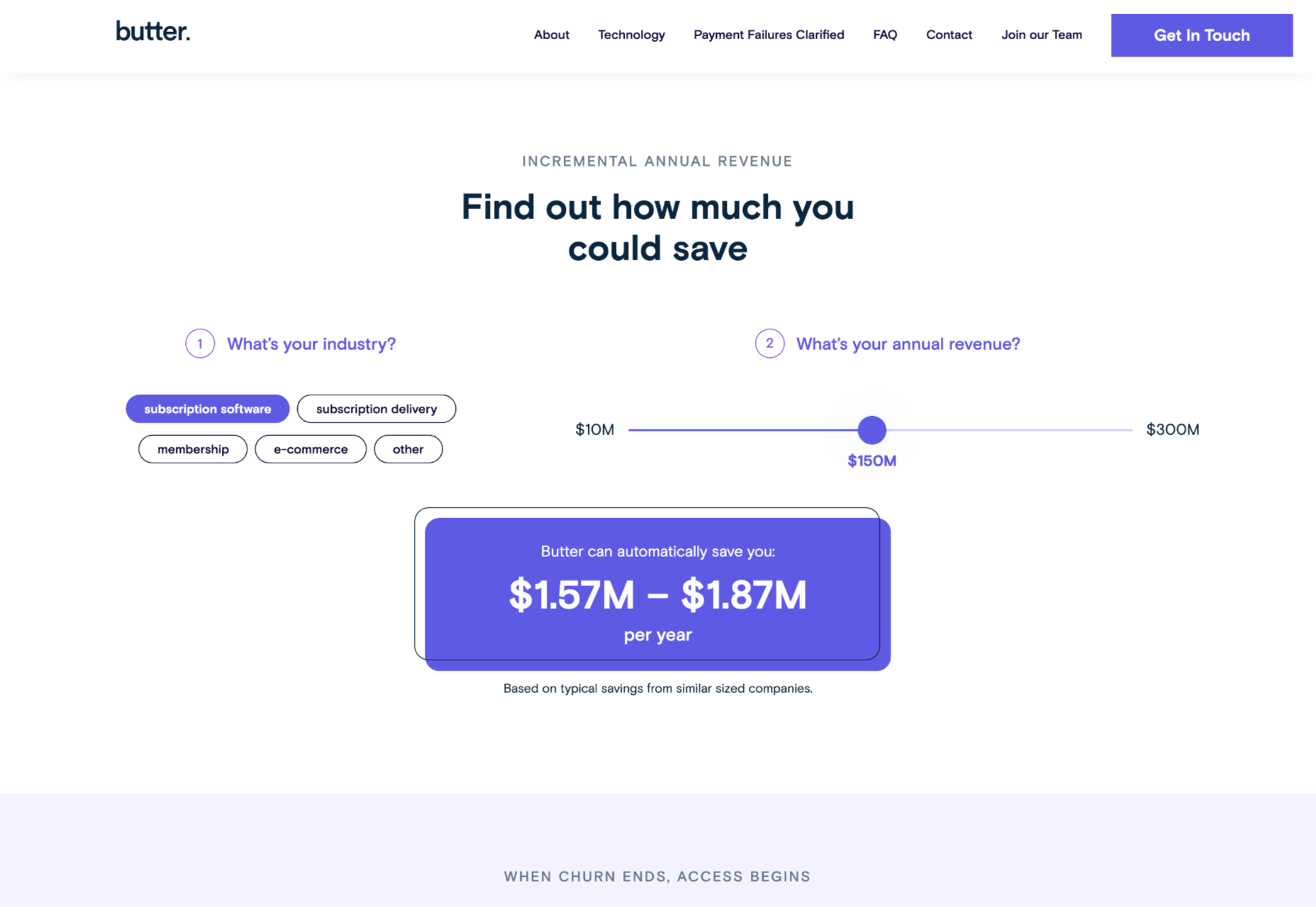
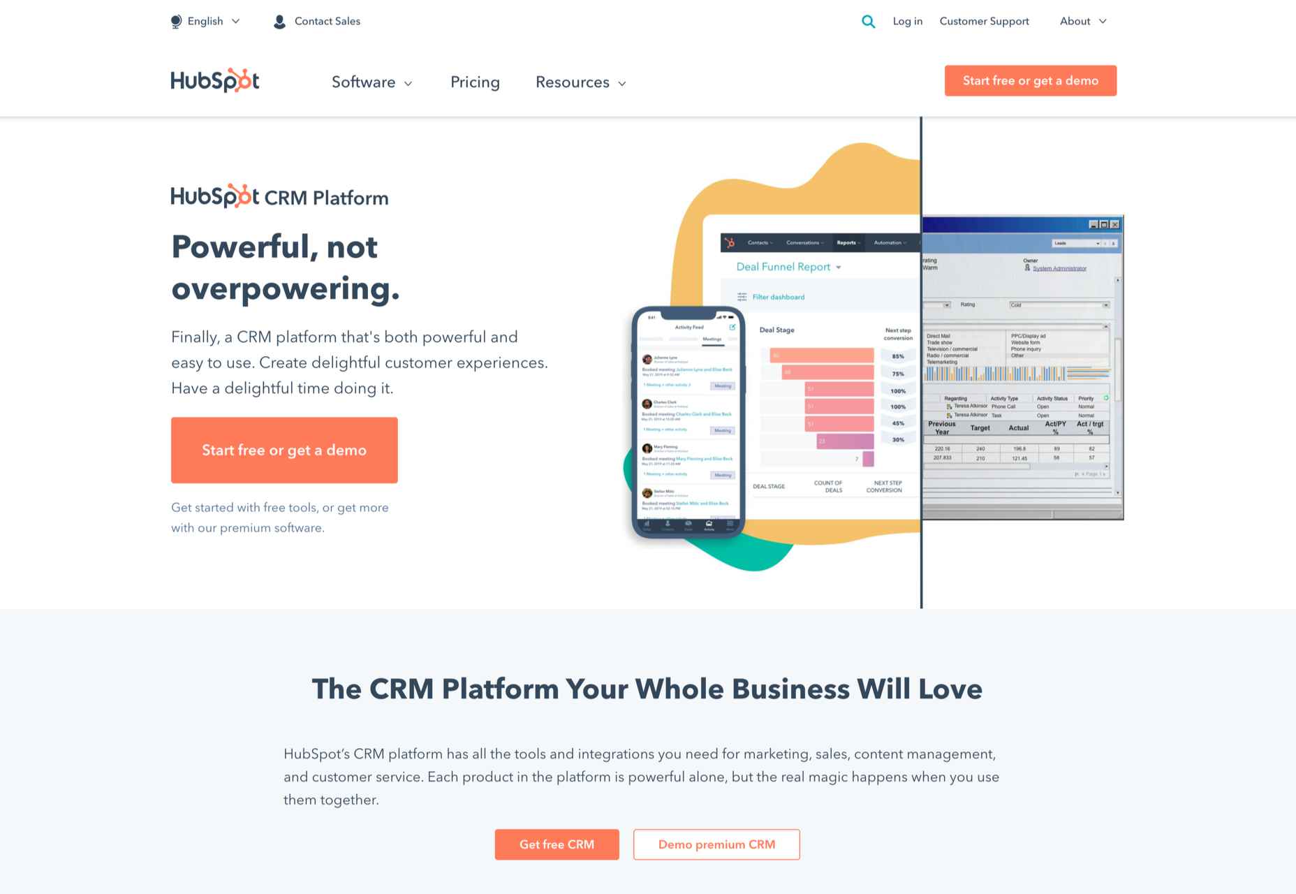
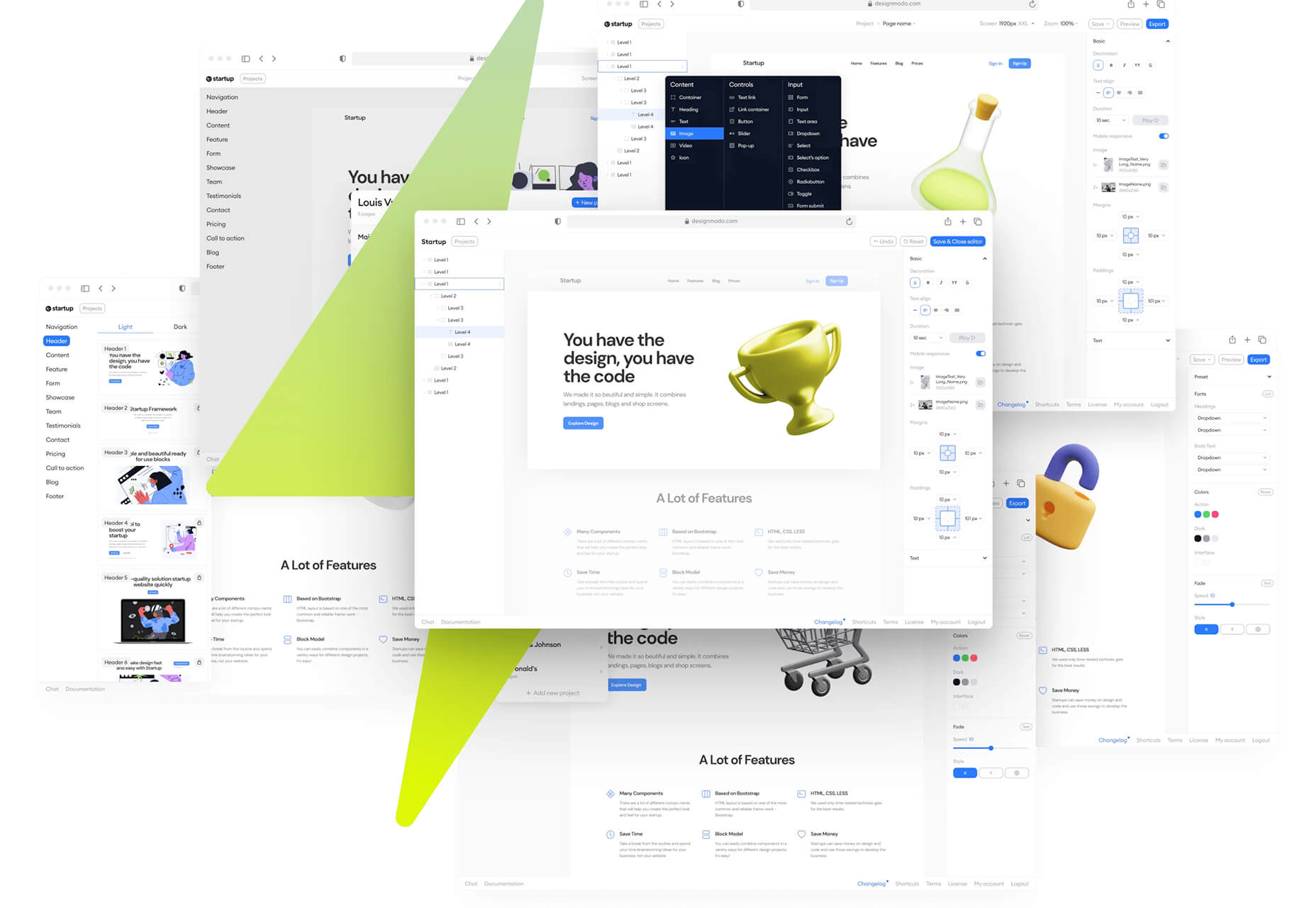
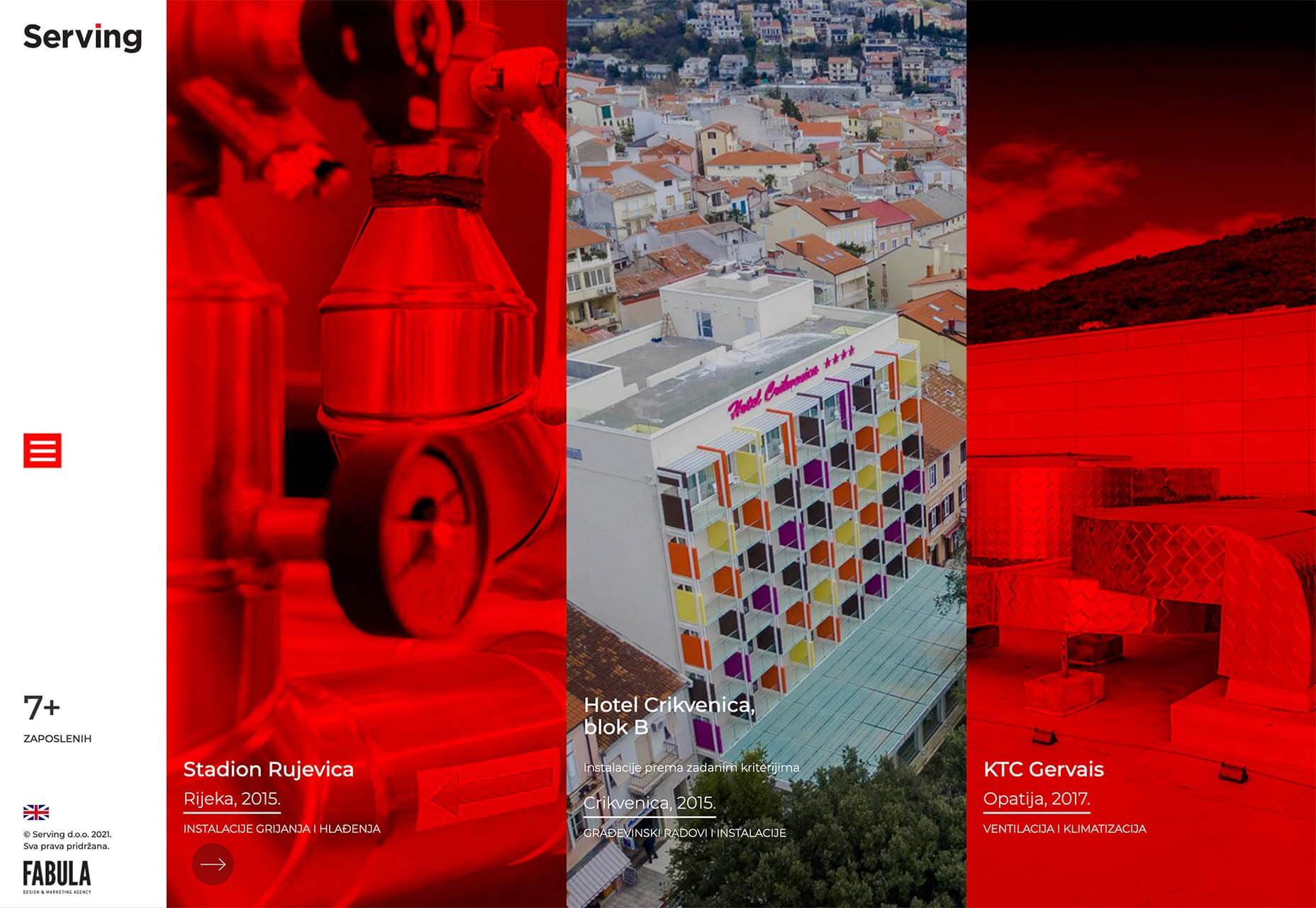
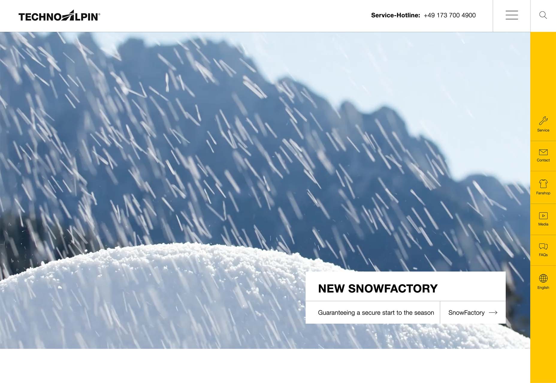
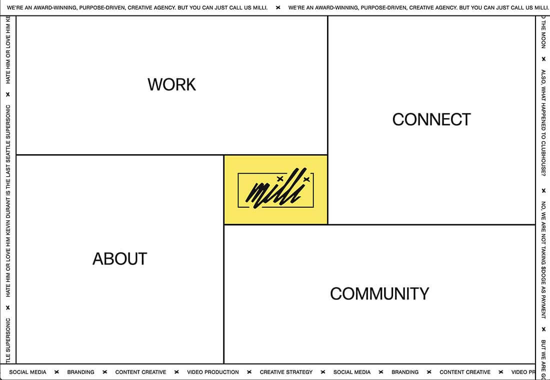
As the year begins to wind down, there are still plenty of new and evolving website design trends going strong. Much of what you’ll see this month carries over from things we’ve been seeing all year but with fresh touches.
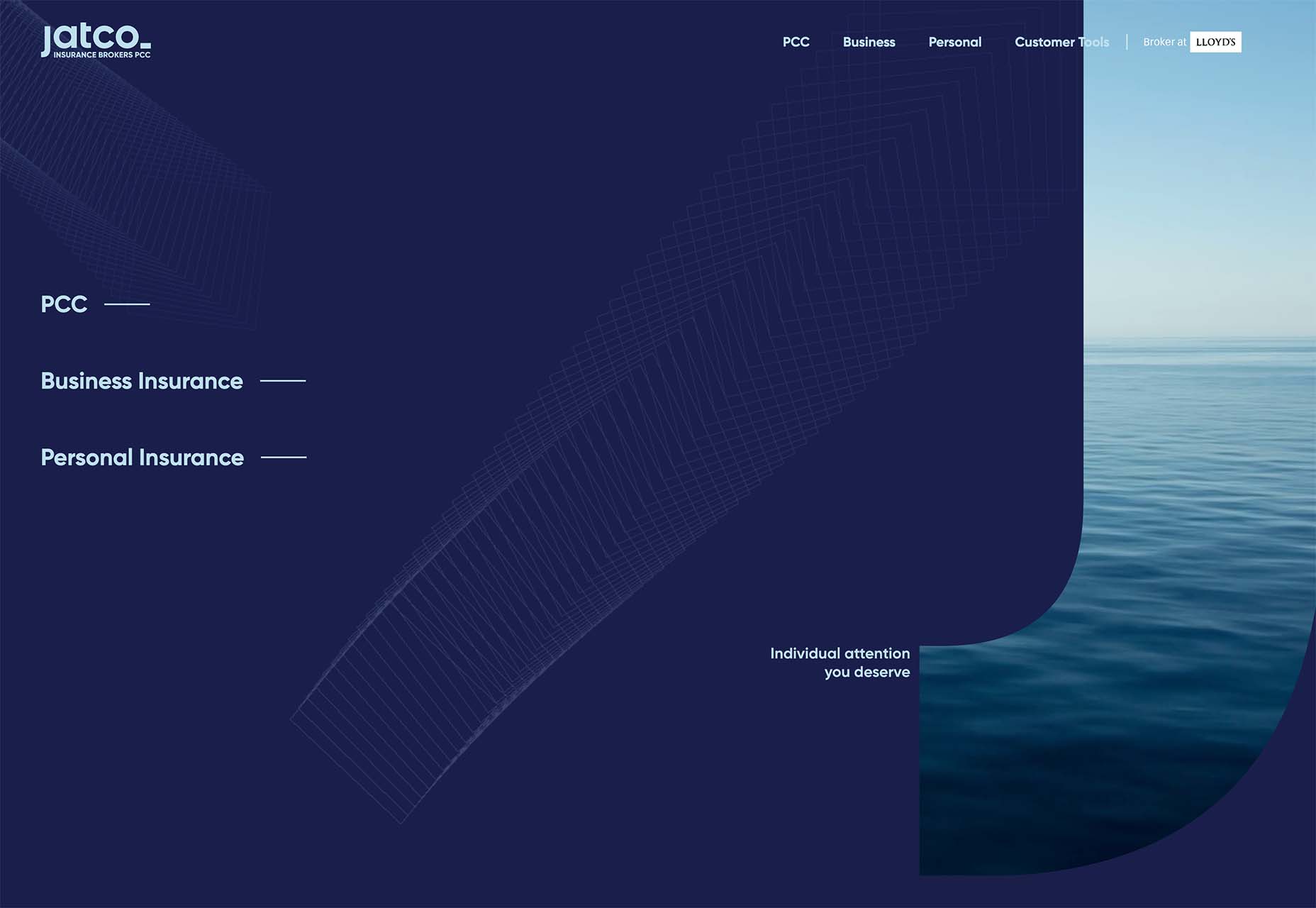
From peek-a-boo designs with neat animated elements to vertical bars to brutalist blocks, there are a lot of highly usable trends to work with.

Here’s what’s trending in design this month.

Peek-a-Boo with Animation

Designers have been experimenting with cut-out and layering elements with animation for some time, which has evolved into full peek-a-boo styles with a lot of visual interest.

How each design comes together is a little different. Some have the animation in the back, others in the front, and some include text as part of the style. There’s almost no set of actual rules to how to make this design trend work.

Each of the examples below does it somewhat differently with varying degrees of success. The commonality here is that it is almost one of those visuals that you either see and love or hate.

Jatco Insurance is the most stunning example here, with a bold color choice and a peek-a-book element inside the oversized “J.” The overall effect is soothing and interesting and naturally draws the user across the screen from the top left to the background video layer. The small tagline, “Individual attention you deserve,” is perfectly placed.

Liron Moran Interiors takes a different approach with the peek-a-boo concept with the letters peeking out from behind an image. The animation is restricted to a hover and scroll effect that adds a liquid element to the image as well as changes to the image and color background. The challenge here is in readability. More of the words show on wider screens, but is it enough?

Melon Fashion also layers text and animated effects for a neat peek-a-book style that almost seems cut out from the background. The overall look appears to have three layers: background video, middle layer for the yellow color block, and text on top. The opacity of text elements with the peeking video is interesting and well pulled together without sacrificing too much readability.

Vertical Bars

Vertical color bars are a design element that keeps popping up in different ways. Designers can use it as a standalone element or container for content, such as navigation or other click actions.

Vertical elements are helpful because they can help create a more consistent and unified user experience from desktop to mobile screens. This shape can also be somewhat disruptive because you don’t see it featured that often. (Although with this style trending that might become less true over time.)

New Classrooms uses a vertical color bar on the left to help you move through the design. The color actually changes as each slide progresses on the homepage.

Serving uses multiple vertical bars as links to different content entry points. Clickability is emphasized with a change from a red overlay to a full-color image. The navigation is also tucked inside a white bar on the left side of the screen with a hamburger menu therein.

TechnoAlpin goes with a skinny vertical navigation menu on the right side of the screen. The icons with menu elements make navigation highly visual and intuitive. The color, which significantly contrasts with the rest of the design, also helps.

Brutalist Blocks

Not many people thought brutalism would stick around when it started trending. Elements of brutalism keep sneaking in, though, although they are much less stark and harsh than some of those original trending website designs.

This version of brutalism focuses on block elements that contain images or text and often click to other pages in the design. The blocks themselves are essentially the buttons that help you navigate to additional content.

The critical question about this design technique is whether this click action is intuitive enough. Will users interact without buttons?

The answer likely depends on your audience base, but if you opt for a style like this, it is essential to keep a close eye on analytics to ensure that users know and understand how to engage.

Milli Agency might be the most intuitive example of the brutalist blocks trend. The homepage is essentially a giant navigation menu. Each block changes from white to yellow on hover and expands, further encouraging clicks.

Sick Agency uses brutalist blocks with experimental typefaces and bold color for an in-your-face design. You can’t help but look at all the different things happening here. The biggest question might be, where should you focus and click next? The cursor provides some visual cues, but it’s not quite as intuitive as you might want it to be.

Mawo mixes brutalist blocks with a big blue cursor to help users click through the design to see more clothing options. Even the images here have a rather stark feel, which isn’t typical for e-commerce. Every block element above the scroll on the homepage includes a click action from the navigation blocks across the top to the “Shop Women” and “Shop Men” images. Further, the blue cursor dot helps show where users can click, and text buttons change to blue on hover as well.

Conclusion

Most of the examples here show trends as homepage elements, but you aren’t limited to that application. Try some of these techniques on landing pages or interior pages that you want to add a little something special to.

This can be an excellent way to test the design and see if your users like the style and know-how to interact with it. If it works, then you can extend the aesthetic to more of the design.

Source

The post 3 Essential Design Trends, November 2021 first appeared on Webdesigner Depot.


Source de l’article sur Webdesignerdepot