Articles

Since school is back in session, this month’s roundup has a learning focus. In addition to tools, many of the resources include guides, tutorials, and cheat sheets to help make design work easier.

Here’s what’s new for designers this month.

ScrollingMockup.io

ScrollingMockup.io generates high-definition, animated scrolling mockups in minutes. All you have to do is paste your website URL, select from the expanding template gallery, add some music and post. You can create three mockups for free, and then this tool comes with a subscription model. The paid model allows for custom branding for mockups and more.

FilterSS

FilterSS is a curated collection of CSS image filters for use in projects. Upload an image, sort through the list, and then copy the code for the filter you want to use. It’s that easy!

Buttons Generator

Buttons Generator is a fun tool with so many button options in one place. Choose from three-dimensional, gradient, shadow borders, neumorphic, retro, animated, ghost, with arrows, and more all in one place. Click the one you like, and the code is copied right to your clipboard and ready to use in projects.

UI Cheat Sheet: Spacing Friendships

UI Cheat Sheet: Spacing Friendships is a fun – and memorable approach to figuring out spacing. This guide shows how close or far away elements should be based on “friend” circles with a couple of relatable instances. It’s one of the most relatable examples of this concept out there while emphasizing the importance of spacing in design.

PrettyMaps

PrettyMaps is a minimal Python library that allows you to draw customized maps from OpenStreetMap data. This tool can help you take online map design to the next level with cool, unique map visuals. It’s based on osmnx, matplotlib, shapely, and vsketch libraries.

Card.UX/UI

Card.UX/UI is a card-style generator with more than 20 templates and elements to create custom cards. Use the on-screen tools to design it the way you want and then copy the code for easy use.

Couleur.io

Couleur.io is a simple color palette builder tool that lets you pick a starting color and build a scheme around it. One of the best elements of the tool might be the quick preview, which shows your choices using the palette in context and in dark mode. Get it looking the way you want, and then snag the CSS to use in your projects.

CSS Accent-Color

CSS Accent-Color can help you tint elements with one line of CSS. It’s a time-saving trick that allows for greater customization for your brand in website design projects. Plus, it works equally well in dark or light color schemes. It supports checkboxes, radio, range, and progress bars.

Vytal

Vytal shows what traces your browser leaves behind while surfing the web. This scan lets you understand how easy it is to identify and track your browser even while using private mode. In addition, it scans for digital fingerprints, connections, and system info.

Imba

Imba is a programming language for the web that’s made to be fast. It’s packed with time-saving syntax tags and a memorized DOM. Everything compiles to JavaScript, works with Node and npm, and has amazing performance. While the language is still in active development, the community around it is pretty active and growing.

SVG Shape Dividers Creator

SVG Shape Dividers Creator is a tool that allows you to create interesting shapes with SVG so that your colors and backgrounds aren’t always rectangles. You can adjust and side, change the color, axis, and flip or animate it. Then snag the CSS, and you are ready to go.

Image Cropper

Image Cropper is a tool that allows you to crop and rotate images using the flutter plugin. It works for Android and IOS.

Noteli

Noteli is a CLI-based notes application that uses TypeScript, MongoDB, and Auth0. The tool is just out of beta.

Yofte

Yofte is a set of components for Tailwind CSS that help you create great e-commerce stores. The UI Kit is packed with components with clean and colorful designs that are customizable. The code is easy to export and clean. This premium kit comes with a lifetime license or a monthly plan.

UI Deck

UI Deck is a collection of free and premium landing page templates, themes, and UI kits for various projects. This is a premium resource with paid access to all of the tools. It includes access to more than 80 templates.

Star Rating: An SVG Solution

Star Rating: An SVG Solution is a tutorial that solves a common design dilemma: How to create great star rating icons for pages. This code takes you through creating an imageless element that’s resizable, accessible, includes partial stars, and is easy to maintain with CSS. It’s a great solution to a common design need.

Designing Accessible WCAG-Compliant Focus Indicators

Designing Accessible WCAG-Compliant Focus Indicators is another convenient guide/tutorial for an everyday application. Here’s why it is important: “By designing and implementing accessible focus indicators, we can make our products accessible to keyboard users, as well as users of assistive technology that works through a keyboard or emulates keyboard functionality, such as voice control, switch controls, mouth sticks, and head wands, to mention a few.”

Blockchain Grants

Blockchain Grants is a tool for anyone developing blockchain applications and in need of funding. It’s a database of grants from a variety of organizations for different applications. Start looking through this free resource to help secure additional funding for your projects.

Basement Grotesque

Basement Grotesque is a beautiful slab with a great heavy weight and plenty of character. There are 413 characters in the set with plenty of accents, numbers, and variable capitals.

Gadimon

Gadimon is a fun, almost comic book-style layered script. The font package includes a regular and extrude style.

Lagom

Lagom is a sleek and functional serif typeface with 16 styles in the robust family from ultralight to extra bold italic. It’s readable and has a lot of personality.

Striped Campus

Striped Campus fits our back-to-school theme with a fun, scholastic look and feel. The block letters have a thick outline stroke and some fun inline texture.

Source

The post Exciting New Tools for Designers, September 2021 first appeared on Webdesigner Depot.


Source de l’article sur Webdesignerdepot

Low-code and no-code development platforms have been the trending IT topic for some time now. Experts in this field speculate as to how they could change the future of the industry. Some publications predict the gradual decline of traditional IT, as low-code and no-code products continue to reshape the very approach to solutions development. But, before we get into a discussion on the future of low-code and no-code, let’s define what these terms actually mean.

What Is Low-Code/No-Code?

Low-code and no-code tools help scale and maximize software delivery. The grid below explains, defines, and differentiates low-code vs. no-code tools.

Source de l’article sur DZONE

In the tech world, DevOps is a word frequently tossed around to describe the blending of development and operations teams. It’s a melting pot where engineers work in tandem across the application lifecycle, revamping the typical « silo » framework. Adopting this model requires a necessary change of antiquated company culture to dismantle and reorganize the traditional structure, ultimately reducing operational inefficiencies. Once optimized, these DevOps teams produce benefits like increased speed and reliability, rapid delivery and scaling ability, and improved collaboration and security. 

Typically, this philosophy is hailed as a superior organizational approach; however, Uri Zaidenwerg voices a different opinion in his article « Why DevOps Will Cease to Exist. » In his article, Uri, a DevOps engineer himself, begins by briefly summarizing what the path to becoming a DevOps engineer looks like. Following this career outline, he identifies what he sees as « signs of the end » for DevOps engineers before forecasting his prophecy.

Source de l’article sur DZONE

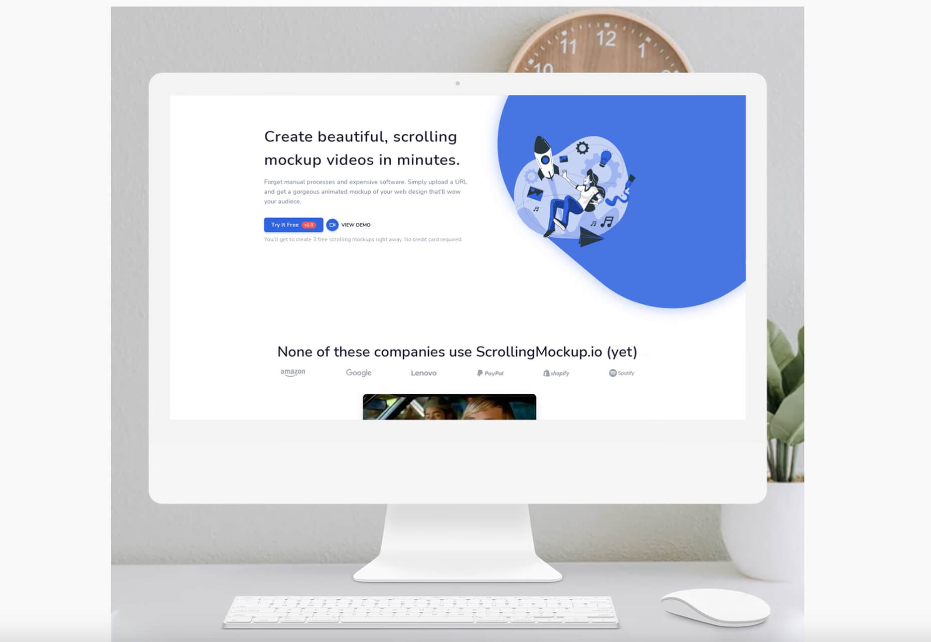
It’s almost time for another season of change. Although the temperatures might not reflect it, this is the time of year where most of us start thinking about what’s next.

This collection of tools and resources for designers is just the spark to propel you forward with work as you think ahead. Here’s what’s new for designers this month.

Gradient.Art

Gradient.Art is a CSS-based gradient generator that’s packed with functionality and customization options. It’s more than just a color selector and is an actual gradient editor that allows you to work with a variety of controls to get just the color variations you want for projects. Create illustrations, patterns, icons, and more with this layer-based tool that’s still in beta.

Wicked Backgrounds

Wicked Backgrounds takes some of the headaches out of creating just the right background for website design projects. It’s another easy and customizable generator designed to help create backgrounds with great color, depth, and balance for various project types. The makers promise more features in the future as well.

Typedream

Typedream is not what you might expect from the name; it’s actually a website-building tool. It’s designed to help put the focus on the words of a design with a simple interface that most people can figure out. You can connect your own domain and then optimize for search with built-in SEO tags. It’s a zippy tool for simple sites.

Orbital

Orbital is a zero-friction, super-interactive, customizable place to gather online. Pop in for meetings, quick chats, open-door office hours, or cowork together through the day – all using the same link. This premium tool has super fun backgrounds and meeting spaces.

Access Guide

Access Guide is your one-stop guide to accessibility information for the web. It’s packed with articles and information to help you understand parts and all of the WCAG 2.1 guidelines, the official standard for accessibility online. (Plus, content is sorted into neat cards that make things easy to search and find.)

InLine

InLine is a free JavaScript library built to create a simple text editor for web applications and mobile apps. The tool claims to be the smallest WYSIWYG editor designed to fit into any layout. The plugin allows you to edit and customize text elements practically anywhere.

3D Bay

3D Bay is a collection of free three-dimensional stock images that you can use for various projects. Collections are searchable. Most of the images are actually 3D scene illustrations, a popular design element with many SaaS website designs.

MeisterNote

MeisterNote is a writing tool for teams. (It’s perfect for the new remote working world.) The interface is sleek and intuitive, and you can create customer workspaces for notes and teams to collaborate. One of the best functions might be the search feature, allowing you to find information in notes easily.

Shapecatcher

Shapecatcher solves an interesting problem. Have you ever visualized an element but don’t know what it is called or how to find it? This tool has a “drawbox” where you can sketch the element, and then it visually searches a database of 11,000-plus Unicode characters in multiple languages to find a close match that you can use online.

Batch Image Processing

Batch Image Processing allows you to edit, crop, and style or add watermarks groups of images all at once. It’s a web-based tool that does everything in a flash and allows you to redownloaded processed images for quick use. (It’s great if you need multiple photos with the same crop or size!)

Integrately

Integrately is an integration automation tool designed to help your apps, tools, and web elements talk back and forth. Connect apps to make tasks run on their own in ways that native software might not do alone. (Pro tip: Use it to connect with your email to send notifications or reports automatically.)

Vechai UI

Vechai UI is a set of high-quality, accessible React UI components with built-in dark mode using Tailwind CSS. Components include pre-designed headless UI and Radix UI.

Style Free HTML Bootstrap 4 Template

Style Free HTML Bootstrap 4 Template is a simple and minimally styled website template for a variety of project types. It’s a great website starter if you need to get a site up and running quickly.

Glass UI CSS Generator

Glass UI CSS Generator helps you create trending neumorphism/soft UI/glass UI style elements. The tool is a CSS generator that allows you to add some of your own elements and then pick styling options while outputting CSS and HTML.

Lineicons

Lineicons is a collection of more than 5,000 line icons that you can use for various projects. Every icon comes with free CDN, regular and light variations, an editor, and more to make it browsable and easy to use. The set has high legibility, and the free set of icons includes more than 500 options.

Carrd

Carrd is a simple, free, and responsive one-page website builder that you can do pretty much anything with. It’s perfect for personal profiles, landing pages, or one-page websites. All it takes is a little imagination.

AdonisJS

AdonisJS includes everything you need to create a fully functional web app or an API server. So stop wasting hours in downloading and assembling hundreds of packages and do it all with this framework for Node.js.

Eastman Condensed

Eastman Condensed is a beautiful and functional sans serif that’s easy to read. The demo version is free for personal use, but a commercial license for the full family is available.

Peachy Rose Font

Peachy Rose Font is a fun novelty option that is fun and light. Plus, it is free for any use, even commercial. The set is fairly large for a free option, with 233 characters.

Selga

Selga is an expressive and complex display font with a retro feel. The swashes and tails are especially nice on this typeface, which is free for personal use.

Source

The post Exciting New Tools For Designers, August 2021 first appeared on Webdesigner Depot.


Source de l’article sur Webdesignerdepot

Microservices have crafted highly flexible and adaptable IT infrastructures. Microservices is a unique software development approach that concentrates on creating single-function modules that work jointly to execute the same tasks. It enables you to alter only one service, without modifying the rest of the infrastructure. In simple words, one can easily deploy and change every service without affecting the functional facets of other applications or services. Instead of following an old monolithic architecture (sole app with manifold functions), testers and developers use this microservice approach to build independent modules for every function.

However, the microservice architecture can also make an app extra complicated, particularly when we add several functionalities. Likewise, testing the combined functionality of numerous services is a lot more complicated due to the distributed nature of the app. As microservices follow a dissimilar architecture, we also require an exceptional strategy for testing microservices. In this article, we will explore different tools for testing microservice applications. Testing microservices can assist us in eradicating several issues by avoiding a domino effect. 

Source de l’article sur DZONE

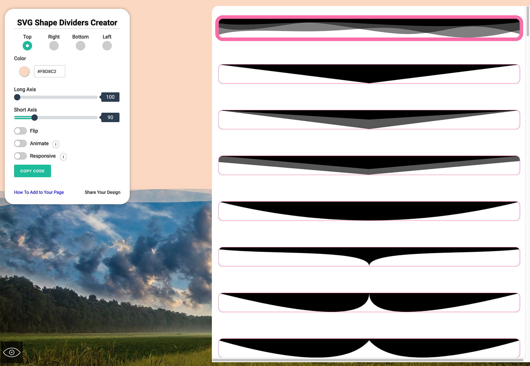
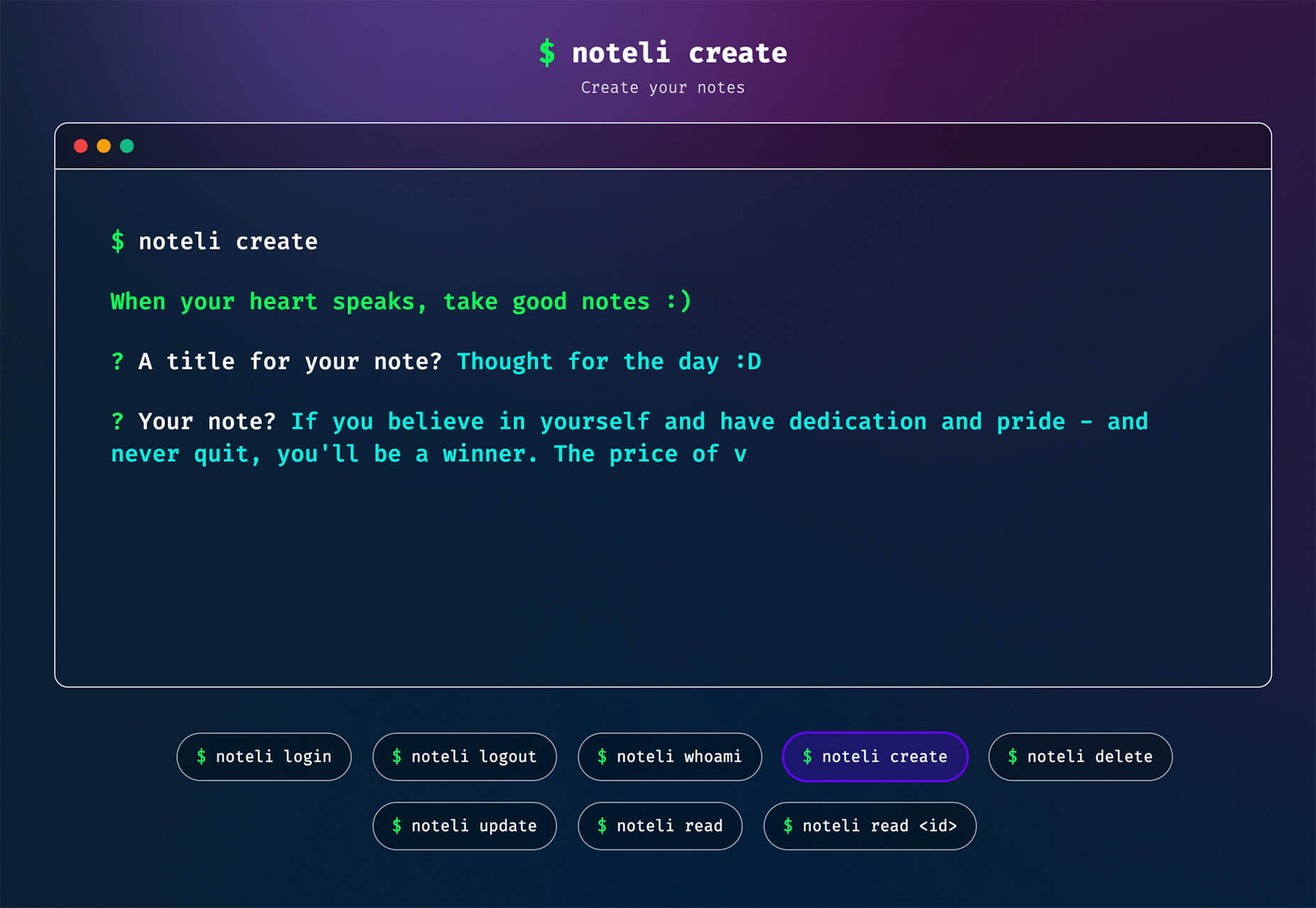
Productivity is a crowded space, with countless apps and services promising to make your life and business easier and more profitable. Of all the apps that make that promise, very few deliver, but we’ve found one that does: Taskade.

Flexible Planning With Taskade

Every problem is unique, and part of what defines us as creative professionals is the different ways we approach problems. What suits one person in one situation doesn’t suit another in another. This is where many planning apps fall down: they adopt one singular approach and expect users to fit around the app.

Taskade is different. Like the love-child of Trello, Notion, and Slack, Taskade uses a template approach to create a flexible planning system that you can use in whatever way you prefer.

When you open up Taskade, you’ll see some quick options: ‘blank,’ ‘weekly planner,’ ‘meeting agenda,’ and so forth. But there’s also a ‘more’ option that will give you access to the hundreds of templates Taskade supplies. There are dozens of template categories, and each category contains multiple templates that you can use to drive your planning process.

Whether you’re looking for a task list for launching on Product Hunt, a design system checklist, or a project scrum board, you’ll find the template ready and waiting for you.

If none of the predesigned options are right for the task at hand, Taskade gives you the option to create your own template from the basic building blocks of boards, actions, mind maps, charts, and lists.

Team Collaboration With Taskade

One of Taskade’s main strengths is its ability to work equally well for individuals and teams.

It makes sense when you’re evaluating a product that you do it on your own. But we encourage you to bring team members on board early in the trial because it’s when working with teams that Taskade really excels as a collaborative tool.

Once you’ve created a new planning project, you can invite your team, either by email or — if they’re already registered — by tagging them with their Taskade username.

You can assign tasks to individuals or multiple individuals (a much better option than the free-for-all you find in some to-do apps). You can also set deadlines for tasks so that everyone knows what the schedule is.

Team Chat on Taskade

Another area that Taskade excels for teams is the built-in real-time live chat. You can communicate with team members right in the project instead of jumping onto Slack or email.

For teams working remotely, or even just multi-tasking throughout the day, it’s a great way of ensuring that everyone has the information they need. As a result, mistakes are minimized, and best of all, there’s a written record that can be referred back to at any time.

Chat can be sent to the whole team, or direct messaged to an individual, so you don’t need to worry about filling up everyone’s notifications with messages that don’t apply to them.

Project Management With Taskade

If you’re working on a single project, then you probably know exactly where it is at all times. But for anyone working on multiple projects, it can be hard to keep track of everything. So Taskade has several different options for project managers.

The Mindmap section is one of the most useful parts of Taskade because it gives you a complete overview of everything in your project. You can see what has been completed and how much time it took — that way, you can assess how viable the timeline for your other tasks is.

Another great feature of Taskade is the activity feed. When one of your team makes a change to a project, it will pop up in your activity feed, and the next time you log in, you’ll see the status of your projects with a single glance.

Multi-Platform

One of our favorite aspects of Taskade is that it works equally well across different platforms. As well as the desktop web app, you’ll also find native apps in the iOS app store and the Android play store.

Syncing your account over different apps is awesome because ideas often occur at inconvenient times — on your commute, walking the dog. Even when you’re at your desk, it’s much handier to grab your phone and make notes than it is to switch to your browser and visit a site.

Easy Registration

If you’re feeling the pressure of a bulging inbox, or to-do lists on multiple post-its, then the last thing you need is another complex, confusing task to add to the pile.

Taskade is super-easy to get started with. Just click the ‘Sign up’ link in the top right of the site, and you’ll have three options: Sign up with Google, sign up with your email, or you can continue as a guest.

If you’re not sold yet, then continue as a guest — essentially a free trial — you can sign in properly later once your curiosity is satisfied.

Free to Use

Taskade is free to use on a limited basis. The free plan comes with 500Mb of storage and a maximum 25Mb file size. You can create individual tasks or whole projects, workflows, and custom templates and share tasks and projects with your team. That’s enough to help you make the most of Taskade for $0.

If you find that the generous free plan isn’t quite enough, paid plans start at just $5 per month. The paid plan gives you unlimited storage and bumps the maximum file size up to 250Mb. You have the same core features as the free plan; it’s just that they’re unlimited, which means you can do even more planning. In addition, the paid plan adds some handy extra features that are great time-savers, such as sorting tasks, creating repeat tasks, and bulk assigning tasks. Just look at how Taskade compares to similar tools.

Most professionals will get along with the free plan just fine, but $5 per month for unlimited storage is a great deal. On top of that, you have future premium features to look forward to, including a project revision history and a calendar view.

You can sign up to Taskade for free now, as a guest, with your email, or with Google.


[– This is a sponsored post on behalf of Taskade –]

Source

The post Collaborative Task Management with Taskade first appeared on Webdesigner Depot.


Source de l’article sur Webdesignerdepot

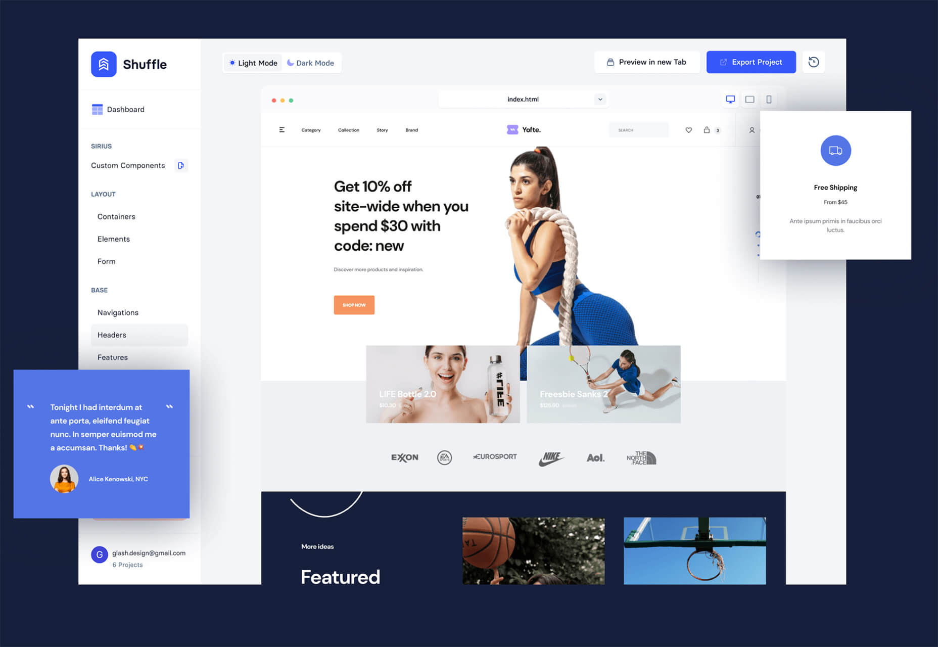
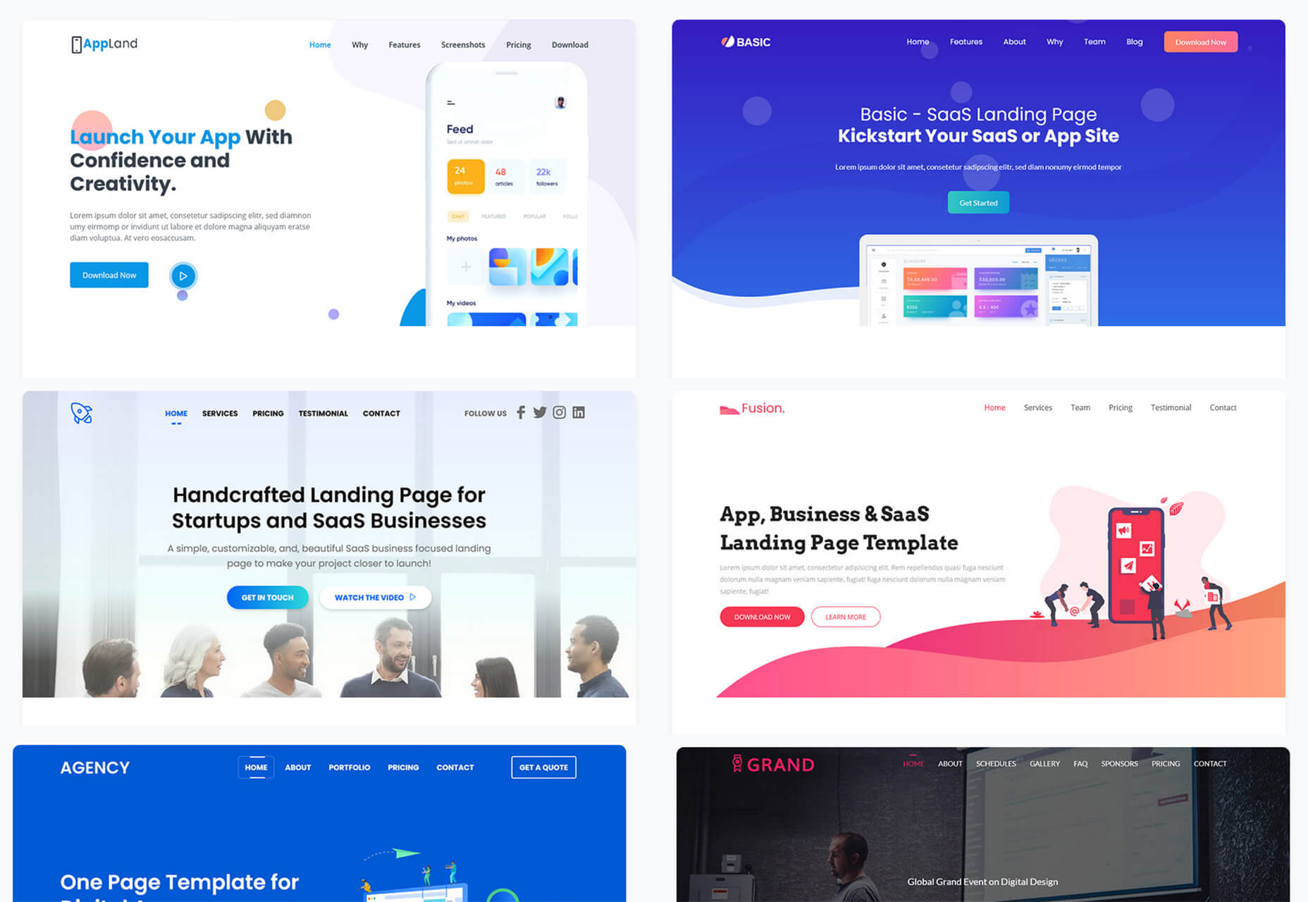
Looking to give your homepage a well-needed design update in late 2021 or 2022? Not a bad idea; first impressions are crucial when it comes to business websites. But, fixing your homepage and website design is no easy feat.

Web design trends are evolving faster. Blame the ever-decreasing user’s attention span. The average visitor now spends just 0.5 seconds scanning your homepage to form an opinion about your brand and decide whether to click through or bounce.

Increased user expectations and uncertainty in the user’s response, which is highly impacted by the site’s first impression, are other reasons to consider. This is why the designs which were trending in 2019 are no longer viable in 2021 or 2022.

We have curated the ten best examples of homepage designs to inspire your business in 2022, including a rundown of the best strategies and tips.

Let’s start by highlighting why homepage optimization is necessary for 2022:

Why Your Homepage Will Be So Important in 2022

Your website — especially your homepage — is your brand’s first chance to attract, build trust with, and connect with visitors.

According to recent statistics on why website design is important:

  1. 38% of visitors will stop interacting with a website if they think the layout isn’t visually appealing or intuitive. This creates a higher bounce rate and fewer conversions.
  2. 94% of a visitor’s first impression is based on website design (including colors, fonts, layout, navigation menus, etc.).
  3. 46% of people base a business’s credibility on the aesthetics of its website. Brands with less-than-stellar homepage designs are seen as less trustworthy than companies investing in the visitor experience.

Think of it the same way as walking into a brick-and-mortar store. Visitors are more enticed by a carefully curated ambiance of neatly stocked shelves and welcoming employees than a store that’s dark, messy, or seemingly unfriendly.

Using this logic, your homepage’s above-the-fold section is where you’ll greet visitors and reel them in for more.

10 Homepage Design Comparisons (2019 vs. 2021) To Inspire Your Business Website Design in 2022

Homepage design has come a long way since 2019. In this section, you will explore how.

These homepage designs crush it above the fold. Take just a few of these tips to heart, and your website will be poised to attract leads and conversions — no matter which industry you’re in.

1. Netflix – Crafting The Perfect Call To Action That Reduces Friction With An Additional FAQs Section

Most businesses make the mistake of adding a CTA button that first persuades the user to click on it and then asks for the visitor’s email address.

Netflix also did the same in its 2019 design.

However, Netflix combined both steps in its 2021 homepage design.

The new, improved 2021 homepage design asks for the user email address right up front along with the CTA button.

Here is a good comparison of both the designs:

2019 homepage design

vs.

2021 homepage design

Key Takeaways:

  • The design encourages visitors to enter their email address right when they land on the homepage. As a result, form submission is much easier when the user has started the process. Hence, Netflix makes it easier for visitors to move along their conversion funnel nicely by reducing the friction.
  • The 2021 design also has a nice FAQ section that provides quick information about the company’s services and improves the overall user experience.
  • FAQs also help increase the organic presence of the website in the search engines because Google presents snippets from the FAQ section in the form of an answer box in the search results.

2. Spotify – Revamped Color Combinations For Improved CTA Visibility And Using The ‘Rule of Three’ For Heading Text

The older 2019 Spotify homepage design used light pink and orange colors in its home page main area. The CTA color was green, but if you look closely, the CTA lacks visibility.

The new 2021 design uses blue and green colors with a much larger font size for the main heading. The colors are attractive, and the CTA is visible clearly.

Here is the comparison of the Spotify homepage 2019 design vs. 2020 design:

2019 homepage design

Vs.

2021 homepage design

Key Takeaways:

  • Blue is the most versatile color, and green is the perfect choice for the CTA button. Spotify used universally accepted color combinations to redesign its homepage and made the CTA more visible.
  • The main heading is also made larger than it was in the 2019 design, and it follows the rule of three in writing which is effective and satisfying. It uses just three words in the main heading to allow the human brain to process information as a pattern that is more memorable.

3. Hulu – Give Priority To Your Brand Name And Hide Pricing

If you compare the Hulu 2019 vs. 2021 Hulu homepage, the brand name has been prioritized and shown as the main heading.

Moreover, the older homepage had pricing information everywhere, which has been reduced intelligently in the new design.

2019 homepage design

vs.

2021 homepage design

Key Takeaways:

  • The brand name ‘Hulu’ is displayed as the main heading of the homepage, which helps to build audience trust.
  • The older design persuaded the users to pick a paid plan even though they had a free trial option—this discouraged users from trying their service. The new 2021 design encourages users to try the platform for free. In addition, the packages have prominent CTAs that mention “try for $0”. This design move improves conversions on the website.
  • The new design makes it easier for the visitors to select a viewing plan with easy comparison of the three available plans. The best part is, customers can start all the plans for $0. It’s a win-win situation for the users, and they can quickly pick a plan to start watching Hulu.

4. Nextiva – Reduce Visual Noise And Add Pictures In Menu To Improve UX

Nextiva realized the importance of reducing visual noise in its newly designed 2021 homepage. Visual noise happens when you use too many colors to attract user attention. Different colors compete with each other resulting in diluted customer observation.

In the old 2019 homepage, Nextiva used orange, blue, and green as the primary colors, while in the 2021 revamped design, they have used blue as the main color.

Here is a comparison of the two designs:

2019 homepage design

vs.

2021 homepage design

Moreover, the older homepage didn’t have an image in the product menu, but the new 2021 homepage improves the UX further.

Below is a comparison:

2019 homepage design

vs.

2021 homepage design

Key Takeaways:

  • Nextiva used blue as their base color for the homepage design and removed orange and green colors to reduce visual complexity. This is an excellent change to keep the user’s attention focused. Notice the green colored bar at the top of the homepage in the 2019 version now replaced with blue.
  • The 2021 design has a clean look compared to the 2019 design, which looks scattered with too many different elements, including CTAs that confuse the users.
  • The product menu does an excellent job of linking intelligently to service pages such as phone systems and video meetings. The image of a smiling lady attracts users to click on Nextiva’s products to learn more about them. Improving UX is an impressive way to reduce bounce rates and increase time on site.

5. GoToMeeting – Avoid Lengthy Sign Up Form, Educate Users About Your Products, and Add Images That Depict The Current Needs of The Audience

GoToMeeting does a great job educating the users about their product by adding more content on the homepage that comprehensively explains their product features.

Moreover, they have replaced the older hero image with a new picture that portrays the changing needs of their audiences. Nowadays, there is a rise in work from home culture due to Covid-19. Hence, the photo and the heading text clearly target the needs of their users.

Here is a comparison of the 2019 vs. 2020 homepage of GoToMeeting:

2019 homepage design

vs.

2021 homepage design

Key Takeaways:

  • The 2019 homepage design had a sign-up form on the homepage, which GoToMeeting removed in the 2021 design. People hate to fill in so much information right when they land on the home page. Hence, GoToMeeting did the right thing by removing the signup form from their homepage.
  • The hero image steals the show of the 2021 redesign because the picture of a working mom with her kid playing studying in front of her is a great way to portray the current needs of the society when over 60% of the employees are working from home. Audiences can quickly relate their working environment with the hero image leading to more sign-ups.
  • The older 2019 design was confusing, and it made little effort to help the users understand the different features of the product. The new 2021 homepage design has a product features section that explains the different features of the software. When users are educated about the product, they earn the confidence to try the product.

6. Zillow – Apply Hick’s Law To Allow Visitors To Take Faster Decisions

Zillow does an impressive job of applying Hick’s Law in allowing visitors to make faster decisions. Hick’s law states that the more options you present to the users, the faster they will decide. Therefore, it is a major factor in improving website usability.

The old 2019 homepage design of Zillow offered too many options to the users, like they want to buy, rent, or sell a property. The users first select either one of the three options and then enter the zip code to start their search.

The new 2021 homepage design changed that. Now, Zillow offers users a single option. They only need to enter the zip code to get started.

By reducing the number of actions that users need to take to just one, the homepage design eases the overall decision-making process of the site visitors.

2019 homepage design

vs.

2021 homepage design

Key Takeaways:

  • The new homepage design has a simple search bar that persuades visitors to take prompt action.
  • The Hero image is placed smartly behind the search bar to depict the needs of the users accurately.
  • The homepage does have three different panels for buying, renting, or selling a home when the users scroll below. The old design is missing that. The new design removed so many options above the fold and kept just a single option for the users to encourage more users to search properties on the site.

7. Plex – Placement of Prominent Calls-to-Action On Homepage

The CTA is a key element of every website. It helps the users decide on their next action and helps to convert the visitors into leads.

Plex lacked an optimized CTA placement in its 2019 home page design. Hence, the 2021 design received an uplift to better place the CTA for increased visitor engagement.

Take a look at the home page designs of Plex from two different years. If you compare the two home pages of 2019 vs. 2021, the primary difference that will grab your attention is the CTA.

2019 homepage design

vs.

2021 homepage design

Key Takeaways:

  • The call-to-action buttons are more prominent and have actionable texts.
  • The number of CTA buttons is increased to two to encourage users to take action.
  • The additional CTA button is wisely placed at the center to get immediate attention.
  • Note that the color choice for the button is also bright and highly contrasts with the background yet matches the color theme.
  • The old heading text ‘Stream Smarter’ was confusing because it didn’t help the users understand what Plex does. Hence it is now revised to ‘Watch Free Movies and TV on Plex.’ The new text is easy to understand and has the word ‘Free’ to increase the number of visitors clicking on the CTA.

8. Dropbox – More Above The Fold Content And Change of Fonts

Dropbox has significantly worked on its main content, which is clearly visible in the comparison homepage design images of 2019 vs. 2021.

The 2021 homepage is seen fixing faded, minimalistic, and less engaging content in the older homepage.

2019 homepage design

vs.

2021 homepage design

Key Takeaways:

  • Sans serifs, with their clean readability, are included for longer bouts of the homepage.
  • Bold sans text is doing the job of drawing user attention effortlessly.
  • The color contrast of the text with the background is increased, which improves the visibility.
  • The right side image of a laptop is replaced with a screenshot of the software, which intrigues users to know more.

9. Cisco – Moving Blocks To Outsmart Competitor Websites

The homepage design of American technology company Cisco has seen a drastic change in 2021; it deserves to appear on this list. The company website smartly represents an appeal for future development through its killer homepage design.

Here is a comparison of the old 2019 homepage design vs. the new moving block design of 2021:

2019 homepage design

vs.

2021 homepage design

Key Takeaways

  • The home page contains moving blocks with news from the blog. As you hover over the image, it widens up, and a CTA button appears. The blocks represent a design of the future which the competitors might find hard to replicate.
  • Every block has a CTA, which was missing in the 2019 design. Each block represents a specific Cisco service and caters to the different needs of the visitors.
  • The new design is elegant and cleaner with lots of information.

10. Slack – Product Video On Home Page For More Conversions

Slack has made it easier for the users to understand the product well by using a video on the homepage.

The 2019 design has an image, while the 2021 design has a video that helps the visitors understand how the product works.

Here is a comparison of the 2019 design vs. 2021 design:

2019 homepage design

vs.

2021 homepage design

Key Takeaways

  • The inclusion of a product video leaves a great impression in the minds of the visitors and shows them what your product does.
  • Video helps Slack to make its value proposition clear and super fast.
  • Video has a strong correlation to conversions, and they work well as compared to hero images. Slack used a hero image on the homepage in 2019, but they replaced it with a video in 2021.

Final Thoughts on Using These Homepage Designs for Inspiration in 2021

By making it to this point in our guide, you now have plenty of inspiration to run with when upgrading your homepage. You should also have a better understanding of how powerful this tool may become for your brand.

So now it’s time to brainstorm how to use these ideas for your own 2021 homepage design. First, jot down the key points from this guide and honestly assess how your website currently compares.

Accomplish this task, and your brand might see an uptick in website traffic and conversions. It may even earn a spot in a roundup of killer website designs just like this one.

Source

The post 10 Homepage Design Comparisons to Inspire Your Business in 2022 first appeared on Webdesigner Depot.


Source de l’article sur Webdesignerdepot

In this post, we will look at the solution for Coin Change Problem using Greedy Algorithm.

But before that, let’s understand what Greedy Algorithms are in the first place.

Source de l’article sur DZONE

A press release is one of the most valuable tools in a marketing team’s arsenal. Though press releases have been around for decades, they remain one of the best ways to reach new customers, improve your brand reputation, and generate awareness. 

Press releases are also wonderfully cost-effective. Unless you’re using paid distribution channels, all you have to spend is your time to create your press release.

So, how do you get started?

What is a Press Release?

A Press Release is a short, simple, and compelling news story designed to promote the goods and services of a business. You’ll usually see these pieces of content published on industry websites, news channels, social media platforms, and even on the company’s blogs looking for awareness. 

The idea behind a press release is you provide a publication or group with all of the most valuable facts and insights into your latest newsworthy story. You might use a press release to announce a new product or to tell people about your recent partnership, for instance. 

A press release post then delivers this information to a wider potential audience by distributing the content in a range of different places. 

Why Should My Business Send Press Releases?

Why not simply tell people about your latest products and sales on social media, and leave it at that? The simple answer is Press Releases help you to gain the attention you might not get from your own media channels alone. With a press release, you can:

  • Set the record straight: In the middle of a PR disaster, a Press Release can give people the information they need to make their own decision about who’s right.
  • To improve your brand reputation: Launching press releases through well-known publications immediately boosts your credibility. The right publication shows you’re well-connected and professional. 
  • To gain media coverage: When launching a new product or service, a press release helps attract potential customers to your business and gives you more opportunities for sales.
  • To improve SEO: In the digital world, a press release allows you to earn backlinks from high-authority websites, improving your ranking.
  • To find new customers: Press publications and websites will reach a wider audience than you can find on your own. In addition, publishing press releases gives you new eyes on your business for minimal cost. 

You can send a press release for various reasons, including announcing breaking news, talking about newly launched products, discussing upcoming events, confirming partnerships, and more. It’s also worth creating a press release when new people join your executive team when you receive an award, or even if something bad happens (for crisis management)

What’s Included in a Press Release?

A press release will include different information depending on what you’re trying to accomplish. In general, PR posts feature:

  • A headline: This is where you share the most important info of your story
  • Contact details: How the media can get in touch with you
  • Location: Where you are and where the news event is taking place
  • Body copy: Information about the news event
  • Quotes: It’s common to see quotes in a press release from high-level staff
  • Boilerplate: Insights into what your organization is about

How to Write a Press Release (Step by Step)

Now you know what goes into a press release and why these tools are so valuable, it’s time to start planning your big announcement. 

Here are our top tips for creating an amazing press release.

1. Choose the Right Story

Press releases are focused on sharing valuable news with a specific audience. It would be best if you had something important and new to say, or you risk not getting your story published at all. You can’t just talk about a product or service that’s selling well (unless it’s breaking world, or brand records). 

Think about whether your PR topic is:

  • Timely: Is the event you’re talking about just about to happen, or has it happened recently? If something happened weeks or months ago, press groups aren’t going to be interested. Aside from ensuring your message is timely, make it topical too. Ensure this story is going to give something valuable to your audience. 
  • Relevant: Before you send a press release to anyone, make sure it will be relevant to the audience you’re targeting. Who does the story affect, and why is it important? What kind of benefits or opportunities will it deliver?
  • Unique: What’s unusual or unique about this story? You don’t want to comment on the same things that everyone in your industry is already talking about. 
  • Engaging: What about your story is going to make readers stand up and take notice? Is there any trouble or tension you’re going to overcome? Look at this press release from Target as an example. How can you frame your story in a way that makes people want to learn more about your business?

When asking yourself what your PR story should be about, consider whether you want to publish it if you were a publication leader. From an objective perspective, does this story have value?

2. Answer the Right Questions

A press release doesn’t just provide information. Written correctly, this content will also answer essential questions for your audience. For instance, let’s take a look at the questions you should answer, with an example. 

For this example, we’ll be looking at a social media marketing firm partnering with an SEO brand:

  • Who is doing this? What’s the name of the social media marketing firm and the SEO brand? Where do they come from? Which executives are involved?
  • Who is affected? This news would probably affect the stakeholders and shareholders for the business and the customers by providing access to new services.
  • What have the companies done? They’ve joined forces in a partnership, but which sectors and teams are actually going to be working together?
  • Where is this happening? Which area will these two companies now serve? Who will be able to access the service?
  • When did it happen? When is the partnership going to start when will customers see the first major changes?
  • Why has this happened? In this example, the why might be to offer customers more services and helpful products. 
  • Why does this matter? Why is it so important that this event is taking place for your target audience? How are they going to benefit?
  • How will you be implementing this change? For example, if you’re partnering with a new business, will you change your brand name and leadership team? Will you have a new headquarters?

3. Target the Right Sector

Like most pieces of great copy, a press release should generally be written with a specific audience in mind. The interesting thing about a press release is that you’re not just writing for the people who might be interested in your products and services. You’re also writing for a specific publication, journalist, broadcaster, or editor. 

When you’re writing your content, you’ll need to keep both audiences in mind to ensure that you get your message across. Focus on the kind of crucial messages which will appeal to your end-users and customers but address the preferences and needs of the editor too. Many publications will have guidelines to follow if you want a chance of getting your content on their site. 

If you’re sending your press release to multiple locations, you might need to look into doing several different versions of your press releases, each with slightly different wording and information, based on your target publication.

4. Get the Headline Right

There are few things more important in a press release than an amazing headline. 

A good headline will immediately attract the attention of your publication, as well as anyone who might end up reading your article. The media uses headlines to determine whether stories are worth reading or publishing. This means that you need to get attention quickly. 

Most press release headlines don’t try to be clever. There isn’t a lot of fancy language to worry about. Instead, your focus should be on sharing the main point of the press release fast.

For instance, if you’re announcing the arrival of new security measures in your business to protect hybrid workers, you might have a headline like:

  • [Company] implements end-to-end encryption for hybrid workers
  • [Company] uses new encryption techniques to support hybrid work
  • [Company] invests in encryption technology for hybrid employees

5. Use the Right Structure

Structuring a press release can be tough.

Some companies have specific requests on how your press release should look. For instance, you might have to place the date and time in a specific place. For instance, CNN always puts the date of the release before the headline:

If you don’t have to follow a specific format, you should stick with the inverted pyramid structure. This strategy involves placing the most critical information first and moving down the hierarchy to less important info – like contact details. 

When structuring your press release, make sure the headline immediately tells your customers and readers what the story is about and presents immediate value. The opening paragraph will then summarise the main factors and elements of the story, giving a fuller explanation of what the story is about. For instance, for the “[Company] implements end-to-end encryption for hybrid workers” example, the first paragraph might read:

[Company] recently announced an investment in the latest encryption tools for information at rest and transit for hybrid employees. This new security strategy is rolling out immediately to new and existing customers of [company], with access to extra features available for premium subscribers.

The second paragraph then follows up with contextual insight into why this story is important. For instance, in the example above, the second paragraph might say:

This new investment comes at a time when more employees are moving into the hybrid working model. [Company] believes that higher encryption is crucial for teams working in a cloud environment, even with access to VPNs and other security measures available. 

The third paragraph then presents details on the story, including information on who’s involved, how this story came about, and anything else that business leaders might need to know. If there is an additional paragraph, you might include some quotes from business leaders or industry authorities to add credibility or opinions. 

6. Perfect Your Writing

No matter how short or simple, any press release is an insight into your company and brand. Don’t rely on the publication company you choose to do all the editing for you. Make sure you proofread your content and ensure everything sounds fantastic. It’s also worth double-checking any details to ensure that stats and facts remain accurate. 

When boosting the writing of your press release, remember:

  • Address the topics that your readers will find most interesting: Choose relevant topics with obvious benefits and repercussions for your target audience. Don’t get bogged down in fluff, and don’t be overzealous with patting yourself on the back. It’s best to avoid too many adjectives like “world-leading” and “fantastic” when describing your brand.
  • Write in the third person: Third-person writing is common for press releases, even when you’re talking about yourself. For instance, you might say, “Dell’s marketing team recently shared information on a new computer series.” 
  • Keep it simple: Stick to one focus story per press release and try not to overwhelm your audience with too much information. Press releases are short, focused, and easy to read. If you have extra information to provide, you can make a note at the bottom of the release. The close of your PR is where you can provide contact details, links to products, and backlinks to further articles. 

Remember, a compelling, human quote can really make a difference to your press release too. This is a chance to allow the executive voices in your business to shine through. Make sure you highlight exactly why you’re so excited about the press release in the quote while using emotive language to connect with customers. For instance,

The company CEO said: “We’re proud to be offering our current and new customers access to this new security service. After working with the best encryption professionals in the industry, we’re confident we can reduce data breaches and security concerns for hybrid workers.”

7. Double-Check Your Press Release

Before you send your press releases to anyone, it’s best to do a quick check to ensure that everything sounds great and that you haven’t left any annoying errors unaddressed. Use this quick checklist to examine your content:

  • Is the release date and publishing date correct (make sure you’ve included information on any embargos)
  • Is the contact information correct and in the right-hand corner of the page? This includes the name of the company, phone number, and email address.
  • Does the formatting match the outline requested by the publication?
  • Is the boilerplate at the bottom of the template?
  • Is the headline eye-catching and meaningful?
  • Are all of the relevant details included throughout the press release in order?
  • Are names and information spelled correctly?
  • Is the press release free from any grammatical issues and complex jargon?

Make sure you include information on how to reach out to you if the publication notices anything wrong with your site’s performance. 

Where To Send Your Press Releases

Once you’ve worked through your press release (and double-checked it for quality and accuracy), you can think about where you’re going to send it. For example, you may send multiple versions of your press release to different companies and publications. Ideally, you’ll create an entire press kit, which might include pictures of your team, product, or service, as well as contact details and extra brand information. 

Some companies prefer to approach press relationships by pitching their story to a few carefully selected editors and publications. This is often a good idea if you’re trying to reach a particular audience or you want to improve your reputation by connecting with a certain brand. 

Alternatively, you can use PR wire services to send your information to multiple companies at once. There are various services online to help you get your press announcements to the right people. Options to look into include:

  • Industry publications for specific sectors (like technology or medicine)
  • Local newspapers and online news outlets
  • General news sites like Google News and Apple News
  • Blog sites that attract your target audience
  • Influencers and industry partners

Start small and gradually build a list of contacts to help you get your voice and business out there. Eventually, you’ll find it’s much easier to get publications to accept your press releases. You might even find that people start approaching you to find out if you have any upcoming news. 

Go and Get Published!

Now you’re equipped with everything you need to know to create a fantastic press release and attract new eyes to your business. The only thing to do next is to get out there and start sending your press releases to the right people. Remember, once your press release is published, make sure you promote it through your social channels, email, and website. 


Featured image via Pexels.

Source

The post How to Write a Press Release: The Complete Guide for 2021 first appeared on Webdesigner Depot.


Source de l’article sur Webdesignerdepot

It’s only been a few days since Microsoft officially followed Apple past the $2 Trillion valuation mark, and having done so it appears to be mimicking more of its long-term rival’s approach with hardware cut-offs and a macOS-style GUI refresh.

Hardware Shock

The first surprise for fans of Windows is that there is a Windows 11; the push for Windows 10 adoption was widely expected to all but eliminate numbered versions; creating a landscape in which there were numerous, regular minor updates. The arrival of Windows 11 later in 2021 kills off that idea.

Once Windows users come to terms with the fact that their (for the most part) reluctant upgrade to Windows 10 was short-lived, they’re going to have to come to terms with the fact that their hardware is probably about to be bricked by Microsoft.

Okay, so “bricked” is an exaggeration. But if you’re one of the many Mac users who were tempted over to the other side by the lure of the very desirable — and very expensive — Surface Studio 2, you’ll be understandably put out to discover that it is deemed too out-of-date to be supported by Windows 11.

The only hardware that Microsoft will officially support are those machines with AMD Ryzen 2000 processors, or better; you’ll also need at least a 2nd generation EPYC chipset. For those who cannot afford, or cannot stomach, purchasing new hardware this year, there is some respite to be found in the fact that you may be able to run Windows 11, you just won’t be officially supported and you’ll have to put up with regular compatibility warnings. You can check your hardware’s compatibility here.

It’s an unexpected departure for Microsoft, whose USP has until now been that — unlike macOS — Windows is hardware-agnostic, and the box you run Windows on is a personal preference.

macOS Style GUI

If however, you’re one of the lucky few who can download Windows 11, you’ll be confronted with a very macOS-style GUI. The whole environment has had a subtle refresh, with rounding happening throughout the design, resulting in a visually smoother, more Mac-like user experience.

The most obvious change is that the start button has been relocated to the center of the screen, making the process of using it considerably closer to macOS’ dock.

Windows 11 also includes a redesigned set of icons, which thankfully retain much of Windows’ current aesthetic.

Tablet mode has been removed in favor of a fullscreen option which indicates that Microsoft expects a greater blurring of the lines between traditional desktop machines, and touchscreen devices in future.

Source

The post Poll: Are You Excited by Windows 11? first appeared on Webdesigner Depot.


Source de l’article sur Webdesignerdepot