Articles

SAP SE (NYSE : SAP) annonce que le Groupe plantera un arbre pour chaque achat effectué sur les plateformes SAP® Store et SAP App Center. L’objectif de SAP étant de planter 5 millions d’arbres d’ici 2025. Cette initiative s’ajoute aux mesures déjà prises par SAP pour intégrer le développement durable dans ses opérations et activités centrales.

« Chez SAP, nous avons à cœur de promouvoir le développement durable et de lutter contre le changement climatique », a déclaré Christian Klein, CEO de SAP. « Nous avons déjà atteint la moitié de notre objectif visant à planter 5 millions d’arbres d’ici 2025. Pour renforcer ces efforts, nous planterons un arbre pour chaque transaction numérique effectuée sur les SAP Store et SAP App Center. Les clients bénéficieront d’une expérience simplifiée de la commande à l’approvisionnement, tandis que nous planterons également un arbre en leur nom. Cela souligne notre engagement à relever les défis environnementaux avec des solutions basées sur la nature. »

Pour soutenir davantage l’objectif de plantation d’arbres de l’entreprise, Thomas Saueressig, membre du Conseil d’administration de SAP SE et Ingénierie produits chez SAP, a rédigé une publication LinkedIn sur le programme Climate 21 de la société. Chaque fois que cette publication recevra une mention J’aime ou sera partagée, SAP plantera un arbre, avec un objectif de 21 000 arbres plantés.

SAP permet aux entreprises de trouver, d’essayer et d’acheter rapidement et efficacement ses solutions ainsi que celle de ses partenaires sur SAP Store et SAP App Center. Les clients peuvent bénéficier de nouvelles solutions opérationnelles en quelques minutes seulement. Les canaux en ligne fournissent également aux clients existants des recommandations et des offres complémentaires, leur permettant d’ajouter des abonnements existants en quelques clics seulement.

Cette annonce fait suite à plusieurs autres initiatives récentes de SAP en faveur du développement durable qui aident les organisations à atteindre leurs objectifs climatiques. Celles-ci incluent notamment le programme Climate 21 et l’application SAP Product Carbon Footprint Analytics dévoilée en juin dernier lors de l’événement SAPPHIRE NOW® Reimagined. Cette dernière permet à aux entreprises utilisatrices d’analyser leurs émissions de gaz à effet de serre afin de réduire leur empreinte carbone et de contribuer au 13ème objectif des Nations Unies pour le développement durable : la lutte contre le changement climatique.

En plus de fournir aux clients des technologies habilitantes, SAP entend montrer l’exemple en se fixant pour objectif d’atteindre la neutralité climatique d’ici 2025 et s’engage à atteindre des objectifs de réduction des émissions de 1,5 °C fondés sur des données scientifiques en adéquation avec l’objectif à long terme de neutralité carbone. 94 % des employés de SAP étant engagés en faveur du développement durable, comme le montre la dernière enquête auprès des employés, les objectifs de développement durable de SAP et ceux de ses clients resteront certainement une priorité absolue.

Le rapport intégré de SAP, qui contient une analyse détaillée de ses émissions et de ses impacts, est considéré comme l’un des plus progressistes du secteur de la technologie. L’entreprise est signataire du Pacte mondial de l’ONU et membre d’associations partageant des valeurs communes, dont le CDP, la Value Balancing Alliance et la Fondation Ellen MacArthur. Par ailleurs, SAP est le premier éditeur de logiciels figurant en tête des indices Durabilité Dow Jones (DJSI).

Trouvez, essayez et achetez des solutions SAP en ligne sur SAP Store, et des solutions partenaires sur SAP App Center.

The post SAP renforce son engagement dans le développement durable en plantant un arbre pour chaque achat en ligne sur les SAP Store et SAP App Center appeared first on SAP France News.

Source de l’article sur sap.com

In this month’s collection of the freshest web designs from the last four weeks the dominant trend is attention to detail.

You’ll find plenty of animation, in fact, almost every one of these sites uses animation to a greater or lesser degree. Let’s dive in:

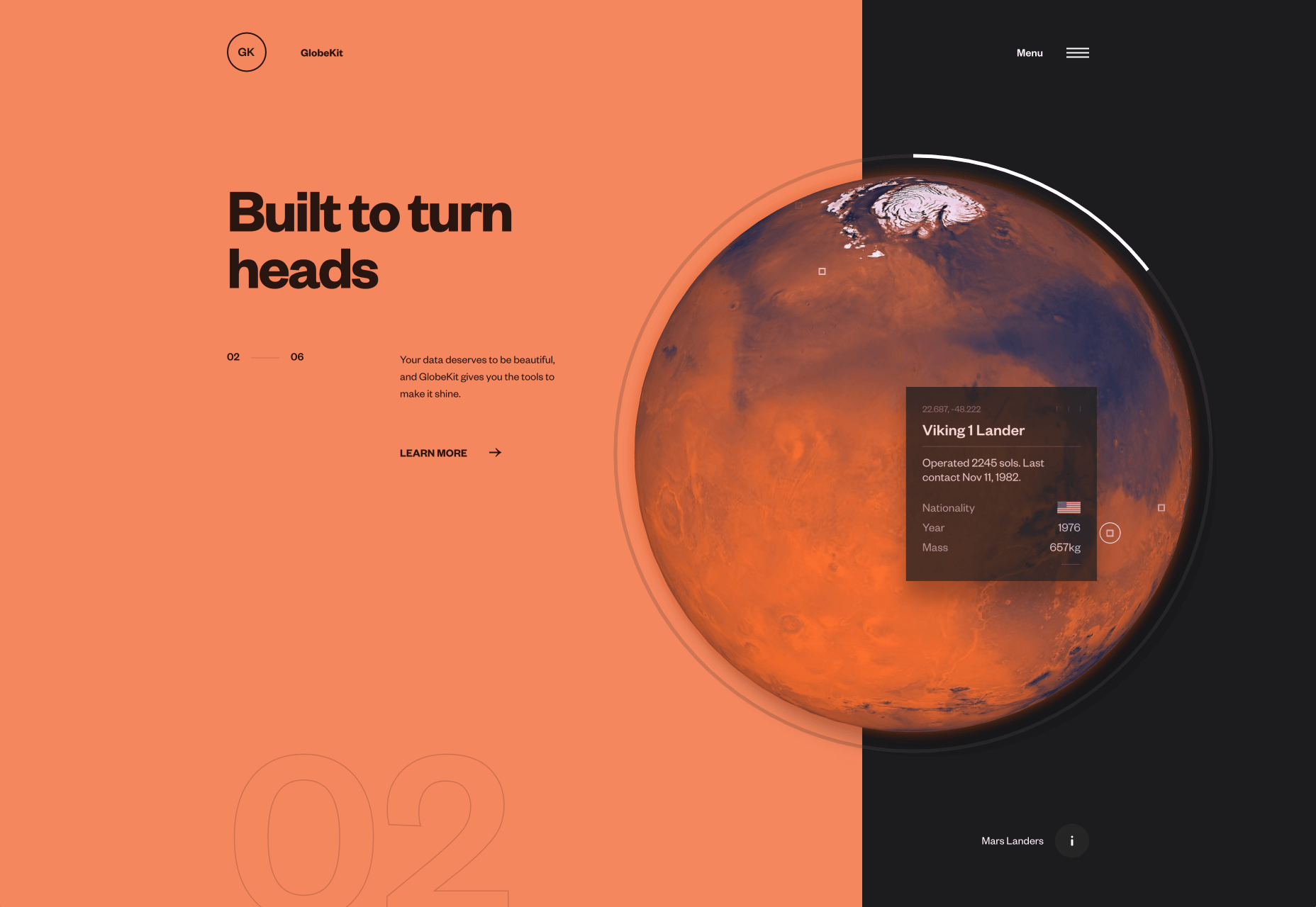
Globekit

Globekit is a tool that allows developers to quickly create animated and interactive globes and embed them on web pages. Its site features some exceptional 3D animation.

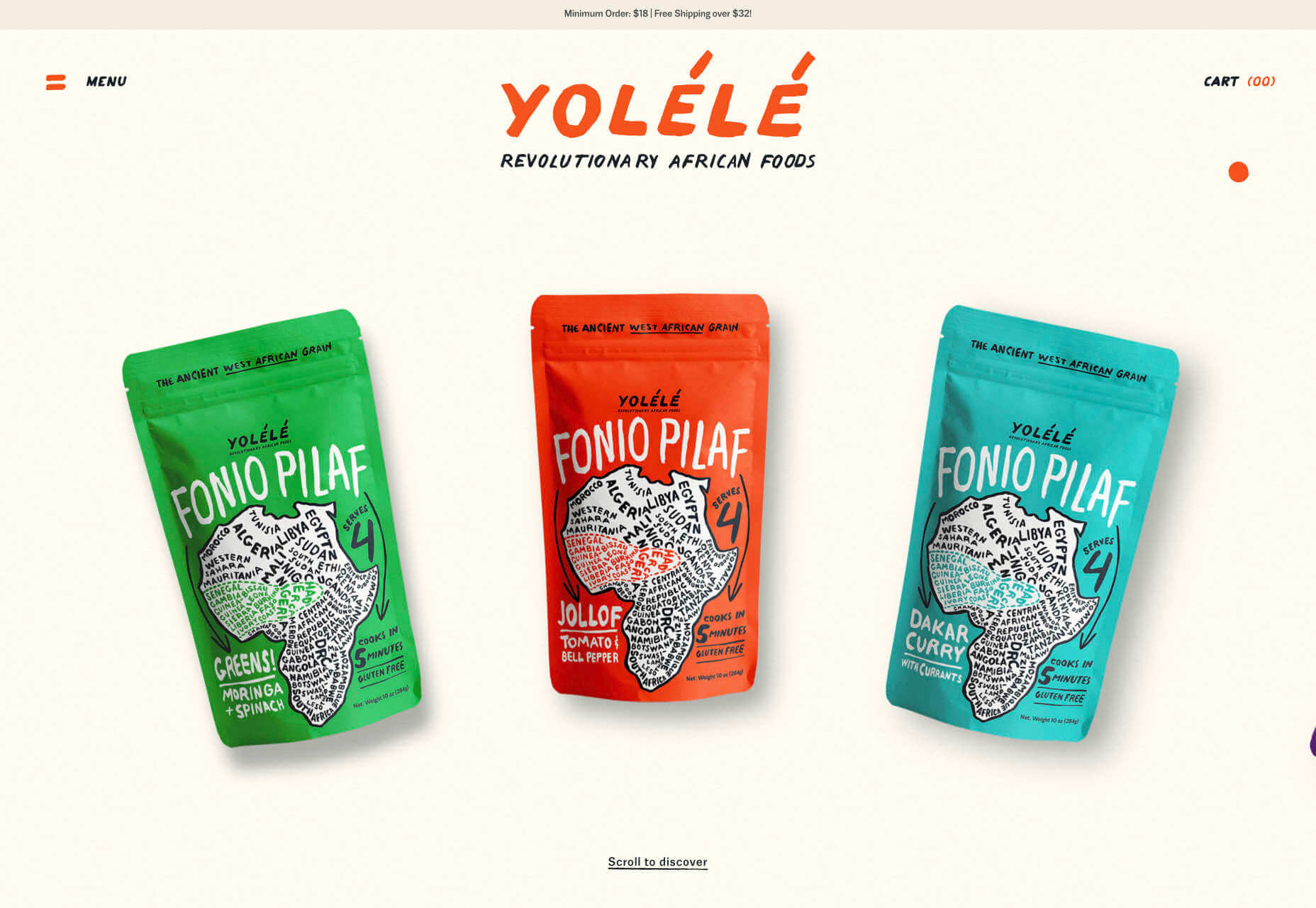
Yolélé

Yolélé is food company built around fonio, a West African super grain. Its site features a great page transition, and the landing page carousel is one of the few examples of horizontal scrolling we’ve seen work well.

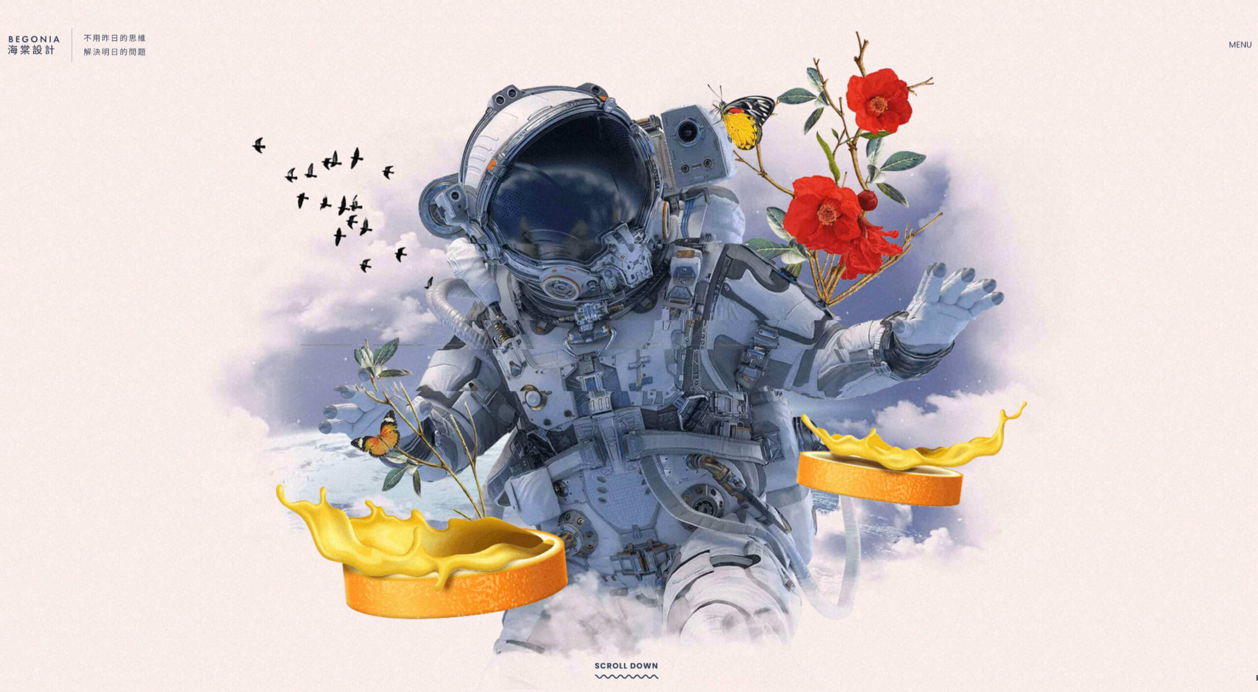
Begonia

Begonia is a Taiwanese design agency with an impressive client list. Its site features animated typography, a super bold splash screen, and some surreal artwork. There’s so much here, it’s almost overwhelming.

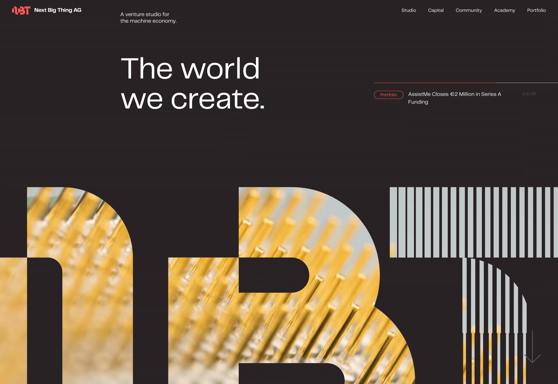
Next Big Thing

Next Big Thing is an agency supporting the full lifecycle of start-ups. Its site is clearly targeting tech-based clients, and there are some lovely transitions. The masked hero transition on scroll is delightful.

Proper

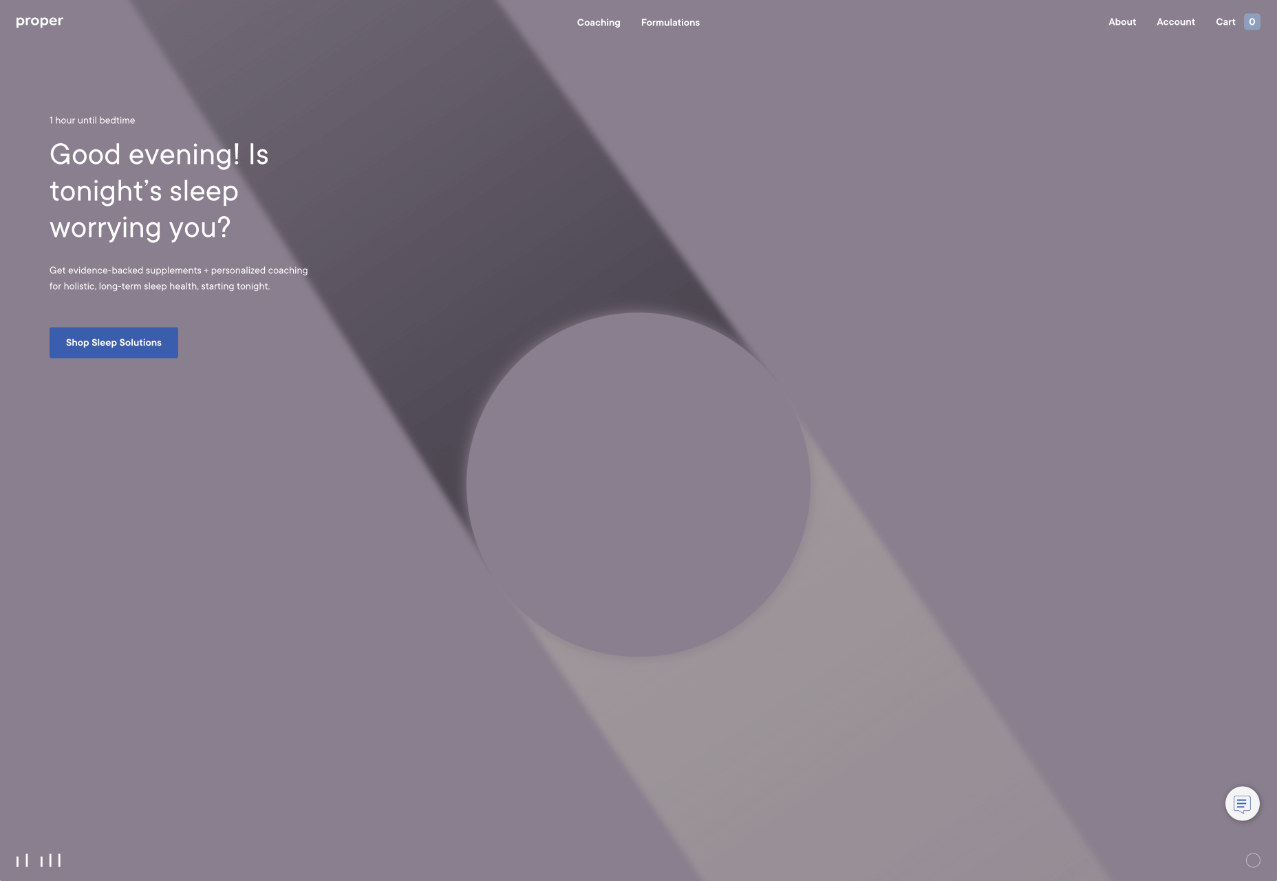
We all have every reason for the odd sleepless night right now, but regular sleep is essential for our health. Proper offers sleep solutions from coaching to supplements on its subtly shaded site.

The Oyster & Fish House

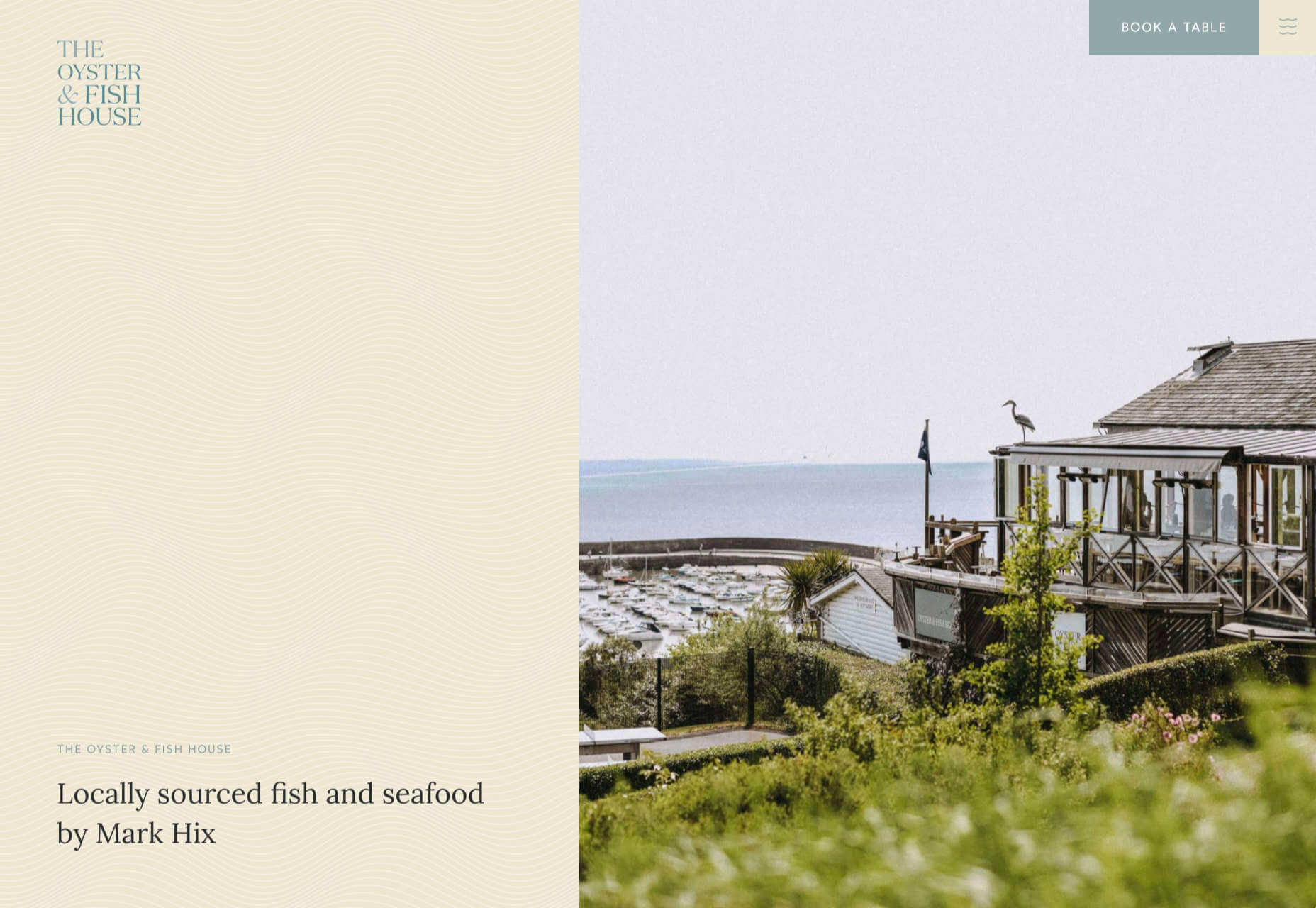
The site for The Oyster & Fish House is packed with some delightful details. We love the subtle wave textures, the photography has a nostalgic feel, and the typography is perfectly sophisticated.

Drink Sustainably

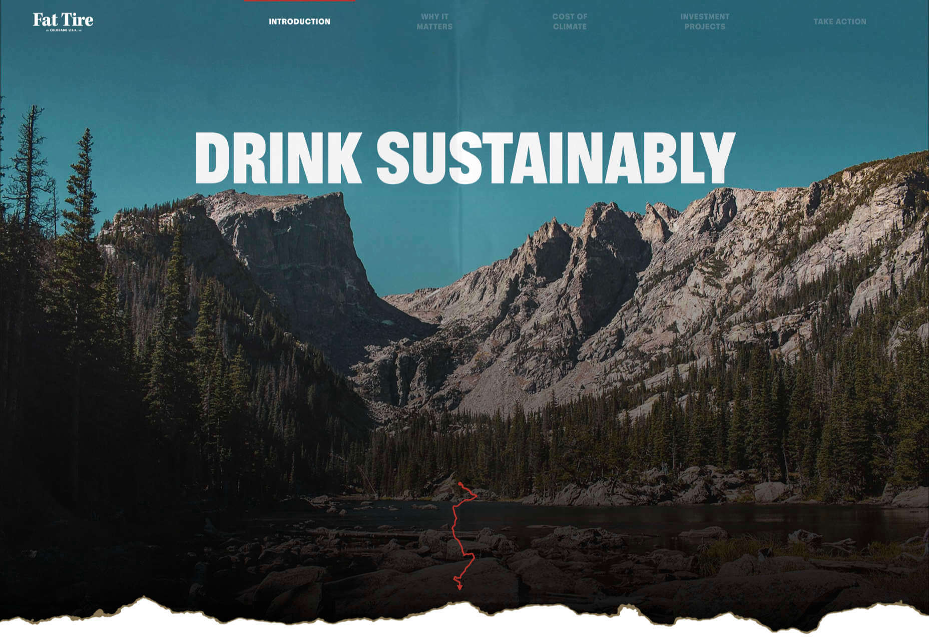
Fat Tire produces America’s first certified carbon neutral beer, and Drink Sustainably has been produced to explain the concept. We love the vintage advertising style of the artwork.

Treaty

It seems like every week there’s a new CBD brand launching. What we like about Treaty’s site is the slick fullscreen video, the inclusion of botanical illustrations, and the really brave use of whitespace.

Studio Louise

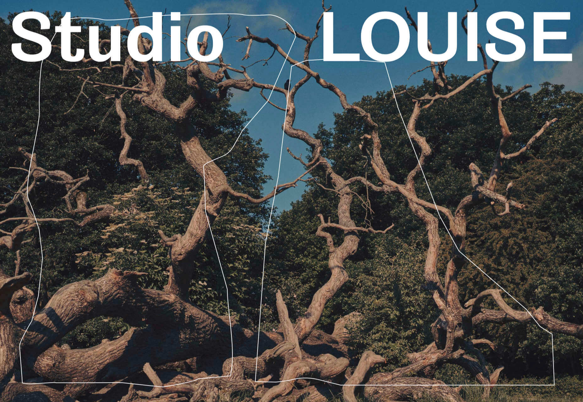
You’re greeted on Studio Louise’s site by a shot of trees with two random shapes; as you scroll the shapes morph and relocate to the top right corner, and you suddenly realize they’re an “S” and an “L”, cue: smiles.

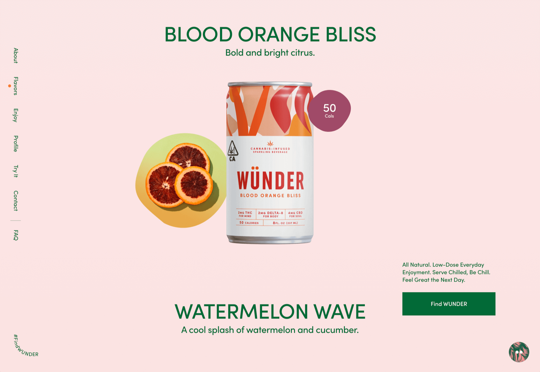
Wünder

Another site for a CBD product, this time a vibrantly branded sparkling beverage. Wünder’s site features enticing photography, an on-trend color palette, and credible typography.

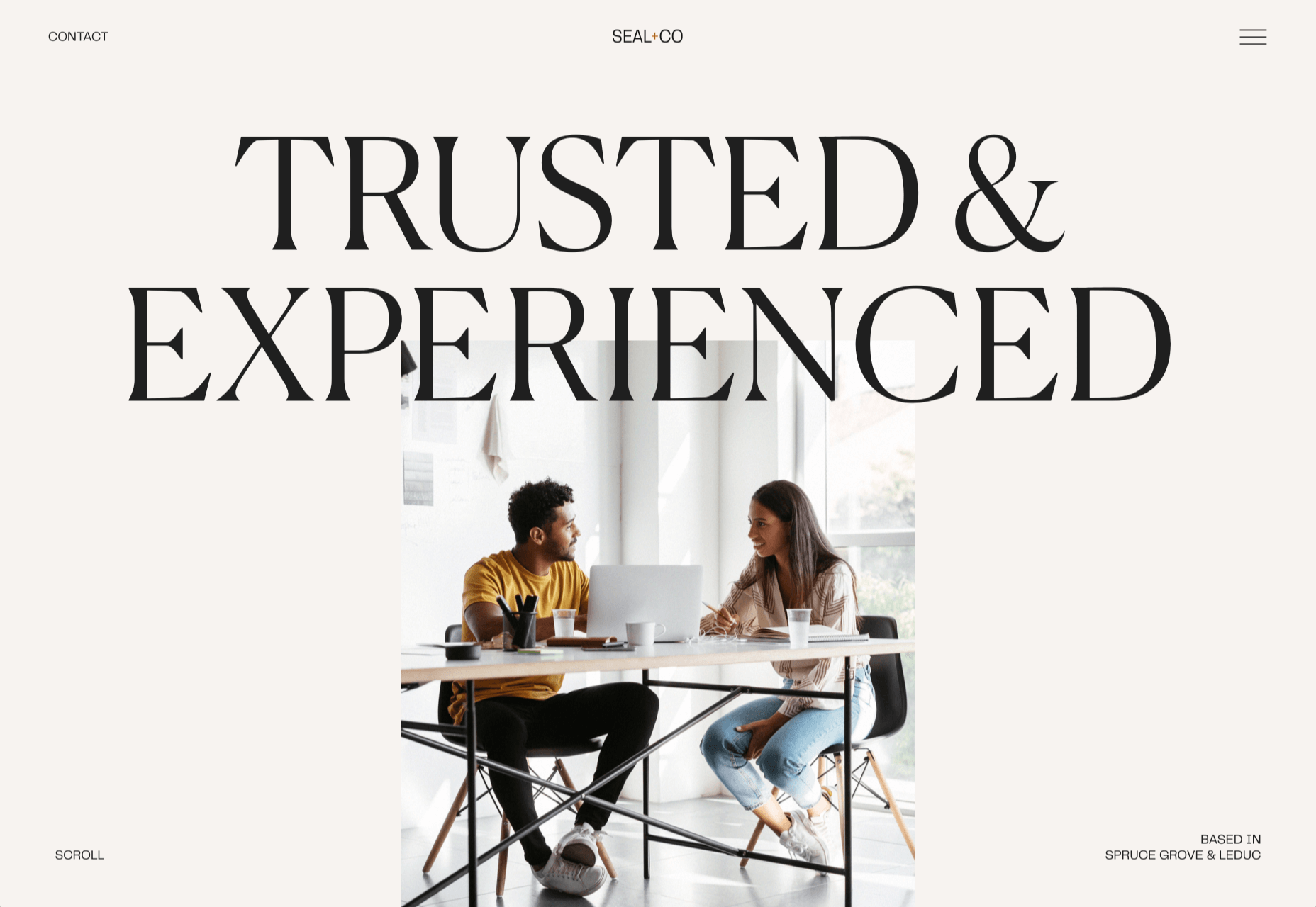
Seal + Co

Some professions lend themselves to exciting, aspirational sites, and some companies are accountancy firms. However Seal + Co’s site creates the impression of a modern, capable, and imaginative firm.

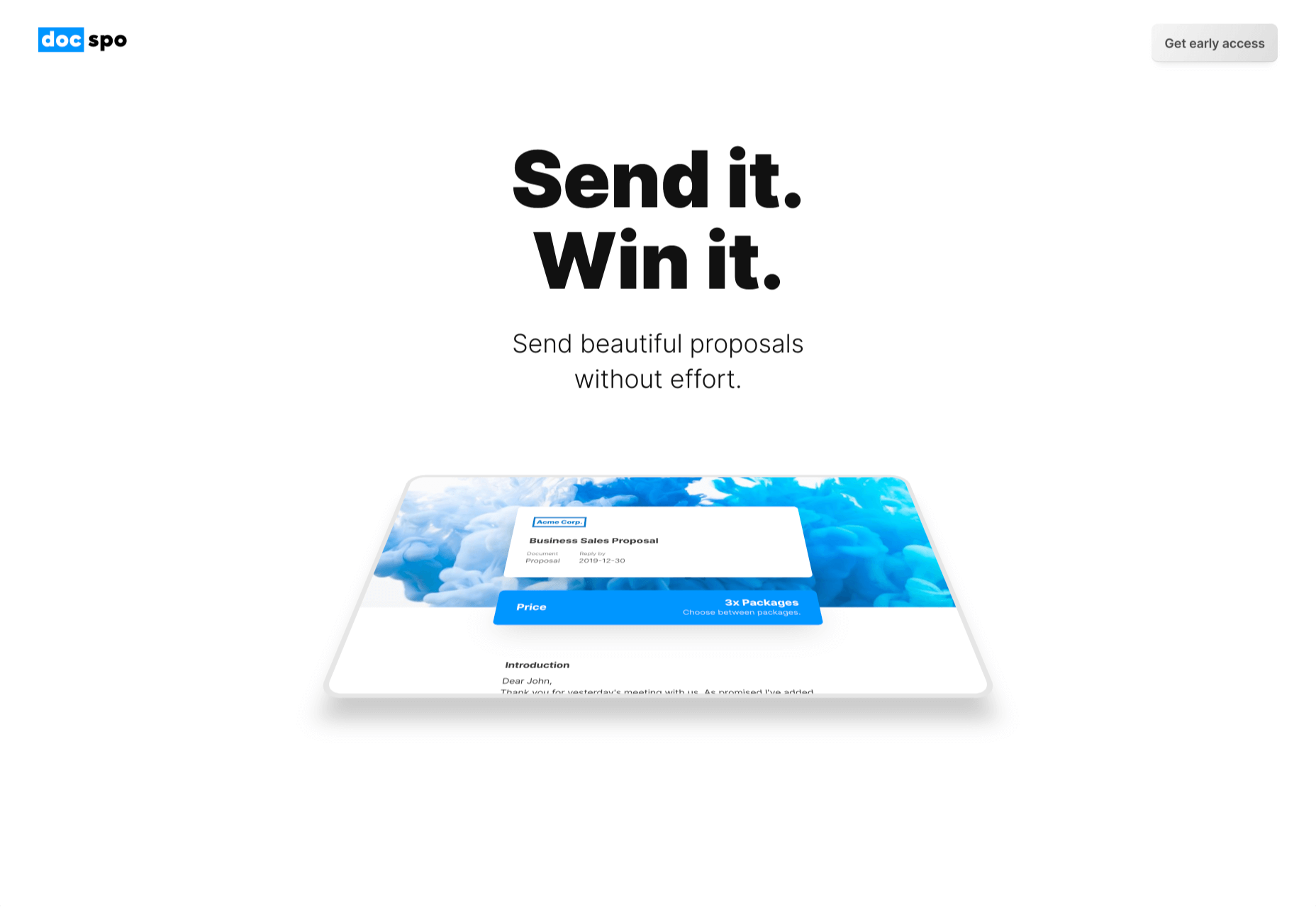
DocSpo

There is some lovely, 3D animation on the DocSpo site. The company is a Swedish startup enabling digital business proposals, and its site is bold, Appleesque, and packed with nice details.

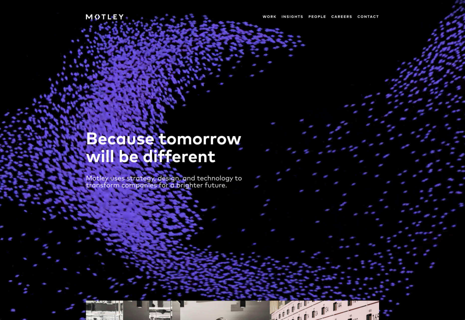
Motley

We never get tired of particle effects, like the one employed by Finland-based agency Motley. There’s some superb work in the portfolio, and it’s great to see a blog using Old Master paintings for thumbnails.

The Ornamental

The Ornamental sources leather goods for wealthy individuals, and luxury lifestyle firms. Its site is minimal, with some drool-worthy handbags. We particularly liked the image zoom hover effect in the store.

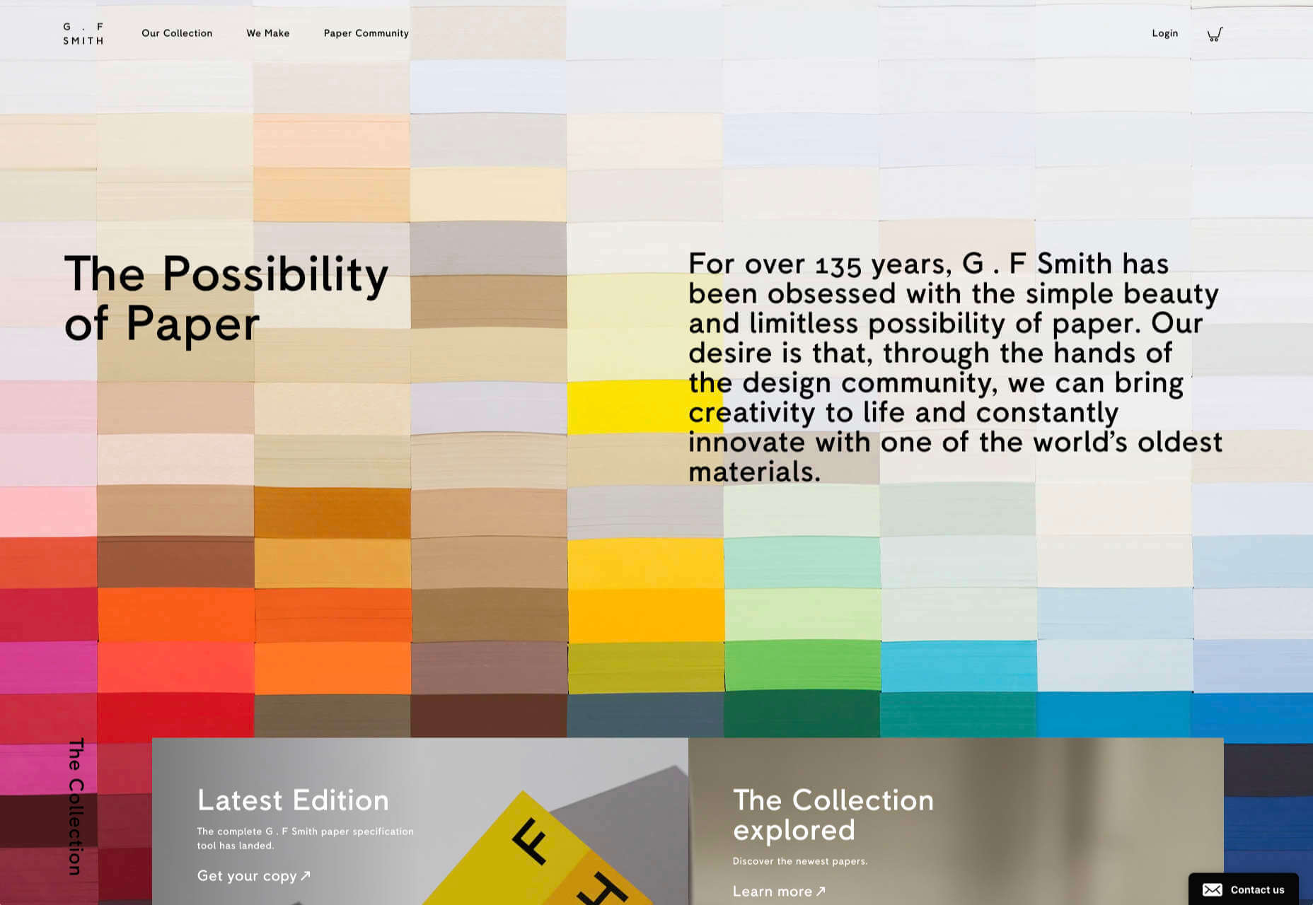
G.F Smith

G.F Smith is one of the world’s leading paper suppliers. Its redesigned site is much simpler than its last, with some lovely touches, like the varied paper photography when you hover over product thumbnails.

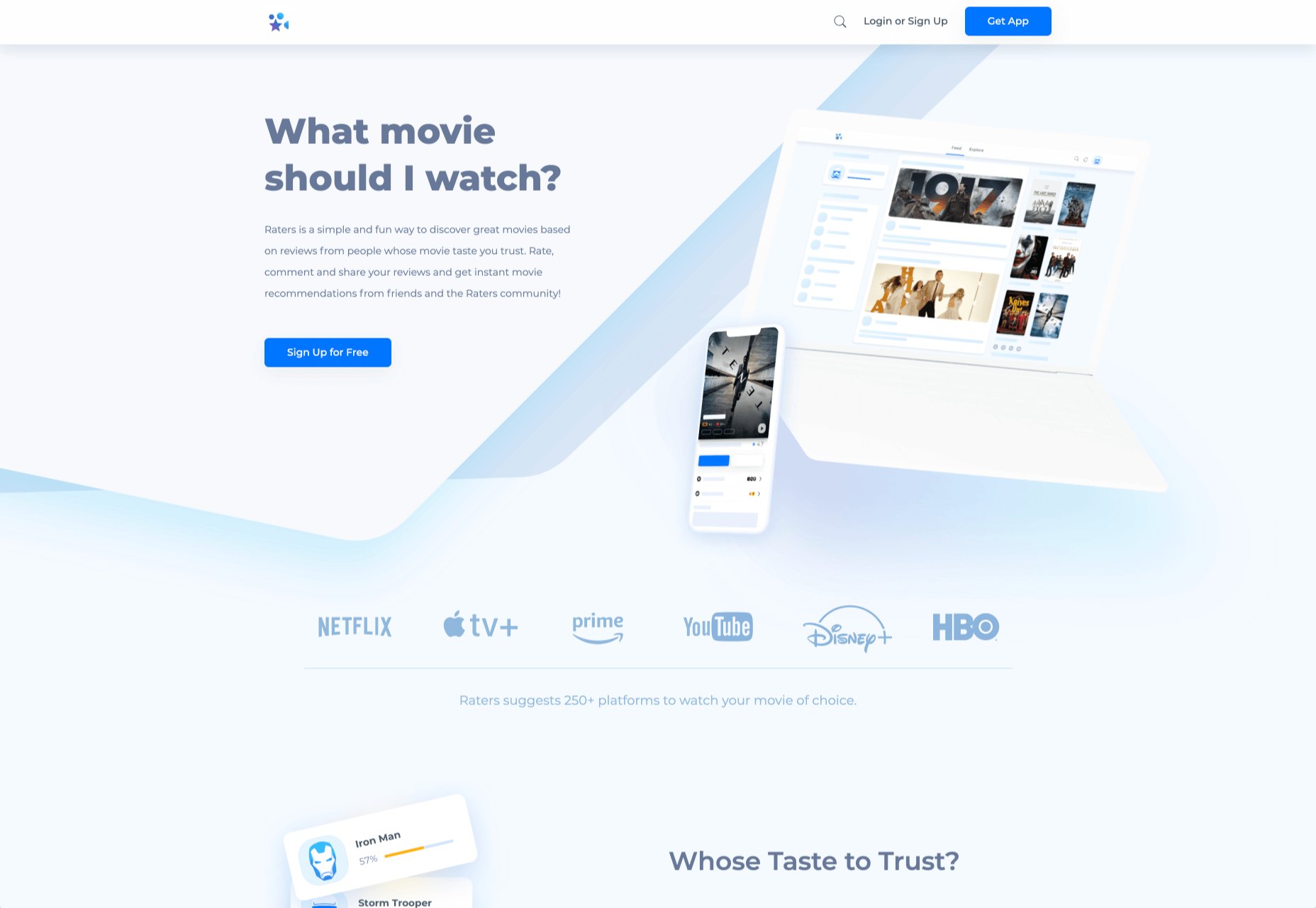
Raters

Raters is a new app that lets you discover new movies via reviews from people you trust. This simple site does an exceptional job of previewing the app, across multiple device sizes.

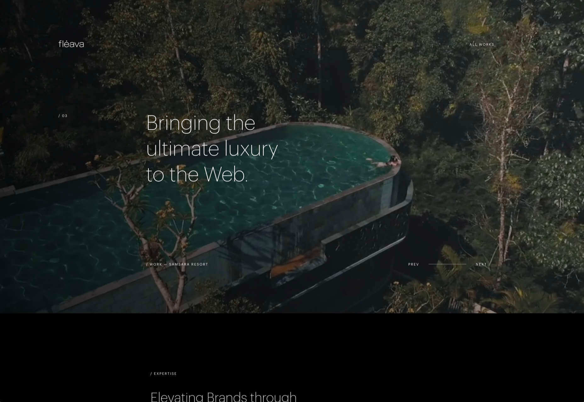
Fleava

There’s a whole heap of nice interactive details on Fleava’s site, from the cursor-following circles when hovering over links, to the way the thumbnails are squeezed when dragging through projects.

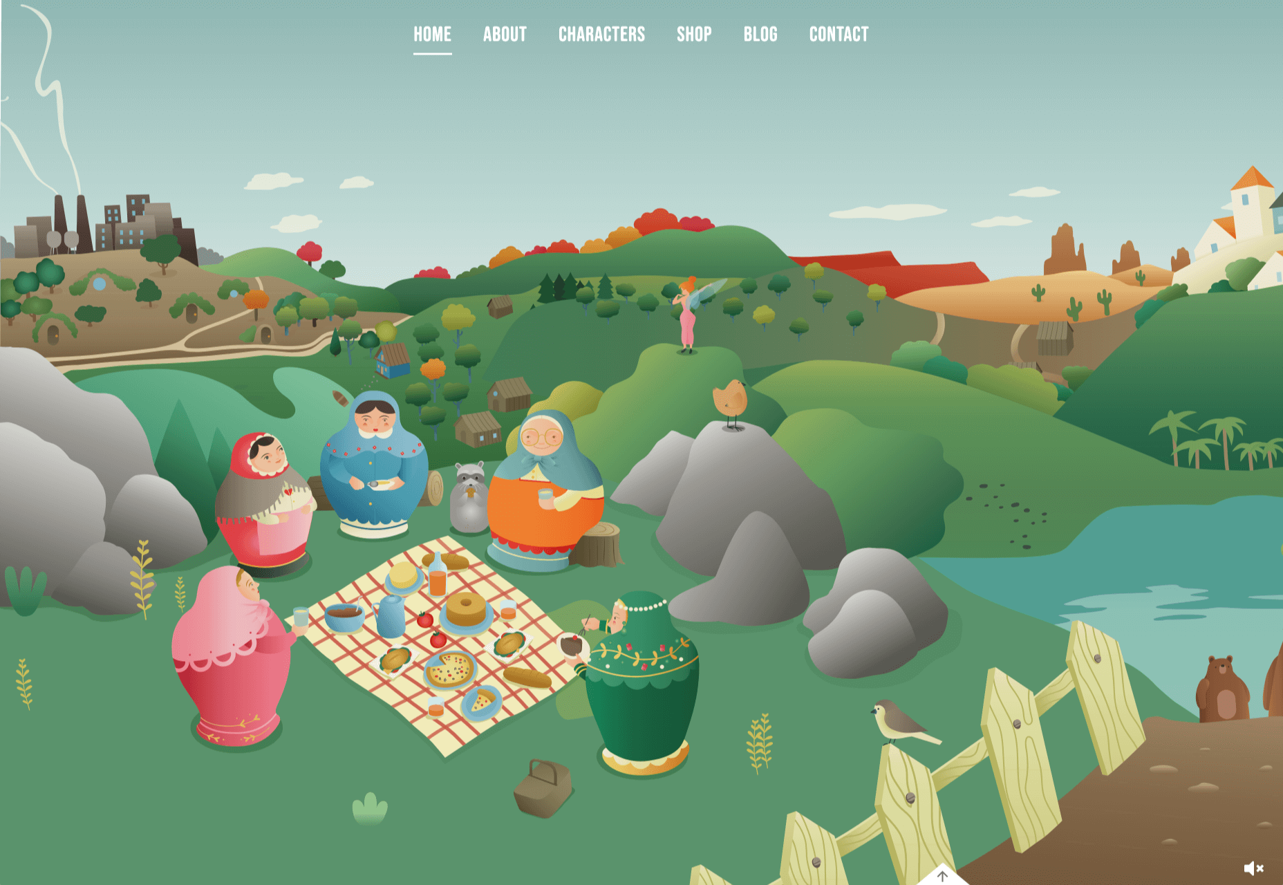
The Story of Babushka

A babushka doll is a traditional Russian toy, made up of dolls, nested inside dolls. The Story of Babushka uses the toy as a metaphor for growth in this children’s book, and the accompanying animated website.

Grand Matter

After the uniformity of the 2010s, there are a wealth of illustration styles being explored across the web. Grand Matter is an artist agency that represents some amazing talent, and we love the illustration they chose themselves.

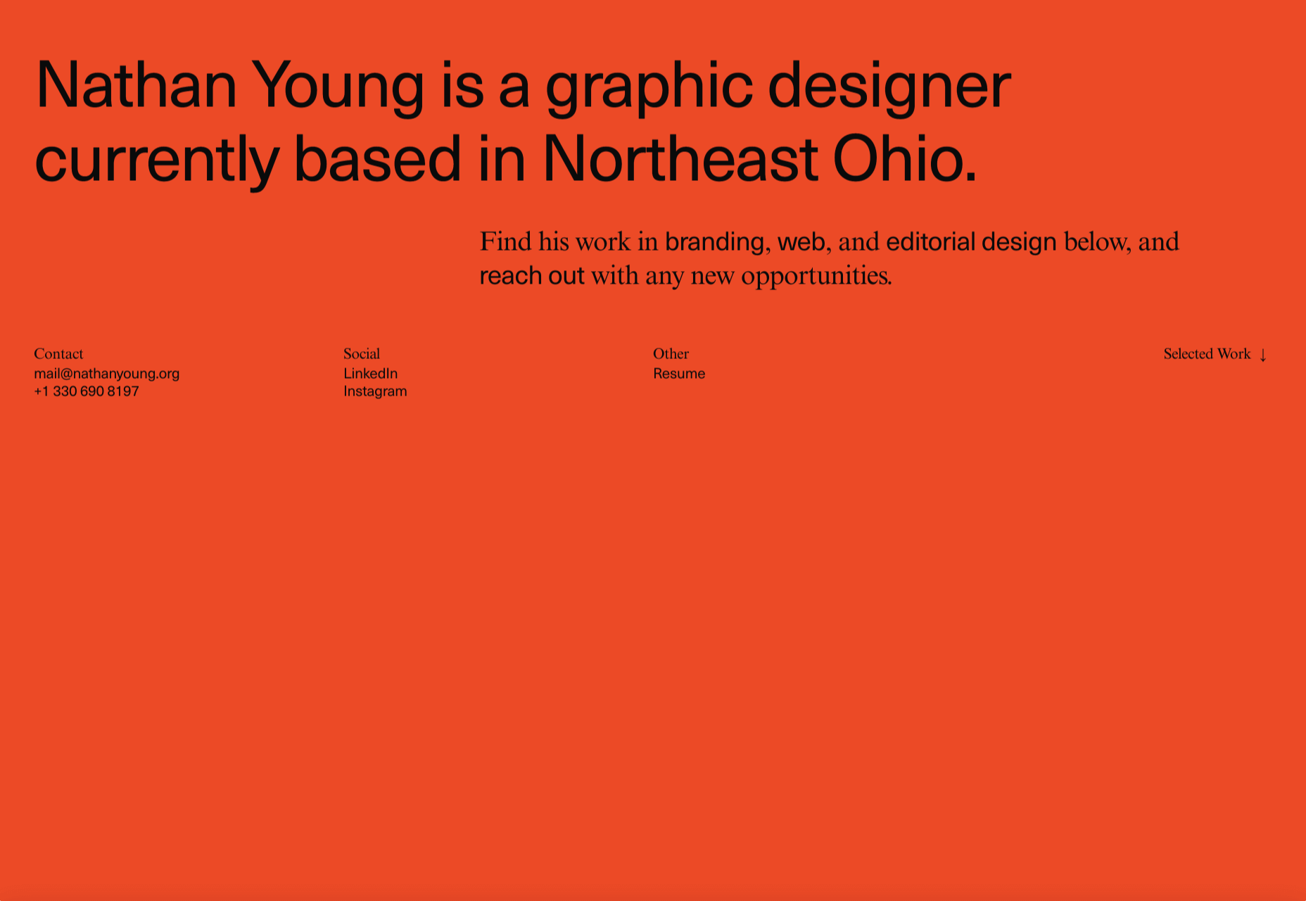
Nathan Young

Nathan Young’s site does exactly what it needs to do: Providing case studies for his design work. The fade-out on scroll is a simple device that elevates the whole site experience.

Source


Source de l’article sur Webdesignerdepot

While a lot of the research for web designers that’s come out this year has to do with COVID-19, we’re starting to see a light at the end of the tunnel. Many of these reports aren’t just looking at the effects of the pandemic on business and marketing today. They’re now looking at what consumers plan to do once the pandemic is gone.

So, I have some very interesting research for you here today. Three of the reports have to do with coronavirus side effects — pertaining to ecommerce, market research, and freelancing — and one of them is just a really great argument against using PDFs on websites.

1. The Digital 2020 Survey Says Ecommerce Growth Will Continue Post-Coronavirus

Obviously, everyone is paying close attention to COVID-19’s impact on the world. For the purposes of the work you do as a web designer, you should be clued into what it’s doing to the business and marketing fields. Because, if those opportunities dry up or companies begin to pivot, you need to be ready to adapt.

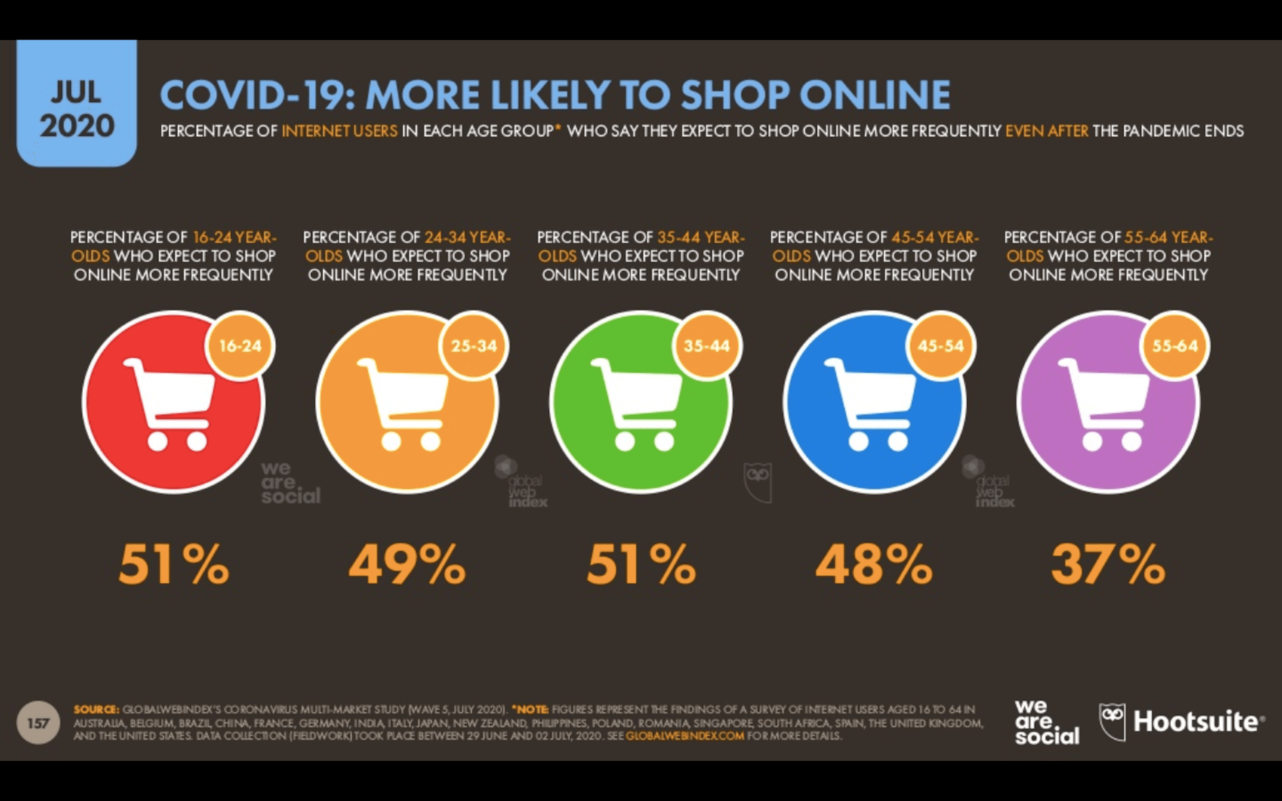
The Digital 2020, a joint monthly report from we are social and HootSuite, brings interesting news about the state of ecommerce thanks to COVID-19.

Because the pandemic has forced consumers indoors, online shopping has increased. But, according to about half of those surveyed for this report, this isn’t some temporary solution. They plan on doing more online shopping even after the pandemic ends.

This means that web designers are sitting in an enviable position now and for the foreseeable future. If you’re not already helping businesses sell through their websites, now is the time to do so as more and more businesses are going to need reliable online stores to sell their offerings through.

2. eMarketer Shares Data on Social Listening

When conducting research at the beginning of a design project, what kinds of sources do you turn to for quick and reliable information? Your client provides you with information on their business, industry, and the competition, of course, but what else?

You can conduct user surveys and interviews, but those take time and resources. It also usually means working with clients who have existing businesses and user bases to tap into. Unless you’re working as a UX designer where that’s a big part of the work you do, you might not have the ability to do that level of research.

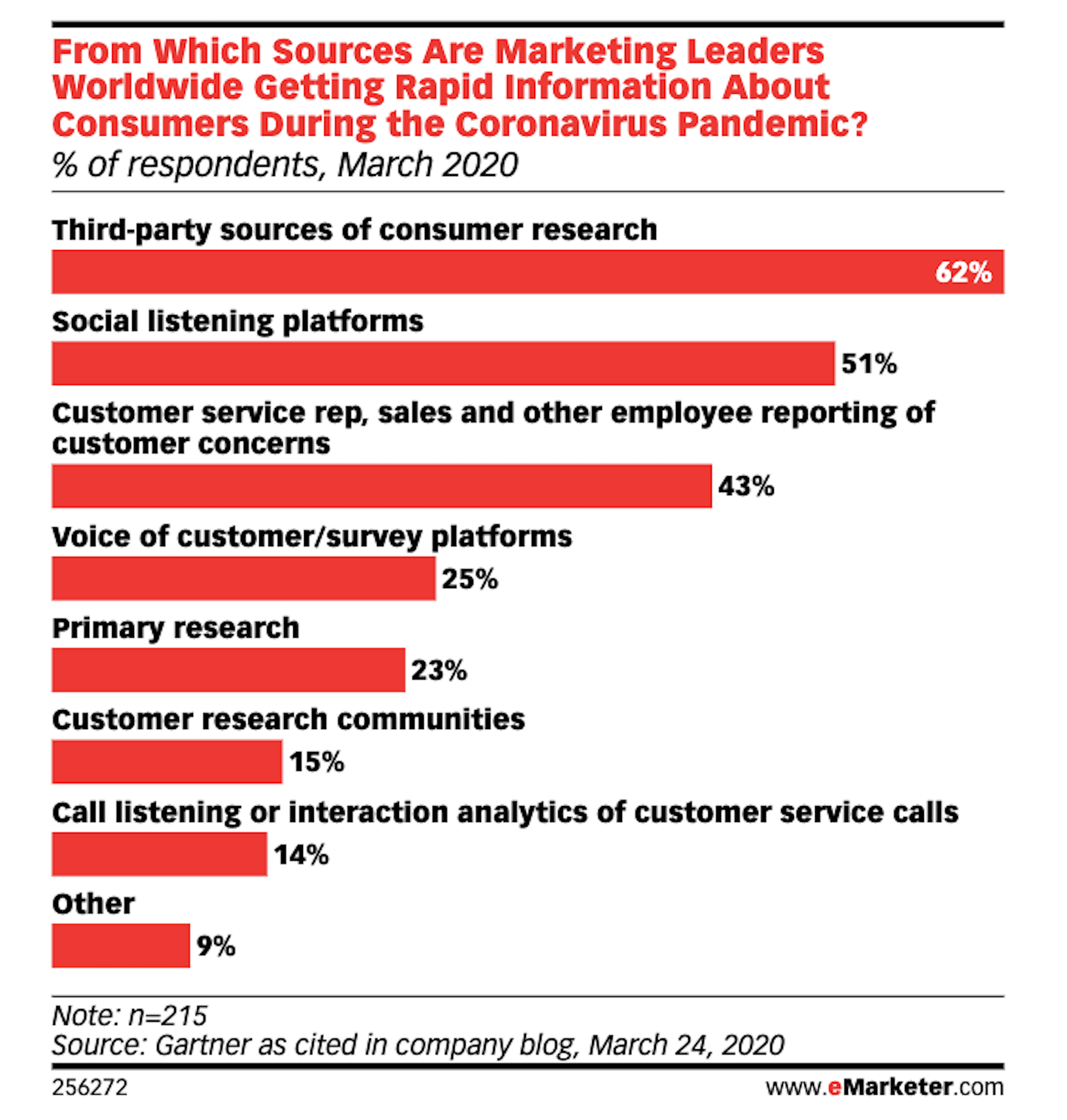
As reported by Gartner (via eMarketer), leading marketers are now learning about their target audiences through the following channels:

Thanks to the surge of traffic online right now, social listening platforms have become really useful resources for learning about one’s users, with 51% of marketing leaders using them.

If you feel as though your initial research and planning phases could use a boost, I’d recommend taking advantage of one of these social listening tools now.

If you build websites for a specific niche, you can set up keywords/hashtags that are universally relevant to (most of) your clients. By listening in on these conversations regularly, you can become more attuned to what the visitors of your websites actually need and you can proactively build better experiences for them as a result.

3. Upwork Reports Increasing Numbers of Freelancers Entering the Market

The main focus of the Upwork 2020 Future Workforce Report is on how employers are changing their approaches to hiring now and in the near future. And the basic premise is this:

  • It’s long been predicted that more and more of the workforce would be allowed to work remotely.
  • COVID-19 has escalated those predictions to the point where most of the workforce is remote right now.
  • Businesses see the value in remote work arrangements, especially if it enables them to get work done more quickly and cost-effectively by freelancers.

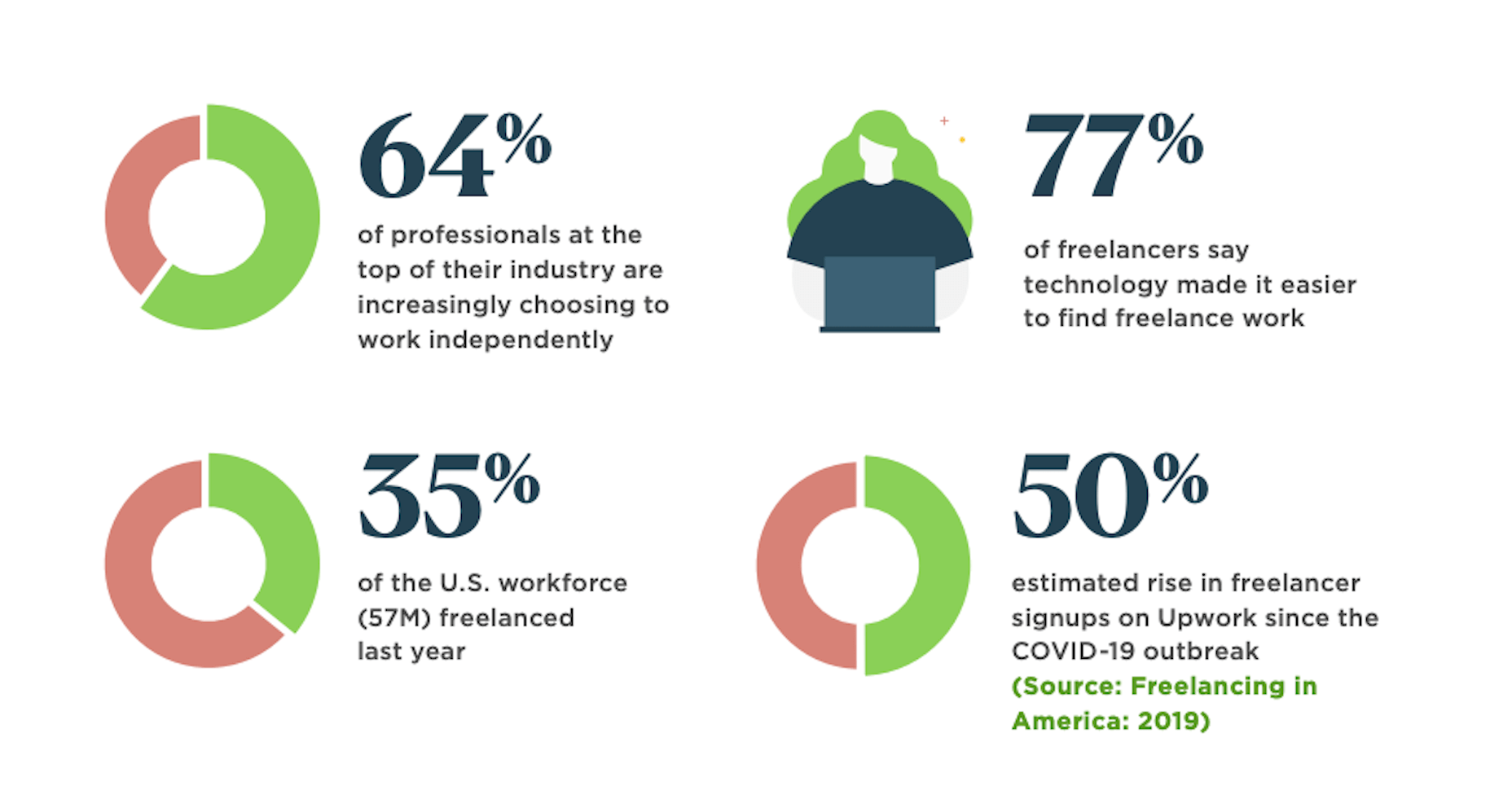
While this is certainly great news for web designers looking for new clients, the report also provides us with this data:

64% of professionals in the top of their field work independently. That statistic alone means you’re up against some tough competition. But there’s also the 50% rise in signups on freelancer marketplaces that should have you worried.

Even though business demand for freelance talent is growing, this unprecedented rise in freelance competition may pose some problems. So, if you’re not already doing everything you can to position yourself as the web designer in your niche, get going on that now so you don’t get drowned out by the rising number of competitors.

4. NNG Says That PDFs Are Unsuitable for the Web

While I don’t have statistics to share with you from the Nielsen Norman Group’s post on why the PDF is “Still Unfit for Human Consumption”, I do have a ton of usability arguments against them that are worth summing up here:

  1. PDFs are written in the style of print documents, which means that strategies we use to design content on websites — like making a page scannable and accessible — don’t apply.
  2. They’re not designed to be as concise or attractive as a web page.
  3. They don’t operate like a website, which disrupts the seamless experience you’ve worked so hard to create when one is opened up from your site.
  4. The website navigation disappears and any sense of orientation (besides the browser “Back” button) goes out the window.
  5. There’s no way to build an internal navigation in a PDF document, save for internal linking or a table of contents.
  6. If they’re formatted for paper sizes, scrolling through them can be difficult for mobile users.
  7. They load more slowly the bigger they get, so unless it’s something like a small and optimized menu, expect visitors to wait for the download to appear.

And those are just the arguments that came from NNG’s researchers. Take some time to read through real user complaints about PDFs and you’ll never want to include one on a client’s website again.

Wrap-Up

Thankfully, the research for web designers and marketers is finally starting to move away from the confusion and speculation we saw a lot of earlier this year.

Just as with anything we do on the web, the more time you give it, the more data you can collect. And, luckily for us, the data suggests that there’s a pretty positive outlook for web designers if they position themselves the right way now.


Featured image via Unsplash.

Source


Source de l’article sur Webdesignerdepot

In part one of this blog, I provided a high-level introduction to SAP Systems, Clients, Landscapes, and Transports and how they might fit together in a ‘standard’ configuration. But like life, SAP tends to be a bit more complicated than that. The reality of marrying architectural constraints with complex business needs means that the kind of simple landscapes I described in my last piece often will not do the job. Something more complex is required.

In this article – part two of three – I will look at some of the more advanced concepts associated with SAP Landscape Design and how to manage the increased complexity that comes with them. 

Source de l’article sur DZONE

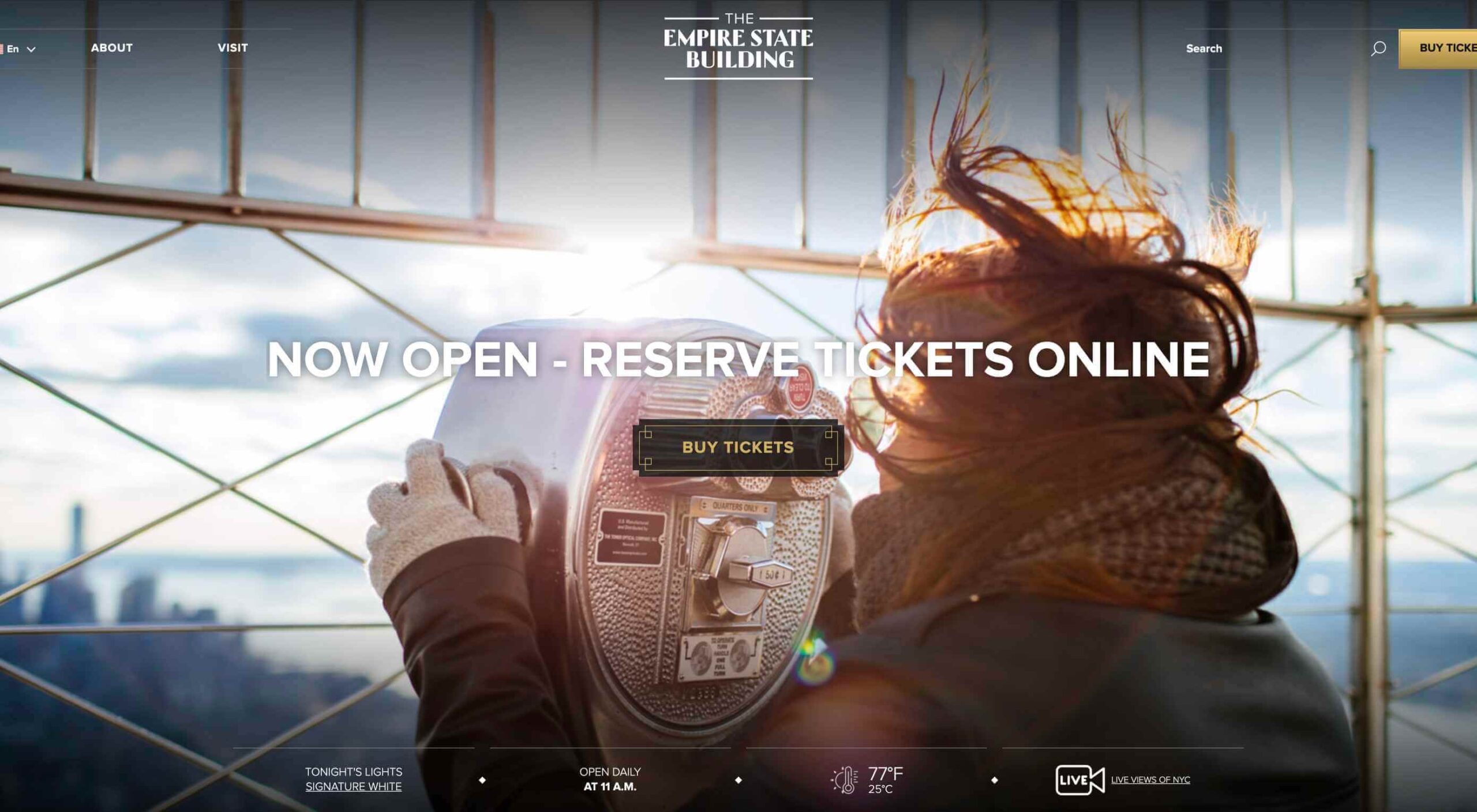
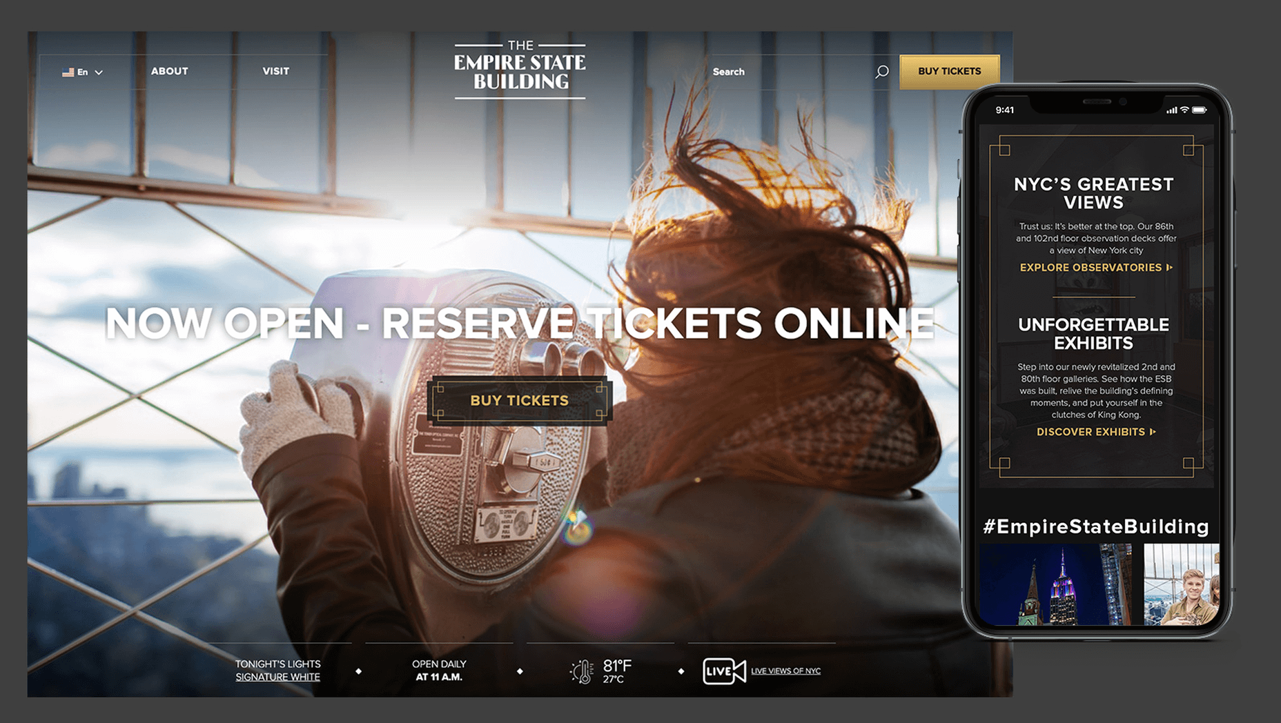
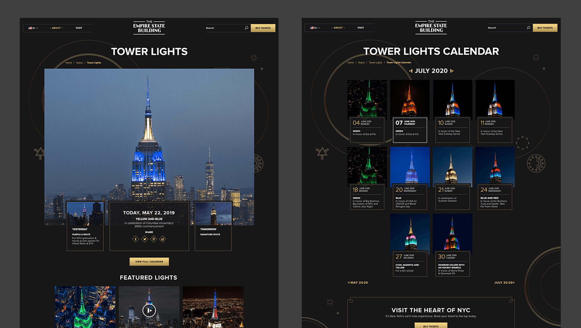
In 2019, to keep pace with an interior redesign of its visitor experience, the Empire State Building decided to redesign its website. Blue Fountain Media were engaged to deliver the project. With the new site launching, we spoke to Head of Design, Tatyana Khamdamova about designing for the world’s most famous building.

Webdesigner Depot: The Empire State Building is probably the most iconic building in America, if not the world. Were there any points at which you thought, “Oh God, this is too much pressure”?

Tatyana Khamdamova: Yes, of course, it was a lot of pressure knowing that people all over the world will be looking at your work. But with the pressure, we also felt excitement and pride that we got to work on such an iconic project. Just thinking that we are doing the site for Empire State Building made us feel proud of all that other work we did during our whole life that gave us the opportunity to be a part of this project.

WD: Blue Fountain Media is a large agency. Did you utilize the whole company, or was there a smaller, dedicated team tasked with creating the site?

TK: On a project like this one, you need the expertise of the team members from all departments in the agency. You want people to work together from the beginning to ensure that their knowledge helps to shape the project and produce the best possible outcome. It’s important for designers and marketers, for example, to be a part of the strategy and UX phase to provide their input which minimizes tunnel vision and generates more ideas. You can only achieve the best results if every single detail from strategy to design to development is done right.

WD: That’s a lot of people to coordinate. Did any roles naturally come to the fore, or is design leadership a quality that varies from person to person?

TK: Some people are natural leaders in their fields. But, sometimes a certain project requires people to take responsibility and show their leadership skills within the team. So I would say that it’s a quality that varies from person to person and doesn’t depend on a role or a title at all.

WD: What were the central aims of the redesign?

TK: ESB’s previous website did not reflect the level of design to match their iconic brand, UX was not user friendly, the content was outdated, and they wanted to grow online individual and group ticket sales. In addition to competing with global and NYC based tourist attractions, ESB was also faced with growing competition in the NYC Observatory market with Top of The Rock, One World Observatory, and Edge at Hudson Yards.

While the building underwent a $165 million renovation, BFM was tasked with creating a best in class website that reclaimed their iconic brand identity while providing an intuitive, and enjoyable user experience for both domestic and international visitors looking to learn about the building, exhibits, and the many ticket experience packages that they offer to visitors.

WD: How do you approach researching a unique project like this?

TK: We went to the source! First, we spoke to visitors of the Empire State Building while they were in line. What was their experience, did they use the website, what made them choose to visit the observatory instead of or in addition to some of the other competing observatories in the city. We then looked at other key tourist towers worldwide to see how they are positioning themselves globally to draw inspiration. We did in-depth stakeholder interviews that included folks working at the building every day and the types of interaction and questions they field from visitors. We conducted surveys of international travelers to understand their motivations and concerns. Finally, we dug into the website itself by testing using various protocols and platforms to understand the visitor paths, what they were able to easily do, and what tasks they may have found challenging. Drawing from all of those insights, we planned and designed the site using an iterative process.

WD: ESB visitors come from all over the world; how did you tackle designing for an international audience?

TK: People across the globe speak different languages, have different cultures and needs. Our goal was to learn about the audience and give them a site that looks and feels like it was created for them. Luckily we were working for the iconic building that is well known internationally and capturing the design aesthetic of the building itself already made the site recognizable across the globe. When working on the project we also were making sure that all users can see the information in their local language when they land on the site and have easy access to the language selector in case they want to change it. When you translate from one language to another the number of words and characters is not always the same. It was important to make sure that the site is designed and developed with an understanding of how the content will be displayed in other languages. With the localization help of our parent company Pactera EDGE we successfully translated the site in several languages and tested it to ensure that it looks right for the local and international audience.

WD: The famous view of the ESB is the external view, but your design feels more in keeping with the experience of the building’s interior. Was that a conscious decision?

TK: It was a conscious decision to create a site that makes you feel like you are visiting the building. Our goal was to make the visitor excited to buy a ticket and see all that beauty with their own eyes. But, if someone doesn’t have an opportunity to come to NY we wanted to make that online experience as close to the real one as possible. We understand that nothing will replace the actual visit to the Empire State Building but we wanted the website to feel real and by using the great photography and amazing Art Deco design elements, we were able to do so.

WD: How did you interpolate such a complex style as Art Deco into a functional site?

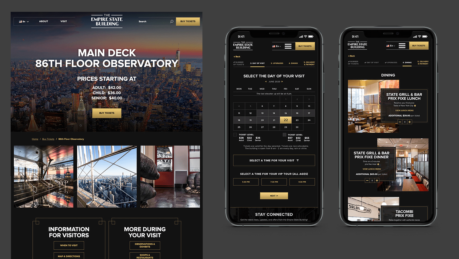
TK: Fortunately for us, our office is located a couple blocks away from the building and we had the opportunity to go there and see some of the details. We also had access to the great photos of the renovated hallways, exhibits, and observatory decks, which gave us the idea of how the Art Deco elements were used in the interior design of the building. We all know that interior design and web design have different needs and goals so it was an interesting challenge to design a site that makes you feel like you are inside the building without overwhelming users and that content is easy to read and the ticket purchasing process is simple and clean. We re-created a lot of design elements used on the ceiling, walls, and floor of the building simplified those elements and made them part of the website design. A lot of those elements were used in the background, call to actions, icons, and maps, and combined with the brand colors used in both interior and web designs we were able to give the site the Art Deco look.

WD: There’s been speculation in the design community recently that Art Deco may re-emerge as a trend in the 2020s. Having worked with the style, do you think it could benefit the wider web?

TK: This was a very specific design approach for a very specific project that takes us back to the 1920’s and emphasizes that era through modern twists in web design. I do not see how it can be applied on the web in general unless the client specifically asks for it, for example, architecture website, real estate, or furniture site. Every project is unique and has its own goals and style and there is no one solution that will fit all. As of today, The ESB is Art Deco in a sense and it truly owns that style.

WD: Can you share some details on the technology stack you employed?

TK: The site was built on the Drupal CMS, integrates with Empire’s partner Gateway Ticketing System, and is hosted on Acquia.

WD: Why Drupal? Does it have qualities that suit a project of this scale, or is it simply the case that BFM had the pre-existing expertise of Drupal to facilitate the build?

TK: BFM is a dev-agnostic production team and we always ensure we’re making the best recommendation to our clients. In this case, the previous website was built on Drupal, so in order to decrease the effect of a new platform rollout that would be unfamiliar to the internal ESB teams, we decided to keep the site on the Drupal platform. Luckily, Drupal is an extremely flexible CMS and the needs of the site perfectly align with what Drupal provides.

WD: With visitors from around the world, the range of browsers and devices you had to consider was vastly larger than most projects. Did you draw a line for support? If so, where was it?

TK: BFM constantly updates our list of supported browsers and devices to stay in line with changing technology trends and device usage around the world. We’re extremely lucky that our larger organization, Pactera EDGE, has deep roots in globalization and localization, so we leveraged their team to help us with all aspects of website visitors from the many regions around the world, including translation services and testing. Since this was a complete overhaul, we ensured the baseline standard for all devices was met and will continue to enhance as the future technology needs become apparent.

WD: The Empire State Building gets millions of visits each year, what sort of server resources do you need to throw at it to guarantee uptime?

TK: BFM is a partner of Acquia, and Empire State Building is hosting their new site with them. Acquia is a wonderful ecosystem built specifically for high performing drupal websites and provide many tools for their hosted sites to be able to handle fluctuations in visitors, traffic surges, and with the 24/7 support offered, they can easily manage the changing needs of worldwide visitors.

WD: Now it’s live, how does the new ESB site relate to its real world presence?

TK: The Empire State Building defines the New York City skyline. The world’s most magnificent Art Deco skyscraper, it’s a living piece of New York history and an instantly recognizable symbol of city culture today. The old site did not reflect the amazing interior and exterior design of the building and we had a chance to showcase the redesigned interior and bring more attention to the beautiful Art Deco design elements. We wanted to create the site to make you feel like you are visiting the building. By showcasing the exhibits, renovated halls, and observatories through compelling photography and architectural details, our goal is to make the visitor excited to buy a ticket and see all that beauty with their own eyes.

We’d like to thank Tatyana for taking the time out of her day to talk to us.

Source


Source de l’article sur Webdesignerdepot


Avec la propagation du coronavirus, un effet domino fait des ravages sur les entreprises et les employés . Les chefs d’entreprise ont été contraints de fermer leurs portes ou de couper les services, ce qui a menacé leurs propres moyens de subsistance et ceux de leurs travailleurs.

Pour atténuer l’impact économique et humain, de nombreux pays ont adopté des lois qui doivent être mises en œuvre rapidement afin de protéger les emplois des citoyens les plus démunis.

Les entreprises étaient sous pression pour se conformer rapidement à ces nouvelles obligations légales et réglementations fiscales. Étant donné que de nombreux changements fiscaux et juridiques influencent la manière dont les entreprises rémunèrent leurs employés, les applications de paie et autres solutions de gestion de l’expérience humaine (HXM) ont été fortement impactées par la législation.

Les entreprises du monde entier se sont donc tournées vers SAP pour les aider à se conformer rapidement aux changements en mettant à jour leur logiciel.

80 mesures juridiques accélérées pour aider les clients

SAP dispose d’une stratégie de localisation solide, conçue pour de telles urgences inattendues. Qu’il s’agisse de mettre en œuvre la conformité légale liée à la sécurité des revenus, de réserver des billets aller-retour pour les employés expatriés bloqués ou d’accorder des allègements fiscaux aux petites et moyennes entreprises, l’équipe des services de mondialisation est là pour vous aider.

Pour relever le défi, il a fallu redistribuer les équipes, mobiliser des ressources supplémentaires et continuer à faire appel à des experts internes et externes.

«Nous n’avons épargné aucun effort pour proposer plus de 80 mesures juridiques accélérées qui aideront les clients à relever les défis actuels du marché», déclare Stefan Steinle, responsable des services de mondialisation chez SAP. «Et en plus de tous les changements juridiques liés au COVID-19, nous continuons également à fournir des mises à jour régulières et des changements juridiques.»

Les services de mondialisation travaillent en étroite collaboration avec les clients et les partenaires afin de fournir une solution pour chaque changement pertinent aussi rapidement et efficacement que possible et de mettre ces informations à la disposition du public. Nestlé est une entreprise mondiale qui s’appuie fortement sur la localisation soutenue par SAP, quel que soit le lieu d’activité de ses clients.

«C’est une excellente idée d’avoir un guichet unique pour tous les changements juridiques liés au COVID-19», déclare Mukesh Kumar Rai, SAP Total Quality Manager chez Nestlé pour l’Asie, l’Océanie et l’Afrique subsaharienne. «C’est encore plus utile pour un client mondial comme Nestlé avec plusieurs versions nationales.»

SAP maintient cette vue d’ensemble des annonces légales pertinentes pour les localisations SAP Payroll Processing et SAP SuccessFactors Employee Central Payroll. Trois exemples en Espagne, en Italie et en Autriche montrent l’étendue des changements légaux que SAP a mis en œuvre dans les solutions HXM pendant la pandémie.

Rallye en Espagne

L’Espagne fait partie des pays les plus durement touchés par le COVID-19 . Les autorités gouvernementales y ont publié six bulletins juridiques contenant jusqu’à quatre changements chacun. Ces changements affectent les paiements et les impôts de la sécurité sociale et nécessitent des modifications d’algorithme des données de base, du calcul de la paie et des rapports juridiques.

Comme l’analyse et la mise en œuvre de ces changements devaient être effectuées rapidement, Gema Moraleda, chef de produit chez SAP Espagne, et Carlos Moehlecke, propriétaire du produit de développement, ont organisé des réunions de groupes d’utilisateurs pour partager les détails des solutions SAP et ont utilisé plusieurs canaux de communication pour tenir les clients informés.

La contribution de SAP a été reconnue par les représentants du groupe d’utilisateurs, les clients et les partenaires. En mars, Juan José Díaz Vázquez de Barrahache , un partenaire SAP, a écrit : «Tout comme il y a des moments de critique, nous de Barrahache pensons également qu’il y a des moments de gratitude, et dans ce cas, nous applaudissons la façon dont SAP Espagne a intensifié ses dons. réponses aux utilisateurs espagnols de la paie en ces temps compliqués que nous vivons. »

Aider l’Italie à guérir

Mi-mars, le gouvernement italien a promulgué le décret-loi Cura Italia (« Guérir l’Italie »), qui contient des mesures telles que le report du paiement des impôts, un traitement spécial des absences, des primes supplémentaires et des allocations pour soutenir les familles. Le plus grand défi était de mettre à jour le logiciel en ligne et en temps voulu, compte tenu de la nature dynamique des annonces. SAP a utilisé tous les canaux de communication possibles pour aider à minimiser tout manque de clarté auquel le client était confronté.

Adaptation au modèle autrichien de travail à court terme

L’Autriche a adopté un modèle de chômage partiel , qui s’appuie sur les allocations de chômage fédérales. Bien que le programme ait nécessité des modifications très complexes du logiciel géré par les entreprises et les institutions, l’équipe régionale des services de mondialisation a terminé l’analyse et la mise en œuvre des changements requis en une semaine.  Dès la deuxième semaine d’avril, plus de 600 000 citoyens avaient demandé une indemnisation dans le cadre du programme, ce qui a incité le gouvernement autrichien à décupler les fonds disponibles pour soutenir le programme de chômage partiel, qui sont passés de 400 millions à 5 milliards d’euros.

Steinle résume la réponse de son équipe à la crise mondiale : « Notre contribution va au-delà de l’expertise en matière de solutions, de l’agilité et de la mise en place de solutions sur mesure. Nous nous sommes distingués non seulement en répondant rapidement aux opportunités du marché, mais aussi en proposant des solutions concrètes qui ont un impact socio-économique énorme sur les citoyens, les entreprises et les gouvernements ».

Tags: COVID-19 , HXM , paie

Article posté pour la première fois en anglais sur news.sap.com

The post SAP aide à faire face à la crise grâce à la localisation appeared first on SAP France News.

Source de l’article sur sap.com

Every week users submit a lot of interesting stuff on our sister site Webdesigner News, highlighting great content from around the web that can be of interest to web designers.

The best way to keep track of all the great stories and news being posted is simply to check out the Webdesigner News site, however, in case you missed some here’s a quick and useful compilation of the most popular designer news that we curated from the past week.

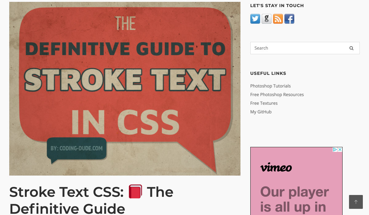
Stroke Text CSS: The Definitive Guide


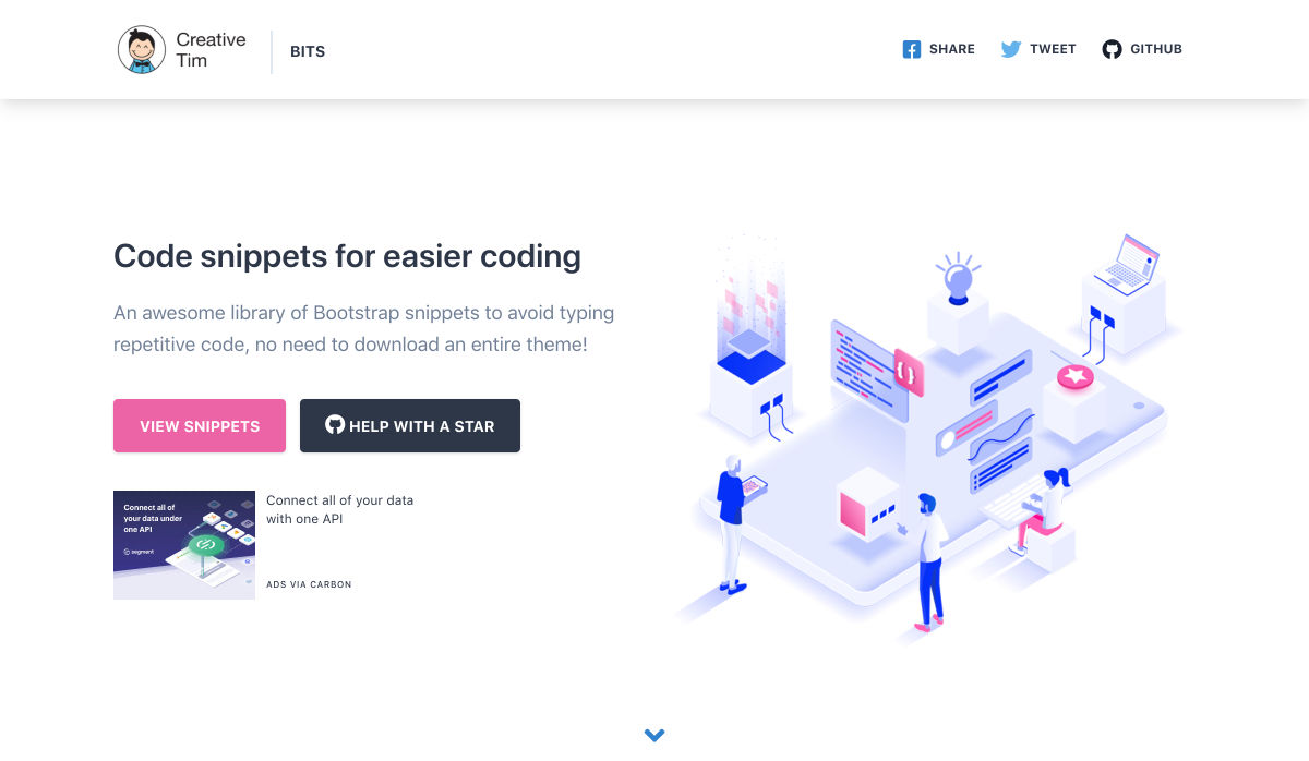
Code Snippets for Easier Coding


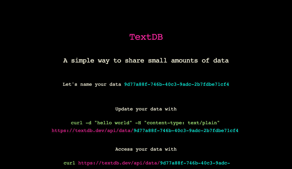
Textdb – A Simple Way to Share Small Amounts of Data


10+ Favicon Generators to Make your Brand Stand Out


12 CSS Grid Layouts


Applying Disney’s Basic Principles of Animation to UI Design


Curiosity Creates


Previewed – Beautiful Mockups & Graphics for your Next App


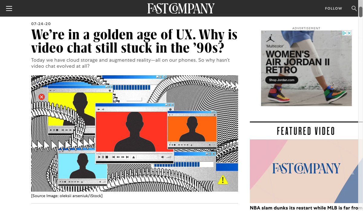
We’re in a Golden Age of UX. Why is Video Chat Still Stuck in the ’90s?


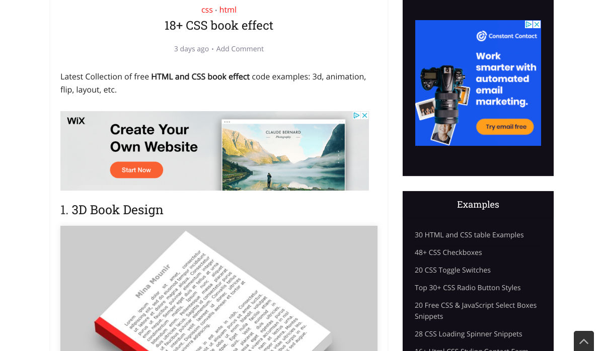
18+ CSS Book Effect


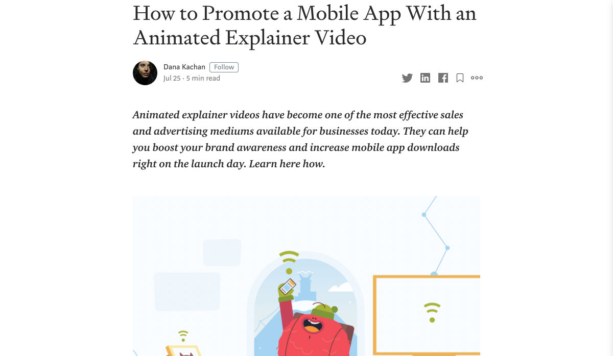
How to Promote a Mobile App with an Animated Explainer Video


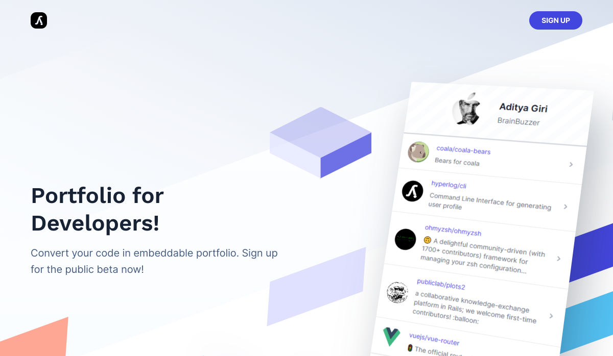
Hyperlog – Portfolios for Developers


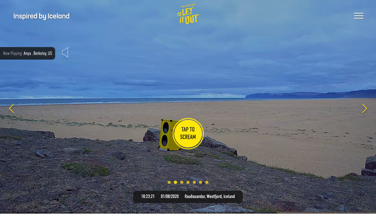
Site Design: Looks like You Need to Let it Out


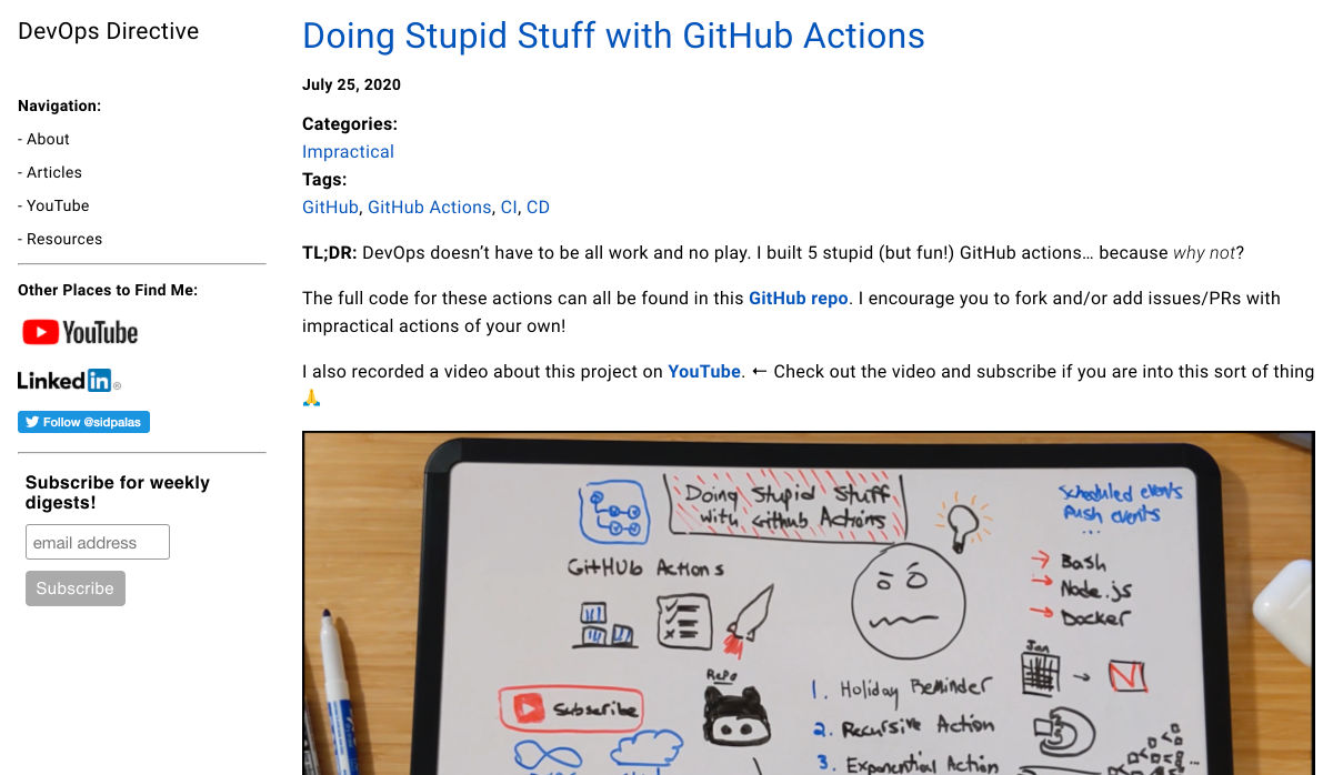
Doing Stupid Stuff with GitHub Actions


Is it Good Design? Well, Yeah.


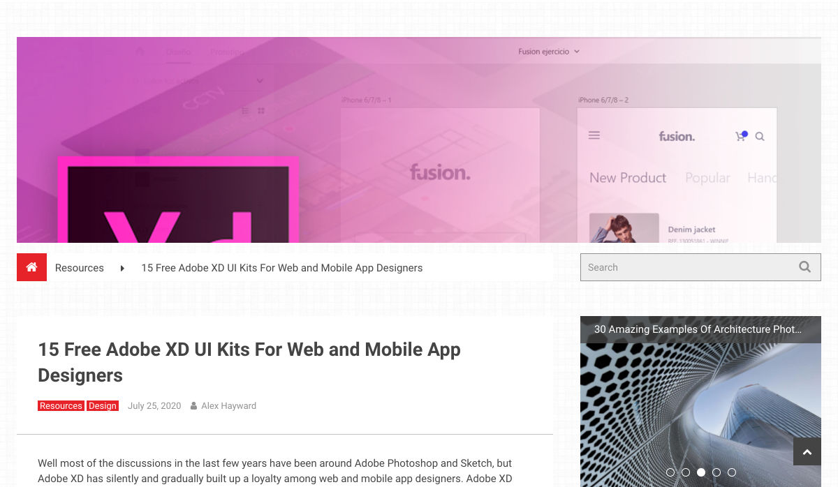
15 Free Adobe XD UI Kits for Web and Mobile App Designers


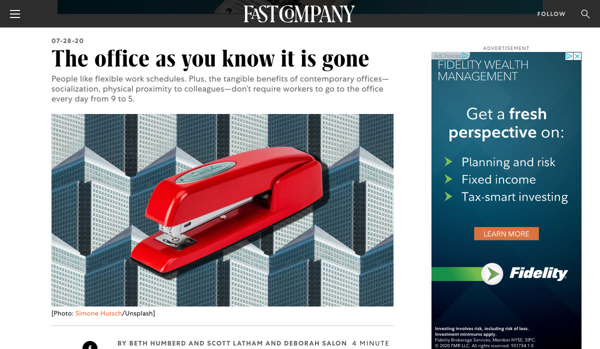
The Office as You Know it is Gone


How Interactive Content will Increase your Visitor’s Time on Page


What do Web Design Clients Need from Designers?


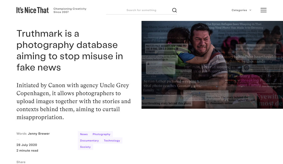
Truthmark is a Photography Database Aiming to Stop Misuse in Fake News


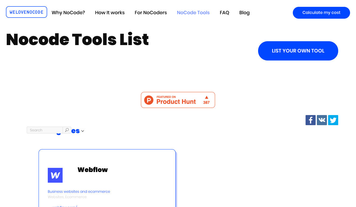
200+ NoCode Tool List by WeLoveNoCode


Designing for ‘Why?’


10 Tips Before You Buy a Domain Name


Making Memories to Last (August 2020 Wallpapers Edition)


Design Constraints are not Restraints – They Stoke Creativity


Want more? No problem! Keep track of top design news from around the web with Webdesigner News.

Source


Source de l’article sur Webdesignerdepot

As a web designer, you’re constantly being bombarded with messages that tell you to acquire new skills, try new tools, and keep on hustling.

But if you’re constantly changing things up, does it do the opposite of what you originally set out to do? In other words, if you always have to start over, is it possible to ever really achieve anything?

I think it ultimately depends on why you’re making the change.

When Change Is the Right Move for Web Designers

One of the reasons I despise New Year’s resolutions is because it’s change for the sake of change:

It’s a new year, so it’s time to get all hyped up about this one thing I need to change about myself!

There’s a reason why so many resolutions fail by February. When you force a change, it’s really hard to stay invested in it, especially if it’s something you’ve chosen to do because everyone else has.

Change should be driven by necessity.

That said, when it comes time to make changes as a web designer, is it ever really necessary? Or are you learning new skills, trying new tools, or switching up your client list simply because it’s what you believe you have to do?

It’s important to be open to change, but you should only invest your time, money, or effort when it’s the absolute right move for you. Here are some ways you’ll know when that’s the case:

Learn New Skills To…

…Round Out the Basics

If you’re a new designer and there are gaps in your education and training (and I don’t mean formally, just in general), then there’s no reason to hesitate in spending time to acquire those skills.

This doesn’t just go for basic skills as a web designer or as a coder. This also goes for skills you need to become a successful freelancer.

…Add Evergreen Skills to Future-Proof Your Position

As you move up in your career, you’ll eventually find other skills worth learning. Just make sure they’ll help you move the needle.

The best way to do that is to focus on acquiring evergreen skills that’ll always be useful to you, no matter what stage you’re at in your career or how the design landscape changes. They should also go beyond the average skill set of a designer, so they help you stand out further from the pack.

… Create a Better Situation for Yourself

The web is constantly evolving, which means that your responsibilities and skills as a web designer will have to change in order to adapt. Whenever one of these shake-ups occurs, you should either be ready to master the needed skill right away or, better yet, have been working on it beforehand.

Take, Google’s mobile-first indexing, for instance. It announced it was going to be making this shift years before website rankings were impacted. Designers had plenty of time to not only learn what was needed to design for the mobile-first web, but to get all their existing clients’ sites in shape for it.

Adopt New Tools When…

…Your Existing Ones Are Slowing You Down

If you’re doing a lot of things from-scratch (like writing emails to clients or creating contracts), that’s a good sign your toolbox needs some improvement.

As a web designer, you should be focused on creating, not on the tedious details involved in running a business or communicating with clients. That’s just not a good use of your time. A lot of this stuff can easily be automated with tools and templates.

…You’re Turning Down Business

In some cases, it’s the right thing to say “no” to prospective clients — like when they’re a bad fit or can’t afford your rates. However, there are other times when you desperately want to be able to say “yes”, but you don’t have the capacity for the job or you’re unable to cover the full scope of what they need.

This is where new tools come in handy. For instance, let’s say you’ve been approached by a ecommerce company that not only wants you to build a new store, but also needs it fully optimized for search (it’s not the first time this has happened either). Rather than turn something like that down, you may find that the addition of an SEO tool to your toolbox is all you need to be able to say “yes”.

…You Have Extra Room in Your Budget

Obviously, you don’t want to throw away money on a bunch of tools simply because a ton of people are talking about them. But you’ll eventually get to a point where the tools that served you well in the first year of business need to be replaced.

If you get to a point where you have extra time to experiment and there’s room in your budget for upgraded tools, go ahead and assess what you currently have and test out replacement solutions that will help you work better, faster, and smarter.

Look for New Business Opportunities If…

…You’re Not Doing Well

“Well” here is subjective. For instance:

  • If you’re not doing well financially, you probably need to look for more clients;
  • If you’re not doing well in terms of how you get along with clients, you should explore a niche that’s a better fit;
  • If you’re not happy with your job because burnout and stress have overtaken your life, then you might consider exploring other avenues of work.

When something has been amiss for awhile, the last thing you should do is lean into it and hope it gets better.

…The Web is Changing

Notice a trend here? Each of these changes (skills, tools, and now business opportunities) is often driven by the fact that the web is always changing. And as the web changes, you have to be ready to evolve.

In terms of business opportunities, what you’ll realistically need to do is look for new kinds of design work as technologies make your job obsolete. Take website builders like Wix or Shopify, for example. As business owners and entrepreneurs take it upon themselves to build their own websites, more and more web designers will need to find other kinds of clients and jobs to take on.

…You Want to Diversify Your Income

This is something many web designers are doing already as they’ve discovered how beneficial it is to have predictable recurring revenue streams.

But even if you’ve already found one way to diversify and stabilize your income (like by offering website maintenance services), you may become interested in exploring other opportunities along the way. If you have the capacity to pursue them, then go for it.

Is Change a Good Idea?

As you can see, change can be a very good thing for a web designer, their business, and their clients. However, there should be a very good reason for the change and you need to prepare yourself for how it’s going to impact what you’re doing now before implementing it. No amount of change can happen without some level of sacrifice.


Featured image via Unsplash.

Source


Source de l’article sur Webdesignerdepot

Dans des moments comme celui-ci, la raison d’être n’est pas seulement un mot, c’est une responsabilité. Chez SAP, nous tirons parti de nos ressources et de notre réseau pour des solutions pragmatiques et innovantes, sur la base de valeurs et d’un objectif communs, mais nous vivons également notre raison d’être à travers nos propres actions pour aider le monde à mieux fonctionner et améliorer la vie des gens.


Les employés et les équipes de l’entreprise se sont engagés de manière utile pour répondre à la crise actuelle et montrer que l’objectif est de vivre au-delà des revenus et des bénéfices. En mettant l’accent sur la santé, le bien-être, la main-d’œuvre qualifiée et la promotion de l’entrepreneuriat social et inclusif, notre raison d’être ne répond pas seulement aux objectifs de développement durable des Nations Unies (ODD des Nations Unies), mais permet également de prendre soin des personnes dont nous nous soucions le plus.
Les employés de SAP dans les pays nordiques et au Royaume-Uni ont développé diverses idées sur la manière de se soutenir mutuellement pendant la pandémie – en tant que collègues, clients, partenaires ou bénévoles pour les personnes dans le besoin. Que ce soit pour un usage interne, local ou international, leur aide ainsi que leur créativité n’ont pas connu de frontières.
Poussé par l’envie de renforcer sa communauté locale Ottershaw, l’employé de SAP Mark French a puisé dans son expérience et son savoir-faire technique et a créé un site Web qui relie les personnes dans le besoin avec des voisins et des bénévoles. Grâce à www.ottershawsupport.com , chaque résident peut s’inscrire facilement pour obtenir de l’aide ou en donner, en recueillant des ordonnances, en faisant les achats essentiels ou en fournissant une assistance et des informations par téléphone.
Un autre exemple de dévouement sans limite a été la mise en place par un autre collègue de SAP qui a soutenu l’idée de son ami de longue date et artiste graffeur Keith Hopewell ( SP: zéro ). SP:zero voulait créer une pièce de collaboration sous forme d’illustrations avec des artistes du monde entier, démontrant la croissance du virus sous son titre « Spread art, not the ‘Rrona ». Ils se sont vite rendu compte que cette collaboration pouvait également apporter une aide financière.
«J’ai eu l’idée de vendre les tirages et de les donner aux hôpitaux britanniques qui nous soutiennent», explique Jago Livingstone. Sous le nom de «No Toys Allowed», il a conçu une boutique en ligne pour faciliter l’accès à leurs dons de charité. Les résultats ont été étonnants : de plus en plus d’artistes se sont impliqués, avec un pic à 163 artistes dans 21 pays sur tous les continents.
Les employés de SAP dans les pays nordiques et baltes ont utilisé leur créativité pour promouvoir la santé, le bien-être et l’inséparabilité, malgré la distance sociale. Vingt-deux collègues SAP d’une équipe de prévente ont livré une vidéo thématique en tant que contribution du Nordic Customer Solution Advisory à un événement à venir sur le thème «We Rise Up». La vidéo révèle une histoire personnelle sur la façon dont ils gèrent la situation actuelle et sur la façon dont chaque individu « se relève » ensemble pour ses collègues, clients et partenaires.
«Parce que c’est ce que nous faisons en ces temps difficiles, c’est dans notre ADN», dit Gitte Winther Bruhn, résumant l’essence de leur idée et montrant une fois de plus que chacun peut agir pour le bien commun, même avec les actions les plus simples.

Article posté pour la première fois en anglais sur news.sap.com

The post Les employés SAP face à la crise du Covid19 appeared first on SAP France News.

Source de l’article sur sap.com

I think of a creative practice as a combination of an approach (a design philosophy) and a series of techniques (craft skills); a good tool facilitates a technique, which in turn supports an approach.

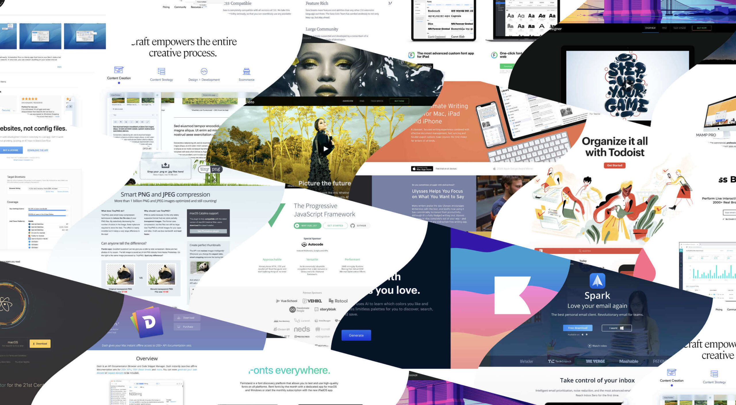
It wasn’t until I sat down to write a list of tools I can’t design without, that I realized just how many tools I rely on as an integral part of my creative process. The danger of tools is that they promote certain techniques, and that bias can alter your approach.

First and foremost a good tool does no harm, it does not dictate, or obstruct your approach. Secondly, a good tool offers flexibility in the techniques you choose. Thirdly a good tool is invisible, it leaves no marks on the end product.

If I’d written this post a year ago the list would have been different, and I hope that in a year it will be different again. These are the tools that I currently find enabling, that have contributed to my craft, and supported my approach.

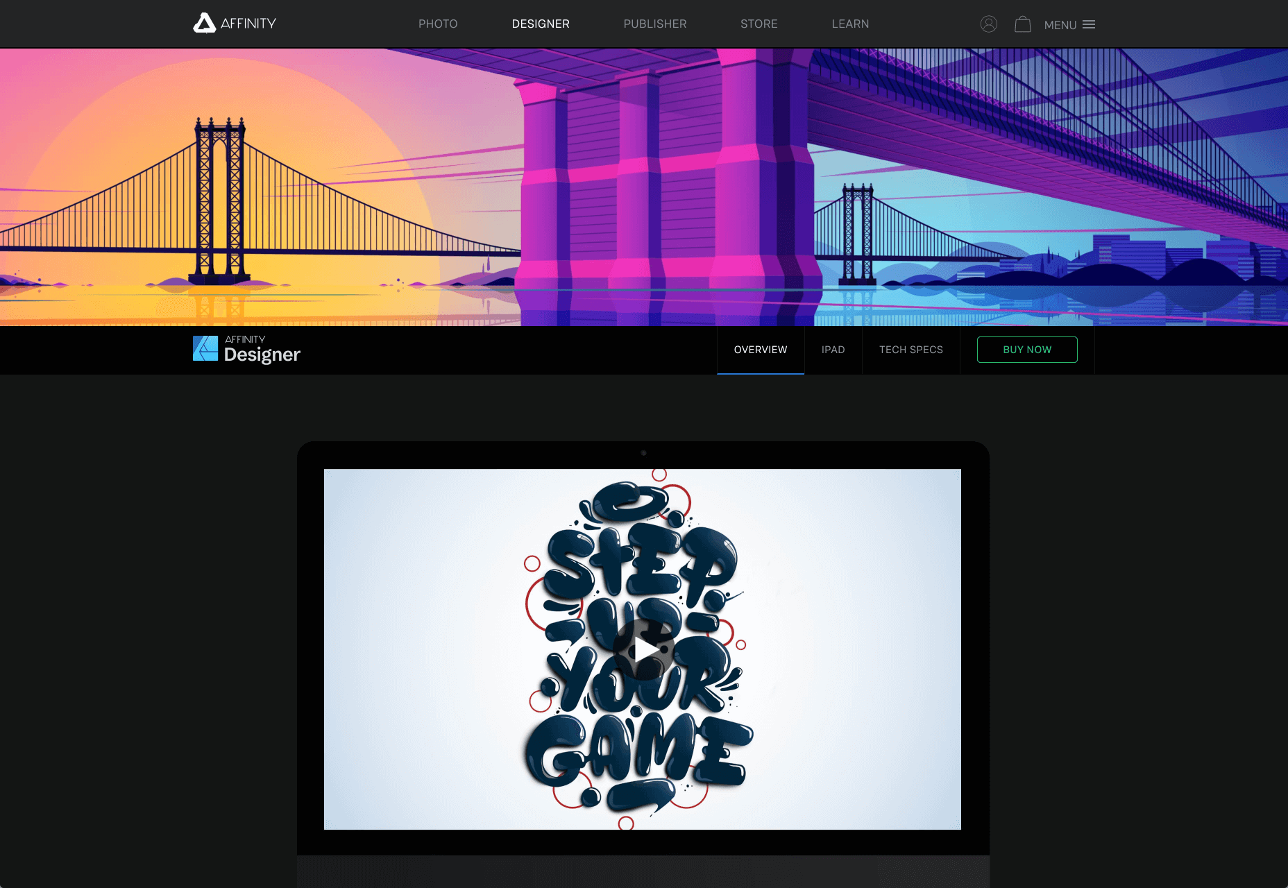
Affinity Designer

I’ve always used Adobe products. Photoshop and Illustrator were the de facto graphic tools for half my life. I’ve never had an issue with the subscription licensing of Creative Cloud, which I think is proportionate for a professional set of tools. Then, around 18 months ago I got very frustrated with how sluggish Illustrator had become.

I’d written an early review of Affinity Designer, I’d been impressed at the time, so I decided to give it another try expecting the sojourn to last an hour or two before I gravitated back to Illustrator. Running the latest version of Affinity Designer was a revelation, I’ve simply never wanted to switch back.

Why not Sketch? Well, I do occasionally jump into Sketch, especially for pure vector wireframing. I was an early adopter of Sketch, but the reliability issues (long since resolved) poisoned my relationship with it. Why not Figma? Well, Figma’s real strength is in collaboration, something that I get with Sketch, and personally I find some of Figma’s features unintuitive.

Affinity Designer isn‘t perfect. I dislike the color tools, especially the gradient tool, which I find clunky. But it’s the first design app I’ve used in years that syncs closely with my creative process.
Affinity Photo

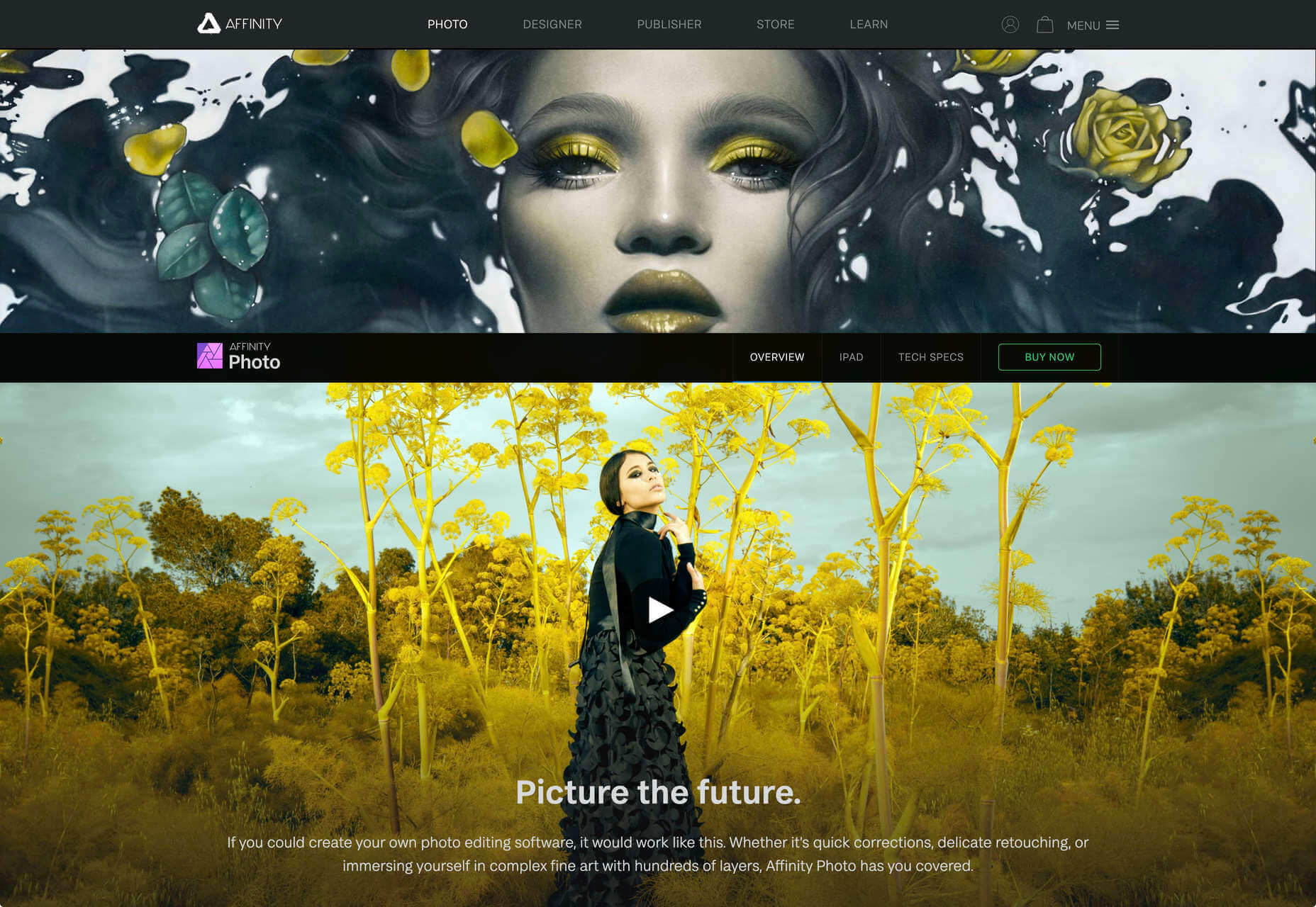
I don’t do a lot of photo manipulation, so when I switched away from Creative Cloud for design work, I was relaxed about switching from Photoshop to Affinity Photo.

In my experience, Affinity Photo is stronger than Photoshop in some areas, and weaker in others. Affinity Photo’s bitmap scaling is much better than Photoshop’s, largely due to Lanczos 3 sampling.

Affinity Photo also solves a lot of little irritations that Adobe has chosen not to address for legacy or philosophical reasons, such as the toggleable ratio setting when resizing the canvas — I’ve lost track of the hours I’ve spent in Photoshop manually calculating vertical whitespace so that it’s proportionate to the horizontal.
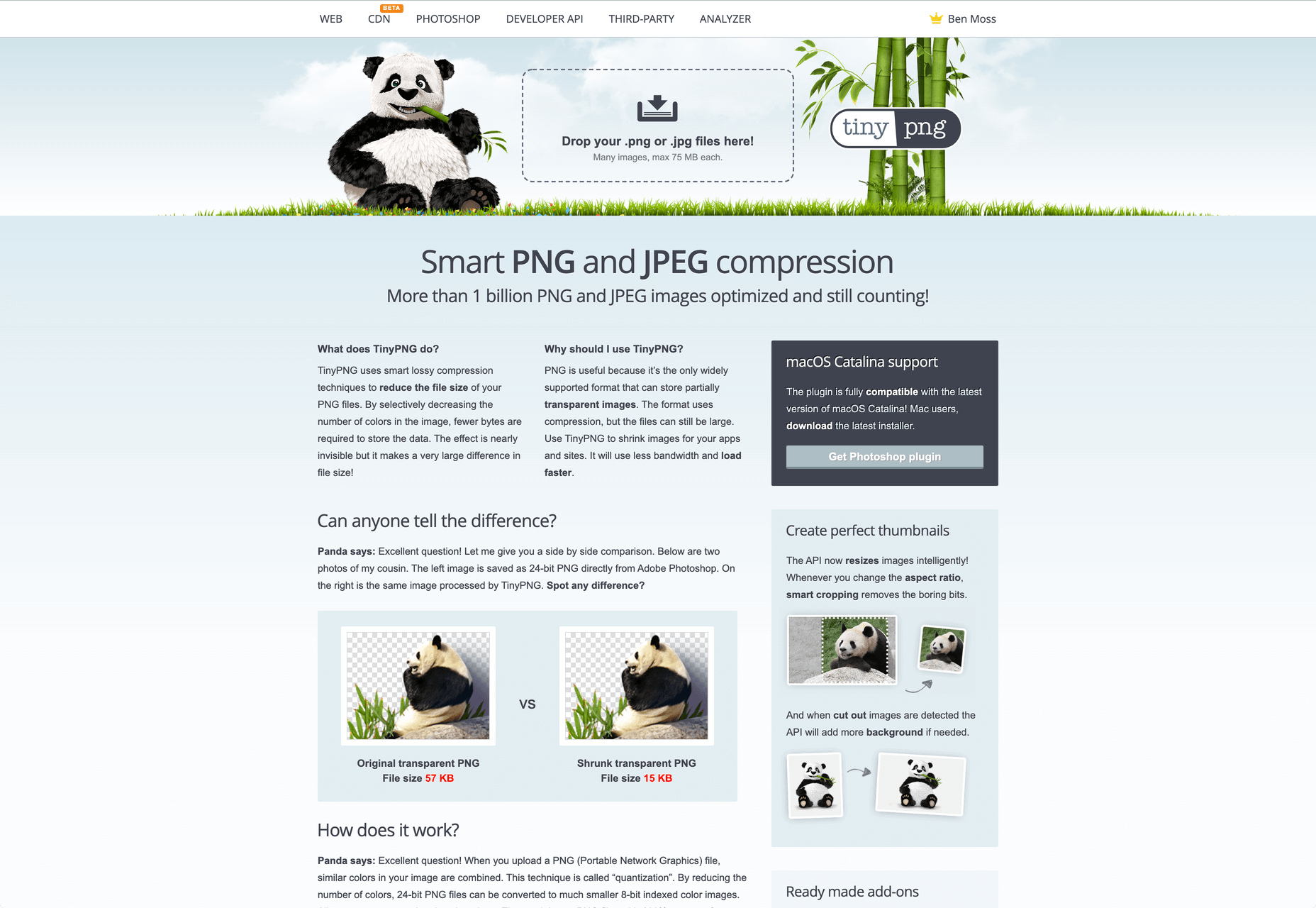
TinyPng

Both Affinity Photo and Photoshop are poor at web format optimizations. Photoshop perhaps has the edge, but its output certainly isn’t acceptable for production.

I run bitmaps through TinyPng, which on average halves the size of the file without any appreciable loss of quality. (It stripped 66% off the images for this post.)
Fontstand

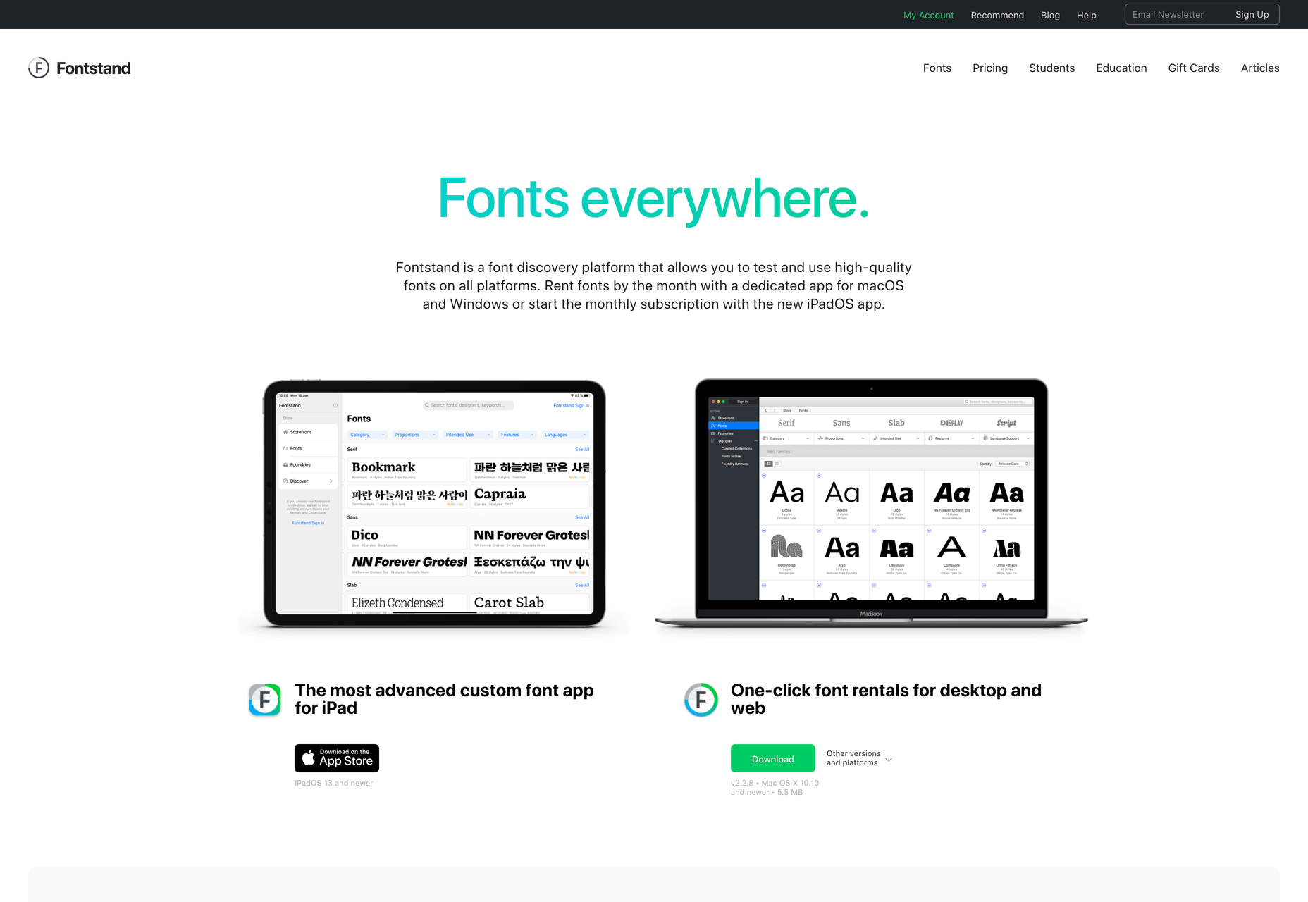
When I started to drift away from Creative Cloud, the one service that delayed me was Adobe Fonts (née Typekit). Not so much for the webfonts — which are faster and more reliable self-hosted — but for the ability to sync desktop fonts into my design apps.

I tried Fontstand when it was first released, and I loved the concept, but was worried about the small library. When I took a second look and discovered the library is now substantial for both workhorses and experimental typefaces, it was an easy decision to switch.

Fontstand is a desktop font rental service. Once you’ve found a typeface you’re interested in, you can activate an hour-long trial, then choose to rent the font for a small fee. You can auto-renew the rental if you need to, and if you rent the font for 12 months it’s yours forever.

If there’s one tool on this list I genuinely could not design without it’s this one. Fontstand makes working with fonts from independent foundries affordable for freelancers, and it’s enriched the typographic palette available to me.
Khroma

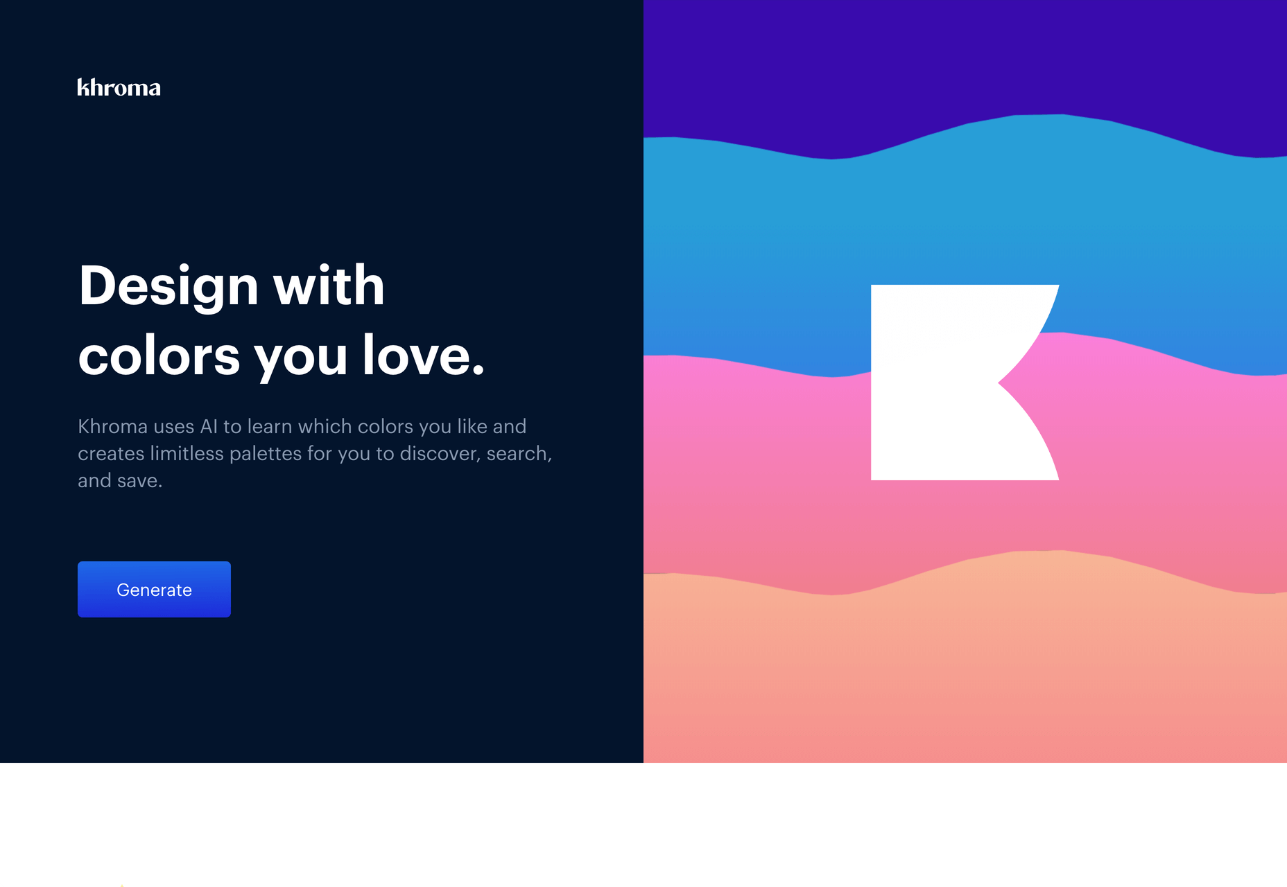
Every designer has strengths and weaknesses. Since day one of art school, my weakness has been color. It just doesn’t come naturally to me, and I have to work quite hard at it.

An incredibly helpful tool that I’ve been using for a few months is Khroma. It helps my eyes warm up before approaching color, and helps me find a starting point that I can then refine. Comparing my design work before, and after Khroma, the latter color choices are cleaner, more vibrant, and more interesting.
Atom

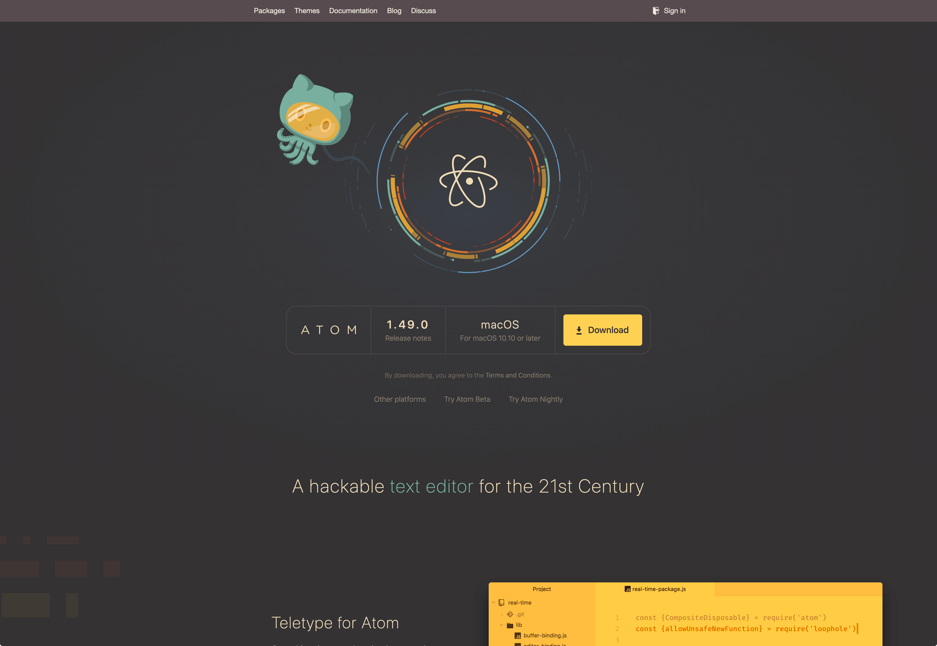
A good code editor is essential, and I’ve never found one that I’m completely happy with. For years I’ve flitted back and forth between Brackets, Sublime Text, and BBEdit. I think that probably reflects the changes in the type of coding I’m doing.

For now, I’ve settled on Atom. It’s fast, reliable, and it’s not biased to front or back-end code.
CodeKit

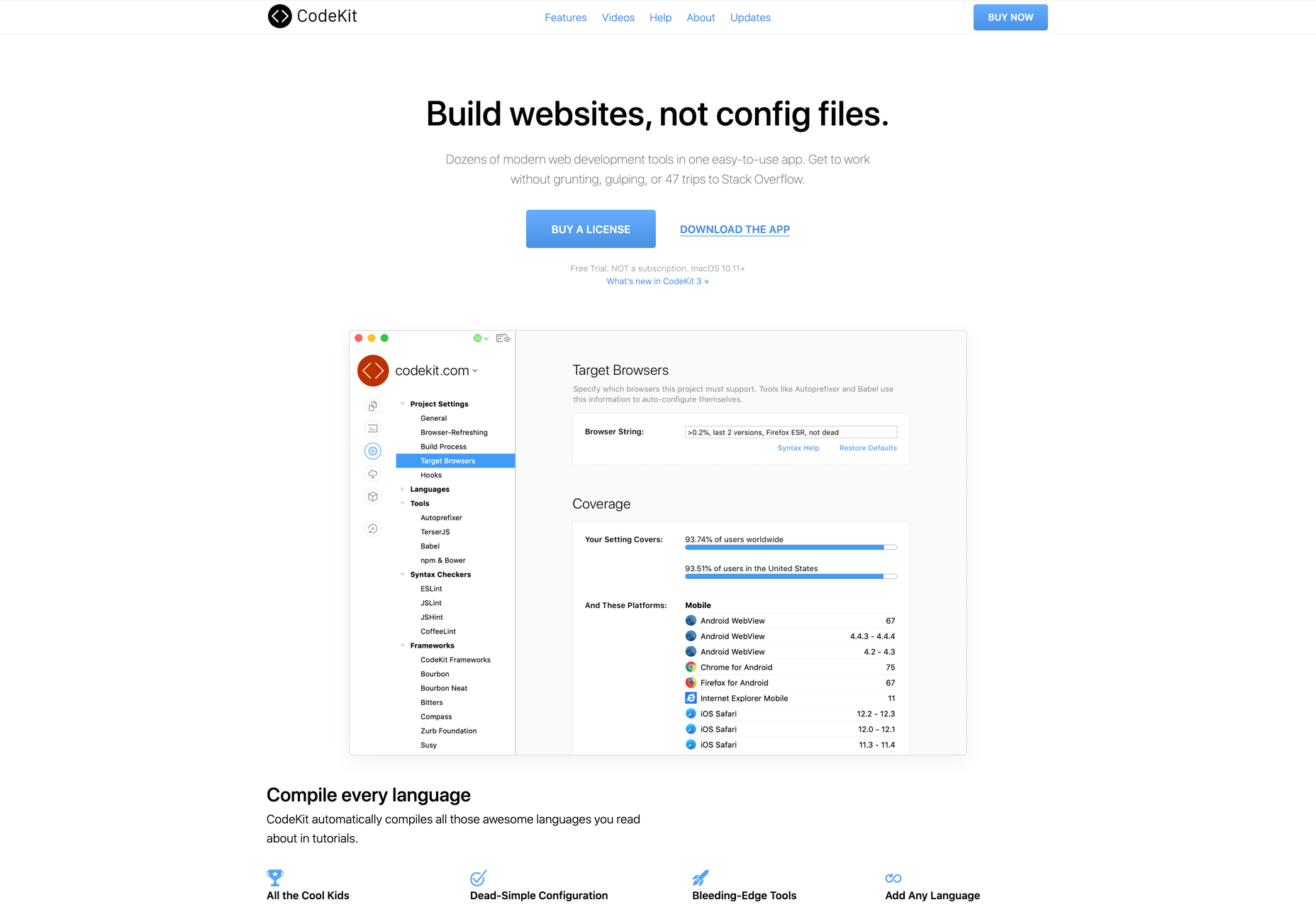
I held out on compilers longer than I should have, using apps like Minify to minify CSS and JavaScript, and the command line to process Sass (see below). Then I found CodeKit and it’s been essential to my workflow ever since.

What I like best about CodeKit is that it’s a GUI. Which means I can change settings while coding, like toggling off the JavaScript linting, without switching mental gears into another language.
MAMP

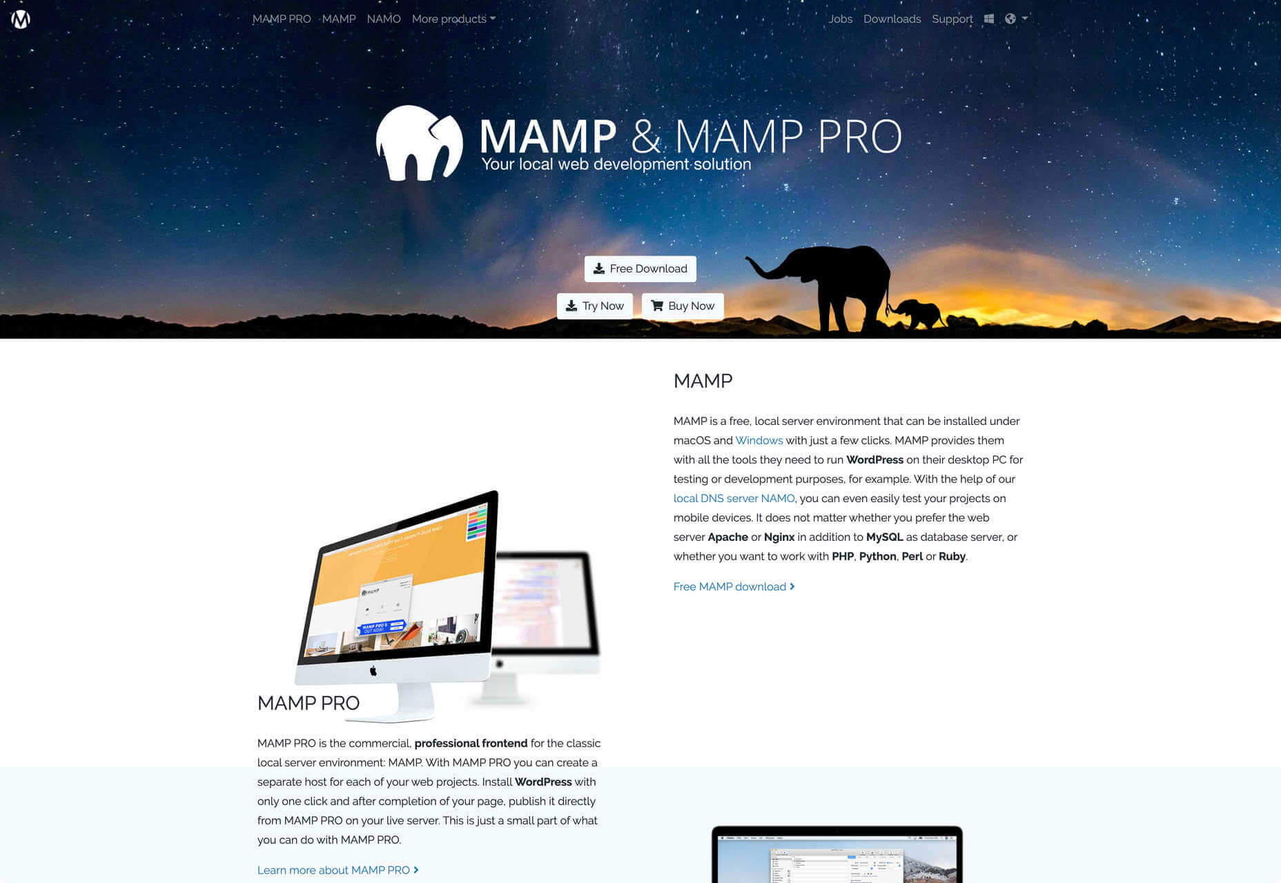
MAMP is a tool that allows you to run a local server environment, meaning I can run PHP and MySQL without the tedious process of FTPing to a server to test a change. Mac comes with Apache, so this isn’t strictly necessary, but it’s simple to use and works well with both CodeKit and Craft (see below).

There’s a pro version of MAMP, which allows you to switch seamlessly between projects, but it’s heavily geared towards WordPress. I’m still trying to find the time to evaluate Laravel Valet.
Dash

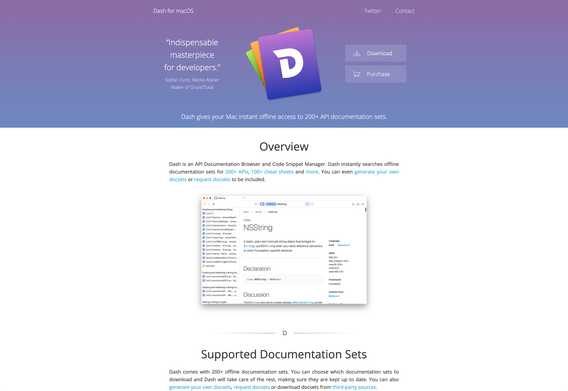
When you first start coding you try and memorize the entire language. It’s very possible to become fluent in the core of a language, but there are always nuances, defaults, and gotchas that you miss. As you grow more experienced, you realize that all professional coders Google the answer at least once per day.

When I got tired of Googling I started using Dash which is a superb app that combines the docs of numerous different languages into a searchable window. I use it daily for everything from SVG to Twig.
LambdaTest

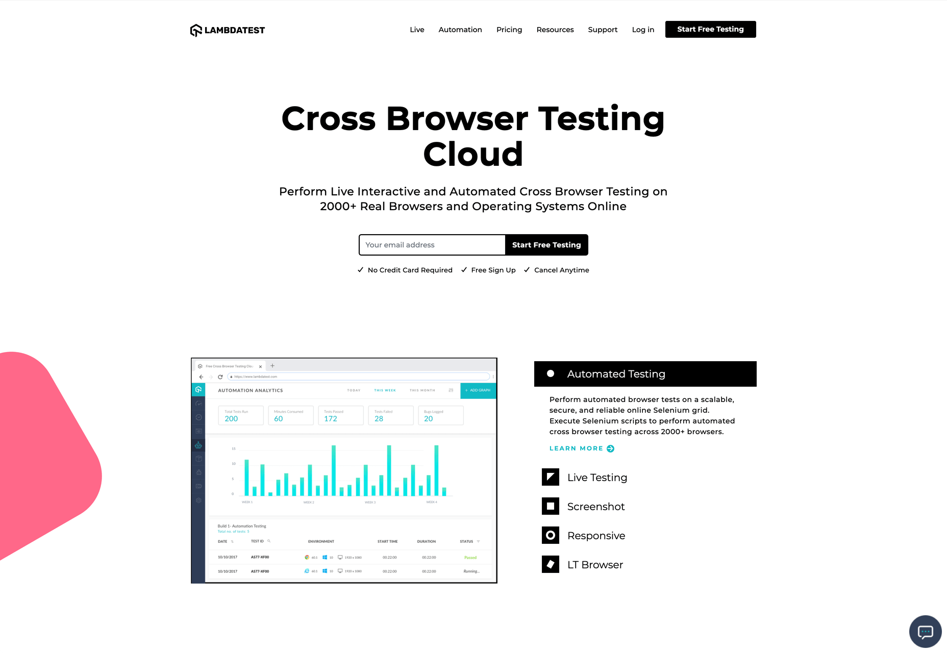
It doesn’t really matter what you’re building, even the indy-web needs to be tested. Ideally you’ll test on real devices, but if you can’t afford a device library — and who but the largest agencies can — you need a live testing solution.

There are a few upstarts, but your choice is basically between BrowserStack and LambdaTest. I went for LambdaTest because I prefer the style of the UI, but that’s entirely subjective. If you’re not sure, toss a coin, you’ll get the same results with both.
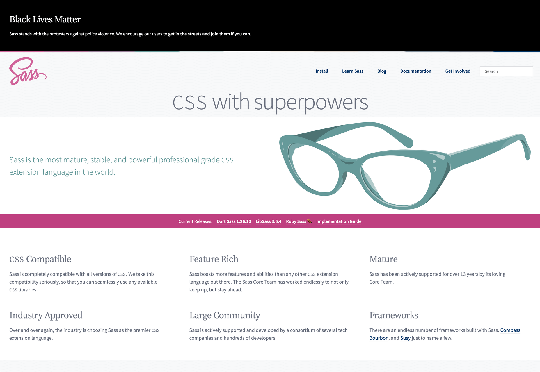
Sass

I can’t write CSS without Sass — and I mean that literally. If I try and write vanilla CSS I guarantee I’ll nest something with @at-root and it will throw an error.
Craft CMS

Stating any preference for a CMS online that is not WordPress inevitably invites impassioned protests from developers whose career is built on the WordPress platform. So let me say preface this by saying: if WordPress works for you, and more importantly for your clients, then more power to you; I think it’s a dog.

Shopping around for a CMS is challenging, and I’ve gone through the process several times. A good CMS needs to be in sync with your mindset, and it needs to be appropriate for your clients — all of them, because unless you’re in a large agency with multiple coders, you need to commit to a single solution in order to master it.

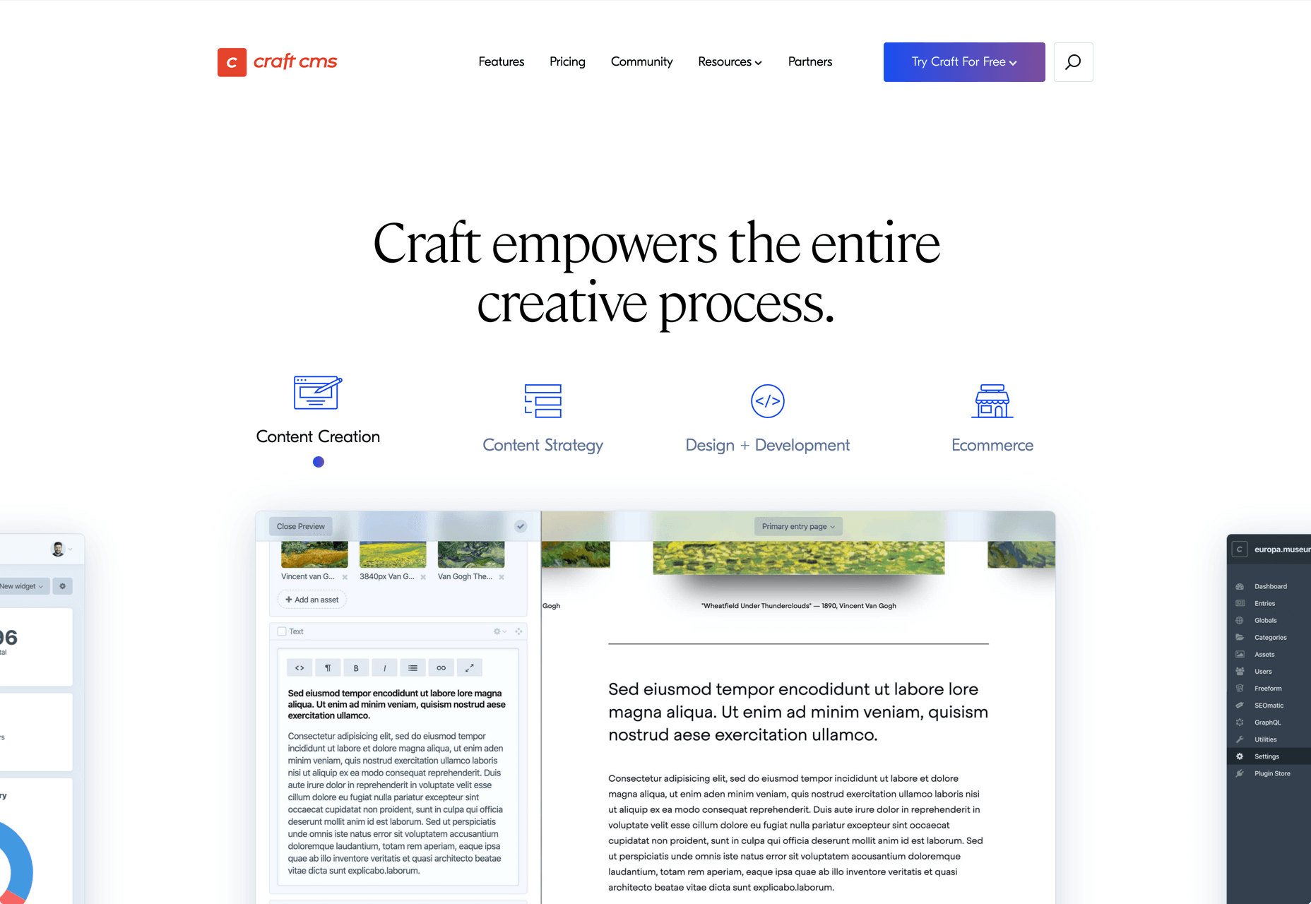
I have looked and looked, and finally settled on Craft CMS. Craft makes it easy to build and maintain complex, high-performance sites. It has a shallow learning curve that grows exponentially steeper, making it easy to get started with plenty of room to grow.
Vue.js

Way back when Flash went kaput I switched to jQuery, and that was a really easy route into JavaScript — ignore the people who tell you to master the core language first, do whatever it takes to start using a language, that’s how you learn. But jQuery is heavy, and I found I needed it less and less.

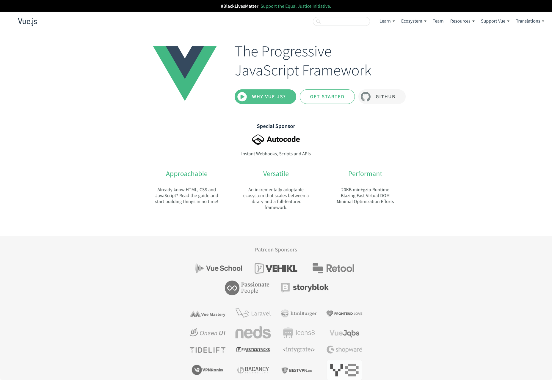
These days 90% of the JavaScript I write is progressive enhancements in vanilla JavaScript to keep the dependencies low. Occasionally I encounter a job that requires complex state management, and then I fall back on Vue.js. JavaScript developers are as partisan as CMS aficionados, so let’s just say I favor Vue.js because it’s not controlled by a mega-corp and leave it at that.
Ulysses

As editor at WDD, I cannot emphasize enough that the right way to write copy for the web is markdown.

Markdown is faster to write so you don’t lose the thread of your thought process, and it doesn’t impose formatting so you can easily migrate to a CMS. If you’ve ever spent 20 minutes stripping the class, id, and style tags out of a file created in Word, Pages, or (by far the worst offender) Google Docs, then you don’t need to be sold on this point.

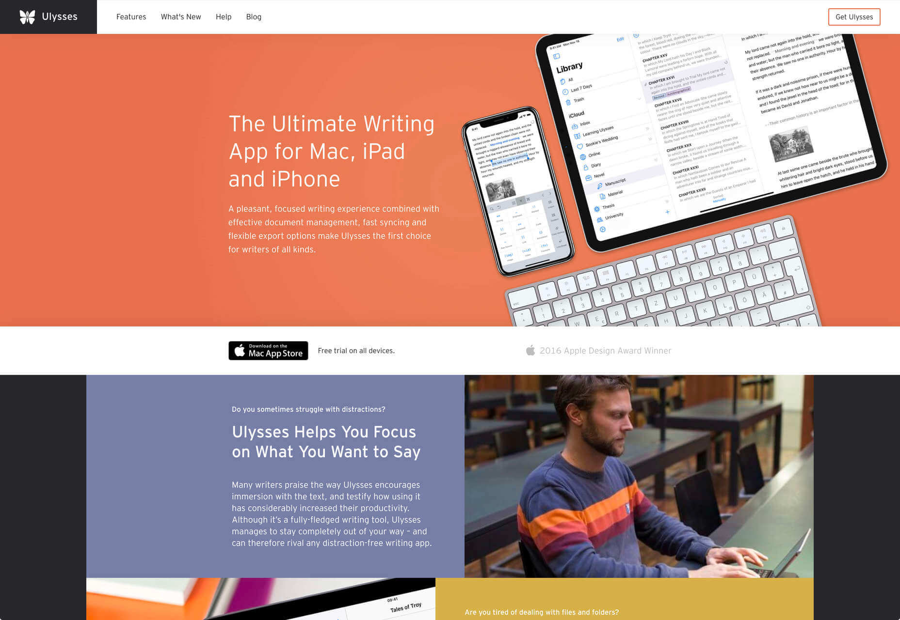
There are a few markdown-based writing apps available, I tested half a dozen, and the one I settled on was Ulysses. I like its distraction-free mode, I love its clean exports. Everything I write, I write in Ulysses.
Screenshot Plus

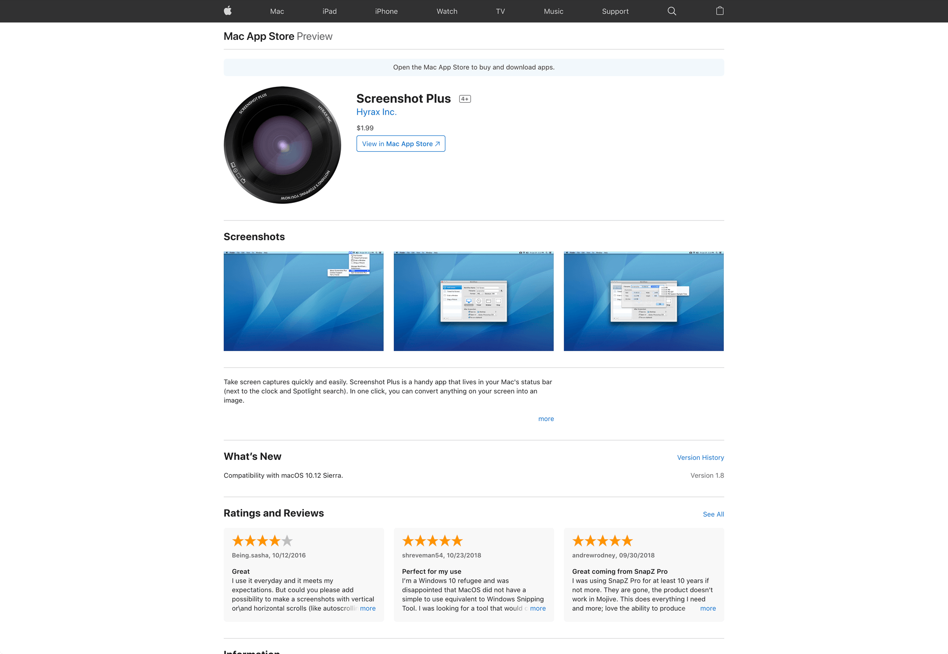
Much like markdown editors, there’s no shortage of screenshot apps. My current favorite is Screenshot Plus.

Screenshot Plus has one feature that makes it standout for me, and that is its Workflows. It sounds like a small problem, but when you’re taking screenshots of a dozen sites, the extra clicks to save, switch to your editor, and open the file are laborious. I have several workflows setup in Screenshot Plus that allow me to take a screenshot, save it to a specified folder on my local machine, and then open it in Affinity Photo, all with a single click.
Spark

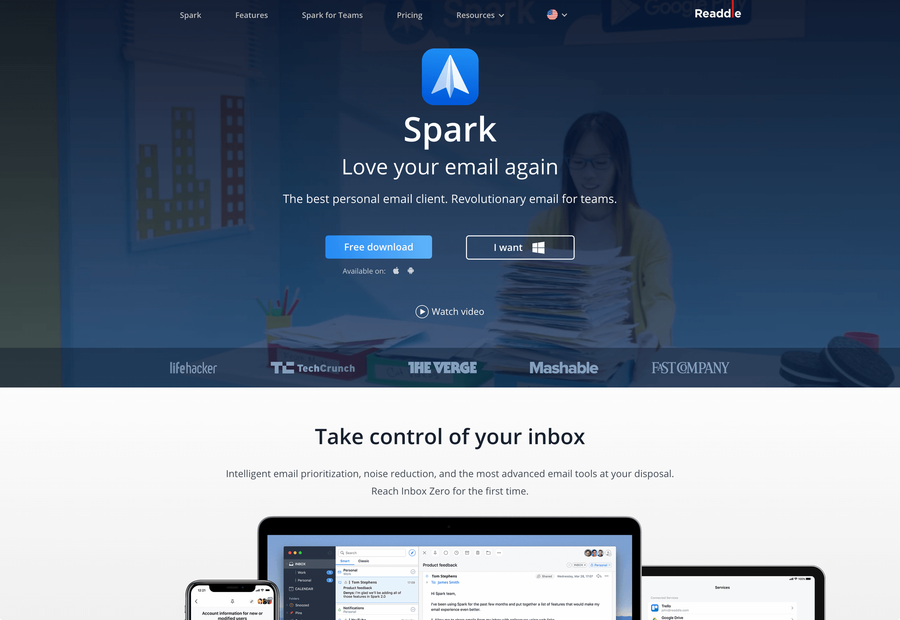
I get a lot of email, a lot. At one point the influx was so bad I was using multiple email apps to segment it. Yes, I use Slack daily, but it doesn’t eliminate the need for email.

I‘ve been using Spark for around six months and it’s radically sped up my workflow. I’m a big fan of the smart inbox that allows me to compartmentalize email like newsletters, and email that warrants a reply. I like that I can switch to a chronological list if I’m looking for something specific. I love the ability to pin, or snooze messages, which helps me triage my inbox.
Todoist

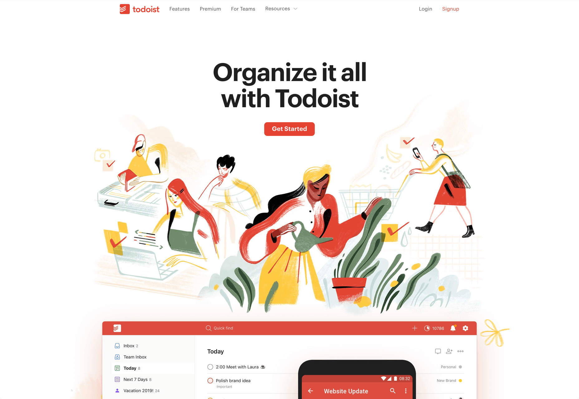
I’m one of those people who can’t make it through the day without being organized. I need lists and sublists, and I need something native that opens automatically when I boot my Mac, and something that sits on the home screen of my Android.

There are as many to-do apps as there are things to do. When I’m working in a team I’ll use whichever task-tracking system it prefers. But by choice I always use Todoist thanks to its balance of simplicity and power. At this point it’s something of a meta-tool, and the app I open first every morning.
Source


Source de l’article sur Webdesignerdepot