 If you are feeling like me right now, you have mixed emotions about the world in general. And this is translating into a pretty distinct design trend that’s happening almost across the board: Websites aren’t using many images of people right now.
There are just too many questions about what is appropriate (mask, no mask? groups?), so the default answer seems to be using more “artless” options focusing on typography, graphical elements, and small animations.
Here’s what’s trending in design this month.…
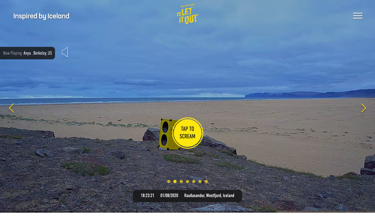
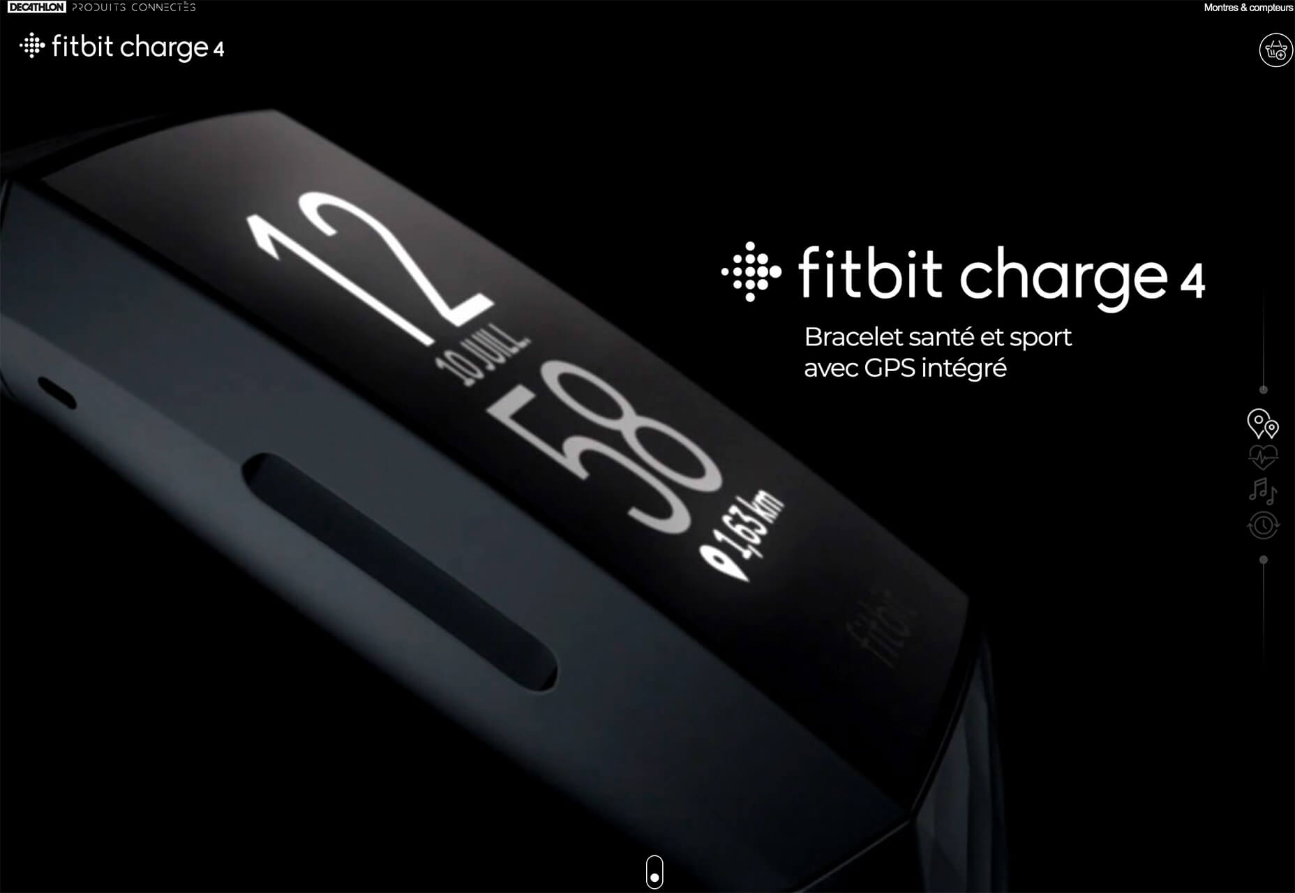
1. No Photos Above the Scroll
As the world works to pull itself out of the pandemic, designers struggle with post-pandemic design elements, mainly photography.
Many brands and companies started to refresh their libraries with new imagery that included smaller groups and masked people. Now some parts of the world are pushing to reopen, making some of these images seem immediately dated.
What is a designer to do? First, you have to weigh keeping a fresh-looking design with a world that’s changing quickly right now.
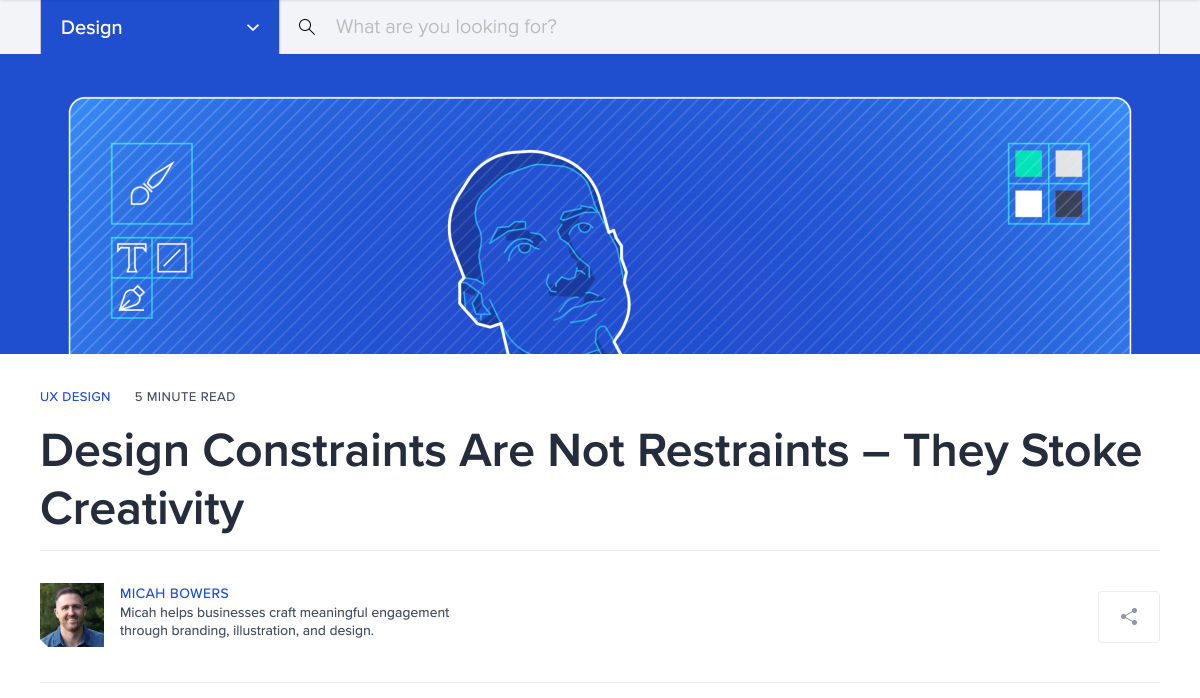
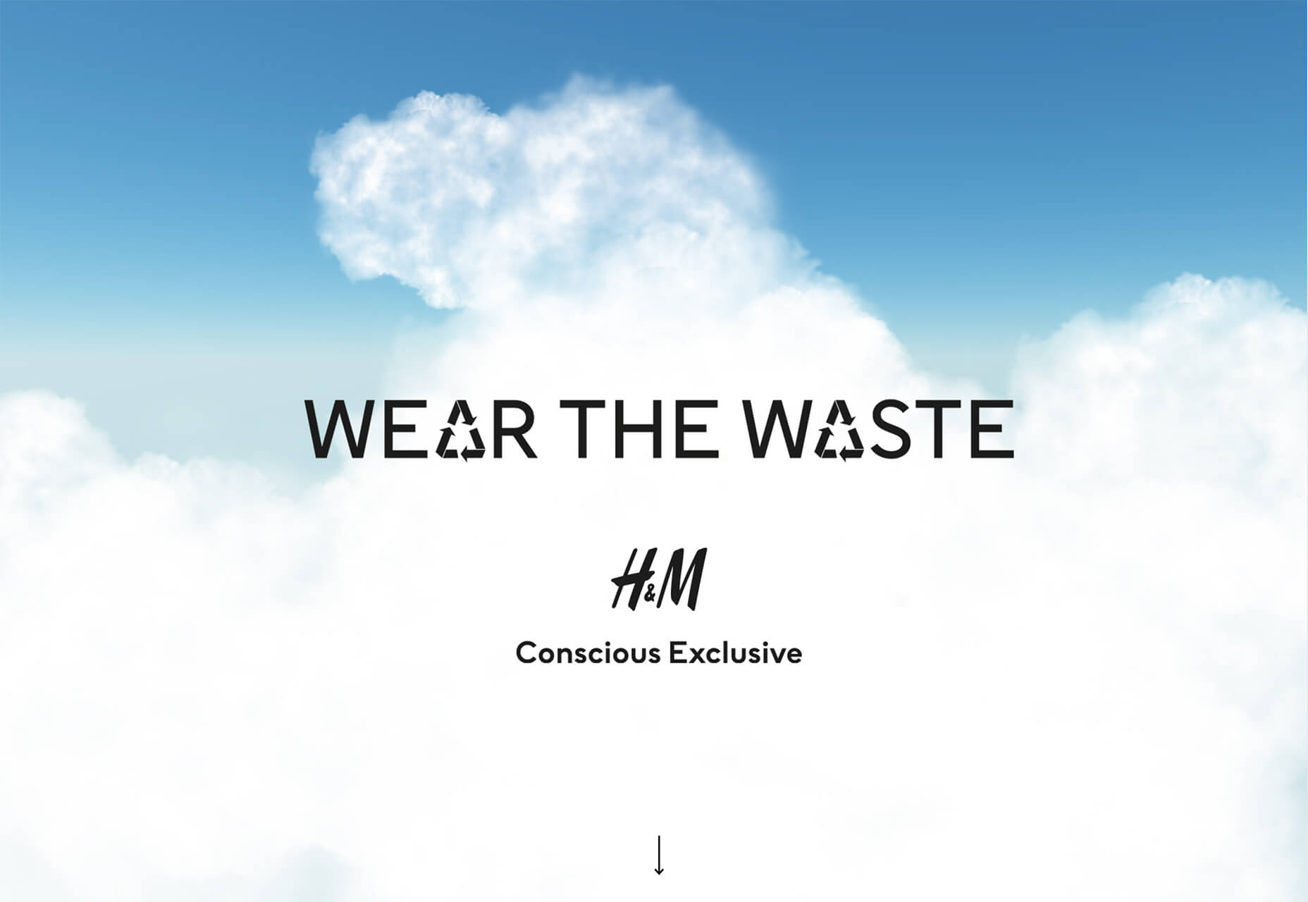
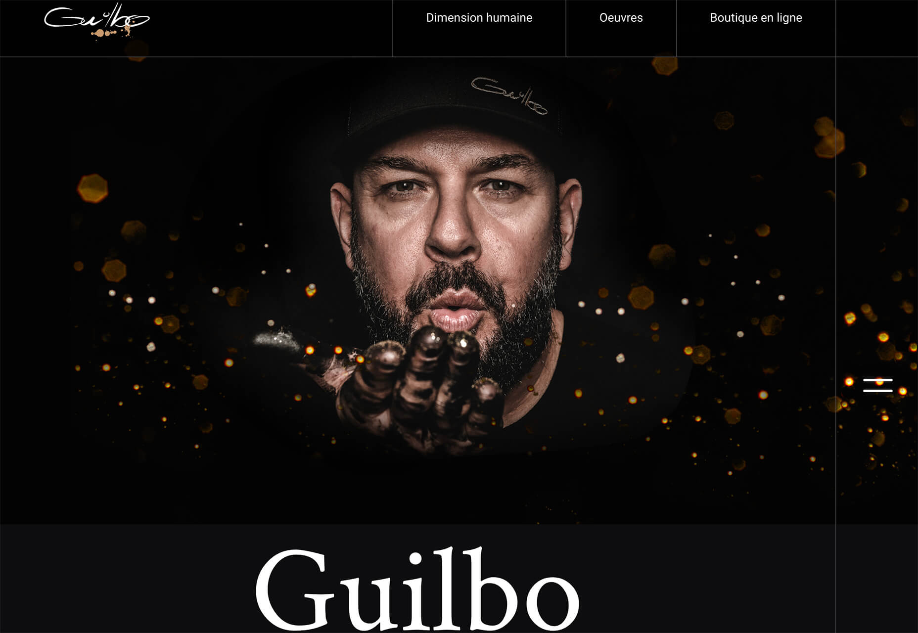
That’s likely the big reason why so many website designs are launching without photos above the scroll. Instead, the hero areas are dominated by oversized typography, graphical elements, and small animations to grab attention.
There aren’t many images that contain people or real-life scenes.
This middle ground allows designers to create something interesting within some pretty distinct constraints while preventing a design from looking dated if local pandemic health guidelines change. (It’s a fine line to walk that may continue for some time to come.)
Each of these three sites does it differently, but with similar themes.
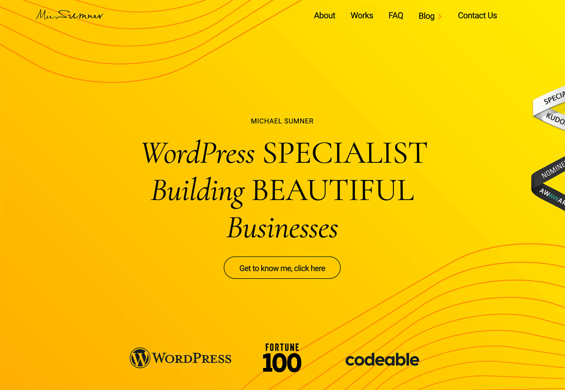
Michael Sumner uses bright color and subtle text animations to keep you look at the design. Clean lines and flowing graphical elements almost seem to counter the in-your-face color choice.
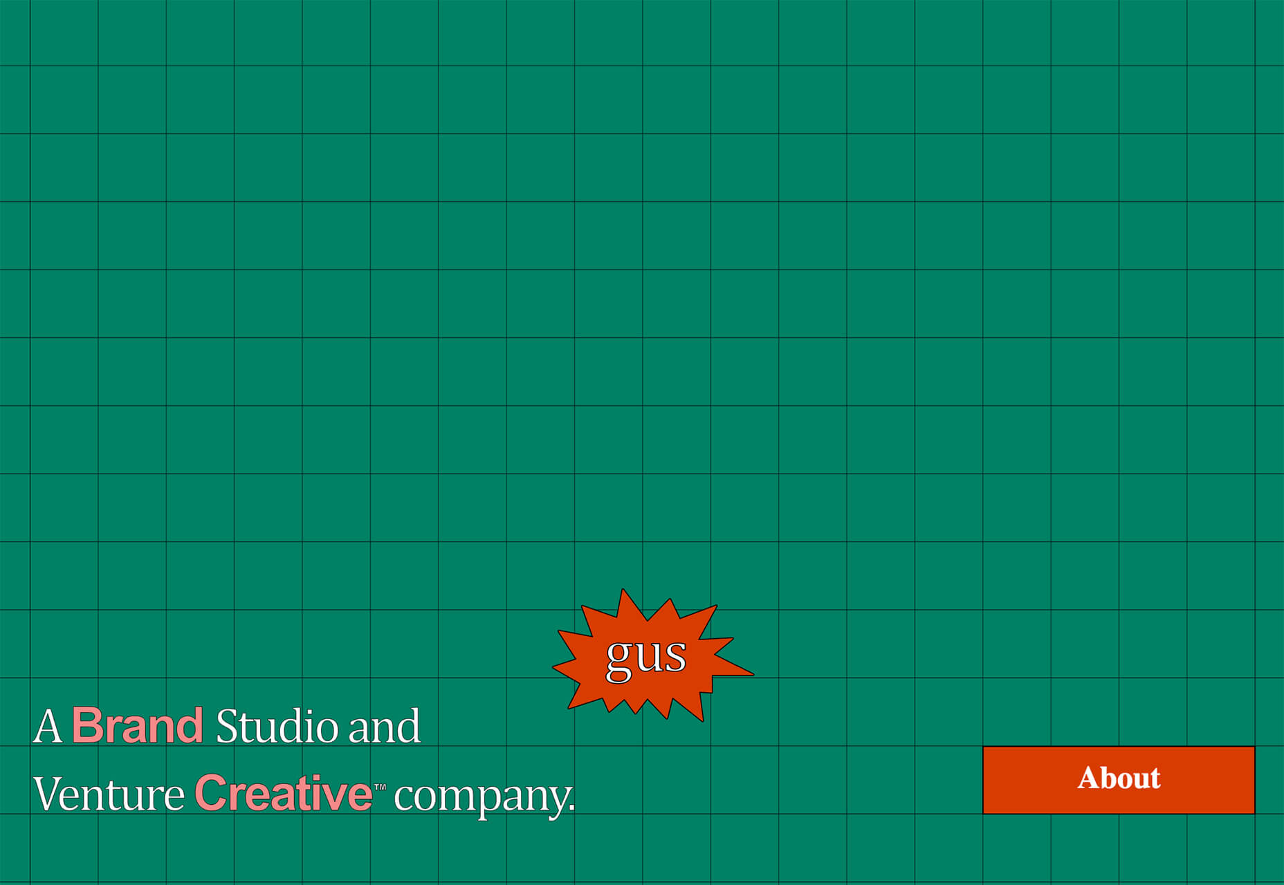
Gus uses a grid background – also with a nontraditional color palette – to draw attention. You keep looking at the design thanks to the animated “gus” on the screen. This small element is just enough to help users click deeper into the design.
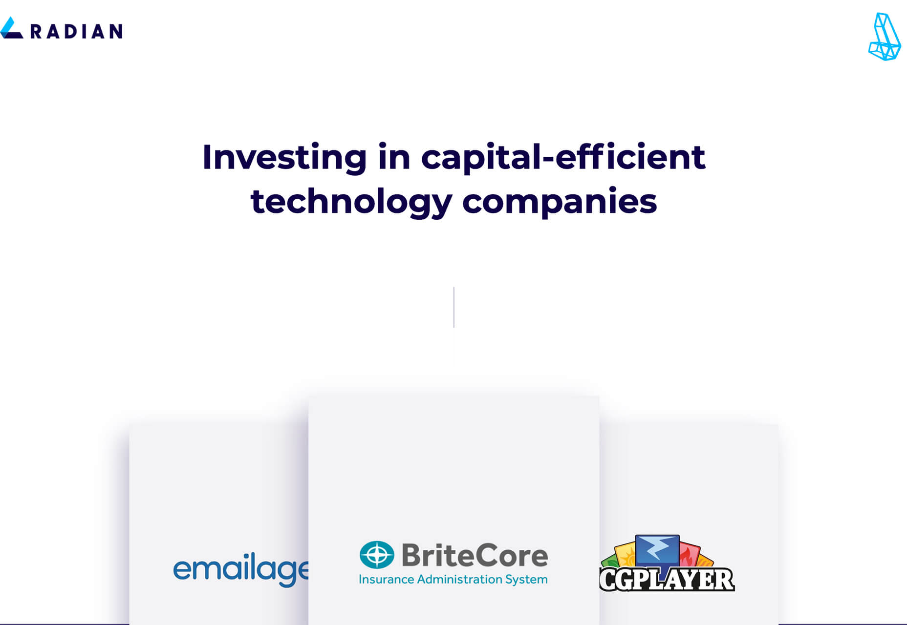
Radian takes a different approach while also embracing the no photos design trend. With a lot of white space and clean fonts, the design uses simple scrolling logo boxes to help tell the company’s story.
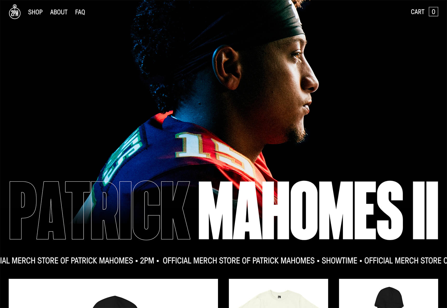
2. Left Align Headline Dominates the Hero
This website design trend is a twofer of sorts: There are no photos above the scroll, and the main headlines are aligned left with dominance in the header area.
A left-aligned stack headline can be a striking and dominant element. It can have even more impact with the right words in the headline that entice and engage users to learn more. (If you use this design trend, it is imperative to spend time on the words to ensure that the design says something meaningful.)
Here’s where it gets tricky. To push the eye across the screen, you want the stacked headline not to extend all the way across. Most of the designs using this trend are going half to two-thirds across the screen.
Then the text size needs to be large enough so that the words don’t break awkwardly. (Sizing depends on how many words and letters you have to deal with.)
Finally, you want to stack lines of text to fall nicely into the main, first scroll of the design. If the headline sits too low, it might be distracting. The same is true of a headline that’s too close to the navigation or breaks funny on the scroll.
The lesson here is that stacking text in this manner is a fine art, takes just the right (and highly readable) typeface to pull off, and requires meaningful messaging.
Steadfast Collective does it with a simple headline and “pieces” of images that encourage scrolling.
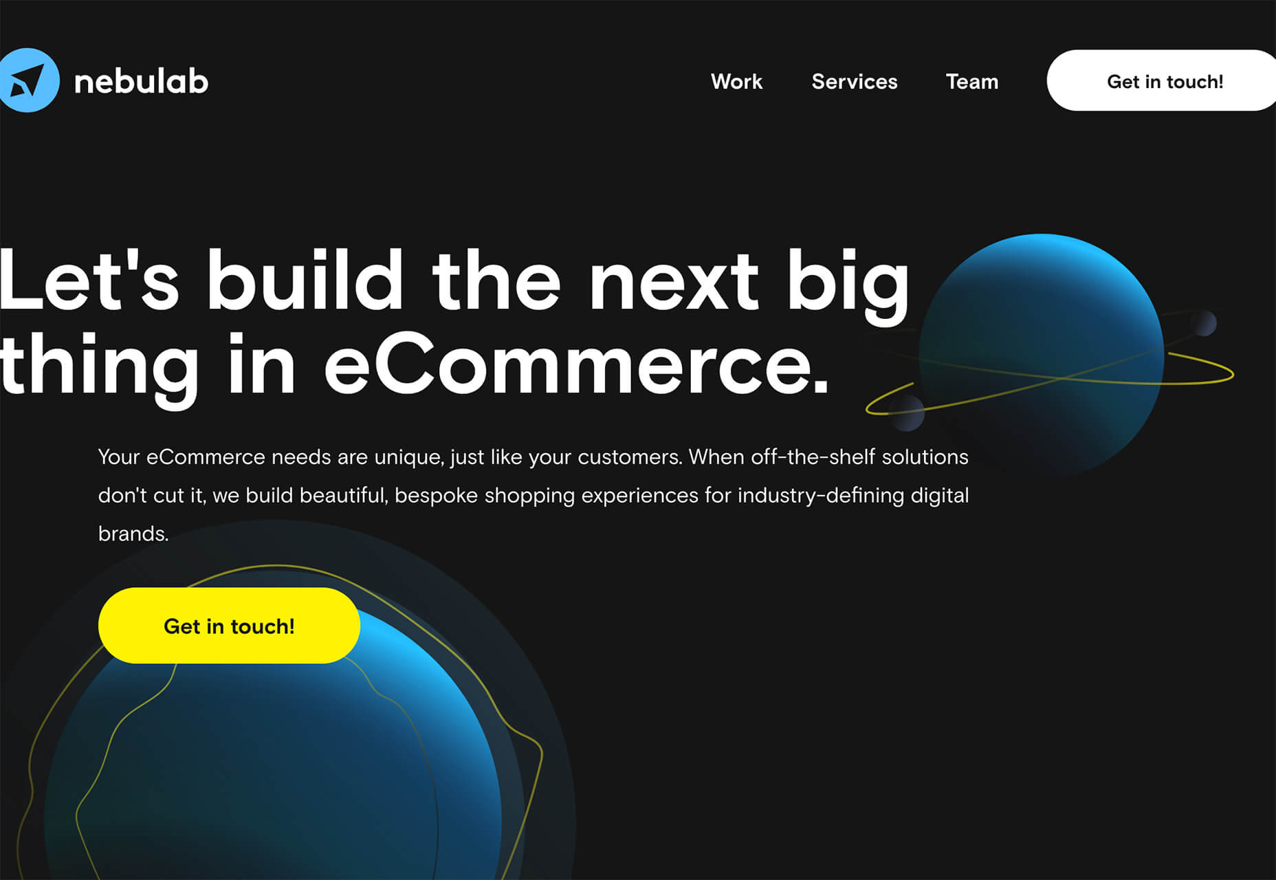
Nebulab uses some imagery, but what you really see is the giant, two-deck headline. Note the clever use of “next big thing” in an oversized typeface.
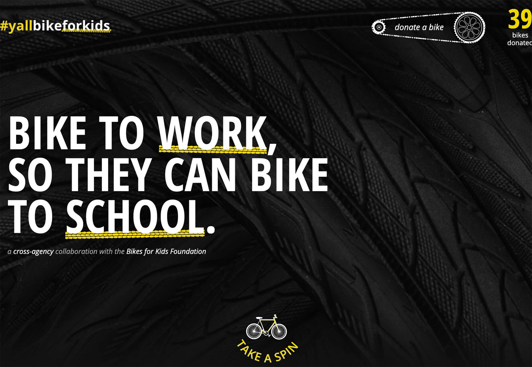
#Yallbikeforkids uses an all-caps configuration with intentional underlines to bring attention to keywords. The stark black and white color palette with yellow accents is a bonus for this design and style.
3. Fun with Fonts
When you don’t have many images to work with and no faces to show, it leaves more room for typographic creativity.
From experimental typefaces to line styles to interesting weight combinations to completely artistic font treatments, designers are having a lot of fun in this area.
Here are three examples to crush on.
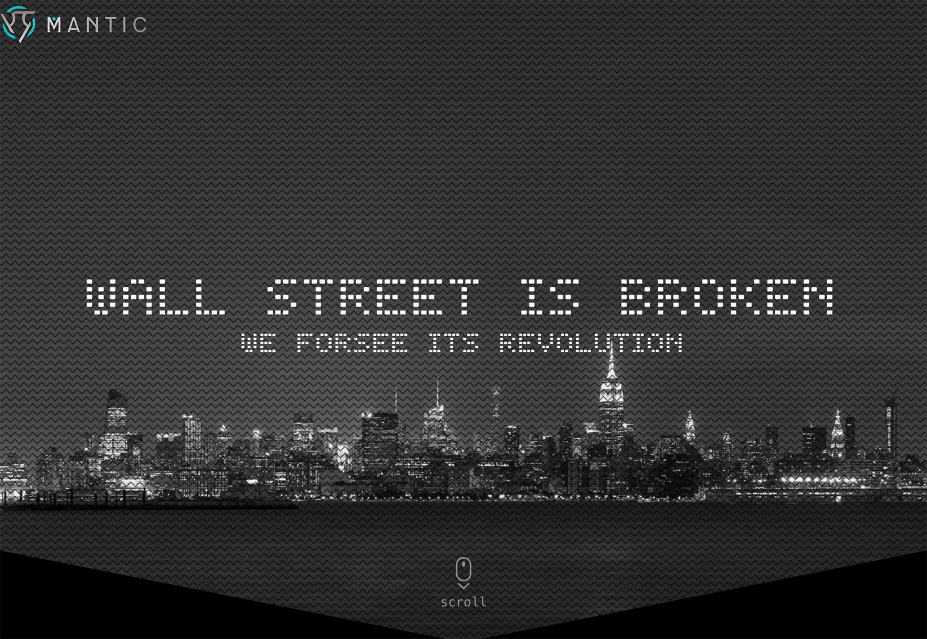
Mantic uses a fun dot-style experimental typeface for an AI tool with a futuristic feel. Using a type style that matches the tone and content of the design is key for making a technique like this really work wonders.
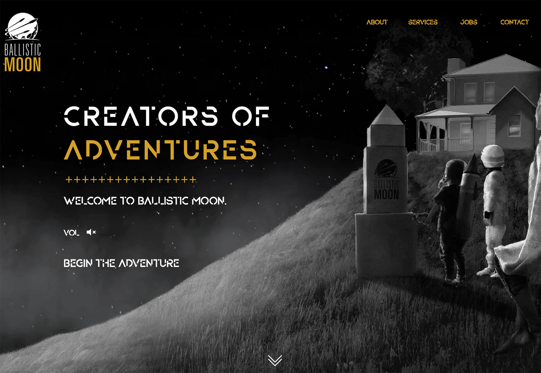
Ballistic Moon also uses a funky, experimental typeface for the intro to the online storybook adventure. What’s really nice about the use of the trend here is that the fun font has a distinct purpose and is used for only that use and is not scattered all over the design.
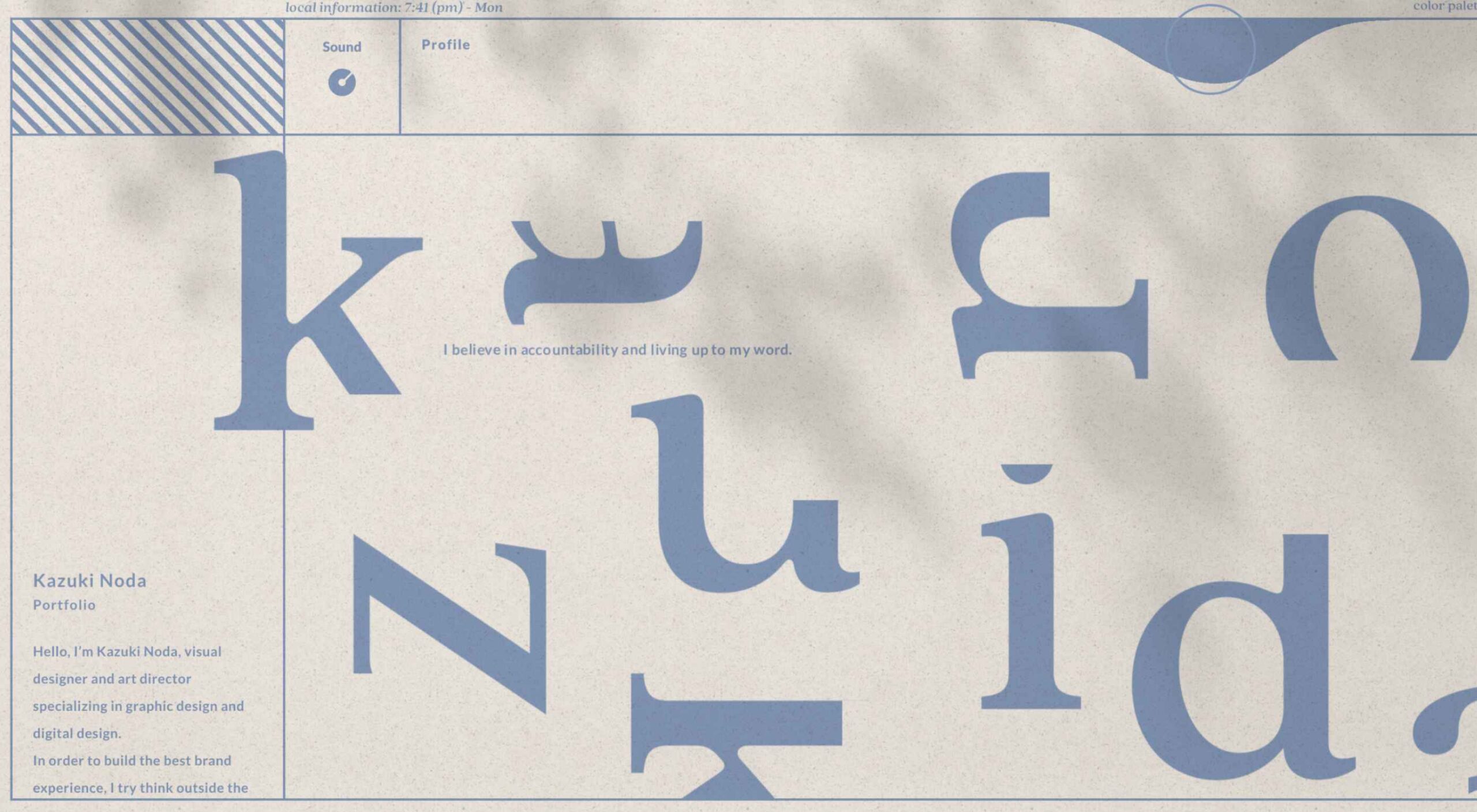
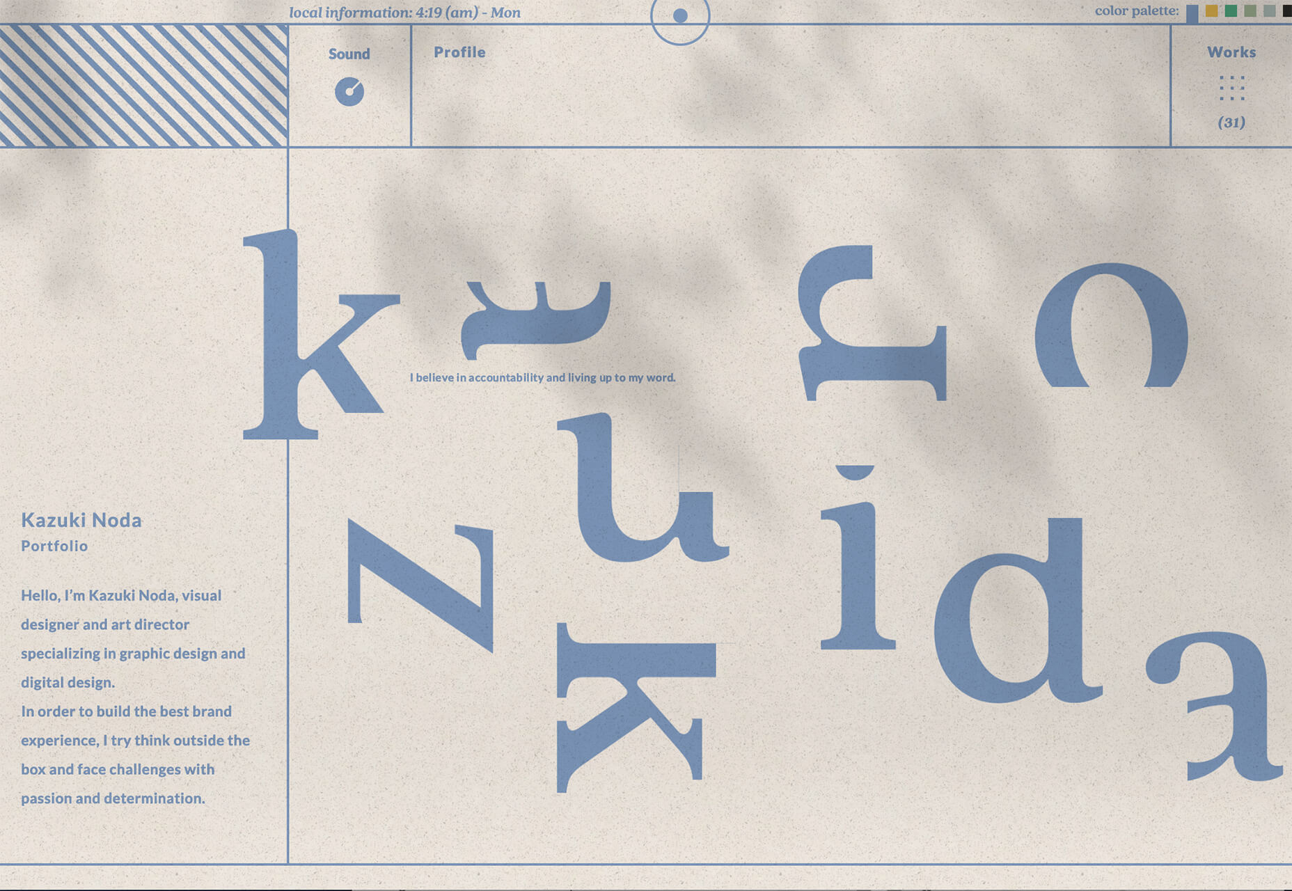
Kazuki Noda has fun with the letters of his name so that the same cool and majestic feel as the rest of the design. Look closely at the uber-blurred video background and phrases that pop into the hero area to describe the portfolio and art direction therein. It’s artful and fun.
Conclusion
There aren’t a lot of pictures to look at with website design projects this month. And that theme is at the heart of what’s trending right now. It will be interesting to see how long this continues in an uncertain world landscape.
What’s nice about these projects that aren’t so photo-heavy is that it forces designers to develop creative solutions and use other tools to help draw attention to the projects.
Designing within these types of constraints can seem a little overwhelming at first, but the best designers can run with this challenge to create something amazing. (And it can even feel freeing in some ways.) Good luck if you are working on one of these projects, and we hope these trends serve as a source of inspiration.
Source
The post 3 Essential Design Trends, June 2021 first appeared on Webdesigner Depot.

Source de l’article sur Webdesignerdepot


 The end of the year tends to be busy for a variety of reasons and it can limit some of the freshness we see in designs during much of the year. Regardless, there are a few trending design elements.
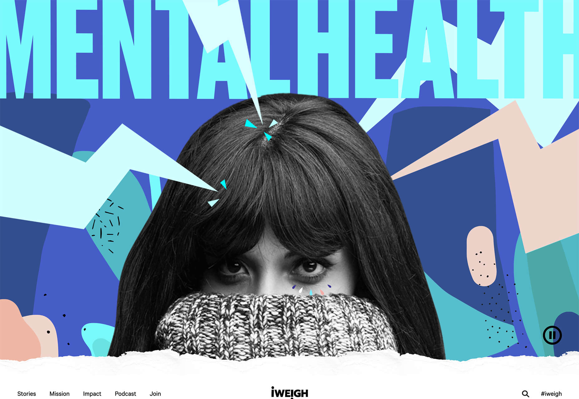

 Every week users submit a lot of interesting stuff on our sister site Webdesigner News, highlighting great content from around the web that can be of interest to web designers.