Articles

User Experience is a crucial consideration for any web developer or designer; the only way to ensure that you’re delivering a successful website is to ensure that the end-user or customer will feel comfortable using it. 

A strong user experience increases your client’s chances of successful audience engagement and conversions.

What you might not realize, however, is that the strategies you use to enhance UX as a web developer or designer can also influence how the search engines respond to a website. 

Though many designers assume that SEO (Search Engine Optimization) is the work of a copywriter or content producer, there are design elements to consider too. 

After all, the definition of optimization is “the action of making the best version of a resource.”

So, how are UX and SEO connected?

Adding UX to a Successful SEO Strategy

SEO used to be easy. To stand out on the search results, you just needed to stuff a page full of as many keywords and phrases as possible. Now, it’s a little more complicated. 

Leaders in search engine development, like Google and Bing, know that they need to offer their customers excellent experiences to keep them. In this new experience-focused landscape, SEO and UX share common goals. 

Search engines don’t just want to provide customers with any answers to their questions. Instead, Google and its competitors are using everything from artificial intelligence to machine learning algorithms to ensure that search results are accurate, relevant, and engaging. 

In the same way, user experience is about providing users with easy access to the information and resources they want. 

Now that SEO is a multi-disciplined approach, UX is just one of the essential tools that makes it possible for developers to optimize their websites properly. 

Where UX Developers Influence SEO 

There are plenty of connections between UX and site indexability

We all know that since 2018, site speed has become a crucial ranking factor for companies in search of better search results. As a developer, it’s up to you to ensure that there aren’t too many elements weighing a website down that would prevent it from delivering fast results. 

Bounce rate is another critical factor in search engine ranking algorithms. When customers click on a website, Google wants to see that they get the answers they want. If your navigation is difficult to understand, or the correct information isn’t easy to see on a page, end-users will just hit the back button. 

Let’s take a closer look at how developers can influence SEO with their UX strategies. 

1. Site Navigation and Ease of Use

It’s no secret that today’s digital consumers crave easy-to-use sites.

A complex website with pages ranking for different terms might seem like an excellent idea for SEO. However, from a UX perspective, the easier it is to navigate your website, the more your end-users will benefit. 

According to a study from Ahrefs, well-optimized pages that rank for several keywords can be more beneficial than dozens of pages ranking for similar terms. At the same time, if the search engines have difficulty crawling all your pages due to a poor site navigation strategy, then some pages won’t get indexed. 

So, how do you improve navigation and SEO at once? Follow the proper structure for your site first, categories and subcategories on the retail page help customers find exactly what they need. A solid internal linking structure allows the crawlers to examine your website and index each essential page individually.

Keep navigation simple when designing a website for both UX and SEO potential. 

2. User-Friendly Page Layouts

There are countless cases where poor layout design and formatting disrupts SEO potential. For example, cluttering a page with too much information makes it tougher to read and index. At the same time, if your pages aren’t attractive and easy to navigate, customers are more likely to hit the back button. 

If customers come to a website and immediately leave it again, this tells the search engines that they’re not finding what they need on those pages. That means Google will bump you to a lower position on the SERPs. 

So, how do you make your layouts more UX and SEO-friendly?

  • Get your category pages right: Say you’re creating a blog page for your client. They want to list all of their blogs on one main page while linking to separate locations for each article. A design that puts a large chunk of content from each blog on the main page can be problematic for UX and SEO. It means your customers have to scroll further to find what they need. At the same time, the search engines never know which words to rank that main page for. On the other hand, listing blogs on smaller cards, as Fabrik does in this example, makes sorting through content easier. 
  • Leverage headers and tags: Your customers and the search engines habitually “scan” your pages. When trying to improve UX and SEO simultaneously, you must ensure that it’s easy to find crucial information quickly. Header 1 or H1 tags can help by showing your audience your website’s critical sections. Title tags also give search engines more information on the term you want to rank for. Organizing your content into a structure that draws the eye down the page also means your customers are more likely to stay on your website for longer. That shows the search engines that you have quality, relevant content. 
  • Make the most of images and videos: Visual media isn’t just an excellent way to engage your audience. With videos and pictures, you can convey more vital information in a quick and convenient format. This leads to greater satisfaction from your audience from a UX perspective. However, visual content is also great for SEO. You can optimize every image with alt text and meta descriptions. That means you have a higher chance of ranking both in the main search results and the image searches on Google. 

3. Using Search Data to Inform Site Architecture

Today, SEO is less about building hundreds of landing pages for individual queries. Now, it’s more important to take a simple, de-cluttered approach with your website. SEO can determine what kind of architecture you need to create for a successful website. 

For instance, say you wanted to rank for eCommerce SEO. There are tons of related words that connect to that primary search term. Rather than making dozens of different pages that try to rank for distinct phrases, you can cover a lot of other ideas at once with a larger, more detailed piece of content. 

If a topic is too big to cover everything on a single page, then you might decide to create something called “pillar” content out of your main terms. This involves using one main page where you discuss all of the topics you will cover. Then, you design several smaller sub-pages that link back to that central pillar. 

Once again, this helps the search engines to navigate your website and index your pages while assisting the customers in finding the correct information. At the same time, you combine more pages on a website and remove anything that might be detracting from your site’s authority or not offering enough value. 

4. Improving Website SERP Listings

It’s easy to forget as a developer that a customer’s first experience with a website won’t always happen on that site’s homepage. Usually, when your customers are looking for solutions to a problem, they’ll find your website on the search engine results instead. 

This means that you need to ensure that you make the right impression here:

There are a few ways that developers can ensure the search engine listings they create for their clients are up to scratch. For instance, a reasonable title tag for each page that includes appropriate keywords is excellent for SEO and UX. A title tag lets your customers know they’re in the right place and helps them find the information they need. 

Remember, around eight out of ten users on search engines say that they’ll click a title if it’s compelling. 

Another component you have control over as a developer or designer is the “rich snippet.” Rich snippets are the informative chunks of content that Google adds to a search listing to help it stand out. You can use rich snippet plugins on a website to tell Google what kind of extra information you want to include on a page. 

For instance, you might want a company’s ratings to show up on your search results, so customers can see how trustworthy they are:

5. Local Business Rankings

When you’re creating a website for a company, it’s easy to forget about local rankings. We see the digital world as a way of reaching countless people worldwide. Local orders are easier to overlook when you have a global scope to work with. 

However, as a developer, you can boost a company’s chances of attracting the right local audience and boosting its credibility. For instance, you can start by ensuring that the correct directory information appears on your client’s website and social media profiles.

Another option is to create dedicated location pages for each area the company serves. This will make it easier for clients to find the contact details they need for their specific location. 

At the same time, pages that have been carefully optimized to rank for specific locations will earn more attention, specifically from search engines. The more of the search engine landscape your client can cover, the more chances they have to attract new customers and leads. 

Combing SEO and UX

In a world where experience is crucial for every business, it’s no wonder that UX and SEO are blending more closely together. There are a lot of areas where SEO and UX work in harmony together if you know where to find them. Improving your client’s SEO ranking with UX doesn’t just mean ensuring that their pages load quickly anymore. 

Simple strategies, like making sure a call-to-action button is clickable on a mobile page, can simultaneously boost a website’s UX potential and SEO performance. At the same time, adding images and alt text to a website provides search engines with more information while adding context to your content. 

The key to success is understanding how SEO and UX work together. If you look at SEO and UX as part of the same comprehensive strategy to give end-users a better online experience, achieving the right design goals is much easier. 

Of course, just like any strategy, it’s also worth making sure that you take the time to track the results of your UX and SEO campaigns. Examine which systems help you, and examine customers from an SEO perspective with design and development strategies.


Features image by gstudioimagen on Freepik

Source

The post 5 Ways That UX Developers Influence SEO  first appeared on Webdesigner Depot.

Source de l’article sur Webdesignerdepot

Whether you’re an e-commerce company, a SaaS provider, or a content publisher, understanding the performance of your website is important to everyone on the team—not just the developers. Performance is a huge part of the user experience and is directly tied to how well your website achieves its goals. But web performance is often measured in very technical terms, like Largest Contentful Paint, that cause most business folk’s eyes to glaze over.

This language gap is a big part of the reason why many websites are so slow. Many only consider performance from their own perspective—“it’s fast for me”—and leave it at that. We simply lack the vocabulary to talk about the problem.

Source de l’article sur DZONE

It is a common requirement to render dynamic content into our HTML page. Templating engines is a great way to support this feature. In this post, we will learn how to perform templating in NodeJS using the Express Pug view engine.

If you are new to Express, check out this post on getting started with ExpressJS.

Source de l’article sur DZONE

Modals, a nifty little feature that allows you to display different messages at the top of your website, have been touted as extremely useful. Some even claim that they are helpful enough to completely replace the banner ads we all hate so much. But are modals in web design a UX disaster?

If you are unfamiliar with the term, a modal is a dialogue window appearing when a visitor clicks on a hyperlink or hover image.

Suppose you want to collect on-site subscribers or you want visitors to sign up for a freebie. In that case, you can use modals.

However, many web designers – and some website visitors – are against using modals in web design. The main argument is that it affects the user experience. But are modals in web design a UX disaster? Read on to find out.

What Do Modals Do?

Modals often appear as pop-up windows on a web page, requesting a visitor to take action. Most times, they appear following a click on a page element.

Also known as lightboxes, modals isolate the page’s main content. The user will have to complete the action requested by the modal or close it before reassessing the page.

Web designers use modals to capture a visitor’s attention. Since other page contents are inaccessible, a visitor must interact with the modal.

Cons Of Modals In UX

While there are different cons of modals in UX, they all sum up to one con – interruption. When modals appear, they interrupt whatever the user is doing.

Unlike regular pop-ups, users cannot simply ignore the modal and continue browsing. As a result, modals demand immediate attention. 

A user may be interested and decide to interact with the modal. However, if the modal’s content differs from the page’s, the user could forget what they were doing after interacting with the modal.

Furthermore, sometimes modals require action related to information on the page. For example, suppose the user wants to review the information before taking action. In that case, they’ll have to close the modal since the main page is inaccessible.

Statistics show that up to 82% of users dislike pop-ups. Most website visitors aren’t knowledgeable about the technicalities of web design. As a result, they won’t be able to differentiate between regular pop-ups and modals.

After all, modals are a type of pop-up. Some users may consider modals worse since they darken the page’s primary content, making it inaccessible.

Furthermore, people want to visit a website and get what they want immediately. Hence, time is significant. Therefore, modals that require actions that take time can make a website lose visitors.

With all of these cons, you can understand why many web designers say modals are a UX disaster in web design.

Can Modals Be Useful in UX?

In some situations, modals are helpful, and they can improve UX. Many web designers swear on the usefulness of modals, and it’s not difficult to understand why.

Firstly, modals can help simplify a website’s content. For example, a user can immediately exit the page if your website is relatively complex, with lots of content and elements.

You can use a modal to explain the content on the page so that the user doesn’t get confused. Perhaps the modal can display when the user clicks on the back button. The modal can highlight the most critical content on the page and tell the user what to do next.

Secondly, modals are invaluable if you must capture your user’s attention. For example, perhaps you want to display a warning or pass any crucial information that users must know before they continue browsing.

As mentioned before, a user can easily ignore a pop-up, especially if it opens in a new window. However, with modals, the user must at least view the content before they proceed.

Thirdly, a modal can make a web page easier to navigate. It sounds ironic considering the cons, but it’s true if properly implemented. Rather than packing different elements on a web page, you can set some to display as modals.

For example, you can have a page with just text to improve readability. Then, users can click to view visual elements like images and videos as modals.

How To Use Modals the Right Way

Using modals correctly is key to ensuring they don’t negatively affect UX. Here are some ideal situations when you can use modals:

1. Display Warnings

Using modals to give users crucial warnings is ideal, especially if their subsequent actions have serious consequences.

For example, most websites display modals when users click the delete button. Deletion is always critical because, in most cases, it’s irreversible.

A practical example would be an eCommerce website where a user opts to delete items from their cart. You can use a modal to ask the user to confirm before deleting.

2. Input or Collect Information

Modals are effective in prompting users to input information. Sometimes, users must enter specific details before they continue browsing.

A practical example would be a review site where a user wants to submit a review. Before submitting the review, you can use a modal to request the user’s name and other necessary information.

3. Simplify Navigation

As mentioned before, modals can simplify a complex website. In addition, it will help a user navigate better, which is a UX boost.

A practical example would be a news site with many stories and updates. You can use a modal to highlight the day’s trending news stories so that users can visit the web pages with one click.

Conclusion: Are Modals a Disaster in UX?

In conclusion, modals affect a site’s user experience since visitors must interact with them. However, it doesn’t always have to be a negative effect.

Modals become a UX disaster in web design when wrongly used. However, if you follow good practices, modals can improve your website’s user experience.

Generally, only use modals when necessary and in a way that won’t frustrate the users.


Featured image by Freepik.

Source

The post Are Modals In Web Design A UX Disaster? first appeared on Webdesigner Depot.

Source de l’article sur Webdesignerdepot

I bet you didn’t know that WordPress is the world’s most popular website builder and content management system (CMS).

Just kidding…of course, you did! But that’s not all there is to know about WordPress, so take our ridiculously challenging WordPress quiz and see how much of an expert you are…

(Scroll to the bottom for the correct answers.)

1. What is WordPress?

  1. SEO plugin to check your keyword density
  2. AI tool to create illustrations
  3. Online software to create websites
  4. A coffee shop in Canada

2. What is the number of websites using WordPress?

  1. 75 million
  2. 1.3 billion
  3. 2 thousand
  4. 7.1 billion

3. WordPress has a tradition of naming its major releases after:

  1. American presidents
  2. Famous jazz musicians
  3. British kings
  4. Heavy metal bands

4. How many websites are created on WordPress per day?

  1. Two websites
  2. 20,040 websites
  3. Over 500 websites
  4. 60-80 websites

5. What is the correct WordPress website address?

  1. WordPress.org
  2. WordPress.us
  3. WordPress.com
  4. WordPress.au

6. Who is the WordPress CEO?

  1. Elon Mask
  2. Bill Gates
  3. Leonardo DiCaprio
  4. No CEO

7. Which US government website is using WordPress?

  1. WhiteHouse.gov
  2. U.S. Embassy Websites
  3. State.gov
  4. All of them

8. How many languages is WordPress available in?

  1. 21
  2. 72
  3. 78
  4. 1

9. What is the most downloaded WordPress theme of all time?

  1. Divi
  2. Gutenberg
  3. WoodMart
  4. Astra

10. How many Fortune websites are using WordPress?

  1. 11
  2. 25
  3. 90
  4. 78

11. What is the average salary of a WordPress developer per year?

  1. $100k
  2. $56k
  3. $24k
  4. $201k

12. When was the first WordPress version released?

  1. 1999
  2. 2010 
  3. 2007
  4. 2003

Answers

1. What is WordPress? – 3. WordPress is online, open-source software that you can use to create websites.

2. What is the number of websites using WordPress? – 2. In 2021, WordPress powers over 1.3 billion websites all over the web, and this number continues to grow.

3. WordPress has a tradition of naming major releases after – 2. WordPress has a habit of naming its big releases after famous jazz musicians. For example, in the first version of January 2004, they called 1.0 (Davis), named after American trumpeter Miles Davis. Another version of May 2004 was named 1.2 (Mingus).

4. How many websites are created on WordPress per day? – 3. Over 500 websites are created on WordPress every day. At the same time, only 60-80 sites are built on popular platforms like Squarespace and Shopify. Besides, every second, 17 new blog posts are published on WordPress!

5. What is the correct WordPress website address? – 1. The fact that always confuses beginners is that WordPress.org and WordPress.com are entirely different companies that provide separate services. WordPress.org is the real WordPress everyone talks about that helps you to build websites. While WordPress.com is a hosting provider created by Automattic, the co-founder of WordPress.

6. Who is the WordPress CEO? – 4. WordPress is a free, open-source project. That’s why it does not have a CEO; volunteer developers run the project from all over the globe. This is the reason anyone can submit a report about a bug or suggest features.

7. Which US government website is using WordPress? – 4. The correct answer is all of them. All major websites of the US federal government use WordPress for their websites. The list includes all government sites of big and small cities, counties, universities, and high schools.

8. How many languages is WordPress available in? – 2. The Default WordPress language is English; however, the platform provides a fully translated platform with plugins that allow you to change your site’s language in seconds. The software has been successfully used in over 72 languages and can be modified for more!

9. What is the most downloaded WordPress theme of all time? – 4. Astra is the most downloaded WordPress theme of all time. Astra is claimed to be the most potent and fast theme trusted by many popular brands. Besides, the theme earned over $30M.

10. How many Fortune 500 websites use WordPress? – 1. 11 Fortune websites, such as Walt Disney Company, ABM Industries, and 21st Century Fox, use WordPress.

11. What is the average salary of a WordPress developer per year? – 2. The average WordPress developer earns $56,000 per year, according to Payscale.

12. When was the first WordPress version released? – 4. The first version of WordPress was released on May 27, 2003, which makes WordPress much older than Twitter and Facebook.


Featured image via upklyak on Freepik

Source

The post Ridiculously Challenging WordPress Quiz first appeared on Webdesigner Depot.

Source de l’article sur Webdesignerdepot

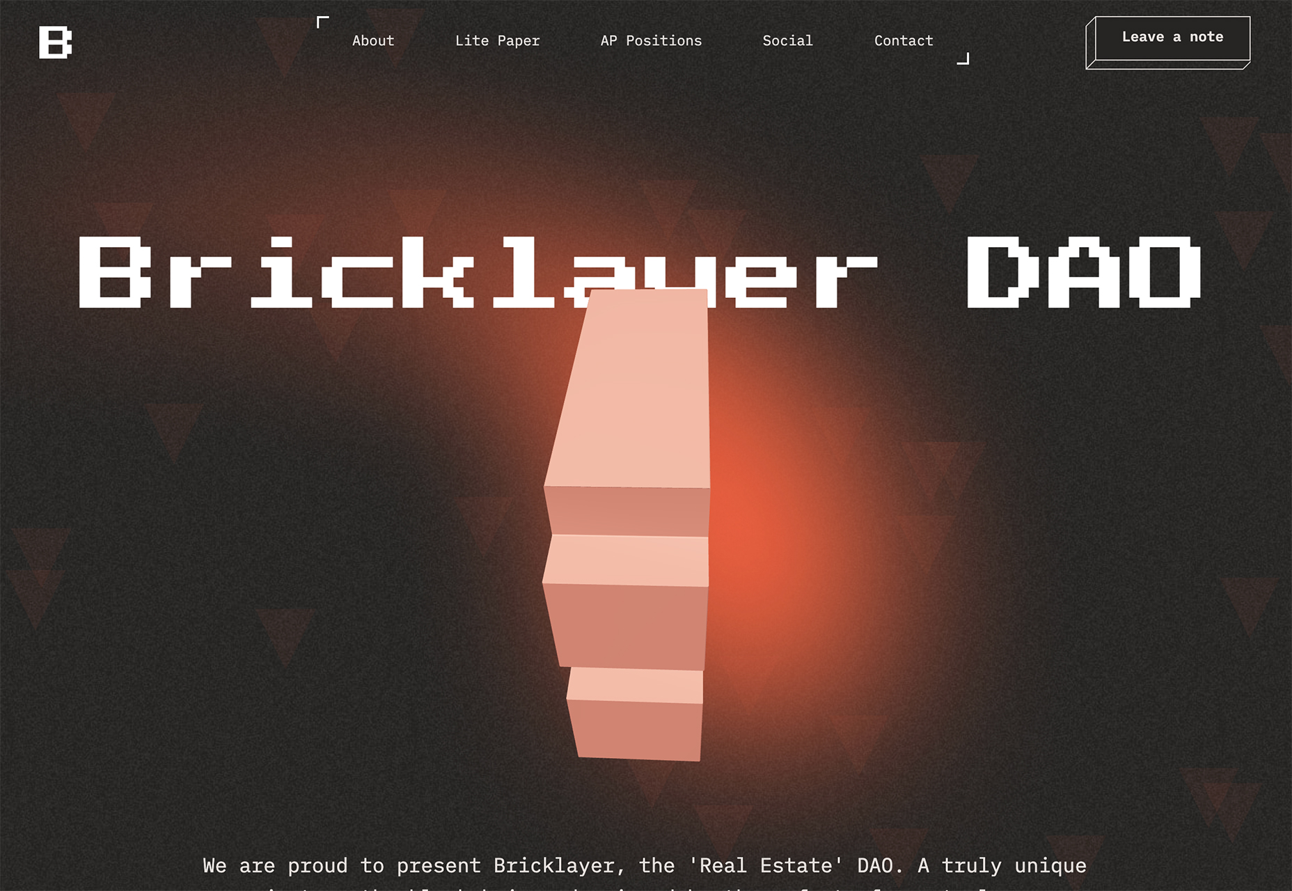
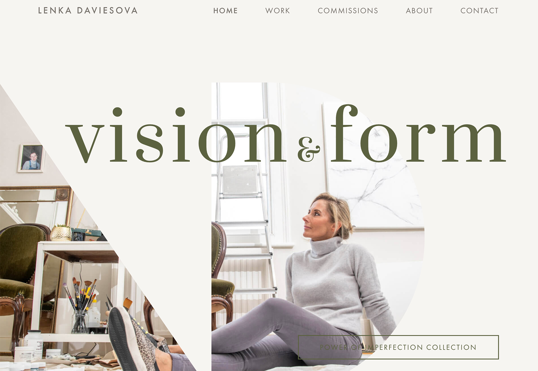
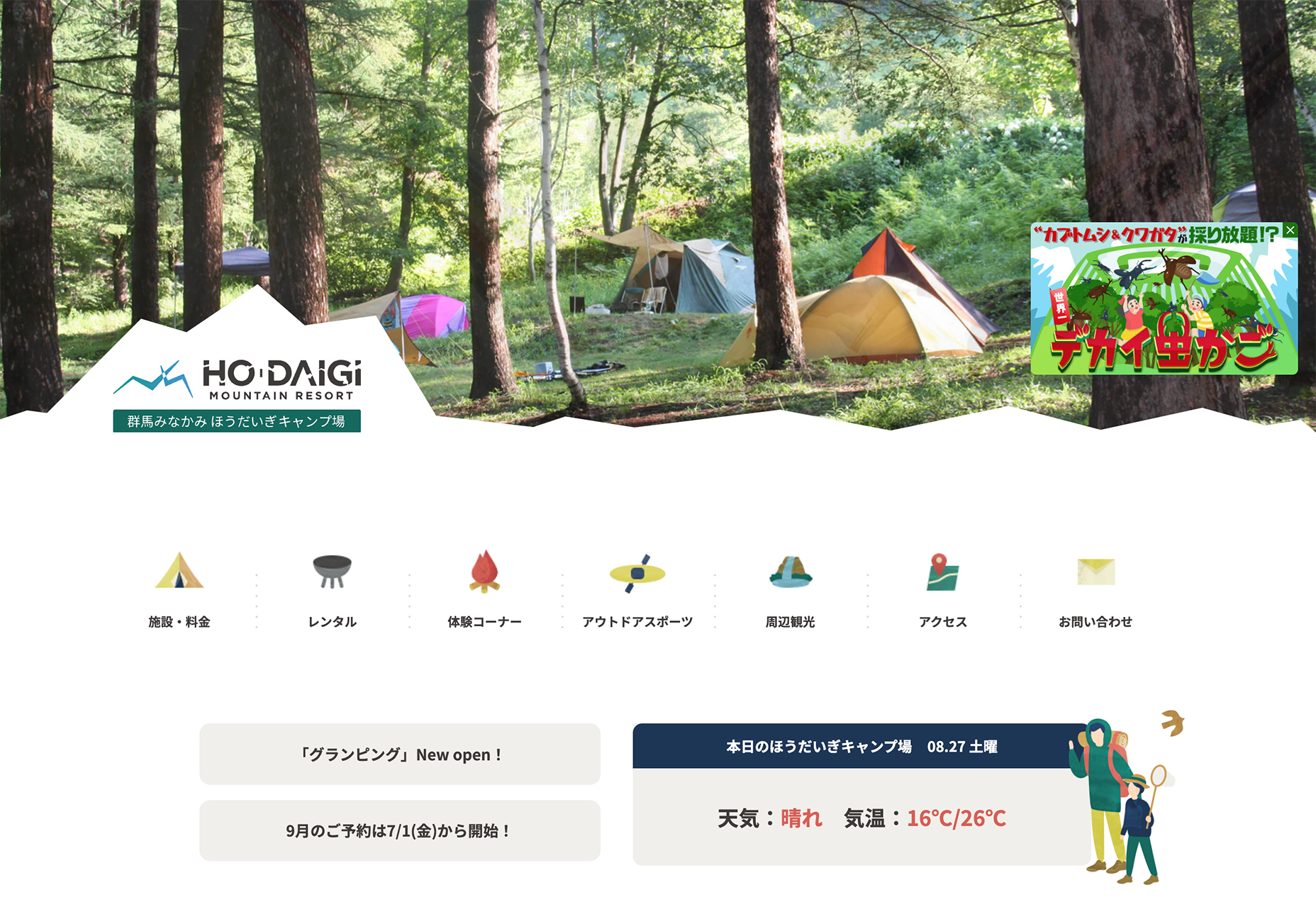
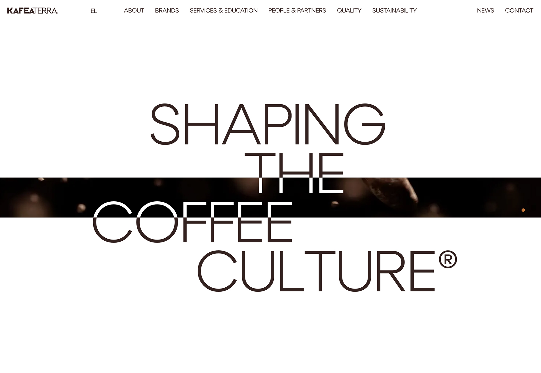
This month we’re seeing websites that are very conscious of the design trends they’re following. Designers are making conscious choices to adopt styles, and opting out when it doesn’t suit the site. What we end up with is a crop of sophisticated, well-designed websites that use style as a technique to further their aims.

Here are the sites that caught our eye this month, enjoy!

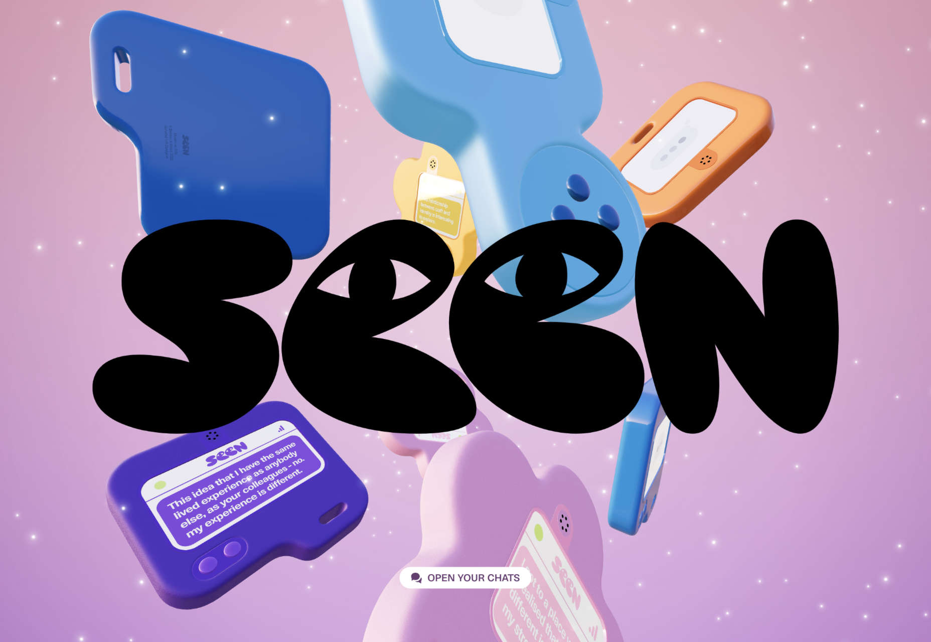
Seen

Seen uses conversations to explore themes surrounding ethnicity and racism in creative fields. Displaying these conversations as online chats creates a sense of intimacy.

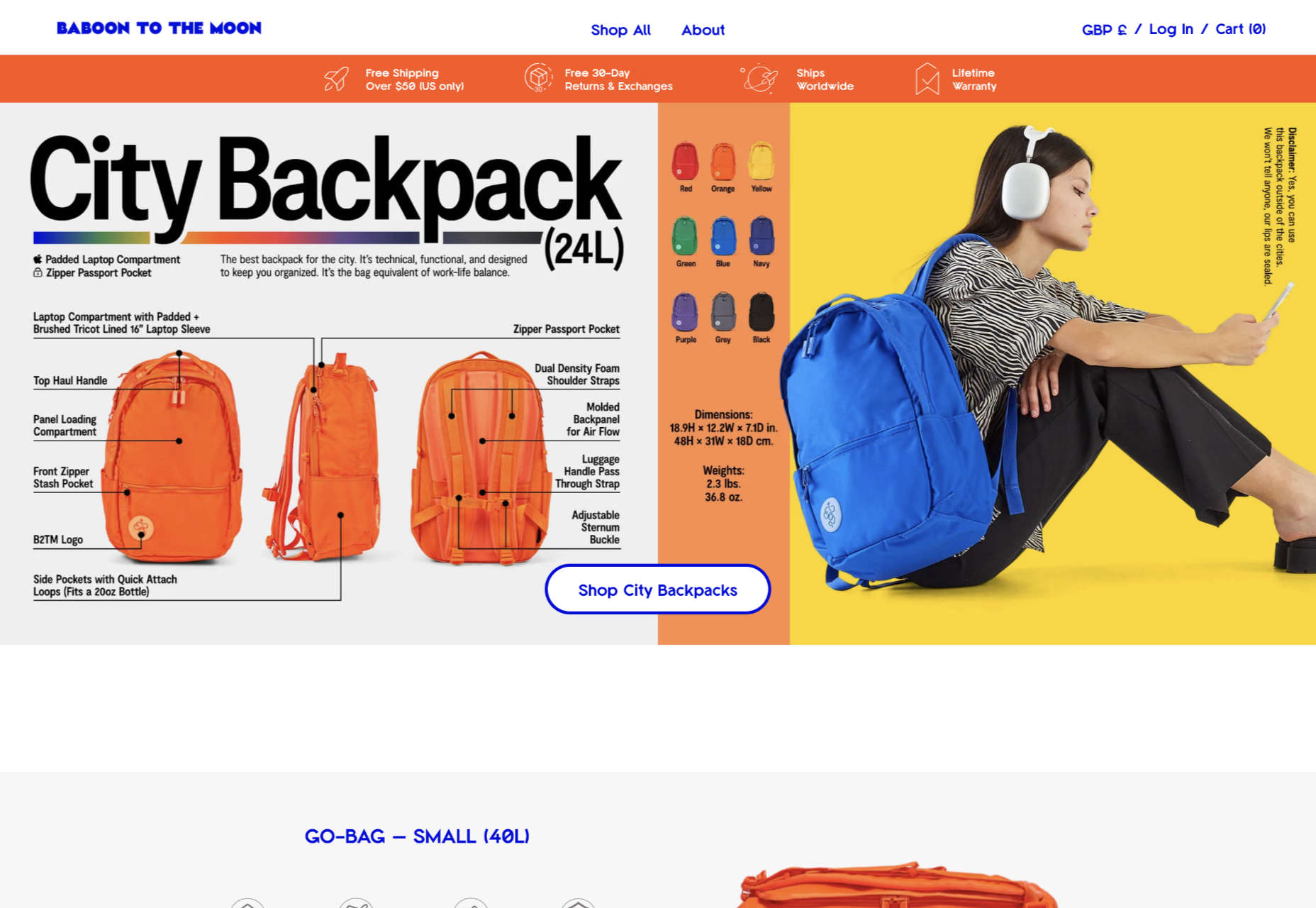
Baboon to the Moon

There is a lot of color in Baboon to the Moon’s product shots, so the rest of the site is kept simple, with good clear navigation too.

Fleava

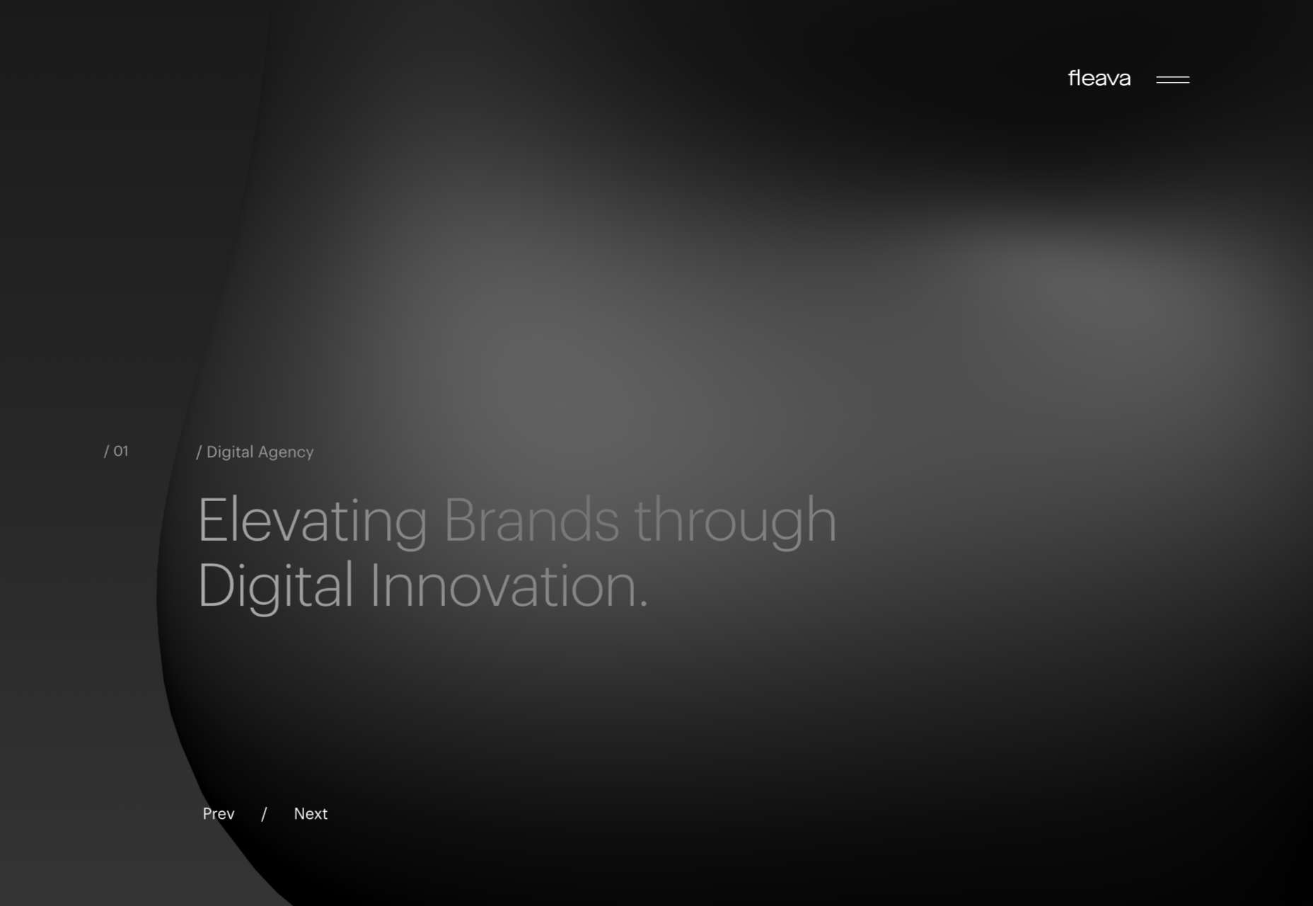
There is a strong sense of luxury to digital agency Fleava’s glossy brochure portfolio site.

Baunfire Portfolio Review 2022

This site for Baunfire digital agency’s creative networking event is bold, personable, and fun.

Laesk Kombucha

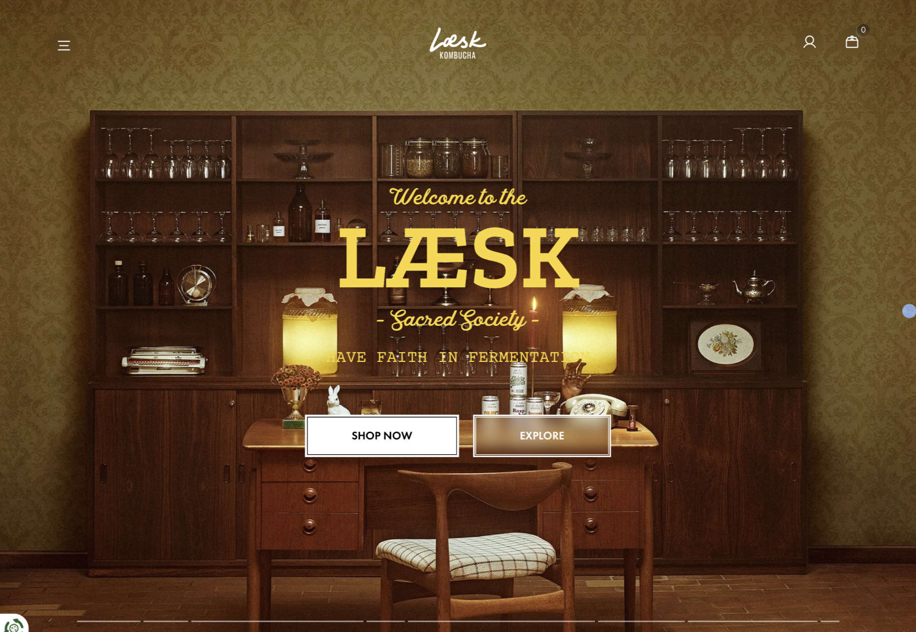
There is more than a touch of Wes Anderson’s style to this site for Laesk Kombucha; somewhere just out of sight is Bill Murray in a red beanie.

Viso Haus

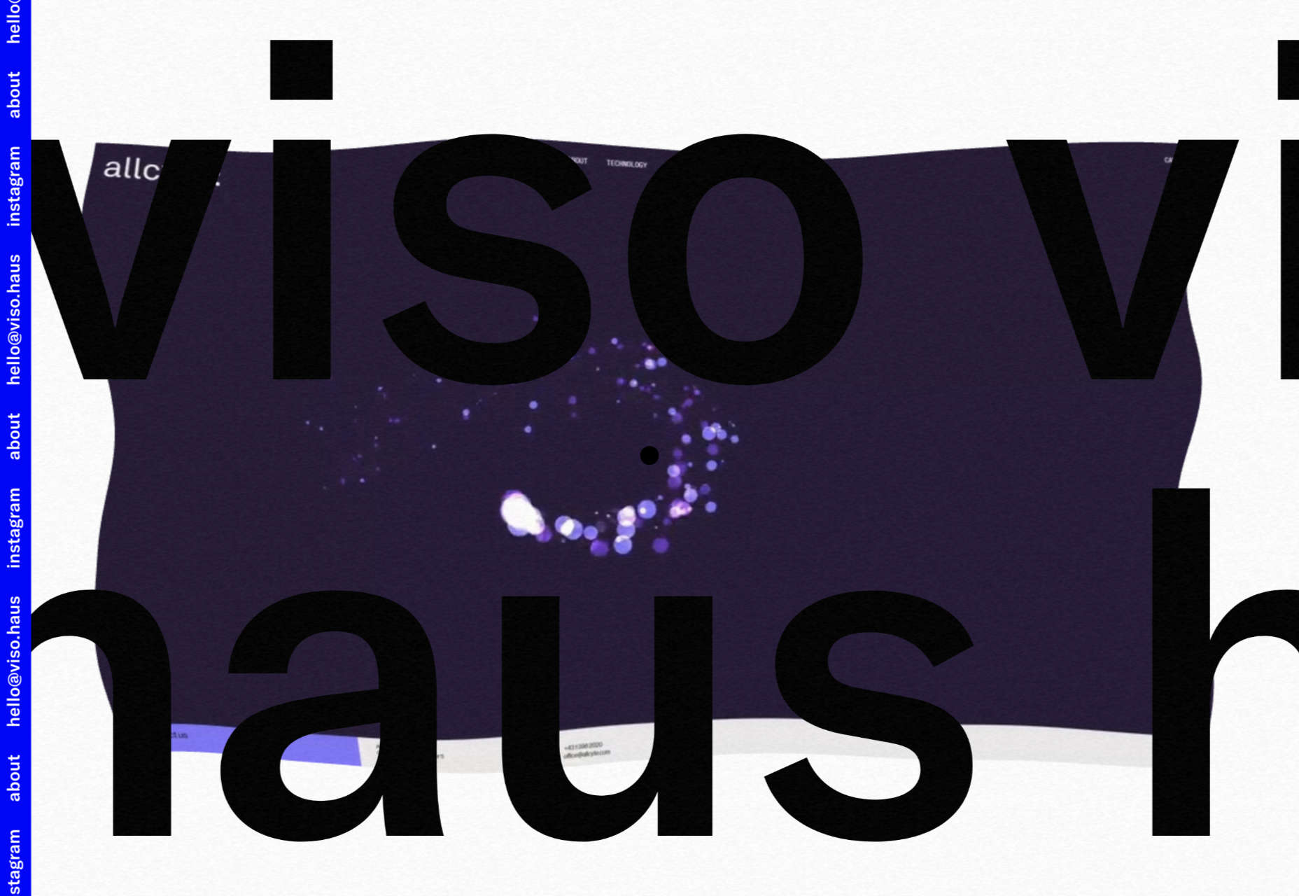
Viso Haus doesn’t do anything hugely groundbreaking here with their brutalist-style portfolio site, but they do it very well.

Mario Carillo

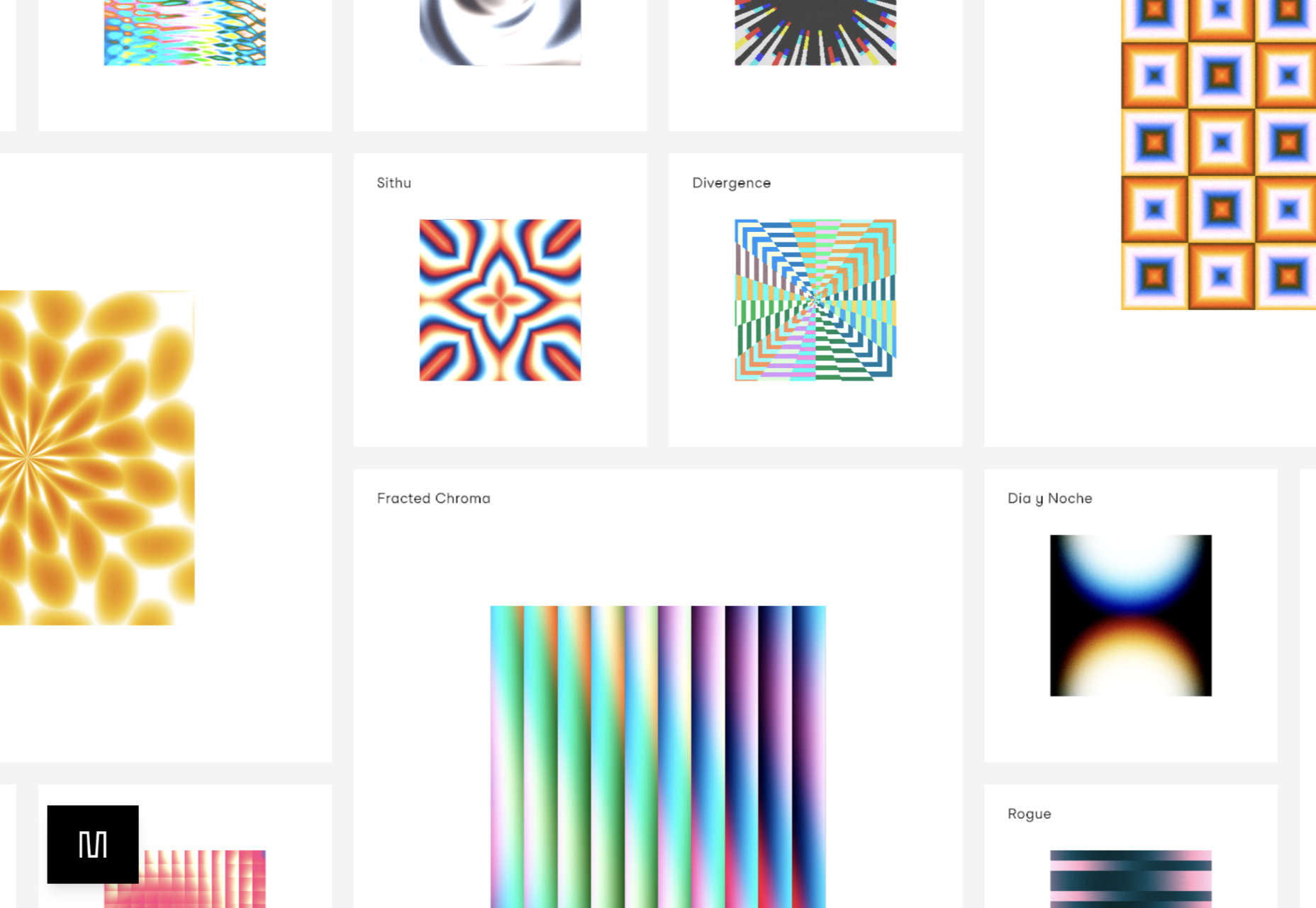
Artist/programmer Mario Carillo has opted for a minimal approach, allowing the work to do the talking.

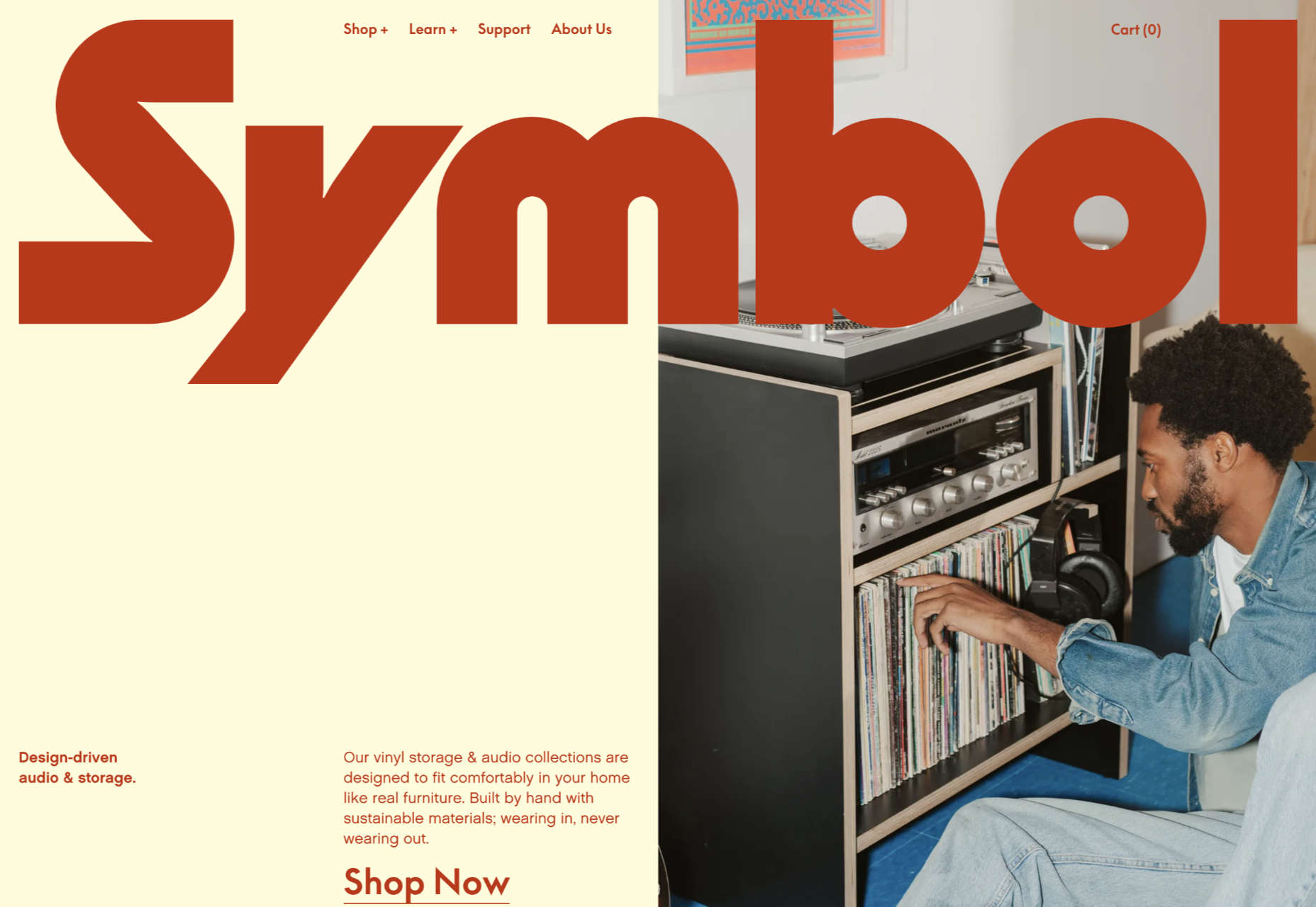
Symbol

There is a warmth to Symbol’s site, created by the color tones and combinations used here.

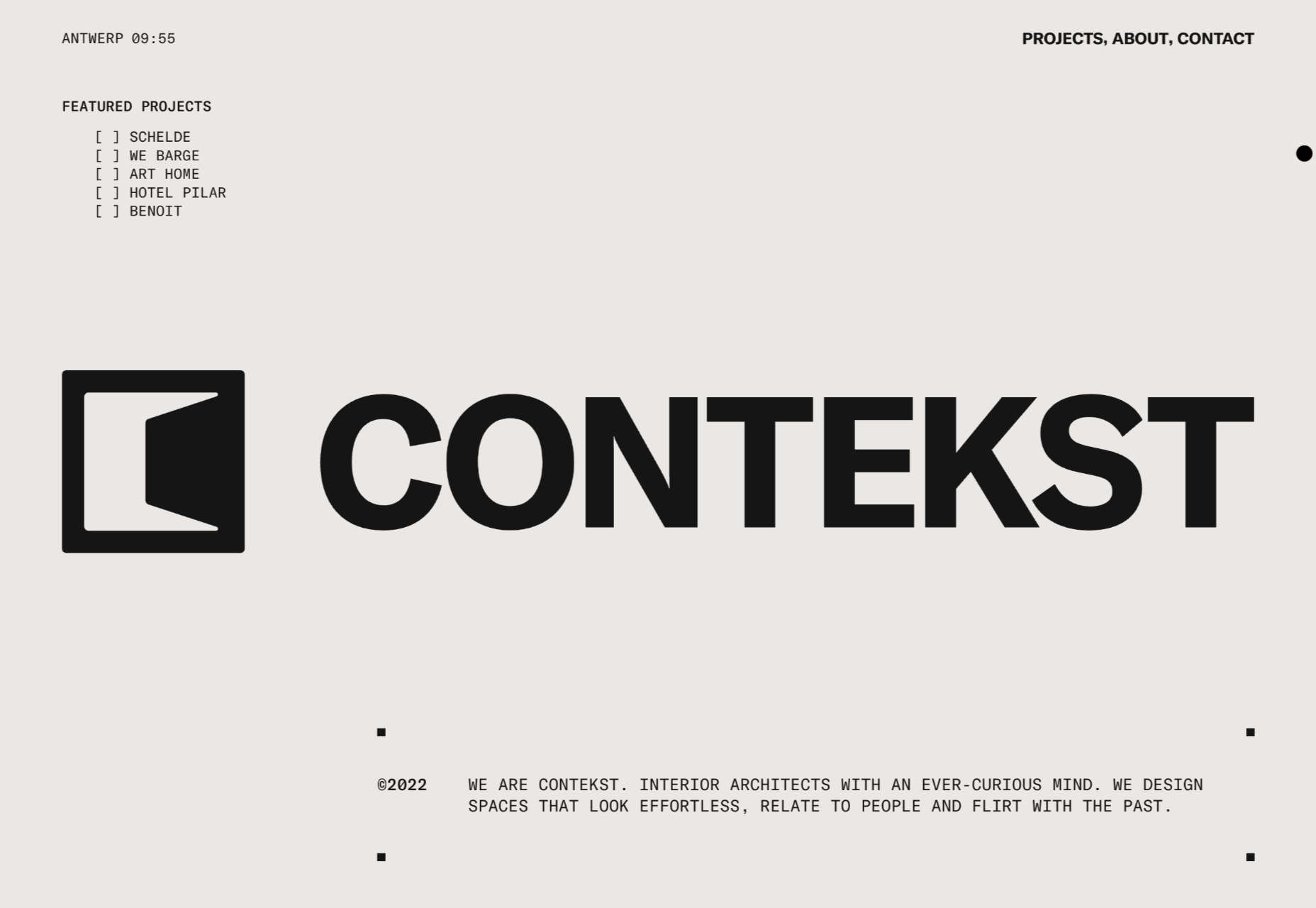
Contekst

Interior architects Contekst favor a brutalist visual style for their site, but with some nice little animated extras.

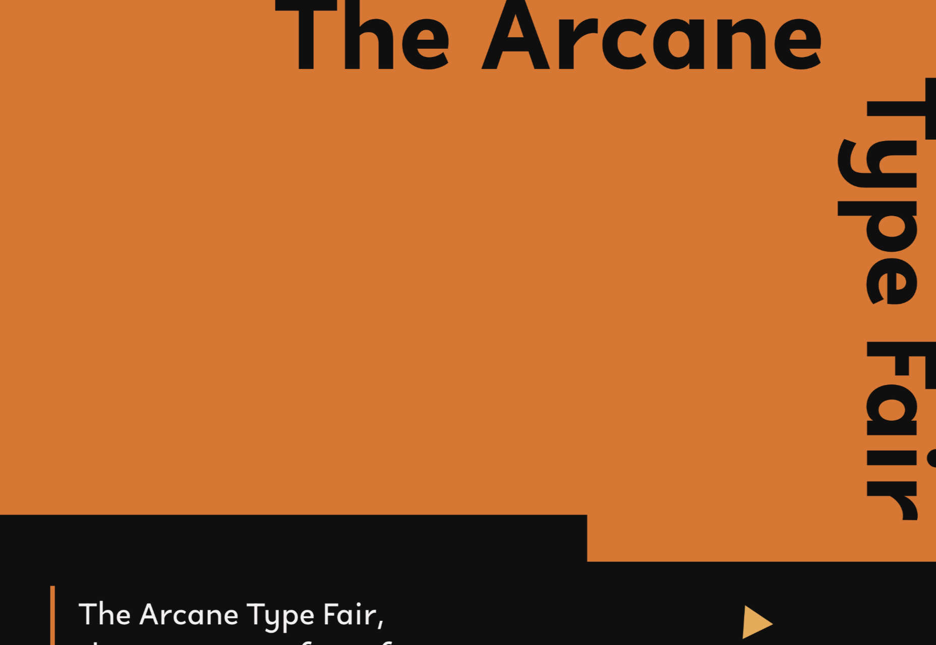
Arcane Type Fair

No, you haven’t missed the font lover’s answer to Comic Con: the Arcane Type Fair is fictitious and a clever showcase for Rain Foundry’s Conacher typeface.

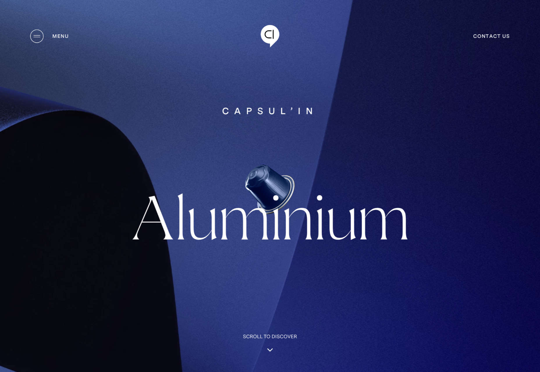
Capsul’in Pro

With lovely scrolling animation and soothing colors, this site for Capsul’in Pro manages to turn coffee pods into objects of desire.

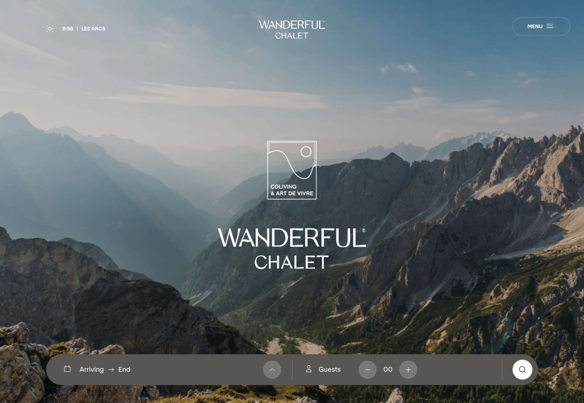
Wanderful Chalet

Random illustrations and a quirky display type add character to Wanderful Chalet’s brochure site.

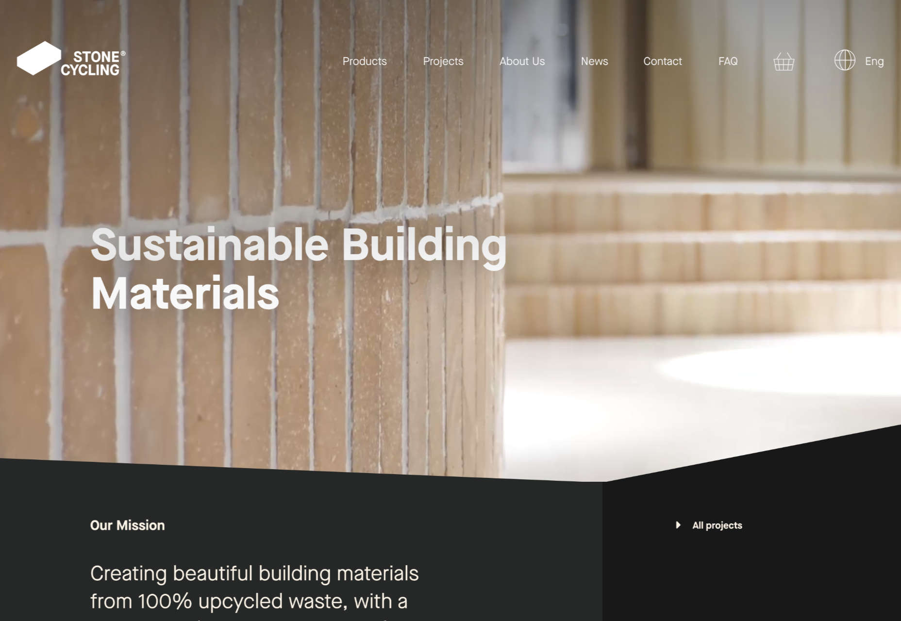
Stone Cycling

Bricks made from rubbish don’t sound like the most exciting thing ever, but this site evokes a lovely clean feel: like an old building gleaming in the sunlight after all the soot has been scraped off it.

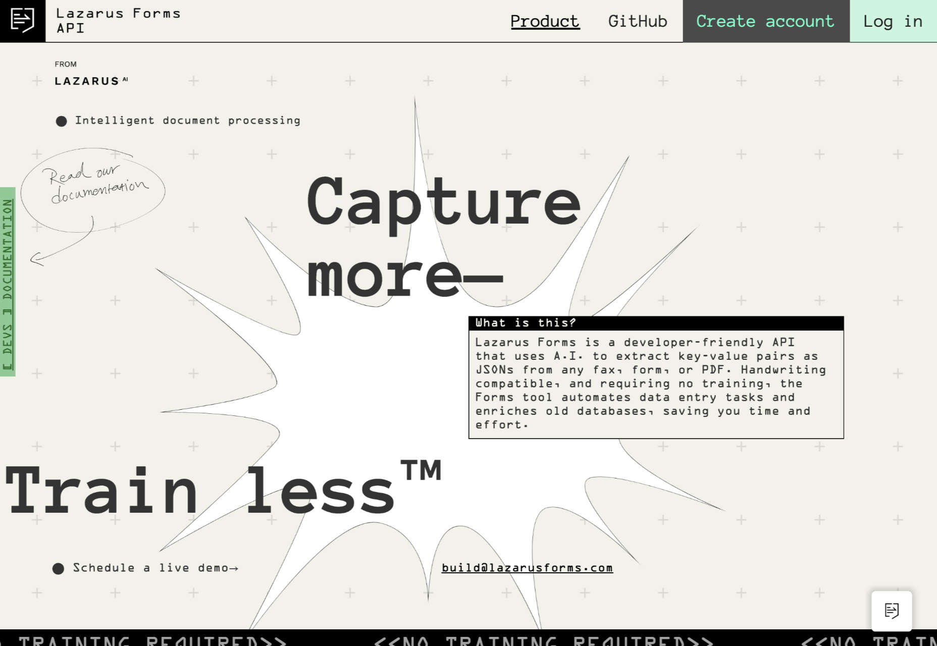
Lazarus Forms

Lazarus Forms is an API for AI document processing. This site succeeds in being transparent in its explanation without being overly technical and pleasing visually.

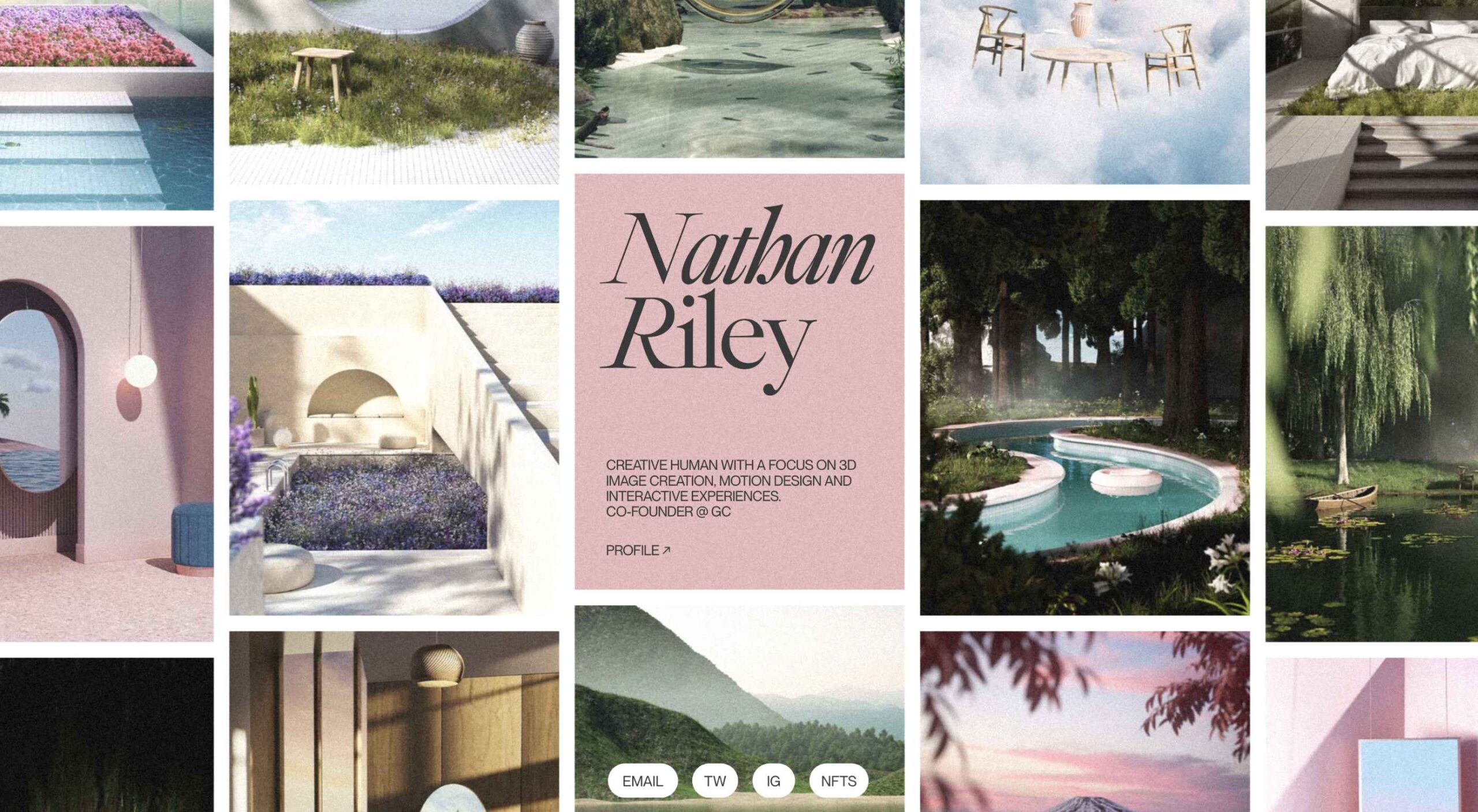
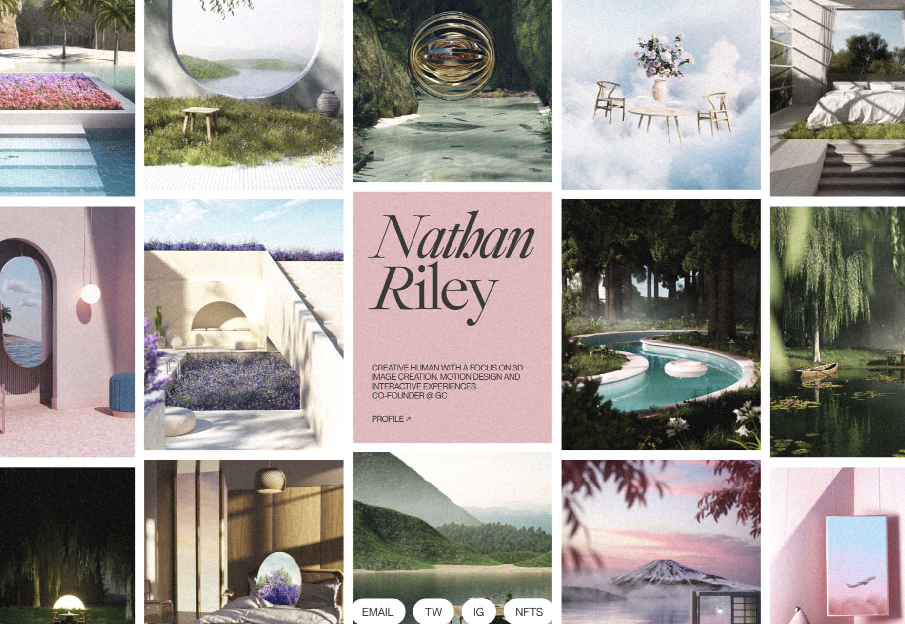
Nathan Riley

An excellent example of masonry combined with variable scrolling speeds creates tension in digital artist Nathan Riley’s portfolio.

Evi O. Studio

Sometimes the simplest things, like this full-screen image transition for Evi O. Studio’s portfolio, can be so well done it’s an absolute pleasure to scroll through.

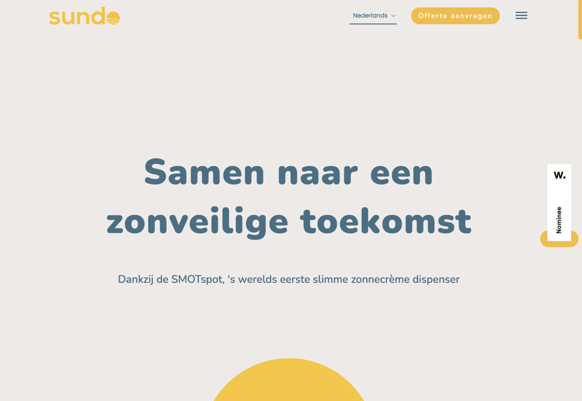
Sundo

Sundo has created SMOTSpots – smart sunscreen dispensers for public areas. The tone of the site is suitably utilitarian with a soft edge.

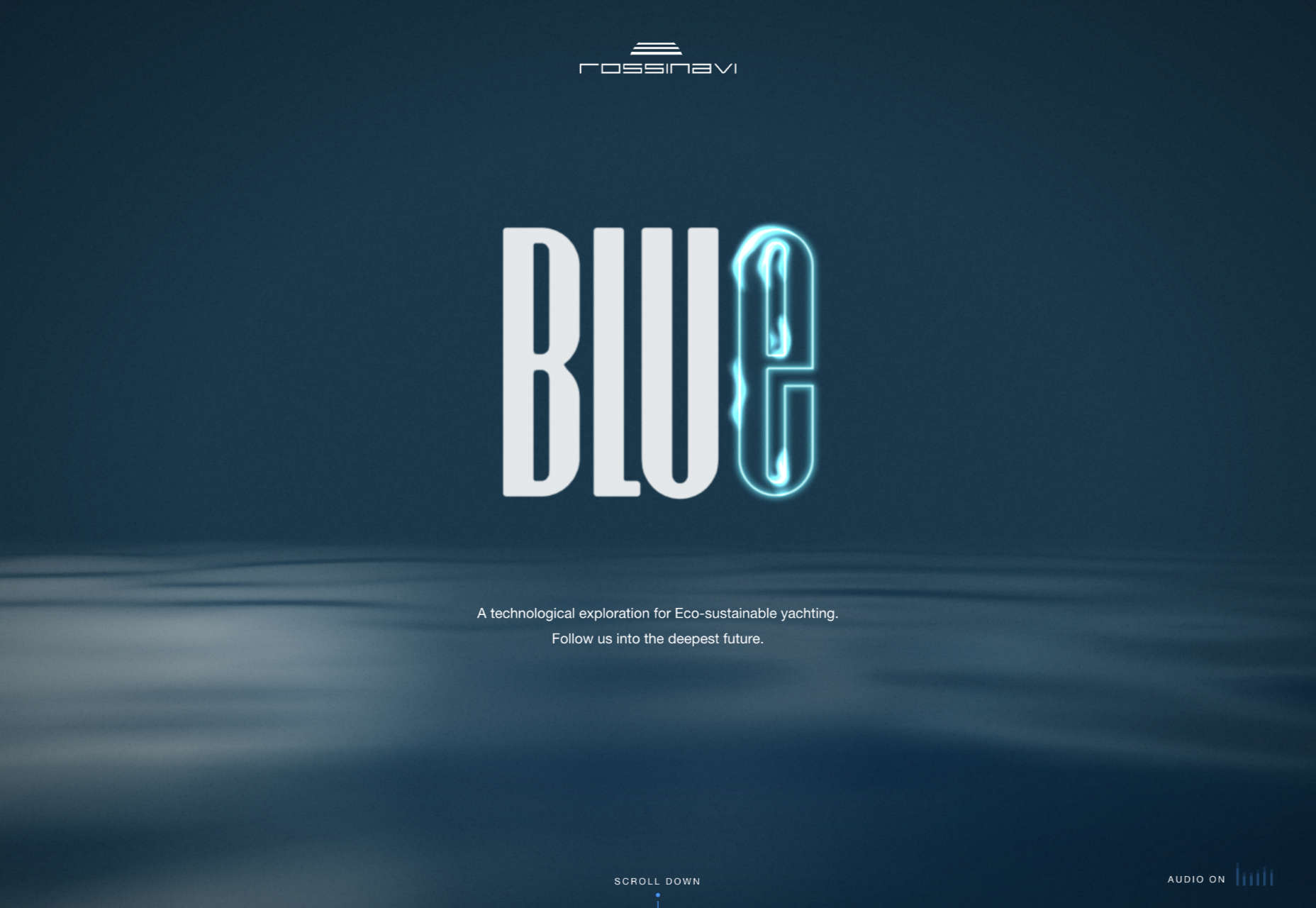
Blue

The Blue experience from Rossinavi luxury boat builders is a pleasing immersive microsite showcasing their new hybrid-electric boats.

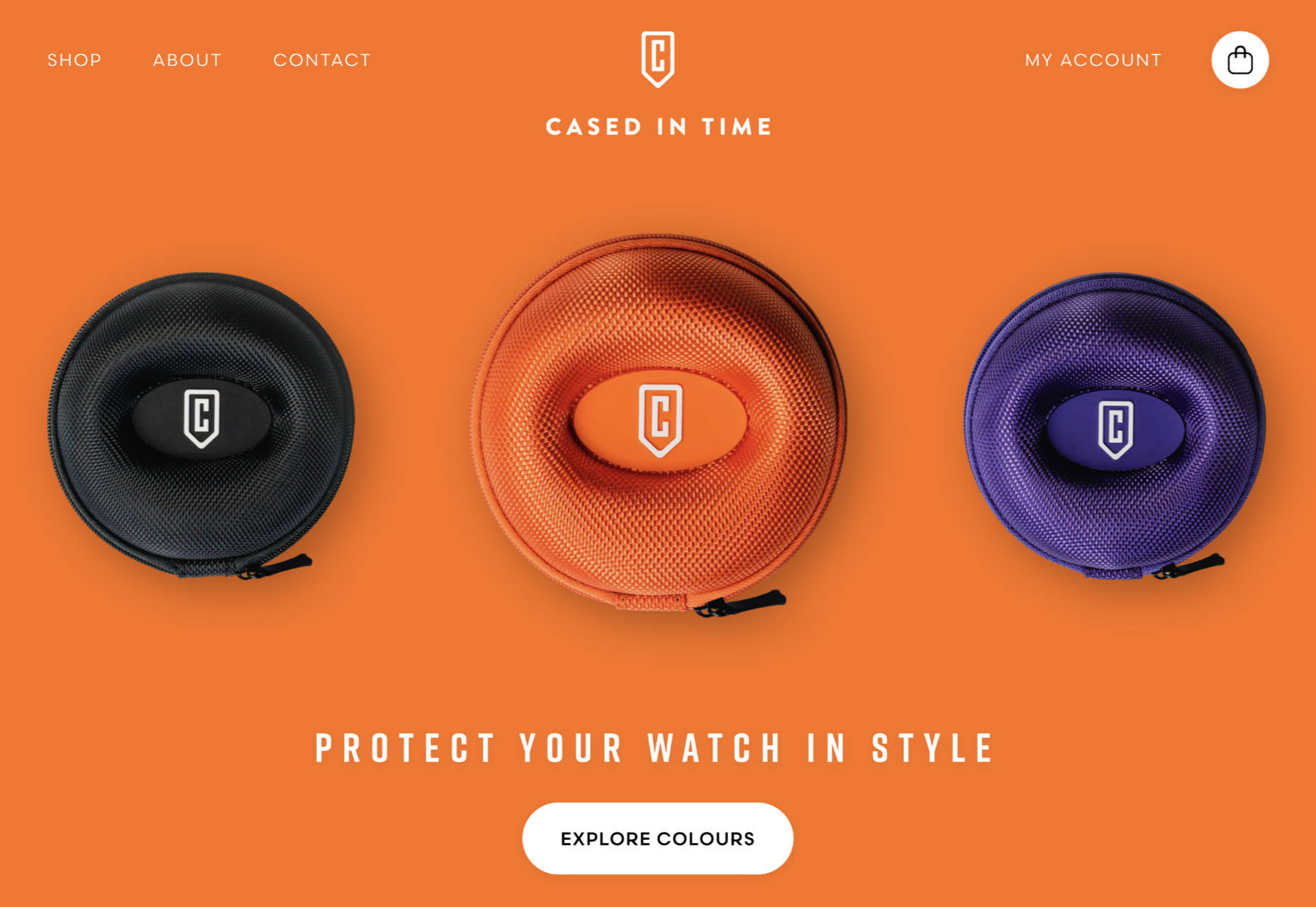
Cased in Time

This site is an excellent example of how to make a single product commerce site that doesn’t feel lacking in content.

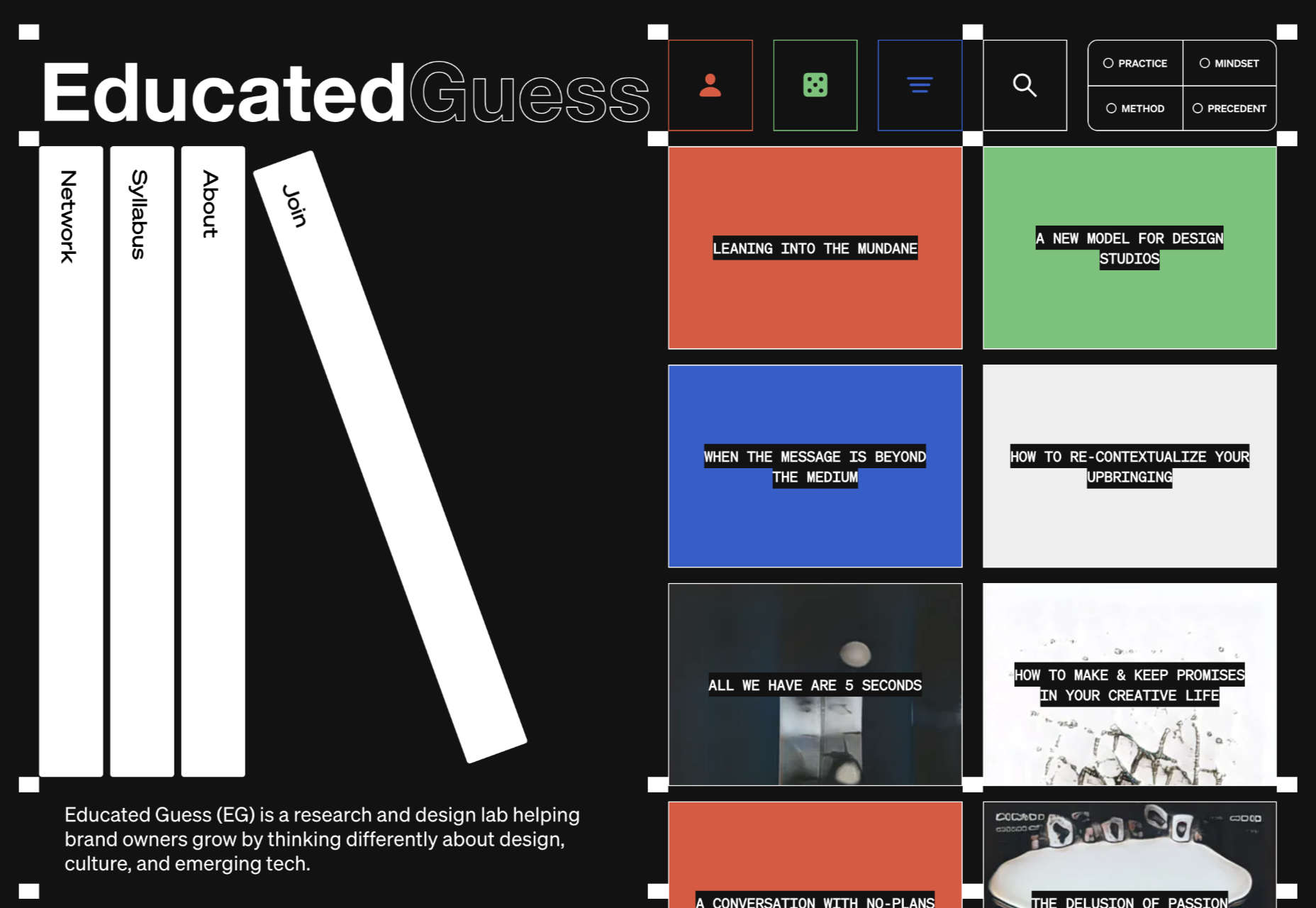
Educated Guess

Educated Guess is a podcast for creatives by creatives. The accompanying website is pleasing to use, easy to navigate, and allows the user to focus on the content.

Source

The post 20 Best New Websites, September 2022 first appeared on Webdesigner Depot.
Source de l’article sur Webdesignerdepot

Web design is often stagnant because designers look at the same work and follow the same trends. Unfortunately, algorithms promote work that is liked, and designers produce content to get likes, which leads to a self-feeding cycle.
We’ve been talking about the dribbblization of design for years, but Behance is just as guilty of promoting and encouraging homogenous design.

It’s not that Dribbble and Behance don’t have value; they are both excellent resources for designers. But they’re victims of their own success, and it’s healthier for them, designers, and the industry if we broaden our sources of design inspiration.

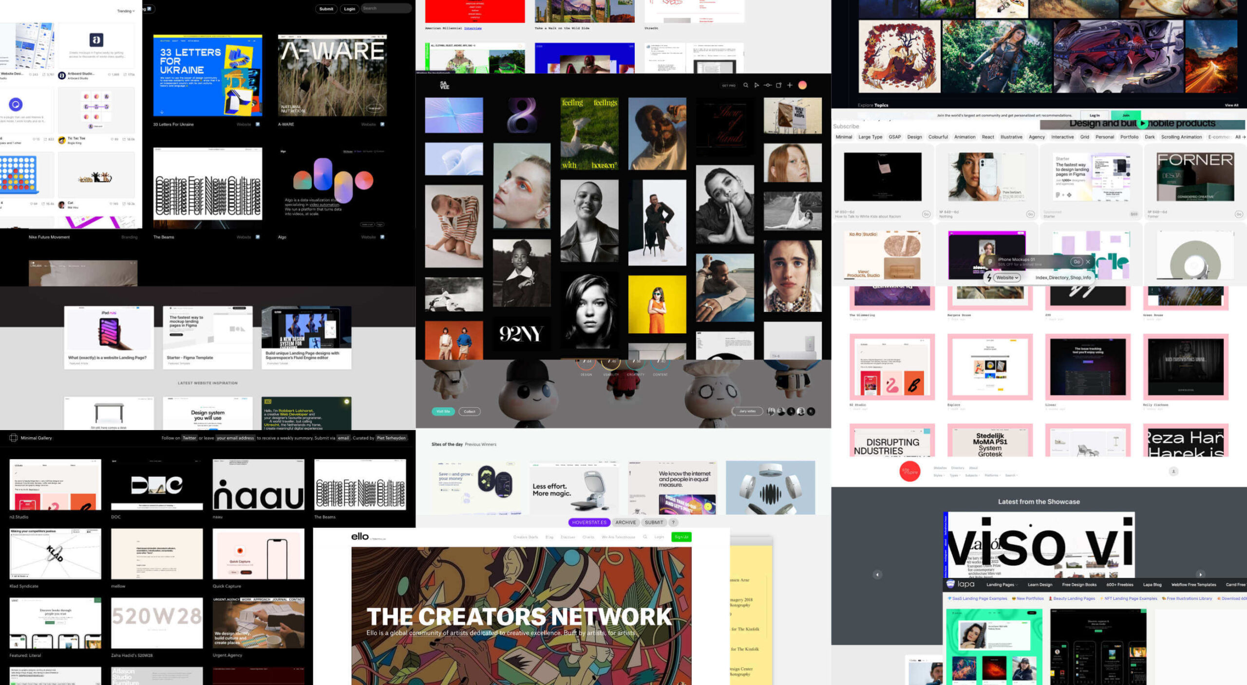
And so, today, we’re presenting this list of the best places to find design inspiration for web designers that aren’t Dribbble or Behance. (OK, you can check them out too, if you really want to!)

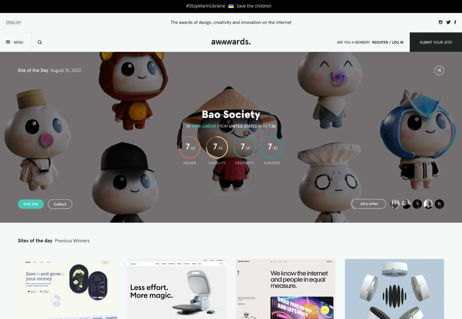
Awwwards

Awwwards is the top site for web design inspiration. The best agencies in the world post here, and a ‘Site of the Day’ award is a coveted accolade. So if you’re looking for design inspiration, this should be your first stop.

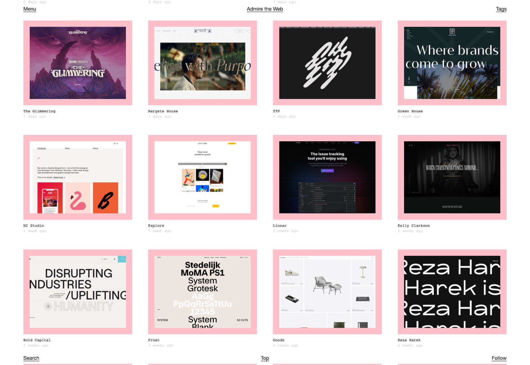
Admire The Web

Admire The Web is an excellent collection of curated sites. It’s more selective than sites like Awwwards, so you don’t have to dig through so much to find the best web design.

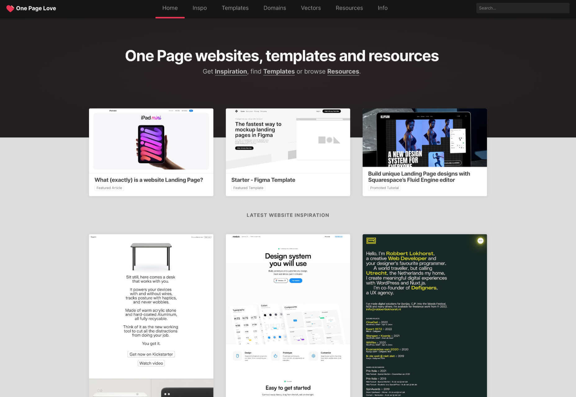
One Page Love

One Page Love is one of the best resources for designers seeking inspiring new ideas. It’s devoted to one-pagers, which means it leans towards apps, tech start-ups, and smaller independent projects.

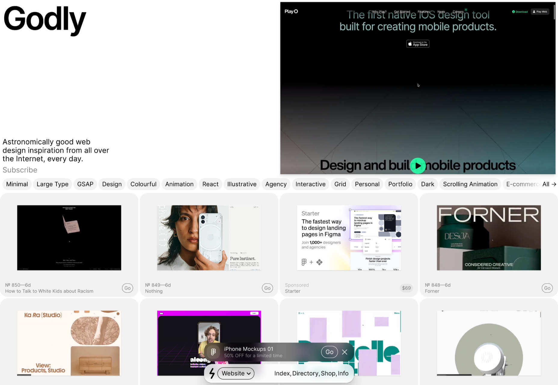
Godly

Godly is another excellent collection of web design inspiration. Godley uses animated thumbnails, so you can get a sense of a site before you look at it in detail. As such, it’s perfect for animated landing pages.

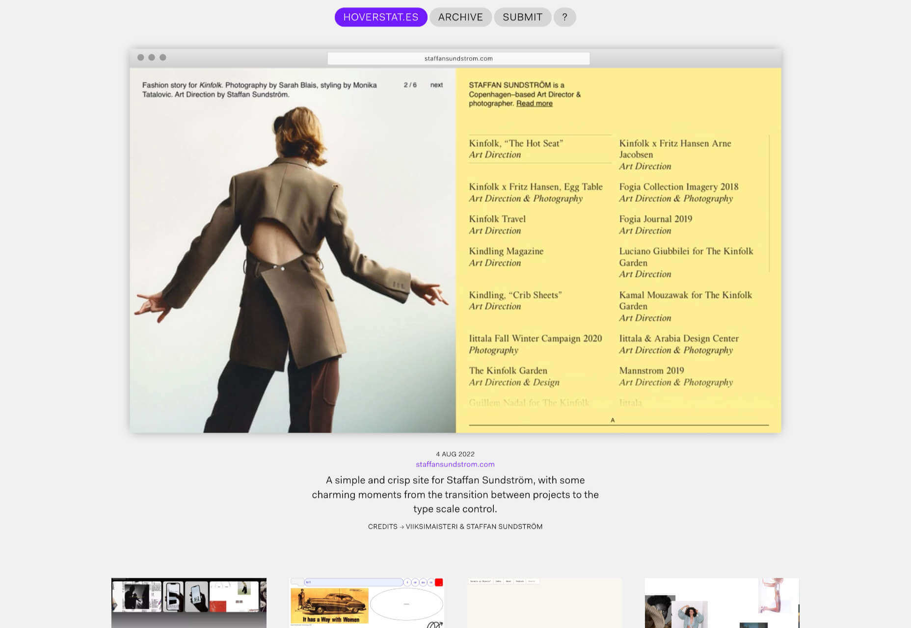
Hoverstat.es

Hoverstat.es is a collection of curated websites that often finds little gems other sites miss. Unlike most roundups, it doesn’t go into much detail on each site, and new sites are infrequent, but it’s always worth a browse.

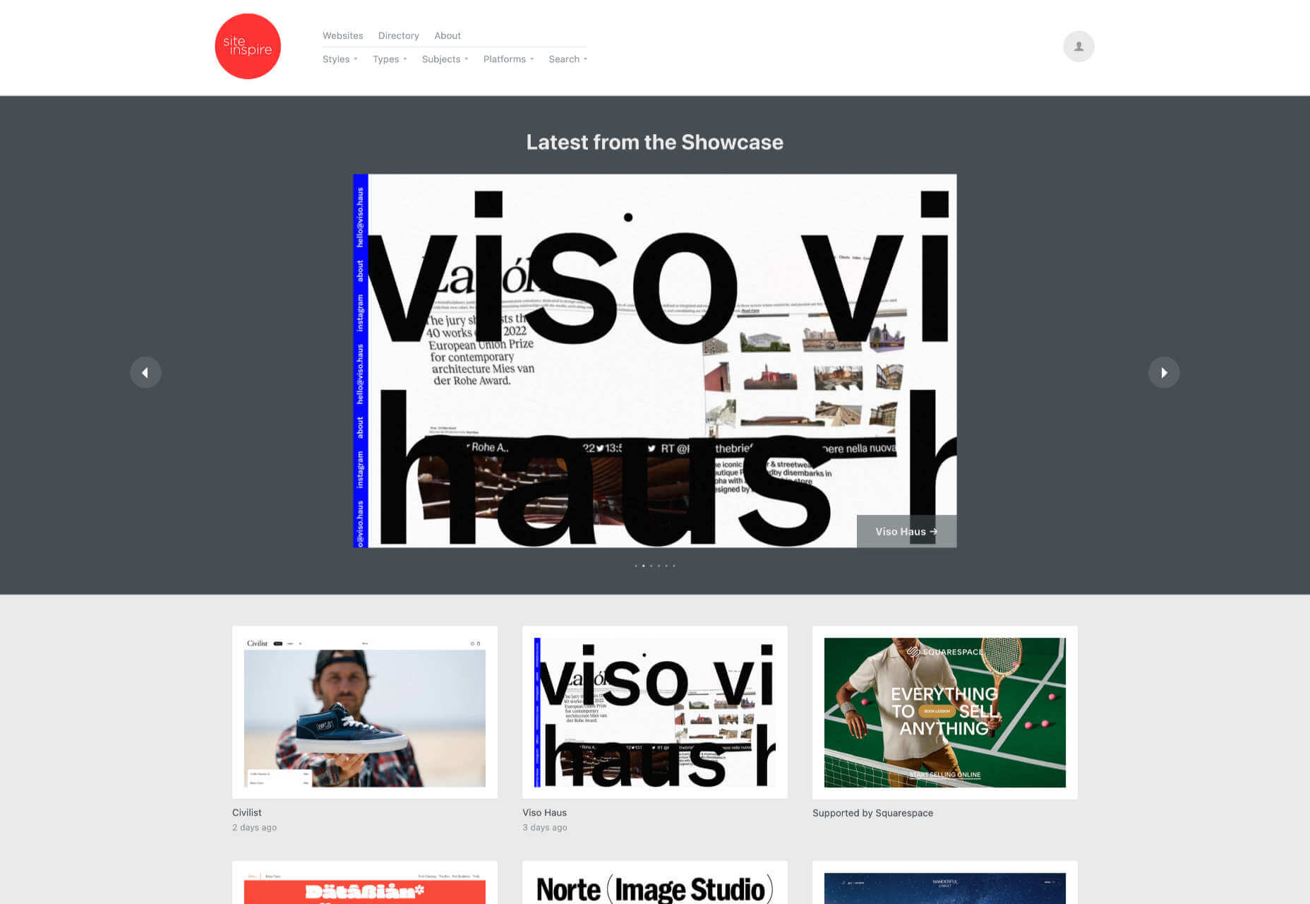
Siteinspire

Siteinspire is one of the most established design inspiration sites. The collection is carefully divided into different styles; if you find your own site listed, you can add your contact details.

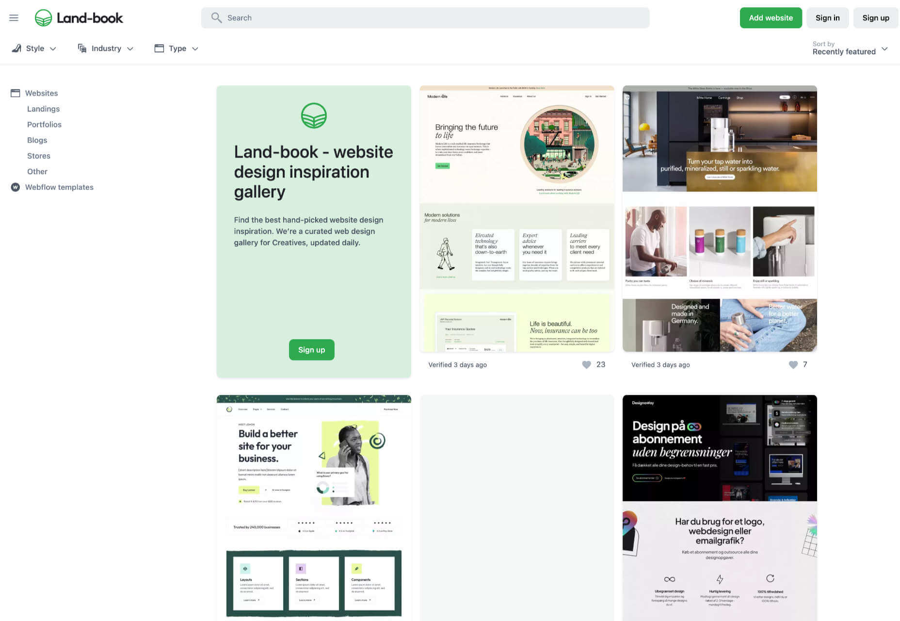
Land-book

Land-book is a curated collection of the best sites on the web. The site does a great job of presenting screenshots clearly, and the similar sites feature is great for browsing a particular mood.

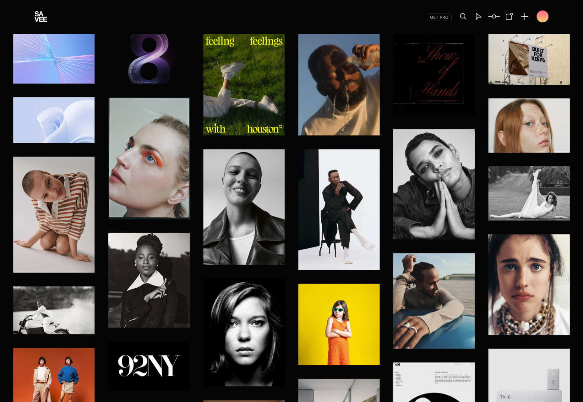
Savee

Savee is a fantastic site for browsing all kinds of design inspiration. It’s like Pinterest for designers as it leans towards art direction and photography. It’s easy to scan for mood boards.

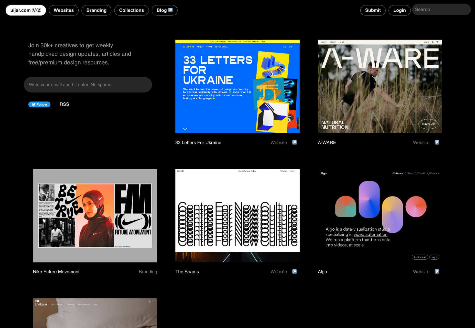
UIJar

UIJar is a nicely designed collection of hand-picked websites. Unlike most other sites on this list, UIJar also features a collection of branding that’s great for identity designers.

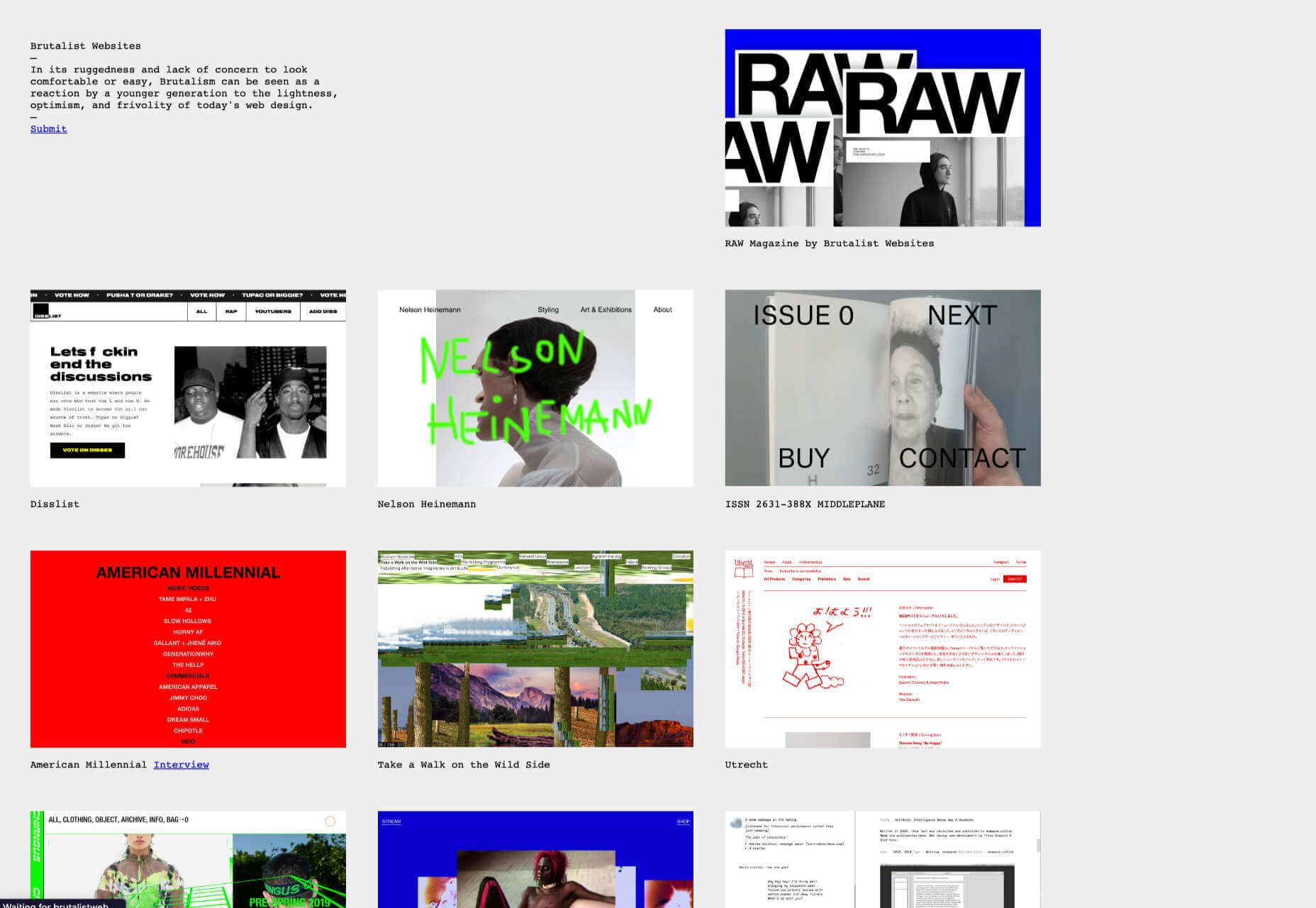
Brutalist Websites

Brutalist Websites is the perfect inspiration site if you’re a fan of the Brutalist design trend. There are plenty of designs that show why Brutalism is so popular right now, but the site itself is probably short-lived.

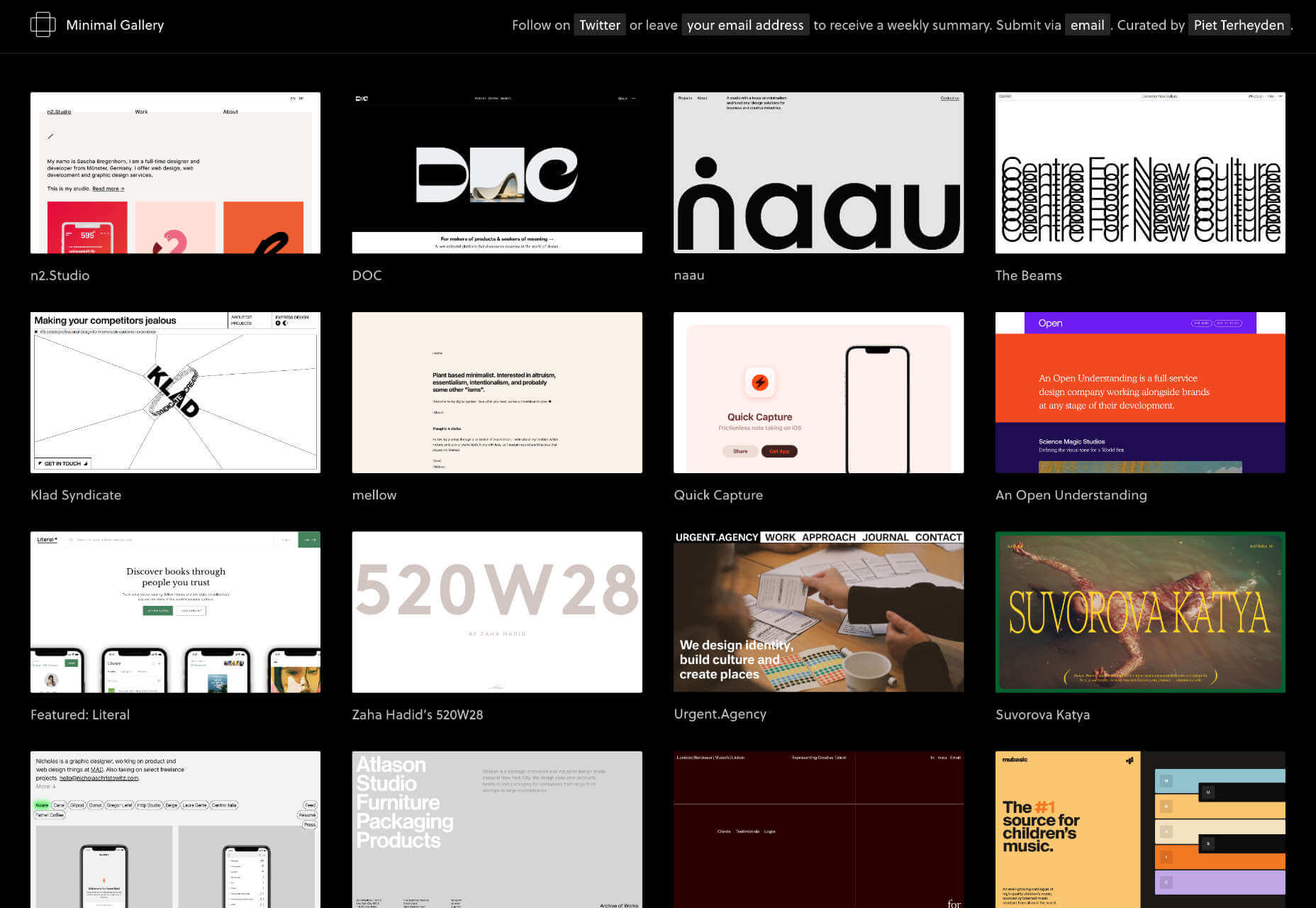
Minimal Gallery

Minimal Gallery is a collection of sites that embrace minimalism. Like Brutalist Websites, the quality of the collection is very high, but the site’s lifespan is probably short-lived thanks to being tied to one trend.

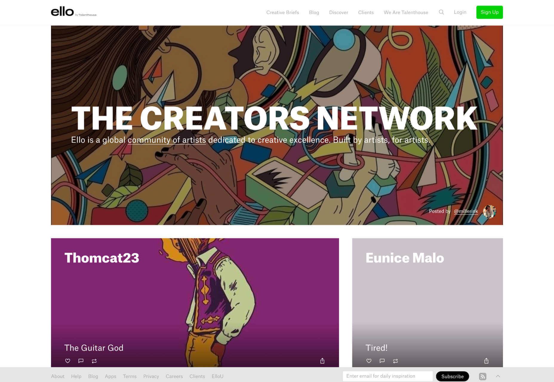
Ello

Ello is a platform for showcasing excellent design work. It’s solid on illustration and artwork. There’s also a great deal of photography on show. You’ll also find regular opportunities tied to creative briefs.

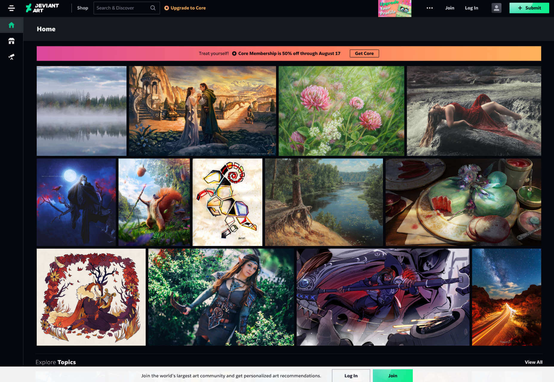
DeviantArt

DeviantArt is still the largest, and arguably the best, showcase for illustration, with dozens of styles from Anime to classicism. It’s easy to lose a few hours browsing DeviantArt.

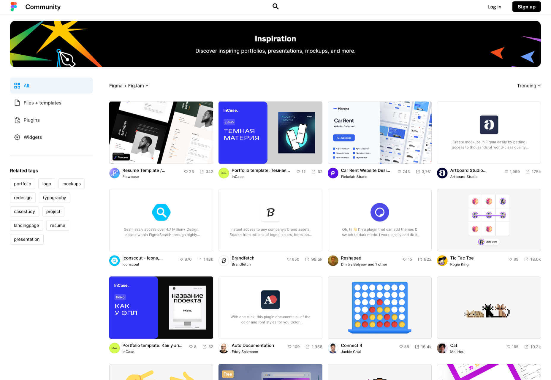
Figma Community

Figma Community is a collection of the best work from the Figma community. But you don’t need to be a Figma user to grab some inspiration from the UI work on show.

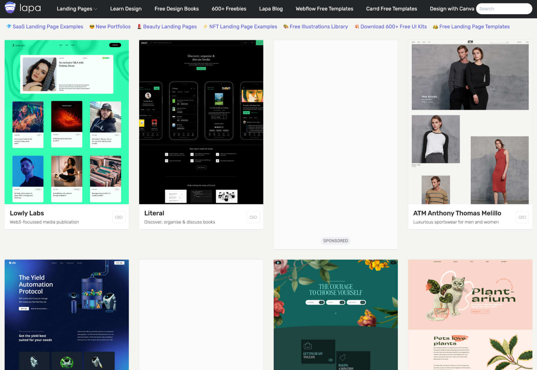
Lapa

Lapa is a collection of 5000+ landing pages. The collection is headhunted from around the web, so if you only have time to check out one site, Lapa could be a good choice.

Source

The post 15 Inspiring Alternatives to Dribbble & Behance first appeared on Webdesigner Depot.

Source de l’article sur Webdesignerdepot

API management solutions, also known as API gateways, are a must in the day and age of APIs. However, once you’ve set up such a gateway, you can use it for different purposes unrelated to APIs. Today, I want to show you how to improve the security of web apps.

Prevent Sniffing

Browsers are fantastic pieces of technology that try to make the life of users as comfortable as possible. However, the balance between ease of use and security may sometimes tip on the former to the latter’s detriment. For example, if an HTTP response doesn’t set the content type, the browser may try to infer it:

Source de l’article sur DZONE