 Websites haven’t always been as adaptable as they are today. For modern designers, “responsivity” is one of the most significant defining factors of a good design. After all, we’re now catering to a host of users who frequently jump between mobile and desktop devices with varying screen sizes.
However, the shift to responsive design didn’t happen overnight. For years, we’ve been tweaking the concept of “responsive web design” to eventually reach the stage we’re at today.
Today, we’re going to take a closer look at the history of responsive web design.
Where Did Web Design Begin?
When the first websites were initially created, no one was worried about responsivity across a range of screens. All sites were designed to fit the same templates, and developers didn’t spend a lot of time on concepts like design, layout, and typography.
Even when the wider adoption of CSS technology began, most developers didn’t have to worry much about adapting content to different screen sizes. However, they still found a few ways to work with different monitor and browser sizes.
Liquid Layouts
The main two layout options available to developers in the early days were fixed-width, or liquid layout.
With fixed-width layouts, the design was more likely to break if your monitor wasn’t the exact same resolution as the one the site was designed on. You can see an example here.
Alternatively, liquid layouts, coined by Glenn Davis, were considered one of the first revolutionary examples of responsive web design.
Liquid layouts could adapt to different monitor resolutions and browser sizes. However, content could also overflow, and text would frequently break on smaller screens.
Resolution-Dependent Layouts
In 2004, a blog post by Cameron Adams introduced a new method of using JavaScript to swap out stylesheets based on a browser window size. This technique became known as “resolution-dependent layouts”. Even though they required more work from developers, resolution-dependent layouts allowed for more fine-grained control over the site’s design.
The resolution-dependent layout basically functioned as an early version of CSS breakpoints, before they were a thing. The downside was developers had to create different stylesheets for each target resolution and ensure JavaScript worked across all browsers.
With so many browsers to consider at the time, jQuery became increasingly popular as a way to abstract the differences between browser options away.
The Rise of Mobile Subdomains
The introduction of concepts like resolution-dependent designs was happening at about the same time when many mobile devices were becoming more internet-enabled. Companies were creating browsers for their smartphones, and developers suddenly needed to account for these too.
Though mobile subdomains aimed to offer users the exact same functions they’d get from a desktop site on a smartphone, they were entirely separate applications.
Having a mobile subdomain, though complex, did have some benefits, such as allowing developers to specifically target SEO to mobile devices, and drive more traffic to mobile site variations. However, at the same time, developers then needed to manage two variations of the same website.
Back at the time when Apple had only just introduced its first iPad, countless web designers were still reliant on this old-fashioned and clunky strategy for enabling access to a website on every device. In the late 2000s, developers were often reliant on a number of tricks to make mobile sites more accessible. For instance, even simple layouts used the max-width: 100% trick for flexible images.
Fortunately, everything began to change when Ethan Marcotte coined the term “Responsive Web Design” on A List Apart. This article drew attention to John Allsopp’s exploration of web design architectural principles, and paved the way for all-in-one websites, capable of performing just as well on any device.
A New Age of Responsive Web Design
Marcotte’s article introduced three crucial components developers would need to consider when creating a responsive website: fluid grids, media queries, and flexible images.
Fluid Grids
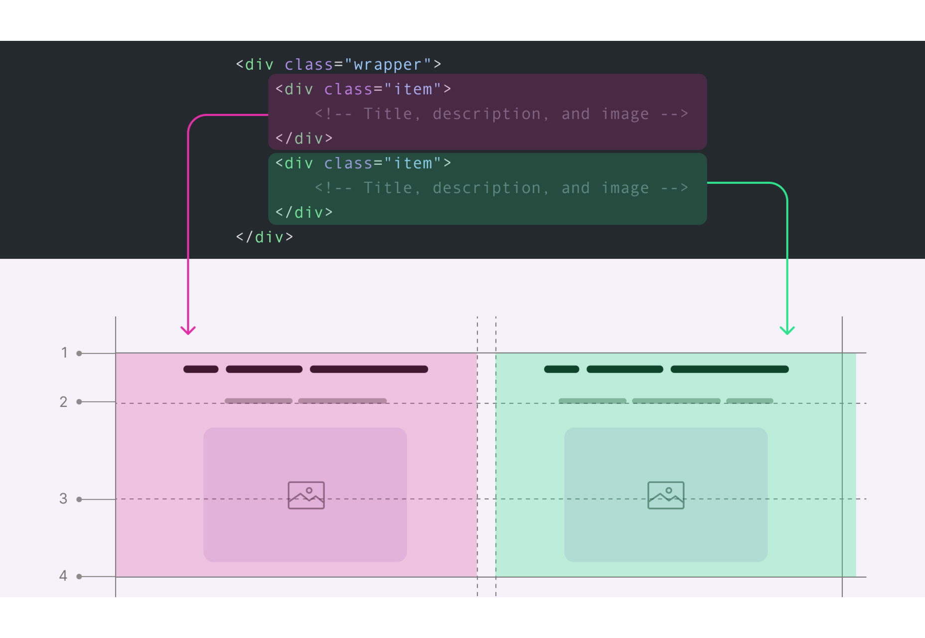
The concept of fluid grids introduced the idea that websites should be able to adopt a variety of flexible columns that grow or shrink depending on the current size of the screen.
On mobile devices, this meant introducing one or two flexible content columns, while desktop devices could usually show more columns (due to greater space).
Flexible Images
Flexible images introduced the idea that, like content, images should be able to grow or shrink alongside the fluid grid they’re located in. As mentioned above, previously, developers used something called the “max-width” trick to enable this.
If you were holding an image in a container, then it could easily overflow, particularly if the container was responsive. However, if you set the “max-width” to 100%, the image just resizes with its parent container.
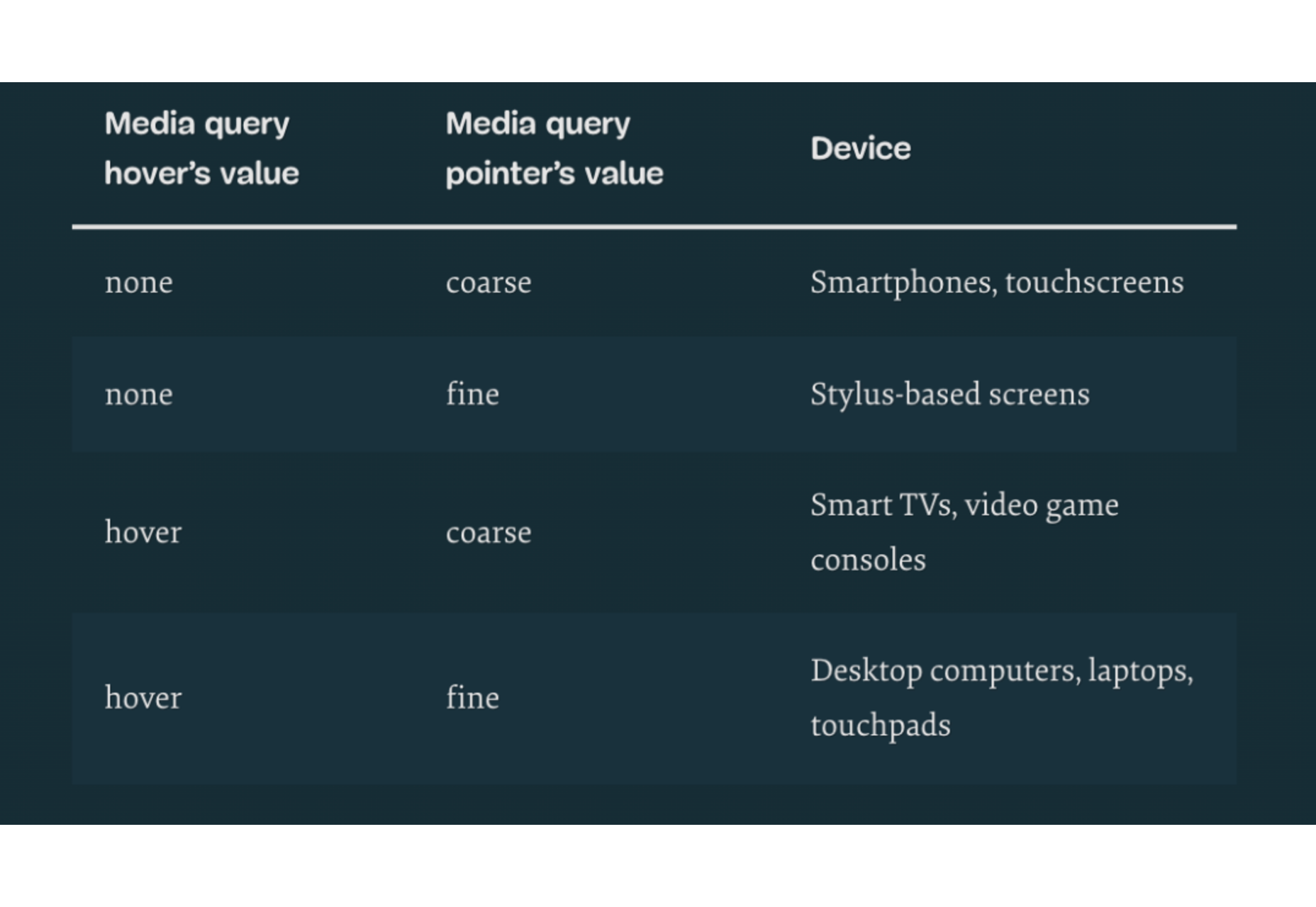
Media Queries
The idea of “media queries” referred to the CSS media queries, introduced in 2010 but not widely adopted until officially released as a W3 recommendation 2 years later. Media queries are essentially CSS rules triggered based on options like media type (print, screen, etc), and media features (height, width, etc).
Though they were simpler at the time, these queries allowed developers to essentially implement a simple kind of breakpoint – the kind of tools used in responsive design today. Breakpoints refer to when websites change their layout or style based on the browser window or device width.
Viewport Meta tags need to be used in most cases to ensure media queries work in the way today’s developers expect.
The Rise of Mobile-First Design
Since Marcotte’s introduction of Responsive Web Design, developers have been working on new ways to implement the idea as effectively as possible. Most developers now split into two categories, based on whether they consider the needs of the desktop device user first, or the needs of the mobile device user. The trend is increasingly accelerating towards the latter.
When designing a website from scratch in an age of mobile-first browsing, most developers believe that mobile-first is the best option. Mobile designs are often much simpler, and more minimalist, which matches a lot of the trends of current web design.
Taking the mobile first route means assessing the needs of the website from a mobile perspective first. You’d write your styles normally, using breakpoints once you start creating desktop and tablet layouts. Alternatively, if you took the desktop-first approach, you would need to constantly adapt it to smaller devices with your breakpoint choices.
Exploring the Future of Responsive Web Design
Responsive web design still isn’t perfect. There are countless sites out there that still fail to deliver the same incredible experience across all devices. What’s more, new challenges continue to emerge all the time, like figuring out how to design for new devices like AR headsets and smartwatches.
However, it’s fair to say we’ve come a long way since the early days of web design.
Featured image via Pexels.
Source
The post A Brief History of Responsive Web Design first appeared on Webdesigner Depot.
Source de l’article sur Webdesignerdepot
 Every day design fans submit incredible industry stories to our sister-site, Webdesigner News. Our colleagues sift through it, selecting the very best stories from the design, UX, tech, and development worlds and posting them live on the site.


 Every day design fans submit incredible industry stories to our sister-site, Webdesigner News. Our colleagues sift through it, selecting the very best stories from the design, UX, tech, and development worlds and posting them live on the site.


 Every day design fans submit incredible industry stories to our sister-site, Webdesigner News. Our colleagues sift through it, selecting the very best stories from the design, UX, tech, and development worlds and posting them live on the site.
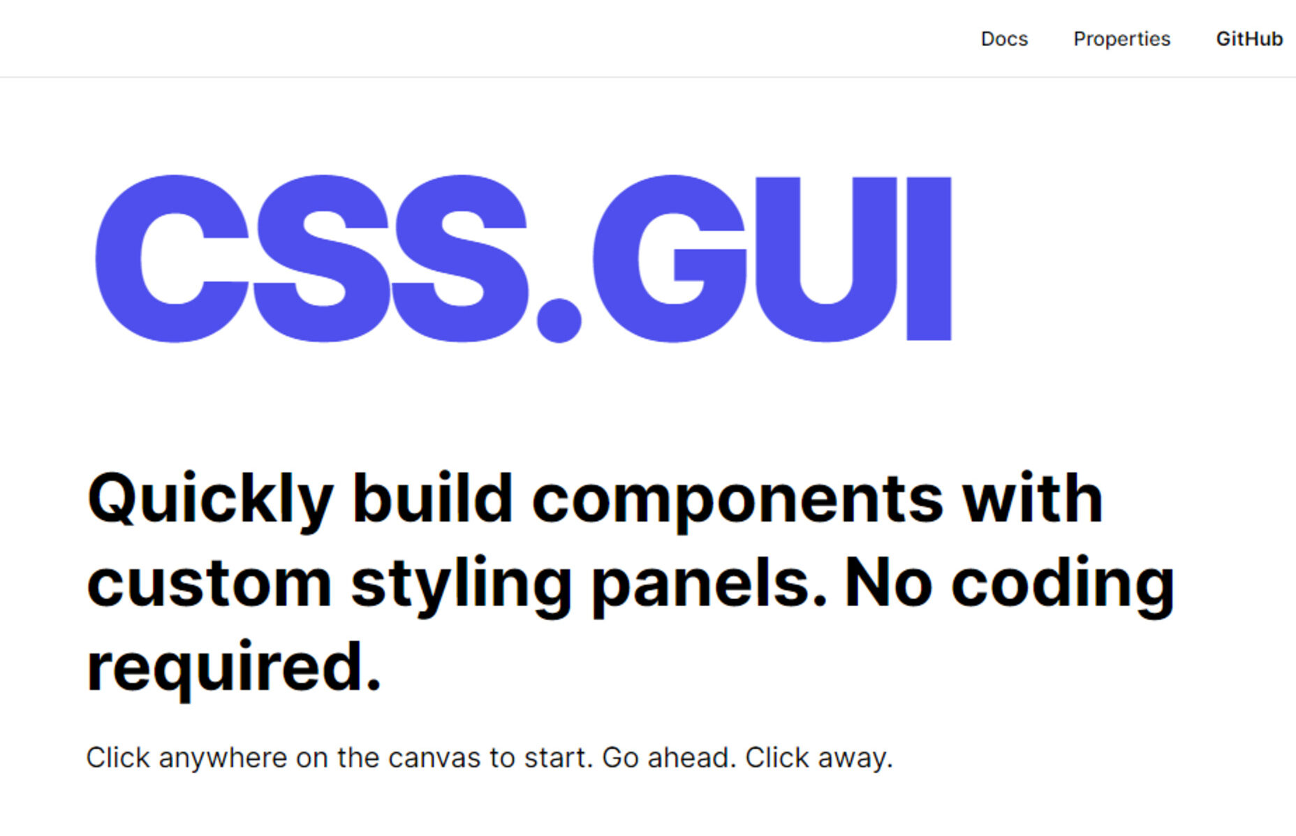

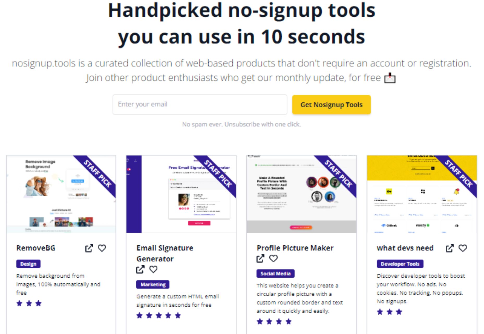
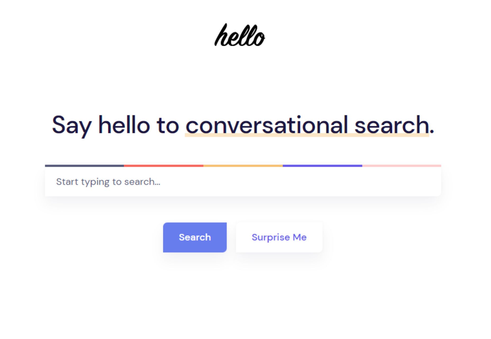

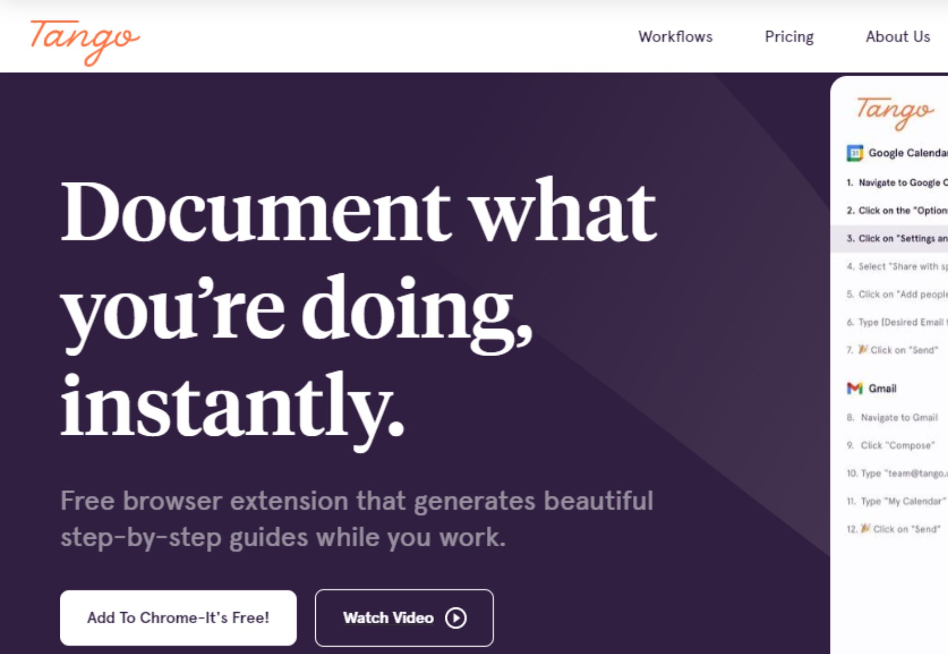


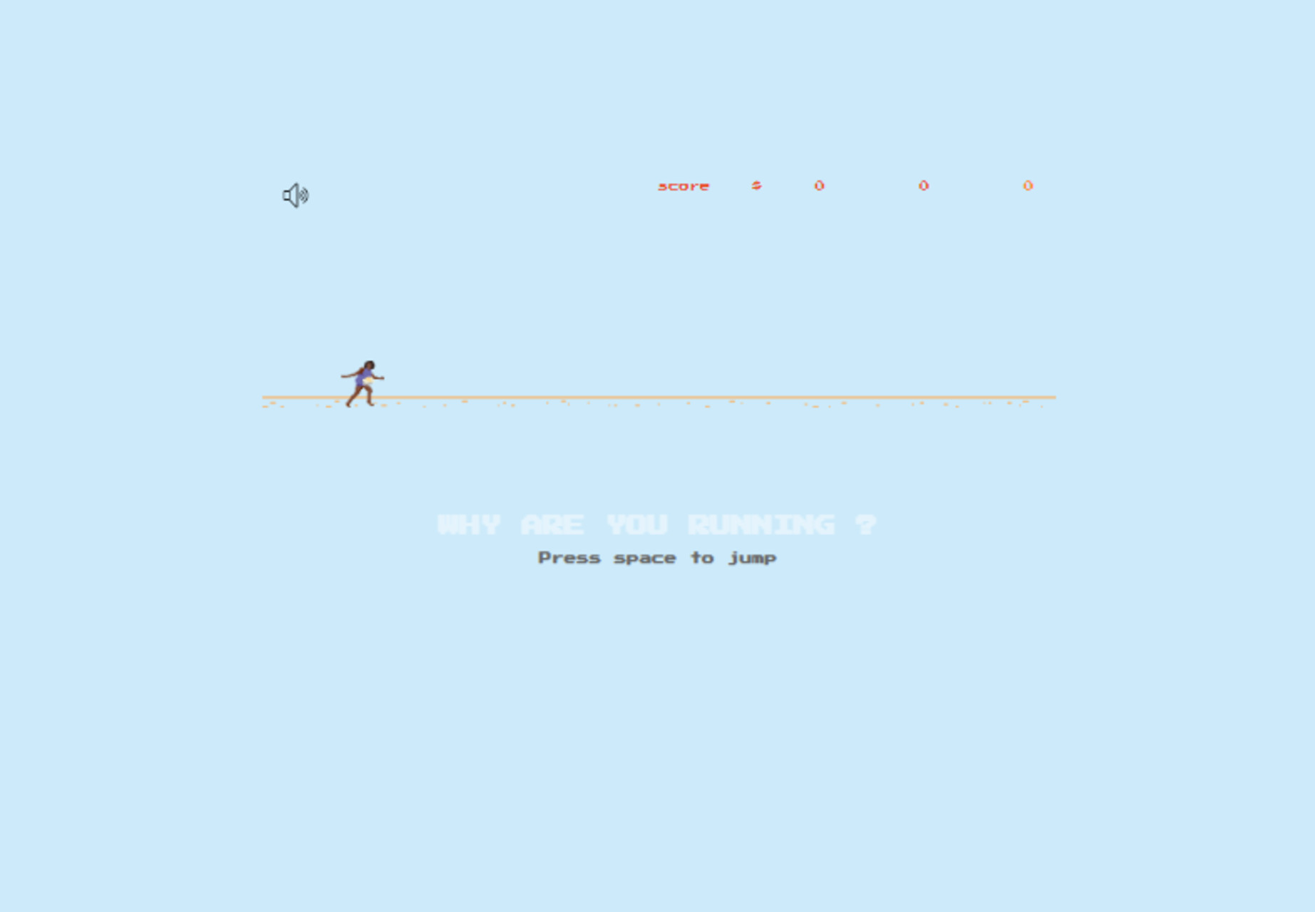
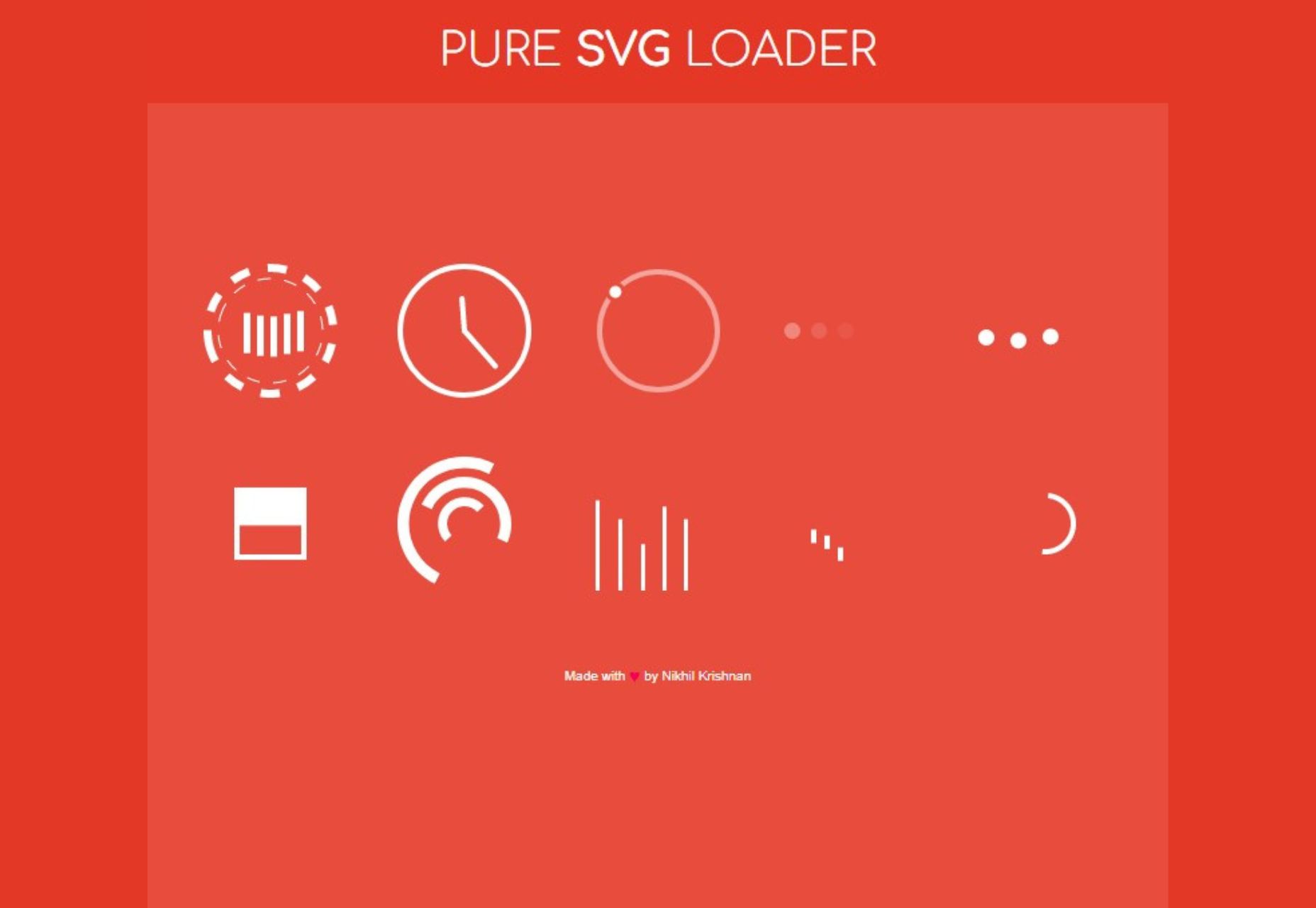
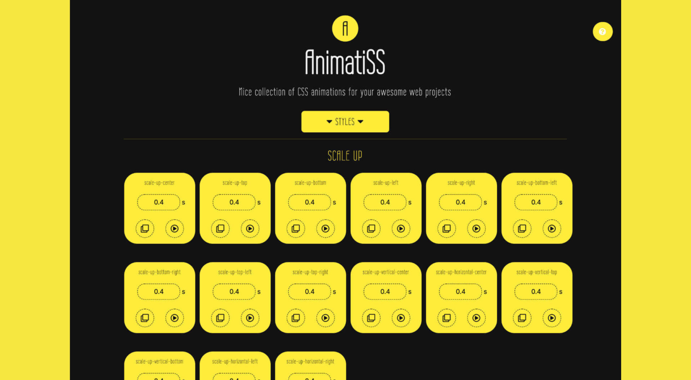
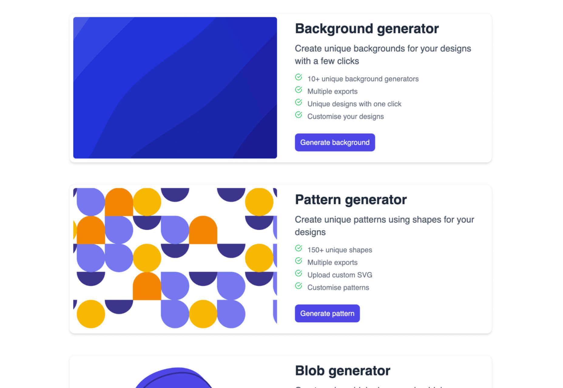
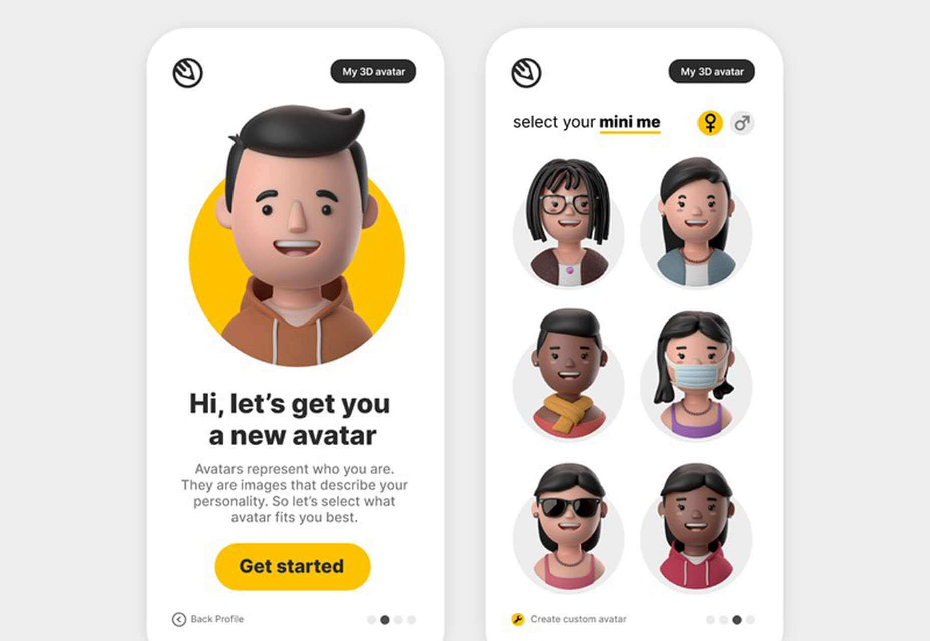
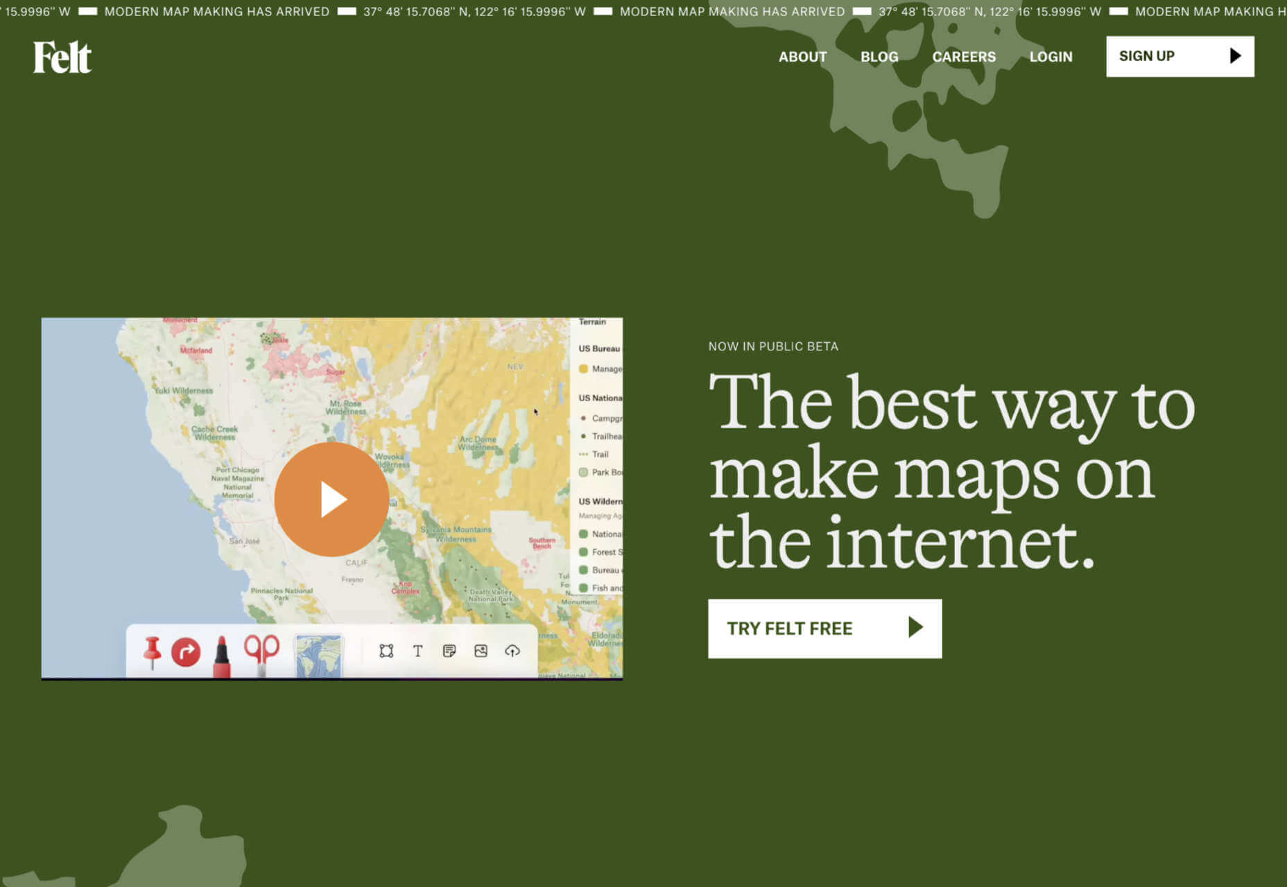
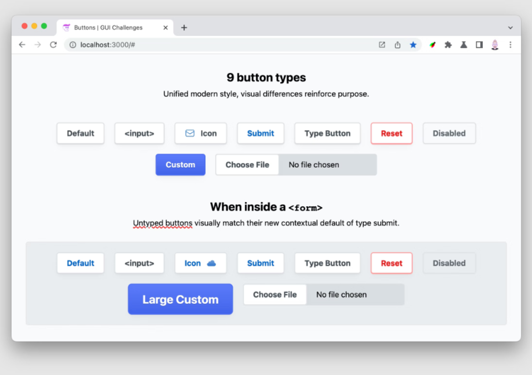
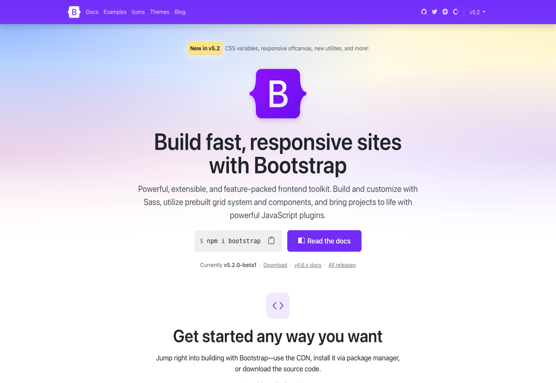
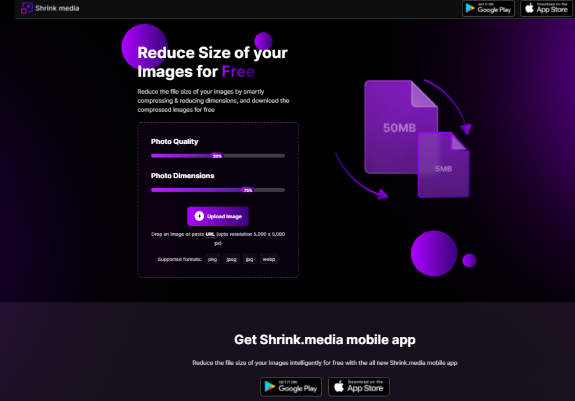
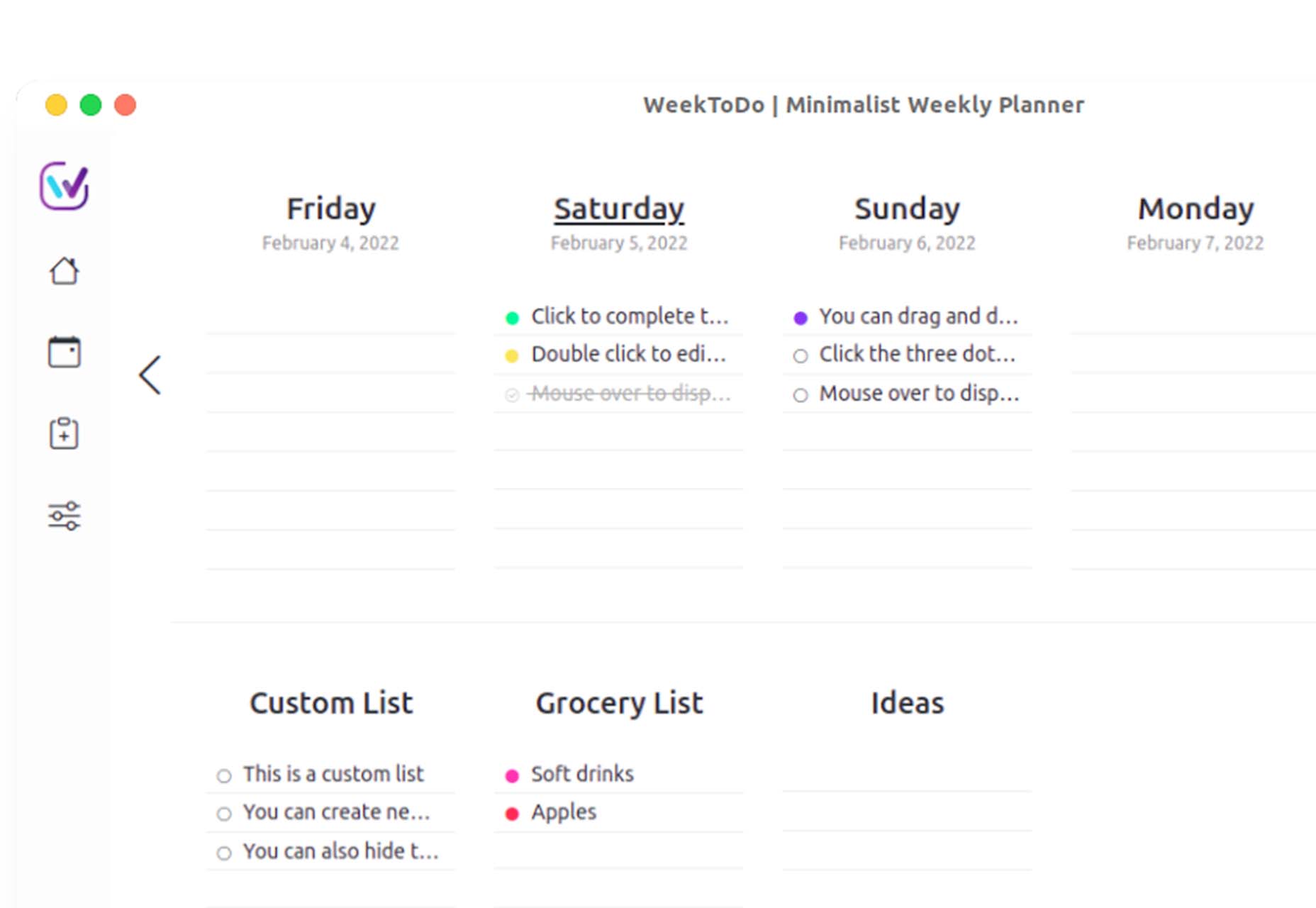
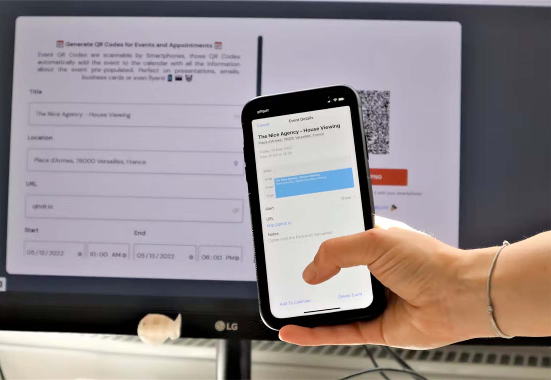
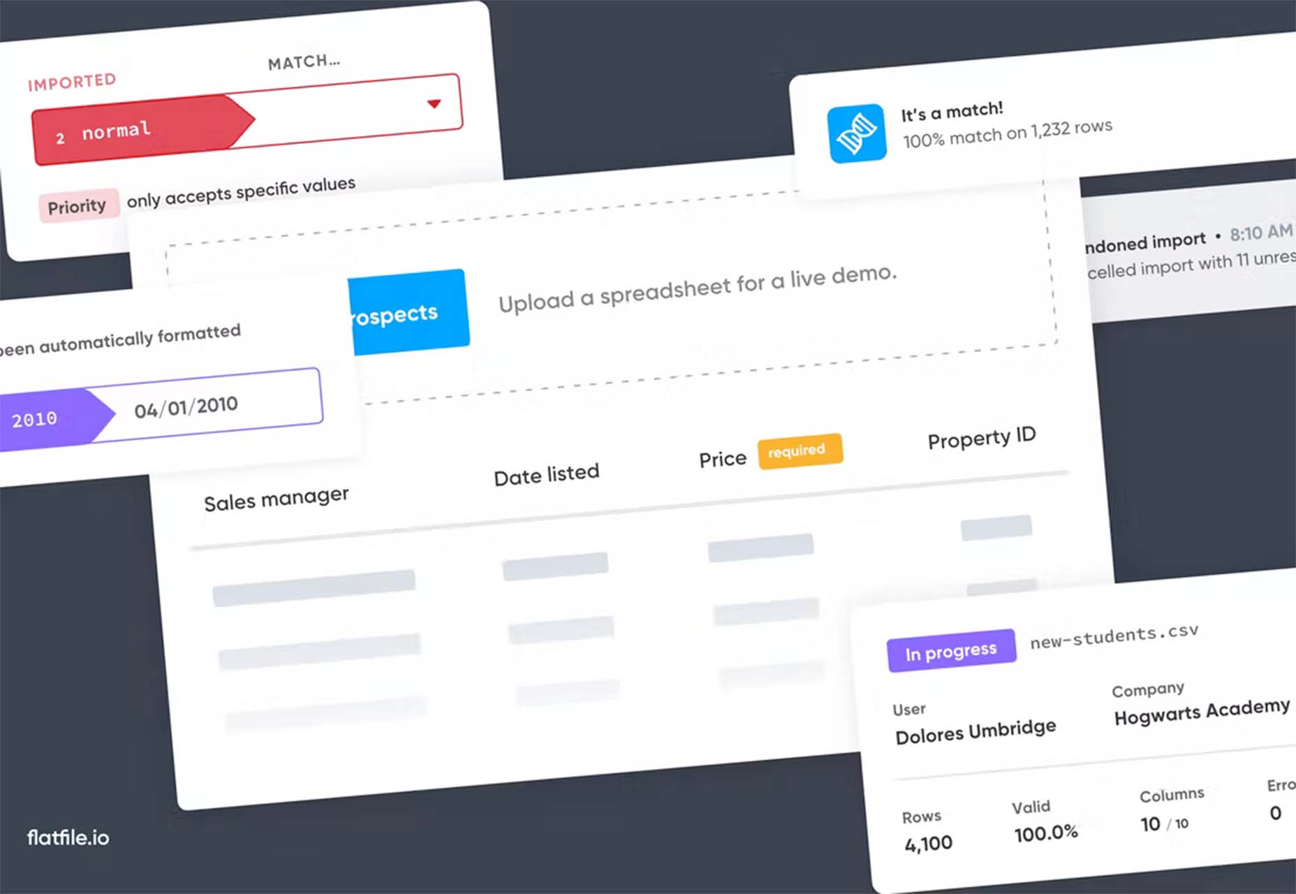
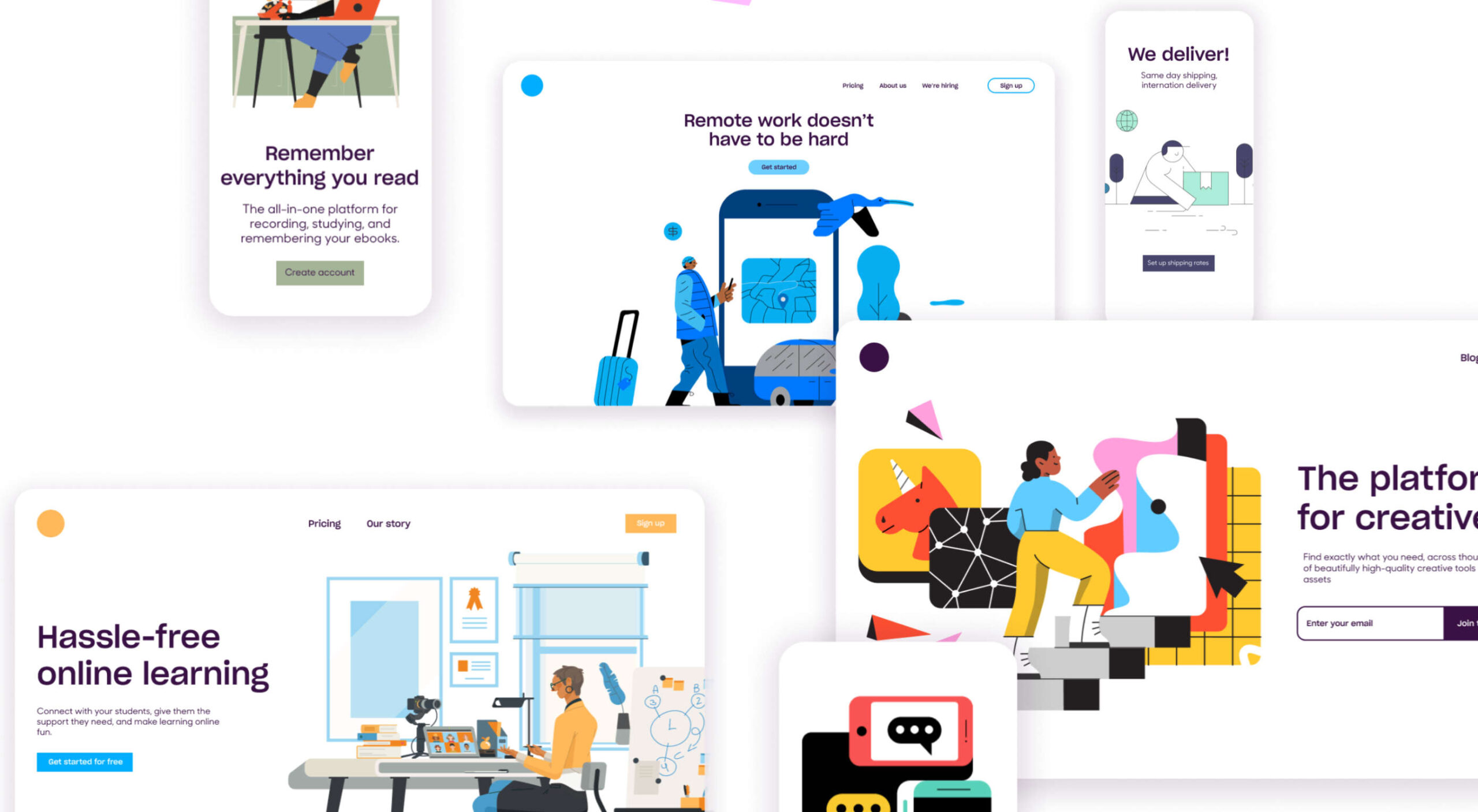 Automation is the theme of this month’s collection of exciting new tools for designers and developers. There are tools to make your images better, tools to create illustrations, and tools to make your workflow more efficient. Plus, a whole host of tools that are just plain fun.
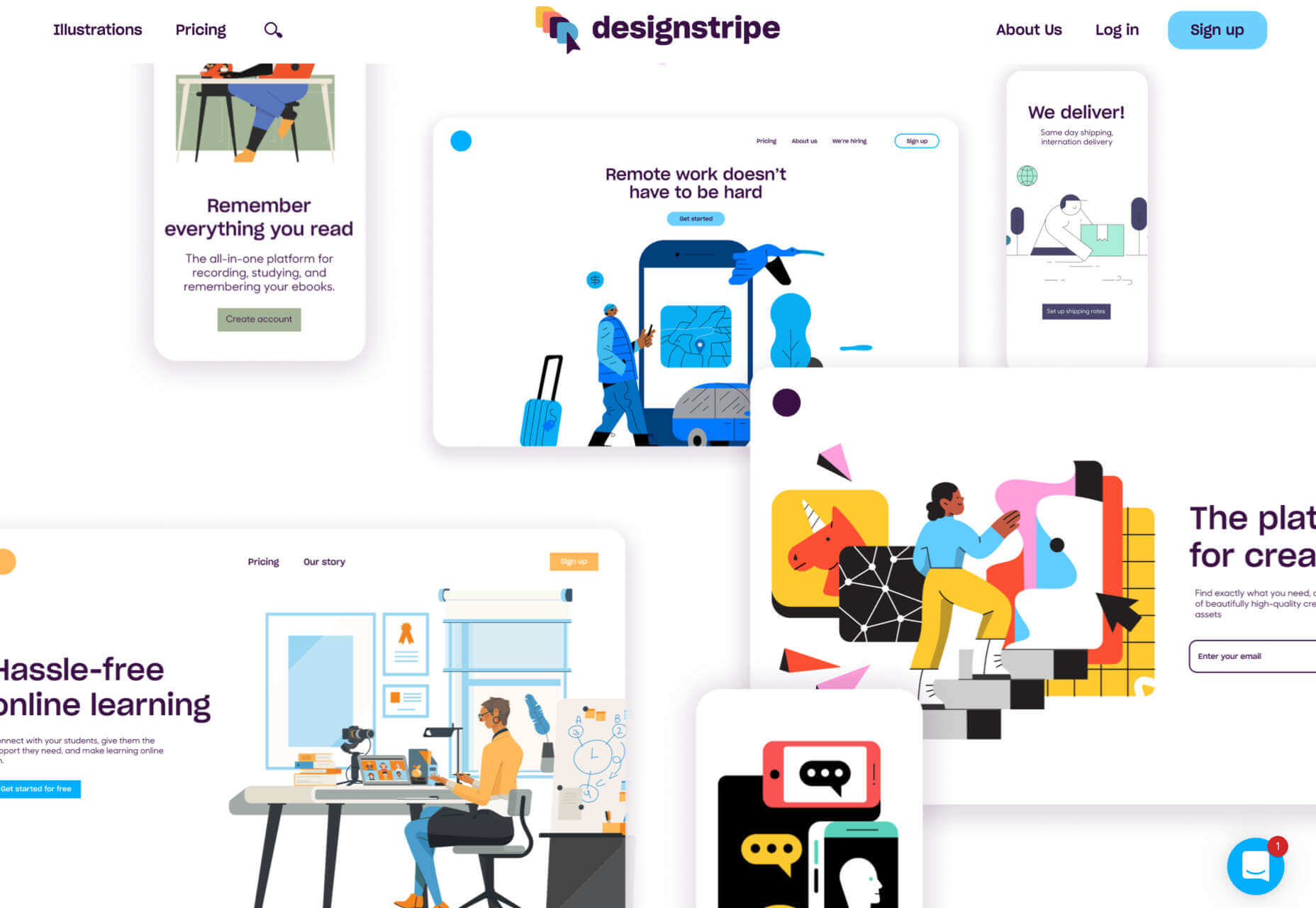


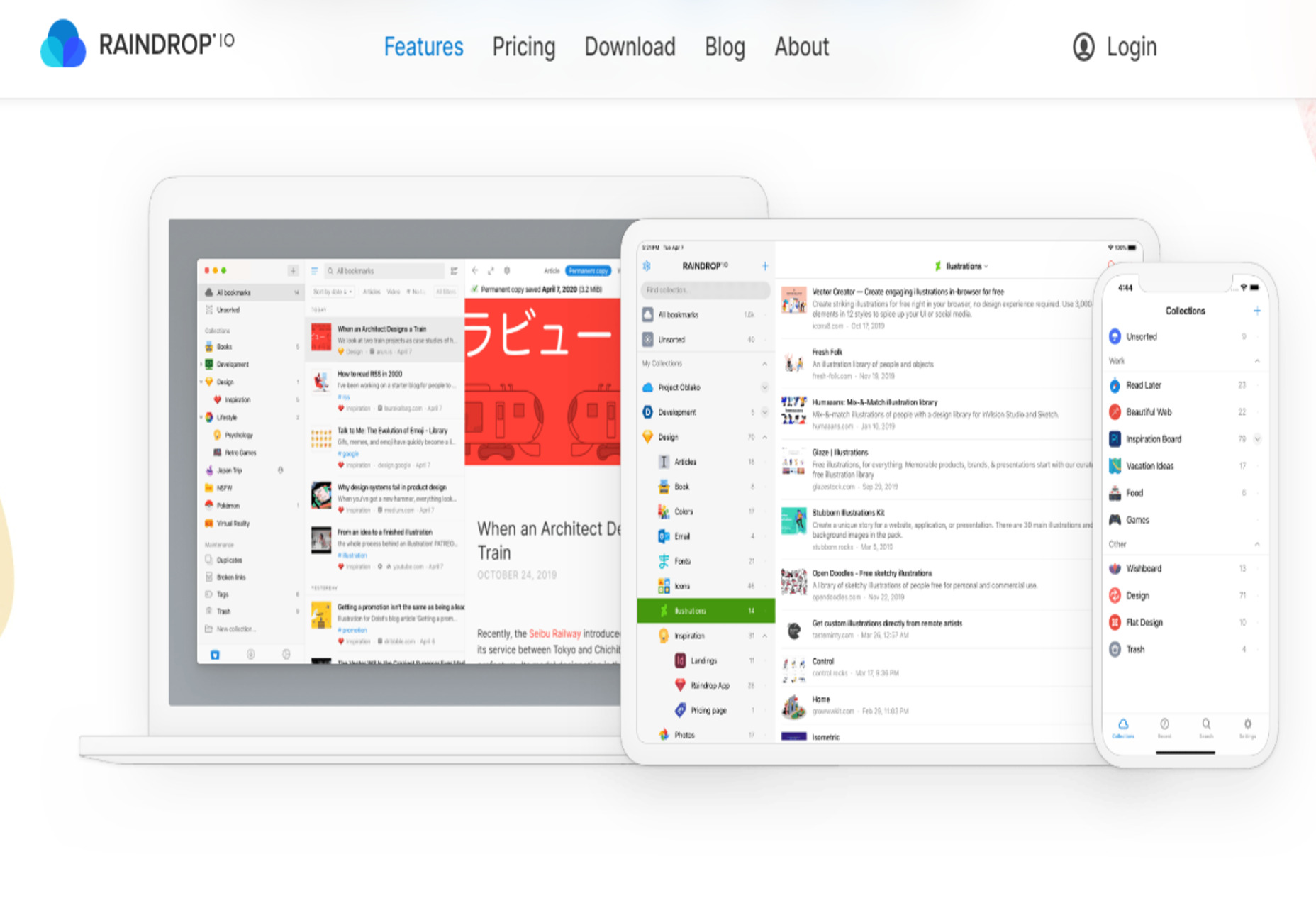
 Every day design fans submit incredible industry stories to our sister-site, Webdesigner News. Our colleagues sift through it, selecting the very best stories from the design, UX, tech, and development worlds and posting them live on the site.

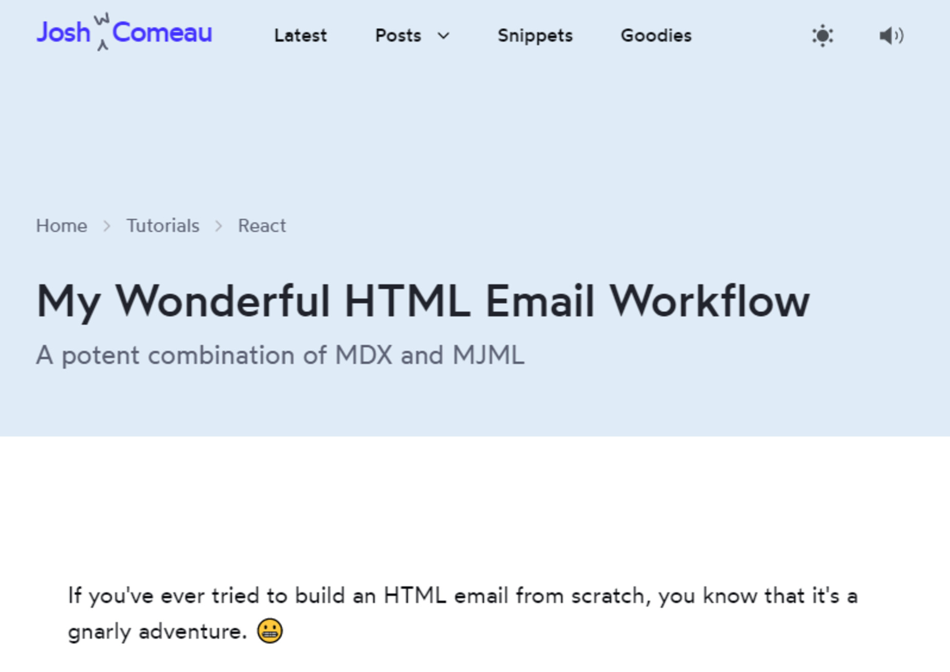
 Every day design fans submit incredible industry stories to our sister-site, Webdesigner News. Our colleagues sift through it, selecting the very best stories from the design, UX, tech, and development worlds and posting them live on the site.


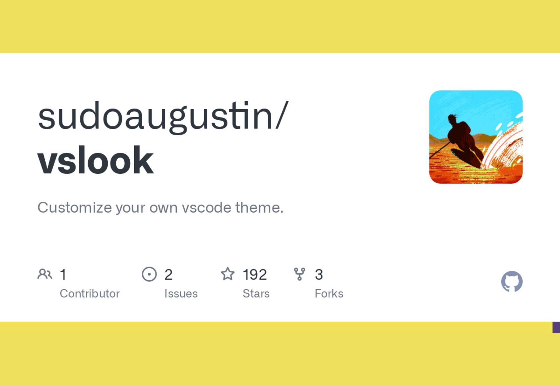
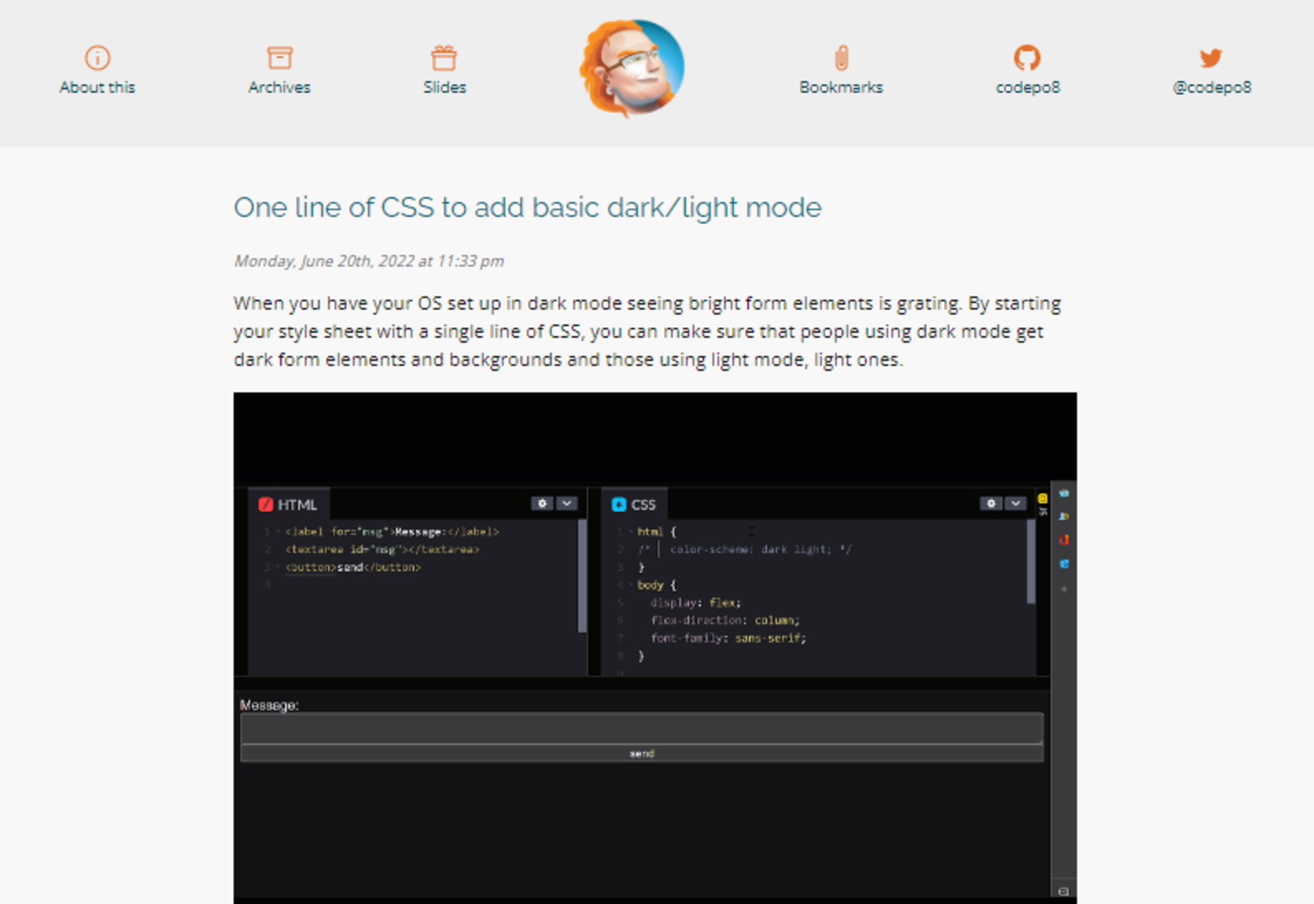
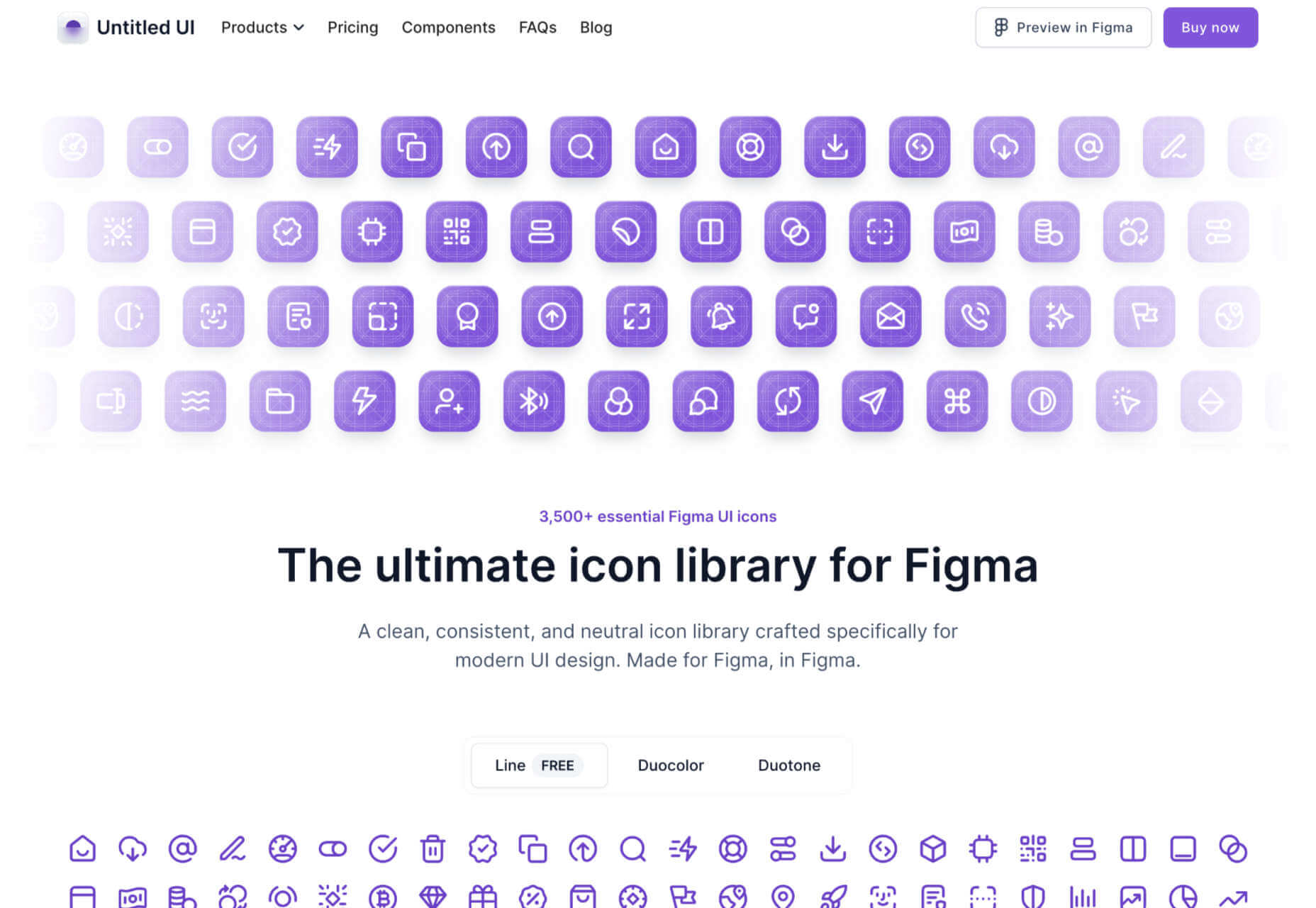
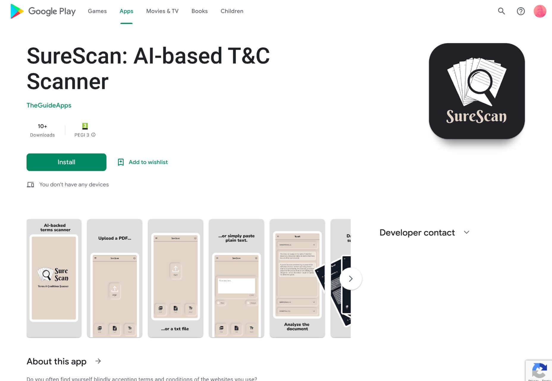
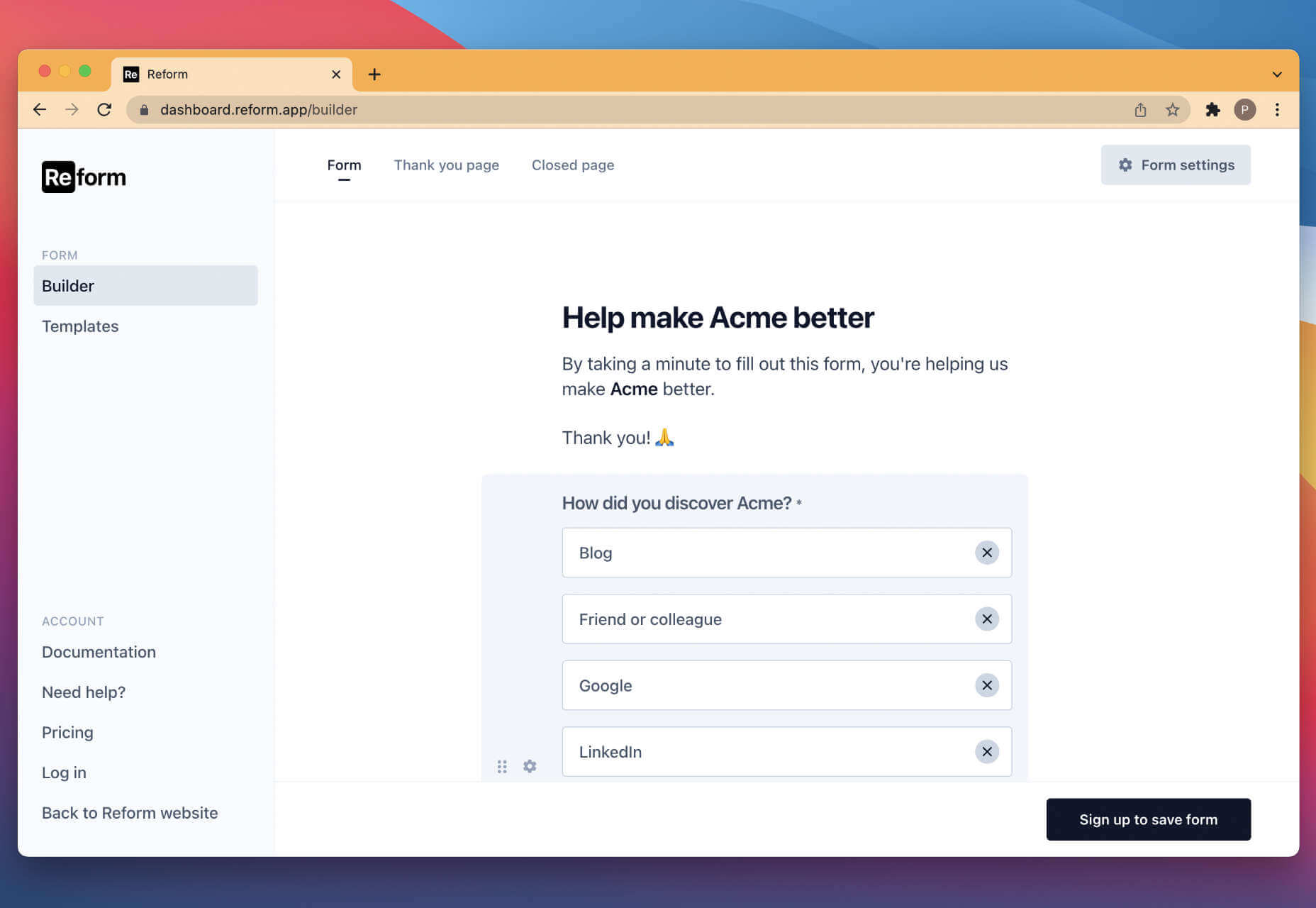
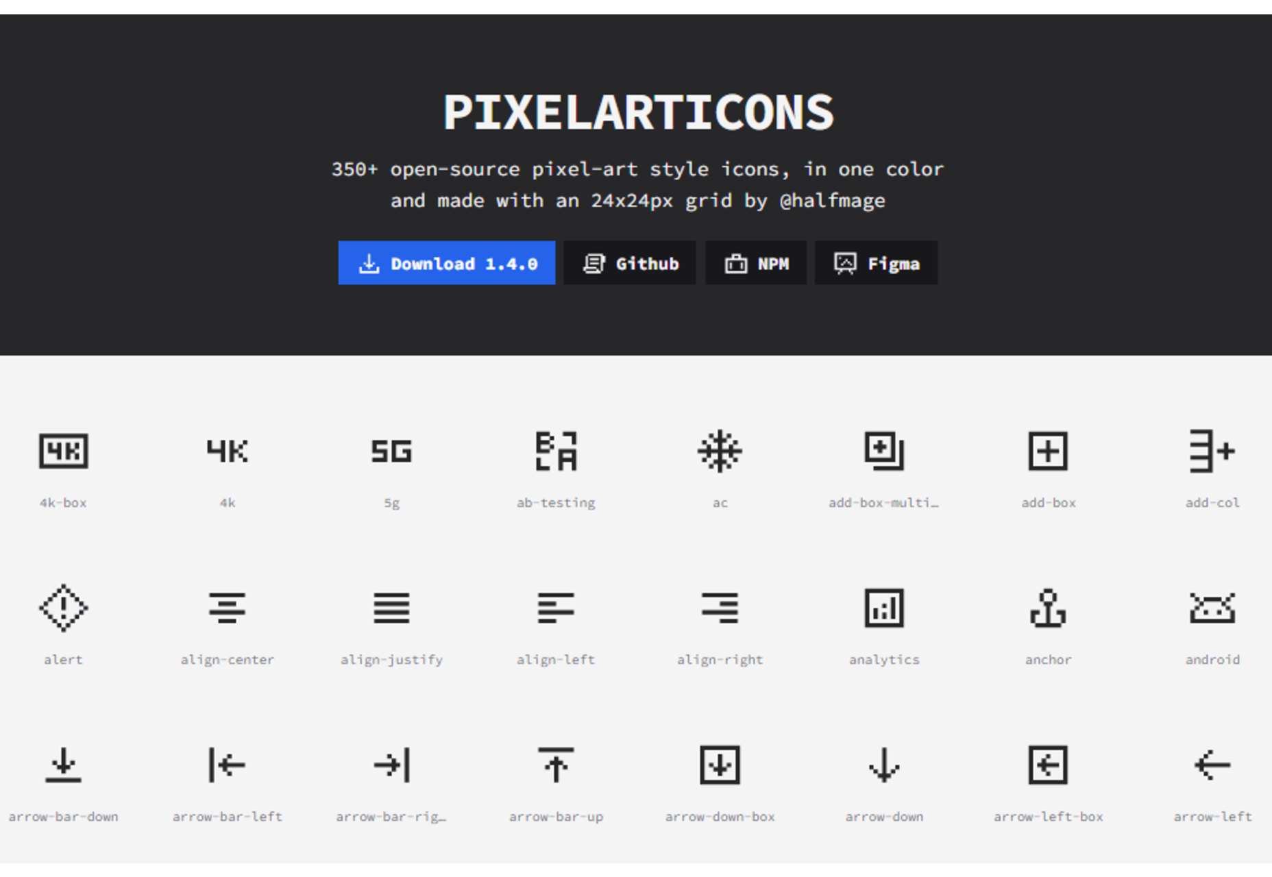
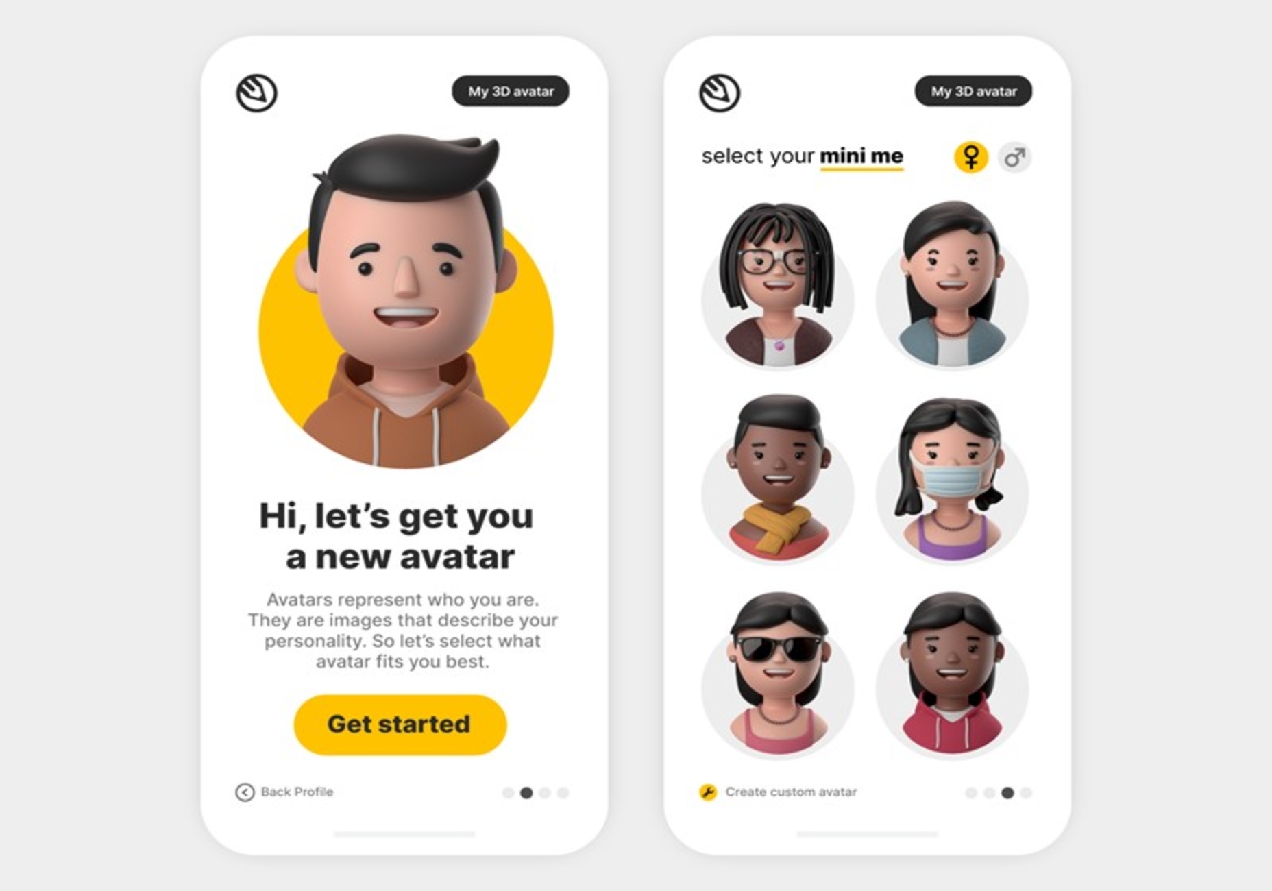
 The underlying theme of this month’s collection of new tools and resources is development. Almost every tool here makes dev a little easier, quicker, or plain fun. There are a few great tutorials in the mix to help you get into the spirit of trying new things and techniques.


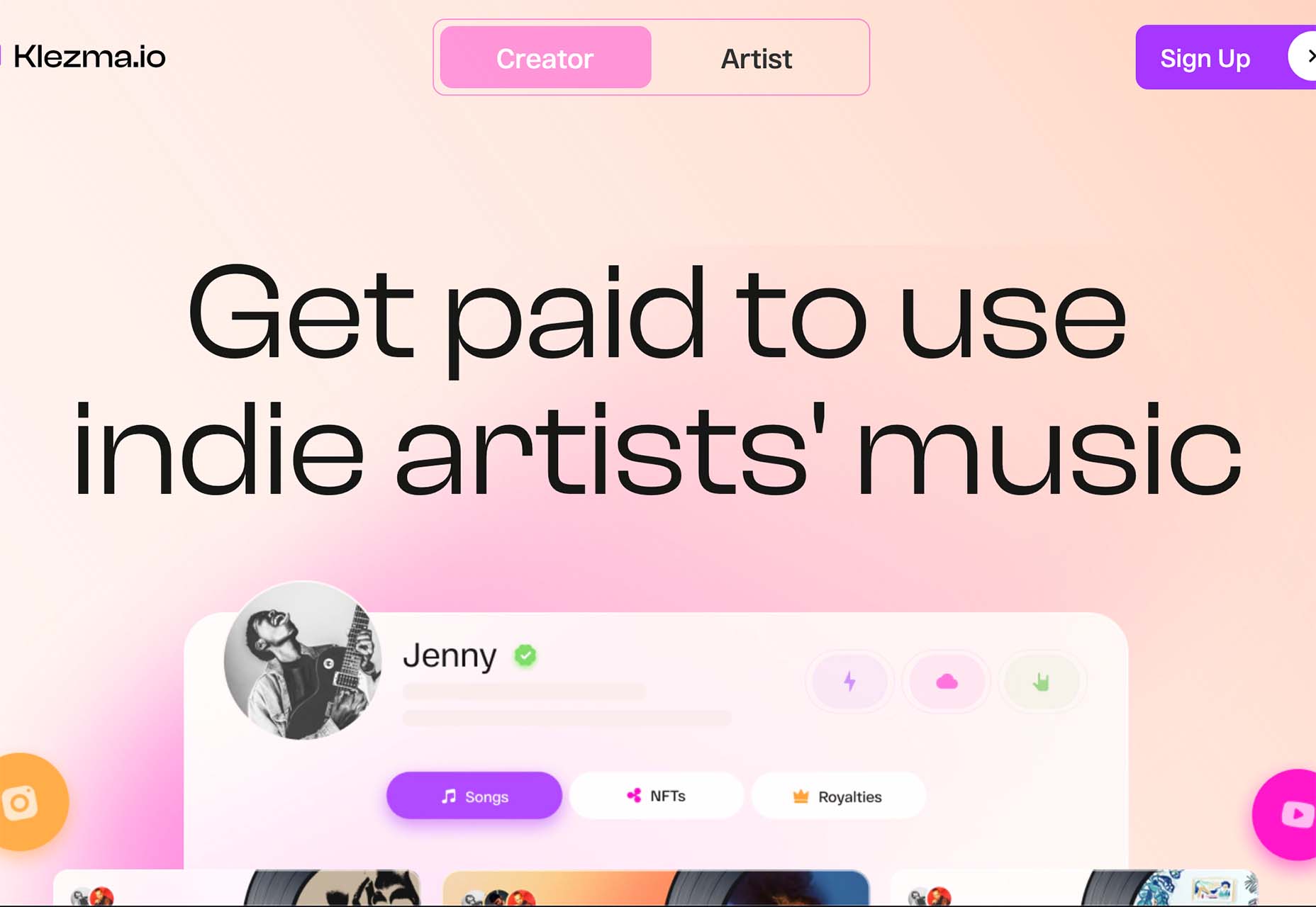
 Every day design fans submit incredible industry stories to our sister-site, Webdesigner News. Our colleagues sift through it, selecting the very best stories from the design, UX, tech, and development worlds and posting them live on the site.


 Are you a creative person looking for the perfect career path to take? If so, there are not many more creative professions than that of a web designer.