
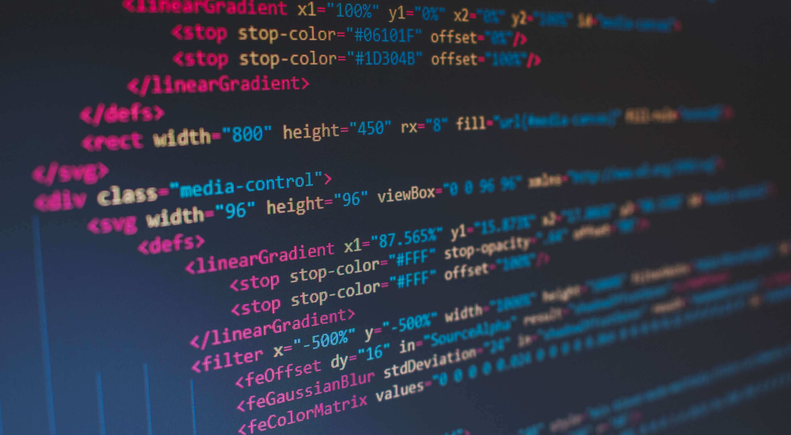
 HTML is one of the foundational building blocks of the Web. But just as web design best practices and techniques change over time, so does the code we use. As HTML evolves, some of its older markup has been deprecated while other parts have been repurposed.
Does that create more problems for us, though? Would we be better off starting over so we can make sure we’re all working from the same language rather than trying to edit out the bits we don’t want or need?
Problems With Holding Onto Legacy HTML
Let’s take a look at what happens when we amend the rules of HTML over time and how it impacts the Web:
1. It’s Risky to Leave Deprecated HTML Behind
Whether certain features have become outdated and need to go, or browsers have stopped supporting certain tags altogether, deprecated code eventually becomes a problem.
You’ll find a long list of deprecated HTML on the HTML.com website:
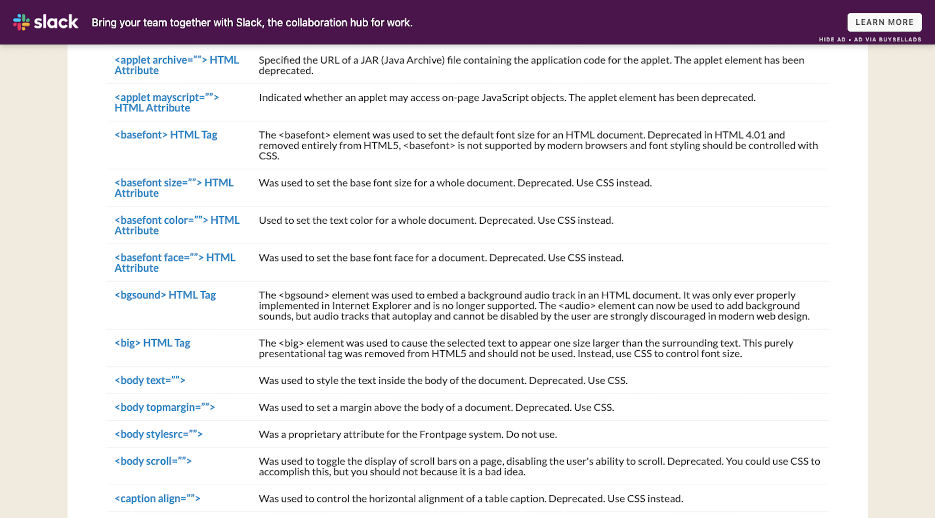
For many of these, HTML tags and attributes have been replaced by more efficient CSS styling. There are also examples of HTML deprecation because the features have become outdated (like frames).
Yet, there are still websites out there that contain deprecated HTML.
In some cases, the HTML sits silently on the other side of the website. If there’s enough of this errant code hanging around, though, those extra characters and directives could slow down your server’s processing time and render pages more slowly than usual.
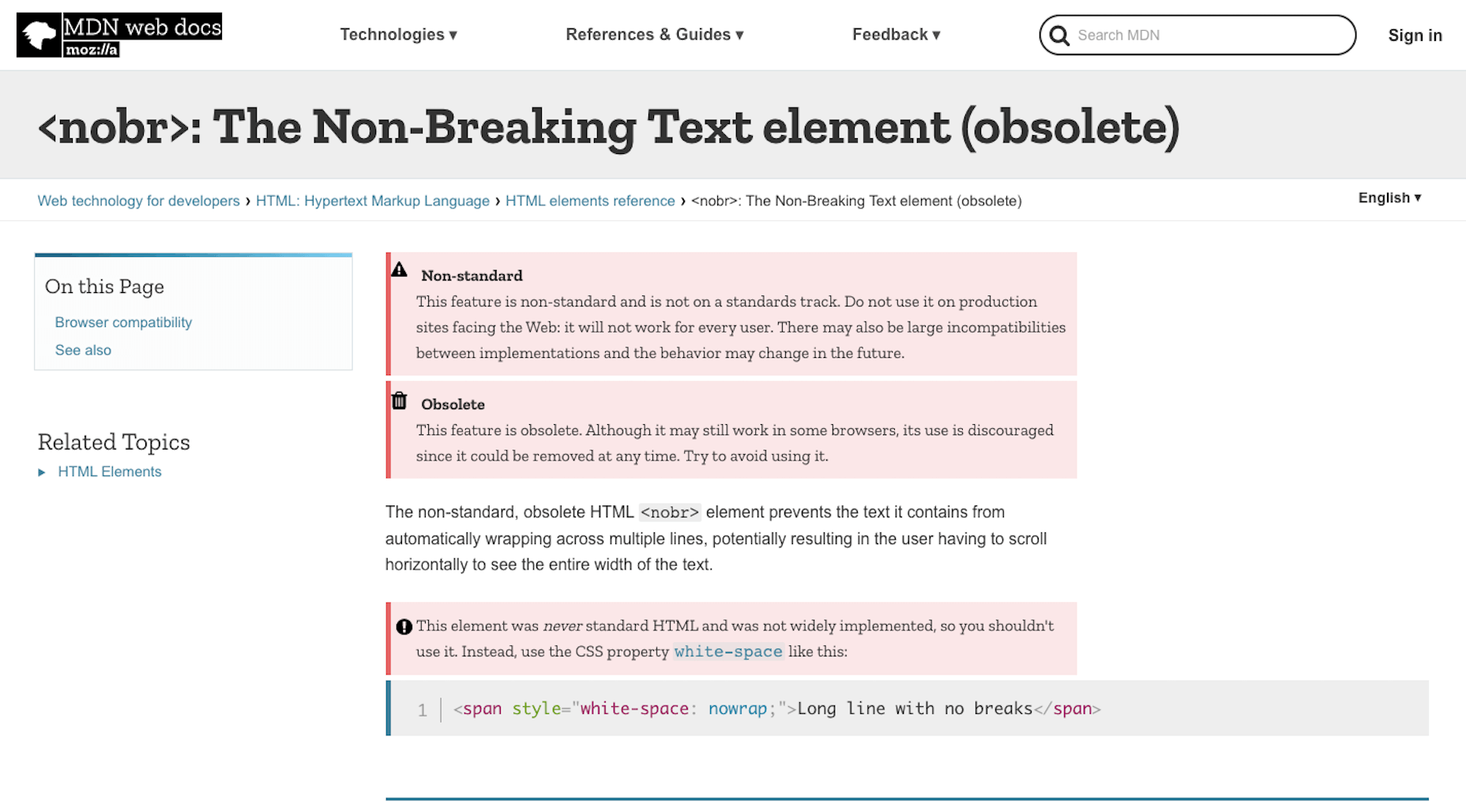
In other cases, the HTML breaks features on the front-end of a website. Take, for instance, this warning from Mozilla regarding the <nobr> tag:
Using deprecated code can create inconsistent and poor experiences on the front-end. And when all browsers finally get on board and decide not to support an HTML tag anymore, all visitors will be left with a broken UI.
So, while it’s great that HTML5 has deprecated legacy HTML that’s no longer useful or necessary, that’s not to stop everyone from using it or leaving it behind on older websites.
2. Legacy Code Focuses on Style; Not Semantics
As I mentioned, a lot of deprecated HTML has been phased out and replaced by CSS styling. And that’s a good thing.
Let me give you a simple example of this…
My favorite book is <i>The Stand</i> by Stephen King. The first time I read it, I didn’t sleep for <i>three days</i>. Thankfully, when I revisit it every year, I have fewer nightmares and can more greatly appreciate the storytelling aspect of it.
In the above paragraph, I’ve used the <i> tag to italicize several words.
In the early days of HTML,<i> stood for “italics” (the way<b> stood for “bold”). With HTML5, however,<i> will still render as italics, but its semantic meaning isn’t as broad. It’s been repurposed to indicate a stylistic change, which is important for things like book and film names, foreign words, and so on. To express emphasis, we use the <em> tag instead.
Keeping the legacy <i> and <b> tags can lead to issues, though.
In the statement above, I’ve italicized the name of the book (The Stand) as well as the number of sleepless nights I had (three days) with<i>. Whether the designer decides today, tomorrow or ten months down the road that they want to change the way literary or cinematic references are styled, my choice of HTML will stand in their way.
Because all of my italic text is indicated by <i>, styles can’t universally be applied to specific content (like book references). Instead, the designer would have to go through and clean up my code so that it looks like this:
My favorite book is <i>The Stand</i> by Stephen King. The first time I read it, I didn’t sleep for <em>three days</em>. Thankfully, when I inevitably revisit it every year, I have fewer nightmares and can more greatly appreciate the storytelling aspect of it.
This would then allow the semantically italicized content to remain intact while the designer or developer adjusts the styles of the book title here and across the site. (Though, really, the first italicized phrase should be surrounded by <cite> as it would be more semantically accurate.)
While it’s great that we’ve created guidelines for using legacy HTML today, keeping old code around can confuse writers, designers, and others who are familiar with the previous way of formatting content. By resetting HTML, throwing out old styles, and creating one language we use consistently across the web, we won’t create more work for ourselves later on.
3. Deprecated Code Hinders Accessibility
Another big reason why repurposed and deprecated HTML is a problem is because of accessibility.
For starters, when you leave deprecated and unsupported code behind, it’s likely to cause issues for screen readers, search engines, and browsers that use HTML for clues about the content.
Header tags (e.g.<h1>, <h2>, <h3>), for instance, aren’t just used to visibly break up large chunks of text. Header tags and, more specifically their hierarchy, present important information about the relationship between subjects on a page — and this is the kind of thing that screen readers and search engines pick up on.
That’s why we need to be very careful about the code we leave behind the scenes, even if readers on the front end can’t visibly see it. Let’s look at an example of how this can affect accessibility:
Is there an <i>à la carte</i> menu or is it just <i>prix fixe</i> tonight?
If a screen reader were to read over this sentence, the French phrases would be said with the same emphasis as any other italicized words on the page.
This is why HTML5 encourages semantic coding instead of purely stylistic.
The proper way to write HTML in the line above would be:
Is there an <i lang="fr">à la carte</i> menu or is it just <i lang="fr">prix fixe</i> tonight?
There are two reasons to do this:
- To indicate to screen readers that there’s a language change.
- To make it easier for designers or developers to create a custom style for foreign phrases.
Semantic coding is essential for designers that work on multilingual websites.
As the World Wide Web Consortium explains, languages like Japanese don’t use italicization or bolding for emphasis — at least not the way English speakers do.
So, to properly translate a page from English, a Japanese designer would need to remove the italics or bolding and add surrounding brackets to the words. However, if everything is coded with <i> and <b>, or there’s a mix of <i> and <em> and<b> and <strong>, it’s going to be really difficult to Find-and-Replace the correct HTML with ease.
So, if accessibility or internationalization are concerns for you at all, getting clear on the HTML you write with is going to be really important.
Wrap-Up
The fact of the matter is, it requires a lot of work to have the rules of HTML rewritten. So while it would be great to reset HTML, I don’t know that it’s all that practical.
All we can really do is stay abreast of what’s happening with the language, edit out legacy code from our websites the second it becomes deprecated, and always use tags and attributes that are supported. By playing around with deprecated or repurposed code, we only put the website visitors’ experience in jeopardy, so it’s best to take the time to clear out the old any chance we get.
If we can all get on the same page about this, problematic legacy HTML will eventually disappear from our websites and memories.
Featured image via Unsplash.
The post Is It Time to Reset HTML? first appeared on Webdesigner Depot.

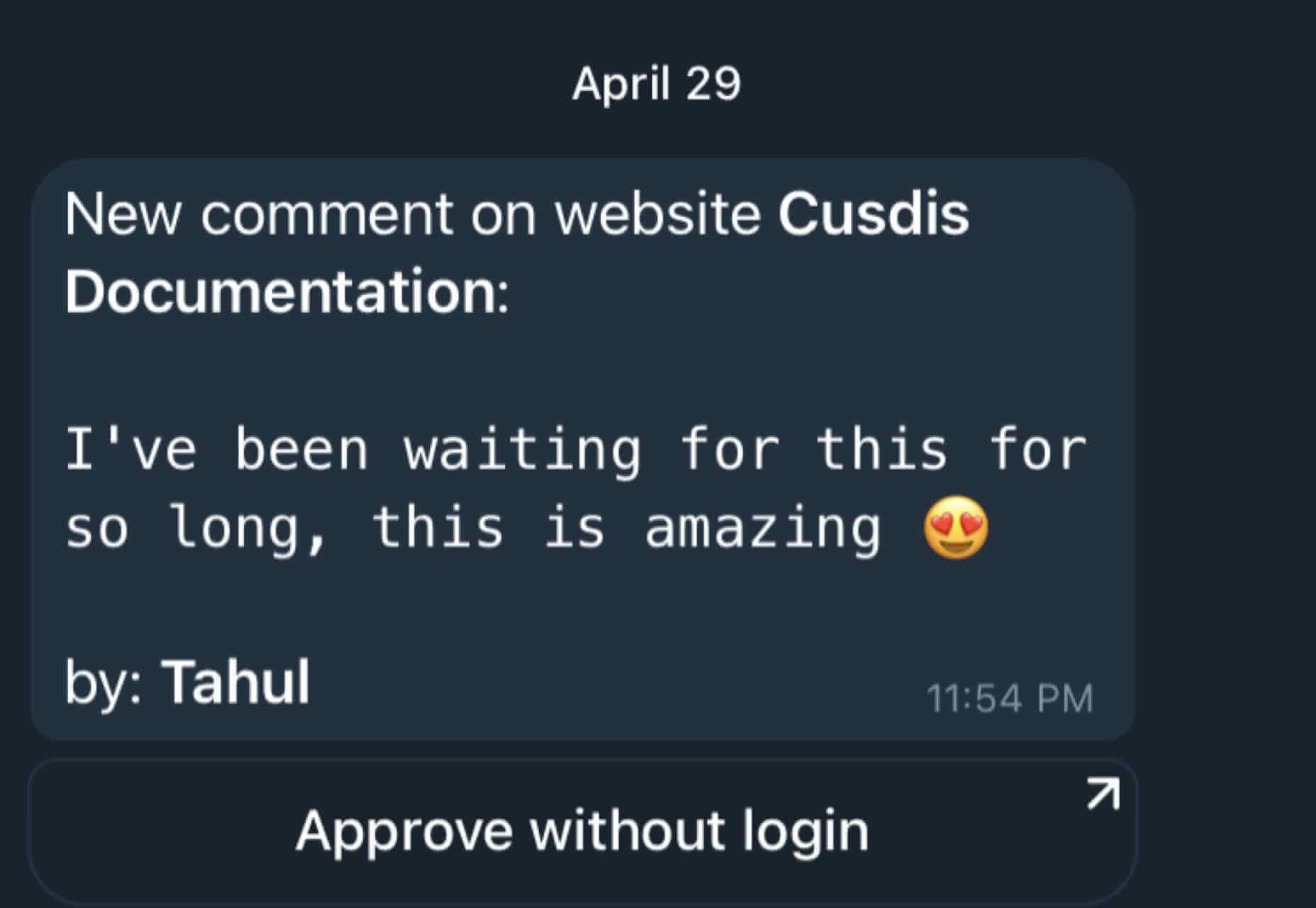
 Every day design fans submit incredible industry stories to our sister-site,


 Every day design fans submit incredible industry stories to our sister-site,


 Each day design fans submit incredible industry stories to our sister-site,


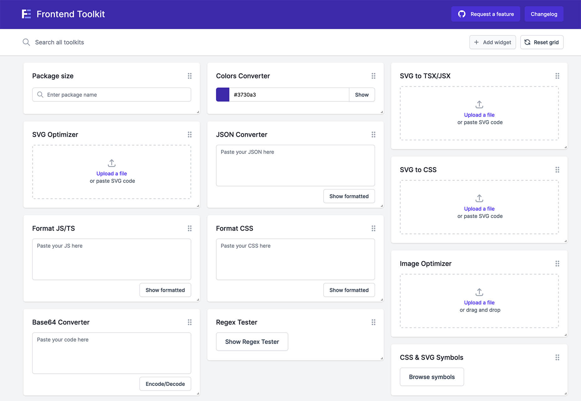
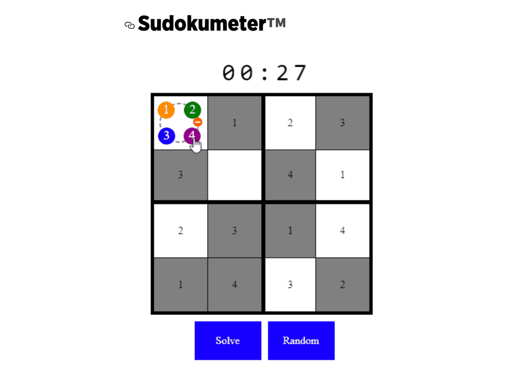
 From dev tools to productivity to a little bit of fun with sudoku, this month’s collection of new tools is packed with something for everyone.


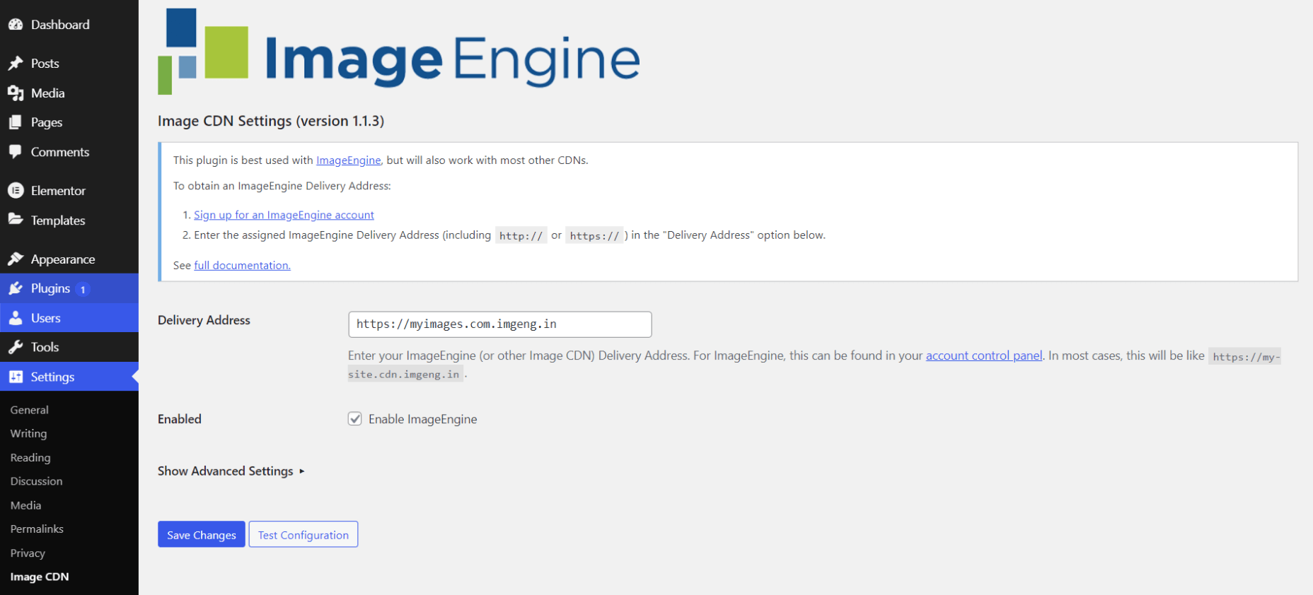
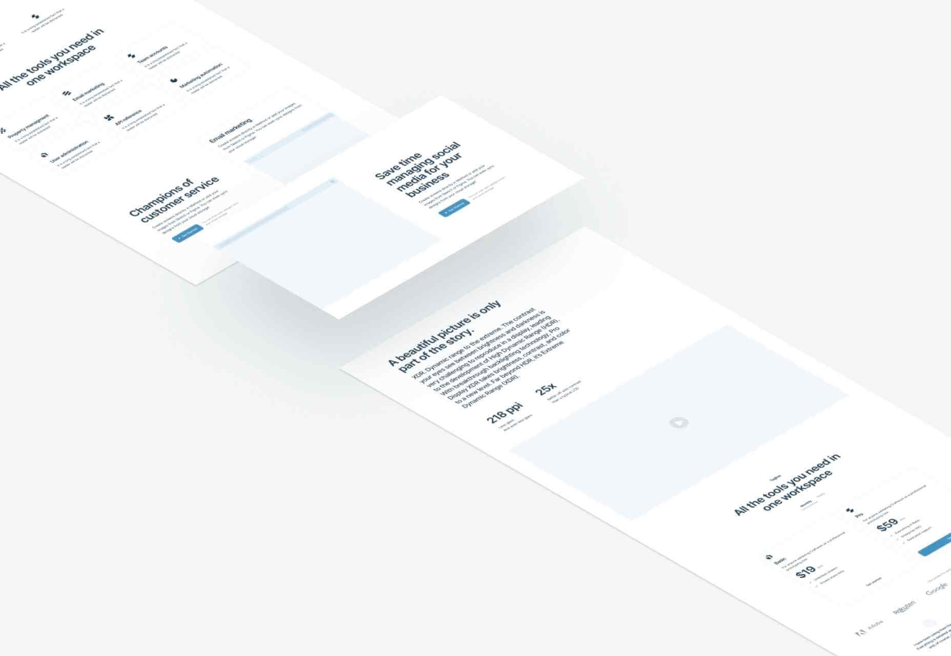
 WordPress powers nearly 40% of all websites, thanks to its commitment to making publication possible for everyone, for free. Combined with premium plugins and themes, it’s possibly the ultimate tool for building attractive, unique, and feature-rich websites without any coding or design experience.
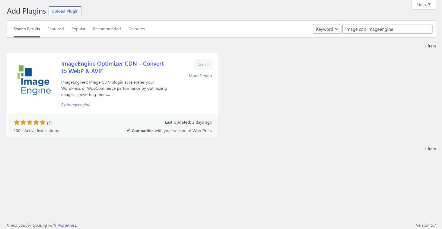


 Every day design fans submit incredible industry stories to our sister-site,


 Every day design fans submit incredible industry stories to our sister-site,


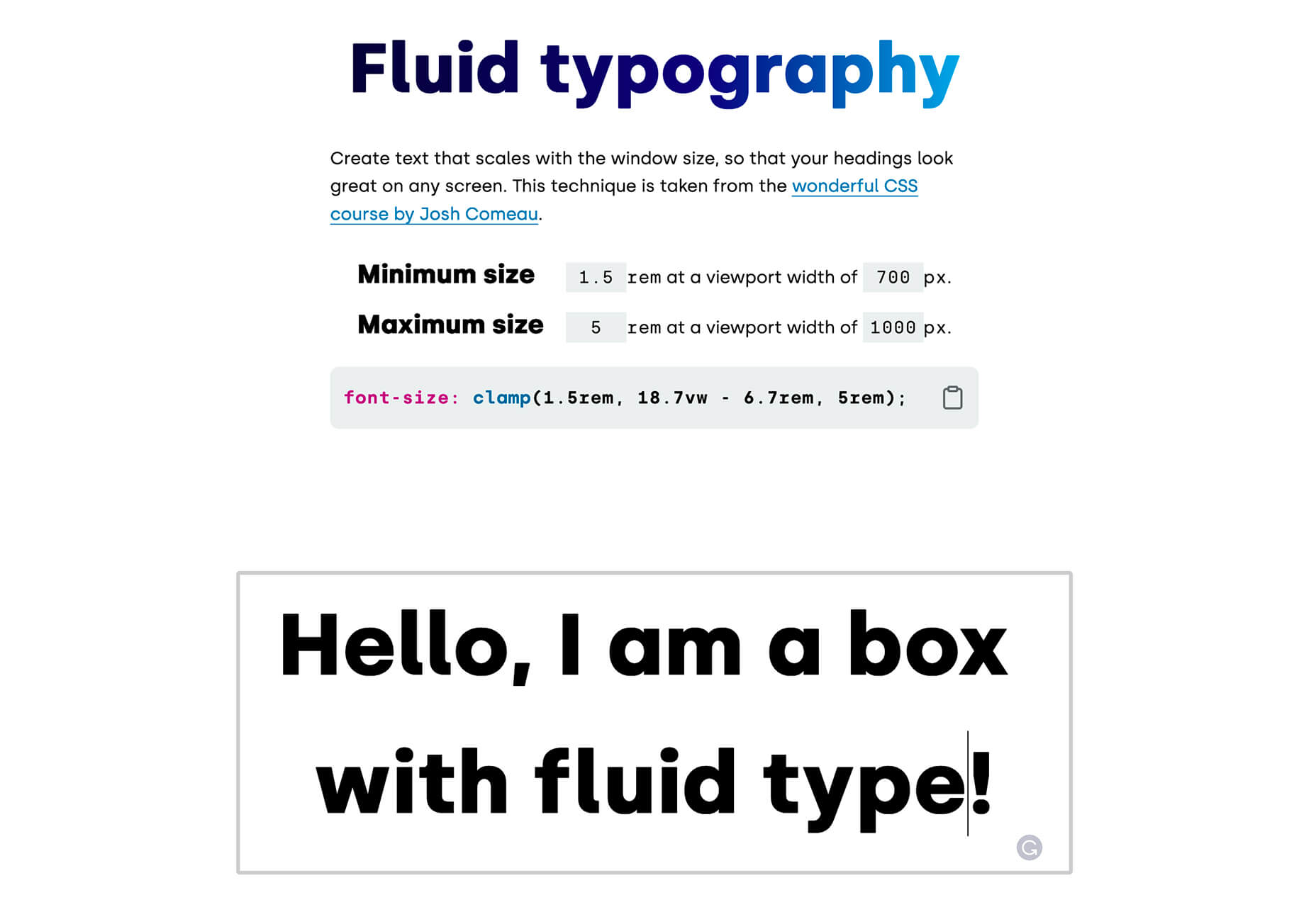
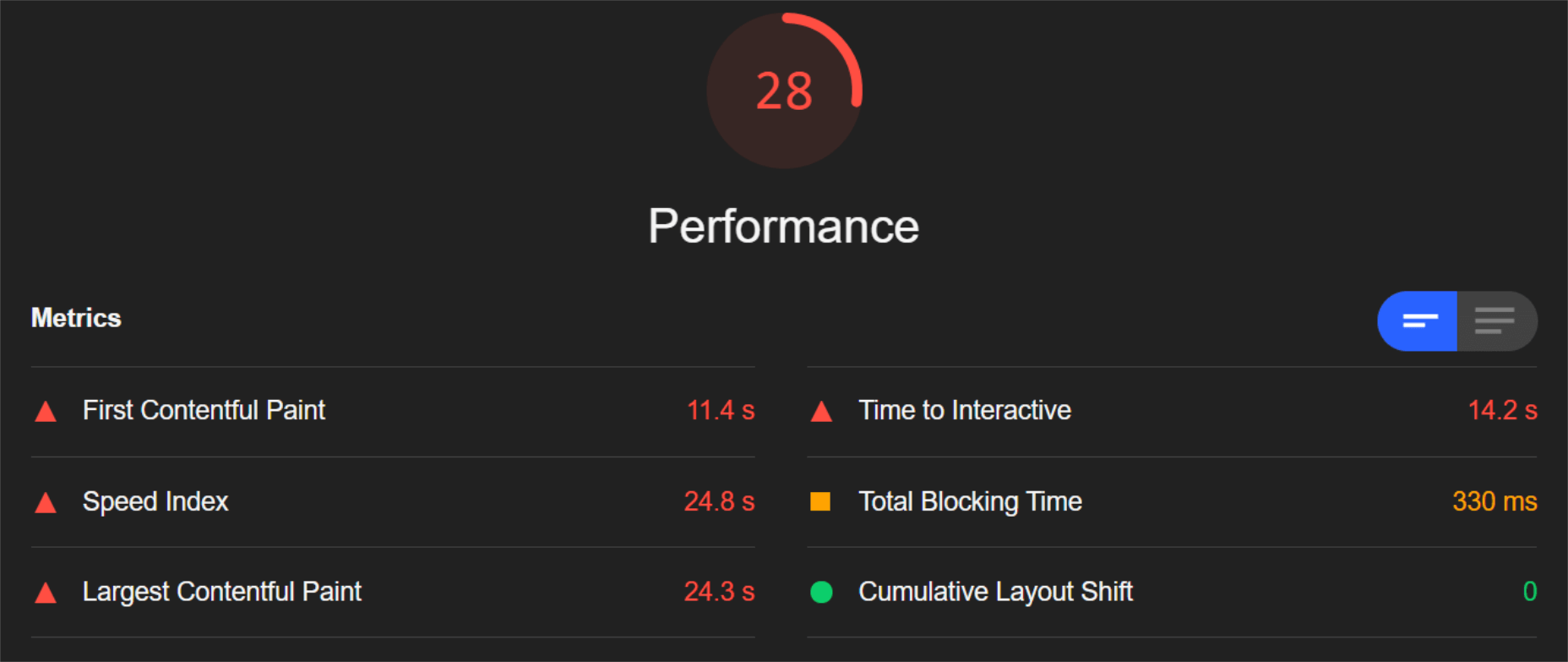
 CSS is an awesome tool for styling websites. It’s small, fast, and easy to learn. But like all code, there’s a right way, and a wrong way to write it. Badly written CSS renders slowly, impacting on the perceived speed of your site, and even damaging your SEO.
 At the dawn of the web-era, there was much focus on how environmentally friendly websites were: we’d chop down fewer trees, ship fewer products, and travel less for business.