
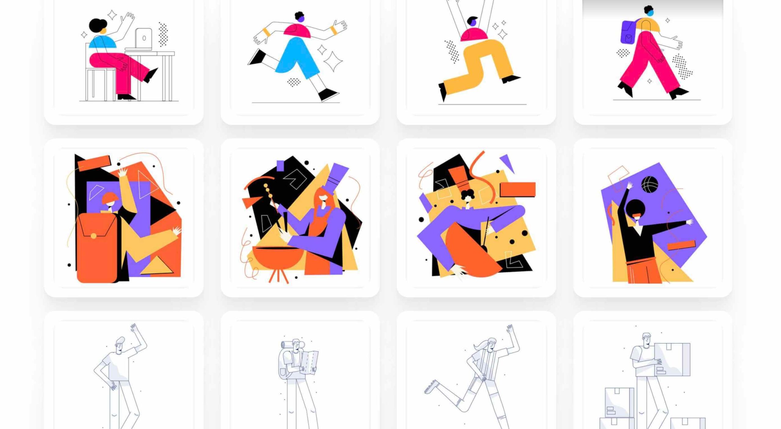
 Since school is back in session, this month’s roundup has a learning focus. In addition to tools, many of the resources include guides, tutorials, and cheat sheets to help make design work easier.
Here’s what’s new for designers this month.
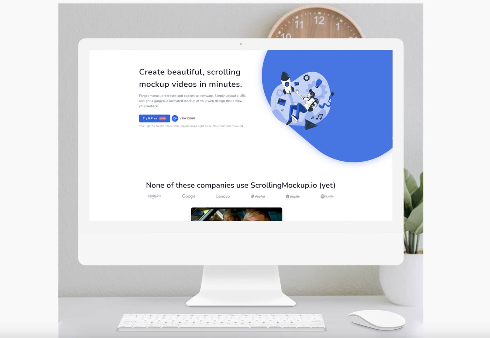
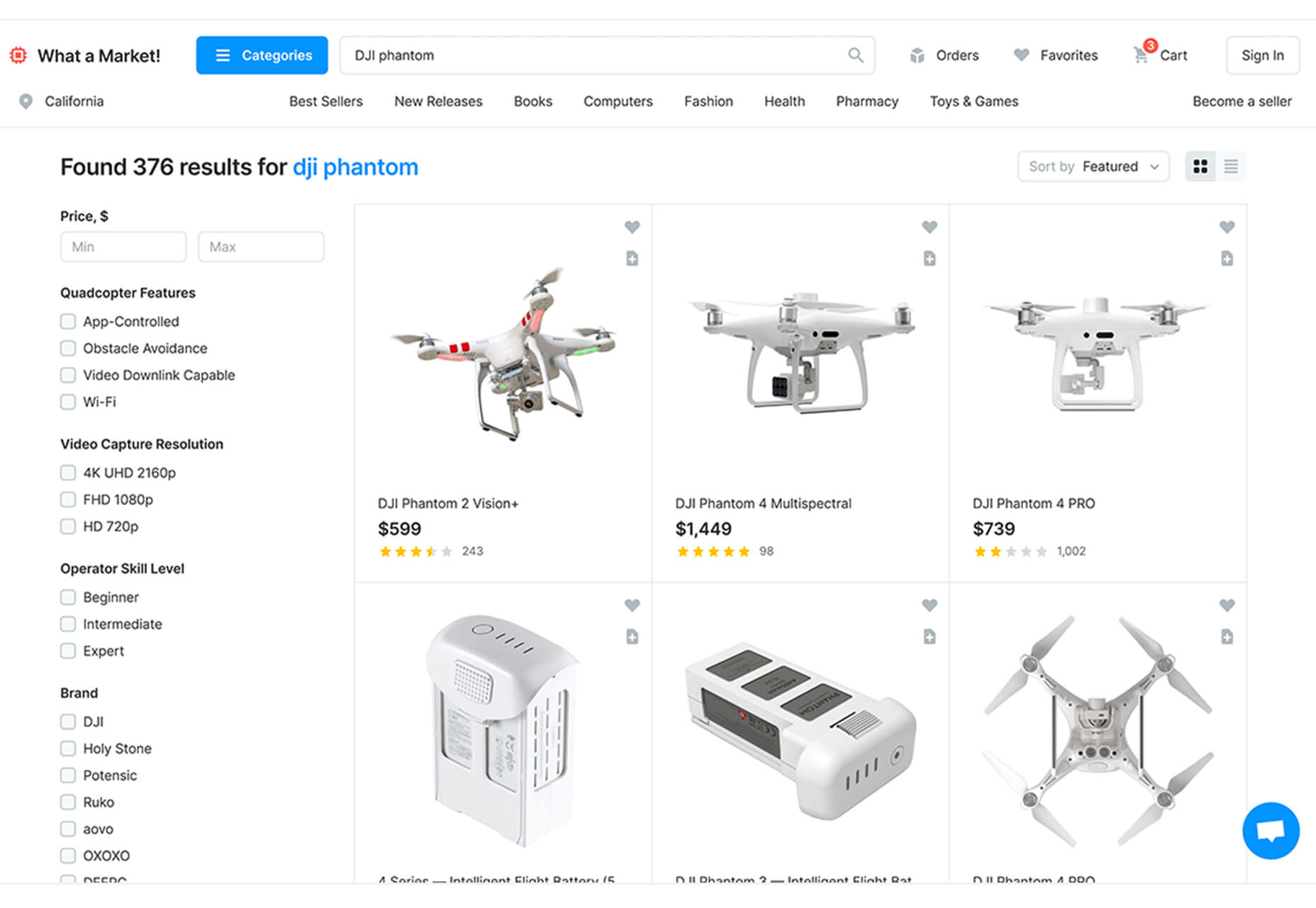
ScrollingMockup.io
ScrollingMockup.io generates high-definition, animated scrolling mockups in minutes. All you have to do is paste your website URL, select from the expanding template gallery, add some music and post. You can create three mockups for free, and then this tool comes with a subscription model. The paid model allows for custom branding for mockups and more.
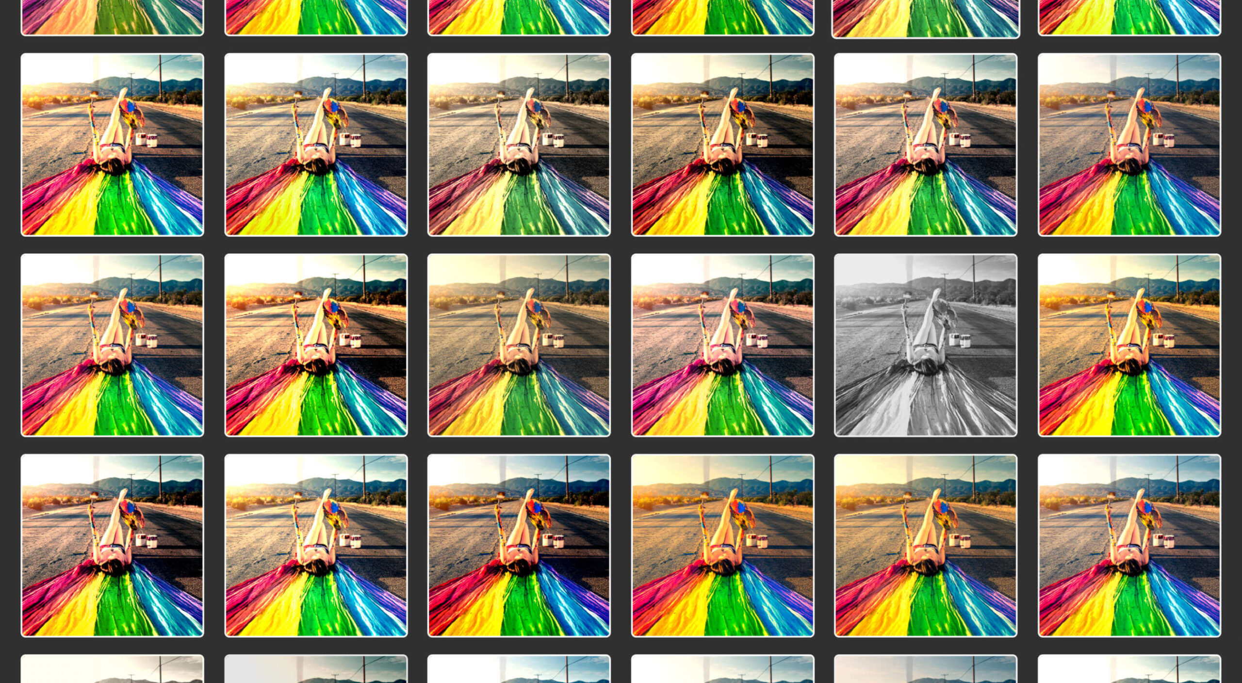
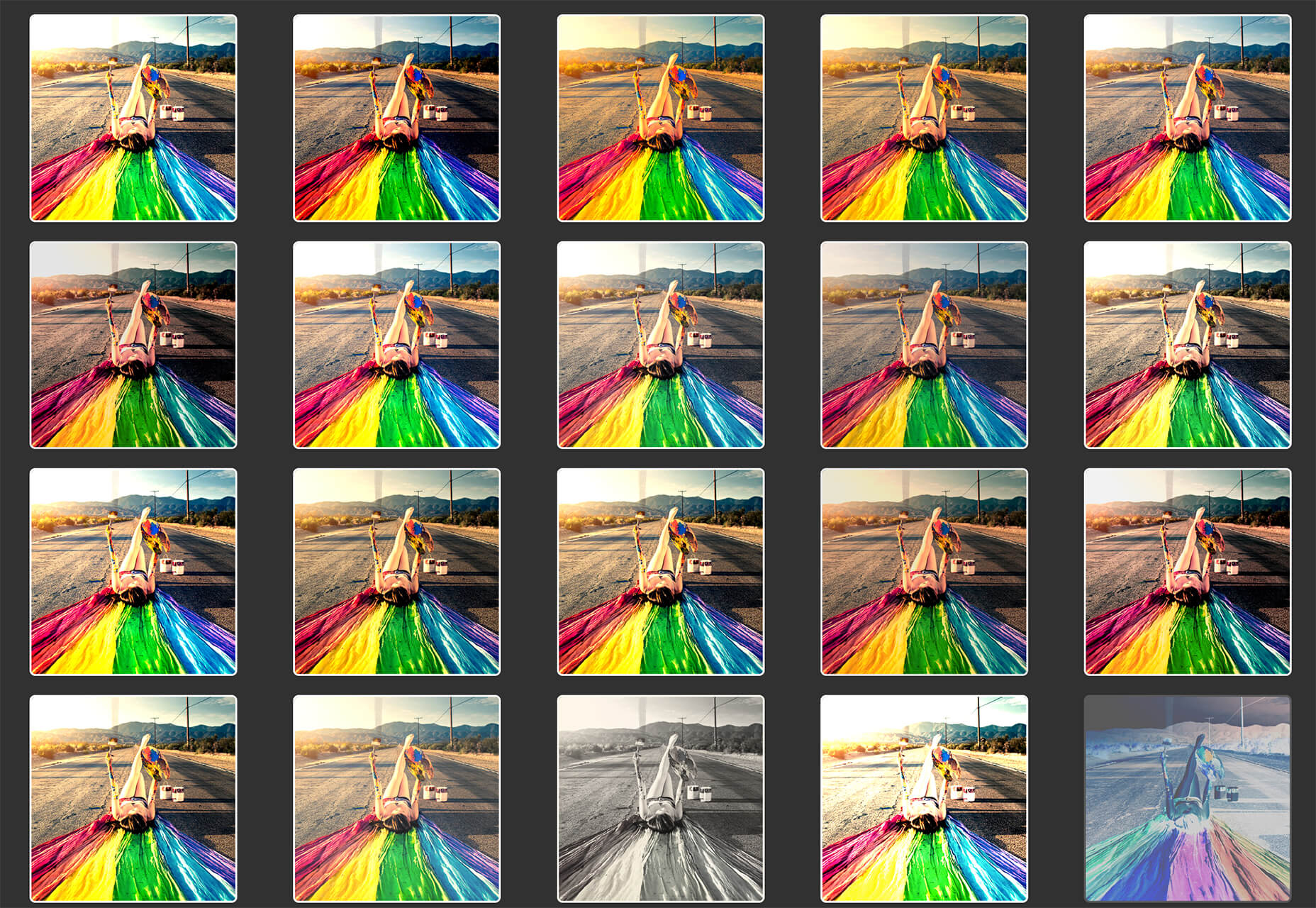
FilterSS
FilterSS is a curated collection of CSS image filters for use in projects. Upload an image, sort through the list, and then copy the code for the filter you want to use. It’s that easy!
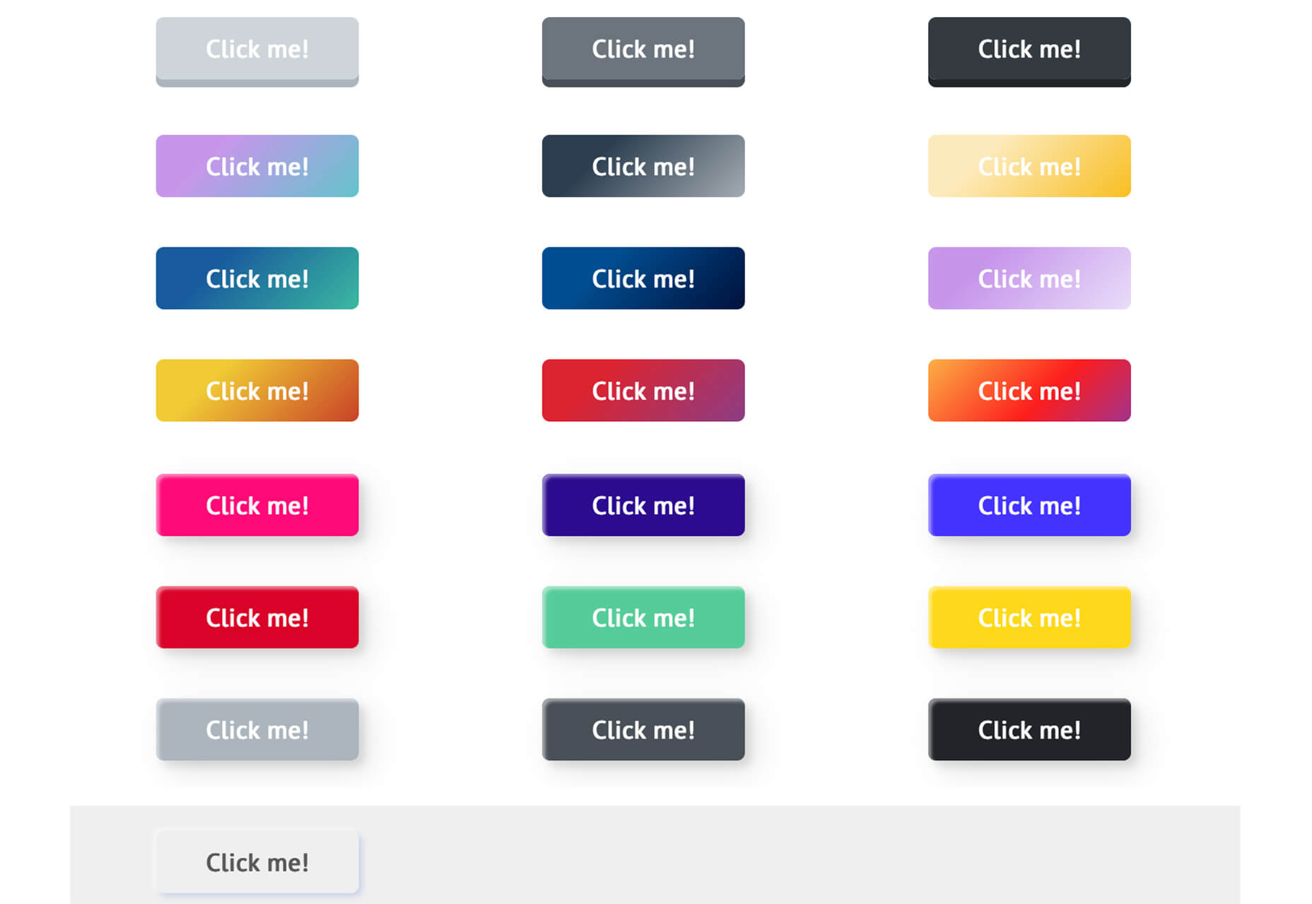
Buttons Generator
Buttons Generator is a fun tool with so many button options in one place. Choose from three-dimensional, gradient, shadow borders, neumorphic, retro, animated, ghost, with arrows, and more all in one place. Click the one you like, and the code is copied right to your clipboard and ready to use in projects.
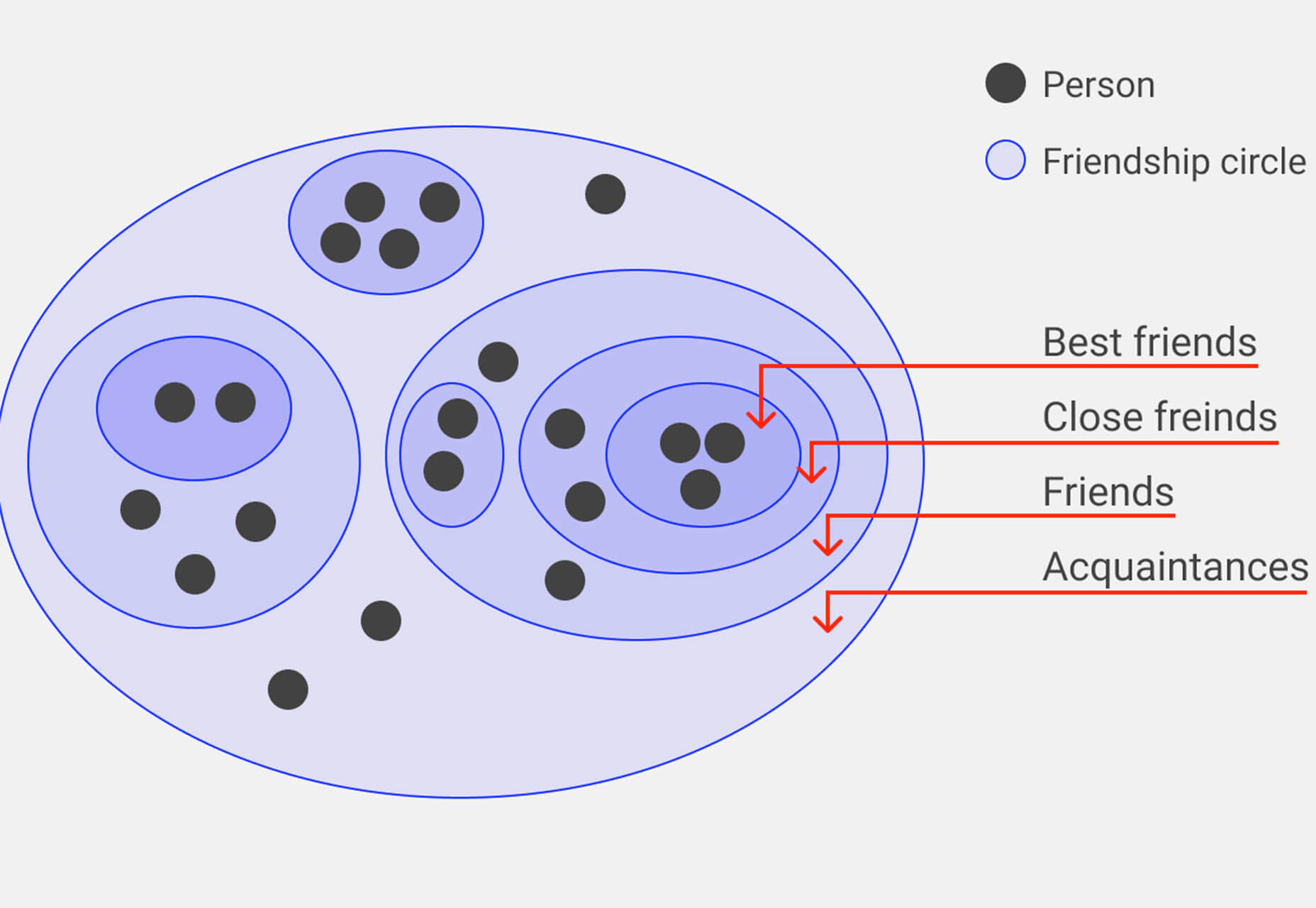
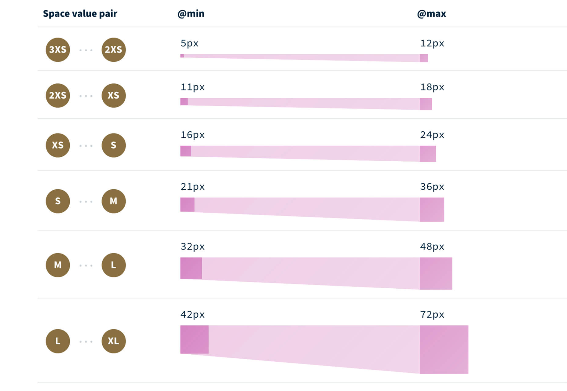
UI Cheat Sheet: Spacing Friendships
UI Cheat Sheet: Spacing Friendships is a fun – and memorable approach to figuring out spacing. This guide shows how close or far away elements should be based on “friend” circles with a couple of relatable instances. It’s one of the most relatable examples of this concept out there while emphasizing the importance of spacing in design.
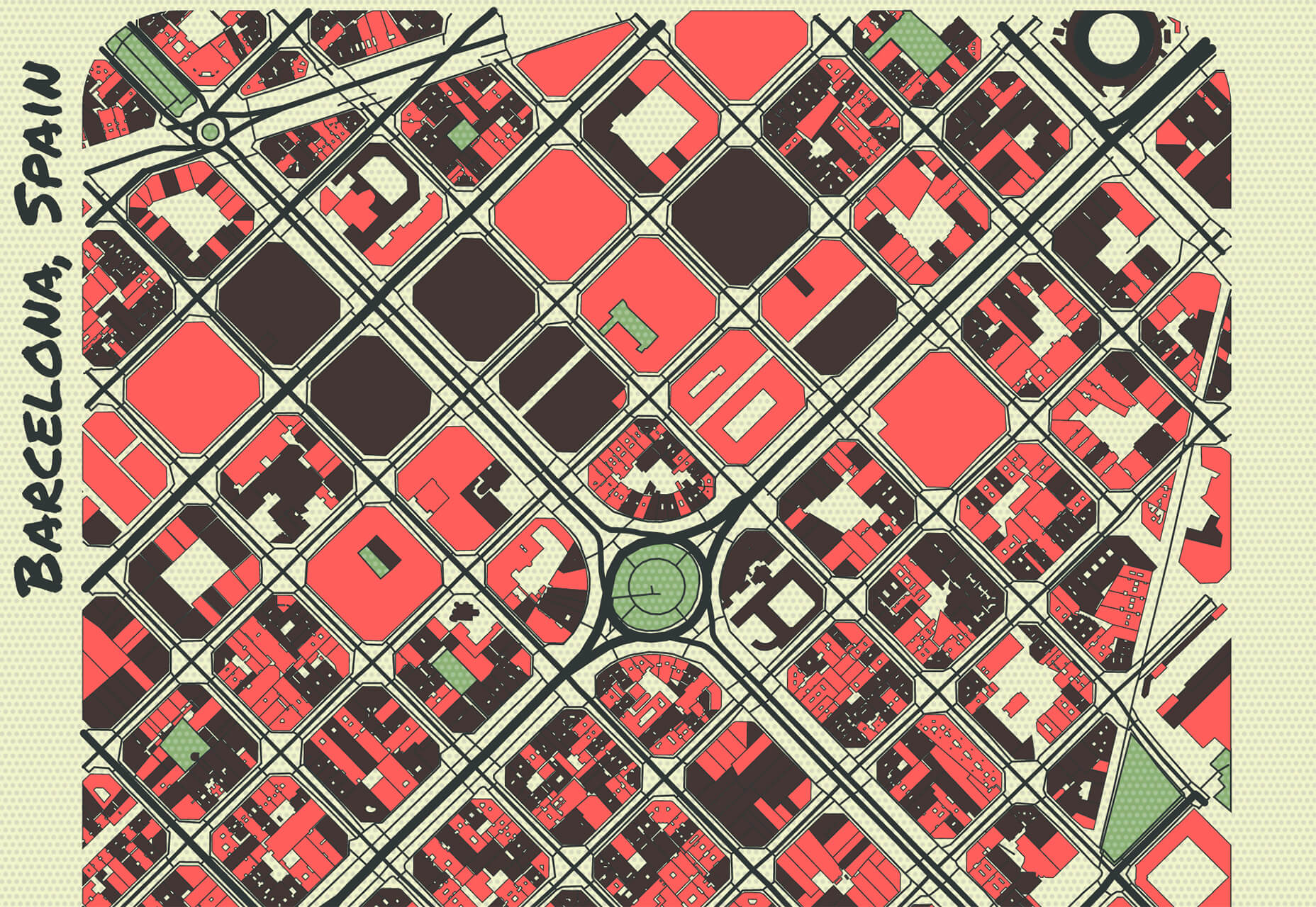
PrettyMaps
PrettyMaps is a minimal Python library that allows you to draw customized maps from OpenStreetMap data. This tool can help you take online map design to the next level with cool, unique map visuals. It’s based on osmnx, matplotlib, shapely, and vsketch libraries.
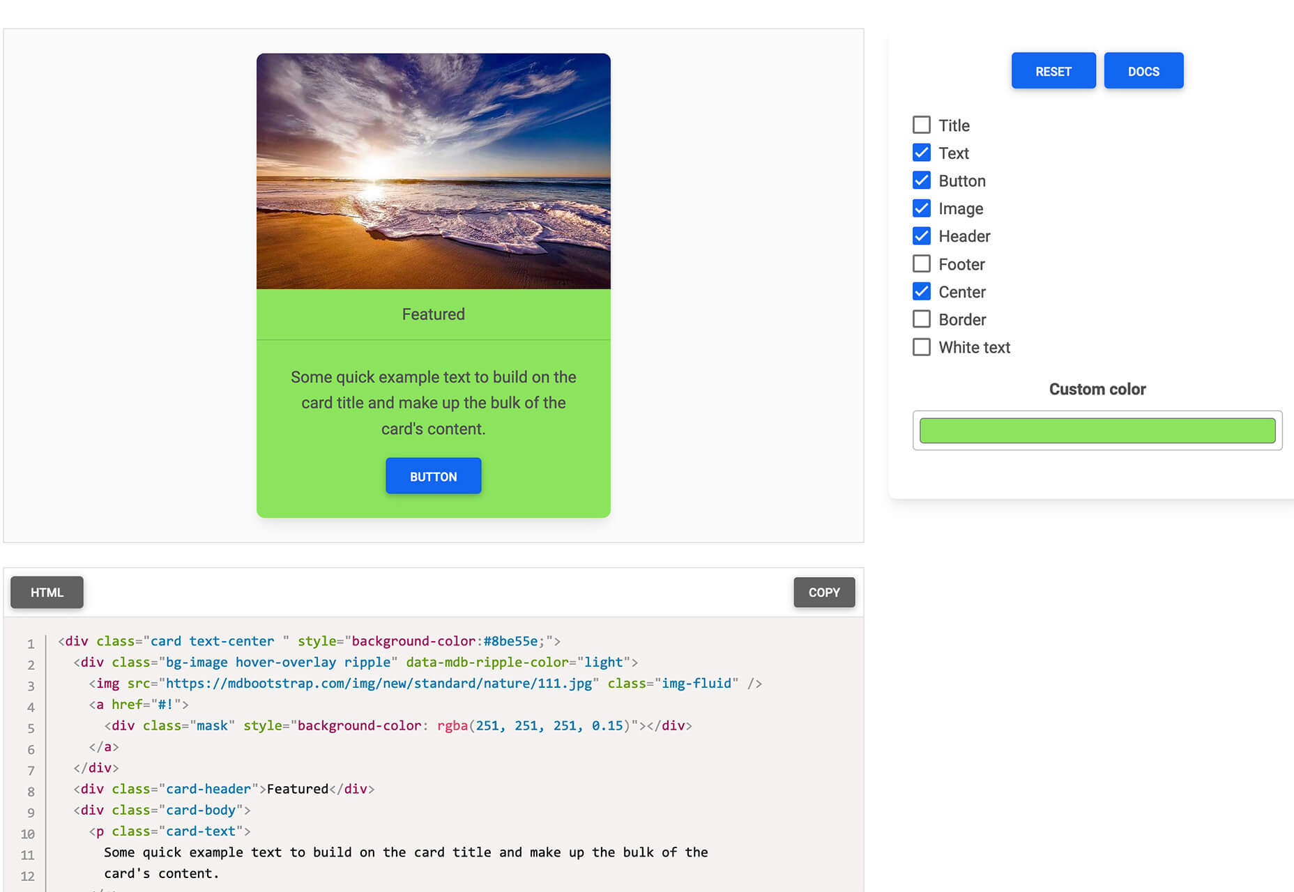
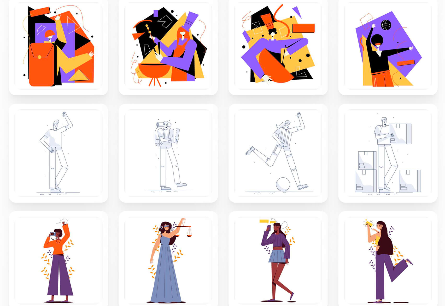
Card.UX/UI
Card.UX/UI is a card-style generator with more than 20 templates and elements to create custom cards. Use the on-screen tools to design it the way you want and then copy the code for easy use.
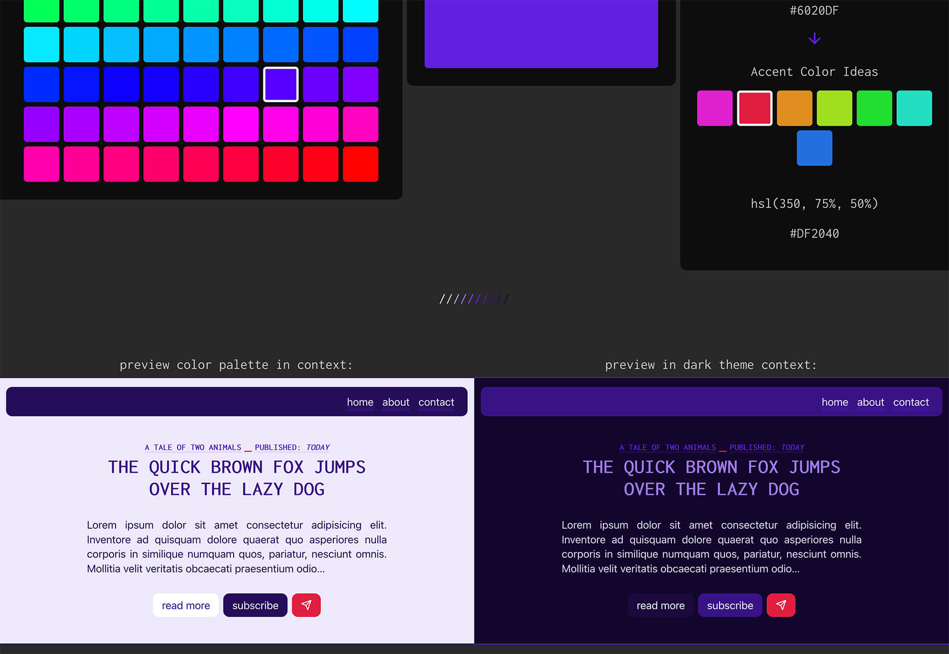
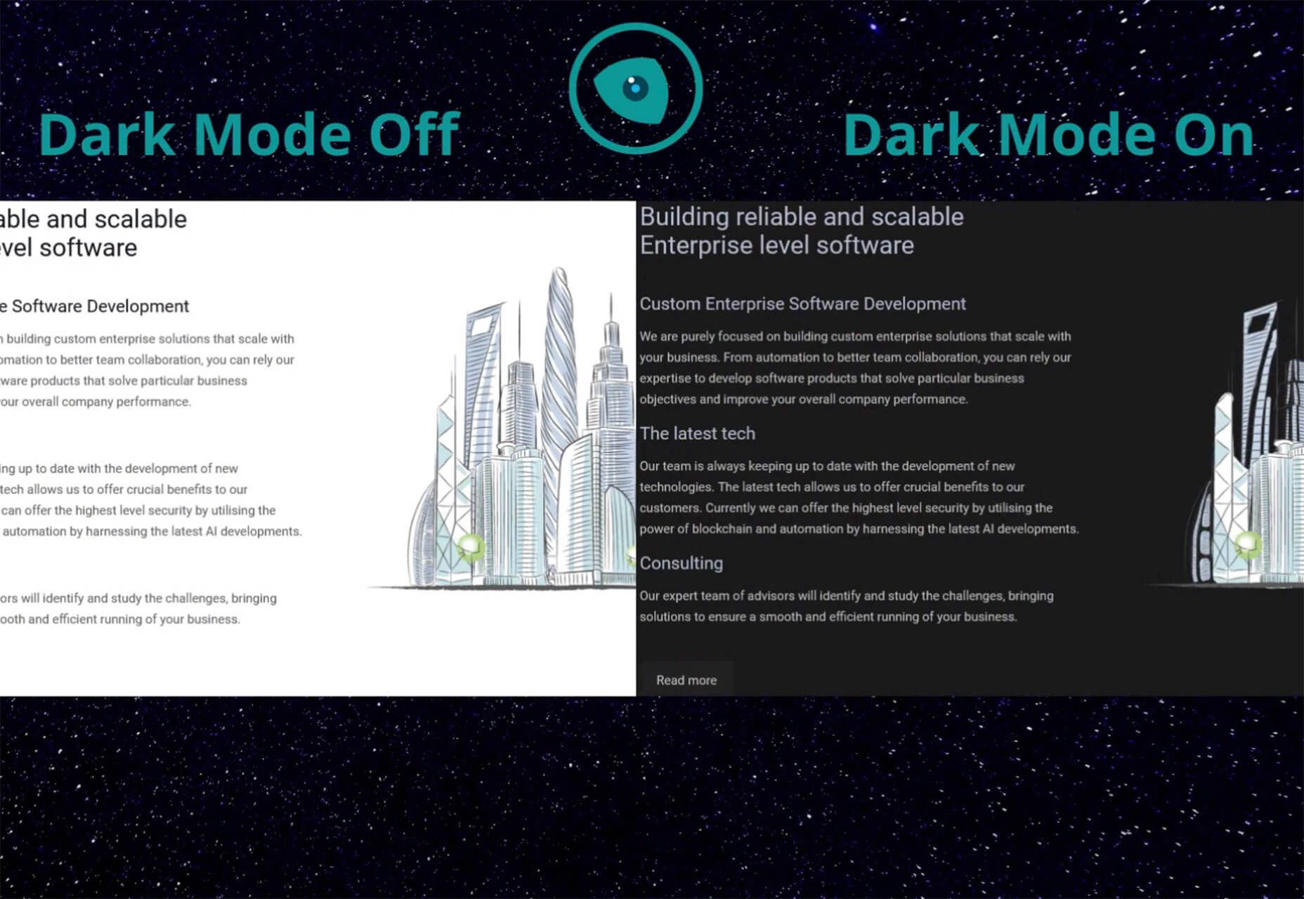
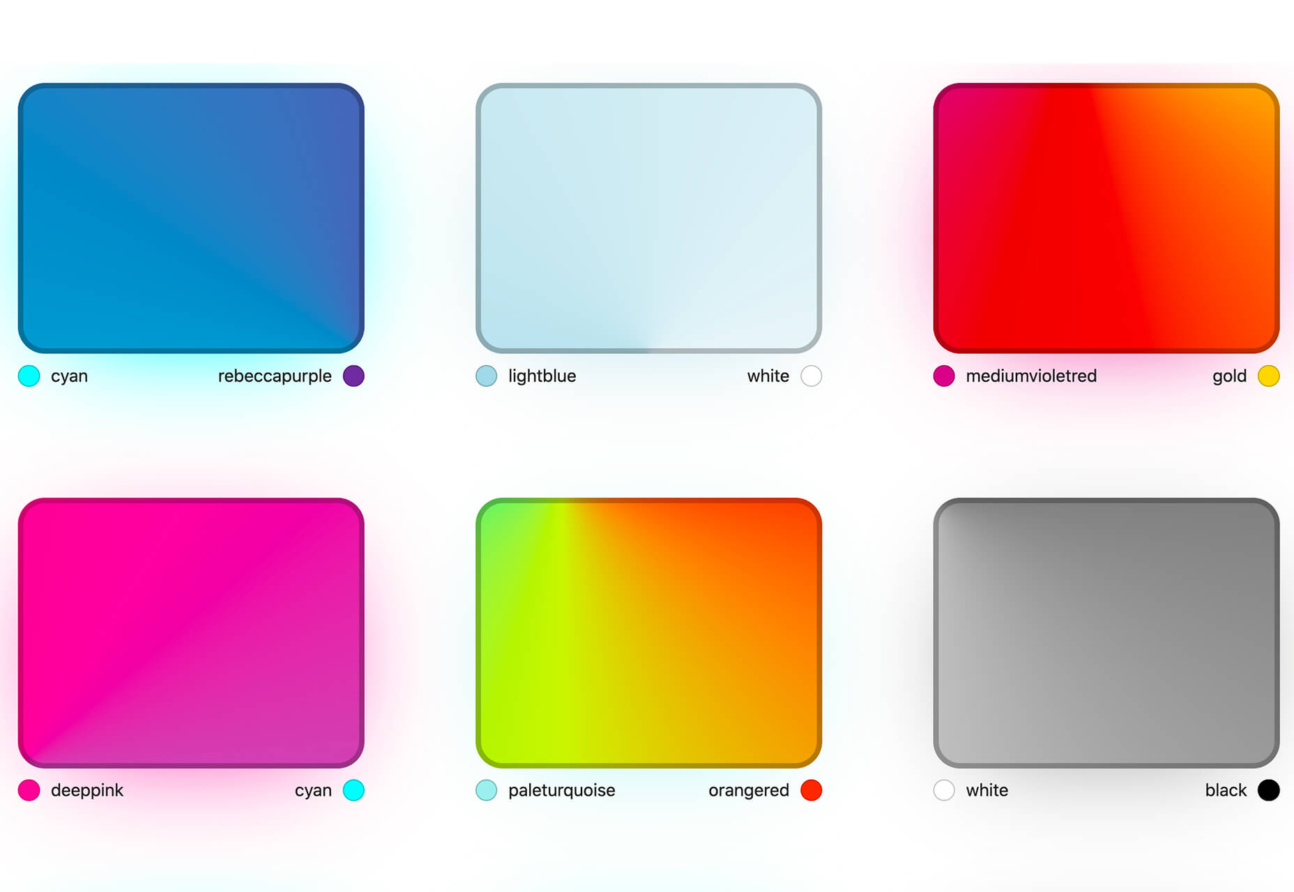
Couleur.io
Couleur.io is a simple color palette builder tool that lets you pick a starting color and build a scheme around it. One of the best elements of the tool might be the quick preview, which shows your choices using the palette in context and in dark mode. Get it looking the way you want, and then snag the CSS to use in your projects.
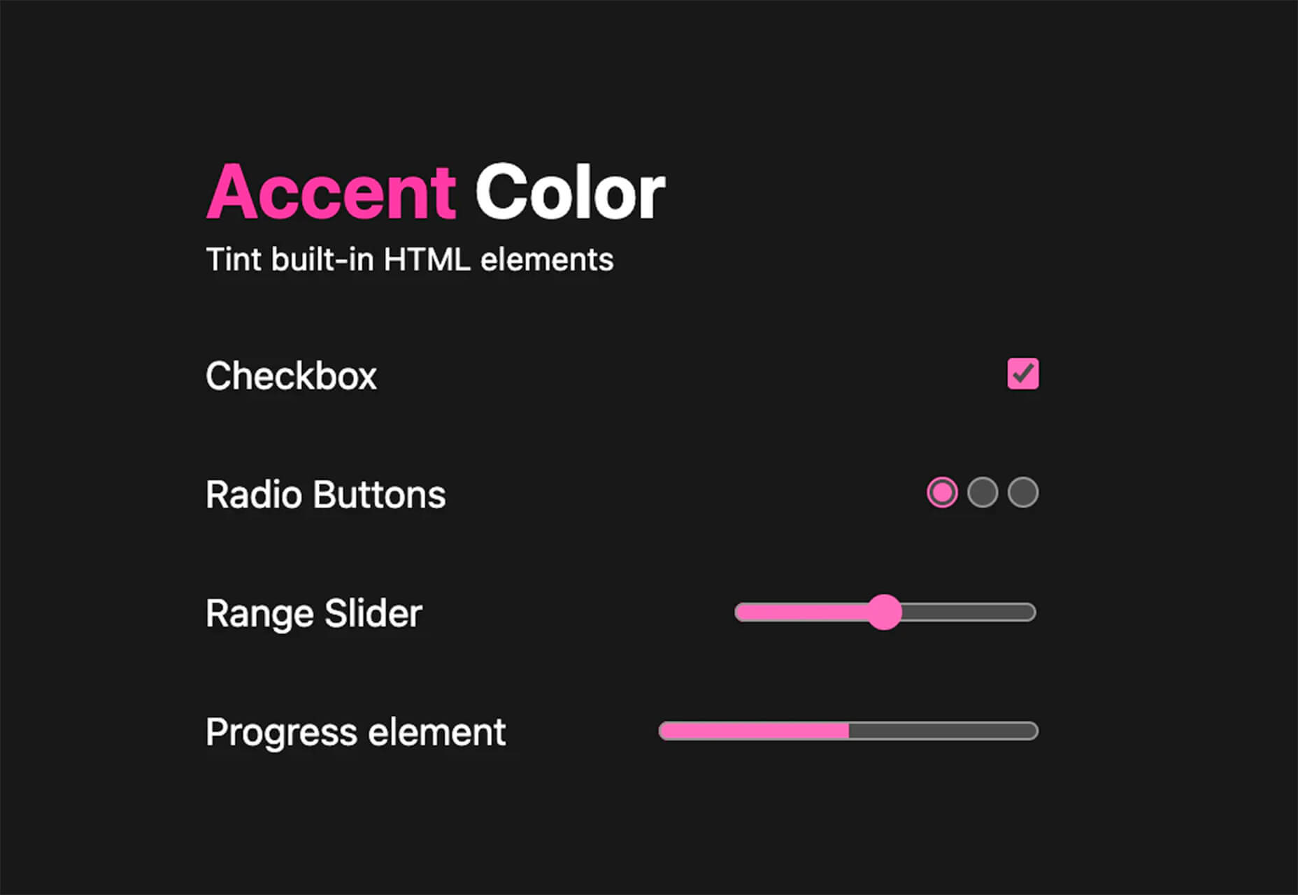
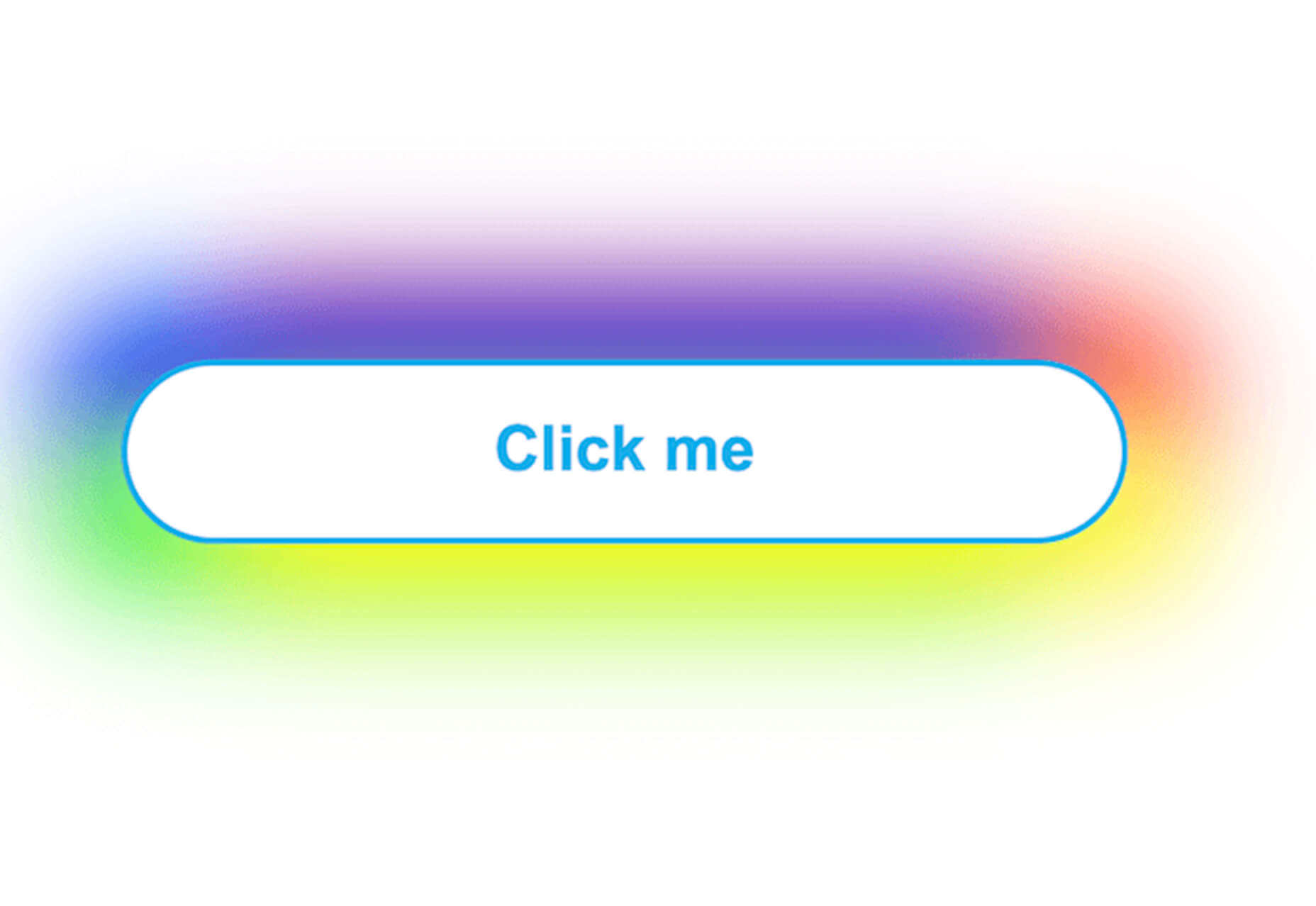
CSS Accent-Color
CSS Accent-Color can help you tint elements with one line of CSS. It’s a time-saving trick that allows for greater customization for your brand in website design projects. Plus, it works equally well in dark or light color schemes. It supports checkboxes, radio, range, and progress bars.
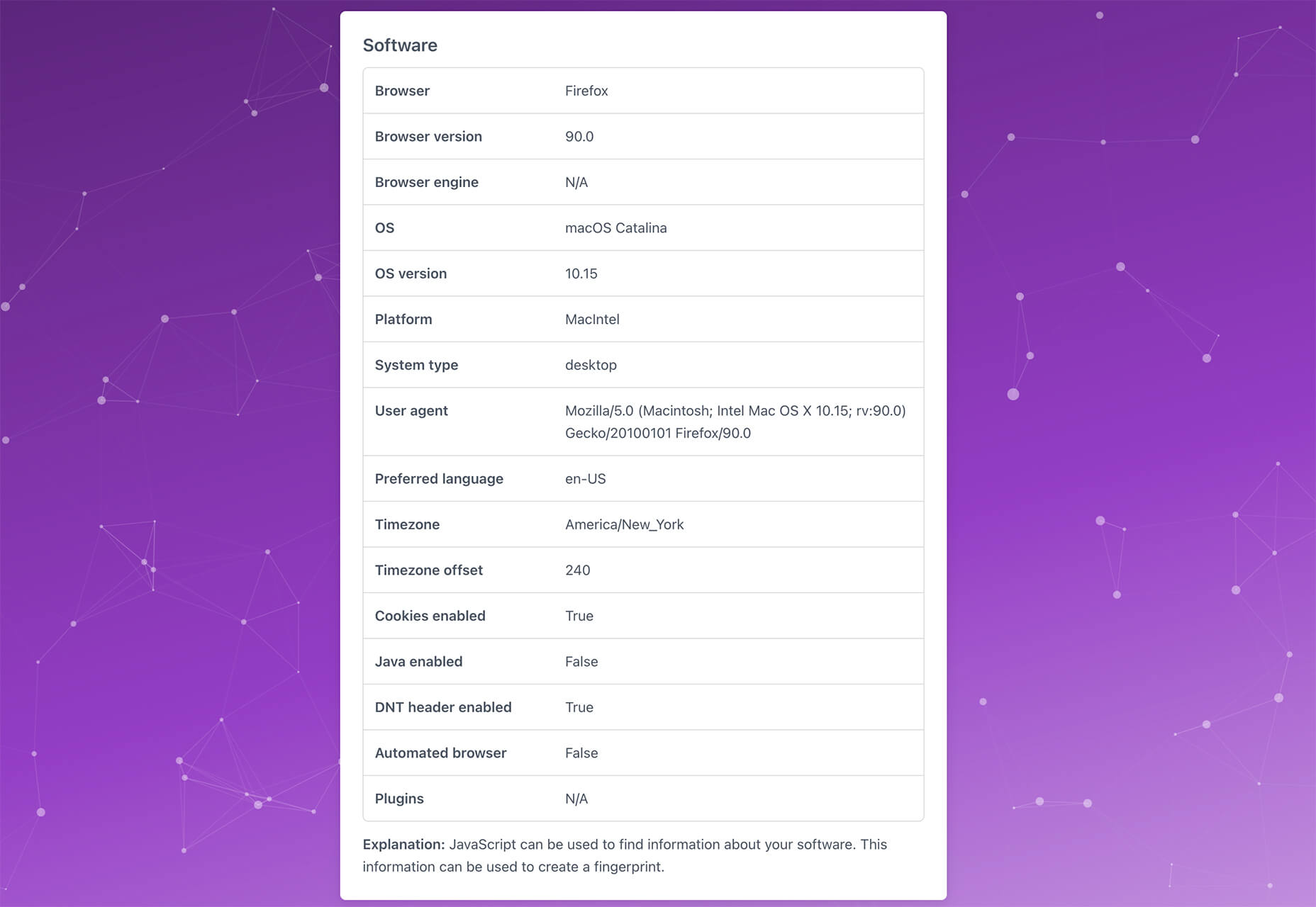
Vytal
Vytal shows what traces your browser leaves behind while surfing the web. This scan lets you understand how easy it is to identify and track your browser even while using private mode. In addition, it scans for digital fingerprints, connections, and system info.
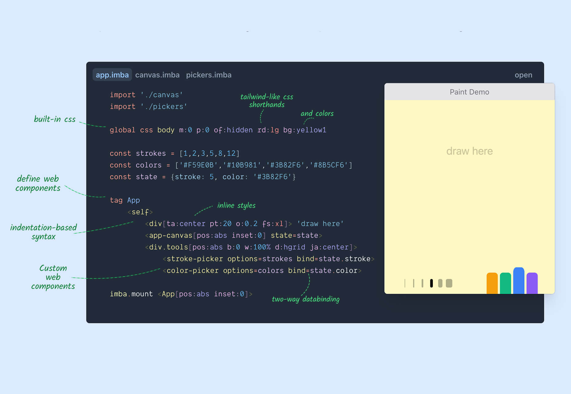
Imba
Imba is a programming language for the web that’s made to be fast. It’s packed with time-saving syntax tags and a memorized DOM. Everything compiles to JavaScript, works with Node and npm, and has amazing performance. While the language is still in active development, the community around it is pretty active and growing.
SVG Shape Dividers Creator
SVG Shape Dividers Creator is a tool that allows you to create interesting shapes with SVG so that your colors and backgrounds aren’t always rectangles. You can adjust and side, change the color, axis, and flip or animate it. Then snag the CSS, and you are ready to go.
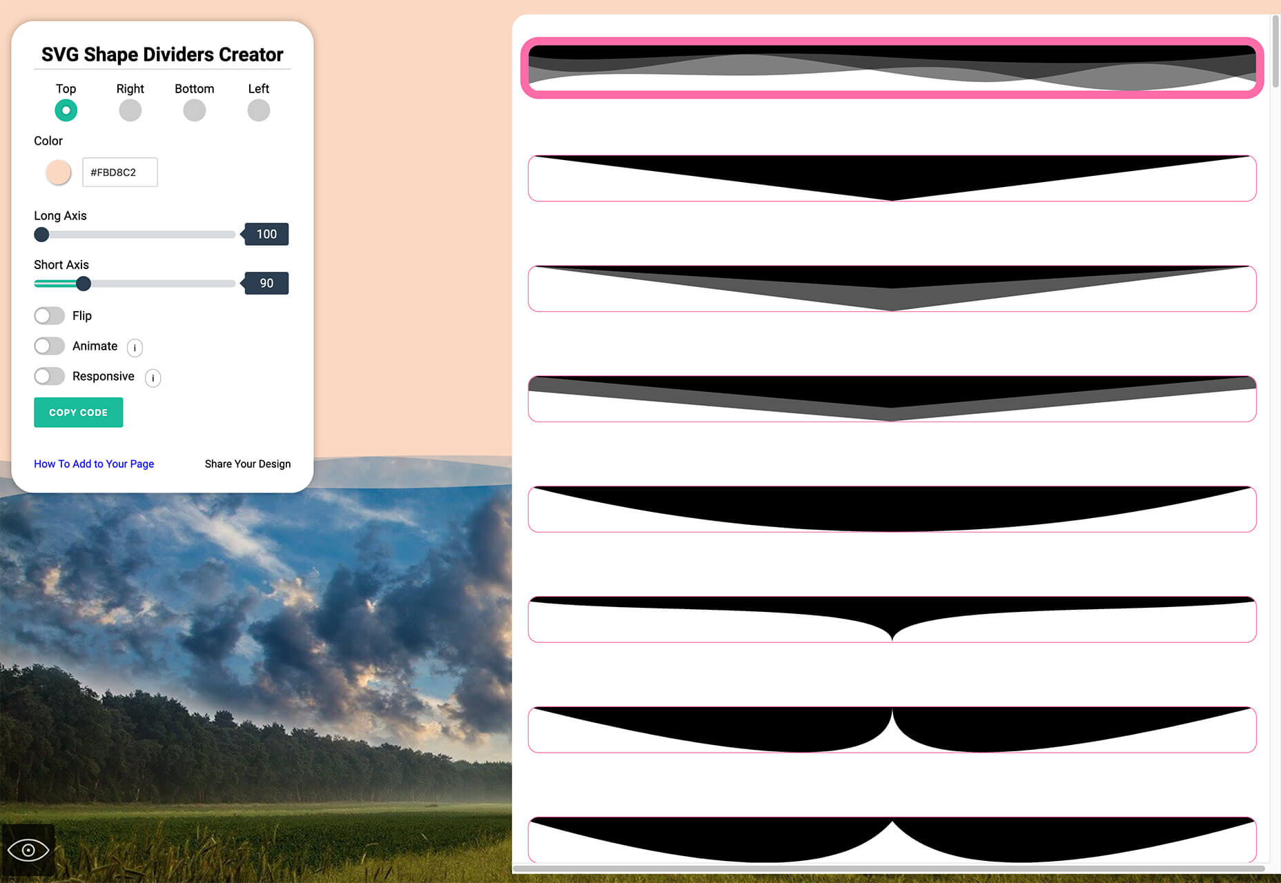
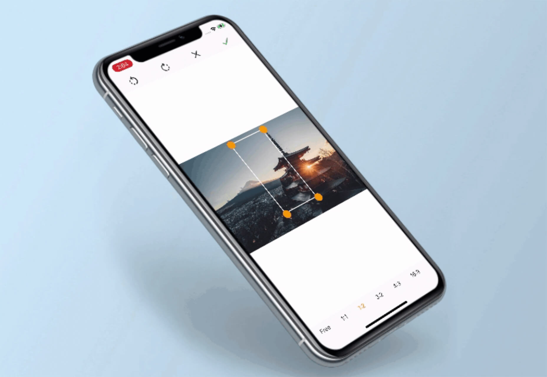
Image Cropper
Image Cropper is a tool that allows you to crop and rotate images using the flutter plugin. It works for Android and IOS.
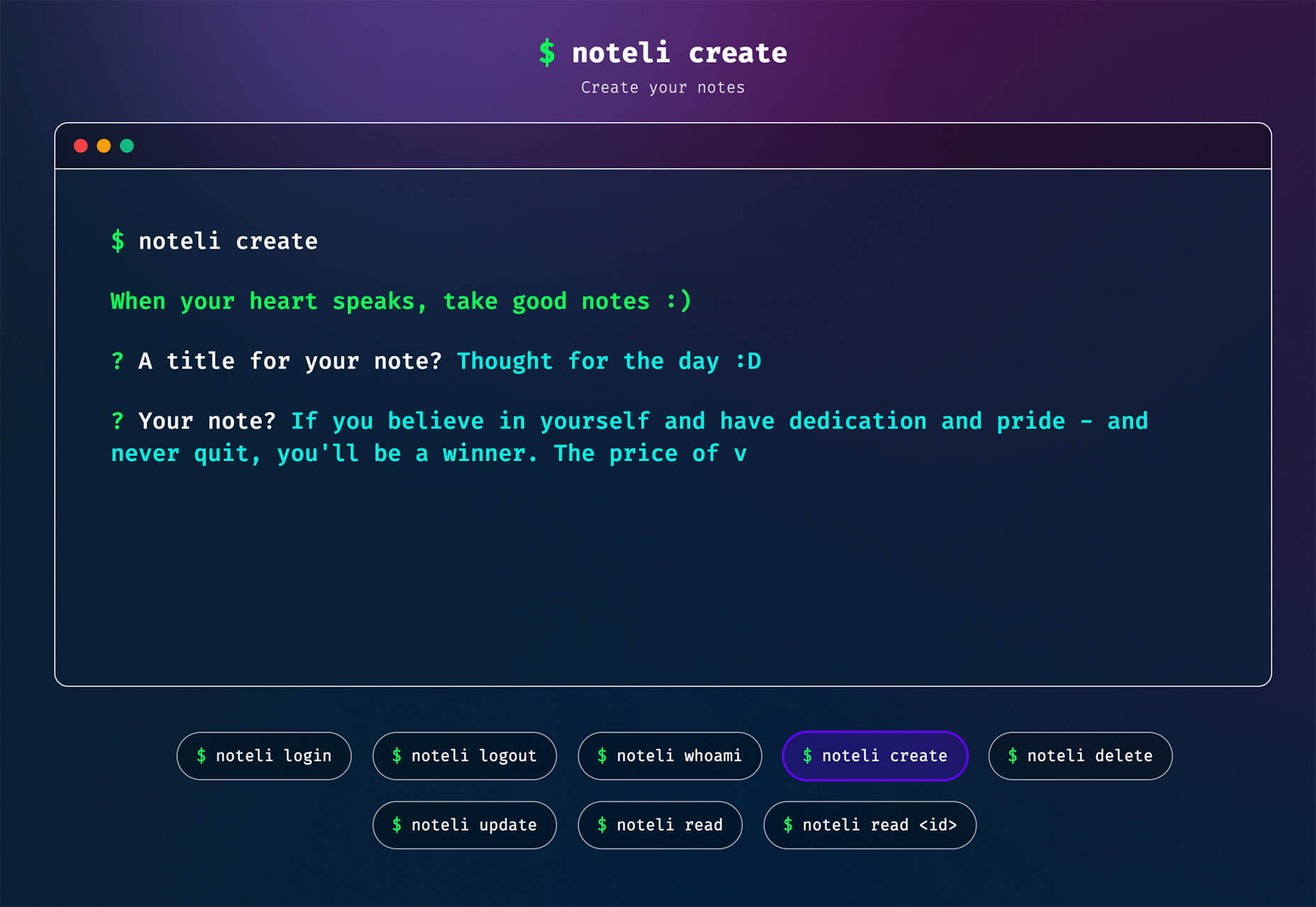
Noteli
Noteli is a CLI-based notes application that uses TypeScript, MongoDB, and Auth0. The tool is just out of beta.
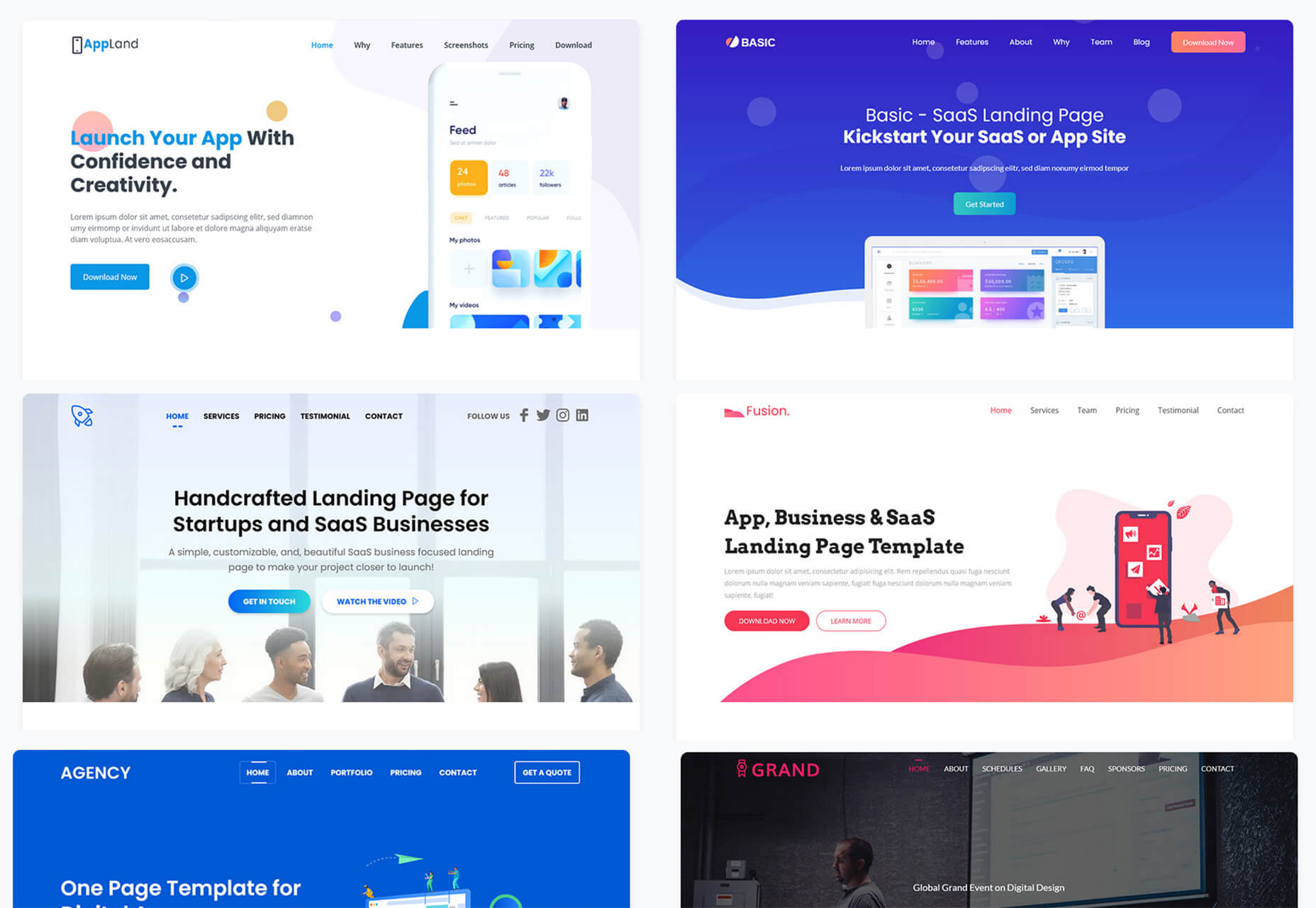
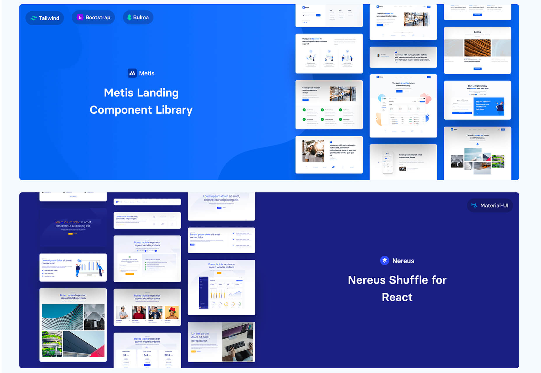
Yofte
Yofte is a set of components for Tailwind CSS that help you create great e-commerce stores. The UI Kit is packed with components with clean and colorful designs that are customizable. The code is easy to export and clean. This premium kit comes with a lifetime license or a monthly plan.
UI Deck
UI Deck is a collection of free and premium landing page templates, themes, and UI kits for various projects. This is a premium resource with paid access to all of the tools. It includes access to more than 80 templates.
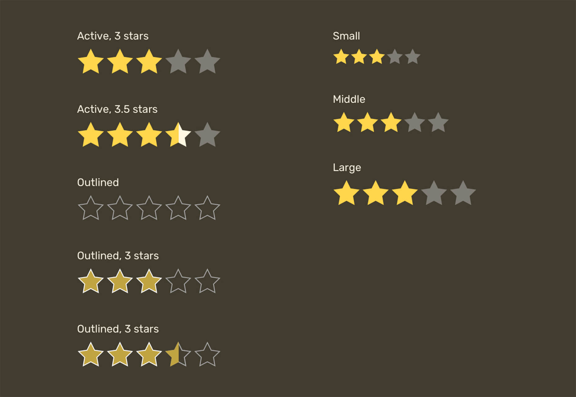
Star Rating: An SVG Solution
Star Rating: An SVG Solution is a tutorial that solves a common design dilemma: How to create great star rating icons for pages. This code takes you through creating an imageless element that’s resizable, accessible, includes partial stars, and is easy to maintain with CSS. It’s a great solution to a common design need.
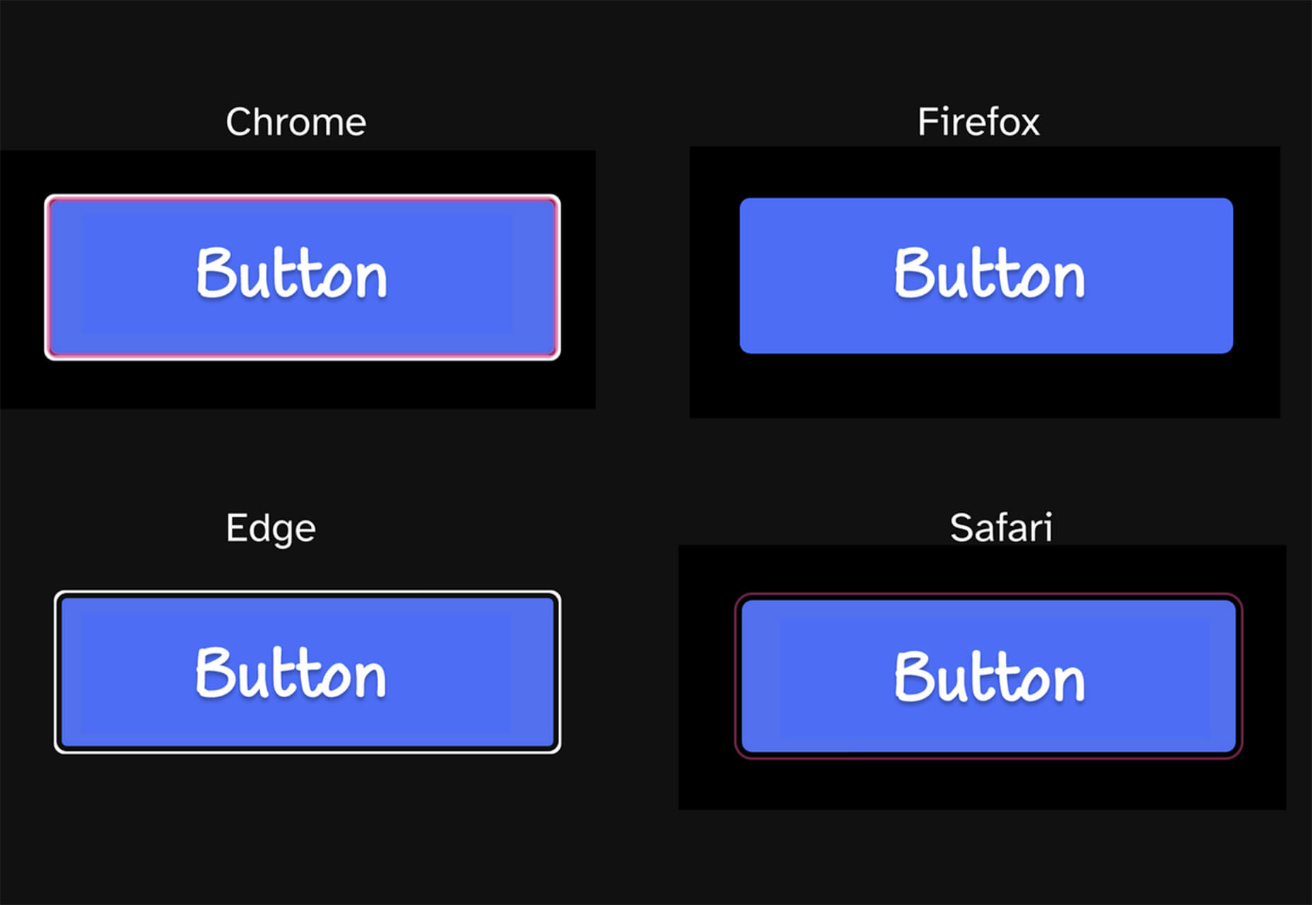
Designing Accessible WCAG-Compliant Focus Indicators
Designing Accessible WCAG-Compliant Focus Indicators is another convenient guide/tutorial for an everyday application. Here’s why it is important: “By designing and implementing accessible focus indicators, we can make our products accessible to keyboard users, as well as users of assistive technology that works through a keyboard or emulates keyboard functionality, such as voice control, switch controls, mouth sticks, and head wands, to mention a few.”
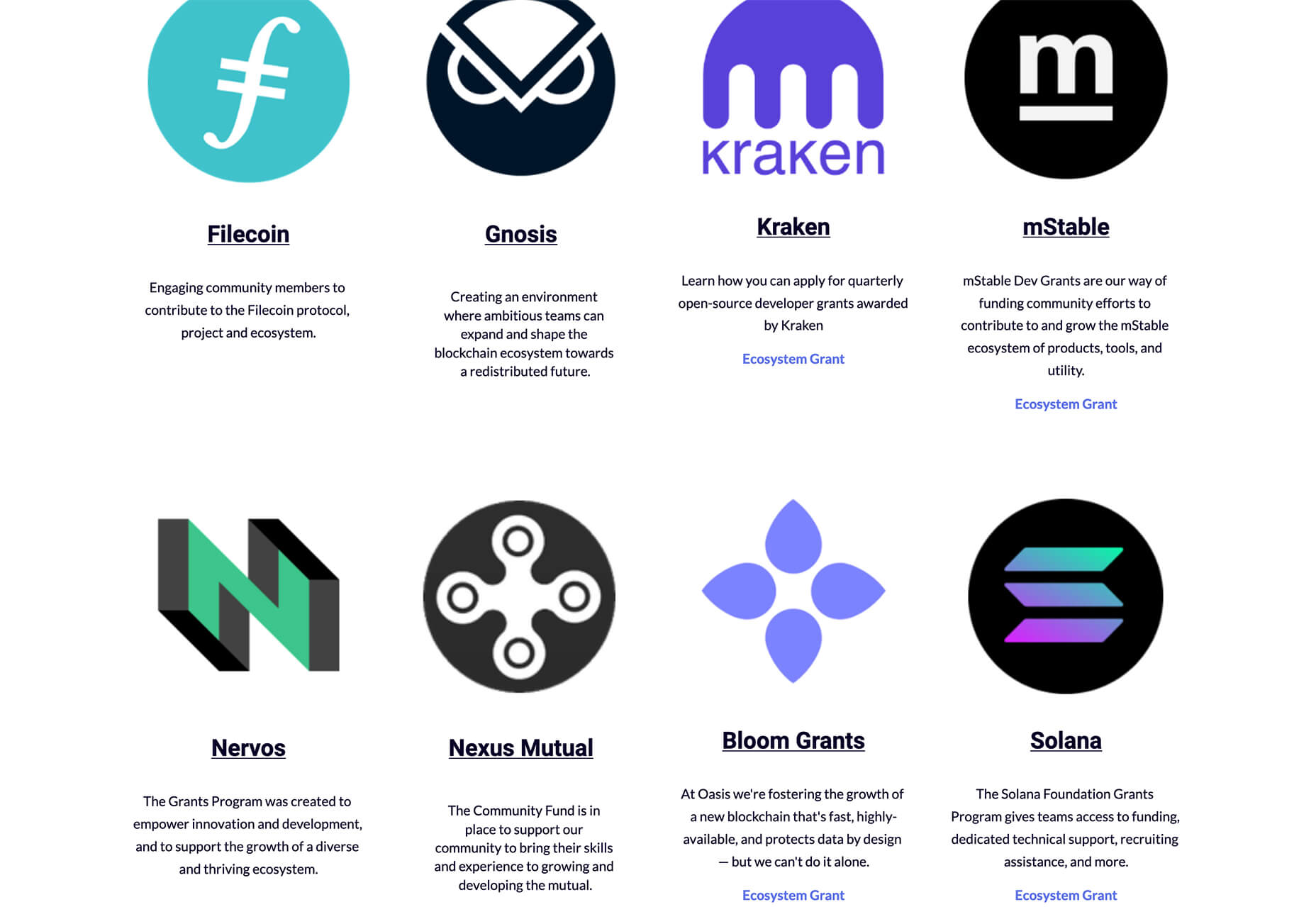
Blockchain Grants
Blockchain Grants is a tool for anyone developing blockchain applications and in need of funding. It’s a database of grants from a variety of organizations for different applications. Start looking through this free resource to help secure additional funding for your projects.
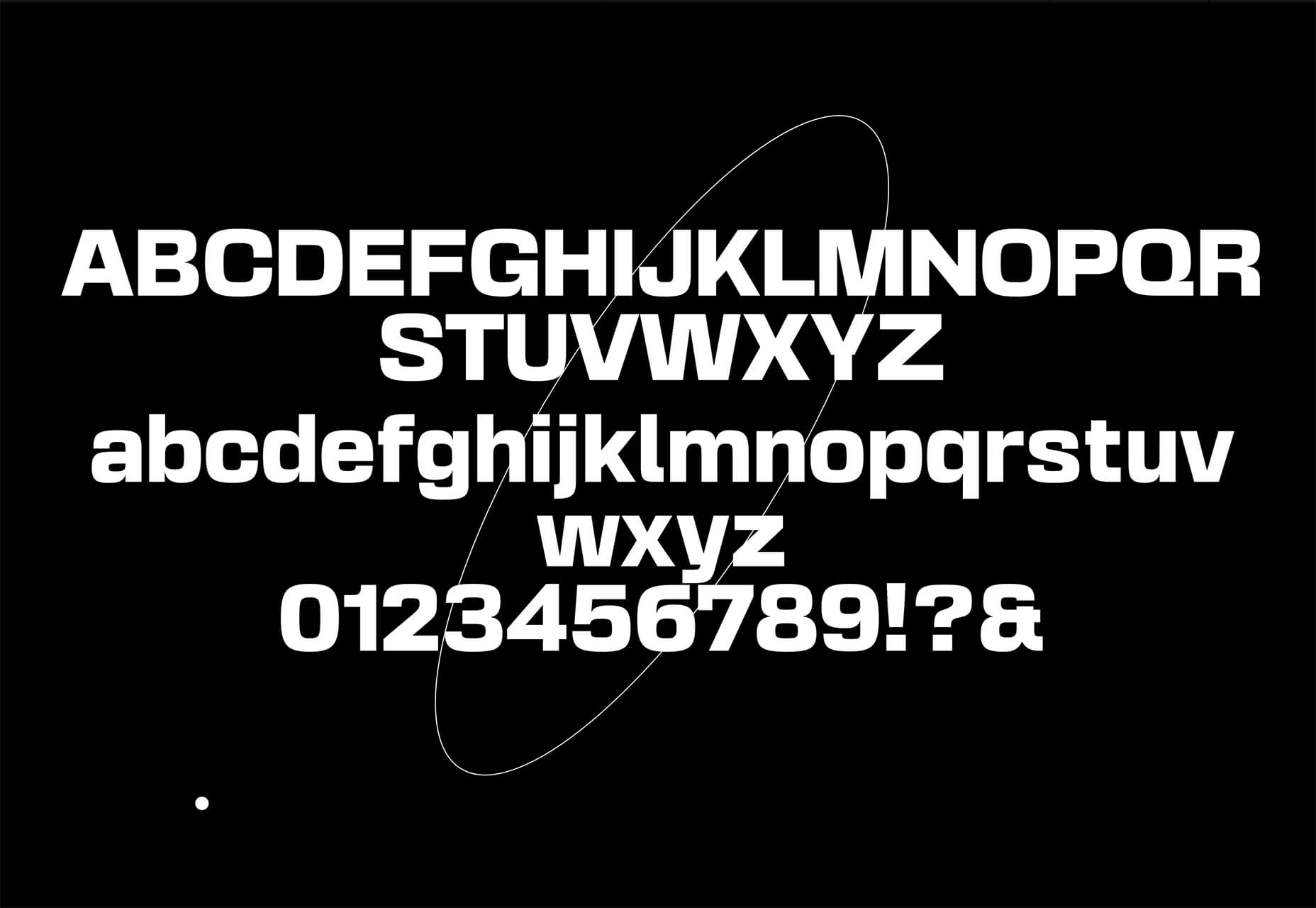
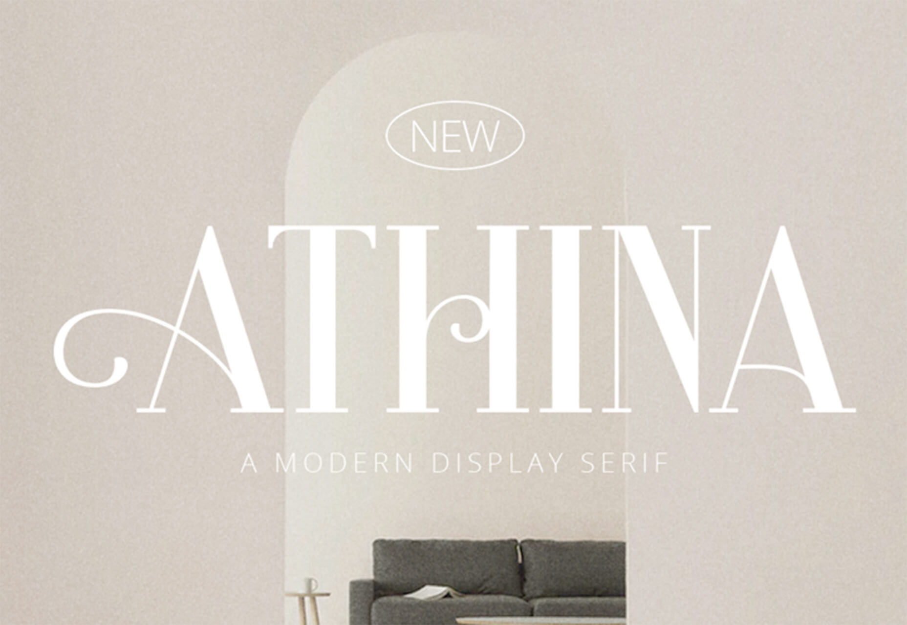
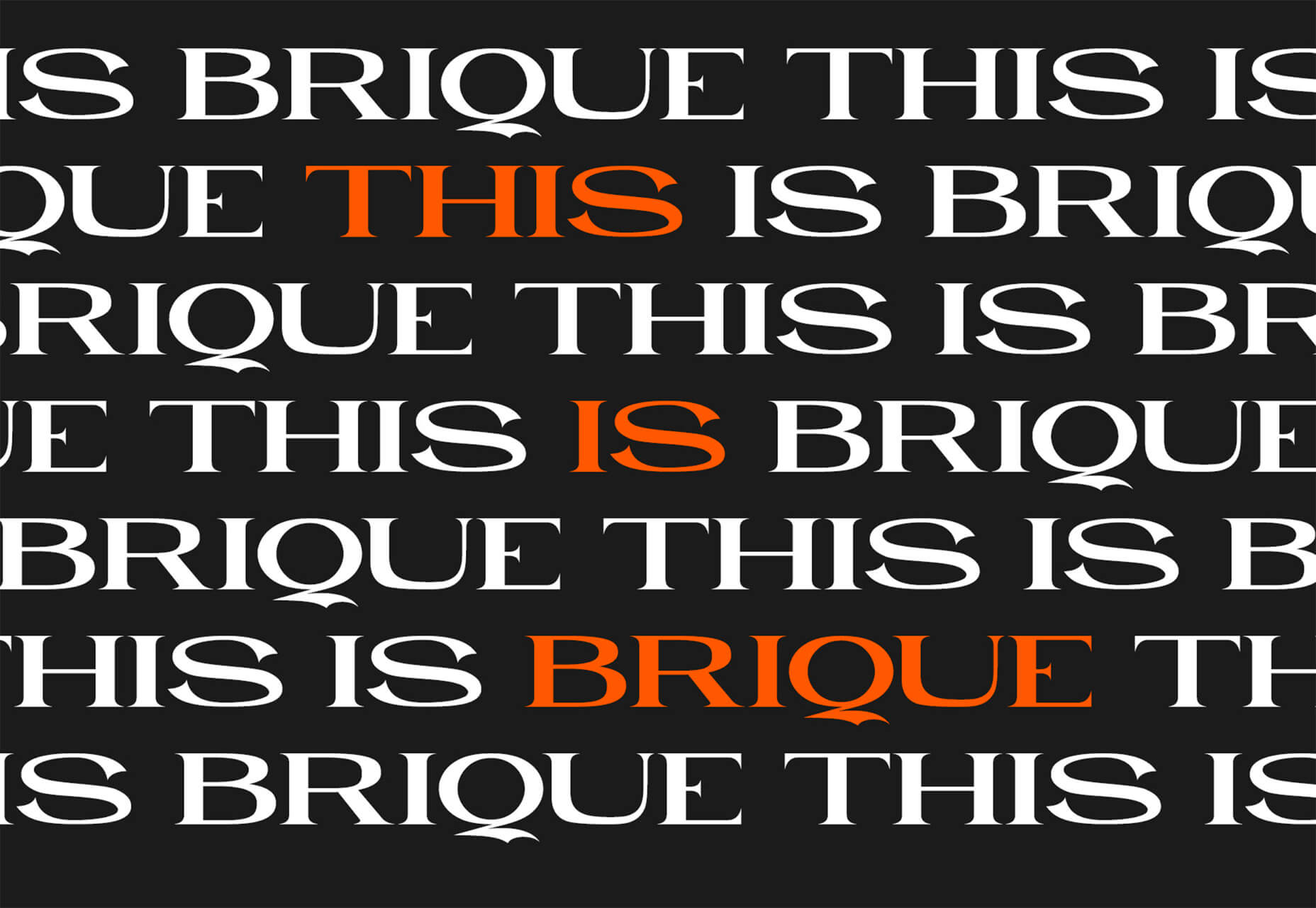
Basement Grotesque
Basement Grotesque is a beautiful slab with a great heavy weight and plenty of character. There are 413 characters in the set with plenty of accents, numbers, and variable capitals.
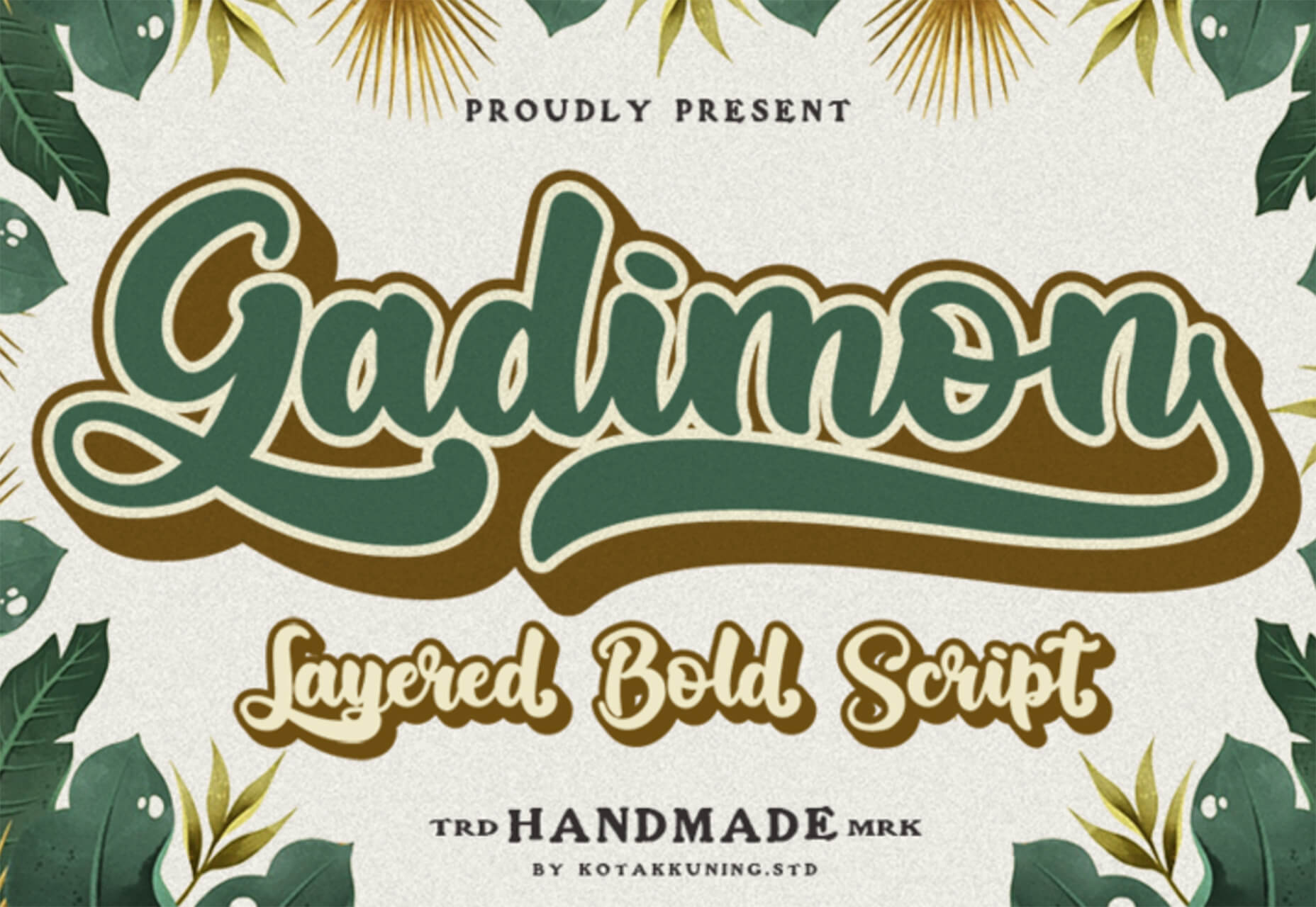
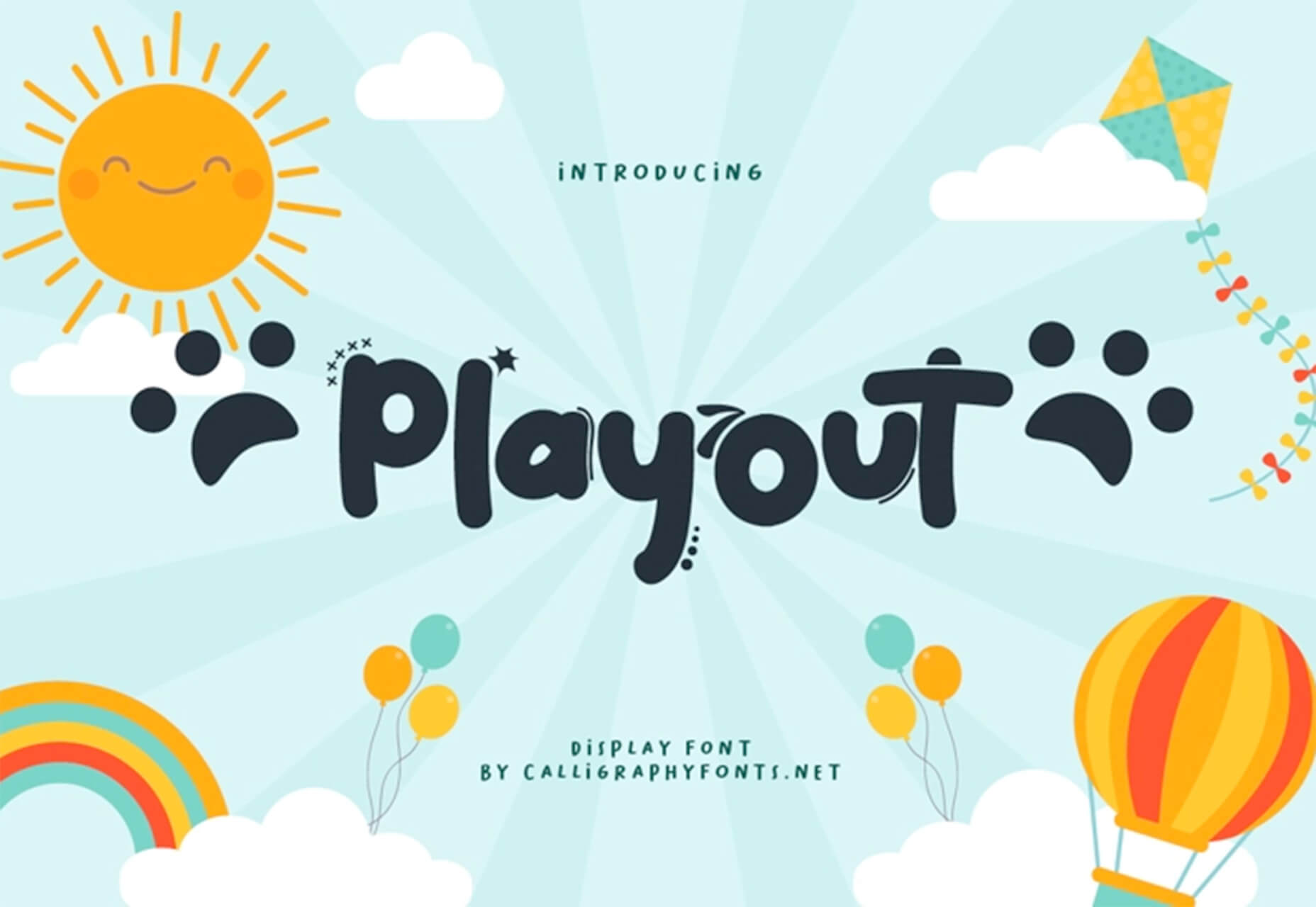
Gadimon
Gadimon is a fun, almost comic book-style layered script. The font package includes a regular and extrude style.
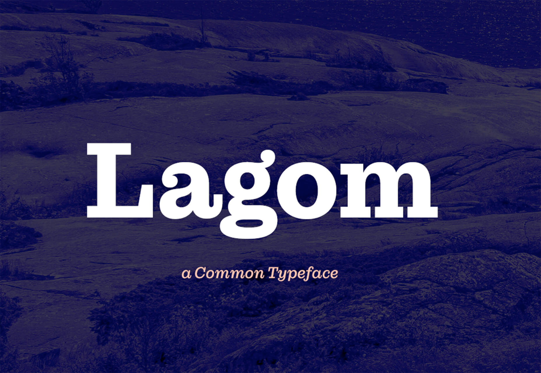
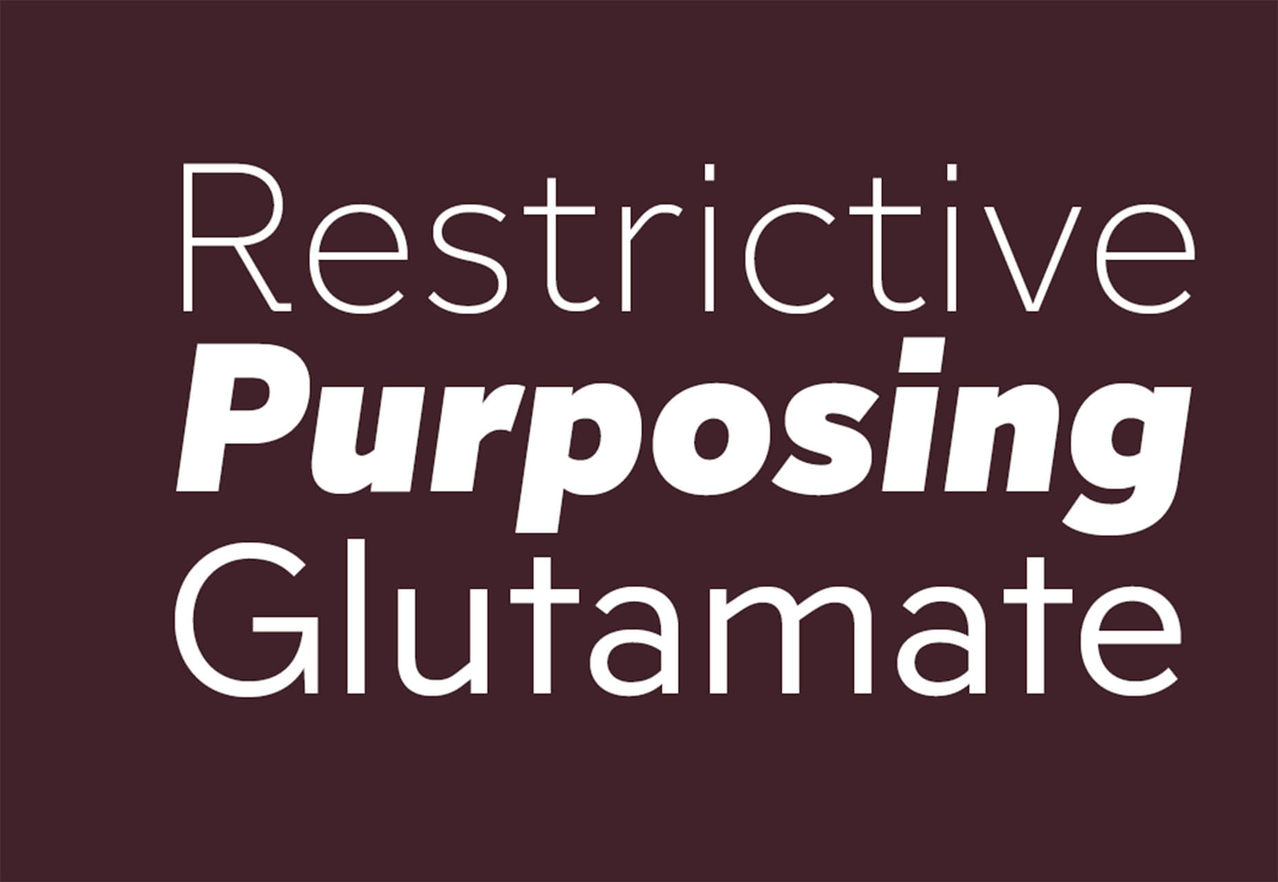
Lagom
Lagom is a sleek and functional serif typeface with 16 styles in the robust family from ultralight to extra bold italic. It’s readable and has a lot of personality.
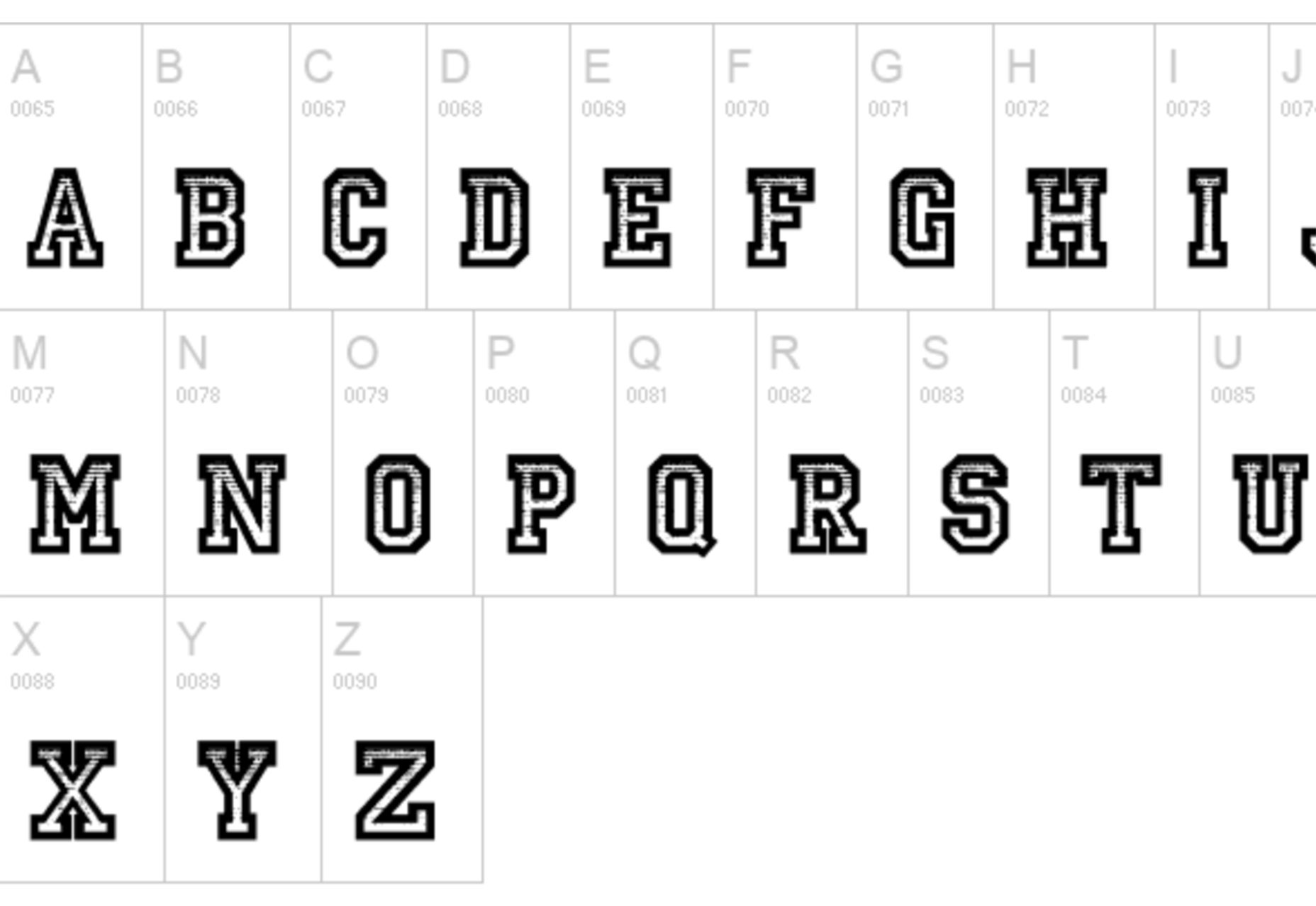
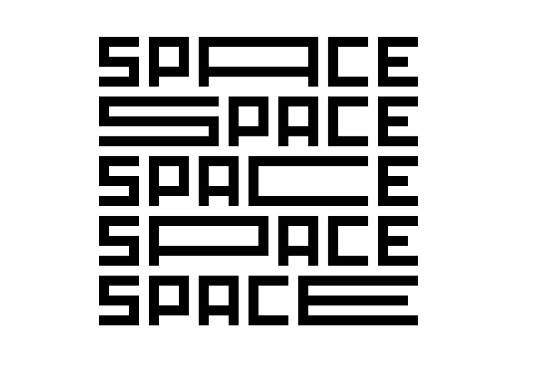
Striped Campus
Striped Campus fits our back-to-school theme with a fun, scholastic look and feel. The block letters have a thick outline stroke and some fun inline texture.
The post Exciting New Tools for Designers, September 2021 first appeared on Webdesigner Depot.

 It’s almost time for another season of change. Although the temperatures might not reflect it, this is the time of year where most of us start thinking about what’s next.


 The dog days of summer are here. From vacations to pool time, you might not be thinking about work that much. But there are still plenty of new tools and resources popping up to help you become a better or more efficient designer.


 Rather than spring cleaning, do some spring “shopping” for tools that will make your design life easier. Packed with free options this month, this list is crammed full of tools and elements that you can use in your work every day.
 We’re no longer arguing about whether climate change exists because climate change is now extensively documented. Instead, we’re arguing over whether climate change is a natural cycle or human-accelerated.
 We’ve been
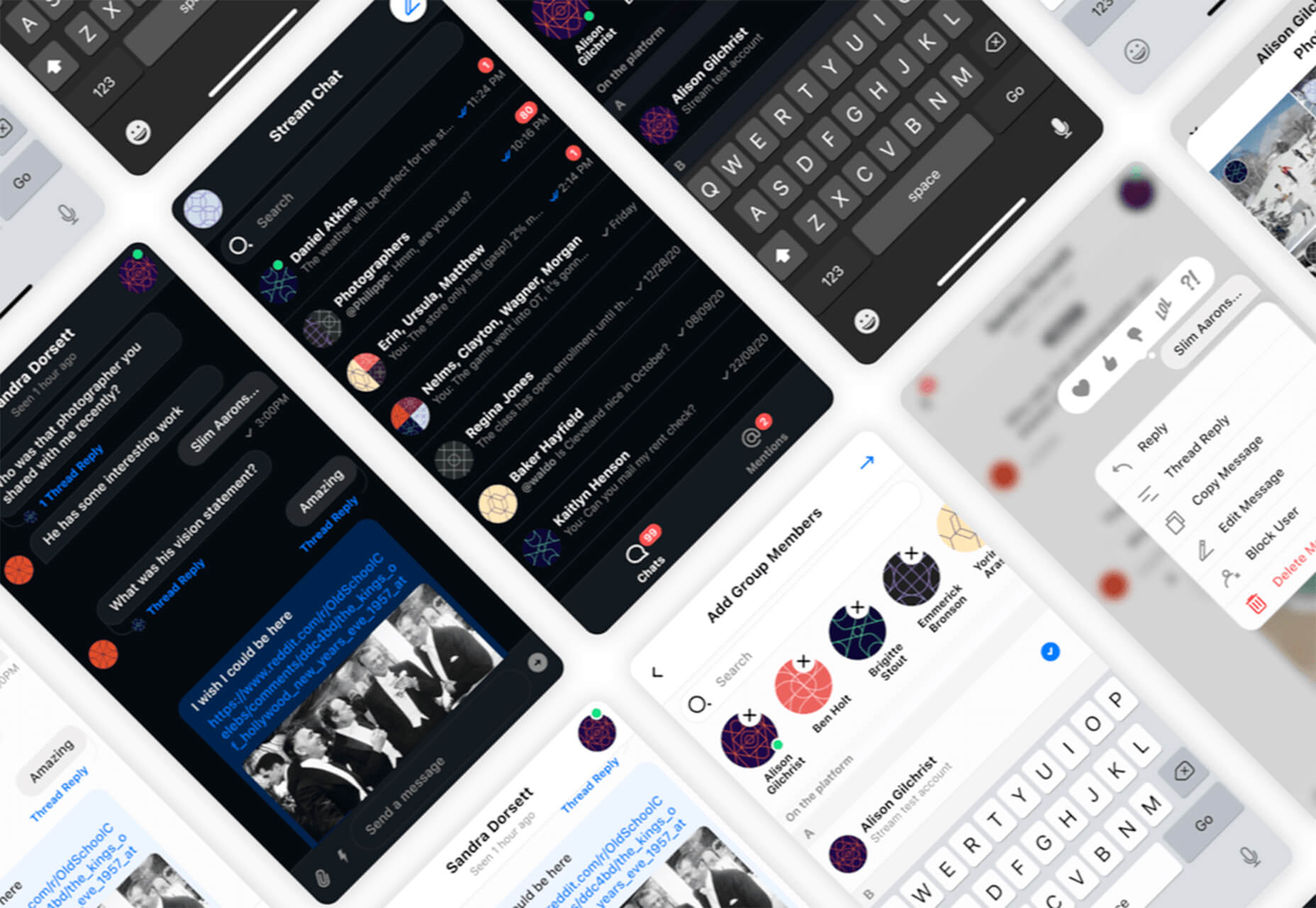
 Dark themes are everywhere these days.