 Looking to give your homepage a well-needed design update in late 2021 or 2022? Not a bad idea; first impressions are crucial when it comes to business websites. But, fixing your homepage and website design is no easy feat.
Web design trends are evolving faster. Blame the ever-decreasing user’s attention span. The average visitor now spends just 0.5 seconds scanning your homepage to form an opinion about your brand and decide whether to click through or bounce.
Increased user expectations and uncertainty in the user’s response, which is highly impacted by the site’s first impression, are other reasons to consider. This is why the designs which were trending in 2019 are no longer viable in 2021 or 2022.
We have curated the ten best examples of homepage designs to inspire your business in 2022, including a rundown of the best strategies and tips.
Let’s start by highlighting why homepage optimization is necessary for 2022:
Why Your Homepage Will Be So Important in 2022
Your website — especially your homepage — is your brand’s first chance to attract, build trust with, and connect with visitors.
According to recent statistics on why website design is important:
- 38% of visitors will stop interacting with a website if they think the layout isn’t visually appealing or intuitive. This creates a higher bounce rate and fewer conversions.
- 94% of a visitor’s first impression is based on website design (including colors, fonts, layout, navigation menus, etc.).
- 46% of people base a business’s credibility on the aesthetics of its website. Brands with less-than-stellar homepage designs are seen as less trustworthy than companies investing in the visitor experience.
Think of it the same way as walking into a brick-and-mortar store. Visitors are more enticed by a carefully curated ambiance of neatly stocked shelves and welcoming employees than a store that’s dark, messy, or seemingly unfriendly.
Using this logic, your homepage’s above-the-fold section is where you’ll greet visitors and reel them in for more.
10 Homepage Design Comparisons (2019 vs. 2021) To Inspire Your Business Website Design in 2022
Homepage design has come a long way since 2019. In this section, you will explore how.
These homepage designs crush it above the fold. Take just a few of these tips to heart, and your website will be poised to attract leads and conversions — no matter which industry you’re in.
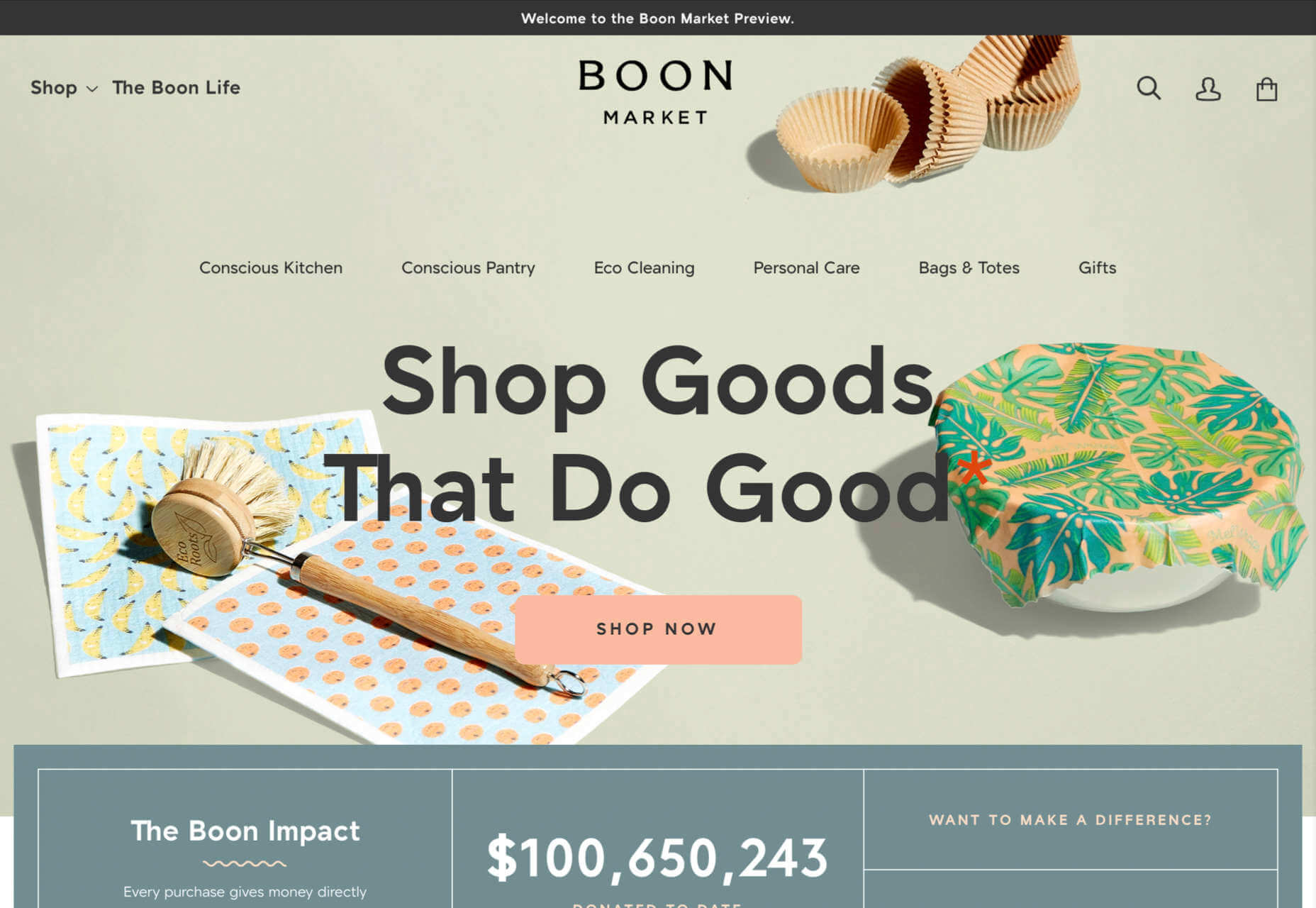
1. Netflix – Crafting The Perfect Call To Action That Reduces Friction With An Additional FAQs Section
Most businesses make the mistake of adding a CTA button that first persuades the user to click on it and then asks for the visitor’s email address.
Netflix also did the same in its 2019 design.
However, Netflix combined both steps in its 2021 homepage design.
The new, improved 2021 homepage design asks for the user email address right up front along with the CTA button.
Here is a good comparison of both the designs:

2019 homepage design
vs.

2021 homepage design
Key Takeaways:
- The design encourages visitors to enter their email address right when they land on the homepage. As a result, form submission is much easier when the user has started the process. Hence, Netflix makes it easier for visitors to move along their conversion funnel nicely by reducing the friction.
- The 2021 design also has a nice FAQ section that provides quick information about the company’s services and improves the overall user experience.
- FAQs also help increase the organic presence of the website in the search engines because Google presents snippets from the FAQ section in the form of an answer box in the search results.
2. Spotify – Revamped Color Combinations For Improved CTA Visibility And Using The ‘Rule of Three’ For Heading Text
The older 2019 Spotify homepage design used light pink and orange colors in its home page main area. The CTA color was green, but if you look closely, the CTA lacks visibility.
The new 2021 design uses blue and green colors with a much larger font size for the main heading. The colors are attractive, and the CTA is visible clearly.
Here is the comparison of the Spotify homepage 2019 design vs. 2020 design:

2019 homepage design
Vs.

2021 homepage design
Key Takeaways:
- Blue is the most versatile color, and green is the perfect choice for the CTA button. Spotify used universally accepted color combinations to redesign its homepage and made the CTA more visible.
- The main heading is also made larger than it was in the 2019 design, and it follows the rule of three in writing which is effective and satisfying. It uses just three words in the main heading to allow the human brain to process information as a pattern that is more memorable.
3. Hulu – Give Priority To Your Brand Name And Hide Pricing
If you compare the Hulu 2019 vs. 2021 Hulu homepage, the brand name has been prioritized and shown as the main heading.
Moreover, the older homepage had pricing information everywhere, which has been reduced intelligently in the new design.

2019 homepage design
vs.

2021 homepage design
Key Takeaways:
- The brand name ‘Hulu’ is displayed as the main heading of the homepage, which helps to build audience trust.
- The older design persuaded the users to pick a paid plan even though they had a free trial option—this discouraged users from trying their service. The new 2021 design encourages users to try the platform for free. In addition, the packages have prominent CTAs that mention “try for $0”. This design move improves conversions on the website.
- The new design makes it easier for the visitors to select a viewing plan with easy comparison of the three available plans. The best part is, customers can start all the plans for $0. It’s a win-win situation for the users, and they can quickly pick a plan to start watching Hulu.
4. Nextiva – Reduce Visual Noise And Add Pictures In Menu To Improve UX
Nextiva realized the importance of reducing visual noise in its newly designed 2021 homepage. Visual noise happens when you use too many colors to attract user attention. Different colors compete with each other resulting in diluted customer observation.
In the old 2019 homepage, Nextiva used orange, blue, and green as the primary colors, while in the 2021 revamped design, they have used blue as the main color.
Here is a comparison of the two designs:

2019 homepage design
vs.

2021 homepage design
Moreover, the older homepage didn’t have an image in the product menu, but the new 2021 homepage improves the UX further.
Below is a comparison:

2019 homepage design
vs.

2021 homepage design
Key Takeaways:
- Nextiva used blue as their base color for the homepage design and removed orange and green colors to reduce visual complexity. This is an excellent change to keep the user’s attention focused. Notice the green colored bar at the top of the homepage in the 2019 version now replaced with blue.
- The 2021 design has a clean look compared to the 2019 design, which looks scattered with too many different elements, including CTAs that confuse the users.
- The product menu does an excellent job of linking intelligently to service pages such as phone systems and video meetings. The image of a smiling lady attracts users to click on Nextiva’s products to learn more about them. Improving UX is an impressive way to reduce bounce rates and increase time on site.
5. GoToMeeting – Avoid Lengthy Sign Up Form, Educate Users About Your Products, and Add Images That Depict The Current Needs of The Audience
GoToMeeting does a great job educating the users about their product by adding more content on the homepage that comprehensively explains their product features.
Moreover, they have replaced the older hero image with a new picture that portrays the changing needs of their audiences. Nowadays, there is a rise in work from home culture due to Covid-19. Hence, the photo and the heading text clearly target the needs of their users.
Here is a comparison of the 2019 vs. 2020 homepage of GoToMeeting:

2019 homepage design
vs.

2021 homepage design
Key Takeaways:
- The 2019 homepage design had a sign-up form on the homepage, which GoToMeeting removed in the 2021 design. People hate to fill in so much information right when they land on the home page. Hence, GoToMeeting did the right thing by removing the signup form from their homepage.
- The hero image steals the show of the 2021 redesign because the picture of a working mom with her kid playing studying in front of her is a great way to portray the current needs of the society when over 60% of the employees are working from home. Audiences can quickly relate their working environment with the hero image leading to more sign-ups.
- The older 2019 design was confusing, and it made little effort to help the users understand the different features of the product. The new 2021 homepage design has a product features section that explains the different features of the software. When users are educated about the product, they earn the confidence to try the product.
6. Zillow – Apply Hick’s Law To Allow Visitors To Take Faster Decisions
Zillow does an impressive job of applying Hick’s Law in allowing visitors to make faster decisions. Hick’s law states that the more options you present to the users, the faster they will decide. Therefore, it is a major factor in improving website usability.
The old 2019 homepage design of Zillow offered too many options to the users, like they want to buy, rent, or sell a property. The users first select either one of the three options and then enter the zip code to start their search.
The new 2021 homepage design changed that. Now, Zillow offers users a single option. They only need to enter the zip code to get started.
By reducing the number of actions that users need to take to just one, the homepage design eases the overall decision-making process of the site visitors.

2019 homepage design
vs.

2021 homepage design
Key Takeaways:
- The new homepage design has a simple search bar that persuades visitors to take prompt action.
- The Hero image is placed smartly behind the search bar to depict the needs of the users accurately.
- The homepage does have three different panels for buying, renting, or selling a home when the users scroll below. The old design is missing that. The new design removed so many options above the fold and kept just a single option for the users to encourage more users to search properties on the site.
7. Plex – Placement of Prominent Calls-to-Action On Homepage
The CTA is a key element of every website. It helps the users decide on their next action and helps to convert the visitors into leads.
Plex lacked an optimized CTA placement in its 2019 home page design. Hence, the 2021 design received an uplift to better place the CTA for increased visitor engagement.
Take a look at the home page designs of Plex from two different years. If you compare the two home pages of 2019 vs. 2021, the primary difference that will grab your attention is the CTA.

2019 homepage design
vs.

2021 homepage design
Key Takeaways:
- The call-to-action buttons are more prominent and have actionable texts.
- The number of CTA buttons is increased to two to encourage users to take action.
- The additional CTA button is wisely placed at the center to get immediate attention.
- Note that the color choice for the button is also bright and highly contrasts with the background yet matches the color theme.
- The old heading text ‘Stream Smarter’ was confusing because it didn’t help the users understand what Plex does. Hence it is now revised to ‘Watch Free Movies and TV on Plex.’ The new text is easy to understand and has the word ‘Free’ to increase the number of visitors clicking on the CTA.
8. Dropbox – More Above The Fold Content And Change of Fonts
Dropbox has significantly worked on its main content, which is clearly visible in the comparison homepage design images of 2019 vs. 2021.
The 2021 homepage is seen fixing faded, minimalistic, and less engaging content in the older homepage.

2019 homepage design
vs.

2021 homepage design
Key Takeaways:
- Sans serifs, with their clean readability, are included for longer bouts of the homepage.
- Bold sans text is doing the job of drawing user attention effortlessly.
- The color contrast of the text with the background is increased, which improves the visibility.
- The right side image of a laptop is replaced with a screenshot of the software, which intrigues users to know more.
9. Cisco – Moving Blocks To Outsmart Competitor Websites
The homepage design of American technology company Cisco has seen a drastic change in 2021; it deserves to appear on this list. The company website smartly represents an appeal for future development through its killer homepage design.
Here is a comparison of the old 2019 homepage design vs. the new moving block design of 2021:

2019 homepage design
vs.

2021 homepage design
Key Takeaways
- The home page contains moving blocks with news from the blog. As you hover over the image, it widens up, and a CTA button appears. The blocks represent a design of the future which the competitors might find hard to replicate.
- Every block has a CTA, which was missing in the 2019 design. Each block represents a specific Cisco service and caters to the different needs of the visitors.
- The new design is elegant and cleaner with lots of information.
10. Slack – Product Video On Home Page For More Conversions
Slack has made it easier for the users to understand the product well by using a video on the homepage.
The 2019 design has an image, while the 2021 design has a video that helps the visitors understand how the product works.
Here is a comparison of the 2019 design vs. 2021 design:

2019 homepage design
vs.

2021 homepage design
Key Takeaways
- The inclusion of a product video leaves a great impression in the minds of the visitors and shows them what your product does.
- Video helps Slack to make its value proposition clear and super fast.
- Video has a strong correlation to conversions, and they work well as compared to hero images. Slack used a hero image on the homepage in 2019, but they replaced it with a video in 2021.
Final Thoughts on Using These Homepage Designs for Inspiration in 2021
By making it to this point in our guide, you now have plenty of inspiration to run with when upgrading your homepage. You should also have a better understanding of how powerful this tool may become for your brand.
So now it’s time to brainstorm how to use these ideas for your own 2021 homepage design. First, jot down the key points from this guide and honestly assess how your website currently compares.
Accomplish this task, and your brand might see an uptick in website traffic and conversions. It may even earn a spot in a roundup of killer website designs just like this one.
Source
The post 10 Homepage Design Comparisons to Inspire Your Business in 2022 first appeared on Webdesigner Depot.

Source de l’article sur Webdesignerdepot

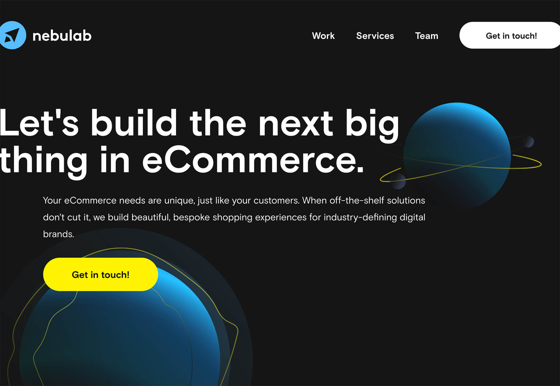
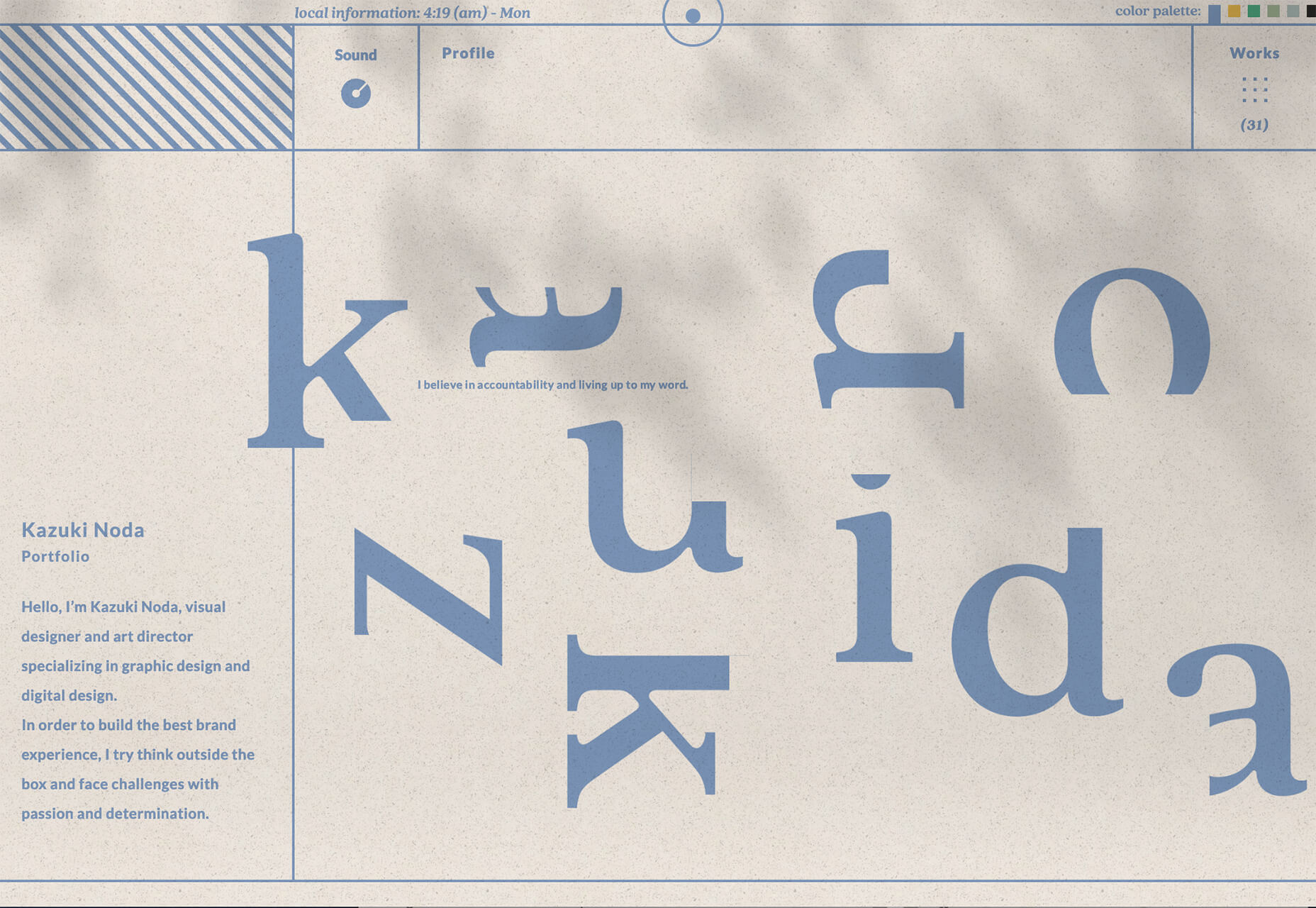
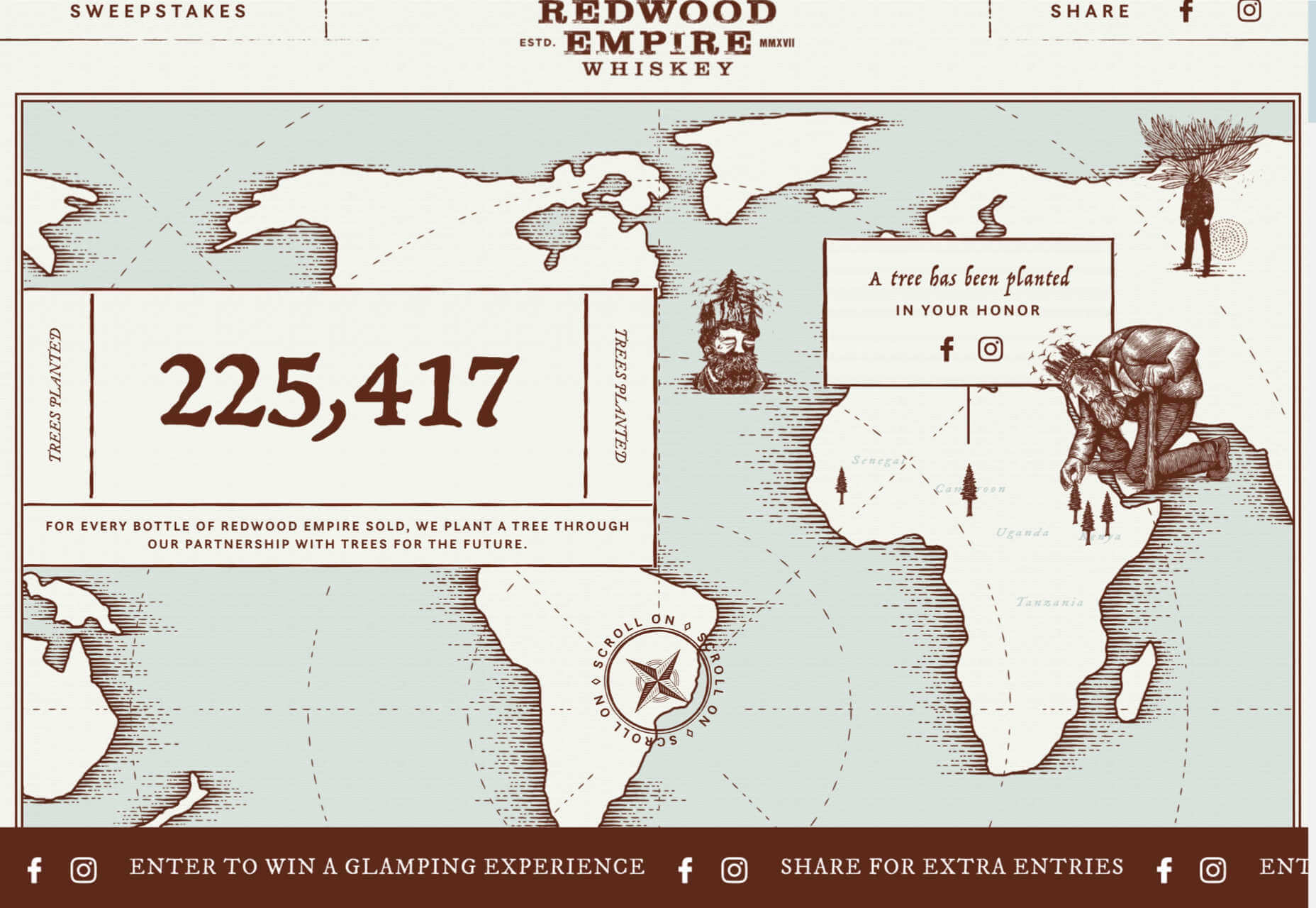
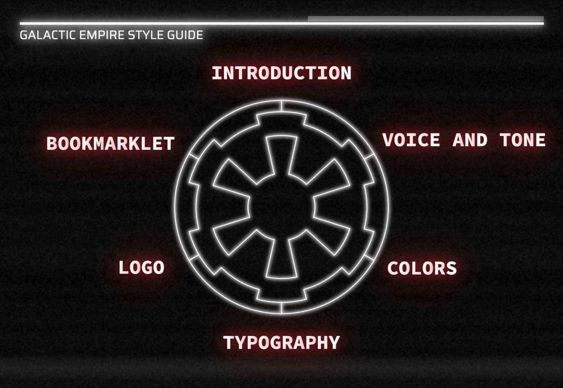
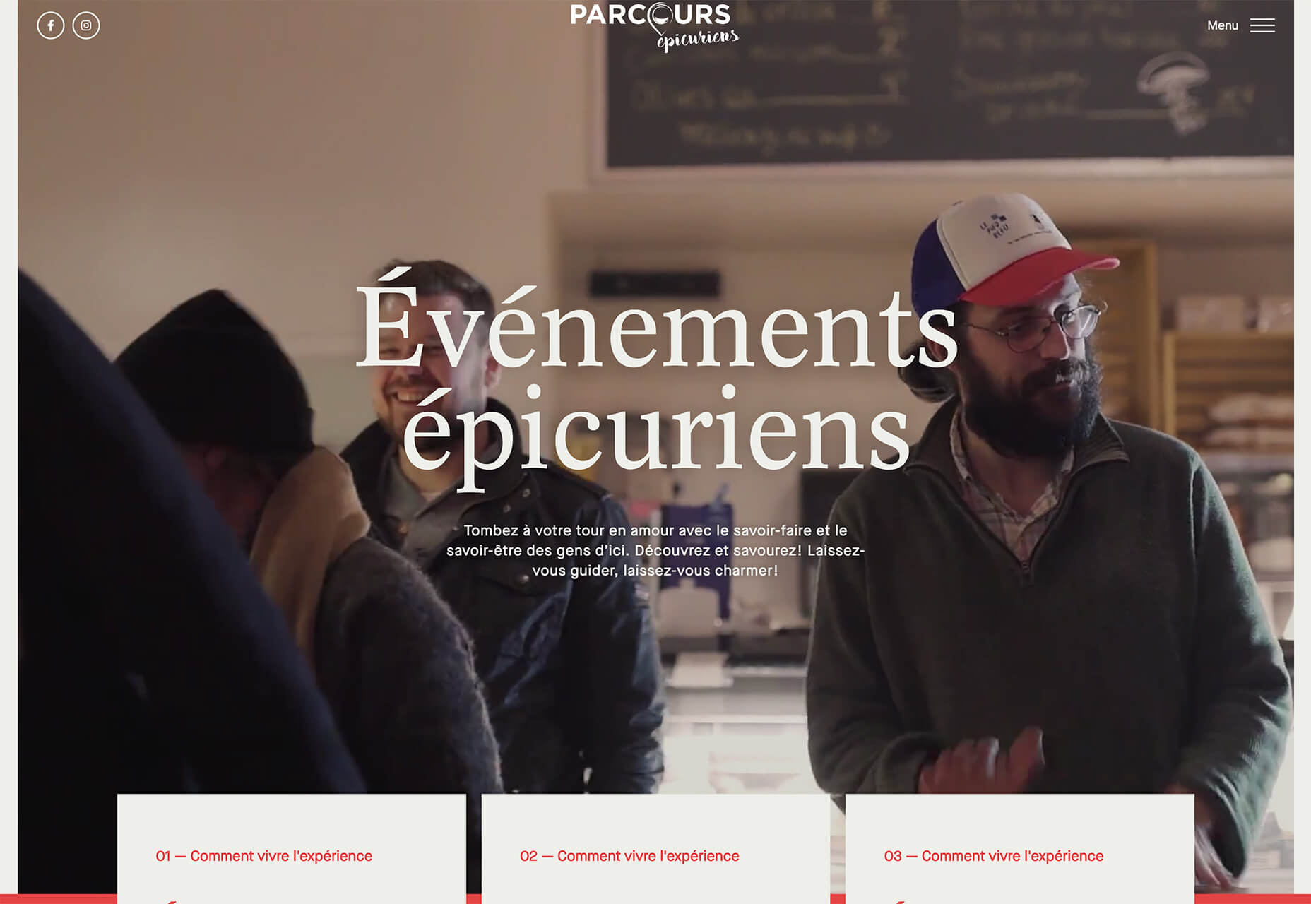
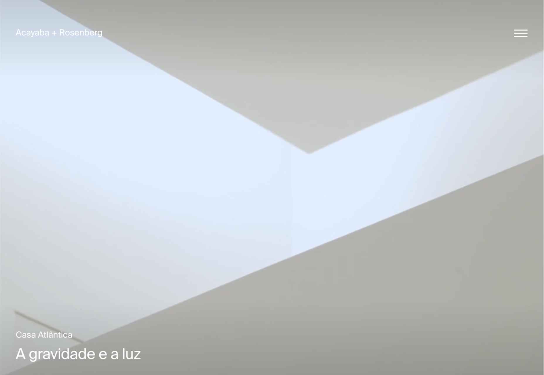
 Often, when designing a website or branding, it is easy to get wrapped up in the details–typography, graphics, color, the grid–and lose the bigger picture. Of course, these things are vitally important, but they are building blocks that go together to form a greater whole.


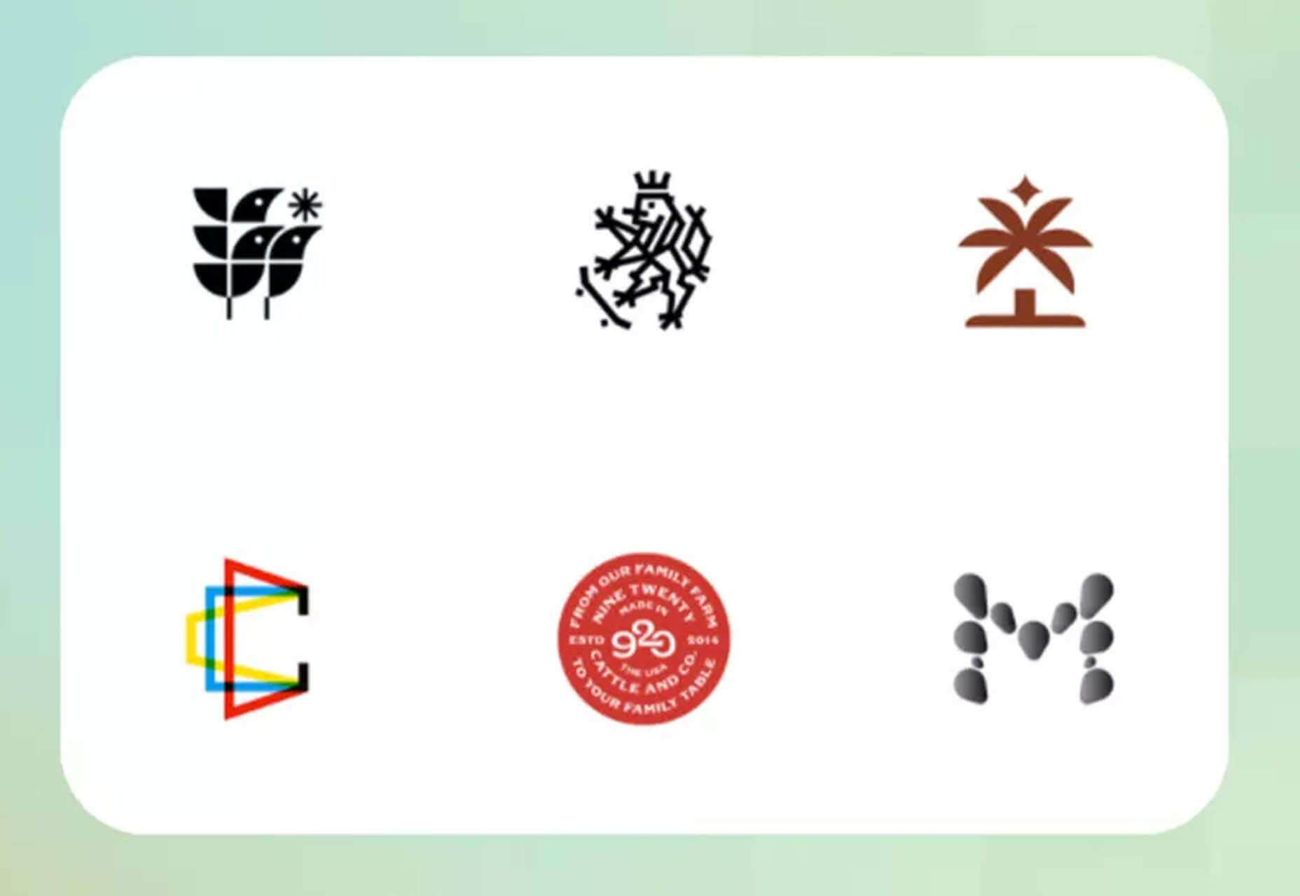
 Sometimes the designs that make the most impact do a lot of unexpected things and break some of the most tried and true rules of visual theory.


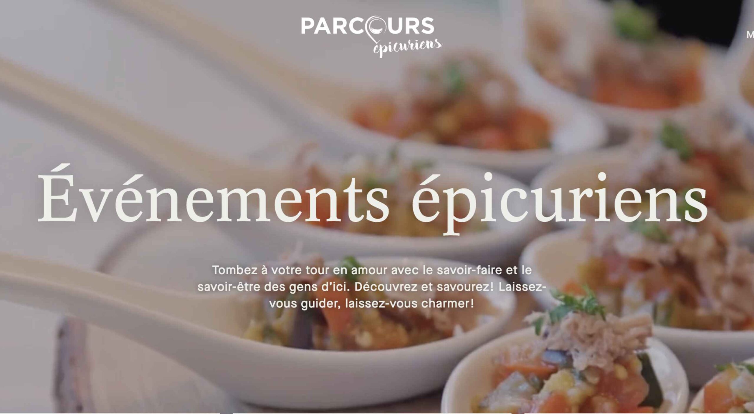
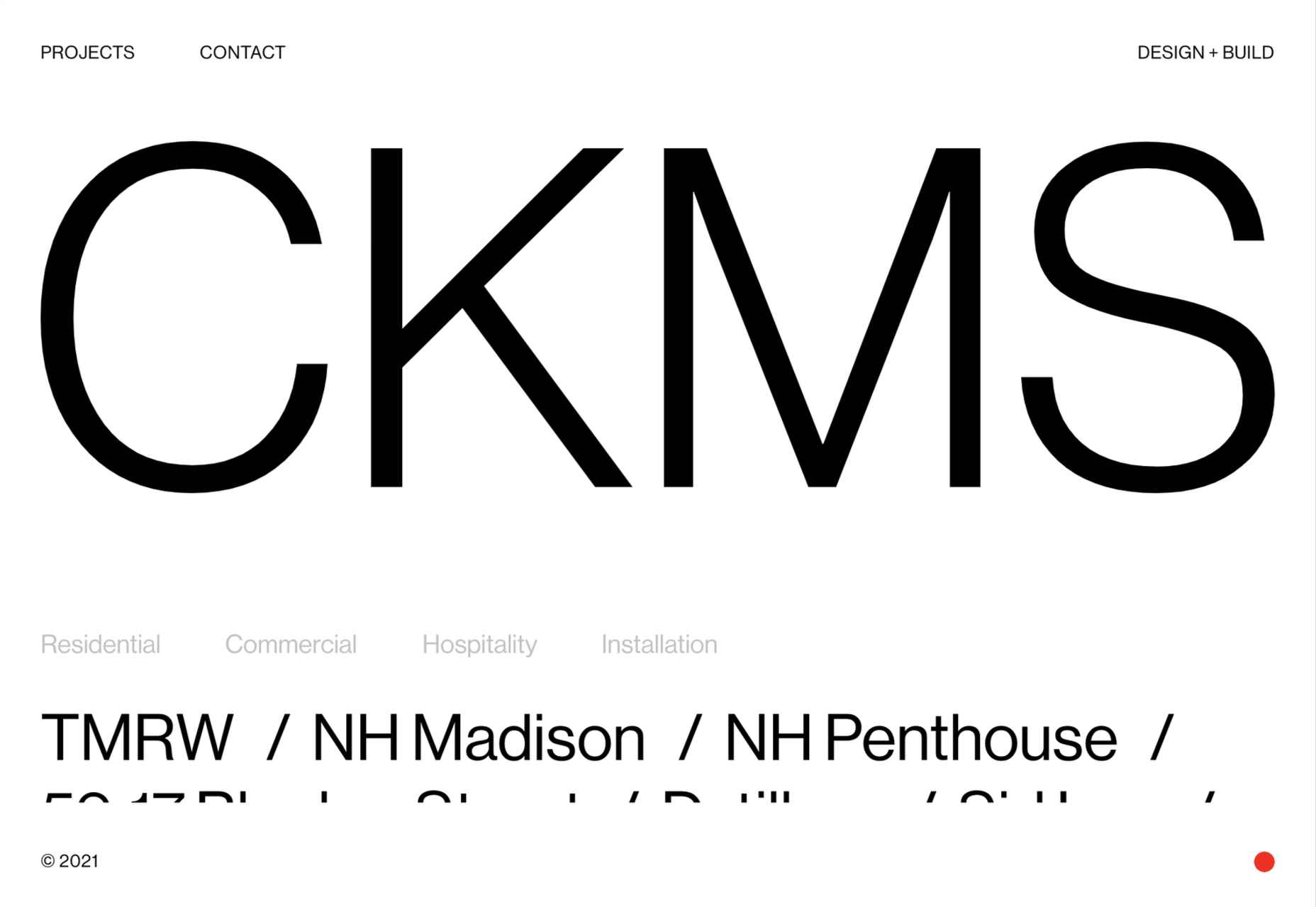
 This month we have a variety pack for you. There are all sorts, from the most conservative layouts and structures to more experimental navigation. And we see how even the most traditional and functional websites can connect with users through mood-enhancing color schemes, clever font choices, and illustrations.


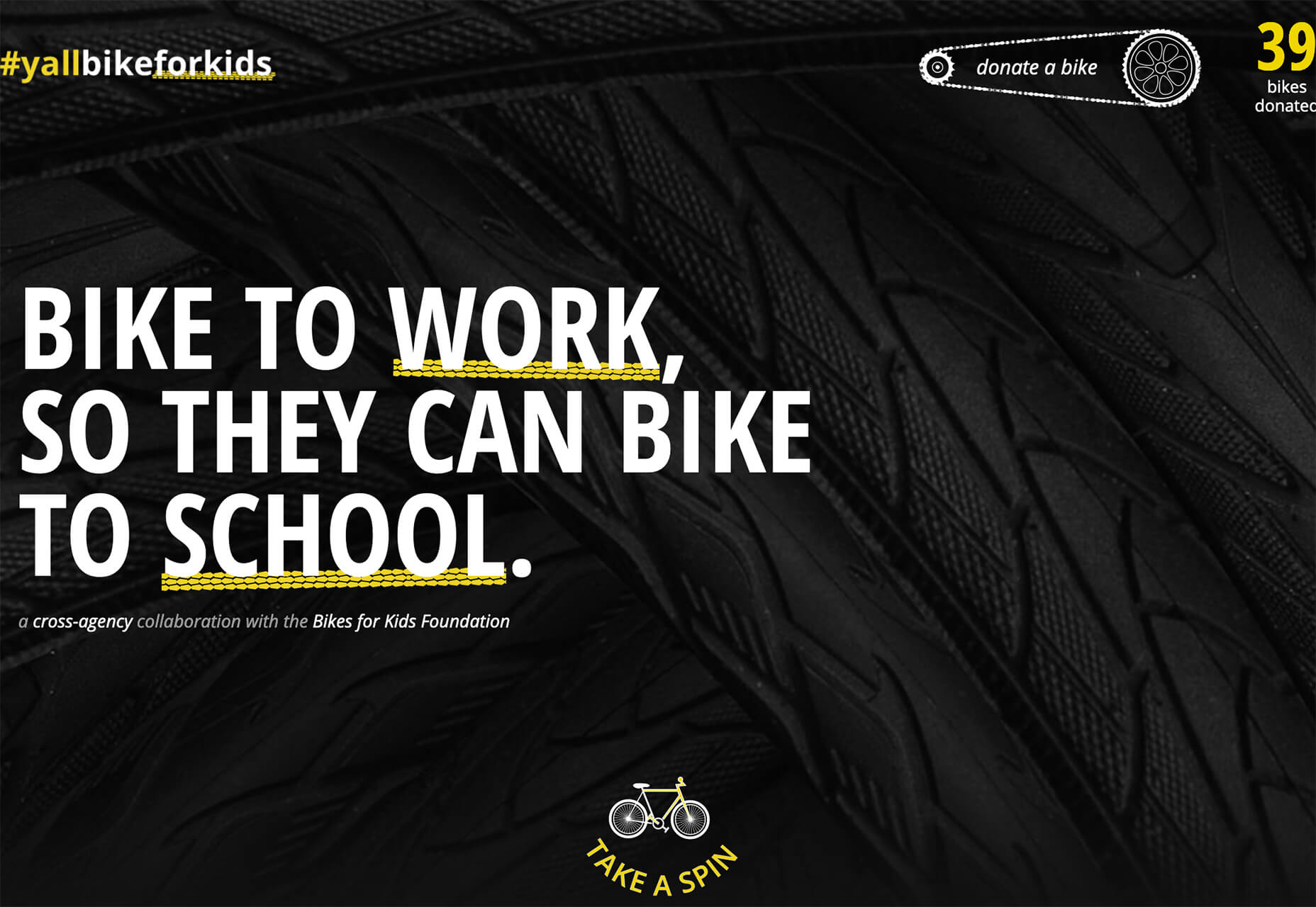
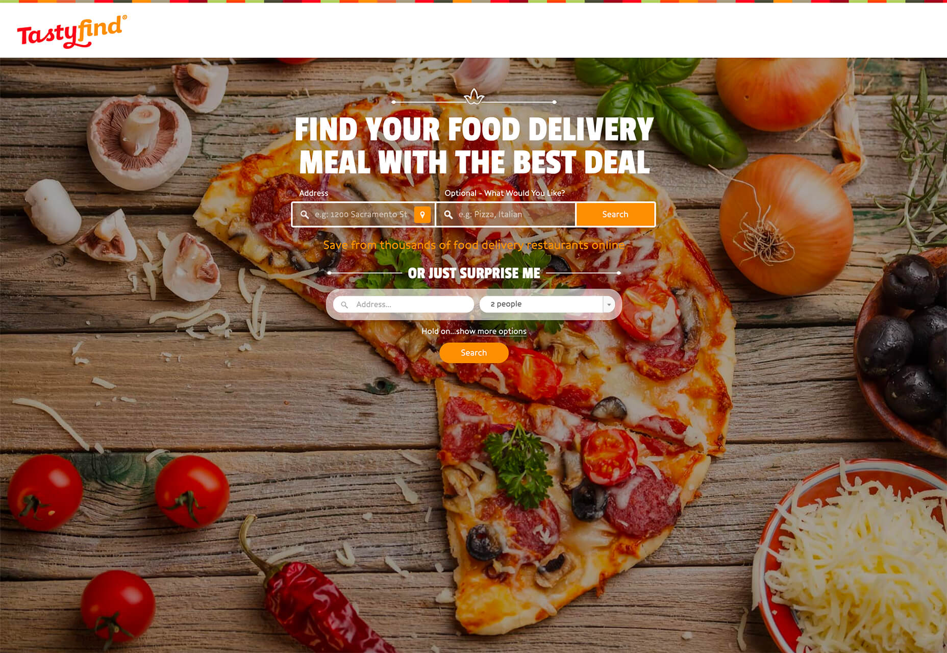
 This month, you will either love or hate the featured design trends.

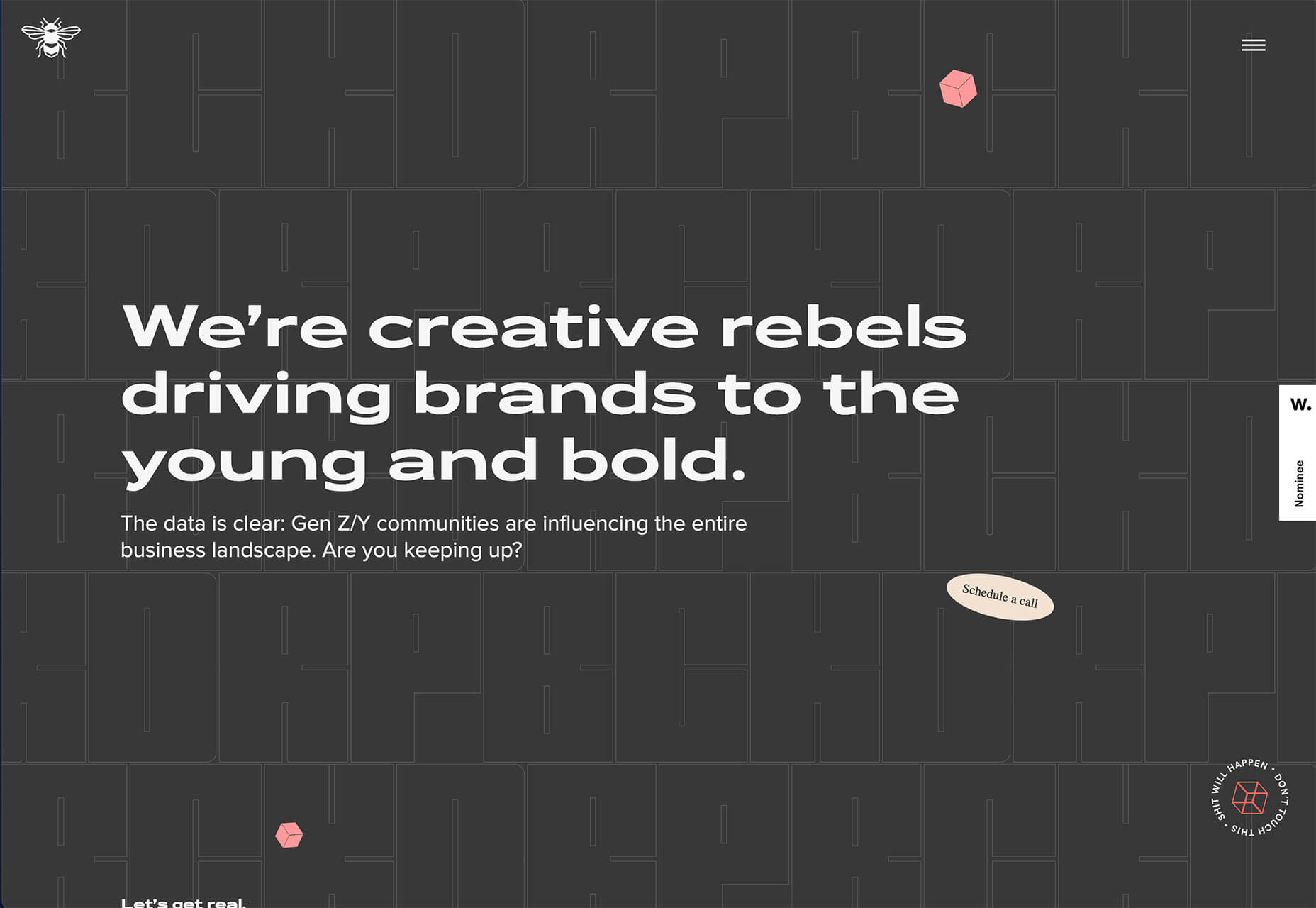


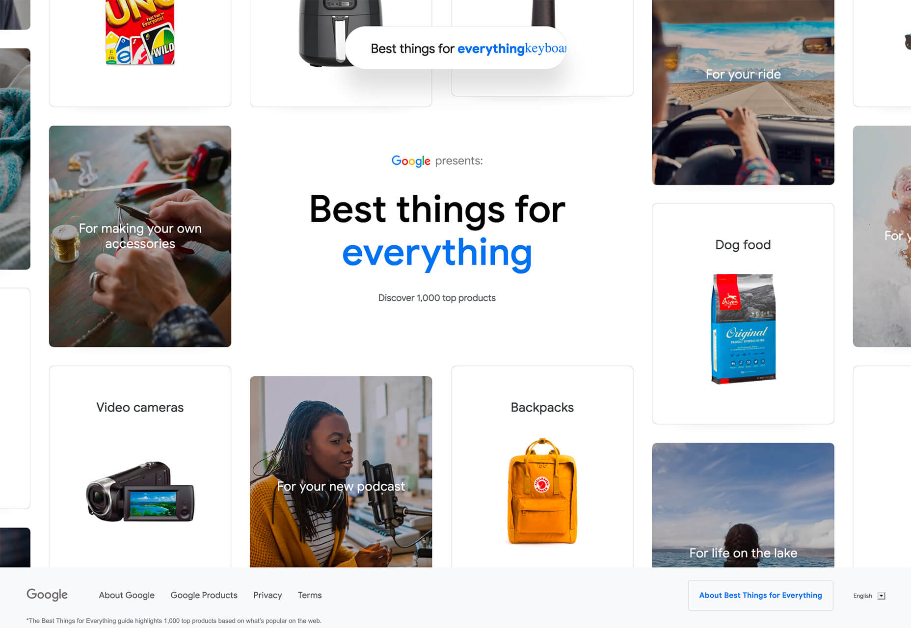
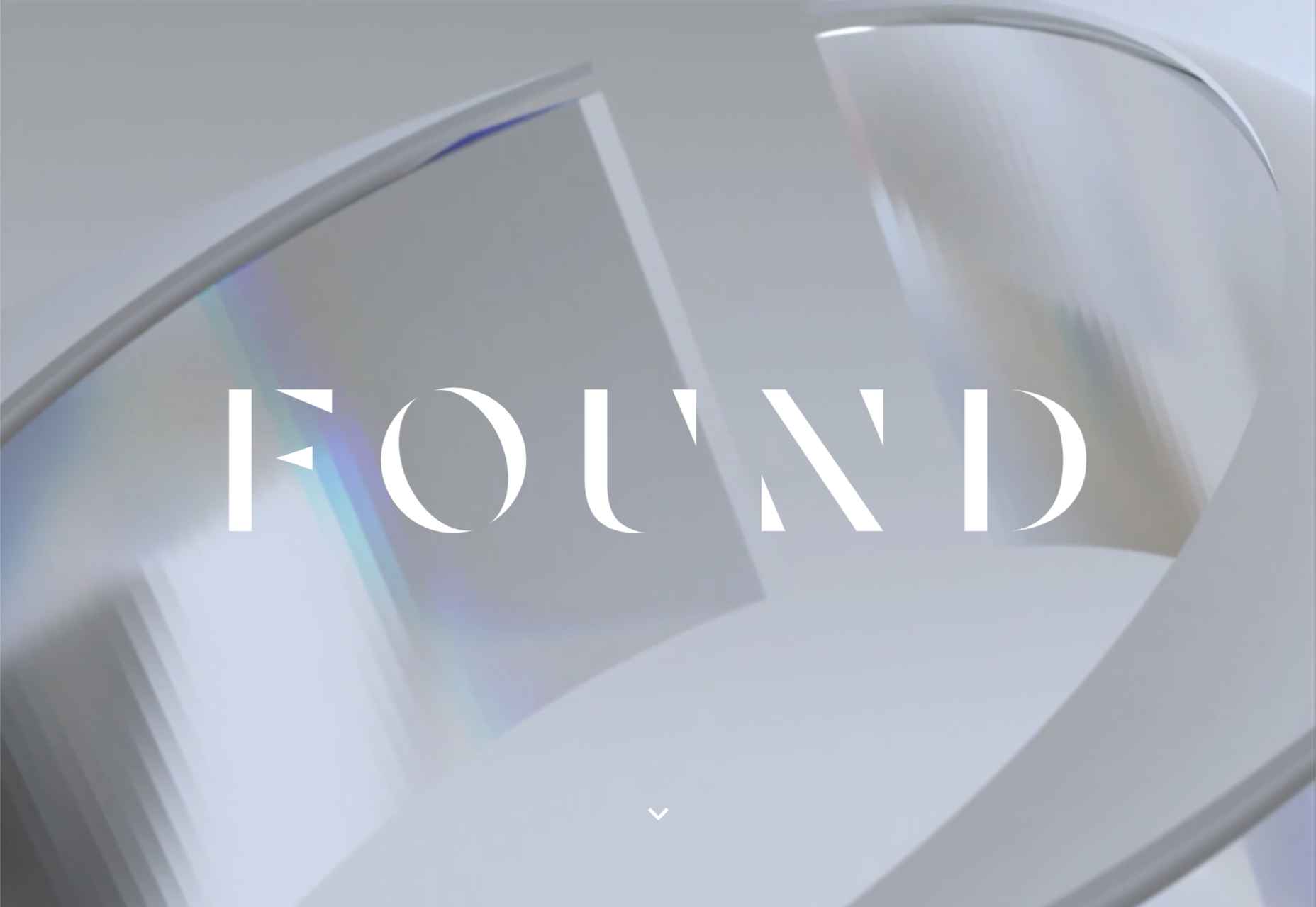
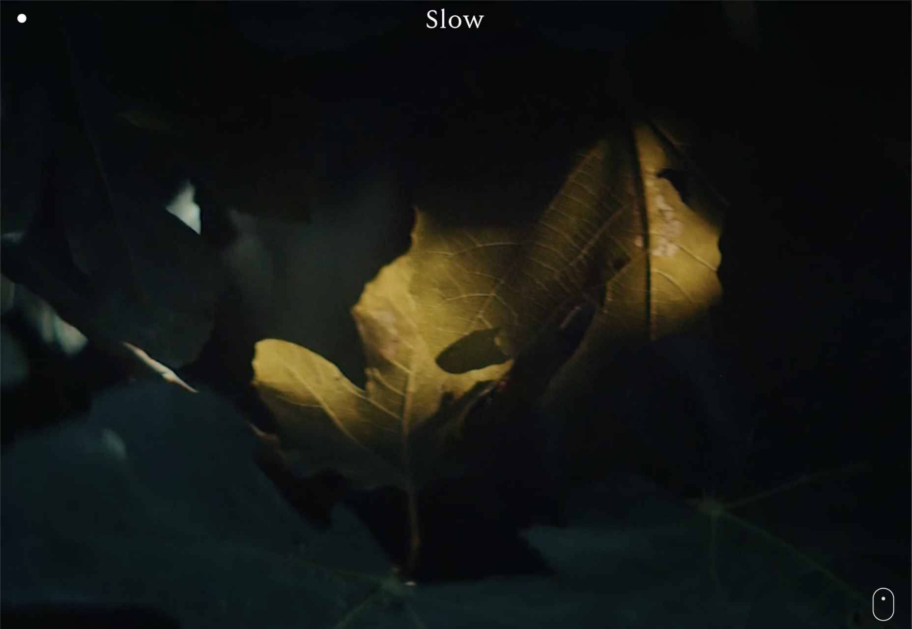
 If you are feeling like me right now, you have mixed emotions about the world in general. And this is translating into a pretty distinct design trend that’s happening almost across the board: Websites aren’t using many images of people right now.

 Every day design fans submit incredible industry stories to our sister-site,


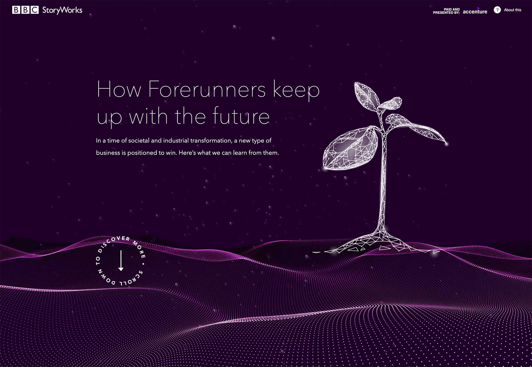
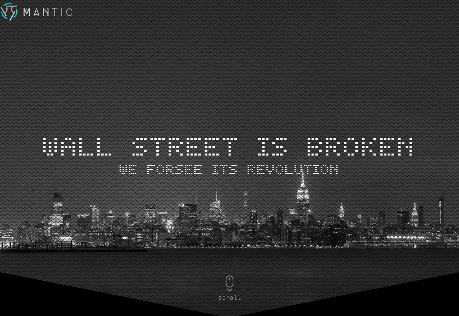
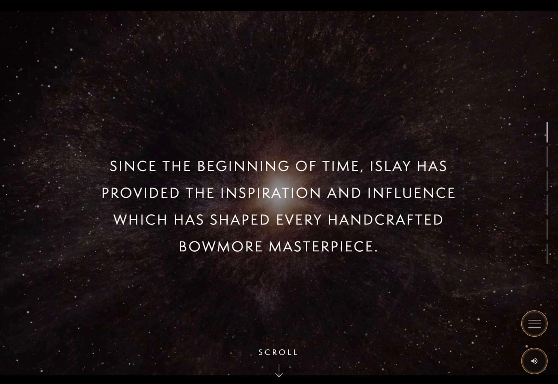
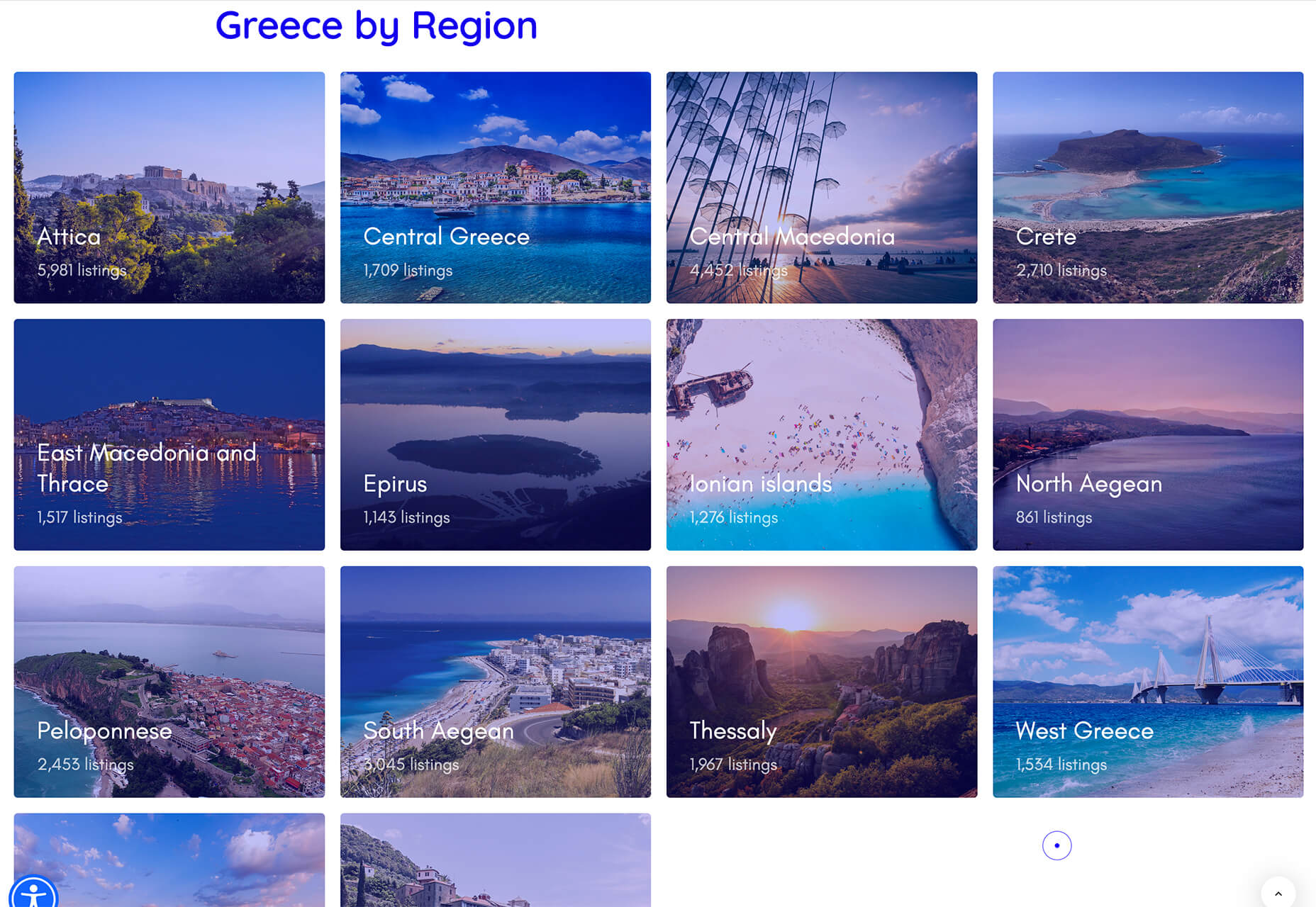
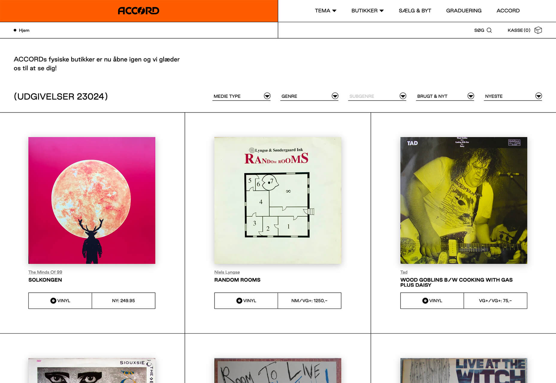
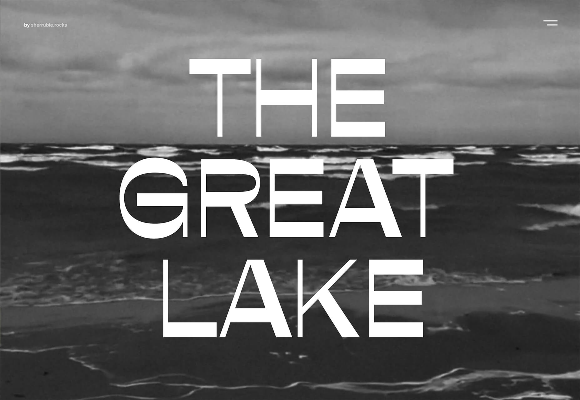
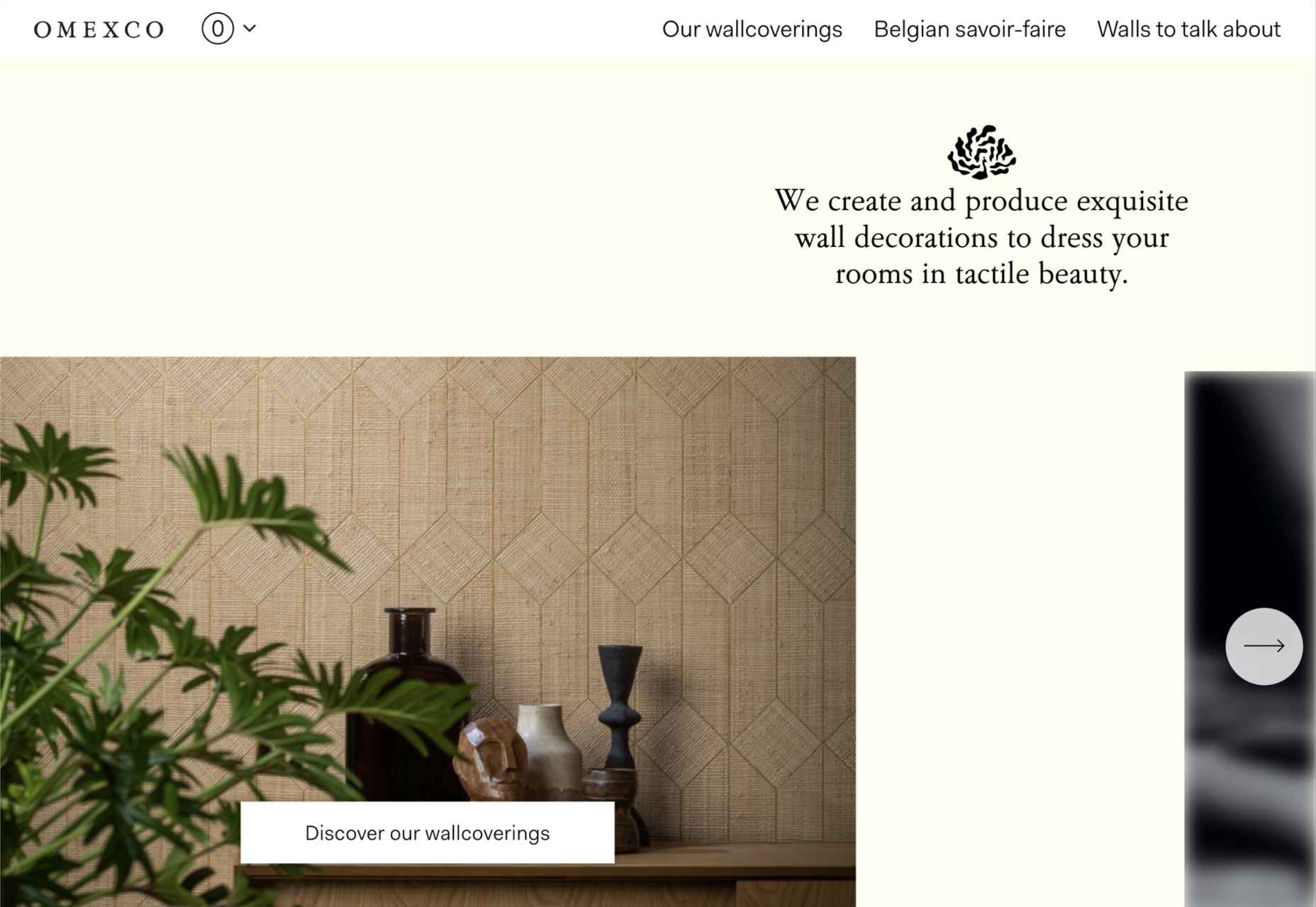
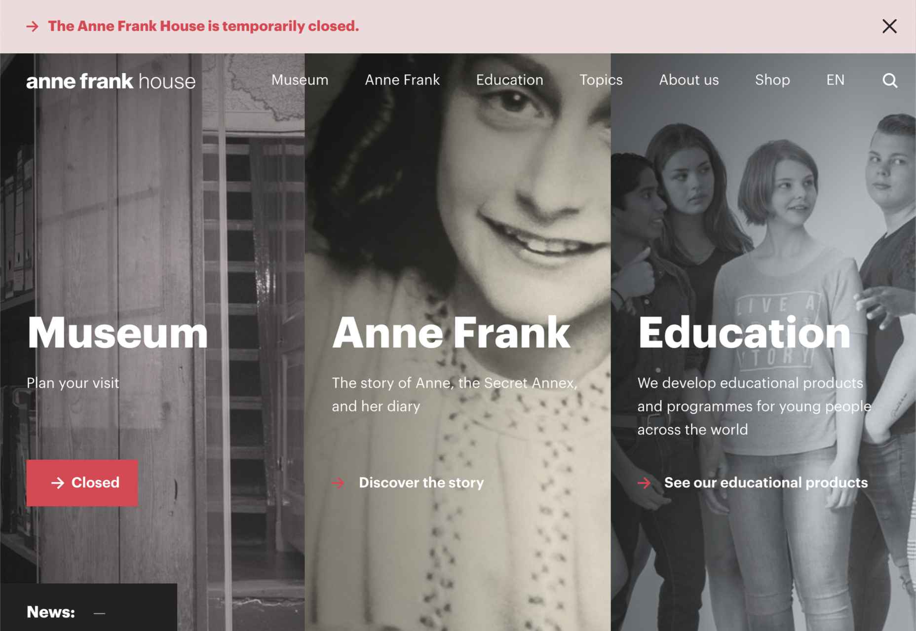
 This month we have several examples of brutalism used to good effect as a foil to showcase products and/or work. By contrast, at the other end of the scale, we have brands who have chosen to go more of an immersive experience route, using full-screen images, sound, animation, and even VR.
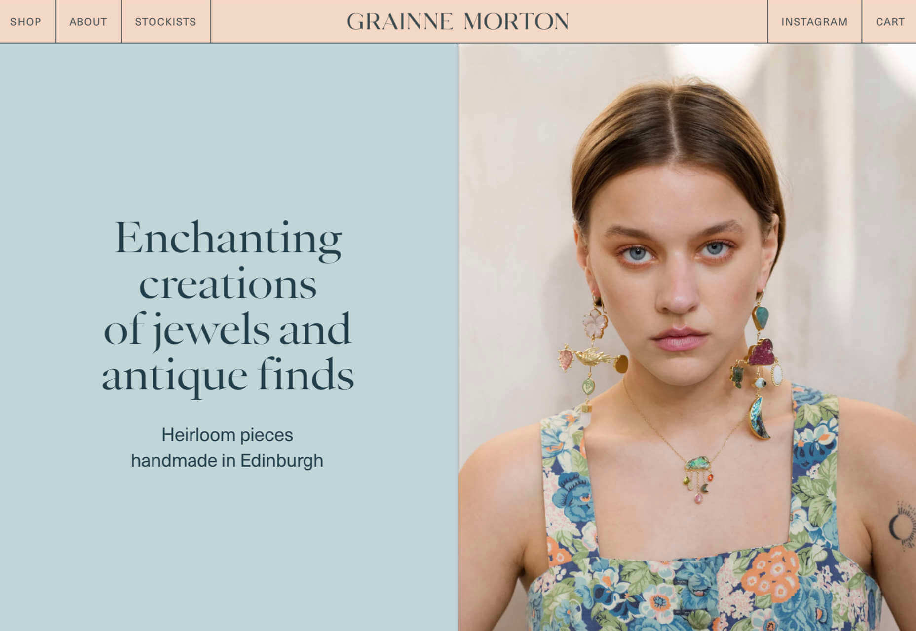
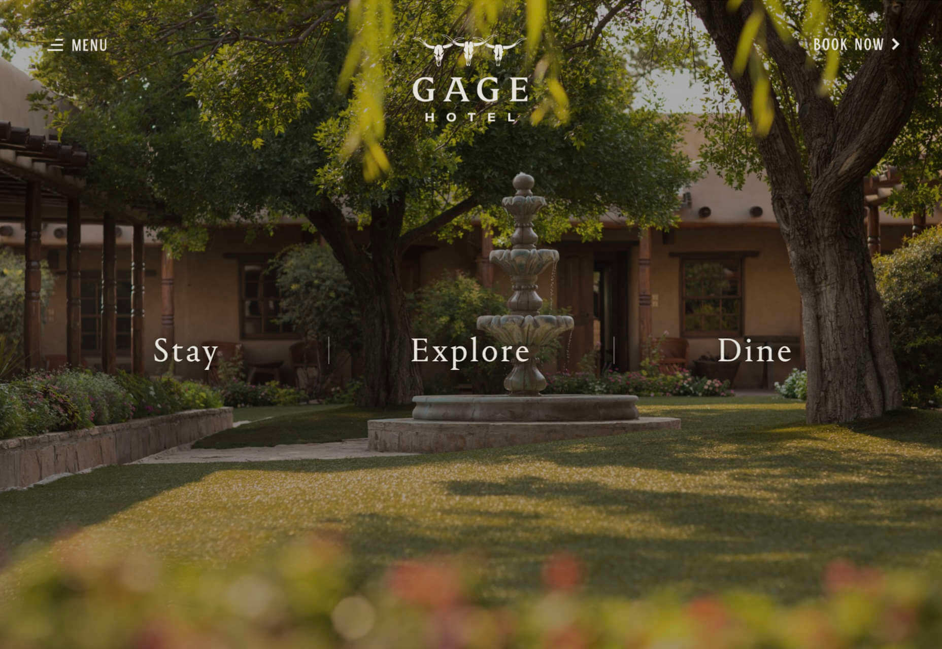
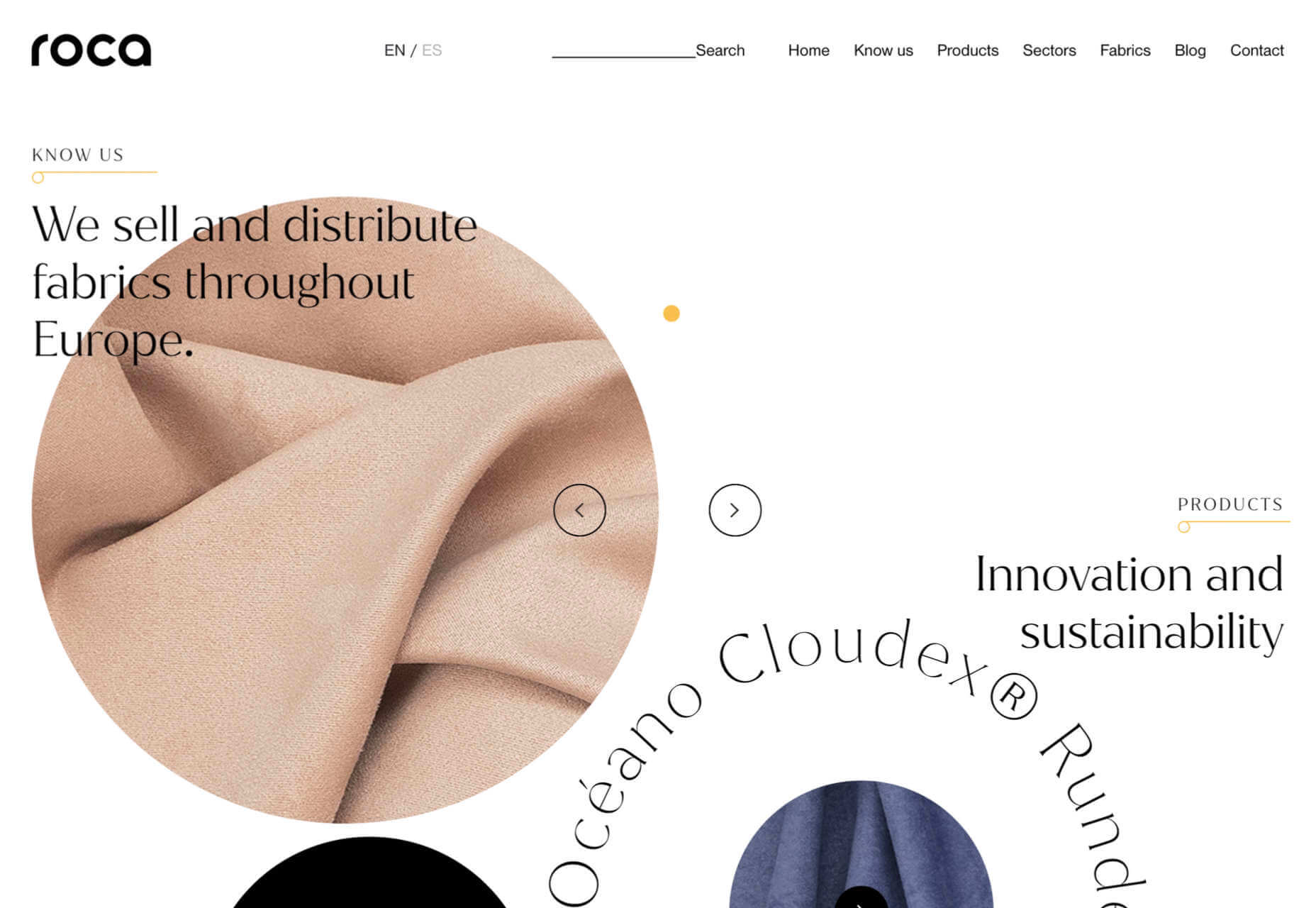
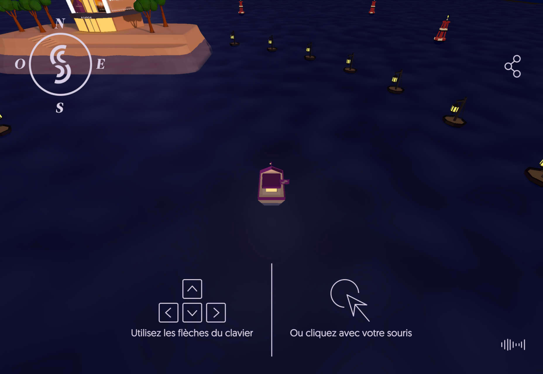
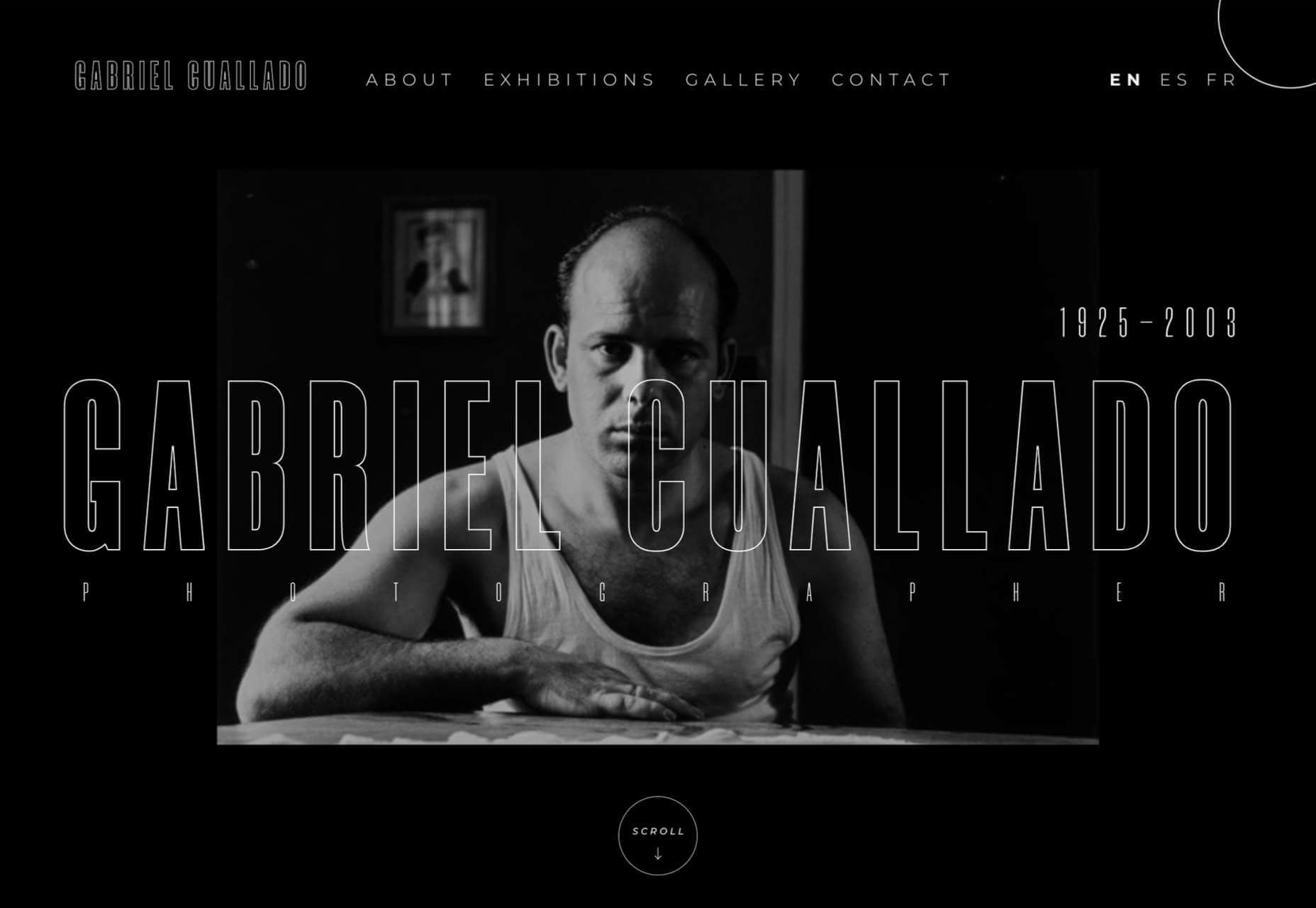
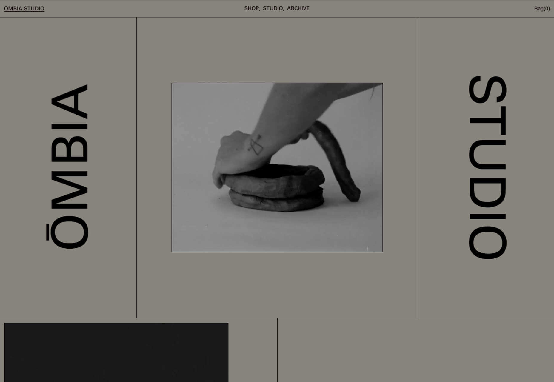
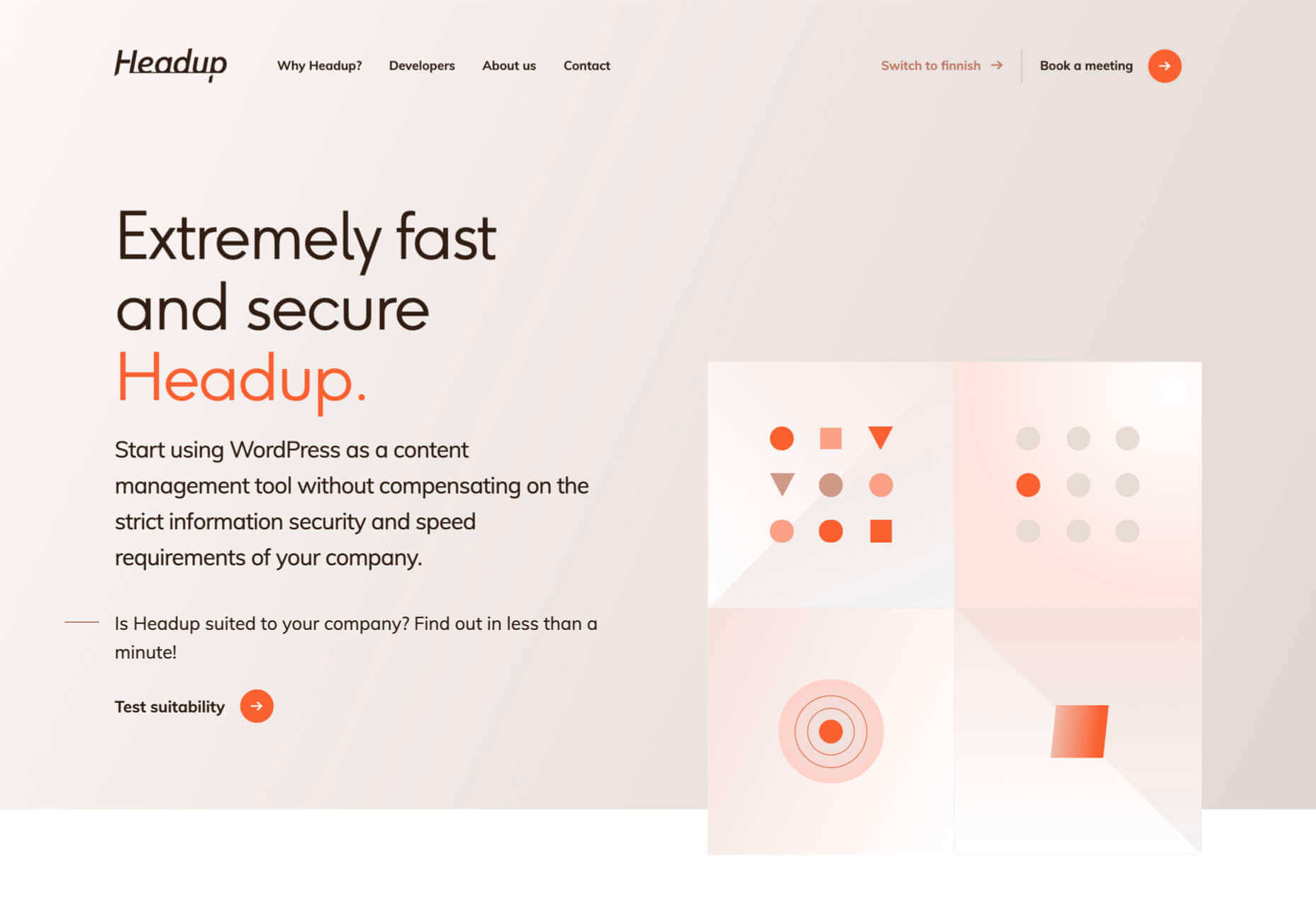
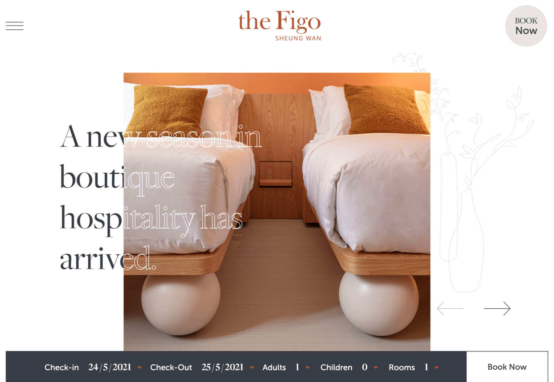
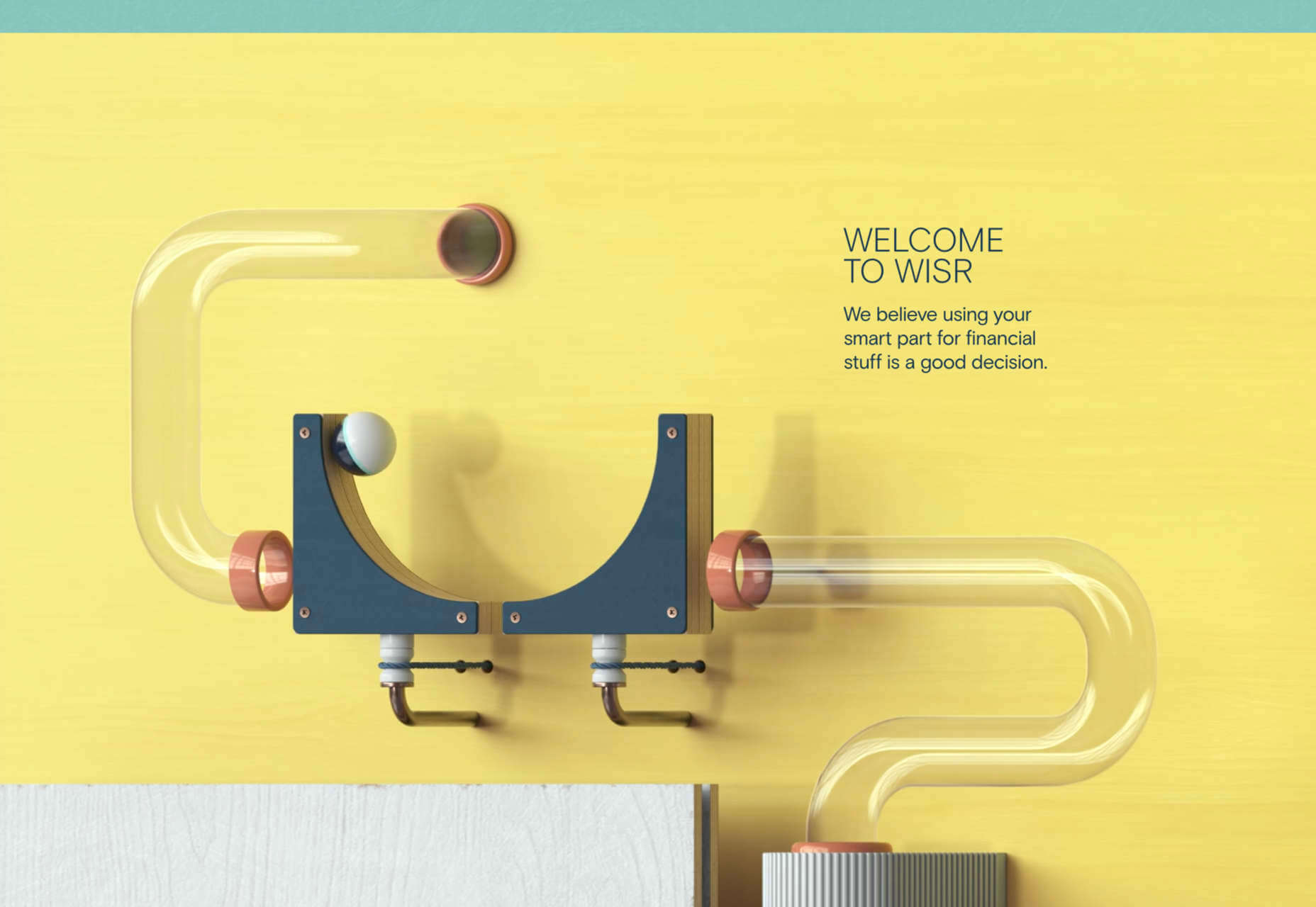
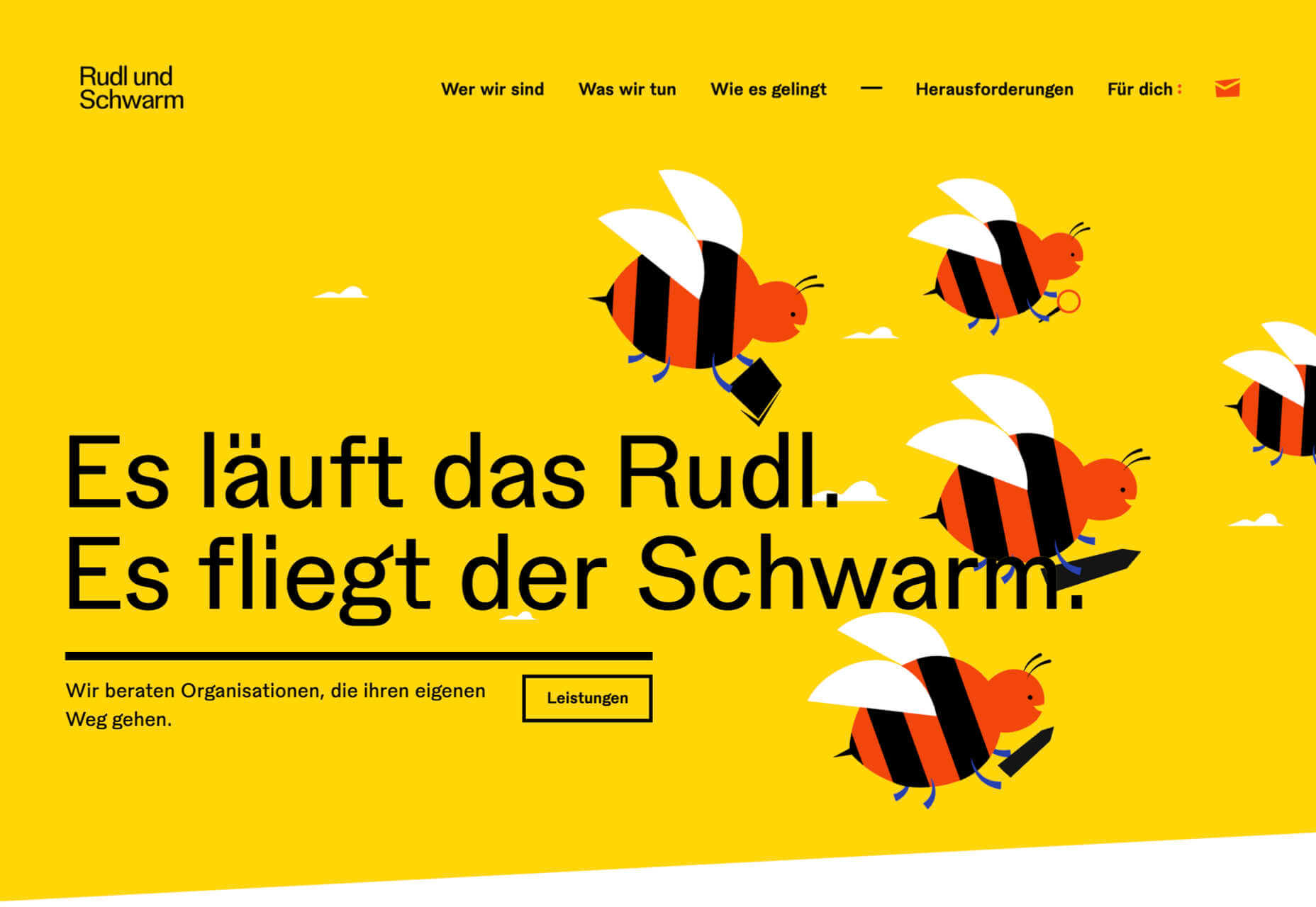
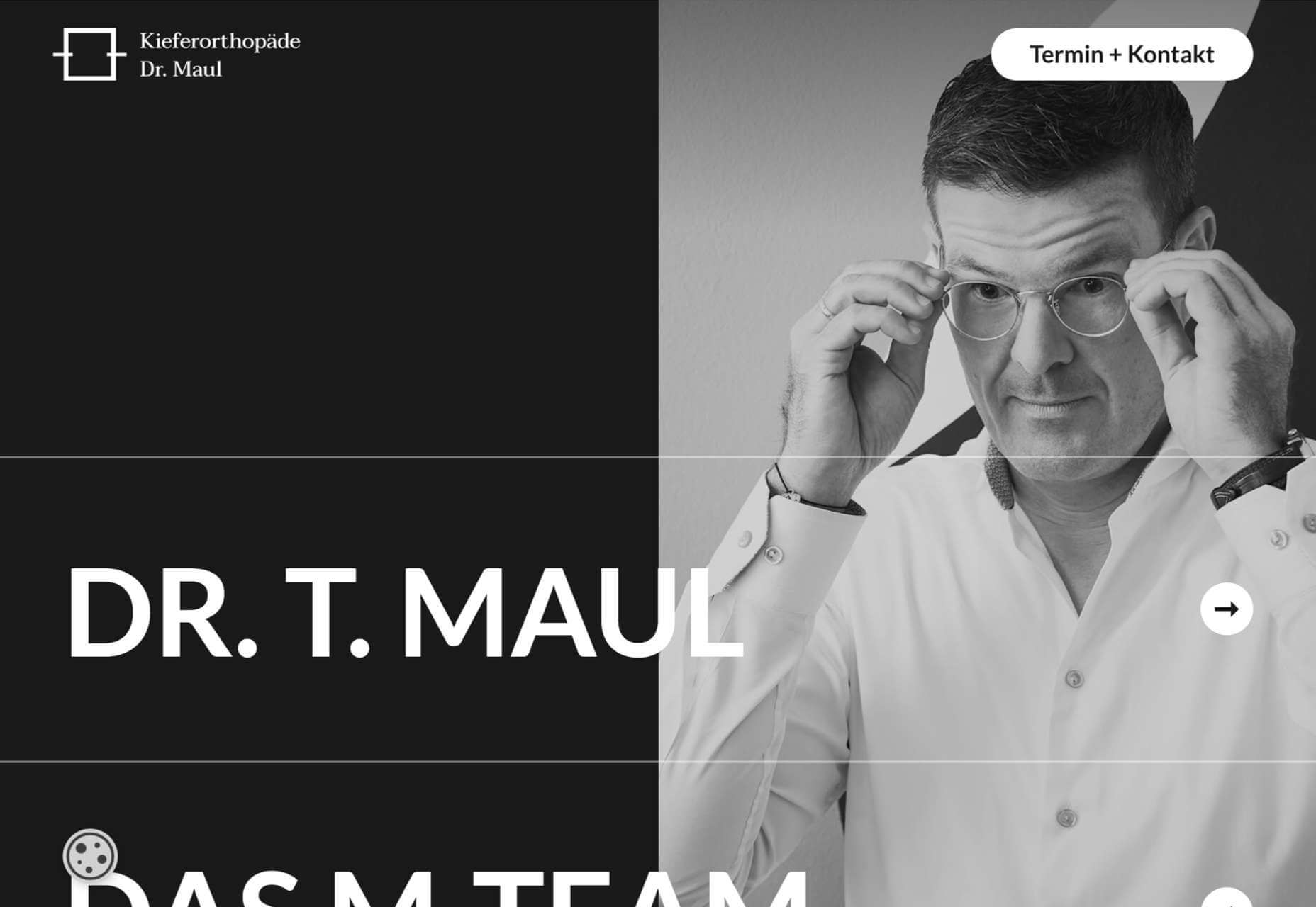
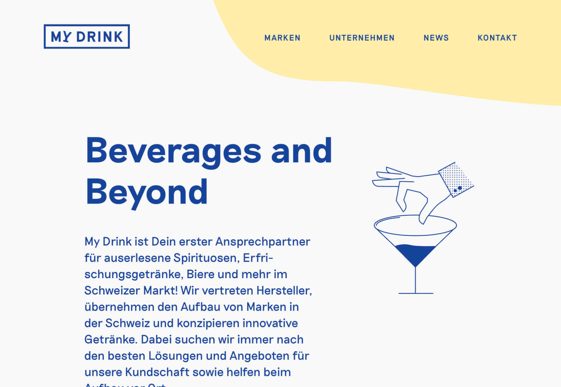

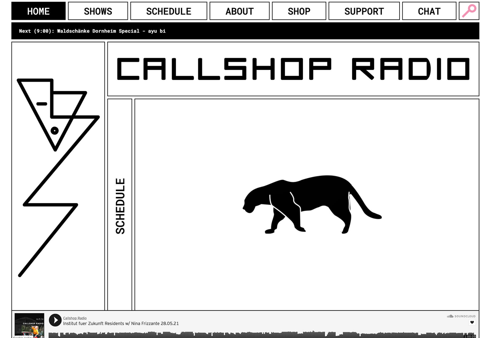
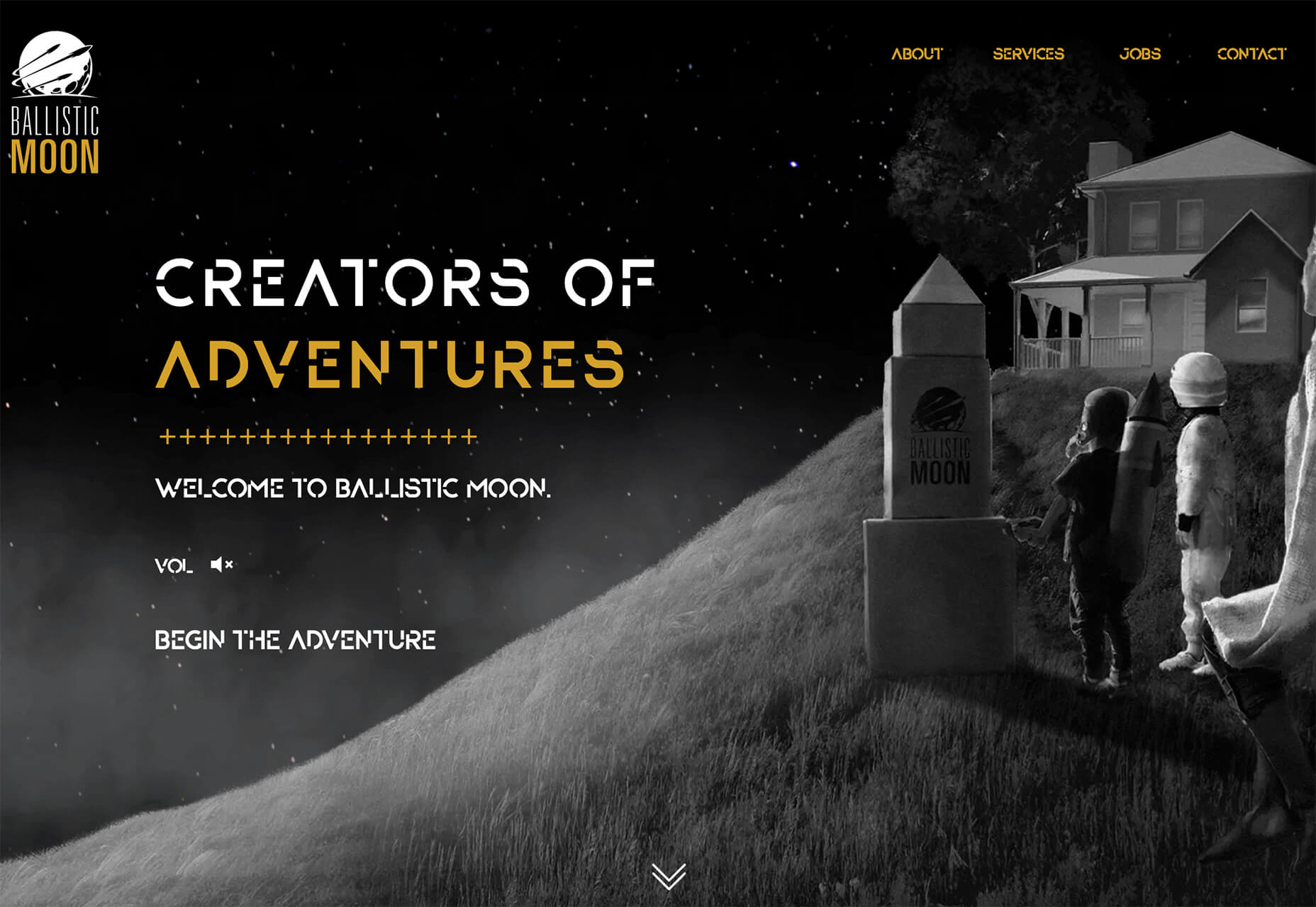
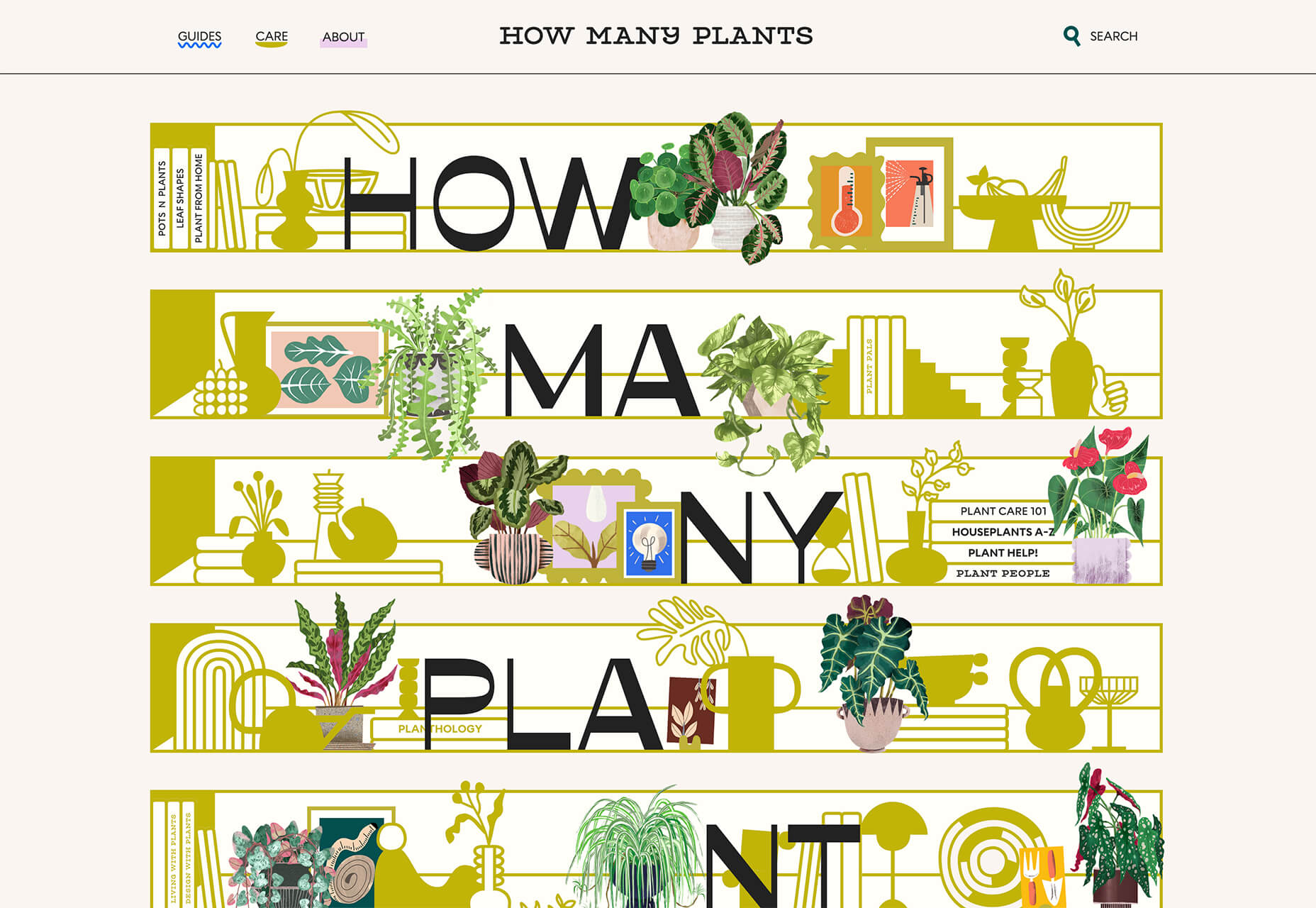
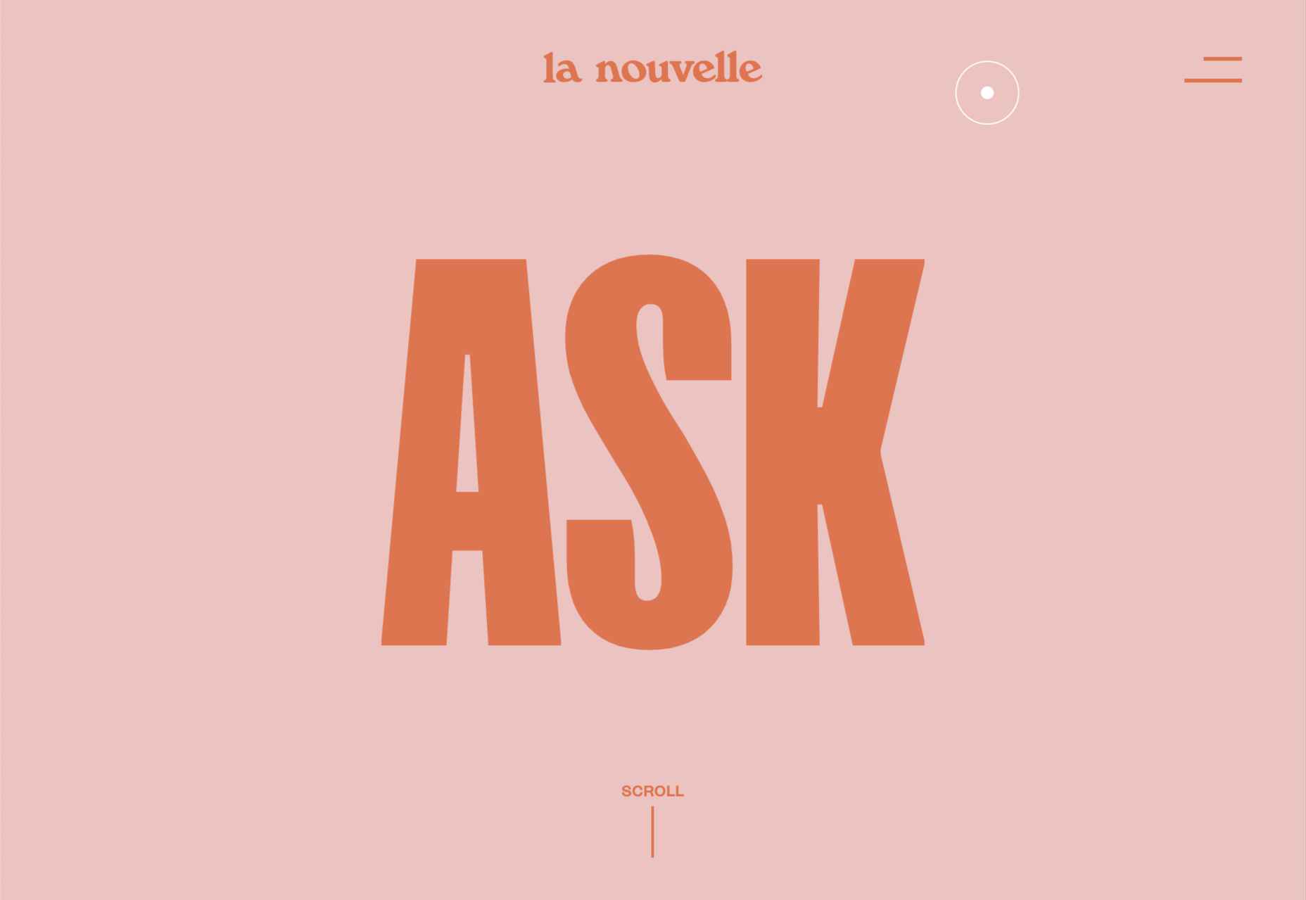
 Spring and fresh designs are in the air. This month, it’s obvious that designers are feeling creative with new and interesting concepts that range from a new style for cards, homepage experimentation with multiple entry points or calls to action, and risky typography options.
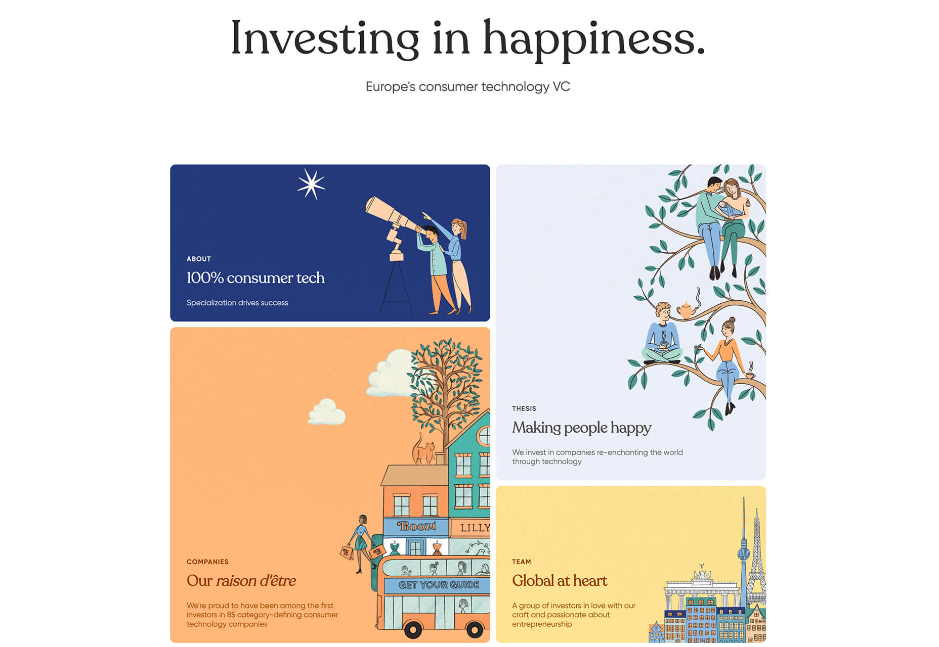

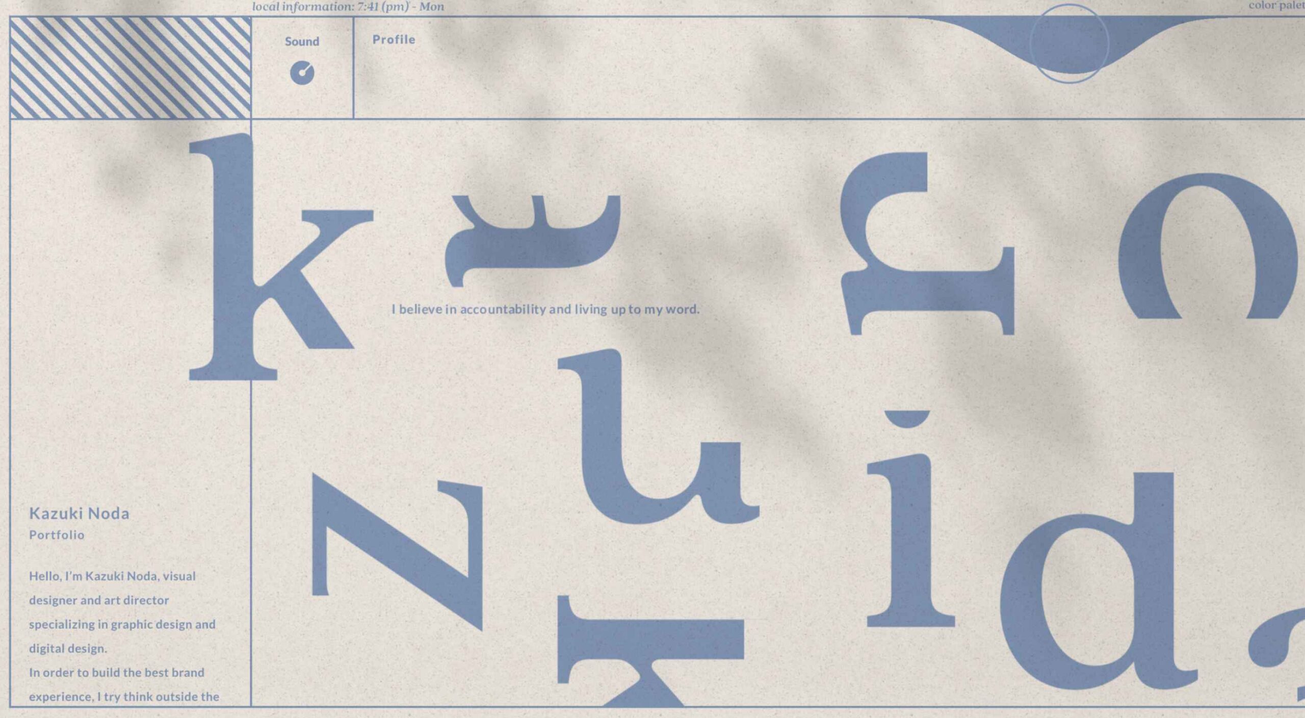
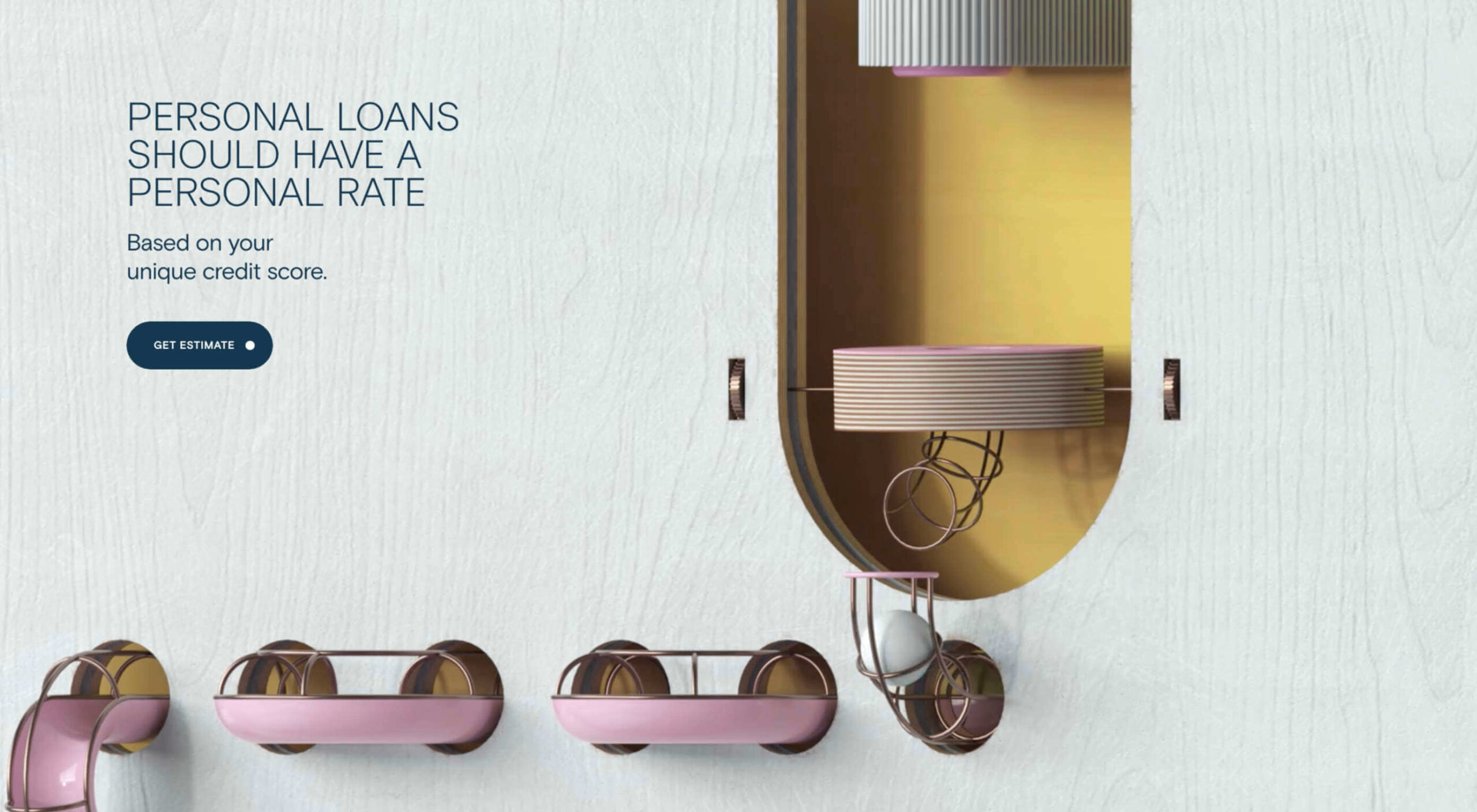
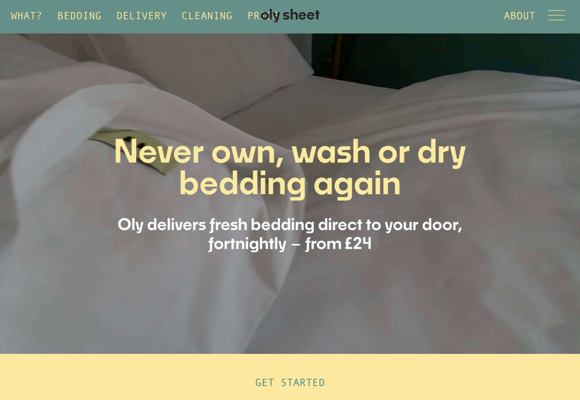
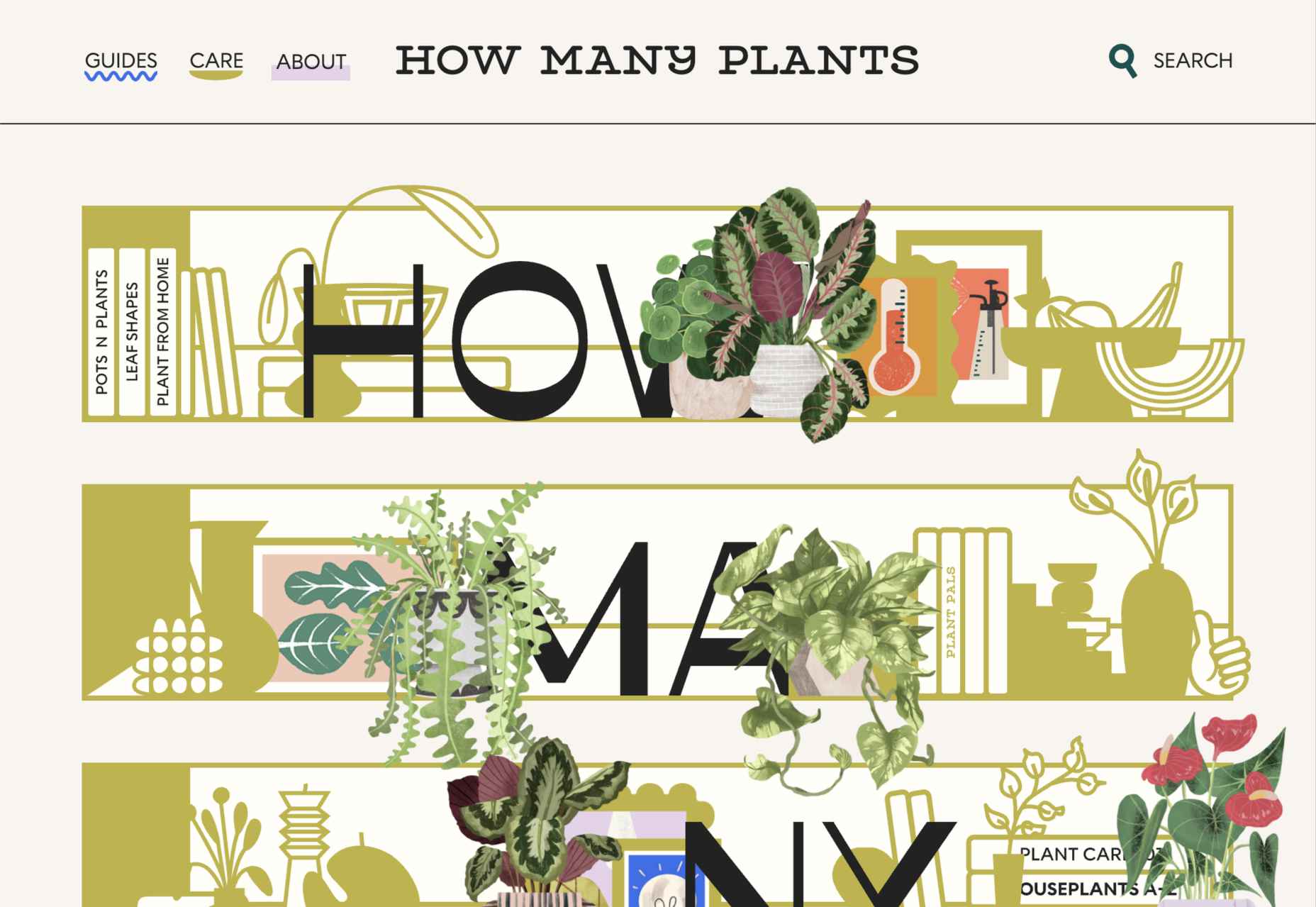
 This month’s collection contains a combination of big and bold, and clean and minimal. Although basic minimalism is still trendy, with lots of white space and greyscale type, we are seeing it softened with color. This is implemented differently, ranging from hints of off-whites in images to gentle pastels as section backgrounds.
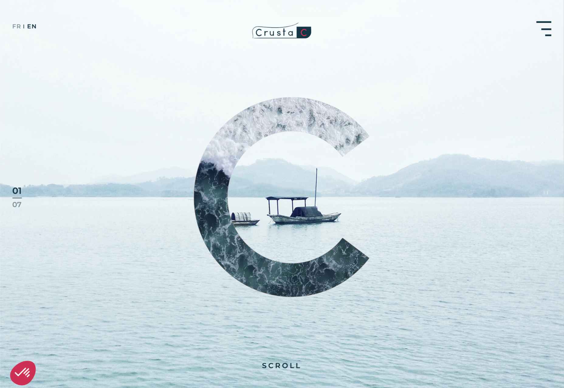