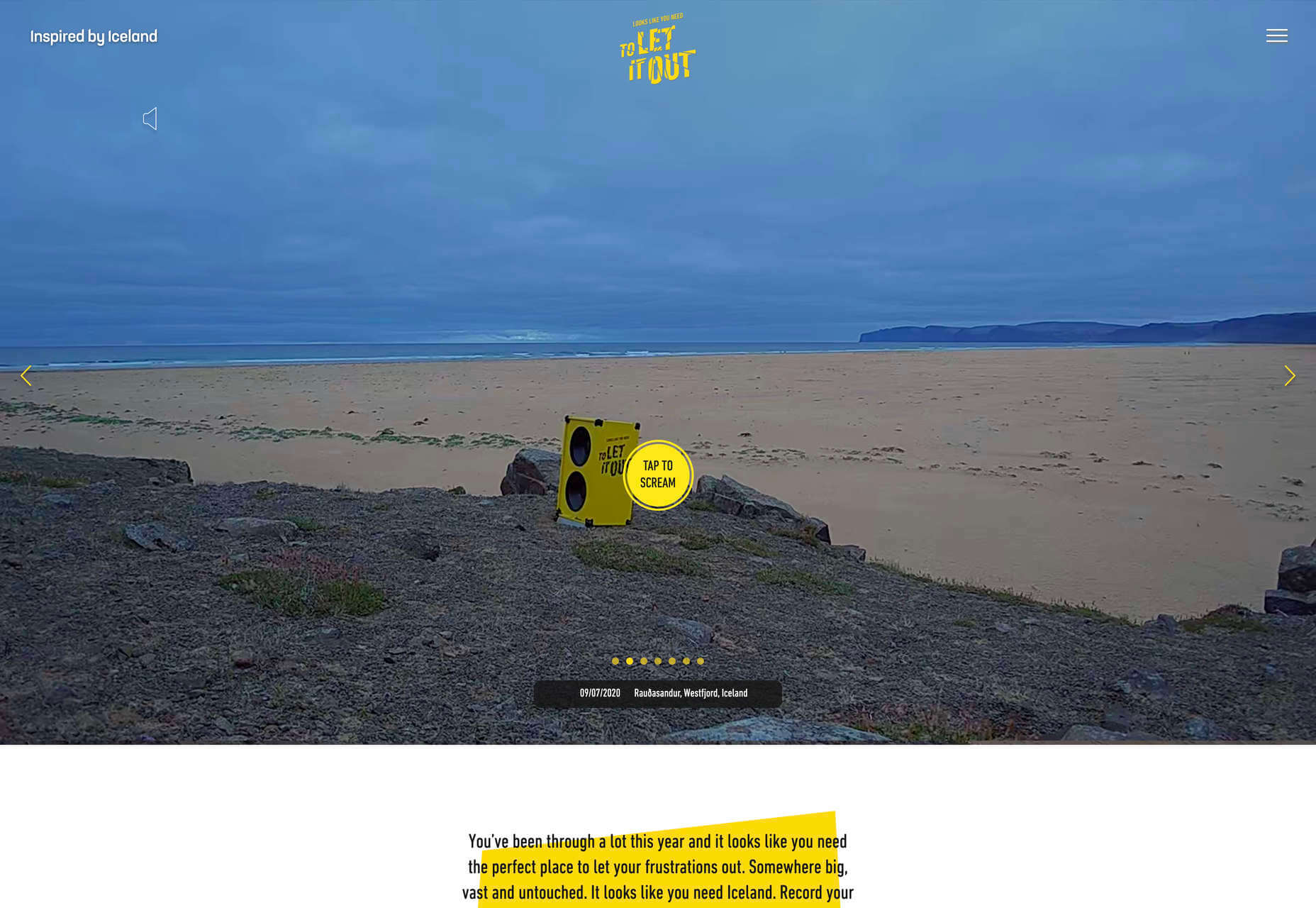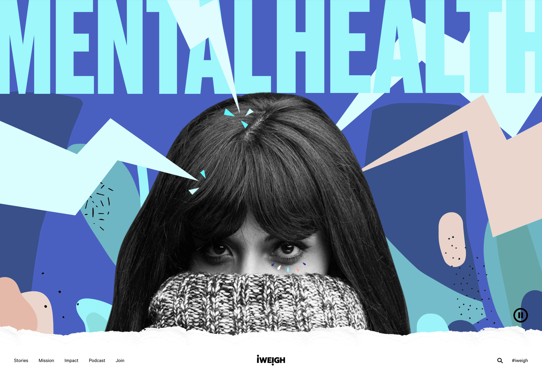
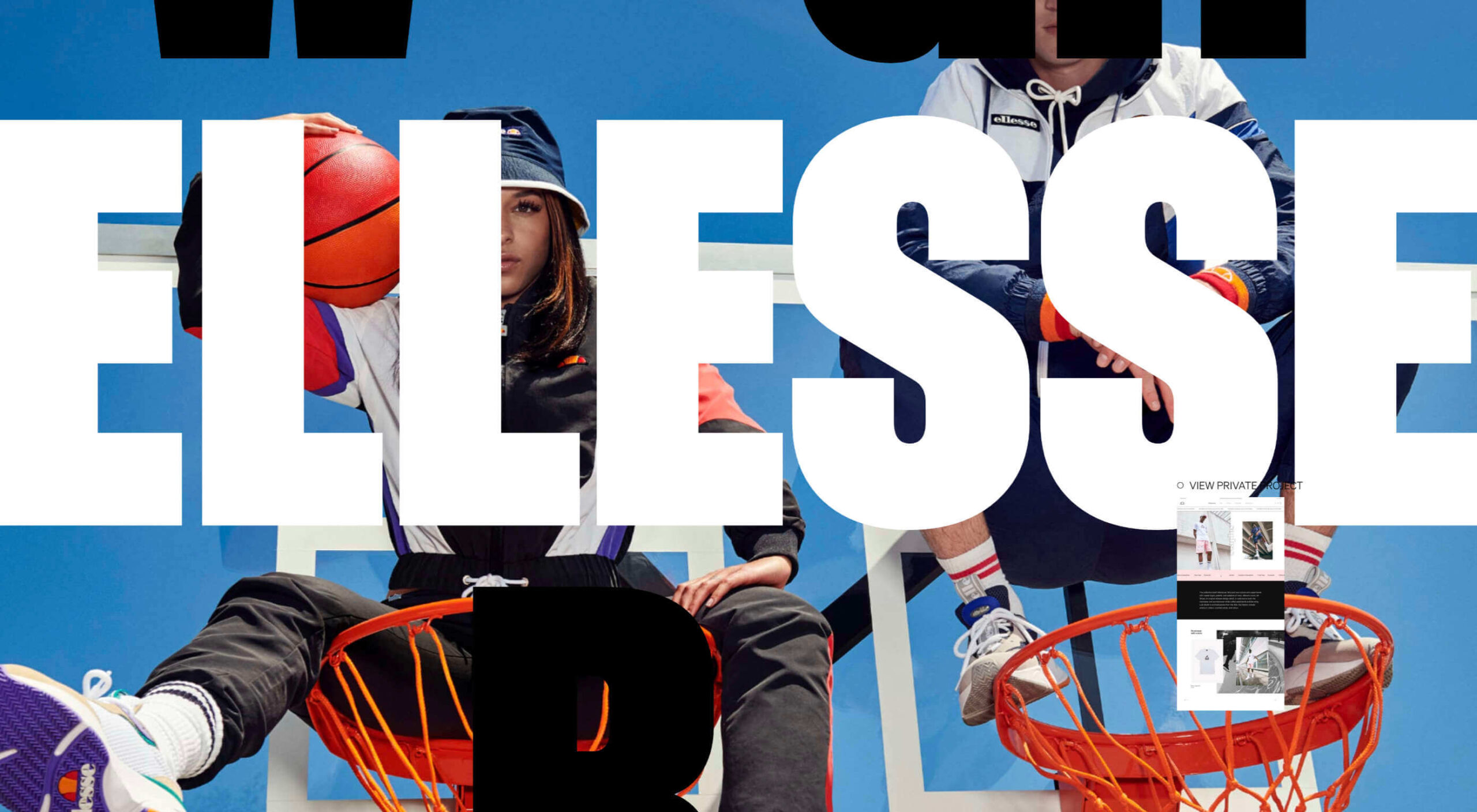
 This month’s collection of the best new websites launched or updated in the last four weeks features color, and more color, and then — just for good measure — a bit more color. Yellow is a hue of choice, but you’ll also find burnt orange, rich purples, and greens and blues in equal measure. What is missing is the tech-blue of years past, replaced with something altogether more Mediterranean. Enjoy!
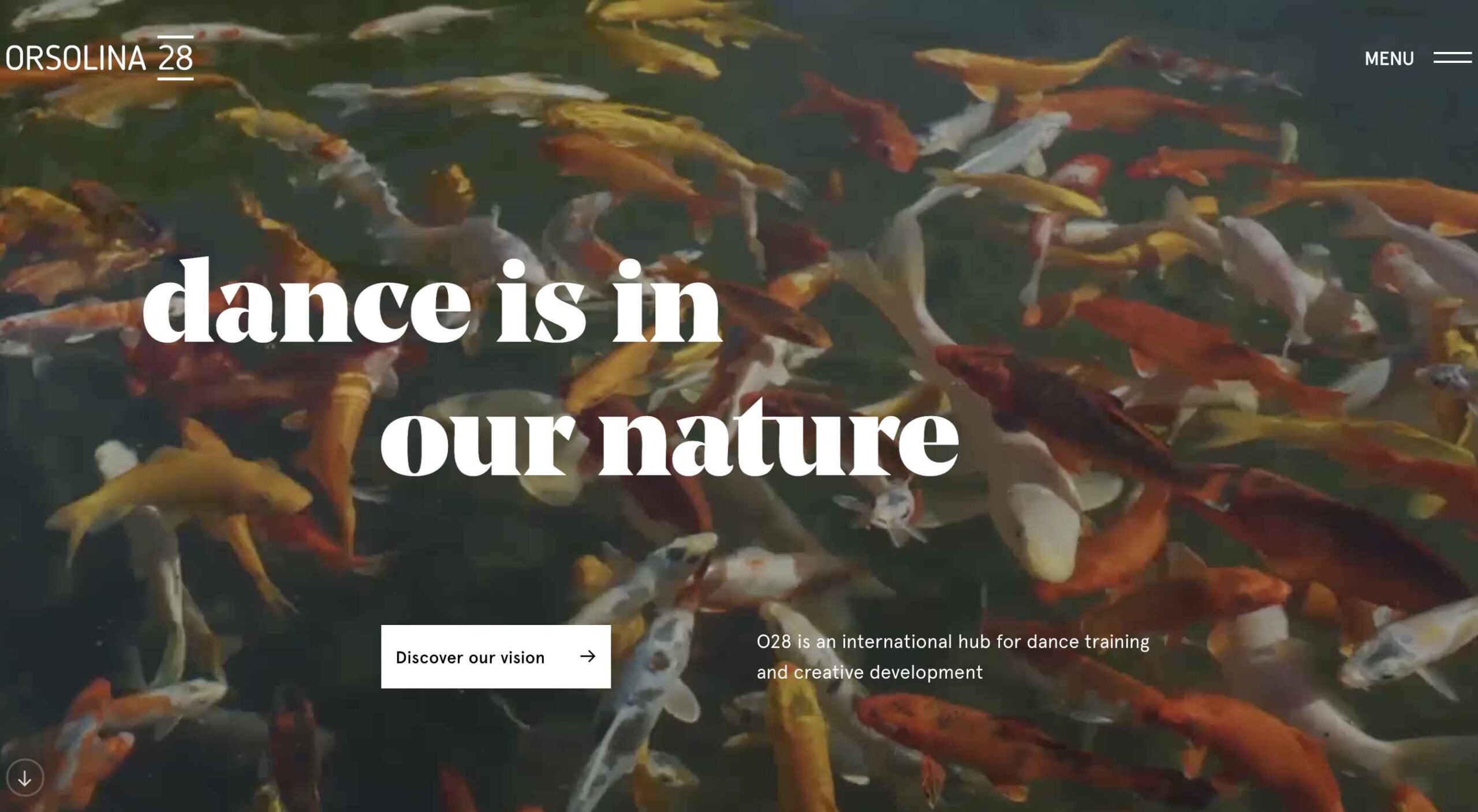
Cevitxef
This site for Cevitxef ceviche restaurant in Bilbao creates drama with oversized text, heavily styled photography, white on black, and lots of movement.
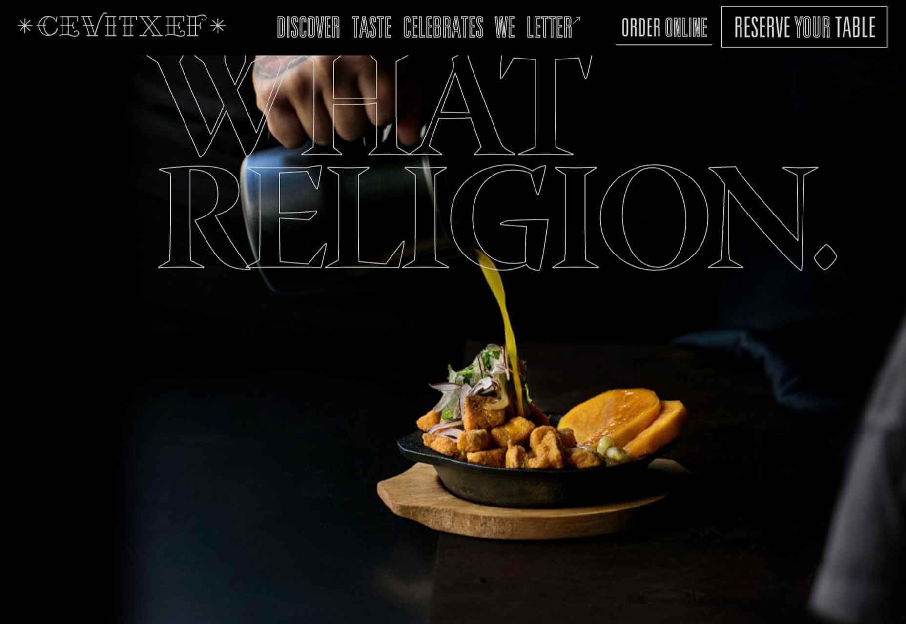
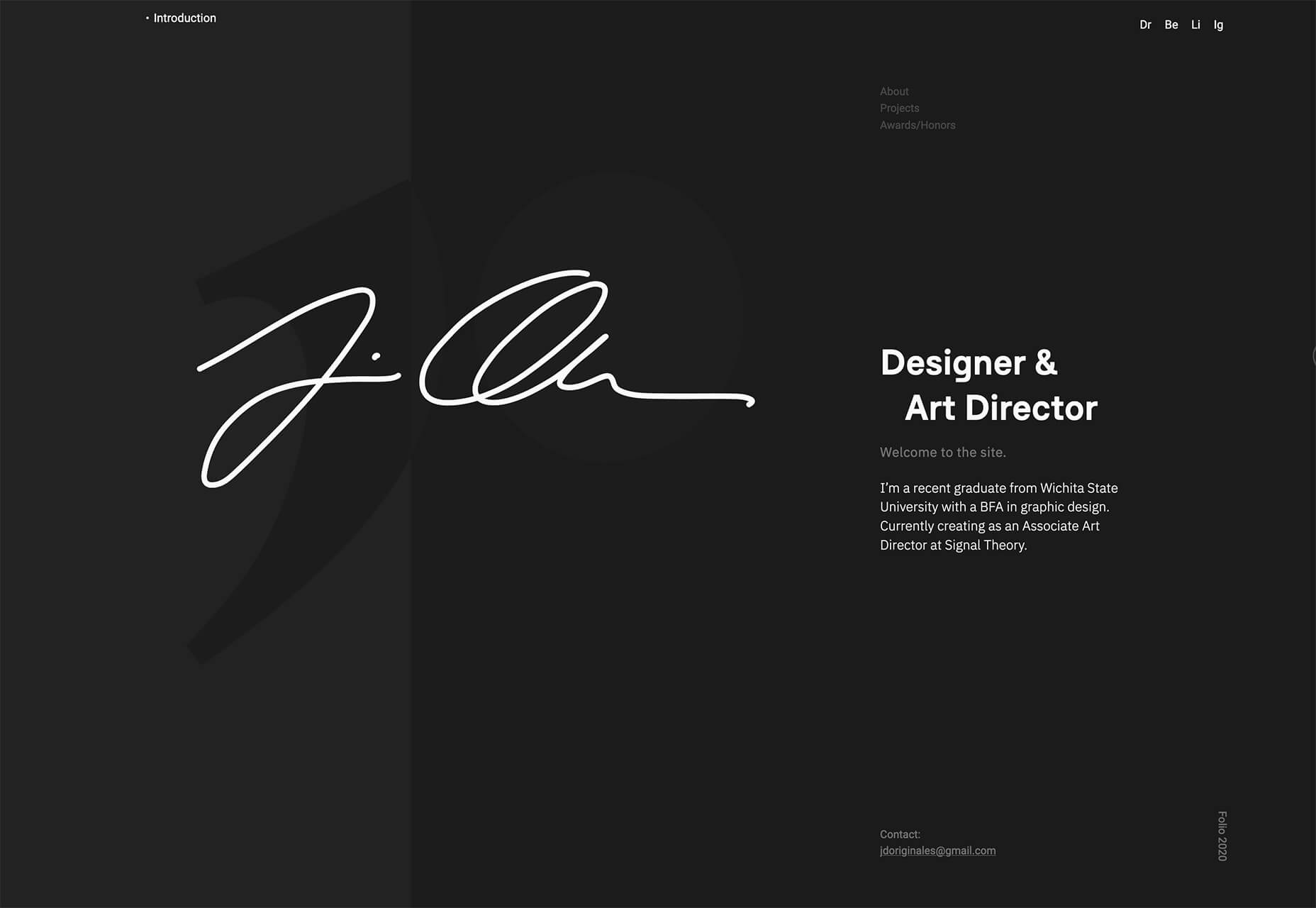
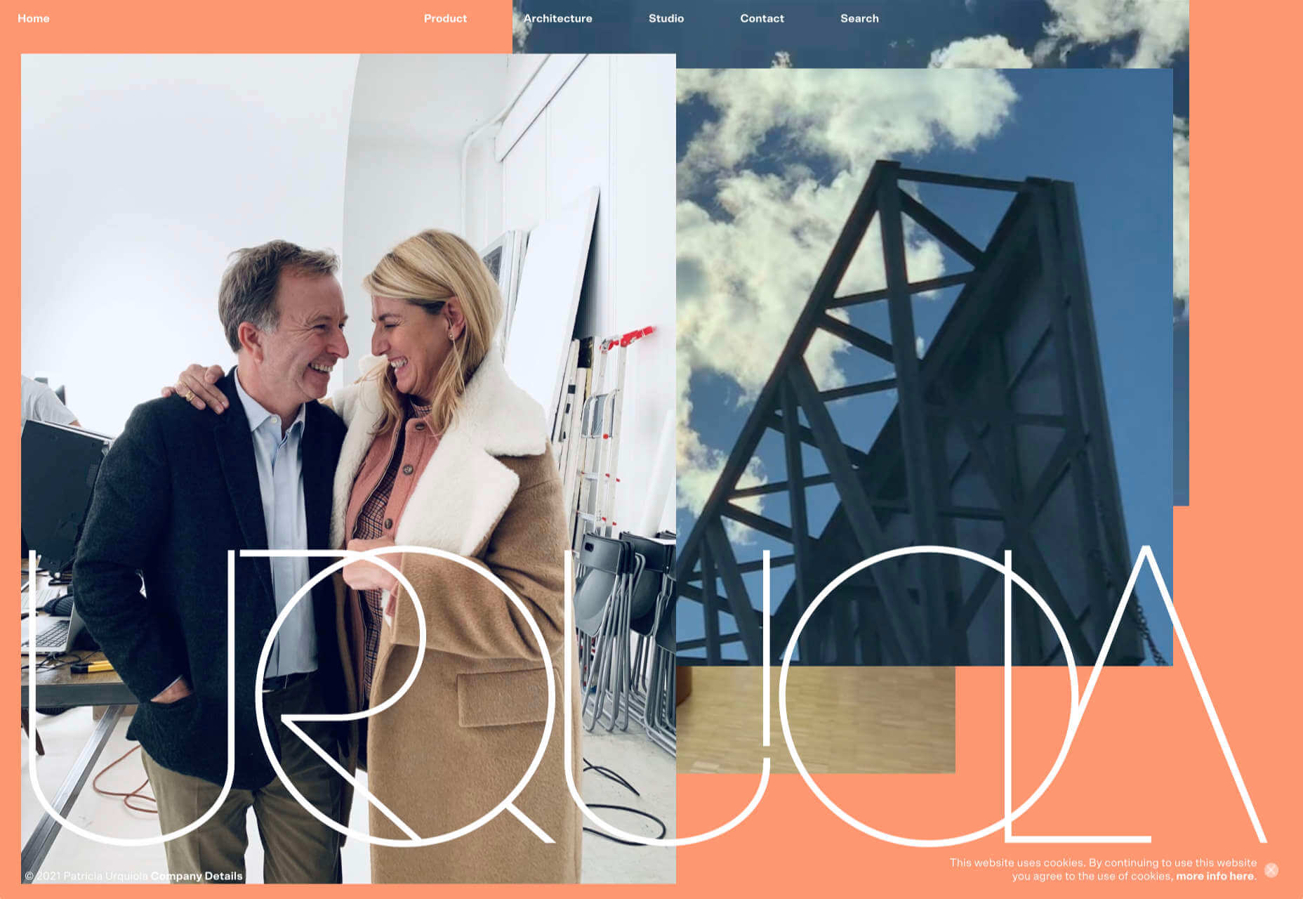
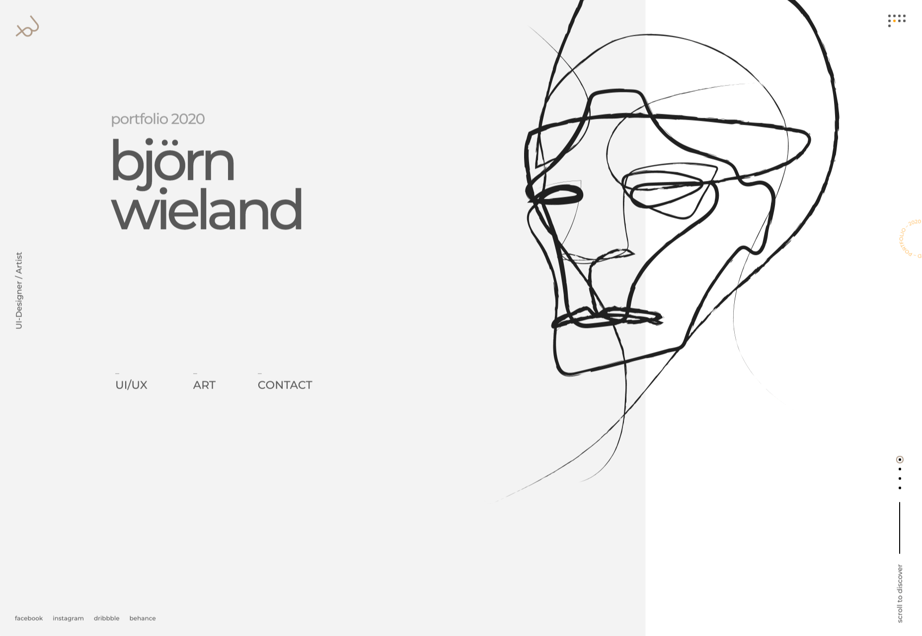
Katarina Markina
Katarina Markina’s portfolio site is bright, bold, and full of character.
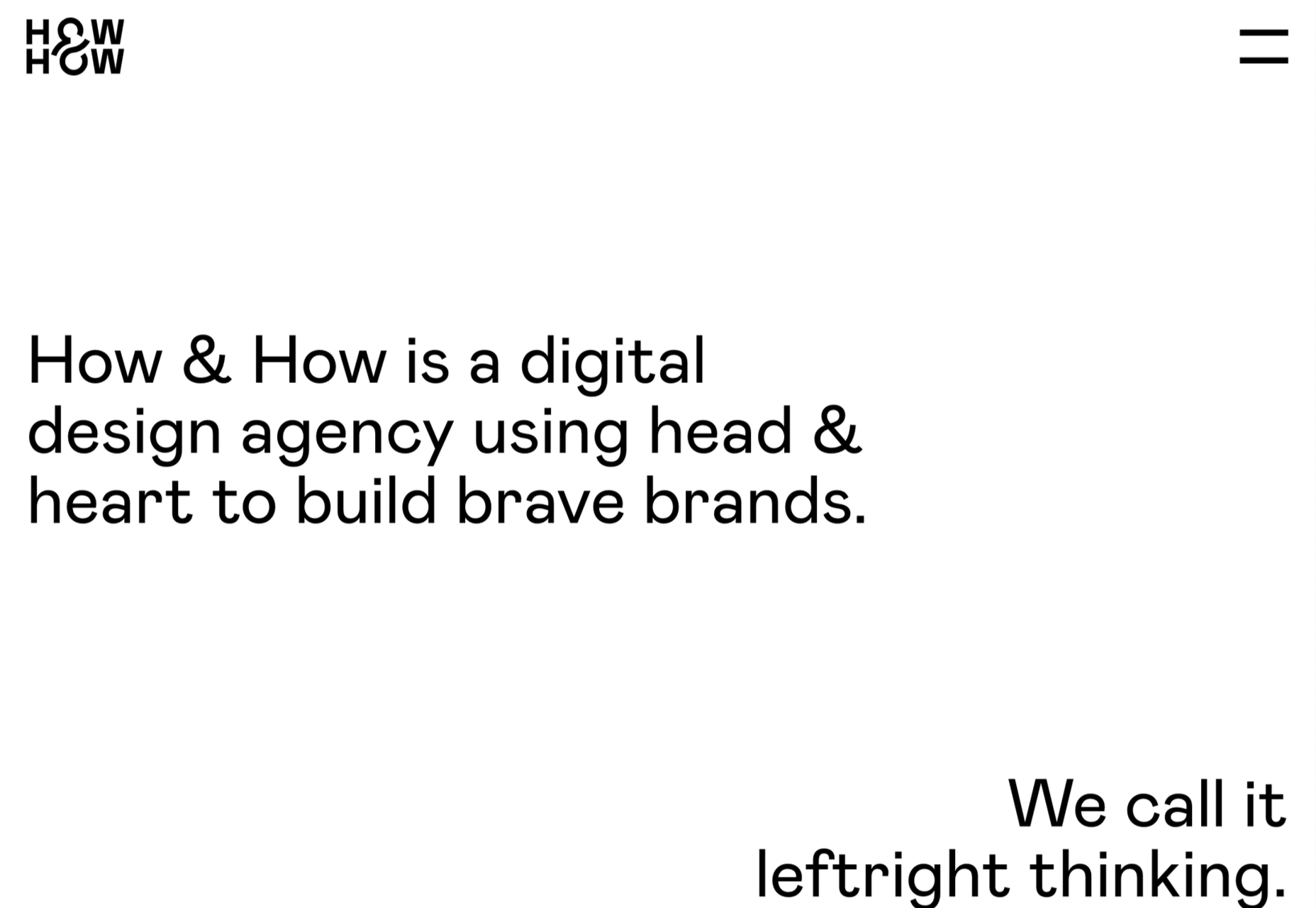
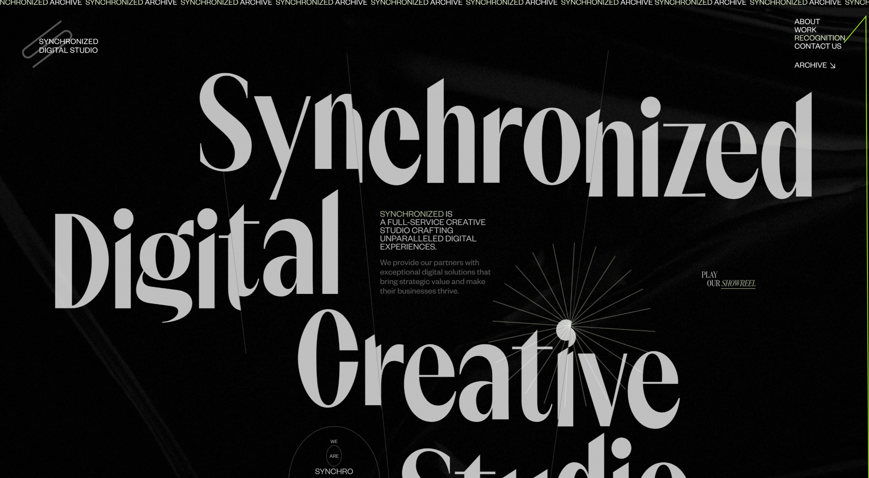
How & How
Digital design agency How & How keep things light and clean for their own website.
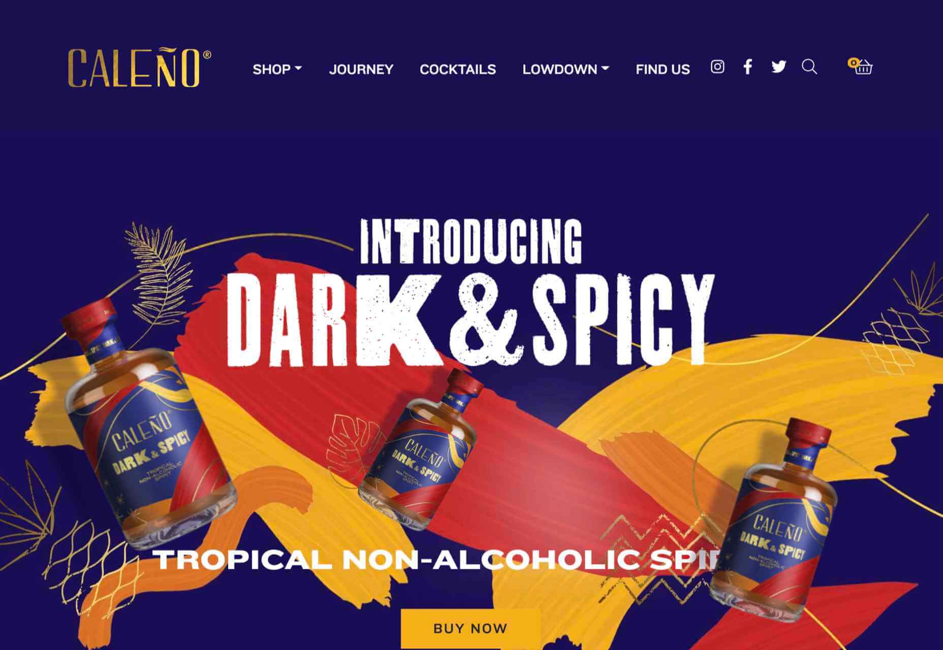
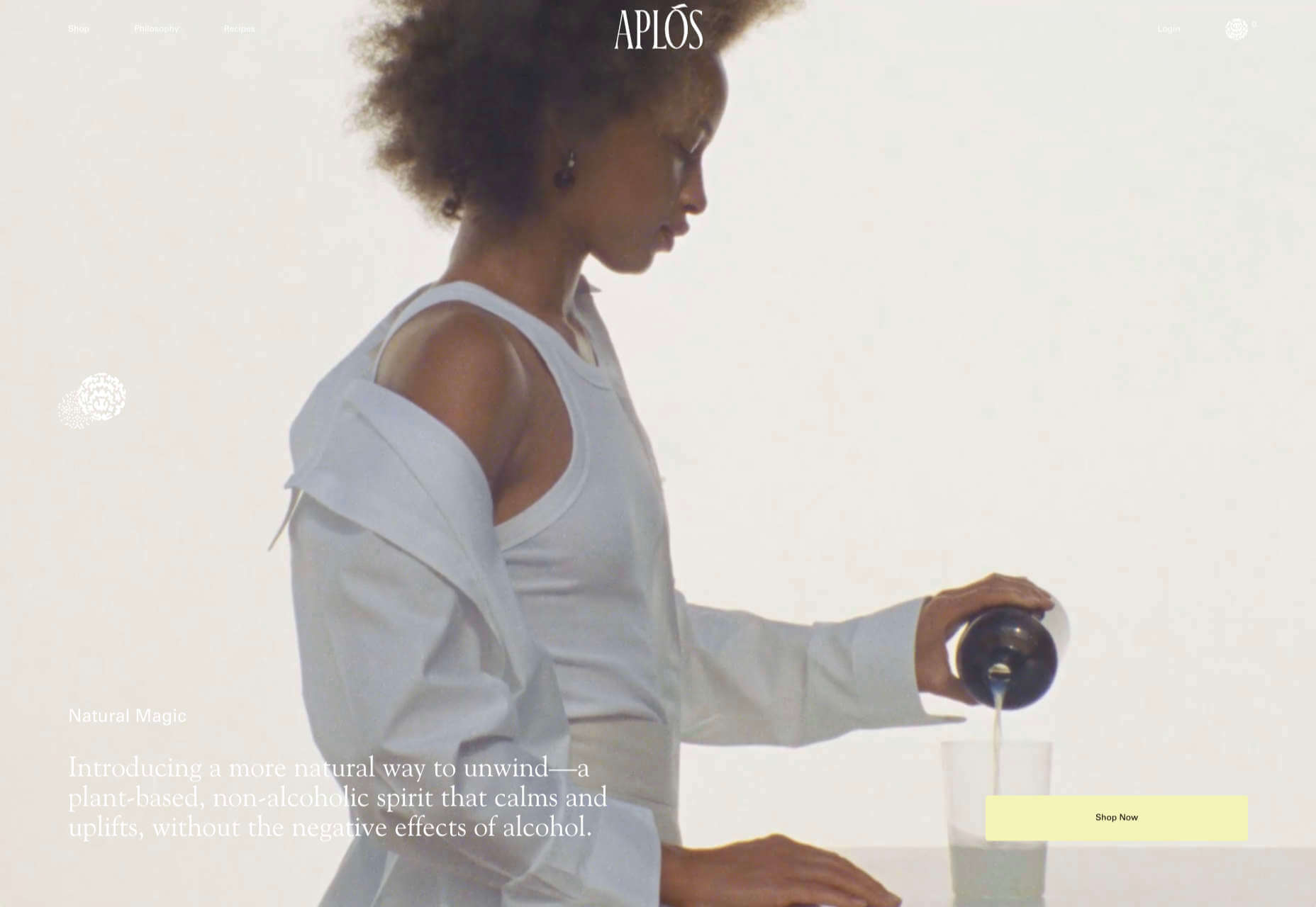
Caleño
Caleño makes non-alcoholic distilled spirits. Their relaunched website is bright and joyful, reflecting the character of the brand.
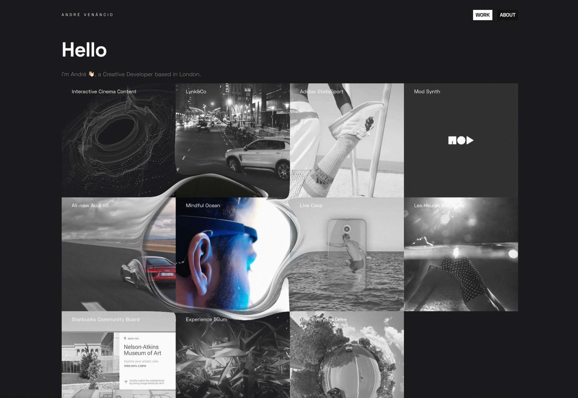
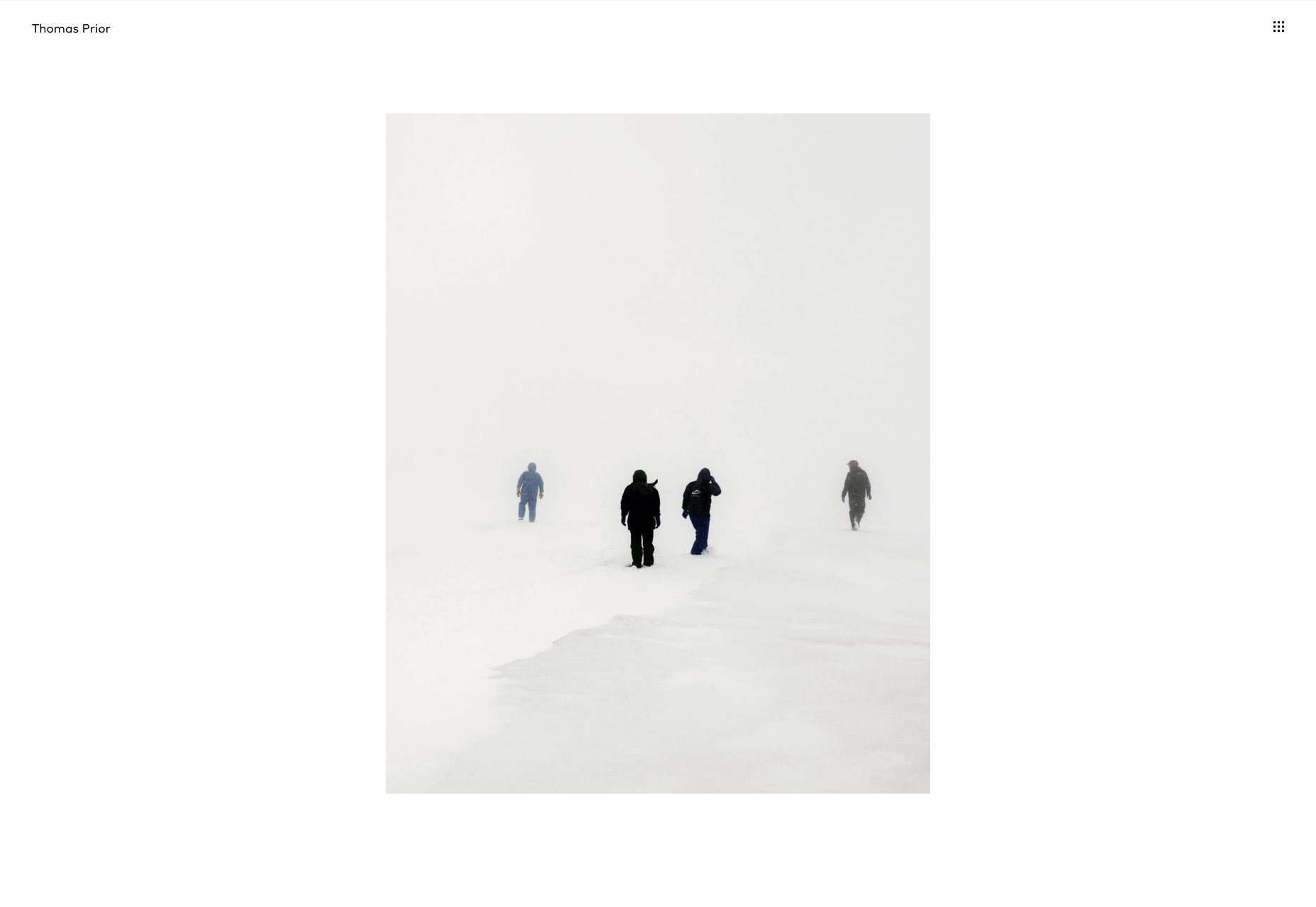
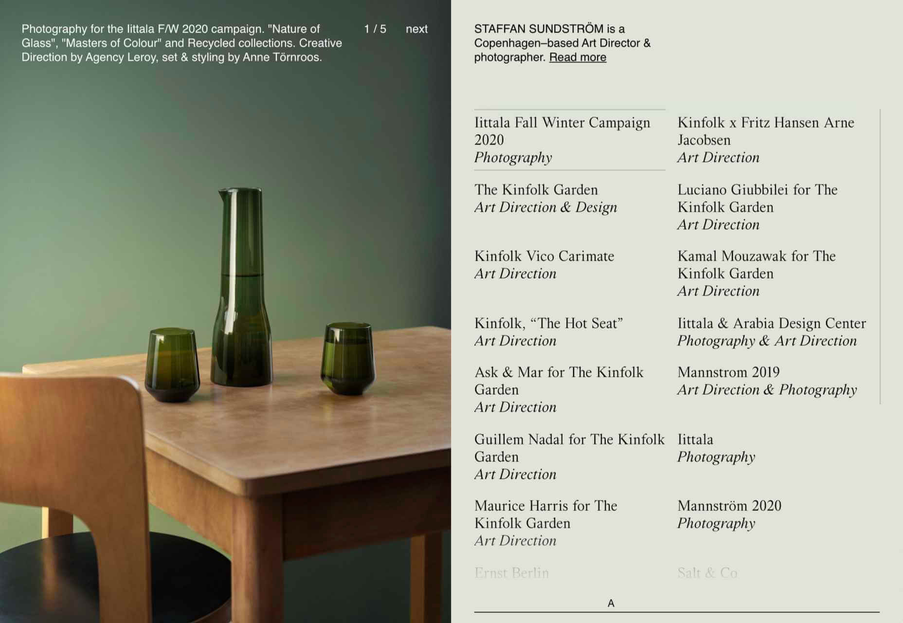
Staffan Sundstrom
Art director and photographer Staffan Sundström has a simple portfolio site that matches his work’s calm, minimalist aesthetic.
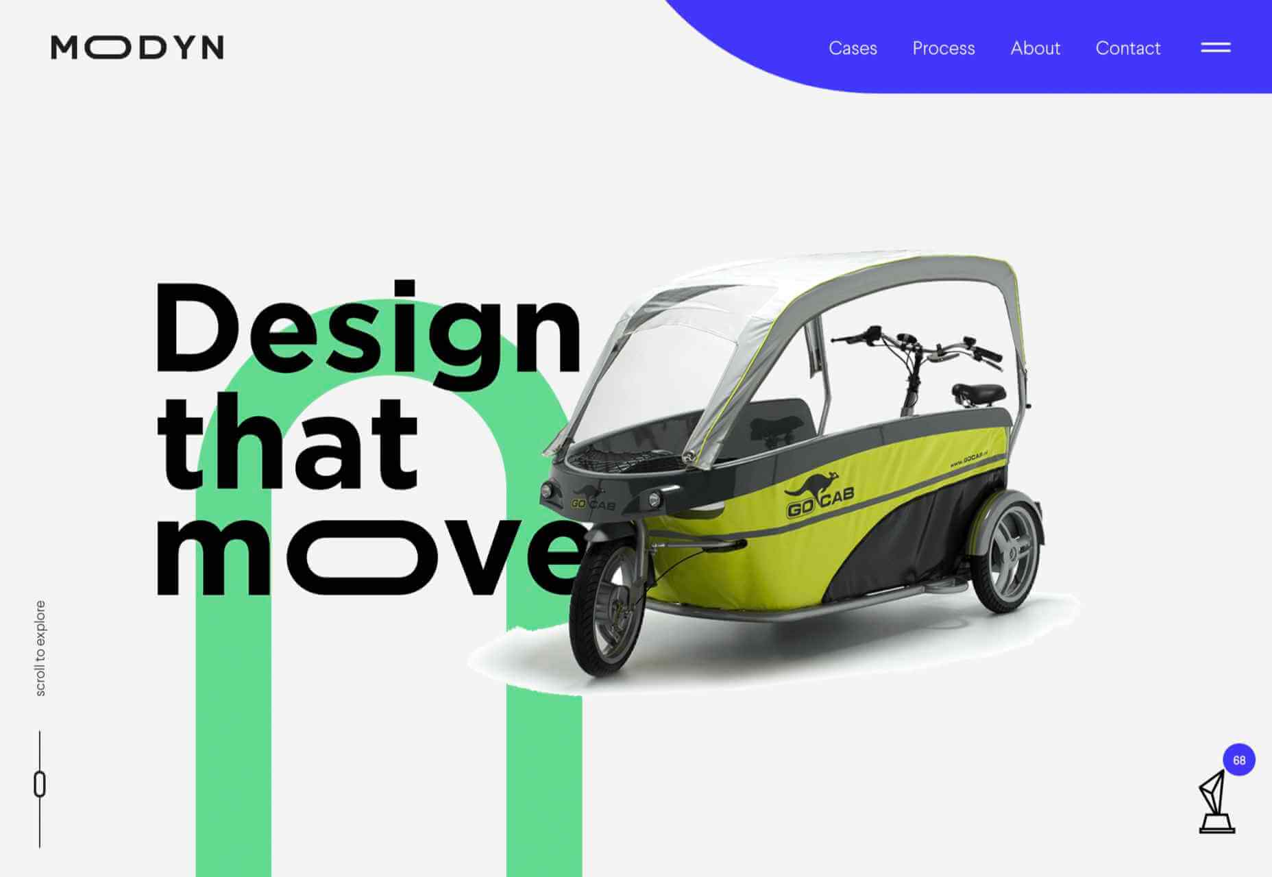
Modyn
Modyn is a product design agency with a focus on mobility. The flexing of logo text and occasionally other elements adds a nice touch to an otherwise simple design.
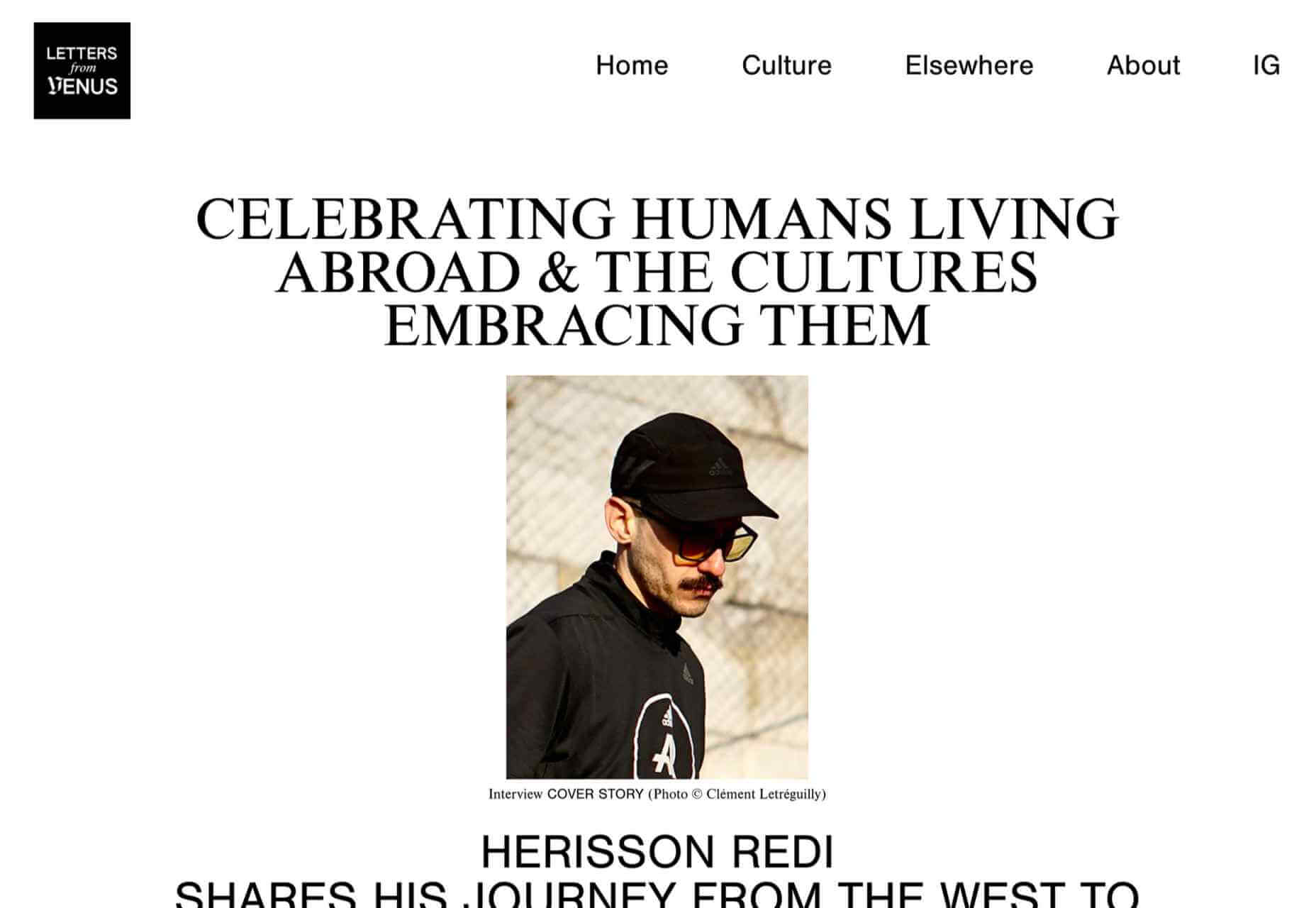
Letters from Venus
Letters from Venus celebrate people living abroad and the cultures that embrace them. An asymmetric grid creates light and space.
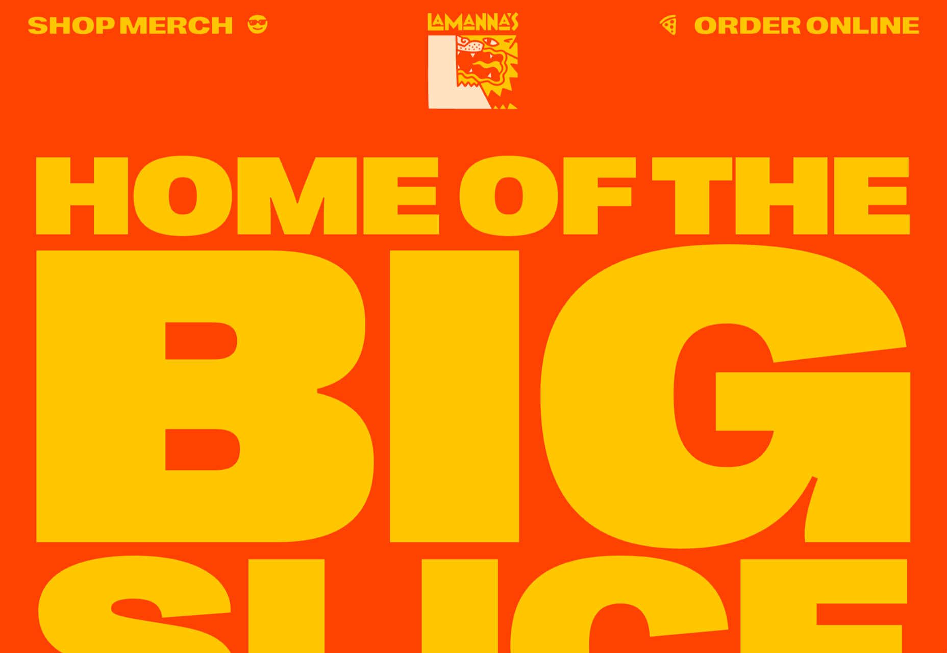
La Manna’s
La Manna’s makes giant pizza slices and pizza cake slices. Their site has a larger-than-life feel with a nod to the 1970s.
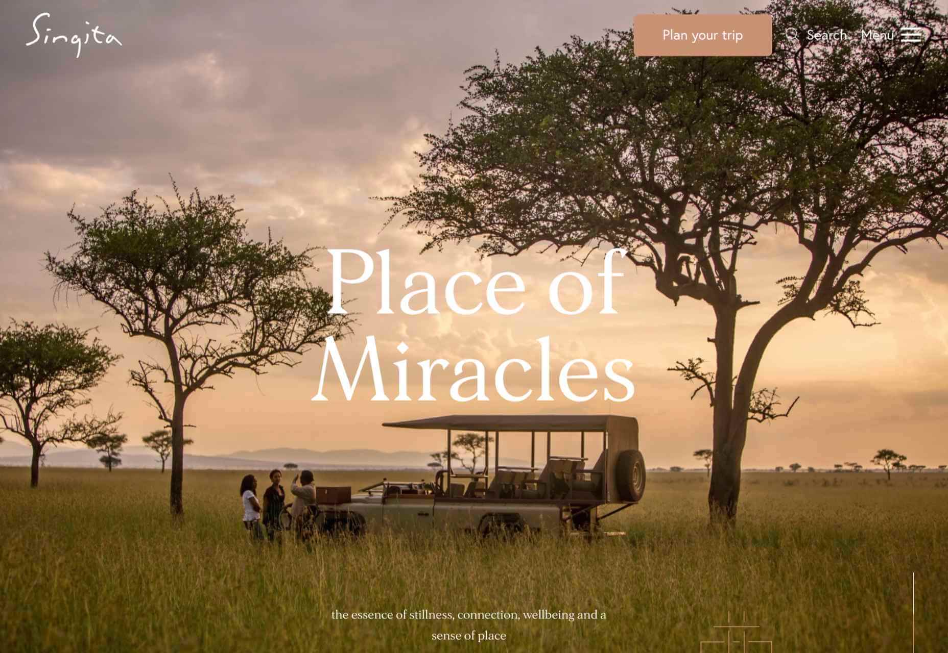
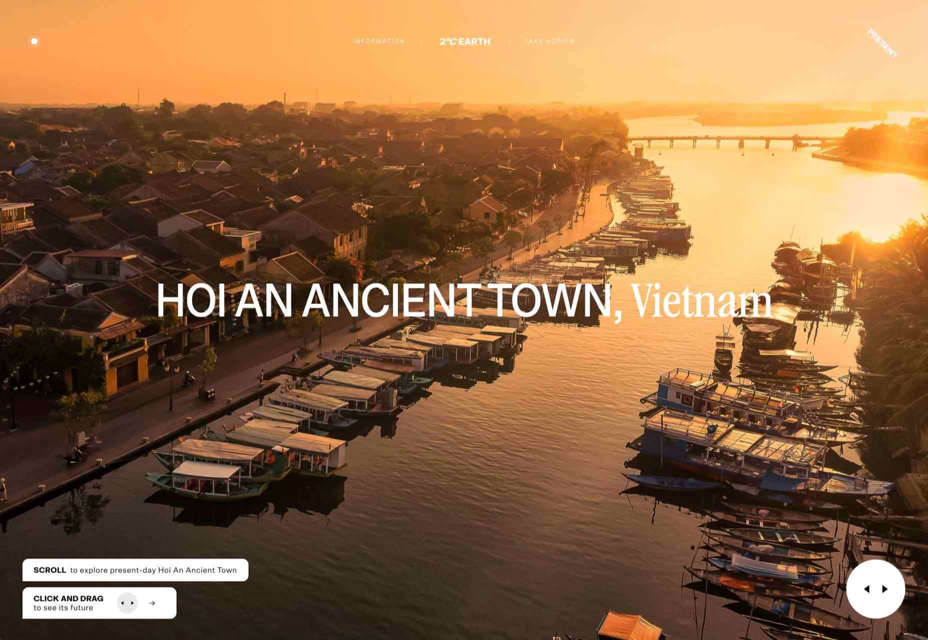
Singita
Singita is an ecotourism and conservation brand based in south and east Africa. High-quality photography and a warm, terracotta-based color scheme create an inviting ambiance.
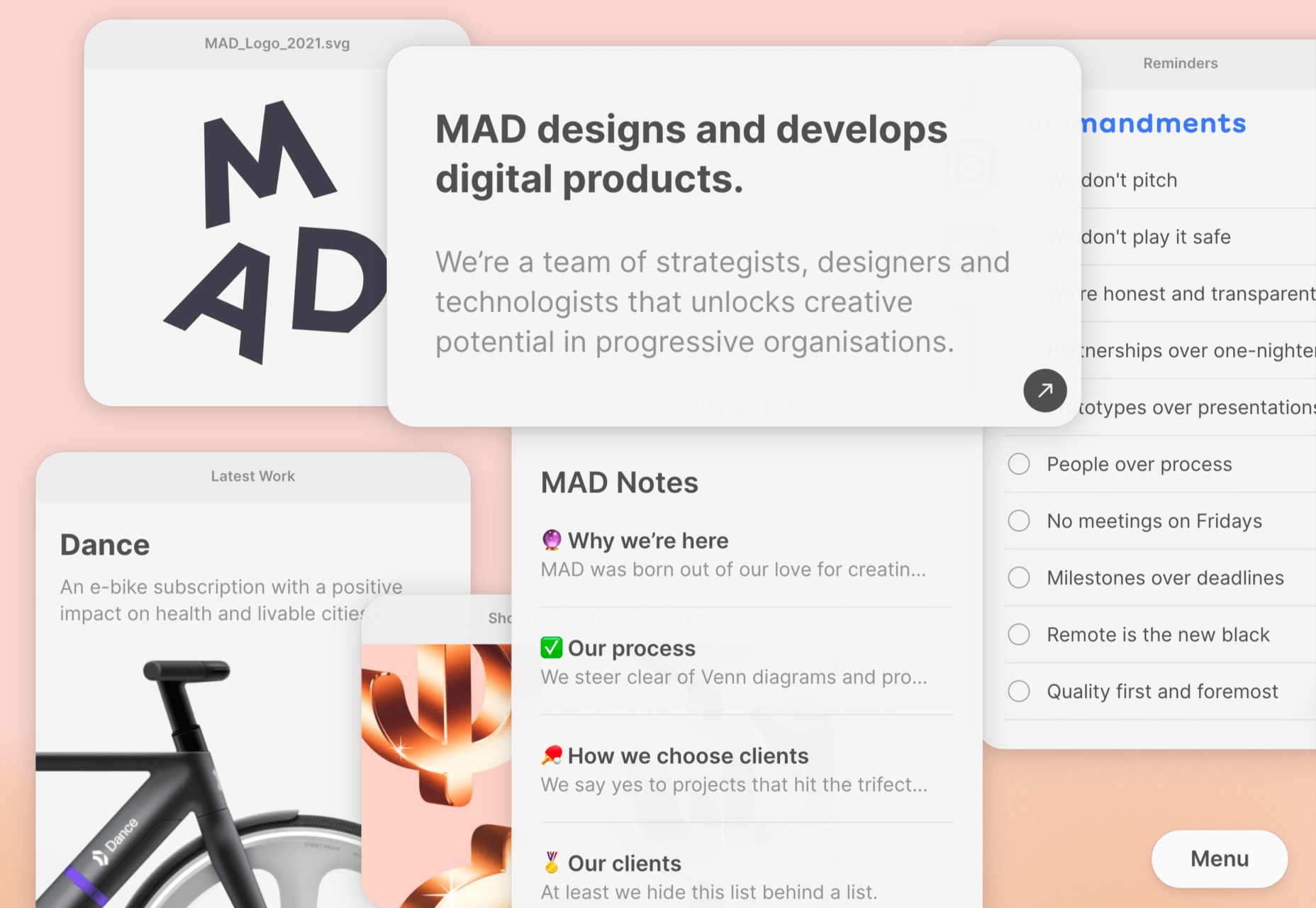
MAD
Digital product design agency MAD has gone for an app-like feel to their website. There is some nice user interaction, and they stay just the right side of cutesy.
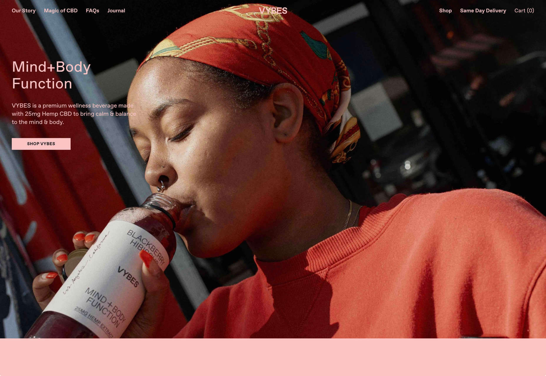
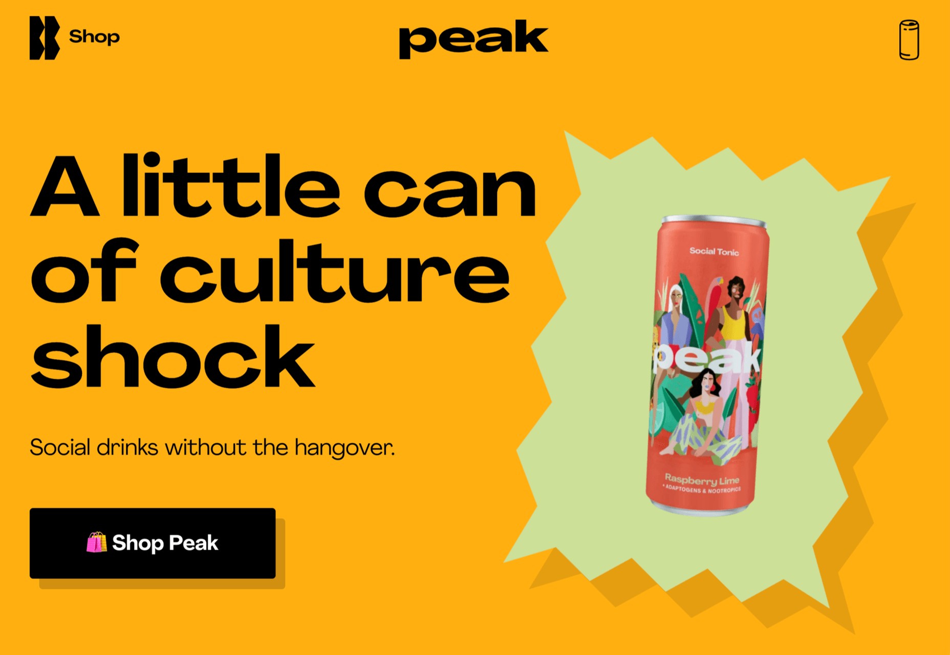
Peak
Another non-alcohol drink, Peak, has chosen the healthy angle, with further emphasis on the social. The site is colorful but minimal.
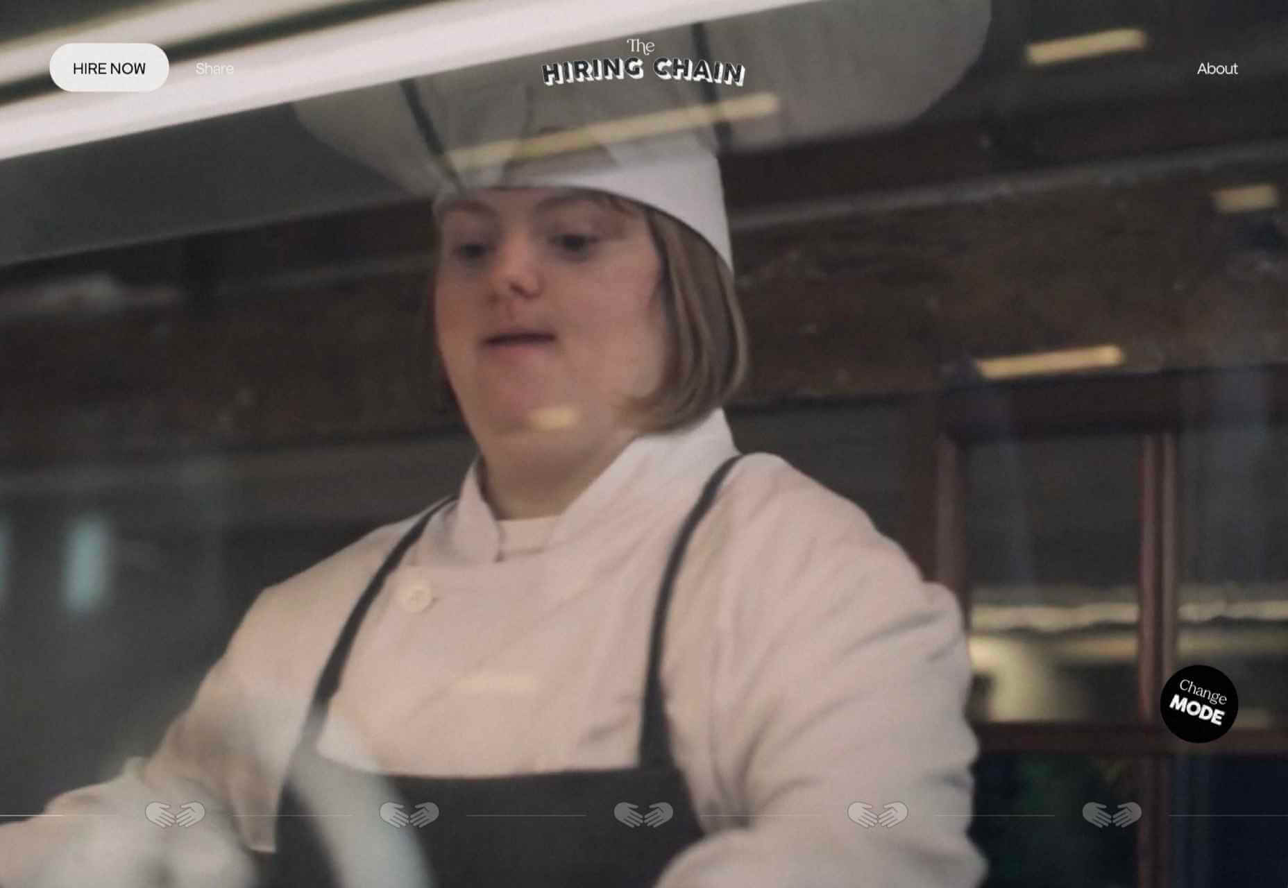
The Hiring Chain
The Hiring Chain website is part of a campaign encouraging businesses to offer employment to people with Down Syndrome. The centerpiece is a video, but the about information is clearly presented appealingly.
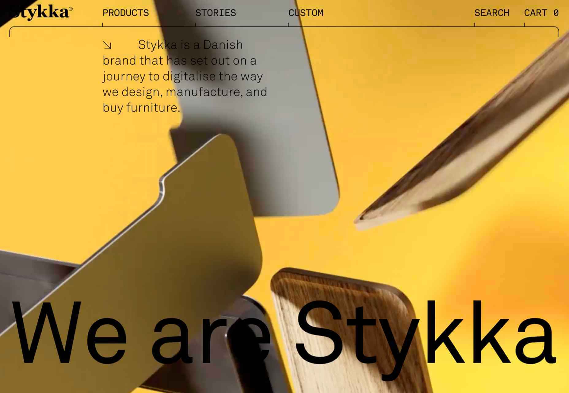
Stykka
Stykka’s aim is to digitize the design, manufacture, and buying of furniture. The site has a very light feel, with a simple type and good use of white space.
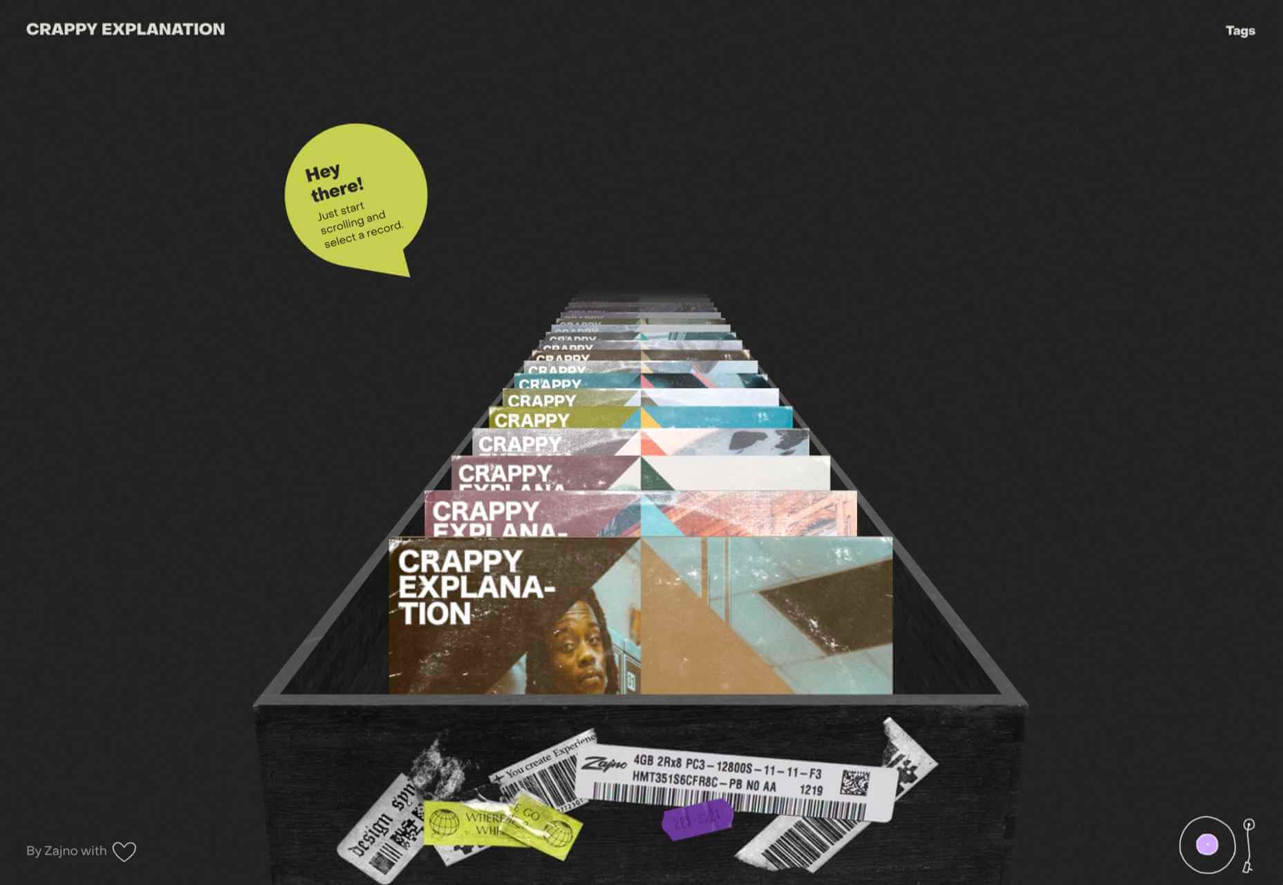
Crappy Explanation
Crappy Explanation is a fun microsite from design agency Zajno that links to various playlists in Spotify. As a promotional piece, it’s well done without being too flashy.
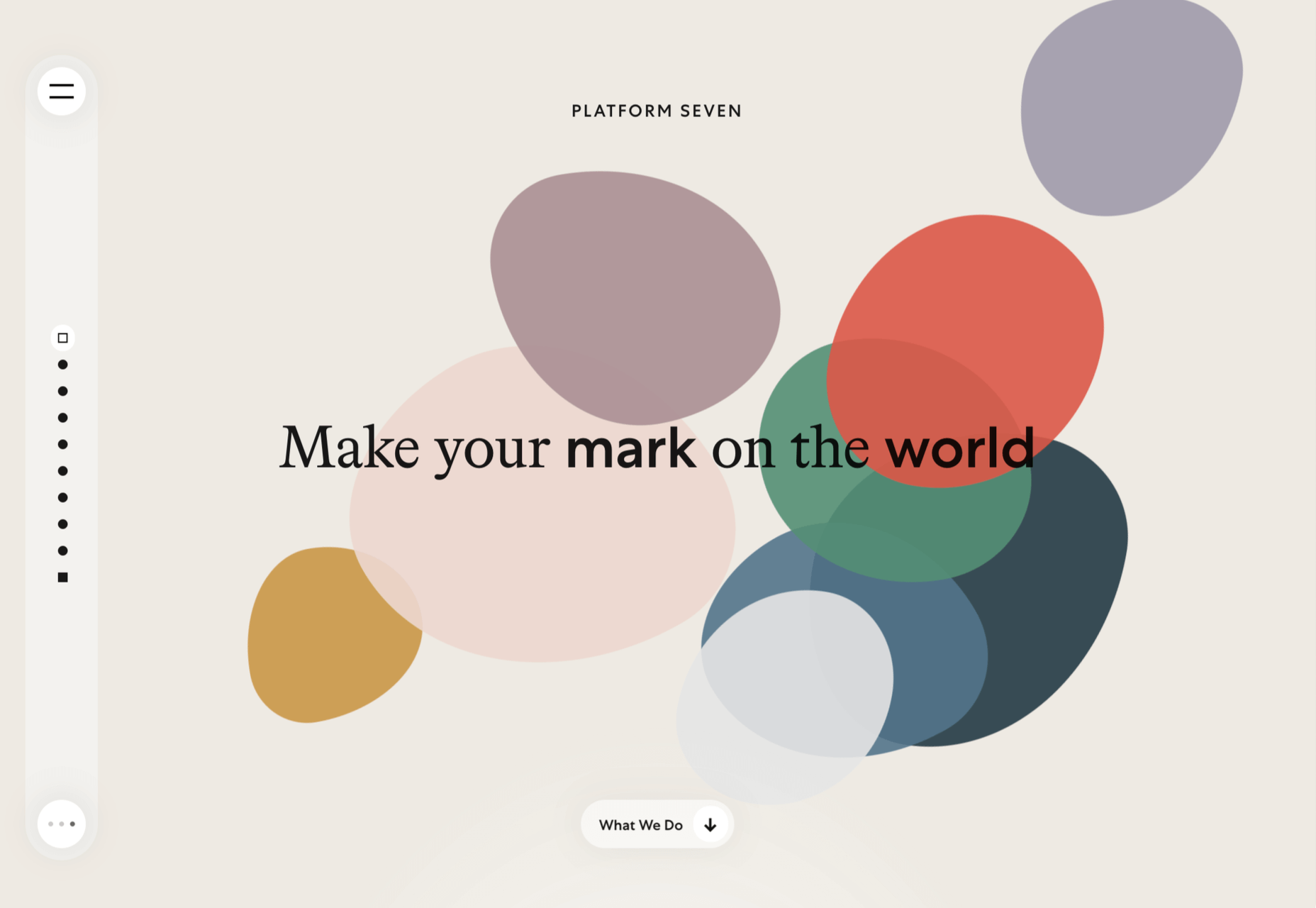
Platform Seven
Platform Seven offers career mentoring for young people. The site is well structured with a strong narrative flow and a positive feel to the color scheme.
Moth Drinks
This time the drinks are alcoholic: Moth does classic cocktails in a can. As holding pages go, this makes a statement with its black and white graphics and masking effects.

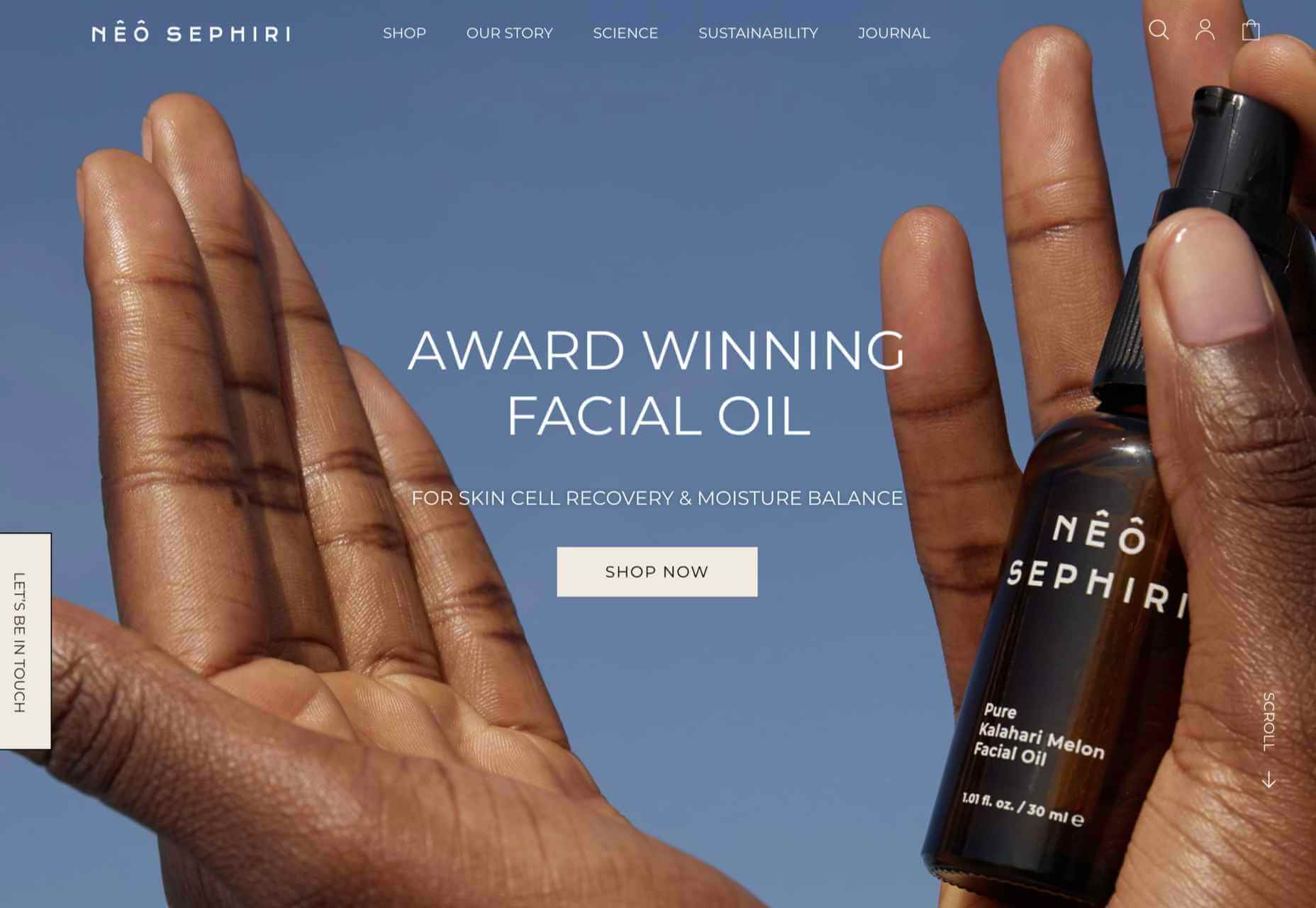
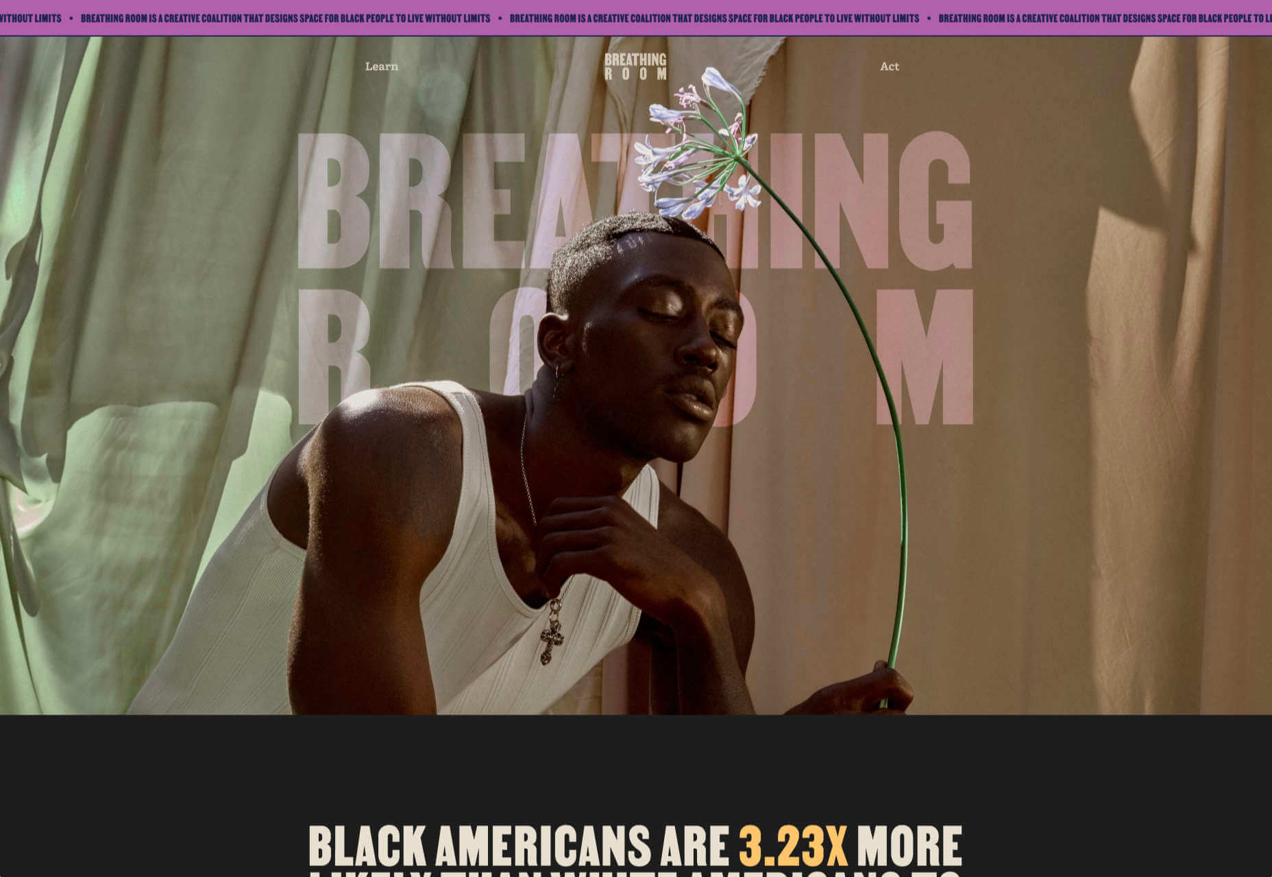
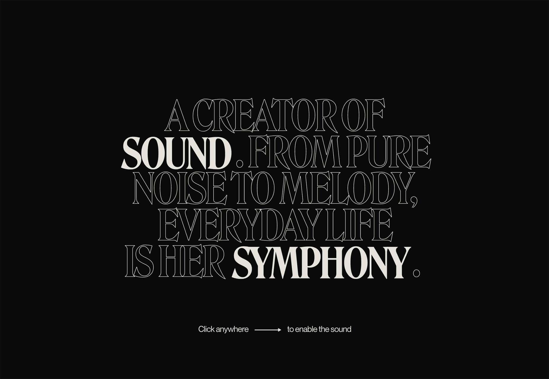
Nêô Sephiri
Nêô Sephiri is a facial oil produced from melon seed grown in the Kalahari. A nice blend of simple illustration and atmospheric photography underlines the nature angle with this product.
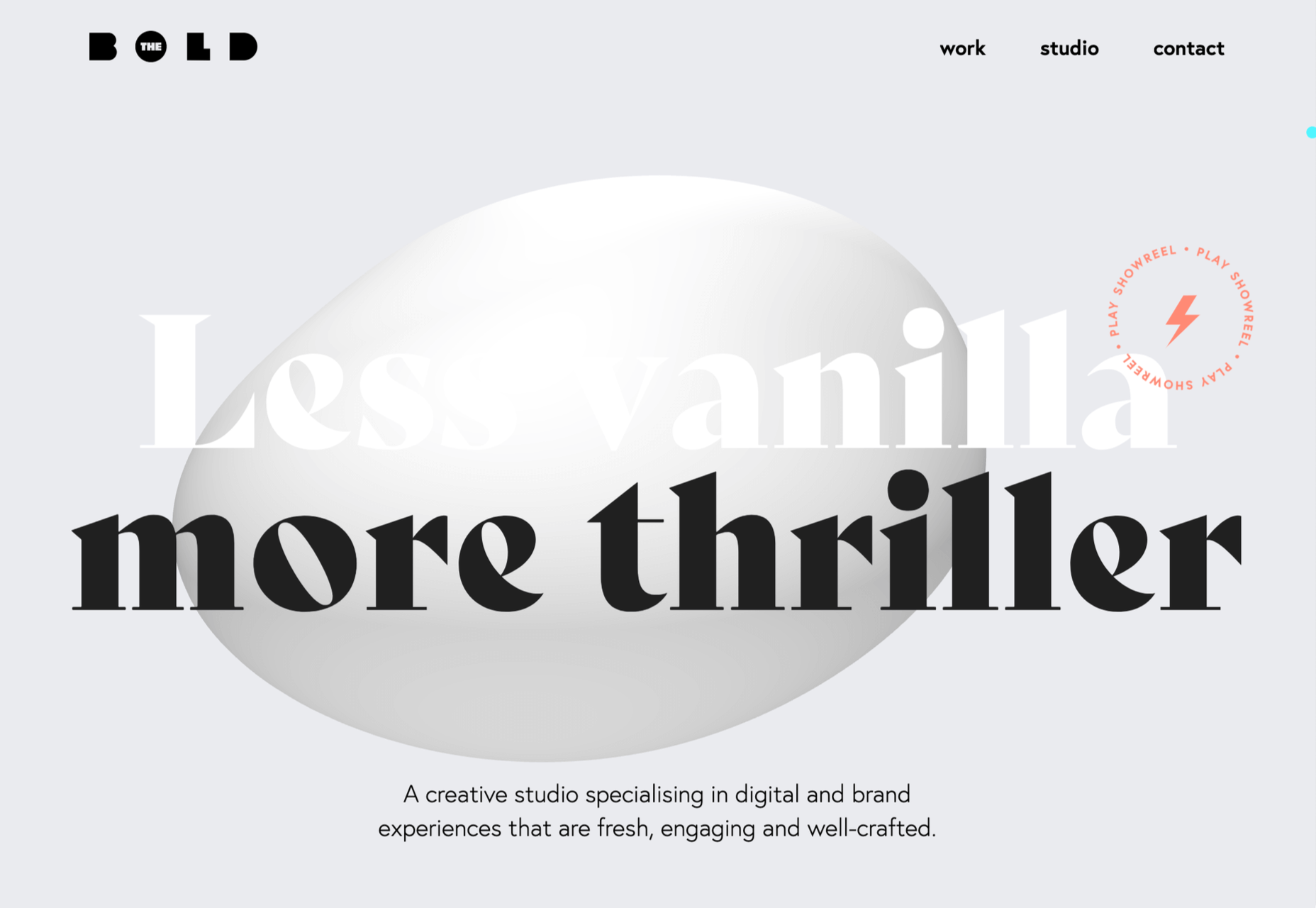
The Bold
Digital design studio Bold’s own site has some pleasing transitions and scrolling animation, teamed with fresh colors.
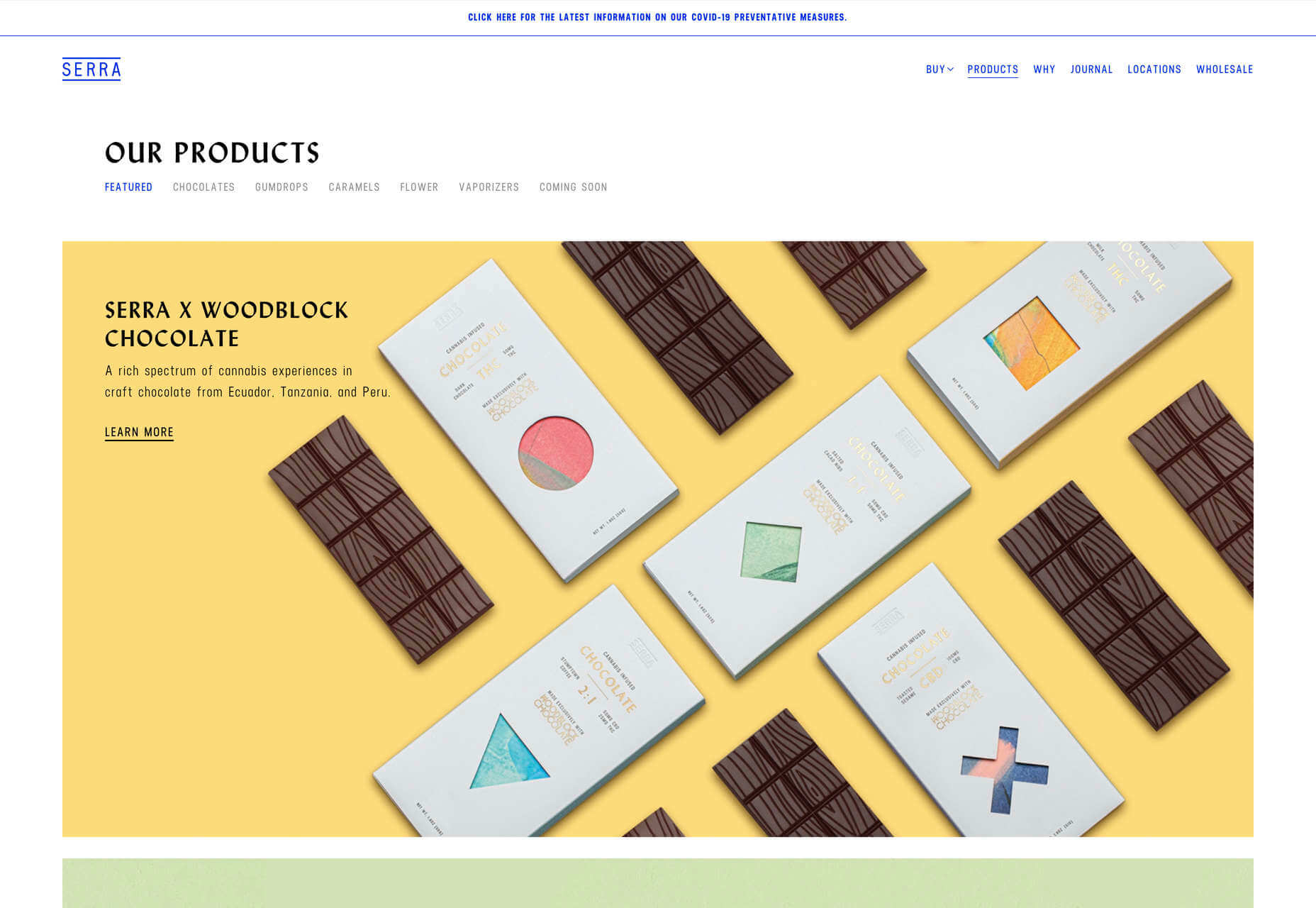
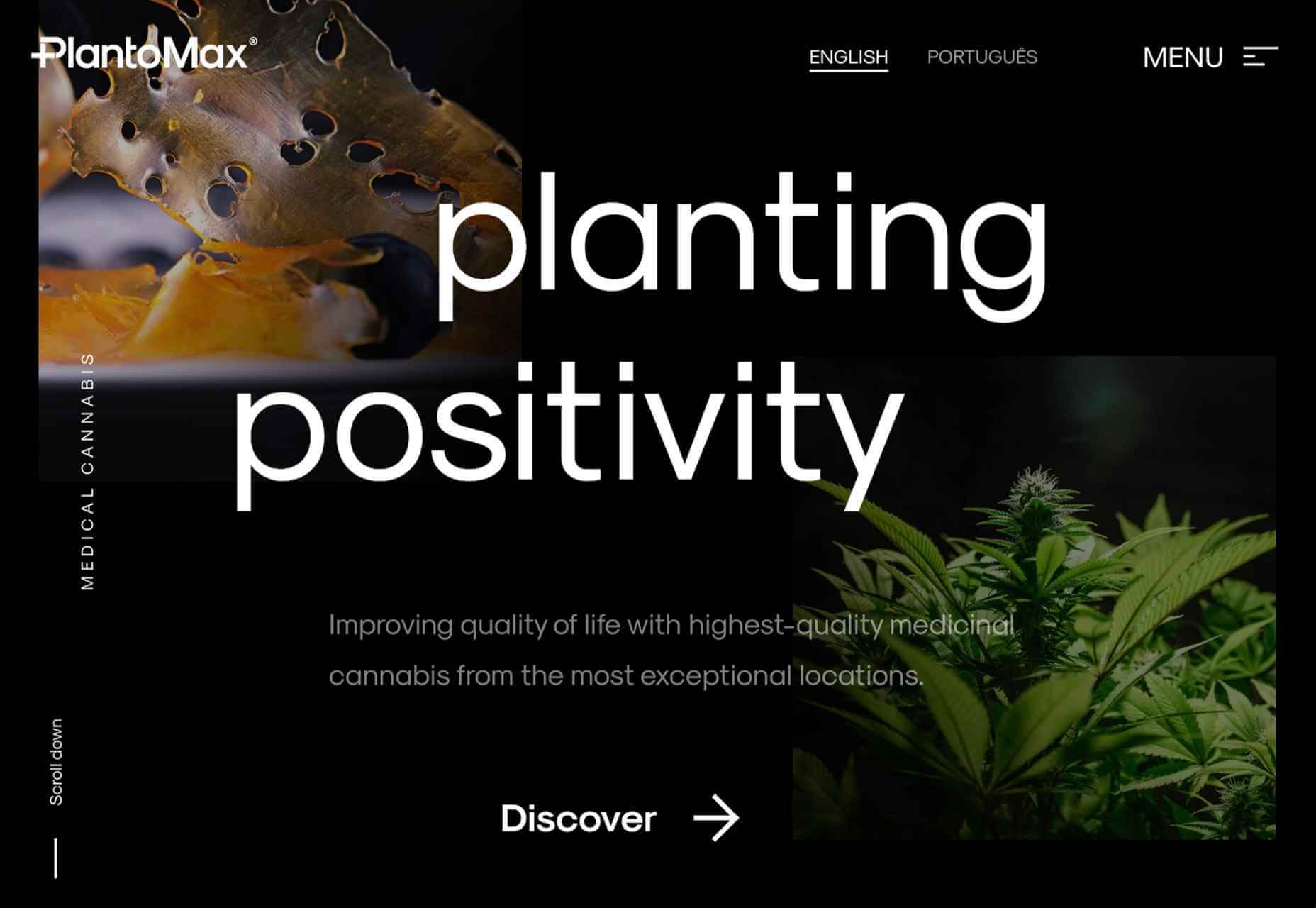
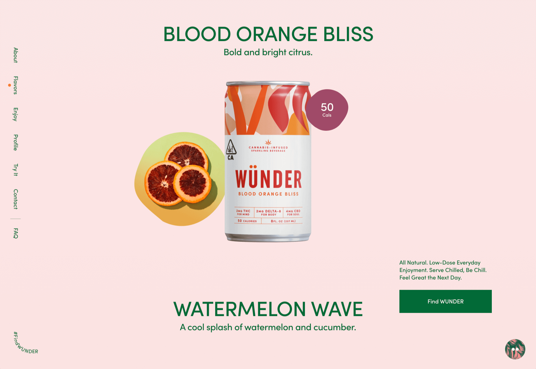
PlantoMax
PlantoMax produces medicinal cannabis from plantations in southern Europe. This is a glossy site, taking a clear step away from the usual hippy image of cannabis.
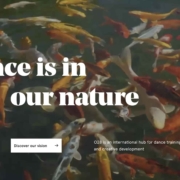
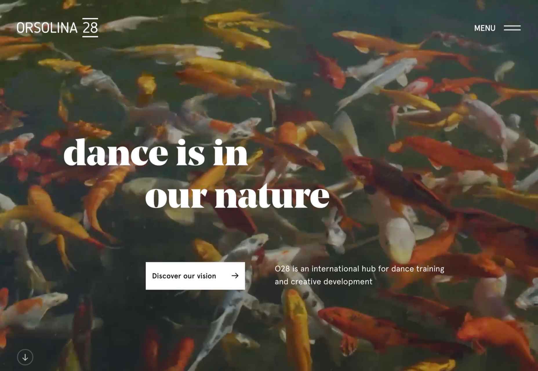
Orsolina28
Orsolina28 describes itself as a hub for dance training and creative development. Its setting in the Monferrato hills in northern Italy provides some great photography. The inline links to video are a nice touch.
The post 20 Best New Websites, March 2021 first appeared on Webdesigner Depot.
 It’s hard to believe we are more than a month into 2021 already. But that means more trends to dive into this year, right?
 Here we are into a brand new year, and although we’re far from out of the woods yet, there is a feeling of renewed hope on many fronts.
 As we turn the corner into the final part of the year, many of the new websites and redesigns that we see during much of the rest of the year tend to slow down. Many businesses are focusing on fourth quarter and holiday sales.
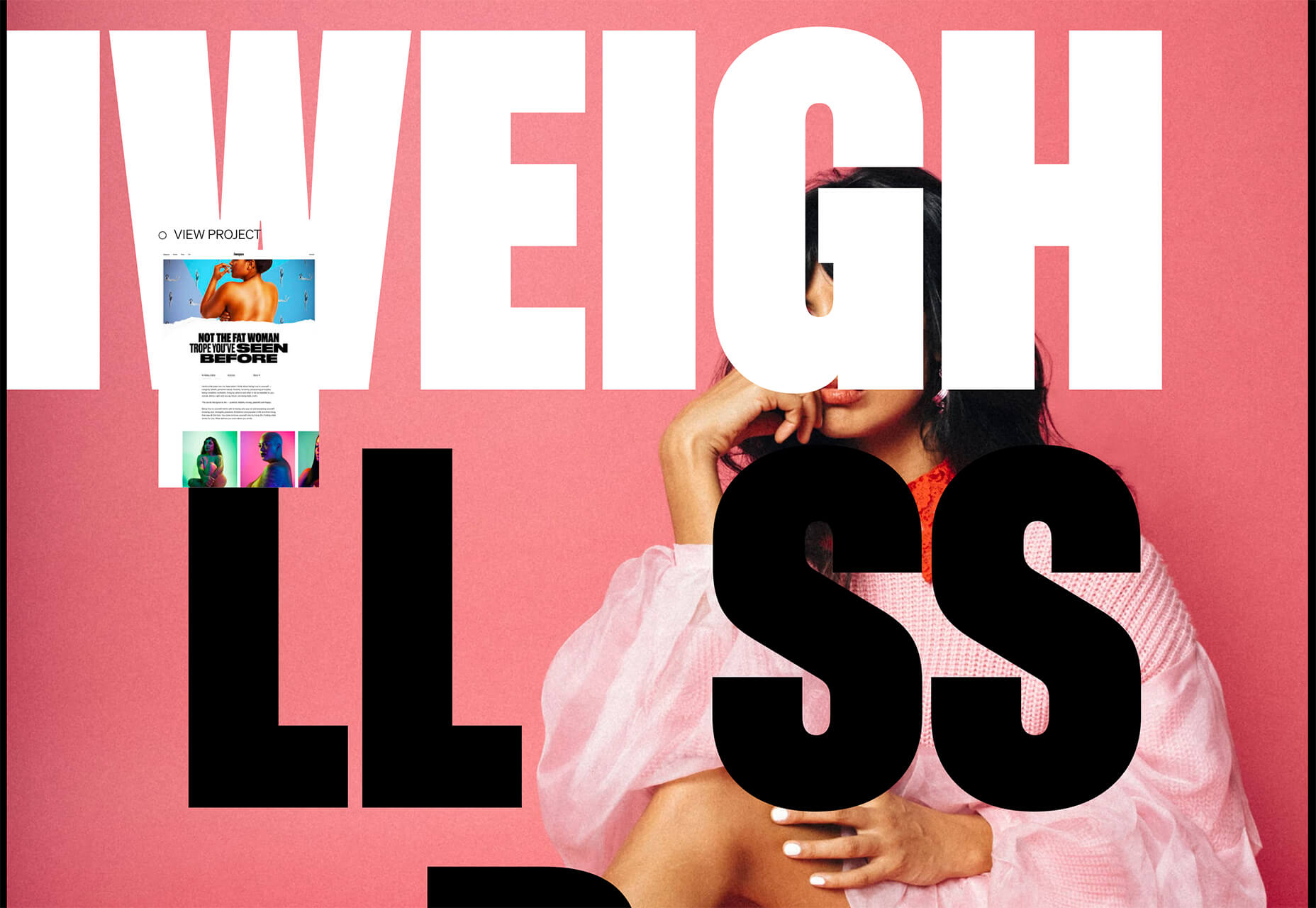
 This month we’re going big and bold. Oversized type, strong colors, in-your-face layouts, and little touches of playfulness exude confidence and make a statement. There are some quieter moments too, with thoughtful illustration and more gentle use of color. Animation still features strongly in the details, with circles proving popular in rollover effects. Enjoy.
 A seasonal change is on the horizon and that always has me looking to refresh projects. This month’s design trends provide a few different ways to do that without ripping up your entire website.

 In this month’s collection of the freshest web designs from the last four weeks the dominant trend is attention to detail.
 Do the lazy days have you longing for a new design technique to try? You are in luck.
 After six months of uncertainty 2020 is finally beginning to find a style of its own. There are nods to Brutalism, a delightful blending of 80s pastels with 90s primaries, and the font style of choice is anything but geometric sans-serif.