
In the video below, we take a closer look at the State Design Pattern in Java. This tutorial includes an introduction, real-time examples, class/sequence diagram, and implementation. Let’s get started!
In the video below, we take a closer look at the State Design Pattern in Java. This tutorial includes an introduction, real-time examples, class/sequence diagram, and implementation. Let’s get started!

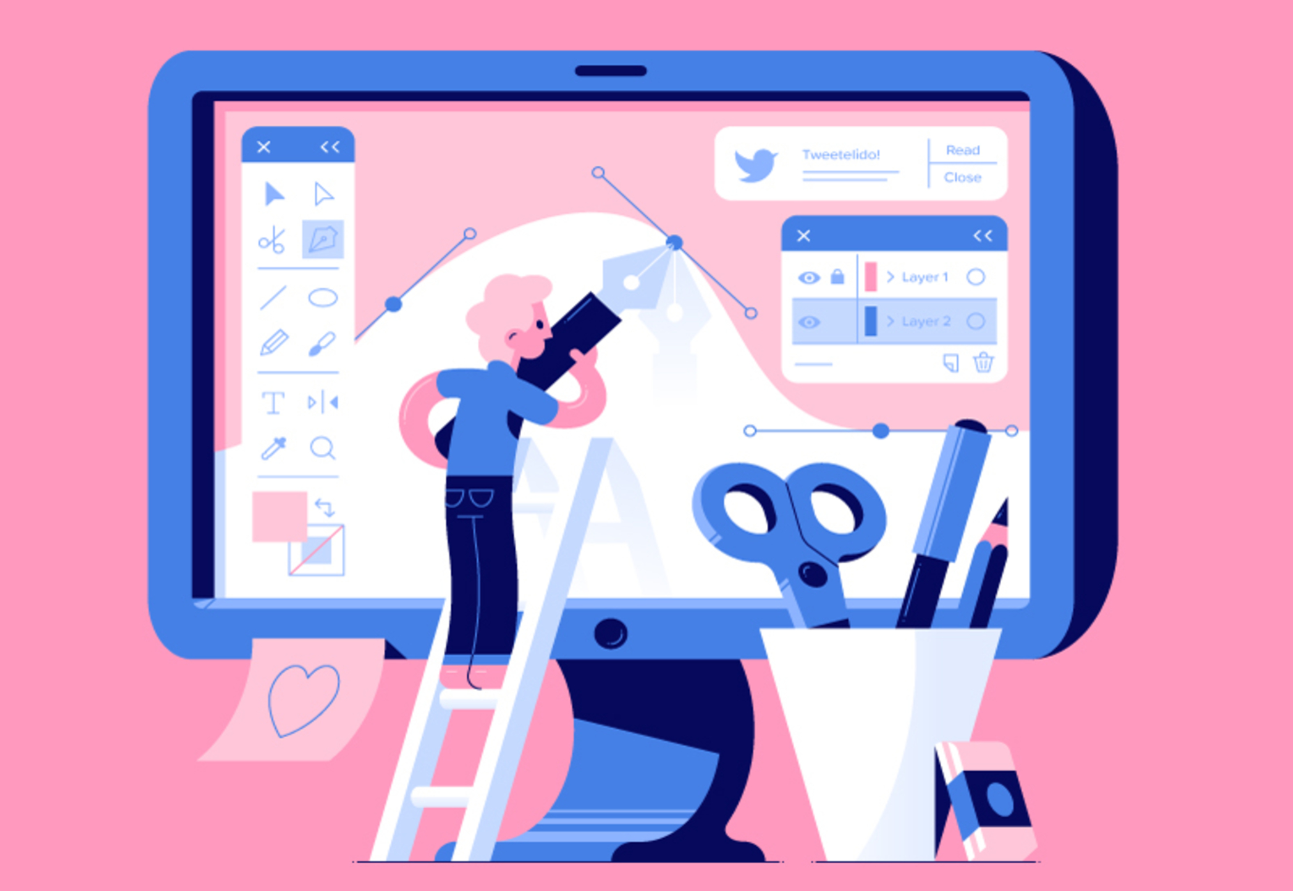
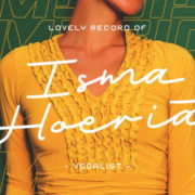
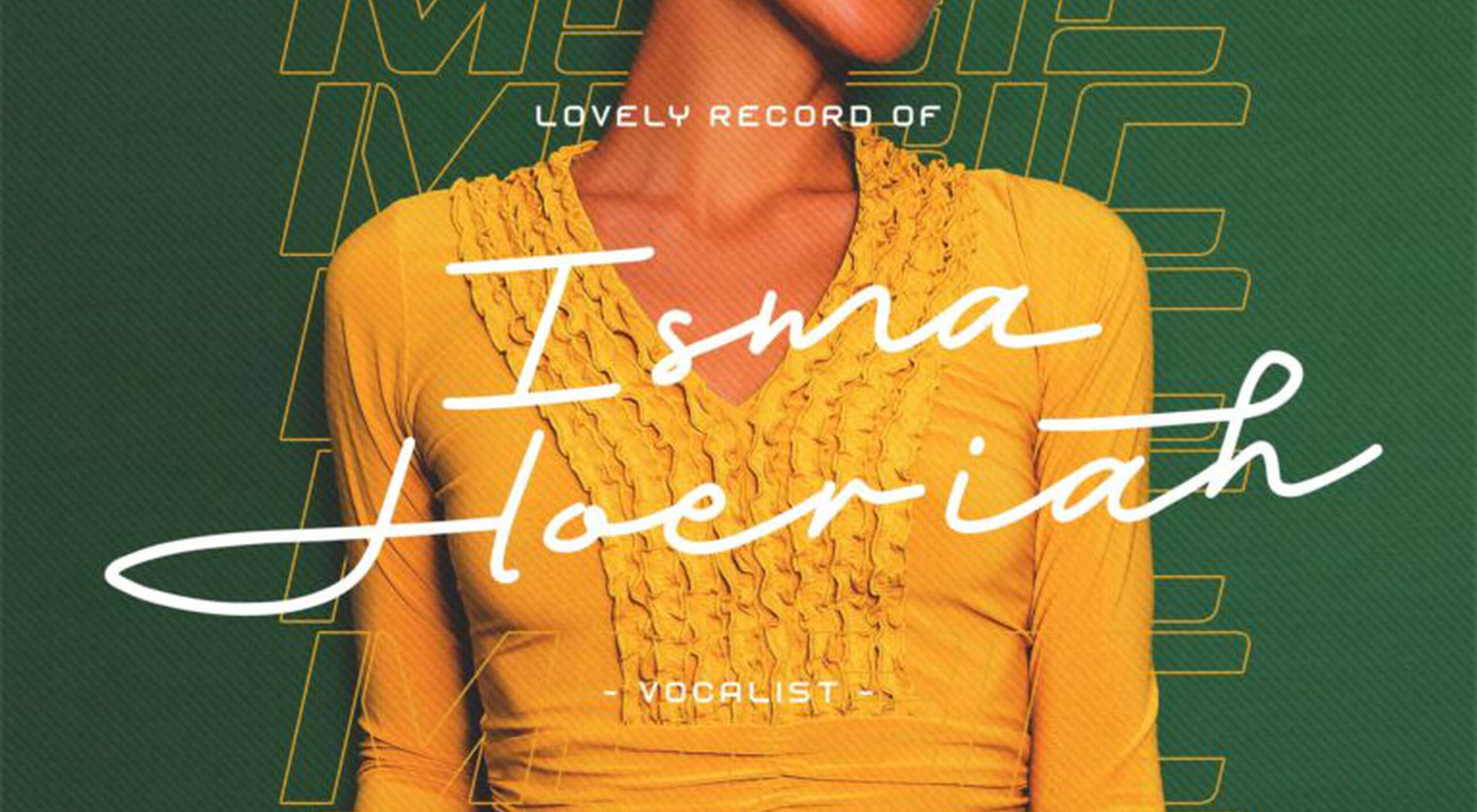
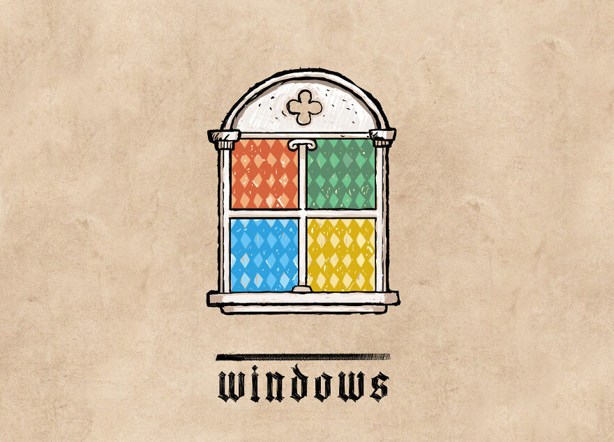
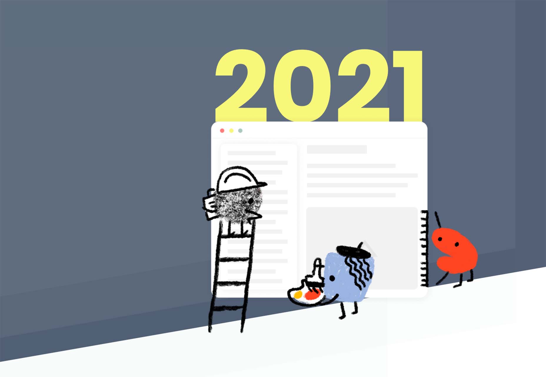
 Welcome to the latest edition of our top 20 sites of the month. In this February’s collection, the overall feel is lighthearted and optimistic, as we are seeing the positivity of a new year persisting across the web.
There is a continued inclination towards warmth and personableness and away from a more corporate, impersonal feel. We see this most in the color palettes used and in the use of illustrations as accents to add character and charm. Of course, as always, type plays a big part too. Enjoy!
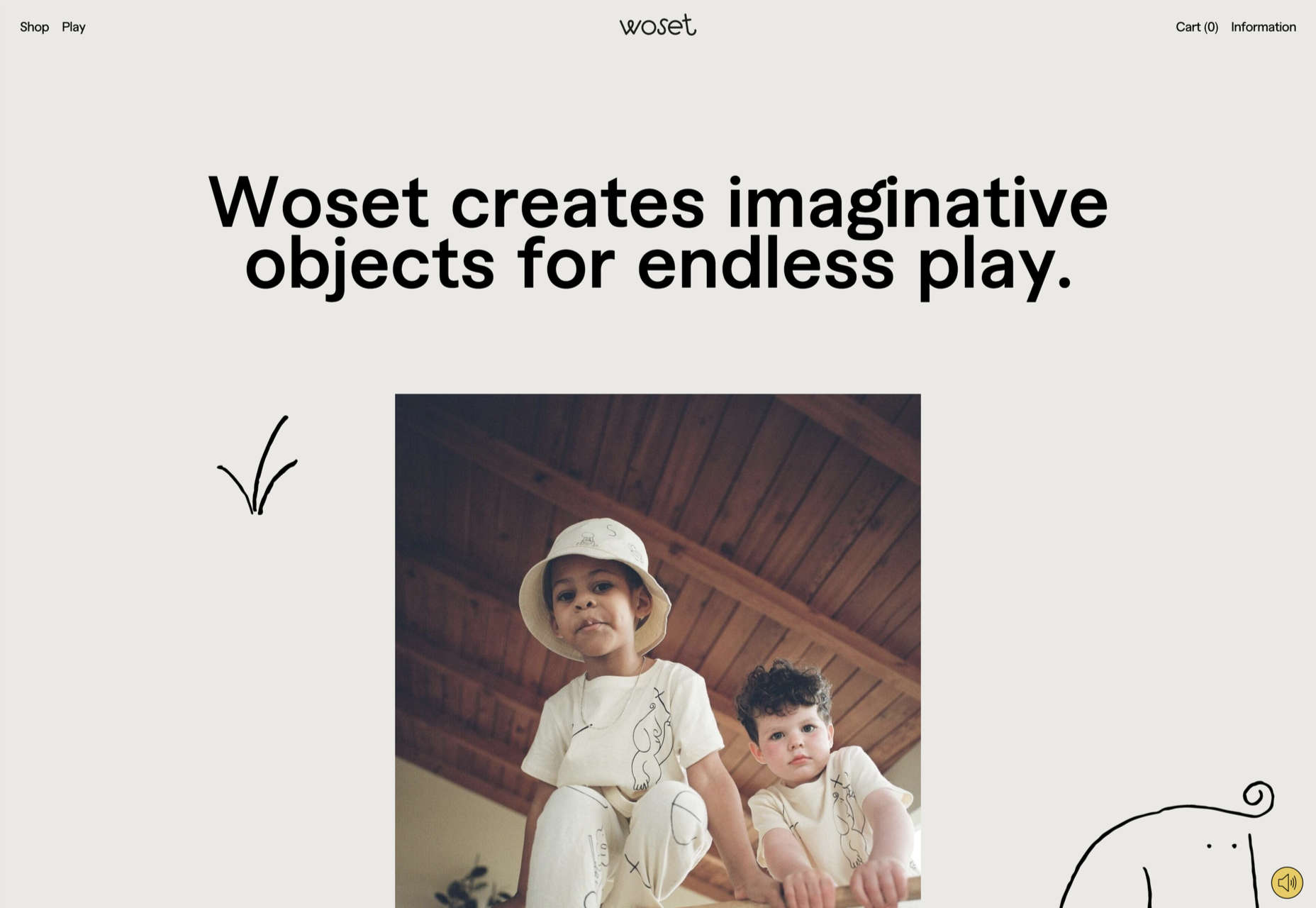
Woset has a simple aesthetic and features a charming illustration style on this site for its creative toys. The interactive ‘play’ section is a nice touch.
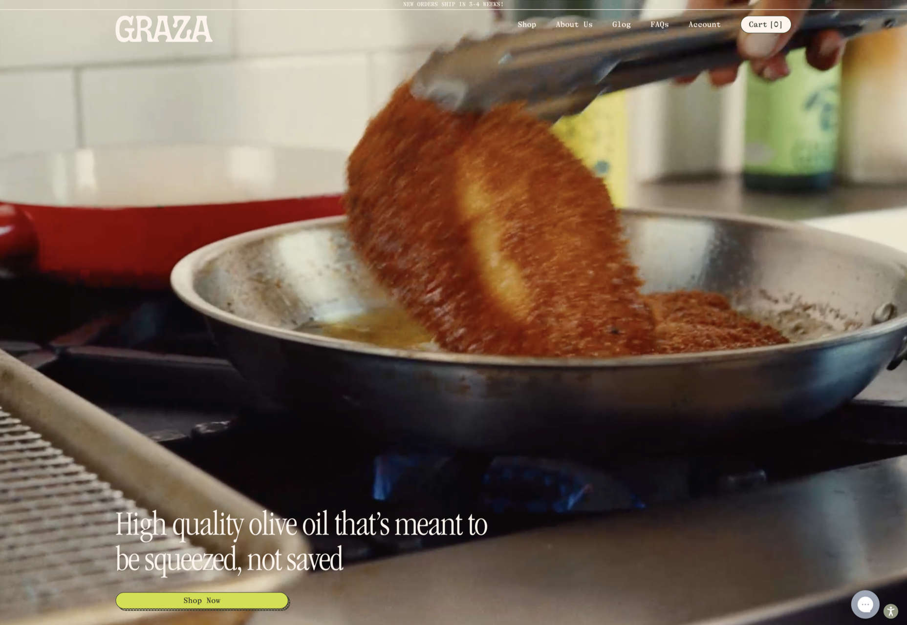
This site for Graza olive oil has a fun feel, with comic style illustration and bright splashes of color while making a serious sales pitch.
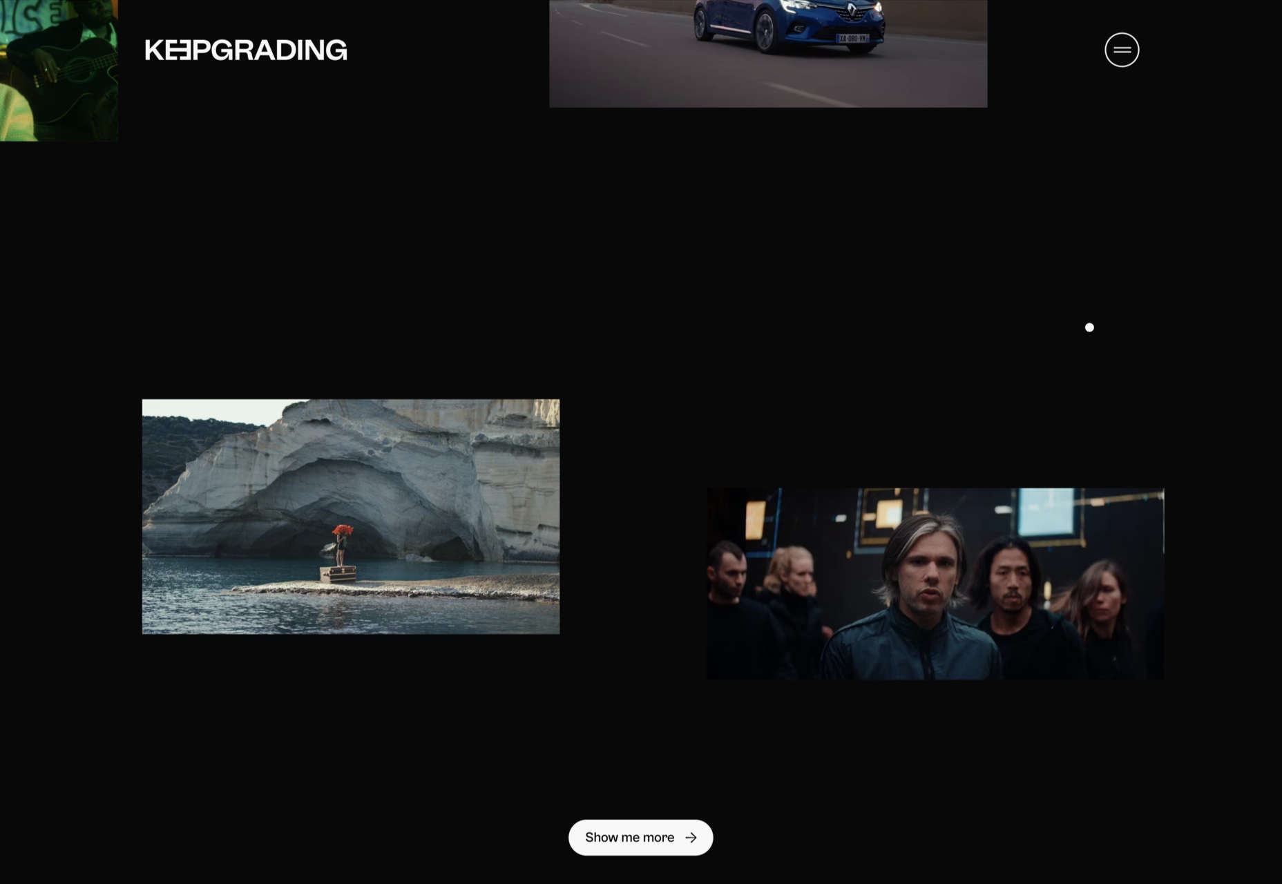
KeepGrading is a post-production color studio. Their portfolio site showcases a lot of work but keeps it well organized and pleasing to navigate.
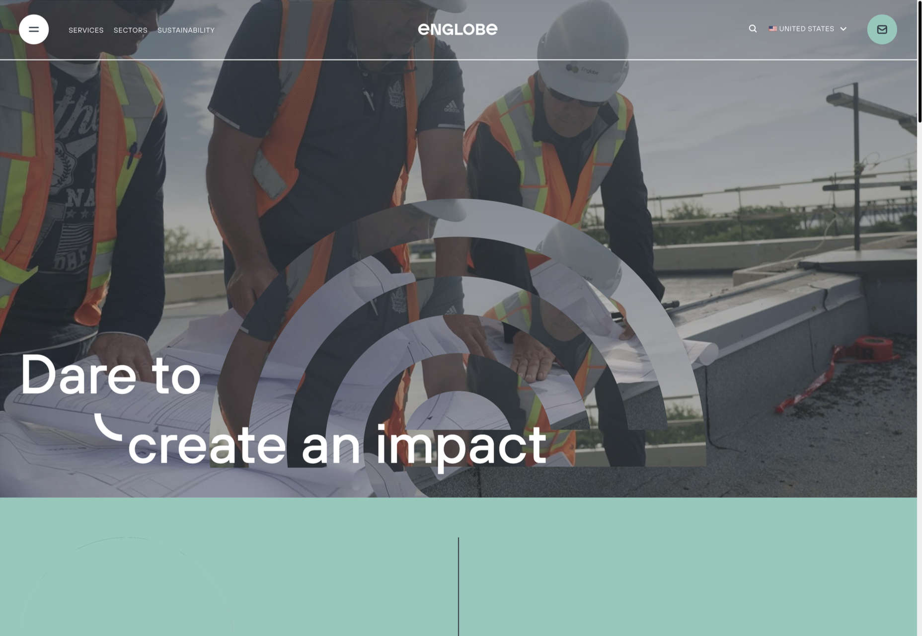
By using soft colors and slightly rounded type, Englobe has managed to portray a warm, friendly, and human aspect with this website, despite being a huge company.
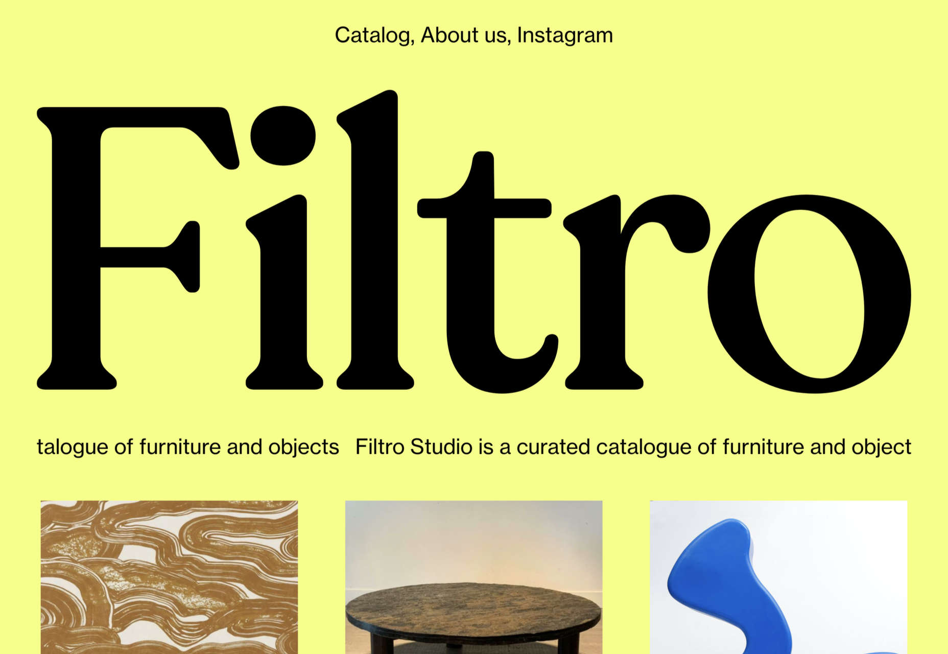
Filtro’s design is about as basic as it gets, and yet it has a certain charm to it.
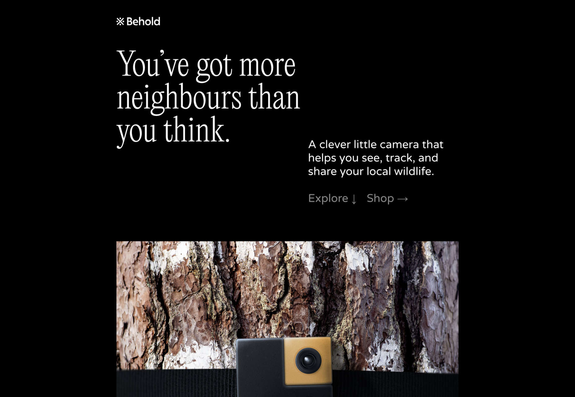
Behold is a wildlife camera that is currently in development. This landing page does an excellent job of creating interest with just enough information.
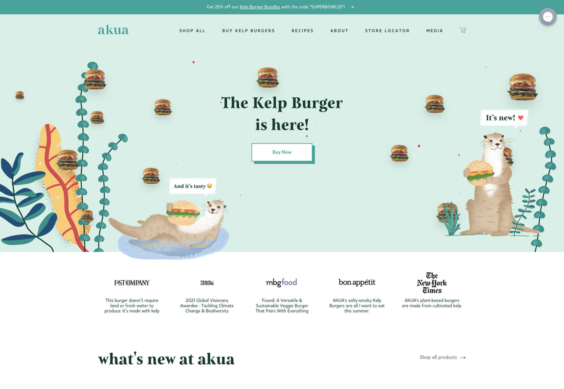
Some rather sweet illustration work creates a good balance with technical information on this site for Akua kelp burgers.
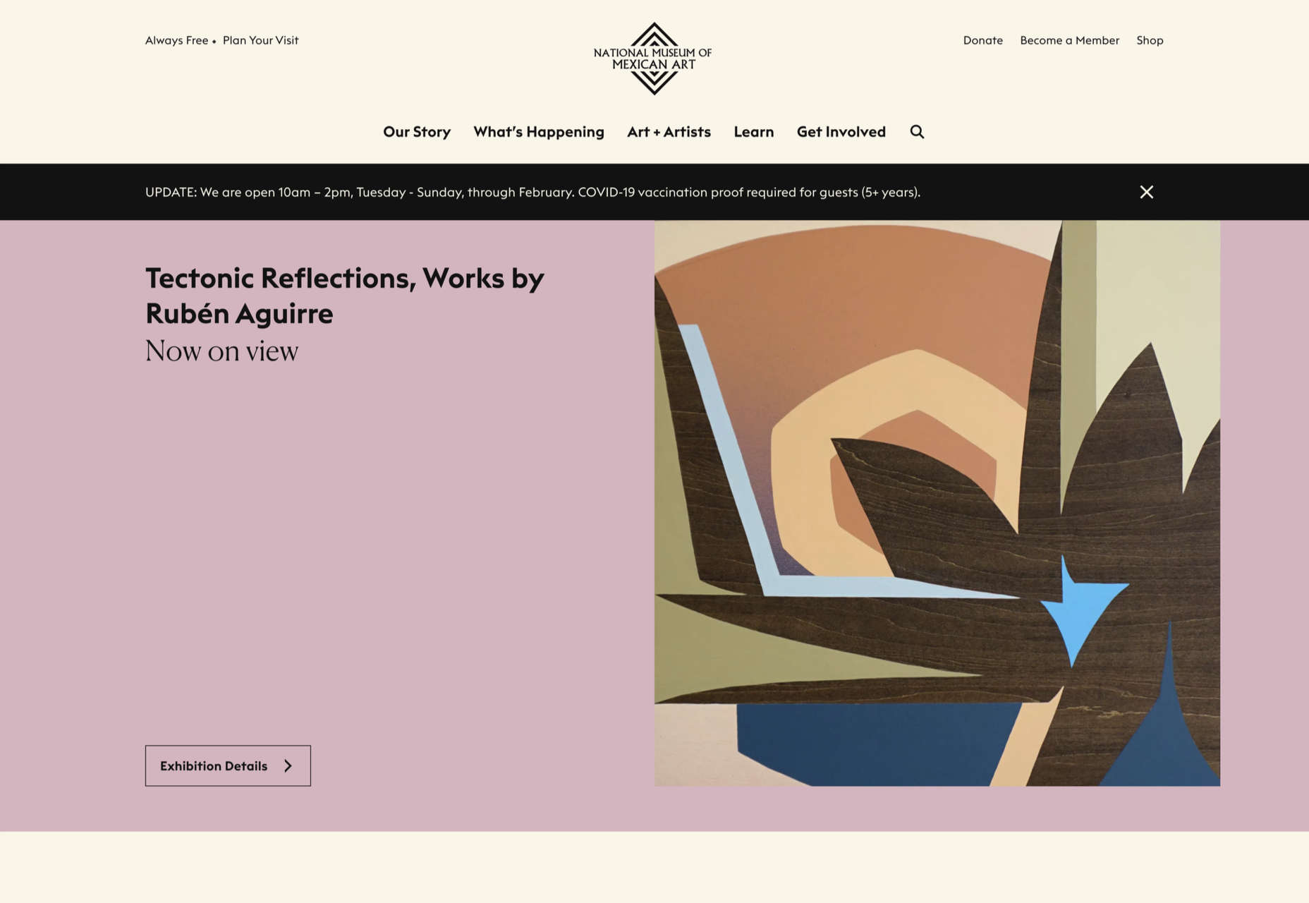
A color scheme of warm, earthy tones and a carefully thought-out type pairing create an inviting presence for the National Museum of Mexican Art.
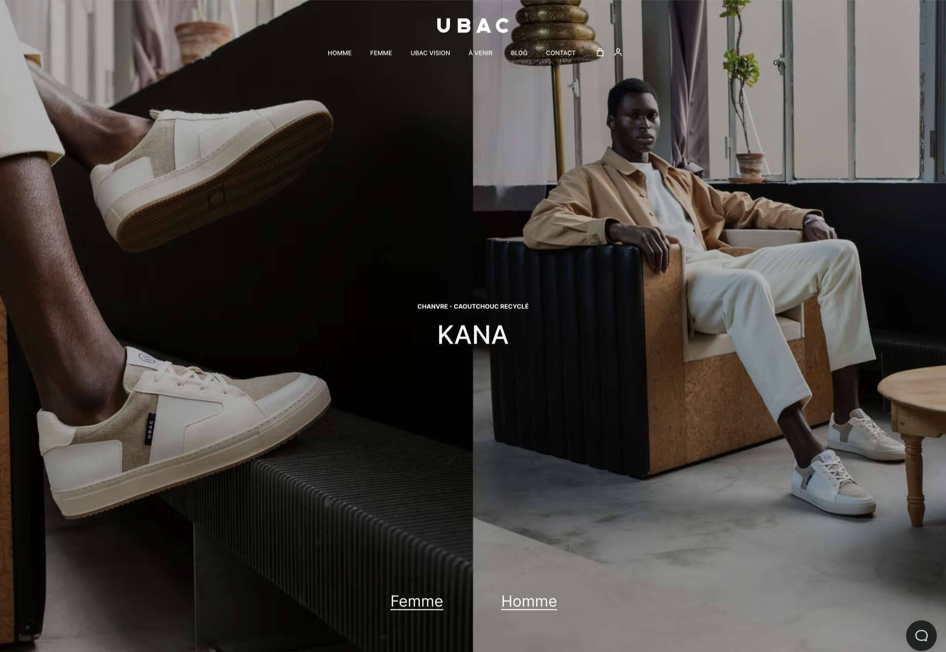
This site for Ubac trainers feels clean and modern with some nice and mostly functional, scroll-activated animation.
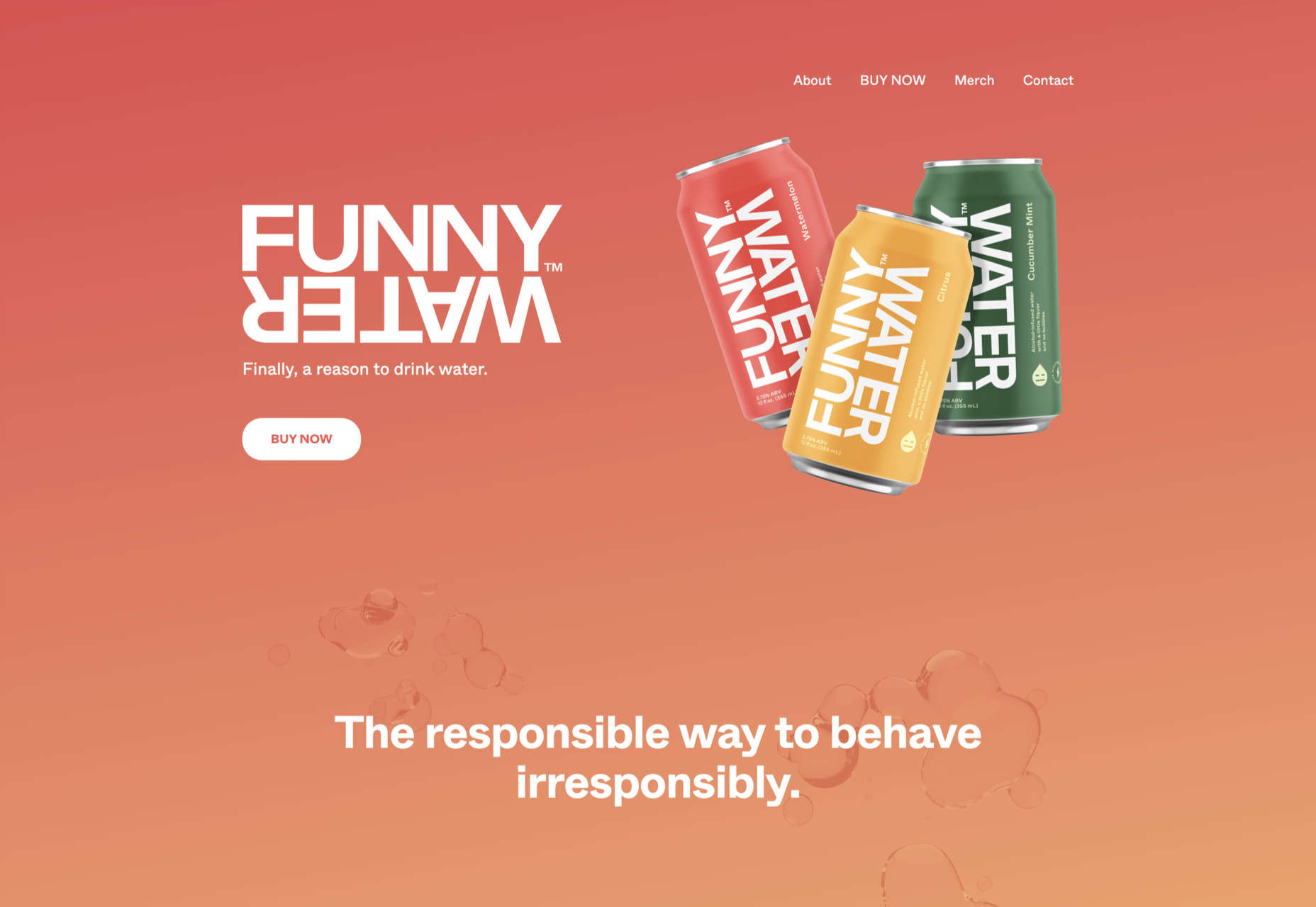
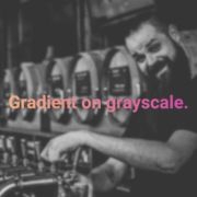
The background gradient is really nicely done on Funny Water’s otherwise very minimal site.
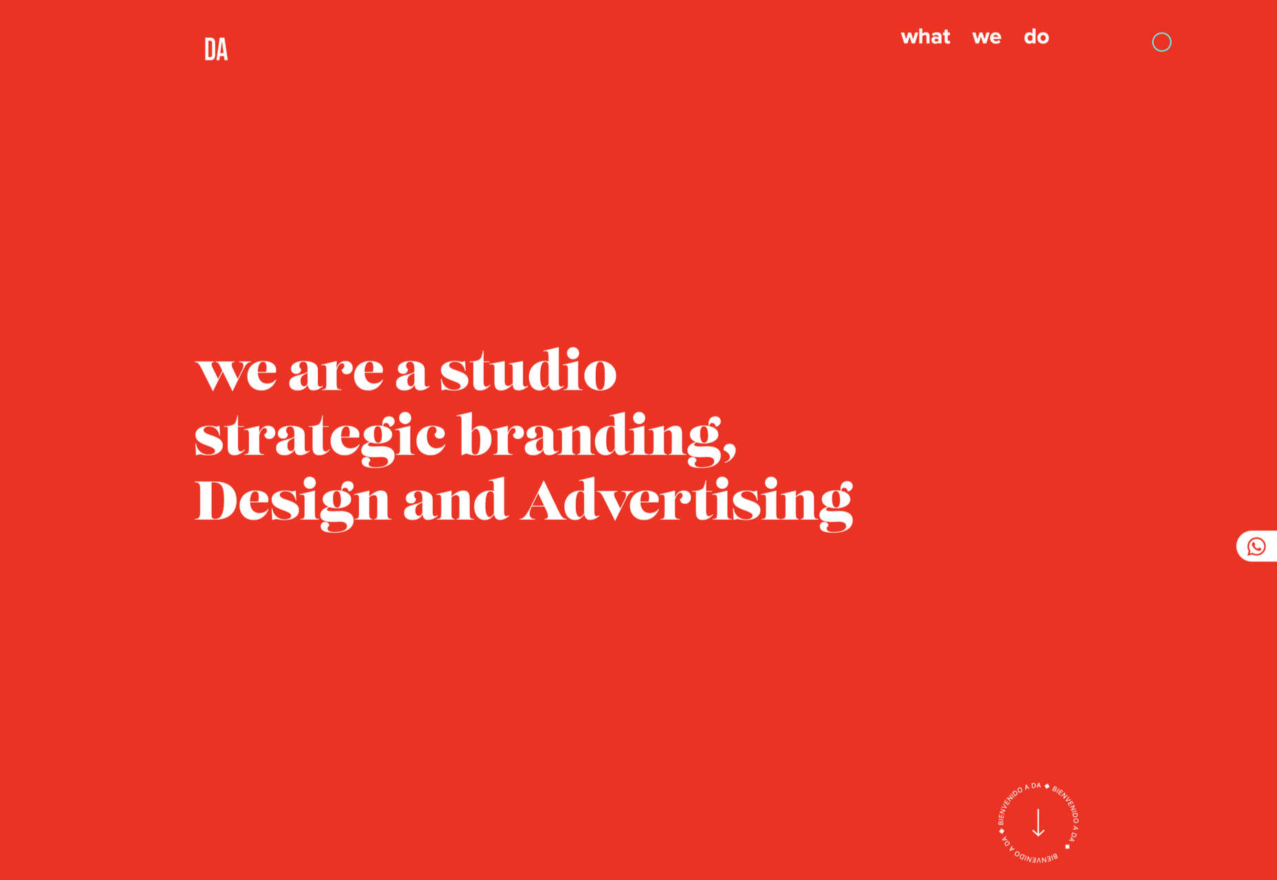
DA is a strategic branding, design, and advertising studio, and this site is a good, polished example of a site for such an agency. What stands out is the clever menu text.
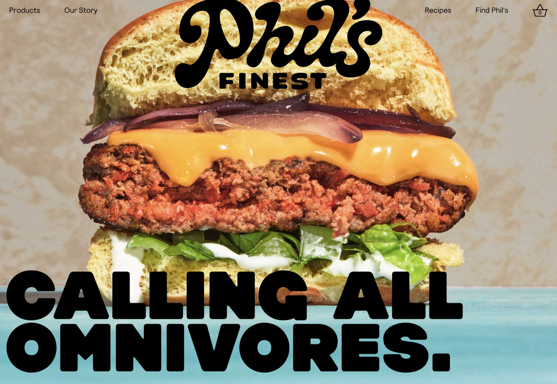
Phil’s Finest makes good use of color, oversized type, and occasional illustration mixed in among the well-styled photography.
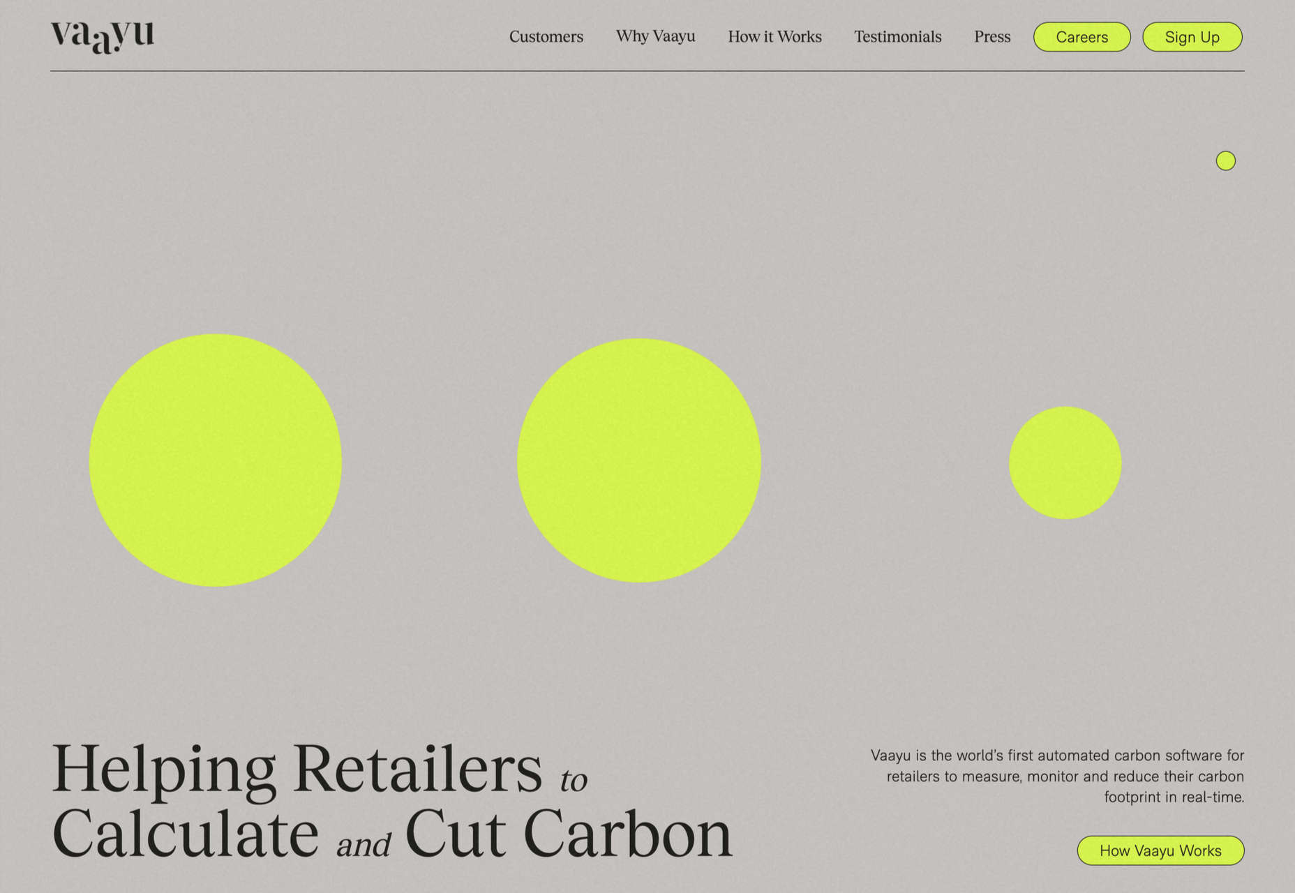
Grey and black are enlivened by neon yellow in Vaayu’s minimalist, single-page presentation.
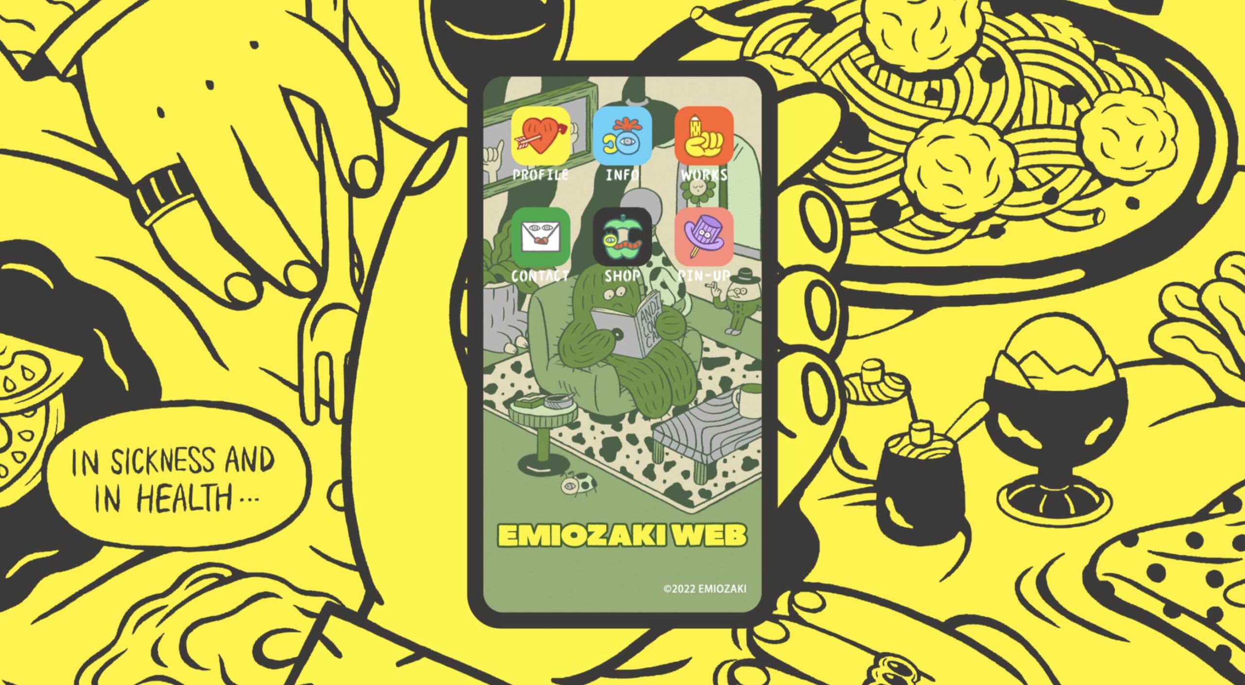
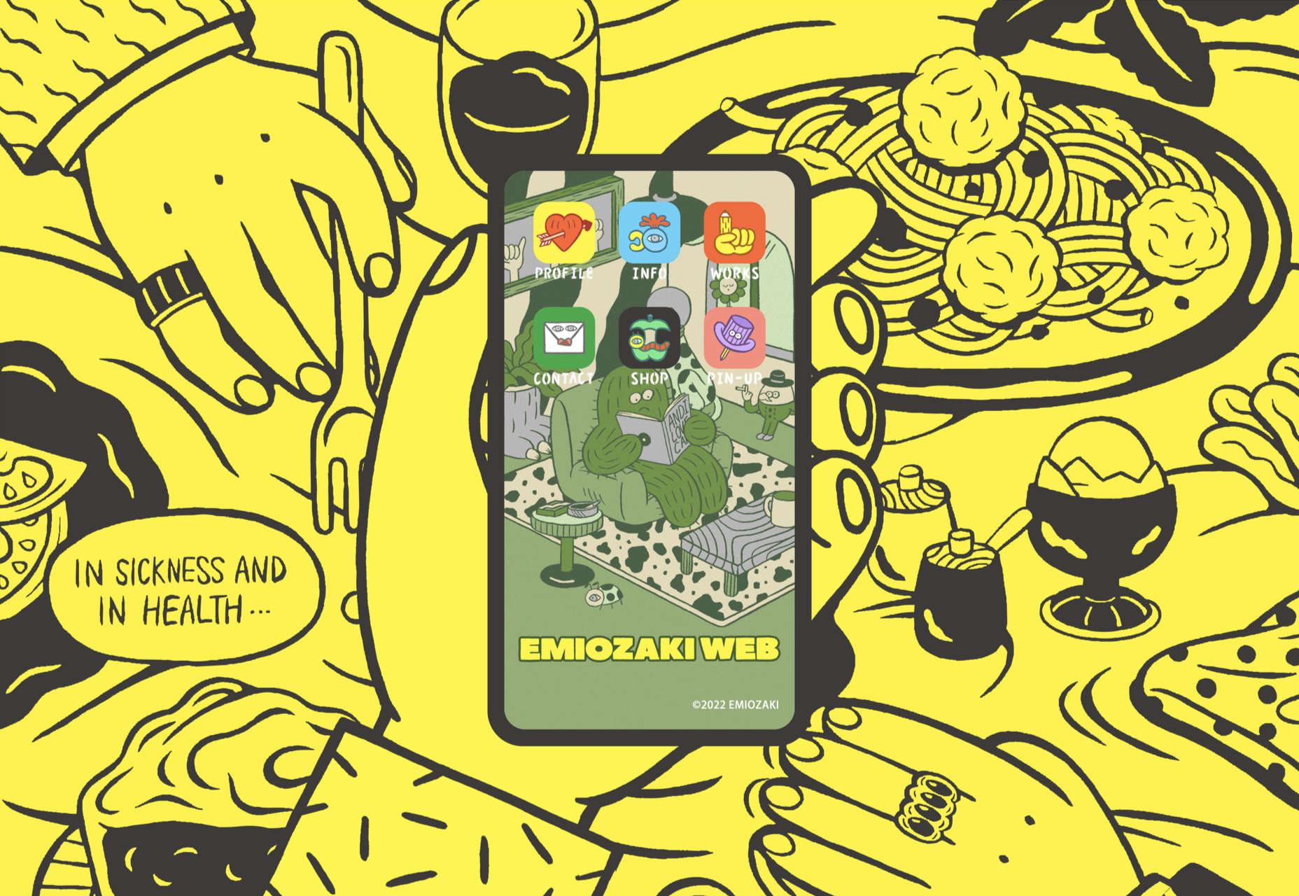
Artist and illustrator Emi Ozaki has created a stylized phone interface for her portfolio site, which showcases her illustration aesthetic.
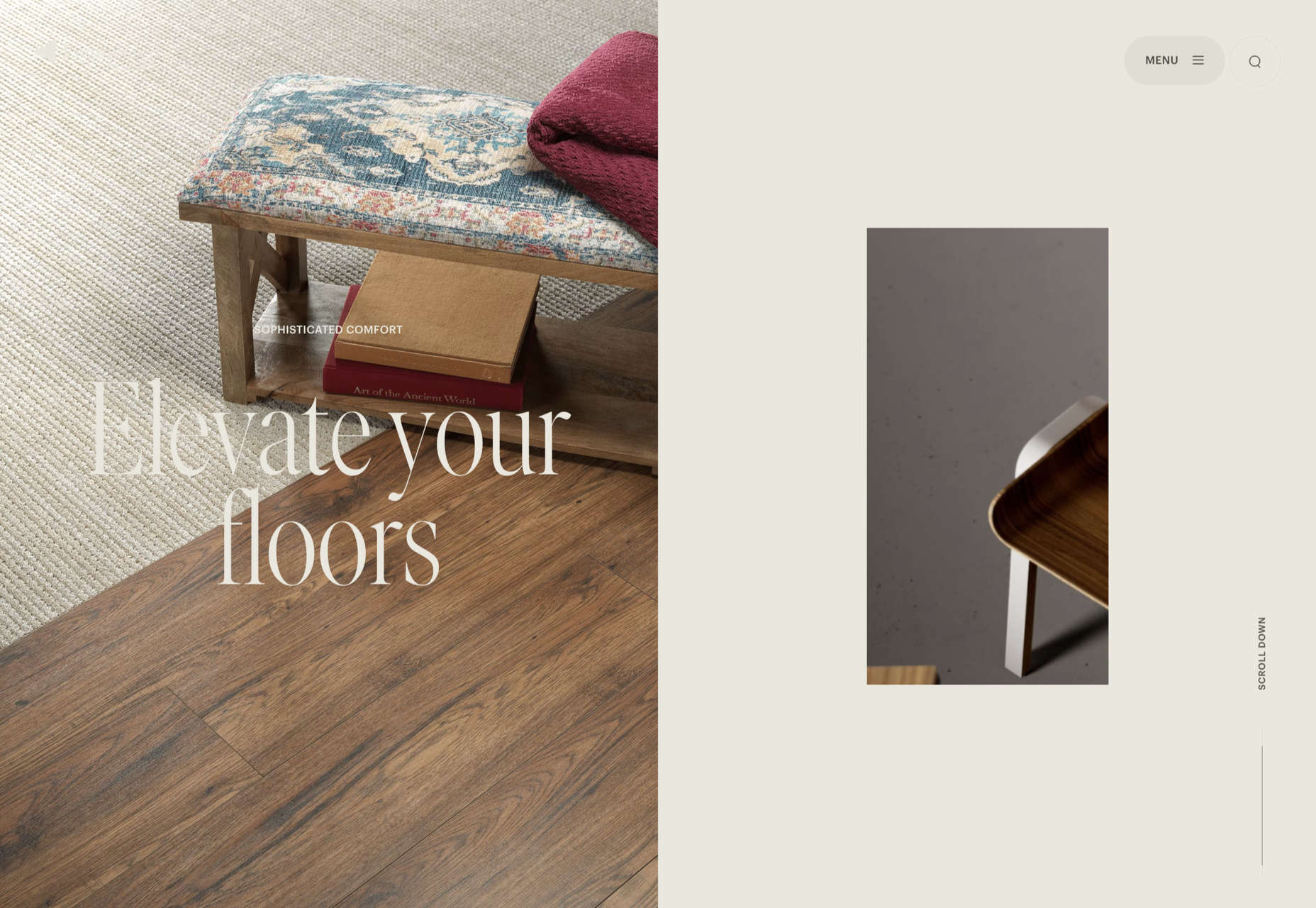
The home page scrolling is the centerpiece of Engineered Floors’ site, and it works especially well on mobile.
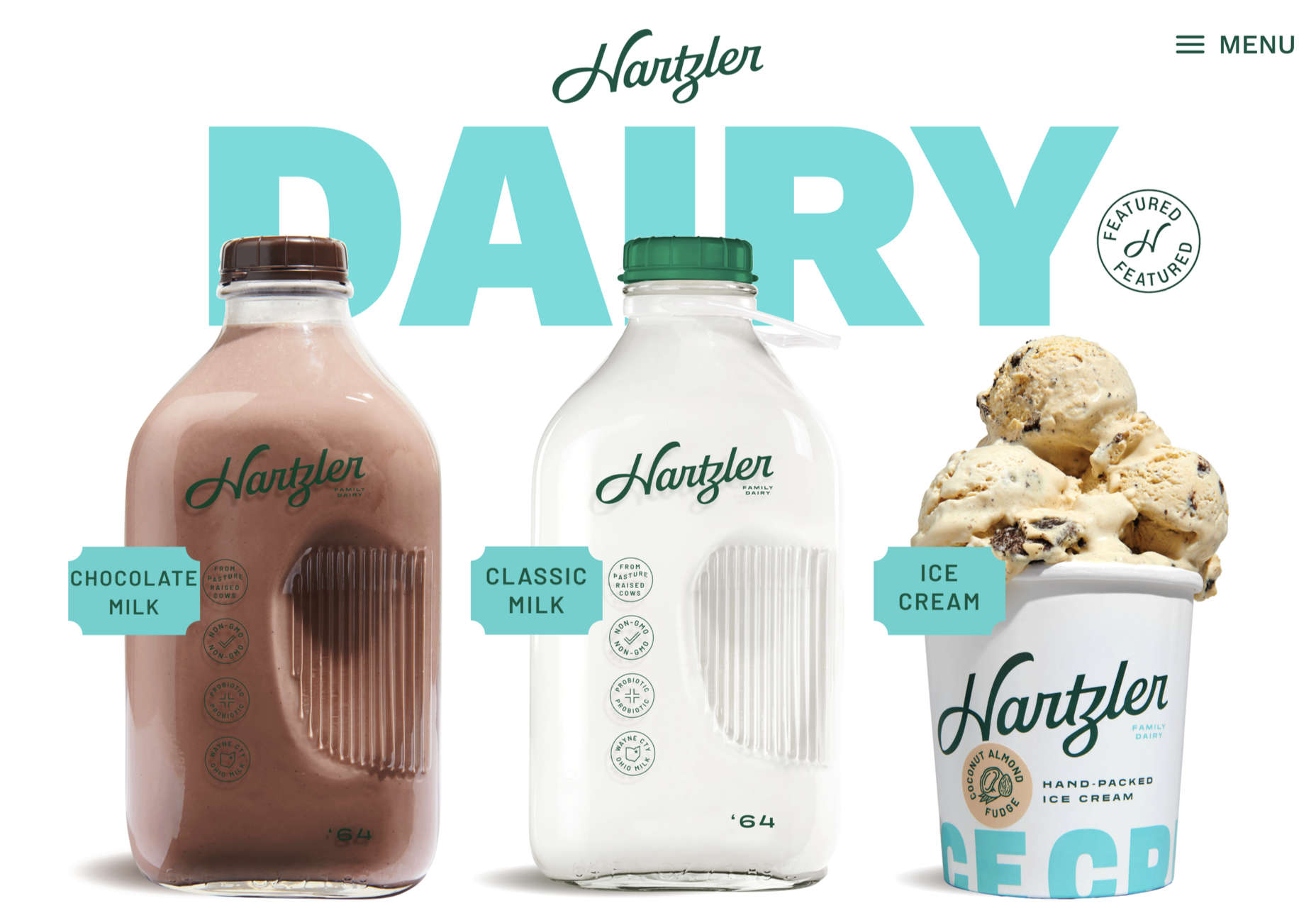
Hartzler Dairy goes for a nostalgic feel to match the company’s classic mid-20th century style branding.
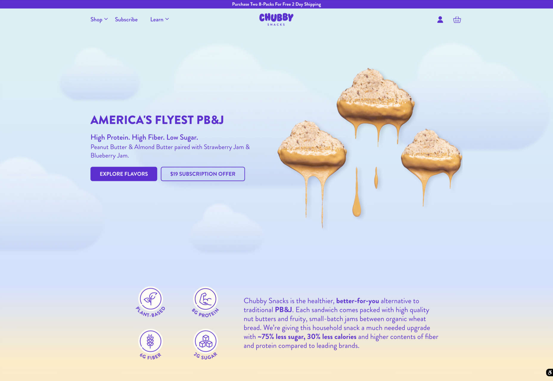
Chubby Snacks is PB&J in your pocket; it sells itself! Having said that, the site is pretty appealing in its own right.
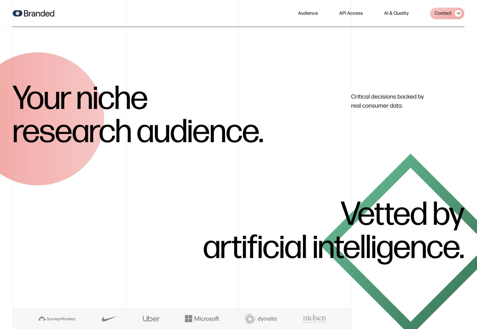
Market research company Branded goes down the flat design road for this site, which could feel a little dated but actually works quite nicely here.
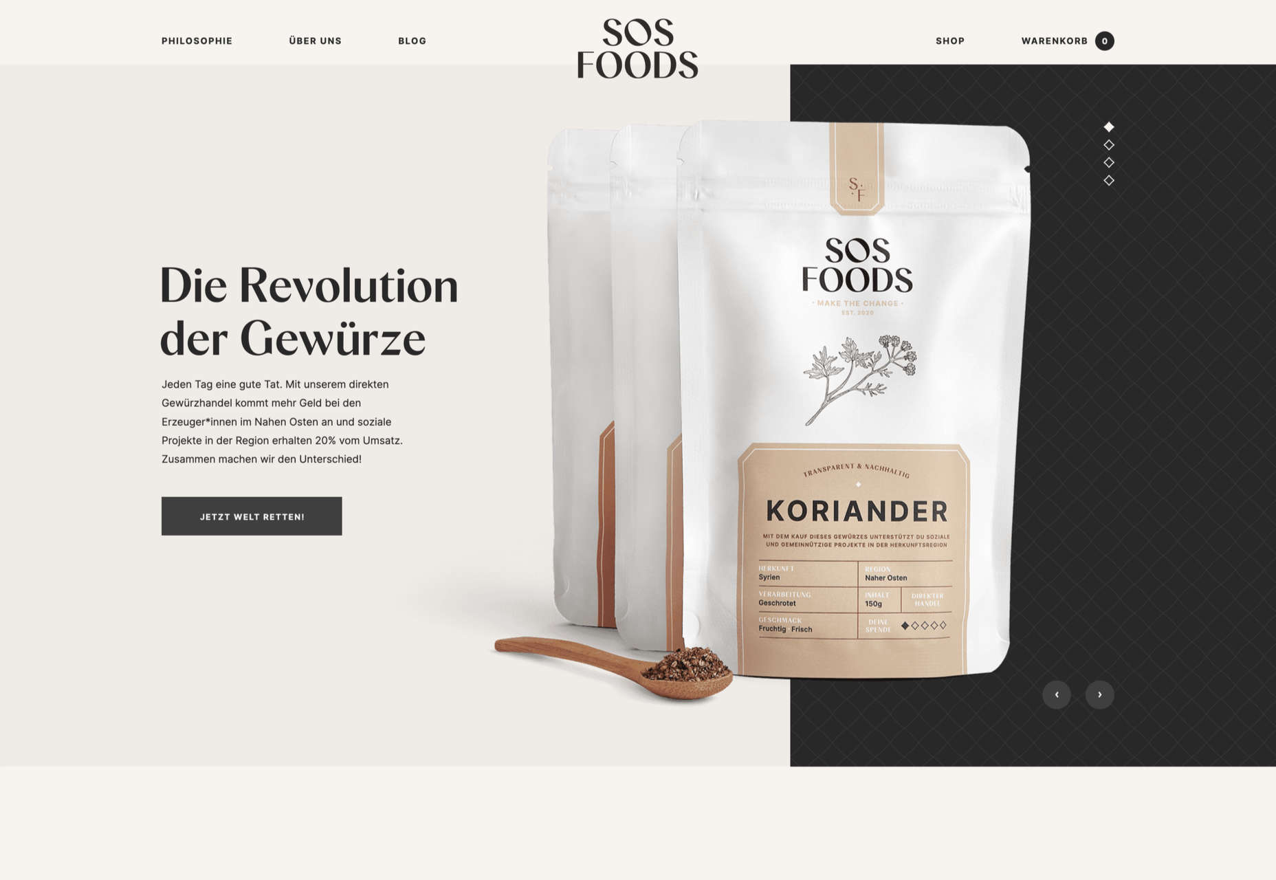
SOS Foods is an excellent example of a responsible/sustainable goods site, with a design aesthetic aimed at the ethical consumer.
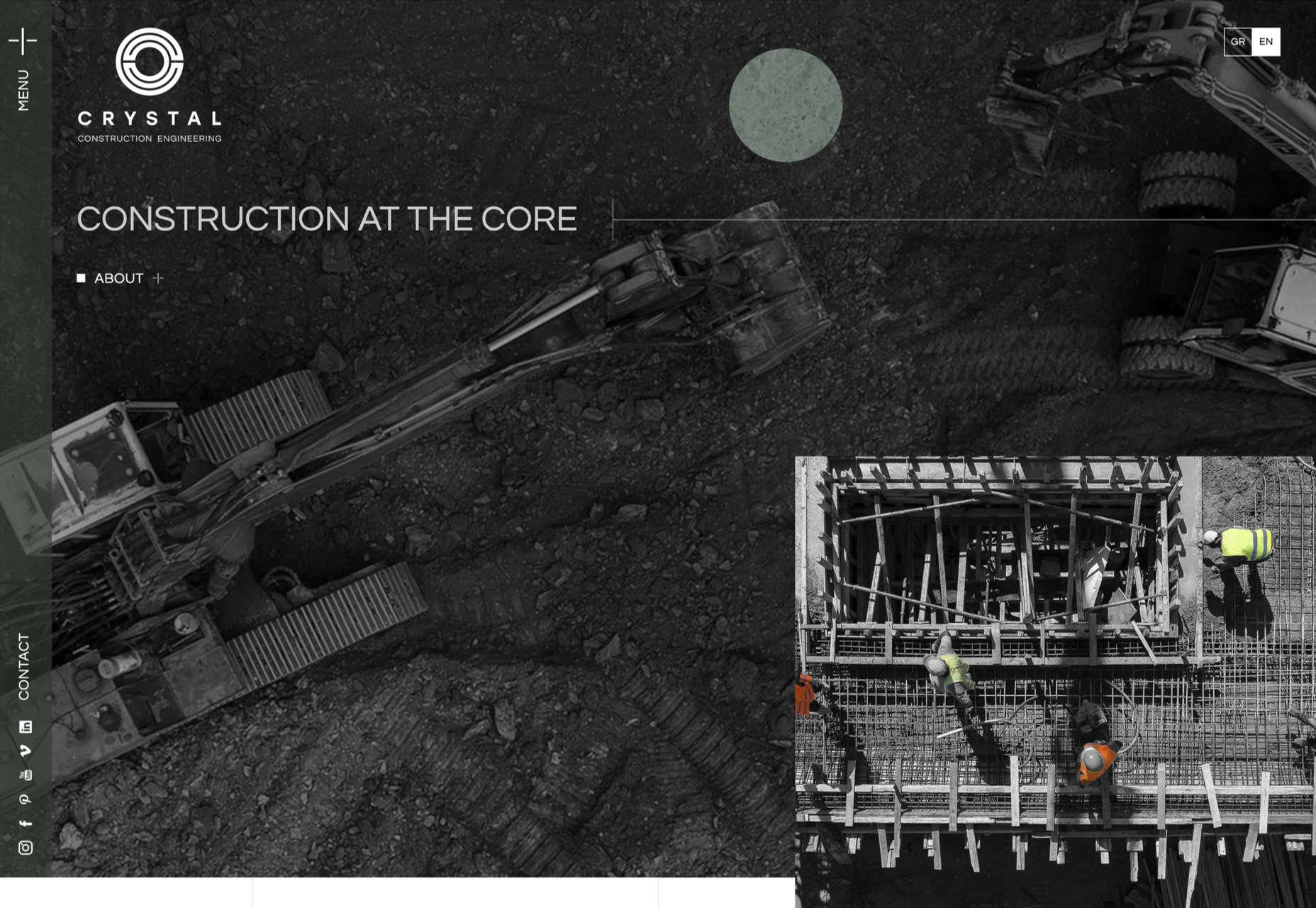
Some nice use of masonry-style layout and overlapping elements create space, but also a pleasing flow in this site for Crystal Construction Engineering.
The post 20 Best New Websites, February 2022 first appeared on Webdesigner Depot.
 Every day design fans submit incredible industry stories to our sister site, Webdesigner News. Our colleagues sift through it, selecting the very best stories from the design, UX, tech, and development worlds and posting them live on the site.
The best way to keep up with the most important stories for web professionals is to subscribe to Webdesigner News or check out the site regularly. However, in case you missed a day this week, here’s a handy compilation of the top curated stories from the last seven days. Enjoy!”

The post Popular Design News of the Week: February 7, 2022 – February 13, 2022 first appeared on Webdesigner Depot.
 Are you looking for a unique font that will make your next project shine? Or maybe you need a typeface with a beautiful design and rich history behind it. Luckily, mini-sites for fonts allow us to creatively explore a font’s origins and history. We know (from our own experience) how important it is for UI and UX designers to have a variety of fonts for our designs.
Now that 2022 is here, it’s time to expand our font collection. That’s why, after extensive research, we have created the ultimate list of the best 16 creative mini websites for fonts.
Are you ready to take a look at the most creative, cute, and fun font websites available on the market?
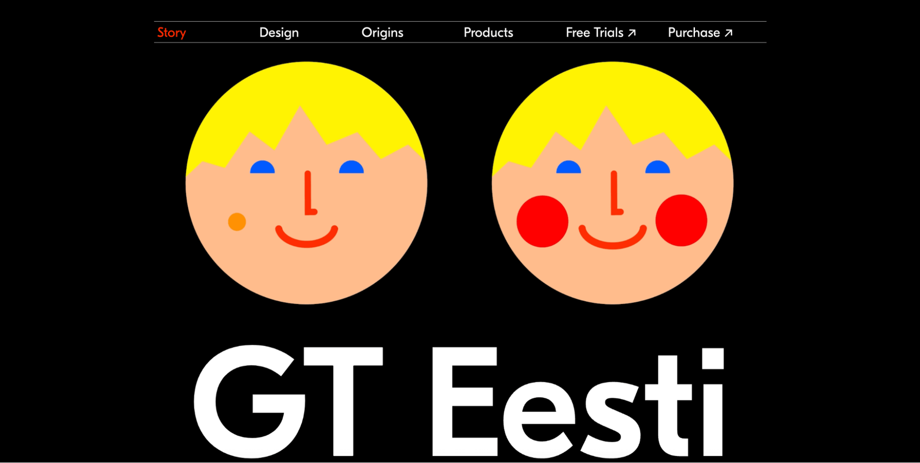
This website is about the history of one of the most popular fonts on the market, GT Eesti. As you will notice, the typeface has a long history (more than 80 years) and was recently reborn in Switzerland.
As for the font, GT Eesti is a flexible geometric sans serif that can be used in almost any project. As one of the most creative websites for fonts, full of animations and interesting information, GT Eesti quickly made it onto our list.
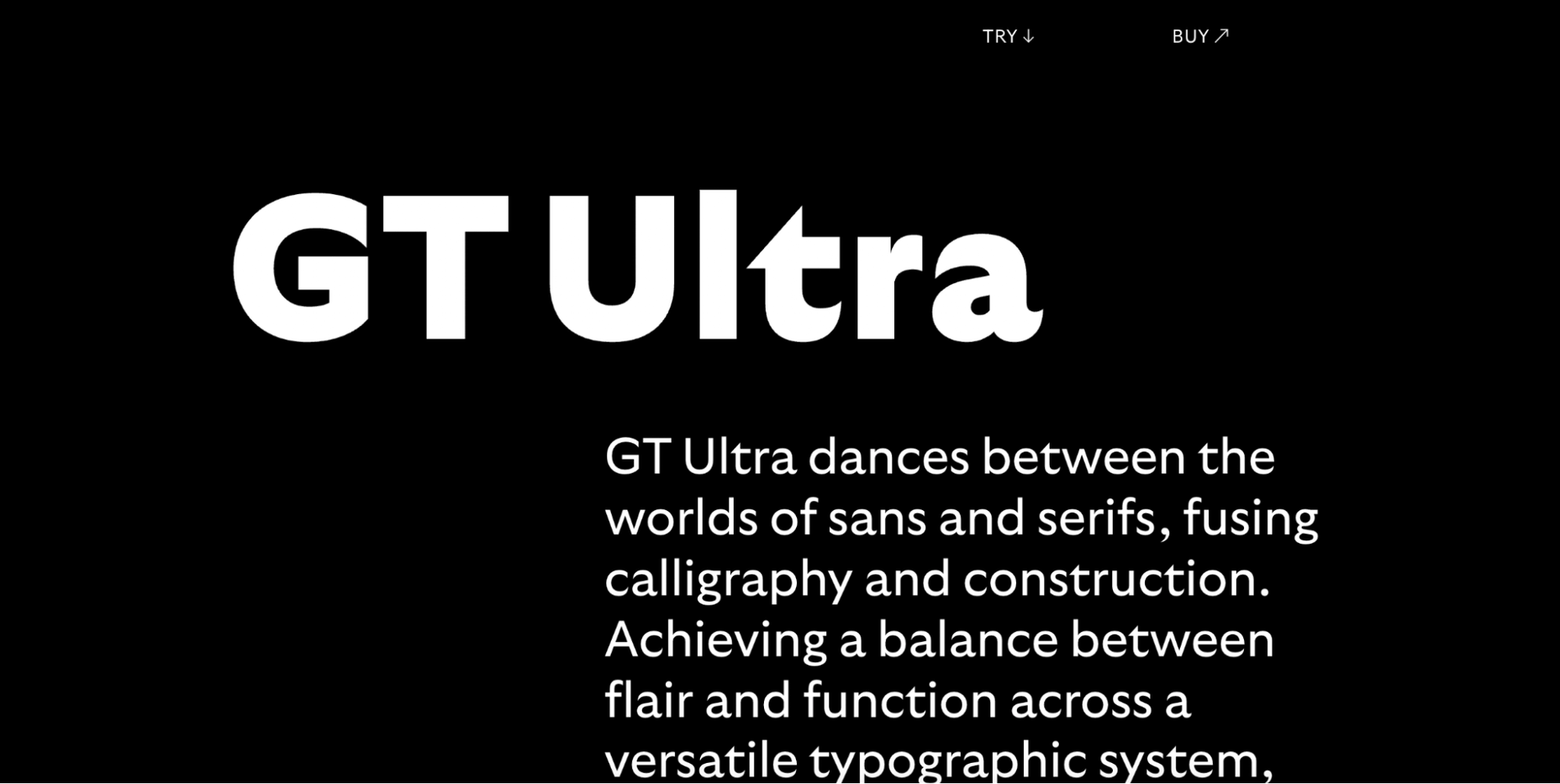
Are you looking for a font that combines calligraphy and elegance and sits between the sans and serif styles?
Then GT Ultra is just what you need. We loved how the creator tells the story and structure of Ultra with beautiful animations on this unique, one-page website.
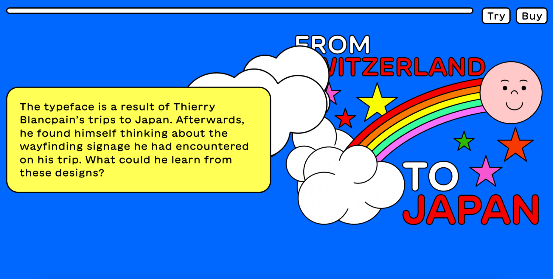
Maru is by far the cutest design on this list. The website is a vertical narrative of the typeface’s history.
The typeface was inspired by the designer’s travels to Japan, and the mini-site fully reflects that. Best of all, Maru also includes a great collection of cute emojis and stickers.
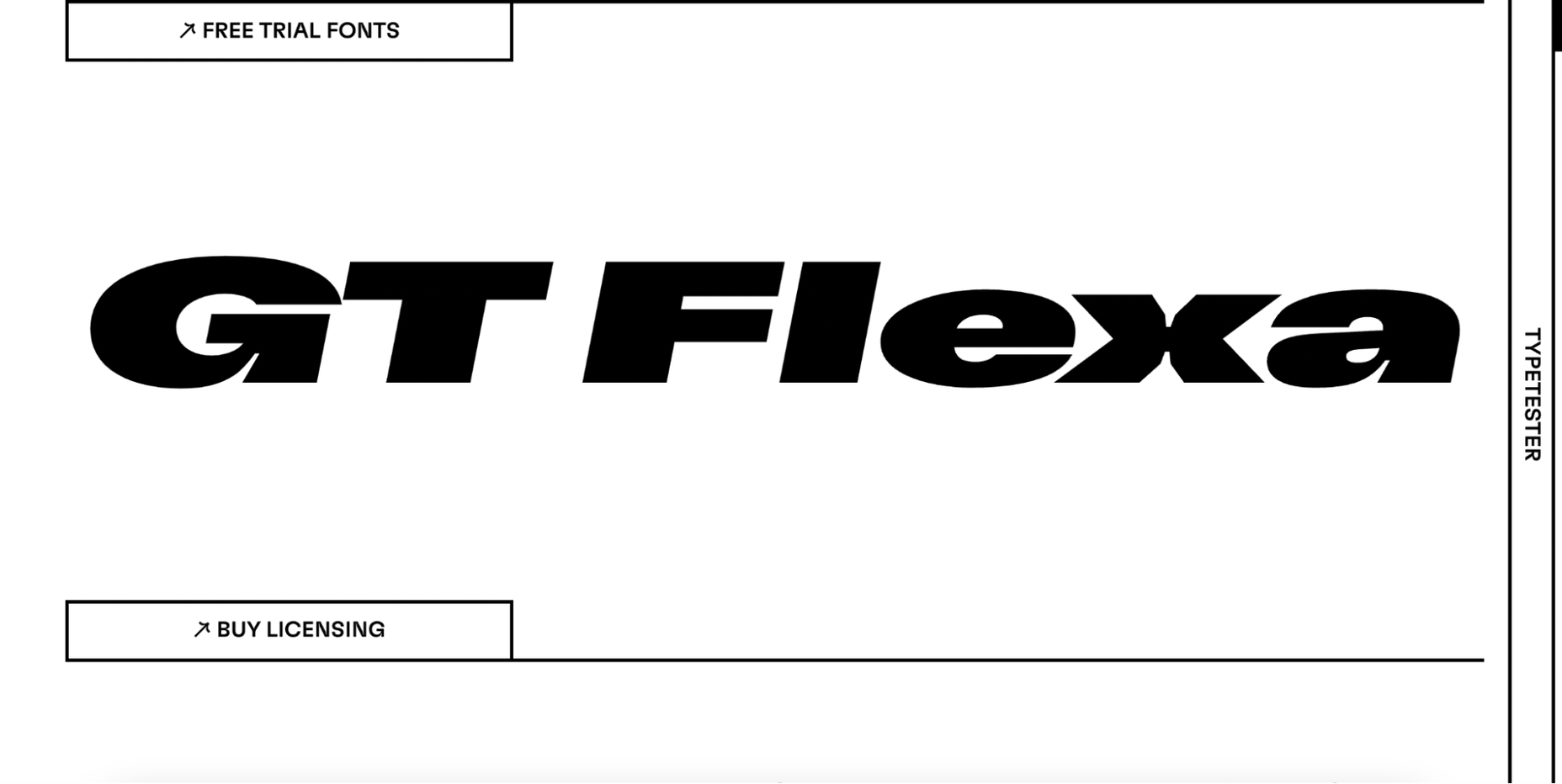
GT Flexa is a very flexible font that you can easily use for a responsive UI design. We enjoyed navigating through the minimalist mini-site and exploring the creation and history of Flexa.
Flexa also offers a free trial that allows you to try the font before you buy.
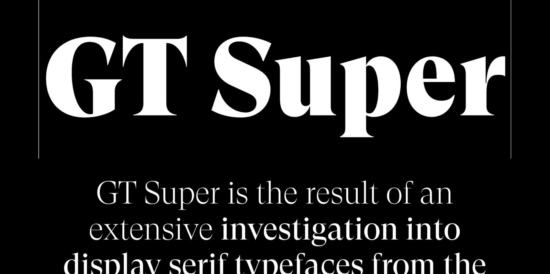
Super’s mini-site reminded us of earlier decades. GT Super is a vintage typeface inspired by the serif fonts of the 70s and 80s.
Therefore, it can beautifully frame nostalgic designs. The font was designed by Noel Leu and is available in two styles (text and display).
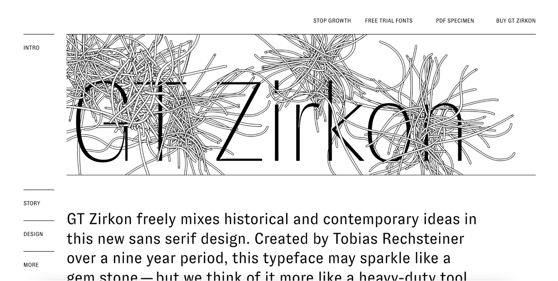
GT Zircon is located in a place where creativity meets minimalism. This is one of our favorite mini-sites for fonts.
The site showcases Zirkon’s history and design process through creative graphics, videos, and animations.
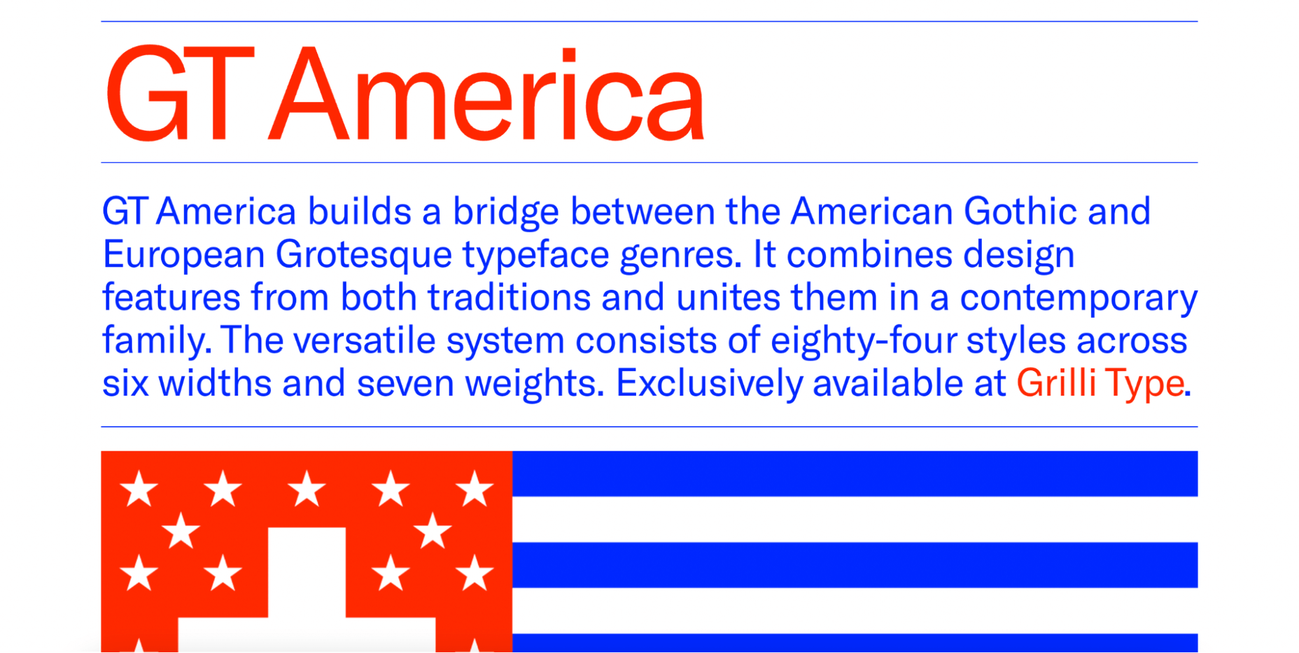
This mini-site allows you to explore the history, style, and character overview of GT America, a contemporary font family.
The designer has used elements from American Gothic and European Grotesque to create one of the most flexible typefaces available.
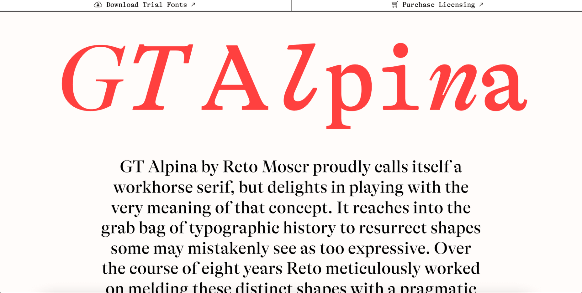
Reto Moser recently designed one of the most popular GT typefaces, the Alpina “Workhorse” serif.
This innovative, one-page website tells us the story of Alpina and explains how the designer jazzed up, posed, and flexed the classic book typography to create a wide range of typeface variations.
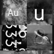
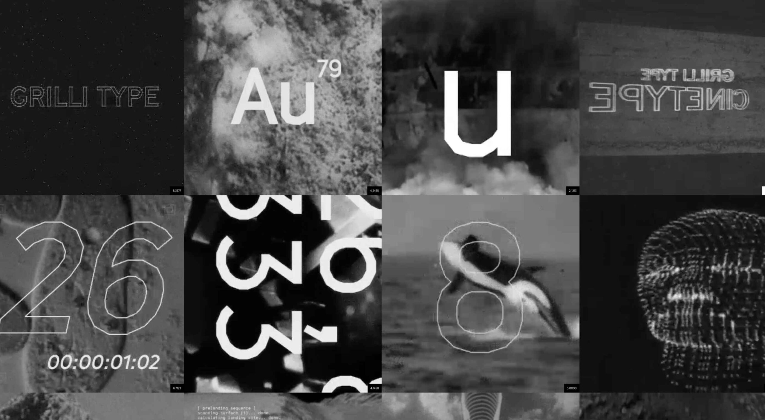
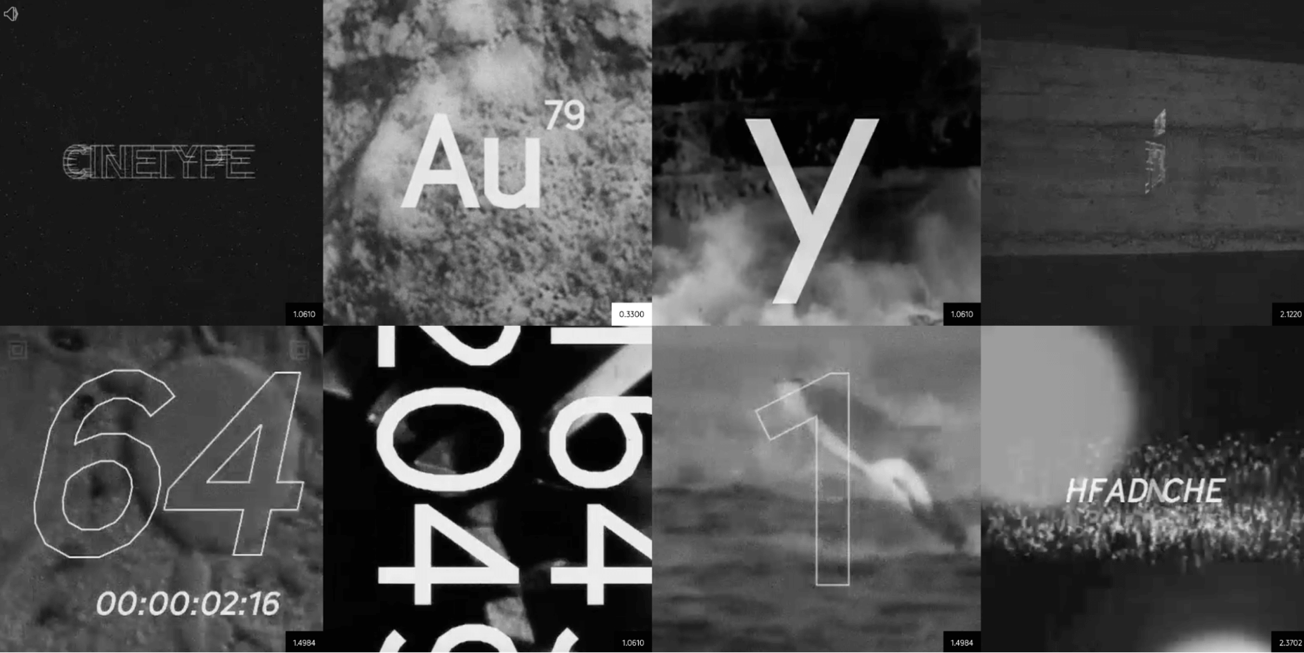
As the name suggests, this mini-site is inspired by classic cinematic movie reels. If you’re looking for a font inspired by the fascinating world of cinemas, Cinetype is simply the best choice. And on this creative website, you will learn all the reasons why.
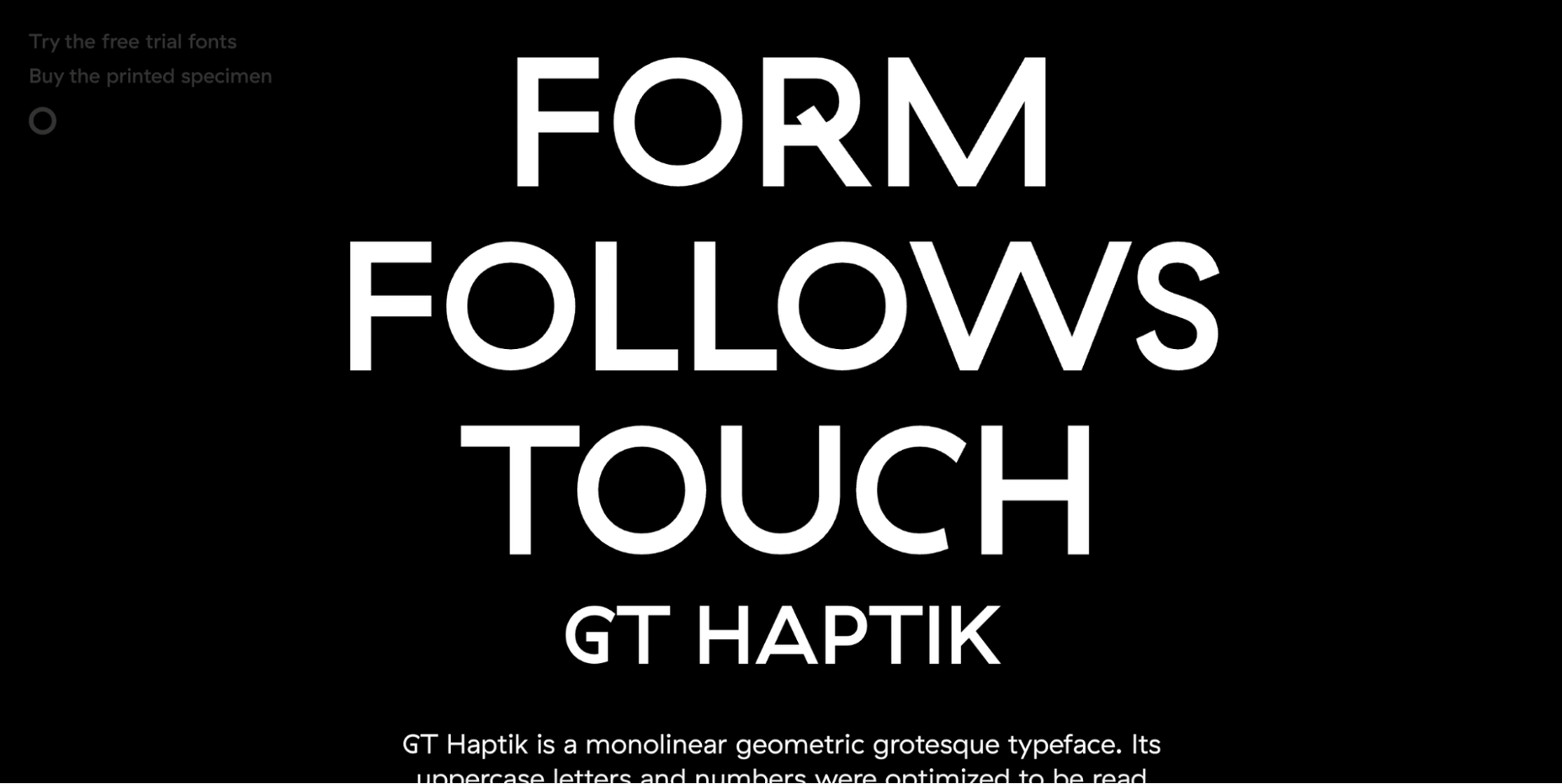
When it comes to monolinear geometric typefaces, Haptik is one of the best. This innovative mini-website tells how the Haptik font came to be and highlights the history of the font.
The hand gesture gifs at the bottom of this one-page site are some of the most creative mini-videos we have seen in a long time.
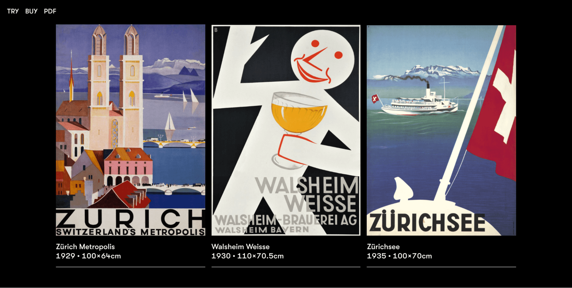
Walsheim is a typeface designed by Noel Leu. This mini-site explains how the designer was inspired by the fascinating poster designs of Otto Baumberger, a successful Swiss painter of the 20th century (1889-1961). If you like fonts with a deep backstory, Walsheim is a must-have for you.
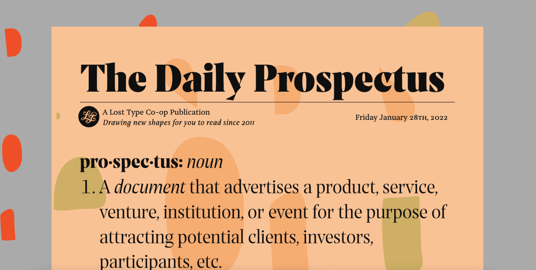
The Prospectus mini-site is specially designed to look like a newspaper. And let us say: the result is extraordinary.
This one-page website explores the origins, construction phase, and classifieds of the Prospectus typeface, allowing us to experiment in real-time with the weight, height, tracking, and size of the typeface.
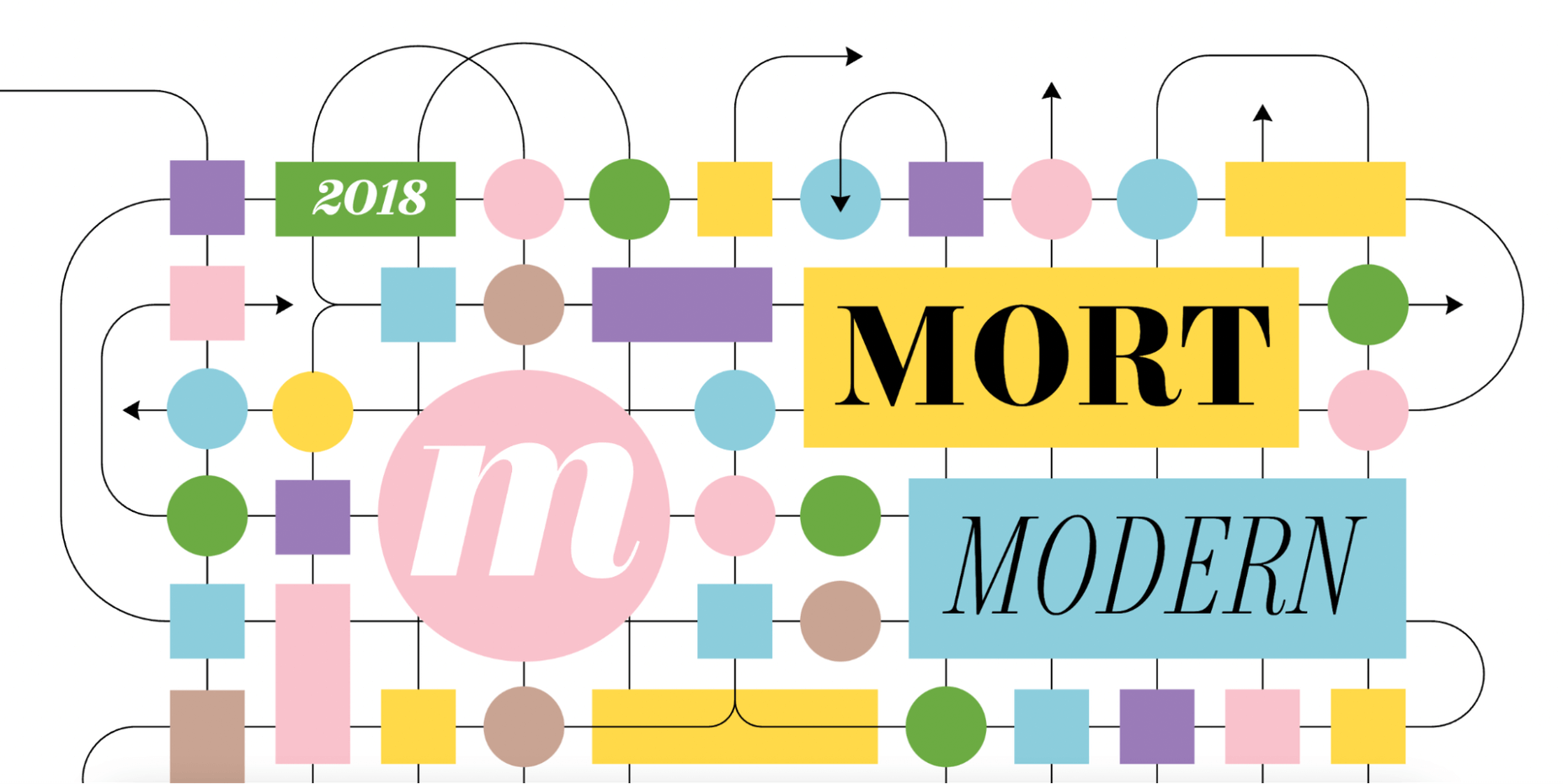
Mort Modern is a unique serif typeface designed by Riley Cran in 2018. The mini-site provides information about the typeface in a creative, cartoon-like way.
We really liked this responsive, one-page website because it is elegant and colorful at the same time. The font is available in 56 (!) styles and promises to beautifully frame any kind of modern design.
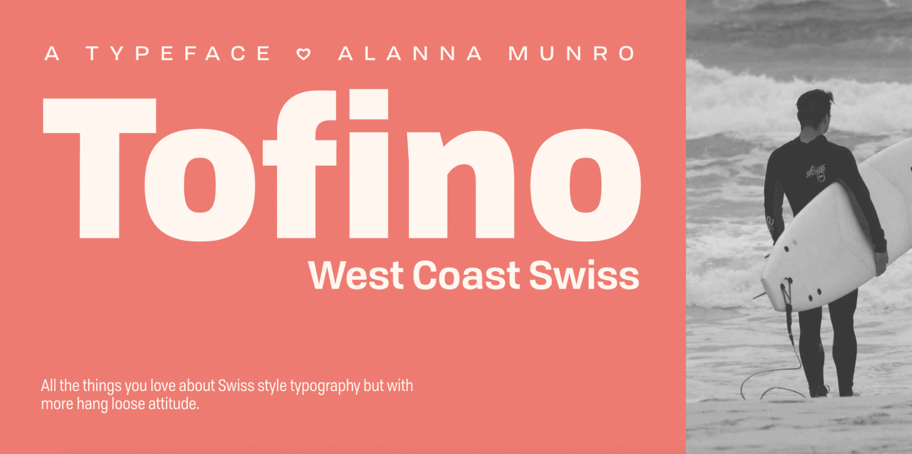
The Tofino mini-site is a creative, one-page portal that allows us to discover one of the most adventurous Swiss-style fonts on the market.
Tofino is a top choice for any travel-related project and comes in 75 unique styles. When it comes to creating a well-crafted report on a font, there’s nothing better than this.
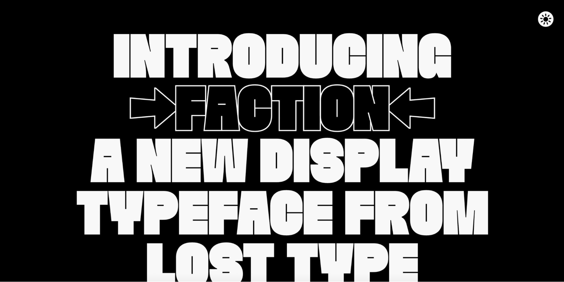
We love websites that offer both a dark and light theme. And the Faction mini-site is one of them.
In this mini-site, you’ll learn how the Faction typeface was created and why it’s one of the most popular display typefaces for modern designs.
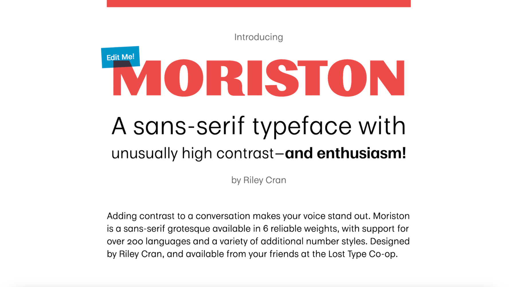
If you’re looking for a unique sans serif font with extended multilingual support, Moriston is the font for you.
In this one-page mini-site, Riley Cran tells the story behind this typeface and explains why Moriston is the best choice for Risograph posters, monograms, and more.
The post 16 Best Typeface Micro-Sites first appeared on Webdesigner Depot.
WordPress is by far the world’s most popular CMS. Not only does it dominate the CMS market with a 64% market share, but it also powers 39.6% of all websites. It has taken the internet by storm by democratizing the web for all. Now, anyone can build, manage, and host a successful website without needing a college degree or coding expertise.
However, while WordPress is great at managing many technical aspects, it still can’t do everything for you. Built mostly on PHP, there are often concerns regarding how performant WordPress is. And, with performance impacting everything from bounce rates to SEO rankings to conversions, it’s something that should be on your radar too.
If you don’t know it yet, images are one of the main causes of slow-loading websites. In recent years, WordPress has stepped up its efforts to try and help users with image optimization out-of-the-box.
Still, as we’ll show, it’s not a total solution, and there is still plenty you can do to deliver better experiences on your WordPress website through image optimization.
Simply put, image optimization is anything you do to make images load faster on your website pages. Almost all websites that use images can benefit from some form of image optimization, even those using WordPress.
Well, performance is a hugely significant factor when it comes to the competitiveness of your website today.
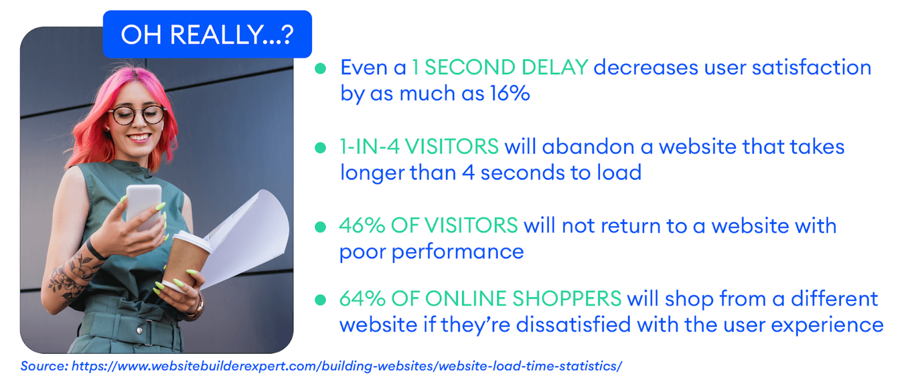
Google has also made performance an increasingly important factor when it comes to SEO rankings. In fact, performance is a direct ranking signal that carries significant weight.
Google’s Page Experience Update that went live in 2021 has been the biggest move in that direction yet. Soon, Google might even use visual indicators in SERP results to distinguish high-performing websites from the rest.
In Google’s own words, “These signals measure how users perceive the experience of interacting with a web page and contribute to our ongoing work to ensure people get the most helpful and enjoyable experiences from the web.”
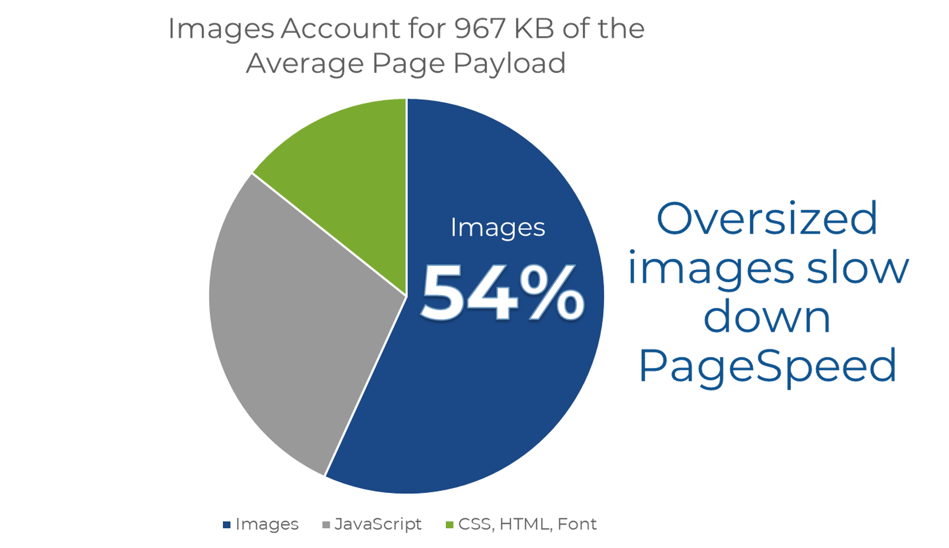
According to Google, images are the largest contributor to page weight. Google has also singled out image optimization specifically as the factor with the most untapped potential for performance optimization.
This problem isn’t going away soon. According to data by the HTTP Archive, there are roughly 967.5 KB bytes of image data on desktop web pages and 866.3 KB of image data on mobile pages. This is an increase of 16.1% and 38.8%, respectively, over the last five years.
Thanks to popular e-commerce tools like Woocommerce, it’s estimated that up to 28% of all online sales happen on WordPress websites.
And don’t forget, images are both a key part of conveying information to the user and integral to the design of your website. If they take significantly longer to load than your text, for example, it will negatively impact the user experience in a variety of ways.
In summary, optimized images help your WordPress website by:
WordPress is so popular because it’s a CMS (content management system) that allows anyone to build, design, and manage a website without any coding or advanced technical experience. Advanced features can be installed with just a few clicks, thanks to plugins, and you rarely have to touch the code behind your website unless you want to make some unique modifications.
In short, using a CMS like WordPress shields you from many of the day-to-day technicalities of running a website.
As we mentioned, one of the main reasons WordPress is so popular is because it takes care of many of the technical aspects of running a website. With that in mind, many think that WordPress should also automatically take care of image optimization without them having to get involved at all.
Unfortunately, that’s not really the case.
True, WordPress does offer some built-in image optimization. Whenever you upload an image to WordPress, it currently compresses the quality to about 82% of the original (since v4.5).
In v4.4, WordPress also introduced responsive image syntax using the srcset attribute. This creates four breakpoints for each image you upload according to the default WordPress image sizes:
Here you can see an example of the actual responsive syntax code generated by WordPress:
<img loading="lazy" src="https://bleedingcosmos.com/wp-content/uploads/2021/12/33-1024x683.jpg" alt="" class="wp-image-9" width="610" height="406" srcset="https://bleedingcosmos.com/wp-content/uploads/2021/12/33-1024x683.jpg 1024w, https://bleedingcosmos.com/wp-content/uploads/2021/12/33-300x200.jpg 300w, https://bleedingcosmos.com/wp-content/uploads/2021/12/33-768x512.jpg 768w, https://bleedingcosmos.com/wp-content/uploads/2021/12/33-1536x1024.jpg 1536w" sizes="(max-width: 610px) 100vw, 610px">
Depending on the screen size of the device from which a user visits your webpage, WordPress will let the browser pick the most appropriately sized image. For example, the smallest version for mobile displays or the largest for 4K Retina screens, like those of a Mac.
While this may seem impressive, it’s only a fraction of what can be achieved using a proper image optimization solution, as we’ll show later.
Lastly, WordPress implemented HTML native default lazy loading for all images starting with version 5.5.
So, in short, WordPress offers the following image optimization capabilities baked-in:
There are other issues many have with both the implementation of image compression and responsive syntax as it’s used by WordPress. This leads to some users even purposefully deactivating WordPress’ built-in image optimization so they can fully take control of it themselves.
Here are some of the reasons why:
Another important optimization feature that WordPress does not have is auto-conversion to next-gen image file formats. Different image formats offer different performance benefits on different devices. Some formats also enable higher levels of compression while maintaining visual fidelity.
Next-gen formats like WebP, AVIF, and JPEG-2000 are considered to be the most optimal formats on compatible devices. For example, until recently, WebP would be the optimal choice on Chrome browsers, while JPEG-4000 would be optimal on Safari browsers.
However, WordPress will simply serve images in the same formats in which they were originally uploaded to all visitors.
As the undisputed king of search engines, we’ll base most of our performance metrics on guidelines established by Google.
Along with its various performance updates, Google has released a number of guidelines for developers as well as the tools to test and improve their websites according to said guidelines.
Google introduced Core Web Vitals as the primary metrics for measuring a web page’s performance and its effect on the user experience. Thus, Core Web Vitals are referred to as “user-centric performance metrics.” They are an attempt to give developers a testable and quantifiable way to measure an elusive and abstract concept such as “user experience.”
Combined with a number of other factors, Core Web Vitals constitute a major part of the overall page experience signal:
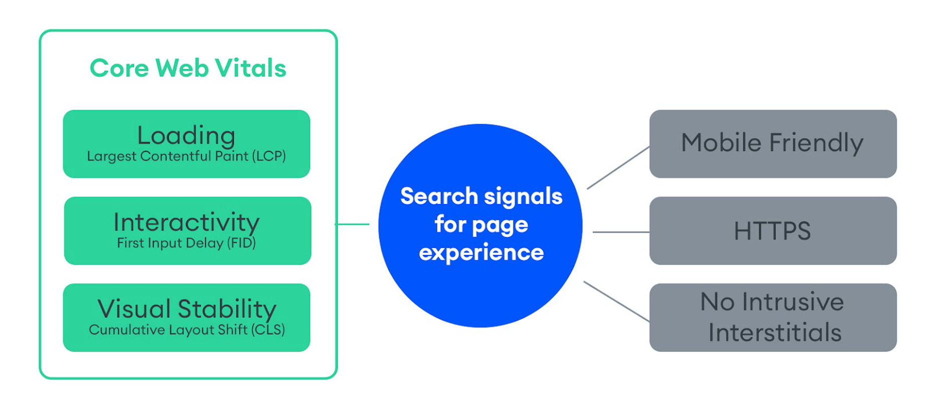
You can find a complete introduction to Core Web Vitals here. However, they currently consist of three main metrics:
Here is an illustration of how these metrics are scored:
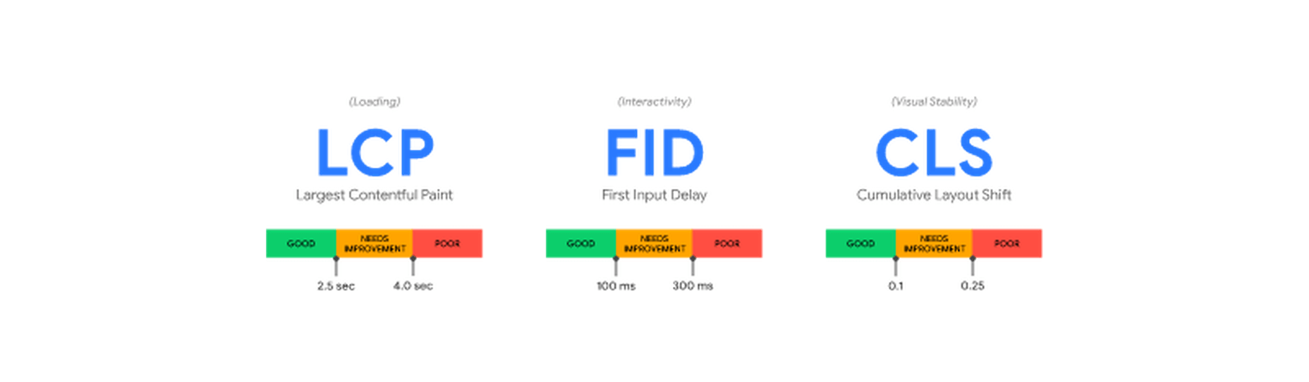
While these are the three most important metrics to optimize, they are not the only ones. Google still measures other metrics like the FCP (First Contentful Paint), SI (Speed Index), as well as the TTFB (Time to First Byte), TBT (Total Blocking Time), and TTI (Time to Interactive).
A number of these metrics are directly affected by the images used on your web pages. For example, LCP, FCP, and SI are direct indicators of how fast the content of your web page loads and depends on the overall byte size of the page. However, it can also indirectly affect FID by keeping the main thread busy with rendering large amounts of image content or the perceived CLS by delaying the time it takes large images to load.
These metrics apply to all websites, whether they are custom-made or built using a CMS like WordPress.
When using tools like Lighthouse or PageSpeed Insights, you’ll also get scored based on other flags Google deems important. Some of them are specific to images, such as properly sizing images and serving images in next-gen formats.
If you only use built-in WordPress image optimization, you’ll get flagged for the following opportunities for improvement:
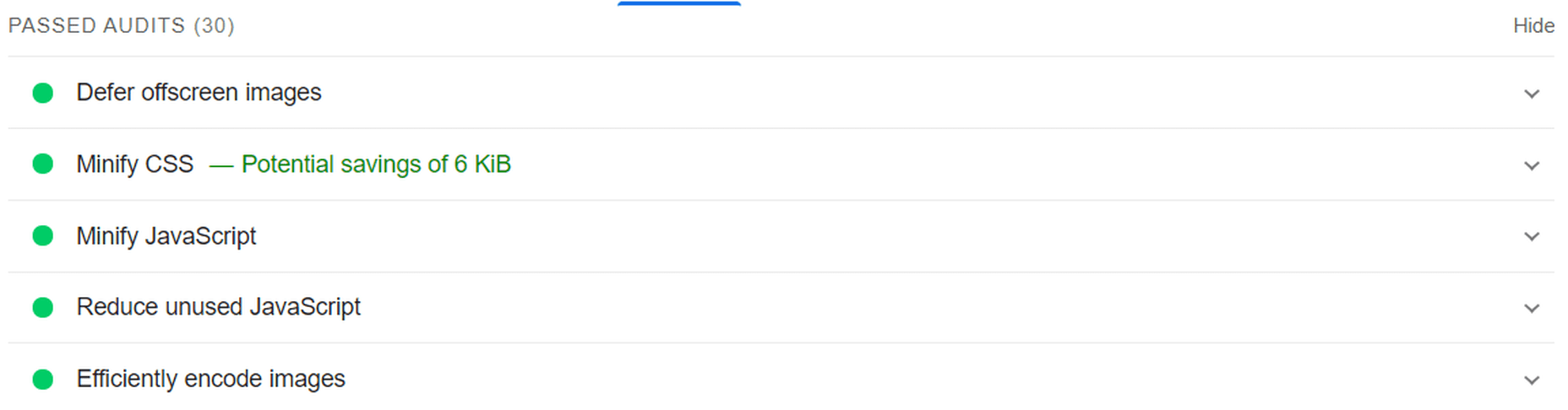
Some of the audits it will pass, however, are deferring offscreen images (lazy loading) and efficiently coding images (due to compression):
Billions of websites are all vying for prime real estate on Google SERPs, as well as the attention of an increasingly fussy internet-using public. Every inch matters when it comes to giving your website a competitive advantage.
So, how can you eliminate those remaining performance flags and deliver highly optimized images that will keep both your visitors and Google happy?
Sure, you could manually optimize images using software like PhotoShop or GIMP. However, that will take you hours for each new batch of images. Plus, you still won’t benefit from any automated adaptive optimization.
A more reasonable solution in today’s fast-paced climate is to use a tool developed specifically for maximum image optimization: an image CDN like ImageEngine.
ImageEngine is an automated, cloud-based image optimization service using device detection as well as intelligent image compression using the power of AI and machine learning. It can reduce image payloads by up to 80% while maintaining visual quality and accelerating delivery around the world thanks to its CDN with geographically dispersed PoPs.
When making a head-to-head comparison, here are the reasons why ImageEngine can deliver better performance:
So, the key differentiator is that ImageEngine can tailor optimizing images for what’s optimal for each of your visitors. ImageEngine is particularly good at serving mobile visitors thanks to WURFL device detection, which can dynamically resize images according to most devices and screen sizes in use today. As of now, this is a completely unique capability that none of its competitors offer.
It allows for far better and more fine-tuned optimization than WordPress’ across-the-board approach to compression and responsive syntax.
If you want, you could turn off WordPress responsive syntax and compression, and you would still experience a performance increase using ImageEngine. However, ImageEngine also plays nice with responsive syntax, so it’s not completely necessary unless you want to serve the highest-fidelity/low-byte-size images possible.
The process ImageEngine uses to integrate with WordPress can be broken down into a few easy steps:
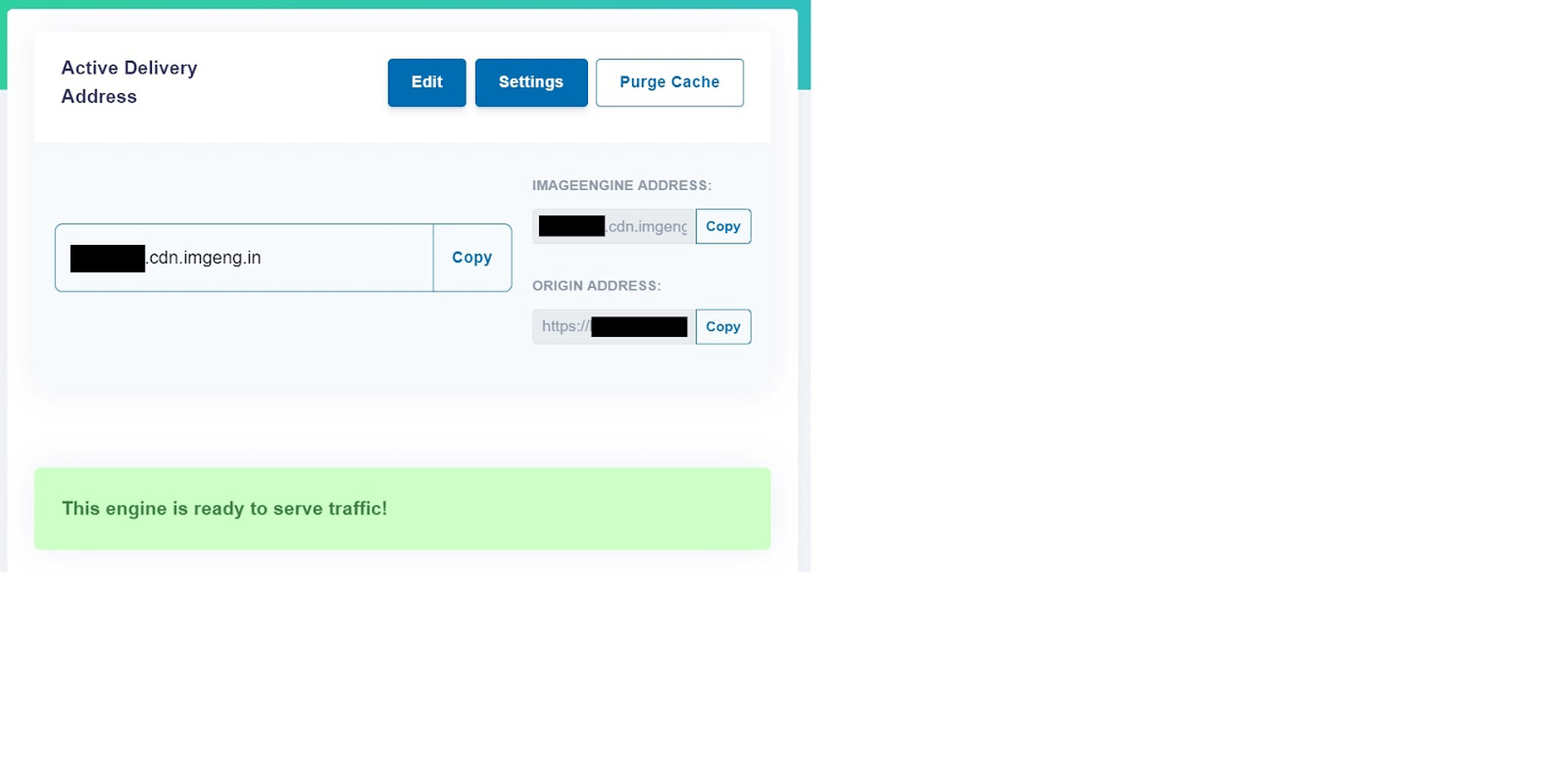
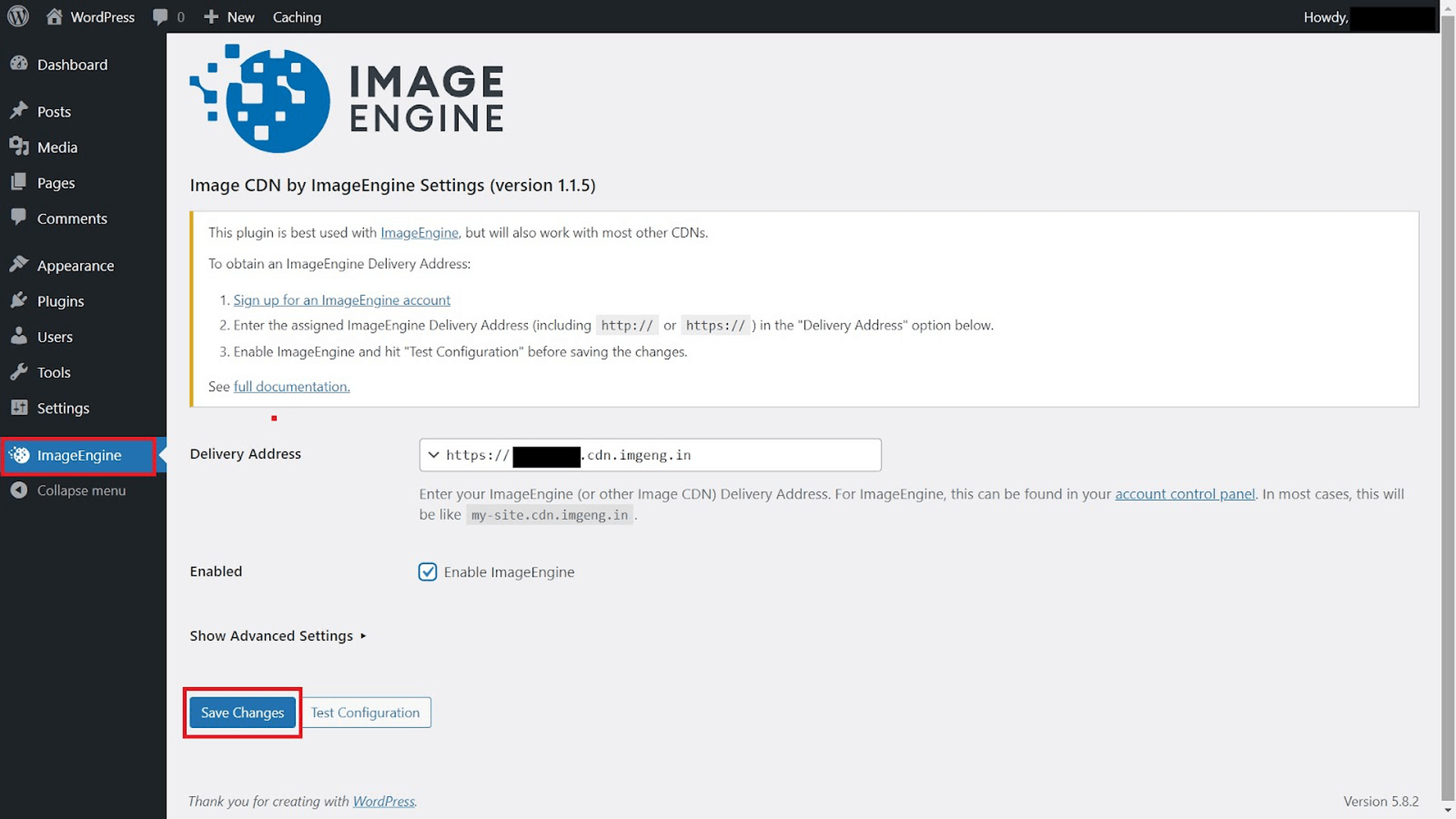
Now, all ImageEngine basically does is replace your WordPress website domain in image URLs with your new ImageEngine Delivery Address. This makes it a simple, lightweight, and non-interfering plugin that works great with most other plugins and themes. It also doesn’t add unnecessary complexity or weight to your WordPress website pages.
So, now let’s get down to business by testing the performance improvement you can expect from using ImageEngine to optimize your image assets.
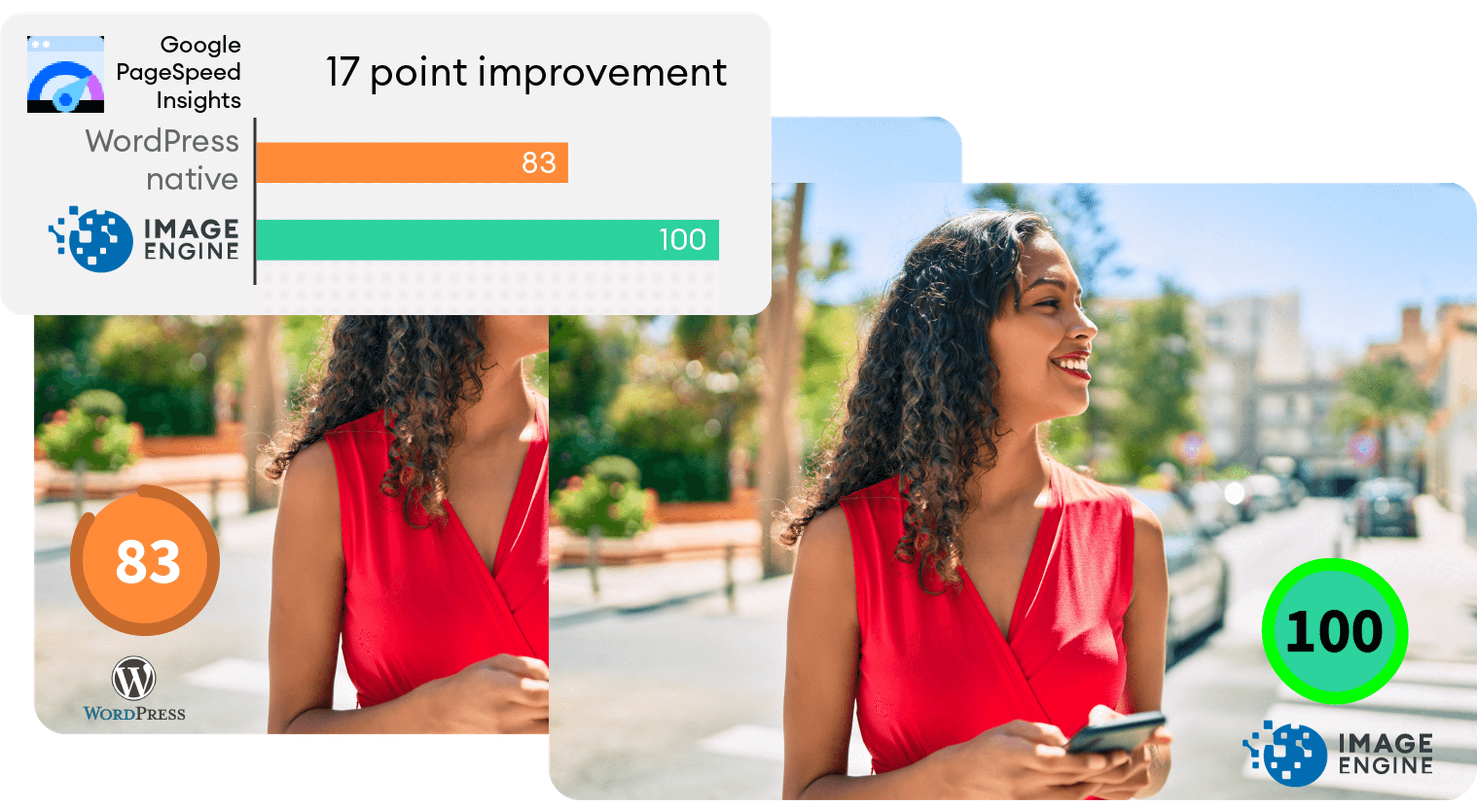
To do this test, we set up a basic WordPress page containing a number of high-quality images. I then used PageSpeed Insights and the Lighthouse Performance Calculator to get the performance scores before and after using ImageEngine.
Importantly, we conducted this test from a mobile-first perspective. Not only has mobile internet traffic surpassed desktop traffic globally, but Google themselves have committed to mobile-first indexing as a result.
Here is a PageSpeed score using the Lighthouse calculator for WordPress with no image optimization:
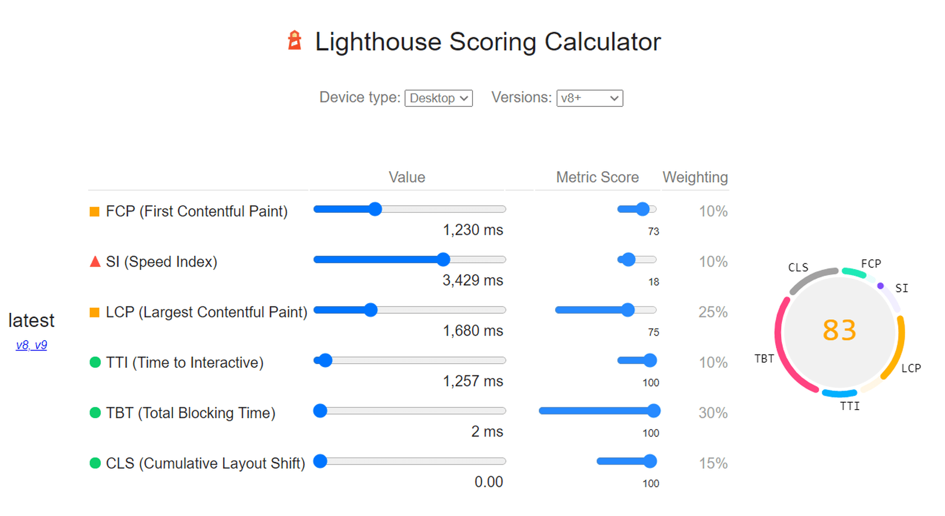
As we can see, both Core Web Vitals and other important metrics were flagged as “needs improvement.” Specifically, the LCP, FCP, and TBT. In this case, both the LCP and FCP were a high-res featured image at the top of the page.
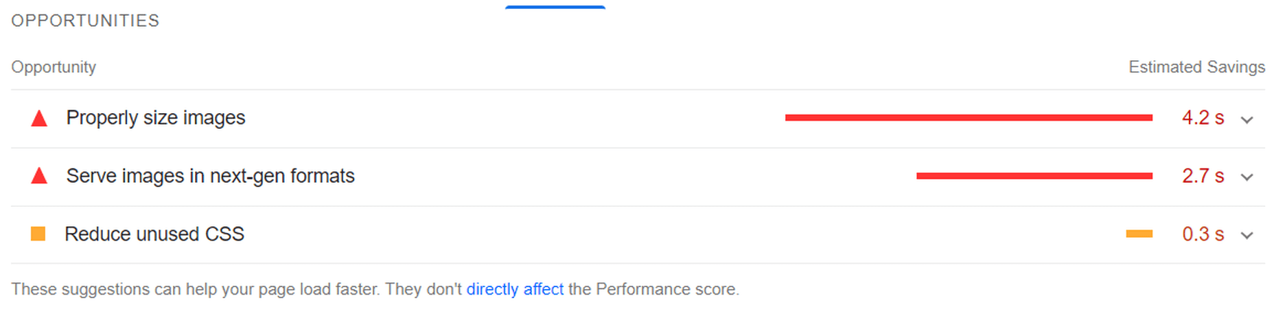
If we go to the opportunities for improvement highlighted by PageSpeed, we see where the issues come from. We could still save as much as 4.2s of loading time by properly resizing images and a further 2.7s by serving them in next-gen formats:

So, now let’s see how much ImageEngine can improve on that.
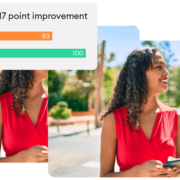
The same test run on my WordPress website using ImageEngine got the following results:
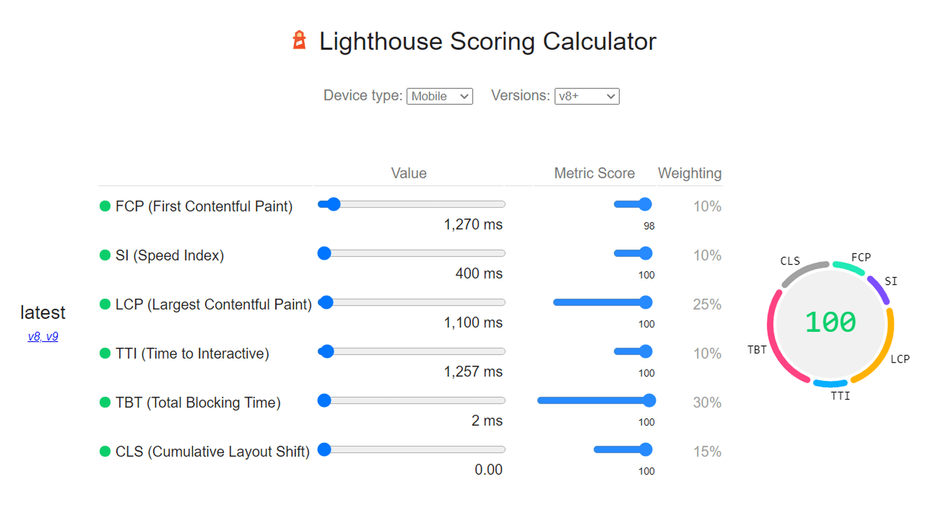
As you can see, we now have a 100 PageSpeed score. I saved roughly 2.5s on the SI (~86%) as well as roughly 1.7s on the LCP (~60%). There was also a slight improvement in the FCP.
Not only will you enjoy a stronger page experience signal from Google, but this represents a tangible difference to visitors regarding the speed with which your website loads. That difference will lead to lower bounce rates, increased user satisfaction, and more conversions.
There was also a 53% overall reduction in the total image payload. This is impressive, considering that it’s on top of WordPress’ built-in compression and responsive syntax.
So, as someone with a WordPress website, what can you take away from this?
Well, first of all, WordPress does feature some basic image optimization. And while not perfect, it should help you offer reasonable levels of performance, even if you use a lot of image content.
However, the caveat is that WordPress applies aggressive, across-the-board compression, which will lead to a noticeable reduction in visual quality. If you use WordPress for any type of website where premium quality images are important, this is a concern — for example, as a photography portfolio, exhibition, or image marketplace like Shutterstock.
By using ImageEngine, you can reduce image payloads and accelerate delivery even further without compromising too harshly on visual quality. What’s more, ImageEngine’s adaptive image optimization technology will provide greater improvements to more of your visitors, regardless of what device(s) they use to browse the web.
Whether or not you still want to use WordPress’ built-in optimizations, ImageEngine will deliver significant improvements to your user experience, traffic metrics, and even conversions.
Plus, true to the spirit of WordPress, it’s extremely simple to set up without any advanced configuration. Just sign up for ImageEngine in 3 easy steps, install the plugin, integrate ImageEngine by copy/pasting your image domain, and you’re good to go.
[ This is a sponsored post on behalf of ImageEngine ]
The post WordPress Website Analysis: Before & After ImageEngine first appeared on Webdesigner Depot.
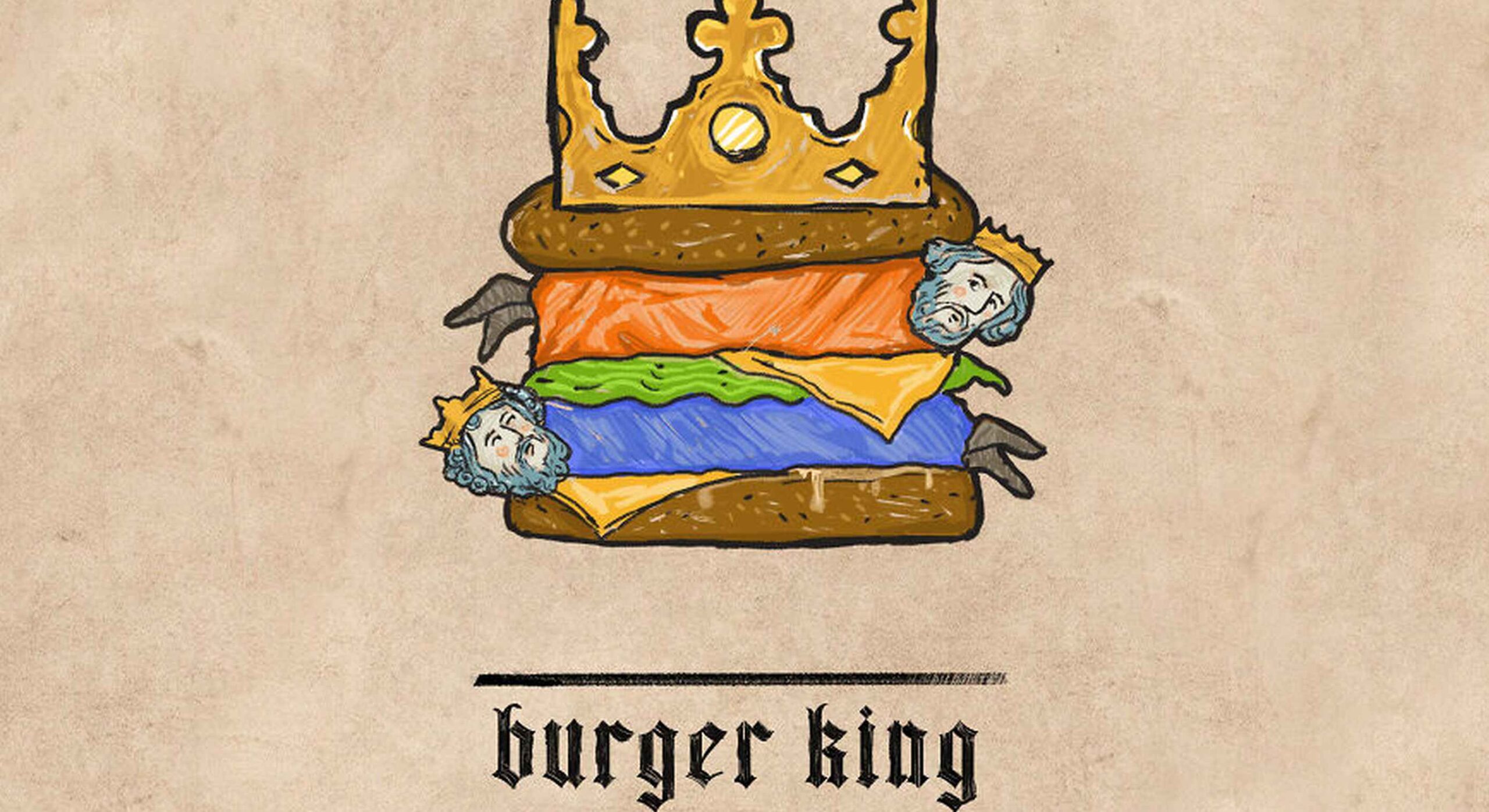
 Type foundries have been putting out some really interesting fonts these last few months. Based on the collection of the best new fonts for February 2022, it looks like we’re going to see lots of throwbacks to the ‘70s in the coming year.
Do we have Burger King’s most recent and successful rebranding campaign to thank for that? I don’t know, but it looks like many font designers are going to try and emulate those fun retro vibes going forward.
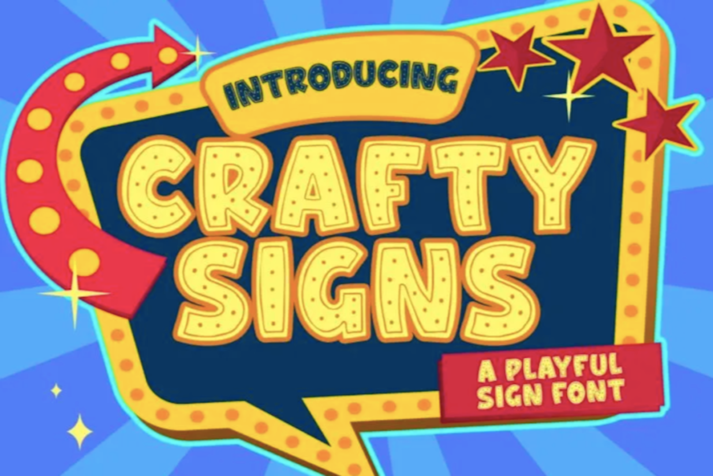
Crafty Signs is a display font that draws inspiration from old game shows — think Family Feud or anything on Nickelodeon in the ‘90s. This playful bubble font would work well for brands targeting children or ones that have a big personality and old school vibe.

Epicene is a Baroque font with beautifully exaggerated calligraphic details (like swirls and strokes). There are two families within Epicene — one for Display and one for Text — so you can use this single font collection to style your entire site.

It’s hard to call Kingsad a sans serif font when it has such a distinctly unique design to it. The font’s creator suggests using Kingsad for branding. I’d add that the curious structure of the characters would make this font perfect for branding in the science and tech spaces.

Lucius is a lively-looking font, combining serif and sans serif characteristics. There are eight weights in this font family, which can be used both for display and text purposes.

Manju is a retro font that the designer describes as “soft and chewy”. You don’t see it as much in the thinner styles, but the bolder, thicker styles definitely feel like the kinds of fonts you’d see on food packaging and candy wrappers in the ‘70s and ‘80s.

Midnight Sans is a font that comes in a single weight (Black) and also has two variants: Midnight Sans RD and Midnight Sans ST. It was originally designed for When Midnight Comes Around, a book about the emerging punk music scene in NYC in the ‘70s, so it has a somewhat grungy, nostalgic feel to it.

Nagel is technically still in beta, so this may not end up being the finished font when it’s done. For instance, they still have the italic and variable styles to develop. That said, it’s a neat-looking sans serif font — easy to read, but has a bit of an edge to it as well.

What you see is what you get with Painless. It has just one style — a textured, bold sans serif. Because of its casual, hand-brushed feel, it won’t fit well with just any brand. Where it would look cool is on websites for brands that sell hardware, furniture, and other DIY products.

Recipient is a monospaced font inspired by the typefaces that appeared on old typewriters. With five weights and a set of matching italics, this font can be used for standard paragraph text as well as for smaller headlines.

Sea Angel is a beautiful serif font with elegant curves. This easy-on-the-eyes font would look great on websites for high-end retailers, luxury magazines, museums, fashion brands, beauty companies, and more.

Comic books and graphic novels will never go out of style. Especially as their stories branch out into other channels, like TV and movies. Smack Boom will enable you to bring that exciting and heroic look to your logos and web designs.

Stoner Sport is an outline display font that brings a modern touch to a retro sporty style. This font would work especially well for sporting industries as well as businesses that are associated with them—retailers, sports complexes, automakers, publications, and so on.

Stormland is a good example of what makes Scandinavian design so striking. The lettering is clean and simple, built using uniformly sized lines. However, the characters are wide, which gives them a sturdy and strong feeling as well.

Tellumo is a humanist sans serif font family, ranging in styles from Thin to Extra Bold. What you see in the example below demonstrates some of the charm and warmth you can add to branding and designs with Tellumo’s swash caps. However, if you want to keep things simple and reap the benefits of the font’s clean and tidy design, you can use the regular character set.

Yamet Kudasi is a script font that comes in just the one style. Based on where it’s used (like in a signature line vs. a hero image) and the background it’s framed against, this versatile font can be used in a variety of ways and for various niches.

The post 15 Best New Fonts, February 2022 first appeared on Webdesigner Depot.
 Every day design fans submit incredible industry stories to our sister-site, Webdesigner News. Our colleagues sift through it, selecting the very best stories from the design, UX, tech, and development worlds and posting them live on the site.
The best way to keep up with the most important stories for web professionals is to subscribe to Webdesigner News or check out the site regularly. However, in case you missed a day this week, here’s a handy compilation of the top curated stories from the last seven days. Enjoy!

The post Popular Design News of the Week: January 31, 2022 – February 6, 2022 first appeared on Webdesigner Depot.
 What stands out as an incredible web design project for you? Do you count your creation as a success if it’s modern, minimal, and accessible? Maybe you’re the kind of designer that’s constantly experimenting with the latest dynamic design tools or state-of-the-art technology. Perhaps your websites are vivid, animated, and brimming with unique components?
Sometimes, creating the ideal design means thinking carefully about what you want to accomplish for your client. The purpose of your web creation has a significant impact on the components that you need to consider. For instance, if you’re hoping for a highly emotive and human design, it may be worth combining some of your sleek lines and graphics with hand-drawn elements.
Hand-drawn elements are just like the other components of web design; that way may use to express individuality in a cluttered digital environment. In a world where everyone focuses on futuristic and virtual creations, hand-drawn elements can pull attention back to the importance of humanity in your content.
As web designers, we know that visual components often impact people more than text-based content. Illustrations are highly engaging functional elements that capture audience attention and convey relevant information.
The main difference between hand-drawn elements and graphics built with vectors and other digital components is that one appears to be more influenced by the human hand than the other. Even if your illustrations are created on a screen, just like any other web design component, it pushes an audience to see something more straightforward, more natural, and authentic.
For a brand trying to convey innocence and humanity in its personality, hand-drawn design can speak to the part of the human psyche that’s often unappreciated by web design. Perhaps more than any other visual, the content reminds your audience that there’s a human behind the web page.
Any image can have a massive impact on the quality of your web design. Visuals deliver complex information in an easy-to-absorb format. In today’s world of fast-paced browsing, where distractions are everywhere, visuals are a method of capturing attention and delivering value fast.
However, with hand-drawn elements, you go beyond the basic functionality of images to embrace the emotional side of the content. Benefits include:
Hand-drawn components, just like any other element of visual web design, demand careful strategy. You don’t want to overwhelm your websites with these sketches, or you could end up damaging the user experience in the process.
As you work on your web designs, pulling hand-drawn elements into the mix, think about how you can use every illustration to accomplish a crucial goal. For instance:
Hand-drawn design components can mix and match with other visual elements on your website. They work perfectly alongside videos and photos and help to highlight critical points.
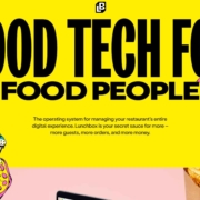
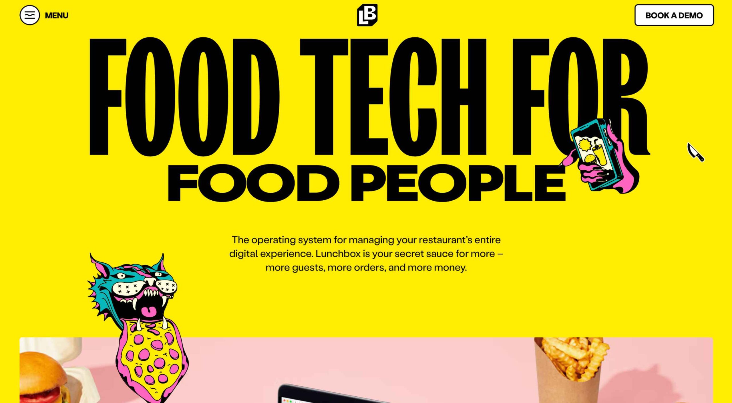
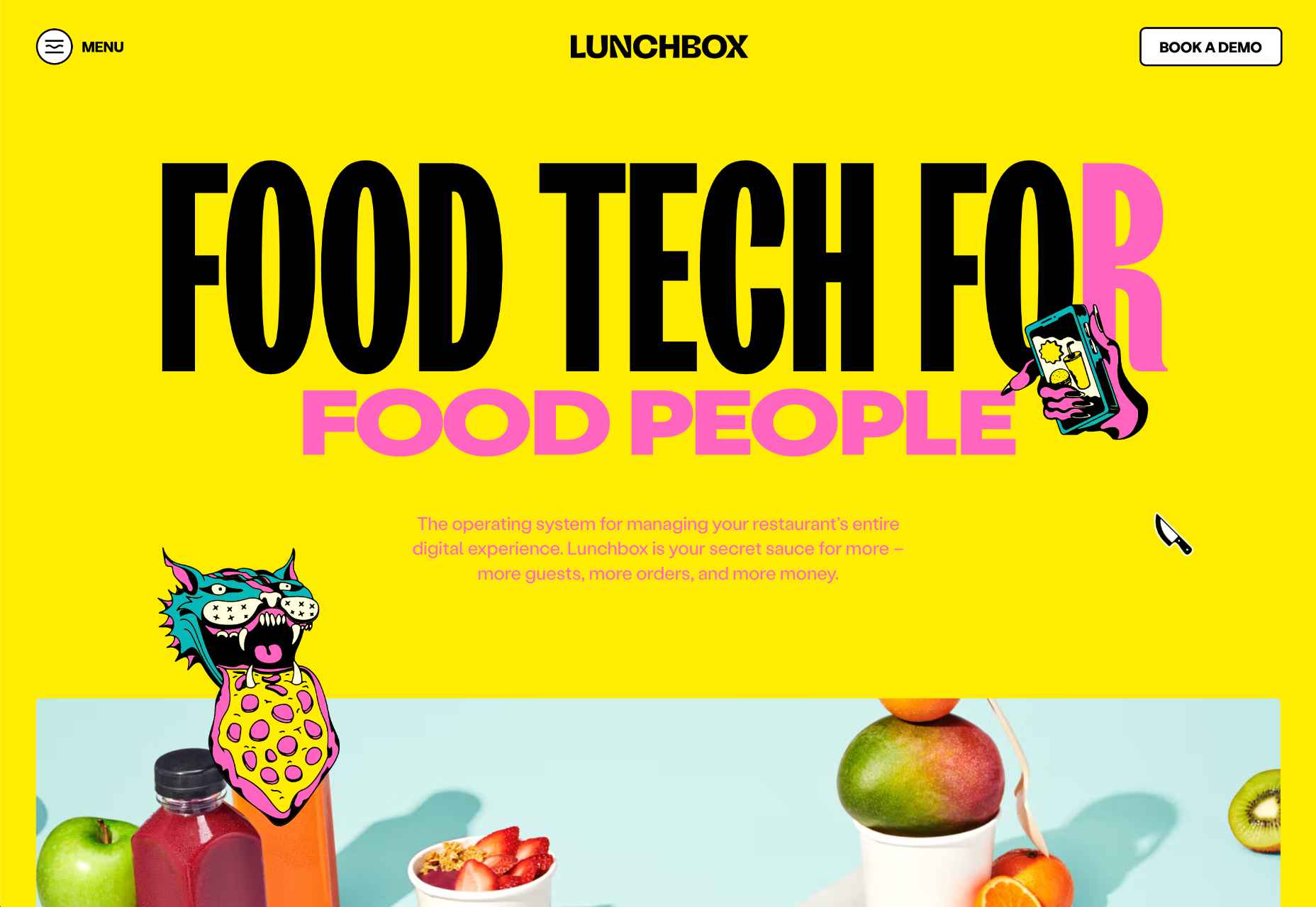
On the Lunchbox website, the company uses hand-drawn elements. This helps make the site stand out, and it provides additional context for customers scanning the website for crucial details.
Sometimes, hand-drawn elements are all about connecting with end-users on a deeper, more emotional level. One of the best ways to do this is to make your hand-drawn elements fun and interactive pieces in the design landscape.
One excellent example of this is in the Stained Glass music video here. This interactive game combines an exciting web design trend with creative interactive components so that users can transform the web experience into something unique to them.
Sometimes, the best hand-drawn elements aren’t full illustrations or images. Hand-drawn or doodle-like typography can also give depth to a brand image and website design.
Typography styles that mimic natural, genuine handwriting are excellent for capturing the audience’s attention. These captivating components remind the customer of the human being behind the brand while not detracting from the elegance of the website.
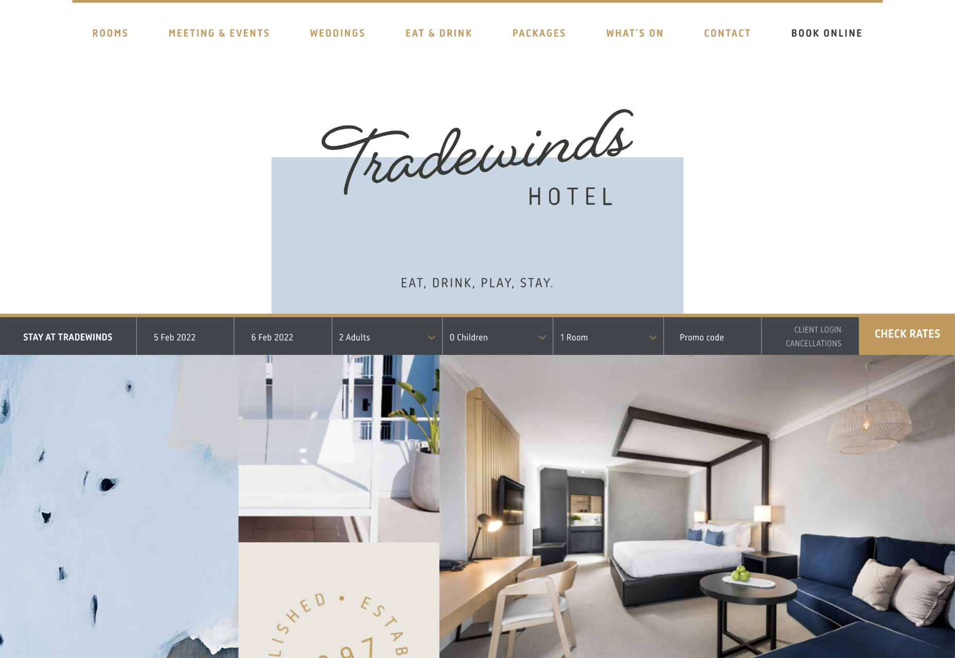
This example of hand-drawn typography from the Tradewinds hotel shows how designers can use script fonts to immediately capture customer attention. Notice that the font is still easy to read from a distance, so it’s not reducing clarity.
Depending on the company that you’re designing for, your website creation choices can have a massive impact on the emotional resonance that the brand has with its audience. Hand-drawn elements allow websites to often take on a more playful tone. They can give any project a touch of innocence and friendliness that’s hard to accomplish elsewhere.
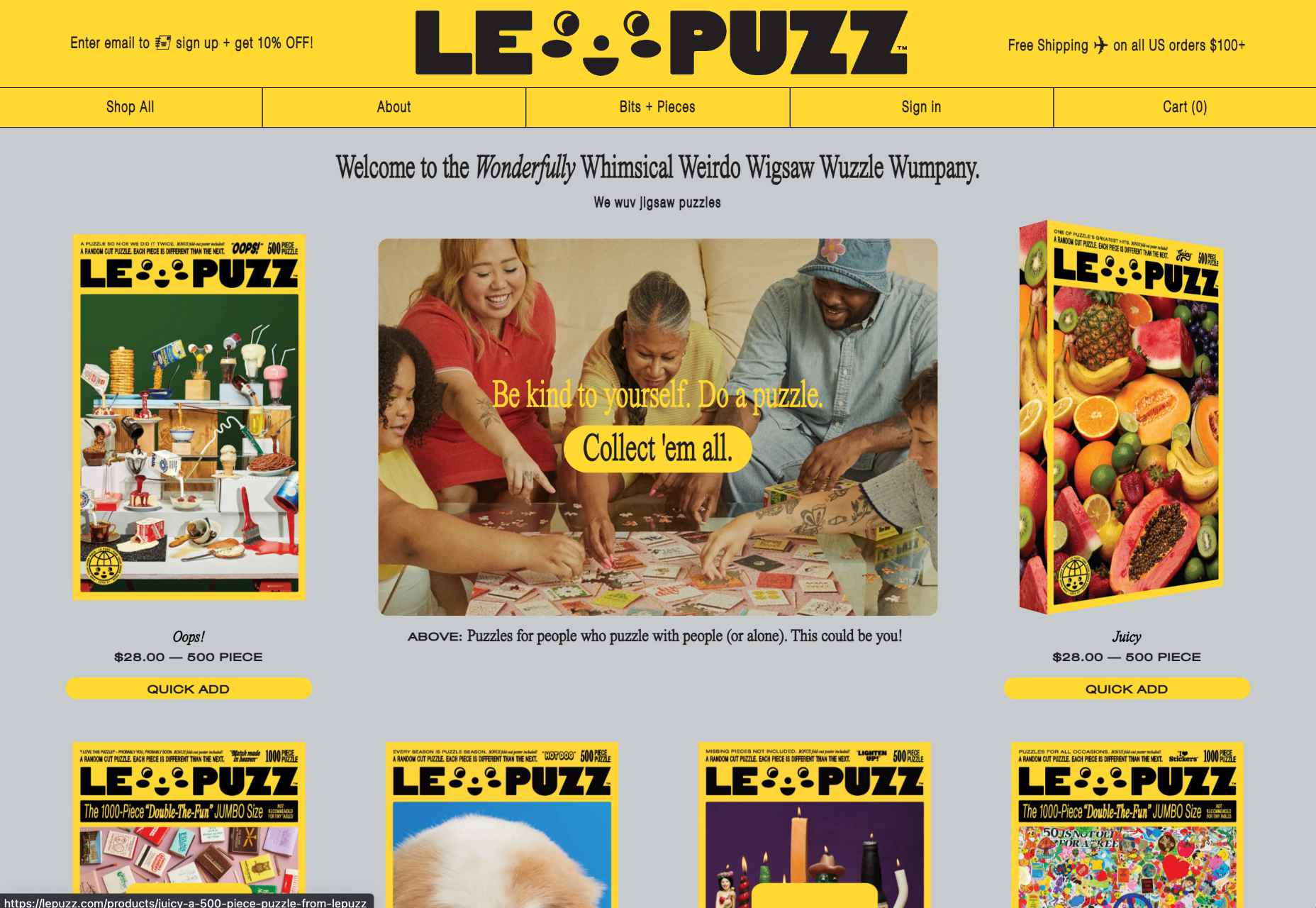
A child-like aesthetic with bright colors and bulky fonts combines with hand-drawn elements on the Le Puzz website. This is an excellent example of how web designers can use hand-drawn elements to convey a mood of creativity and fun.
Finally, if you want to combine the unique nuances of hand-drawn design with the modern components of what’s possible in the digital world today, why not add some animation. Animated elements combined with illustrations can help to bring a website to life.
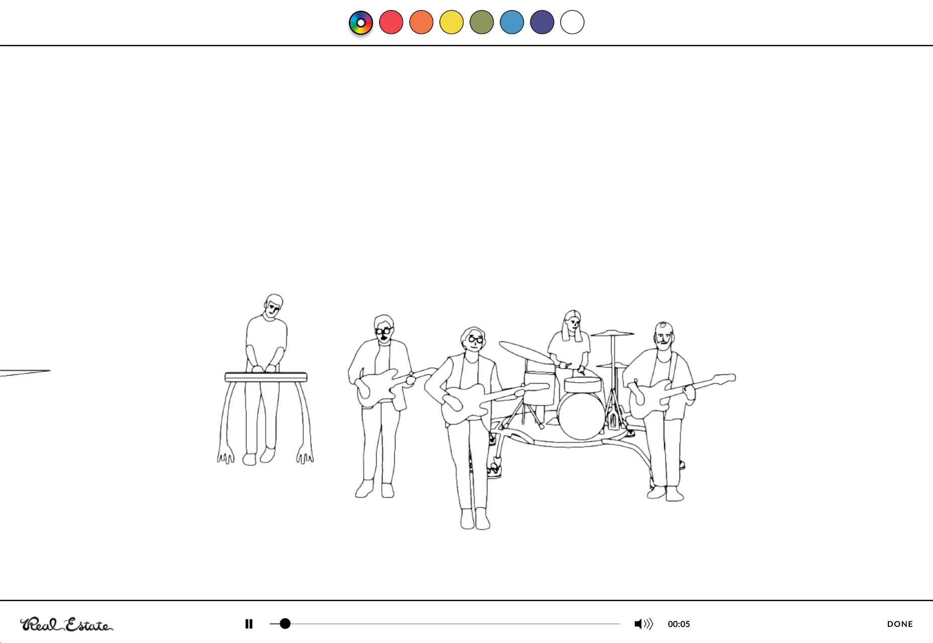
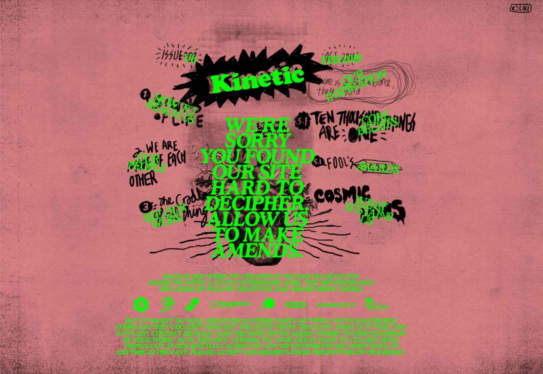
In the Kinetic.com website, the animated illustrated components help to highlight the punk-rock nature of the fanzine. It’s essential to ensure that you don’t go too over-the-top with your animations here. Remember that too many animations can quickly slow down a website and harm user-friendliness.
Hand-drawn elements have a lot to offer to the web-design world.
Even if you’re not the best artist yourself, you can still simulate hand-drawn components in your web design by using the right tools and capabilities online.
Although these features won’t fit well into every environment, they can be perfect for businesses that want to show their human side in today’s highly digitized world. Hand-drawn components, perhaps more than any other web design feature, showcase the innocence and creativity of the artists that often exist behind portfolio pages and startup brands.
Could you experiment with hand-drawn design in your next project?
The post How to Use Hand-Drawn Elements in Web Design first appeared on Webdesigner Depot.

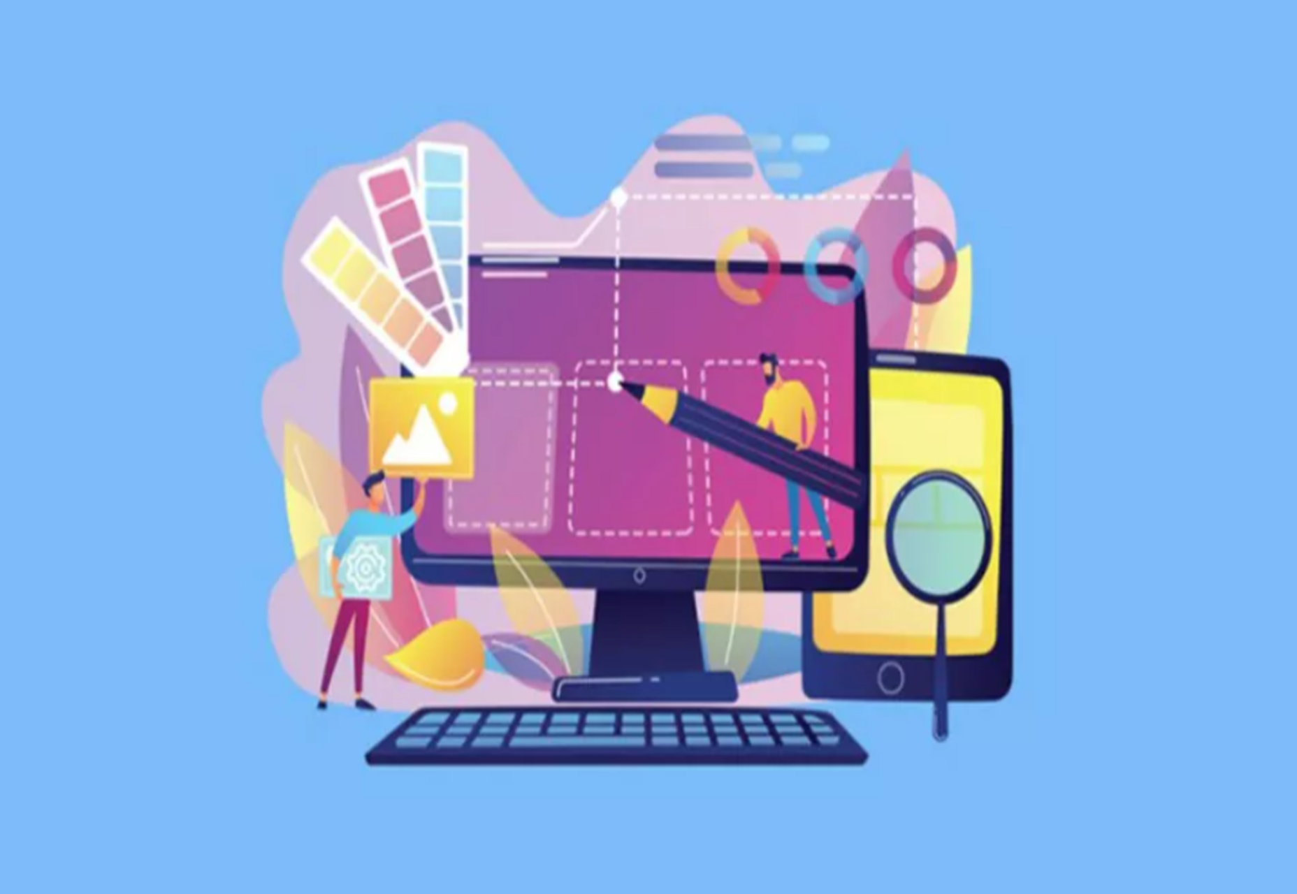
 User Experience (UX) design and User Interface (UI) design are two terms people sometimes mistakenly use interchangeably. While aspects of each are interconnected, there are distinct differences between UI/UX design.
According to Internet Live Stats, there are over 1.9 billion websites, but not all are active at the same time. No matter how you slice it, there’s a lot of competition to grab and keep user attention. Good UX is just part of the equation. For a genuinely stellar site, you must also offer an excellent interface.
Learning the ins and outs of good UI and UX requires a bit of knowledge of how the two differ and what works. Although they weave in and out of the same design, they are different.
UI is the functionality of the design and what users see. How do they interact with various elements? UX is more the way things come together — both visual and interactive features — to create a feel for the user. You can certainly see why people confuse the two as they both apply to interacting with a website or app.
Top design firms often have team members specializing in each discipline. However, UX designers are also aware of UI, and UI designers are also mindful of UX. How can you ensure you’re offering excellent UI/UX design while covering the full spectrum of requirements for each?
Good UX design increases conversion rates by 400% or more. The site visitor walks away feeling understood and not frustrated. What are some of the most important aspects of good UX design?
What is the hierarchy of your site? What is the first thing the user sees when they pull it up? How do they navigate from one page to the next? A well-designed website classifies different aspects of the page, and new content naturally falls into the appropriate category as it grows.
When creating a structure for your site, think about how it might expand in the next five years. You want the hierarchy to work from day one, but you also want to think through significant shifts in the content you might see down the road.
Even your navigational hierarchy should accommodate new areas easily. Plan for the unexpected, so you know how to work it into the overall design when you must.
You have a few seconds to make an excellent impression on your site visitors. Take the time to make sure your design functions and is visually appealing. Your color palette should work, images should be crisp and relevant, and typography should be readable and engaging.
Step back from your computer and look at your design from a distance. Does anything stand out that isn’t pleasing to the eye? Get feedback from visitors about what they like and dislike. Since the focus is on user experience, your best source of constructive criticism is from your target audience. Listen to their concerns and ideas.
Most experts agree that users want an element of interactivity on sites and apps. People want to know you hear them and get a response. Some ideas include adding a live chat option to your site or engaging in SMS customer support.
Put yourself in their shoes. A customer may visit your site for the first time, having never heard of your brand. They have no reason to trust you or that you’ll follow through on your promises. Potential leads may have a few questions before parting with their hard-earned dollars.
Adding various ways to communicate shows them you’ll be there should they have a problem. It’s much easier to trust a company when you know you can phone, engage in live chat or shoot off an email and get an almost immediate response.
Excellent UX is intuitive. You should add calls to action (CTAs) and images pointing the user where they should go next. You can use graphics of arrows, people looking or pointing toward the next step, words, or CTA buttons.
Get feedback on how clear the directions are and tweak them as needed. The user should never have to stop and ponder what to do next. Everything on the page should guide them toward the ultimate goal.
Every industry has complicated data that is difficult for non-experts to understand. Part of good UX is breaking down complex information and sharing it in a simplified way.
One example might be the registration process. Instead of just showing text, a good UX designer would number the steps. Visualizations help add to understanding.
User Interface impacts UX and involves how the design works. The UI designer thinks through visitor expectations and then creates an interface that isn’t frustrating. UI works within the framework of a website to develop functional features. User experience isn’t the complete focus of UI, but it does tie into the planning phases. What are some elements of good UI design?
For a design to have good UI, it must perform as expected. Have you ever clicked on a button, and nothing happened? Determine how you want things to work and the minimum acceptable standards for your site.
For example, what happens when someone clicks on a link or button? How does the user know their action created the expected result? Consistency is crucial to how a site performs.
While UX designers look at the emotional impact of various colors, UI designers look at whether the shades match branding and how well the different ones contrast for readability and usability. UI/UX design often bridges a single designer’s work, so the employee ensures everything works as intended, both emotionally and functionally.
You may work with another designer to make the site aesthetically pleasing while also tapping into the emotions driving users. For example, some people love blue, so a blue button can have positive results.
UX and UI designers utilize split testing to see which users respond best to. Then, make adjustments as indicated by how site visitors respond.
According to the Interaction Design Foundation, people can only retain around five things in their short-term memory. Designers should work with recognition instead, as users tend to rely on cues to find what they need.
UI designers may develop an intuitive navigation system and then use the same cues on every page, such as placement, color, and language. Users can then recognize the system without having to memorize it.
Your job is to ensure errors are kept to a minimum when designing a website or app. One of the most significant parts of a designer’s job is testing and retesting.
Think about all the potential problems a user might run into, such as broken links, images not showing, or incomplete actions. How can you keep those problems from occurring in the first place?
Error prevention is particularly vital when designing software as a service (SaaS) or apps. Users grow frustrated quickly and will find another solution rather than troubleshooting an issue. You’re much better off avoiding the error in the first place.
You’ve likely already figured out how closely UX and UI entwine to create a usable experience. The UX designer pays attention to function and interactivity, and the UI designer thinks through how the interface looks.
UX pays attention to the flow of the website and where users start, go next and end up. On the other end, UI figures out how the elements look to the viewer and where everything is placed.
The UX team may decide to add an extra button to the page. The UI team must determine where to place it, if any sizing needs must occur, and how it impacts usability on desktop and mobile devices.
Although each has a different function, user experience and user interface must work together to create a usable site the target audience responds to. You can’t have excellent UX without excellent UI, and vice versa. The best designers consider both and implement them to their fullest potential.
Featured image via Pexels.
The post What’s the Difference Between Good UI and Good UX? first appeared on Webdesigner Depot.
 One of the most talked-about digital elements of the new year leads our roundup of tools and resources this month – NFTs. The NFT landscape seems to be exploding right now and that includes tools for designers to get in on the game as well.
Here’s what is new for designers this month…
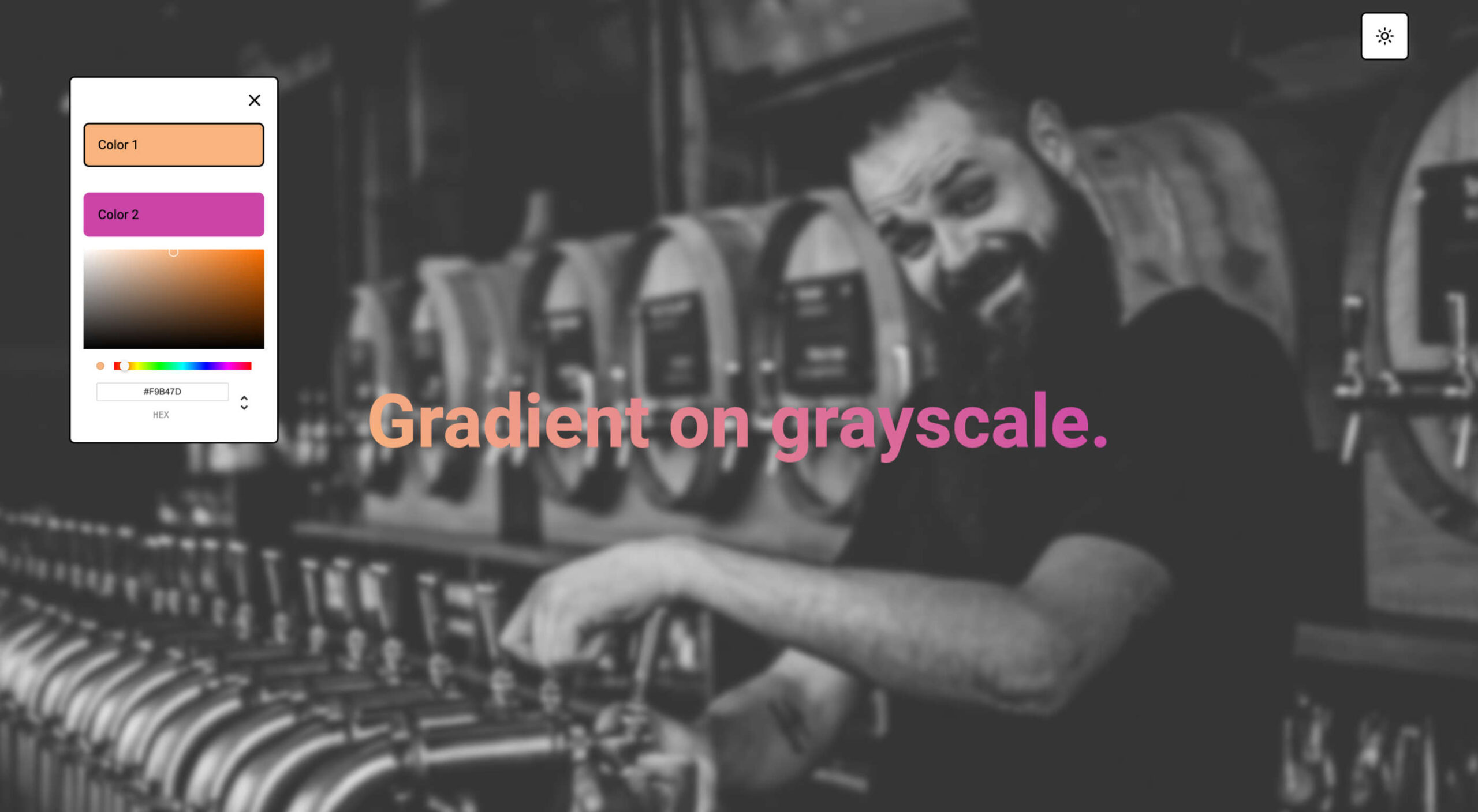
Zero Code NFT offers an advanced no-code tool to simplify the smart contract development and deployment process, allowing you to launch your NFTs with no previous coding experience. It includes a smart contract wizard that supports Ethereum, Polygon, Fantom, and Avalanche, with Solana and others underway. The tool has a waitlist if you are interested.
54nft is a tool to create a customized NFT store. It is a complete commerce platform that lets you start, grow, and manage an NFT business. Create and customize a store, publish and mint assets on available blockchains, and sell. The tool is free but charges a transaction fee on sales.
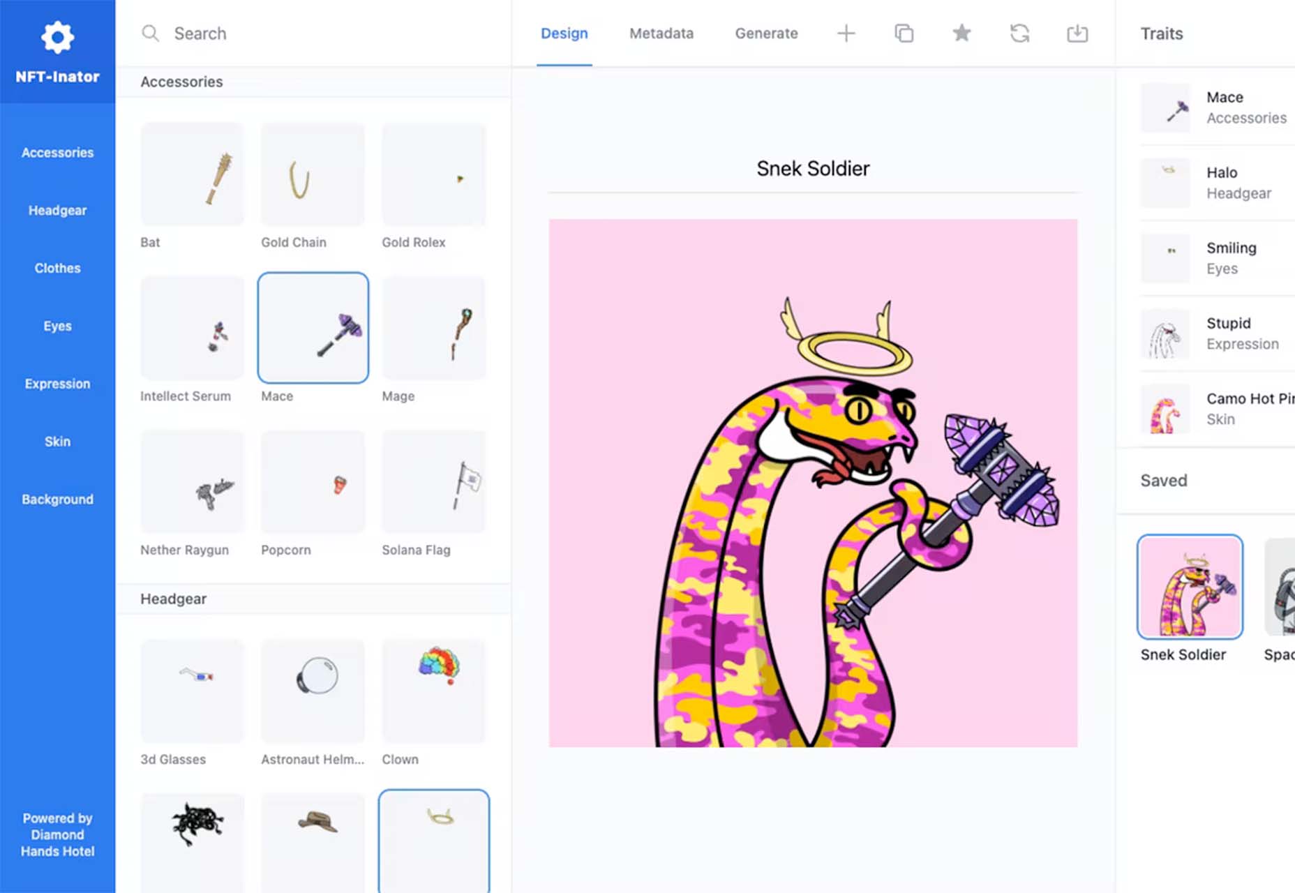
NFT-Inator is a free toolkit to accelerate the design and development of procedurally generated NFT projects. Create custom and randomized designs, test layer combinations, and export images and metadata for Solana, Ethereum, and Polygon.
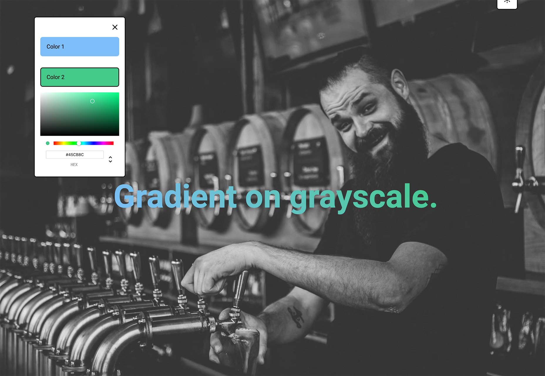
Gradientos makes finding gradients that work with your design easy. Pick your colors and see the gradient live on a demo website with common UI elements.

Web Almanac is an annual state of the web report from HTTP Archive. It is a comprehensive report on the state of the web, backed by real data and trusted web experts. The 2021 edition is comprised of 24 chapters spanning aspects of page content, user experience, publishing, and distribution.
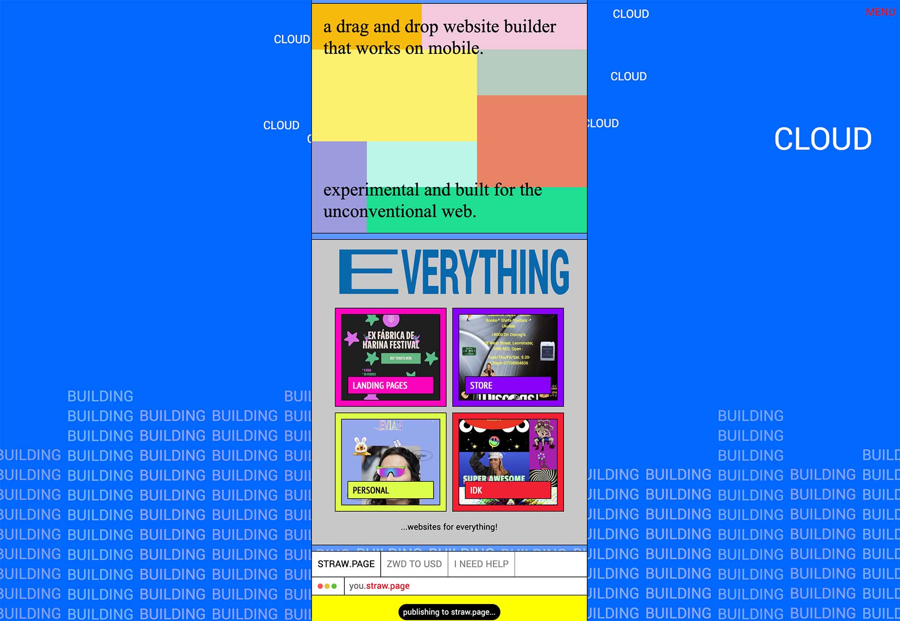
Straw.Page is a new take on website builders. It is a super simple builder that you can use to create websites from your phone. It’s a drag and drop builder that’s highly experimental and allows you to connect via a subdomain or with a custom domain.
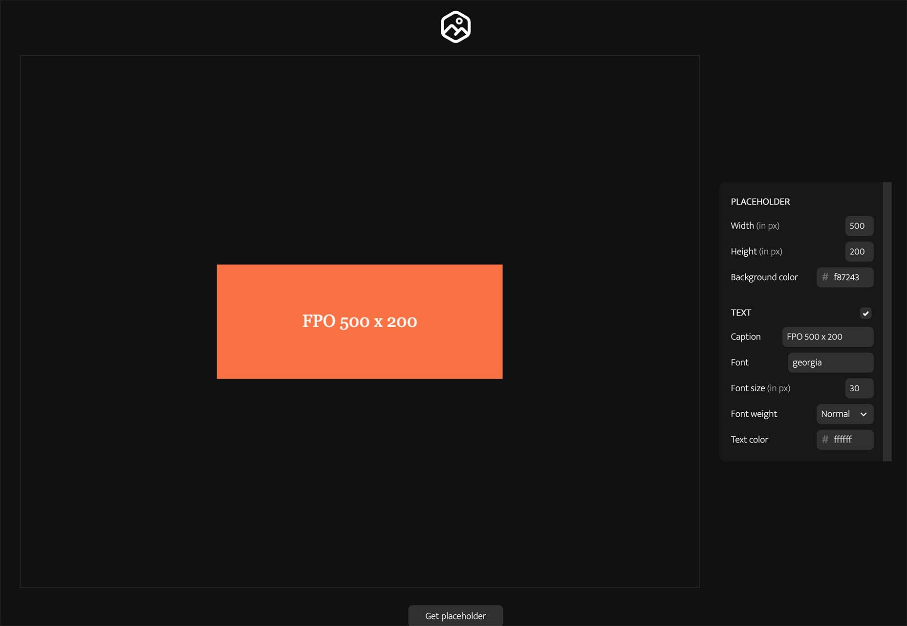
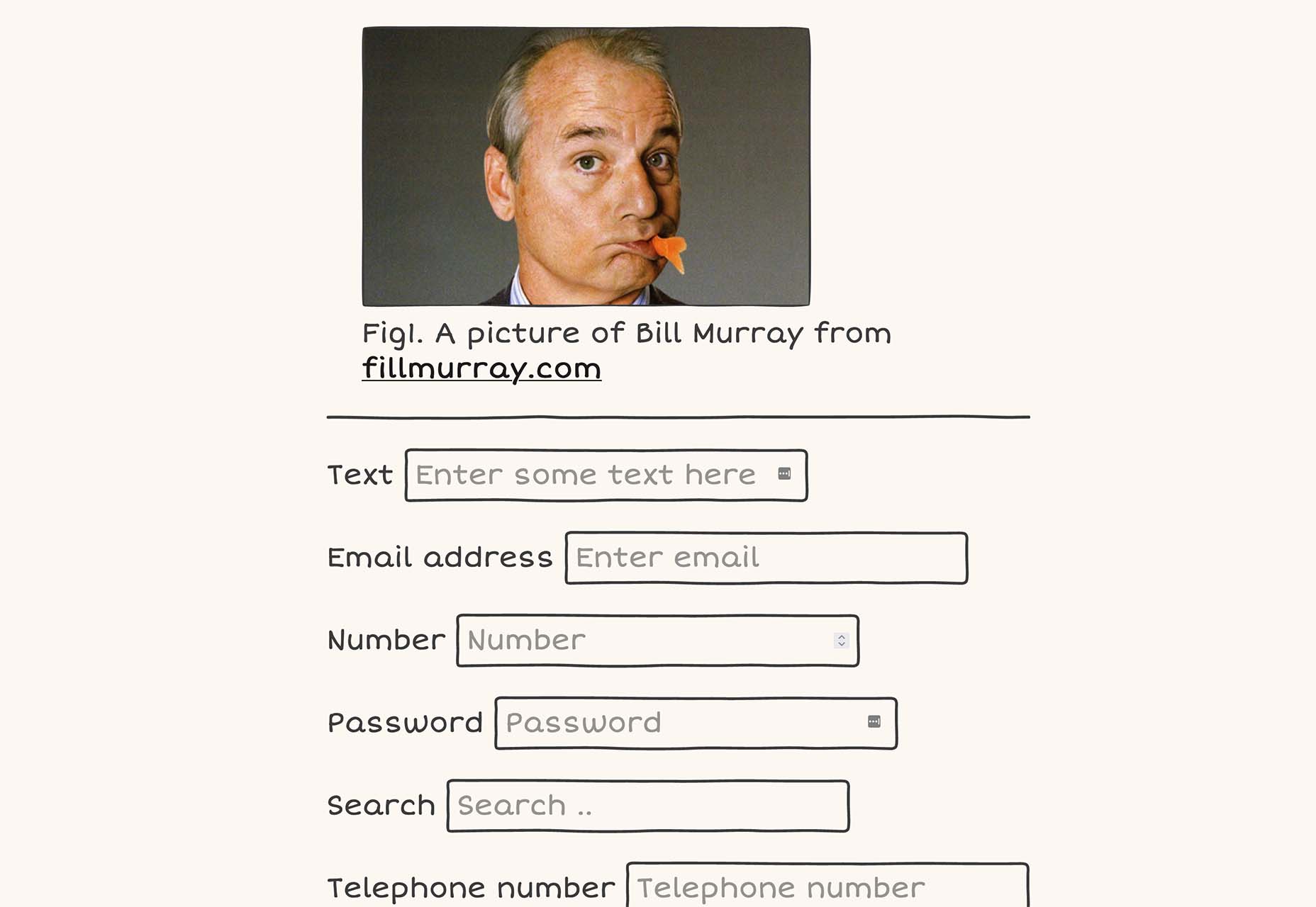
Placy is a simple placeholder generator. Set the size, color, and fonts and you’ll get a usable data URL to include on your website. Available and JPG, PNG, or SVG.
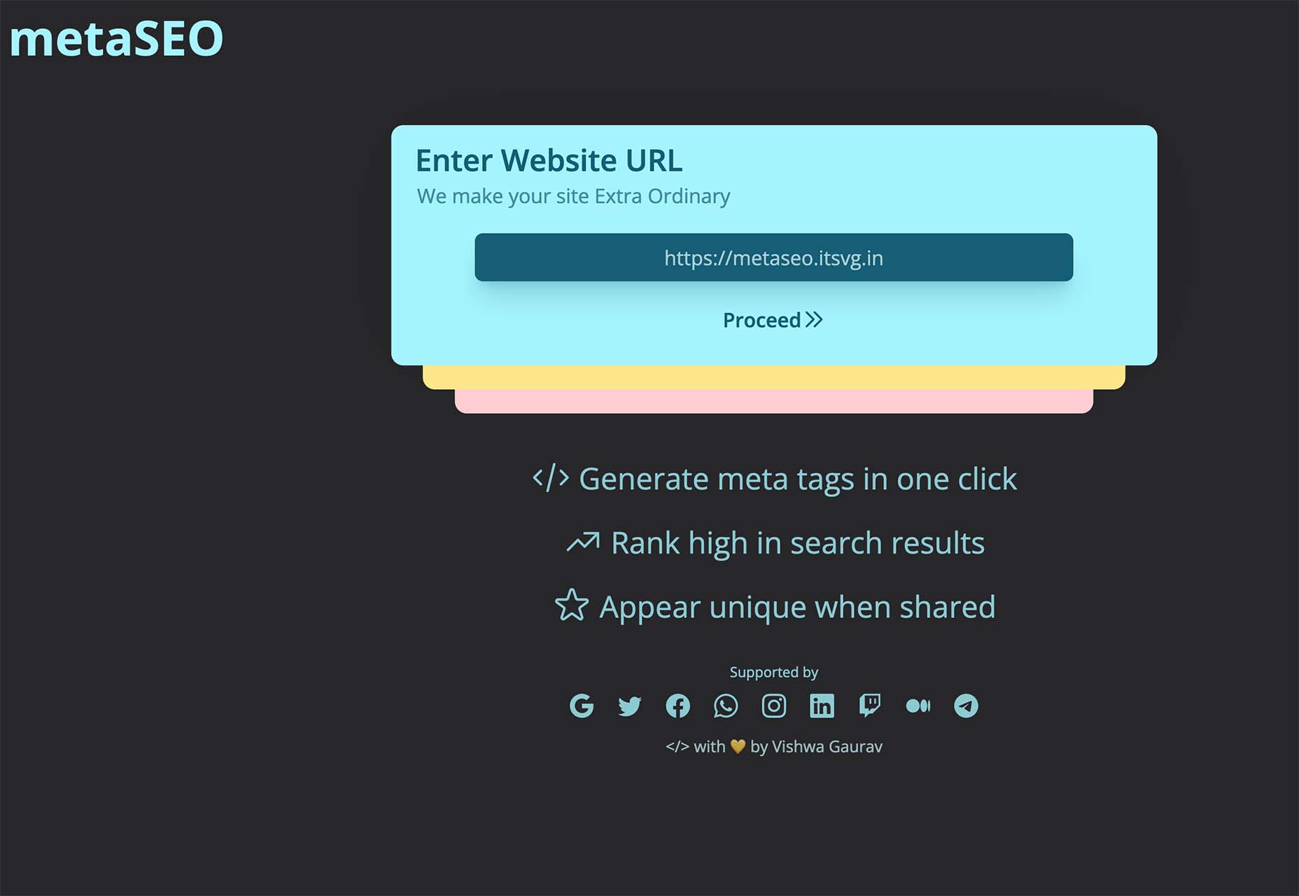
MetaSEO is a tool to generate meta tags in one click for the best SEO of your website, rank high in search results, and appear unique when someone shares your link. It’s a no-brainer SEO tool for web designers and developers that aren’t as versed in search engine optimization.
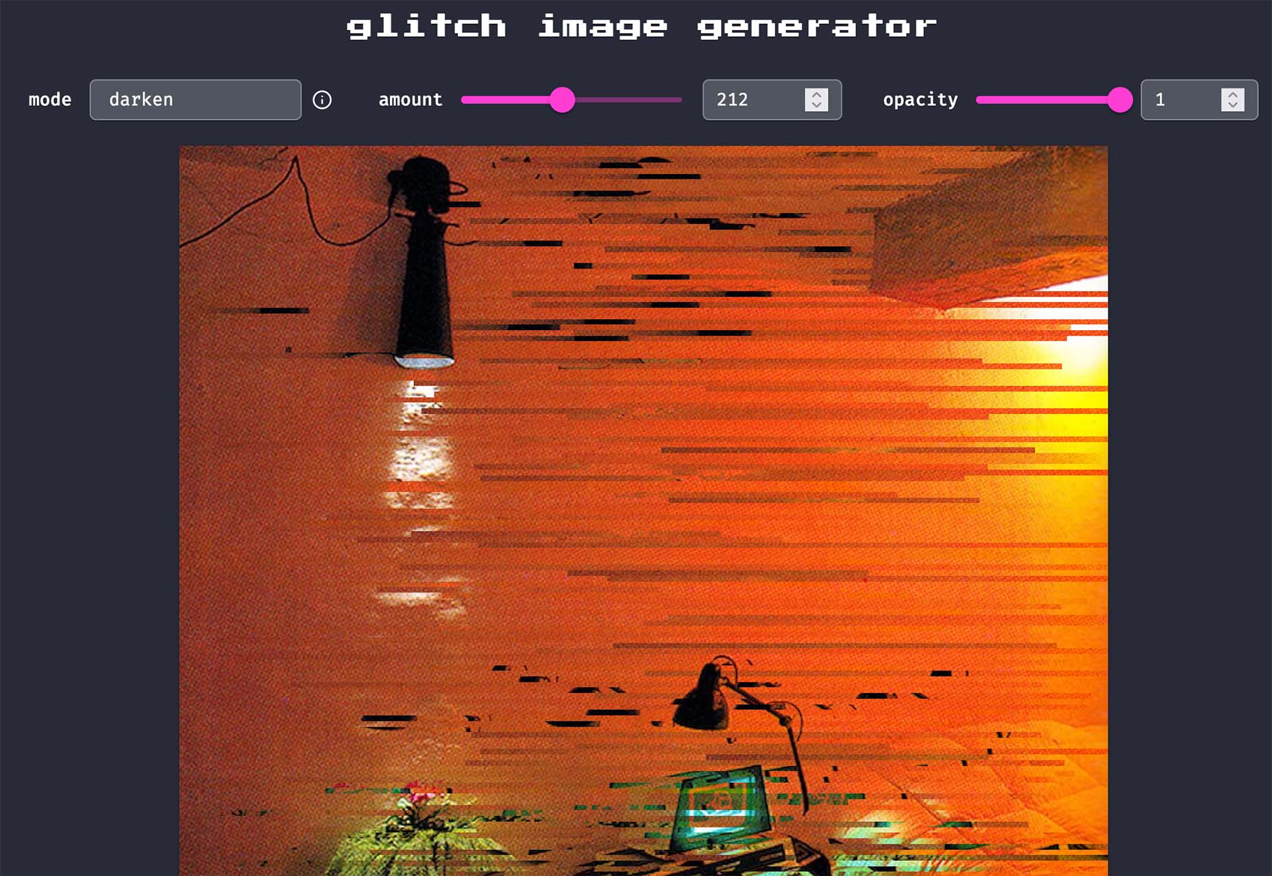
Glitch Image Generator is a tool to create a trend effect of the same name. Upload an image, pick a color mode, set glitch preferences, and save it as a PNG for projects. It’s that easy.
Smoothly Reverting CSS Animations is a simple and easy-to-understand tutorial that will walk you through how to create a keyframe animation that moves smoothly. Pragmatic Pineapple explains the steps with code snippets to help you understand how to make this animated element work for you.
Alternate Column Scroll Animation is a nifty little tutorial and demo (with downloadable source code) from Codrops. The result is a grid layout with columns that scroll in opposite directions and a content preview animation.
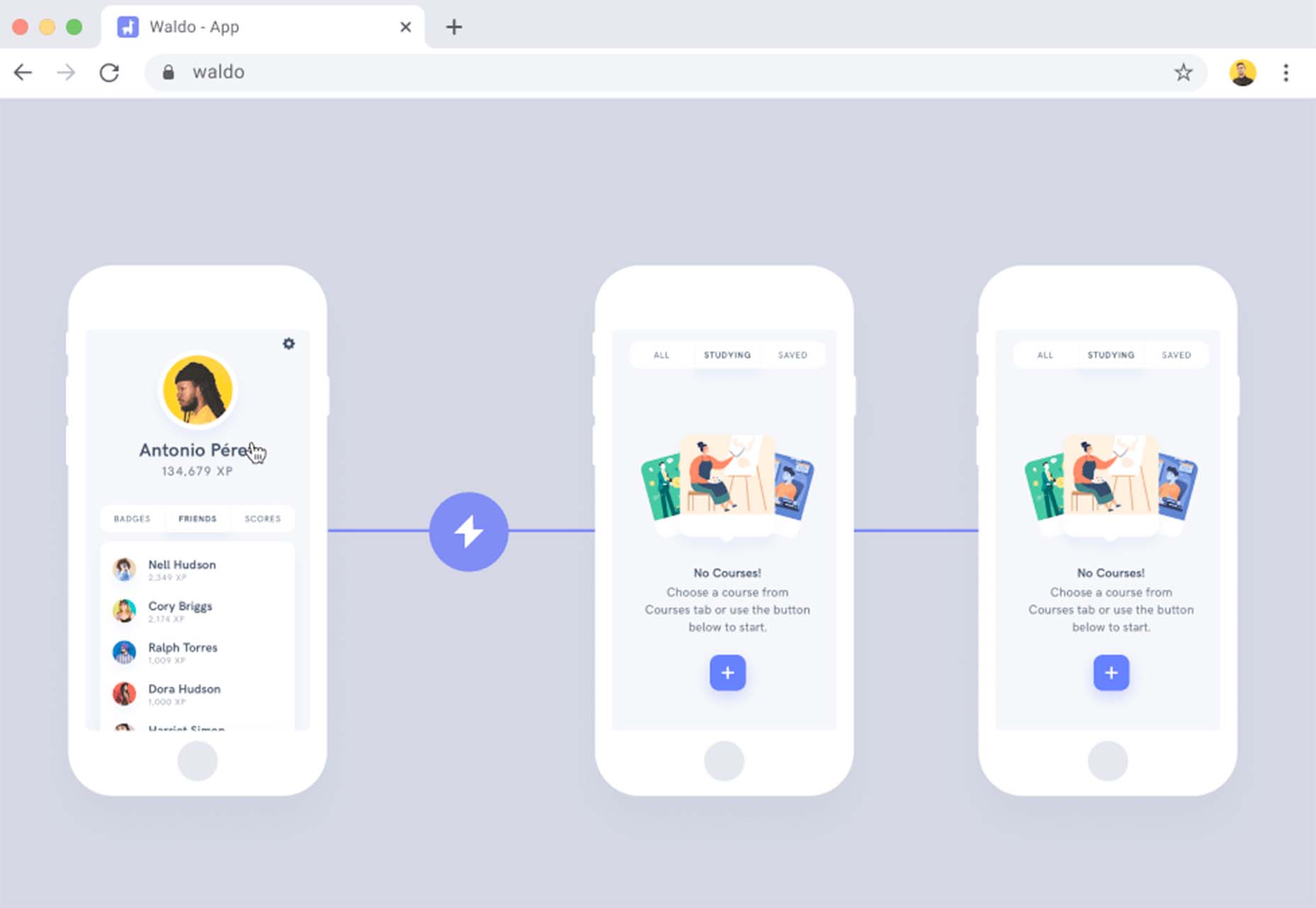
Waldo is a premium tool that can help you ship mobile apps faster with fewer bugs (that’s a win-win). The no-code testing platform allows you to upload your app to the platform, run tests, and fix any issues that might arise to help you provide a better experience when it is time to make your app live.
Monad offers an efficient and simple way to share and discover code snippets. Create an account to easily find snippets relevant to you using tags or browse and create snippets anonymously. One of the best features is the ability to work collaboratively or privately.

Doodle CSS is a simple hand-drawn HTML/CSS theme that you can snag from GitHub. It’s fun and whimsical. Practical application for a look like this is up to your style and imagination.
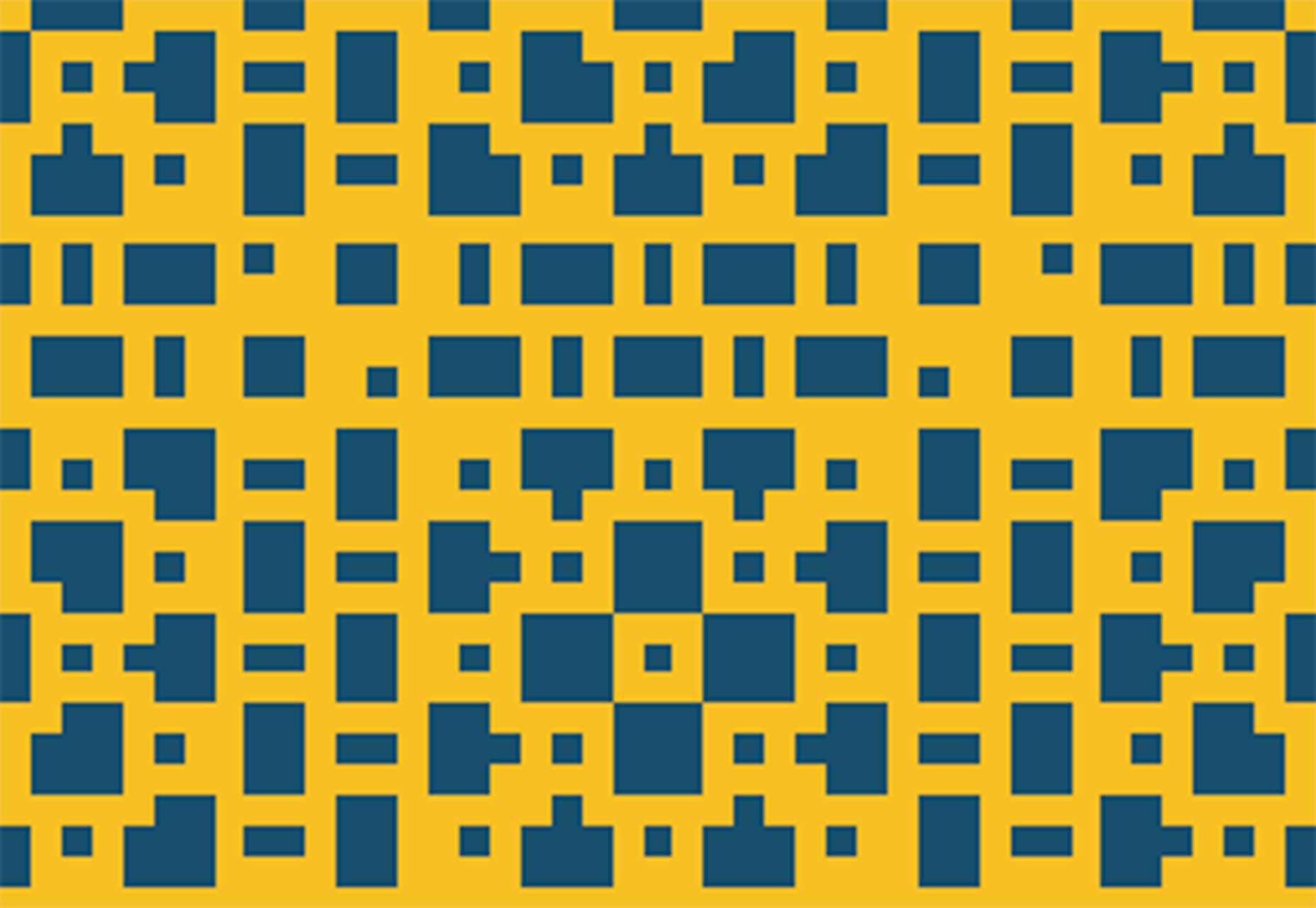
Pixel Patterns is a concept pattern set that implements a function to create patterns with minimal syntax. They are in a pixel style with code snippets that you can play with.
Protodeo is a tool to make 3D video website templates to help show off new products or services. Just upload a few images, customize your settings, and the tool will give you a Bootstrap template with video mockups in less than a day.

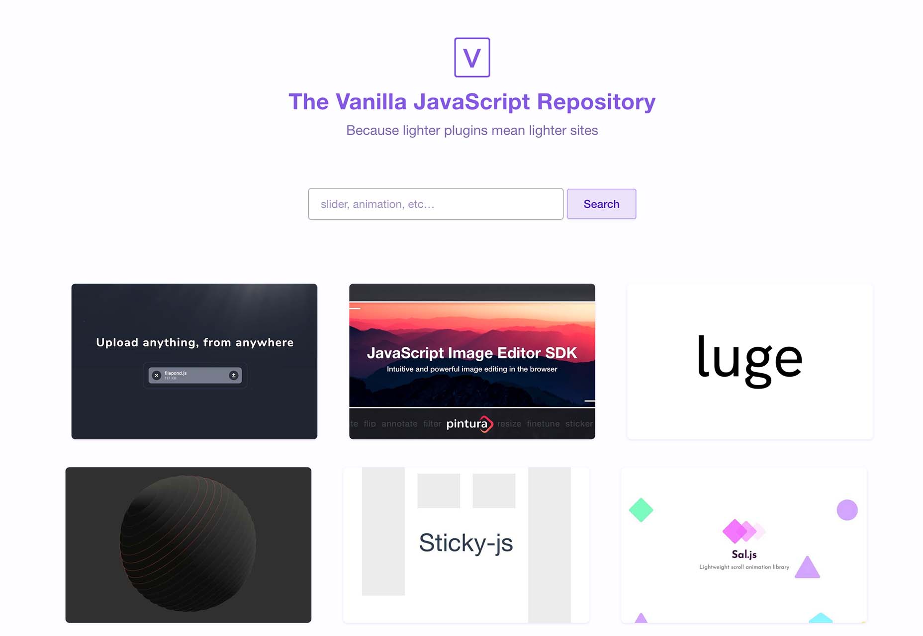
VanillaList is a repository of handpicked JavaScript plugins and resources to save time as a developer and create high-performance web apps. And as the name implies, they are all vanilla.
The Mouse Mover is a fun little tool with questionable ethics – it simulates real mouse movements on your PC. Plus you get the source code and won’t have to worry about going to sleep or triggering a logged-off status.

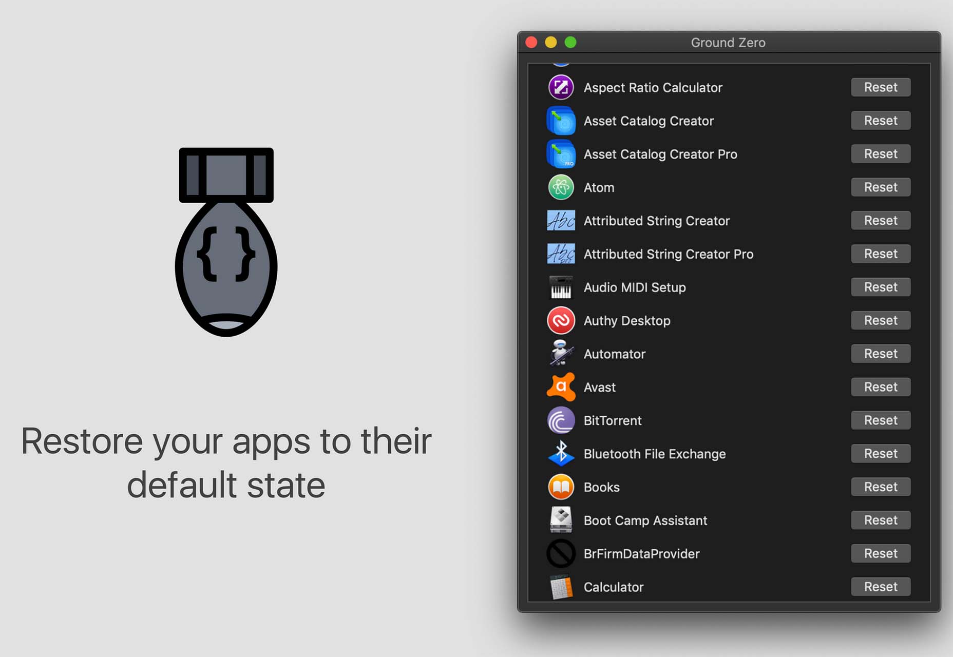
Ground Zero returns Mac apps to the state they were in when first installed, without deleting the app. Fix issues and get back the default settings, or simply re-claim disk space by cleaning up data that would normally be left behind when uninstalling an app.
Alonzo is a premium typeface family in a modern style with high contrast stroke weights. The family includes 24 styles and with an almost condensed style fits nicely in tight spaces.
ContaneText is the more readable text version of the Contane typeface family. It’s a solid serif with 20 styles including Romans and matching italics. Stronger hairlines, solid serifs, and slightly more comfortable proportions make it appropriate for bold headlines, as well as for small text sizes.
Plinc Flourish completes our roundup this month with an interesting, premium typeface that’s beautiful and functional. Part italic, part roman, this iconoclastic font is all style. It includes formal pen strokes in a taut upright framework to create a typeface that looks defiantly forward.
The post Exciting New Tools For Designers, February 2022 first appeared on Webdesigner Depot.