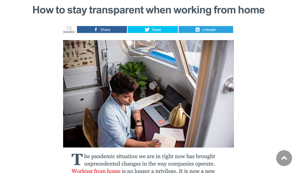
 Some of the changes we are seeing with where we work are starting to pop up in the type of new tools made for designers and developers. More tools with remote collaboration as a key feature are increasing in popularity. (You’ll find a few of those here.)
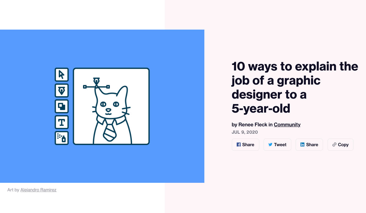
Here’s what new for designers this month.
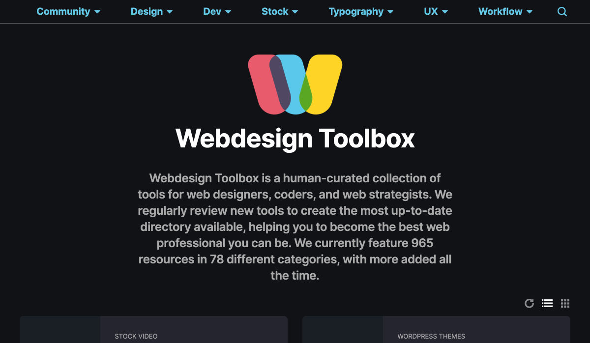
Webdesign Toolbox
Webdesign Toolbox is a collection of tools, apps, and resources all in one location for designers and developers. The best part of this resource is that it is human-curated, so every tool is quality checked and makes the list because it has been tested and researched. Search the collection by design, dev, stock, typography, UX, or workflow tools (and more) and use them to help create more efficiently. The collection is constantly growing, too.
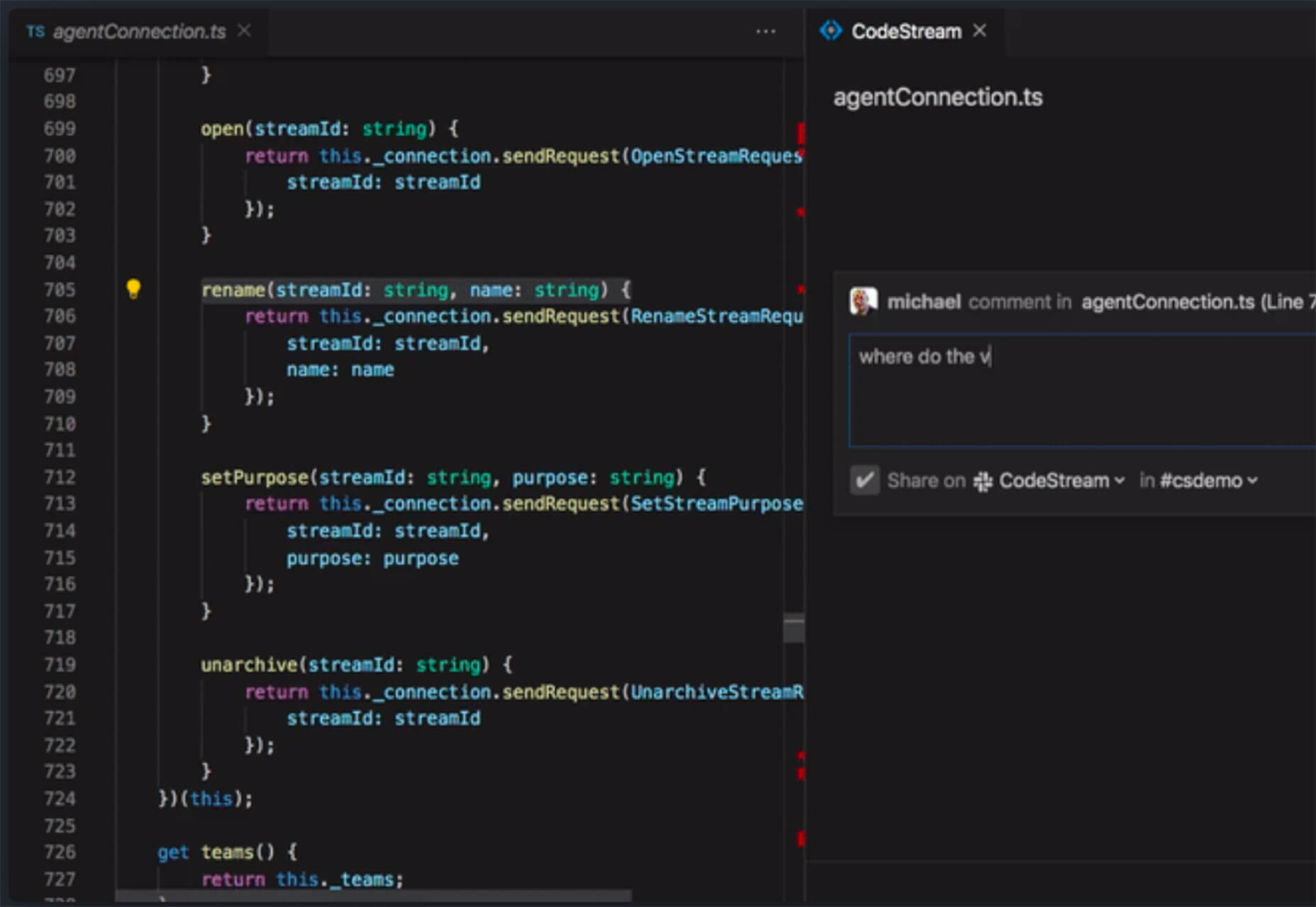
CodeStream
CodeStream might be the new-world workflow tool for web designers and developers. It is made for remote teams to review code right inside your IDE without breaking from development flow. You can post and review changes and comments are all independent of the code itself, even though they link to it.
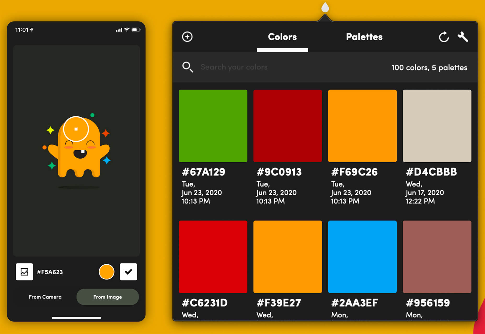
Litur
Litur is a color management app for iOS. Use it to find and collect color swatches, create custom palettes, and even check color combinations against accessibility standards. The app can even generate color codes for you from swatches you find from a photo or image upload or create. The app works on mobile and desktop Mac devices and is a paid app.
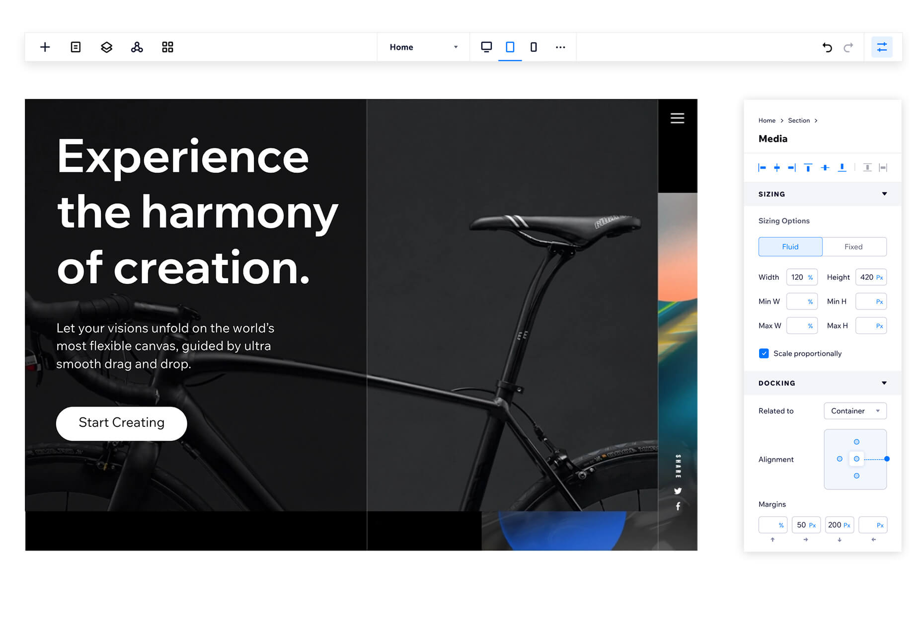
Editor X
Editor X, which is still in beta, is a website building tool that combines advanced design and prototyping capabilities with secure web hosting and integrated business solutions. Go from an idea straight to production in a highly intuitive design workspace. The best feature might be exact design precision tools.
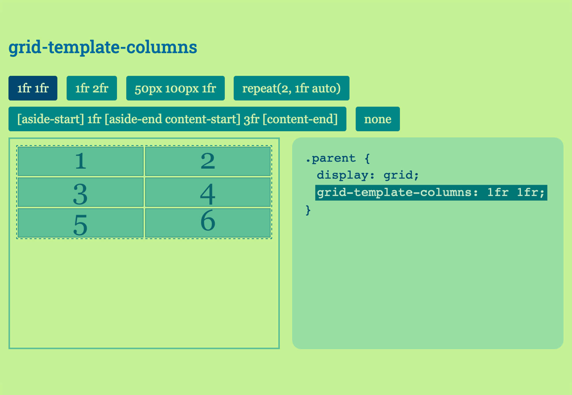
Grid Cheatsheet
Grid Cheatsheet is a visual and code-based set of “cheats” based on the W3C CSS Grid Specifications. What’s nice is it makes these guidelines easier to understand and use if reading through them makes you a little uneasy.
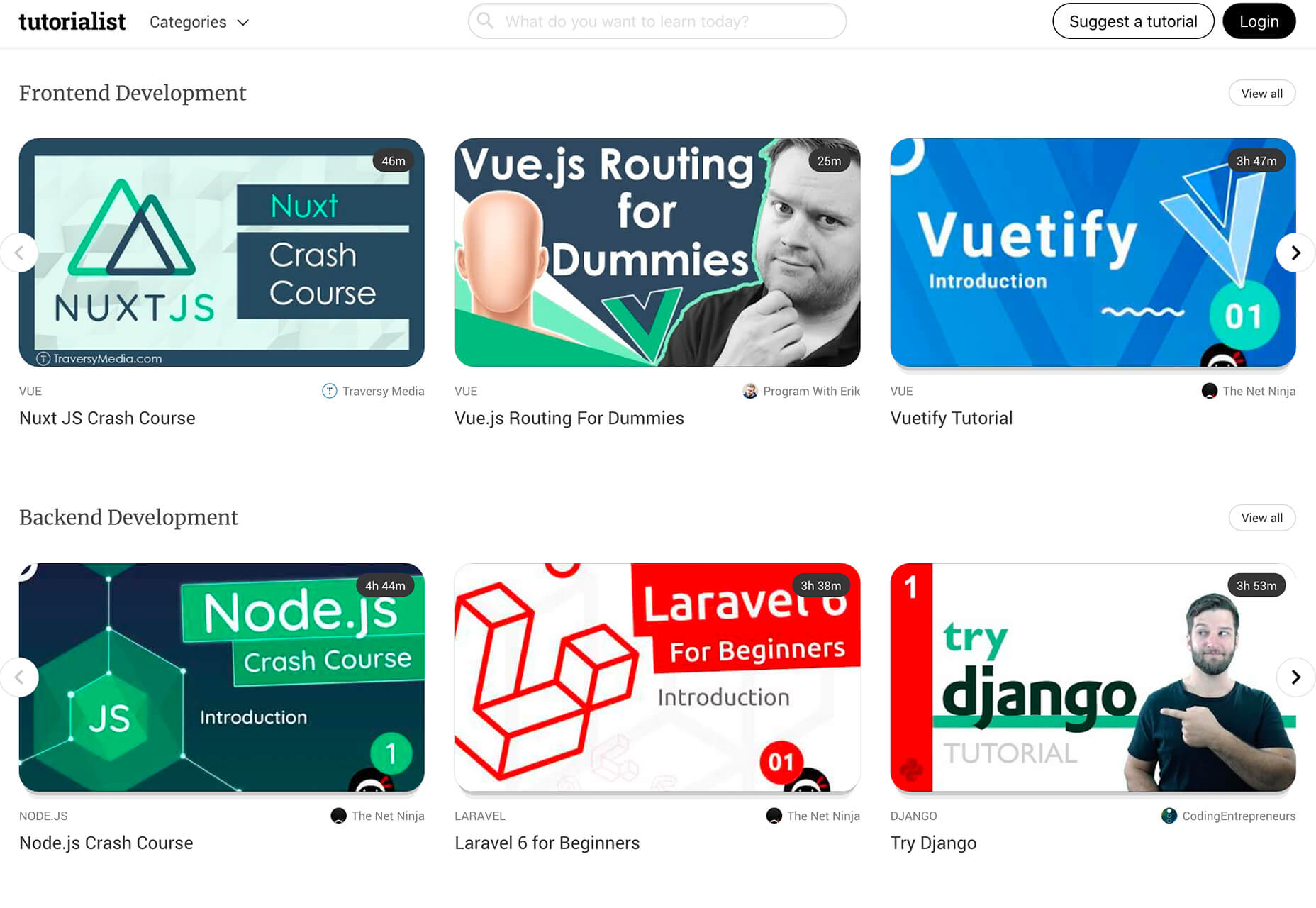
Tutorialist
Tutorialist brings together some of the best development tutorials on the web. All of the tutorials are free videos available on YouTube, and this project collects them all in one place.
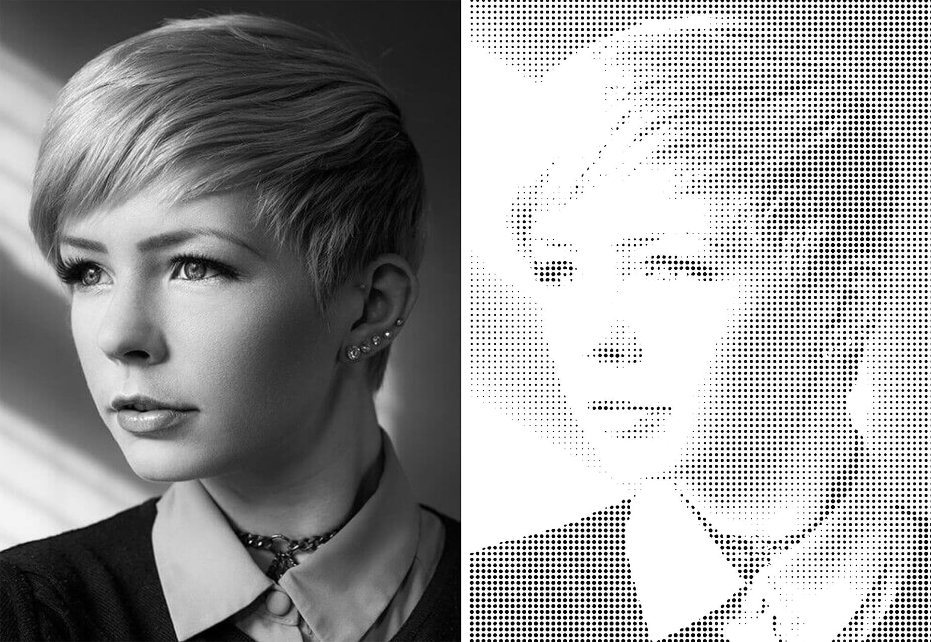
Pure CSS Halftone Portrait from JPG
Pure CSS Halftone Portrait from JPG is a beautiful pen from Ana Tudor that shows how to change the visual representation of an image. The examples are brilliant and in true halftone fashion. The code snippet works with color, or black and white images as well.
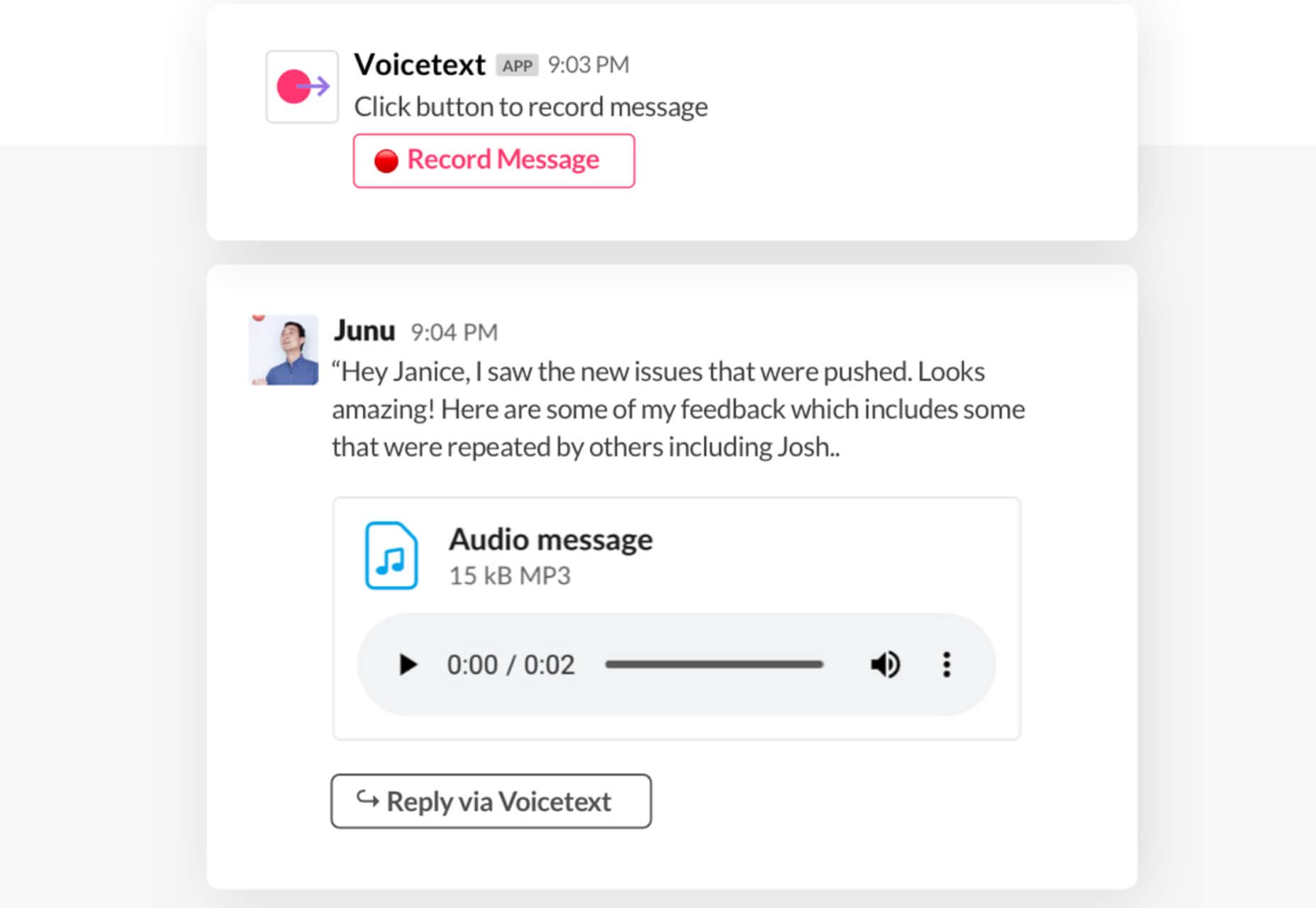
VoiceText for Slack
VoiceText for Slack is another work from home productivity tool. Integrate it with Slack and send messages with text that’s transcribed right in your channels. It’s a free integration and supports 18 languages.
Feature Peek
Feature Peek is a developer tool that helps you get frontend staging environments on demand and gather team feedback earlier in the development process. It’s made for use with GitHub and works with a variety of other tools as well.
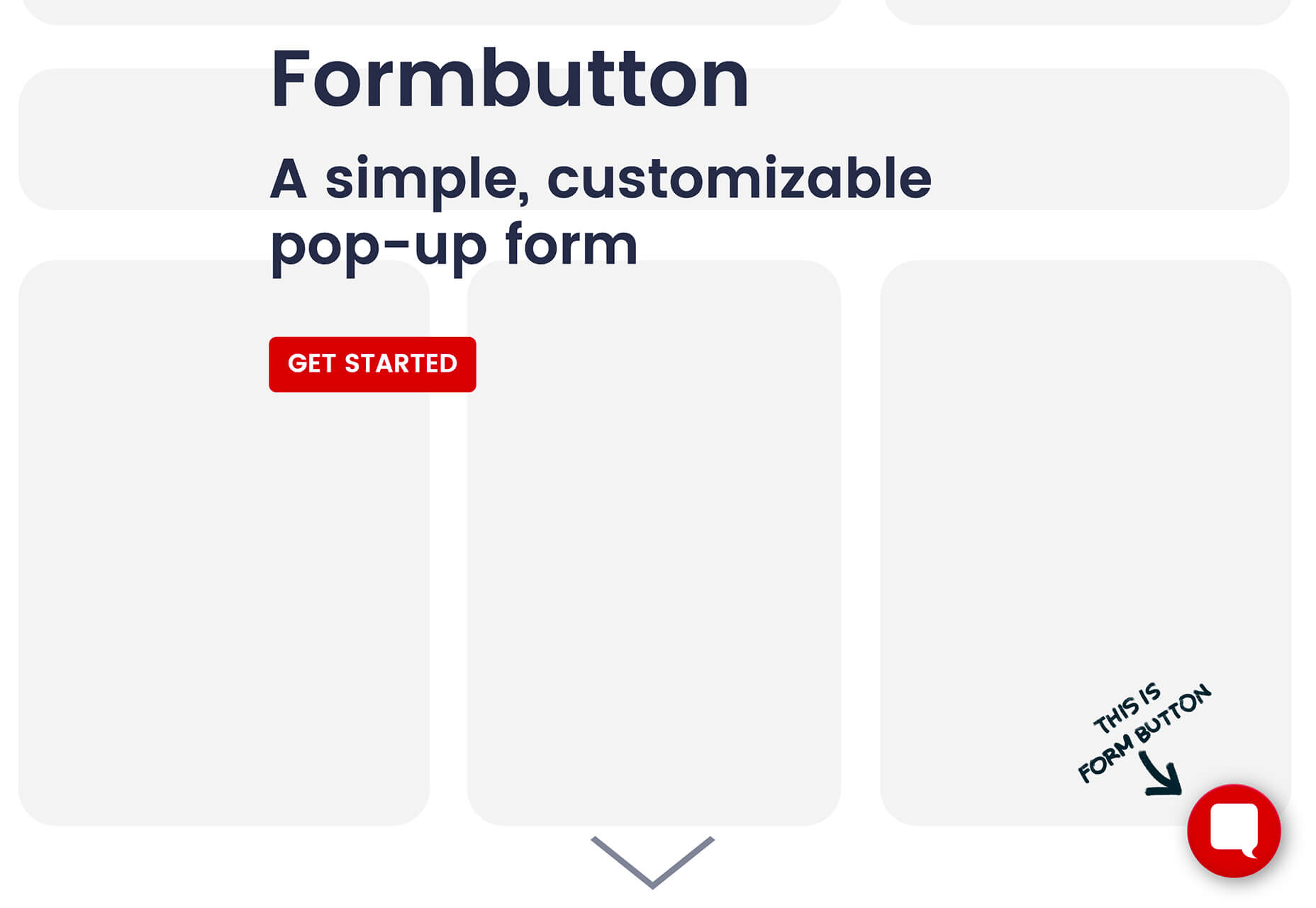
Formbutton
Formbutton is a simple and customizable pop-up form. (And we all know websites have plenty of them right now.) It connects to other services you already use, such as Google Sheets and MailChimp, and is simple to set up.
Blocksy Theme
Blocksy is a WordPress theme that’s made for non-coders. It’s a zippy and highly visual theme made for Gutenberg. It works with other builders and allows the user to customize pretty much everything visually. (There’s even a dark mode.) The theme is packed with tools and options and is a free download.
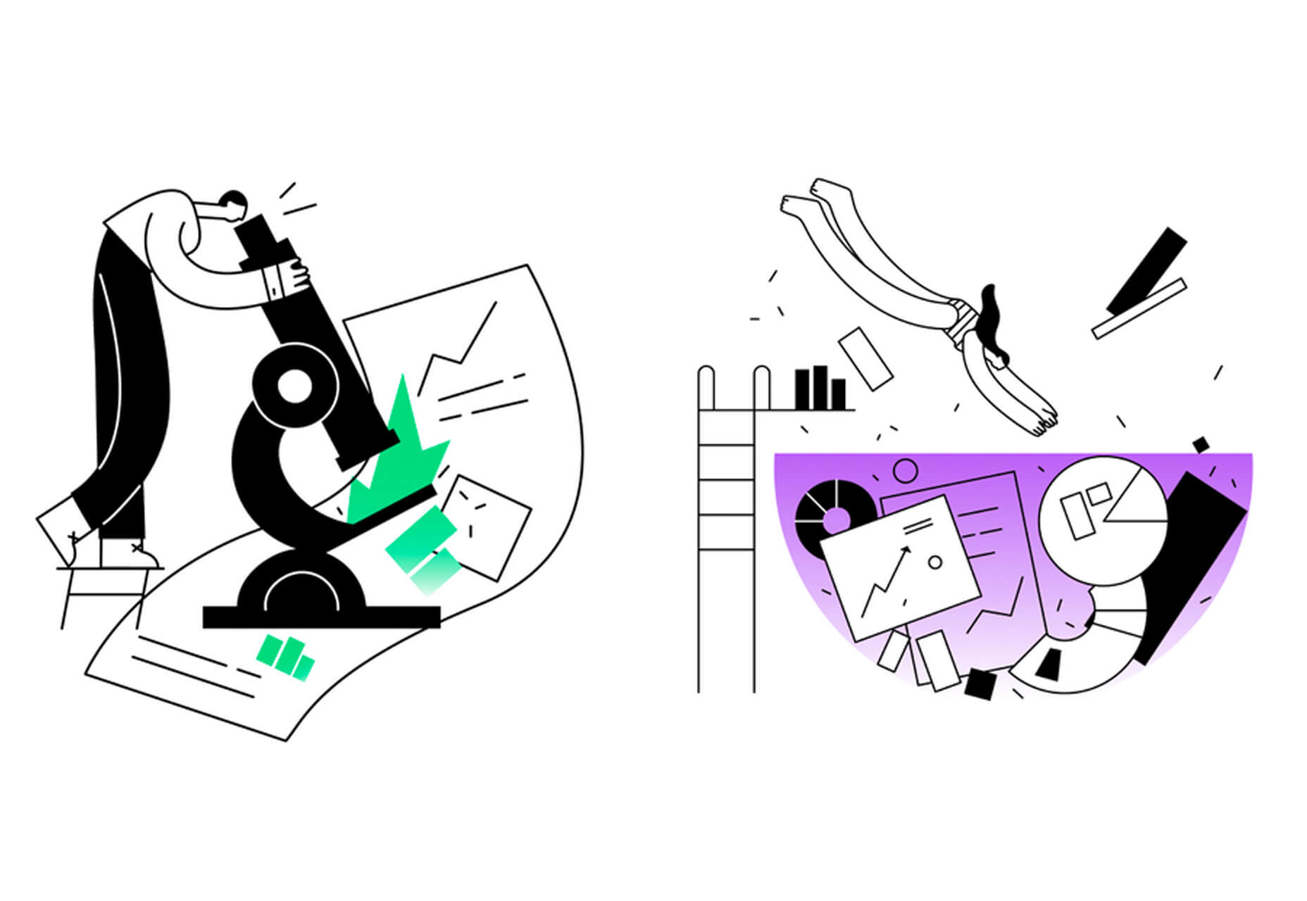
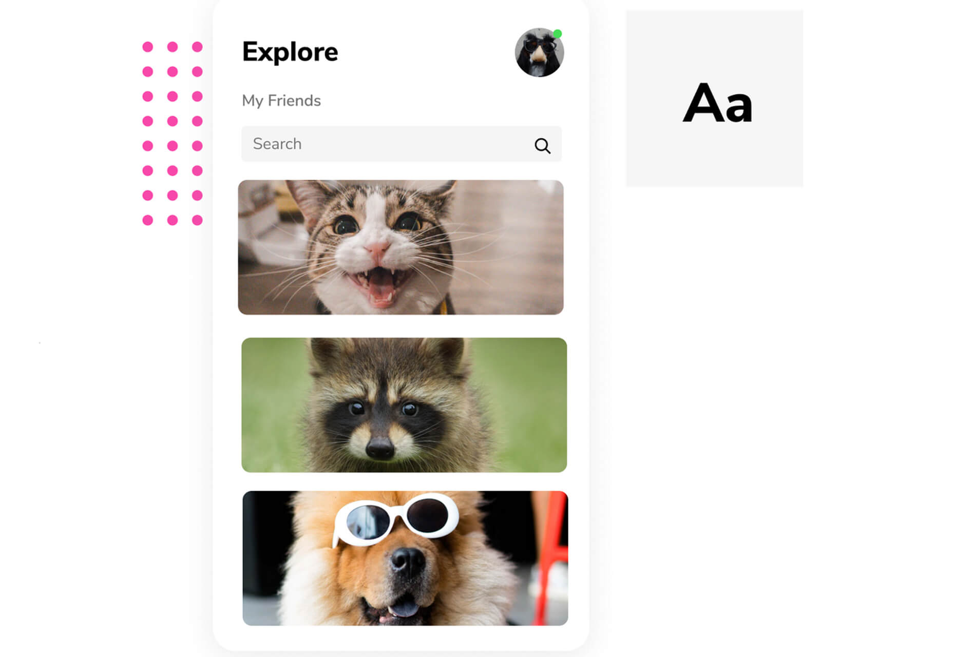
Oh My Startup Illustrations
Oh My Startup Illustrations is a set of vector illustrations in several categories featuring a popular style on many projects. Use the characters and scenes to create a semi-custom story for your startup project.
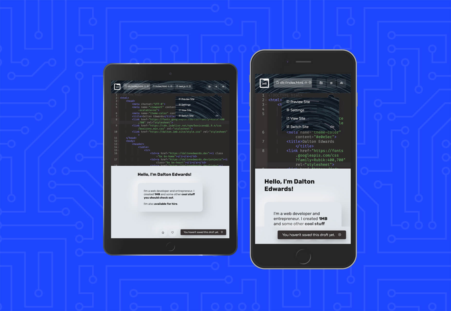
1mb
1mb is a code editor and host where you can create a static website with a custom domain and SSL included. The editor works in-browser and everything is saved in the cloud.
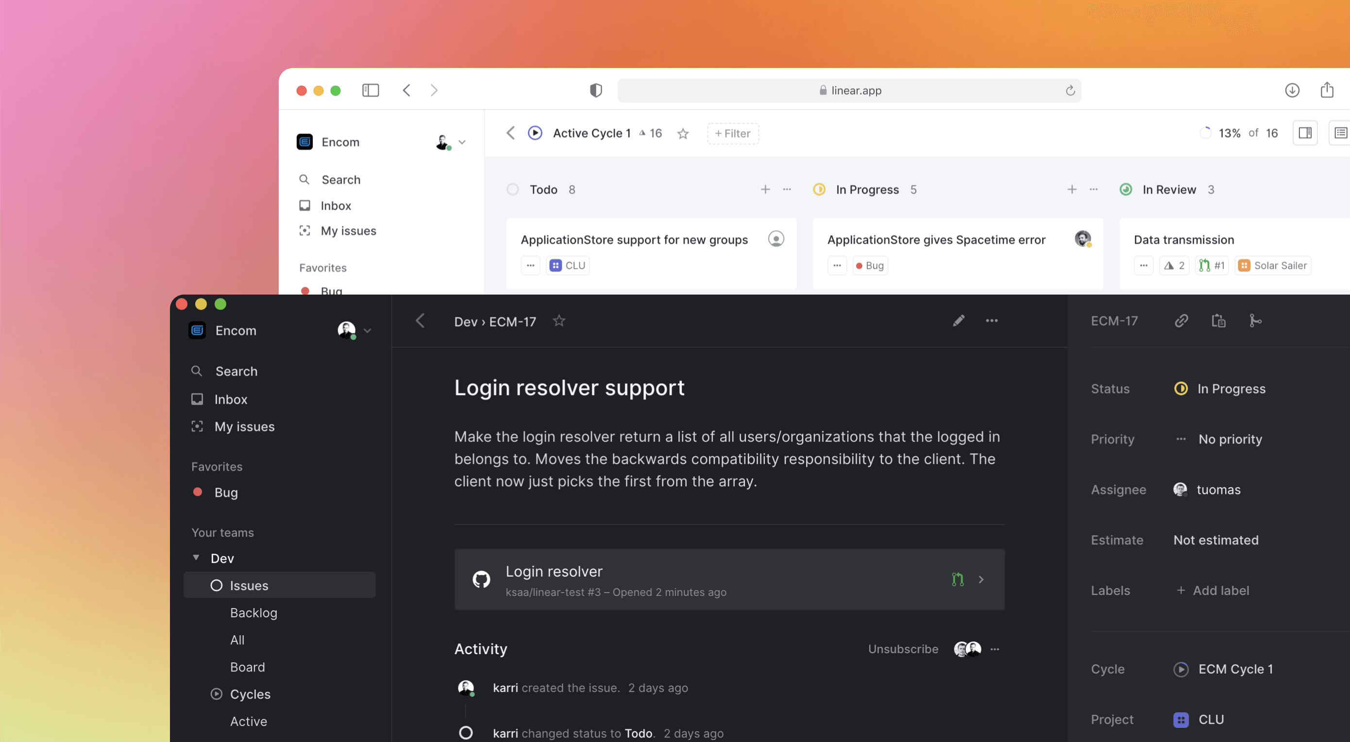
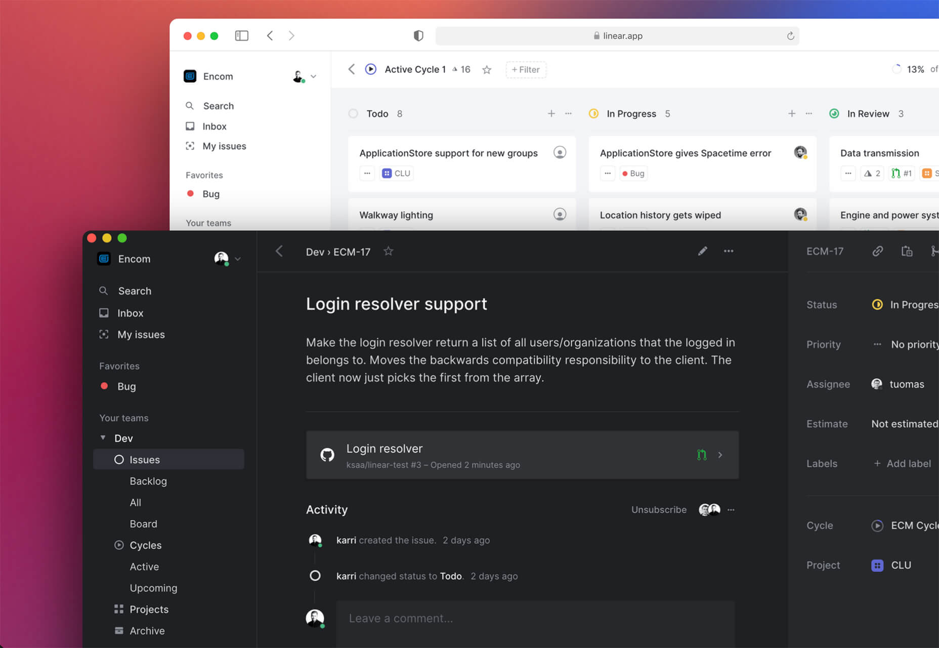
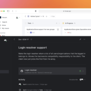
Linear
Linear is an issue tracking Mac app for teams. It’s designed to help streamline software projects, sprints, and tasks, and can integrate with standard tools such as Github, Figma, and Slack.
Hosting Checker
Hosting Checker solves a common issue – a client wants you to work on their website, but has no idea who hosts it. Hosting Checker shows the user hosting provider and IP address the website uses, along with where its server computers are located and the host’s contact details. It also claims to be 82% faster than other similar tools.

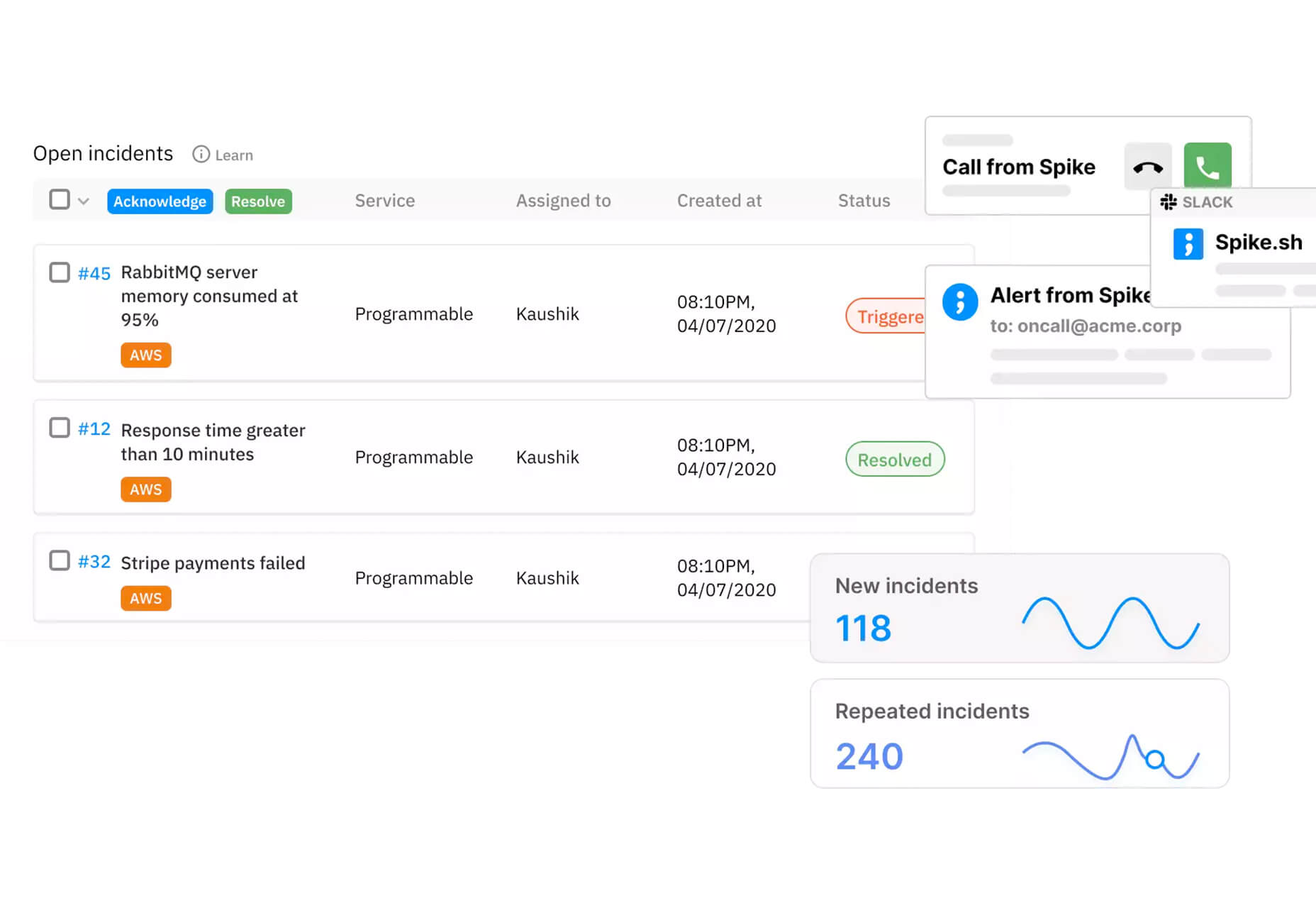
Spike
Spike alerts you to website incidents before customers. Create alerts and get a phone call, text message, email, or Slack notification right away. The tool provides unlimited alerts and integrations to you can stay on top of issues before they become real problems.
Magnus UI
Magnus UI is a framework that helps you building consistent user interfaces in React. It comes with plenty of components ready to use and you can customize the theme.
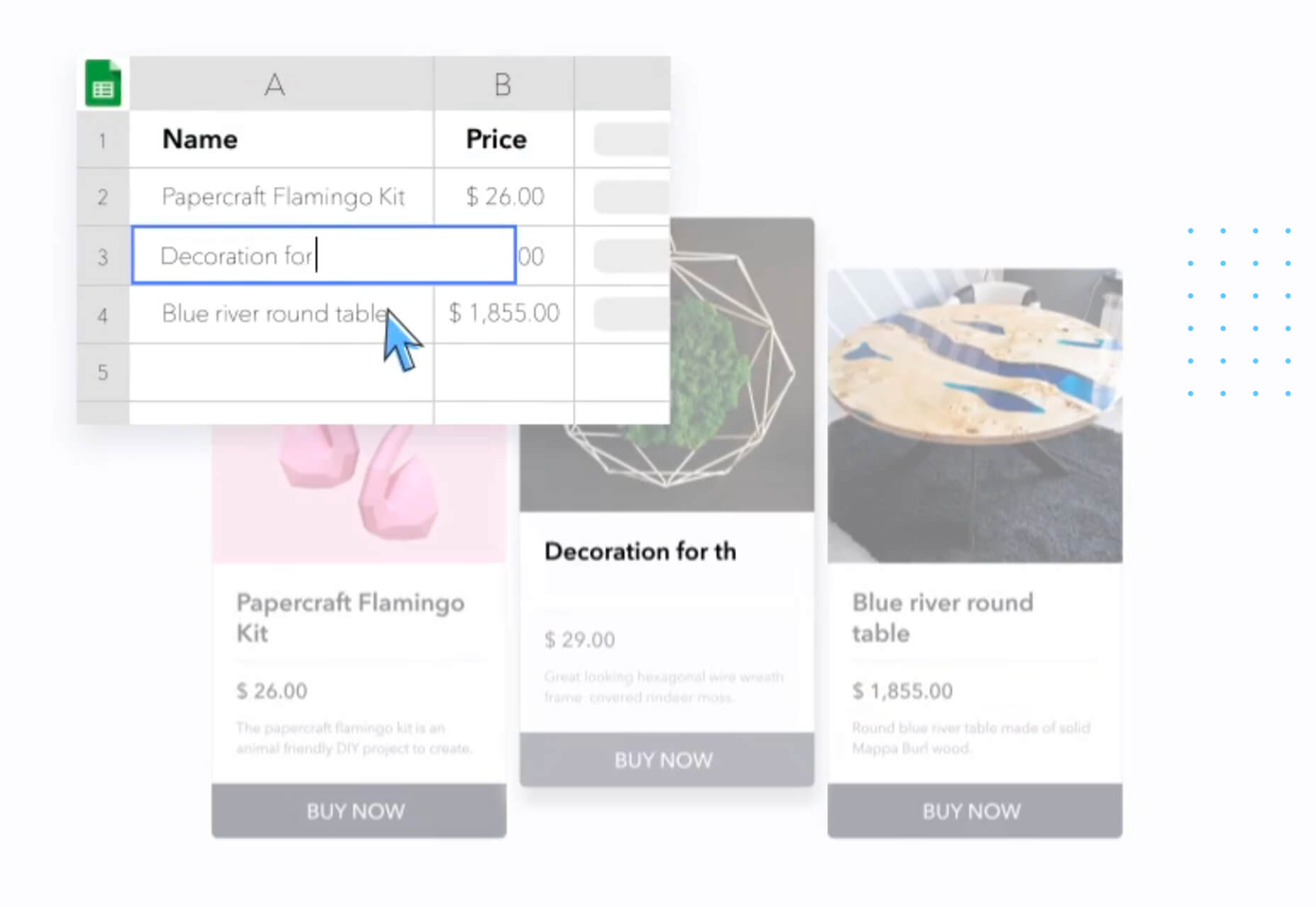
SpreadSimple
SpreadSimple uses data in Google Sheets to create styled websites with features such as filtering, search, sorting, cart, order collection via forms, and much more. Update the sheet and instantly see changes on the website.
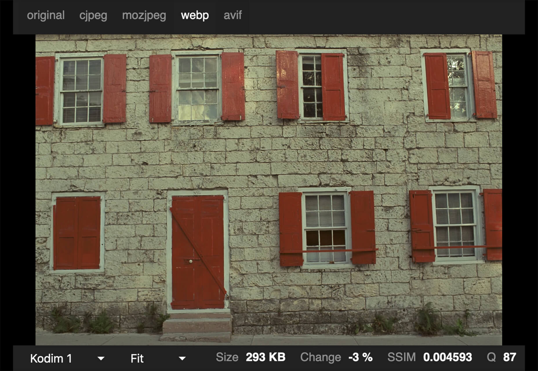
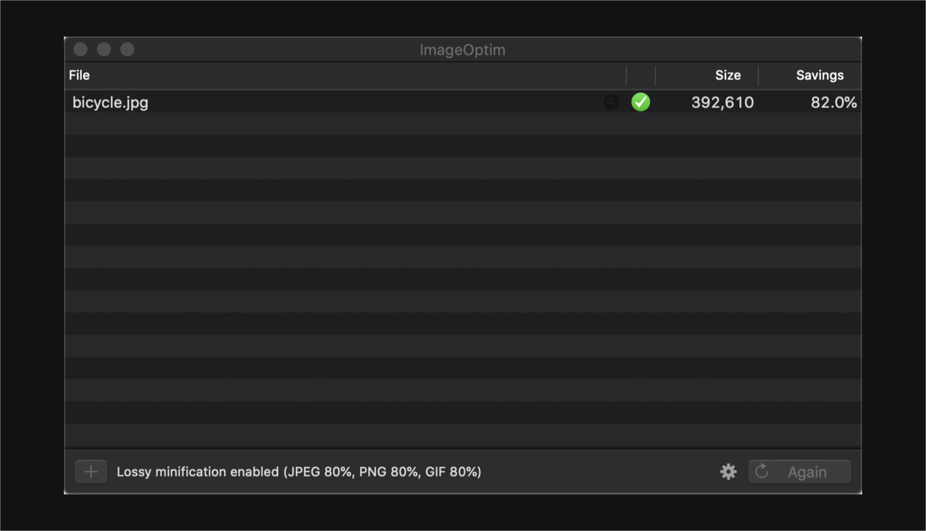
WebP vs. JPEG
Google is starting to suggest using it’s WebP image format to decrease load times, because of the lighter file size. But is WebP better than the traditional JPEG? Developer Johannes Siipola tested the file types at different sizes to answer the question. The answer is a bit complicated, but sometimes it might be better; read the full analysis for more.
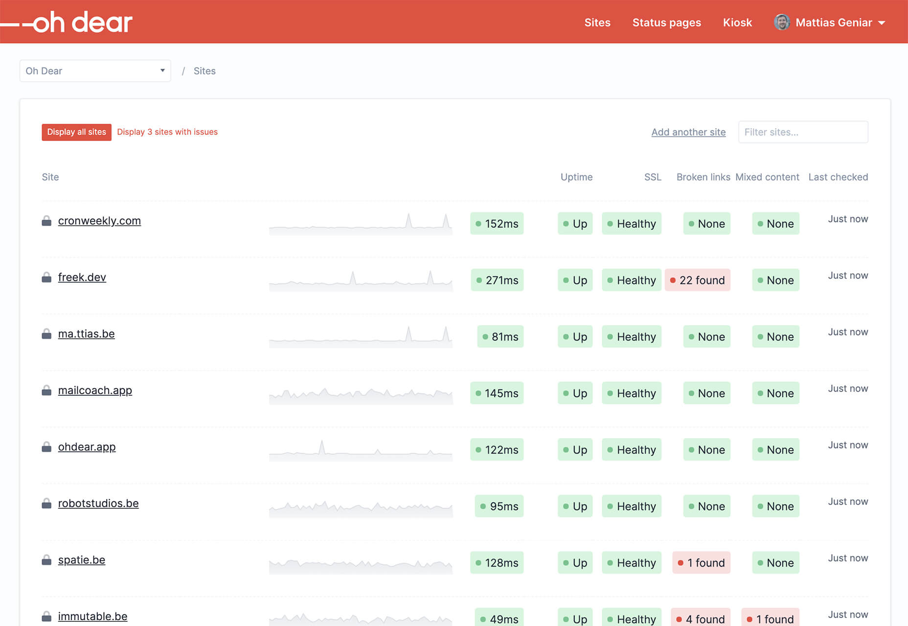
Oh Dear
Oh Dear is a website monitoring tool that can help you keep a check on websites. Monitor uptime, SSL certificates, broken links, and more with notifications that come right to you if there’s an issue.
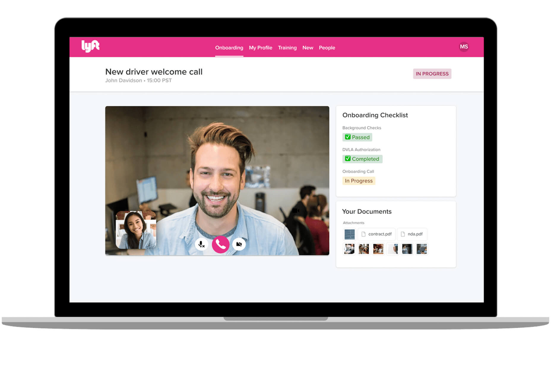
Airconnect
Airconnect is a Zoom video conferencing alternative that you can use for your brand with a custom header, colors, and portal for clients. The tool includes video calling as well as the ability for customers to access their data and automate your onboarding process.
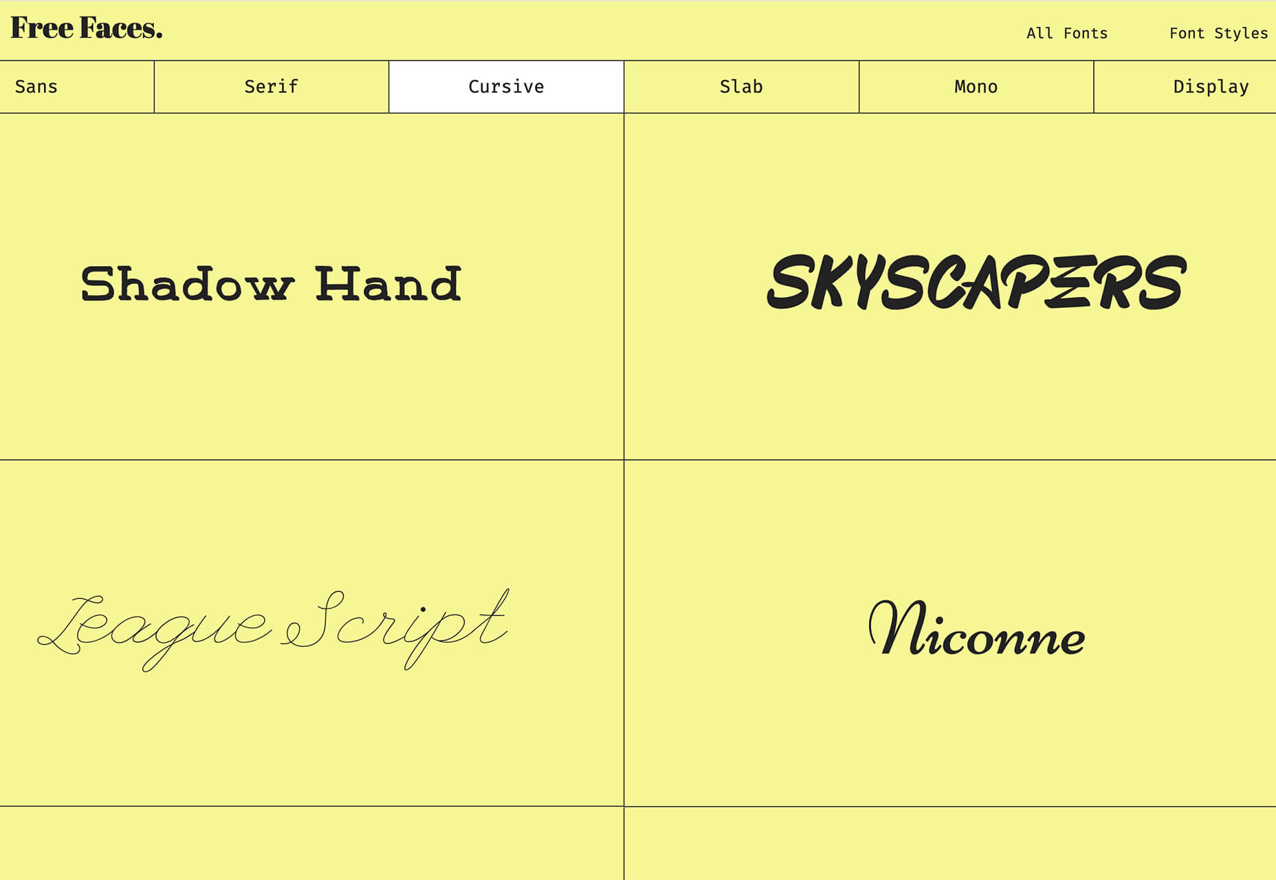
Free Faces
Free Faces is a curated collection of free typefaces that you can browse and use in projects. Search by type style with visual results that include a download link.
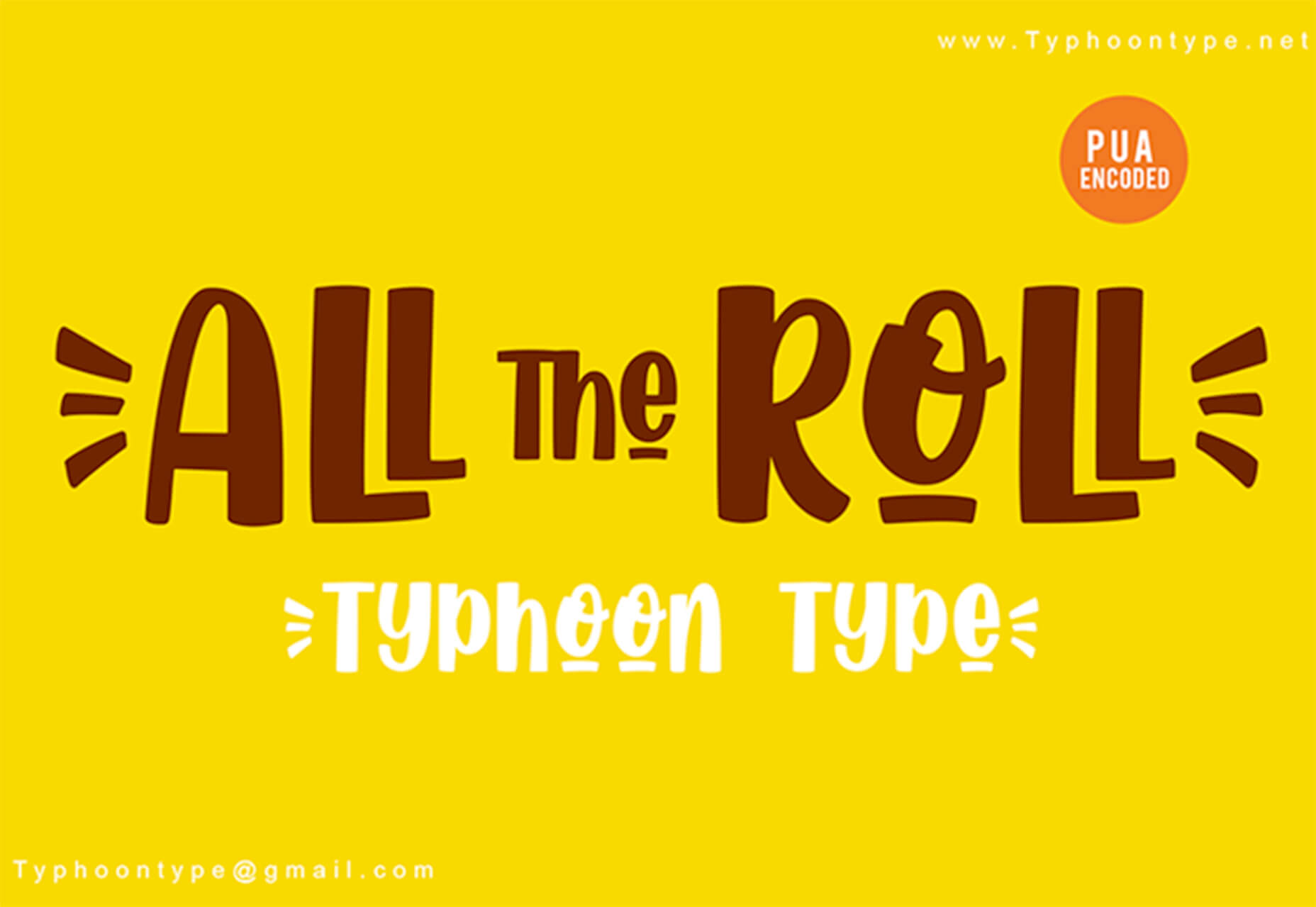
All the Roll
All the Roll is a fun novelty font for just the right type of project. It includes 167 characters with swash characters that can be added before or after certain letters.
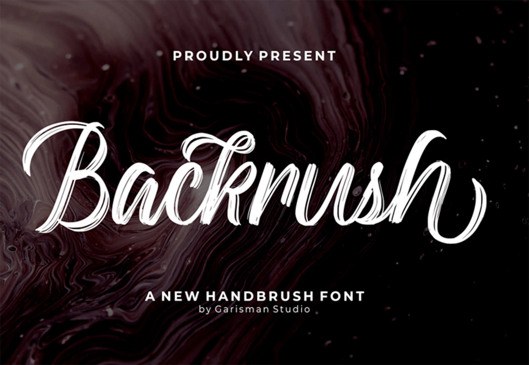
Backrush
Backrush is a handwriting-style typeface with easy strokes and a pen-like feel. It includes thicker letterforms with nice swashes and a full character set.
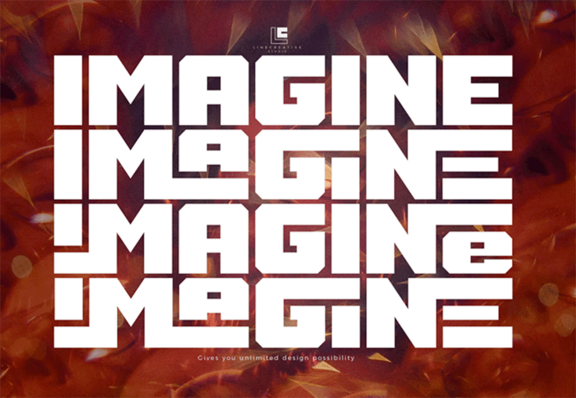
Thuner
Thuner is a slab display font with interesting quirks. It’s made for larger than life designs. It includes a full uppercase character set and numerals.
Source

Source de l’article sur Webdesignerdepot


 Every week users submit a lot of interesting stuff on our sister site Webdesigner News, highlighting great content from around the web that can be of interest to web designers.


 Every week users submit a lot of interesting stuff on our sister site Webdesigner News, highlighting great content from around the web that can be of interest to web designers.


 Every week users submit a lot of interesting stuff on our sister site Webdesigner News, highlighting great content from around the web that can be of interest to web designers.


 You’ve been working away at your latest design project, and the client has given the go-ahead on your lovingly created digital concepts. Now it’s time to bring those designs to life, and you have a developer queued up to do just that.


