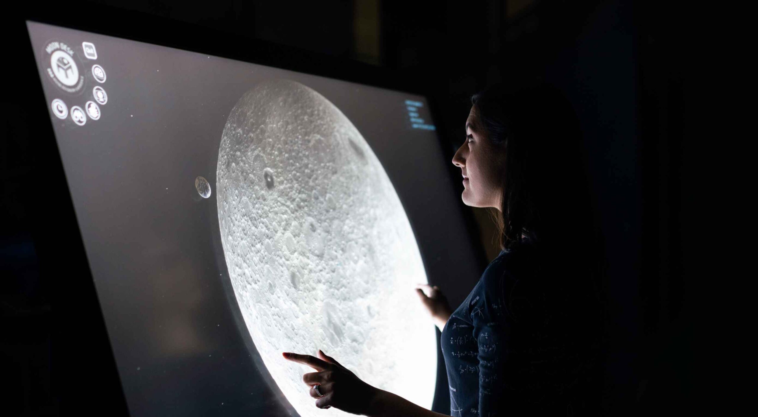
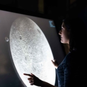
 AR (Augmented Reality) continues to build as one of the most exciting technology innovations to appear in recent years. More accessible than virtual reality experiences, since no specialist headset is required, AR has quickly emerged as a crucial tool for building unique experiences.
Although interest in AR as a tool for customer interaction and experience has been growing, demand has skyrocketed in recent years. In addition, since the pandemic of 2020, companies no longer have the same in-person opportunities available to create meaningful relationships with customers.
To ensure a client is fully invested in your brand today, you need to find a new way of building that emotional link. As an immersive, experience-led solution for brand building, AR can improve a company’s chance of earning brand loyalty. What’s more, around 71% of consumers say they would shop more often if AR technology were available.
The question is, how do you develop your own AR branded experiences?
Creating Branded Experiences in AR
For an augmented reality experience to be effective, you need more than just the right technology; you need a strategy for how you’re going to engage, empower, and support your target audience.
The best AR branded experiences aren’t just multi-dimensional advertisements; they’re tools intended to engage, inform, and entertain your audience in a new, highly immersive realm. Before you can begin to work on your AR app, you need to think about what kind of branded experience you want to develop. Here are some excellent examples to get you started.
AR Try-Before-You-Buy Interactions
Globally, ecommerce sales are growing at an astronomical pace. Going forward, there’s no question that the digital landscape will become the new platform for shopping and transactions. But, unfortunately, there are some limitations when it comes to shopping online.
While the right website developer or designer can create a stunning site packed with information about a product or service, there’s only so much that a webpage can do. Delivering a truly immersive user experience for your target audience involves replicating the kind of in-person experiences they would get in a digital format.
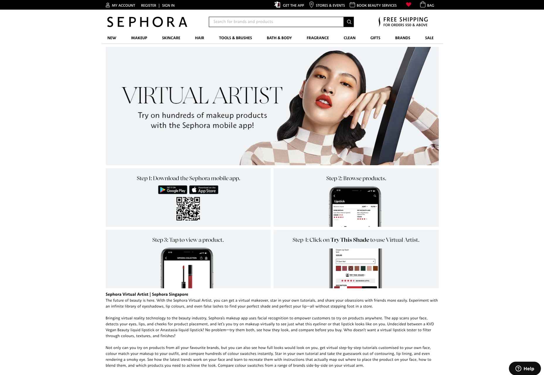
The best example of this is the “try-before-you-buy” AR app. Most commonly seen in the clothing and beauty industries, this app allows customers to use AR filters to see what everything from a new hair color to a shade of lipstick might look like on them. The experience is highly accessible and engaging because it builds on customers’ familiarity with filters and similar effects on social media channels like TikTok and Instagram.
A popular example of an AR try-before-you-buy experience comes from Sephora, with the “Virtual Artist” application. Originally installed within the Sephora app in 2016, the technology uses Modiface to scan and track the eyes and lips of the customer using a smartphone camera. After that, the system can overlay eye-shadows, lipsticks, and other products, to give the customer idea of what they might look like in real-life.
As AR applications become more mainstream, new solutions are emerging for companies concerned about things like privacy. Consumers who don’t want to load their image into a system for try-before-you-buy experiences can still access the benefits of AR with the right tools.
For instance, ASOS created the new “See My Fit” service in 2020 to help customers shop for clothing during the pandemic. The solution allows users to see what clothing will look like on a model with a similar body type to their own. This helps to show shoppers how products realistically look in similar bodies while reducing the risk of returns.
ASOS certainly saw the benefit of this innovation, with an increase in revenues of around 24% in the six months leading to the end of February 2021.
AR for Product Catalogs and Visualization
We all remember what it was like to flick through the glossy pages of a magazine or catalog for our favorite stores. Unfortunately, in today’s digital age, these paper brochures are far from the most efficient tool for shopping. We need a more digital experience that allows us to select products, see what they will look like, and add them to our virtual baskets.
One excellent example of how companies can use AR to improve the overall shopping and visualization experience for customers comes from Home Depot. The brand was one of the first to upgrade its user experience strategy with a new Project Color application in 2015. Although this app might seem a little outdated by today’s standards, it’s still an excellent insight into what companies can do to improve their customer’s brand experience.
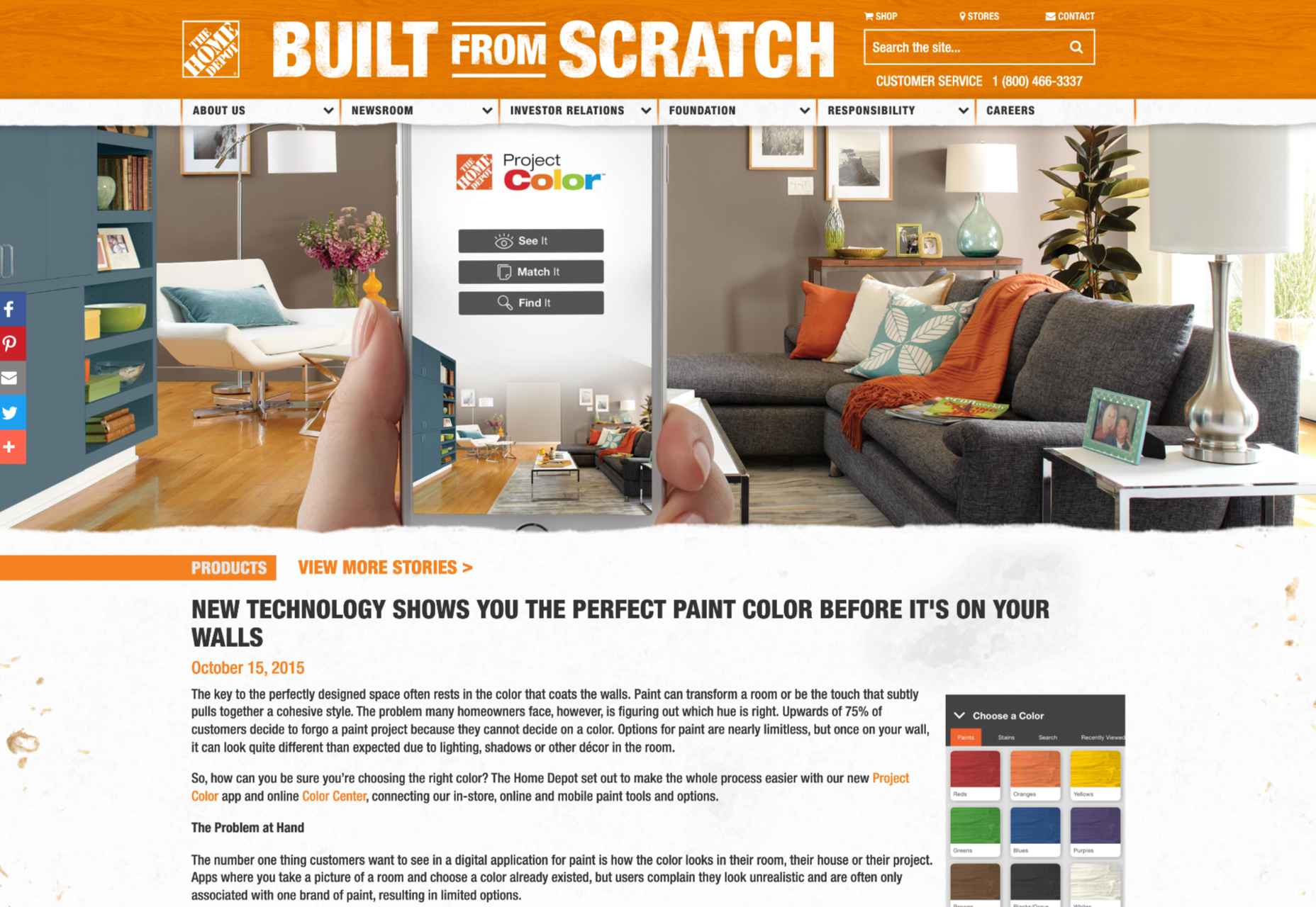
The Home Depot app used AR to scan a room and implement the color a customer chose for their walls into that space, considering things like furniture, shadow, and lighting, to allow for a more realistic insight. The app has updated significantly over the years to become increasingly immersive.
Visualizing products in a real, contextual space is hugely beneficial for a customer’s purchasing experience and perception of a specific brand. If your customer sees buying the right product from you as simple and convenient, they’re more likely to stick with your organization long-term.
The product catalog and visualization approach to AR in brand development has grown increasingly popular in the last two years, perhaps driven by the demand for more online shopping opportunities. In 2020, Wayfair announced the release of an updated version of its “View in Room” app, which now uses LiDAR technology to provide enhanced utility when shopping for home products.
According to Wayfair, the LiDAR technology and “RealityKit” software give customers a more authentic and realistic view, so they can make better decisions about what they want to buy. According to Apple, customers are 11 times more likely to buy an item of furniture if they have seen how it looks in their home using AR.
Creating Unique Brand Experiences
AR is one of the technology innovations in our current landscape, helping blur the lines between digital worlds and reality. In a future defined by the rise of the metaverse, AR could have a significant impact on how we spend our time in a more virtual world.
Already, companies are taking advantage of this, with things like virtual pop-up shops and temporary experiences intended to differentiate their brands. For instance, Machine-A, a London-based concept store, is usually committed to showcasing contemporary fashion designs.
When it became apparent that London fashion week for 2020 would be virtual, Machine-A came up with a virtual boutique enabled by AR. By scanning a QR code embedded into billboards and posters across London, users could enter the boutique virtually from their phones and experience the designs themselves.
The concept created by Machine-A has opened the minds of countless business brand teams and marketers to new methods of increasing engagement and awareness among customers. In a world where you can’t necessarily interact with your top customers in person, providing them with a new and immersive experience can be a great way to generate loyalty.
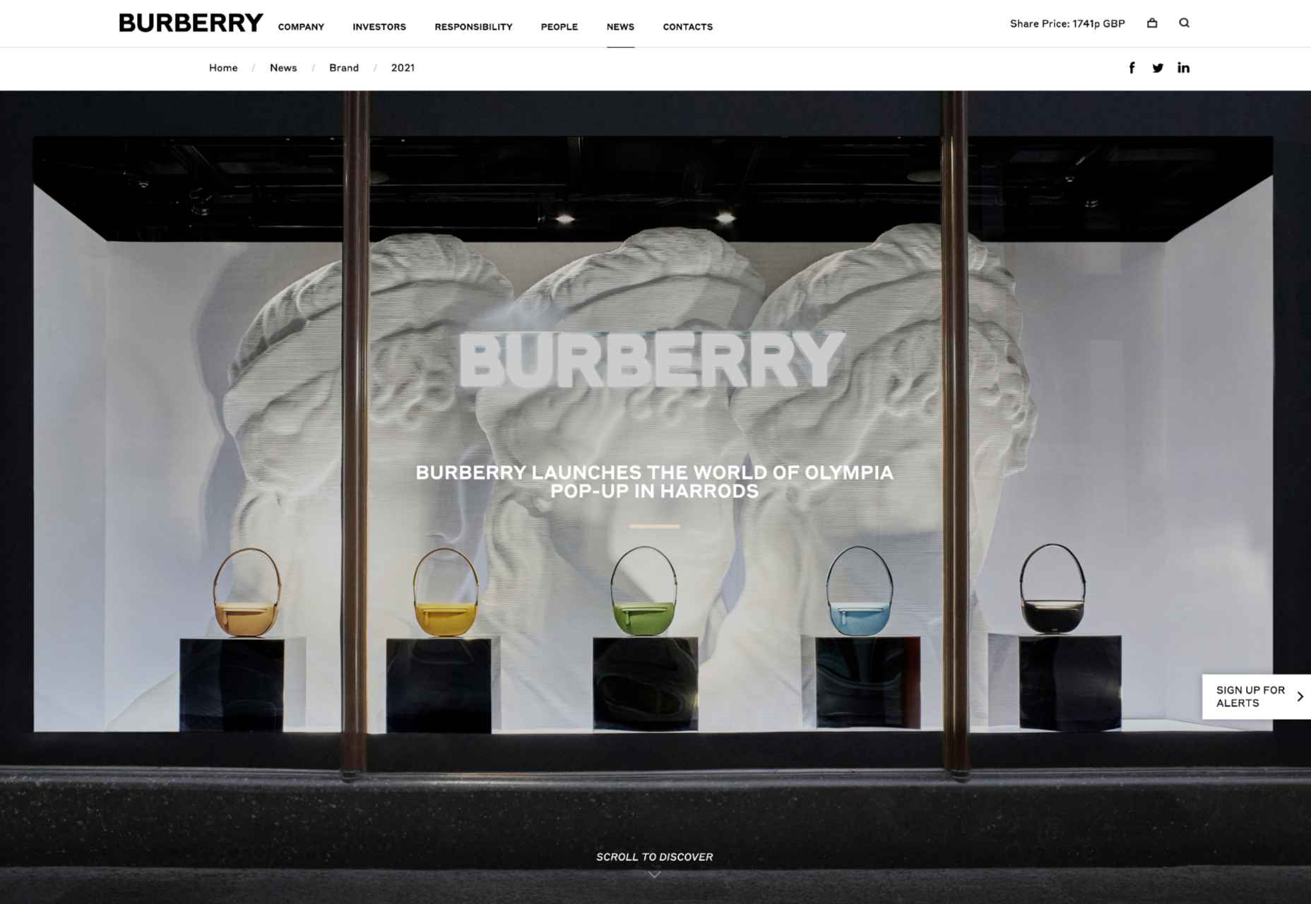
The companies more willing to invest in innovative solutions like AR are also more likely to stand out as innovators in their field. Other companies have experimented with similar “pop-up” experiences and unique ways to capture audience attention. For example, Burberry placed a QR code in a Harrods store, which customers could scan to visit a branded experience, where an Elphis statue walked around in their surroundings through the lens of their smartphone camera.
It’s even possible to use AR experiences to attract the attention of new audience groups. For instance, the retail brand, Pull & Bear launched an AR game created with Facebook to help the company reach the 90% of Gen Z customers who identify as “gamers.”
Provide New Levels of Customer Support
As many of today’s businesses know, memorable branding isn’t just about having the right image or website; it’s also about providing the correct level of customer service and support. Most purchasing and brand loyalty decisions made today are based on customer experience.
Providing customers with unique experiences to improve their shopping journey is sure to make your company stand out in the new digital age. But it’s also possible to go even further with AR in your brand CX strategy too.
Amazon Salon, for instance, the first bricks-and-mortar hair salon created by Amazon, was partially established to test new technology. The “point and learn” service, for example, allowed customers to point a product they were interested in on a display or shelf and immediately access educational content. Users could also scan QR codes to visit the product page on the QR site.
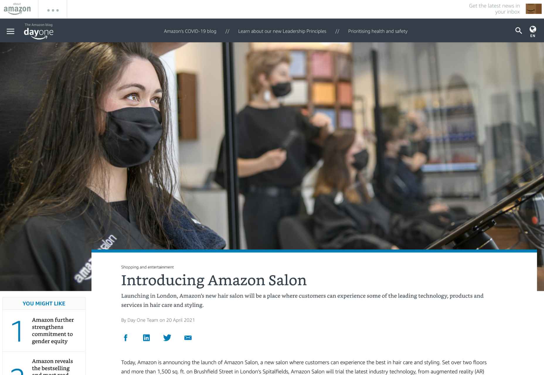
This helps customers immediately get to the product they want to buy without relying on input from human services agents. In a similar vein, AR could be an excellent way to onboard a customer, learning how to use a new product for the first time.
Imagine having a user’s manual your customer can enjoy scanning through, thanks to AR technology. All your customer needs to do is scan the QR code on the back of a product, and they can see the item they need to build or install coming to life in front of them. This reduces the risk of customers having to call for help from tech support and means clients can see the value in their purchases a lot faster.
Companies can embrace AR as a virtual learning experience, helping users collect information and learn how to do things through an immersive first-hand experience. This kind of immersive technology could help to make any brand stand out as more user-experience-focused. Even car companies could essentially provide their customers with a complete virtual HUD showing them how each button and dial on their dashboard works.
Upgrade Website Design
Perhaps the most common way companies will be using AR to create branded experiences today is by updating their website. You’ve probably already seen examples of AR being used in a host of retail sites, with new experiences designed specifically for the age of augmented reality.
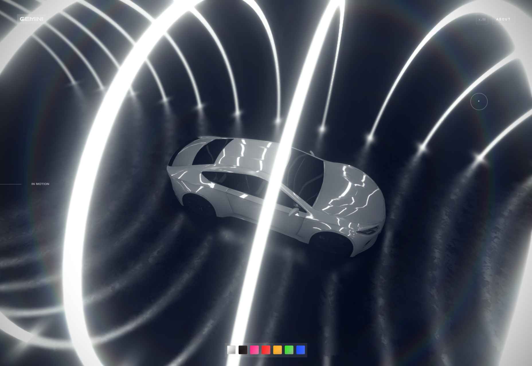
360-degree images, for instance, allow customers to essentially “look around” a product, and see it from different angles, just like they would if they were looking at the item in-store. We can see an excellent example of this on the BMW build-your-own web page, where vehicle browsers can see their vehicles from every angle.
The 360-degree product viewing experience lets you check everything from the side molding to the sculpted edges in perfect detail.
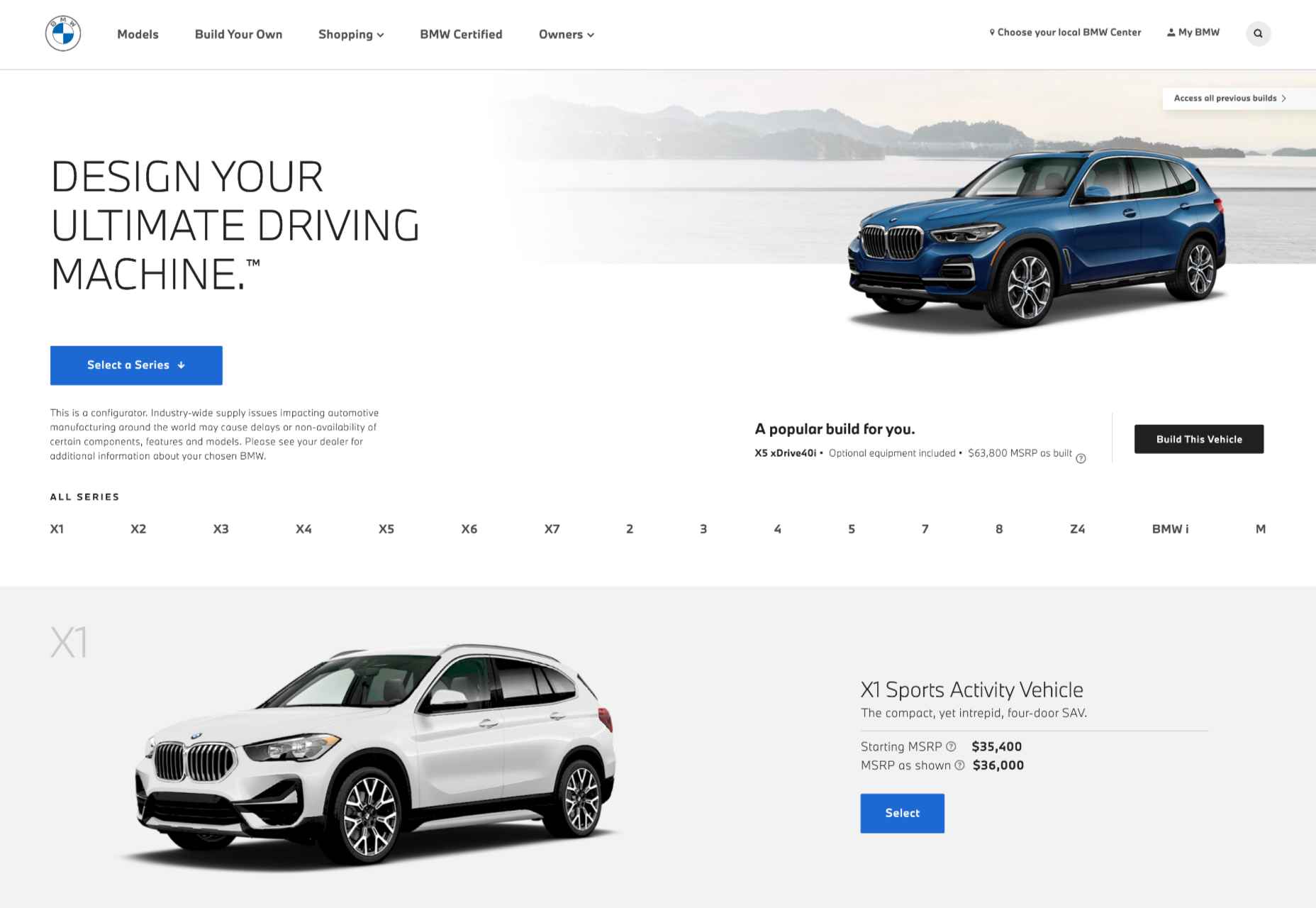
QR codes and app downloads can also allow customers to take their AR experience even further, looking at things like what life would be like behind the wheel of one of these virtually augmented vehicles.
As AR becomes more commonplace and the tools available for designers in this arena continue to expand, there will be even more opportunities available to bring AR into the website experience. Even essential website upgrades today might include allowing customers to upload pictures of themselves or their homes, then using augmented reality technology to implement parts of a product catalog into the space.
AR Virtual Events
Finally, when it comes to exploring all the unique ways you can build a better brand experience and excellent customer relationships with AR, it’s worth looking at the event space. The event landscape has struggled significantly over the last couple of years. The pandemic forced most live events to be canceled, and although the post-pandemic era holds new hope for upcoming in-person experiences, the landscape will be very different.
Going forward, most companies plan to avoid a complete shift back to in-person events by creating “hybrid” experiences and augmented reality events instead. Augmented and virtual reality tools allow customers to step into an event arena from wherever they are.
For instance, the Pot Noodle Unilever brand hosted a virtual alternative careers fair in AR, where people could use their phones to navigate through a range of graduate employer booths. The unique career fair experience was designed to replace the more common in-person interactions graduates might have as they approached the end of their education.
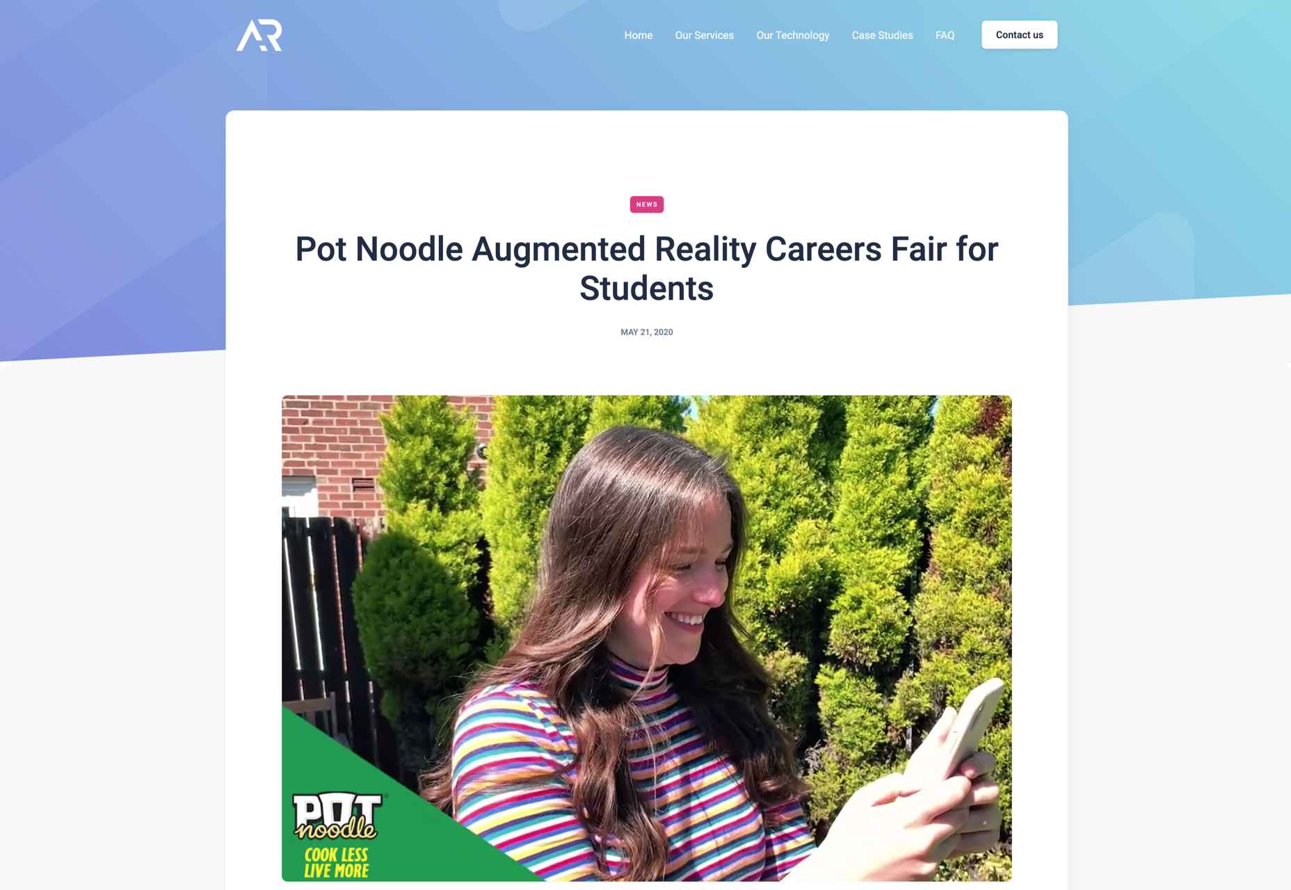
The custom-developed 3D booths featured a range of different employers, and students could tap on the booth screen they were interested in to see a video from each employer. As an added bonus, the connection to the Pot Noodle AR careers fair website meant that students could also instantly apply for any of the jobs they were interested in.
Similar events could help brands recreate some of the meaningful experiential experiences that their customers have been missing out on in the last couple of years. They could also act as a valuable tool for bringing together people in a hybrid event, where someone visiting an in-person demo table could scan a QR code to send virtual demonstrations of a product back to their team.
This would reduce the number of people who needed to be present in an event environment at any given time, reducing the risk of health issues.
Bringing Brands to Life with AR
In the new consumer landscape, brand relationships are more important than ever. As a result, customers are making more careful choices about who they purchase from, based on their understanding of that company’s values and differentiators.
Now that you won’t always have an opportunity to interact with customers in-person to earn their trust, AR could be the solution for a lot of companies in search of new engagement tools. All you need to do is figure out how you’ll leverage all the benefits AR can offer.
Will you be creating an app, building a new website with enhanced 360-degree photos, or designing in-person experiences? Hopefully, these examples have inspired you to start exploring your options.
Featured image via Unsplash.
Source
The post How to Use AR in Brand Experiences first appeared on Webdesigner Depot.
Source de l’article sur Webdesignerdepot
 Every day design fans submit incredible industry stories to our sister-site, Webdesigner News. Our colleagues sift through it, selecting the very best stories from the design, UX, tech, and development worlds and posting them live on the site.
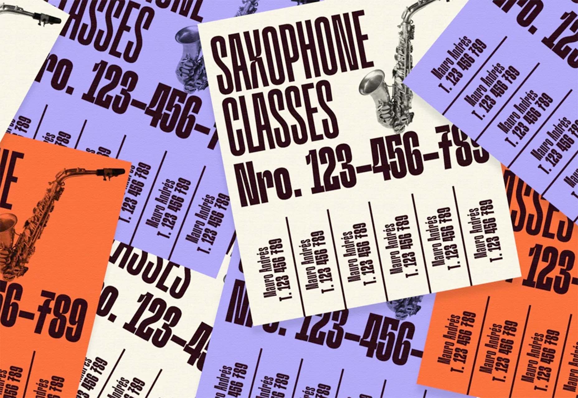


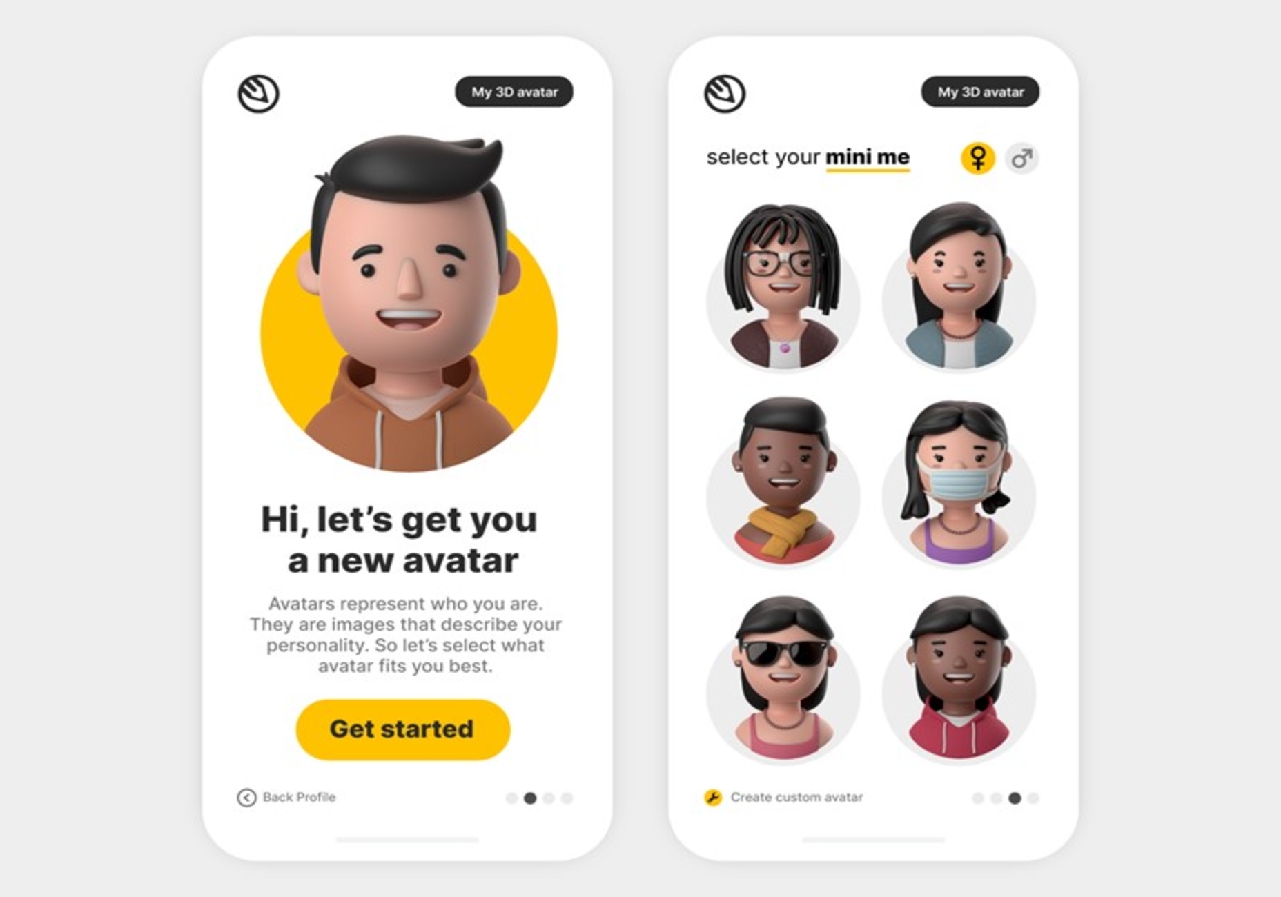
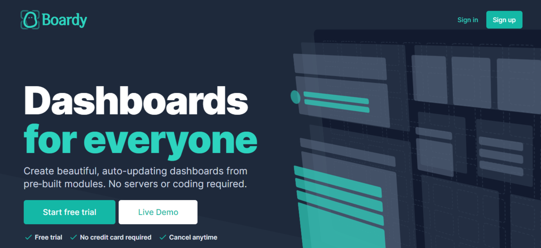
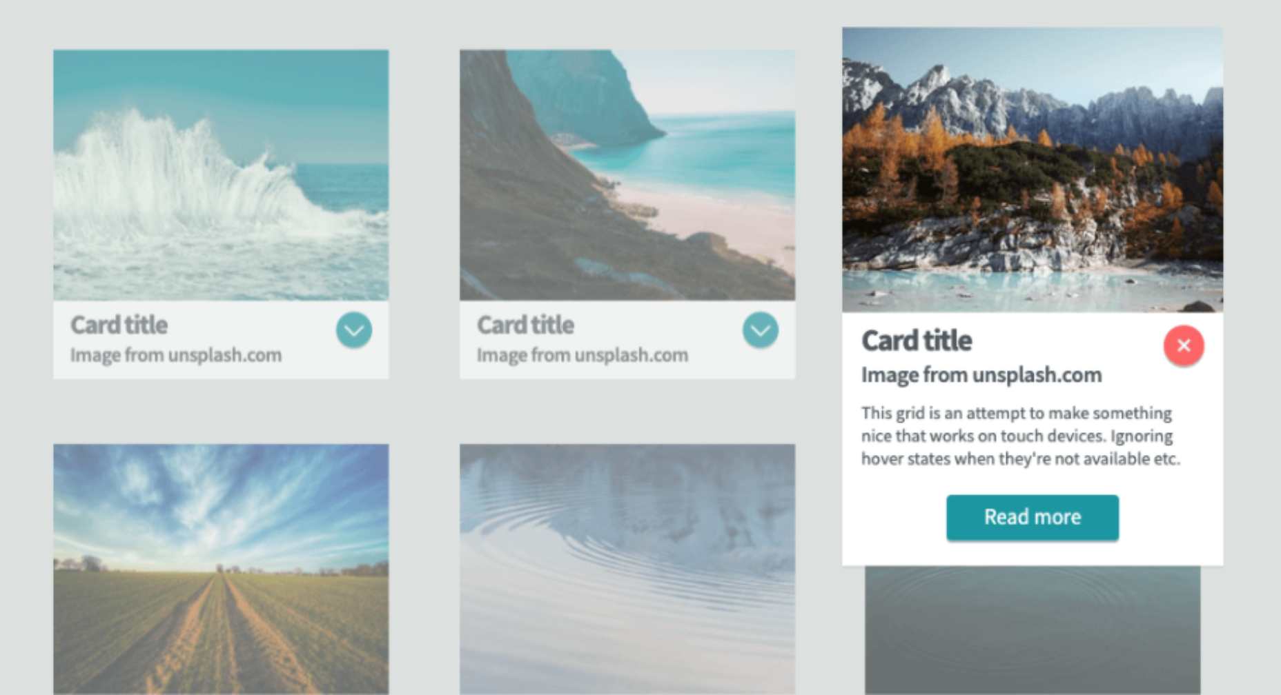
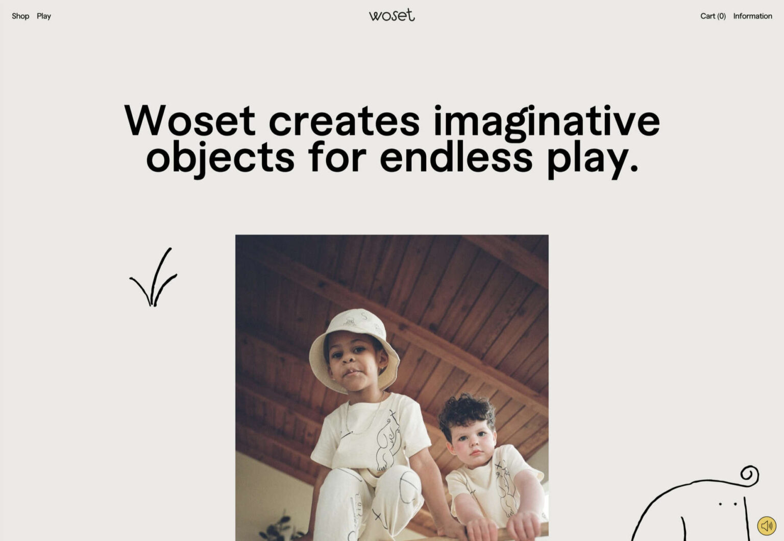
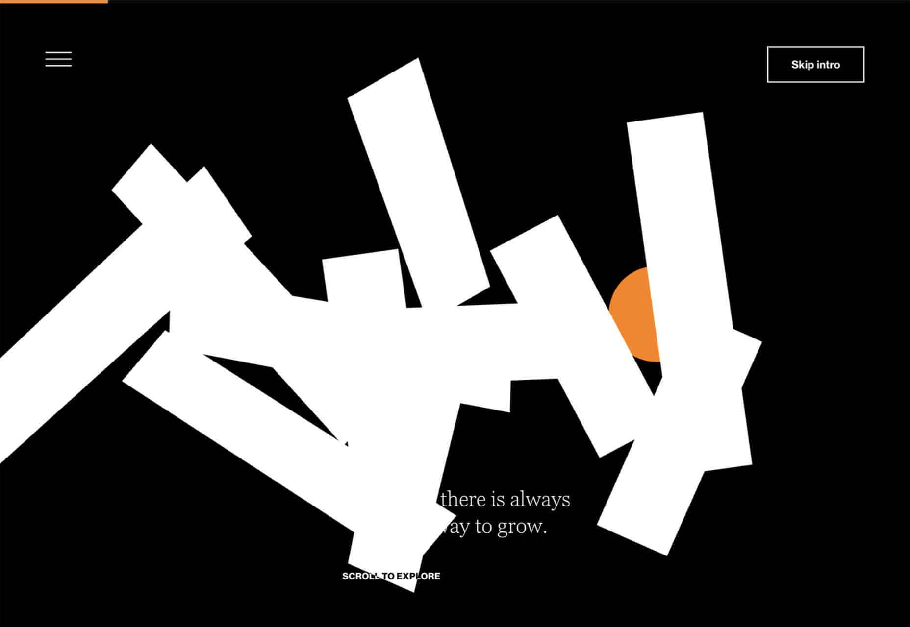
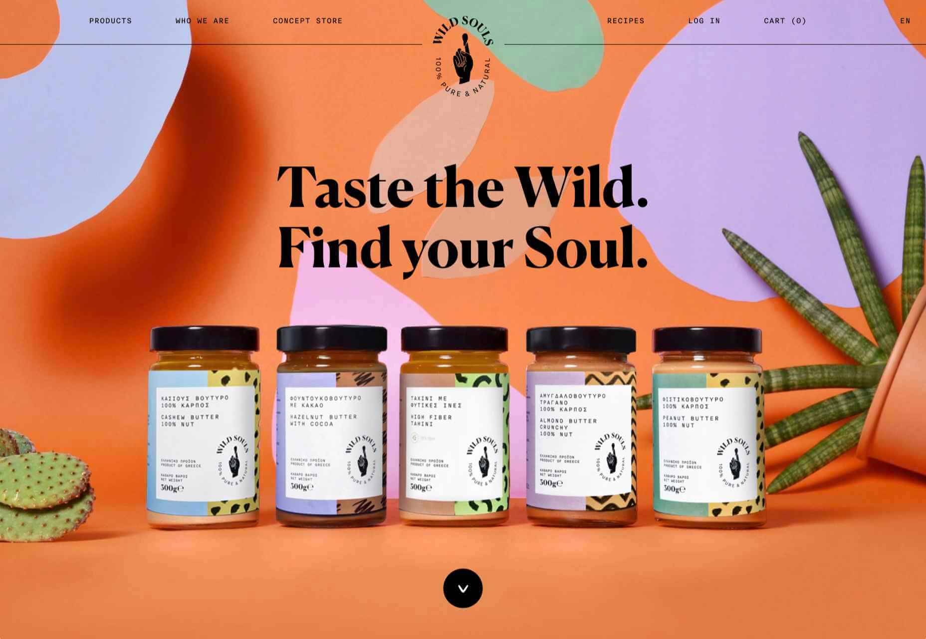
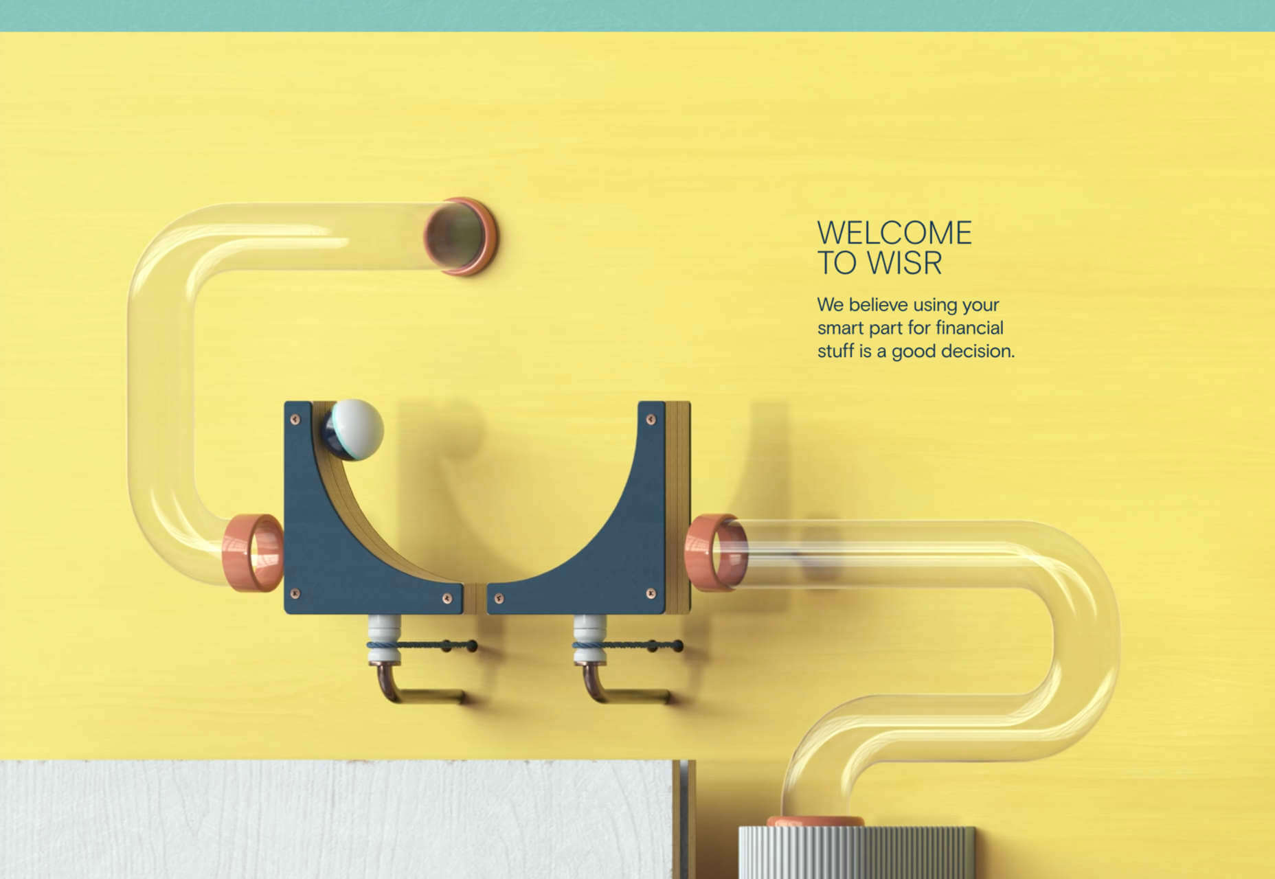
 Do you ever look at a website and think, why did they do that? Sometimes with website design trends, that’s the exact thought that can come to mind. What about an element works (or doesn’t) and why did it get so popular so fast? That’s the theme of this month’s roundup.

 Whether you are looking for comprehensive tutorials on UX design or professional courses on topics like logo design, video or photo editing, there’s the perfect YouTube channel for you as a designer.
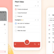
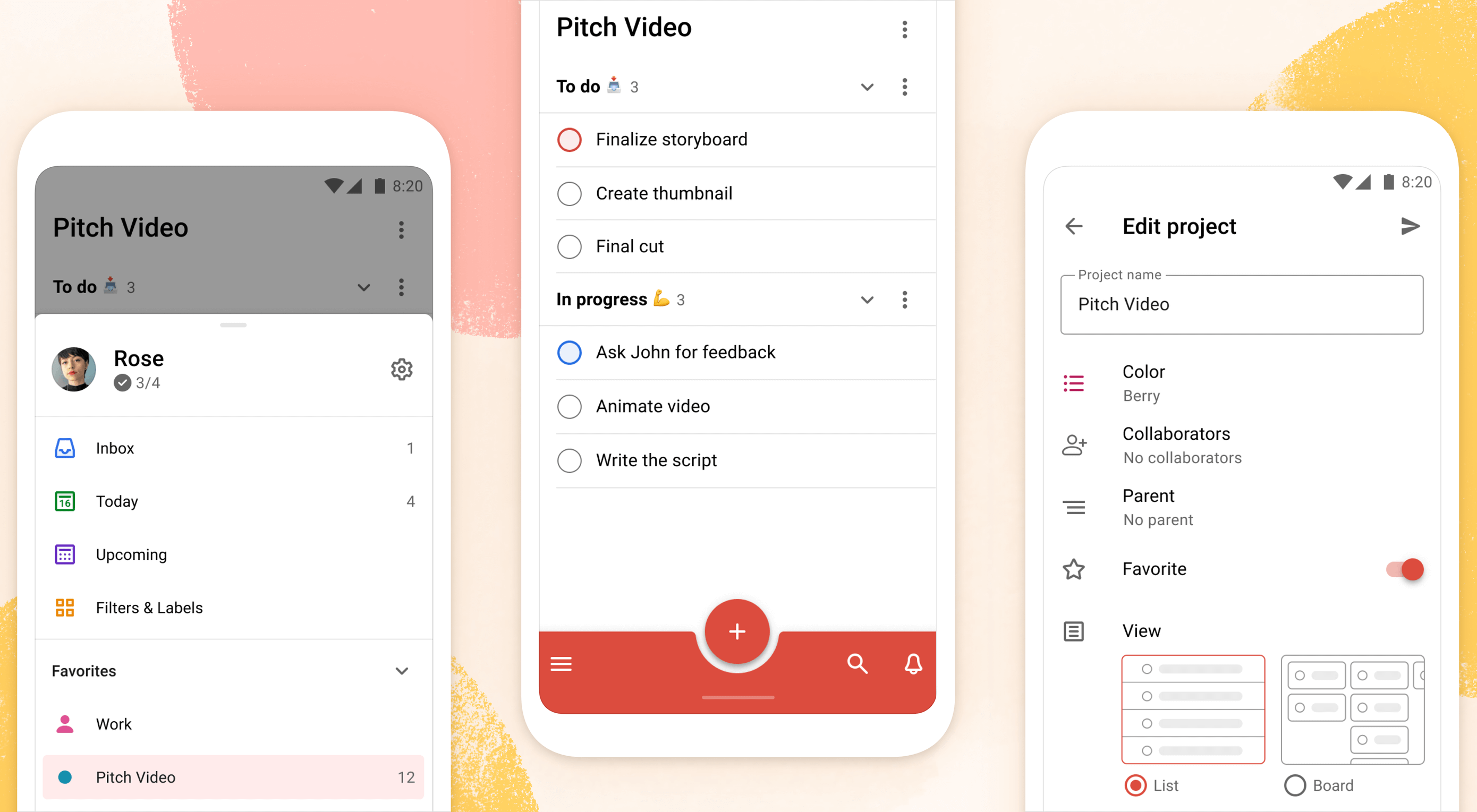 Todoist is a to-do list app that 25 million people rely on every day to keep their lives organized. As part of the Doist design team’s goals for 2021, we aimed to redesign the Todoist Android app to take advantage of the latest Google Material Design guidelines.


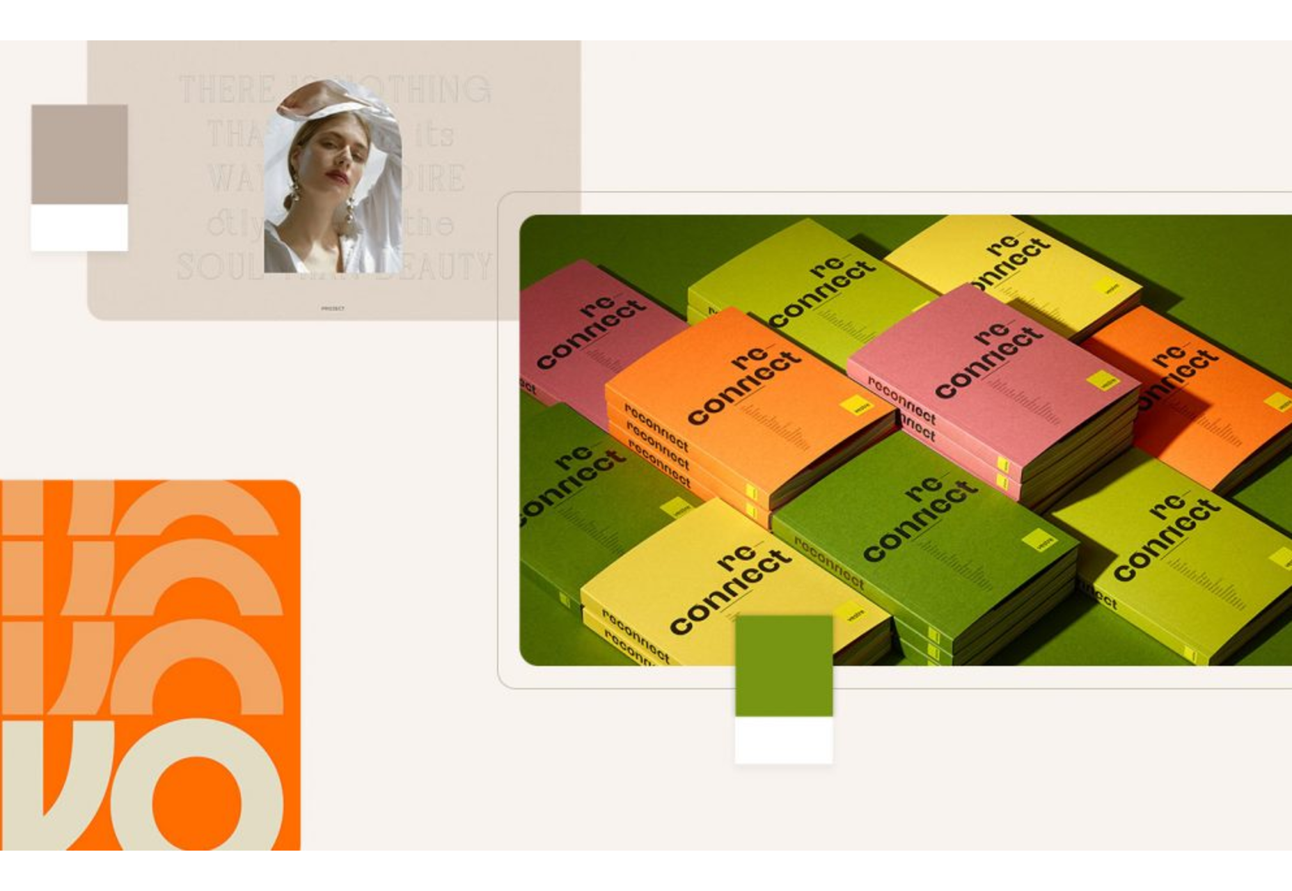
 We’re going to have some fun this month. There are so many new tools and resources out there for designers that make life easier, and others are simply enjoyable.


 Every day design fans submit incredible industry stories to our sister-site, Webdesigner News. Our colleagues sift through it, selecting the very best stories from the design, UX, tech, and development worlds and posting them live on the site.
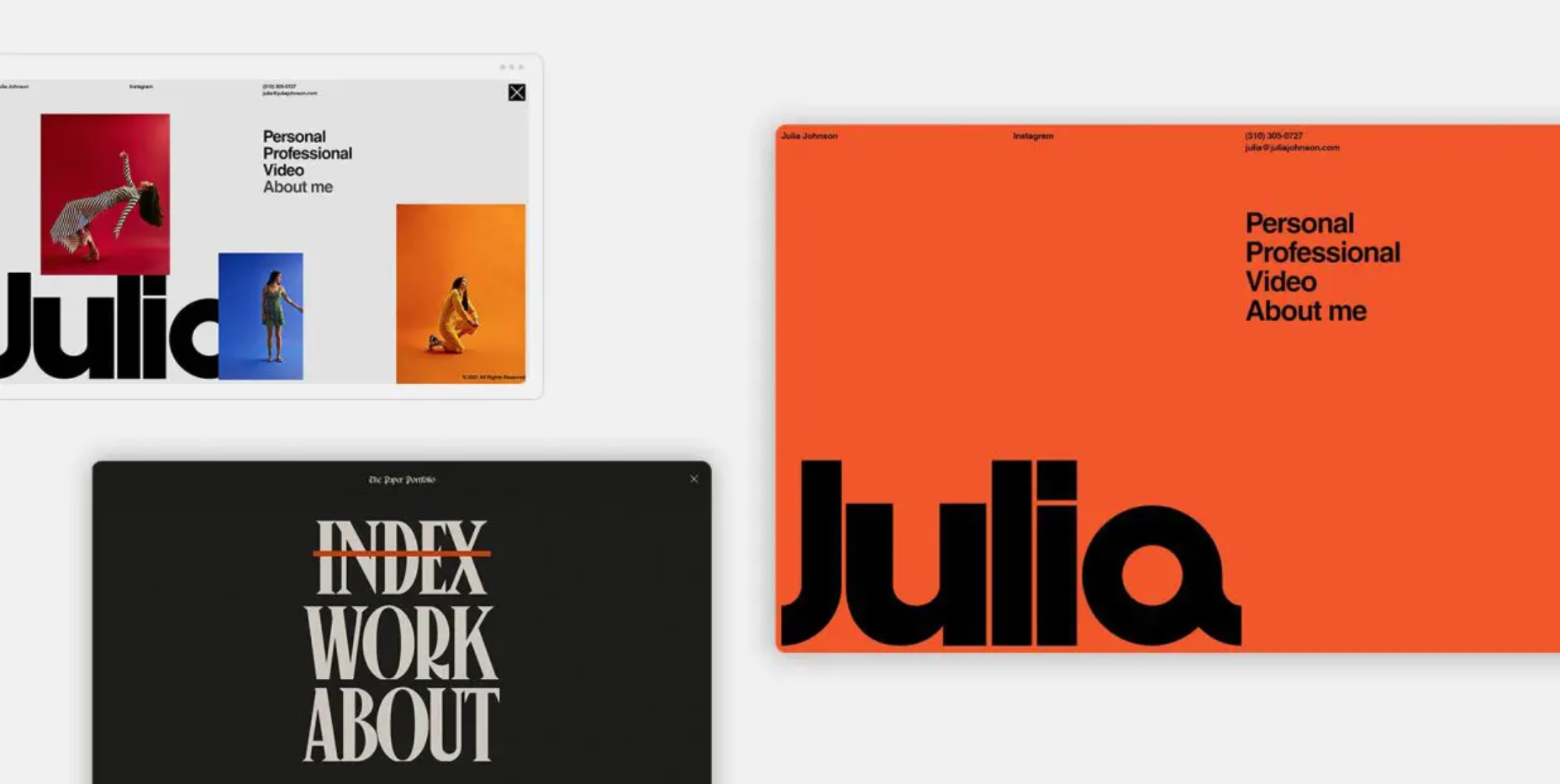


 Happy New Year, fabulous new website design trends!

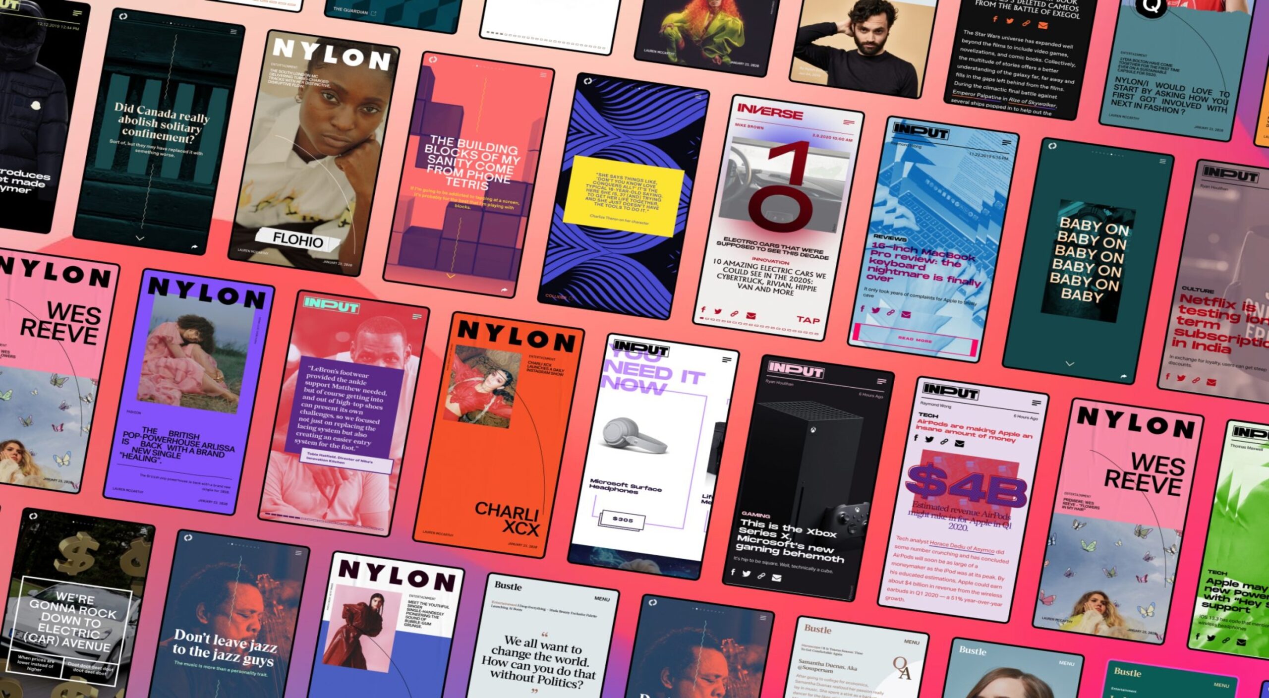
 2021 has been both memorable and instantly forgettable. Pop stars were freed from modern-day servitude, some people tried to overthrow democracy, and we all vacationed at home.


