Articles

Design can make a statement. It evokes feeling and can encourage thought and conversation. That’s the common theme among the three trends in website design this month.

Each trend is rooted on the time and place where we live and includes elements that provoke thought. Kudos to these designers and design teams for jumpstarting conversations. Here’s what’s trending in design this month.

1. “Taking a Stance” Design

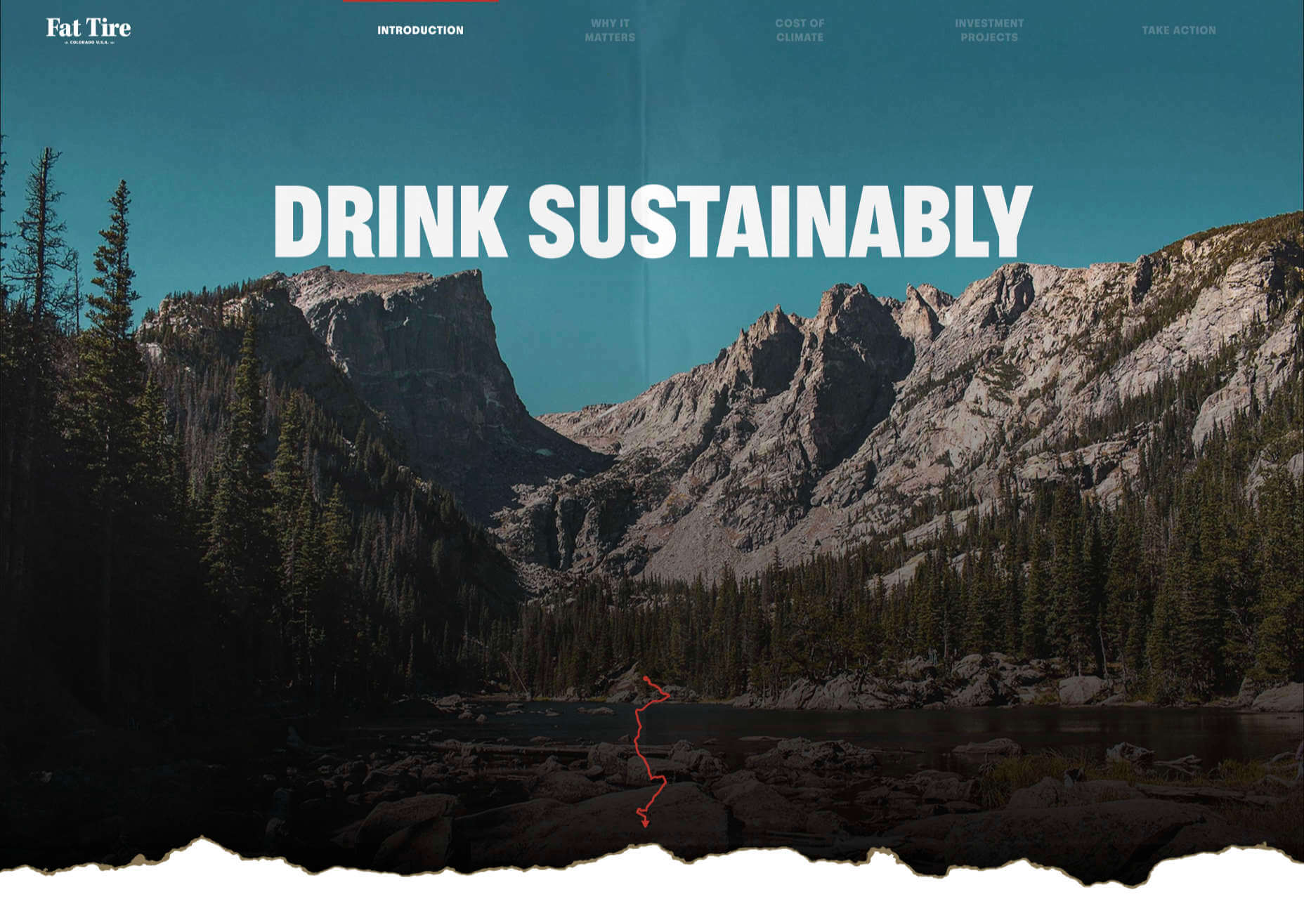
From social to environmental issues, design projects are echoing the sentiments of their audiences and organization in a way that take a stance on an issue.

Once taboo, this is becoming increasingly used as a technique for brands who are no longer worried about turning off a certain segment. The goal is to rally the core audience and people who feel the same way about an issue or cause.

There’s also a secondary thing happening here. Some designs aren’t really position based, but use imagery and language that resonates with a movement to associate with that feeling.

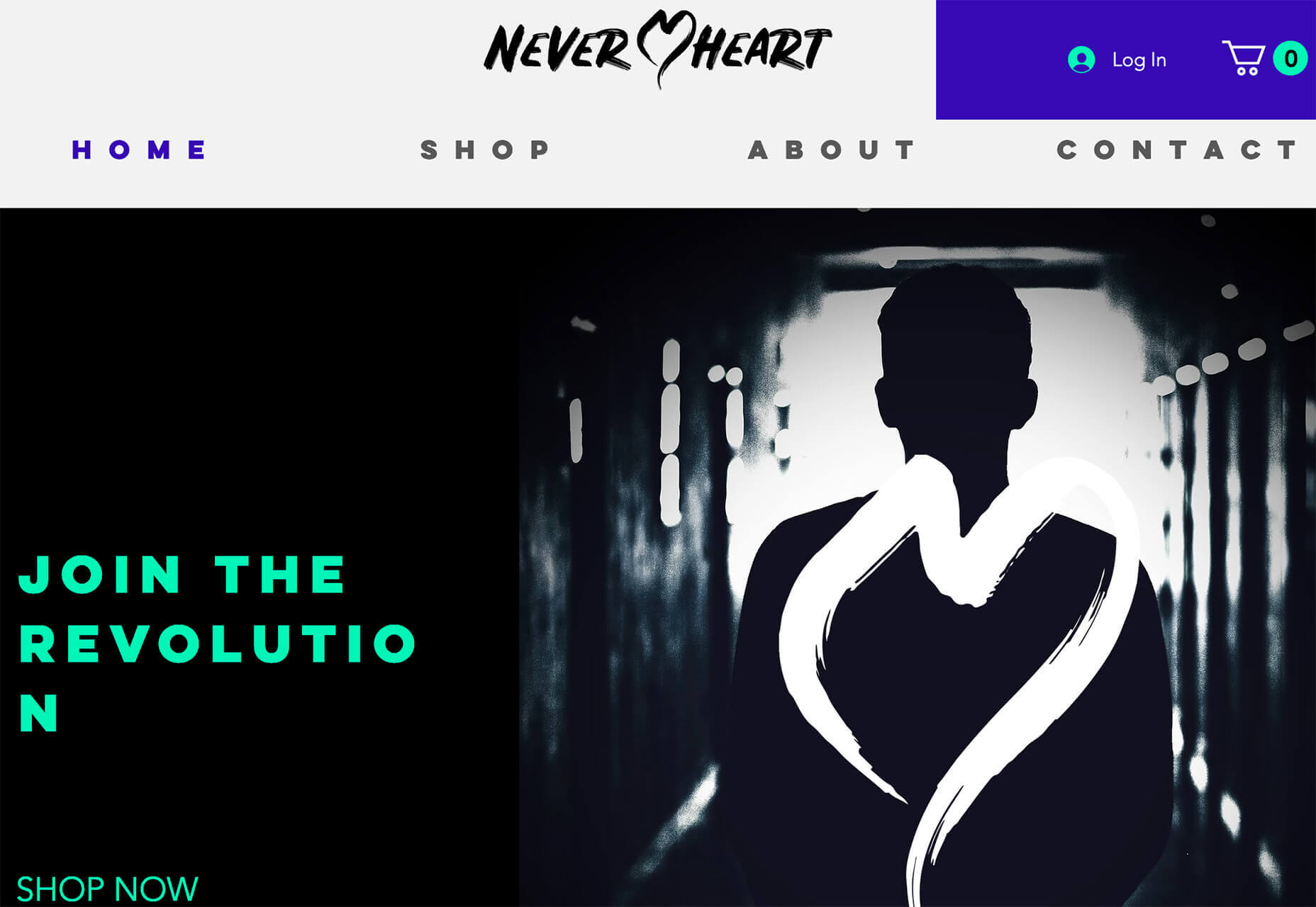
Never Heart uses “Join the Revolution” and a dark image with a heart to tug at your feelings. It can help create an association to a cause that you believe in without stating that cause directly. The design feels strong and inviting while making you feel like part of something.

Skye High uses “powerful” twice in the headline to convey a particular messages to women. The agency is looking to work with “powerful” women. It’s a timely statement and message that could resonate with a lot of business-women at various levels of their careers.

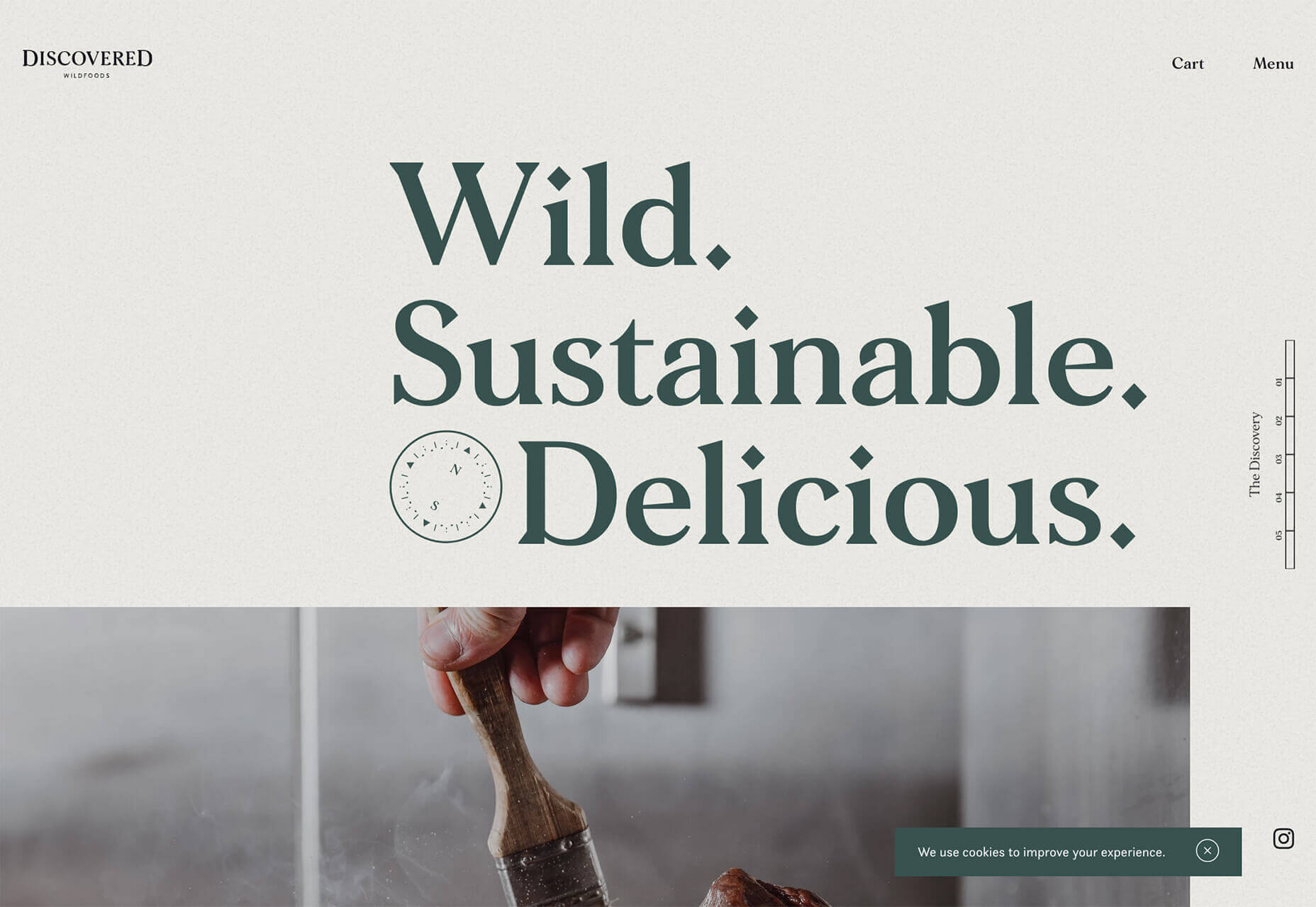
Discovered Wildfoods is a brand that is rooted in sustainability. The corporate model and responsibility of the brand shows through in the website. This type of design helps connect people with mutual feelings to the brand and products.

It’s refreshing to see more websites and brands embracing social causes and issues. It can be tricky for a number of reasons. But for some brands, it pays off.

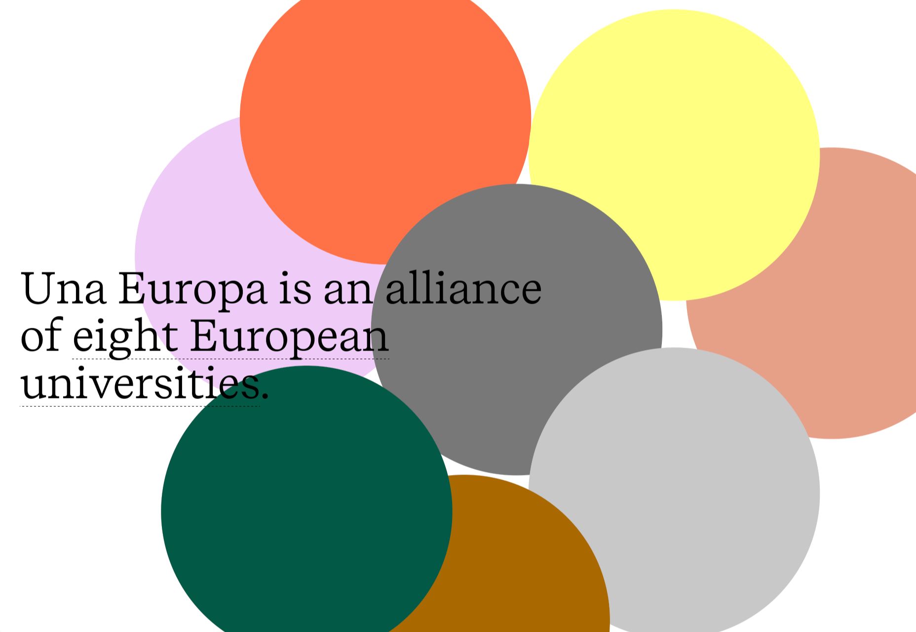
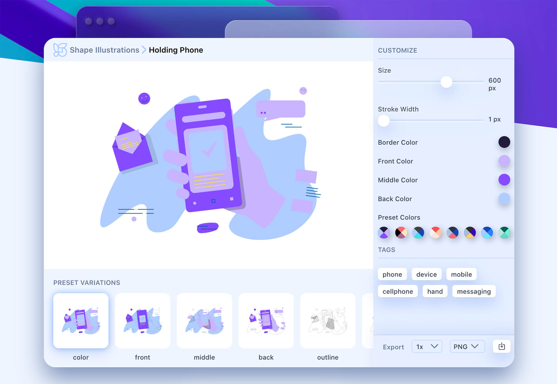
2. Abstract Art Elements

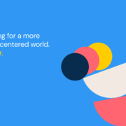
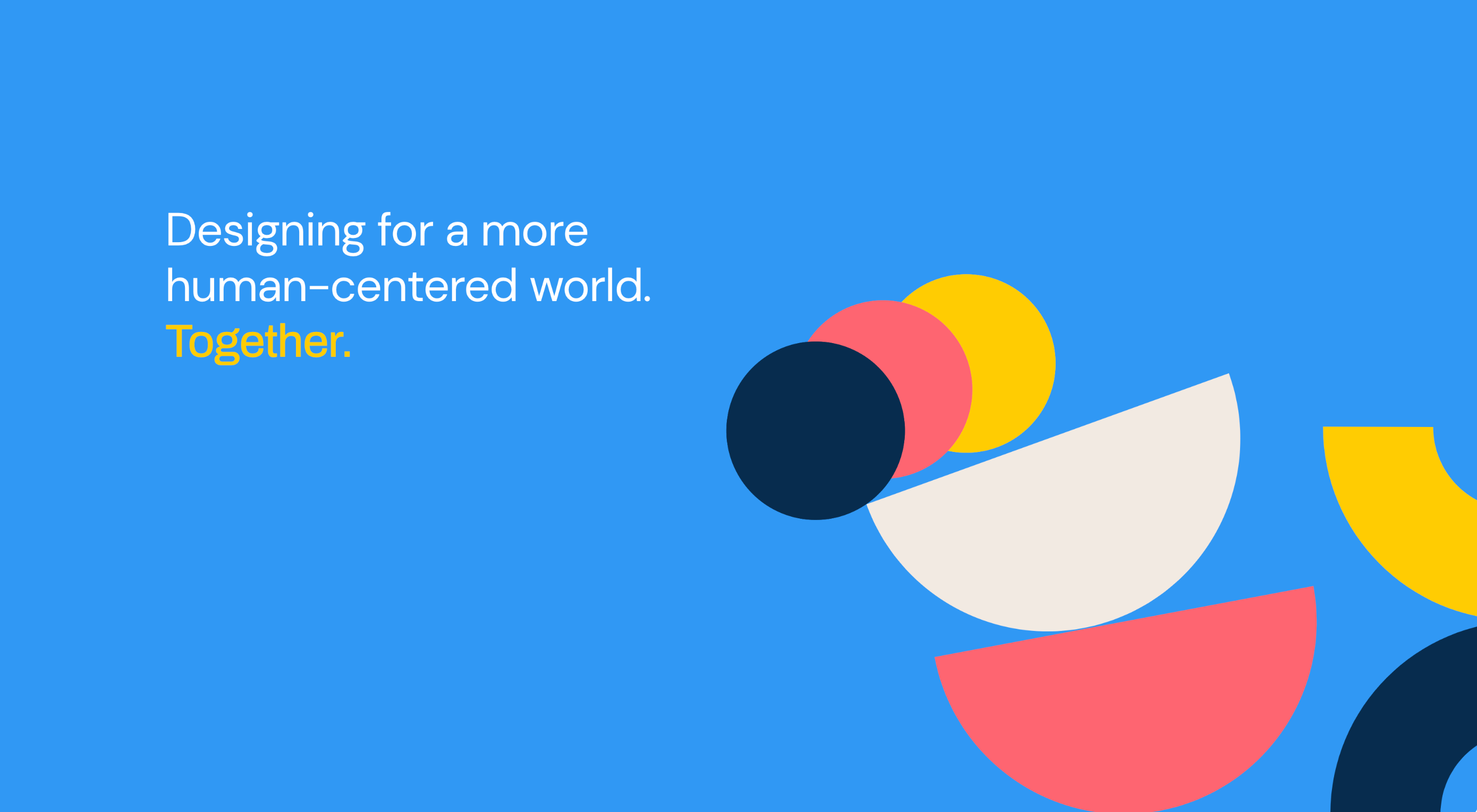
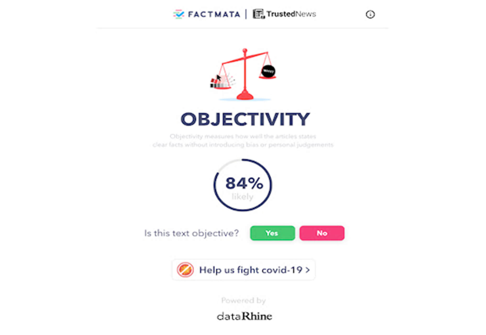
If you are worried about a lack of images, or not sure how to portray images in an appropriate way due to the worldwide pandemic – groups or not, masked or not – abstract art elements can be the solution.

Widely used for startups and apps, more abstract design elements are everywhere. It’s an easy way to create strong visual interest without photography.

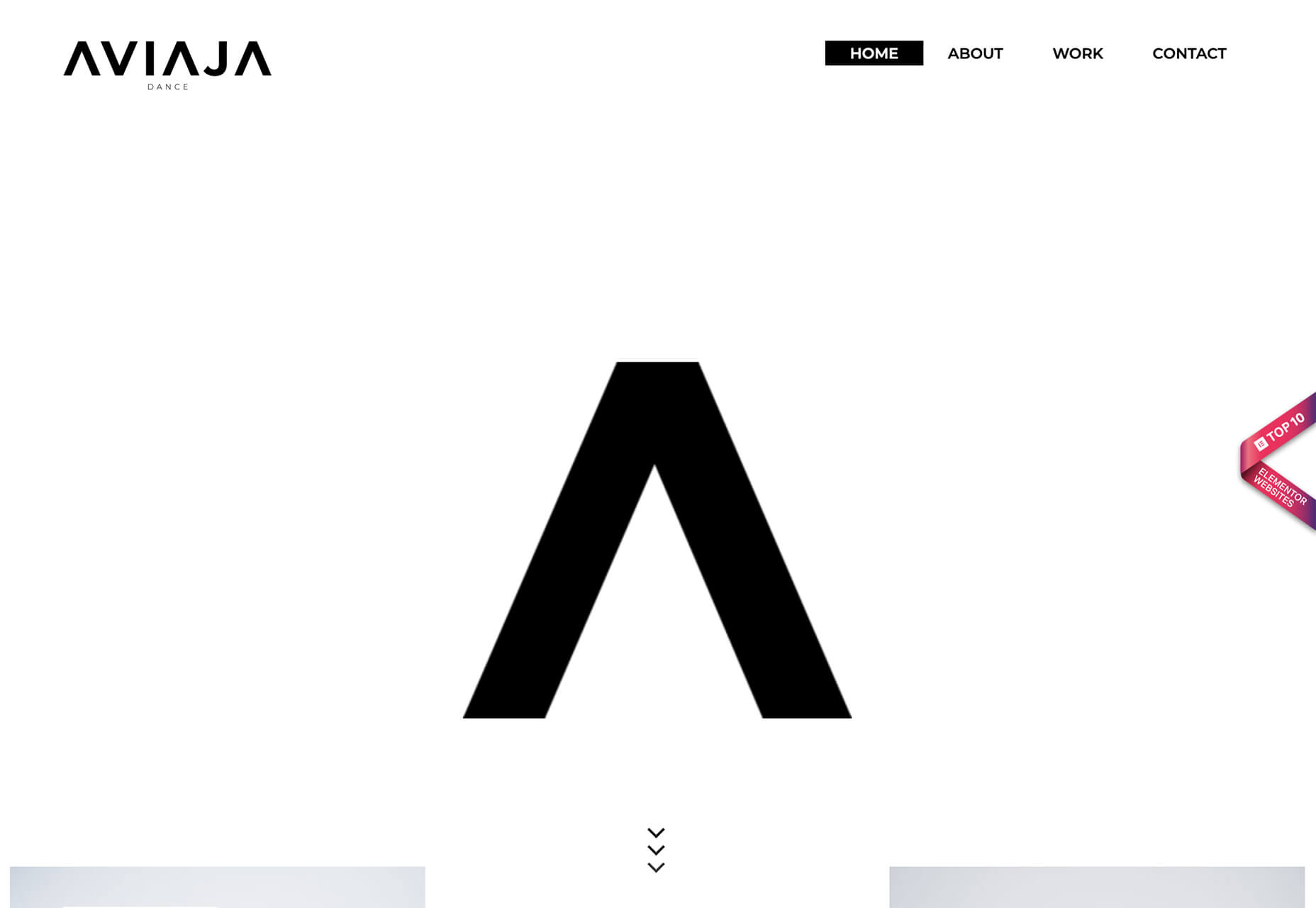
The most common use of abstract art elements is often in the form of geometric shapes with animation. This is something that almost anyone can understand and simple shapes and movement can be quite stunning when done well.

The good news is this aesthetic can work for almost any type of website. Try it for a redesign when you don’t have photography that feels appropriate in the current environment or if you want to create focus for content that drives website visitors to the words or scroll. This works with more abstract concepts when they are simple and help you move quickly from the visual to text.

Here’s how each of the examples handles abstract art elements:

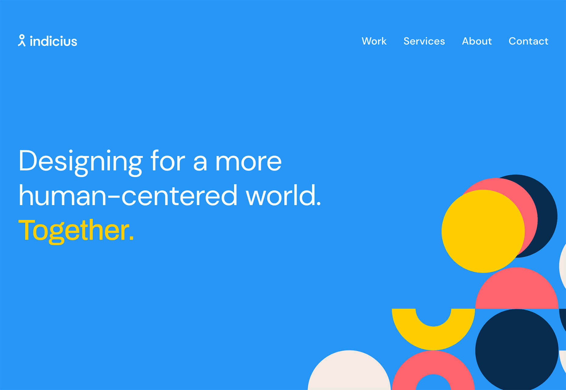
Indicius uses bouncing circles that move toward text and down the screen to drive users to the headline and scroll action.

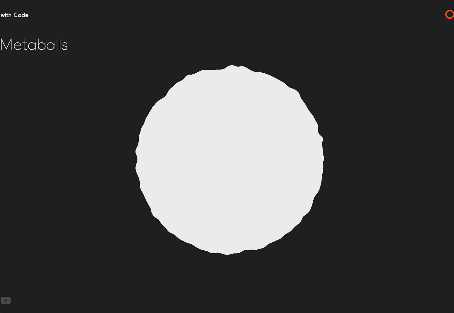
With Code uses a fun fuzzy circle with different animations to draw you in.

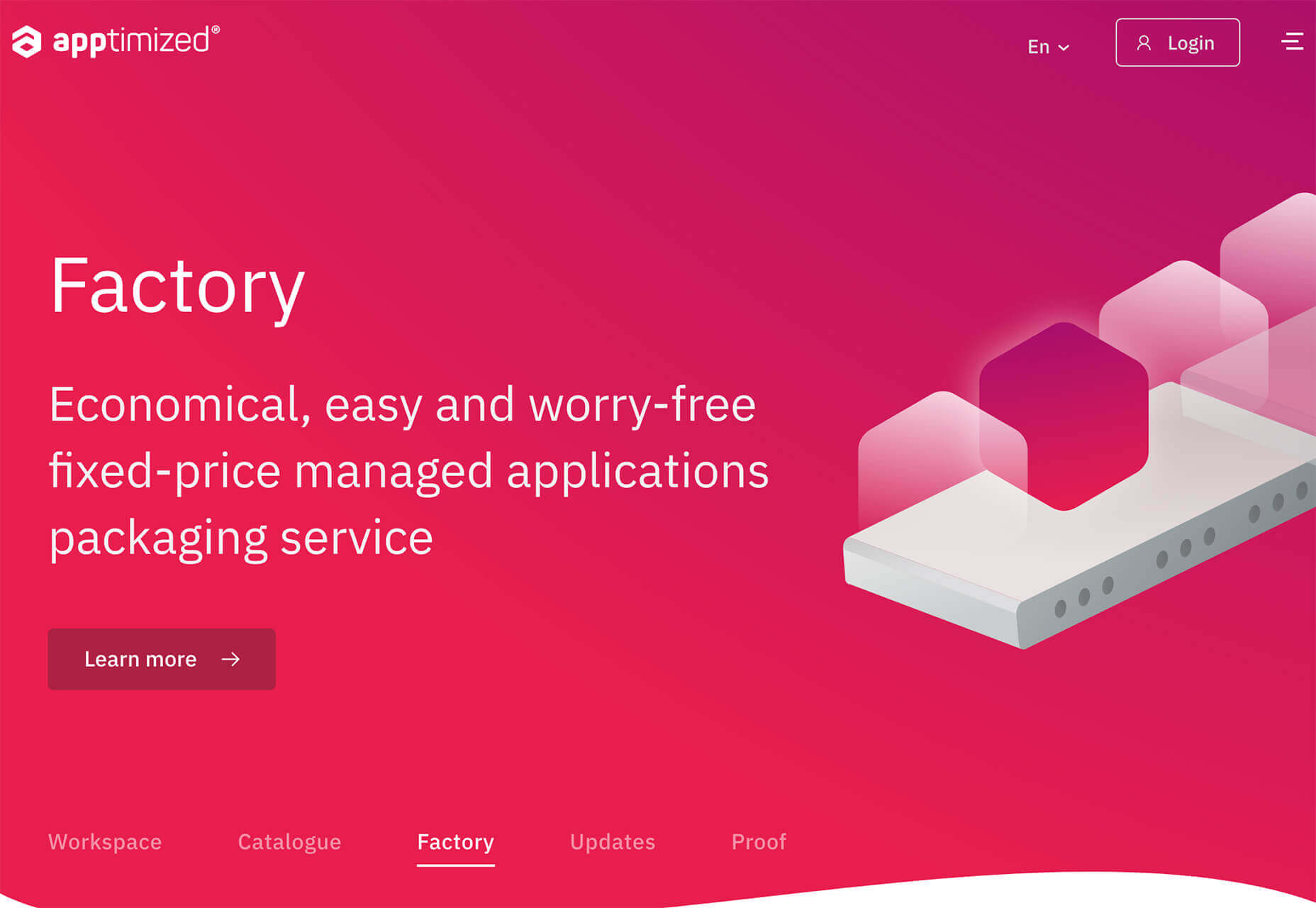
Appimized uses bright color and a monotone scheme with geometric shapes to sell its services.

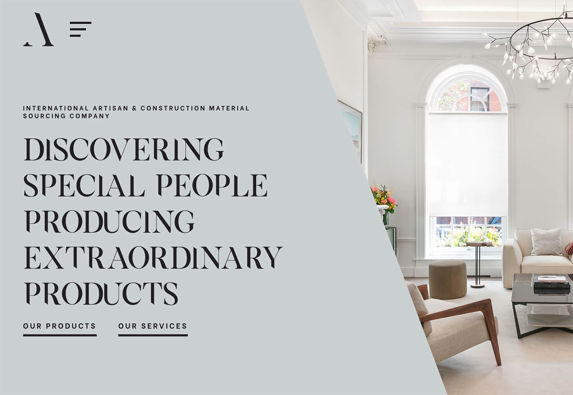
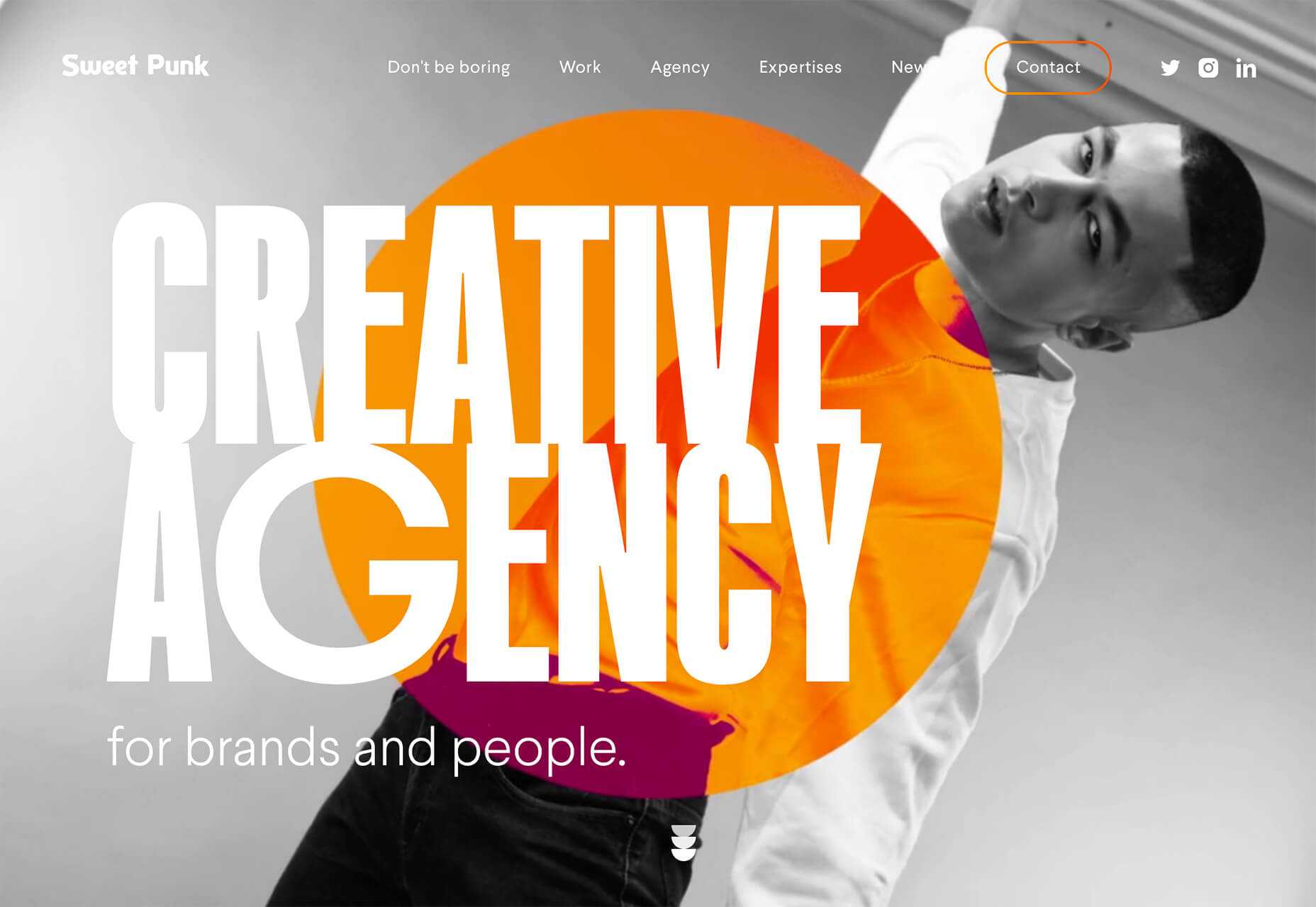
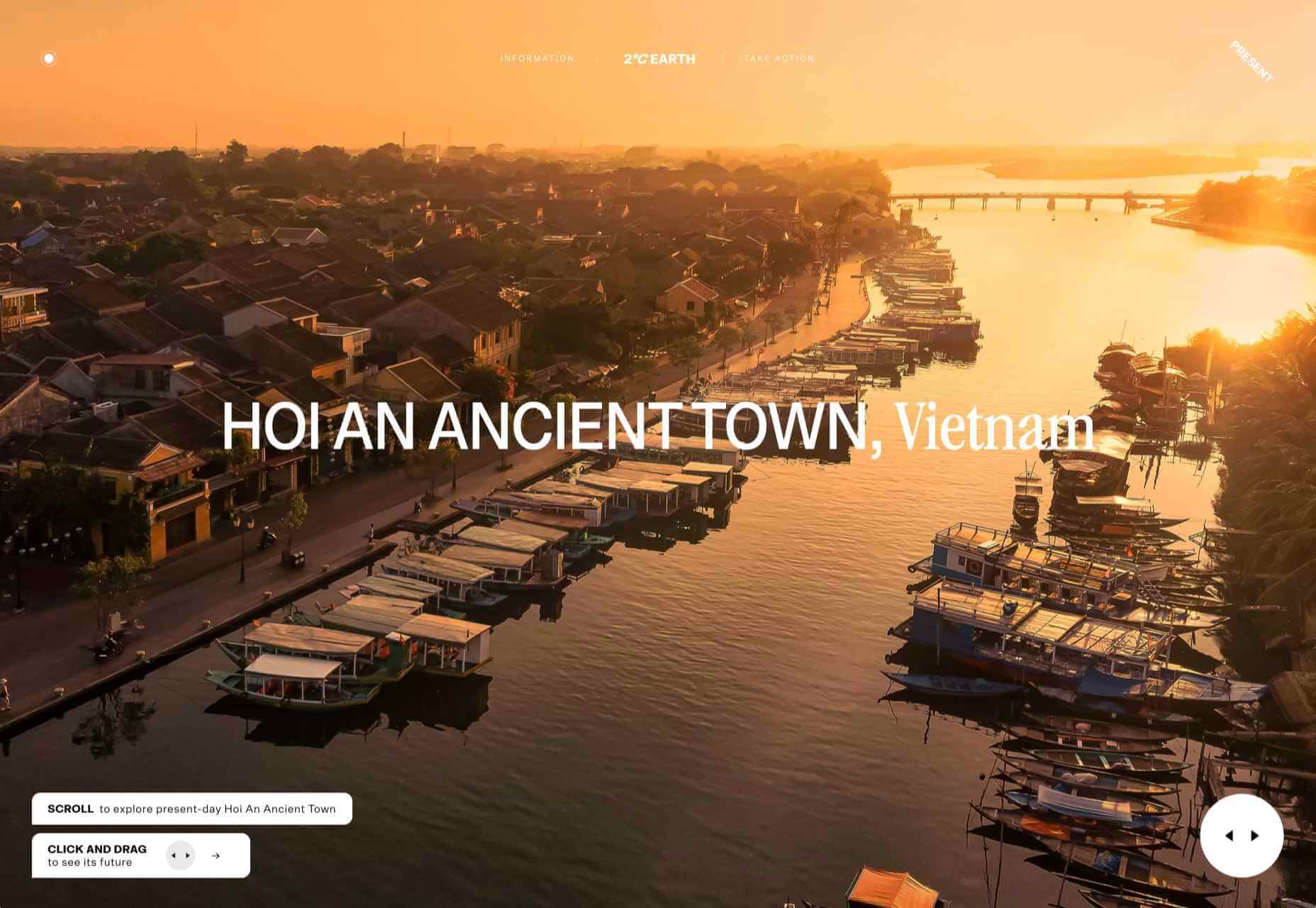
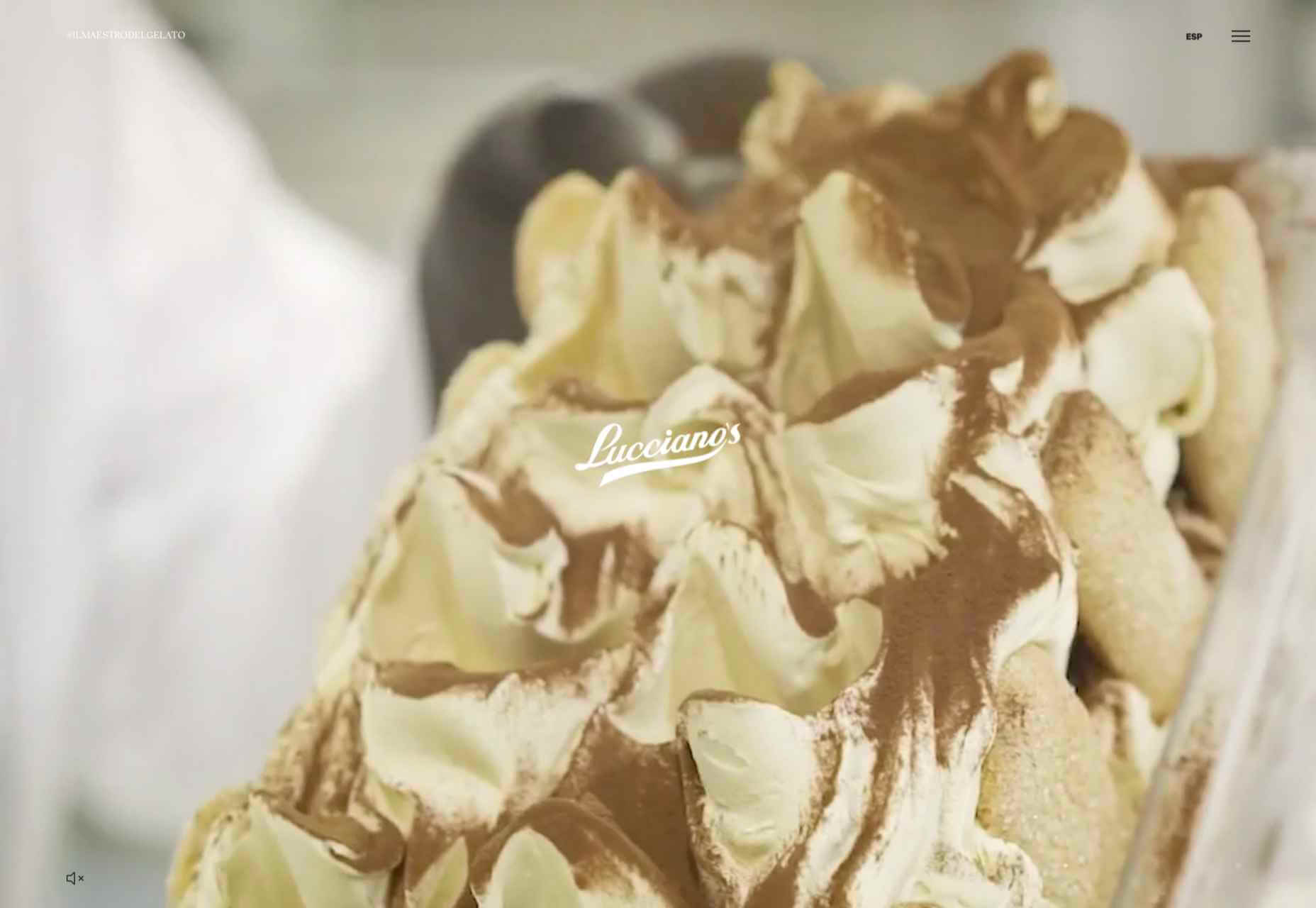
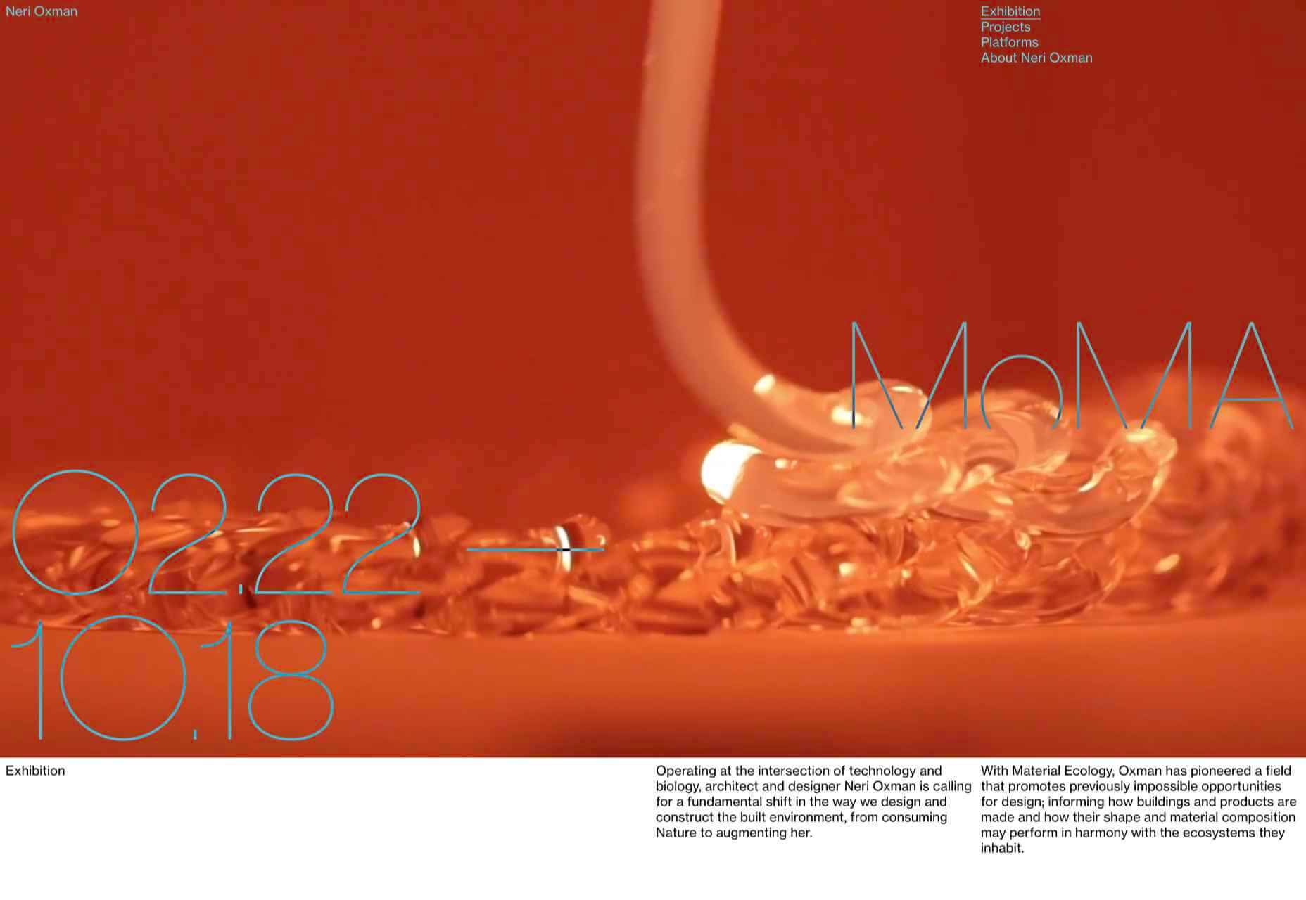
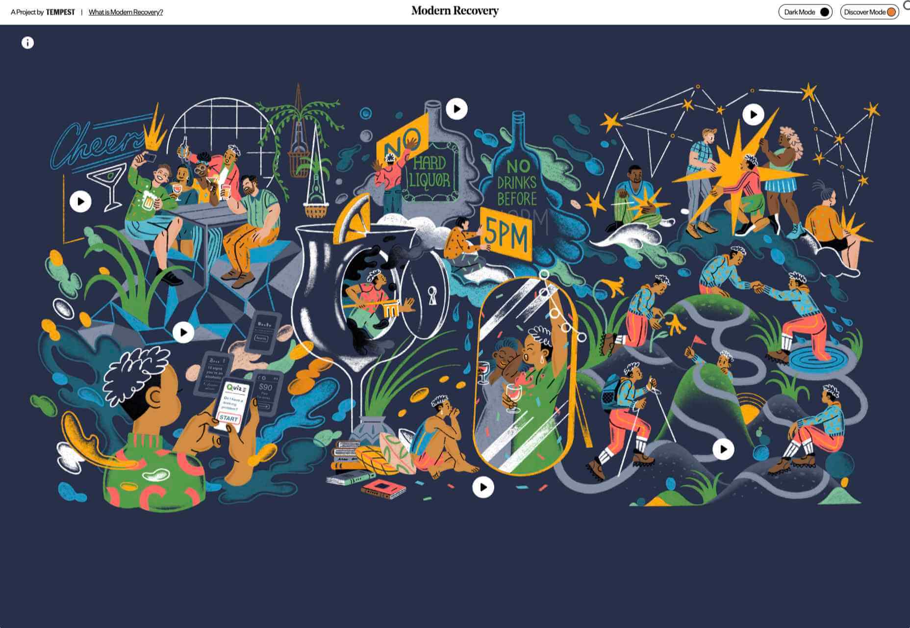
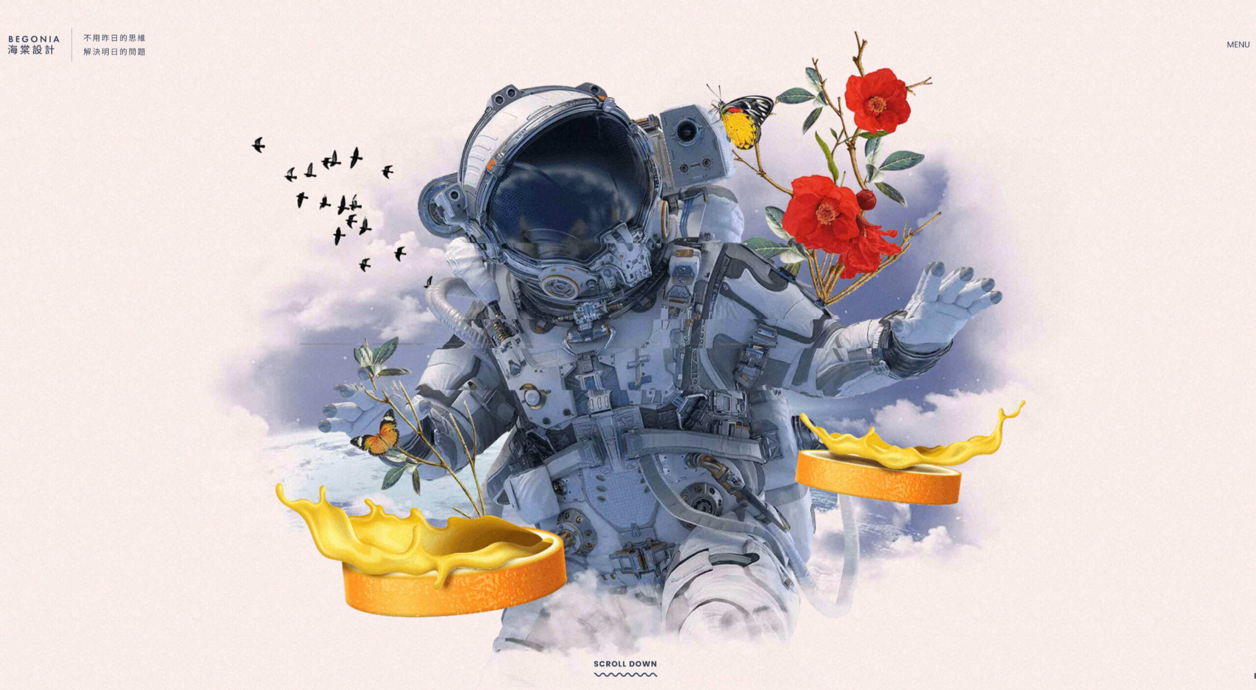
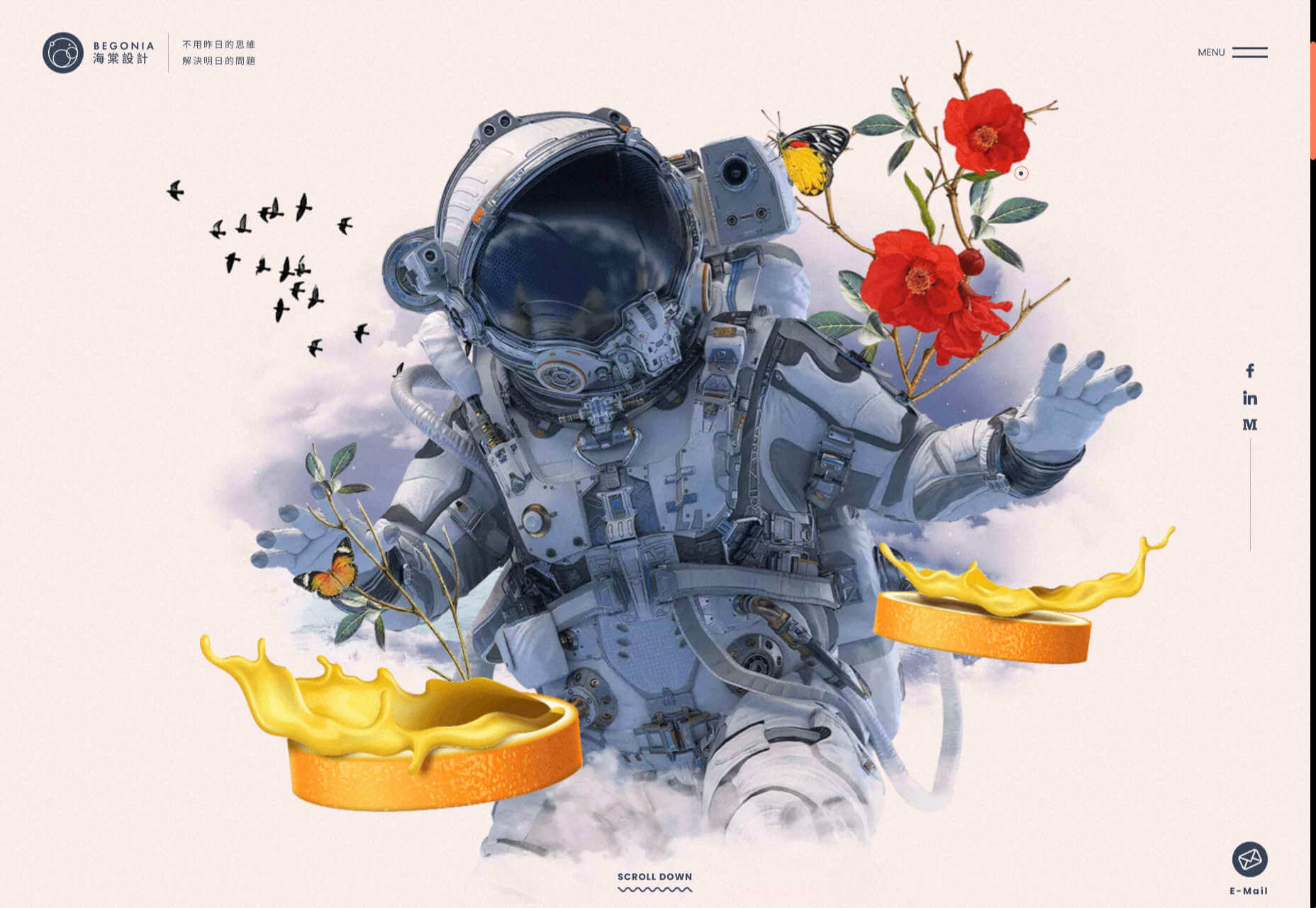
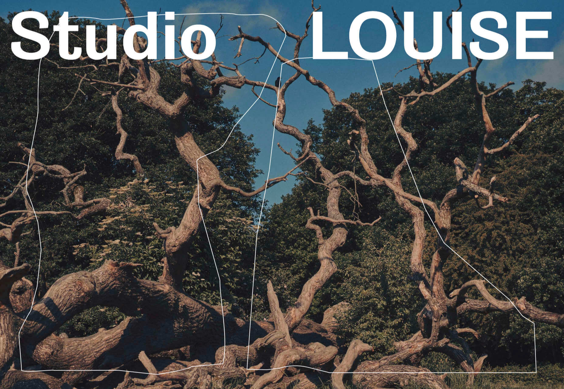
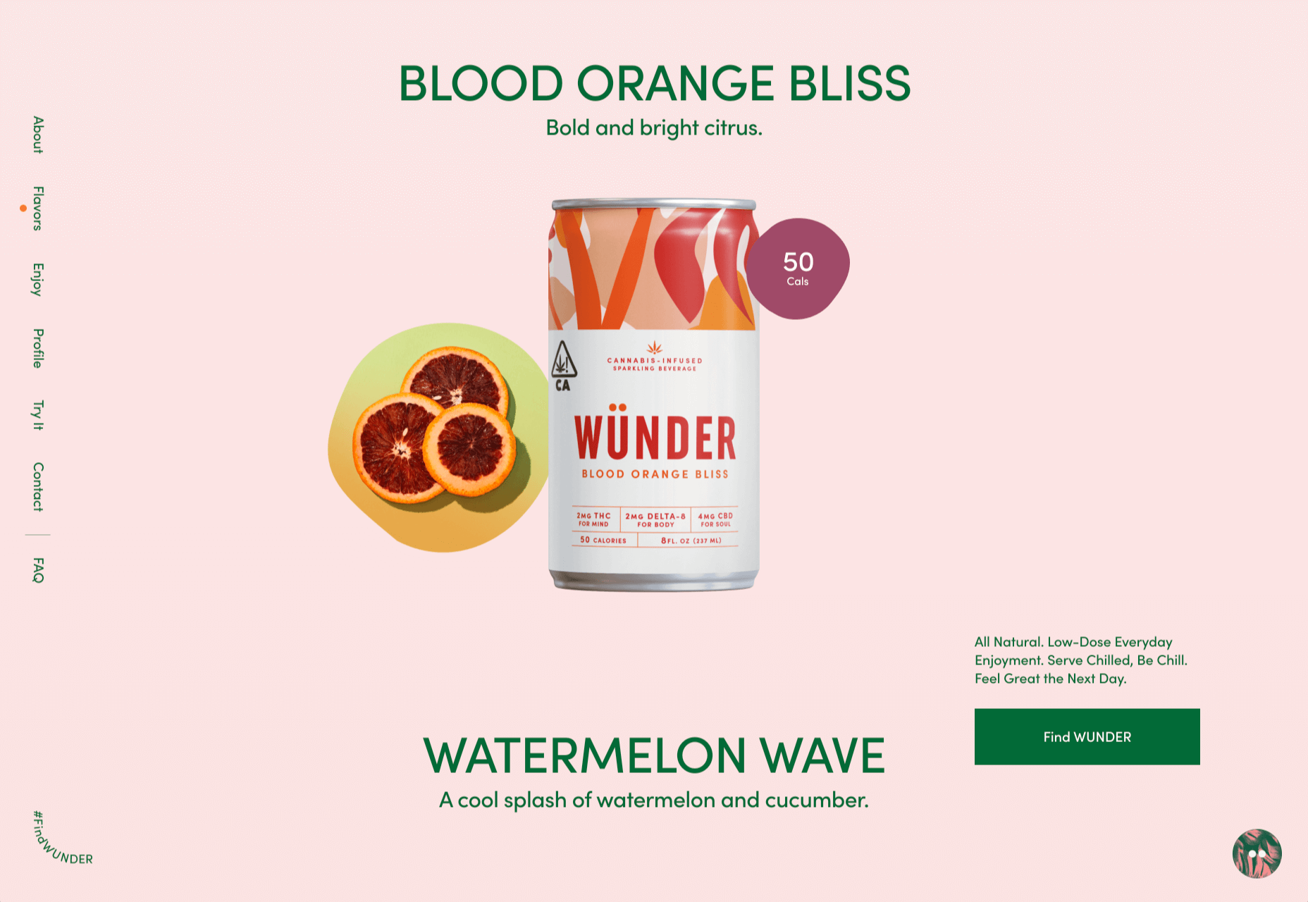
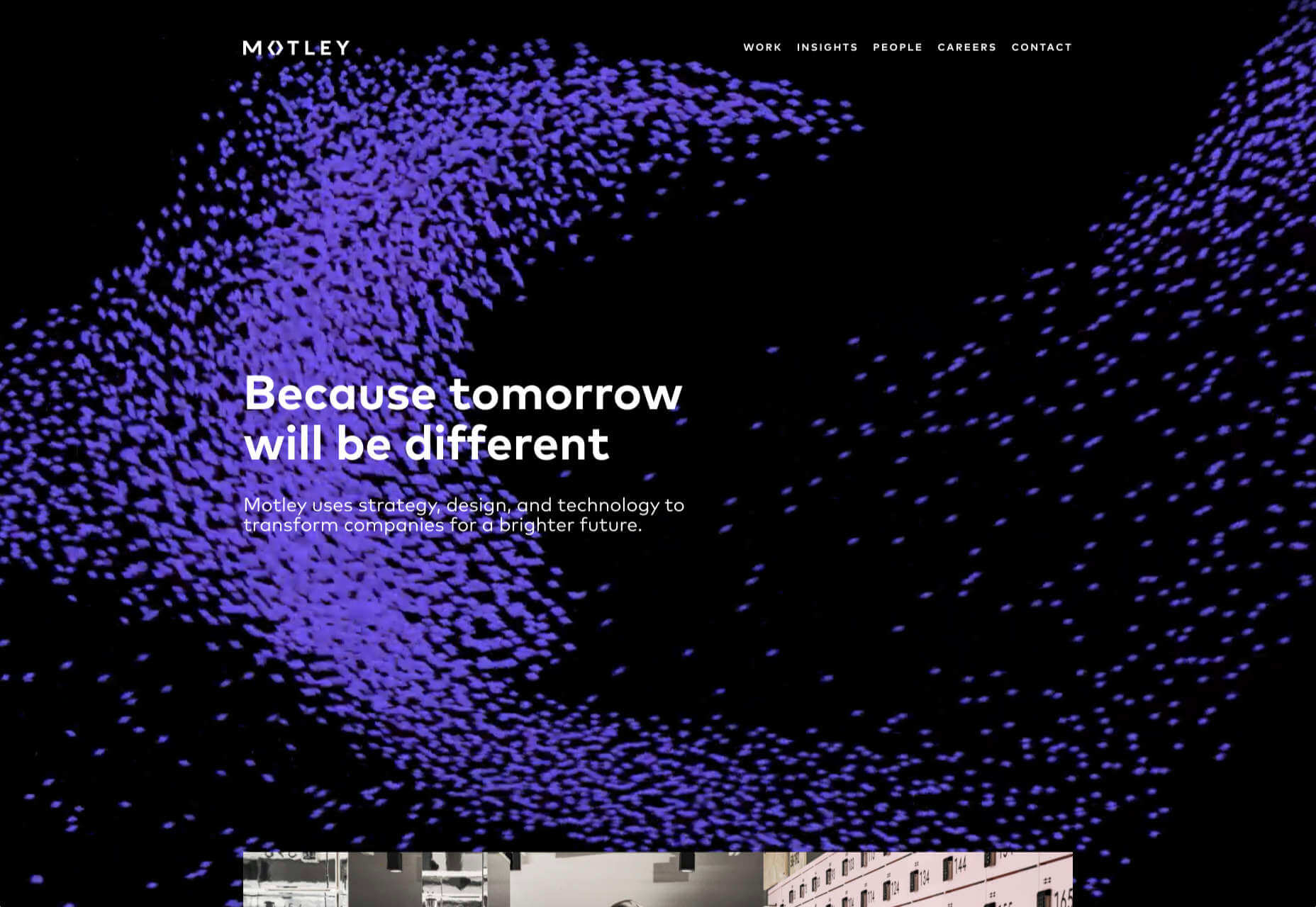
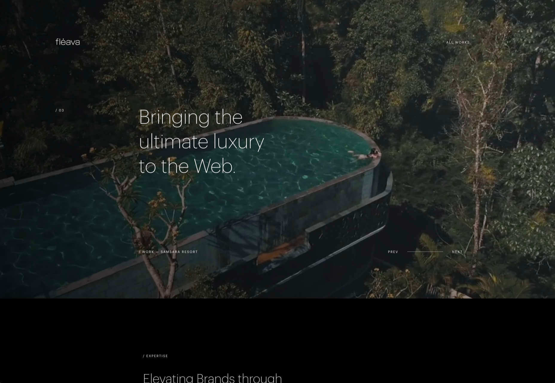
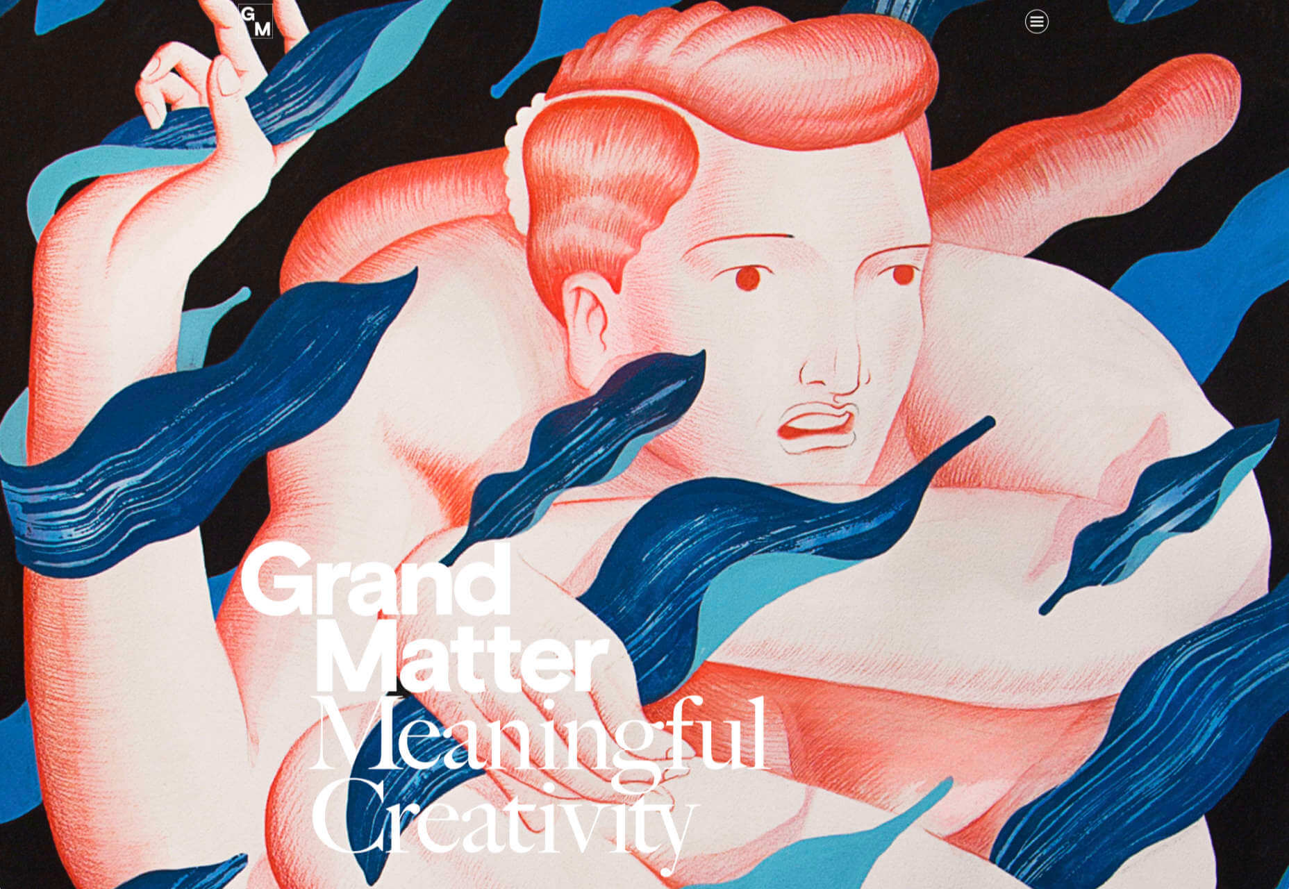
3. Images That Make You Think

This might be the most visually interesting, and thought-provoking, website design trend we’ve seen in a while. These designs all feature images with a little something different or unusual that make you think.

There are a lot of different ways to do this – marry photographs and illustrations, create imaginary imagery, animations or effects, visual tricks that play on depth perception or create pseudo-3D effects.

The commonality is that the visual is so striking and unusual that website visitors stop and engage with the design. What do the “oddball” visuals mean? What message do they convey? How did they do that?

All of the questions could be associated with this different style of visual representation.

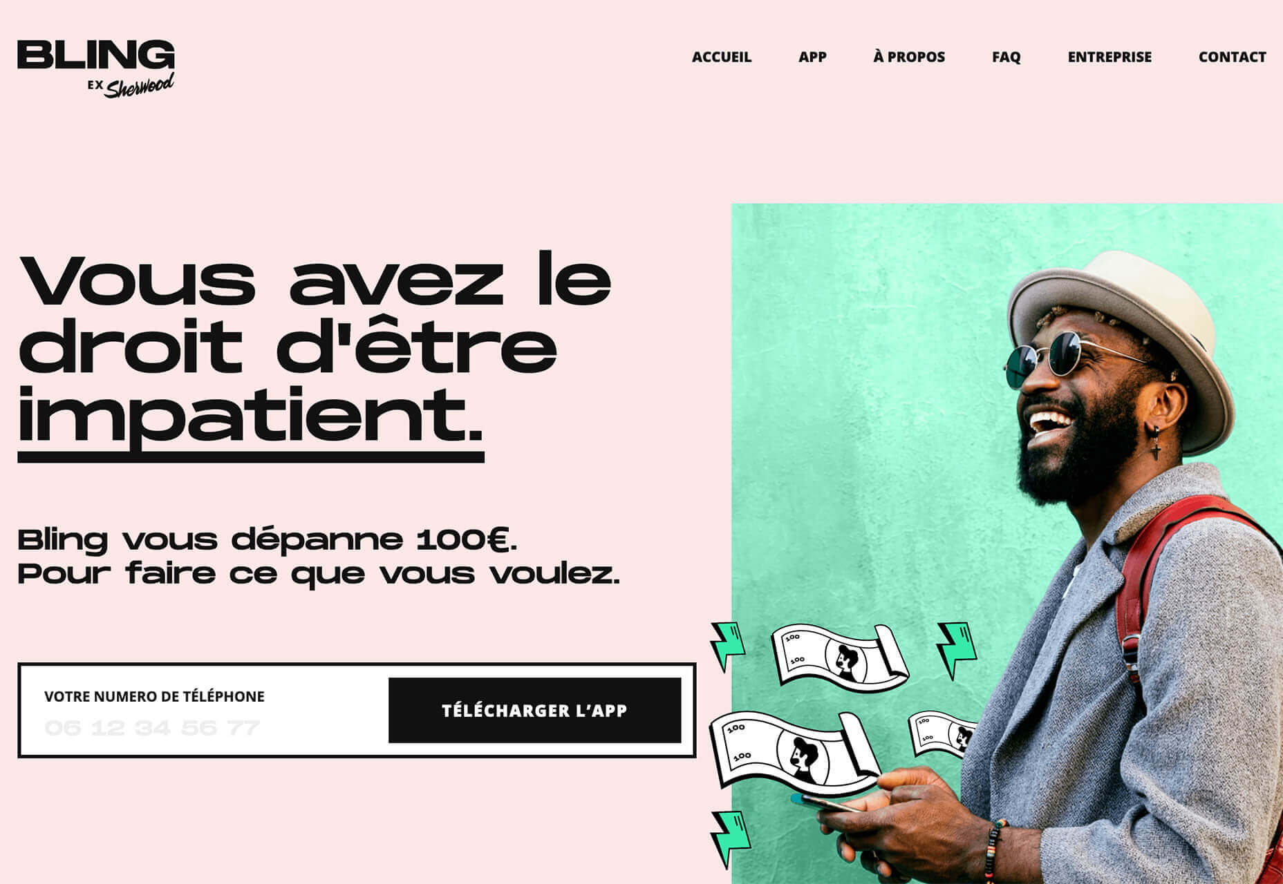
Bling uses a combination of a photo with illustrated animated elements to draw the eye. The yin and yang between reality and fantasy is quickly evident and makes you want to know more. (It doesn’t hurt that the animation uses dollars and lightning.)

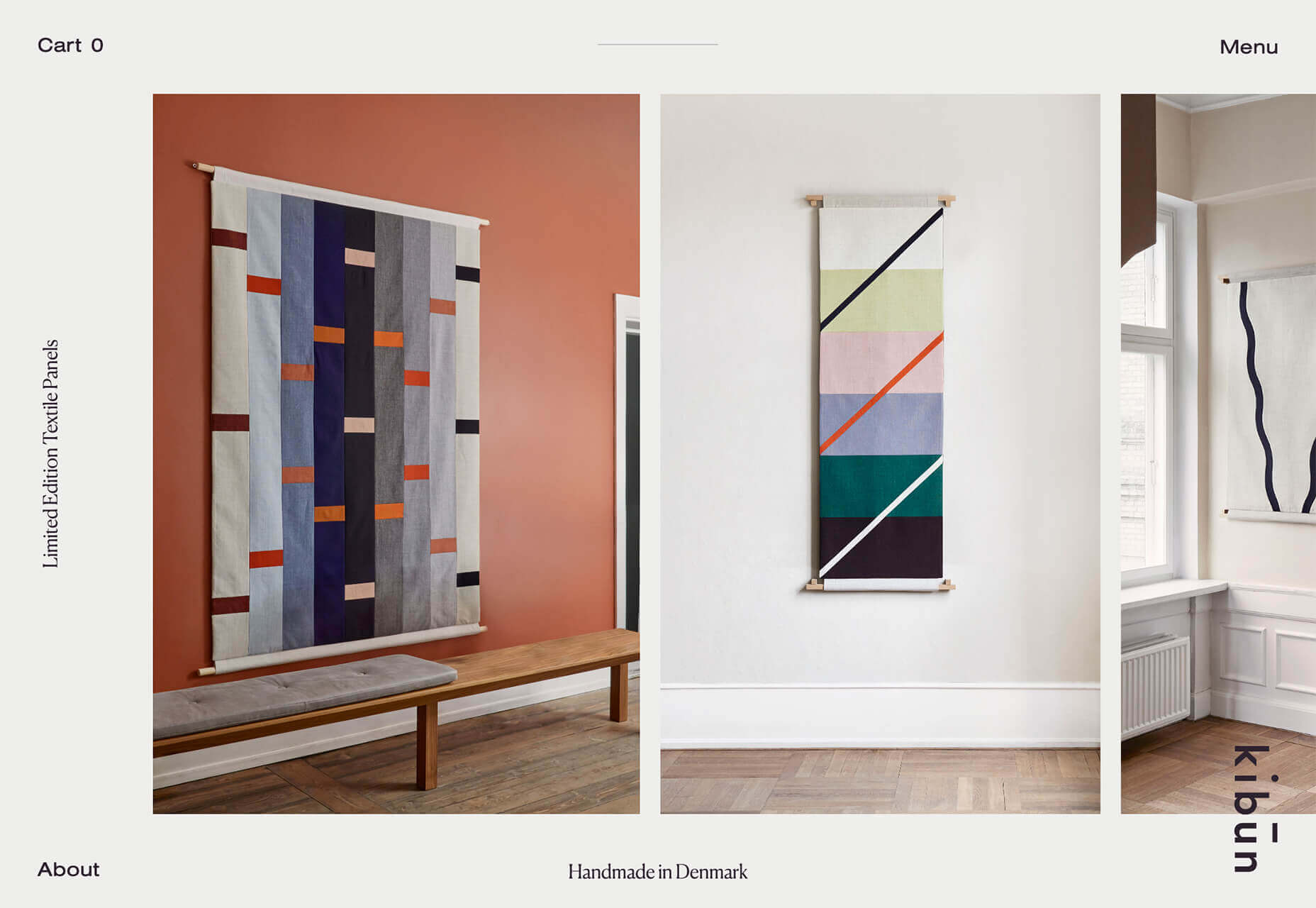
Kibun is interesting because the photo choices create an optical illusion of depth. It matches the content of the design well because the website features artistic textile panels with an artistic design. The illusion is in the angles and coloring of photographs and their placements on the screen. The only downside of this design is that it loses the artistic panache on mobile because the images stack.

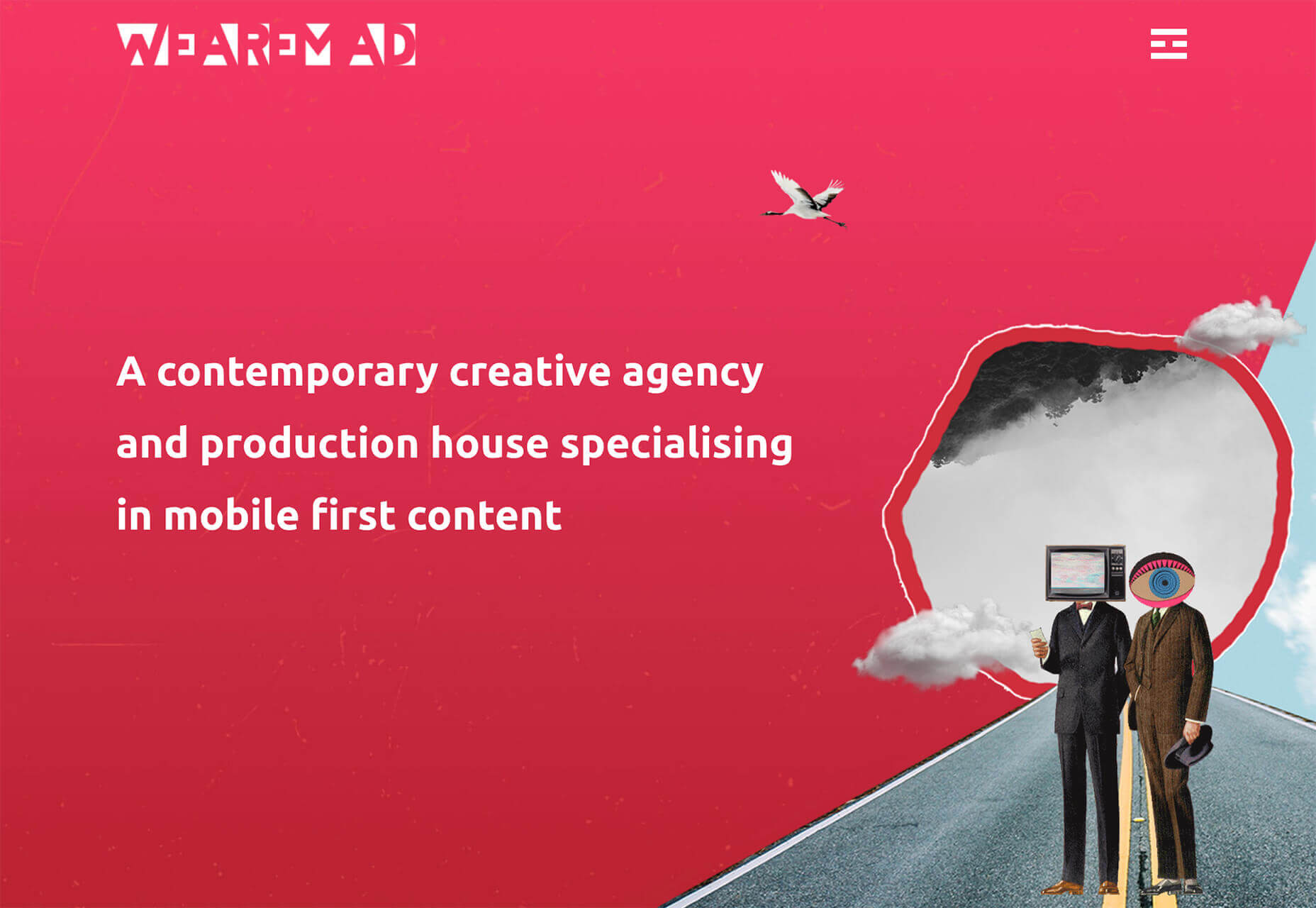
Oddball images can sell. We Are Mad stands out because it uses a contrived image, but doesn’t go oversized with it. The more subtle placement is ideal and arguably more attention-grabbing.

Conclusion

Website design can be a powerful thing, as these trends and examples show. Don’t discredit the power of choices in color, imagery, animation, and text when creating a digital experience. Design can mean a lot of different things depending on the audience as these examples show.

At the same time, these design trends are powerful and meaningful. They provide context into our world, our time, and our feelings. Don’t be afraid to experiment and make a statement with your design work. Just remember to keep in mind all potential impacts (positive and negative) before taking the project live.

Source


Source de l’article sur Webdesignerdepot

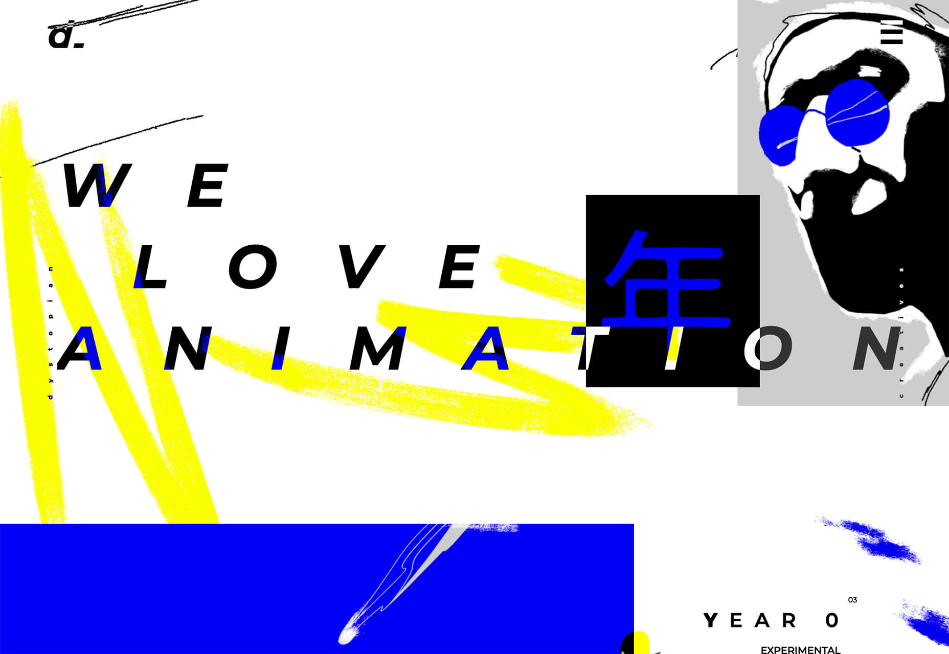
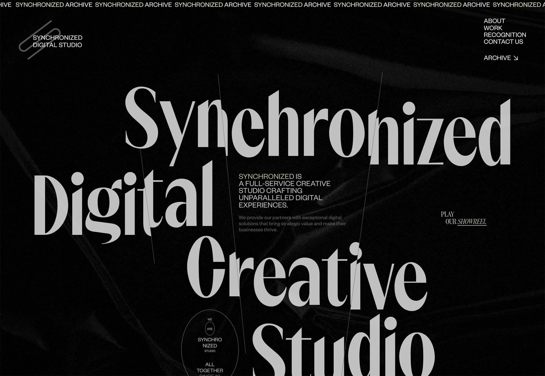
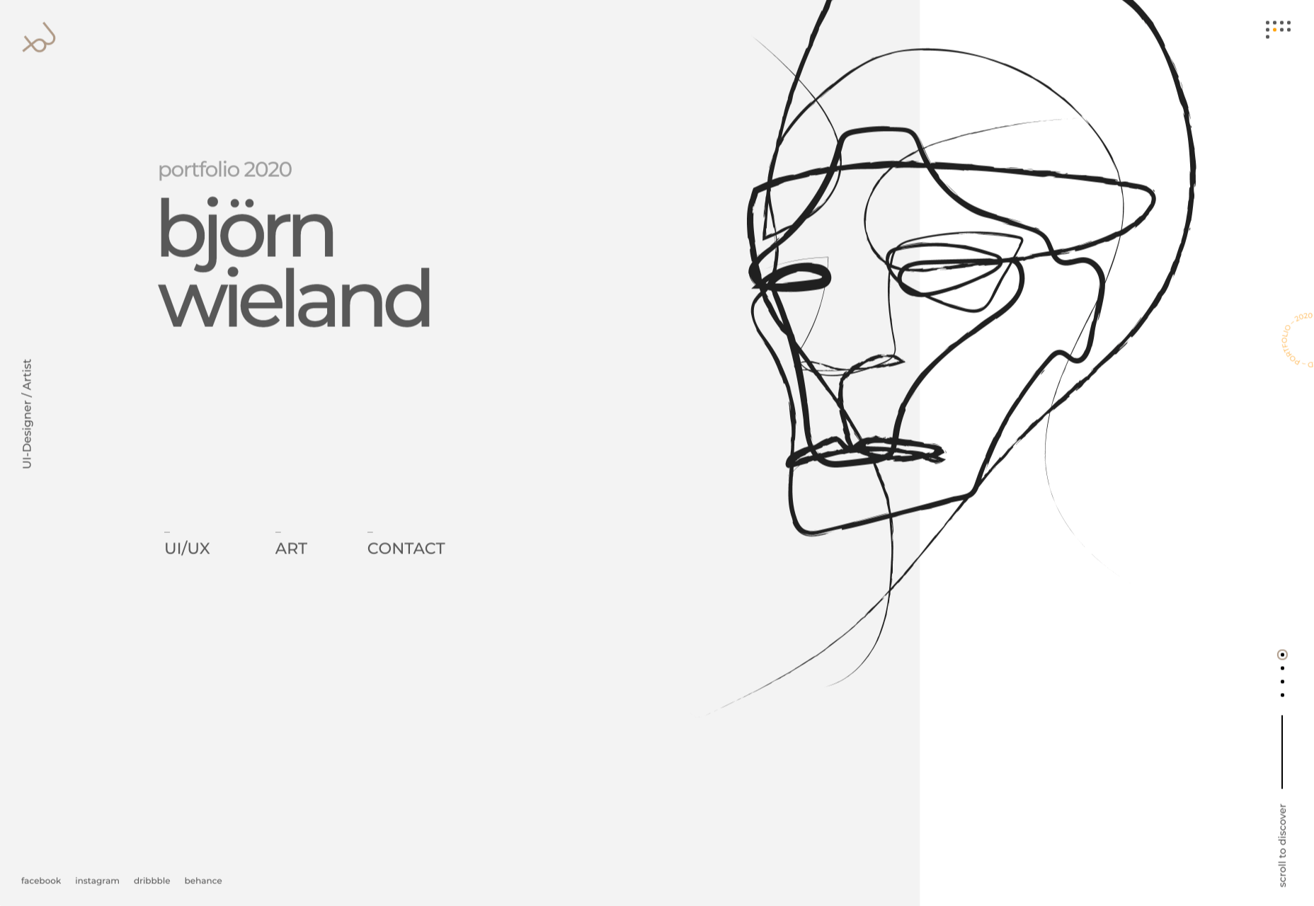
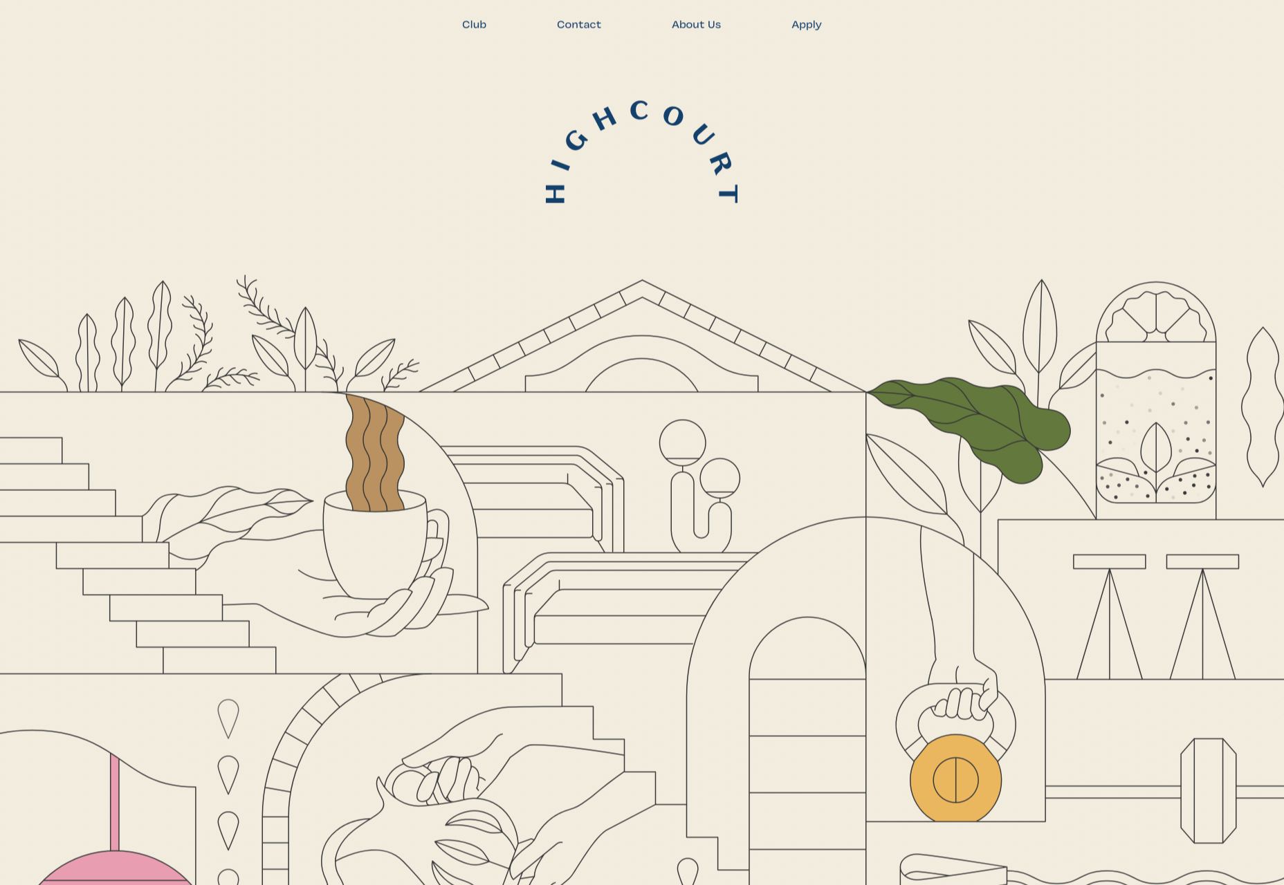
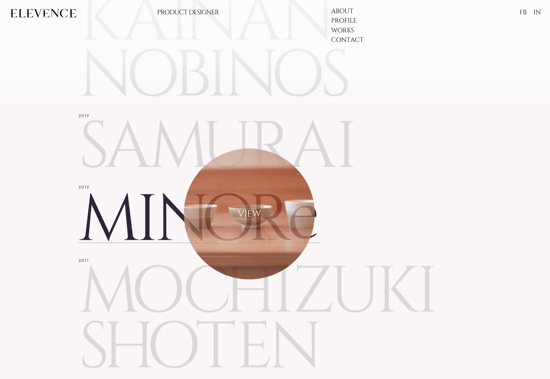
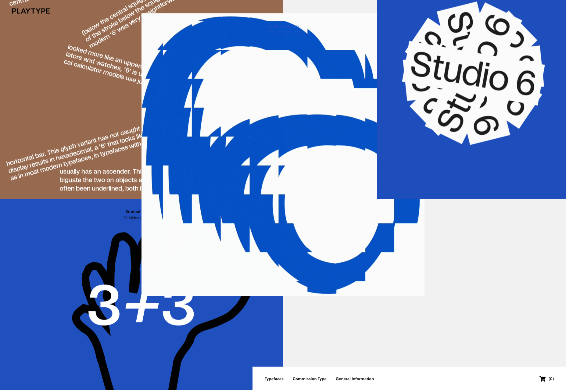
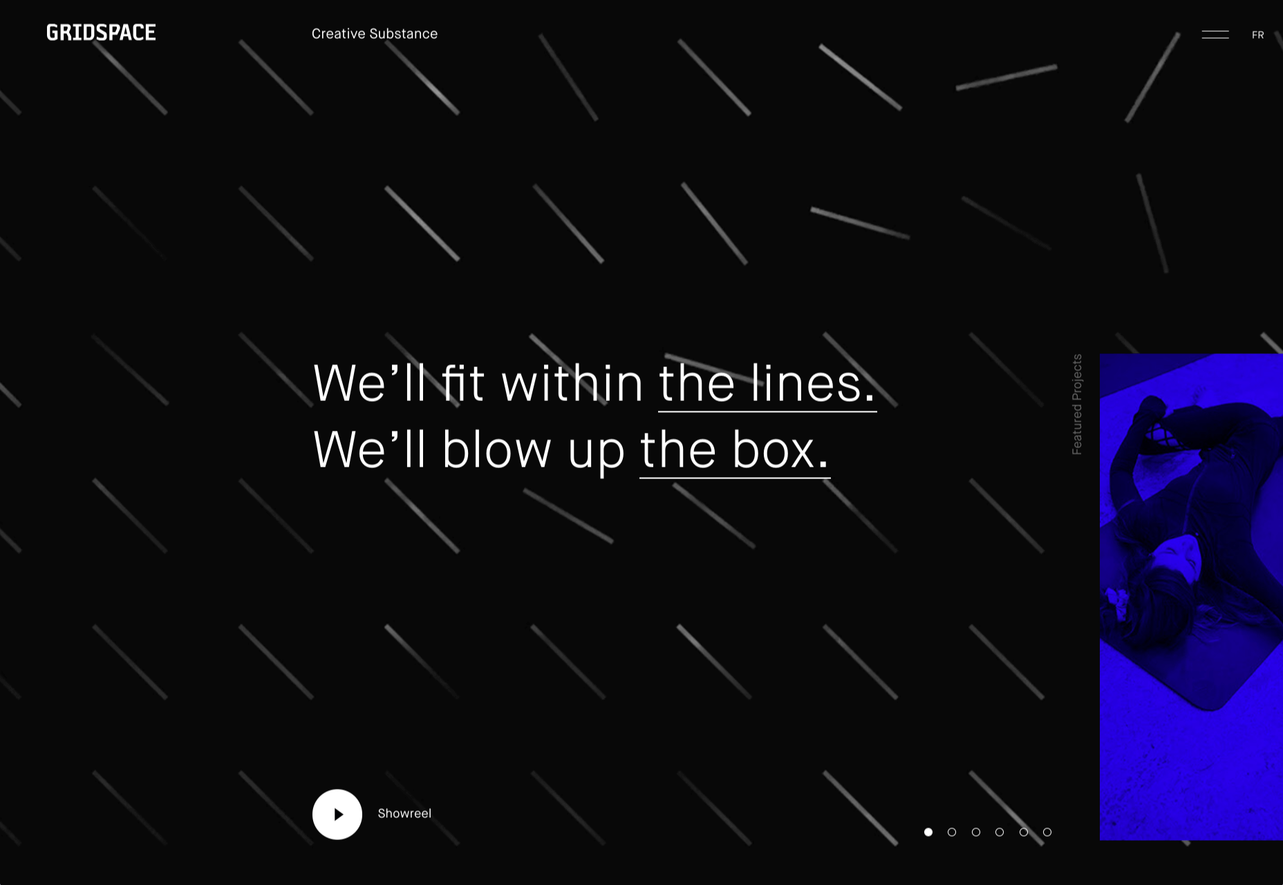
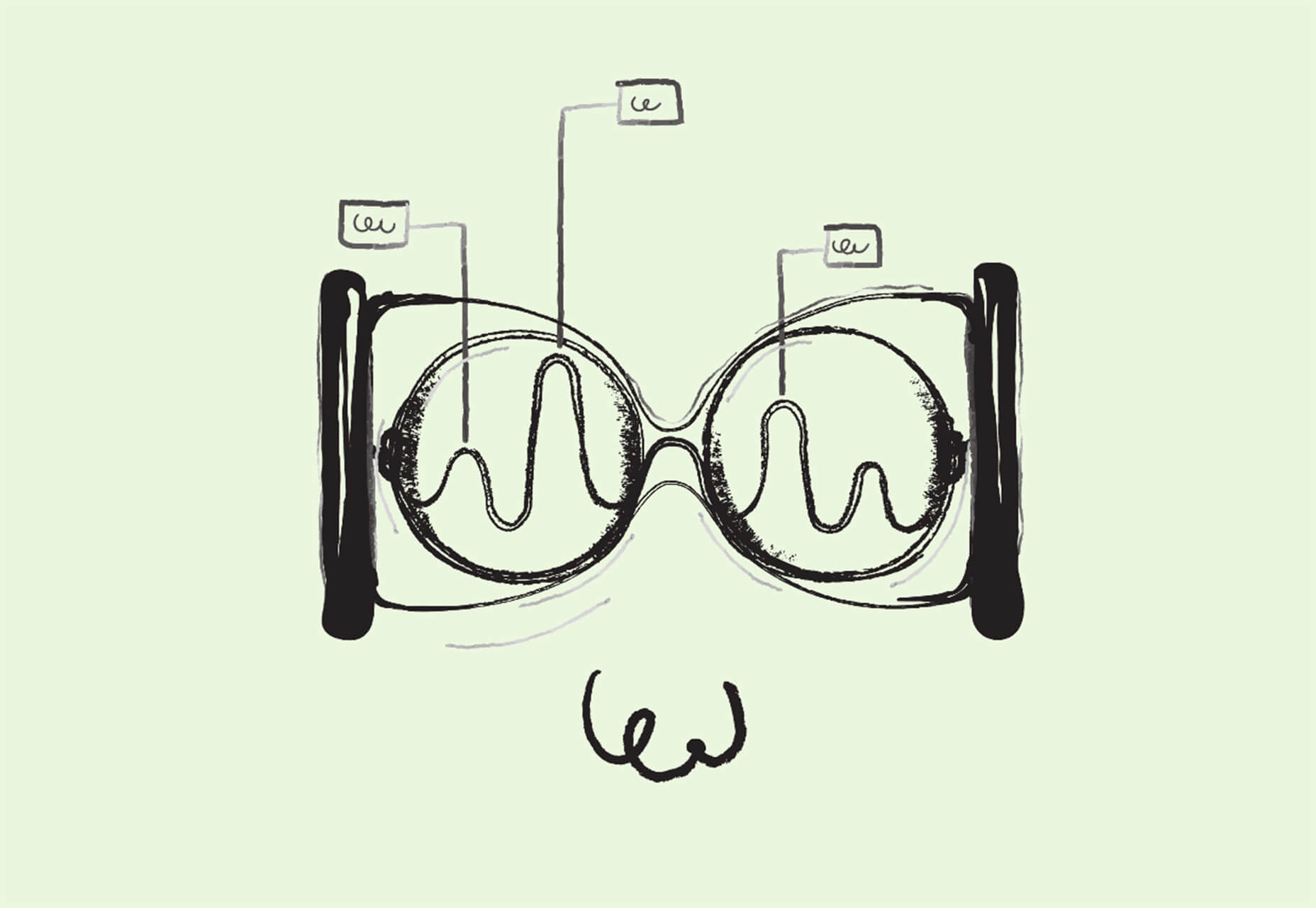
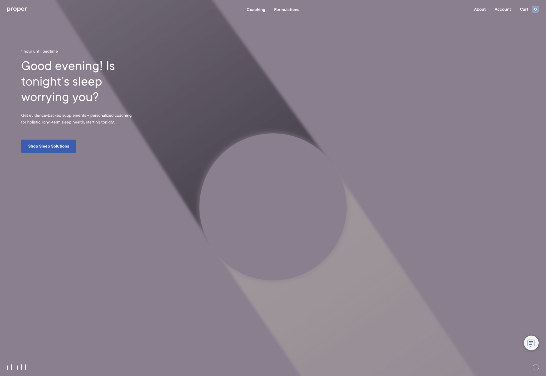
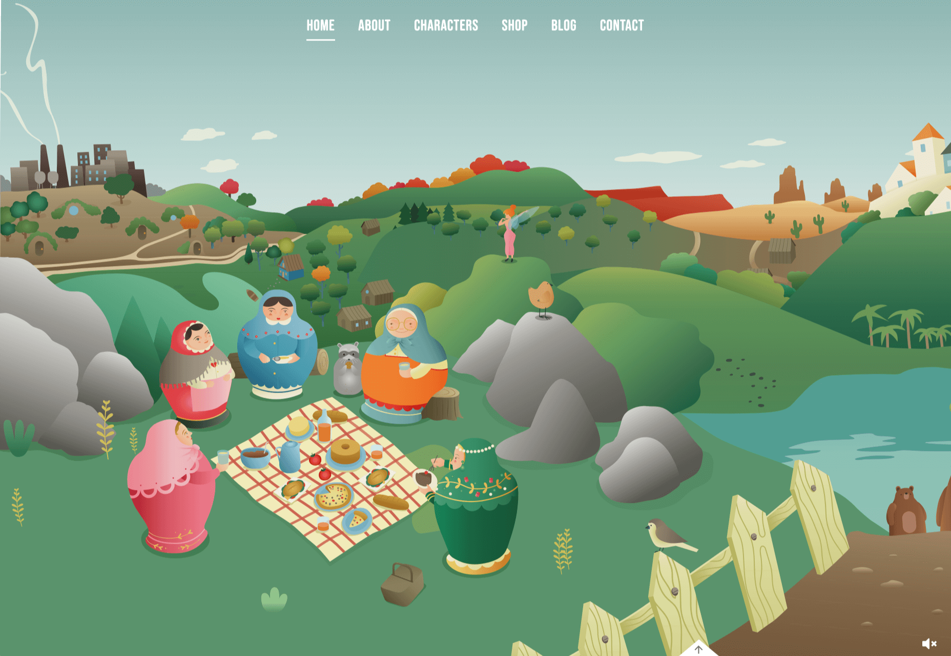
This month we’re going big and bold. Oversized type, strong colors, in-your-face layouts, and little touches of playfulness exude confidence and make a statement. There are some quieter moments too, with thoughtful illustration and more gentle use of color. Animation still features strongly in the details, with circles proving popular in rollover effects. Enjoy.

Fledge

Fledge is a film production company based in Belgium. Their site uses split screen with looped text scrolling in opposite directions on each side. A minimal color palette adds extra punch.

2ºC Earth

2ºC Earth is a beautiful and also scary website that explores the effects of rising global temperatures by focusing on 5 specific locations. Some stunning photography and subtle use of sound take you to these locations as they are now, then show what they could become. The experience is both immersive and unsettling.

pill&pillow

Unlike many digital studios who use the design of their own site to demonstrate their skills, pill&pillow have taken a very basic approach. It is very self-assured, and it works. Random colored strikethroughs on visited links add a nice touch of playfulness.

Ferrum Pipe

Metal fencing is not the most interesting of subjects to most of us, but this site for Ferrum Pipe is surprisingly appealing. On scroll animation and some off-grid image layout brings life to what would normally be, well, a bit dull.

Lucciano’s

With its focus on mouth-watering photography and videography, the site for gelato makers Luccianos, will have you checking your freezer for any leftover salted caramel or stracciatella. The zoom on rollover is a nice effect, and the use of circles with ice cream color backgrounds for rollover text reinforces the gelato theme.

Björn Wieland

UI designer and artist Björn Wieland has created a portfolio site with a simple, relaxed feel and pleasing transitions. It feels simple, but behind the scenes there is quite a lot going on.

Coloursmith

Coloursmith is a tool from Taubmans paint company which allows you to create a custom paint color by uploading a photo. You name your color and can add a story, then you order a test pot. colors are presented well, in different light and with suggestions for complementary colors.

Finn 

Finn make diet supplements for dogs. Their site is fun, modern and clean. Bright colors and an illustration that manages to be cute but not too cutesy make a bold impression.

Highcourt

Highcourt is a new private membership leisure club set to open in New York in spring 2021. Dark blue text on cream gives a softer edge than black on white. The background color changes on scroll are pleasing, and simple line illustrations with occasional gentle animation add to the overall sense of calm.

Elevence

Elevence is the company of product designer Kazuo Kobayashi. The site uses only black, white, and grays allowing the color photos of his work to really stand out. Circular thumbnails are used to good effect, appearing on rollover.

Playtype

Playtype is a Danish type foundry whose site seems to fit their name. It has a playful, almost chaotic feel, with bright blocks of color and occasional animation. Some pretty nice typefaces too.

Neri Oxman 

Neri Oxman is many things: architect, scientist, engineer, inventor, and designer. This site feels like a really beautiful coffee table art book that you want to pick up and look through every so often. There are some nice details too, like the lens ‘reveal’ effect on rollover in a few places.

Modern Recovery

Modern Recovery is a project by sobriety program Tempest. The interactive illustration encourages exploration, to discover different stages of recovery from alcohol abuse and insights from others who have followed the program. The aim is to change our social attitudes towards alcohol and not drinking.

Bliss

Have you clicked on the link to visit Bliss Search? Yes, the link is correct, no you haven’t been redirected to a Google search results page. This Australian digital marketing company have copied the appearance of different well-known sites for their pages — Google, Instagram, LinkedIn, Tinder all make an appearance. The humor in this approach shows confidence, and makes it memorable.

Miilkiina

Miilkiina describe themselves as a digital media space and creative agency. Punchy typography, with great use of blackletter, well chosen images, and a strong header video give this home page an in-your-face edge.

Ukrainian Railroad Ladies

Ukrainian Railroad Ladies is a book by photographer Sasha Maslov. Its subjects are the, mostly, women who work as traffic controllers and safety officers at railroad crossings in Ukraine. It’s a simple site — outsized type, black and white, basic image grid, only very brief text — but it is effective in its simplicity.

Una Europa

Una Europa is an alliance of 8 European universities with the aim of offering joint research and study programs. There is some playful scrolling behavior with geometric shapes moving and changing color that enlivens what could otherwise be quite a dry site.

Bureau Cool

There’s a bit of an old school feel about the site of digital design studio Bureau Cool, with its recent traffic animation. The changing backgrounds on scroll are a nice touch.

Gridspace

Gridspace is a multimedia entertainment studio based in Montreal, and their website is a visual feast. Lots of movement, lots of video, some good use of sideways scrolling.

Nolii

Nolii make cases and accessories for iPhone that work together. The sorbet color palette complements the product colors and the block layout provides a visual reflection of the interlocking of the different products.

Source


Source de l’article sur Webdesignerdepot

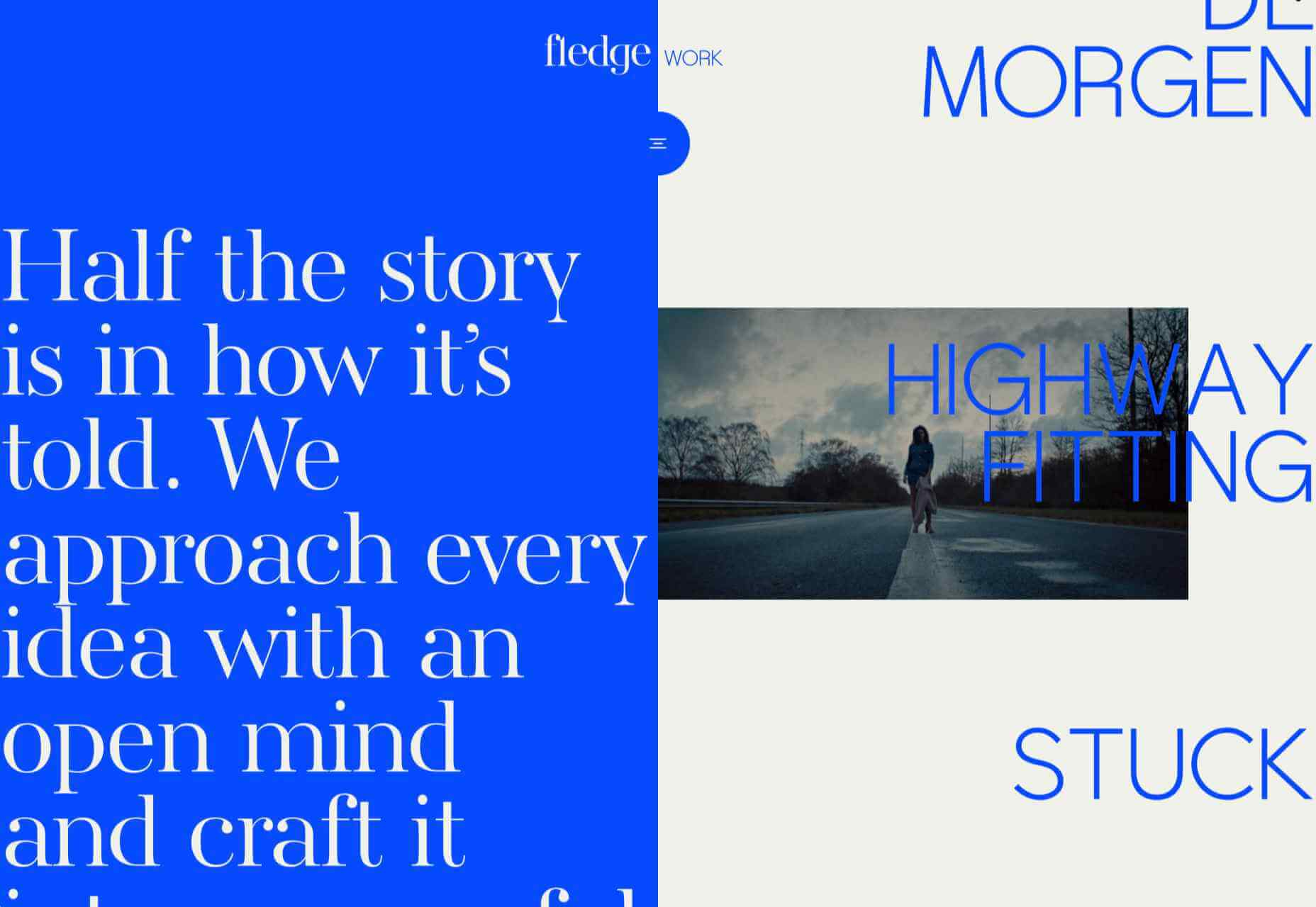
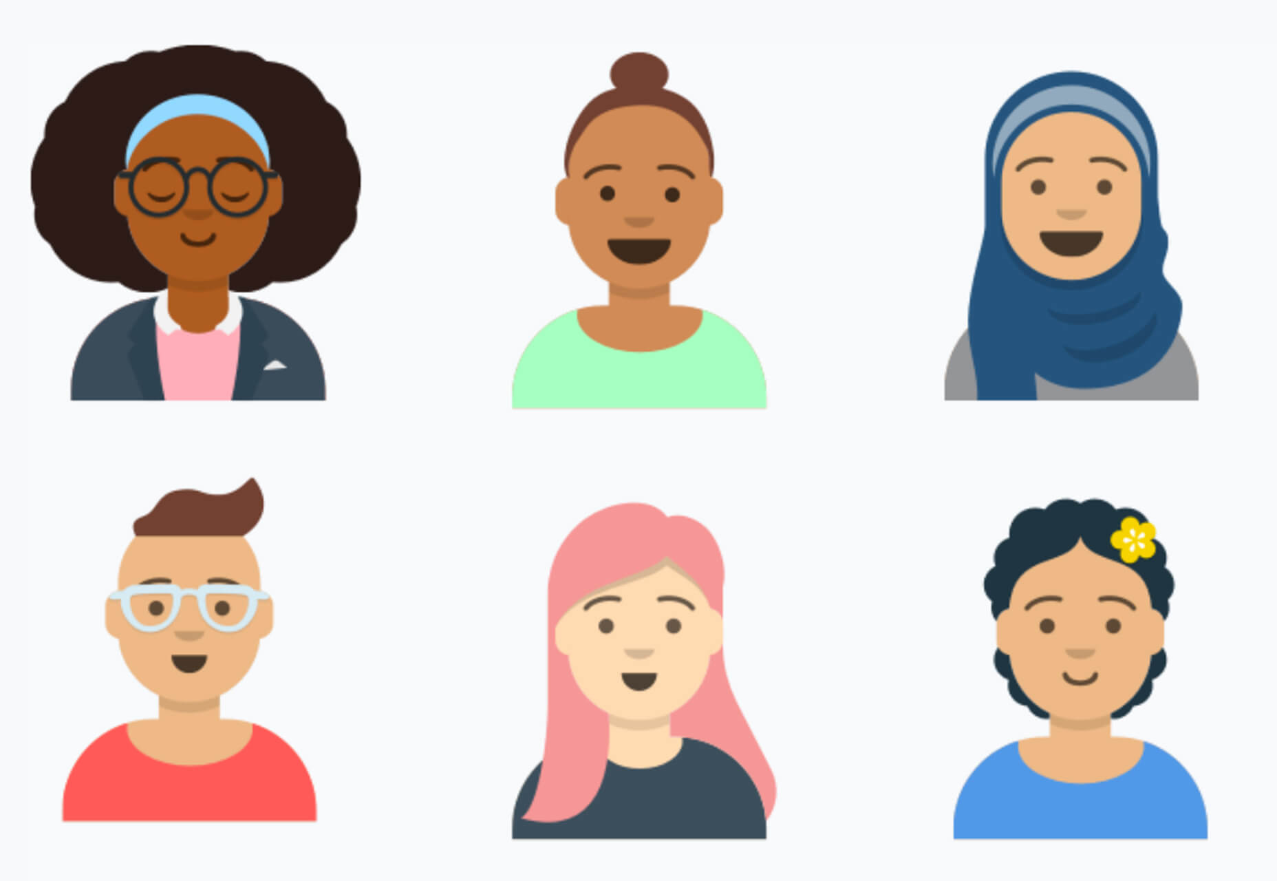
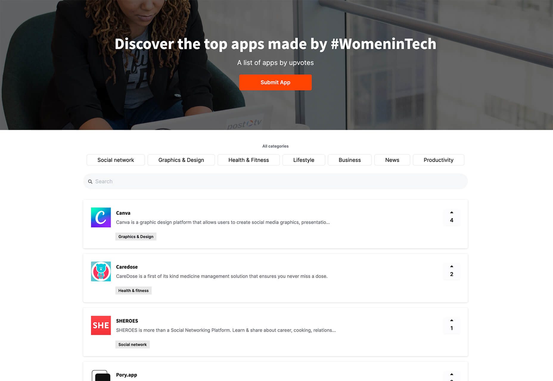
It’s fun to see new website design tools that reflect current times and the state of the world. That’s very true this month with new databases devoted to diversity and women in technology, as well and resources to make your design life easier.

Here’s what’s new for designers and developers this month:

Ztext.js

Ztext.js is an easy to implement, three-dimensional typography tool for the web that works with any font you want to use. With the popularity of 3D effects and animation, this tool has a lot of practical applications. Everything you need, including documentation, is available from developer Bennett Feely on his website and GitHub. (It’s free but you can show appreciation with a donation if you like it.)

Gradient Magic

Gradient Magic is a free gallery of fun and interesting CSS gradients. You can sort through a random selection or by category of color to find just the right gradient for your project. Some of them would make really neat backgrounds or image overlays.

Impossible Checkbox

Impossible Checkbox is a fun little divot that you’ll want to play with and emulate. Click or tap the slider to activate and a nifty little friend pops up. Now here’s the fun part: You can’t leave it checked, and take note of the changing expression of the checkbox character.

Diversify Tech

Diversify Tech isn’t your average job board; it is a collection of resources – and opportunities – for underrepresented people in technology. It includes a weekly roundup and everything from scholarships, to events, to jobs, to speaking opportunities.

Women in Tech

Women in Tech is a list of apps made by women. The apps are ranked and chosen based on upvotes and is a good resource if you want to help support women-owned projects. Search or submit an app for inclusion.

Devello Studio

Devello Studio is a tool that allows you to write code in the cloud. You don’t have to install anything and no matter where you are, just can open a project in-browser, and continue development where you had left off last time. Plus, it works with GitHub support built right in.

Hustl

Hustl is a premium Mac app that allows you to create time-lapse videos of your screen. Use it to show off work or projects or create a cool video for your portfolio. Plus you can use it to capture just one active app so you don’t have to do a lot of editing later.

FeedBaxley

FeedBaxley is a user feedback tool that helps you (and users) figure out what’s frustrating before it becomes a real issue. You can customize everything to match your brand and set it up with copy and paste tools. Feedback integrates with Slack, making it easy for you to analyze information with a team.

BestTime

BestTime launched a major update with a new tool that makes it possible to analyze visitor peaks of public business (cafe, gym, etc) for whole areas. Using the heatmap API you can find businesses at popular times, locations, or by business type.

Pixeltrue

Pixeltrue is a new collection of free SVG illustrations and Lottie animations in a trendy style. They are available for commercial and personal use and add a bit of whimsical delight to website projects. (The error illustrations are particularly fun.)

Previewed

Previewed has tons of cool and realistic mockups that you can use to create the perfect setting for digital projects. You can find mockups for a variety of devices and cool panoramas that work perfectly for elements such as app store previews.

Alt Text Overlay Bookmarklet

The Alt Text Overlay Bookmarklet solves a common problem: It shows what images use alt text and what that text is. The tool was created by Christian Heilmann and he’s put it on GitHub for you to play with and test.

MergeURL

MergeURL allows you to merge and shorten up to five links. Enter the links and mergeurl.com/o/xxxxx, for example, will open all the URLs associated with that link. The tool is free to use and you don’t have to register to use the service.

Infinity Search

Infinity Search is a new search engine that lets you look for things privately and efficiently. Search the web, images, or videos. Here’s a little about how it works: “While we retrieve results from other search engines like Bing and Wikipedia, we also have our own indexes of links that are displayed in our search results. We are actively working on improving these indexes and they will only get better.”

Blade UI Kit

Blade UI Kit is a set of renderless components to use in Laravel Blade Views. It’s built for the tall stack and is completely open source. It includes 26 components and you can contribute as well.

Trusted News

Trusted News is a Google Chrome extension that uses AI to assist in evaluating the quality of the online content. In its first release, it scores the objectivity for a selected article, testing whether it is written from a neutral perspective as opposed to a subjective one.

BaseDash

BaseDash allows you to edit production data without coding. You can make changes to the database with the ease of a spreadsheet. This tool makes it easy to find and edit information in a hurry. It works with all major databases including MySQL, PostgreSQL, Amazon Redshirt, Microsoft SQL Server, and more.

Email2Go

Email2Go is a service that helps you create email templates and test them on dozens of physical devices and applications. It’s free right now while it is in early release.

Iconscout Converter

The Iconscout Converter allows you to convert icons and images from one file format to another for free. Convert SVG, PNG, JPG, and PDF with a single click.

Shape 2

Shape 2 is a massive collection of 5,000+ unique icons and illustrations with a full-blown web editor. Customize colors, stroke width, size and full variations that can export to SVG, PDF, PNG, GIF, and React. This is a premium tool and includes a discounted release price for now.

Aestetico

Aestetico is a beautiful sans serif that includes a massive family with 54 styles. This premium typeface is highly readable and has modern lines and curves that make it a great option for a variety of uses.

Arcades

Arcades is a modern display font with a retro, 1980s-style vibe. It includes regular and italic styles.

Brimington

Brimington is a handwriting style typeface with rough strokes and smooth curves. It includes a set of 227 characters and 219 glyphs in a readable design.

California Signature

California Signature is a typeface duo with a slab serif and handwriting style that are perfectly paired. The thick and thin options provide a yin and yang effect.

Eastblue

Eastblue is a script typeface with long swashes and interesting curves. It includes a solid character set and is free for personal use only.

Source


Source de l’article sur Webdesignerdepot

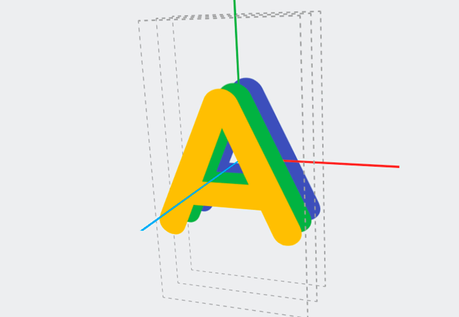
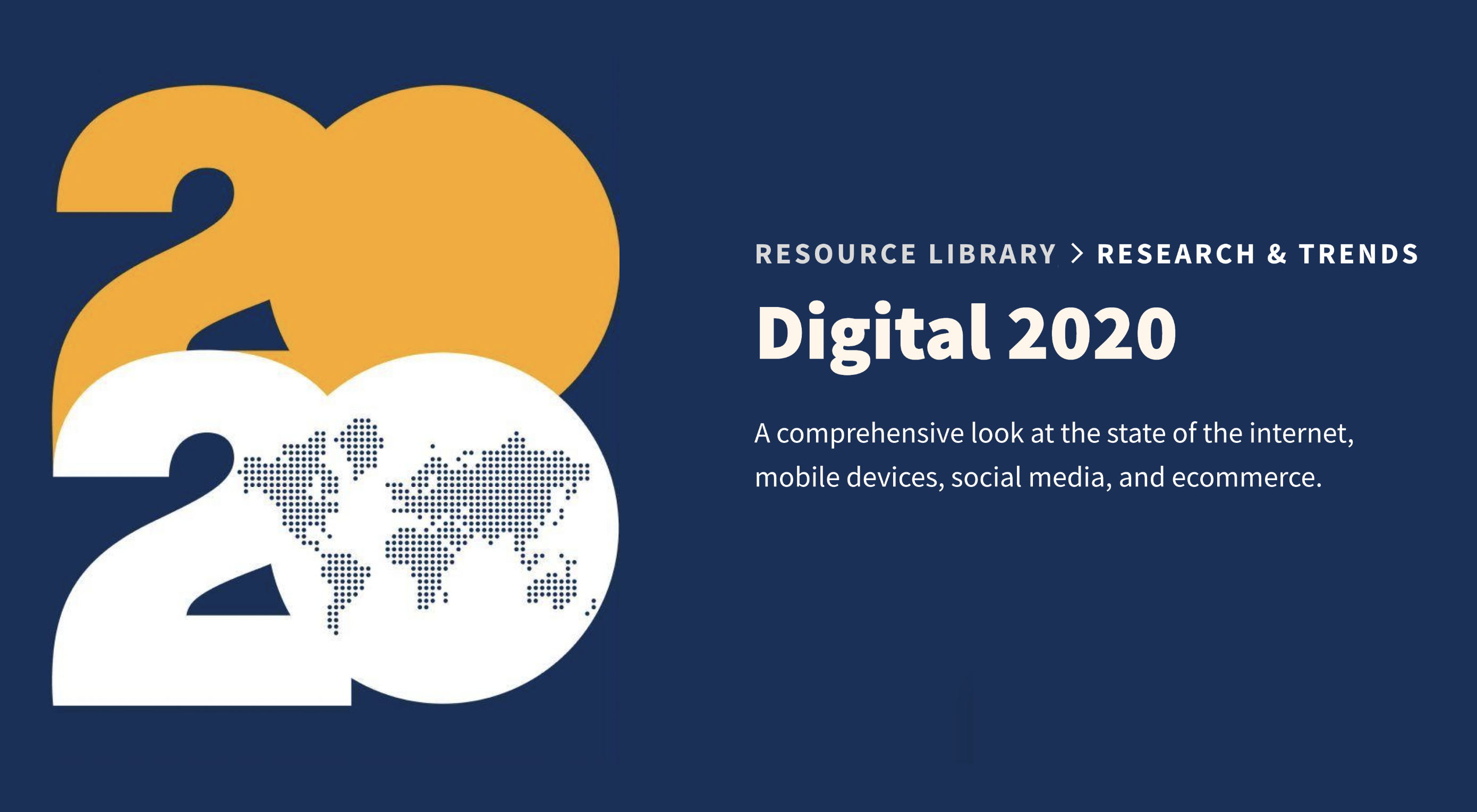
In today’s look at the latest research for web designers, we’re going to look at studies and reports from Payoneer, Robert Half, Hootsuite, and Contentsquare to see what they have to say about things like:

  • Current freelancer demand
  • Web designer earning potential
  • A change in ecommerce shopping trends
  • Unseen content rates

1. There’s Light At the End of the COVID-19 Tunnel for Freelancers

Payoneer’s The State of Freelancing During COVID-19 had to take a different approach to reporting on the freelancer workforce than in years passed.

Here’s why:

When 1000+ freelancers around the globe were asked how demand for their services changed during COVID-19, this was the response:

Less than 17% of freelancers experienced an increase in demand for their services and less than 23% saw demand remain the same.

An overwhelming majority of freelancers experienced a shrink in demand, with nearly 29% saying it slightly decreased while almost 32% said it greatly decreased.

However, the data collected wasn’t just assessed on a global scale. Payoneer also looked at freelancing demand trends in various parts of the world:

Notice the differences between Asia and Australia (who were hit with COVID-19 earlier) and North America and Europe (where the pandemic arrived a little later).

It appears as though Asian and Australian freelancers are, economically speaking, already starting to feel the effects of recovery from the pandemic with demand working in their favor.

So, if you’re feeling like there’s no end to the hardships you’ve faced during COVID-19, and were considering dropping your prices, hold on for just a little bit longer. Freelancers are starting to feel optimistic about demand for their services increasing. If you go devaluing yourself now, it’ll be hard to return to where you were before COVID-19 when things get back to normal.

2. Robert Half’s Salary Guide Breaks Down the Earning Potential for Web Designers

On a related note, let’s talk about demand from the employer’s point of view.

According to Robert Half’s 2020 Salary Guide for creative marketing professionals, there’s big demand for digital talent:

So, that’s number one. We know that almost 50% of hiring managers feel as though their digital teams are inadequately staffed. That’s good news for web designers.

However, these same managers complain about creative marketing professionals’ lack of up-to-date skills as the biggest barrier to hiring or retaining them. Although the report doesn’t say so, I’m going to assume this refers both to employees as well as contractors.

This should be a no-brainer. By keeping up with the latest web design trends and techniques, you can make top-dollar for your services — and hold onto those valuable client relationships for a long time.

According to the report, this is how much you stand to earn working in web design (in the U.S.) today:

If you’re eyeballing those salaries in the 95th percentile, then you know what you need to do. Hiring managers have spoken up about what’s holding them back from hiring.

For those of you who feel as though you’ve gone as far as you can as a web designer, it might be worth exploring a new specialty. Like one of the following:

As you can see, designers in the UI, UX, and interactive space (along with web developers) have the opportunity to make more money, even earlier on in their careers. You may also find that more job opportunities are available as you move into these niches (because of less competition), which might cut down on any demand issues you’ve been experiencing because of COVID-19.

3. Hootsuite’s Digital 2020 Report Reveals an Interesting Trend in Ecommerce

Hootsuite’s Digital 2020 report is always a great resource for learning about social media marketing trends. That said, that’s not why I read it.

It’s for hidden gems like these:

It’s no surprise that we’re seeing changes in retail and ecommerce during COVID-19. What is a surprise, however, is how consumers’ online shopping habits have changed.

Here’s what we’re seeing when we compare 2020 ecommerce data with the pre-COVID benchmarks:

Site visits are 1.7% lower than expected. That would make sense considering how budget-conscious consumers are right now. It likely keeps them from going on unnecessary shopping sprees.

Session durations are 3.3% lower. This could be related to fewer site visits. It might also indicate greater consumer confidence. If they come to a website with a plan for what they need to buy, they’re going to take a straight line to conversion instead of spending time window shopping that prolongs their session.

The number of transactions is 19.1% higher and the conversion rate is 21.6% higher. Considering shoppers aren’t spending as much time with ecommerce websites, this point suggests that there’s a massive shift happening from in-store shopping to online shopping.

If that’s the case (even if consumers are currently spending less money), that means web designers need to set their sights on the ecommerce space. With the holiday shopping season expected to start sooner rather than later this year, now is the time to get in there and make sure these sites provide as streamlined an experience as possible.

4. Contentsquare Studies the Unseen Content Rates By Industry

Contentsquare analyzed more than 7 billion user sessions globally to create the 2020 Digital Experience Benchmarks report.

There’s some interesting data in here about website traffic and conversion trends, but what I find the most valuable is the breakdown by industry.

It was this chart, in particular, that really caught my eye:

According to Contentsquare’s data, between 60% and 75% of a website’s content is unseen. Some industries fare better than others, like home supplies and luxury retailer websites, but the numbers still aren’t flattering.

For example, what does it mean when consumers miss 75% of a financial service provider’s content?

Does this mean that the financial advisory content — which I’m assuming comprises the bulk of the pages on the site — is useless or irrelevant? Or perhaps it’s an issue of discoverability since blog content and other resources often take a backseat to service and product promotion?

What about ecommerce brands in the apparel or beauty space?

If two-thirds of their pages are unseen, does that mean their websites are overrun with obsolete inventory? Or, again, is it an issue of navigability and discoverability around the store?

As a web designer, I’d suggest performing your own unseen content analysis on the websites you’ve built. If over 60% of your pages never get any views, you’re going to have to decide what to do with them:

Option 1: Fix the navigation or search function so people can actually find these unseen pages.

Option 2: Remove them from the site and make room for content your visitors actually find valuable.

Wrap-Up

As you encounter research and reports online — whether it’s written specifically for web designers or other creative professionals — spend some time looking for hidden gems.

As you can see above, there’s a ton of relevant research for web designers out there, even if it’s hiding behind the mask of a larger issue or matter. And it’s this data that will help you get a leg up on the competition since it’ll get you thinking about your business and your approach to design in different ways.

Source


Source de l’article sur Webdesignerdepot

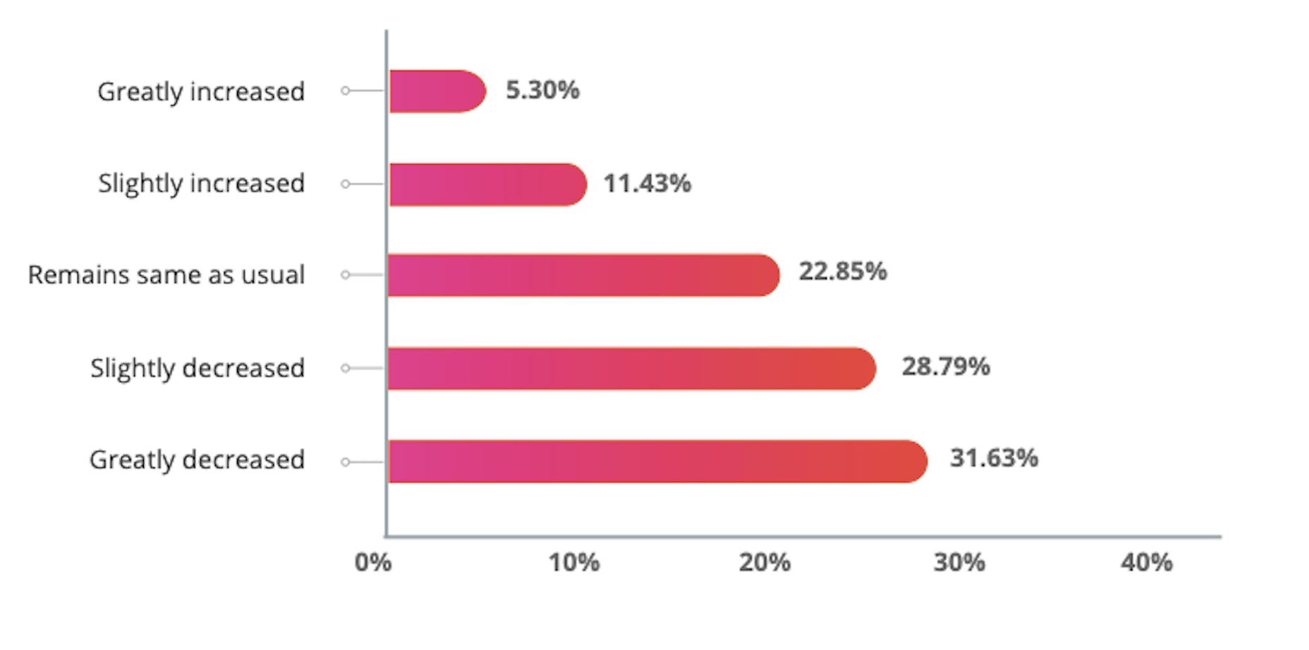
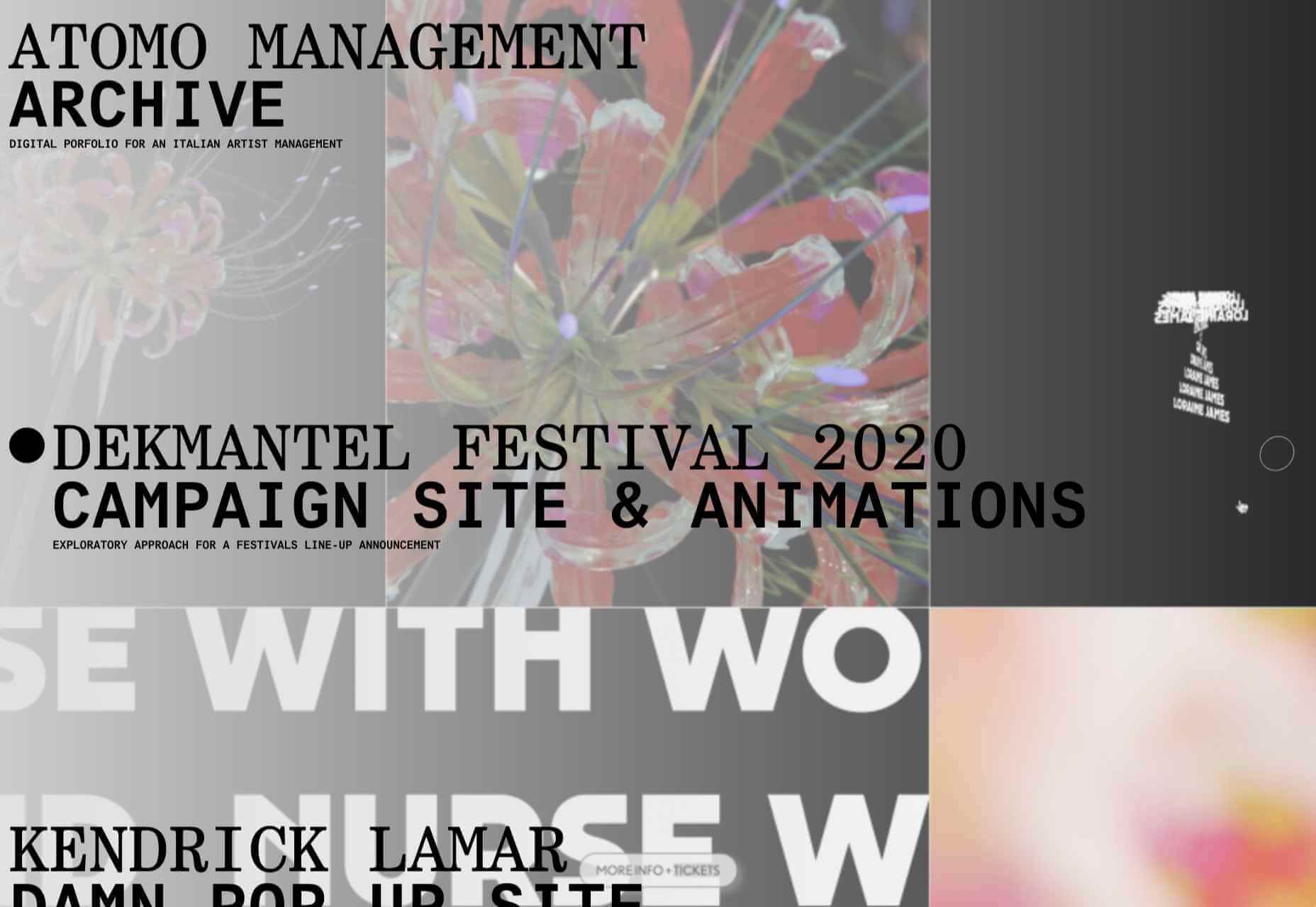
Every week users submit a lot of interesting stuff on our sister site Webdesigner News, highlighting great content from around the web that can be of interest to web designers.

The best way to keep track of all the great stories and news being posted is simply to check out the Webdesigner News site, however, in case you missed some here’s a quick and useful compilation of the most popular designer news that we curated from the past week.

UX Design for Navigation Menus


How to Choose UI Colors for Mobile and Web Design Wisely


A Step-By-Step Guide to Create your own WordPress Theme


HTML5 Canvas Cheat Sheet [PDF]


Beyond Media Queries: Using Newer HTML & CSS Features for Responsive Designs


The Power of not Messing Around


Tailwind Ink: AI Color Palette Generator for Tailwindcss


Resumey.Pro – Save Time and Effort on Designing your Resume Using Markdown


The Ultimate List of YouTube Channels to Boost your Web Dev’t and Programming Skills


10 Google Font Combinations for Inspiration


Everything You Need to Know About WordPress 5.5


How to Create Stronger Layouts with the 8pt Grid


TEDx Talk: Good UX is a Problem


All the Ways to Make a Web Component


Landing Page 101: How to Design a Landing Page that Converts


30 Free HTML and CSS Book Effects and UI Design


A Guide to Design System Models


15 Designer Curated Color Palettes to Inspire your Next Project


My Thoughts About Editors in 2020


The Napoleon Technique: Postponing Things to Increase Productivity


Announcing TypeScript 4.0


Un-Cancelling 2020: Virtual Conferences for Designers


How to Manage Stress as a Developer


Explaining UX Design to a 5-year-old


How to Win Over Skeptics with Qualitative Research


Want more? No problem! Keep track of top design news from around the web with Webdesigner News.

Source


Source de l’article sur Webdesignerdepot

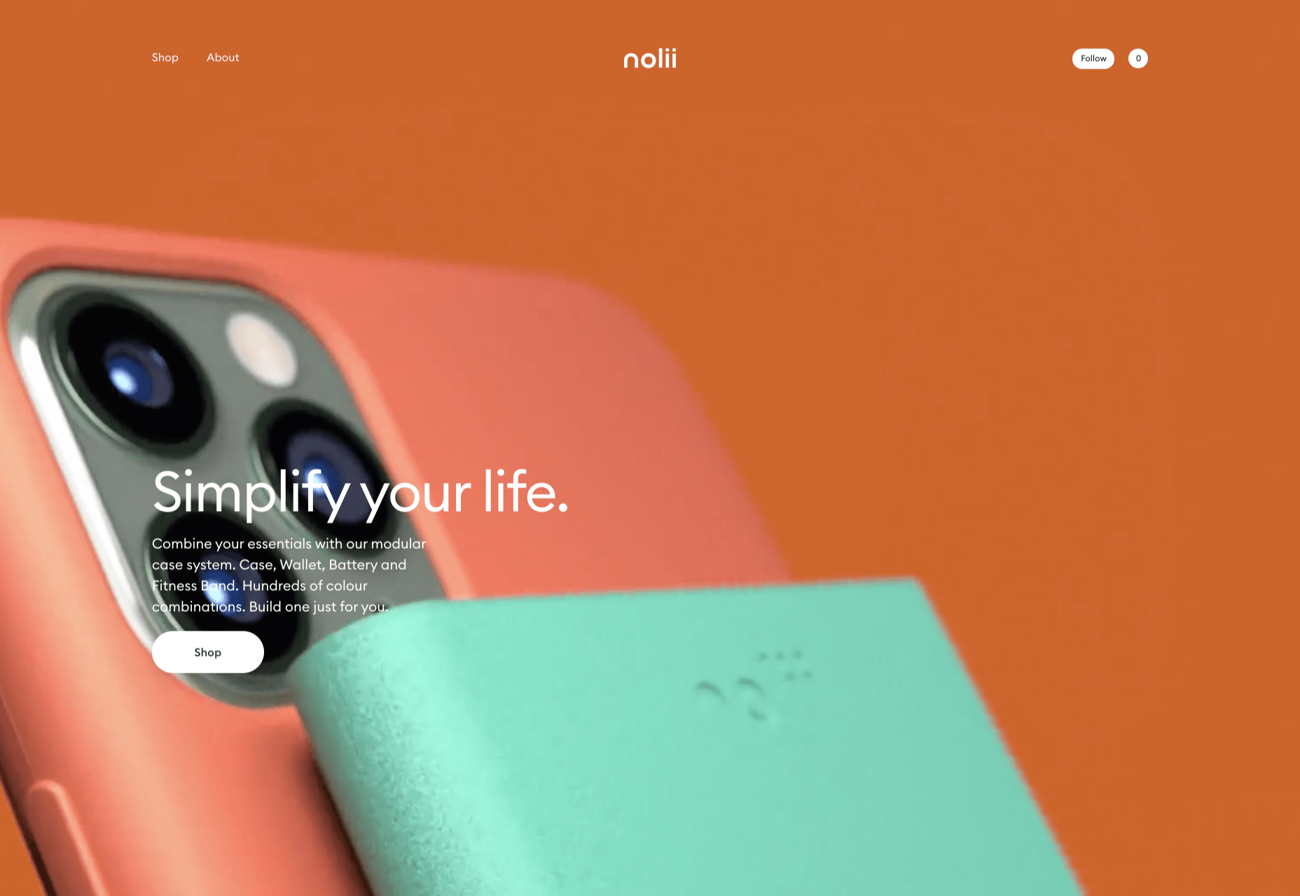
In this month’s collection of the freshest web designs from the last four weeks the dominant trend is attention to detail.

You’ll find plenty of animation, in fact, almost every one of these sites uses animation to a greater or lesser degree. Let’s dive in:

Globekit

Globekit is a tool that allows developers to quickly create animated and interactive globes and embed them on web pages. Its site features some exceptional 3D animation.

Yolélé

Yolélé is food company built around fonio, a West African super grain. Its site features a great page transition, and the landing page carousel is one of the few examples of horizontal scrolling we’ve seen work well.

Begonia

Begonia is a Taiwanese design agency with an impressive client list. Its site features animated typography, a super bold splash screen, and some surreal artwork. There’s so much here, it’s almost overwhelming.

Next Big Thing

Next Big Thing is an agency supporting the full lifecycle of start-ups. Its site is clearly targeting tech-based clients, and there are some lovely transitions. The masked hero transition on scroll is delightful.

Proper

We all have every reason for the odd sleepless night right now, but regular sleep is essential for our health. Proper offers sleep solutions from coaching to supplements on its subtly shaded site.

The Oyster & Fish House

The site for The Oyster & Fish House is packed with some delightful details. We love the subtle wave textures, the photography has a nostalgic feel, and the typography is perfectly sophisticated.

Drink Sustainably

Fat Tire produces America’s first certified carbon neutral beer, and Drink Sustainably has been produced to explain the concept. We love the vintage advertising style of the artwork.

Treaty

It seems like every week there’s a new CBD brand launching. What we like about Treaty’s site is the slick fullscreen video, the inclusion of botanical illustrations, and the really brave use of whitespace.

Studio Louise

You’re greeted on Studio Louise’s site by a shot of trees with two random shapes; as you scroll the shapes morph and relocate to the top right corner, and you suddenly realize they’re an “S” and an “L”, cue: smiles.

Wünder

Another site for a CBD product, this time a vibrantly branded sparkling beverage. Wünder’s site features enticing photography, an on-trend color palette, and credible typography.

Seal + Co

Some professions lend themselves to exciting, aspirational sites, and some companies are accountancy firms. However Seal + Co’s site creates the impression of a modern, capable, and imaginative firm.

DocSpo

There is some lovely, 3D animation on the DocSpo site. The company is a Swedish startup enabling digital business proposals, and its site is bold, Appleesque, and packed with nice details.

Motley

We never get tired of particle effects, like the one employed by Finland-based agency Motley. There’s some superb work in the portfolio, and it’s great to see a blog using Old Master paintings for thumbnails.

The Ornamental

The Ornamental sources leather goods for wealthy individuals, and luxury lifestyle firms. Its site is minimal, with some drool-worthy handbags. We particularly liked the image zoom hover effect in the store.

G.F Smith

G.F Smith is one of the world’s leading paper suppliers. Its redesigned site is much simpler than its last, with some lovely touches, like the varied paper photography when you hover over product thumbnails.

Raters

Raters is a new app that lets you discover new movies via reviews from people you trust. This simple site does an exceptional job of previewing the app, across multiple device sizes.

Fleava

There’s a whole heap of nice interactive details on Fleava’s site, from the cursor-following circles when hovering over links, to the way the thumbnails are squeezed when dragging through projects.

The Story of Babushka

A babushka doll is a traditional Russian toy, made up of dolls, nested inside dolls. The Story of Babushka uses the toy as a metaphor for growth in this children’s book, and the accompanying animated website.

Grand Matter

After the uniformity of the 2010s, there are a wealth of illustration styles being explored across the web. Grand Matter is an artist agency that represents some amazing talent, and we love the illustration they chose themselves.

Nathan Young

Nathan Young’s site does exactly what it needs to do: Providing case studies for his design work. The fade-out on scroll is a simple device that elevates the whole site experience.

Source


Source de l’article sur Webdesignerdepot

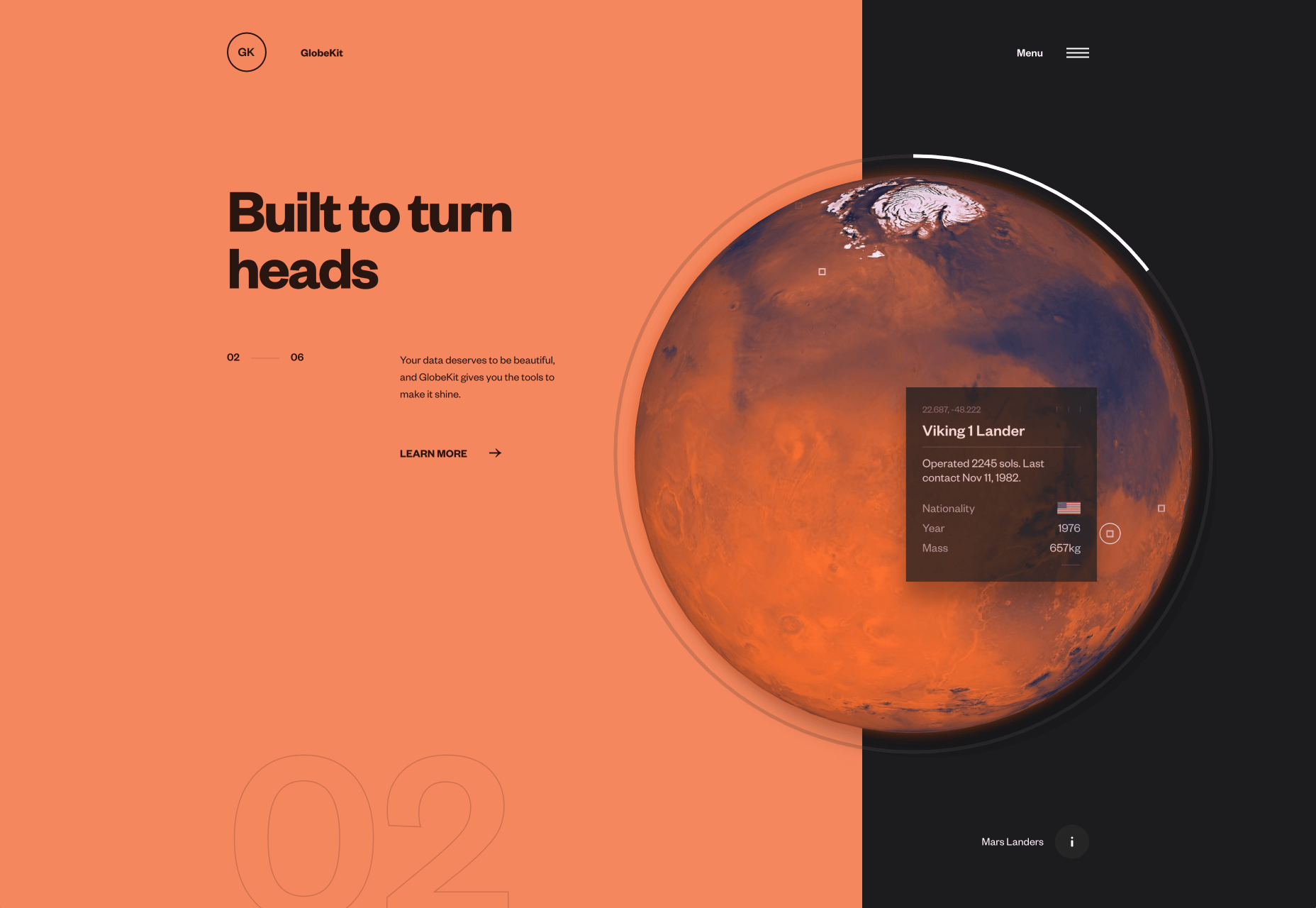
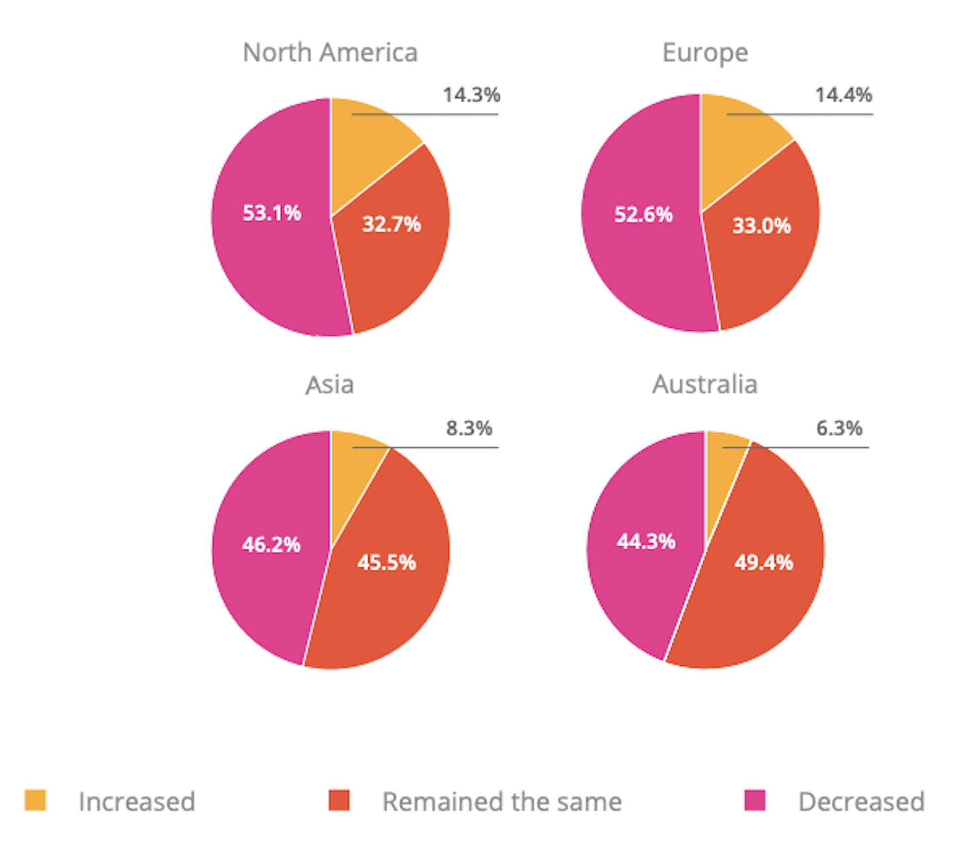
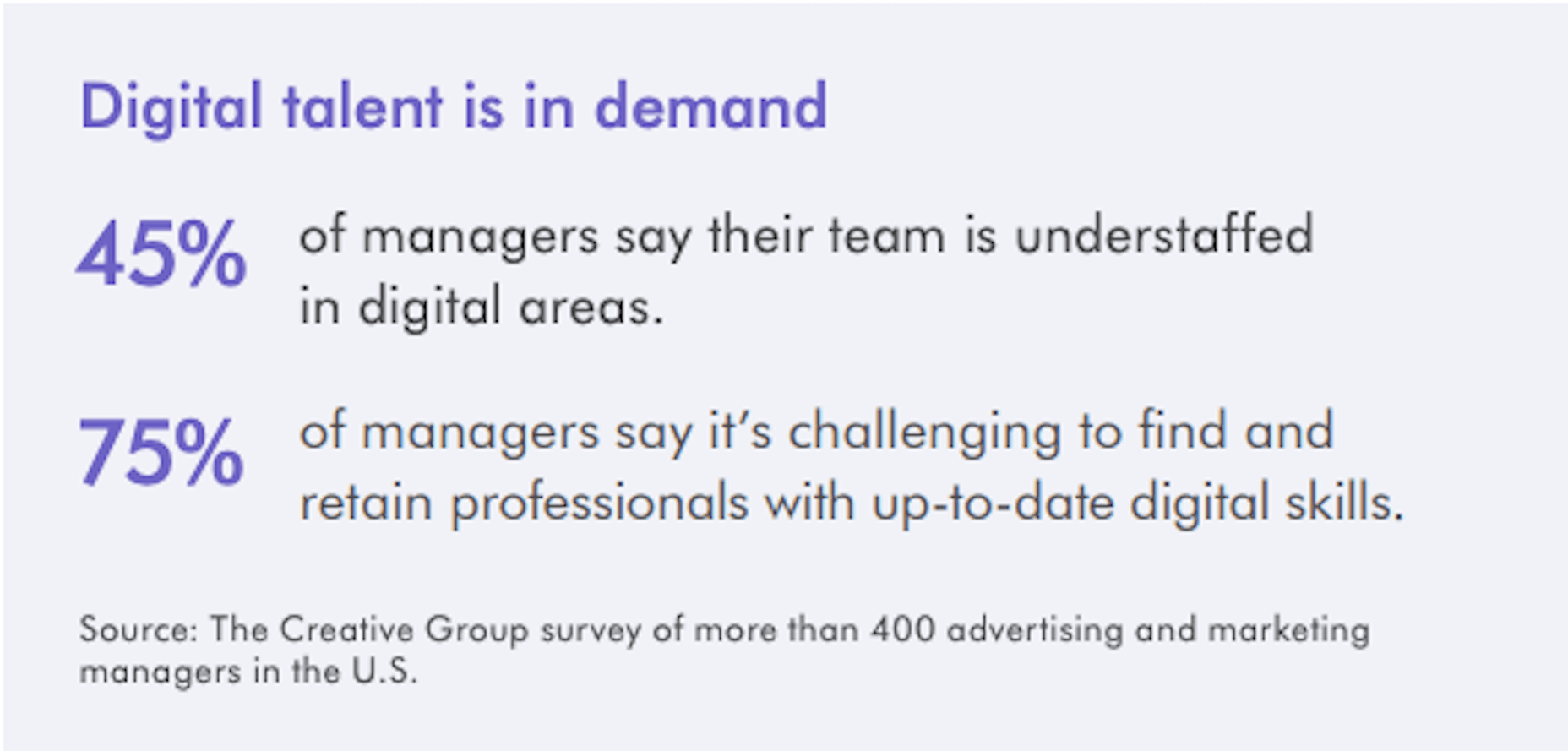
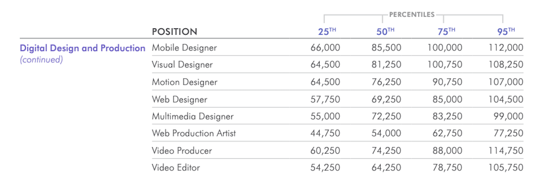
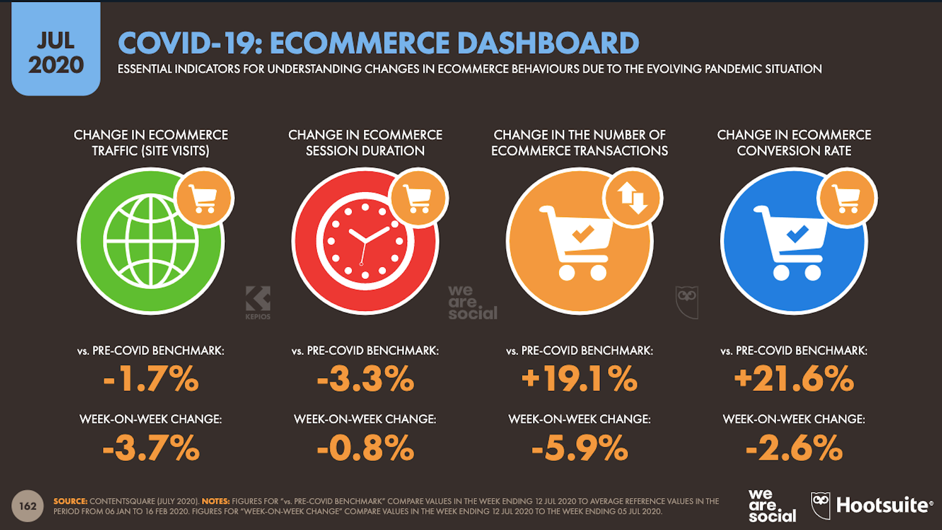
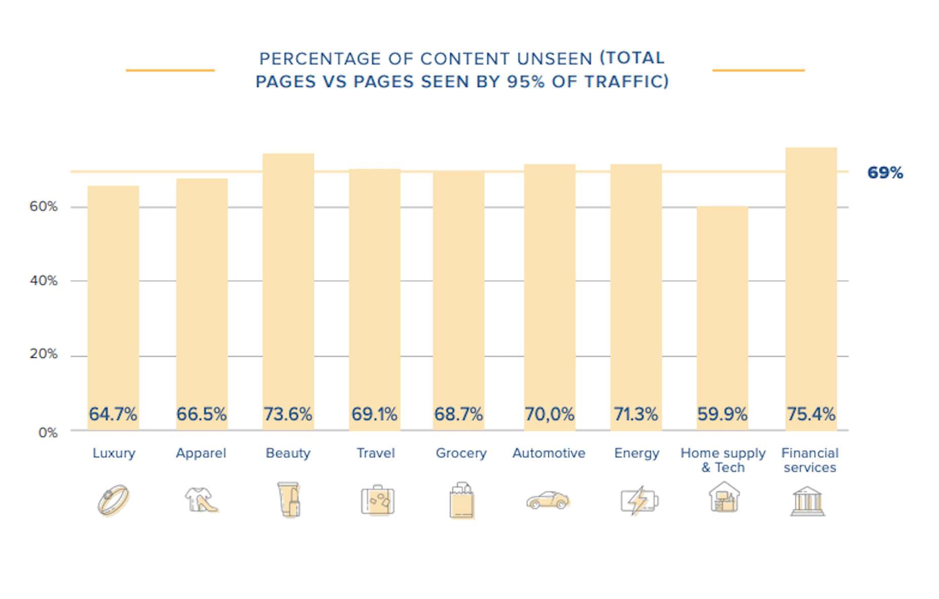
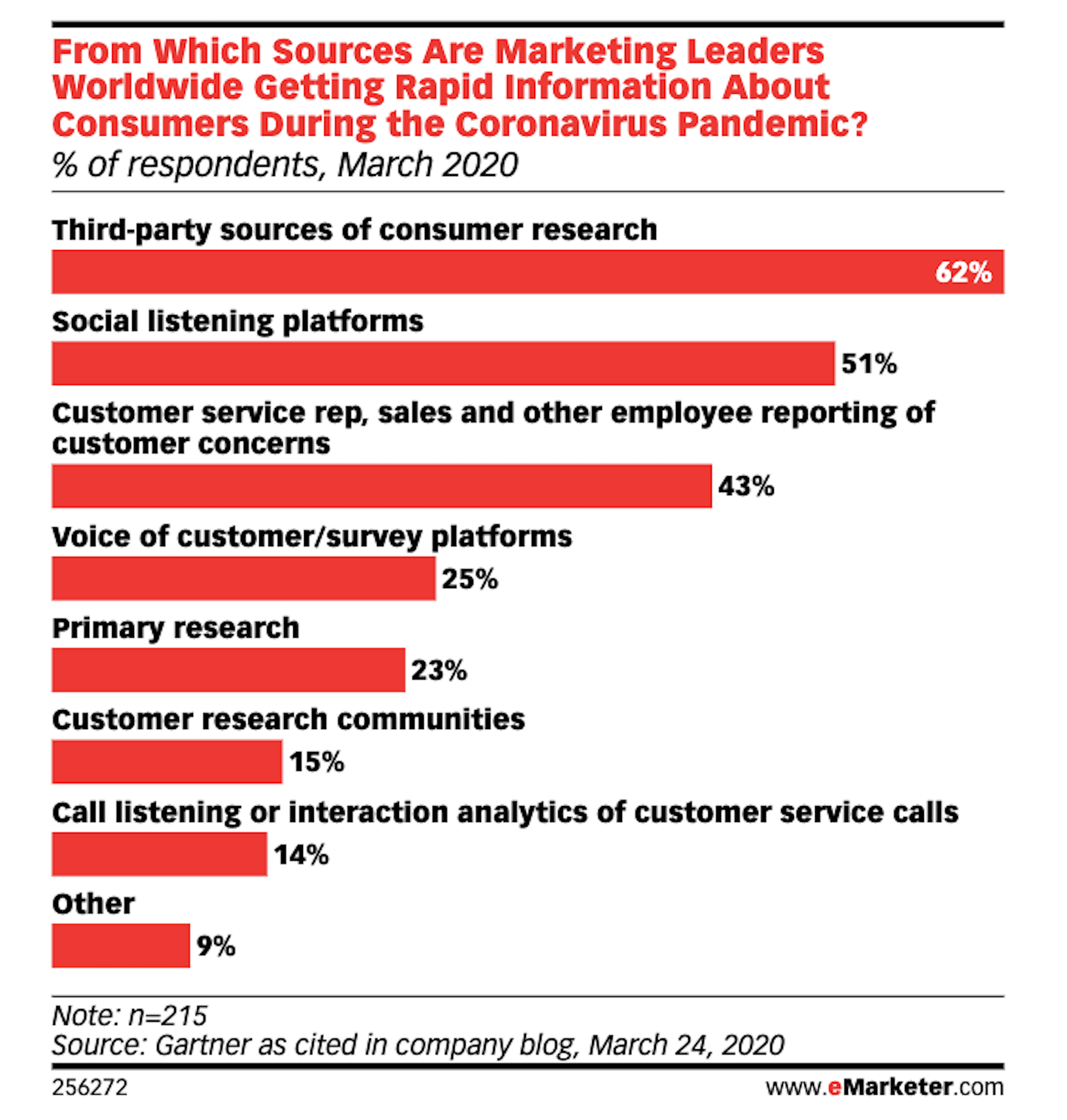
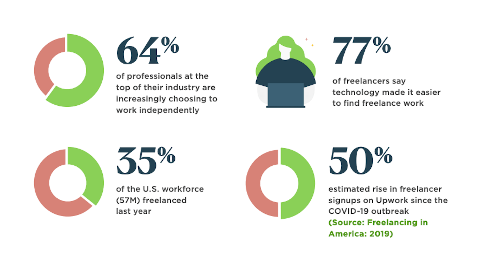
While a lot of the research for web designers that’s come out this year has to do with COVID-19, we’re starting to see a light at the end of the tunnel. Many of these reports aren’t just looking at the effects of the pandemic on business and marketing today. They’re now looking at what consumers plan to do once the pandemic is gone.
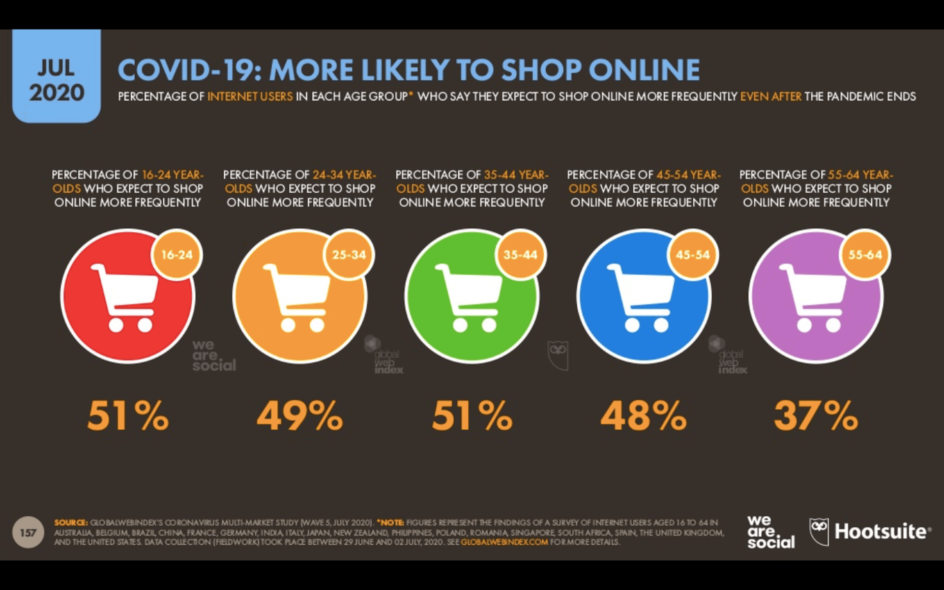
So, I have some very interesting research for you here today. Three of the reports have to do with coronavirus side effects — pertaining to ecommerce, market research, and freelancing — and one of them is just a really great argument against using PDFs on websites.

1. The Digital 2020 Survey Says Ecommerce Growth Will Continue Post-Coronavirus

Obviously, everyone is paying close attention to COVID-19’s impact on the world. For the purposes of the work you do as a web designer, you should be clued into what it’s doing to the business and marketing fields. Because, if those opportunities dry up or companies begin to pivot, you need to be ready to adapt.

The Digital 2020, a joint monthly report from we are social and HootSuite, brings interesting news about the state of ecommerce thanks to COVID-19.

Because the pandemic has forced consumers indoors, online shopping has increased. But, according to about half of those surveyed for this report, this isn’t some temporary solution. They plan on doing more online shopping even after the pandemic ends.

This means that web designers are sitting in an enviable position now and for the foreseeable future. If you’re not already helping businesses sell through their websites, now is the time to do so as more and more businesses are going to need reliable online stores to sell their offerings through.

2. eMarketer Shares Data on Social Listening

When conducting research at the beginning of a design project, what kinds of sources do you turn to for quick and reliable information? Your client provides you with information on their business, industry, and the competition, of course, but what else?

You can conduct user surveys and interviews, but those take time and resources. It also usually means working with clients who have existing businesses and user bases to tap into. Unless you’re working as a UX designer where that’s a big part of the work you do, you might not have the ability to do that level of research.

As reported by Gartner (via eMarketer), leading marketers are now learning about their target audiences through the following channels:

Thanks to the surge of traffic online right now, social listening platforms have become really useful resources for learning about one’s users, with 51% of marketing leaders using them.

If you feel as though your initial research and planning phases could use a boost, I’d recommend taking advantage of one of these social listening tools now.

If you build websites for a specific niche, you can set up keywords/hashtags that are universally relevant to (most of) your clients. By listening in on these conversations regularly, you can become more attuned to what the visitors of your websites actually need and you can proactively build better experiences for them as a result.

3. Upwork Reports Increasing Numbers of Freelancers Entering the Market

The main focus of the Upwork 2020 Future Workforce Report is on how employers are changing their approaches to hiring now and in the near future. And the basic premise is this:

  • It’s long been predicted that more and more of the workforce would be allowed to work remotely.
  • COVID-19 has escalated those predictions to the point where most of the workforce is remote right now.
  • Businesses see the value in remote work arrangements, especially if it enables them to get work done more quickly and cost-effectively by freelancers.

While this is certainly great news for web designers looking for new clients, the report also provides us with this data:

64% of professionals in the top of their field work independently. That statistic alone means you’re up against some tough competition. But there’s also the 50% rise in signups on freelancer marketplaces that should have you worried.

Even though business demand for freelance talent is growing, this unprecedented rise in freelance competition may pose some problems. So, if you’re not already doing everything you can to position yourself as the web designer in your niche, get going on that now so you don’t get drowned out by the rising number of competitors.

4. NNG Says That PDFs Are Unsuitable for the Web

While I don’t have statistics to share with you from the Nielsen Norman Group’s post on why the PDF is “Still Unfit for Human Consumption”, I do have a ton of usability arguments against them that are worth summing up here:

  1. PDFs are written in the style of print documents, which means that strategies we use to design content on websites — like making a page scannable and accessible — don’t apply.
  2. They’re not designed to be as concise or attractive as a web page.
  3. They don’t operate like a website, which disrupts the seamless experience you’ve worked so hard to create when one is opened up from your site.
  4. The website navigation disappears and any sense of orientation (besides the browser “Back” button) goes out the window.
  5. There’s no way to build an internal navigation in a PDF document, save for internal linking or a table of contents.
  6. If they’re formatted for paper sizes, scrolling through them can be difficult for mobile users.
  7. They load more slowly the bigger they get, so unless it’s something like a small and optimized menu, expect visitors to wait for the download to appear.

And those are just the arguments that came from NNG’s researchers. Take some time to read through real user complaints about PDFs and you’ll never want to include one on a client’s website again.

Wrap-Up

Thankfully, the research for web designers and marketers is finally starting to move away from the confusion and speculation we saw a lot of earlier this year.

Just as with anything we do on the web, the more time you give it, the more data you can collect. And, luckily for us, the data suggests that there’s a pretty positive outlook for web designers if they position themselves the right way now.


Featured image via Unsplash.

Source


Source de l’article sur Webdesignerdepot

As I covered in a previous post, monad transformers have poor performance properties in languages and runtimes unequipped to deal with them — including the Scala programming language and the JRE.

There’s a general technique to improving performance that involves something I call effect rotation.

Source de l’article sur DZONE