 One of the few bright spots in 2020 has been the creativity companies and individuals alike have exhibited in dealing with what, at times, seemed to be overwhelming problems.
The world of web design was no different. Designers and agencies had to adapt and implement new color schemes or design new shopping experiences, which made some of the previous design trends not fit for the current design problems.
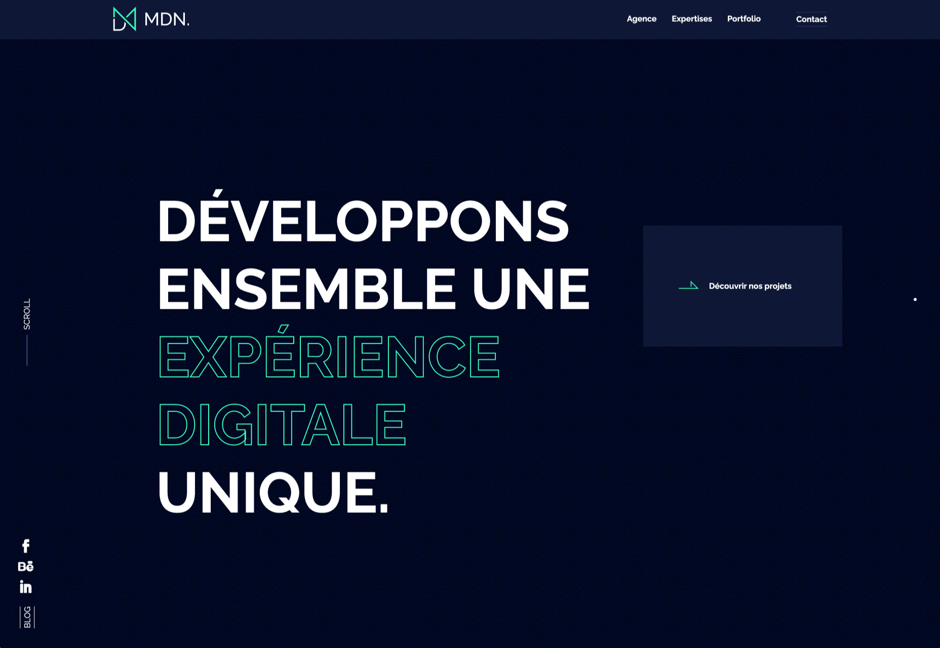
We’ll take a look at these newest design trends and the rationale behind them. As we do so, we’ll also take a look at some of BeTheme’s 600+ pre-built sites that have already put them to good use.
1. Comforting Color Palettes Lighten the Load
In years past, bolder color schemes were one of the hallmarks of web design trends. Their purpose was to quickly engage a visitor and prompt him or her to respond emotionally.
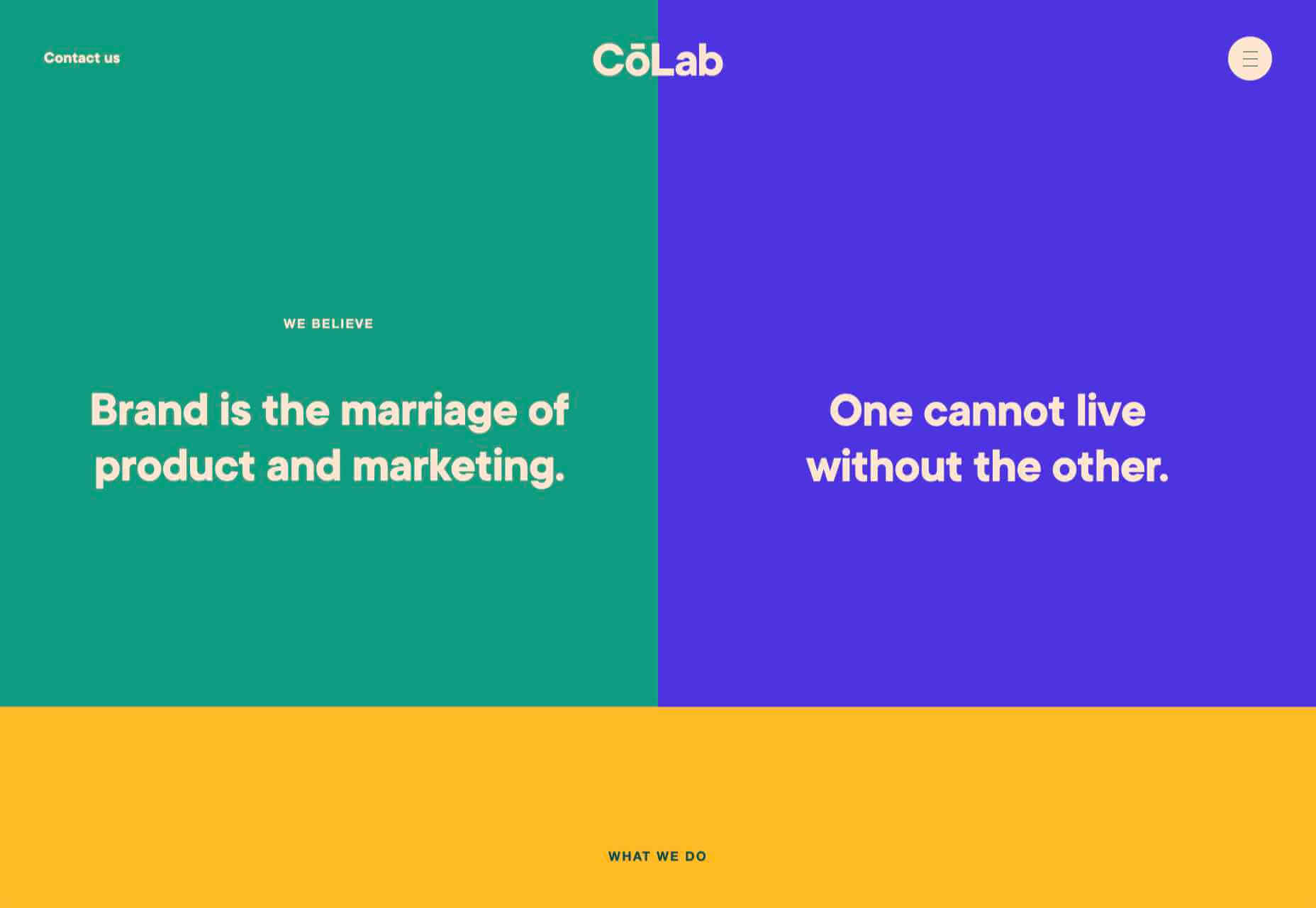
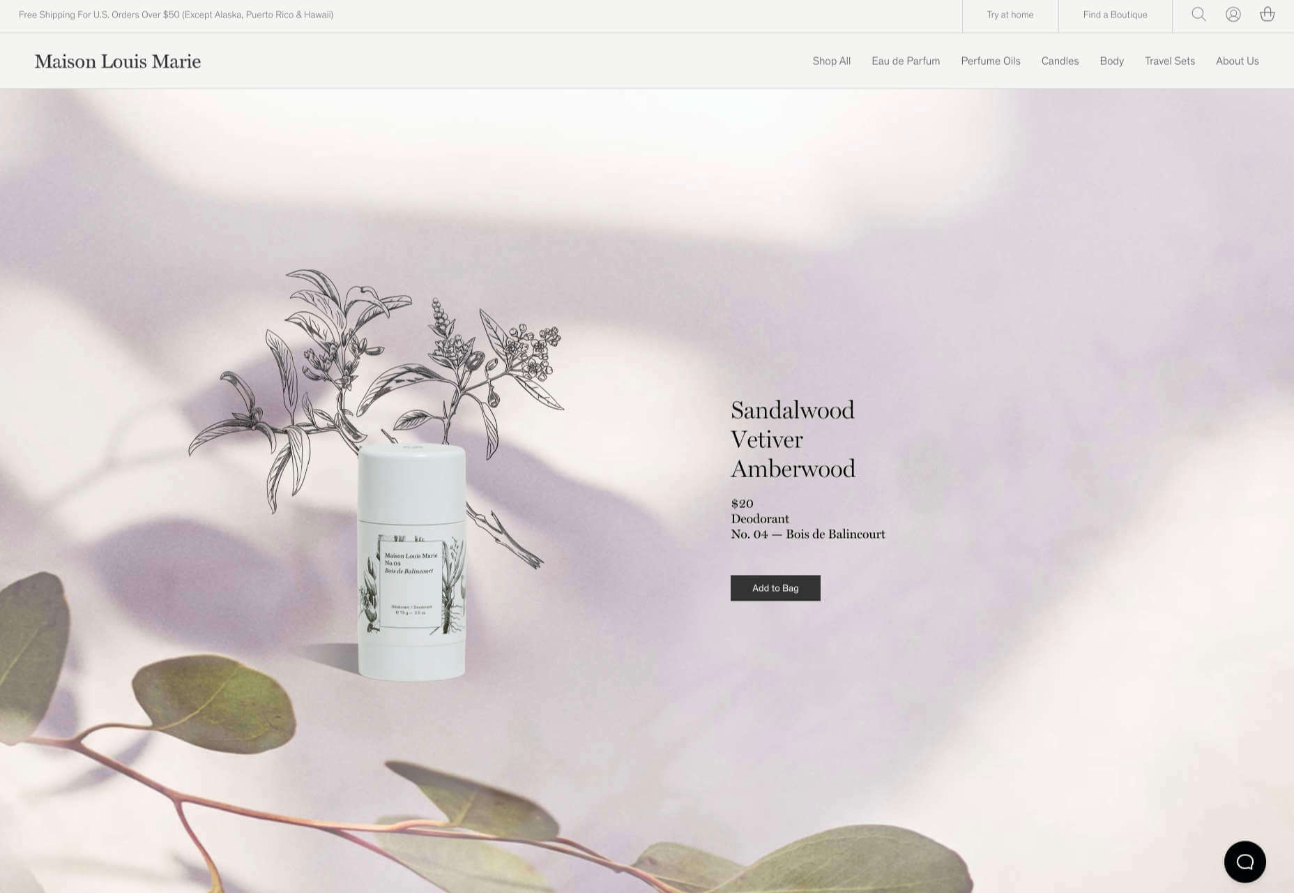
Given all the drama and turmoil we were subjected to through most of 2020, we’ve come to welcome the use of toned-down colors in marketing instead of the bolder, brasher, and more “in-your-face” color schemes.
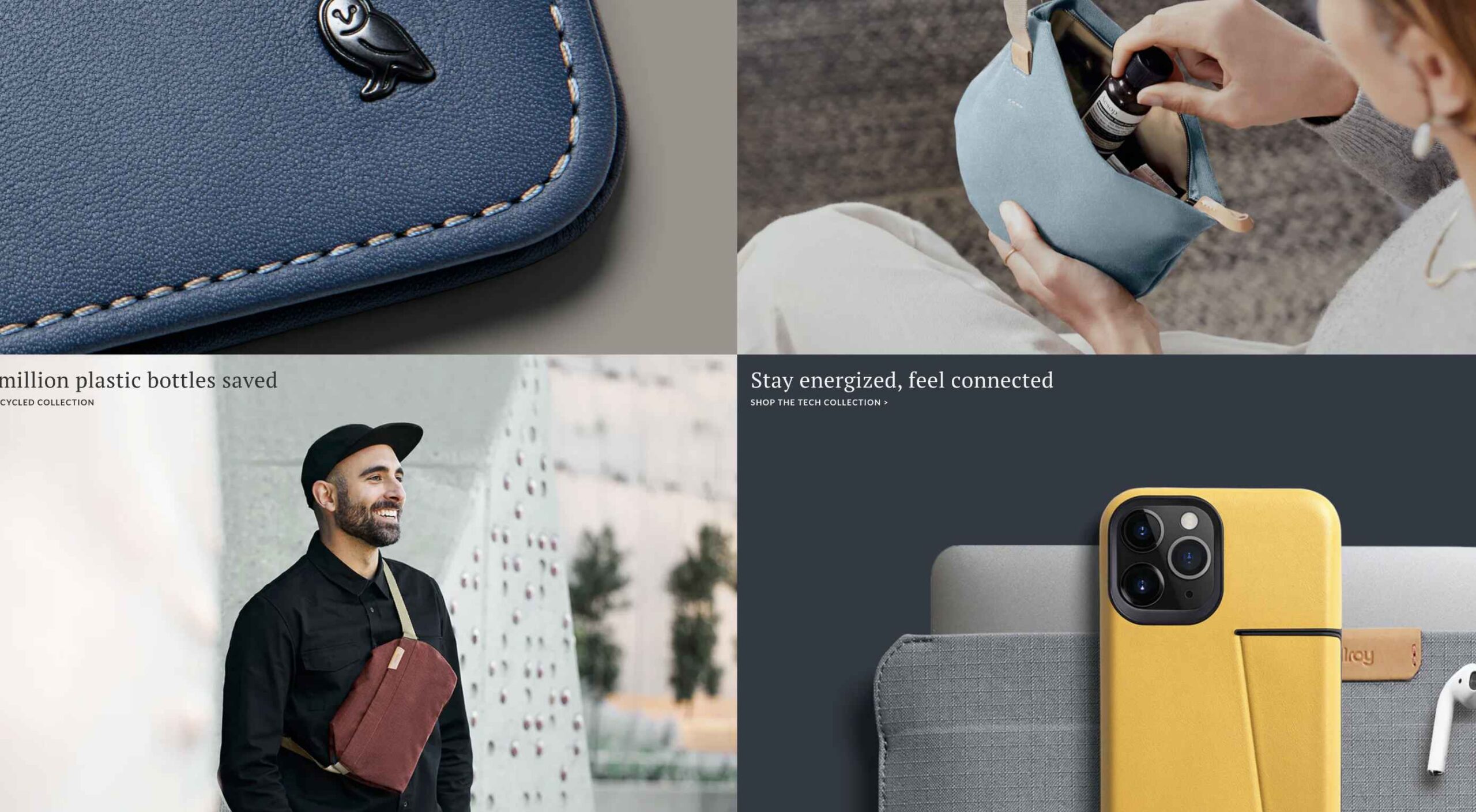
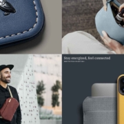
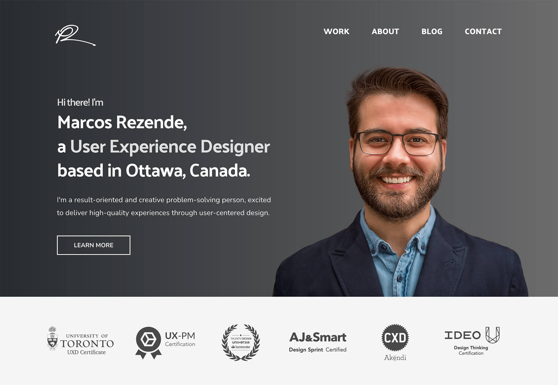
Bellroy’s website puts toned-down colors to good use. This company’s product line of wallets, bags, and the like, are designed to keep people’s belongings organized, safe, and secure. A wild color scheme simply wouldn’t be fitting.
How, then, are brightly-colored products dealt with? Thanks to judicious uses of white space and background photos, this website still emphasizes a toned-down color palette.
The BeSpa pre-built website is another example of a color scheme that almost immediately puts the mind at ease.
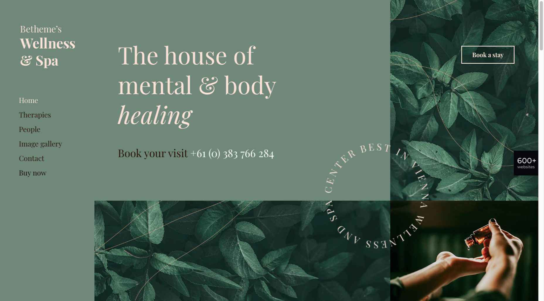
Calm and soothing? Yes.
Boring? Definitely not.
Comfort and security are the emotional drivers in this example.
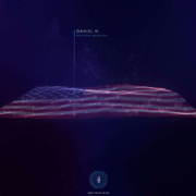
2. Seamlessly Intermingle and Balance Physical and Digital Imagery
People confined to their homes because of Covid-based restrictions spent many more hours looking at their screens in 2020. Online programming began to take on the appearance of a reality show that blurred the boundaries between the real and the digital.
Whereas web designers tended in the past to rely on either photos or illustrations in their designs, these same designers have started to integrate these blurring effects into their designs, with results that range from amusing and quirky to highly informative.
Check out this example from fashion designer Constance Burke:
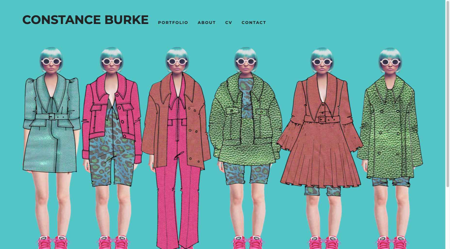
It’s not every day you see real models wearing hand-drawn fashion sketches. But it’s just one example of how the physical can be blended with the digital.
The BeSki pre-built site does the same blending of the two, but in a totally different way:
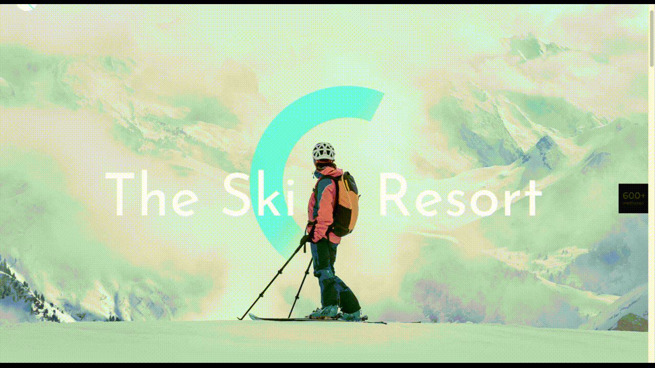
The sections’ designs switch from predominantly physical to largely digital and back again, an excellent approach that provides a maximum amount of useful information.
It’s also worth noting how snowbanks are effectively used to seamlessly transition from one section to the next.
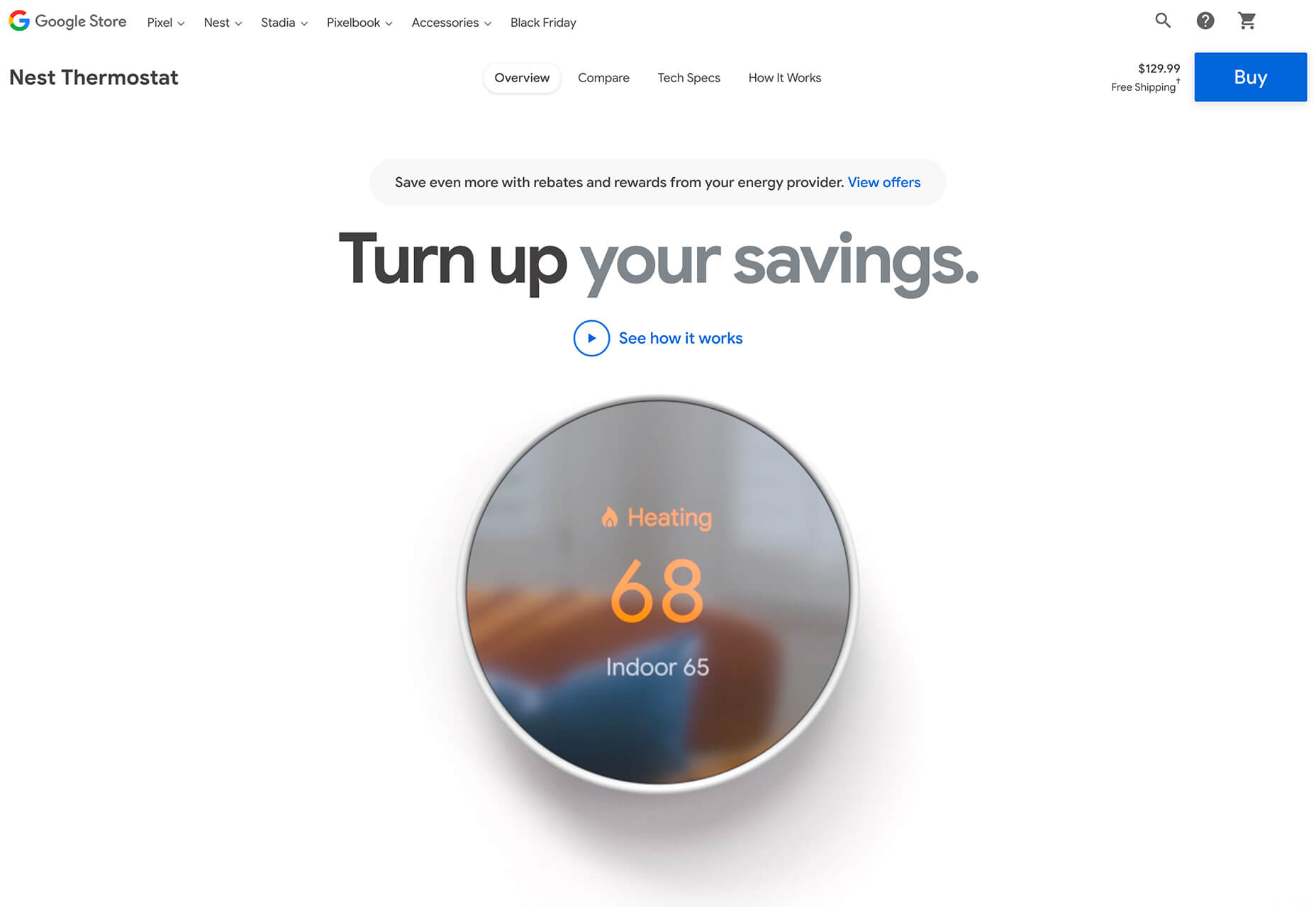
3. Create Well-Organized and Helpful Shopping Experiences
More people spending more time at home has created a surge in online shopping. As a result, many online store owners are now feeling the effects of increased competition.
Consumers look for brands they believe they can trust. At the same time, they want their online shopping experiences to be as quick and painless as possible. They look for (and expect) quick and effective product search capabilities, helpful and effective product displays, one-page product descriptions, and the like.
Walgreen’s product page design is especially well-suited for 2021 ecommerce shoppers:
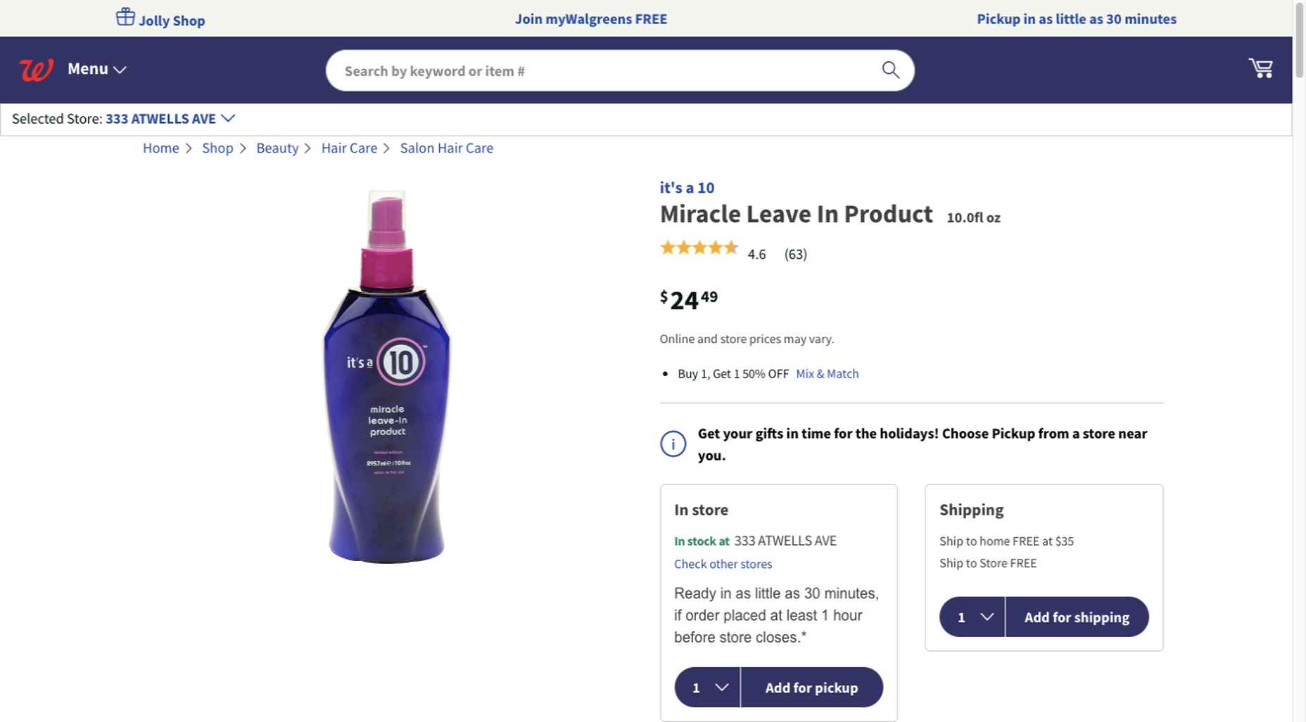
Everything shoppers usually need to know is presented above-the-fold. They can easily proceed to the next step or scroll down for reviews or additional product specifications.
BePestControl’s pre-built website uses a similar product design approach:

In this example, the main selling points are up-front and are kept short and sweet. The shopper can either hit the ‘Add to Cart’ button or look below the button for additional information.
In both examples, a visitor doesn’t have to mull over what step to take next since one of the design objectives is to make the shopping experience as easy and as satisfying as possible.
4. Take Advantage of the Benefits of User-Controlled Video Content
Once upon a time, video content was “the thing” to incorporate in a website. Hero background videos proved to be particularly engaging, and “how-to” videos presented much more useful information than illustrations or blocks of text could.
On the other hand, Auto-play videos, those that started on their own, all too often had a tendency to irritate rather than inform, especially when their content didn’t address a visitor’s immediate concern.
Thanks to Zoom and similar video platforms that came into widespread use in 2020 and to website designs that include video “Play” buttons, users have become much more comfortable with the medium. As an example, Shoppers have been given total control over if or when they want to view a given video.
This is the design approach Payoneer has taken:
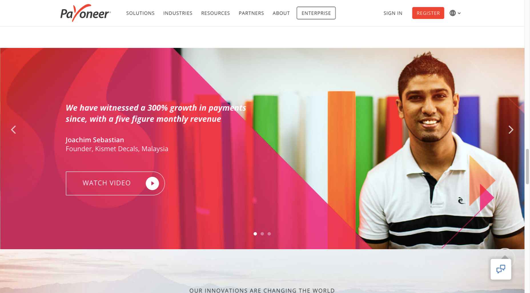
The white “Pay” button is impossible to miss, and while it is designed to encourage a visitor to watch a testimonial, doing so is completely optional.
The BeOptics pre-built website cleverly slips in a video play option as well:
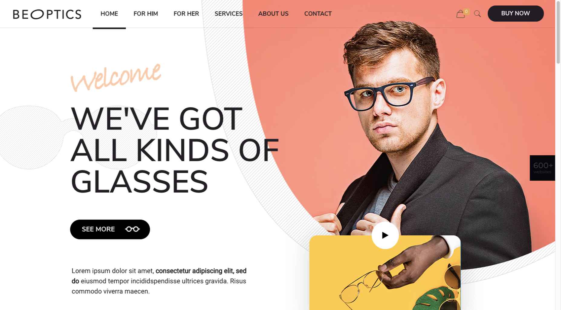
In this example, when visitors hover over the “See More” button, it lets them know that they have the option to watch the video if they want to learn more.
5. Trust Builders Should be Non-Negotiable Web Design Elements
There are various ways in which products are organized or showcased in brick and mortar businesses to instill trust. Helpful and friendly staff also contribute to instilling trust.
Some of these trust-builders are easily incorporated into eCommerce designs. Others, though more difficult to fit in, can usually be satisfactorily addressed.
Digital trust builders can include.
- Logos (familiar, whimsical, innovative, engaging)
- Portfolios and/or product pages
- Customer reviews, product ratings, and client testimonials
- Case studies and product or price comparisons
- Safety and security seals, e.g., Better Business Bureau, PayPal checkout
- Charts, graphs, counters, and other data visualization techniques
- Proof of social, charitable, or community-related actions and contributions
Put, trust-building content will beat hard-sell techniques every time, especially if you would like your customer base to include referred and repeat customers.
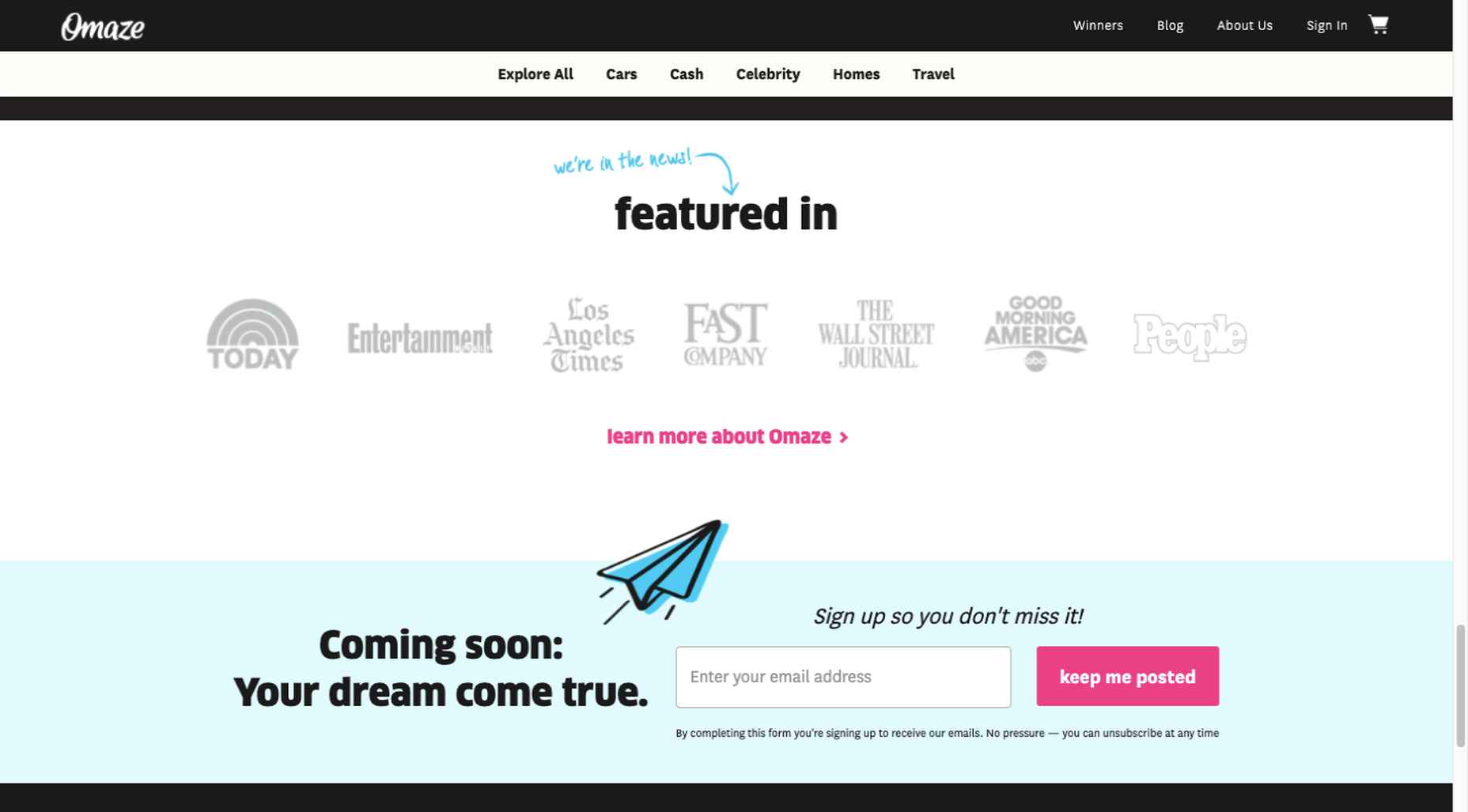
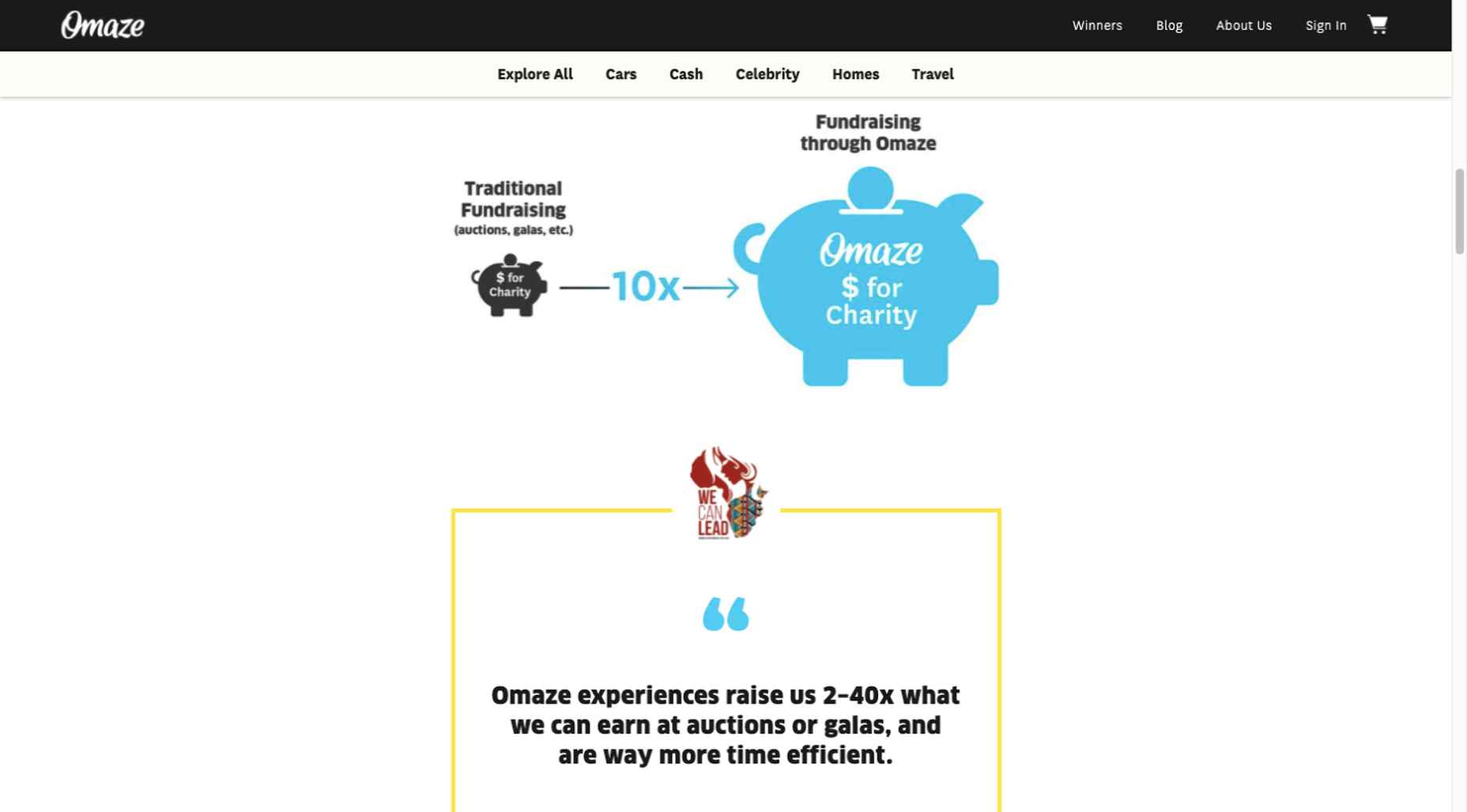
Omaze, for example, gives people entries for prizes based on their donations while at the same time highlighting the good things it and its donors have brought about.
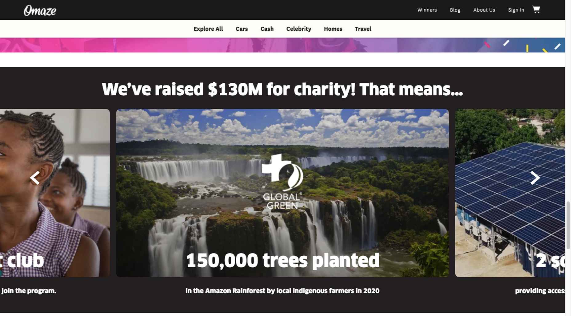
To help build trust, the site devotes space to highlighting publications that have featured Omaze and the work it has done and is doing.
Plus, it puts data visualization and non-profit testimonials into play to give visitors an added insight into what is going on behind the scenes:
As you can see, it doesn’t have to be difficult to incorporate genuine trust-building content into your website designs.
BePortfolio is a great example of how you might go about doing this for a portfolio site, whether it’s your own or a site for a client:
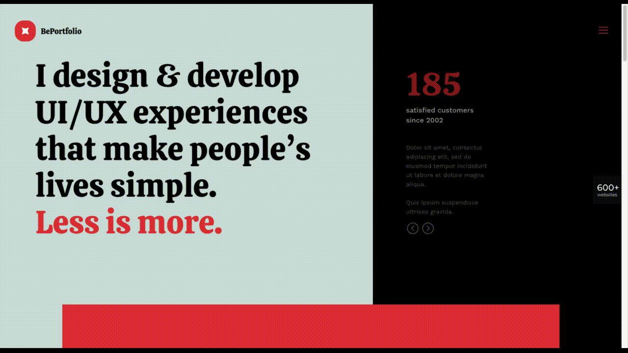
The home page alone has plenty of space for including trust-building content:
- A satisfied customer counter
- Product usage case studies and testimonial
- Portfolio highlights
- Client and partnership logos
And it can only get better as a visitor moves through the site, but only if you’ve chosen to make that happen.
Have You Started to Take These New Web Design Trends to Heart?
We’re not suggesting that you throw the baby out with the bathwater, but some trends will need to be discarded to enable you to adjust to a new normal. Other 2020 design trends, like minimalism and headline topography, are likely to remain popular for years to come.
New trends that incorporate calming color palettes, image blending, more efficient eCommerce UX designs, user-controlled video, and trust-building elements should give your customers the feeling of comfort and security they will be seeking in 2021.
If you want to implement some or all of these new trends in your 2021 website designs, BeTheme’s 600+ pre-built sites make doing so an easy task.
[– This is a sponsored post on behalf of BeTheme –]
Source
The post 5 Web Design Trends and Ideas for 2021 first appeared on Webdesigner Depot.

Source de l’article sur Webdesignerdepot
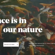
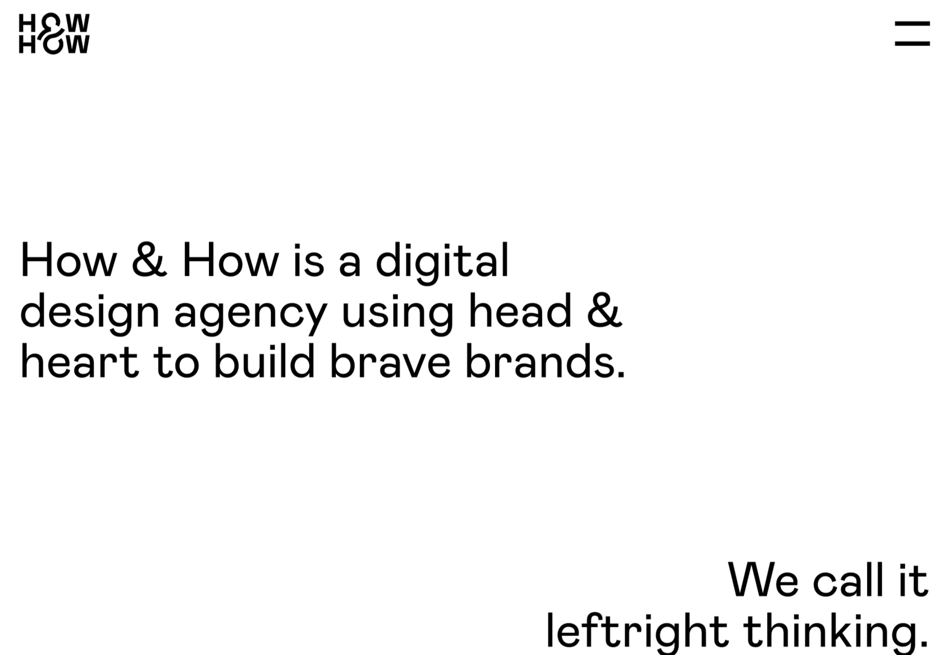
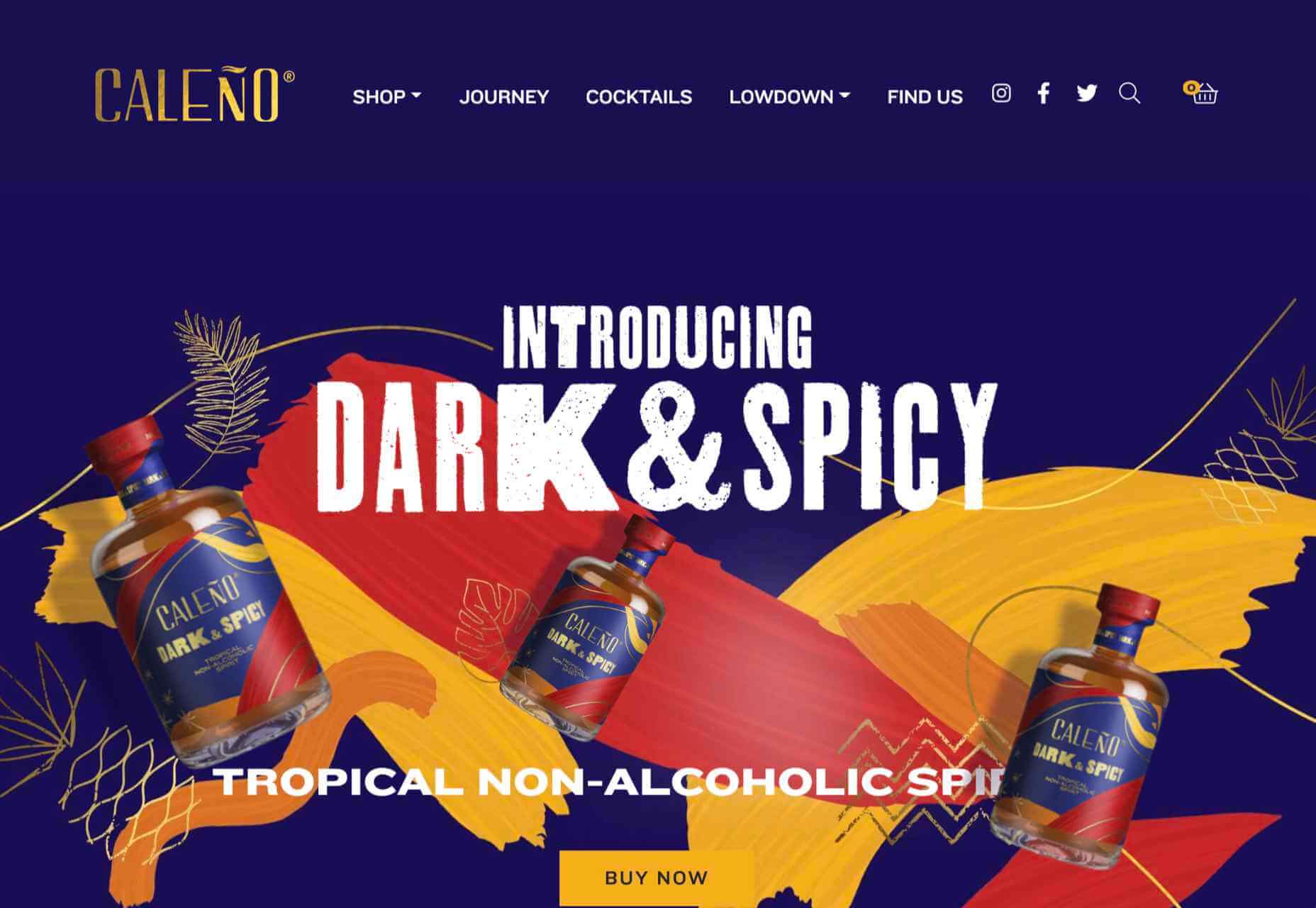
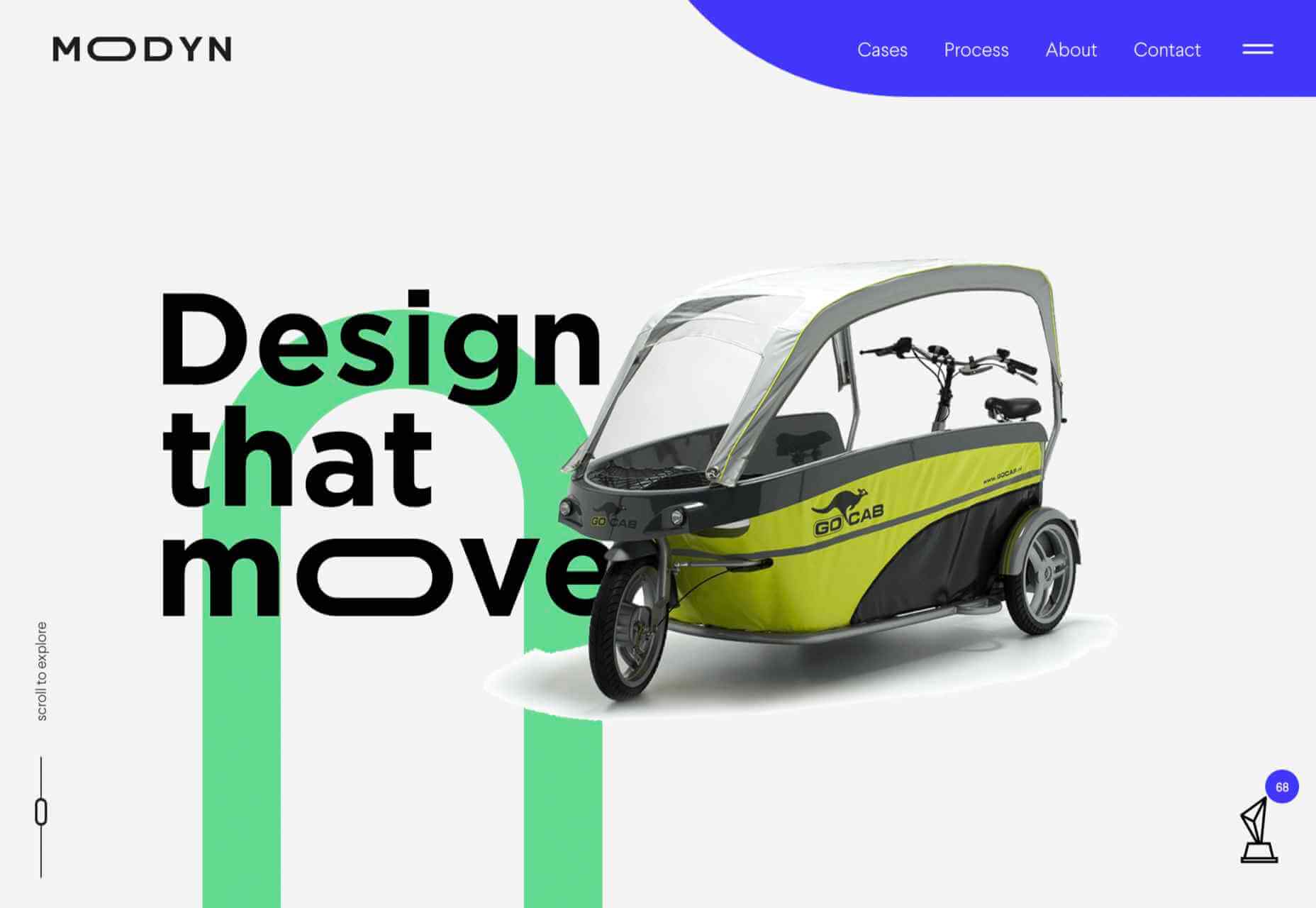
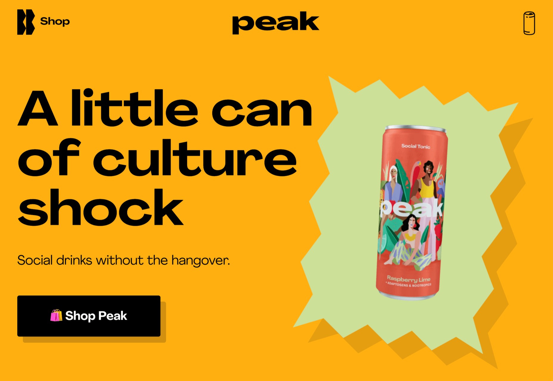
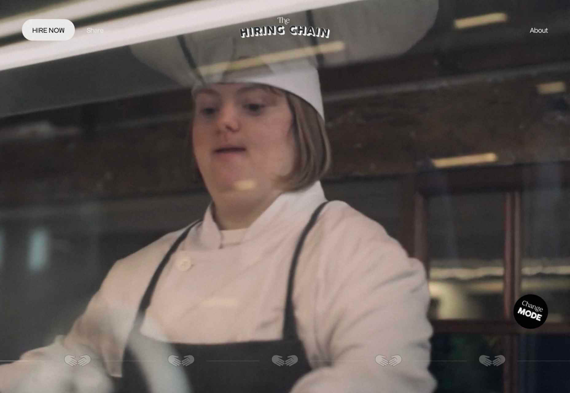
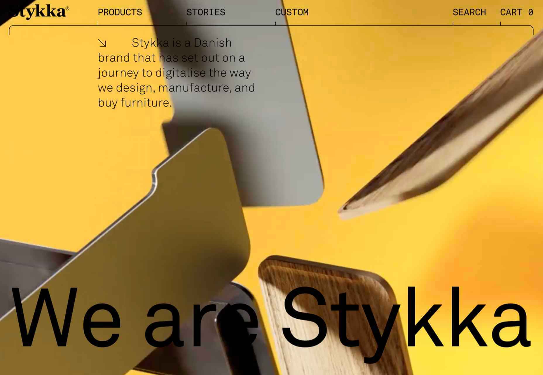
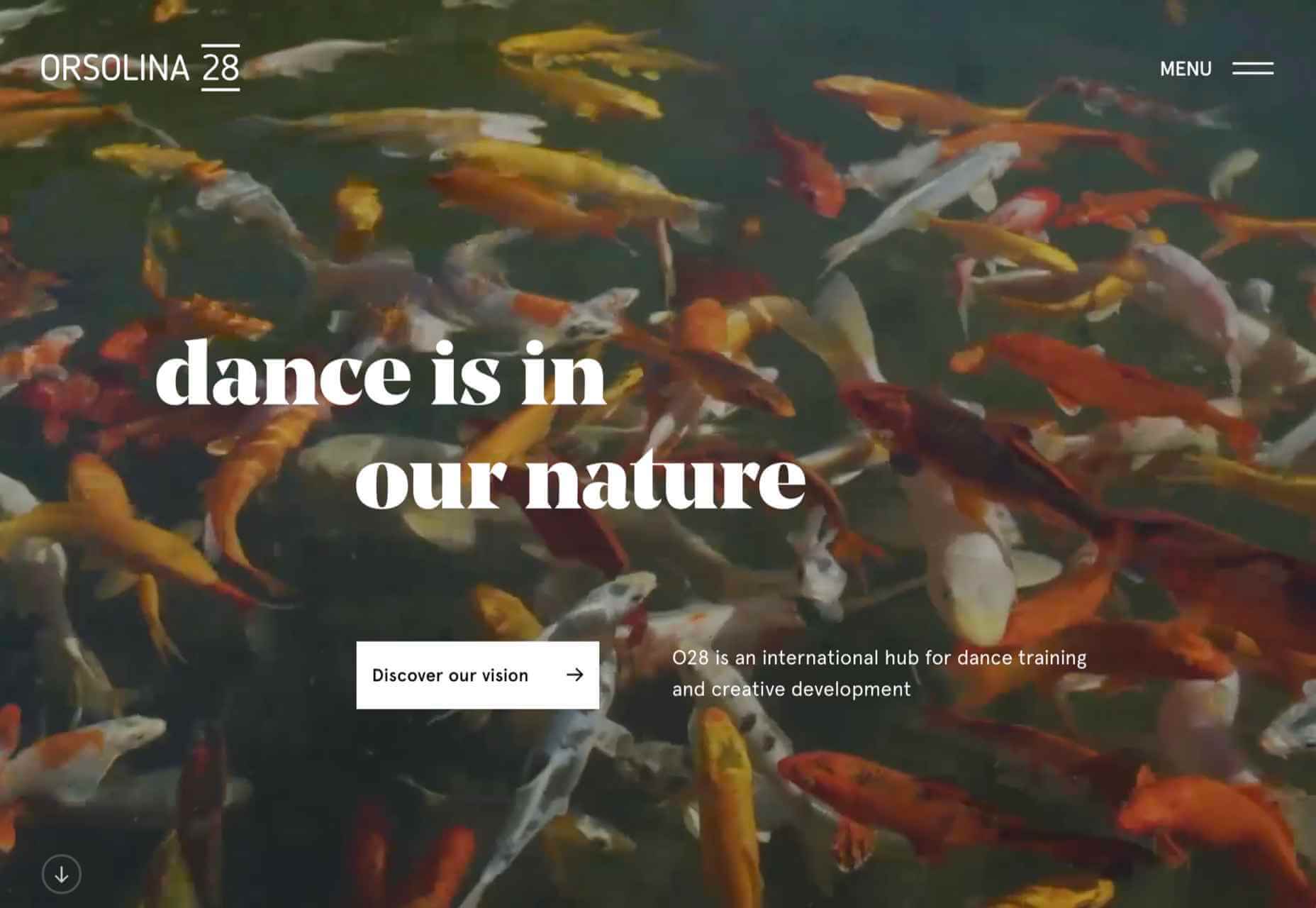
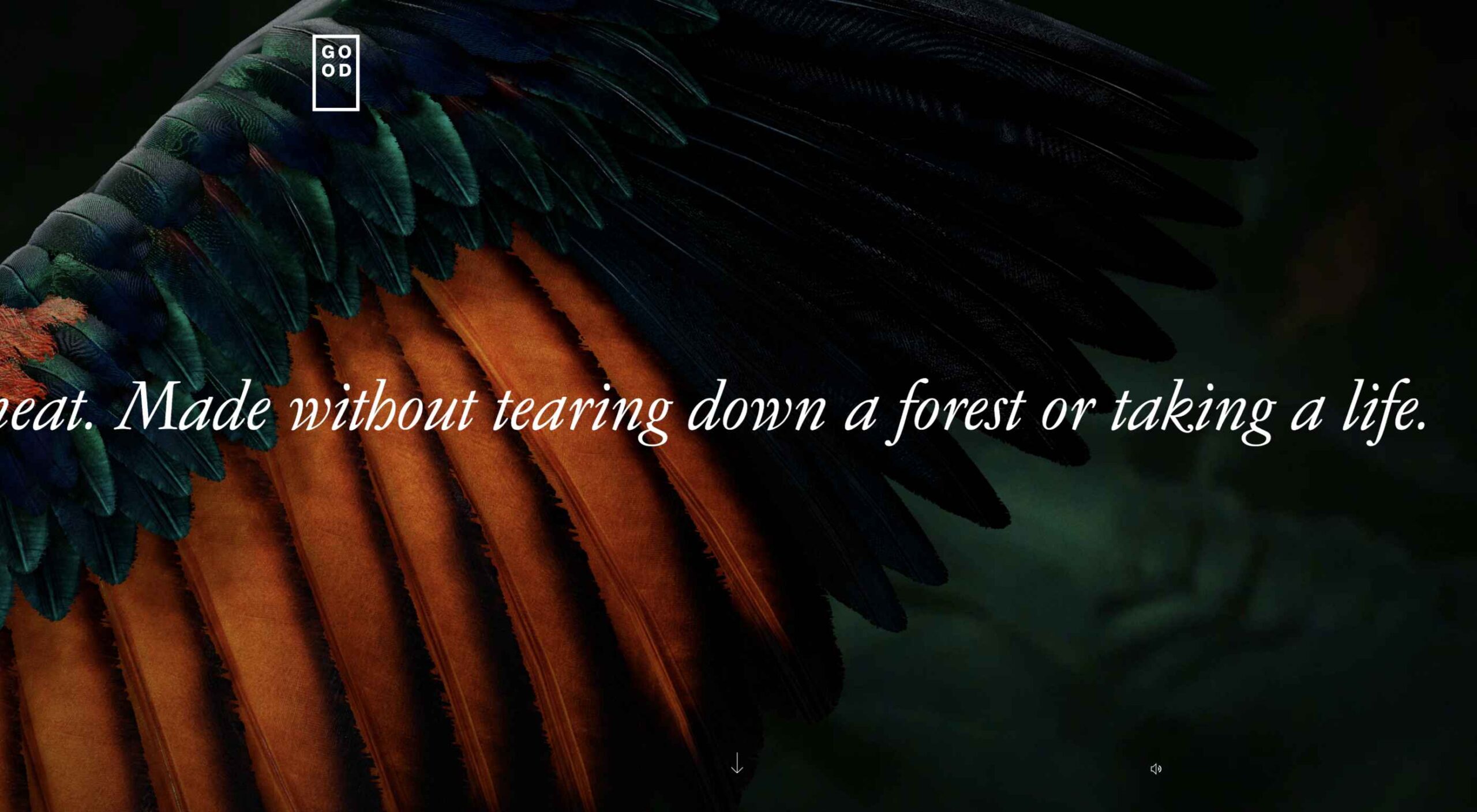
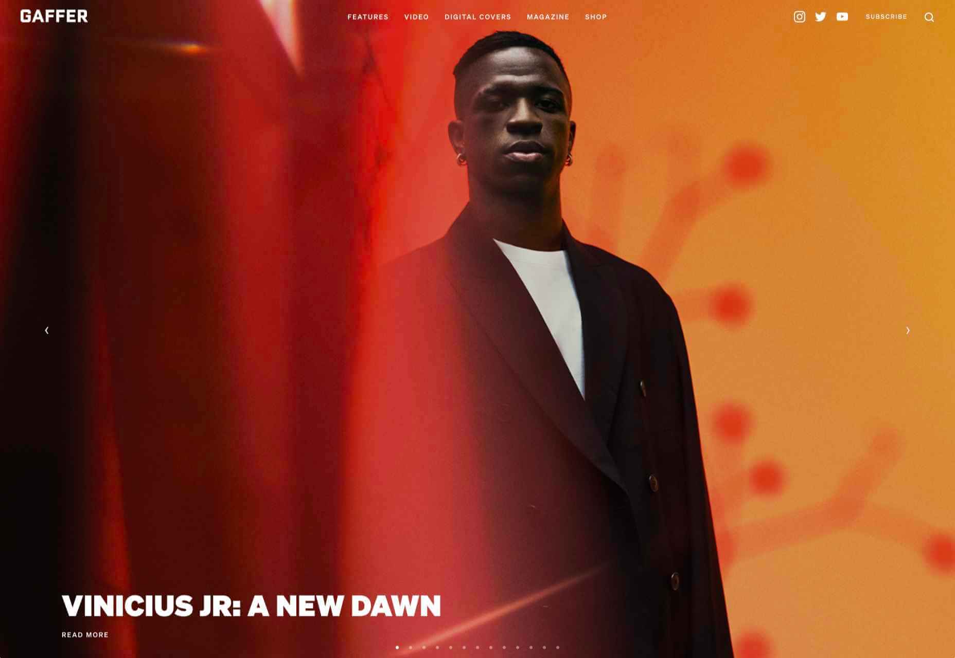
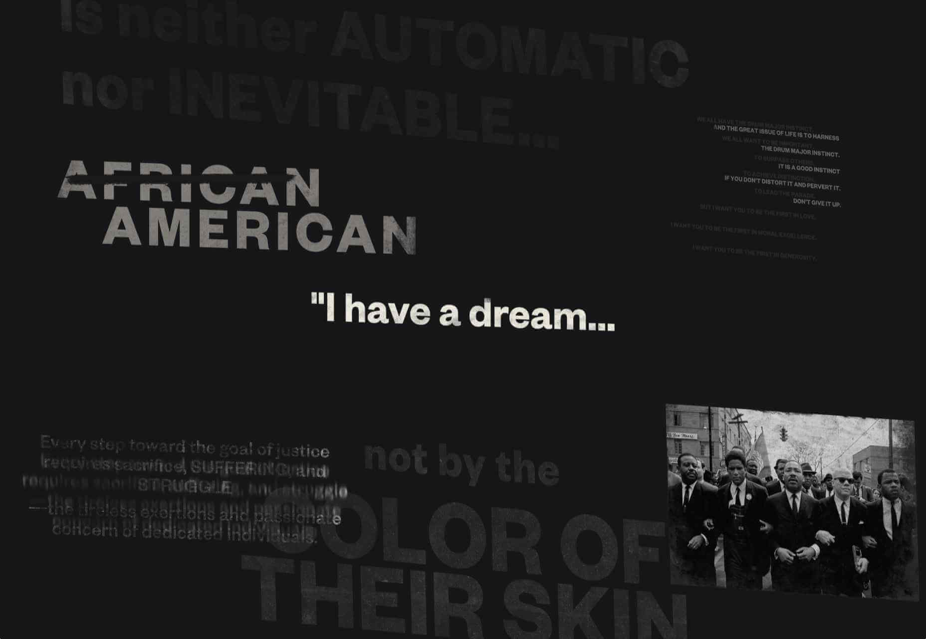
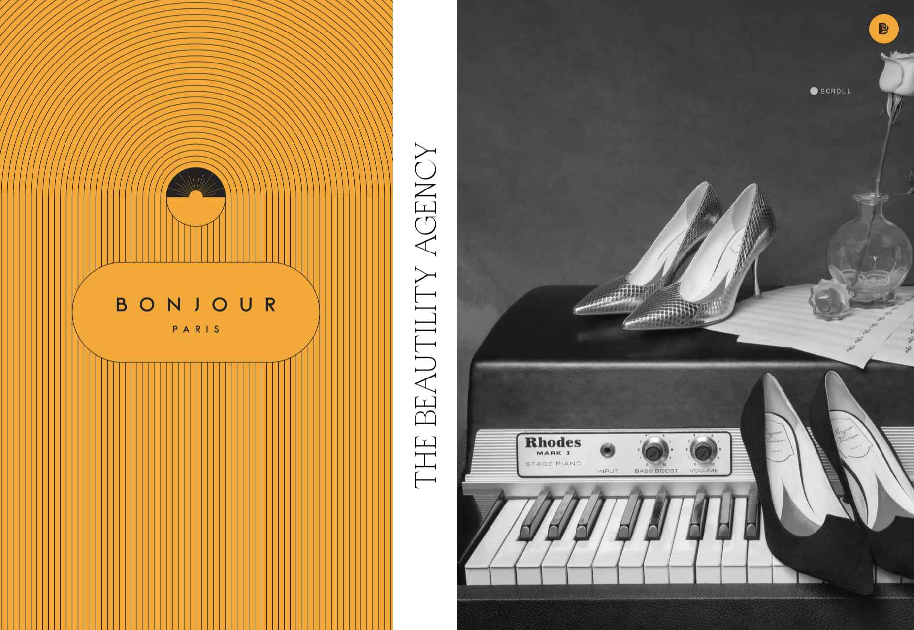
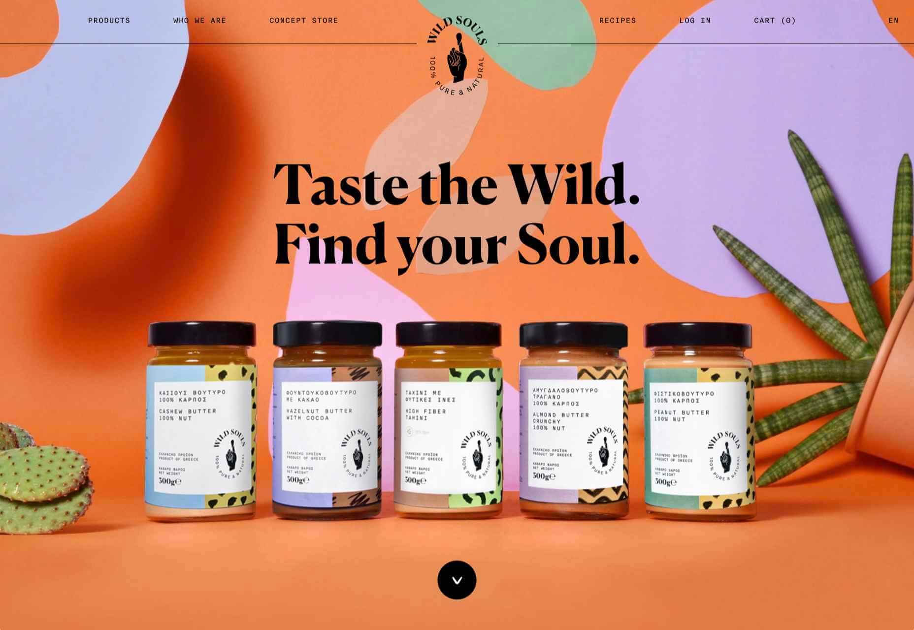
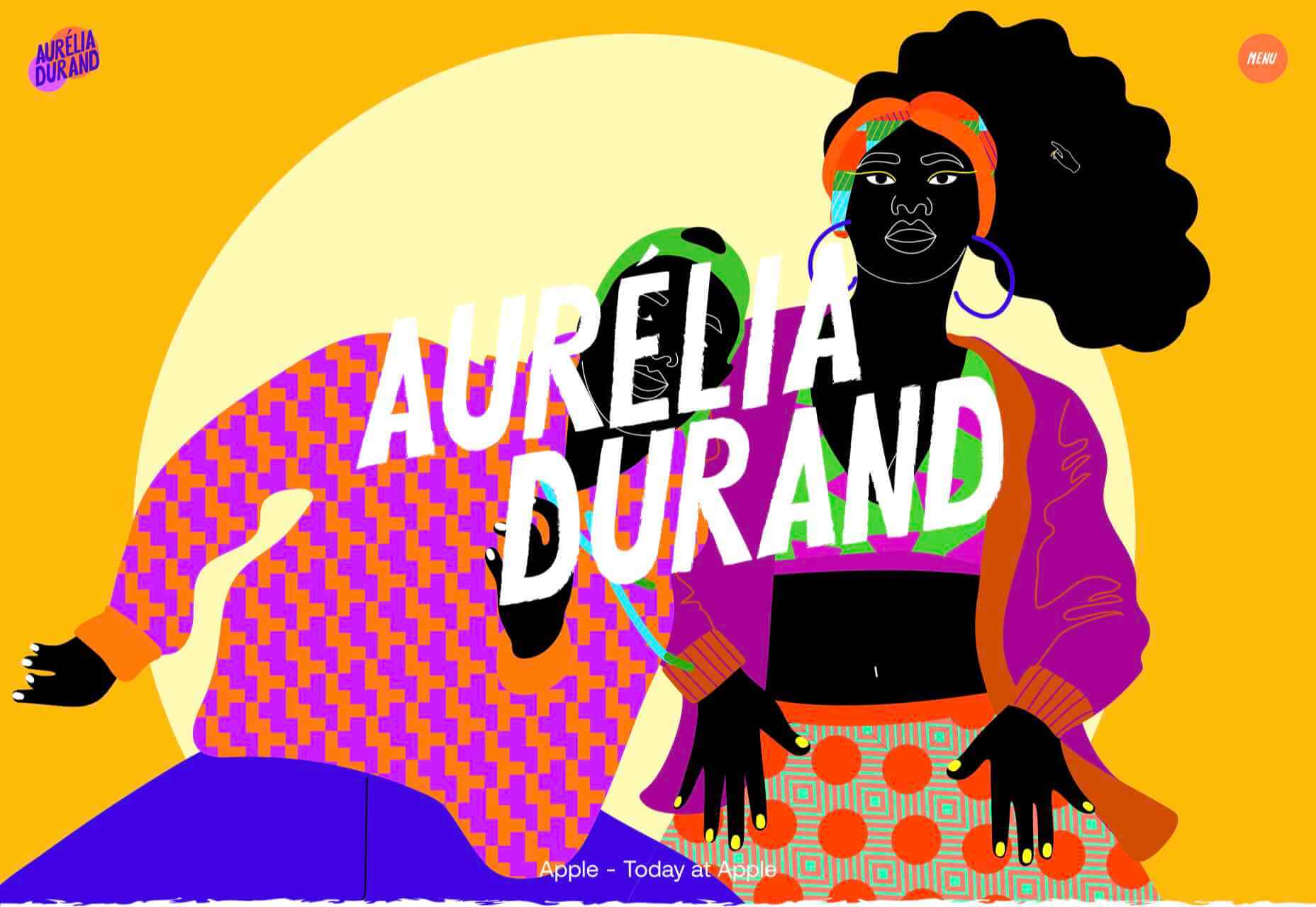
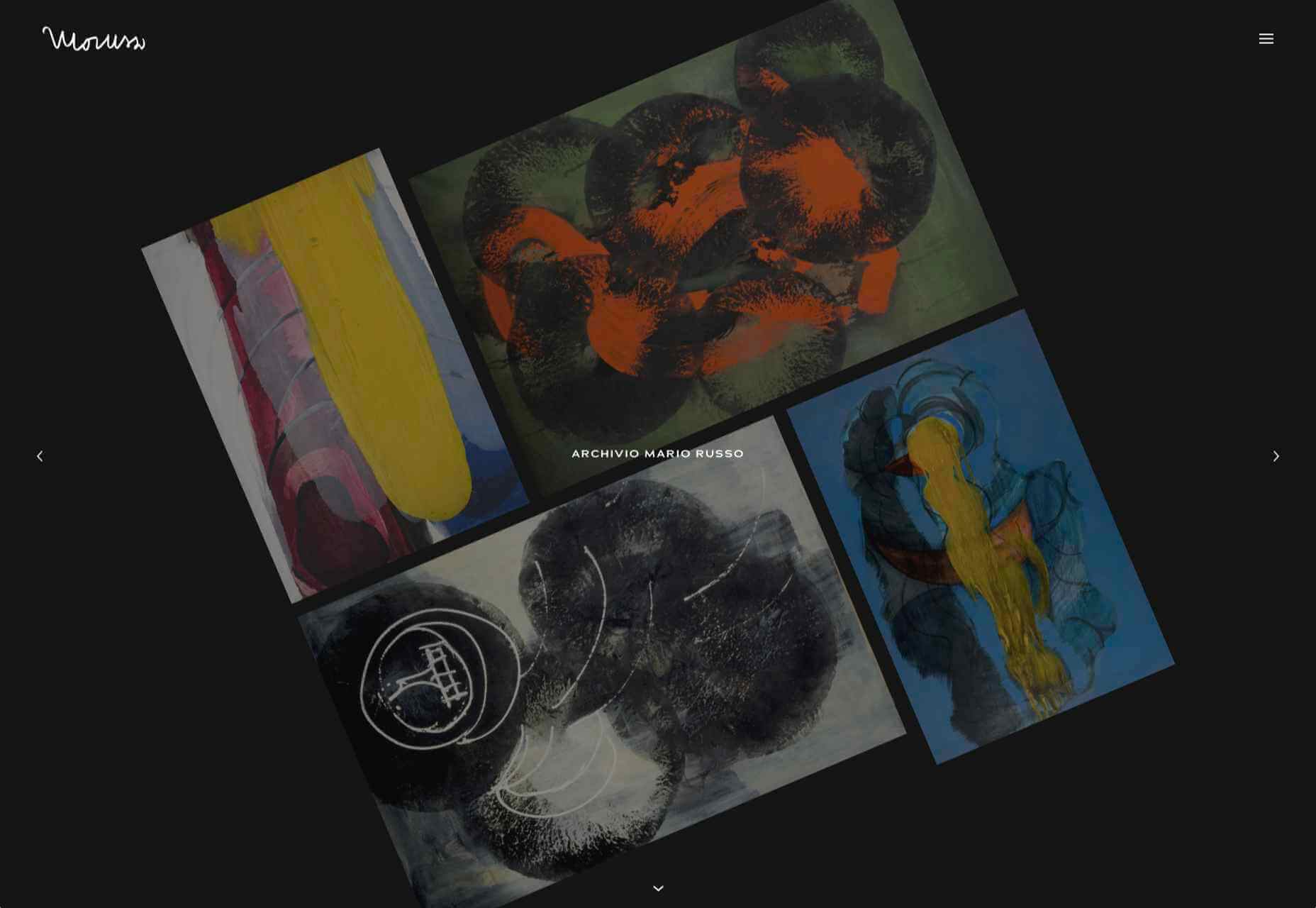
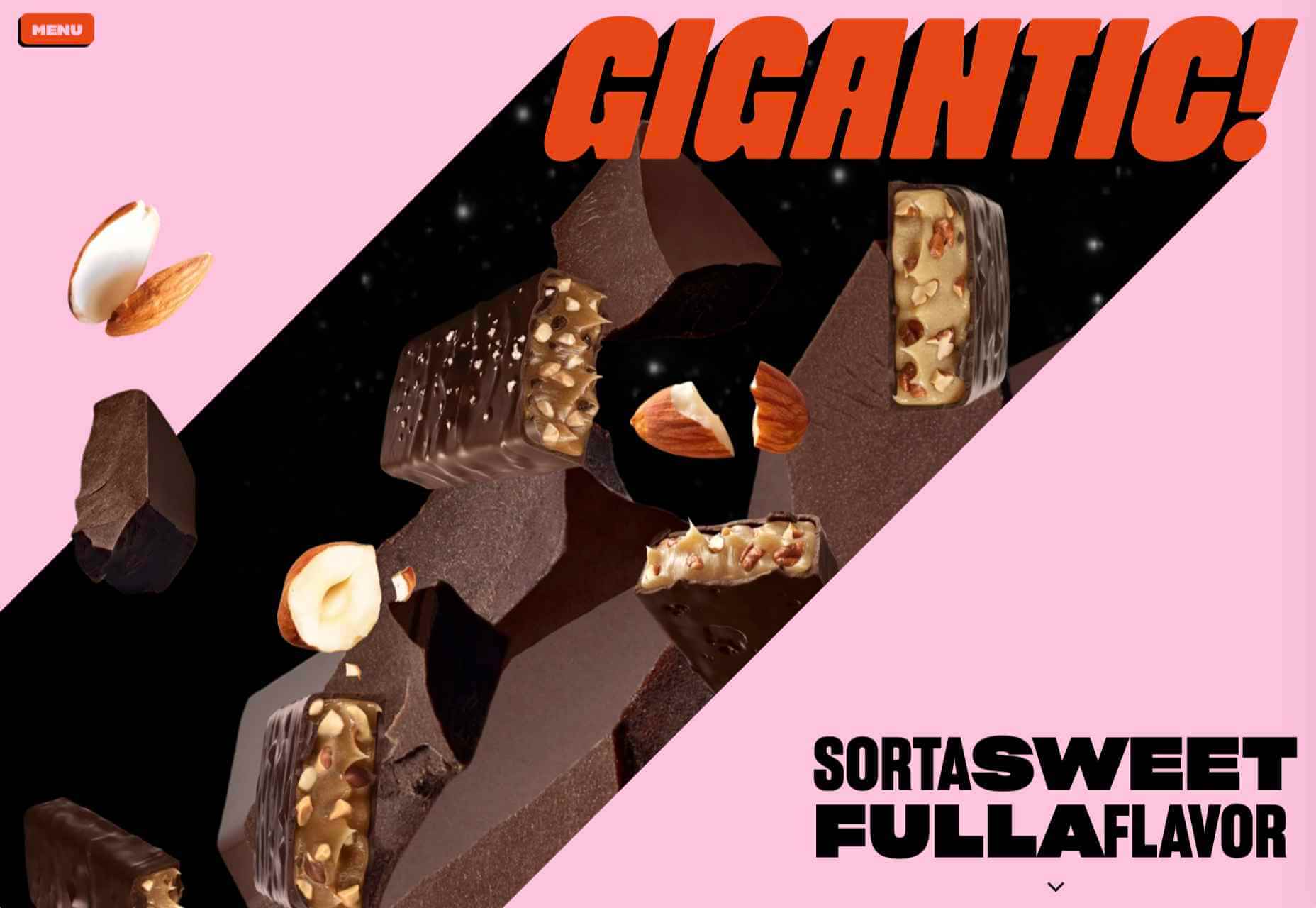
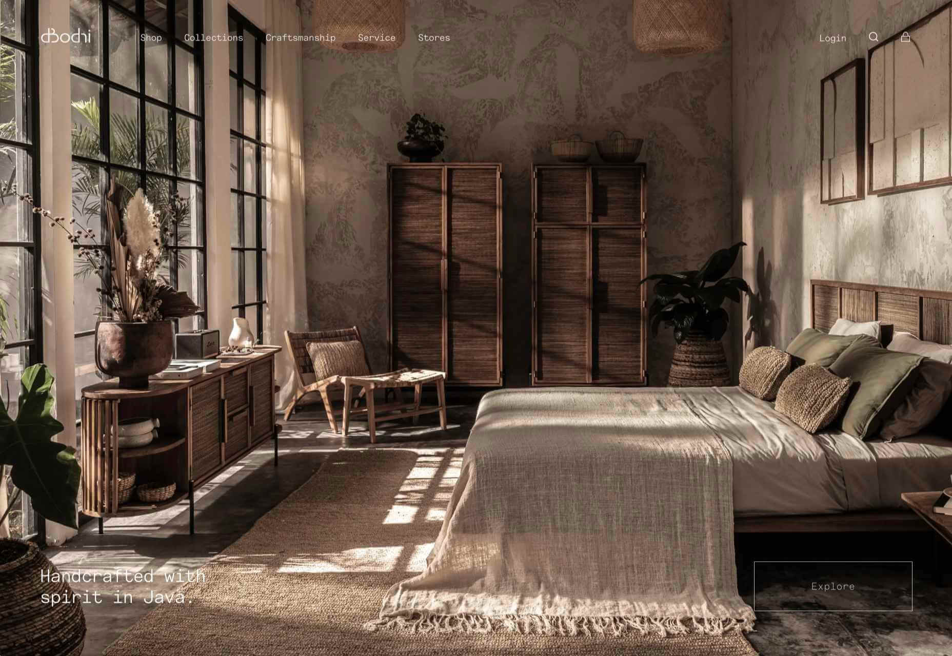
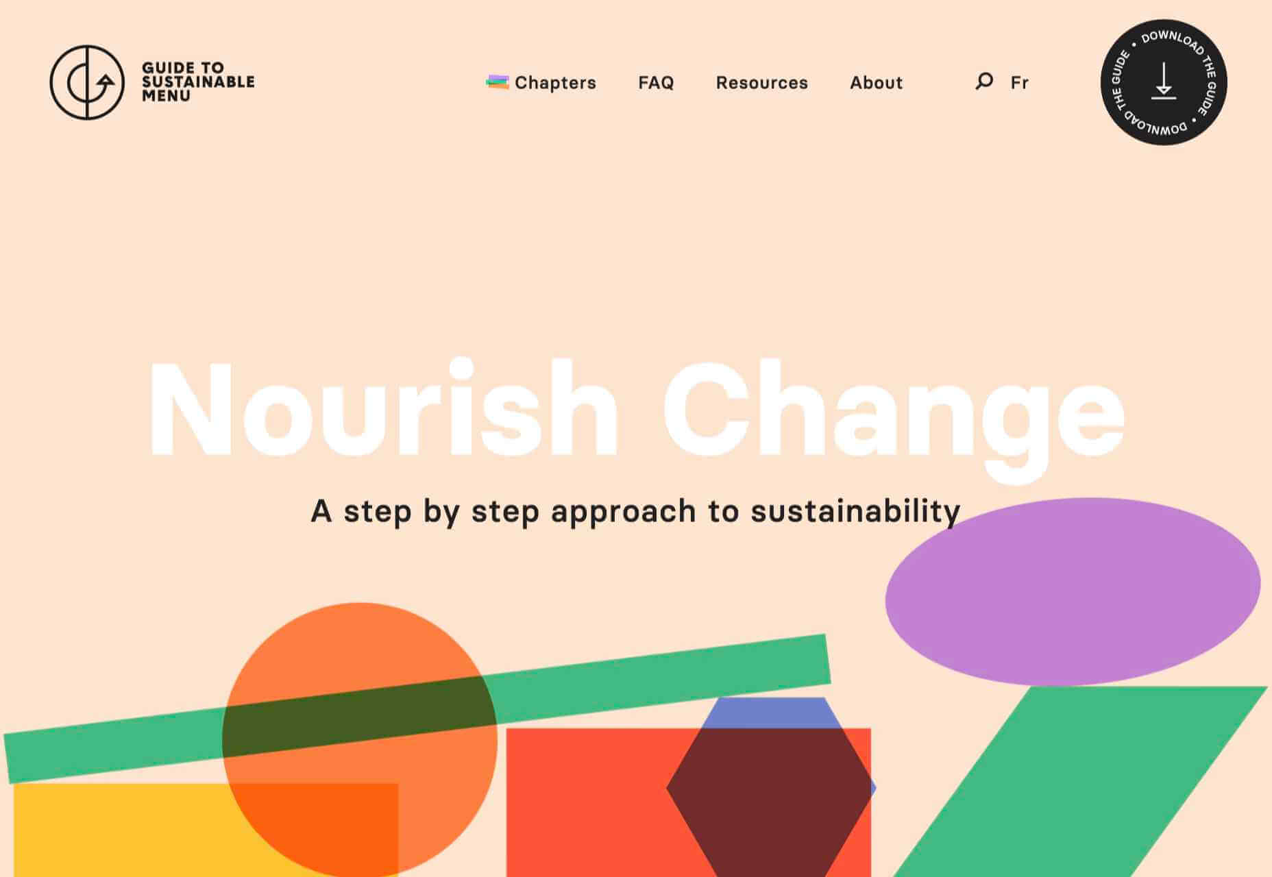
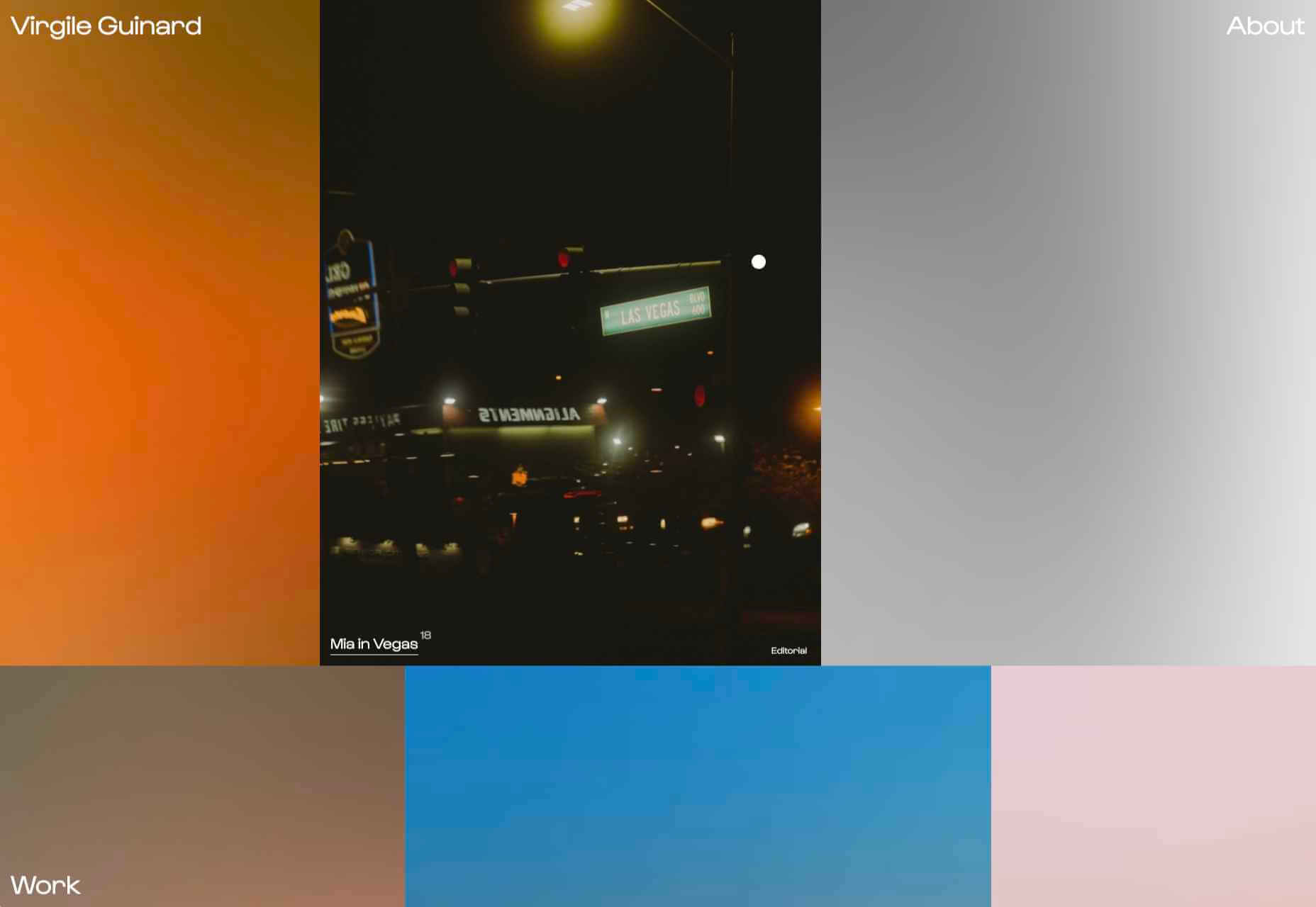
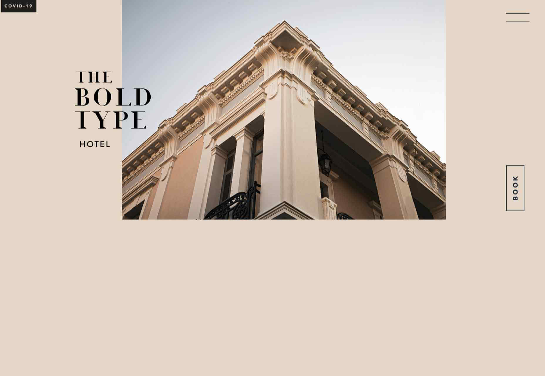
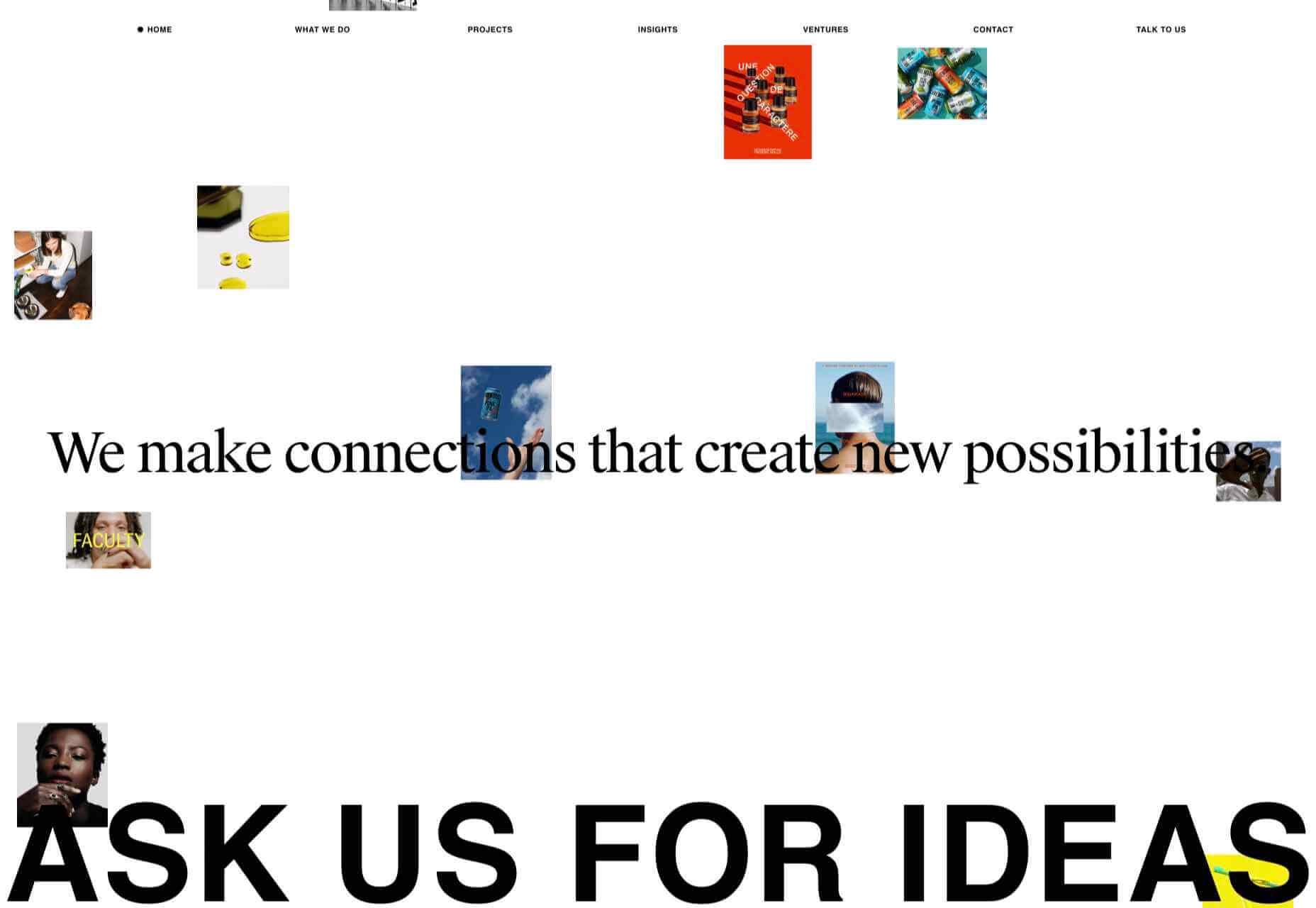
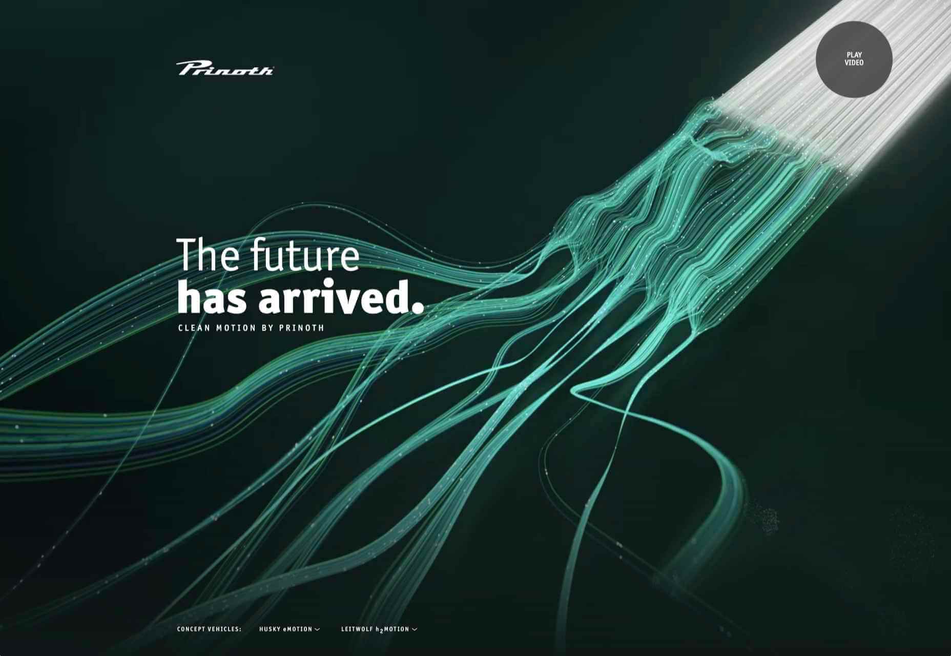
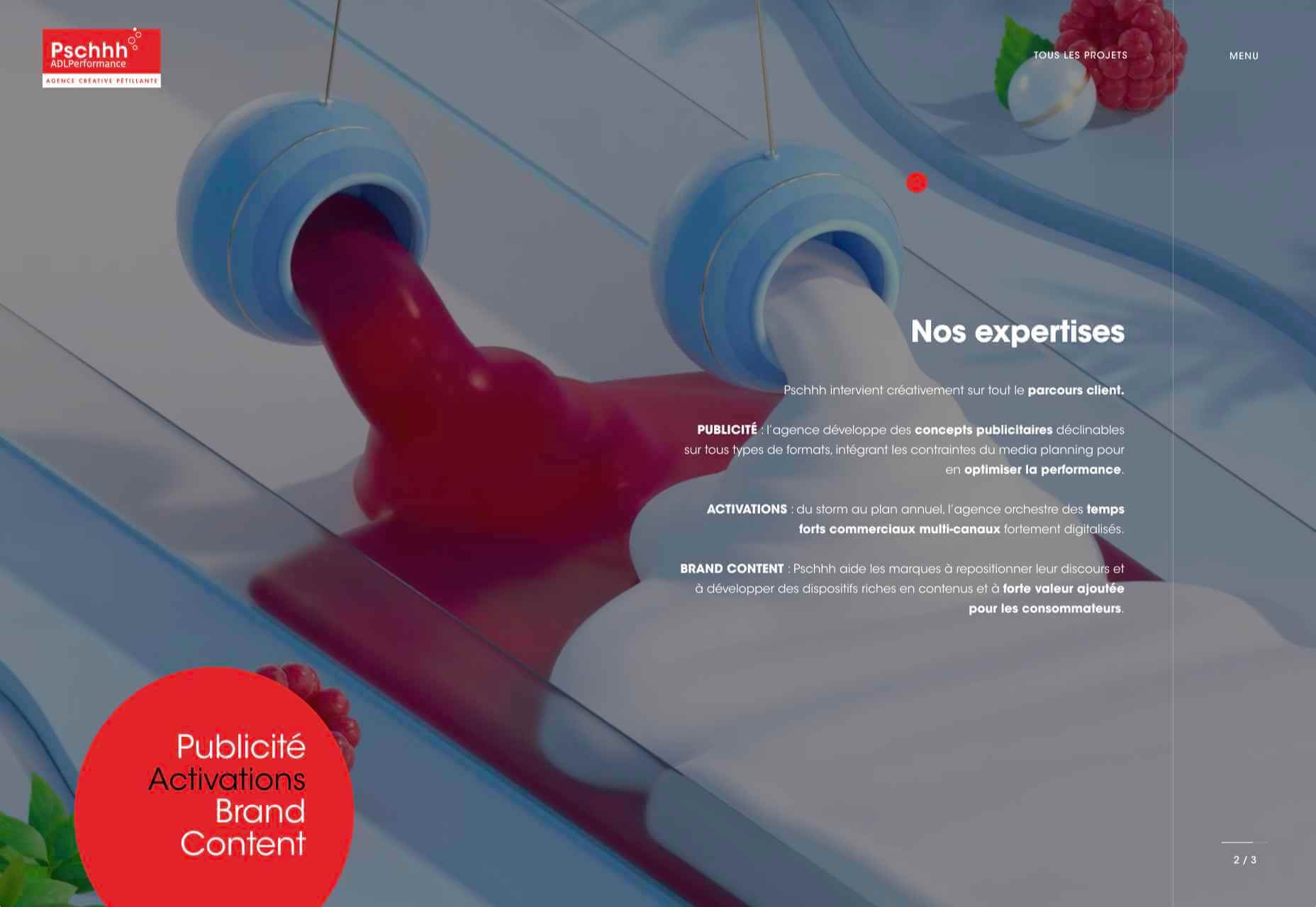
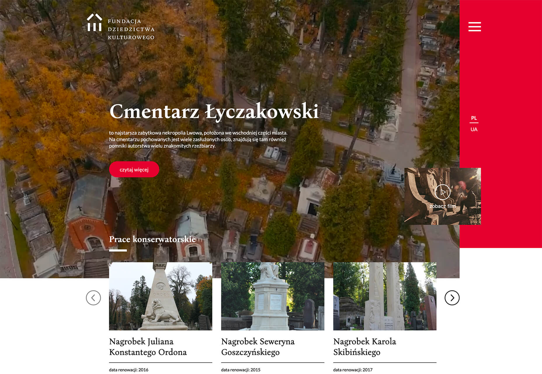
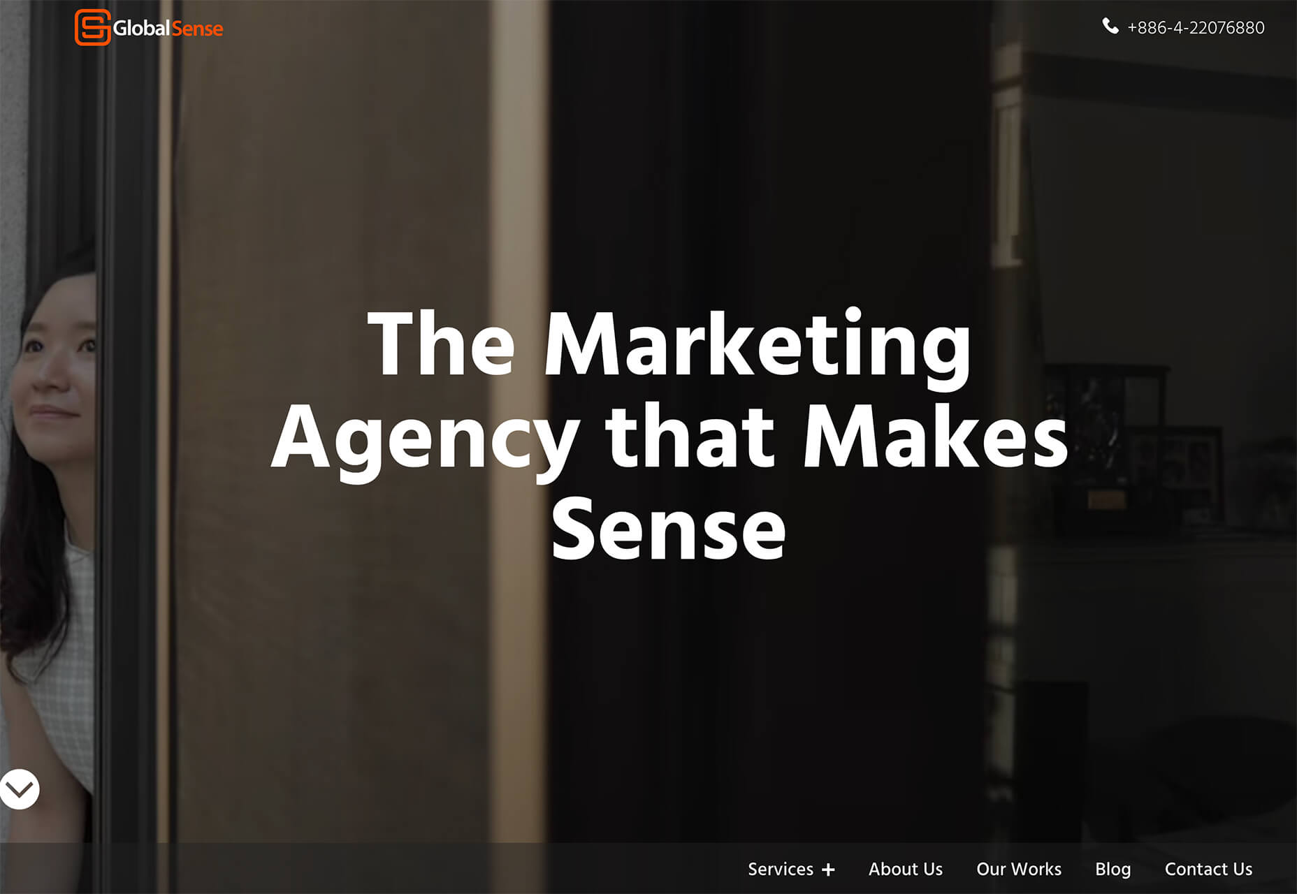
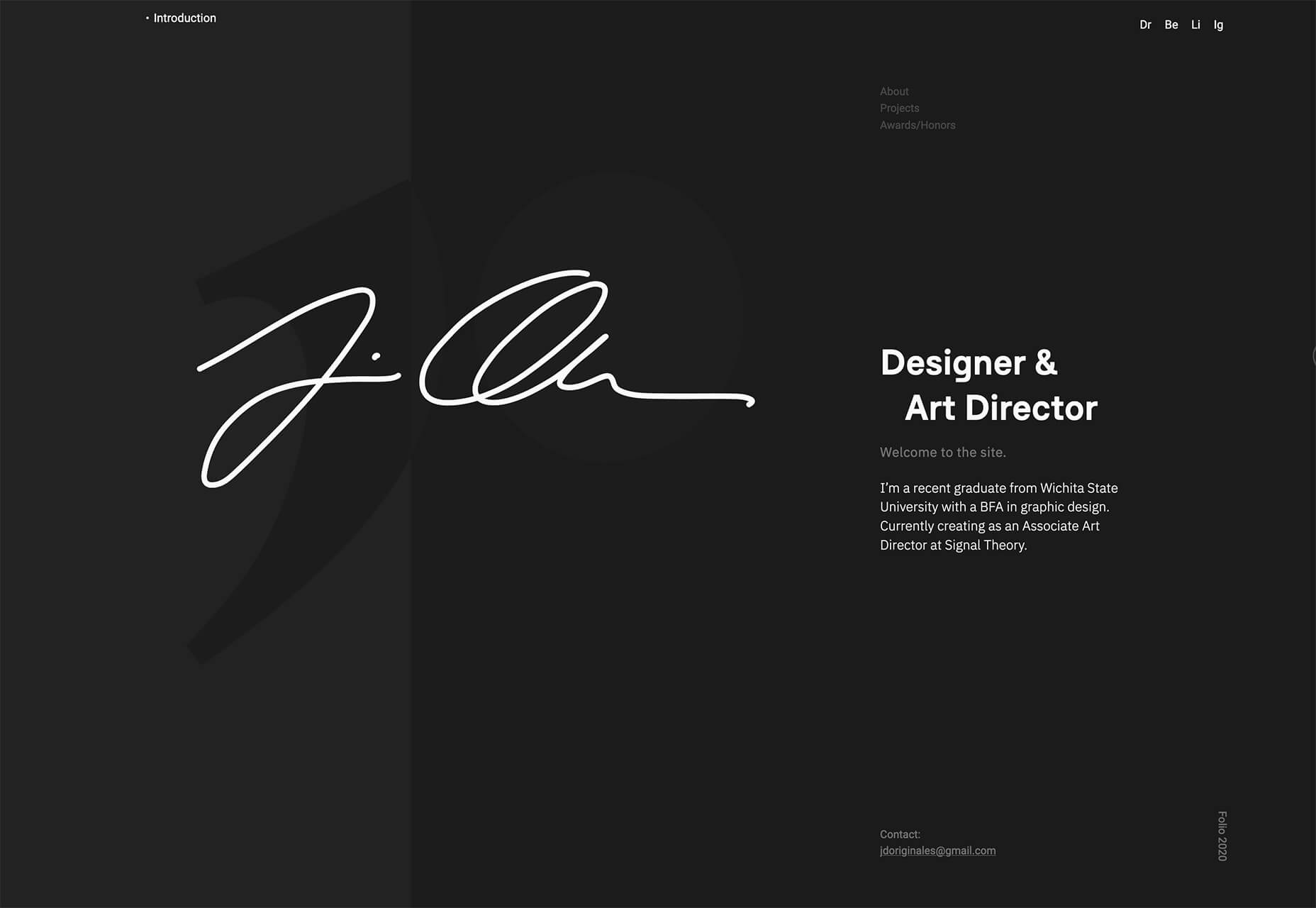
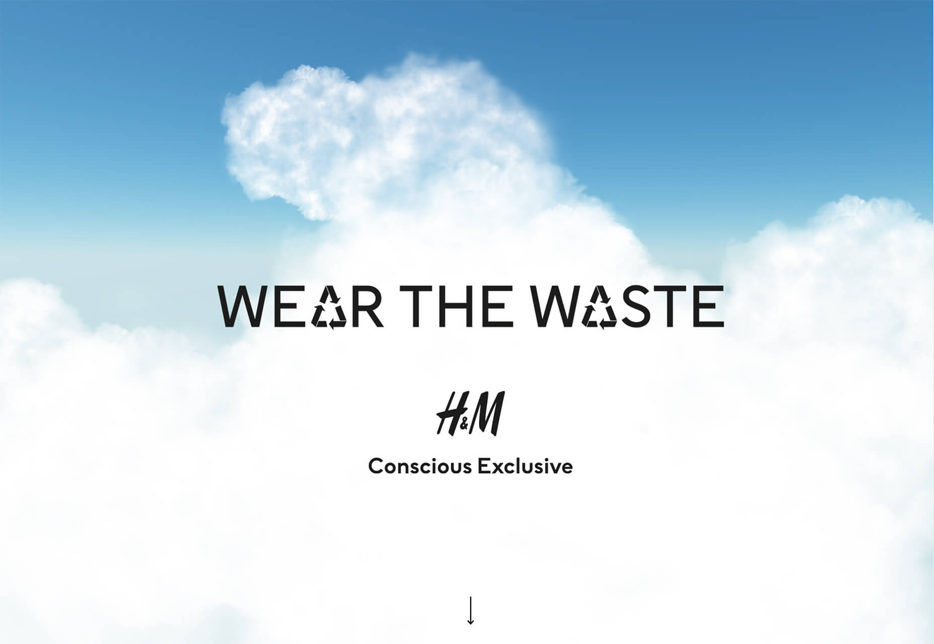
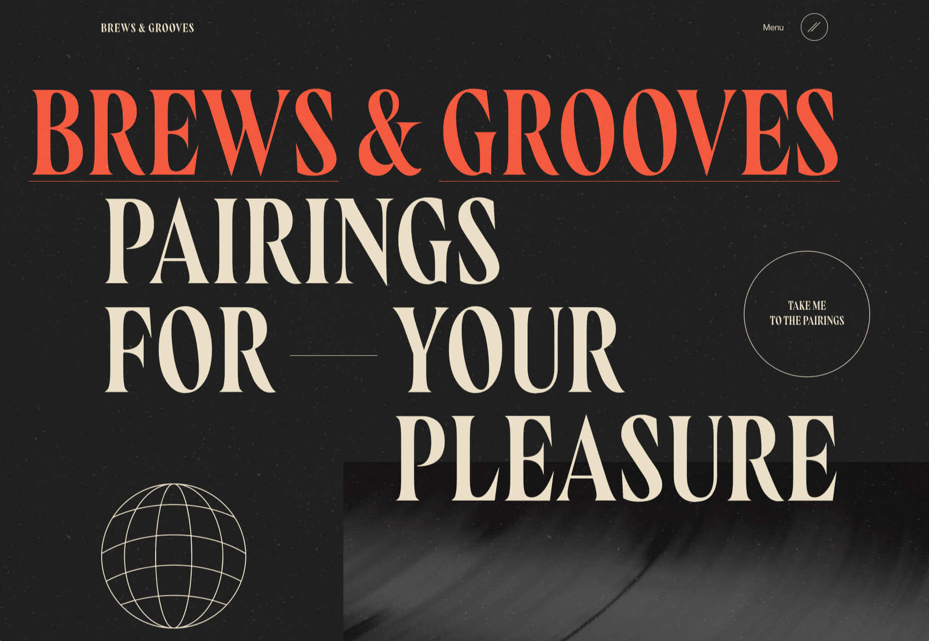
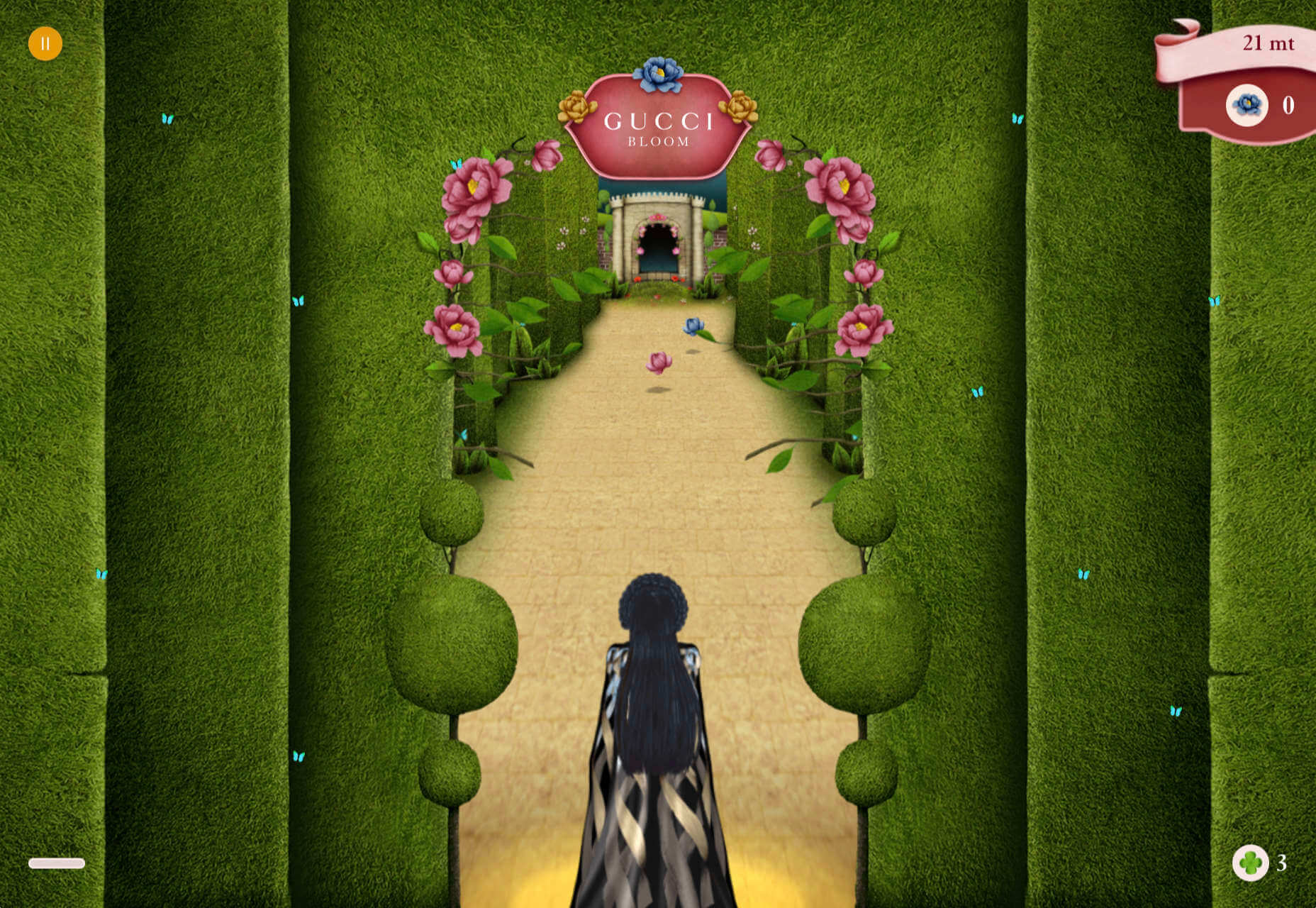
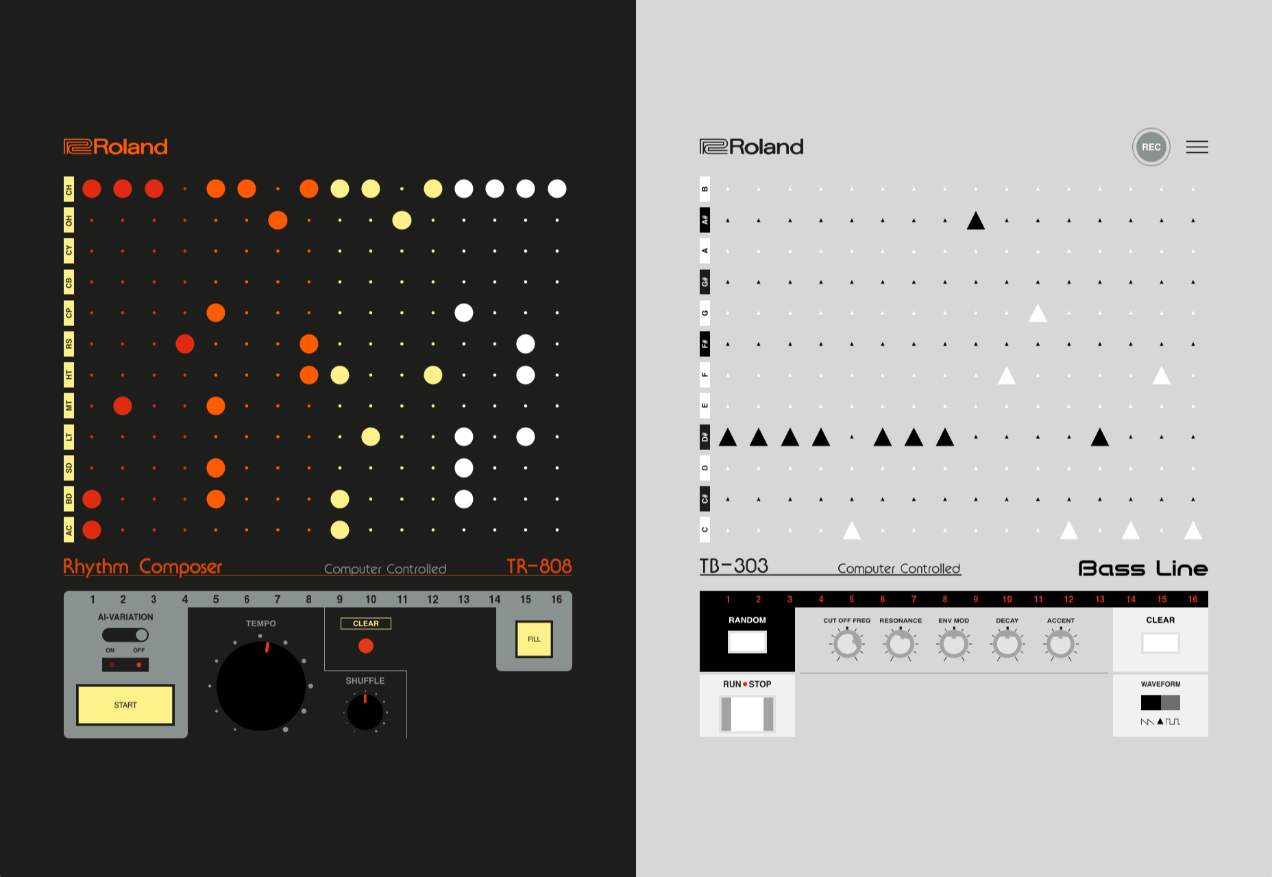
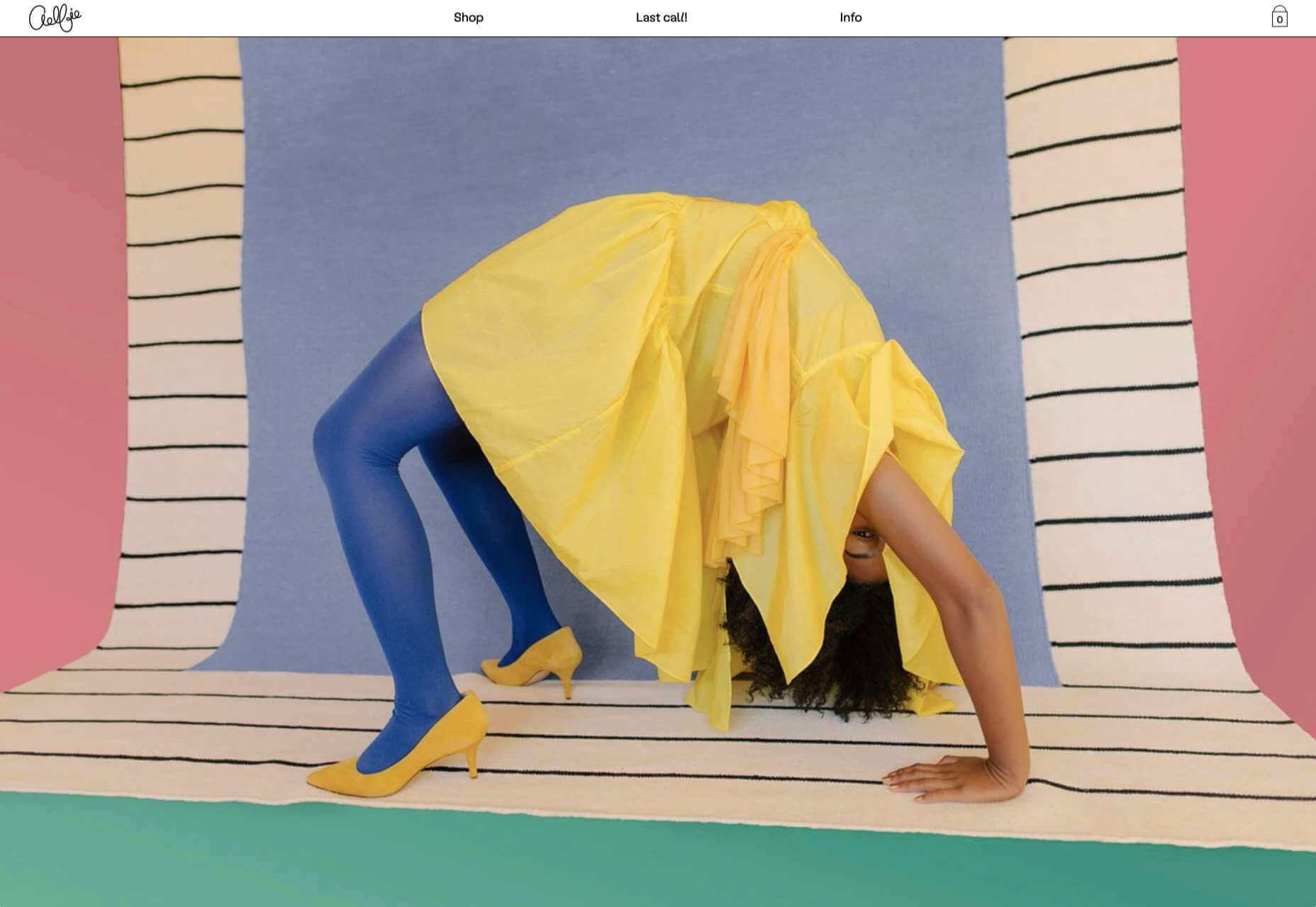
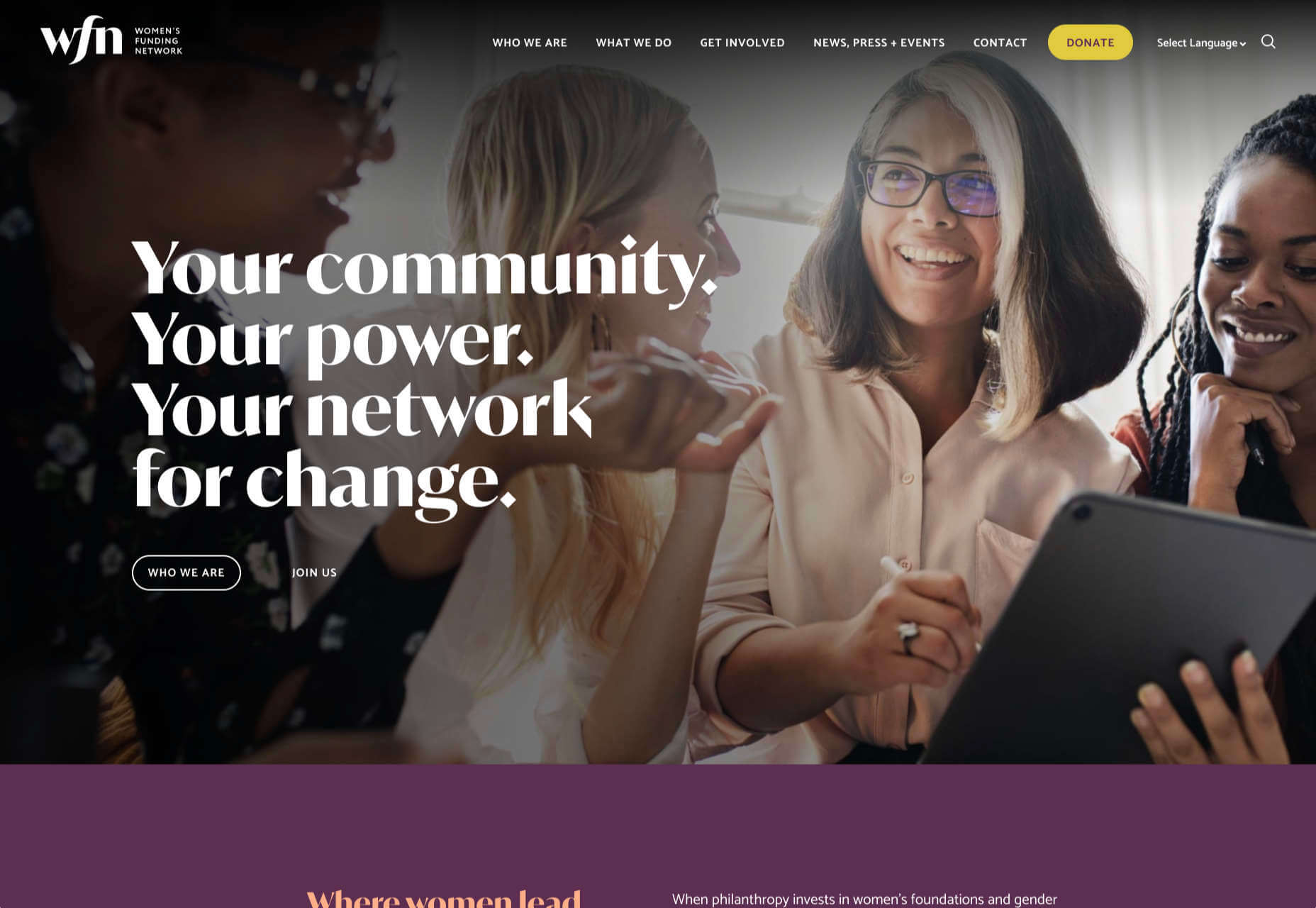
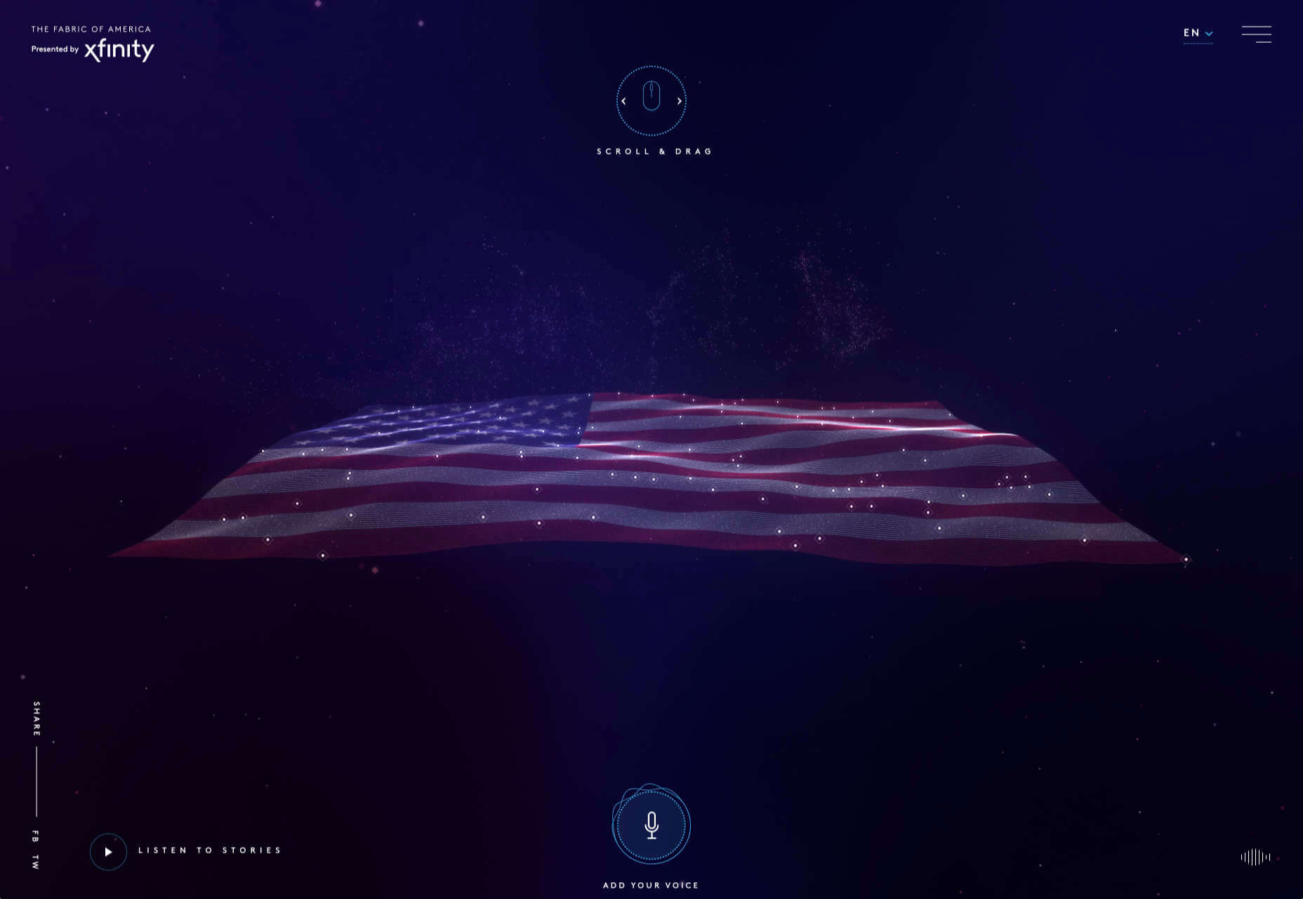
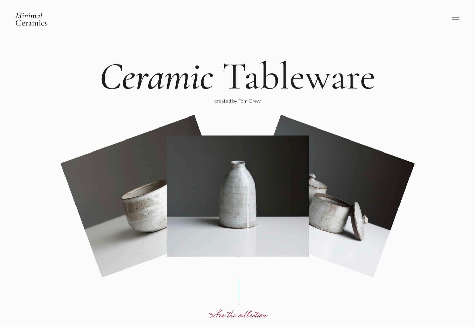
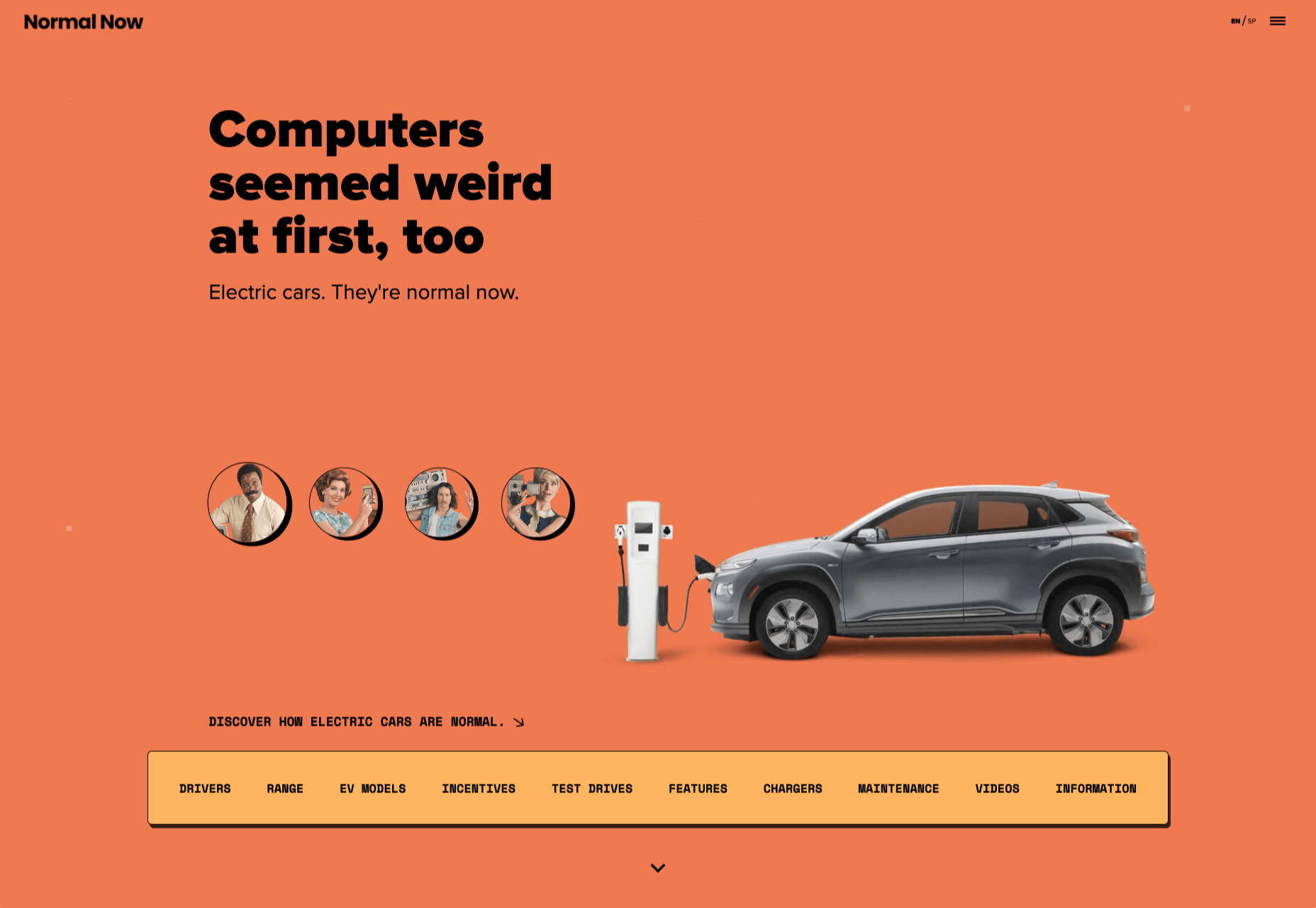
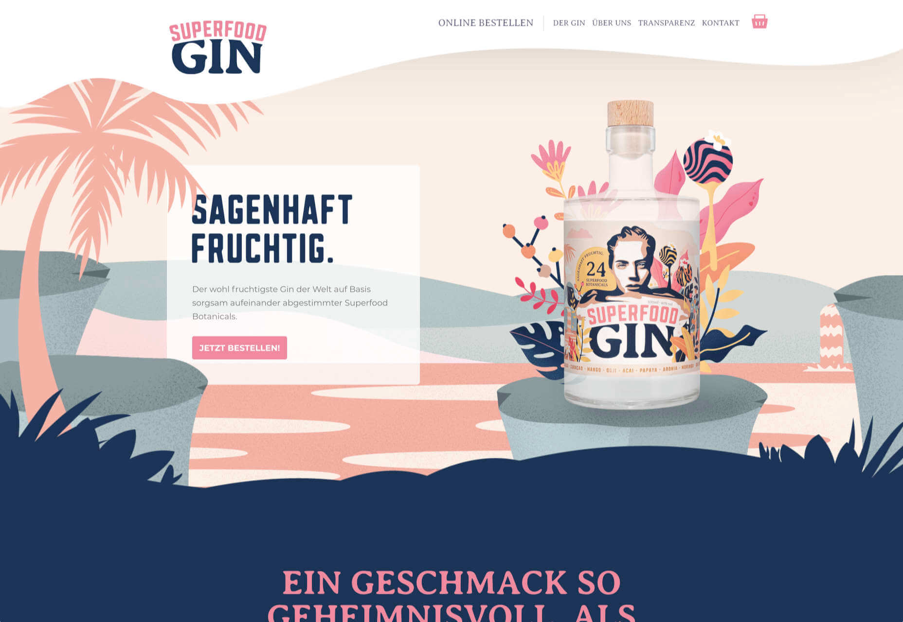
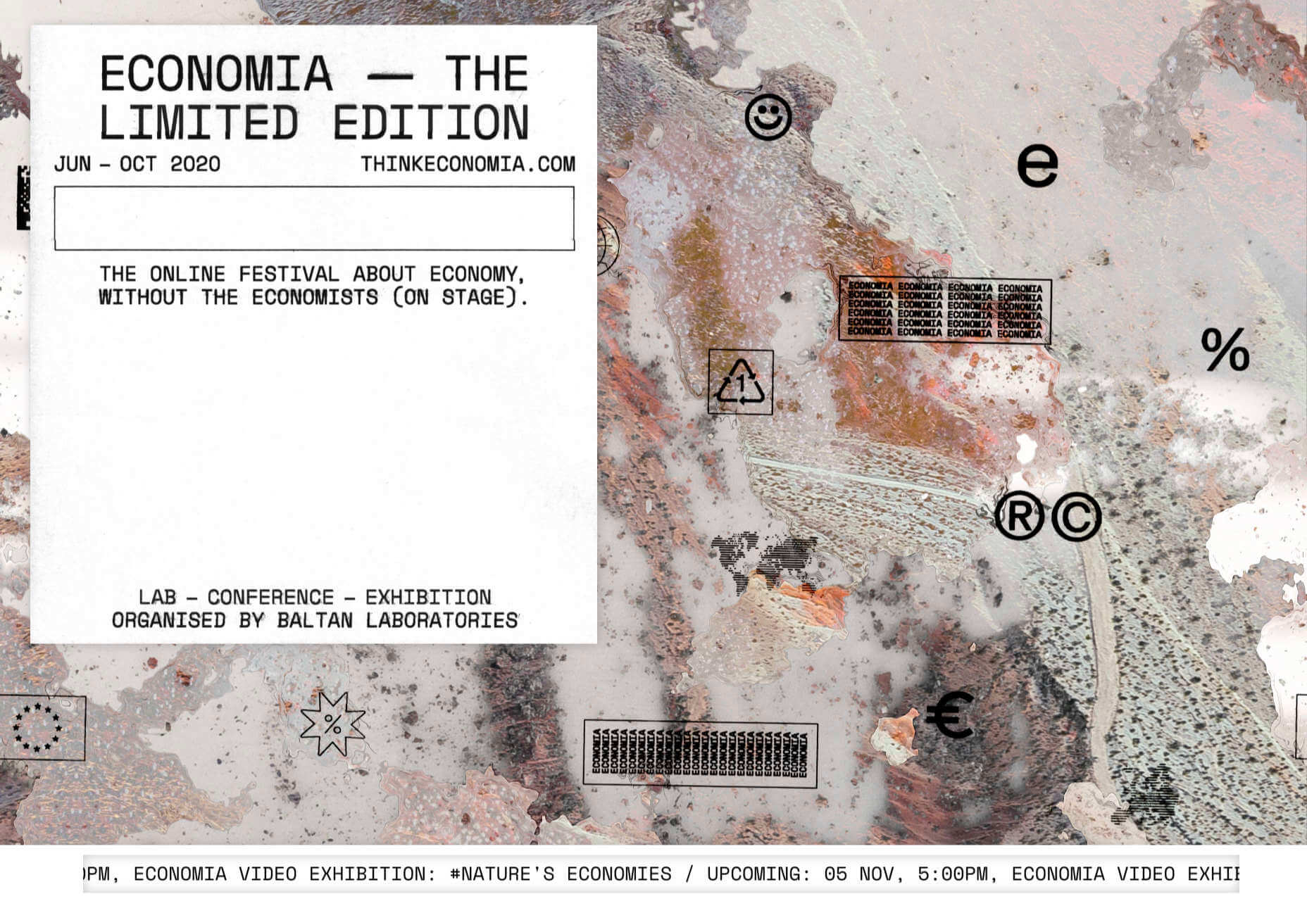
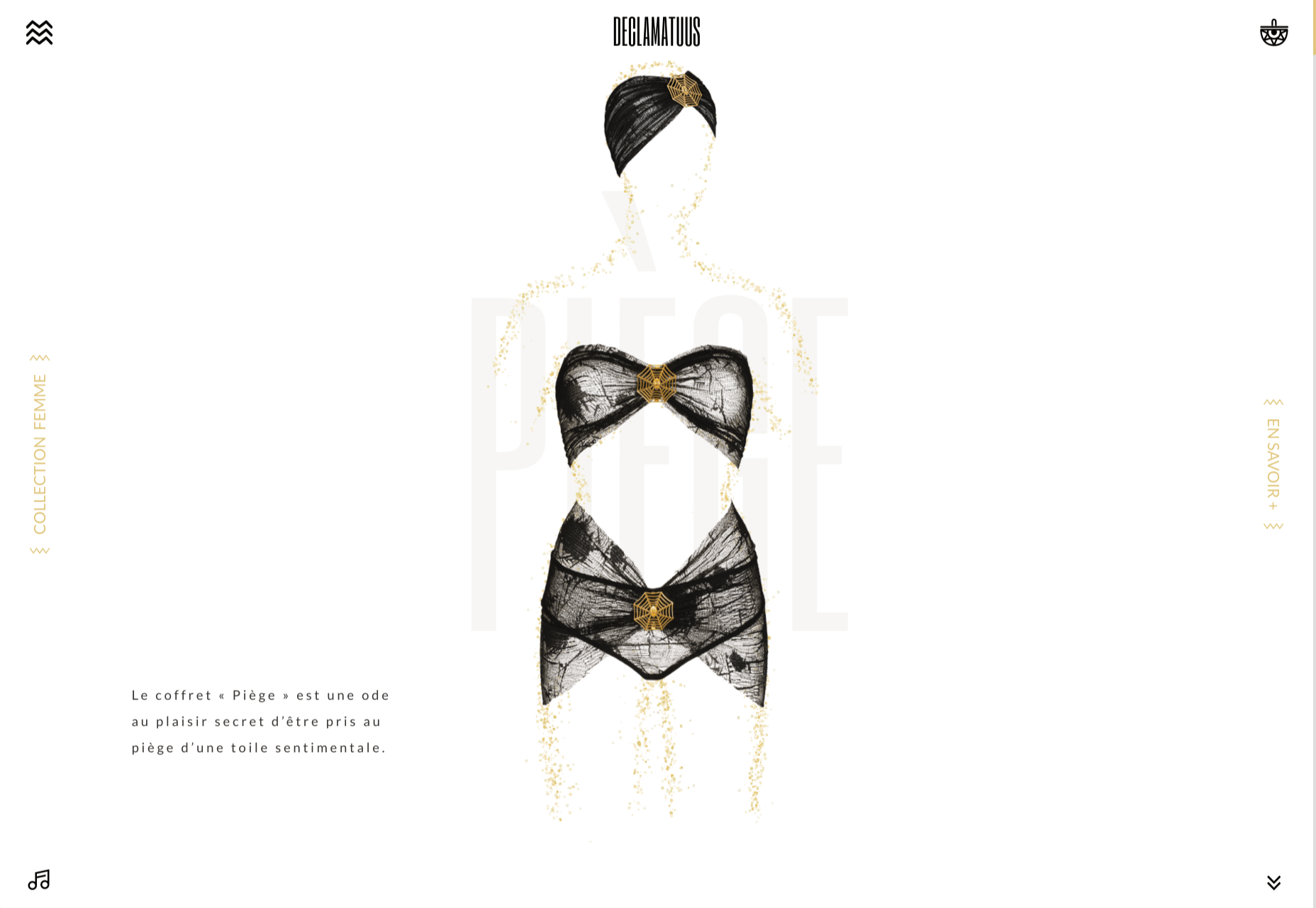
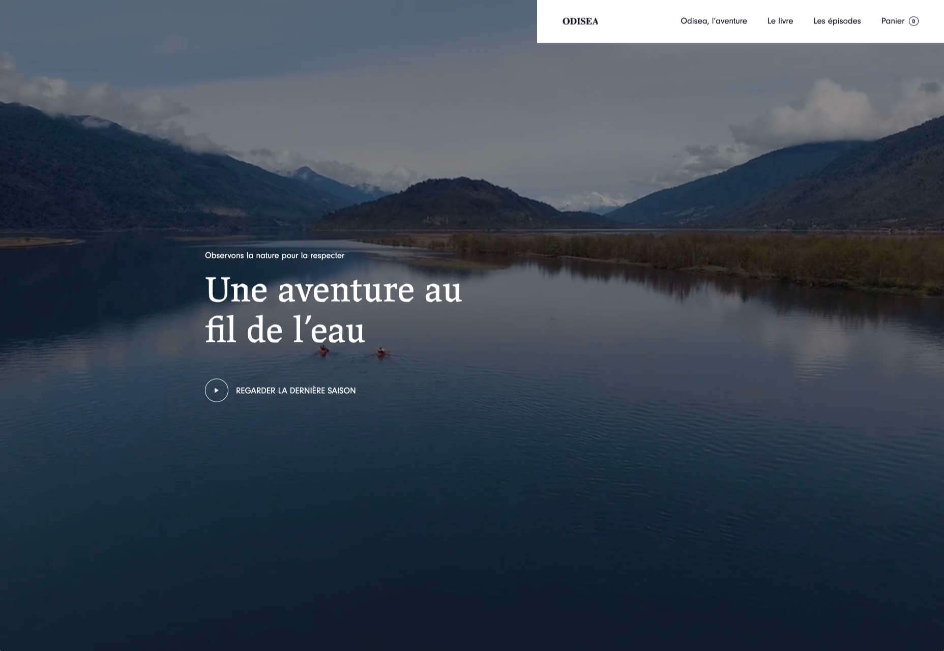
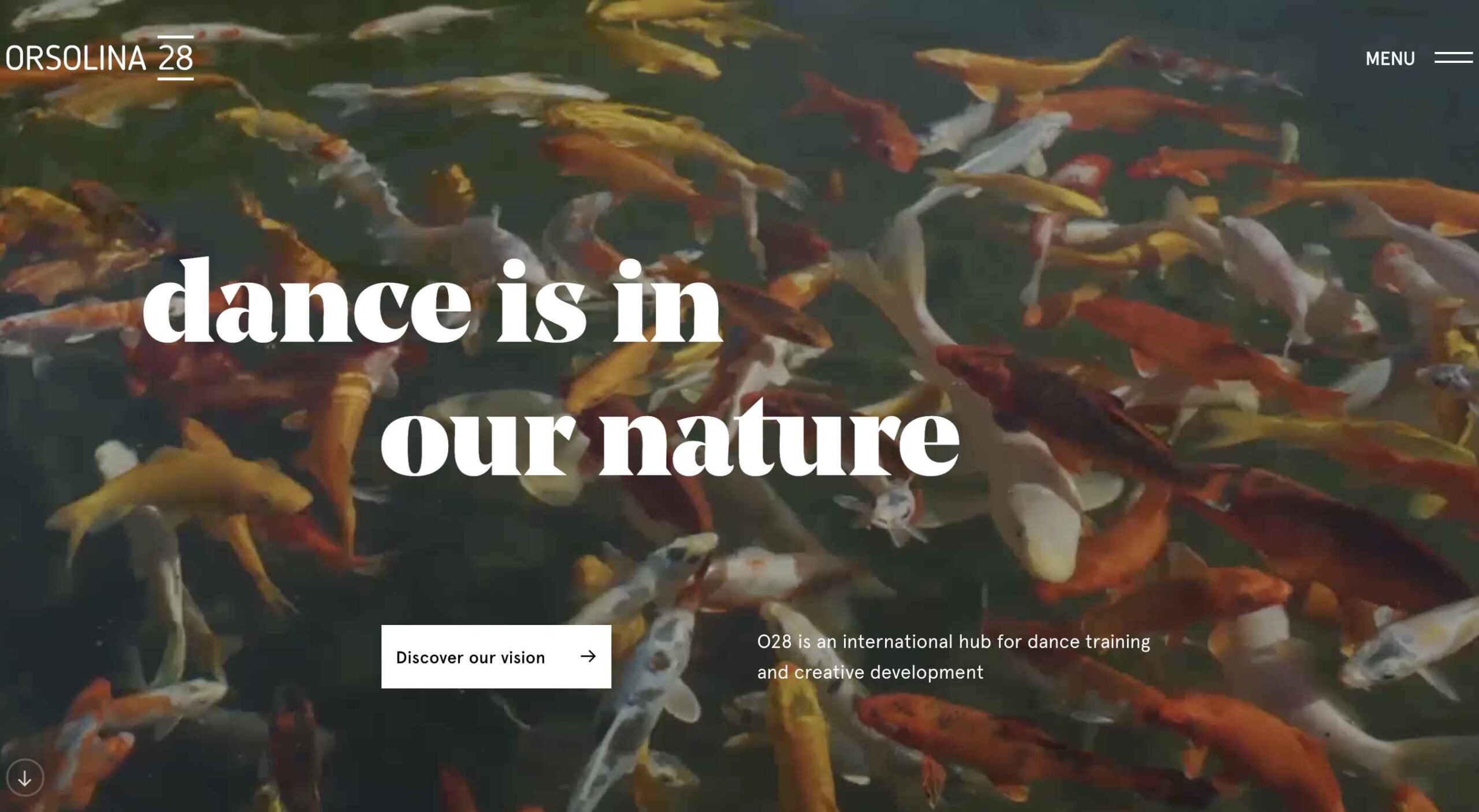 This month’s collection of the best new websites launched or updated in the last four weeks features color, and more color, and then — just for good measure — a bit more color. Yellow is a hue of choice, but you’ll also find burnt orange, rich purples, and greens and blues in equal measure. What is missing is the tech-blue of years past, replaced with something altogether more Mediterranean. Enjoy!
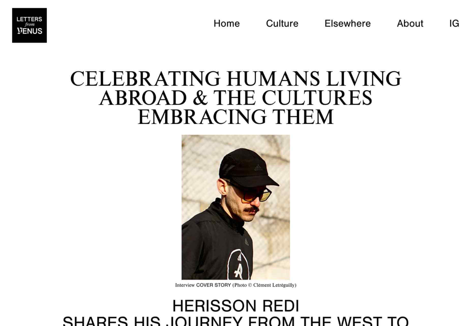
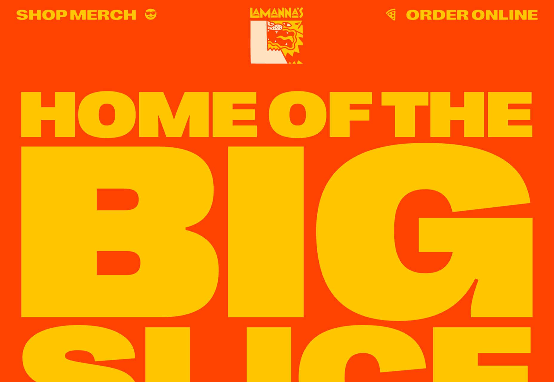
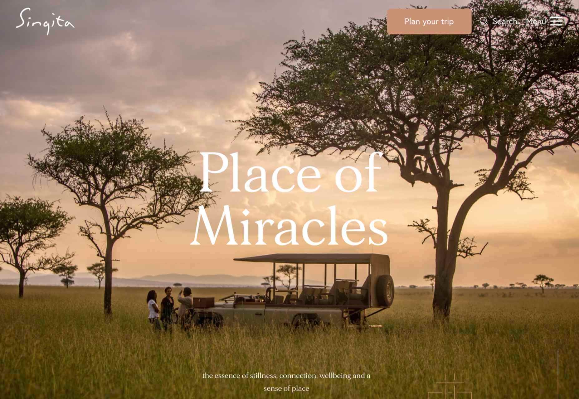
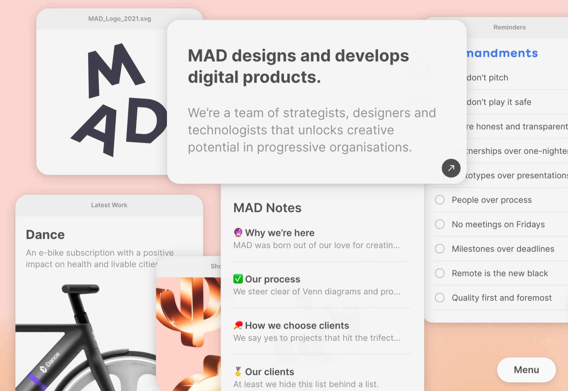
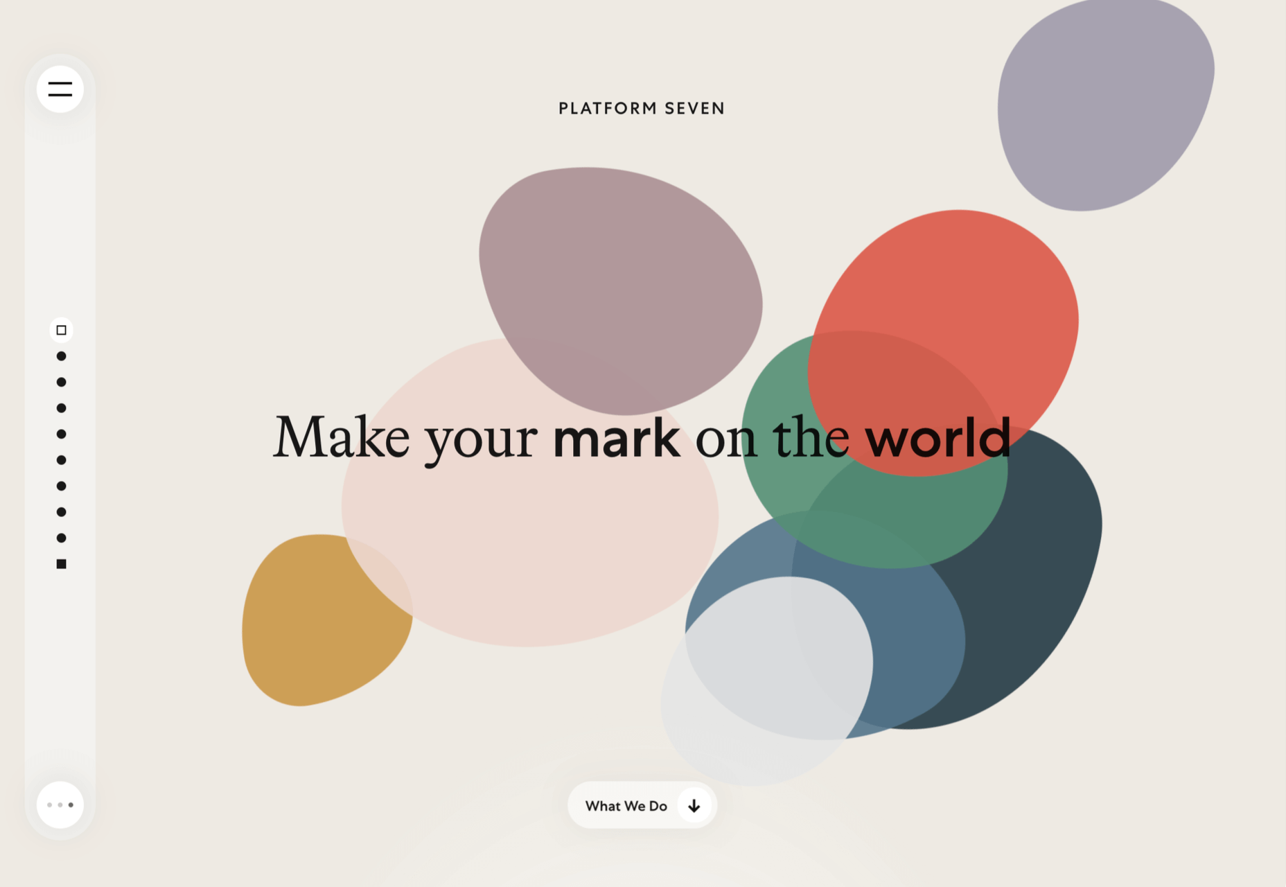

 It’s February, and the spring sun is finally starting to peep through the winter clouds. While many of us are still largely restricted to our homes, the web has kept on growing.


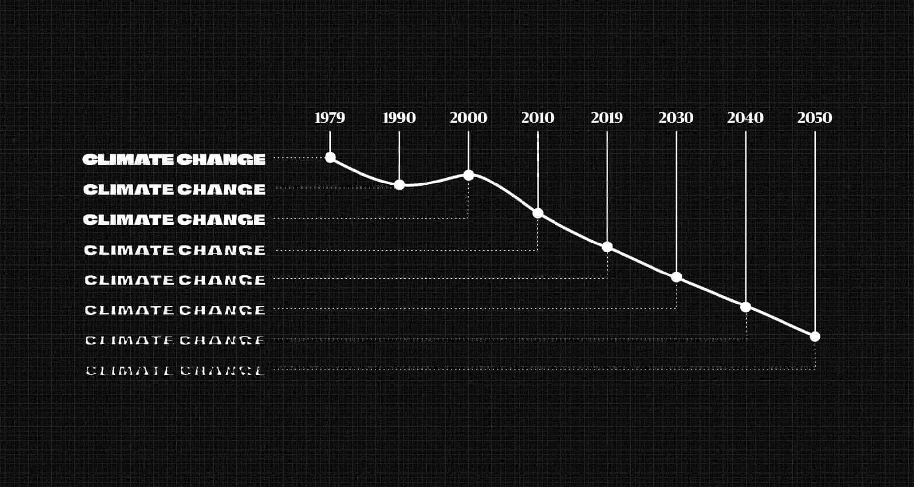
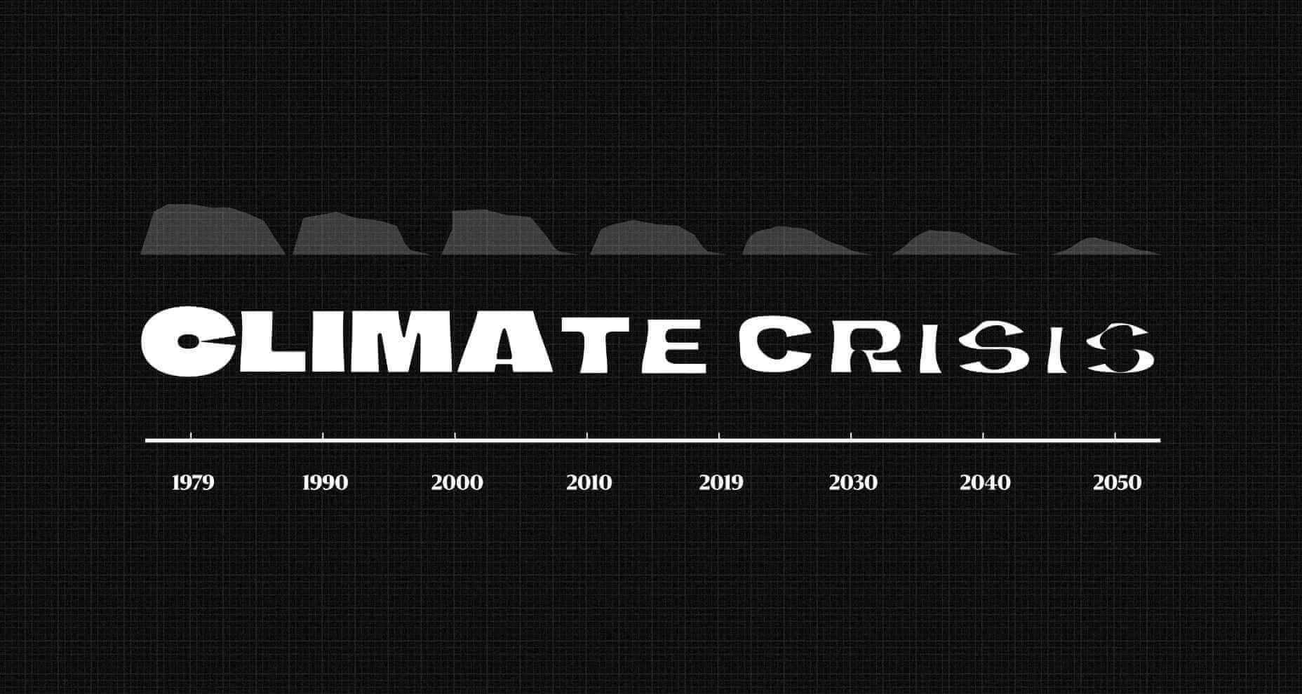
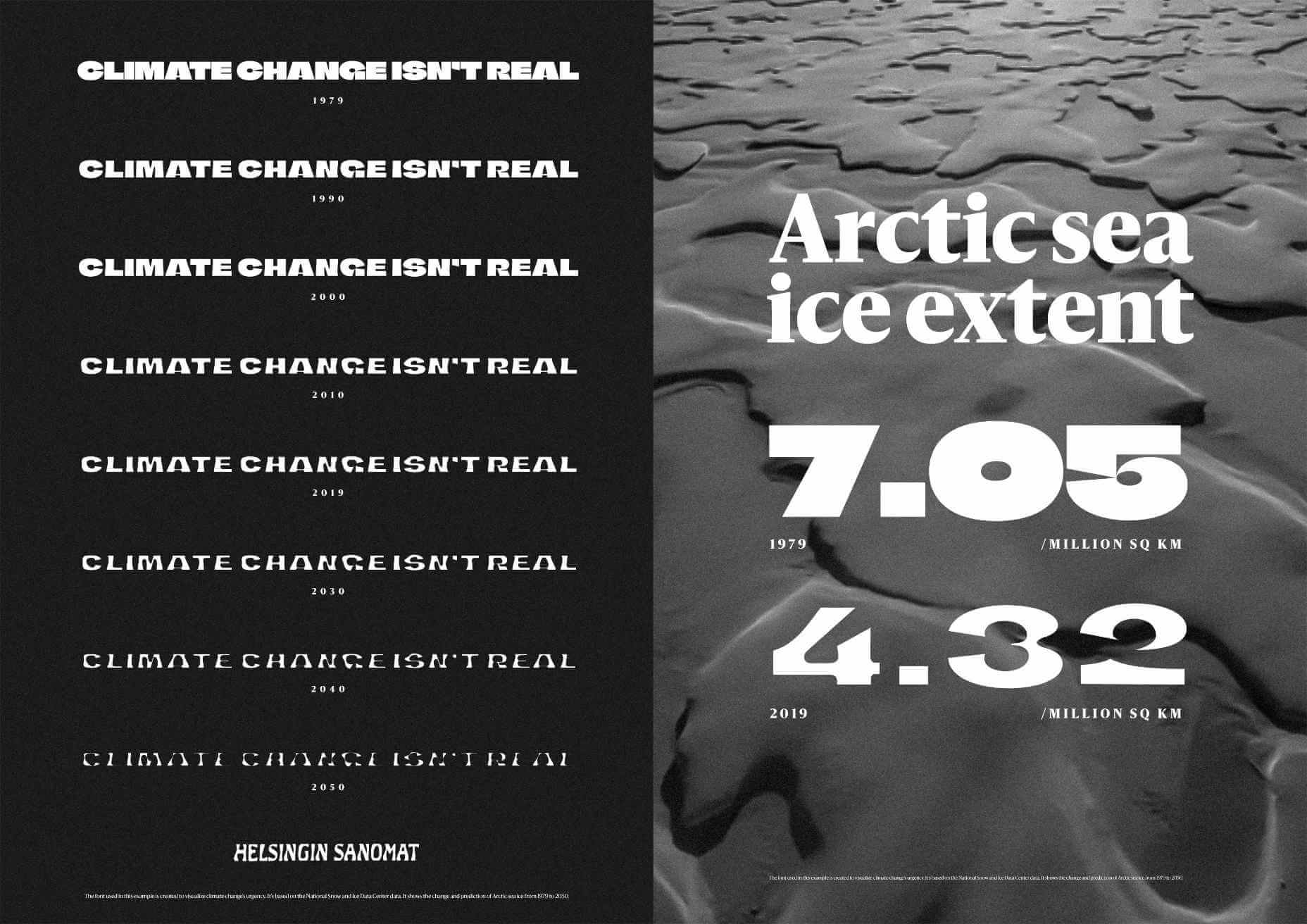
 Finnish newspaper Helsingin Sanomat has developed
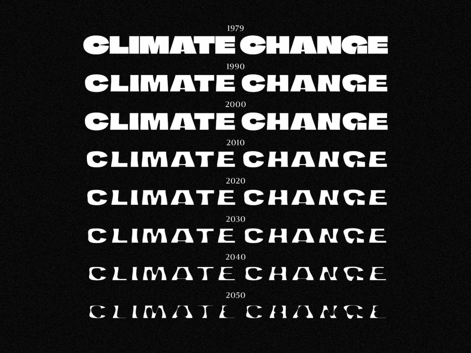

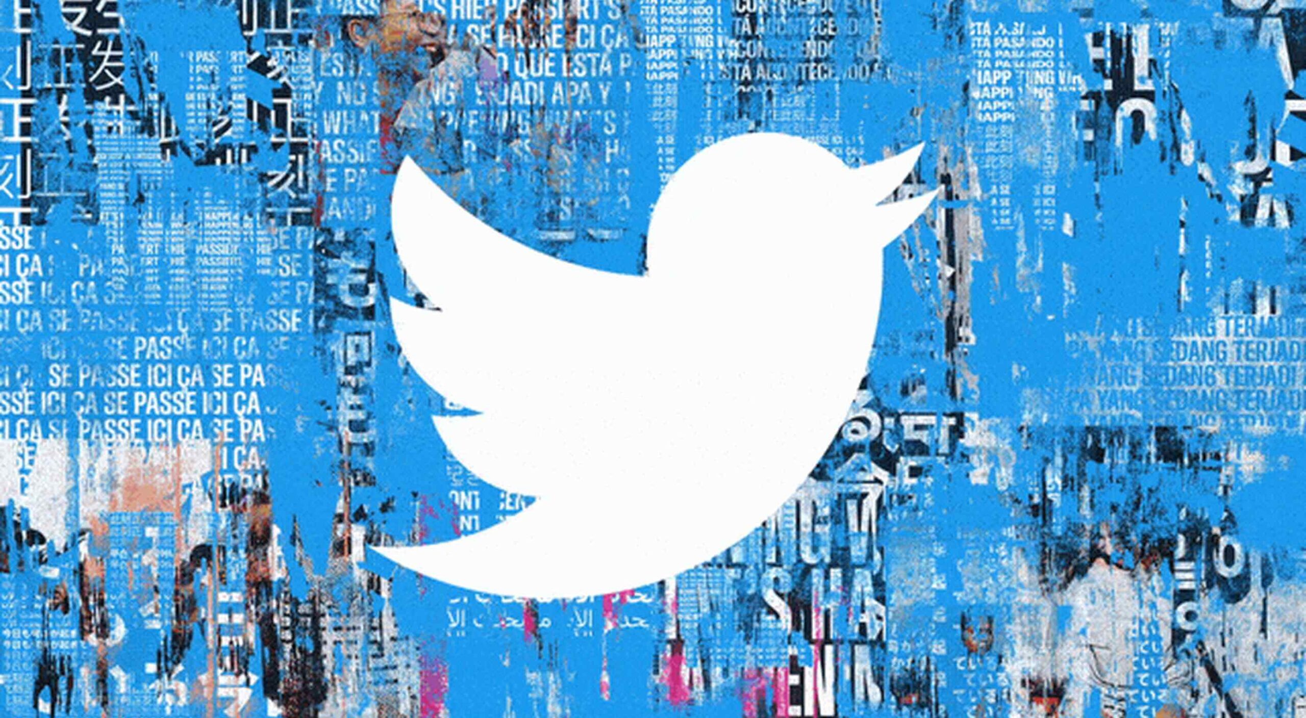 The CMO at Twitter, Leslie Berland,
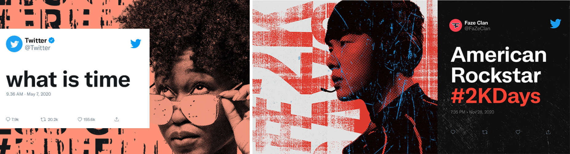
 It’s hard to believe we are more than a month into 2021 already. But that means more trends to dive into this year, right?
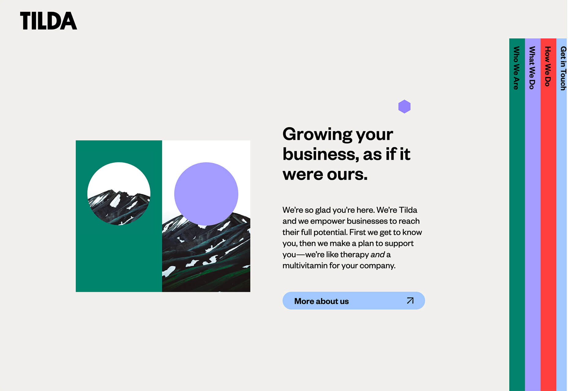


 The start of the year is always a good time to reassess priorities and consider new approaches, but 2021 is more of a reset than we expected this time last year. 2020 is unlikely to go down in anyone’s autobiography as the best year of their life, but it has done something positive: it’s prepared the ground for rapid change in the next 12 months.
 The end of the year tends to be busy for a variety of reasons and it can limit some of the freshness we see in designs during much of the year. Regardless, there are a few trending design elements.
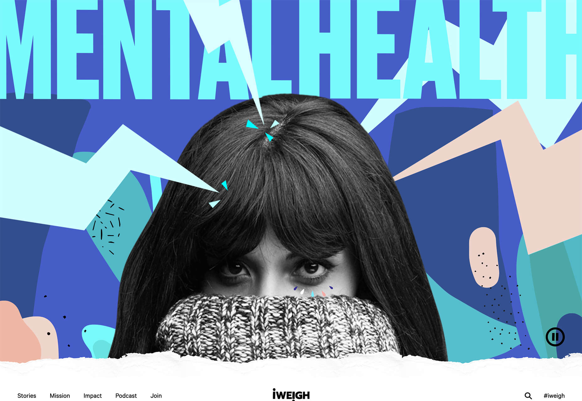
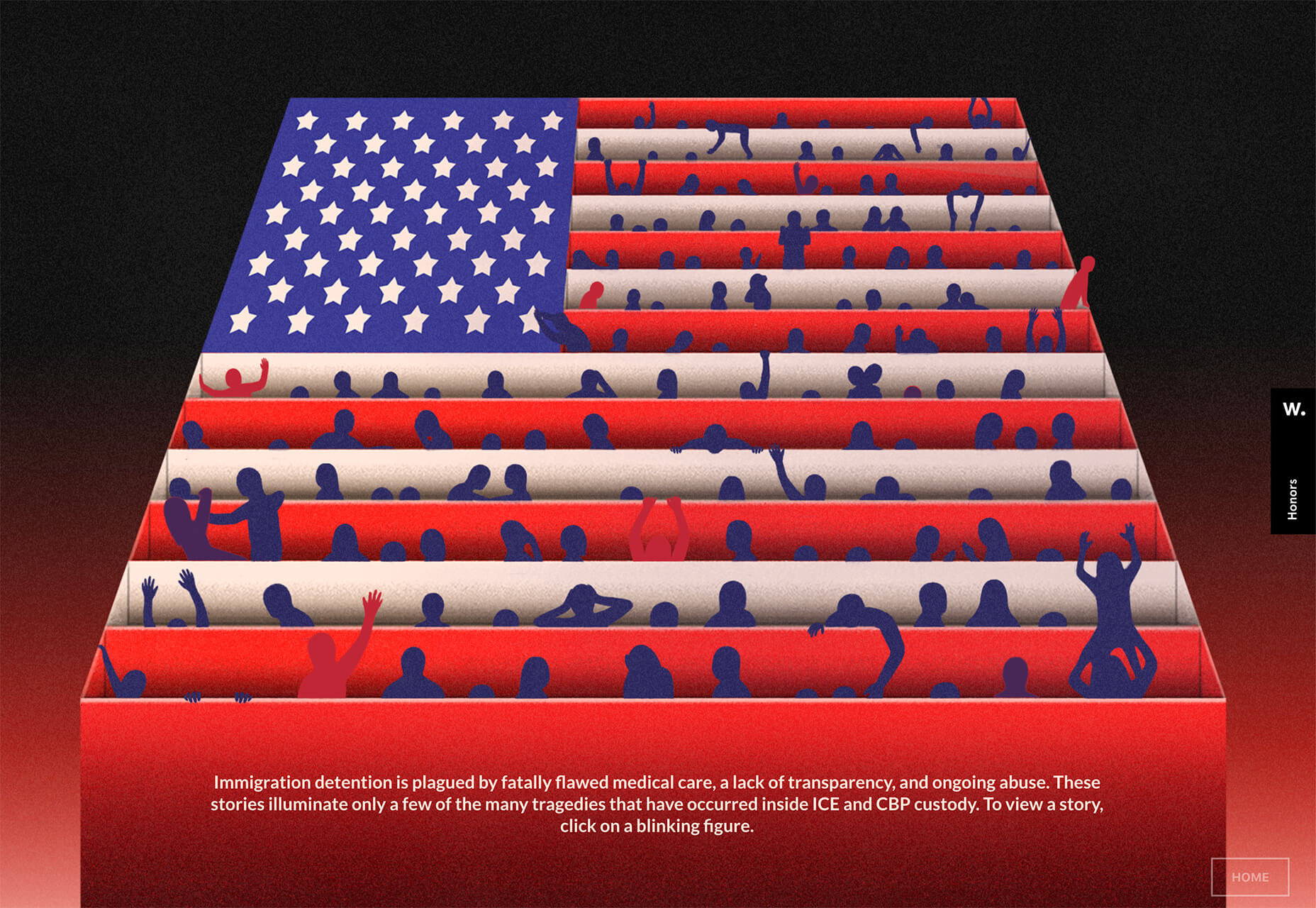

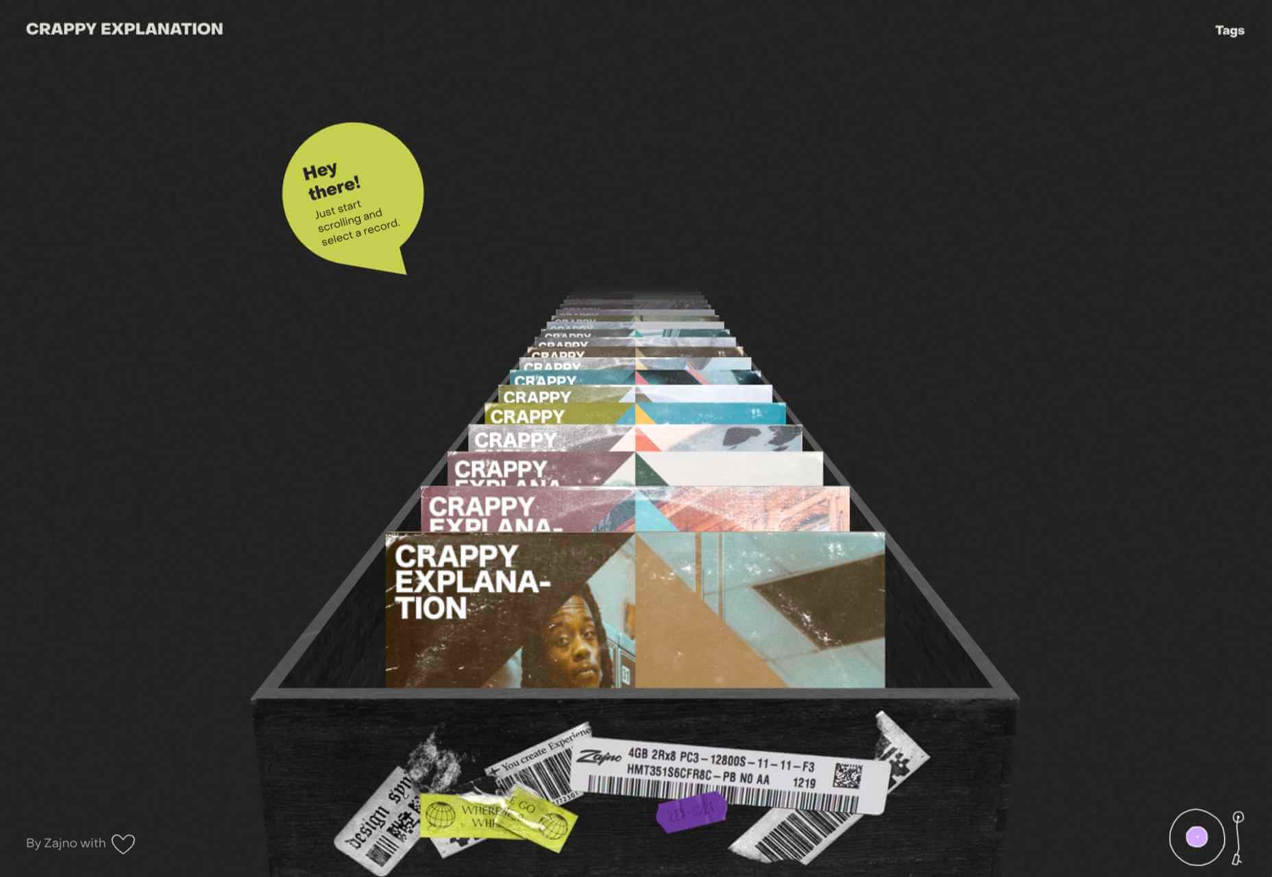
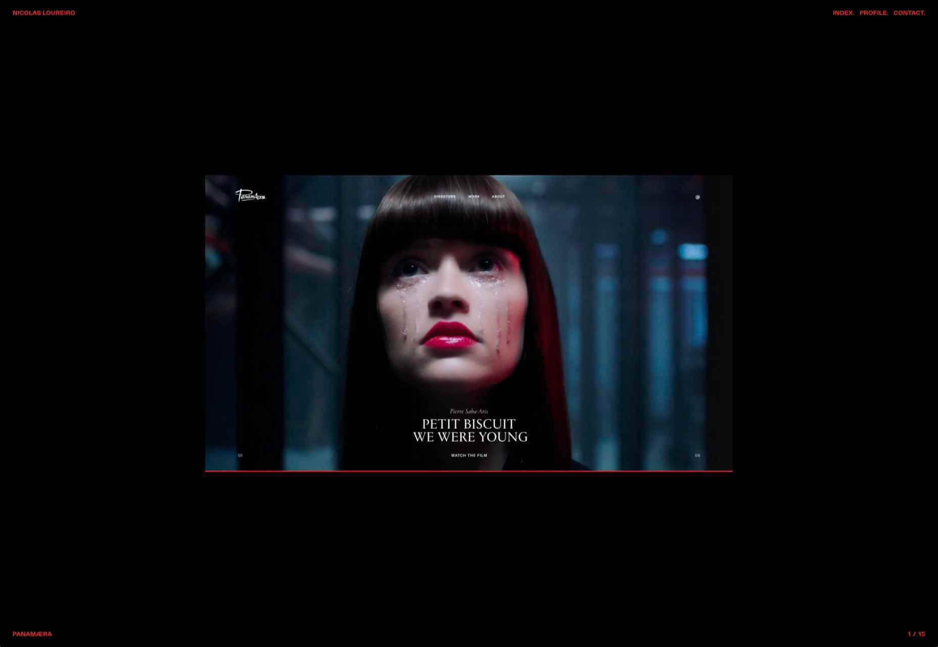
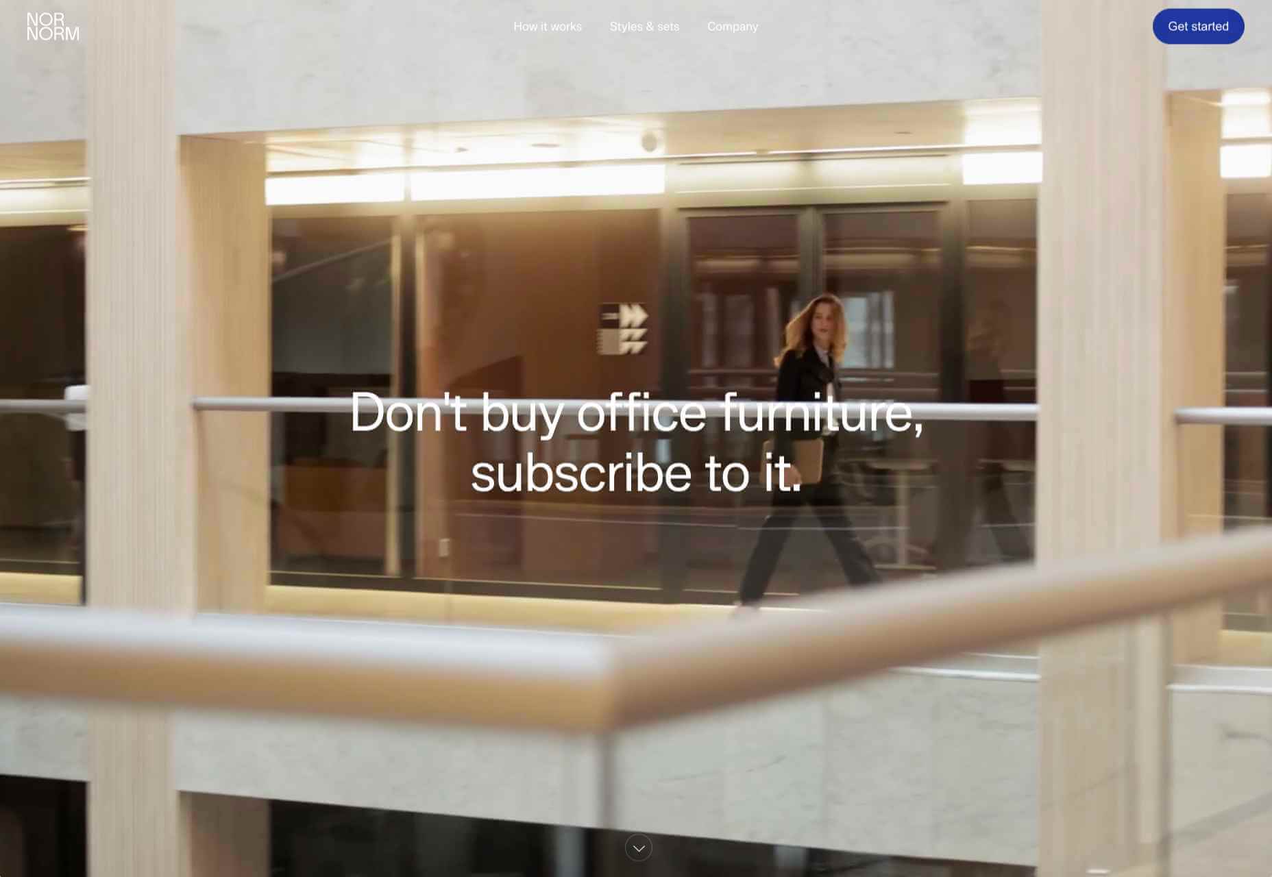
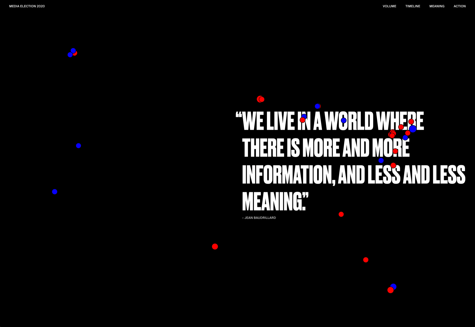
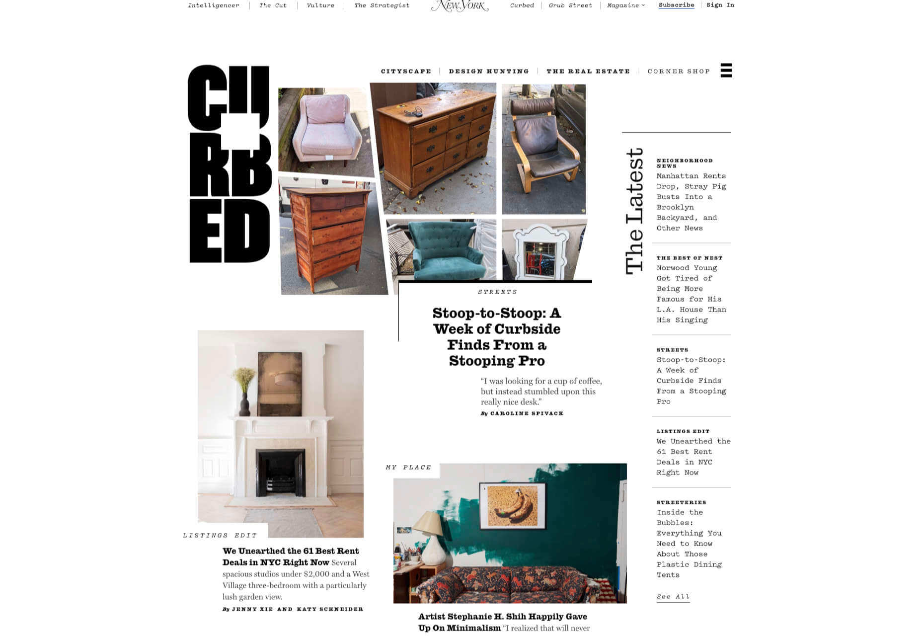
 We have become so used to using web sites just to buy stuff that it is easy to forget that the web has more to offer. So this month we’ve included some because-it’s-interesting sites, some micro-sites and some just-for-the-sake-of-it projects.


 Plugins offer a ton of benefits to developers and website administrators; from flexibility, to saving time in development, the right plugin is priceless to a project.