Articles

Looking to give your homepage a well-needed design update in late 2021 or 2022? Not a bad idea; first impressions are crucial when it comes to business websites. But, fixing your homepage and website design is no easy feat.

Web design trends are evolving faster. Blame the ever-decreasing user’s attention span. The average visitor now spends just 0.5 seconds scanning your homepage to form an opinion about your brand and decide whether to click through or bounce.

Increased user expectations and uncertainty in the user’s response, which is highly impacted by the site’s first impression, are other reasons to consider. This is why the designs which were trending in 2019 are no longer viable in 2021 or 2022.

We have curated the ten best examples of homepage designs to inspire your business in 2022, including a rundown of the best strategies and tips.

Let’s start by highlighting why homepage optimization is necessary for 2022:

Why Your Homepage Will Be So Important in 2022

Your website — especially your homepage — is your brand’s first chance to attract, build trust with, and connect with visitors.

According to recent statistics on why website design is important:

  1. 38% of visitors will stop interacting with a website if they think the layout isn’t visually appealing or intuitive. This creates a higher bounce rate and fewer conversions.
  2. 94% of a visitor’s first impression is based on website design (including colors, fonts, layout, navigation menus, etc.).
  3. 46% of people base a business’s credibility on the aesthetics of its website. Brands with less-than-stellar homepage designs are seen as less trustworthy than companies investing in the visitor experience.

Think of it the same way as walking into a brick-and-mortar store. Visitors are more enticed by a carefully curated ambiance of neatly stocked shelves and welcoming employees than a store that’s dark, messy, or seemingly unfriendly.

Using this logic, your homepage’s above-the-fold section is where you’ll greet visitors and reel them in for more.

10 Homepage Design Comparisons (2019 vs. 2021) To Inspire Your Business Website Design in 2022

Homepage design has come a long way since 2019. In this section, you will explore how.

These homepage designs crush it above the fold. Take just a few of these tips to heart, and your website will be poised to attract leads and conversions — no matter which industry you’re in.

1. Netflix – Crafting The Perfect Call To Action That Reduces Friction With An Additional FAQs Section

Most businesses make the mistake of adding a CTA button that first persuades the user to click on it and then asks for the visitor’s email address.

Netflix also did the same in its 2019 design.

However, Netflix combined both steps in its 2021 homepage design.

The new, improved 2021 homepage design asks for the user email address right up front along with the CTA button.

Here is a good comparison of both the designs:

2019 homepage design

vs.

2021 homepage design

Key Takeaways:

  • The design encourages visitors to enter their email address right when they land on the homepage. As a result, form submission is much easier when the user has started the process. Hence, Netflix makes it easier for visitors to move along their conversion funnel nicely by reducing the friction.
  • The 2021 design also has a nice FAQ section that provides quick information about the company’s services and improves the overall user experience.
  • FAQs also help increase the organic presence of the website in the search engines because Google presents snippets from the FAQ section in the form of an answer box in the search results.

2. Spotify – Revamped Color Combinations For Improved CTA Visibility And Using The ‘Rule of Three’ For Heading Text

The older 2019 Spotify homepage design used light pink and orange colors in its home page main area. The CTA color was green, but if you look closely, the CTA lacks visibility.

The new 2021 design uses blue and green colors with a much larger font size for the main heading. The colors are attractive, and the CTA is visible clearly.

Here is the comparison of the Spotify homepage 2019 design vs. 2020 design:

2019 homepage design

Vs.

2021 homepage design

Key Takeaways:

  • Blue is the most versatile color, and green is the perfect choice for the CTA button. Spotify used universally accepted color combinations to redesign its homepage and made the CTA more visible.
  • The main heading is also made larger than it was in the 2019 design, and it follows the rule of three in writing which is effective and satisfying. It uses just three words in the main heading to allow the human brain to process information as a pattern that is more memorable.

3. Hulu – Give Priority To Your Brand Name And Hide Pricing

If you compare the Hulu 2019 vs. 2021 Hulu homepage, the brand name has been prioritized and shown as the main heading.

Moreover, the older homepage had pricing information everywhere, which has been reduced intelligently in the new design.

2019 homepage design

vs.

2021 homepage design

Key Takeaways:

  • The brand name ‘Hulu’ is displayed as the main heading of the homepage, which helps to build audience trust.
  • The older design persuaded the users to pick a paid plan even though they had a free trial option—this discouraged users from trying their service. The new 2021 design encourages users to try the platform for free. In addition, the packages have prominent CTAs that mention “try for $0”. This design move improves conversions on the website.
  • The new design makes it easier for the visitors to select a viewing plan with easy comparison of the three available plans. The best part is, customers can start all the plans for $0. It’s a win-win situation for the users, and they can quickly pick a plan to start watching Hulu.

4. Nextiva – Reduce Visual Noise And Add Pictures In Menu To Improve UX

Nextiva realized the importance of reducing visual noise in its newly designed 2021 homepage. Visual noise happens when you use too many colors to attract user attention. Different colors compete with each other resulting in diluted customer observation.

In the old 2019 homepage, Nextiva used orange, blue, and green as the primary colors, while in the 2021 revamped design, they have used blue as the main color.

Here is a comparison of the two designs:

2019 homepage design

vs.

2021 homepage design

Moreover, the older homepage didn’t have an image in the product menu, but the new 2021 homepage improves the UX further.

Below is a comparison:

2019 homepage design

vs.

2021 homepage design

Key Takeaways:

  • Nextiva used blue as their base color for the homepage design and removed orange and green colors to reduce visual complexity. This is an excellent change to keep the user’s attention focused. Notice the green colored bar at the top of the homepage in the 2019 version now replaced with blue.
  • The 2021 design has a clean look compared to the 2019 design, which looks scattered with too many different elements, including CTAs that confuse the users.
  • The product menu does an excellent job of linking intelligently to service pages such as phone systems and video meetings. The image of a smiling lady attracts users to click on Nextiva’s products to learn more about them. Improving UX is an impressive way to reduce bounce rates and increase time on site.

5. GoToMeeting – Avoid Lengthy Sign Up Form, Educate Users About Your Products, and Add Images That Depict The Current Needs of The Audience

GoToMeeting does a great job educating the users about their product by adding more content on the homepage that comprehensively explains their product features.

Moreover, they have replaced the older hero image with a new picture that portrays the changing needs of their audiences. Nowadays, there is a rise in work from home culture due to Covid-19. Hence, the photo and the heading text clearly target the needs of their users.

Here is a comparison of the 2019 vs. 2020 homepage of GoToMeeting:

2019 homepage design

vs.

2021 homepage design

Key Takeaways:

  • The 2019 homepage design had a sign-up form on the homepage, which GoToMeeting removed in the 2021 design. People hate to fill in so much information right when they land on the home page. Hence, GoToMeeting did the right thing by removing the signup form from their homepage.
  • The hero image steals the show of the 2021 redesign because the picture of a working mom with her kid playing studying in front of her is a great way to portray the current needs of the society when over 60% of the employees are working from home. Audiences can quickly relate their working environment with the hero image leading to more sign-ups.
  • The older 2019 design was confusing, and it made little effort to help the users understand the different features of the product. The new 2021 homepage design has a product features section that explains the different features of the software. When users are educated about the product, they earn the confidence to try the product.

6. Zillow – Apply Hick’s Law To Allow Visitors To Take Faster Decisions

Zillow does an impressive job of applying Hick’s Law in allowing visitors to make faster decisions. Hick’s law states that the more options you present to the users, the faster they will decide. Therefore, it is a major factor in improving website usability.

The old 2019 homepage design of Zillow offered too many options to the users, like they want to buy, rent, or sell a property. The users first select either one of the three options and then enter the zip code to start their search.

The new 2021 homepage design changed that. Now, Zillow offers users a single option. They only need to enter the zip code to get started.

By reducing the number of actions that users need to take to just one, the homepage design eases the overall decision-making process of the site visitors.

2019 homepage design

vs.

2021 homepage design

Key Takeaways:

  • The new homepage design has a simple search bar that persuades visitors to take prompt action.
  • The Hero image is placed smartly behind the search bar to depict the needs of the users accurately.
  • The homepage does have three different panels for buying, renting, or selling a home when the users scroll below. The old design is missing that. The new design removed so many options above the fold and kept just a single option for the users to encourage more users to search properties on the site.

7. Plex – Placement of Prominent Calls-to-Action On Homepage

The CTA is a key element of every website. It helps the users decide on their next action and helps to convert the visitors into leads.

Plex lacked an optimized CTA placement in its 2019 home page design. Hence, the 2021 design received an uplift to better place the CTA for increased visitor engagement.

Take a look at the home page designs of Plex from two different years. If you compare the two home pages of 2019 vs. 2021, the primary difference that will grab your attention is the CTA.

2019 homepage design

vs.

2021 homepage design

Key Takeaways:

  • The call-to-action buttons are more prominent and have actionable texts.
  • The number of CTA buttons is increased to two to encourage users to take action.
  • The additional CTA button is wisely placed at the center to get immediate attention.
  • Note that the color choice for the button is also bright and highly contrasts with the background yet matches the color theme.
  • The old heading text ‘Stream Smarter’ was confusing because it didn’t help the users understand what Plex does. Hence it is now revised to ‘Watch Free Movies and TV on Plex.’ The new text is easy to understand and has the word ‘Free’ to increase the number of visitors clicking on the CTA.

8. Dropbox – More Above The Fold Content And Change of Fonts

Dropbox has significantly worked on its main content, which is clearly visible in the comparison homepage design images of 2019 vs. 2021.

The 2021 homepage is seen fixing faded, minimalistic, and less engaging content in the older homepage.

2019 homepage design

vs.

2021 homepage design

Key Takeaways:

  • Sans serifs, with their clean readability, are included for longer bouts of the homepage.
  • Bold sans text is doing the job of drawing user attention effortlessly.
  • The color contrast of the text with the background is increased, which improves the visibility.
  • The right side image of a laptop is replaced with a screenshot of the software, which intrigues users to know more.

9. Cisco – Moving Blocks To Outsmart Competitor Websites

The homepage design of American technology company Cisco has seen a drastic change in 2021; it deserves to appear on this list. The company website smartly represents an appeal for future development through its killer homepage design.

Here is a comparison of the old 2019 homepage design vs. the new moving block design of 2021:

2019 homepage design

vs.

2021 homepage design

Key Takeaways

  • The home page contains moving blocks with news from the blog. As you hover over the image, it widens up, and a CTA button appears. The blocks represent a design of the future which the competitors might find hard to replicate.
  • Every block has a CTA, which was missing in the 2019 design. Each block represents a specific Cisco service and caters to the different needs of the visitors.
  • The new design is elegant and cleaner with lots of information.

10. Slack – Product Video On Home Page For More Conversions

Slack has made it easier for the users to understand the product well by using a video on the homepage.

The 2019 design has an image, while the 2021 design has a video that helps the visitors understand how the product works.

Here is a comparison of the 2019 design vs. 2021 design:

2019 homepage design

vs.

2021 homepage design

Key Takeaways

  • The inclusion of a product video leaves a great impression in the minds of the visitors and shows them what your product does.
  • Video helps Slack to make its value proposition clear and super fast.
  • Video has a strong correlation to conversions, and they work well as compared to hero images. Slack used a hero image on the homepage in 2019, but they replaced it with a video in 2021.

Final Thoughts on Using These Homepage Designs for Inspiration in 2021

By making it to this point in our guide, you now have plenty of inspiration to run with when upgrading your homepage. You should also have a better understanding of how powerful this tool may become for your brand.

So now it’s time to brainstorm how to use these ideas for your own 2021 homepage design. First, jot down the key points from this guide and honestly assess how your website currently compares.

Accomplish this task, and your brand might see an uptick in website traffic and conversions. It may even earn a spot in a roundup of killer website designs just like this one.

Source

The post 10 Homepage Design Comparisons to Inspire Your Business in 2022 first appeared on Webdesigner Depot.


Source de l’article sur Webdesignerdepot

There’s no shortcut to success when it comes to Google search results. That is unless you count pay-per-click advertising.

While pay-to-play will shoot your site to the top of the SERP immediately, it’s not a sustainable strategy for maintaining your position there. So, you’re going to have to get serious about SEO.

This guide will show you what to do to improve your SEO ranking and start seeing results this year:

  1. Use Google Analytics to track metrics
  2. Get an SSL certificate
  3. Improve mobile page speed
  4. Design a mobile-first UI
  5. Make your site accessible
  6. Optimize your images
  7. Create great content
  8. Structure your content for scannability and readability
  9. Create click-worthy title tags and meta descriptions
  10. Choose one focus keyword per page
  11. Improve your internal link strategy
  12. Use only trustworthy external links
  13. Get your site listed as a featured snippet
  14. Get high-quality backlinks
  15. Create a Google My Business page
  16. Refresh Your Content
  17. Regularly monitor Google Search Console

How to Increase Your Website’s SEO Ranking

If you can improve your SEO ranking — and get your pages closer to, if not on the highly coveted top SERP — you will:

  • Boost your site’s overall visibility as its authority in search grows;
  • Bring high-quality traffic to your pages;
  • Drive-up your conversion rate.

That said, search engine optimization is most effective when it’s an ongoing strategy as opposed to something you set up and forget about. So, some of the suggestions below will only need to be implemented once, while others you’ll have to return to every six months or so to make sure your site is on track.

Let’s get started.

1. Use Google Analytics to Track Metrics

If you haven’t yet begun tracking your website’s activity with Google Analytics, it’s the very first thing you need to do.

While Google Analytics alone can’t tell you how well or poorly your website ranks, there’s valuable data in there about what happens to the traffic that arrives from Google. Or any search engine your visitors use.

You can find this information under Acquisition > Source/Medium:

What you want to see here is that (1) you’re getting lots of visitors from organic search results (as opposed to paid) and (2) that they’re highly engaged. So, that means:

  • Longer times on site;
  • Multiple pages visited;
  • Lower bounce rates.

And if you configure Google Analytics to track different conversions on your site, you can see how well those organic visits convert.

Obviously, there’s a lot more you can track here. But you must understand if your SEO efforts are working in the first place, and that’s where you’ll get your confirmation.

2. Get an SSL Certificate

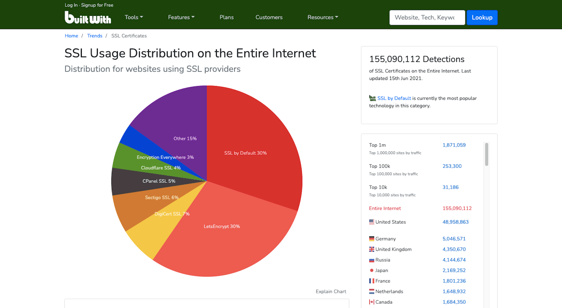
HTTPS has long been one of Google’s SEO ranking factors. Yet, of the two billion-plus websites that are online today, BuiltWith data shows that only 155 million have an SSL certificate installed:

Security and privacy are major concerns for consumers. So if you want to increase their confidence in your website, installing an SSL certificate is an easy thing to do. And it’ll put you in Google’s good graces, too.

If you don’t have one already, get one for free from Zero SSL.

3. Improve Mobile Page Speeds

Mobile loading speeds became a Google ranking signal in July 2018.

It was something we saw coming ever since smartphones overtook the desktop as the primary device people used to access the Internet. Once it became a ranking factor, though, mobile page speed was something we could no longer treat as a “nice to have.” It became a must.

And with Google’s most recent Core Web Vitals algorithm update, there’s no ignoring how big of a role your site’s mobile loading speeds (i.e., performance) play in ranking it.

To ensure that your site meets Google’s expectations for speed, bookmark the Core Web Vitals tool. It’ll tell you how your site performs across all four of the major ranking categories.

You’ll find your speed-related issues at the bottom of the page, along with resources to help you resolve them.

Most of those tips will have to do with optimizing your code. However, there are other things you can do to make your site load quickly:

  • Use well-coded themes and plugins;
  • Remove unused themes, plugins, media, pages, comments, backups, and so on from your database and server;
  • Install a caching plugin that’ll minify, compress, and otherwise make your site lightweight and fast.

It’s also not a bad idea to review your web hosting plan. You might not have the right amount of server power or resources to keep up with your existing activity.

4. Design a Mobile-First UI

On a related note, a mobile-first design can also improve your site’s loading speeds. Rebekah Carter wrote a really helpful guide on how to do this last year.

In addition to speeding things up — since you won’t be trying to jam a bunch of desktop-first design and content into a smartphone screen — it’s going to help your site rank better.

Just be careful when you do this. A mobile-first design doesn’t mean creating a scaled-back version of the larger site for smartphone users.

In fact, Google explicitly tells us not to do that and why:

“If it’s your intention that the mobile page should have less content than the desktop page, you can expect some traffic loss when your site is enabled mobile-first indexing, since Google can’t get as much information from your page as before.”

And if your response is that the content on desktop-only doesn’t matter, then it really shouldn’t be there. Don’t waste your visitors’ time with useless or repetitive content, as it’ll only give them more reason to abandon your site.

5. Make Your Site Accessible

Accessibility has come to the forefront of the SEO discussion thanks to Core Web Vitals.

Now, running your site through the tool will tell you if there are any inaccessibility issues that Google will ping you for. But that doesn’t make your site completely accessible.

Considering the rise in website accessibility-related lawsuits, you’ll want to take this seriously.

Because a bad experience due to inaccessibility won’t just cost you visitors and a lower search ranking, it’ll cost you a lot of money, too.

Here are some things you can do to ensure that your site and all its content is accessible.

6. Optimize Your Images

Technically, image optimization falls under the page speed tip. However, that’s not the only way you should be optimizing your images, which is why I wanted to address this separately.

According to HTTP Archive, the average weight of a mobile web page these days is 1917.5 KB. Images take up a sizable chunk of that weight:

Because of this, bloated image sizes are often to blame for slow pages.

You can do several things to optimize your images for speed, like using lightweight formats, resizing them, and compressing them. You’ll find 6 other image optimization tips here.

While those tips will help you speed up your site and, consequently, improve your SEO ranking, there’s something else you need to do:

Add alt text to your most important images.

One reason to do this is to improve accessibility. Another is so your web page can rank in both the regular Google search results and image results as this search for “WordPress by the numbers” does:

If you can write alt text that perfectly describes your graphic and matches the image searchers’ intent, you can create another ranking opportunity for your page.

7. Create Great Content

There are many technical ranking factors you have to pay attention to if you want to create a good experience for your visitors and rank well as a result. However, none of that will matter if your content sucks.

So, how do you make great content? It really depends.

Think about the difference between a page describing your web design services and a product page for a blender.

Your web design services page would need to:

  • Explain why hiring a web designer is a must;
  • What your design services entail;
  • What they can expect in terms of results;
  • Include some proof in the form of testimonials or portfolio samples;
  • Have information on next steps or how to get in touch.

That would be a comprehensive and useful page. If business owners searched for “hire a web designer near me” or “should I hire a web designer?”, that page would sufficiently answer their query.

A product page, however, would need to:

  • Provide a brief summary of the blender;
  • Show photos of the blender, different angles of it, as well as different variations of the product;
  • Display the price;
  • Allow customers to Add to Cart or Save for later;
  • Include technical specs of the blender;
  • Recommend related products;
  • Display sortable customer testimonials and ratings.

The last thing a shopper would want is to be directed to a product page that reads like one of your services pages.

So, great content not only needs to be well-written and error-free, but it needs to match the searcher’s intent and expectations. If you can do that, your visitors will stay as long as they need to read through everything, which will help strengthen the page’s ranking.

8. Structure Your Content for Scannability and Readability

Including necessary details and in the right format is an important part of making a page’s content valuable to the visitor. The structure is going to help, too.

For starters, you want to make sure every page is human-readable. So, that involves:

  • Shorter sentences and paragraphs;
  • Linkable table of contents for longer pages;
  • Header tags every few hundred words;
  • Descriptive and supportive imagery throughout;
  • Text callouts like blockquotes and bolded phrases.

By making a page less intimidating to read and easier to scan for a quick summary of what it is, you’ll find that more visitors are willing to read it and follow your calls to action.

You can use a tool like Hemingway to improve your page’s readability. Quickly pop the text of each page into the editor and follow the recommended suggestions:

You’re also going to have to think about how well Google’s indexing bots can read your page. They’re smart enough to pick up on cues but not smart enough to sit down and read your article on the benefits of Vitamin D or how to install a new showerhead.

So, you’ll need to use HTML meta tags as well as hierarchical header tags to tell the bots what the page is about.

If you’re building a WordPress site, you can use the Yoast SEO plugin to analyze how scannable and readable each page of your site is (among other things):

9. Create Click-Worthy Title Tags and Meta Descriptions

To get eyeballs on your really great content, the brief preview users see of it in search results needs to be able to lure them in. Get more clicks to your site from search, and Google will take notice.

But they can’t just be superficial clicks. If Google notices that your page is getting a ton of traffic that almost immediately drops off once they see the content on the page, your page will not fare well in search results.

So, your goal is to stay away from clickbait-y title tags and meta descriptions and make them click-worthy.

The first thing to focus on is the length. Google only gives you a certain amount of space to make your pitch.

There are many tools you can use for this, but I prefer Mangools’s SERP Simulator:

It allows you to play around with your URL, title tag, and meta description and to watch in real-time as it fits the allotted space. You can also compare it to the pages that currently rank for the keyword you’re going after, which can be a really useful reference point. After all, if those sites have made it to the first SERP, then they’re doing something right.

Another thing to think about when writing click-worthy titles is how engaging they are.

The tool I recommend for this is CoSchedule’s Headline Studio:

I don’t find this useful so much for basic web pages. You don’t need to get creative with something like your About or Contact pages. But for content marketing? If you want to beat out competing articles for attention in Google, this tool will be very useful.

10. Choose One Focus Keyword Per Page

It’s not as though you can add a keyword tag to your page, and Google will automatically rank your site for it. That’s not what keyword optimization is.

Instead, what you do is select one unique keyword per page and write the content around it. So, it’s really more about creating a clear focus for yourself and then comprehensively unpacking the subject matter on the page.

Keep in mind, though, that if you want to improve your chances of ranking for the keyword, it needs to be relevant to your brand, useful for your audience, and your site needs to actually be able to compete for it.

You can use the Google Keyword Planner to find keywords that fit those criteria:

Ultimately, you should choose a keyword that:

  • Has a decent amount of monthly searches — over 1,000 is what I aim for;
  • Have “Low” to “Medium” amount of competition, but the lower, the better;
  • Matches the user intent. So take that keyword, put it into Google and see what you find. Then, look at the sites on that first page of search results. Do they match what your own page will address? If so, then you’ve found a keyword that aligns with your users’ search intent.

Now, if you’re writing great content that addresses your visitors’ questions and concerns, then optimizing for your focus keywords will happen naturally. The same goes for related keywords you might want to target. As you write the content for each page, the keywords will organically appear.

But remember how I said Google’s indexing bots need certain HTML and header tags to “read” the content on the page? This means you’ll need to include the focus keyword in some of those areas, so there is no question about what the page is about.

Here’s where your focus keyword should show up:

  • Title tag (H1);
  • Meta description;
  • Slug (hyperlink);
  • Within the intro;
  • The first H2 header tag;
  • Alt text for the most important image on the page;
  • Within the conclusion.

It should also appear throughout the page, along with variations of the keyword that people might search for.

You can use the Yoast SEO plugin to analyze this as well.

11. Improve Your Internal Link Strategy

Okay, so here’s where we start to get into SEO strategies that Google might not directly care about, but that can still drastically improve how well your site ranks.

Internal links, in particular, are valuable because they create an interconnected structure for your site. Here’s a basic example of why that’s important:

Let’s say these are the pages on your website. Each of them can be accessed from the home page and main navigation. This structure tells us that each page is related to the overall message and mission of the company, but they are not related to one another. And that doesn’t make sense, right?

When you’re educating visitors on your Web Design services, it’s naturally going to come up that you also happen to specialize in WordPress and eCommerce design. So, those internal links should appear on your Web Design page. And vice versa.

In addition, your Portfolio and Contact Us pages are likely going to be the most common CTAs on the site. Your prospective clients shouldn’t be forced to backtrack to the homepage or scroll up to the navigation to take action. By including these internal links or buttons within the content of the services pages, you’re giving them a quick and direct line to the next steps.

The more intuitive you make the user journey, the easier it will be for them to convert.

This is one reason why websites with a strong internal linking structure perform well in search results. Another reason is that internal links help Google’s bots find all of the content on your site and better understand how they relate to one another.

12. Use Only Trustworthy External Links

Link juice is one of the reasons why business owners are obsessed with getting backlinks. We’ll get to that shortly.

But it’s also something that comes into play when choosing external links to include on your site.

Link juice is the idea that one site can pass its authority to another through a dofollow link. So, by linking out to authoritative and trustworthy sources, your site may raise its own clout with the search engines because of that connection.

However, it works both ways. If you create external links to websites with misinformation that pose a security threat to visitors or are otherwise untrustworthy, that bad reputation can do your website harm.

So, make sure that every external link you use is necessary and reliable. If not, get rid of it.

13. Get Your Site Listed As a Featured Snippet

I said earlier in this post that pay-per-click advertising is the only way to shortcut the SEO process and get on the first page of Google. That’s not entirely true.

We’ve already seen how optimizing your images for Google Images search can shoot your site to the top of results. Another way to get ahead is by optimizing your page using structured data to land a spot as a featured snippet.

Like this page from Bankrate that answers the question “how do you get a loan”:

Remember that structured data alone won’t instantly move your web page into the featured snippet space. The content needs to be the best it can be, and the structured data needs to be well written.

Schema.org was created to help you pick the right category and write the structured data for it:

Use this to write up the relevant microdata for the pages to make the most sense to do so. For instance, an About page probably wouldn’t benefit from having structured data attached to it. However, a lengthy blog post that explains a step-by-step process would.

There are WordPress plugins (Yoast is one of them) that will help you insert this code into your pages if you prefer.

14. Get High-Quality Backlinks

Backlinks pointing to your website are a huge indicator to Google that your site is share-worthy and authoritative.

However, like everything else in SEO, you can’t cheat your way into a bunch of backlinks. They need to come from authoritative sources, and they need to be relevant. That’s why paying or bartering for backlinks isn’t usually effective. If your web page’s backlink doesn’t organically fit within the content on their site, visitors aren’t going to click on it.

There are lots of ways to go about building up a repository of backlinks that do generate authority for you and improve your SEO ranking in the process:

Get active on social media and become an authority there: The rule is generally that 80% of your posts need to be non-promotional. By sharing content from all kinds of sources that are relevant to your audience, you’re going to get more meaningful engagement. And this’ll eventually put the spotlight on your own content and get people to share it on social media, too.

This is something that Google will look at when ranking your site: What sort of social signals are coming from your brand?

Get featured as an expert: You don’t need to become an influencer for people to view you as an expert in your field. It’s all about your reputation.

By leveraging your reputation to get speaking gigs, you’ll grow your authority even more. Just make sure they’re relevant to what you do. So, look for podcasts, webinars, and conferences in your field that are looking for experts.

Become a guest blogger: If public speaking isn’t your forte, that’s okay. Turn your attention instead to lining up guest blogging gigs.

By writing high-quality content for authoritative websites (whether you get paid or not), you’ll bring more attention to your own brand. And Google will pass that authority onto your site.

15. Create a Google My Business Page

Any business can create a Google My Business page. There are a number of SEO-related benefits to doing this.

The first is that local businesses can literally put themselves on the map with Google My Business. Here’s what a Google search for “restaurants near me” looks like:

Even if your site doesn’t appear on the first SERP, the map that sits at the top of search results can give you a front seat anyway.

Another reason to create a My Business page is that you get to control your knowledge graph sidebar, like Ford’s Garage does here:

By including high-quality graphics, pertinent details about the business, and collecting positive customer reviews, this knowledge graph could do your brand’s reputation a lot of good in the eyes of Google and your prospects.

16. Refresh Your Content

This is useful for all of the content on your site, even your most high-performing pages.

If your site is starting to gain traction, take a close look at your Google Analytics data. You may find a few pages that no one seems to be paying attention to or, worse, that they always seem to bounce from.

In Google Analytics, go to Behavior > Site Content to figure out which pages are underperforming.

Then, ask yourself:

  1. Is this page even a necessary part of the user journey? If not, you can probably scrap it and have one less distraction on your site.
  2. If this page is necessary, what do you need to do to make it more valuable and relevant to your audience?

With the most popular pages on your site, it’s not unreasonable to expect that at least part of what you originally wrote will go stale or become irrelevant within a year or two. So, it’s a good idea to refresh these as well.

To do that, it’s simple. Do a search in Google for your focus keyword. Read through the top five results and see what sort of information your post is missing. Then update it accordingly.

Anything outdated or irrelevant should also be stripped out.

17. Regularly Monitor Google Search Console

Last but not least, you should keep your eyes on Google Search Console.

There’s a lot of valuable information in here that will tell you why your site might not be ranking as well as it could. You’ll find issues related to:

  • Indexing
  • Mobile usability
  • Security
  • Core Web Vitals

You’ll also find data on how well your site is ranking in general. You’ll find this under the Performance tab:

Use this to identify:

  • Which keywords you’re ranking for and are driving traffic to your site;
  • Which keywords you’re getting the most impressions from but not getting clicks from;
  • Which keywords you’re getting the most clicks from but not a lot of impressions;
  • Which keywords you rank low for and could stand to improve upon.

You can learn a lot about how strong your SEO strategy is. Just use the Clicks, Impressions, and Position tabs to sort your data so you can better understand what’s going on.

Then, prioritize fixing the pages that can and should be bringing your site highly qualified traffic but aren’t.

Wrap-Up

If you’re wondering how long it’ll take before you see an improvement in your SEO ranking, it depends. If your domain’s current authority is low, it can realistically take about six months to see major changes. That said, if you implement all of the suggestions above, you can certainly expedite that.

Just remember that there are no real shortcuts in SEO. You need to have an authoritative and trustworthy website and brand before anything else. So, take the time to build your credibility online so that these SEO tactics can really work.

Source

The post 17 Things You Can Do To Improve Your SEO Ranking In 2021 first appeared on Webdesigner Depot.


Source de l’article sur Webdesignerdepot

Inclusive design is often mistaken for accessibility, or even used as an interchangeable term, which is a good indication that most designers don’t know what it means.

Accessibility is a process that seeks to mitigate issues in a design that is not sufficiently universal; inclusive design increases the universality of the design. In real-world terms, an accessible building may replace its front steps with a ramp; an inclusive building is constructed at the same level as the sidewalk.

Accessibility is concerned with objective, measurable improvements. It’s a UI concern. Inclusive design is subjective, more difficult to measure, and is a UX concern. By designing inclusively, we extend our designs to the widest possible user group and contribute to a better society. Here are three ways to get started.

1. You’re the Edge Case

When designing, it’s normal to assume that we are normal. After all, we are the center of our experience of the world. Everything from our preferences to our empathy stems from our individual place in time and space.

When we use the term “edge case,” what we’re referring to is a minority experience, a way of using our design that is uncommon or distinct from our own expectations.

But what would happen if we treat ourselves as the edge case? What if all of the experiences that we deem to be minority experiences are actually the core, common user experience of our design?

If we start from the position that we are the one out-of-step with the design, that most people will not think or act as we do, then we’re eliminating thousands of biased decisions about how our design should be.

Draw From Life

It has always surprised me that in Europe’s dark ages — ranging from the decline of the Roman empire to the Proto-Renaissance — it didn’t occur to anyone to draw from life. Artists drew things the way they thought they should look, which is why so many Byzantine icons of the infant Jesus look like a middle-aged blonde man that has been shrunk.

It’s important to draw from real life as much as possible. That means abandoning personas — which are by definition under-representative and frequently loaded with bias — and engaging with actual users. Most of all, it means taking a step back and opening your eyes.

2. Stop Making Inclusive Design Part of Your Practice

Inclusive design cannot be a part of your practice; it’s an all-encompassing attitude. Your design practice must be inclusive. At least, it should aspire to be…

As human beings, we are biased—all of us. The reason for that is that bias — be it racism, misogyny, nationalism, homophobia, or anything else — is cultural. And we all exist within society. We’re all bombarded with information that reinforces those biases every day.

Accept that you have biases and that your biases will pull your design work away from the inclusive solution you aspire to. But equally, accept that by acknowledging your biases you’re limiting the influence they have over your decision-making.

Do Not Require Users to Self-Identify

It’s divisive and abusive to partition users into groups, especially when the act of doing so perpetuates bias.

One of the most encouraging developments of the last decade has been the introduction of the answer “prefer not to say” in response to personal questions about race, gender, status, and so forth. But if “prefer not to say” is a valid option, in other words if you don’t actually need to know, then why ask at all?

Beware Occam’s Razor

Occam’s Razor is an often misquoted idea that (to paraphrase) states that when making a decision, the one with the least assumptions is the correct choice.

The problem is that Occam’s Razor implies that there is a ‘correct’ decision. But in fact, inclusive design benefits most from a flexible UI and a high tolerance for deviation.

If you can identify the assumptions in a design decision sufficiently to count them, then you’re best served by testing, not comparing, those assumptions.

3. Design Flexibility Into Everything

There is no such thing as a “natural normal,” but there is “perceived normal.” Much of our behavior is governed by the experiences we’ve had since we were very young. Despite existing somewhere on a scale of ability and preference, most of us have inched towards what we have been told is a “normal” range all our lives.

However, it is a physiological fact that every characteristic exists somewhere on a spectrum. There are no black and whites; it’s all grey.

When we design a site or app, we tend to silo certain characteristics into one. Someone who is visually impaired is treated to the same ‘solution’ as someone who is blind, even though visual impairment can range from screen reflections on a sunny day to someone who was born without optic nerves.

There are people who have lost their sight through degeneration or accident and will be able to make visual connections based on remembered visuals. Other people have never seen anything and their conscious mental process isn’t figurative at all.

To accommodate the full gamut of possible interactions with our design, we need to design to a scale, not with absolute values. This means thinking less about set colors and sizes and more in terms of contrast and scale.

Avoid Communicating in Color

Few areas are more indicative of a spectrum of experiences than color.

Color is instantly problematic for designers because quite apart from color blindness, color has deeply personal associations.

Over the last couple of decades, it’s been repeatedly proven that it is contrast, not hue, that increases engagement. Green does not always mean go; red does not always mean stop.

Color involves so many biases and assumptions that it’s simply better to work with contrast than select the ‘right’ hue.

Bigger Typography (Sometimes)

In the first draft of this article, I wrote that increasing the scale of your typography was always good.

My rationale was that some users will benefit from larger type, and zero users will be hindered by it. But that’s not true. Larger type means fewer lines per viewport, which means more scrolling; not a problem for some users, but potentially an issue for those with motor control issues.

That was one of my biases right there.

Congratulations, You’re Now An Inclusive Designer

Good design is self-aware in origin and unselfconscious in execution.

Inclusive design isn’t about enabling access for everyone; it’s about designing for a user experience that is welcoming and respectful. Every one of your users should feel not just enabled but validated.

Inclusive design isn’t a series of items on a checklist; it’s an ideal, like harmony or beauty, that we may struggle to achieve but that we should strive for nonetheless.


Image via Pexels.

Source

The post 3 Ways to Design More Inclusively first appeared on Webdesigner Depot.


Source de l’article sur Webdesignerdepot

Announcing the DZone monthly community award winners for May 2021! The DZone monthly community awards celebrate our amazing developer and software professional creators and contributors worldwide!

May 2021 DZone Community Award Winners


DZone Dev of the Month – Mir Ali


From DZone Editor Samantha Ross: « Mir Ali (DZone profile) never fails to bring the fire and wisdom to his beautifully worded articles. His focus this May was on Infrastructure-as-Code (IaC), but since he started only this past December, he’s shared his knowledge on everything from AI to DevOps. Both his published pieces this month I classed as phenomenally well-written, and I’d like to congratulate Mir on his growing DZone portfolio and engagement, having hit his 100k this month. Looking forward to what’s next! »

Source de l’article sur DZONE

Lors de sa conférence globale SAPPHIRE NOW®, SAP SE (NYSE : SAP) a dévoilé SAP® Business Network, la première étape d’une stratégie ambitieuse visant à créer de nouvelles communautés professionnelles capables d’améliorer les résultats commerciaux, de mieux gérer l’évolution des conditions économiques et géopolitiques et de renforcer les contributions au développement durable.

Le groupe a également annoncé un certain nombre de nouvelles innovations destinées à aider les clients à transformer leurs processus d’entreprise, à améliorer leurs performances et à donner le meilleur d’eux-mêmes. Les points forts de ces innovations prévues sont les suivants :

Les solutions de Business Process Intelligence proposent désormais la solution SAP Process Insights

Dans le cadre du portefeuille de solutions de Business Process Intelligence (BPI), la solution SAP Process Insights permet aux entreprises d’analyser et d’améliorer leurs processus de gestion dans le monde réel. EY, Deloitte et Infosys Limited sont les premiers partenaires stratégiques à travailler avec le portefeuille BPI de SAP pour aider les entreprises à se transformer. Pour en savoir plus : « SAP annonce la nouvelle solution SAP Process Insights pour une compréhension rapide et facile de la performance des processus« .

Verify, une nouvelle fonctionnalité de SAP Concur®, utilise l’intelligence artificielle et le machine learning pour simplifier la vérification des notes de frais

Le service Verify, une nouvelle fonctionnalité des solutions SAP Concur®, utilise l’intelligence artificielle et le machine learning pour identifier automatiquement les problèmes et anomalies potentiels des notes de frais. Les modèles d’IA sont construits à partir de l’analyse de plus de 1 000 milliards de dollars de dépenses et de dizaines de millions de dépenses et de reçus. Verify peut approuver les notes de frais automatiquement, tout en signalant d’éventuelles anomalies pour que les auditeurs les examinent. Grâce à cette expérience alimentée par l’IA, les auditeurs ne perdent plus de temps à examiner des notes de frais conformes, mais restent en capacité de détecter des problèmes de conformité ou de fraude. Pour en savoir plus : « Verify applique l’intelligence artificielle et l’apprentissage automatique pour simplifier l’audit des dépenses« .

SAP Upscale Commerce, une solution no-code pour un engagement direct du consommateur

La solution SAP Upscale Commerce est une solution de commerce en ligne sans code qui permet aux détaillants de taille moyenne de créer une expérience d’achat omnicanale en quelques minutes. Grâce à l’IA intégrée, les détaillants peuvent proposer des offres personnalisées basées sur une vision à 360 degrés de leurs clients, à partir du ressenti client et des données d’achat. Grâce à une architecture API « headless », les détaillants peuvent fournir aux clients des informations en temps réel sur leurs achats et leur livraison, quel que soit le canal. SAP Upscale Commerce est intégré à SAP S/4HANA®, ce qui permet de s’assurer que les expériences en contact client fonctionnent avec les systèmes back-end de finance, de logistique et d’exécution pour offrir une expérience client fluide. Pour en savoir plus : « SAP Upscale Commerce offre aux marques du Midmarket une voie sans code et sans maintenance vers l’engagement direct du consommateur« .

Trois nouvelles fonctionnalités de la SAP Business Technology Platform, pour exploiter les données en toute transparence

La solution SAP Analytics Cloud offre désormais des fonctionnalités d’analyse et de planification de la main-d’œuvre opérationnelle et une intégration avec les solutions SAP SuccessFactors®. Ces fonctionnalités relient les données opérationnelles, financières et humaines pour donner aux entreprises une vision plus complète de leur personnel. Pour en savoir plus : « Enabling Human-Centric & Data-Driven Workforce Planning« .

La nouvelle marketplace de données pour la solution SAP Data Warehouse Cloud, quant à elle, permet aux clients et aux partenaires de se connecter à des fournisseurs de données de tous les secteurs et de toutes les branches d’activité afin d’obtenir des informations pour une meilleure prise de décision.

SAP étend également son offre low-code/no-code : Les services SAP Intelligent Robotic Process Automation peuvent désormais capturer et automatiser les interactions des utilisateurs et s’intégrer à SAP Process Insights pour identifier les opportunités d’automatisation à fort impact.

Vous pouvez en savoir plus sur les mises à jour de la plate-forme SAP Business Technology et obtenir d’autres informations dans le guide de l’innovation de SAPPHIRE NOW.

À propos de SAP

La stratégie de SAP vise à aider chaque organisation à fonctionner en “entreprise intelligente”. En tant que leader du marché des logiciels d’application d’entreprise, nous aidons les entreprises de toutes tailles et de tous secteurs à opérer au mieux : 77 % des transactions commerciales mondiales entrent en contact avec un système SAP®. Nos technologies de Machine Learning, d’Internet des objets (IoT) et d’analytique avancées aident nos clients à transformer leurs activités en “entreprises intelligentes”. SAP permet aux personnes et aux organisations d’avoir une vision approfondie de leur business et favorise la collaboration afin qu’elles puissent garder une longueur d’avance sur leurs concurrents. Nous simplifions la technologie afin que les entreprises puissent utiliser nos logiciels comme elles le souhaitent – sans interruption. Notre suite d’applications et de services de bout en bout permet aux clients privés et publics de 25 secteurs d’activité dans le monde de fonctionner de manière rentable, de s’adapter en permanence et de faire la différence. Avec son réseau mondial de clients, partenaires, employés et leaders d’opinion, SAP aide le monde à mieux fonctionner et à améliorer la vie de chacun.

Pour plus d’informations, visitez le site www.sap.com .

Contacts presse SAP
Daniel Margato, Directeur Communication : 06 64 25 38 08 – daniel.margato@sap.com
Mateo Moreau : 06.31.80.86.93 – presse-sap@publicisconsultants.com
SAP News Center. Suivez SAP sur Twitter : @SAPNews.


The post SAPPHIRE NOW : de nouvelles innovations SAP pour renforcer l’autonomie des clients appeared first on SAP France News.

Source de l’article sur sap.com

Alors que la vaccination progresse et que les restrictions COVID-19 s’assouplissent, les entreprises du monde entier revoient leurs politiques internes pour répondre aux demandes de flexibilité des collaborateurs. L’évolution mondiale vers le travail à domicile a conduit à de nouvelles préférences de la part des employés et à une meilleure compréhension de la manière dont la productivité et la collaboration peuvent se poursuivre avec succès, malgré le travail à distance.

Depuis des décennies, SAP a adopté un environnement de travail basé sur l’indépendance, et ce pour toute les localisations. Nous avons ainsi créé une main-d’œuvre véritablement mondiale et soutenu les employés grâce à la technologie mobile, qui permet de travailler partout et à tout moment.

Nos récentes enquêtes auprès des employés sur l’avenir du travail après le COVID montrent que les employés souhaitent continuer à bénéficier de cette flexibilité. Plus de 80 % des employés de SAP déclarent vouloir allier travail à domicile ou à distance et temps passé au bureau.

Aujourd’hui, SAP s’appuie sur les méthodes éprouvées de travail à distance que ses employés apprécient depuis des décennies et dans le monde entier pour créer une nouvelle politique entièrement flexible et basée sur la confiance. Nous continuons à croire en un environnement de travail basé sur la confiance et la responsabilisation, car nos collaborateurs sont  au cœur de ce que nous faisons.

Aujourd’hui, SAP s’engage à fournir une configuration adaptée à chaque poste, chaque style et chaque lieu

  • Un environnement de travail 100 % flexible et basé sur la confiance : la norme, pas l’exception.
  • Un environnement inclusif dans lequel les employés peuvent travailler à domicile, au bureau ou à distance, afin que chacun puisse donner le meilleur de lui-même et contribuer à la réussite des clients de SAP.
  • Des horaires de travail flexibles, pour que les employés puissent décider de leurs horaires de travail en fonction des besoins de l’entreprise.
  • Des bureaux inspirants, conçus pour favoriser la créativité, la collaboration, la vie en communauté ou le travail ciblé, permettant aux employés de trouver l’espace adapté à chaque tâche.
  • Des immeubles de bureaux qui privilégient la durabilité et la santé
  • Une approche qui respecte les réglementations locales dans les nombreuses régions où travaillent nos employés.

Notre engagement en faveur de la flexibilité vise à garantir que nos collaborateurs puissent disposerde tout ce dont ils ont besoin pour être productifs, créatifs et inspirés. Le tout, en gérant l’entreprise de manière responsable et en répondant aux exigences commerciales. Nous avons de plus constaté dans les enquêtes sectorielles que les femmes et les jeunes diplômés souhaitent particulièrement bénéficier d’un  environnement de travail flexible. Grâce à notre engagement, nous espérons et croyons que SAP sera une entreprise de choix pour ces groupes d’employés précieux.

L’une des pièces maîtresses de l’approche flexible du travail de SAP est notre technologie. Le logiciel SAP SuccessFactors offre une solution de gestion de l’expérience des employés (HXM) de bout en bout, de l’accueil des employés jusqu’à l’évolution de leur carrière, améliorant ainsi leur engagement, leur croissance et leur fidélisation, quel que soit leur lieu de travail. Qualtrics nous permet de rester en phase avec le ressenti des employés en offrant une visibilité instantanée de l’expérience vécue par les employés dans le monde entier. Pour permettre une collaboration facile et fluide, quel que soit l’endroit où se trouvent les personnes, nous travaillons à l’intégration de Microsoft Teams dans l’ensemble de notre portefeuille, ce qui permet un choix plus large d’outils d’accès.

Chez SAP, c’est avec honneur et humilité que nous avons été choisis plusieurs fois comme employeur de choix dans les pays où nous sommes implantés. Notre engagement en faveur de la flexibilité est une autre expression de notre profond respect pour nos collaborateurs.

The post Pledge to Flex : L’avenir du travail chez SAP sera 100% flexible et basé sur la confiance appeared first on SAP France News.

Source de l’article sur sap.com

Parallax is a term that is applied loosely and frequently in the world of web design. As a trend, it has been popular and unpopular in equal measures for some time. However, it’s still one of the most valuable tools for animation in the digital world.

Parallax creates an illusion of depth when scrolling, a timeless effect that still has lots of value in the web design world.

Sure, parallax has its issues, from problems with usability, to concerns with mobile responsivity — but it’s also an interesting way to make a website stand out when done correctly.

Let’s take a closer look at some of the ways that parallax scrolling still works in 2021…

1. Parallax Tells A Story

Let’s start simple. 

One of the most effective ways to use parallax scrolling in the modern age is to tell a story. Today’s consumers want to have an emotional connection with the brands they buy from – now more than ever. Five years ago, studies showed that around 80% of customers want brands to tell stories, and that trend remains consistent to this day.

In the age of digital consumerism, where people can’t get to know a company in person through face-to-face interactions with its salespeople, companies need new ways to connect with their clients. Telling brand-driven stories is a way to highlight that your company is more than just a faceless entity – it’s something with real soul. 

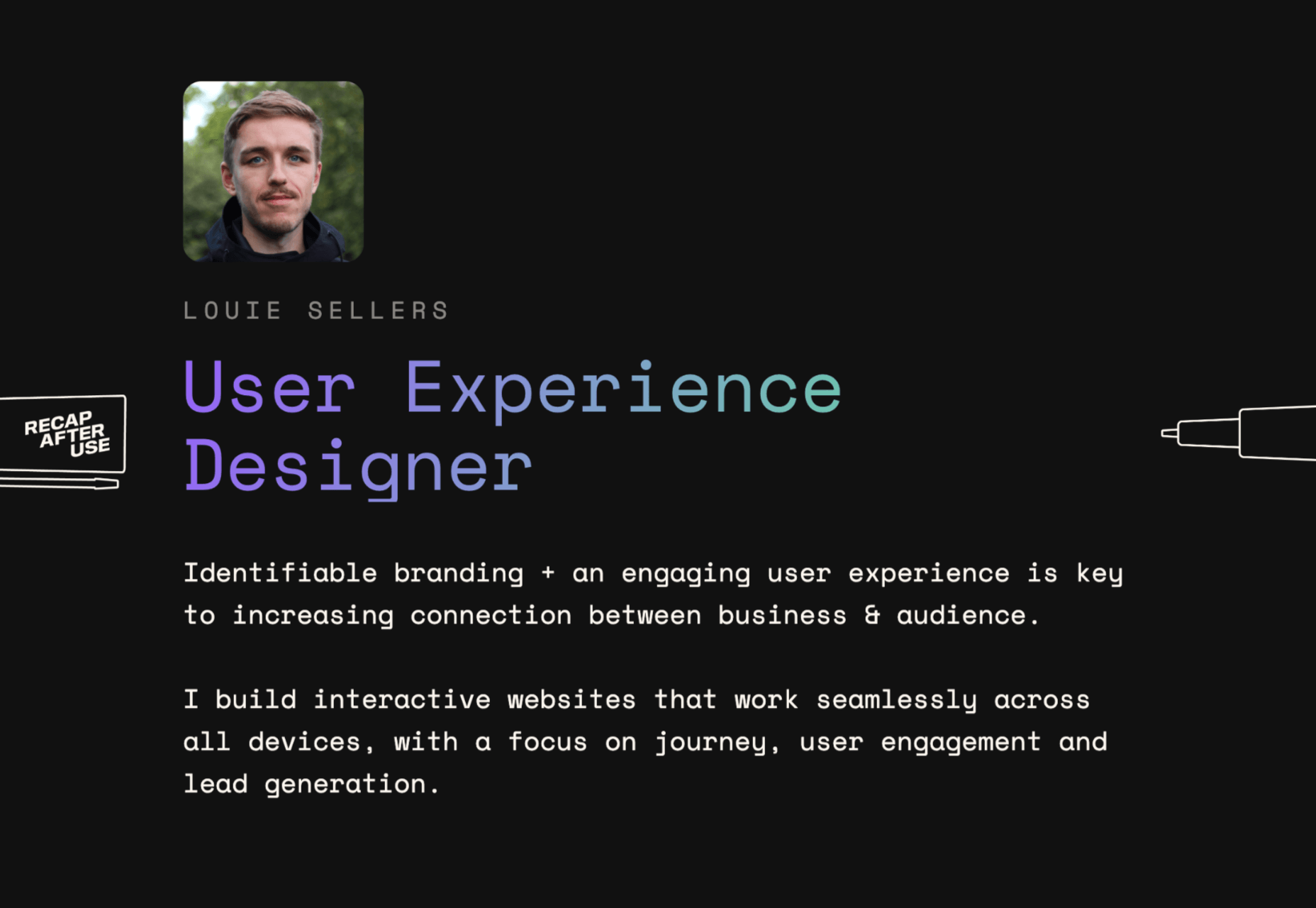
Let’s look at the “Recap After Use” website, a portfolio belonging to the innovative Louie Sellers. This website showcases Louie’s skills with attention-grabbing visuals, including a parallax animation that makes it looks like Louie is drawing the page as you scroll through it.

This is the kind of exceptional animation that makes parallax scrolling more compelling. The animation isn’t there to make a visual difference to the page – it tells you something more about the person behind the website and what they can do.

2. Parallax Increases Website Visit Times

If a website effectively tells a story with parallax animation, you can also bet that’s going to keep customers or readers on a page for longer. Reducing bounce rate by increasing engagement is one of the main goals of any web designer. (Bounce rates, of course, refer to the percentage of site visitors that hit the back button after just seeing the first page of your website.)

While some people argue that parallax websites can hurt your SEO rankings if they slow down your site, there’s also the argument that the lack of a visually engaging page can harm SEO. Bounce rates drag down your ranking and make it harder to get audience attention. 

A parallax animation that tells a story and engages your audience through carefully delivered information is a great way to keep people around – even just for a little longer than usual. For instance, if you check out Alex Dram’s portfolio page here, you’ll see several shapes coming together during the parallax scrolling animation.

The shapes merge to tell a story about the visual experiences that Alex can create for customers. It’s a way to draw the eye and connect with the viewer without just writing about what you do through text. 

3. Parallax Develops Credibility

There’s a reason why both examples of parallax scrolling we’ve looked at so far are from creative portfolios. Parallax scrolling, with its excellent storytelling capabilities, is great for demonstrating your credibility as a digital expert. Basically, it’s a version of “showing” and not “telling” customers about your skills. 

You can tell someone that you know how to use tricky techniques like parallax animation correctly, but they’re less likely to believe you that way. If you can show that you have the skills to create something amazing, that’s more engaging. 

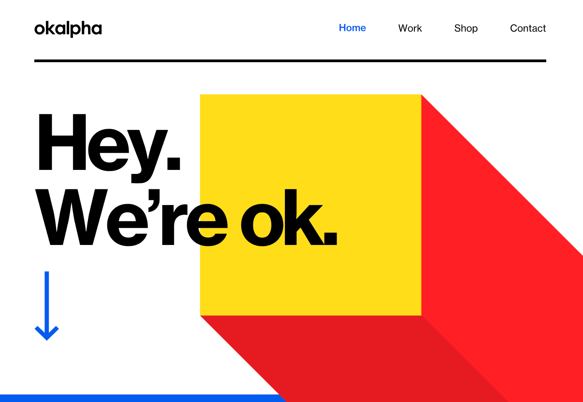
The OK Alpha team is a great company to reference when it comes to sensational design. This company seems to always be on the cutting edge of the latest trends, whether it’s bold typography or bright colors. To add to the impact of their website, the company has combined parallax effects into the mix to make everything more immersive as you scroll. 

This is a beautiful example of how companies in the design landscape can use techniques like parallax scrolling to show what they’re capable of. 

4. Parallax Makes Information More Fun

Most of us are naturally visual learners. We like to consume information in a way that’s refreshingly eye-catching and attractive. That’s why visual content generally earns more social shares and attention than written content. With parallax scrolling, companies that want to deliver valuable information and educational content to their audience can do so effectively.

Rather than just scrolling through a page and seeing lots of text, your customers can see images and graphs come to life alongside the blocks of text they’re reading. It’s like adding video demonstrations next to a textbook to help people better understand what they’re reading about. 

Look at the Web Design and Art History microsite from Webflow as an example. The company wants you to understand how web design and art have evolved over the years, but it doesn’t want to deliver that information in a boring format. The bright graphics and parallax animation work together to give you a more contextual, meaningful experience.

5. Parallax Replicates Another Medium

What if you could remind someone of their experience when reading a book or watching a video while telling them about a video or a novel? Parallax scrolling and animation can help with that. It’s a way of making your website feel like a video presentation or slideshow without the added components of implementing video players into your back end. 

Parallax scrolling also has another slight benefit over a standard video-based website. On a website that uses a video for a background, the video often plays automatically. This means that your visitors can’t control how quickly the video plays. 

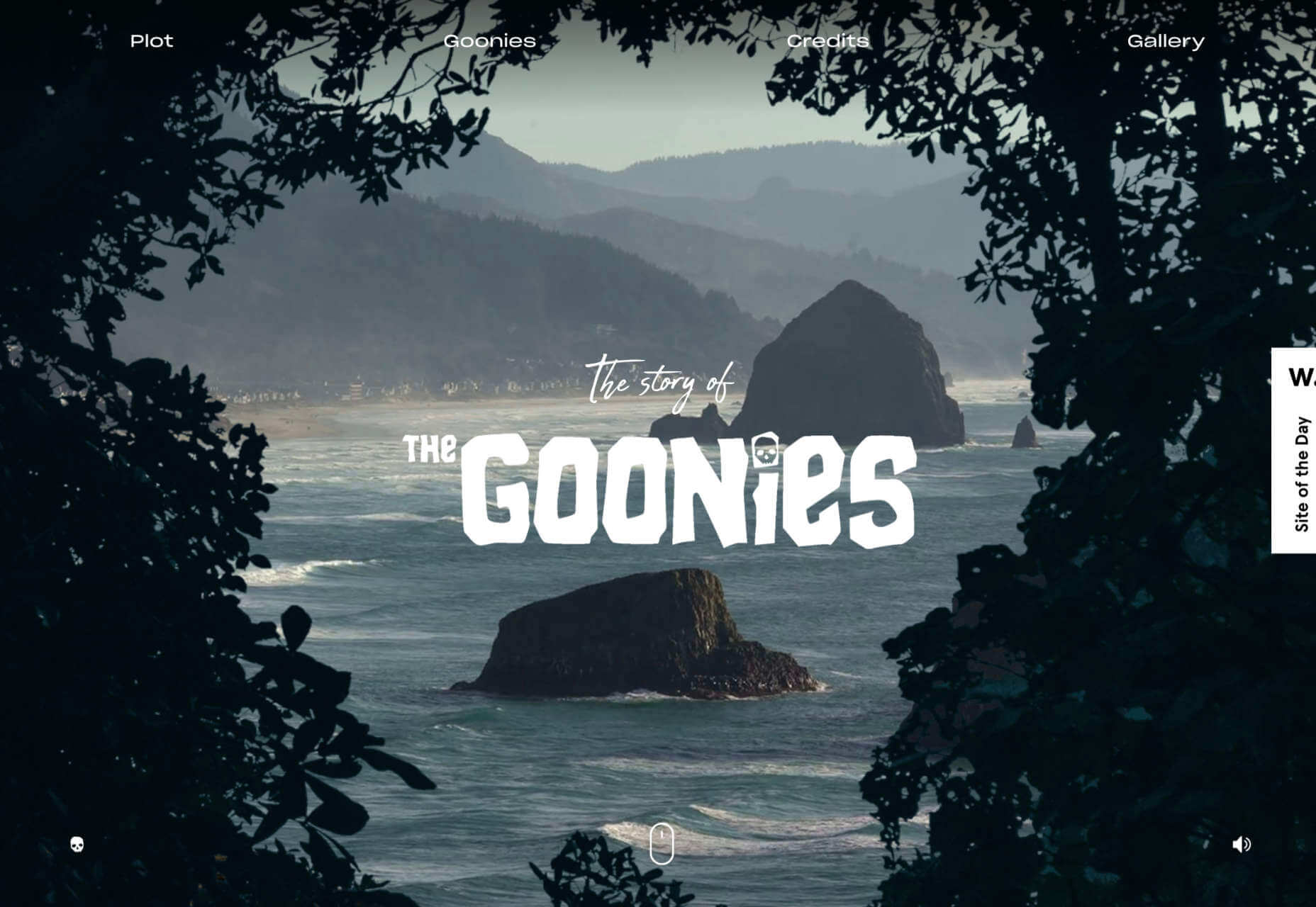
On the other hand, parallax animations driven by scrolling action allow your customer to collect information at a pace that suits them. Take a look at the Story of the Goonies website, for instance. This stunning parallax site introduces you to the details you need to know about the movie in a way that makes it feel like the intro to a film.

The great thing about the parallax on this site is that the slow video-style design also gives you a dose of nostalgia – which ties in perfectly with the movie. 

6. Parallax Is More Memorable

What’s the main reason any designer does anything special to a website? To make it stand out, of course. Web design is all about conveying the unique essence of a brand, business, or entity in a way that’s going to make that client unforgettable. Although parallax isn’t as novel as it once was, it can still be a way to make your site stand out – if it’s used correctly. 

The key to success with parallax scrolling for memorability is making it smart. The layout needs to feel simple and intuitive. Everything needs to work well together, from the lightly shifting font to the various parallax effects that work together to draw the viewer’s eye (and attention). 

A great example comes from Jomor Design – another designer with a portfolio that really grabs your focus from the first second. The layout is beautifully done, with plenty of mini moments for engagement and interactions throughout. As you scroll through the site, you get a better idea of what the designer is all about. The little moments of animation make the whole experience so much more memorable. 

When your site is more memorable and engaging than that of your competition, you can drive many major benefits for your brand, including an improved bounce rate.

What To Remember When Using Parallax

Parallax is just like any other design technique. There are ways you can do it wonderfully, which engage and delight your audience. However, there are also a lot of areas where you can easily go wrong. When using any design element, the main thing to remember is that the primary focus should always be your users’ experiences. Parallax shouldn’t just be a way to show off your design knowledge. It’s just another feature that you can use to create an amazing website. 

Remember that user experience and visual appeal need to work perfectly together for parallax to work. If scrolling through the page is practically impossible for people on a mobile device, then you’re not going to get the results you want. If it’s difficult to take in the message you’re trying to send because the content is moving too quickly, again, your users will suffer. 

Remember the following tips:

  • Simple is better: Reduce the amount of content and visual elements on your page whenever you can. The less information there is to capture your customer’s attention, the less likely it is that you’re going to end up with a problem. 
  • Compress file sizes: Make sure that you’re not reducing the speed of your website by creating a huge single page with tons of high-quality images. You’re going to need to use the smallest possible file sizes. 
  • Check responsiveness: Make sure that the parallax effect works just as well on your smartphone or tablet as it would on a desktop. As more people move their browsing experiences into their palms, you can’t afford to ignore responsivity. 
  • Find the “wow”: Look at these examples of parallax websites. Every one stands out because it does something special with the scrolling effect. If you’re going to be using this strategy with your website, you need to make sure it’s worth the effort. Don’t just follow the same guidelines as everything else. Find the idea that’s going to make people take notice.

Source

The post 6 Ways Parallax Still Works in 2021  first appeared on Webdesigner Depot.


Source de l’article sur Webdesignerdepot

Spring and fresh designs are in the air. This month, it’s obvious that designers are feeling creative with new and interesting concepts that range from a new style for cards, homepage experimentation with multiple entry points or calls to action, and risky typography options.

Here’s what’s trending in design this month.

1. “Flat” Cards

Card-style design elements that allow users to click through to other content aren’t new, but the design of these cards is fresh and interesting.

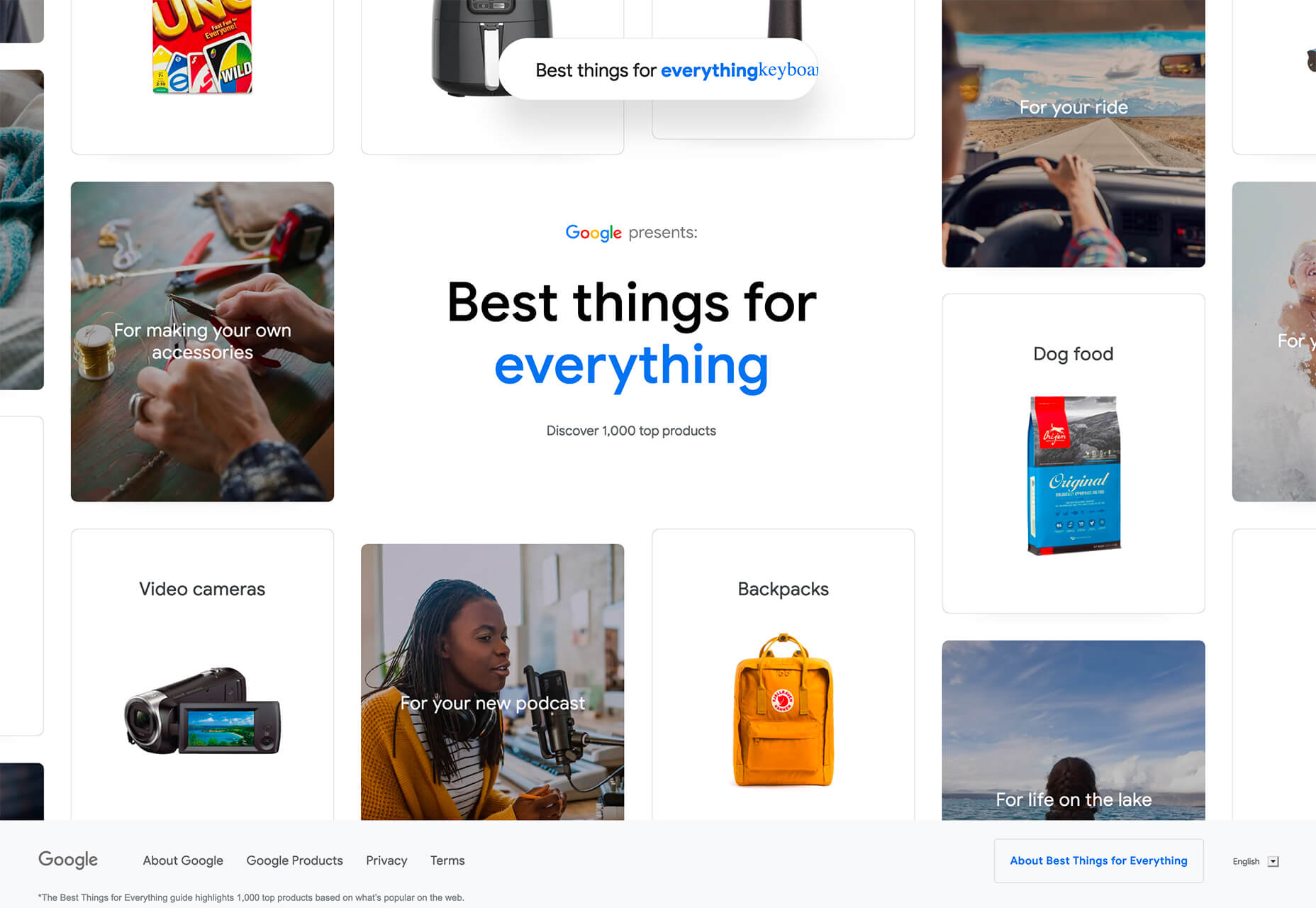
Rather than more heavily designed cards with shadows and layers of content, flat styles are trending. Expect this trend to explode thanks to usage by Google for a shopping experience page.

The Google example below is interesting because Google’s Material Design guidelines are what helped card-style elements grow in popularity previously. However, those cards did include more layers, color options, buttons inside the cards, and shadows.

Today’s trending cards are completely flat. And beautiful.

Each of these websites does it in a slightly different way.

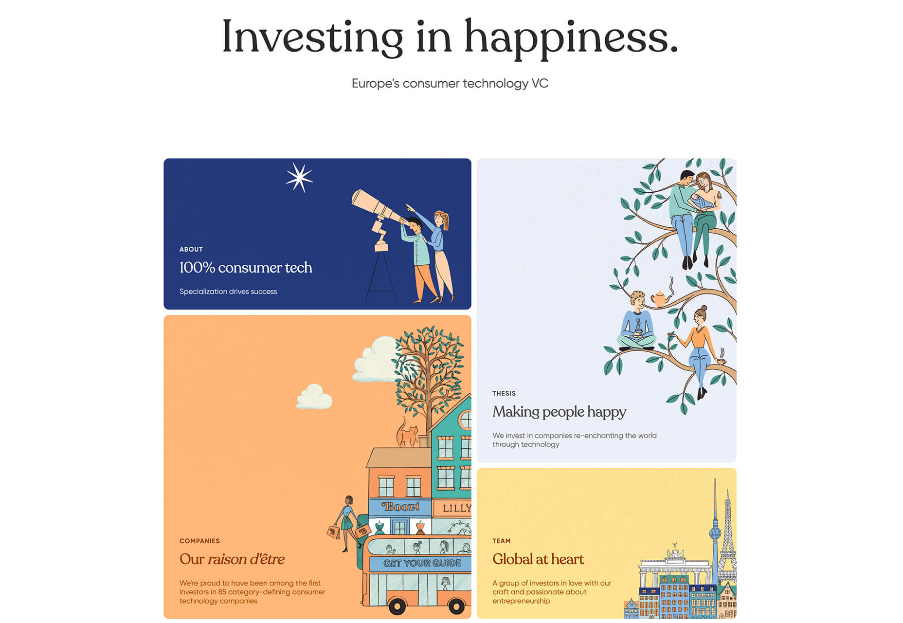
Heartcore, a consumer technology VC company, uses a series of flat cards as a navigation element to help users find their way through the website. Each features a bright color background with an illustration and a simple text block.

Each card has a nice hover state where only the illustration zooms inside the card frame. This is an interesting effect because it is exactly the opposite of the previous iteration of cards, which zoomed the entire card as a hover state.

Google Shopping uses that whole card bounce hover state (plus a not-so-flat shadow) for each card. The initial design is sleek with the pairing of white and image cards with simple text in each. You are enticed to click around to see what happens.

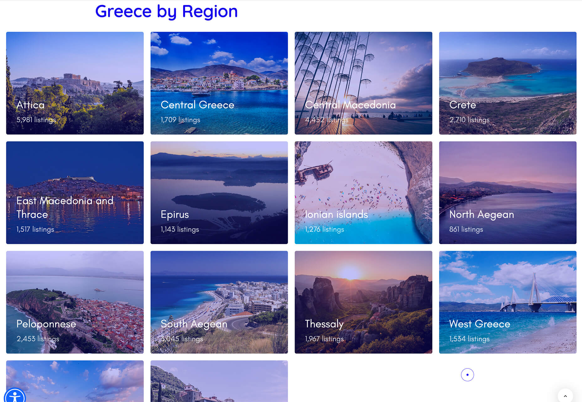
Click on Greece is a travel website design that uses simple cards with a minimal color and text overlay. The consistency of these cards makes the design pop and the beauty of the images draw you in. Each card also has a hover state with a darker color mask to guide navigation and make text elements easier to read.

2. Multiple Homepage Entry Points

For a long time, designers have been working off the philosophy that the homepage should have one direct entry point, creating a direct funnel for the user experience.

These designs throw that idea out the window, with multiple entry points and click elements.

You can think of it as the “create your own adventure” option for these designs.

It can be a risky concept if you are diving into analytics to pay attention to user paths. You want to make sure you know what choices users are making so that you can help them on the journey to the content and information that you want them to get from the visit.

But this type of design scheme does feel somewhat personalized, putting the user in more control.

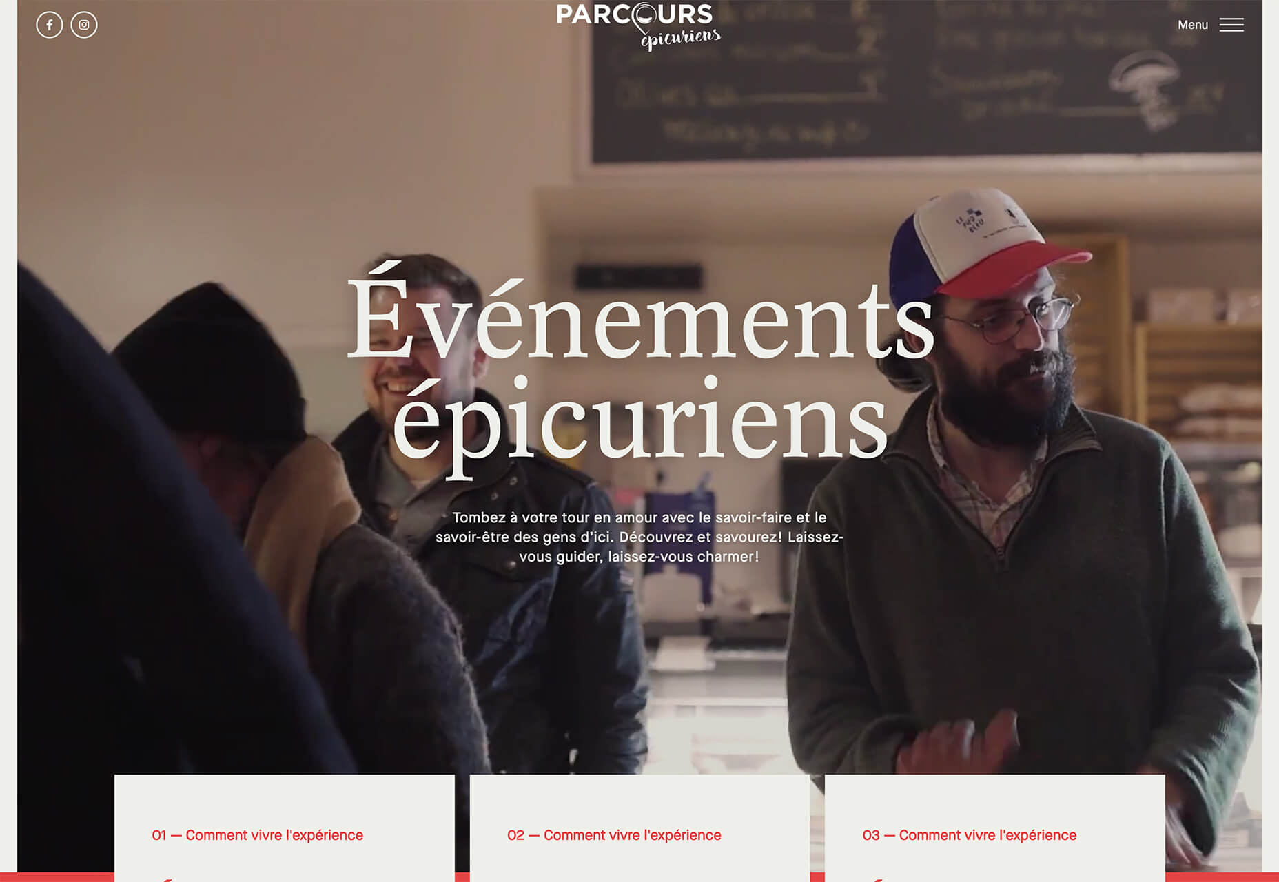
Parcouse Epicuriens uses three flat card-style elements to help users pick what they want to see from the home page. There’s no other button or direct call to action, which is somewhat uncommon in today’s website design landscape. Users have to pick from one of the cards, scroll, or enter using the hamburger menu icon.

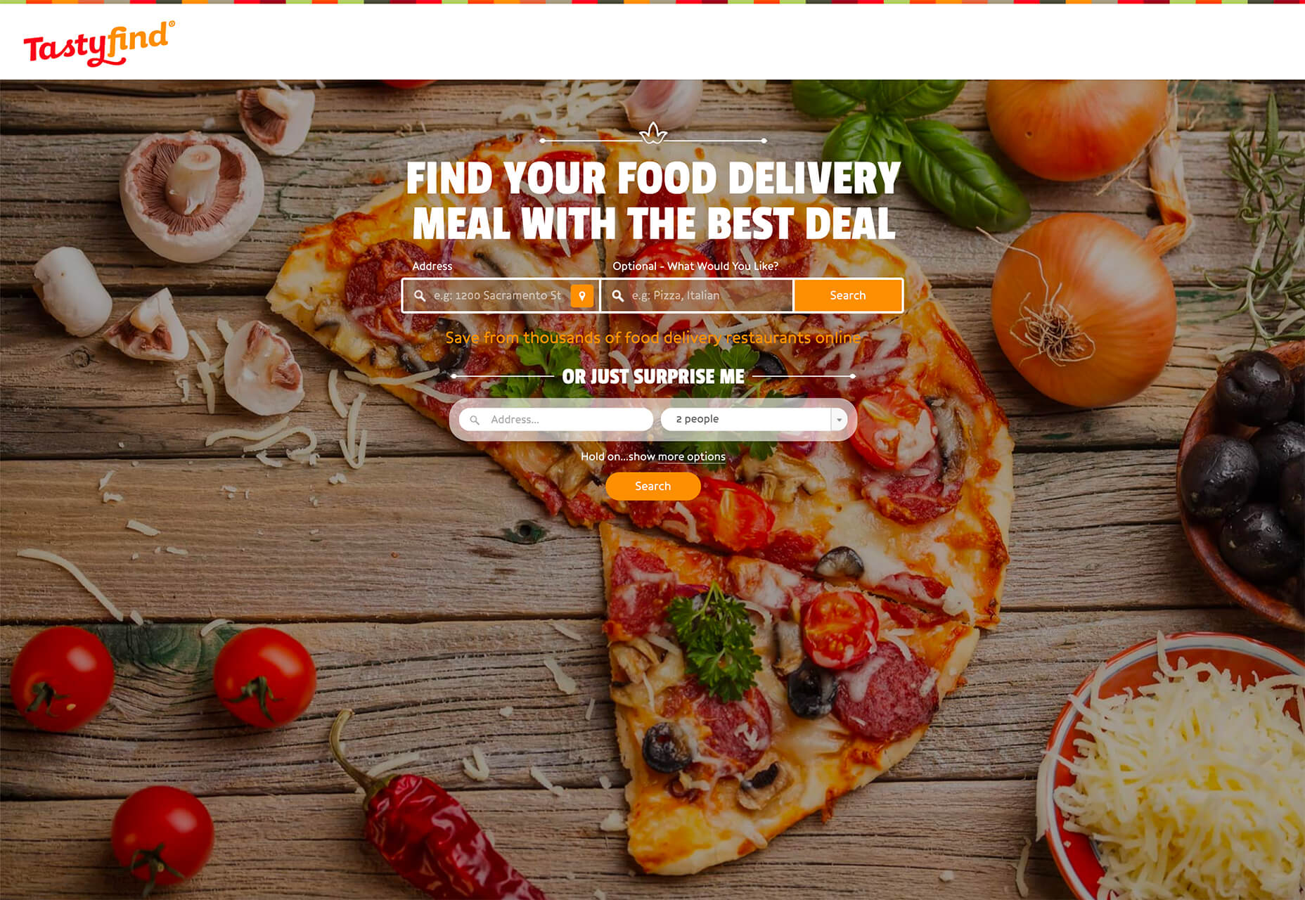
Tasty Find uses search options to help users start their journey. What’s interesting here are the choices – search for the food you want, pick something random, or (in the small print) find even more options. Users get three choices to begin their journey with the website.

What’s interesting is how simple this complex user journey looks. The design is easy to digest, but so many options could overwhelm users. This is one of those situations where you have to watch return search data and information and weigh the risk versus the reward of so much choice. It’ll be interesting to watch this design over time and see if the options decrease in number.

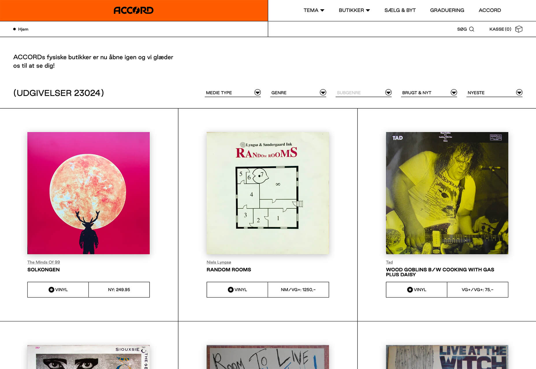
Accord also has several levels of user engagement opportunity. Option 1: Every block contains a click element. Option 2: Use the search at the top to narrow choices. This is an interesting configuration as the homepage for an e-commerce website because they get right to product selection and shopping without a softer sell or introduction.

3. Risky Typography

Typographic risk has been an ongoing theme for a little while. Designers are embracing experimental and novelty typefaces to stand out in the cluttered website space. Sometimes it works beautifully, and other times, it can fall short.

Here, each of these trending website designs uses a risky typography treatment. The risks are a little different for each design, from readability to comprehension to font delivery.

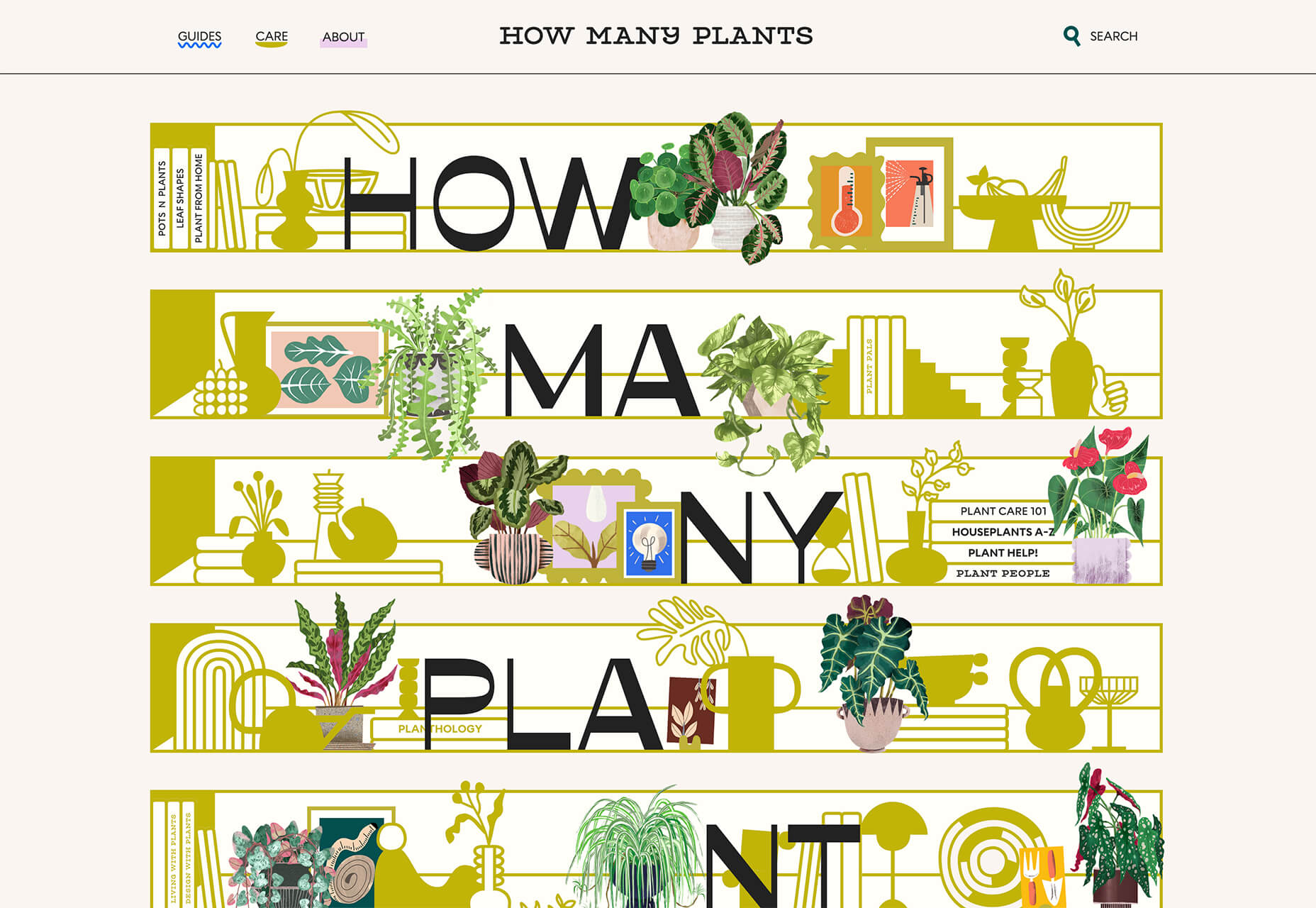
How Many Plants has duel typography risks: A funky typeface paired with odd word breaks. Interestingly enough, readability isn’t as big of a concern as you might think. This is likely because there aren’t many words, and they are short. Plus, the imagery ties in nicely.

Do you notice a similarity between How Many Plants and The Great Lake? The typography has the same style with a blocky, slab, sans serif with alternating thick and thin strokes. (It’s the same font.)

The risk in the typography design for The Great Lake isn’t in the homepage display, although you might wonder what the design is about. It is carrying this font throughout the design. While it looks great large and with only a few words, it gets a little more difficult the more you see it. This type of mental reading weight can be difficult for visitors over time, creating an element of risk.

Zmaslo uses an interesting typeface with a liquid effect on top of an unusual word. That combination of text elements makes you think hard to read the homepage, despite its neat looks. The risk here is weighing visual interest against comprehension. Depending on the audience, this risk can be worth the chance.

Conclusion

Spring always seems to be that time of year where designers start thinking about new, fresh design elements. That might explain some of the “riskier” design choices and experimentation here.

Regardless of the motivation, it is always fun to see the creative stretch happen. It can be even more interesting to see what elements from these trends continue to grow in the coming months.

Source

The post 3 Essential Design Trends, May 2021 first appeared on Webdesigner Depot.


Source de l’article sur Webdesignerdepot

NEW YORK et WALLDORF – Accenture (NYSE : ACN) et SAP SE (NYSE : SAP) étendent leur partenariat de plusieurs décennies pour aider les entreprises à intégrer le développement durable à l’ensemble de leurs activités, de la stratégie à l’exécution, afin de dégager une nouvelle valeur au sein de leurs entreprises et de leurs chaînes de valeur et d’approvisionnement.

En associant la technologie SAP aux services de développement durable d’Accenture et à leur vaste connaissance du secteur, les partenaires élargissent leur alliance afin de créer conjointement de nouvelles solutions qui permettront aux entreprises d’accélérer la dé-carbonisation complète de leurs chaînes d’approvisionnement et d’obtenir leur part des 4 500 milliards de dollars de croissance économique que l’économie circulaire pourrait générer*.

Grâce à ce partenariat étendu, Accenture et SAP prévoient de co-innover et de co-développer la nouvelle solution de SAP pour la production et la conception responsables, qui comprend des fonctionnalités aidant les entreprises à intégrer des mesures de durabilité dans leurs chaînes de valeur et d’approvisionnement, en mettant l’accent sur la conception et la fabrication des produits. Grâce à des données intégrées provenant de l’ensemble des opérations, les entreprises peuvent mieux concevoir et fabriquer des produits produisant moins de déchets, plus recyclables et contenant davantage de matières recyclées. Cela contribuera également à réduire le coût croissant de la conformité induit par les nouvelles réglementations en matière d’emballage et de responsabilité élargie des producteurs (REP).

« Notre collaboration permettra aux clients de SAP, qui comprennent 92% des Forbes Global 2000, d’utiliser leurs systèmes centraux pour les aider à mener leur programme de développement durable, à optimiser leurs performances ESG et à atteindre leurs objectifs », a déclaré Julie Sweet, chief executive officer d’Accenture. « Cette collaboration élargie s’appuie sur notre longue histoire avec SAP – notamment notre partenariat conjoint avec le Pacte mondial des Nations unies et 3M – et sur notre engagement commun à favoriser la réalisation des objectifs de développement durable. »

Accenture soutient également l’initiative Climate 21 de SAP, qui permet aux entreprises de tout secteur d’activité d’utiliser des outils d’analyse pour mesurer et minimiser les émissions de dioxyde de carbone (CO2) et réduire l’empreinte carbone tout au long du cycle de vie des produits. Par exemple, les recherches montrent que les émissions des fournisseurs en amont sont en moyenne plus de cinq fois supérieures à celles des opérations directes**. Grâce à l’ajout de mesures de durabilité dans l’ensemble de la chaîne d’approvisionnement de bout en bout, les entreprises disposent d’une vision intégrée des économies environnementales et de l’impact des coûts et peuvent plus facilement optimiser leurs opérations.

« Pour réussir à lutter contre la plus grande menace qui pèse sur notre monde aujourd’hui, nous devons collaborer à tous les niveaux de l’entreprise et de la société « , a déclaré Christian Klein, chief executive officer de SAP. « En s’appuyant sur notre partenariat de longue date et de confiance, SAP et Accenture unissent leurs forces pour aider nos clients à réaliser une croissance à long terme de manière durable. Nous apportons une visibilité sur l’impact environnemental de l’ensemble de la chaîne de valeur, en fournissant aux entreprises les informations dont elles ont besoin pour prendre les bonnes mesures et accélérer leur transition vers l’économie circulaire. »

Le mois dernier, SAP et Accenture ont donné le coup d’envoi d’un programme d’accélération mondial axé sur le développement durable au sein de SAP.iO Foundries. Le programme Sustainable Future, la plus grande cohorte de SAP.iO à ce jour, vise à aider les startups B2B en phase de démarrage à favoriser la transformation numérique et l’innovation dans quatre domaines cibles : le suivi et le commerce du carbone, l’efficacité des ressources, le suivi et l’atténuation des risques climatiques et l’économie circulaire. Treize startups ont été sélectionnées pour travailler avec SAP.iO Foundries Berlin et Munich, en tandem avec des experts d’Accenture et des entreprises leaders dans divers secteurs.

« La mise en œuvre de la gestion durable de la chaîne d’approvisionnement et des principes de l’économie circulaire est une tâche incroyablement difficile pour les entreprises, compte tenu de la diversité des questions ESG et des multiples parties prenantes concernées », a déclaré Bjoern Stengel,  senior research analyst, Worldwide Business Consulting and ESG Business Services chez IDC. « Selon les recherches d’IDC, les questions relatives au processus de création de valeur des entreprises (conception et gestion du cycle de vie des produits, approvisionnement en matières premières, etc.) sont les sujets d’ESG qui généreront le plus de demande à court terme. Cette nouvelle offre d’Accenture et de SAP permet aux clients de générer des informations critiques, fondées sur des données, de bout en bout, qui prennent en compte les paramètres non financiers nécessaires pour construire des chaînes d’approvisionnement durables et aider les entreprises à créer une valeur partagée. »

Cette collaboration est la dernière d’une série d’initiatives d’Accenture et de SAP qui aident les entreprises à tirer de la valeur du développement durable. Le Pacte mondial des Nations unies, avec le soutien d’Accenture et de SAP SE, en faveur des objectifs de développement durable (ODD), a lancé SDG Ambition en janvier 2020 et a publié les guides SDG Ambition et Integration en septembre 2020. Ensemble, grâce au SDG Ambition Accelerator qui a débuté en février 2021, plus de 600 entreprises dans 65 pays sont en train de monter en compétences pour appliquer ces outils à leurs activités.

À propos d’Accenture

Accenture est un des leaders mondiaux des services aux entreprises et administrations, avec une expertise de pointe dans les domaines du numérique, du cloud et de la sécurité. Combinant une expérience unique et une expertise spécialisée dans plus de 40 secteurs d’activité, Accenture s’appuie sur le plus grand réseau international de centres de technologie avancée et d’opérations intelligentes pour offrir à ses clients des services Strategy & Consulting, Interactive, Technology et Operations. Avec 537 000 employés, Accenture s’engage chaque jour auprès de ses clients dans plus de 120 pays, à réaliser la promesse de la technologie alliée à l’ingéniosité humaine. Accenture s’appuie sur le changement pour générer de la valeur et créer une réussite partagée avec ses clients, ses collaborateurs, ses actionnaires, ses partenaires et ses communautés.
Site Internet : www.accenture.com/fr

À propos de SAP

La stratégie de SAP vise à aider chaque organisation à fonctionner en “entreprise intelligente”. En tant que leader du marché des logiciels d’application d’entreprise, nous aidons les entreprises de toutes tailles et de tous secteurs à opérer au mieux : 77 % des transactions commerciales mondiales entrent en contact avec un système SAP®. Nos technologies de Machine Learning, d’Internet des objets (IoT) et d’analytique avancées aident nos clients à transformer leurs activités en “entreprises intelligentes”. SAP permet aux personnes et aux organisations d’avoir une vision approfondie de leur business et favorise la collaboration afin qu’elles puissent garder une longueur d’avance sur leurs concurrents. Nous simplifions la technologie afin que les entreprises puissent utiliser nos logiciels comme elles le souhaitent – sans interruption. Notre suite d’applications et de services de bout en bout permet aux clients privés et publics de 25 secteurs d’activité dans le monde de fonctionner de manière rentable, de s’adapter en permanence et de faire la différence. Avec son réseau mondial de clients, partenaires, employés et leaders d’opinion, SAP aide le monde à mieux fonctionner et à améliorer la vie de chacun.

Pour plus d’informations, visitez le site www.sap.com .

Contacts presse SAP
Daniel Margato, Directeur Communication : 06 64 25 38 08 – daniel.margato@sap.com
Pauline Barriere : 06.13.73.93.11 – presse-sap@publicisconsultants.com
SAP News Center. Suivez SAP sur Twitter : @SAPNews.

The post Accenture et SAP vont aider les entreprises à accélérer leur transformation en matière de développement durable, à créer de nouvelles sources de valeur et à se positionner comme leader en matière d’économie circulaire appeared first on SAP France News.

Source de l’article sur sap.com

Le changement climatique, l’utilisation des matériaux, la pollution de l’air, les déchets solides et la disponibilité des ressources sont les principaux freins au développement durable que les dirigeants d’entreprise ont identifiés comme nécessitant des investissements, selon une nouvelle étude mondiale parrainée par SAP SE (NYSE : SAP). En effet, la mise en œuvre et l’élargissement des plans d’action sur ces sujets restent des obstacles rencontrés par beaucoup d’entre eux.

« Préserver l’environnement à l’échelle planétaire : Une enquête sur les moteurs et les actions des entreprises » explore les mesures prises par les entreprises pour protéger l’environnement et les défis auxquels elles sont confrontées. L’étude sera commentée lors du SAP Sustainability Summit, les 28 et 29 avril prochain. Le sommet se concentrera sur la manière dont les entreprises réduisent leur empreinte environnementale et gèrent de manière productive des ressources limitées, tout en pilotant et en rendant compte de leurs activités de manière holistique.

L’enquête, qui s’appuie sur les commentaires de plus de 7 400 dirigeants d’entreprise, répartis dans 19 pays et 16 secteurs d’activité, a également révélé les points suivants :

  • Selon la plus grande tranche de répondants (29%), les réglementations sectorielles constituent une raison sous-jacente à l’investissement dans les enjeux environnementaux. Cependant, 27% ont cité le renforcement attendu par les publics quant aux efforts des entreprises pour le développement durable comme une forte raison sous-jacente, tandis que 26% ont cité les risques pour la réputation de l’entreprise.
  • L’engagement du PDG et du conseil d’administration, ainsi que les réglementations gouvernementales, arrivent en tête des motivations. La croissance du chiffre d’affaires et des bénéfices arrive juste derrière, ce qui démontre que les actions environnementales sont influencées par des pressions internes et externes.
  • L’incertitude quant à la manière d’intégrer la durabilité dans les processus commerciaux et les systèmes informatiques est considérée comme le principal obstacle à la mise en œuvre des plans d’action (35 %). L’alignement des actions proposées dans la stratégie globale de l’entreprise (34%) arrive en deuxième position, suivi de la difficulté à prouver le retour sur investissement de ces investissements (33%).
  • Seuls 21% des personnes interrogées se disent entièrement satisfaites de la qualité des données relatives aux problèmes environnementaux, la raison principale étant le manque de confiance dans le fait que les données sont complètes et couvrent le champ d’application requis.

« Les résultats de cette étude montrent que 83 % des entreprises ne pensent pas que les impacts environnementaux sont importants pour leur activité à l’heure actuelle », a déclaré Daniel Schmid, Chief Sustainability Officer, SAP. « Les entreprises doivent reconnaître que les questions environnementales sont désormais importantes. Avec un pourcentage croissant de consommateurs qui portent attention aux valeurs et à l’éthique des entreprises auprès desquelles ils achètent, nous avons la lourde responsabilité d’aider les organisations à mieux comprendre les impacts commerciaux de la crise climatique, à surmonter les obstacles identifiés dans ce rapport et à accélérer leur progression vers l’action en faveur du climat. »

Inscrivez-vous à l’événement virtuel en direct ici. Pour être informé de la publication des résultats finaux de l’enquête, veuillez consulter et vous abonner à SAP Insights.

À propos de SAP

La stratégie de SAP vise à aider chaque organisation à fonctionner en “entreprise intelligente”. En tant que leader du marché des logiciels d’application d’entreprise, nous aidons les entreprises de toutes tailles et de tous secteurs à opérer au mieux : 77 % des transactions commerciales mondiales entrent en contact avec un système SAP®. Nos technologies de Machine Learning, d’Internet des objets (IoT) et d’analytique avancées aident nos clients à transformer leurs activités en “entreprises intelligentes”. SAP permet aux personnes et aux organisations d’avoir une vision approfondie de leur business et favorise la collaboration afin qu’elles puissent garder une longueur d’avance sur leurs concurrents. Nous simplifions la technologie afin que les entreprises puissent utiliser nos logiciels comme elles le souhaitent – sans interruption. Notre suite d’applications et de services de bout en bout permet aux clients privés et publics de 25 secteurs d’activité dans le monde de fonctionner de manière rentable, de s’adapter en permanence et de faire la différence. Avec son réseau mondial de clients, partenaires, employés et leaders d’opinion, SAP aide le monde à mieux fonctionner et à améliorer la vie de chacun.

Pour plus d’informations, visitez le site www.sap.com .

Contacts presse SAP
Daniel Margato, Directeur Communication : 06 64 25 38 08 – daniel.margato@sap.com
Pauline Barriere : 06.13.73.93.11 – presse-sap@publicisconsultants.com


The post Les actions en faveur du développement durable restent difficiles à mettre en œuvre, selon une nouvelle étude de SAP appeared first on SAP France News.

Source de l’article sur sap.com