Articles

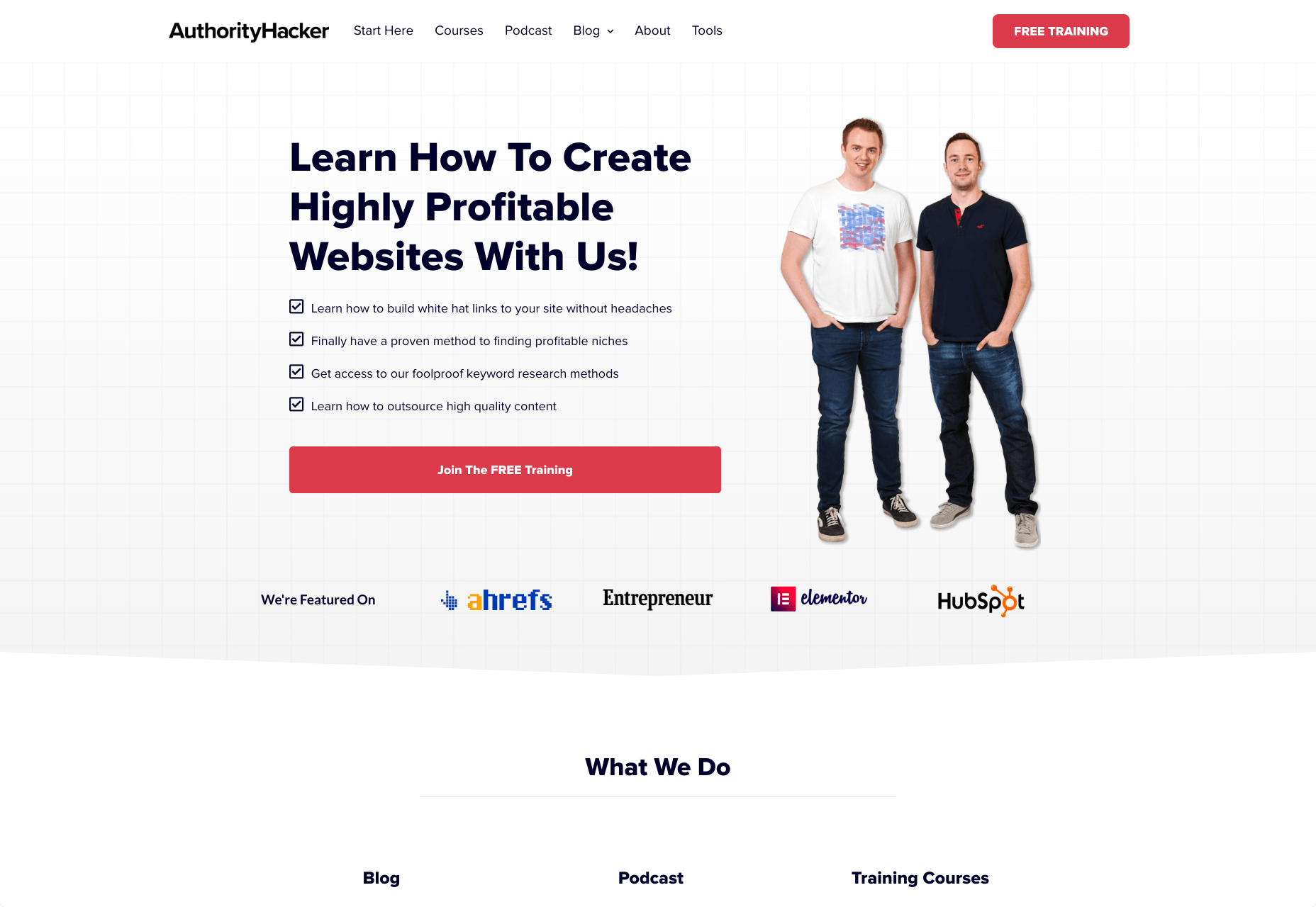
Designing for emotion in and of itself is not a problem. Websites are bound to elicit an emotional reaction from visitors, even if it’s as simple as them feeling at ease because of the soft, pastel color palette you’ve designed the site with.

I don’t want to outright villainize emotional design. Unless there is some form of unethical manipulation at play, designing for your visitors’ emotions can actually provide them with a more positive experience.

So, here’s what I’d like to look at today:

  1. What is emotional design?
  2. When does emotional design cross a line?
  3. What’s the right way to design for emotions?

1. What Is Emotional Design?

When we look at emotional design in the context of a website, we’re focused on three types of emotional reactions:

a. Visceral Reactions

Visceral reactions are instinctive ones. Usually, visitors experience these as their first impressions of a website or web page. For instance, a cluttered or otherwise poorly designed homepage might leave visitors feeling overwhelmed, hesitant, or wanting to flea.

A minimally designed homepage interface, on the other hand, might have visitors not feeling much of a reaction at all. In this case, no feeling is a good feeling.

Like Irene Au said:

b. Behavioral Reactions

Behavioral reactions stem from the usability of a website. There’s a lot that can stir up negative emotions here, like:

  • Extra-long contact forms
  • Confusing menus
  • Error-ridden content
  • Slow-loading pages
  • And more

Again, if a website is easy to get through and attractively designed, visitors aren’t likely going to “ooh” and “aah” with every step they take on the site. And that’s a good thing. If they’re focusing more on how the design looks, they’re not paying attention to the brand’s actual offer.

c. Reflective Reactions

Reflective reactions are the third type of emotions we design for.

This is complicated because there’s a lot wrapped up in how visitors feel about a website after the fact. Sometimes the most well-designed interfaces and experiences can’t save them from a bad experience, whether they realized too late that the products were overpriced or they were treated poorly by a live chat representative.

As a web designer, all you can really do is to make sure you’re working with reputable companies and then aligning the designs of their sites with their values.

When Does Emotional Design Cross a Line?

There’s already enough social pressure online; your website doesn’t need to be one of those places, too

Emotional design shouldn’t be about manipulating consumers’ emotions. In most cases, emotional design is about controlling the environment of the website so that emotions don’t go spinning wildly out of control — in either direction.

It’s when we take what we know about influencing someone’s emotional state to monetarily benefit from it that emotional design becomes problematic.

Here are some ways in which you might negatively impact the emotions of your visitors through design:

FOMO

The fear-of-missing-out isn’t always a bad marketing strategy. However, when FOMO is used for the purposes of rushing consumers to take action now and without time to really think it through, it definitely can be.

Chances are good they’ll feel badly no matter what. Either because they regret the rushed (and probably unnecessary, or expensive) decision or they blame themselves for missing out on an opportunity to be like everyone else.

There’s already enough social pressure online; your website doesn’t need to be one of those places, too. So, be careful with how you present customers with limits (on time, on products, etc.) or how you frame the call-to-action (“If you don’t buy this now, expect to fail/be miserable/suffer even more”).

Analysis Paralysis

It doesn’t matter why people specifically seek out your website. They have a problem or a hole in their life, and they’re looking for something to fix it.

Now, you can’t help it if the website has too much to offer in the way of options or solutions. Companies have to provide every possible solution/option so their users don’t feel like they have to go somewhere else to get what they need. However, the way you design these options can lead to a negative emotional state if you’re not careful.

For instance, your visitors might experience analysis paralysis, where there are so many options that it becomes impossible to take action. Similar to FOMO, this can lead to regret either with the decision they made or the one they were incapable of making.

By simplifying how many choices are presented at once, or designing a clear and supportive pathway to the right option of many, your website will leave visitors feeling much more positively about the whole experience.

Trendy Nostalgia

Nostalgia can be a great way to play upon the positive associations and emotions consumers feel towards an era gone by or a place they once knew. But, again, it depends on how you design with it.

For example, if you design a vintage website for an agency launched in 2019 and run by a group of 20-somethings, it might come off feeling disingenuous once customers start to catch on.

For a restaurant known as the oldest bar in the state, that would be a different story. That nostalgically designed website would be a real part of its story; not just done as a sales gimmick. As a result, customers would likely embrace those warm feelings for the “good ol’ days” they get from the website.

Also, think about how quickly nostalgia fades if it’s done to align with a trend. Unless you’re committed to redesigning a website the second that nostalgic feeling falls out of favor, you could be condemning your client to an outdated website mere months after launch.

What’s the Right Way to Design for Emotions?

Like I said before, there’s nothing wrong with designing for emotions. You just have to make sure your website visitors don’t feel manipulated and that they welcome the pleasant feelings the site gives them.

make sure your website visitors don’t feel manipulated

It might seem harmless at the time. After all, what are they doing on the site if they weren’t interested in the first place? And it’s not like they were bullied into spending their money, right?

But if they sense in any way that their response was driven by an emotion they wouldn’t have otherwise felt, they’re not going to be happy. While it might not be enough for them to cancel their subscription or services, or to return products they bought, it will definitely leave a bad taste in their mouth. And, ultimately, it can cost your website loyal visitors and customers.

So, if you’re going to use emotional design on a website, do it to improve their experience, not to put more money into your clients’ pockets. That means your emotional design choices need to be honest, transparent, and focused on eliciting naturally positive emotions like:

  • Satisfaction
  • Feeling impressed
  • Trust
  • Calm
  • Feeling valued

Go back to the three emotional reactions I brought up earlier. If you can design a website to give off a positive first impression, and to be pain-free and usable, you can spend the rest of your time injecting small bits of happiness and positivity into the website with color choices, friendly micro-interactions, personalized content, and more.


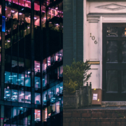
Featured image via Unsplash.

Source


Source de l’article sur Webdesignerdepot


Agile 

AI

Big Data

Cloud

Database

DevOps

Integration

  • Mulesoft 4: Continuous Delivery/Deployment With Maven by Ashok S — This article is a great example of what we want every tutorial to look like on DZone. The main aim of this article is to provide a standard mechanism to release project artifacts and deploy to Anypoint Platform, from the local machine or configure in continuous delivery pipelines.
  • Integration With Social Media Platforms Series (Part 1) by Sravan Lingam — This article helps you to build a RESTful API through MuleSoft that integrates with LinkedIn and shares a post on behalf of one’s personal account. I like this article because, in the age of social media, it’s so important for businesses to be connected and integrated!

IoT

Java

Microservices

Open Source

Performance

  • What Is Big O Notation? by Huyen Pham — Aside from a silly name, this article is an example of an in-depth analysis on a little-spoken-about concept. In this article, take a look at a short guide to get to know Big O Notation and its usages.
  • Is Python the Future of Programming? by Shormisthsa Chatterjee — Where is programming going? This article attempts to answer this question in a well-rounded way. The author writes, "Python will be the language of the future. Testers will have to upgrade their skills and learn these languages to tame the AI and ML tools".

Security

Web Dev

  • A Better Way to Learn Python by Manas Dash: There’s so many resources available for learning Python — so many that it’s difficult to find a good and flexible place to start. Check out Manas’ curated list of courses, articles, projects, etc. to get your Python journey started today. 
  • Discovering Rust by Joaquin Caro: I’m a sucker for good Rust content, as there’s still so many gaps in what’s available. Joaquin does a great job of giving readers his perspective of the language’s features in a way that traditional docs just 

Source de l’article sur DZONE

Smart design choices can help reduce the fatigue and frustration people would otherwise feel when using the web.

There are a lot of ways web designers can minimize distractions, information overload, and analysis paralysis. For instance, designing with abundant white space, shorter snippets of text, and calming color palettes all work.

One-page websites might be another design choice worth exploring.

When done right, a single-page website could be very useful in creating a simpler and more welcoming environment for today’s overwhelmed consumers.

With its diminutive structure, it would leave a unique and memorable impression on visitors. What’s more, a well-crafted one-page website would provide visitors with a clean, narrow, and logical pathway to conversion.

For those of you who use BeTheme’s pre-built sites (or are thinking about adopting them for your next site), there’s good news. In addition to the great selection of traditionally structured sites available, Be also has single-page websites for you to work with.

So, the technical aspects you’d need to master to get the one-page formula right are already taken care of.

Let’s have a look at some of the features that make single-page websites shine and how you can design them:

1. Give Visitors a Succinct Journey Through the Website and Brand’s Story

The typical business websites you design include pages like Home, About, and Contact, as well as pages that explain the company’s services or sell their products. Unless you’re building really long sales landing pages, there’s usually about 400 to 600 words on each page.

That’s still a lot of content for your visitors to get through and it can make perusing a single website an overwhelming experience. Imagine how they feel about reading through all that content when they have to do it multiple times when comparing other websites and options.

In some cases, this multi-page website structure is overkill. The information you’d otherwise fill a full page with can easily be edited down to fit a single pane or block on a one-page website and still be as useful.

Like how design and development studio Pixel Lab does it:

Pixel Lab

Notice how all the key points are hit in a concise and visually attractive manner:

  • The Featured Work portfolio
  • The About Us introduction
  • The FAQs
  • The contact form

The BeCV pre-built site is built in a similar manner (and for a similar purpose, too):

BeCV

Just remember to keep a sticky navigation bar present at all times so visitors know exactly how much content there is on the page.

2. Opt For a Non-Traditional Navigation for a Uniquely Memorable Experience

Typically, the rule is that website navigation should follow one of two patterns:

  • Logo on the left, navigation links on the right.
  • Logo on the left, hamburger menu storing the navigation on the right (for mobile or desktop).

There are a number of reasons why this layout is beneficial. Ultimately, it comes down to the predictability and comfort of having a navigation be right where visitors expect it, no matter where they end up on your website.

However, with a single-page website, this is one of those rules you can bend, so long as you have a way to keep the navigation ever-present and easy to use.

There are some great examples of one-page sites that have done this, usually opting for a stylized left-aligned sidebar that contains links to the various parts of the page. Purple Orange is just one of them:

Purple Orange

And you can use a Be pre-built site like BeHairdresser to create a similar navigation for your website:

BeHairdresser

If you’re trying to make a bold brand stand out, this is a neat layout option to experiment with.

3. Tell a More Visually Striking Story

One of the problems with building a website with WordPress is that you always have to worry about how your design decisions affect speed. Even once the code is optimized, images are usually the low-hanging fruit that have to be dealt with.

But when your website only contains one page, this means images aren’t as much of a problem (so long as you compress and resize them). It’s only when you continue to add pages, products, and galleries that you have to scale back your visual content.

So, if your brand has a strong visual identity and you want the website to show that off through images, a one-page website is a great place to do it.

Just remember to keep a good balance between text and images as Vodka A does:

Vodka A

There’s no reason for a liquor distribution company to mince words when the elegant product photos effectively communicate to consumers what it’s all about.

In fact, this image-heavy, single-page style would work well for any vendor selling a small inventory of products: food, beverages, subscription boxes, health and beauty products, etc. And you can use the pre-built BeBistro to carefully craft it:

BeBistro

4. Turn a Complex Business Idea or Offering into Something Simple to Understand

When a company sells a technical or complex solution to consumers, it can be a real struggle to explain what it does and why they should buy it.

But here’s the thing: Consumers don’t really care about all that technical stuff. Even if you were to explain how an app worked or how you use a software like Sketch or WordPress to design a website, their eyes would glaze over.

What matters most to them is that you have an effective and affordable solution that they can trust. So, why bog them down with page after page of technical specs and sales jargon?

A one-page website enables you to simplify even the most complex of solutions.

Take Critical TechWorks, for instance. It offers an advanced technological solution for the automobile industry…and, yet, this is all it needs to explain the technology at work:

Critical Techworks

If your website’s visitors are more concerned with the outcomes rather than the “how”, you’d do well to make the website and content as easy to digest as possible. And you can use a pre-built site like BeCourse to do that:

BeCourse

Notice how both of these sites take visitors through a small handful of sections (pages) before delivering them to the main attraction: the contact or sign-up form.

5. Capture Leads and Sales at Different Stages of the Sales Funnel

Some of your visitors will be brand new to the site and need more information before they pull the trigger. Others will already have a good idea of what they’re getting into and just need one small push to get them to take action.

With a single-page website, you can design each section to cater to the different kinds of leads and prospects that arrive there.

The top sections should be introductory in nature, providing new visitors with information they need to decide if this is an option worth pursuing. The sections further below should drill down into the remaining questions or concerns that interested prospects have.

Regardless of which section they’re looking at, your one-page site will have CTA buttons built in along the way that drive them to conversion the second they’re ready.

This will enable your site to always be prepared to convert leads, whether visitors read the first two sections or make their way through all of them until they reach the conversion point (e.g. a contact form, a checkout page, etc.).

You’ll find a nice example of this on the Cycle website, with CTAs strategically placed along the single-page’s design:

Cycle

BePersonalTrainer is a good pre-built site option if you want to ensure that you include a CTA button at the perfect stopping points throughout your page:

BePersonalTrainer

You won’t find them at the bottom of every section, but that’s okay. You just need them whenever your visitors are seriously thinking about taking action.

What Should You Build: A Multi-Page or One-Page Website?

Although a single-page website won’t work for larger websites (especially in ecommerce), it could work well for business websites that are on the smaller side to begin with.

By centralizing all of that information into a single page, you’ll create a fresh experience that wows visitors with how succinct yet powerful both the message and offering are.

Just be careful. Many single-page websites are poorly done (which is probably why they fell out of fashion for a while).

Remember: This is not your chance to throw web design rules out the window. In fact, this will be an opportunity to clear out the fluff and the clutter that’s accumulated over the years and to return to a more scaled-back and classic approach to design.

And with the help of Be’s pre-built one-page websites, it won’t require much work on your part to make that happen.


[– This is a sponsored post on behalf of BeTheme –]

Source


Source de l’article sur Webdesignerdepot

We are moving toward a future where everything is going to be autonomous, fast, and highly efficient. To match the pace of this fast-moving ecosystem, application delivery times will have to be accelerated, but not at the cost of quality. Achieving quality at speed is imperative and therefore quality assurance gets a lot of attention. To fulfill the demands for exceptional quality and faster time to market, automation testing will assume priority. It is becoming necessary for micro, small, and medium-sized enterprises (SMEs) to automate their testing processes. But the most crucial aspect is to choose the right test automation framework. So let’s understand what a test automation framework is.

What Is a Test Automation Framework?

A test automation framework is the scaffolding that is laid to provide an execution environment for the automation test scripts. The framework provides the user with various benefits that help them to develop, execute, and report the automation test scripts efficiently. It is more like a system that was created specifically to automate our tests. In a very simple language, we can say that a framework is a constructive blend of various guidelines, coding standards, concepts, processes, practices, project hierarchies, modularity, reporting mechanism, test data injections, etc. to pillar automation testing. Thus, the user can follow these guidelines while automating applications to take advantage of various productive results.

Source de l’article sur DZONE

Microservice is an architectural style that made up of smaller (micro) applications that communicate with each other, through open protocols like HTTP. Microservices have a much simpler and direct communication mechanism. Microservices typically deployed Docker platforms in the cloud environment will get maximum benefit.

Microservices architecture’s main aim is to break down the applications into smaller applications for maintainability and address the particular functionality. Microservices are scalable, and the maintainability of the application was as typical in monolithic applications. Below are some of the benefits of microservices architecture

Source de l’article sur DZONE

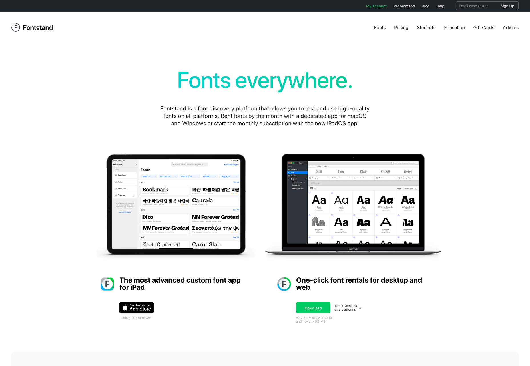
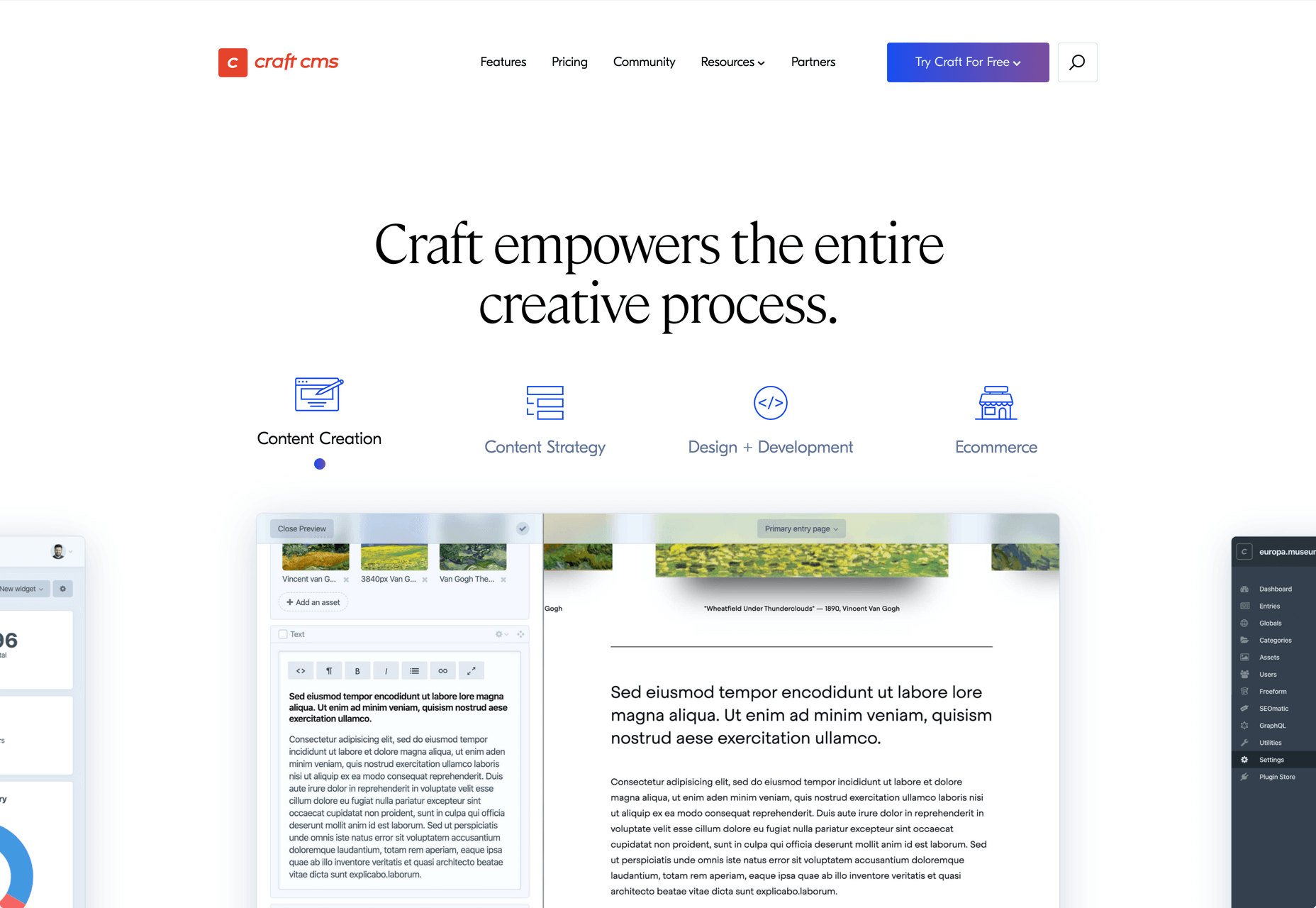
I think of a creative practice as a combination of an approach (a design philosophy) and a series of techniques (craft skills); a good tool facilitates a technique, which in turn supports an approach.

It wasn’t until I sat down to write a list of tools I can’t design without, that I realized just how many tools I rely on as an integral part of my creative process. The danger of tools is that they promote certain techniques, and that bias can alter your approach.

First and foremost a good tool does no harm, it does not dictate, or obstruct your approach. Secondly, a good tool offers flexibility in the techniques you choose. Thirdly a good tool is invisible, it leaves no marks on the end product.

If I’d written this post a year ago the list would have been different, and I hope that in a year it will be different again. These are the tools that I currently find enabling, that have contributed to my craft, and supported my approach.

Affinity Designer

I’ve always used Adobe products. Photoshop and Illustrator were the de facto graphic tools for half my life. I’ve never had an issue with the subscription licensing of Creative Cloud, which I think is proportionate for a professional set of tools. Then, around 18 months ago I got very frustrated with how sluggish Illustrator had become.

I’d written an early review of Affinity Designer, I’d been impressed at the time, so I decided to give it another try expecting the sojourn to last an hour or two before I gravitated back to Illustrator. Running the latest version of Affinity Designer was a revelation, I’ve simply never wanted to switch back.

Why not Sketch? Well, I do occasionally jump into Sketch, especially for pure vector wireframing. I was an early adopter of Sketch, but the reliability issues (long since resolved) poisoned my relationship with it. Why not Figma? Well, Figma’s real strength is in collaboration, something that I get with Sketch, and personally I find some of Figma’s features unintuitive.

Affinity Designer isn‘t perfect. I dislike the color tools, especially the gradient tool, which I find clunky. But it’s the first design app I’ve used in years that syncs closely with my creative process.

Affinity Photo

I don’t do a lot of photo manipulation, so when I switched away from Creative Cloud for design work, I was relaxed about switching from Photoshop to Affinity Photo.

In my experience, Affinity Photo is stronger than Photoshop in some areas, and weaker in others. Affinity Photo’s bitmap scaling is much better than Photoshop’s, largely due to Lanczos 3 sampling.

Affinity Photo also solves a lot of little irritations that Adobe has chosen not to address for legacy or philosophical reasons, such as the toggleable ratio setting when resizing the canvas — I’ve lost track of the hours I’ve spent in Photoshop manually calculating vertical whitespace so that it’s proportionate to the horizontal.

TinyPng

Both Affinity Photo and Photoshop are poor at web format optimizations. Photoshop perhaps has the edge, but its output certainly isn’t acceptable for production.

I run bitmaps through TinyPng, which on average halves the size of the file without any appreciable loss of quality. (It stripped 66% off the images for this post.)

Fontstand

When I started to drift away from Creative Cloud, the one service that delayed me was Adobe Fonts (née Typekit). Not so much for the webfonts — which are faster and more reliable self-hosted — but for the ability to sync desktop fonts into my design apps.

I tried Fontstand when it was first released, and I loved the concept, but was worried about the small library. When I took a second look and discovered the library is now substantial for both workhorses and experimental typefaces, it was an easy decision to switch.

Fontstand is a desktop font rental service. Once you’ve found a typeface you’re interested in, you can activate an hour-long trial, then choose to rent the font for a small fee. You can auto-renew the rental if you need to, and if you rent the font for 12 months it’s yours forever.

If there’s one tool on this list I genuinely could not design without it’s this one. Fontstand makes working with fonts from independent foundries affordable for freelancers, and it’s enriched the typographic palette available to me.

Khroma

Every designer has strengths and weaknesses. Since day one of art school, my weakness has been color. It just doesn’t come naturally to me, and I have to work quite hard at it.

An incredibly helpful tool that I’ve been using for a few months is Khroma. It helps my eyes warm up before approaching color, and helps me find a starting point that I can then refine. Comparing my design work before, and after Khroma, the latter color choices are cleaner, more vibrant, and more interesting.

Atom

A good code editor is essential, and I’ve never found one that I’m completely happy with. For years I’ve flitted back and forth between Brackets, Sublime Text, and BBEdit. I think that probably reflects the changes in the type of coding I’m doing.

For now, I’ve settled on Atom. It’s fast, reliable, and it’s not biased to front or back-end code.

CodeKit

I held out on compilers longer than I should have, using apps like Minify to minify CSS and JavaScript, and the command line to process Sass (see below). Then I found CodeKit and it’s been essential to my workflow ever since.

What I like best about CodeKit is that it’s a GUI. Which means I can change settings while coding, like toggling off the JavaScript linting, without switching mental gears into another language.

MAMP

MAMP is a tool that allows you to run a local server environment, meaning I can run PHP and MySQL without the tedious process of FTPing to a server to test a change. Mac comes with Apache, so this isn’t strictly necessary, but it’s simple to use and works well with both CodeKit and Craft (see below).

There’s a pro version of MAMP, which allows you to switch seamlessly between projects, but it’s heavily geared towards WordPress. I’m still trying to find the time to evaluate Laravel Valet.

Dash

When you first start coding you try and memorize the entire language. It’s very possible to become fluent in the core of a language, but there are always nuances, defaults, and gotchas that you miss. As you grow more experienced, you realize that all professional coders Google the answer at least once per day.

When I got tired of Googling I started using Dash which is a superb app that combines the docs of numerous different languages into a searchable window. I use it daily for everything from SVG to Twig.

LambdaTest

It doesn’t really matter what you’re building, even the indy-web needs to be tested. Ideally you’ll test on real devices, but if you can’t afford a device library — and who but the largest agencies can — you need a live testing solution.

There are a few upstarts, but your choice is basically between BrowserStack and LambdaTest. I went for LambdaTest because I prefer the style of the UI, but that’s entirely subjective. If you’re not sure, toss a coin, you’ll get the same results with both.

Sass

I can’t write CSS without Sass — and I mean that literally. If I try and write vanilla CSS I guarantee I’ll nest something with @at-root and it will throw an error.

Craft CMS

Stating any preference for a CMS online that is not WordPress inevitably invites impassioned protests from developers whose career is built on the WordPress platform. So let me say preface this by saying: if WordPress works for you, and more importantly for your clients, then more power to you; I think it’s a dog.

Shopping around for a CMS is challenging, and I’ve gone through the process several times. A good CMS needs to be in sync with your mindset, and it needs to be appropriate for your clients — all of them, because unless you’re in a large agency with multiple coders, you need to commit to a single solution in order to master it.

I have looked and looked, and finally settled on Craft CMS. Craft makes it easy to build and maintain complex, high-performance sites. It has a shallow learning curve that grows exponentially steeper, making it easy to get started with plenty of room to grow.

Vue.js

Way back when Flash went kaput I switched to jQuery, and that was a really easy route into JavaScript — ignore the people who tell you to master the core language first, do whatever it takes to start using a language, that’s how you learn. But jQuery is heavy, and I found I needed it less and less.

These days 90% of the JavaScript I write is progressive enhancements in vanilla JavaScript to keep the dependencies low. Occasionally I encounter a job that requires complex state management, and then I fall back on Vue.js. JavaScript developers are as partisan as CMS aficionados, so let’s just say I favor Vue.js because it’s not controlled by a mega-corp and leave it at that.

Ulysses

As editor at WDD, I cannot emphasize enough that the right way to write copy for the web is markdown.

Markdown is faster to write so you don’t lose the thread of your thought process, and it doesn’t impose formatting so you can easily migrate to a CMS. If you’ve ever spent 20 minutes stripping the class, id, and style tags out of a file created in Word, Pages, or (by far the worst offender) Google Docs, then you don’t need to be sold on this point.

There are a few markdown-based writing apps available, I tested half a dozen, and the one I settled on was Ulysses. I like its distraction-free mode, I love its clean exports. Everything I write, I write in Ulysses.

Screenshot Plus

Much like markdown editors, there’s no shortage of screenshot apps. My current favorite is Screenshot Plus.

Screenshot Plus has one feature that makes it standout for me, and that is its Workflows. It sounds like a small problem, but when you’re taking screenshots of a dozen sites, the extra clicks to save, switch to your editor, and open the file are laborious. I have several workflows setup in Screenshot Plus that allow me to take a screenshot, save it to a specified folder on my local machine, and then open it in Affinity Photo, all with a single click.

Spark

I get a lot of email, a lot. At one point the influx was so bad I was using multiple email apps to segment it. Yes, I use Slack daily, but it doesn’t eliminate the need for email.

I‘ve been using Spark for around six months and it’s radically sped up my workflow. I’m a big fan of the smart inbox that allows me to compartmentalize email like newsletters, and email that warrants a reply. I like that I can switch to a chronological list if I’m looking for something specific. I love the ability to pin, or snooze messages, which helps me triage my inbox.

Todoist

I’m one of those people who can’t make it through the day without being organized. I need lists and sublists, and I need something native that opens automatically when I boot my Mac, and something that sits on the home screen of my Android.

There are as many to-do apps as there are things to do. When I’m working in a team I’ll use whichever task-tracking system it prefers. But by choice I always use Todoist thanks to its balance of simplicity and power. At this point it’s something of a meta-tool, and the app I open first every morning.

Source


Source de l’article sur Webdesignerdepot

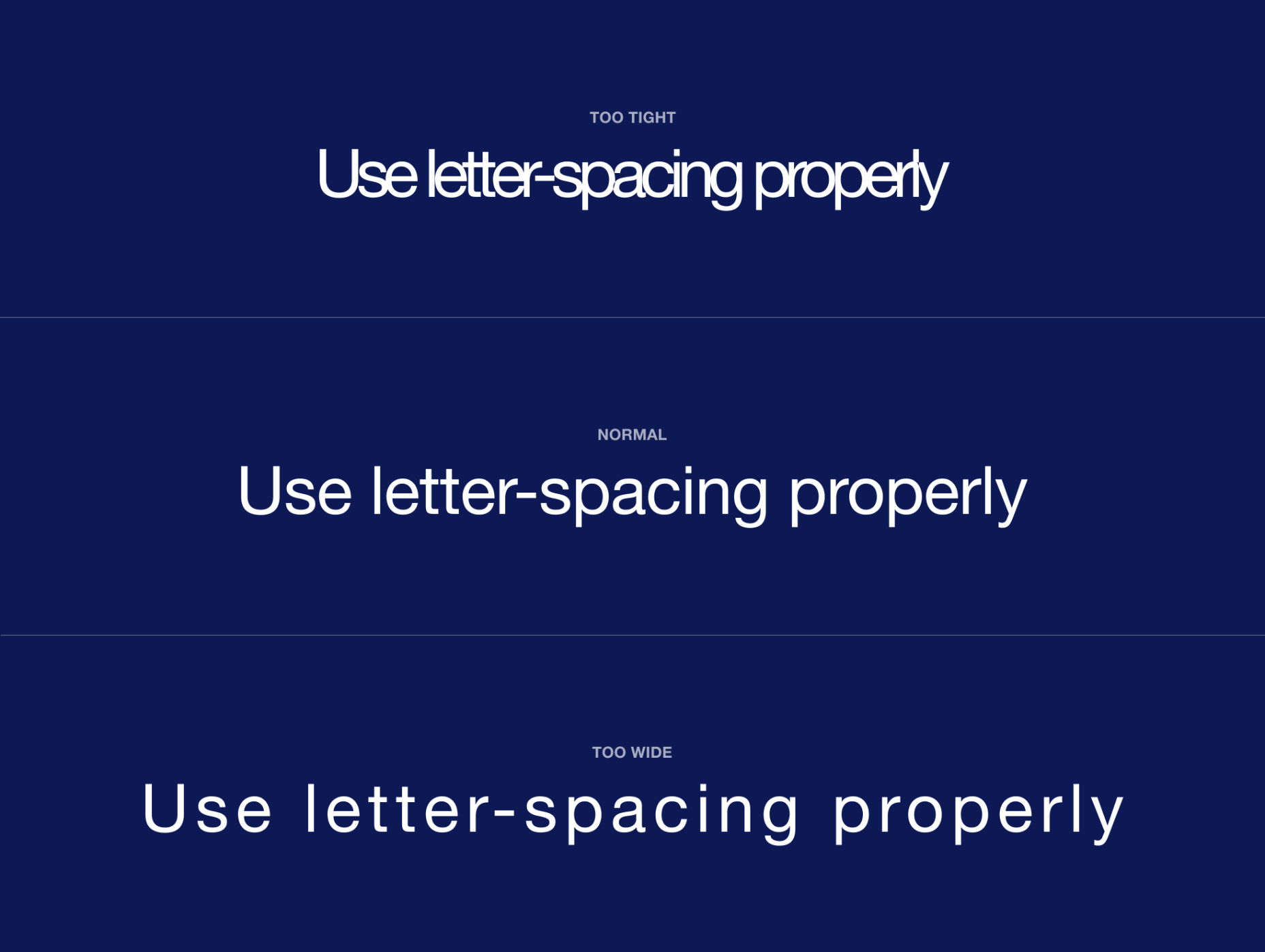
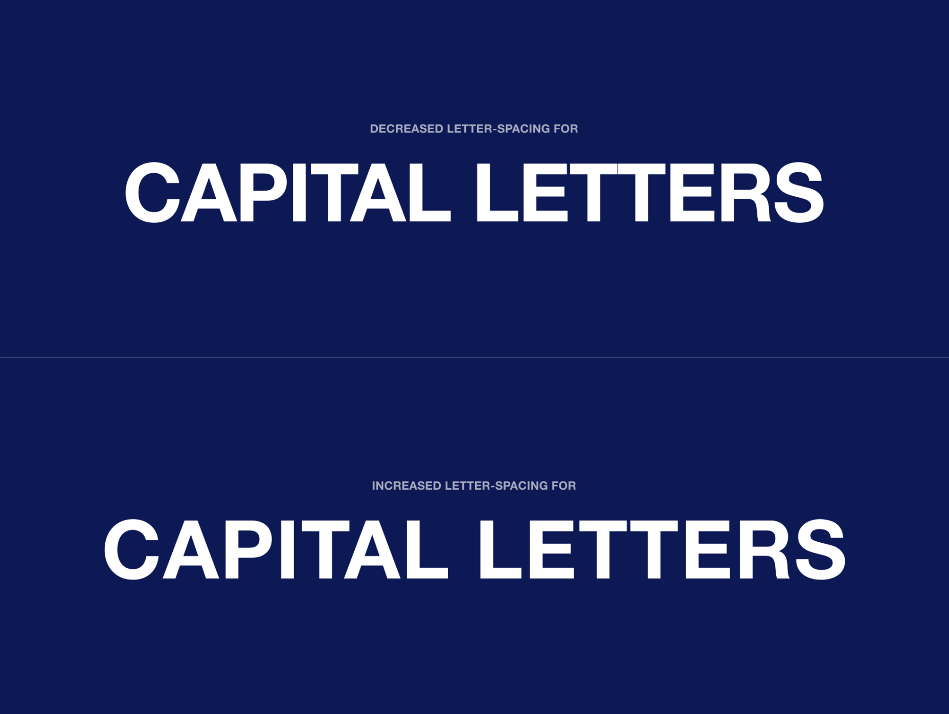
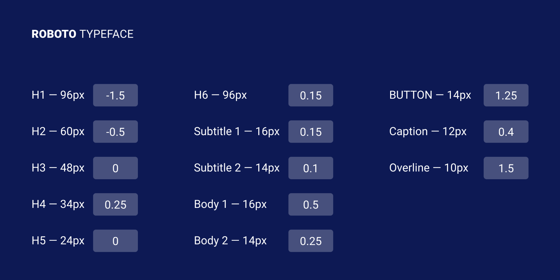
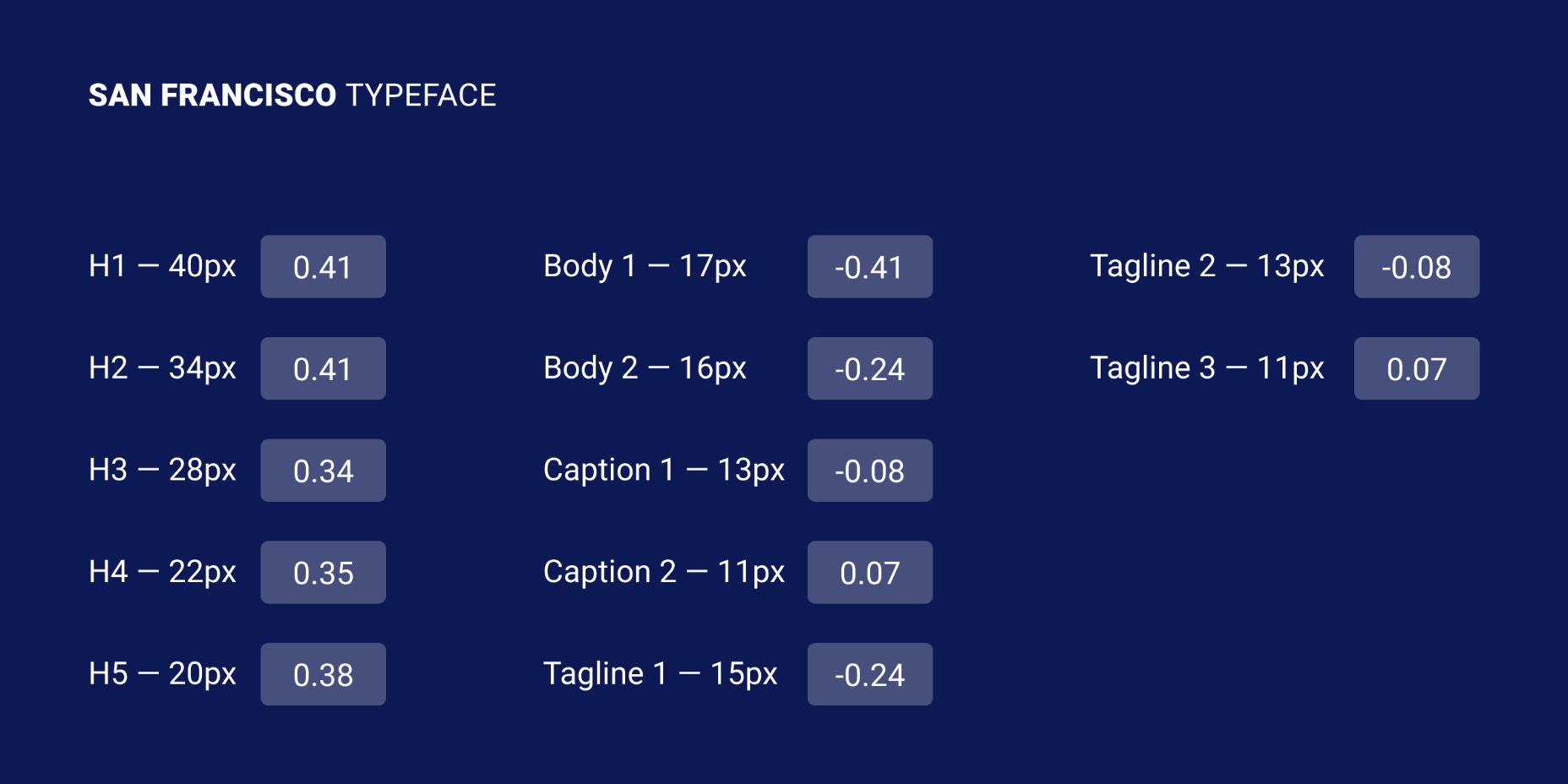
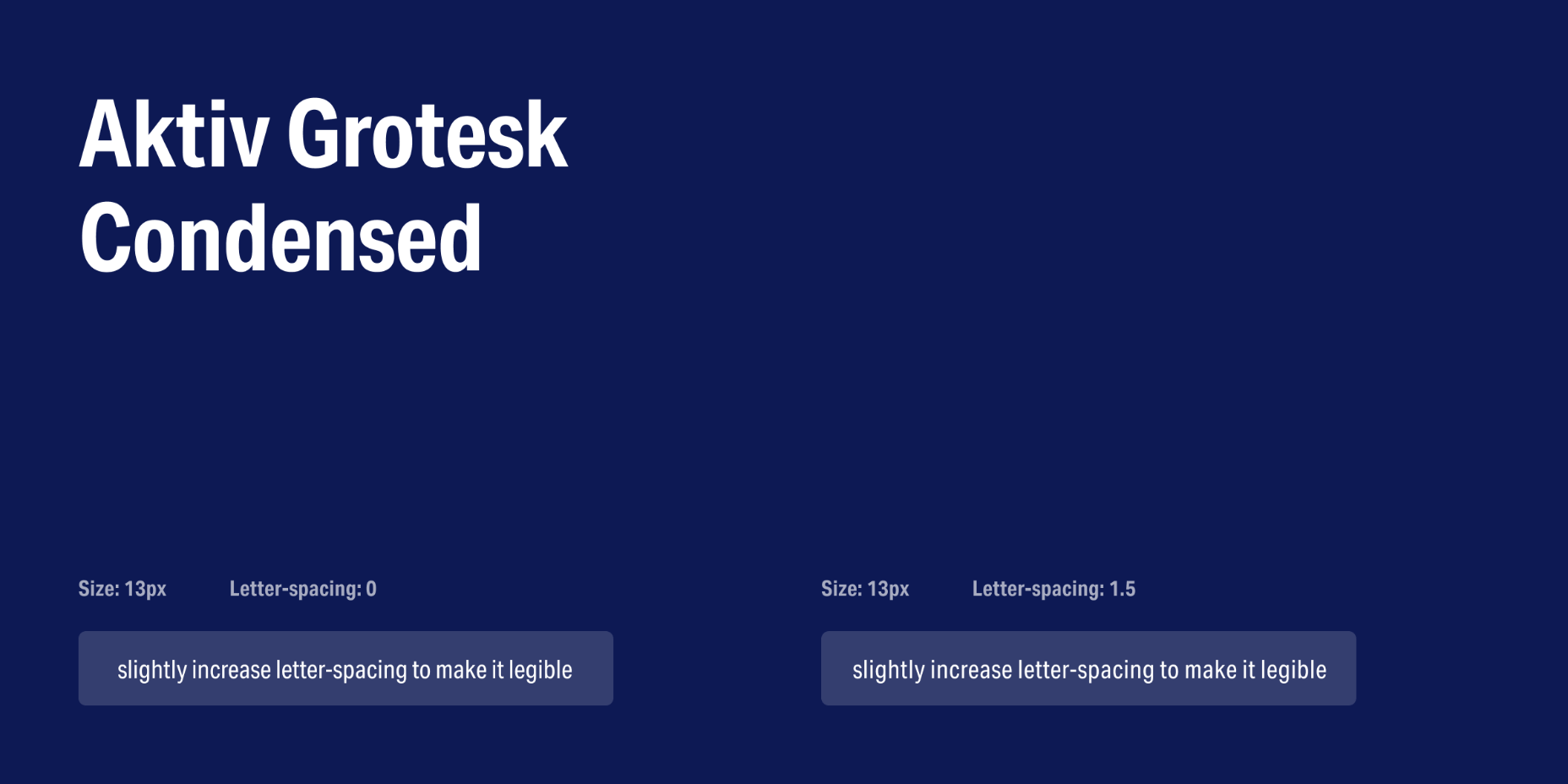
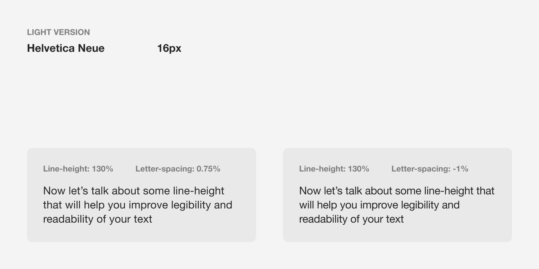
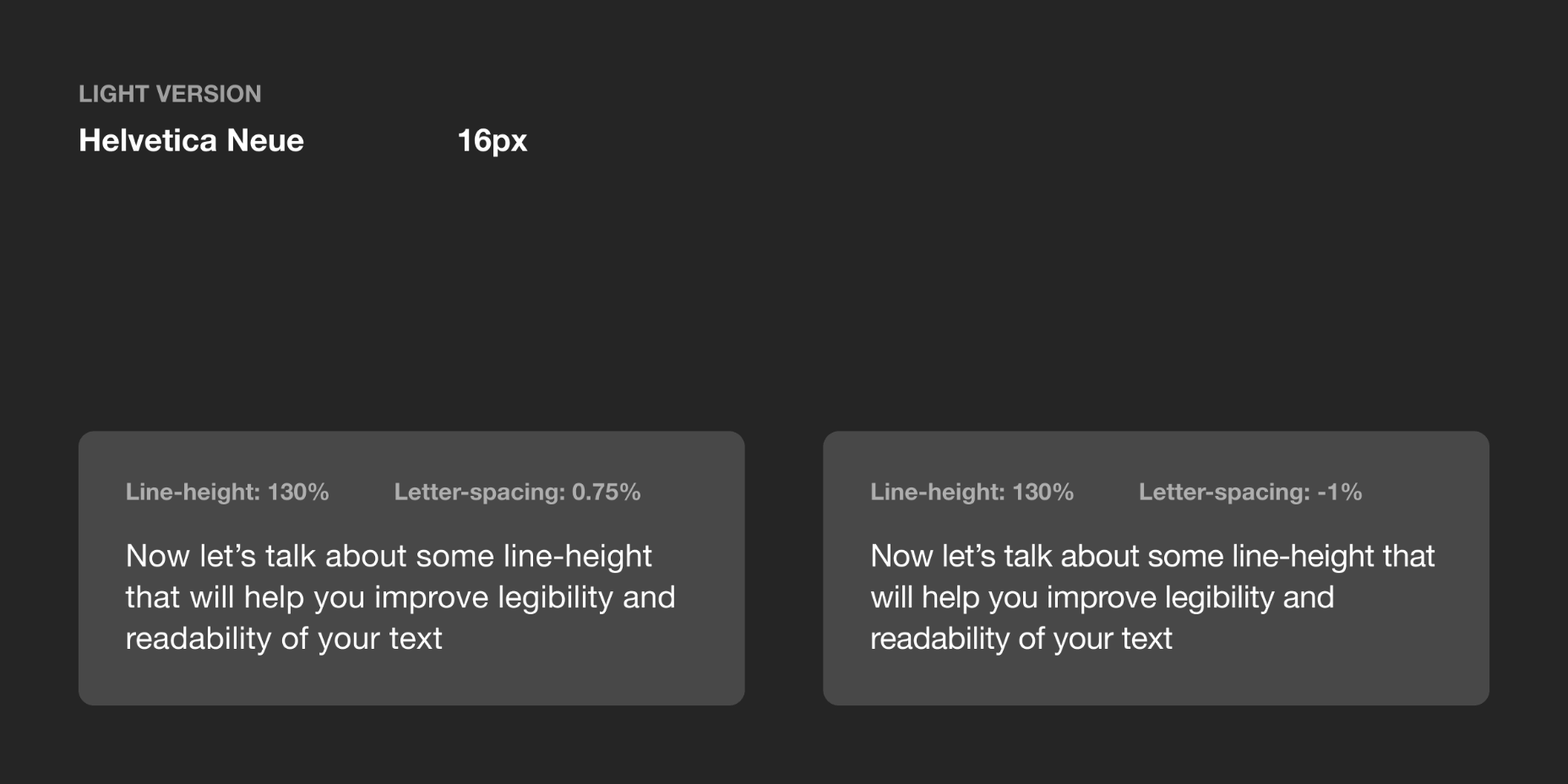
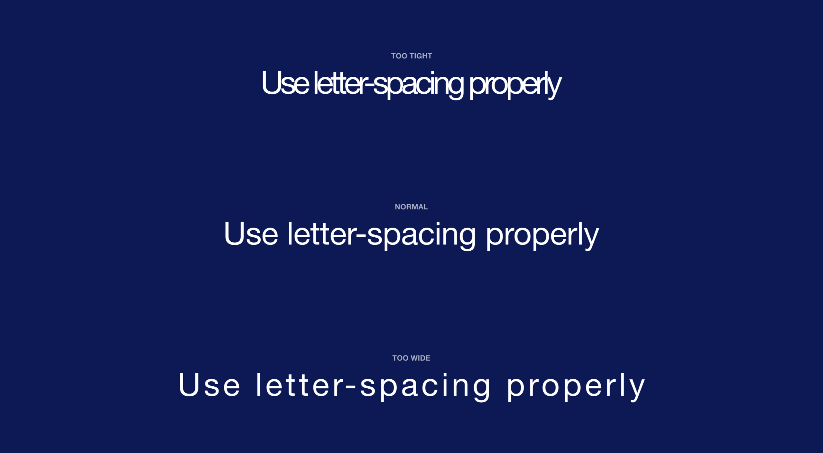
Most of the information we consume happens through reading, so it makes a lot of sense to pay attention to the words when designing. There are many aspects to typography, but one of the things that helped improve the quality of my design was letter-spacing.

Letter-spacing is about adding and removing space between letters. Some people confuse it with kerning, but these two are different; letter-spacing affects the whole line of text, whereas kerning adjusts the space between two individual letters at the time. Kerning is best left to type designers, besides which, unlike letter-spacing there is currently no way to control kerning in CSS.

I believe that practice and a lot of observation will change the way you treat letter-spacing in your work as well.

The Purpose of Letter-Spacing

The main purpose of letter-spacing is to improve the legibility and readability of the text. Words act differently depending on their size, color, and the background they are on. By adjusting letter-spacing to the environment you are working with you will help readers consume your information faster, and more efficiently. The fun part is that they won’t even notice it — that’s the whole point of the job.

Bear in mind that typographers think about letter-spacing and kerning when designing a typeface. It means you don’t have to apply it to all your text, but in order to have an understanding when it’s necessary, you should know some basic principles, and use good typefaces.

How Letter-Spacing Affects Legibility and Readability

The legibility and readability of your text depend on things like line-height, paragraph length, font size, typeface choice, letter-spacing, and much more. Regarding letter-spacing, if you are just getting into typography, the best thing you can do is not overuse it. What I mean by that is simply don’t make the distance between letters too big or too small; even if you think it looks good, people will struggle reading it, and that will ruin their experience.

Letter-Spacing Capital Letters

Capital letters are designed with the intention that they will appear at the beginning of a sentence or proper noun, in combination with lowercase letters. When capital letters are next to each other, the space between them is too tight. So in order to achieve better readability, space needs to be increased. This applies to both large and small font sizes.

Letter-Spacing Headlines

If you are using well designed fonts, you can be sure that they are calibrated well, and you won’t need to make any major adjustments to them. However, the problem with headlines is that at larger scales the space between letters looks unbalanced. It can be fixed by increasing or decreasing the letter-spacing value.

There are no strict rules for letter-spacing — there are a lot of typefaces and all of them require an individual approach — but if you look at how big companies like Google and Apple treat their typefaces, you can find a lot of valuable information there.

Let’s take a look at the “Roboto” and “San Francisco” typefaces (the first one is used in Material Design and the second one in Apple’s ecosystem). Headlines from 20 to 48 pixels have either a positive letter-spacing value or none. If the font size is bigger, letter-spacing becomes negative. These exact numbers are not going to work that well for other typefaces, but after trying different approaches I can state that it’s a common pattern.

I’ve tested several guidelines for letter-spacing and the one that was published by Bazen Agency works for a lot of popular typefaces. It will be a good starting point for you, but you can always apply additional adjustments:

  • H1 — 96px — -1.5%
  • H2 — 60px — -0.5%
  • H3 — 48px — 0%
  • H4 — 34px — 0.25%
  • H5 — 24px — 0%
  • H6 — 20px — 0.15%
  • Subtitle — 16px — 0.15%

If you happen to design a lot of apps or you’re planning to do that, one thing that helps me is using the default Material Design and Apple guidelines for their typefaces. They are well balanced and it saves a lot of time.

Letter-Spacing Body Text

If you ever read anything about letter-spacing, you’ve probably have seen this popular wisdom from typographer Frederic Goudy: “Anyone who would letter-space lowercase would steal sheep”. (There’s an argument that he was only referring to blackletter fonts.) Some designers took it as a hard rule and now never adjust the letter-spacing of lowercase text.

Based on my practice and by looking at the work of designers I can’t agree with Goudy, because sometimes small changes can make a big difference in how your text performs. Let’s take, for example, condensed fonts. At a small size, the letters are too close to each other, which leads to poor legibility. By increasing letter-spacing by 1.5% you will see that the text is now easier to read.

If we look at my previous example, in the guidelines for “Roboto” and “San Francisco” typefaces, letter-spacing is applied to body text; even though San Francisco has a dedicated “SF Pro Display” for headlines and “SF Pro Text” for body text, letter-spacing is still used to refine them.

There are a lot of different typefaces and a single rule doesn’t apply to all of them. Experiment with letter-spacing and do what seems right to you. There are some simple guidelines that will lead you in the right direction, especially when working with body text:

Keep in Mind Line-Height

If you have a line-height greater than 120%, most likely negative letter-spacing will lead to an unbalanced look to the paragraph. To refine it you would need to either keep it at 0% or only slightly increase it.

Light Text on Dark Background

On a dark background, white text looks overexposed and therefore letters appear too tight. To make it more legible, I would suggest you increasing letter-spacing a small amount.

General Values for Body Text

You can use the following guidelines for body text, which I have tested with several typefaces:

  • Body 1 — 16px — 0.5%
  • Body 2 — 14px — 0.25%

Letter-Spacing Captions

Unlike headlines and body text, smaller font sizes don’t have many variations in letter-spacing. It’s a common practice when a font size is lower than 13px to increase the space between letters to make it legible. But there are always exceptions (“SF Pro Text” guidelines suggest using positive letter-spacing only when a font size is 11px or below). Make sure you experiment with settings.

You can use the following values as a starting point and then edit them to what seems right to the typeface of your choice:

  • Caption — 12px — 0.5%
  • Overline — 10px — 1.5%

Final Tip

One of the things that helped me improve my skills in typography was looking at other designers and especially type foundries. By decoding their work you might notice some nuances of how they treat typography and it will help you in future projects.

Source


Source de l’article sur Webdesignerdepot

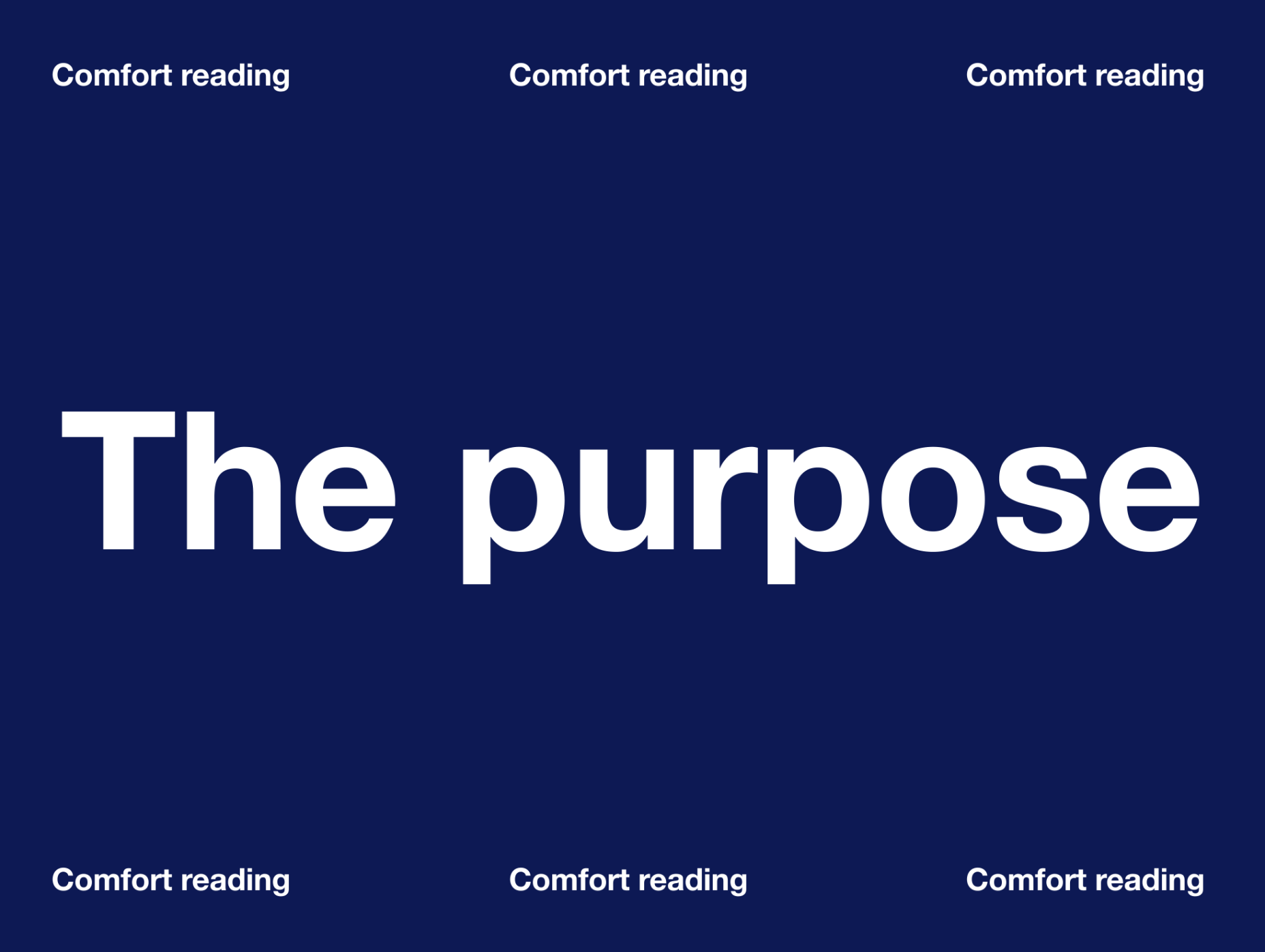
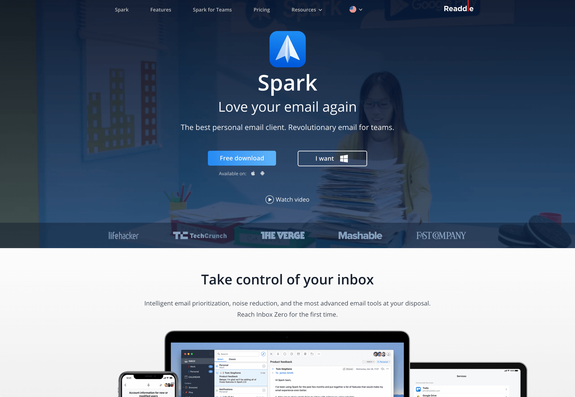
Web design clients come from a wide variety of backgrounds. One day, you’ll be designing a portfolio website for a voiceover artist, the next you’ll be creating a comprehensive ecommerce site for a leading retailer. In an ideal world, you’ll get to a point where you eventually specialize in a niche. However, you’ll need to master both avenues first.

The more time you spend in this industry, the more you’ll learn that every client comes with their own unique requirements and challenges to consider. However, there’s a particularly huge divide between the kind of web design projects you do for B2B clients, and the ones you do for B2C customers.

Both B2B (Business to Business) and B2C (Business to Consumer) websites need to be clear, concise, and aesthetically pleasing. They should always have a strong focus on user experience, and they need to work consistently across devices. However, being aware of the difference between B2B and B2C projects will help you to deliver better results to your customers.

Defining the Differences Between B2B and B2C Sites

Some web design trends remain consistent in any environment.

Whether you’re creating a site for a hairdresser, or a leading SaaS company, you’ll need to deliver responsive design, intuitive navigation, and excellent site security.

Your process is unlikely to differ from B2B to B2C much in terms of project milestones, phases, prototyping and wire-framing. The differences that arise between B2B and B2C projects often come in the approach you take to building certain elements.

Let’s take a closer look at the things you might need to consider:

1. The Target Audience

In any design project, it’s always important to keep the end customer in mind. Knowing your client’s target audience will help you to create both an image and a tone of voice that appeals to the right people.

B2B Websites

With B2B websites, you’ll be speaking to a range of highly-educated individuals who already have a general knowledge of your service. The aim here will be to show the end-user how you can help them achieve better results. For instance, m.io highlights “syncing communication” so you can “effortlessly chat” with your team.

The language and content of the website is all about highlighting the key benefits of the products, and the kind of outcomes that they can deliver. The Nielsen Norman Group reports that there’s often a lot of discussion between decision-makers when they’re checking out a B2B website.  

Designers need to work harder at convincing B2B buyers that they’re making the right decision. This is particularly true when you’re selling something like a software subscription that requires a lot of long—term investment.

B2C Websites

On the other hand, while B2B customers make decisions based on logic, information, and well-explained benefits, B2C customers are more influenced by emotion. They want quick solutions to their problems, and the opportunity to purchase from a brand that “understands” them.

Look at the Firebox website, for instance. It instantly highlights an ongoing sale at the top of the homepage, addressing any concerns a customer might have about price. That combined with a quirky layout full of authentic photos and bright colors means that customers are more inclined to take action.

2. The Purpose

Another factor that can vary from B2C to B2B websites, is the motive behind a customer’s purchase. Knowing what’s pushing a target audience to interact with a brand will help you to create a website that appeals to specific goals.

B2B Websites

B2B websites often aim to solve expensive and time-consuming problems for companies. To sell a decision-maker on the validity of a solution, it’s important to thoroughly explain what the solution is, how it works, and how it addressees a specific pain point.

Look at the Zoom website for instance, they don’t just tell people that they offer video conferencing, they address the practical applications of the platform:

B2C Websites

Consumers are a lot easier to appeal to in terms of emotional impact, because many of them come to a website looking to fulfill an urgent need. Because of this, many web designers can take advantage of things like urgency and demand to encourage conversions. For instance, look at this website from TravelZoo. It takes advantage of a customer’s desire to get away:

A B2B website needs to focus on providing information that helps companies to make more confident decisions. What’s more, with B2B sites, decisions are often made by several stakeholders, while B2C sites ask a single person to make a choice. A B2C website needs to address immediate concerns and connect with customers on an emotional level. B2C buyers still want to do their research on products or services, but the turnaround is much quicker, and often requires less information.

3. The Design Elements (Visual Appearance)

Just as the focus of your website design and the audience that you’re creating the experience for can differ from B2B to B2C websites, the visual elements of the design might change too.

B2B Websites

In most cases, B2B websites are all about presenting a highly professional and respectable image. You’ll notice a lot of safe and clear choices when it comes to typography and imagery. It’s unusual to see a B2B website that takes risks with things like illustrations and animations.

Look at the Green Geeks website for instance. Everything is laid out to encourage clarity and understanding. Information is easy to find, and there are no other issues that might distract a customer.

B2C Websites

On the other hand, B2C websites can be a little more daring. With so many different options to choose from, and most customers buying out of a sense of urgency or sudden demand, designers are under pressure to capture attention quick. This means that it’s much more likely to see large pieces of eye-catching imagery on B2C sites, with very little text.

Movement, like slideshows and animations often play more of a role here. Additionally, there’s a good chance that you’ll be able to experiment more aggressively with color. Take a look at the Yotel website, for instance. There’s very little textual information here, but the appeal of the website is conveyed through sliding images:

4. Website Content

The way that information is conveyed on a B2B website is very different to the messages portrayed on a B2C site. Usually, everything from the language, to the amount of content that you use for these projects will differ drastically.

B2B Websites

When designing for a B2B website, you’ll need to be careful with content, as you’ll be speaking to a very mixed audience. If your site caters to different industries, you’ll need to ensure that you show authority, without using too much jargon. Some companies even create different pages on their site for specific customers. The aspin.co.uk website covers the benefits from a company, sale and integration perspective:

Rather than try to talk to all business owners about their differing communication pains, G-Suite anticipates its audience and creates pages for each.

B2C Websites

Alternatively, B2C websites can make things a little simpler. For instance, on glossybox.co.uk, there’s no need to provide a ton of information for different types of shopper, designers can appeal to one audience, i.e. the “beauty addict”:

In both B2B and B2C websites, the aim of the content should always be to answer any questions that the end user might have.

5. CTA Buttons

Call to Action buttons are often a crucial part of the web design journey. However, it’s sometimes difficult to determine where they should be placed, or how many buttons you need.

B2B Websites

Because the decision to buy something won’t always happen immediately with a B2B website, these kinds of sites often use a variety of CTAs. For instance, you might have a “Request a Quote” button at the top of a page, as well as a Sign in button.

On the Klaviyo site, for instance, you can request a demo, sign up or log in:

You can place CTAs lower on the page with B2B websites too, as it’s more likely that your customers will be scrolling through the site to collect more information before they decide to buy.

B2C Websites

On the other hand, with B2C websites, you usually don’t need to give your visitors as many options. A single option to “Add to Cart”, or perhaps an extra choice to “Add to Favorites” is all your user will need. Customers need to instantly see what they need to do next as soon as they arrive on a page:

On the Evil Hair website, you immediately see how to add a product to your cart.

Remember, the sales process is a lot quicker with B2C customers. This means that you need your CTA buttons to be front and center as soon as someone clicks on a page.

6. Contact Forms

In a similar vein, the way that you design your contact forms will also depend on the end-user that the website wants to appeal to. There’s a very different process for getting in touch on a B2B website, compared to a B2C site.

B2B Websites

B2B websites often require longer contact forms, as clients need to collect additional information about a prospect’s position in a company, and what that company does. B2B companies need to share things like what they’re looking for in a service, and how many users they have, so a sales team knows what kind of demonstration to give.

As with any strategy for contact form design, you should always only include the fields that your client needs and no more. If you demand too much from any client, you could send them running in the opposite direction. Check out this straightforward option from Ironpaper, for instance:

The form addresses as many relevant questions as possible without overwhelming the customer. Because the site handles things like design, it makes sense that they would ask for a link to the company’s existing website.

B2C Websites

On a B2C website, there are very different approaches to contact forms. You may have a dedicated contact form on your website where people can get in touch if they have any questions. A FAQ page where customers can serve themselves is another great way to help your client stand out from the competition. Check out this option from River Island, for instance:

On the other hand, you might implement pop-up contact forms into a website if your client wants to collect emails for email marketing. In that case, it’s important to make sure that you’re only asking for the information you need, and nothing more.

The easier it is to sign up for a newsletter, the more likely it is that customers will do it. Being able to enter their name and email address and nothing else will make the signup seem less tasking.

7. Search Bars and Navigation

Whether you’re designing for B2B or B2C companies, navigation will always be a critical concern. End users need to find it easy to track down the information that they need about a company, whether they’re looking for a particular product or a blog.

B2B Websites

On a B2B website, the search bar often takes up a lot less prominence than it does on a B2C site. That’s because all of the information that a client needs, and the buttons they need to take their next steps, are already visible front-and-center.

As a designer, it will be your job to push as many people to convert as possible, by making the purchasing journey the most appealing path for visitors. For instance, on the Copper website, the “Try Free” buttons are much easier to see than “Continue with Google” or “Login”:

With B2B sites, the focus is on a very specific goal. Although navigation still needs to be available, it doesn’t need to be as obvious as it is on a B2C site.

B2C Websites

On the other hand, most B2C websites offer a wide range of products, and they’re perfectly happy for their customers to purchase anything, as long as they eventually convert. Because of this, they make navigation a much more significant part of the customer journey.

The search bar is often presented at the very top of the screen where customers can see it immediately. Additionally, there may be multiple pages within certain product categories, so that customers can browse through the items they’re most interested in. For instance, look at the homepage on the IWoot website:

The navigation elements in B2C websites need to be a lot more obvious, because consumers are more likely to use them when they’re searching through their options.

8. Social Proof and Testimonials

Finally, social proof is one of the things that will work well for improving conversions on any kind of website. When your customers aren’t sure whether or not they should buy from you, a review or testimonial could be just the thing to push them over the edge.

B2B Websites

On a B2B website, the decision-making process takes a lot longer. Because of this, it’s worth including as much social proof as possible in every part of the website. Client testimonials, reviews and ratings, and even high-profile company logos make all the difference. Many B2B websites include a page dedicated to case studies highlighting the success of other brands.

Your client might even go as far as to ask for a page that highlights their awards and recognition or showcases comparison tables that pit their products against the competition.

For instance, Authority Hacker has a “what the pros say about us” section as social proof:

B2C Websites

With a consumer website, you can include consumer ratings and reviews wherever you like. However, it’s most likely that you’ll want to have a place where customers can see the reviews of other clients on the product pages themselves. On the EMP website the company gives users the option to click on the star review section to jump to a different space on the page where testimonials are listed. This ensures that customers don’t have to scroll through a lot of excess information if they just want to add an item straight to their cart.

Designing for B2B vs B2C

In the world of web design, no two customers are ever the same. While you’ll need to adapt your processes to suit each customer you interact with, you can set your expectations in advance by learning the differences between B2B and B2C strategies.


Featured images by Chris Ross Harris and Mike Kononov.

Source

p img {display:inline-block; margin-right:10px;}
.alignleft {float:left;}
p.showcase {clear:both;}
body#browserfriendly p, body#podcast p, div#emailbody p{margin:0;}

Source de l’article sur