Articles

The CMO at Twitter, Leslie Berland, has announced a substantial rebrand intended to reflect the experience of using the site. The move was announced on the platform first and later confirmed on its blog.

Twitter hopes the visual identity will “fully reflect the complexity, fluidity, and power of the conversations today.”

The instantly recognizable bird logomark stays, as does the inoffensive tech-blue. But everything else has been grunged up.

rather than build the system up from each component part or build around a specific element, we embarked upon building a creative design system that’s intentionally imperfect

— Donna Lamar, Global ECD, Twitter

There’s a brand new custom typeface named “Chirp” designed in collaboration with Grilli Type. It mixes features of gothics and grotesques with hipster-friendly quirks and replaces the decidedly corporate Helvetica.

The most visually arresting elements are the print-inspired collages, faux-print effects, and distress marks. It’s a move away from the safe, minimal style that has dominated the design industry for more than a decade.

There are layers of bill posters torn off in pieces revealing text beneath, macroscopic views of people, and an all-pervading effortless cool. Think Paris, on a Sunday morning, circa 1997.

It’s exciting to see a major brand strike out in a new direction, particularly one that isn’t Google-derived. There’s plenty of energy in the new artwork, but it doesn’t escape notice that this is a surface level restyle; the core design remains.

Is this a glimpse of design over the next few years: a braver, irreverent, and decidedly less-corporate style of corporate design? Or, a misstep we’ll all forget as soon as Material Design 3.0 is released?

Source

The post Is Twitter Rebrand a Glimpse at the Future of Design? first appeared on Webdesigner Depot.


Source de l’article sur Webdesignerdepot

If you are building an application using Node.js, it can get a little overwhelming since there are a variety of databases to choose from and different ways to build APIs. One way to reduce development time and focus on the problem you are trying to solve is to use a Database as a service to store the data. The advantage of this approach is to use a cloud database system without purchasing hardware which can be cost and time-effective.

One such database service is HarperDB Cloud. To build REST APIs rapidly this service allows us to perform all database operations using a single endpoint. It supports a variety of programming languages such as JavaScript, Java, Python, and so on. Some of the features of HarperDB are the following:

Source de l’article sur DZONE

It’s never been easier to set up an ecommerce store and start selling. There are a dizzying array of ecommerce solutions available in 2021, and most are feature-rich and competitively priced.

Ecommerce sites are notoriously difficult to migrate from platform to platform, so more often than not, you’ll be committed to your chosen solution for years. The key when choosing an ecommerce solution to maximize your return on investment, is to consider not just what your business needs today but what it will need tomorrow.

There are two basic approaches to ecommerce. The first is a dedicated platform that handles everything. The second is a plugin that adds ecommerce features to an existing CMS. Both approaches have benefits and drawbacks.

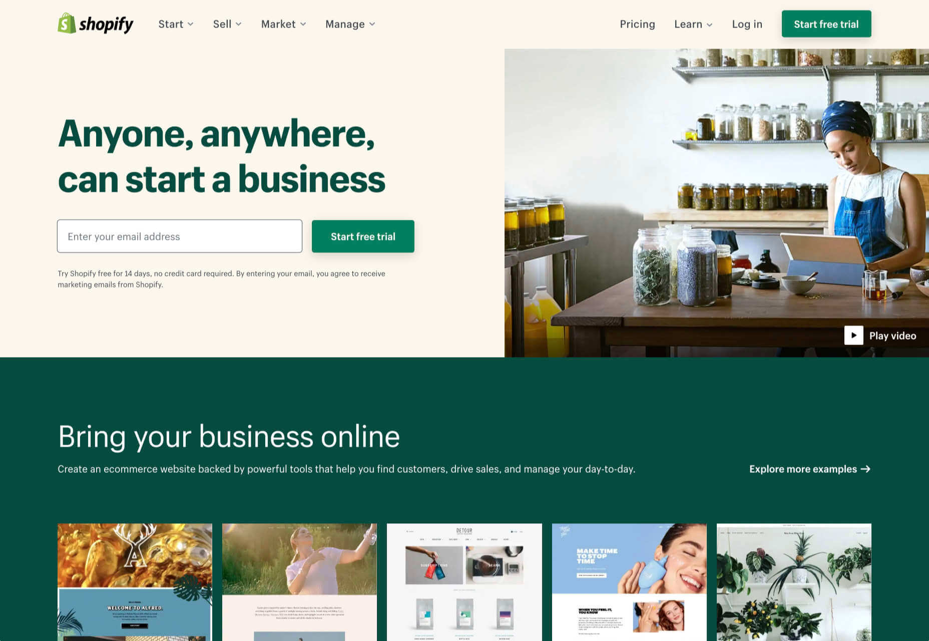
1. Shopify: Best for Almost Everyone

Shopify is a well-known, well-liked, and reliable dedicated ecommerce platform. As a system for getting a business off the ground and selling fast, it is peerless.

Shopify jealously guards developer access, with templates and plugins pre-vetted. Unlike some marketplaces, you can be confident that there are no hidden surprises in your shiny new store.

And because Shopify has passed the point of market saturation, it’s worthwhile for big players to provide their own plugins; credit services like Klarna and shipping companies like netParcel can be integrated with a few clicks.

The admin panel is a touch complex, as Shopify is designed to allow a single account to be linked to multiple stores. But once you’re set up and familiar with where to find everything, it’s a slick, streamlined business management system.

Whenever a client says, “we want to start selling online.” My first thought is, “Shopify.” And for 90% of clients, it’s the right choice.

And that’s where this roundup should end…except there’s still that 10% because Shopify isn’t perfect.

For a start, an all-in-one platform doesn’t suit everyone. If you already have a website you’re happy with, you’ll either need to migrate or lease a dedicated domain for your store.

Shopify’s platform is very secure, which inspires confidence in buyers, but the price of that security is a lack of flexibility in the design.

Then there’s the infamous variant limit. Shopify allows 100 variants on a product. Almost every client runs into that wall at some point. Let’s say you’re selling a T-shirt: male and female cuts are two variants; now add long or short sleeves, that’s four variants; now add seven sizes from XXS to XXL, that’s 28 variants; if you have more than three color options, you’ve passed the 100 variant limit. There are plugins that will allow you to side-step this issue, but they’re a messy hack that hampers UX for both customer and business.

Shopify should certainly be on every new store owner’s shortlist, but there are other options.

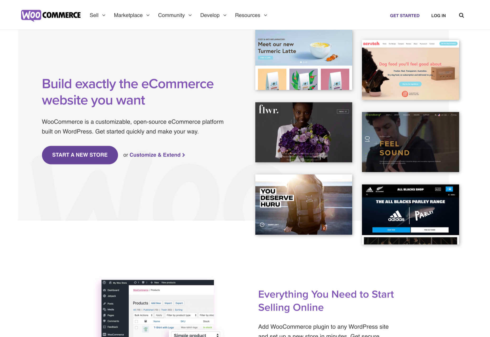
2. WooCommerce: Best for WordPress Users

If you’re one of the millions of businesses with a pre-existing site built on WordPress, then adapting it with a plugin is the fastest way to get up and running with ecommerce.

WooCommerce is regularly recommended as “Best for WordPress Users,” which is a back-handed compliment that belies the fact that WooCommerce reportedly powers 30% of all ecommerce stores. If running with the crowd appeals to you — and if you’re using WordPress, it presumably does — then you’re in the right place.

WordPress has a gargantuan plugin range. As such, there are other plugins that will allow you to sell through a WordPress site. The principle benefit of WooCommerce is that as the largest provider, most other plugins and themes are thoroughly tested with it for compatibility issues; most professional WordPress add-ons will tell you if they’re compatible with WooCommerce. If your business is benefitting from leveraging WordPress’ unrivaled ecosystem, it can continue to do so with WooCommerce.

The downside to WooCommerce is that you’re working in the same dashboard as the CMS that runs your content. That can quickly become unmanageable.

WooCommerce also struggles as inventories grow — every product added will slow things a little — it’s ideally suited to small stores selling a few items for supplementary income.

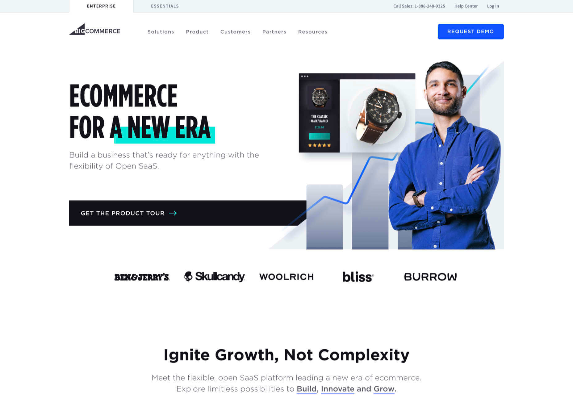
3. BigCommerce: Best for Growth

BigCommerce is an ecommerce platform similar to Shopify, but whereas Shopify is geared towards newer stores, BigCommerce caters to established businesses with larger turnovers.

The same pros and cons of a dedicated ecommerce solution that applied to Shopify also apply to BigCommerce. One of the considerable downsides is that you have less control over your front-end code. This means that you’re swapping short-term convenience for long-term performance. Templates, themes, and plugins — regardless of the platform they’re tied to — typically take 18 months to catch up with best practices, leaving you trailing behind competitors.

BigCommerce addresses this shortcoming with something Shopify does not: a headless option. A headless ecommerce platform is effectively a dedicated API for your own store.

Enabling a headless approach means that BigCommerce can be integrated anywhere, on any technology stack you prefer. And yes, that includes WordPress. What’s more, being headless means you can easily migrate your frontend without rebuilding your backend.

BigCommerce also provides BigCommerce Essentials, which is aimed at entry-level stores. It’s a good way to get your feet wet, but it’s not BigCommerce’s real strength.

If you have the anticipated turnover to justify BigCommerce, it’s a flexible and robust choice that you won’t have to reconsider for years.

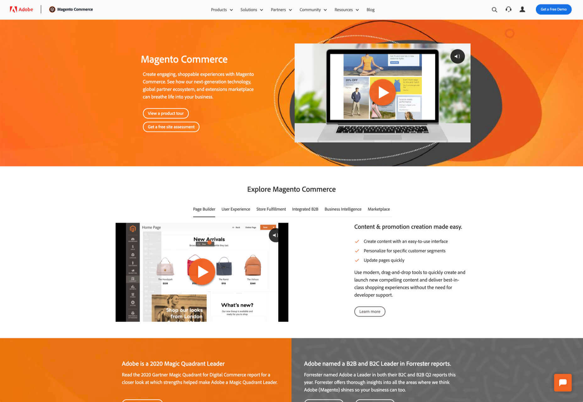
4. Magento: Best for Burning Budgets

If you have a development team at your disposal and a healthy budget to throw at your new store, then Magento could be the option for you.

You can do almost anything with a Magento store; it excels at custom solutions.

Magento’s main offering is its enterprise-level solution. You’ll have to approach a sales rep for a quote — yep, if you have to ask the price, you probably can’t afford it. Magento has the track-record and the client list to appeal to boards of directors for whom a 15-strong development team is a footnote in their budget.

That’s not to say that a Magento store has to be expensive; Magento even offers a free open source option. But if you’re not heavily investing in a custom solution, you’re not leveraging the platform’s key strengths.

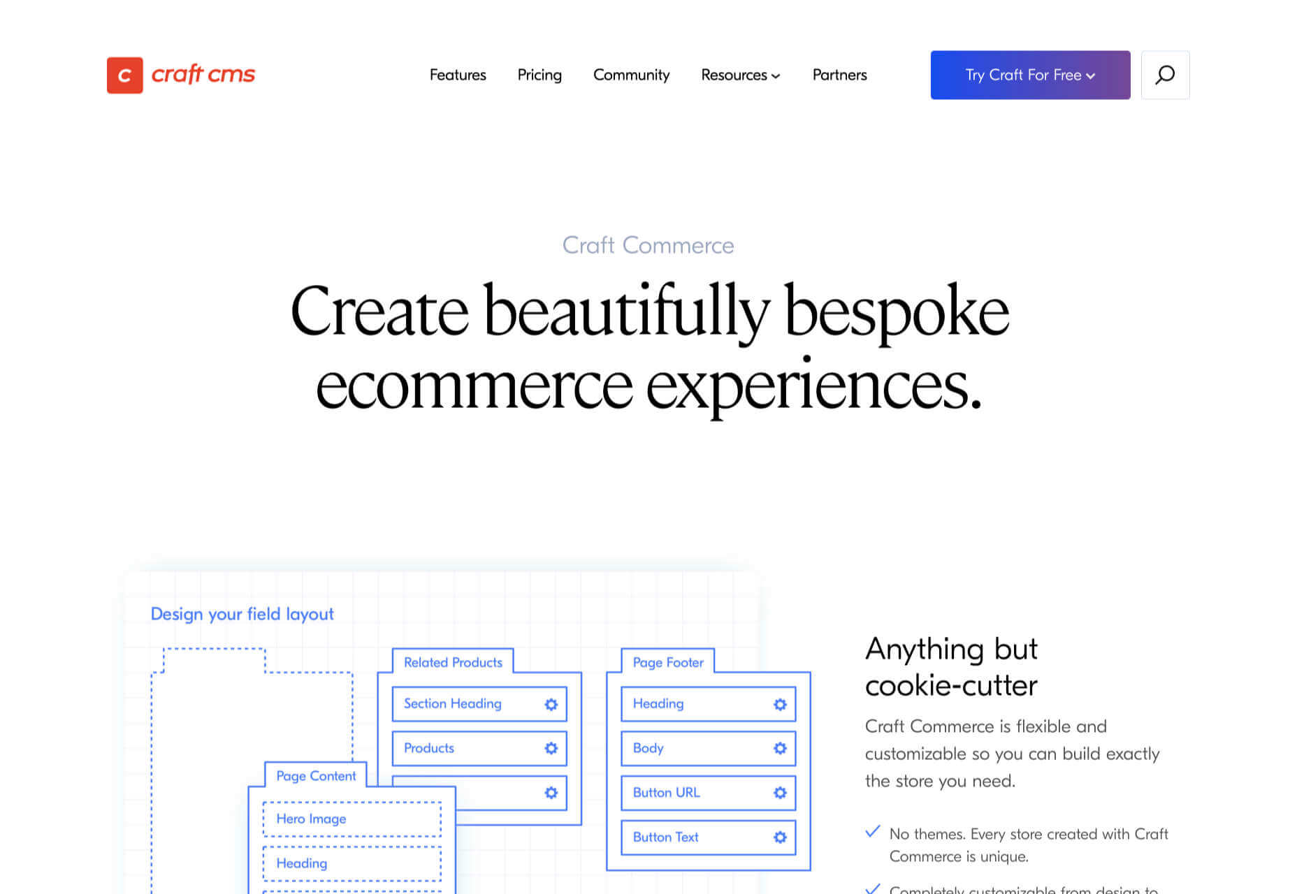
5. Craft Commerce: Best for Custom Solutions

If you’re in the market for a custom solution, and you don’t have the budget for something like Magento, then Craft Commerce is ideally positioned.

Like WooCommerce for WordPress, Craft Commerce is a plugin for Craft CMS that transforms it into an ecommerce store.

Unlike WordPress, Craft CMS doesn’t have a theme feature. Every Craft Commerce store is custom built using a simple templating language called Twig. The main benefit of the approach is that bespoke solutions are fast and relatively cheap to produce, with none of the code bloat of platforms or WordPress.

Because your site is custom coded, you have complete control over your frontend, allowing you to iterate UX and SEO.

You will need a Craft developer to set up Craft Commerce because the learning curve is steeper than a CMS like WordPress. However, once you’re setup, Craft sites are among the simplest to own and manage.

6. Stripe: Best for Outliers

Ecommerce solutions market themselves on different strengths, but the nature of design patterns means they almost all follow a similar customer journey: search for an item, add the item to a cart, review the cart, checkout. Like any business, they want to maximize their market share, which means delivering a solution that caters to the most common business models.

Occasionally a project happens along that doesn’t fit that business model. Perhaps you’re selling a product that’s uniquely priced for each customer. Perhaps you’re selling by auction. Perhaps you don’t want to bill the customer until a certain point in the future.

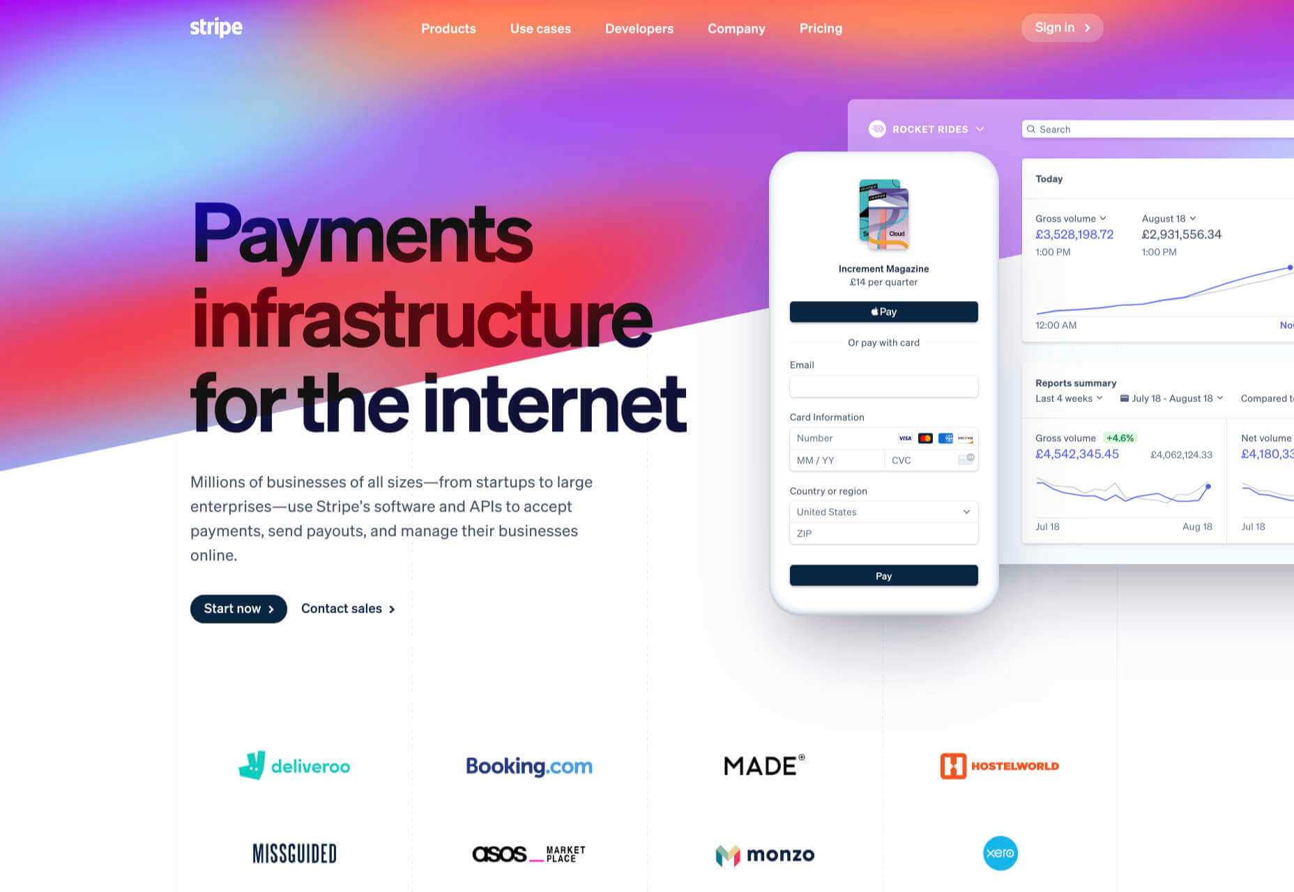
Whatever your reason, the greatest customization level — breaking out of the standard ecommerce journey — can be managed with direct integration with Stripe.

Stripe is a powerful payment processor that handles the actual financial transaction for numerous ecommerce solutions. Developers love Stripe; its API is excellent, it’s documentation is a joy, it’s a powerful system rendered usable by relentless iteration.

However, this approach is not for the faint-hearted. This is a completely custom build. Nothing is provided except for the financial transaction itself. Every aspect of your site will need to be built from scratch, which means hefty development costs before seeing any return on investment.

The Best eCommerce Solution in 2021

The best ecommerce solution is defined by three factors: the size of your store, the anticipated growth, and the degree of custom design and features you want or need.

Shopify is the choice of most successful small stores because you can be selling inside a day. For businesses with an existing presence and a smaller turnover, those on WordPress will be happy with WooCommerce. For larger stores planning long-term growth, BigCommerce’s headless option is ideal. Craft Commerce is a solid performer that marries low costs with flexibility for businesses that need a custom approach.


Featured image via Unsplash.

Source

The post 6 Best Ecommerce Solutions for 2021 first appeared on Webdesigner Depot.


Source de l’article sur Webdesignerdepot

If you already have a good idea of what you want a new website to look like, the next step would be to decide on the tools you’ll need to put into play to turn that vision into a reality.

  • Tools enable you to present its content in ways that will engage and captivate its audience and gain their trust.
  • Tools that will make your website perform flawlessly in all respects.

That is why choosing the right WordPress theme to get the job done is so important. You want a theme that features the page building tools and design aids that make your task far easier than anticipated.

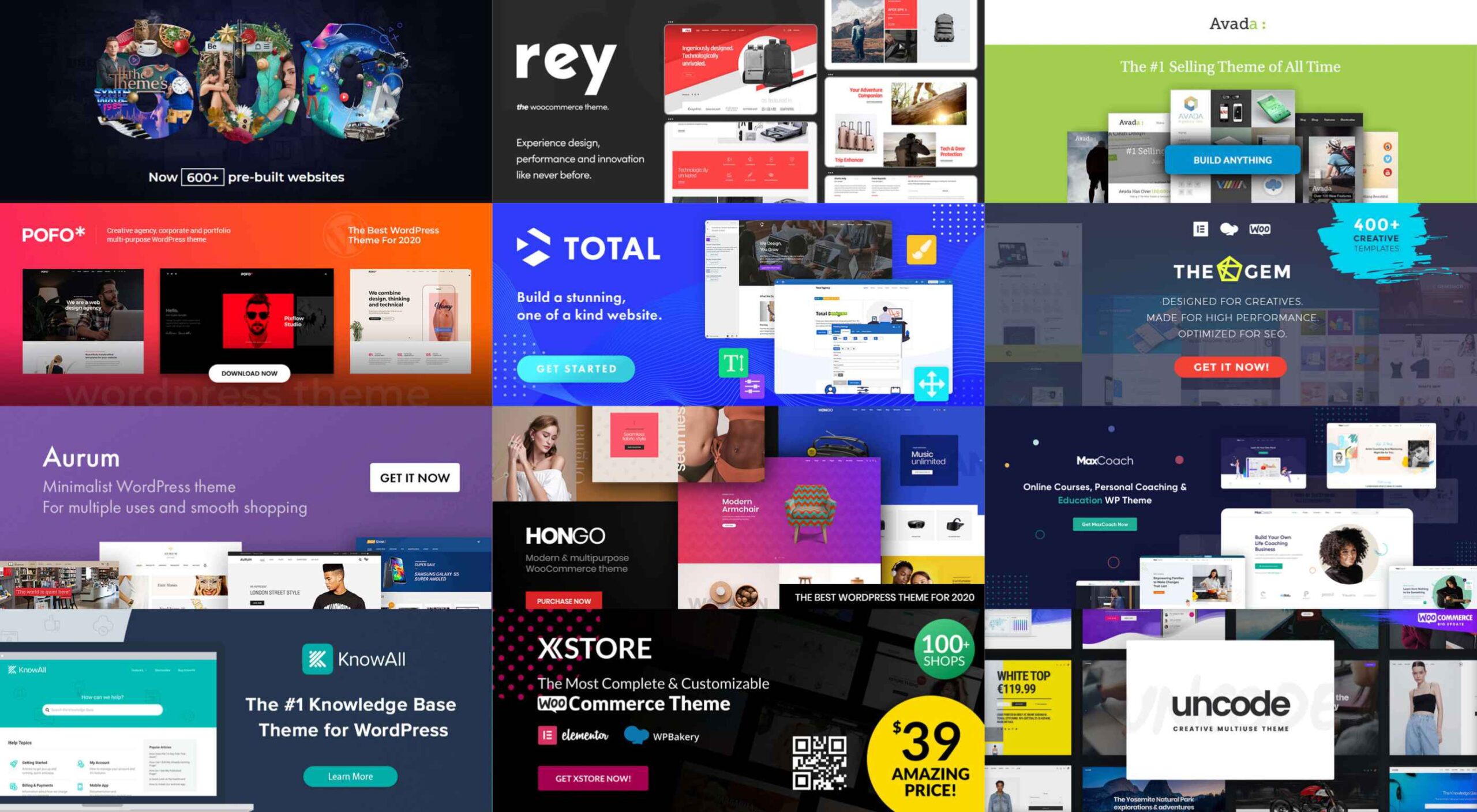
The following 12 top WordPress themes and plugins have been selected with those purposes in mind. They will not only get the job done for you but do it better than most of the other website-building tools in the marketplace are capable of doing.

The choice is up to you. Whatever that choice may be, it should prove to be a winner.

1. BeTheme

A website-building toolkit that can boast of 40+ core features sounds like a pretty good-sized toolkit, and BeTheme is just that. In fact, this popular (200,000 sales) theme is the biggest WordPress theme of them all.

It’s unlikely you will need to put every one of these core features to use for your next project, but some will be essential, such as –

  • The Muffin Builder page builder, Admin Panel, and Shortcode Generator combine to make BeTheme easy to use, give you a ton of flexibility, and enable you to build your website without any need for coding.
  • Be’s library of shortcodes together with the many Header, Footer, and Grid options, and the new Header Builder extends your design options even more.
  • The Layout Generator will come in handy if you want to start a page from scratch.
  • You’ll love what may be the most important core feature of them all; Be’s selection of 600+ customizable pre-built websites. They cover most industry sectors and website types plus a variety of business niches.

Click on the banner to learn more.

2. Total Theme

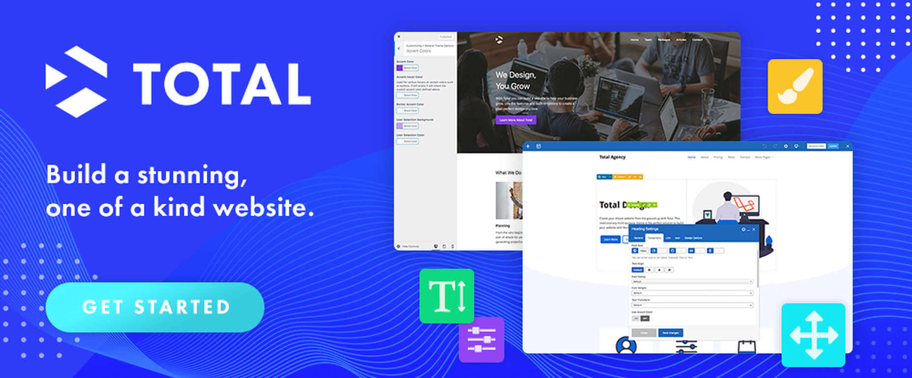
Designed with excellence in mind, Total features an exceptional selection of tools and design aids to work with. Total is also well-known for its speed, ease of use, and the flexibility it offers its users.

  • Since you can disable any feature you want to, you won’t be distracted by or bothered with those you don’t intend to use.
  • Total’s 40+ quick import demos and one-of-a-kind theme cards are designed to get your projects off to a rapid start.
  • The Dynamic Template function is a driving force behind this WordPress theme’s remarkable flexibility.
  • You’re given a wealth of design options to work with, thanks to the live customizer and the advanced theme panel.
  • Total is a WordPress plugin and WooCommerce friendly.

Click on the banner to learn more.

3. Avada Theme

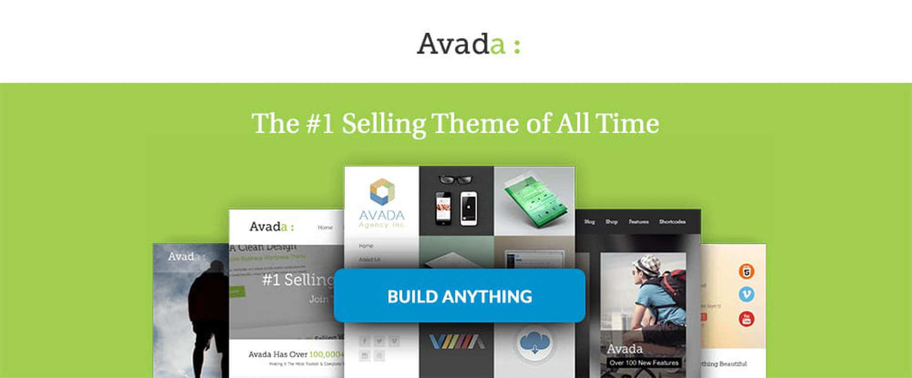
When a WordPress theme has the distinction of being the #1 best seller of all time, you can safely assume that those who created it got it right. Avada’s 450,000+ sales can’t easily be ignored.

Look closer, and you’ll see some of the many reasons behind Avada’s popularity.

  • There’s an impressive selection of one-click import demos, pre-built websites, and a wealth of supporting design elements.
  • The Fusion drag and drop builder and Fusion page and theme options enable designers to create complex websites without resorting to coding.
  • 5-star support and free updates ensure users that they will always be able to follow the latest design trends and create websites as they envision them.

Click on the banner to learn more.

4. MaxCoach – Online Courses, Personal Coaching & Education WP Theme

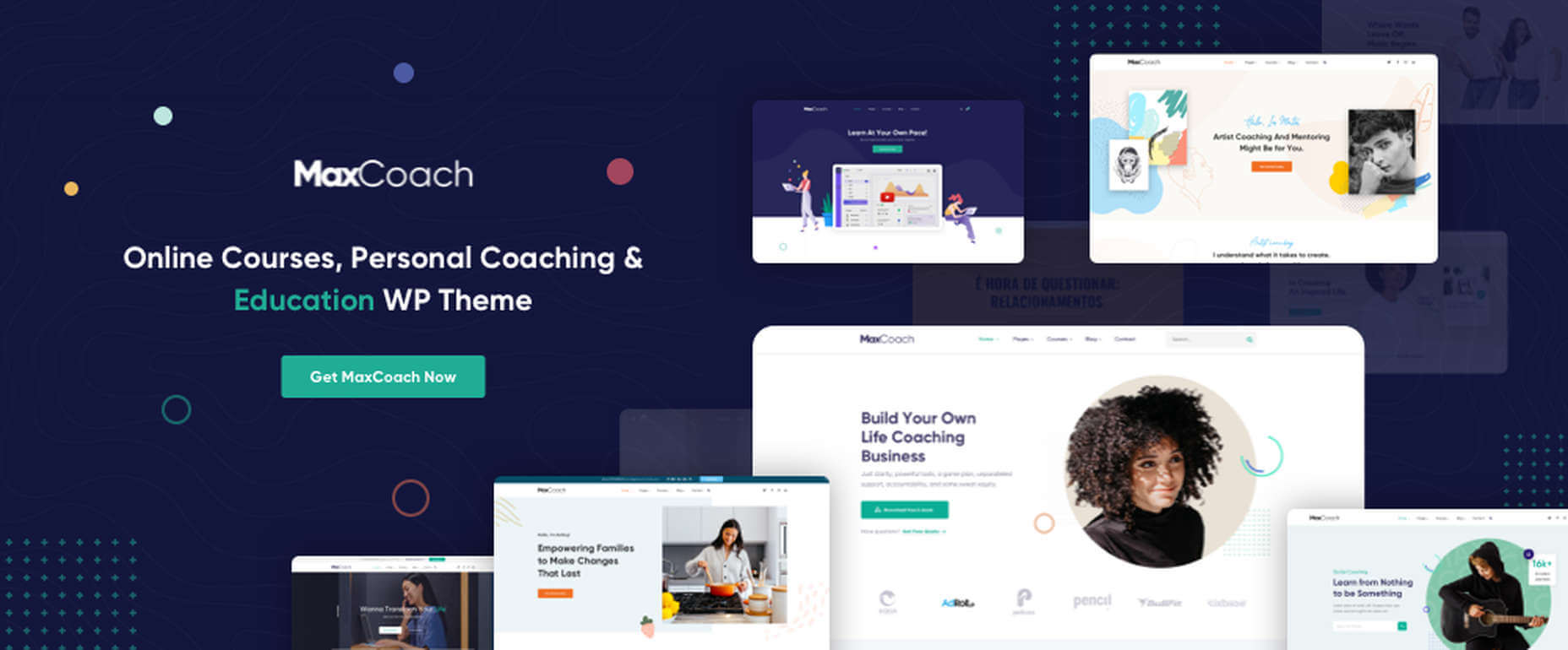
MaxCoach is a specialty tool that enables web designers to create an online distance learning and/or tutoring platform. This LearnPress theme was last year’s #1 coaching theme, and it will most likely be so in 2021 as well.

  • The platform is learner-centric
  • MaxCoach’s design is modern, trendy, and unique
  • Elementor is the drag and drop page builder of choice

Visit the site to see for yourself why this specialty theme has generated so much interest.

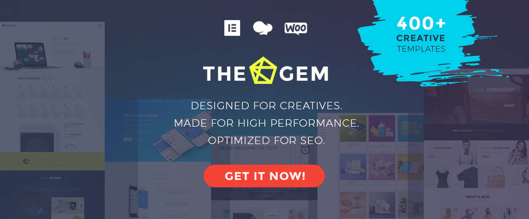
5. TheGem – Creative Multi-Purpose High-Performance WordPress Theme

TheGem, WordPress’s ultimate multiuse toolbox, gives its users:

  • A selection of more than 400 professionally-crafted pre-built multi-page and single-page websites
  • Two popular page builders – WPBakery and Elementor
  • Demos, layouts, and page sections you can mix and match to create a look that’s uniquely yours

The GemBlocks with its 300+ pre-designed section templates to speed up your workflow, plus WooCommerce layouts and design aids

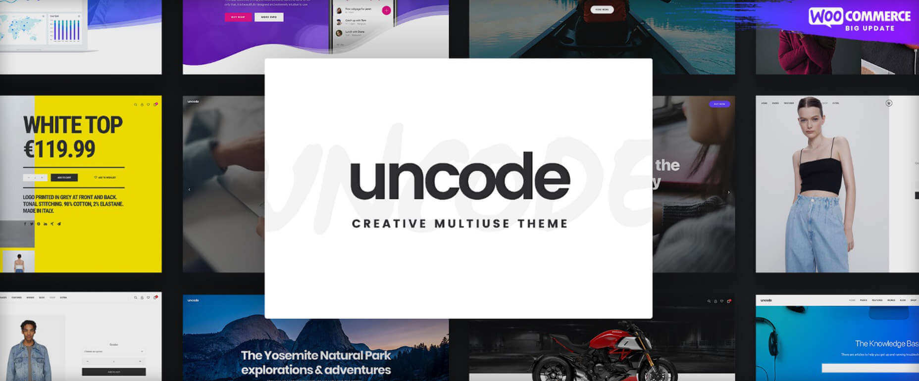
6. Uncode – Creative Multiuse & WooCommerce WordPress Theme

The Uncode multi-use WordPress theme is ideal for entrepreneurs, creative individuals, agencies, and small businesses.

  • Its 80.000+ sales to date have made it a ThemeForest best-seller.
  • Features include a unique WooCommerce Custom Builder you can use to give site visitors a supreme shopping experience.

Viewing Uncode’s showcase of user-built websites is a must. Click on the banner to visit the site and prepare to be impressed.

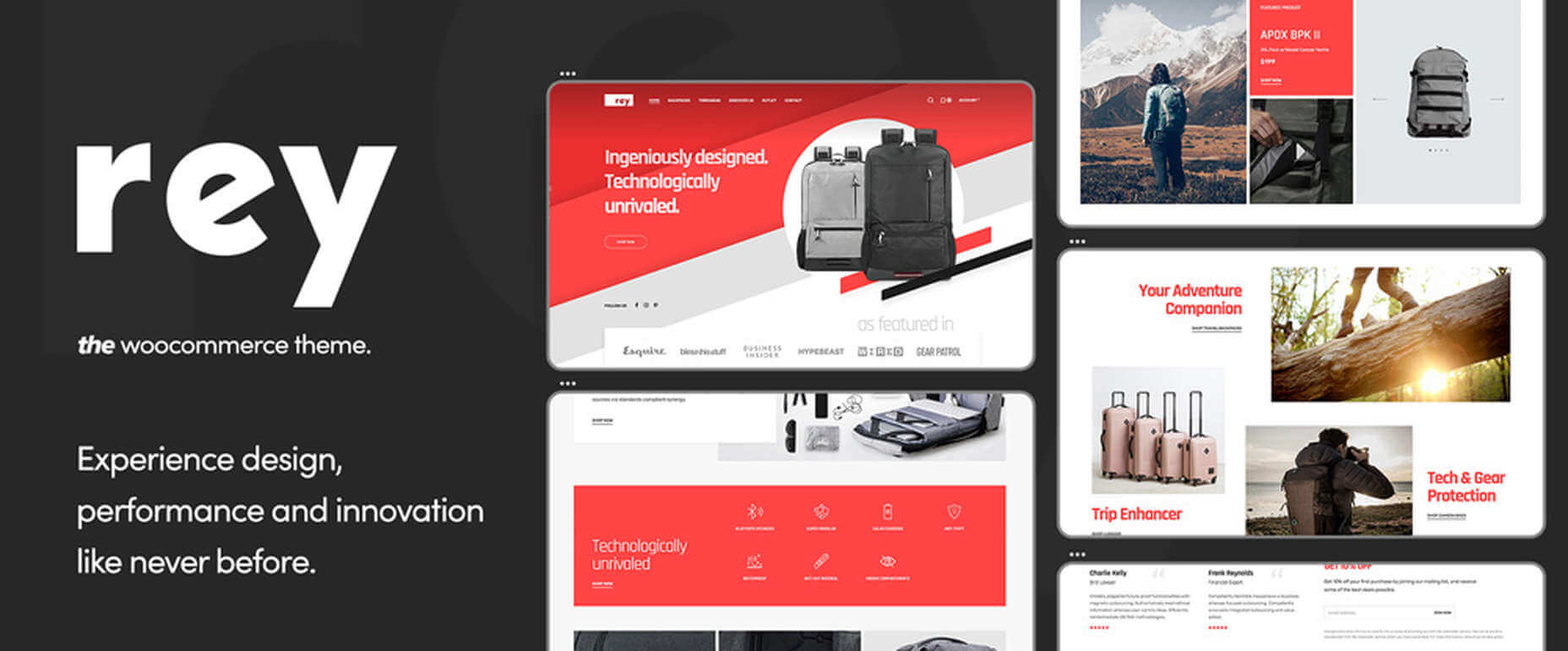
7. Rey Theme

This highly modular popular theme is definitely worth a close look. It is simply one of the most innovative website building tools you’re likely to find on the market today,

  • Rey’s features include a library of professionally-designed templates and an imposing selection of WooCommerce site-building tools
  • It is easy to set up and easy to use
  • You will be more than satisfied with Rey’s robust performance

Rey has built-in SVG support and is user and developer-friendly.

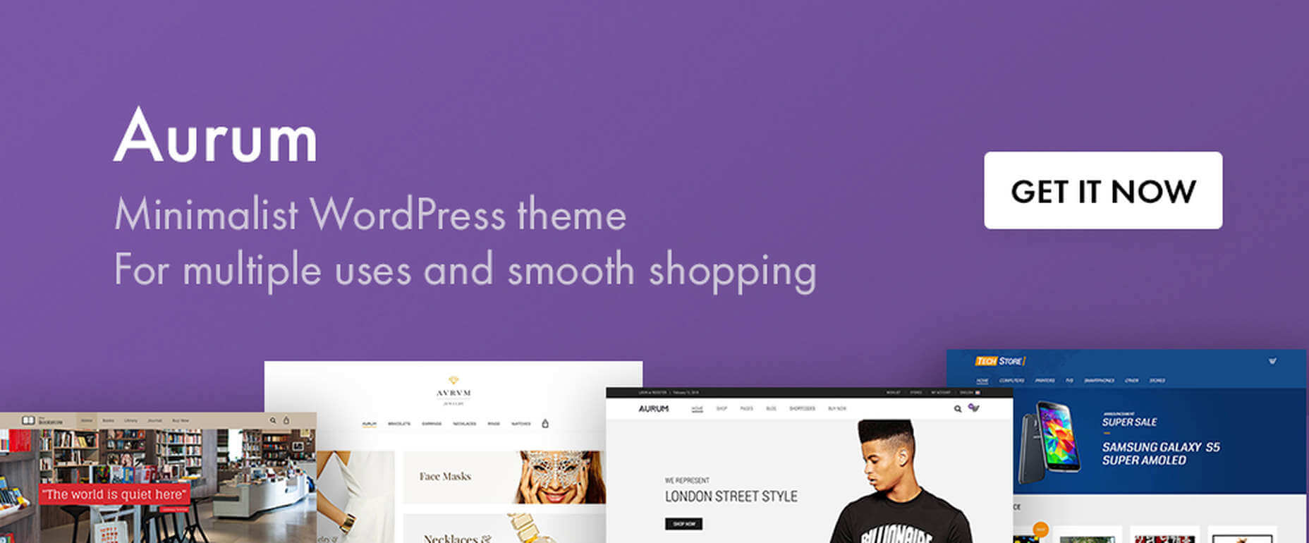
8. Aurum – Minimalist WordPress Theme

With this multiuse minimalist WordPress theme at your fingertips, you’ll be able to create an online store that will give shoppers a fully satisfying shopping experience.

  • With Aurum, you can design megamenus to accommodate huge selections of products
  • Aurum’s page load times are super-fast, and Aurum’s pages are responsive to every screen size
  • Popular plugins are included, and all the popular WordPress plugins are supported

Click on the banner and check it out.

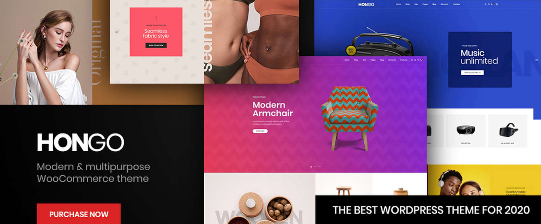
9. Hongo – Modern & Multipurpose WooCommerce WordPress Theme

Its trendy selections of creative design elements and ready-to-go store demos make Hongo an ideal choice for company, blogging, and eCommerce websites.

  • Premium plugins and WPBakery custom shortcodes are among the most popular of Hongo’s website-building features
  • This multipurpose theme also features an attractive selection of product-related tools that include product compare, quick view, wish lists, and product filter

You can expect and receive exceptional user support.

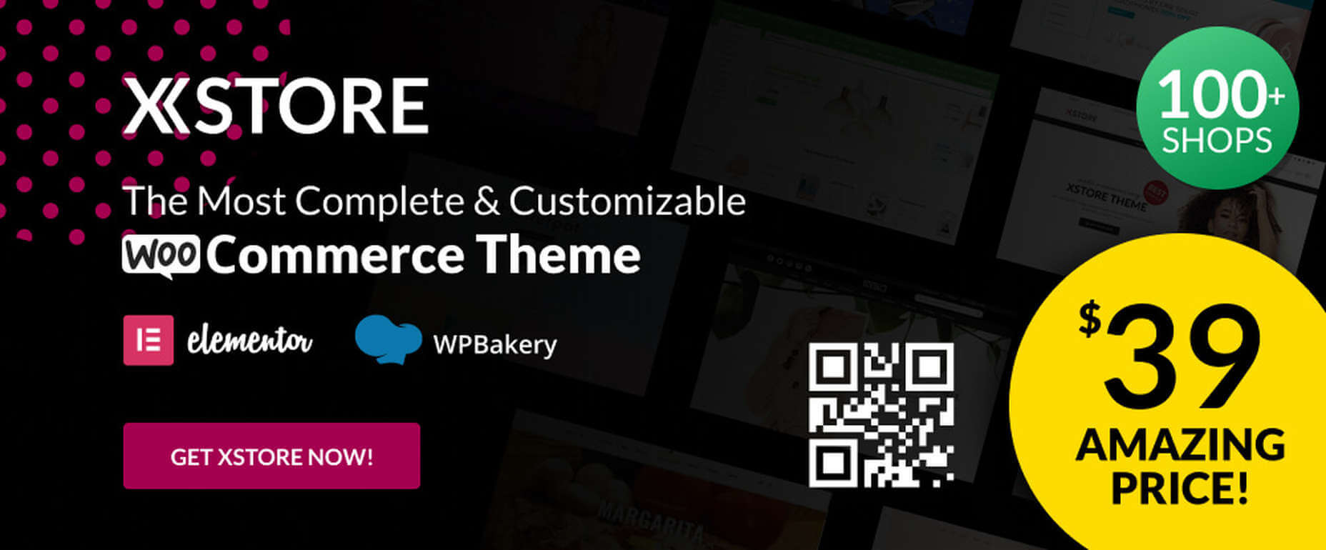
10. XStore – The Most Customizable WooCommerce Theme Ever

With its $39 price tag, XStore gives you more value for your money than you’ll find in any other WooCommerce theme.

  • For starters, there are 100+ good-to-go shops
  • A full Ajax shop is another popular feature
  • As is XStore’s single product page builder and its selection of product filters and display features

Check XStore out if you’re looking for a way to create an awesome online store in no time at all.

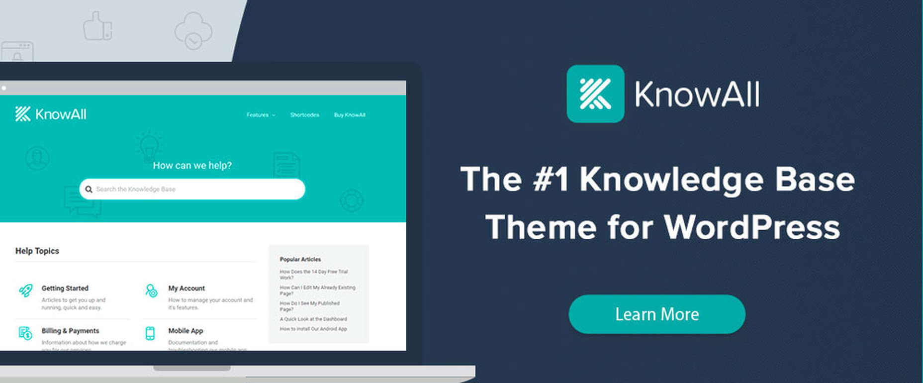
11. KnowAll – Knowledge Base Theme

Have you ever come across a FAQ page you really liked? It doesn’t happen often. 

Visitors that can’t find a good answer might decide to make a phone call (and be placed on hold). That answer is OK, but additional information would be more helpful.

With AI-based KnowAll, customers get answers 24/7, and they can search for other relevant information. They will be happier customers, which is obviously good for business.

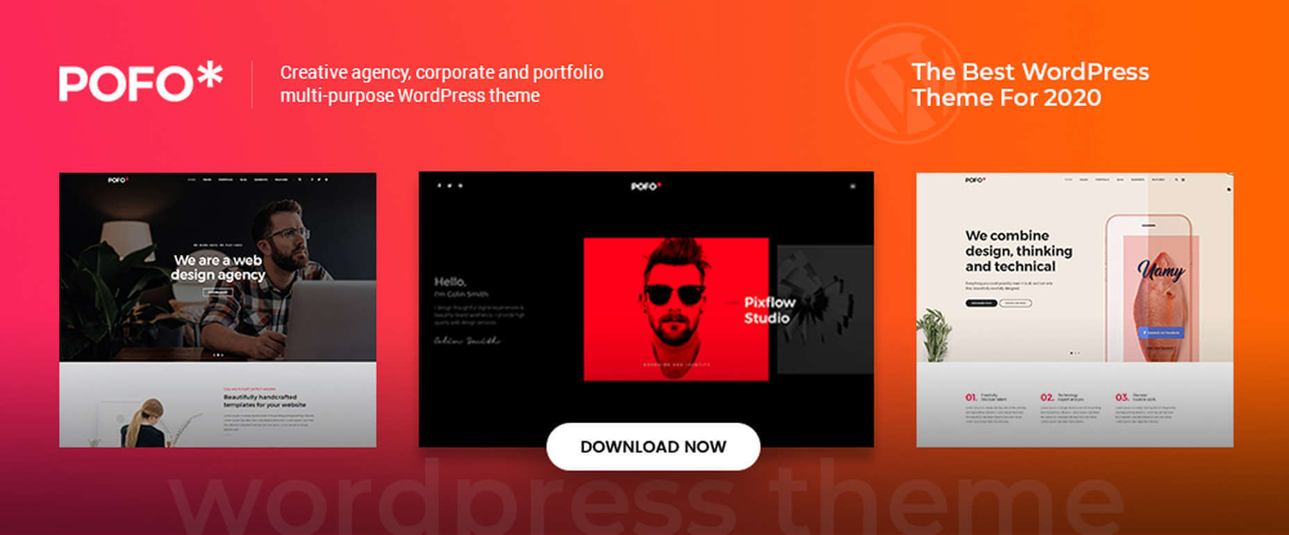
12. Pofo – Creative Portfolio, Blog, and eCommerce WordPress Theme

Bloggers, creatives, agencies, and those looking to create an eCommerce site should give Pofo a good, hard look.

Pofo is fast, flexible, SEO optimized, and packed with useful features that include:

  • Trendy selections of pre-built design elements, ready-to-go home pages, and one-click import demo pages.
  • Premium plugins, including Revolution Slider and the WPBakery page builder.

Detailed online documentation is provided, and you’ll be more than pleased with this theme’s customer support.

A modern, fast-loading, and smoothly performing theme is what you need. It will help you create a website that will have a significantly positive impact on your business’ growth.

Themes like those presented here can do just that by enabling you to give your website the professional touch you’re looking for. You can do it without having to rely on a single line of code.

These 12 top WordPress themes are modern, trendy, and easy to work with. Trying to find the “best” of the bunch could admittedly be somewhat daunting. But, you can take comfort in the fact that you really can’t make a wrong or bad choice.


[– This is a sponsored post –]

Source

The post 12 Best WordPress Themes for 2021 first appeared on Webdesigner Depot.


Source de l’article sur Webdesignerdepot

When creating a website, it’s vital to remember that not only does it need to work and look great on the device you are creating it on, but on all the other devices, it might be used on too.

Mobile and tablet optimization is important not only for the user journey but from an SEO point of view too, and badly created mobile sites just don’t cut it anymore.

With more and more devices entering the market, you need to check any website you create is compatible across the board. One bad experience and users are likely to leave and not come back again, which can be catastrophic for a business, particularly if it is just starting out.

It’s vital to check how a site looks and behaves when browsed differently from how you would use it. A common mistake is to assume users only browse websites on mobile devices in portrait mode; they don’t; landscape browsing is common, especially if the user is used to watching video.

Here are some of our top tools for testing websites on devices without the need for an entire device library:

1. Multi-Screen Test

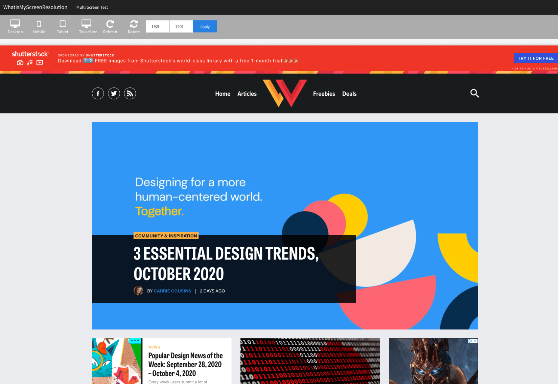
WhatIsMyScreenResolution offers a great little tool to test how your site will look on different devices easily, and it costs absolutely nothing. You put the URL and choose between desktop, mobile, tablet, and television and then the orientation. Each device can also be broken down into different sizes and resolutions (or you can enter your own), making it easier than ever to test what a site will look like on different devices.

2. Responsinator

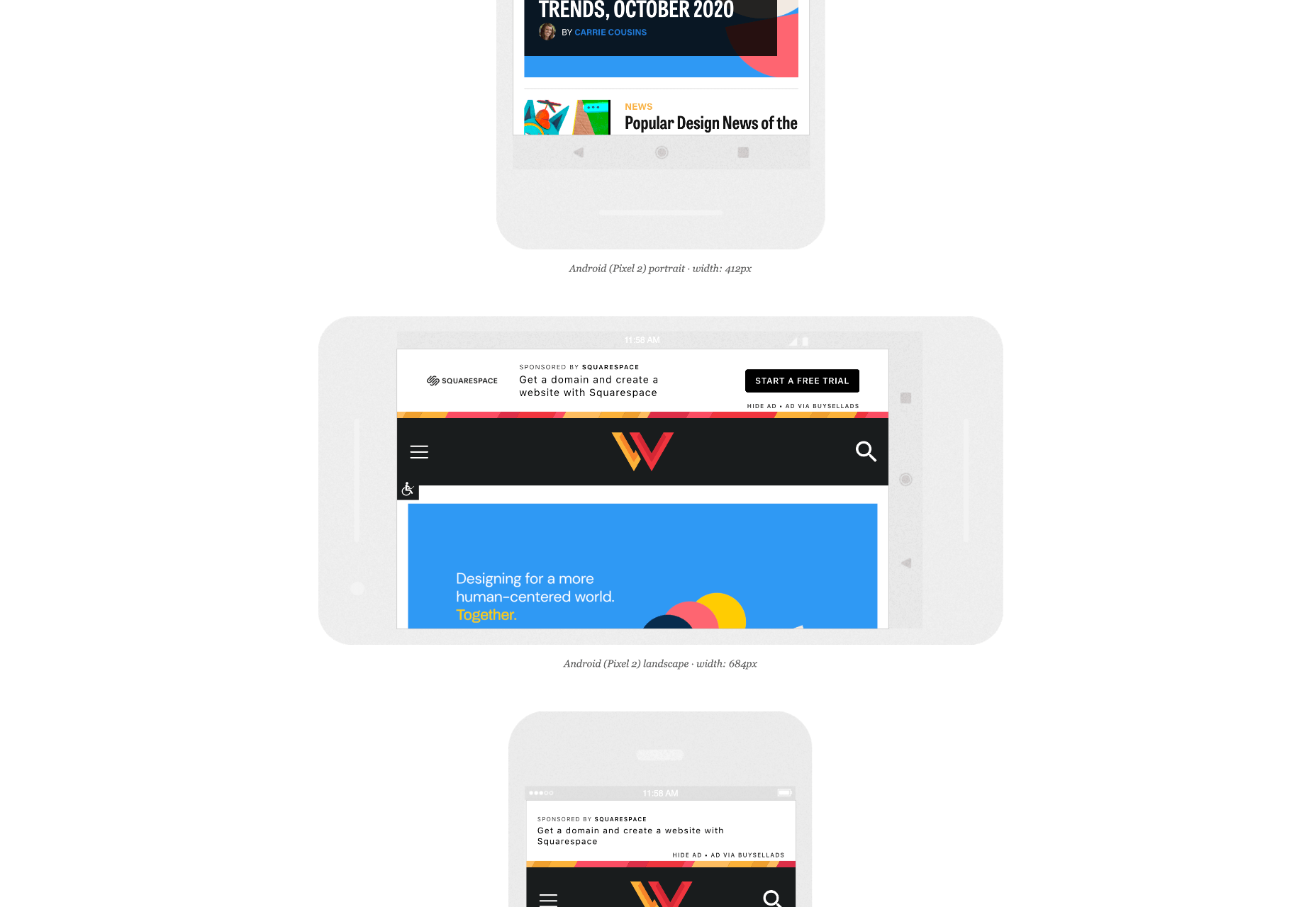
Responsinator is another great tool to test how a site looks on other devices without dipping into your wallet. Put your URL in the top bar, and it will instantly show you what it looks like on generic devices. This is a great, easy to use tool, and you can click through any links on your site to check the usability of multiple pages. This site is free, but if you want to “create your own” template, you need to sign up.

3. Google Dev Tools

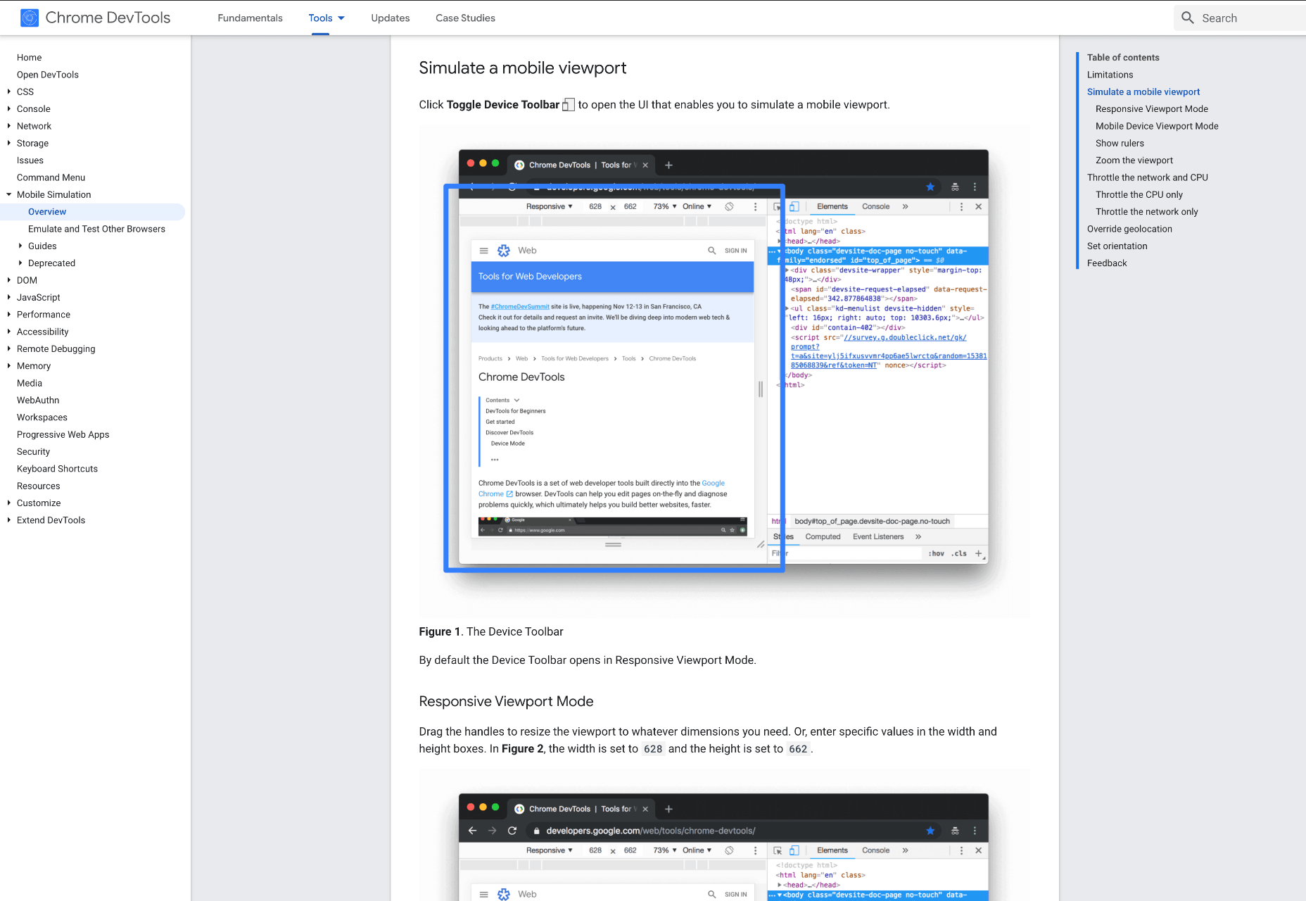
Google Dev Tools is one of the most commonly used free tools. Add it to Chrome, and you can see how your site looks in a multitude of different screen sizes and resolutions. You can simulate touch inputs, device orientation, and geolocation to test how they work. It’s great to easily spot problems using their remote debugging tool to view, change, debug and profile a page’s code directly from your laptop or computer while viewing it on your mobile device.

4. Browser Stack

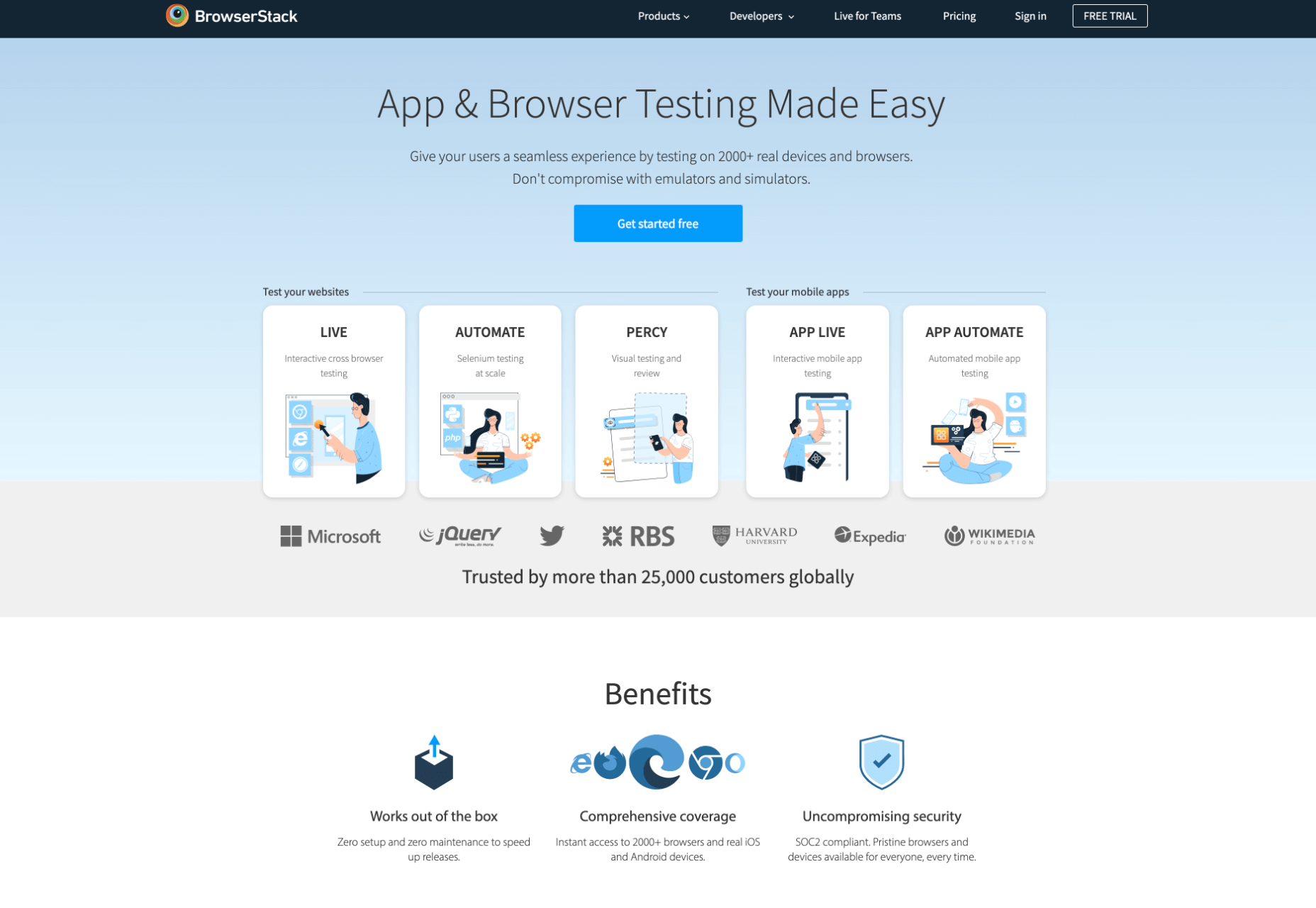
Browser Stack allows you to test your site on over 2,000 real devices and browsers, enabling you to see in real-time how your site looks. It is no hassle to set up, and it can be seamlessly integrated into your setup. As it tests on real browsers on real machines, you know the results are more reliable and accurate. It also enables you to debug in real-time using their pre-installed developer tools for ease of editing. The tests are all run securely on tamper-proof physical devices and are wiped clean of all data after each session, so you don’t need to worry about security being compromised.

5. TestComplete Mobile

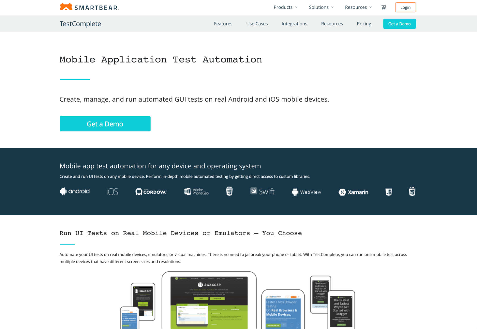
TestComplete Mobile allows you to create and run UI tests across real mobile devices, virtual machines, and emulators. You can test both mobile device layouts and apps with script-free record and replay actions. This can help you to edit and fix any potential issues that may arise during the tests. Due to them being conducted on real devices, you know it is less likely to have errors in the system than a simulated device. This is free for 30 days then can get pricier, so make sure you take advantage of the trial and try the service before committing to it.

6. Sizzy

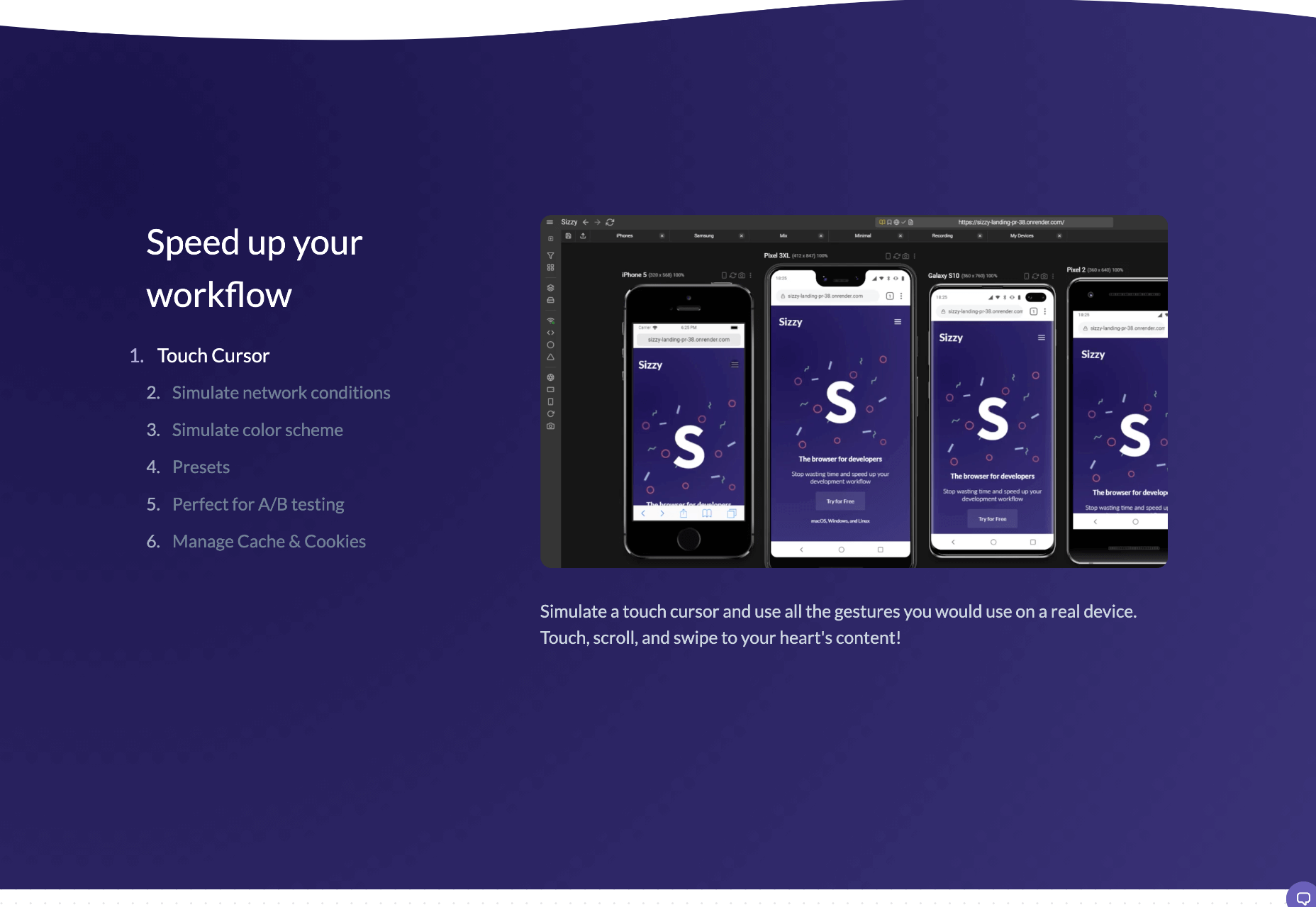
Sizzy is a great tool for checking sites, and it has a host of features to assist you. You can rotate the screen between portrait and landscape, filter by OS and device type, switch themes, and take screenshots. These little things mean it’s a super easy to use and convenient tool. It claims to simulate each device’s viewport and user agent, meaning the results are the same as what you would actually see on that phone/ tablet, etc. It can’t simulate different browser rendering engines however, so there’s a chance there might be some minor differences compared to the actual thing. Sizzy offers a free trial or has different price packages starting at $5 per month.


Featured image via Unsplash

Source

The post 6 Tools for Rapid Cross-Device Website Testing first appeared on Webdesigner Depot.


Source de l’article sur Webdesignerdepot

Don’t drop the ball on these website design trends for the new year. All of the trends featured here this month are visual in nature – not as many user interface elements as previous months, but all just as stunning and usable.
Here’s what’s trending in design this month.

1. 3D Scenes on White (Light)

Three-dimensional scenes are not just a trend this month but are likely to be one of the biggest website design trends that you see all year.

They offer a great way to show off product imagery, design something with illustrations or animation for visual impact, and provide usability and understandability cues for users.

It’s a versatile technique that can work with real or created images and are also “COVID-friendly,” something designers have had to think a lot about in the past few months. (Appropriate imagery in design is a real concern, as is trying to design projects without the ability to produce traditional photoshoots.)

What’s neat about all of these projects – and plenty of others – is that they root the design in white or light backgrounds. The light effect creates an easier visual mood that’s clean and emphasizes the imagery.

This website design trend solves a lot of those problems and looks good doing it.

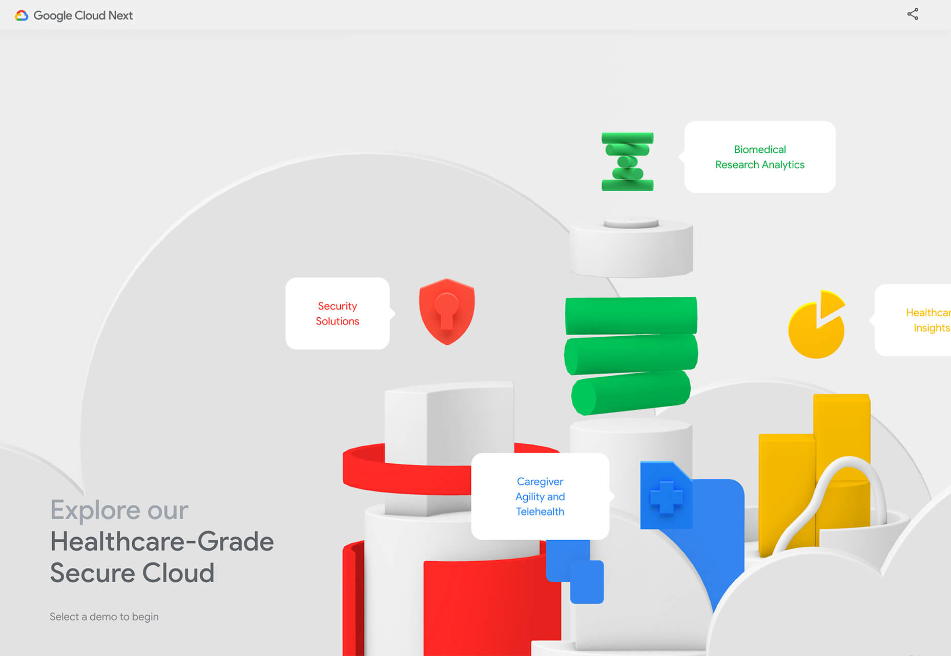
Google’s Cloud design uses 3D illustrated animation on a white background with plenty of depth elements. The primary color palette of illustrated objects pulls it all together and guides the eye through each of the callout labels.

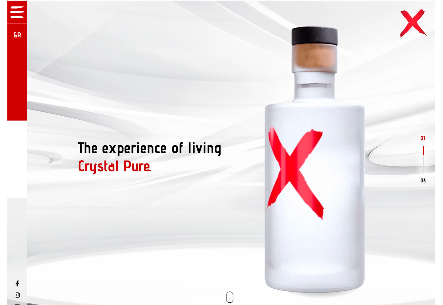
The red words on the screen Crystal Pure fit perfectly with the white-on-white 3D imagery of this design. Red accents pull you into different places on the screen, and it all has a clean feel.

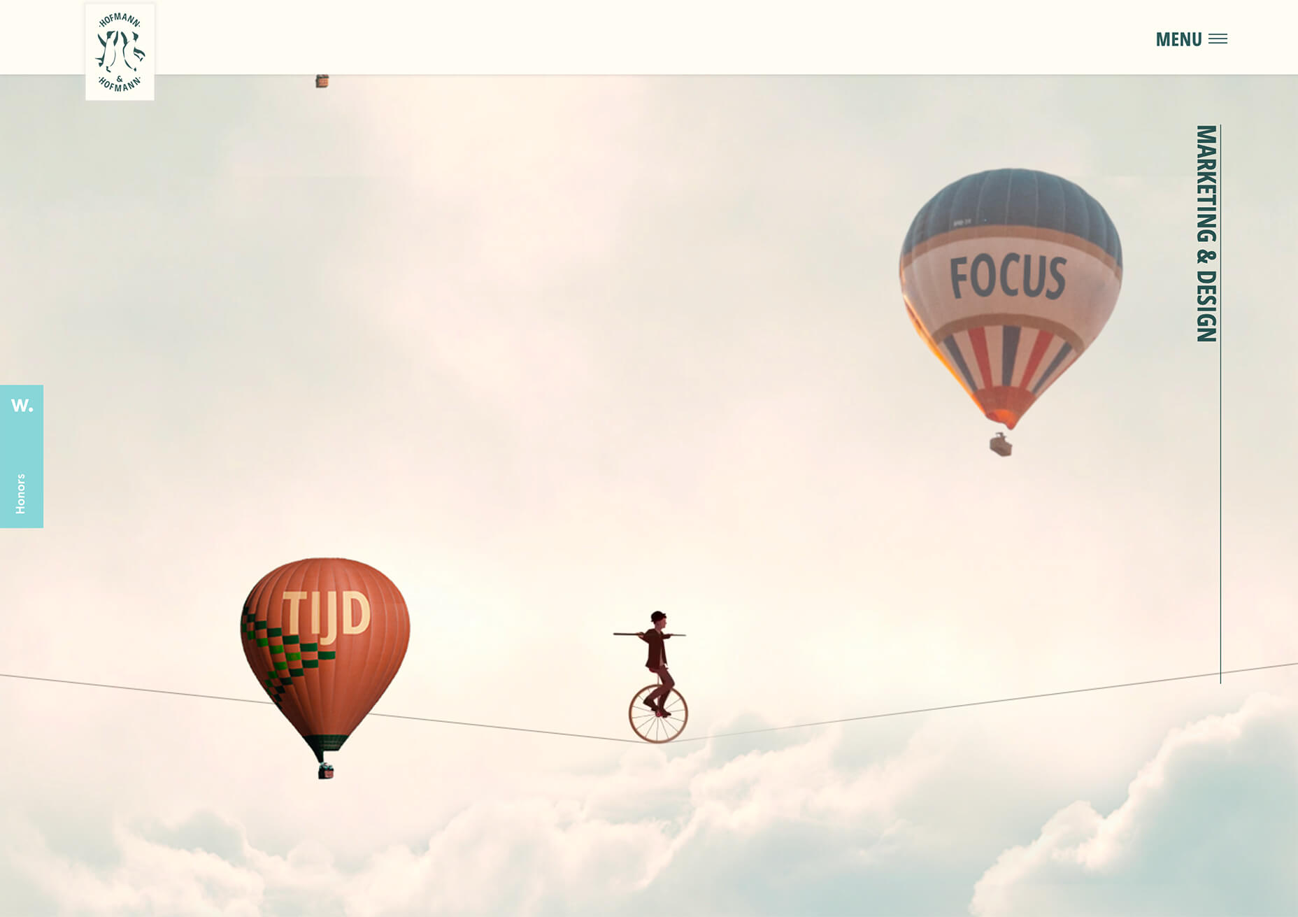
Hofmann & Hofmann uses the same concept with a slightly different approach. The background is still light with a realistic feel and 3D objects, but it is a lot less stark and white. The feel is a little warmer and more inviting than a flat white aesthetic.


2. So Many Stacked Capitals

If you don’t have great artwork or imagery, make your own with typography.

This trend seems like it might be yelling at you just a little, but it still works for the most part — well, as long as you don’t land on too many of these website designs in a row!

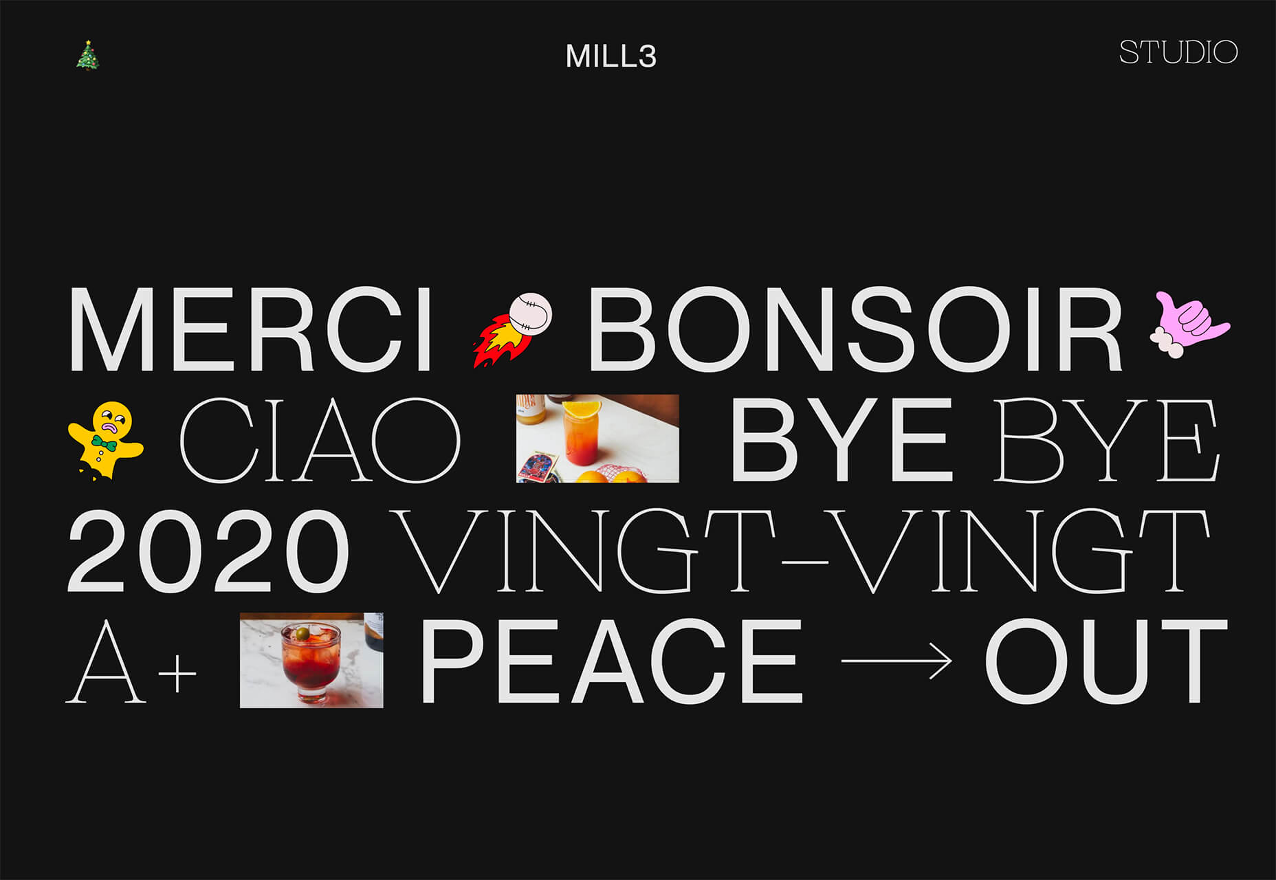
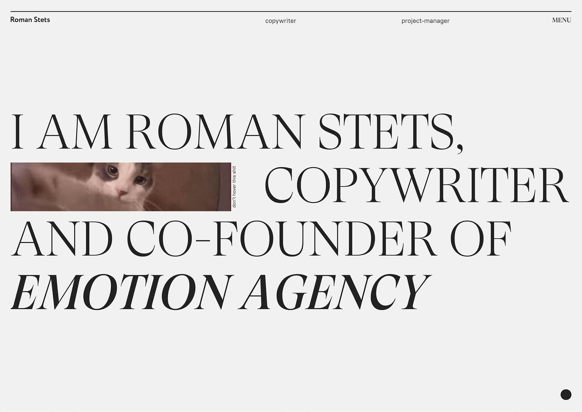
What’s interesting about this trend is that many of the designs feature all caps type and serifs. These styles have been making a bit of a comeback, but this use is interesting for many reasons.

The hardest part when using all caps is maintaining readability. That’s why you see some variances in regular, italics, and bold weights, as well as the use of multiple typefaces. The goal is to create a good reading flow with a stunning visual presence.

This trend works best when you have “easy” words on the screen to facilitate scanning. Too many long or complicated letter combinations can get challenging quickly.

Make sure to look for the Easter eggs in each of these projects:

Emotion Agency has tiny “waving” illustrations next to each word (which doubles as the navigation) when you hover over them.

Mill3 Studio has a few animations, from the text flying in and out on load and scroll to subtle movements in the emojis.

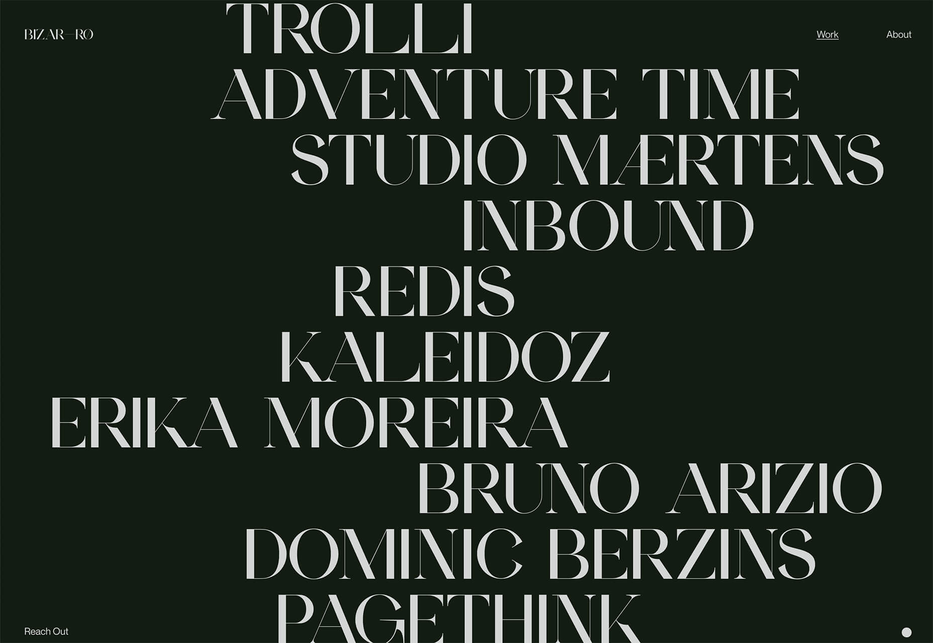
Bizarro has this fun little cat video with a tiny warning not to hover over it, but you definitely should.


3. Empty Places

The final trend in this roundup is a stark reminder of current times. Each of the website design features empty places or locations.

This style of imagery would have been avoided pre-pandemic because tourism locations would want visitors to feel like a part of a bustling environment. Not today. If you travel, chances are you may feel safer or want to be in a more secluded environment.

All of the images and videos from these locations show just that.

Designers are doing this with new stark imagery that stands alone for the design or inserting a few empty place frames into video clips or among images that show more populated times. Even scenes that contain people show very few people and focus on more solitary activities.

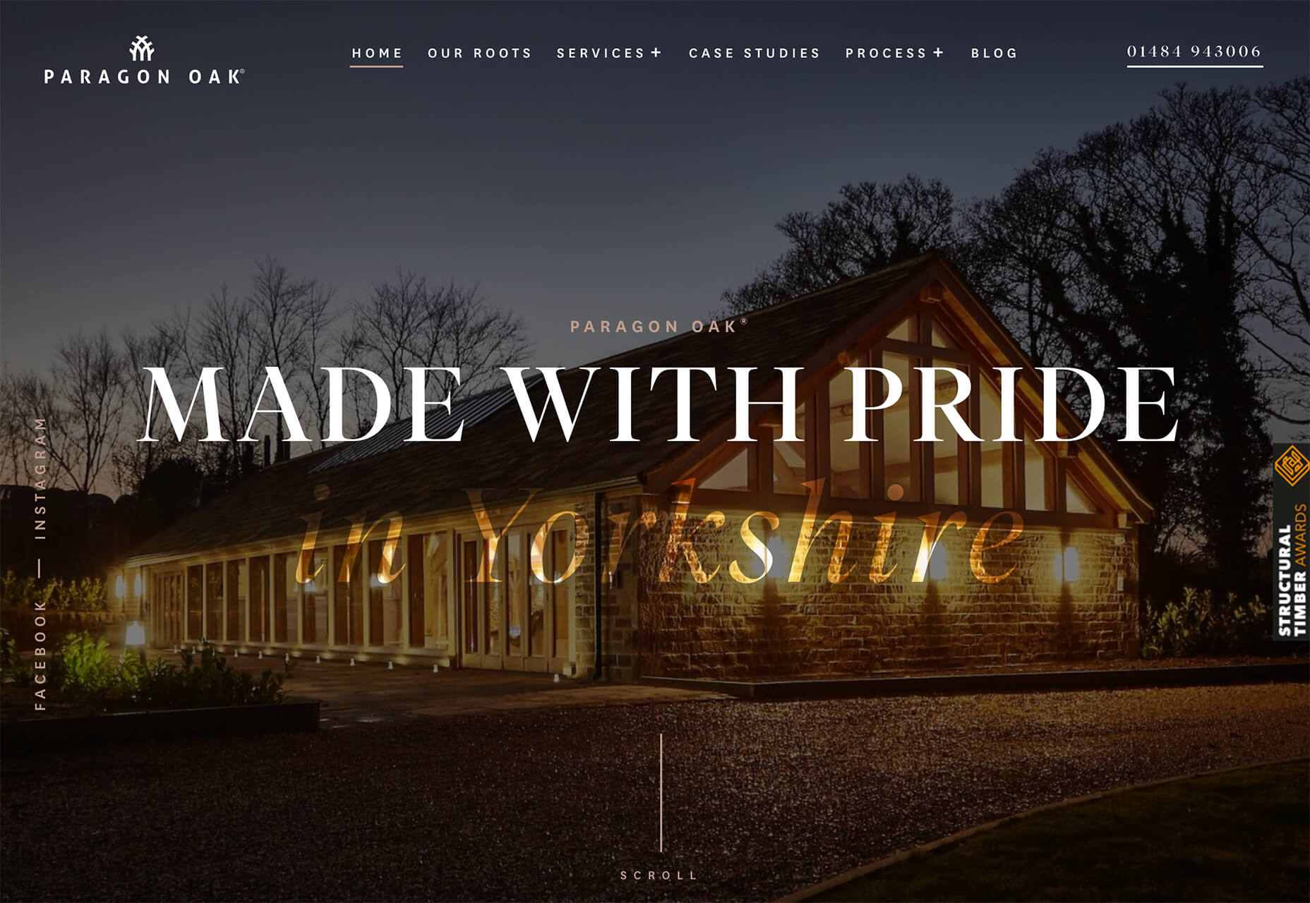
Paragon Oak does this by showing a beautifully lit location at night. Note that using a nighttime photo eliminates questions about where the people are or what they are doing. (This is a clever option when showing imagery of an empty place.)

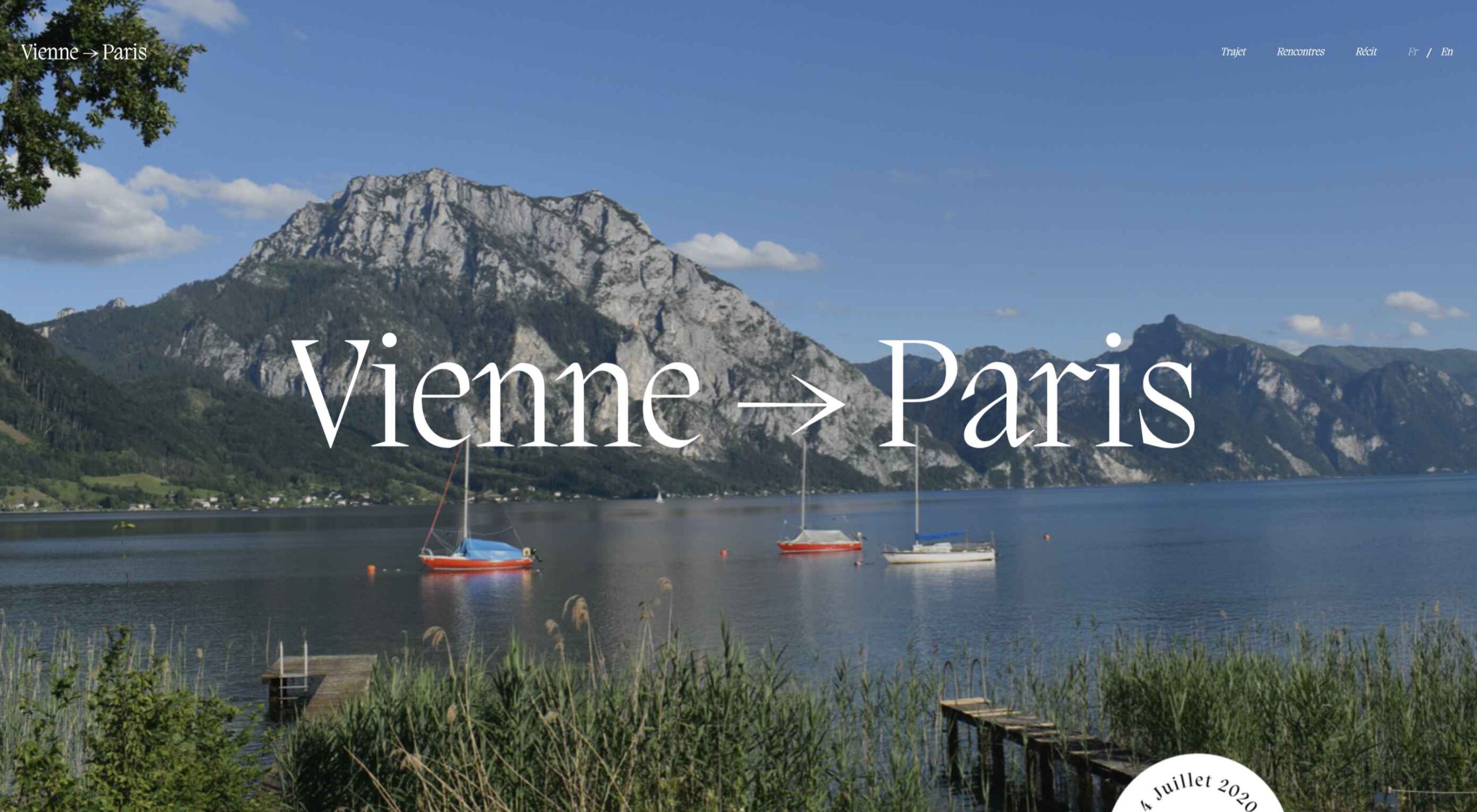
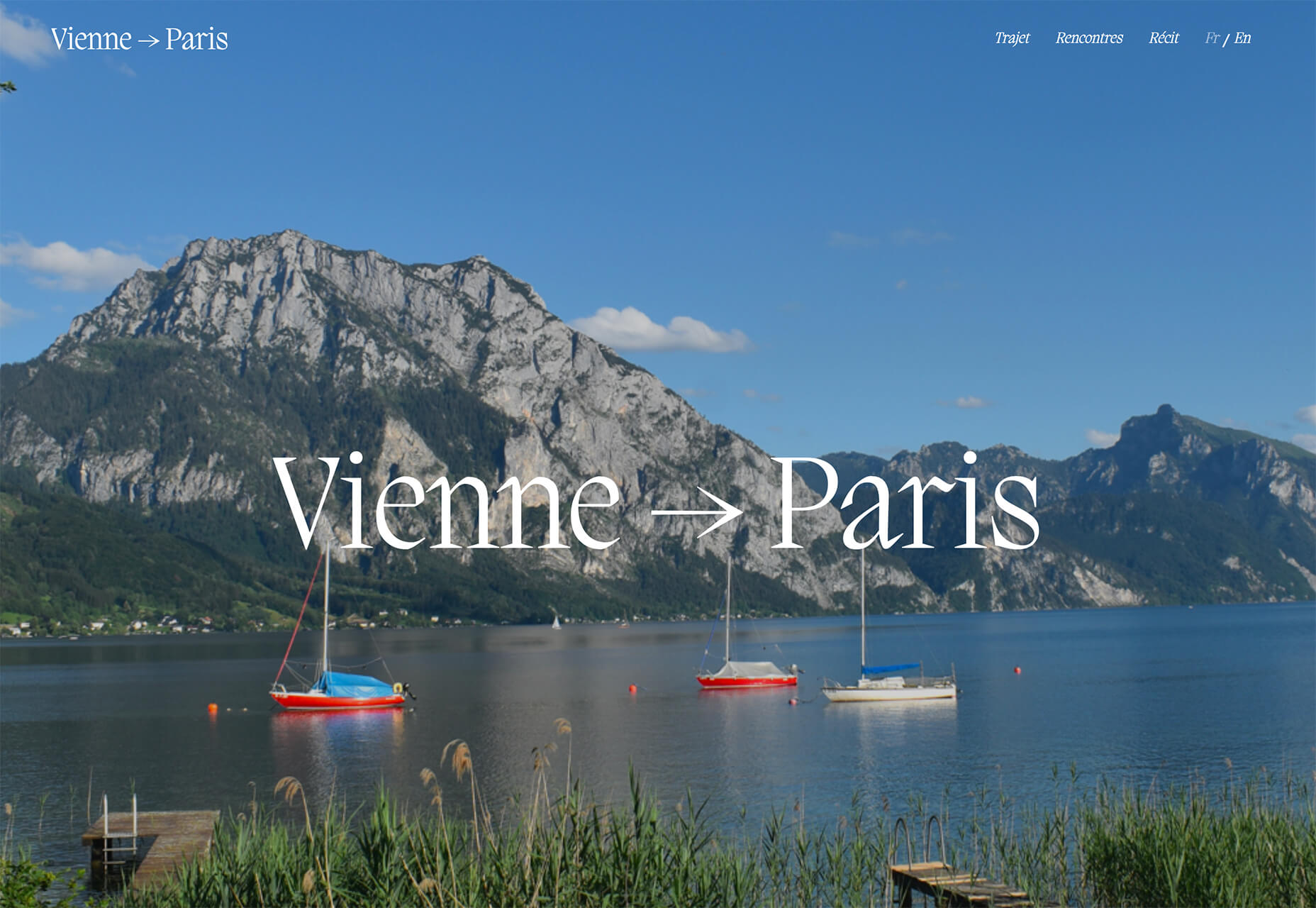
Vienne to Paris shows boats on the water with a beautiful background. While you assume there are people on the water vessels; you don’t see them and get the feeling that everyone is separated in their own “pod,” a pandemic-friendly option for travel.

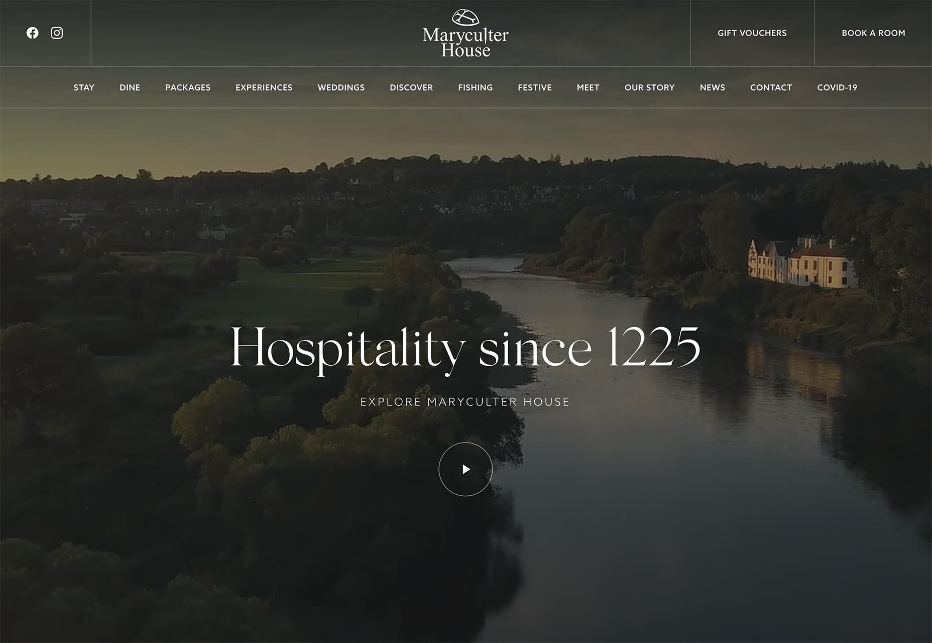
The Maryculter House shows various images without people – the resort’s location on beautiful grounds; empty, but immaculate rooms, and a few images of a person alone on the grounds. Again, the empty nature of the place feels more appropriately welcome for the time we live in.


Conclusion

One of the things that we’ve seen with design trends in the past year is pandemic-related. The composition of images to the way elements are arranged on the screen influences every aspect of our lives.

While the empty place image and video trend is big now, it may fade post-pandemic. Although, it could still be relevant for quite some time. It will be interesting to see what happens as the year progresses with this trend – will it hold on or fade away?

These trends might continue to hold well into 2021.

Source


Source de l’article sur Webdesignerdepot

Over the years, experts have repeatedly discussed the possible impact of mixed realities on web design. Concepts like AR and VR are expected to have the potential to change the way that we interact with websites on a fundamental level.
Now that we’re in the year 2021, however, discussions about AR aren’t just observational anymore. The age of mixed-reality interfaces is here, in everything from Pokémon Go, to Snapchat filters.

The question is, how do web designers create incredible user experiences in a world where there are now multiple digital realities to consider?

The Benefits of Experimenting with AR

Before we look at some of the steps that web designers can take to enhance their projects with AR, it’s worth examining the benefits of interacting with augmented reality in the first place. 

While virtual reality replaces the typical world around us completely with digital components, AR augments it. This means that developers and designers need to learn how to thrive in an environment where the real world and the digital one work together. 

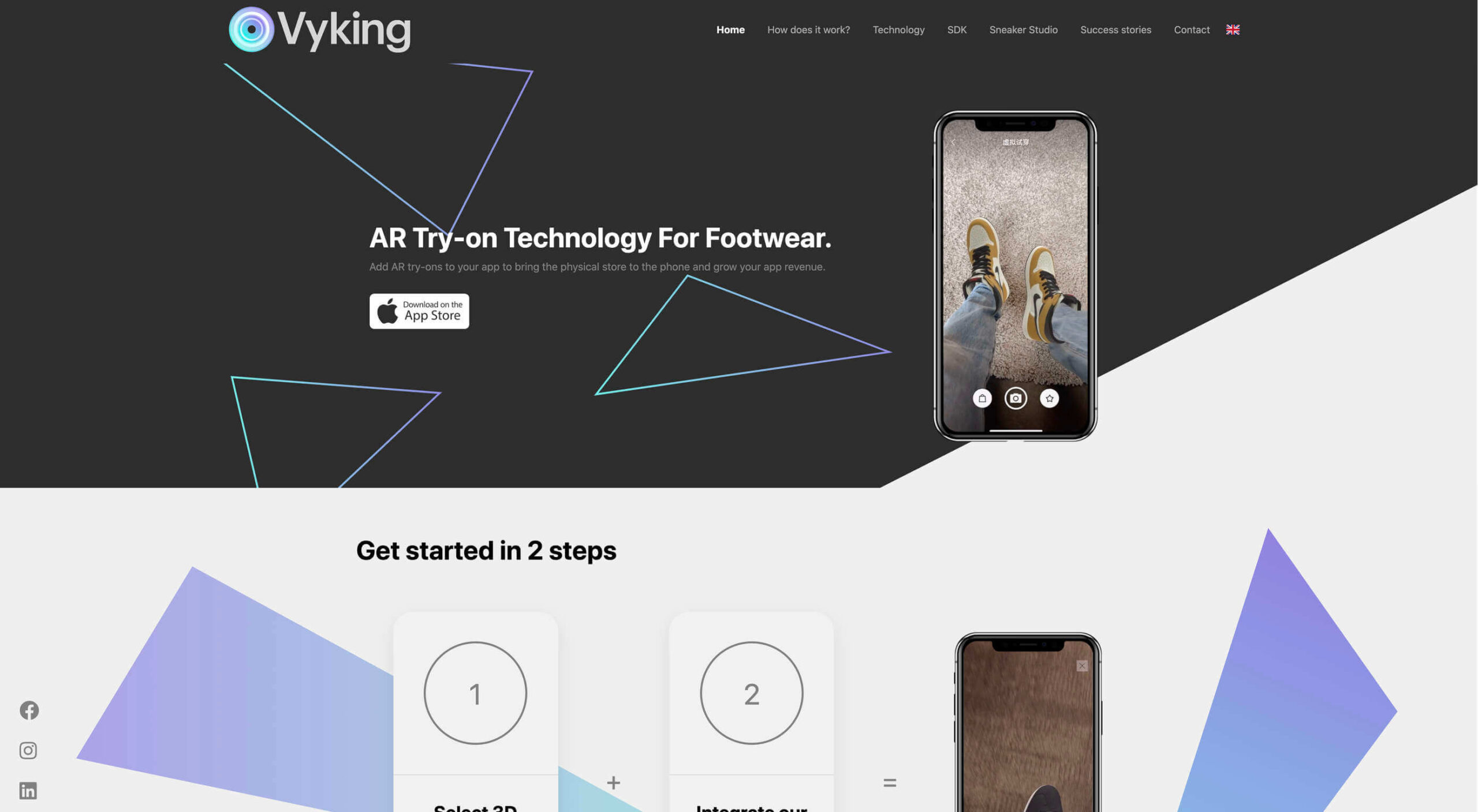
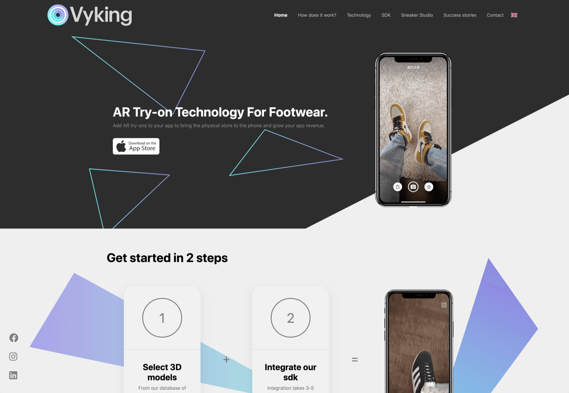
The most common AR application for website owners is to provide a solution for real-time and remote product visualization. Imagine being able to try on a pair of shoes before you buy them online. That’s a service that the Vyking brand can deliver by creating technology that “reinvents” the digital shopping experience. 

This test functionality plays a massive role in purchasing decisions. In a world where people can’t see a shade of make-up in person when they’re shopping online, or check how an item of furniture looks in their home, AR has a crucial role to play. 

In simple terms, AR helps shoppers to make more informed purchases. 

Here’s how you can use augmented reality to deliver incredible UX. 

1. Focus on Real-Time Feedback

Augmented reality is all about connecting the real world to the virtual world. 

Doing this provides users a unique experience – one that’s filled with real-time feedback that can deliver crucial and insightful information. For instance, an augmented reality system in a GPS app can calculate the average time before reaching a destination based on previous trips.

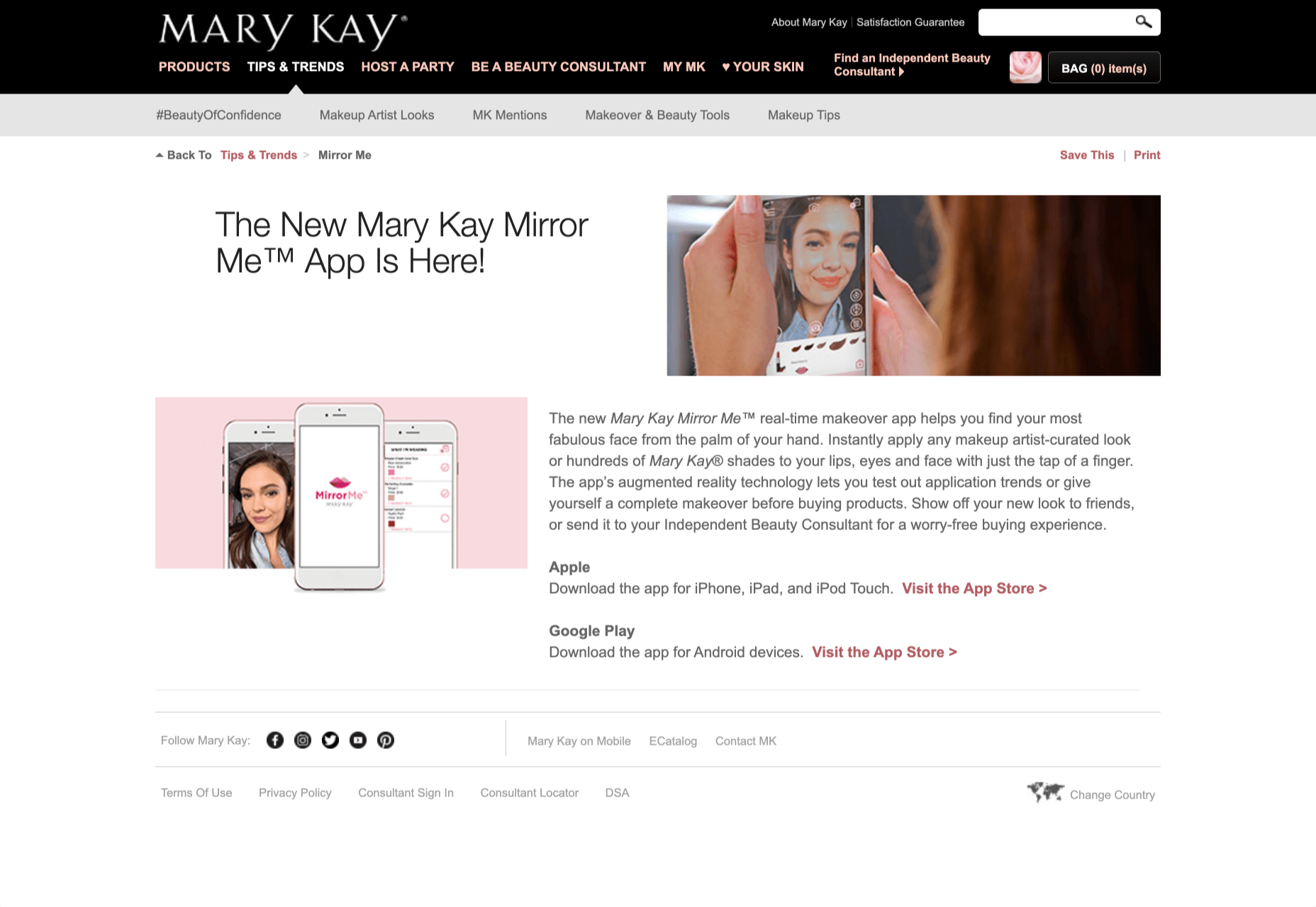
Another option is for an augmented reality to use solutions like face-mapping to help customers determine how a certain makeup product will look before they buy it. For instance, that’s the case for the Mary Kay Mirror Me app, which simplifies the process of shopping for make-up. 

When designing for AR, experts need to consider how they can provide customers with real-time information that they can use to make better purchasing decisions. 

2. Define input and output

Although you’ve probably performed similar exercises when designing for traditional websites and applications in the past, defining inputs and outputs of UX in AR environments can be tough.

Defining inputs and outputs allows you to determine which elements of an interface your user can actually interact with, in your interface. This gives you a better idea of what to “augment.” For instance, you might decide that physical gestures like a swipe of the hand will be essential for AR inputs. However, you’ll also need to consider how each mobile device offers different input possibilities. 

Outputs are a little simpler. For instance, you could offer a three-dimensional model of a product that your customers are interested in. Once you have that output, you can think about how the customer will interact with it by changing colors or position.

3. Embrace Customer-Friendly Performance

Another feature at the heart of AR applications is interactivity. 

Good designs in the augmented reality world need to be simple to access and use, otherwise customers will end up avoiding them. For instance, 60% of customers say they want to use AR when they’re shopping for furniture. However, they’re only going to use your app if it actually works. 

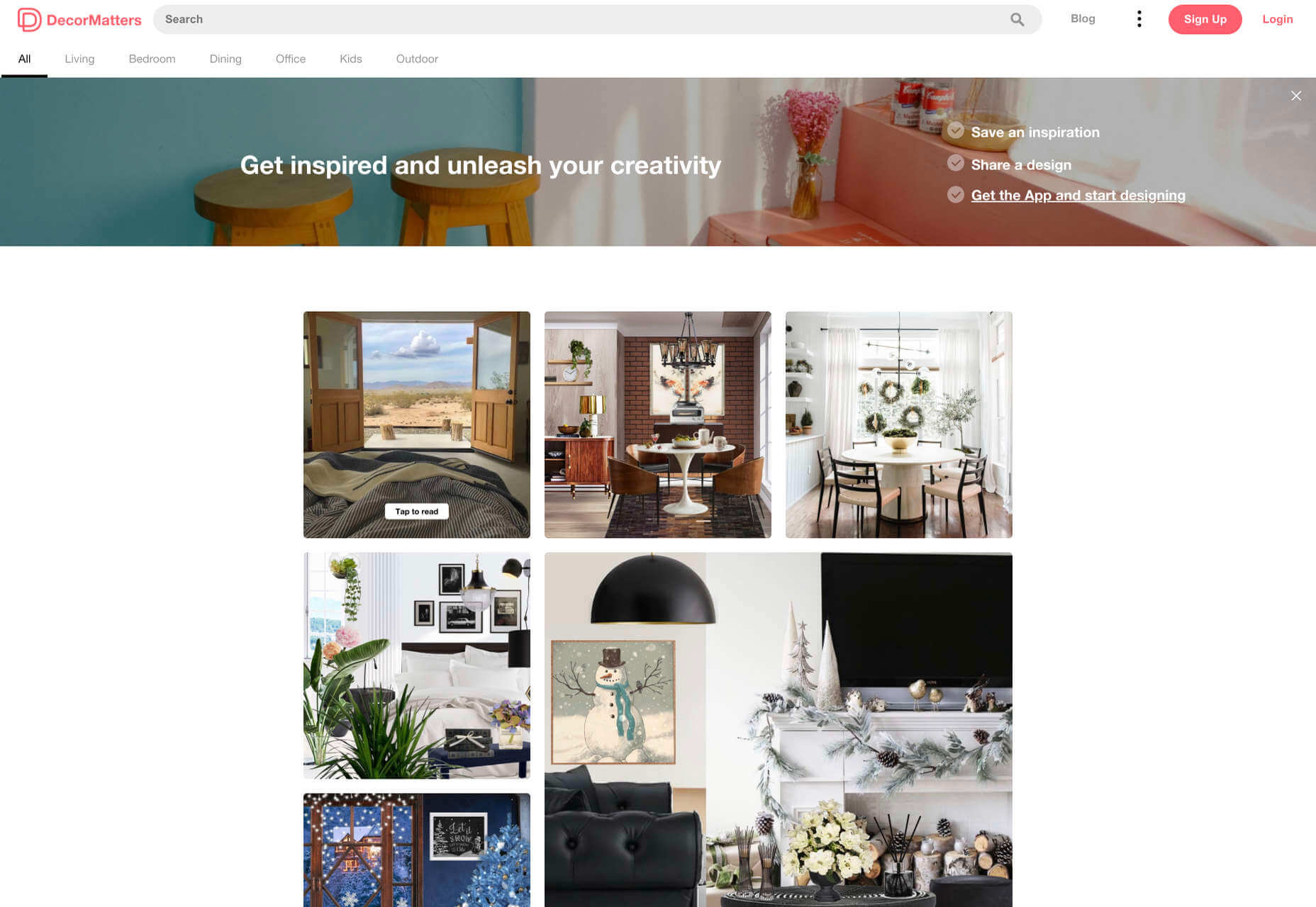
The Décor Matters website and app mix gamification with home decorating features that help customers get a better view of the home goods they’re planning on buying. The website even has inspiration pages available to help users find and try new design options with their AR technology. 

When designing for AR, think about how you can make your applications or technology as simple to use as possible, so customers actually want to interact with it. 

4. Address the Environment

In augmented and virtual reality applications, it’s important to remember that interfaces aren’t bound by physical screens. The viewport will move with the user, shifting perspectives in response. Most AR designers will use four different signifiers to describe AR environments:

  • Public environment: The entire body of the user is involved as a controller, like with the Xbox Kinect or Nintendo Wii;
  • Intimate environment: Where a user can be seated – often in a desktop environment;
  • Personal environment: AR on smartphones, mobile devices, and tablets, like Pokémon Go;
  • Private environments: Completely private spaces, such as with wearable technology like the Google Glass solution.

The environment that you’re designing for will be crucial for your project outcomes. Remember, spatial considerations need to be carefully considered when accounting for how users will interact with objects in a frame. 

5. Remember User Fatigue

Another thing to keep in mind when designing for AR technology is that user fatigue is likely to be a much more significant consideration. After all, people interact with websites and applications in a much more intimate and in-depth way when AR is involved. 

AR applications can often use the entire body of a customer as a controller. Because of this, designers need to be careful about exhausting interactions. High-effort and repetitive interactions could tire the user out mentally and physically, causing them to give up on the interaction. 

When designing, you’ll need to consider how you might over-stimulate the user with too many interaction-focused elements at once. Keep it simple.

6. Remember the Essential Principles of UX Design

Remember, just because you’re tapping into a relatively new technology doesn’t mean that you should abandon all the basic tenets of user experience design that you’ve come to understand over the years. Although UX is constantly evolving and changing, it’s always going to keep a few fundamental principles in mind. 

For instance, you’ll always strive to give users the best digital experience in exchange for the lowest amount of effort on their part. Additionally, you’ll need to think about how you can make end-users as comfortable as possible when they’re interacting with new types of technology on websites and apps. 

For instance, since AR is most commonly associated with gaming in the current environment, it might be a good idea to implement gamification concepts into your AR design. What can you do to make sure your customers are having fun?

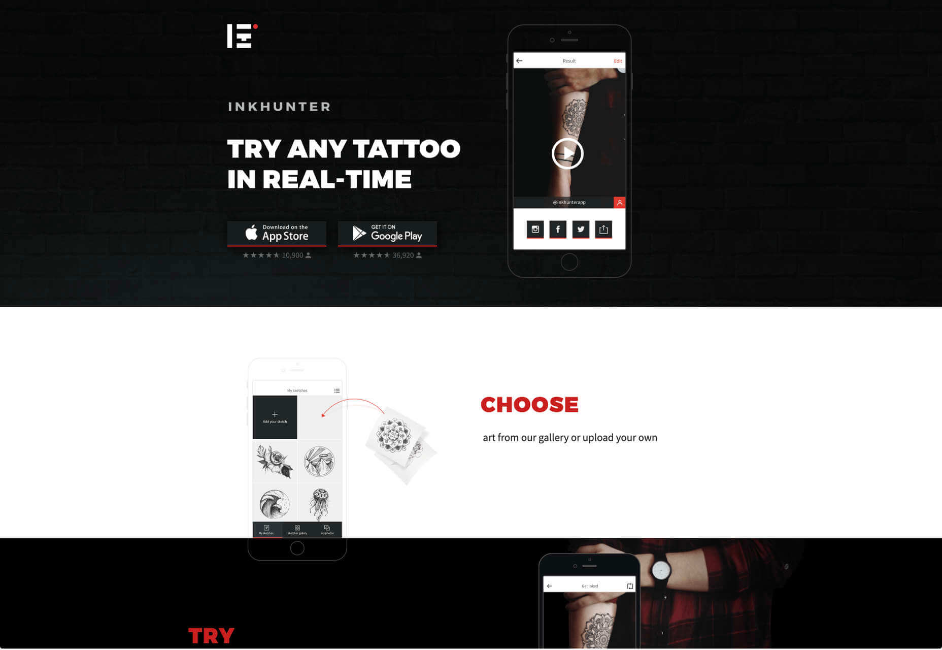
For instance, Inkhunter is an app that allows users to try on tattoos just like using a filter on Snapchat. The experience feels familiar, comfortable, and exciting.

Unlocking the Potential of AR Web Design

Augmented Reality technology has come a long way over the years. Today, developers and designers can access simple plug-in tools like WordPress VR, allowing designers to upload 360-degree videos into WordPress sites and other unique web extensions. 

Augmented reality is becoming much more readily available on sites and apps of all shapes and sizes. Additionally, customers are accessing more ways to unlock AR’s power through everything from headsets to mobile interfaces. 

However, just like any new technology in the web design world, designers need to think carefully about how they will overcome the challenges in user experience that AR can present. For instance, though AR can offer more information for a customer and help them make purchasing decisions faster, there are also risks. For instance, add too many interactive features to a single website or application, and you could scare users off with too much information. 

In the short-term, web designers need to explore the new tools that are available to them and think about the customers they’re designing for. Only this way will we be able to make any considerable advances in the possibilities of AR. 

Are You Ready to Embrace AR?

Designing for augmented reality applications and websites can be an intimidating concept – even for seasoned designers. However, this is just another technology that creatives can use to drive better experiences for end-users. 

Learn how the latest technology works and get an insight into your customers’ needs, and you’ll be amazed at what you can accomplish in the AR world.

Source


Source de l’article sur Webdesignerdepot

2020 has been one of the most memorable years in our history. Few of us have been alive long enough to experience a more turbulent time. But throughout the year, we saw design respond to challenging events with positivity, color, and a desire to elevate those people and projects working to make the world better.

As we head into 2021, there’s no denying that 2020 has changed our outlook on life and marked a major turning point in web design trends.

Here’s a collection of the websites we loved the most this year. Enjoy!

Looks Like You Need Iceland

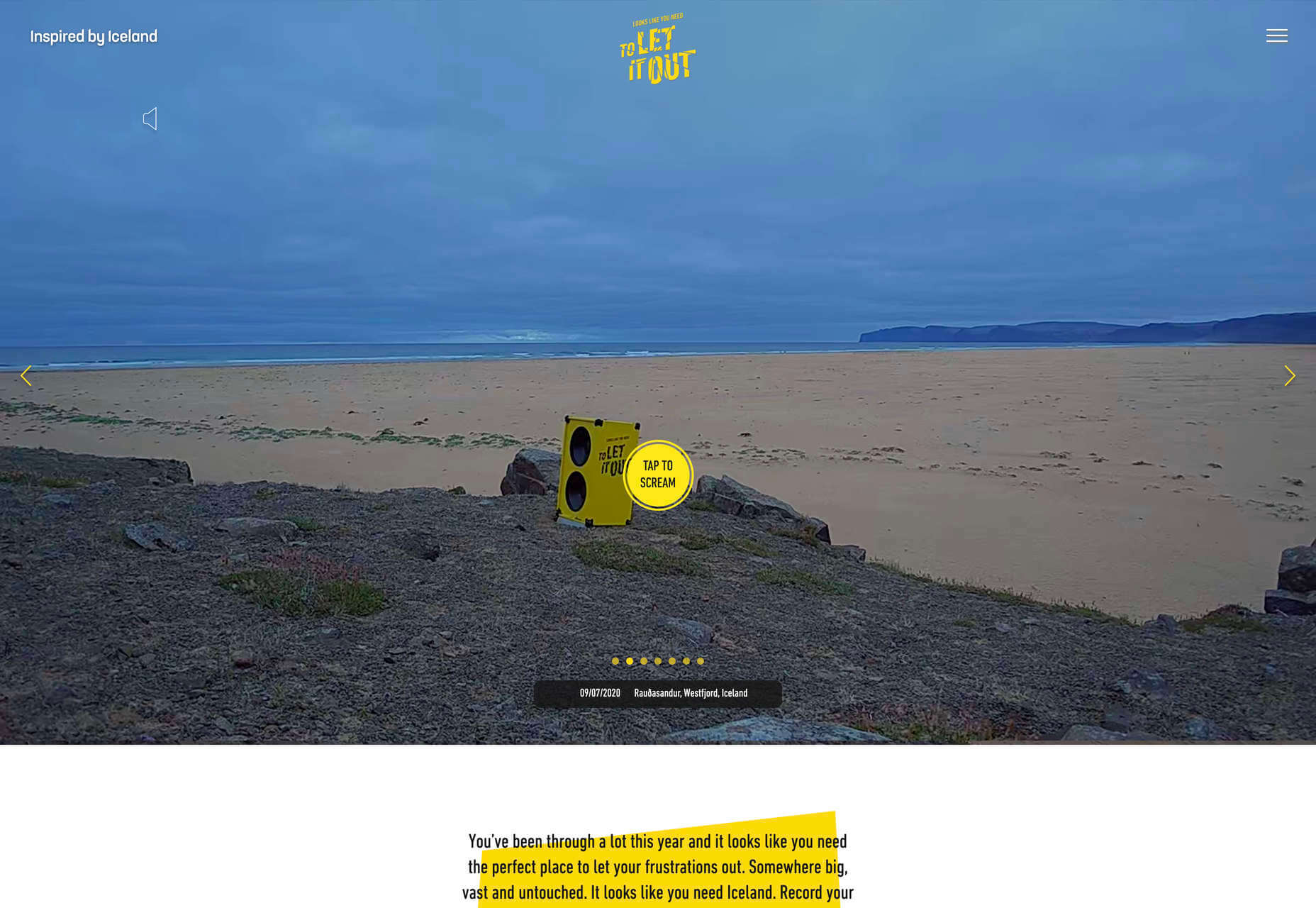
On Looks Like You Need Iceland, you are invited to record a scream, which will then be broadcast into the Icelandic wilderness. It’s meant as a form of therapy. The idea is that you will one day visit Iceland in person. That might still be some way off for most of us, but we could certainly use a good therapeutic scream.

Black Lives Matter

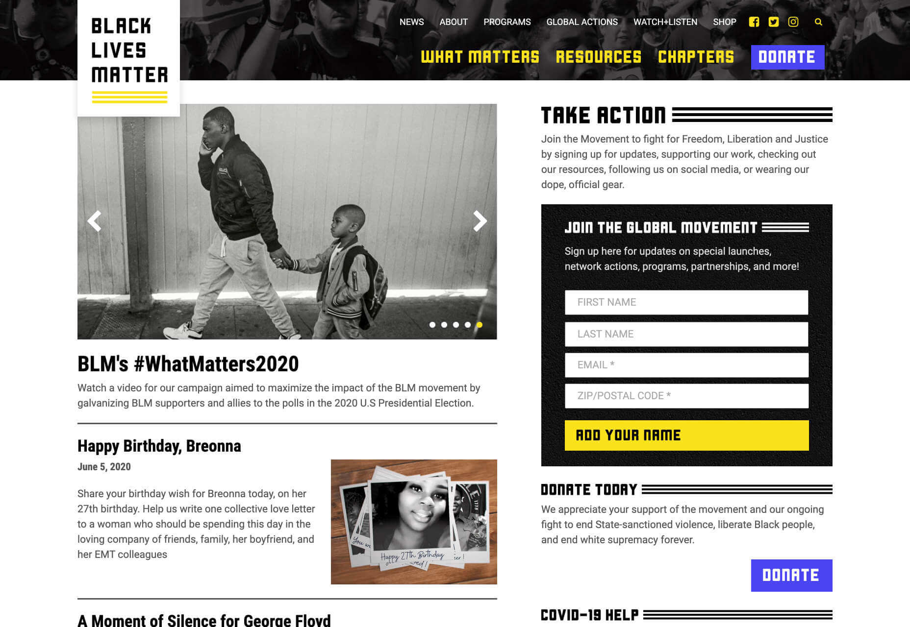
Across 2020 there were major protests around the world in support of Black Lives Matter. The movement’s website is a central hub for news, resources, and civil rights information in 38 countries.

2º Earth

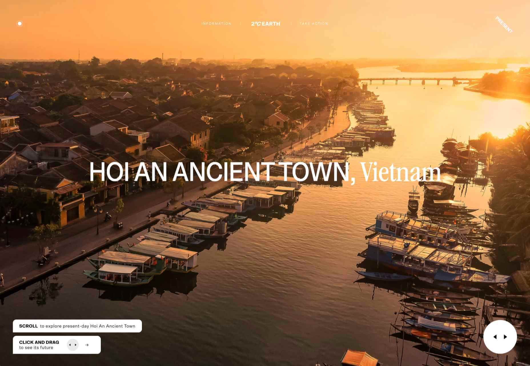
2ºC Earth takes the user to 5 locations worldwide and shows what will happen there if global temperatures rise by 2ºc. Sound is used really well here to create an immersive experience, along with some beautiful photography.

Github

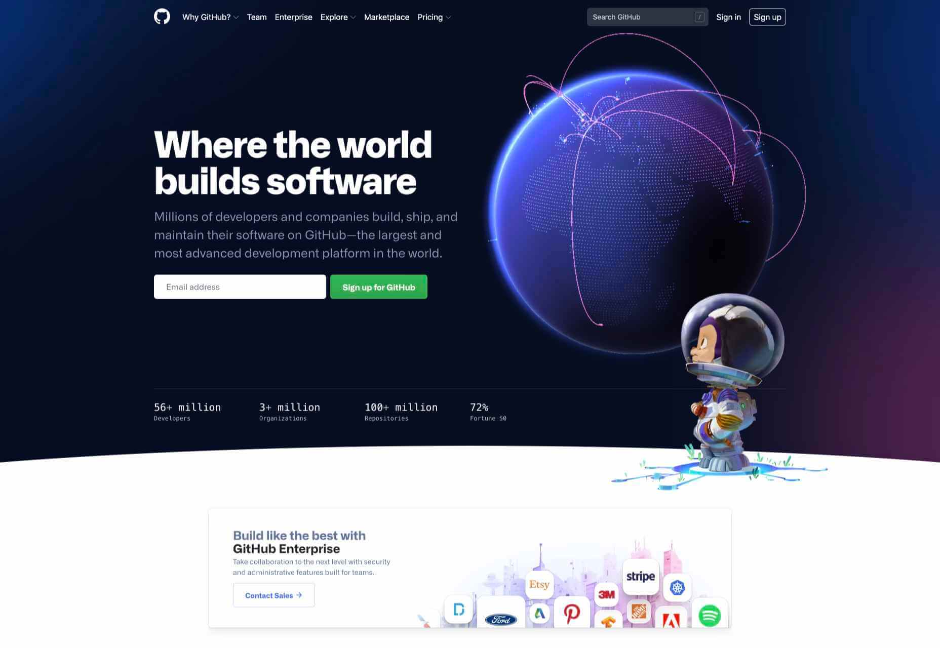
Along with some new features announced earlier this month, GitHub has a glossy new homepage. It has a clean feel, with some nice scrolling animation and sparing but effective use of illustration.

I Weigh Community

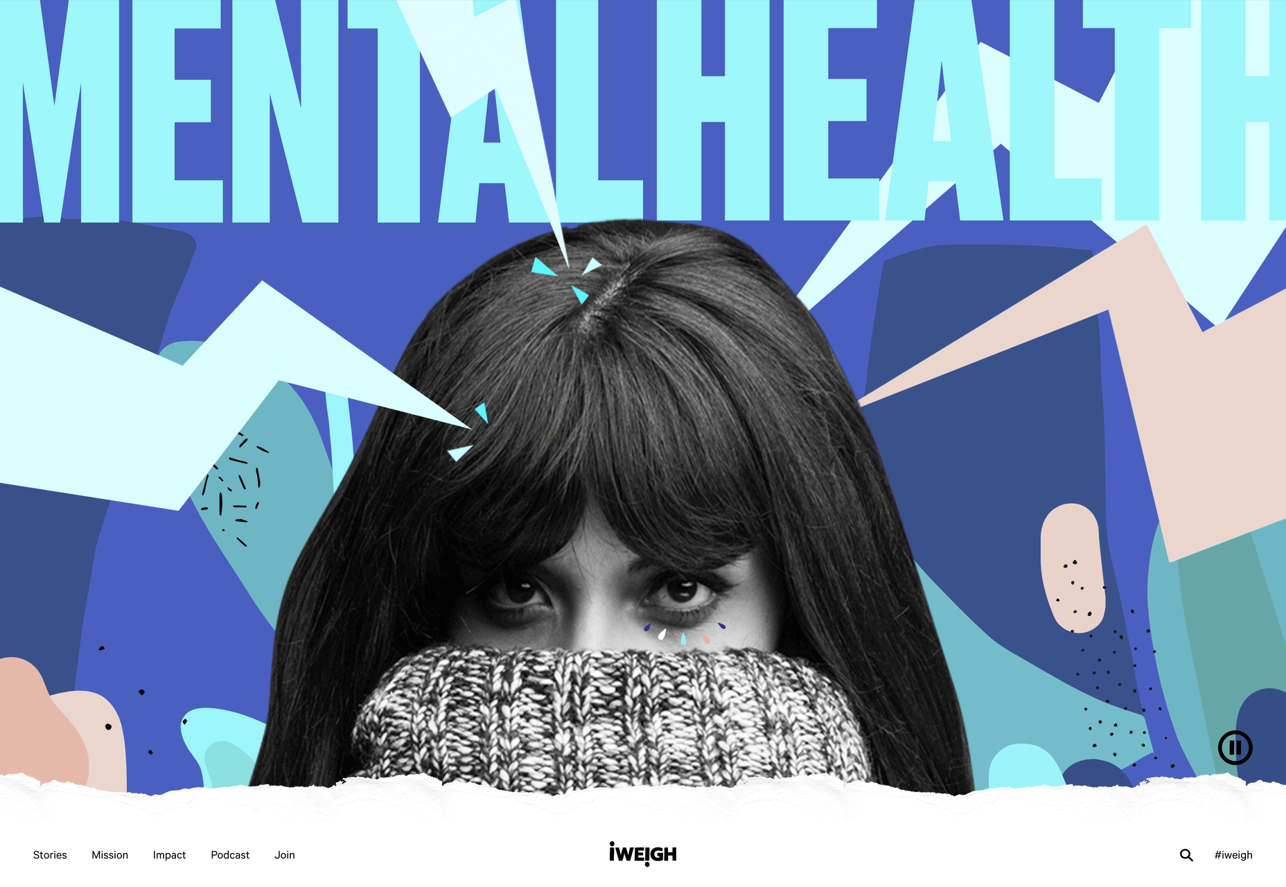
Political and social initiatives were big in 2020, and non-profit activism initiative I Weigh Community is the brainchild of actress Jameela Jamil. It’s devoted to radical inclusivity, communicated with bold, expressive graphics.
UNREAL

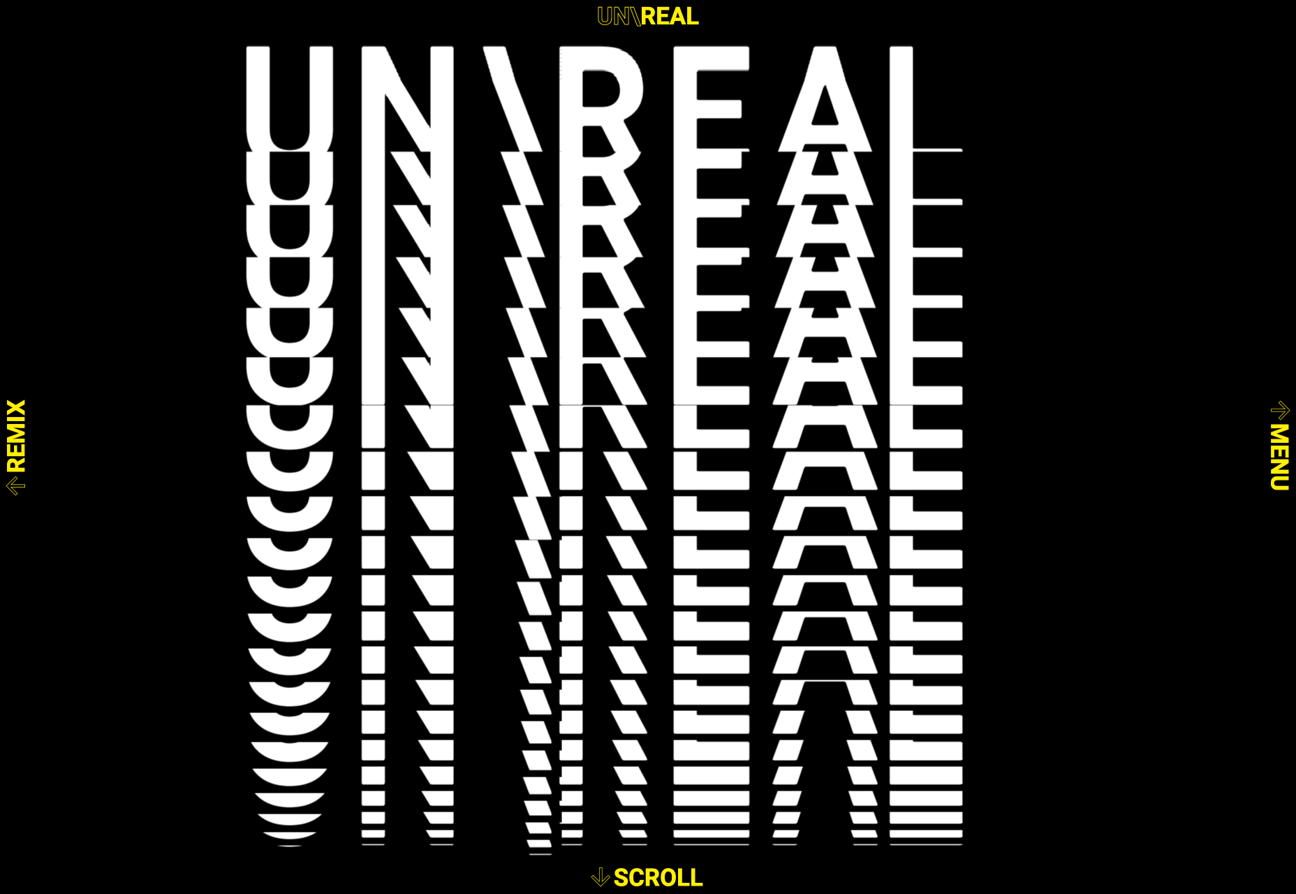
Back in January, we clicked around UNREAL’s site for hours, enjoying the sharp transitions. The Swiss agency produced a wonderfully chaotic love letter to web animation.

Delassus

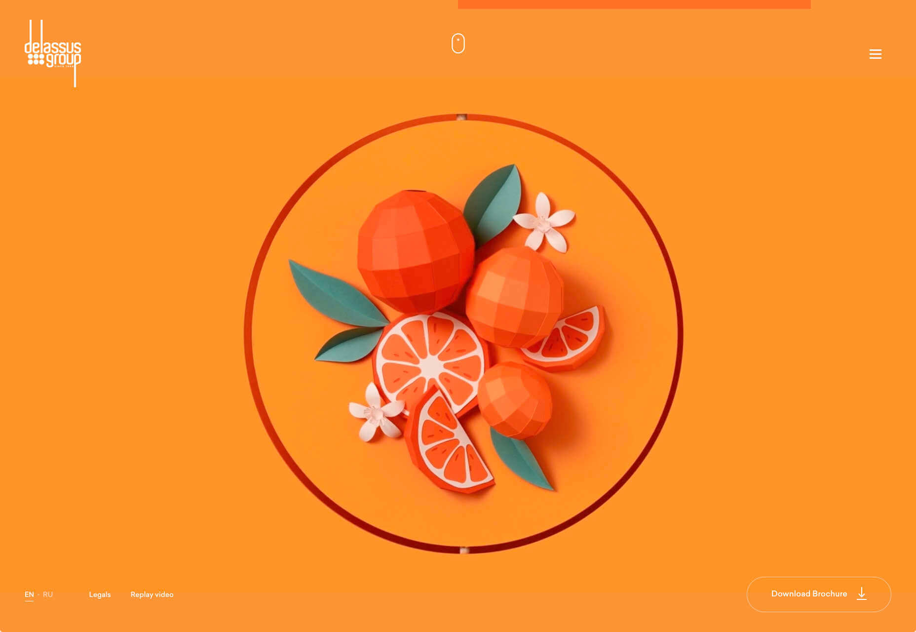
Delassus grows fruit, from citrus to avocados. The Moroccan company employs a cornucopia of 3D design to make its site bold, fun, and practical.

Lynn Fisher

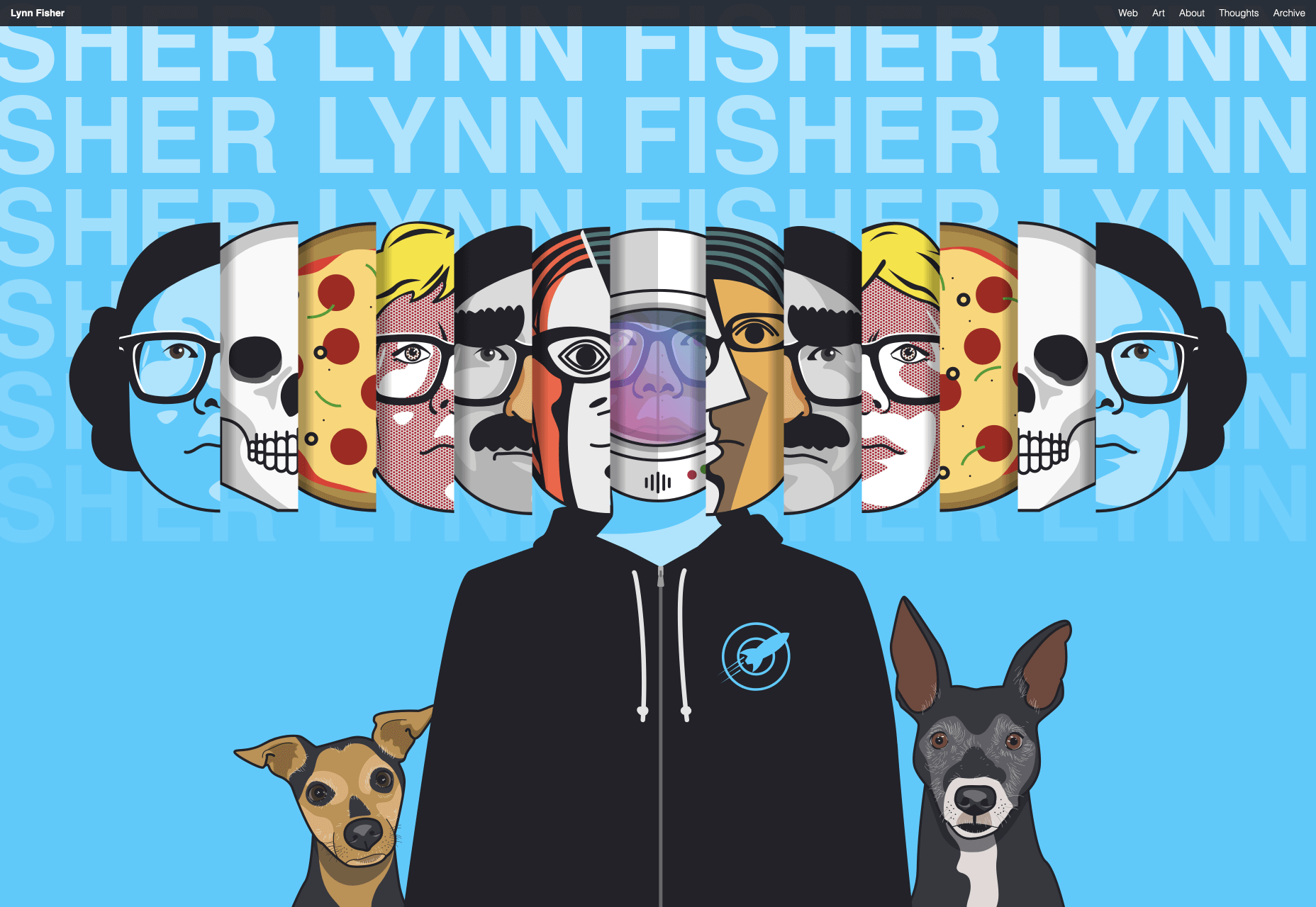
We loved everything about Lynn Fisher’s site back in May. The homepage illustration was awesome. It was a humorous approach to RWD that we really appreciated. The site has since changed, with tons more to explore.

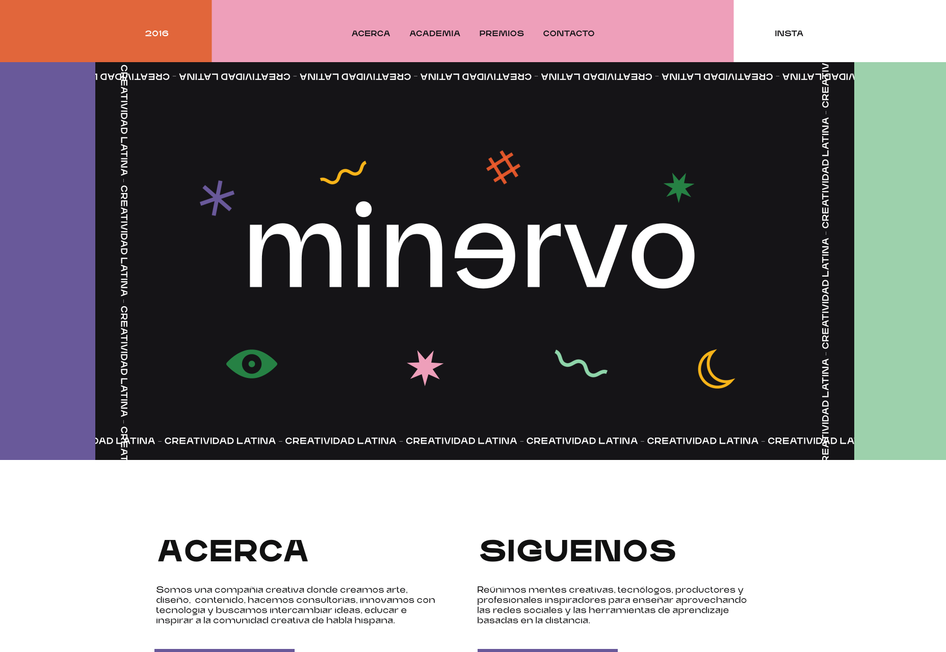
Minervo

The Minervo site feels distinctly Latin, with the hot pinks and sun-blasted desaturation feeling suitably South American. We love the cropping on the custom typeface.

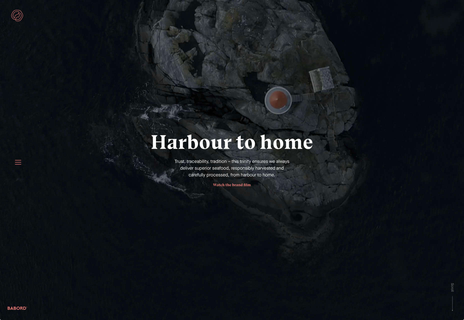
Babord

Norwegians have an almost mystical connection with the sea, which is evident in the site for Babord, a Norwegian seafood supplier. We loved the brand font too.

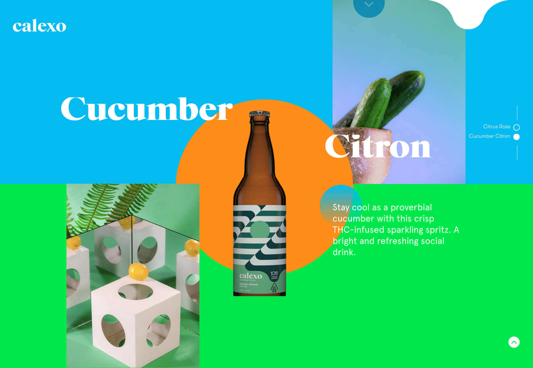
Calexo

Calexo makes THC-infused beverages, and back in April, we loved the color and positivity of the site. The animated hamburger menu was a hit too.

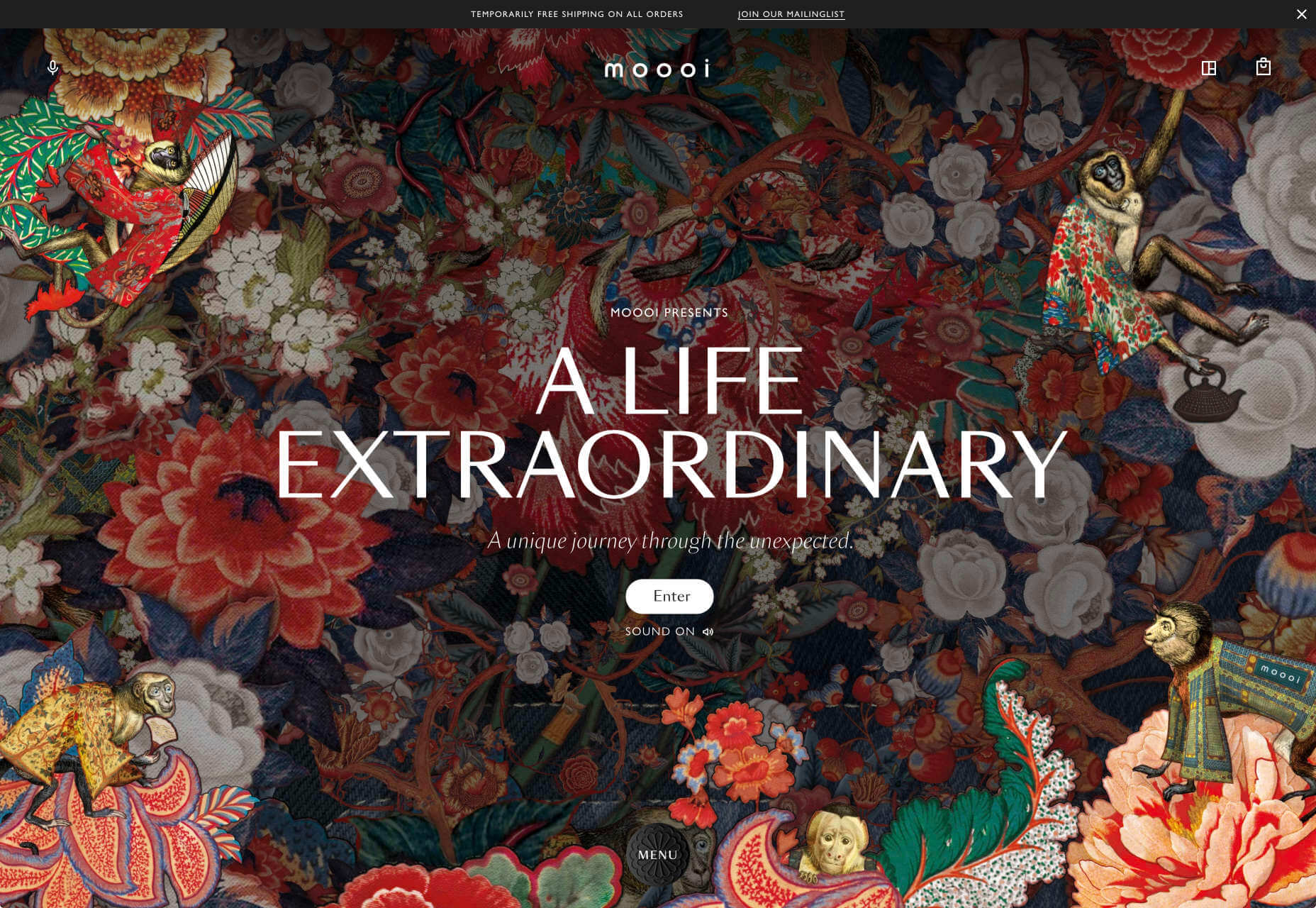
Moooi

Moooi’s site layers illustration with a maximal effect that makes you feel like you’re chasing a white rabbit. There are tons of great UI details here, especially the bar that reveals the product videos.

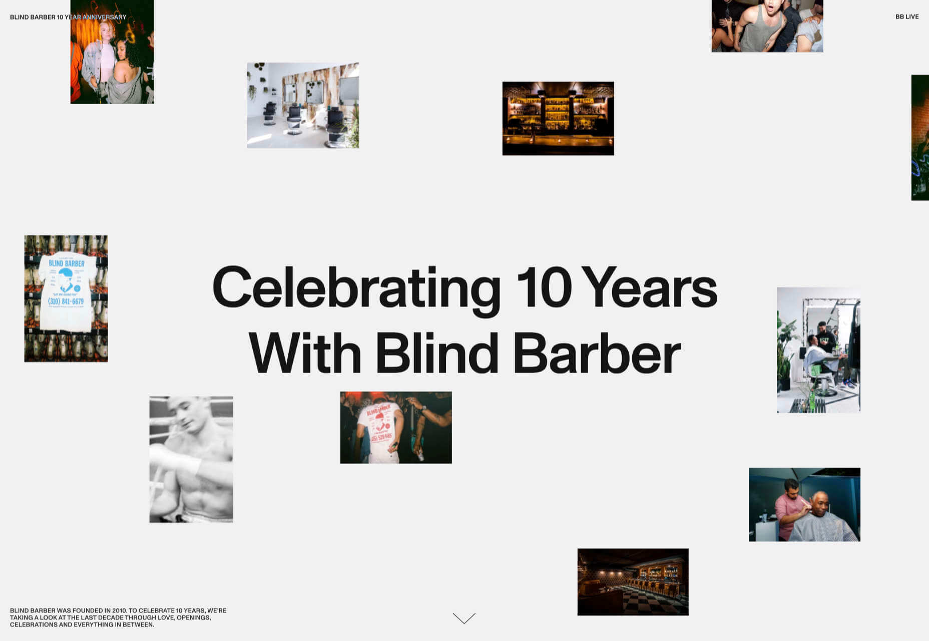
Blind Barber Anniversary

The Blind Barber celebrates 10 years of success with this microsite. A deconstructed grid and an entirely black and white design, but with color photos, create energy and a sense of joy.

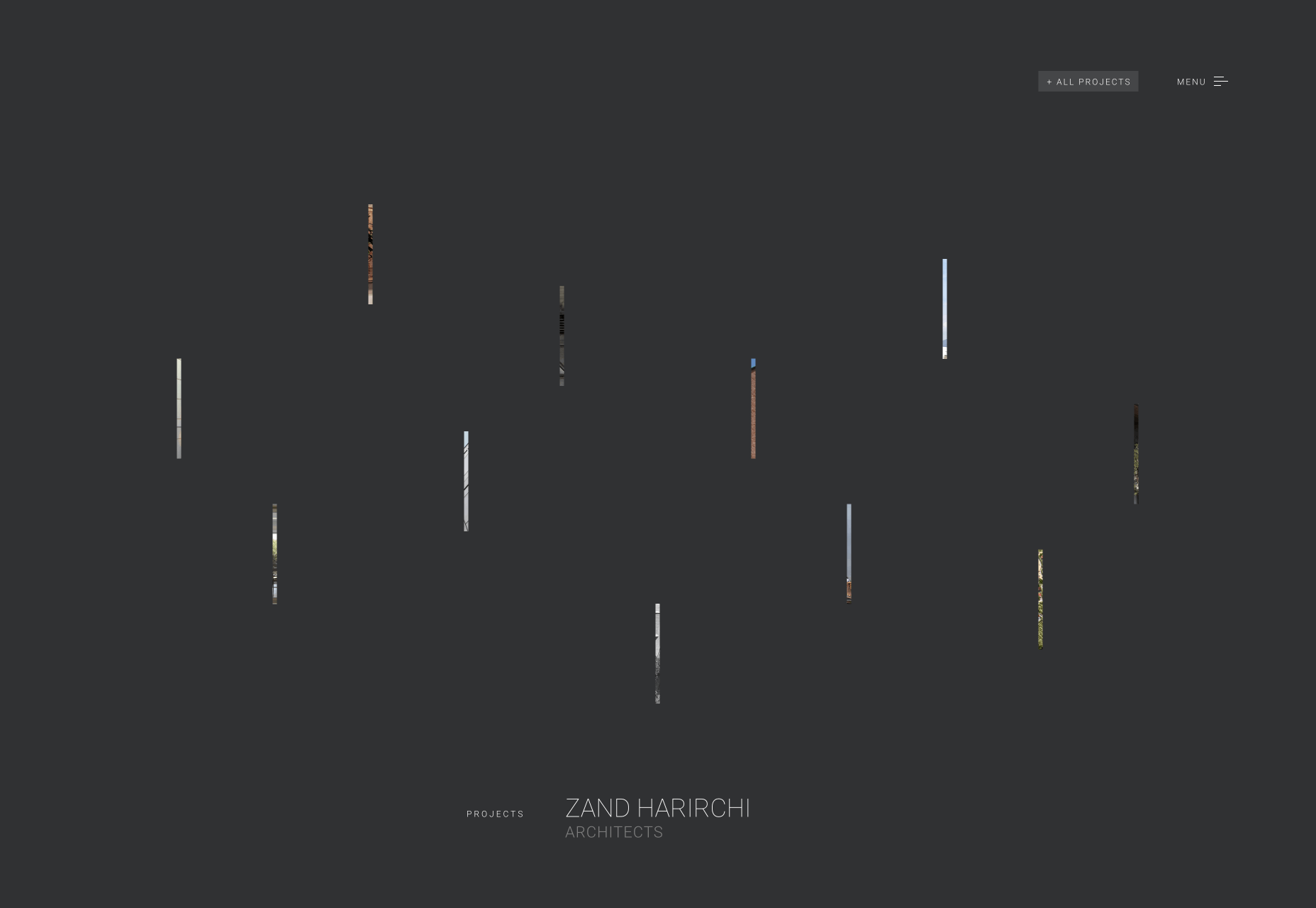
Zand Harirchi Architects

Zand Harirchi is an architecture firm based in Tehran, Iran. Its site features subtle references to architecture, like the delightful thumbnails reminiscent of small windows.

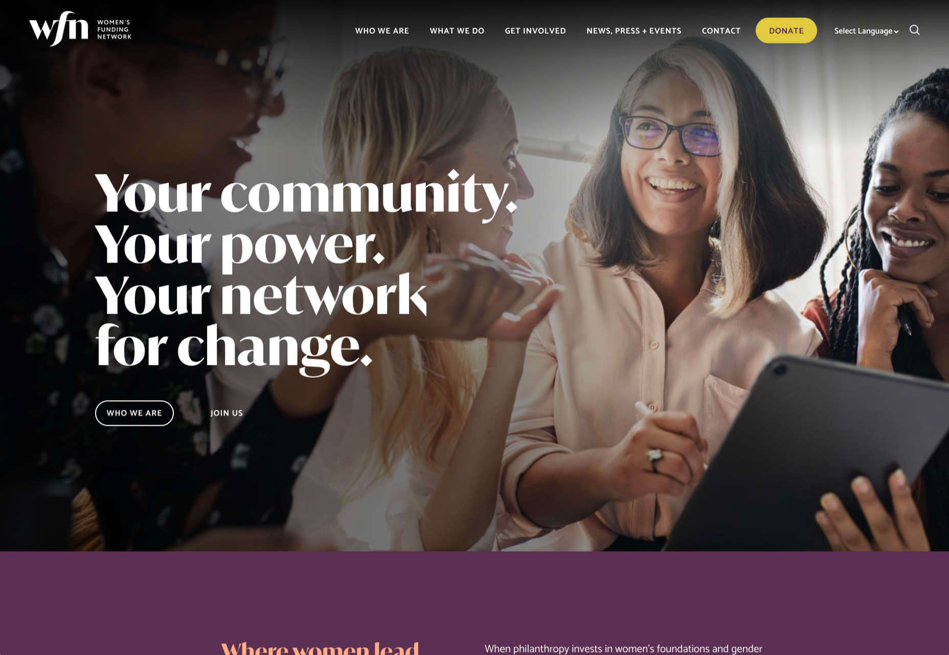
WFN

The WFN (Women’s Funding Network) is an international alliance supporting women’s foundations and gender justice funders. The sophisticated color palette and clean type are both confident and feminine.

Nathan Taylor

We loved exploring Nathan Taylor’s playful site all the way back in January. The different lighting modes were a firm favorite.

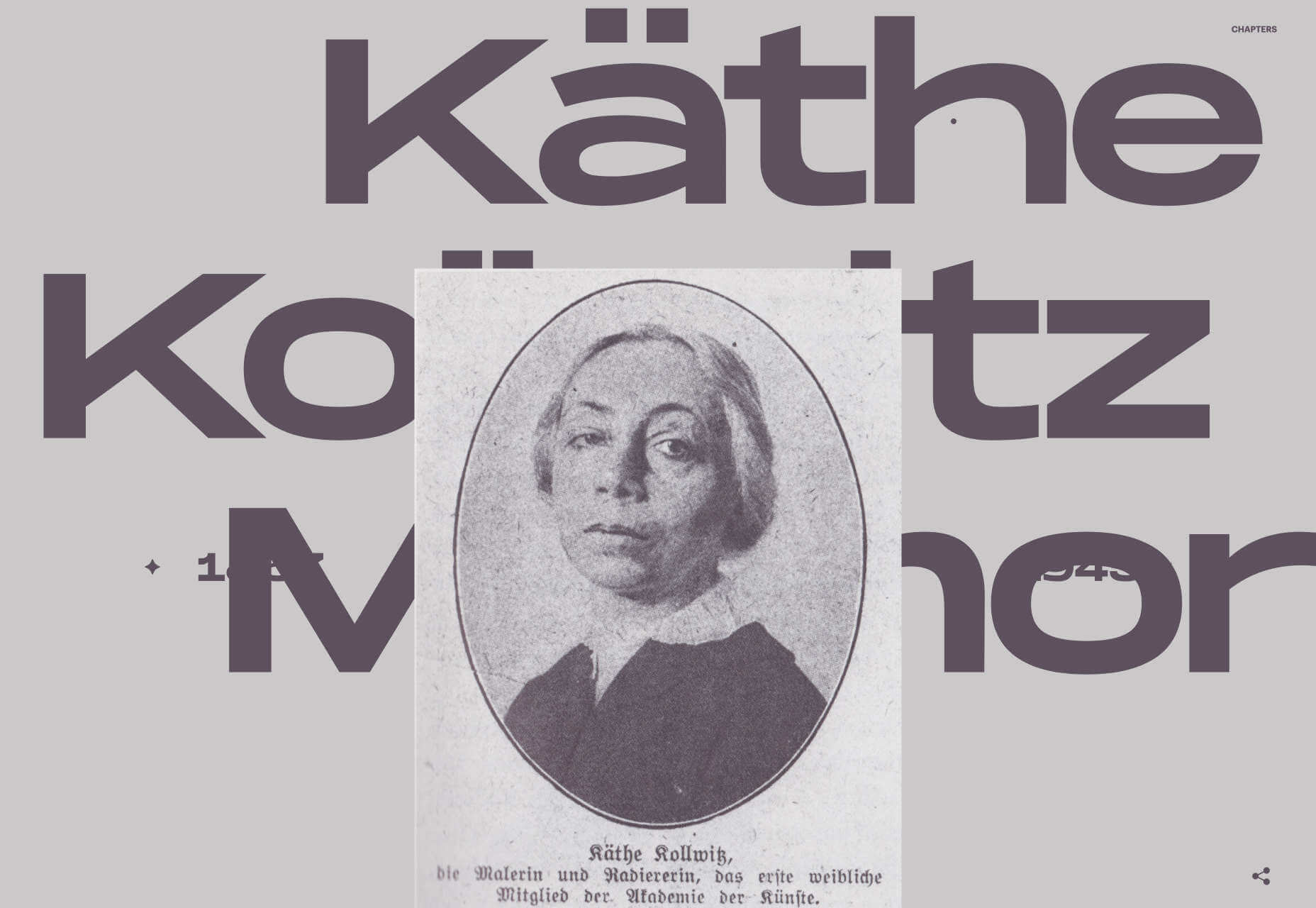
Käthe Kollwitz Memorial

A tribute to the life and work of Käthe Kollwitz, an Expressionist printmaker. There’s a catalog of her work, presented alongside large type and splashy color transitions.

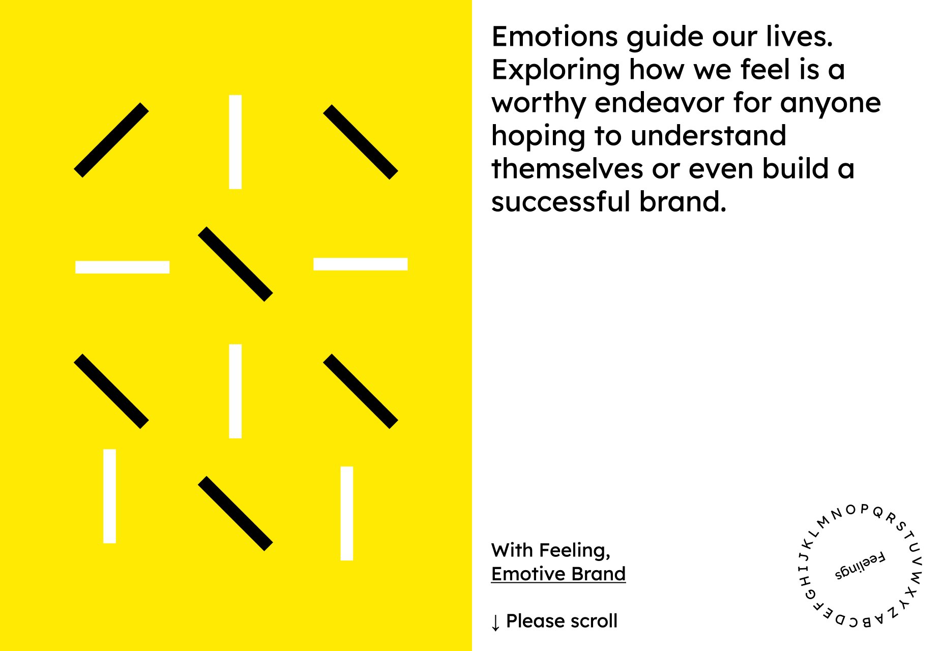
Emotive Feels

Emotive Feels is a design manifesto from the Emotive Brand agency that illustrates an A–Z of potential brand emotions with simple animations that we likened to a Blue Note release.

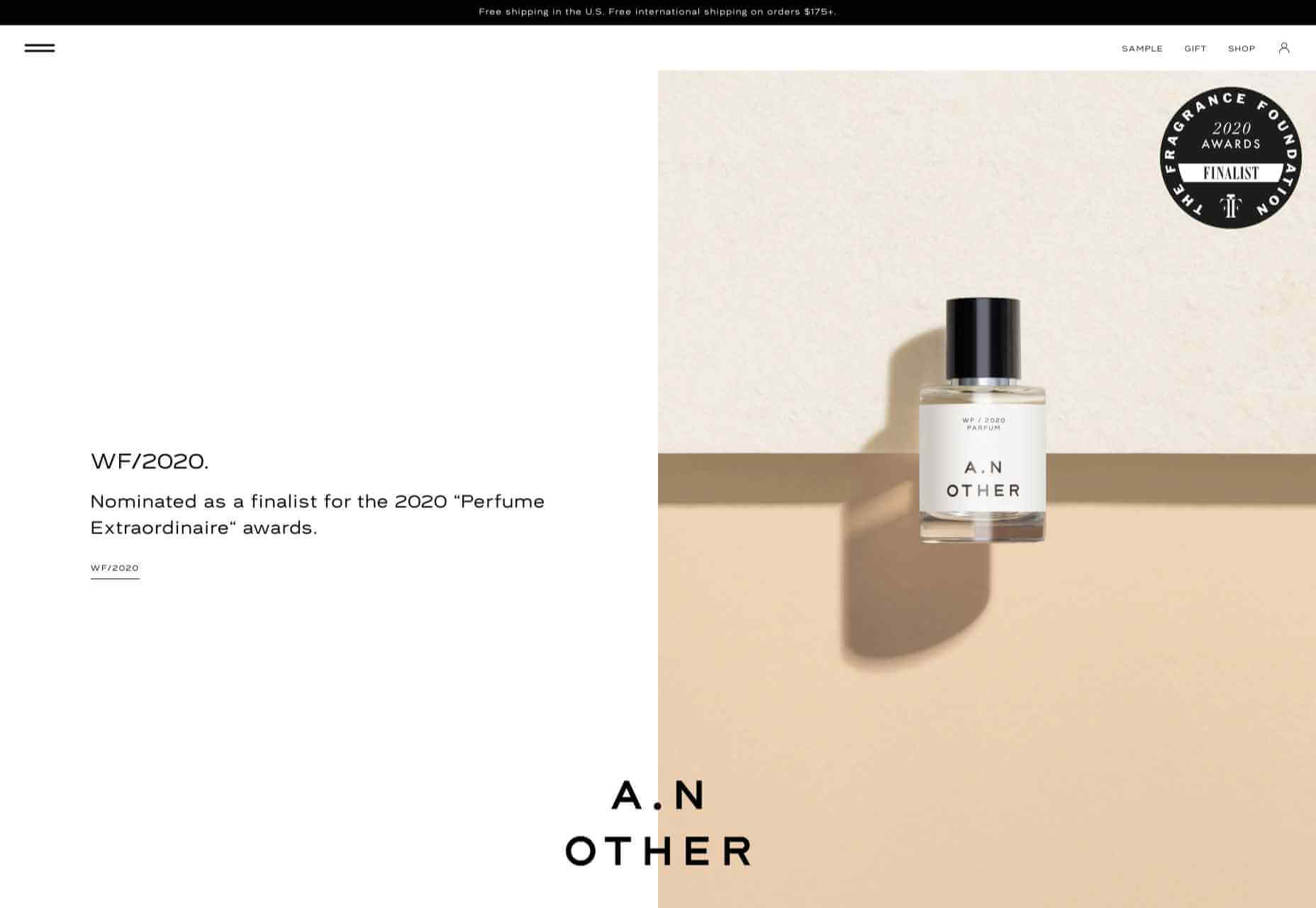
A. N Other

A.N Other’s site for perfume highlights quality ingredients, materials, simplicity, craftsmanship, and the environment; in the process, it cleverly invokes a sense of luxury.

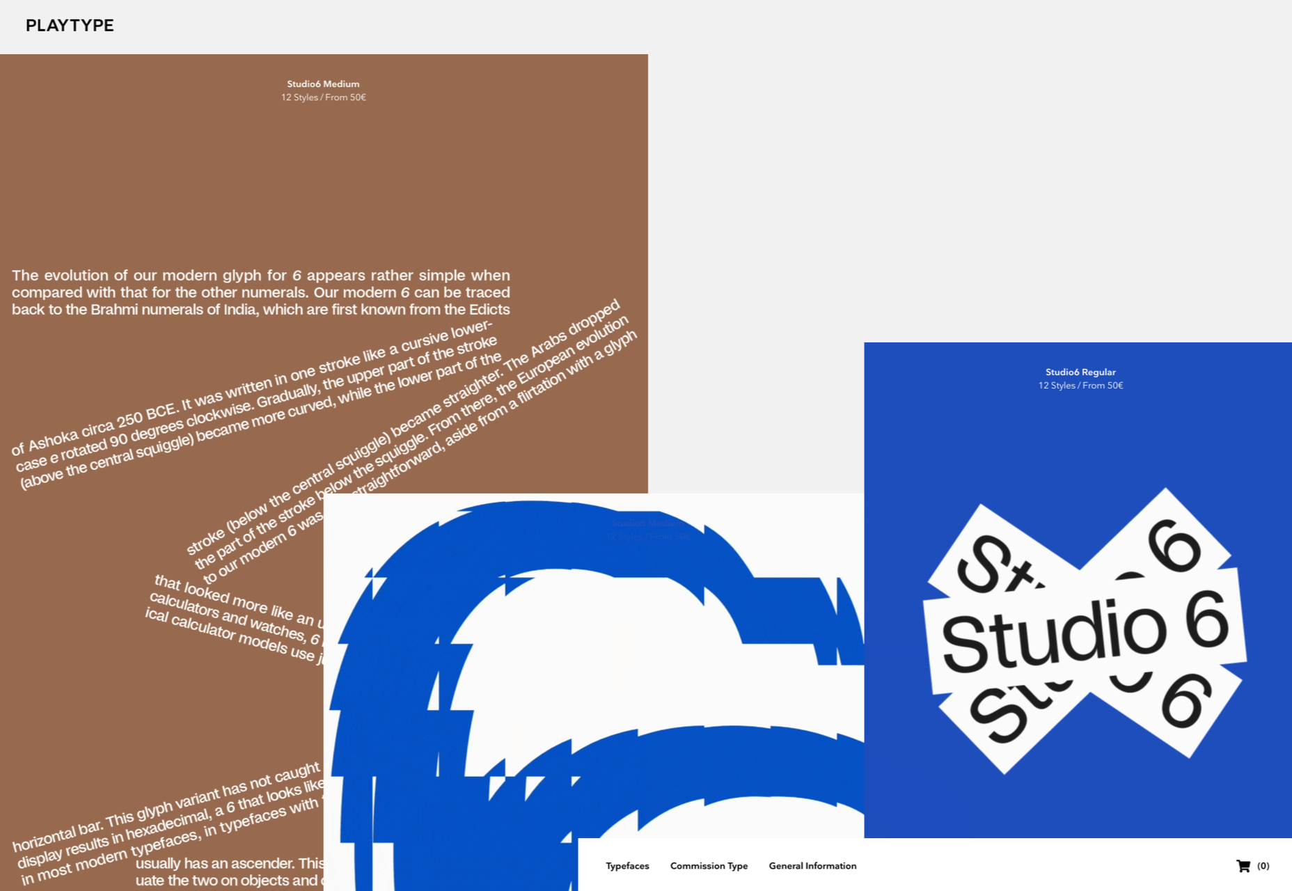
Playtype

Danish type foundry Playtype’s site fits its name perfectly. The playful site with bright blocks of color and the occasional animation shows off some pretty nice typefaces.

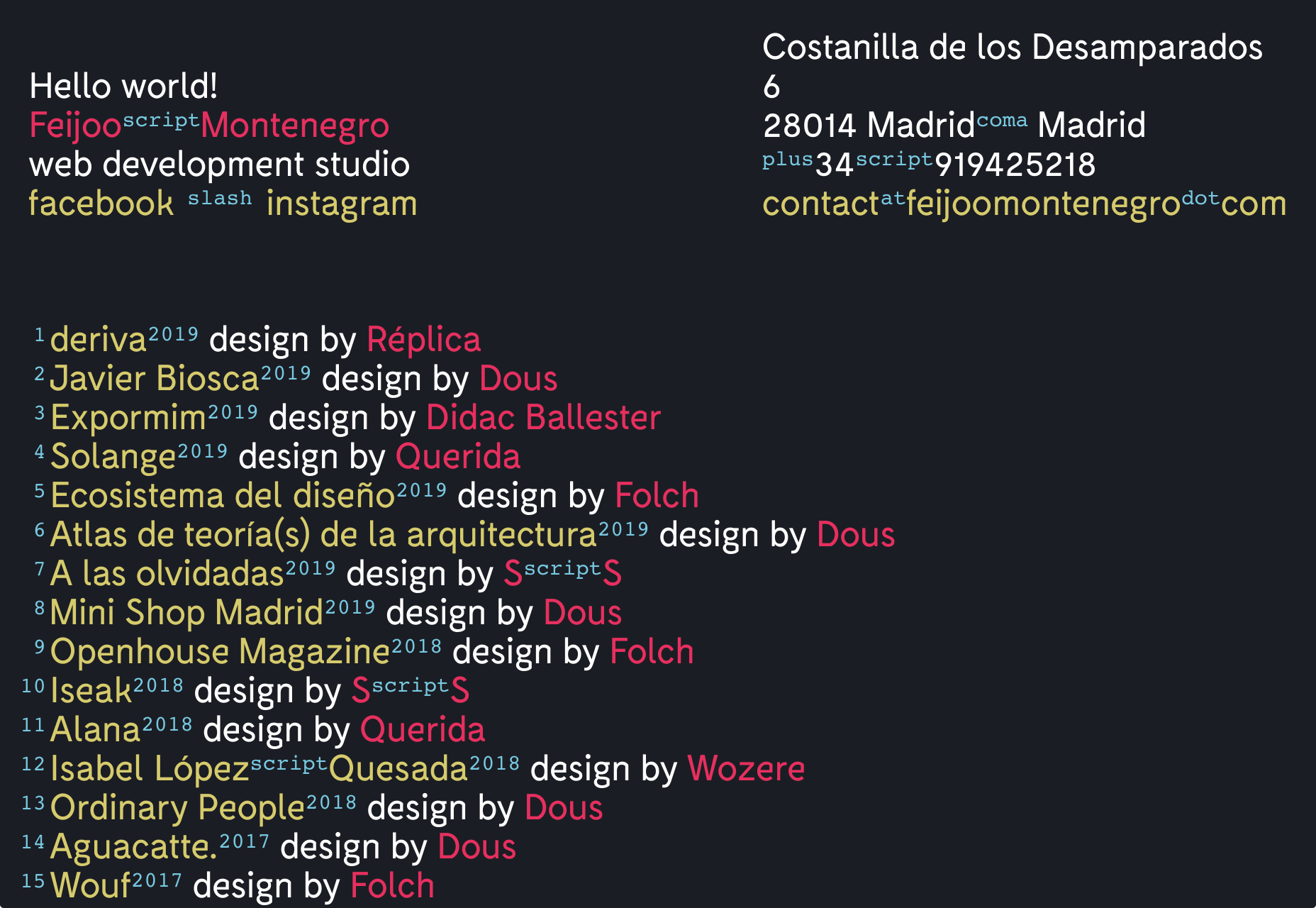
Feijoo Montenegro

All-text sites are always a thrill, and back in June, we were treated to this simple one-pager by Feijoo. Details like the numerals being replaced by words are delightful.

Wavering Stripes

Although this site’s subject matter is harrowing, it is presented in a very beautiful, thoughtful manner.

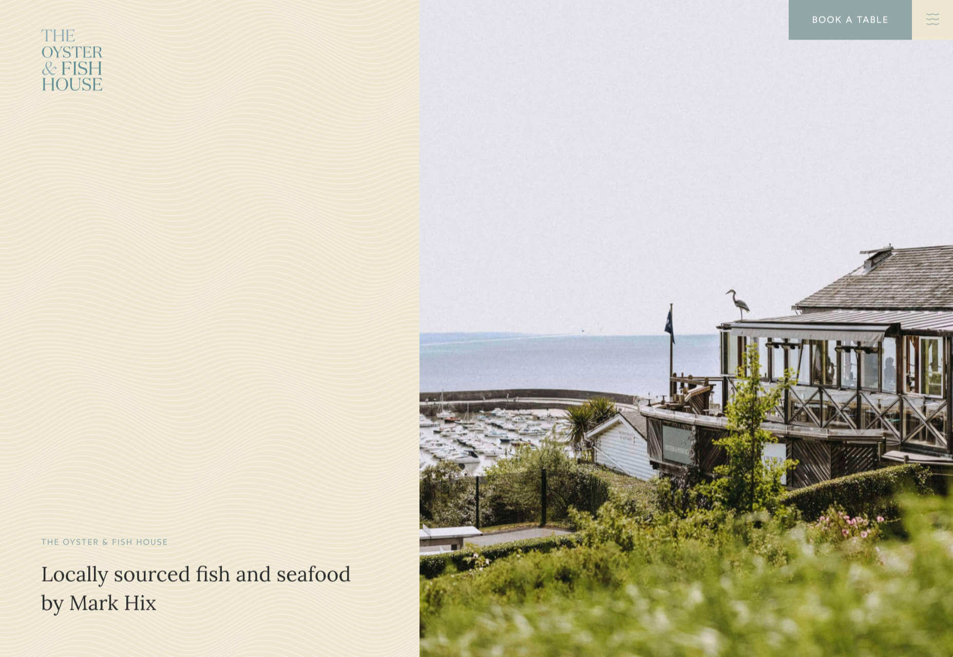
The Oyster & Fish House

Sophisticated typography, the wave textures, the nostalgic feel of the photography, and even the cookie notice’s on-brand styling all show attention to detail, which gives this site its appeal.

Who Cares

Find and ‘photograph’ the endangered species to learn about them in this delightfully illustrated game.

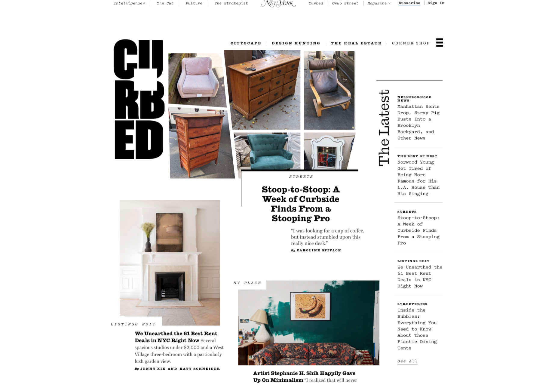
Curbed

When Curbed came under the umbrella of New York magazine earlier this year, it got a makeover. Neon highlights and a distorted grid give an edge to the classic magazine layout.

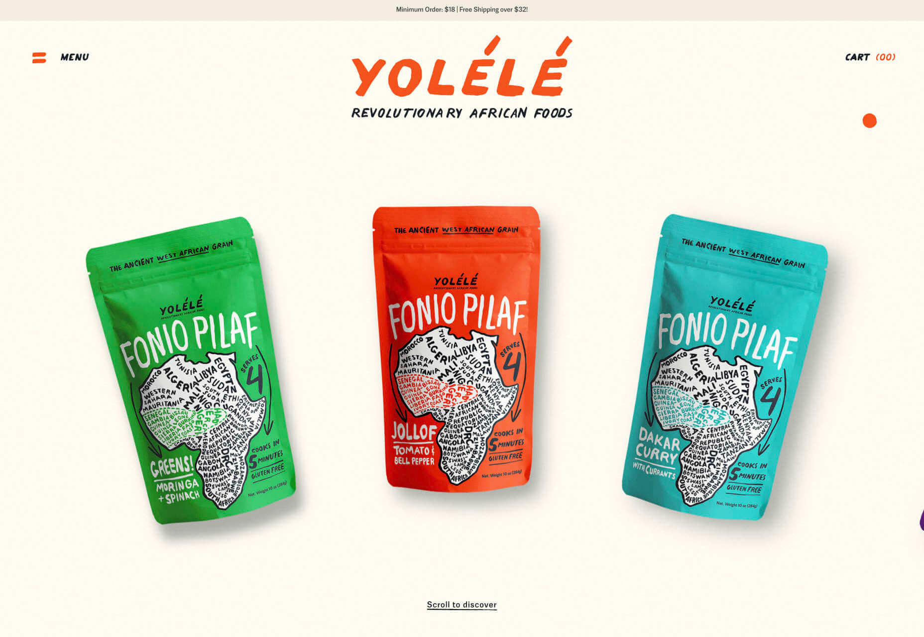
Yolélé

The carousel of fonio (it’s a West African grain) products on Yolélé’s landing page is a good example of horizontal scrolling that works well. There are some great page transitions too.

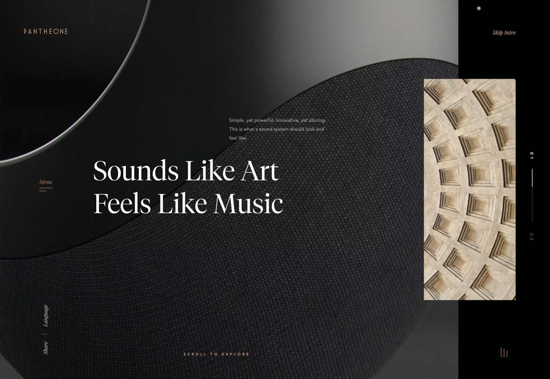
Pantheone Audio

Pantheone Audio’s site employs elegant scrolling to enable seamless navigation of an extremely luxurious site, underpinned by a complex grid.

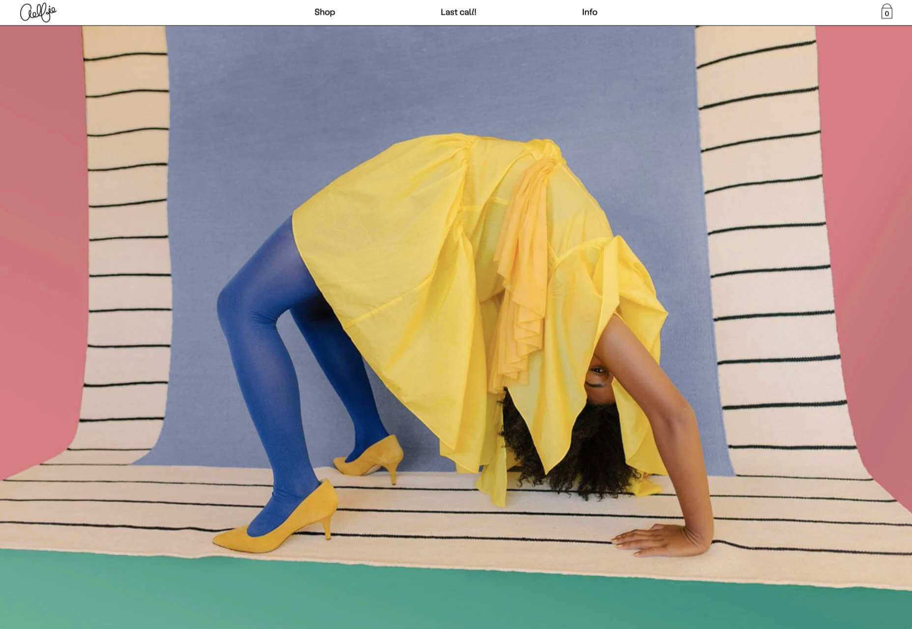
Aelfie

Bright color, an irregular grid, illustrations, and a display type that feels almost hand-drawn perfectly captures the aesthetic of this NY-based home furnishing brand.

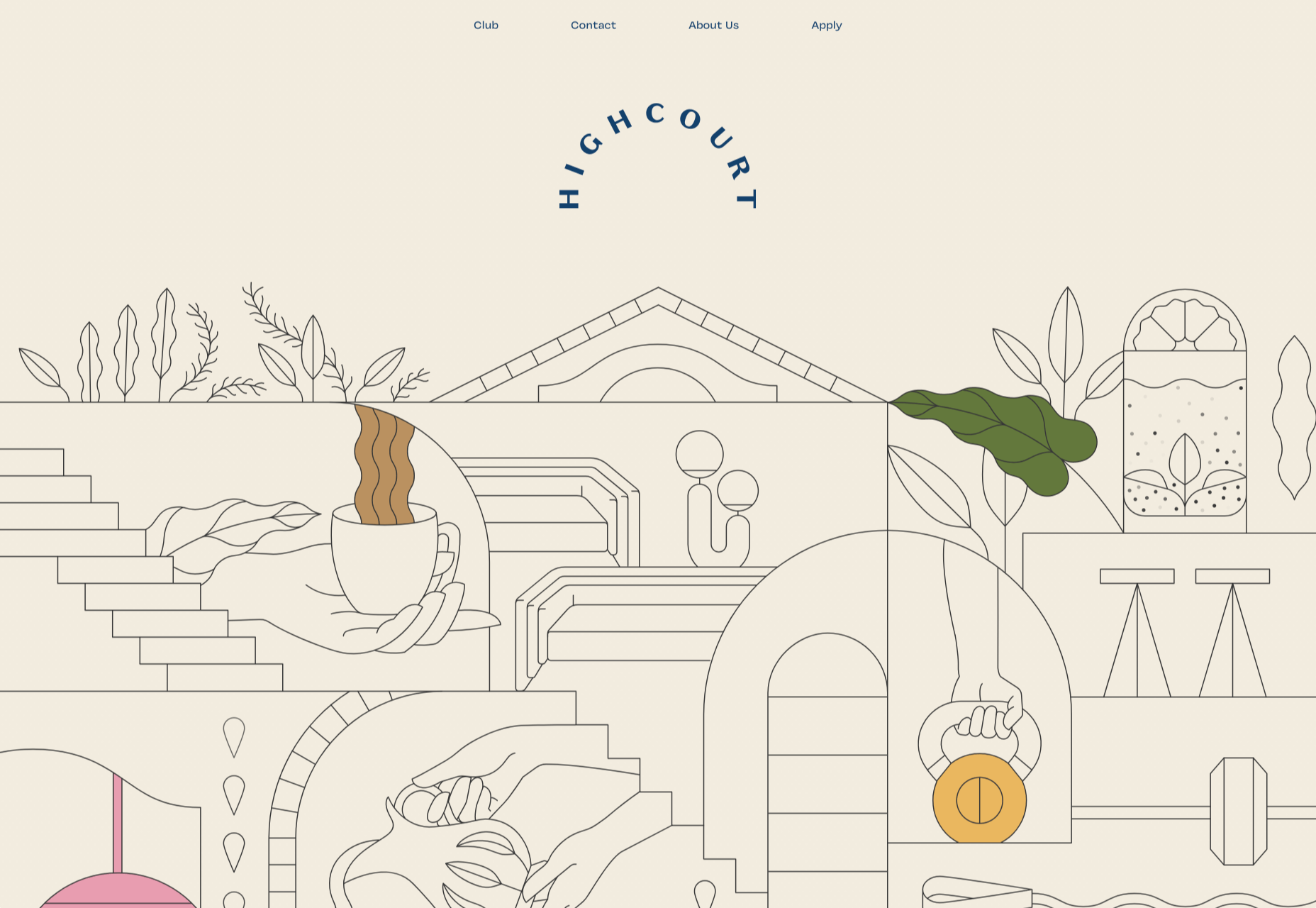
Highcourt

This site for private membership leisure club Highcourt uses subtle background color changes and simple line illustrations to create a sense of calm. Black and white are softened to dark blue and ivory, and gentle animation adds interest.

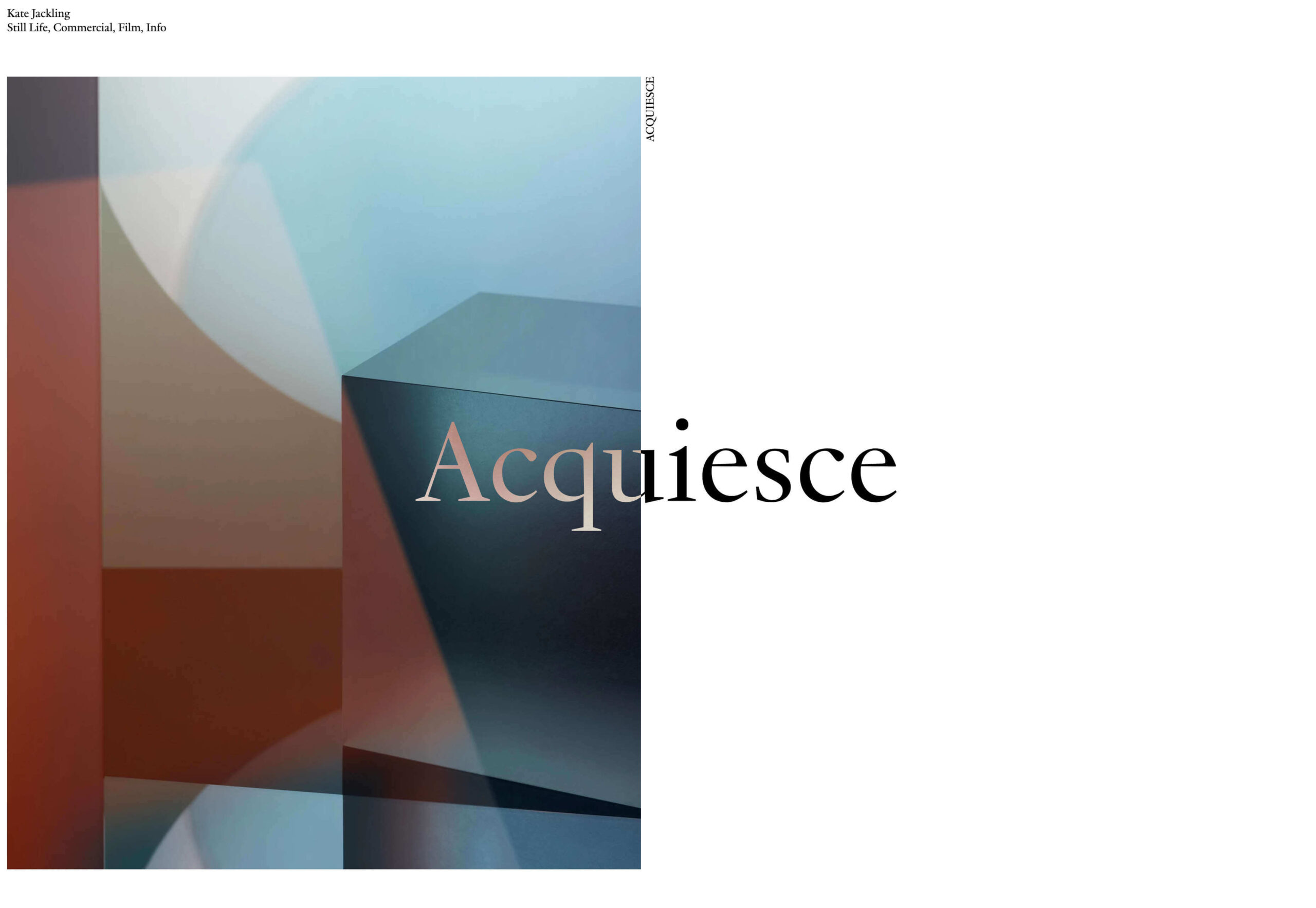
Kate Jackling

Kate Jackling’s site takes a step back and allows the content to bask in the glow of attention, placing her photography at center stage.

Treaty

While there is less hustle and bustle outside than we were used to pre-pandemic, we could certainly all use some calm. Treaty’s site for CBD oils reflects that calm with a combination of video, whitespace, and botanical drawings.

Ukrainian Railroad Ladies

Ukrainian Railroad Ladies is a book of photographs of women, and some men, who work on the Ukrainian railways. The site is basic, even brutalist, but it has charm, and the photographer’s fascination with his subject comes through.

Year & Day

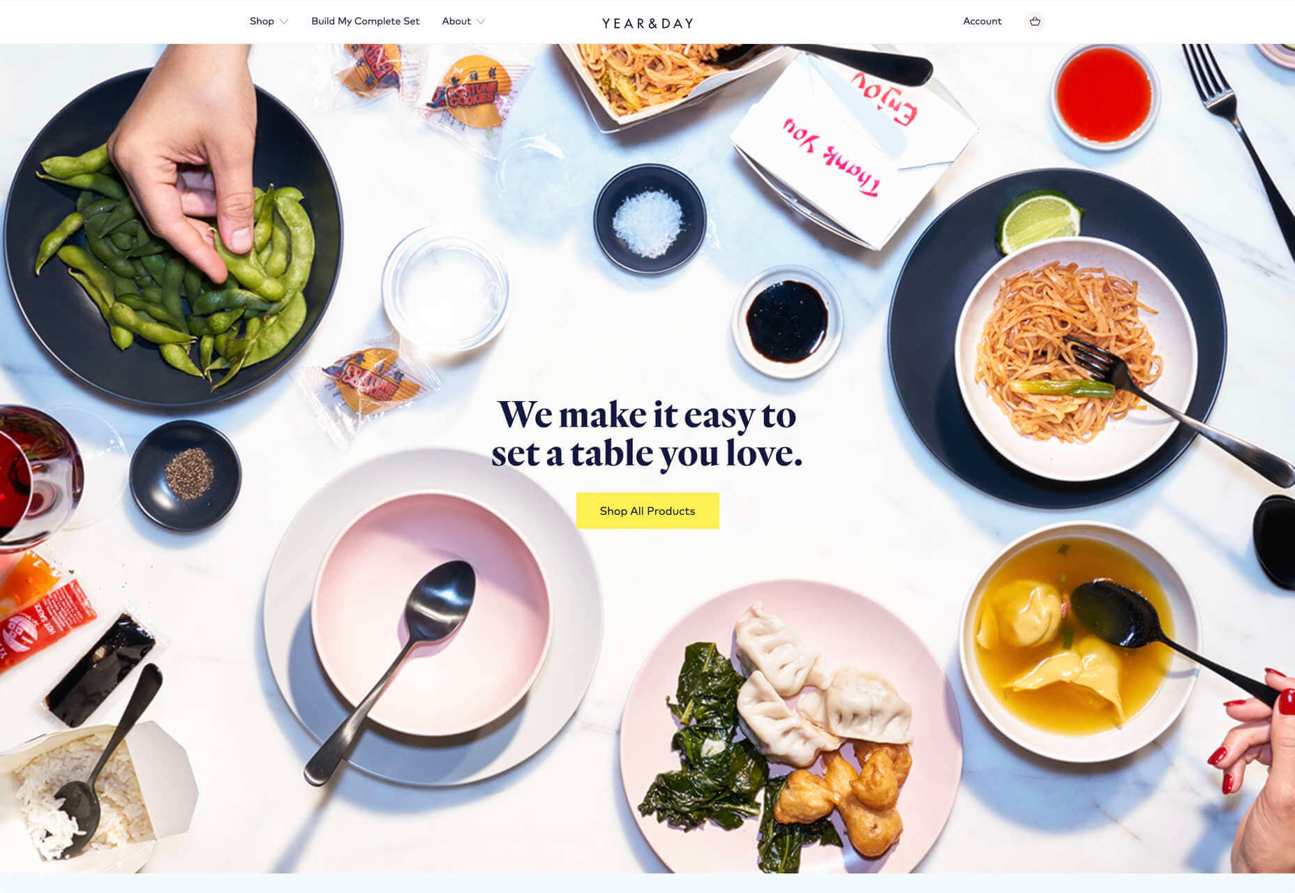
Year & Day is an ecommerce site that sells tableware, from glassware to ceramics. The colorful collection is designed to complement different types of food, and the site’s color scheme reflects that perfectly.

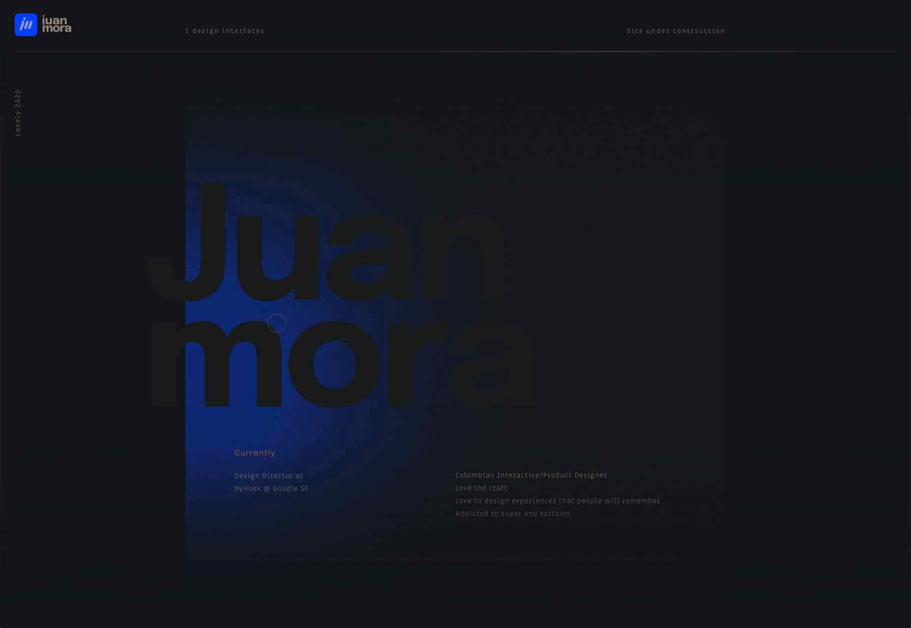
Juan Mora

Juan Mora’s ‘under construction’ holding page has probably been crafted with more care than many full-blown sites. This showcase cleverly manages to demonstrate its subject’s skills without showing a single piece of work.

Lucciano’s

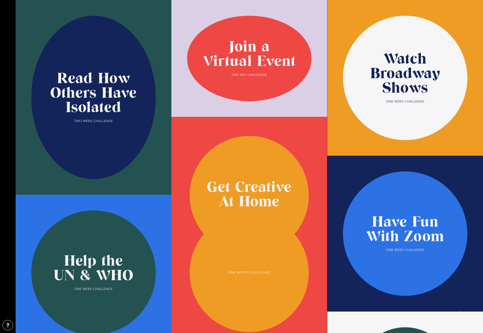
Lucciano’s homepage hero video alone will have your mouth watering for some of their gelato. Much of the appeal of food is visual, and the photography here does not disappoint. Circular text boxes in ice cream colors complement the product shots nicely.

Bored Solutions

Back in April, we were already a little weary of lockdown — if only we’d known how long it would last! The amazing color blobbing of bored.solutions was the ideal distraction.

Grand Matter

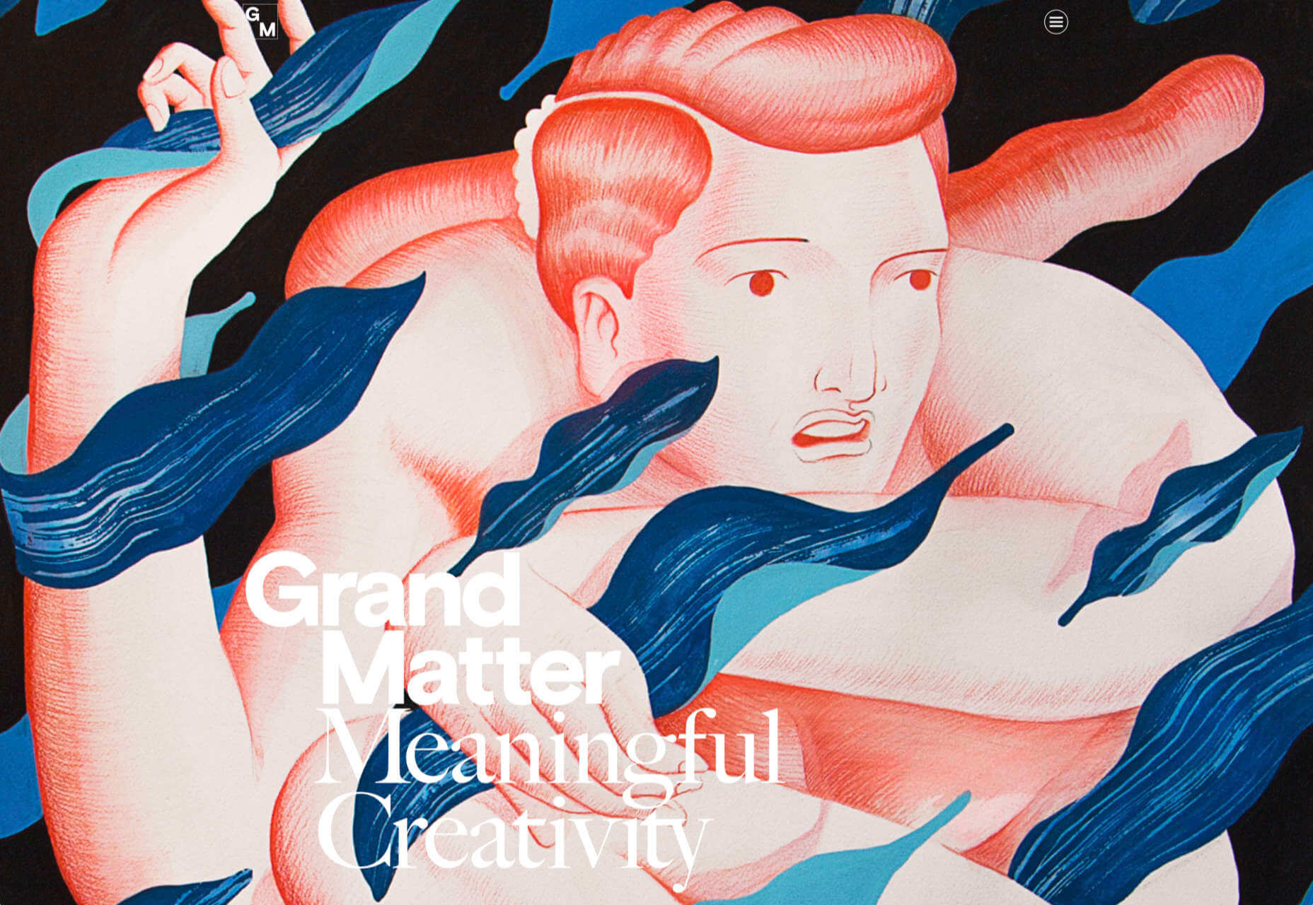
Grand Matter is an artist agency representing illustrators. There is a wealth of talent on show here and a broad enough range of styles to keep the web interesting for a good while.

Dunderville

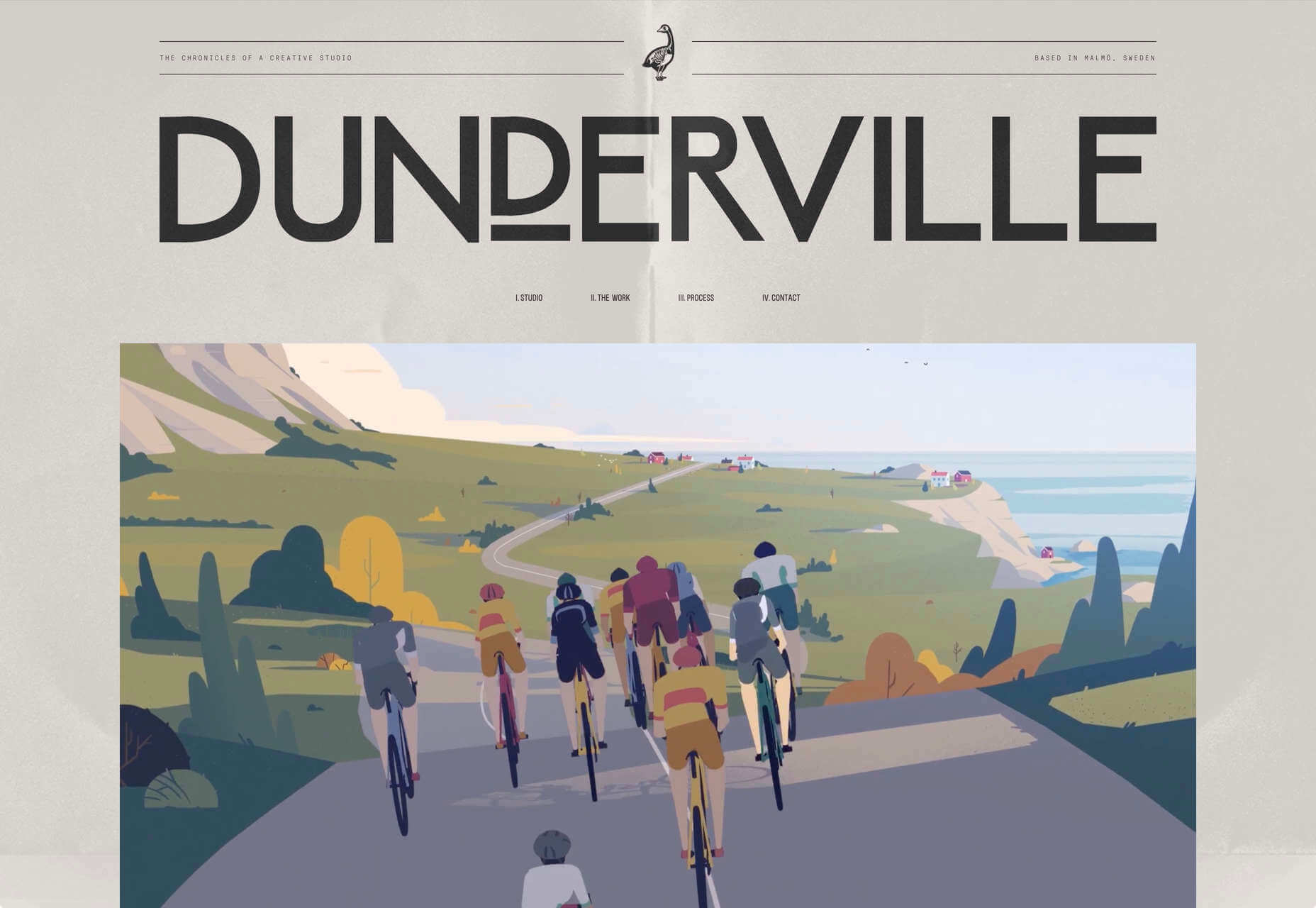
This site for Dunderville motion design studio features a paper fold detail, which adds tactility to the virtual. Some superb type and vector animations showcase an impressive portfolio.

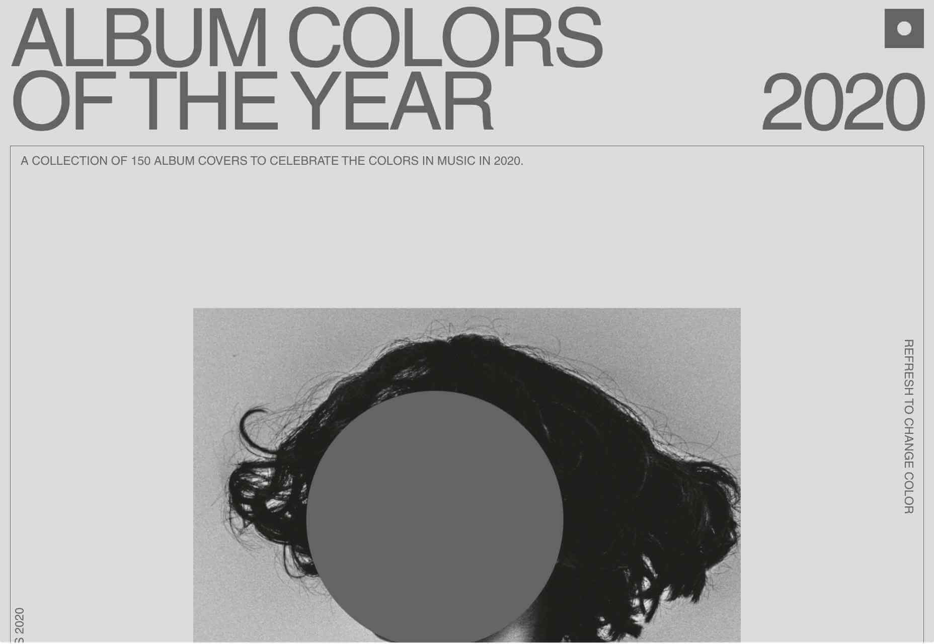
Album Colors of the Year

Album Colors has taken the covers from 150 albums released this year and arranged them by dominant color. The hex code for each color is provided if you want to copy it.

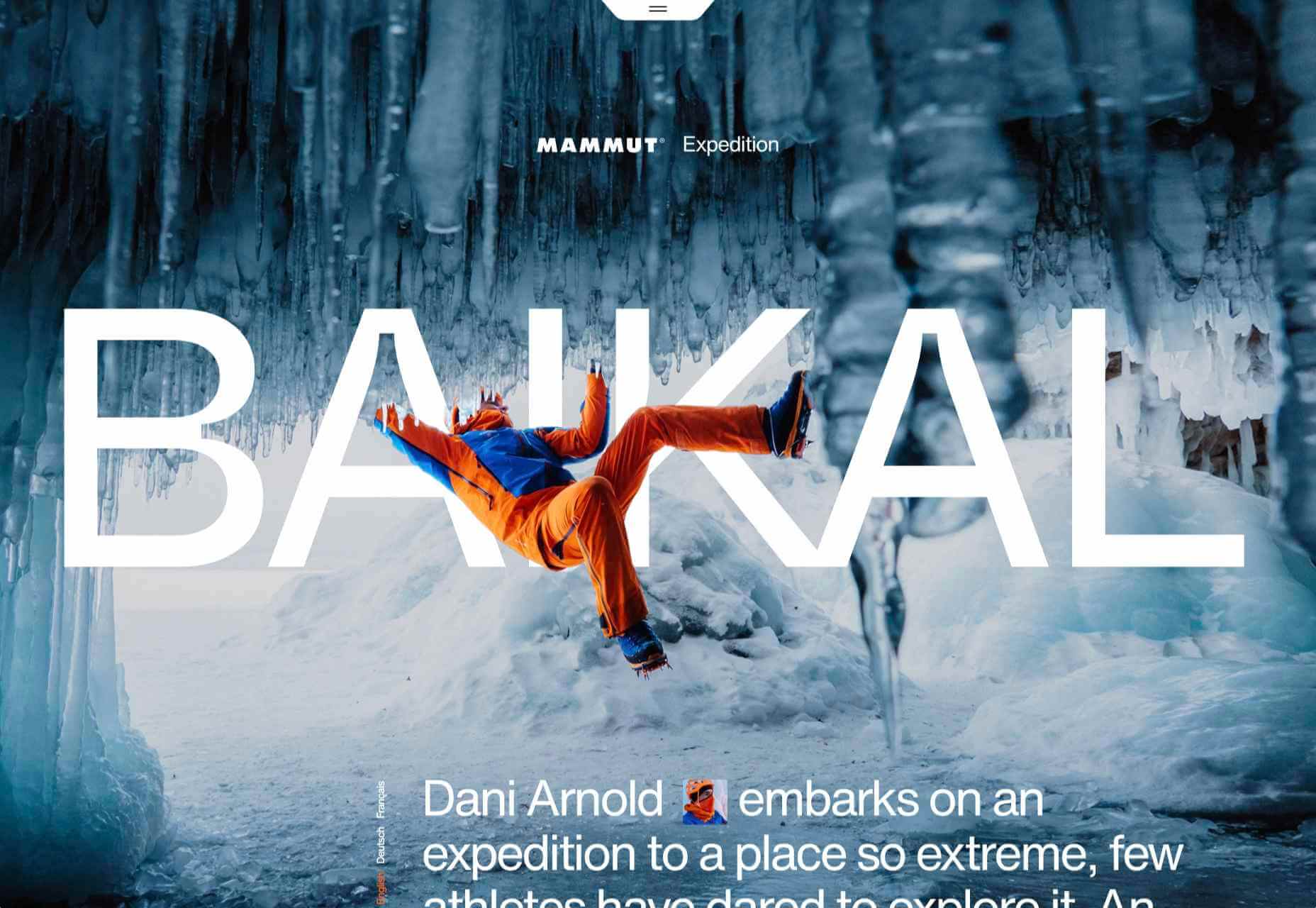
Mammut Expedition Baikal

Mammut uses stunning photography and a strong narrative to present its Eiger Extreme outdoor clothing. Longing for the great outdoors will either be alleviated or exacerbated by this one.

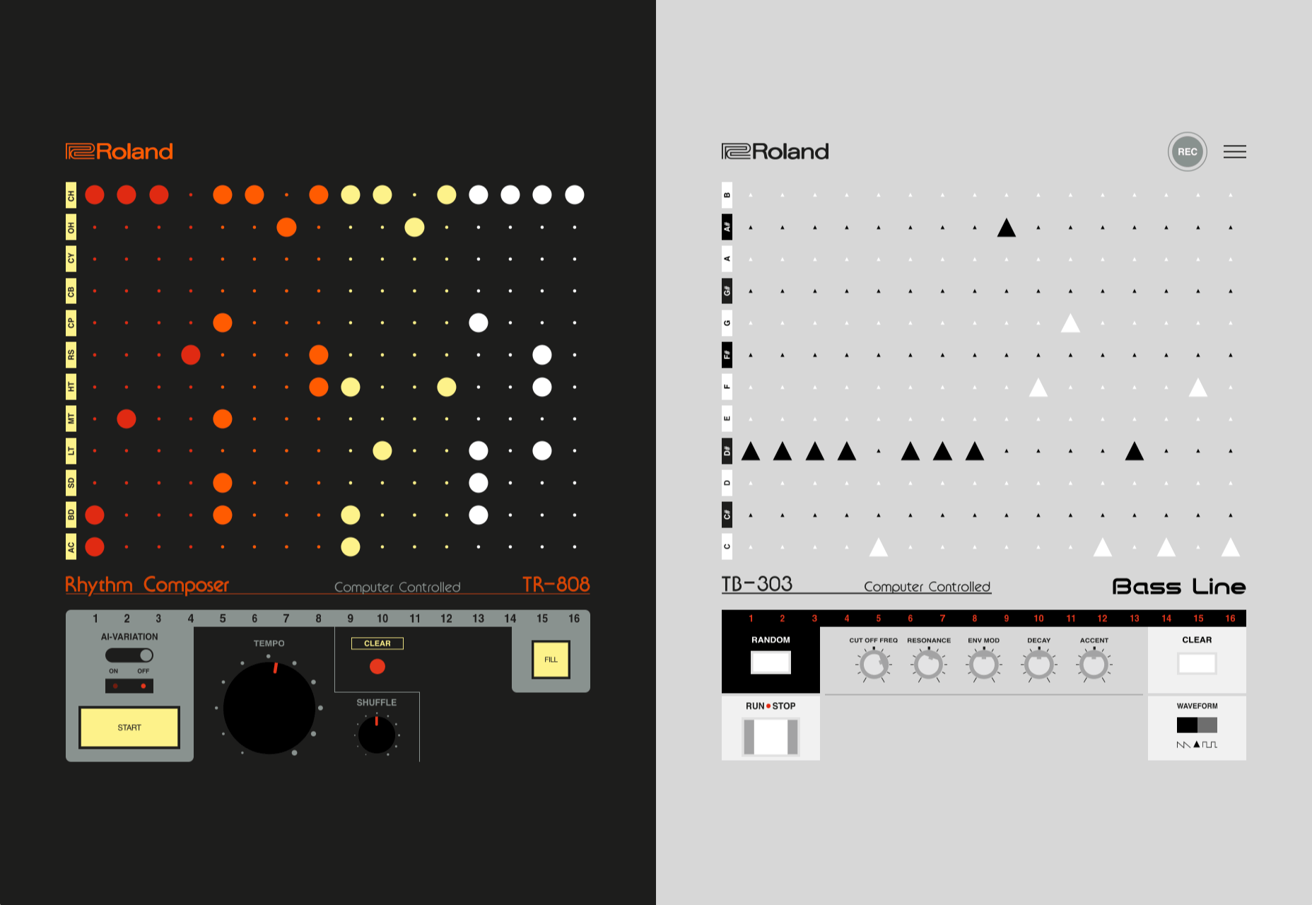
808303

808303.studio is a virtual Roland TR-808 drum machine and TB 303 bass synthesizer. You can program, record, and share your very own 80s techno masterpiece.

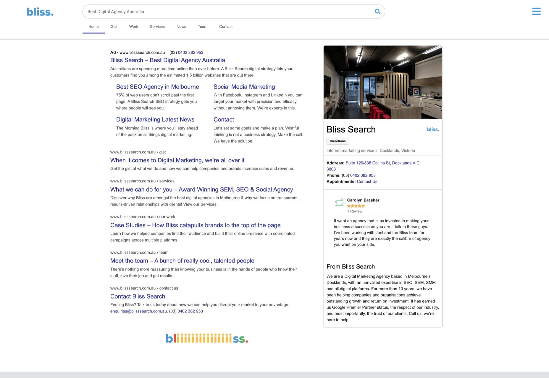
Bliss

Humor can be hard to get right, especially when you want to be taken seriously at the same time. Here, it works, and the result is a memorable site, oozing with confidence.

Jazz Keys

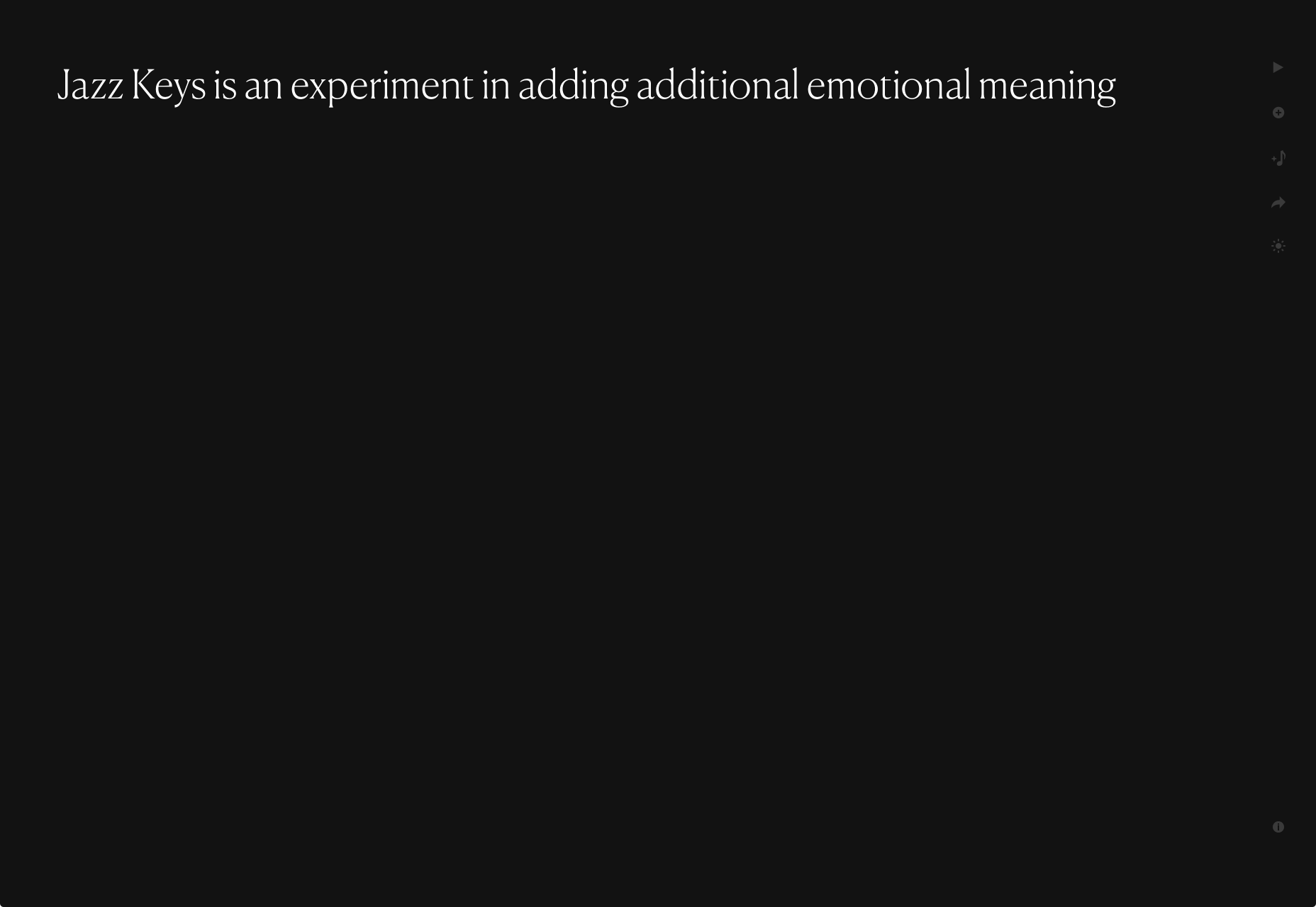
Type your message into Jazz Keys, and you’ll hear it in sound. You can send the message to anyone and let them hear your words — the web lives for side-projects like this.

Érika Moreira

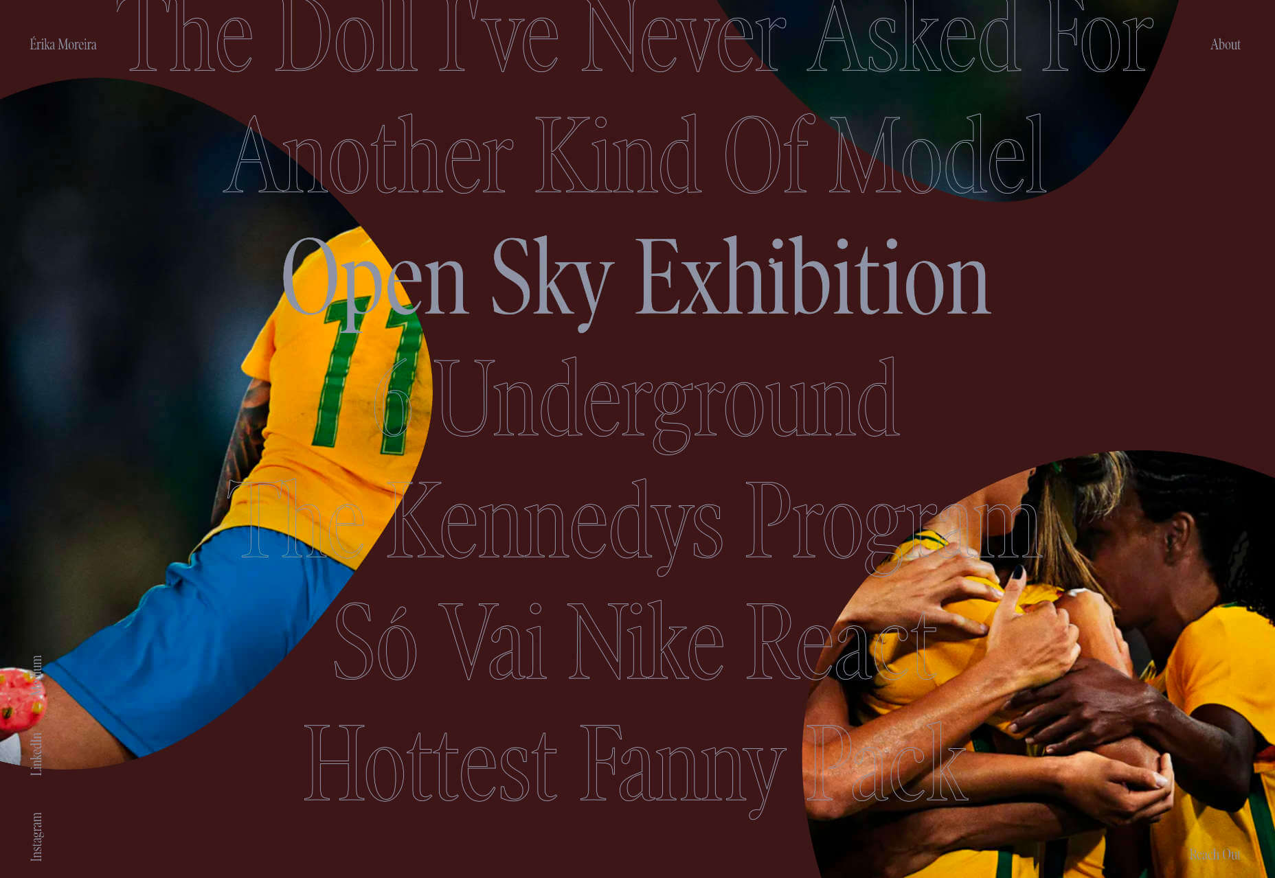
The fabulous, simple site for Sao Paulo-based Érika Moreira has some awesome big type and creative case studies. It’s an excellent example of a non-visual portfolio.

G.F Smith

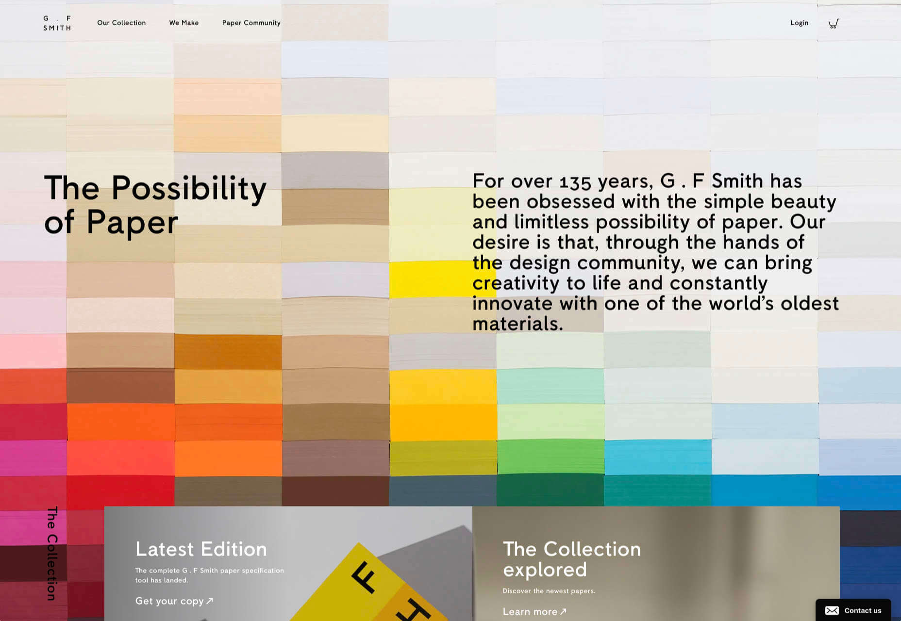
Earlier this year, the site for leading paper supplier G.F Smith got a redesign. It is a simpler design than the previous site and keeps the visual focus on the products and the colors.

Abbotsford Convent

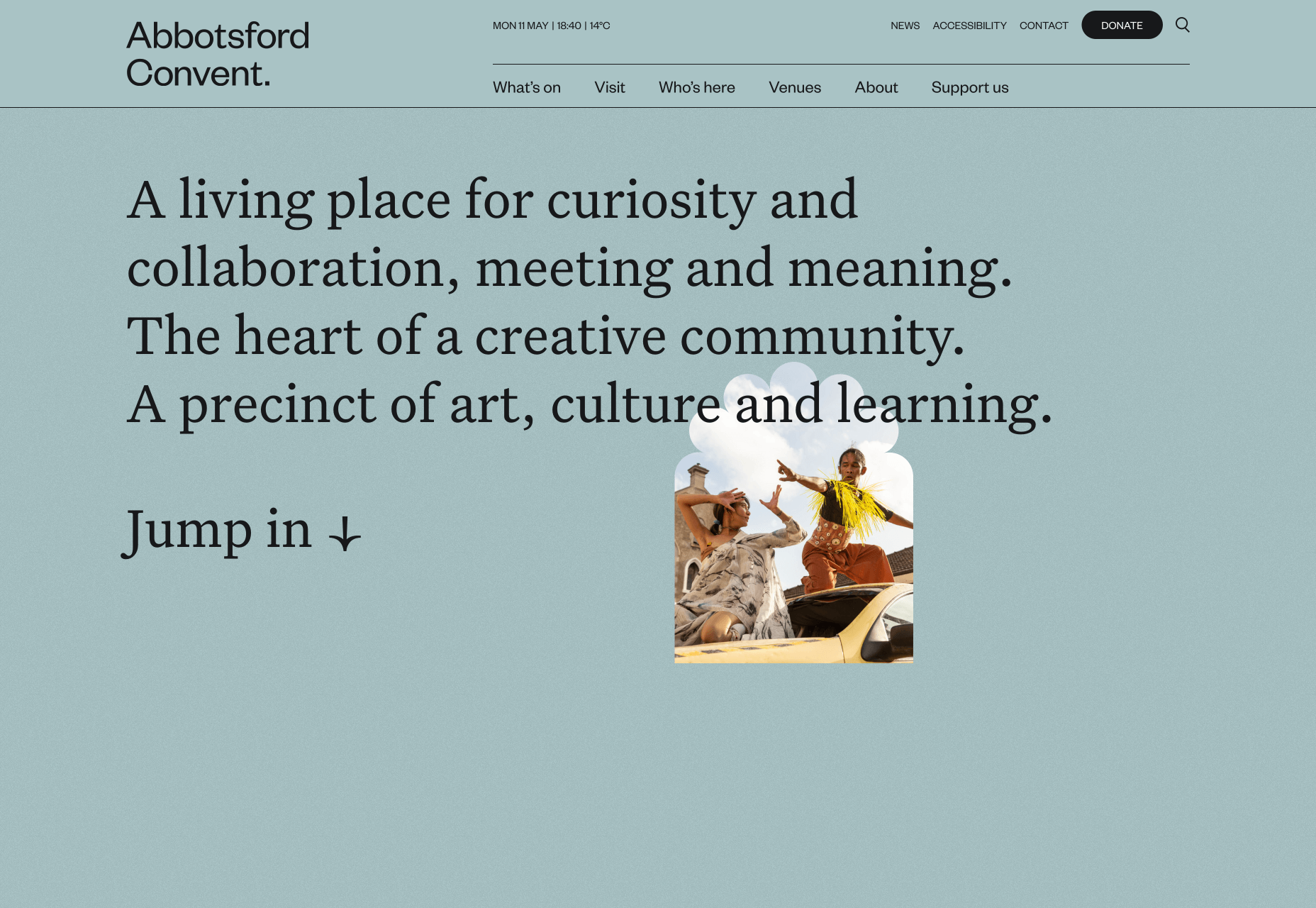
Abbotsford Convent is a creative arts venue in Melbourne, Australia, based in a former convent. The UI for its site blends architectural forms to acknowledge the building’s heritage.

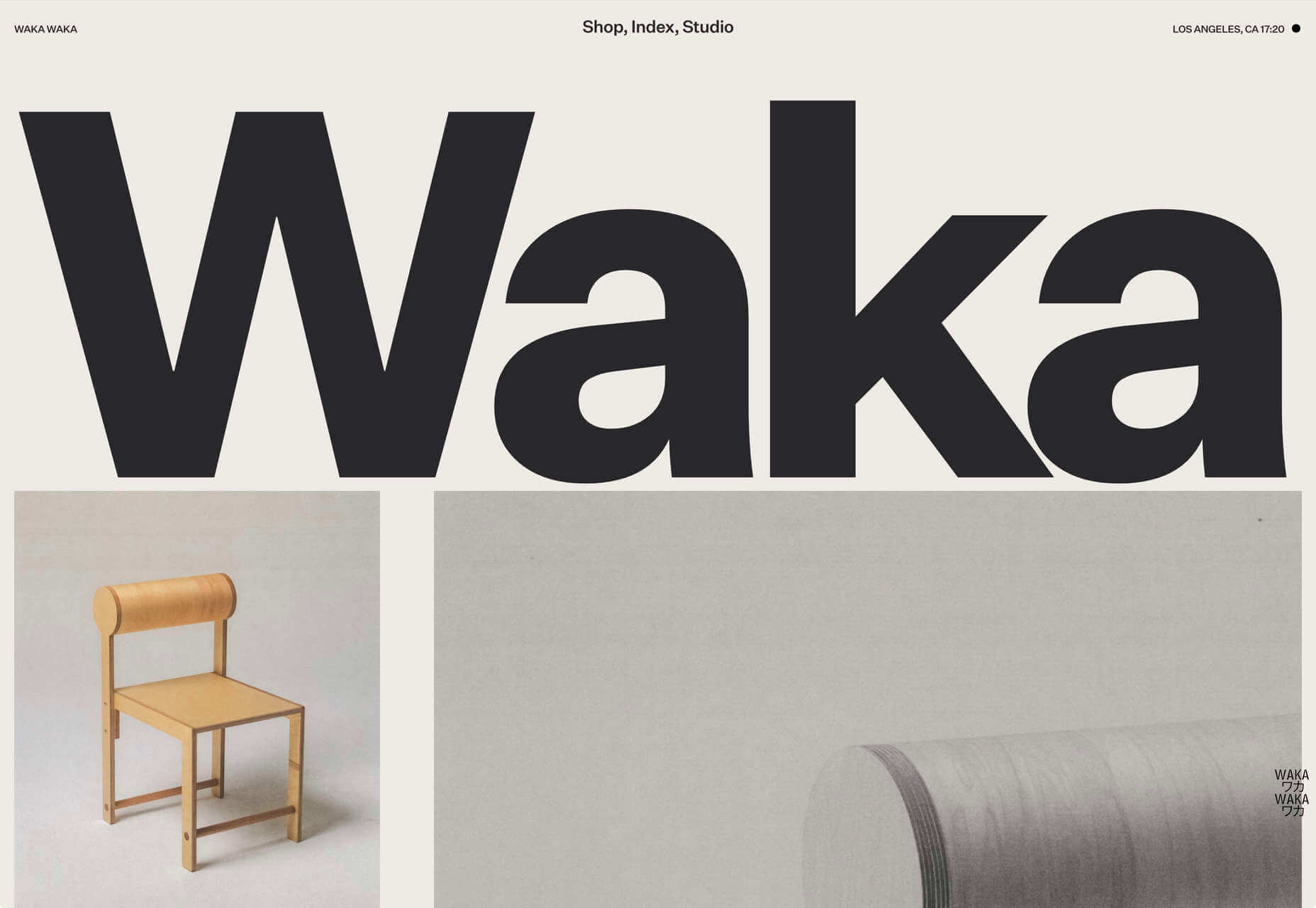
Waka Waka

Waka Waka designs and builds wooden furniture. The mid-century typography and the noise textures transport the site to the last century’s radical graphic design. There’s some clever disruption to the typical thumbnail approach.

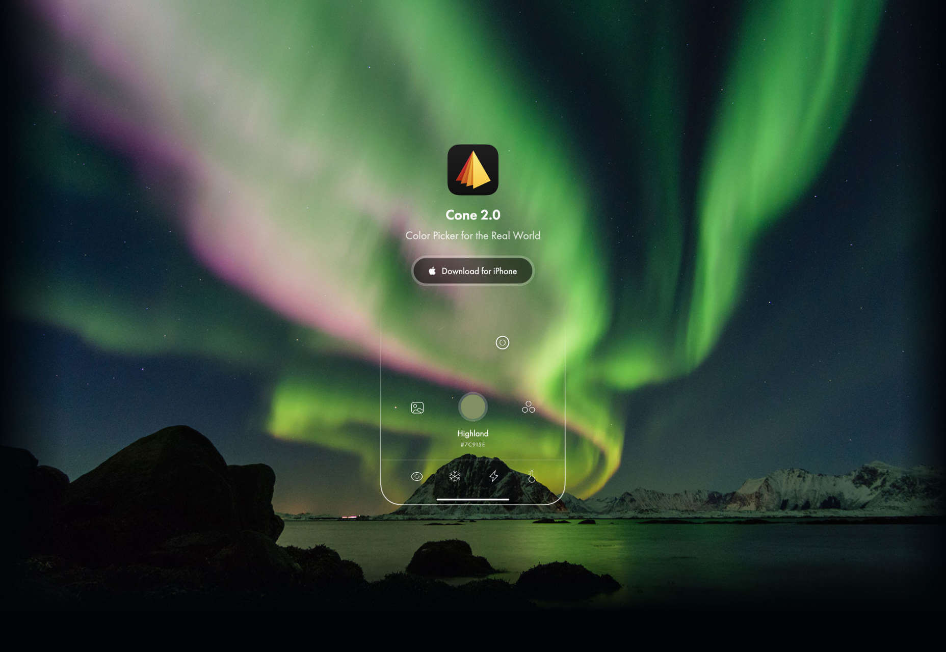
Cone

Sites advertising apps always seem to want to box the design into a hastily de-branded mock-up. Cone takes a daringly refreshing approach by depicting a more expansive mobile experience.

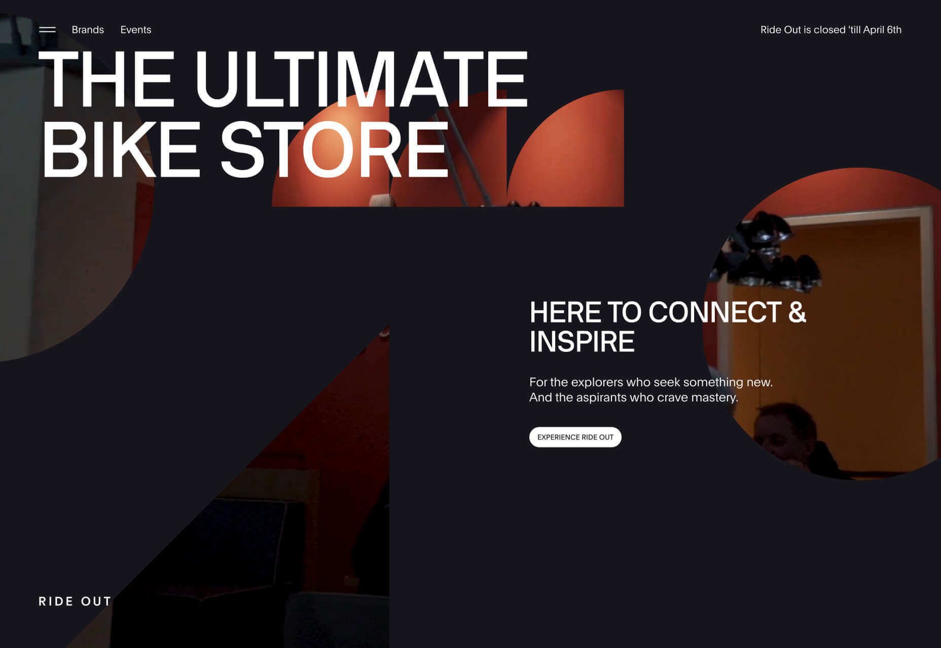
Ride Out

Amsterdam’s Ride Out bike store teases the content with an intriguingly masked video. Plus, we love the wheel-inspired spinning links.

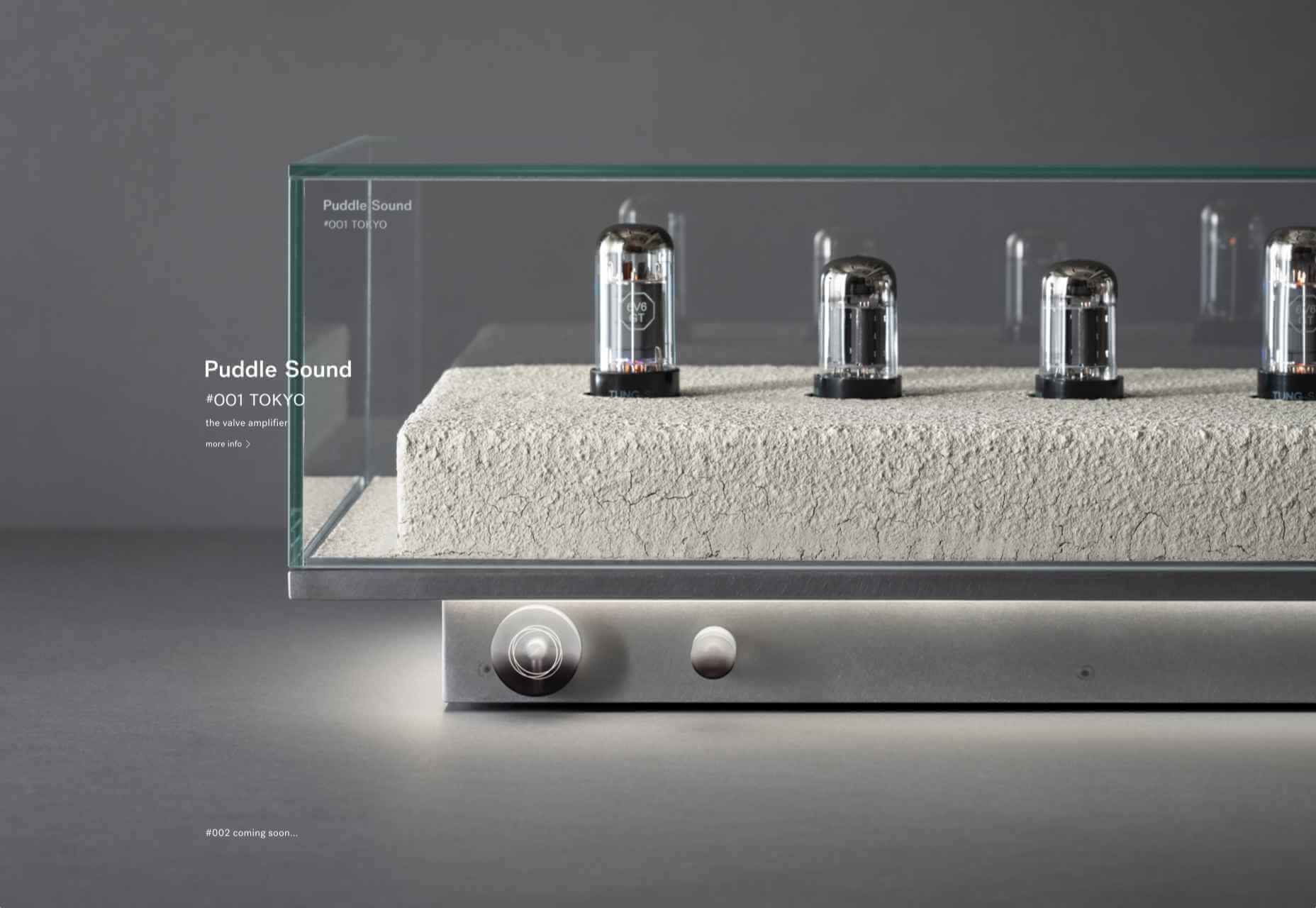
Puddle Sound

This site is a model of minimalism. Beautiful photographs and very little text, there is nothing to distract from the product on display.

Source


Source de l’article sur Webdesignerdepot