Articles

If you already have a good idea of what you want a new website to look like, the next step would be to decide on the tools you’ll need to put into play to turn that vision into a reality.

  • Tools enable you to present its content in ways that will engage and captivate its audience and gain their trust.
  • Tools that will make your website perform flawlessly in all respects.

That is why choosing the right WordPress theme to get the job done is so important. You want a theme that features the page building tools and design aids that make your task far easier than anticipated.

The following 12 top WordPress themes and plugins have been selected with those purposes in mind. They will not only get the job done for you but do it better than most of the other website-building tools in the marketplace are capable of doing.

The choice is up to you. Whatever that choice may be, it should prove to be a winner.

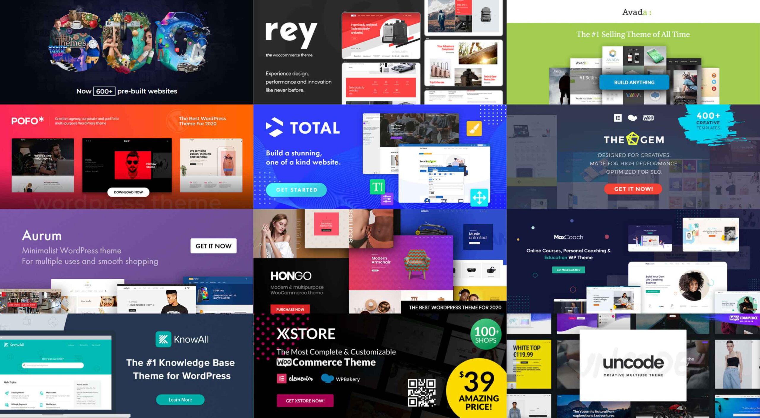
1. BeTheme

A website-building toolkit that can boast of 40+ core features sounds like a pretty good-sized toolkit, and BeTheme is just that. In fact, this popular (200,000 sales) theme is the biggest WordPress theme of them all.

It’s unlikely you will need to put every one of these core features to use for your next project, but some will be essential, such as –

  • The Muffin Builder page builder, Admin Panel, and Shortcode Generator combine to make BeTheme easy to use, give you a ton of flexibility, and enable you to build your website without any need for coding.
  • Be’s library of shortcodes together with the many Header, Footer, and Grid options, and the new Header Builder extends your design options even more.
  • The Layout Generator will come in handy if you want to start a page from scratch.
  • You’ll love what may be the most important core feature of them all; Be’s selection of 600+ customizable pre-built websites. They cover most industry sectors and website types plus a variety of business niches.

Click on the banner to learn more.

2. Total Theme

Designed with excellence in mind, Total features an exceptional selection of tools and design aids to work with. Total is also well-known for its speed, ease of use, and the flexibility it offers its users.

  • Since you can disable any feature you want to, you won’t be distracted by or bothered with those you don’t intend to use.
  • Total’s 40+ quick import demos and one-of-a-kind theme cards are designed to get your projects off to a rapid start.
  • The Dynamic Template function is a driving force behind this WordPress theme’s remarkable flexibility.
  • You’re given a wealth of design options to work with, thanks to the live customizer and the advanced theme panel.
  • Total is a WordPress plugin and WooCommerce friendly.

Click on the banner to learn more.

3. Avada Theme

When a WordPress theme has the distinction of being the #1 best seller of all time, you can safely assume that those who created it got it right. Avada’s 450,000+ sales can’t easily be ignored.

Look closer, and you’ll see some of the many reasons behind Avada’s popularity.

  • There’s an impressive selection of one-click import demos, pre-built websites, and a wealth of supporting design elements.
  • The Fusion drag and drop builder and Fusion page and theme options enable designers to create complex websites without resorting to coding.
  • 5-star support and free updates ensure users that they will always be able to follow the latest design trends and create websites as they envision them.

Click on the banner to learn more.

4. MaxCoach – Online Courses, Personal Coaching & Education WP Theme

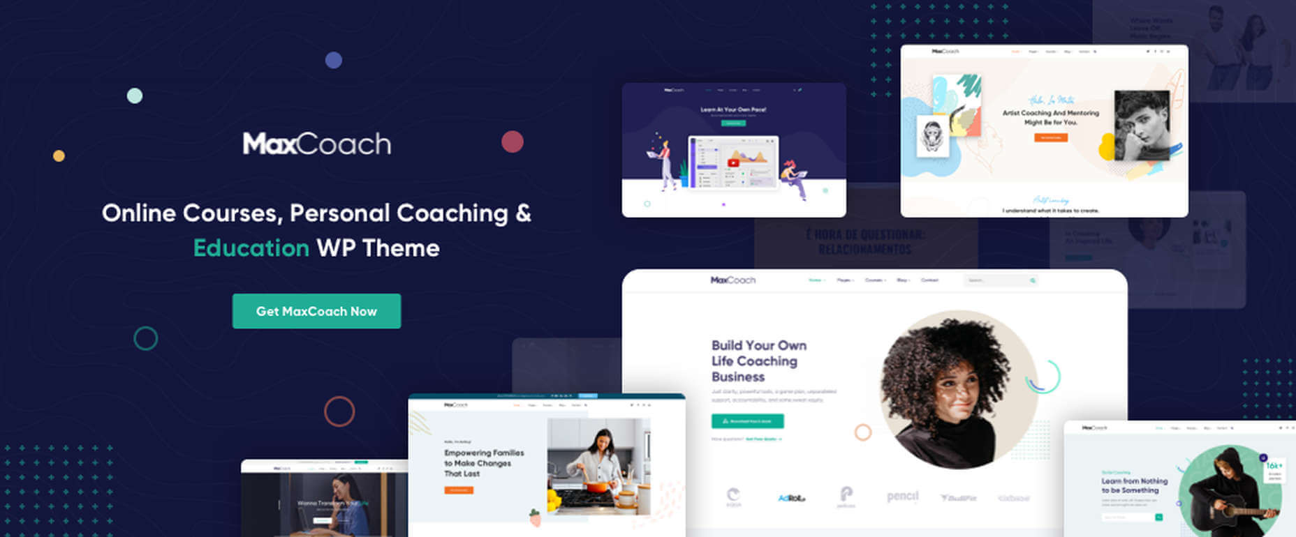
MaxCoach is a specialty tool that enables web designers to create an online distance learning and/or tutoring platform. This LearnPress theme was last year’s #1 coaching theme, and it will most likely be so in 2021 as well.

  • The platform is learner-centric
  • MaxCoach’s design is modern, trendy, and unique
  • Elementor is the drag and drop page builder of choice

Visit the site to see for yourself why this specialty theme has generated so much interest.

5. TheGem – Creative Multi-Purpose High-Performance WordPress Theme

TheGem, WordPress’s ultimate multiuse toolbox, gives its users:

  • A selection of more than 400 professionally-crafted pre-built multi-page and single-page websites
  • Two popular page builders – WPBakery and Elementor
  • Demos, layouts, and page sections you can mix and match to create a look that’s uniquely yours

The GemBlocks with its 300+ pre-designed section templates to speed up your workflow, plus WooCommerce layouts and design aids

6. Uncode – Creative Multiuse & WooCommerce WordPress Theme

The Uncode multi-use WordPress theme is ideal for entrepreneurs, creative individuals, agencies, and small businesses.

  • Its 80.000+ sales to date have made it a ThemeForest best-seller.
  • Features include a unique WooCommerce Custom Builder you can use to give site visitors a supreme shopping experience.

Viewing Uncode’s showcase of user-built websites is a must. Click on the banner to visit the site and prepare to be impressed.

7. Rey Theme

This highly modular popular theme is definitely worth a close look. It is simply one of the most innovative website building tools you’re likely to find on the market today,

  • Rey’s features include a library of professionally-designed templates and an imposing selection of WooCommerce site-building tools
  • It is easy to set up and easy to use
  • You will be more than satisfied with Rey’s robust performance

Rey has built-in SVG support and is user and developer-friendly.

8. Aurum – Minimalist WordPress Theme

With this multiuse minimalist WordPress theme at your fingertips, you’ll be able to create an online store that will give shoppers a fully satisfying shopping experience.

  • With Aurum, you can design megamenus to accommodate huge selections of products
  • Aurum’s page load times are super-fast, and Aurum’s pages are responsive to every screen size
  • Popular plugins are included, and all the popular WordPress plugins are supported

Click on the banner and check it out.

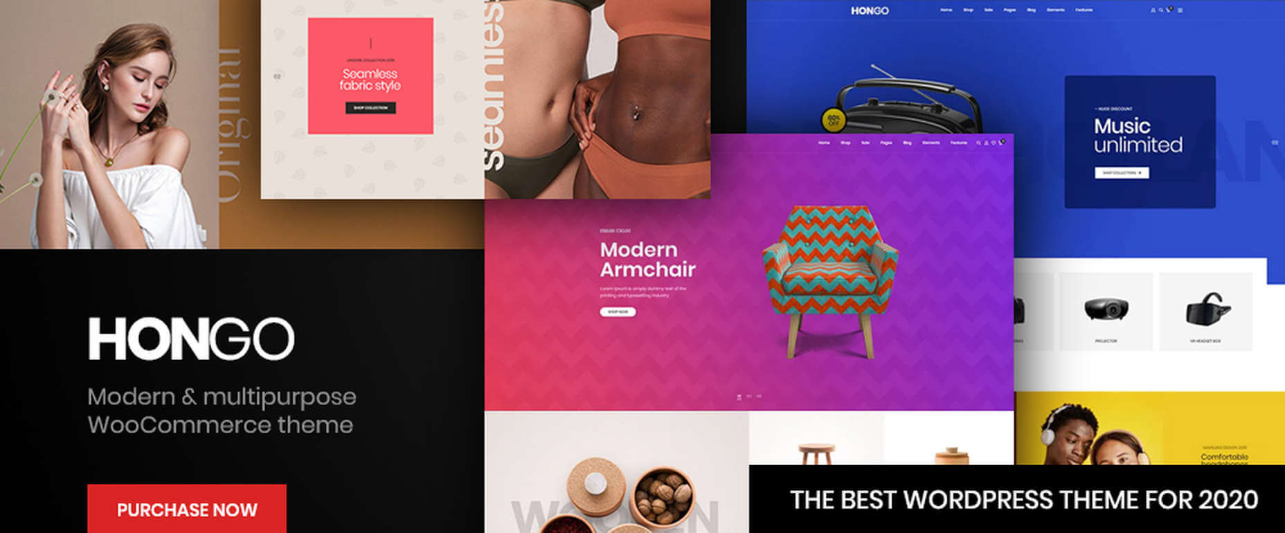
9. Hongo – Modern & Multipurpose WooCommerce WordPress Theme

Its trendy selections of creative design elements and ready-to-go store demos make Hongo an ideal choice for company, blogging, and eCommerce websites.

  • Premium plugins and WPBakery custom shortcodes are among the most popular of Hongo’s website-building features
  • This multipurpose theme also features an attractive selection of product-related tools that include product compare, quick view, wish lists, and product filter

You can expect and receive exceptional user support.

10. XStore – The Most Customizable WooCommerce Theme Ever

With its $39 price tag, XStore gives you more value for your money than you’ll find in any other WooCommerce theme.

  • For starters, there are 100+ good-to-go shops
  • A full Ajax shop is another popular feature
  • As is XStore’s single product page builder and its selection of product filters and display features

Check XStore out if you’re looking for a way to create an awesome online store in no time at all.

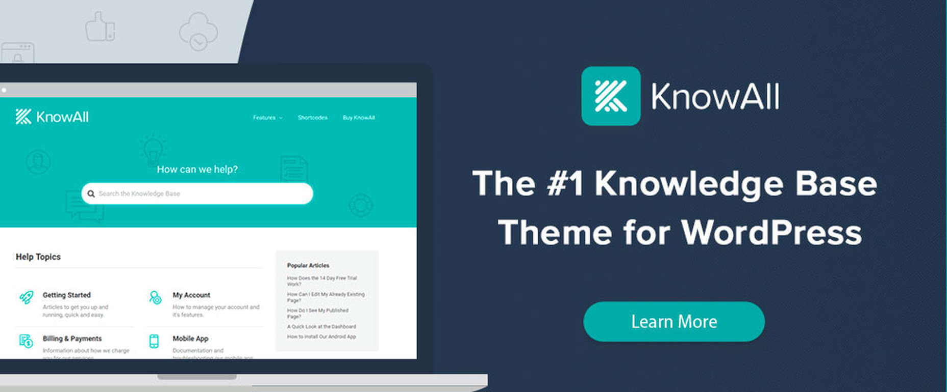
11. KnowAll – Knowledge Base Theme

Have you ever come across a FAQ page you really liked? It doesn’t happen often. 

Visitors that can’t find a good answer might decide to make a phone call (and be placed on hold). That answer is OK, but additional information would be more helpful.

With AI-based KnowAll, customers get answers 24/7, and they can search for other relevant information. They will be happier customers, which is obviously good for business.

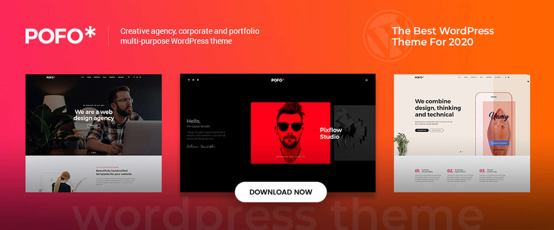
12. Pofo – Creative Portfolio, Blog, and eCommerce WordPress Theme

Bloggers, creatives, agencies, and those looking to create an eCommerce site should give Pofo a good, hard look.

Pofo is fast, flexible, SEO optimized, and packed with useful features that include:

  • Trendy selections of pre-built design elements, ready-to-go home pages, and one-click import demo pages.
  • Premium plugins, including Revolution Slider and the WPBakery page builder.

Detailed online documentation is provided, and you’ll be more than pleased with this theme’s customer support.

A modern, fast-loading, and smoothly performing theme is what you need. It will help you create a website that will have a significantly positive impact on your business’ growth.

Themes like those presented here can do just that by enabling you to give your website the professional touch you’re looking for. You can do it without having to rely on a single line of code.

These 12 top WordPress themes are modern, trendy, and easy to work with. Trying to find the “best” of the bunch could admittedly be somewhat daunting. But, you can take comfort in the fact that you really can’t make a wrong or bad choice.


[– This is a sponsored post –]

Source

The post 12 Best WordPress Themes for 2021 first appeared on Webdesigner Depot.

Source de l’article sur Webdesignerdepot

Over the years, experts have repeatedly discussed the possible impact of mixed realities on web design. Concepts like AR and VR are expected to have the potential to change the way that we interact with websites on a fundamental level.
Now that we’re in the year 2021, however, discussions about AR aren’t just observational anymore. The age of mixed-reality interfaces is here, in everything from Pokémon Go, to Snapchat filters.

The question is, how do web designers create incredible user experiences in a world where there are now multiple digital realities to consider?

The Benefits of Experimenting with AR

Before we look at some of the steps that web designers can take to enhance their projects with AR, it’s worth examining the benefits of interacting with augmented reality in the first place. 

While virtual reality replaces the typical world around us completely with digital components, AR augments it. This means that developers and designers need to learn how to thrive in an environment where the real world and the digital one work together. 

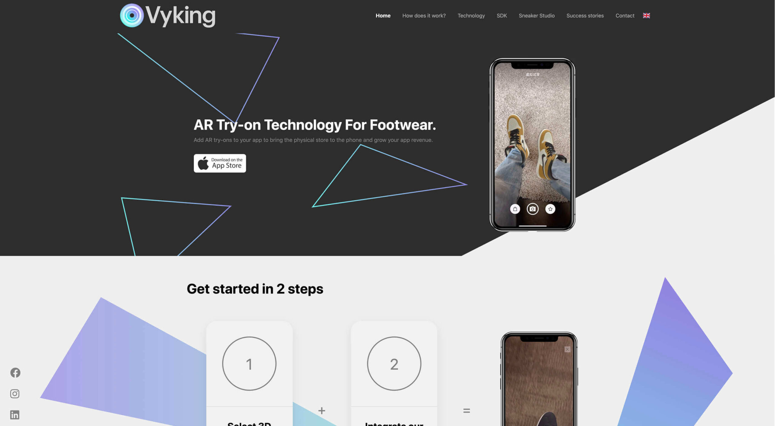
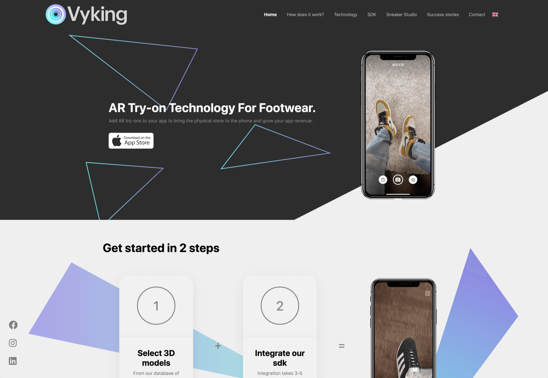
The most common AR application for website owners is to provide a solution for real-time and remote product visualization. Imagine being able to try on a pair of shoes before you buy them online. That’s a service that the Vyking brand can deliver by creating technology that “reinvents” the digital shopping experience. 

This test functionality plays a massive role in purchasing decisions. In a world where people can’t see a shade of make-up in person when they’re shopping online, or check how an item of furniture looks in their home, AR has a crucial role to play. 

In simple terms, AR helps shoppers to make more informed purchases. 

Here’s how you can use augmented reality to deliver incredible UX. 

1. Focus on Real-Time Feedback

Augmented reality is all about connecting the real world to the virtual world. 

Doing this provides users a unique experience – one that’s filled with real-time feedback that can deliver crucial and insightful information. For instance, an augmented reality system in a GPS app can calculate the average time before reaching a destination based on previous trips.

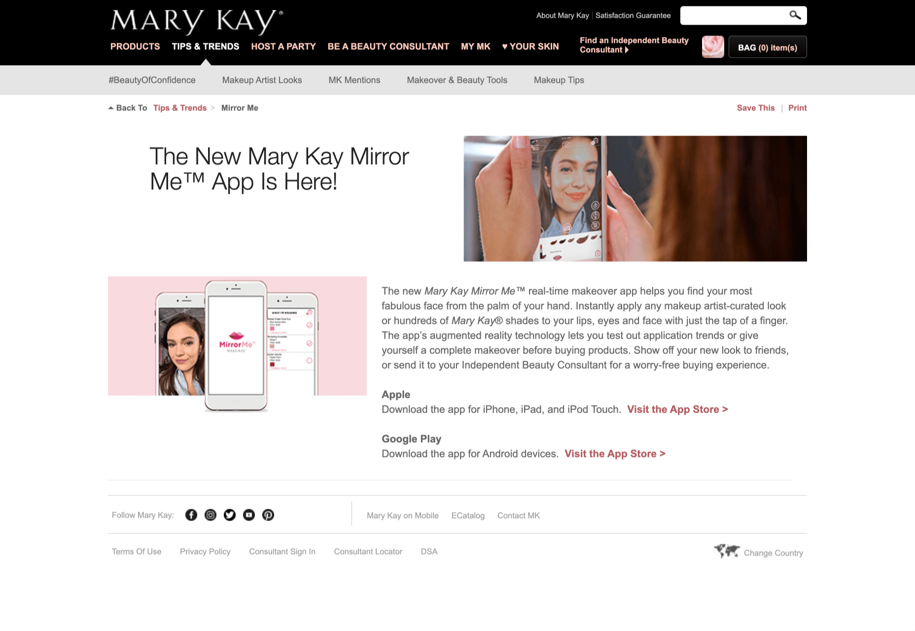
Another option is for an augmented reality to use solutions like face-mapping to help customers determine how a certain makeup product will look before they buy it. For instance, that’s the case for the Mary Kay Mirror Me app, which simplifies the process of shopping for make-up. 

When designing for AR, experts need to consider how they can provide customers with real-time information that they can use to make better purchasing decisions. 

2. Define input and output

Although you’ve probably performed similar exercises when designing for traditional websites and applications in the past, defining inputs and outputs of UX in AR environments can be tough.

Defining inputs and outputs allows you to determine which elements of an interface your user can actually interact with, in your interface. This gives you a better idea of what to “augment.” For instance, you might decide that physical gestures like a swipe of the hand will be essential for AR inputs. However, you’ll also need to consider how each mobile device offers different input possibilities. 

Outputs are a little simpler. For instance, you could offer a three-dimensional model of a product that your customers are interested in. Once you have that output, you can think about how the customer will interact with it by changing colors or position.

3. Embrace Customer-Friendly Performance

Another feature at the heart of AR applications is interactivity. 

Good designs in the augmented reality world need to be simple to access and use, otherwise customers will end up avoiding them. For instance, 60% of customers say they want to use AR when they’re shopping for furniture. However, they’re only going to use your app if it actually works. 

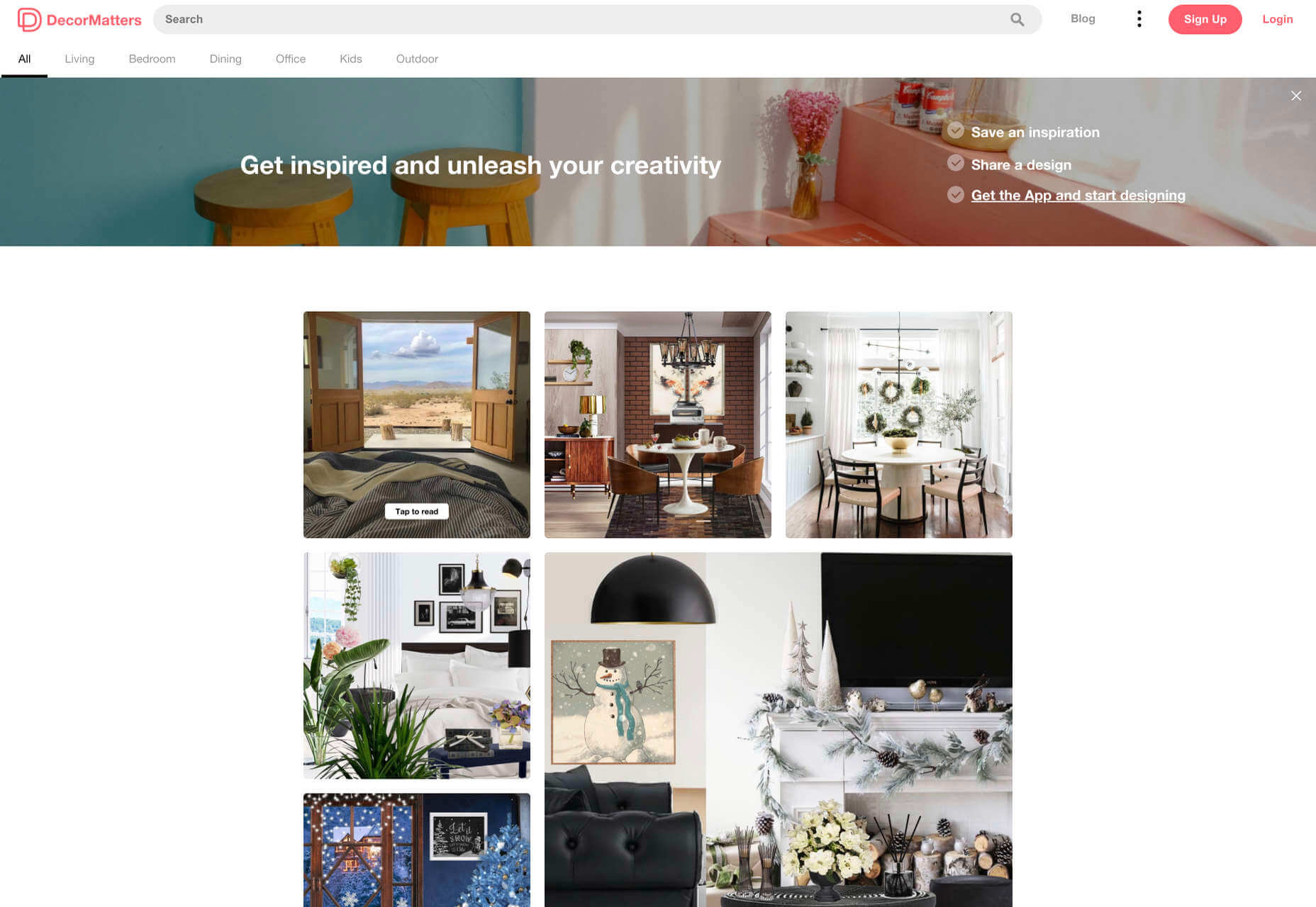
The Décor Matters website and app mix gamification with home decorating features that help customers get a better view of the home goods they’re planning on buying. The website even has inspiration pages available to help users find and try new design options with their AR technology. 

When designing for AR, think about how you can make your applications or technology as simple to use as possible, so customers actually want to interact with it. 

4. Address the Environment

In augmented and virtual reality applications, it’s important to remember that interfaces aren’t bound by physical screens. The viewport will move with the user, shifting perspectives in response. Most AR designers will use four different signifiers to describe AR environments:

  • Public environment: The entire body of the user is involved as a controller, like with the Xbox Kinect or Nintendo Wii;
  • Intimate environment: Where a user can be seated – often in a desktop environment;
  • Personal environment: AR on smartphones, mobile devices, and tablets, like Pokémon Go;
  • Private environments: Completely private spaces, such as with wearable technology like the Google Glass solution.

The environment that you’re designing for will be crucial for your project outcomes. Remember, spatial considerations need to be carefully considered when accounting for how users will interact with objects in a frame. 

5. Remember User Fatigue

Another thing to keep in mind when designing for AR technology is that user fatigue is likely to be a much more significant consideration. After all, people interact with websites and applications in a much more intimate and in-depth way when AR is involved. 

AR applications can often use the entire body of a customer as a controller. Because of this, designers need to be careful about exhausting interactions. High-effort and repetitive interactions could tire the user out mentally and physically, causing them to give up on the interaction. 

When designing, you’ll need to consider how you might over-stimulate the user with too many interaction-focused elements at once. Keep it simple.

6. Remember the Essential Principles of UX Design

Remember, just because you’re tapping into a relatively new technology doesn’t mean that you should abandon all the basic tenets of user experience design that you’ve come to understand over the years. Although UX is constantly evolving and changing, it’s always going to keep a few fundamental principles in mind. 

For instance, you’ll always strive to give users the best digital experience in exchange for the lowest amount of effort on their part. Additionally, you’ll need to think about how you can make end-users as comfortable as possible when they’re interacting with new types of technology on websites and apps. 

For instance, since AR is most commonly associated with gaming in the current environment, it might be a good idea to implement gamification concepts into your AR design. What can you do to make sure your customers are having fun?

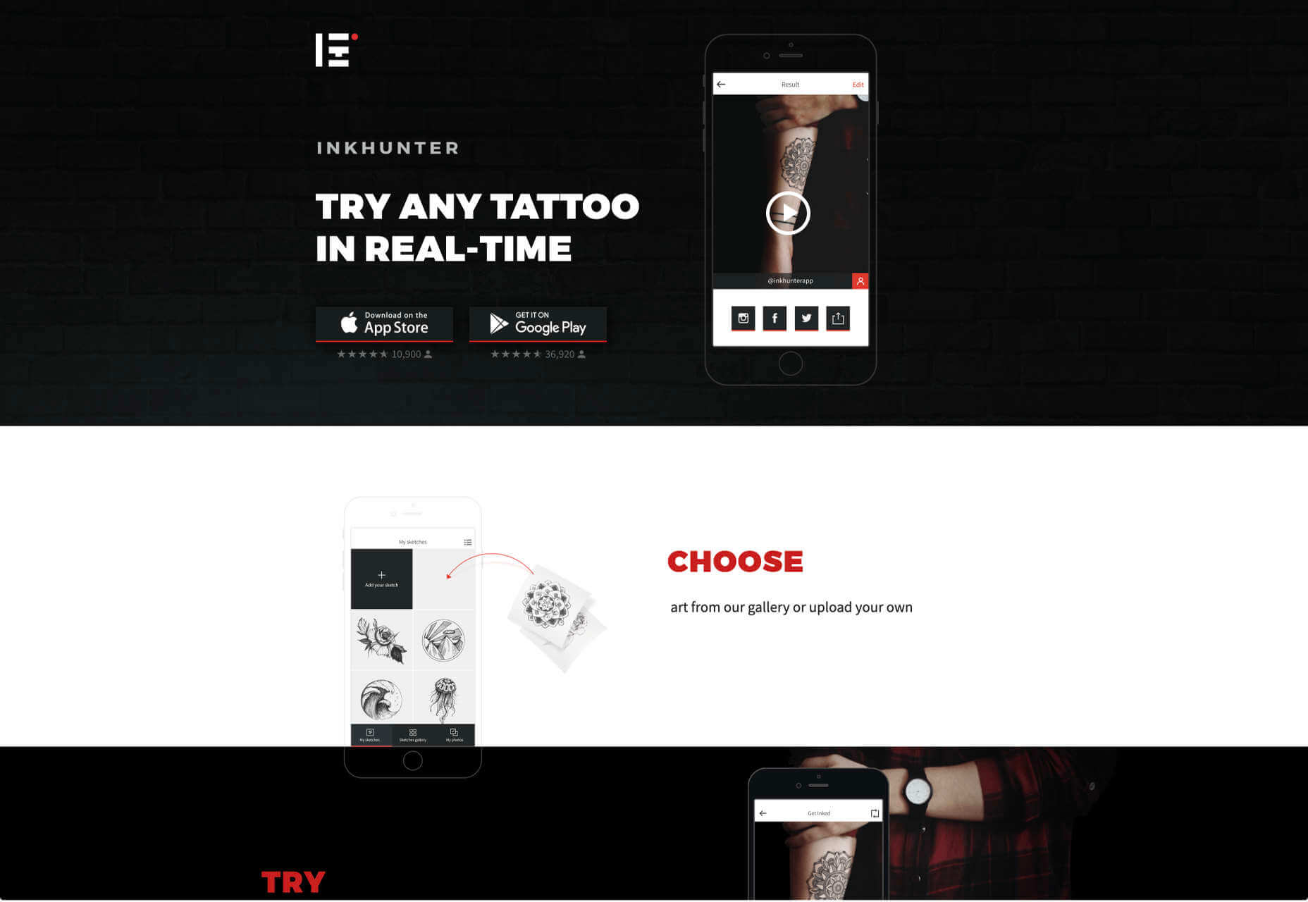
For instance, Inkhunter is an app that allows users to try on tattoos just like using a filter on Snapchat. The experience feels familiar, comfortable, and exciting.

Unlocking the Potential of AR Web Design

Augmented Reality technology has come a long way over the years. Today, developers and designers can access simple plug-in tools like WordPress VR, allowing designers to upload 360-degree videos into WordPress sites and other unique web extensions. 

Augmented reality is becoming much more readily available on sites and apps of all shapes and sizes. Additionally, customers are accessing more ways to unlock AR’s power through everything from headsets to mobile interfaces. 

However, just like any new technology in the web design world, designers need to think carefully about how they will overcome the challenges in user experience that AR can present. For instance, though AR can offer more information for a customer and help them make purchasing decisions faster, there are also risks. For instance, add too many interactive features to a single website or application, and you could scare users off with too much information. 

In the short-term, web designers need to explore the new tools that are available to them and think about the customers they’re designing for. Only this way will we be able to make any considerable advances in the possibilities of AR. 

Are You Ready to Embrace AR?

Designing for augmented reality applications and websites can be an intimidating concept – even for seasoned designers. However, this is just another technology that creatives can use to drive better experiences for end-users. 

Learn how the latest technology works and get an insight into your customers’ needs, and you’ll be amazed at what you can accomplish in the AR world.

Source


Source de l’article sur Webdesignerdepot

Jumpstart your next design project or speed up a workflow with some of these new tools and resources. With so many new tools being developed all the time, you are almost certain to find something that can help you with projects.
Here’s what new for designers this month.

Everypixel Patterns

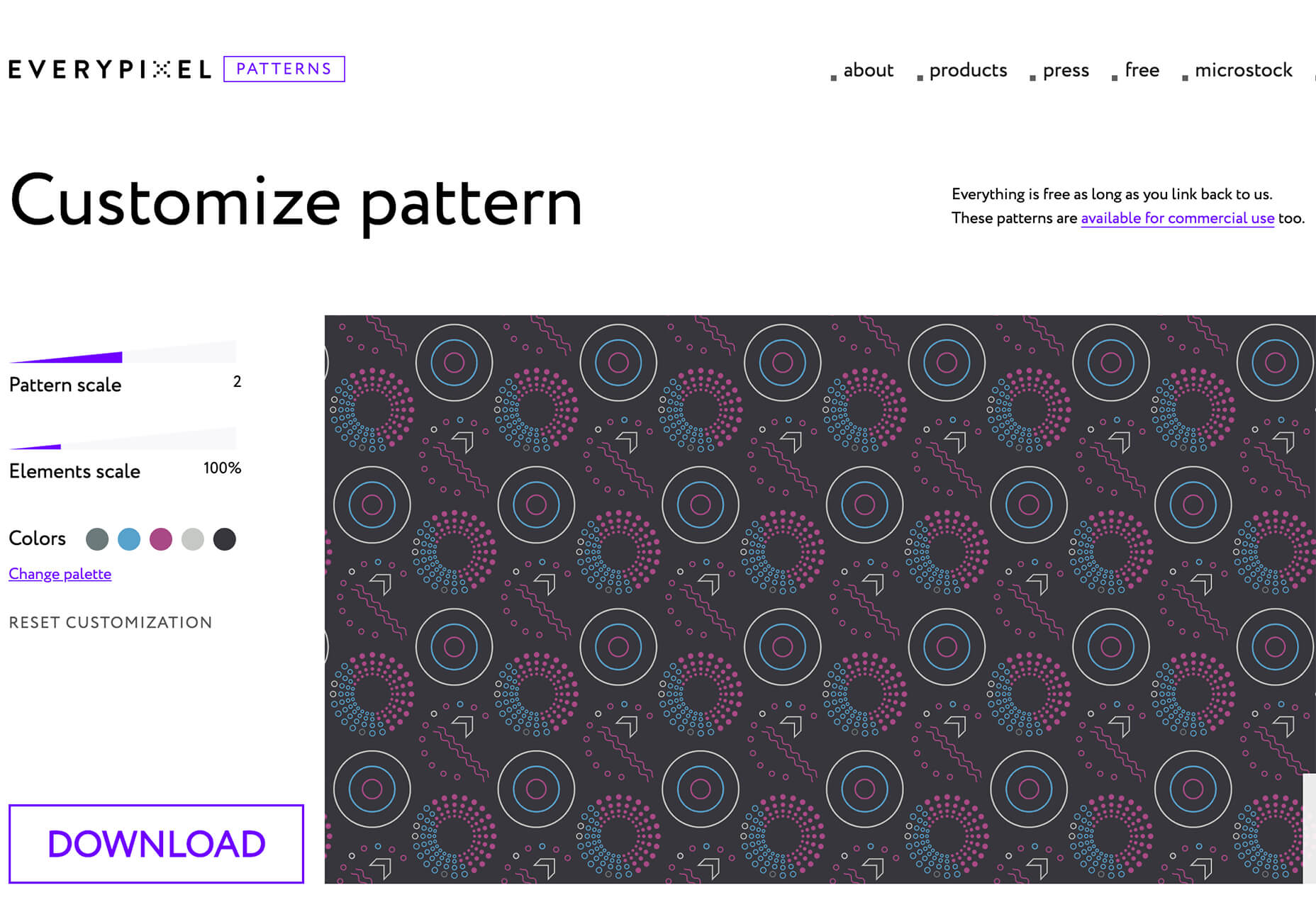
Everypixel Patterns solves a common design problem: Creating seamless patterns with graphic editors is such a long and exhausting process. That’s why some people choose to get patterns from stock websites but that can be a challenge too (and difficult to search). This tool makes getting patterns less time-consuming. It includes a gallery of well-designed content, which you can customize and edit as needed.

Multiavatar

Multiavatar is a free and open-source multicultural avatar maker. Type something in the input field and generate one of 12 billion avatars. (Everything is randomly generated and free to use.)

Lobe

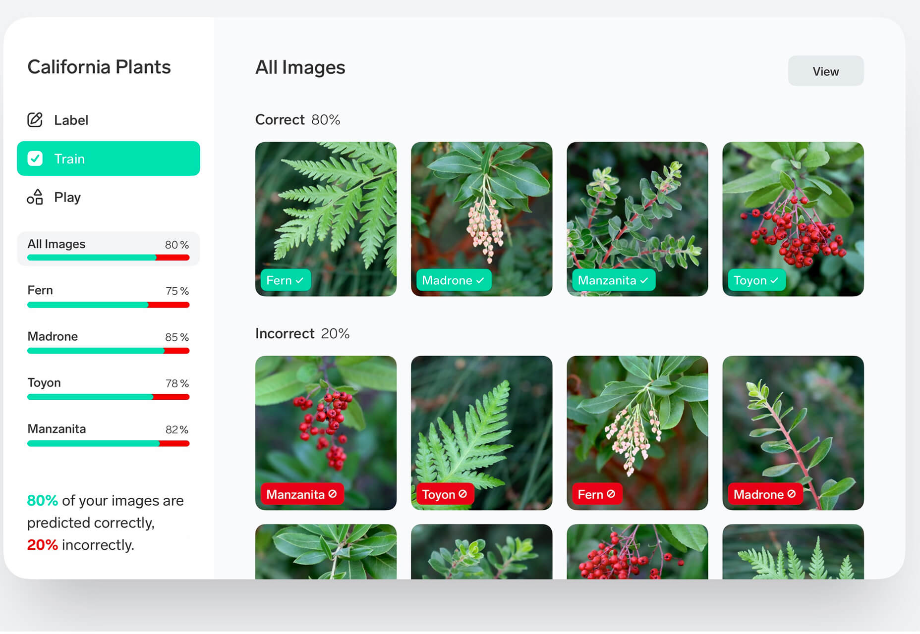
Lobe is a machine learning app from Microsoft that helps you create and train models. Start by showing the app examples of what you want it to learn and it will train a model for you. The tool is pretty easy to understand and you don’t need or experience or code knowledge to use it and you can train an app for free on your computer.

Laser Cat

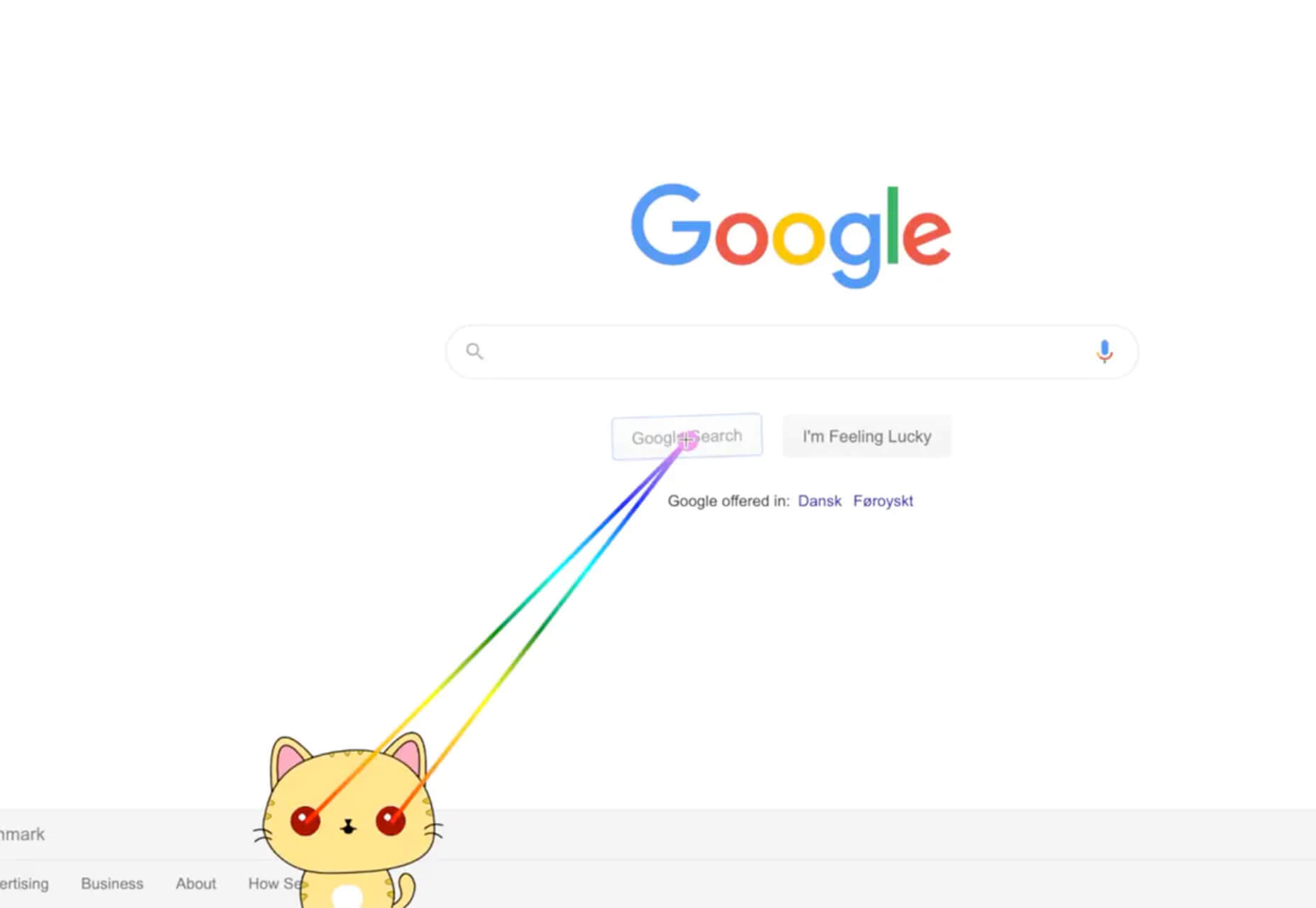
Laser Cat is a silly and fun Google Chrome extension that adds a cartoon cat to your browser that allows you to zap away anything you want to remove in the browser window. It’s light and fun. Go play!

Pattern Collect

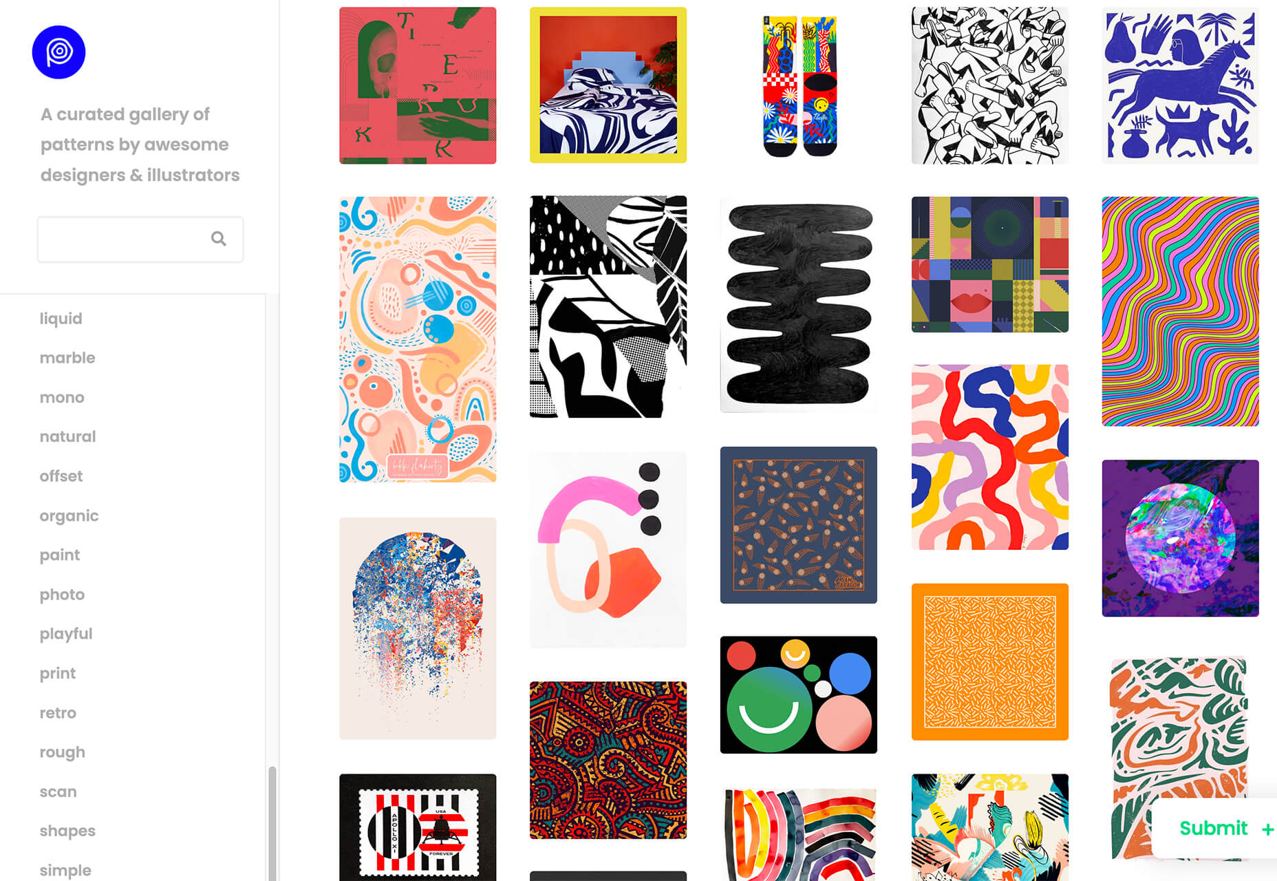
Pattern Collect is a curated gallery of patterns by various designs and illustrators. You can download patterns for use in projects or submit your own to share with the design community. The library is searchable and you can get new patterns via email if you subscribe.

FarbVelo

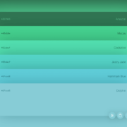
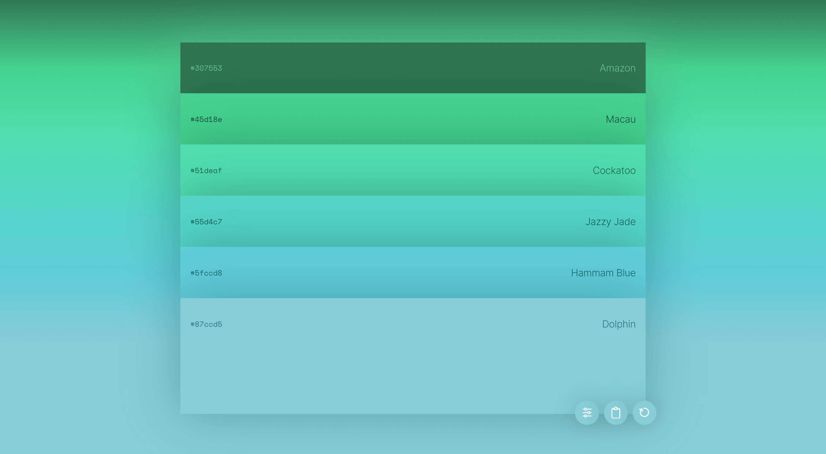
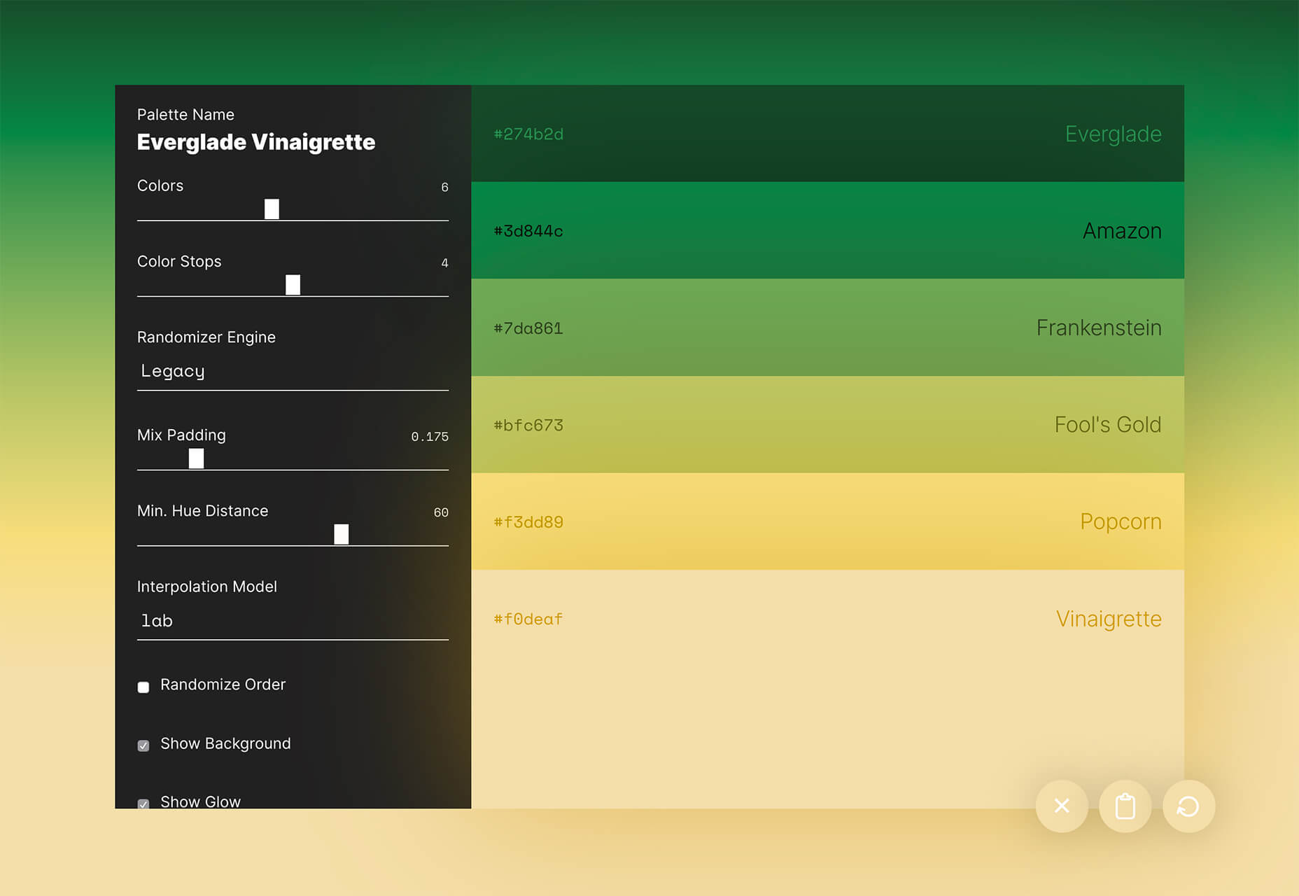
FarbVelo is a color palette generator that shows a new and random scheme with every refresh. The color choices are fresh and could work for a variety of projects, too.

CSS Clip Path Editor

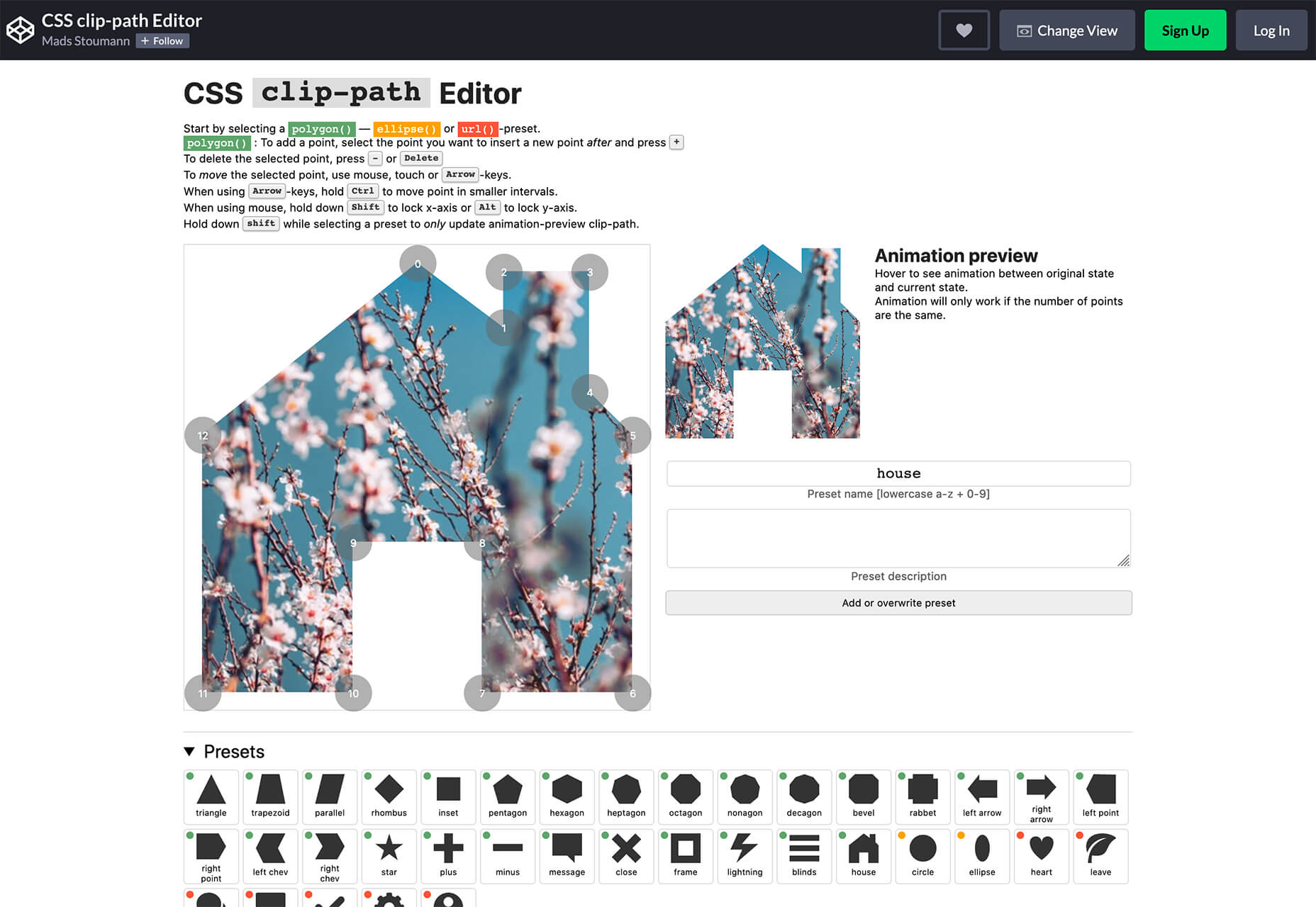
CSS Clip Path Editor is a cool little pen by Mads Stoumann that puts an image inside of almost any clip path you can imagine. There are presets to choose from or you can adjust the settings and paths to create your own image shape.

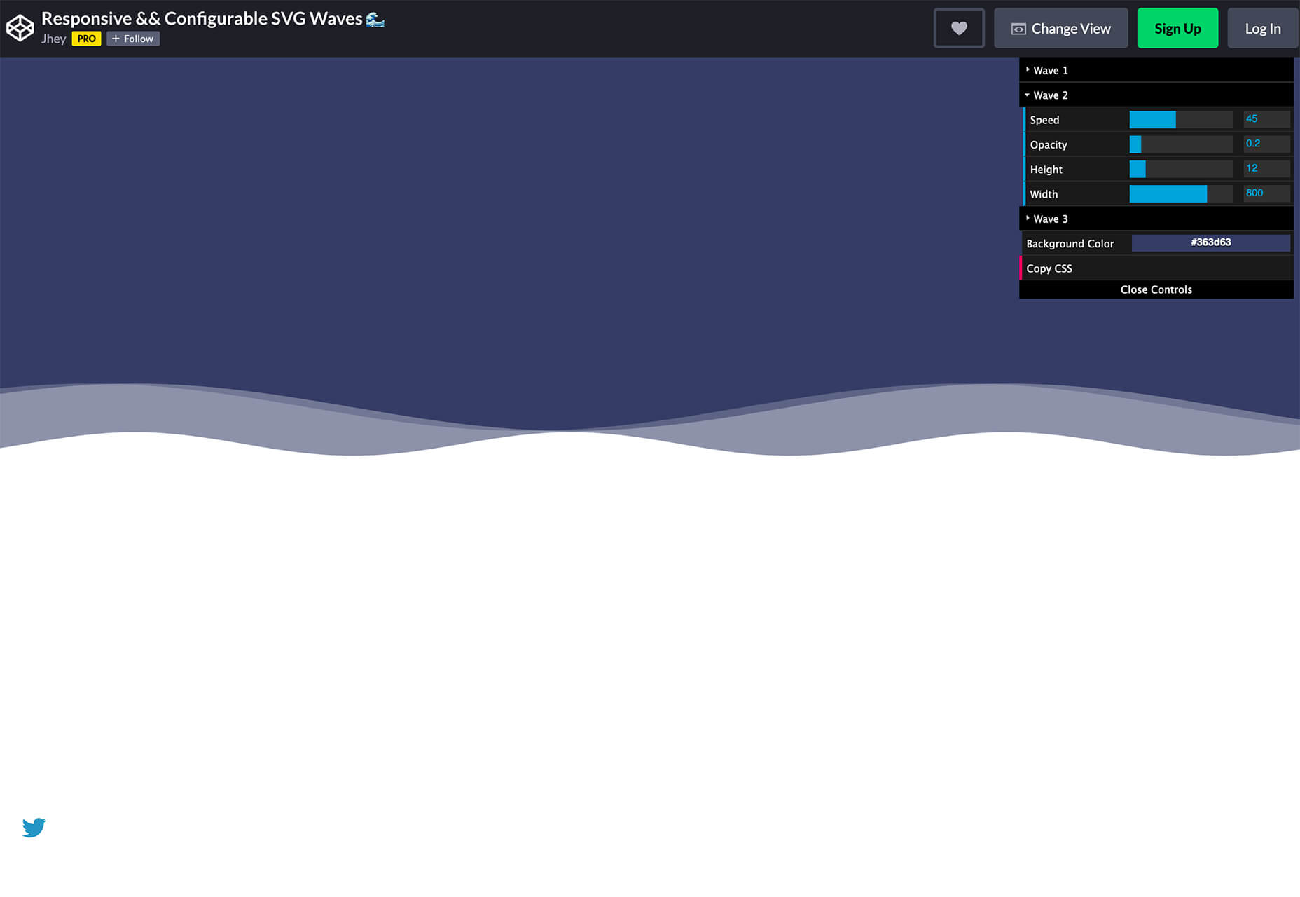
Responsive & Configurable SVG Waves

Responsive & Configurable SVG Waves is a soothing pen by Jhey. Change the background and wave elements for a simple and cool animation in SVG.

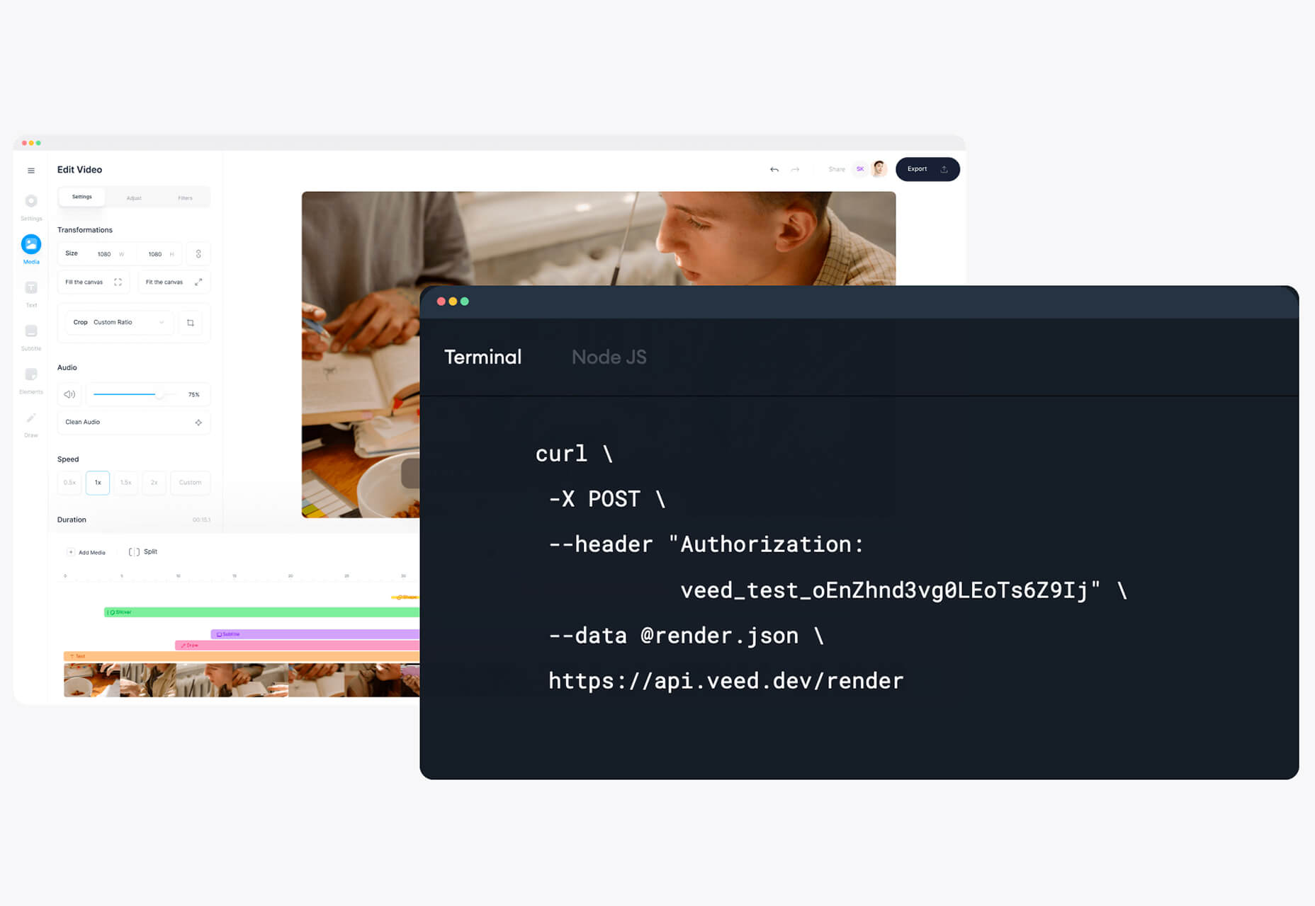
Veed

Veed lets you host, edit, and deliver videos in the cloud using a REST API. It works on any browser, device, and bandwidth, and keeps your website light, even when delivering heavy video content.

Overlay

Overlay is a plugin for Figma or Sketch that transforms components and symbols into clean and reusable React, Vue, or HTML code. The benefit? Use it to create more consistent websites and design systems more quickly and in a pixel-perfect manner.

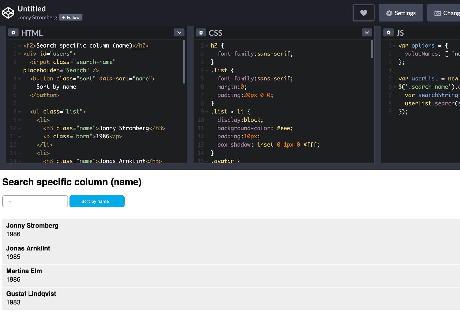
List.js

List.js is a library for adding search, sort, filters, and flexibility to tables, lists, and other HTML elements. It is built so that it will work on existing HTML and be invisible. Plus, it is simple to install and use.

What Are Design Tokens?

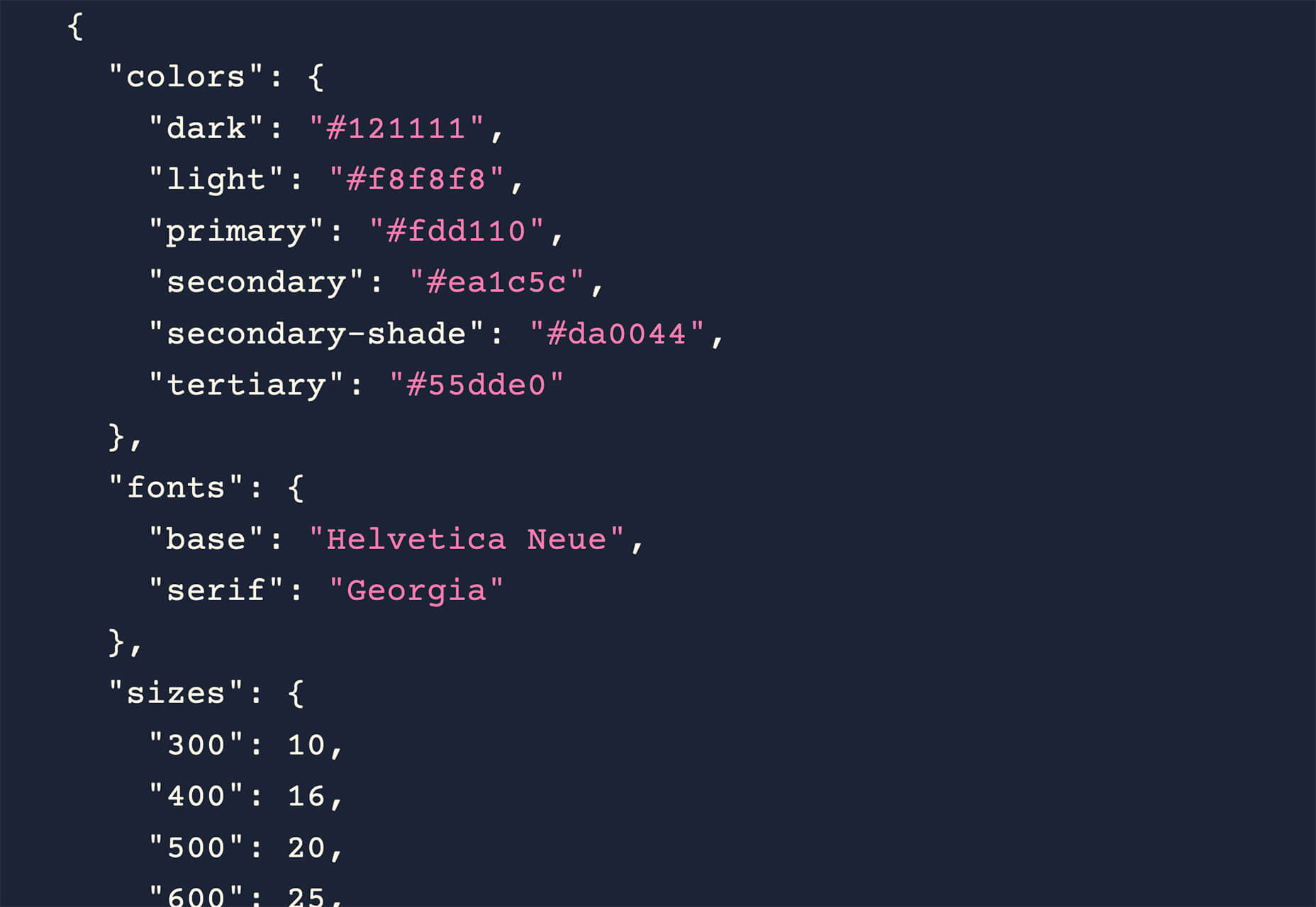
Design tokens are a “hot term” says Andy Bell. So, he wrote an explainer that breaks down what they are and how they might look in a standard data format like JSON. Read the explainer and you’ll be able to identify design tokens and understand them.

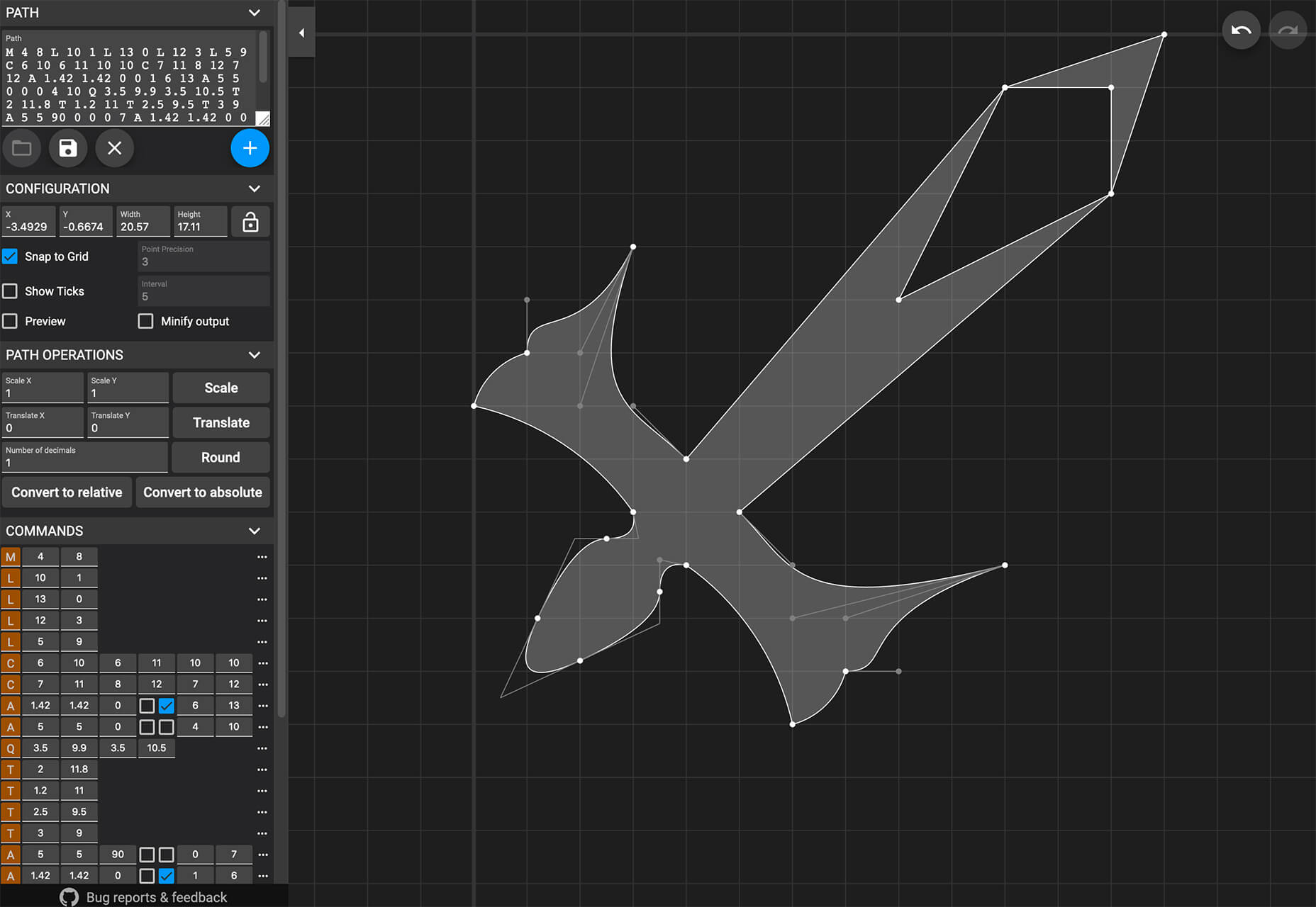
SVG Path Editor

SVG Path Editor makes it easy to manipulate paths for any SVG element. The grid – if you choose to use it – helps edits stay symmetrical and easy to manage.

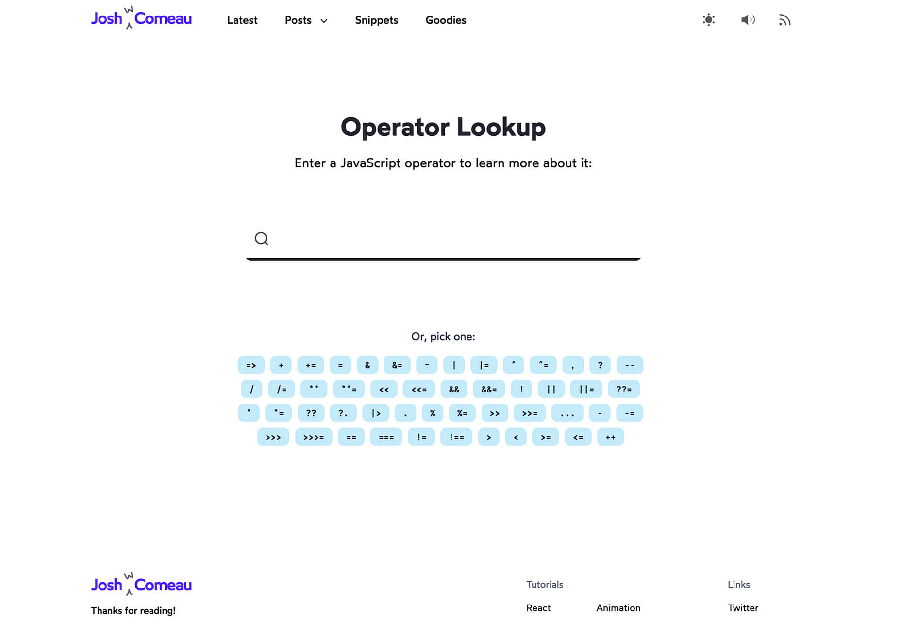
Operator Lookup

Operator Lookup is a practical and fun tool. Enter a JavaScript operator in the search box to learn more about what it does. (You can also choose from a “keyboard” of options.) Thanks for the tutorial, Josh W. Comeau.

Beacon

Beacon is a tool designed to help you write, run, and share SQL in Slack. It makes collaboration easy so you can work on and run queries, debug, and resolve issues all in a single platform.

Plaiceholder

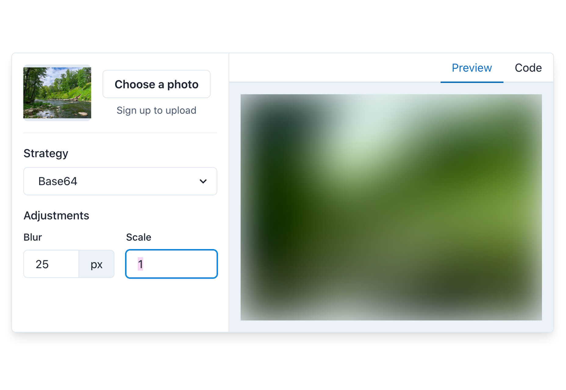
Plaiceholder transforms your images into lightweight placeholders using pure CSS or SVG.

Machine Translation

Machine Translation is available as Cloud API, on-premise translation server, and SDK that can be easily integrated into lots of business cases. Both solutions work with 110 languages.

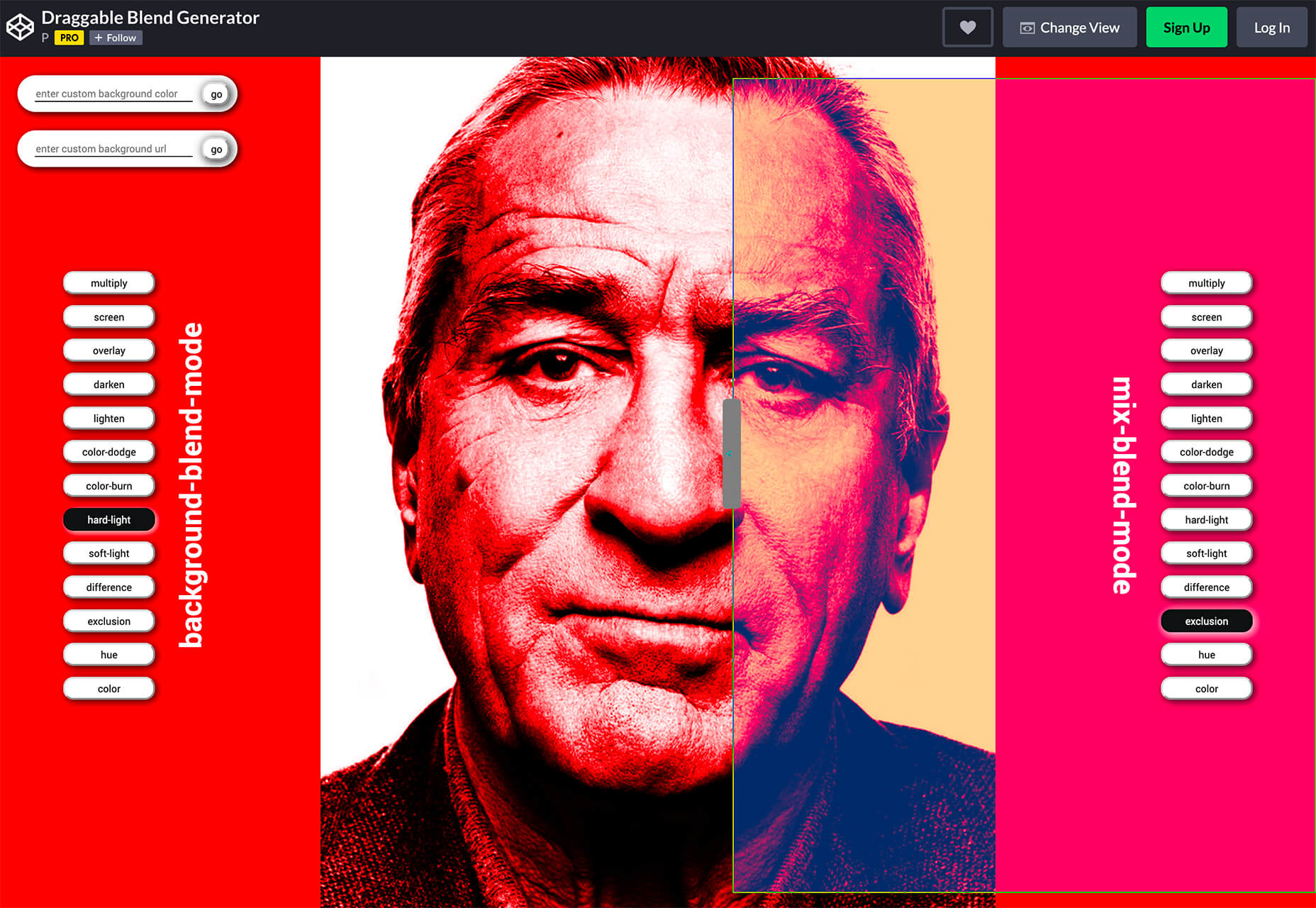
Draggable Blend Generator

Draggable Blend Generator does just what the name implies. Change the blend mode of a background and foreground using a draggable tool so that you can see the changes in real time. Just enter the URL of a background image or pattern and color swatch and you are ready to go.

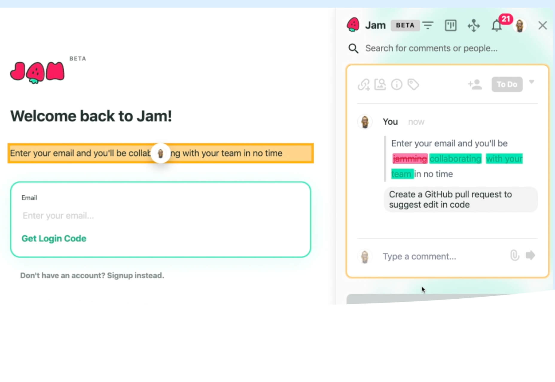
Jam Wand

Jam Wand is a “magic wand” for making changes on your website, starting with copy. Click on any text, edit it, and submit the change to GitHub to be merged into the code. Copy changes as easy as click, type, and click again. (This tool is still in beta.)

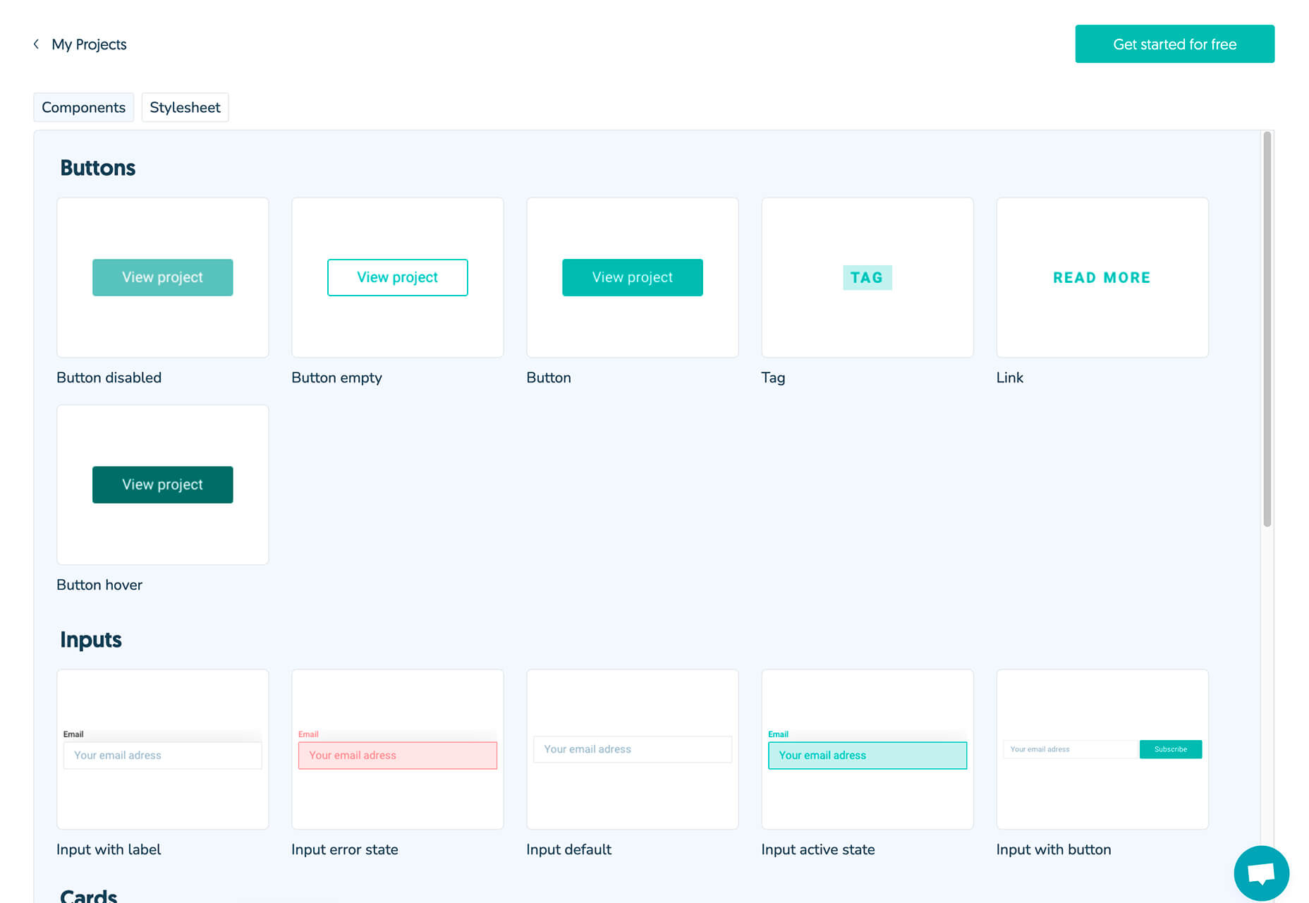
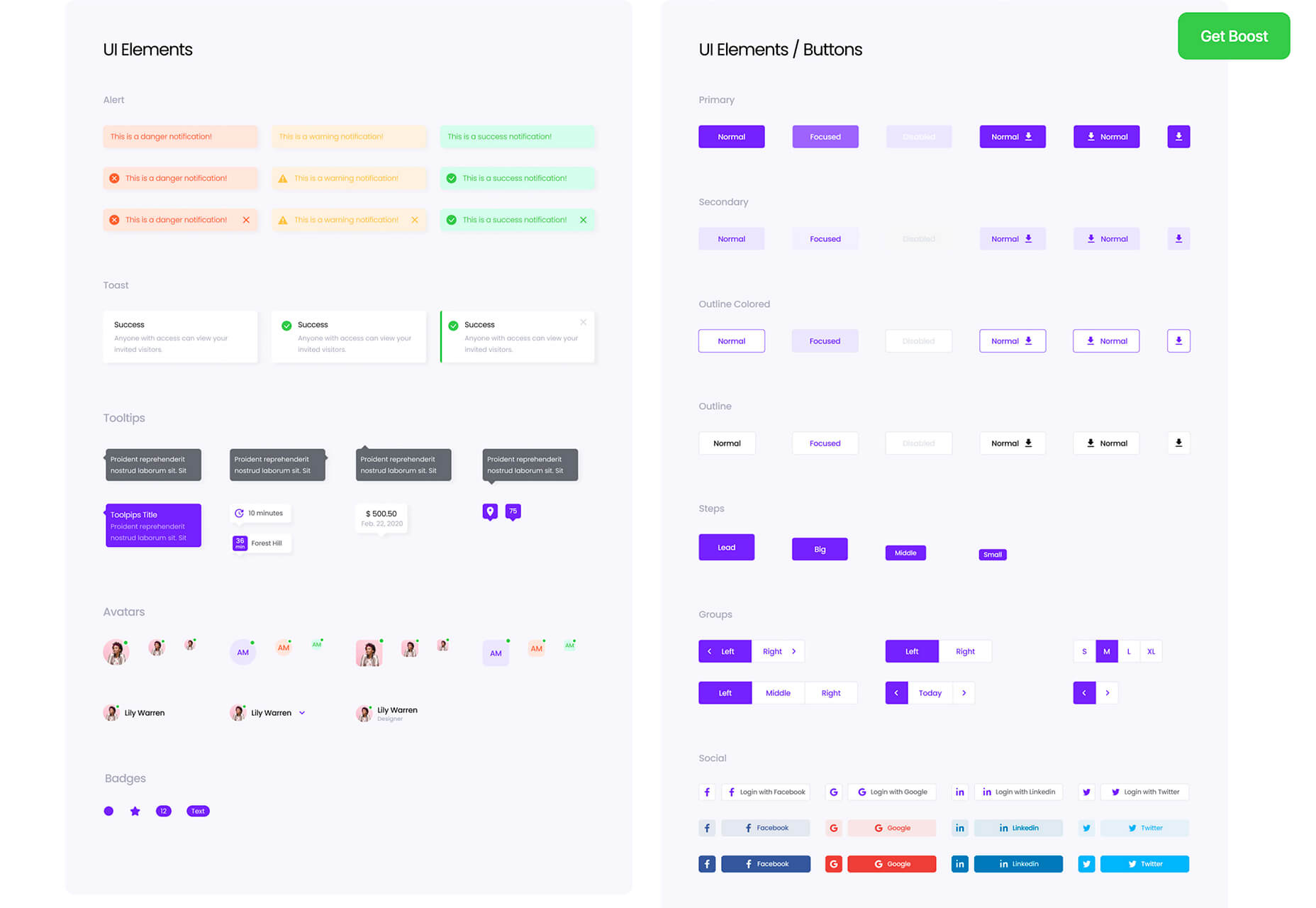
Boost UI Kit

Boost UI Kit is a collection of elements and components that will help you finish website design projects using a bright and airy style. It works with Figma for easy integration.

Romanizer

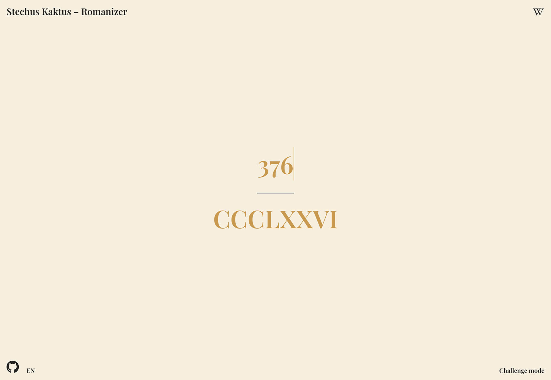
Romanizer is a fun game that tests your knowledge of Roman numerals. With two modes – a randomizer and a challenge you can participate in – you’ll learn to convert numbers visually in minutes.

Itmeo Market

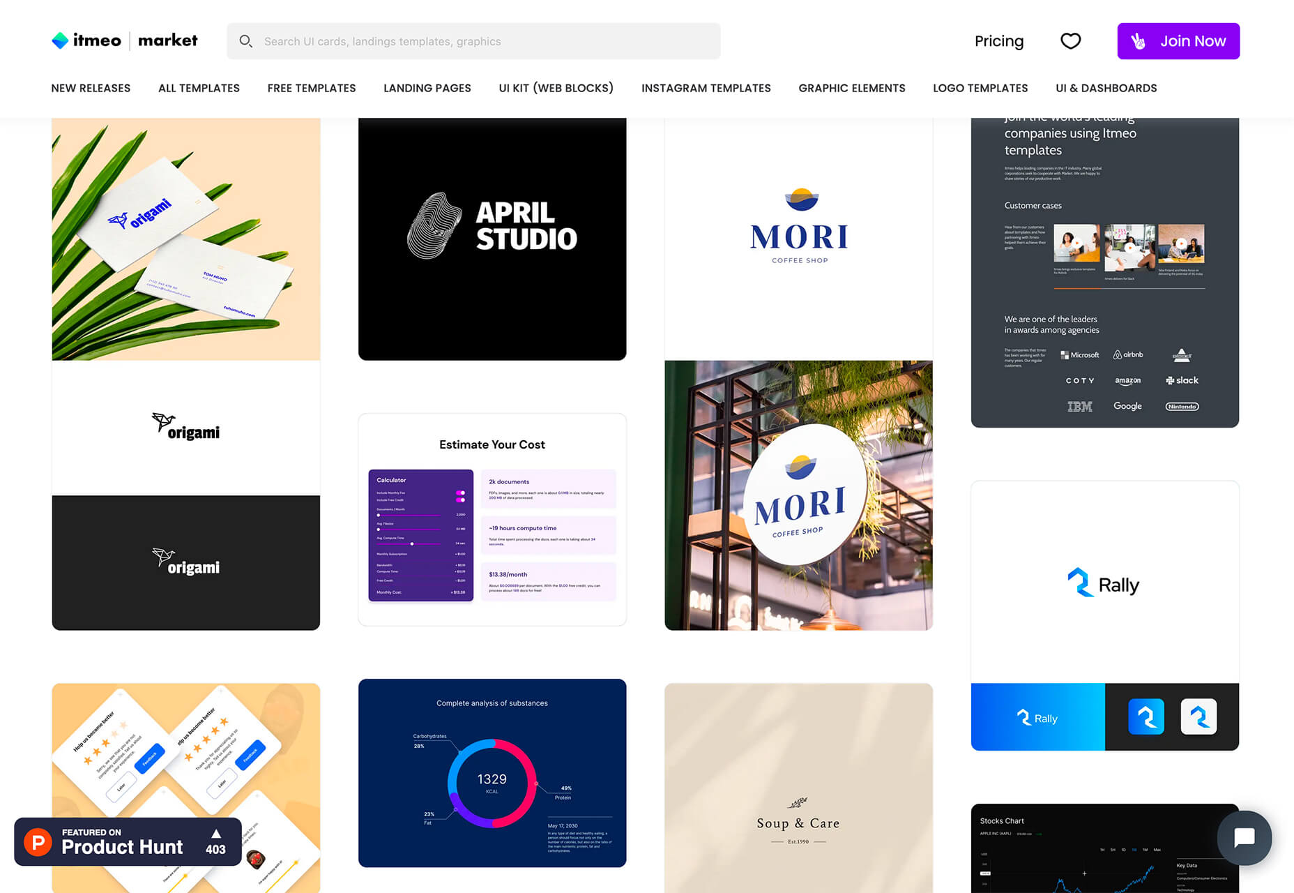
Itmeo Market is a new online graphics marketplace with exclusive and ready-to-use templates for a variety of projects. Templates include elements for logos, UI kits, graphic elements, Instagram templates, landing pages, and more. (This is a paid/subscription-based resource.)
Bellmoco Handcola

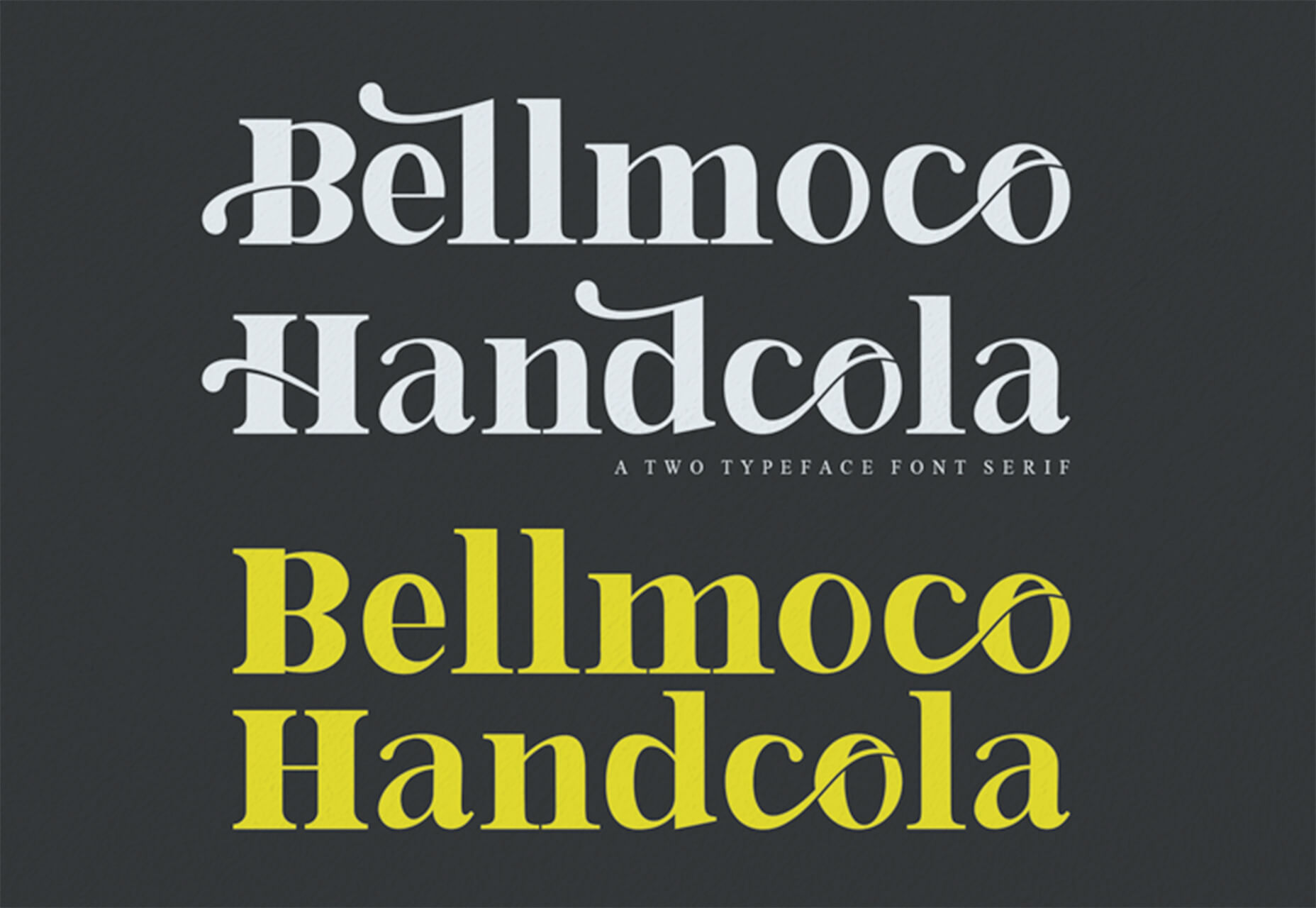
Bellmoco Handcola is a beautiful decorative typeface with fun swashes and serifs. The free version is for personal use only.

Bondie

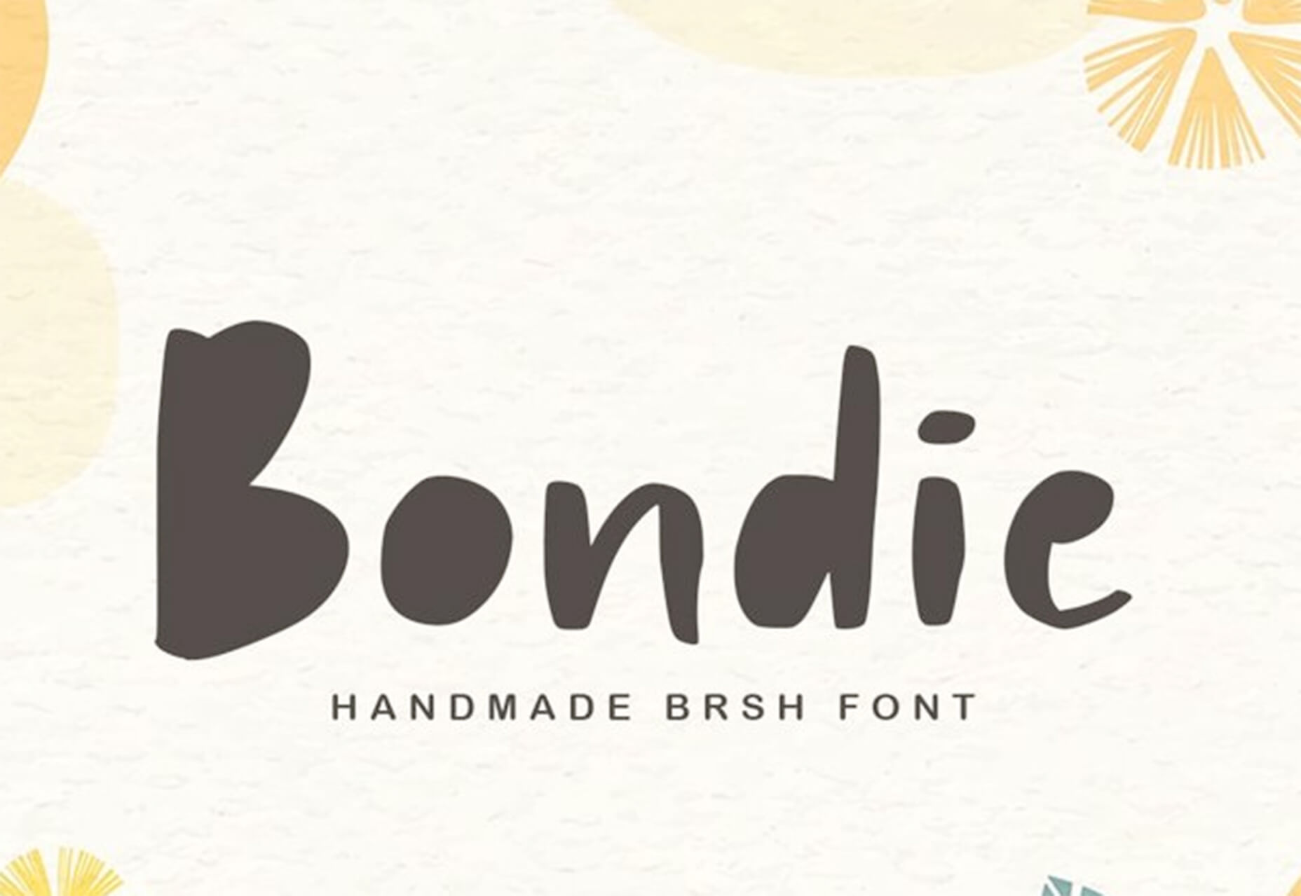
Bondie is a handmade brush typeface with fills in many of the letterforms. It contains 106 characters and is free for personal use.

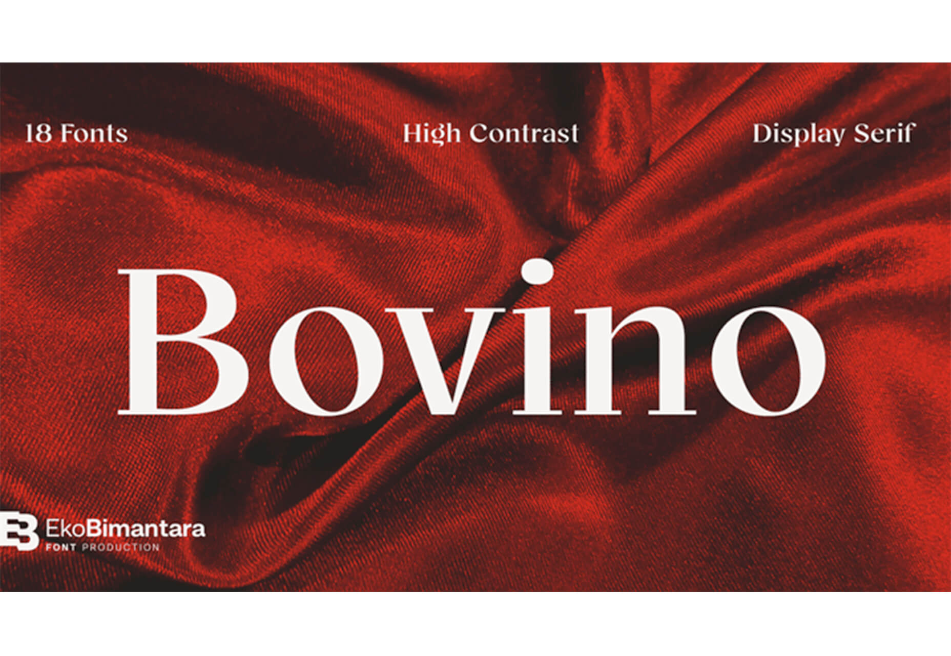
Bovino

Bovino has multiple weights that can work for display or body text. The modern serif is free for personal use.

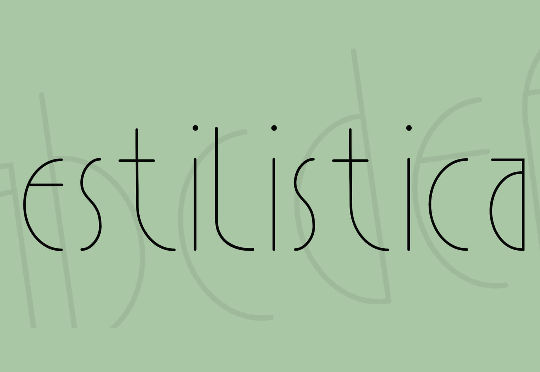
Estilistica

Estilistica is a thin modern style sans serif with smooth lines and a vertical profile. It is best suited for display use and is free for personal use.

Source


Source de l’article sur Webdesignerdepot

Personalization; it’s probably one of the most important design trends to emerge in recent years.

As consumers in all industries become more demanding, they’re increasingly searching for online experiences that are customized to suit their individual needs and expectations.

Today, personalization exists in virtually every digital interaction, from adverts on social media to PPC campaigns and email marketing efforts.

Used correctly, the manipulation of demographic, behavioral, and other in-depth user-data can help designers to create dynamic, highly customized content for each website user. At the same time, these unique websites ensure that designers really make an impact on behalf of their clients, outshining the competition and driving amazing results.

What is Hyper-Personalization?

Basic personalization in web design involves making changes to a design based on what you know about your client’s target audience.

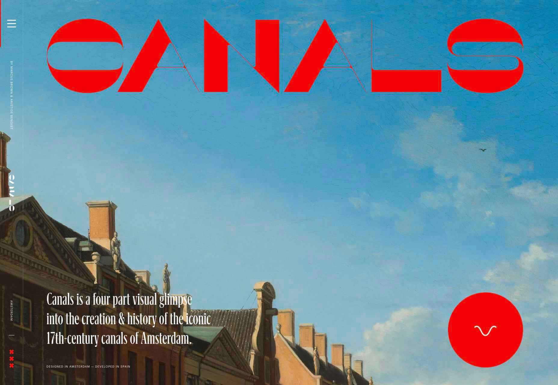
For instance, if you knew that you were designing for an audience that spends more time on their smartphone than their computer, you’d concentrate on building hyper-responsive experiences for small screens. For instance, the Canals-Amsterdam.nl website is specifically designed to support people using smartphones to swipe, tap, and scroll.

If you’re aware that your customer’s target market is other businesses, you might put more testimonials, free demo CTAs and other enticing components on the website to encourage investment.

Hyper-Personalization is an emerging trend for 2020 that focuses on going beyond the basic understanding of a target audience, to look at genuine customer data. Hyper-personalization is all about leveraging in-depth omnichannel data to drive more advanced customer experiences on every page of a website.

For hyper-personalization to be genuinely effective, designers need access to virtually unlimited data, from CMS systems, sales teams, marketing experts, and more. When you have that data handy, you can use it to:

  • Design websites that showcase dynamic CTAs, featuring content relevant to each user;
  • Implement sign-in screens for customers vs. demo requests for new leads on home pages;
  • Showcase products similar to past pages when repeat customers return to a site.

Why is Hyper-Personalization Important?

Personalized experiences have always been important to the sales journey.

However, in an era where companies are constantly competing to grab user attention, you can’t just cater to your site designs to a group of people anymore. Increasingly, users are expecting specific interactive moments on websites, made just for them.

Amazon is an obvious example to consider here. As one of the world’s leading online shopping sites, Amazon’s efforts with website personalization are incredible. The Amazon website uses tools integrated into the back-end of the marketplace to watch everything a customer does on its platform.

As users browse through the website, the site jots down each category that you look at, and which items interest you. Thanks to this, Amazon can suggest which products you may be most interested in.

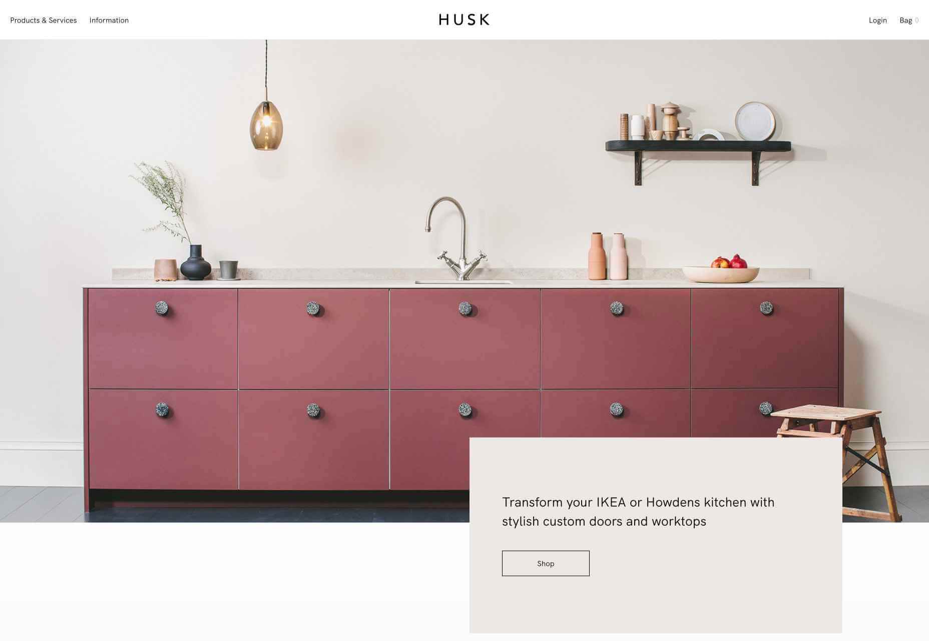
Websites like Madebyhusk also offer an incredible insight into hyper-personalization, allowing users to browse for the products that appeal to them based on in-depth filters like edging and color.

The result is a higher chance of conversion.

When customers feel as though they have complete control over their buyer journey, and that each step on that journey is tailored to them, they’re more likely to buy.

Better Converting CTAs

A call to action is an excellent way to move things along when you’re encouraging the buying process with your target audience.

Used correctly, your CTAs can encourage more than just cart conversions. They can also convince people to sign up for your newsletter via a subscription form, take a survey, or begin a free demo.

Regardless of the CTAs that you choose to implement, personalization will quickly make your requests more effective. According to studies, CTAs that are personalized are 202% more effective than generic alternatives.

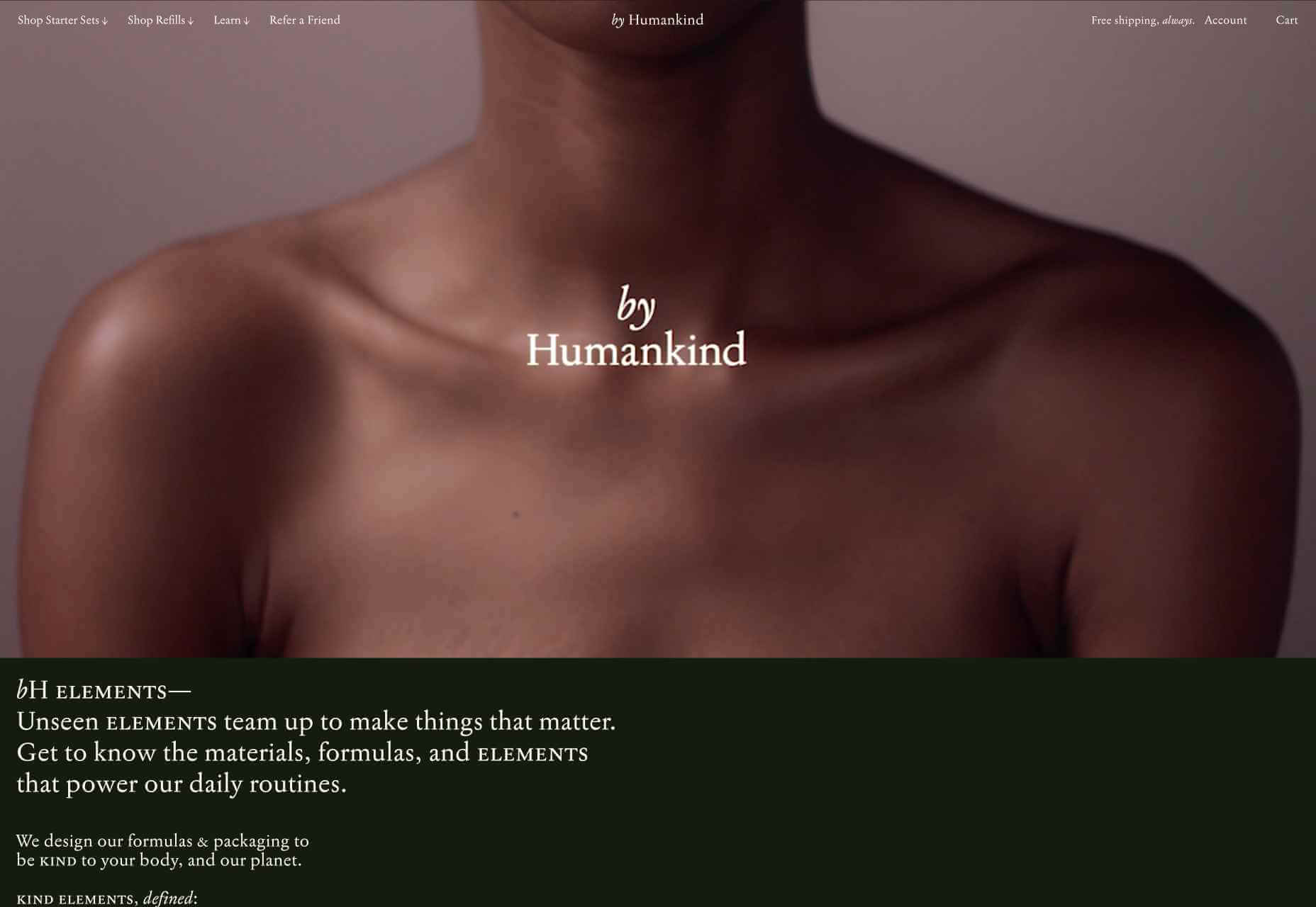
For instance, Byhumankind.com uses a crucial statement: “Great personal care products don’t have to come at earth’s expense.” Followed by an engaging CTA to drive positive action from their audience. The company knows that they’re appealing to a customer interested in saving the planet, so they make the benefits of “Getting Started” obvious immediately.

Using data provided by clients, designers can figure out exactly how to position CTAs and offers for customers. For instance, notice that Humankind has a green colored CTA button.

Most buttons take advantage of bold colors like red and orange, but the green shade for Humankind further highlights the nature-driven personality of the brand.

Relevant Product Recommendations

Repeat customers are infinitely more valuable than people who purchase just one item from your site.

However, convincing a standard customer to become a repeat client isn’t easy. Sometimes, clients need a push to determine what they want to buy next.

Fortunately, as a website designer, you can help with that. Using dynamic modules in the product pages of your customer’s website, you can show individual end-users what they might want to purchase next from a specific brand.

These dynamic modules can use information about what each customer has purchased in the past, to suggest a new product or service. Amazon do particularly well in this regard, leveraging a vast marketplace and treasure trove of information to make quality recommendations. But you don’t need to be designing a considerable website for a global business like Amazon to take advantage of dynamic suggestions. Any business with a focus on hyper-personalization can benefit from this strategy.

Increased Time on Site

Any form of personalization on a website can significantly improve the amount of time a customer spends in that digital environment.

Imagine walking into a restaurant that seems as though it was designed specifically for you. The décor, the seating arrangements, and even the menu are customized to your taste. You’re more likely to spend your time and money there than on any generic food place you find on the street.

The same rules apply to website design. The more hyper-personalized you can get with your client’s design, based on what you know about their customers, the easier it will be to keep customers engaged.

For instance, the WarnerMusic.no website entices visitors with various high-quality images of popular bands and artists, before providing them with endless information about the brand and what it does. The designer of this site knew that it needed to appeal to the visual demands of the audience first, before offering useful information like featured artist lists, News, and blog posts to keep the users on site.

Hyper personalization is all about figuring out what kind of end-user you’re designing for, so you can build the digital environment that’s more engaging and compelling to them. Some designers even create dynamic pages that change depending on whether a customer is a repeat client or a new visitor.

Improved Loyalty and Affinity

Finally, it’s human nature that we all want to spend time with the people that treat us best.

We all value excellent customer service, which is why customer experience is the most significant differentiating factor for any organization today.

Web-based personalization works in a similar way. When you use your design tools to make the site experience that you give to each visitor warm, individualized, and welcoming, then your clients are sure to see a boost in customer loyalty.

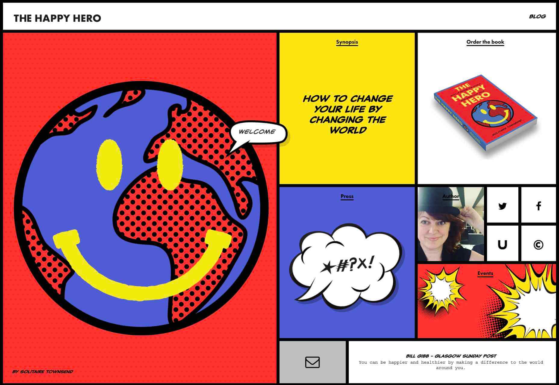
Around 89% of consumers say that they’ll only consider buying from brands that care about them. As a designer, you can convince every website visitor that they’re going to get the experience they deserve. Just look at how TheHappyHero.com instantly lets clients know that they can expect a fun and friendly interaction on every page.

Accessing useful data from the companies that you’re working with before you begin developing and designing a website could be the key to creating happier customers and higher conversions.

The more delighted end-users are with the experience that a website gives them, the happier that your client will be with you – increasing the impact of your design portfolio.

If you can create customer loyalty and affinity for your client, then you will be able to develop the same feelings between yourself and your client. This could mean that you earn more recommendations as a designer and build your position as a leader in the industry.

Hyper-Personalization is Crucial for 2021

As companies continue to worry about how they can safely use data without crossing the line when it comes to customer privacy, hyper-personalization has stayed just out of the mainstream. While it may be a while before we see every website designer starting their process with piles of in-depth data, it seems that we are heading in that direction.

Customers in 2021 and beyond will undoubtedly want a more advanced and customized experience from the brands that they interact with – particularly in an era where it’s becoming much easier to deliver meaningful moments online.

Source

Source de l’article sur Webdesignerdepot

Autre source / On the same theme

Dark themes are everywhere these days. 

As human beings continue to spend more of their time interacting with technology, dark themes provide a more relaxing way to engage with the digital world. More often than not, these themes are easier on the eyes, more attractive, and perfect for the dedicated user

Throughout 2020, countless leading brands have debuted their own version of the dark theme. Google has a solution for your Drive, while Apple and Android have built dark theme performance right into their operating systems. 

If you haven’t learned how to make the most out of dark mode yet, then you could be missing out on an excellent opportunity to differentiate your design skills, and earn more clients going forward. 

Why Dark Mode?

Before we dive too deeply into the possibilities of creating your own dark theme, let’s examine what dark mode is, and why it’s so effective. 

Ultimately, dark themes are created to reduce the amount of luminance emitted by everything from your desktop and laptop, to your smartphone and smartwatch. Dark themes help to improve the visual ergonomics of design, by reducing eye strain, adjusting brightness to suit current lighting conditions, and more. Additionally, many dark mode offerings are also fantastic at conserving battery life. 

Here are some of the main benefits of adding dark themes to your design portfolio

  • Better user experience: A focus on user experience is one of the most important trends of the digital age. You need to be willing to deliver incredible experiences to everyone who visits your website if you want to stand out today. Dark mode reduces everything from eye strain, to battery power consumption. This helps to keep customers on a website for longer.
  • Innovation and cutting edge appeal: Most companies want to prove that they can stay on the cutting edge of their industry. The ability to offer an opt-in dark mode version of a website theme or appearance can help your clients to stand out from the crowd. As the environment becomes more mobile-focused, more companies will be looking for designers that can provide the best mobile experiences. 
  • Support for universal design: Dark mode isn’t just great for people who have light sensitivity at night. This solution could be more comfortable for visually-impaired users who would struggle with eye strain when visiting your websites otherwise. If you want your content to be more inclusive for a wider range of viewers, then learning how to design for dark mode is a good way to start.

Best Practices When Designing for Dark Mode

Designing for dark mode is easier than you’d think. Most of the time, it involves simply thinking about how you can replace some of the brighter, more overwhelming aspects of your site, with something deeper and darker. 

Here are some useful tips that will get you moving in the right direction. 

1. Experiment with Colors

A big issue for a lot of web designers when it comes to developing a dark mode solution is that they get too caught up with things like pure white text against pure black backgrounds. However, this high-contrast option can be a little much after a while. 

It’s often much easier to use a dark grey as your primary surface color, instead of a true black. Additionally, rather than using bright white, think about slightly off-white alternatives that will be warmer to the eye.

Experiment with surfaces and color combinations that are unlikely to cause too much eye strain. Dark grey foundations often offer a wider range of depth, too, because you can demonstrate shadows on grey. 

Additionally, when you are experimenting with colors, remember that saturated colors often vibrate painfully against very dark surfaces, making them harder to read. Desaturating your colors will help to reduce the contrast and make your websites more welcoming. 

Lighter tones in the 200-50 range will have better readability on dark themes. However, you can always experiment with your choices. Google Material Design recommends using a contrast level of around 15:8:1 between your background and text. 

2. Consider the Emotional Impact

Much of the effort involved with dark mode design is figuring out how certain colors work together. It’s easy to get carried away with stark contrasts, particularly when you’re used to working with a white background. However, you need to remember that you’re designing for a user that’s primarily looking for an easier and more subdued browsing experience.

While you’re working, remember to consider the emotional aspect of the design too. The emotion in colors can make or break a buyer’s journey in any environment. However, an often overlooked-aspect of color psychology, is that people perceive shades differently when they’re on a black background

For instance, think of the color green. On a light background, it conveys nature and even financial wealth. However, on a dark background, the same green could come across as something venomous, toxic, or even sickly. It’s important to think about the kind of impressions end users are going to get when they arrive on your site.

3. Give Users the Freedom to Choose

One of the biggest mistakes you can make when you begin designing for dark mode, is thinking that you should focus entirely on your dark themes, and nothing else. This lines you up for a problem if you interact with users who want the best of both worlds. If you’re designing for apps in particular, you’re going to need web pages that can switch naturally between light and dark themes. 

Learning how to implement both a dark mode and a light mode option into the desks you create will help you to reach a wider selection of customers. Remember, you’ll need to test the performance and impact of your designs in both themes, to check that they deliver the same kind of experience, no matter how your user chooses to browse. 

Although dark mode should offer a different experience to end-users, it still needs to feel as though they’re browsing on the same website. That means that you’re going to need to experiment with the most natural combination of light and dark mode options.

4. Remember the Basics

Remember, although the three tips above will help you to get on the right path for dark mode design, you’ll also need to consider the opportunities and limitations of the platforms that you’re designing for. The kind of dark mode experience you can deliver for Google Chrome websites is going to be very different to what you can create for something running on iOS.

Examining the documentation provided by the system that you’re designing for will help you to develop something with a close insight into what’s actually possible. 

Other top tips for dark mode design include:

  • Focus on your content: Make sure that your content stands out on the page, without being too overwhelming. 
  • Test your design: In both light and dark appearances, you need to make sure everything is working as it should be.
  • Adopt vibrancy for your interfaces: Vibrancy helps to improve the contrast between your background and foreground. 
  • Use semantic colors: Semantic colors adapt to the current appearance of a website automatically. Hard-coded color values that don’t adapt can seem more aggressive. 
  • Desktop tinting: Try experiment with things like transparency and filters to give your websites and apps a slightly warmer tint – ideal for late-night browsing
  • Icons: Use individual glyphs and icons for dark and light modes if necessary. 

Ready to Design for Dark Mode?

Preparing your web development and design portfolio for an era addicted to dark mode can be a complex experience. You need to think carefully about how people are going to browse through your websites and apps when they’re searching for something more subtle, and less visually overwhelming than the websites that we’re used to making. 

The most important thing to remember is that everything on your website or application should look just as beautifully tailor-made in dark mode as it does in light mode. Simply adding a dynamic black background when people want to switch settings in an app isn’t enough. You need to go in-depth with your designs and examine how different fonts, colors, and images work together.

Source


Source de l’article sur Webdesignerdepot

This month’s collection of new tools, resources, and freebies for designers is a smorgasbord of sorts. You’ll find everything from useful APIs to icons to tutorials to fonts.

Let’s get right into it, here’s what new for designers this month:

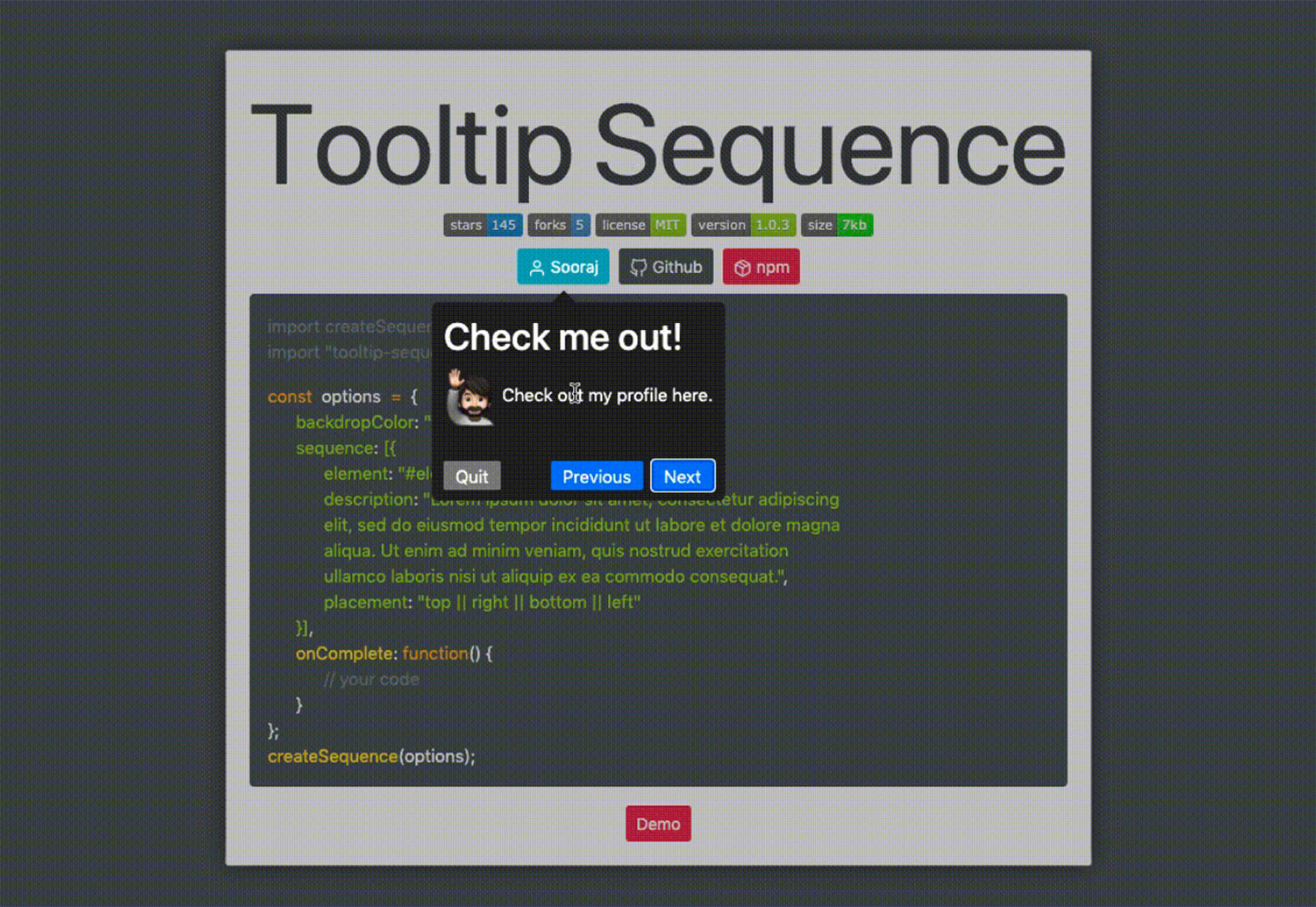
Tooltip Sequence

Now that your app or website is ready, you might need to help users engage with it. Tooltip Sequence is a simple JavaScript package that helps you create a series of small tooltips that will guide users through product features with a small description of what they need to know. It looks great and the best part is this tool saves you from having to create each tooltip description manually on each page and link them together.

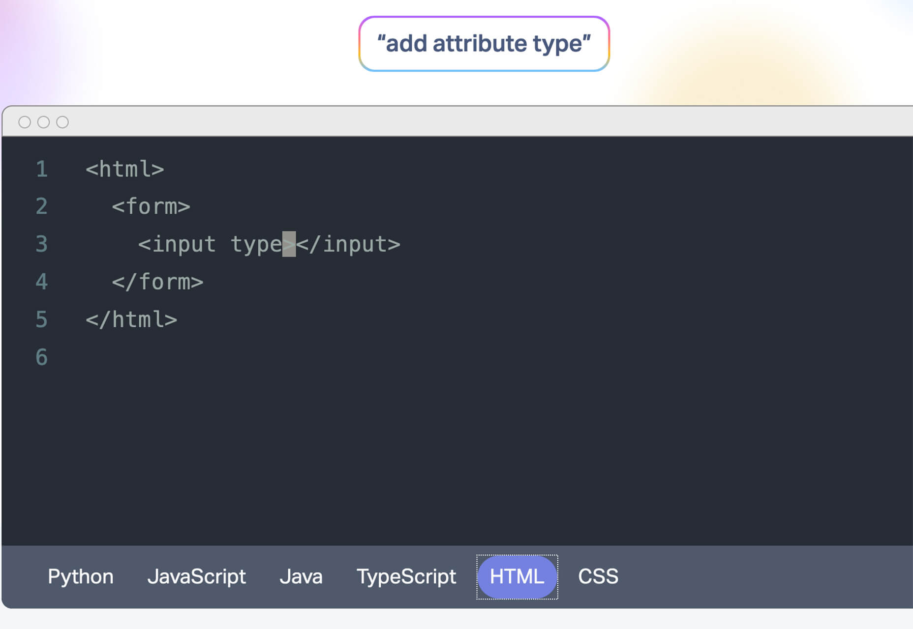
Serenade

Serenade allows you to free up your hands with voice coding technology. Use natural speech and stay productive with this tool that allows you to code without typing. It works across multiple coding languages and platforms. It’s as easy as “add function hello” and the tool knows what syntax to use.

Gazepass

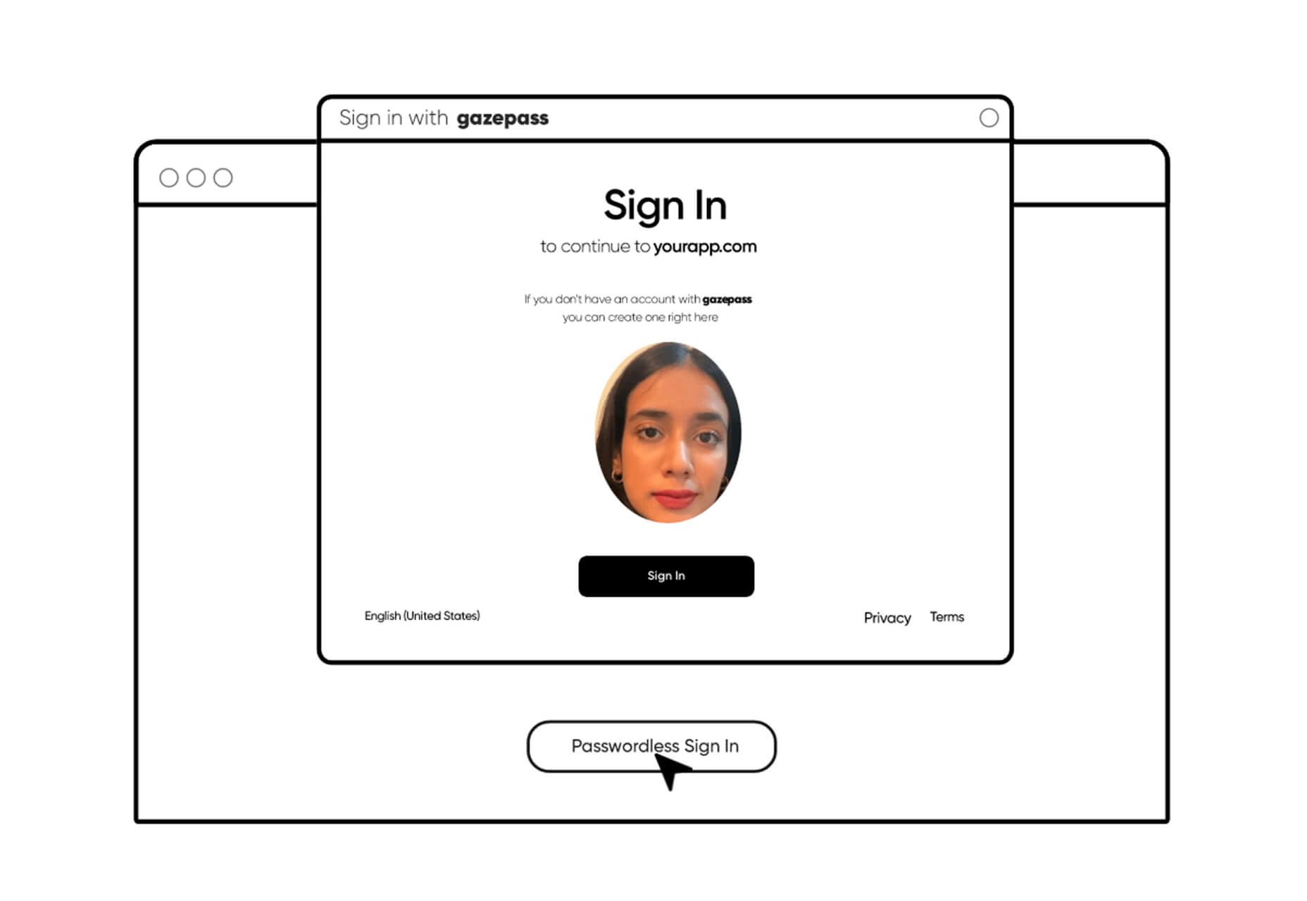
Gazepass, which is still in beta, is a nifty API that allows for passwordless multi-factor authentication for any website or mobile app. It uses biometrics on any device or platform to make getting into apps or websites easier for users.

Filters.css

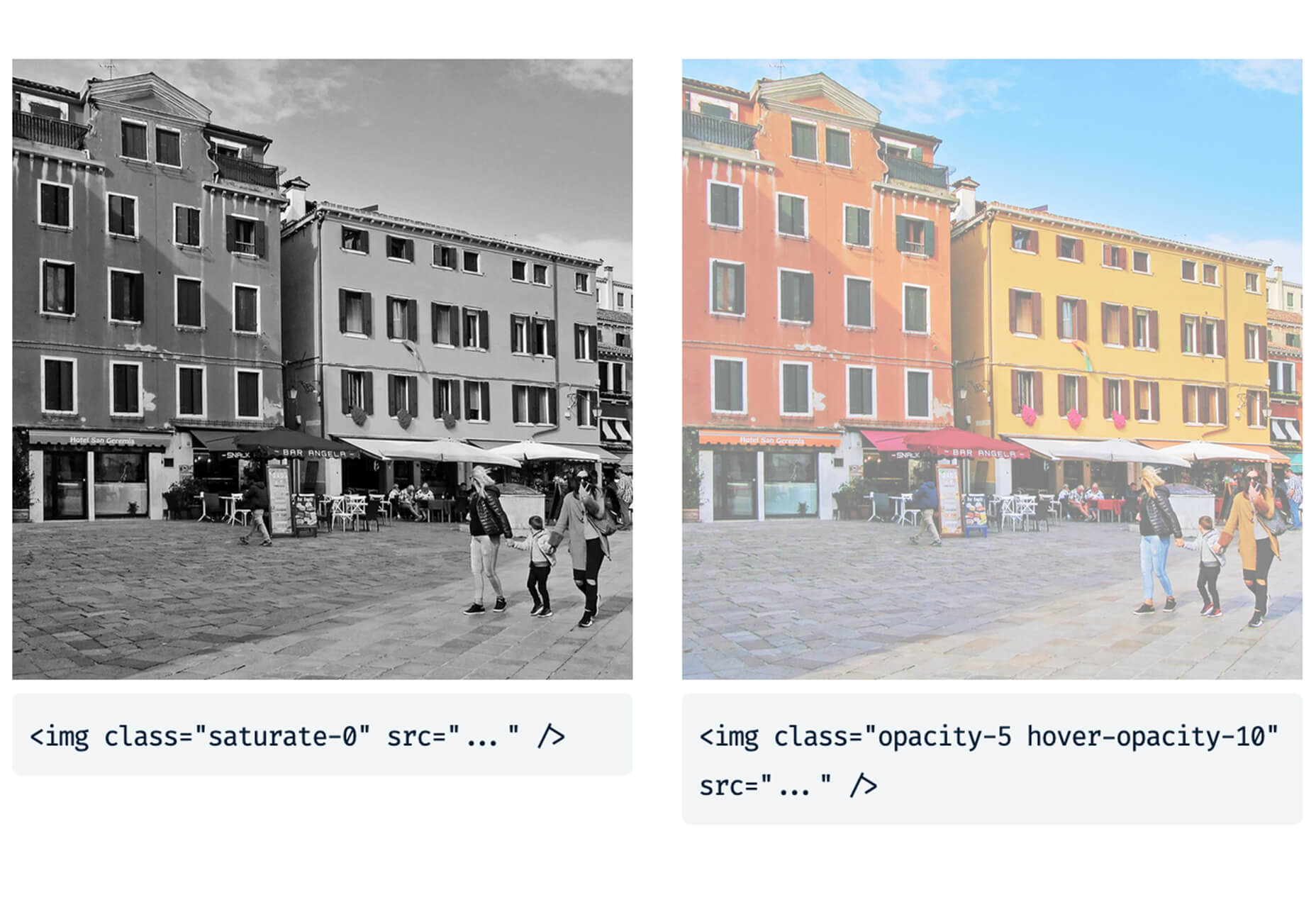
Filters.css is a CSS-only library to apply color filters to website images. Installation only takes three steps and includes a variety of filers, such as blur, grayscale, brightness, contrast, invert, saturate, sepia, and opacity.

Sidebar Webring

Sidebar Webring is a collection of blogs and websites that are focused on web design. The curated list is handpicked for superb content for designers and developers. But, what’s a webring? It’s a collection of linked websites in a circular structure that are organized around a theme. The term is a throwback to the early days of the web in the 1990s and 2000s.

Wicked Templates

Wicked Templates is a set of responsive HTML templates made with Bulma and Tailwind CSS that you can style and use as you wish. Use these templates to jumpstart projects. Free and paid options available.
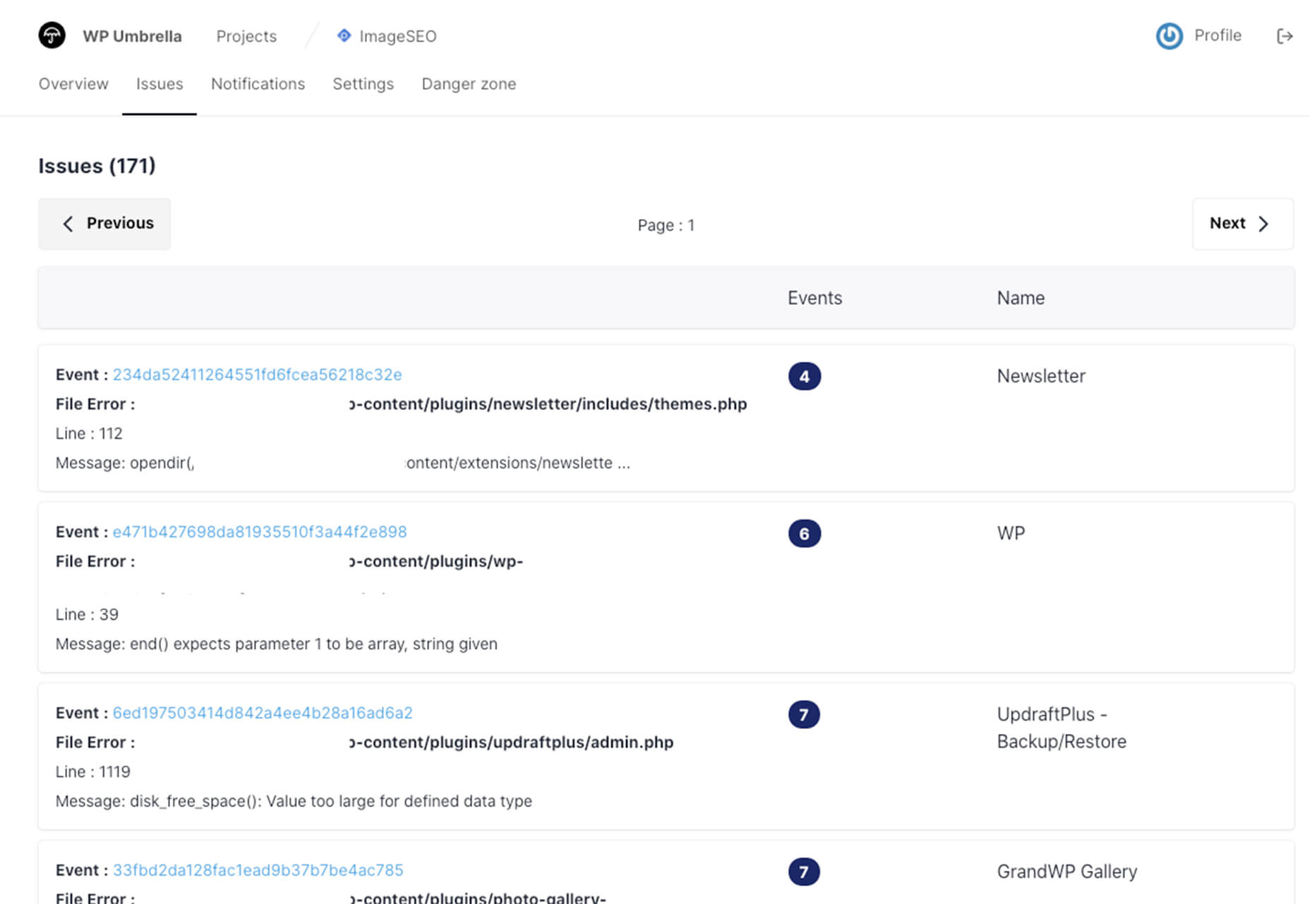
WP Umbrella

WP Umbrella will help you keep sites running in a healthy and safe manner on WordPress. Monitor uptime and performance, PHP errors, and keep up with hundreds of websites from one dashboard.

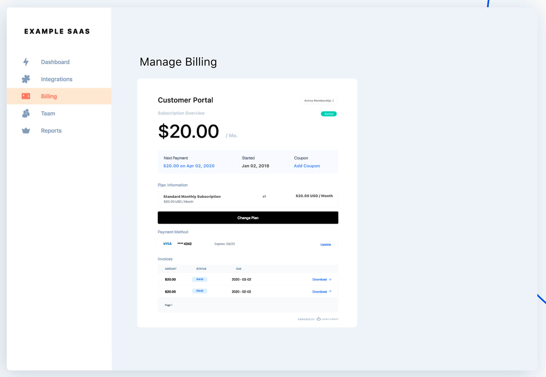
Servicebot

Servicebot helps you create customer-facing embeddable billing pages that work with Stripe payments. This premium tool is quite user-friendly and works with websites or SaaS.

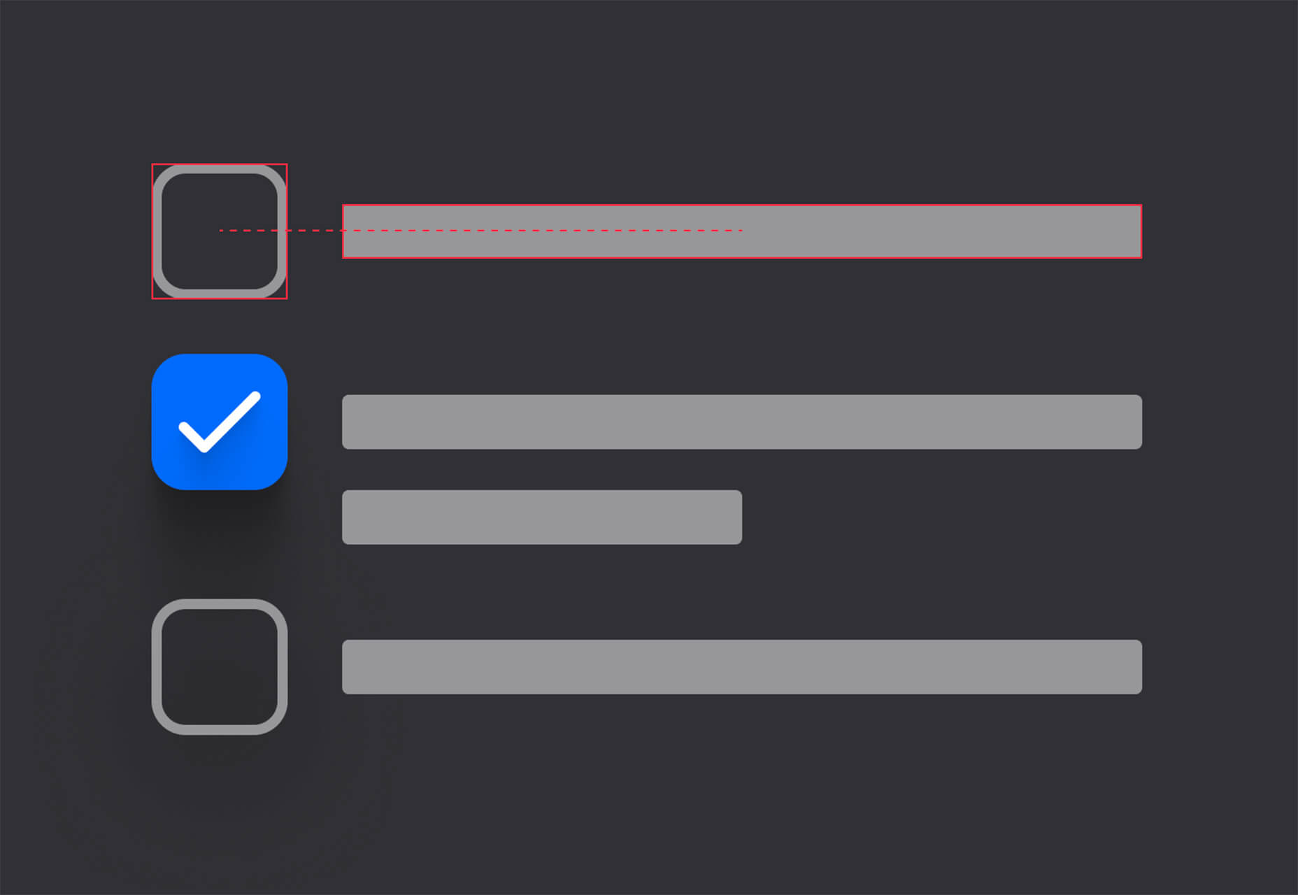
Custom, Accessible Checkboxes with Perfect Alignment

Create custom, accessible checkboxes with perfect alignment every time. This walkthrough shows you how to use CSS to align elements and labels.

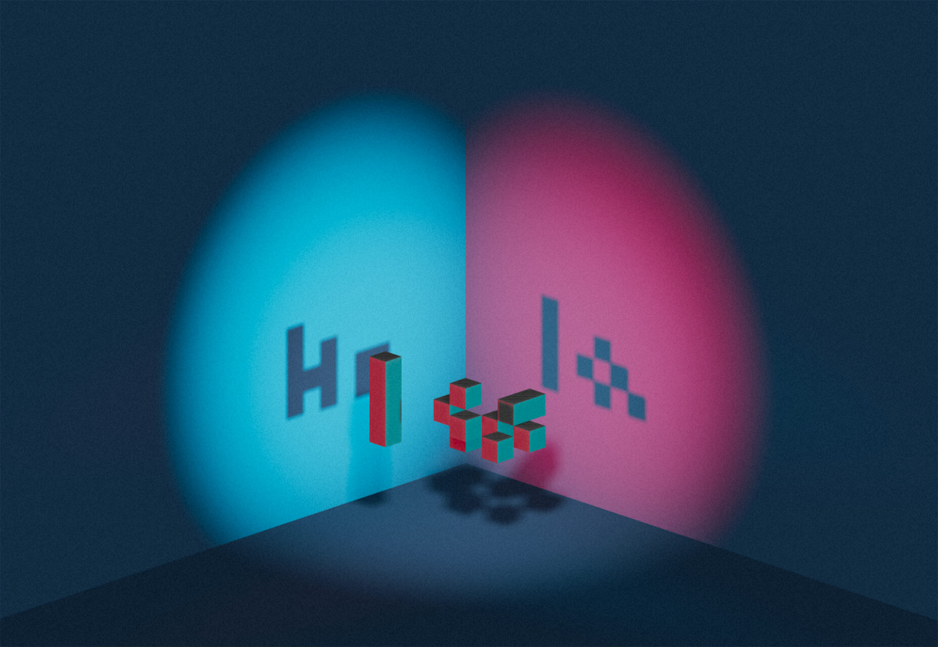
Sombras.app

Sombras.app is a nifty tool that creates 3D object shadows. Use the easy on-screen controls to get just the right orientation and shape.

urlcat

Urlcat is a tiny JavaScript library that helps you build URLs with dynamic parameters and without mistakes. The friendly API has no dependencies, includes TypeScript types, and is just 0.8KB minified and gzipped.

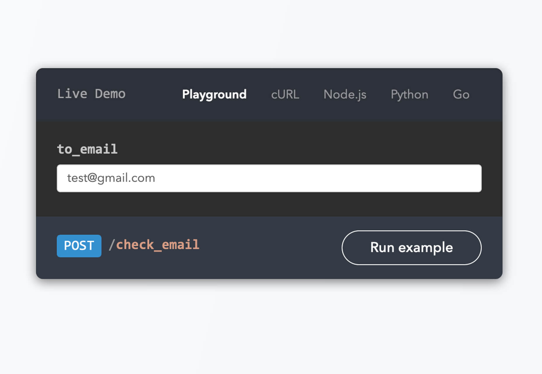
Reacher

Reacher is a real-time email verification API that lets you check the validity of an address before you send the email. Reduce bounce rates in an instant. (The personal version is free.)

Swell

Swell is a most powerful headless ecommerce platform for modern brands, startups, and agencies. Create fast and flexible shopping experiences with the API and headless storefront themes. This is a premium tool but does have a free trial.

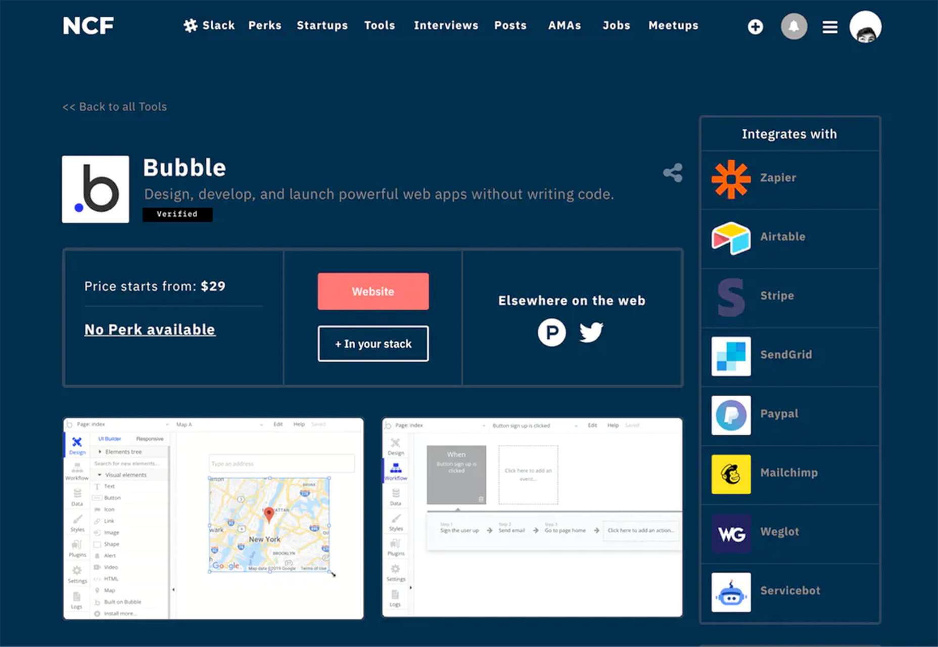
No Code Founders 2.0

No Code Founders 2.0 is a platform for discovering the latest startups built with no-code and the tools used to build them. Browse startups, tools, perks, interviews, jobs, meetups, posts, and more as part of the no-code movement. The community engages on Slack and requires an email to sign up.

How to Pick More Beautiful Colors for Your Data Visualizations

Beautiful color choices will make your data visualizations that much more impactful. This tutorial by Lisa Charlotte Rost will help you make better color choices on the way to better infographics and charts. Plus, it’s well developed, designed, and packed with useful information.

IconPark

IconPark is a collection of more than 1,200 high-quality icons with an interface that allows you to customize them. It uses a single SVG source file that can be transformed into multiple themes. The library includes cross-platform components and is free to use.

Mono Icons

Mono Icons is a simple and consistent open-source icon set that uses mono spacing. The collection includes 136 icons.

BGJar

BGJar is a free SVG background generator for digital projects. Pick a category and customize the result to fit your project or needs.

HitCount

HitCount is almost too simple to be true. This tiny tool lets you add a hit counter to your website that’s as easy as adding an image. Copy the code and make any customizations you want. Then paste it to your design. That’s it!

Blacklight

Blacklight is a real-time website privacy inspector. The tool by Surya Mattu scans any website you enter in the scan bar and shows what user-tracking technologies are used on the website. This allows you to see who might be gathering data about your visit.

Alter

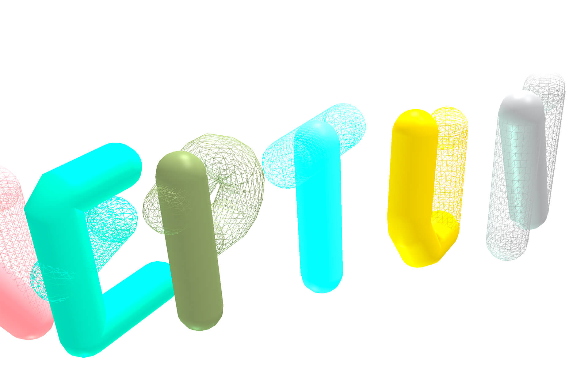
Alter is a customizable – and experimental – three-dimensional typeface that you can experiment with. It’s as fun to play with as use.

Autobus Omnibus

Autobus Omnibus is a simple all capitals font with new wave styling. The character set has 96 glyphs that are perfect for display use.

Deathmatch

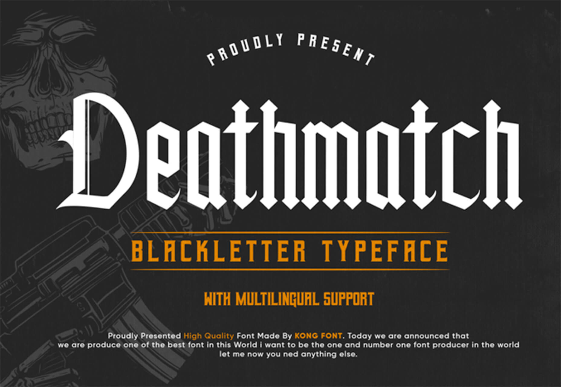
Deathmatch is a seasonal blackletter font that’s ideal for the upcoming Halloween holiday. The character set includes plenty of options and there’s a full version (paid) for commercial use.

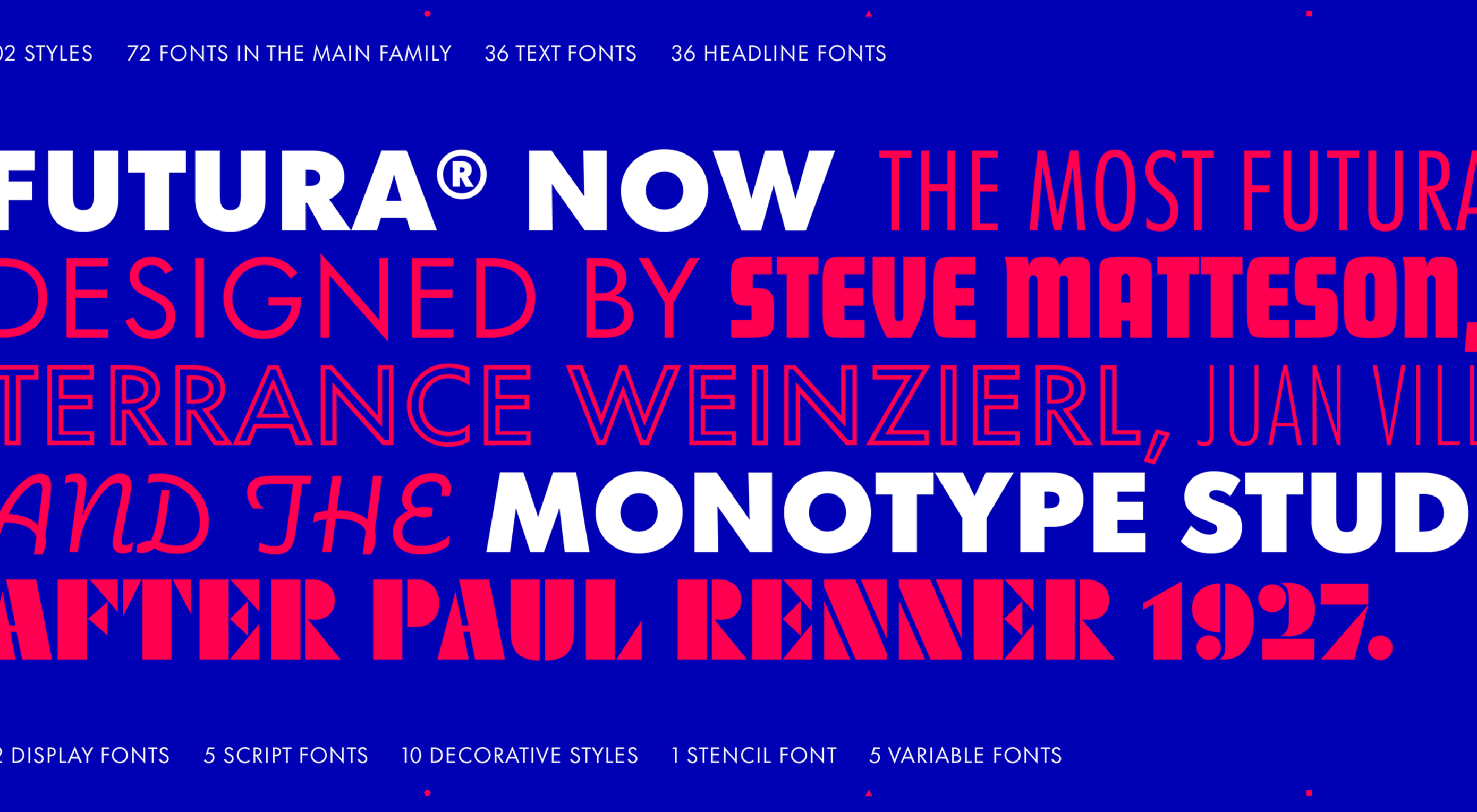
Futura Now

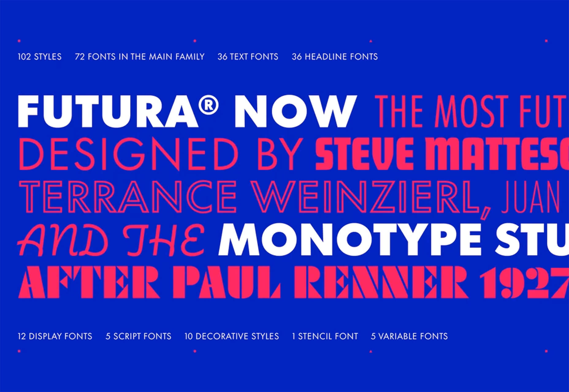
Futura Now is a premium typeface and update to a font you may already know and love. The new version has 107 styles in a massive family.

Pumpkin Soup

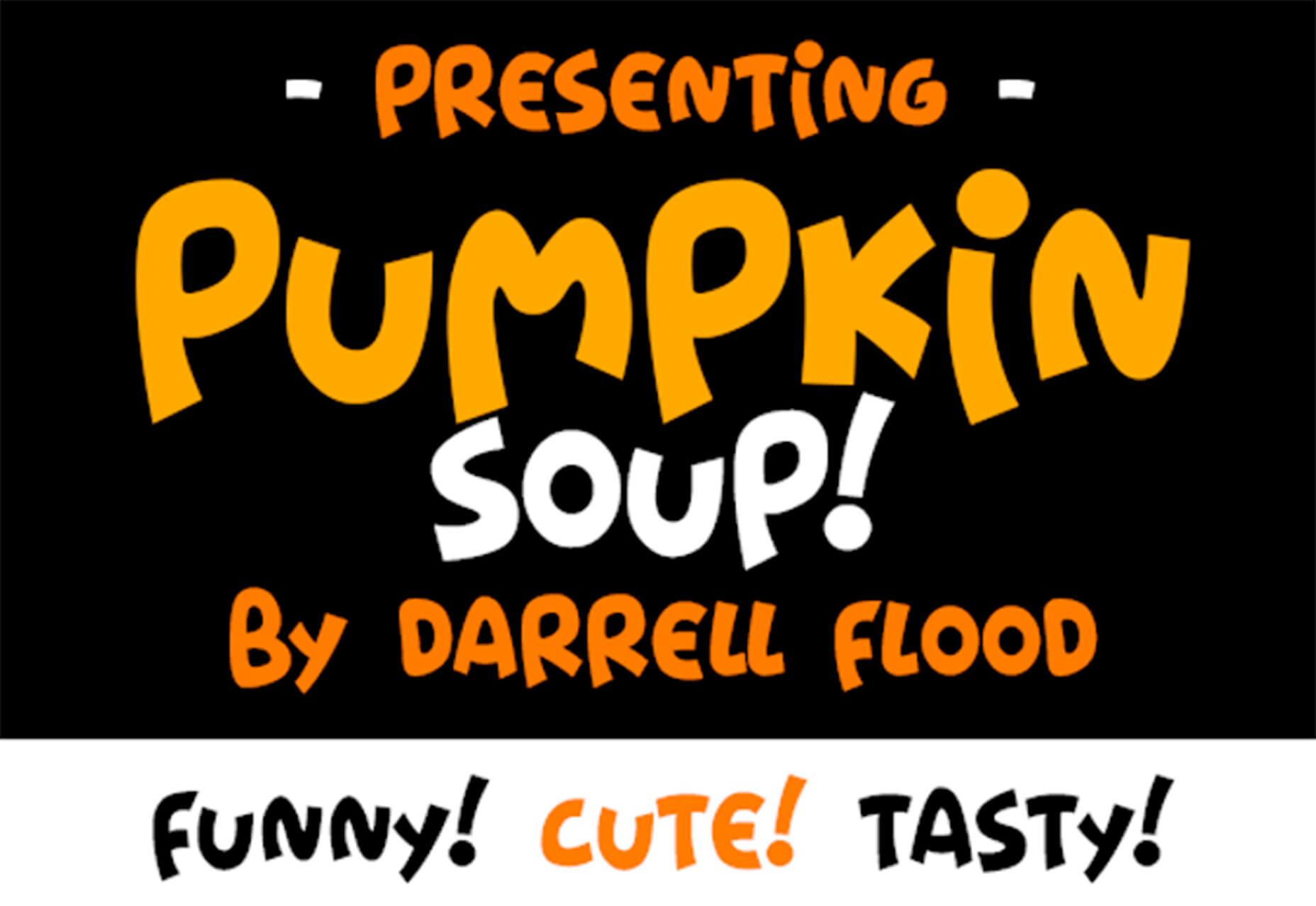
Pumpkin Soup is a fun almost handwriting style typeface with a cartoonish vibe. It includes a regular and italic style and is most appropriate in limited use.

Source


Source de l’article sur Webdesignerdepot

In this article, I am going to talk about how to best implement filters over HTTP requests in Spring. That is, assuming we have a program listening in a URI, we can specify that we want to execute something before the requests are processed by the controller.

This is very useful if we want all the requests to meet a requirement, for example, that they must include a specific header.

Source de l’article sur DZONE