Articles

Does it ever cross your mind that praise can be negative? I guess not. After all, it looks harmless and seems to be quite effective. Conventional wisdom says that if you praise people, they are motivated to do better.
People who have been praised throughout their life by their well-meaning parents, friends, and teachers for their talent and smartness or those who have experienced extreme focus on talent and smartness throughout their childhood learn to value only intelligence. No wonder when these people enter the workforce, they continue to seek approval and demand praise every step of the way.
Every opportunity is a measure of their intelligence — do I look smart, how will I be judged, what if others find my ideas dumb. With a single-minded focus on validating themselves, all their actions are rooted in establishing their worth. Every mistake hurts their reputation and every failure is a reflection of their competence. They care less about learning and more about proving themselves. Their sense of morality sometimes takes a hit as they resort to brutal behaviors — demeaning others by yelling, insulting, controlling, or taking undue credit — all in an attempt to boost their self-esteem.
Carol Dweck, professor of Psychology at Stanford University summarised this unfortunate reality from Morgan McCall’s book High Flyers:

People often like the things that work against their growth. . . . People like to use their strengths . . . to achieve quick, dramatic results, even if . . . they aren’t developing the new skills they will need later on. People like to believe they are as good as everyone says . . . and not take their weaknesses as seriously as they might. People don’t like to hear bad news or get criticism. . . . There is tremendous risk . . . in leaving what one does well to attempt to master something new.

What Do Organizations Do with Such People?

They feed and promote this mindset. They praise people for their brilliant ideas conveying the message “we value talent and smartness.” They shower people with rewards and bonuses for their achievements communicating to everyone else around “all we care about is success.”
What happens when these people take on a leadership role? Their mindset of valuing brilliance above everything else amplifies leading to disastrous results. History is full of leadership fiascos with great promises that turned out to be the biggest disasters. This article from Malcolm Gladwell in The New Yorker is as valid now as it was 18 years ago. Describing the talent mindset at Enron and the consultants at McKinsey who wandered the hallways at the company’s headquarters, he points out “They were there looking for people who had the talent to think outside the box. It never occurred to them that, if everyone had to think outside the box, maybe it was the box that needed fixing.”
He also talks about the impact of an environment that values innate talent and what happens when times get tough and that self-image is threatened “They have difficulty with the consequences. They will not take the remedial course. They will not stand up to investors and the public and admit that they were wrong. They’d sooner lie.”
Really, is praising people for their intelligence and achievements the only way to develop people who will be the leaders of tomorrow? Is there a better way out?
What if we praised people for their hard work, for their ability to persist despite failures and setbacks, for taking initiatives to build new skills, for standing up to their mistakes, for believing in their growth, and implementing the right strategies to overcome their shortcomings. What does this kind of praise tell them?
It tells them the value of effort in building abilities. It teaches them the importance of implementing the right strategies to solve problems. It encourages them to seek help to make progress on their task. It creates a passion for learning that’s not driven by the need to look smart, but with a desire to cultivate skills, to stretch themselves to grow.
When these people take on leadership positions, this mindset guides them to put the well-being of the company and its people before their own needs, to place value on teamwork over individual accomplishment, and to foster growth and development of their people.

As growth-minded leaders, they start with a belief in human potential and development — both their own and other people’s. Instead of using the company as a vehicle for their greatness, they use it as an engine of growth — for themselves, the employees, and the company as a whole.
– Carol Dweck

Unlike leaders who pull their companies down with their focus on brilliance, these leaders lead their companies into greatness and gratitude filled in their own hearts and those of the people around them.
Choose your praise carefully as you will see the tremendous benefits in praising for growth over brilliance.

When Leaders Focus on Brilliance

They live in a world of personal greatness and entitlement, vie for labels, and will do anything to boost their image. Instead of building a long-lasting company, they spend time and money on enhancing their image.
With the constant need for validation, they use people in the company to feed their egos and showcase their superiority. Everything is about pleasing the boss. They surround themselves with people who boost their self-esteem. Agreement earns them admiration and disagreement is an attack on their intelligence. Instead of hearing people out, they punish dissent and shut people down.
They pounce at the less talented for their lack of intelligence and find those who are more talented than they are as threatening. They mistreat employees, yell, insult, control and abuse them into their way of doing things. They feel better about themselves by making other people feel worse. Employees worry about being judged all the time. When people are ridiculed for mistakes, they soon learn to keep their heads down, stop putting their critical thinking skills to use, and give in to groupthink.
Their belief in their superiority blinds them to see reality. They turn a blind eye to complaints, ignore warning signs, and fire people who tell them what they don’t want to hear. Their decision-making criteria are based on what would make them look good as opposed to what’s good for the company long term.

What happens when a leader refuses to confront the brutal facts? “The minute a leader allows himself to become the primary reality people worry about, rather than reality being the primary reality, you have a recipe for mediocrity, or worse. This is one of the key reasons why less charismatic leaders often produce better long-term results than their more charismatic counterparts.
– Jim Collins

Since success and failure are a part of their identity — success means they are smart and failure means they are not — they find excuses and blame others for failures instead of taking personal responsibility. Instead of investing in the future growth of their company, they play safe with fear of failure, become less responsive to challenges from competition, go with what’s tried and tested, and refuse to take risks. Why take up the challenge that can hurt their reputation? On the other extreme, they may not shy away from crossing ethical boundaries to beat the competition at all costs. Success is what they are after and it doesn’t matter how they get it.
With more focus on talent and less on potential, they do not invest in mentoring and coaching employees. Instead of putting practices in place to develop employees and help them collaborate together, they make them compete against each other.
Carol Dweck sums up their brilliant mindset “My genius not only defines and validates me. It defines and validates the company. It is what creates value. My genius is profit. Wow!”

When Leaders Focus on Growth

They operate with a learning mode. They don’t claim to be genius but promise to invest in development, their own development, and the development of their people. The drive and enthusiasm to grow their companies make them adopt long-term strategies over short-term tactics. They aren’t in the game to boost their ego or establish their self-esteem. It’s the pure joy of shaping the future of their company that excites and motivates them. More than prestige, they are in it for the challenge.
They understand that the path to success goes through failure. Why lose the opportunity that can drive their future growth? So instead of hiding behind their failures, they face them head-on. Failures don’t define their competence, they are glaring moments of self-reflection. They are opportunities to build skills, explore possibilities, experiment, and invest in the promise of a better future.
They lead with vulnerability. They accept mistakes to shift the focus in the organization from hiding mistakes to finding solutions. When they don’t know something, instead of pretending to hide their ignorance, they say “I don’t know”. These three powerful words show humility and self-confidence. To make decisions, they invite others to share their opinion which promotes the culture of constructive criticism. Since they do not connect their identity to their opinion, more value is placed on seeking the right answers which require open disagreements and championing flexibility of opinion over their sense of righteousness.
Difficult situations make them uncomfortable, no doubt. Instead of letting their discomfort get in the way of meaningful conversations, they embrace it. They choose to look past their discomfort in the value that these discussions provide — saving a lot of time that can be wasted due to stress and anxiety that comes from misalignment of expectations and lack of clarity of purpose.
They are tough but compassionate. They do not shy away from giving critical feedback while also challenging the people in their organization to step outside their comfort zone. They empower people to make decisions with the right channels of feedback to assist in better decision-making in the organization.
Leaders with the growth mindset operate with what Lou Gerstner, who turned IBM’s fortunes around by saving it from near bankruptcy said “Hierarchy means very little to me. Let’s put together in meetings the people who can help solve a problem, regardless of position.” Not blinded by reality, they focus on finding solutions that will push their company forward. This requires keeping an open eye to change in market trends, identifying and investing in future growth areas, and taking calculated risks.
With a focus on potential and growth, they invest in identifying and building future skills of the organization — skills that will be useful during difficult circumstances giving them an advantage over the competition. They foster productivity through coaching and mentoring, place value on teamwork by encouraging collaboration and defining shared measures of success.
Warren Bennis, a scholar, author, and widely regarded as a pioneer of the contemporary field of Leadership studies, writes in Organizing Genius:

Leaders are people who believe so passionately that they can seduce other people into sharing their dream.

His most admirable view on leadership says:

Good leaders make people feel that they’re at the very heart of things, not at the periphery. Everyone feels that he or she makes a difference to the success of the organisation. When that happens people feel centred and that gives their work meaning.

What kind of leaders think like this — those focused on brilliance or the ones driven by growth?
Previously published here.

Source de l’article sur DZONE

Announcing the DZone monthly community award winners for May 2021! The DZone monthly community awards celebrate our amazing developer and software professional creators and contributors worldwide!

May 2021 DZone Community Award Winners


DZone Dev of the Month – Mir Ali


From DZone Editor Samantha Ross: « Mir Ali (DZone profile) never fails to bring the fire and wisdom to his beautifully worded articles. His focus this May was on Infrastructure-as-Code (IaC), but since he started only this past December, he’s shared his knowledge on everything from AI to DevOps. Both his published pieces this month I classed as phenomenally well-written, and I’d like to congratulate Mir on his growing DZone portfolio and engagement, having hit his 100k this month. Looking forward to what’s next! »

Source de l’article sur DZONE

Want to know which of the top blogging platforms you should consider using this year?

Blogging is still one of the best ways to draw attention to your brand, generate thought leadership, and build your credibility. Research suggests that US internet users spend 3x more of their browsing time on blogs than on email. Additionally, people view about 20 billion blog pages on average each month. 

So, how do you join the blogging revolution? You’ll need the right platform. 

Essentially, a blogging platform is a CMS (Content Management System) which supports blog creation. Many come with additional tools like SEO support and integrations with email marketing too. There are tons of great blogging platforms out there, which means knowing where to start searching can be tough. To help you, we’ve put together this list of the leading blogging platforms.

What to Look for in a Blogging Platform

Before we sort through our list of the leading blogging platforms, let’s start with a quick overview of what the best blogging solutions typically include. Notably, depending on what you’re going to be using your blog for, you may have other features to prioritize besides those listed here. These features will act as a starting point for your comparisons:

Ease of Use

Uploading, publishing, and sharing your blog shouldn’t be a headache. 

There are many website builders out there that seem to have blogging tacked on as an “extra” rather than having it built into the foundations of the software. This often leads to a clunky backend experience when you’re building your site. 

If you’re a new blogger or don’t want to spend time messing around with HTML and coding, make sure that your blogging environment is easy to use. The simpler it is to distribute your content, the more likely you’ll stick to your blogging strategy. 

Cost and Revenue Opportunities

Many of the top blogging platforms come with a fee to think about. Even if you use an open-source platform for blogging, you still need to consider domain names, hosting, and security costs. Finding the right balance between spend and return on investment is crucial. 

Remember, just because a blogging platform is cheap doesn’t mean it’s good value. Similarly, expensive software may not be the best for your business. Ideally, you want something that’s going to deliver a good blogging experience, combined with plenty of opportunities to grow your readership for the lowest possible price. 

If you want to get the best return on investment, focus on the kind of monetization options you can access with each platform. Medium, for instance, has a partner program that allows you to earn money on the posts that customers read. Platforms like Wix, WordPress, and Squarespace can all offer earning opportunities too. You can use them to place certain content behind a paywall, create subscriptions, and sell products or services. 

Marketing and Growth Tools

Most blogging platforms will come with at least some tools to help you build your online presence. Wix and WordPress integrate with Google marketing, so you can purchase PPC campaigns and track your organic content through an SEO dashboard. 

The majority of CMS tools equipped with blogging capabilities also come with integrations for your email marketing service. This ensures you can create automated campaigns that inform your audience whenever a new blog post goes live. 

One of the best things about WordPress is how many plugins you can access to boost your readership levels. Access to extra tools like SEO solutions, landing form creators, and pop-ups can all boost your chances of converting and capturing leads. 

Custom Branding

If you’re keen to save money on your blogging platform, you might be tempted to start with a free version of a popular service. This is fine when you’re just testing the waters. However, you will need to spend extra if you want to remove the ads that other website builders put on your site. For instance, Wix’s free version will place ads on your pages and show the Wix identity in your footer. 

To build your own brand identity, you’re going to need to replace that CMS branding with your own. Look for a blogging service where you can buy your own domain name, customize your themes, and add your own colors, images, and logos into the mix. 

While tools like Medium won’t run ads on your campaigns, they also don’t allow you to customize your site to showcase your brand personality. It’s much easier to build a memorable identity when you can control what your site looks like. 

Upkeep and Maintenance

This ties in a little with the “ease of use” factor above. Before you invest in any blogging platform, think about how much work it’s going to require. A hosted blogging platform is pretty easy to manage because you don’t have to worry about security and uptime yourself.

Products like Wix and Squarespace will give you access to SSL certificates, patch security issues on your behalf, and handle other complicated site maintenance issues. WordPress and other open-source solutions require you to take more of a hands-on approach. You’ll need to manage your own web hosting and check the security of your site regularly. 

Flexibility

This feature is often overlooked in some guides to the best blogging platforms, but it’s also growing increasingly more important in today’s digital age. If you want your website to work for years to come, you need to make sure it’s flexible. This could mean that you look for something that allows you to upload different kinds of content, like written blogs and connecting podcasts. 

It could also mean investing in a service that has a lot of integrations and add-on options available. Plugins are fantastic for extending the functionality of your blog without having to move your entire site to another location. 

The right plugins can even allow you to transform your blog into a store if you decide to start selling your services or products later. 

The Best Blogging Platforms for 2021

Now we’ve covered what to look for in a blogging platform, we can begin to explore some of the top platforms on the market today. We’ve chosen these platforms for their ease of use, flexibility, performance, customization options, and value. 

WordPress

The best-known and most popular blogging platform in the world, WordPress is the go-to choice for most bloggers and website creators. Currently, there are around 64 million websites actively using WordPress as their chosen CMS. Usage stats also show that around 400 million people visit WordPress websites every month. 

WordPress powers most of the internet as one of the most flexible and easy-to-use platforms around. The biggest decision most users need to make is between WordPress.com and WordPress.org. 

You can create a blog for free at WordPress.com, and the company will host your site for you. However, you have to use a subdomain (rather than your own domain) with the free version. You’ll also lose control of your ads with the free package until you upgrade to a premium plan. 

A personal plan on WordPress.com starts at about $4 per month, and it removes all ads from your site. The more functionality you need, the more you’ll need to upgrade. WordPress.com is very easy to use and requires minimal initial setup, but it’s not very scalable. There are no custom themes, and you don’t technically “own” your blog this way. 

WordPress.org is a different story. With WordPress.org, you’re accessing an open-source blogging platform that allows you to build your site from scratch. You do need to purchase your own domain name and hosting with this service, but the software is free to use. 

WordPress.org is a lot more appealing to most bloggers because it’s so customizable. Features include:

  • Free and premium themes that you can customize to suit your brand;
  • Thousands of plugins to help with security, SEO, subscriptions, and more;
  • Gutenberg block editors to make creating and publishing blogs easy;
  • Tons of SEO friendly solutions to help you stand out online;
  • Access to a huge community of experts;
  • Infinite control over your design options;
  • Advanced user permissions and roles.

Pricing: WordPress.org is different from most blogging platforms because the foundation technology is free. You just pay for the a-la-carte options, like plugins, hosting, and domain name subscriptions. This means you can choose how expensive your site is going to be.

Pros:

  • Extremely easy to use with lots of community support available;
  • Free platform (though you do need to pay for the domain and hosting);
  • Lots of customization and plugin options to expand site functionality;
  • Search engine friendly as-standard, to help you grow;
  • Plenty of ways to make your brand stand out.

Cons:

  • It can be difficult to control your own website at first;
  • You have to manage your own backup and security;
  • Extra costs can quickly build up.

Squarespace

Squarespace is one of the more popular website design and blogging tools for people with a creative streak. Unlike WordPress.org, Squarespace gives you everything you need to build your own website straight out of the box. This includes hosting, the option to purchase your own domain name, and access to a range of beautiful templates. 

Squarespace stands out for its focus on small business owners. You can choose from a range of stunning designs and customize them however you choose with a convenient drag-and-drop builder. There’s also a fantastic customer service experience available from Squarespace, with a team that’s ready to help you with anything you need. 

Like many other hosted blogging platforms, you start on Squarespace by choosing the templates you like and customizing from there. There are some limitations in what you can do here, particularly if you have a lot of coding knowledge, making Squarespace less appealing to growing companies or larger brands. On the plus side, you do get features like:

  • Dedicated blogging templates to get you started;
  • Categories, tags, and featured post options;
  • Built-in scheduling for your blog posts;
  • Contributor roles and permissions;
  • Analytics to track your readers’ favorite posts;
  • Email marketing tools;
  • Social media and SEO solutions built-in;
  • Mobile app access.

Pricing: Compared to some of the other leading blogging solutions on the market, Squarespace is also quite affordable. The personal package at $12 per month will power a website with a stunning blog. You can also upgrade to the Business version for $18 per month, or if you decide to start selling your own products through your blog, you can transition to “Basic Commerce” at $26 per month.

Pros:

  • Squarespace is easy to use for beginners;
  • Fantastic range of stunning templates included;
  • SEO, email marketing, and social media marketing included;
  • SSL and HTTPS support;
  • Access to eCommerce features on some plans;
  • Useful analytics tools.

Cons:

  • Not very scalable for bigger brands;
  • Limited in terms of integrations and customization.

Medium

Medium is a different kind of blogging platform to many of the options mentioned here. This isn’t a tool you can use to build your own websites, like Wix or Squarespace. Instead, it’s a community you join with a monthly membership fee. 

Medium comes with a built-in audience, so you can immediately start speaking to customers and generating results from your content. As mentioned above, there’s also a Partner Program, which is free to join. The Partner Program allows you to earn money if people are reading your blogs regularly. 

For companies or individuals who just want to generate brand awareness but don’t want to invest in an entire blog-ready website yet, Medium can be a powerful choice. You can easily share posts and view what other people are posting. The biggest downside is that you can’t build an entire community and earn a fortune through your website with Medium. 

Medium is more like a social networking site, where you can begin to develop thought leadership than a true space to carve out your piece of the online world. But it does feature things like:

  • An easy-to-use environment for publishing content;
  • Analytics and insights into your campaigns;
  • Some design customization for your blog layout;
  • Access to a pre-existing audience of readers;
  • Support for monetization in the Partner program;
  • Access to picture uploading options;
  • Mobile-responsive blog posts.

Pricing: You don’t have to be a paid member of Medium to sign up for the partner program and start publishing blogs. This does make it a pretty good way to enhance your existing blogging strategy if you’re trying to generate more attention online. 

Pros:

  • Free to use for Partners and creators;
  • Excellent for appealing to already-engaged customers;
  • Easy to use, with no coding required;
  • No requirement to create a website or pay for hosting;
  • Communicate with a team of like-minded people.

Cons:

  • Limited customization options;
  • No ownership over your audience or readership;
  • Limitations to how you can make money (no ads).
LinkedIn

LinkedIn is among the most popular platforms for professionals in the world. It’s the go-to place for people in search of reliable ways to develop their professional network. Currently, there are around 756 million members on LinkedIn. When they’re not searching for connections with their peers or chatting about work opportunities, they’re checking out the content on the platform. 

If you’re keen to develop your position as a thought leader but prefer social media accounts to full websites, LinkedIn is the perfect choice. The more you publish on LinkedIn, the more you’ll attract new people who might want to work with you, invest in your company, or just work as part of your team. 

LinkedIn is a great place to generate attention if you’re in the B2B marketplace because most professionals already have their own account. You can also earn social proof by getting people to “endorse” your work. Some of the features of LinkedIn for bloggers include:

  • Private messaging for interactions with connections;
  • Notifications to help you keep track of valuable content;
  • A full profile posting section where you can publish your blogs;
  • A convenient network of active B2B professionals;
  • Endorsements for social proof;
  • A resume and blogging platform in one (you can list your skills);
  • Job searching and employee searching features.

Pricing: It’s free to access a basic membership with LinkedIn, but you will be limited on some of the features you can unlock. For instance, you can only send messages to people already in your network, and you’ll have limited analytics. LinkedIn Premium gives you slightly more functionality, with Business accounts starting at around $29.95 per month. 

Pros: 

  • Tons of people ready to read your blogs;
  • Great for building your professional network;
  • Good environment for thought leadership;
  • Access to extra tools like job listings;
  • Notifications to keep you on top of relevant posts;
  • Engagement options like private messaging;
  • Reports and insights.

Cons: 

  • No access to full website branding;
  • Limits to how you can monetize your content;
  • You don’t own the site or your traffic.
Wix

Easily one of the most popular website building solutions for beginners, Wix can help you build both a blog and a fully-featured website. You can even design your own store with Wix and start selling products whenever you choose. 

Wix is a straightforward site builder which you can use to build a site in a matter of minutes. There are hundreds of website themes to choose from, and you can also add as many customizations as you choose with the convenient drag-and-drop editor. The blog manager section of the CMS is also simple and intuitive, with SEO and analytics built in already. 

Wix aims to make jumping into blogging as quick and painless as possible. Elements like comments, social tools, hashtags, and subscriber forms are already available, and you can add further plugins if you choose. There’s also the option to include sharing buttons for social media accounts like Twitter, Facebook, and more. Features of Wix include:

  • An extensive range of blog templates;
  • Drag-and-drop customization (no coding required);
  • Subscriber forms, comments, likes, and categories;
  • Social media connections;
  • Extra features like store access;
  • Analytics and insights;
  • Quick and easy blogging interface.

Pricing: 

The most basic features of the Wix website builder are free to use. With a free Wix account, you’ll get a subdomain where you can’t choose the name of your own website, unfortunately. However, you can add a custom domain for only $4.50 per month. If you want a full premium plan with Wix, costs start at $8.50 per month and extend to $24.50 per month.

Pros:

  • Lots of pre-built blogging themes;
  • Easy customization options with no coding skills required;
  • Quick and easy to load and publish blogs;
  • Connections with social media platforms;
  • Access to various third-party apps and integrations;
  • Free option for beginners.

Cons:

  • Some limitations to the free account;
  • Ecommerce features are limited to paid plans;
  • Not as scalable for bigger companies.

Ghost

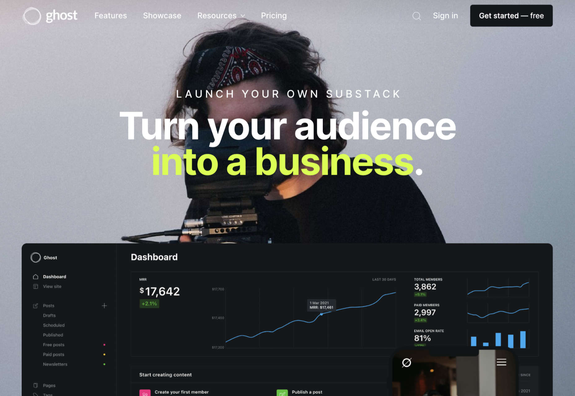
Lesser known than some of the options we’ve discussed so far but still brimming with value, Ghost is a minimalist blogging platform that’s all about content creation. Ghost promises a range of ways for you to turn your blogging into a business, with access to customizable templates, newsletter integrations, premium subscriptions, and more. 

The dashboard for Ghost is clean and intuitive, with access to simple sections where you can add tags to your posts, create drafts, track published content, and access valuable insights. You’ll have an easy view of important metrics like email open rates and numbers of paid members at a glance. You can also find integrations to make your Ghost experience even better. 

Ghost works alongside things like Buffer, Stripe, Twitter, Slack, MailChimp, and many other tools so you can take your blog to the next level. There’s no need for any coding knowledge, and because everything is written in JavaScript, it’s ultra-fast too. Features include:

  • Easy-to-use and intuitive interface;
  • Blogging and writing focused;
  • Clean and clutter-free design;
  • Integrations with various powerful tools;
  • Super-fast JavaScript coding;
  • Lots of templates and customizations;
  • Comment, mobile apps, A/B testing, and more;
  • Analytics and reporting.

Pricing: There’s a 14-day free trial to get you started with Ghost, then subscriptions start at $9 per month when billed annually for up to 1,000 members, 1 staff user, 2k views per month, and an SSL and CDN. The same plan is $15 per month billed monthly. Prices go all the way up to $199 per month billed annually, or $249 per month for 1 million views per month, 35,000 members, 15 staff users, and a 99.99% uptime SLA. 

Pros: 

  • Focus on writing and blogging;
  • Clutter-free and clean backend environment;
  • Easy to use and speedy performance;
  • Lots of packages to choose from;
  • Great integration options.

Cons:

  • Some limitations in scalability;
  • Complicated setup when installed;
  • Not a huge number of themes.

Choosing Your Blogging Platform

Whether you’re blogging because you want to build your personal brand or you’re looking for a way to strengthen sales opportunities for your company, you’re going to need the right blogging platform. The options above are just some of the best blogging solutions available right now. 

Remember, do your research and explore the free versions available whenever possible, so you can confidently invest in the software that’s best for you.


Featured image via Unsplash.

Source

The post Top Blogging Platforms Worth Considering in 2021 first appeared on Webdesigner Depot.


Source de l’article sur Webdesignerdepot

Asset management and website performance optimization are two of those unavoidable headaches faced by every website owner.

A digital asset management (DAM) platform can provide centralized asset repositories with intuitive dashboards to help you manage assets. On the other hand, an image CDN can help you get rid of that messy responsive syntax and provide dynamic asset optimization with huge performance boosts.

The problem is that website performance has become such a competitive factor that DAMs with other priorities tend to fall short. On the other hand, specialized image CDNs don’t solve the problems associated with image management, particularly within organizations.

With that in mind, I propose solving these problems for good by putting together image management and optimization stack using ImageEngine and Cloudinary. Instead of being a comparison between these two tools, this article describes the benefits of using them to complement each other.

Features and Asset Management Capabilities

As a DAM, Cloudinary provides you with a visual interface to store, manage, and edit your image and video assets. In that way, it’s not much different from any other professional image managing software such as Adobe Bridge, except that it’s an online, browser-based service.

Using the Media Library, you can upload, delete, and organize images in folders, for example. The visual image editor allows you to make advanced transformations and image touch-ups and see the results instantaneously using tools like sliders, dropdowns, etc. You can even chain transformations together for multi-layered effects.

Cloudinary also allows you to manipulate images and videos this way using their URL-based API.

Cloudinary has additional auxiliary features that make asset management easier (especially in organizations), such as backups, role-based multi-user admin, and feature extensions via third-party integrations and add-ons.

This is something most image CDNs don’t provide. Instead, they allow you to access and transform images using URL manipulation. Transformations are usually made using string-based parameters or directives. A serverless, headless DAM, if you will.

However, the advantage of using a dedicated image CDN like ImageEngine, is that it can usually provide enhanced asset optimization. ImageEngine, for example, is an intelligent image CDN that uses WURFL device detection to finely read the context an image is accessed from (device model, PPI, OS, browser, resolution, etc.) and then chooses the optimal image for that configuration.

This frees up website owners from having to do any additional optimization. This business logic is also built-in to all of their global PoP servers, and ImageEngine specifically delivers cache-hit ratios close to 100%. The following performance section will illustrate the difference this can make in practice.

Check out the key differences between ImageEngine and Cloudinary. And, for a deeper insight, see the comparison with other similar CDNs, like imgix and Cloudflare

Performance

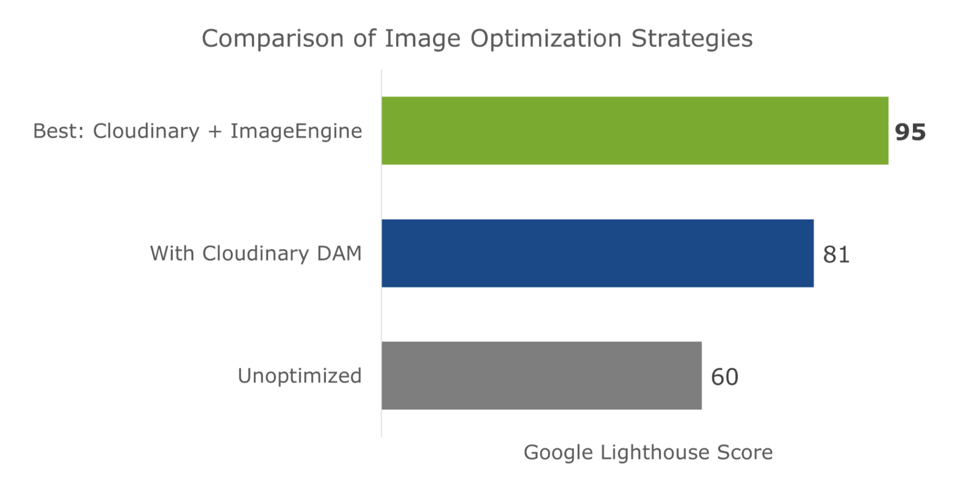
Just to cover our bases and prove that this is an effective asset management and optimization stack, I’m also going to affirm it using a Lighthouse performance audit. Here is a quick summary of the results:

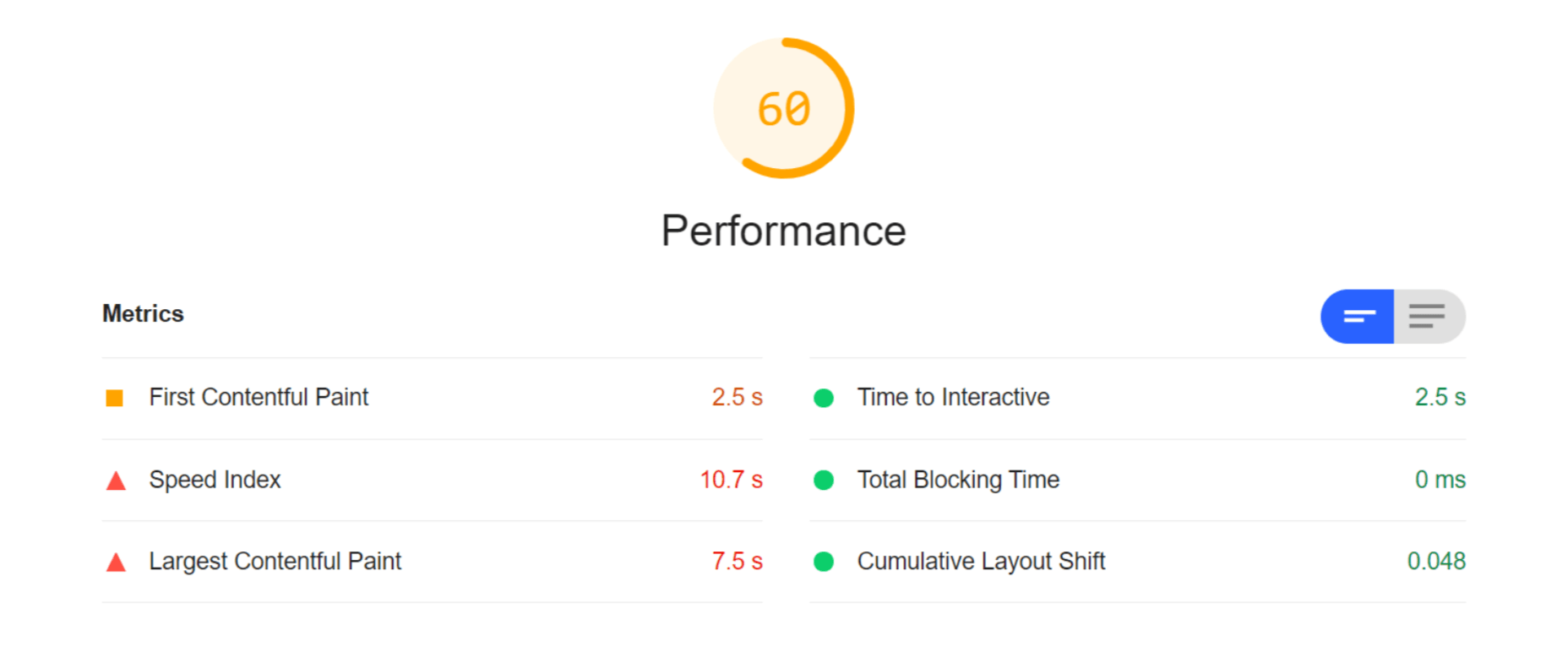
For this test, I built a web page with a tonne of images with overly large file sizes. In this first Lighthouse audit, I didn’t apply any optimization to the images. Here’s the result:

As you can see, we had some major problems when it came to the loading time of our assets. Overall, the page took more than 10 seconds to load. One of Google’s crucial user-centric performance metrics, LCP, scored a miserable 7.5s. Lighthouse suggested that some of the main problems encountered were the asset file size, inefficient cache policies, using non-optimal image formats, and improperly sized images.

Both Cloudinary and ImageEngine are supposed to address all of these factors with their auto image optimization. In the next audit, I used the same page and content but served my images via Cloudinary:

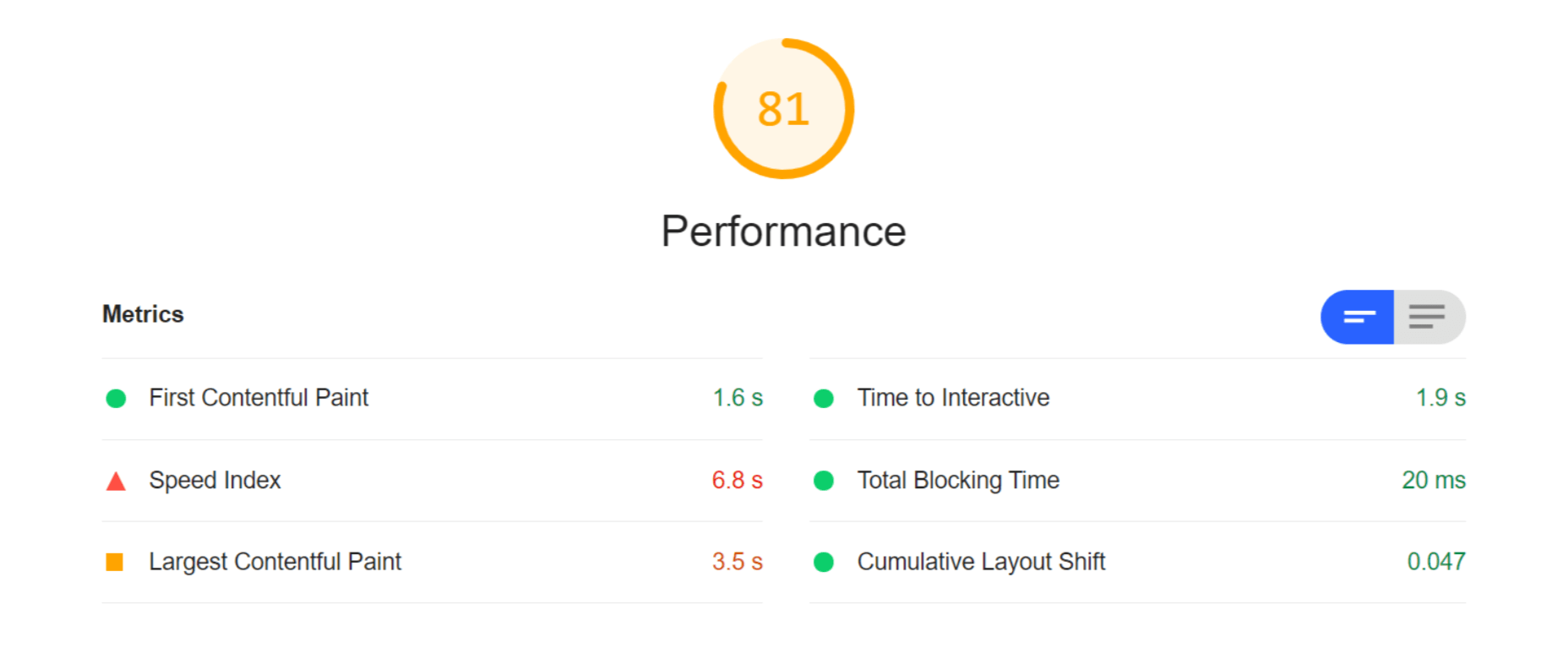
As you can see, there is improvement in most factors. FCP is now in the green, and both the Speed index and LCP times have almost halved. Even TTI and CLS improved slightly. That being said, it’s still nowhere near optimal, and we’re still falling short of the all-important 3-second loading time ceiling.

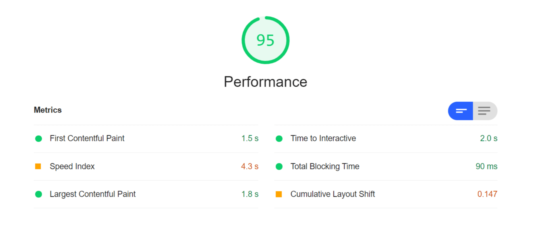
So, finally, let’s do another Lighthouse audit – this time using ImageEngine on top of Cloudinary. Here are the results:

With ImageEngine, I finally scored in the green with 95. All the metrics that have to do with the sheer speed at which image content loads improved. The Speed Index and LCP, which is the most important, improved dramatically. CLS scored worse, but this typically varies from test to test.

You can find another and more extensive breakdown of the performance and pricing comparison here.

Transformations, Bandwidth Utilization, and Cost

Cloudinary’s pricing plans work on a credit-based system. Starting with the free account, you get 25 credits/month. Each credit can be used for 1,000 transformations, 1 GB of storage, or 1 GB of net viewing bandwidth. The other two packages cost $99 for 225 credits and $249 for 600 credits, respectively.

You should plan to generate a minimum of 5 transformations per image. In effect, that limits you to around 200 images with the free plan, excluding whatever manual transformations you make.

ImageEngine’s Basic plan costs $49 and provides you with 100 GB of Smart Bytes. Smart Bytes are based on optimized image content and translate to roughly 400-500 GB of raw images.

So, with Cloudinary, you have to compromise between bandwidth and storage usage as well as the number of transformations you can make. Transformations for Cloudinary are counted as they are dynamically generated on-demand.

However, if you use ImageEngine for optimization, you can switch off Cloudinary’s auto-optimization. When a new image variant is needed, it will be generated and delivered via ImageEngine. Considering variant count isn’t limited by ImageEngine, this will drastically cut down on the number of credits you’ll need to spend on transformations.

Effectively, that means you could use the bulk of your Cloudinary credits purely for storage and specific transformations. For example, advanced cropping, applying effects, or color adjustments. These are, after all, the main functions of a DAM.

With this setup, ImageEngine’s Basic plan and Cloudinary’s free plan should be adequate for most websites, saving around $50 a month.

How to Implement Cloudinary with ImageEngine

Signing up for Both Services

As it will house all of your image assets, the logical place to start would be to sign up with Cloudinary.

Create a (free) account, and make sure to take note of your “cloud name” during the setup wizard. This will be the name of your designated storage location on the Cloudinary platform and is usually a garbled string like di2zgnxh0 by default. However, you can change this to something more meaningful.

Once you’ve signed up, you can start uploading your image assets and creating different versions/transformations of them. Setting up Cloudinary integration on a CMS, like WordPress, is usually straightforward. Just indicate the CMS you’ll be using, copy the API key, install the plugin, and activate it.

Next, sign up for a free trial with ImageEngine. There will also be a short setup wizard during which you will:

  1. Provide ImageEngine with the website where your images will be delivered.
  2. Supply your image origin (in this case, your Cloudinary web folder). For now, you can only add the Cloudinary, e.g., res.cloudinary.com.
  3. Get your ImageEngine image-serving domain, e.g., {randomstring}.cdn.imgeng.in

When in your ImageEngine dashboard, you’ll see this domain listed under “Engines” as well as an entry for Cloudinary under “Origins.” Edit the latter and under “Advanced,” add your Cloudinary folder to the “PATH” field.

That’s it, you should now be able to store and manage images via Cloudinary and serve them via the ImageEngine CDN.

Dynamically Loading Specific Image Variants

Let’s take a look at a use case for loading different transformations of individual images on your site. This example will showcase how you can use Cloudinary’s advanced image editing tools to transform images while still reaping the optimization rewards of using ImageEngine as your image CDN.

A popular practice today is to use rounded images for team, client, or profile portraits. Using Cloudinary, you can load this transformation using the following URL:

https://res.cloudinary.com/myimages/image/upload/w_400,h_400,c_crop,g_face,r_max/w_200/profile.jpg

This will resize the image to 400 by 400px, focus on the face, and apply the maximum amount of radial cropping around it – to a width of 200px.

The same image can then be accessed via your ImageEngine delivery engine simply by swapping out the domain:

https://images.myimageengine.com.imgeng.in/image/upload/w_400,h_400,c_crop,g_face,r_max/w_200/profile.jpg

NOTE: I added my Cloudinary folder designation (“myimages”) as the path to my image origin. With that config, I don’t need to include it every time I use the image URL.

For example, you can set up the origin like this:

And, then under advanced:

If I specifically wanted to load the profile picture in WebP format (for transparency support, for example), I could add the ImageEngine directive f_webp:

https://images.myimageengine.com.imgeng.in/image/upload/w_400,h_400,c_crop,g_face,r_max/w_200/?imgeng=/f_webp/profile.jpg

ImageEngine and Cloudinary – The Wrap Up

Both ImageEngine and Cloudinary are superb platforms that can make managing image and video assets easier and improve your website maintenance. However, both services have their specialty in which they outperform each other.

For ImageEngine, it’s delivering blisteringly fast image loading times in next-gen formats and with a minimal loss of visual quality.

For Cloudinary, it’s providing a visual interface to organize, store, and edit your image and video assets.

As a further incentive, letting each of these services handle what they’re best at can lead to lowering your long-term operating costs.


[– This is a sponsored post on behalf of ImageEngine –]

Source

The post Start Using a Smart DAM and Image Optimization Stack first appeared on Webdesigner Depot.


Source de l’article sur Webdesignerdepot

Parallax is a term that is applied loosely and frequently in the world of web design. As a trend, it has been popular and unpopular in equal measures for some time. However, it’s still one of the most valuable tools for animation in the digital world.

Parallax creates an illusion of depth when scrolling, a timeless effect that still has lots of value in the web design world.

Sure, parallax has its issues, from problems with usability, to concerns with mobile responsivity — but it’s also an interesting way to make a website stand out when done correctly.

Let’s take a closer look at some of the ways that parallax scrolling still works in 2021…

1. Parallax Tells A Story

Let’s start simple. 

One of the most effective ways to use parallax scrolling in the modern age is to tell a story. Today’s consumers want to have an emotional connection with the brands they buy from – now more than ever. Five years ago, studies showed that around 80% of customers want brands to tell stories, and that trend remains consistent to this day.

In the age of digital consumerism, where people can’t get to know a company in person through face-to-face interactions with its salespeople, companies need new ways to connect with their clients. Telling brand-driven stories is a way to highlight that your company is more than just a faceless entity – it’s something with real soul. 

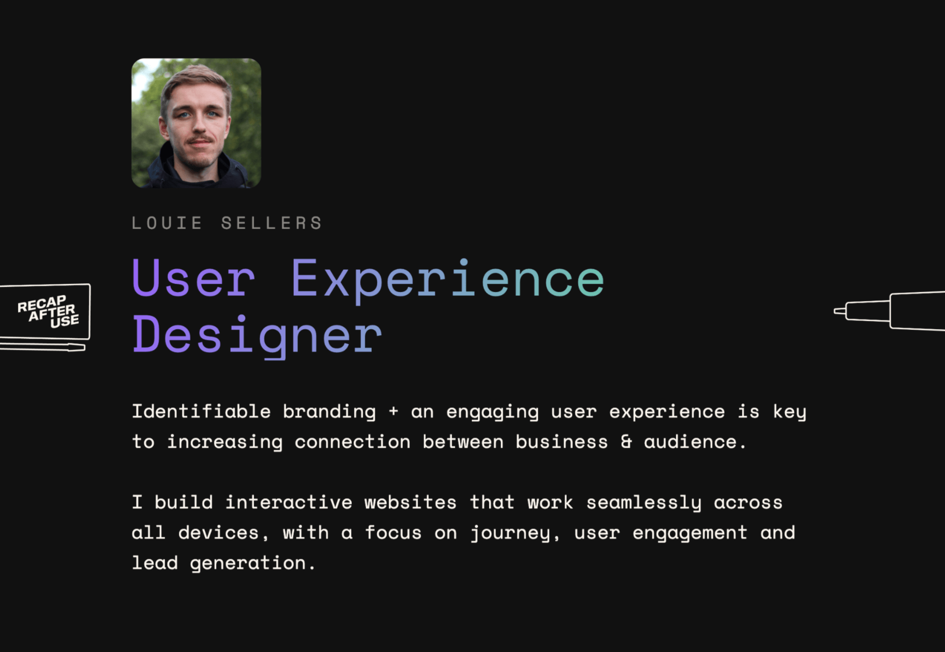
Let’s look at the “Recap After Use” website, a portfolio belonging to the innovative Louie Sellers. This website showcases Louie’s skills with attention-grabbing visuals, including a parallax animation that makes it looks like Louie is drawing the page as you scroll through it.

This is the kind of exceptional animation that makes parallax scrolling more compelling. The animation isn’t there to make a visual difference to the page – it tells you something more about the person behind the website and what they can do.

2. Parallax Increases Website Visit Times

If a website effectively tells a story with parallax animation, you can also bet that’s going to keep customers or readers on a page for longer. Reducing bounce rate by increasing engagement is one of the main goals of any web designer. (Bounce rates, of course, refer to the percentage of site visitors that hit the back button after just seeing the first page of your website.)

While some people argue that parallax websites can hurt your SEO rankings if they slow down your site, there’s also the argument that the lack of a visually engaging page can harm SEO. Bounce rates drag down your ranking and make it harder to get audience attention. 

A parallax animation that tells a story and engages your audience through carefully delivered information is a great way to keep people around – even just for a little longer than usual. For instance, if you check out Alex Dram’s portfolio page here, you’ll see several shapes coming together during the parallax scrolling animation.

The shapes merge to tell a story about the visual experiences that Alex can create for customers. It’s a way to draw the eye and connect with the viewer without just writing about what you do through text. 

3. Parallax Develops Credibility

There’s a reason why both examples of parallax scrolling we’ve looked at so far are from creative portfolios. Parallax scrolling, with its excellent storytelling capabilities, is great for demonstrating your credibility as a digital expert. Basically, it’s a version of “showing” and not “telling” customers about your skills. 

You can tell someone that you know how to use tricky techniques like parallax animation correctly, but they’re less likely to believe you that way. If you can show that you have the skills to create something amazing, that’s more engaging. 

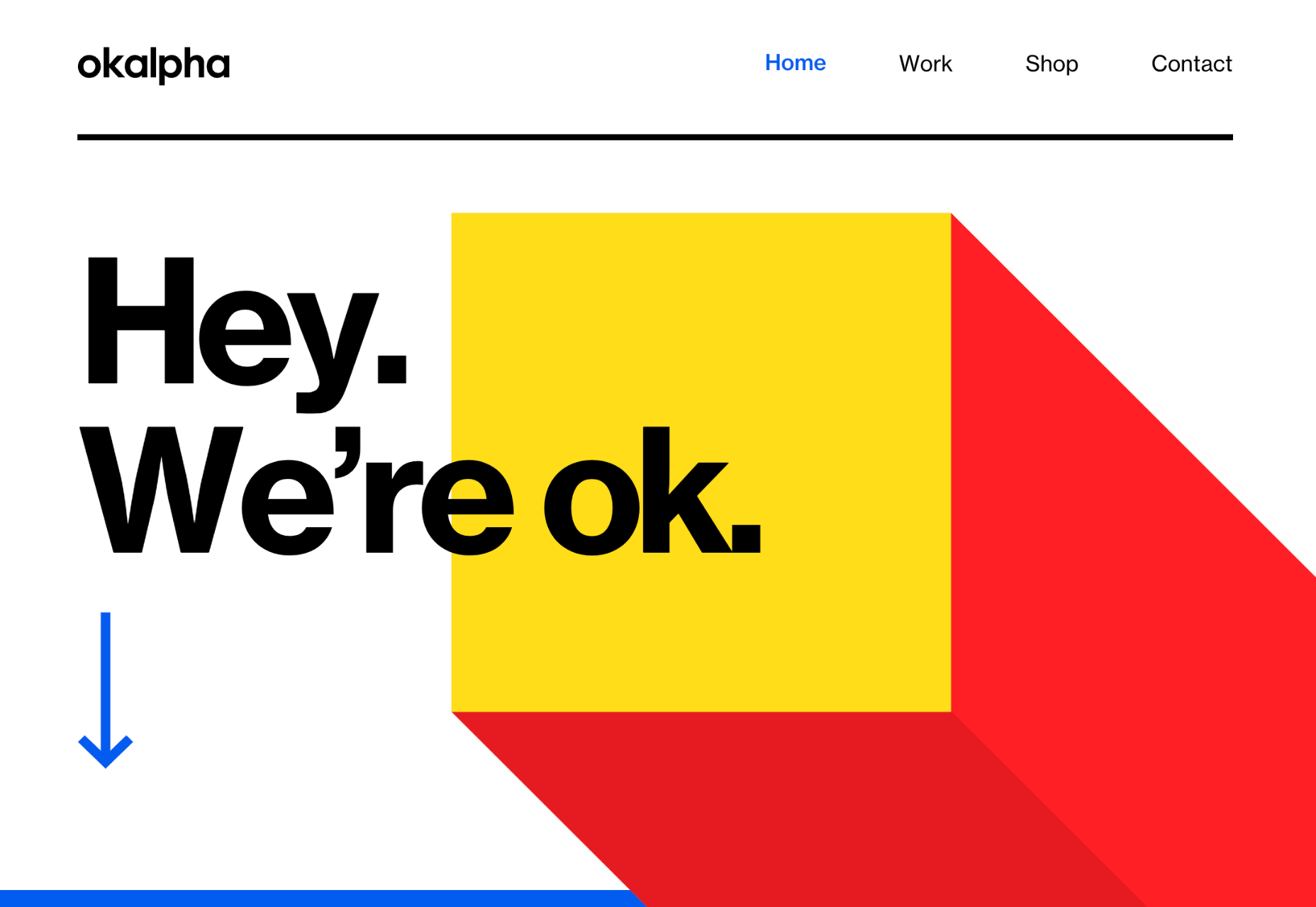
The OK Alpha team is a great company to reference when it comes to sensational design. This company seems to always be on the cutting edge of the latest trends, whether it’s bold typography or bright colors. To add to the impact of their website, the company has combined parallax effects into the mix to make everything more immersive as you scroll. 

This is a beautiful example of how companies in the design landscape can use techniques like parallax scrolling to show what they’re capable of. 

4. Parallax Makes Information More Fun

Most of us are naturally visual learners. We like to consume information in a way that’s refreshingly eye-catching and attractive. That’s why visual content generally earns more social shares and attention than written content. With parallax scrolling, companies that want to deliver valuable information and educational content to their audience can do so effectively.

Rather than just scrolling through a page and seeing lots of text, your customers can see images and graphs come to life alongside the blocks of text they’re reading. It’s like adding video demonstrations next to a textbook to help people better understand what they’re reading about. 

Look at the Web Design and Art History microsite from Webflow as an example. The company wants you to understand how web design and art have evolved over the years, but it doesn’t want to deliver that information in a boring format. The bright graphics and parallax animation work together to give you a more contextual, meaningful experience.

5. Parallax Replicates Another Medium

What if you could remind someone of their experience when reading a book or watching a video while telling them about a video or a novel? Parallax scrolling and animation can help with that. It’s a way of making your website feel like a video presentation or slideshow without the added components of implementing video players into your back end. 

Parallax scrolling also has another slight benefit over a standard video-based website. On a website that uses a video for a background, the video often plays automatically. This means that your visitors can’t control how quickly the video plays. 

On the other hand, parallax animations driven by scrolling action allow your customer to collect information at a pace that suits them. Take a look at the Story of the Goonies website, for instance. This stunning parallax site introduces you to the details you need to know about the movie in a way that makes it feel like the intro to a film.

The great thing about the parallax on this site is that the slow video-style design also gives you a dose of nostalgia – which ties in perfectly with the movie. 

6. Parallax Is More Memorable

What’s the main reason any designer does anything special to a website? To make it stand out, of course. Web design is all about conveying the unique essence of a brand, business, or entity in a way that’s going to make that client unforgettable. Although parallax isn’t as novel as it once was, it can still be a way to make your site stand out – if it’s used correctly. 

The key to success with parallax scrolling for memorability is making it smart. The layout needs to feel simple and intuitive. Everything needs to work well together, from the lightly shifting font to the various parallax effects that work together to draw the viewer’s eye (and attention). 

A great example comes from Jomor Design – another designer with a portfolio that really grabs your focus from the first second. The layout is beautifully done, with plenty of mini moments for engagement and interactions throughout. As you scroll through the site, you get a better idea of what the designer is all about. The little moments of animation make the whole experience so much more memorable. 

When your site is more memorable and engaging than that of your competition, you can drive many major benefits for your brand, including an improved bounce rate.

What To Remember When Using Parallax

Parallax is just like any other design technique. There are ways you can do it wonderfully, which engage and delight your audience. However, there are also a lot of areas where you can easily go wrong. When using any design element, the main thing to remember is that the primary focus should always be your users’ experiences. Parallax shouldn’t just be a way to show off your design knowledge. It’s just another feature that you can use to create an amazing website. 

Remember that user experience and visual appeal need to work perfectly together for parallax to work. If scrolling through the page is practically impossible for people on a mobile device, then you’re not going to get the results you want. If it’s difficult to take in the message you’re trying to send because the content is moving too quickly, again, your users will suffer. 

Remember the following tips:

  • Simple is better: Reduce the amount of content and visual elements on your page whenever you can. The less information there is to capture your customer’s attention, the less likely it is that you’re going to end up with a problem. 
  • Compress file sizes: Make sure that you’re not reducing the speed of your website by creating a huge single page with tons of high-quality images. You’re going to need to use the smallest possible file sizes. 
  • Check responsiveness: Make sure that the parallax effect works just as well on your smartphone or tablet as it would on a desktop. As more people move their browsing experiences into their palms, you can’t afford to ignore responsivity. 
  • Find the “wow”: Look at these examples of parallax websites. Every one stands out because it does something special with the scrolling effect. If you’re going to be using this strategy with your website, you need to make sure it’s worth the effort. Don’t just follow the same guidelines as everything else. Find the idea that’s going to make people take notice.

Source

The post 6 Ways Parallax Still Works in 2021  first appeared on Webdesigner Depot.


Source de l’article sur Webdesignerdepot

User experience design is something that most of us associate with websites. But why isn’t it something we extend beyond the website?

Here’s why I ask this:

As a consumer, it’s so rare that your only interaction with a brand is through its website. Take an ecommerce site, for example. You buy a product from it, and then what happens?

  • You get a confirmation email;
  • You get another email when the package ships;
  • You might get another email or SMS notification when the package is delivered;
  • You retrieve the package and open it;
  • You open up your purchase and use it.

These are all an extension of that initial user experience on the site. If there’s just one hiccup along the way, it could easily erode the trust and happiness you felt after quickly finding and buying what you needed on the site.

So, what I’d like to do today is look at 10 areas where UX design should extend beyond the website to ensure that the frictionless experience started there remains untarnished.

Extending UX Design Beyond the Website

As a web designer, you might be thinking that this part of the user experience doesn’t fall under the umbrella of your responsibilities. And you may be right about that.

For brands to truly be successful and profitable, someone needs to carefully examine the bigger picture and ensure that the user experience is flawless no matter how far away from the site it is. At the very least, you should share the UX research and strategy you do for a client’s site so their team can ensure it carries over to other areas of the business.

Here are some things to think about:

1. Mobile App

It’s not uncommon for websites to have mobile app counterparts these days. The layout doesn’t need to be identical since mobile users tend to behave differently than those on desktop.

That said, an app shouldn’t force users accustomed to the desktop experience to re-learn how to navigate or engage with the brand. So, the branding, UI design, speed, security, and navigation all need to be on par with what’s already been established in terms of usability.

2. Email

Most websites have a direct connection to email. For example, blog newsletters, purchase confirmation emails, and lead generation follow-ups all start on the website.

Consumers are well aware that when they hand over their email address, they will receive an email in return. In many cases, those emails are welcomed when they’re done right. But if something feels off, that bridge could easily burn between brand and consumer.

To preserve the UX, emails should come with the following:

  • The same branding and visual style as the website;
  • A personalized subject line, greeting, or offer;
  • Consistent messaging as the site, especially when it comes to the CTA.

Another thing to remember is that email isn’t the time to inject dark patterns into the experience. So, the “Unsubscribe” option should be in an easy-to-spot area and a sharply contrasting font color.

3. Social Media

Social media is another channel that’s commonly connected to a website. While you can’t control the aesthetics of social media websites themselves, the visuals and messaging in posts need to be on-brand.

That means that things like memes and emojis — which are popular means of communication on social — should only be used if they’re normally part of the brand identity. If not, you’ll need to find other ways to communicate engagingly.

Another part of the user experience to think about is customer support. Social media is a lot like going into a store. If someone has an issue with what they bought or the service they received, there will be many people around to witness the complaint. Social media only amplifies that — so the quality of customer care needs to be consistent with how the brand handles it everywhere else.

4. SMS

Not every brand will need to be connected to customers via text messaging. eCommerce companies, news sites, and personal services providers likely will, though.

However a brand uses SMS, the same UX guidelines apply here as they do across all other channels:

  • Keep messages concise;
  • Make sure they’re relevant and valuable;
  • Use branded messaging and design;
  • Don’t abuse the privilege and send too many;
  • Make it easy to opt out.

Basically, if you can’t make it a valuable extension of the brand’s offering, don’t use it.

5. Phone

Any website that publishes its phone number should expect to receive calls from prospects and customers. While there’s nothing to design here visually, the experience of getting on the phone with a company should be consistent with what they experience elsewhere.

One way to do this is to design an easy-to-follow routing system. It should be simple for callers to figure out which number to choose. What’s more, there should be no endless loops. If a caller has exhausted the options, they should be immediately directed to a representative.

Another way to ensure consistency is to adhere to a script — that goes for call centers for enterprises as well as the local lawyer’s office. Every caller should be greeted with the same tone and handled in the same manner (depending on the situation, of course).

6. Ads

There are a lot of places where brands can advertise these days:

  • Google search;
  • Social media;
  • Ad networks;
  • TV;
  • Radio;
  • Podcasts;
  • Blogs;
  • Billboards;
  • Direct mail.

When designing an ad campaign, there should be consistent messaging, aesthetics (when relevant), and CTAs presented. If branding isn’t consistent from ad to ad, there may be a delay in consumers recognizing the brand or its offer. Or, worse, not recognizing it at all.

7. Packaging

For brands that sell products, you have to think about how the packaging will impact the user experience. There are two types of packages to consider, too.

The first is the product’s own packaging. Branding should be clear as day and consistent with the site they bought it from.

It should also be easy to open. There’s nothing more frustrating than finally getting your purchase, only to realize you need tools to get it out of the packaging.

You also have to think about packaging for products that get shipped.

The product should fit well within the packaging. A too-roomy package will feel downright wasteful. So will excessive bubble wrap and paper filler.

Having a shipping label present in the package is also important. If the website makes it easy to make a purchase, the package should offer a convenient way to return the product if they’re not happy.

8. Product

The product itself has to align with the expectations set by the website.

Take the example of a SaaS. You’ve built an awesome landing page and mobile app store page to promote it. It looks great, it loads fast, and it’s easy to get around. But if the SaaS itself is ugly, disorganized, slow, or otherwise just clunky, all of the work you did to market it will end up being just false advertising.

So, make sure the expectations set before and during purchase naturally carry over to the experience with the product.

9. Business Exterior

For brick-and-mortar companies, the business’s exterior matters just as much as what happens inside it.

The most obvious thing to focus on is the aesthetics of the building. Does it look attractive? Is it in a safe area? Is there clear signage around it? Is it easy to find?

But you also have to think about user experiences that take place outside of the building. For example, there’s now a rise in curbside pickup. There are tons of things that can affect how happy the customer is with the experience — like if the pickup area is hard to find, there are never enough spots or the associates who deliver the orders always seem to be in a foul mood.

The business’s exterior should always set a good impression for what takes place inside.

10. Business Interior

Here are some things to think about when it comes to “designing” business interiors for a good UX:

  • Decor;
  • Layout;
  • Signage;
  • Furnishings;
  • Product discoverability;
  • Availability (of products or people);
  • Quality of customer service;
  • Checkout process.

It doesn’t matter what the company does — whether it’s a large retailer like Walmart or your own freelance design business. If a business’s establishment doesn’t look good, operate flawlessly, or provide a good person-to-person experience, it’s going to be very hard to get people to return.

So, all those things you do to design a streamlined website journey should be applied to a bricks-and-mortar business’s interior.

Wrapping Up

Depending on the types of companies you build sites for, some of the channels and suggestions above might not be relevant. Hopefully, this has got you thinking about other ways you (and your clients) can extend the UX design and strategy from the website.

If you can maintain the high-quality user experience from channel to channel, your clients’ brands will get more business, grow their profitability, and see a rise in loyalty, too.


Featured image via Pexels.

Source

The post UX Design Doesn’t End With Your Website first appeared on Webdesigner Depot.


Source de l’article sur Webdesignerdepot

WordPress powers nearly 40% of all websites, thanks to its commitment to making publication possible for everyone, for free. Combined with premium plugins and themes, it’s possibly the ultimate tool for building attractive, unique, and feature-rich websites without any coding or design experience.
However, you do pay the price for this experience, with WordPress and its third-party products not always being built for performance – whether it’s page loading times or SEO.

Image optimization is a particularly big concern. Images are one, if not the largest, contributors to page weight, and it’s growing significantly by the year. So, while images are crucial for beautifying your website pages, they are also one of the biggest factors slowing it down.

In terms of image optimization, WordPress+Elementor brings very little to the table. WordPress core now comes with both responsive syntax and lazy-loading. Elementor itself also only comes with responsive syntax out-of-the-box. However, these are baseline techniques for image optimization that will deliver the bare minimum of improvements.

This means that, while Elementor makes it easy to design sweet-looking WordPress pages (with tonnes of creatively utilized images), you will probably pay the price when it comes to performance. But don’t worry. We will show you how to dramatically improve web performance by over 30 points on scoring tools like Google’s PageSpeed Insight

Why Optimize Your Elementor Images with ImageEngine?

In general, image CDNs use various techniques to get image payloads as small as possible and deliver image content faster, all while minimizing the visual impact. ImageEngine is no different in that regard.

Firstly, ImageEngine, when used in auto mode, will apply all of the following optimizations that web performance tools like Google’s PageSpeed Insight recommend. For example:

  • Properly size images – ImageEngine automatically resizes images for optimal size-to-quality ratios depending on the screen size of the user device. ImageEngine supports Retina devices.
  • Efficiently encode images – Applies different rates of compression depending on the PPI of the user devices. For example, ImageEngine adapts and more aggressively compresses on higher PPI devices without losing visual quality.
  • Next-gen format conversion – Automatically converts images to the optimal next-gen format according to the browser, device, or OS. ImageEngine can convert images to WebP or JPEG-2000 as well as GIFs to MP4 or WebP.  AVIF is also available in a manual directive mode.
  • Strip unnecessary metadata

While these features are standard for most image CDNs, ImageEngine is unique for its use of WURFL device detection. This gives ImageEngine much deeper insight into the user device accessing a website page and, by extension, its images. Using the screen size, resolution, PPI, etc., ImageEngine can make more intelligent decisions regarding how to reduce image payloads while maintaining visual quality.

This is why ImageEngine brands itself as an “intelligent, device-aware” image CDN and why it can reduce image payloads by as much as 80% (if not more).

ImageEngine also provides a proprietary CDN service to accelerate image delivery. The CDN consists of 20 globally positioned PoPs with the device-aware logic built-in. This allows you to deliver image content faster in different regions while also serving images straight from the cache with a ~98% hit ratio.

ImageEngine also supports Chrome’s save data setting. If someone has a slow connection or has activated this setting, ImageEngine will automatically compress image payloads even more, to provide a better user experience on slower connections.

How to Use ImageEngine with WordPress and Elementor

If you’re using WordPress and Elementor, then chances are you want to spend as little time on development and other technicalities as possible. Luckily, ImageEngine is a highly streamlined tool that requires little to no effort to integrate or maintain with a WordPress site.

Assuming you already have a WordPress website with Elementor, here are the step-by-step instructions to use ImageEngine:

  1. Go to ImageEngine.io and sign up for a 30-day free trial.
  2. Provide ImageEngine with the URL of the website you want to optimize.
  3. Create an account (or sign up with your existing Google, GitHub, or ScientiaMobile account).
  4. Provide ImageEngine with the current origin where your images are served from. If you upload images to your WordPress website as usual, then that means providing your WordPress website address again.
  5. Finally, ImageEngine will generate an ImageEngine delivery address for you from where your optimized images will be served. This typically takes the form of: {randomstring}.cdn.imgeng.in. You can change the delivery address to something more meaningful from the dashboard, such as myimages.cdn.imgeng.in.

Now, to set up ImageEngine on your WordPress website:

  1. Go to the WordPress dashboard and head to Plugins -> Add New.
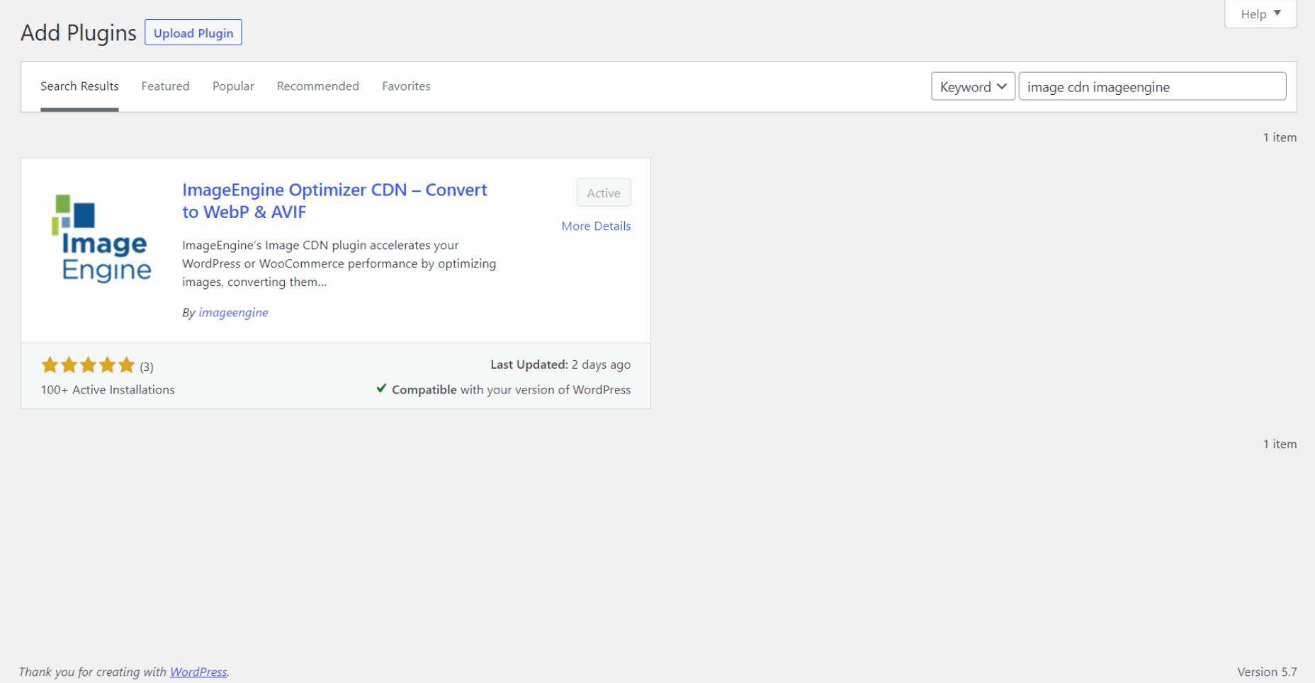
  2. Search for the “Image CDN” plugin by ImageEngine. When you find it, install and activate the plugin.

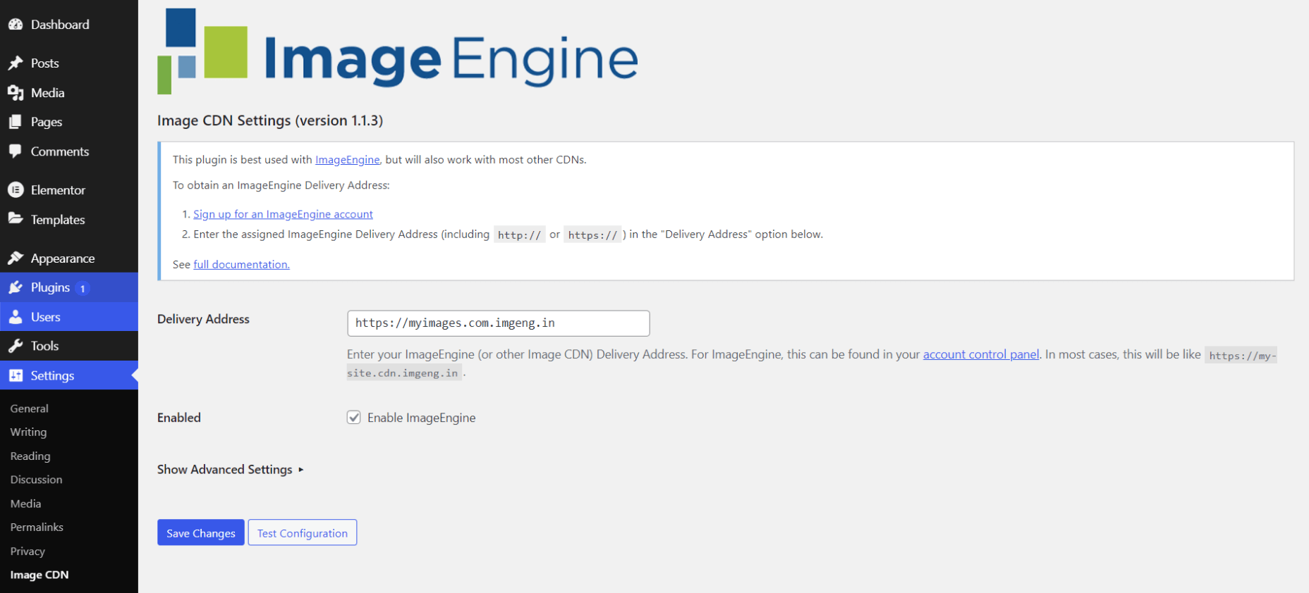
  1. Go to Settings -> Image CDN. OK, so this is the ImageEngine plugin dashboard. To configure it, all you need to do is:

a. Copy the delivery address you got from ImageEngine above and paste it in the “Delivery Address” field.

b. Tick the “Enable ImageEngine” box.

That’s literally it. All images that you use on your WordPress/Elementor pages should now be served via the ImageEngine CDN already optimized. 

ImageEngine is largely a “set-it-and-forget-it” tool. It will provide the best results in auto mode with no user input. However, you can override some of ImageEngine’s settings from the dashboard or by using URL directives to manipulate images.

For example, you can resize an image to 300 px width and convert it to WebP by changing the src attribute like this:

<img src="https://myimages.cdn.imgeng.in/wp-content/uploads/2021/03/banner-logo.png?imgeng=/w_300/f_webp">

However, use this only when necessary, as doing so will limit ImageEngine’s adaptability under different conditions.

What Improvement Can You Expect?

Let’s see what results you can expect from using an image CDN to improve your page loading times.

For this, I created two identical WordPress pages using the Elementor theme. The one page purely relied on WordPress and Elementor, while I installed and set up ImageEngine for the other. The page had some galleries as well as full-size images:

The pages used many high-quality images, as you might expect to find on a professional photography gallery, photography blog, stock photo website, large e-commerce site, etc. I then ran page performance tests using Chrome’s built-in Lighthouse audit tool, choosing scores representing the average results I got for each page.

For thoroughness, I tested both the mobile and desktop performance. However, I focused on the mobile results as these showcase more of the image CDN’s responsive capabilities. Mobile traffic also accounts for the majority share of internet traffic and seems to be the focus for search engines going forward.

So, first of all, let’s see the mobile score for the page without ImageEngine:

As you can see, there was definitely a struggle to deliver the huge amount of image content. Google has shown that 53% of mobile users abandon a page that takes more than 3s to load. So, clearly, this page has major concerns when it comes to user experience and retaining traffic.

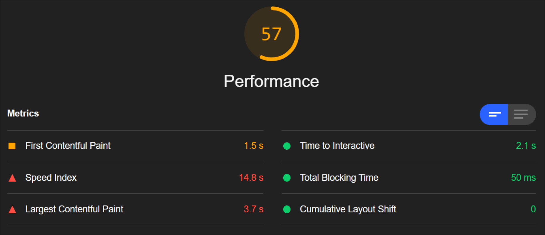
The desktop version fared much better, although it still left much to be desired:

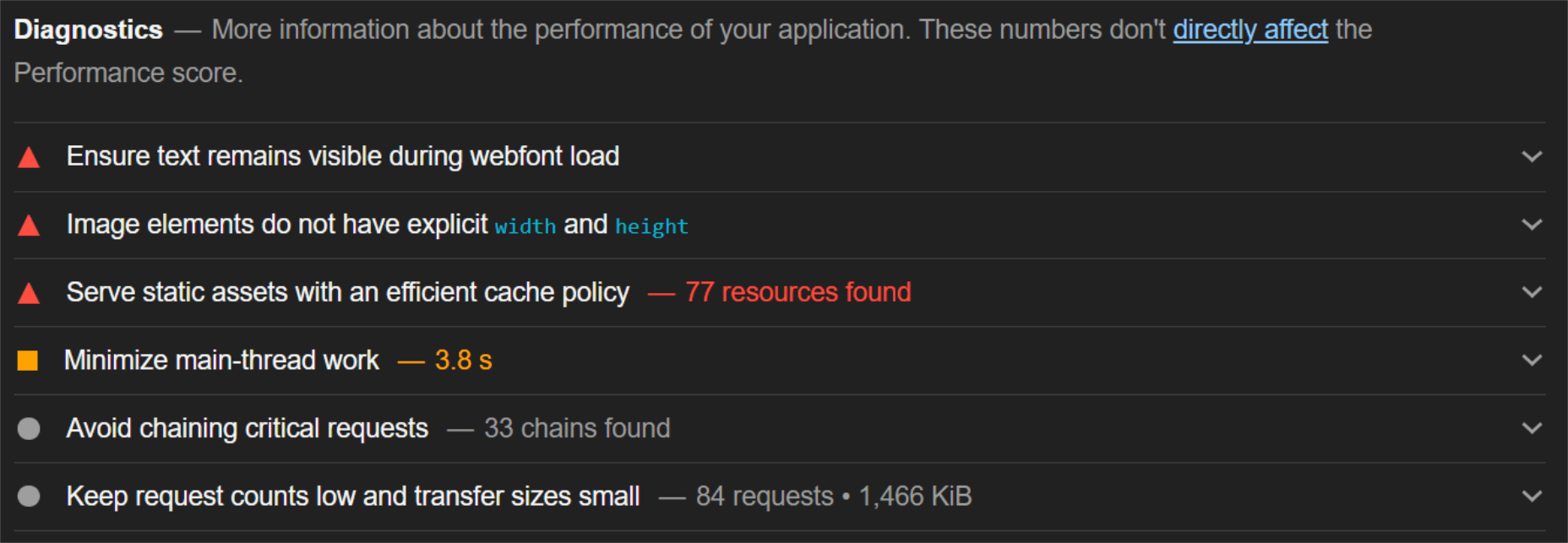
When digging into the reasons behind the slowdown, we can identify the following problems:

Most of the issues related somehow to the size and weight of the images. As you can see, Lighthouse identified a 3.8 MB payload while the total image payload of the entire page was close to 40 MB.

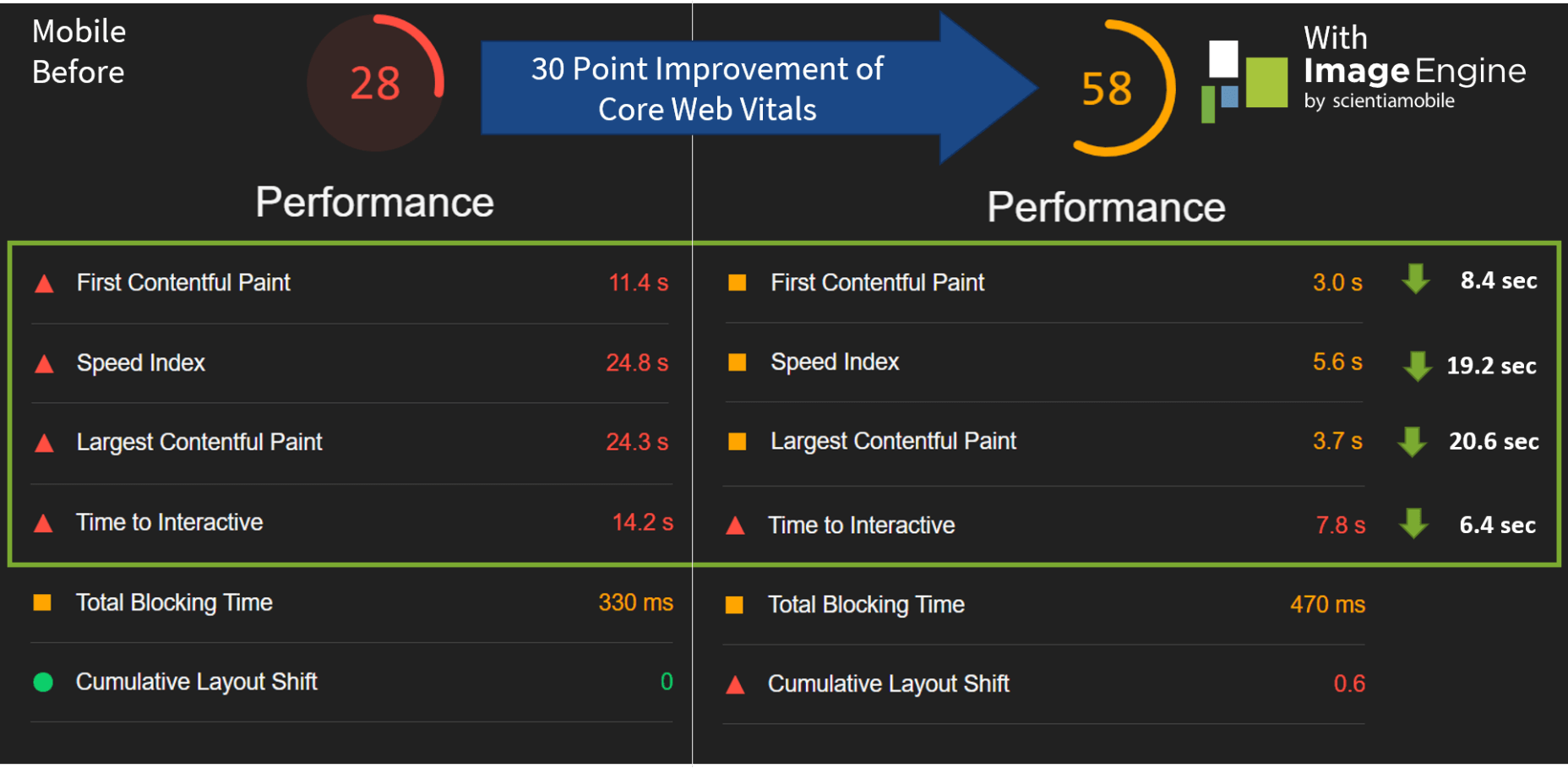
Now, let’s see what kind of improvement ImageEngine can make to these issues by looking at the mobile score first:

So, as you can see, a major improvement of 30 points over the standard WordPress/Elementor page. The time to load images was cut down by roughly 80% across the key core web vital metrics, such as FCP, LCP, and the overall Speed Index.

In fact, we just reached that critical 3s milestone for the FCP (the largest element on the visible area of the page when it initially loads), which creates the impression that the page has finished loading and will help you retain a lot of mobile traffic.

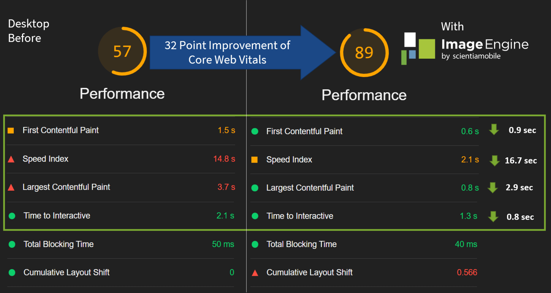
The desktop score was also much higher, and there was further improvement across the key performance metrics.

If we look at the performance problems still present, we see that images are almost completely removed as a concern. We also managed to bring down the initial 3.8 MB payload to around 1.46 MB, which is a ~62% reduction:

An unfortunate side effect of using WordPress and WordPress plugins is that you will almost inevitably face a performance hit due to all the additional JavaScript and CSS. This is part of the reason why we didn’t see even larger improvements. That’s the price you pay for the convenience of using these tools.

That being said, the more images you have on your pages, and the larger their sizes, the more significant the improvement will be.

It’s also worth noting that lazy-loaded images were loaded markedly faster with ImageEngine if you quickly scroll down the page, again making for an improved user experience.

Thanks to its intelligent image compression, there was also no visible loss in image quality, as you can see from this comparison:

Conclusion

So, as you can see, we can achieve significant performance improvements on image-heavy websites by using the ImageEngine image CDN, despite inherent performance issues using a CMS. This will translate to happier users, better search engine rankings, and an overall more successful website.

The best part is that ImageEngine stays true to the key principles of WordPress. You don’t have to worry about any of the nuts and bolts on the inside. And, ImageEngine will automatically adjust automation strategies as needed, future-proofing you against having to occasionally rework images for optimization.

Source

The post Create Beautiful WordPress Pages with Optimized Images Using Elementor and ImageEngine first appeared on Webdesigner Depot.


Source de l’article sur Webdesignerdepot

Gartner predicts that by 2023, over 50% of medium to large enterprises will have adopted a Low-code/No-code application as part of their platform development.
The proliferation of Low-code/No-code tooling can be partially attributed to the COVID-19 pandemic, which has put pressure on businesses around the world to rapidly implement digital solutions. However, adoption of these tools — while indeed accelerated by the pandemic — would have occurred either way.
Even before the pandemic, the largest, richest companies had already formed an oligopsony around the best tech talent and most advanced development tools. Low-Code/No-code, therefore, is an attractive solution for small and mid-sized organizations to level the playing field, and it does so by giving these smaller players the power to do more with their existing resources.
While these benefits are often realized in the short term, the long-term effect of these tools is often shockingly different. The promise of faster and cheaper delivery is the catch — or lure — inside this organizational mousetrap, whereas backlogs, vendor contracts, technical debts, and constant updates are the hammer.
So, what exactly is the No-Code trap, and how can we avoid it?

What is a No-Code Tool?

First, let’s make sure we clear up any confusion regarding naming. So far I have referred Low-Code and No-Code as if they were one term. It’s certainly easy to confuse them — even large analyst firms seem to have a hard time differentiating between the two — and in the broader context of this article, both can lead to the same set of development pitfalls.
Under the magnifying glass, however, there are lots of small details and capabilities that differentiate Low-code and No-code solutions. Most of them aren’t apparent at the UI level, leading to much of the confusion between where the two come from.
In this section, I will spend a little bit of time exploring the important differences between those two, but only to show that when it comes to the central premise of this article they are virtually equivalent.

Low-Code vs. No-Code Tools

The goal behind Low-Code is to minimize the amount of coding necessary for complex tasks through a visual interface (such as Drag ‘N’ Drop) that integrates existing blocks of code into a workflow.
Skilled professionals have the potential to work smarter and faster with Low-Code tools because repetitive coding or duplicating work is streamlined. Through this, they can spend less time on the 80% of work that builds the foundation and focuses more on optimizing the 20% that makes it different. It, therefore, takes on the role of an entry-level employee doing the grunt work for more senior developers/engineers.
No-Code has a very similar look and feel to Low-Code, but is different in one very important dimension. Where Low-Code is meant to optimize the productivity of developers or engineers that already know how to code (even if just a little), No-Code is built for business and product managers that may not know any actual programming languages. It is meant to equip non-technical workers with the tools they need to create applications without formal development training.
No-Code applications need to be self-contained and everything the No-Code vendor thinks the user may need is already built into the tool.
As a result, No-Code applications create a lot of restrictions for the long-term in exchange for quick results in the short-term. This is a great example of a ‘deliberate-prudent’ scenario in the context of the Technical Debt Quadrant, but more on this later.

Advantages of No-Code Solutions

The appeal of both Low-Code and No-Code is pretty obvious. By removing code organizations can remove those that write it — developers — because they are expensive, in short supply, and fundamentally don’t produce things quickly.
The benefits of these two forms of applications in their best forms can be pretty substantial:
  • Resources: Human Capital is becoming increasingly scarce — and therefore expensive. This can stop a lot of ambitious projects dead in their tracks. Low-Code and No-Code tools minimize the amount of specialized technical skills needed to get an application of the ground, which means things can get done more quickly and at a lower cost.
  • Low Risk/High ROISecurity processes, data integrations, and cross-platform support are all built into Low-Code and No-Code tools, meaning less risk and more time to focus on your business goals.
  • Moving to Production: Similarly, for both types of tools a single click is all it takes to send or deploy a model or application you built to production.
Looking at these advantages, it is no wonder that both Low-Code and No-Code have been taking industries by storm recently. While being distinctly different in terms of users, they serve the same goal — that is to say, faster, safer and cheaper deployment. Given these similarities, both terms will be grouped together under the ‘No-Code’ term for the rest of this article unless otherwise specified.

List of No-Code Data Tools

So far, we have covered the applications of No-Code in a very general way, but for the rest of this article, I would like to focus on data modeling. No-Code tools are prevalent in software development, but have also, in particular, started to take hold in this space, and some applications even claim to be an alternative to SQL and other querying languages (crazy, right?!). My reasons for focusing on this are two-fold: 
Firstly, there is a lot of existing analysis around this problem for software development and very little for data modeling. Secondly, this is also the area in which I have the most expertise.
Now let’s take a look at some of the vendors that provide No-Code solutions in this space. These in no way constitute a complete list and are, for the most part, not exclusively built for data modeling. 

1. No-Code Data Modeling in Power BI

Power BI was created by Microsoft and aims to provide interactive visualizations and business intelligence capabilities to all types of business users. Their simple interface is meant to allow end-users to create their own reports and dashboards through a number of features, including data mapping, transformation, and visualization through dashboards. Power BI does support some R coding capabilities for visualization, but when it comes to data modeling, it is a true No-Code tool.

2. Alteryx as a Low-Code Alternative

Alteryx is meant to make advanced analytics accessible to any data worker. To achieve this, it offers several data analytics solutions. Alteryx specializes in self-service analytics with an intuitive UI. Their offerings can be used as Extract, Transform, Load (ETL) Tools within their own framework. Alteryx allows data workers to organize their data pipelines through their custom features and SQL code blocks. As such, they are easily identified as a Low-Code solution.

3. Is Tableau a No-Code Data Modeling Solution?

Tableau is a visual analytics platform and a direct competitor to Power BI. They were recently acquired by Salesforce which is now hoping to ‘transform the way we use data to solve problems—empowering people and organizations to make the most of their data.’ It is also a pretty obvious No-Code platform that is supposed to appeal to all types of end-users. As of now, it offers fewer tools for data modeling than Power BI, but that is likely to change in the future.

4. Looker is a No-Code Alternative to SQL

Looker is a business intelligence software and big data analytics platform that promises to help you explore, analyze, and share real-time business analytics easily. Very much in line with Tableau and Power BI, it aims to make non-technical end-users proficient in a variety of data tasks such as transformation, modeling, and visualization.

You might be wondering why I am including so many BI/Visualization platforms when talking about potential alternatives to SQL. After all, these tools are only set up to address an organization’s reporting needs, which constitute only one of the use cases for data queries and SQL. This is certainly a valid point, so allow me to clarify my reasoning a bit more.

While it is true that reporting is only one of many potential uses for SQL, it is nevertheless an extremely important one. There is a good reason why there are so many No-Code BI tools in the market—to address heightening demand from enterprises around the world — and therefore, it is worth taking a closer look at their almost inevitable shortcomings.

Source de l’article sur DZONE

At the dawn of the web-era, there was much focus on how environmentally friendly websites were: we’d chop down fewer trees, ship fewer products, and travel less for business.
And because the web was small, any negative impact it had was relatively small. But the Internet’s no longer small, and neither is the impact it has on the environment. The average website uses 211,000g of CO2 per year, watching a video online outputs an estimated 0.2g of CO2 per second, and a single email can cost 50g of CO2.

In the next four years, the tech industry as a whole may use up to 20% of the world’s electricity and be responsible for 5.5% of global CO2 emissions.

The good news is that because websites are viewed many times, even small improvements can multiply into real change.

1. Reduce Energy Consumption

Through electricity use, the Internet generates around the same CO2 as most major countries. That carbon comes from two sources: the devices we use to access the Internet and the servers that host our data.

Computers heat up, and when they heat up, they slow down. Servers are especially vulnerable and use extraordinary amounts of energy to keep cool and functional, which is why Microsoft keeps throwing servers into the sea.

Make It Faster

The faster your site, the less data is used to serve it, and the less carbon it’s outputting; it’s that simple.

Reduce the Number of Resources Used

Everything you load on your site has an impact. You might think that a tiny PNG is too small to really impact your carbon footprint, but over thousands of page loads, its impact is multiplied. Anything you can do to reduce the number of actual files requested will reduce your carbon output. You can use sites like Ecograder to estimate your own site’s CO2 output.

Optimize Images

If there’s one thing you can do to reduce the size of your site, the amount of data that needs to be sent over the Internet to serve your site, and the resulting speed, it’s optimizing your images.

Nothing reduces a site’s footprint like optimizing images. It’s easy and free to reduce the size of JPGs and PNGs with a service like TinyPNG. Offer WebP to any browser that will accept them; it will boost your Lighthouse score and improve your CO2 usage.

Lazy Load Images

Lazy loading images means images are loaded as they are required; images at the top of a page always load, images further down only load when the user scrolls to them; if the user doesn’t scroll to the bottom of the page, they don’t load, saving you CO2.

Reduce The Amount Of JavaScript You Use

Yes, JavaScript is awesome. Yes, it can be hugely beneficial to UX. And yes, it munches on energy like it’s candy.

When a web page loads, it’s done, the total cost is in. If JavaScript keeps running in the background, redrawing the screen based on user interaction — as is the case with a parallax site — the web page keeps using up energy on the device.

Choose a Sustainable Hosting Company

You can reduce the power needs of a site, but you can’t eliminate them. One simple step is to opt for a hosting company that gets its electricity from sustainable sources such as wind power or solar.

Low←Tech Magazine is powered by a server that runs on solar energy and carries a warning that it may go offline. But it’s possible to host both reliably and sustainably. Many web hosts outsource their actual server management, so they have no control over how those servers are powered, but there are plenty of exceptions that guarantee green web hosting. Google Cloud aims to be the cleanest in the cloud industry. For green web hosting, I always recommend the all-round superb Kualo.

2. Be Inclusive

One of the biggest issues with the EV (Electric Vehicle) movement is that we’re replacing cars earlier than we normally would in a rush to move to “clean” driving.

A new EV certainly outputs less than a gas-powered vehicle when driven the same distance. Combine increased use — because owners think they are driving cleanly — with the fact that a new EV has to be manufactured, the minerals for batteries have to be mined (in horrific conditions), and it then needs to be shipped to you, and EVs are not as friendly as they appear — so go ahead, buy that vintage Porsche it’s probably better for the environment than a Tesla.

Support Legacy Devices

The same issue that applies to cars applies to devices. Every time we rush ahead to support the latest iPhone, we leave older generations behind. A device can and should last longer than two years.

This is not to say that you shouldn’t embrace modern web standards. Technologies like CSS Grid are excellent at reducing markup size and speeding up sites. CSS Grid has been well supported for over four years, and even “legacy” devices can handle it. If you can keep a phone for an extra six months, the environmental cost of that phone is reduced by 20%.

3. Help Users Make Good Choices

More and more people are trying to make good choices. We’re eating a healthier, balanced diet. We’re recycling clothes. We’re traveling by bike, and on foot, instead of by car. People want to do the right thing, and they seek out companies that aid them.

Improve Navigation

Anything that you can do to make your content more findable will mean fewer page loads and therefore consume fewer resources.

By improving your information architecture, improving your search accuracy, and improving on-page signposts like bread crumbs and link text, you help users find content faster.

Feelgood Feedback

When the environmental impact of a user’s actions are quantifiable, let them know. Users who care will appreciate it, and users who don’t will ignore it.

Raileurope.com adds a note to any quotation letting you know how much carbon you’ve saved by traveling by train instead of flying.

Don’t Remove the Shipping Rate

Many ecommerce sites offer free shipping, especially above a certain order value; it’s a good way to encourage higher sales. But absorbing the shipping cost implies that there is no shipping. By highlighting the shipping costs, even if they’re not passed on to the customer, you remind them that there is an environmental cost and a financial cost.

You can absorb the shipping rate without implying there is no cost by adding the shipping and then explicitly deducting it as a discount.

Sustainable Web Design Is Good For Business

The fundamentals of good web design are the fundamentals of sustainable web design.

Make it fast and usable, and you’ll also be making it energy efficient. Make it inclusive, and you’ll help the industry slow the ever-growing tendency to consume. Make it transparent, and you’ll help your users make good choices of their own. All of these things are not only good for the environment, but they also result in improved UX and SEO.


Featured image via Pexels.

Source

The post 3 Effective Ways To Improve Your Site’s Carbon Footprint first appeared on Webdesigner Depot.


Source de l’article sur Webdesignerdepot