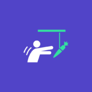
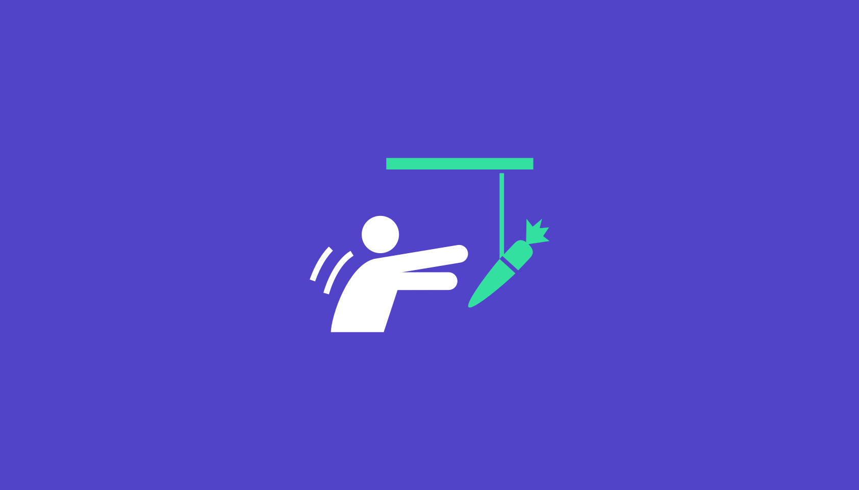
 The transitioning of power is fraught with difficulties. Different teams have different values, different experience, different expertise, different priorities, and that leads to different tooling, and different methodologies.
It’s tempting to think of web design as an end-to-end process, starting with research and concluding with metrics. The reality is that most designers and developers join projects part-way through an ongoing process.
That leaves us with a difficult choice: do we try and meet the client’s expectations with our own toolset, or adapt to the tools and processes that are already in place?
For anyone who’s taking over a web project from a different designer/developer/agency (D/D/A), here’s a practical guide to help you make a success of the transition.
Step 1: Find Out What Went Wrong
99.99% of the time, something broke down in the previous client-D/D/A relationship.
In my experience it’s almost never about money. Most clients are willing to pay above the basic market rate if they believe they’re receiving a good return on their investment. A client that tells you the previous D/D/A is simply too expensive is anticipating negotiating your fees.
happy clients don’t shop around
Occasionally you’ll find that a freelance designer has been headhunted by an agency, and is no longer available. Occasionally the company outgrows a D/D/A, moving into areas that the D/D/A doesn’t support. But these situations are rare, happy clients — even moderately content clients — don’t shop around. If they’re speaking to you, something motivated them to do so.
It is alarmingly common that a D/D/A simply goes AWOL. It’s most common at the lower end of the market where the sums of money involved are less likely to prompt a legal dispute. Frequently, an unreputable D/D/A will ghost a client in favour of a better, newer opportunity.
Sometimes the client hires a new manager, and the new manager ushers in revised expectations that the previous D/D/A can’t meet.
Most commonly, the previous D/D/A has dropped the ball one too many times — mistakes happen, and reasonable clients will tolerate them provided they are rectified promptly, but everyone has their limits.
Most clients will be more than happy to explain what went wrong in the previous relationship; it will inevitably be a one-sided explanation, but it will help you to understand the client’s expectations.
Be extremely wary of a client who doesn’t know what went wrong. Be even more wary of a client who talks about “upgrading” their outsourcing — they’re trying to flatter you. In these cases the client may well be hiding something — like their failure to pay invoices.
Remember: at some point the previous D/D/A was new, and excited about having a new client, was optimistic about the project, and it didn’t end well. The best way to not repeat mistakes is to learn from them, and to do that you need to know what they were.
Step 2: Carry Out a Comprehensive Audit
We’re often so eager to secure new work, that we rush to have the client sign on the dotted line, expecting to be able to tackle any problems later.
It is imperative that as a professional, you keep your promises. Before you make those promises, take your time to understand the project and related business. If a client is invested enough to sign a contract with you they won’t mind you doing due diligence first.
Is There Still a Relationship With the Previous Designer/Developer/Agency?
Clients rarely have a full picture of their project — they’re not web professionals, if they were they’d be building their own sites. Your best source of information is the previous D/D/A.
Before you contact the previous D/D/A check with your client; it’s possible they don’t know they’re being replaced yet. If your client is fine with it, then reach out.
When you speak to the previous D/D/A be sensitive to the fact that you’re taking money out of their pocket. Certainly the previous D/D/A may tell you where to go, they may ignore you altogether, but most will be pragmatic about handing over a project if only to ensure their final invoice to their now ex-client is paid promptly.
Every site has its idiosyncrasies, if you can establish a friendly rapport with the previous D/D/A then the transition will be considerably less bumpy.
Who Controls the Domain Name(s)?
In my opinion a company’s domain name(s) should always be held by the company; it’s such an essential business asset that it should be guarded as jealously as the company’s bank accounts.
Unfortunately there are businesses that outsource everything to do with the web. If the break with the previous D/D/A is acrimonious then securing the domain name could be problematic.
It’s not your job to secure the domain name — you have no leverage, the client does. It is your job to impress upon the client how mission-critical the domain name(s) is.
Who Controls the Hosting?
Hosting arrangements vary from project to project. It’s not uncommon, nor unreasonable, for the previous D/D/A to be hosting the client’s site on their own space. If that is the case, be prepared to migrate it quickly either to your own server, or a dedicated space.
If you’re migrating onto a new space pay particular attention to the email provision. Taking over a project usually means taking over a live project, and that usually means email accounts.
In any case, you need full access to the hosting space. You certainly need FTP access, you probably need SSH access.
In addition to hosting, check if your client’s site uses a CDN, and if it does, who has control of it.
Backend Source Code
Once you have FTP access to the hosting server you can probably grab all backend code from the server.
The benefit of grabbing the code from the server — as opposed to accepting files from the previous D/D/A — is that you can be absolutely certain you’re getting the current (working) code.
If the client has broken with the previous D/D/A because they were unable to deliver on a particular task, you do not want to be working with files that have been partially modified.
Fresh Installs
If you’re working with something like a CMS, it’s often a good idea to run a fresh install on your server, and then copy across any templates, plugins, and migrate the database.
Frontend Source Code
When it comes to acquiring source code, frontend code is far more problematic than backend.
frontend code is far more problematic than backend
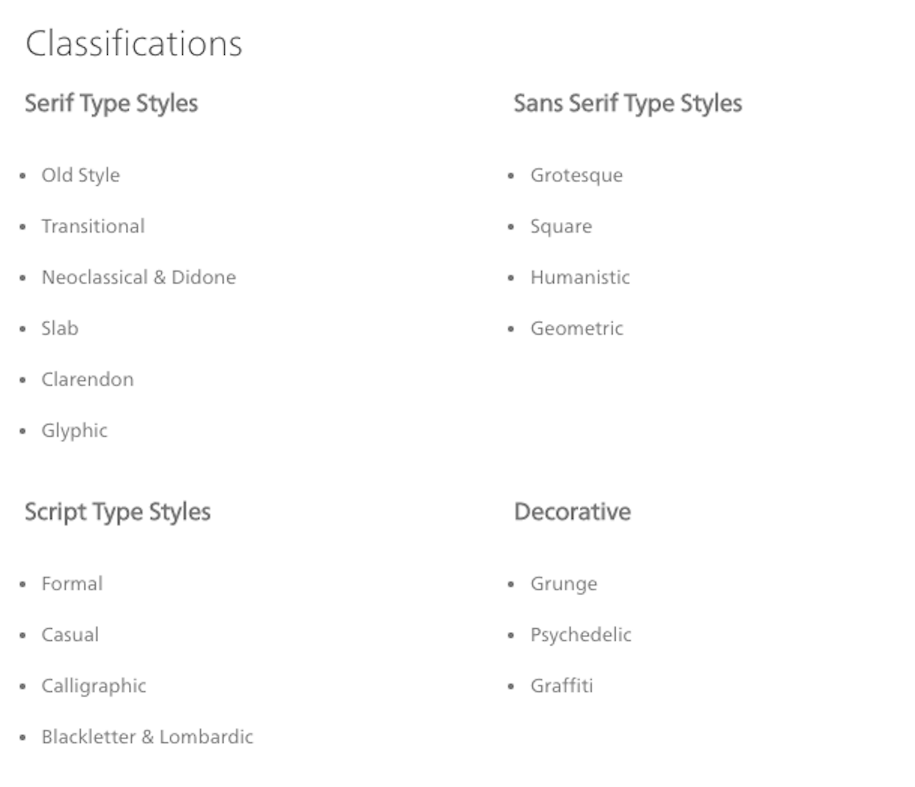
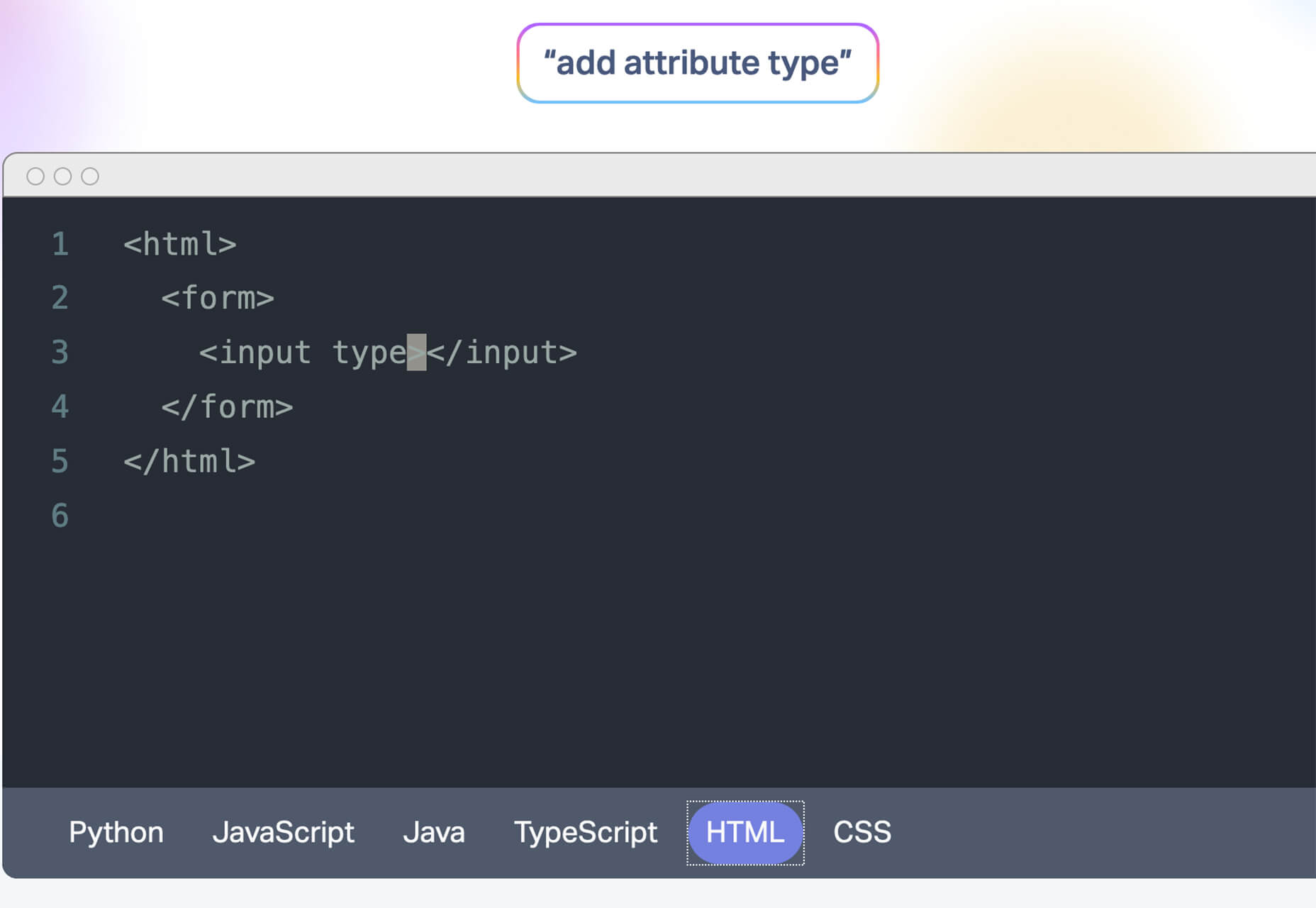
If the previous D/D/A is even part-way competent then the CSS and JavaScript on the web space is minified. Minified CSS is not too problematic and can be unminified fairly easily, but you do not want to be unpicking a minified JavaScript file — I once had a project in which a developer had minified his own code in the same file with all of his dependencies, including both Vue and jQuery [yes, I know].
Dealing with frontend source code can take on an additional dimension if you discover that the previous D/D/A used techniques you don’t — using Less instead of Sass, or writing scripts in TypeScript.
Unminifying CSS & JavaScript
Unminifying (or beautifying, or prettifying) code is reasonably easy. There are tools online that will help, including Unminify, Online CSS Unminifier, FreeFormatter, JS Minify Unminify, and more. You’ll also find plenty of extensions for code editors including HTML-CSS-JS Prettify for Sublime Text, and Atom-Beautify for Atom. You’ll find that some editors have the functionality built in.
A word of warning: code beautification does not restore comments, and in the case of JavaScript, does not unobfuscate variable names. Beautifying code is no substitute for a copy of the original, unminified source code.
Emergency Measures
If unminifying the source code isn’t possible for any reason, or more likely, the unminified JavaScript still looks like minified code — albeit nicely formatted minified code — then your last resort is to import the code and override it where necessary.
The first thing to do in this case is to explain the situation to your client. Make sure they understand this is a temporary patch that you’ll iron-out as you rebuild parts of the project.
Then, copy and paste the old minified code into a fresh project setup. For CSS that probably means creating a legacy.scss file, including the old CSS, and importing it into your own Sass. For JavaScript, create a legacy.js file, add all the old JS, and import that.
This will result in a much bigger set of files than necessary, you may end up using !important in your style declarations [yuck], and you’ll trigger lots of Lighthouse warnings about surplus code.
However, in the likely event that your client has a long list of changes they wanted live yesterday, this dirty hack will give you a working site that you can then rebuild piece by piece over time.
Assets
Assets normally means images, and images can normally be grabbed via FTP.
Occasionally — although less occasionally now image files rarely contain text — you’ll need the source files to make changes to images.
Whether or not the client has them, or if the previous D/D/A will hand them over, depends largely on the agreement between the client and the previous D/D/A.
Most businesses are reasonably aware of the importance of brand assets, so you’ll probably find they at least have a copy of their logo; whether it’s an SVG or a JPG is another matter entirely. Impress upon them the importance of locating those files for you.
Third Party Code
It is rare to receive a project that doesn’t rely on third party code. That third party code is probably entwined in the custom source code, and unpicking it is a time-consuming job.
It is very likely the previous D/D/A used a library or framework, and given the increasing number of them, it’s even more likely that the library or framework they used is not the one you prefer.
Whether you choose to unpick the code and swap out the previous D/D/A’s dependencies for your own preferences (usually faster in the long term), or whether you choose to work with what you’re given (usually faster in the short term) is entirely up to you.
In my experience it’s no hardship to pick up another CSS library; switching from one JavaScript framework to another is a substantially bigger job involving not just syntax but core concepts.
Beware Build Environments
Everyone has their own way of doing things. Some D/D/As embrace build environments, some do not. Some build environments are simple to use, some are not. Some build environments are adaptable to your process, some are not.
Unlike adopting a library, or even a framework, adopting a new build process is rarely a good idea
Build environments are numerous — Gulp, Grunt, and Webpack are all popular — and D/D/As are almost as opinionated about them as they are about CMS.
In lieu of raw files, it’s not uncommon for the previous D/D/A to tell you to “just run such-and-such CLI” command, to match up your local environment to theirs. Unlike adopting a library, or even a framework, adopting a new build process is rarely a good idea because you’re relegating yourself from expert to novice at a time when you’ve yet to earn your new client’s trust.
Stand your ground. Their approach failed, that’s why you’ve been brought in. You do you.
Who is Licensed?
Any third part code that has been paid for is licensed. Always check who holds these licenses. As well as being legally required, valid licenses are normally required for updates, bug fixes, and in some cases support.
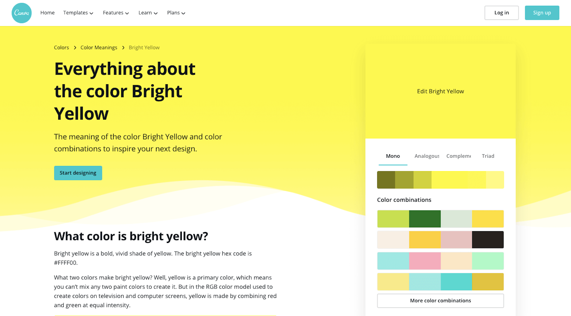
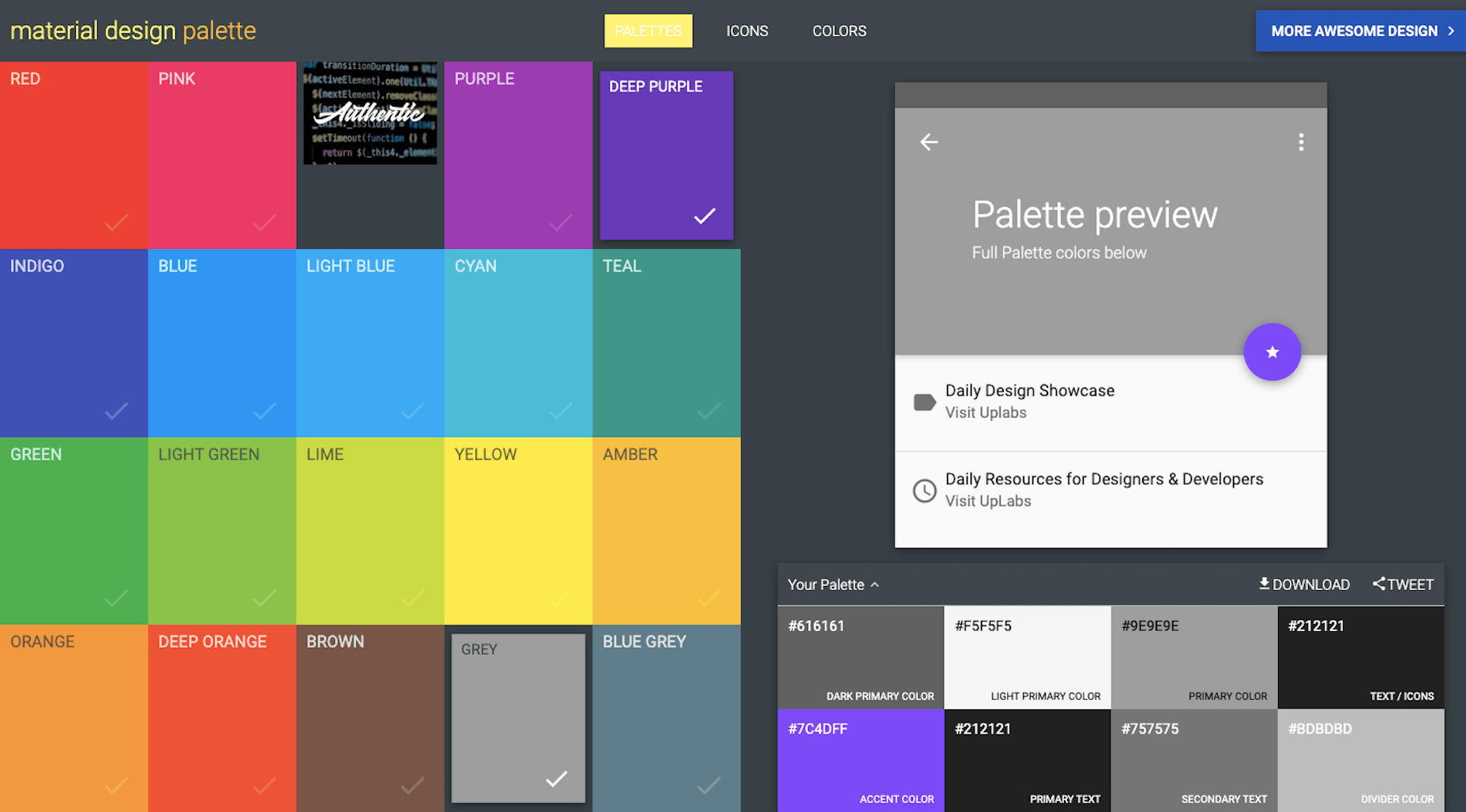
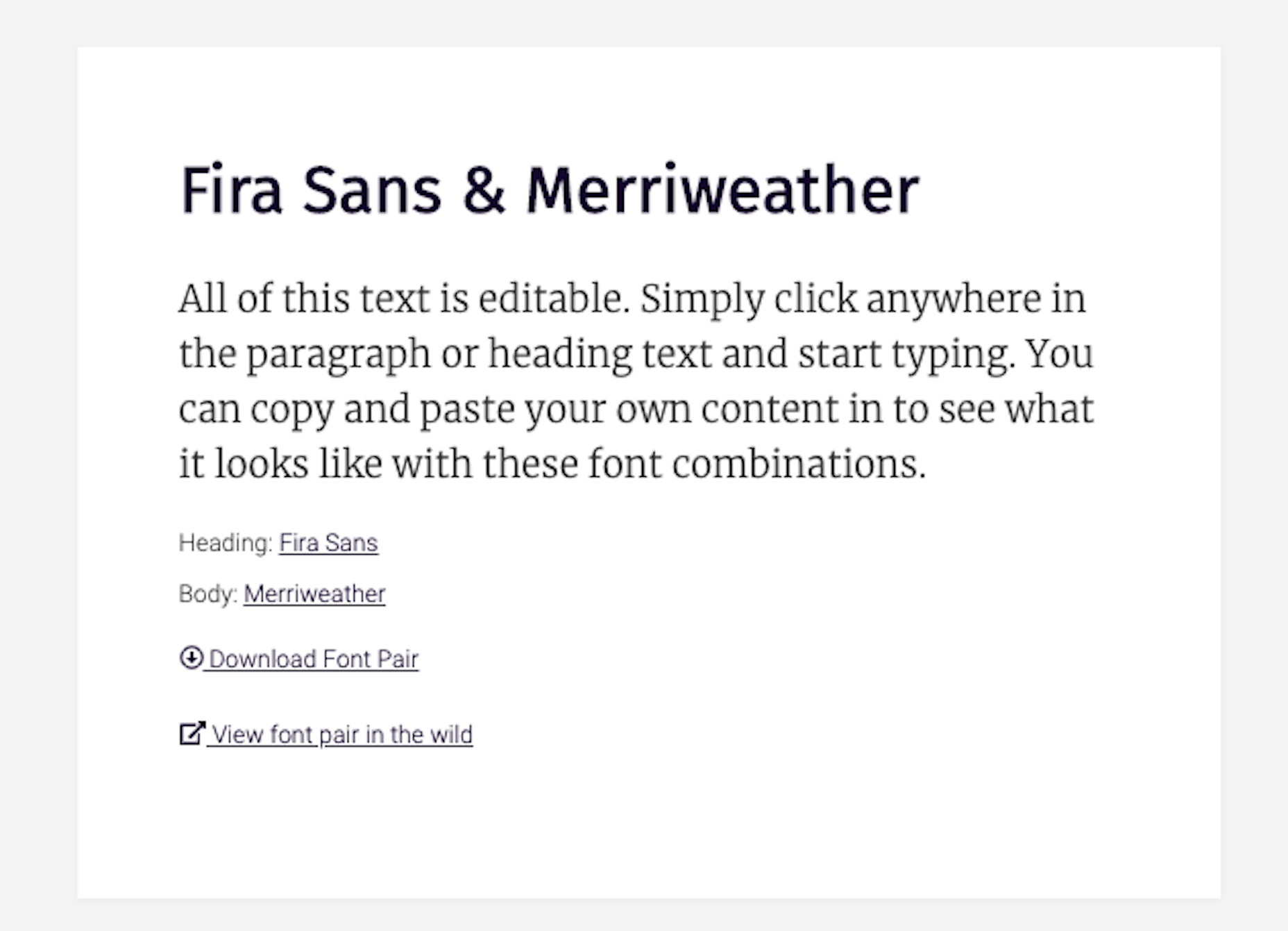
Common pitfalls include: font licenses (which may be licensed under the previous D/D/A’s Creative Cloud, Fontstand, Monotype, etc. account); stock image licenses (which may be licensed for use by the previous D/D/A alone); and plugins (which are frequently bulk-licensed to D/D/As in bundles).
It’s depressingly common to find clients using unlicensed assets. On more than one occasion I’ve had to explain to a client the potential consequences of using pirated fonts.
Fortunately it’s increasingly common for third party providers to attach a licence to a specified domain, which means you may be able to claim the licence on behalf of your client. Major suppliers like CMS and ecommerce solutions frequently have an option for the previous developer to release a licence and allow you to claim it.
In the case of licensing, if you’re unsure, do not be afraid to reach out to the third party provider and check with them if your client is licensed once they break ties with their previous D/D/A.
The only thing that sours a client relationship faster than telling them they need to buy a license they thought they’d already paid for, is telling them they’re being sued for copyright infringement.
Protect your client, and protect yourself, by making sure everything is licensed properly. If you can get something in writing to that effect from the previous D/D/A, do.
Who Has the Research and Analytics?
One of the major benefits of taking over a site, as opposed to building from scratch, is that you have a measurable set of site-specific data to guide your decision making.
This only applies if you have the data, so ask to be added to the client’s analytics account.
There’s a strong chance that the design research carried out by the previous D/D/A is considered an internal document, not a deliverable, by the previous D/D/A. Check with your client: if they paid for the research (is it specified on an invoice?) then they’re entitled to a copy.
We Have a Blog Too…
Clients have a tendency to use the term “website” as a catch-all term for everything digital.
When you take responsibility for a website, you’re almost always expected to take responsibility for any digital service the client uses. That means, newsletter services like Mailchimp, customer service accounts like Intercom, and 227,000 page WordPress blogs that they forgot to mention in the initial brief.
Repeat the whole of Step 2 for every additional app, micro-site, blog, and anything else the client has, unless you are expressly told by the client not to.
Step 3: The Point of No Return
Up until now, you haven’t asked the client to sign on the dotted line. This whole process is part of your due diligence.
By checking these things you can identify unforeseen problems, and potential costs. Are you tied to an obscure build process? Do you need to relicense the CMS? Do you need to recreate all of the site assets?
Some of these conversations are hard to have, but the time to have them is now
If there is any question of the project being more complex than anticipated, have an honest conversation with your client — they will appreciate your transparency, and they’ll appreciate being kept informed. Any client who doesn’t value a clear picture of what they’re paying you for, isn’t a client you want.
Some of these conversations are hard to have, but the time to have them is now, not three months down the line.
This is the point of no return. From this point on, any problems aren’t the previous D/D/A’s, they’re yours.
Change the Passwords
For every service you have, from the newsletter login, to the CMS login, to the FTP details, change the password. (Make sure you notify the client.)
Set Up a Staging Site
You’re going to need a staging site so your new client can preview the work you’ve done for them.
Set the staging site up immediately, before you’ve made any changes to the code. In doing so you’ll discover early on if there are files missing, or issues with the files you do have.
Successfully Transitioning a Project
When a client commissions a site from scratch they are filled with expectation. The fact that they are leaving their previous D/D/A and seeking you out demonstrates that their experience fell short of their hopes.
You now have a client with realistic — perhaps even pessimistic — expectations. You have a benchmark against which your work can be objectively measured.
When problems arise, as they invariably will, never try to blame the previous D/D/A; it was your job to assess the state of play before you started work. If there is an issue with legacy assets, you should have brought it to your client’s attention early on.
If you learn from the previous D/D/A’s mistakes, you won’t be handing the project on to someone else any time soon.
Featured image via Unsplash.
Source

Source de l’article sur Webdesignerdepot
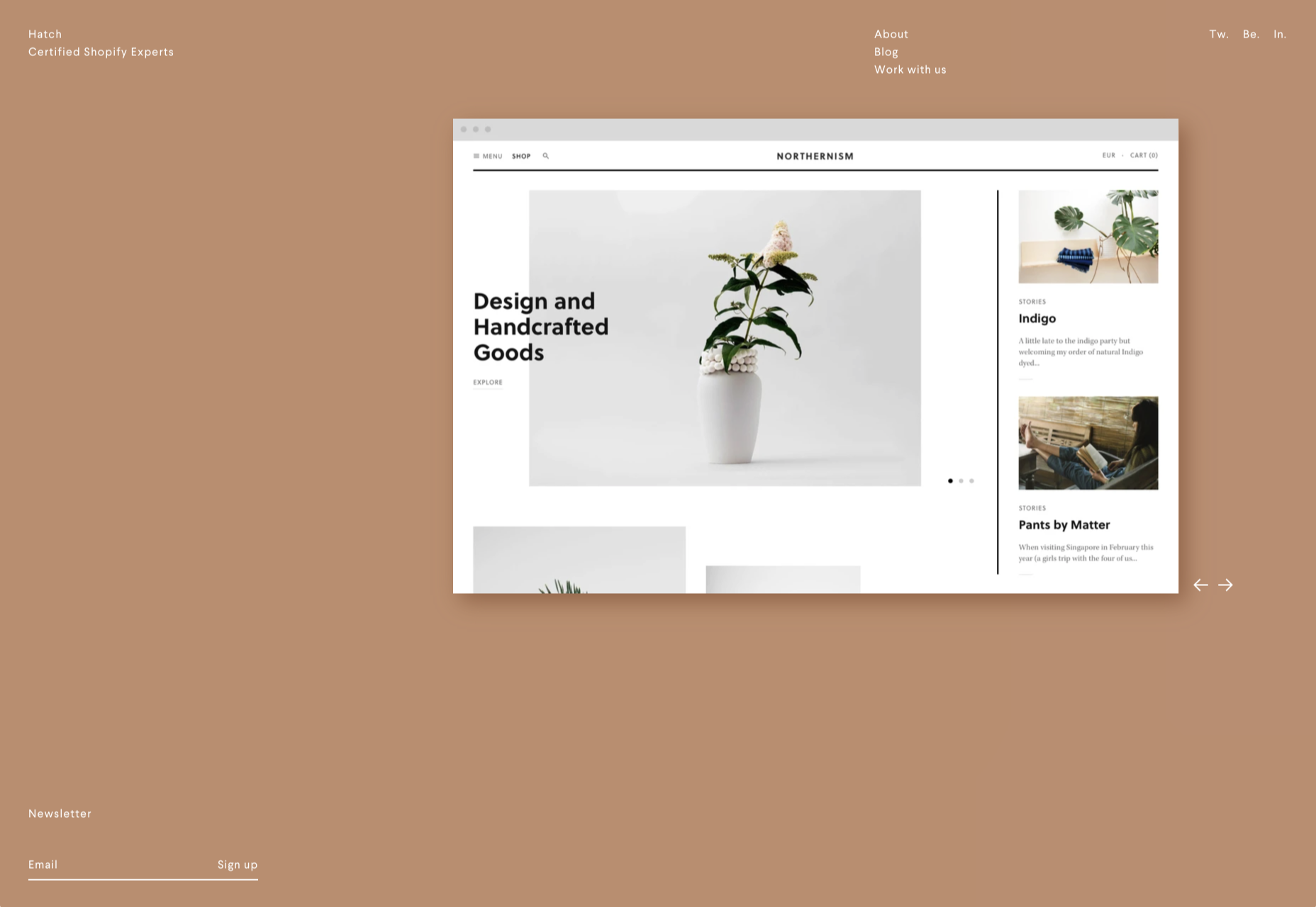
 Every week users submit a lot of interesting stuff on our sister site Webdesigner News, highlighting great content from around the web that can be of interest to web designers.


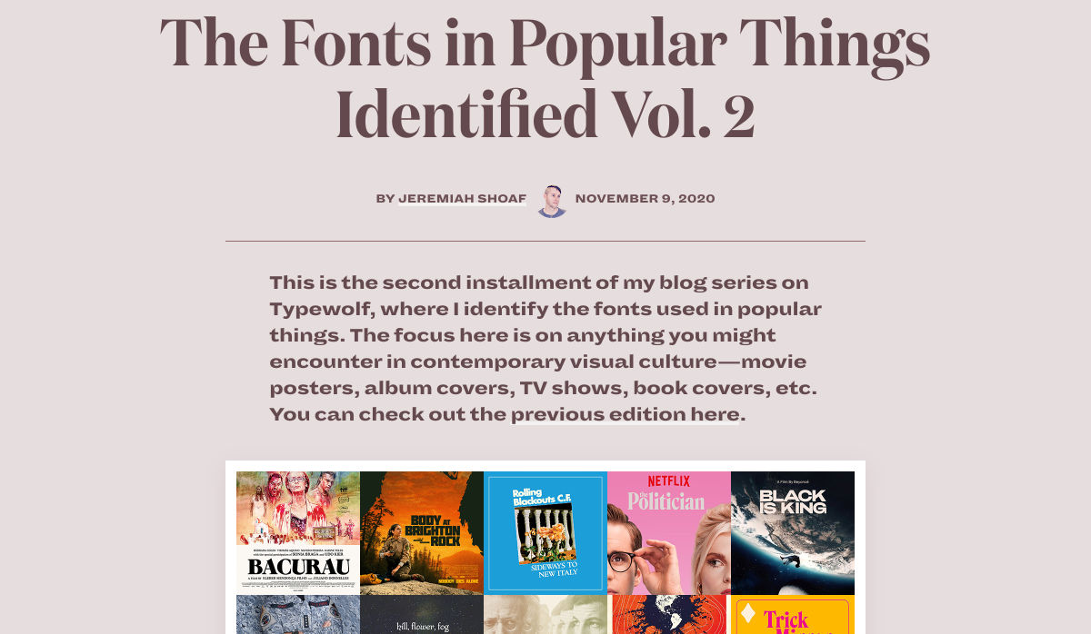


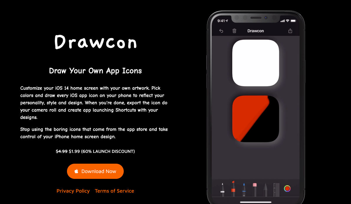
 There are so many things to think about when first starting a business. What will your business offer? How will this differ from existing solutions? Who will benefit most from your offering? And why are you so passionate about this?


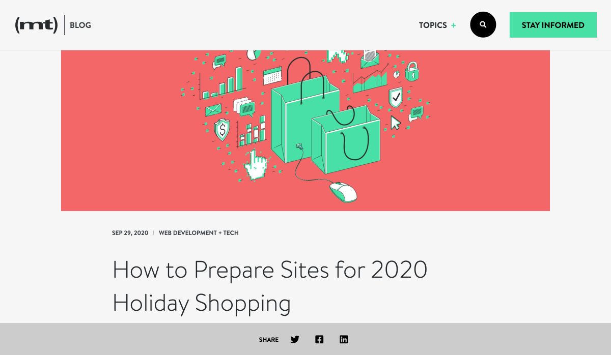
 As we turn the corner into the final part of the year, many of the new websites and redesigns that we see during much of the rest of the year tend to slow down. Many businesses are focusing on fourth quarter and holiday sales.


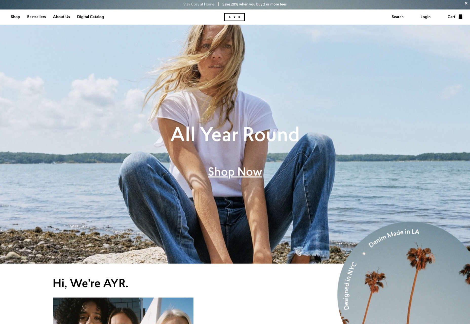
 Every week users submit a lot of interesting stuff on our sister site Webdesigner News, highlighting great content from around the web that can be of interest to web designers.


 Today, great design isn’t just about conveying the right amount of information in a certain number of pages.

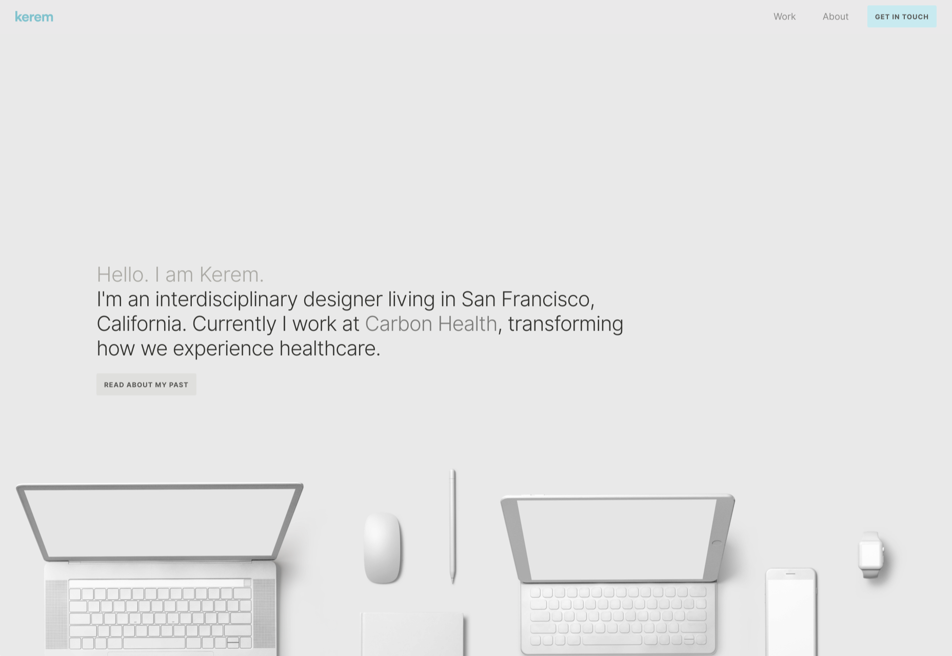

 Every week users submit a lot of interesting stuff on our sister site Webdesigner News, highlighting great content from around the web that can be of interest to web designers.


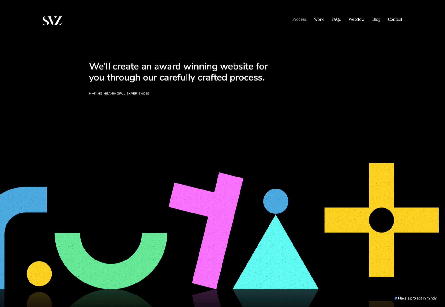
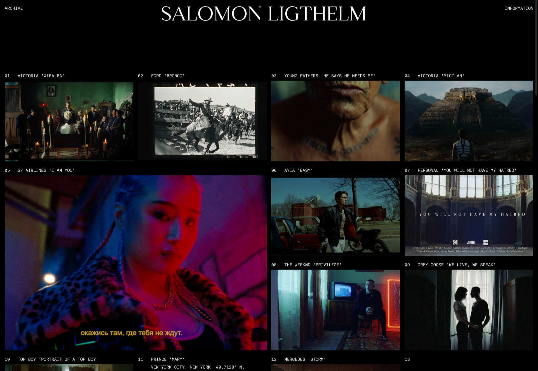
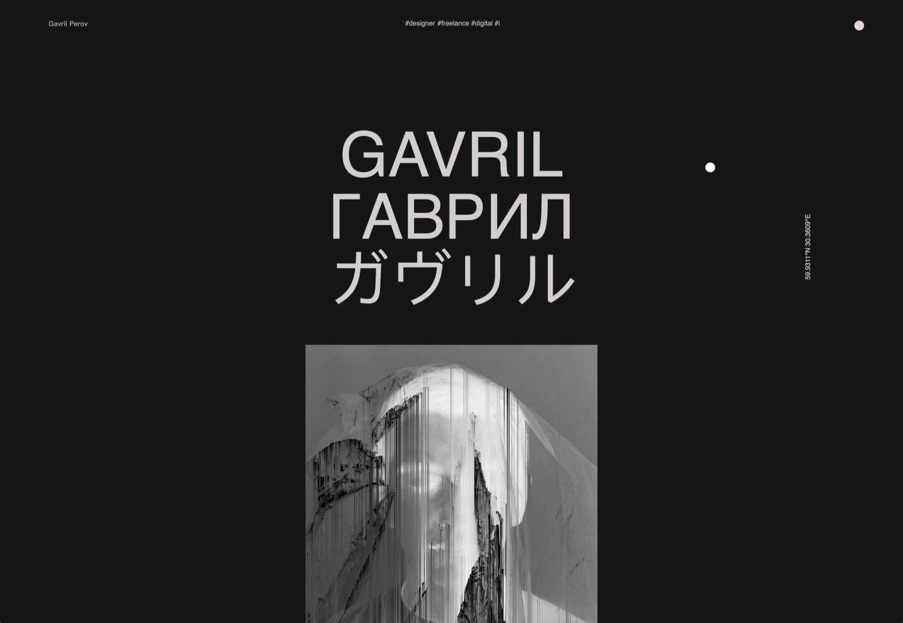
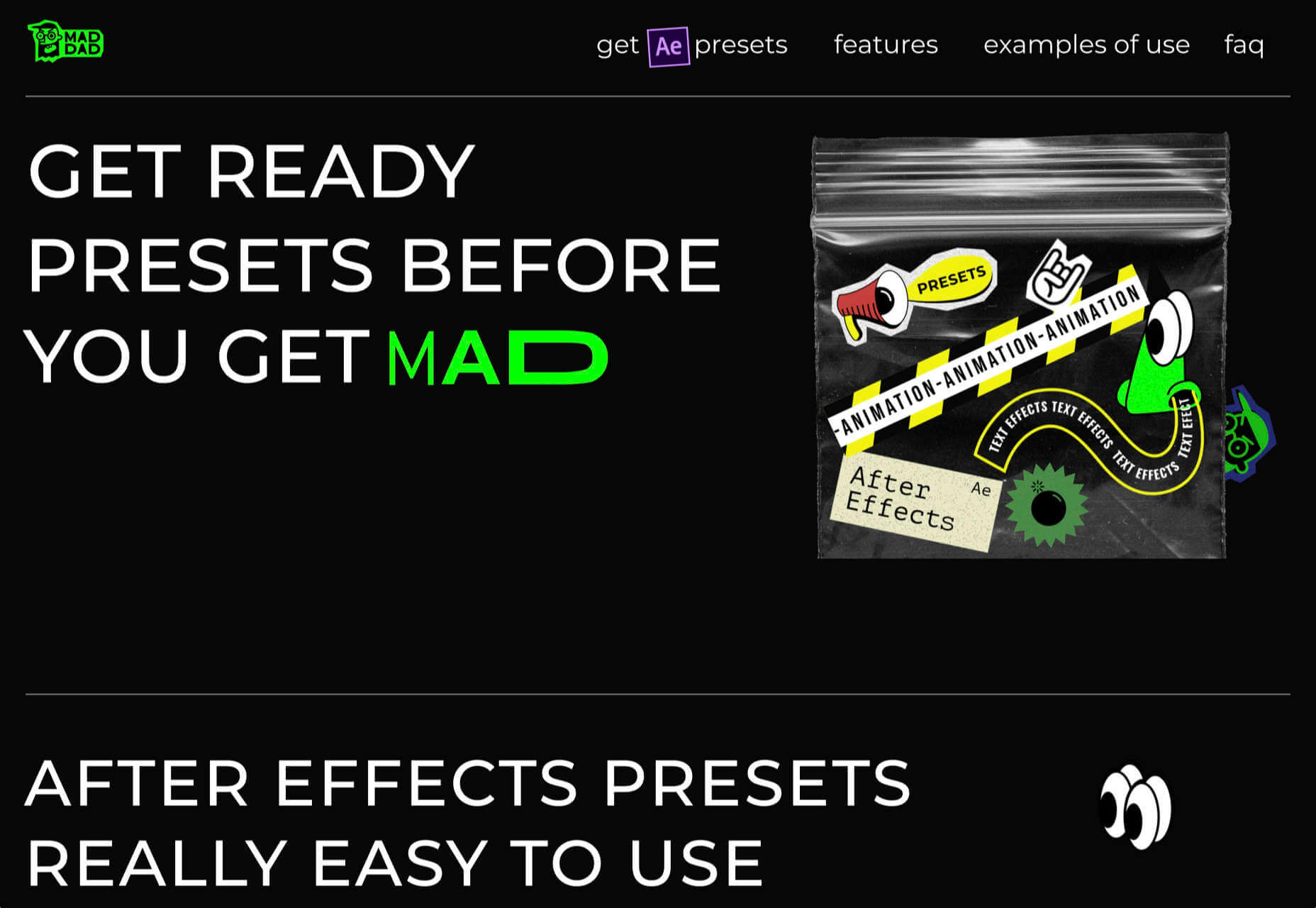
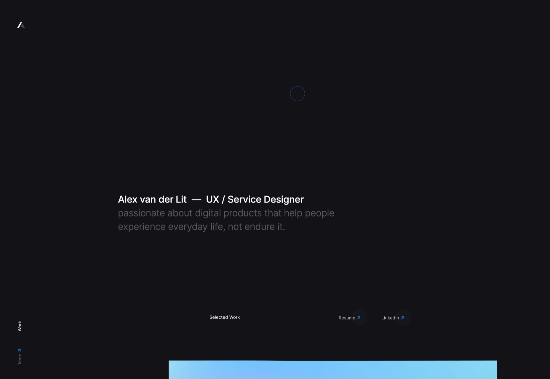
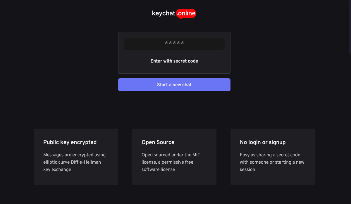
 Dark themes are everywhere these days.


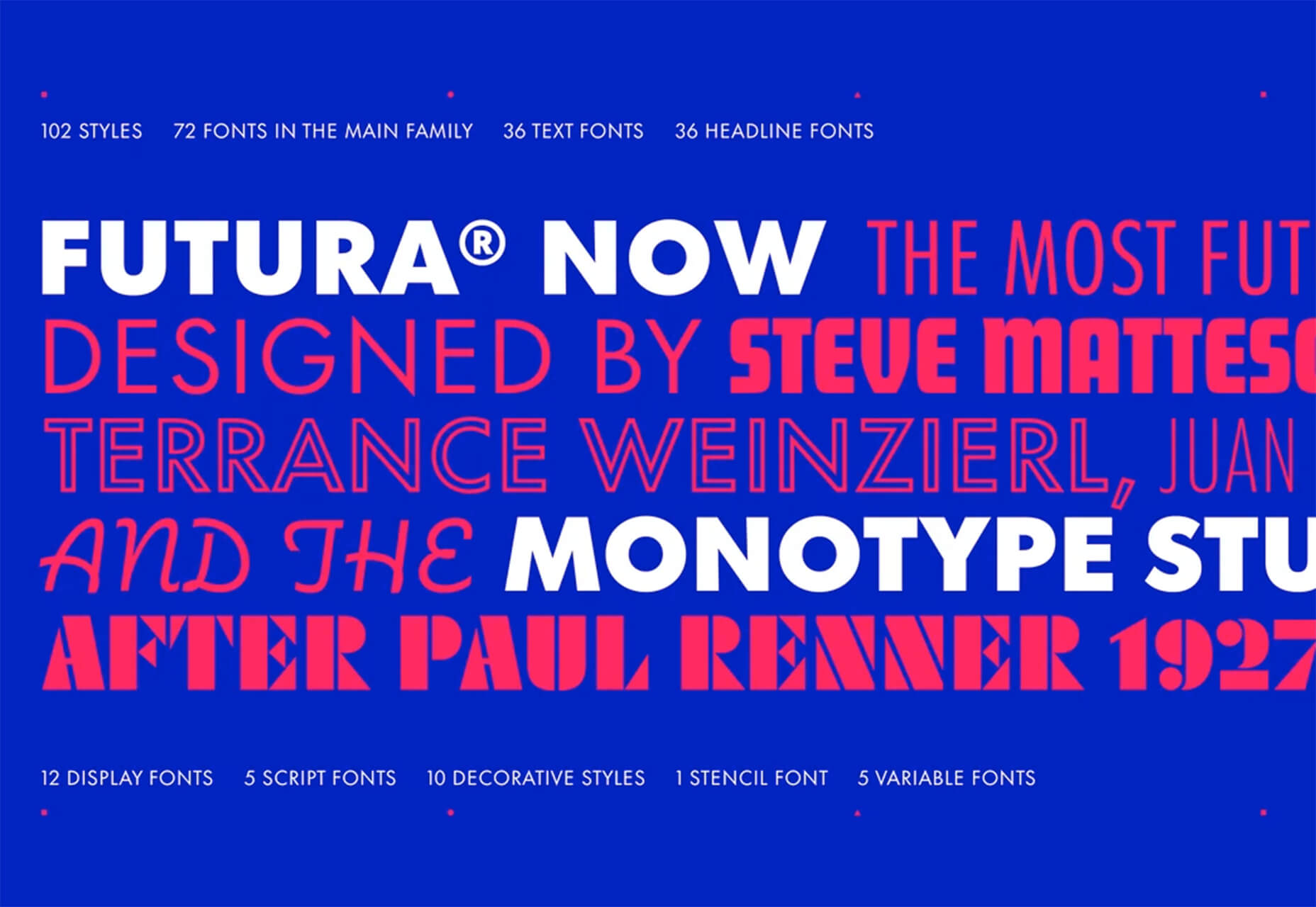
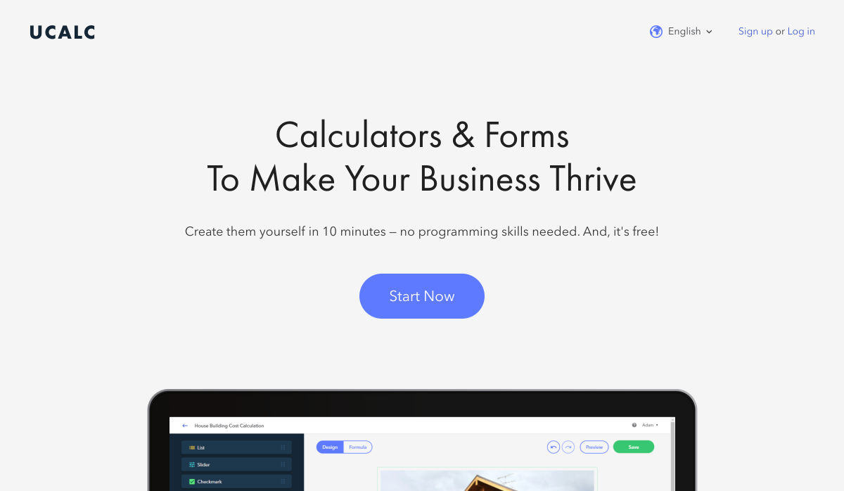
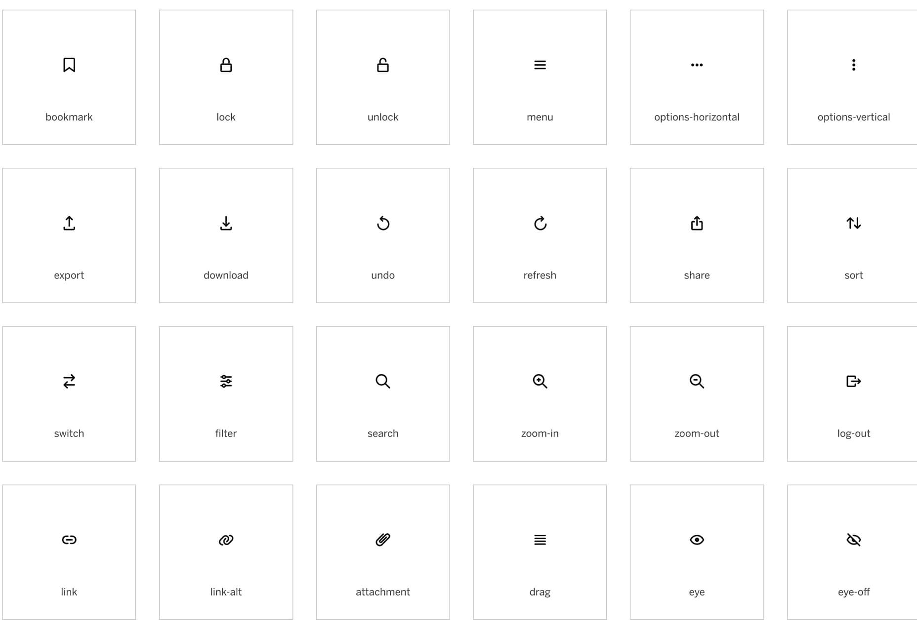
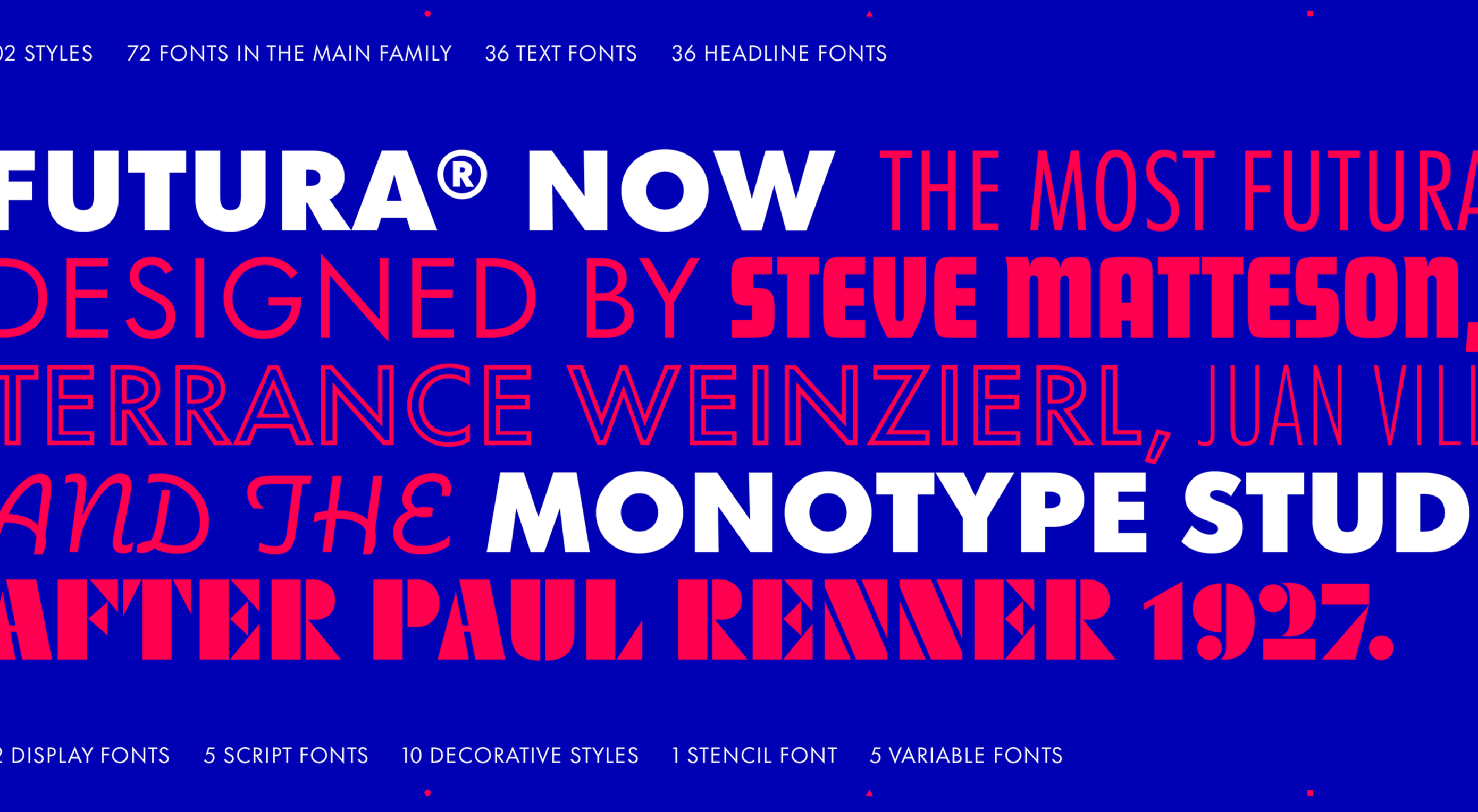 This month’s collection of new tools, resources, and freebies for designers is a smorgasbord of sorts. You’ll find everything from useful APIs to icons to tutorials to fonts.
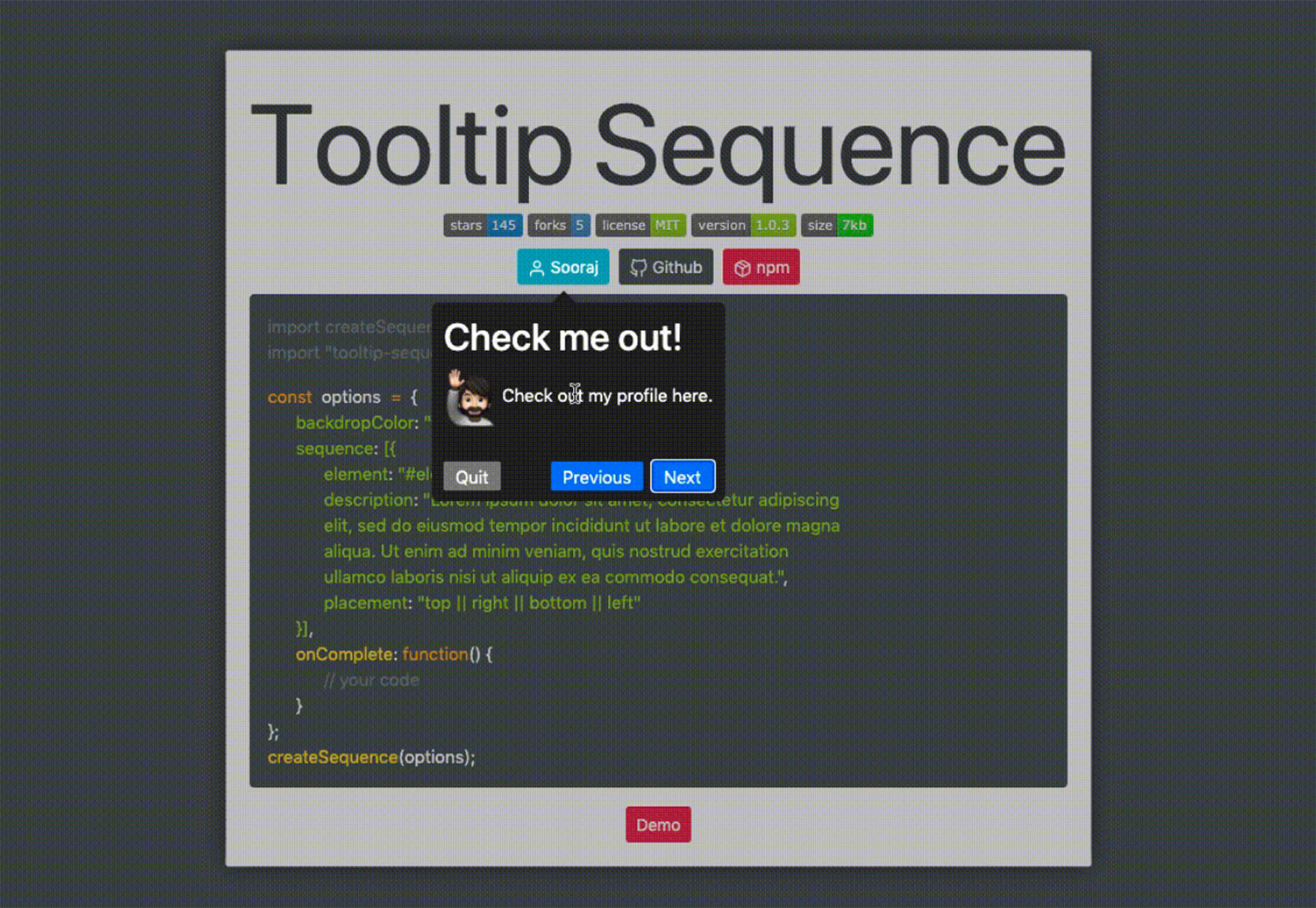


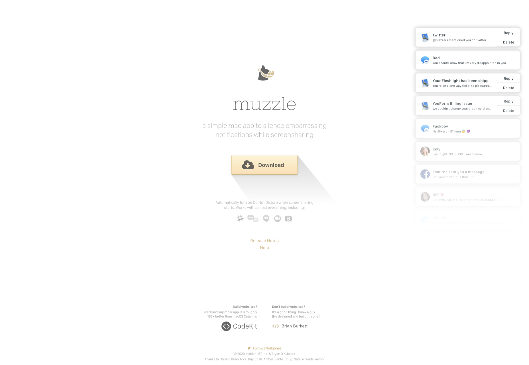
 Every week users submit a lot of interesting stuff on our sister site Webdesigner News, highlighting great content from around the web that can be of interest to web designers.


