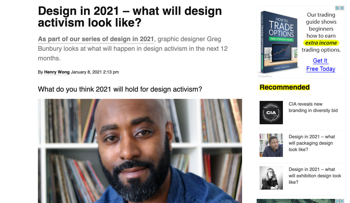
 By the end of the year, the number of global smartphone users is expected to reach 3.5 billion. That’s a significant 9.3% increase over the last 12 months.
In a world where everyone is constantly connected to their mobile devices, it makes sense that web developers and designers would need to consider new rules for how they create engaging experiences. After all, most of us find browsing from our smartphones to be much more convenient than sitting down at a laptop each day.
With a little luck, you’re already taking steps to mobile optimize your website but standards are changing all the time. To make sure your website is up to scratch, here’s your guide to prioritizing your site for mobile, ready for the new year.
Understanding Mobile-First Design
The first step in updating your web design and development principles, is understanding the concept of mobile first design, and how it’s changed.
With a responsive website, you create something that adjusts to the screen size of any device; with a mobile-first site, you’re focusing first-and-foremost on the user experience that people get when they’re on mobile, taking that as your starting point, and building from there. Instead of building your website for the desktop and using mobile as an afterthought, you start with a consideration of mobile.
Even Google is highlighting the demand for this process lately, with the mobile-first indexing algorithm. If you can’t design for mobile-first, then you could risk your clients being unable to rise up the search engine ranks.
So, how do you get started?
1. Start With the Right Tools
Web developers and designers are nothing without a great toolkit.
The good news is that there are solutions out there that can help you to master the right skills for a mobile-focused user experience. For instance, Skeleton is excellent for small-scale projects that require fluid grids and minimal compiling.
Alternatively, Bootstrap can offer a one-size-fits-all solution for the front-end development for mobile devices. There’s a default grid system available, plenty of components, and JavaScript plugins to work with.
With the right tools, you can minimize and prioritize the content that’s most valuable for your website projects. This is crucial for maximizing website speed and creating clarity when it comes to content and imagery.
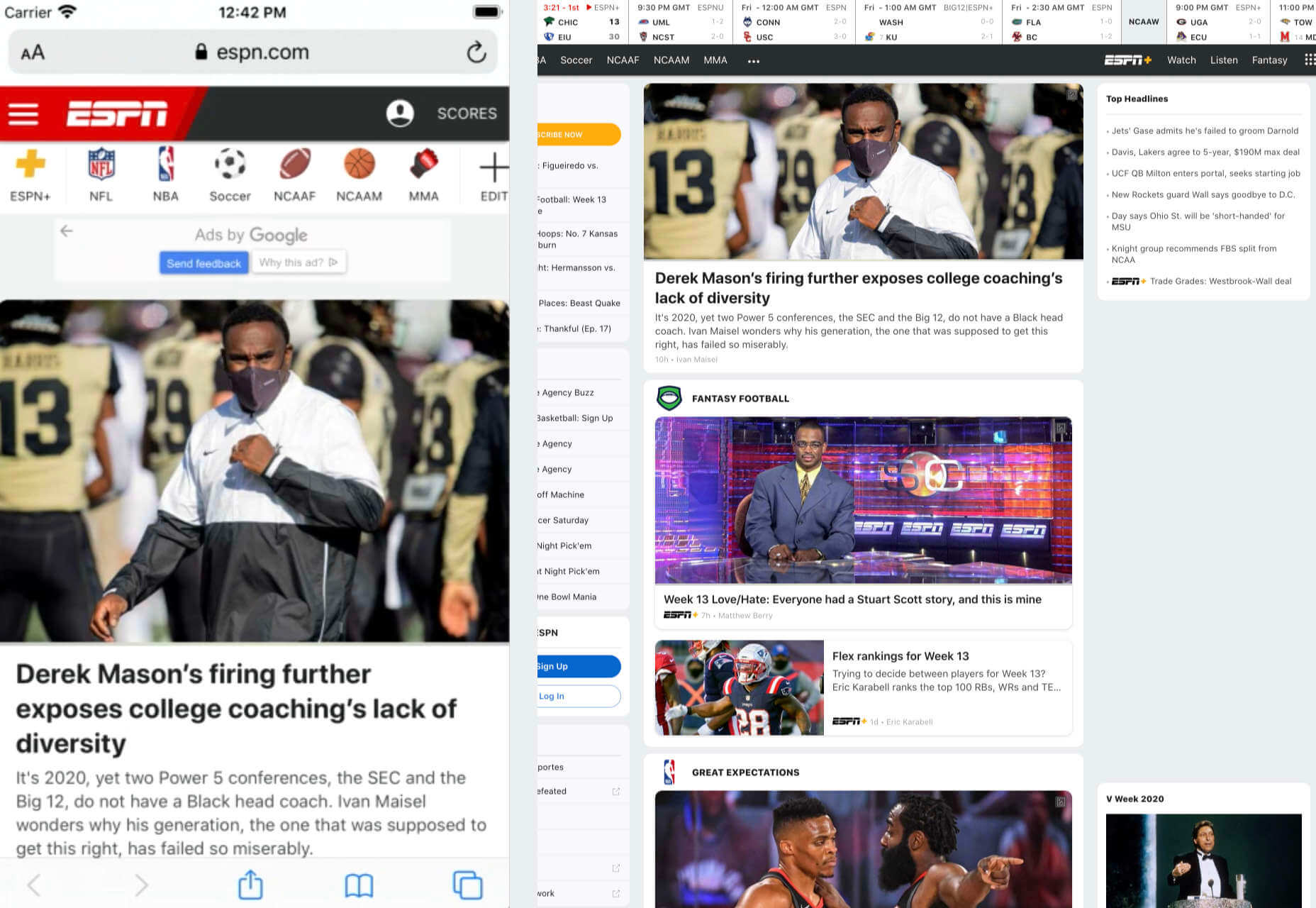
For instance, check out the ESPN website; it’s split into very easy-to-follow categories of content that are perfect for scrolling on a smartphone. The grid of videos makes it feel like you’re using a tool like YouTube.
2. Prioritize Mobile-First Elements
Once you have the right tools to assist you, it’s time to begin building your mobile-first website from the ground up. Rather than jumping straight into considerations of the latest design trends, it’s important to start with the foundations.
For instance, navigation within a mobile page is usually hidden under a hamburger button. However, you can take this concept to the next level too. For example, the Shojin mobile website only demonstrates the most important website options within the navigation bar to avoid overwhelming users.
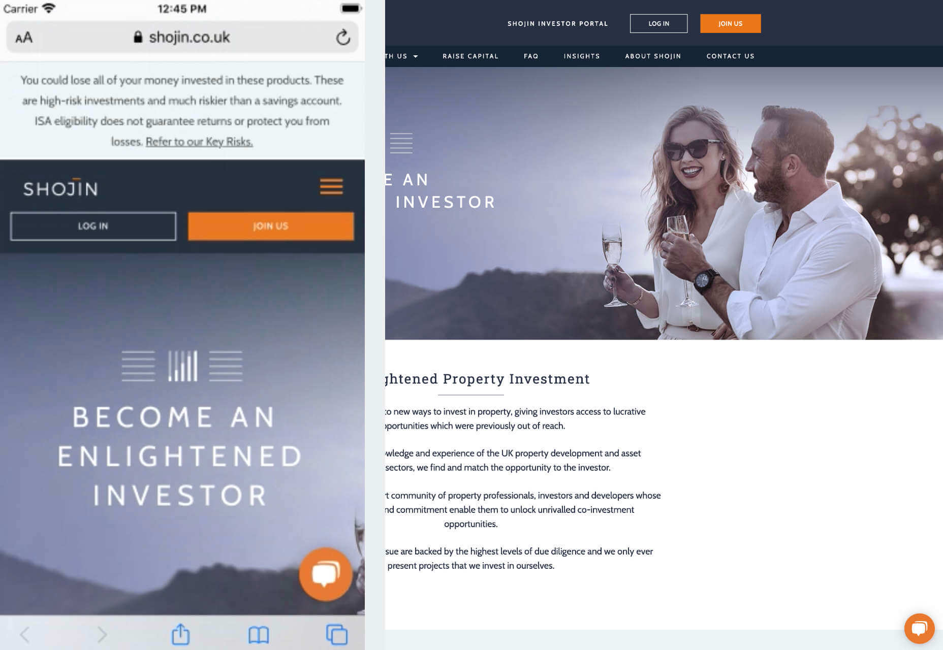
The key here is to keep things as simple as possible, without restricting what your audience can do when they visit your website. Although you want to keep the number of interactive elements on your site small, you also need to ensure that those elements are easy to find and use.
All buttons and CTAs should be clear and tappable. Fonts need to be large enough to read from any screen, and your navigation system needs to be 100% simple, without slowing anything down.
On average, we recommend making all clickable elements at least 48 pixels in height.
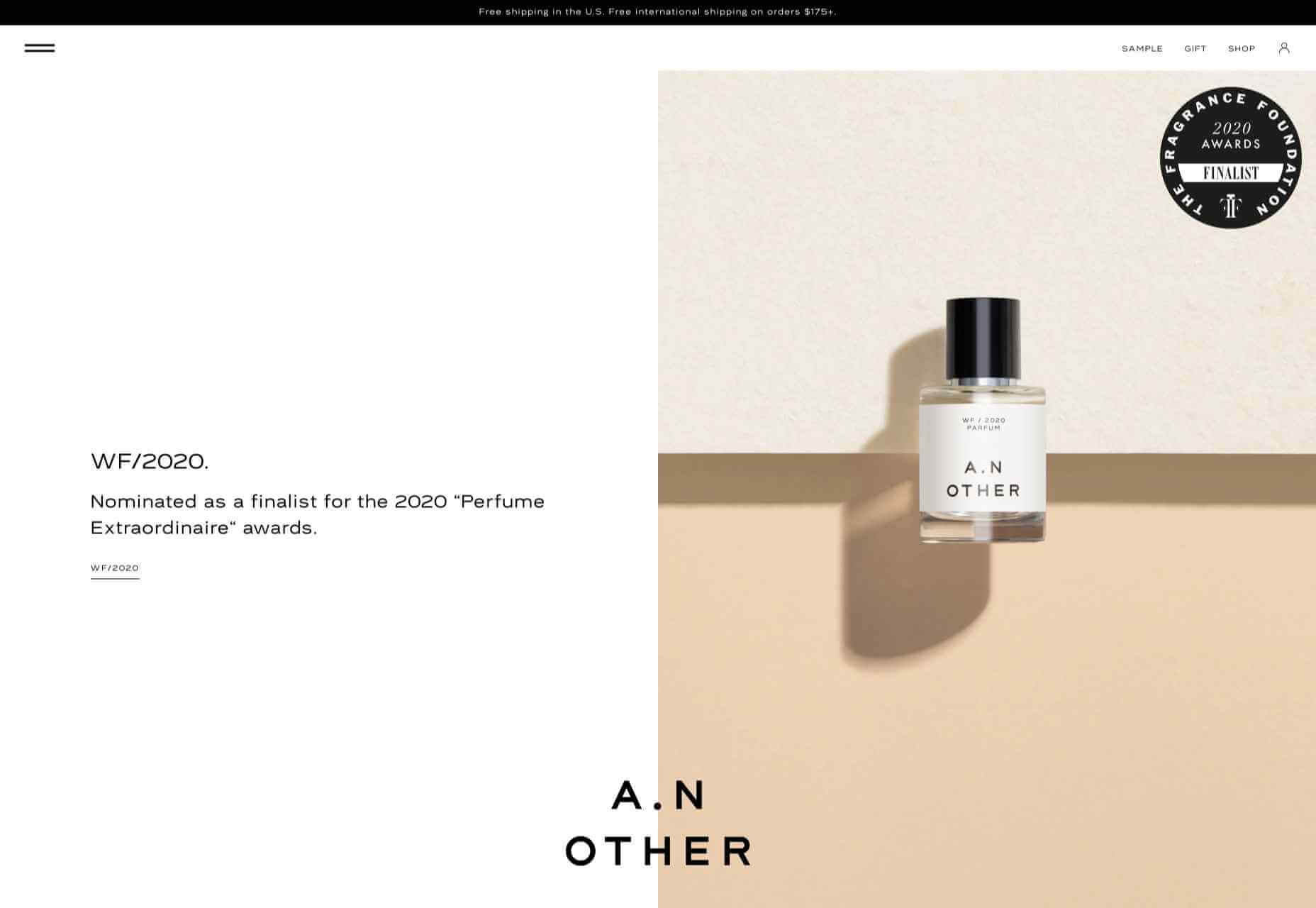
3. Use Responsive Imagery and SVGs
Images are a crucial part of any website. They add context and appeal to your design. However, they can also seriously slow down your website if you’re not careful.
Remember, different devices have different demands when it comes to imagery. A desktop page may need a 1200px wide image, while a mobile-only needs the image to be 400px wide at most. The old way of making your images work was to load a large resolution image and use the same file on every platform. Unfortunately, this slows downloading time significantly.
Instead, it’s better to have at least two different versions of the same image for your mobile and desktop solutions. You can also consider SVG.
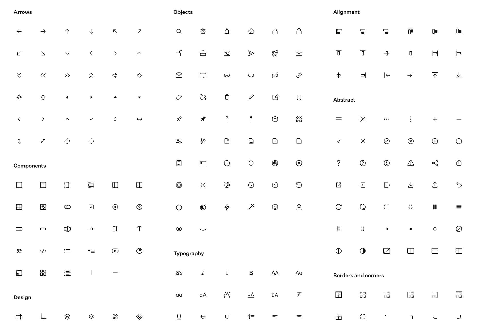
SVGs are incredibly scalable – more so than bitmaps. With SVG, you can ensure any icon or graphic continues to look sharp and clickable across all devices. Because these files are often smaller, your site loads quicker too! Hubspot is great at using SVGs.
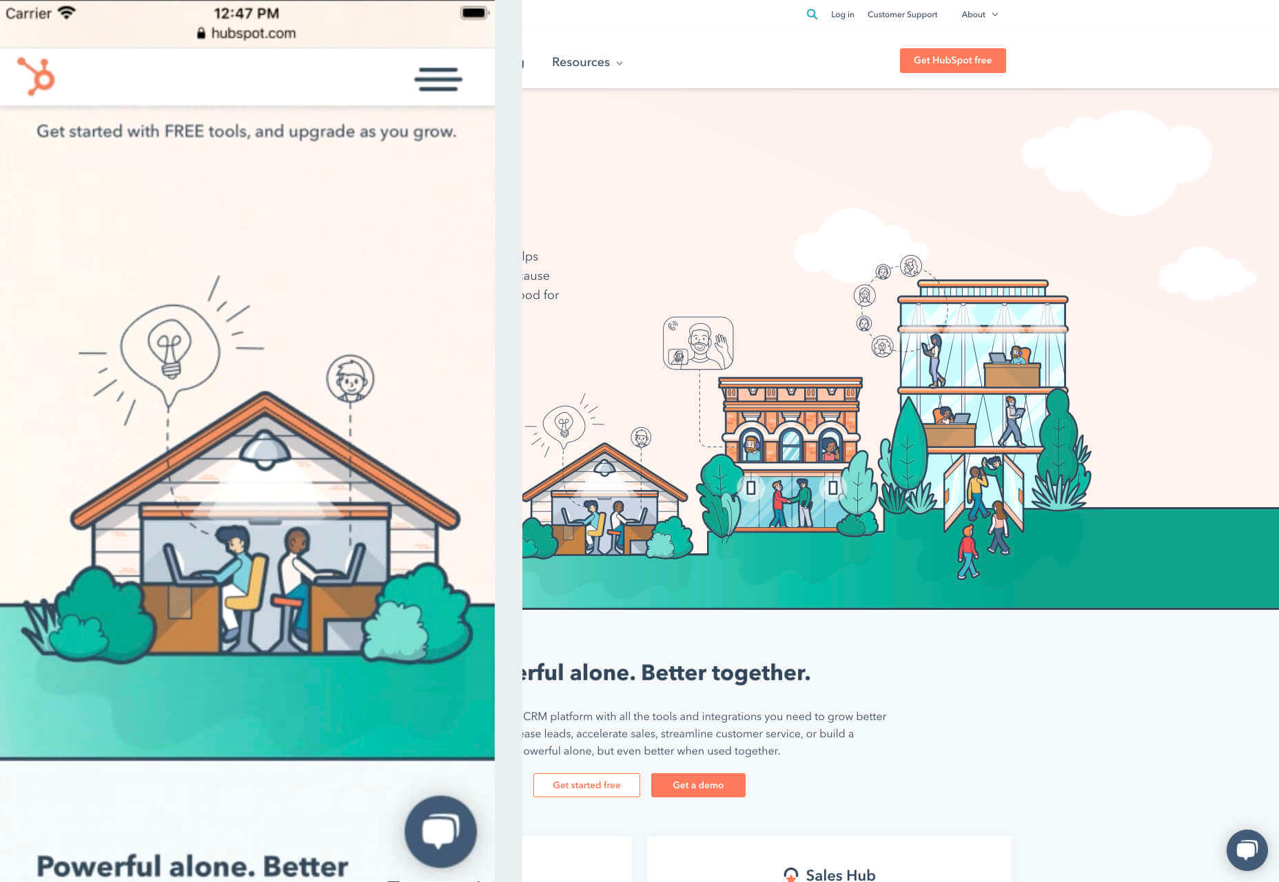
Intricate illustrations are a massive component of HubSpot’s brand. If those images were saved as PNGs or other alternative files, then they would take forever to load. Because they’re all SVGs, you can enjoy the same consistent experience across desktop and mobile.
4. Get the Typography Right
It’s not just the big graphics and images that make a huge difference to your website when it comes to mobile-first design. You also need to think about the legibility and clarity of your website across all devices and platforms. If people can’t read the value proposition of the company that you’re designing for, you’re going to have a major problem.
Focus on making your content as easy to read as possible. Look into the typefaces that seem most appealing on a range of devices.
Remember to balance the body and heading font sizes for the device size too. You’ll need to ensure that the experience feels consistent and smooth as your users scroll through each page. Just take a look at the mobile version of the IMPACT website, for instance.
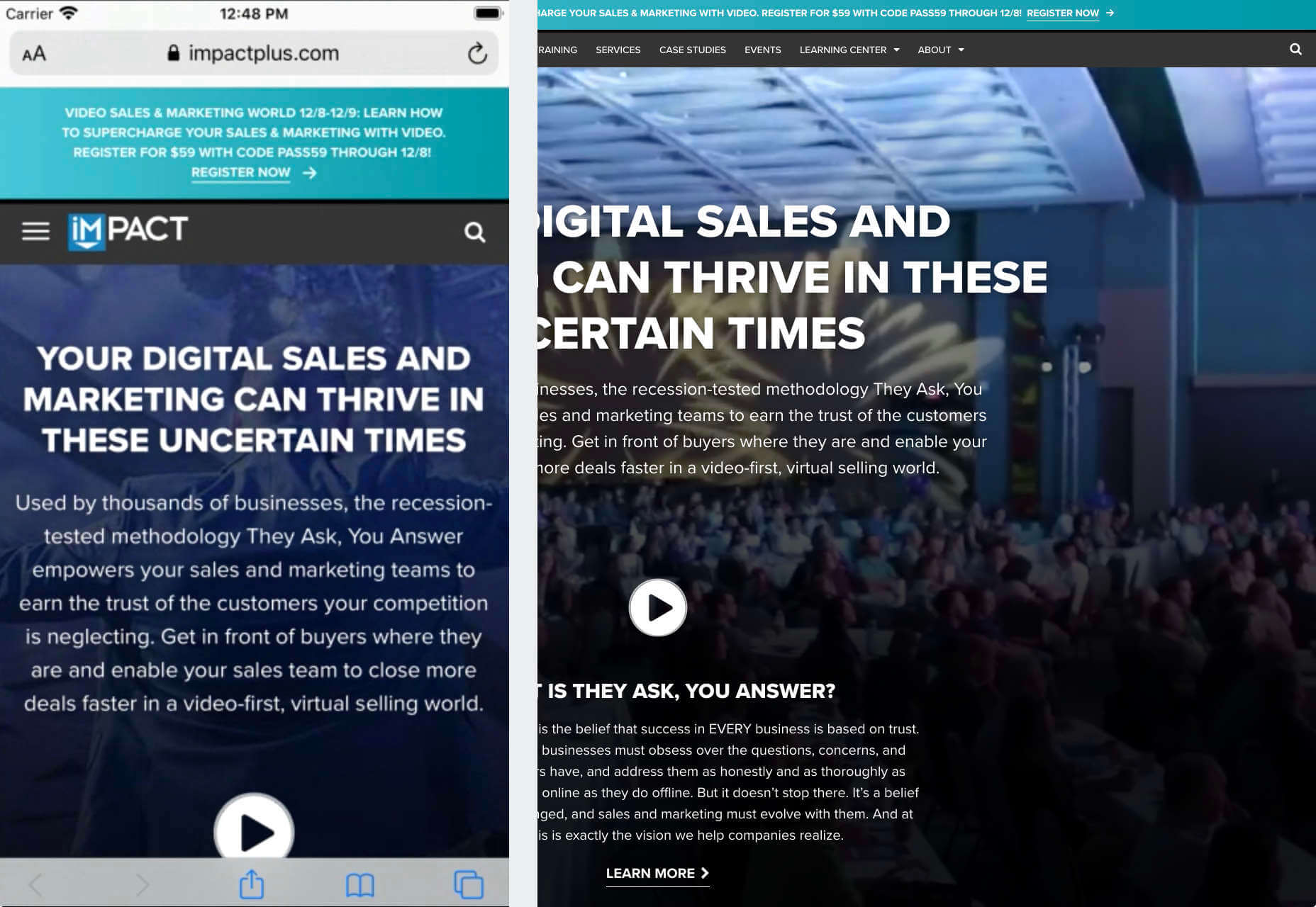
The headings aren’t as huge as they are on the desktop version of the website, and they’re displayed below, rather than above the featured image. However, this helps to give a more immediately eye-catching and structured experience to mobile users.
There’s even a handy “Search Engine Optimization” tag included, that users can click on if they want to find more related articles.
When it comes to typography, remember that it’s not just size and clarity that matter, but how things are structured throughout your website too. Your type should naturally guide your visitors along the page.
5. Master Available Device Features
Finally, on smartphones, you can accomplish a range of amazing things that you might not be able to do when using a desktop device. Your users can make calls, open apps, send messages, and more, all from within their mobile browser. They can also move their smartphone around a room, taking advantage of concepts like AR and VR.
Taking advantage of the unique capabilities that smartphone design can offer gives you a chance to get unique with your user experience.
Making the most of the mobile experience can be much simpler than you’d think. For instance, on a desktop site, you could list your phone number on a contact page. On a mobile site, the number can begin a call when clicked. You can also take the same approach with email addresses, and social media icons too.
Depending on how experimental you feel, there’s also plenty of opportunities to go above and beyond with your mobile features. You may decide to create a mobile app version of a website that your customers can download onto their phones.
Alternatively, you can look into things like AR technology. This could allow your users to practice placing items of furniture that they may be thinking of buying from an online retailer into their house, so they can see how well they work with their other interior design choices.
Making the Most of Mobile-First Design
Ultimately, having a responsive website that works on both mobile and desktop devices is mandatory in the modern world. However, going above and beyond with mobile-first design is a great way to get ahead of the game.
If you can focus on building a website that puts the experiences of mobile users first, then you can create something that’s much more likely to grab audience attention and deliver amazing experiences.
If nothing else, showing your clients that you have what it takes to design for mobile is an excellent way to ensure that you can gain as many new project opportunities as possible.
Source

Source de l’article sur Webdesignerdepot

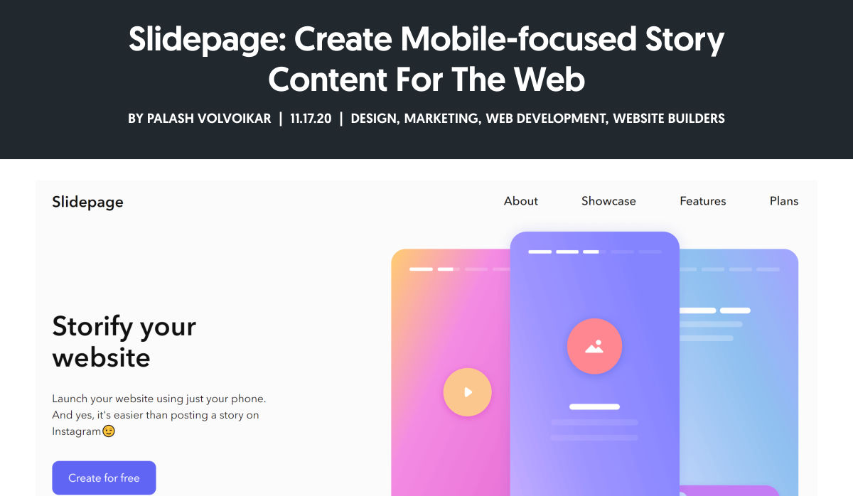
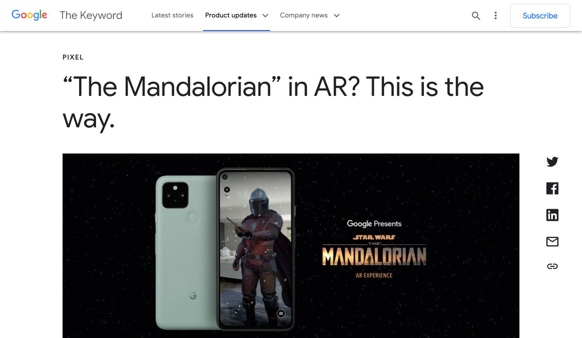
 Every week users submit a lot of interesting stuff on our sister site Webdesigner News, highlighting great content from around the web that can be of interest to web designers.

 Every week users submit a lot of interesting stuff on our sister site Webdesigner News, highlighting great content from around the web that can be of interest to web designers.
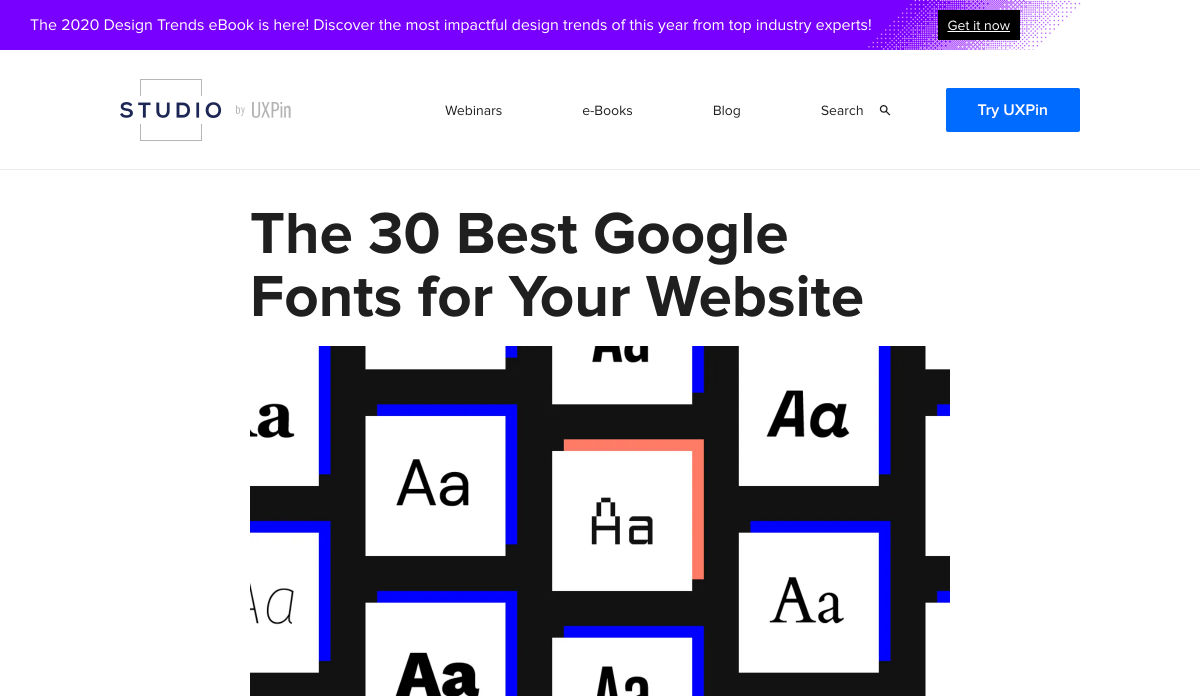
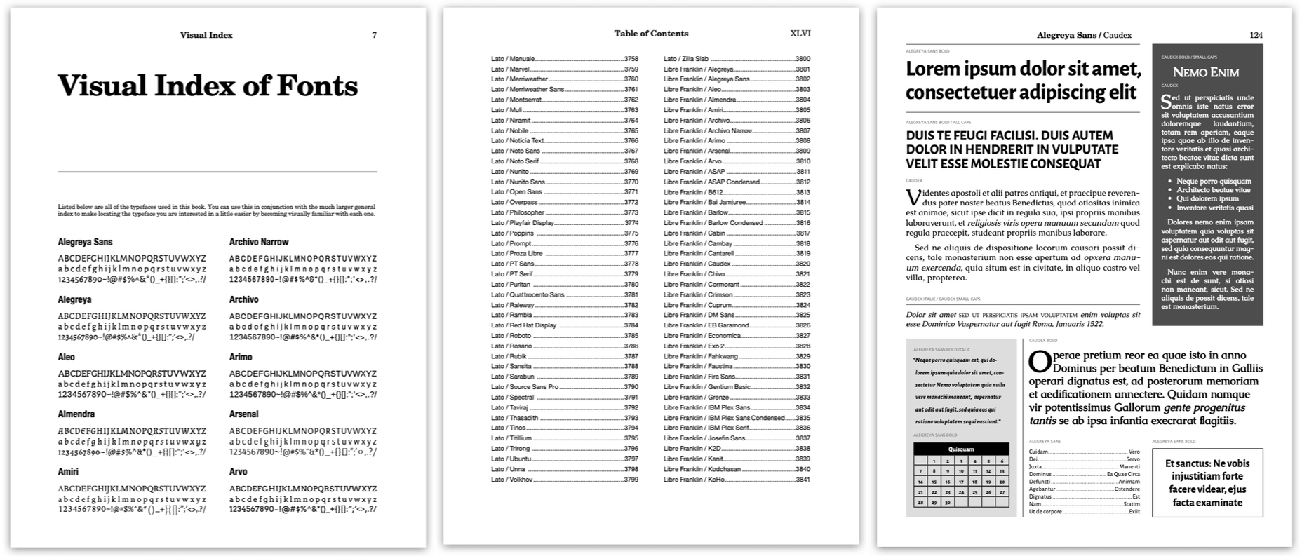
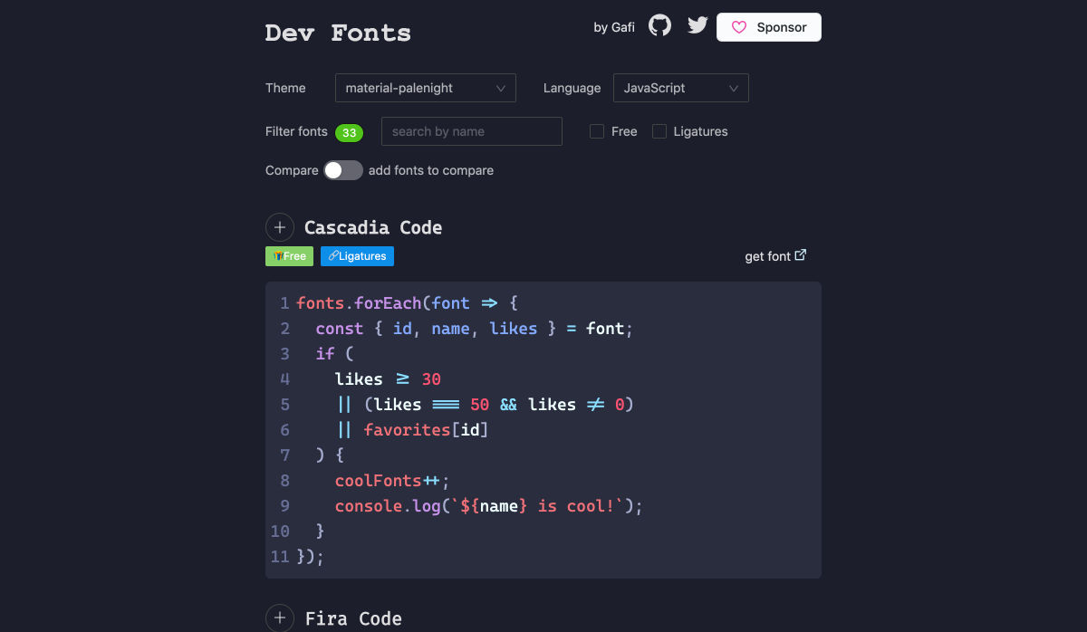
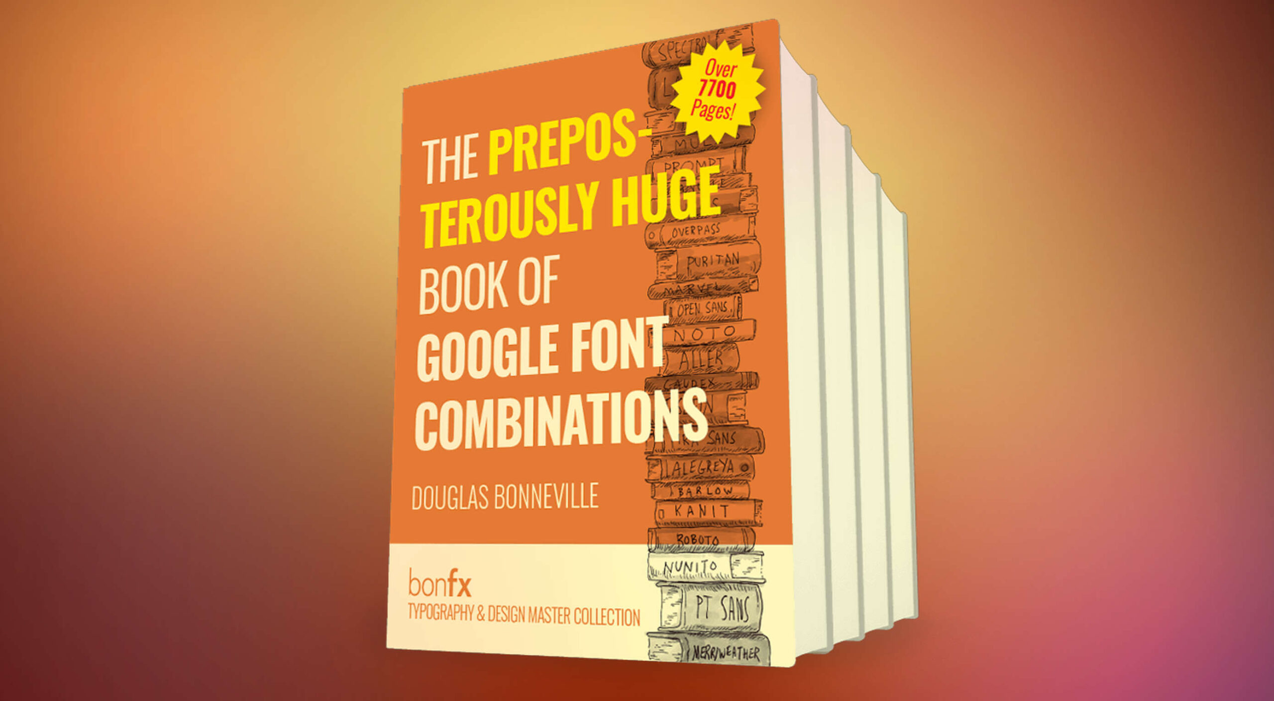 Google Fonts is one of the most useful tools designers have, with hundreds of amazing fonts provided for free. But if you just grab one of the top ten suggestions, you’re missing out on a vast wealth of typographic gems.
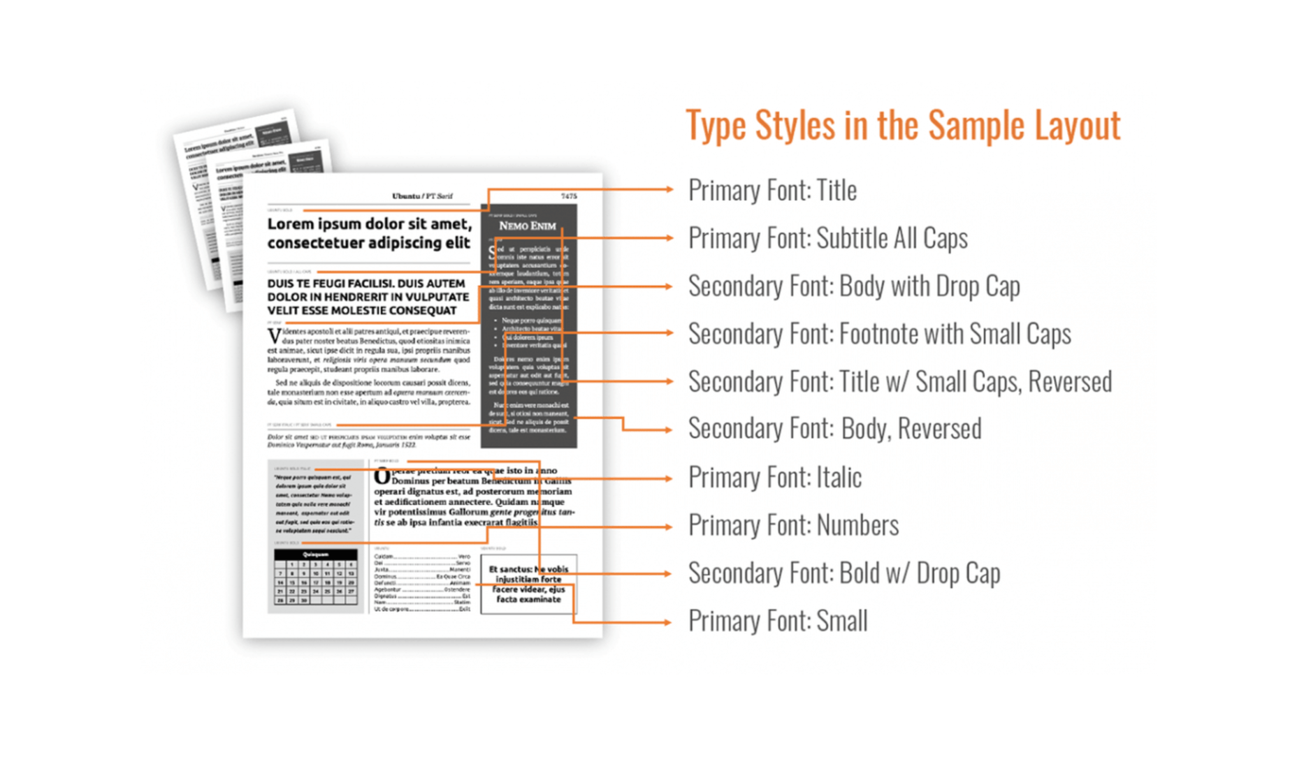

 Every week users submit a lot of interesting stuff on our sister site Webdesigner News, highlighting great content from around the web that can be of interest to web designers.


 Every week users submit a lot of interesting stuff on our sister site Webdesigner News, highlighting great content from around the web that can be of interest to web designers.

 Every week users submit a lot of interesting stuff on our sister site Webdesigner News, highlighting great content from around the web that can be of interest to web designers.
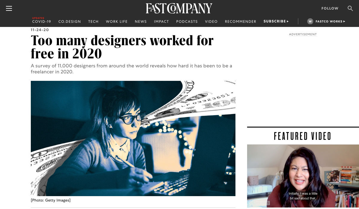

 As we approach our first winter holiday season since the pandemic set in, the world could feel like a very scary place; there is a great deal of uncertainty about the future for businesses, for young people in education, for jobs, for travel. Celebrations are certainly going to be a lot quieter this year.
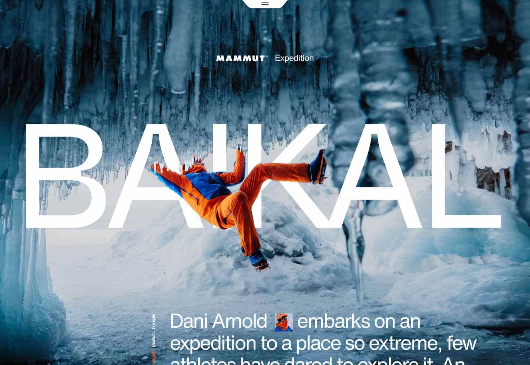


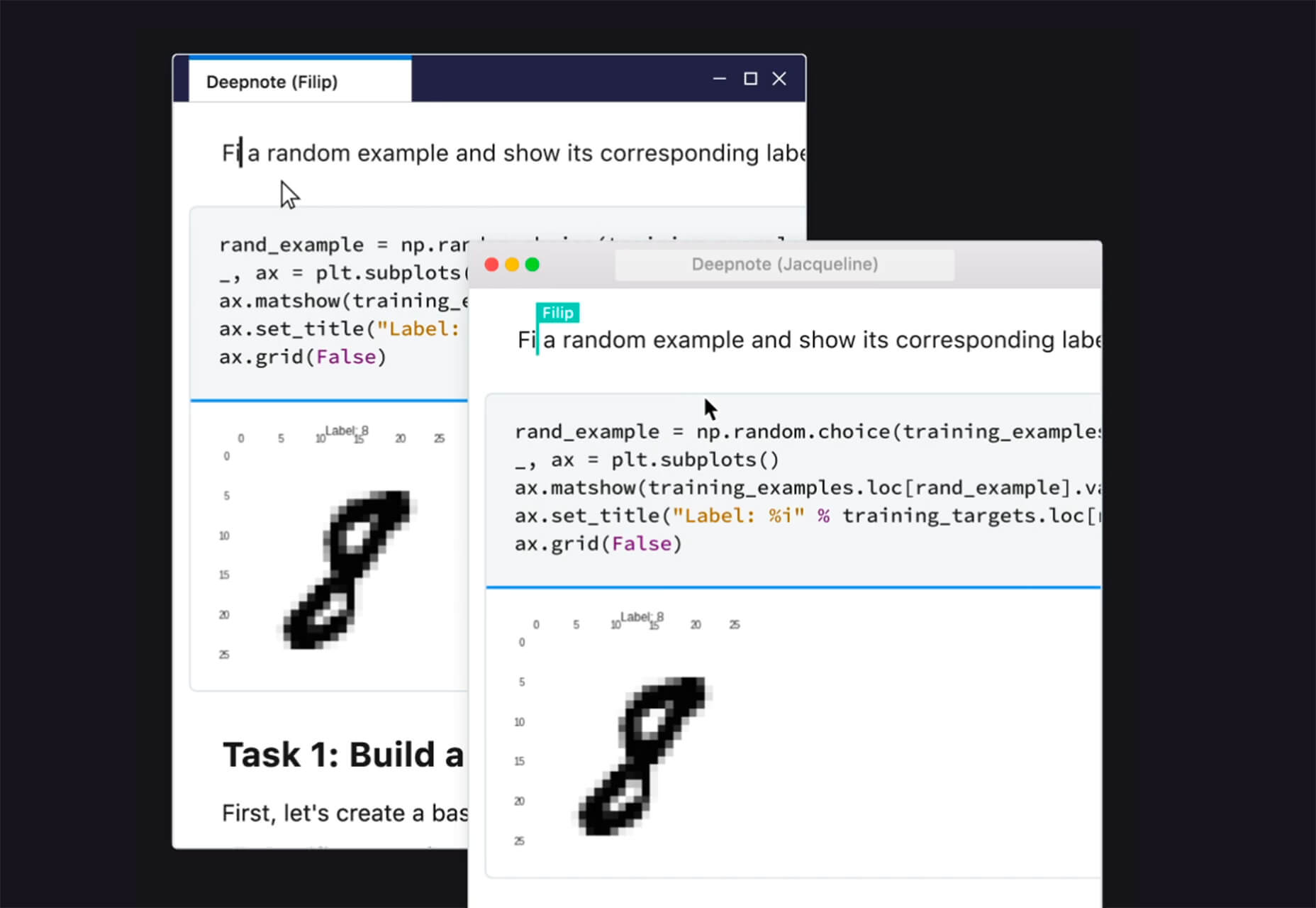
 Since there are so many CMS plugins out there, it can be overwhelming to choose the best ones for your website. We’ve done the research for you; this list contains the top new CMS plugins for November 2020. You’ll find useful plugins for WordPress, Craft, Shopify, and Joomla.
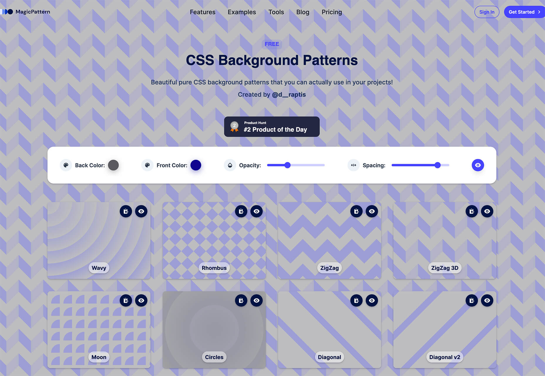
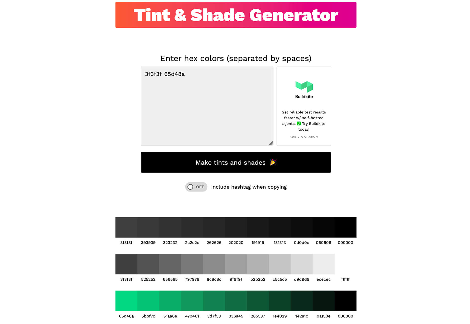
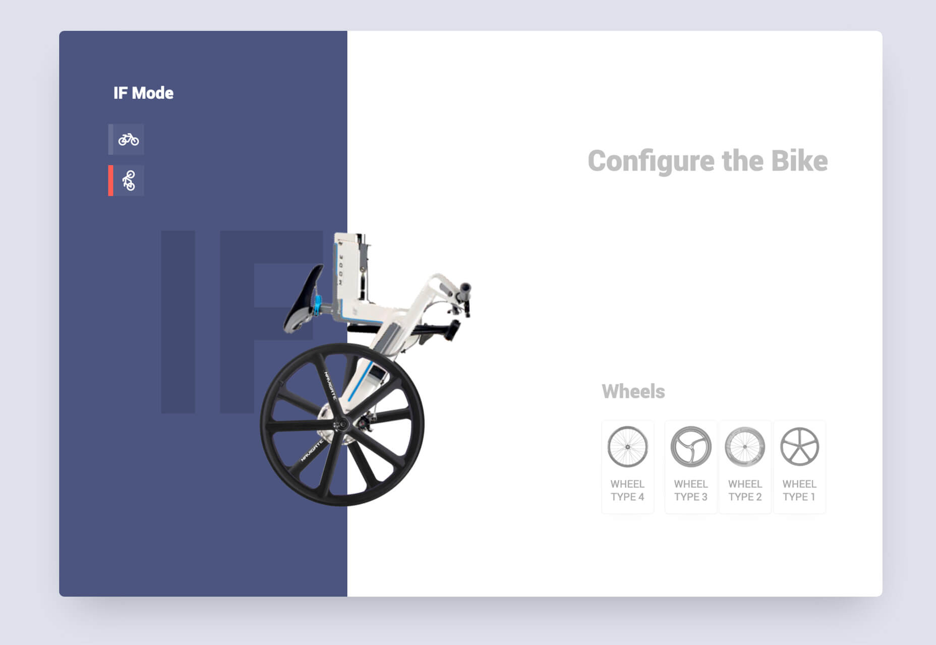
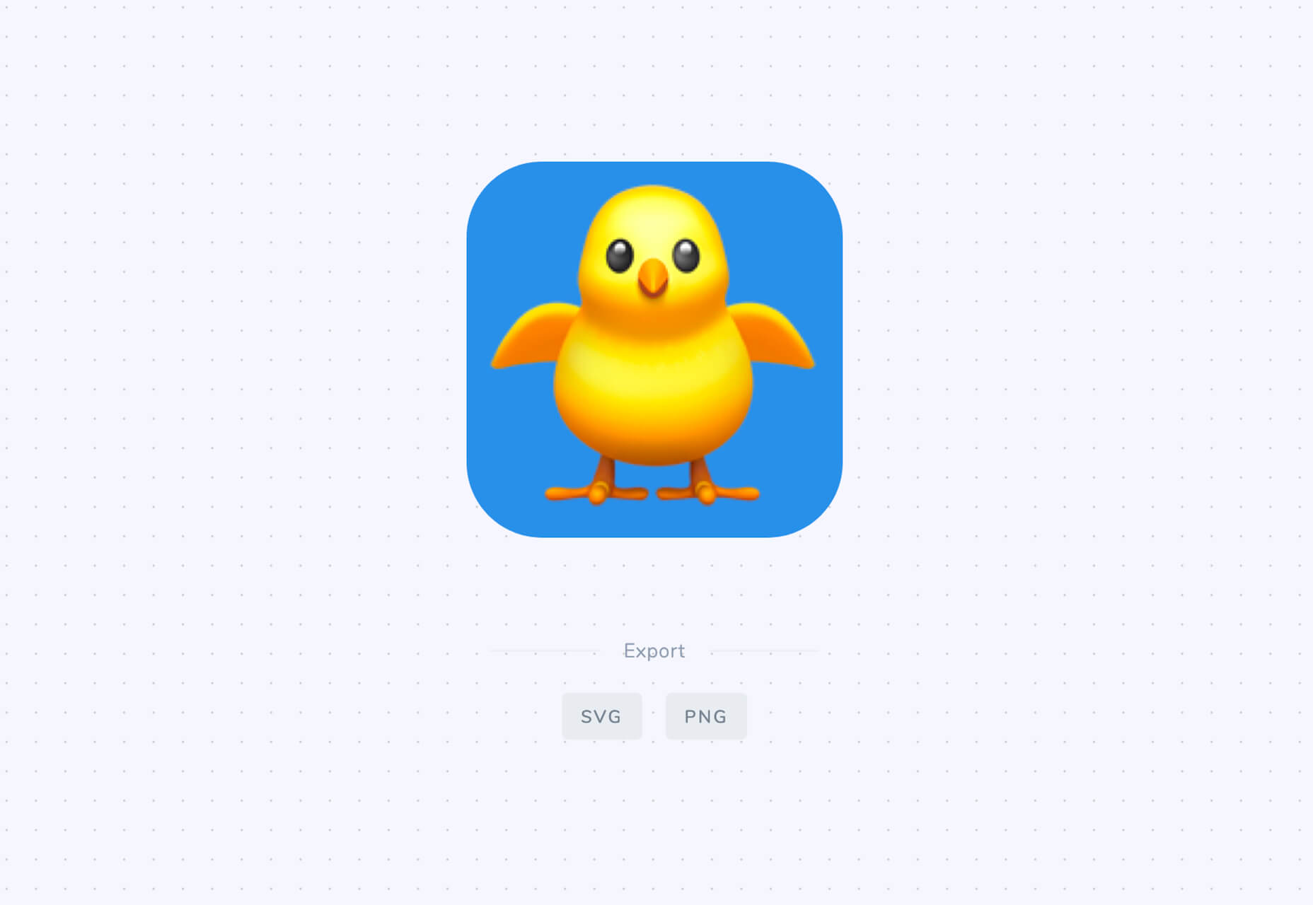
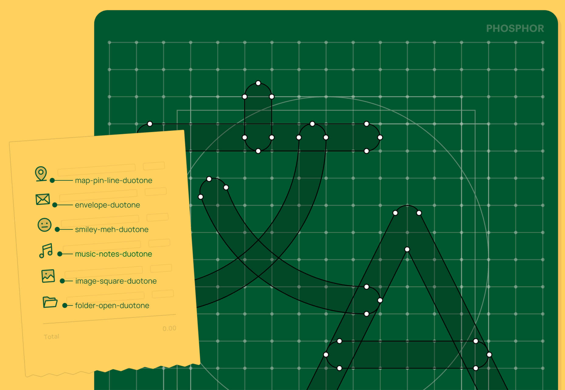
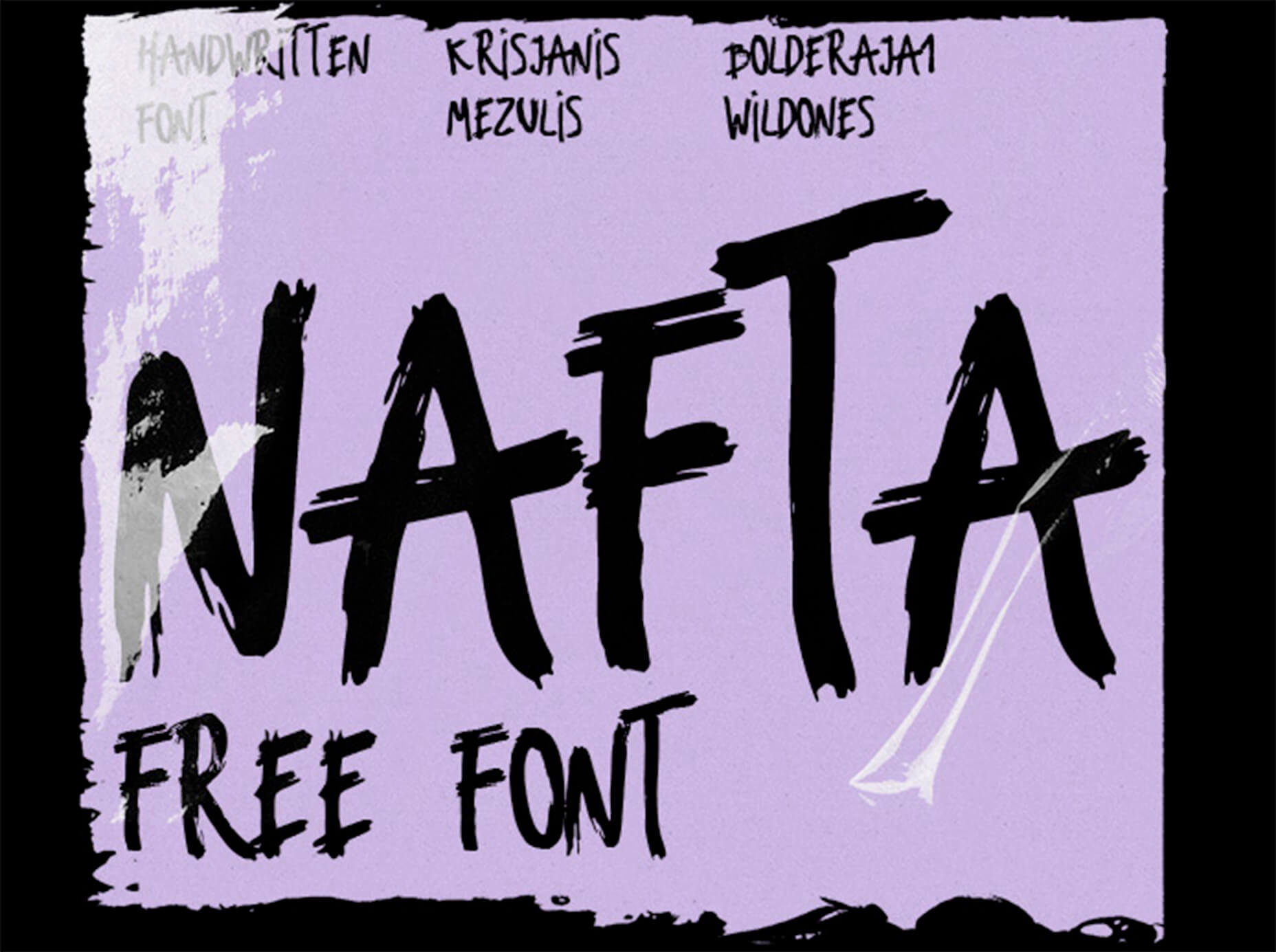
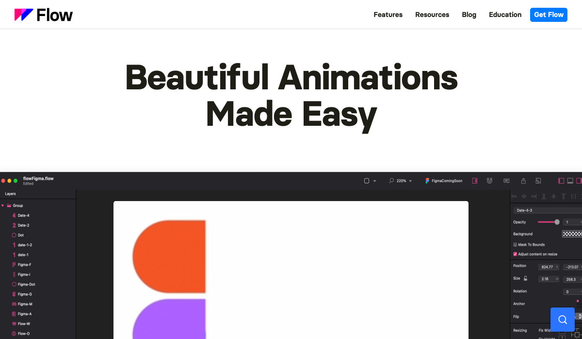
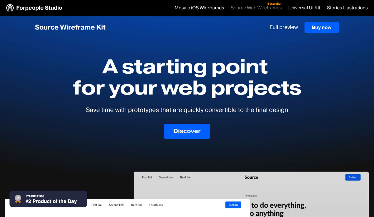
 In the spirit of fall feasts, this month’s collection of tools and resources is a smorgasbord of sorts. You’ll find everything from web tools to icon libraries to animation tools to great free fonts. Let’s dig in.