 Apple has released an OS update. Packaged in with it is the latest version of Safari, 16.
Expected to be released ahead of next month’s macOS 13, Safari 16 is packed with updates, making it one of the most capable browsers available.
For web designers, the significance is the forward momentum in web technologies that enable freer design work and fewer hacks to achieve complex layouts. Little by little, CSS recommendations are being implemented to the point that using JavaScript for layout is rapidly becoming as unnecessary as it is disliked.
Some of this was announced in June in the Safari 16 beta. But a lot has been added in the last couple of months. So here’s what’s new in Safari 16 today.
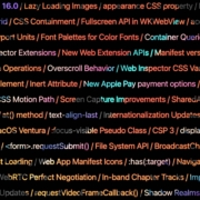
CSS Container Queries
The most exciting addition to Safari 16 is CSS Container Queries.
It is hard to understate how in-demand this feature has been; if you imagine an edit button on Twitter that gifted you crypto every time you corrected a typo, you’d be getting close to how popular this feature is.
Until now, media queries have detected the whole viewport. And so, if you have an element like a card, for example, that needs to change at smaller viewports, you need to calculate the available space and adapt the element’s design accordingly. Unfortunately, this frequently gets out of sync with edge cases causing more than a few headaches for front-end developers.
Media queries are severely restrictive to modern layout methods like Grid that wrap elements automatically because there is no way to detect how the elements are laid out.
Container Queries solve this by allowing you to define styles based on the size of the actual containing element; if a div is 300px wide, the contents can have one design, and if it’s 400px wide, they can have a different design—all without caring what size the whole viewport is.
This is dangerously close to OOP (Object Orientated Programming) principles and almost elevates CSS to an actual programming language. (All we need is conditional logic, and we’re there.)
The latest versions of Chrome, Edge, and now Safari (including mobile) support CSS Grid. Even discounting the rapid decline of Twitter, this is way more exciting than any edit button.
CSS Subgrid
Speaking of Grid, if you’ve built a site with it (and if you haven’t, where have you been?), you’ll know that matching elements in complex HTML structures often results in nesting grids. Matching those grids requires careful management, CSS variables, or both. With CSS Subgrid, grids can inherit grid definitions from a grid defined higher up the hierarchy.
CSS Subgrid has been supported by Firefox for a while but is not yet part of Chrome or Edge. Until there’s wider support, it’s not a practical solution, and using a fallback negates any benefit of using Subgrid. However, its introduction in Safari will surely herald rapid adoption by Google and Microsoft and moves the web forward considerably.
CSS Subgrid is likely to be a practical solution within 18 months.
AVIF Support
AVIF is an exceptionally compact image format that beats even WebP in many instances. It even allows for sequences, creating what is essentially an animated GIF but smaller, and for bitmaps.
AVIF is already supported by Chrome, with partial support in Firefox. Safari now joins them.
AVIF support is one of the more valuable additions to Safari 16 because you’re probably already serving different images inside a picture element. If so, your Safari 16 users will begin receiving a smaller payload automatically, speeding up your site and boosting UX and SEO.
Enhanced Animation
Safari 16 introduces some significant improvements in animation, but the one that catches the eye is that you can now animate CSS Grid.
Yes, let that sink in. Combine Container Queries and animation. The possibilities for hover states on elements are tantalizing.
Safari 16 also supports CSS Offset Path — known initially as CSS Motion Path — which allows you to animate elements along any defined path. This enables the kind of animated effect that previously needed JavaScript (or Flash!) to accomplish.
Chrome, Edge, and Firefox all support CSS Offset Path; the addition of Safari means it’s now a practical solution that can be deployed in the wild.
Web Inspector Extensions
Announced as part of the beta release, Web Inspector Extensions allow web developers to create extensions for Safari, just as they would for Chrome.
Web Inspector Extensions — or Safari Extensions as they’re destined to be known — can be built in HTML, CSS, and JS, so the learning curve is shallow. It’s a good route into app development for web designers.
Because the underlying technology is the same as other browser extensions, anyone who has made a Chrome, Edge, or Firefox extension will be able to port it to Safari 16+ relatively easily. As a result, there should be a rapid expansion of the available extensions.
Improved Accessibility
Accessibility is key to an effective and inclusive web. Be like Bosch: everybody counts, or nobody counts.
When testing a design for accessibility, emulators don’t cut it. In my experience, Safari has some of the most reliable accessibility settings, especially when it comes to Media Queries like prefers-reduced-movement.
Further gains in this field mean that Safari continues to be an essential tool for QA tests.
Reduced Resets
Finally, I want to throw up my hands to celebrate the reduced number of non-standard CSS appearance settings.
For years we’ve been prefacing our style sheets with elaborate resets like Normalize, designed to undo all the assumptions browser developers make about design and the UI preferences of their engineers.
Safari 16 has reportedly “Removed most non-standard CSS appearance values.” How effective this is and how much we can rely on it given the other browsers on the market remains to be seen. However, like many of Safari 16’s changes, it’s a step towards a browser that’s on the developers’ side instead of an obstacle to overcome.
The post Exciting New Features in Safari 16 first appeared on Webdesigner Depot.


 Learning how to design an MVP webpage or website could be one of the best things you can do as a site creator in today’s digital world.

 Last week,
 An unreliable, semi-broken and unresponsive website is an excellent way to lose leads and visitors — regardless of how aesthetically pleasing or well-designed, the visual elements are.

 Every day design fans submit incredible industry stories to our sister-site, Webdesigner News. Our colleagues sift through it, selecting the very best stories from the design, UX, tech, and development worlds and posting them live on the site.


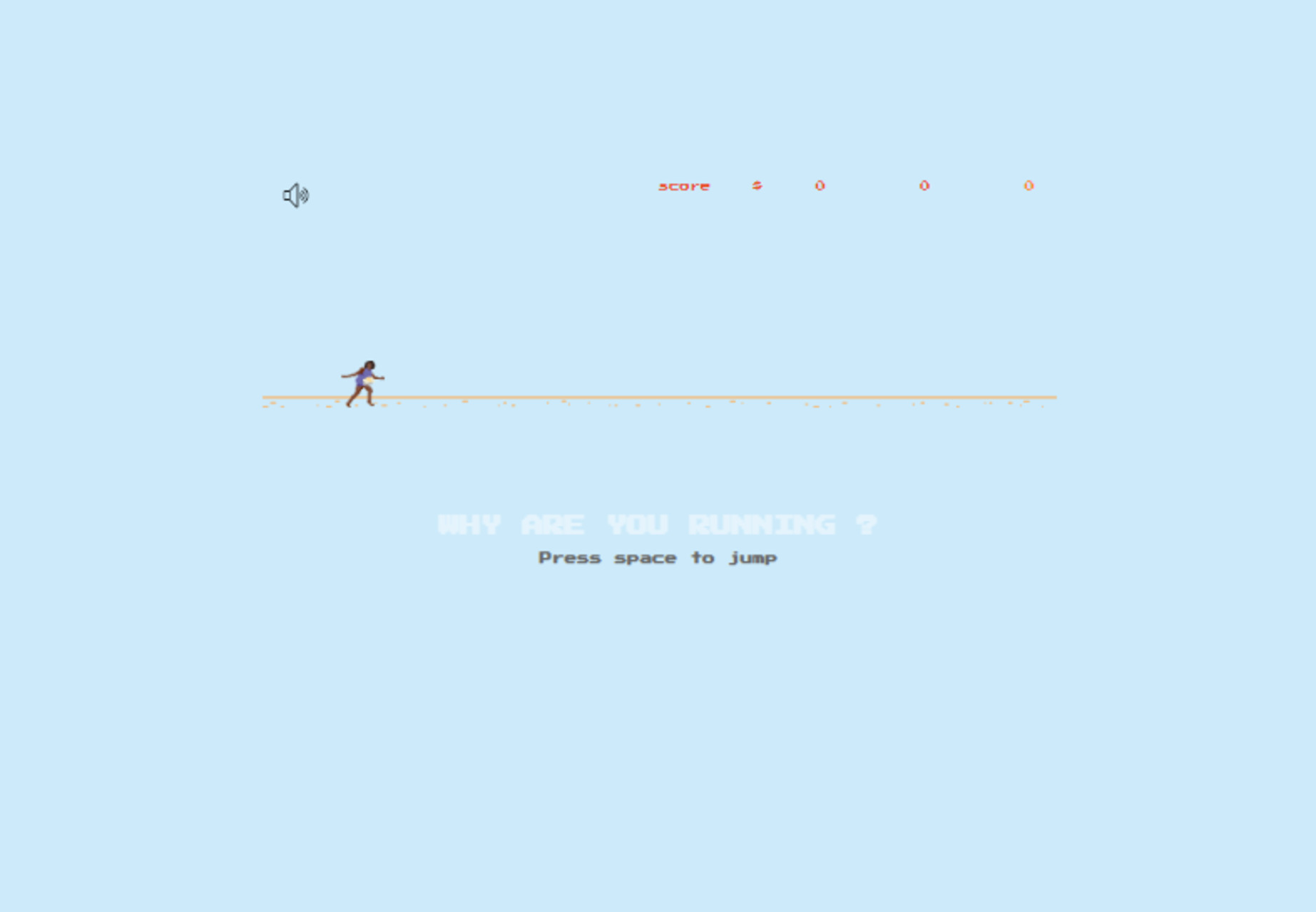
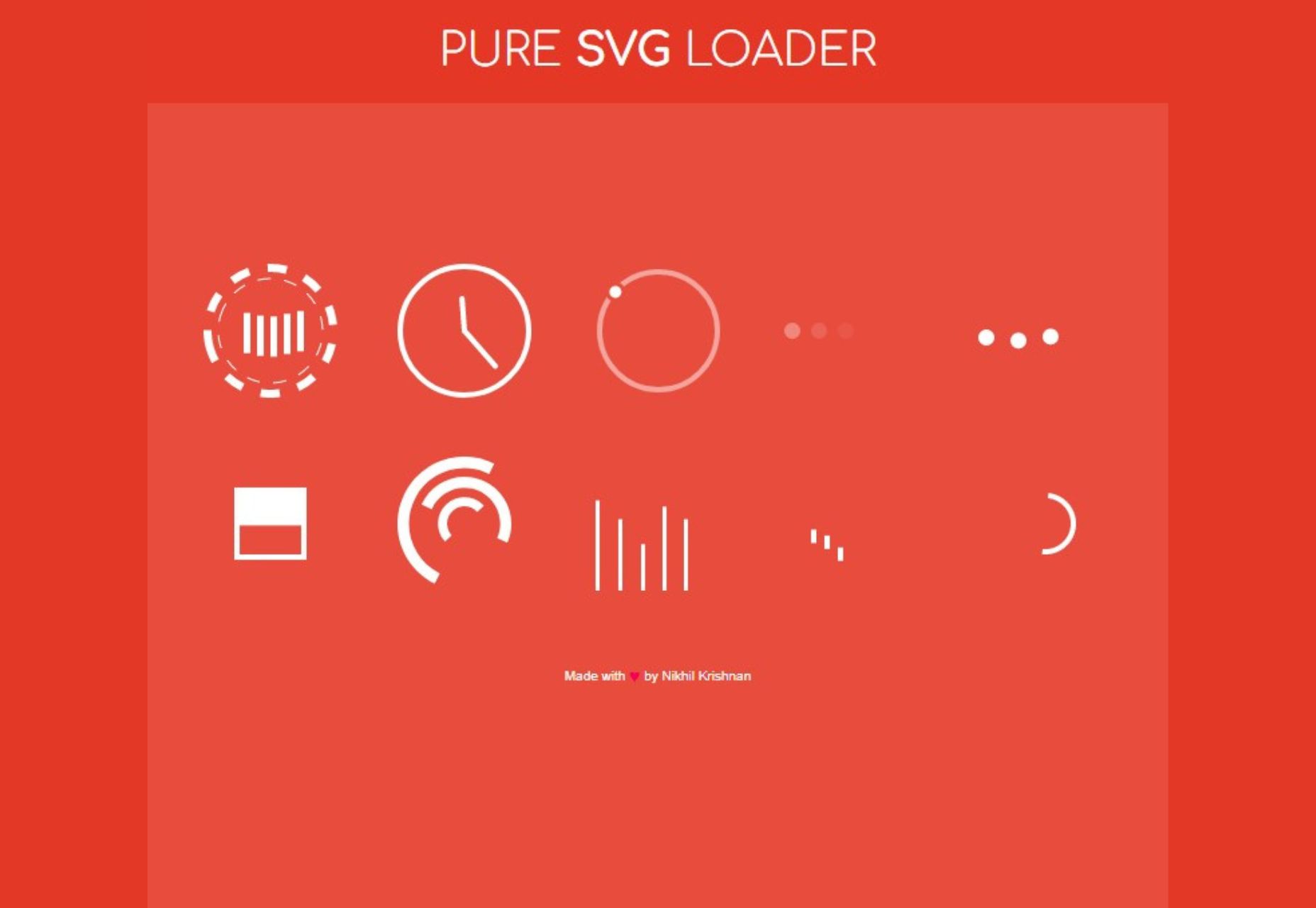
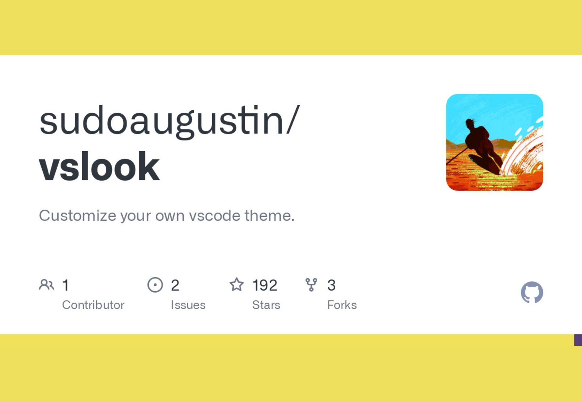
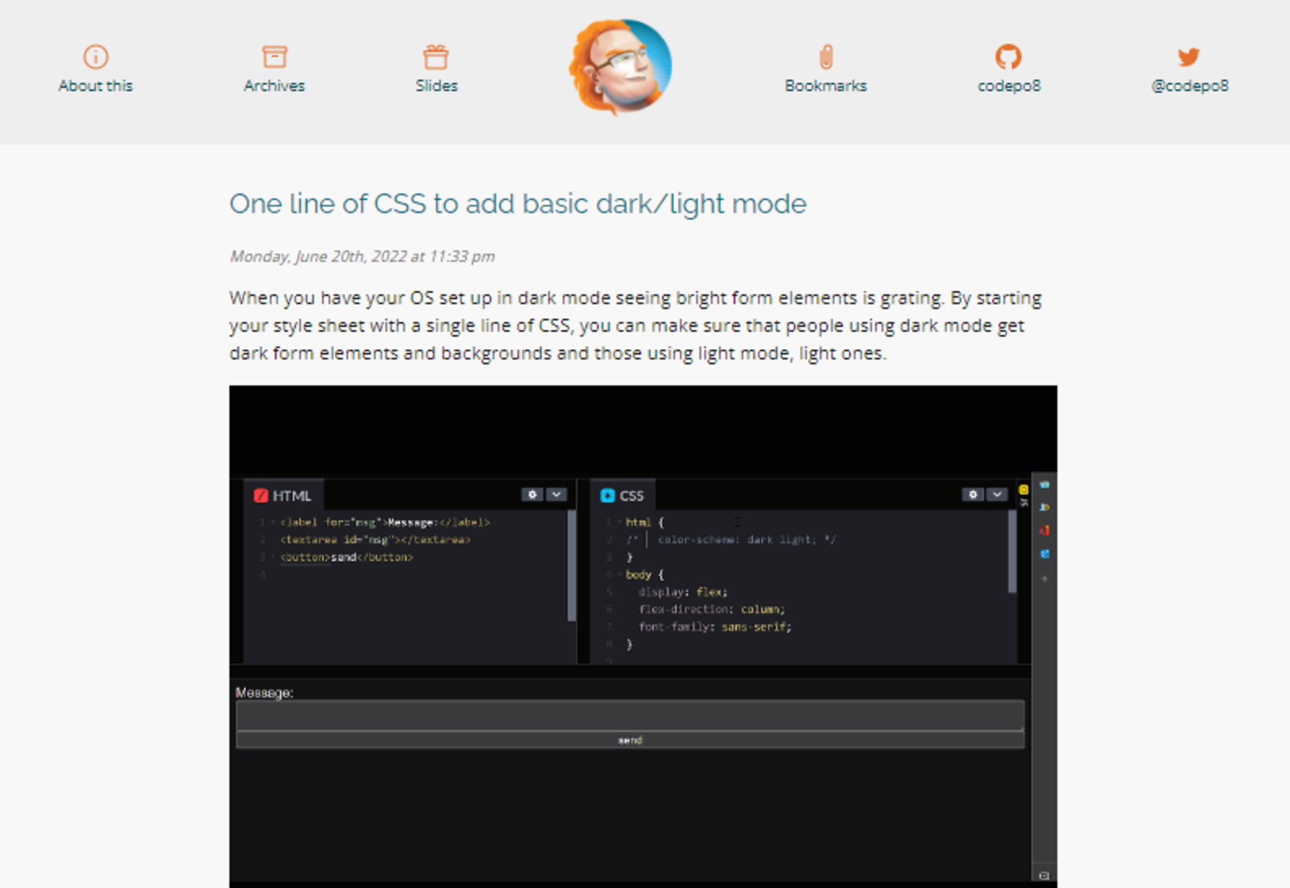
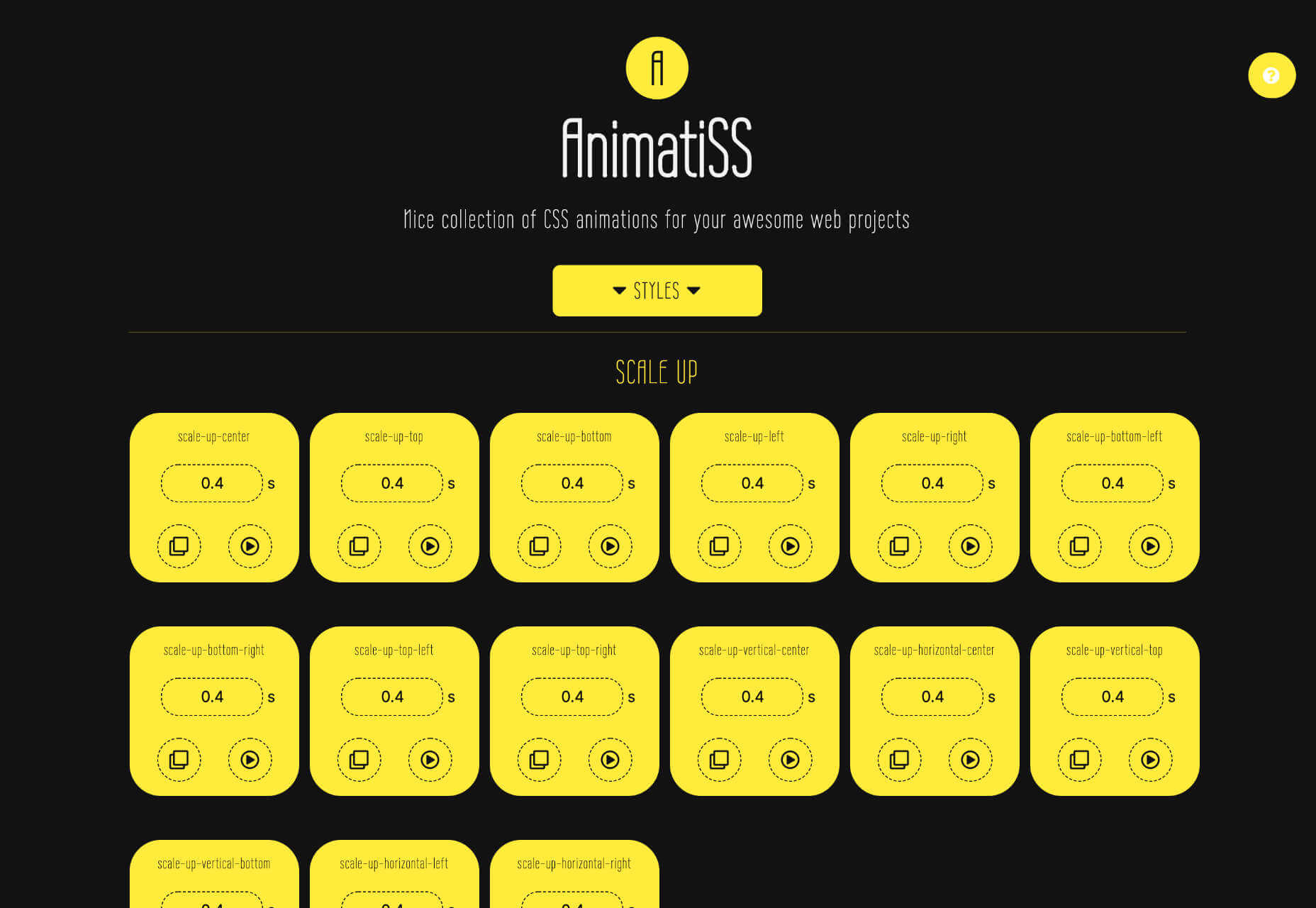
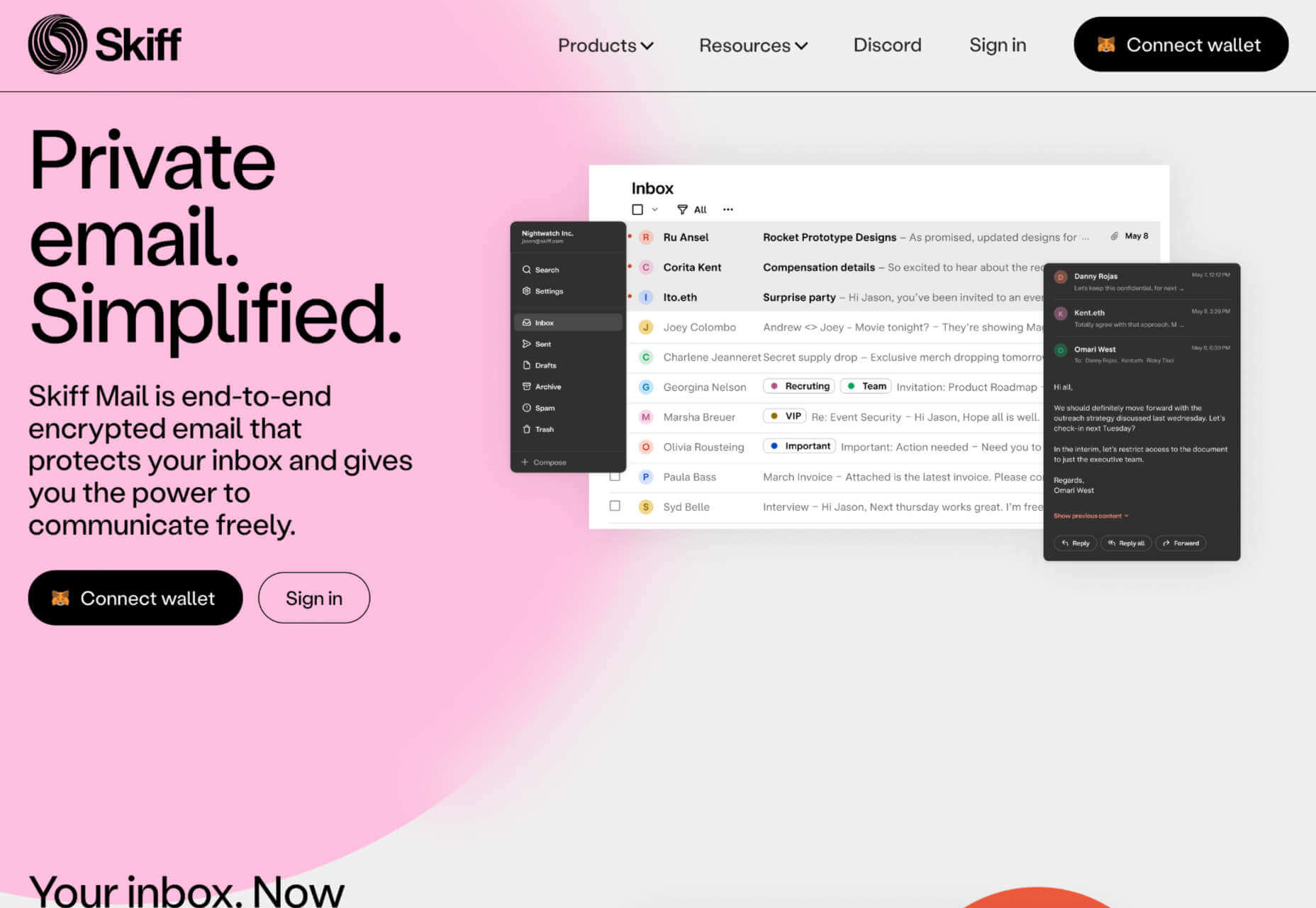
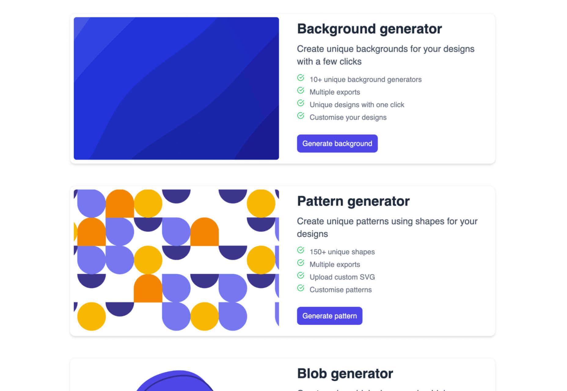
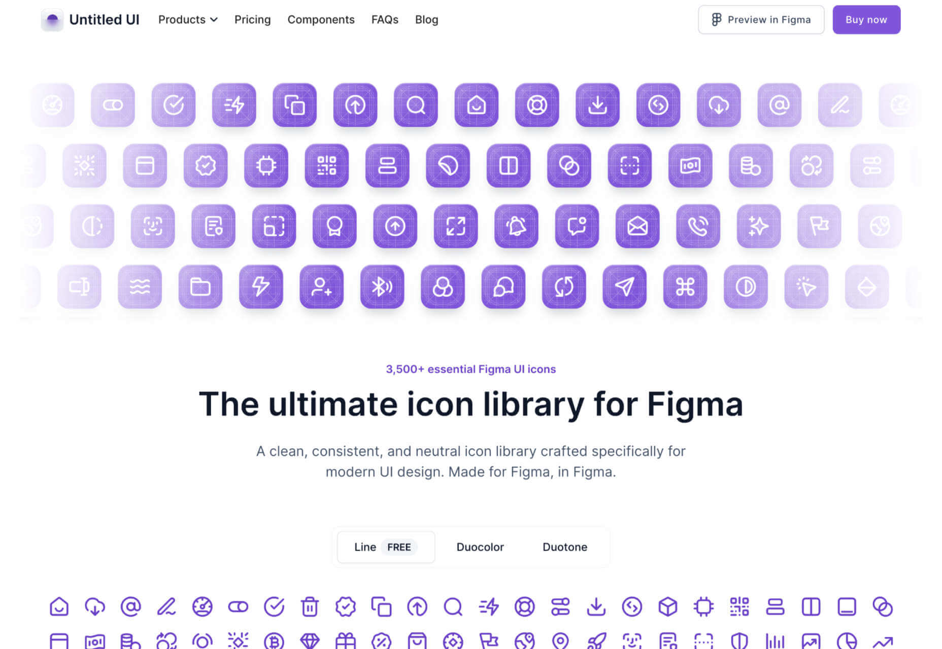
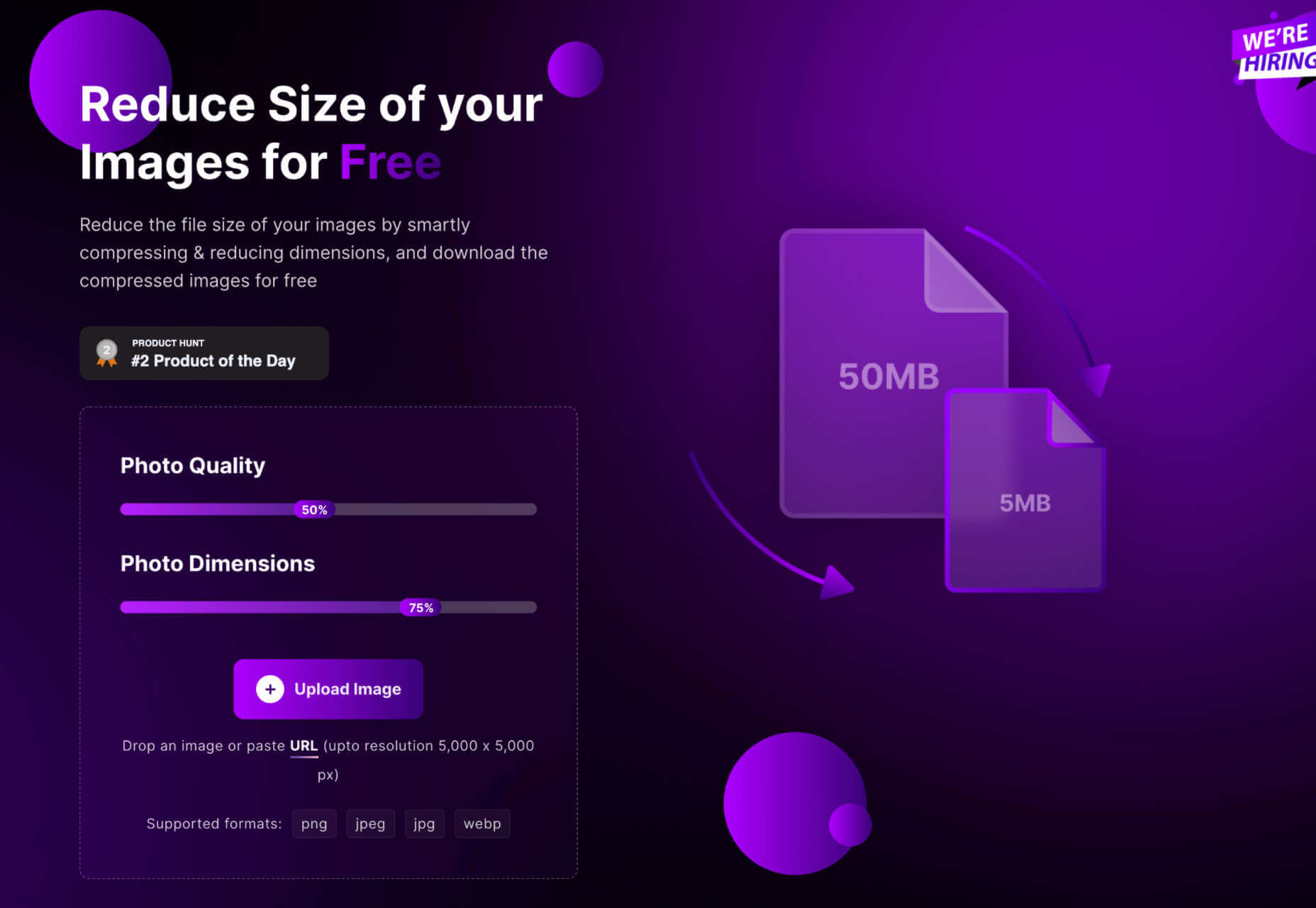
 Automation is the theme of this month’s collection of exciting new tools for designers and developers. There are tools to make your images better, tools to create illustrations, and tools to make your workflow more efficient. Plus, a whole host of tools that are just plain fun.
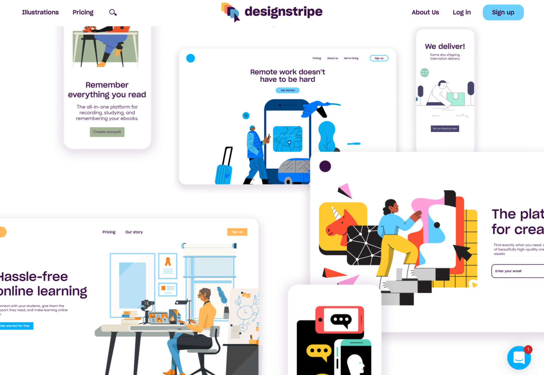


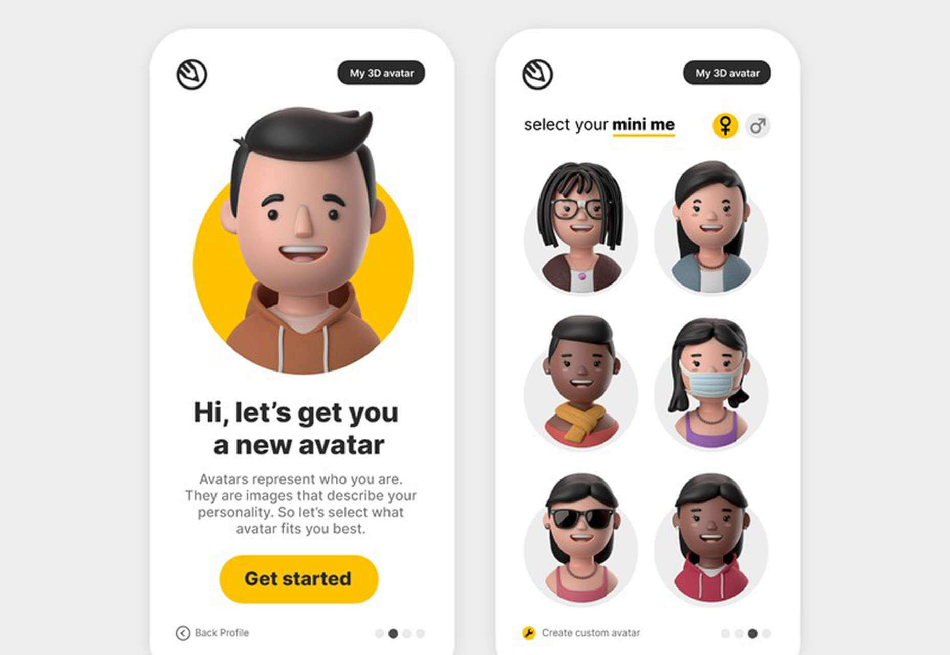
