 Whether you are a designer looking for the best themes for your clients or a new website/blog owner, there are numerous theme marketplaces to cover your needs.
CMS (content management systems) like WordPress, Shopify, and Wix offer built-in theme collections. But there are also trusted third-party marketplaces for themes.
Most beginners are pretty overwhelmed when it comes to choosing a website theme. With thousands of themes to choose from, this is more than understandable. In this article, we will first highlight all you need to consider before selecting a template/theme for your website.
By the end of this 5-minute read, you will also know which are the best third-party and CMS-based marketplaces for both free and premium themes.
How to Choose the Best Theme for Your Website
You might consider many parameters when choosing a theme for a blog or website. To narrow down the options and find a theme that suits your needs and preferences, you can:
- Make a list of the features you need (integrated page builder, SEO optimization, browser compatibility, translation capability, number of columns, etc.).
- Pay attention to responsiveness — nowadays, you should opt for mobile-friendly themes only.
- Opt for lightweight, simple themes — such templates are usually more powerful as they do not affect the speed of your website.
- Make sure that the theme has the visual appearance you want — find the themes that match your branding elements (colors, logo, industry, etc.).
- Keep readability in mind — a font that is difficult to read will affect readability (especially on mobile devices) and ultimately hurt your website traffic.
- Test the themes before you start customizing them — even (most) premium themes offer a trial period, which you should take advantage of; it will save you time and money.
Following these simple steps will ensure that the theme you choose will benefit your website in the long run. Now that we have analyzed that let us look at the best places to find themes in 2022.
5 Best Third-Party Theme Marketplaces
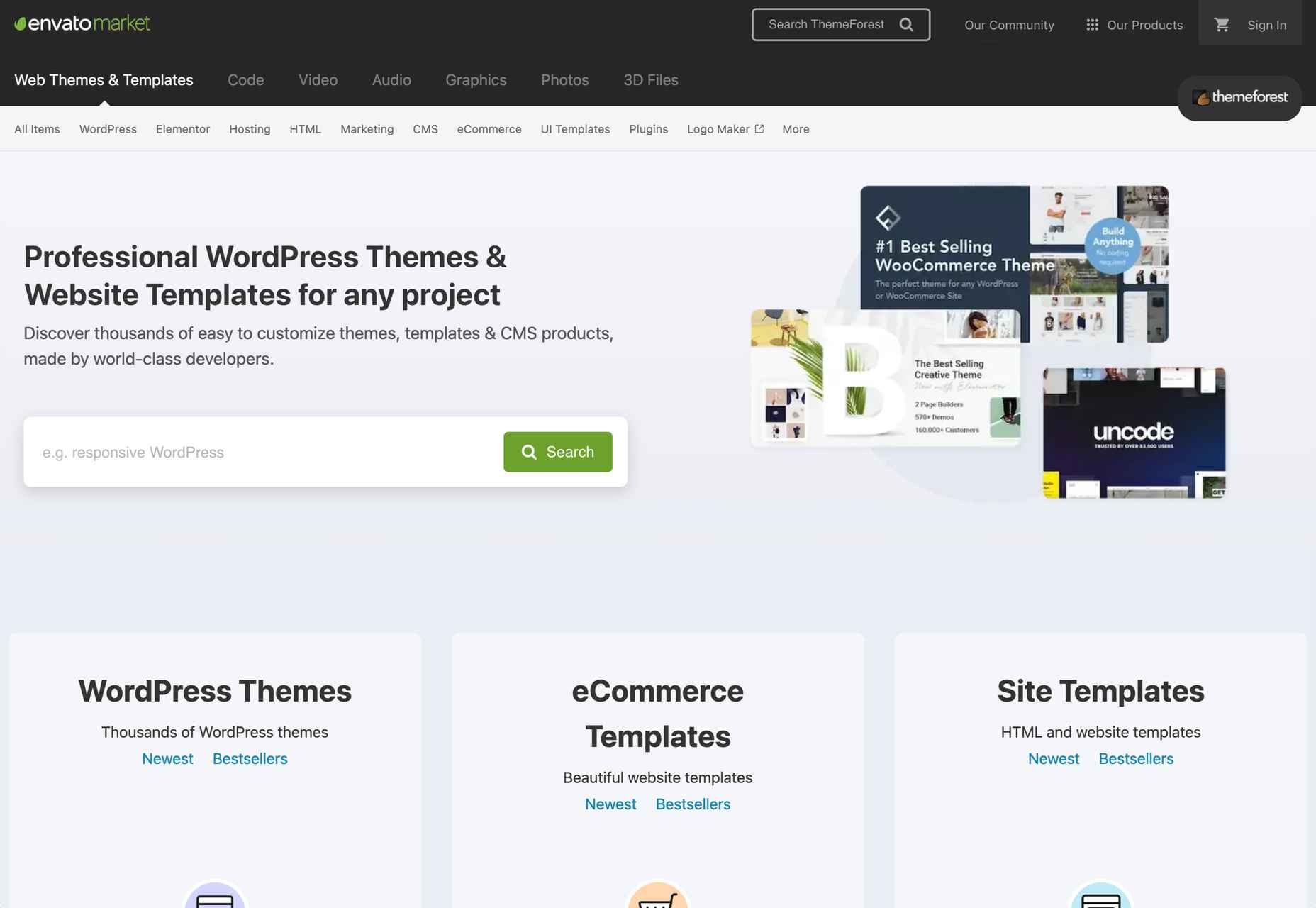
1. ThemeForest
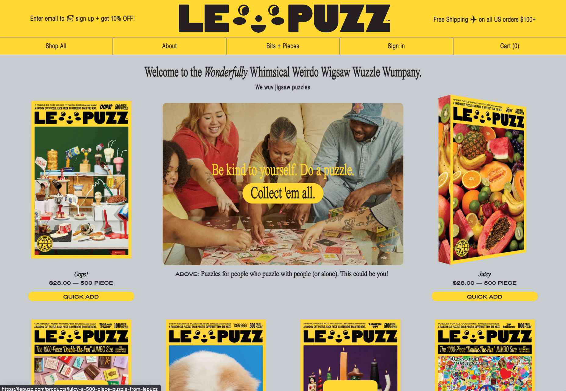
If you are looking for a comprehensive list of premium themes, ThemeForest from Envato is just what you need. The marketplace offers thousands of pre-built templates and themes for pretty much everything: from responsive WordPress themes to the best-selling templates for eCommerce websites on platforms like Shopify.
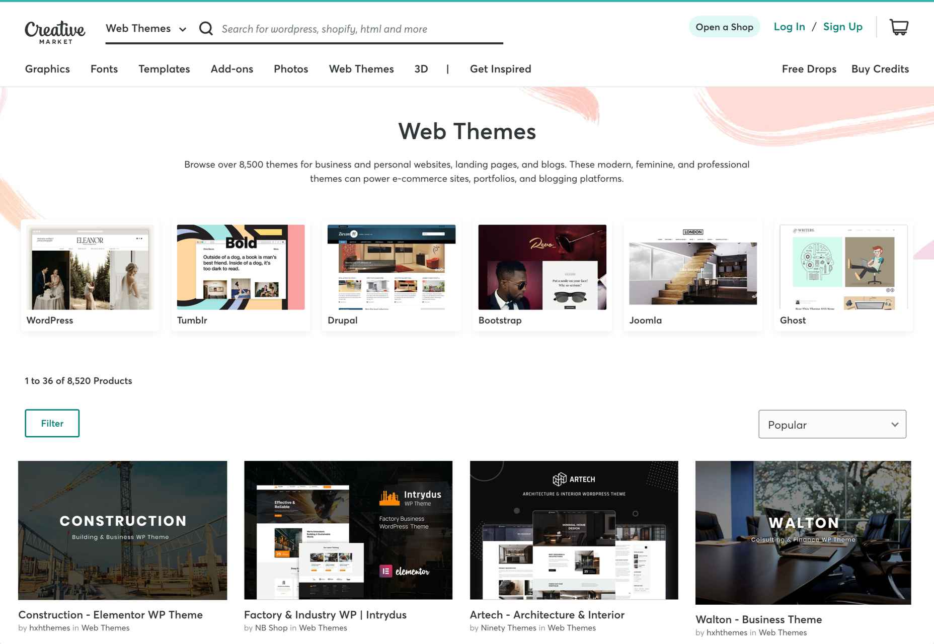
2. Creative Market
Although ThemeForest offers a vast selection of themes, Creative Market is simply the best choice for non-WordPress themes. The platform includes an analytic filter section to select the CMS you use, file type, price range, and much more.
Tumblr, Drupal, Bootstrap, and Joomla are just a few examples of the specified templates available.
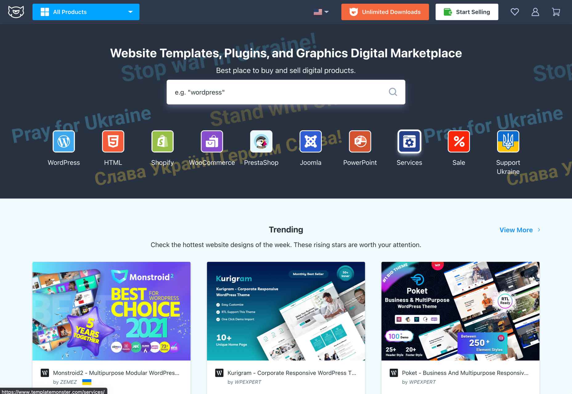
3. Template Monster
The same goes for our next suggestion, the Template Monster website. This third-party marketplace offers some of the best themes, plugins, and graphics that you can use to improve the look and performance of your website. From WordPress and WooCommerce templates to themes created for the Shopify platform, nothing is left out.
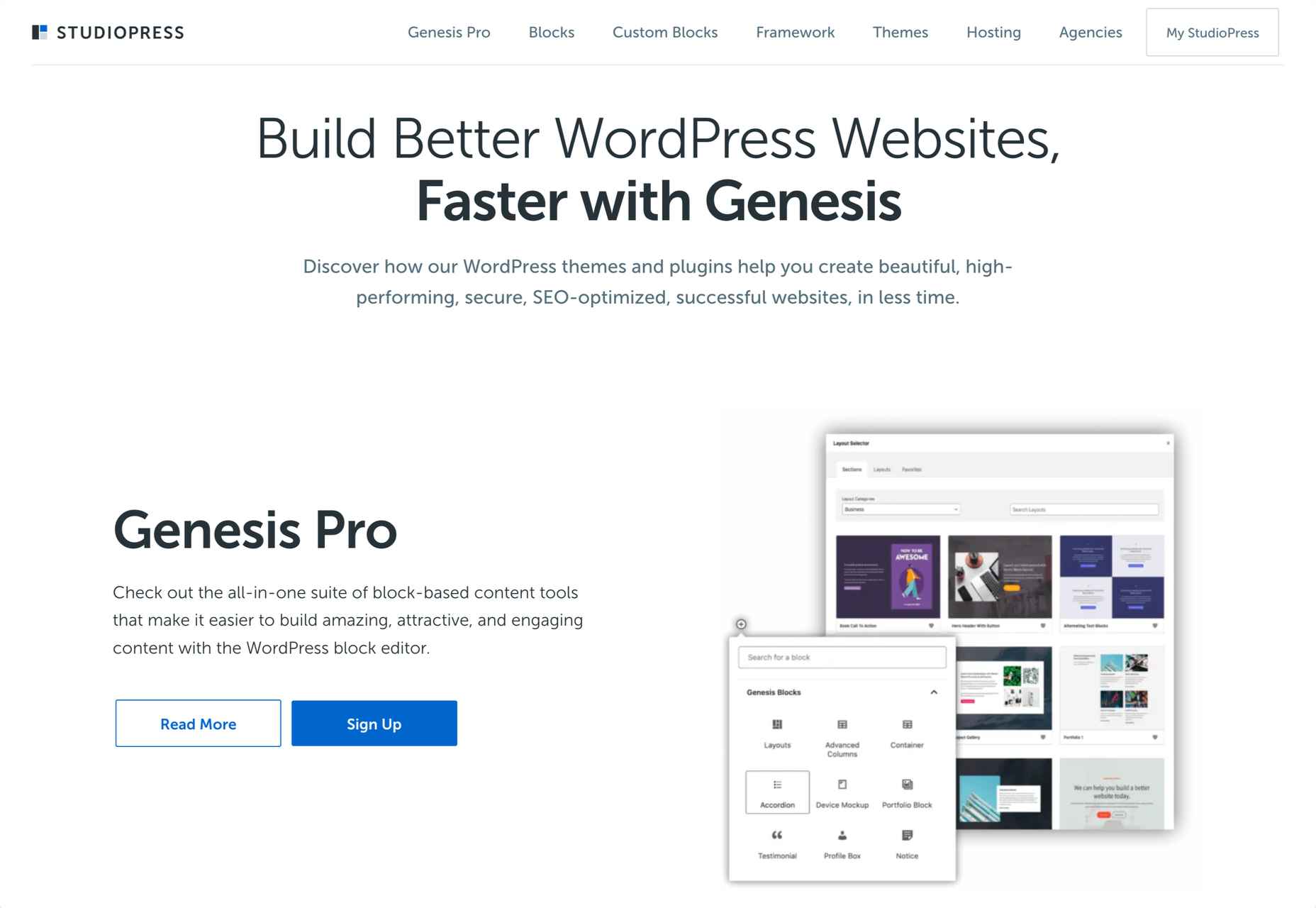
4. StudioPress
StudioPress marketplace allows you to find the best theme for your website through a comprehensive sorting feature. You can sort your search by your niche, the features you need, the layout (columns), and the template’s developer. Even though StudioPress offers its own theme (Genesis Pro), the marketplace also includes numerous third-party themes.
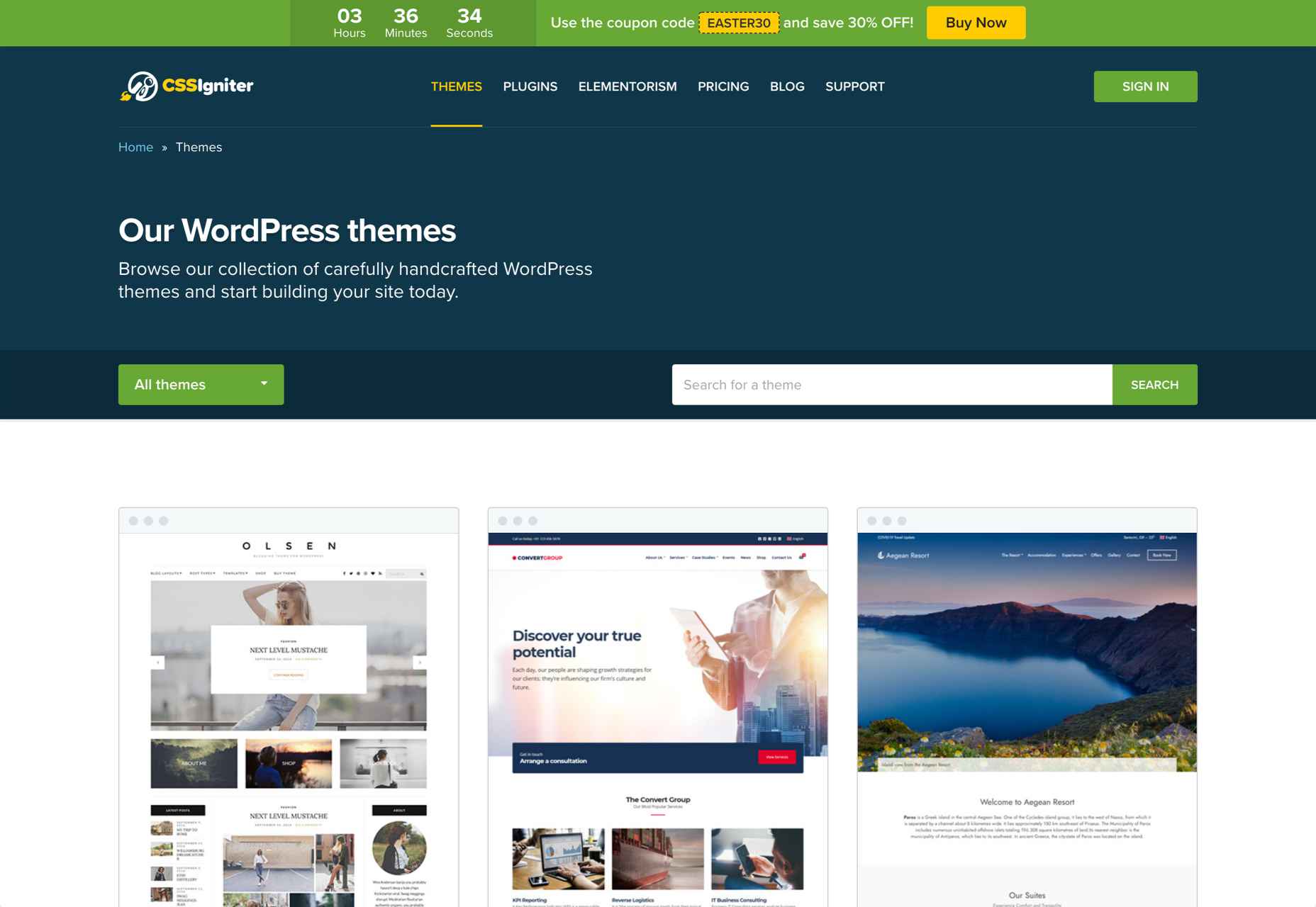
5. CSSIgniter
Our final third-party provider is CSSIgniter, one of the most well-known marketplaces for WordPress website owners and developers. This site offers demos for numerous themes, from minimalist, very popular templates (especially for blogs) like Olsen to comprehensive WooCommerce themes like Amaryllis.
This way, you can try out the premium themes before choosing one that suits your needs. Note that CSSIgniter only offers themes for the WordPress CMS.
5 Best CMS-Based Theme Marketplaces
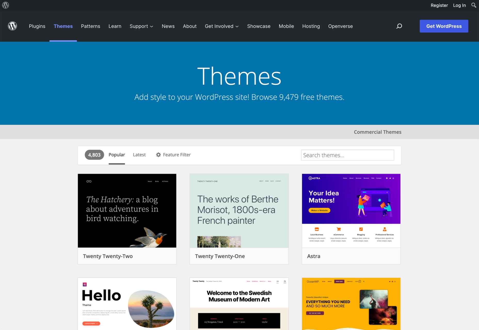
1. WordPress Themes
Although all third-party marketplaces mentioned above offer a wide selection of premium themes, it can be challenging to find free themes for your website. If that’s what you are looking for, there’s simply nothing better than WordPress’ built-in theme marketplace.
The WordPress marketplace contains more than 4,000 free and premium themes for you to choose from.
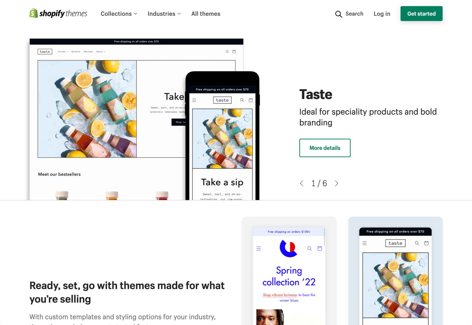
2. Shopify Themes
According to statistics, Shopify is the second most popular CMS, after WordPress. So, it should come as no surprise that the eCommerce platform has an integrated marketplace where you can find numerous free and premium themes.
So, if you are looking for a beautiful template for your Shopify-based store, you should check out the Shopify platform first.
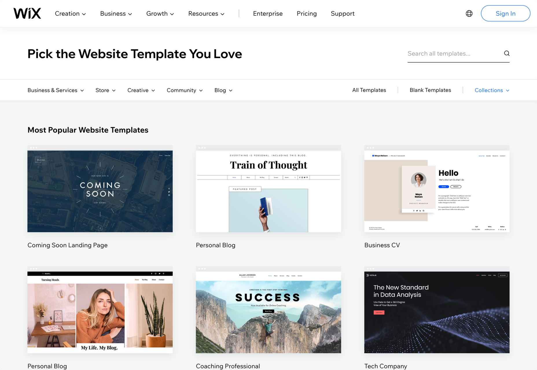
3. Wix Website Templates
Like WordPress and Shopify, Wix has had a marketplace for themes since day one. Keep in mind that when you build your site through Wix, you do not have as many options for finding third-party themes as you do with WordPress. Still, you can find many premium and free themes on the Wix website to solve this problem.
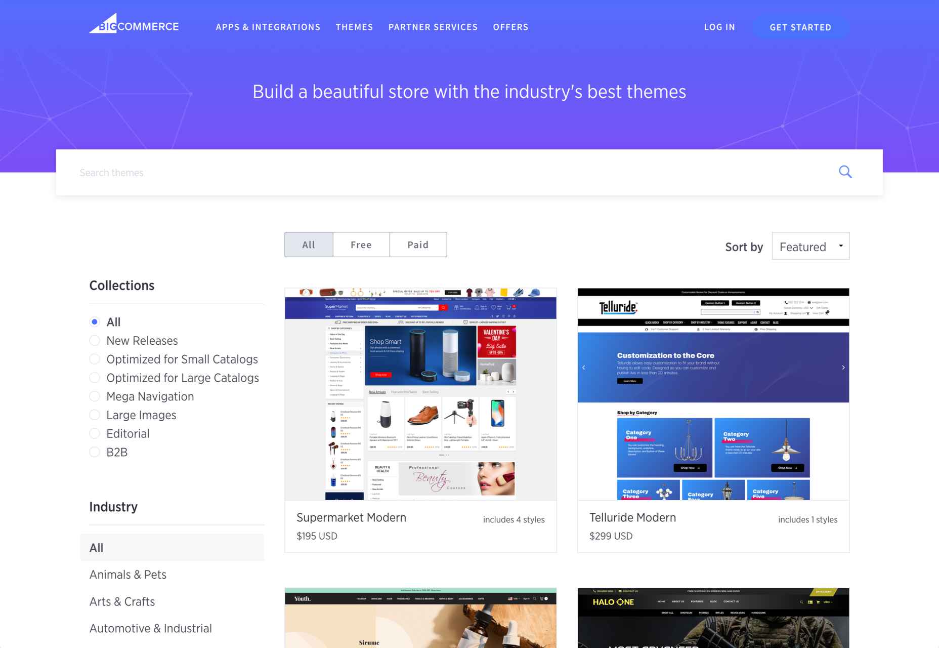
4. BigCommerce Themes & Templates
BigCommerce is one of the most popular CMS on the market, tailored for professionals. On the website, you can find numerous free and premium themes, and you can find the best one based on your industry.
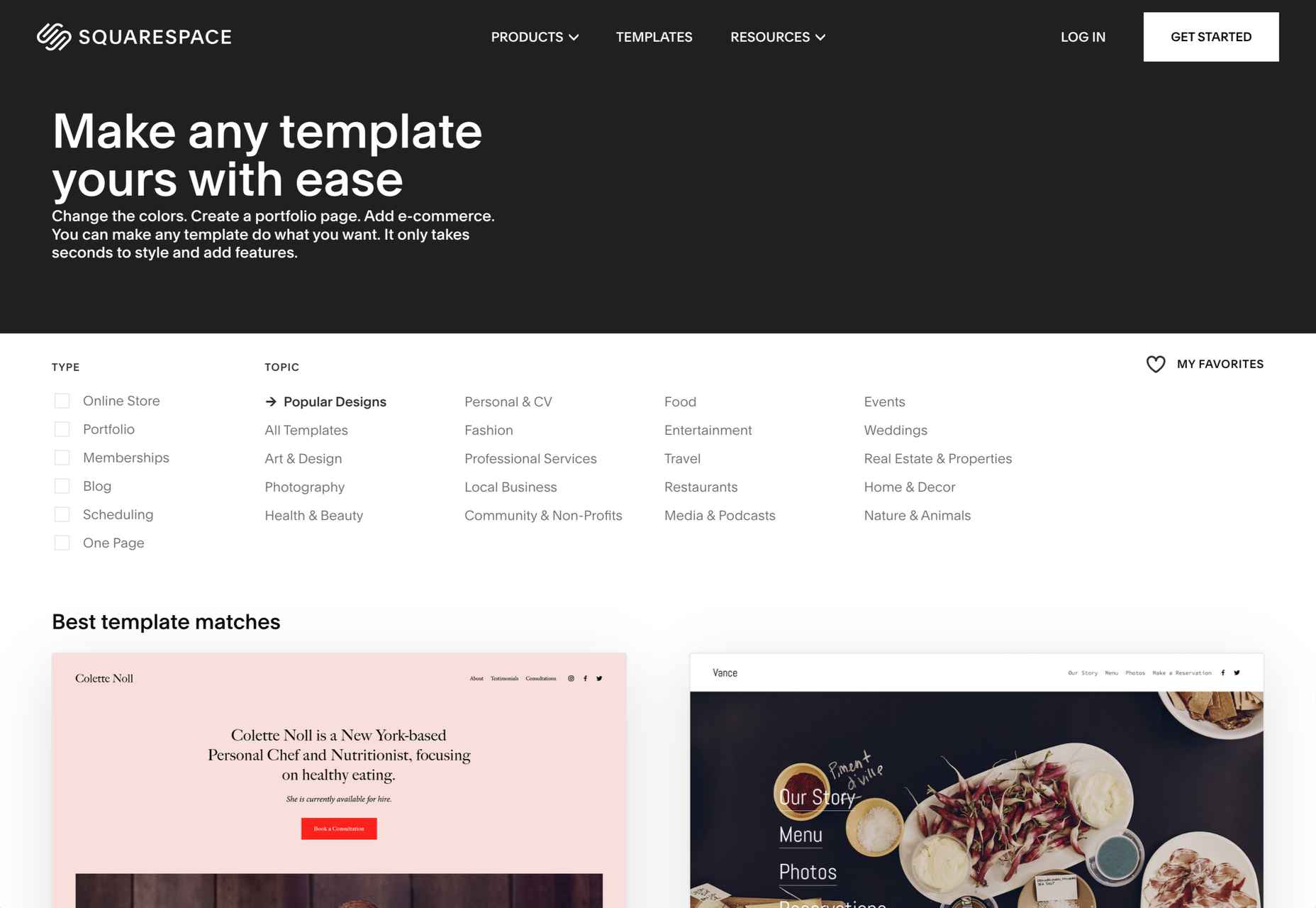
5. Squarespace Themes
Last but not least, we have Squarespace’s official theme marketplace. With a comprehensive filter section, it’s straightforward to find a great theme on Squarespace. If your website or blog is built with Squarespace CMS, there is nothing better than this.
Wrap Up
Of course, the list of places to find themes for your website in 2022 could go on forever. But if you know what you’re looking for in terms of layout and features, choosing the best theme will instantly become easier.
Besides, the providers mentioned above prove the most trustworthy and offer the variety you need for your final selection.
You should probably look at third-party marketplaces like ThemeForest and Creative Market if you need a premium theme. On the other hand, CMS-based theme marketplaces are the best option for those who are looking for the best free themes.
The post 10 Best Places to Find Website Themes in 2022 first appeared on Webdesigner Depot.

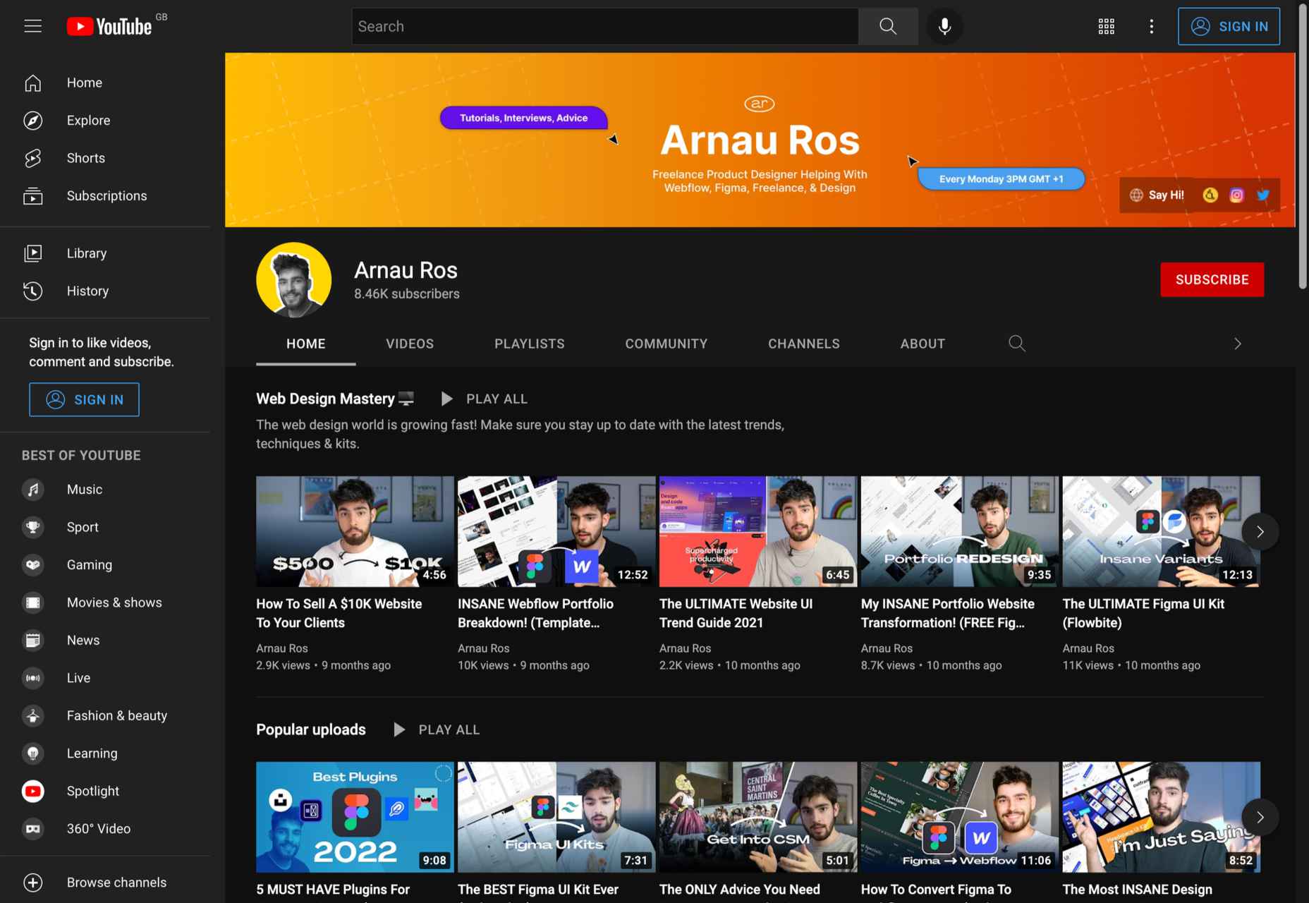
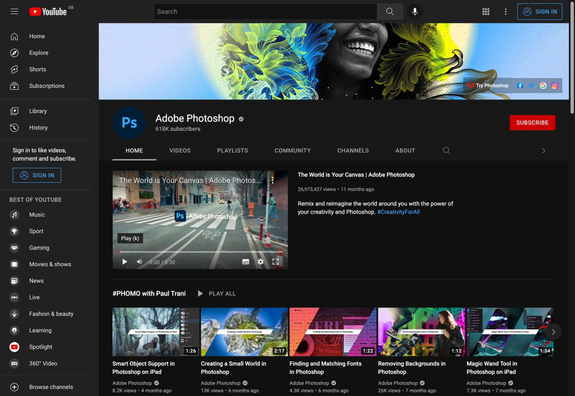
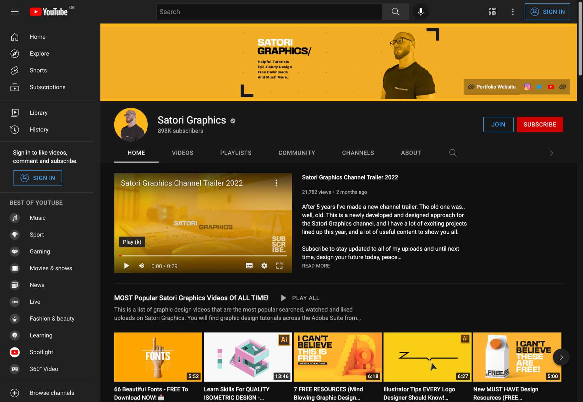
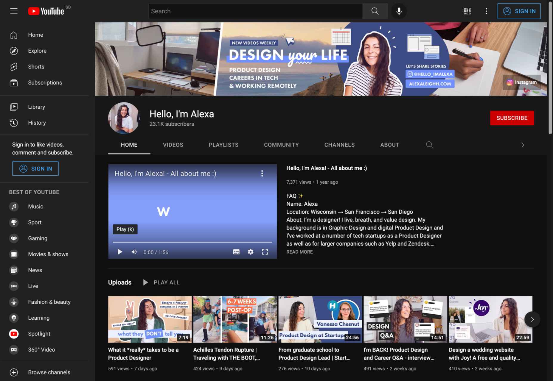
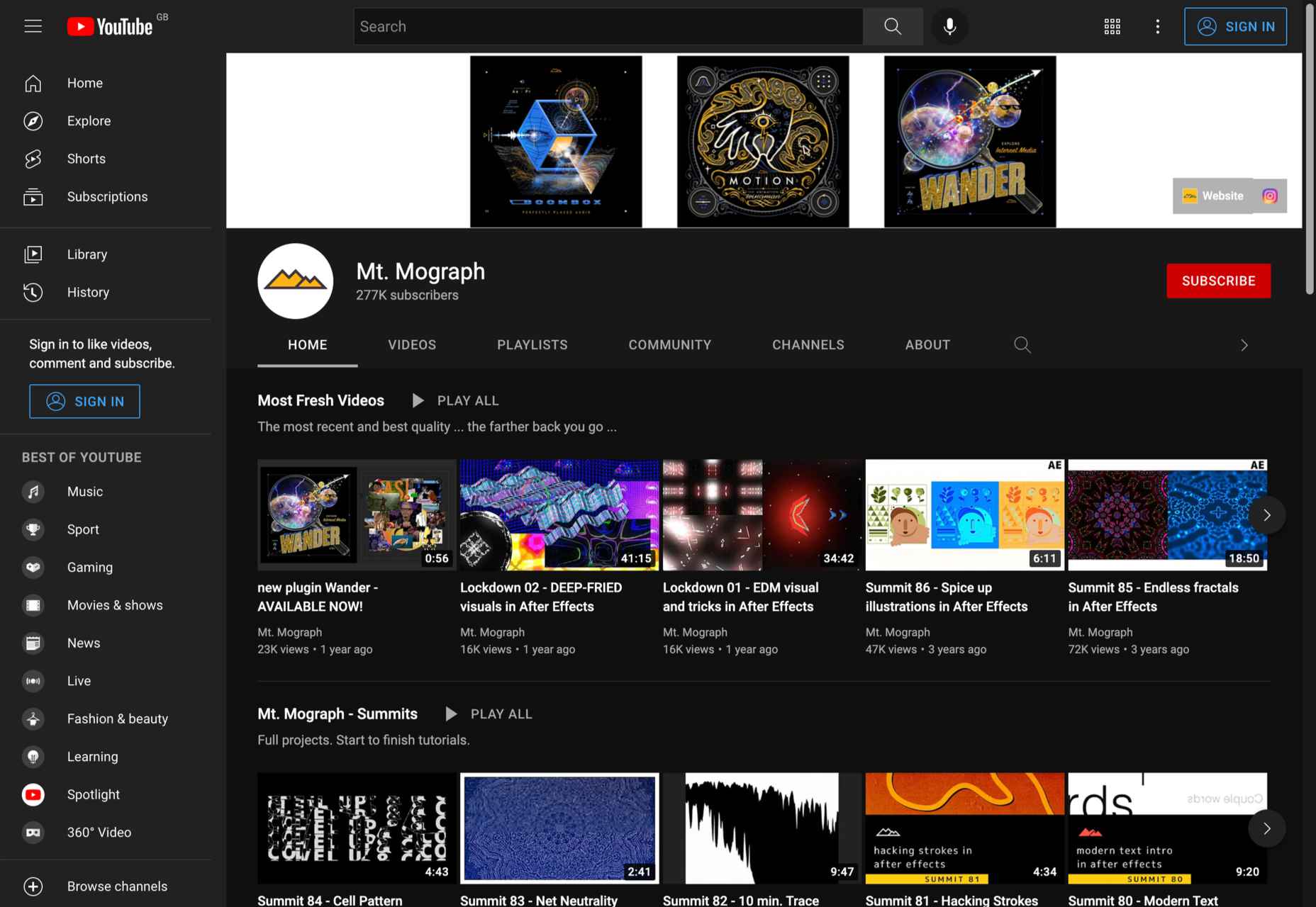
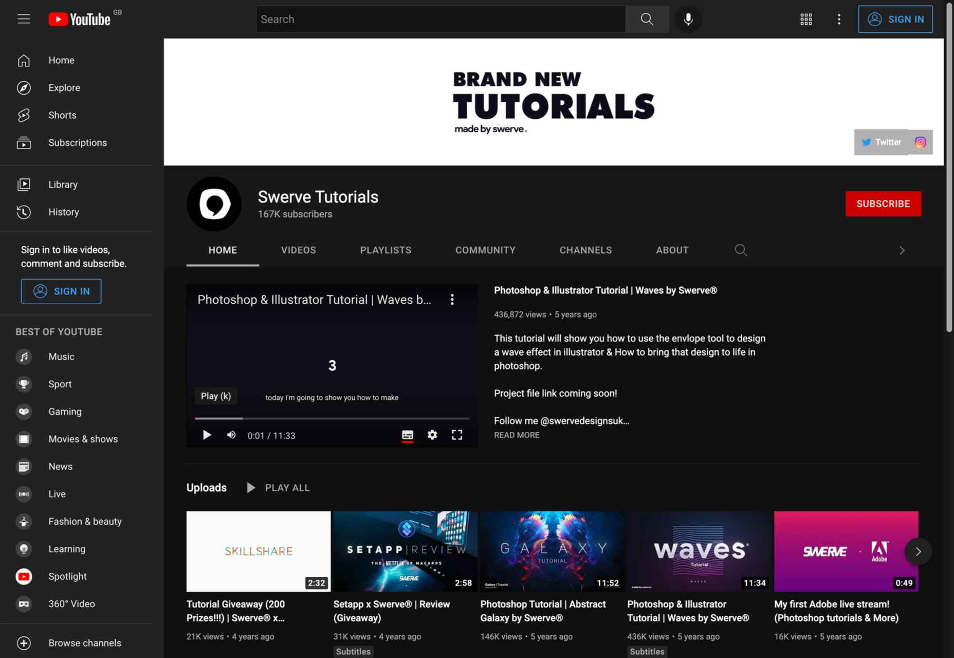
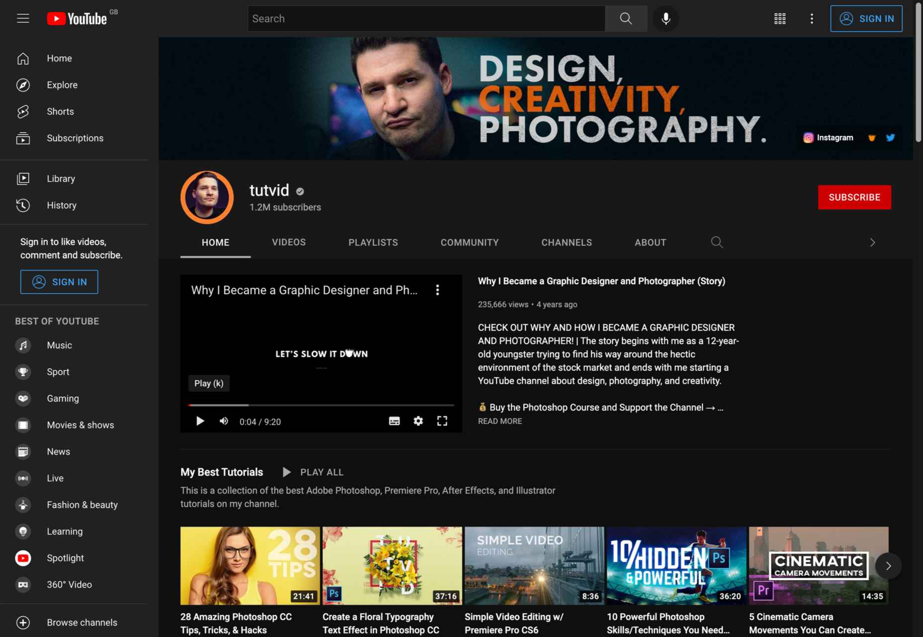
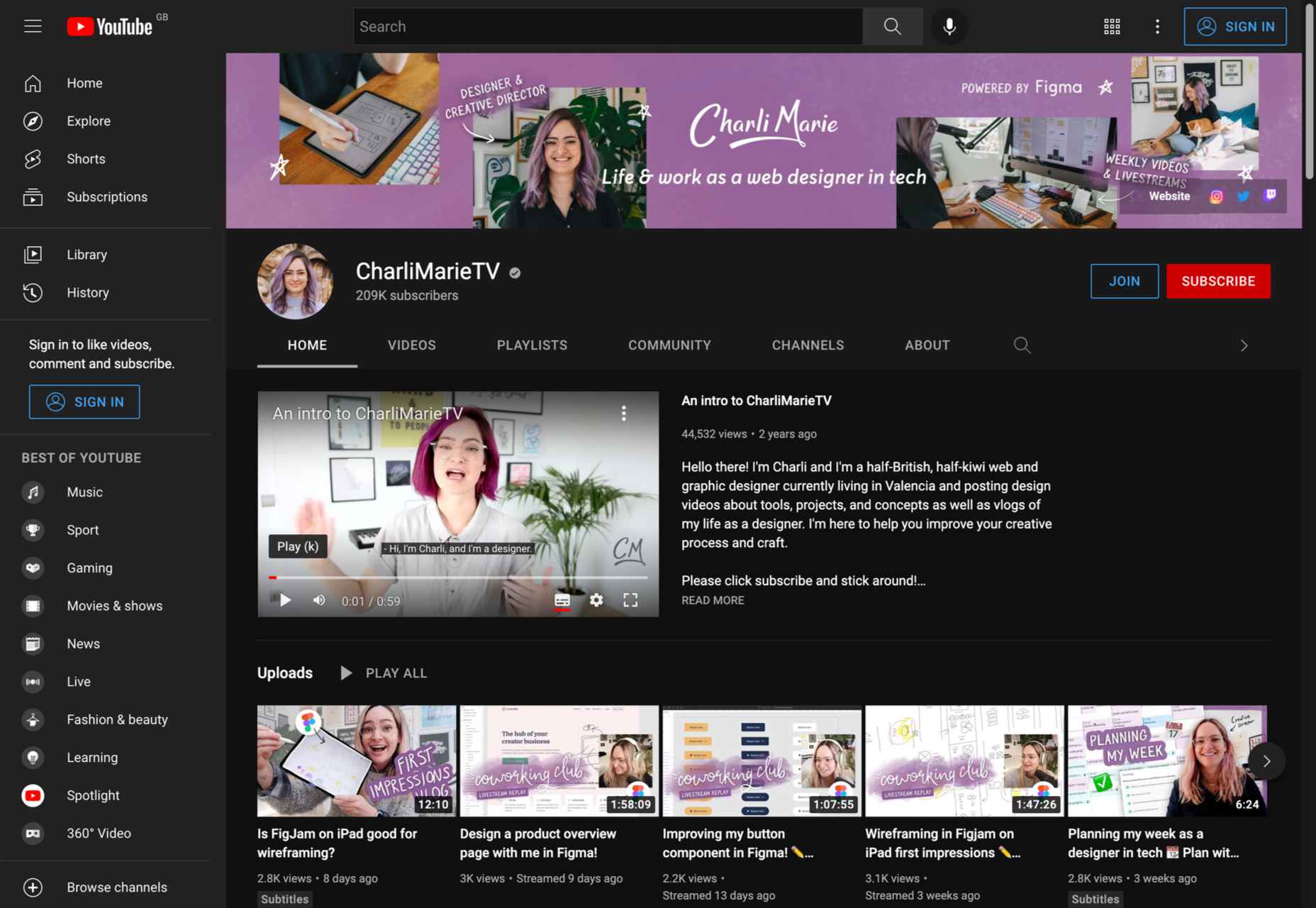
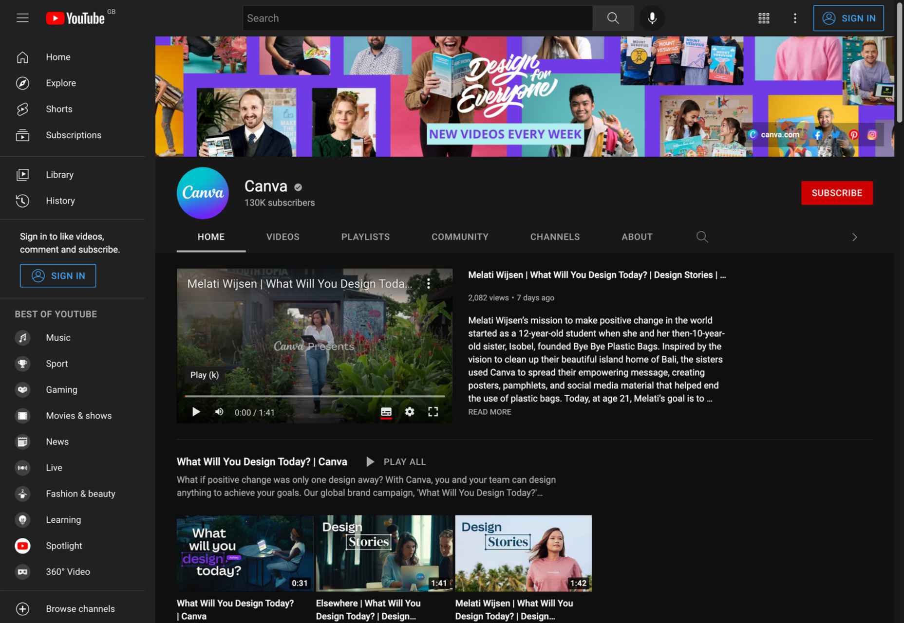
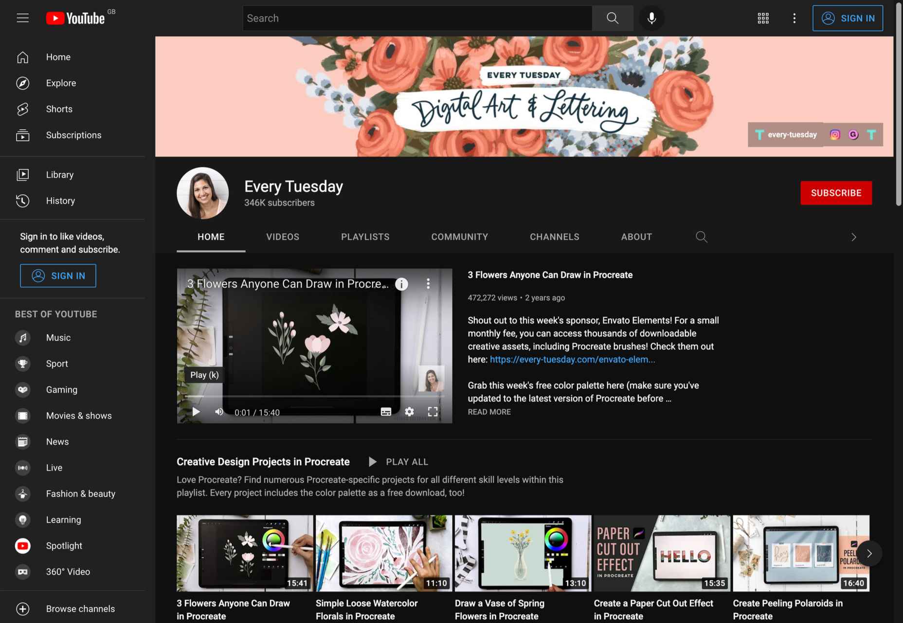
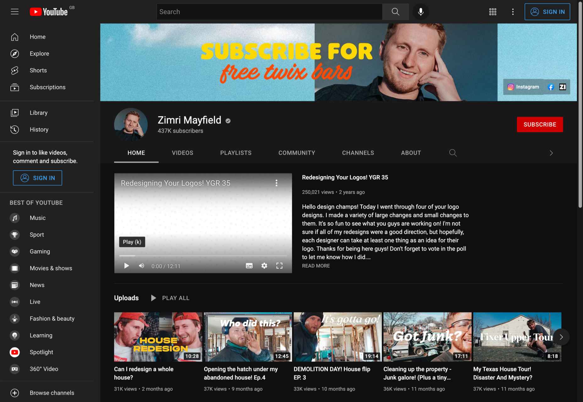
 Whether you are looking for comprehensive tutorials on UX design or professional courses on topics like logo design, video or photo editing, there’s the perfect YouTube channel for you as a designer.
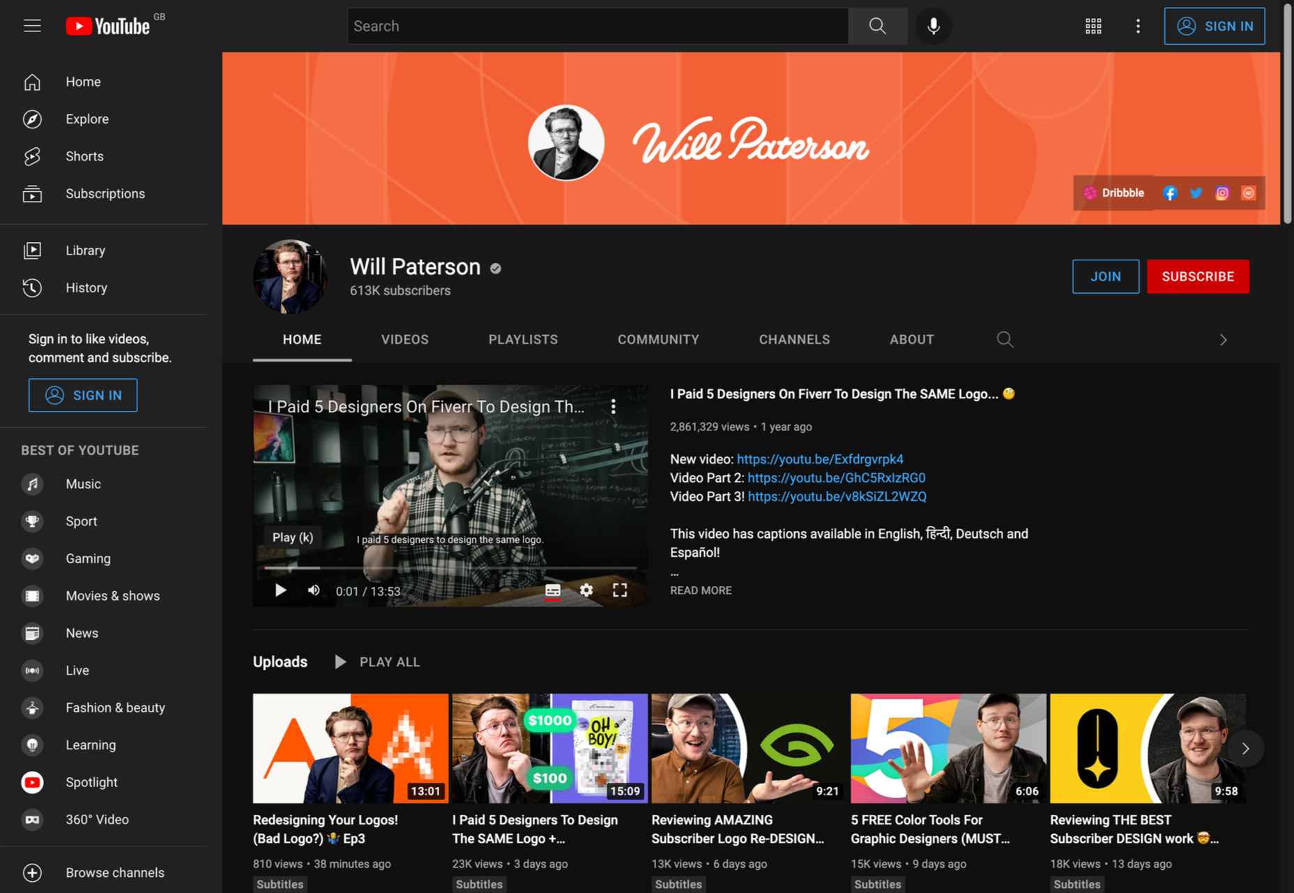
 Experienced web designers are always on the lookout for tools or resources that will (1) introduce them to the latest design trends, (2) enable them to incorporate features and functionalities that will make their products more competitive, (3) allow them to improve their workflows or all the above.


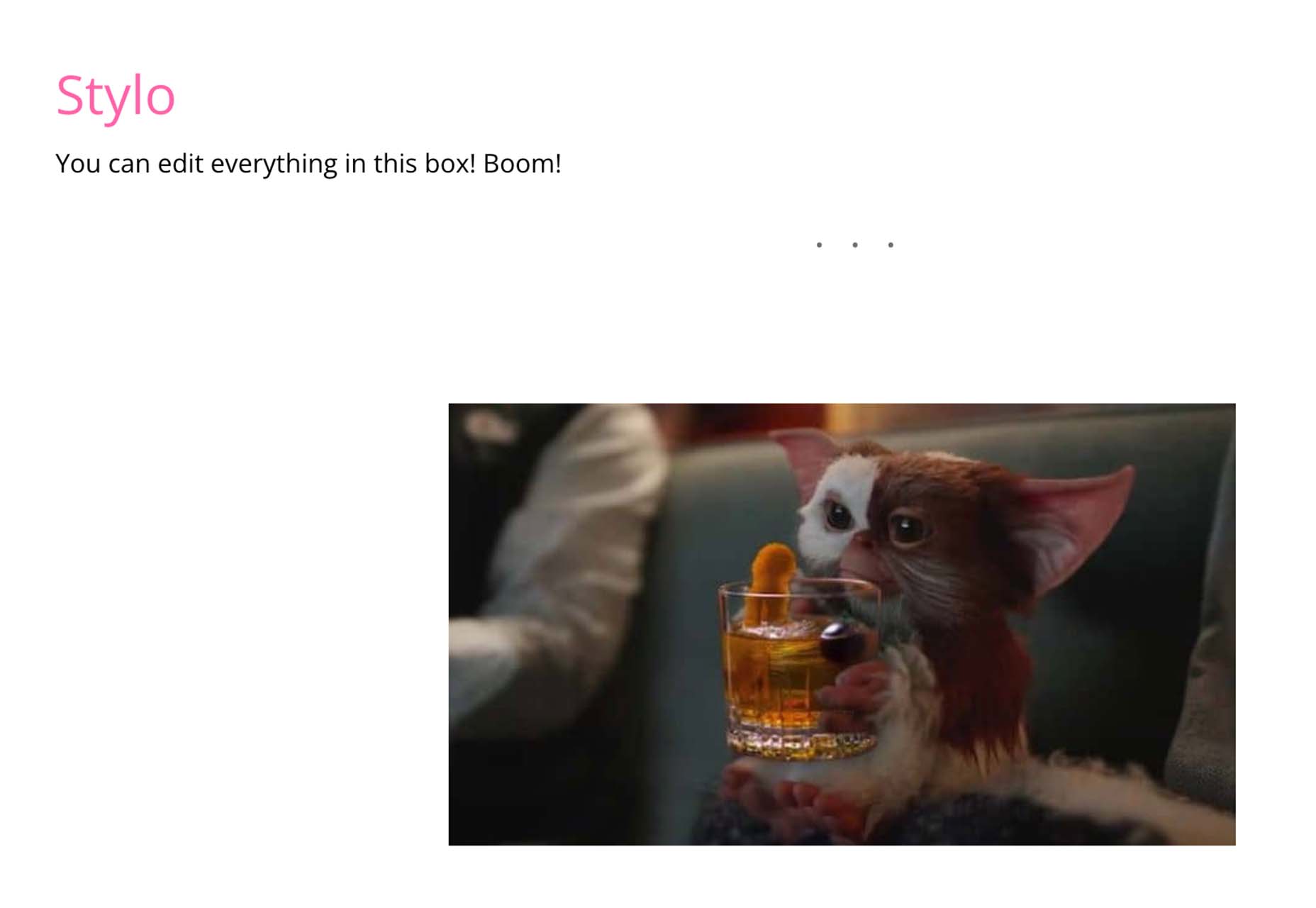
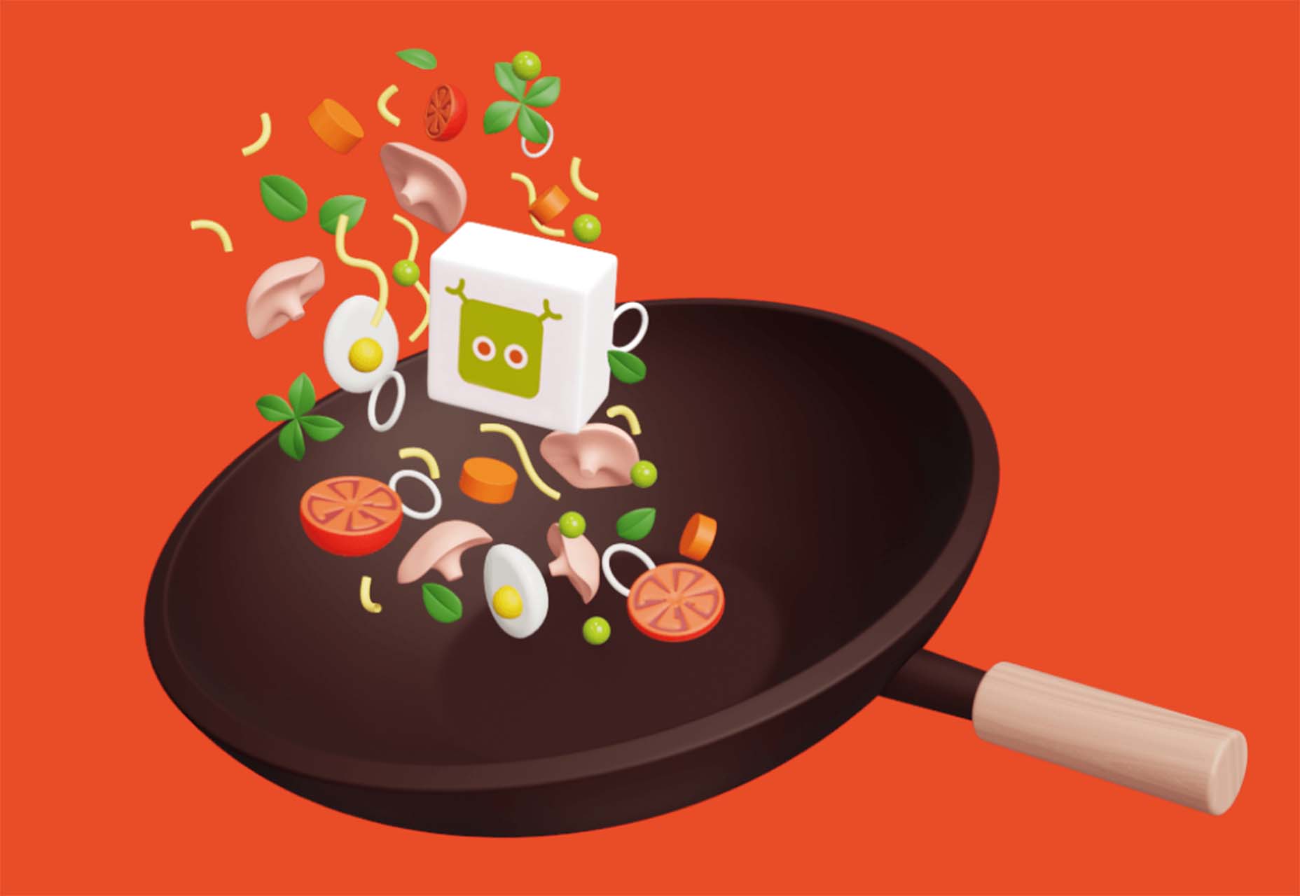
 We’re going to have some fun this month. There are so many new tools and resources out there for designers that make life easier, and others are simply enjoyable.

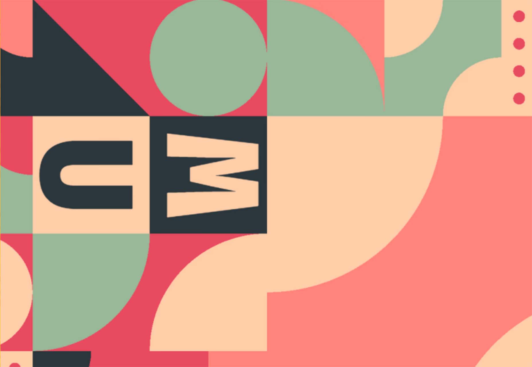

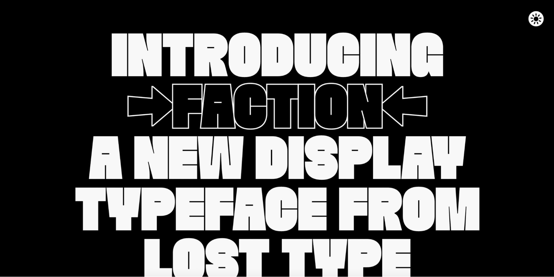
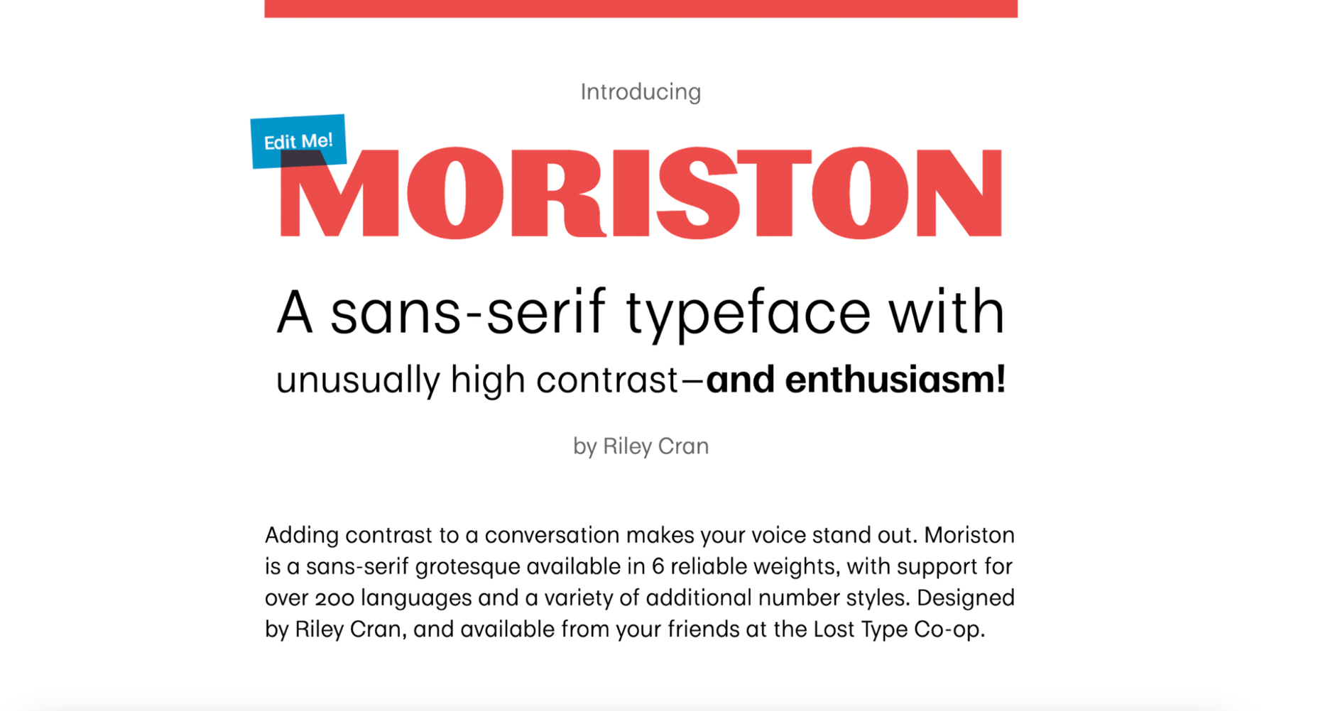
 As we move closer to spring, we’re going to see a change in typography styles come with it. While we always need new serifs and sans serifs to design with, in the spring, it’s not uncommon to use more nature-inspired and whimsical fonts to usher in the warmer temps, wedding season, and holidays like Earth Day and Mother’s Day.


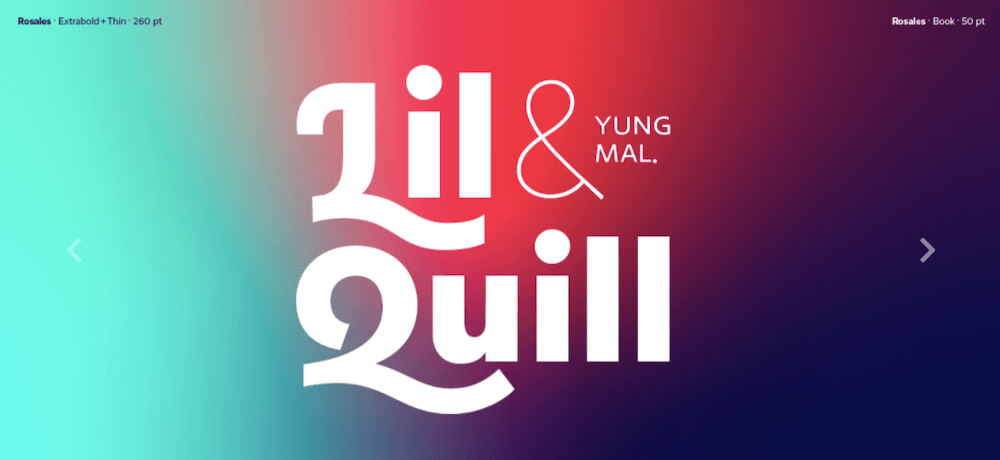


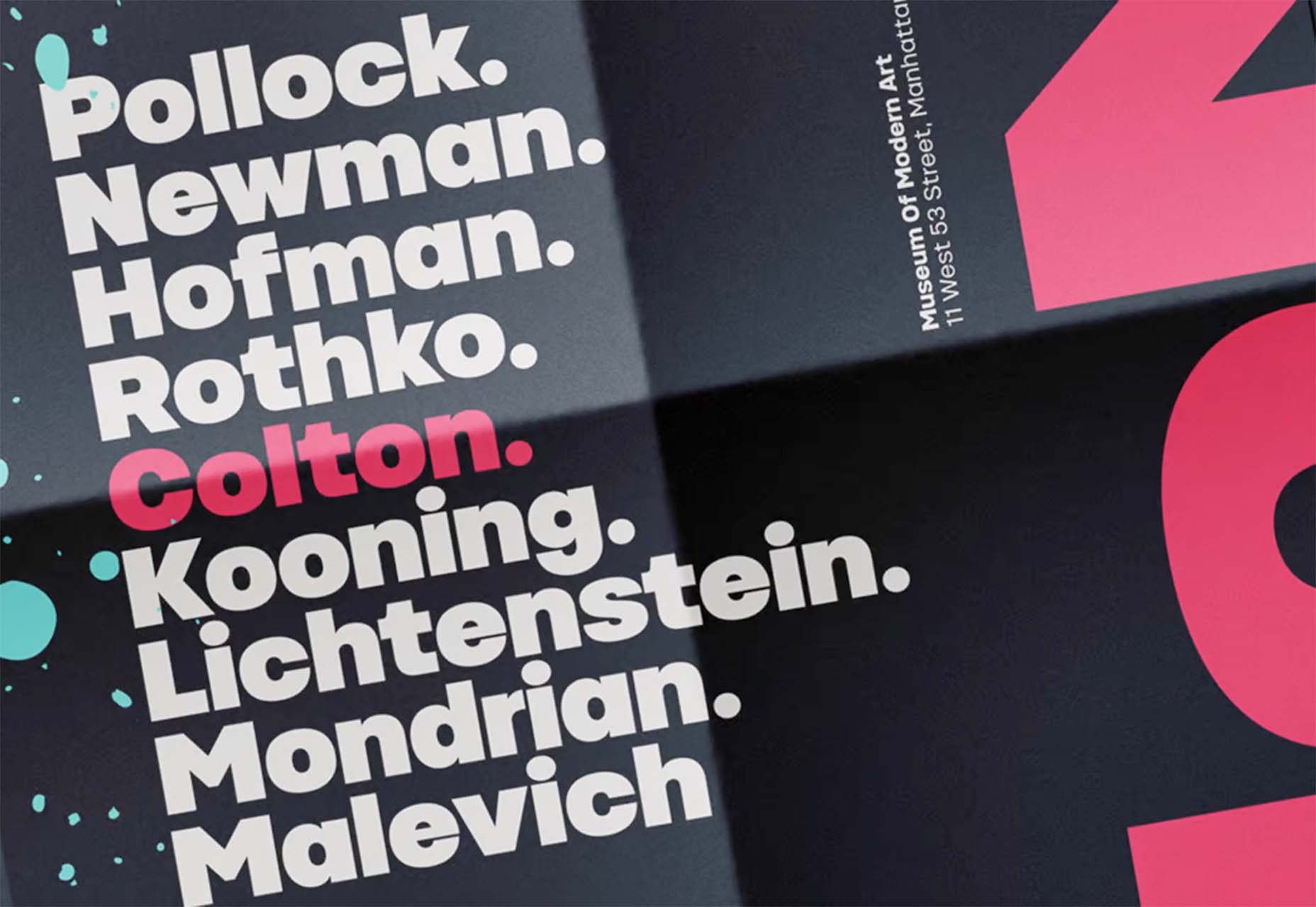
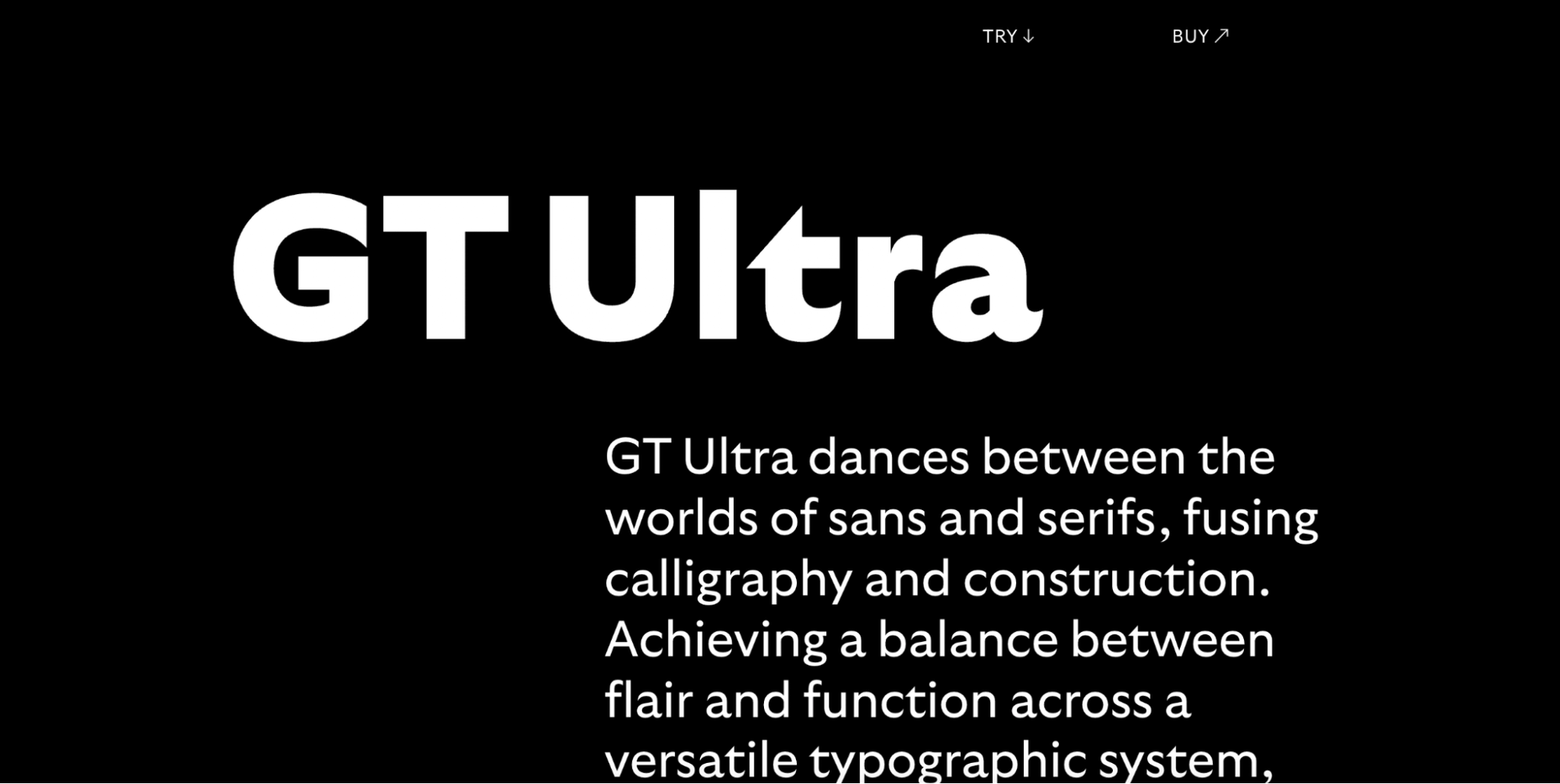
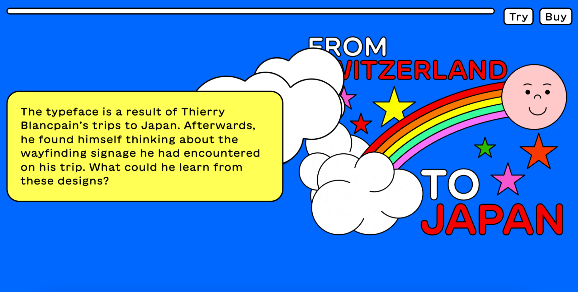
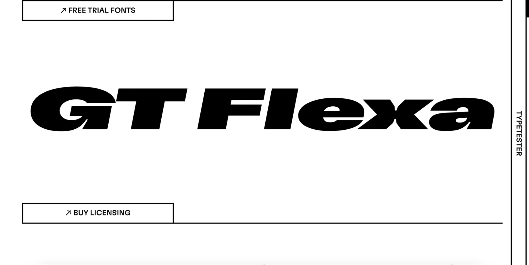
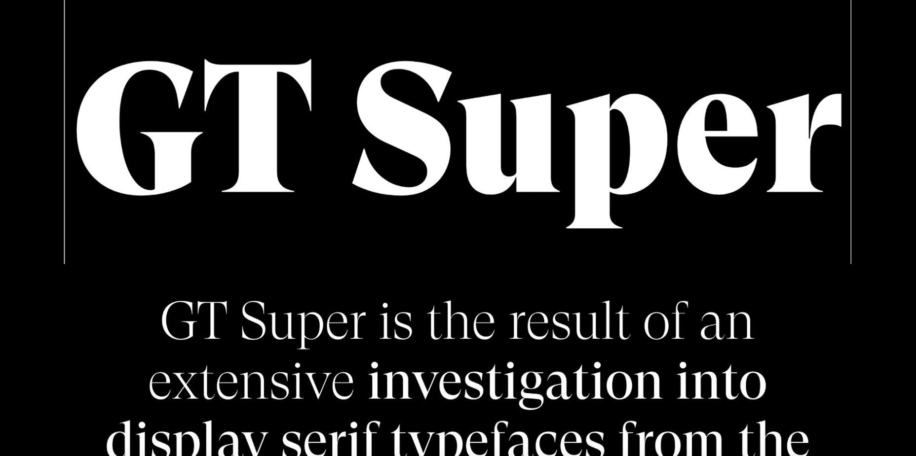
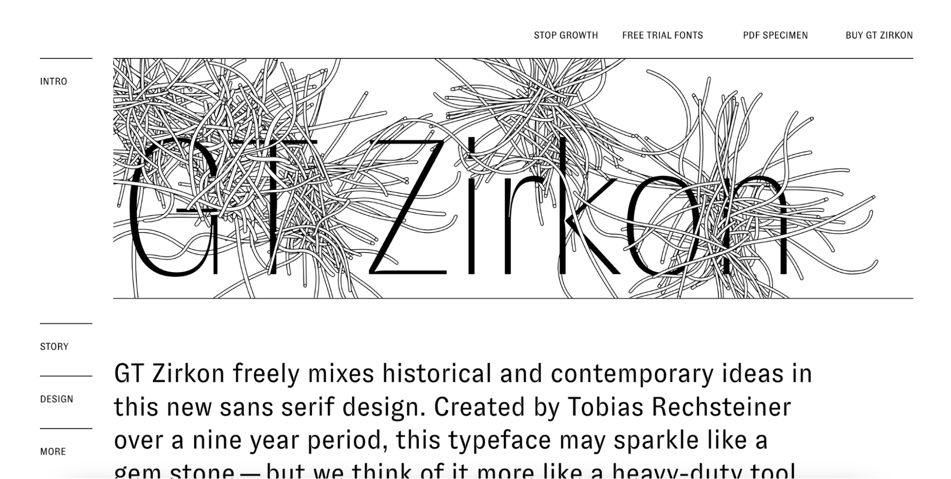
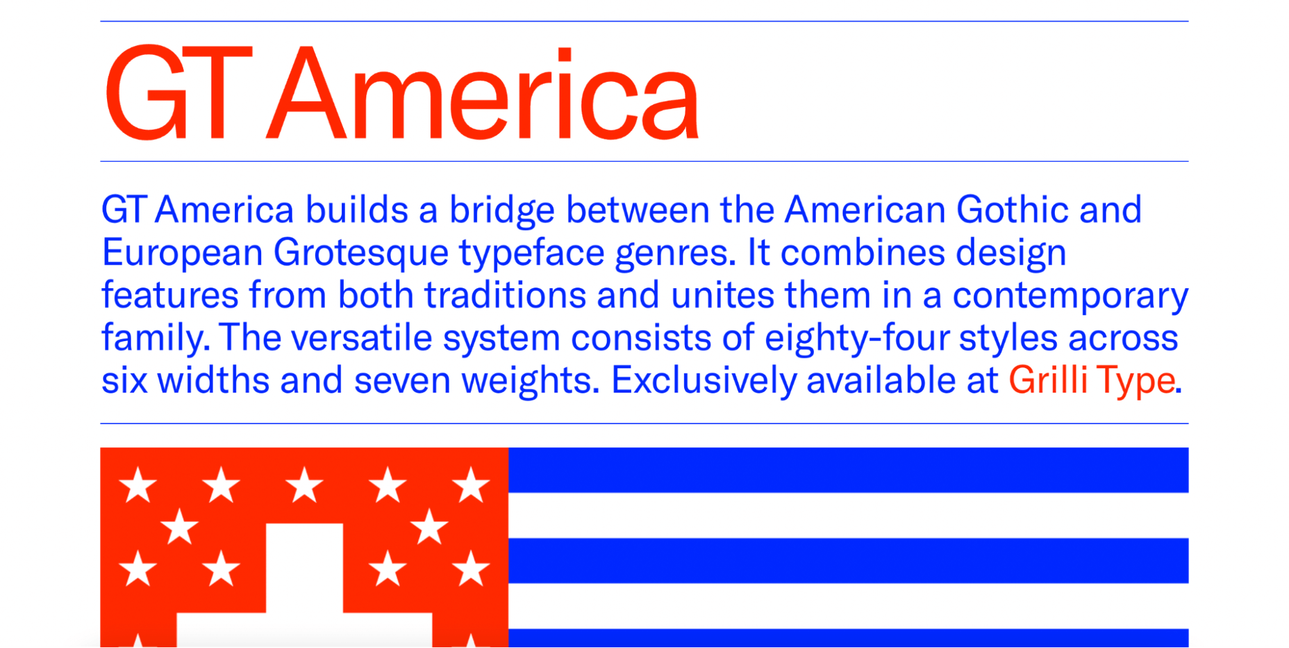
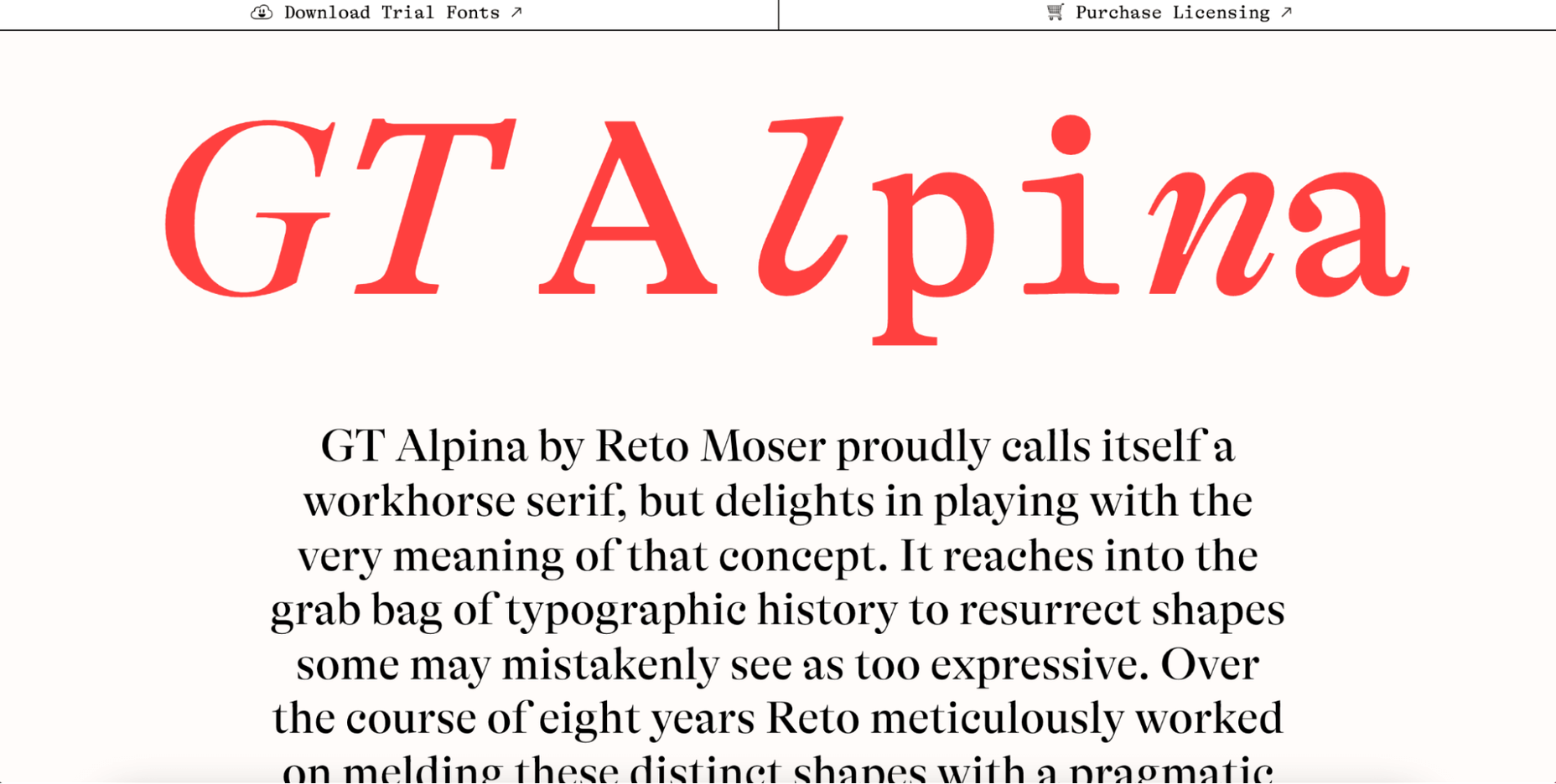
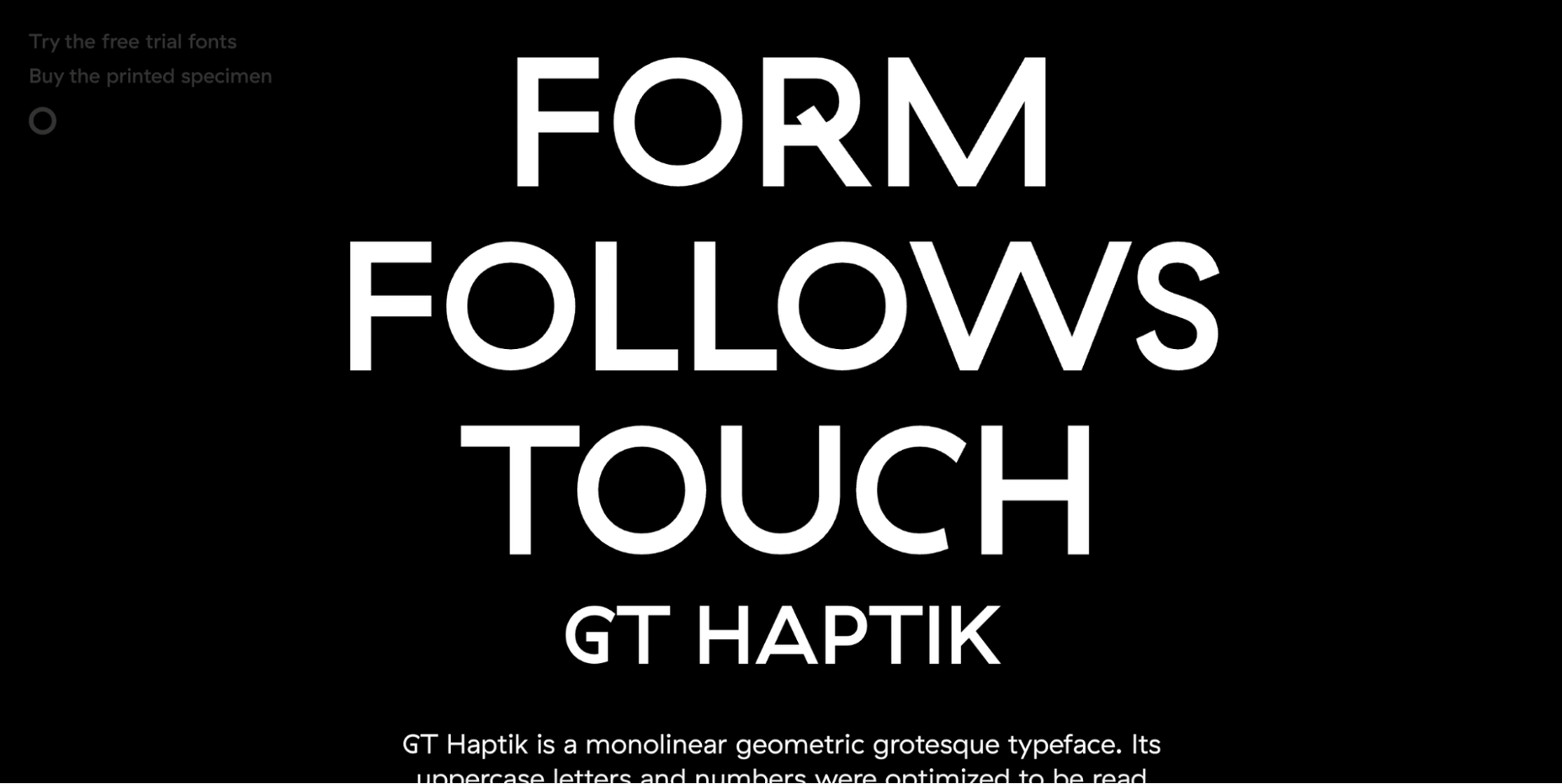
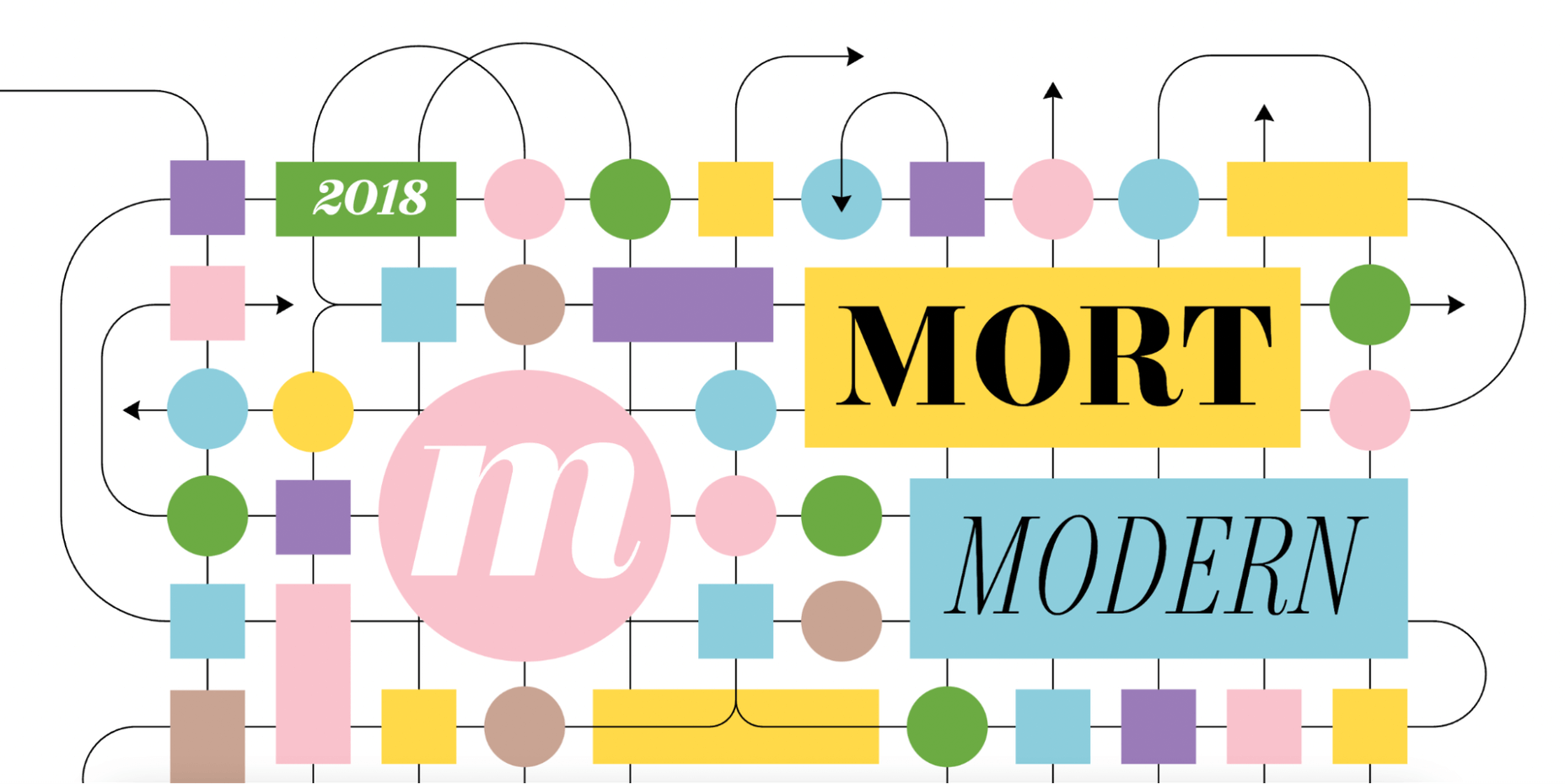
 Are you looking for a unique font that will make your next project shine? Or maybe you need a typeface with a beautiful design and rich history behind it. Luckily, mini-sites for fonts allow us to creatively explore a font’s origins and history. We know (from our own experience) how important it is for UI and UX designers to have a variety of fonts for our designs.
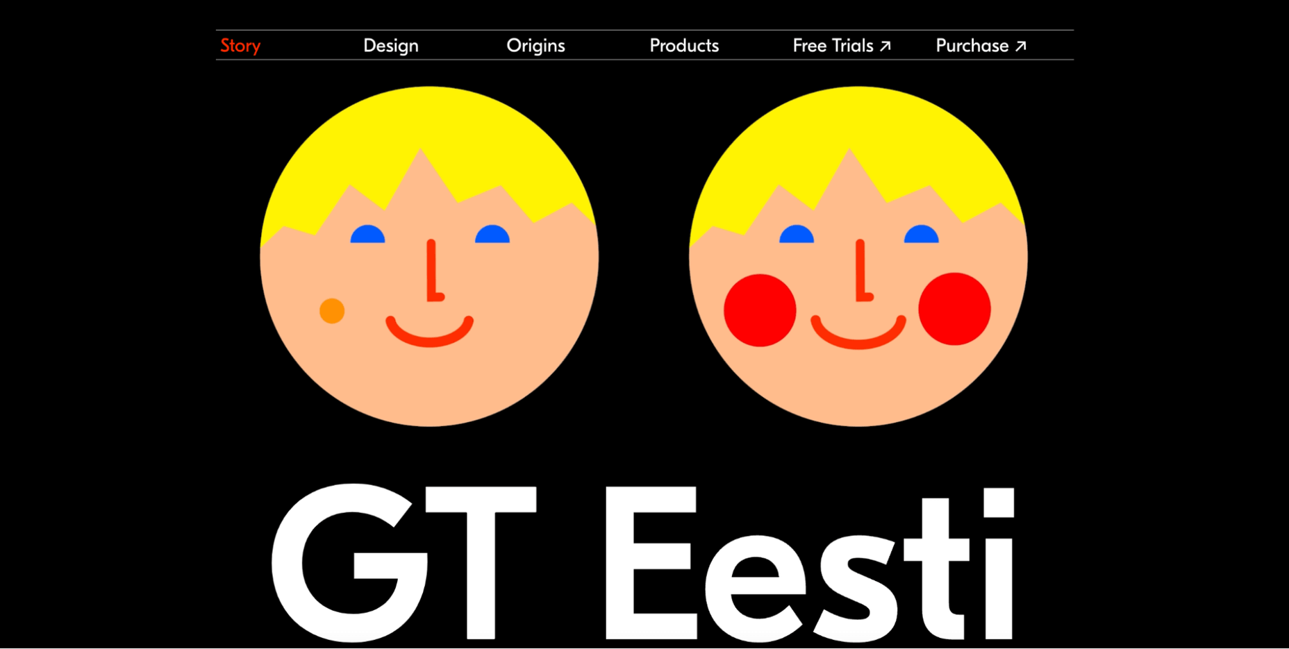


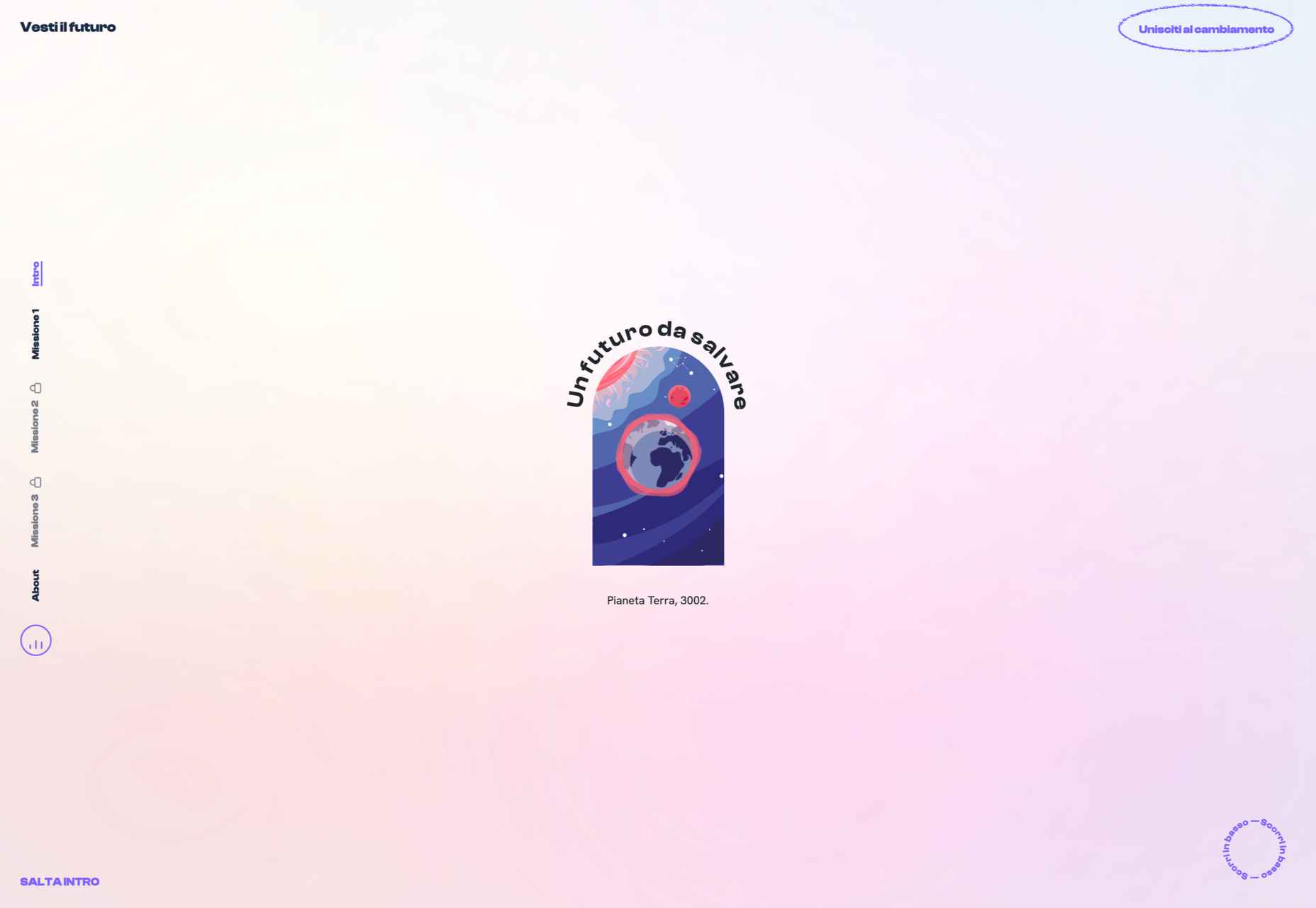
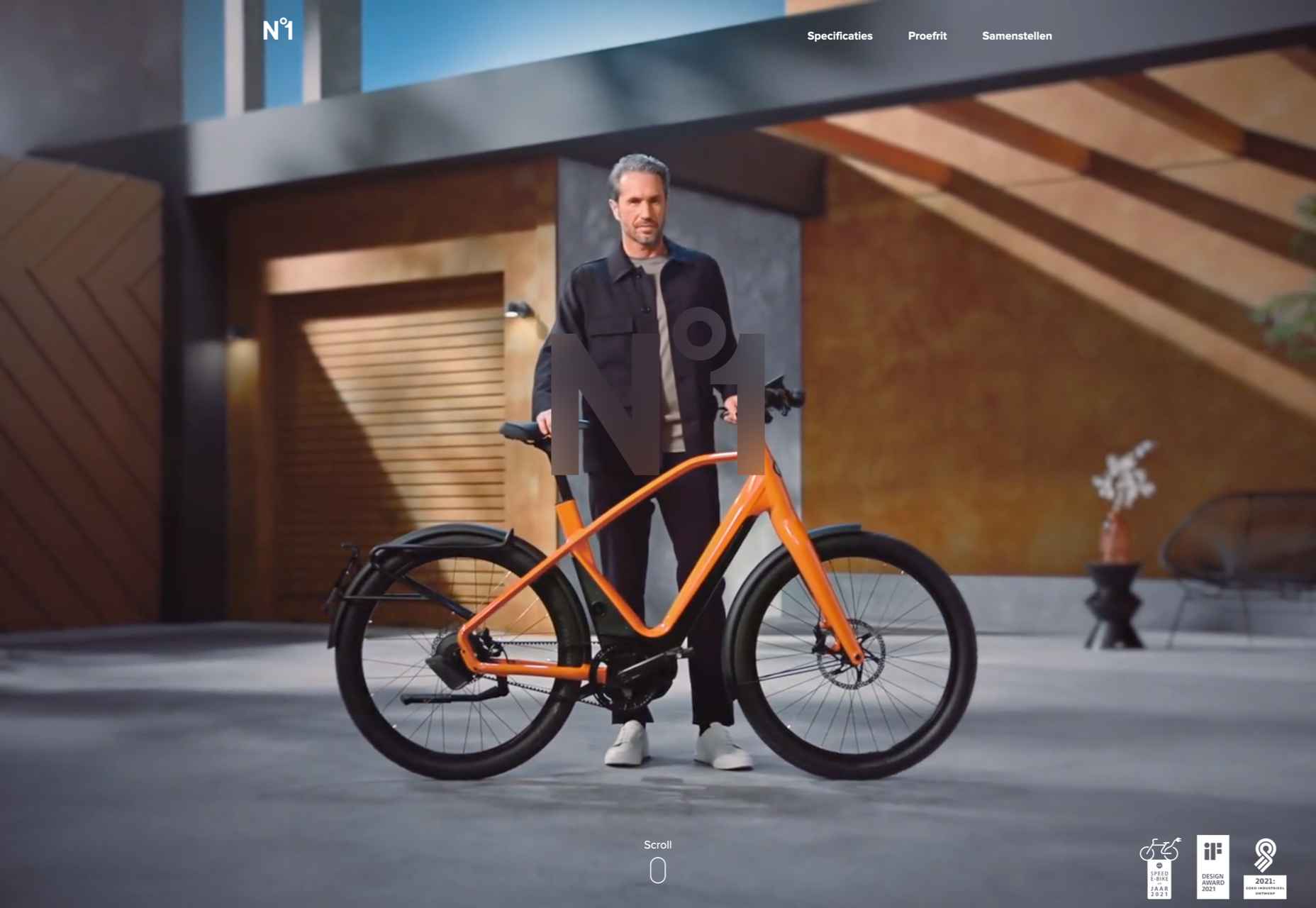
 What stands out as an incredible web design project for you? Do you count your creation as a success if it’s modern,

 User Experience (UX) design and User Interface (UI) design are two terms people sometimes mistakenly use interchangeably. While aspects of each are interconnected, there are distinct differences between UI/UX design.
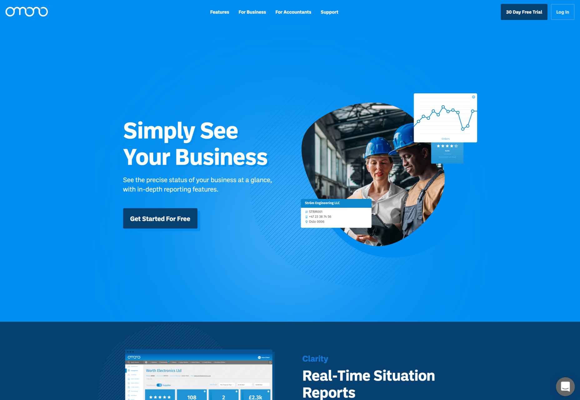
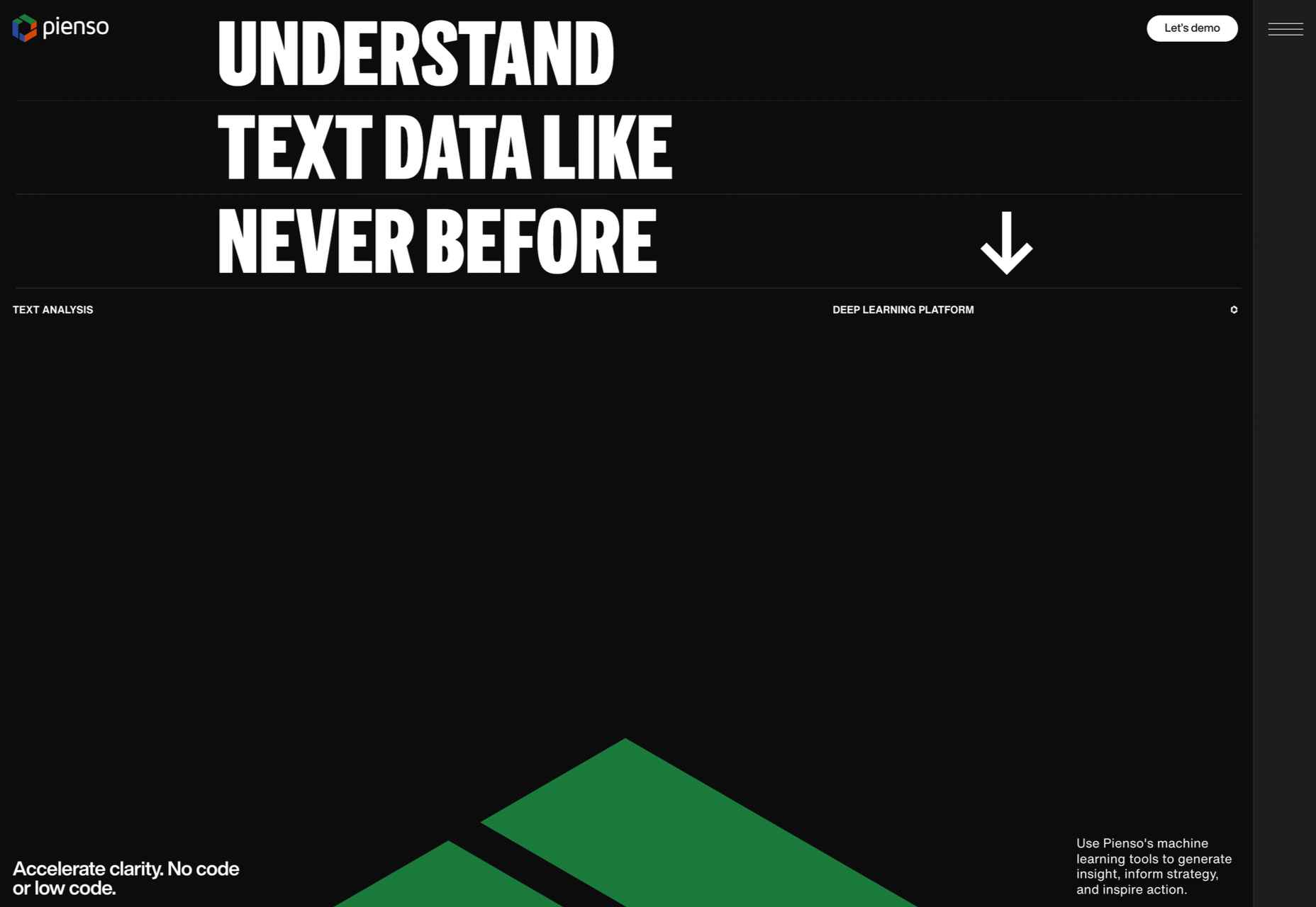
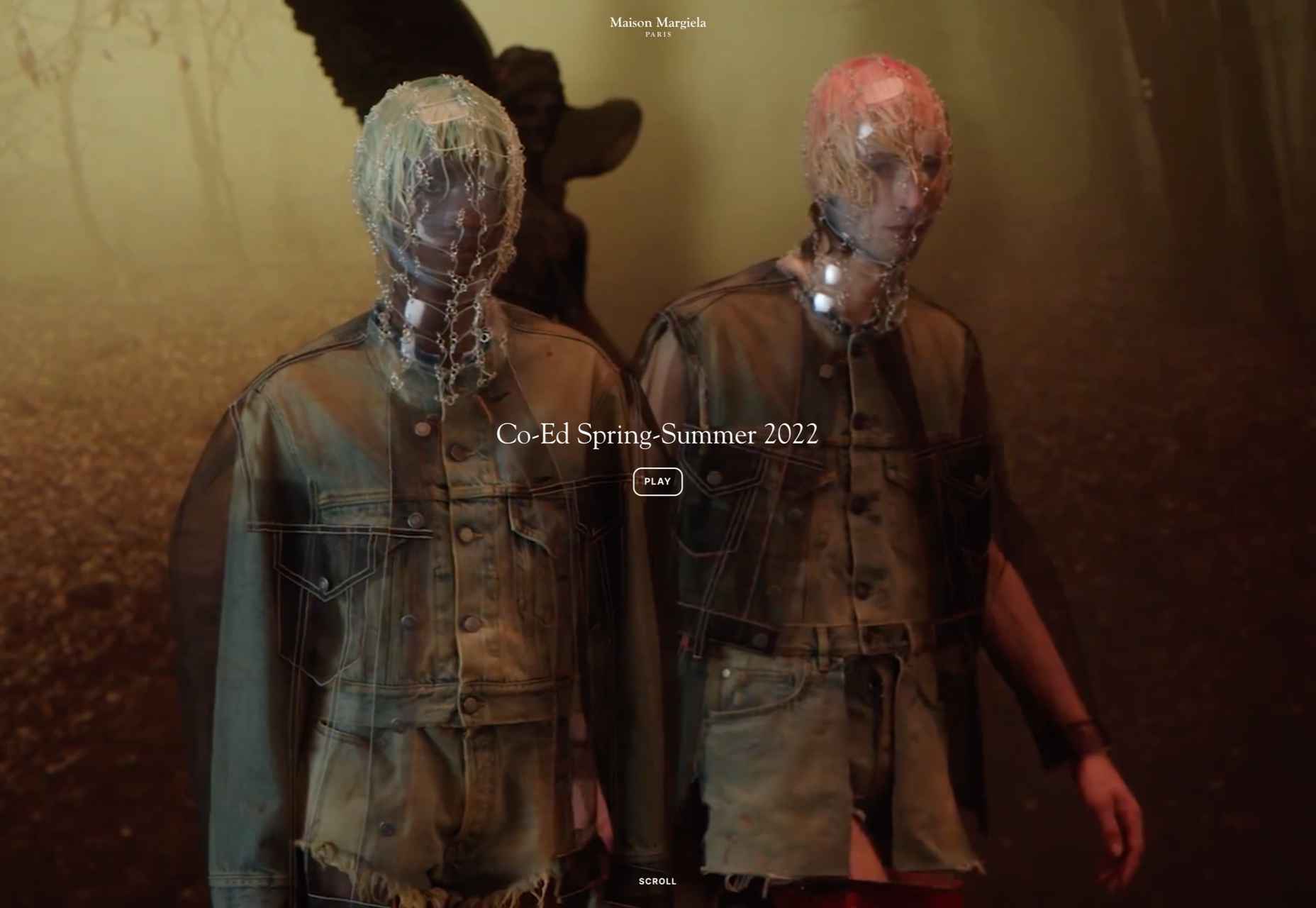
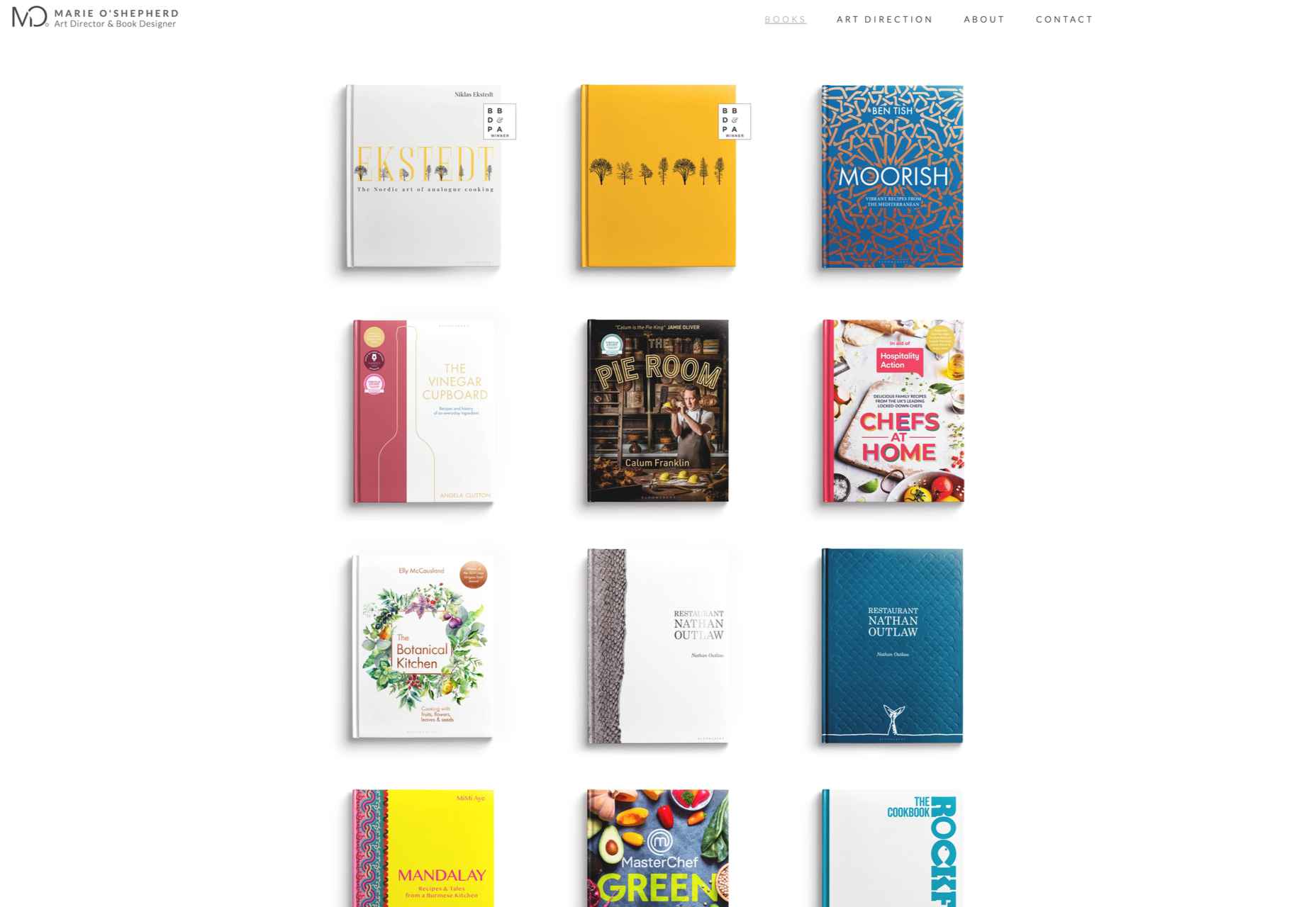
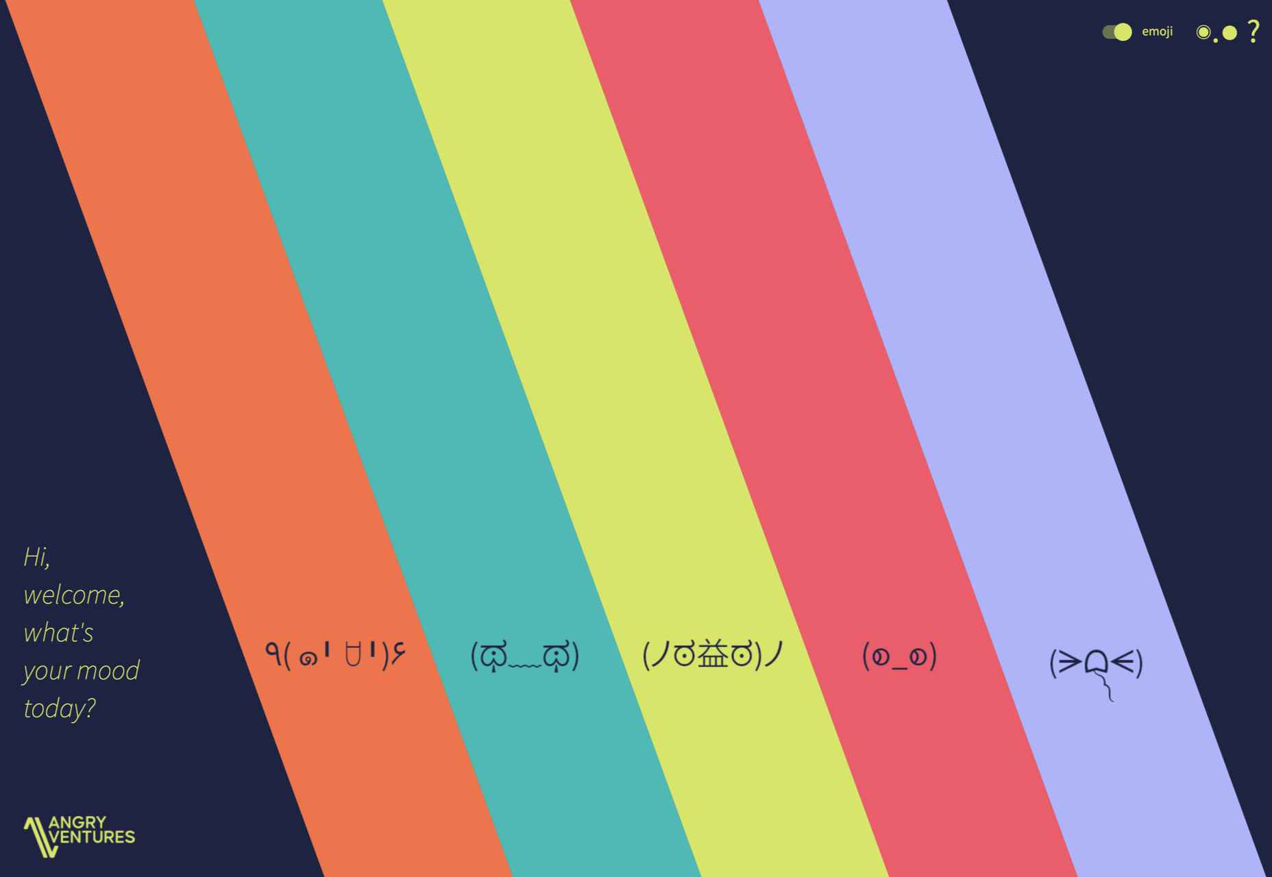
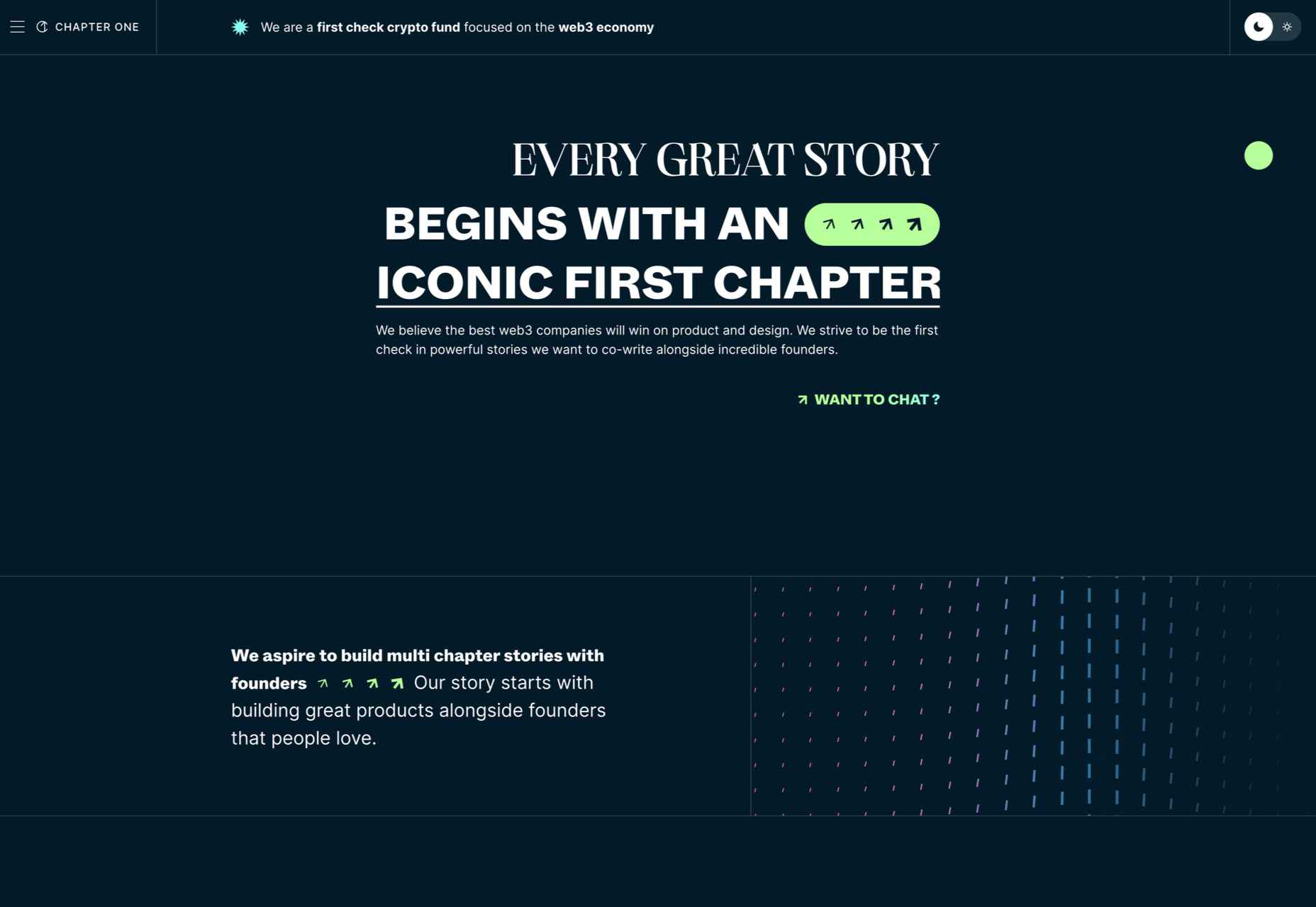
 So here we are, in a brand spanking new year—time for looking forward with fresh ideas and renewed hope for the year ahead. We are kicking off 2022 with a mixed bag and, we hope, something for everyone.