Articles

Asset management and website performance optimization are two of those unavoidable headaches faced by every website owner.

A digital asset management (DAM) platform can provide centralized asset repositories with intuitive dashboards to help you manage assets. On the other hand, an image CDN can help you get rid of that messy responsive syntax and provide dynamic asset optimization with huge performance boosts.

The problem is that website performance has become such a competitive factor that DAMs with other priorities tend to fall short. On the other hand, specialized image CDNs don’t solve the problems associated with image management, particularly within organizations.

With that in mind, I propose solving these problems for good by putting together image management and optimization stack using ImageEngine and Cloudinary. Instead of being a comparison between these two tools, this article describes the benefits of using them to complement each other.

Features and Asset Management Capabilities

As a DAM, Cloudinary provides you with a visual interface to store, manage, and edit your image and video assets. In that way, it’s not much different from any other professional image managing software such as Adobe Bridge, except that it’s an online, browser-based service.

Using the Media Library, you can upload, delete, and organize images in folders, for example. The visual image editor allows you to make advanced transformations and image touch-ups and see the results instantaneously using tools like sliders, dropdowns, etc. You can even chain transformations together for multi-layered effects.

Cloudinary also allows you to manipulate images and videos this way using their URL-based API.

Cloudinary has additional auxiliary features that make asset management easier (especially in organizations), such as backups, role-based multi-user admin, and feature extensions via third-party integrations and add-ons.

This is something most image CDNs don’t provide. Instead, they allow you to access and transform images using URL manipulation. Transformations are usually made using string-based parameters or directives. A serverless, headless DAM, if you will.

However, the advantage of using a dedicated image CDN like ImageEngine, is that it can usually provide enhanced asset optimization. ImageEngine, for example, is an intelligent image CDN that uses WURFL device detection to finely read the context an image is accessed from (device model, PPI, OS, browser, resolution, etc.) and then chooses the optimal image for that configuration.

This frees up website owners from having to do any additional optimization. This business logic is also built-in to all of their global PoP servers, and ImageEngine specifically delivers cache-hit ratios close to 100%. The following performance section will illustrate the difference this can make in practice.

Check out the key differences between ImageEngine and Cloudinary. And, for a deeper insight, see the comparison with other similar CDNs, like imgix and Cloudflare

Performance

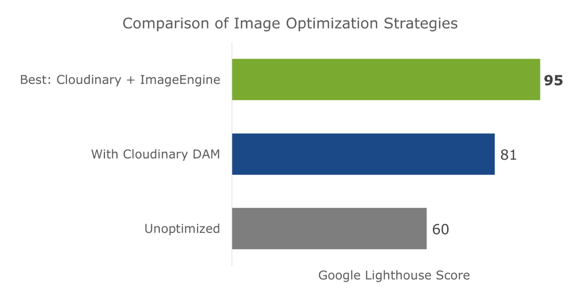
Just to cover our bases and prove that this is an effective asset management and optimization stack, I’m also going to affirm it using a Lighthouse performance audit. Here is a quick summary of the results:
For this test, I built a web page with a tonne of images with overly large file sizes. In this first Lighthouse audit, I didn’t apply any optimization to the images. Here’s the result:
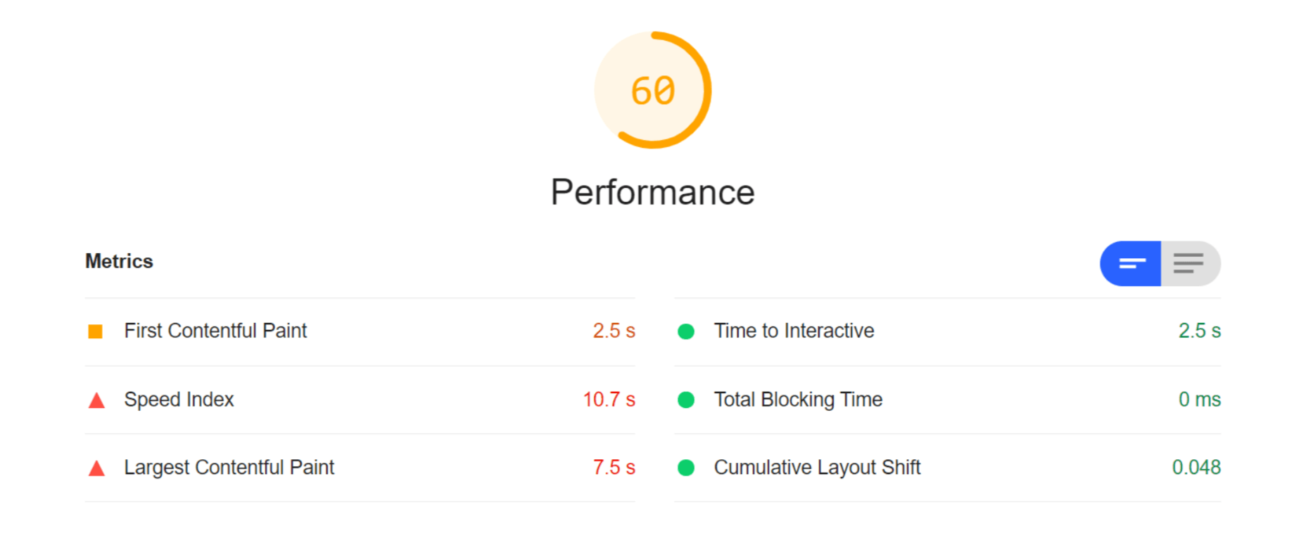
As you can see, we had some major problems when it came to the loading time of our assets. Overall, the page took more than 10 seconds to load. One of Google’s crucial user-centric performance metrics, LCP, scored a miserable 7.5s. Lighthouse suggested that some of the main problems encountered were the asset file size, inefficient cache policies, using non-optimal image formats, and improperly sized images.

Both Cloudinary and ImageEngine are supposed to address all of these factors with their auto image optimization. In the next audit, I used the same page and content but served my images via Cloudinary:
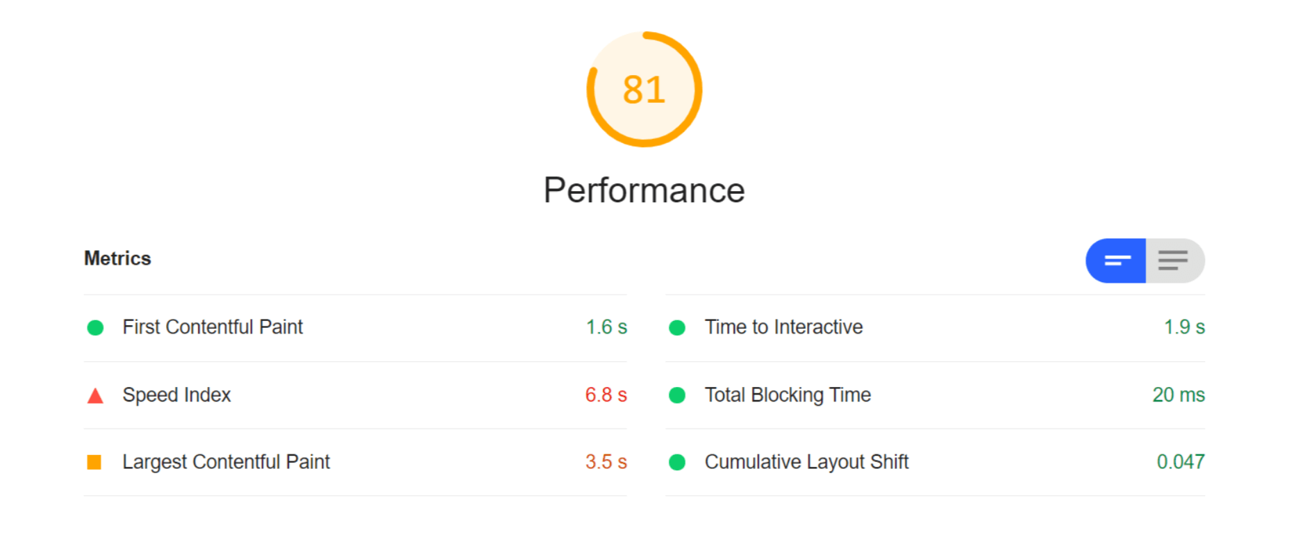
As you can see, there is improvement in most factors. FCP is now in the green, and both the Speed index and LCP times have almost halved. Even TTI and CLS improved slightly. That being said, it’s still nowhere near optimal, and we’re still falling short of the all-important 3-second loading time ceiling.

So, finally, let’s do another Lighthouse audit – this time using ImageEngine on top of Cloudinary. Here are the results:
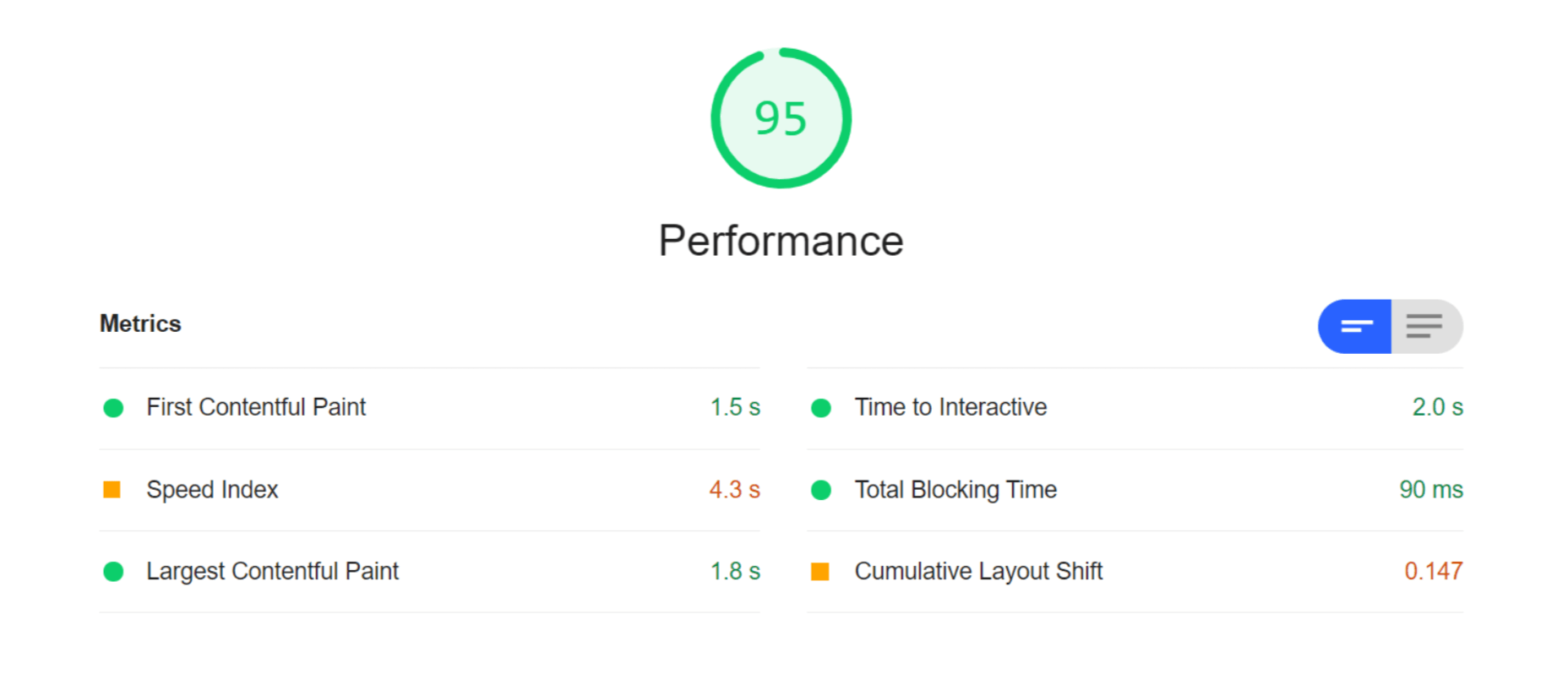
With ImageEngine, I finally scored in the green with 95. All the metrics that have to do with the sheer speed at which image content loads improved. The Speed Index and LCP, which is the most important, improved dramatically. CLS scored worse, but this typically varies from test to test.

You can find another and more extensive breakdown of the performance and pricing comparison here.

Transformations, Bandwidth Utilization, and Cost

Cloudinary’s pricing plans work on a credit-based system. Starting with the free account, you get 25 credits/month. Each credit can be used for 1,000 transformations, 1 GB of storage, or 1 GB of net viewing bandwidth. The other two packages cost $99 for 225 credits and $249 for 600 credits, respectively.

You should plan to generate a minimum of 5 transformations per image. In effect, that limits you to around 200 images with the free plan, excluding whatever manual transformations you make.

ImageEngine’s Basic plan costs $49 and provides you with 100 GB of Smart Bytes. Smart Bytes are based on optimized image content and translate to roughly 400-500 GB of raw images.

So, with Cloudinary, you have to compromise between bandwidth and storage usage as well as the number of transformations you can make. Transformations for Cloudinary are counted as they are dynamically generated on-demand.

However, if you use ImageEngine for optimization, you can switch off Cloudinary’s auto-optimization. When a new image variant is needed, it will be generated and delivered via ImageEngine. Considering variant count isn’t limited by ImageEngine, this will drastically cut down on the number of credits you’ll need to spend on transformations.

Effectively, that means you could use the bulk of your Cloudinary credits purely for storage and specific transformations. For example, advanced cropping, applying effects, or color adjustments. These are, after all, the main functions of a DAM.

With this setup, ImageEngine’s Basic plan and Cloudinary’s free plan should be adequate for most websites, saving around $50 a month.

How to Implement Cloudinary with ImageEngine

Signing up for Both Services

As it will house all of your image assets, the logical place to start would be to sign up with Cloudinary.

Create a (free) account, and make sure to take note of your “cloud name” during the setup wizard. This will be the name of your designated storage location on the Cloudinary platform and is usually a garbled string like di2zgnxh0 by default. However, you can change this to something more meaningful.

Once you’ve signed up, you can start uploading your image assets and creating different versions/transformations of them. Setting up Cloudinary integration on a CMS, like WordPress, is usually straightforward. Just indicate the CMS you’ll be using, copy the API key, install the plugin, and activate it.

Next, sign up for a free trial with ImageEngine. There will also be a short setup wizard during which you will:

  1. Provide ImageEngine with the website where your images will be delivered.
  2. Supply your image origin (in this case, your Cloudinary web folder). For now, you can only add the Cloudinary, e.g., res.cloudinary.com.
  3. Get your ImageEngine image-serving domain, e.g., {randomstring}.cdn.imgeng.in

When in your ImageEngine dashboard, you’ll see this domain listed under “Engines” as well as an entry for Cloudinary under “Origins.” Edit the latter and under “Advanced,” add your Cloudinary folder to the “PATH” field.

That’s it, you should now be able to store and manage images via Cloudinary and serve them via the ImageEngine CDN.

Dynamically Loading Specific Image Variants

Let’s take a look at a use case for loading different transformations of individual images on your site. This example will showcase how you can use Cloudinary’s advanced image editing tools to transform images while still reaping the optimization rewards of using ImageEngine as your image CDN.

A popular practice today is to use rounded images for team, client, or profile portraits. Using Cloudinary, you can load this transformation using the following URL:

https://res.cloudinary.com/myimages/image/upload/w_400,h_400,c_crop,g_face,r_max/w_200/profile.jpg

This will resize the image to 400 by 400px, focus on the face, and apply the maximum amount of radial cropping around it – to a width of 200px.

The same image can then be accessed via your ImageEngine delivery engine simply by swapping out the domain:

https://images.myimageengine.com.imgeng.in/image/upload/w_400,h_400,c_crop,g_face,r_max/w_200/profile.jpg

NOTE: I added my Cloudinary folder designation (“myimages”) as the path to my image origin. With that config, I don’t need to include it every time I use the image URL.

For example, you can set up the origin like this:
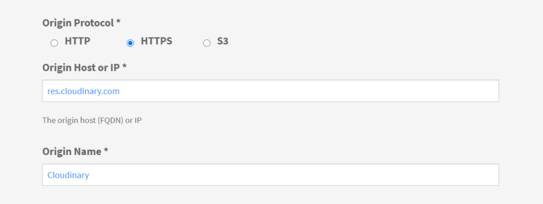
And, then under advanced:

If I specifically wanted to load the profile picture in WebP format (for transparency support, for example), I could add the ImageEngine directive f_webp:

https://images.myimageengine.com.imgeng.in/image/upload/w_400,h_400,c_crop,g_face,r_max/w_200/?imgeng=/f_webp/profile.jpg

ImageEngine and Cloudinary – The Wrap Up

Both ImageEngine and Cloudinary are superb platforms that can make managing image and video assets easier and improve your website maintenance. However, both services have their specialty in which they outperform each other.

For ImageEngine, it’s delivering blisteringly fast image loading times in next-gen formats and with a minimal loss of visual quality.

For Cloudinary, it’s providing a visual interface to organize, store, and edit your image and video assets.

As a further incentive, letting each of these services handle what they’re best at can lead to lowering your long-term operating costs.


[– This is a sponsored post on behalf of ImageEngine –]

Source

The post Start Using a Smart DAM and Image Optimization Stack first appeared on Webdesigner Depot.


Source de l’article sur Webdesignerdepot

At the dawn of the web-era, there was much focus on how environmentally friendly websites were: we’d chop down fewer trees, ship fewer products, and travel less for business.
And because the web was small, any negative impact it had was relatively small. But the Internet’s no longer small, and neither is the impact it has on the environment. The average website uses 211,000g of CO2 per year, watching a video online outputs an estimated 0.2g of CO2 per second, and a single email can cost 50g of CO2.

In the next four years, the tech industry as a whole may use up to 20% of the world’s electricity and be responsible for 5.5% of global CO2 emissions.

The good news is that because websites are viewed many times, even small improvements can multiply into real change.

1. Reduce Energy Consumption

Through electricity use, the Internet generates around the same CO2 as most major countries. That carbon comes from two sources: the devices we use to access the Internet and the servers that host our data.

Computers heat up, and when they heat up, they slow down. Servers are especially vulnerable and use extraordinary amounts of energy to keep cool and functional, which is why Microsoft keeps throwing servers into the sea.

Make It Faster

The faster your site, the less data is used to serve it, and the less carbon it’s outputting; it’s that simple.

Reduce the Number of Resources Used

Everything you load on your site has an impact. You might think that a tiny PNG is too small to really impact your carbon footprint, but over thousands of page loads, its impact is multiplied. Anything you can do to reduce the number of actual files requested will reduce your carbon output. You can use sites like Ecograder to estimate your own site’s CO2 output.

Optimize Images

If there’s one thing you can do to reduce the size of your site, the amount of data that needs to be sent over the Internet to serve your site, and the resulting speed, it’s optimizing your images.

Nothing reduces a site’s footprint like optimizing images. It’s easy and free to reduce the size of JPGs and PNGs with a service like TinyPNG. Offer WebP to any browser that will accept them; it will boost your Lighthouse score and improve your CO2 usage.

Lazy Load Images

Lazy loading images means images are loaded as they are required; images at the top of a page always load, images further down only load when the user scrolls to them; if the user doesn’t scroll to the bottom of the page, they don’t load, saving you CO2.

Reduce The Amount Of JavaScript You Use

Yes, JavaScript is awesome. Yes, it can be hugely beneficial to UX. And yes, it munches on energy like it’s candy.

When a web page loads, it’s done, the total cost is in. If JavaScript keeps running in the background, redrawing the screen based on user interaction — as is the case with a parallax site — the web page keeps using up energy on the device.

Choose a Sustainable Hosting Company

You can reduce the power needs of a site, but you can’t eliminate them. One simple step is to opt for a hosting company that gets its electricity from sustainable sources such as wind power or solar.

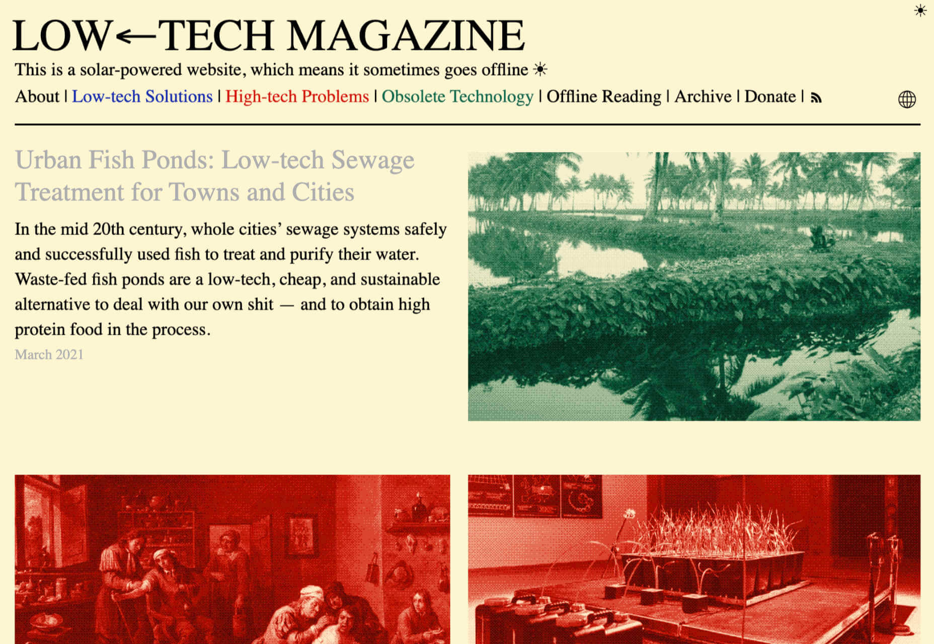
Low←Tech Magazine is powered by a server that runs on solar energy and carries a warning that it may go offline. But it’s possible to host both reliably and sustainably. Many web hosts outsource their actual server management, so they have no control over how those servers are powered, but there are plenty of exceptions that guarantee green web hosting. Google Cloud aims to be the cleanest in the cloud industry. For green web hosting, I always recommend the all-round superb Kualo.

2. Be Inclusive

One of the biggest issues with the EV (Electric Vehicle) movement is that we’re replacing cars earlier than we normally would in a rush to move to “clean” driving.

A new EV certainly outputs less than a gas-powered vehicle when driven the same distance. Combine increased use — because owners think they are driving cleanly — with the fact that a new EV has to be manufactured, the minerals for batteries have to be mined (in horrific conditions), and it then needs to be shipped to you, and EVs are not as friendly as they appear — so go ahead, buy that vintage Porsche it’s probably better for the environment than a Tesla.

Support Legacy Devices

The same issue that applies to cars applies to devices. Every time we rush ahead to support the latest iPhone, we leave older generations behind. A device can and should last longer than two years.

This is not to say that you shouldn’t embrace modern web standards. Technologies like CSS Grid are excellent at reducing markup size and speeding up sites. CSS Grid has been well supported for over four years, and even “legacy” devices can handle it. If you can keep a phone for an extra six months, the environmental cost of that phone is reduced by 20%.

3. Help Users Make Good Choices

More and more people are trying to make good choices. We’re eating a healthier, balanced diet. We’re recycling clothes. We’re traveling by bike, and on foot, instead of by car. People want to do the right thing, and they seek out companies that aid them.

Improve Navigation

Anything that you can do to make your content more findable will mean fewer page loads and therefore consume fewer resources.

By improving your information architecture, improving your search accuracy, and improving on-page signposts like bread crumbs and link text, you help users find content faster.

Feelgood Feedback

When the environmental impact of a user’s actions are quantifiable, let them know. Users who care will appreciate it, and users who don’t will ignore it.

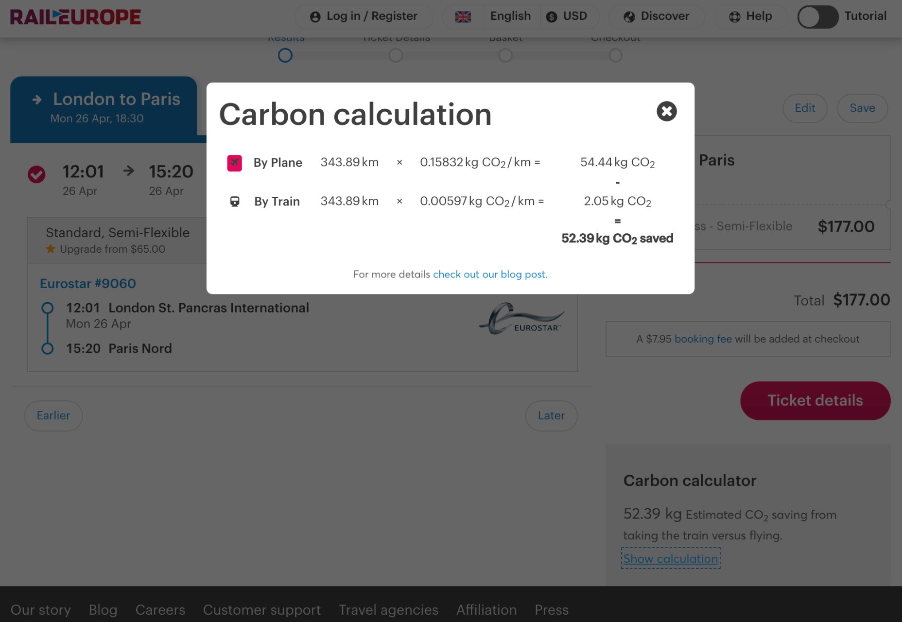
Raileurope.com adds a note to any quotation letting you know how much carbon you’ve saved by traveling by train instead of flying.

Don’t Remove the Shipping Rate

Many ecommerce sites offer free shipping, especially above a certain order value; it’s a good way to encourage higher sales. But absorbing the shipping cost implies that there is no shipping. By highlighting the shipping costs, even if they’re not passed on to the customer, you remind them that there is an environmental cost and a financial cost.

You can absorb the shipping rate without implying there is no cost by adding the shipping and then explicitly deducting it as a discount.

Sustainable Web Design Is Good For Business

The fundamentals of good web design are the fundamentals of sustainable web design.

Make it fast and usable, and you’ll also be making it energy efficient. Make it inclusive, and you’ll help the industry slow the ever-growing tendency to consume. Make it transparent, and you’ll help your users make good choices of their own. All of these things are not only good for the environment, but they also result in improved UX and SEO.


Featured image via Pexels.

Source

The post 3 Effective Ways To Improve Your Site’s Carbon Footprint first appeared on Webdesigner Depot.


Source de l’article sur Webdesignerdepot

De tous les défis auxquels le monde est confronté aujourd’hui, le changement climatique représente la plus grande menace. Des points de basculement que nous ne nous attendions pas à voir franchir avant de nombreuses années ont déjà été atteints. Il reste peu de temps pour arrêter les changements irréversibles et désastreux des systèmes climatiques de la Terre.

L’objectif mondial de zéro émission carbone est un gigantesque challenge. Une transition significative vers les énergies renouvelables ne peut à elle seule résoudre que 55 % des émissions mondiales. Les 45 % restants résultent des transports, de l’utilisation des sols, de la gestion des bâtiments et de la production de biens de consommation et industriels. L’action en faveur du climat nécessite de nombreuses solutions différentes et interdépendantes. Elle doit être un effort conjoint des nations, des sociétés civiles et des entreprises.

L’évolution vers des pratiques commerciales durables est impulsée par les gouvernements, les consommateurs, les investisseurs et même les employés. Si la plupart des entreprises surveillent et mesurent les émissions de CO2 de leurs sites de production, les clients exigent de plus en plus de connaître l’empreinte carbone complète des produits qu’ils achètent.

En conséquence, les entreprises doivent passer du modèle linéaire qui domine encore aujourd’hui le secteur à une économie circulaire – un changement systémique qui renforce la résilience à long terme, génère des opportunités commerciales et économiques et procure des avantages environnementaux et sociétaux.

Dans cette nouvelle équation, le carbone devient de plus en plus un nouveau vecteur de transformation. Il s’agit effectivement d’une « monnaie » mondiale et universelle qui peut être suivie, échangée, gérée et minimisée comme toute autre ressource. Pourtant, pour la plupart des entreprises, la gestion du carbone est considérée soit comme un coût nécessaire à la conduite des affaires, soit comme une taxe qui sert de pénalité. D’une manière ou d’une autre, elle est considérée comme corrosive pour les bénéfices.

Mais que se passerait-il si nous pouvions convertir la gestion du carbone en stratégie d’investissement qui puisse également générer des bénéfices ? Et si nous pouvions rendre la durabilité rentable et la rentabilité durable, sans sacrifier l’une à l’autre ?

Cette idée est tout aussi visionnaire que prometteuse. Prenons l’exemple d’une grande entreprise de biens de consommation. À un horizon de cinq à dix ans, en fonction de l’évolution de la législation, il est possible d’éviter des dépenses de compensation de 1 à 2 % du chiffre d’affaires par an, d’augmenter le chiffre d’affaires de 1 à 3 % par an et de réaliser des économies de 2 à 5 millions d’euros par an grâce à une comptabilisation et une déclaration plus précise et plus efficace des émissions.

Pour ce faire, les entreprises ont besoin de logiciels qui les aident à mesurer, à comptabiliser et à prendre les bonnes actions – et SAP est très bien positionné pour répondre à ce challenge. Nous gérons les chaînes logistiques des plus grandes entreprises du monde, nous pouvons jouer un rôle central en aidant les entreprises à gérer leur Green Line* en minimisant l’empreinte carbone et l’impact environnemental négatif de leurs produits.

Inscrivez-vous dès maintenant au SAP Sustainability Summit pour les détails sur la manière dont nous aidons les entreprises à gérer leur Green Line* de manière responsable.

* en plus du pilotage traditionnel de la « top line » – c’est-à-dire la génération de chiffre d’affaires – et de la « bottom line » – l’optimisation des résultats nets et la profitabilité, les entreprises doivent maintenant piloter la « green line », c’est-à-dire la production responsable et durable.

Article original posté sur Linkedin en anglais

The post Empreinte carbone : on ne peut pas gérer ce que l’on ne mesure pas appeared first on SAP France News.

Source de l’article sur sap.com

March is that time of year where the feeling of newness starts, from the first Spring days to fresh design projects. These trends are no exception, with fun new takes on some classic concepts.
Circles are always popular, but the top trend is an animated take on the traditional element; plus, fun pink and purple color palettes and a few faux split screen designs round out trending styles.

Here’s what’s trending in design this month.

Circle Animations

Circles are one of those shapes that never leave the design sphere. They have a lot of classical meaning and are flexible in terms of design options.

Designers are having a lot of fun with this shape right now. From animations to text circles to image frames, they seem to be all over the place.

More recently trending is more circle-shaped animations. This trend maintains a circle’s properties as a unified and harmonious element with movement to create more engagement and make you look at the design just a little bit more.

Each of these examples uses circles in a different but equally interesting – and animated – way.

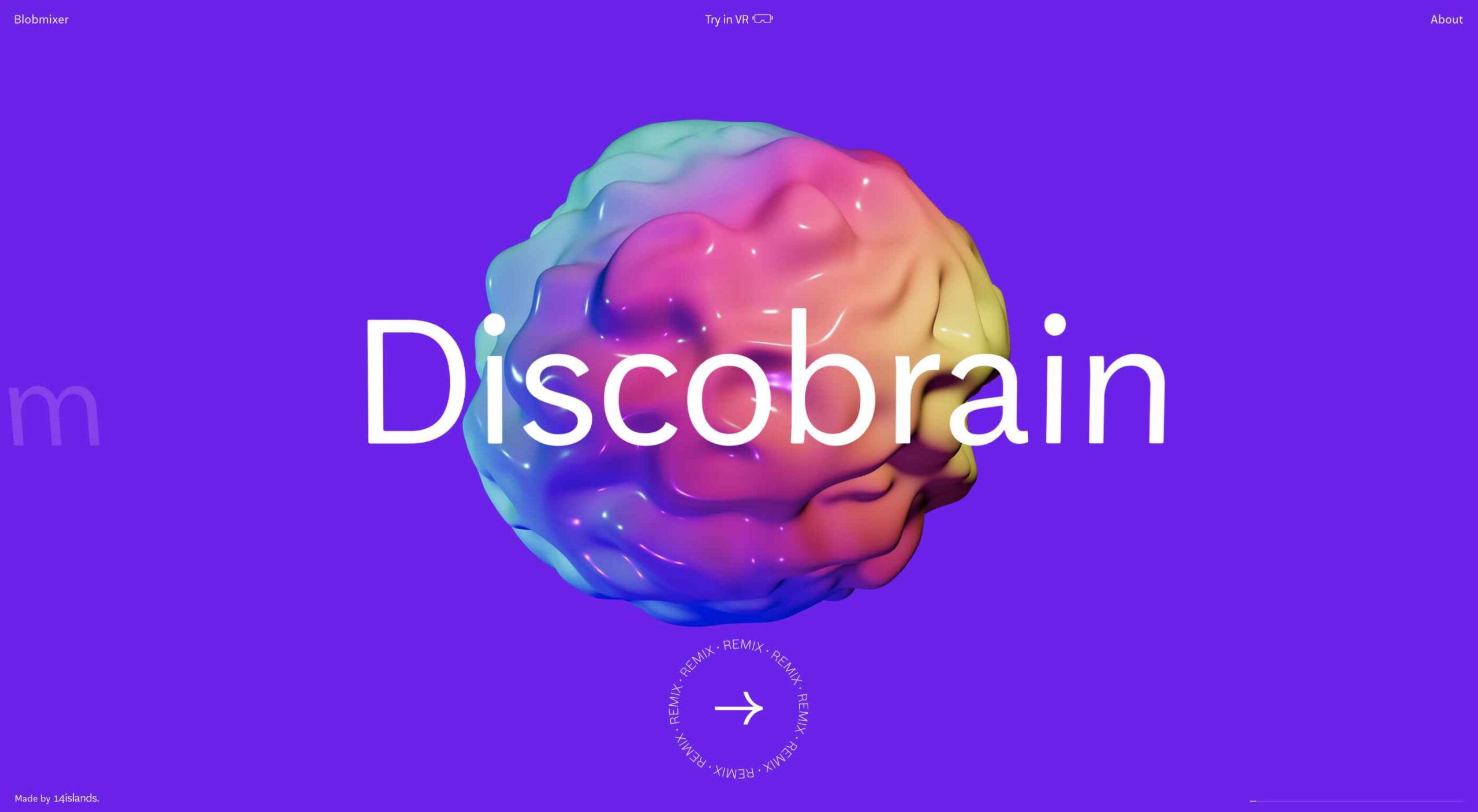
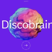
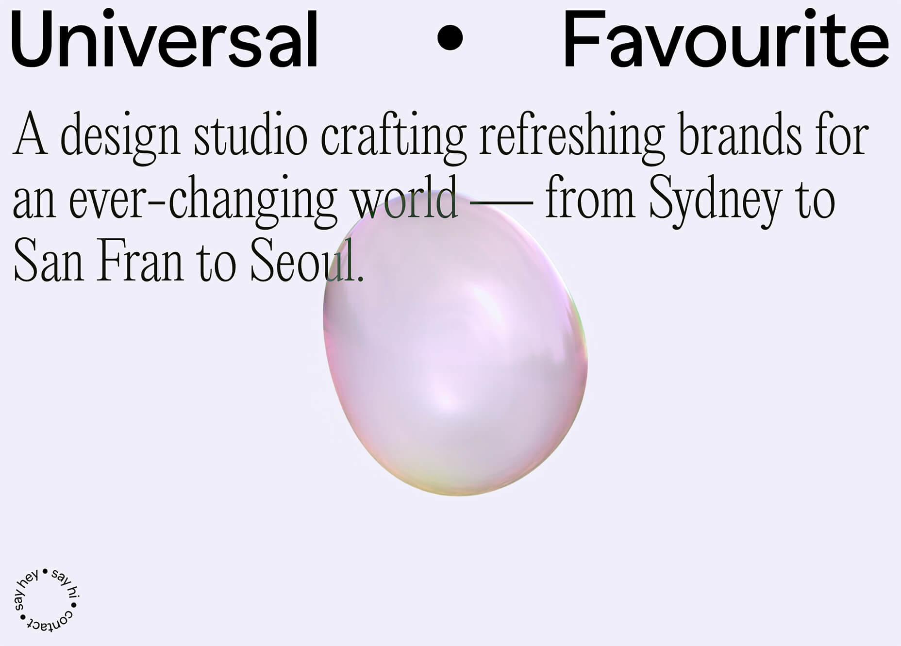
Universal Favourite uses a circular blob. It’s almost like a giant bubble. It wiggles and flows, and stretches within the space without any help from the user. It has a smoothly quality that makes you want to stare at it. The color here helps, with the circle and background not having an immense amount of contrast. Also, note the cute little circle button in the bottom corner.

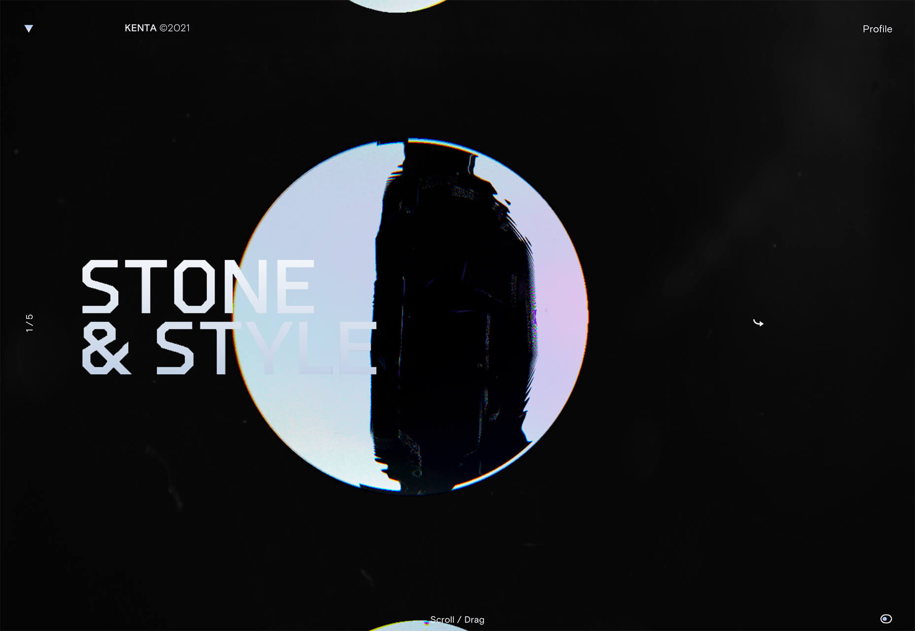
Kenta Toshikura put most of the subtle animation for this design inside the circle. With a hover state, the entire circle moves on the screen with a second layer of animation, and the cursor is also a circle that hops around the black background.

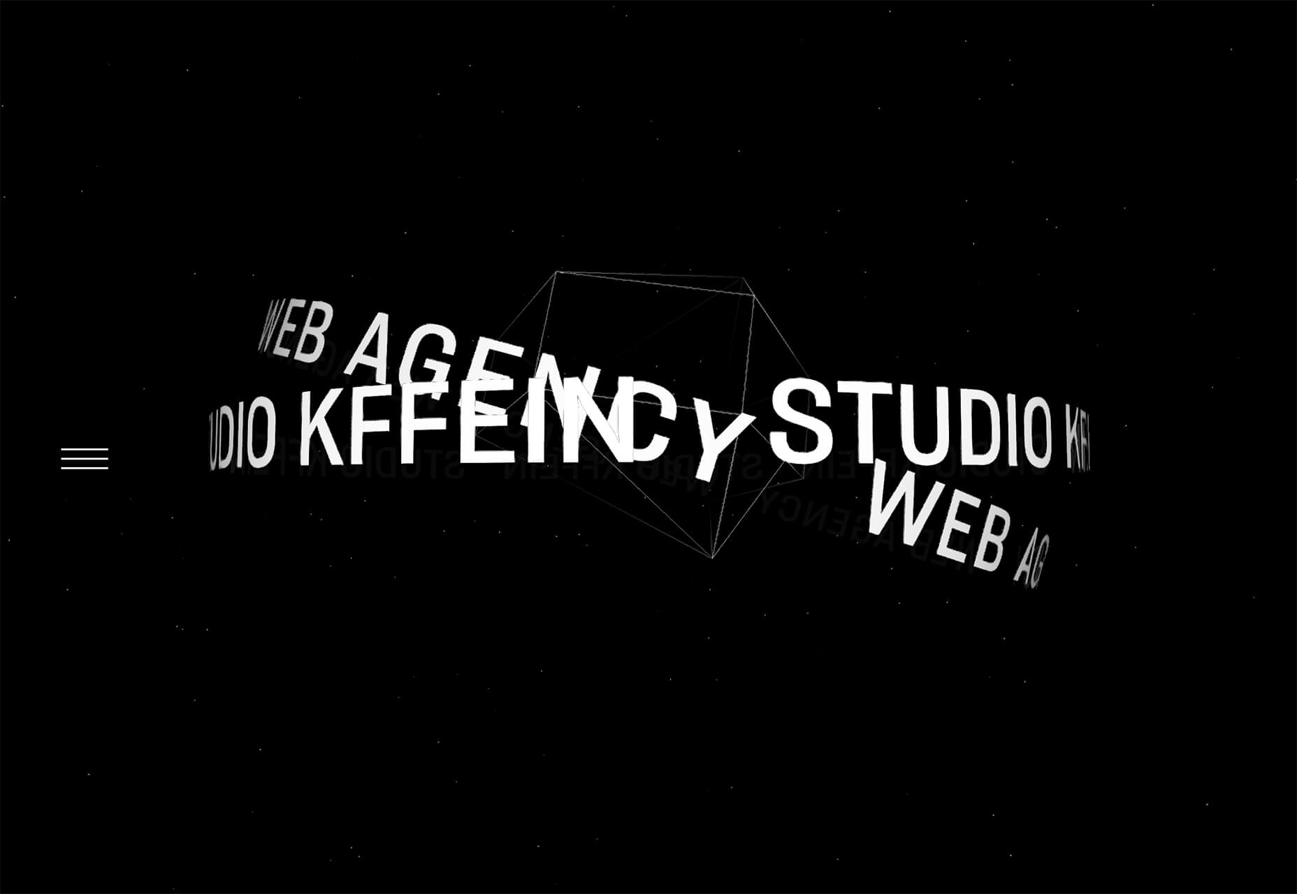
Kffein takes a totally different approach with a circle made from the primary test elements. Identifying website information rotates in a circle around another geo shape on the main plane. Not only is there a circular animation, but an almost three-dimensional effect that happens due to the way elements are layered here.


Pink and Purple Palettes

The prevalent pink and purple color combination isn’t for everyone – although you wouldn’t know it from the number of designs using similar colors.

This bright combination almost screams “spring” and has a lightness to it that almost seems to lift the mood of any project. (Maybe color selection is a reflection of how we all want to feel.)

What’s nice about these colors is that they flow into one another nicely. They can also be expanded to fall into neighboring hues on the color wheel, such as red from pink and blue from purple.

Maybe the most popular use of this color pair is as a gradient. You can find pink to purple everywhere, from background gradients to image overlays to buttons and user interface elements. There’s no lack of use here.

Each of these examples shows opportunities with this color combination.

SMU uses bright pink, blue, and purple to create a giant “road sign” in the design that jumps out from the rest of the project. The sign almost seems out of place and doesn’t fit as part of the normal color palette. This is what draw you right to it.

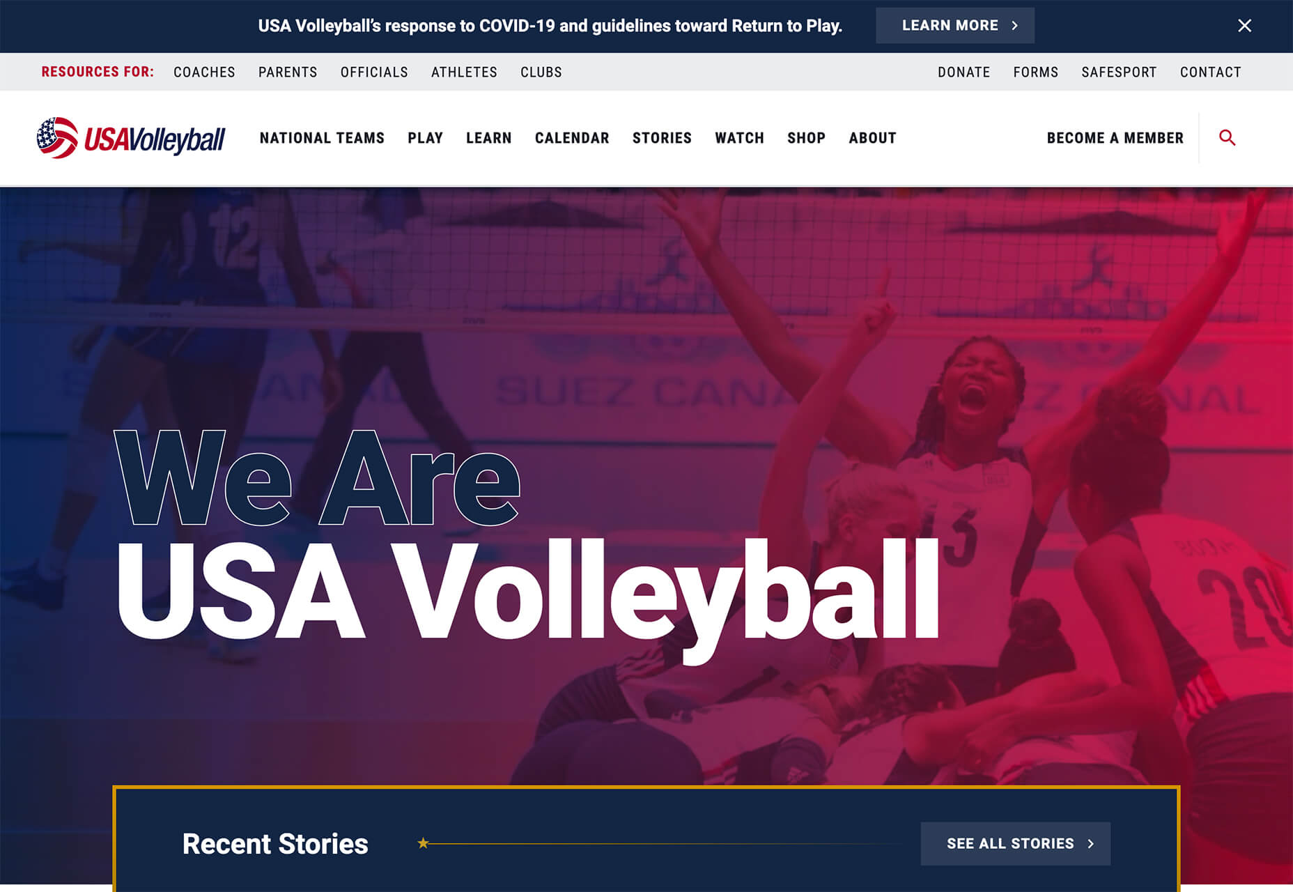
USA Volleyball uses the popular gradient option and extends the pink to the purple palette to hints of blue and red. What’s great about this design is that it uses a super trend element and color option and makes it work with their current color palette. You can almost imagine the design conversation when someone wanted to use a pink to purple gradient for a brand that features red, white, and blue. The gamble paid off, and it works beautifully without being off-brand.

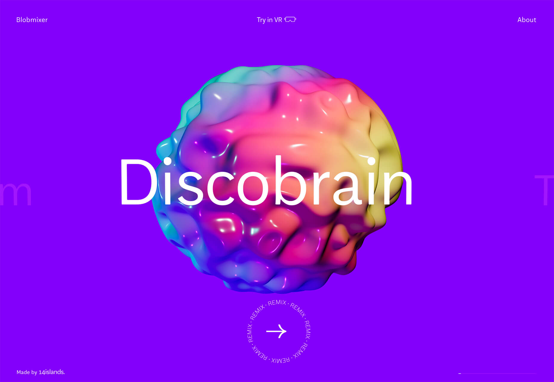
Blobmixer uses purple, pink, and a few other bright colors – note the animated circles, too – to draw users into the design. The entire project is a fun, customizable experience that you can play with, and the color choices are what make you interested enough to try. This design also offers a great example of tactile animation and elements that feel real even when you interact with them using a mouse on the screen.


Faux Split Screens

Split-screen designs were a huge trend for about two years. The aesthetic was also functional for content that required a this or that choice on the part of users.

Now, we see the design elements but without the function. (Maybe because it just looks nice and creates a sense of balance without a symmetrical design.)

These projects look like they might offer multiple gateways to content, but there is only one call to action on the dual-screen aside from navigation elements.

What this design option does is help draw the eyes across the screen. One side will immediately appeal to you, and when done well, you’ll feel a subtle push of pull from the color, text, and images to look at the other side as well.

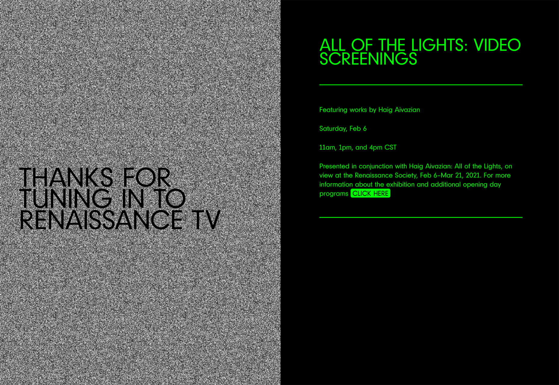
Renaissance TV does it with heavy animation with “dancing dots” from an old TV that doesn’t work. But then you need to look at the green text to understand what is happening.

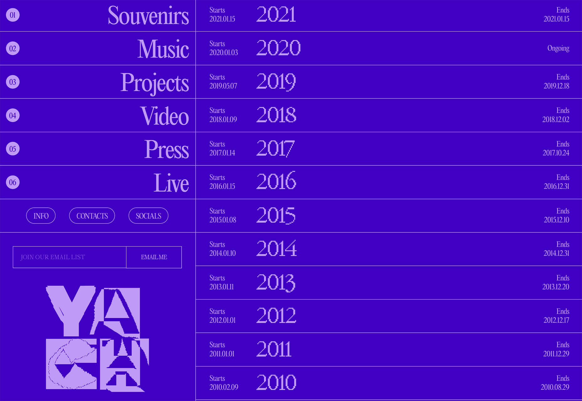
Yacht uses text weight and space to push the eyes across the screen. Almost everyone will go to the heavier areas first and then gaze across the screen through blocks of space to the final small text on the right side. And it all happens in a fraction of seconds.

Bonjour Paris pairs bold color with black and white images. You may look at either side first, depending on personal preference, but the other half of the screen is necessary for a complete understanding of the website.


Conclusion

While all of these design trends are evident in new and recent projects, the use of pink and purple color palettes – particularly with a gradient – seems to be everywhere you look. These color choices are popular and come in a lot of forms.

Maybe the most obvious is with brighter pink and purple gradients, but other variations are also trending. It’s definitely one to watch in the longer term.

Source

The post 3 Essential Design Trends, March 2021 first appeared on Webdesigner Depot.


Source de l’article sur Webdesignerdepot

LEVALLOIS-PERRET, France – 10 décembre 2020 – SAP France, 5ème filiale du Groupe SAP, leader du marché des logiciels d’applications d’entreprise, annonce le renforcement de sa stratégie « Green Line » avec la création d’une direction dédiée. Dirigée par Pascal Le Nahédic, celle-ci vise à aider les organisations à répondre à une de leurs priorités incontournables : améliorer leur impact environnemental et sociétal. SAP entend ainsi accélérer sur les sujets clés du développement durable.

En effet, les entreprises européennes sont face à une problématique complexe : alors qu’elle ont consacré 124 milliards d’euros l’an dernier à de nouvelles actions de réduction de leurs émissions de Co2, elles vont encore devoir doubler les investissements bas carbone pour avoir une chance d’atteindre l’objectif de zéro émission nette en 2050 fixé par Bruxelles.

Pascal Le Nahédic nommé Directeur des solutions à impact écologique et sociétal, SAP France

Pascal Le Nahédic prend les commandes des solutions à impact écologique et sociétal de SAP et sera en charge d’accompagner les clients de SAP dans le développement de nouvelles pratiques pour réduire leur empreinte sur l’environnement grâce aux technologies.
Après avoir passé 10 ans au sein du Groupe Exxon en Europe et en Asie, Pascal rejoint SAP France en 1999 en tant que Directeur de projet. En 2007, il occupe la fonction de Presales Industries. Depuis 2015, il assure le rôle de Presales Business Architect pour l’industrie ENR. Passionné par le sujet d’économie circulaire, il multiplie les initiatives d’intrapreneuriat en interne dont un projet innovant visant à aider les entreprises à réduire leurs déchets en termes de PLV (Publicité sur Lieu de Vente).

Sylvie Turcotte – Directrice Avant-Vente, SAP France

Sylvie Turcotte est à la tête de l’ensemble de l’organisation Avant-Vente pour SAP France.  Elle a pour mission de renforcer la croissance cloud de la filiale française par la mise en place de nouvelles approches avant-vente. Passionnée du milieu des technologies depuis 30 ans dont 20 ans au sein du groupe SAP. Sylvie a débuté sa carrière chez SAP Canada en 2000 comme consultante Finance, Funds management et Real Estate, avant de rejoindre l’équipe avant-vente Secteur Public pendant plusieurs années pour ensuite devenir directrice des ventes de Premium Engagement. Par la suite, elle a été nommée Customer Solution Director (CSD) puis Directrice de l’équipe Digital Core (Finance et Supply Chain) au niveau de SAP Canada, rôle qu’elle occupait depuis 3 ans.

The post SAP France nomme Pascal Le Nahédic, Directeur des solutions à impact écologique et sociétal et Sylvie Turcotte, Directrice avant-vente appeared first on SAP France News.

Source de l’article sur sap.com

As human beings, we like to think that we’re rational creatures.
We tell ourselves that we make our decisions based on fact and logic. However, that’s rarely the full truth. As much as we try to make choices guided by rationality, the truth is that we’re often highly emotional people, driven by the way that things make us feel.

So, what does that mean for a website designer?

Though designing a functional and logical website is important, it’s crucial not to forget about the emotional impact of each interaction that your customer has with the sites that you build.

Sites that don’t elicit any kind of emotional response aren’t just boring; they’re forgettable.

A forgettable website is poison to any website designer’s portfolio.

That’s why we’re going to introduce you to some easy ways to use emotion in your designs this year.

Getting to the Bottom of Emotion in Web Design

First, you need to understand the part that emotion plays in user decisions.

Don Norman’s book Emotional Design says that there are many things that designers can do to make their designs more emotional. Even something as simple as focusing on the aesthetic impact of your website can make it more likely that you’ll reach your audience on an emotional level.

One important thing to remember about emotional design, is that it’s not just about making your customers feel good. Emotion can be both positive and negative. Sometimes negative emotion is more impactful than positive feelings – it all depends on the kind of site you’re trying to create.

A website selling health products to customers needs to make that audience feel comfortable and confident that they’re buying a trustworthy item. However, it may also need to trigger small feelings of worry or concern in the audience about what might happen if they don’t buy.

Knowing how to walk that balance between positive and negative feelings is how a designer takes a simple website design and turns it into something incredible.

So, where do you get started?

Step 1: Use Visual Elements to Trigger Emotion

Visual elements are one of the easiest points to get started with when you’re designing for emotion. That’s because visuals are fantastic at drawing out feelings.

An animation can create an emotional connection with your audience by helping them to understand how your product works or making them laugh when they land on your page. A genuine photograph of your team working together can inspire trust and feelings of affinity.

One of the most common visual elements used to trigger emotion is color.

Shades like blue and green in the digital design world are more likely to drive feelings of calmness and comfort. On the other hand, red and yellow often encourage feelings of enthusiasm and happiness.

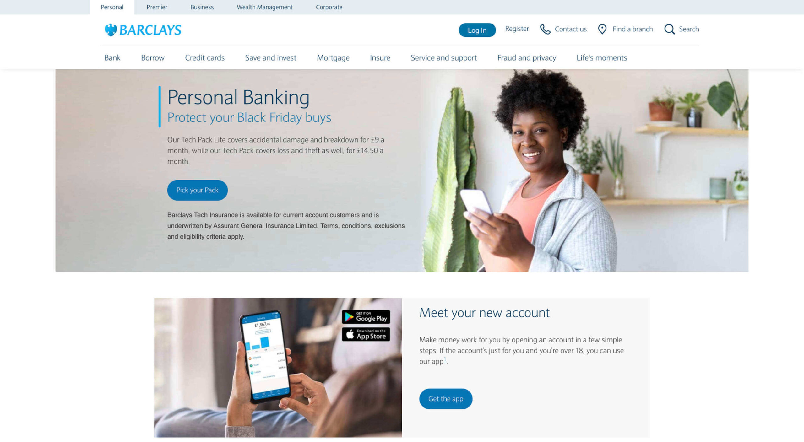
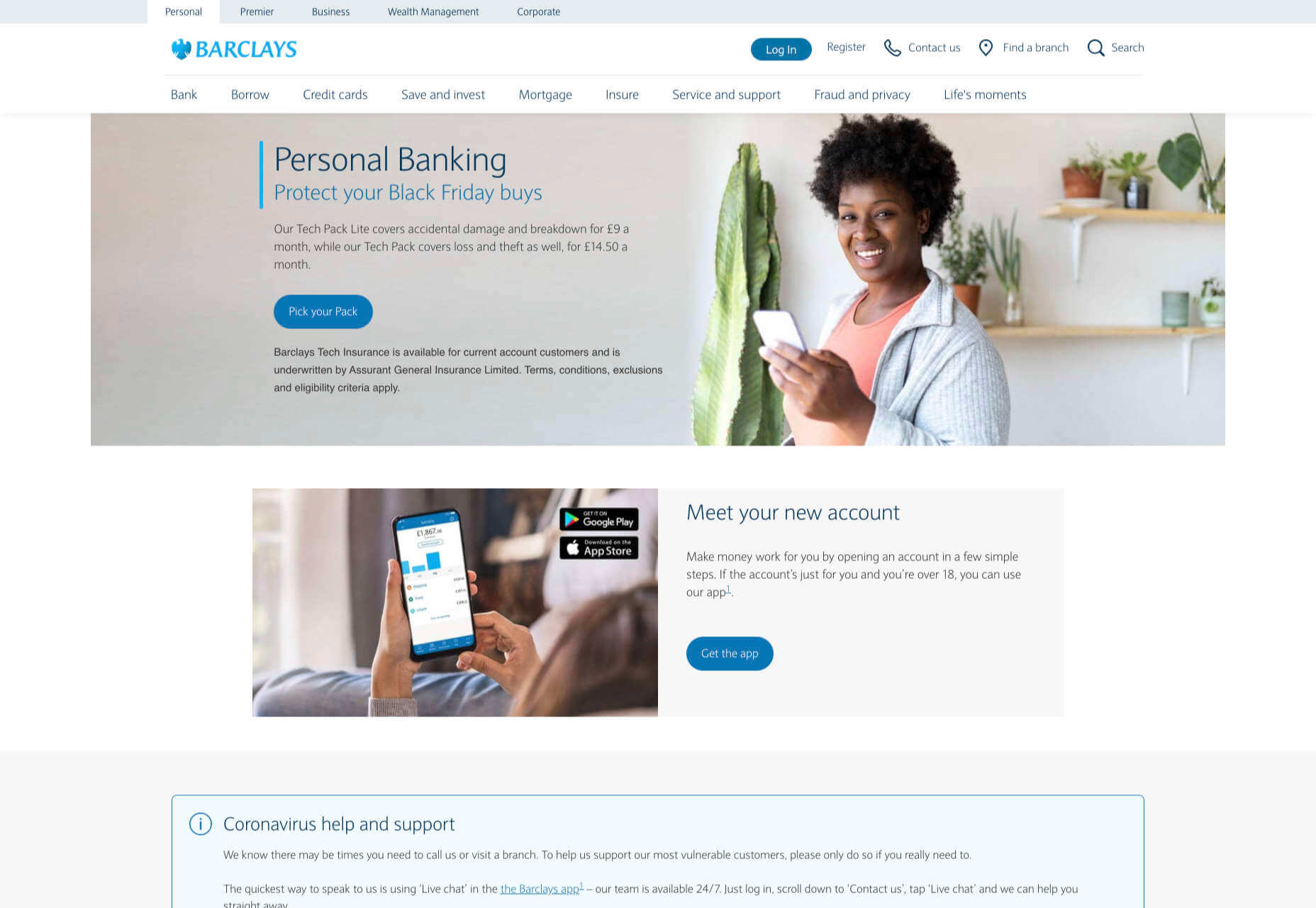
The way that you use color can make a massive difference to how users feel when they arrive on a website. For instance, the Barclay’s website would have been pretty boring if it was just a basic black and white screen. However, a banking site can’t afford to go over the top with animations or illustrations in most cases, as this can detract from its professional image.

Adding small patches of blue in a way that complements the brand’s color palette is a great way to generate feelings of trust. Combined with the image of a genuine real-life person, and calm tones, the bank instantly presents itself as something approachable and honest.

At the same time, the clear hierarchical layout of the bank’s website, with an easy-to-follow navigation bar, easy-to-read font, and clear headings and buttons comfort the customer. Users get exactly what they expect when they come to a financial website, and that makes users feel as though they’re in the right place.

Step 2: Create Engaging and Emotional Interactions

Visual elements are a great way to embed emotion into digital design. However, they’re just the first step. The emotional aspects of your web design choices should also appear throughout the interactions that customers have with the website.

A good interaction on a website or app needs to be simple and straightforward enough that users feel comfortable taking the next step in their journey. However, it also needs to drive the right emotional response from users too.

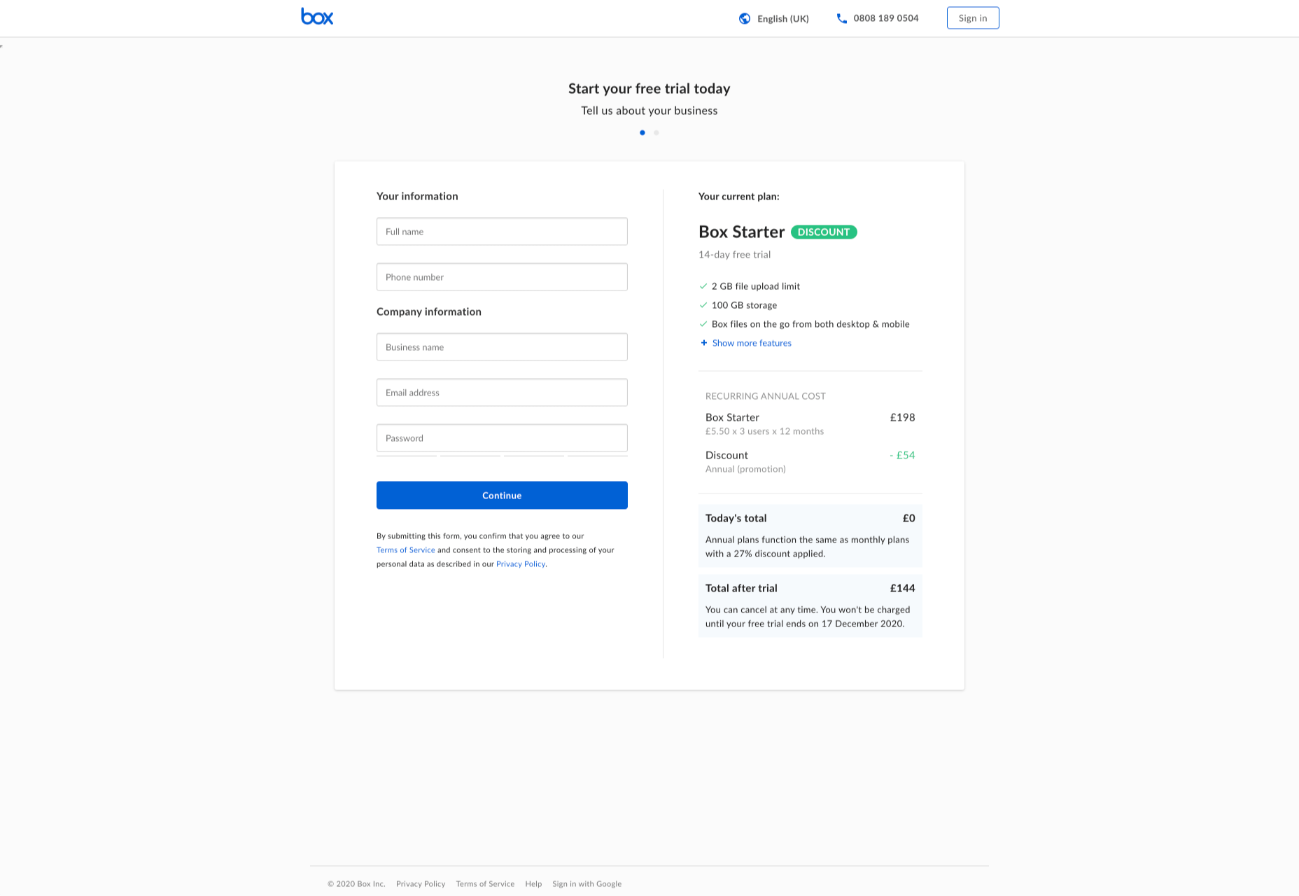
For instance, when you sign up for a free account trial from Box.com, you don’t just get a form full of information that you need to fill out.

Next to the form, you also get information about what you’re signing up for, complete with small checks next to each of the free features you’re getting. This helps to put the customer’s mind at ease and remind them that they’re in the right place.

The use of a box, including discount information next to the sign-up form also helps to make the interaction more emotional, by reminding customers that they’re getting something for free.

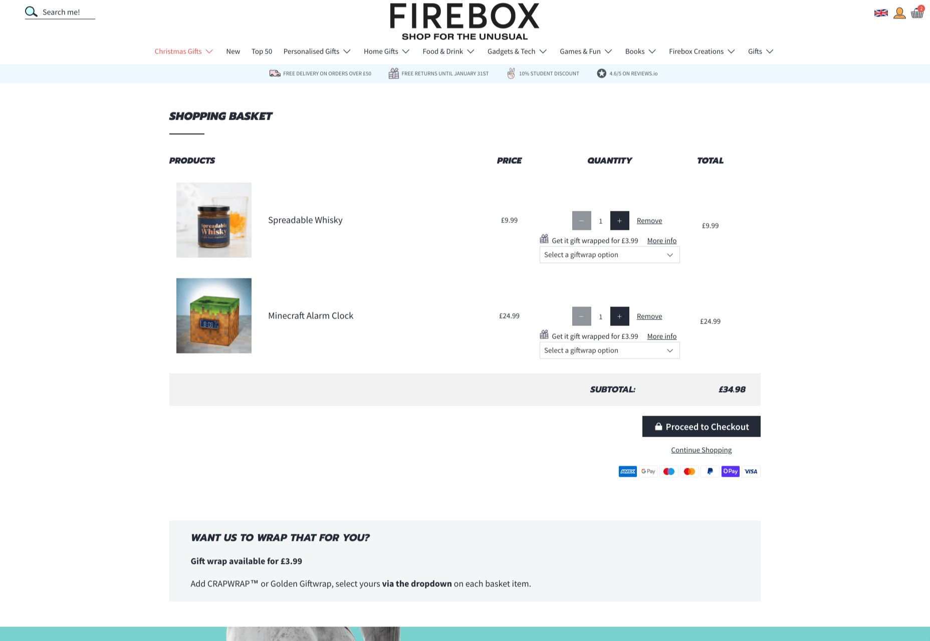
Every time a customer interacts with a website, there’s another opportunity to engage them on an emotional level. On the Firebox website, when a customer adds something to their cart, there’s a small animation on the cart icon that informs them that something is waiting for them.

When they click through to the checkout, they get instant information, including what they can do to “gift wrap” their item, and buttons showing the various payment options available.

Whenever you’re designing a page for a website, whether it’s the checkout page, a product page, or something else entirely, think about the interaction that the visitor is having at that moment. How can you ensure that each customer feels more comfortable, delighted, informed, or engaged?

Step 3: Leverage Microcopy and Detail to Express Emotions

Visuals are an excellent way to express emotions.

However, they’re not the only option.

As a designer, you’ll need to think about how you can combine web design with the use of microcopy to connect with customers on a deeper level.

Rather than drawing attention to tedious, dull, or impersonal instructions, notifications, and error messages on a site, how you can you make sure that everything on the website delivers the same emotional impact?

The simple addition of a tiny illustration is enough to provide a much more emotional experience to customers. Compelling micro copy and illustrations on 404 pages can also strengthen the connections that customers have with the sites they visit.

Just look at how Google added a dinosaur game to the page that customers are sent to when they don’t have an internet connection.

The right micro copy and interactions can instantly transform even a negative experience, like not being able to connect to the internet, into something emotionally engaging and positive.

When it comes to making an emotional connection between your customer and their end users, web designers need to remember that often the smallest details can make the biggest differences. Little extra features, like implementing a way for customers to have fun when their internet connections aren’t working, are the things that make websites more memorable from an emotional perspective.

Don’t Choose Emotion Over Functionality

Although emotional impact can be an essential aspect of a fantastic website design, it’s important not to get carried away. Adding too much to a website in the form of little extra graphics and unique interactions could end up weighing down a site and making it slow to load.

Although it’s valuable to think about how every interaction an end-user has with a website will make them feel, it’s important not to overlook the basics of web design when you’re at it. You’ll still need to ensure that the finishing design is easy to use, engaging, and attractive.

Pay attention to the basics of user experience design, and make sure that the extra emotional elements you’re infusing into your sites aren’t going to damage the experience that end-users get.

If you can get the blend right between emotional impact and functionality, then you could create the kind of website that audiences will never forget.

It pays to implement emotion into your design portfolio.

Source


Source de l’article sur Webdesignerdepot

The holidays are fast approaching. But that doesn’t mean it’s too late to get a new website online or to make your existing one look festive for the holiday season.
When it comes to decking the halls of your website with a little festive cheer, how do you do this without spending loads of money and time on it?

You’re in luck. BeTheme has a variety of pre-built websites to help you do just that. Not only that, but you can use these festive websites for a variety of occasions, like:

  • Hanukkah
  • Kwanzaa
  • Christmas
  • Boxing Day
  • New Year’s

You could also just use one of these sites to make your website feel more seasonal as the temperatures get colder and the snow starts to fall. (If that’s what your winter wonderland looks like!)

Let’s have a look at 4 ways you can bring a little seasonal or holiday cheer to your visitors with a festive website from BeTheme:

Tip #1: Use a Page Builder That Makes it Easy to Swap in Festive Content

Unless you’re running a business like the Christmas Tree Shops, it doesn’t make a lot of sense to have holiday imagery up all year long.

The only problem, though, is that it can be a real pain having to go in, find a new theme, and then redesign your site around it… For only a month or two.

That issue is easily resolved with BeTheme, which comes with over 600 pre-built websites and two page builders — Muffin and Elementor.

Because there are so many pre-built sites available, you can easily switch to a non-festive website once the holiday season is over.

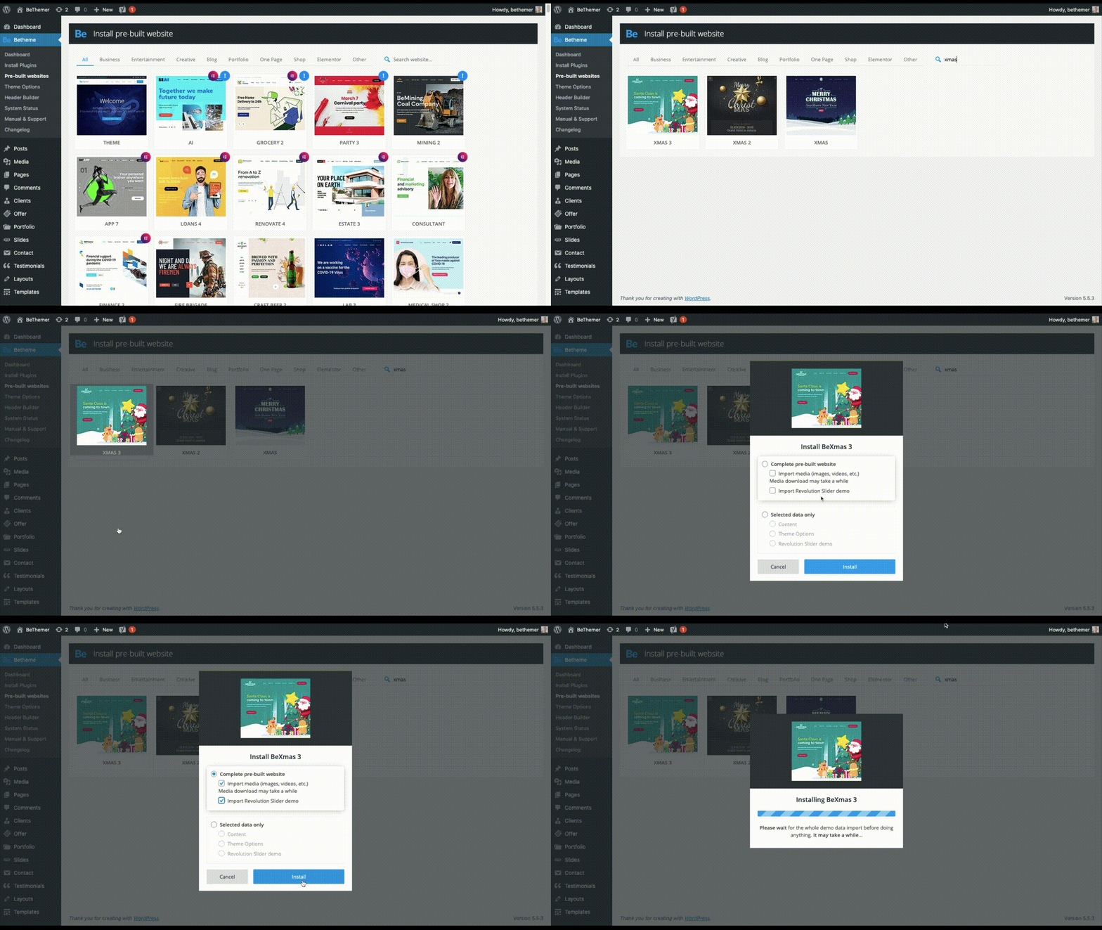
In order to swap out this design with a festive website, you’d first have to reset your theme (which Be provides instructions on how to do). Then, install the new site you want to use.

Like BeXmas:

And if you only want, say, a new hero image in the top of your website, you can cherry-pick which parts of the pre-built site you install.

Tip #2: Effortlessly Switch From One Holiday to the Next

Let’s be honest, the winter holiday season can feel a little nuts — not just because your business has to keep up with the change of pace, but because your website has to keep in step with what’s going on.

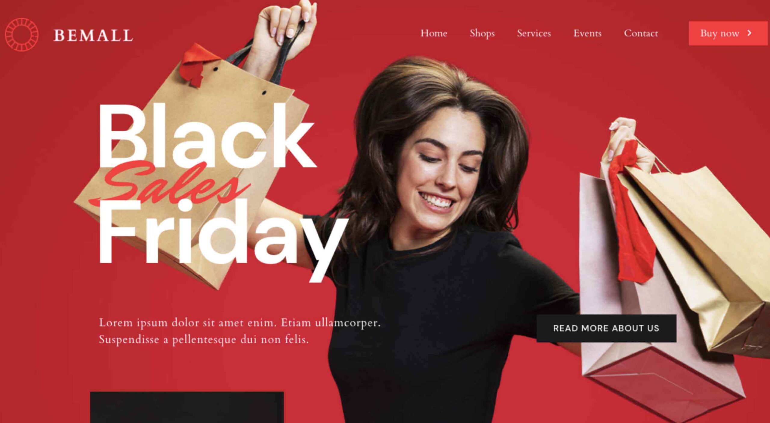
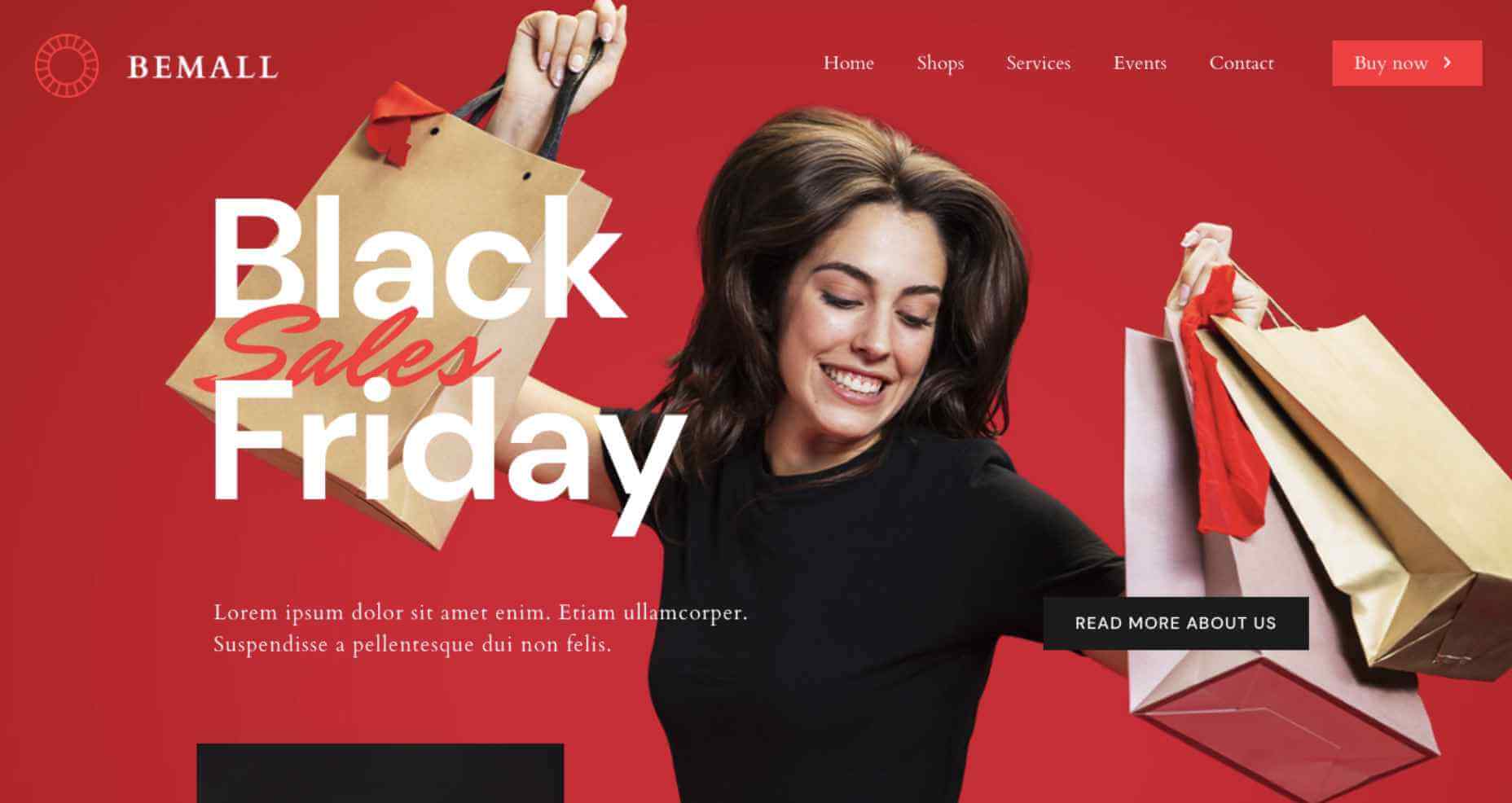
So, let’s say you have an ecommerce site that changes frequently for upcoming sales, holidays, events, and so on. For this, you could use the BeMall pre-built site (all year long, mind you):

As you can see, it currently has a Black Friday message on the homepage. It’s not uncommon to have to transition from Black Friday or Cyber Monday into the December holidays.

Here’s how you might do that:

The update can be as minor or major as you want. So long as you use graphics and content that stay on-brand, you can easily swap out as much of your imagery as you like.

Tip #3: Use Small Animations to Bring the Holidays to Life

Holidays should be a time to lift spirits. Having a website that’s able to satisfy your customers’ needs during the holiday season will certainly help.

You might also want to think about adding small animations to your design, too.

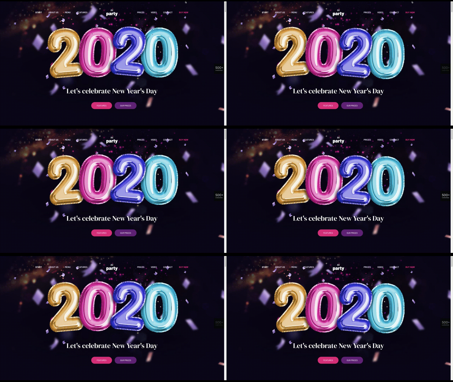
The animations themselves don’t have to be festive, but you can use them to call attention to holiday-themed content. Take, for instance, BeParty:

You don’t need to have champagne bottles popping or streamers flying across the screen to get your point across.

This animation gives the New Year’s party balloons a gentle and natural feeling of bobbing up and down. An attention to a detail this small is sure to bring a smile to your visitors’ faces.

Tip #4: A Little Hint of Seasonal Flavor Can Go a Long Way

Holiday celebrations aren’t always big blowouts. Unless your entire business is going all-in on the holidays (or it’s a totally holiday-themed business), there’s no reason your site should have to go all out either.

Sometimes a more understated approach is best.

In that case, you’d keep your normal branded elements, imagery, and content in place on the website. But to make it feel a little more festive, you could infuse your site (at the very least, the homepage) with slight seasonal or festive touches.

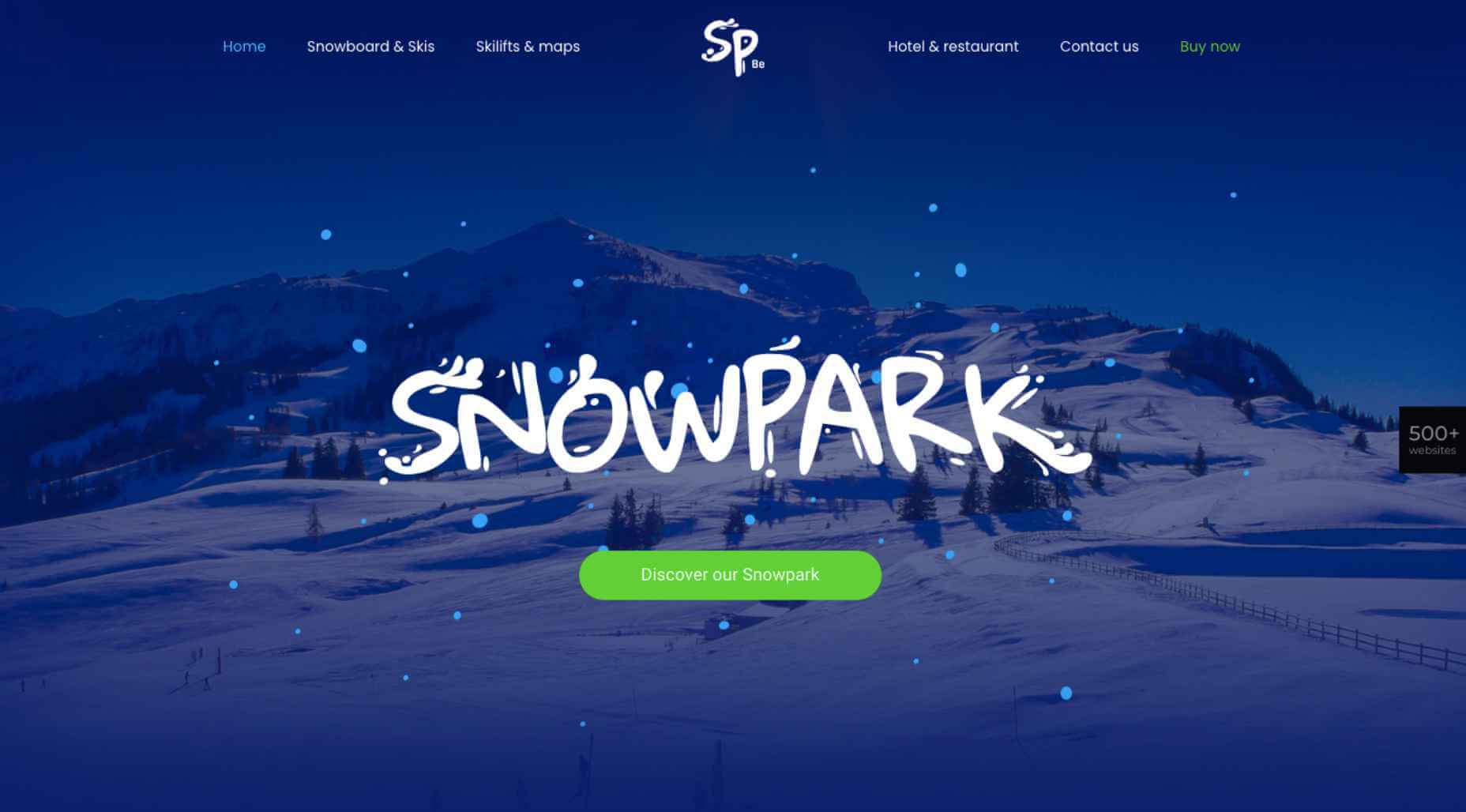
For instance, let’s say you’ve built a website for a popular ski resort. Your website might look like the BeSnowpark site does normally:

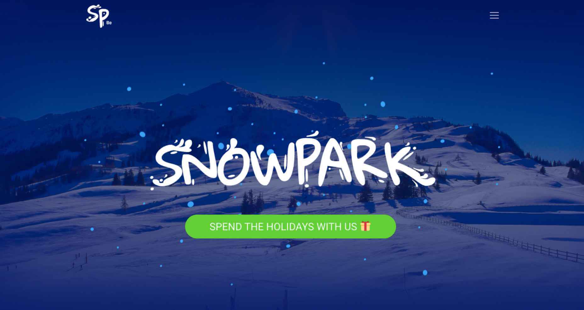
The main draw of the resort is skiing, so it wouldn’t make much sense to change the graphics. However, you could do something like this:

It’s a small enough change, but the gift emoji and bigger lettering in the green button might inspire loyal snowbirds as well as first-time visitors to more quickly book their much-needed holiday getaway.

Get Your Festive Website for Christmas, New Year’s, and More

There are many science-backed reasons why a festive website is a good idea.

Holiday decorations, in general, stir up positive feelings of nostalgia for many people. They can also help alleviate some of the stress that’s built up over the course of the year:

What’s more, holiday decorations can visually signal to others that you’re friendly and accessible, even if they don’t know you.

Sounds exactly like how you want visitors and prospects to feel, right?

As you can see, there are many ways to decorate your website for the holidays. To do it quickly and affordably — and not completely turn your regular website upside-down — a BeTheme pre-built site is the way to go.


[– This is a sponsored post on behalf of BeTheme –]

Source


Source de l’article sur Webdesignerdepot

WALLDORF – Pour la 14ème année consécutive, SAP SE (NYSE : SAP) a été désignée leader du secteur des logiciels au Dow Jones Sustainability Indices (DJSI). SAP a dépassé ses scores des années précédentes et a creusé l’écart par rapport à ses pairs du secteur, malgré les défis causés par la pandémie.

SAP a obtenu 74 points sur 100 (2019 : 69) au score global, soit cinq points de plus que l’entreprise classée en deuxième position. SAP a amélioré sa valeur de percentile dans 15 des 20 catégories par rapport à 2019, notamment en matière de « sécurité de l’information/cybersécurité et disponibilité des systèmes », d’« attraction et de rétention des talents » et de « rapports environnementaux ».

Cette évaluation souligne les efforts déployés par SAP pour mettre en place une stratégie de cloud fiable et conforme, en valorisant les employés comme son atout le plus important et en améliorant ses capacités de reporting interne. Cette année, 83 entreprises du secteur des logiciels ont participé, soit plus du double par rapport à l’année dernière. SAP a également amélioré sa notation dans les trois dimensions principales :

  • Gouvernance et économie : 65 (2019 : 61)
  • Environnement : 87 (2019 : 83)
  • Social : 81 (2019 : 73)

« Nous sommes fiers de notre classement au Dow Jones Sustainability Indices. Cela nous prouve une fois de plus que nous avons une responsabilité particulière en tant que leader de la durabilité dans l’industrie du logiciel », a déclaré Luka Mucic, directeur financier et membre du conseil d’administration de SAP SE. « Cela nous pousse à redoubler d’efforts auprès de nos clients pour leur fournir des solutions destinées à leur transformation durable, afin que nous puissions tous ensemble construire une économie plus inclusive et plus régénératrice ».

Créés en 1999 par la société de gestion d’investissements RobecoSAM, les DJSI sont les plus anciens indices de référence mondiaux en matière de durabilité. Ils sont cotés en bourse depuis leur création. Basé sur l’évaluation de la durabilité des entreprises (Corporate Sutainability Assessment, CSA) de SAM, le DJSI fournit une analyse des performances économiques, environnementales et sociales des entreprises. Ils comprennent des critères de durabilité généraux ainsi que spécifiques à chaque secteur pour chacune des 60 industries définies selon l’Industry Classification Benchmark (ICB).

En 2020, la solide performance environnementale, sociale et de gouvernance (ESG) de SAP a également été reconnue par d’autres notations ESG. SAP est restée présente dans la série d’indices FTSE4 Good Index et dans les indices Euronext Vigeo Eiris (Europe 120 et Eurozone 120). SAP a de nouveau été reconnue comme un leader ESG par MSCI Inc. (anciennement Morgan Stanley Capital International), qui lui a attribué la meilleure note, soit « AAA ». Et pour la première fois, SAP a figuré dans le nouveau classement du Wall Street Journal des 100 entreprises les mieux gérées sur le plan du développement durable.

Reconnaissant l’importance croissante des performances ESG non seulement pour son activité, mais aussi pour la réussite de ses clients, SAP fait du pilotage et du reporting holistique un domaine d’action essentiel. Grâce à son programme Climate 21 et à d’autres programmes axés, par exemple, sur l’économie circulaire, SAP propose des offres qui aident ses clients à améliorer leurs propres performances en matière de développement durable. Le rapport interne de SAP reflète sa conviction que les entreprises peuvent mesurer leur succès de manière plus globale grâce à de nouvelles pratiques comptables qui relient les impacts économiques, sociaux et environnementaux. SAP a également rejoint des initiatives internationales telles que celles de la Value Balancing Alliance e.V. et des initiatives locales telles que QuartaVista, un projet financé par le gouvernement allemand qui vise à standardiser les mesures générales de l’impact des entreprises.

The post SAP conforte sa position de leader dans les indices de durabilité du Dow Jones appeared first on SAP France News.

Source de l’article sur sap.com

Personalization; it’s probably one of the most important design trends to emerge in recent years.

As consumers in all industries become more demanding, they’re increasingly searching for online experiences that are customized to suit their individual needs and expectations.

Today, personalization exists in virtually every digital interaction, from adverts on social media to PPC campaigns and email marketing efforts.

Used correctly, the manipulation of demographic, behavioral, and other in-depth user-data can help designers to create dynamic, highly customized content for each website user. At the same time, these unique websites ensure that designers really make an impact on behalf of their clients, outshining the competition and driving amazing results.

What is Hyper-Personalization?

Basic personalization in web design involves making changes to a design based on what you know about your client’s target audience.

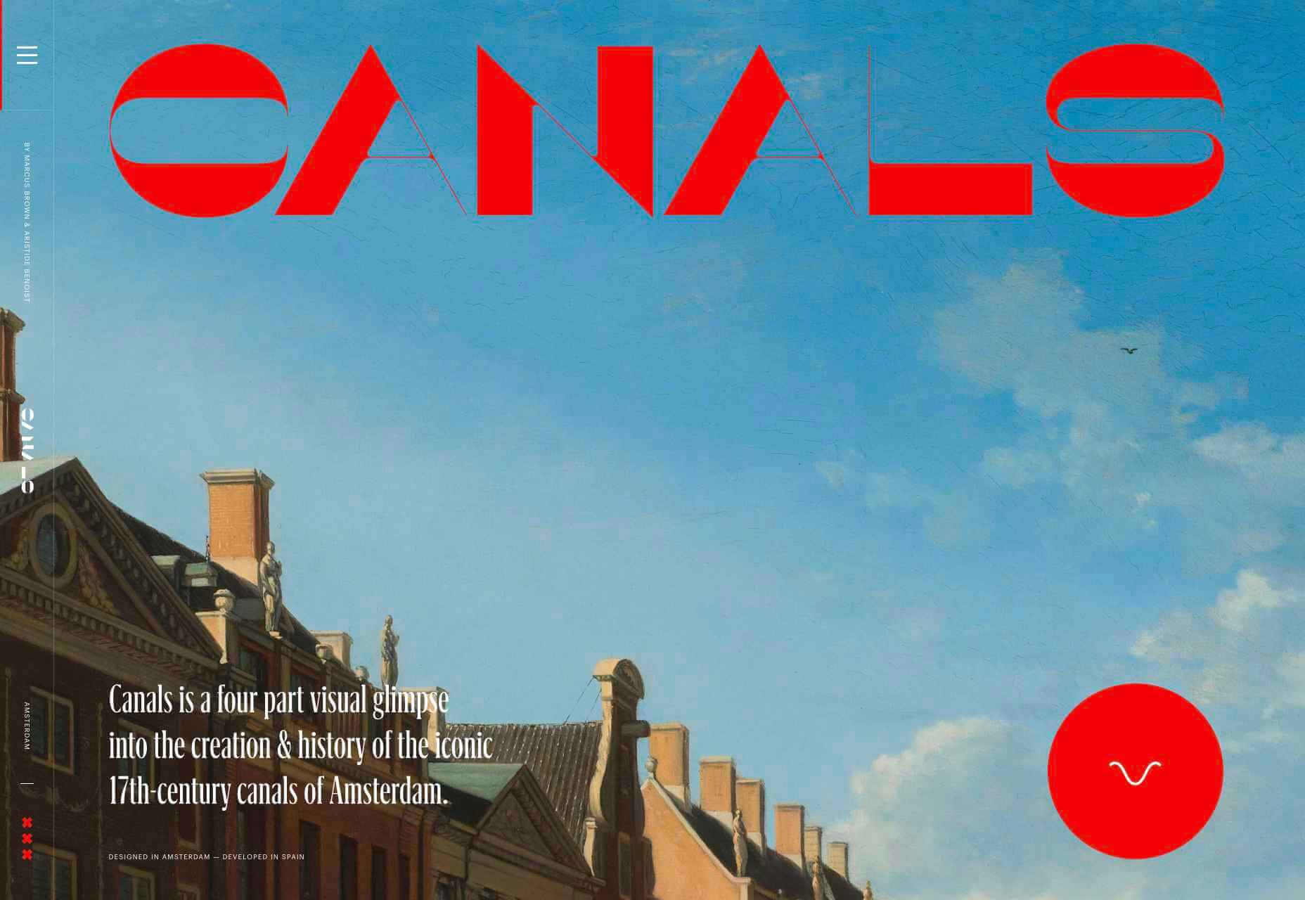
For instance, if you knew that you were designing for an audience that spends more time on their smartphone than their computer, you’d concentrate on building hyper-responsive experiences for small screens. For instance, the Canals-Amsterdam.nl website is specifically designed to support people using smartphones to swipe, tap, and scroll.

If you’re aware that your customer’s target market is other businesses, you might put more testimonials, free demo CTAs and other enticing components on the website to encourage investment.

Hyper-Personalization is an emerging trend for 2020 that focuses on going beyond the basic understanding of a target audience, to look at genuine customer data. Hyper-personalization is all about leveraging in-depth omnichannel data to drive more advanced customer experiences on every page of a website.

For hyper-personalization to be genuinely effective, designers need access to virtually unlimited data, from CMS systems, sales teams, marketing experts, and more. When you have that data handy, you can use it to:

  • Design websites that showcase dynamic CTAs, featuring content relevant to each user;
  • Implement sign-in screens for customers vs. demo requests for new leads on home pages;
  • Showcase products similar to past pages when repeat customers return to a site.

Why is Hyper-Personalization Important?

Personalized experiences have always been important to the sales journey.

However, in an era where companies are constantly competing to grab user attention, you can’t just cater to your site designs to a group of people anymore. Increasingly, users are expecting specific interactive moments on websites, made just for them.

Amazon is an obvious example to consider here. As one of the world’s leading online shopping sites, Amazon’s efforts with website personalization are incredible. The Amazon website uses tools integrated into the back-end of the marketplace to watch everything a customer does on its platform.

As users browse through the website, the site jots down each category that you look at, and which items interest you. Thanks to this, Amazon can suggest which products you may be most interested in.

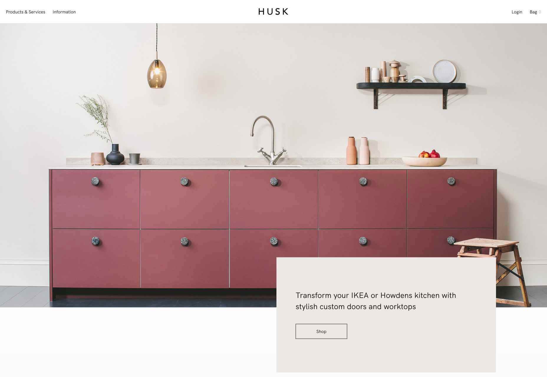
Websites like Madebyhusk also offer an incredible insight into hyper-personalization, allowing users to browse for the products that appeal to them based on in-depth filters like edging and color.

The result is a higher chance of conversion.

When customers feel as though they have complete control over their buyer journey, and that each step on that journey is tailored to them, they’re more likely to buy.

Better Converting CTAs

A call to action is an excellent way to move things along when you’re encouraging the buying process with your target audience.

Used correctly, your CTAs can encourage more than just cart conversions. They can also convince people to sign up for your newsletter via a subscription form, take a survey, or begin a free demo.

Regardless of the CTAs that you choose to implement, personalization will quickly make your requests more effective. According to studies, CTAs that are personalized are 202% more effective than generic alternatives.

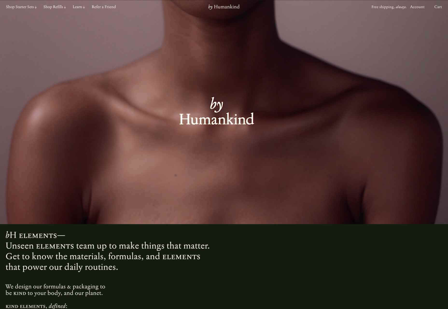
For instance, Byhumankind.com uses a crucial statement: “Great personal care products don’t have to come at earth’s expense.” Followed by an engaging CTA to drive positive action from their audience. The company knows that they’re appealing to a customer interested in saving the planet, so they make the benefits of “Getting Started” obvious immediately.

Using data provided by clients, designers can figure out exactly how to position CTAs and offers for customers. For instance, notice that Humankind has a green colored CTA button.

Most buttons take advantage of bold colors like red and orange, but the green shade for Humankind further highlights the nature-driven personality of the brand.

Relevant Product Recommendations

Repeat customers are infinitely more valuable than people who purchase just one item from your site.

However, convincing a standard customer to become a repeat client isn’t easy. Sometimes, clients need a push to determine what they want to buy next.

Fortunately, as a website designer, you can help with that. Using dynamic modules in the product pages of your customer’s website, you can show individual end-users what they might want to purchase next from a specific brand.

These dynamic modules can use information about what each customer has purchased in the past, to suggest a new product or service. Amazon do particularly well in this regard, leveraging a vast marketplace and treasure trove of information to make quality recommendations. But you don’t need to be designing a considerable website for a global business like Amazon to take advantage of dynamic suggestions. Any business with a focus on hyper-personalization can benefit from this strategy.

Increased Time on Site

Any form of personalization on a website can significantly improve the amount of time a customer spends in that digital environment.

Imagine walking into a restaurant that seems as though it was designed specifically for you. The décor, the seating arrangements, and even the menu are customized to your taste. You’re more likely to spend your time and money there than on any generic food place you find on the street.

The same rules apply to website design. The more hyper-personalized you can get with your client’s design, based on what you know about their customers, the easier it will be to keep customers engaged.

For instance, the WarnerMusic.no website entices visitors with various high-quality images of popular bands and artists, before providing them with endless information about the brand and what it does. The designer of this site knew that it needed to appeal to the visual demands of the audience first, before offering useful information like featured artist lists, News, and blog posts to keep the users on site.

Hyper personalization is all about figuring out what kind of end-user you’re designing for, so you can build the digital environment that’s more engaging and compelling to them. Some designers even create dynamic pages that change depending on whether a customer is a repeat client or a new visitor.

Improved Loyalty and Affinity

Finally, it’s human nature that we all want to spend time with the people that treat us best.

We all value excellent customer service, which is why customer experience is the most significant differentiating factor for any organization today.

Web-based personalization works in a similar way. When you use your design tools to make the site experience that you give to each visitor warm, individualized, and welcoming, then your clients are sure to see a boost in customer loyalty.

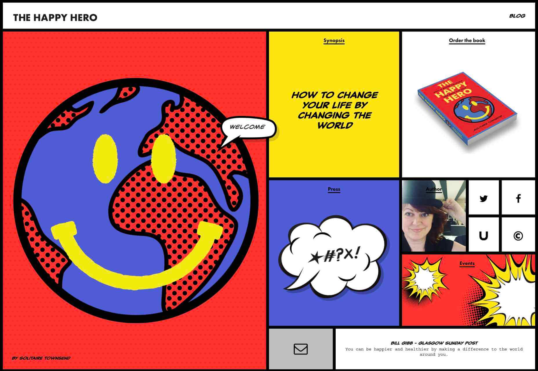
Around 89% of consumers say that they’ll only consider buying from brands that care about them. As a designer, you can convince every website visitor that they’re going to get the experience they deserve. Just look at how TheHappyHero.com instantly lets clients know that they can expect a fun and friendly interaction on every page.

Accessing useful data from the companies that you’re working with before you begin developing and designing a website could be the key to creating happier customers and higher conversions.

The more delighted end-users are with the experience that a website gives them, the happier that your client will be with you – increasing the impact of your design portfolio.

If you can create customer loyalty and affinity for your client, then you will be able to develop the same feelings between yourself and your client. This could mean that you earn more recommendations as a designer and build your position as a leader in the industry.

Hyper-Personalization is Crucial for 2021

As companies continue to worry about how they can safely use data without crossing the line when it comes to customer privacy, hyper-personalization has stayed just out of the mainstream. While it may be a while before we see every website designer starting their process with piles of in-depth data, it seems that we are heading in that direction.

Customers in 2021 and beyond will undoubtedly want a more advanced and customized experience from the brands that they interact with – particularly in an era where it’s becoming much easier to deliver meaningful moments online.

Source

Source de l’article sur Webdesignerdepot

Autre source / On the same theme

How can your customer reach you? If a client arrives on your website after searching on Google, what can they do to take the next step in a relationship with your brand, without buying anything?
One of the primary aims of any website is to drive conversions. However, it usually takes between 5 and 8 touchpoints to generate a viable sales lead. People don’t want to convert straight away.

Since building a relationship with customers is crucial to success, it makes sense that the contact page would be an essential part of driving results. Unfortunately, a lot of website owners pay virtually no attention to that page. They ask their designer to create a page with their address and phone number on – and that’s it.

What many business owners don’t realize, is that the contact page is the door to deeper, more lucrative relationships with potential prospects. The design of this essential website element needs to be fantastic to drive results.

So, where do you start?

Defining a Well-Designed Contact Page

Let’s start with the basics, what makes a great contact page?

The complete answer to that question depends on the target audience. Some customers will want to see fun and friendly contact pages, complete with social media sharing buttons. Others will want to see a map that shows them exactly how to reach an office or business.

There are a few golden rules to keep in mind, of course. Contact pages should be:

  • Easy to find: Don’t hide the link to the contact page on the website footer. Make it easy for customers to find out how they can get in touch.
  • Simple: Don’t put too much content on this page or it will overwhelm your audience. Just let them know where they can go to get answers to various questions.
  • Professional: Even if you have a friendly brand personality, your contact form still needs to be grammatically correct and well-designed to show a professional edge.
  • Convenient: Make your phone number clickable so customers can use it on Skype. The same can apply for your email address. Provide easy access to social media profiles, and if you have a contact form – keep it short and sweet.
  • Informative: Include all of your contact information in the same place. This may include your address, a map to your location, social media pages, email addresses, and even forums.
  • Accurate: Ensure that the information on your contact page matches the information listed elsewhere. Check directories and Google my Business listings to be sure.
  • Attractive: Yes, a contact page needs to look good too. Plenty of white space will make essential information stand out. A good layout will guide the eye through the page.
  • Consistent: Make sure the contact form on your website matches the brand personality that appears on all of your other pages.

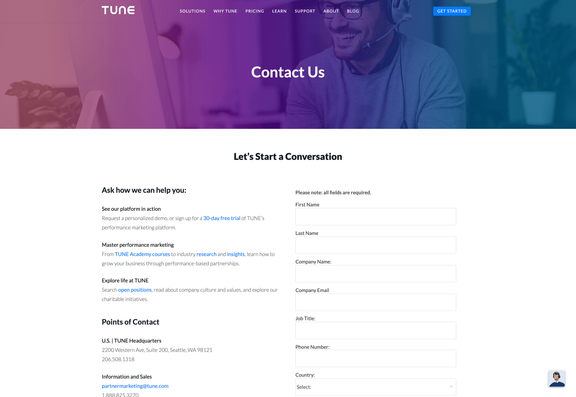
Take a look at the Tune Contact page:

It’s beautifully laid out, with clear information that’s easy to read. The company shows exactly why customers might want to get in touch and how they can reach out. As you scroll through the page, you’ll find additional office locations, email addresses for different teams (sales and support), and links to social media accounts too.

How to Drive Engagement on a Contact Us Page

A good contact page needs to look fantastic, showcase the company’s personality, and capture audience attention. However, there’s a big difference between a contact page that gets the job done, and one that convinces your audience they have to connect with you.

Here are some excellent ways to make your contact us page stand out.

Step 1: Using Color Correctly

Color and color psychology have a massive impact on user experience.

Studies constantly demonstrate the conversion powers of having the right shades on certain pages throughout your website. For instance, changing a CTA button from red to green can increase click-through rates by 27%.

However, every audience is different. The colors that drive engagement on a contact page for your company will depend on your target customer. A/B testing color palettes that match your brand personality is a good way to get started.

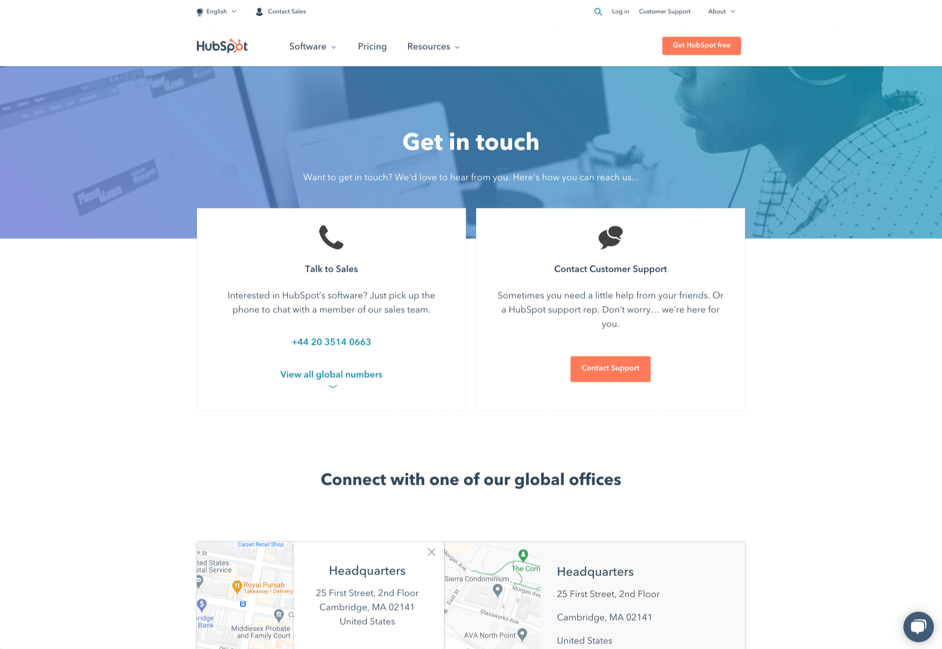
One interesting example of colors that make the right impact on a Contact Us page comes from Hubspot. Here, the brand maintains it’s brand color (orange), but it also introduces some new shades that convey trustworthiness and professionalism.

Blue is the most calming and credible color for any brand, The gradient that Hubspot uses here blends perfectly with its brand identity, allowing for a stunning contact page, with CTA buttons that still stand out.

Experiment with colors that can generate the right emotional response from your audience, but don’t ignore the golden rules of color in web design. You still need to showcase your brand identity, and you still need a way of making crucial information stand out.

Step 2: Humanizing the Customer Service Team

Some of the customers that arrive at a contact page are interested in your product or inspired by the potential of your service. Other customers will be looking for assistance because they’re frustrated with something or stressed out.

If you’ve ever had a problem with a product and wanted to reach out to the brand about it, you’ve probably noticed how annoying it is to find a blank contact page with nothing but an email address. The lack of effort and humanity in the contact page is enough to convince you that you probably won’t get a response.

But what if you add some happy smiling faces to the page?

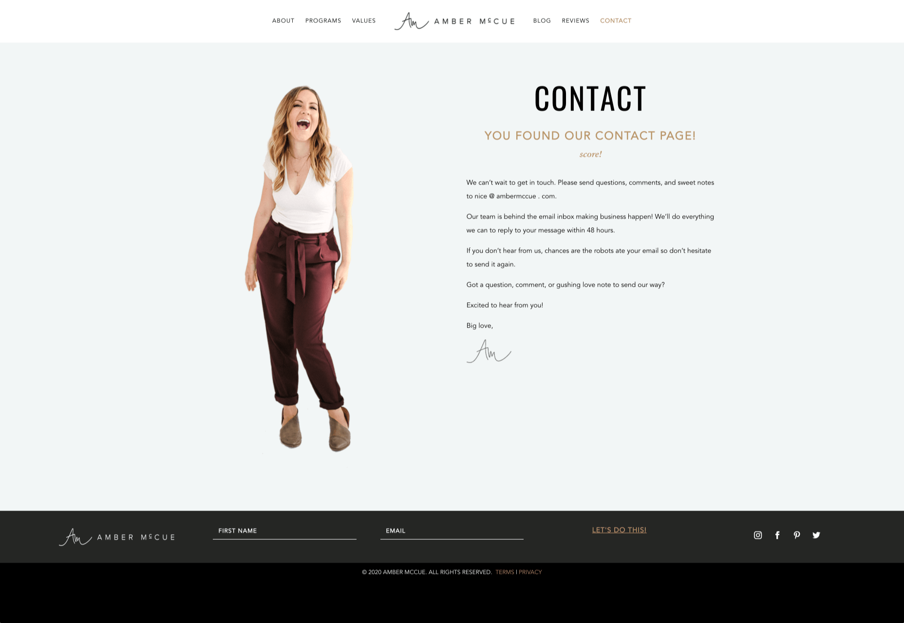
Research indicates that brains are fine-tuned to recognize and appreciate human faces. Having a picture of your customer service team, or just any human being on your contact page makes you instantly more approachable. Your customers start to feel like they’re reaching out to a person – not an empty website.

Look at how engaging and personalized this contact page from Amber McCue looks:

Although you can show any human face on your contact page and potentially get results, showing your actual agents will be more likely to drive positive results. It’s a great way to showcase the authenticity and humanity of your team.

Step 3: Making it Easy to Find

A surprisingly large amount of the time, companies shove their contact information into the footer of their website, forcing customers to spend forever looking for them. However, your audience might not want to spend an age searching for your details if they’re in a hurry to get answers.

Stowing a contact page in a footer is also a problem for those visiting your website via mobile, as they might not be able to see all your footer details and links as well.

A Contact Us page doesn’t have to be a massive part of your website navigation if you don’t want it to be. However, it should be one of the first things your audience can see. Putting the information on the header of your website, or even sticking it to the top of the page as your users scroll is very helpful.

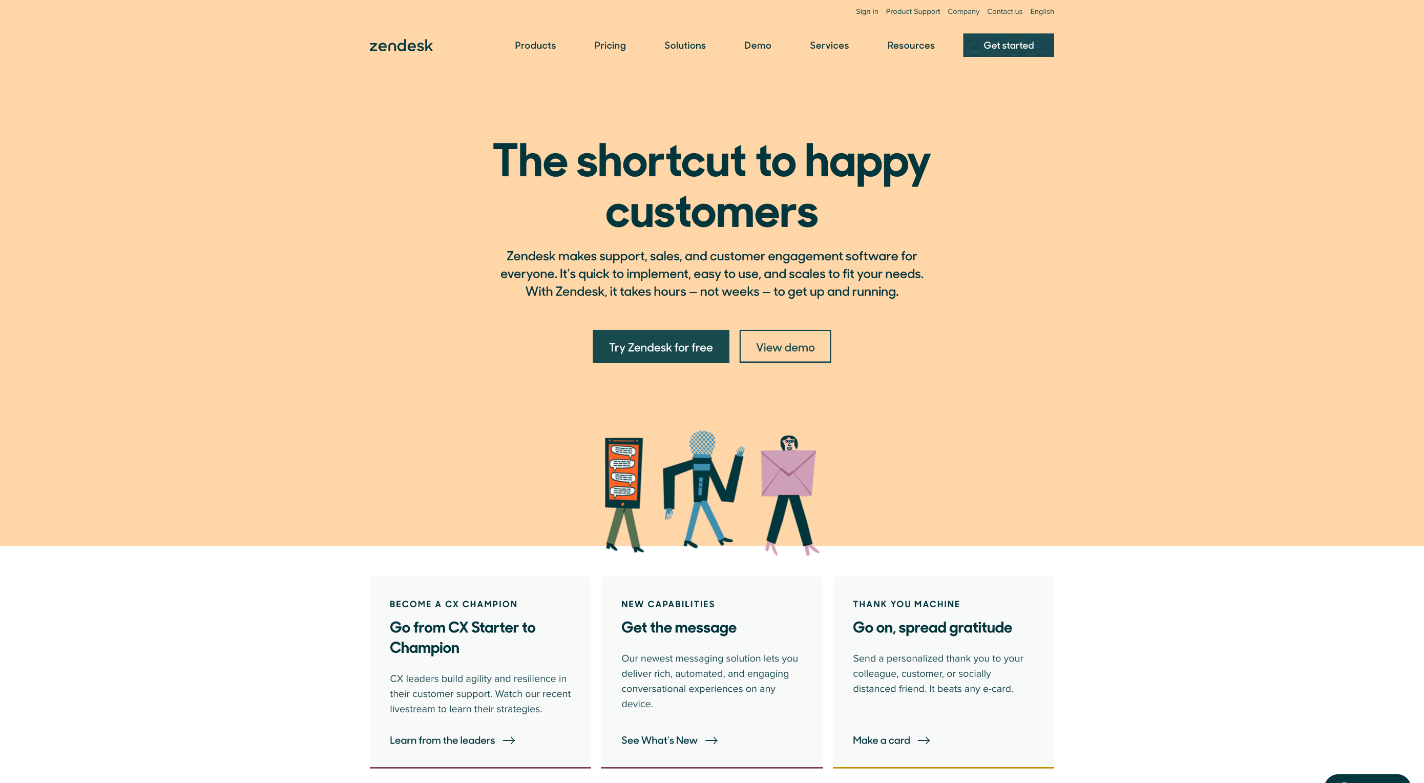
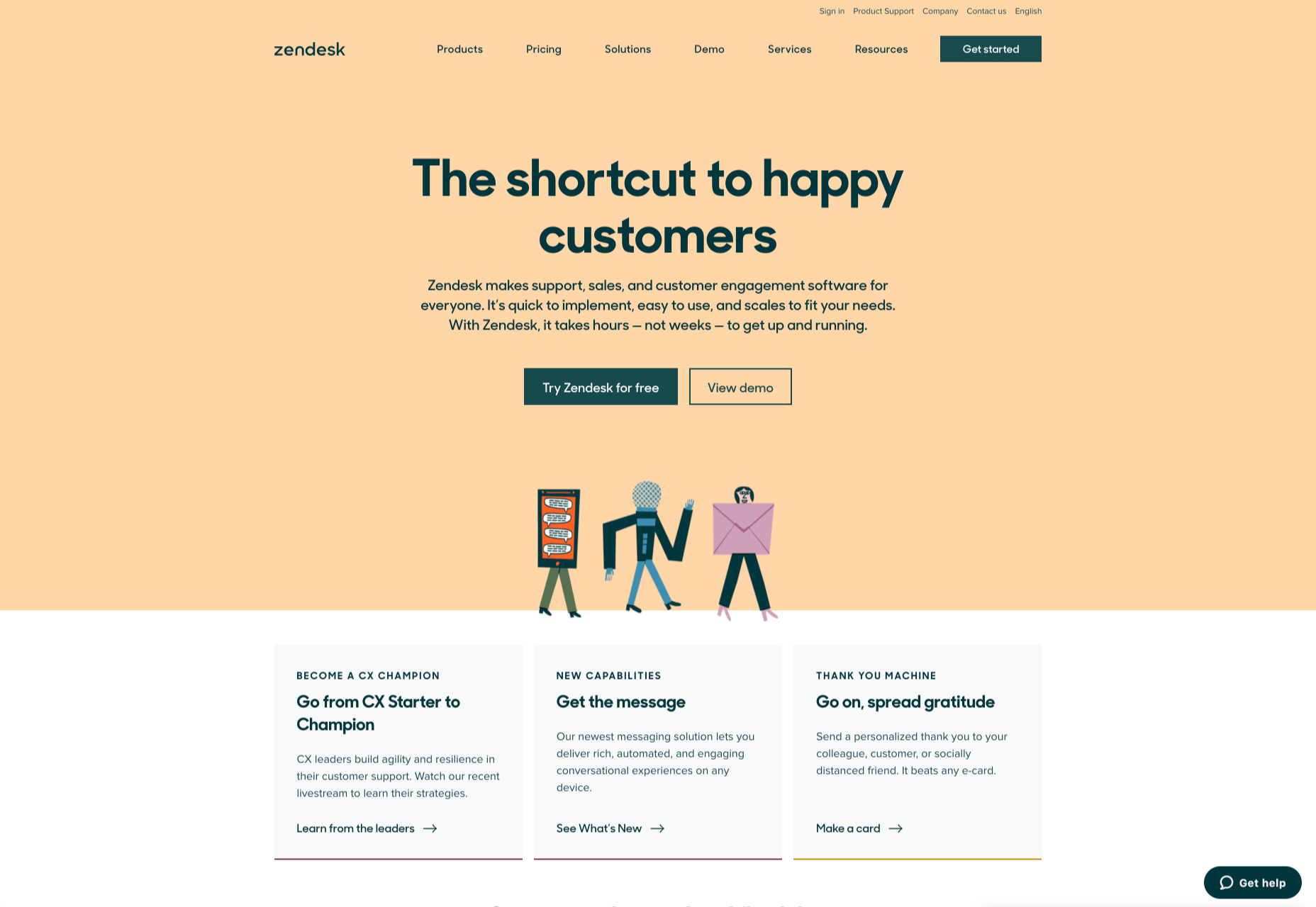
Zendesk makes it easy for customers to get in touch in multiple ways. First, the Contact section of the website is clear at the top of the page. Secondly, if you start scrolling through the Zendesk website, a “Get Help” button pops up, so you don’t have to scroll back to find assistance:

Remember, aside from making sure that your contact page appears in the right part of your website, it’s also worth ensuring that it’s easy to understand. Don’t use unusual terms like “Chat”, or “Chill with us”. Stick to tried-and-true options like Help, Contact, or Support.

Step 4: Making the Experience Relevant

There’s a reason why it’s practically impossible to find a one-size-fits-all contact page.

It’s because different customers need different things from your brand.

Some customers will be looking for the answer to a question; others will want to discuss something with your sales team. That’s why many companies are using adaptive contact pages that can change to suit the situation.

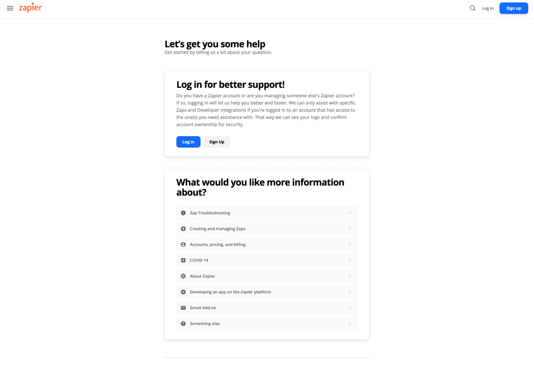
For instance, you may start by asking customers what they need help with. Zapier takes this approach with its Contact page:

By asking the client what they need straight away, Zapier can make sure that the visitor finds the right information, and the right number or email address for the appropriate agent. You can even scroll down the help page and look for something in the available help centre, using the search bar. Or you can click on View our experts to hire a Zapier pro.

Creating a dynamic and customized experience like this does a few things. First, it ensures that the customer will reach the right person to help them first-time around. This reduces the number of inappropriate calls your employees have to deal with, and the number of transfers.

Secondly, you deliver a better experience overall for your client, because they don’t have to repeat their issue to multiple people or start a massive email thread. They get the support they need immediately.

Dynamic contact pages can even save you some money and time. If clients decide to solve an issue themselves, using your resources, that’s great for your busy agents.

Step 5: Direct People to the Right Place

The central focus of your contact us page needs to be the available contact options. Centralizing the contact options on a page is an excellent way to make sure that they get the right amount of attention. Centralizing also means that your customers can spend less time searching for the contact details that they need, which is great for usability.

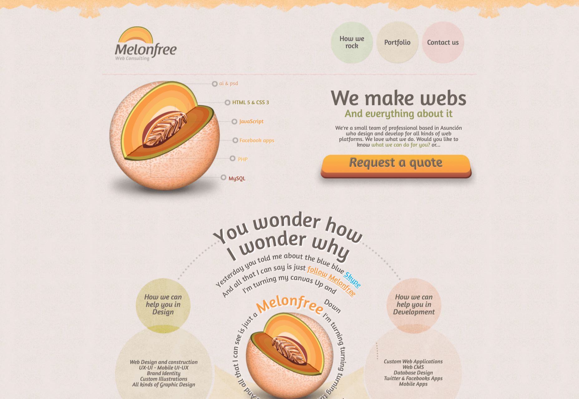
The Melonfree.com website uses a contact us form that’s centralized to immediately pull attention to the customer’s options for getting help.

Centralization isn’t the only way of using design principles to guide visitors on a contact page. According to Ray Hyman and Edmund Hick, increasing the number of choices on a page often increases the time it takes for people to make a decision.

When it comes to connecting with a brand, the right option for each customer will depend on the person and the situation they’re trying to overcome. For instance, a customer that needs to reset their password will probably be able to get the solution they need from an FAQ page.

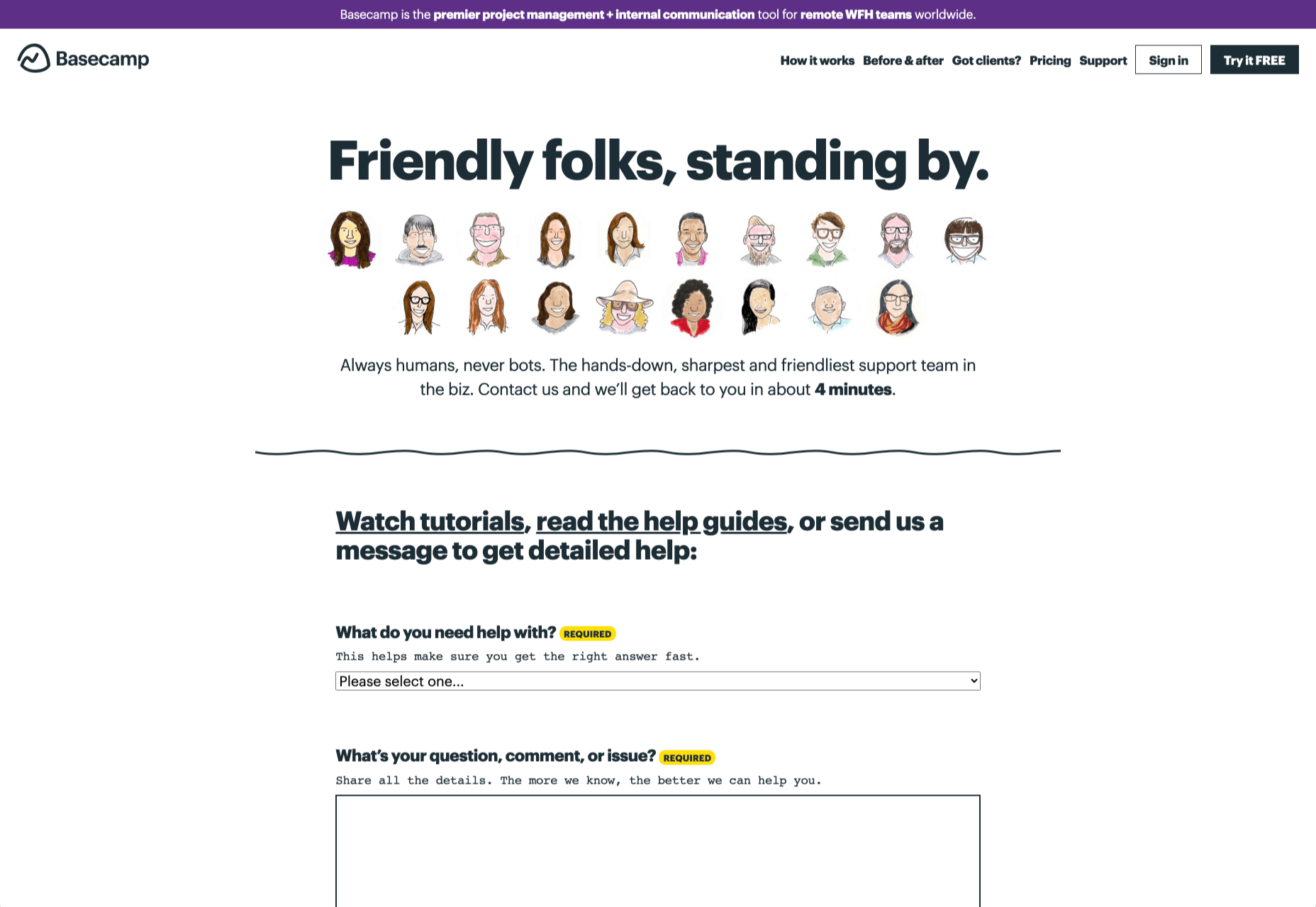
On the other hand, someone who needs help using a new feature might need the guidance of a professional. To help guide customers to the right solution, Basecamp gives customers a variety of steps to follow to get the right solution fast.

The main purpose of the contact page is to help customers get the right answer with an informative form. However, there are unobtrusive alternative options available too. If all you’re looking for is a way to help yourself fix a problem, you can click on the help guides link before you ever scroll down to the form.

Step 6: Support the Contact Team Too

The best contact us pages aren’t just a great way to improve customer experience. Well-designed solutions also help the customer service team to save time and stay productive.

One of the primary metrics that companies consider when evaluating the success of a service team, is the number of replies required before an issue is resolved. However, if the initial question from a customer doesn’t contain enough information, this number often increases.

Using the design of the contact form to access the right information helps with:

  • Automatically routing people to the right team member: Companies can set up segmentation rules that automatically send certain emails to different employees based on keywords. You might have questions that go to the sales team, and separate queries that you direct straight to the customer service team.
  • Show appropriate support options and FAQs: Remember to give the audience a chance to help themselves before they reach out for extra support. Links to an FAQ page or self-service options can really reduce the pressure on a team. Some companies even add automated chatbots to the mix to help with self-service.
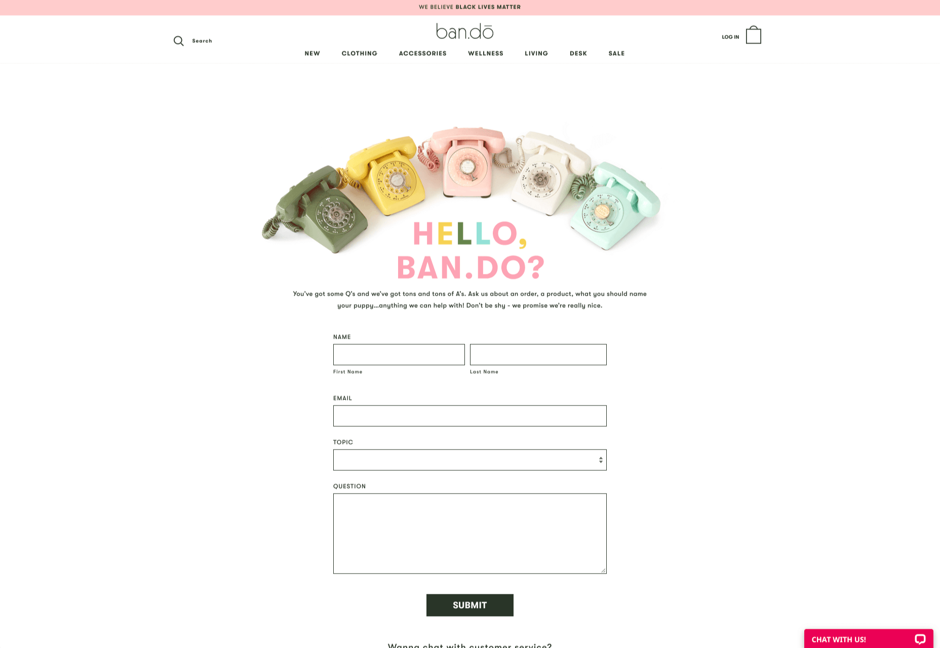
  • Prompt for extra context: Although not every customer will take advantage of an opportunity to add extra information to a form, some will. Adding a box to your contact form for “anything we need to know?” is a great way to generate more information. Ban.do includes a simple “question” box where customers can add as much detail as they like. An option to add screen shots or documents might be a nice touch too.

Building Your Own Contact Us Page

Every customer has their own specific set of needs. The right contact page for another business might not be the right one for you. That’s why it’s so important to take some time getting to know your customers and speaking to your support team.

When you’re planning your contact page, it helps to ask yourself some basic questions about what you want to achieve. For instance:

  • What kind of channels will our customers want to use to connect with us? Look at things like social media messaging, email, or phone calls. If you’ve got a relatively tech-savvy audience, then they might want to use things like instant messaging with chat bots too.
  • How can we direct clients to the appropriate channels in as little time as possible? Having a system in place to automatically route your customers to the right agent will reduce the time to resolution for your customers. The faster you solve problems, the better your reputation becomes.
  • What can we do to set customer expectations and build confidence before they speak to us? Designing a professional-looking contact page will increase customer confidence, while an FAQ section shows that you’re ready to answer common questions.
  • How can we showcase a unique brand personality without making the page complicated? Everything from using distinct brand colors on a contact page, to adding images and illustrations reminds customers that they’re in the right place.
  • What can we do to reduce the friction points in a customer’s path to contact? Avoid adding too many input options to a contact form and ensure that it’s easy to reach out when your clients have a problem.

Understanding exactly what your audience needs from you, and what they’re looking for when they come to your team for help reduces the effort involved for your client when they reach out for help. Remember, today’s digitally-savvy customers expect their interactions with companies to be as streamlined and simple as possible.

Make the Most of Your Contact Page

Contact pages are frequently an afterthought in the website design process. However, they’re one of the most valuable tools your company has. With a good contact page, you ensure that your customers can always reach you when they have problems. What’s more, you boost your chances of people wanting to reach out to the sales team too!

Good luck creating a contact page that encourages engagement from your target audience. Don’t forget to track your results from each design, and A/B test for optimization.

Source


Source de l’article sur Webdesignerdepot