Articles

Web developers have been the bedrock of any company’s business strategy for some time, and the industry is continuing to thrive and grow at a rapid pace. This is why it’s surprising that it is so lacklustre when it comes to diversity.

A recent study revealed 80% of those in the design industry are male, and more specifically 79% within the field of web design. According to WISE, just 23% of the people working in STEM roles (Science, Technology, Engineering and Maths) are female and women currently account for just 15.8% of the UK’s current generation of engineering and technology graduates.

Why the Lack of Diversity in Web Design?

The main reason for this, as cited by the Organisation for Economic Co-operation and Development (OECD) found that women still lack the confidence to pursue these careers, despite their school results being as good as (or better) than their male counterparts. Research has found that the professional and technical services sector has the fourth-highest gender pay gap of all UK industries. If more women were to join these higher-paid sectors it could help reduce the gender pay gap as a whole, as well as help female economic empowerment.

This division is seen in ethnic minority groups too. The numbers for BAME (Black, Asian, Minority Ethnic) employees in the British tech industry are unknown but is estimated by the British Computer Society to be at 1-2%, a ridiculously low number in this day and age. This is why groups and organisations are cropping up designed to promote an industry that reflects all of society rather than one part of it. Here are some of the organisations to pay attention to who are bridging the diversity gaps in web design.
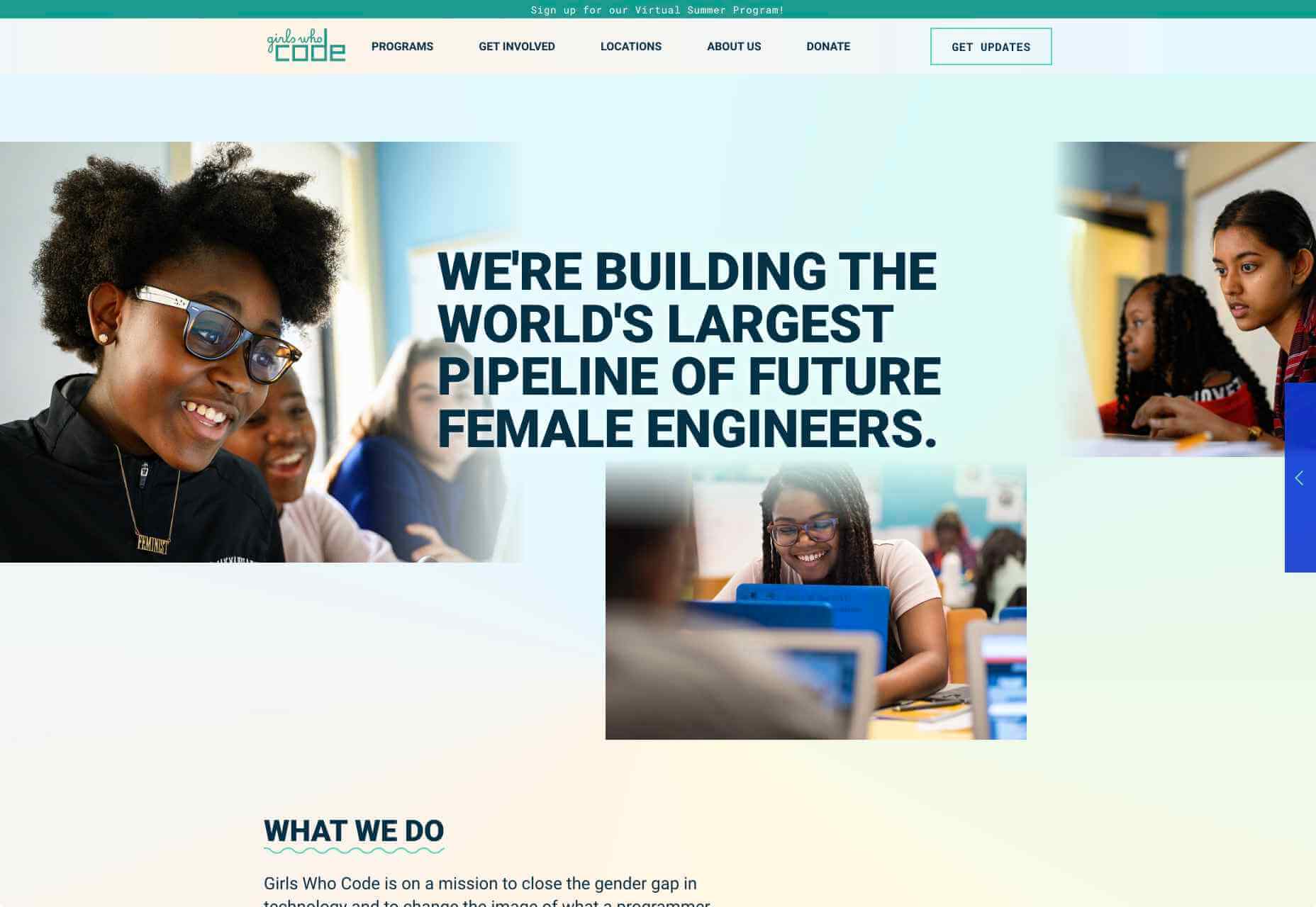
Girls Who Code

Girls Who Code are working to create opportunities for women within tech, aiming to deepen their computer science skills and confidence. They run a range of programs designed to equip women with the necessary computing skills to pursue opportunities in the field and to give chances that are often shunned due to society. Founder Saujani states that women are socialized to seek perfection, and this is something that needs to be overcome. One way to break that mentality at an early age, she says, is coding:

[Girls] walk into these classrooms and they feel like they will never be good at it, and when they learn how to create something, whether it’s a website or app, it changes their mindset and they stop giving up
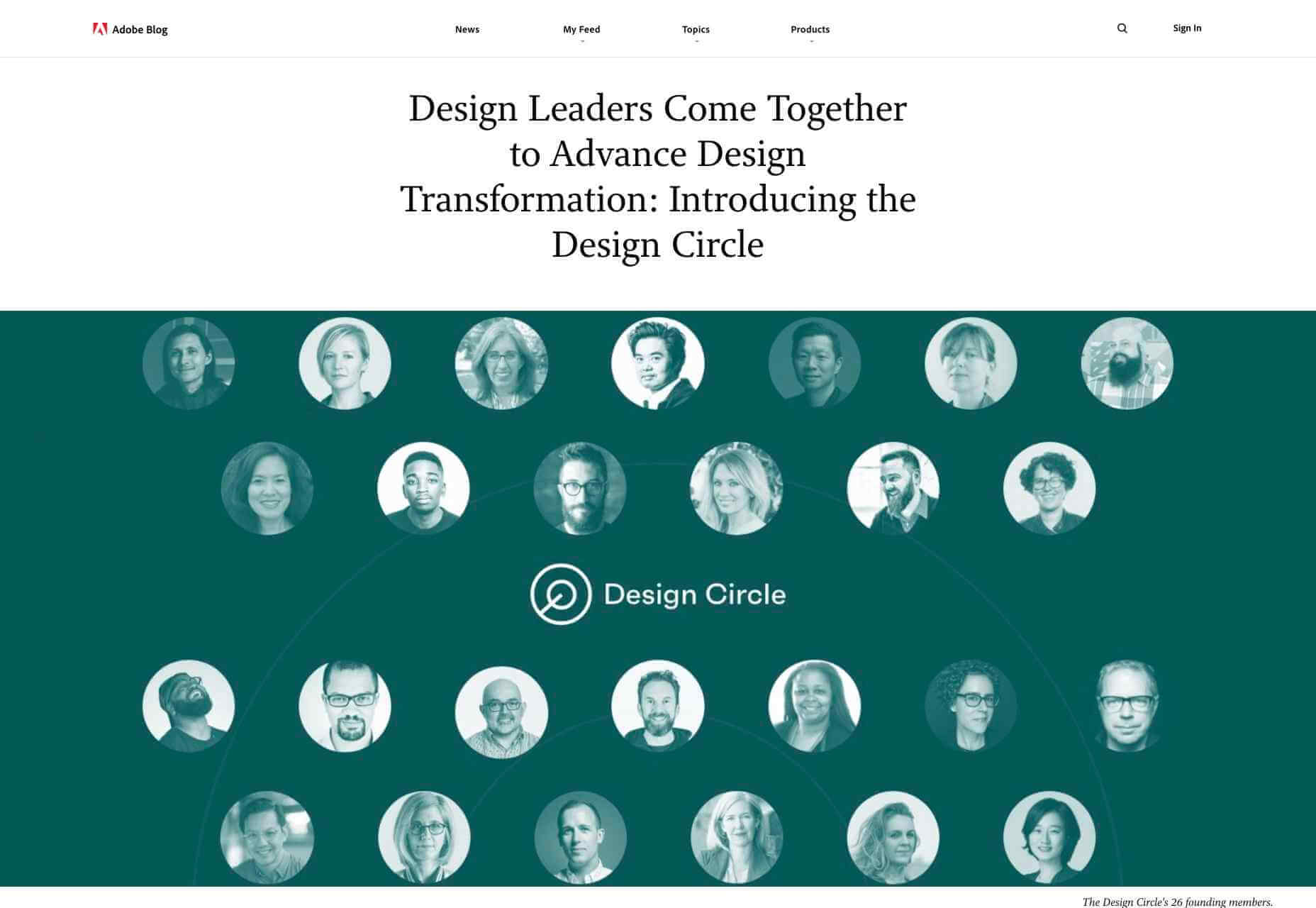
Adobe Design Circle

Adobe Design Circle is another initiative aiming to introduce all members of society to design. They want to create more visibility for design as a viable career path for anyone that might be considering it, and to help with youth entering the field. This is opening the opportunities of working in tech and web to aspiring designers at a young age who aren’t necessarily yet conditioned by the pressures of society and showing them it can be a realistic career path.

They have their own scholarships and mentoring initiative to support these goals too. The faces behind the team of Adobe Design Circle range through multiple ethnicities and have a fairly even male-female divide. This equal representation alone is inspiring. One of Adobe’s core missions is to offer youth the opportunity to learn and express themselves through creativity and technology, regardless of their economic or cultural backgrounds. With this they specifically encourage applicants of all backgrounds to apply and offer many other opportunities from mentoring to internships.
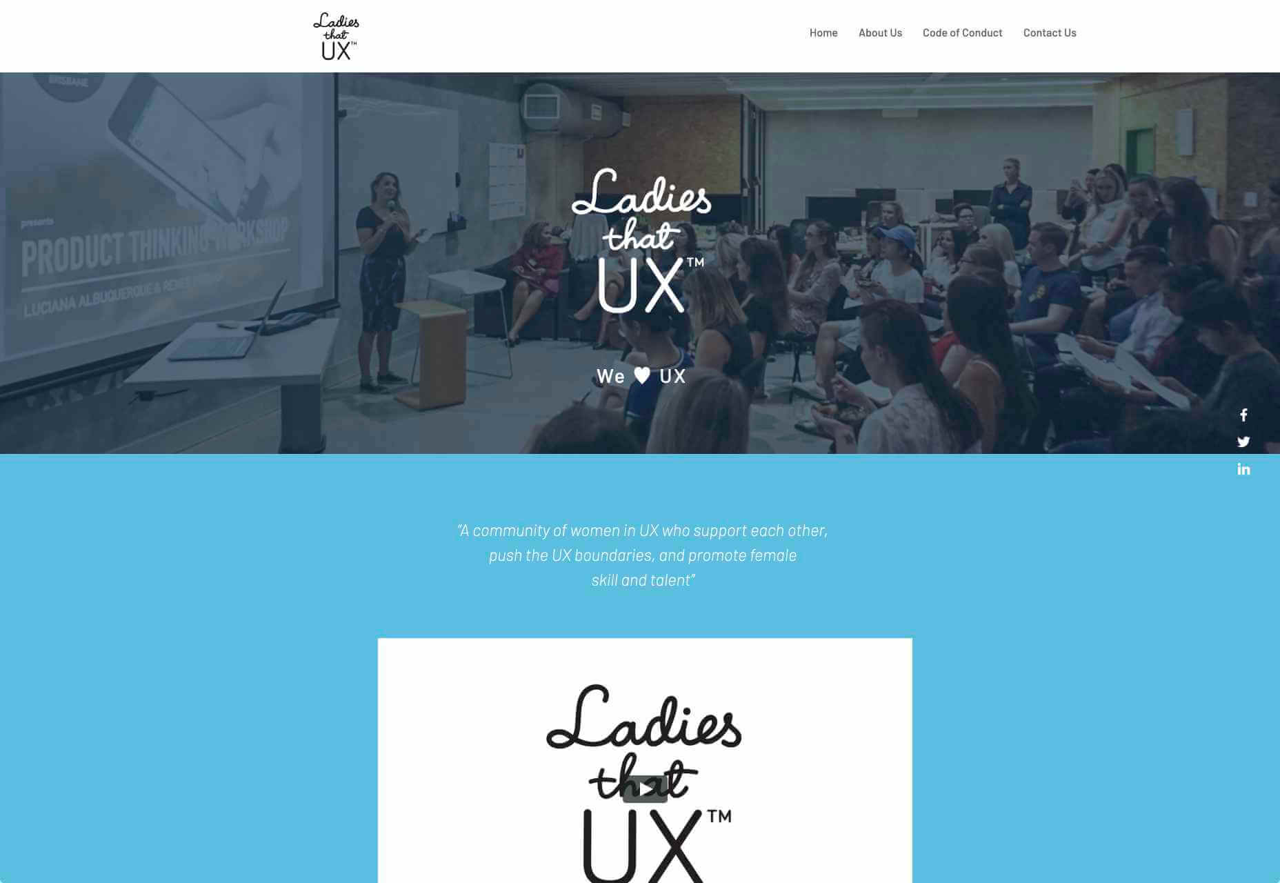
Ladies that UX

Ladies that UX are a collaborative community of women in UX aiming to “support each other, push the UX boundaries and promote female skill and talent.” It is a European-based initiative where each city involved runs slightly different events and groups decide together what they would like to get from their meetups. They assist each other with UX challenges, discuss topics, and brainstorm ideas. Ladies that UX was created in 2013 by Georgie Bottomley and Lizzie Dyson with the aim of bringing together women in the industry, offering support and creating connections around the world.
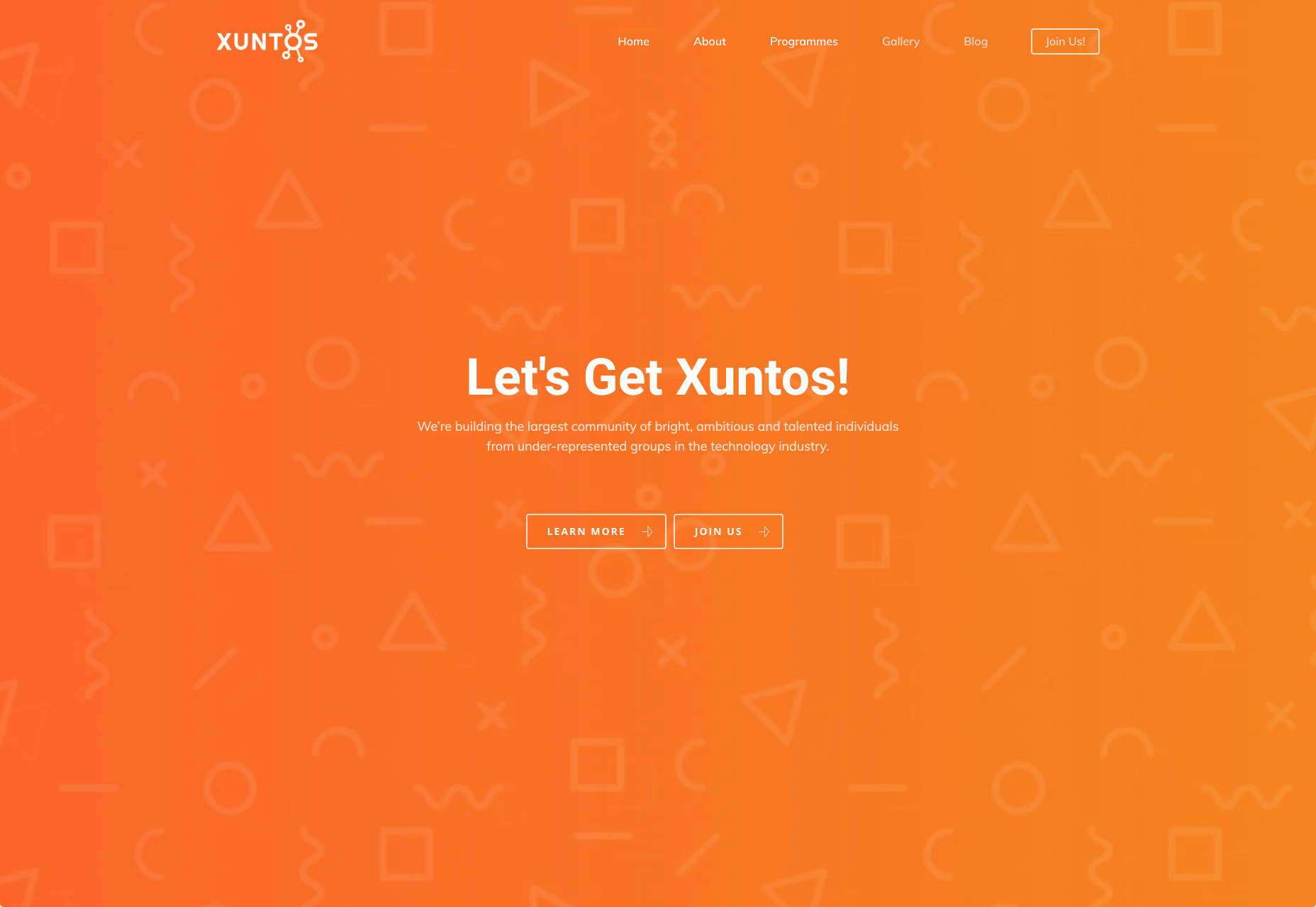
Xuntos

Xuntos is aiming to create the largest community of ambitious and talented individuals from under-represented groups in the technology industry. It works to nurture university students and recent graduates that are often overlooked in the tech industry by the means of educational workshops, university hubs, events and an active community. The very name “Xuntos” is a Galician word which means “together” and this is their most important factor. They want people to realise they are not alone and just because the representation isn’t there, doesn’t mean their capabilities aren’t.
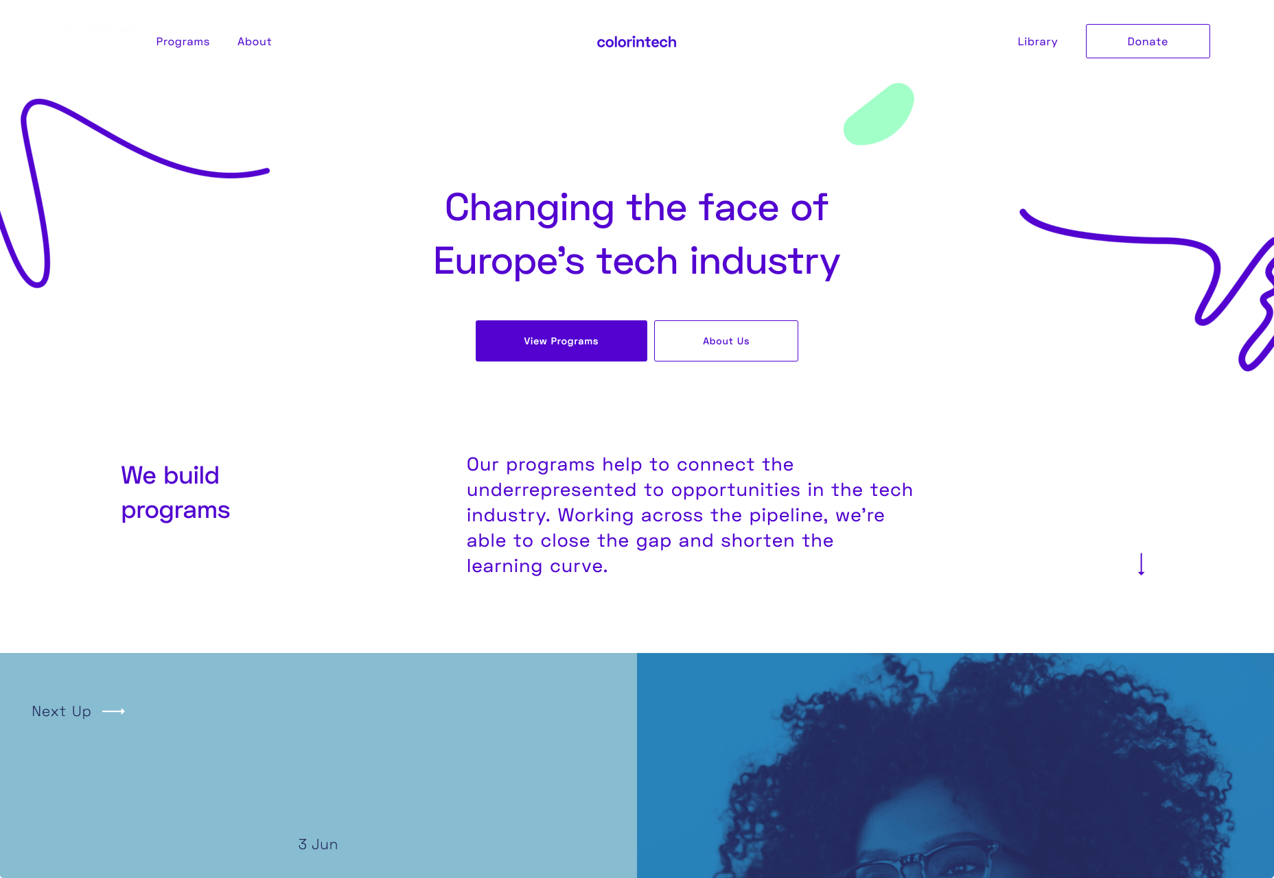
Colorintech

Colorintech is a non-profit organisation that was founded in 2016. It aims to close the gap and shorten the learning curve, with a strong community designed to help each other. The company was founded by Silicon Valley tech executive Dion McKenzie and ex-Googler Ashleigh Ainsley after they became frustrated at the few black individuals in the field. Since its inception 30,000 students, professionals, volunteers and tech companies have been impacted by their work, and over 450 minorities graduated from their programs in 2019 alone.
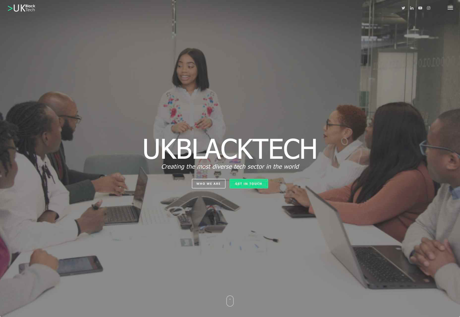
UKBlackTech

UKBlackTech are on a mission to create the most diverse tech sector in the world. Their aim is to encourage more ethnic minorities to enter the UK’s technology workforce and make an impact. To help with this, they design and implement different initiatives to help them get employed and retain employment, put on bespoke events that target aspects such as specific job roles or tech topics and promote different opportunities for members to apply to.
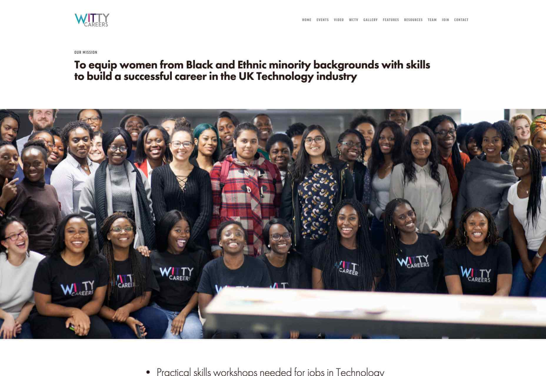
Witty Careers

Witty Careers was created with the aim to support women from black and ethnic minority backgrounds in the UK and equip them with the skills to build a career in the tech industry. They run different practical skills workshops and events which in the past have included visits to a Microsoft store, Uber, and Pivotal. They open doors for communications, networking and future career prospects for those in the minority. They also have a handy range of resources designed to help you get into the career you want. From CV writing advice to industry insights, they are all free of charge.

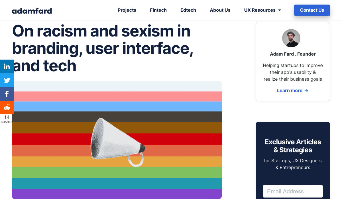
Featured image via Unsplash.

Source

p img {display:inline-block; margin-right:10px;}
.alignleft {float:left;}
p.showcase {clear:both;}
body#browserfriendly p, body#podcast p, div#emailbody p{margin:0;}


Source de l’article sur

[Mise à jour du 03 juillet 2020] 

Microsoft a mis à jour ses avis pour indiquer que les versions Server de Windows ne sont pas vulnérables.

De même, comme les composants vulnérables sont uniquement disponibles par le Windows Store, tout système bloquant …
Source de l’article sur CERT-FR

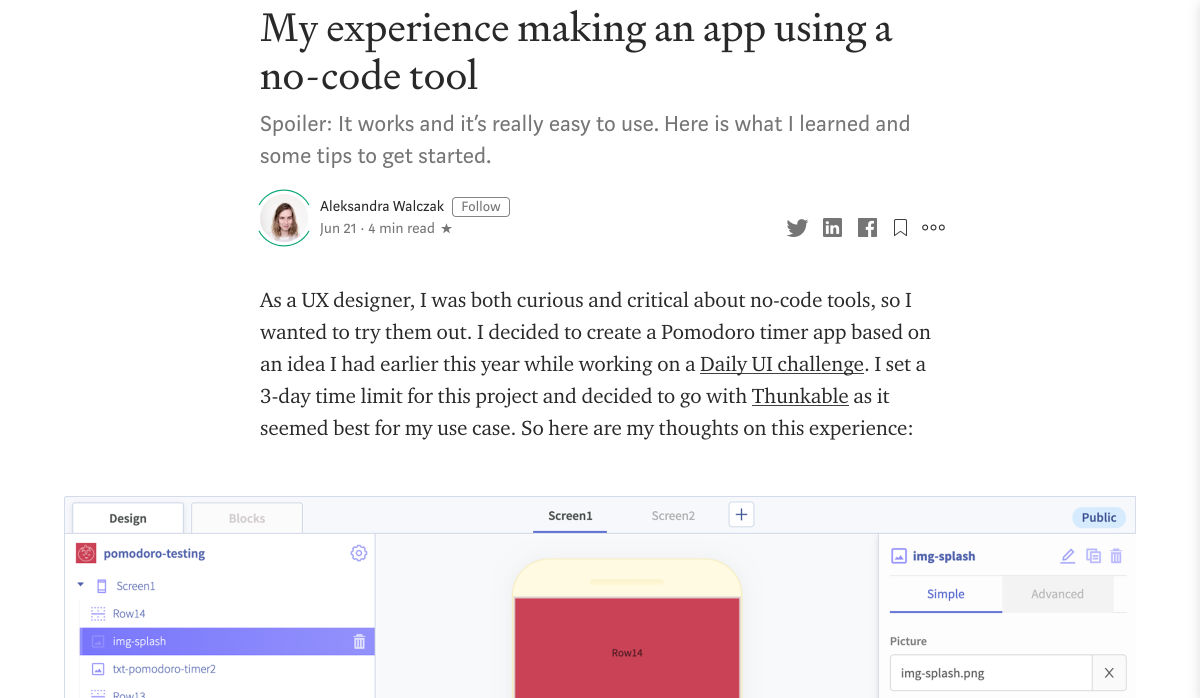
You’ve been working away at your latest design project, and the client has given the go-ahead on your lovingly created digital concepts. Now it’s time to bring those designs to life, and you have a developer queued up to do just that.

So your part’s done, right? Not quite. You’re going to want to make sure your developer has the best head start they can in order to create the site as you imagined.

Below are a few tips to make that handover process a little easier.

Communicate to Make It Great

Get Talking

Scheduling a face-to-face meeting with your developer to talk over your project’s specifics and ambitions will help align your expectations and make the intent behind your concepts more clear. It’s quite likely they’ll even ask questions and request assets you haven’t even thought of yet!

It’s not just a one-and-done thing either, your developer’s going to have questions or requirements that arise as the project progresses. Deciding on a communication channel to allow easy discussion will help you both immensely.

Annotating Your Concepts

Developers might seem like magicians with the way they bring your websites to life, but they’re not clairvoyant! Annotating your concepts where advanced functionality is required reduces ambiguity and makes it more likely that your cool, quirky idea is going to make it to production. If it’s a feature that’s particularly unusual, you might want to find an example of a website or code sandbox that does something similar.

An example of Figma’s comment tool in use to make developer notes.

Figma and Sketch both have comment functionality in order to make annotations a little easier, also allowing multiple parties to comment. If dealing with PDFs, there is also an annotation tool available through Adobe Acrobat.

Specify the Basics

The basis of modern front end development revolves around DRY thinking. Some might argue thinking about code can be pretty dry, but we’re not talking about that – in this case, DRY stands for Don’t Repeat Yourself.  Most developers will tackle a project by starting with defining variables: what colors, font sizes, grid columns… anything that can be reused! Good, consistent design follows this same principle – although it’s a habit that can be hard to get going at first.

Tip: It’s always easier to define variables if this mentality is approached towards the start of the project!  

Colors

Make a style guide that specifies the colors you’ve used in your designs. Think about their logical applications to help signpost how they might work as a variable – for example, what colors did you use for paragraph text, hyperlinks and backgrounds? Did you consider colors to convey status messaging, such as successes, warnings and errors?

Typefaces

Which fonts have you used for your project? Is there a consistent set of font sizes you used throughout? If you haven’t already, maybe consider a ratio-based type scale – I like to use ModularScale to help with this.

Basic HTML Elements

Think about general styling for these basic html tags:

  • Paragraphs <p>
  • Headings <h1–h6>
  • Bullet lists <ul> and numbered lists <ol>
  • Emphasized text <b>, <strong> and <em>

Buttons

How about buttons and links? What should they do when they’re hovered over, focused (using the tab key on a keyboard) or disabled?

Forms Fields and Inputs

What should form fields look like? Is there any validation checking that should occur when a form is submitted?  How about checkboxes and radio buttons?

It’s unlikely that you’re going to be able to cover absolutely every single eventuality – allow your developer to use some common sense to fill in the gaps, and be available to them if they have any questions. In the words of John Maxwell and your aunt’s home office wall sticker, teamwork makes the dream work.

Get Your Favic-on

Favicons are widely recognized as the small icon that appears to the left of the site title on your browser’s tab bar. Nowadays, the application of your site’s favicon is much further reaching, showing up in Google search results and app tiles. There’s also extra theming options available, such as the ability to customize the color of Google Chrome Android’s browser bar color for your site.

Using a generator site such as realfavicongenerator takes the pain out of much of this decision-making, allowing you to upload specific graphics as desired, creating silhouettes of your icon for Windows Metro tiles and macOS Safari pins, and packaging everything into easy-to-use files and code.

 Compress Your Images

Nobody wants to load a 20MB image when they’re on a slow connection or a data plan – it pays dividends to plan ahead and downsize your images so that they’re production-ready for the web. If you’re worried image compression is going to harm your image quality, fear not – you can go a long way with image compression before quality is seriously compromised.

  1. Start by reducing the image resolution – for batch jobs, I use Adobe Photoshop’s image processor script to downsize images to fit 1920 x 1200 pixels
  2. Alternatively, if you’re working on a static project – where specific images will be used only in specific places – you could use your design software (nearly all mainstream UI software allows you to do this now) to export your images at 2x size to support devices with high pixel densities.
  3. I also convert my image color profiles to SRGB to ensure consistency across most modern display types (this one’s optional)
  4. I then take my newly downsized images and run them through imageOptim at 80% quality. Generally I would aim to get my images under 300kb – if there are any that are still significantly over this target once compressed, I’d run these through again at 70% quality (I wouldn’t recommend going lower than this, though).

Don’t forget you can also do this for PNGs! Enabling PNGCrush in imageOptim will let you significantly reduce the size of PNGs… just be ready for it to take a while.

Make Your Vectors SVG-Easy to Use

If your design contains graphics or illustrations you created using vector software, it can be used on the web as an SVG file. Usually, these files will be a lot smaller than JPGs or PNGs. You can export graphics in most (if not all) vector software in this format.

Optionally, you could use imageOptim or SVGOMG to compress the SVG code without sacrificing quality. Your developer might already use a script that does this automatically when processing the site for production, so it may be worth asking ahead.

Get Your Licenses in Check

If you’re using premium fonts, make sure you’ve purchased a webfont license so you can hand over the correct files to the developer. I’d recommend doing this sooner rather than later – although not often, occasionally web versions of fonts can have slightly different bounding boxes to their desktop counterparts, making it a real pain for developers to work with further down the line.

If you’ve been using samples of stock photos (or if you’ve been going crazy lifting whatever you can find on Google Images), make sure everything is kosher before you go live. Make sure you purchase licensed photos, and if certain photos you want to use require attribution, make the developer aware of this.

Source

p img {display:inline-block; margin-right:10px;}
.alignleft {float:left;}
p.showcase {clear:both;}
body#browserfriendly p, body#podcast p, div#emailbody p{margin:0;}

Source de l’article sur

Rosny-sous-Bois, ville dynamique de Seine Saint-Denis, anticipe les nombreuses transformations engendrées par le Grand Paris notamment sur son nombre d’habitants. Déjà desservie par le RER E, la commune de 45 000 habitants entrée dans la métropole du Grand Paris en 2016, verra s’ouvrir trois nouvelles stations de la ligne 11 en 2023, et une station de la future ligne 15 en 2025. Ainsi, la mairie anticipe sa croissance démographique pour devenir un ville phare de l’est parisien. Pour anticiper ces changements, le numérique est un atout du futur Rosny-sous-Bois. La ville a donc choisi la solution SAP Conversational AI pour accueillir au mieux ses futurs citoyens.

La mise en place d’un chatbot, première pierre vers une vocalisation des services de la ville

Depuis janvier 2019, un chatbot développé par la solution SAP Conversational AI fait office d’interface privilégiée avec les habitants de Rosny-sous-Bois. L’objectif est d’assurer un premier niveau de service public différenciant par rapport aux villes voisines en proposant un service simple d’utilisation capable de répondre aux questions des citoyens de la commune en 24/7.

« Nous avons choisi la solution SAP car elle était la seule à pouvoir couvrir l’ensemble de nos services. Son caractère langage agnostique nous permet également de prendre le tournant de la vocalisation des services. En effet, Nous souhaitions également pouvoir répondre en plusieurs langues pour répondre à des populations non-francophones et offrir des services publics de qualité pour tous les habitants », explique Menahd Ouchenir, Conseiller Municipal délégué à la ville numérique.

Une solution rapidement adoptée par les habitants de la ville

En l’espace d’un an, le chatbot de SAP est rentré dans le quotidien des habitants de la ville de Rosny-sous-Bois. Ils n’hésitent pas à lui poser des questions impactant leur quotidien : les jours de collecte des poubelles, les transports fonctionnant en période de grève, les services disponibles pendant le confinement ou encore les dates des élections municipales.

« Les habitants de la ville ont rapidement fait du chatbot un outil de leur vie quotidienne : nous comptabilisons maintenant 2 500 utilisateurs uniques par mois, 4,5 messages par utilisateur, un taux de compréhension de 74%, et un taux de précision de 0,878. Pendant la période de confinement, cela nous a permis de maintenir un lien supplémentaire avec les habitants de la ville et de répondre à leurs interrogations. En complément, le chatbot est un atout de communication et pousser les utilisateurs à aller vers les contenus du site. Cela nous permet donc d’aller plus loin dans notre rôle de service public », ajoute Menahd Ouchenir.

Améliorer constamment la solution pour accueillir les futures populations de la façon la plus efficace possible

Avec 300 intentions et 2 700 tournures de questions comprises par le chatbot, la solution proposée par SAP est largement opérationnelle. Toutefois, les équipes communication et événementiel de la mairie analysent constamment les questions posées par les habitants afin d’enregistrer de nouvelles tournures de phrases et de nouveaux sujets pour que l’IA les comprenne de manière optimale par la suite. L’objectif final est maintenant d’arriver à soulager les différents pôles de la mairie en déléguant l’ensemble des questions quotidiennes au chatbot, et ainsi faciliter l’emménagement des nouveaux rosnéens.

L’avantage de cette solution est sa capacité à adresser des périmètres et métiers hétérogènes, et ainsi de répondre à des questions sur un grand nombre de domaines.

« Le résultat de cette intégration à notre site web est très satisfaisant. Nous souhaitons à long terme enrichir notre socle de données technologiques grâce à SAP pour pouvoir nous diriger vers une vocalisation toujours plus sophistiquée », conclue Menahd Ouchenir.

The post La mairie de Rosny-sous-Bois utilise le chatbot de SAP pour converser avec ses habitants et anticiper sa croissance démographique appeared first on SAP France News.

Source de l’article sur sap.com

WALLDORF — SAP SE (NYSE: SAP) annonce le lancement de SAP Learning Hub Enhanced Student Edition. Centrée sur les dernières technologies et innovations de SAP, celle-ci s’adresse aux étudiants du monde entier qui préparent leur carrière au sein de l’écosystème SAP. Cette édition fournit tous les outils, sessions d’entraînement et ressources nécessaires pour devenir un professionnel SAP certifié.

Créée en partenariat avec les programmes SAP University Alliances et SAP Next-Gen, cette édition renforce la collaboration de SAP avec les universités et les organismes de recherche. Elle a pour mission d’inspirer et de faire progresser la prochaine génération de talents et de dirigeants. Elle s’adresse aux étudiants issus de toute formation universitaire qui , par abonnement, ont accès 24h/24 à tous les contenus et outils d’apprentissage numériques et collaboratifs avancés de SAP. Ceux-ci incluent notamment :

  • Des guides de parcours d’apprentissage et des salles de cours SAP en ligne pour apprendre, collaborer et réseauter avec les experts SAP et les autres apprenants.
  • Un apprentissage numérique à son propre rythme portant sur les principales solutions SAP pour la planification des ressources de l’entreprise, la gestion de la relation client, l’analyse, les technologies intelligentes et autres fonctionnant sur SAP S/4HANA Cloud; le portefeuille SAP Customer Experience et les solutions SAP Analytics Cloud et SAP Internet of Things.
  • Soixante heures de pratique ou d’expérimentation des applications SAP accessibles via le portail SAP Live Access.
  • Un examen en ligne pour obtenir les badges numériques SAP Global Certification — une accréditation d’excellence très reconnue et recherchée pour les professionnels SAP.

« La prochaine génération de professionnels SAP cherche à entamer sa carrière et nous nous engageons à les préparer avec les connaissances et les compétences pratiques nécessaires pour exceller dans les solutions numériques et intelligentes qui font partie de notre écosystème SAP », a déclaré Eva Zauke, chief knowledge officer, SAP SE. « C’est pourquoi nous avons adapté le SAP Learning Hub, édition améliorée pour étudiants, afin de présenter nos solutions, technologies et contenus les plus innovants et orientés vers l’avenir, ainsi que des exercices pratiques et la possibilité d’obtenir des badges numériques SAP Global Certification ».

Avec cette nouvelle édition, les étudiants peuvent obtenir un véritable avantage concurrentiel pour toute carrière au sein de l’écosystème des partenaires et clients SAP.

Selon une étude récente de Pearson VUE, la possession d’une certification informatique, comme les badges numériques SAP Global Certification, présente des avantages directs pour les carrières professionnelles. En effet, avec l’obtention de certification en informatique :

  • 35% reçoivent des augmentations de salaire ;
  • 44% produisent un travail de meilleure qualité ;
  • 26% sont promus ;
  • 55 % appliquent leurs connaissances à des situations de travail réelles ;
  • 67% prennent davantage confiance en leurs compétences professionnelles.

« Pour notre université et pour moi même en tant que professeur, il est crucial que nos diplômés trouvent des emplois passionnants en rapport avec leurs qualifications acquises et qu’ils démarrent ainsi leur vie professionnelle avec succès », a déclaré le professeur Dietmar Kilian, professeur au Management Center Innsbruck (MCI) de l’Internationale Hochschule GmbH et CEO de PDA Group GmbH. « SAP Learning Hub, enhanced student edition, est l’une de nos offres complémentaires à nos étudiants. Les possibilités d’apprentissage et les certifications proposées constituent une préparation idéale pour les jeunes professionnels qui s’intéressent aux sujets de l’informatique et du numérique. C’est une base parfaite pour ceux qui veulent commencer une carrière de consultant SAP. Cette offre supplémentaire est très avantageuse et particulièrement importante pour ceux qui veulent se positionner dans l’environnement des solutions SAP ».

Pour en savoir plus et vous inscrire, consultez les offres de formation ou visitez l’atelier de formation pour SAP Learning Hub.

Consultez le SAP News Center. Suivez SAP sur Twitter : @SAPNextGen.

À propos de SAP

SAP est le leader du marché des applications d’entreprise : 77% des transactions financières mondiales passent par un système SAP. L’entreprise accompagne les organisations de toute taille et de tout secteur à mieux opérer. Nos technologies de machine learning, d’Internet des objets (IoT), d’analytique avancée et de gestion de l’expérience aident nos clients à transformer leur activité en « entreprise intelligente ». SAP dote les professionnels d’une vision approfondie sur leur activité et favorise la collaboration pour garder une longueur d’avance sur leurs concurrents. Pour les entreprises, nous simplifions la technologie afin qu’elles puissent utiliser nos logiciels comme elles le souhaitent, sans interruption. Notre suite d’applications de bout en bout et nos services permettent à plus de 440 000 clients d’opérer de manière rentable, de s’adapter en permanence et de faire la différence. Avec son réseau mondial de clients, partenaires, employés et leaders d’opinion, SAP aide le monde à mieux fonctionner et à améliorer la vie de chacun. Pour plus d’information, visitez le site www.sap.com

Contacts presse :

Daniel Margato, Directeur Communication : 06 64 25 38 08 – daniel.margato@sap.com

Sylvain Drillon : 06 44 71 35 68 – presse-sap@publicisconsultants.com

SAP News Center. Suivez SAP sur Twitter : @SAPNews.

Veuillez tenir compte de notre politique de confidentialité. Si vous avez reçu cette alerte de presse dans votre courriel et que vous souhaitez vous désabonner de notre liste d’envoi, veuillez communiquer avec presse-sap@publicisconsultants.com et écrire Désabonnement dans la ligne Objet.

The post Lancement de SAP Learning Hub Enhanced Student Edition pour soutenir la prochaine génération de professionnels SAP appeared first on SAP France News.

Source de l’article sur sap.com

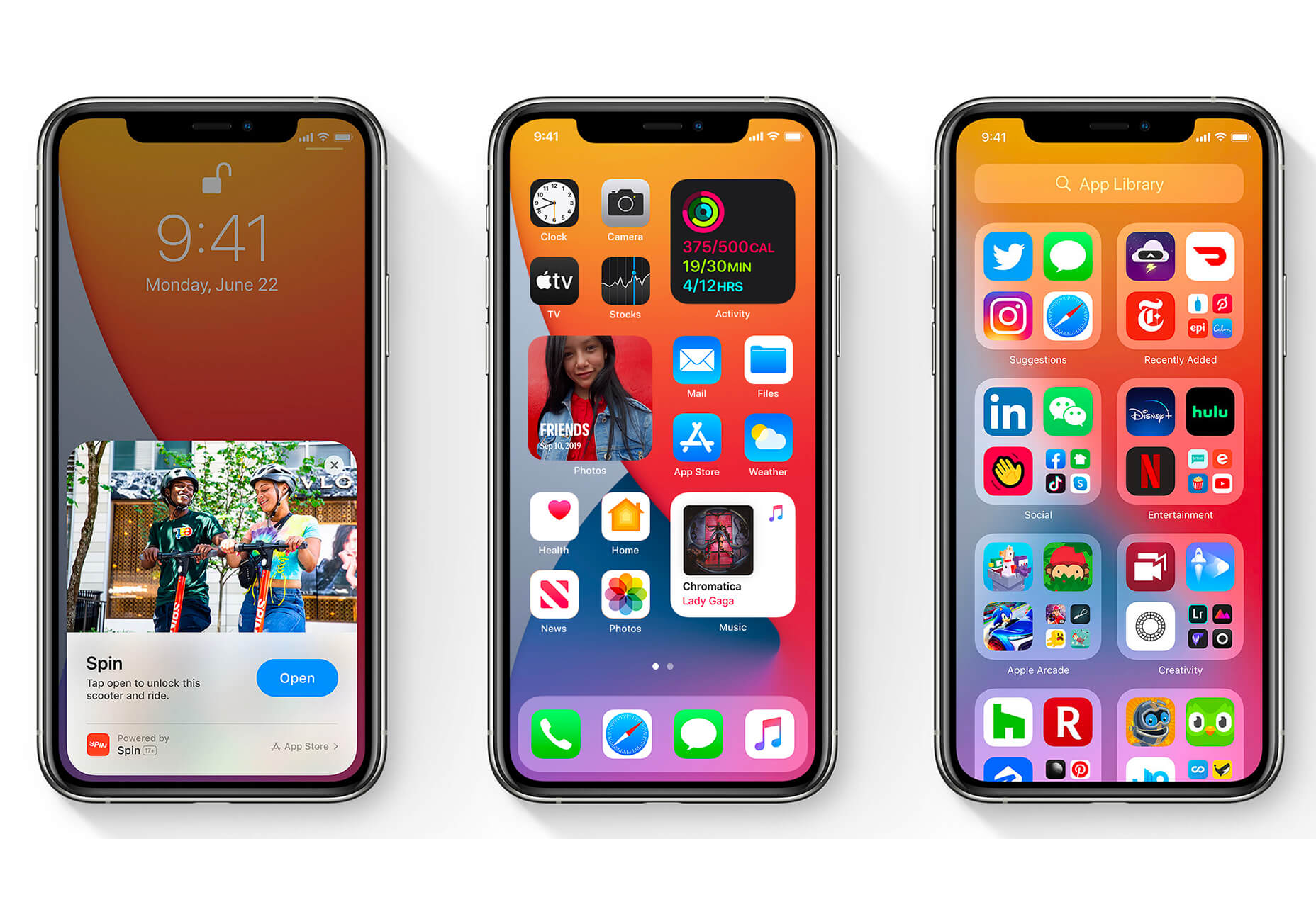
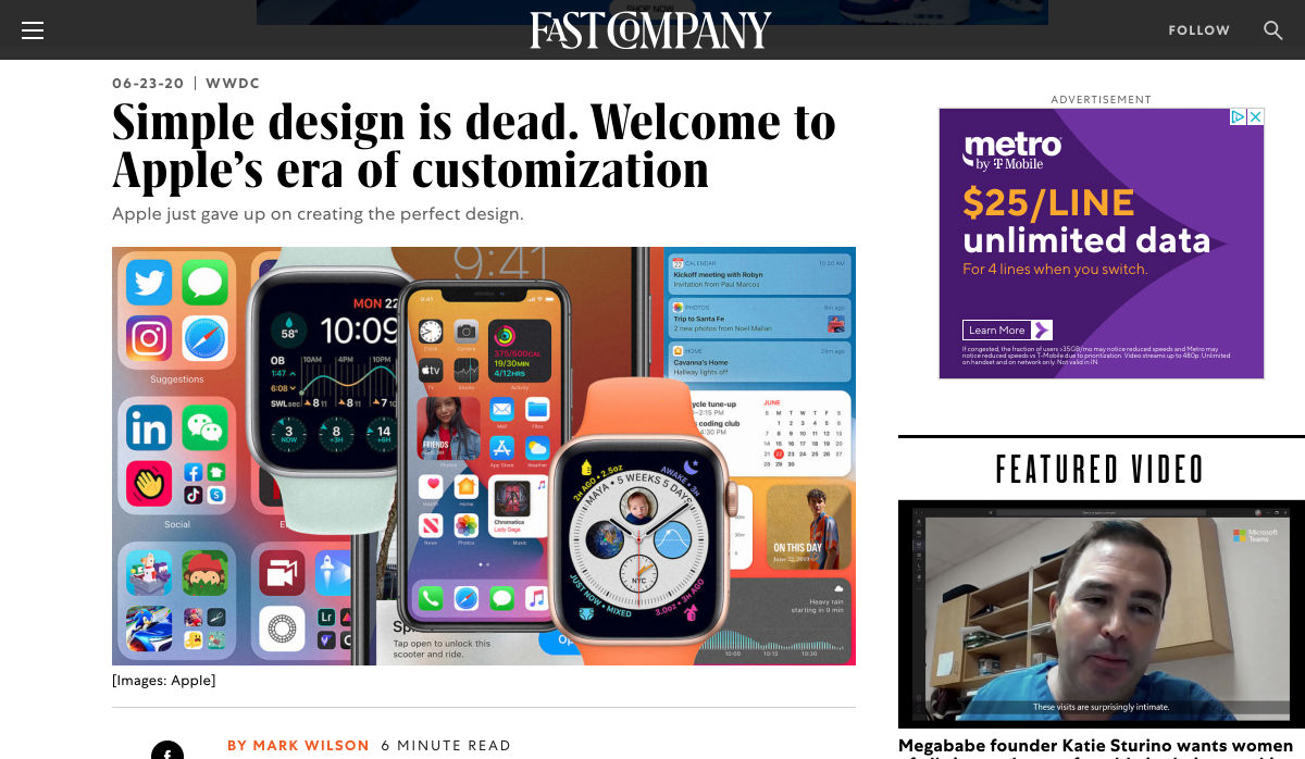
The biggest trend we’re talking about this month started at WWDC as Apple provided a glimpse of what’s coming next for their operating systems. This time around there’s a distinct design element. Did you catch it?

Here’s what’s trending in design this month.

1. Text Highlights and Underlines

There’s always been an unwritten rule in website design that text uses more plain styles. Bold is acceptable, italics are OK from time to time, but underlining is seldom used.

This design trend bucks that concept with text elements that use highlighter or underline elements to emphasize key words. And it works rather nicely.

What it takes to make this work is plenty of contrast and a design style that fits with underline or highlighted elements.

This design trend works thanks to clear intention. The words are obviously important to the overall meaning of the design or what visitors should take away from the content.

Pepper It uses a nifty underline that the letters seem to rest inside of to highlight a key phrase. The shape and color also mimic that of the larger button below, helping the eyes move from one element to the next. It’s an effective use of an underline (or maybe you could call it a highlight) effect in conjunction with brand colors.

Zappos Kids uses a fun highlight in a colorful scheme to highlight a key text element. It almost looks like a button and helps website visitors understand that the entire hero image area is clickable. The highlight serves to make the text more readable and the interactive element more functional.

Zeus Jones uses a variety of text treatments on the homepage, but arguable the underline is most noticeable, likely because it is the most unfamiliar in the context of website design.

2. Distinct Geometry

Geometric shapes in website design have popped up as trending elements in a variety of forms. This iteration is pretty simple: Use of distinct geometry as part of the overall aesthetic.

Geometry might pair with illustrations, photos, text, or in the background or foreground. What’s great about shapes is that they are versatile and work with a lot of other design patterns.

What can be the most challenging about shapes and design is that distinct geometry requires some space and thought. Just tossing a few triangles or rectangles in a design without reason can look rather strange.

So how can you add geometric shapes to a design so that they look intentional? These examples do it well (and in three different ways).

Rui Ma uses square and rectangular containers in a modular grid with portfolio projects inside each. This is one of the most common and applicable uses of geometry – as a container element. What makes it stand out is the circle, smiley wheel (also a geometric shape) that never leaves the center of the screen. The black background for the grid is also a nice contrast element for content blocks.

Thompson Stenning uses shapes in the background and with illustrations to create a stunning homepage visual. It’s big and bold and has just enough going on that you want to look at it and figure out the scene. Maybe what’s most intriguing about the visual concept is that it uses lots of geometric shapes – rectangles, squares, triangles, ad circles – whereas most projects pick one shape to focus on.

Romain Penchenat uses three-dimensional style angles to draw you into the portfolio website. They use a simple animation that “floats” on the homepage and follows the scroll with other geometric elements.

3. Shadow and Gradient Icons

Did you notice all the gradients and subtle shadows in icons in the images previewing iOS 14 or were you just looking at other changes (such as widgets) on the iPhone screen?

We’ve been seeing more designers incorporating more shadows and depth into icons for a while, but this move by a major player in design will push it to the forefront fast. Each of the icons moves from a flat style to one with a background gradient color as well as more shadows within icon elements for depth.

Don’t worry, the design still looks very much like Apple, but is a little more reminiscent of the skeuomorphism style icons from earlier versions of iOS.

It’s nice that the color and shadow elements are contained within each icon. This creates more visual interest and depth for each element without getting cluttered or junky. The gradients are also super simple, using a darker version of the main color in a monotone element.

It’s an iconography style that others are already using. DG Studio has a collection of icons on its homepage with subtle gradients and shadowing in the designs. Again, what’s nice about this trend is that it adds depth to visuals without tricks that get in the way of visual comprehension.

Guillaume Gouessan uses gradients in image icons in much the same way as the previous examples but with a little more color variation. Here, you can see what the gradient looks like when using a color change that’s not super drastic, but more dramatic than a monotone option. You can find some use of the more monotone gradient on his site below the scroll in the large desk image. (It’s definitely worth a few clicks to check it out.)

Love it or hate it, gradients and shadows seem to be here to stay for a while.

Conclusion

How often do you find yourself looking to major brands and companies for design inspiration? While a lot of web design trends start as experiments with smaller sites, the big players can really shape what gets popular (or not).

The example of Apple moving to icons with more shadows and gradients is a prime example. We’ve been seeing more of these elements creeping in for a while, but this style is about to get very big again.

Source

p img {display:inline-block; margin-right:10px;}
.alignleft {float:left;}
p.showcase {clear:both;}
body#browserfriendly p, body#podcast p, div#emailbody p{margin:0;}

Source de l’article sur

SAP annonce l’extension de l’accès gratuit à SAP Ariba Discovery, permettant aux acheteurs de publier leurs besoins d’approvisionnement et à l’un des quatre millions de fournisseurs de l’Ariba Network d’y répondre sans frais jusqu’au 31 décembre 2020.

Le libre accès à SAP Ariba Discovery qui devait se terminer fin juin se révèle avoir un impact considérable sur la connexion des acheteurs et des fournisseurs et le maintien des chaînes d’approvisionnement intactes pendant la pandémie. Depuis le lancement de l’offre le 10 mars, les inscriptions de nouveaux acheteurs sur SAP Ariba Discovery ont augmenté de 484%, les nouvelles inscriptions de fournisseurs ont augmenté de 3966% et les réponses des fournisseurs aux offres des acheteurs ont augmenté de 424% (par rapport à la période du 1er janvier au 9 mars 2020).

Al Dahra, une entreprise agroalimentaire basée à Abu Dhabi, aux Émirats arabes unis, avait besoin d’options de stockage de céréales dans des conditions désertiques. Après avoir publié son besoin d’approvisionnement sur SAP Ariba Discovery, Al Dahra a reçu des réponses de 142 fournisseurs dans le monde en moins de trois jours. L’entreprise a pu trouver les solutions de stockage dont elle avait besoin pour éviter les retards d’expédition et ainsi délivrer aux consommateurs la nourriture dont ils ont besoin.

« Le COVID-19 a perturbé les chaînes d’approvisionnement mondiales de manière plus importante que la plupart des entreprises n’avaient jamais connu », a déclaré Chris Haydon, président de SAP Procurement Solutions. « Les entreprises réalisent aujourd’hui plus que jamais la puissance des services achats et des réseaux numériques pour trouver rapidement de nouvelles sources d’approvisionnement. Nous étendons cette offre pour continuer à accélérer les connexions entre acheteurs et fournisseurs et ce, afin de garantir que les besoins d’approvisionnement soient satisfaits le plus rapidement possible pendant cette période difficile. »

Pour plus d’informations, visitez my.ariba.com/Discovery.

The post SAP étend l’accès gratuit à SAP Ariba Discovery pour aider les acheteurs et les fournisseurs à se connecter appeared first on SAP France News.

Source de l’article sur sap.com

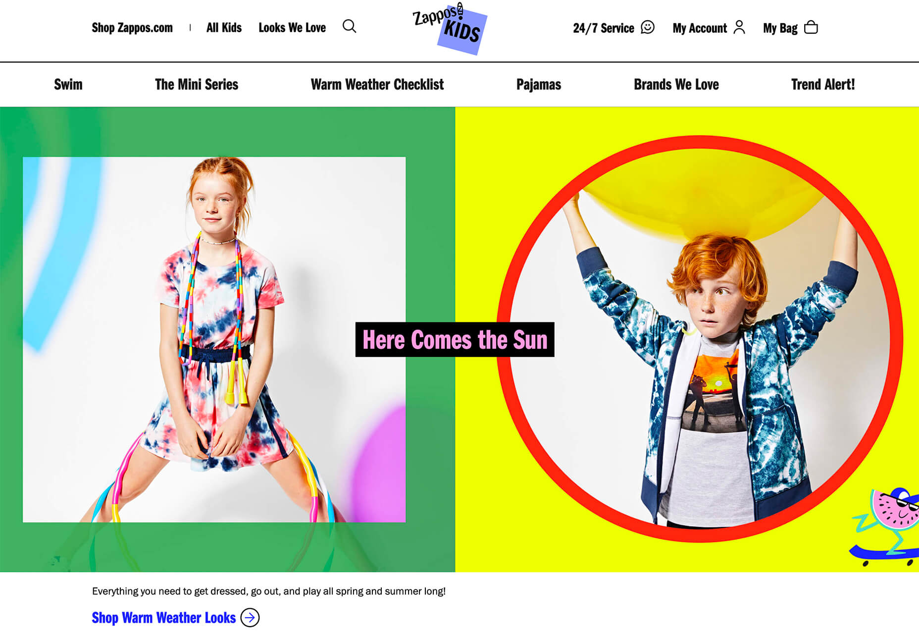
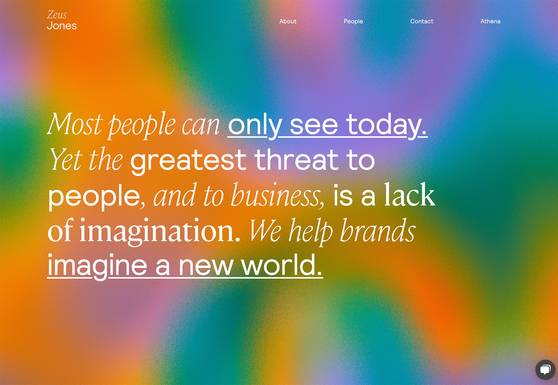
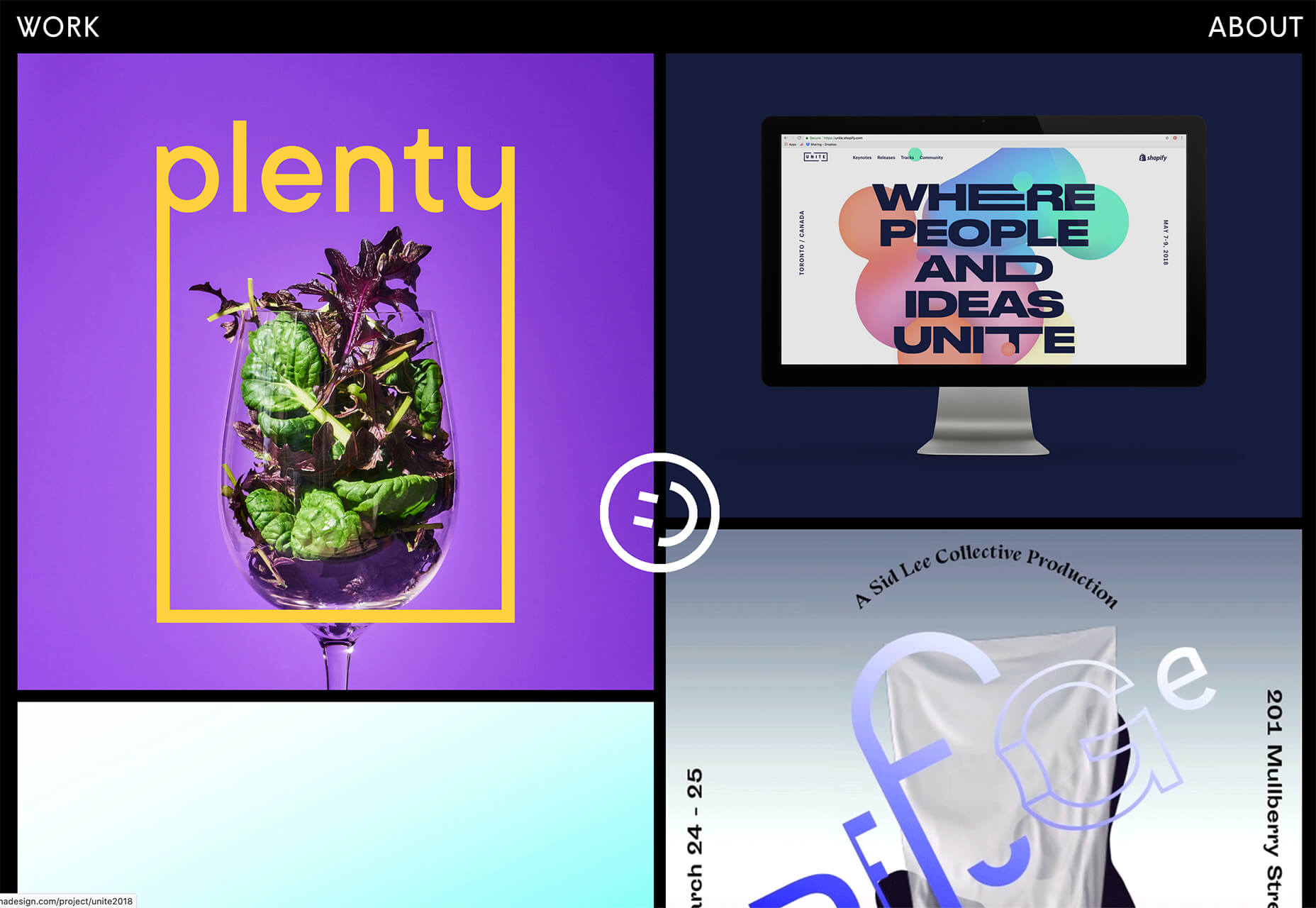
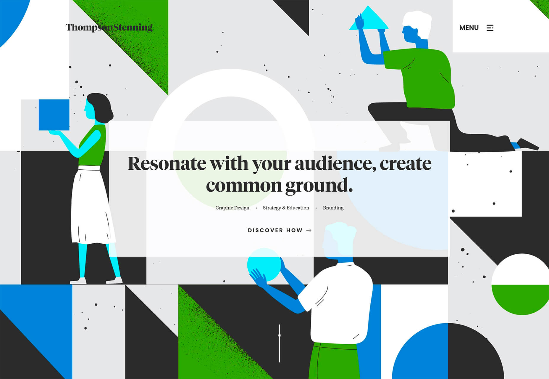
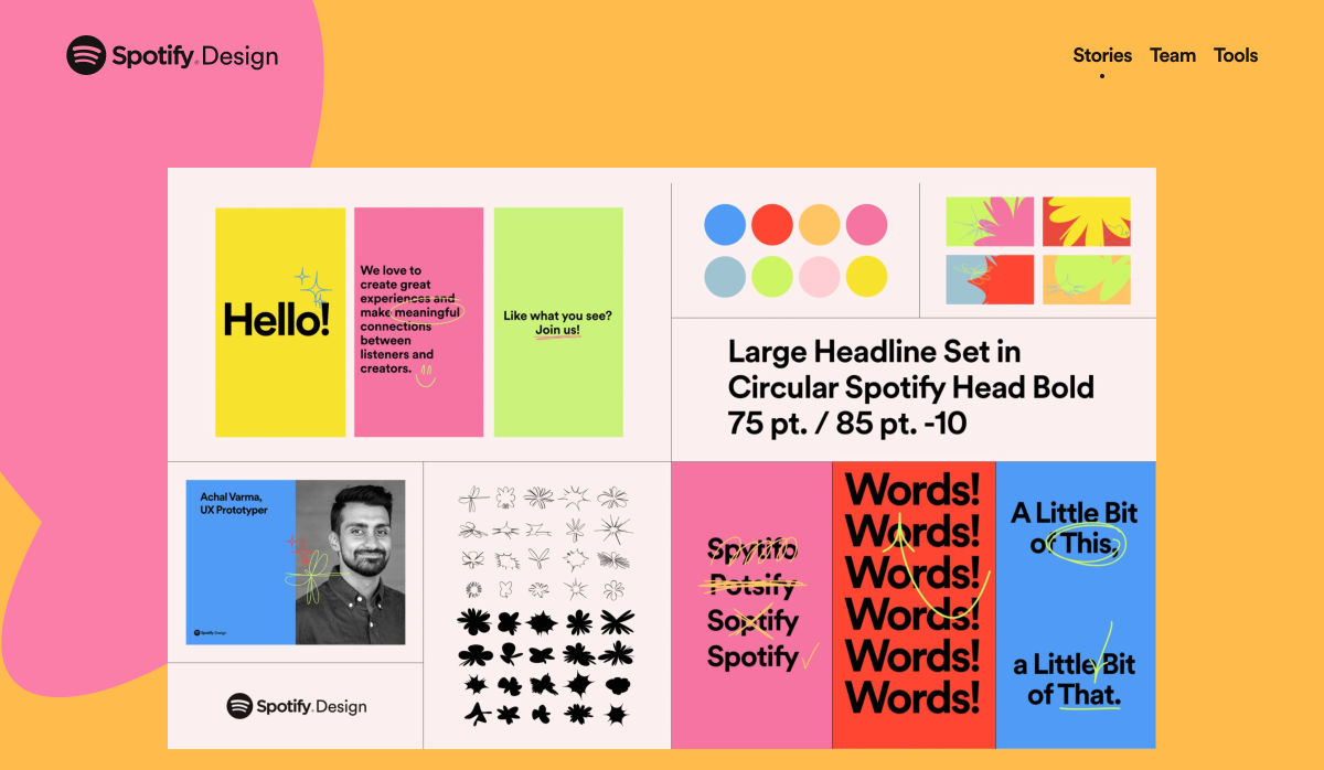
Every week users submit a lot of interesting stuff on our sister site Webdesigner News, highlighting great content from around the web that can be of interest to web designers.
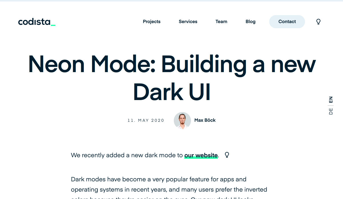
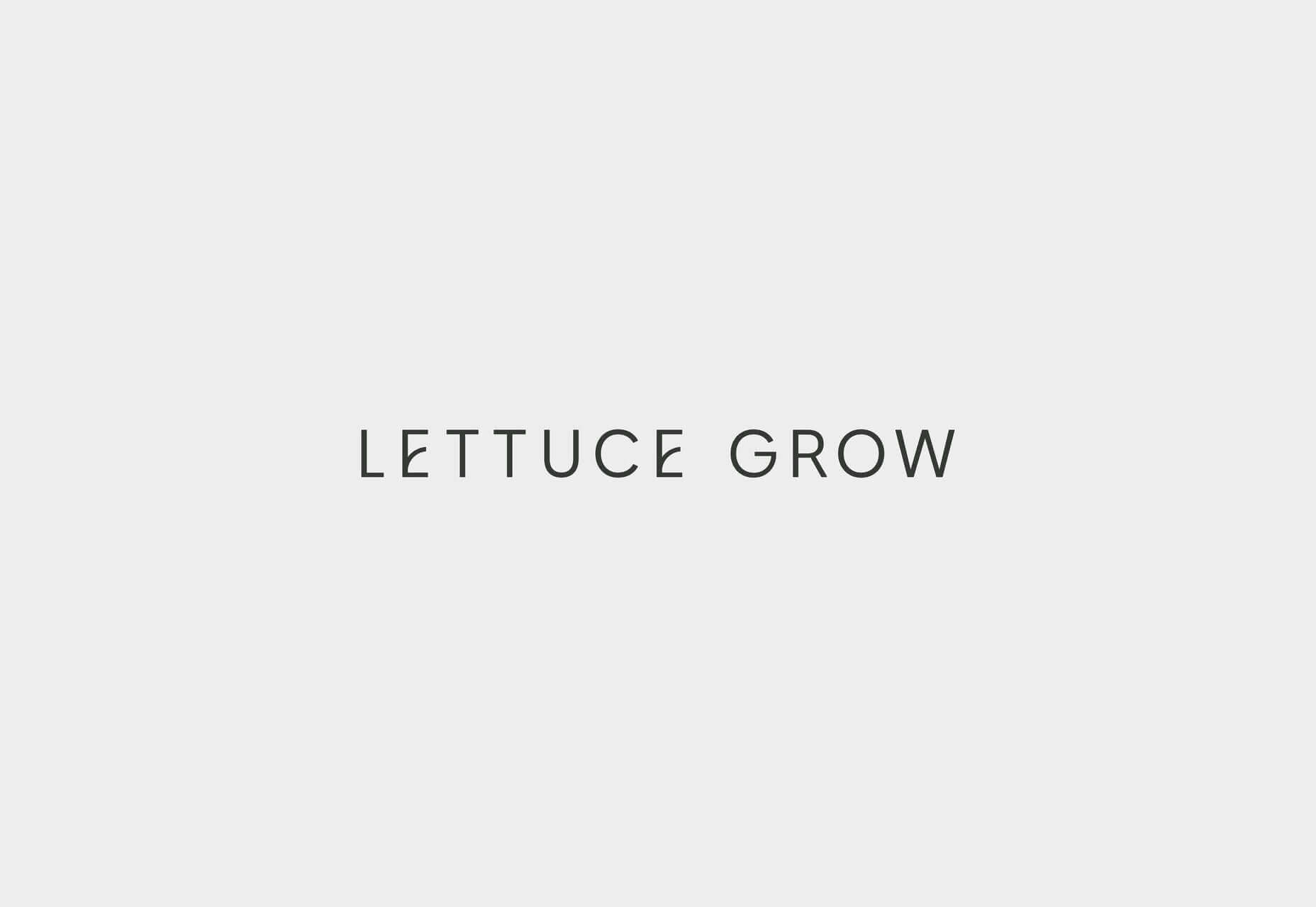
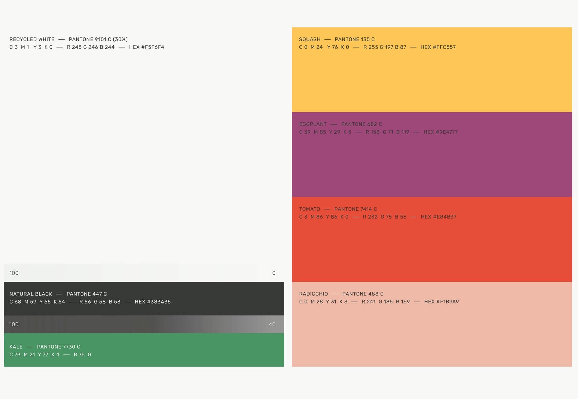
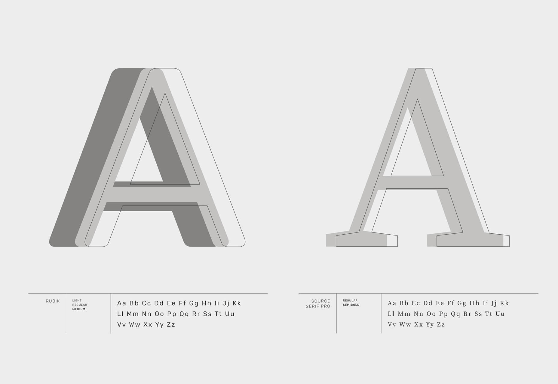
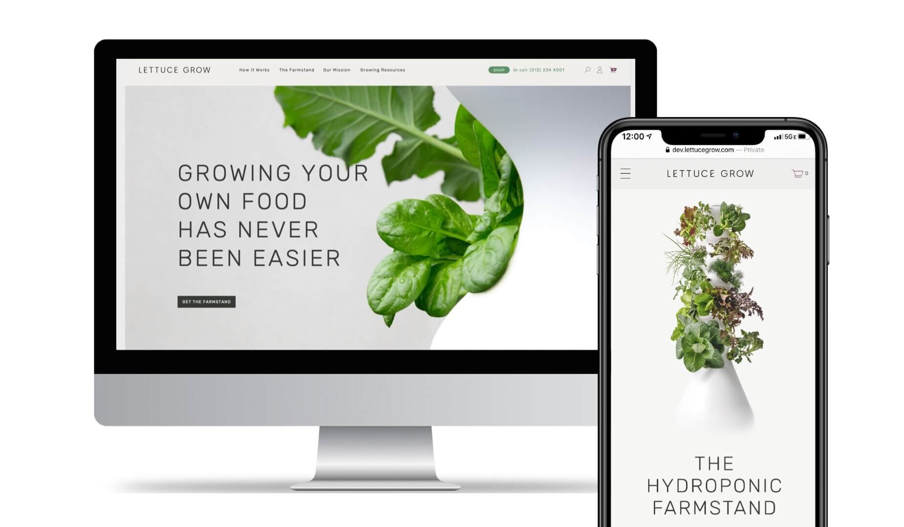
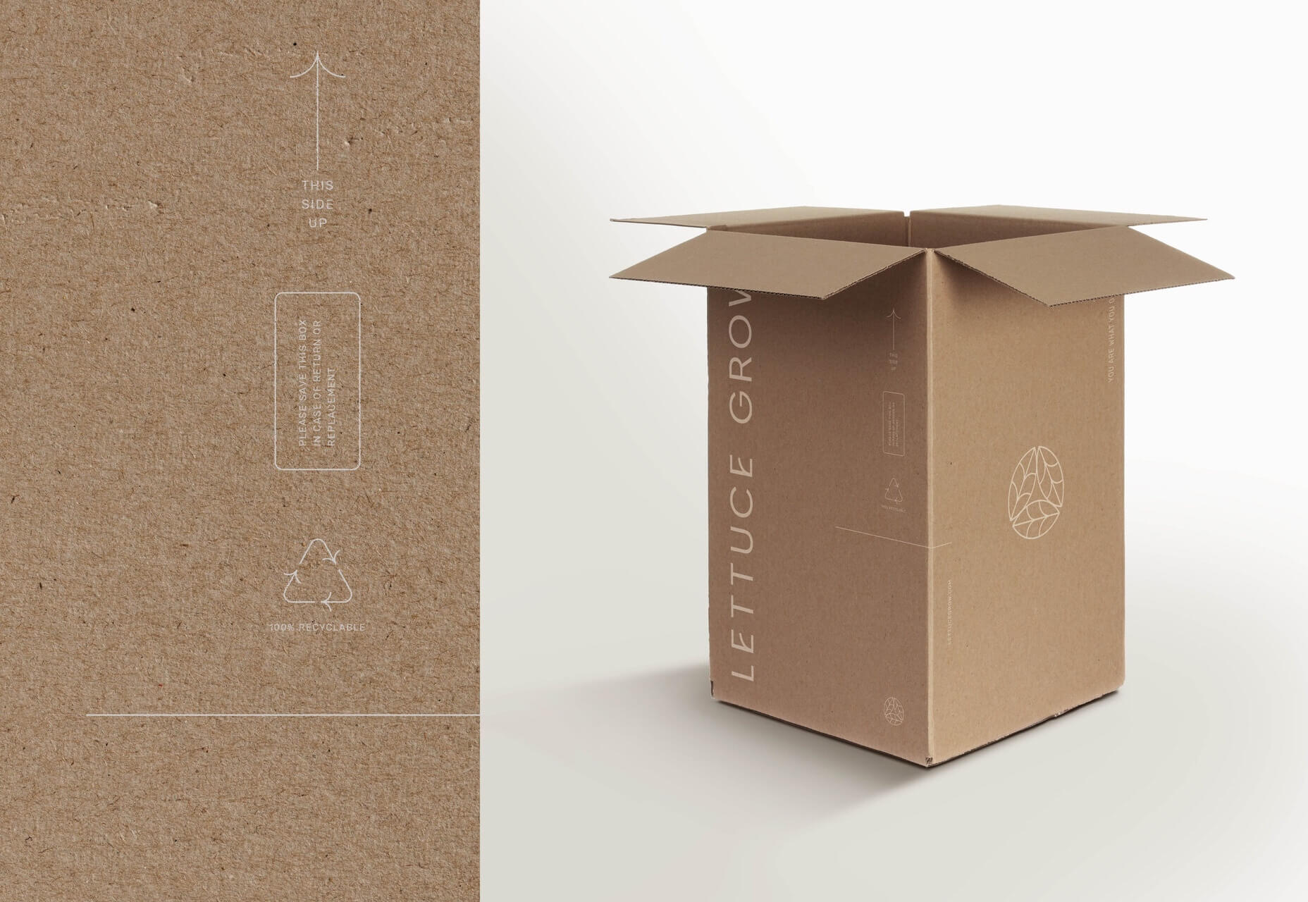
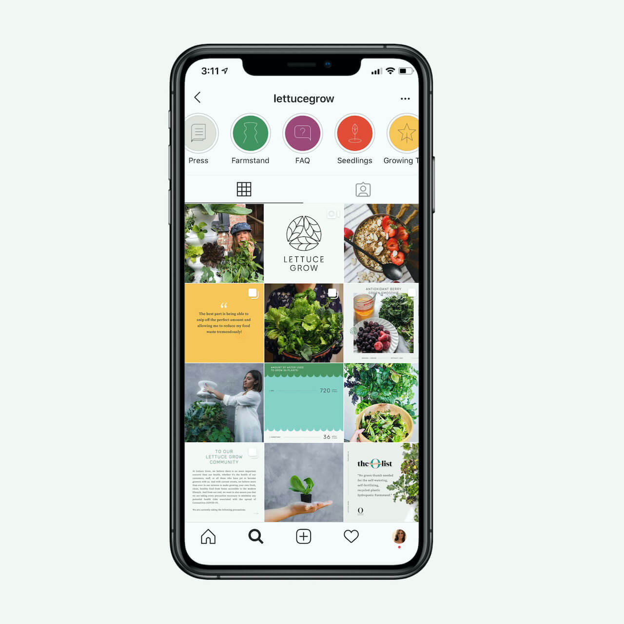
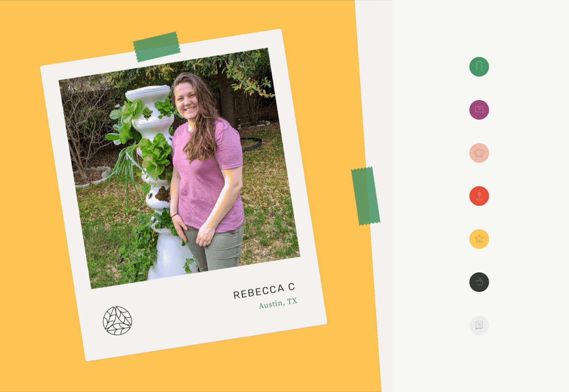
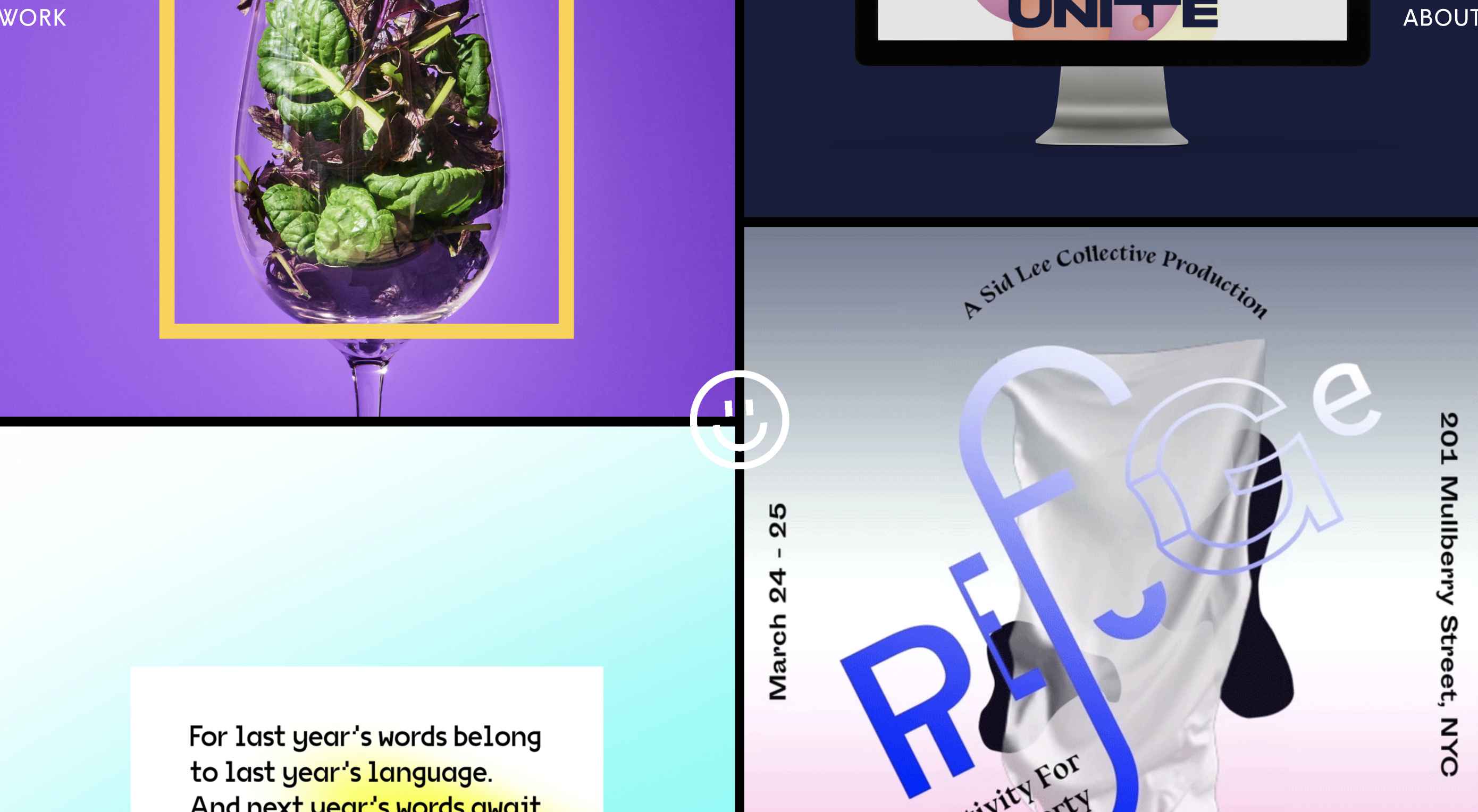
The best way to keep track of all the great stories and news being posted is simply to check out the Webdesigner News site, however, in case you missed some here’s a quick and useful compilation of the most popular designer news that we curated from the past week.

Elevator.js – A “back to Top” Button that Behaves like a Real Elevator


Redesigning Airbnb for the New Normal – a UX Case Study


My Experience Making an App Using a No-Code Tool


Simple Design is Dead. Welcome to Apple’s Era of Customization


Making the Brand: Redesigning Spotify Design


Neon Mode: Building a New Dark UI


The Return of the 90s Web


Design Roundup June 2020


Google Quietly Launches an AI-powered Pinterest Rival Named Keen


Apple’s Siri Gets First Major Redesign in Years


Perfection will Kill your Design


Using 6 Google Analytics Features to Improve UX and Website Metrics


Yale Rebrands for Warmth and a Digital Future


3 Awesome Digital Marketing Strategies to Boost your Web Presence


Onboarding is Dead, Here Comes Noboarding


User Experience (UX) Testing: 4 UX Best Practices


8 Ways to Promote your Business Without a Marketing Budget


10 Interaction Design Rules You Must Never Break


On Racism and Sexism in Branding, User Interface, and Tech


Staying Creative During Hard Times


Serious UX Mistakes that Might Be Sabotaging your Sales


10 Key Things a Small Business Website Must Have


22+ Horizontal Timeline CSS Examples


How to Write an Effective Design Brief in 9 Easy Steps


Creative Exercises to Help You Through your Anxiety


Want more? No problem! Keep track of top design news from around the web with Webdesigner News.

Source

p img {display:inline-block; margin-right:10px;}
.alignleft {float:left;}
p.showcase {clear:both;}
body#browserfriendly p, body#podcast p, div#emailbody p{margin:0;}

Source de l’article sur

SAP propose depuis une quinzaine d’années une solution de gestion d’entrepôt appelée SAP Extended Warehouse Management, qui s’est enrichie pour répondre aux besoins des clients, quel que soit l’industrie ou le marché adressé : gestion avancée des vagues, mobilité, pilotage intégré de la mécanisation, Labor Management, pré colisage, intégration avec la production … Le tout dans une approche ‘Digital Supply Chain of One’, visant à fournir à nos clients une chaine logistique agile, unifiée et ‘end to end’.

Dans cette démarche d’amélioration et d’innovation continue, un nouveau module a vu le jour l’année dernière pour apporter un niveau supplémentaire d’optimisation aux clients qui le souhaitent.

SAP Warehouse Insights est un module basé sur la plateforme SCP (SAP Cloud Platform), et dédié à l’optimisation des entrepôts et de leurs ressources. Basé sur les dernières technologies : algorithmes, cloud computing et machine learning, cet outil complète les fonctions déjà avancées de la solution SAP Extended Warehouse Management. Les principaux domaines sont : la cartographie des entrepôts, des fonctions supplémentaires d’analyses et de monitoring de KPIs, la simulation de l’utilisation des ressources, et l’optimisation en temps réel.

SAP Warehouse Insights a été conçu pour tout type de clients et d’industries. Il apporte un niveau ultime dans l’optimisation des ressources et des missions en proposant les meilleurs scénarios possibles. Si le module s’enrichit en permanence de nouvelles fonctions, à ce jour il faut retenir 3 principaux sujets :

  • Visualisation dynamique de la cartographie entrepôt et des parcours des opérateurs,
  • Analyse des opérations, basées sur les données historiques comme la charge de travail et les distances de déplacement des ressources,
  • Optimisation / ré optimisation des missions (Warehouse Orders) affectées aux ressources pour réduire les déplacements à vide.


Cartographie entrepôt

Les utilisateurs peuvent interroger la cartographie d’un site de façon dynamique et interactive. Cela se traduit par une visualisation précise et aisée des différentes zones, avec la capacité d’aller jusqu’à la granularité la plus fine  (emplacement), et de s’assurer de l’adéquation de la configuration avec les besoins du terrain, ainsi qu’aux fonctions d’optimisation des déplacements.

Exemple d’écran de visualisation de différents types de zones de stockage :

‘Travel distance Network’ : Configuration simplifiée des chemins

La configuration des chemins est utilisée pour l’optimisation des déplacements. Les utilisateurs peuvent visualiser rapidement sur la carte, la complétude et la bonne configuration des chemins et segments paramétrés. En cas de rupture ou de mauvaise configuration, il est alors aisé de ‘réparer’ ou créer de nouvelles connexions à partir des nœuds existants. Exemple d’écran :

Configuration assistée

SAP Warehouse Insights facilite par ailleurs la création et la maintenance de la cartographie des sites. Il est possible d’importer des plans ‘CAD’ (Computer Aided Design) sous format PDF et de les utiliser directement dans le système. L’opérateur va ensuite pouvoir enrichir les informations avec les données ‘business’ comme les allées ou types de stockage. Le système va alors automatiquement propager ces paramètres de configuration sur les emplacements éligibles.

Exemple d’écran :

Fonctions de simulation

Cette première approche repose sur une optimisation ‘Off Line’. Il s’agit d’utiliser les données historiques pour comprendre et remédier à une situation insatisfaisante. SAP Warehouse Insights va ainsi utiliser les missions (Warehouse orders) et les ressources dans un processus avancé de simulation, pour proposer des scénarios réoptimisés, visant à limiter les déplacements, le nombre de ressource et par conséquent permettre une meilleure productivité tout en réduisant les couts d’exécution.

Le système offre une représentation simple et claire des gains potentiels d’optimisation, à travers une représentation des déplacements modélisés et comparables en un simple coup d’œil (avant optimisation / après optimisation).

Exemple d’écran de visualisation et comparaison des chemins :

Heatmap intégrée

SAP Warehouse Insights propose également une fonction de heatmap, très utile à l’analyse des flux dans l’entrepôt et à l’identification des goulets d’étranglement au sein d’une zone, d’une allée ou d’une gare de préparation. La ‘chaleur’ est déterminée en fonction du nombre de tâches réalisées sur chaque emplacement.

Exemple d’écran :

Optimisation temps réel et continue

Le processus de ré optimisation présenté plus haut est alors réalisé en temps réel, avec la possibilité de configurer des règles différentes en fonction par exemple des types de flux ou zones.

Exemple d’écran de configuration :

Principe de fonctionnement :

Les Missions ‘ouvertes’ sont récupérées et traitées en lien avec le système de destination, comme SAP EWM, à une fréquence configurable (ex : toutes les 10 minutes).

La ré optimisation des missions et des ressources associées est alors réalisée et une nouvelle séquence est déterminée suivant les critères souhaités d’optimisation des déplacements ou de dates/heures « au plus tard ».

Les missions ré optimisées sont ensuite remontées vers le système de destination pour exécution par les opérateurs en mode ‘dirigé’ par le système.

Un écran de monitoring permet également de suivre et visualiser les résultats de l’optimisation proposée par le système, avec notamment pour chaque ressource les missions associées, séquences, trajet à vide et en charge … Exemple d’écran :

Indicateurs de performance

En complément, SAP Warehouse Insights inclut des indicateurs offrant une vue analytique sur les opérations et la performance :

  • Utilisation par ressources
  • Charge par groupes de ressources
  • Charge des ressources par groupes de missions (‘queues’)
  • Temps de déplacements à vides par type de ressources
  • Temps total de déplacement par ressource

Exemple d’écran de consultation des opérations en entrepôt

The post Nouveaux enjeux d’agilité et d’excellence opérationnelle : vers l’entrepôt 4.0 appeared first on SAP France News.

Source de l’article sur sap.com