Articles

Contentful; Webster’s Dictionary defines “contentful” as… not found. Clearly someone made up this word, but that is not necessarily a bad thing.

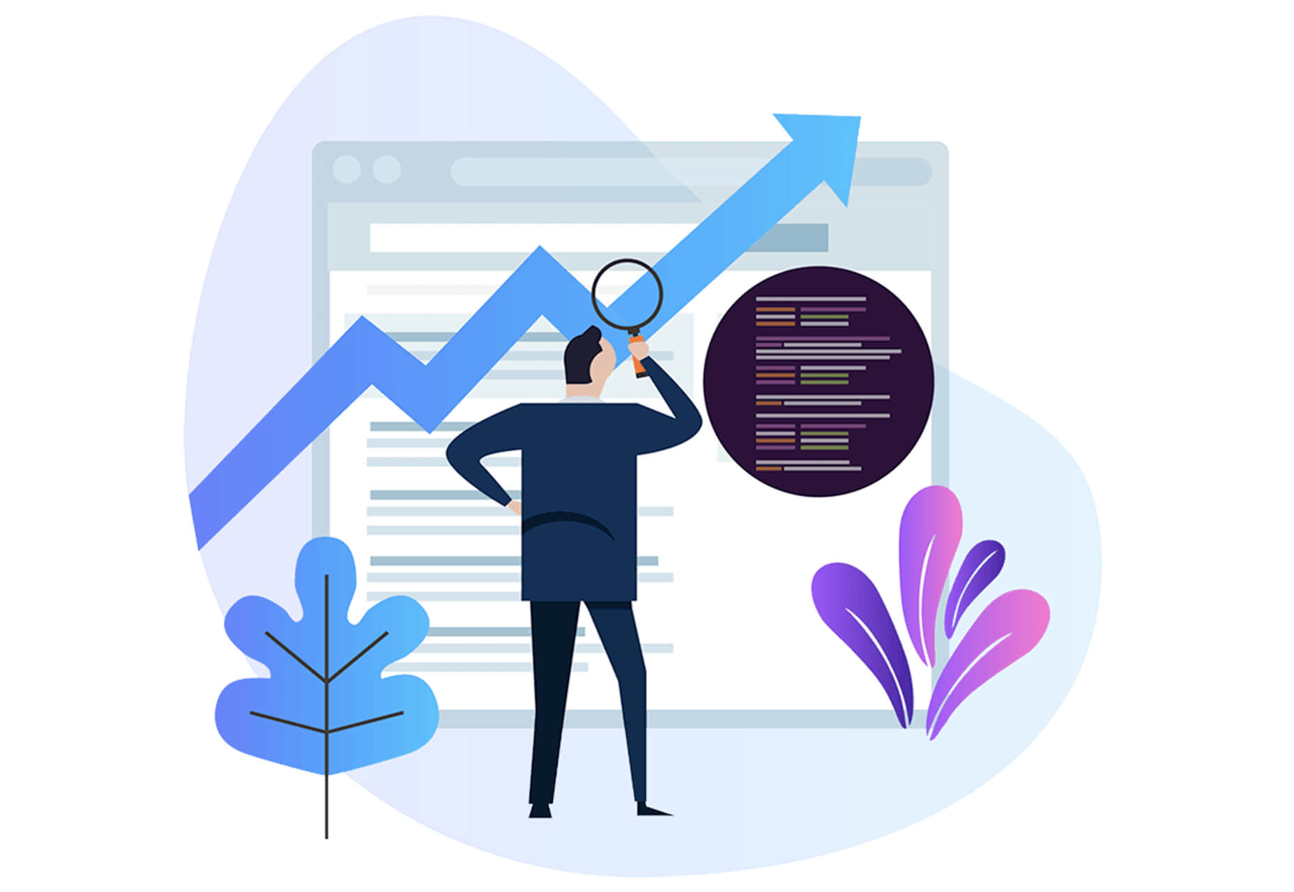
The world of user experience metrics is moving quickly, so new terminology is needed. Largest Contentful Paint (LCP) is one of a number of metrics measuring the render time of content on a web page.

What is Largest Contentful Paint?

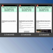
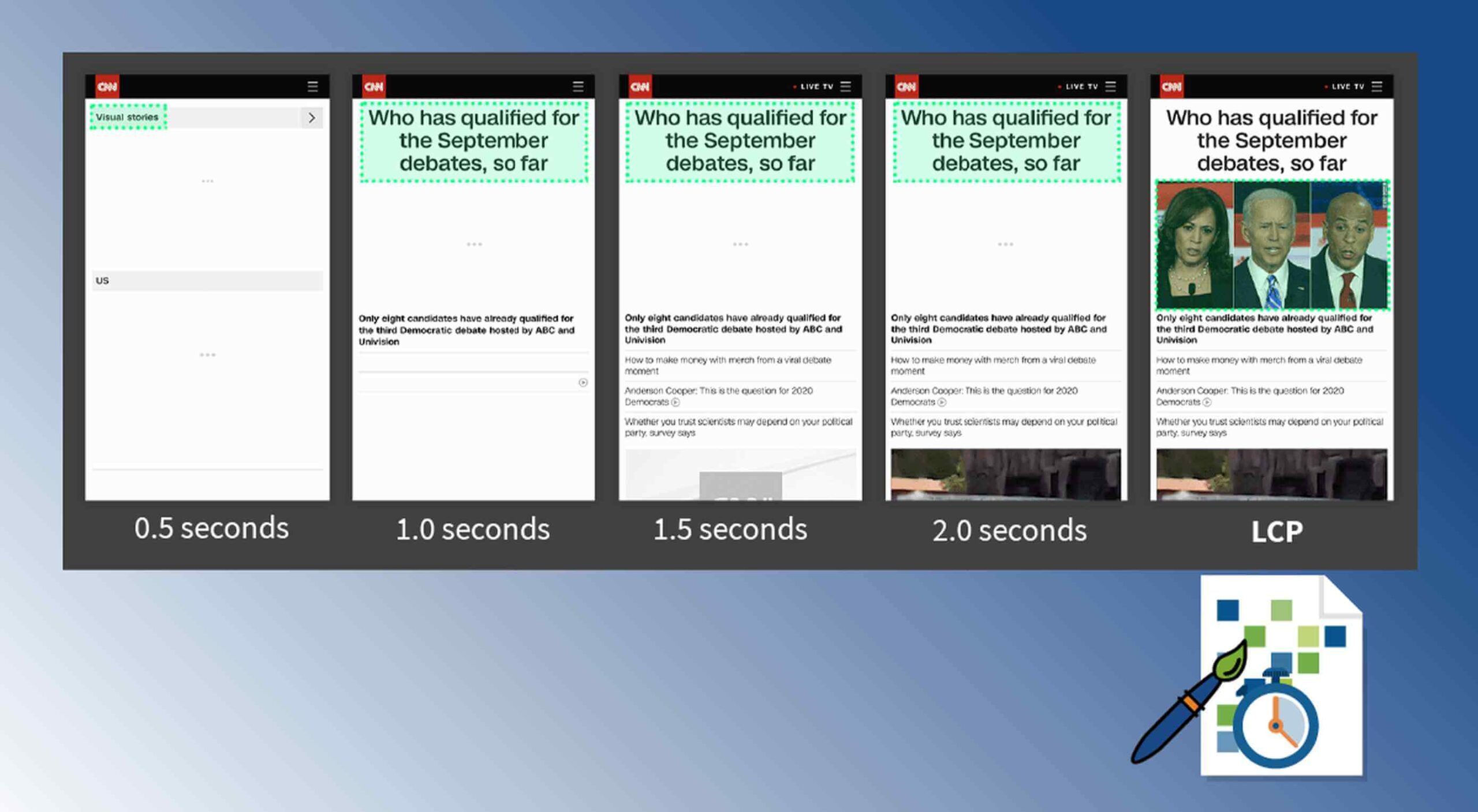
Google defines LCP as “the render time of the largest content element visible within the viewport.” For what we are talking about in this blog, we will consider “content” to be an image, typically a JPEG or PNG file. In most cases, “largest” points to a hero image that is “above the fold” and is one of the first images people will notice when loading the page. Applying optimization to this largest content is critical to improving LCP.

It is probably more instructive to view LCP relative to other metrics. For example, First Contentful Paint (FCP) and Visually Complete book end LCP.

Each metric has its pros and cons, but LCP is a happy medium. LCP marks when web page loading starts to have a substantial impact on user experience.

In Google’s opinion, to provide a good user experience, LCP should occur within 2.5 seconds of when the page first starts loading. Poor values are anything greater than 4 seconds.

How Does Largest Contentful Paint Impact Lighthouse Scores and SEO?

LCP is now part of several “Core Web Vitals” scores that Google will measure in its ranking algorithm. Each of the Core Web Vitals represents a distinct facet of the user experience, is measurable in the field, and reflects the real-world experience of a critical user-centric outcome.

In the case of the overall Google Lighthouse score, LCP represents 25% weighting on the performance score of Lighthouse version 6.0. This makes LCP the most important Core Web Vitals metric in determining the performance score.

While Google has indicated that content is still the most important factor in SEO ranking, a better user experience (as measured by Core Web Vitals) will generate higher rankings in a crowded field. If there are many websites competing for the top search engine spots, then Largest Contentful Paint will play a critical factor in rankings.

How to Improve Largest Contentful Paint

Now that you know that LCP is important, what can you do to improve it by making content load faster? Google provides a number of suggestions, but the most effective technique is to optimize content for the device requesting it.

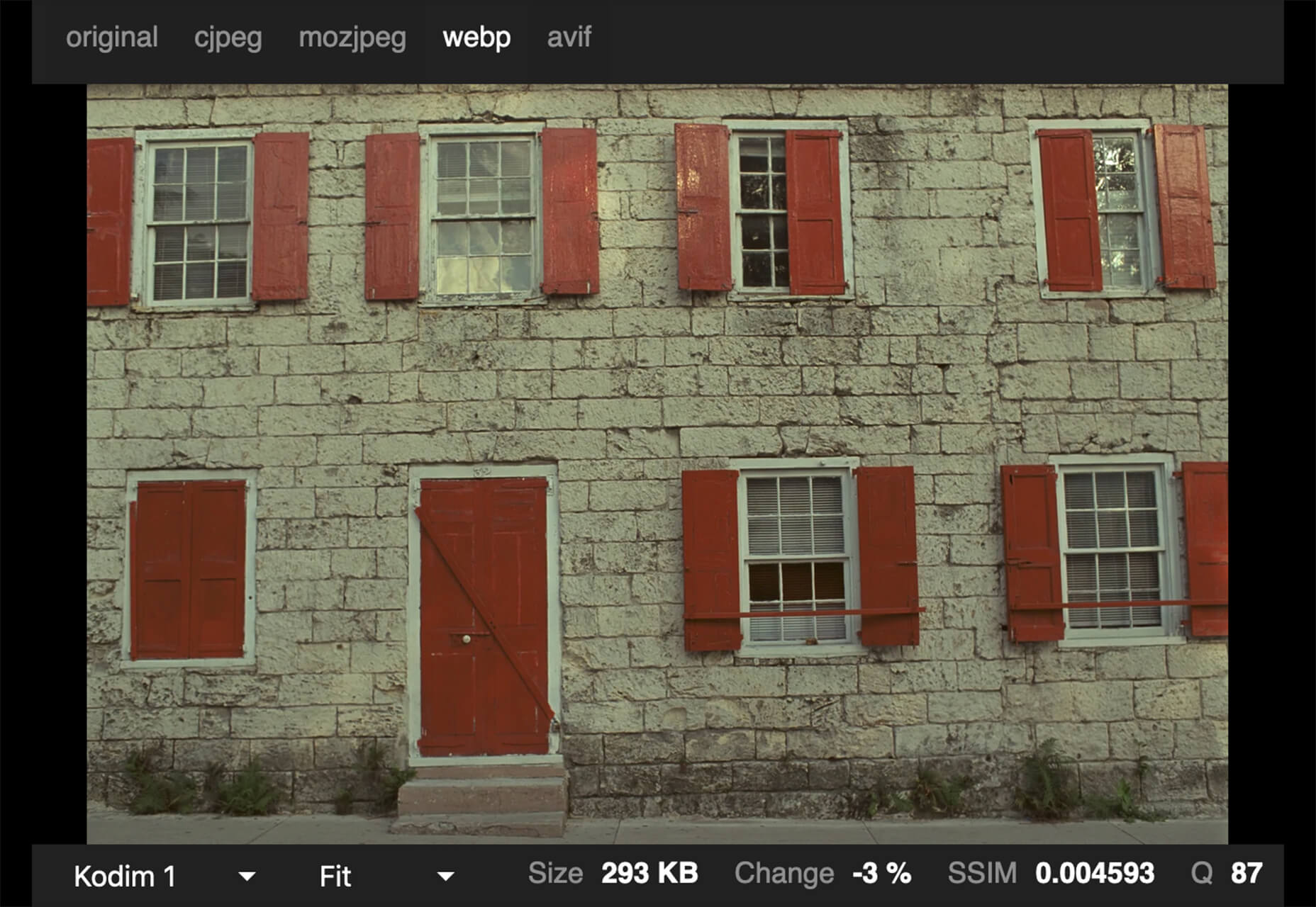
For example, a website includes an 800kb JPEG image that is intended for high resolution desktops. On a smartphone, that would be optimized down to less than 100kb, with no perceptible impact on quality. LCP can improve by more than 60% — or several seconds — through this single optimization.

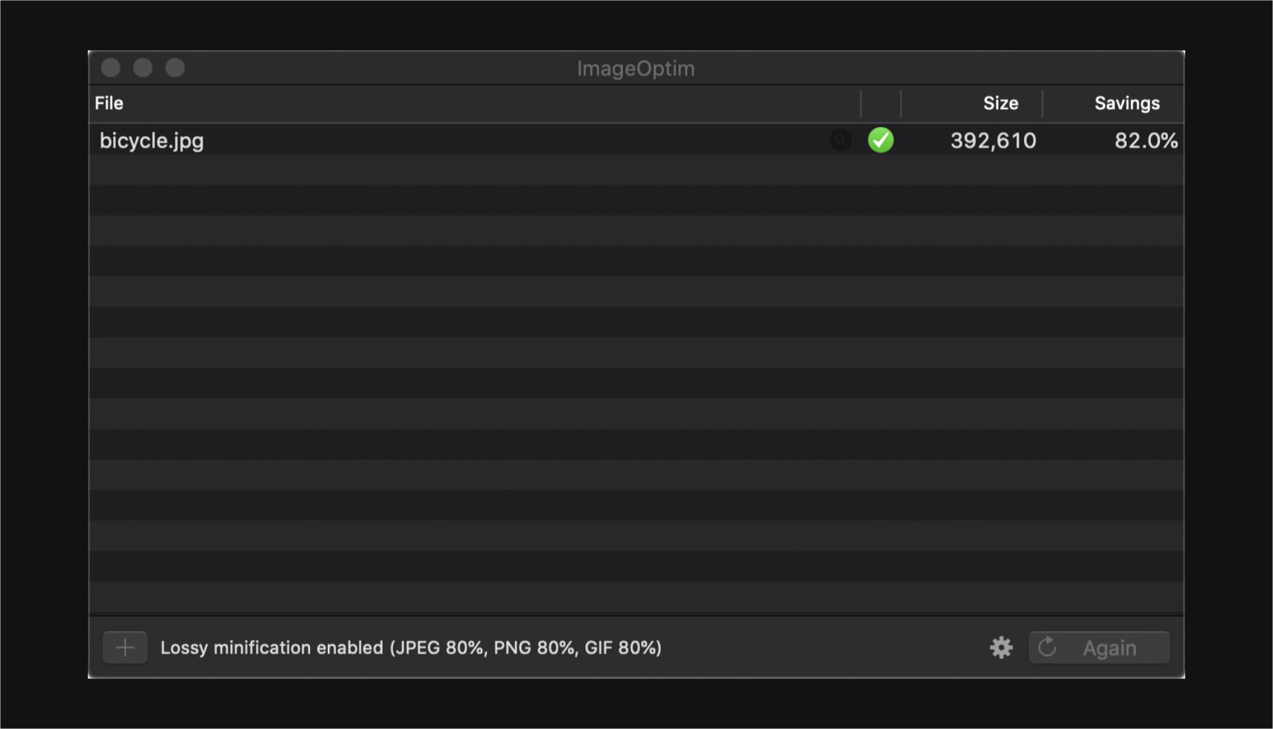
Find Savings in Largest Contentful Paint by using Image Speed Test

Image Speed Test is a great tool offered by ImageEngine.io that provides an analysis of LCP improvement opportunities. Just paste in the URL of the web page you are interested in optimizing, and the test will show you:

  • Image Payload Reduction
  • Speed Index
  • Largest Contentful Paint
  • Page Load Time (Visually Complete)

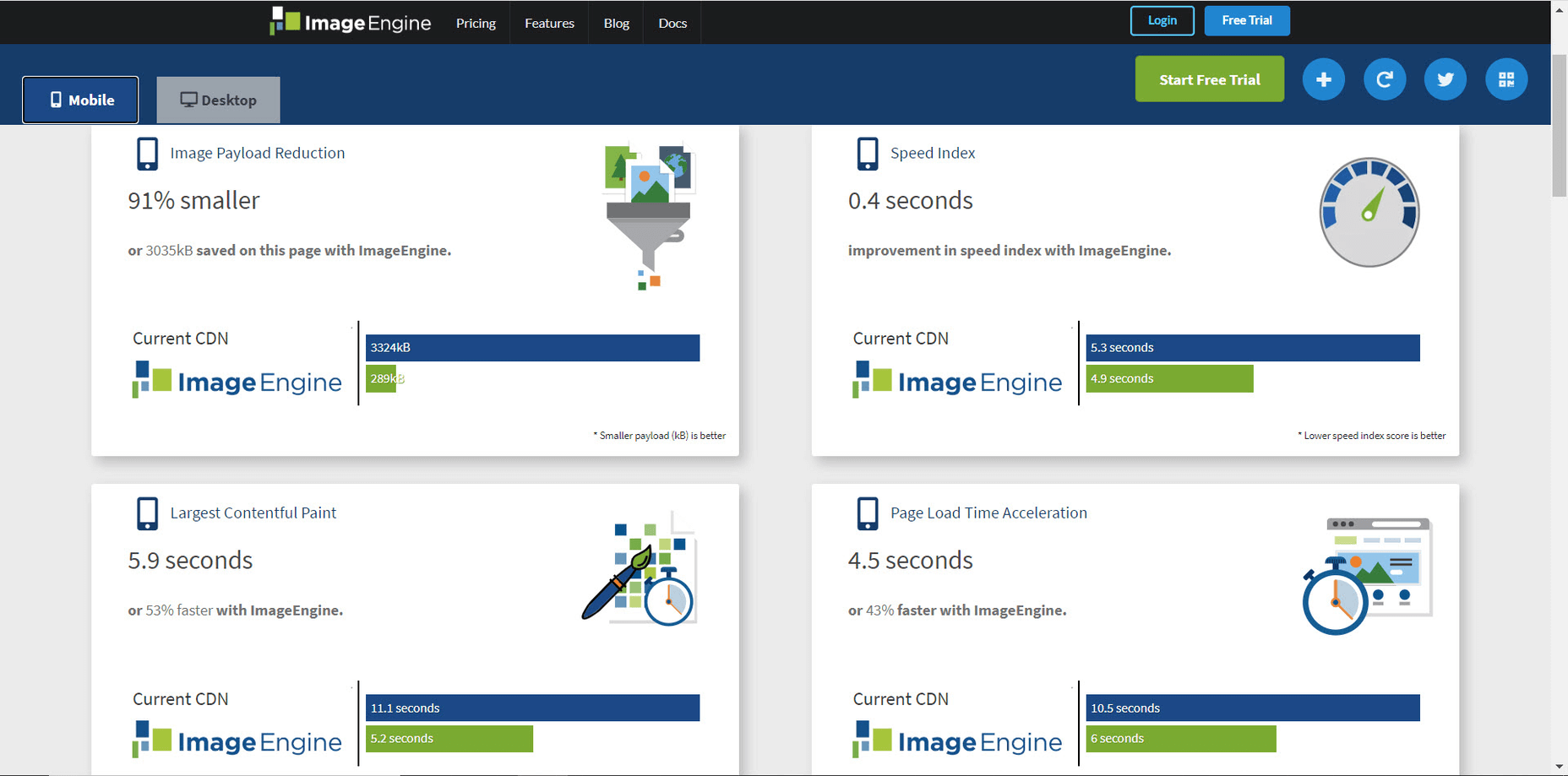
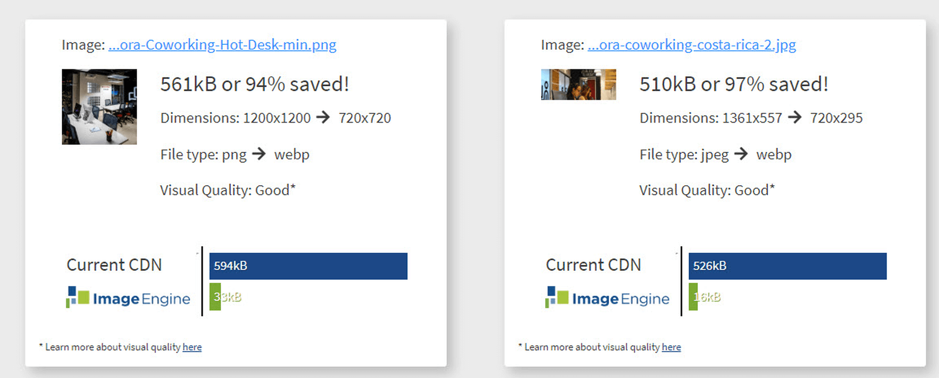
It also provides a video of the web page loading with and without optimizations. Finally, it analyses each image to provide an estimate of payload savings. In this case, the “largest content” on the page is this image. With optimizations, the image payload is reduced by 94%. That delivers a huge improvement in LCP.

How Does ImageEngine Improve LCP

ImageEngine is an image content delivery network (CDN) service that makes image optimization simple. Basically, for each image on the page, the image CDN will:

  1. Detect the device model requesting the web page;
  2. Optimize the image in terms of size, compression, image format;
  3. Deliver via a CDN edge server that is geographically closest to the user.

ImageEngine improves web performance for every image on the page, including the largest. You can learn more about ImageEngine here, and also sign up for a free trial.

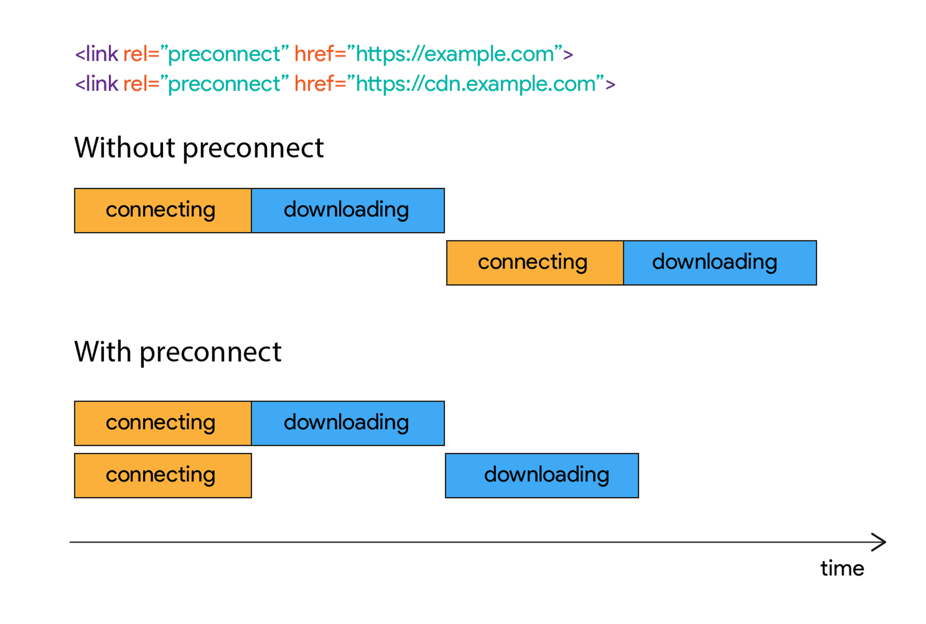
Best Practices: Preconnect

In addition to using an image CDN like ImageEngine, a few other best practices can improve LCP. Using the resource hints to provide a preconnect for your content can streamline the download process.

For example, putting the following link statement in the HTML will accelerate the download process. The link statement will make the browser connect to the third party as early as possible so that download can start sooner. ImageEngine’s optimizations make each image download smaller and faster, but preconnect save time in the connection phase.

Best Practices: Minimize Blocking JavaScript and CSS

When JavaScript or CSS is “blocking” it means that the browser needs to parse and execute CSS and JavaScript in order to paint the final state of the page in the viewport.

Any website today relies heavily on both JavaScript and CSS, which means that it is almost impossible to avoid some render blocking resources. On a general note: be careful with what kind of CSS and JavaScript is referenced inside the <head> element. Make sure that only the strictly necessary resources are loaded in <head>. The rest can be deferred or loaded asynchronously.

When looking to improve the LCP specifically, there are some practices worth looking into more deeply.

Inline Critical CSS

It is not an easy task, but if the browser can avoid making a request to get the CSS needed to render the critical part of the page – usually the “above the fold” part – the LCP is likely to occur earlier. Also you will avoid content shifting around and maybe even a Flash of Unstyled Content (FOUC).

The critical CSS — the CSS needed by the browser to set up the structure and important styles of the part of the page shown above the fold — should in-inlined. This inlined CSS may also refer to background images, which of course should also be served by an Image CDN.

Do Not Use JavaScript to (lazy) Load Images

Many modern browsers natively support lazy loading, without the use of JavaScript. Because images usually are heavily involved in the performance of LCP, it is best practice to leave image loading to the browser and avoid adding JavaScript in order to lazy load images.

Lazy loading driven by JavaScript will add additional latency if the browser first has to load and parse JavaScript, then wait for it to execute, and then render images. This practice will also break the pre-parser in the browser.

If an image CDN is used to optimize images, then the benefits of lazy loading become much smaller. Especially large hero images that are above the fold have a large impact on LCP and will not benefit from being lazy loaded with JavaScript. It is best not to make JavaScript a blocking issue for rendering images, but rather rely on the browser’s own ability to select which images should be lazy loaded.


[– This is a sponsored post on behalf of ImageEngine –]

Source


Source de l’article sur Webdesignerdepot

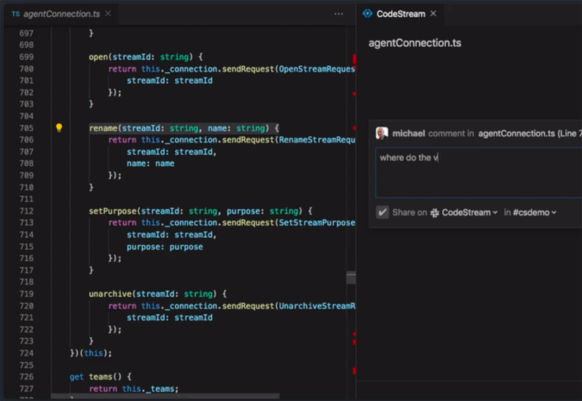
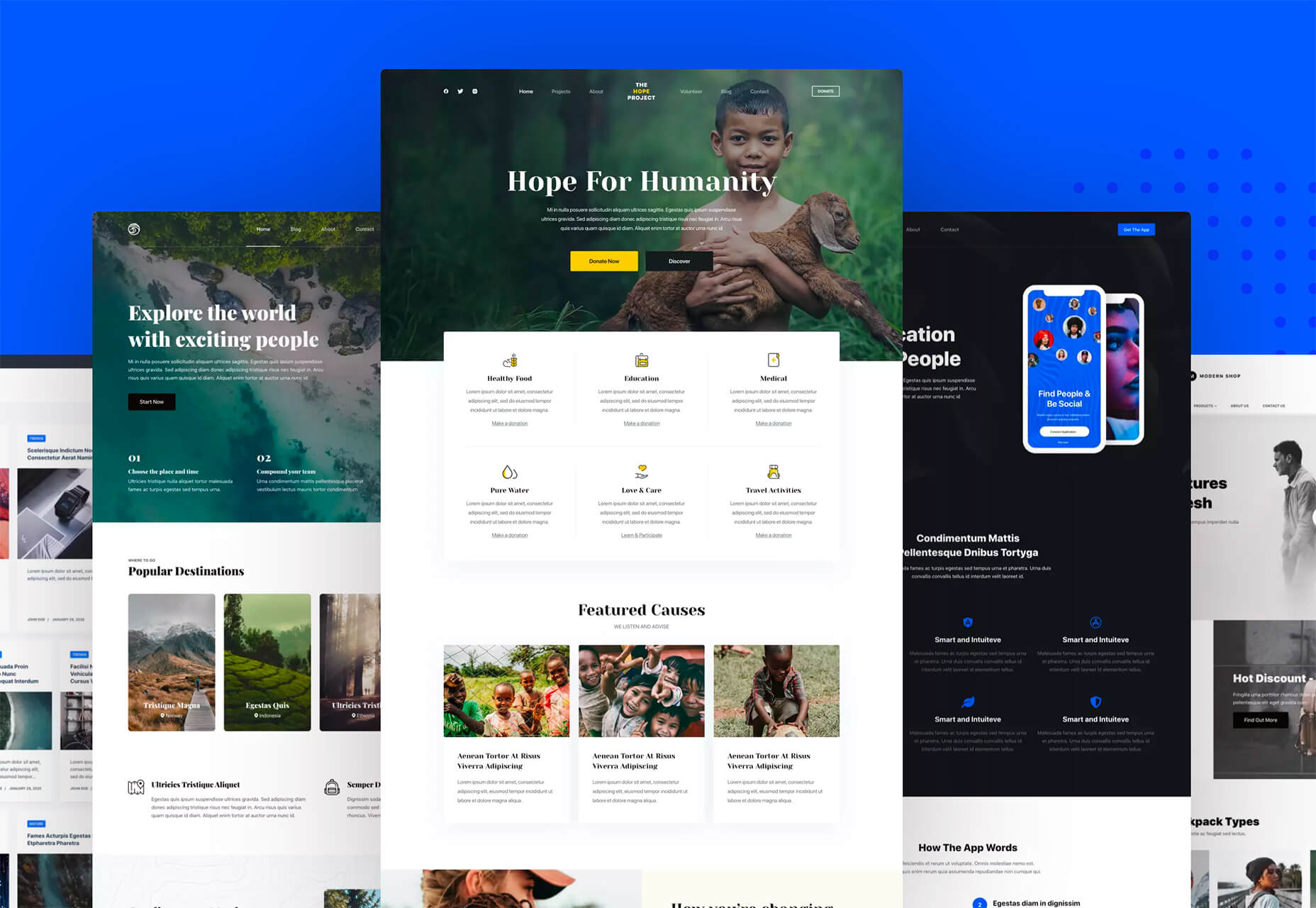
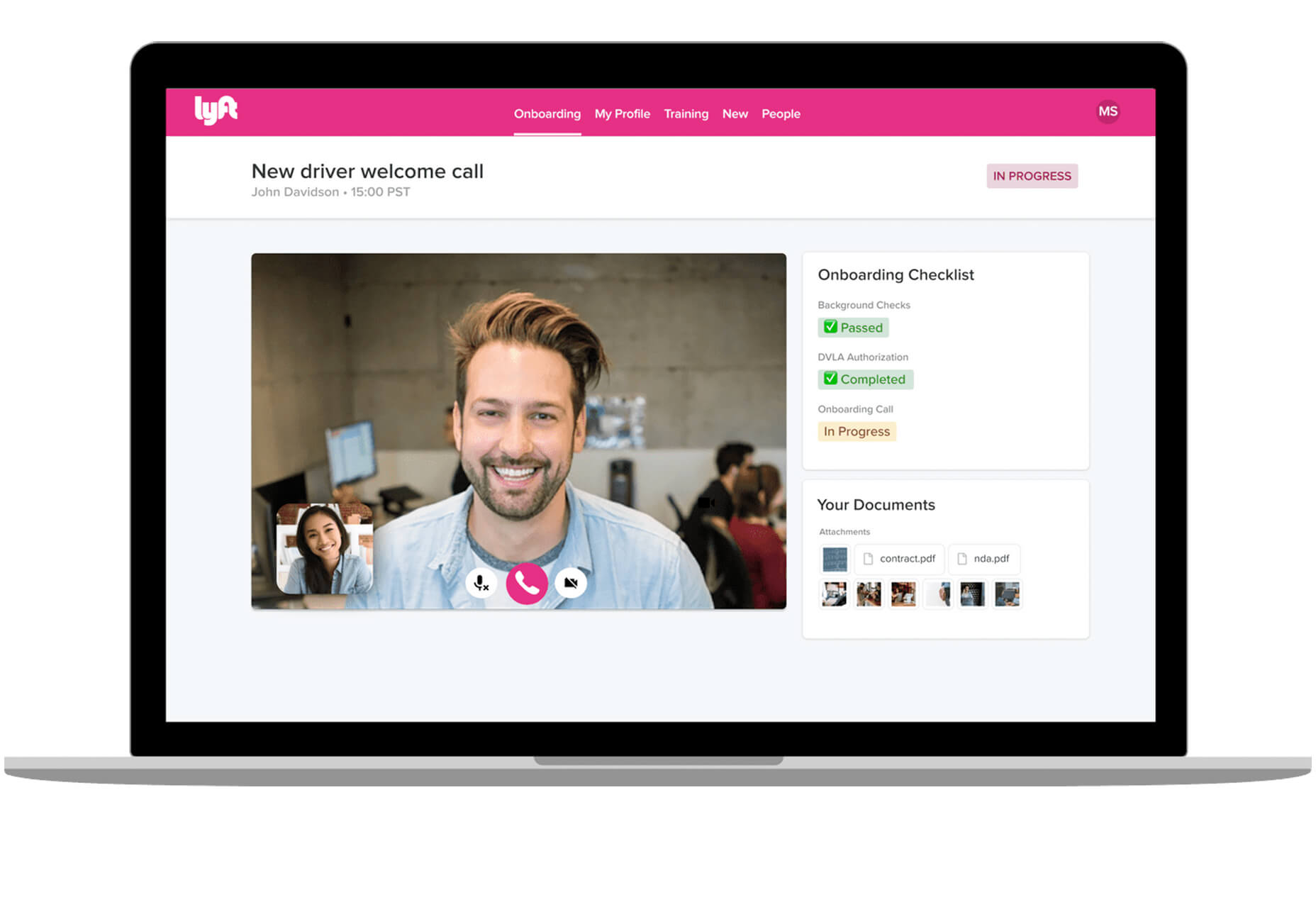
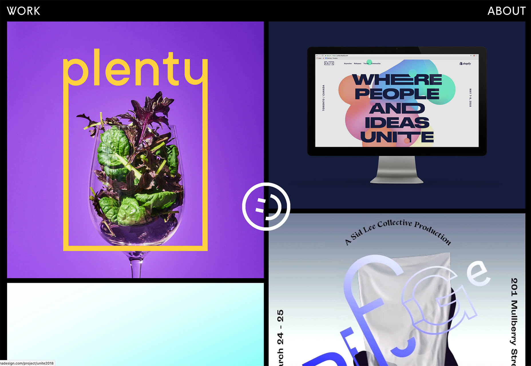
Some of the changes we are seeing with where we work are starting to pop up in the type of new tools made for designers and developers. More tools with remote collaboration as a key feature are increasing in popularity. (You’ll find a few of those here.)

Here’s what new for designers this month.

Webdesign Toolbox

Webdesign Toolbox is a collection of tools, apps, and resources all in one location for designers and developers. The best part of this resource is that it is human-curated, so every tool is quality checked and makes the list because it has been tested and researched. Search the collection by design, dev, stock, typography, UX, or workflow tools (and more) and use them to help create more efficiently. The collection is constantly growing, too.

CodeStream

CodeStream might be the new-world workflow tool for web designers and developers. It is made for remote teams to review code right inside your IDE without breaking from development flow. You can post and review changes and comments are all independent of the code itself, even though they link to it.

Litur

Litur is a color management app for iOS. Use it to find and collect color swatches, create custom palettes, and even check color combinations against accessibility standards. The app can even generate color codes for you from swatches you find from a photo or image upload or create. The app works on mobile and desktop Mac devices and is a paid app.

Editor X

Editor X, which is still in beta, is a website building tool that combines advanced design and prototyping capabilities with secure web hosting and integrated business solutions. Go from an idea straight to production in a highly intuitive design workspace. The best feature might be exact design precision tools.

Grid Cheatsheet

Grid Cheatsheet is a visual and code-based set of “cheats” based on the W3C CSS Grid Specifications. What’s nice is it makes these guidelines easier to understand and use if reading through them makes you a little uneasy.

Tutorialist

Tutorialist brings together some of the best development tutorials on the web. All of the tutorials are free videos available on YouTube, and this project collects them all in one place.

Pure CSS Halftone Portrait from JPG

Pure CSS Halftone Portrait from JPG is a beautiful pen from Ana Tudor that shows how to change the visual representation of an image. The examples are brilliant and in true halftone fashion. The code snippet works with color, or black and white images as well.

VoiceText for Slack

VoiceText for Slack is another work from home productivity tool. Integrate it with Slack and send messages with text that’s transcribed right in your channels. It’s a free integration and supports 18 languages.

Feature Peek

Feature Peek is a developer tool that helps you get frontend staging environments on demand and gather team feedback earlier in the development process. It’s made for use with GitHub and works with a variety of other tools as well.

Formbutton

Formbutton is a simple and customizable pop-up form. (And we all know websites have plenty of them right now.) It connects to other services you already use, such as Google Sheets and MailChimp, and is simple to set up.

Blocksy Theme

Blocksy is a WordPress theme that’s made for non-coders. It’s a zippy and highly visual theme made for Gutenberg. It works with other builders and allows the user to customize pretty much everything visually. (There’s even a dark mode.) The theme is packed with tools and options and is a free download.

Oh My Startup Illustrations

Oh My Startup Illustrations is a set of vector illustrations in several categories featuring a popular style on many projects. Use the characters and scenes to create a semi-custom story for your startup project.

1mb

1mb is a code editor and host where you can create a static website with a custom domain and SSL included. The editor works in-browser and everything is saved in the cloud.

Linear

Linear is an issue tracking Mac app for teams. It’s designed to help streamline software projects, sprints, and tasks, and can integrate with standard tools such as Github, Figma, and Slack.

Hosting Checker

Hosting Checker solves a common issue – a client wants you to work on their website, but has no idea who hosts it. Hosting Checker shows the user hosting provider and IP address the website uses, along with where its server computers are located and the host’s contact details. It also claims to be 82% faster than other similar tools.

Spike

Spike alerts you to website incidents before customers. Create alerts and get a phone call, text message, email, or Slack notification right away. The tool provides unlimited alerts and integrations to you can stay on top of issues before they become real problems.

Magnus UI

Magnus UI is a framework that helps you building consistent user interfaces in React. It comes with plenty of components ready to use and you can customize the theme.

SpreadSimple

SpreadSimple uses data in Google Sheets to create styled websites with features such as filtering, search, sorting, cart, order collection via forms, and much more. Update the sheet and instantly see changes on the website.

WebP vs. JPEG

Google is starting to suggest using it’s WebP image format to decrease load times, because of the lighter file size. But is WebP better than the traditional JPEG? Developer Johannes Siipola tested the file types at different sizes to answer the question. The answer is a bit complicated, but sometimes it might be better; read the full analysis for more.

Oh Dear

Oh Dear is a website monitoring tool that can help you keep a check on websites. Monitor uptime, SSL certificates, broken links, and more with notifications that come right to you if there’s an issue.

Airconnect

Airconnect is a Zoom video conferencing alternative that you can use for your brand with a custom header, colors, and portal for clients. The tool includes video calling as well as the ability for customers to access their data and automate your onboarding process.

Free Faces

Free Faces is a curated collection of free typefaces that you can browse and use in projects. Search by type style with visual results that include a download link.

All the Roll

All the Roll is a fun novelty font for just the right type of project. It includes 167 characters with swash characters that can be added before or after certain letters.

Backrush

Backrush is a handwriting-style typeface with easy strokes and a pen-like feel. It includes thicker letterforms with nice swashes and a full character set.

Thuner

Thuner is a slab display font with interesting quirks. It’s made for larger than life designs. It includes a full uppercase character set and numerals.

Source


Source de l’article sur Webdesignerdepot

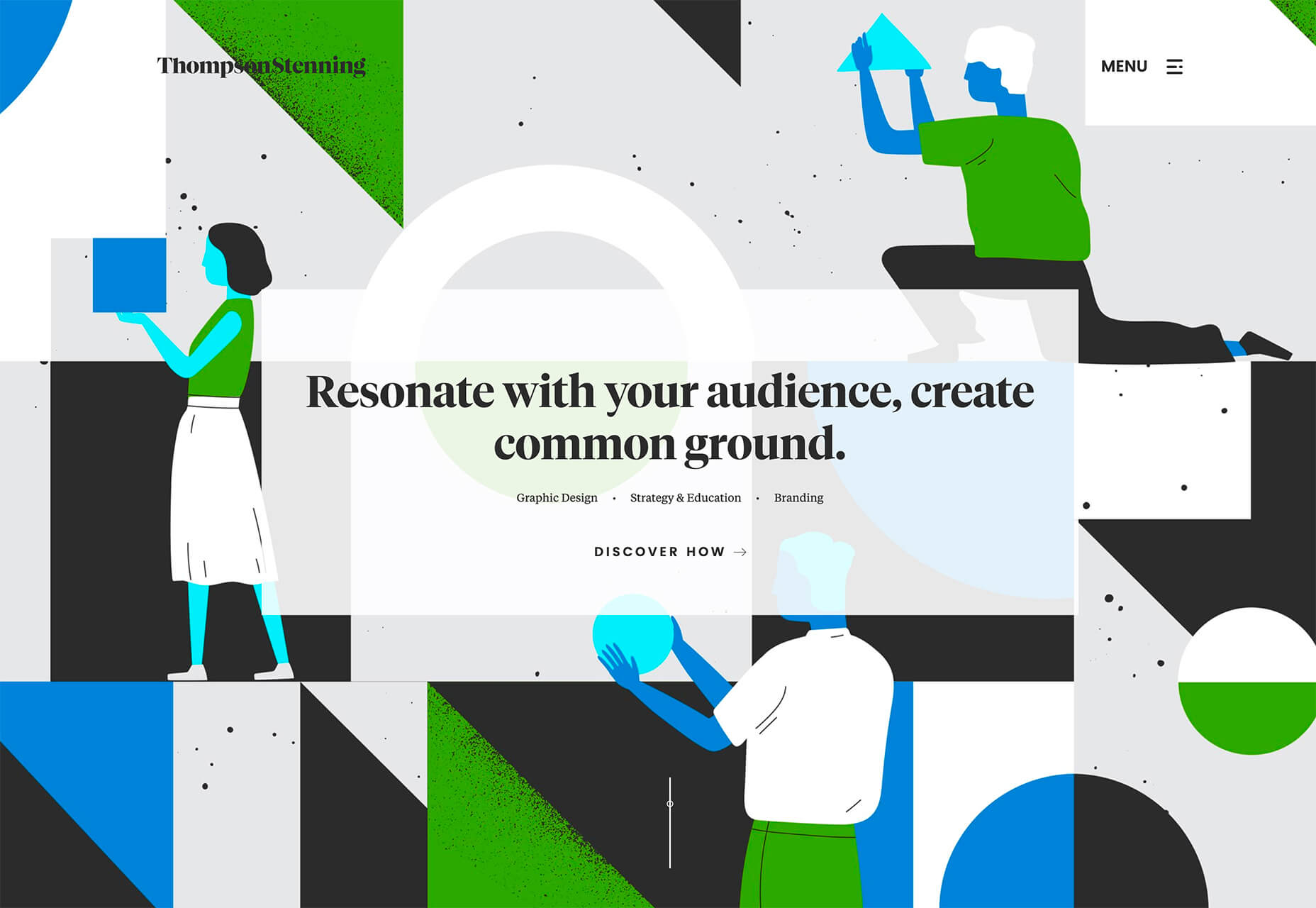
Web design clients come from a wide variety of backgrounds. One day, you’ll be designing a portfolio website for a voiceover artist, the next you’ll be creating a comprehensive ecommerce site for a leading retailer. In an ideal world, you’ll get to a point where you eventually specialize in a niche. However, you’ll need to master both avenues first.

The more time you spend in this industry, the more you’ll learn that every client comes with their own unique requirements and challenges to consider. However, there’s a particularly huge divide between the kind of web design projects you do for B2B clients, and the ones you do for B2C customers.

Both B2B (Business to Business) and B2C (Business to Consumer) websites need to be clear, concise, and aesthetically pleasing. They should always have a strong focus on user experience, and they need to work consistently across devices. However, being aware of the difference between B2B and B2C projects will help you to deliver better results to your customers.

Defining the Differences Between B2B and B2C Sites

Some web design trends remain consistent in any environment.

Whether you’re creating a site for a hairdresser, or a leading SaaS company, you’ll need to deliver responsive design, intuitive navigation, and excellent site security.

Your process is unlikely to differ from B2B to B2C much in terms of project milestones, phases, prototyping and wire-framing. The differences that arise between B2B and B2C projects often come in the approach you take to building certain elements.

Let’s take a closer look at the things you might need to consider:

1. The Target Audience

In any design project, it’s always important to keep the end customer in mind. Knowing your client’s target audience will help you to create both an image and a tone of voice that appeals to the right people.

B2B Websites

With B2B websites, you’ll be speaking to a range of highly-educated individuals who already have a general knowledge of your service. The aim here will be to show the end-user how you can help them achieve better results. For instance, m.io highlights “syncing communication” so you can “effortlessly chat” with your team.

The language and content of the website is all about highlighting the key benefits of the products, and the kind of outcomes that they can deliver. The Nielsen Norman Group reports that there’s often a lot of discussion between decision-makers when they’re checking out a B2B website.  

Designers need to work harder at convincing B2B buyers that they’re making the right decision. This is particularly true when you’re selling something like a software subscription that requires a lot of long—term investment.

B2C Websites

On the other hand, while B2B customers make decisions based on logic, information, and well-explained benefits, B2C customers are more influenced by emotion. They want quick solutions to their problems, and the opportunity to purchase from a brand that “understands” them.

Look at the Firebox website, for instance. It instantly highlights an ongoing sale at the top of the homepage, addressing any concerns a customer might have about price. That combined with a quirky layout full of authentic photos and bright colors means that customers are more inclined to take action.

2. The Purpose

Another factor that can vary from B2C to B2B websites, is the motive behind a customer’s purchase. Knowing what’s pushing a target audience to interact with a brand will help you to create a website that appeals to specific goals.

B2B Websites

B2B websites often aim to solve expensive and time-consuming problems for companies. To sell a decision-maker on the validity of a solution, it’s important to thoroughly explain what the solution is, how it works, and how it addressees a specific pain point.

Look at the Zoom website for instance, they don’t just tell people that they offer video conferencing, they address the practical applications of the platform:

B2C Websites

Consumers are a lot easier to appeal to in terms of emotional impact, because many of them come to a website looking to fulfill an urgent need. Because of this, many web designers can take advantage of things like urgency and demand to encourage conversions. For instance, look at this website from TravelZoo. It takes advantage of a customer’s desire to get away:

A B2B website needs to focus on providing information that helps companies to make more confident decisions. What’s more, with B2B sites, decisions are often made by several stakeholders, while B2C sites ask a single person to make a choice. A B2C website needs to address immediate concerns and connect with customers on an emotional level. B2C buyers still want to do their research on products or services, but the turnaround is much quicker, and often requires less information.

3. The Design Elements (Visual Appearance)

Just as the focus of your website design and the audience that you’re creating the experience for can differ from B2B to B2C websites, the visual elements of the design might change too.

B2B Websites

In most cases, B2B websites are all about presenting a highly professional and respectable image. You’ll notice a lot of safe and clear choices when it comes to typography and imagery. It’s unusual to see a B2B website that takes risks with things like illustrations and animations.

Look at the Green Geeks website for instance. Everything is laid out to encourage clarity and understanding. Information is easy to find, and there are no other issues that might distract a customer.

B2C Websites

On the other hand, B2C websites can be a little more daring. With so many different options to choose from, and most customers buying out of a sense of urgency or sudden demand, designers are under pressure to capture attention quick. This means that it’s much more likely to see large pieces of eye-catching imagery on B2C sites, with very little text.

Movement, like slideshows and animations often play more of a role here. Additionally, there’s a good chance that you’ll be able to experiment more aggressively with color. Take a look at the Yotel website, for instance. There’s very little textual information here, but the appeal of the website is conveyed through sliding images:

4. Website Content

The way that information is conveyed on a B2B website is very different to the messages portrayed on a B2C site. Usually, everything from the language, to the amount of content that you use for these projects will differ drastically.

B2B Websites

When designing for a B2B website, you’ll need to be careful with content, as you’ll be speaking to a very mixed audience. If your site caters to different industries, you’ll need to ensure that you show authority, without using too much jargon. Some companies even create different pages on their site for specific customers. The aspin.co.uk website covers the benefits from a company, sale and integration perspective:

Rather than try to talk to all business owners about their differing communication pains, G-Suite anticipates its audience and creates pages for each.

B2C Websites

Alternatively, B2C websites can make things a little simpler. For instance, on glossybox.co.uk, there’s no need to provide a ton of information for different types of shopper, designers can appeal to one audience, i.e. the “beauty addict”:

In both B2B and B2C websites, the aim of the content should always be to answer any questions that the end user might have.

5. CTA Buttons

Call to Action buttons are often a crucial part of the web design journey. However, it’s sometimes difficult to determine where they should be placed, or how many buttons you need.

B2B Websites

Because the decision to buy something won’t always happen immediately with a B2B website, these kinds of sites often use a variety of CTAs. For instance, you might have a “Request a Quote” button at the top of a page, as well as a Sign in button.

On the Klaviyo site, for instance, you can request a demo, sign up or log in:

You can place CTAs lower on the page with B2B websites too, as it’s more likely that your customers will be scrolling through the site to collect more information before they decide to buy.

B2C Websites

On the other hand, with B2C websites, you usually don’t need to give your visitors as many options. A single option to “Add to Cart”, or perhaps an extra choice to “Add to Favorites” is all your user will need. Customers need to instantly see what they need to do next as soon as they arrive on a page:

On the Evil Hair website, you immediately see how to add a product to your cart.

Remember, the sales process is a lot quicker with B2C customers. This means that you need your CTA buttons to be front and center as soon as someone clicks on a page.

6. Contact Forms

In a similar vein, the way that you design your contact forms will also depend on the end-user that the website wants to appeal to. There’s a very different process for getting in touch on a B2B website, compared to a B2C site.

B2B Websites

B2B websites often require longer contact forms, as clients need to collect additional information about a prospect’s position in a company, and what that company does. B2B companies need to share things like what they’re looking for in a service, and how many users they have, so a sales team knows what kind of demonstration to give.

As with any strategy for contact form design, you should always only include the fields that your client needs and no more. If you demand too much from any client, you could send them running in the opposite direction. Check out this straightforward option from Ironpaper, for instance:

The form addresses as many relevant questions as possible without overwhelming the customer. Because the site handles things like design, it makes sense that they would ask for a link to the company’s existing website.

B2C Websites

On a B2C website, there are very different approaches to contact forms. You may have a dedicated contact form on your website where people can get in touch if they have any questions. A FAQ page where customers can serve themselves is another great way to help your client stand out from the competition. Check out this option from River Island, for instance:

On the other hand, you might implement pop-up contact forms into a website if your client wants to collect emails for email marketing. In that case, it’s important to make sure that you’re only asking for the information you need, and nothing more.

The easier it is to sign up for a newsletter, the more likely it is that customers will do it. Being able to enter their name and email address and nothing else will make the signup seem less tasking.

7. Search Bars and Navigation

Whether you’re designing for B2B or B2C companies, navigation will always be a critical concern. End users need to find it easy to track down the information that they need about a company, whether they’re looking for a particular product or a blog.

B2B Websites

On a B2B website, the search bar often takes up a lot less prominence than it does on a B2C site. That’s because all of the information that a client needs, and the buttons they need to take their next steps, are already visible front-and-center.

As a designer, it will be your job to push as many people to convert as possible, by making the purchasing journey the most appealing path for visitors. For instance, on the Copper website, the “Try Free” buttons are much easier to see than “Continue with Google” or “Login”:

With B2B sites, the focus is on a very specific goal. Although navigation still needs to be available, it doesn’t need to be as obvious as it is on a B2C site.

B2C Websites

On the other hand, most B2C websites offer a wide range of products, and they’re perfectly happy for their customers to purchase anything, as long as they eventually convert. Because of this, they make navigation a much more significant part of the customer journey.

The search bar is often presented at the very top of the screen where customers can see it immediately. Additionally, there may be multiple pages within certain product categories, so that customers can browse through the items they’re most interested in. For instance, look at the homepage on the IWoot website:

The navigation elements in B2C websites need to be a lot more obvious, because consumers are more likely to use them when they’re searching through their options.

8. Social Proof and Testimonials

Finally, social proof is one of the things that will work well for improving conversions on any kind of website. When your customers aren’t sure whether or not they should buy from you, a review or testimonial could be just the thing to push them over the edge.

B2B Websites

On a B2B website, the decision-making process takes a lot longer. Because of this, it’s worth including as much social proof as possible in every part of the website. Client testimonials, reviews and ratings, and even high-profile company logos make all the difference. Many B2B websites include a page dedicated to case studies highlighting the success of other brands.

Your client might even go as far as to ask for a page that highlights their awards and recognition or showcases comparison tables that pit their products against the competition.

For instance, Authority Hacker has a “what the pros say about us” section as social proof:

B2C Websites

With a consumer website, you can include consumer ratings and reviews wherever you like. However, it’s most likely that you’ll want to have a place where customers can see the reviews of other clients on the product pages themselves. On the EMP website the company gives users the option to click on the star review section to jump to a different space on the page where testimonials are listed. This ensures that customers don’t have to scroll through a lot of excess information if they just want to add an item straight to their cart.

Designing for B2B vs B2C

In the world of web design, no two customers are ever the same. While you’ll need to adapt your processes to suit each customer you interact with, you can set your expectations in advance by learning the differences between B2B and B2C strategies.


Featured images by Chris Ross Harris and Mike Kononov.

Source

p img {display:inline-block; margin-right:10px;}
.alignleft {float:left;}
p.showcase {clear:both;}
body#browserfriendly p, body#podcast p, div#emailbody p{margin:0;}

Source de l’article sur

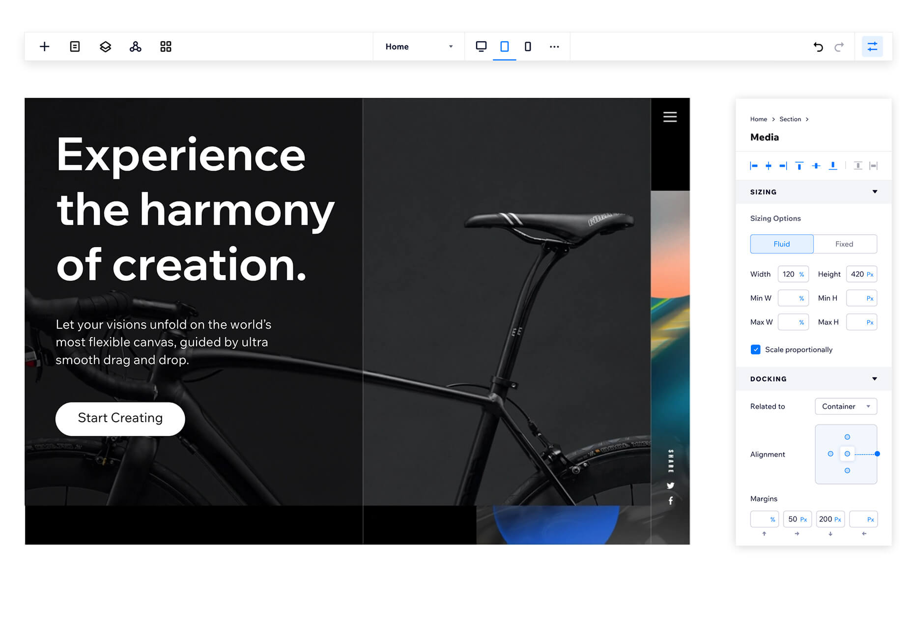
You’ve been working away at your latest design project, and the client has given the go-ahead on your lovingly created digital concepts. Now it’s time to bring those designs to life, and you have a developer queued up to do just that.

So your part’s done, right? Not quite. You’re going to want to make sure your developer has the best head start they can in order to create the site as you imagined.

Below are a few tips to make that handover process a little easier.

Communicate to Make It Great

Get Talking

Scheduling a face-to-face meeting with your developer to talk over your project’s specifics and ambitions will help align your expectations and make the intent behind your concepts more clear. It’s quite likely they’ll even ask questions and request assets you haven’t even thought of yet!

It’s not just a one-and-done thing either, your developer’s going to have questions or requirements that arise as the project progresses. Deciding on a communication channel to allow easy discussion will help you both immensely.

Annotating Your Concepts

Developers might seem like magicians with the way they bring your websites to life, but they’re not clairvoyant! Annotating your concepts where advanced functionality is required reduces ambiguity and makes it more likely that your cool, quirky idea is going to make it to production. If it’s a feature that’s particularly unusual, you might want to find an example of a website or code sandbox that does something similar.

An example of Figma’s comment tool in use to make developer notes.

Figma and Sketch both have comment functionality in order to make annotations a little easier, also allowing multiple parties to comment. If dealing with PDFs, there is also an annotation tool available through Adobe Acrobat.

Specify the Basics

The basis of modern front end development revolves around DRY thinking. Some might argue thinking about code can be pretty dry, but we’re not talking about that – in this case, DRY stands for Don’t Repeat Yourself.  Most developers will tackle a project by starting with defining variables: what colors, font sizes, grid columns… anything that can be reused! Good, consistent design follows this same principle – although it’s a habit that can be hard to get going at first.

Tip: It’s always easier to define variables if this mentality is approached towards the start of the project!  

Colors

Make a style guide that specifies the colors you’ve used in your designs. Think about their logical applications to help signpost how they might work as a variable – for example, what colors did you use for paragraph text, hyperlinks and backgrounds? Did you consider colors to convey status messaging, such as successes, warnings and errors?

Typefaces

Which fonts have you used for your project? Is there a consistent set of font sizes you used throughout? If you haven’t already, maybe consider a ratio-based type scale – I like to use ModularScale to help with this.

Basic HTML Elements

Think about general styling for these basic html tags:

  • Paragraphs <p>
  • Headings <h1–h6>
  • Bullet lists <ul> and numbered lists <ol>
  • Emphasized text <b>, <strong> and <em>

Buttons

How about buttons and links? What should they do when they’re hovered over, focused (using the tab key on a keyboard) or disabled?

Forms Fields and Inputs

What should form fields look like? Is there any validation checking that should occur when a form is submitted?  How about checkboxes and radio buttons?

It’s unlikely that you’re going to be able to cover absolutely every single eventuality – allow your developer to use some common sense to fill in the gaps, and be available to them if they have any questions. In the words of John Maxwell and your aunt’s home office wall sticker, teamwork makes the dream work.

Get Your Favic-on

Favicons are widely recognized as the small icon that appears to the left of the site title on your browser’s tab bar. Nowadays, the application of your site’s favicon is much further reaching, showing up in Google search results and app tiles. There’s also extra theming options available, such as the ability to customize the color of Google Chrome Android’s browser bar color for your site.

Using a generator site such as realfavicongenerator takes the pain out of much of this decision-making, allowing you to upload specific graphics as desired, creating silhouettes of your icon for Windows Metro tiles and macOS Safari pins, and packaging everything into easy-to-use files and code.

 Compress Your Images

Nobody wants to load a 20MB image when they’re on a slow connection or a data plan – it pays dividends to plan ahead and downsize your images so that they’re production-ready for the web. If you’re worried image compression is going to harm your image quality, fear not – you can go a long way with image compression before quality is seriously compromised.

  1. Start by reducing the image resolution – for batch jobs, I use Adobe Photoshop’s image processor script to downsize images to fit 1920 x 1200 pixels
  2. Alternatively, if you’re working on a static project – where specific images will be used only in specific places – you could use your design software (nearly all mainstream UI software allows you to do this now) to export your images at 2x size to support devices with high pixel densities.
  3. I also convert my image color profiles to SRGB to ensure consistency across most modern display types (this one’s optional)
  4. I then take my newly downsized images and run them through imageOptim at 80% quality. Generally I would aim to get my images under 300kb – if there are any that are still significantly over this target once compressed, I’d run these through again at 70% quality (I wouldn’t recommend going lower than this, though).

Don’t forget you can also do this for PNGs! Enabling PNGCrush in imageOptim will let you significantly reduce the size of PNGs… just be ready for it to take a while.

Make Your Vectors SVG-Easy to Use

If your design contains graphics or illustrations you created using vector software, it can be used on the web as an SVG file. Usually, these files will be a lot smaller than JPGs or PNGs. You can export graphics in most (if not all) vector software in this format.

Optionally, you could use imageOptim or SVGOMG to compress the SVG code without sacrificing quality. Your developer might already use a script that does this automatically when processing the site for production, so it may be worth asking ahead.

Get Your Licenses in Check

If you’re using premium fonts, make sure you’ve purchased a webfont license so you can hand over the correct files to the developer. I’d recommend doing this sooner rather than later – although not often, occasionally web versions of fonts can have slightly different bounding boxes to their desktop counterparts, making it a real pain for developers to work with further down the line.

If you’ve been using samples of stock photos (or if you’ve been going crazy lifting whatever you can find on Google Images), make sure everything is kosher before you go live. Make sure you purchase licensed photos, and if certain photos you want to use require attribution, make the developer aware of this.

Source

p img {display:inline-block; margin-right:10px;}
.alignleft {float:left;}
p.showcase {clear:both;}
body#browserfriendly p, body#podcast p, div#emailbody p{margin:0;}

Source de l’article sur

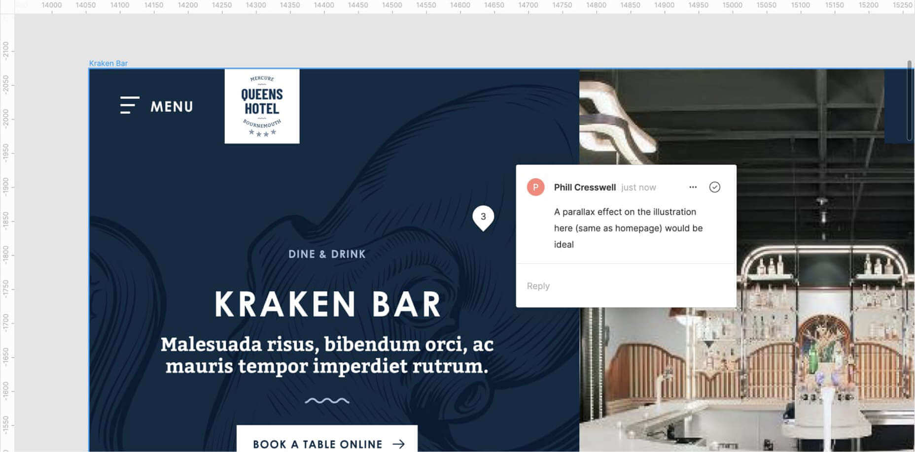
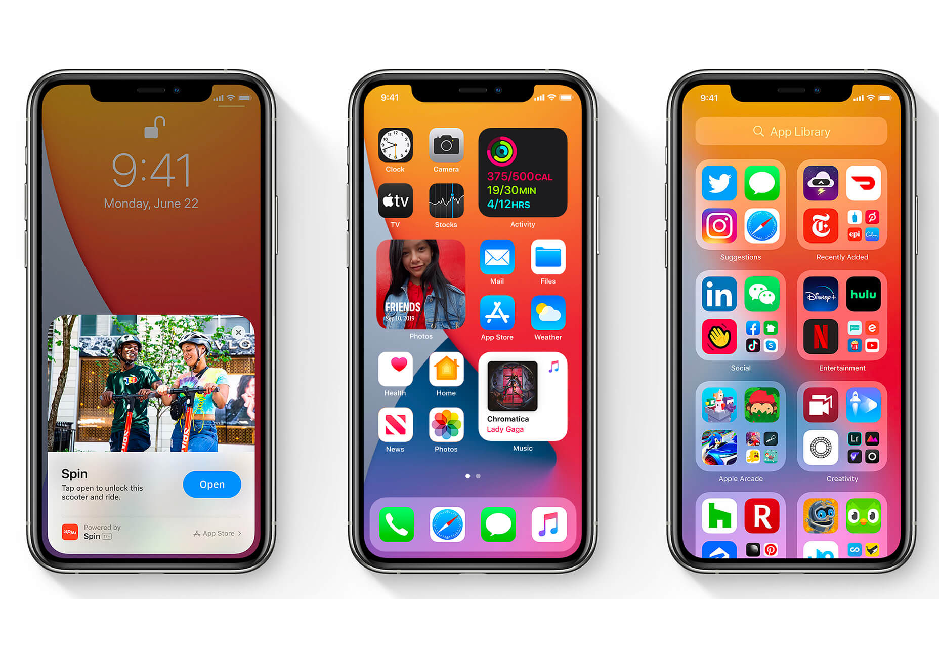
The biggest trend we’re talking about this month started at WWDC as Apple provided a glimpse of what’s coming next for their operating systems. This time around there’s a distinct design element. Did you catch it?

Here’s what’s trending in design this month.

1. Text Highlights and Underlines

There’s always been an unwritten rule in website design that text uses more plain styles. Bold is acceptable, italics are OK from time to time, but underlining is seldom used.

This design trend bucks that concept with text elements that use highlighter or underline elements to emphasize key words. And it works rather nicely.

What it takes to make this work is plenty of contrast and a design style that fits with underline or highlighted elements.

This design trend works thanks to clear intention. The words are obviously important to the overall meaning of the design or what visitors should take away from the content.

Pepper It uses a nifty underline that the letters seem to rest inside of to highlight a key phrase. The shape and color also mimic that of the larger button below, helping the eyes move from one element to the next. It’s an effective use of an underline (or maybe you could call it a highlight) effect in conjunction with brand colors.

Zappos Kids uses a fun highlight in a colorful scheme to highlight a key text element. It almost looks like a button and helps website visitors understand that the entire hero image area is clickable. The highlight serves to make the text more readable and the interactive element more functional.

Zeus Jones uses a variety of text treatments on the homepage, but arguable the underline is most noticeable, likely because it is the most unfamiliar in the context of website design.

2. Distinct Geometry

Geometric shapes in website design have popped up as trending elements in a variety of forms. This iteration is pretty simple: Use of distinct geometry as part of the overall aesthetic.

Geometry might pair with illustrations, photos, text, or in the background or foreground. What’s great about shapes is that they are versatile and work with a lot of other design patterns.

What can be the most challenging about shapes and design is that distinct geometry requires some space and thought. Just tossing a few triangles or rectangles in a design without reason can look rather strange.

So how can you add geometric shapes to a design so that they look intentional? These examples do it well (and in three different ways).

Rui Ma uses square and rectangular containers in a modular grid with portfolio projects inside each. This is one of the most common and applicable uses of geometry – as a container element. What makes it stand out is the circle, smiley wheel (also a geometric shape) that never leaves the center of the screen. The black background for the grid is also a nice contrast element for content blocks.

Thompson Stenning uses shapes in the background and with illustrations to create a stunning homepage visual. It’s big and bold and has just enough going on that you want to look at it and figure out the scene. Maybe what’s most intriguing about the visual concept is that it uses lots of geometric shapes – rectangles, squares, triangles, ad circles – whereas most projects pick one shape to focus on.

Romain Penchenat uses three-dimensional style angles to draw you into the portfolio website. They use a simple animation that “floats” on the homepage and follows the scroll with other geometric elements.

3. Shadow and Gradient Icons

Did you notice all the gradients and subtle shadows in icons in the images previewing iOS 14 or were you just looking at other changes (such as widgets) on the iPhone screen?

We’ve been seeing more designers incorporating more shadows and depth into icons for a while, but this move by a major player in design will push it to the forefront fast. Each of the icons moves from a flat style to one with a background gradient color as well as more shadows within icon elements for depth.

Don’t worry, the design still looks very much like Apple, but is a little more reminiscent of the skeuomorphism style icons from earlier versions of iOS.

It’s nice that the color and shadow elements are contained within each icon. This creates more visual interest and depth for each element without getting cluttered or junky. The gradients are also super simple, using a darker version of the main color in a monotone element.

It’s an iconography style that others are already using. DG Studio has a collection of icons on its homepage with subtle gradients and shadowing in the designs. Again, what’s nice about this trend is that it adds depth to visuals without tricks that get in the way of visual comprehension.

Guillaume Gouessan uses gradients in image icons in much the same way as the previous examples but with a little more color variation. Here, you can see what the gradient looks like when using a color change that’s not super drastic, but more dramatic than a monotone option. You can find some use of the more monotone gradient on his site below the scroll in the large desk image. (It’s definitely worth a few clicks to check it out.)

Love it or hate it, gradients and shadows seem to be here to stay for a while.

Conclusion

How often do you find yourself looking to major brands and companies for design inspiration? While a lot of web design trends start as experiments with smaller sites, the big players can really shape what gets popular (or not).

The example of Apple moving to icons with more shadows and gradients is a prime example. We’ve been seeing more of these elements creeping in for a while, but this style is about to get very big again.

Source

p img {display:inline-block; margin-right:10px;}
.alignleft {float:left;}
p.showcase {clear:both;}
body#browserfriendly p, body#podcast p, div#emailbody p{margin:0;}

Source de l’article sur

Handling large images has always been a pain in my side since I started writing code. Lately, it has started to have a huge impact on page speed and SEO ranking. If your website has poorly optimized images it won’t score well on Google Lighthouse. If it doesn’t score well, it won’t be on the first page of Google. That sucks.

TL;DR

I’ve built and open-sourced a snippet of code that automates the process of creating and deploying an image resize function and an S3 bucket with one simple command. Check out the code here.

Source de l’article sur DZONE