Articles

WALLDORF, Allemagne – 18 décembre 2020 – SAP SE (NYSE : SAP) a dévoilé la solution SAP® SuccessFactors® Time Tracking. Cette nouvelle solution cloud offre aux entreprises des outils simples et innovants pour enregistrer, approuver et contrôler le temps de travail de leurs collaborateurs. Dotée d’une interface utilisateur intuitive, la solution SAP SuccessFactors Time Tracking améliore l’expérience des collaborateurs et permet de s’assurer que les salariés sont payées avec précision, dans les délais et conformément aux réglementations locales.

Grâce à des fonctionnalités avancées de gestion du temps et des présences, SAP SuccessFactors Time Tracking offre une vue en temps réel de la saisie des temps du personnel, ce qui permet une plus grande transparence des rémunérations et un meilleur contrôle des horaires et des heures supplémentaires. Les dirigeants peuvent suivre et minimiser les coûts de main-d’œuvre grâce à des informations et des tableaux de bord intégrés, ce qui contribue à améliorer la productivité de l’ensemble du personnel. La solution s’intègre aux solutions SAP SuccessFactors Employee Central, SAP SuccessFactors Employee Central Payroll ainsi qu’aux solutions de paie SAP classiques. La solution s’intègre également avec les badgeuses du marché. Les entreprises peuvent ainsi partager des données pertinentes entre plusieurs systèmes afin de garantir l’exactitude des paiements. En outre, la solution SAP SuccessFactors Time Tracking est une solution internationale conçue pour prendre en charge les spécificités locales notamment les fuseaux horaires, les langues, les calendriers de vacances, les règlementaires de paie spécifiques à chaque pays.

« La solution SAP SuccessFactors Time Tracking offre aux employés la personnalisation et la simplicité qu’ils sont en droit d’attendre d’une expérience de site internet grand public », a déclaré Amy Wilson, vice-présidente senior, HXM Product & Design, SAP SuccessFactors. « En même temps, elle apporte l’innovation dont nos clients ont besoin pour gérer des effectifs diversifiés et mondiaux et leur offre une plus grande flexibilité dans leur démarche vers le cloud ». 

Les principaux avantages et caractéristiques prévus pour la solution SAP SuccessFactors sont les suivants :

  • Une plus grande flexibilité pour les employés : Pour aider les employés à gérer leur équilibre entre vie professionnelle et vie privée, les salariés éligibles peuvent choisir soit d’être payés pour leurs heures supplémentaires, soit de les utiliser pour prendre des congés supplémentaires. La gestion des horaires flexibles permet aux employés de déterminer le rythme de travail qui leur conviennent le mieux dans le respect des règles imposées par l’employeur.
  • Gestion simplifiée des horaires de travail : Le suivi intelligent des horaires permet aux collaborateurs de pointer à l’entrée et à la sortie et de suivre leur temps de travail au cours de la journée. Il permet aux RH de définir des alertes automatiques pour rappeler aux employés et aux responsables de remplir les feuilles de présence et les pointages de sortie. Les alertes de temps fournissent des avertissements et des messages d’erreur qui permettent aux administrateurs d’examiner et de corriger les problèmes de gestion et de pointage, tels que les heures supplémentaires excessives. En outre, la fonction de suivi de la valorisation des temps fournit des informations détaillées sur chaque étape de valorisation pour un employé, en montrant comment les saisies de temps spécifiques sont calculées. Cela permet aux RH de répondre rapidement et facilement aux questions des collaborateurs concernant leur rémunération.
  • Amélioration de la transparence des processus de rémunération : Grâce à des flux d’approbation intelligents, les RH peuvent définir des règles pour automatiser l’approbation des feuilles de temps par lots. Grâce à l’approbation d’un seul enregistrement, les gestionnaires peuvent pré-approuver des demandes spécifiques, telles que le temps de déplacement associé au temps de travail effectif.
  • Une visibilité accrue sur l’ensemble des effectifs : Les responsables disposent d’une parfaite visibilité sur les coûts salariaux, y compris les feuilles de temps planifiées et enregistrées, sur les heures de travail et les coûts associés. Cela permet de connaître les coûts de main-d’œuvre, le suivi des congés et de la productivité, et ainsi de prendre de meilleures décisions.

« La nouvelle solution SAP SuccessFactors Time Tracking est un ajout important à la suite SAP SuccessFactors Human Experience Management« , a déclaré Steve Goldberg, vice-président et directeur de recherche de Ventana Research Inc. « L’automatisation et l’activation de ces processus peuvent être ardues, voire complexes, et les limites des solutions existantes sur le terrain n’ont pas aidé. Cette solution de gestion du temps basée sur le cloud offre un large éventail de fonctionnalités essentielles et innovantes, associées au type d’interface utilisateur moderne que les clients attendent des solutions SAP SuccessFactors ».

La disponibilité de la solution SAP SuccessFactors Time Tracking est prévue pour janvier 2021. Pour en savoir plus sur la solution, consultez le site sap.com/time-tracking.

Visitez le SAP News Center. Suivez SAP sur Twitter @SAPNews.

The post SAP SuccessFactors Time Tracking : une nouvelle solution cloud pour simplifier les processus RH et améliorer l’expérience des salariés appeared first on SAP France News.

Source de l’article sur sap.com

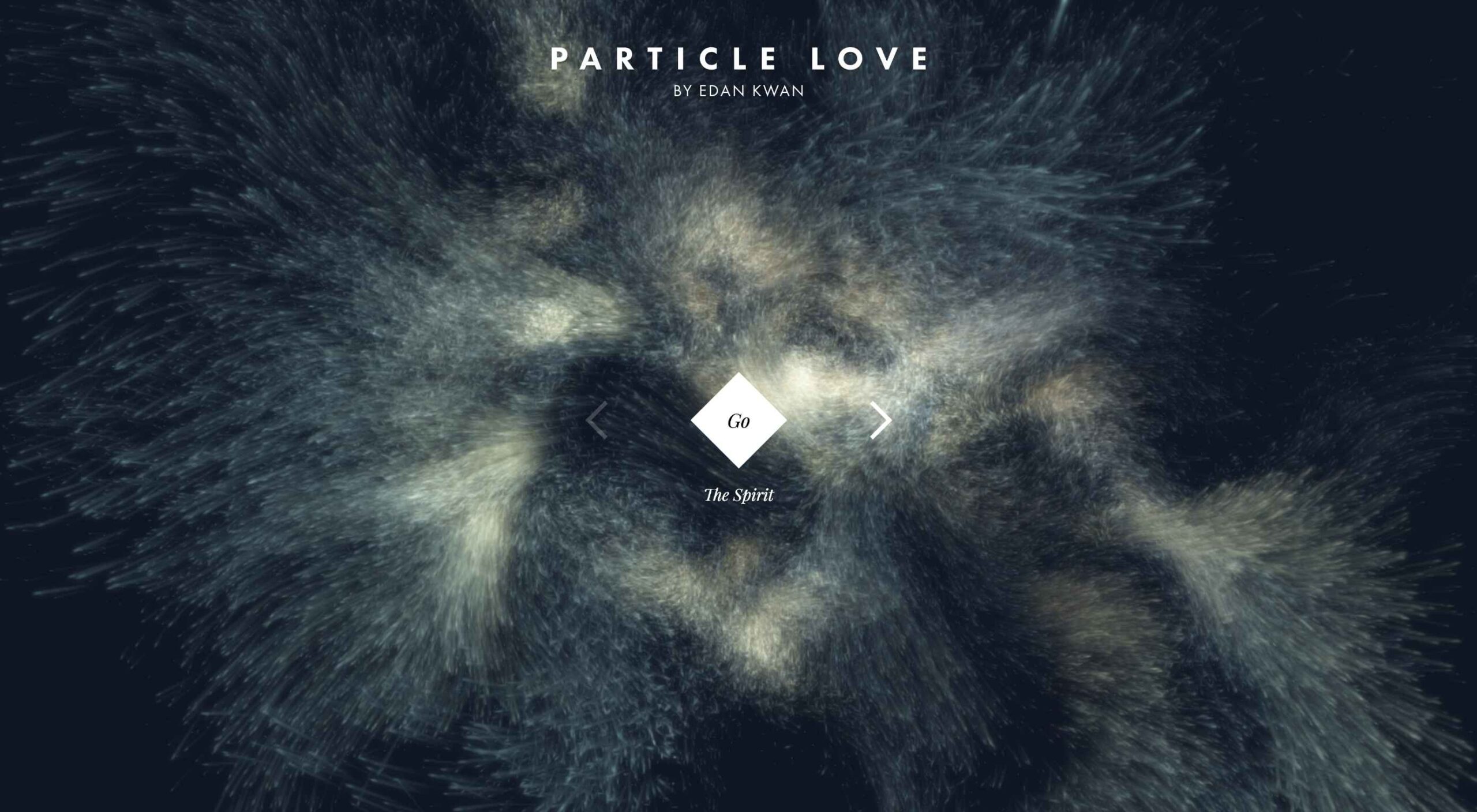
Animation is a fun and interesting way to bring life to a website. Used correctly, it can capture audience attention, make your website more engaging, and even improve your chances of delivering conversions for your clients.

Unfortunately, like many things in the web design world, it’s also easy to get too carried away with animation. As professional designers and developers, it’s up to us to find the line between making the most of animation on our website projects and creating a site that’s overwhelmed with too much activity.

Fortunately, by the time you’ve finished reading this article, you’ll have a deeper insight into how you can use animation in web design, without going too over the top.

Introducing Animation in Web Design

Animations are virtually everywhere on the web today.

In the past, when designers first discovered that they could embed movement into their websites, the amount of animation we saw was often higher than it needed to be. It wasn’t uncommon to find some websites running entirely on Flash, where every element could be animated.

Fortunately, the trends of modern web design have left those practices behind. These days, it’s a lot more common to make animation a part of the overall user experience, rather than focusing on them as a centerpiece attraction. For instance, you’ve probably noticed plenty of animated sliders showing off pictures in a gallery, or transition animations when people hover over a button.

Since it’s entirely possible to construct an entire website with no animations at all, the key to creating an engaging website today is making sure that every animation you use serves a specific purpose. Your animations should make a website more attractive, easier to use, and better for navigation. Add too many, and you could even risk slowing down a site.

So, where does it make sense to use animation for web design?

1. Loading Animations

One of the best ways to use animations in a website is to distract and delight users as a page loads. You can use the animation to deliver a unique experience, or even just highlight the playful nature of your brand. For instance, just check out this classic load animation called “Tightrope.”

You can also use things like particle animations to capture a customer’s attention and help your visitors relax when they visit a website. Particle animations can be interactive or non-interactive, and they’re a great way to stop visitors from feeling frustrated when a page takes too long to load.

A website by Edan Kwan called “Particle Love” shows you exactly what kind of experience you can create with real-time animations.

The more you can delight visitors with experiences that keep them engaged while the information they need is loading, the less likely people will be to hit the “back” button.

2. Microinteraction Animations

Microinteractions are quick and simple animations that come with specific use cases. Usually, this animation works to provide visual feedback and information when you interact with a specific element.

For instance, this microinteraction design from Colin Garven encourages users to enter their email address and password into a login field:

Ideally, the best way to use microinteractions is to make them as subtle as possible. These tools aren’t here to steal the spotlight from other information on the page. However, they can sometimes encourage your viewers to take the next stage in their conversion journey.

Animated microinteractions can be as complex or as basic as you choose. For instance, you could use them when:

  • Highlighting if a feature is switched on or off;
  • Letting users know when actions were successful (like sending a message in a contact form);
  • Showcasing important information, like prices on a table;
  • Animating icons on your site to encourage action;
  • Depending on your experience with animations, you can even find themes and plugins that come with options already built-in.

3. Dynamic Backgrounds

An animated background can be an excellent way to make your website stand out from the crowd. However, it’s important to remember that excessive animation has a habit of making your site slower and more clunky than it needs to be.

The animated background on the mystaticself.com website is fantastic for introducing customers to new information with a handy dynamic menu.

Often, the only reason that you should create your own dynamic background for a website, is if it’s going to improve your customer’s experience in some way.

Remember, ensure that the animations that you’re using on your website aren’t going to make any aspect of your site more difficult to use. Animated backgrounds need to offer a compliment to your existing website, rather than distracting customers from what they want to do.

Before you go all-in with your background animations, focus on animating small sections of an image, one piece at a time. You can also animate components with very small motions too.

4. Reveal Hidden Messages

Another excellent way to use animation in web design is to harness it for showcasing important information. For instance, a navigation menu is an important component in your website design, but it can also take up a lot of valuable space.

In some cases, a hidden menu that appears when a customer scrolls over a small box or icon could make a lot of sense. You can also think about animated drop-down menus if you’re working with a website that has a large number of pages.

Check out this fun example of an animated CSS3 menu:

The sections change color and move as you hover over them, making it easier to see exactly where you’re clicking.

It’s up to you exactly how creative you want to be when you’re playing with animated menus. The easiest option is often just to have a component that changes color or shape with a hover effect. However, you can also expose hidden menus and extra information too.

For instance, with some websites, you can create pictures that turn over to show information on the other side. That means that you could create an about page with pictures of team members, which flip to show biography information.

Just make sure that everything works smoothly, both on desktop and mobile.

5. Try Carousels

Finally, we come to perhaps the simplest and most popular way of using animation in web design. Carousels are a common component of almost every theme on the web today. They’re great for showing off useful information, such as what a website has to offer, or which deals are available.

When creating a carousel, you can either give your users control over how quickly an image transitions, or you can implement automatic movement. On the heathfield.co.uk website, the designer has added buttons to let you flip backwards and forwards between photos, while also ensuring that the animation is automatic.

Without the animation to show you the pictures sliding into space, the transitions between each picture would be instant – which is a little more jarring for viewers.

Sliders are such a common component of web design today that customers almost expect to see them on many websites. That means that you can enjoy a very effective experience if you want to avoid doing anything too dramatic with your websites.

You can use sliders for everything from showing off products, to displaying testimonials from customers and more. It’s a great way to compress a lot of useful information into one small space on a site.

Use Website Animation Carefully

The most important thing for most designers to remember with animation and web design is that it’s entirely possible to have too much of a good thing. When it comes to creating amazing designs for your clients, you can take advantage of animation to encourage more engagement and a unique experience. However, you shouldn’t allow yourself to go too over the top.

Rather than animating every aspect of a page to constantly grab visitor attention, think about how you can make the visitor experience more compelling with the right animation choices. If an entire page of animation on the background isn’t right for your target audience, perhaps custom animations on a navigation bar or a slider would be a good option instead.

At the same time, remember to make the most of the latest technologies on the market for adding animation to web design. A good combination of CSS3, JavaScript, and HTML5 often makes it easier to create more immersive, high-quality animations that users can interact with on desktop and mobile alike.

Source


Source de l’article sur Webdesignerdepot

A domain name is used to represent online entities and provide users with access to websites that can help them accomplish goals like purchasing products, finding information, and connecting with others. As the internet a tool universally used in commerce throughout business practices, it is important to know what sites you are accessing, as well as any threats that may exist from those domains. 

With phishing attempts and other cyber threats on the rise, online security should be a key part of business planning. Preparing for these risks will help prevent the theft of information and protect your organization and client-base. Having a plan in place will lend your business credibility and reliability in the eyes of your users and partners, who will know that they can trust you with their sensitive data.

Source de l’article sur DZONE

De la conception à l’utilisation, le numérique permet de suivre l’ensemble du cycle de vie d’un produit. Mais aussi de transformer la relation entre le fournisseur et ses clients, en proposant des innovations comme le Product as a Service.

Le jumeau numérique est une réplique numérique d’un objet, processus ou système. Alimenté en temps réel par des données venant de son jumeau physique, le jumeau numérique permet de disposer d’informations clés sur le dispositif ou service simulé. L’apport de techniques de Machine Learning ouvre même les portes du prédictif.

De la simulation classique au jumeau numérique

L’utilisation de la simulation numérique et de modèles 3D n’est pas nouvelle, mais cet usage était auparavant limité aux bureaux d’études.

« Le jumeau numérique existe dans l’ingénierie depuis une bonne vingtaine d’années », confirme Denis Goudstikker, en charge du Business Development du PLM et du SLM chez Siemens Digital Industries Software. « Dans l’industrie automobile, la simulation numérique a permis de raccourcir le temps de mise sur le marché d’un nouveau véhicule. Il y a trente ans, on jetait 100 véhicules contre un mur pour pouvoir assurer un certain niveau de sécurité. Il y a vingt ans, on n’en jetait plus que 5, après en avoir jeté 5000 dans un autre mur… virtuel. » Une avancée qui s’est traduite par un meilleur niveau de sécurité et une accélération du processus de conception des voitures.

Avec le jumeau numérique, les barrières sont éliminées entre l’ingénierie, la production et la maintenance. Et même au-delà, puisque cette continuité numérique peut se prolonger hors des murs de l’entreprise.

« Le constructeur nous fournit des définitions numériques de son produit », témoigne Eric Miralles, CIO de SNOP, équipementier automobile de premier plan. « À partir de cette définition, nous fabriquons les outils qui vont nous permettre d’emboutir les tôles suivant ce cahier des charges. Il faut pour cela que la chaîne allant de la conception à la production soit numérisée. La modélisation numérique de l’ensemble de la chaîne permet d’avoir une maîtrise globale des processus. »

Le jumeau numérique offre également des opportunités après la phase de fabrication.

« Si le jumeau numérique est né dans le milieu industriel, la capacité de connecter de façon massive des objets distribués aux clients, au travers de l’IoT, permet de développer de nouveaux services, mais aussi de redéfinir la relation entre client et fournisseur », analyse Luca Ammassari, Group Deputy Chief Information Officer in charge of Applications chez Engie.

Quels usages clés pour les jumeaux numériques ?

De la conception d’un produit à son utilisation, en passant par la production, le jumeau numérique permet de suivre l’ensemble du cycle de vie d’un produit. Mais également de réduire le time to market de nouvelles offres, la simulation numérique permettant d’accélérer la conception, le test et l’industrialisation des produits.

« Le jumeau numérique permet de répondre à des enjeux économiques et de recherche d’efficacité dans la production, analyse Eric Miralles. Sa mise en place nécessite toutefois une transformation numérique, mais aussi une transformation des organisations et des hommes. Il faut savoir saisir cette nouvelle opportunité par étapes et accompagner les équipes dans ce changement. »

« Le jumeau numérique est également important pour identifier et comprendre le comportement du matériel, poursuit Denis Goudstikker. Et ainsi optimiser son design et sa maintenance. Analyser le comportement acoustique d’une turbine permet par exemple de détecter tout changement dans son fonctionnement. Des modèles prédictifs vont alors déterminer si et quand elle tombera en panne. »

Les usages dans le secteur de la maintenance commencent à devenir communs, « mais il y a une chose à laquelle on s’attendait moins : le packaging d’objets et de services, explique Luca Ammassari. Le constructeur d’une turbine va proposer avec son équipement des services prédictifs basés sur l’utilisation d’un jumeau numérique. Il va s’appuyer sur les informations issues de turbines installées dans le monde entier qui seront comparées en temps réel au comportement de votre turbine, pour vous donner des probabilités de défaillance ou de perte de performance. »

Oser le passage au jumeau numérique

Construire le jumeau numérique de l’ensemble d’une ligne de production n’est pas toujours possible. Certains équipements anciens, amortis sur des dizaines d’années, ne sont en effet pas équipés de capteurs et ne peuvent parfois pas l’être.

La bonne pratique consiste à avancer par étapes, sur des projets ciblés, au fort ROI. « Il faut mener ses projets selon une approche agile, par petits pas et construire ainsi progressivement de la compétence en interne, explique Luca Ammassari. Certains projets auront des résultats décevants, mais cela ne doit pas remettre en cause la démarche. »

Difficile de savoir de quoi demain sera fait en matière d’innovation, constate Luca Ammassari, « c’est pourquoi notre objectif est d’accompagner les entreprises en leur fournissant des fondations capables d’intégrer ces innovations. Notre but n’est pas de proposer des offres clé en mains, mais une plate-forme permettant de sortir de la supply chain classique pour créer un nouvel écosystème. »

Une logique de partenaires qui est essentielle pour Eric Miralles. « C’est cet assemblage de partenaires qui nous permettra de digitaliser l’ensemble de notre supply chain », confirme-t-il. Et de conclure : « La crise que nous traversons aujourd’hui est un accélérateur et il y a beaucoup d’opportunités, très positives, qui nous permettent d’accéder à ces innovations. »

The post Le jumeau numérique, facteur d’optimisation du cycle de vie des produits appeared first on SAP France News.

Source de l’article sur sap.com

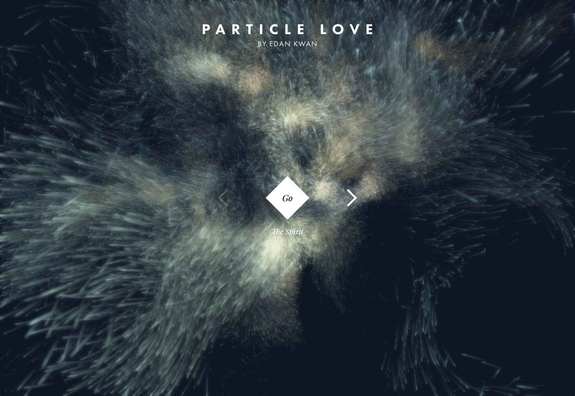
Sass – the extended arm of CSS; the power factor that brings elegance to your code.

With Sass, it is all about variables, nesting, mixins, functions, partials, imports, inheritance, and control directives. Sass makes your code more maintainable and reusable.

And now, I will show you how to make your code more structured and organized.

The organization of files and folders is crucial when projects expand. Modularizing the directory is necessary as the file structure increases significantly. This means structuring is in order. Here is a way to do it.

  • Divide the stylesheets into separate files by using Partials
  • Import the partials into the master stylesheet – which is typically the main.sass file.
  • Create a layout folder for the layout specific files

Types of Sass Structures

There are a few different structures you can use. I prefer using two structures — a simple one and a more complex one. Let’s have a look.

Simple Structure

The simple structure is convenient for a small project like a single web page. For that purpose, you need to create a very minimal structure. Here is an example:

  • _base.sass — contains all the resets, variables, mixins, and utility classes
  • _layout.sass — all the Sass code handling the layout, which is the container and grid systems
  • _components.sass — everything that is reusable – buttons, navbars, cards, and so on
  • _main.sass — the main partial should contain only the imports of the already mentioned files

Another example of the same simple structure is the following:

  • _core.sass — contains variables, resets, mixins, and other similar styles
  • _layout.sass — there are the styles for the header, footer, the grid system, etc
  • _components.sass — styles for every component necessary for that project, including buttons, modals, etc.
  • _app.sass — imports

This is the one I usually use for smaller projects. And when it comes to making a decision of what kind of structure to be used, the size of the project is often the deciding factor.

Why Use This Structure?

There are several advantages why you should use this organisational structure. First of all, the CSS files cache and in doing so, the need to download a new file for every new page visit is decreased. In this way, the HTTP requests decrease as well.

Secondly, this structure is much easier to maintain since there is only one file.

Thirdly, the CSS files can be compressed and thus decrease their size. For a better outcome, it is recommended to use Sass/Less and then do concatenation and minification of the files.

In case files become disorganized, you would need to expand the structure. In such a case, you can add a folder for the components and break it further into individual files. If the project broadens and there is a need for restructuring the whole Sass structure, consider the next, more complex pattern.

The 7-1 Patterned Structure

The name of this structure comes from 7 folders, 1 file. This structure is used by many, as it is considered to be a good basis for projects of larger sizes. All you need to do is organize the partials in 7 different folders, and one single file (app.sass) should sit at the root level handling the imports. Here is an example:

sass/
|
|- abstracts/
| |- _mixins // Sass Mixins Folder
| |- _variables.scss // Sass Variables
|
|- core/
| |- _reset.scss // Reset
| |- _typography.scss // Typography Rules
|
|- components/
| |- _buttons.scss // Buttons
| |- _carousel.scss // Carousel
| |- _slider.scss // Slider
|
|- layout/
| |- _navigation.scss // Navigation
| |- _header.scss // Header
| |- _footer.scss // Footer
| |- _sidebar.scss // Sidebar
| |- _grid.scss // Grid
|
|- pages/
| |- _home.scss // Home styles
| |- _about.scss // About styles
|
|- sections/ (or blocks/)
| |- _hero.scss // Hero section
| |- _cta.scss // CTA section
|
|- vendors/ (if needed)
| |- _bootstrap.scss // Bootstrap
|
- app.scss // Main Sass file

In the Abstract partial, there is a file with all the variables, mixins, and similar components.

The Core partial contains files like typography, resets, and boilerplate code, used across the whole website. Once you write this code, there is no further overwriting.

The Components partial contains styles for all components that are to be created for one website, including buttons, carousels, tabs, modals, and the like.

The Layout partial has all styles necessary for the layout of the site, i.e., header, footer.

The Pages partial contains the styles for every individual page. Almost every page needs to have specific styles that are to be used only for that particular page.

For every section to be reusable and the sass code to be easily accessible, there is the Section/Blocks partial. Also, it is important to have this partial so that you don’t need to search whether particular code is in the home.sass or about.sass files in the Pages partial.

It is a good idea to put each section in a separate .sass file. Thus, if you have two different hero sections, put the code in the same file to know that there you can find the code for the two sections. And if you follow this pattern, you will have the majority of files in this folder.

The Vendors partial is intended for bootstrap frameworks so, if you use one in your project, create this partial.

I recommend you use app.sass as the main folder. Here is how it should look:

// Abstract files
@import "abscracts/all"; // Vendor Files
@import "vendor/bootstrap.scss"; // Core files
@import "core/all"; // Components
@import "components/all"; // Layout
@import "layout/all"; // Sections
@import "sections/all"; // Pages
@import "pages/all";

Instead of having a lot of imports in the file, create an all.sass file in every folder. Each all.sass file should contain all the imports for that folder — and to make it more visible and understandable, create a main file.

Organisation

The biggest benefit of this structure is organisation.You always know where to check if you need to change something specific. For example, if you want to change the spacing on a Section/Block you go directly to the Sections/Blocks folder. That way, you don’t need to search in the folder to find the class in a file.

Facilitation

When the code is structured, the processes are promptly facilitated. They are streamlined and every segment of the code has their own place.

Final Words

Organizing code is essential for developers and together with all other skills, it is the most effective way to improve the functioning of the site. And even though there are multiple ways of organisation and different strategies, opting for simplicity helps you avoid the dangerous pitfalls. And finally, there is no right or wrong choice since everything depends on the developer’s work strategies.


Featured image via Reshot.

Source


Source de l’article sur Webdesignerdepot

By the end of the year, the number of global smartphone users is expected to reach 3.5 billion. That’s a significant 9.3% increase over the last 12 months.

In a world where everyone is constantly connected to their mobile devices, it makes sense that web developers and designers would need to consider new rules for how they create engaging experiences. After all, most of us find browsing from our smartphones to be much more convenient than sitting down at a laptop each day.

With a little luck, you’re already taking steps to mobile optimize your website but standards are changing all the time. To make sure your website is up to scratch, here’s your guide to prioritizing your site for mobile, ready for the new year.

Understanding Mobile-First Design

The first step in updating your web design and development principles, is understanding the concept of mobile first design, and how it’s changed.

With a responsive website, you create something that adjusts to the screen size of any device; with a mobile-first site, you’re focusing first-and-foremost on the user experience that people get when they’re on mobile, taking that as your starting point, and building from there. Instead of building your website for the desktop and using mobile as an afterthought, you start with a consideration of mobile.

Even Google is highlighting the demand for this process lately, with the mobile-first indexing algorithm. If you can’t design for mobile-first, then you could risk your clients being unable to rise up the search engine ranks.

So, how do you get started?

1. Start With the Right Tools

Web developers and designers are nothing without a great toolkit.

The good news is that there are solutions out there that can help you to master the right skills for a mobile-focused user experience. For instance, Skeleton is excellent for small-scale projects that require fluid grids and minimal compiling.

Alternatively, Bootstrap can offer a one-size-fits-all solution for the front-end development for mobile devices. There’s a default grid system available, plenty of components, and JavaScript plugins to work with.

With the right tools, you can minimize and prioritize the content that’s most valuable for your website projects. This is crucial for maximizing website speed and creating clarity when it comes to content and imagery.

For instance, check out the ESPN website; it’s split into very easy-to-follow categories of content that are perfect for scrolling on a smartphone. The grid of videos makes it feel like you’re using a tool like YouTube.

2. Prioritize Mobile-First Elements

Once you have the right tools to assist you, it’s time to begin building your mobile-first website from the ground up. Rather than jumping straight into considerations of the latest design trends, it’s important to start with the foundations.

For instance, navigation within a mobile page is usually hidden under a hamburger button. However, you can take this concept to the next level too. For example, the Shojin mobile website only demonstrates the most important website options within the navigation bar to avoid overwhelming users.

The key here is to keep things as simple as possible, without restricting what your audience can do when they visit your website. Although you want to keep the number of interactive elements on your site small, you also need to ensure that those elements are easy to find and use.

All buttons and CTAs should be clear and tappable. Fonts need to be large enough to read from any screen, and your navigation system needs to be 100% simple, without slowing anything down.

On average, we recommend making all clickable elements at least 48 pixels in height.

3. Use Responsive Imagery and SVGs

Images are a crucial part of any website. They add context and appeal to your design. However, they can also seriously slow down your website if you’re not careful.

Remember, different devices have different demands when it comes to imagery. A desktop page may need a 1200px wide image, while a mobile-only needs the image to be 400px wide at most. The old way of making your images work was to load a large resolution image and use the same file on every platform. Unfortunately, this slows downloading time significantly.

Instead, it’s better to have at least two different versions of the same image for your mobile and desktop solutions. You can also consider SVG.

SVGs are incredibly scalable – more so than bitmaps. With SVG, you can ensure any icon or graphic continues to look sharp and clickable across all devices. Because these files are often smaller, your site loads quicker too! Hubspot is great at using SVGs.

Intricate illustrations are a massive component of HubSpot’s brand. If those images were saved as PNGs or other alternative files, then they would take forever to load. Because they’re all SVGs, you can enjoy the same consistent experience across desktop and mobile.

4. Get the Typography Right

It’s not just the big graphics and images that make a huge difference to your website when it comes to mobile-first design. You also need to think about the legibility and clarity of your website across all devices and platforms. If people can’t read the value proposition of the company that you’re designing for, you’re going to have a major problem.

Focus on making your content as easy to read as possible. Look into the typefaces that seem most appealing on a range of devices.

Remember to balance the body and heading font sizes for the device size too. You’ll need to ensure that the experience feels consistent and smooth as your users scroll through each page. Just take a look at the mobile version of the IMPACT website, for instance.

The headings aren’t as huge as they are on the desktop version of the website, and they’re displayed below, rather than above the featured image. However, this helps to give a more immediately eye-catching and structured experience to mobile users.

There’s even a handy “Search Engine Optimization” tag included, that users can click on if they want to find more related articles.

When it comes to typography, remember that it’s not just size and clarity that matter, but how things are structured throughout your website too. Your type should naturally guide your visitors along the page.

5. Master Available Device Features

Finally, on smartphones, you can accomplish a range of amazing things that you might not be able to do when using a desktop device. Your users can make calls, open apps, send messages, and more, all from within their mobile browser. They can also move their smartphone around a room, taking advantage of concepts like AR and VR.

Taking advantage of the unique capabilities that smartphone design can offer gives you a chance to get unique with your user experience.

Making the most of the mobile experience can be much simpler than you’d think. For instance, on a desktop site, you could list your phone number on a contact page. On a mobile site, the number can begin a call when clicked. You can also take the same approach with email addresses, and social media icons too.

Depending on how experimental you feel, there’s also plenty of opportunities to go above and beyond with your mobile features. You may decide to create a mobile app version of a website that your customers can download onto their phones.

Alternatively, you can look into things like AR technology. This could allow your users to practice placing items of furniture that they may be thinking of buying from an online retailer into their house, so they can see how well they work with their other interior design choices.

Making the Most of Mobile-First Design

Ultimately, having a responsive website that works on both mobile and desktop devices is mandatory in the modern world. However, going above and beyond with mobile-first design is a great way to get ahead of the game.

If you can focus on building a website that puts the experiences of mobile users first, then you can create something that’s much more likely to grab audience attention and deliver amazing experiences.

If nothing else, showing your clients that you have what it takes to design for mobile is an excellent way to ensure that you can gain as many new project opportunities as possible.

Source


Source de l’article sur Webdesignerdepot

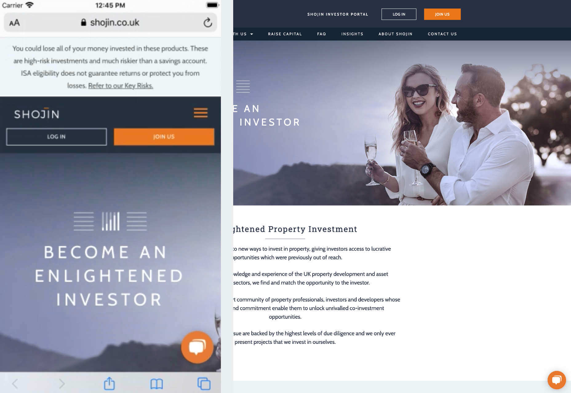
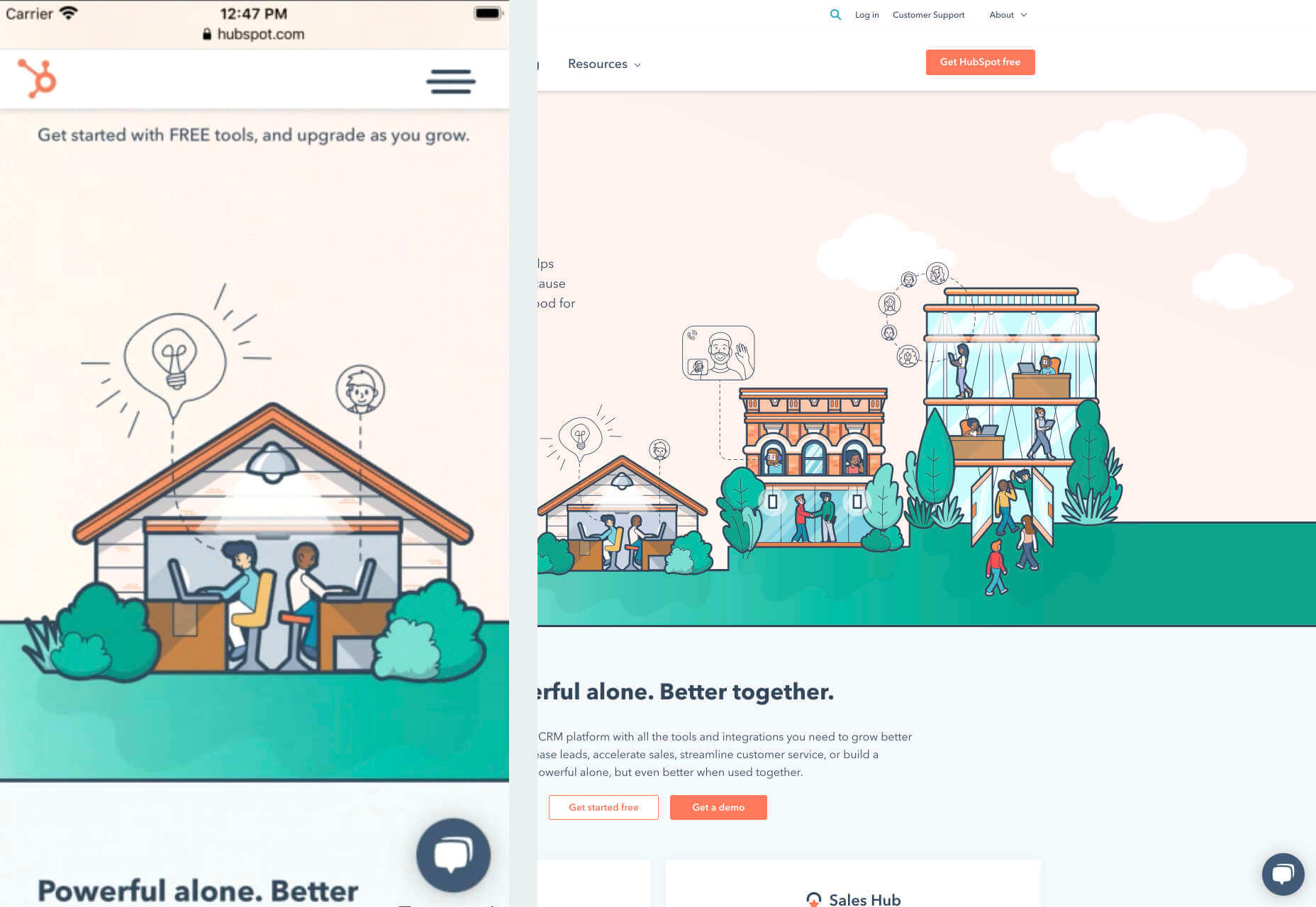
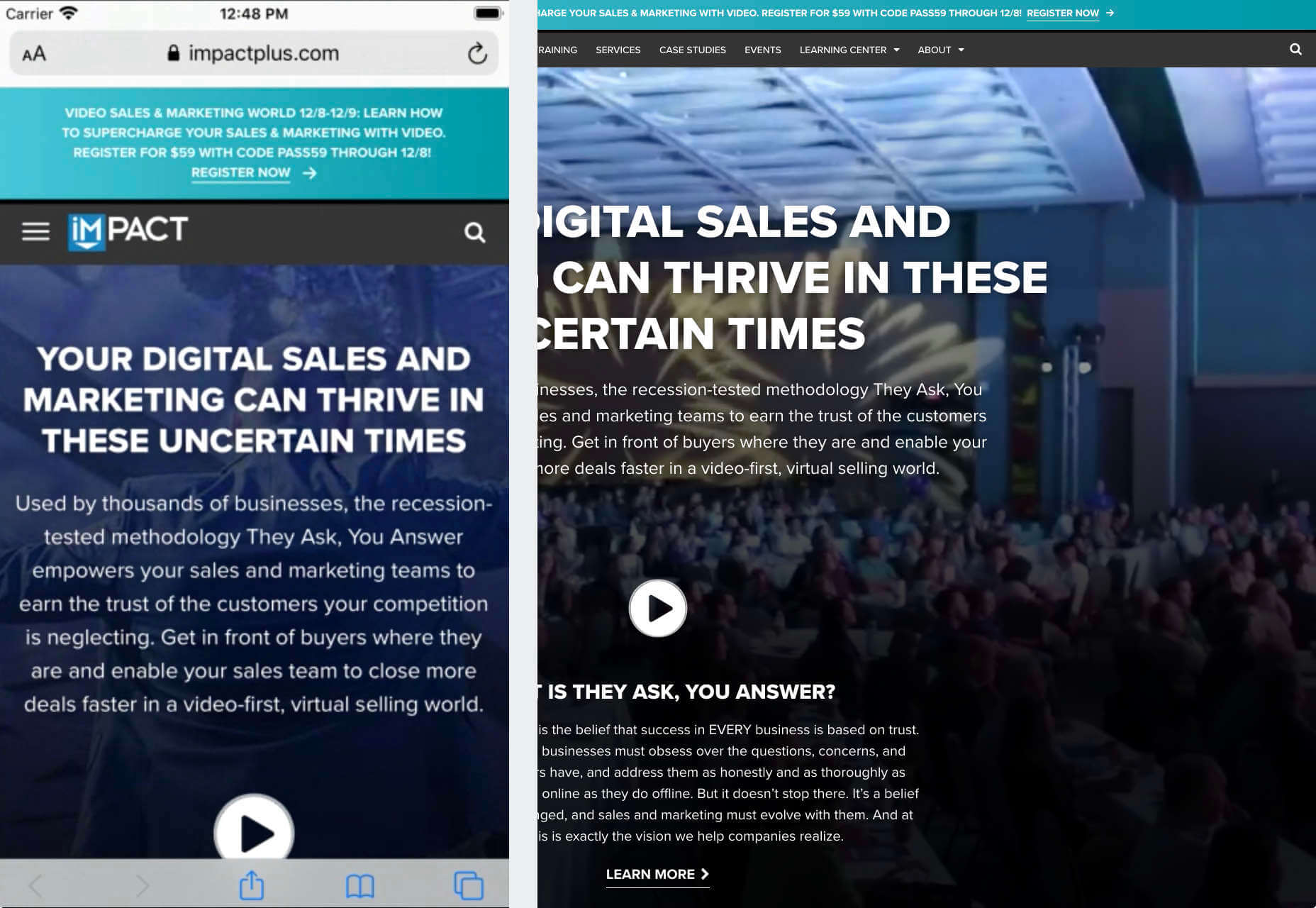
The end of the year tends to be busy for a variety of reasons and it can limit some of the freshness we see in designs during much of the year. Regardless, there are a few trending design elements.

What we are seeing right now is rooted in deep simplicity with a focus on the message.

Here’s what’s trending in design this month…

Activism and Engagement

Websites with a focus on societal issues have moved to the forefront. While the look and design techniques used for these websites can vary greatly, there’s a common theme of activism, community engagement, and support.

What’s great about this movement – and what it reflects – is that people can take to the digital space to help amplify their message or find support with people who are going through the same things they are.

While some of these efforts are backed by people and brands you may know, that’s not always the case.

The designs also work best when they reflect the personality of the spokesperson or mood of the issue at hand. Note the vast differences in the three examples.

The I Weigh Community uses bright color with a black and white image of promoter and celebrity Jameela Jamil to bring attention to mental health issues.

Wear the Waste by retailer H&M uses simple typography in a natural environment to set the stage for more eco-friendly clothing options.

Wavering Stripes uses an illustrative approach to bring attention to the stories of immigrants in detention.

Each design is vastly different but all are striking and draw attention to the causes therein. The common thread is that each design is simple enough to draw you in and help you better understand the message and not get lost in tricks or design effects.


In Your Face Products

’Tis the season for product promotion.

Designers are opting for larger-than-life product images that allow shoppers to see every detail before making a purchase. (Seems like a good plan in a socially-distanced pandemic world.)

It can work in a number of ways:

  • With an oversized image and ability to use on-screen controls to take a closer look;
  • With video and animation effects to see the product in action;
  • With super high-resolution and zoomed in photography.

Pair these visuals with strong descriptive language and you’ve got a winning combination.

The variance in the examples is a good showcase of how to do this well, while not over-doing effects.

The Fitbit Charge 4 website uses an opening image of the device that’s way larger in scale than reality (especially if you are on a large desktop screen). Users control using click and scroll to get more views and details of the device. Zoom and animation aren’t overwhelming, providing a solid look at the product.

The Nest Thermostat opens with a video animation of the device moving into the forefront of the screen. (It’s rather quick.) From there, if you want more detail, there’s a video to watch that provides deeper product information in a digestible manner.

The final example isn’t really a product at all, but rather an art installation. What’s interesting is that it uses these same oversized options to show the art in detail. This is a great way to handle seeing something that you may not be able to experience in person. What makes it work so well is that the angles of the photography mimic how you would view it, looking up toward the piece hanging from the ceiling.


Simple Motion for Impact

Carrying on the theme of big, bold, and oversized designs, this trend focuses on simple animation for maximum impact.

While all-out cinematic animation can be fun to watch, it can be a little overwhelming at times. This more subtle approach is easier to digest and helps put the focus on the content at hand rather than the effect on the display.

There are plenty of ways to use simple animated effects, including scrolling animations, hover actions, and constantly moving elements. (You can see each of these if you click through the examples.)

The Patrick Mahomes store, 2PM, uses a single line of moving text that tells you what the website is about. It differentiates the retail store website from information about the athlete or his other efforts. White text on a black background is classic and easy to read. The most important thing of note may be the speed of the animation; it’s timed in a way that’s scannable but not dizzying. Sometimes the hardest part of nailing an animation is getting the speed right.

The resume-style website for Naomi Niko is striking and simple, but neat hover effects and a simple scroll animation for her resume only – and not the photo or details on the left side of the screen – make the design intriguing. The almost awkward crop and directional pull of her image also creates interest and makes you want to get further into the design.

Guilbo uses layered hover animation to make it look like he’s blowing a glittery-dust off the screen and at the user. The rugged detail of his face with the sparkle of the animation is a fun contrast. The design uses layering with dots in the foreground and background for an additional depth effect. It’s also especially nice that the objects are made to stay off his face for a realistic effect.


Conclusion

While 2020 has been an interesting year, designers have continued to find new ways to evolve the craft and create visual experiences that are inspiring. These trends are no exception.

It shows that even in unusual circumstances or with odd constraints, that amazing work and creativity can thrive. Stay creative everyone, and keep those new designs – and potential trends – coming!

Source


Source de l’article sur Webdesignerdepot

As we have discussed before, the PDF is the ideal file format for saving, sharing, and protecting documents, both small and large. Its high compatibility with most Operating Systems makes it popular amongst most users for sharing information with different parties. Furthermore, it provides a more static platform for working with important documents like contracts and manuals, as steps can be taken to prevent any unwanted access or editing to the file. 

With large and highly complex files like this, however, different systems may have difficulty uploading, downloading, and reading the formatting for your document. This can lead to file corruption or increased loading times that can halt productivity. Thus, streamlining large PDF files can greatly benefit organizations that regularly use this format in day-to-day operations. 

Source de l’article sur DZONE

As human beings, we like to think that we’re rational creatures.

We tell ourselves that we make our decisions based on fact and logic. However, that’s rarely the full truth. As much as we try to make choices guided by rationality, the truth is that we’re often highly emotional people, driven by the way that things make us feel.

So, what does that mean for a website designer?

Though designing a functional and logical website is important, it’s crucial not to forget about the emotional impact of each interaction that your customer has with the sites that you build.

Sites that don’t elicit any kind of emotional response aren’t just boring; they’re forgettable.

A forgettable website is poison to any website designer’s portfolio.

That’s why we’re going to introduce you to some easy ways to use emotion in your designs this year.

Getting to the Bottom of Emotion in Web Design

First, you need to understand the part that emotion plays in user decisions.

Don Norman’s book Emotional Design says that there are many things that designers can do to make their designs more emotional. Even something as simple as focusing on the aesthetic impact of your website can make it more likely that you’ll reach your audience on an emotional level.

One important thing to remember about emotional design, is that it’s not just about making your customers feel good. Emotion can be both positive and negative. Sometimes negative emotion is more impactful than positive feelings – it all depends on the kind of site you’re trying to create.

A website selling health products to customers needs to make that audience feel comfortable and confident that they’re buying a trustworthy item. However, it may also need to trigger small feelings of worry or concern in the audience about what might happen if they don’t buy.

Knowing how to walk that balance between positive and negative feelings is how a designer takes a simple website design and turns it into something incredible.

So, where do you get started?

Step 1: Use Visual Elements to Trigger Emotion

Visual elements are one of the easiest points to get started with when you’re designing for emotion. That’s because visuals are fantastic at drawing out feelings.

An animation can create an emotional connection with your audience by helping them to understand how your product works or making them laugh when they land on your page. A genuine photograph of your team working together can inspire trust and feelings of affinity.

One of the most common visual elements used to trigger emotion is color.

Shades like blue and green in the digital design world are more likely to drive feelings of calmness and comfort. On the other hand, red and yellow often encourage feelings of enthusiasm and happiness.

The way that you use color can make a massive difference to how users feel when they arrive on a website. For instance, the Barclay’s website would have been pretty boring if it was just a basic black and white screen. However, a banking site can’t afford to go over the top with animations or illustrations in most cases, as this can detract from its professional image.

Adding small patches of blue in a way that complements the brand’s color palette is a great way to generate feelings of trust. Combined with the image of a genuine real-life person, and calm tones, the bank instantly presents itself as something approachable and honest.

At the same time, the clear hierarchical layout of the bank’s website, with an easy-to-follow navigation bar, easy-to-read font, and clear headings and buttons comfort the customer. Users get exactly what they expect when they come to a financial website, and that makes users feel as though they’re in the right place.

Step 2: Create Engaging and Emotional Interactions

Visual elements are a great way to embed emotion into digital design. However, they’re just the first step. The emotional aspects of your web design choices should also appear throughout the interactions that customers have with the website.

A good interaction on a website or app needs to be simple and straightforward enough that users feel comfortable taking the next step in their journey. However, it also needs to drive the right emotional response from users too.

For instance, when you sign up for a free account trial from Box.com, you don’t just get a form full of information that you need to fill out.

Next to the form, you also get information about what you’re signing up for, complete with small checks next to each of the free features you’re getting. This helps to put the customer’s mind at ease and remind them that they’re in the right place.

The use of a box, including discount information next to the sign-up form also helps to make the interaction more emotional, by reminding customers that they’re getting something for free.

Every time a customer interacts with a website, there’s another opportunity to engage them on an emotional level. On the Firebox website, when a customer adds something to their cart, there’s a small animation on the cart icon that informs them that something is waiting for them.

When they click through to the checkout, they get instant information, including what they can do to “gift wrap” their item, and buttons showing the various payment options available.

Whenever you’re designing a page for a website, whether it’s the checkout page, a product page, or something else entirely, think about the interaction that the visitor is having at that moment. How can you ensure that each customer feels more comfortable, delighted, informed, or engaged?

Step 3: Leverage Microcopy and Detail to Express Emotions

Visuals are an excellent way to express emotions.

However, they’re not the only option.

As a designer, you’ll need to think about how you can combine web design with the use of microcopy to connect with customers on a deeper level.

Rather than drawing attention to tedious, dull, or impersonal instructions, notifications, and error messages on a site, how you can you make sure that everything on the website delivers the same emotional impact?

The simple addition of a tiny illustration is enough to provide a much more emotional experience to customers. Compelling micro copy and illustrations on 404 pages can also strengthen the connections that customers have with the sites they visit.

Just look at how Google added a dinosaur game to the page that customers are sent to when they don’t have an internet connection.

The right micro copy and interactions can instantly transform even a negative experience, like not being able to connect to the internet, into something emotionally engaging and positive.

When it comes to making an emotional connection between your customer and their end users, web designers need to remember that often the smallest details can make the biggest differences. Little extra features, like implementing a way for customers to have fun when their internet connections aren’t working, are the things that make websites more memorable from an emotional perspective.

Don’t Choose Emotion Over Functionality

Although emotional impact can be an essential aspect of a fantastic website design, it’s important not to get carried away. Adding too much to a website in the form of little extra graphics and unique interactions could end up weighing down a site and making it slow to load.

Although it’s valuable to think about how every interaction an end-user has with a website will make them feel, it’s important not to overlook the basics of web design when you’re at it. You’ll still need to ensure that the finishing design is easy to use, engaging, and attractive.

Pay attention to the basics of user experience design, and make sure that the extra emotional elements you’re infusing into your sites aren’t going to damage the experience that end-users get.

If you can get the blend right between emotional impact and functionality, then you could create the kind of website that audiences will never forget.

It pays to implement emotion into your design portfolio.

Source


Source de l’article sur Webdesignerdepot

Aujourd’hui les entreprises s’efforcent de plus en plus à offrir une expérience employé exceptionnelle. Et elles ont de bonnes raisons de le faire.

Les recherches révèlent que l’expérience employé a une incidence sur la façon dont les salariés perçoivent leur travail et les efforts qu’ils fournissent. Cette expérience a ensuite un impact sur la satisfaction client, la fidélisation, le rendement des actifs et les ventes (1).

Bien que de nombreux facteurs entrent en jeu, environ 30% de l’expérience employé est liée à l’utilisation de la technologie par leur organisation. Grâce à elle, les salariés peuvent gagner en productivité, flexibilité, améliorer leurs relations professionnelles, mieux gérer le travail à distance. A l’inverse, elle peut aussi les distraire, créer un sentiment d’isolement et limiter leur capacité à se « déconnecter ».

Pour en savoir plus, SAP SuccessFactors a mené des entretiens avec des employés dans le monde entier. Nous avons étudié l’influence de la technologie sur le bien-être, l’engagement, le sentiment d’appréciation et de valeur, la productivité, ainsi que l’expérience globale des processus RH

Bien que cette recherche soit toujours en cours, les résultats préliminaires révèlent trois insights sur la façon dont la technologie peut contribuer à une expérience employé exceptionnelle.

Les employés ont besoin d’outils pour effectuer le travail qu’ils trouvent important et se décharger de ce qu’ils jugent inutile. Nous les avons interrogés sur les tâches, activités, ce qu’ils apprécient le plus et les motive à se lever chaque matin. Selon eux, le « travail utile » est un travail qui implique :

  • La mise en œuvre de quelque chose, par exemple un projet
  • La collaboration avec des collègues dans le but d’atteindre un objectif commun
  • La contribution à une solution et voir les résultats de ces efforts

Sans surprise, lorsqu’on leur demande des exemples illustrant comment la technologie les a aidé, les employés mentionnent des outils conçus pour les soutenir dans ces activités (pour la productivité, Microsoft 365, pour la collaboration, Microsoft Teams et Skype). Avec des résultats plus prononcés chez les employés régulièrement en déplacement ou télétravail.

Mais ils mentionnent aussi des outils qui leur permettent de gagner du temps sur les tâches opérationnelles et administratives. En voici quelques exemples :

  • Une application qui indique les places de parking disponibles lorsqu’on se rend au travail
  • Une application pour commander le déjeuner à l’avance et éviter de faire la queue
  • Les solutions SAP Concur : un employé interrogé a indiqué qu’il a réduit d’au moins 1/3 son temps passé à envoyer ses frais de voyage
  • Des outils qui définissent des modèles fondés sur des comportements antérieurs et qui présentent des propositions de manière proactive. Un employé mentionne une application de navigation GPS qui propose automatiquement un itinéraire en fonction des comportements précédents. Un autre affirme : « J’aime avoir accès au système pour effectuer une tâche, et que le système reconnaisse à l’avance la façon dont j’agis habituellement et prenne en charge certaines étapes à ma place afin que je puisse m’occuper de mon travail […]. Plus vite le système gère les informations, mieux c’est, car ce sont généralement des choses que je […] ne veux pas faire ».

Moins de systèmes séparés et disparates

Les employés soulignent que devoir passer par plusieurs systèmes pour accomplir une tâche ou trouver des informations est extrêmement frustrant et chronophage. Certaines recherches ont démontré que les employés passent jusqu’à 30 % de leur journée de travail à chercher des informations qui peuvent être stockées dans des systèmes et des bases de données disparates.

« J’aimerais faire certaines choses en exactement 20 secondes », confie un employé. « Je ne veux pas avoir à me demander si je dois accéder au portail RH, au portail informatique ou au facility portal. Peu importe qui résout mon problème, je veux juste qu’il soit résolu ».

De meilleures solutions en libre-service avec une assistance humaine

Pendant trop longtemps les solutions technologiques RH des entreprises (surtout celles en libre-service) ont été conçues en tenant compte des RH plutôt que des utilisateurs finaux : les employés. Par conséquent, les employés sont souvent obligés d’utiliser quotidiennement des solutions libre-service obsolètes, non intuitives et mal conçues.

Comme le décrit un employé : « J’essayais de réserver un vol et je recevais sans cesse un message d’erreur, mais le message ne précisait pas ce qui n’allait pas. Ce qui aurait dû me prendre cinq minutes a fini par me prendre plus de trois heures Et quand j’ai finalement réussi à joindre quelqu’un au téléphone, mon interlocuteur n’a pas pu m’en dire plus […]. C’était vraiment frustrant ».

Les conséquences d’une expérience frustrante liée à la technologie vont bien au-delà de la perte de temps. Elles peuvent avoir des effets négatifs sur le bien-être psychologique et physique des employés. Des recherches ont démontré que les expériences frustrantes liées à la technologie peuvent entraîner une perte d’efficacité et un sentiment de colère, impacter l’humeur et les interactions avec les autres, diminuer à la fois le niveau de satisfaction professionnelle et la qualité du travail, compromettre la productivité et même augmenter la pression sanguine ainsi que la tension musculaire (2).

Des recherches antérieures ont démontré que l’élément indispensable des solutions libre-service est la possibilité, si besoin, de parler à quelqu’un. Et cela sans effort important et sans avoir à répéter sans fin une tâche (3).

L’effet de la technologie sur les moments importants : pas toujours positif

Qu’il s’agisse de rejoindre une entreprise, fêter une promotion, s’occuper d’un proche malade ou d’accueillir un nouvel enfant dans sa famille, les moments qui définissent la carrière ainsi que la vie personnelle sont des occasions essentielles de montrer aux employés qu’ils sont reconnus et appréciés. Pourtant, l’expérience technologique associée à ces moments véhicule souvent le message inverse.

Par exemple, un employé interrogé confie : « J’étais très excité quand j’ai trouvé ce travail. Mais le fait d’avoir dû entrer manuellement les informations relatives à mon CV dans le système à plusieurs reprises ne m’a pas laissé une première impression positive de l’entreprise ».

Une récente enquête auprès des candidats et employés de la génération Z est éclairante. 54% d’entre eux déclarent qu’ils ne soumettraient pas une candidature si les méthodes de recrutement de l’entreprise sont dépassées. 26% s’accordent à dire qu’un manque de technologie tout au long du processus d’embauche les dissuaderait d’accepter un emploi.

Alors que les entreprises continuent d’investir dans l’expérience employé, elles doivent être attentives aux solutions technologiques fournies aux collaborateurs. Des solutions dépassées, difficiles à utiliser, qui n’ont pas été conçues en pensant aux employés, désavantageront grandement les organisations lorsqu’il s’agira d’attirer et de fidéliser les talents dans l’économie de l’expérience d’aujourd’hui.

En fin de compte c’est l’un de nos clients interrogés qui le souligne le mieux : « Lorsque nous lançons de nouveaux services de ressources humaines, nous ne voulons pas seulement avoir des utilisateurs. Nous voulons avoir des fans ».

Publié en anglais sur news.sap.com


Lauren Bidwell est chercheuse en gestion du capital humain pour SAP SuccessFactors chez SAP.

(1) The Financial Impact of a Positive Employee Experience ; A Beginner’s Guide to Employee Experience

(2) Ceaparu et al. (2004) ; Lazar et al. (2006) ; Norman (2004) ; Scheirer et al. (2002) ; Murrell & Sprinkle (1993)

(3) Howard & Worboys (2003)

The post Comment créer une expérience employé engageante : le rôle de la technologie appeared first on SAP France News.

Source de l’article sur sap.com