Articles

Few fonts in the world have become a part of the cultural landscape that they have an entire documentary film and a MOMA exhibition made about them. Helvetica, however, is different. It has been the go-to font for everyone from government agencies to hip pop-up shops whenever clean and modern text is called for. It has become so much a part of our daily lives that it has created a long list of detractors. 

It is strange for a humble font to be so used and so hated at the same time. Is Helvetica the font that symbolizes hip, cool and modern? Or is it a ’60s anachronism loved by boomer designers that deserves to go the same way as the 8-track and gasoline?

Birth of a Legend

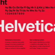
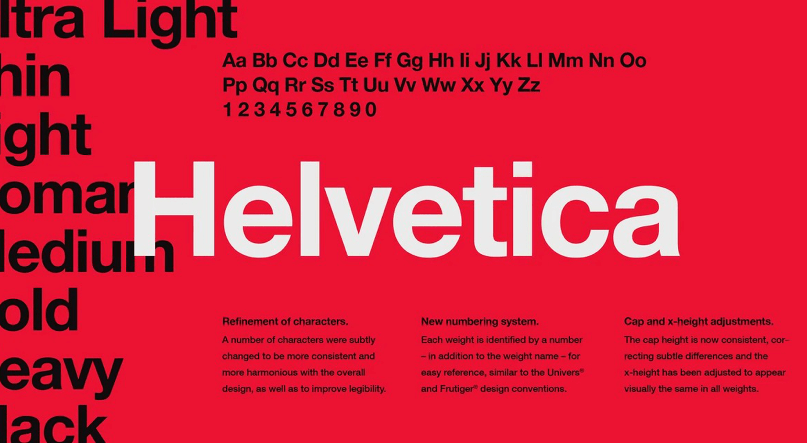
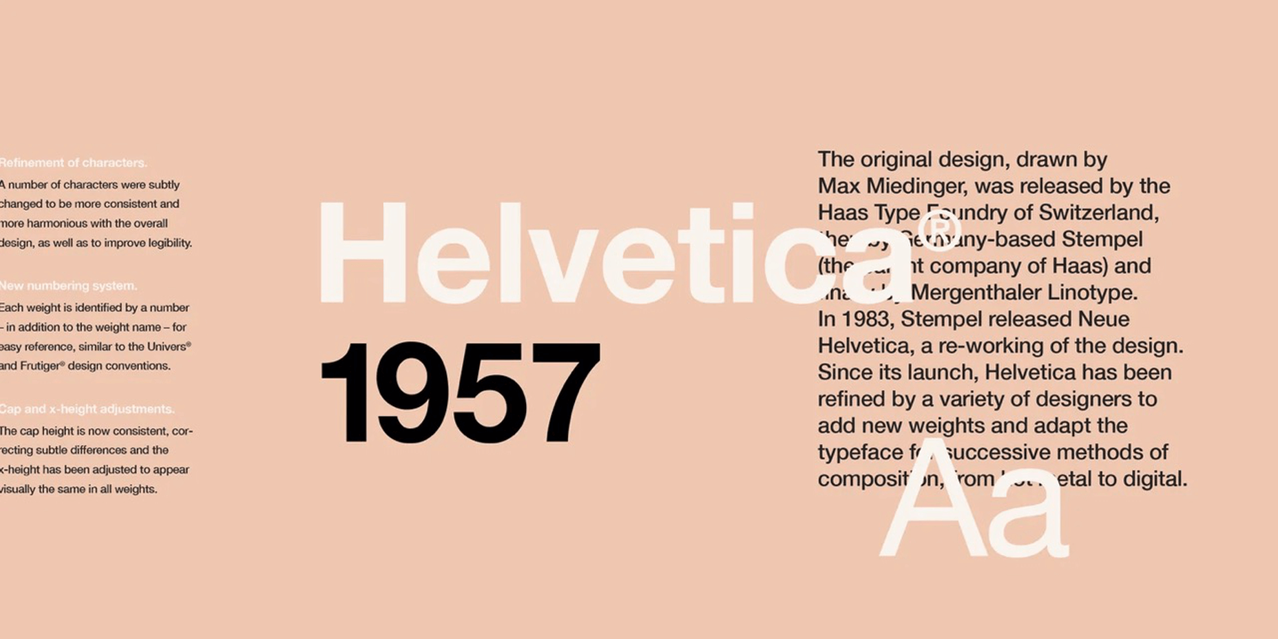
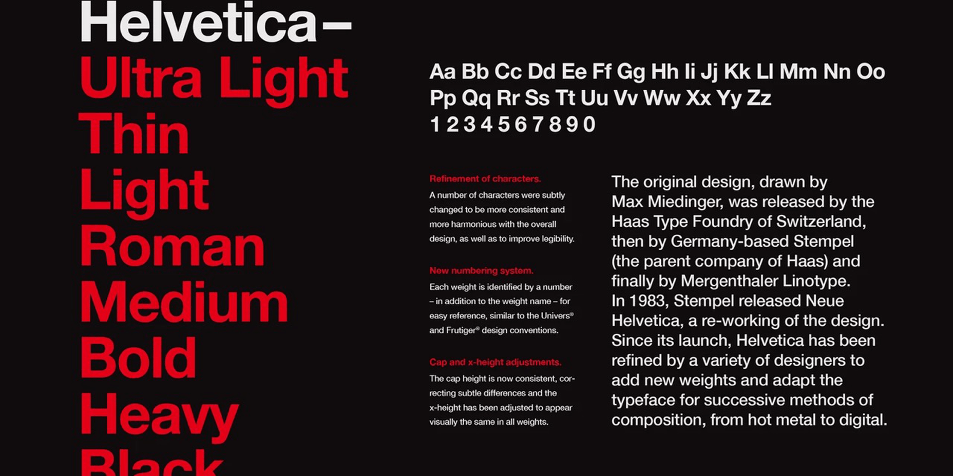
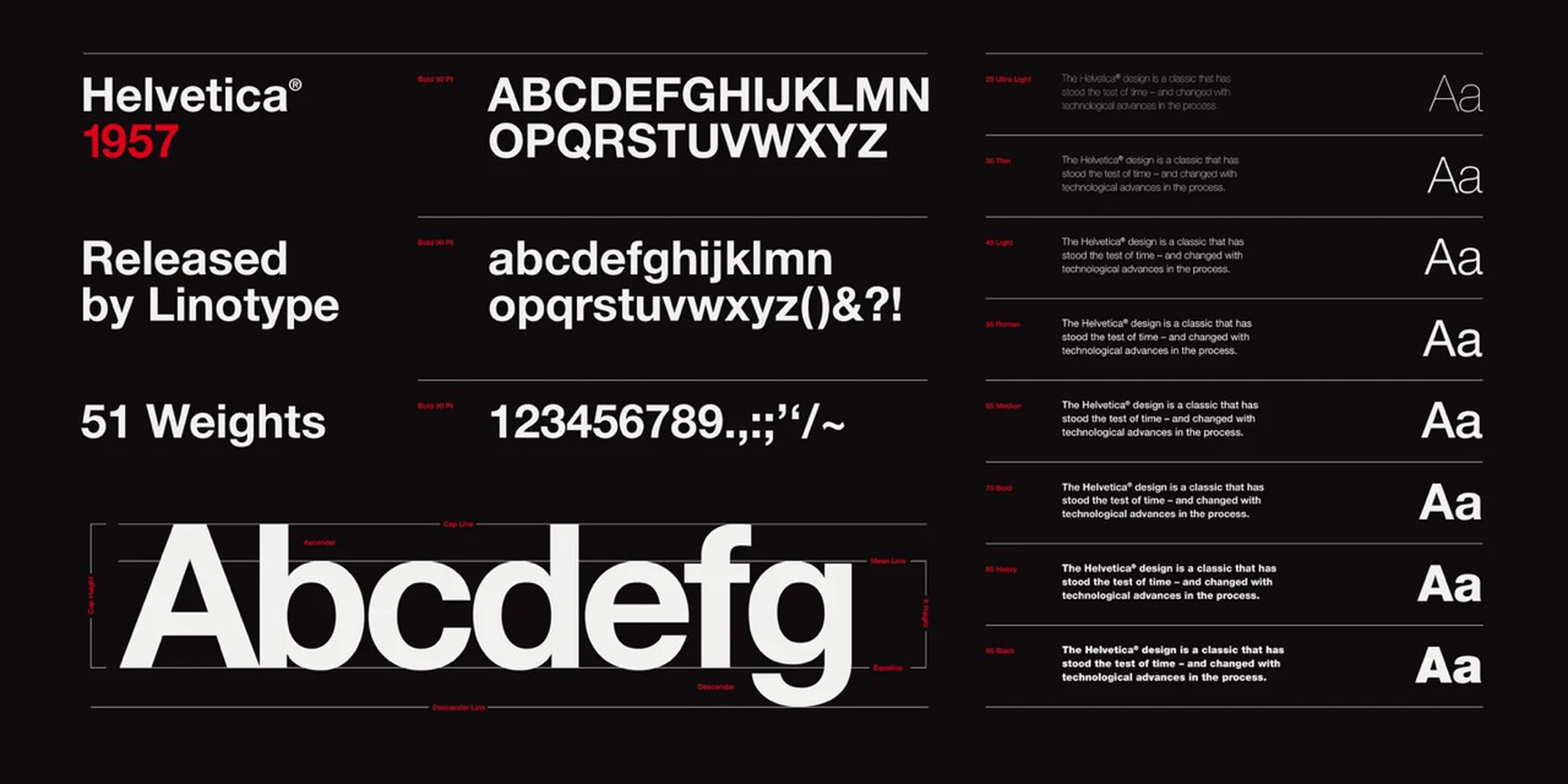
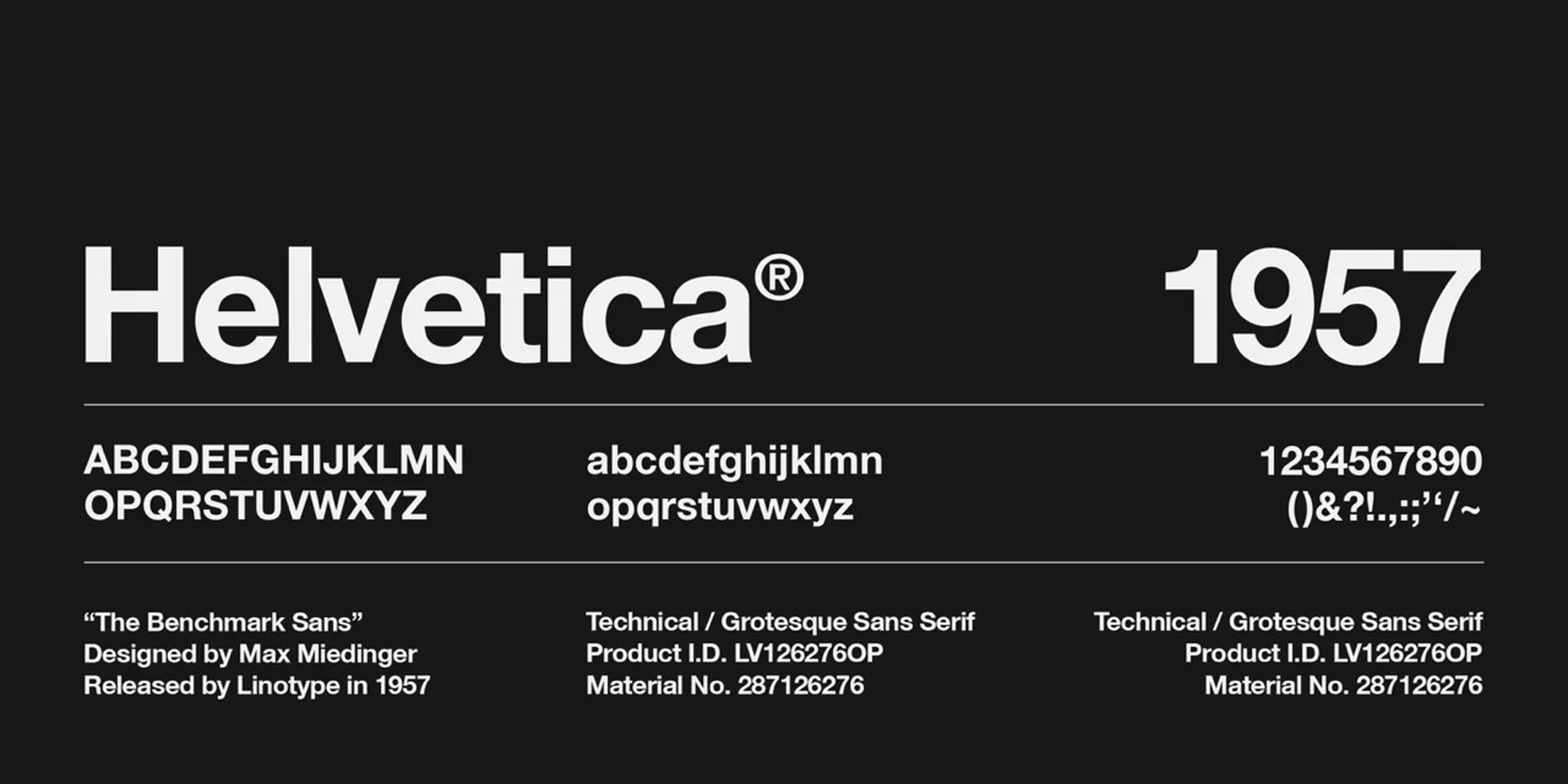
Helvetica is the Latin word for Switzerland, the birthplace of this font. It was created in 1957 in the middle of a boom of fonts created by Swiss designers that today is known as the International Typographic Style. It was the handiwork of two designers, Max Miedinger and Eduard Hoffmann. 

They designed this simple sans-serif font to be — ironically enough, given today’s divided opinions — a neutral font. It was modern, in the popular style, but simple, dense, and legible. It was something that could be put on a sign and easily be read from a distance. 

Helvetica represented a clean break from the fonts that came before. The designers upended the more formal and intricate serif fonts of the 19th and early 20th centuries with bold, clean simplicity. Perhaps it was a product of a new era, maybe it defined a new era as it went, but Helvetica was a revolution in font design. 

The new font was an enormous hit. One of its earliest fans was the United States Government, who put it everywhere from the sides of space shuttles to agriculture policy reports. The European Union went so far as to require its use on all health warning information. In addition, the font spread to languages as diverse as Khymer, Urdu, and Korean. 

The font was initially cast in hot metal typeset and has been altered and redesigned as the world and printing technology have changed. There have been several updates, all modifying the original design to exaggerate or change the font for greater legibility, particularly on computers where many claim the font falls short. And as with anything popular in the design world, the number of imitators and ripoffs far exceeds the scope of the original.

Where Helvetica Stands Today

Today in the 2020s, despite now being old enough to qualify for a pension, this font is everywhere. Why, though, is something so ubiquitous so controversial among designers?

Any style that becomes the ‘next big thing’ will attract critics, particularly if that ‘next big thing’ sticks around longer than expected. For some, the International or Modern fonts era is simply a piece of history. Not unlike the art or architecture from those eras, the pieces are lovely to look at, but it has been done. To continue it now would be imitation, or worse, a lack of imagination. 

Why the Haters Hate

For some critics, Helvetica has fallen victim to the banality of overuse. The day the US Department of Agriculture decides it loves a style, that style is officially uncool. Too many ‘squares with no taste’ have decided that Helvetica represents what must be cool, so the people in the know reflexively reject it. The trend makers define their role in the art world by being avant-garde and neophilic. They have to use the next new thing before anyone else or their tenure as a trend maker is finished. For these critics, Helvetica isn’t bad per se, just old and worn out. 

Lastly, there is the ever snarky group of critics who have come to loathe Helvetica for what it represents: boring corporate design. Helvetica became the darling of every group of people who wanted to give the image of clean modernity. It’s a boring choice, uninspiring, damn near default. It makes designers look lazy, their work stale. Helvetica’s success in becoming a near-ubiquitous font has made it too much of a default to be cool.

Why Helvetica is Well Used and Well-Loved

There are an equal number of fans for every salty critic who has come to dislike Helvetica. Those who favor the font love that it is true to its design, simple and legible. For a government agency or large corporation, it is clean and efficient. It is stylish enough to give a little life and flavor to the publication but is subdued enough to show professionalism and erudition. 

The font’s connection to the Modernist and International era can be appealing to others. Some styles retain their popularity throughout the years, seen as cultural hallmarks and high points of culture and expression. Helvetica was a product of an optimistic age where the dense, dark expressions of the past were replaced with light and airy styles. These looks have fluctuated in public opinion but have never totally gone out of style. This enduring appeal has kept Helvetica in many designers’ good graces. 

Finally, many fans like it because they have been steeped in its use so long it has become part of their style. From the original modernist era designers to the students they taught, and now their students’ students, it was a look many incorporated into their own style. All designers are products of their education and stand on the shoulders of previous generations; Helvetica has been such a part of the design landscape that many people have made it their own. Perhaps this was conscious, perhaps unconscious, but either way, many cool new designers at the forefront of new styles still choose this font to express text in their works.

Cliché or Classic

Perhaps in a twist of ironic fate, the two designers of Helvetica aimed to create a font that would be, in their words, “A neutral font that should not be given additional meaning.” This clean neutrality was a goal worthy of anything named after Switzerland. And this might very well be the true source of division; it is a plain, clean font into which all designers can place some or no meaning. It is a blank canvas, and just as any blank canvas hung in a museum, it would attract positive and negative opinions by its very nature. 

To call it a cliché, or classic, though, is Helvetic’s conundrum. It is undoubtedly classic, and its rampant overuse causes it to stray pretty far into cliché territory. The strange situation it finds itself in is that it seems to exist as both cliché and classic at the same time. It has become a default but a beautiful default.

Helvetica is everywhere, and like anything that is everywhere, it is both divisive and ignorable. Either way, love it or hate it; it isn’t going anywhere. 

Source

The post Helvetica: Overused Cliché or Modernist Classic? first appeared on Webdesigner Depot.

Source de l’article sur Webdesignerdepot

Le groupe Kering renouvelle sa confiance en SAP pour ses activités finance, retail et supply chain, avec la mise en place de solutions de nouvelle génération ayant comme cœur l’ERP S/4HANA for Fashion.

Kering est un groupe mondial de luxe qui regroupe un ensemble de Maisons emblématiques dans le monde de la couture et de la maroquinerie, telles que Gucci, Saint Laurent, Bottega Veneta, Balenciaga, Alexander McQueen et Brioni. Kering est également présent dans le secteur de la joaillerie avec les marques Boucheron, Pomellato, DoDo et Qeelin. Enfin, le groupe a créé en 2015 Kering Eyewear, une entité dédiée à la lunetterie haut de gamme et sport. Kering comptait en 2021   plus de 42.000 collaborateurs pour un chiffre d’affaires annuel de 17,6 milliards d’euros.

Depuis quelques années, le groupe est engagé dans un ambitieux projet de transformation digitale, tant au niveau corporate que de ses marques.

Cette transformation en matière d’innovations et de technologies passe notamment par l’harmonisation des fonctions corporate et par le déploiement de services partagés pour les marques afin qu’elles puissent rester dédiées à leur cœur de métier, la création. Dans le même temps, cela implique une simplification et une rationalisation des systèmes d’information (SI) afin d’atteindre l’excellence opérationnelle et de contrôler les coûts.

L’IT joue un rôle clé dans cette transformation de l’organisation. La DSI de Kering a en effet pour vocation de proposer des solutions communes à l’ensemble des entités du groupe. « Nous nous focalisons actuellement sur trois fonctions clés, explique Nicolas Gauthier, Group Chief Information Officer chez Kering : le retail, afin de proposer le bon produit, au bon moment, la supply chain, avec comme objectif une livraison toujours plus rapide des produits et enfin la finance, afin de soutenir les équipes. »

Afin d‘accompagner cette transformation, Kering a choisi un ensemble de solutions SAP innovantes. « Nous voulons mettre en place une plate-forme permettant de se doter de processus plus efficaces, d’effectuer des échanges de données en temps réel et d’harmoniser nos modèles opératoires. Notre système SAP est probablement l’un des plus importants du marché, avec une instance couvrant trois domaines, trois régions et soixante pays. Il est interfacé avec tous nos systèmes, magasins et entrepôts. »

Aller vite dans la construction de la nouvelle plate-forme SAP

Kering a ainsi sélectionné le meilleur des solutions SAP pour répondre aux besoins de ses métiers. Le groupe a en ligne de mire l’adoption de l’ERP SAP S/ 4HANA Retail et Fashion, accompagné d’une interface utilisateur ergonomique s’appuyant sur la technologie SAP Fiori. À cet effet, il a renouvelé son partenariat stratégique avec SAP. « Nous devons aller vite, afin de respecter le rythme de transformation fixé par le groupe », explique Nicolas Gauthier.

Mais l’organisation doit également faire face à d’autres challenges : savoir insuffler ses principes et bonnes pratiques dans le nouveau système d’information (SI) SAP, être capable de déployer ces nouvelles solutions sans impacter les opérations courantes tout en créant un système respectueux de l’environnement. « Du point de vue technique, toutes nos solutions sont conçues pour avoir un impact minimal sur l’environnement. Nous publions d’ailleurs un rapport incluant une évaluation de l’impact environnemental de nos activités. Du point de vue métier, nous essayons de mettre en place dans notre ERP SAP des processus capables de réduire l’empreinte carbone du groupe Kering. »

Kering a dans un premier temps travaillé sur les fonctions finance. « C’est le cœur du SI, sur lequel se connectent le retail et la supply chain », analyse Nicolas Gauthier. Le core model finance a été déployé avec succès dans les principaux pays du groupe (dont la zone EMEA), et ce pour toutes les marques.


Savoir rester à l’écoute

Le succès du projet repose sur une recette éprouvée : « Nous restons très proches des utilisateurs. Nous écoutons tous nos interlocuteurs, afin de délivrer la solution attendue. Nous utilisons également des méthodes de développement agile et nous construisons nos solutions étape par étape, afin d’éviter tout effet tunnel. Enfin, nous nous challengeons en continu, en évaluant le taux d’adoption et l’utilisation des solutions que nous proposons aux métiers. »

SAP est un partenaire qui accompagne et propose les innovations qui donnent corps au projet de transformation de Kering. « SAP a un rôle à jouer pour nous aider à implémenter notre vision, non seulement, sur la partie technique, mais en apportant également des idées nouvelles sur la manière d’adresser certaines problématiques métiers. Nous avons noué une relation très proche, nos experts parlant avec leurs experts, nos managers avec leurs managers. La qualité du service premium Max Attention est un élément déterminant du succès de la transformation de Kering qui nous permet de bénéficier de l’entièreté du potentiel et de la valeur des solutions SAP ».


The post SAP accompagne la transformation du groupe Kering avec des solutions technologiques innovantes appeared first on SAP France News.

Source de l’article sur sap.com

This month all of our web design trends have a common theme – imagery. Whether it’s seasonal or just coincidence, there’s a shift in the styles and types of images on many designs right now. One thing that might push these design trends is a relaxation of COVID-spurred rules worldwide or even fatigue from the pandemic.

Here’s what’s trending in design this month.

1. Little Images Everywhere

The jury is still out on whether we love or hate this design trend – tiny images (and videos) everywhere.

The thing that’s nice is there is a lot to see and interact with. The thing that’s challenging is that these designs can feel a bit unbalanced and all over the place.

Most of these designs feature four or more images or videos at a time. That can be a lot for a user to digest when we are accustomed to having just one thing to look at in the hero area.

Those four or more images then include all of the other user interface elements that you would expect on the page – navigation, large headline, secondary text, scroll, or engagement interaction. It can be a lot to decipher.

Tokyu Garden City does it with a mix of still and moving images with sliders and other animations. The images are always changing and moving, and there’s constantly something new to look at with movement at the top and bottom of the screen.

Buro Jantzen takes the tiny image idea to an extreme with ten images on the homepage. And every one is smaller than a postage stamp. There is a cool effect that happens with each image though. On hover, the small image pops into the large black box at a size where you can really see the photo.

Oliver Guy uses a combination of video images on his website, which makes perfect sense for his industry of drone photography. There’s some interesting hover animation happening that allows you to see additional video clips without leaving the homepage. The contrast of small video on the white background makes this design easy to understand.


2. Big Detail Photography

Photographic details in all their glory. Images and elements that are so in your face that you can see every detail. That’s majorly trending in website design.

Big detail photography and videography is one of those image trends that can be so visually interesting that you can’t look away. It has other benefits, too, such as facilitating decision-making for e-commerce or helping someone better understand what an item is or the overall messaging.

Each of these examples shows something larger than life-size.

Karak creates ceramic tiles. The primary background image is so big and with such detail that it almost only serves as texture for the design. But it is paired with a smaller image and video that pull everything together for a complete understanding. The big detail image is beautiful and exciting and provides an extra layer of information.

Wuillemin Fleuristes features an off-balanced hero image with a large floral detail. What’s interesting about this design choice for a detail image is that it is the only image on the screen and partially obscured by a tinted box and text element. The overall design draws the eye but may leave the user wanting to see a little more of the image.

Horage pushes its watch in your face with motion in a video that zooms the product closer and closer into view. The combination of detailed video with very little text is a bold choice for e-commerce and might work because this item is still in the preorder phase. Detailed imaging is designed to help create a desire for the product.


3. Big Faces are Back

After two years of not having that many faces in design projects, designers are going big and bold and showing people again.

One of the reasons we haven’t seen as many faces in design projects is because there was concern over how to show people – masked or maskless, alone or in crowds – and it caused more concern than was worth just going another way.

But projects with big faces are back in a major way. And it’s refreshing to make virtual eye contact again.

There are plenty of ways to do it, as outlined in each of these examples.

Glassbox Media uses a full-screen oversized video on the homepage. You can see the subject’s eyes and feel engaged with the person on the screen. She seems happy, and the size and scale of the face make you feel almost like you are in a room with her, ready to have a conversation.

Reamarie uses smaller still images with tight crops to bring you into the faces on the screen. There are more, bigger faces throughout the scroll as well so that the user feels connected to the people and product. Even if an image isn’t super large, a tight crop can make it feel bigger and create the same level of engagement as something that has more size on the screen.

Recruit Holdings Co. uses a trio of people together, happy and smiling, to establish a connection with website visitors. The entire design features similar images throughout and makes you feel like you want to be a part of what they are offering. Note that the people are close together and without masks; that’s a culture shift we are starting to see in a lot of imagery.


Conclusion

Photography, videography, and image trends can be driving factors for website design projects. The types of images selected can set the tone for projects, relate to brand identity, and help engage users.

Source

The post 3 Essential Design Trends, March 2022 first appeared on Webdesigner Depot.

Source de l’article sur Webdesignerdepot

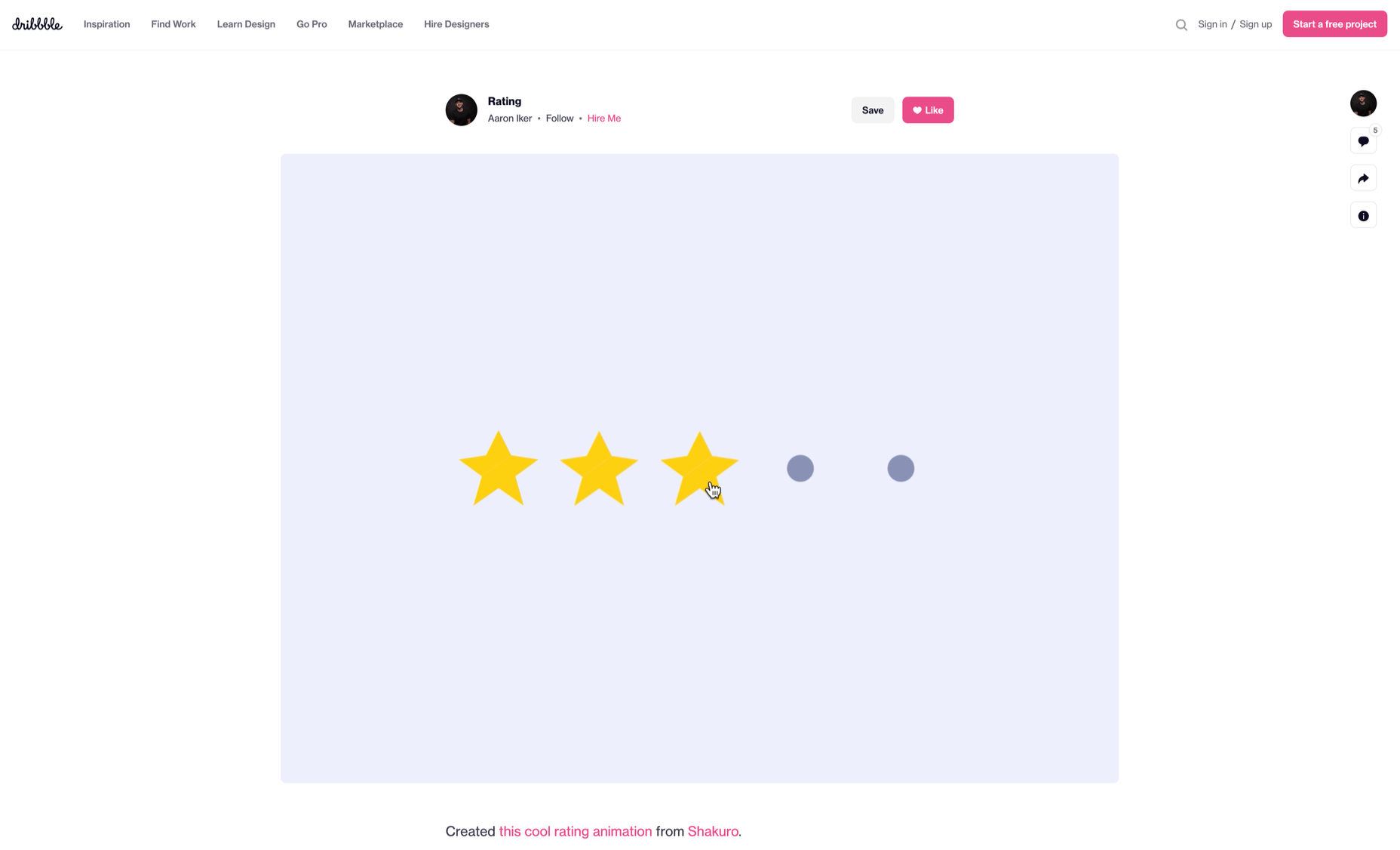
Micro-interactions effectively communicate brand identity and ethos while strengthening ties with the customer. These habit-forming tools make for a fun and seamless user experience. Facebook’s ‘likes’ and Tinder’s ‘swipes’ are two classic examples. 
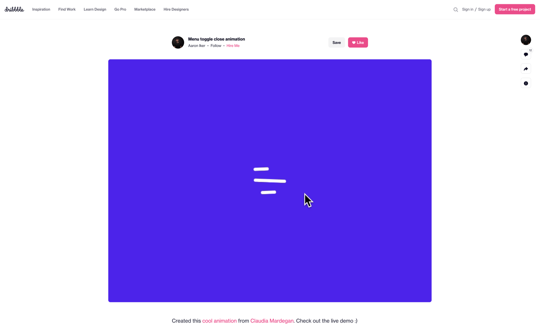
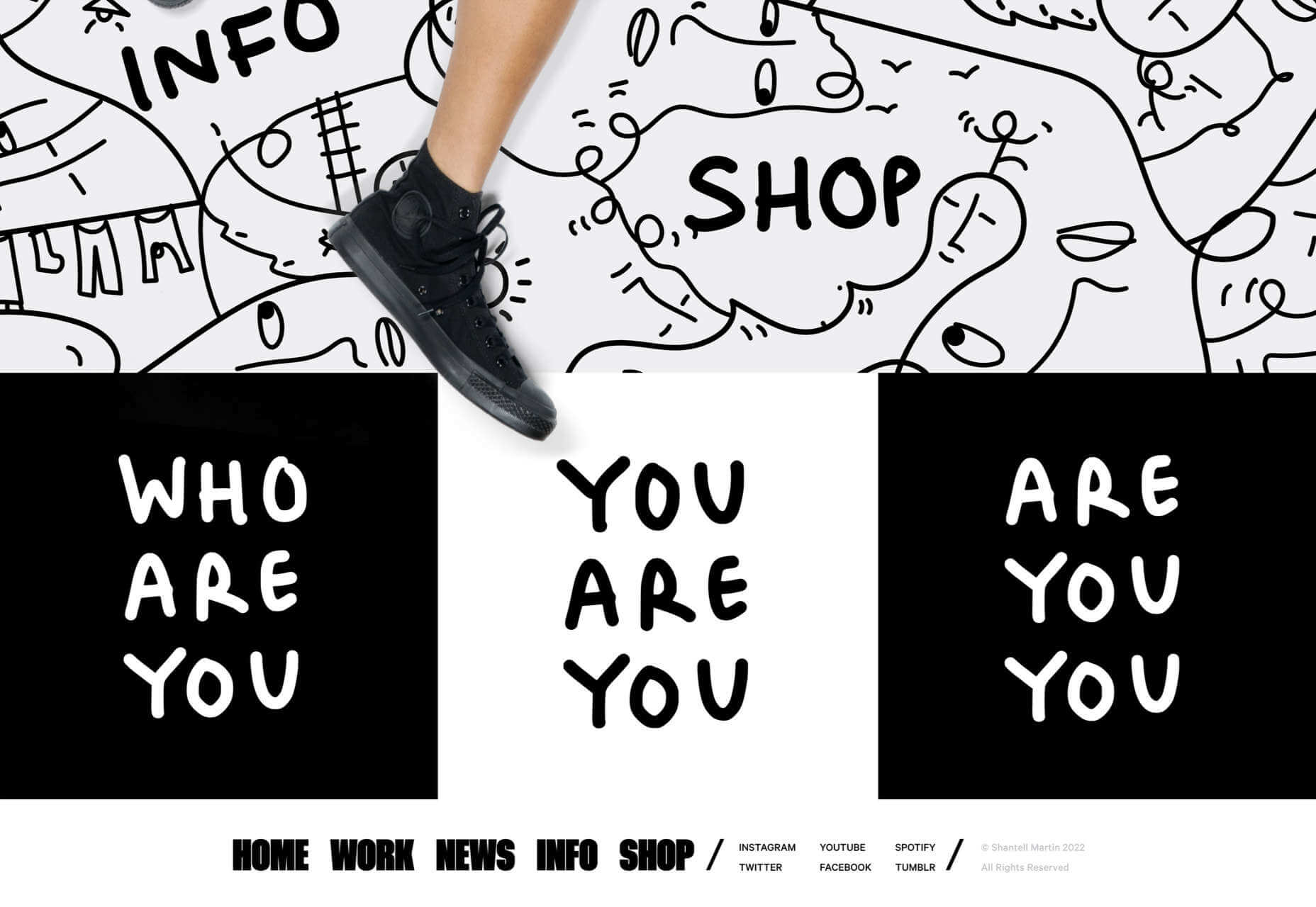
Micro-interactions originated with the need to guide customers who had hit a snag while using a service or a product. The goal was to ease customers into being more product-savvy via subtle reassurance and feedback. Micro-interactions are now employed by everything from washing machines, to coffee makers.

Along with feedback, prompts, and recommendations, they can also present customers with an appealing visual reward upon finishing a task. When used optimally, micro-interactions drastically enhance the navigation and simplify how users interact with sites and apps.

How Micro-Interactions Work

Here are the four structural elements to a simple micro-interaction: triggers, rules, feedback, and loops. Every micro-interaction has a significant component to organize the operational cycle. It lets you control feedback and runs, so the users understand the consequences of their performance and feel motivated to follow through.

Triggers

This feature begins micro-interactions of both the user-initiated (prompted by user) and system-initiated (driven by the system) kind. For example, a click, scroll, swipe, tap, and pull are common triggers that users carry out. So making a payment, booking a cab, and clicking or tapping on the hamburger menu all fall under this category. On the flip side, the user’s alert prompt upon entering a wrong password is a classic system-generated trigger. 

Rules

This element determines what happens after the user sets a prompt into motion via tapping, clicking, scrolling, or swiping. Rules refer to the fact that apps decide the triggers that users employ — Tinder’s ‘swipe’ feature illustrates this point. These rules gradually become a habit-forming action that users get accustomed to while regularly engaging with an app.

Feedback

During this process stage, the system informs the user via auditory, visual, or haptic cues. It engages the users and encourages them to proceed further in their process. For example, the progress bar of a download, the visual representation of steps cleared in a circle, or the visual, aural, and tactile indication upon the success or failure of payment are all a part of the feedback mechanism.

Loop/Modes

This final stage entails tiny meta-rules of the process and determines the frequency and duration. A classic example from an ecommerce app is the ‘Buy Now’ transformed to ‘Buy Another’ Before the user loses interest in the app, the app typically uses such a loop to get them to re-engage with the app. 

How to Use Micro-Interactions

We’ve established that micro-interactions are fabulous, but not every UX interaction on your app or site needs one throughout the wireframe. Overusing this tool could saturate the overall creative experience your design may want to offer. Worse, it might even end up confusing the information hierarchy. It undermines the design and unbalances the user experience of discomfort and irritability. So it’s crucial to know when exactly to use them.

Let’s find out how few quick tips on micro-interactions can elevate and humanize your mobile user experience:

  • Swipe right or left: A signature move made entirely on swiping micro-interaction featured in the famous Tinder app. Swiping is an easier action than clicking or tapping.
  • Call-to-action:  As part of the last step during payment or order, place a ‘Confirm Order’ or ‘Book Now’ prompt, which gives the task a sense of urgency. As a result, having acted on it feels like a minor achievement. 
  • System status: Your app user wants to know what’s happening. System status lets them know they are moving in the right direction and helps avoid confusion. Sometimes, users even run out of patience while uploading a picture, downloading a file, or filling up the registration form.
  • Classic notifications: Users need a quick reminder of products selected/wishlist in their abandoned cart with a reduced attention span. A simple notification can nudge them toward finalizing the purchase. 
  • Button animation: Animated buttons are not only cute, but they also help users navigate the mobile app swiftly. Try out attractive colors, fonts, sizes, shapes, and clipart elements corresponding to the animation and create that cool button to pop up when tapped or hovered on. 
  • Animated text inputs:  A simple process of a likable element like zooming in while entering data into a form or filling up card details for payment can enhance the user experience.
  • Reward an achievement:  Especially true for educational and health apps, micro-interactions celebrating big and small milestones with a badge or a compliment of encouragement can strengthen a user’s engagement with the app. 

Benefits of Micro-Interactions

  • Brand communication: A successful brand ensures that the transmission to the buyer is engaging, positive, and hassle-free. When micro-interactions show a process status clearly, it creates and reinforces a positive image for your brand.
  • Higher user engagement: Experts say micro-interactions engage users better. These tiny elements subconsciously create the urge to keep interacting with your app. For example, each push or nudge notification acts toward redirecting your customers back to your app.
  • Enhanced user experience: From shopping to banking to traveling to learning to staying healthy, there’s an app for everything. A wide range of activities elevates the overall user experience and stays ahead in the game. Micro-interactions can work that magic for your brand. 
  • Prompt feedback: It’s frustrating not to know what’s happening behind the blank screen, especially during a purchase. Instant feedback via visual, sound, or vibrating notifications makes for a pleasant user experience. 
  • Visual harmony: Micro-interactions initiated even with a tap, swipe, typing, or scrolling are all a part of the UX design’s overall appeal. The trick is to keep all the interface elements in perfect sync with the app’s visual features.

Micro-Interaction Best Practices

Here are a few basic principles you should follow when you introduce a micro-interaction to the user experience.

1. Keep it simple, stupid (KISS)

KISS is a famous design principle that becomes even more important in the case of micro-interactions. The goal is to make the user journey delightful and not be a distraction.

2. Keep it Short

It has ‘micro’ in the name itself. But, again, micro-interactions aren’t supposed to be show stars, and a lengthy micro-interaction only distracts the user. 

3. Pick the Right Place

You should always consider the options carefully before choosing the spot for any micro-interaction. The widely used user-interaction designs are popular for a reason. Many people have already approved them, so you can safely continue with them. The use of micro-interaction should also sit well with your brand image. 

See also if the placement of a micro-interaction is reaching your ideal customer or not. And even consider whether you need a micro-interaction to begin with. 

And That’s a Wrap!

As UX designers, we can profoundly impact the overall design of sites and apps, the user’s journey, their interactions with our product/service, their connection with the brand, and the ease of doing a transaction.

We want customers to connect to our brand, love our products, and experience our exceptional customer service. But most of all, we want to earn their trust and loyalty.


Featured image via Pexels.

Source

The post Using Micro-Interactions to Drive UX first appeared on Webdesigner Depot.

Source de l’article sur Webdesignerdepot

Today, more than 100 billion searches are conducted every month on the Google search engine alone. Search engine users conduct searches for several reasons including the foundational conversion of information into action. An action could be a decision to purchase, consume information for decision-making, or seek a better understanding of an issue or topic among others. Search engines make information available at our fingertips right whenever we need it. 

In this era of big data, search solutions are useful not only for popular search engines like Google, Yahoo, and Bing but also for enterprises for monitoring and managing the growing volumes of data in their databases to enhance operational efficiency. The enterprise search industry has grown remarkably and is expected to be worth $8.90 billion by 2024.

Source de l’article sur DZONE

“Minimum Viable Product,” or “MVP,” is a concept of agile development and business growth. With a minimum viable product, you focus on creating the simplest, most basic version of your product, web application, or code possible.

Minimum viable products include just enough features to attract early adopters and validate your idea in the early stages of the development lifecycle. Choosing an MVP workflow can be particularly valuable in the software environment because it helps teams receive, learn from, and respond to feedback as quickly as possible.

The question is, how exactly do you define the “minimum” in MVP? How do you know if your MVP creation is basic enough while still being “viable”?

Defining the Minimum Viable Product: An Introduction

The concept of “Minimum Viable Product” comes from the Lean Start-up Methodology, introduced by Eric Ries. The purpose of MVP is to help companies quickly create versions of a product while collecting validated insights from customers for each iteration. Companies may choose to develop and release minimum viable products because they want to:

  • Introduce new products into the market as quickly as possible;
  • Test an idea with real users before committing a large budget to product development;
  • Create a competitive product with the use of frequent upgrades;
  • Learn what resonates with the target market of the company;
  • Explore different versions of the same product.

Aside from allowing your company to validate an idea for a product without building the entire concept from scratch, an MVP can also reduce the demand on a company’s time and resources. This is why so many smaller start-ups with limited budgets use the MVP and lean production strategy to keep costs as low as possible.

Defining an MVP: What your Minimum Viable Product Isn’t

When you’re building a Minimum Viable Product, you’re concentrating on developing only the most “essential” features that need to be in that product. For instance, you might be building a shopping app for a website. For the app to be “viable,” it would need to allow customers to search through products and add them to a basket or shopping cart. The app would also need a checkout feature and security components.

However, additional functionality, like the ability to send questions about an item to a customer service team or features that allow clients to add products to a “wish list,” may not be necessary straight away. Part of defining a minimum viable product is understanding what it isn’t. For instance, an MVP is not:

  • A prototype: Prototypes are often mentioned alongside MVPs because they can help with early-stage product validation. However, prototypes are generally not intended for customers to use. The “minimum” version of a viable product still needs to be developed enough for clients and users to put it to the test and provide feedback.
  • A minimum marketable product: An MVP is a learning vehicle that allows companies to create various iterations of an item over time. However, a minimum marketable product is a complete item, ready to sell, with features or “selling points” the company can highlight to differentiate the item from the competition.
  • Proof of concept: This is another similar but distinct idea from MVP. Proof of concept items test an idea you have to determine whether it’s attainable. There usually aren’t any customers involved in this process. Instead, companies create small projects to assess business solutions’ technical capabilities and feasibility. You can sometimes use a proof of concept before moving on to an MVP.

Finding the Minimum in your MVP

When finding the “minimum” in a minimum viable product, the primary challenge is ensuring the right balance. Ideally, you need your MVP to be as essential, cost-effective, and straightforward as possible so that you can create several iterations in a short space of time. The simpler the product, the easier it is to adapt it, roll it out to your customers, and learn from their feedback.

However, developers and business leaders shouldn’t get so caught up focusing on the “Minimum” part of Minimum Viable Product that they forget the central segment: “Viable”; your product still needs to achieve a specific purpose.

So, how do you find the minimum in your MVP?

1. Decide on Your Goal or Purpose

First, you’ll need to determine what your product needs to do to be deemed viable. What goal or target do you hope to achieve with your new product? For instance, in the example we mentioned above, where you’re creating an ecommerce shopping app, the most basic thing the app needs to do is allow customers to shop for and purchase items on a smartphone.

Consider the overall selling point of your product or service and decide what the “nice to haves” are, compared to the essential features. For instance, your AR app needs to allow people to interact with augmented digital content on a smartphone, but it may not need to work with all versions of the latest AR smart glasses.

2. Make a List of Features

Once you know the goal or purpose of your product, the next step is to make a list of features or capabilities you can rank according to importance. You can base your knowledge of what’s “most important” for your customers by looking at things like:

  • Competitor analysis: What do your competitors already offer in this category, and where are the gaps in their service or product?
  • User research: Which features or functionalities are most important to your target audience? How can you make your solution stand out from the crowd?
  • Industry knowledge: As an expert in your industry, you should have some basic understanding of what it will take to make your product “usable.”

3. Create Your Iterations

Once you’ve defined your most important features, the next stage is simply building the simplest version of your product. Build the item according to what you consider to be its most essential features and ask yourself whether it’s serving its purpose.

If your solution seems to be “viable,” you can roll it out to your target audience or a small group of beta testers to get their feedback and validate the offering. Use focus groups and market interviews to collect as much information as possible about what people like or dislike.

Using your feedback, you can begin to implement changes to your “minimum” viable product to add more essential features or functionality.

Understanding the “Minimum Viable Product”

Minimum viable products are evident throughout multiple industries and markets today – particularly in the digitally transforming world. For instance, Amazon might be one of the world’s most popular online marketplaces today, but it didn’t start that way. Instead, Jeff Bezos began purchasing books from distributors and shipping them to customers every time his online store received an order to determine whether the book-selling landscape would work.

When Foursquare first began, it had only one feature. People could check-in at different locations and win badges. The gamification factor was what made people so excited about using the service. Other examples include:

  • Groupon: Groupon is a pretty huge discount and voucher platform today, operating in companies all around the world. However, it started life as a simple minimum viable product promoting the services of local businesses and offering exclusive deals for a short time. Now Groupon is constantly evolving and updating its offerings.
  • Airbnb: Beginning with the use of the founders’ own apartment, Airbnb became a unicorn company giving people the opportunity to list places for short-term rental worldwide. The founders rented out their own apartment to determine whether people would consider staying in someone else’s home before eventually expanding.
  • Facebook: Upon release, Facebook was a simple social media tool used for connecting with friends. Profiles were basic, and all members were students of Harvard University. The idea quickly grew and evolved into a global social network. Facebook continues to learn from the feedback of its users and implement new features today.

Creating Your Minimum Viable Product

Your definition of a “minimum viable product” may not be the same as the definition chosen by another developer or business leader. The key to success is finding the right balance between viability – and the purpose of your product, and simplicity – or minimizing your features.

Start by figuring out what your product simply can’t be without, and gradually add more features as you learn and gain feedback from your audience. While it can be challenging to produce something so “minimalistic” at first, you need to be willing to release those small and consistent iterations if you want to leverage all the benefits of an MVP.

Suppose you can successfully define the meaning of the words “Minimum” and “Viable” simultaneously with your new product creations. In that case, the result should be an agile business, lean workflows, and better development processes for your entire team.


Featured image via Pexels.

Source

The post What is the “Minimum” in Minimum Viable Product? first appeared on Webdesigner Depot.

Source de l’article sur Webdesignerdepot


What Is Snowflake?

At its core Snowflake is a data platform. It’s not specifically based on any cloud service which means it can run any of the major cloud providers like Amazon Web Services (AWS), Microsoft Azure, Google Cloud Platform (GCP). As a SaaS (Software-as-a-Service) solution, it helps organizations consolidate data from different sources into a central repository for analytics purposes to help solve Business Intelligence use cases.

Once data is loaded into Snowflake, data scientists, engineers, and analysts can use business logic to transform and model that data in a way that makes sense for their company. With Snowflake users can easily query data using simple SQL. This information is then used to power reports and dashboards so business stakeholders can make key decisions based on relevant insights.

Source de l’article sur DZONE

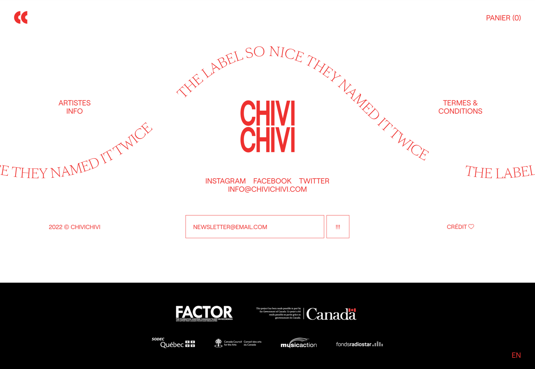
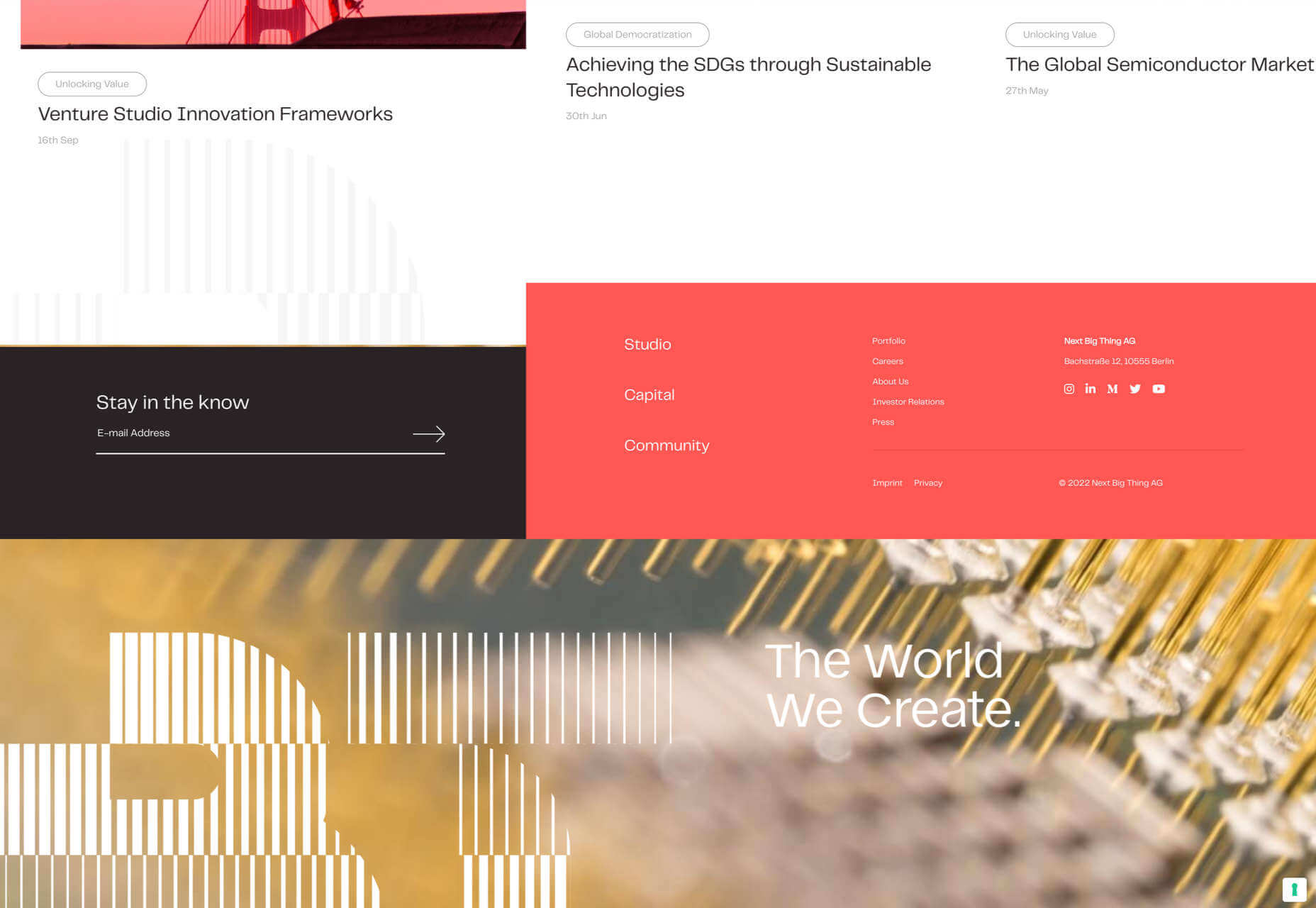
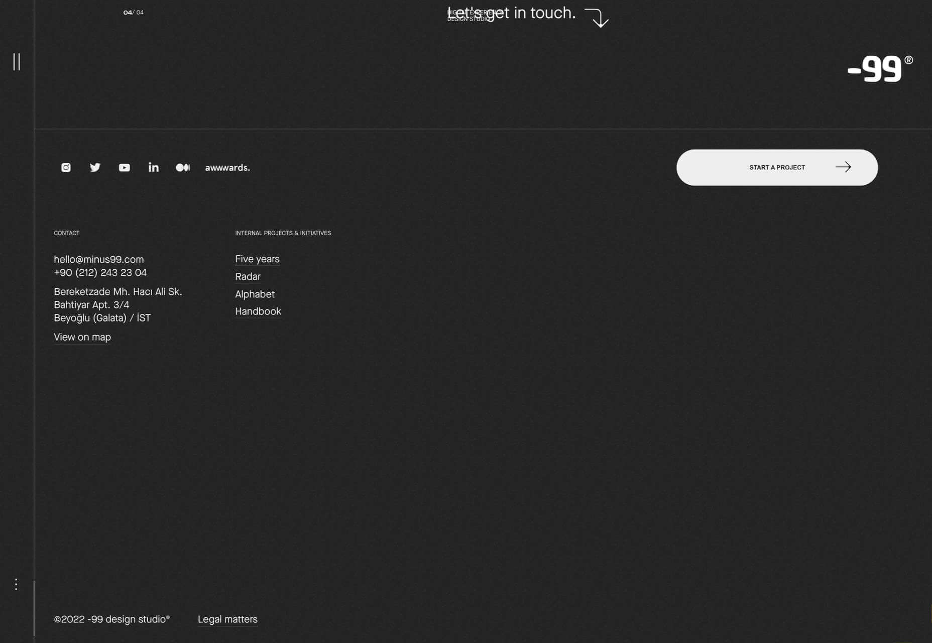
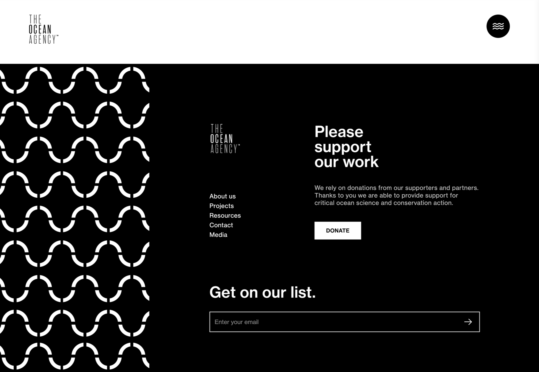
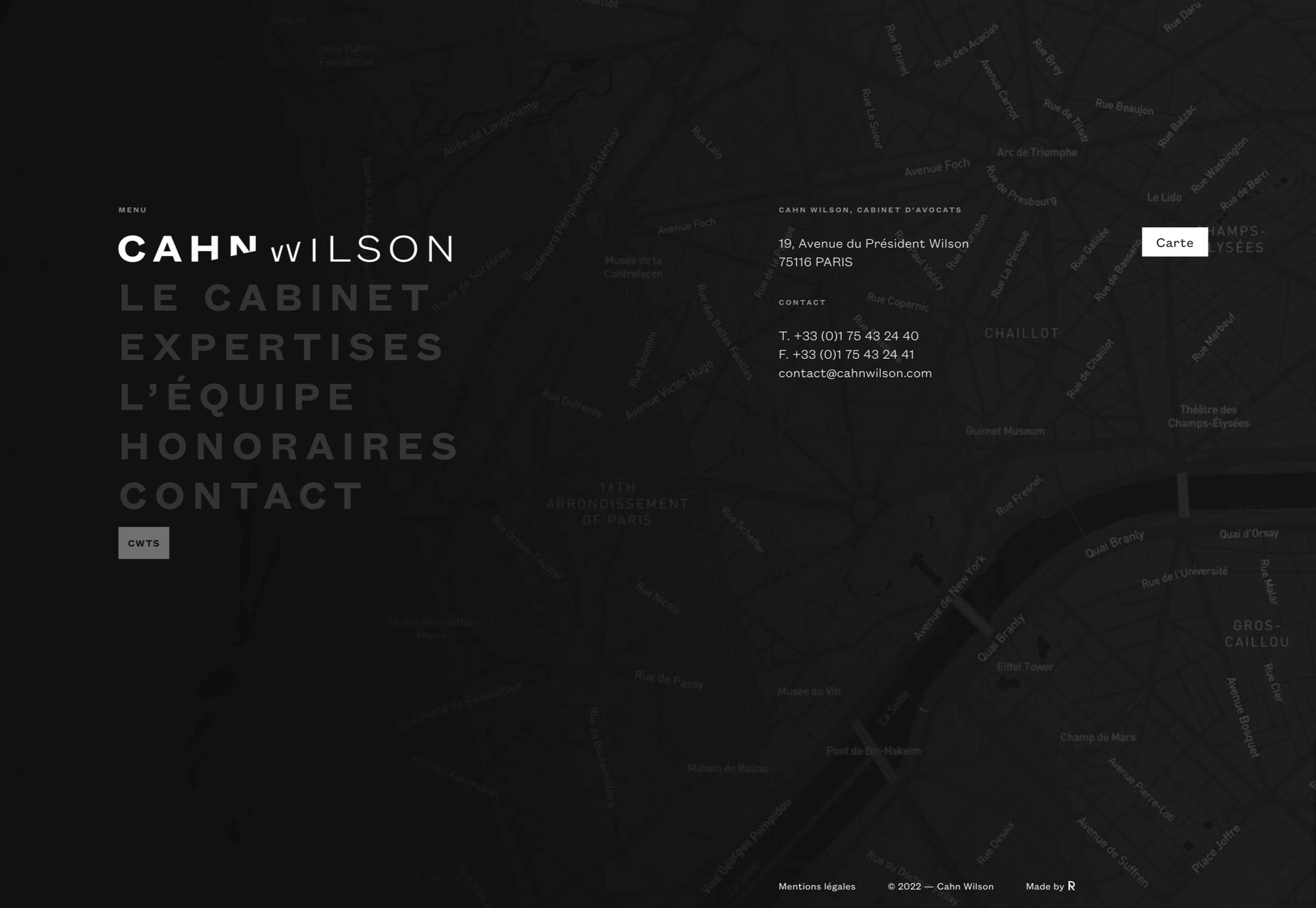
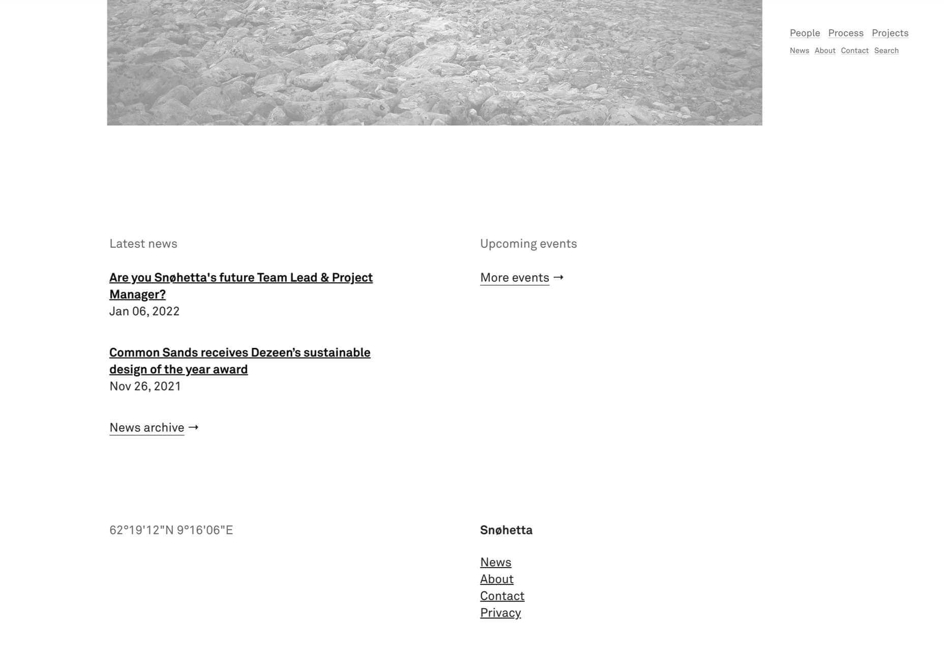
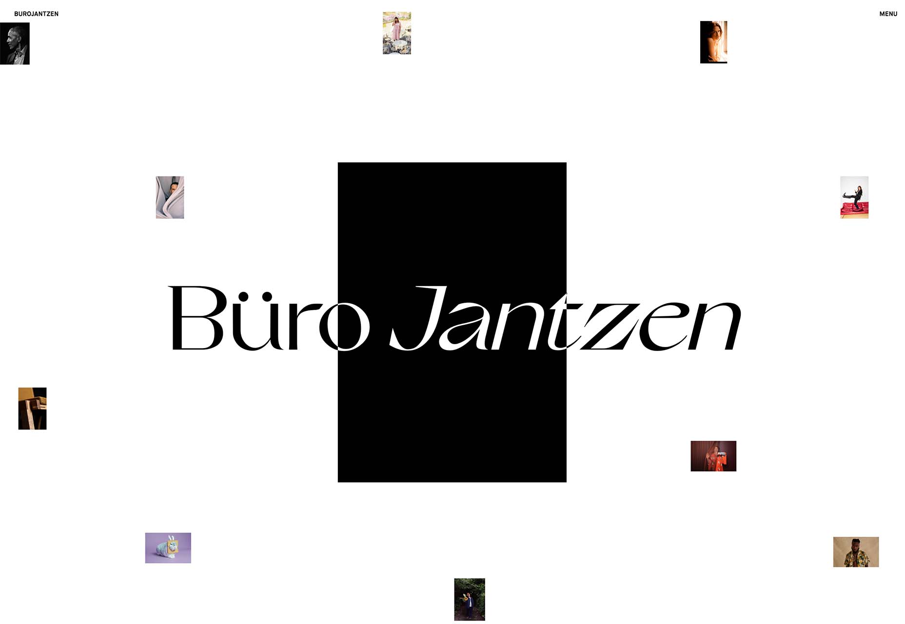
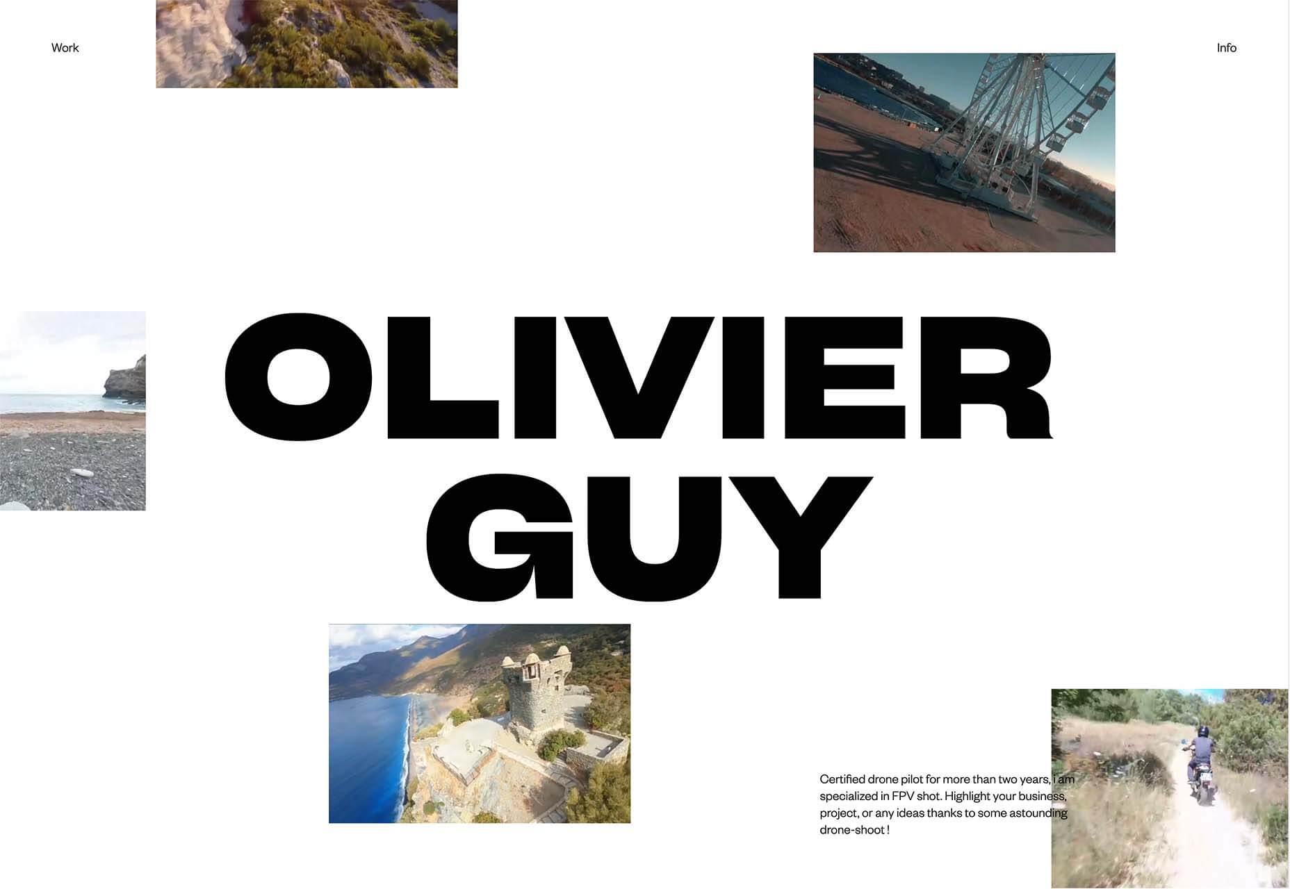
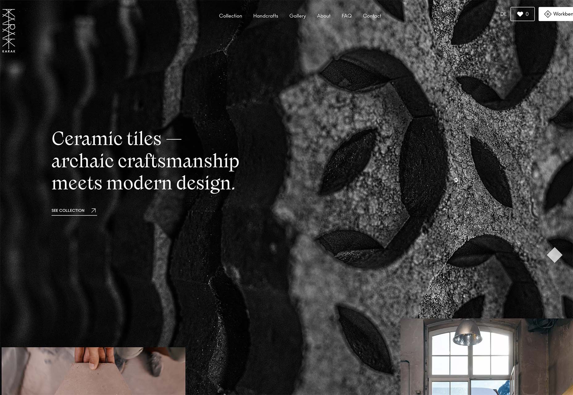
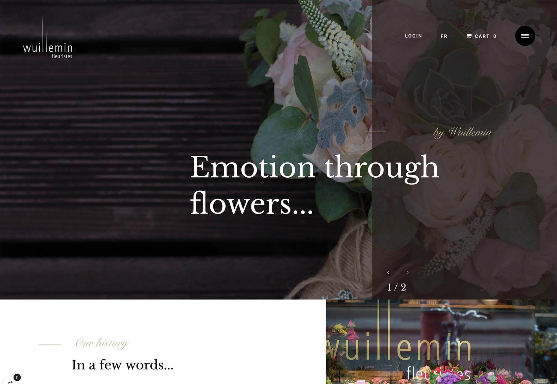
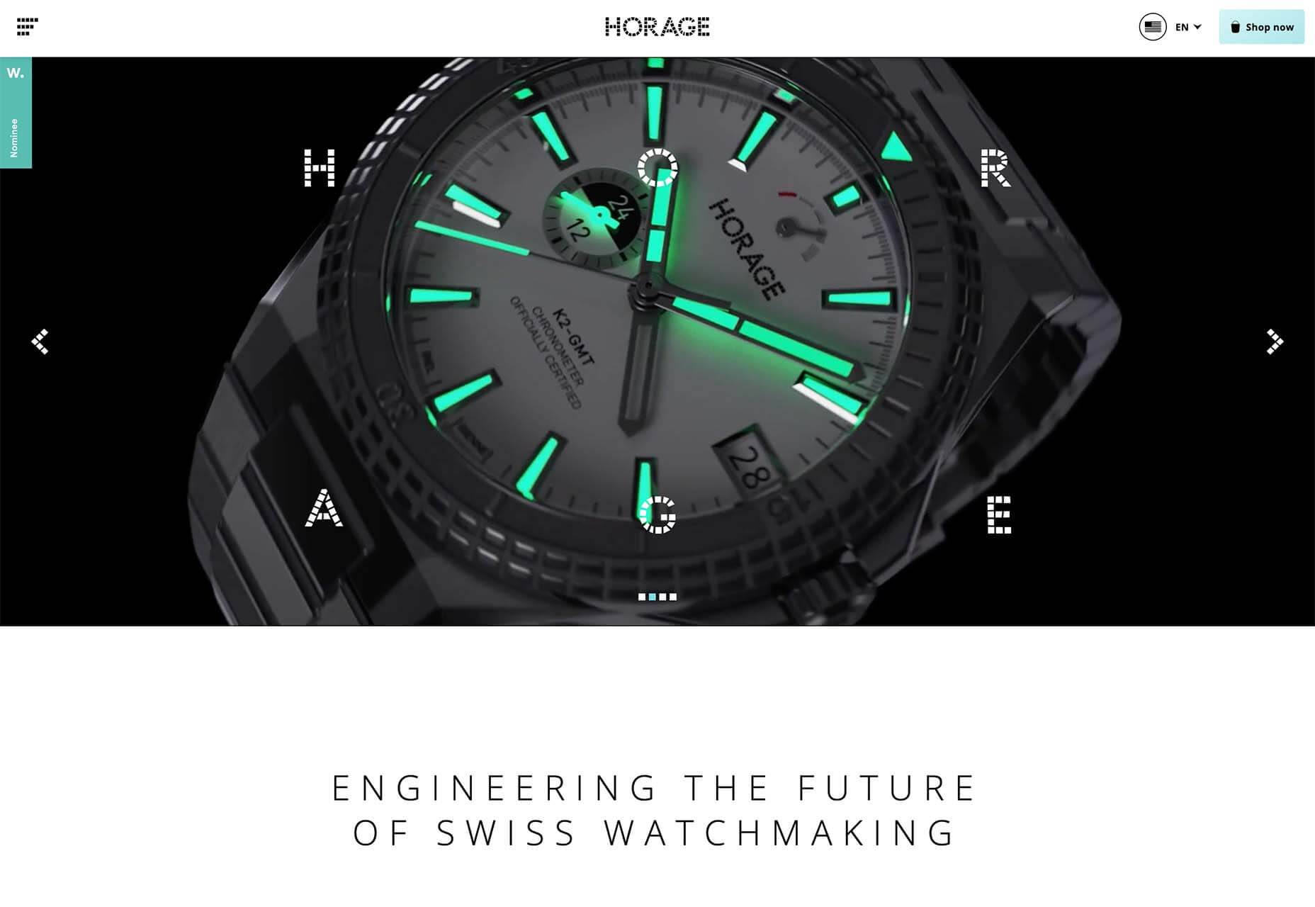
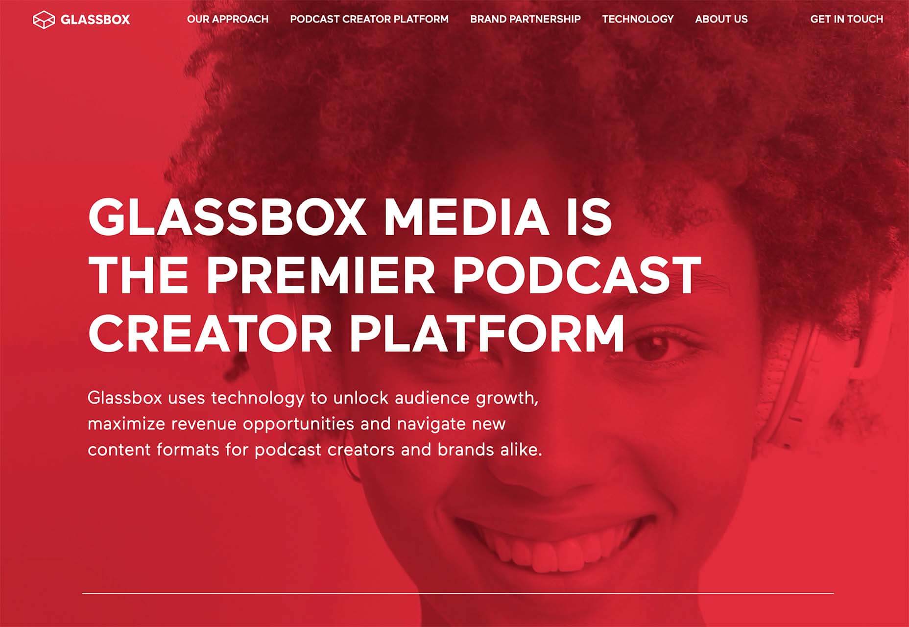
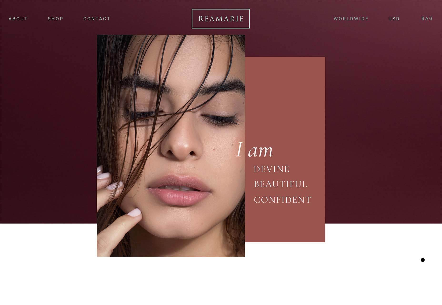
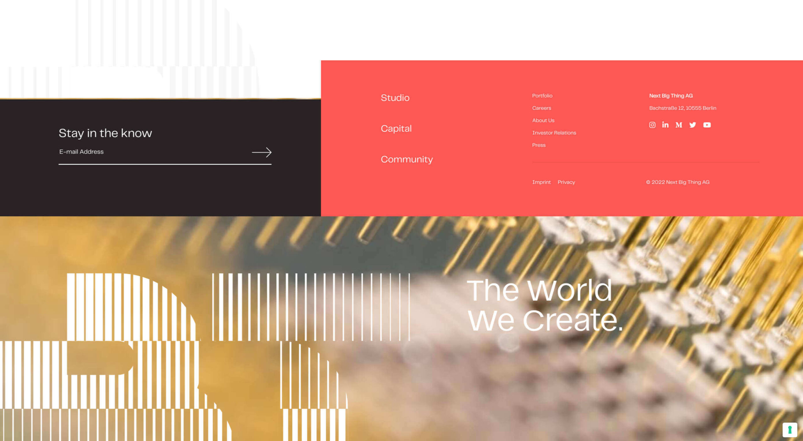
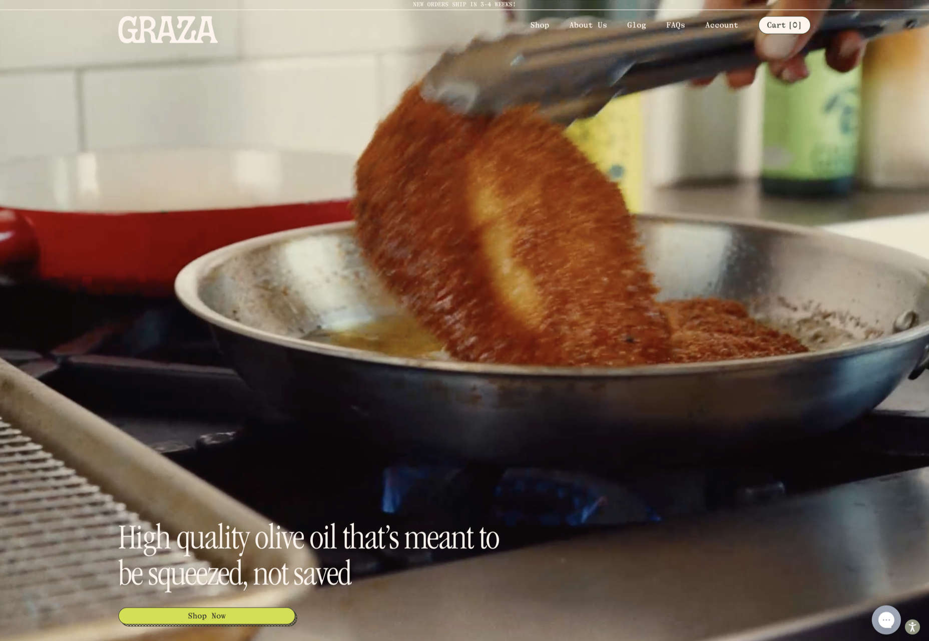
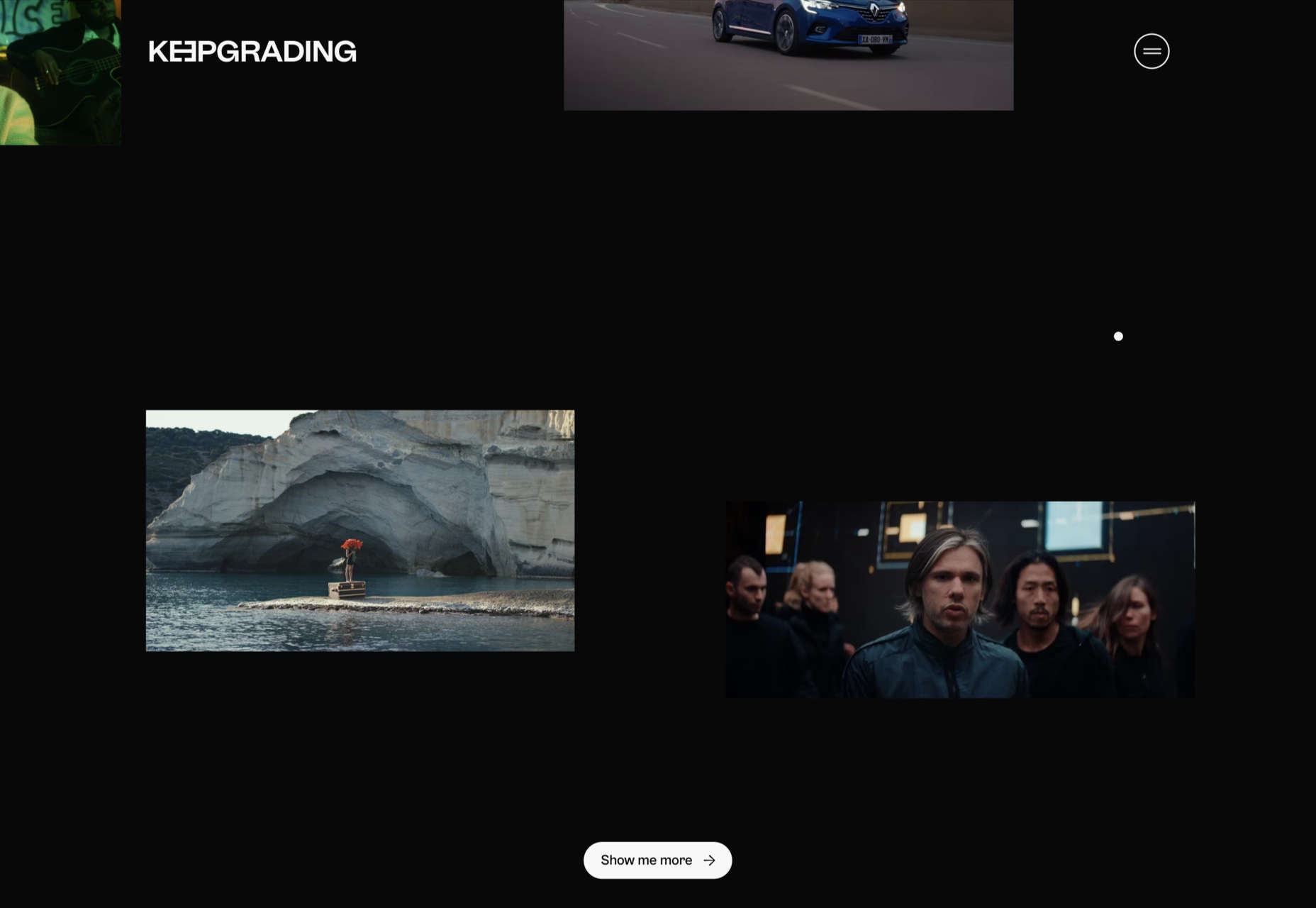
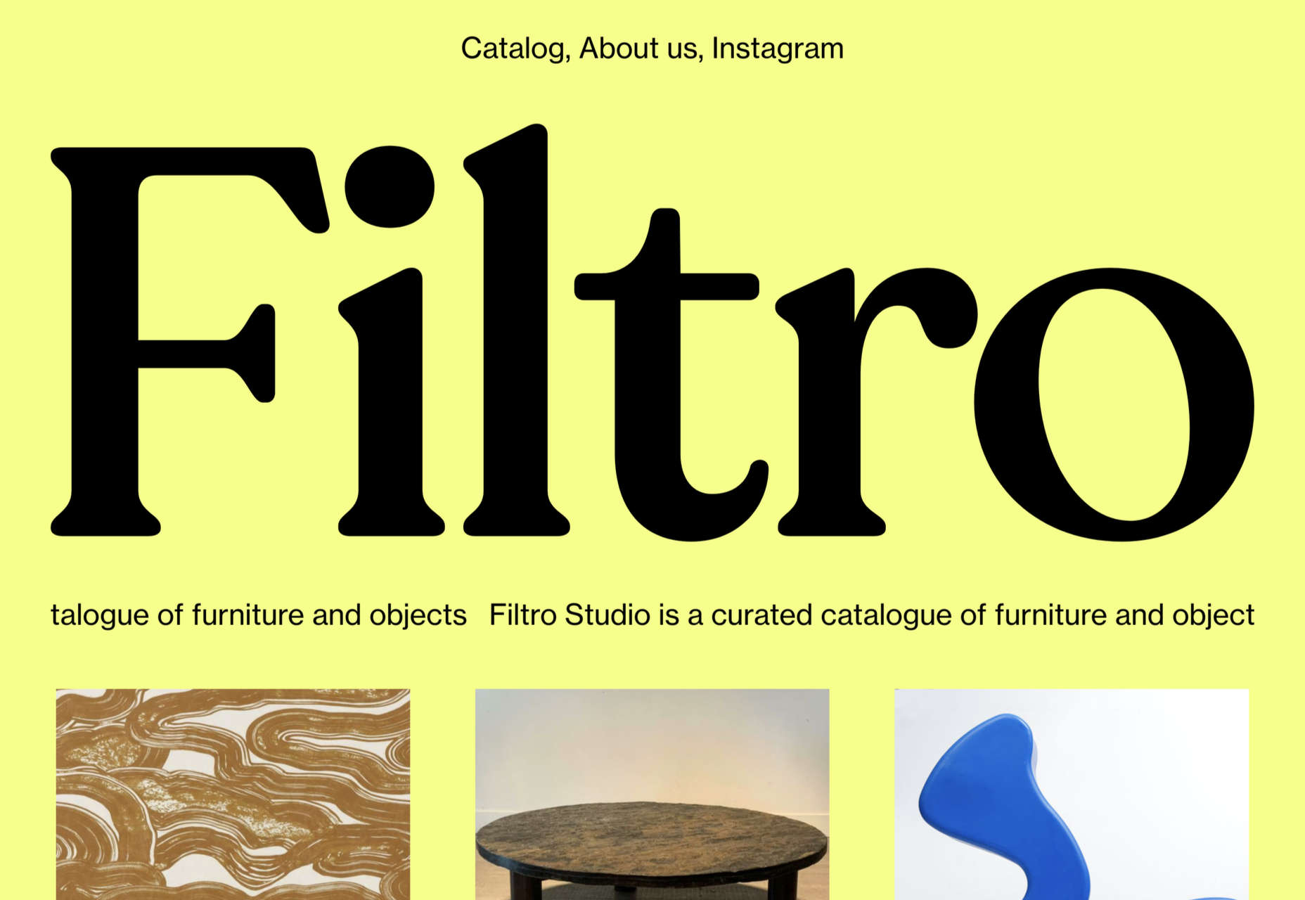
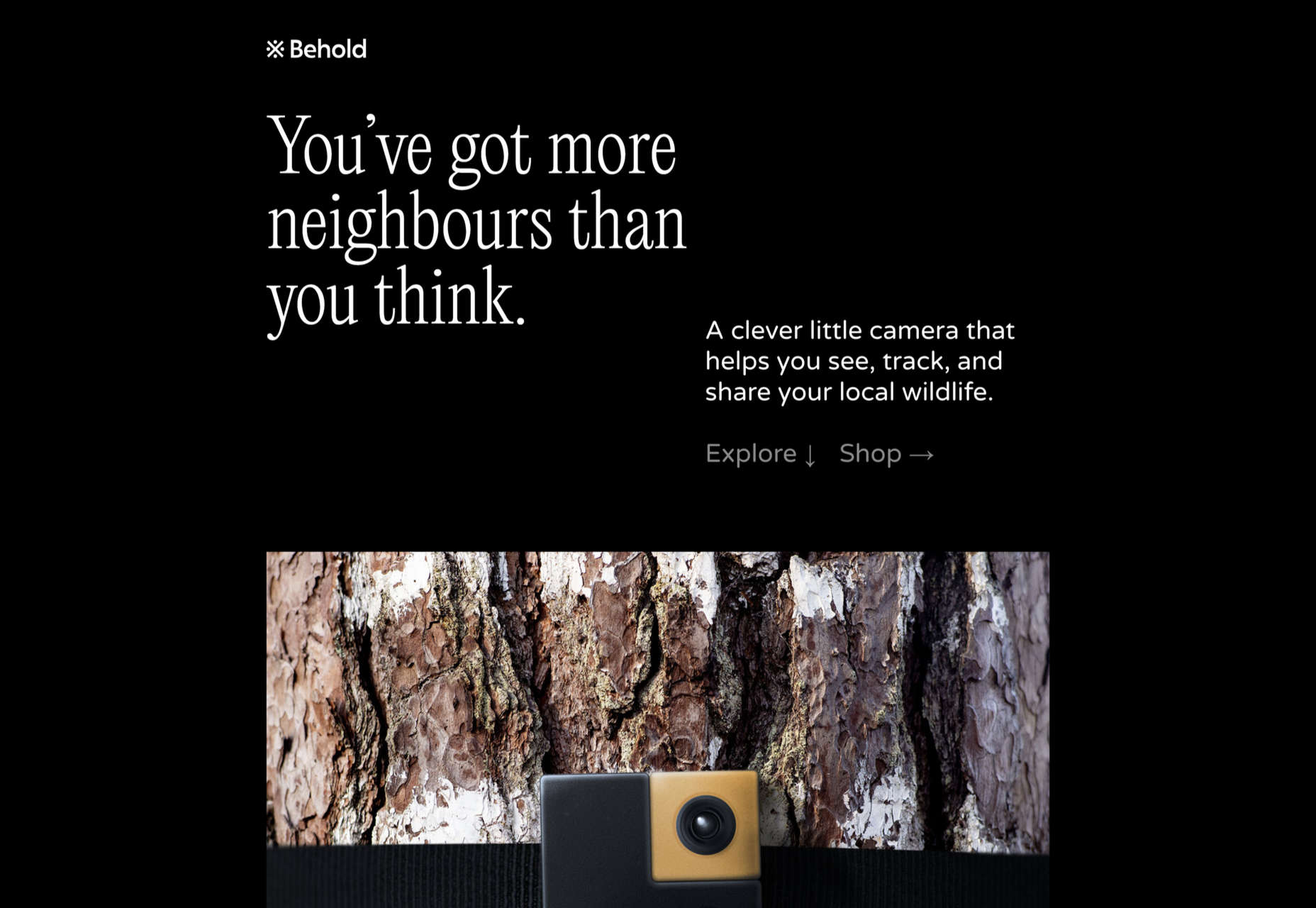
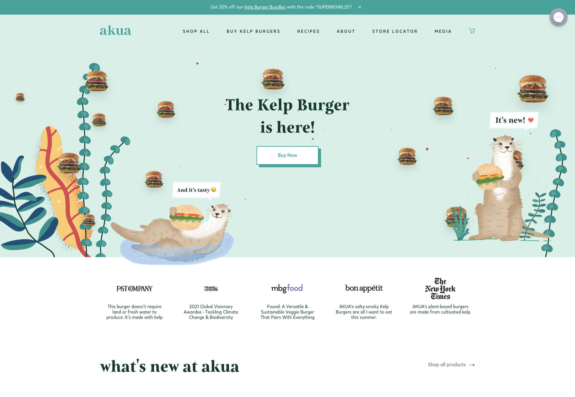
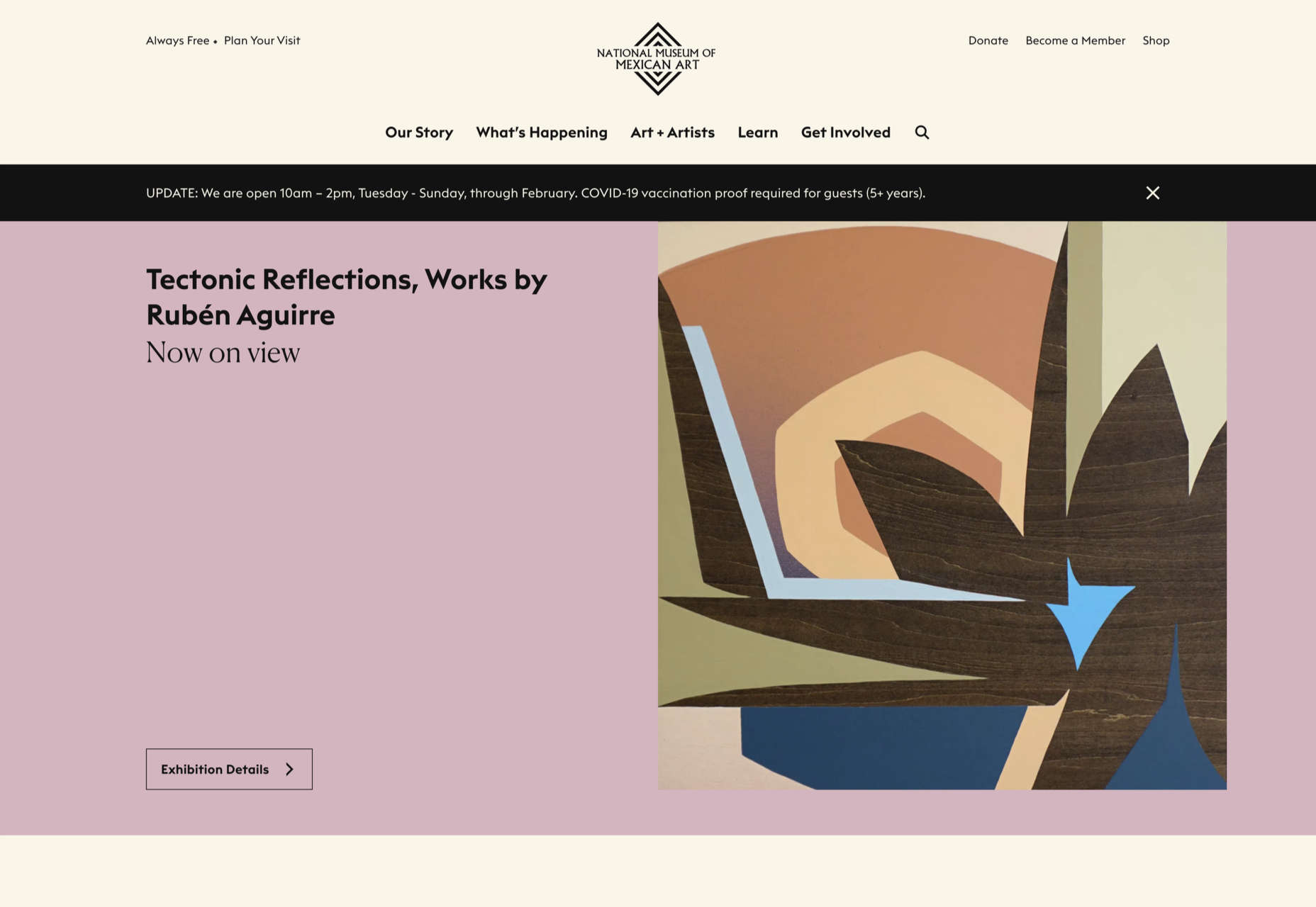
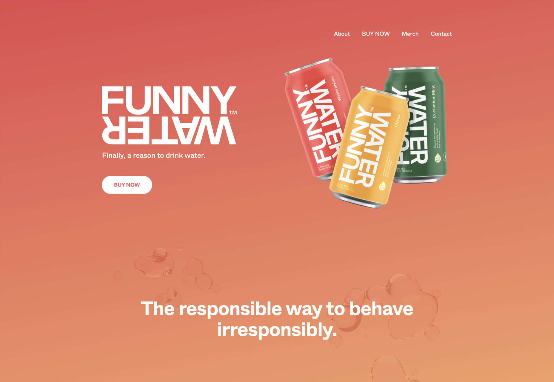
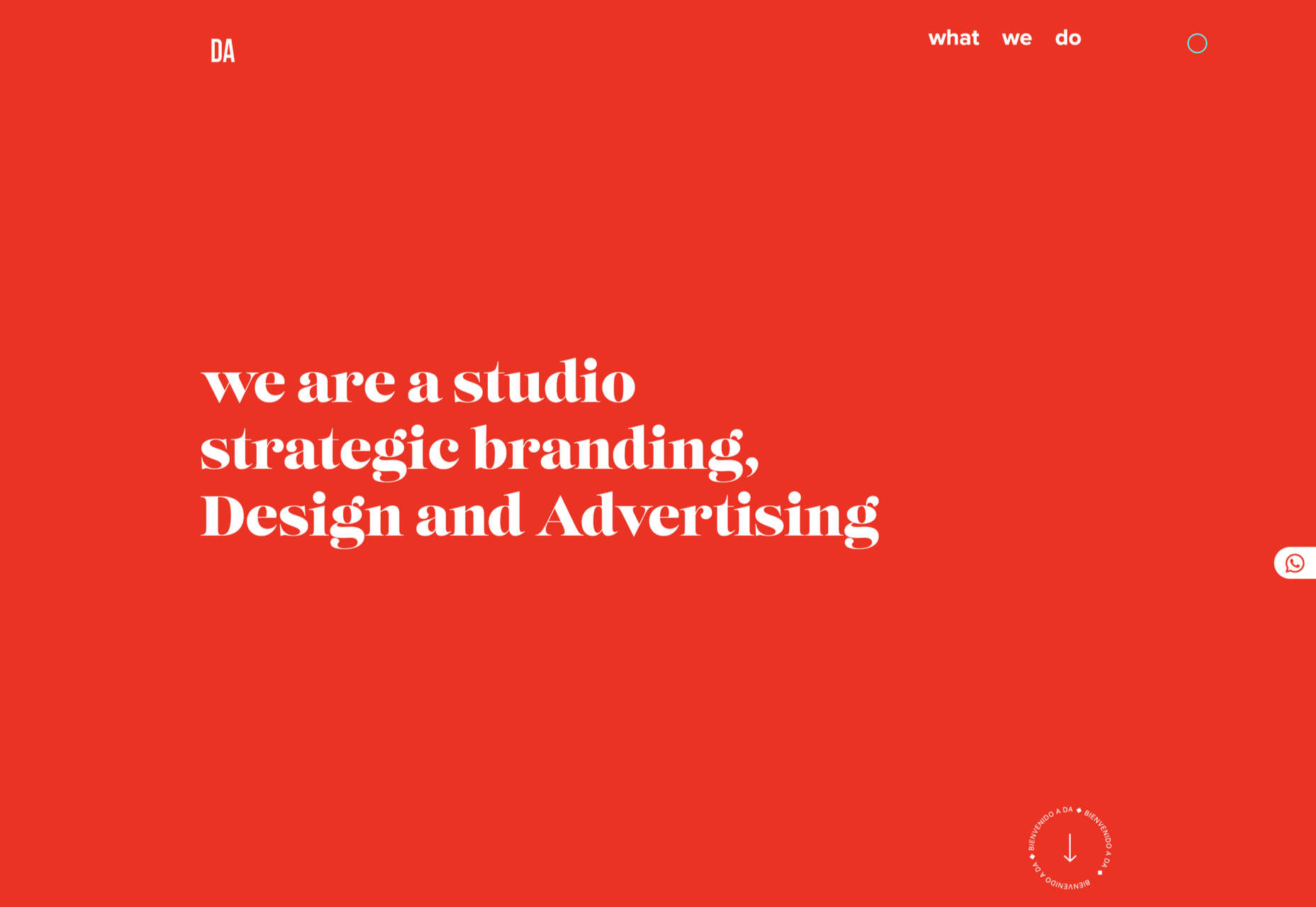
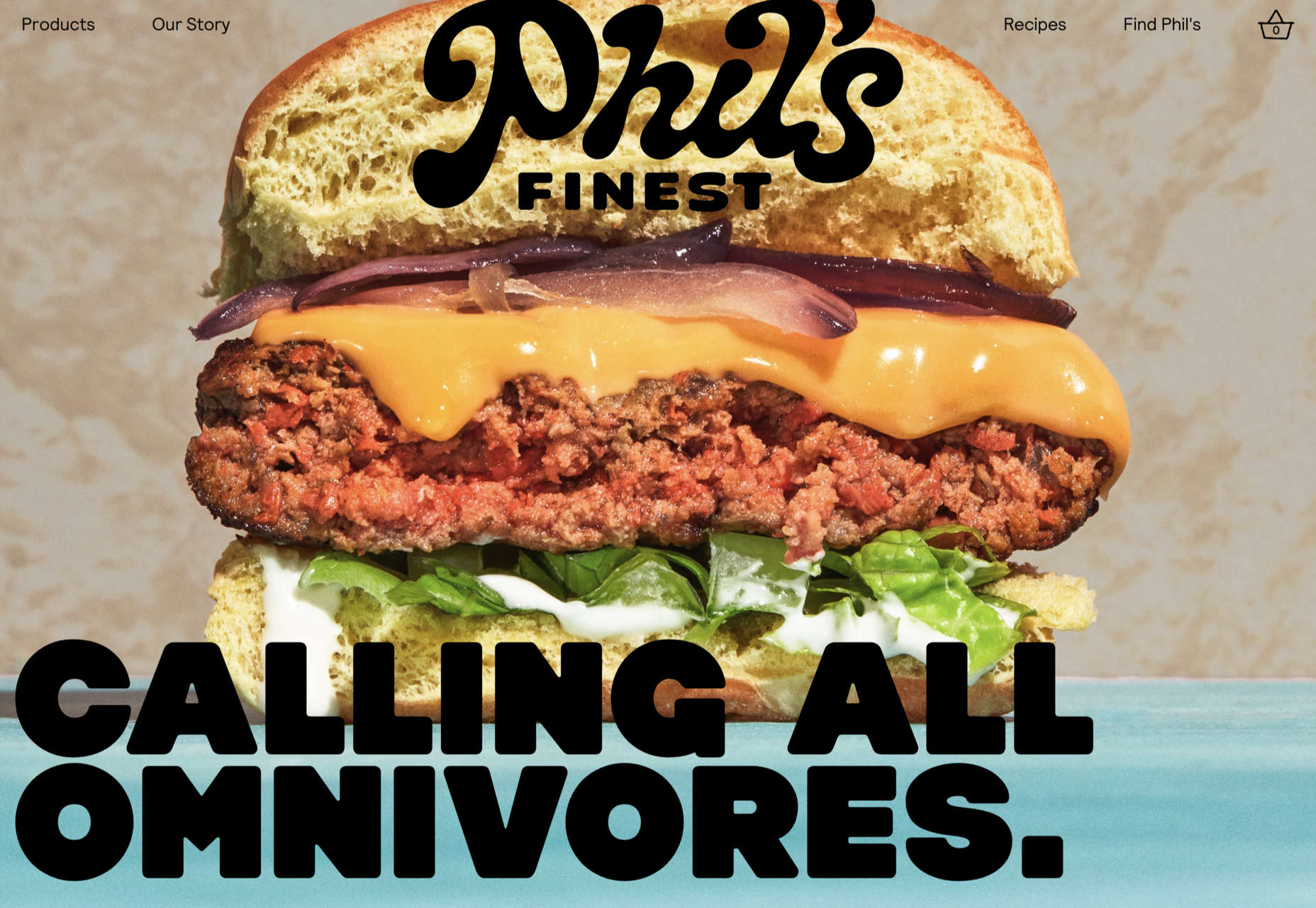
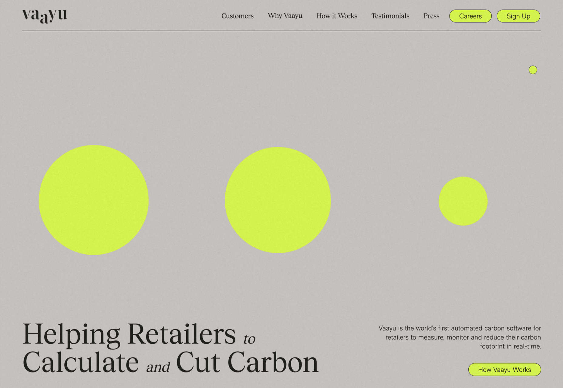
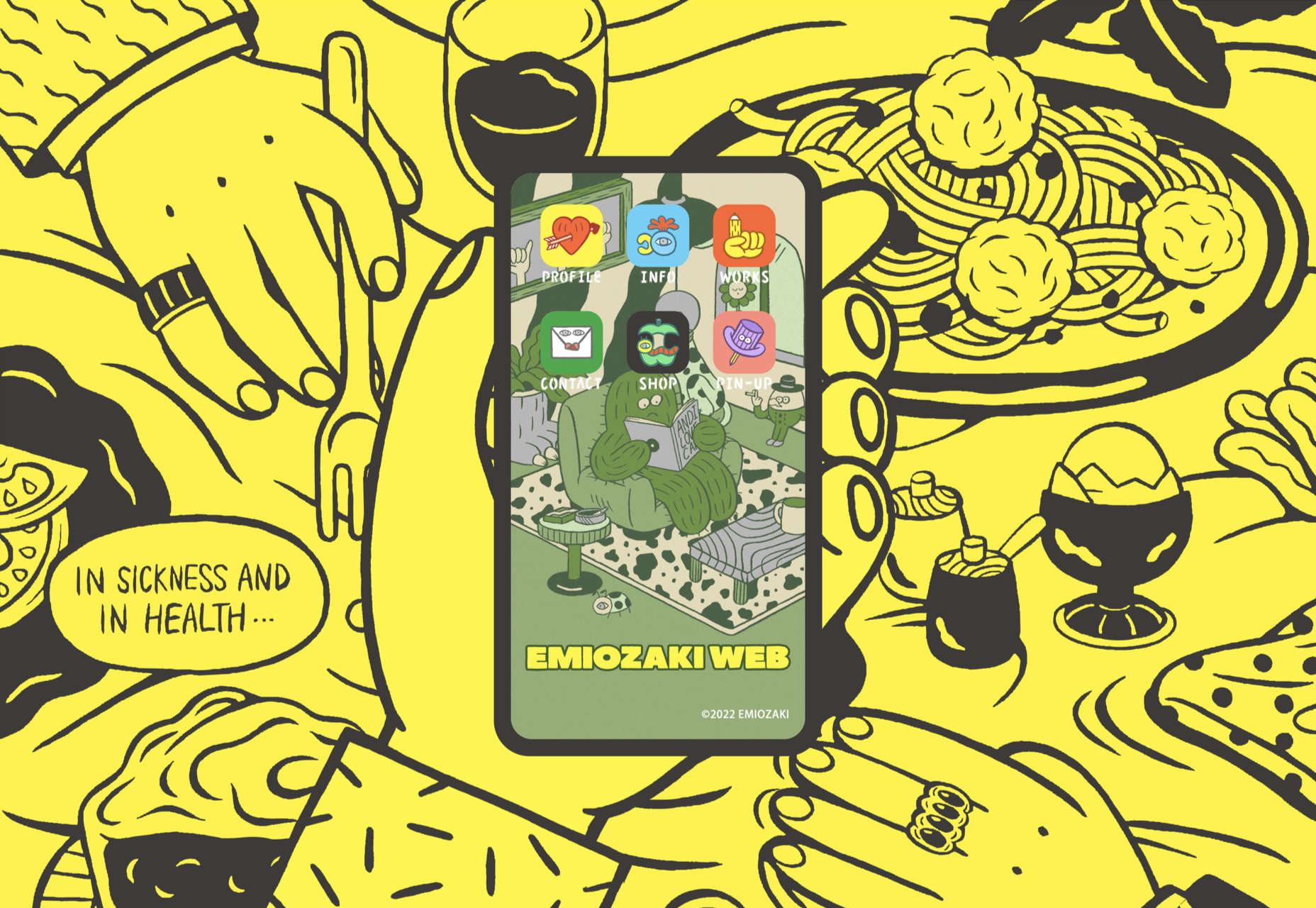
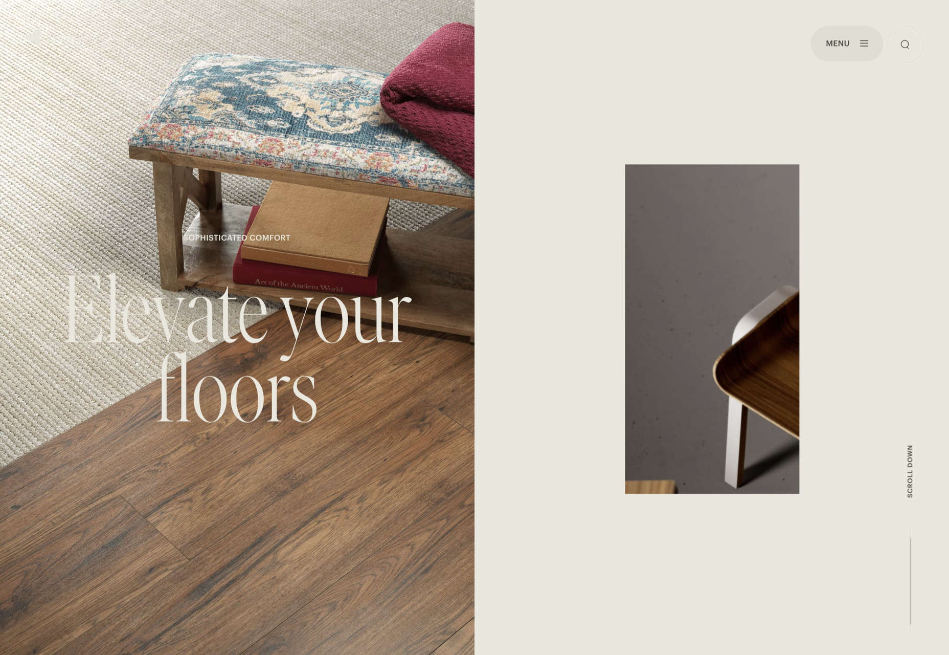
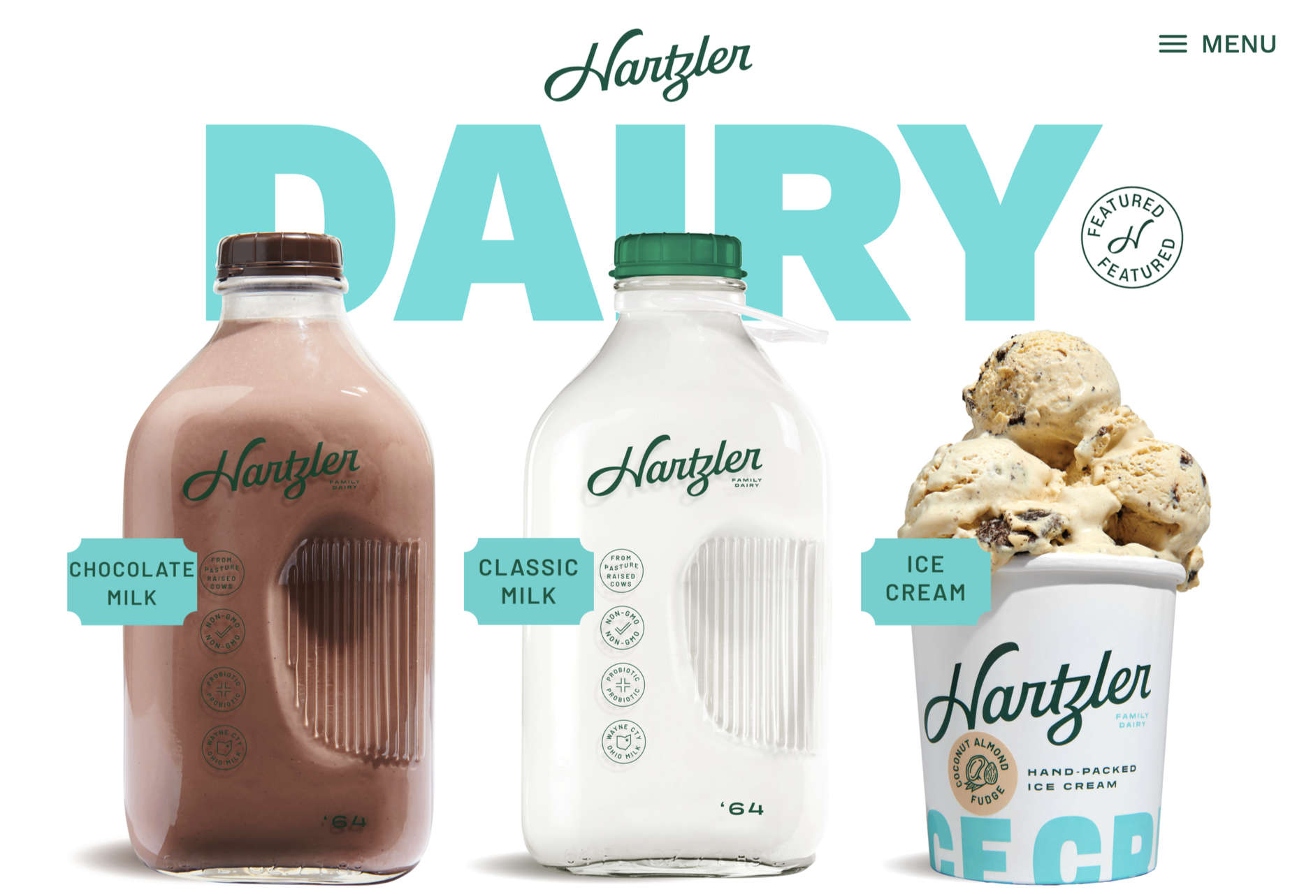
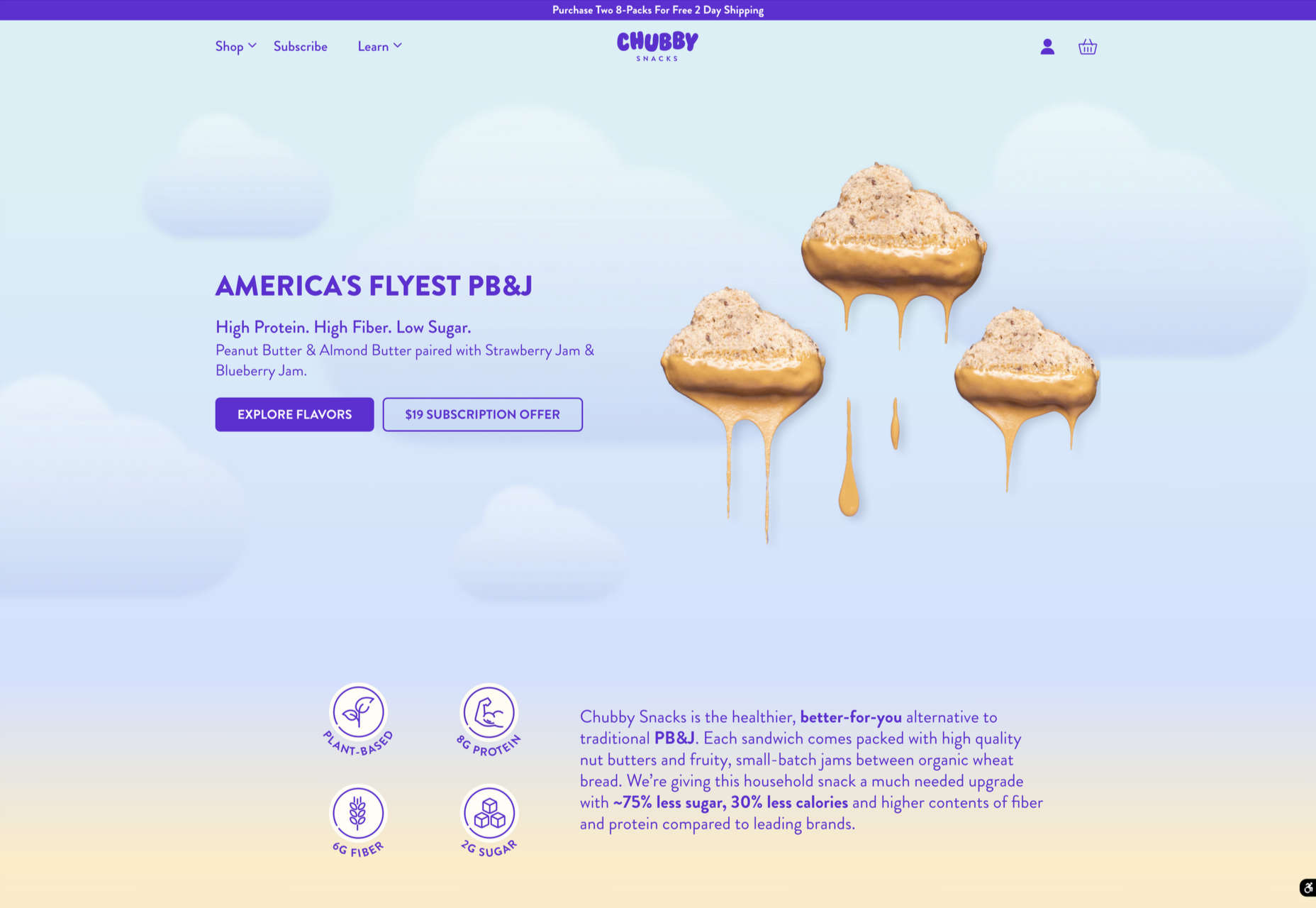
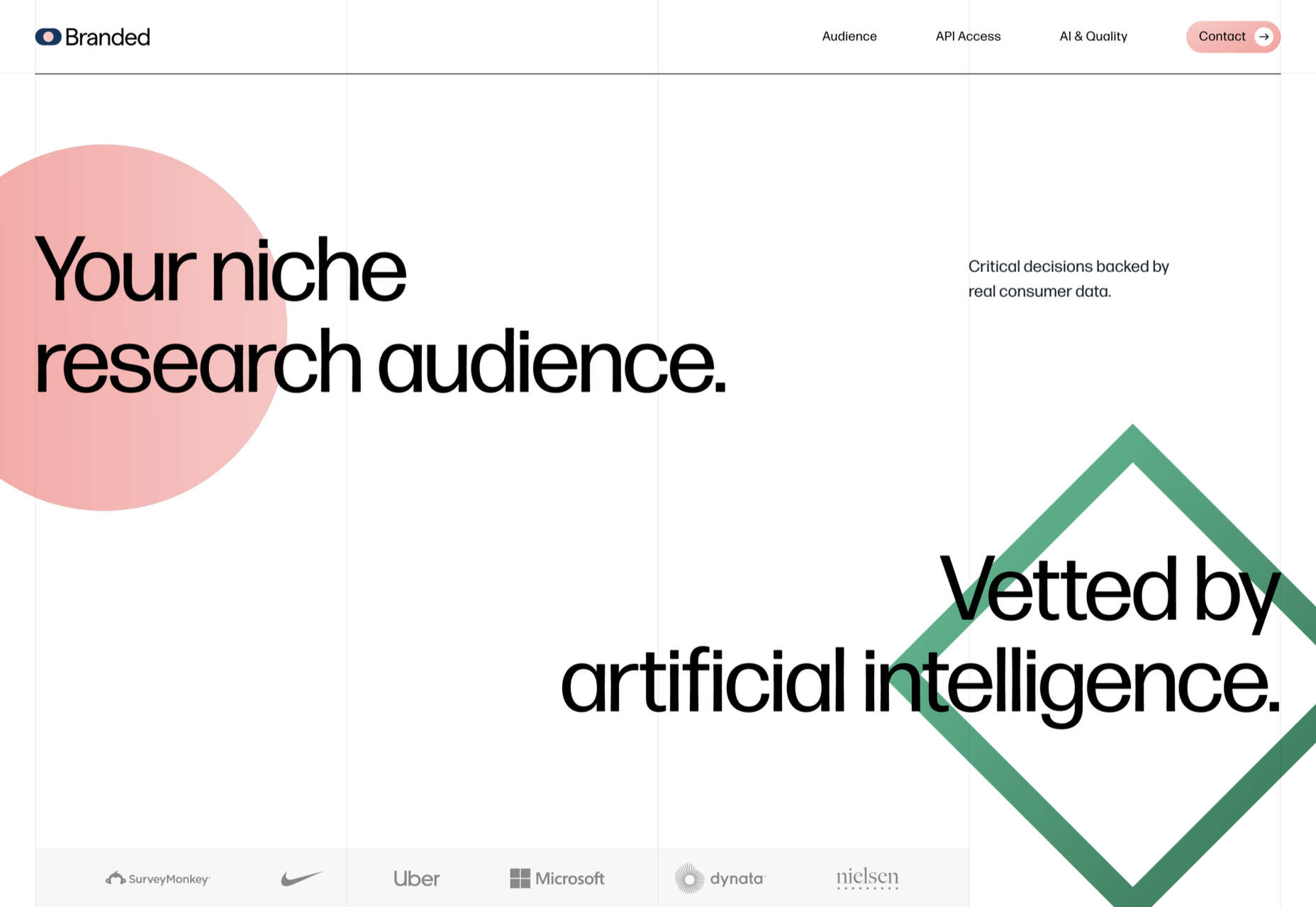
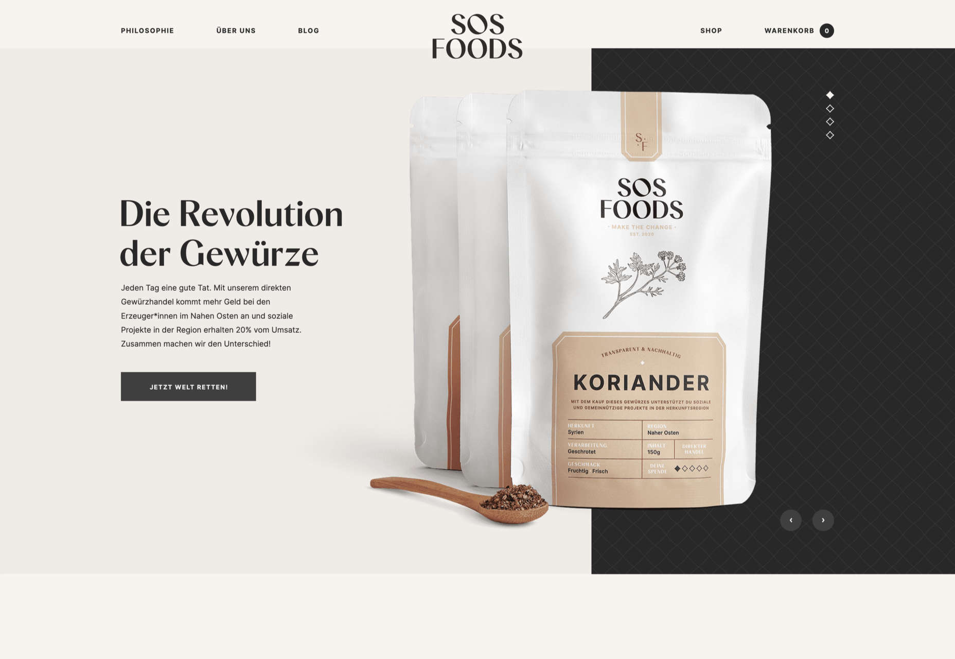
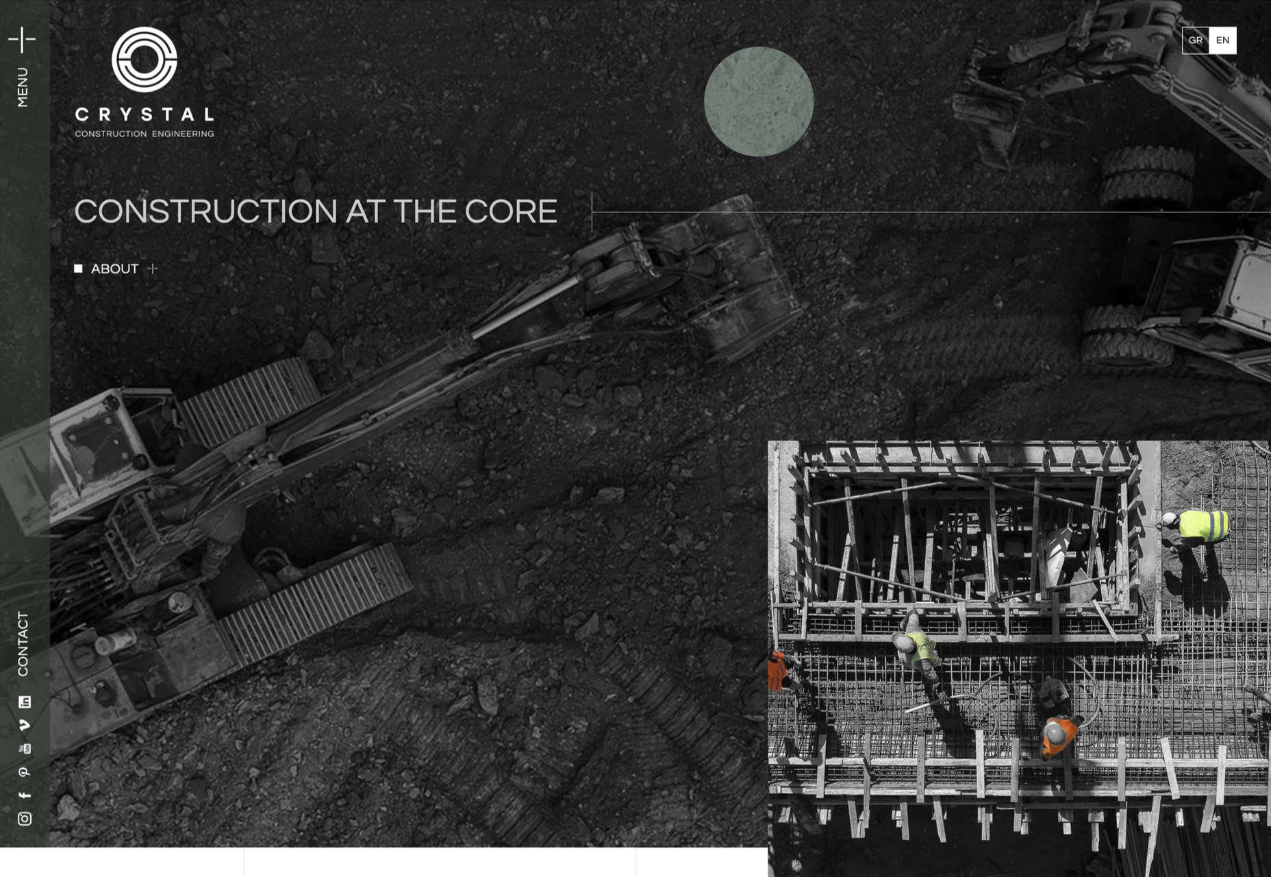
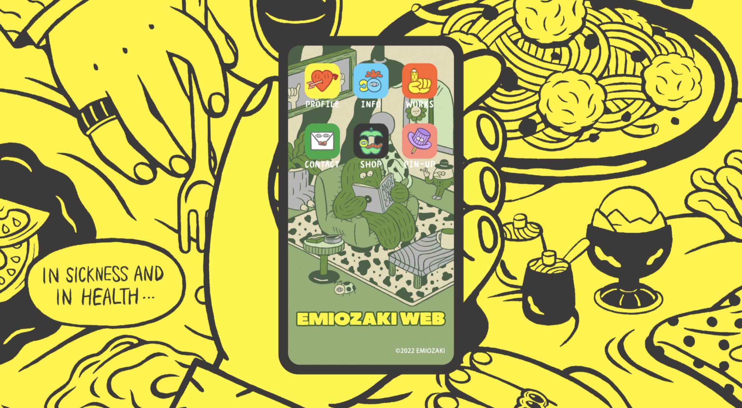
Welcome to the latest edition of our top 20 sites of the month. In this February’s collection, the overall feel is lighthearted and optimistic, as we are seeing the positivity of a new year persisting across the web.

There is a continued inclination towards warmth and personableness and away from a more corporate, impersonal feel. We see this most in the color palettes used and in the use of illustrations as accents to add character and charm. Of course, as always, type plays a big part too. Enjoy!

Woset

Woset has a simple aesthetic and features a charming illustration style on this site for its creative toys. The interactive ‘play’ section is a nice touch.

Graza

This site for Graza olive oil has a fun feel, with comic style illustration and bright splashes of color while making a serious sales pitch.

KeepGrading 

KeepGrading is a post-production color studio. Their portfolio site showcases a lot of work but keeps it well organized and pleasing to navigate.

Englobe

By using soft colors and slightly rounded type, Englobe has managed to portray a warm, friendly, and human aspect with this website, despite being a huge company.

Filtro

Filtro’s design is about as basic as it gets, and yet it has a certain charm to it.

Behold

Behold is a wildlife camera that is currently in development. This landing page does an excellent job of creating interest with just enough information.

Akua

Some rather sweet illustration work creates a good balance with technical information on this site for Akua kelp burgers.

National Museum of Mexican Art

A color scheme of warm, earthy tones and a carefully thought-out type pairing create an inviting presence for the National Museum of Mexican Art.

Ubac

This site for Ubac trainers feels clean and modern with some nice and mostly functional, scroll-activated animation.

Funny Water

The background gradient is really nicely done on Funny Water’s otherwise very minimal site.

DA

DA is a strategic branding, design, and advertising studio, and this site is a good, polished example of a site for such an agency. What stands out is the clever menu text.

Phil’s Finest

Phil’s Finest makes good use of color, oversized type, and occasional illustration mixed in among the well-styled photography.

Vaayu 

Grey and black are enlivened by neon yellow in Vaayu’s minimalist, single-page presentation.

Emi Ozaki

Artist and illustrator Emi Ozaki has created a stylized phone interface for her portfolio site, which showcases her illustration aesthetic.

Engineered Floors 

The home page scrolling is the centerpiece of Engineered Floors’ site, and it works especially well on mobile.

Hartzler Dairy

Hartzler Dairy goes for a nostalgic feel to match the company’s classic mid-20th century style branding.

Chubby Snacks

Chubby Snacks is PB&J in your pocket; it sells itself! Having said that, the site is pretty appealing in its own right.

Branded

Market research company Branded goes down the flat design road for this site, which could feel a little dated but actually works quite nicely here.

SOS Foods 

SOS Foods is an excellent example of a responsible/sustainable goods site, with a design aesthetic aimed at the ethical consumer.

Crystal Construction Engineering

Some nice use of masonry-style layout and overlapping elements create space, but also a pleasing flow in this site for Crystal Construction Engineering.

Source

The post 20 Best New Websites, February 2022 first appeared on Webdesigner Depot.

Source de l’article sur Webdesignerdepot

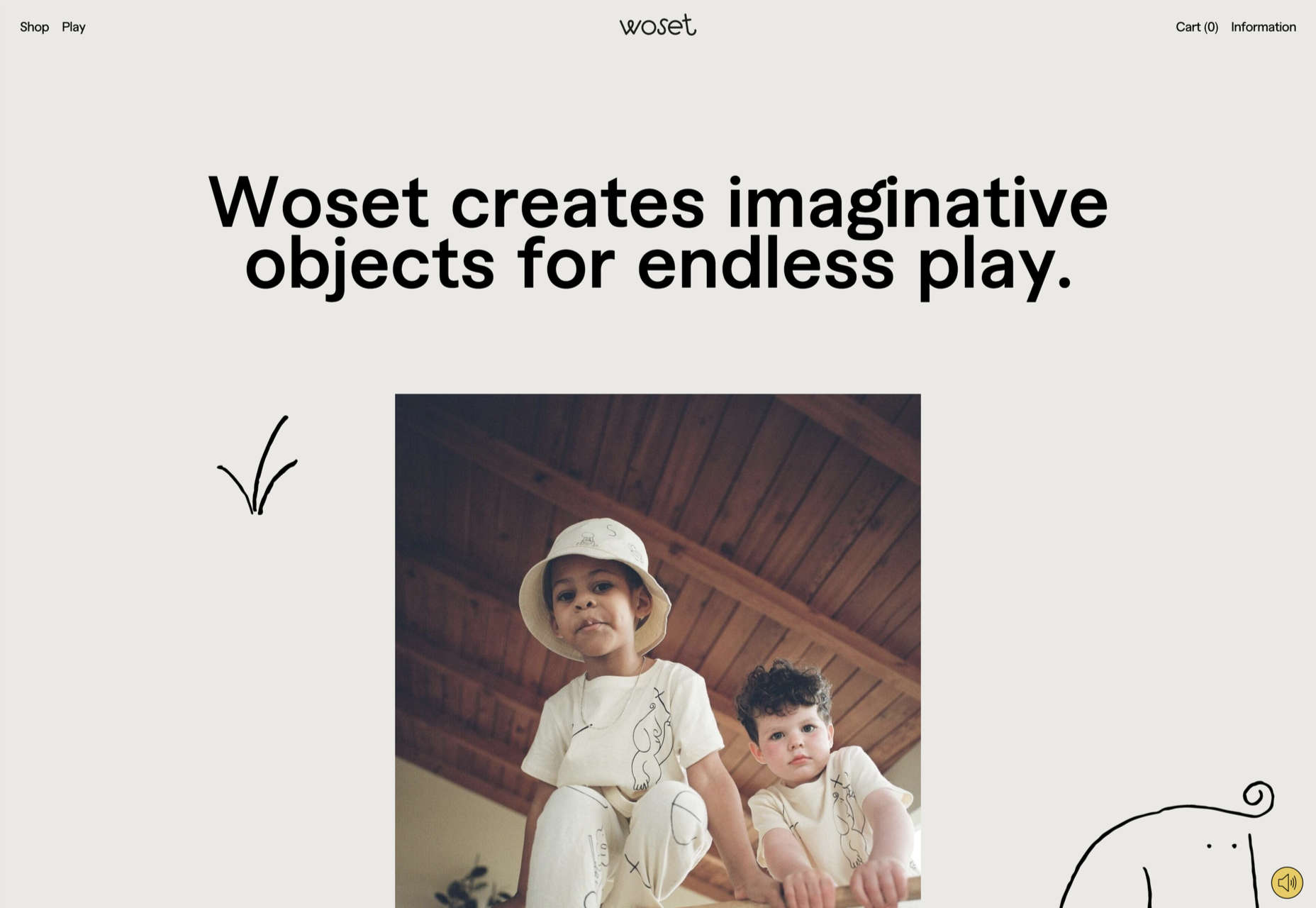
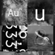
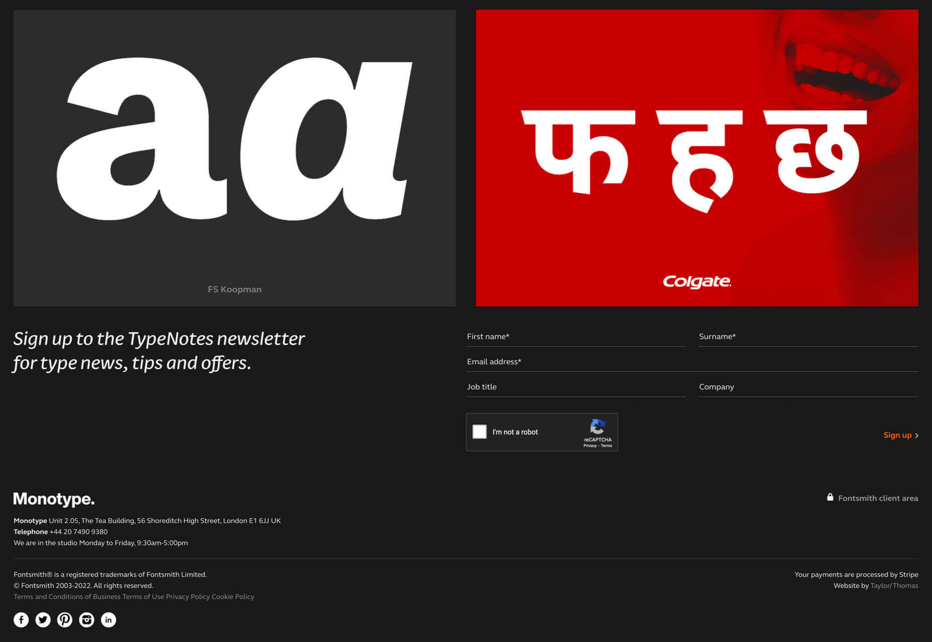
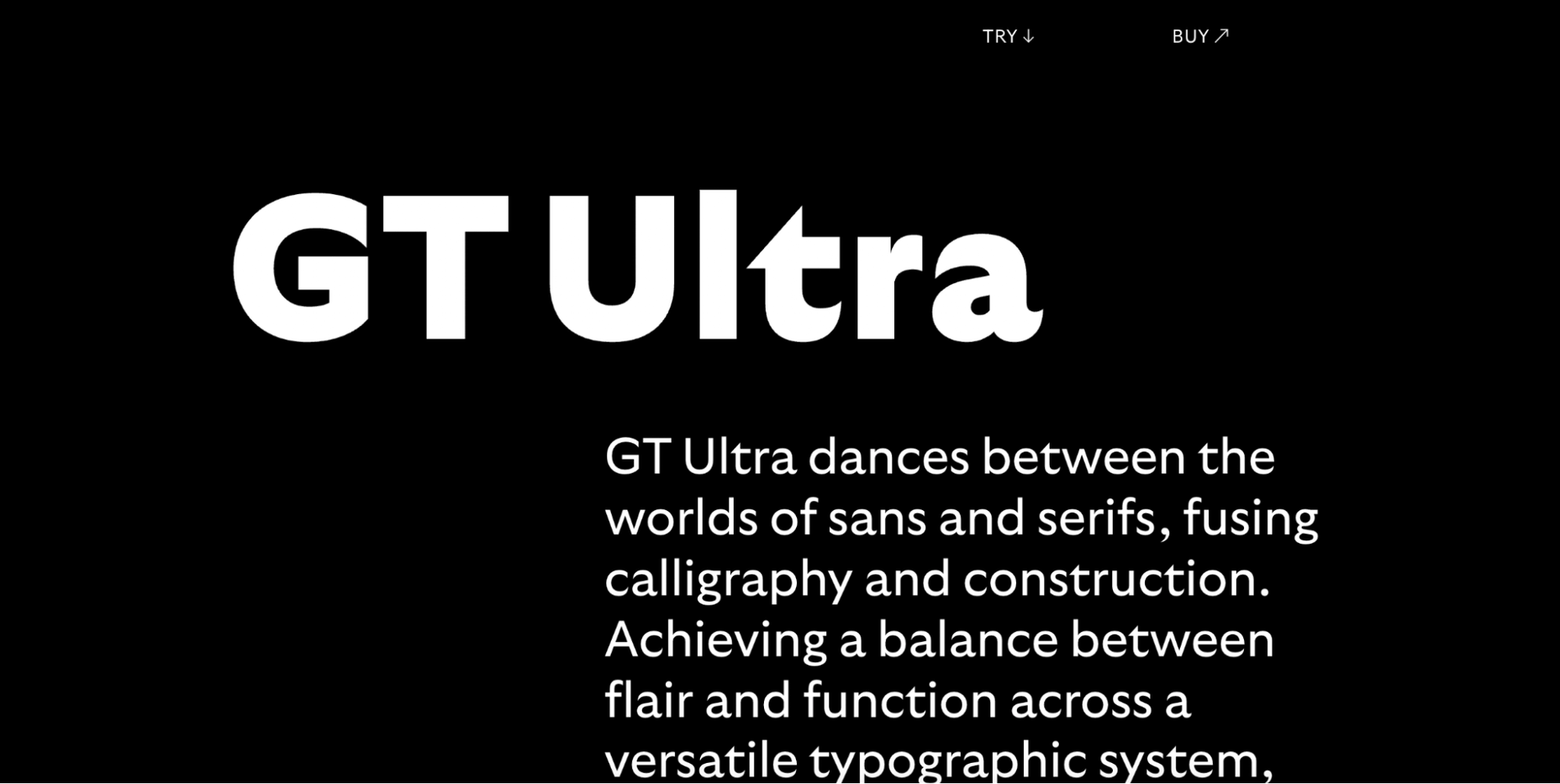
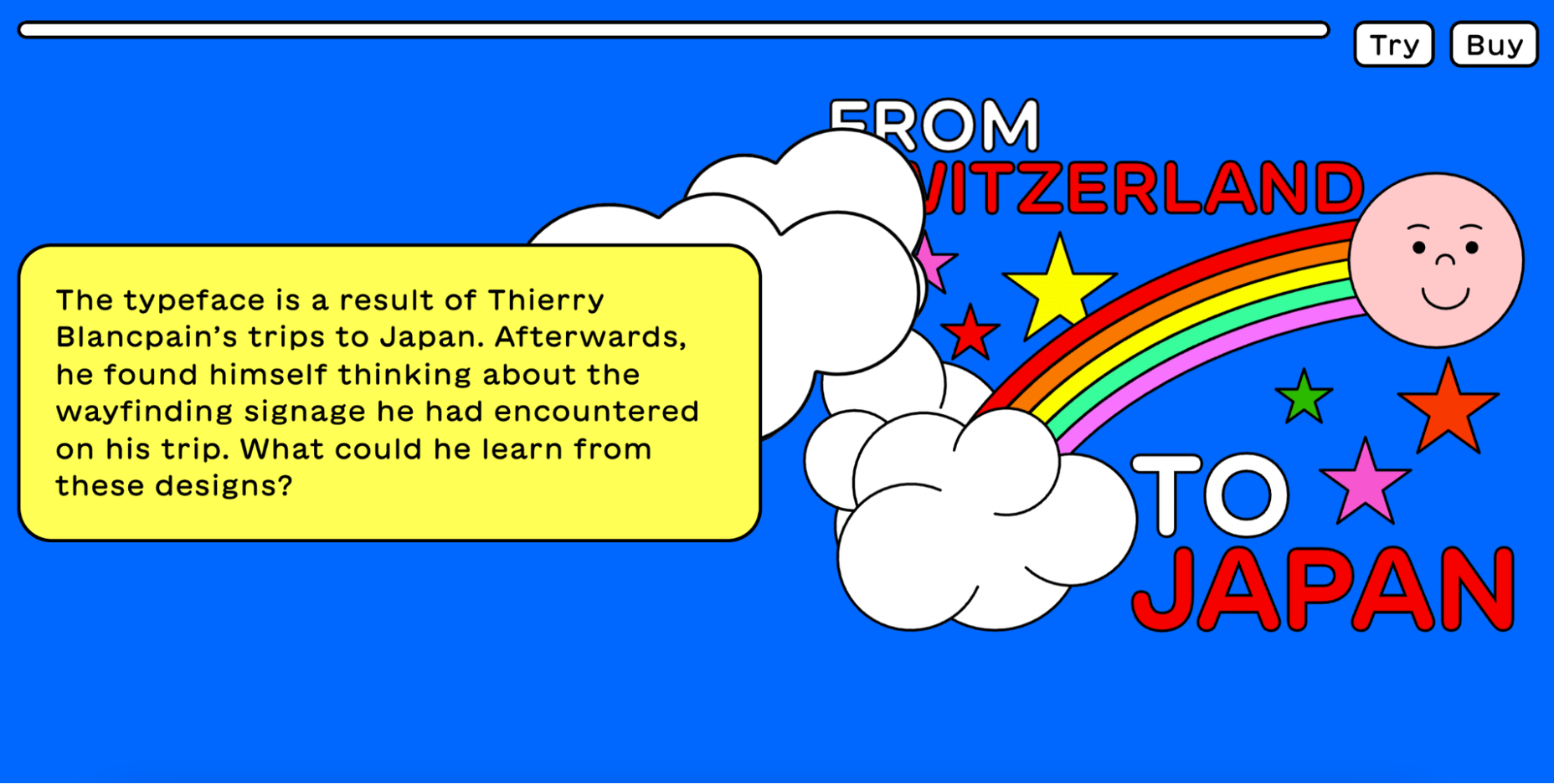
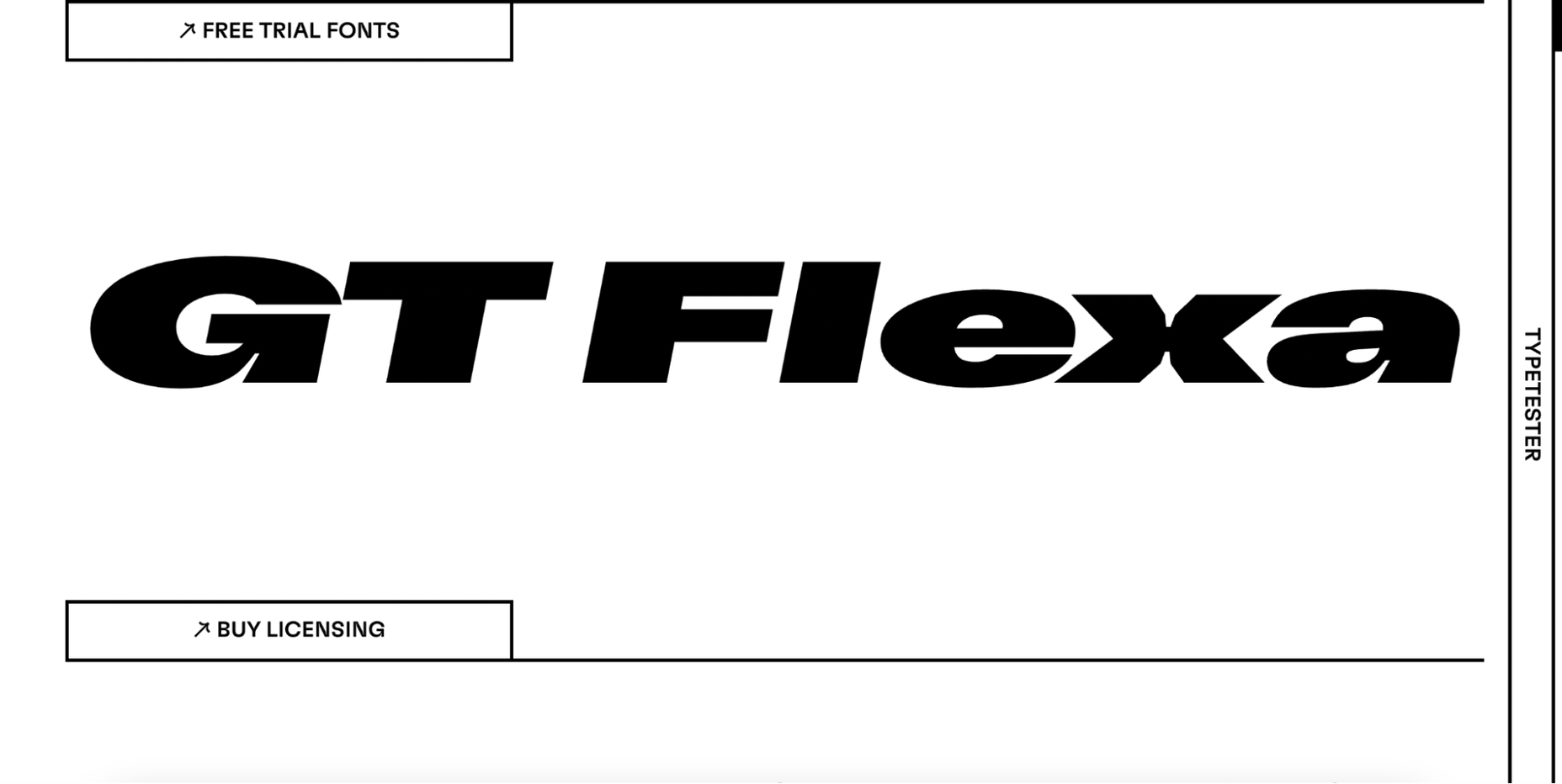
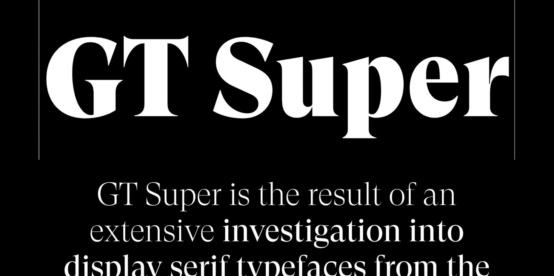
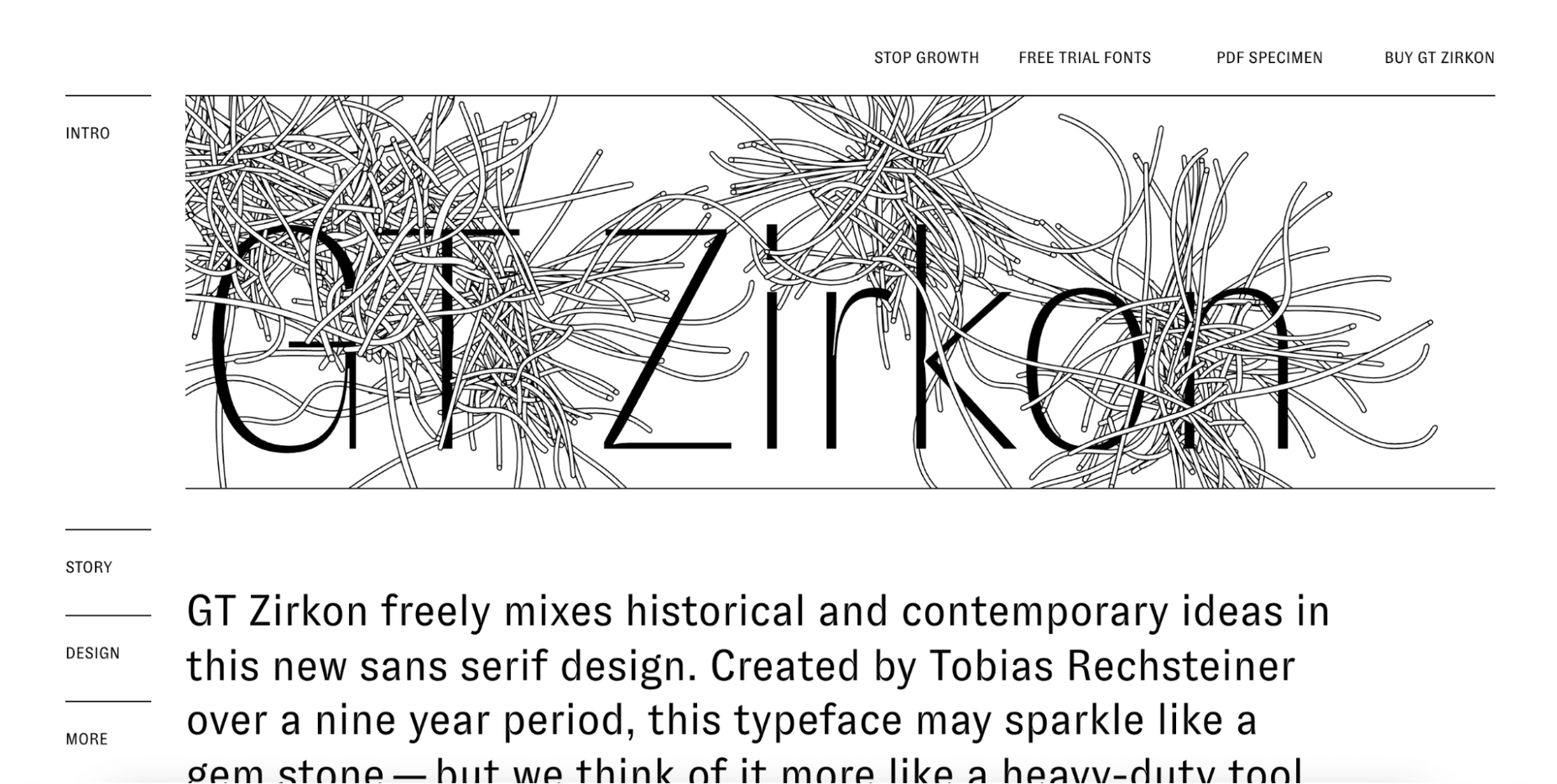
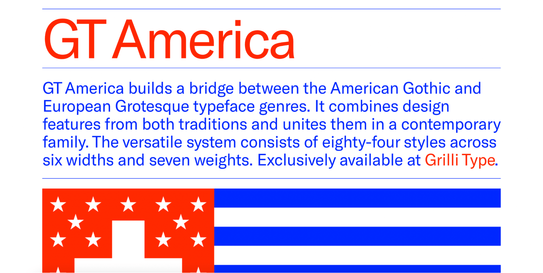
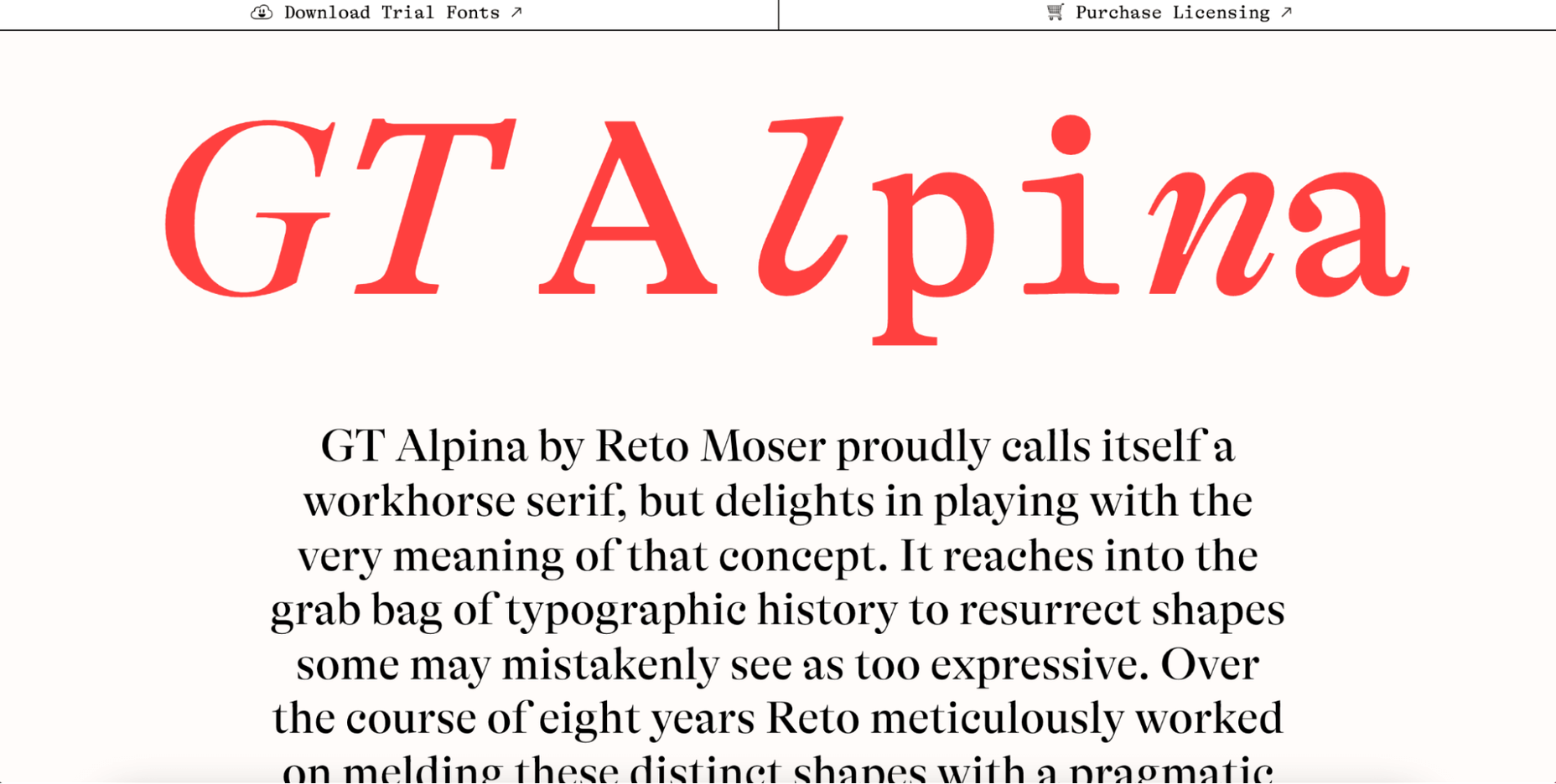
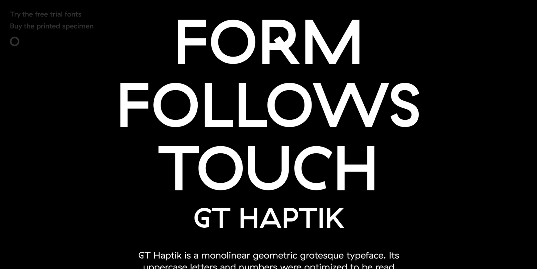
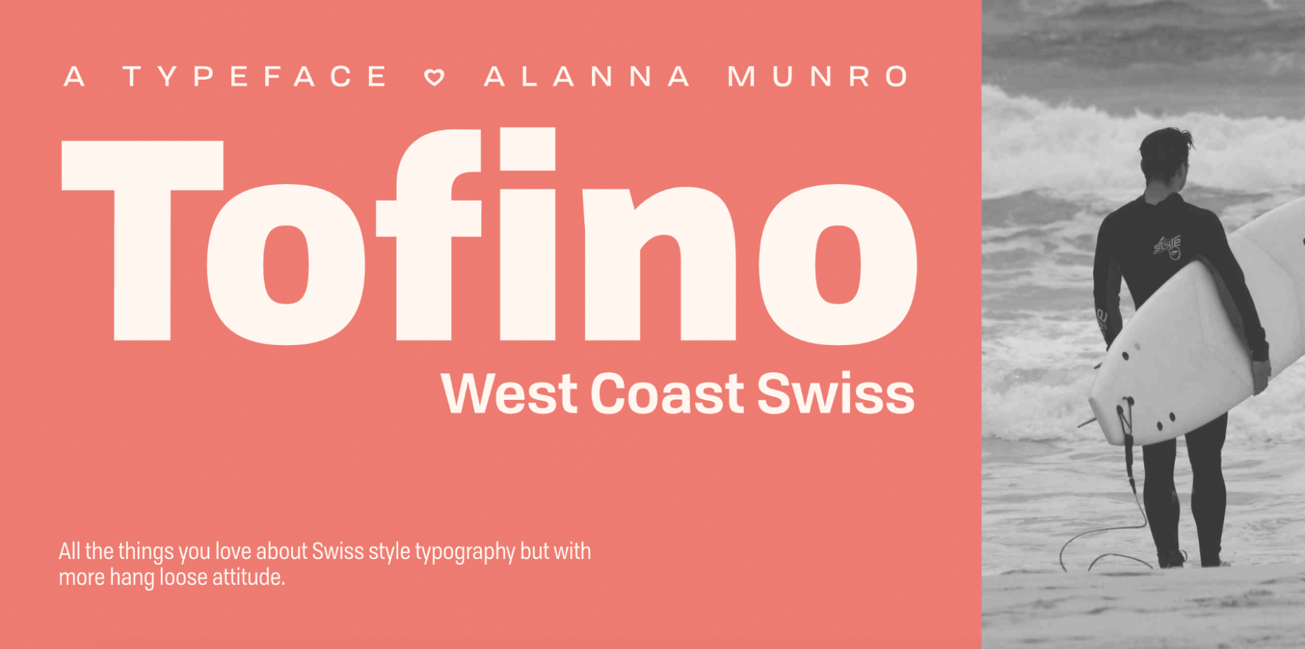
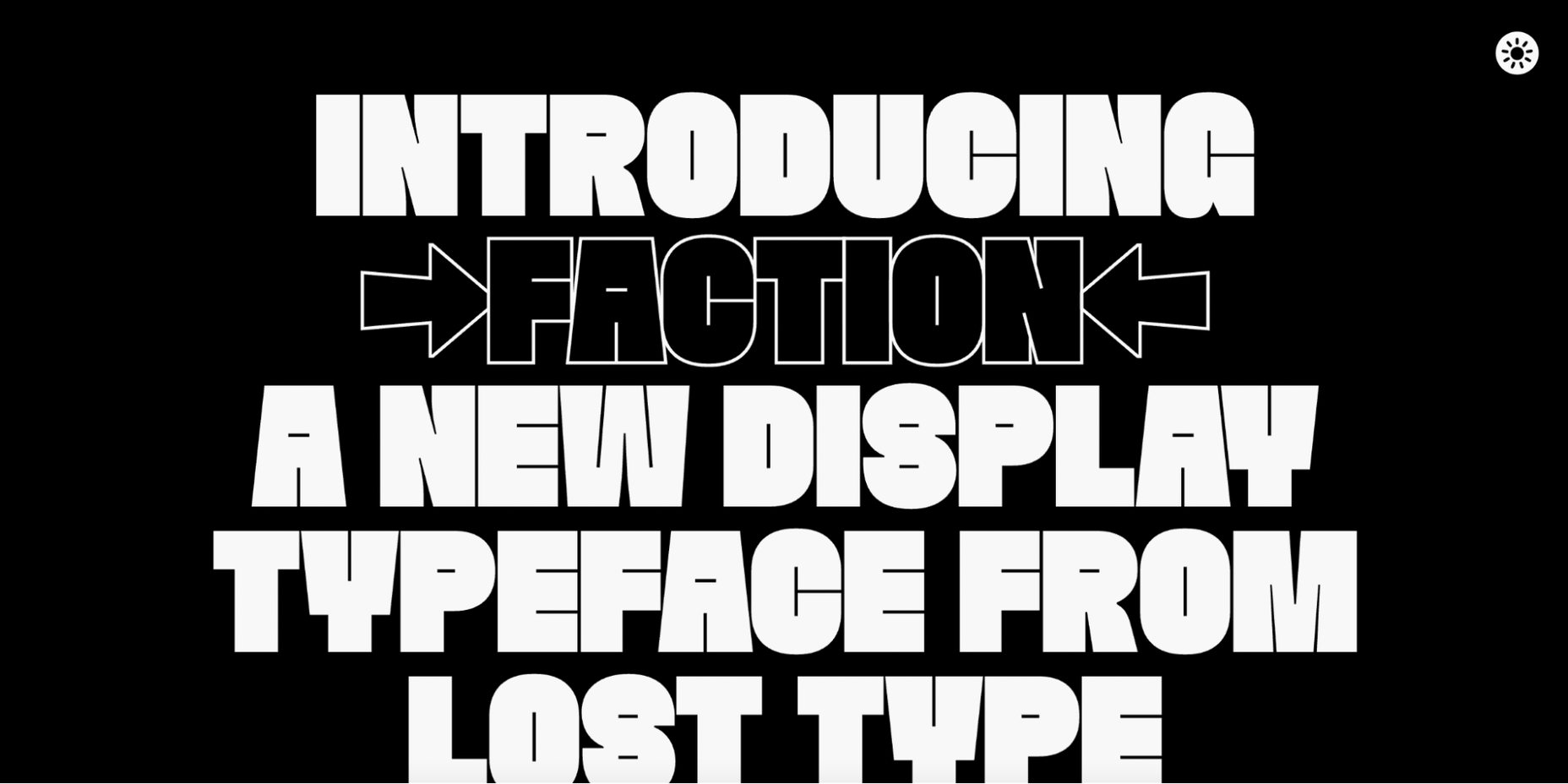
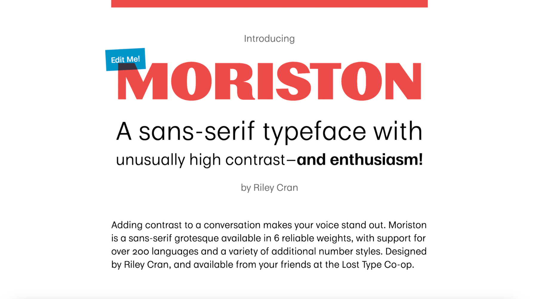
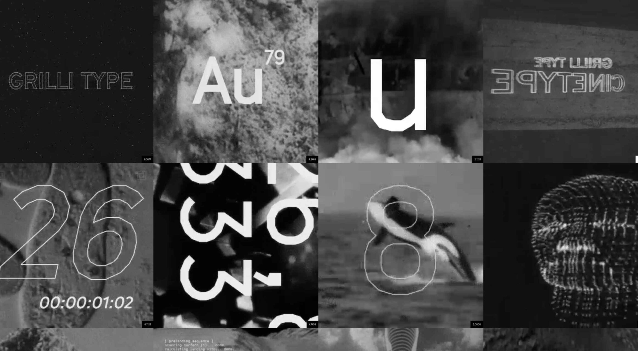
Are you looking for a unique font that will make your next project shine? Or maybe you need a typeface with a beautiful design and rich history behind it. Luckily, mini-sites for fonts allow us to creatively explore a font’s origins and history. We know (from our own experience) how important it is for UI and UX designers to have a variety of fonts for our designs.
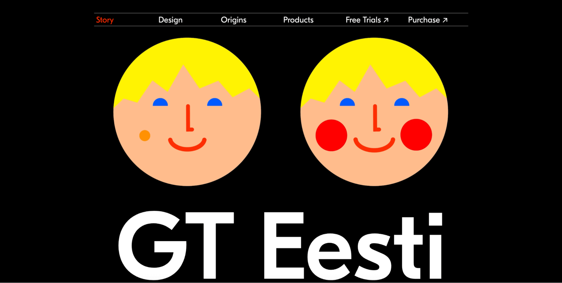
Now that 2022 is here, it’s time to expand our font collection. That’s why, after extensive research, we have created the ultimate list of the best 16 creative mini websites for fonts.

Are you ready to take a look at the most creative, cute, and fun font websites available on the market?

1. GT Eesti

This website is about the history of one of the most popular fonts on the market, GT Eesti. As you will notice, the typeface has a long history (more than 80 years) and was recently reborn in Switzerland.

As for the font, GT Eesti is a flexible geometric sans serif that can be used in almost any project. As one of the most creative websites for fonts, full of animations and interesting information, GT Eesti quickly made it onto our list.

2. Ultra Font

Are you looking for a font that combines calligraphy and elegance and sits between the sans and serif styles? 

Then GT Ultra is just what you need. We loved how the creator tells the story and structure of Ultra with beautiful animations on this unique, one-page website.

3. Maru Typeface

Maru is by far the cutest design on this list. The website is a vertical narrative of the typeface’s history. 

The typeface was inspired by the designer’s travels to Japan, and the mini-site fully reflects that. Best of all, Maru also includes a great collection of cute emojis and stickers.

4. GT Flexa

GT Flexa is a very flexible font that you can easily use for a responsive UI design. We enjoyed navigating through the minimalist mini-site and exploring the creation and history of Flexa. 

Flexa also offers a free trial that allows you to try the font before you buy.

5. Super

Super’s mini-site reminded us of earlier decades. GT Super is a vintage typeface inspired by the serif fonts of the 70s and 80s. 

Therefore, it can beautifully frame nostalgic designs. The font was designed by Noel Leu and is available in two styles (text and display).

6. GT Zirkon

GT Zircon is located in a place where creativity meets minimalism. This is one of our favorite mini-sites for fonts. 

The site showcases Zirkon’s history and design process through creative graphics, videos, and animations.

7. America Font 

This mini-site allows you to explore the history, style, and character overview of GT America, a contemporary font family. 

The designer has used elements from American Gothic and European Grotesque to create one of the most flexible typefaces available.

8. Alpina

Reto Moser recently designed one of the most popular GT typefaces, the Alpina “Workhorse” serif. 

This innovative, one-page website tells us the story of Alpina and explains how the designer jazzed up, posed, and flexed the classic book typography to create a wide range of typeface variations.

9. Cinetype

As the name suggests, this mini-site is inspired by classic cinematic movie reels. If you’re looking for a font inspired by the fascinating world of cinemas, Cinetype is simply the best choice. And on this creative website, you will learn all the reasons why.

10. Haptik Typeface

When it comes to monolinear geometric typefaces, Haptik is one of the best. This innovative mini-website tells how the Haptik font came to be and highlights the history of the font. 

The hand gesture gifs at the bottom of this one-page site are some of the most creative mini-videos we have seen in a long time.

11. Walsheim

Walsheim is a typeface designed by Noel Leu. This mini-site explains how the designer was inspired by the fascinating poster designs of Otto Baumberger, a successful Swiss painter of the 20th century (1889-1961). If you like fonts with a deep backstory, Walsheim is a must-have for you.

12. Prospectus

The Prospectus mini-site is specially designed to look like a newspaper. And let us say: the result is extraordinary. 

This one-page website explores the origins, construction phase, and classifieds of the Prospectus typeface, allowing us to experiment in real-time with the weight, height, tracking, and size of the typeface.

13. Mort Modern

Mort Modern is a unique serif typeface designed by Riley Cran in 2018. The mini-site provides information about the typeface in a creative, cartoon-like way. 

We really liked this responsive, one-page website because it is elegant and colorful at the same time. The font is available in 56 (!) styles and promises to beautifully frame any kind of modern design.

14. Tofino

The Tofino mini-site is a creative, one-page portal that allows us to discover one of the most adventurous Swiss-style fonts on the market. 

Tofino is a top choice for any travel-related project and comes in 75 unique styles. When it comes to creating a well-crafted report on a font, there’s nothing better than this.

15. Faction Typeface

We love websites that offer both a dark and light theme. And the Faction mini-site is one of them. 

In this mini-site, you’ll learn how the Faction typeface was created and why it’s one of the most popular display typefaces for modern designs.

16. Moriston

If you’re looking for a unique sans serif font with extended multilingual support, Moriston is the font for you. 

In this one-page mini-site, Riley Cran tells the story behind this typeface and explains why Moriston is the best choice for Risograph posters, monograms, and more. 

Source

The post 16 Best Typeface Micro-Sites first appeared on Webdesigner Depot.

Source de l’article sur Webdesignerdepot