Articles

Animation is a fun and interesting way to bring life to a website. Used correctly, it can capture audience attention, make your website more engaging, and even improve your chances of delivering conversions for your clients.

Unfortunately, like many things in the web design world, it’s also easy to get too carried away with animation. As professional designers and developers, it’s up to us to find the line between making the most of animation on our website projects and creating a site that’s overwhelmed with too much activity.

Fortunately, by the time you’ve finished reading this article, you’ll have a deeper insight into how you can use animation in web design, without going too over the top.

Introducing Animation in Web Design

Animations are virtually everywhere on the web today.

In the past, when designers first discovered that they could embed movement into their websites, the amount of animation we saw was often higher than it needed to be. It wasn’t uncommon to find some websites running entirely on Flash, where every element could be animated.

Fortunately, the trends of modern web design have left those practices behind. These days, it’s a lot more common to make animation a part of the overall user experience, rather than focusing on them as a centerpiece attraction. For instance, you’ve probably noticed plenty of animated sliders showing off pictures in a gallery, or transition animations when people hover over a button.

Since it’s entirely possible to construct an entire website with no animations at all, the key to creating an engaging website today is making sure that every animation you use serves a specific purpose. Your animations should make a website more attractive, easier to use, and better for navigation. Add too many, and you could even risk slowing down a site.

So, where does it make sense to use animation for web design?

1. Loading Animations

One of the best ways to use animations in a website is to distract and delight users as a page loads. You can use the animation to deliver a unique experience, or even just highlight the playful nature of your brand. For instance, just check out this classic load animation called “Tightrope.”

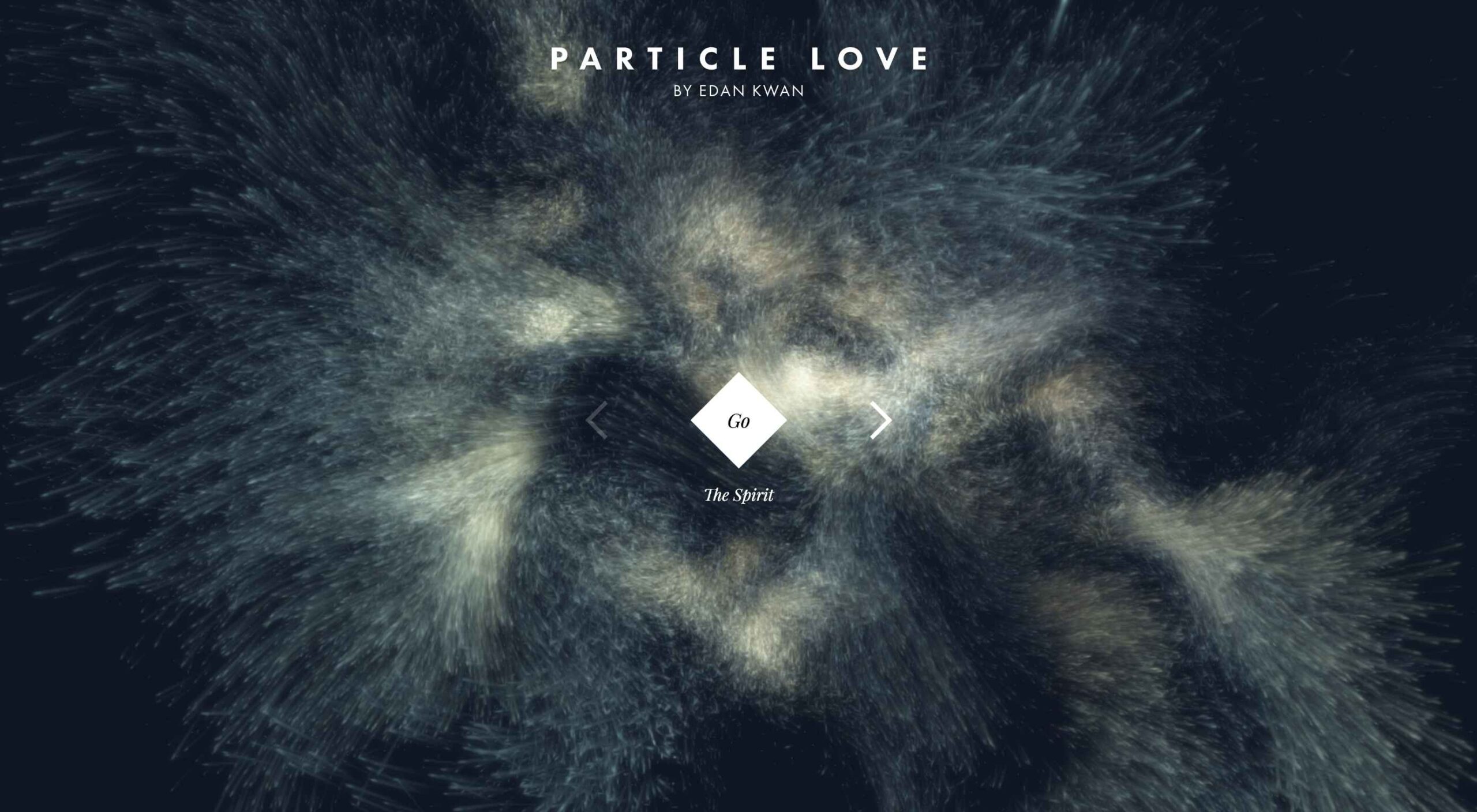
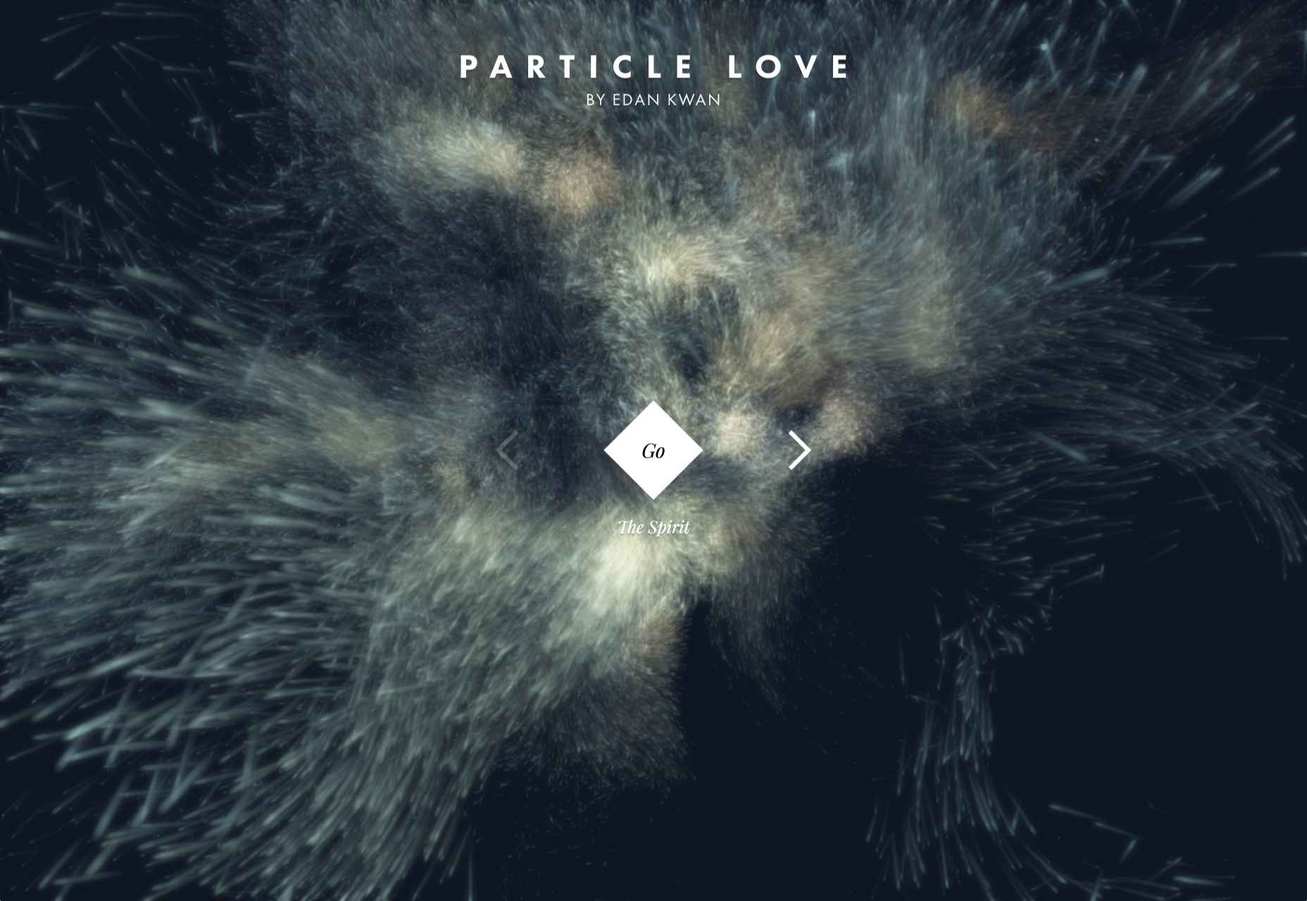
You can also use things like particle animations to capture a customer’s attention and help your visitors relax when they visit a website. Particle animations can be interactive or non-interactive, and they’re a great way to stop visitors from feeling frustrated when a page takes too long to load.

A website by Edan Kwan called “Particle Love” shows you exactly what kind of experience you can create with real-time animations.

The more you can delight visitors with experiences that keep them engaged while the information they need is loading, the less likely people will be to hit the “back” button.

2. Microinteraction Animations

Microinteractions are quick and simple animations that come with specific use cases. Usually, this animation works to provide visual feedback and information when you interact with a specific element.

For instance, this microinteraction design from Colin Garven encourages users to enter their email address and password into a login field:

Ideally, the best way to use microinteractions is to make them as subtle as possible. These tools aren’t here to steal the spotlight from other information on the page. However, they can sometimes encourage your viewers to take the next stage in their conversion journey.

Animated microinteractions can be as complex or as basic as you choose. For instance, you could use them when:

  • Highlighting if a feature is switched on or off;
  • Letting users know when actions were successful (like sending a message in a contact form);
  • Showcasing important information, like prices on a table;
  • Animating icons on your site to encourage action;
  • Depending on your experience with animations, you can even find themes and plugins that come with options already built-in.

3. Dynamic Backgrounds

An animated background can be an excellent way to make your website stand out from the crowd. However, it’s important to remember that excessive animation has a habit of making your site slower and more clunky than it needs to be.

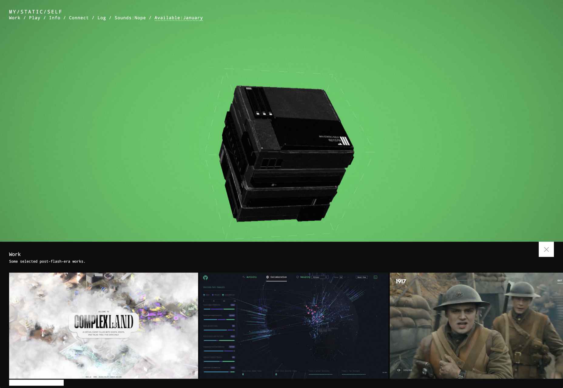
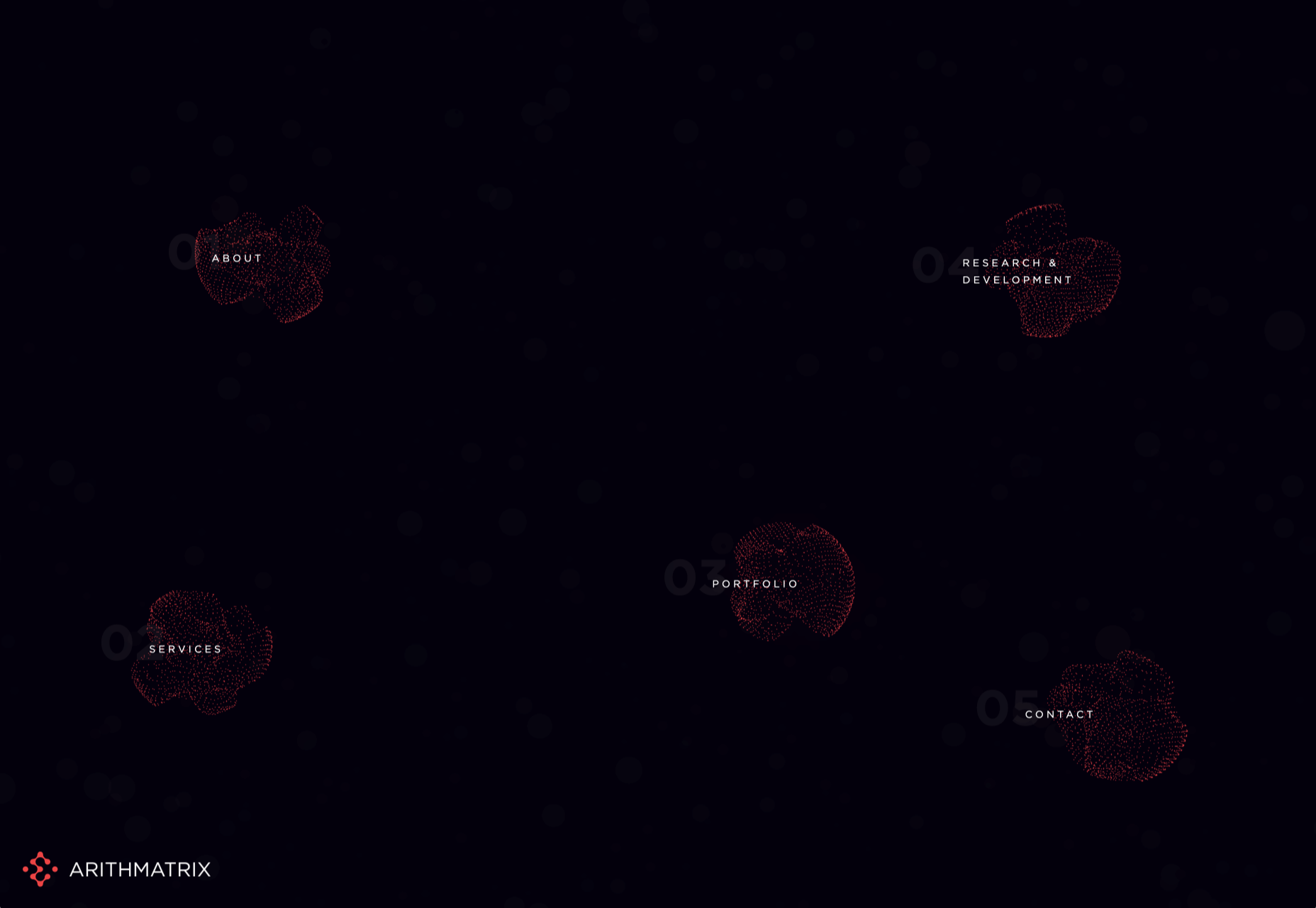
The animated background on the mystaticself.com website is fantastic for introducing customers to new information with a handy dynamic menu.

Often, the only reason that you should create your own dynamic background for a website, is if it’s going to improve your customer’s experience in some way.

Remember, ensure that the animations that you’re using on your website aren’t going to make any aspect of your site more difficult to use. Animated backgrounds need to offer a compliment to your existing website, rather than distracting customers from what they want to do.

Before you go all-in with your background animations, focus on animating small sections of an image, one piece at a time. You can also animate components with very small motions too.

4. Reveal Hidden Messages

Another excellent way to use animation in web design is to harness it for showcasing important information. For instance, a navigation menu is an important component in your website design, but it can also take up a lot of valuable space.

In some cases, a hidden menu that appears when a customer scrolls over a small box or icon could make a lot of sense. You can also think about animated drop-down menus if you’re working with a website that has a large number of pages.

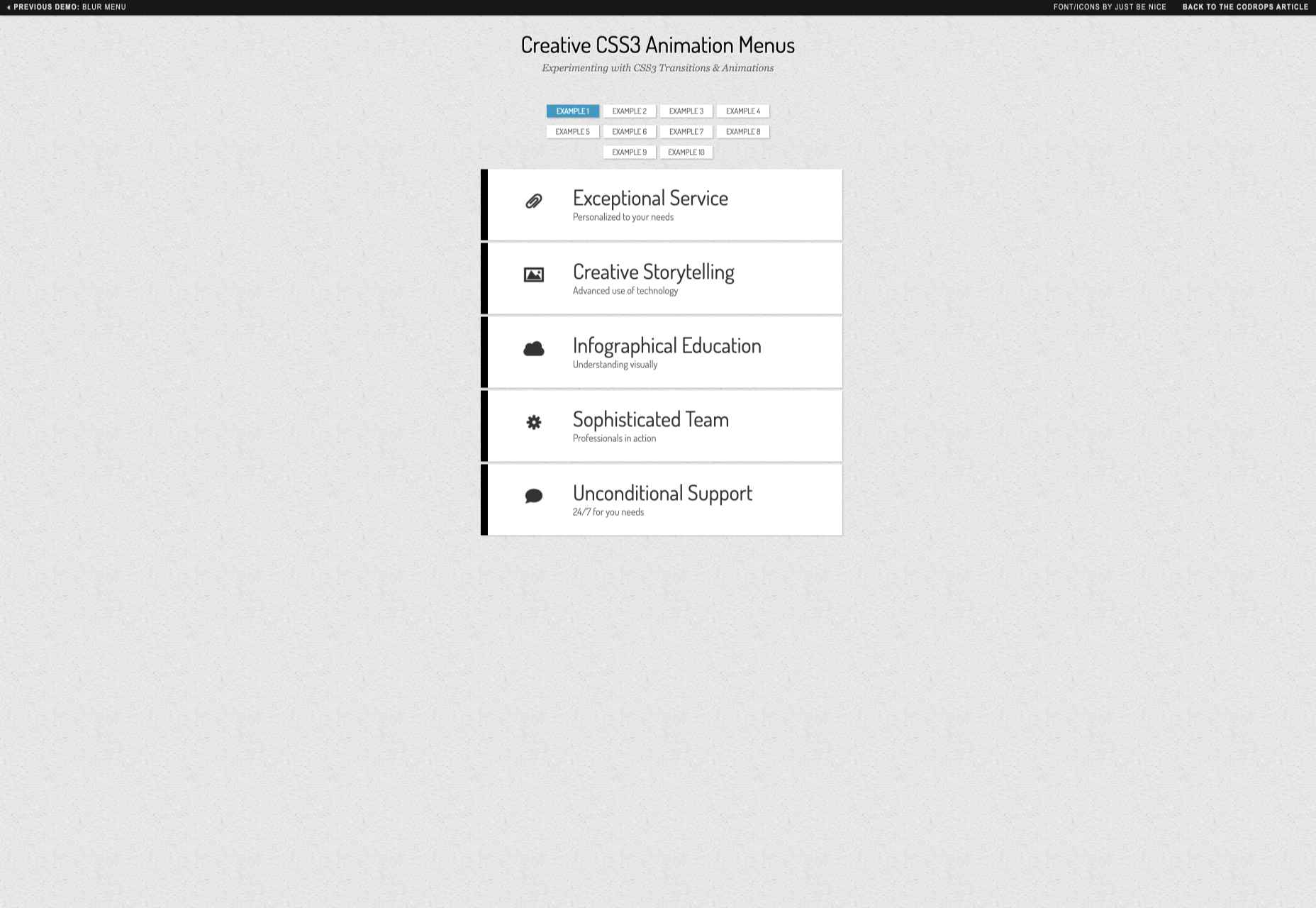
Check out this fun example of an animated CSS3 menu:

The sections change color and move as you hover over them, making it easier to see exactly where you’re clicking.

It’s up to you exactly how creative you want to be when you’re playing with animated menus. The easiest option is often just to have a component that changes color or shape with a hover effect. However, you can also expose hidden menus and extra information too.

For instance, with some websites, you can create pictures that turn over to show information on the other side. That means that you could create an about page with pictures of team members, which flip to show biography information.

Just make sure that everything works smoothly, both on desktop and mobile.

5. Try Carousels

Finally, we come to perhaps the simplest and most popular way of using animation in web design. Carousels are a common component of almost every theme on the web today. They’re great for showing off useful information, such as what a website has to offer, or which deals are available.

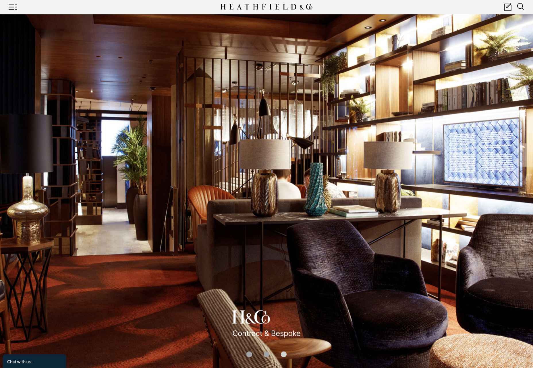
When creating a carousel, you can either give your users control over how quickly an image transitions, or you can implement automatic movement. On the heathfield.co.uk website, the designer has added buttons to let you flip backwards and forwards between photos, while also ensuring that the animation is automatic.

Without the animation to show you the pictures sliding into space, the transitions between each picture would be instant – which is a little more jarring for viewers.

Sliders are such a common component of web design today that customers almost expect to see them on many websites. That means that you can enjoy a very effective experience if you want to avoid doing anything too dramatic with your websites.

You can use sliders for everything from showing off products, to displaying testimonials from customers and more. It’s a great way to compress a lot of useful information into one small space on a site.

Use Website Animation Carefully

The most important thing for most designers to remember with animation and web design is that it’s entirely possible to have too much of a good thing. When it comes to creating amazing designs for your clients, you can take advantage of animation to encourage more engagement and a unique experience. However, you shouldn’t allow yourself to go too over the top.

Rather than animating every aspect of a page to constantly grab visitor attention, think about how you can make the visitor experience more compelling with the right animation choices. If an entire page of animation on the background isn’t right for your target audience, perhaps custom animations on a navigation bar or a slider would be a good option instead.

At the same time, remember to make the most of the latest technologies on the market for adding animation to web design. A good combination of CSS3, JavaScript, and HTML5 often makes it easier to create more immersive, high-quality animations that users can interact with on desktop and mobile alike.
Source


Source de l’article sur Webdesignerdepot

Personalization; it’s probably one of the most important design trends to emerge in recent years.

As consumers in all industries become more demanding, they’re increasingly searching for online experiences that are customized to suit their individual needs and expectations.

Today, personalization exists in virtually every digital interaction, from adverts on social media to PPC campaigns and email marketing efforts.

Used correctly, the manipulation of demographic, behavioral, and other in-depth user-data can help designers to create dynamic, highly customized content for each website user. At the same time, these unique websites ensure that designers really make an impact on behalf of their clients, outshining the competition and driving amazing results.

What is Hyper-Personalization?

Basic personalization in web design involves making changes to a design based on what you know about your client’s target audience.

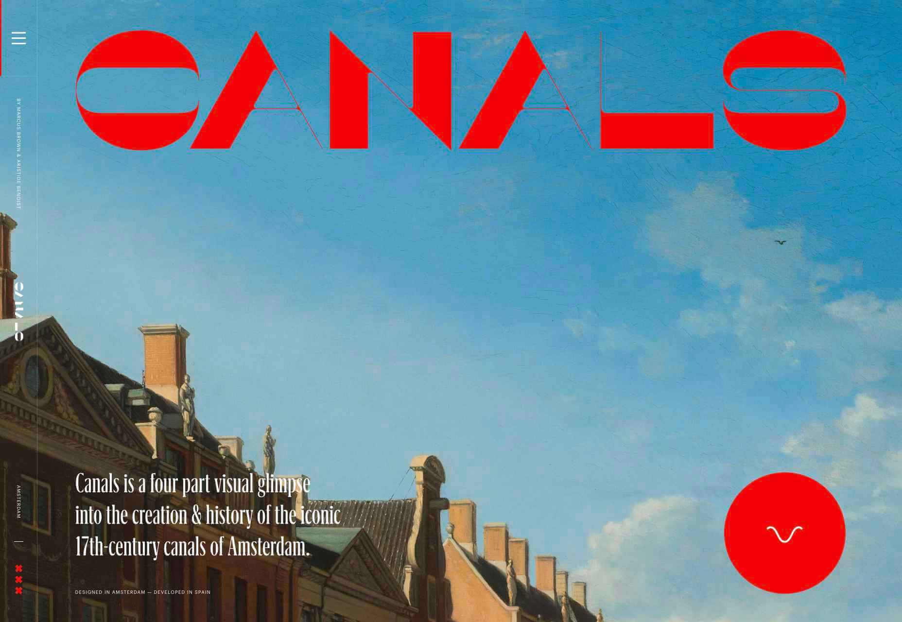
For instance, if you knew that you were designing for an audience that spends more time on their smartphone than their computer, you’d concentrate on building hyper-responsive experiences for small screens. For instance, the Canals-Amsterdam.nl website is specifically designed to support people using smartphones to swipe, tap, and scroll.

If you’re aware that your customer’s target market is other businesses, you might put more testimonials, free demo CTAs and other enticing components on the website to encourage investment.

Hyper-Personalization is an emerging trend for 2020 that focuses on going beyond the basic understanding of a target audience, to look at genuine customer data. Hyper-personalization is all about leveraging in-depth omnichannel data to drive more advanced customer experiences on every page of a website.

For hyper-personalization to be genuinely effective, designers need access to virtually unlimited data, from CMS systems, sales teams, marketing experts, and more. When you have that data handy, you can use it to:

  • Design websites that showcase dynamic CTAs, featuring content relevant to each user;
  • Implement sign-in screens for customers vs. demo requests for new leads on home pages;
  • Showcase products similar to past pages when repeat customers return to a site.

Why is Hyper-Personalization Important?

Personalized experiences have always been important to the sales journey.

However, in an era where companies are constantly competing to grab user attention, you can’t just cater to your site designs to a group of people anymore. Increasingly, users are expecting specific interactive moments on websites, made just for them.

Amazon is an obvious example to consider here. As one of the world’s leading online shopping sites, Amazon’s efforts with website personalization are incredible. The Amazon website uses tools integrated into the back-end of the marketplace to watch everything a customer does on its platform.

As users browse through the website, the site jots down each category that you look at, and which items interest you. Thanks to this, Amazon can suggest which products you may be most interested in.

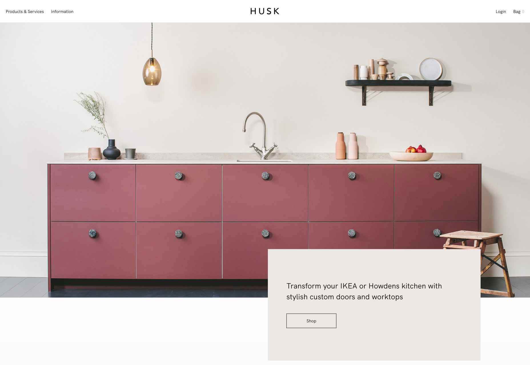
Websites like Madebyhusk also offer an incredible insight into hyper-personalization, allowing users to browse for the products that appeal to them based on in-depth filters like edging and color.

The result is a higher chance of conversion.

When customers feel as though they have complete control over their buyer journey, and that each step on that journey is tailored to them, they’re more likely to buy.

Better Converting CTAs

A call to action is an excellent way to move things along when you’re encouraging the buying process with your target audience.

Used correctly, your CTAs can encourage more than just cart conversions. They can also convince people to sign up for your newsletter via a subscription form, take a survey, or begin a free demo.

Regardless of the CTAs that you choose to implement, personalization will quickly make your requests more effective. According to studies, CTAs that are personalized are 202% more effective than generic alternatives.

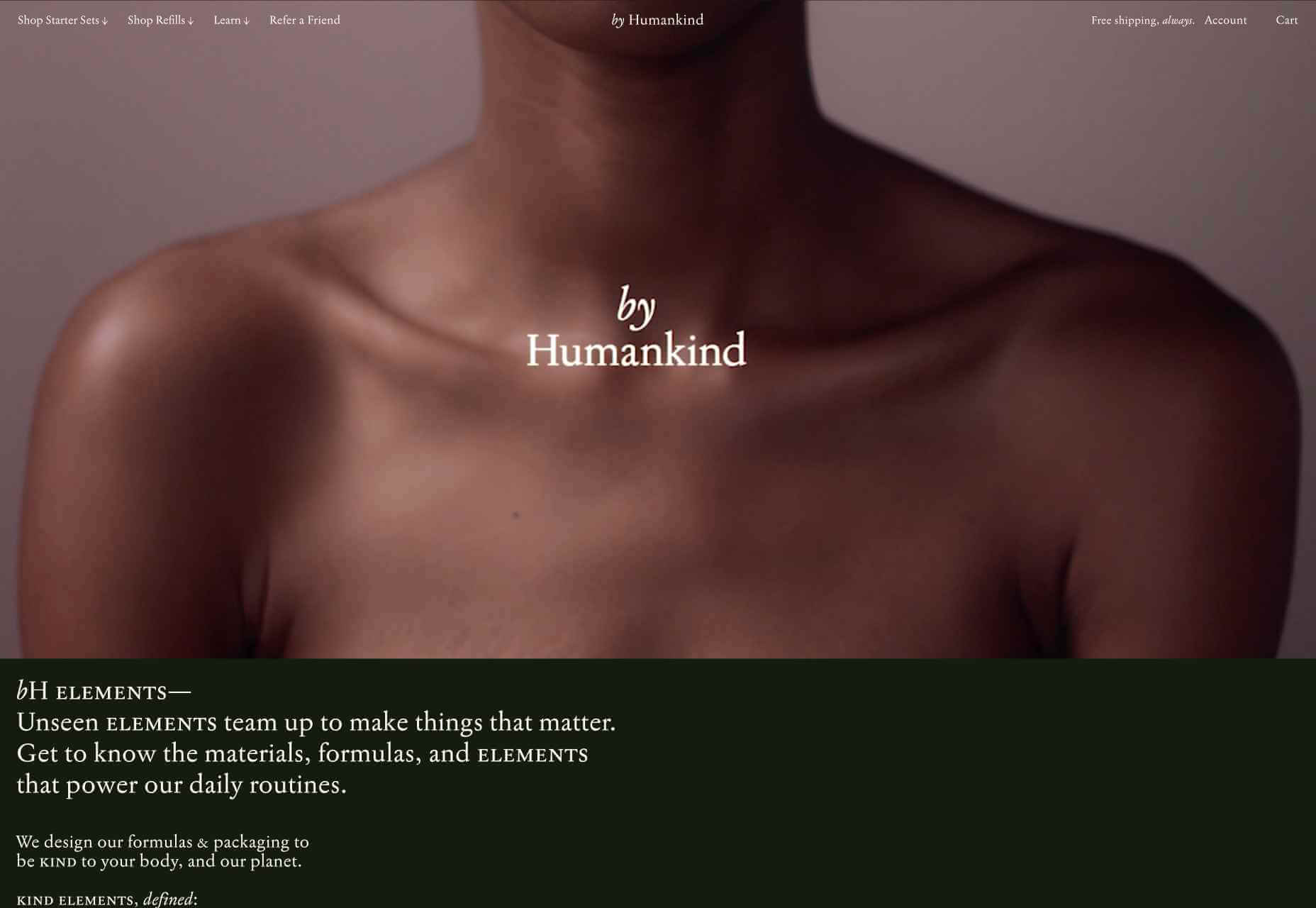
For instance, Byhumankind.com uses a crucial statement: “Great personal care products don’t have to come at earth’s expense.” Followed by an engaging CTA to drive positive action from their audience. The company knows that they’re appealing to a customer interested in saving the planet, so they make the benefits of “Getting Started” obvious immediately.

Using data provided by clients, designers can figure out exactly how to position CTAs and offers for customers. For instance, notice that Humankind has a green colored CTA button.

Most buttons take advantage of bold colors like red and orange, but the green shade for Humankind further highlights the nature-driven personality of the brand.

Relevant Product Recommendations

Repeat customers are infinitely more valuable than people who purchase just one item from your site.

However, convincing a standard customer to become a repeat client isn’t easy. Sometimes, clients need a push to determine what they want to buy next.

Fortunately, as a website designer, you can help with that. Using dynamic modules in the product pages of your customer’s website, you can show individual end-users what they might want to purchase next from a specific brand.

These dynamic modules can use information about what each customer has purchased in the past, to suggest a new product or service. Amazon do particularly well in this regard, leveraging a vast marketplace and treasure trove of information to make quality recommendations. But you don’t need to be designing a considerable website for a global business like Amazon to take advantage of dynamic suggestions. Any business with a focus on hyper-personalization can benefit from this strategy.

Increased Time on Site

Any form of personalization on a website can significantly improve the amount of time a customer spends in that digital environment.

Imagine walking into a restaurant that seems as though it was designed specifically for you. The décor, the seating arrangements, and even the menu are customized to your taste. You’re more likely to spend your time and money there than on any generic food place you find on the street.

The same rules apply to website design. The more hyper-personalized you can get with your client’s design, based on what you know about their customers, the easier it will be to keep customers engaged.

For instance, the WarnerMusic.no website entices visitors with various high-quality images of popular bands and artists, before providing them with endless information about the brand and what it does. The designer of this site knew that it needed to appeal to the visual demands of the audience first, before offering useful information like featured artist lists, News, and blog posts to keep the users on site.

Hyper personalization is all about figuring out what kind of end-user you’re designing for, so you can build the digital environment that’s more engaging and compelling to them. Some designers even create dynamic pages that change depending on whether a customer is a repeat client or a new visitor.

Improved Loyalty and Affinity

Finally, it’s human nature that we all want to spend time with the people that treat us best.

We all value excellent customer service, which is why customer experience is the most significant differentiating factor for any organization today.

Web-based personalization works in a similar way. When you use your design tools to make the site experience that you give to each visitor warm, individualized, and welcoming, then your clients are sure to see a boost in customer loyalty.

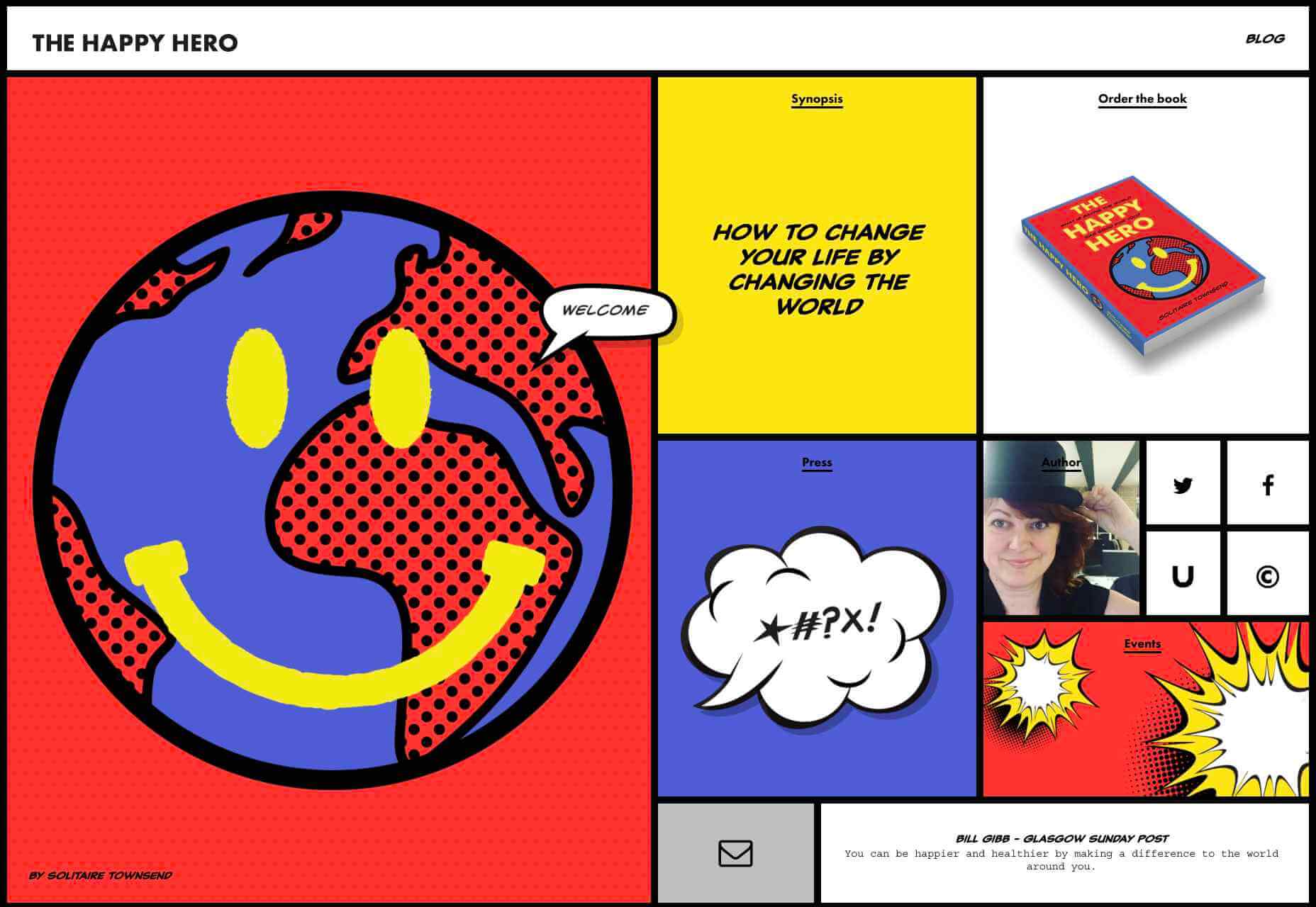
Around 89% of consumers say that they’ll only consider buying from brands that care about them. As a designer, you can convince every website visitor that they’re going to get the experience they deserve. Just look at how TheHappyHero.com instantly lets clients know that they can expect a fun and friendly interaction on every page.

Accessing useful data from the companies that you’re working with before you begin developing and designing a website could be the key to creating happier customers and higher conversions.

The more delighted end-users are with the experience that a website gives them, the happier that your client will be with you – increasing the impact of your design portfolio.

If you can create customer loyalty and affinity for your client, then you will be able to develop the same feelings between yourself and your client. This could mean that you earn more recommendations as a designer and build your position as a leader in the industry.

Hyper-Personalization is Crucial for 2021

As companies continue to worry about how they can safely use data without crossing the line when it comes to customer privacy, hyper-personalization has stayed just out of the mainstream. While it may be a while before we see every website designer starting their process with piles of in-depth data, it seems that we are heading in that direction.

Customers in 2021 and beyond will undoubtedly want a more advanced and customized experience from the brands that they interact with – particularly in an era where it’s becoming much easier to deliver meaningful moments online.

Source

Source de l’article sur Webdesignerdepot

Autre source / On the same theme

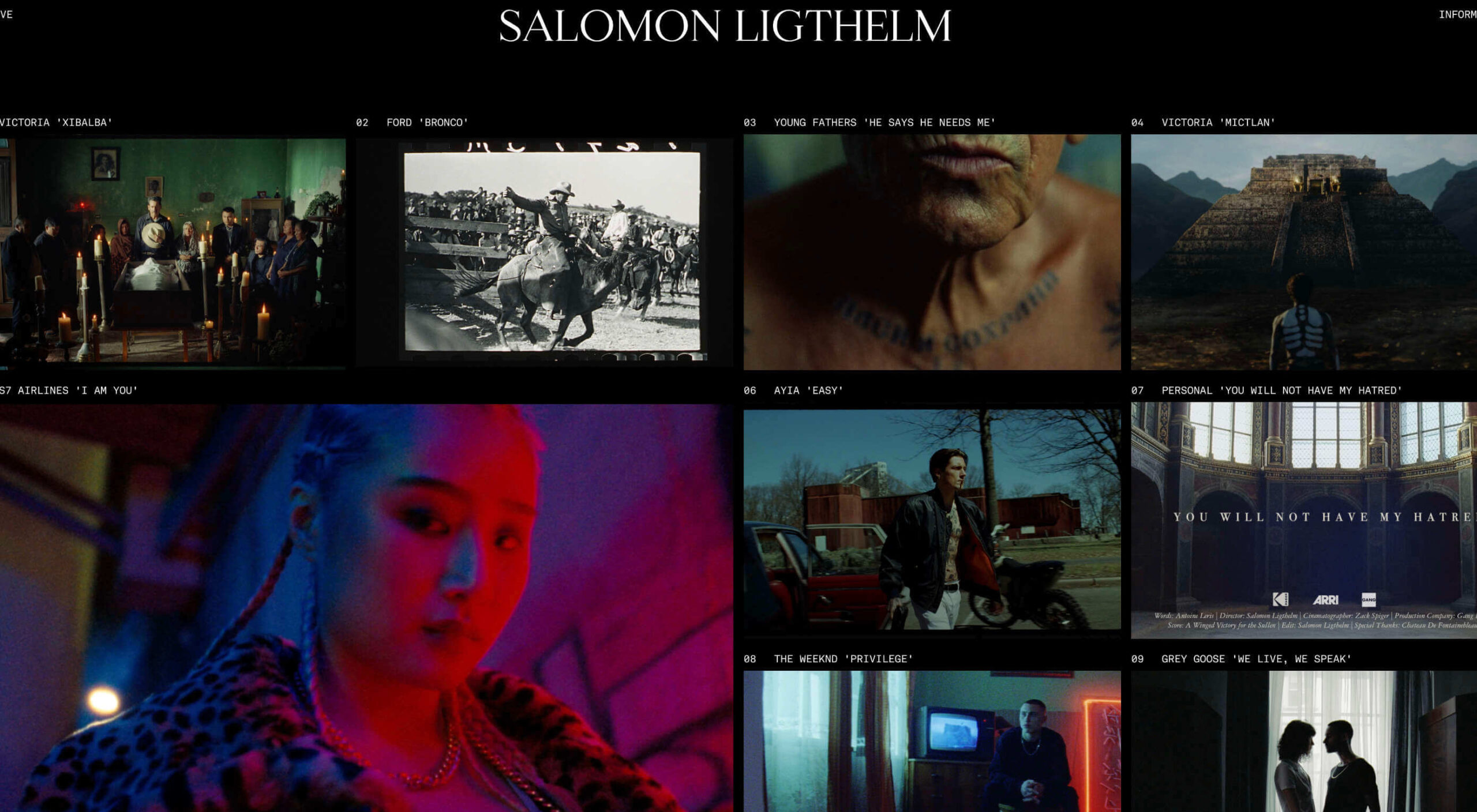
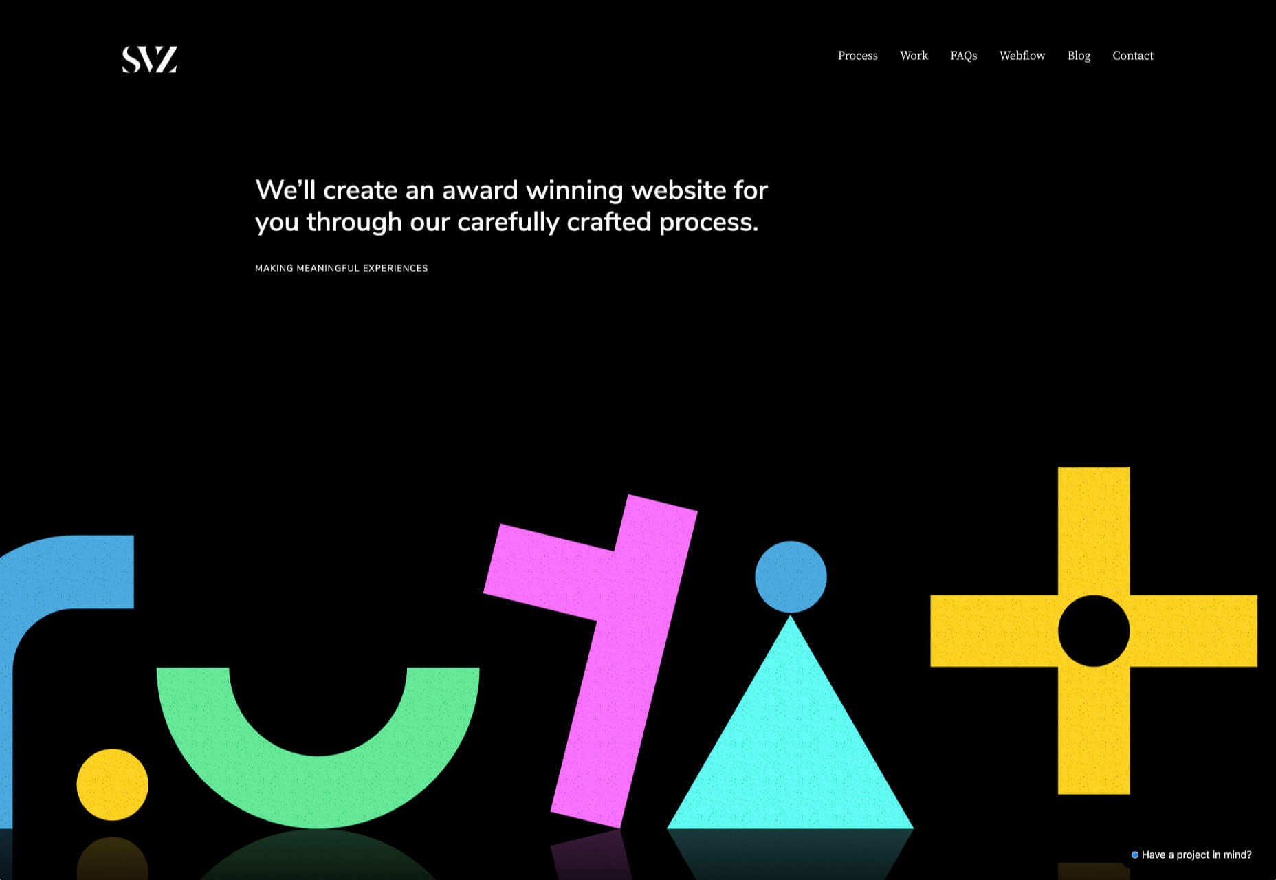
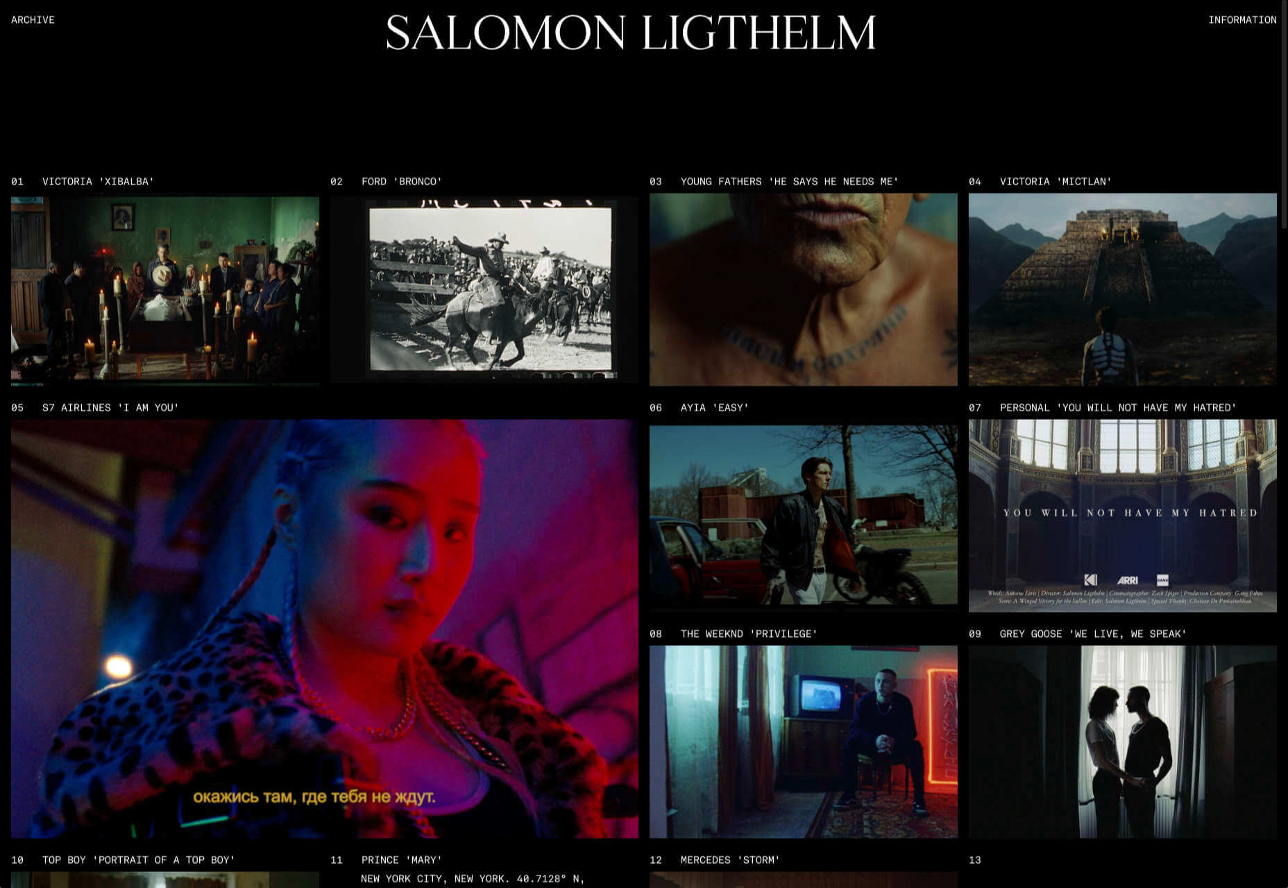
Dark themes are everywhere these days. 
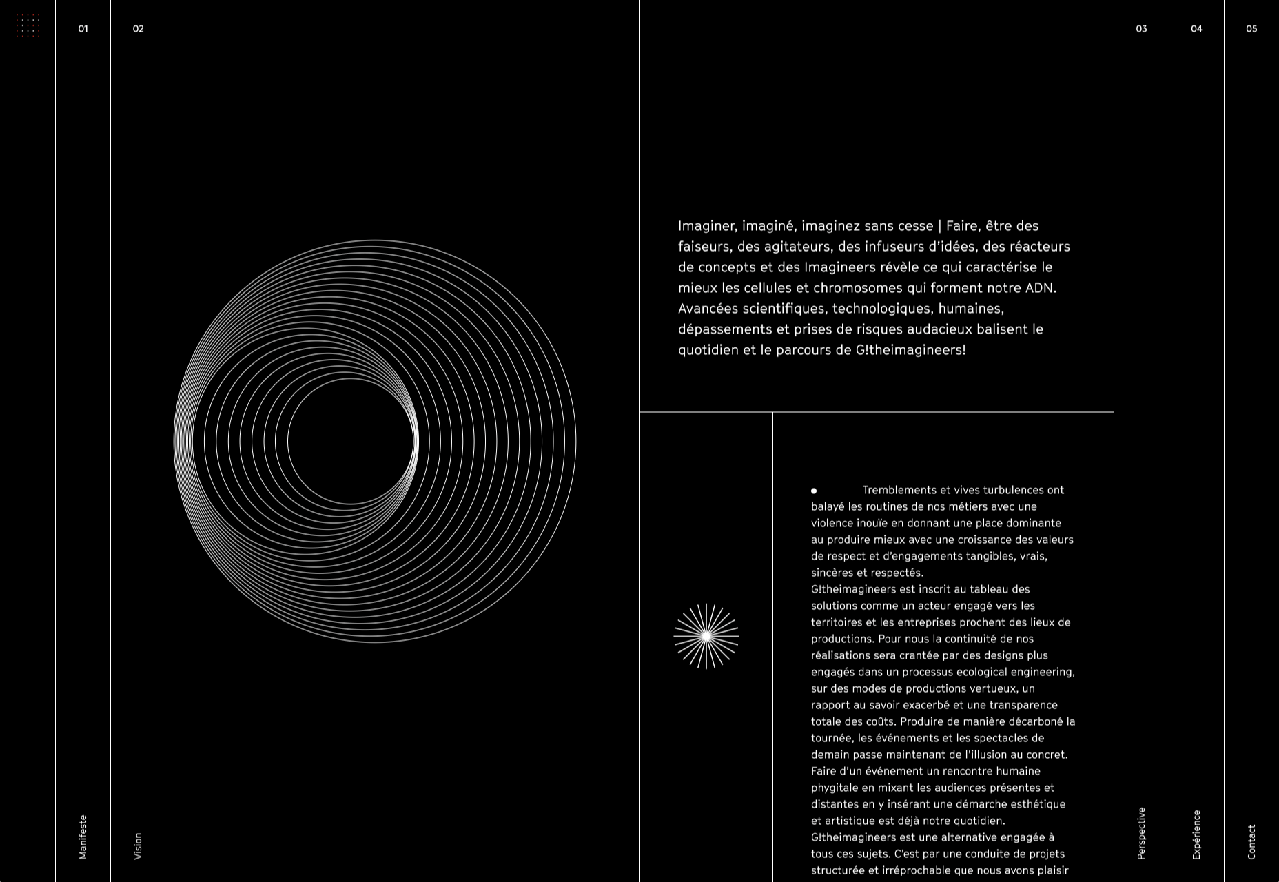
As human beings continue to spend more of their time interacting with technology, dark themes provide a more relaxing way to engage with the digital world. More often than not, these themes are easier on the eyes, more attractive, and perfect for the dedicated user

Throughout 2020, countless leading brands have debuted their own version of the dark theme. Google has a solution for your Drive, while Apple and Android have built dark theme performance right into their operating systems. 

If you haven’t learned how to make the most out of dark mode yet, then you could be missing out on an excellent opportunity to differentiate your design skills, and earn more clients going forward. 

Why Dark Mode?

Before we dive too deeply into the possibilities of creating your own dark theme, let’s examine what dark mode is, and why it’s so effective. 

Ultimately, dark themes are created to reduce the amount of luminance emitted by everything from your desktop and laptop, to your smartphone and smartwatch. Dark themes help to improve the visual ergonomics of design, by reducing eye strain, adjusting brightness to suit current lighting conditions, and more. Additionally, many dark mode offerings are also fantastic at conserving battery life. 

Here are some of the main benefits of adding dark themes to your design portfolio

  • Better user experience: A focus on user experience is one of the most important trends of the digital age. You need to be willing to deliver incredible experiences to everyone who visits your website if you want to stand out today. Dark mode reduces everything from eye strain, to battery power consumption. This helps to keep customers on a website for longer.
  • Innovation and cutting edge appeal: Most companies want to prove that they can stay on the cutting edge of their industry. The ability to offer an opt-in dark mode version of a website theme or appearance can help your clients to stand out from the crowd. As the environment becomes more mobile-focused, more companies will be looking for designers that can provide the best mobile experiences. 
  • Support for universal design: Dark mode isn’t just great for people who have light sensitivity at night. This solution could be more comfortable for visually-impaired users who would struggle with eye strain when visiting your websites otherwise. If you want your content to be more inclusive for a wider range of viewers, then learning how to design for dark mode is a good way to start.

Best Practices When Designing for Dark Mode

Designing for dark mode is easier than you’d think. Most of the time, it involves simply thinking about how you can replace some of the brighter, more overwhelming aspects of your site, with something deeper and darker. 

Here are some useful tips that will get you moving in the right direction. 

1. Experiment with Colors

A big issue for a lot of web designers when it comes to developing a dark mode solution is that they get too caught up with things like pure white text against pure black backgrounds. However, this high-contrast option can be a little much after a while. 

It’s often much easier to use a dark grey as your primary surface color, instead of a true black. Additionally, rather than using bright white, think about slightly off-white alternatives that will be warmer to the eye.

Experiment with surfaces and color combinations that are unlikely to cause too much eye strain. Dark grey foundations often offer a wider range of depth, too, because you can demonstrate shadows on grey. 

Additionally, when you are experimenting with colors, remember that saturated colors often vibrate painfully against very dark surfaces, making them harder to read. Desaturating your colors will help to reduce the contrast and make your websites more welcoming. 

Lighter tones in the 200-50 range will have better readability on dark themes. However, you can always experiment with your choices. Google Material Design recommends using a contrast level of around 15:8:1 between your background and text. 

2. Consider the Emotional Impact

Much of the effort involved with dark mode design is figuring out how certain colors work together. It’s easy to get carried away with stark contrasts, particularly when you’re used to working with a white background. However, you need to remember that you’re designing for a user that’s primarily looking for an easier and more subdued browsing experience.

While you’re working, remember to consider the emotional aspect of the design too. The emotion in colors can make or break a buyer’s journey in any environment. However, an often overlooked-aspect of color psychology, is that people perceive shades differently when they’re on a black background

For instance, think of the color green. On a light background, it conveys nature and even financial wealth. However, on a dark background, the same green could come across as something venomous, toxic, or even sickly. It’s important to think about the kind of impressions end users are going to get when they arrive on your site.

3. Give Users the Freedom to Choose

One of the biggest mistakes you can make when you begin designing for dark mode, is thinking that you should focus entirely on your dark themes, and nothing else. This lines you up for a problem if you interact with users who want the best of both worlds. If you’re designing for apps in particular, you’re going to need web pages that can switch naturally between light and dark themes. 

Learning how to implement both a dark mode and a light mode option into the desks you create will help you to reach a wider selection of customers. Remember, you’ll need to test the performance and impact of your designs in both themes, to check that they deliver the same kind of experience, no matter how your user chooses to browse. 

Although dark mode should offer a different experience to end-users, it still needs to feel as though they’re browsing on the same website. That means that you’re going to need to experiment with the most natural combination of light and dark mode options.

4. Remember the Basics

Remember, although the three tips above will help you to get on the right path for dark mode design, you’ll also need to consider the opportunities and limitations of the platforms that you’re designing for. The kind of dark mode experience you can deliver for Google Chrome websites is going to be very different to what you can create for something running on iOS.

Examining the documentation provided by the system that you’re designing for will help you to develop something with a close insight into what’s actually possible. 

Other top tips for dark mode design include:

  • Focus on your content: Make sure that your content stands out on the page, without being too overwhelming. 
  • Test your design: In both light and dark appearances, you need to make sure everything is working as it should be.
  • Adopt vibrancy for your interfaces: Vibrancy helps to improve the contrast between your background and foreground. 
  • Use semantic colors: Semantic colors adapt to the current appearance of a website automatically. Hard-coded color values that don’t adapt can seem more aggressive. 
  • Desktop tinting: Try experiment with things like transparency and filters to give your websites and apps a slightly warmer tint – ideal for late-night browsing
  • Icons: Use individual glyphs and icons for dark and light modes if necessary. 

Ready to Design for Dark Mode?

Preparing your web development and design portfolio for an era addicted to dark mode can be a complex experience. You need to think carefully about how people are going to browse through your websites and apps when they’re searching for something more subtle, and less visually overwhelming than the websites that we’re used to making. 

The most important thing to remember is that everything on your website or application should look just as beautifully tailor-made in dark mode as it does in light mode. Simply adding a dynamic black background when people want to switch settings in an app isn’t enough. You need to go in-depth with your designs and examine how different fonts, colors, and images work together.

Source


Source de l’article sur Webdesignerdepot

It’s no secret that the senior population is growing. By 2030, people over the age of 65 are predicted to make up 20.6% of the population of the US. 
Around the world, people are living longer and remaining more active in the later years of their lives. What’s more, despite what you might have heard in the past, seniors aren’t as wary of the internet as they used to be. In 2019, the Pew Research institute revealed that 73% of people over the age of 65 were connected to the web. 

So, what does that mean for web designers?

your main focus needs to be on ability…people age differently

Well, first of all, it’s time for all of us to start thinking about user experience from different perspectives. We need to stop expecting our audiences to be made up entirely of iPhone-using millennials and start thinking about the needs of seniors too. After all, designing websites for seniors opens you up to a wide selection of potential visitors in the future.

What’s more, according to the US Census Bureau, people over the age of 65 generally have the highest household wealth figures of any age group. That’s a big deal. 

So, how do you adapt UX for seniors?

Creating Senior-Friendly Web Designs

When it comes to designing websites and applications for seniors, your main focus needs to be on ability. Age is just a number, and people age differently. 

That means that one person in their 70s might have no problem browsing through Netflix to watch the latest shows, while someone else wouldn’t be able to tell you what ‘streaming’ means. 

Rather than worrying specifically about age, think about how different people in older age groups might have different requirements when it comes to things like movement control, hearing, vision, and even device bias. 

Get the Visual Elements Right

Vision loss is by far the most common disability reported by elderly individuals in the US. Around one in six people over the age of 70 have some manner of visual impairment. That’s why UI designers need to think carefully about visual accessibility when creating the right websites. 

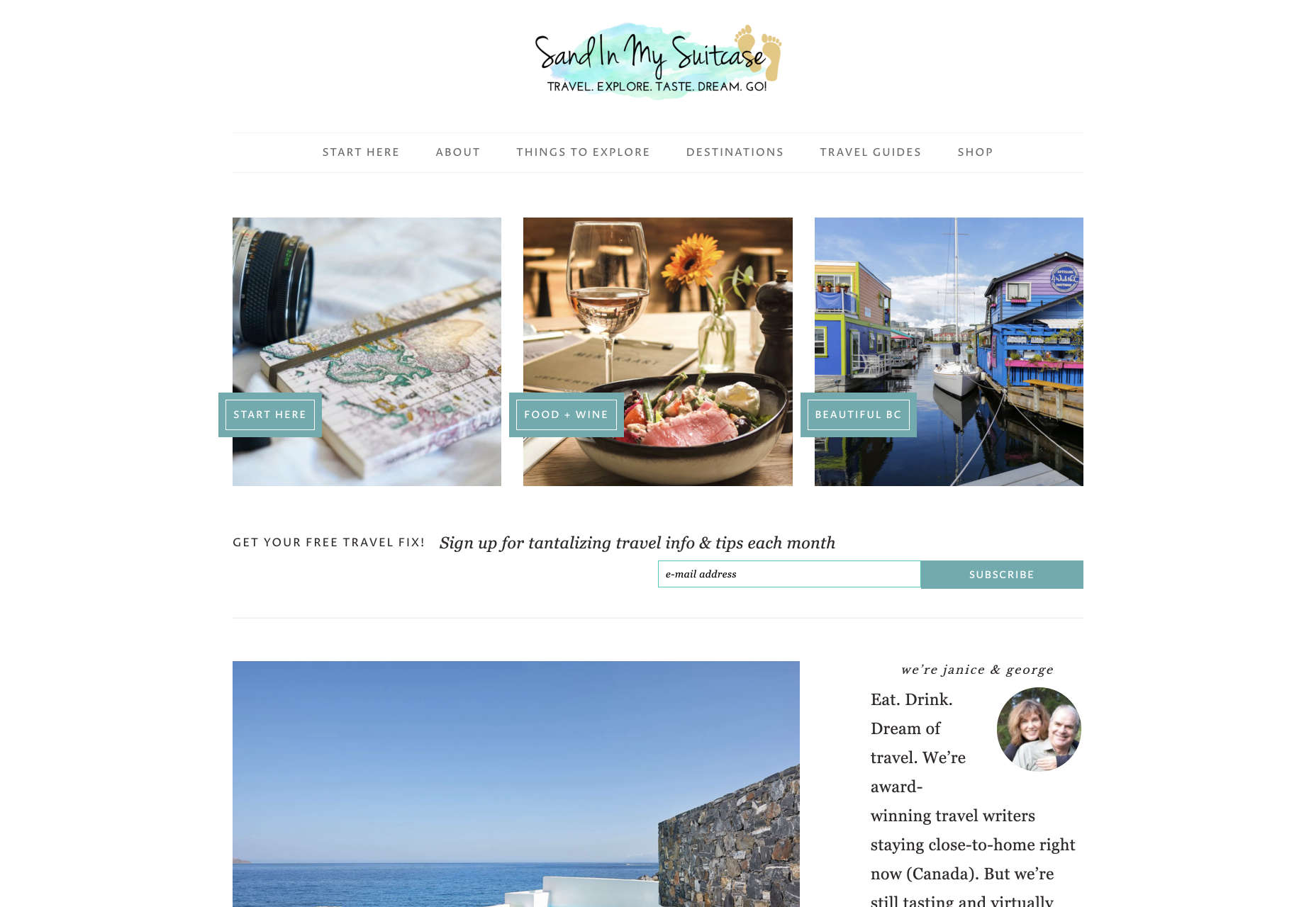
For instance, text and button sizes should always be kept large. Anything that needs to be read or clicked needs to be scaled up, to ensure that everyone can see the information clearly. For instance, on the Sandinmysuitcase.com website, you’ll find clear typography, combined with big buttons that tell you to “Start Here” so you know exactly what to do next.

Remember to stick to icons that are clearly labelled wherever possible. Stay away from anything that your customers might not understand. “Start Here” is easier to read and understand than “Submit”. 

It’s also worth sticking to the color and contrast guidelines laid out by basic UX design when you’re creating something for optimal visibility.  Colors that are too close together might create a nice pastel or gradient effect on a website – but they’ll also make things difficult to read. 

Concentrate on Usability

Over the age of 55, motor skills and coordination can begin to decline for some people. These changes make it harder for people to interact with complex UIs. The mouse on a computer can be a particular problem for people with diminishing motor skills – as can the touchscreen of a tablet or smartphone. 

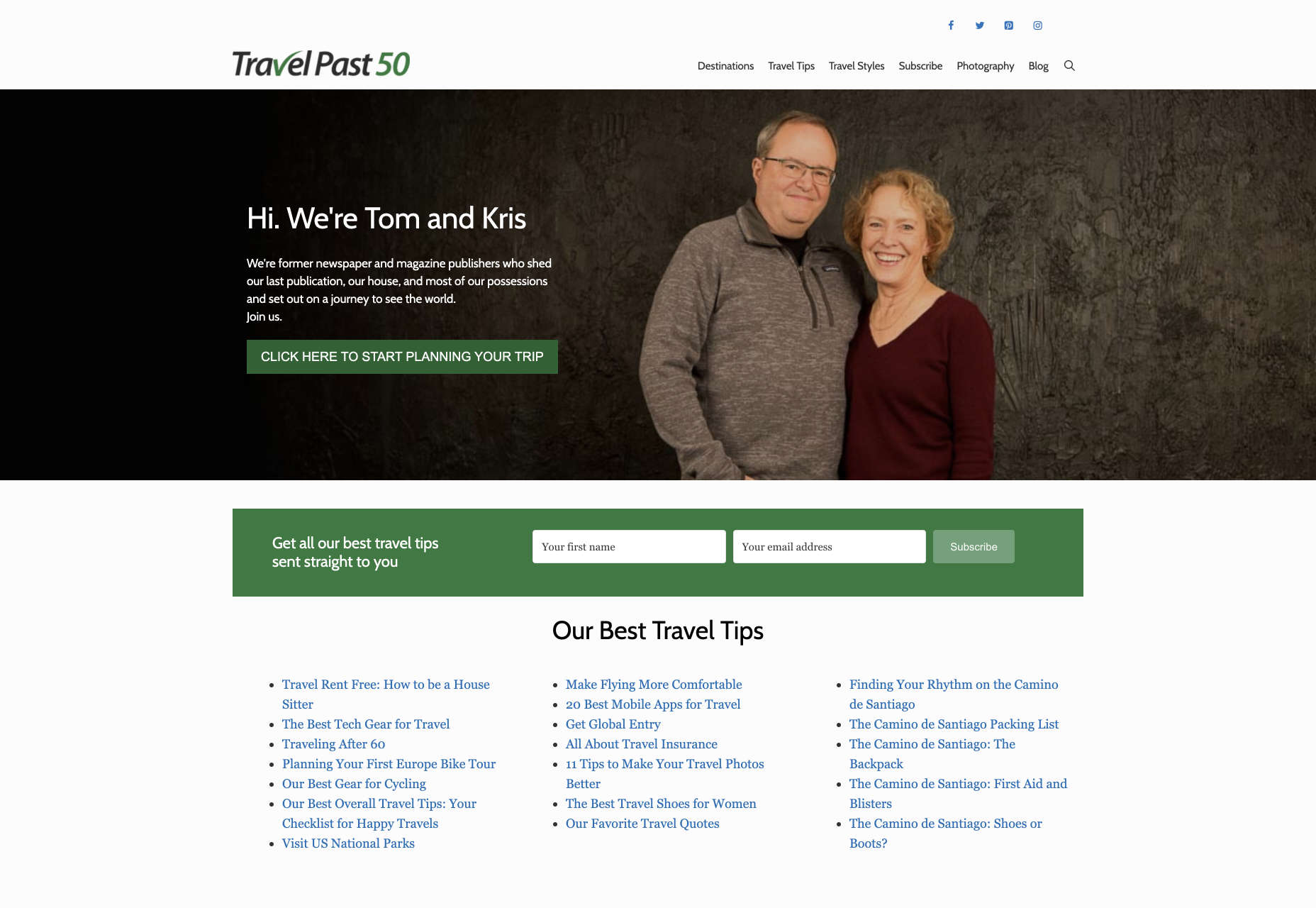
When you’re working on the perfect UX, think about how you can make things as easy to click as possible for people who have a hard time hitting their targets. For instance, in this website for people traveling over the age of 50, you’ll see not only fantastic large font choices but big buttons that are descriptive and easy to understand too: “Click here to start planning your trip”:

The scrollbar can also be a bit of a problem for people with impaired motor skills. Because of this, it’s best to keep your focus on designing above the fold. Make sure that users don’t need to scroll far to find the information that they need and keep scrollbars simple in terms of their look and feel.

While you’re working on usability, remember that it will be important to keep interactions to a minimum wherever possible. Where you can engage younger audiences with double-taps, swiping and scrolling, it’s much easier to connect with seniors through simple one-tap interactions. The less actions your user needs to take to reach their goals, the better. 

Deliver Smooth Navigation 

Navigating from point A to B on your website needs to be as simple as seamless as possible. Remember, crowded pages on your websites and apps are often overwhelming – even for younger browsers. Seniors are generally just searching for “must know” information, so they don’t want anything to get in their way as they navigate through their website. 

As you work on your site or app design, ask yourself if every element on the page absolutely has to be there. If it doesn’t deliver value, then get rid of it. 

Additionally, remember that seniors don’t always have the best memories and concentration levels. That means that they need your navigation experience to be as simple as possible. Basic horizontal menu bars that show everything at once are often a good idea – even if they’re not very exciting.

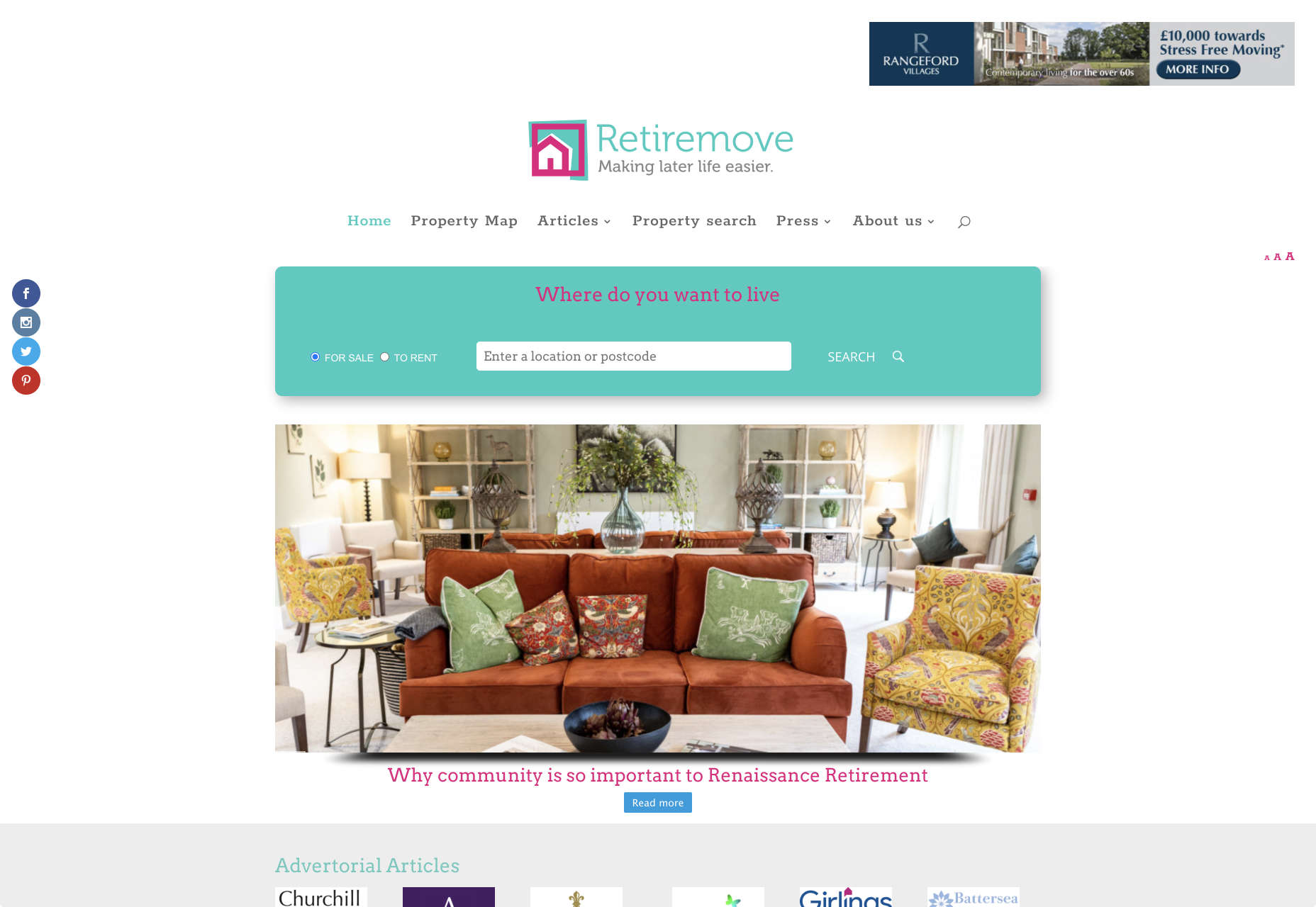
Look at this helpful navigation experience from RetireMove.com, for instance. Everything you need is located at the top of the page, and you can even just enter your postcode to get started:

Cognitive decline happens regularly with age. Although not all older adults will have issues with their memory and concentration, it’s important to be prepared for an audience that might process information a little more slowly. It’s worth double-checking that your viewer’s attention isn’t being diverted to multiple parts of the page at once.

Get to the Point Quickly

While younger generations have quickly implemented technology into every aspect of their lives, older consumers use tech a little differently. These people don’t want to spend forever fiddling around with different parts of your website. They want to get the answers to their questions as quickly and easily as possible. 

Applications that are complicated or difficult to access are usually instantly rejected by seniors. Even if you’ve offered everything that we’ve covered above, from seamless navigation to minimalist design, you still won’t get the interactions you’re looking for if older adults don’t consider your design to be useful. 

Because of this, you need to highlight the point of a website or application to your seniors as quickly as possible. Avoid worrying about things like gifs, animations and gamification. Instead, focus on making sure that your designs are useful and simple. 

For instance, from the moment your senior user arrives on a web page, they should have instant access to clear instructions on how to use the application or service, and what they need to do next. Keep in mind that this is particularly important when you’re creating mobile apps, as apps are still a relatively new concept to older generations. 

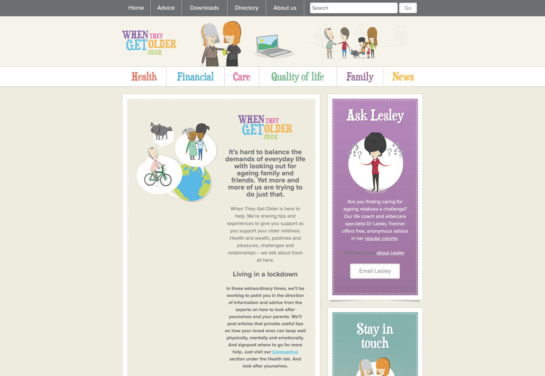
On the “When They Get Older” website, you can instantly find the information you need in a well-organized navigation bar that’s labelled clearly:

A clear interface like this, combined with simple, step-by-step guidance that shows elderly individuals how to get the information that they want is the key to keeping these users coming back for more. 

Bringing a Mature Perspective to Web Design

These days, most designers focus heavily on younger audiences when creating websites and apps. After all, it’s these users that allow us to experiment more with the latest tools and concepts, like augmented reality, artificial intelligence, and robust animations. 

However, there’s still a market out there for the seniors of the world that want more opportunities to get online. This audience often goes ignored and under-served. However, as the value of older consumers grows, and their ability to interact online increases, you’ll find that more businesses begin to search for web designers who can provide immersive experiences for a more mature audience. 

The steps above will give you an excellent insight into how you can start designing for a different kind of customer base. However, remember that the best way to make sure that you’re delivering the right solution for any customer, is to test. User testing will provide you with the exclusive insights that you need to determine whether your senior UX is really working, or whether you’re still struggling to get into the shoes of an older user. 


Featured image via Unsplash.

Source


Source de l’article sur Webdesignerdepot