Articles

In part one of this blog, I provided a high-level introduction to SAP Systems, Clients, Landscapes, and Transports and how they might fit together in a ‘standard’ configuration. But like life, SAP tends to be a bit more complicated than that. The reality of marrying architectural constraints with complex business needs means that the kind of simple landscapes I described in my last piece often will not do the job. Something more complex is required.

In this article – part two of three – I will look at some of the more advanced concepts associated with SAP Landscape Design and how to manage the increased complexity that comes with them. 

Source de l’article sur DZONE

The right typeface can make or break your website. As designers, we will always be naturally drawn towards the premium fonts such as Circular, DIN, or Maison Neue; Before you know it, your website is racking up a font bill larger than your hosting bill.

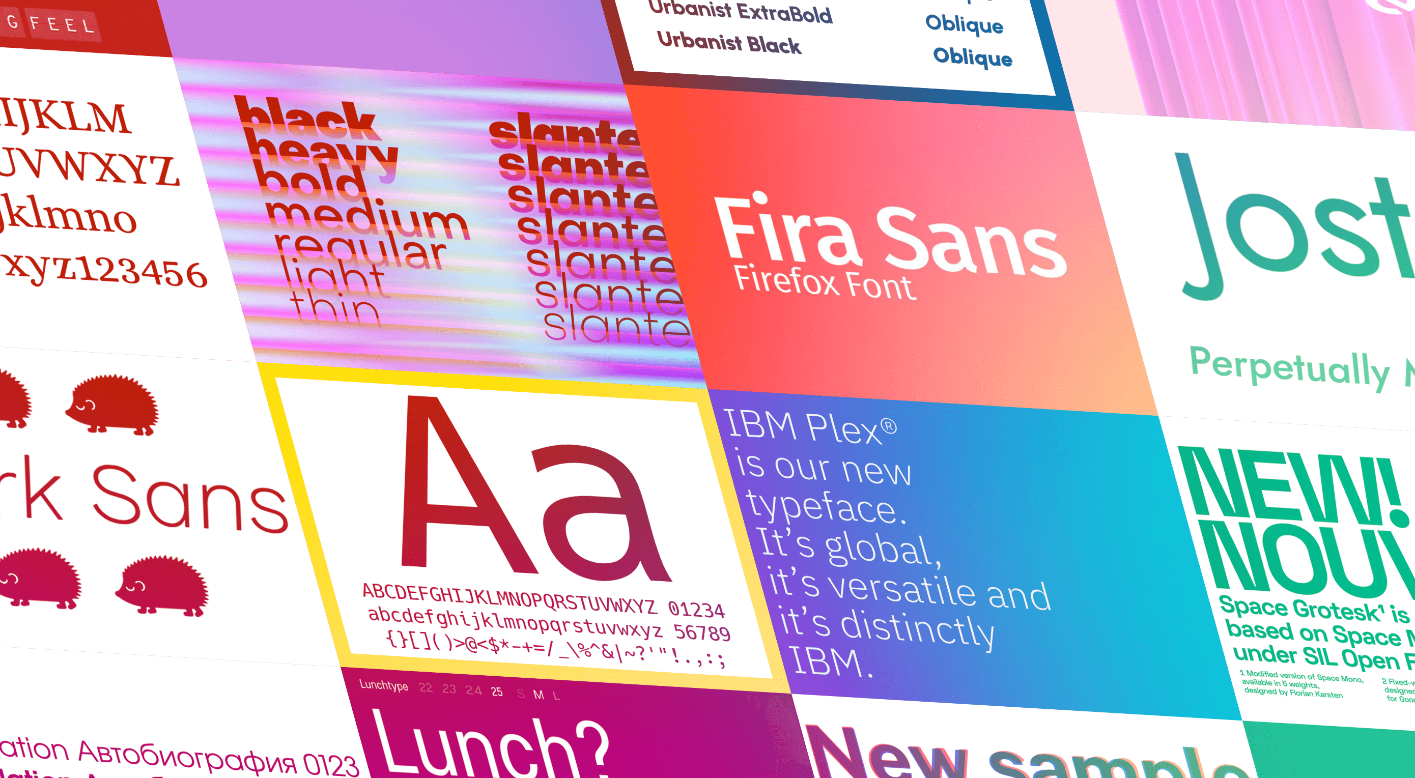
We’ve put together a list of open-source fonts that will rival your fancy fonts, and might even persuade you to switch them out. All the fonts listed here are completely open-source, which means they’re free to use on both personal and commercial projects.

Manrope

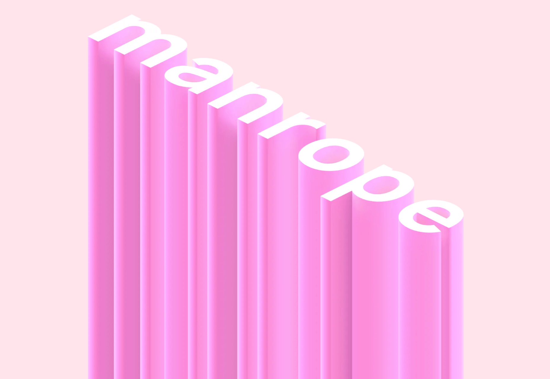
Manrope has sprung onto the font circuit in style, with a website better than most early startups. It’s a variable font, which means you have a flexible range of font weights to choose from in a single font file. Manrope is a personal favorite of mine, it has every ligature you could want, and is fully multi-lingual. It’s a lovely bit of everything as it states on the website: it is semi-condensed, semi-rounded, semi-geometric, semi-din, semi-grotesque.
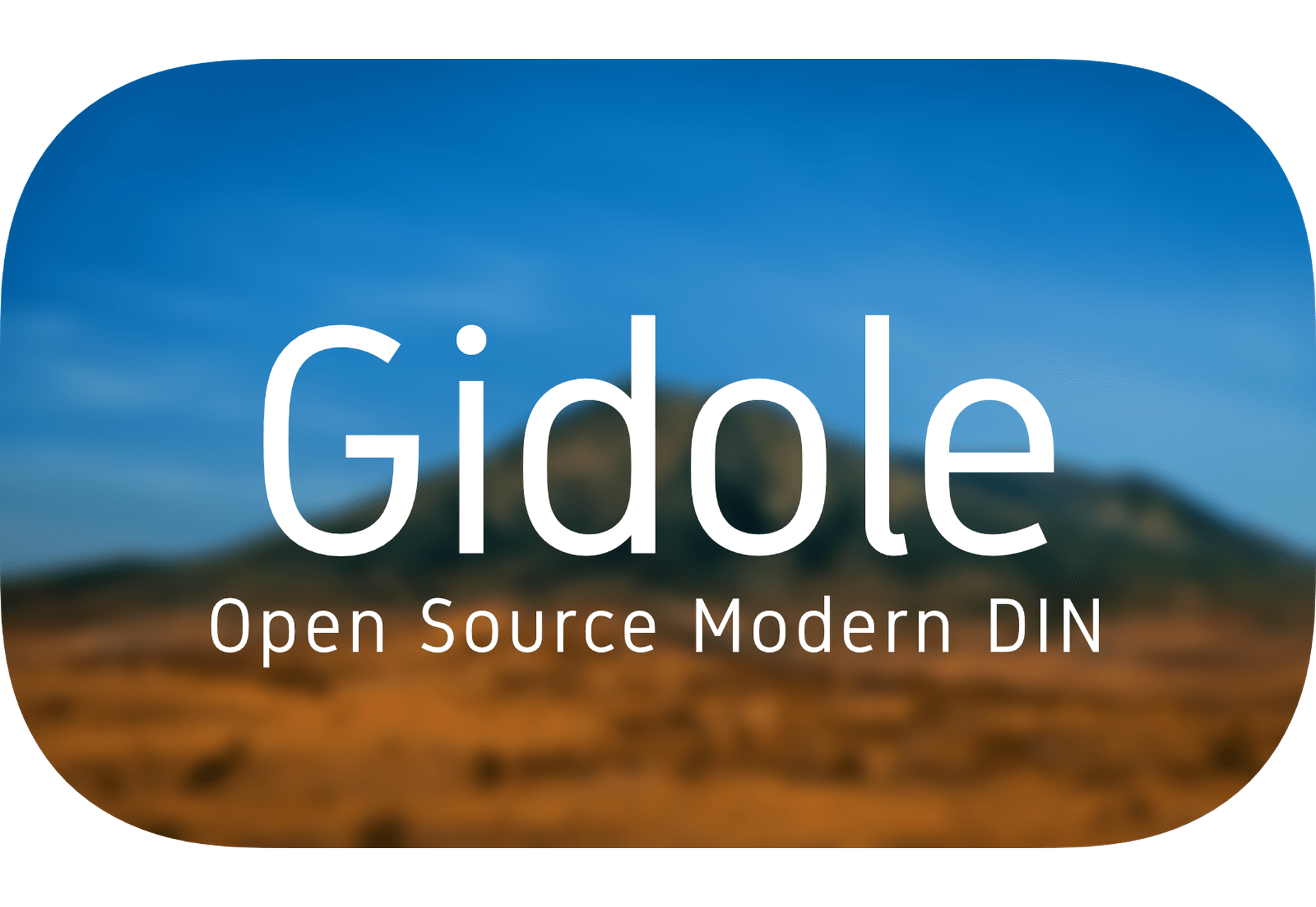
Gidole

DIN – the font we all love, the font that looks great at every size, and the font that costs quite a bit, especially with a large amount of traffic. Gidole is here to save the day, it’s an open-source version of our favorite – DIN. It’s extremely close to DIN, but designers with a keen eye will spot very few minor differences. Overall, if you’re looking to use DIN, try Gidole out before going live. (There is also a very passionate community around the font on Github)
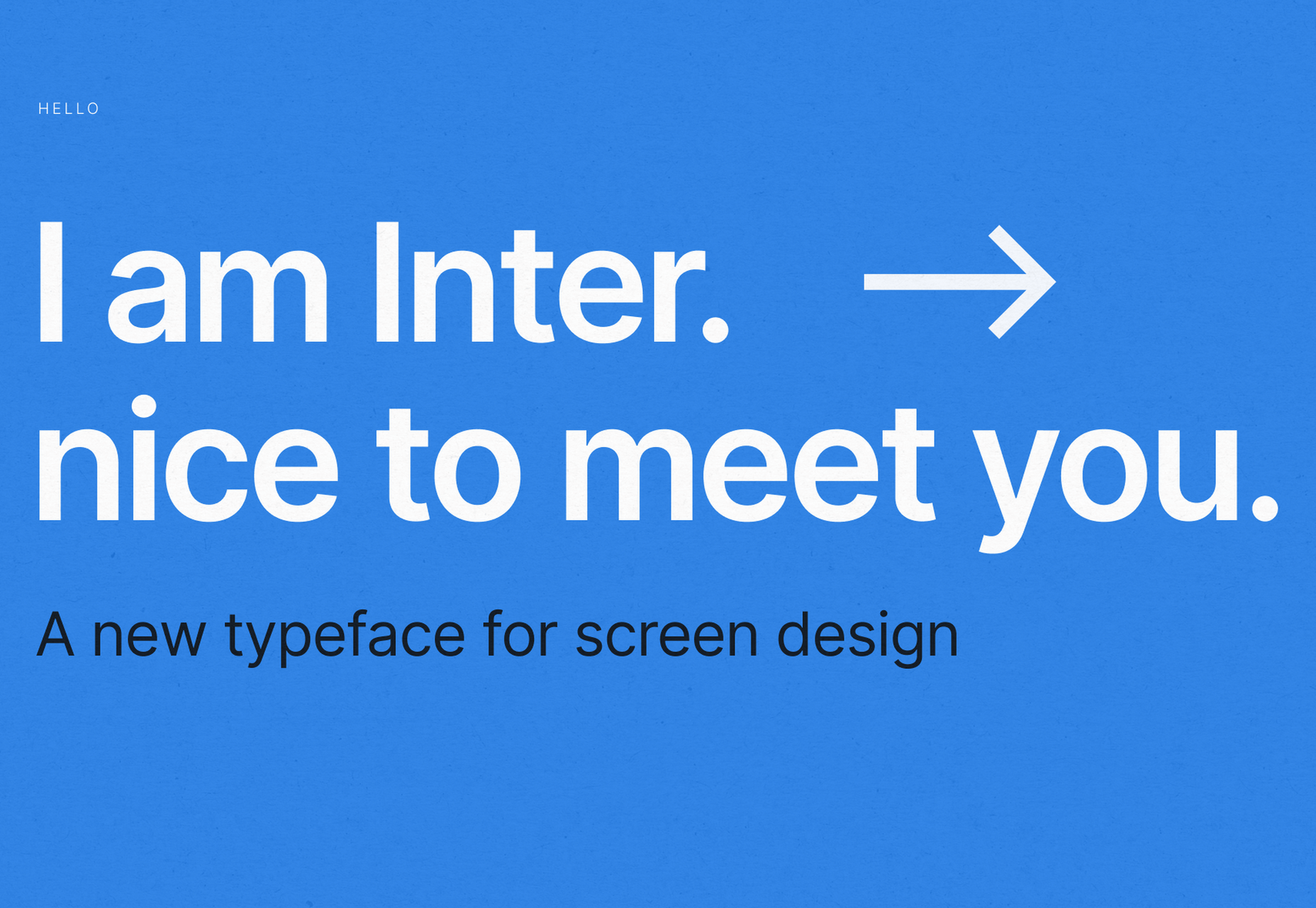
Inter

Inter is now extremely popular, but we wanted to include it as it’s become a staple in the open-source font world — excellent releases, constant updates, and great communication. If you’re looking for something a bit fancier than Helvetica and something more stable than San Francisco, then Inter is a great choice. The font has now even landed on Google Fonts, making it even easier to install. As of today: 2500+ Glyphs, Multilingual, 18 Styles, and 33 Features… do we need to say more?
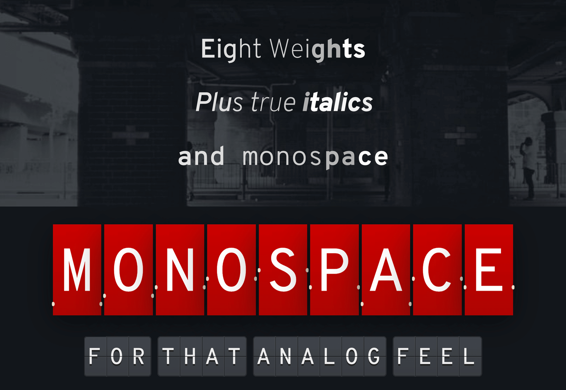
Overpass

Overpass was created by Delvefonts and sponsored by Redhat, it was designed to be an alternative to the popular fonts Interstate and Highway Gothic. It’s recently cropped up on large ecommerce sites and is growing in popularity due to its large style set and ligature library. Did we mention it also has a monospace version? Overpass is available via Google Fonts, KeyCDN, and Font Library.
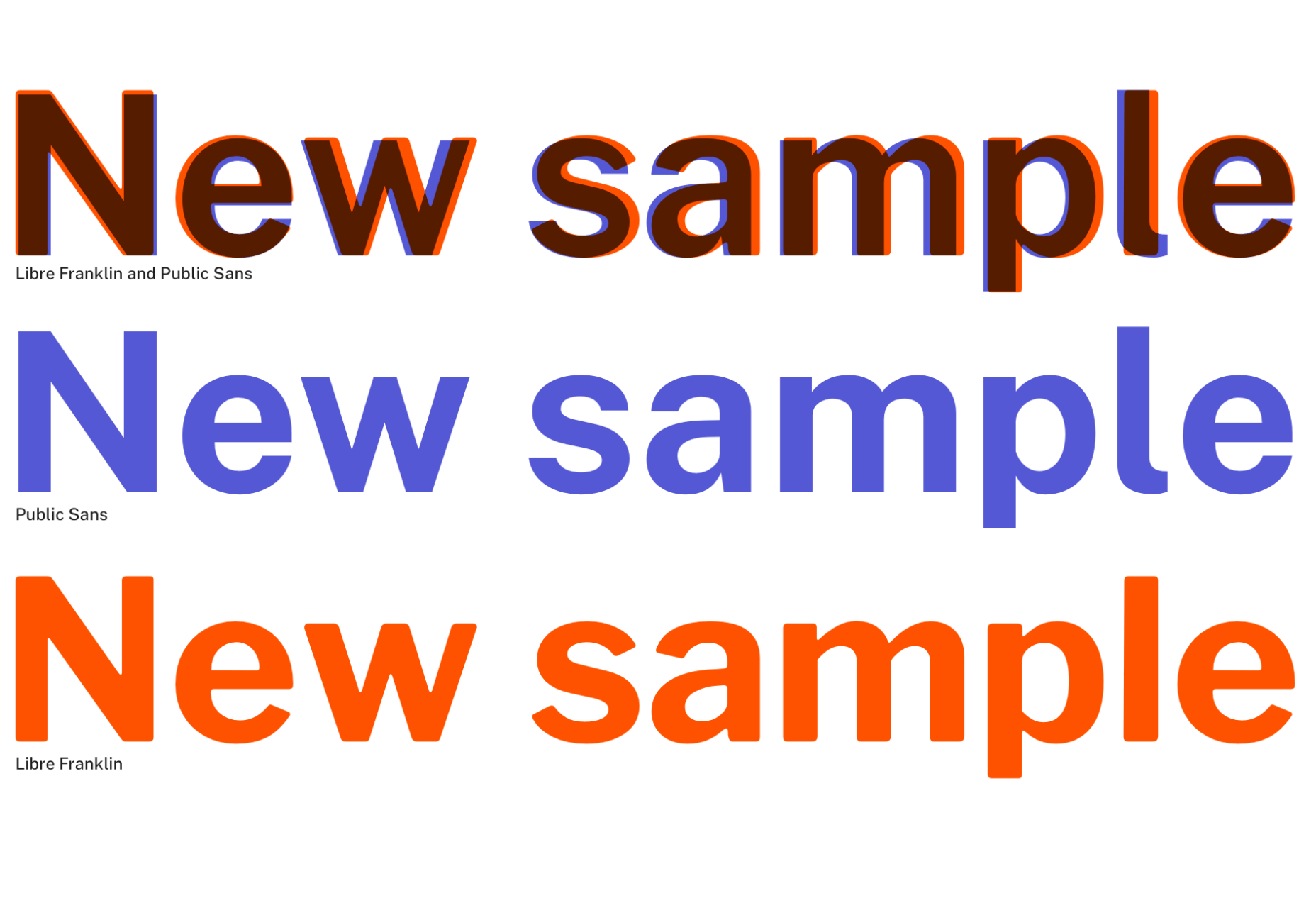
Public Sans

Public Sans is a project of the United States Government, it’s used widely on their own department websites and is part of their design system. The font is based on the popular open-source font Libre Franklin. Public Sans has great qualities such as multilingual support, a wide range of weights, and tabular figures. The font is also available in variable format but this is currently in the experimental phase of development.
Space Grotesk

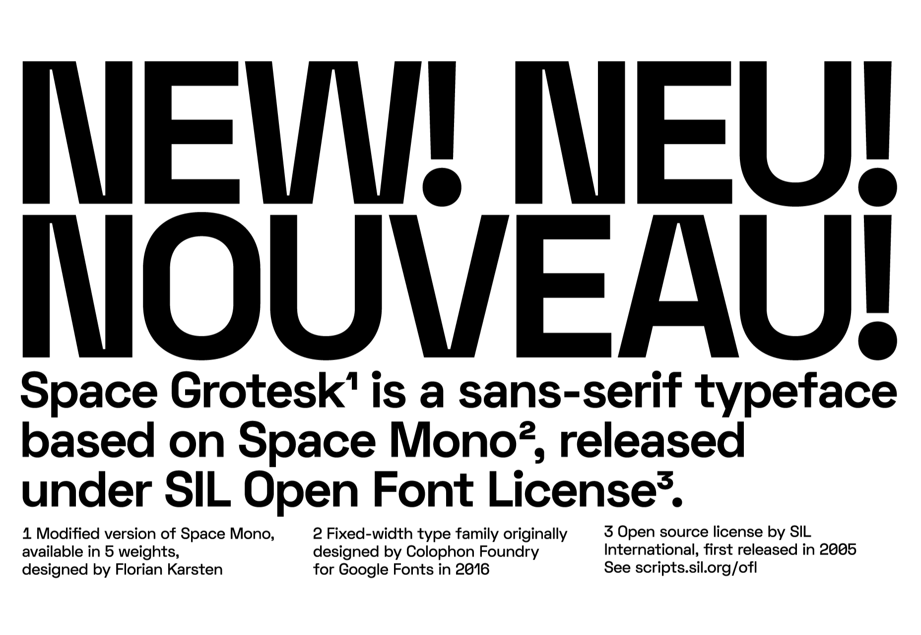
Space Grotesk isn’t widely known yet, but this quirky font should be at the forefront of your mind if you’re looking for something “less boring” than good old Helvetica. Space Grotesk has all the goodies you can expect from a commercial font such as multiple stylistic sets, tabular figures, accented characters, and multilingual support.
Alice

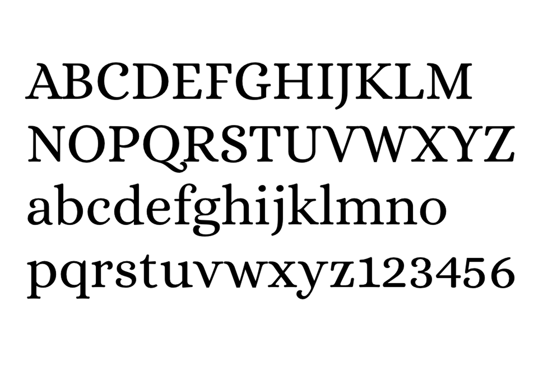
Alice is a quirky serif font usually described as eclectic and quaint, old-fashioned — perfect if you’re looking to build a website that needs a bit of sophistication. Unfortunately, it only has one weight, but it is available on Google Fonts.
Urbanist

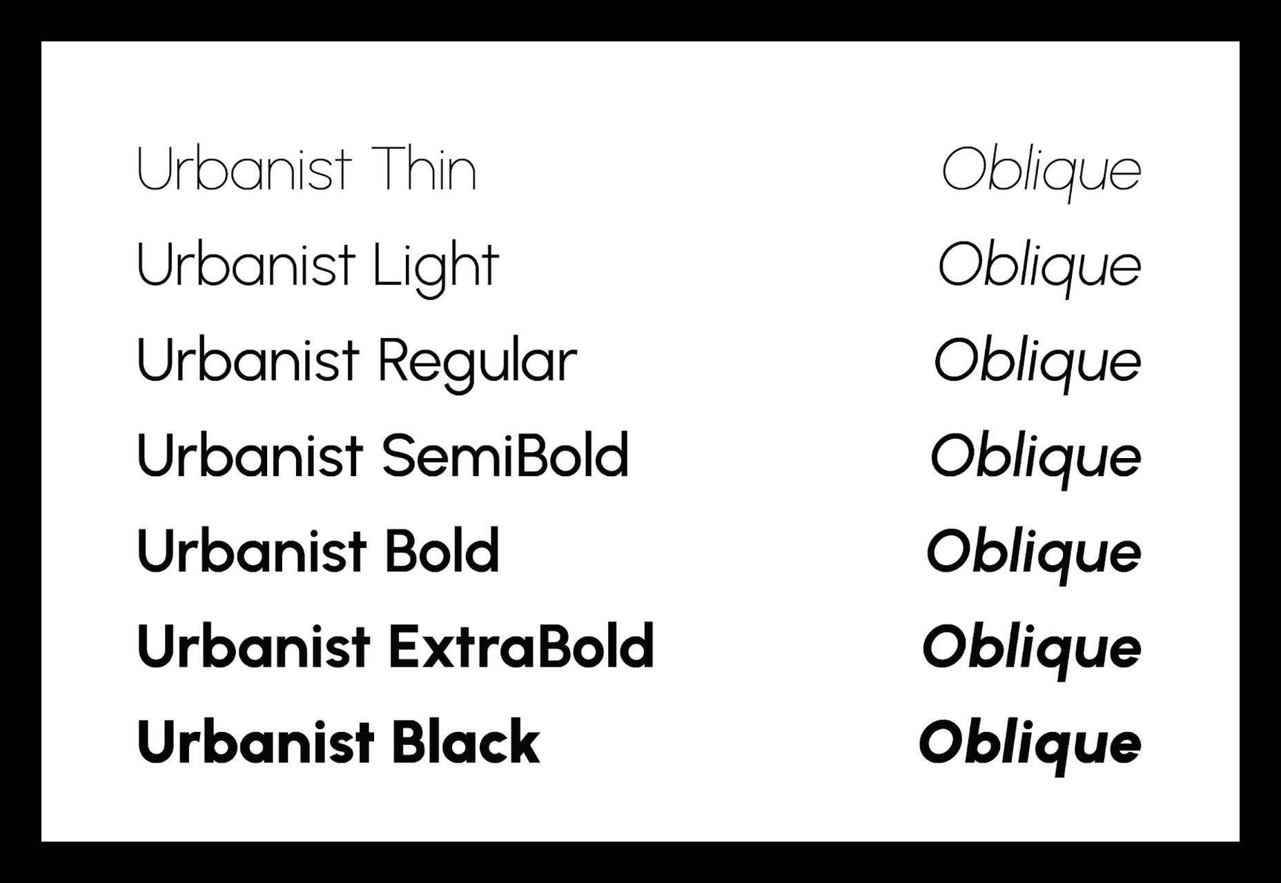
Urbanist is an open-source variable, geometric sans serif inspired by Modernist typography. Designed from elementary shapes, Urbanist carries intentional neutrality that grants its versatility across a variety of print and digital mediums. If you’re looking to replace the premium Sofia font, then Urbanist is your best bet.
Evolventa

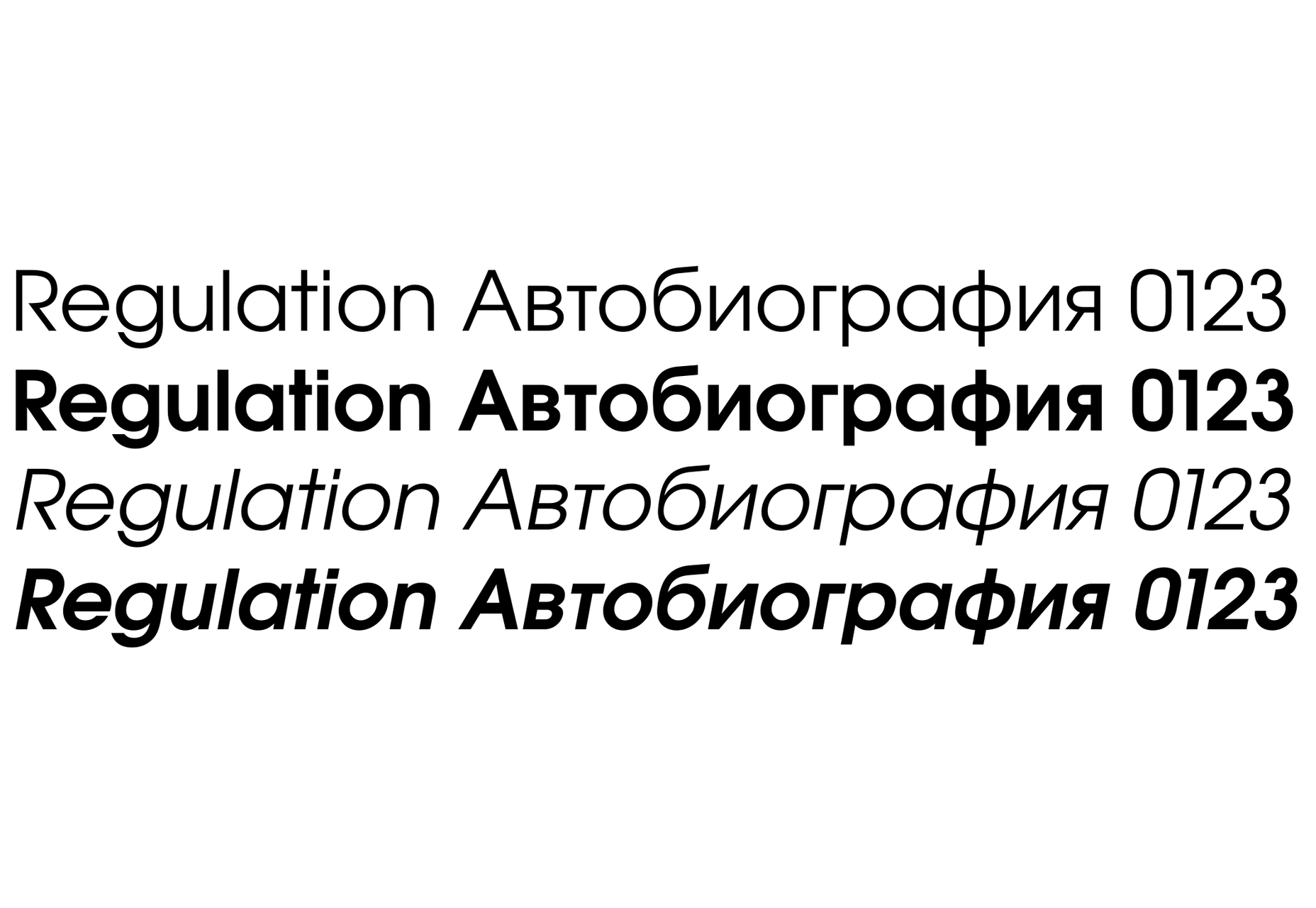
Evolventa is a Cyrillic extension of the open-source URW Gothic L font family. It has a familiar geometric sans-serif design and includes four faces. Evolventa is a small font family, generally used across the web for headlines and bold titles.
Fira Sans

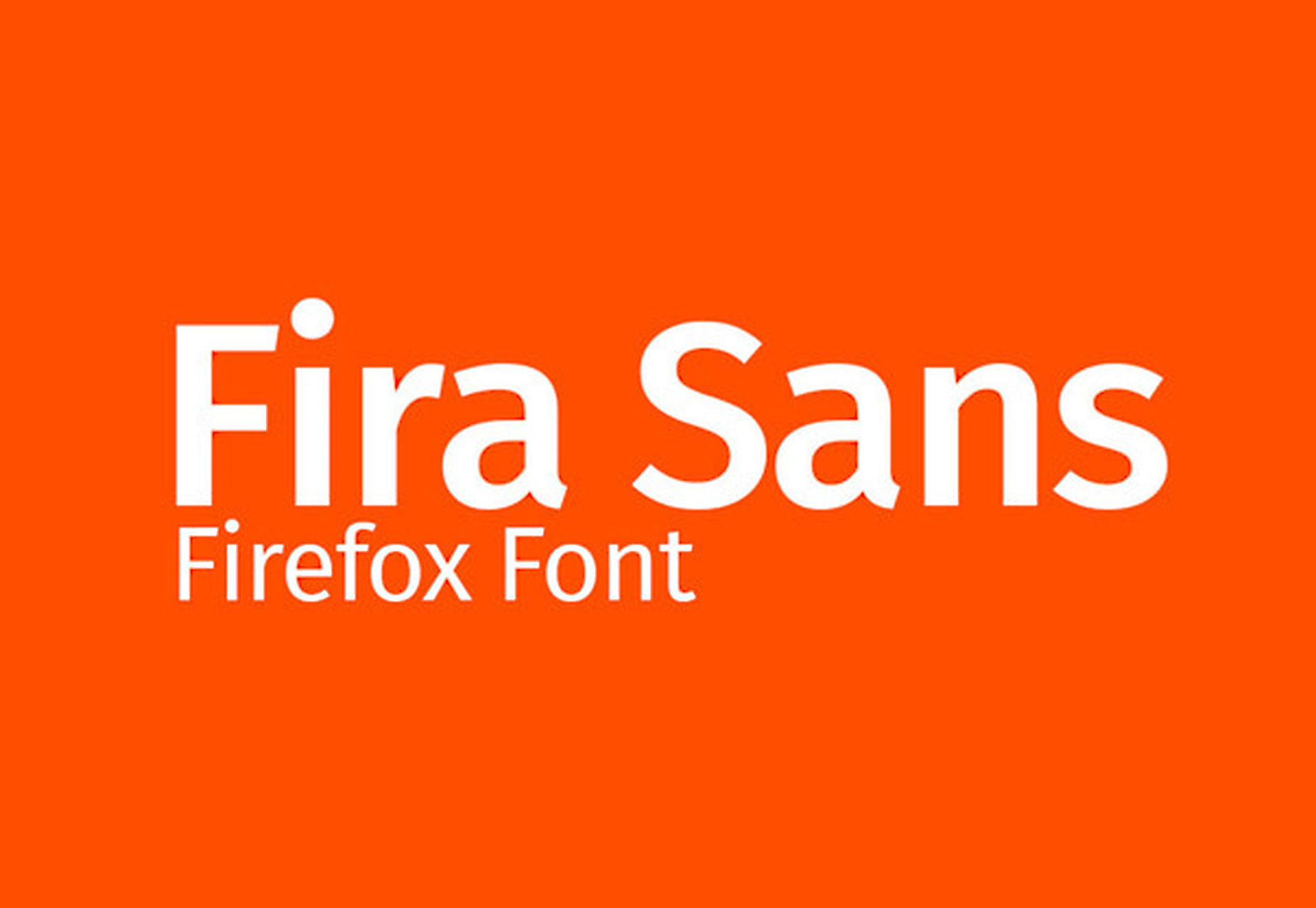
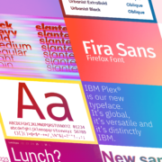
Fira Sans is a huge open source project, brought to you, and opened sourced by the same team that makes Firefox. It’s Firefox’s default browser font and the font they use on their website. The font is optimized for legibility on screens. (And it’s on Google Fonts!)
Hack

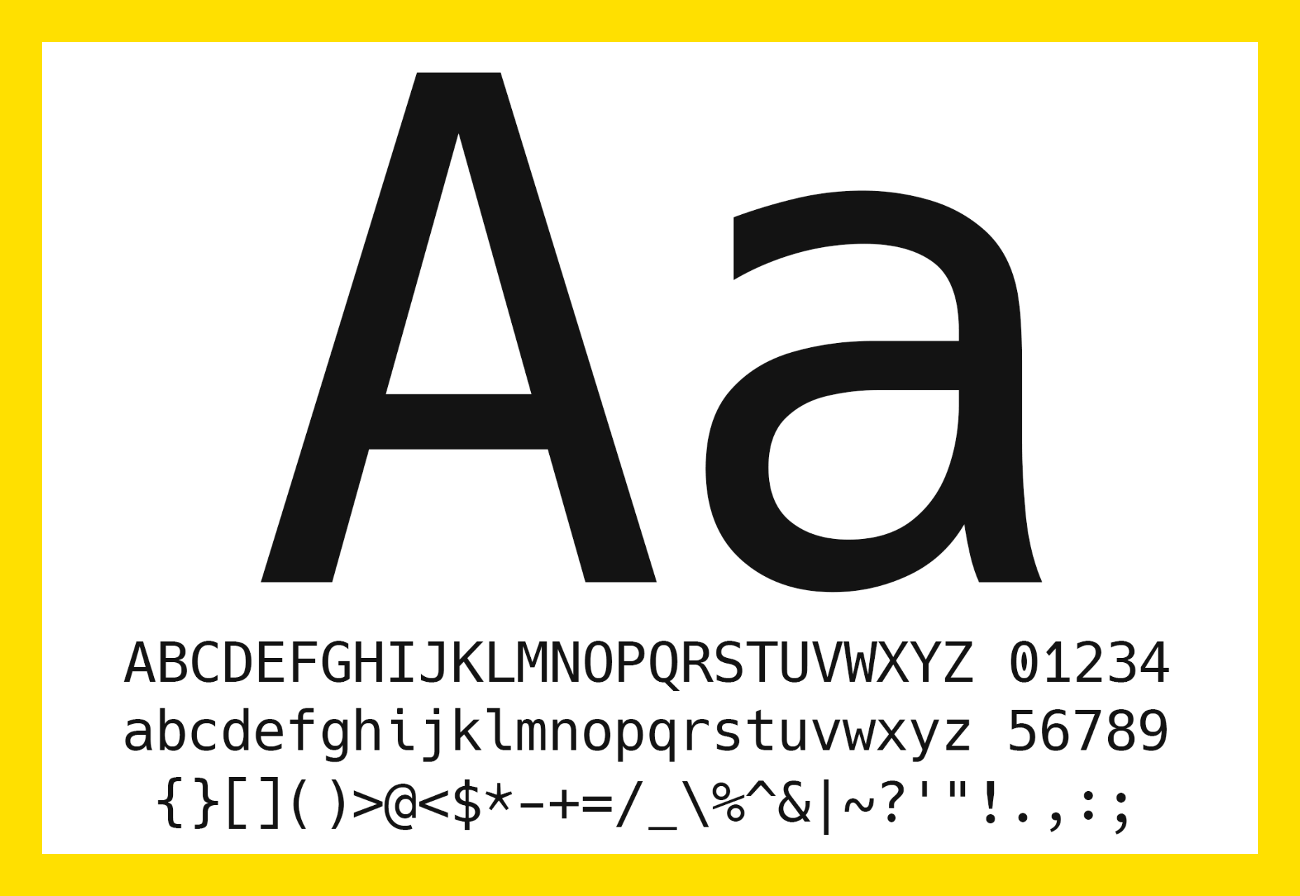
Building a development website, or need a great code font to style those pesky code-blocks? Then Hack is the font for you. Super lightweight and numerous symbols and ligatures. The whole font was designed for source code and even has a handy Windows installer.
IBM Plex

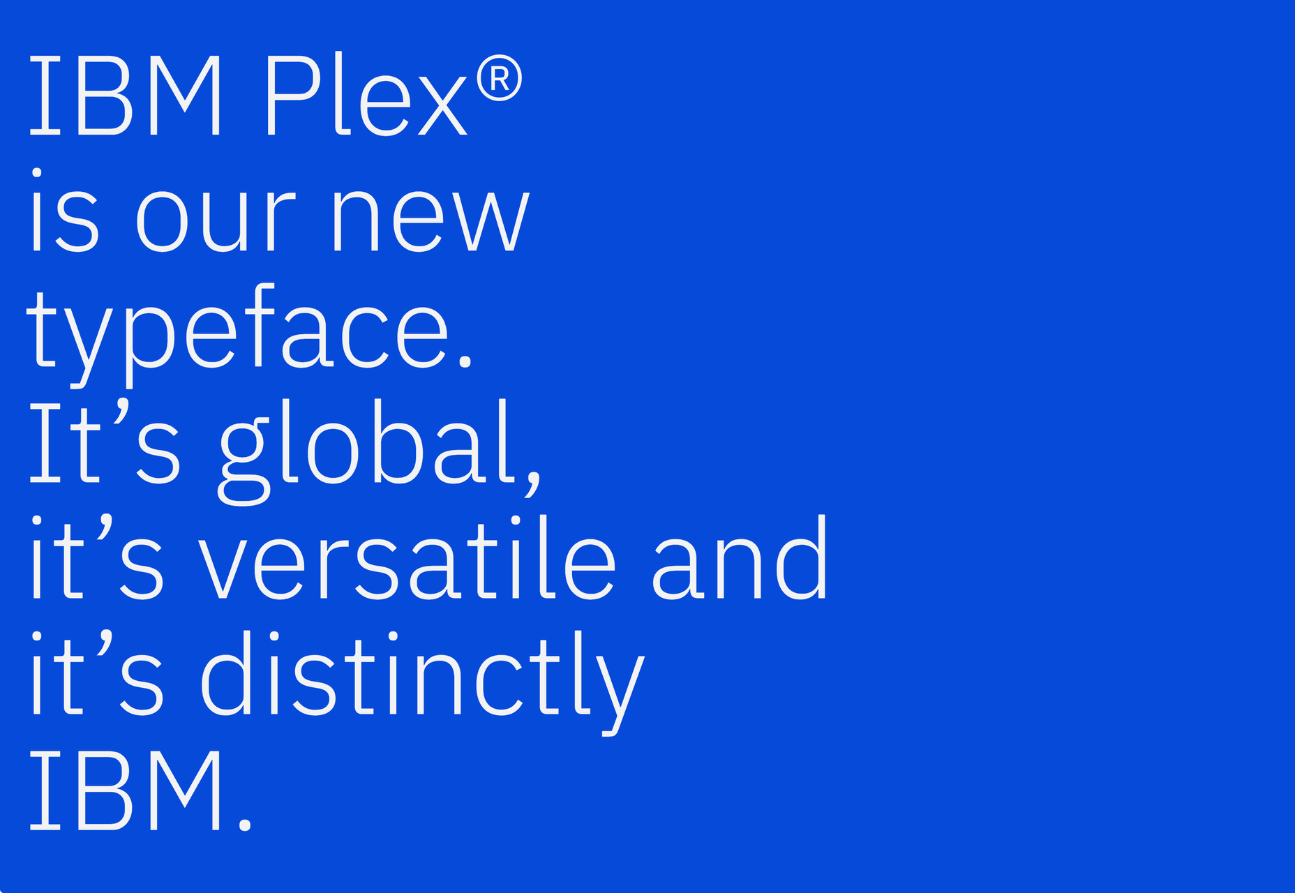
IBM needs no introduction. Plex is IBM’s default website font and is widely used around the web in its numerous formats Mono, Sans, Serif, Sans-Serif, and Condensed – it has everything you’d need from a full font-family. The whole font family is multi-lingual, perfect for multi-national website designs. (It’s fully open-source!)
Monoid

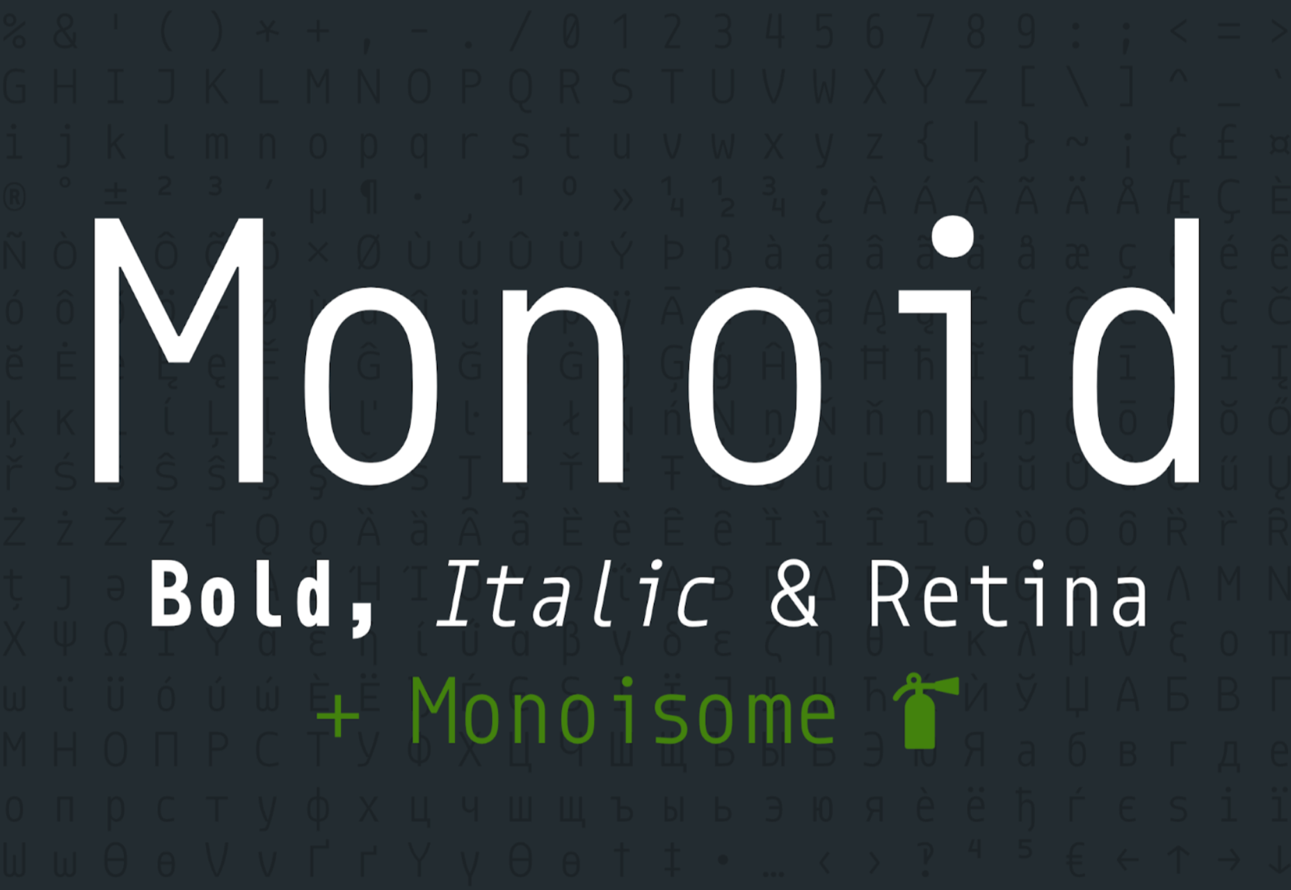
Another great coding font, Monoid is a favorite of mine for anything code. The clever thing about Monoid is that it has font-awesome built into it, which they call Monoisome. This means when writing code, you can pop a few icons in there easily. Monoid looks just as great when you’re after highly readable website body text.
Object Sans

Object Sans (formally known as Objectivity) is a beautiful geometric font family that can be used in place of quite a few premium fonts out there. The font brings together the top qualities of both Swiss neo-grotesks and geometric fonts. The font works beautifully as large headings but can be used for body content as well.
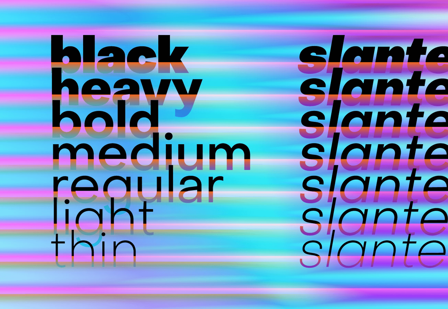
Lunchtype

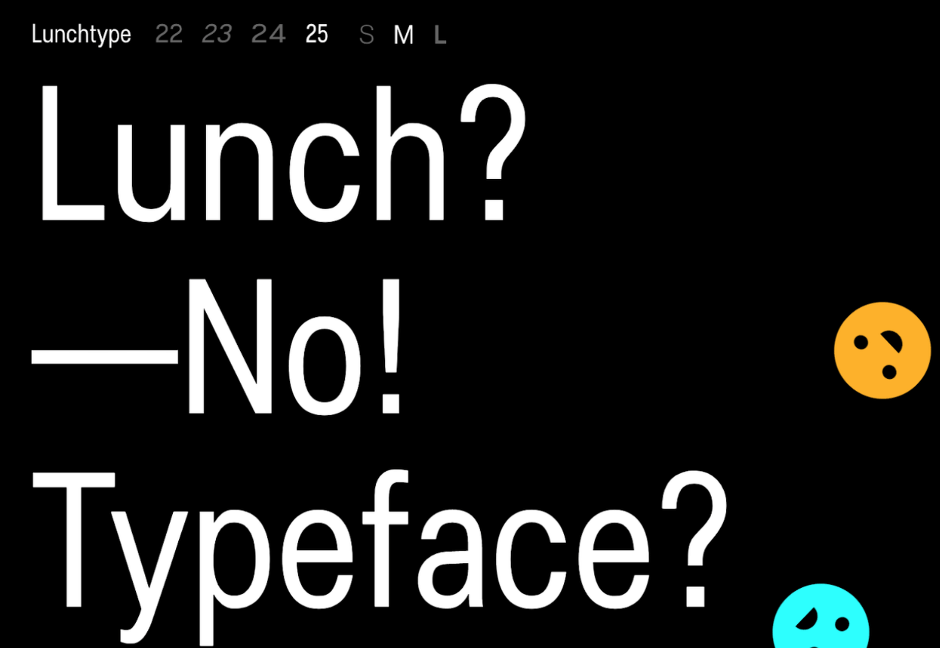
Lunchtype has a very interesting back-story, originally designed during the creator’s daily lunchtime during a 100-day project. If you’re looking for something a bit “jazzier” than the typical Helvetica for your project, then Lunchtype is a perfect choice. The family comes with numerous weights as well as a condensed version — enough to fill any lunchbox.
Jost

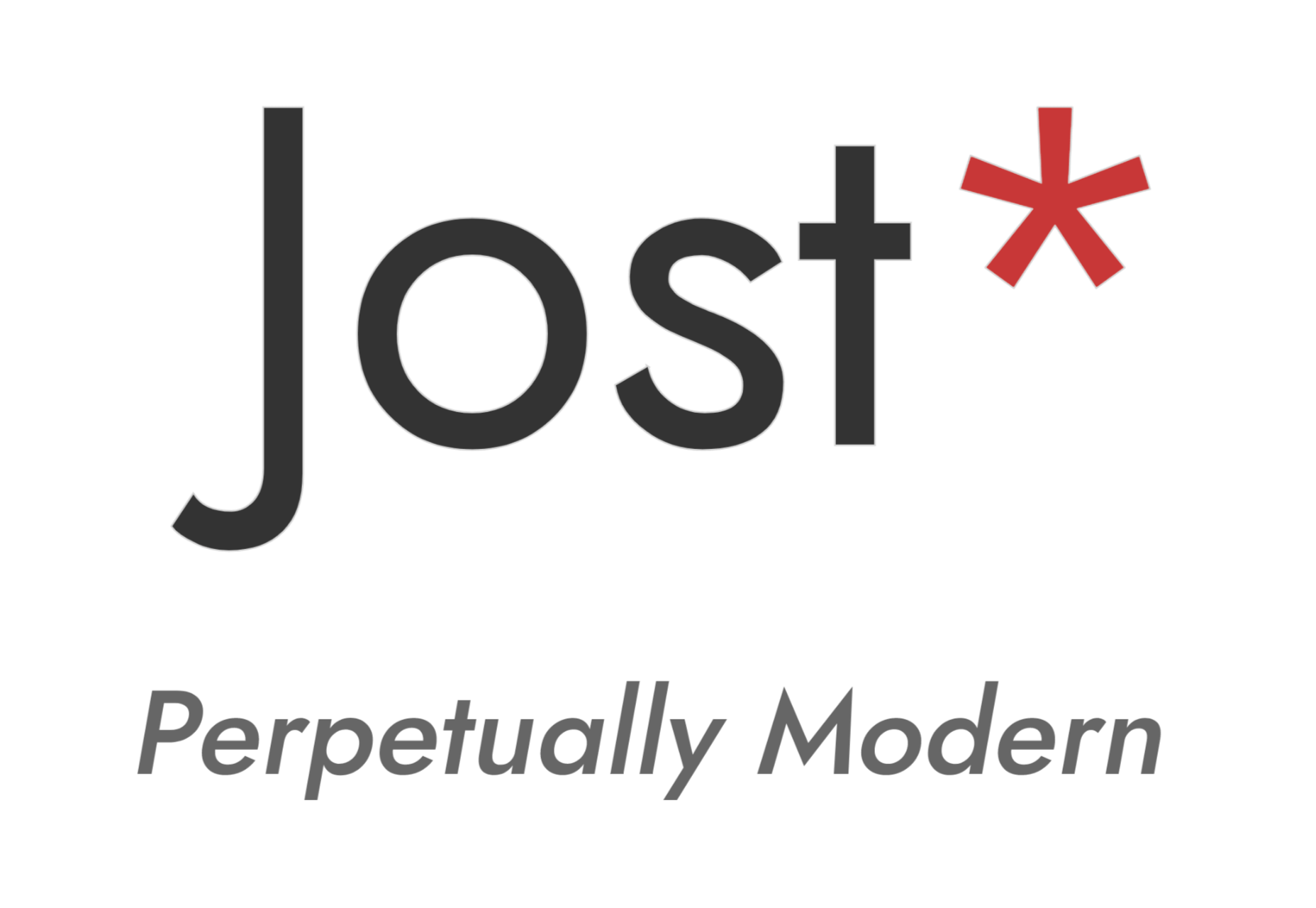
Inspired by the early 1920’s German sans-serif’s, Jost is a firm favorite in the open-source font world. Jost brings a twist to its closest web designer favorite Futura. When you want a change from the typical Futura, then Jost is a great option with its variable weighting as well as multilingual support.
Work Sans

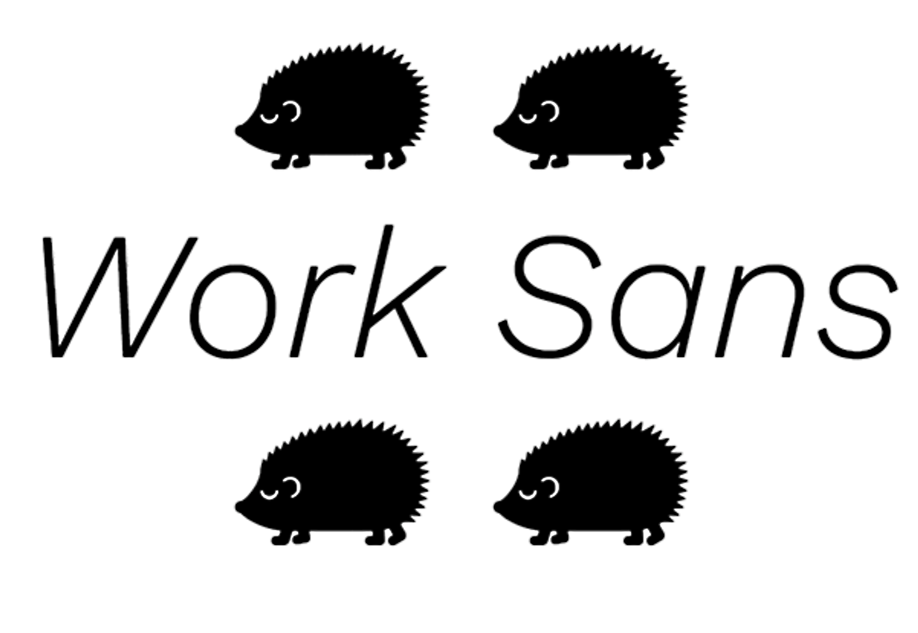
Work Sans is a beautiful grotesk sans with numerous little eccentricities that may delight or annoy some designers. The font has variable weighting, multilingual support and is optimized for on-screen text use but works perfectly well for print also.
Source


Source de l’article sur Webdesignerdepot


What Is Swift Package Manager?

The Swift Package Manager is a tool for managing the distribution of Swift code.

It’s integrated with the Swift build system to automate the process of downloading, compiling, and linking dependencies.

Source de l’article sur DZONE

After six months of uncertainty 2020 is finally beginning to find a style of its own. There are nods to Brutalism, a delightful blending of 80s pastels with 90s primaries, and the font style of choice is anything but geometric sans-serif.

In this month’s collection of the freshest sites from the past four weeks you’ll find tons of new portfolios, from big agencies to freelancers, and some amazing primal scream therapy. Enjoy!

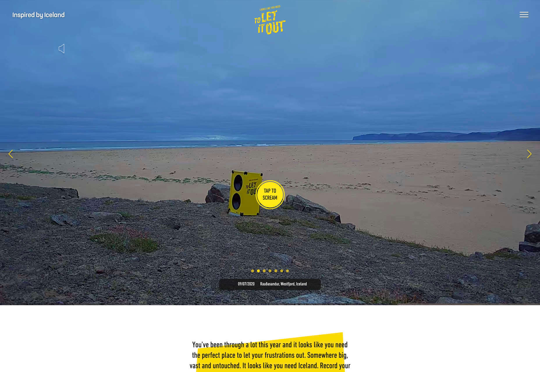
Looks Like You Need Iceland

Looks Like You Need Iceland is an incredible site that asks you to record a scream, that they’ll broadcast for you into the wide open spaces of Iceland as therapy. And then perhaps you’ll visit Iceland for real. It’s brilliant marketing for the Iceland tourist board.

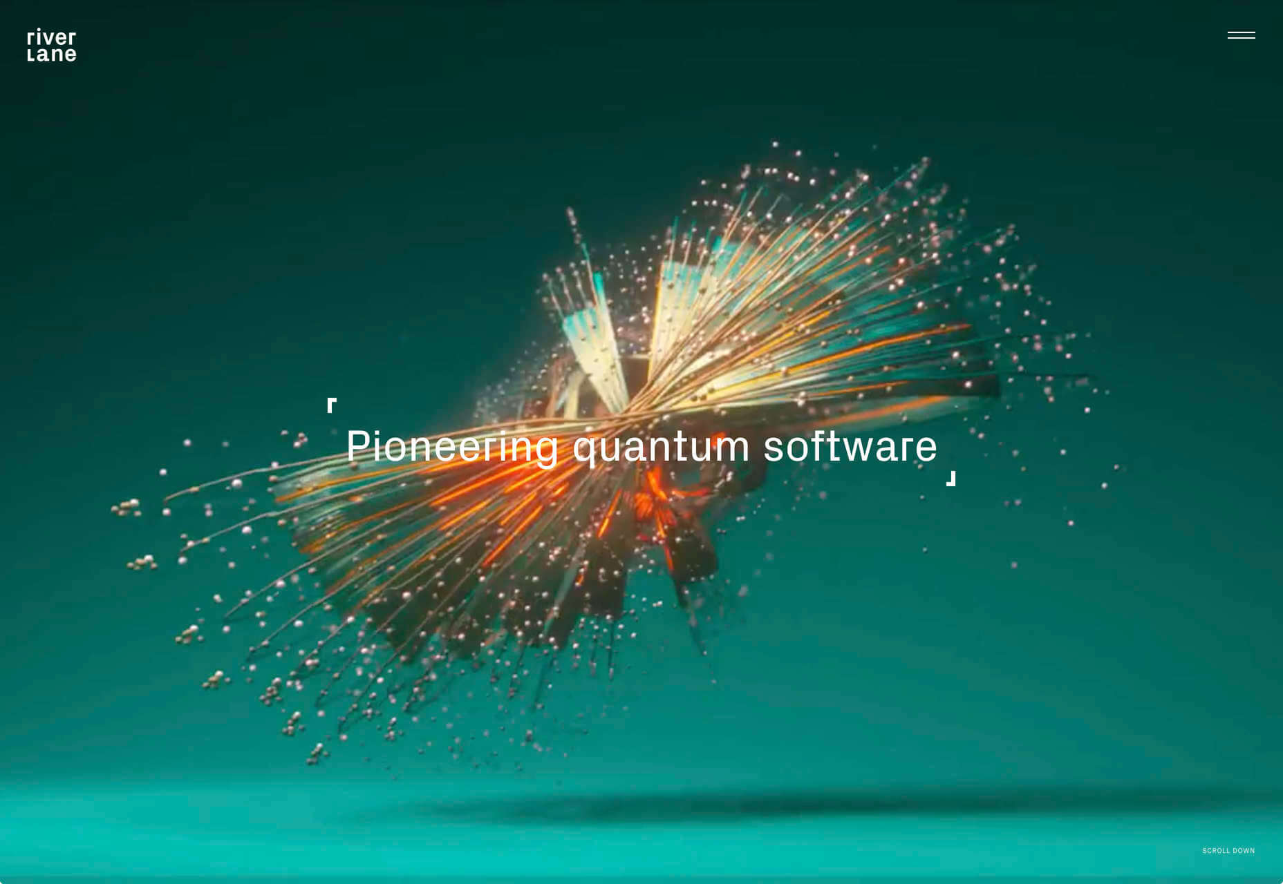
Riverlane

The abstract 3D animation on Riverlane’s site is a stunning introduction to a topic that’s hard to visualize. The rest of the site is equally well done, with great typography, slick brand assets, and a professional engaging tone.

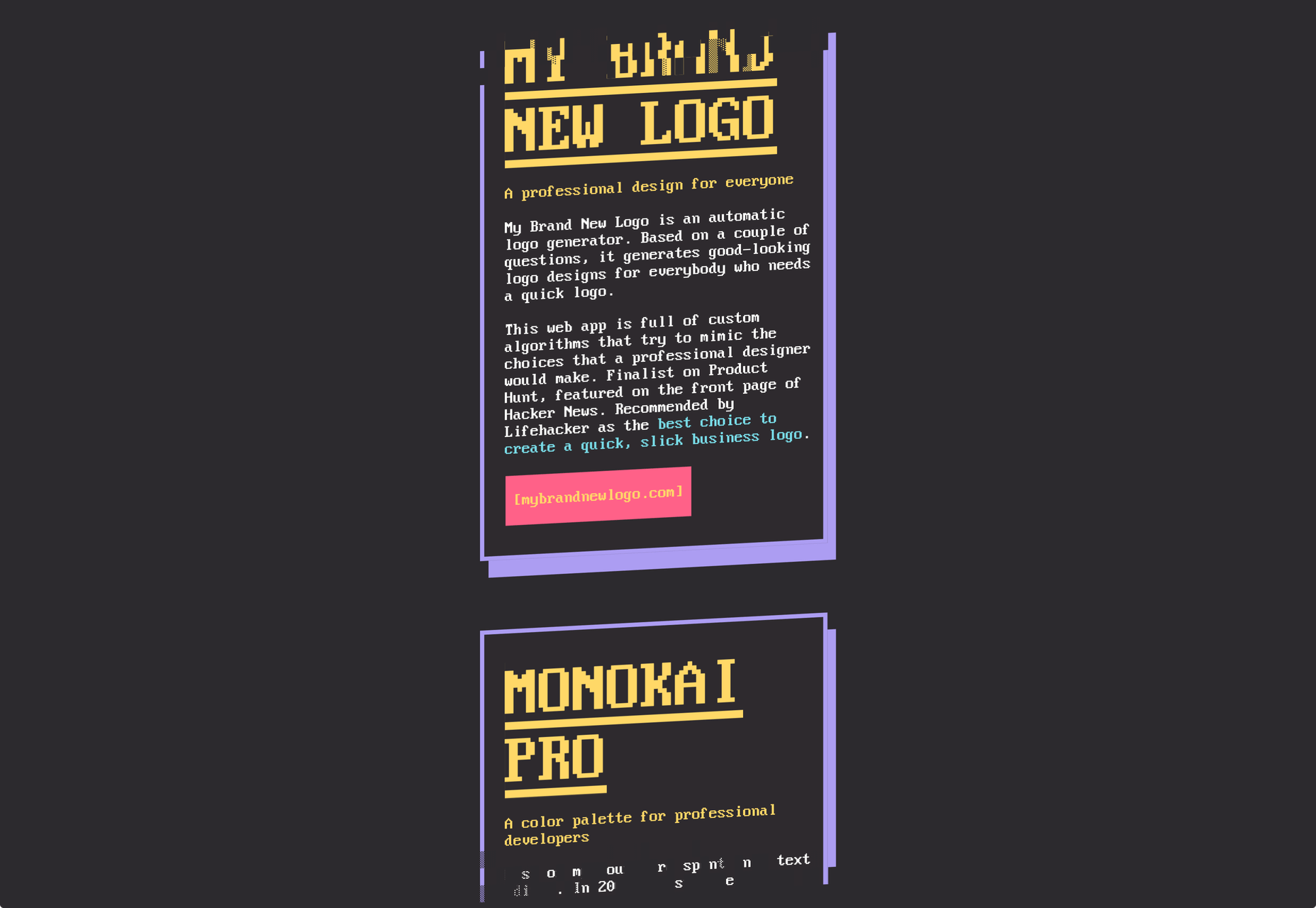
Monokai

Wimer Hazenberg’s site features a simple pixelated text column. But scroll down the page and keep an eye on the awesome text dissolve effect, it transforms this simple design.

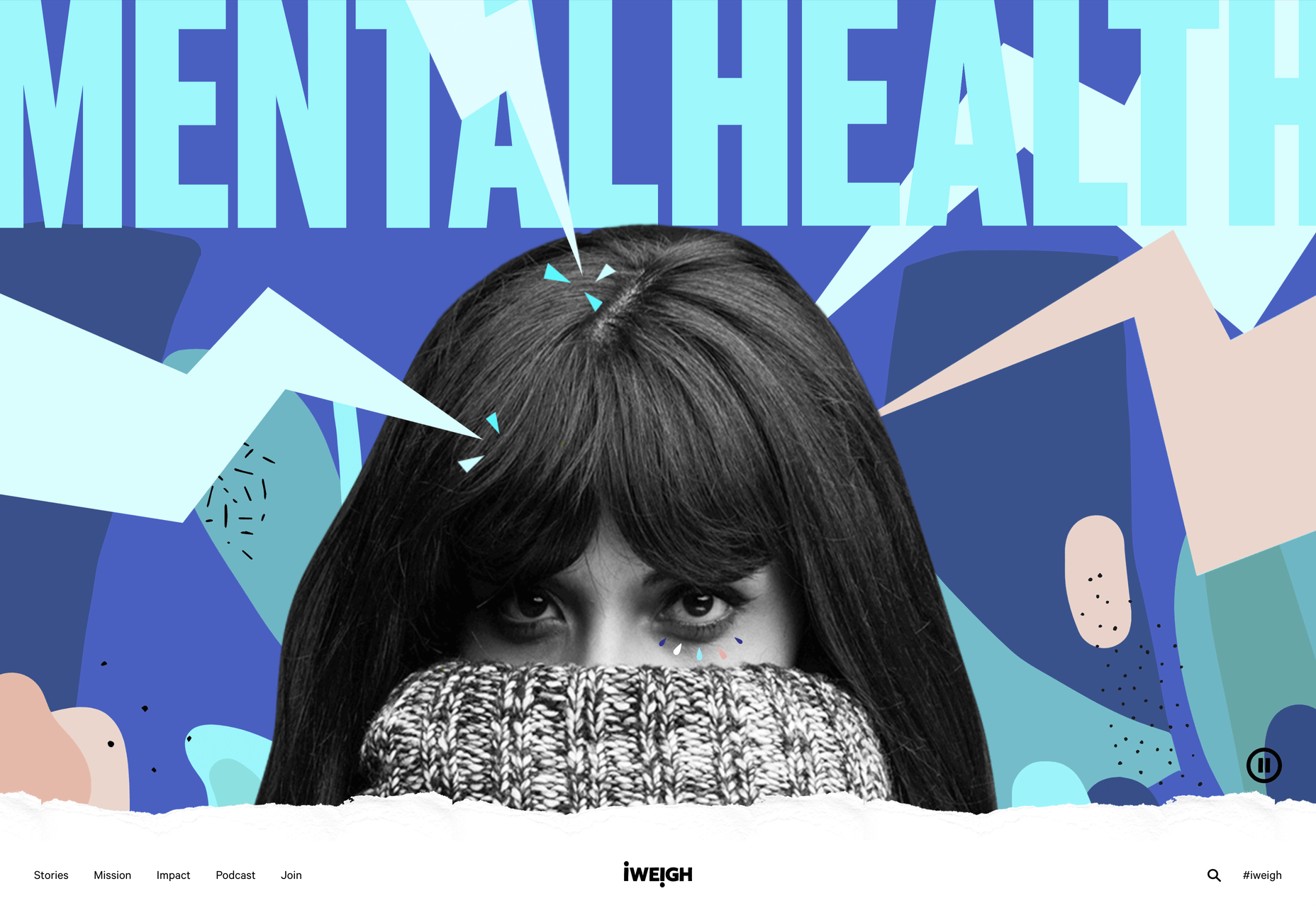
I Weigh Community

The I Weigh Community is a non-profit community activism initiative helmed by Jameela Jamil. It’s devoted to radical inclusivity, and it promotes its message on its site with striking graphics and bold, expressive typography.

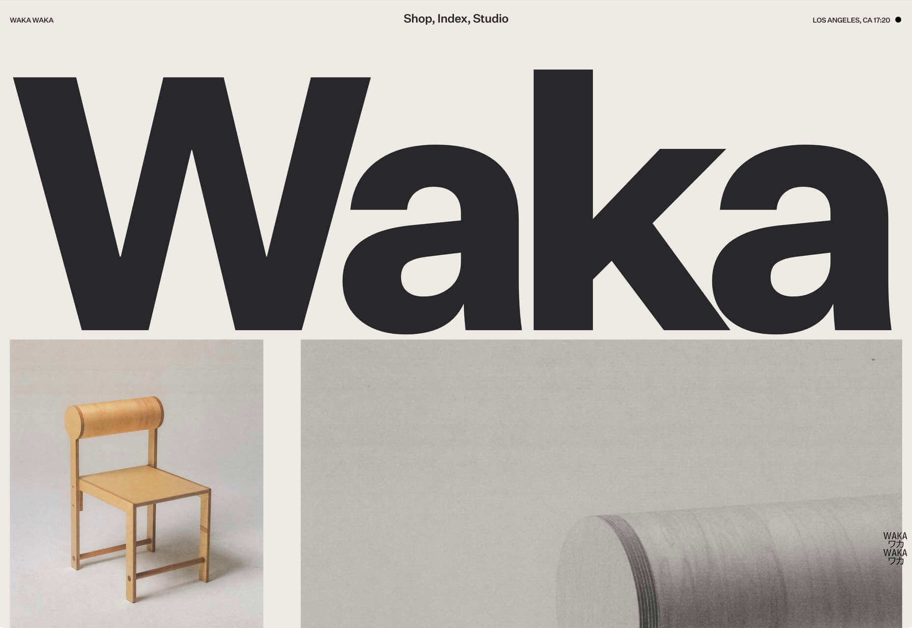
WAKA WAKA

Waka Waka is a design studio specializing in wooden furniture. The noise effect and the mid-century typography evoke the radical design of 60 years ago. The random rotations on the thumbnail hovers are delightfully disruptive.

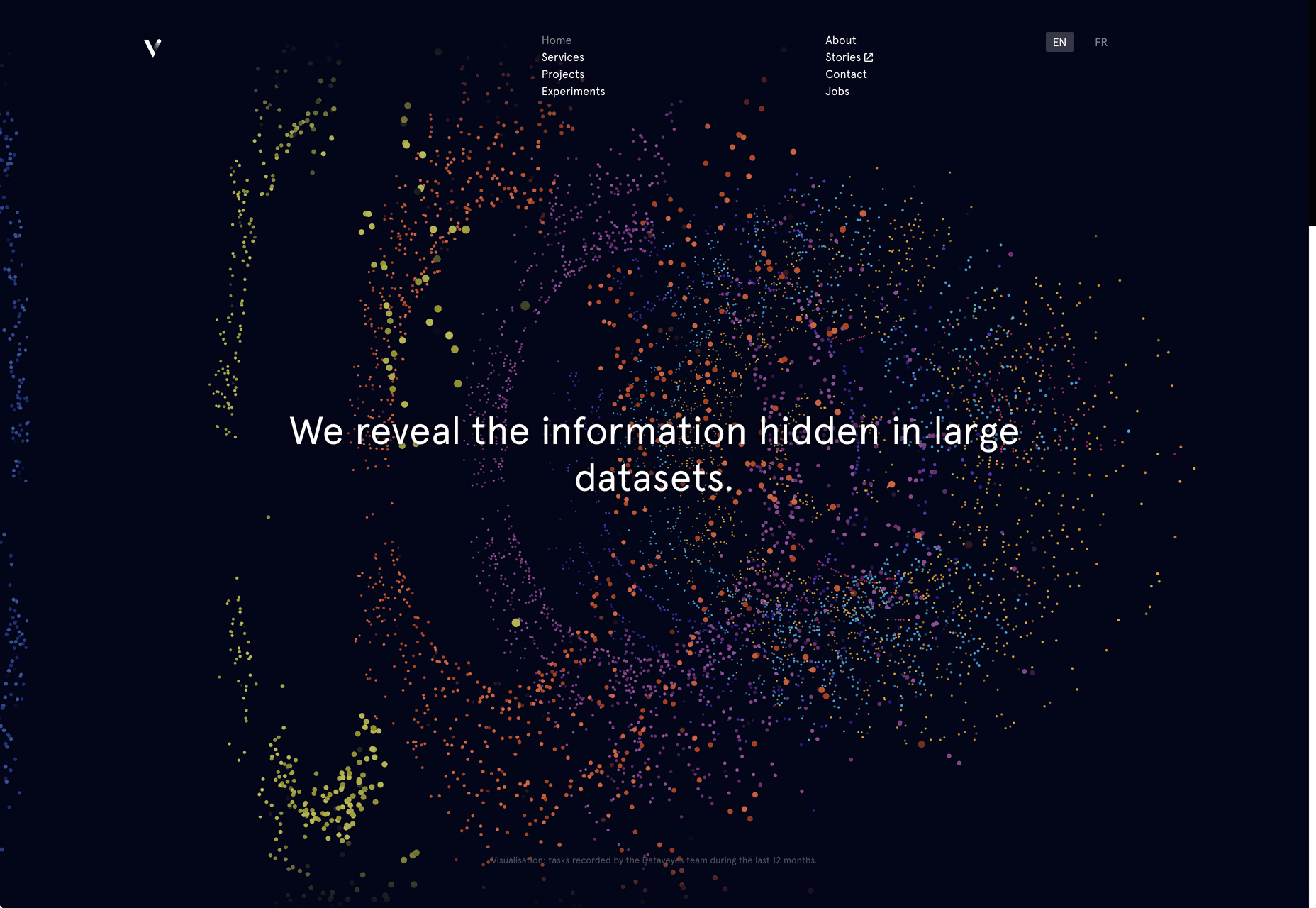
Dataveyes

Dataveyes is an information design studio that works with large datasets to give meaning to complex information. Its site features beautiful, full-screen animations that illustrate the type of information it specializes in.

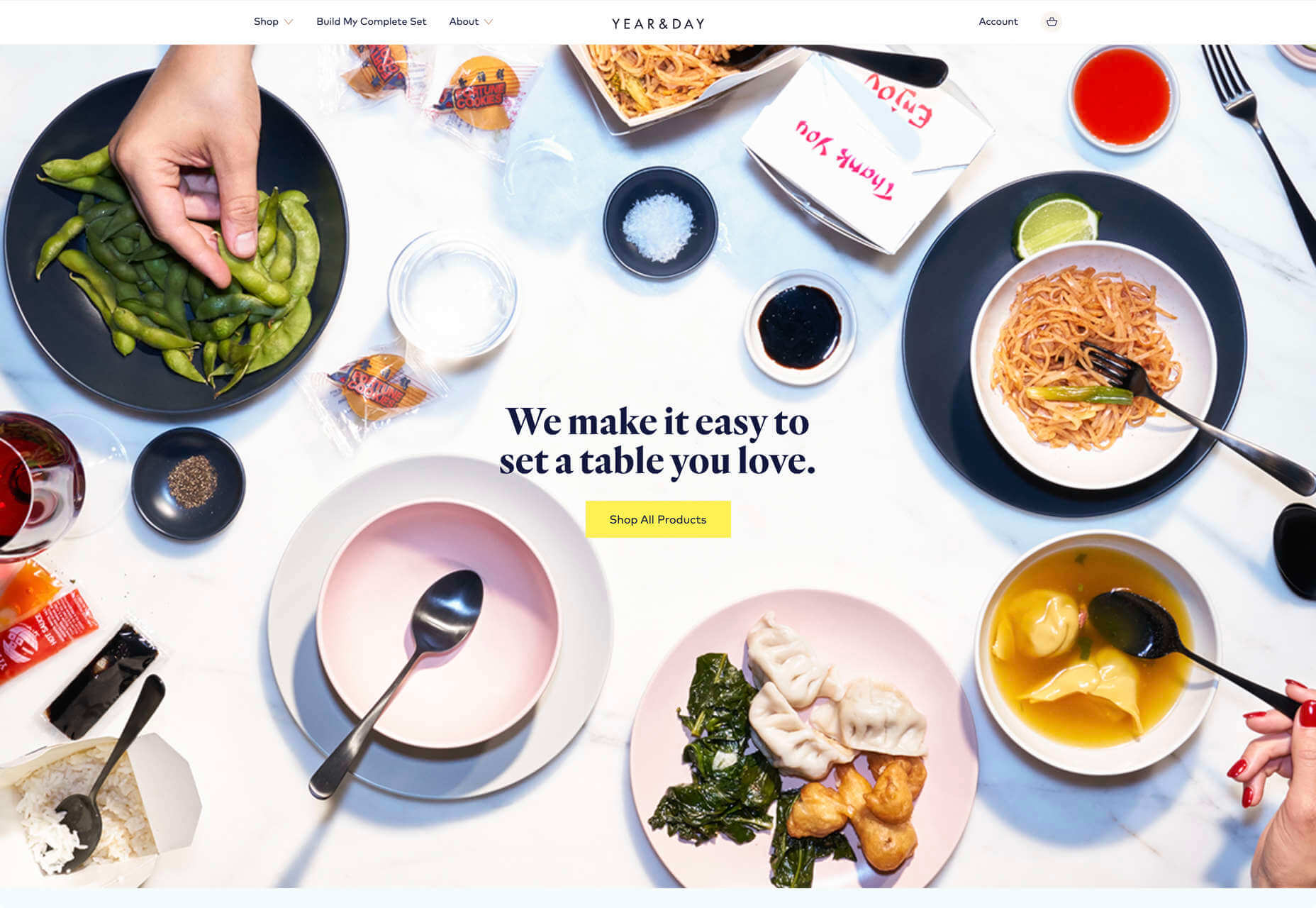
Year & Day

Year & Day is an ecommerce site that sells ceramics, glassware, and other choice pieces of tableware. It’s a colorful collection that perfectly complements your food and the stunning site takes its cues from the collection.

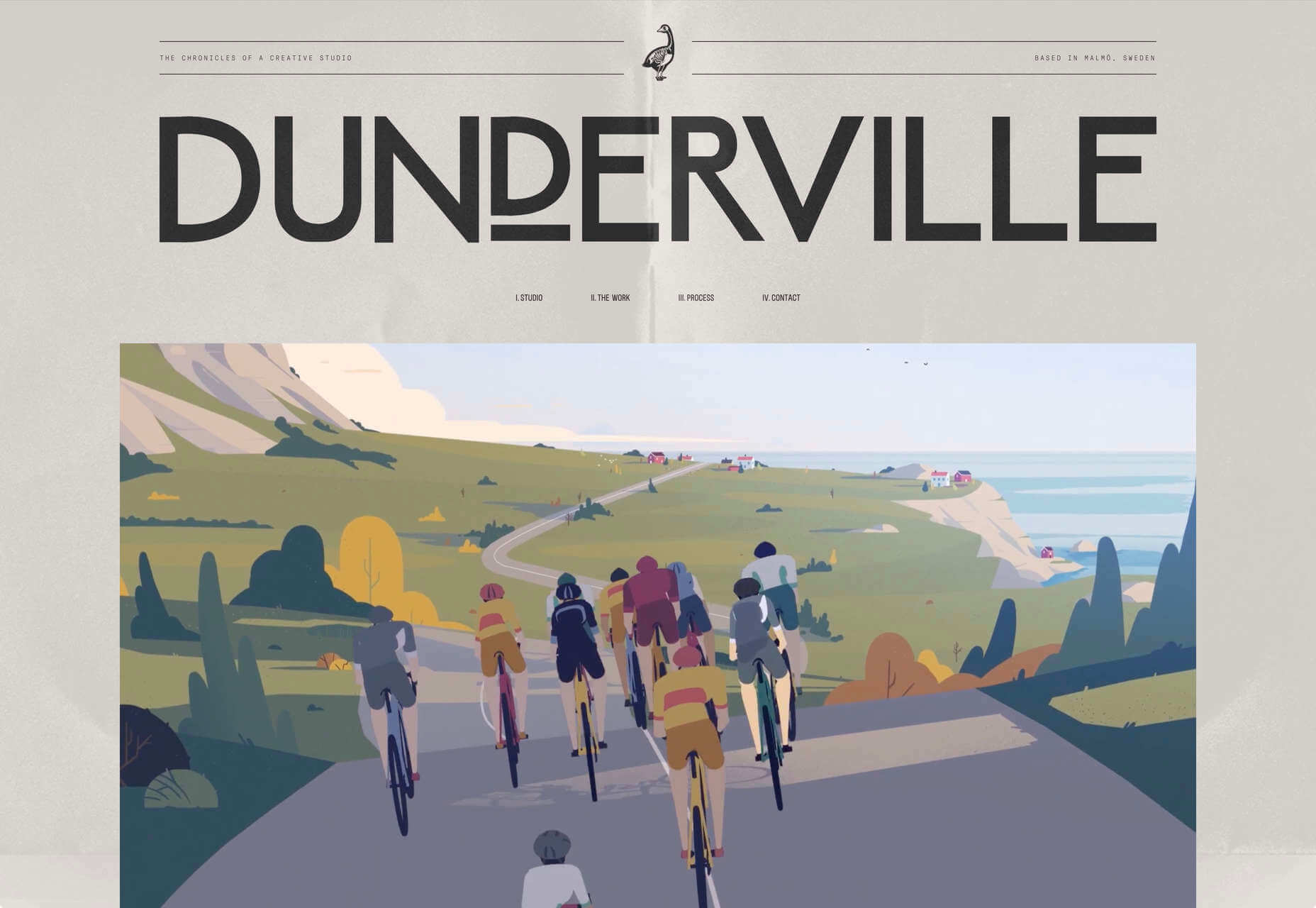
Dunderville

Dunderville is a motion design studio with an impressive portfolio of animation and live action films. Its site features a tactile paper fold detail, and as you would expect, some superb text, and vector animations.

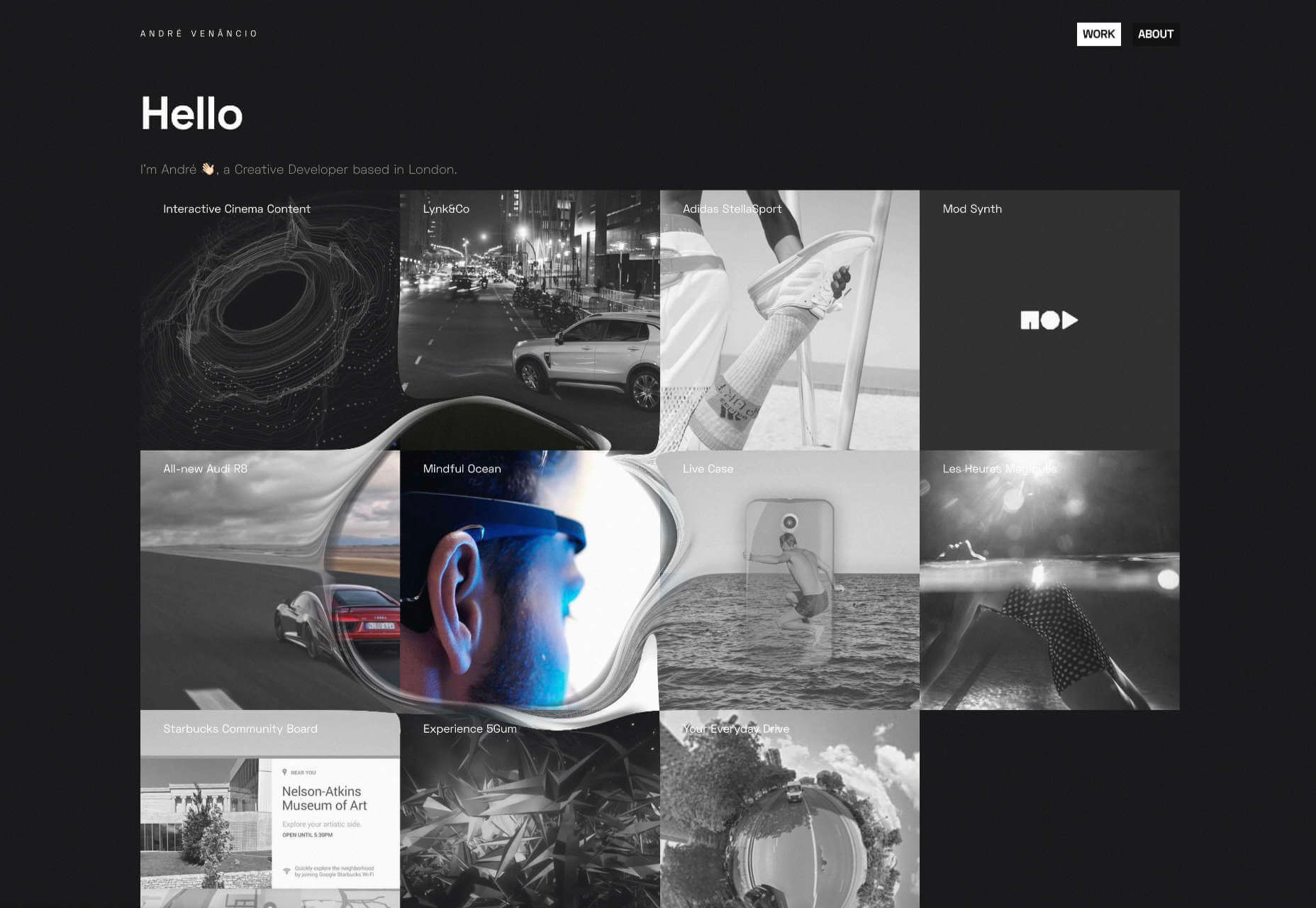
André Venâncio

It’s been months since we last saw a creative developer’s site with a liquid effect. André Venâncio revisits the idea with a cool oil bubble effect, hover over the thumbnails to see it.

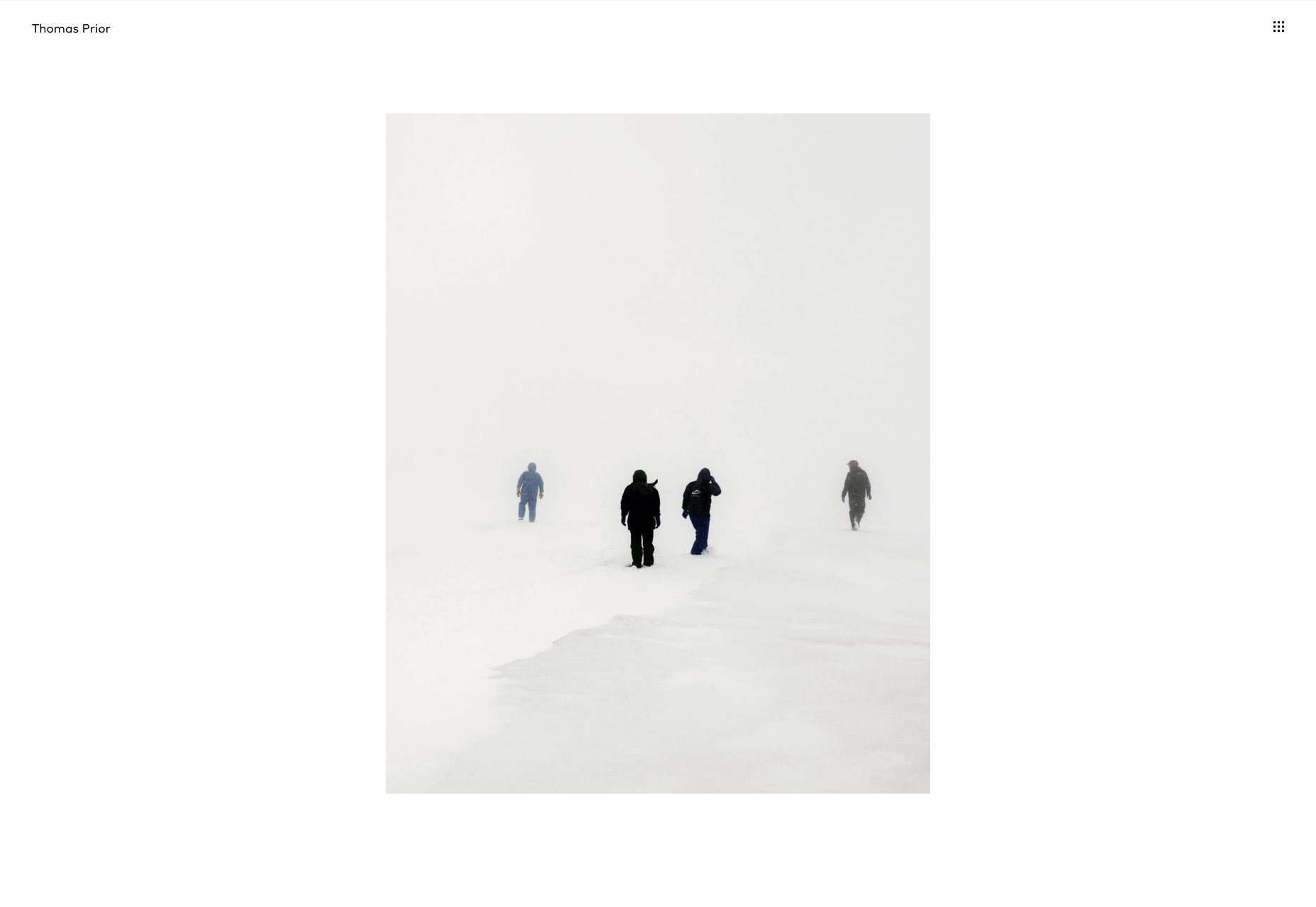
Thomas Prior

It’s not all 60s revivalism, pastels, and cute animations. There will always be room for minimalism, and nothing suits this style as well as portfolios for photographers; Thomas Prior’s site is a prime example.

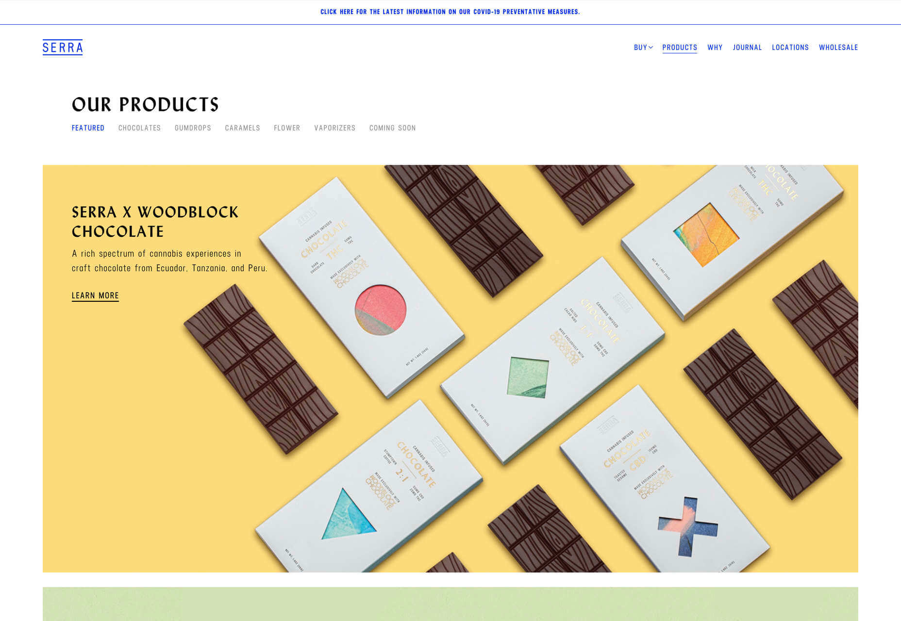
Serra

Serra’s site features a really beautiful high-contrast typeface that sits apart from the usual sans-serif. The product page is all colored product photography. It exudes luxury and distinction in a saturated marketplace.

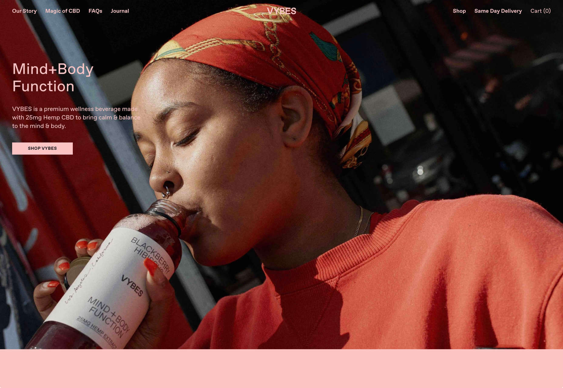
VYBES

VYBES is a CBD drink made in LA. Its site evokes the Californian spirit with baby pink brand colors and sun-bleached photography. It’s a cool, and ever so slightly Brutalist look for what is essentially a health drink.

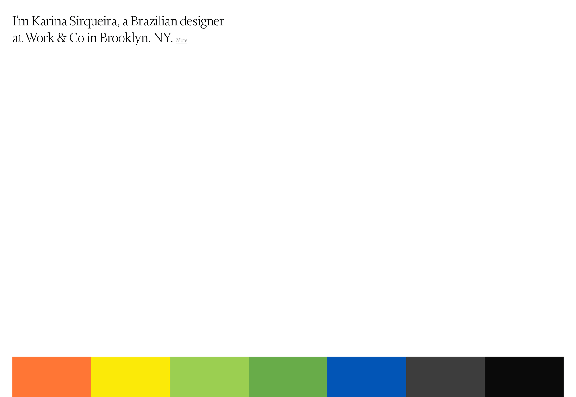
Karina Sirqueira

We love the simplicity of Karina Sirqueira’s portfolio. The desaturated rainbow leads to a simple slideshow of projects, and it’s refreshing to see a minimal site that uses bold serif-based typography. The content feels fresh and honest too.

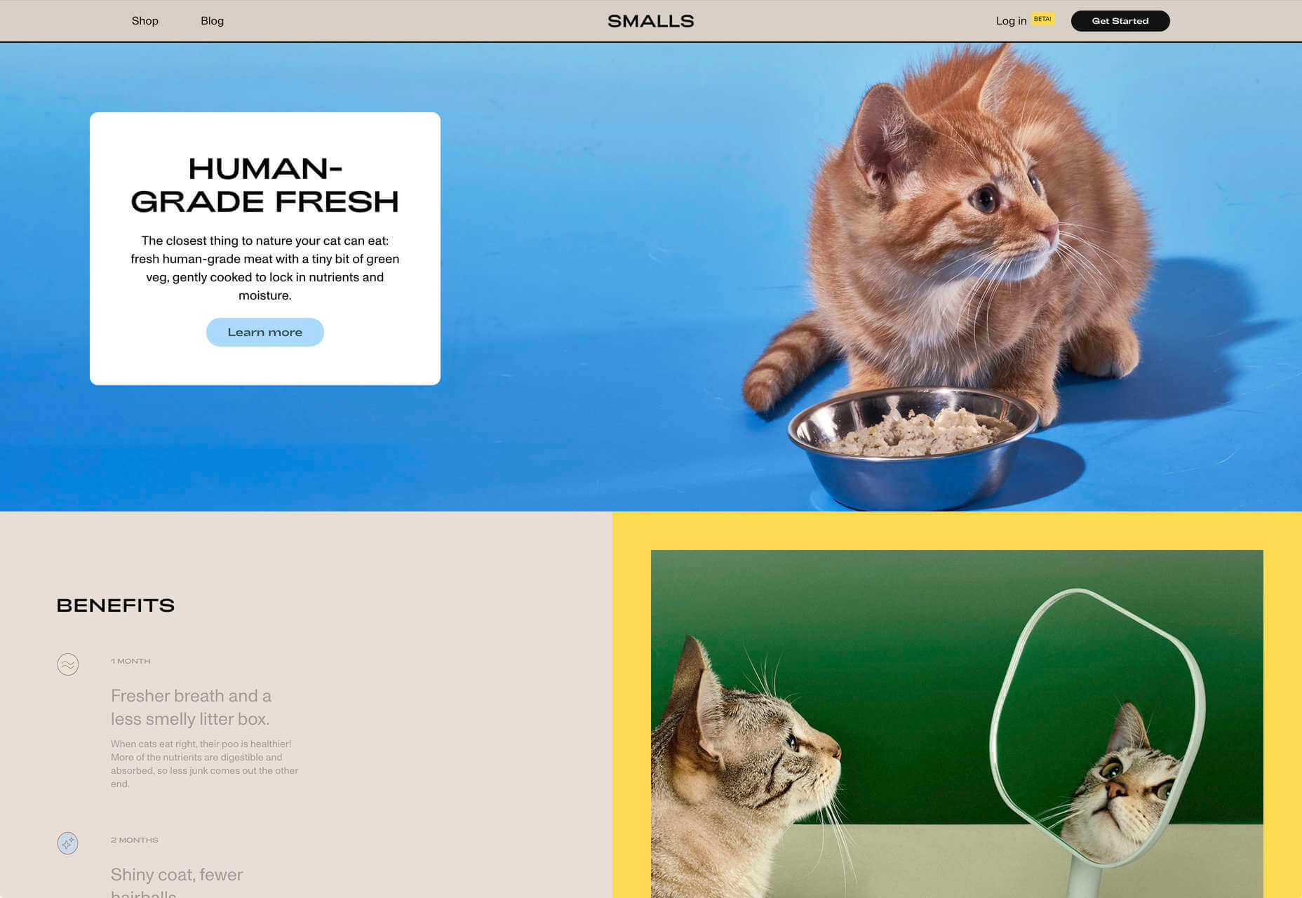
Smalls

Smalls produces healthy food for cats. The site, is packed with adorable pictures of kitties, which if you’re a cat person, is guaranteed to draw you in. There’s a definite Brutalist style to the site, and lots of color too.

Wildist

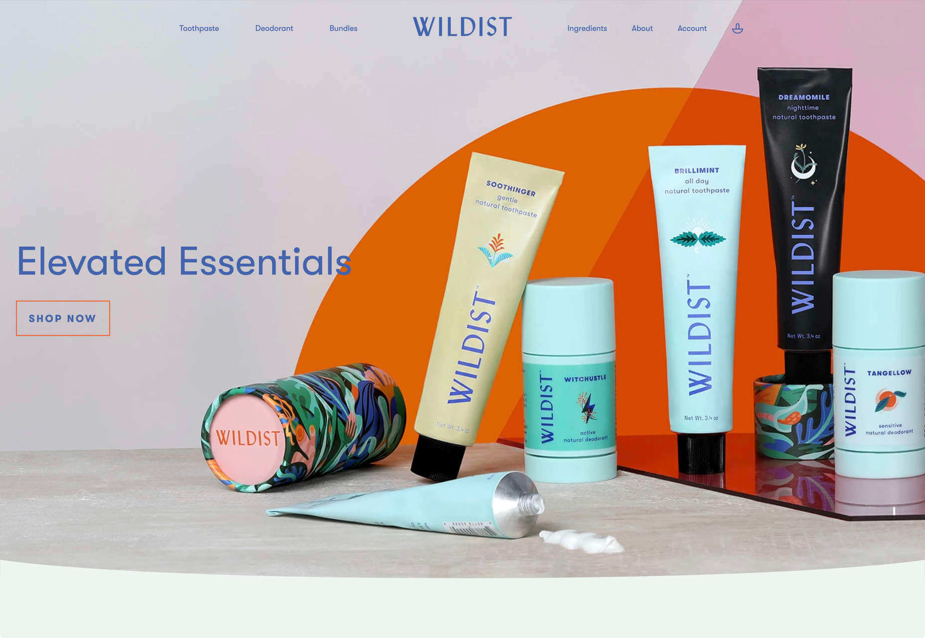
There’s a clear aesthetic beginning to emerge in 2020, with pastels creating a soft background for desaturated primaries, and Wildist gets it exactly right with this youthful, site that features just enough animation to bring it to life.

Kristen Kwong

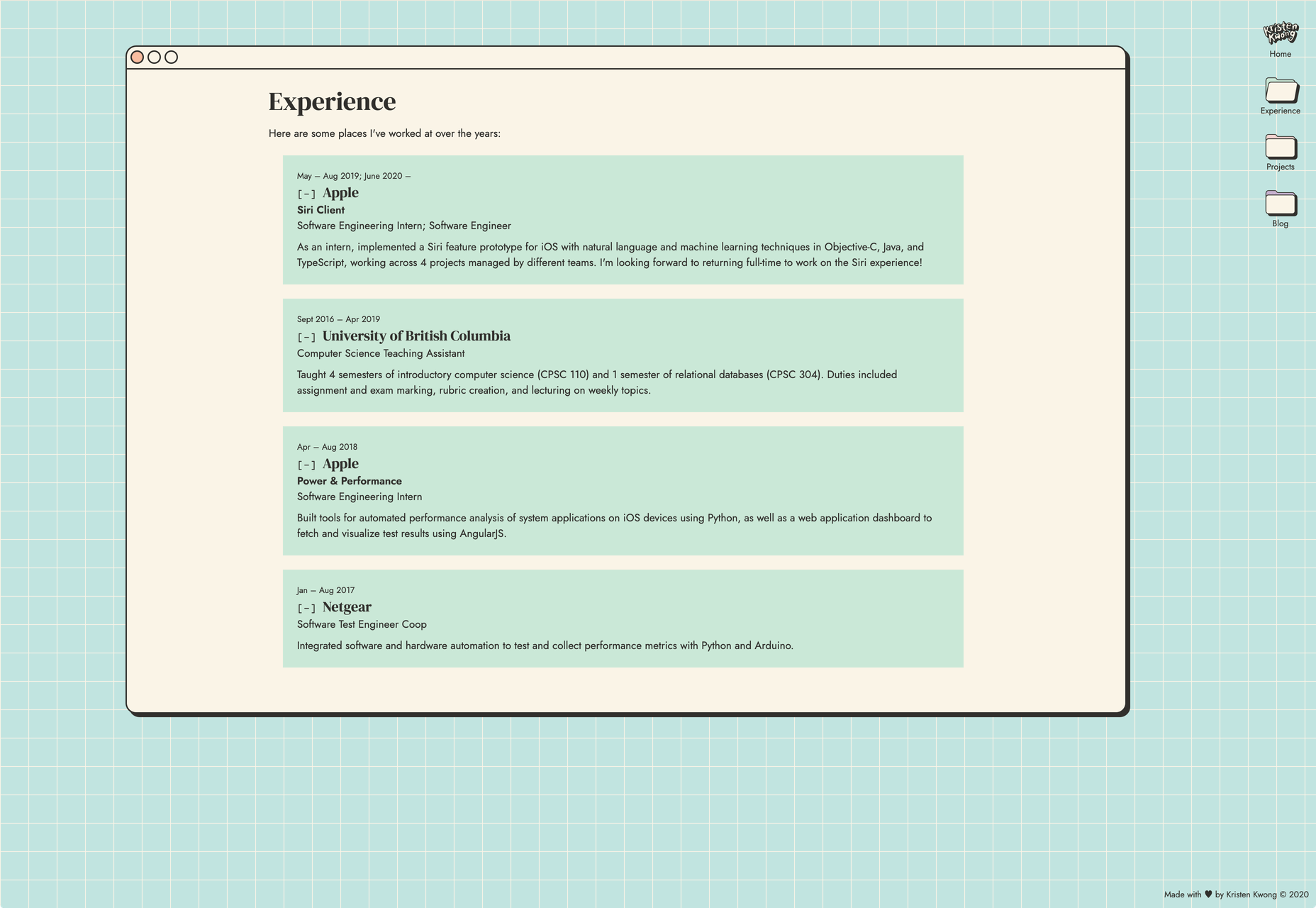
We’ve seen a lot of OS-style sites recently, but Kristen Kwong’s is one of the slickest. It manages to take a simple metaphor for interaction and transform it with a vintage color scheme.

Stojo

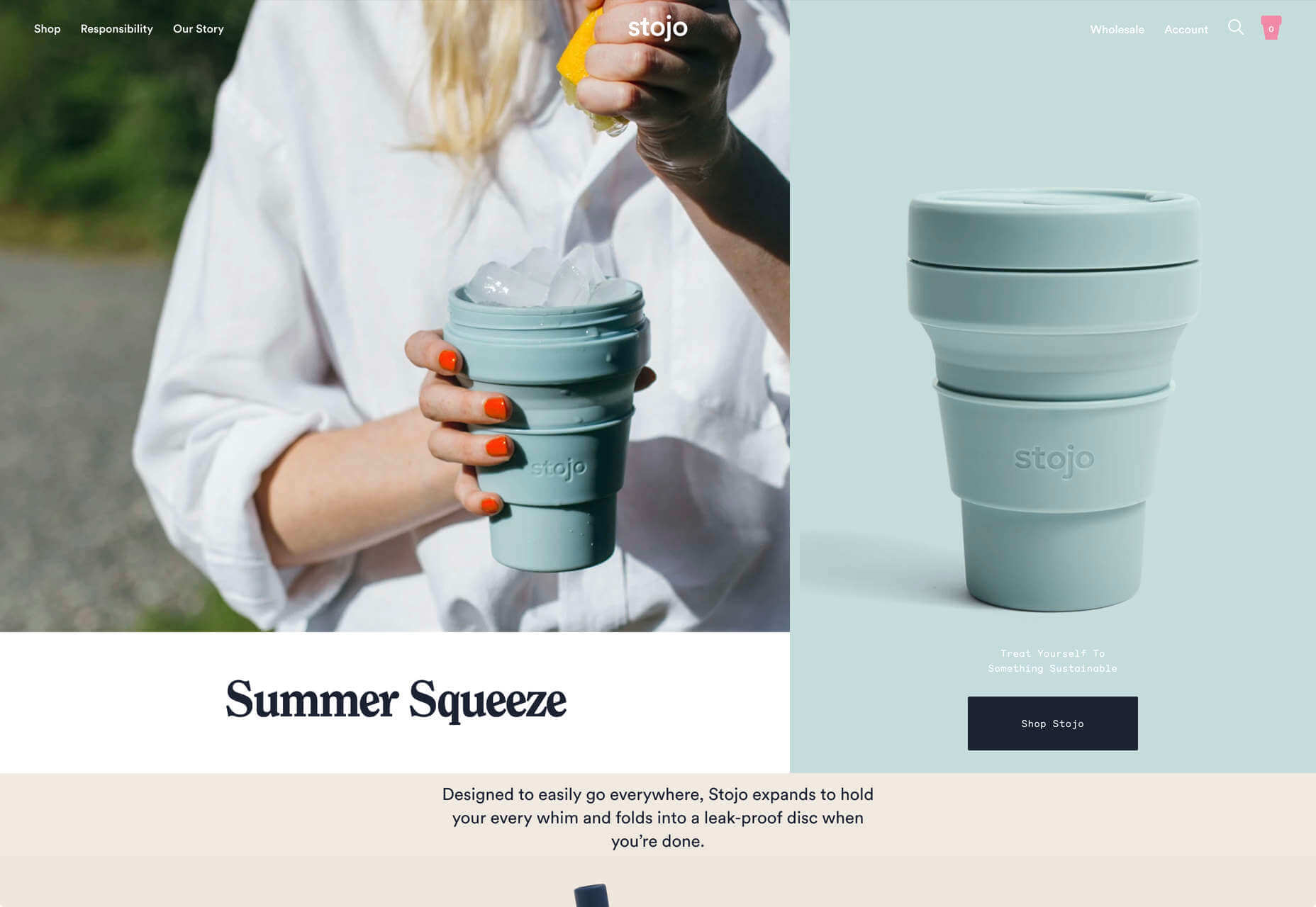
Continuing the Miami-meets-Brutalism trend this month is the site for Stojo, a collapsable cup and bottle. The pastel shades block out a disrupted grid, but for our money it works better on mobile. The vintage typeface is a nice touch.

Hoang Nguyen

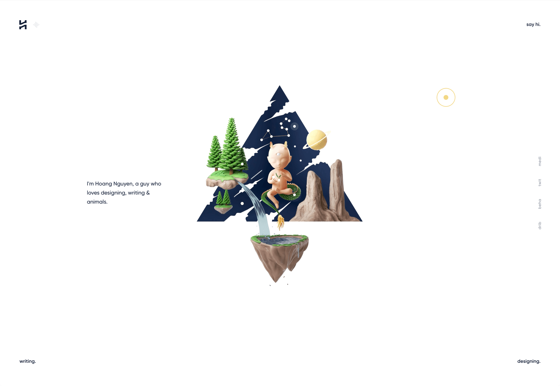
Hoang Nguyen’s site features a surreal 3D scene with mountains, a spinning planet, floating islands, a waterfall, and a floating dragon-boy. Click around the site and the scene transforms.

SMTH / Sam Smith

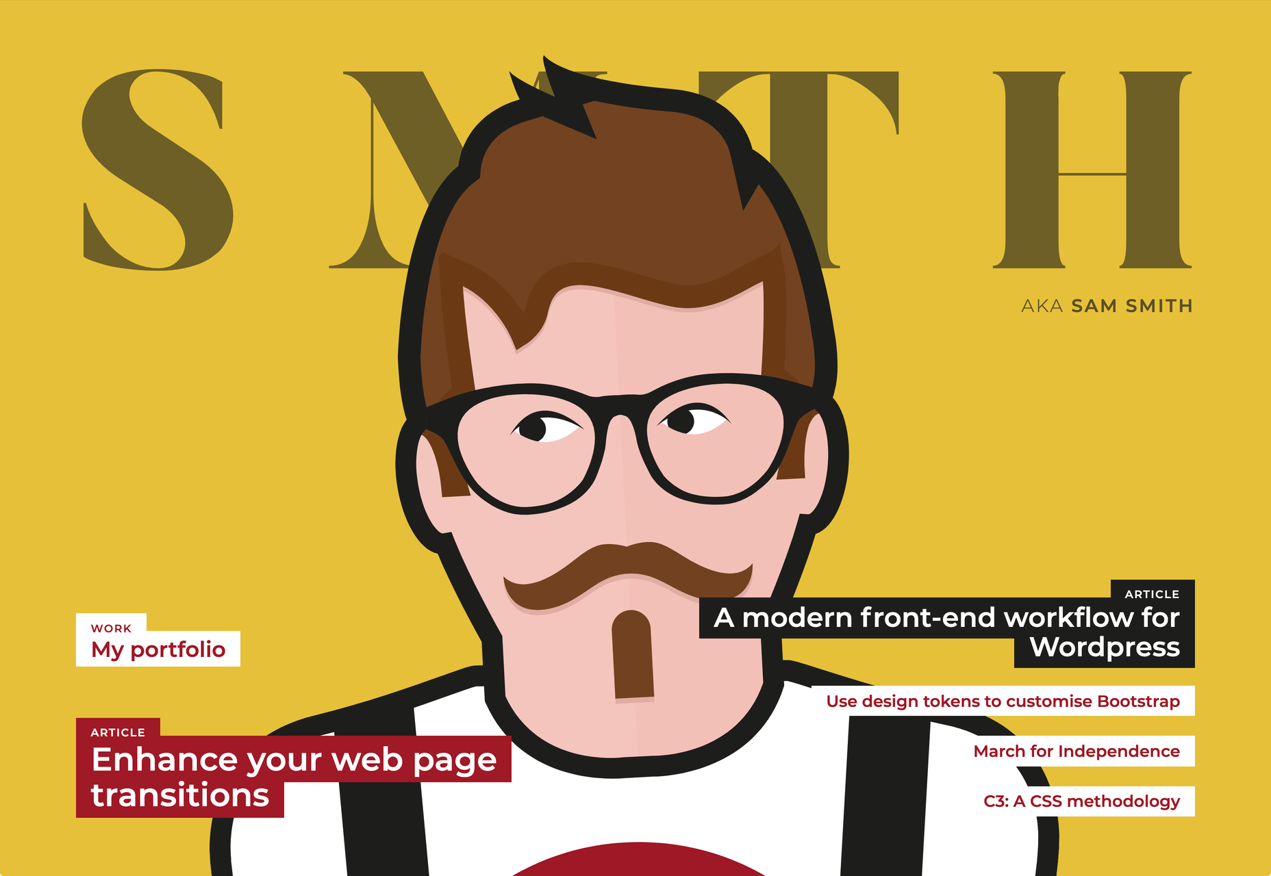
Sam Smith’s portfolio has a cool magazine style to it, with a nice blocky background on the text and a personality packed animated avatar taking centre stage.

Then I Met You

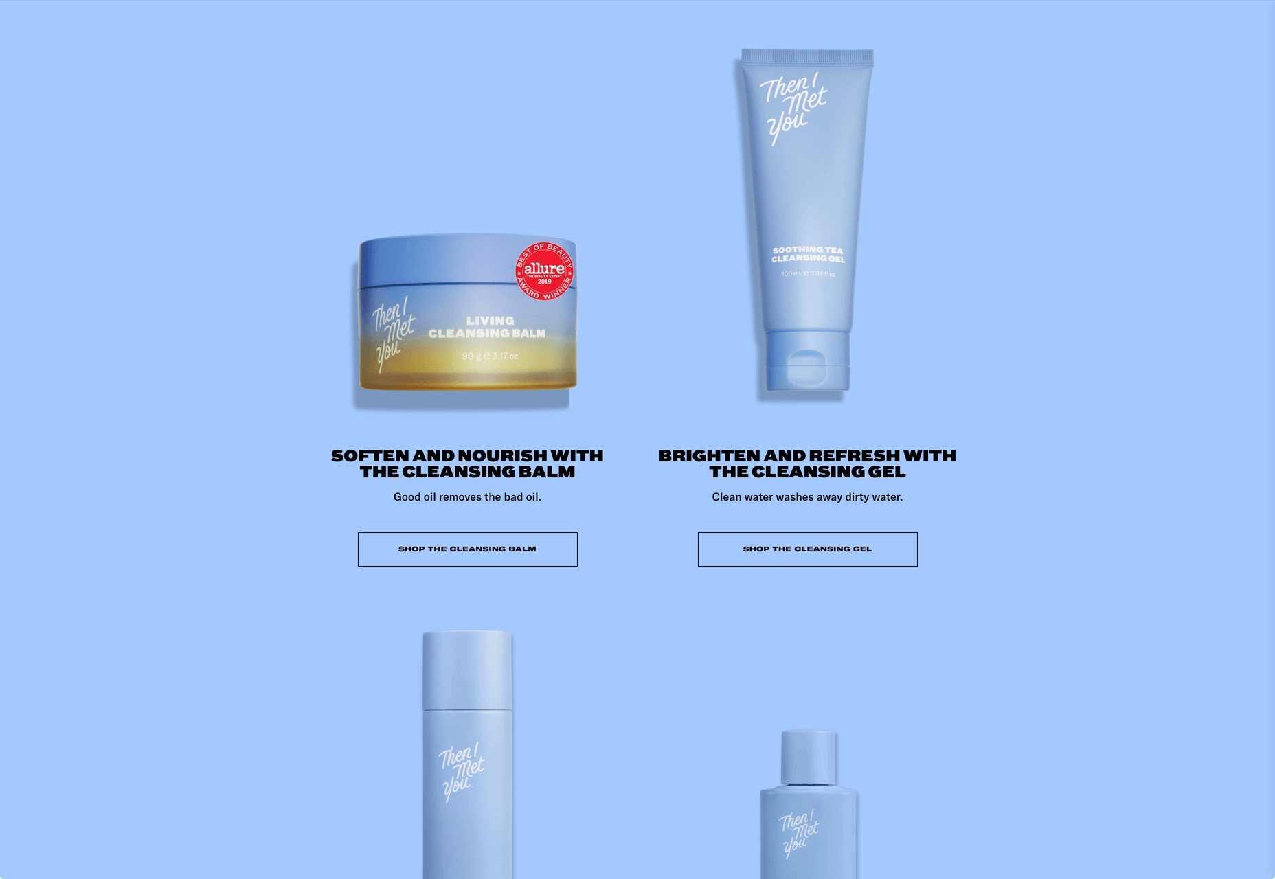
Then I met You is a site promoting a range of skincare products. In this case, the usual pastel colors are replaced with an 80s-style gradient. Watch the products as you scroll, the lighting changes creating an awesome, subtle 3D effect.

Source


Source de l’article sur Webdesignerdepot
Les personnes handicapées sont confrontées à des défis spécifiques, lors de la saisie de la main-d’œuvre. Selon l’organisation des Nations Unies (ONU), dans les pays en développement, 80 à 90% des personnes en âge de travailler handicapées sont au chômage. Dans les pays industrialisés, le taux de chômage des personnes handicapées est au moins le double de ceux qui n’ont pas de handicap. Dans certains pays, il devrait être aussi élevée que 50 à 70 pour cent.

Cette grande inexploité main-d’œuvre crée des opportunités pour les organisations – l’accès à de nouveaux viviers de talents et d’engager des personnes qui apporte des points de vue de leurs équipes. Comme beaucoup de diversité et d’inclusion des sujets, le vrai changement nécessite délibérée des cotisations à un milieu de travail inclusif de la culture. Accenture a constaté que les sociétés avec des haut de l’insertion des personnes handicapées sont deux fois plus susceptibles d’avoir plus de rendement total des actionnaires par rapport à leurs pairs. En outre, les entreprises qui ont amélioré leur inclusion des personnes handicapées, au fil du temps, sont quatre fois plus susceptibles d’avoir rendement total des actionnaires qui se démarquent de leurs pairs.

Définition d’une Fondation

Soixante-dix pour cent de handicap non visible
Vous pouvez penser que vous n’avez pas quelqu’un dans votre équipe ou dans votre milieu de travail qui a un handicap, mais les chances sont que vous faites. Avec de nombreux handicaps être nonvisible, il est important de ne pas faire de suppositions. Plutôt, de créer un milieu de travail inclusif où chacun peut se connecter et de contribuer.

Apprendre le jargon
Les mots sont importants, et il est important d’avoir une compréhension de base lors de la communication avec ou à propos des personnes handicapées. La plupart des individus préfèrent personne comme première langue, ce qui signifie qu’ils identifient comme une personne et ayant une déficience. Par exemple, au lieu de dire “personne sourde”, vous pouvez dire “quelqu’un avec la perte de l’audition” ou “quelqu’un qui est sourd”. Chacun de nous est différent et a des préférences individuelles, donc si vous n’êtes pas sûr, demandez à la personne.

Rencontrer et de saluer
Au moment de l’introduction de quelqu’un avec un handicap, de leur serrer la main, ou les salue toutefois vous le feriez avec n’importe qui d’autre. Si la personne est aveugle, verbalement identifier vous-même et les autres autour de vous. Si la personne est accompagnée par un interprète ou un fournisseur de soins, de parler directement à la personne handicapée.

Demander d’abord
Vous pouvez voir une occasion d’aider quelqu’un avec un handicap – l’ouverture d’une porte, de guider quelqu’un vers le bas d’un couloir, ou de modification de l’éclairage dans une pièce. Au lieu de supposer que la personne a besoin d’aide, demandez-leur si vous pouvez les aider et d’attendre que l’offre soit acceptée. Ils connaissent leurs capacités meilleurs. Aussi, demandez avant de toucher un appareil ou d’un animal qui peut être utilisé pour de l’aide. Un chien-guide peut être en mode de travail et votre interaction pourrait interférer avec la capacité du chien à guider en toute sécurité de la personne.

Nous sommes tous juste de vivre nos vies
Tout le monde est différent et a sa propre personnalité et de ses besoins. Si vous avez rencontré une personne avec un handicap, c’est exactement ce que vous avez fait, rencontré une personne avec un handicap. Ne présumez pas que la prochaine personne avec un handicap, vous rencontrer a les mêmes préférences. Posez des questions lorsque vous ne connaissez pas et d’apprendre de chaque personne que vous interagissez avec.

Quelqu’un n’est pas d’inspiration parce qu’ils ont un handicap
Une personne est une source d’inspiration si ils ont accompli quelque chose de grand, avec ou sans handicap. Même si votre intention peut être gratuit, appeler quelqu’un “d’inspiration” ne peuvent être prises que de dénigrer. Si personne ne fait l’éloge vous pour voyageurs se rendant à une réunion d’affaires, pourquoi gush plus de cela pour quelqu’un d’autre?

Votre Impact dans la Création d’un milieu de Travail Inclusif de la Culture

Fournir un contenu accessible
Utilisez la fonction de l’accessibilité aux dames de s’assurer que ceux qui sont malvoyants ou aveugles peuvent consommer le contenu. Si vous fournissez des copies papier de documents, assurez-vous d’avoir une version électronique vous permet de le partager. Ajouter le sous-titrage et l’audio-description pour les vidéos.

Réévaluer les événements l’équipe de
Si votre équipe moral événements n’ont pas changé en une décennie, il peut être intéressant de regarder de plus près. Nous avons tous probablement entendu parler des “bro culture” et d’éviter de l’équipe de liaison des événements qui sont centrées autour de l’alcool, mais avez-vous également considéré comme l’accessibilité de vos événements? Par exemple, c’est l’espace physiquement accessibles pour quelqu’un ayant une mobilité réduite? L’activité inclure un environnement avec des lumières et des bruits forts que quelqu’un sur le spectre de l’autisme pourrait être sensible?

Mettre en œuvre inclusive réunion de pratiques
Préréglage de l’ordre du jour et partager des ressources à l’avance. Ceci n’a pas seulement l’efficacité de l’entraînement et de la collaboration, mais elle crée également de l’inclusion. Les individus auront plus de temps pour traiter l’information et d’être prêt à contribuer. Vous pouvez également envisager d’autres moyens pour quelqu’un de s’exprimer verbalement, l’ajout d’un commentaire sur le document, par messagerie instantanée, ou après la réunion en une seule conversation.

Supprimer les obstacles dans le processus d’embauche
Si vous êtes un recruteur ou gestionnaire d’embauche, d’évaluer l’accessibilité de votre processus de demande. Si vous êtes à profit pour interviewer un candidat, examiner les objectifs de vos questions. Qu’essayez-vous évaluer? Est-il une autre manière de poser la même question que peut-être le plus inclusif? Par exemple, une commune de la technique d’entretien est de demander à un candidat pour expliquer un concept particulier de l’enquêteur, comme s’ils étaient un enfant. L’intention est susceptible d’évaluer les connaissances du candidat du concept — peuvent-ils briser le concept en facile-à-comprendre les pièces? Cependant, au lieu de mettre en valeur le candidat de l’expertise sur le sujet, il peut être sans le savoir, dépistage de talent, car il évalue leurs compétences en communication, plutôt que de leur expertise sur le sujet.

Découvrir votre propre risque de biais
Nous avons tous des préjugés, y compris certains que nous ne réalisent même pas que nous avons. En savoir plus sur les biais implicites en prenant de l’université de Harvard Handicap Test d’associations Implicite et le blocage de 15 minutes sur leurs calendriers à réfléchir sur les résultats.

Évaluer votre organisation du handicap de l’équité
Handicap:EN fournit une compression à l’outil d’analyse comparative pour l’insertion des personnes handicapées. En savoir plus ici.


Devan Vaughn est directrice de la Diversité et de l’Inclusion et de la Responsabilité Sociale de l’Entreprise chez SAP, d’Accord.
Cette histoire est initialement paru sur le SAP Accord des salles de rédaction.

Source de l’article sur SAP News Center

Originally published August 17, 2016

Turn to page one.

What is DevOps?

Communication, collaboration and integration are the three main principles of the ever-growing, modern approach to software delivery known as “DevOps.” Coined in 2009 by Patrick Debois, the term (development and operations) is an extension of Agile development environments that aims to enhance the process of software delivery as a whole.

Source de l’article sur DZONE