Articles

Web developers have been the bedrock of any company’s business strategy for some time, and the industry is continuing to thrive and grow at a rapid pace. This is why it’s surprising that it is so lacklustre when it comes to diversity.

A recent study revealed 80% of those in the design industry are male, and more specifically 79% within the field of web design. According to WISE, just 23% of the people working in STEM roles (Science, Technology, Engineering and Maths) are female and women currently account for just 15.8% of the UK’s current generation of engineering and technology graduates.

Why the Lack of Diversity in Web Design?

The main reason for this, as cited by the Organisation for Economic Co-operation and Development (OECD) found that women still lack the confidence to pursue these careers, despite their school results being as good as (or better) than their male counterparts. Research has found that the professional and technical services sector has the fourth-highest gender pay gap of all UK industries. If more women were to join these higher-paid sectors it could help reduce the gender pay gap as a whole, as well as help female economic empowerment.

This division is seen in ethnic minority groups too. The numbers for BAME (Black, Asian, Minority Ethnic) employees in the British tech industry are unknown but is estimated by the British Computer Society to be at 1-2%, a ridiculously low number in this day and age. This is why groups and organisations are cropping up designed to promote an industry that reflects all of society rather than one part of it. Here are some of the organisations to pay attention to who are bridging the diversity gaps in web design.

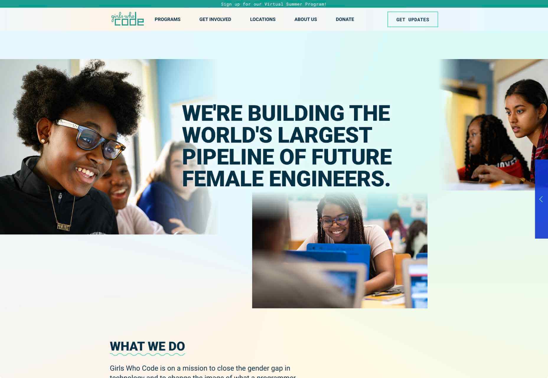
Girls Who Code

Girls Who Code are working to create opportunities for women within tech, aiming to deepen their computer science skills and confidence. They run a range of programs designed to equip women with the necessary computing skills to pursue opportunities in the field and to give chances that are often shunned due to society. Founder Saujani states that women are socialized to seek perfection, and this is something that needs to be overcome. One way to break that mentality at an early age, she says, is coding:

[Girls] walk into these classrooms and they feel like they will never be good at it, and when they learn how to create something, whether it’s a website or app, it changes their mindset and they stop giving up

Adobe Design Circle

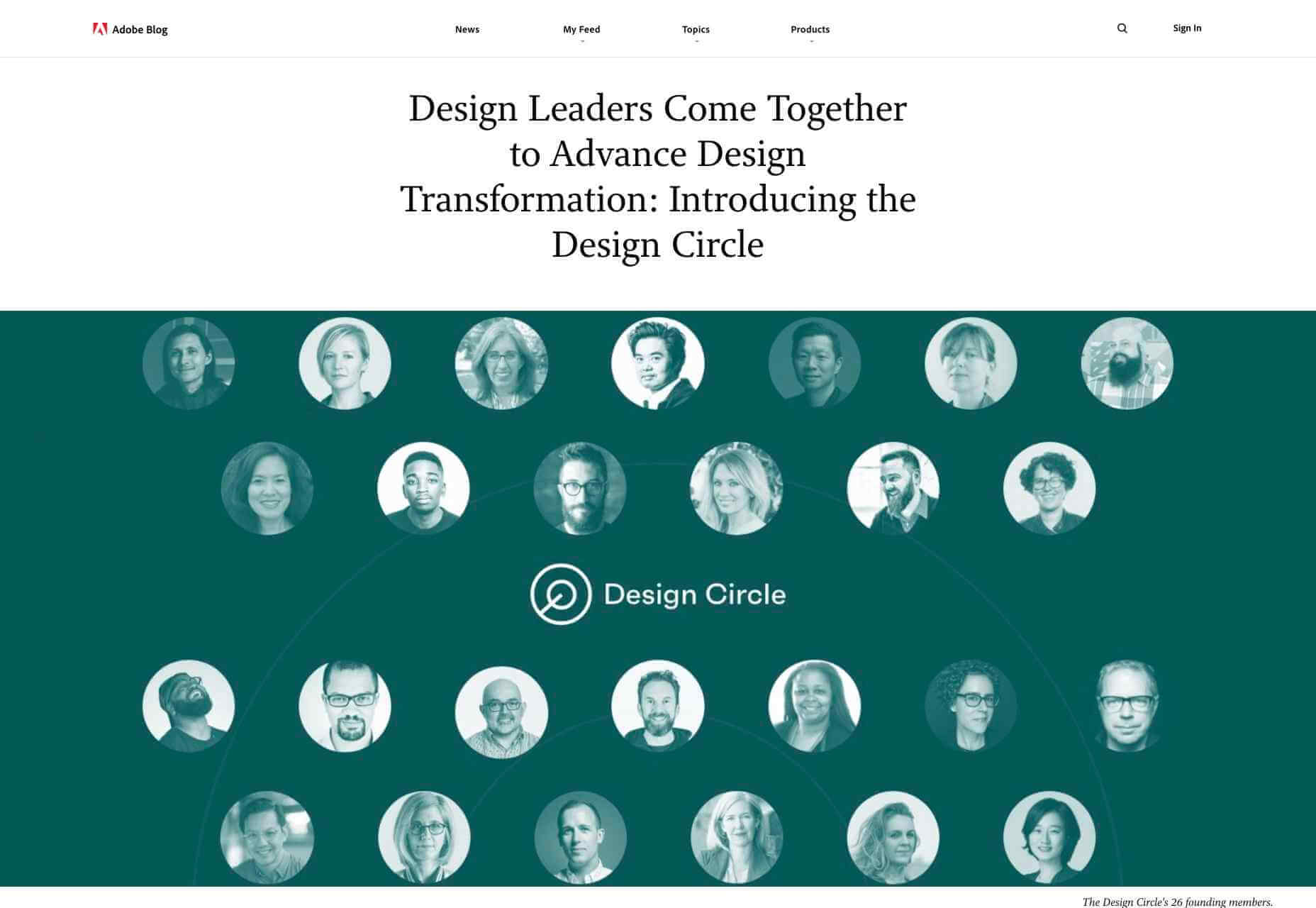
Adobe Design Circle is another initiative aiming to introduce all members of society to design. They want to create more visibility for design as a viable career path for anyone that might be considering it, and to help with youth entering the field. This is opening the opportunities of working in tech and web to aspiring designers at a young age who aren’t necessarily yet conditioned by the pressures of society and showing them it can be a realistic career path.

They have their own scholarships and mentoring initiative to support these goals too. The faces behind the team of Adobe Design Circle range through multiple ethnicities and have a fairly even male-female divide. This equal representation alone is inspiring. One of Adobe’s core missions is to offer youth the opportunity to learn and express themselves through creativity and technology, regardless of their economic or cultural backgrounds. With this they specifically encourage applicants of all backgrounds to apply and offer many other opportunities from mentoring to internships.

Ladies that UX

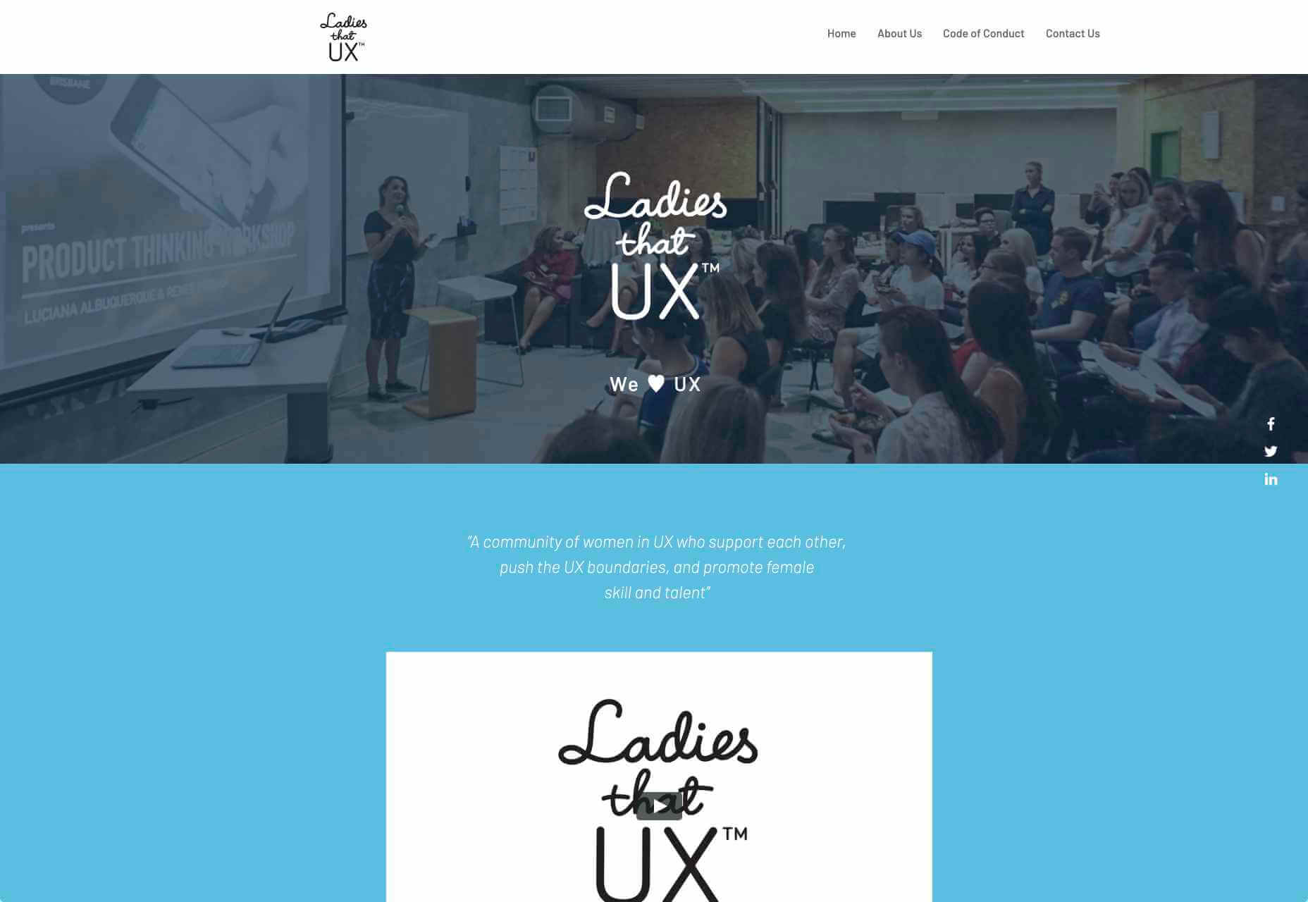
Ladies that UX are a collaborative community of women in UX aiming to “support each other, push the UX boundaries and promote female skill and talent.” It is a European-based initiative where each city involved runs slightly different events and groups decide together what they would like to get from their meetups. They assist each other with UX challenges, discuss topics, and brainstorm ideas. Ladies that UX was created in 2013 by Georgie Bottomley and Lizzie Dyson with the aim of bringing together women in the industry, offering support and creating connections around the world.

Xuntos

Xuntos is aiming to create the largest community of ambitious and talented individuals from under-represented groups in the technology industry. It works to nurture university students and recent graduates that are often overlooked in the tech industry by the means of educational workshops, university hubs, events and an active community. The very name “Xuntos” is a Galician word which means “together” and this is their most important factor. They want people to realise they are not alone and just because the representation isn’t there, doesn’t mean their capabilities aren’t.

Colorintech

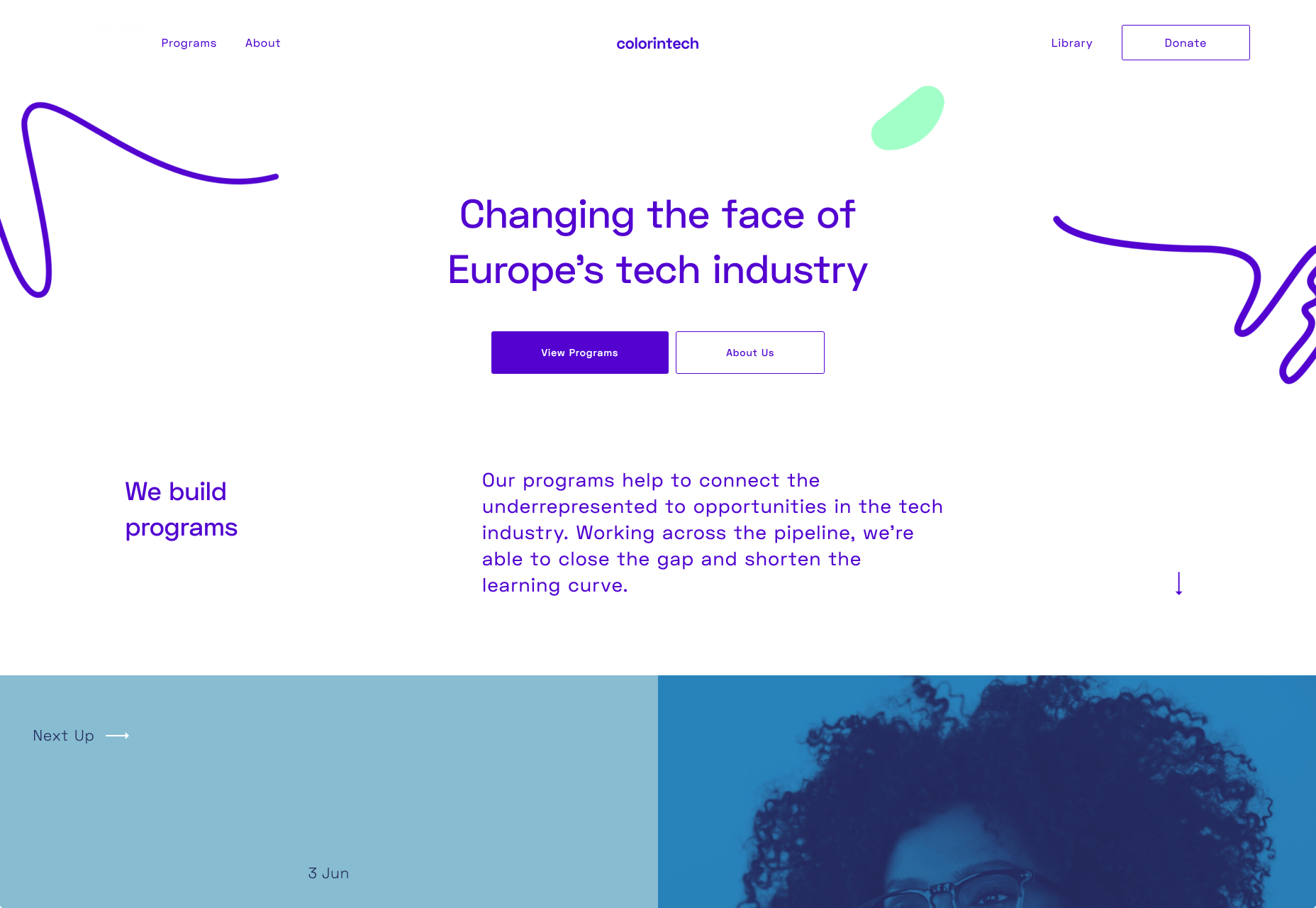
Colorintech is a non-profit organisation that was founded in 2016. It aims to close the gap and shorten the learning curve, with a strong community designed to help each other. The company was founded by Silicon Valley tech executive Dion McKenzie and ex-Googler Ashleigh Ainsley after they became frustrated at the few black individuals in the field. Since its inception 30,000 students, professionals, volunteers and tech companies have been impacted by their work, and over 450 minorities graduated from their programs in 2019 alone.

UKBlackTech

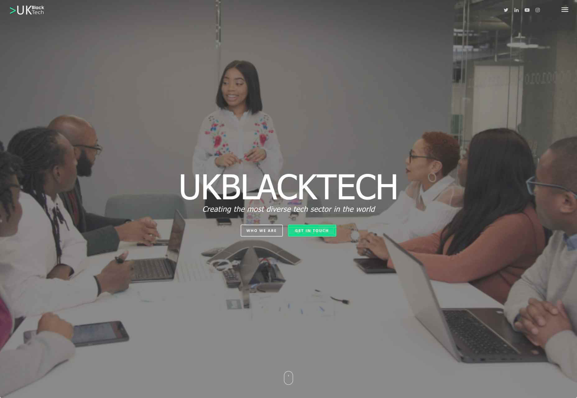
UKBlackTech are on a mission to create the most diverse tech sector in the world. Their aim is to encourage more ethnic minorities to enter the UK’s technology workforce and make an impact. To help with this, they design and implement different initiatives to help them get employed and retain employment, put on bespoke events that target aspects such as specific job roles or tech topics and promote different opportunities for members to apply to.

Witty Careers

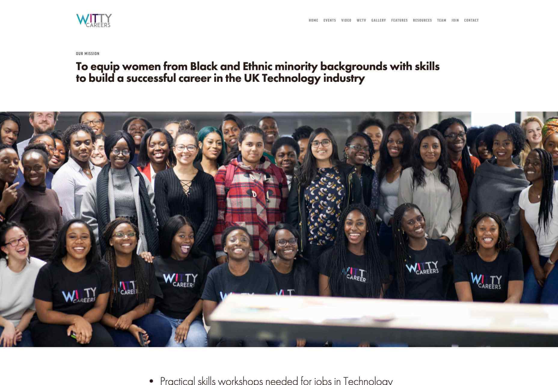
Witty Careers was created with the aim to support women from black and ethnic minority backgrounds in the UK and equip them with the skills to build a career in the tech industry. They run different practical skills workshops and events which in the past have included visits to a Microsoft store, Uber, and Pivotal. They open doors for communications, networking and future career prospects for those in the minority. They also have a handy range of resources designed to help you get into the career you want. From CV writing advice to industry insights, they are all free of charge.

Featured image via Unsplash.

Source

p img {display:inline-block; margin-right:10px;}
.alignleft {float:left;}
p.showcase {clear:both;}
body#browserfriendly p, body#podcast p, div#emailbody p{margin:0;}

Source de l’article sur

You’ve been working away at your latest design project, and the client has given the go-ahead on your lovingly created digital concepts. Now it’s time to bring those designs to life, and you have a developer queued up to do just that.

So your part’s done, right? Not quite. You’re going to want to make sure your developer has the best head start they can in order to create the site as you imagined.

Below are a few tips to make that handover process a little easier.

Communicate to Make It Great

Get Talking

Scheduling a face-to-face meeting with your developer to talk over your project’s specifics and ambitions will help align your expectations and make the intent behind your concepts more clear. It’s quite likely they’ll even ask questions and request assets you haven’t even thought of yet!

It’s not just a one-and-done thing either, your developer’s going to have questions or requirements that arise as the project progresses. Deciding on a communication channel to allow easy discussion will help you both immensely.

Annotating Your Concepts

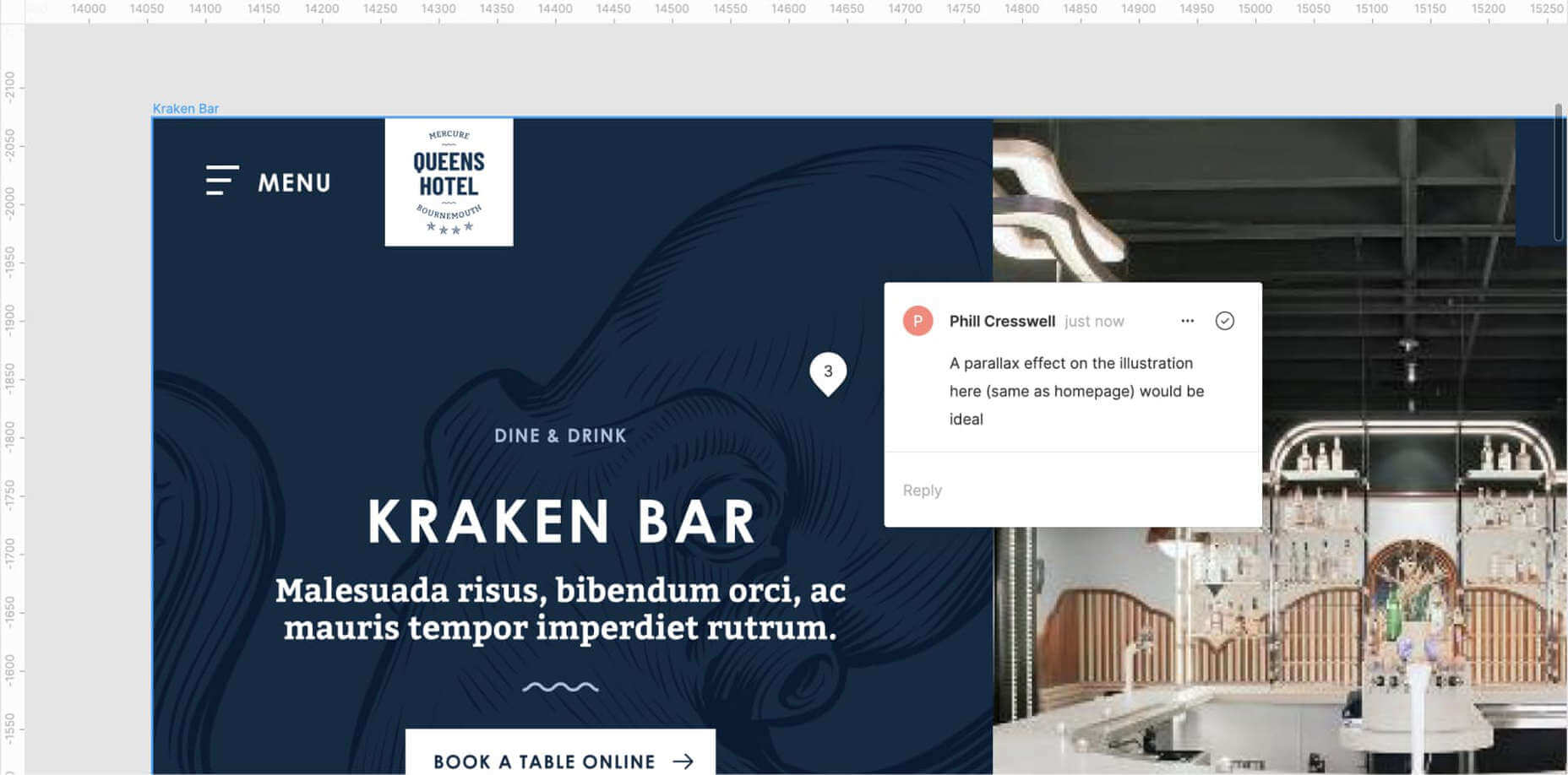
Developers might seem like magicians with the way they bring your websites to life, but they’re not clairvoyant! Annotating your concepts where advanced functionality is required reduces ambiguity and makes it more likely that your cool, quirky idea is going to make it to production. If it’s a feature that’s particularly unusual, you might want to find an example of a website or code sandbox that does something similar.

An example of Figma’s comment tool in use to make developer notes.

Figma and Sketch both have comment functionality in order to make annotations a little easier, also allowing multiple parties to comment. If dealing with PDFs, there is also an annotation tool available through Adobe Acrobat.

Specify the Basics

The basis of modern front end development revolves around DRY thinking. Some might argue thinking about code can be pretty dry, but we’re not talking about that – in this case, DRY stands for Don’t Repeat Yourself.  Most developers will tackle a project by starting with defining variables: what colors, font sizes, grid columns… anything that can be reused! Good, consistent design follows this same principle – although it’s a habit that can be hard to get going at first.

Tip: It’s always easier to define variables if this mentality is approached towards the start of the project!  

Colors

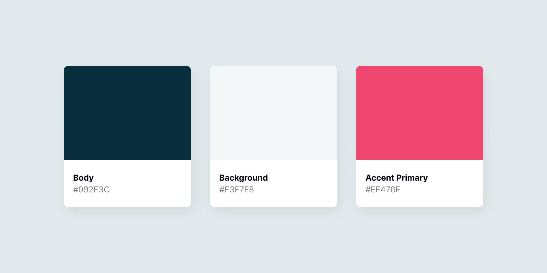
Make a style guide that specifies the colors you’ve used in your designs. Think about their logical applications to help signpost how they might work as a variable – for example, what colors did you use for paragraph text, hyperlinks and backgrounds? Did you consider colors to convey status messaging, such as successes, warnings and errors?

Typefaces

Which fonts have you used for your project? Is there a consistent set of font sizes you used throughout? If you haven’t already, maybe consider a ratio-based type scale – I like to use ModularScale to help with this.

Basic HTML Elements

Think about general styling for these basic html tags:

  • Paragraphs <p>
  • Headings <h1–h6>
  • Bullet lists <ul> and numbered lists <ol>
  • Emphasized text <b>, <strong> and <em>

Buttons

How about buttons and links? What should they do when they’re hovered over, focused (using the tab key on a keyboard) or disabled?

Forms Fields and Inputs

What should form fields look like? Is there any validation checking that should occur when a form is submitted?  How about checkboxes and radio buttons?

It’s unlikely that you’re going to be able to cover absolutely every single eventuality – allow your developer to use some common sense to fill in the gaps, and be available to them if they have any questions. In the words of John Maxwell and your aunt’s home office wall sticker, teamwork makes the dream work.

Get Your Favic-on

Favicons are widely recognized as the small icon that appears to the left of the site title on your browser’s tab bar. Nowadays, the application of your site’s favicon is much further reaching, showing up in Google search results and app tiles. There’s also extra theming options available, such as the ability to customize the color of Google Chrome Android’s browser bar color for your site.

Using a generator site such as realfavicongenerator takes the pain out of much of this decision-making, allowing you to upload specific graphics as desired, creating silhouettes of your icon for Windows Metro tiles and macOS Safari pins, and packaging everything into easy-to-use files and code.

 Compress Your Images

Nobody wants to load a 20MB image when they’re on a slow connection or a data plan – it pays dividends to plan ahead and downsize your images so that they’re production-ready for the web. If you’re worried image compression is going to harm your image quality, fear not – you can go a long way with image compression before quality is seriously compromised.

  1. Start by reducing the image resolution – for batch jobs, I use Adobe Photoshop’s image processor script to downsize images to fit 1920 x 1200 pixels
  2. Alternatively, if you’re working on a static project – where specific images will be used only in specific places – you could use your design software (nearly all mainstream UI software allows you to do this now) to export your images at 2x size to support devices with high pixel densities.
  3. I also convert my image color profiles to SRGB to ensure consistency across most modern display types (this one’s optional)
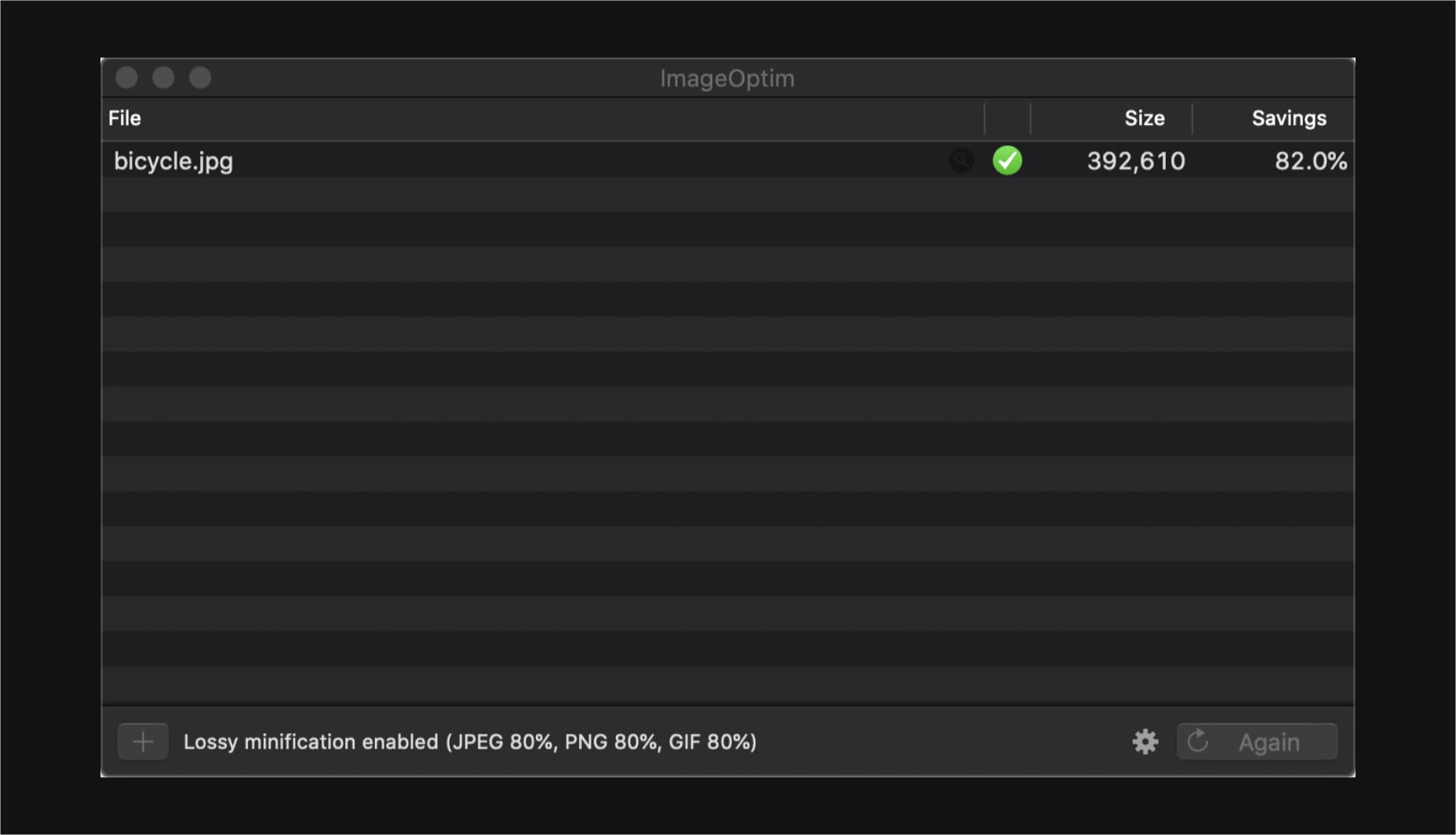
  4. I then take my newly downsized images and run them through imageOptim at 80% quality. Generally I would aim to get my images under 300kb – if there are any that are still significantly over this target once compressed, I’d run these through again at 70% quality (I wouldn’t recommend going lower than this, though).

Don’t forget you can also do this for PNGs! Enabling PNGCrush in imageOptim will let you significantly reduce the size of PNGs… just be ready for it to take a while.

Make Your Vectors SVG-Easy to Use

If your design contains graphics or illustrations you created using vector software, it can be used on the web as an SVG file. Usually, these files will be a lot smaller than JPGs or PNGs. You can export graphics in most (if not all) vector software in this format.

Optionally, you could use imageOptim or SVGOMG to compress the SVG code without sacrificing quality. Your developer might already use a script that does this automatically when processing the site for production, so it may be worth asking ahead.

Get Your Licenses in Check

If you’re using premium fonts, make sure you’ve purchased a webfont license so you can hand over the correct files to the developer. I’d recommend doing this sooner rather than later – although not often, occasionally web versions of fonts can have slightly different bounding boxes to their desktop counterparts, making it a real pain for developers to work with further down the line.

If you’ve been using samples of stock photos (or if you’ve been going crazy lifting whatever you can find on Google Images), make sure everything is kosher before you go live. Make sure you purchase licensed photos, and if certain photos you want to use require attribution, make the developer aware of this.

Source

p img {display:inline-block; margin-right:10px;}
.alignleft {float:left;}
p.showcase {clear:both;}
body#browserfriendly p, body#podcast p, div#emailbody p{margin:0;}
Source de l’article sur

The biggest trend we’re talking about this month started at WWDC as Apple provided a glimpse of what’s coming next for their operating systems. This time around there’s a distinct design element. Did you catch it?

Here’s what’s trending in design this month.

1. Text Highlights and Underlines

There’s always been an unwritten rule in website design that text uses more plain styles. Bold is acceptable, italics are OK from time to time, but underlining is seldom used.

This design trend bucks that concept with text elements that use highlighter or underline elements to emphasize key words. And it works rather nicely.

What it takes to make this work is plenty of contrast and a design style that fits with underline or highlighted elements.

This design trend works thanks to clear intention. The words are obviously important to the overall meaning of the design or what visitors should take away from the content.

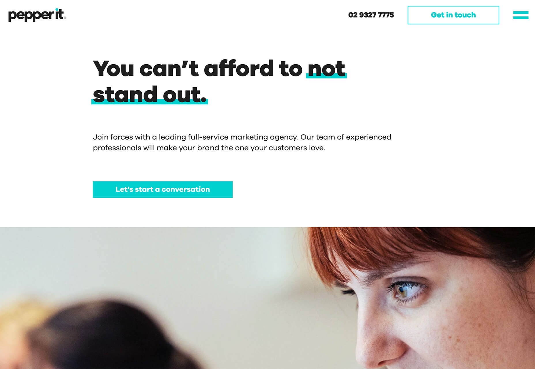
Pepper It uses a nifty underline that the letters seem to rest inside of to highlight a key phrase. The shape and color also mimic that of the larger button below, helping the eyes move from one element to the next. It’s an effective use of an underline (or maybe you could call it a highlight) effect in conjunction with brand colors.

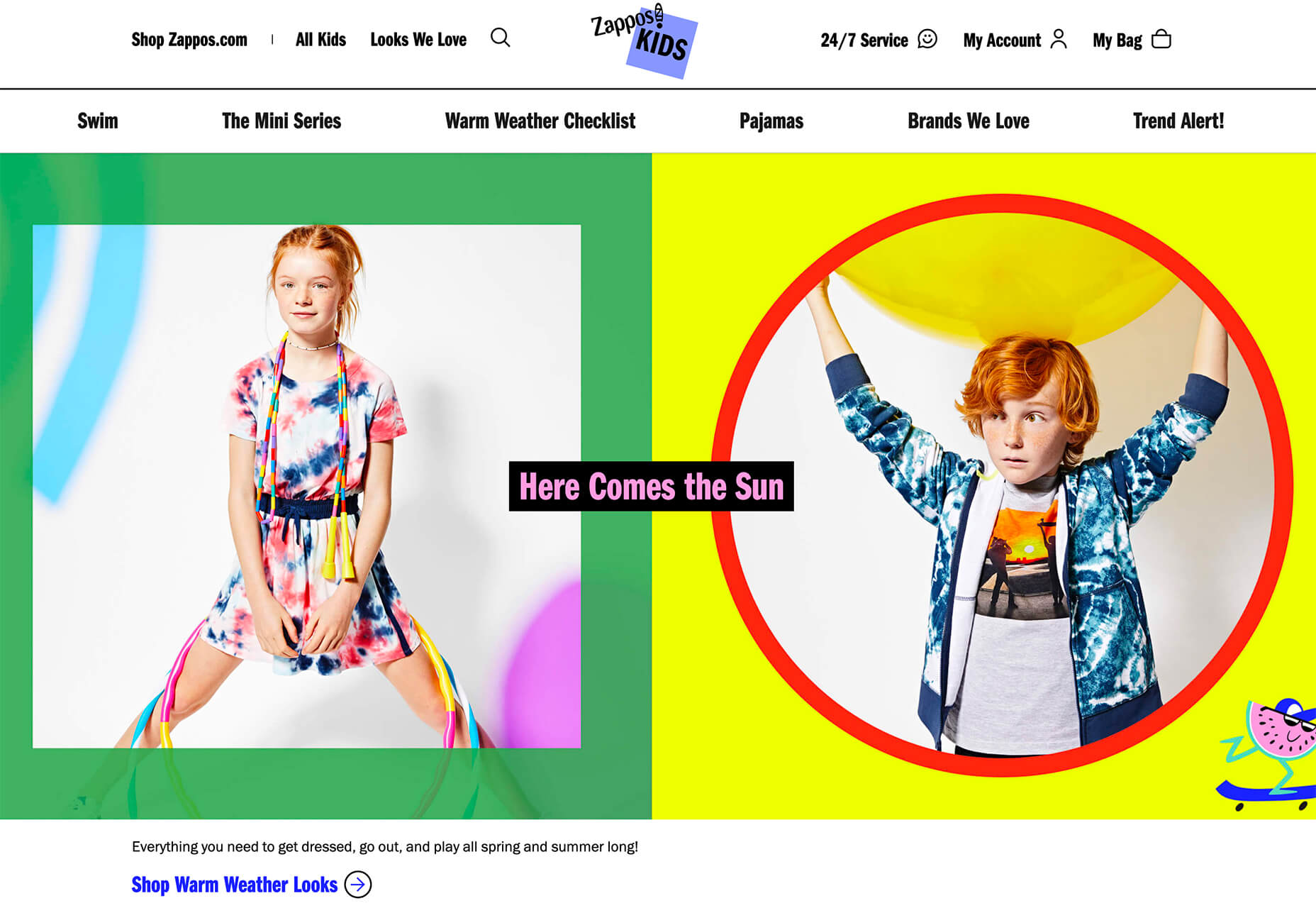
Zappos Kids uses a fun highlight in a colorful scheme to highlight a key text element. It almost looks like a button and helps website visitors understand that the entire hero image area is clickable. The highlight serves to make the text more readable and the interactive element more functional.

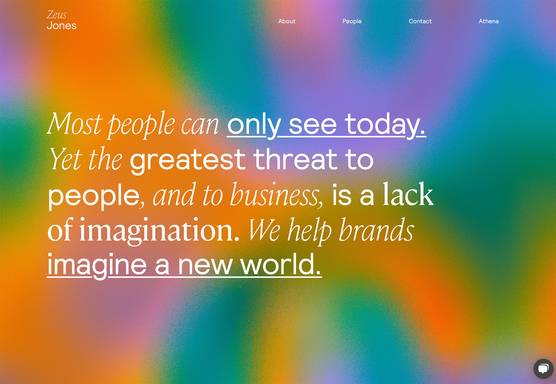
Zeus Jones uses a variety of text treatments on the homepage, but arguable the underline is most noticeable, likely because it is the most unfamiliar in the context of website design.

2. Distinct Geometry

Geometric shapes in website design have popped up as trending elements in a variety of forms. This iteration is pretty simple: Use of distinct geometry as part of the overall aesthetic.

Geometry might pair with illustrations, photos, text, or in the background or foreground. What’s great about shapes is that they are versatile and work with a lot of other design patterns.

What can be the most challenging about shapes and design is that distinct geometry requires some space and thought. Just tossing a few triangles or rectangles in a design without reason can look rather strange.

So how can you add geometric shapes to a design so that they look intentional? These examples do it well (and in three different ways).

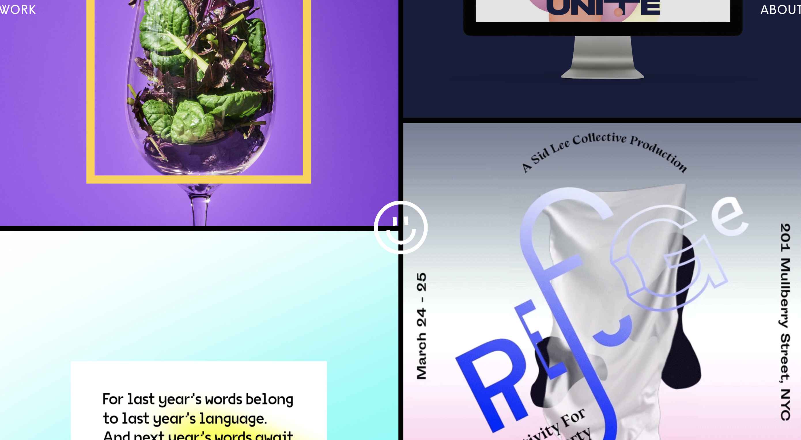
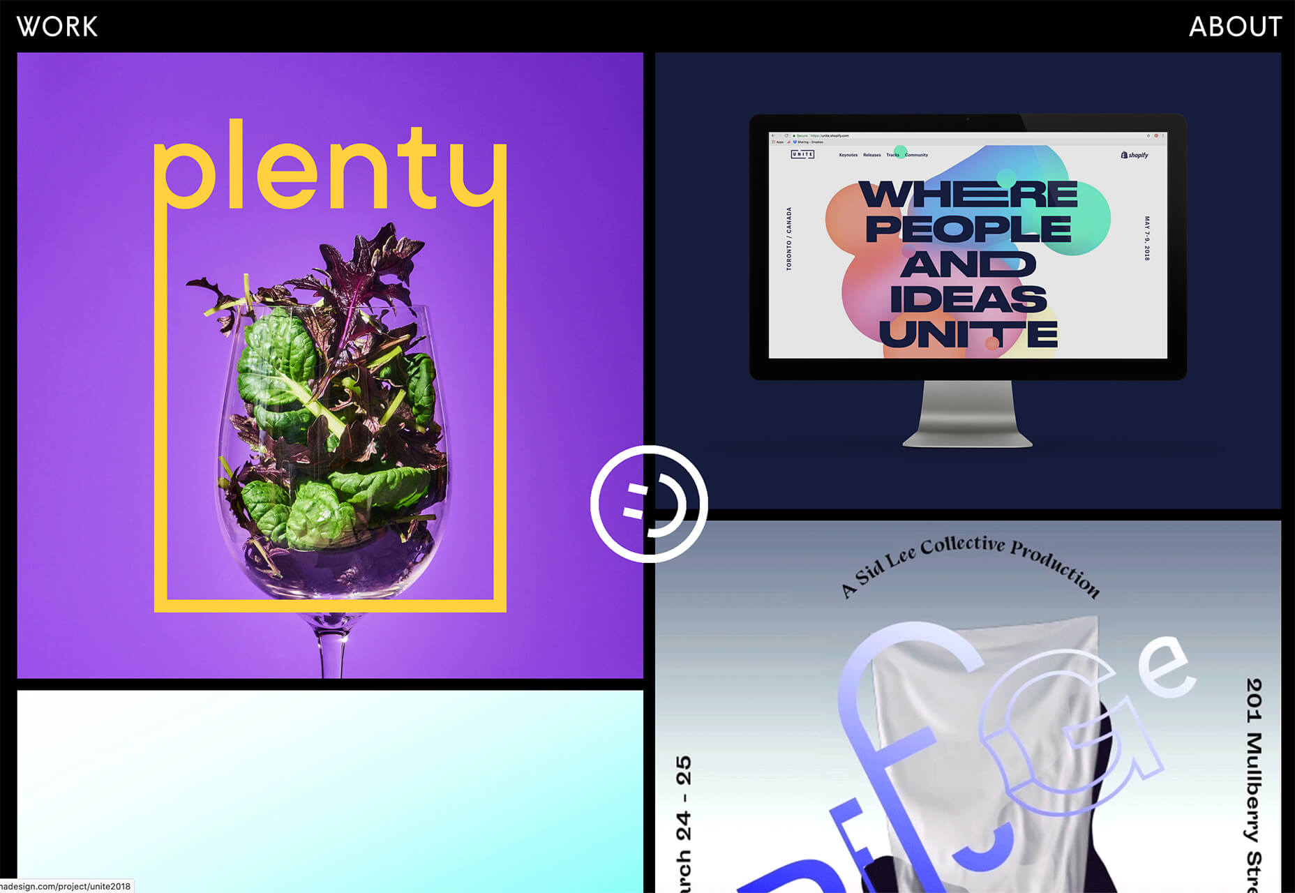
Rui Ma uses square and rectangular containers in a modular grid with portfolio projects inside each. This is one of the most common and applicable uses of geometry – as a container element. What makes it stand out is the circle, smiley wheel (also a geometric shape) that never leaves the center of the screen. The black background for the grid is also a nice contrast element for content blocks.

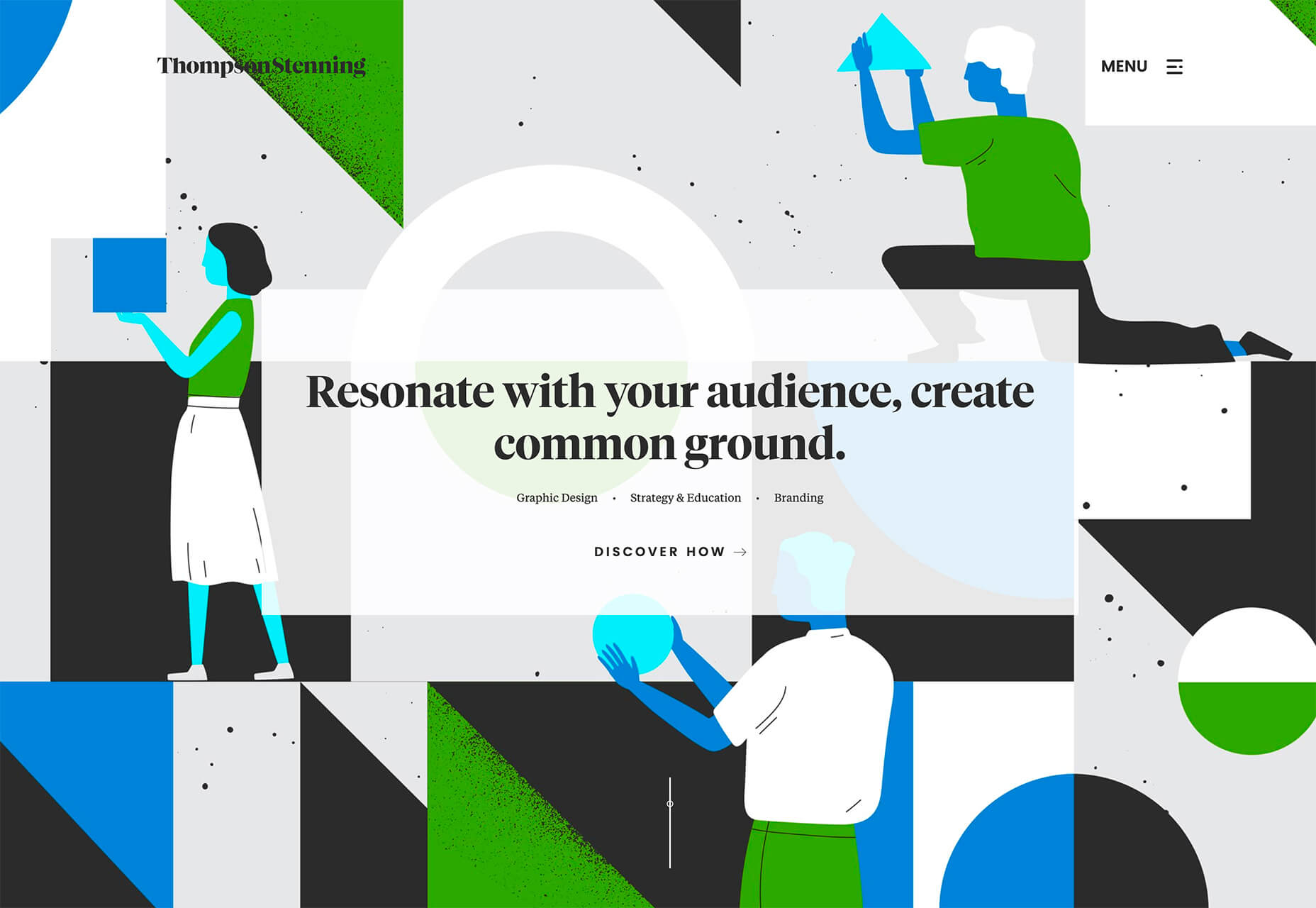
Thompson Stenning uses shapes in the background and with illustrations to create a stunning homepage visual. It’s big and bold and has just enough going on that you want to look at it and figure out the scene. Maybe what’s most intriguing about the visual concept is that it uses lots of geometric shapes – rectangles, squares, triangles, ad circles – whereas most projects pick one shape to focus on.

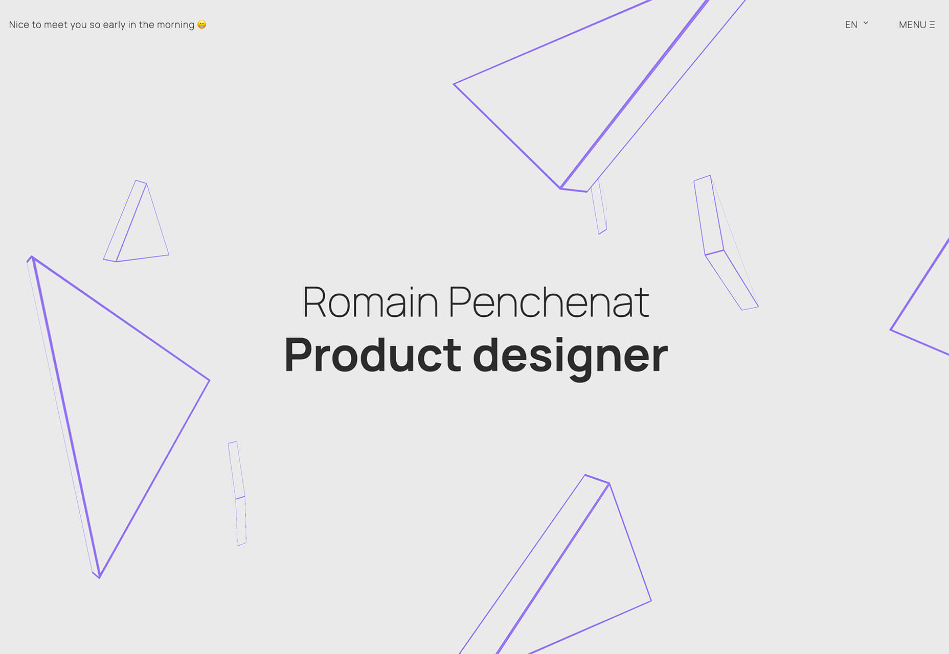
Romain Penchenat uses three-dimensional style angles to draw you into the portfolio website. They use a simple animation that “floats” on the homepage and follows the scroll with other geometric elements.

3. Shadow and Gradient Icons

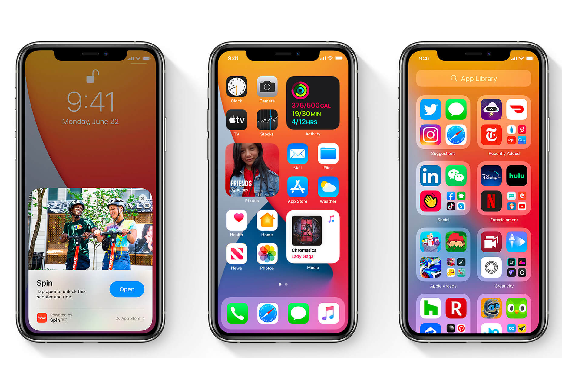
Did you notice all the gradients and subtle shadows in icons in the images previewing iOS 14 or were you just looking at other changes (such as widgets) on the iPhone screen?

We’ve been seeing more designers incorporating more shadows and depth into icons for a while, but this move by a major player in design will push it to the forefront fast. Each of the icons moves from a flat style to one with a background gradient color as well as more shadows within icon elements for depth.

Don’t worry, the design still looks very much like Apple, but is a little more reminiscent of the skeuomorphism style icons from earlier versions of iOS.

It’s nice that the color and shadow elements are contained within each icon. This creates more visual interest and depth for each element without getting cluttered or junky. The gradients are also super simple, using a darker version of the main color in a monotone element.

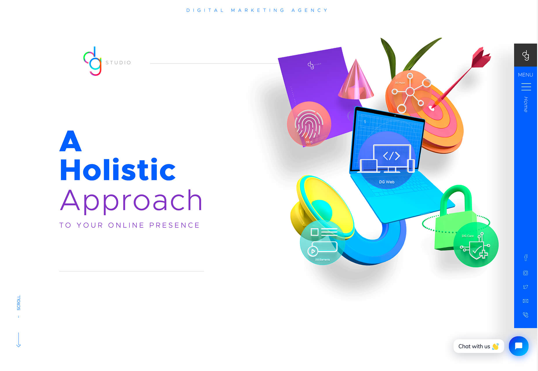
It’s an iconography style that others are already using. DG Studio has a collection of icons on its homepage with subtle gradients and shadowing in the designs. Again, what’s nice about this trend is that it adds depth to visuals without tricks that get in the way of visual comprehension.

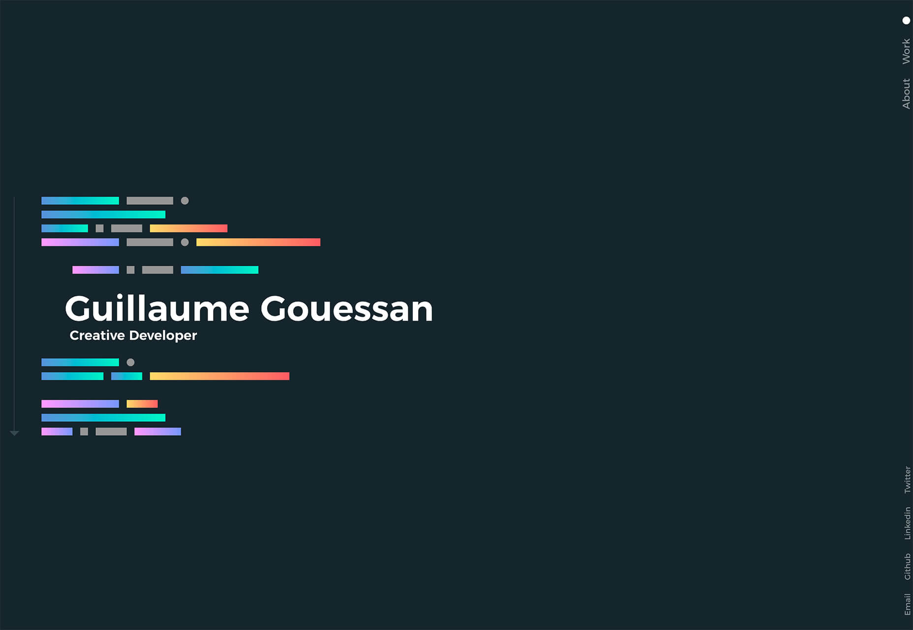
Guillaume Gouessan uses gradients in image icons in much the same way as the previous examples but with a little more color variation. Here, you can see what the gradient looks like when using a color change that’s not super drastic, but more dramatic than a monotone option. You can find some use of the more monotone gradient on his site below the scroll in the large desk image. (It’s definitely worth a few clicks to check it out.)

Love it or hate it, gradients and shadows seem to be here to stay for a while.

Conclusion

How often do you find yourself looking to major brands and companies for design inspiration? While a lot of web design trends start as experiments with smaller sites, the big players can really shape what gets popular (or not).

The example of Apple moving to icons with more shadows and gradients is a prime example. We’ve been seeing more of these elements creeping in for a while, but this style is about to get very big again.

Source

p img {display:inline-block; margin-right:10px;}
.alignleft {float:left;}
p.showcase {clear:both;}
body#browserfriendly p, body#podcast p, div#emailbody p{margin:0;}
Source de l’article sur

The overheated IT labor market, where the number of open positions is larger than the number of eligible candidates, demands different approaches when salary is no longer a key advantage in the battle for real IT professionals. Such popular methods of motivation and remuneration as additional leave time, certificates, and other rewards are not enough anymore. Companies have to come up with creative ways to attract new workers and retain them.

Where should one search for IT specialists?

Source de l’article sur DZone (Agile)


Understanding “Citizen Developer”

You’ve likely read the term “Citizen Developer,” or, according to Gartner: “An end user who creates new business applications for consumption by others using development and runtime environments sanctioned by corporate IT.”* Why is this movement taking place? As end users, Citizen Developers better understand the functional requirements for an application. They can specialize to ensure that what’s needed is what’s done.

Pitfalls of Citizen Developers

But Citizen Developers worry IT for three reasons: The potential for lower security standards, poor performance, and a sub-par end-user experience. Still, the Citizen Developer has significant benefits for the enterprise, so the question is: How can IT address the pitfalls?

Source de l’article sur DZONE