Articles

PostgreSQL is an open-source, versatile, and most popular database system around the world. However, it does not have any features for high availability.

Enter Patroni.  Patroni is a cluster manager tool used for customizing and automating deployment and maintenance of high availability PostgreSQL clusters. It is written in Python and uses etcd, Consul, and ZooKeeper as a distributed configuration store for maximum accessibility. In addition, Patroni is capable of handling database replication, backup, and restoration configurations.

Source de l’article sur DZONE

We certainly live in an age of wonders. We have supercomputers in our pockets, a global Internet, and applications in the cloud. In less than a lifetime, our four-channel television, rotary dial telephone world has transformed, bringing futuristic science fiction to everyday technology reality.

AI continues to advance its penetration into our lives as it seeks ubiquity. The 5G rollout is well underway as consumers snap up the latest generation of 5G devices. Software infrastructure and applications are keeping pace with the rapid maturation of cloud-native computing.

Source de l’article sur DZONE

The world of web design is incredibly dynamic. Every year, new trends and opportunities emerge, primarily driven by the arrival of modern technology. 

In recent years, we’ve seen various updates to the web design landscape, such as the arrival of AR and VR solutions for making mixed media. Video content has increased in quality, while the demand for inclusivity and usability has transformed the way that we build everything from websites to apps. 

Yet, for the most part, web design trends have continued to focus on the visual. 

When we hear the word “interface,” we often think of the graphical user interface – the ultimate way to connect users with sites. However, now we have a new, more natural way for customers to interact with their digital tools… The era of voice is here. 

Designing for the Age of Voice

The technology sector has made incredible progress in the development of things like Automated Speech Recognition and Natural Language Understanding. 

Thanks to updates in the way that machines process and understand human language, voice recognition accuracy is now at 90% and above. More than ever before, users can speak to a smart assistant, speaker, or phone-based application, and get the results that they’re looking for without error. 

The simplicity of communicating with technology via voice means that users have adopted this technology at an incredible pace. Half of all searches will be made with voice by the end of this year.

We’re standing on the edge of a fundamental shift in the way that we interact with computers and critical tools. As designers and developers, we need to be ready to embrace this new medium. 

With that in mind, here’s what designers need to think about when designing for voice UI. 

1. Decide How to Experiment with Voice

There are various steps involved in making a website more “conversational.” One of the first steps for any designer or developer is to think about the kind of voice-based interactions they’re going to enable for an app or website. 

For instance, rather than embedding voice technology into a website, you might decide to create a separate Amazon Alexa “Skill” for devices like the Echo. Companies like Capital One have already invested in this technology so that users can ask their smart speaker about their balance, rather than opening a laptop and logging into the site. 

To determine what kind of voice experiences you should be creating for your client, work with them on a customer journey map. Using this map of interactions that the customer has with your client on a regular basis, you can highlight areas where voice interactions might fit into the user flow. 

For instance, if customers are constantly asking questions about a brand or its service, an FAQ page that’s equipped with a bot that can respond to voice queries could be an excellent choice. 

UI design should always solve problems. Examining the frictions and frustrations that your client’s end-users encounter during their journey will help you to decide which direction to take with your voice UI experience. 

2. Examine the Anatomy of Voice Commands

Before designers can create a dialog flow for their voice UI, they need to understand how voice commands work. The key to success in a successful design for voice is understanding the objective of the interaction. A voice consists of three crucial factors for designers to consider:

  • Intent: Intent represents the subject and context of the voice command. A high utility interaction involves a request for a specific task. For instance, your users might request that your app gives them a list of five-star hotels in a specific area. Designing for these requests is often straightforward because what the voice algorithm needs to do is clear. However, low-utility requests can be harder to decipher, such as “hotels near me,” because there’s less specificity for the bot to work with. 
  • Utterance: Utterance refers to how a user phrases a command. For instance, in the case of looking for five-star hotels in Amsterdam, the customer might say “show me hotels,” or they might ask for “places to stay”. Designers must consider every variation of an utterance for their voice command UI. 
  • Optional variables: This refers to the extra filters that your voice UI needs to be aware of. In the case of five-star hotels in Amsterdam, the descriptor “five stars” is optional. The optional input needs to overwrite default values and bring more detail to the search. 

SideChef, for instance, is a voice-activated recipe app that offers narrated guidance to users and allows customers to search for recipes based on their specific needs. The app comes with a wide range of variables built-in, allowing users to customize their searches according to descriptors like “vegetarian” or “quick” meals. 

3. Learn How to Prototype with Dialog Flows

Learning how to leverage a complex UI strategy like VUI takes time and practice. Prototyping designers will often have to think like scriptwriters, designing various dialog flows to suit the different needs of customers, and the numerous interactions they might face. 

Dialog flows will outline:

  • Keywords that lead to the interaction
  • Branches that represent where the conversation might lead
  • Example dialogs for the user and the voice assistant. 

Practicing your dialog flows with scripts that illustrate the back-and-forth between the voice assistant and user will help designers and developers to understand the various nuances that can appear in a customer to robot interaction. 

Remember, while a crucial part of good voice UI design is keeping the communication conversational and straightforward, you will need to ensure that there is a dialog flow in place for every discussion that may occur between end-users and their apps, website, or digital tools. Users don’t want to feel overloaded and overwhelmed, but they need to ensure that they can complete their tasks too.

Consider the voice-based game RuneScape: One Piercing Note, for instance. 

The developers behind this app allowed players to speak with other in-game characters and use commands like “pull the lever” or “open the chest.” In designing the playable components of the game, the designers needed to think about every possible interaction that a player might have with different parts of the story while ensuring that users didn’t stray off track. 

A Few Tips for Voice UI Design 

Voice UI design can be very complex, mainly if you’ve never created something using voice as your only input before. However, once you get used to creating dialog flows, the whole process starts to feel a lot easier. 

As you’re designing, remember to:

  • Always confirm when a task is complete: When designing a checkout flow for an eCommerce page, one of the most crucial screens for a designer is the confirmation page. It shows the customer that the transaction has successfully been completed and stops them from worrying whether they’ve done the right thing. The same concept applies to Voice UI design. If your client’s end-user asks a voice-activated app to book an appointment with their therapist, for instance, they want to know that the appointment has been successfully booked and added to their calendar. Determine how you’re going to deliver the peace of mind your customers need. 
  • Create a strong strategy for errors: Designers and developers are still in the very early stages of experimentation with voice UI. This means that there’s a good chance that something could go wrong with your applications and tools from time to time. Having a strong error strategy in place is crucial. Always design a dialog flow scenario that allows the assistant to respond if they don’t understand a request, or don’t hear anything at all. You can also implement analytics into these situations to identify misinterpretations and improve usability in the future.  
  • Add extra layers of security: Various Voice UI solutions like Google Assistant and Alexa can now recognize individual voices. This is a kind of biometric security that’s similar to face or touch ID. As voice recognition continues to improve, it’s essential to ensure that you’re adhering to the latest guidelines in security. Additional authentication may be required for some companies. For instance, passwords, face recognition, or fingerprints might be needed for things that require payments and transactions. For instance, the Duer voice assistant uses face recognition to both approve payments, and make meal recommendations based on previous purchases. 

Are You Ready for the Voice UI Revolution?

Voice-based user interfaces are here to stay.

In the years to come, the chances are that developers and designers will need to learn how to use voice more consistently as part of their interface strategies. 

The good news is that although voice takes some getting used to as a design tool, it’s easy enough to make sure that your projects are moving in the right direction. Just like any other kind of design, implementing voice means thinking about whether the interactions and experiences that you’re delivering to end-users are seamless, effective, and valuable. 

Succeeding in voice UI isn’t just about adding the capacity for voice into your designs. It’s a matter of learning how to make user’s lives easier with the power of voice.


Featured image via Unsplash.

Source

The post Designing UI for the Voice Era first appeared on Webdesigner Depot.


Source de l’article sur Webdesignerdepot

Ready to take your business online but not sure where to start? It’s a surprisingly simple process, made all the easier by the tagDiv Newspaper theme that can shoulder the burden of code, leaving you to be creative.

Professional web designers normally begin with broad brushstrokes, roughly hewing a site, before finessing on the finer details; that’s exactly what tagDiv’s Newspaper theme lets you do, with innovative tools and a huge selection of pre-built options to choose from.

What is the Newspaper Theme?

Newspaper is the best-selling magazine theme from tagDiv. In constant development over the last twelve years, it’s been used to create world-beating sites for clients as diverse and demanding as United Nations, ShareAmerica, The Rackspace Blog, Bitcoin News, Uber Engineering, and Tech Explorist.

As the name implies, the Newspaper theme is primarily a magazine or blog theme, but you can use it for any kind of site, in any type of industry.

Packed with intuitive features that make personal web development not just possible but enjoyable, it will have your site ready to launch in no time.

It is fully compatible with Gutenberg, WordPress’ drag-n-drop site builder; it also comes with its own WYSIWYG, tagDiv Composer. All the sites built in Newspaper are fully flexible, responsive, mobile-friendly, and retina-ready. Newspaper is even fully integrated with WooCommerce so that you can transform your magazine site into a fully-featured ecommerce store.

Newspaper has been carefully coded to make the most of the upcoming Core Web Vitals update from Google, so your new site will be well-placed to rank highly on search engines.

Now that you know a little about the background of the Newspaper theme let’s look at how we can use it to build a WordPress site.

Pre-Built Websites

Sometimes it’s not just your coding skills but your design skills that are lacking; you know what kind of site that you want, you’re just hazy on the details.

This is where tagDiv’s Newspaper theme comes into its own. With a single click, you can install an entire pre-built website. And the process is so fast and convenient that you can try out as many as you like and pick the one that matches your vision.

You can even import a whole ton of pre-written content for testing the sites out, so you can see how it will look with your content without spending hours typing or copying and pasting text out of a Word doc.

There are 120 different designs covering all kinds of different industries. This means no matter what kind of site you’re building, one click, and you’re ready to go live.

Cloud Library

One step up from a full pre-built website is tagDiv’s Cloud Library. If you’ve installed one of the pre-built websites, this is probably where you want to go next.

The Cloud Library is a collection of 1600 different design elements that can be mixed and matched with live-editing to fast-track your site creation. You’ll find content blocks like headers, footers, testimonials, banners, and featured items. You can mix-n-match them however you please to create the site of your dreams.

Putting the “Cloud” into the Cloud Library are tagDiv’s servers, storing the code for each of these elements, so your installation only needs to load the code you actually use. This provides a huge boost in performance.

Composer

Lastly, the Newspaper theme provides tagDiv Composer, a specialist WordPress builder — like Gutenberg — that allows you to customize your website with absolutely no coding skills whatsoever. It’s a powerful yet simple-to-use tool that allows you to edit the elements of the Cloud Library and adapt them to your own purposes.

With Composer, you can create your own headers, footers, banners, text blocks, and more without any of the limitations of cookie-cutter design.

tagDiv Composer gives you the ultimate control over your site. You’ll find all the essential elements you need, from text and buttons to images and videos. All you have to do is drag and drop them into place.

Building a Site With tagDiv Newspaper Theme

As you can see that the fastest way to an engaging and original website is, to begin with, a pre-built site, then add the different blocks of code you want from the Cloud Library, and finally customize them with the Composer.

To make this possible, tagDiv has brought together experts from multiple disciplines, including brand strategy, project management, and web development.

It’s a slick system for quickly publishing high-quality sites that are unique to you and your business. Trusted by more than 130,000 customers worldwide, the Newspaper has earned tagDiv the status of Power Elite Author on ThemeForest and Top Author on Envato.

The Newspaper theme costs just $59, which includes six months of support from tagDiv, but for just $17.63, you can extend support to 12 months for added peace of mind.

tagDiv Newspaper is the simplest way for you to take your business online using WordPress.


[— This is a sponsored post on behalf of tagDiv —]

Source

The post Build Your Site The Easy Way With TagDiv Newspaper first appeared on Webdesigner Depot.


Source de l’article sur Webdesignerdepot

It’s almost time for another season of change. Although the temperatures might not reflect it, this is the time of year where most of us start thinking about what’s next.

This collection of tools and resources for designers is just the spark to propel you forward with work as you think ahead. Here’s what’s new for designers this month.

Gradient.Art

Gradient.Art is a CSS-based gradient generator that’s packed with functionality and customization options. It’s more than just a color selector and is an actual gradient editor that allows you to work with a variety of controls to get just the color variations you want for projects. Create illustrations, patterns, icons, and more with this layer-based tool that’s still in beta.

Wicked Backgrounds

Wicked Backgrounds takes some of the headaches out of creating just the right background for website design projects. It’s another easy and customizable generator designed to help create backgrounds with great color, depth, and balance for various project types. The makers promise more features in the future as well.

Typedream

Typedream is not what you might expect from the name; it’s actually a website-building tool. It’s designed to help put the focus on the words of a design with a simple interface that most people can figure out. You can connect your own domain and then optimize for search with built-in SEO tags. It’s a zippy tool for simple sites.

Orbital

Orbital is a zero-friction, super-interactive, customizable place to gather online. Pop in for meetings, quick chats, open-door office hours, or cowork together through the day – all using the same link. This premium tool has super fun backgrounds and meeting spaces.

Access Guide

Access Guide is your one-stop guide to accessibility information for the web. It’s packed with articles and information to help you understand parts and all of the WCAG 2.1 guidelines, the official standard for accessibility online. (Plus, content is sorted into neat cards that make things easy to search and find.)

InLine

InLine is a free JavaScript library built to create a simple text editor for web applications and mobile apps. The tool claims to be the smallest WYSIWYG editor designed to fit into any layout. The plugin allows you to edit and customize text elements practically anywhere.

3D Bay

3D Bay is a collection of free three-dimensional stock images that you can use for various projects. Collections are searchable. Most of the images are actually 3D scene illustrations, a popular design element with many SaaS website designs.

MeisterNote

MeisterNote is a writing tool for teams. (It’s perfect for the new remote working world.) The interface is sleek and intuitive, and you can create customer workspaces for notes and teams to collaborate. One of the best functions might be the search feature, allowing you to find information in notes easily.

Shapecatcher

Shapecatcher solves an interesting problem. Have you ever visualized an element but don’t know what it is called or how to find it? This tool has a “drawbox” where you can sketch the element, and then it visually searches a database of 11,000-plus Unicode characters in multiple languages to find a close match that you can use online.

Batch Image Processing

Batch Image Processing allows you to edit, crop, and style or add watermarks groups of images all at once. It’s a web-based tool that does everything in a flash and allows you to redownloaded processed images for quick use. (It’s great if you need multiple photos with the same crop or size!)

Integrately

Integrately is an integration automation tool designed to help your apps, tools, and web elements talk back and forth. Connect apps to make tasks run on their own in ways that native software might not do alone. (Pro tip: Use it to connect with your email to send notifications or reports automatically.)

Vechai UI

Vechai UI is a set of high-quality, accessible React UI components with built-in dark mode using Tailwind CSS. Components include pre-designed headless UI and Radix UI.

Style Free HTML Bootstrap 4 Template

Style Free HTML Bootstrap 4 Template is a simple and minimally styled website template for a variety of project types. It’s a great website starter if you need to get a site up and running quickly.

Glass UI CSS Generator

Glass UI CSS Generator helps you create trending neumorphism/soft UI/glass UI style elements. The tool is a CSS generator that allows you to add some of your own elements and then pick styling options while outputting CSS and HTML.

Lineicons

Lineicons is a collection of more than 5,000 line icons that you can use for various projects. Every icon comes with free CDN, regular and light variations, an editor, and more to make it browsable and easy to use. The set has high legibility, and the free set of icons includes more than 500 options.

Carrd

Carrd is a simple, free, and responsive one-page website builder that you can do pretty much anything with. It’s perfect for personal profiles, landing pages, or one-page websites. All it takes is a little imagination.

AdonisJS

AdonisJS includes everything you need to create a fully functional web app or an API server. So stop wasting hours in downloading and assembling hundreds of packages and do it all with this framework for Node.js.

Eastman Condensed

Eastman Condensed is a beautiful and functional sans serif that’s easy to read. The demo version is free for personal use, but a commercial license for the full family is available.

Peachy Rose Font

Peachy Rose Font is a fun novelty option that is fun and light. Plus, it is free for any use, even commercial. The set is fairly large for a free option, with 233 characters.

Selga

Selga is an expressive and complex display font with a retro feel. The swashes and tails are especially nice on this typeface, which is free for personal use.

Source

The post Exciting New Tools For Designers, August 2021 first appeared on Webdesigner Depot.


Source de l’article sur Webdesignerdepot

Every day design fans submit incredible industry stories to our sister-site, Webdesigner News. Our colleagues sift through it, selecting the very best stories from the design, UX, tech, and development worlds and posting them live on the site.

The best way to keep up with the most important stories for web professionals is to subscribe to Webdesigner News or check out the site regularly. However, in case you missed a day this week, here’s a handy compilation of the top curated stories from the last seven days. Enjoy!

UXBulls***

What Makes a Good One-Page Website Design?

39 CSS Custom Properties (Variables) Examples 

18 CSS Filter Examples

Is it Time to Ditch the Design Grid?

Here’s 8 Google Penalty Checker Tools to Fix Your SEO Problems

3 Essential Design Trends, August 2021

UX Analysis: Apple Music vs Spotify

How to Optimise Fonts for a Faster Website

Quiz: The Inconceivably Hard Color Quiz

Source

The post Popular Design News of the Week: August 2 2021 – August 8, 2021 first appeared on Webdesigner Depot.


Source de l’article sur Webdesignerdepot

Informing someone that you want to “measure” them is not a great way to start a conversation. Software developers, like all people, tend to look unfavorably upon having their performance closely measured. But measuring developers is one of the hottest trends for companies around the globe. So is it tyranny to measure people?

People are quick to note that numbers don’t tell the whole story and can become defensive at the notion their productivity should be quantified somehow. This resistance can become even more entrenched when teams become stacked against each other. 

Source de l’article sur DZONE

One of the most challenging stages of a design project is laboriously producing all those assets that bring it to life.

Whether you’re a web designer in need of icons, or a brand designer looking for mockups, it’s a smart move to fall back on stock assets to speed up your turnaround, reduce costs, and enliven your designs.

With so many stock sites to choose from, which should you opt for? Today we’re going to take a look at DesignBundles.net and ask if it’s the right choice for your project.

What is Design Bundles?

Design Bundles is exactly what it sounds like: sets of design assets that you can download for free or at huge reductions on RRP.

Launched five years ago, Design Bundles is brought to you by the same team that delivers Font Bundles.

Over two million customers are already enjoying the benefits of Design Bundles’ weekly updates.

What Can You Download From Design Bundles?

There are currently over 800,000 products listed on Design Bundles, and the collection is growing all the time.

The files have been produced by 6,500 of the world’s leading independent designs. Because the products are top-quality, you can really make them work: scale them, flip them, distort them, recolor them; just about anything is possible when you’re using high-quality raw ingredients.

What’s really impressive is the range of products that are in the collection. You’ll find backgrounds, logos, icons, textures, patterns, and clip art. For product designers, there are mockups and web elements. Print designers will love the huge range of cards, invites, flyers, posters, and brochures. And if you’re looking for standard stock images, you’ll find a gargantuan range under popular themes such as technology, architecture, travel, and business.

Because Design Bundles is relatively new, you won’t find its collection padded out with out-of-date Gifs. In fact, Design Bundles is one of our favorite places for free SVGs, the best format for graphics on the web.

All the products are royalty-free and licensed for personal and commercial use, so you can relax knowing that you’re fully covered.

What Makes Design Bundles Different?

There are a lot of design bundles services online, so what makes Design Bundles different? Well, firstly, the quality; Design Bundles has a consistently high level of designs. We love the freebies. They make a huge difference and are great for trying out ideas you might not be ready to invest in.

Design Bundles differs from other stock sites because it offers curated bundles of complementary assets — you don’t just download a vector file; you download a set of vector files. This innovative approach means you don’t have to go hunting for matching images; once you’ve found the right download for your project, you have a whole range to enjoy.

The whole process of using Design Bundles is simple, from browsing through the available assets to choosing a design and through to the fast, simple checkout process. It’s all designed to make including design assets into your projects as simple as possible.

The website is user-friendly, and in the unlikely event that you’ll need them, the support team is friendly, helpful, and prompt to handle queries.

Is Design Bundles Good Value?

We’d be lying if we said that cost wasn’t a big bonus of using Design Bundles. Design Bundles offer up to 96% discounts on regular prices, meaning that you can get the same incredible assets that top design agencies use at a fraction of the price.

In terms of time-saved, inspiration-delivered, and graphics-acquired, your Design Bundles subscription will more than pay for itself.

Alongside the daily and weekly deals, you’ll find products you can try for free. For example, design Bundles provide a whole heap of free SVGs. And not just sample files. There are thousands of files to download and use in projects. You can’t get better value than free!

There are new freebies every week, so it’s worth subscribing just to ensure you don’t miss anything.

For freelancers, the licensing model is particularly attractive. Because there’s no limit on the places you can download design resources once you’ve bought them, you can download files at home, in the office, or at a client’s workspace — whatever is convenient. Meaning you carry a huge library of resources with you wherever you go.

Oh, and if you want to make the most of your new Design Bundles assets, don’t forget to check out its YouTube channel, where you can learn tons about how to create effects, edit images, and complete creative projects.

Should Designers Use Design Bundles?

When you’re designing a project, whether you’re a digital artist, a web developer, or a crafter, the result relies on the quality of its component parts.

Design Bundles offers you the chance to work with high-quality assets from some of the web’s top designers at a fraction of the price of creating them yourself.

We’re confident that if you give Design Bundles a go, you’ll quickly see the benefits for yourself. But if you’re still not sure, why not sign up for its newsletter and check out some of the daily and weekly deals and the freebies that are available to you.

Design Bundles is a recipe for success that you’ll be happy you discovered.


[— This is a sponsored post on behalf of Design Bundles —]

Source

The post Review: Should Designers Use Design Bundles? first appeared on Webdesigner Depot.


Source de l’article sur Webdesignerdepot

Businesses rely on designers to help them build the perfect relationship with visitors.

After all, as much as companies may wish it wasn’t true, many consumers still judge a book by its cover. A website that fails to prioritize concepts like trust and transparency could instantly lose the confidence of its target audience. 

As a designer, it can be tempting to focus on figuring out ways of convincing an audience to convert or give up their money instantly. However, while design experts know how to enhance conversions, they also understand how important it is to make sure that customers feel confident in a website.

Here’s what you need to know about cultivating confidence in user experiences.

How Does Transparency Affect Confidence? 

In a survey conducted in 2016, 94% of consumers stated that they would happily be loyal to a fully transparent brand. As customers continue to search for more honest and reliable companies, the demand for transparency in UX will likely continue. 

As a web designer, you can’t force a company to share all vital information with its clients. However, you can use your design knowledge to help the honesty of a company stand out.

Here are some other strategies that designers can use to build transparency for their clients. 

Create an Eye-Catching “About” Page

One of the first things that today’s businesses need to be honest about if they want to delight their customers is their people. 

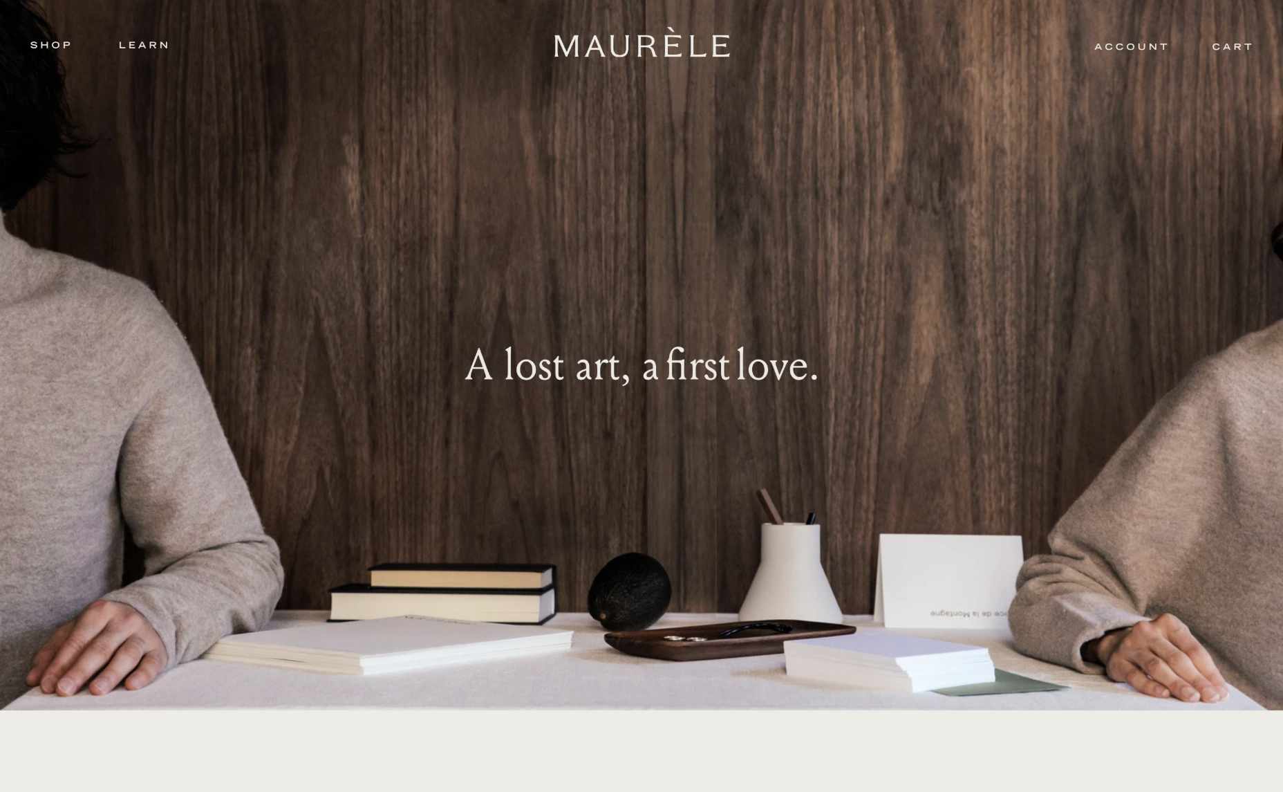
For instance, creating a page where your client can highlight the nature of the products that they sell is an excellent first start. Maurele has a beautifully designed “About” page to tell its customers everything they need to know about the business. 

At the same time, drawing attention to the footer where customers can check things like the terms and policies of the website or FAQs that answer their most common questions is another fantastic way to build transparency. 

Giving a brand a human face makes it easier for that company to establish lasting connections. That’s why designers should always prioritize using real, authentic images over stock photos where possible. For example, a large feature image on an “About” page that addresses the company’s unique nature makes it easier to connect with a target audience. 

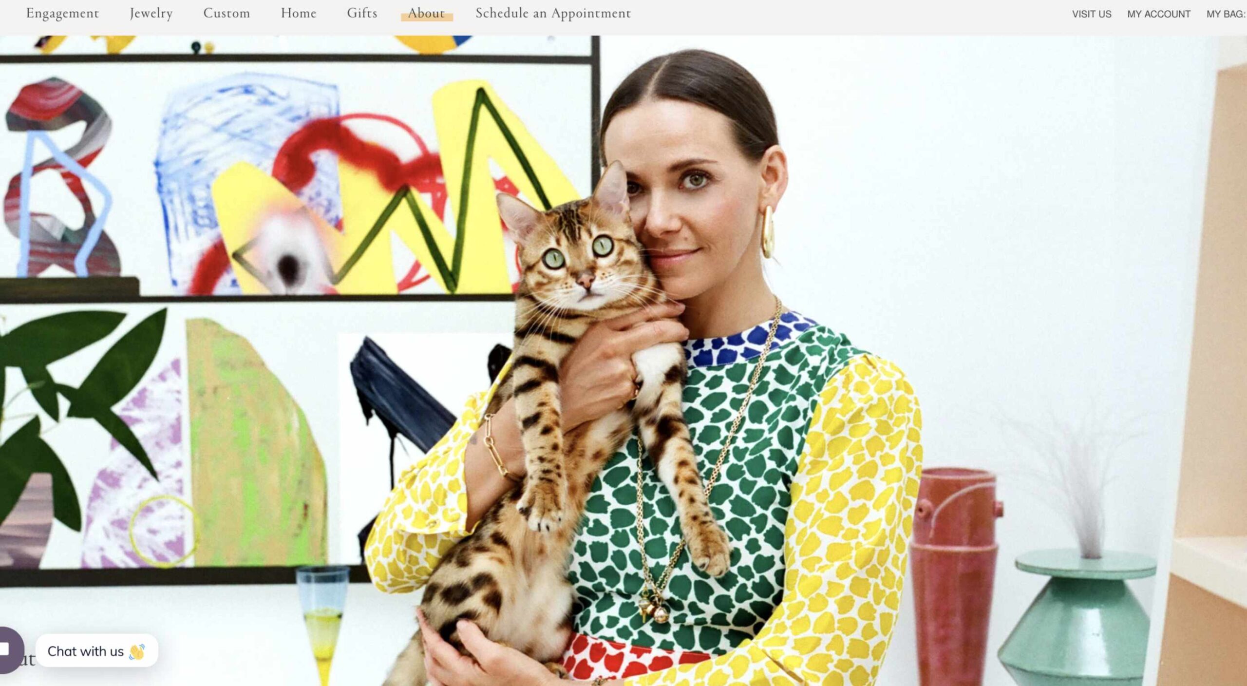
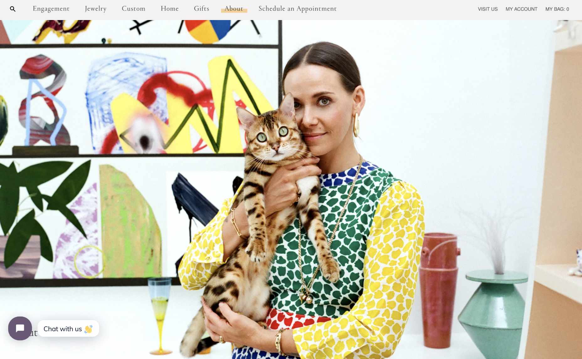
Make sure that there’s plenty of space on the “About” page to introduce significant members of staff that can give a face and personality to both the website and the brand. For instance, Mociun.com uses a fantastic hero image of a person with her cat.

Add Space for Testimonials and Customers

While you don’t need to post a customer’s entire consumer list online to prove that they’re a reputable company, it is worth highlighting some of their clients. No one wants to be the first person online to trust a new website. Testimonials and reviews from other people are how you add instant confidence to any experience. 

For designers, social proof can come in a lot of different formats. For instance, if you’re building a website for a company that sells directly to other businesses, you could add pictures of the logos of the brands that the company has worked with. Alternatively, for a B2C brand, basic reviews and quotes will often work wonders. For instance, there’s a list of great reviews included on the product pages of the PlaySuperlative.com website.

Unless customers leave comments directly on the web page themselves, remind your customer that they need to get permission from the client to use their quotes on any web page. 

Additionally, remember that adding pictures and names to testimonials where possible can sometimes make them more believable. 

Tell Your Client’s Story

When building a website for a client, there are many different things that you’ll need to think about. For instance, you need to focus on the company’s USP or whatever makes them unique. You’ll also need to ensure that clients have all the information they need to make purchases easily. 

At the same time, it’s important not to go over the top with too many features. Simplicity is often the key to good UX. 

Where possible, however, if you want to boost confidence for your client, it’s a good idea to highlight their unique motives and vision as a business. Ask the company that you’re designing for what their mission is. Do they want to transform the way people communicate and collaborate like Trello? Do they want to fill the world with information, like Google?

Focusing on the unique ambitions of the business, beyond the desire to make money, makes them seem more three-dimensional and real. 

Highlight Security

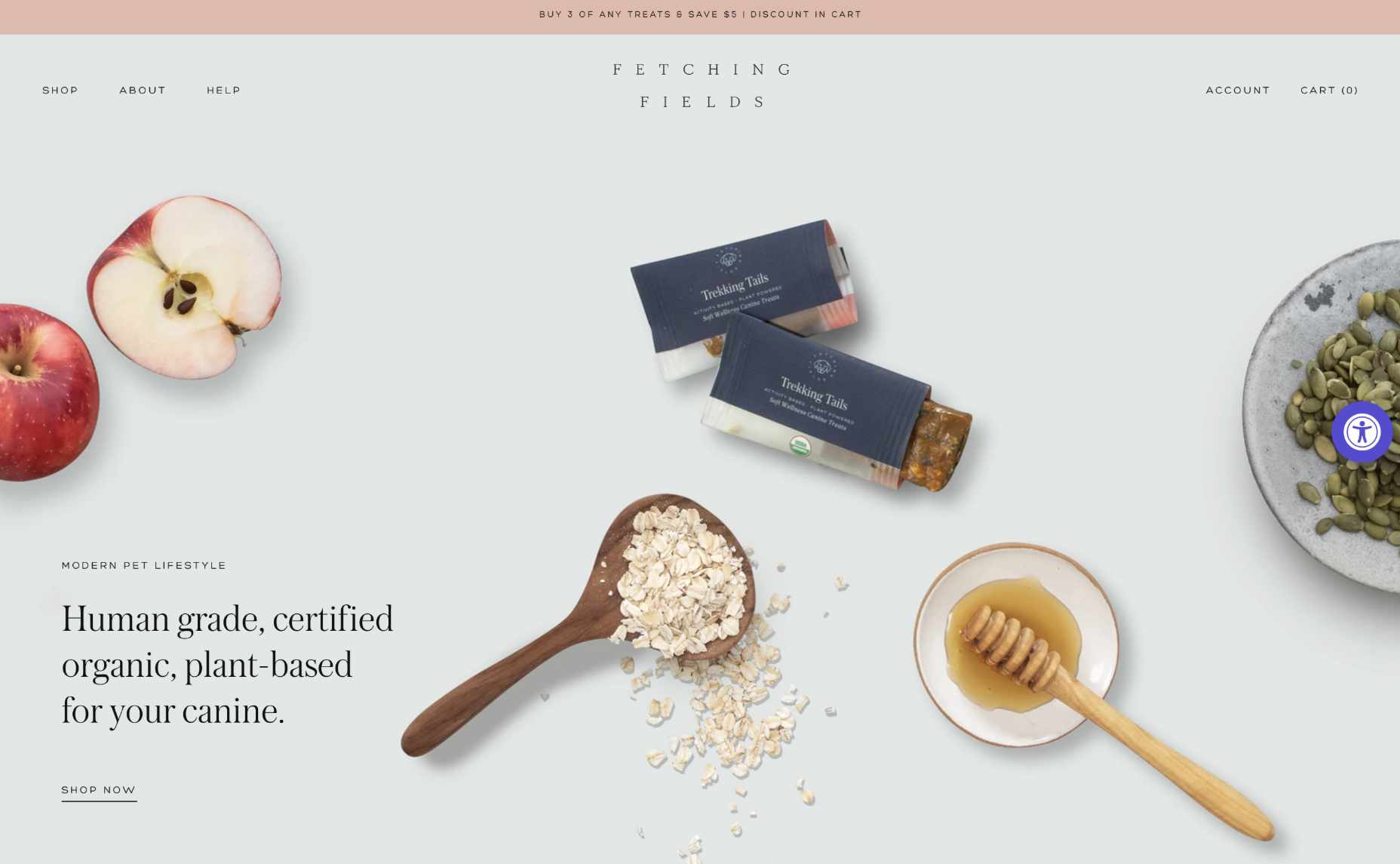
Use your skills to ensure that certain aspects of safety and security stand out for your client. For instance, notice how Fetching Fields instantly pulls attention to the fact that they’re using certified and organic, human-grade wellness solutions.

Other steps you can take include making sure there’s an SSL certificate installed to cement the website’s safety. Additionally, if your customer has any badges or certifications that can highlight their security strategies, it may be a good idea to include those too.

If your customer takes payments online, you can use several secure website seals to boost confidence. For instance, showing that you’re “Verified by Visa” or using Mastercard Secure Code is a wonderful choice. 

Make Sure Visitors Can Find Contact Information

As a website designer, one of the best things you can do for your customer is making sure that they have excellent navigation, complete with easy-to-find information. 

On any website, innovative navigation ensures that an audience can find the pages they need to make sure that they feel as comfortable as possible, making their purchases. 

Make it easy for visitors on a website to track down useful insights about the products they want to buy or the kind of services available from the company in question. Additionally, if your client has any FAQ pages or additional resources, make sure that customers will have no trouble tracking those down. 

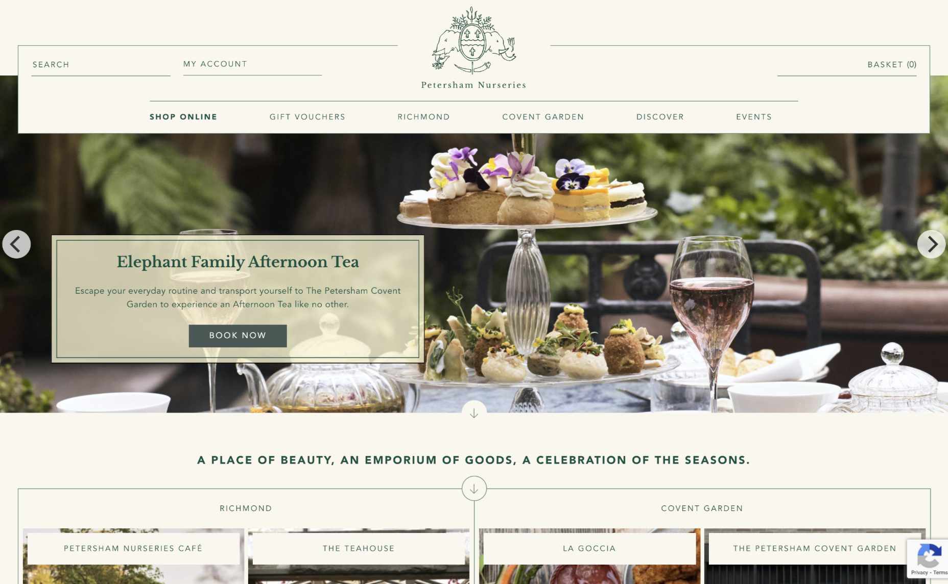
The example above from Petersham Nurseries makes it easy for clients to find everything they need on the website, thanks to a convenient vertical navigation bar. 

Remember, one piece of information that should always be as easy as possible to find for your customers should be the contact page. A contact page shows that the business is willing to answer any questions a client might have via many channels. 

List a physical street address and phone number for the website where possible, or at the very least include an email address where people can get in touch. 

Make Sure Pricing is Clear

Finally, if you want to ensure that visitors can trust your client’s website, you need to avoid hiding any critical information with fine print or content hidden in the website’s footer. When designing product pages or service information, make sure that you’re as transparent as possible about the company’s pricing. 

You don’t want a customer to wait until they click through into the checkout page to discover that they have to spend a fortune on postage and packaging. And, no one purchasing a service wants to wait until they’ve got their credit card out to discover that they’re going to be paying extra for things like set-up fees. 

According to Jakob Nielsen, one of the top mistakes anyone can make on a website is not listing their pricing as clearly as possible. 

As tempting as it may be to hide certain expenses and send customers through to the checkout page faster, avoid any opportunity to hide information about costs. 

Designing for Confidence

Ultimately, many different things can make a website stand out today. 

Designers can experiment with unique strategies like dynamic loading and video-based backgrounds. You might even decide to explore new styles with the right company or adapt certain pages to take advantage of things like 5G and new connectivity options. 

However, before you can begin exploring new opportunities on any website, one of the most important things you can do is ensure that you get the foundations of the website’s credibility right. Take an approach to design that focuses on transparency and trust first, and the rest will naturally fall into place. 

In a world where consumers are less trusting of brands than ever before, people who design for transparency will be sure to stand out from the crowd. Don’t underestimate the power of embracing trust for your clients in 2020. 

Source

The post Cultivating Customer Confidence with UX first appeared on Webdesigner Depot.


Source de l’article sur Webdesignerdepot