Articles

A new design trend has emerged in the last year: Soft UI or Neumorphism is everywhere. 

Even Apple is in on the trend; the company introduced a host of changes in both its mobile and desktop operating systems that use the style. The elements of Soft UI introduced by Apple reflect various aspects of the Microsoft Fluent UI design too. 

So, if soft UI is such a huge concept, what do we need to know about it? How does soft UI work, and what are the pros and cons of using it?

What is Soft UI (Neumorphism)?

Soft UI involves using highlights and shadows in design elements to make them look as though they’re layered on the page. 

The term neumorphism is derived from a previous design style — skeuomorphism, where designers create something as close to its real-life counterpart as possible. If you remember the shift between iOS 6 and 7, you’ll remember the switch between skeuomorphic and flat designs. However, neumorphic design isn’t quite as dramatic. 

Neumorphism doesn’t focus excessively on things like contrast or similarities between real and digital elements. Instead, this “soft UI” practice creates a smoother experience for users. 

With neumorphism, you get the sense that buttons and cards are actually part of the background they’re on. This trend removes the flashier aspects of a typical interface and focuses on a softer style that stays consistent throughout the design. 

The Common Features of Soft UI

Soft UI is all about smoothing out the experience by making everything feel more connected. There’s nothing overly harsh in the aesthetic, hence the term “soft.”

So, what kind of features can you expect?

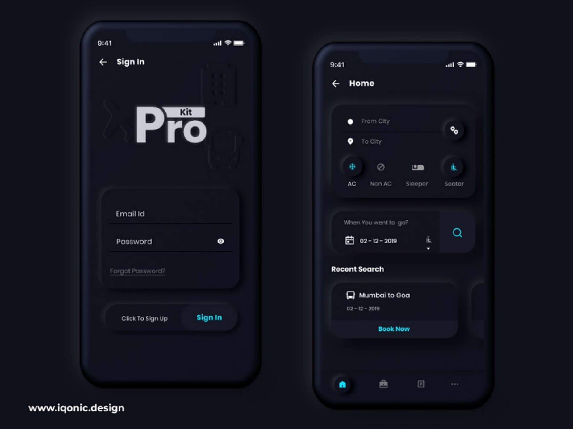
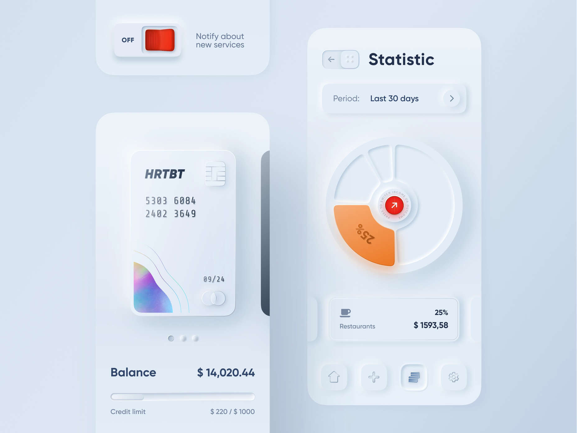
Rounded Corners: Soft UI removes some of the sharper parts of the interface, like the corners on modules and segments. This allows for a more gentle appearance overall. In this experimentation from Iqonic Design, we can see how the round corners tie everything together.

Transparency and Background Blur: Background blur and transparency are more popular today since the infamous iOS 7 solution emerged. Most people hated the appearance of ultra-minimalism, combined with thin fonts. However, the background blur effect was more popular. The blur in soft UI shows that part of the window is connected to the rest of the OS. It seems like parts of the background in the app are pushing through to the surface. 

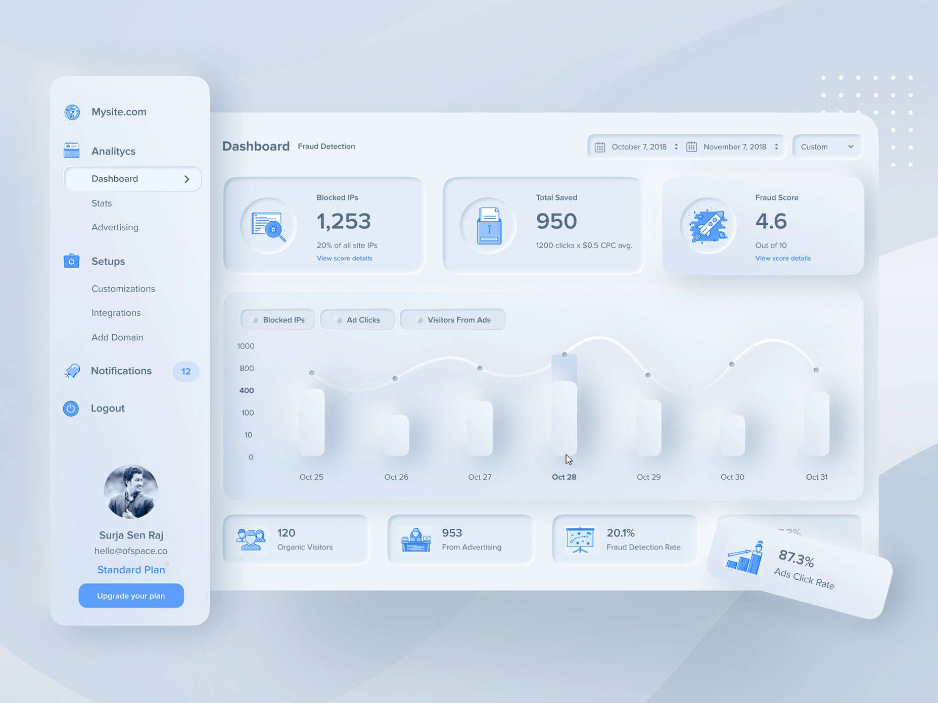
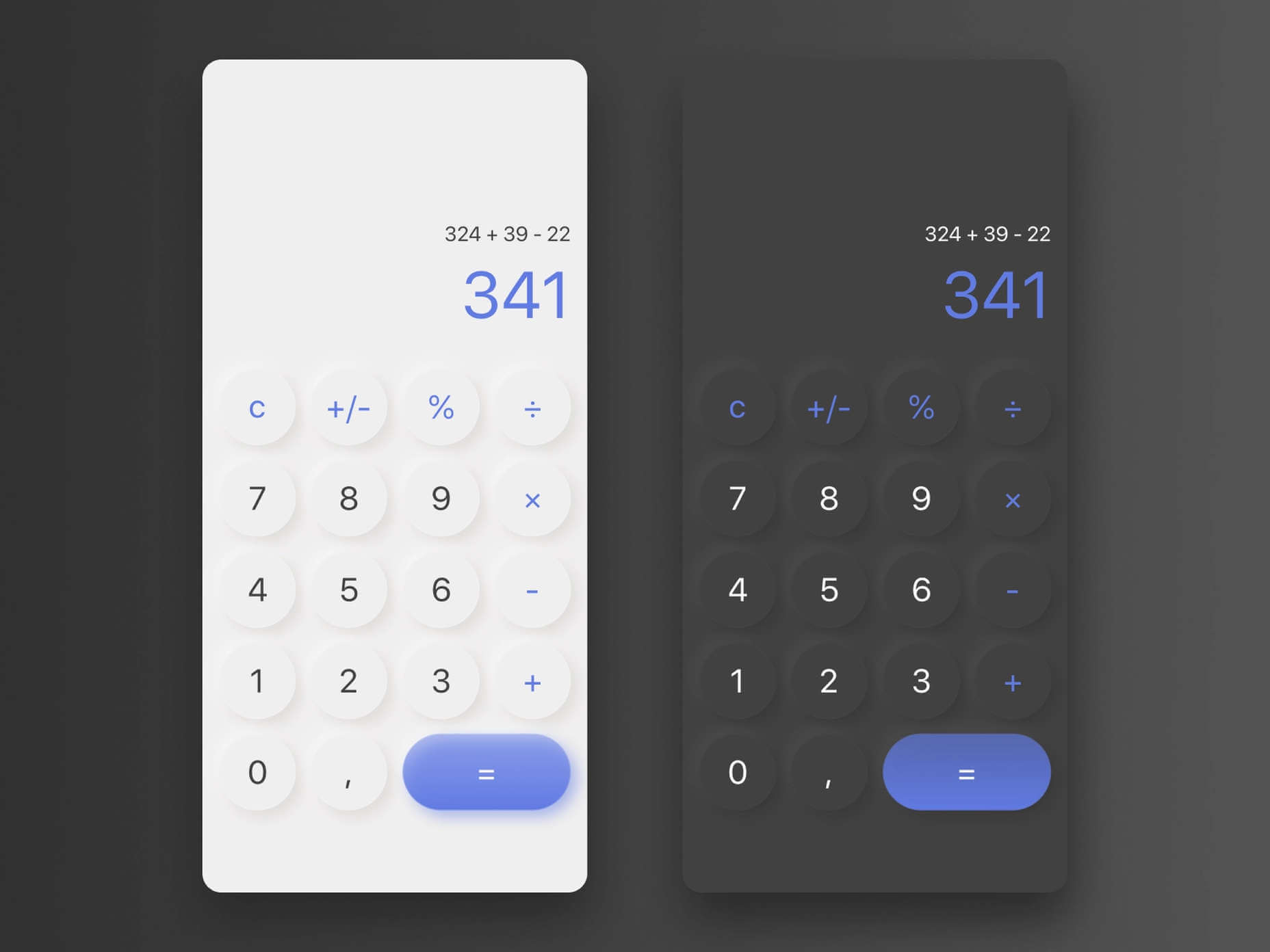
Unified Symbols: Everything needs to fit perfectly in a soft UI design. Anything that doesn’t look like it’s part of the same entity throws off the experience. In this design experiment by Surja Sen Das Raj, you can see how all the colors, shadows, and gradients tie together consistently. Because everything is more uniform, the experience flows perfectly for the end-user. 

Implementing Soft UI Elements in Your Design

So, what does neumorphism look like in your UI design process?

Ultimately, it’s all about subtle contrast and aligned colors. Every part of your interface needs to look like it’s part of the same form. Your element and background need to be the same color so that you can create a feeling of objects protruding from the background. 

With Soft UI, the keys to success are shadows and highlights. 

Let’s take a look at some key steps. 

Achieving the Soft Look

When you’re designing your interface, remember that sharp edges make the interface more serious and formal. Rounded corners are more playful and friendly. 

What also makes the design look lightweight and delicate is plenty of deep shadows and highlights. When you add shadows to elements, you create a visual hierarchy. The items that cast a larger, deeper shadow are the ones closest to you. That’s why only a few elements need to cast an intense shadow. Everything else should work in the background. 

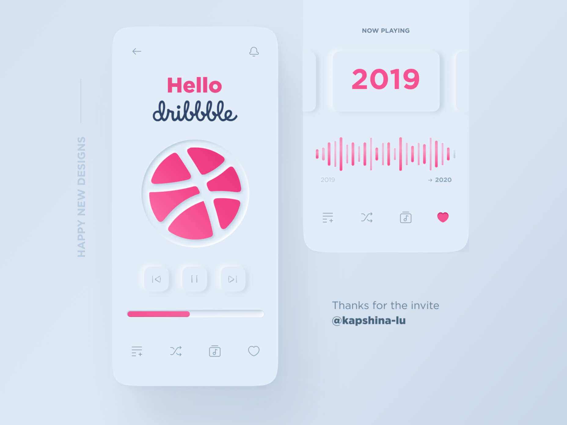
Take a look at this design by Alexander Plyuto, for instance.

Creating Smooth and Delicate Gradients

Gradients are part of the shadow and highlighting process in Soft UI design. Ideally, you’ll need to choose colors from the same palette, just toned down or brightened, depending on your needs. The gradient needs to be barely visible, but just enough to make the elements stand out. 

For white gradients, like highlights, use a very delicate color somewhere between white and your background shade. For instance, consider this design from Marina Tericheva.

Consider the Little Details

Finally, remember that the neumorphism design principle is all about little details. 

Choosing a font that visually matches the background is an excellent choice. However, you can also choose something more contrasting, as this will help information stand out

Adding a little bit of the background into your fonts might be suitable too. For instance, if you have a green font and a grey background, add a little grey into the mix. 

Extra elements in your design, like allowing a button to shift into a more recessed state after being clicked, are a great way to make the soft UI more engaging. Everything your end-user interacts with needs to feel smooth and perfectly unified. 

The Problems with Soft UI Design

Just because a design process is trending – doesn’t mean it won’t have its issues. 

Neumorphism is a fun way to make apps, operating systems, and websites feel more friendly and informal. However, this softer approach has a weak spot too. 

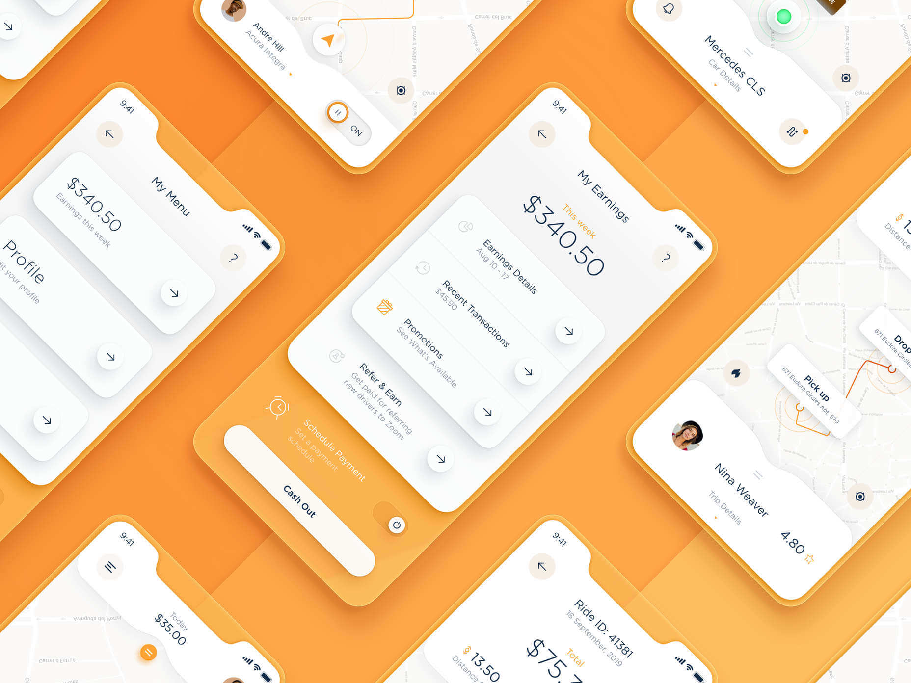
When you’re dealing with a small margin of contrast and color where neumorphism works well, it’s hard to get the effect right every time. For instance, this all-yellow design for Dtail Studio may be overwhelming for some.

A slight deviation in saturation or a problem with your shadowing could render the entire effect of Neumorphism completely pointless. 

Another major issue is accessibility. The soft UI design looks great for people who have a full visual range. However, visually impaired users might not see the same benefits. Anyone without perfect vision may see crucial objects disappearing into the background.

Your users don’t necessarily need significant vision problems to struggle with neumorphism, either. The design is all about softness that causes elements to almost blend together. People with low-quality screens that don’t have as many pixels to work with won’t see these elements. 

Issues With Buttons and CTAs

Another major issue of neumorphism is that its subtlety can lead to problems with attracting clicks and conversions. Usability is the most important consideration of any UI design. 

Unfortunately, when you focus on subtle elements throughout your entire interface, usability sometimes takes a hit. 

Let’s consider buttons, for instance – they’re essential to any interface. To simplify the customer journey, these buttons need to be noticeable, and they need to shift into different states when your customers interact with them. 

For the button experience to be excellent, users need to notice the design instantly. However, the heart of neumorphism revolves around the idea that nothing stands out too much. 

This isn’t just an accessibility issue; it’s a problem for conversions too. 

Neumorphism is soft on the eyes, with minimal color contrast and few color pops. This means that CTA buttons don’t stand out as much as they should. Buttons almost blend into the background, and the website struggles to pull attention to the areas that demand it most. 

How to Experiment With Soft UI (Free Kits)

The key to unlocking the benefits of soft UI interfaces without getting lost in the negative points – is proper experimentation. Like any new design trends, professionals and artists will need to learn how to merge the elements of soft UI together in a way that doesn’t compromise usability. 

Trends in UI design can’t focus exclusively on aesthetics, as a customer’s comfort will always be an essential part of the process. 

If you want to start exploring, here are some of the best kits and freebies to get you started:

Closing Thoughts on Soft UI

The world of design and the trends that we use are constantly changing. Companies are always searching for the best ways to connect with their users. Often, this means focusing on an interface that really connects with your target audience and delivers the best possible results. 

The soft UI design trend has its benefits and its downsides. On the one hand, the smooth appearance of every element on a combined screen can deliver a delightful aesthetic. Buttons feel less imposing, and elements are friendlier and easier to interact with. 

On the other hand, neumorphism also makes it difficult to truly capture your audience’s attention in the places where it matters most. It suffers from accessibility issues and requires plenty of care and practice.

Source

The post Soft UI: Making Sense of the Latest Design Trend first appeared on Webdesigner Depot.


Source de l’article sur Webdesignerdepot

With the widespread acceptance of web standards, and the resulting deprecation of browser prefixes, there has been a noticeable change in the browser market. Where once browser manufacturers would try to lure users in with promises of feature support, now the focus is on privacy, speed, and developer tools.

When it comes to web development, you should really be testing on every browser and device you can lay your hands on; you’re probably already doing so using an app like LambdaTest, or BrowserStack.

When quality assurance testing, you probably work by market share: starting with Safari on mobile, Chrome on desktop, and working your way down to Opera and (if you’re a glutton for punishment) Yandax; naturally, when testing, it’s the largest number of users that concerns us the most.

But before you reach the QA stage, there are a number of browsers designed to assist development. Browsers that offer tools, especially for front-end developers, that assist with code and speed up development. Here are the best browsers for web development in 2021:

1. LT Browser

LT Browser is an app for web developers from LambdaTest. Like many of the apps in this class, it offers side-by-side comparisons of a site in different viewports. Additionally, LT Browser has a number of features that make it stand out.

As well as previewing web pages, LT Browser offers developer tools to rival Chrome, which is handy if you want to see how changes across different devices affect your Lighthouse scores. LT Browser also supports hot-reloading, which means when you make a change to your code, you don’t have to hit ‘refresh,’ the viewports simply reload — it’s surprising how much of a time-saver that simple addition is.

LT Browser requires a LambdaTest account, there is a free plan, and paid plans start at $15/month.

2. Firefox Developer

The best conventional browser for web development in 2021 is the developer edition of Mozilla’s Firefox.

The standard edition of Firefox is an excellent browser, packed with features, and privacy-focused. The developer edition adds to this with a suite of tools aimed at developers. The CSS and JavaScript debugging tools are superb, and the Grid tools are unparalleled for coding layouts with CSS Grid.

Firefox Developer is free to download.

3. Polypane

Polypane is one of the new generation of web browsers that are firmly intended as development aids rather than browsers. Polypane allows you to compare different viewports and platforms by placing them side by side. Interactions like scrolling are synced.

Polypane takes a step further than many browser apps in this class by showing social media previews. It even has a suite of accessibility tools, including some handy color blindness simulators.

Polypane has a 14-day free trial, and plans start at $8/month.

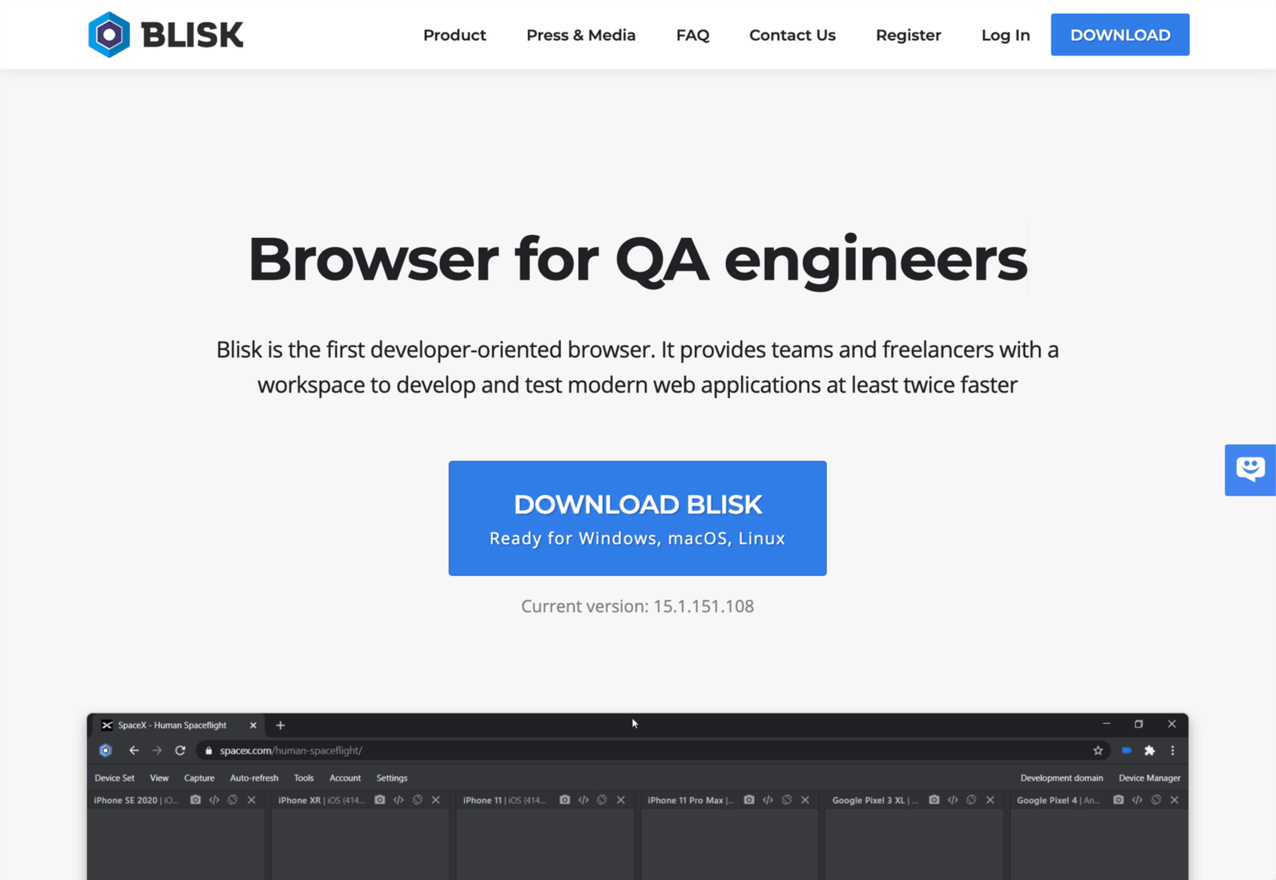
4. Blisk

Blisk is another browser for developers that allows you to line up a collection of viewports in a single app. URL and scrolling are synced, making testing interactions and animations effortless.

Blisk is awesome fun to play with and delivers a great preview of a responsive design. But be warned, synced viewports can be addictive, and it’s easy to line up browsers and become hypnotized by the synchronized movement; you’ll need a very large screen to get the most out of Blisk.

Blisk plans start at $9.99/month.

5. Sizzy

Sizzy is another app that allows you to view multiple viewports at once. It also has synchronized interactions, and like many competing apps, Sizzy allows you to screenshot different views.

Sizzy also includes a very clever synchronized inspect tool, so you can focus on individual elements across different viewports. It’s an excellent option for debugging, particularly if you’re digging into someone else’s code.

Sizzy has a 14-day free trial, and paid plans start at $7.15/month.

6. Brave

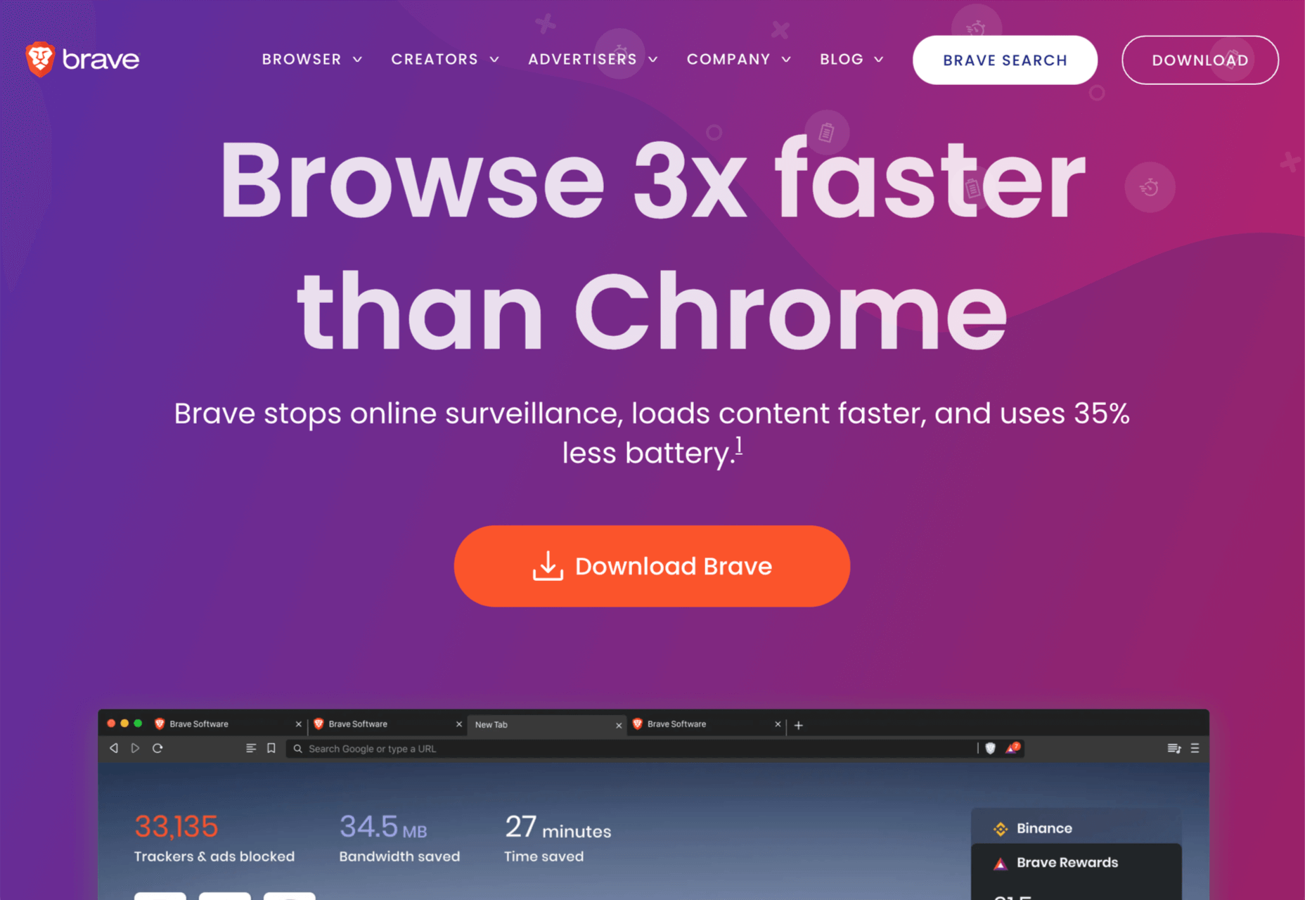
Brave is a privacy-focused browser that runs up to three times faster than Chrome. If you’re someone who balks at rendering speeds on most sites, Brave could be for you.

Brave’s main benefit for developers is that it supports Chrome extensions while maintaining privacy — it can even access the Web using Tor if simple privacy mode isn’t enough for you. There are hundreds of useful Chrome extensions, and if you avoid Chrome due to privacy concerns, then Brave solves your problem.

Brave is also pioneering a new system for monetizing site revenue, allowing viewers to tip sites, and soon, to control how advertising revenue is distributed.

Brave is free to download.

7. Chrome

Boring it may be, but Chrome is still the world’s most popular browser from the US to mainland China. Where once sites were “best viewed in IE,” Chrome is now the Web’s default.

No matter the site you’re designing, it has to work well in Chrome, and no simulator is as good as the real thing.

In addition to being the benchmark for page rendering, Chrome developer tools are the simplest way to access your Lighthouse scores, which helps you track down issues that may be holding you back in Google’s search results.

Chrome is free to download.

Source

The post 7 Best Browsers for Developers in 2021 first appeared on Webdesigner Depot.

Source de l’article sur Webdesignerdepot

It’s difficult to find a boardroom anywhere in the world where cloud-native transformation isn’t a top-five item on the business agenda. Businesses understand that in order to survive and keep up with their competitors, they need to lean heavily into the cloud and embrace it as part of their digital transformation strategy. According to a recent survey of C-suite executives, almost 90% of organizations now understand that cloud technology is going to be a critical step on their path to success. But are they running before they’ve learned to walk? 

Businesses that run headlong into cloud-native transformations tend to do so with an idealized view of what it is they want to achieve. They invest heavily and devote their most valuable resources to trying to achieve the perfect transformation, pinning all of their future successes on it. However, we all know that true perfection is unobtainable, and in pursuing it so doggedly we often cut corners and miss opportunities along the way. The ‘rush to cloud’ has only been exacerbated by the pandemic, pushing companies to up their investments and accelerate their plans for cloud transformation. But rather than speeding up, some of these businesses might be better off slowing down to figure out where they’re going and how to get there. 

Source de l’article sur DZONE

Welcome to a new series of articles, in which we round up the best new fonts released from some of the top designers on the Web.

In this inaugural edition, the collection includes fonts released or expanded over the last few months. Many of the fonts have free weights available. If you use any of them in your work, be sure to let us know!

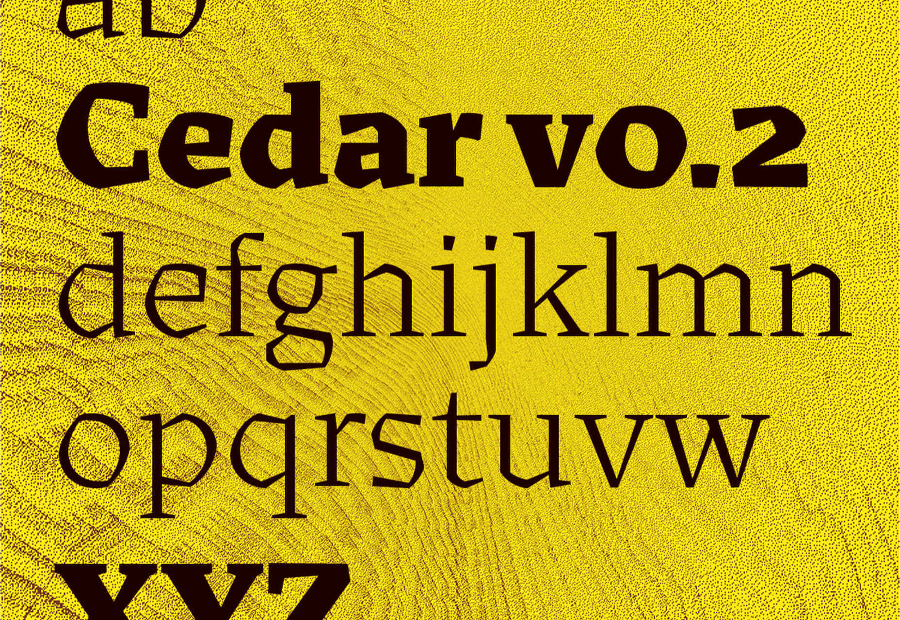
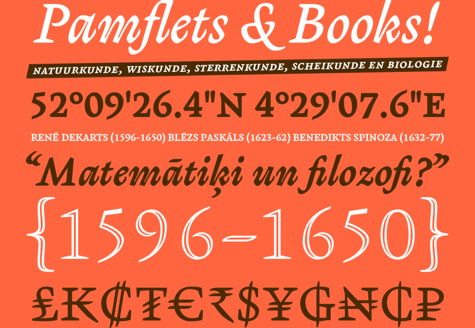
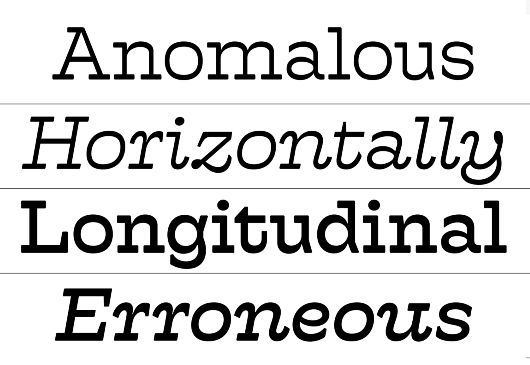
Cedar

Cedar is a unique angular serif built by wrapping vector shapes around calligraphic structures. It has its roots in woodblock printing but creates a very modern aesthetic.

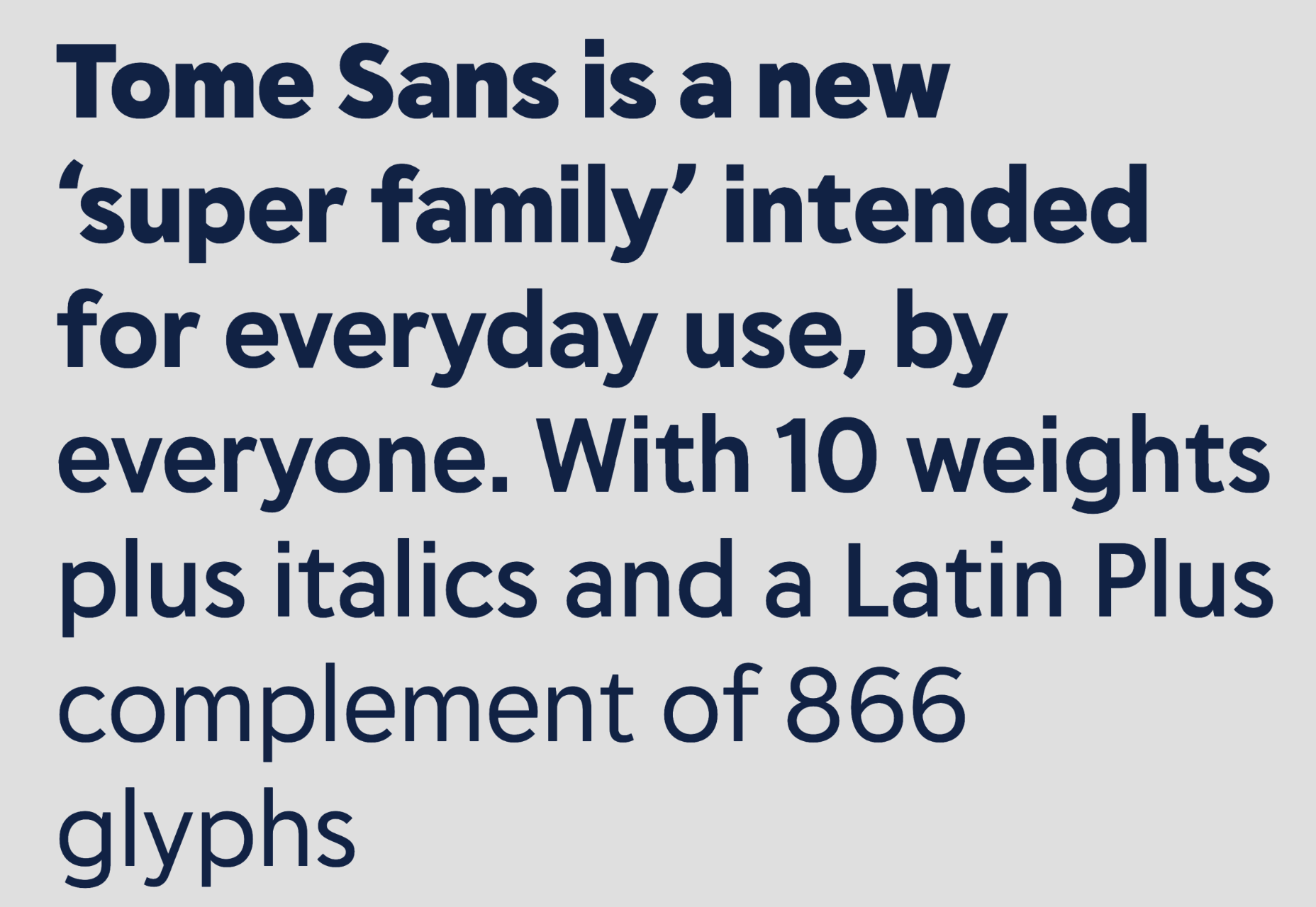
Tome Sans

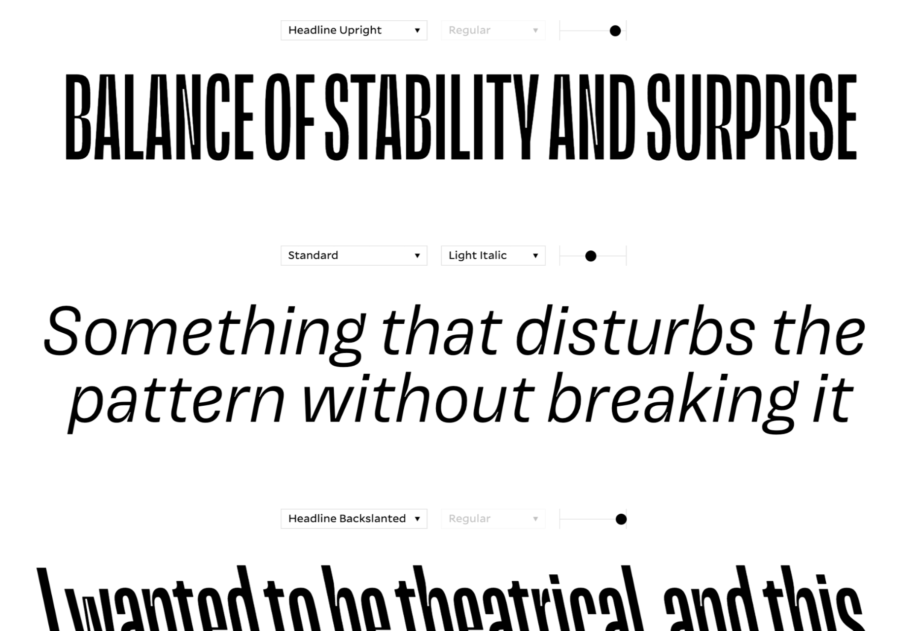
Tome Sans is a very usable business-like type family of ten weights, plus italics. It features some awesome ligatures that you don’t often find in a sans-serif.

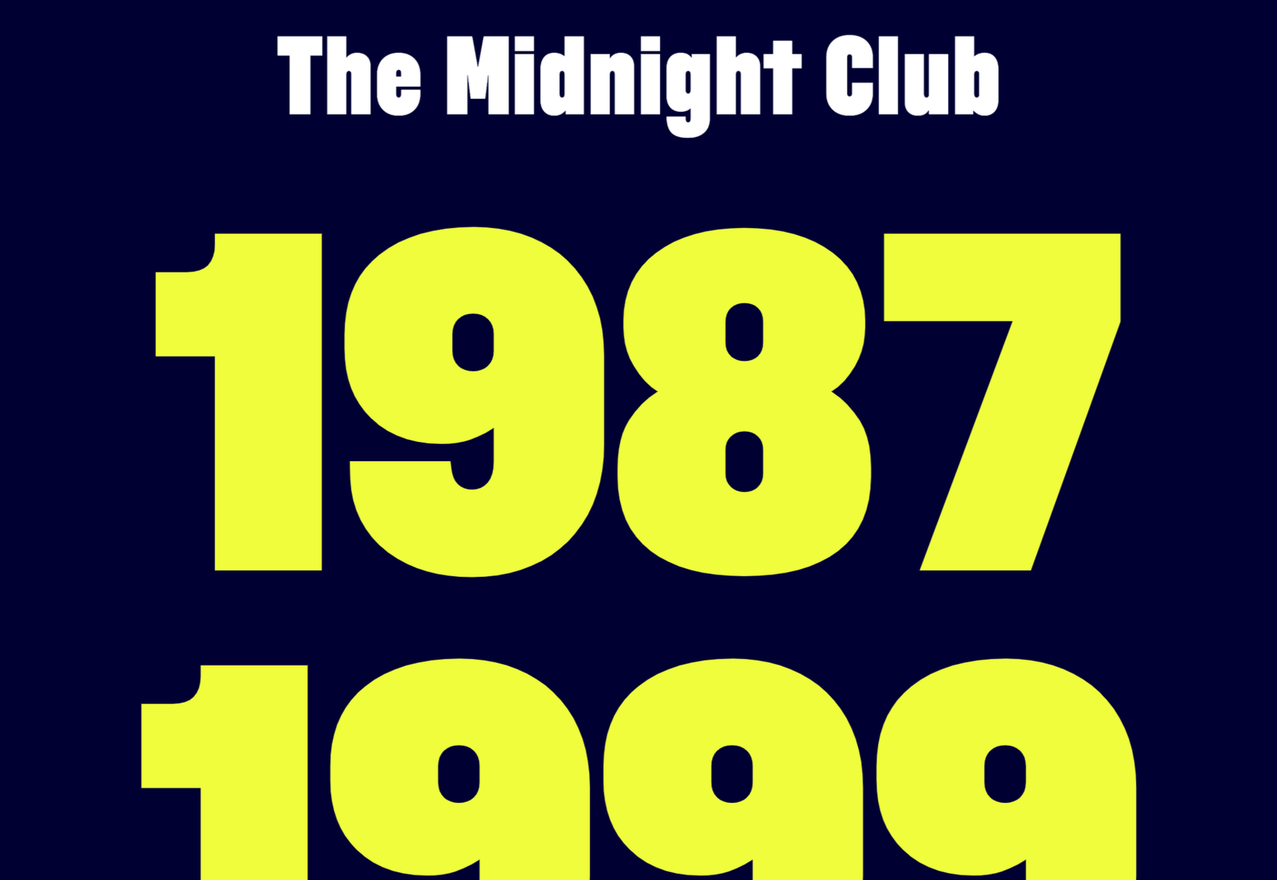
Midnight Sans

Midnight Sans is a chunky sans serif, suitable for display sizes. There’s a rounded variation for added warmth and dozens of OpenType features. It’s a good alternative to Impact.

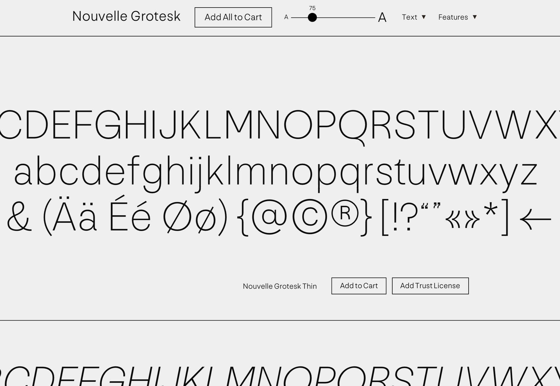
Nouvelle Grotesk

Nouvelle Grotesk is a workhorse sans serif that you’ll come back to all the time. The humanist forms are a little more considered for digital usage than Akzidenz Grotesque or Helvetica.

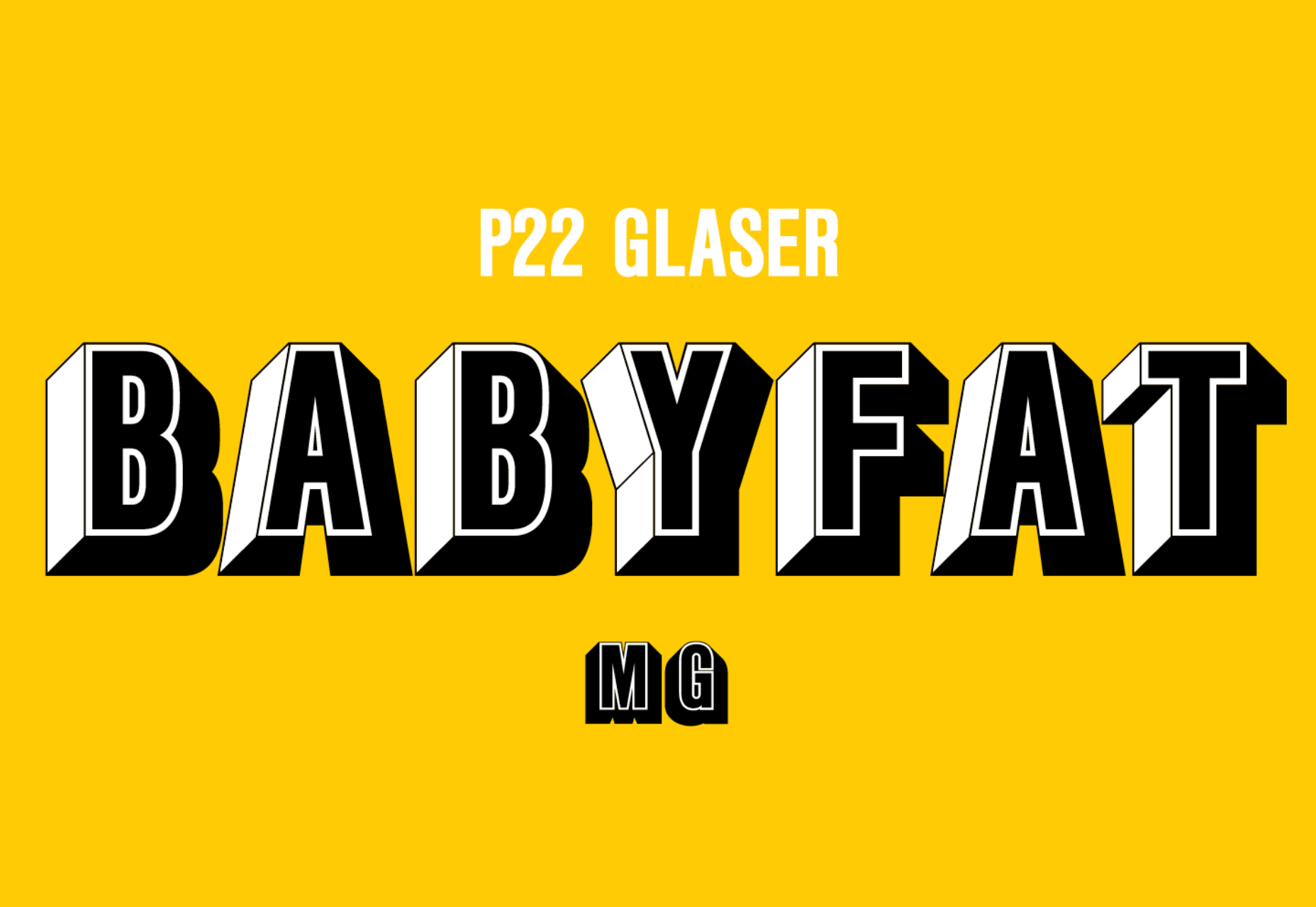
Glaser Babyfat

Glaser Babyfat is the first typeface designed by the late, great Milton Glaser. It has been released posthumously by P22 alongside three other fonts based on Glaser’s designs.

Kristal

Kristal is a flexible and highly readable serif, suitable for large blocks of text in small sizes. It has some beautiful details, including a selection of ligatures and a fine set of italics.

Lightbox 21

Lightbox 21 is a redesigned version of Lightbox; the original made use of the golden ratio for its geometry, the redesign completely abandons that resulting in a more readable typeface.

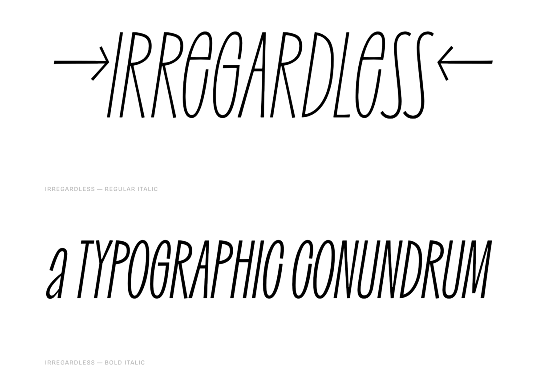
Irregardless

Irregardless is a tall sans serif with organic shapes that feels almost like lettering. Unusually for this style of typeface it has upper and lowercase letters. It’s perfect for a retro design.

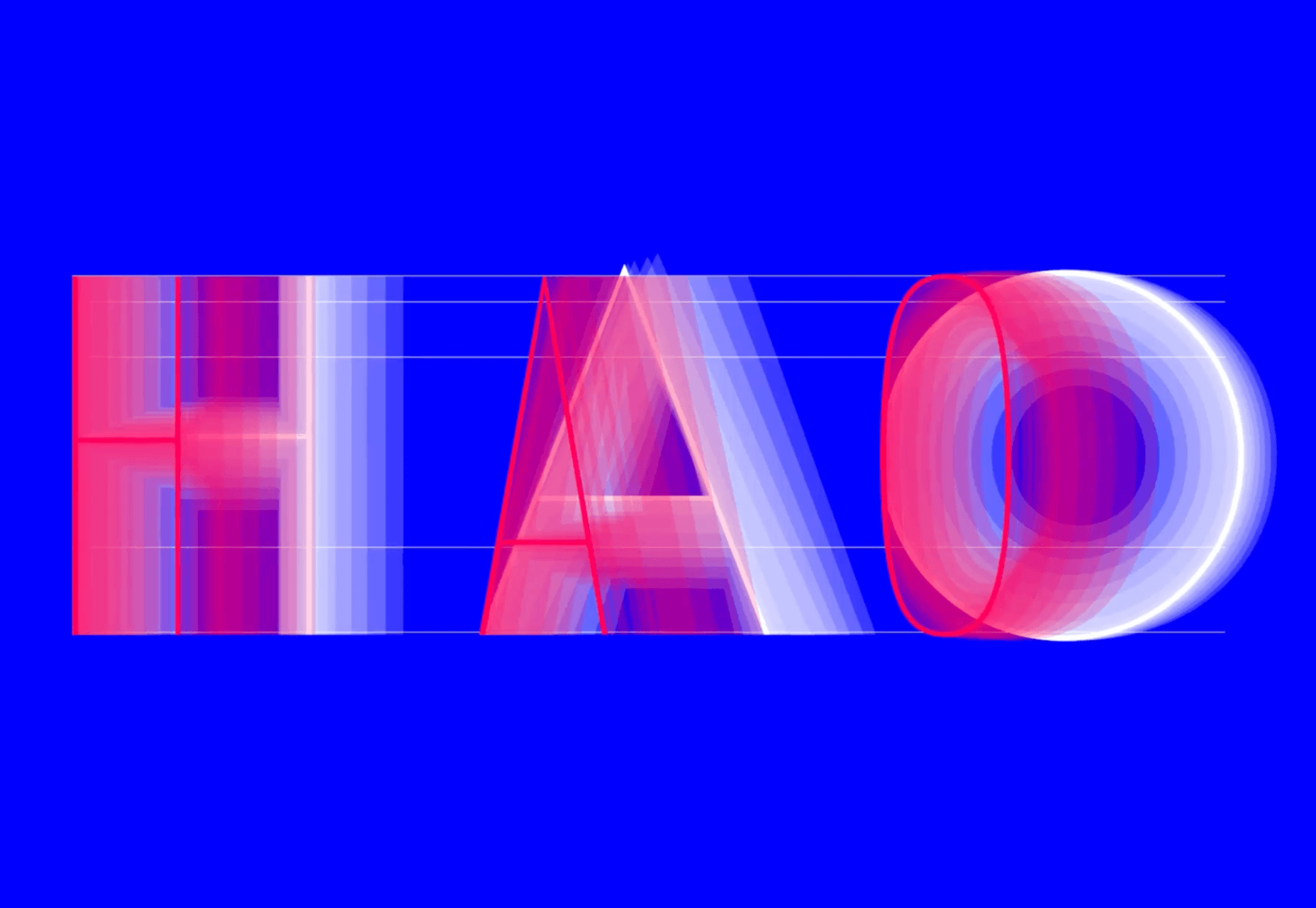
Futura Now

Futura Now is Monotype’s redrawn version of Paul Renner’s classic Futura. As well as being massaged for screens and expanded to cover more languages, it’s also now available as a variable font.

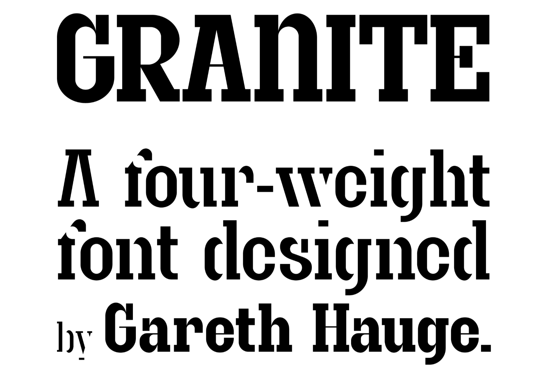
Granite

Granite is a slab serif with high-contrast strokes, giving it the feeling of an Old West woodblock font. There’s a stencil alternate set that adds to the rustic aesthetic.

Magnet

Magnet is a sans-serif with heaps of character. There is a condensed headline variation that’s perfect for display purposes, but the real standout feature is the quirky ear on the lowercase g.

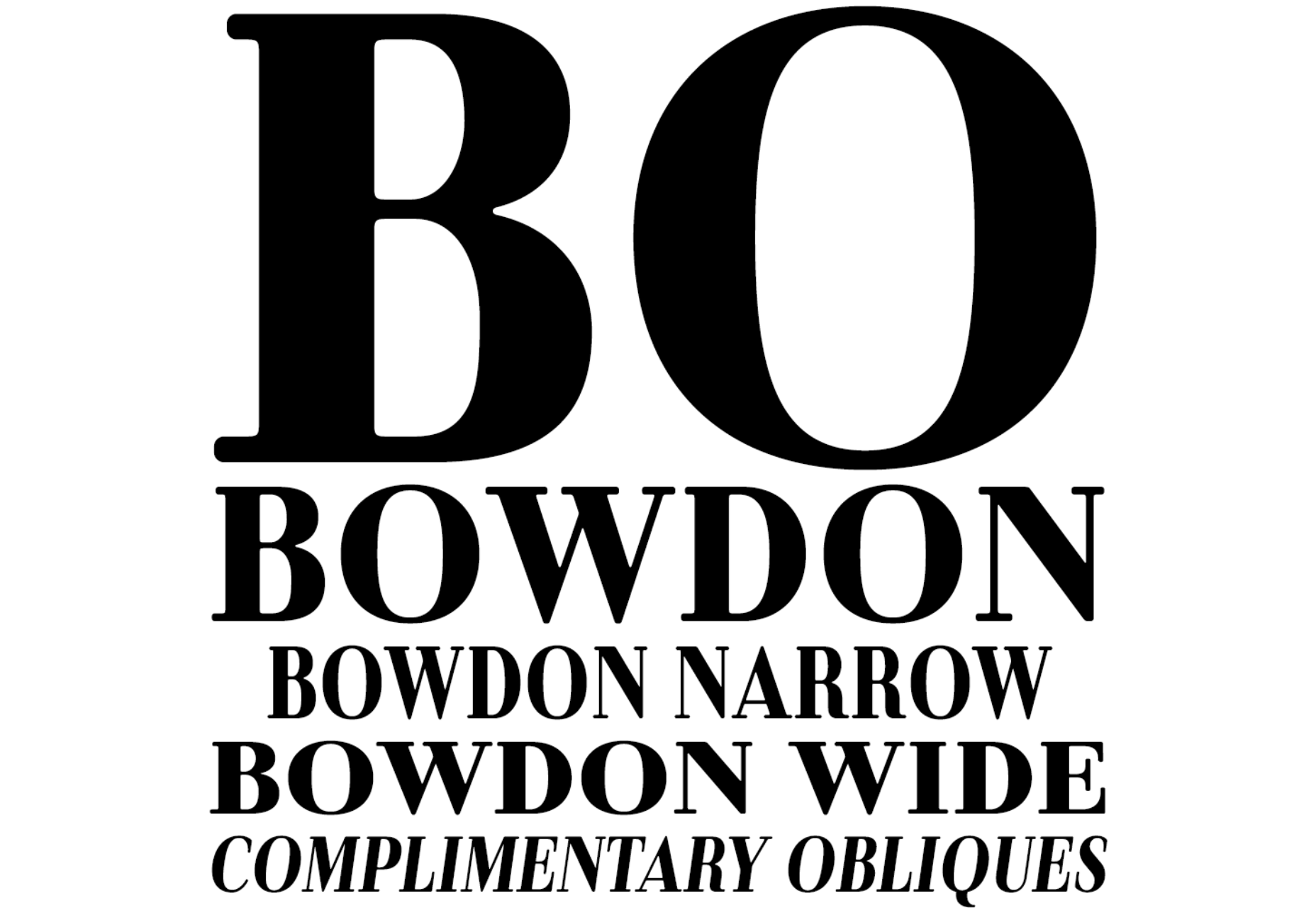
Bowdon

Bowdon is a warm serif in the Bodoni tradition. The contrast between serif and stroke creates a sense of luxury. It’s available in three weights: regular, narrow, and wide.

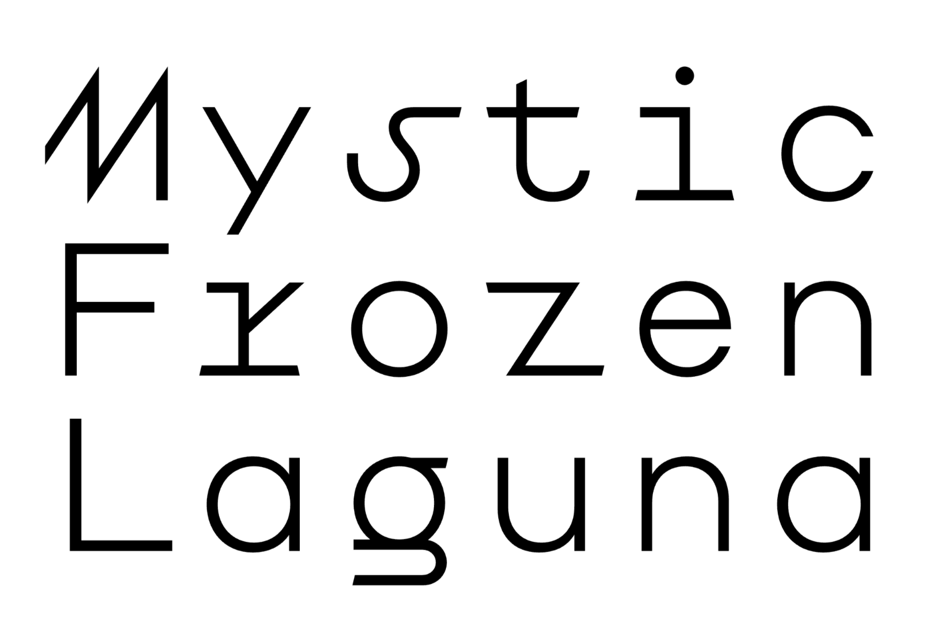
Euclid Mono

Euclid Mono is an attempt to design a monospaced font that doesn’t fit the traditional mold. The extended shapes create a dance-like composition with plenty of movement.

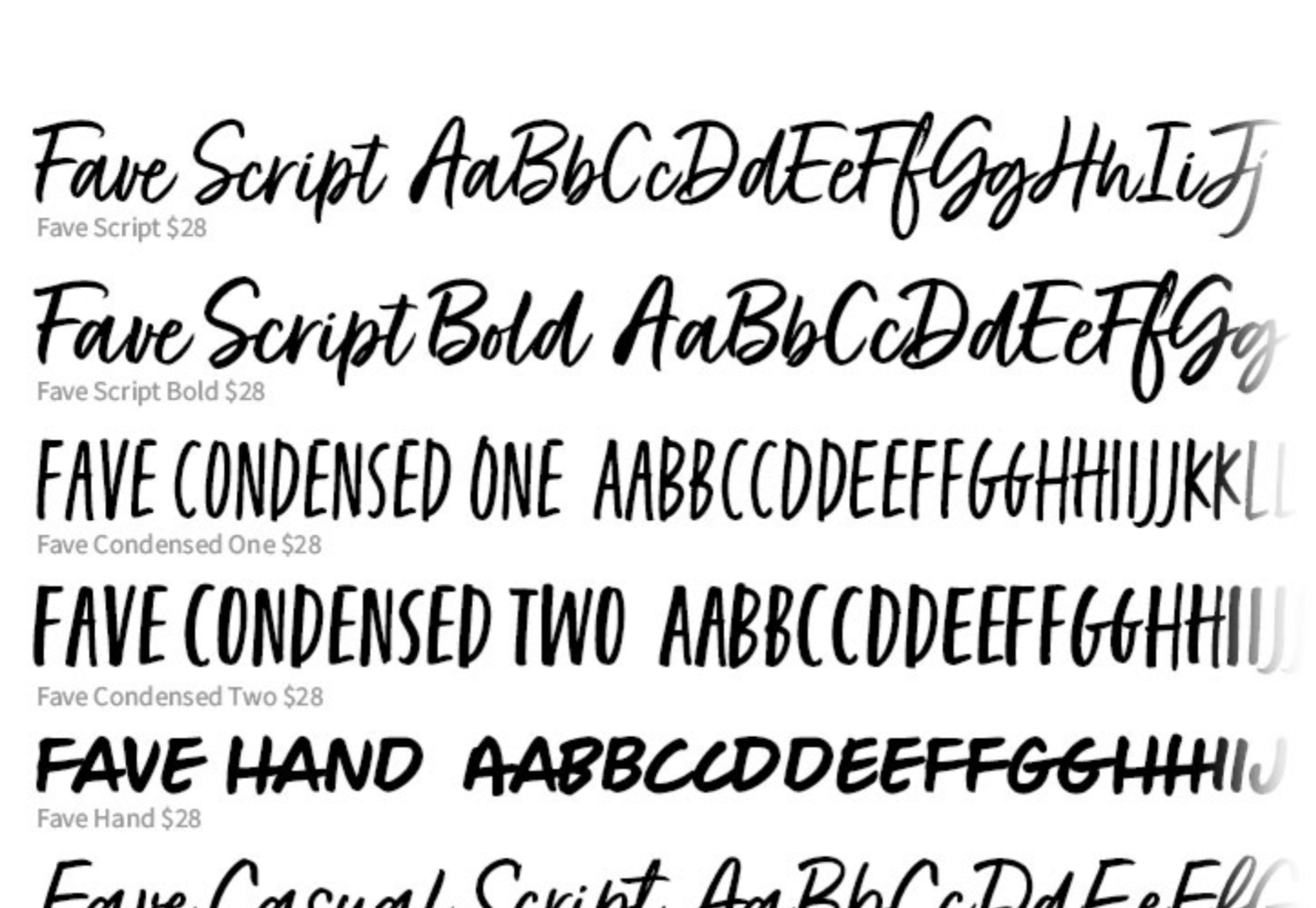
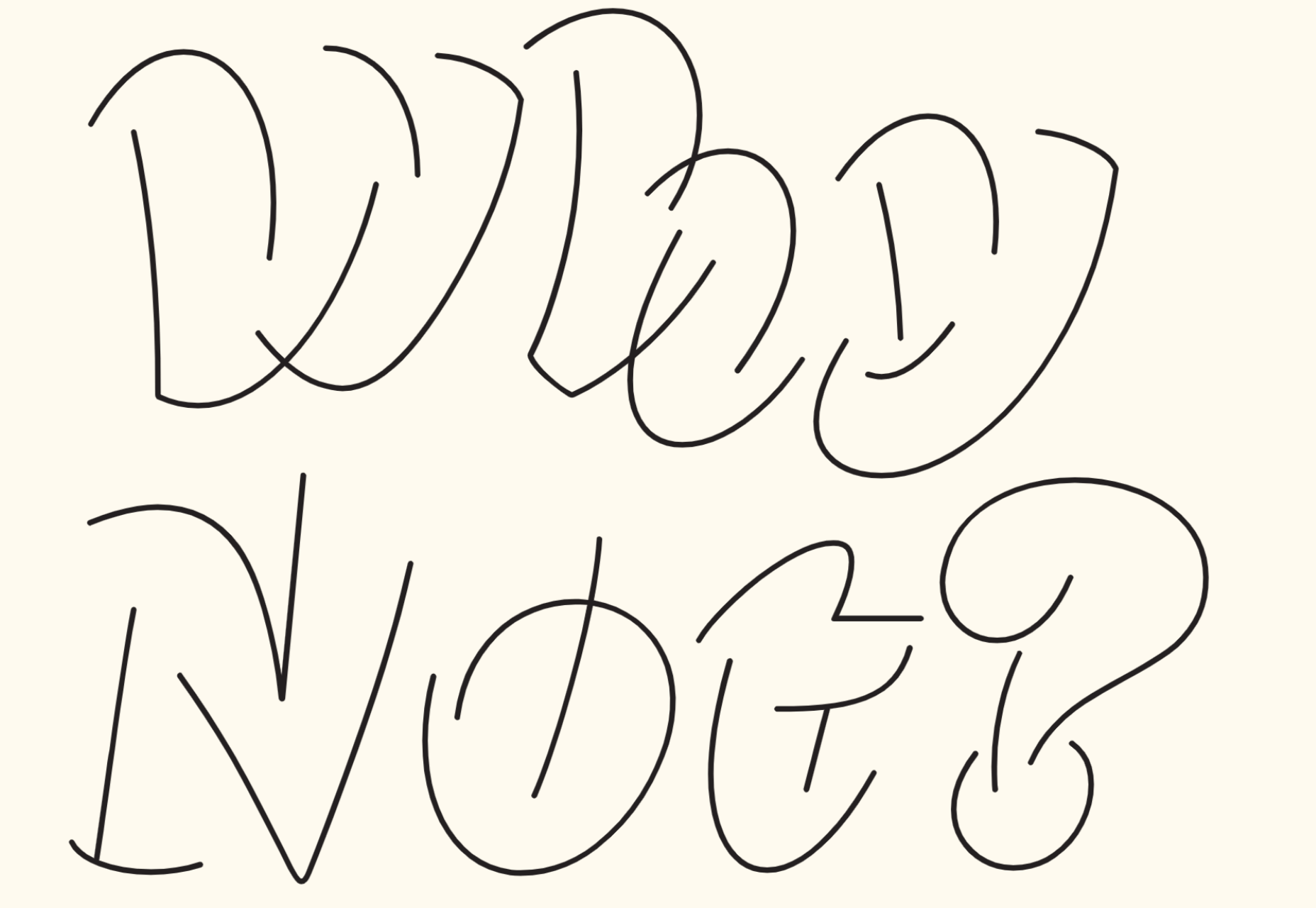
Fave Set

Fave Set is a collection of marker pen scripts that are always handy to have in your toolbox. There are ten fonts included in total, with condensed and extra casual styles adding to the number.

Saison

Saison is a wonderfully energetic outline font. It only works as a display option, but it’s perfect for editorial work or even branding.

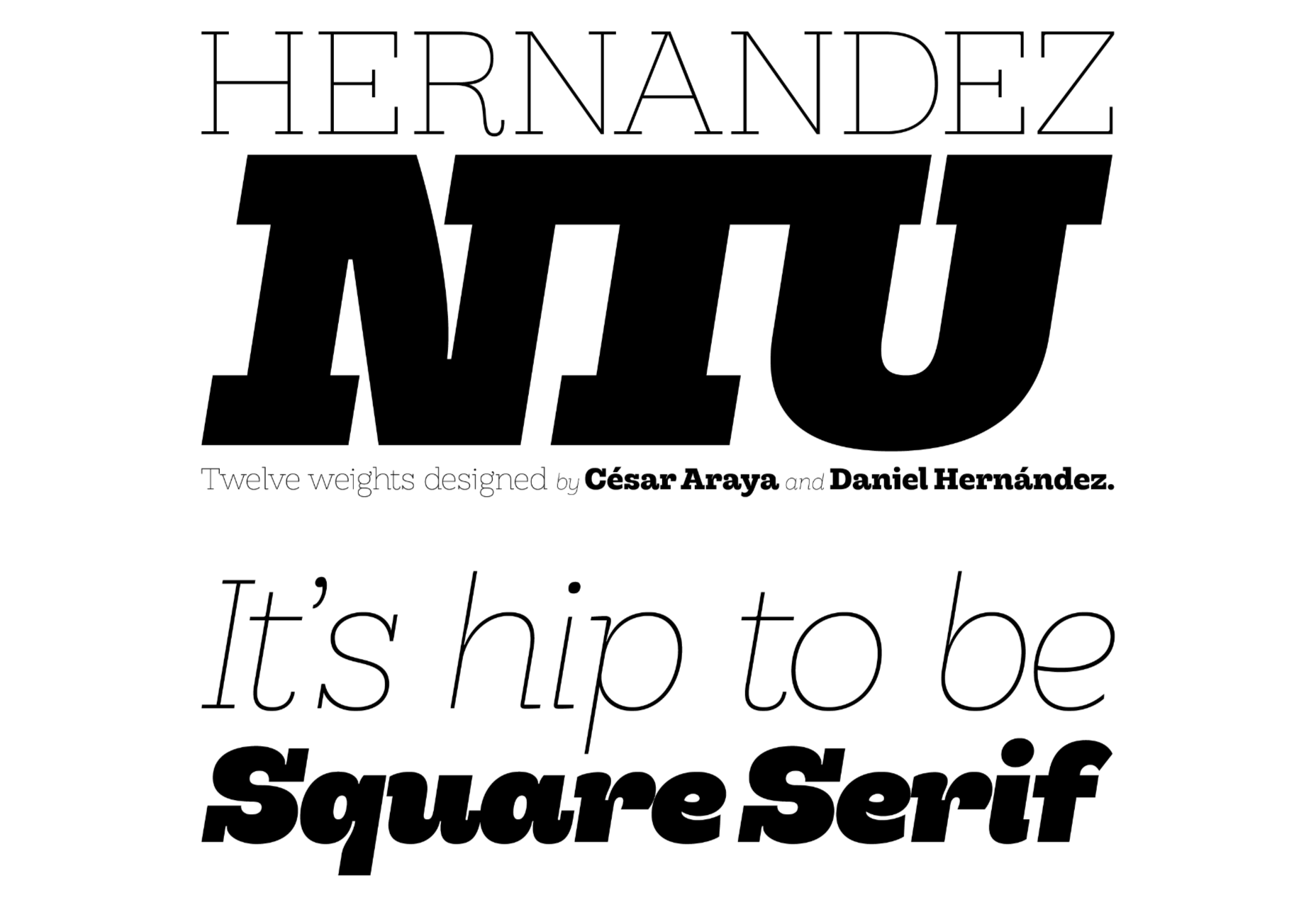
Hernandez Niu

Hernandez Niu is a slab serif that takes lots of character from its exaggerated ink traps in weightier sizes.

Gomme Sans

Gomme Sans is a typeface with 12 weights. The extended style creates a modern feel, and it’s suitable for display or short to medium amounts of text.

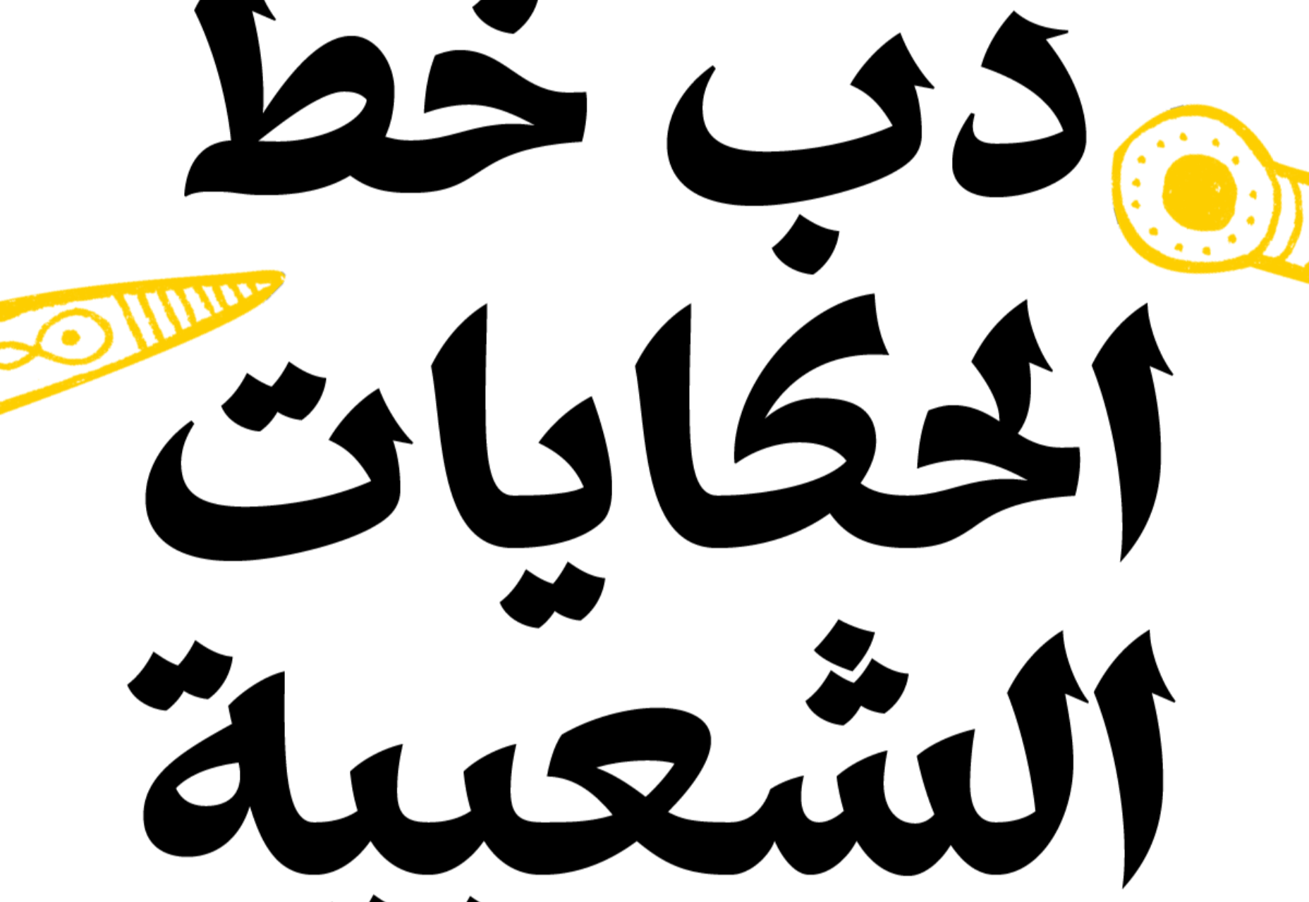
Dobb

Dobb is an Arabic typeface designed to offer a playful and expressive option for pairing with illustrations. It has a graphic novel feel in extended text blocks.

Hatch

Hatch is a slab serif that has drawn inspiration from reverse stress typefaces of the nineteenth century. It has some quirky details that make it distinctly modern and a beautiful italic.

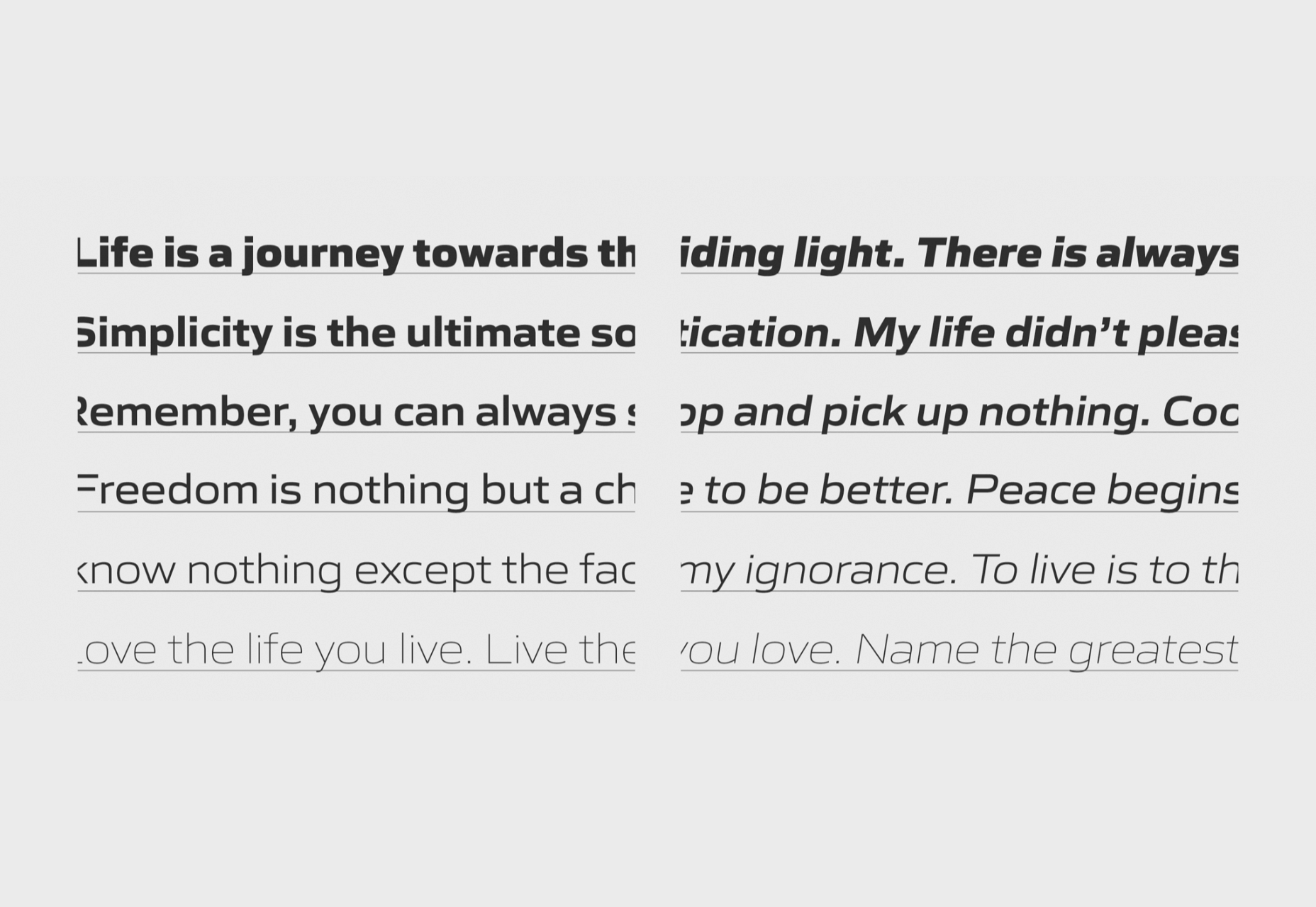
Sculpin

Sculpin is a sans serif with sharp strokes and corners, inspired by the sharp edges of tools like chisels. It comes in five weights with matching italics, and there is a variable font available.

Source

The post 20 Best New Fonts, June 2021 first appeared on Webdesigner Depot.

Source de l’article sur Webdesignerdepot

Every day design fans submit incredible industry stories to our sister-site, Webdesigner News. Our colleagues sift through it, selecting the very best stories from the design, UX, tech, and development worlds and posting them live on the site.

The best way to keep up with the most important stories for web professionals is to subscribe to Webdesigner News or check out the site regularly. However, in case you missed a day this week, here’s a handy compilation of the top curated stories from the last seven days. Enjoy!

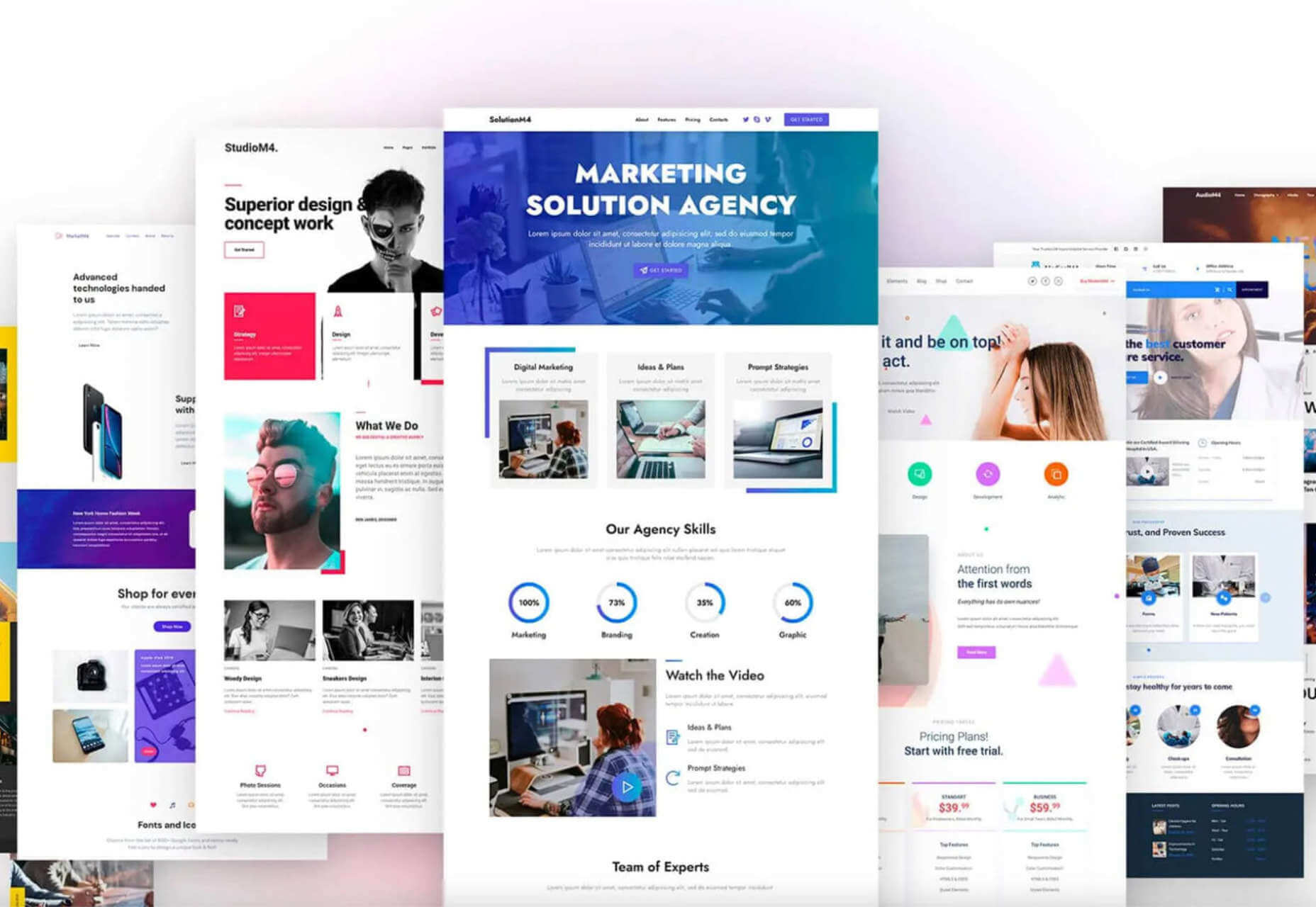
22 Exciting New Tools for Designers, June 2021

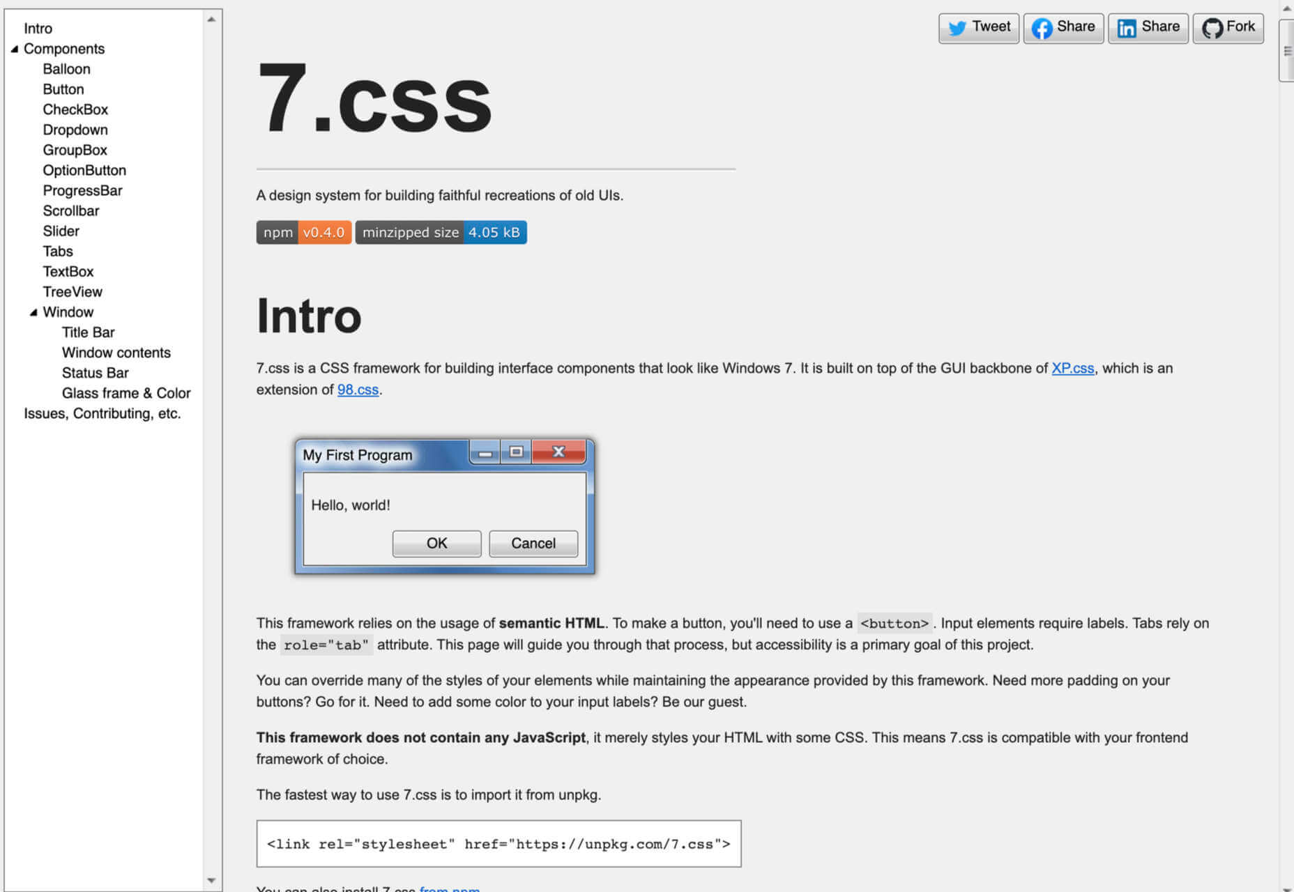
7.css

Does the Hamburger Menu Make Mincemeat of UX Design?

Top 15 Tools and Resources for Designers and Agencies

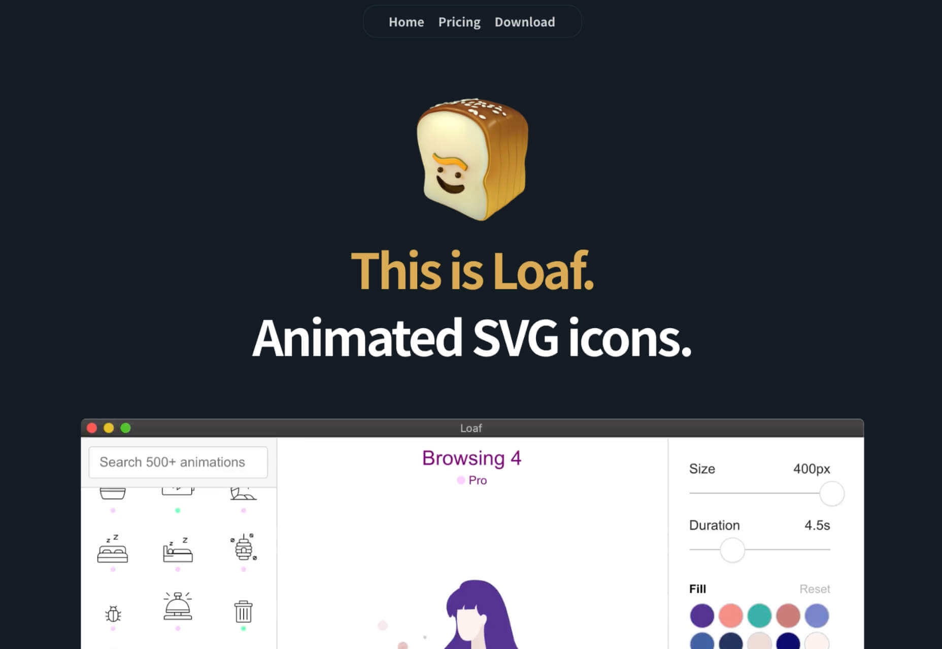
Loaf Animation SVG Library

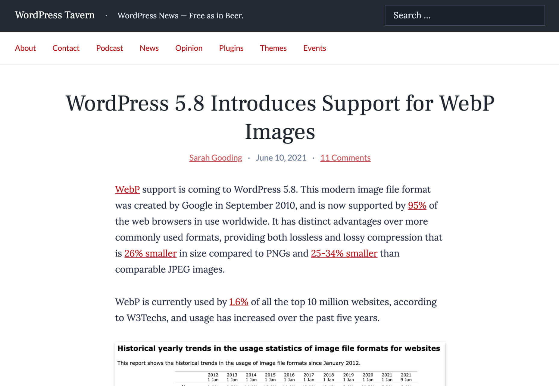
WordPress 5.8 Introduces Support for WebP Images

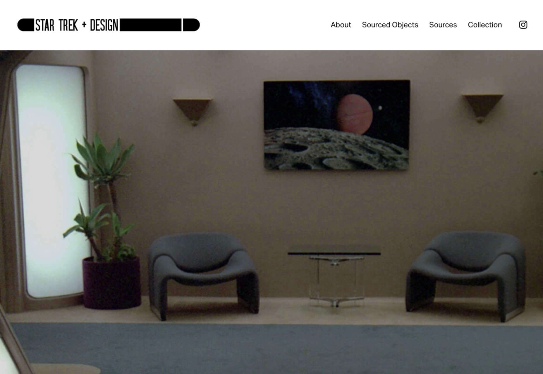
Star Trek + Design

11 Landing Page Design Tips You Should Follow Today

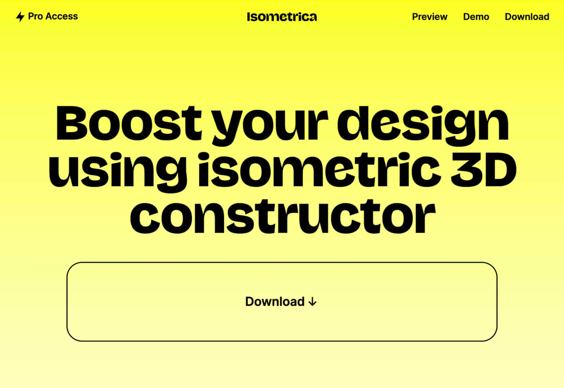
Isometrica 3D Constructor

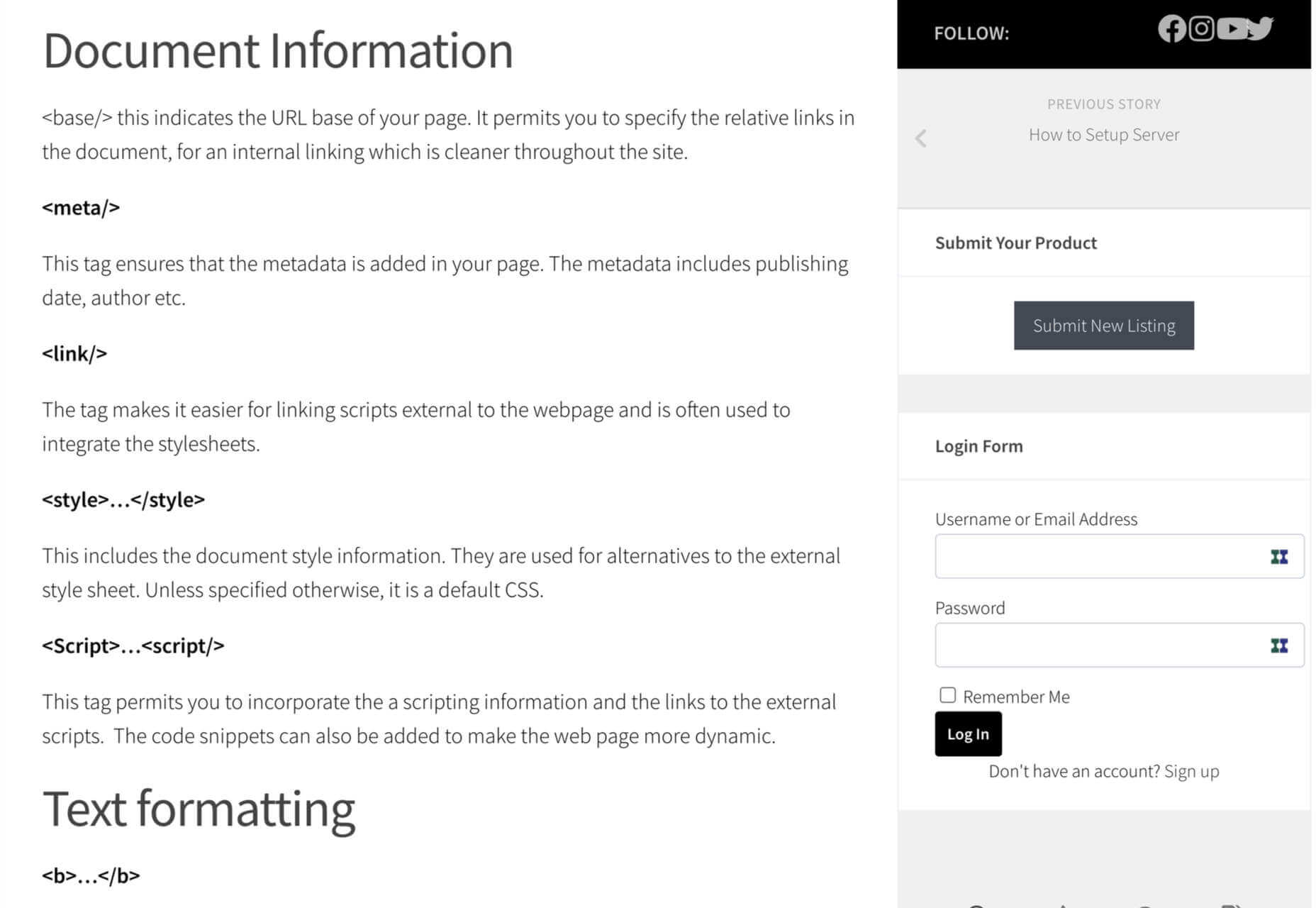
HTML Semantic Tags Cheat Sheet

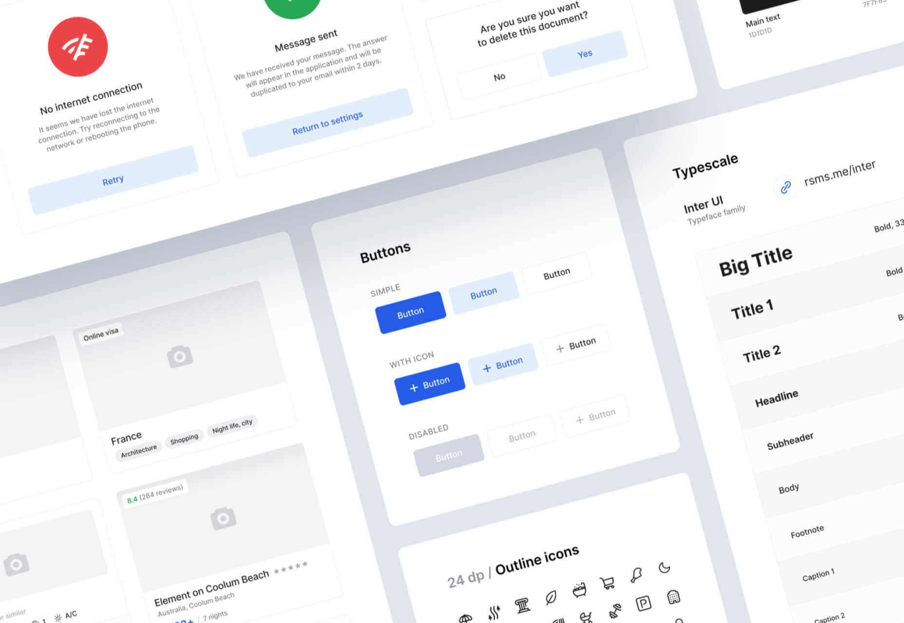
What is a Design System?

Source

The post Popular Design News of the Week: June 14 2021 – June 20, 2021 first appeared on Webdesigner Depot.

Source de l’article sur Webdesignerdepot

This article explains creating or setting up a cypress.io end-to-end testing framework from scratch using Typescript. Unlike another tutorial, this explains setting up the Cypress framework using Typescript in a simple and easy way. This article is helpful for whoever wants to set up the Cypress Typescript automation framework for the first time. Also, I know that there are many, migrating from different automation frameworks like Protractor, webdriver.io, etc. this will be helpful for them too.

This Tutorial shows page object model creation as well, however you can use it for any type of framework by skipping those steps.

Source de l’article sur DZONE

It’s fair to say that AMP (Accelerated Mobile Pages) is a controversial topic among web developers.

AMP is a Google-guided technology that strips down web pages to a limited sub-set of tags to serve pages faster. It was developed as a web-based rival to native news apps from vendors like Apple.

The controversy first arose when it was clear how much influence Google had over the conventions, essentially creating a tiered Web overseen by a single entity. The clamor didn’t calm when it became clear that Google prioritized AMP pages for mobile search results. Developers were left in a difficult position: stand by best practices supporting a platform-agnostic Web, or do what’s right for their clients by building the most competitive mobile site possible.

But that was 2015, six years is a lifetime for a web technology, and things are about to change.

Hidden among the announcements about the much-delayed Core Web Vitals update — it’s finally rolling out, a year after originally planned, but don’t expect to see much impact until the end of August — is the news that Google mobile search will no longer prioritize AMP pages.

Beginning immediately (from the 17th June onwards) and completing sometime before the end of August, AMP will cease to be a factor in mobile site ranking. The AMP badge on mobile search results will disappear, and AMP is not required to have your site included on Google’s news app.

This significant move is due to the fact that the Core Web Vitals update from Google will expect the same speed and usability as AMP from non-AMP pages. Google still expects the same optimized user experience; it simply isn’t offering a cheat sheet on how to achieve it.

You can continue to use AMP, but there’s no automatic benefit to doing so, and the housekeeping involved in maintaining multiple front-ends means it’s far simpler to optimize your base site. Without a solid purpose, AMP ceases to fill a need. And just like that, one of the most controversial technologies of recent years slips away.

Featured image via Unsplash.

Source

The post Poll: Is AMP Dead, and Do We Care? first appeared on Webdesigner Depot.

Source de l’article sur Webdesignerdepot


Java Messaging Service

JMS or Java Messaging service is a solution for asynchronous communication using messages (objects). Initially, it was part of JSR (specification used in Java EE).

Simple Problem as Example to Explain: User Creation Service

Let’s assume we have any service that can process only 100 requests per second. Any higher load will freeze service or put it down.

Source de l’article sur DZONE

In most companies the single largest cost is human resources. However, by leveraging Open Source intelligently, you can significantly reduce this cost, by literally having the entirety of GitHub’s user base, working for « free » for your company. This of course is a bit like what investors refers to as « China math », but GitHub has 65 million registered user accounts, most of whom we must assume are developers one way or another. If you intelligently structure your organisation around GitHub, there is literally nothing preventing you from using every single one of these developers as your own company’s resource, making you a million times more productive than mega corporations such as Amazon, Facebook, and Microsoft – For a millionth of the cost these mega corporations are paying. But first let’s illustrate the problem, such that the solution becomes clear …

The problem

In one of my previous jobs somebody had cloned an open source git repository, then added its code to our own private corporate cloud’s git repositories, for then to start modifying the thing (the horror!) 2 years later it took one of my developers 6 weeks to update the thing to use the latest version as created by its main developer on GitHub, trying to keep as many of our own customisations as possible in the process. Needless to say, but I was furious about the original decision, due to having responsibilities for code quality at this company.

Source de l’article sur DZONE

Inclusive design is often mistaken for accessibility, or even used as an interchangeable term, which is a good indication that most designers don’t know what it means.

Accessibility is a process that seeks to mitigate issues in a design that is not sufficiently universal; inclusive design increases the universality of the design. In real-world terms, an accessible building may replace its front steps with a ramp; an inclusive building is constructed at the same level as the sidewalk.

Accessibility is concerned with objective, measurable improvements. It’s a UI concern. Inclusive design is subjective, more difficult to measure, and is a UX concern. By designing inclusively, we extend our designs to the widest possible user group and contribute to a better society. Here are three ways to get started.

1. You’re the Edge Case

When designing, it’s normal to assume that we are normal. After all, we are the center of our experience of the world. Everything from our preferences to our empathy stems from our individual place in time and space.

When we use the term “edge case,” what we’re referring to is a minority experience, a way of using our design that is uncommon or distinct from our own expectations.

But what would happen if we treat ourselves as the edge case? What if all of the experiences that we deem to be minority experiences are actually the core, common user experience of our design?

If we start from the position that we are the one out-of-step with the design, that most people will not think or act as we do, then we’re eliminating thousands of biased decisions about how our design should be.

Draw From Life

It has always surprised me that in Europe’s dark ages — ranging from the decline of the Roman empire to the Proto-Renaissance — it didn’t occur to anyone to draw from life. Artists drew things the way they thought they should look, which is why so many Byzantine icons of the infant Jesus look like a middle-aged blonde man that has been shrunk.

It’s important to draw from real life as much as possible. That means abandoning personas — which are by definition under-representative and frequently loaded with bias — and engaging with actual users. Most of all, it means taking a step back and opening your eyes.

2. Stop Making Inclusive Design Part of Your Practice

Inclusive design cannot be a part of your practice; it’s an all-encompassing attitude. Your design practice must be inclusive. At least, it should aspire to be…

As human beings, we are biased—all of us. The reason for that is that bias — be it racism, misogyny, nationalism, homophobia, or anything else — is cultural. And we all exist within society. We’re all bombarded with information that reinforces those biases every day.

Accept that you have biases and that your biases will pull your design work away from the inclusive solution you aspire to. But equally, accept that by acknowledging your biases you’re limiting the influence they have over your decision-making.

Do Not Require Users to Self-Identify

It’s divisive and abusive to partition users into groups, especially when the act of doing so perpetuates bias.

One of the most encouraging developments of the last decade has been the introduction of the answer “prefer not to say” in response to personal questions about race, gender, status, and so forth. But if “prefer not to say” is a valid option, in other words if you don’t actually need to know, then why ask at all?

Beware Occam’s Razor

Occam’s Razor is an often misquoted idea that (to paraphrase) states that when making a decision, the one with the least assumptions is the correct choice.

The problem is that Occam’s Razor implies that there is a ‘correct’ decision. But in fact, inclusive design benefits most from a flexible UI and a high tolerance for deviation.

If you can identify the assumptions in a design decision sufficiently to count them, then you’re best served by testing, not comparing, those assumptions.

3. Design Flexibility Into Everything

There is no such thing as a “natural normal,” but there is “perceived normal.” Much of our behavior is governed by the experiences we’ve had since we were very young. Despite existing somewhere on a scale of ability and preference, most of us have inched towards what we have been told is a “normal” range all our lives.

However, it is a physiological fact that every characteristic exists somewhere on a spectrum. There are no black and whites; it’s all grey.

When we design a site or app, we tend to silo certain characteristics into one. Someone who is visually impaired is treated to the same ‘solution’ as someone who is blind, even though visual impairment can range from screen reflections on a sunny day to someone who was born without optic nerves.

There are people who have lost their sight through degeneration or accident and will be able to make visual connections based on remembered visuals. Other people have never seen anything and their conscious mental process isn’t figurative at all.

To accommodate the full gamut of possible interactions with our design, we need to design to a scale, not with absolute values. This means thinking less about set colors and sizes and more in terms of contrast and scale.

Avoid Communicating in Color

Few areas are more indicative of a spectrum of experiences than color.

Color is instantly problematic for designers because quite apart from color blindness, color has deeply personal associations.

Over the last couple of decades, it’s been repeatedly proven that it is contrast, not hue, that increases engagement. Green does not always mean go; red does not always mean stop.

Color involves so many biases and assumptions that it’s simply better to work with contrast than select the ‘right’ hue.

Bigger Typography (Sometimes)

In the first draft of this article, I wrote that increasing the scale of your typography was always good.

My rationale was that some users will benefit from larger type, and zero users will be hindered by it. But that’s not true. Larger type means fewer lines per viewport, which means more scrolling; not a problem for some users, but potentially an issue for those with motor control issues.

That was one of my biases right there.

Congratulations, You’re Now An Inclusive Designer

Good design is self-aware in origin and unselfconscious in execution.

Inclusive design isn’t about enabling access for everyone; it’s about designing for a user experience that is welcoming and respectful. Every one of your users should feel not just enabled but validated.

Inclusive design isn’t a series of items on a checklist; it’s an ideal, like harmony or beauty, that we may struggle to achieve but that we should strive for nonetheless.


Image via Pexels.

Source

The post 3 Ways to Design More Inclusively first appeared on Webdesigner Depot.

Source de l’article sur Webdesignerdepot