Articles

In the information age, time is a valuable commodity and something people don’t want to spend too much of. As a result, the average visitor only reads about 20% of the content of a page

For web designers and developers, that means a few things: first, you need to ensure that the web pages you create are as engaging as possible; secondly, you need to find a way of making the critical information on any page stand out; thirdly, every modern designer needs to create assets that are easy for today’s fast-paced customers to use. 

Making websites more scannable is how you do your part as a designer to ensure that the customers who come to a page get the quick and convenient experiences they need. 

So, how do designers embrace scannability?

Designing for Scannability: An Introduction

At first glance, the concept of creating a website for scannability is strange. 

Most designers start their projects with the aim of making customers stay on a page for as long as possible. So it’s odd to think that you would want to make it simple for end-users to skip from one page to another on a website in a matter of seconds. 

However, scannability isn’t just about delivering information and getting users off a page. When sites are scannable, they make it quicker and easier for customers to slide down the purchasing funnel. A quicker and more convenient customer journey leads to a stronger user experience and more conversions. 

Look at Netflix, for instance. It doesn’t give interested users a ton of information on its homepage. Instead, the key USPs of the product are laid out bright and bold in the middle of the screen, along with one simple call to action: Get Started.

Designing for scannability means making it easy for users on a page to glance at a screen and instantly access all the information they need to take the next step in their buyer journey. 

There’s no needless scrolling or wondering what to do next. 

According to analyst Jacob Nielsen, scannability is essential because people look for specific things on every page they visit. 

Customers don’t read through web pages word by word. Instead, they scan through the content, plucking information out that serves their requirements. 

Questions to Ask When Designing for Scannability

So, how do you know if your web pages are scannable?

Start by asking the following questions:

  • What’s the intent of the people who arrive on this page?
  • What kind of information needs to be conveyed instantly?
  • Can the visitor see the next step in their journey immediately?

For instance, when someone arrives on the Evernote homepage, you can assume that they want to:

  • Find out about Evernote
  • Learn how to sign up
  • Jump to other pages to find out about features, and contact details

That’s why the designer behind the Evernote website placed an immediate piece of useful information at the top of the page: “Tame your work, organize your life” tells customers exactly what the entire product is all about. The brief paragraph of information underneath can provide a few more details if customers need it, then there’s an immediate call to action: Sign up for free. 

Not only does the call to action tell users what to do next, but it tells them the most important information they need straight away: it’s free. 

Scannable pages like this are useful because:

  • They help users complete their tasks quicker: Whether you want to sign up or learn more about the product, everything you need is available instantly, with no scrolling required. 
  • The bounce rate is reduced. Customers don’t get confused and hit the back button. That’s good for your client’s SEO and their bottom line. 
  • The website looks and feels more credible: Because customers get all the answers to their questions immediately, they’re more likely to trust the website. 

So, what are some of the best things you can do to make your sites as scannable as possible?

Use Visual Hierarchy

Visual hierarchy is a way of organizing the content on your website in a way that adheres to how people use the website. For instance, if you land on a blog page, you expect to see the headline first, maybe some information about the writer, and any other essential information, followed by the body content. 

Although it’s tempting for designers to try and surprise users with new visual strategies, the best way to make your content more scannable is to give end-users precisely what they expect. 

If you’re not sure what a page should look like, try checking out the competition. 

One of the most obvious visual hierarchy rules is that the main navigation should always go at the top of the page. 

Customers will expect to look at the top of the page to find navigation. They don’t want to have to scroll through your website, searching for a way to get to another page. If you want to make it as easy as possible for end-users to jump from one page to another, you can pin the navigation bar to the page so that it stays with users as they scroll. 

Maintain Negative Space

White space, negative space, or whatever you call it – is the part of your design that’s left empty. 

White space is crucial because it gives all of the objects on your page some much-needed breathing room. Without enough negative space on your pages, it’s impossible to embrace scannability because there’s too much information for a customer to take in at once. 

For instance, notice how there are big gaps of space between every element on a Forbes website post. A proper amount of negative space on your site ensures that users can quickly take in chunks of information and use that information to decide what to do next. 

To ensure there’s enough negative space on your website pages, ask yourself what the key elements visitors will notice when they come to a website. The essential items should be:

  • A title or header to confirm that the user is in the right place
  • A CTA that shows your user what to do next
  • A navigation header or menu
  • Critical information includes an introduction to what a page is about or an excerpt from the blog post they’re about to read. 
  • A visual component: A picture or image that gives context to the page. 

Anything else can usually be removed. So, for instance, if Forbes wanted to make the page above more scannable, they could easily remove the ads and social media sharing buttons.

Make the Next Step Obvious

Every page on a website exists in a hierarchy within the customer journey. 

A homepage leads customers to product pages, which leads to a checkout page, which connects to a thank-you page that sends the visitor back to another product page, and so on. 

When designing for scannability, it’s crucial to make the next step in the journey as obvious as possible. Usually, this means placing the call to action “above the fold,” where the customer can see it immediately.

Ideally, scannable pages should have just one CTA. This will stop your audience members from being confused or overwhelmed by choice. 

However, if you’ve got multiple CTAs, think about the average customer’s journey and what they’ll want access to first.

If those buttons don’t appeal to the customer, they can scroll a little further and see other “next step” options, like shopping for “self-isolation essentials” or browsing other popular product categories:

Test Every Page

Testing for scannability means examining every page and making sure that it’s as easy as possible for customers to move through the buying process as fast as they want to. 

Visit each page you design in a buyer journey and ask how quickly it would take end-users to get from point A to point B and beyond. Here are some of the common issues that might slow the customer’s journey and harm scannability:

  • Readability: Is the font legible? Is it large enough to read on all screens, including mobile devices? Legibility in the design world measures how quickly and intuitively your users can distinguish what’s going on any page. Remember that the color of the background, the amount of negative space around copy blocks, and even font pairing can impact the readability of the content. Show your pages to multiple people and time how long it takes for them to grasp the message that you’re trying to convey. 
  • Fluff: Fluff and extra features can make your pages more intriguing, but they can also slow users down. For instance, one picture at the top of a blog page can add context to the article. A slideshow of pictures stops the customer from progressing and keeps them stuck at the top of the page for longer. 
  • Words instead of numbers: According to Nielsen, eye-tracking studies show that numerals often stop the wandering eye. Numbers are compact and more regularly associated with statistics and facts, so they’re more likely to grab attention. If you want to get important points across to end users fast, use numbers, not words. 

Creating Scannable Pages

Scannability is becoming an increasingly important concept in today’s busy landscape. 

Now that more customers are browsing websites from their smartphones or checking out products on the move, designers need to think more carefully about adjusting to this agile environment. 

Scannable pages that move visitors along the buying cycle and into the next stage of the funnel will deliver better results for your clients, and therefore better outcomes for you. 

Source

The post Quick Ways to Make a Webpage More Scannable first appeared on Webdesigner Depot.


Source de l’article sur Webdesignerdepot

Choosing to work for free, pro bono, gratis, without charge is something that most of us find ourselves doing at one time or another. Whether we’re filling a hole in our portfolio, there’s a friend or relative we feel beholden to, or because there’s an opportunity to aid a cause we value.

Recently, I agreed to take on some work, free of charge, for a charity whose goals I share. Because it’s a cause I believe in, I enjoyed the idea of being able to contribute in a more meaningful way than donating money. But my initial goodwill rapidly diminished as the project spiraled out of control, leaving me resenting the time I spent on it.

No one should feel obliged to give away their time for free, but if you do choose to, there are rules you can apply to ensure that everything runs smoothly and you’re left with a positive experience.

1. Be Specific in What You’re Donating

The most obvious problem with working pro bono is that there is no correlation between cost and value.

Budget reins in project ambitions in a regular designer-client relationship; the more you ask for, the more it costs. Everyone encounters clients who want an ecommerce store “just like Amazon,” only to then rapidly downscale their plans when the actual development cost of a site on that scale is made clear.

working pro bono…there is no correlation between cost and value

But when there is no development budget, ambitions quickly escalate. Clients do not necessarily understand the work involved, and if they’re not footing the bill, there’s no incentive to learn.

As the professional, you need to guide them. Set limits on what you’re expecting to donate, and use that to frame what is reasonably achievable.

“I’m donating 40 hours of my time, which normally costs $3000.” Or, “I’m donating my SEO package, which is enough to meet your initial goals as discussed.” They are both perfectly fine.

The purpose is not to highlight your generosity; it’s to establish clear boundaries to prevent scope creep.

2. They’re Not Doing You a Favour

Any client who suggests that their project will be good for your portfolio or gain you “exposure” knows they’re underpaying you. When you hear it from a pro bono client, walk away immediately.

The client needs to understand you are donating your expertise, not because you need to, not because you’re expecting something in return, but because you’re an awesome human being who wants to make the world a little better.

A client who thinks you’re getting something out of the arrangement does not understand your commercial value and will treat you as a novice. Your evidence will become guesses, your decisions will become suggestions, and the client will have little faith in the project outcome.

Clients, whether paying or not, need guidance. If they don’t respect you and believe in your guidance, they will start to cast around for other opinions to the detriment of the project outcome and your relationship.

This brings us neatly on to…

3. Everyone’s an Expert

Q. What’s the difference between an amateur and a professional? A. Professionals get paid.

You’re not getting paid, so in the client’s eyes, you’re now an amateur. Hey, guess what? Their 12-year-old daughter is an amateur too, and her views are now equally valid.

When you’re working pro bono, you can expect a lot of “help.” You’ll find that someone’s niece is planning to major in graphic design…when she graduates high school…in four years. You’ll find that someone’s partner has a hiking blog, read an SEO article, and is happy to “give it a try.” You may even find that the client themselves fancies a career switch to web design and doesn’t think it looks too hard.

Shut that **** down immediately. Smile, be gracious. Explain that, of course, you’re happy for contributions, and then avoid them like the coronavirus.

You’re donating a professional service that you’ve spent years developing, and you’re donating it to a cause that you value. You’re not there to increase someone’s chance of getting into college or to distract someone from their boring day job. If you do want to mentor people, there are places you can do that.

Everyone Actually Is An Expert

The nature of pro bono work is that more often than not, the people involved actually are experts. The simple truth is that people who aren’t experts in something tend to be in low-paying employment and are too busy trying not to be in low-paying employment to donate their time.

Like you, the people volunteering their time are doing so because they can afford to. For example, you may find that the organization’s head of accounts spends Monday–Friday as a tax advisor; the head of outreach is a project manager at a construction firm; the head of safeguarding is a school teacher.

People bring transferable skills to pro bono roles. Be sensitive to the fact that just as you are an expert in your professional context, so may they be. Simply not being an expert in design does not make them an idiot.

4. Do Not Foot the Bill

It’s tempting to simply donate everything to do with the project: the domain name’s going to cost $10? Well, it’s only $10; hosting’s $5/month? Well, it’s not too arduous to set up a small space on your own server.

imparting your experience sets the organization up for future success

However, when you give everything away, the client doesn’t understand the cost or value they’re receiving. As a professional, it’s part of your job to educate the client on the costs of a project like this; imparting your experience sets the organization up for future success.

Be clear at the start of the project that the client will be responsible for all expenses.

If you wish to — and you should not feel obliged — you are always free to make a financial donation equivalent to the expenses.

5. Stick to Office Hours

When you agree to do pro bono design work, the chances are that you know the person or organization you’re doing the work for. There’s almost always a personal connection of some kind, which means that the person or organization doesn’t see you in the professional context that normal clients see.

All good clients will respect the fact that you don’t answer emails on a Sunday morning. Not so the charity client. Not only will the charity client assume that you’re available outside of office hours, they may even think they are doing you a favor by not disturbing you during your regular office hours.

It’s important that you find some downtime outside of work to live your life. If you don’t want your evening out with friends to descend into an impromptu planning meeting (you don’t), set clear boundaries about when and how you’re prepared to work on the project.

Unless you’re self-employed, you can’t donate time when you should be working; what you can do is append pro bono work to your paid employment — do an hour after work, on weekday evenings, for example.

If you are literally doing this in your spare time, then allocate a specific time slot, such as a Saturday afternoon, and stick to it.

7. Stick to the Plan, and the Deadline

It is a universal truth that projects run better when there’s a structured approach. It doesn’t matter if it’s lean, agile, waterfall, or whatever you want to dub it. What matters is that you have a plan that works for you and is suitable for the project goals.

A structured approach, especially one that includes a timeline, will combat most disruptions. On the project I was working on recently, I was preparing for final sign-off when one volunteer announced it was time to “start thinking about what pages we need on the site.” 🤨

Discipline is crucial in pro bono work because different stakeholders will have different levels of commitment; some people will be full-time volunteers, others will be donating an hour per week. What matters is that the project that you are responsible for runs on your schedule.

8. You Have Zero Availability

Non-profits tend to talk to one another. When your friends and family see what you’ve done for Joe’s startup, they will start having ideas of their own. The client you’re completed the project for will have other projects lined up. When you aren’t charging, there’s no shortage of clients.

be prepared to say, “no,” at some point

Before you agree to do any pro bono work at all, be prepared to say “no,” at some point.

The simplest way out is to say you have zero availability: you’re already booked up with paying work, or your boss has let you know she needs you for overtime next month.

Don’t feel bad about it. It’s probably true. There are only so many hours in the day, and even if you do have some time to spare, doesn’t your partner, dog, or social life deserve some attention?

There’s No Profit In Non-Profits

Working for free is not transactional. It probably won’t benefit your portfolio. It definitely won’t lead to paying work. Any skills or experience you acquire probably won’t be transferable. (It might give you the topic for a blog post.)

If the work were meant to benefit you, it would be called personalis bono.

Nevertheless, many of us will find ourselves agreeing to do pro bono work, either out of obligation or idealism. It’s not something to shy away from; changing the world — whether for a group or an individual — is a noble pursuit.

The key is that while you will not profit, neither should you suffer a loss. Volunteering your time, skills, and experience should be a sustainable process. One that you will not come to regret.


Featured image via Unsplash.

Source

The post How to Work for Free Without Wrecking Your Career first appeared on Webdesigner Depot.


Source de l’article sur Webdesignerdepot

The world of web design is incredibly dynamic. Every year, new trends and opportunities emerge, primarily driven by the arrival of modern technology. 

In recent years, we’ve seen various updates to the web design landscape, such as the arrival of AR and VR solutions for making mixed media. Video content has increased in quality, while the demand for inclusivity and usability has transformed the way that we build everything from websites to apps. 

Yet, for the most part, web design trends have continued to focus on the visual. 

When we hear the word “interface,” we often think of the graphical user interface – the ultimate way to connect users with sites. However, now we have a new, more natural way for customers to interact with their digital tools… The era of voice is here. 

Designing for the Age of Voice

The technology sector has made incredible progress in the development of things like Automated Speech Recognition and Natural Language Understanding. 

Thanks to updates in the way that machines process and understand human language, voice recognition accuracy is now at 90% and above. More than ever before, users can speak to a smart assistant, speaker, or phone-based application, and get the results that they’re looking for without error. 

The simplicity of communicating with technology via voice means that users have adopted this technology at an incredible pace. Half of all searches will be made with voice by the end of this year.

We’re standing on the edge of a fundamental shift in the way that we interact with computers and critical tools. As designers and developers, we need to be ready to embrace this new medium. 

With that in mind, here’s what designers need to think about when designing for voice UI. 

1. Decide How to Experiment with Voice

There are various steps involved in making a website more “conversational.” One of the first steps for any designer or developer is to think about the kind of voice-based interactions they’re going to enable for an app or website. 

For instance, rather than embedding voice technology into a website, you might decide to create a separate Amazon Alexa “Skill” for devices like the Echo. Companies like Capital One have already invested in this technology so that users can ask their smart speaker about their balance, rather than opening a laptop and logging into the site. 

To determine what kind of voice experiences you should be creating for your client, work with them on a customer journey map. Using this map of interactions that the customer has with your client on a regular basis, you can highlight areas where voice interactions might fit into the user flow. 

For instance, if customers are constantly asking questions about a brand or its service, an FAQ page that’s equipped with a bot that can respond to voice queries could be an excellent choice. 

UI design should always solve problems. Examining the frictions and frustrations that your client’s end-users encounter during their journey will help you to decide which direction to take with your voice UI experience. 

2. Examine the Anatomy of Voice Commands

Before designers can create a dialog flow for their voice UI, they need to understand how voice commands work. The key to success in a successful design for voice is understanding the objective of the interaction. A voice consists of three crucial factors for designers to consider:

  • Intent: Intent represents the subject and context of the voice command. A high utility interaction involves a request for a specific task. For instance, your users might request that your app gives them a list of five-star hotels in a specific area. Designing for these requests is often straightforward because what the voice algorithm needs to do is clear. However, low-utility requests can be harder to decipher, such as “hotels near me,” because there’s less specificity for the bot to work with. 
  • Utterance: Utterance refers to how a user phrases a command. For instance, in the case of looking for five-star hotels in Amsterdam, the customer might say “show me hotels,” or they might ask for “places to stay”. Designers must consider every variation of an utterance for their voice command UI. 
  • Optional variables: This refers to the extra filters that your voice UI needs to be aware of. In the case of five-star hotels in Amsterdam, the descriptor “five stars” is optional. The optional input needs to overwrite default values and bring more detail to the search. 

SideChef, for instance, is a voice-activated recipe app that offers narrated guidance to users and allows customers to search for recipes based on their specific needs. The app comes with a wide range of variables built-in, allowing users to customize their searches according to descriptors like “vegetarian” or “quick” meals. 

3. Learn How to Prototype with Dialog Flows

Learning how to leverage a complex UI strategy like VUI takes time and practice. Prototyping designers will often have to think like scriptwriters, designing various dialog flows to suit the different needs of customers, and the numerous interactions they might face. 

Dialog flows will outline:

  • Keywords that lead to the interaction
  • Branches that represent where the conversation might lead
  • Example dialogs for the user and the voice assistant. 

Practicing your dialog flows with scripts that illustrate the back-and-forth between the voice assistant and user will help designers and developers to understand the various nuances that can appear in a customer to robot interaction. 

Remember, while a crucial part of good voice UI design is keeping the communication conversational and straightforward, you will need to ensure that there is a dialog flow in place for every discussion that may occur between end-users and their apps, website, or digital tools. Users don’t want to feel overloaded and overwhelmed, but they need to ensure that they can complete their tasks too.

Consider the voice-based game RuneScape: One Piercing Note, for instance. 

The developers behind this app allowed players to speak with other in-game characters and use commands like “pull the lever” or “open the chest.” In designing the playable components of the game, the designers needed to think about every possible interaction that a player might have with different parts of the story while ensuring that users didn’t stray off track. 

A Few Tips for Voice UI Design 

Voice UI design can be very complex, mainly if you’ve never created something using voice as your only input before. However, once you get used to creating dialog flows, the whole process starts to feel a lot easier. 

As you’re designing, remember to:

  • Always confirm when a task is complete: When designing a checkout flow for an eCommerce page, one of the most crucial screens for a designer is the confirmation page. It shows the customer that the transaction has successfully been completed and stops them from worrying whether they’ve done the right thing. The same concept applies to Voice UI design. If your client’s end-user asks a voice-activated app to book an appointment with their therapist, for instance, they want to know that the appointment has been successfully booked and added to their calendar. Determine how you’re going to deliver the peace of mind your customers need. 
  • Create a strong strategy for errors: Designers and developers are still in the very early stages of experimentation with voice UI. This means that there’s a good chance that something could go wrong with your applications and tools from time to time. Having a strong error strategy in place is crucial. Always design a dialog flow scenario that allows the assistant to respond if they don’t understand a request, or don’t hear anything at all. You can also implement analytics into these situations to identify misinterpretations and improve usability in the future.  
  • Add extra layers of security: Various Voice UI solutions like Google Assistant and Alexa can now recognize individual voices. This is a kind of biometric security that’s similar to face or touch ID. As voice recognition continues to improve, it’s essential to ensure that you’re adhering to the latest guidelines in security. Additional authentication may be required for some companies. For instance, passwords, face recognition, or fingerprints might be needed for things that require payments and transactions. For instance, the Duer voice assistant uses face recognition to both approve payments, and make meal recommendations based on previous purchases. 

Are You Ready for the Voice UI Revolution?

Voice-based user interfaces are here to stay.

In the years to come, the chances are that developers and designers will need to learn how to use voice more consistently as part of their interface strategies. 

The good news is that although voice takes some getting used to as a design tool, it’s easy enough to make sure that your projects are moving in the right direction. Just like any other kind of design, implementing voice means thinking about whether the interactions and experiences that you’re delivering to end-users are seamless, effective, and valuable. 

Succeeding in voice UI isn’t just about adding the capacity for voice into your designs. It’s a matter of learning how to make user’s lives easier with the power of voice.


Featured image via Unsplash.

Source

The post Designing UI for the Voice Era first appeared on Webdesigner Depot.


Source de l’article sur Webdesignerdepot

SQL Server Analysis Services (SSAS) is used to create high-level aggregated views of data, allowing users to quickly create dynamic reports and dashboards to centralize business measurable values like Key Performance Indicators (KPIs).

In this article, we’ll cover how a user continued their analytics in SSAS after transferring terabytes of data into a Snowflake data warehouse.

Source de l’article sur DZONE

The office of the 20th century is a testament to design. A great deal of thought goes into the layout of a building. How are the offices laid out? Where are the elevators located? Where will teams meet? But the focus on co-located office space is quickly becoming a relic of the past. To meet the challenges of the 21st century GitLab’s Head of Remote Darren Murph is pushing organizations to put just as much thought into their remote work structure as they would an office building. 

For many companies, the transition to this mindset comes with difficulty. They’ve shifted into remote work as a necessity, but maintain the 20th-century ‘office-first’ mindset. While this is passable and can work, it’s not ultimately taking advantage of the key benefits of a virtual atmosphere. 

Source de l’article sur DZONE

Businesses rely on designers to help them build the perfect relationship with visitors.

After all, as much as companies may wish it wasn’t true, many consumers still judge a book by its cover. A website that fails to prioritize concepts like trust and transparency could instantly lose the confidence of its target audience. 

As a designer, it can be tempting to focus on figuring out ways of convincing an audience to convert or give up their money instantly. However, while design experts know how to enhance conversions, they also understand how important it is to make sure that customers feel confident in a website.

Here’s what you need to know about cultivating confidence in user experiences.

How Does Transparency Affect Confidence? 

In a survey conducted in 2016, 94% of consumers stated that they would happily be loyal to a fully transparent brand. As customers continue to search for more honest and reliable companies, the demand for transparency in UX will likely continue. 

As a web designer, you can’t force a company to share all vital information with its clients. However, you can use your design knowledge to help the honesty of a company stand out.

Here are some other strategies that designers can use to build transparency for their clients. 

Create an Eye-Catching “About” Page

One of the first things that today’s businesses need to be honest about if they want to delight their customers is their people. 

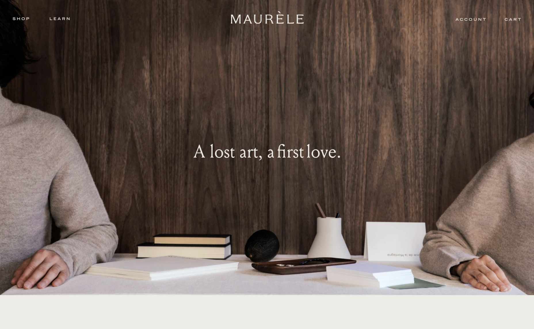
For instance, creating a page where your client can highlight the nature of the products that they sell is an excellent first start. Maurele has a beautifully designed “About” page to tell its customers everything they need to know about the business. 

At the same time, drawing attention to the footer where customers can check things like the terms and policies of the website or FAQs that answer their most common questions is another fantastic way to build transparency. 

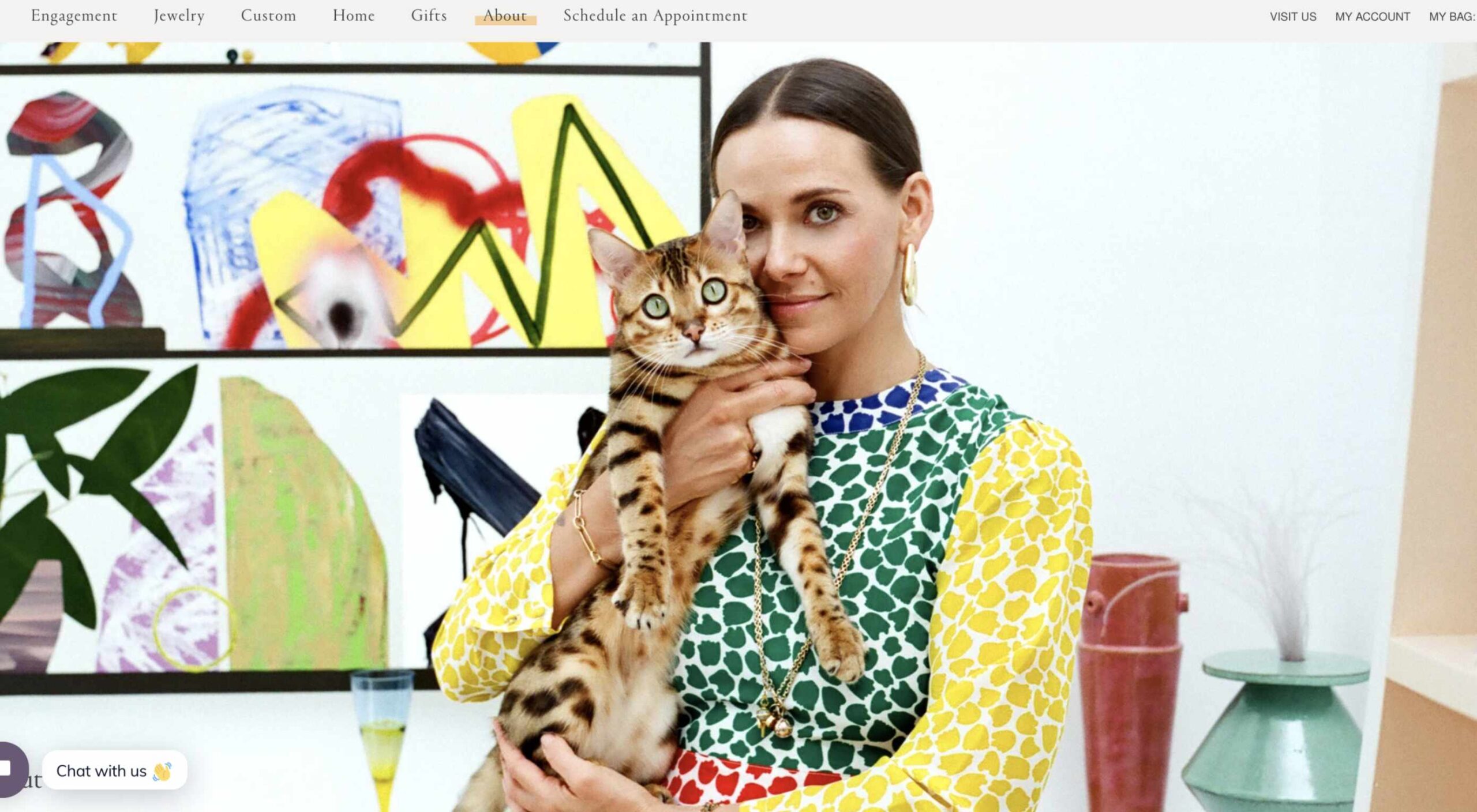
Giving a brand a human face makes it easier for that company to establish lasting connections. That’s why designers should always prioritize using real, authentic images over stock photos where possible. For example, a large feature image on an “About” page that addresses the company’s unique nature makes it easier to connect with a target audience. 

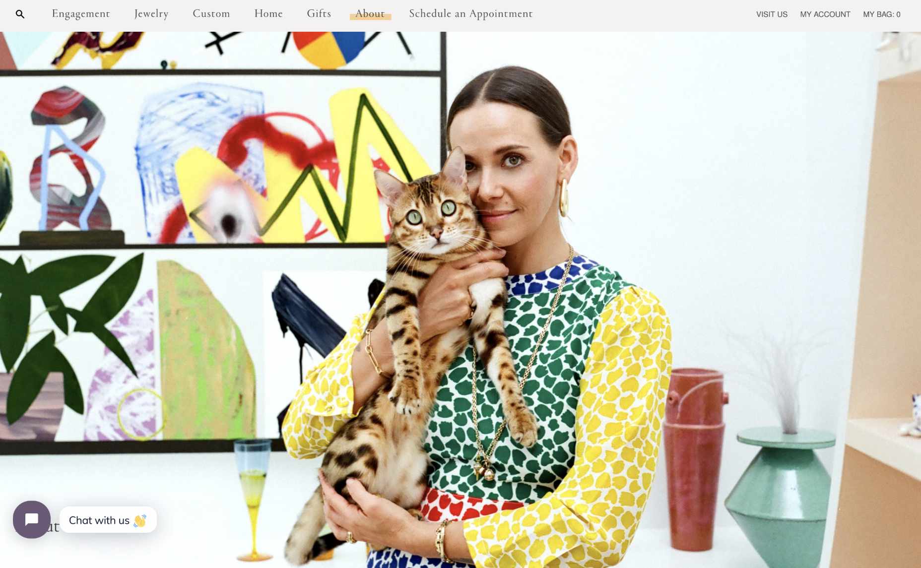
Make sure that there’s plenty of space on the “About” page to introduce significant members of staff that can give a face and personality to both the website and the brand. For instance, Mociun.com uses a fantastic hero image of a person with her cat.

Add Space for Testimonials and Customers

While you don’t need to post a customer’s entire consumer list online to prove that they’re a reputable company, it is worth highlighting some of their clients. No one wants to be the first person online to trust a new website. Testimonials and reviews from other people are how you add instant confidence to any experience. 

For designers, social proof can come in a lot of different formats. For instance, if you’re building a website for a company that sells directly to other businesses, you could add pictures of the logos of the brands that the company has worked with. Alternatively, for a B2C brand, basic reviews and quotes will often work wonders. For instance, there’s a list of great reviews included on the product pages of the PlaySuperlative.com website.

Unless customers leave comments directly on the web page themselves, remind your customer that they need to get permission from the client to use their quotes on any web page. 

Additionally, remember that adding pictures and names to testimonials where possible can sometimes make them more believable. 

Tell Your Client’s Story

When building a website for a client, there are many different things that you’ll need to think about. For instance, you need to focus on the company’s USP or whatever makes them unique. You’ll also need to ensure that clients have all the information they need to make purchases easily. 

At the same time, it’s important not to go over the top with too many features. Simplicity is often the key to good UX. 

Where possible, however, if you want to boost confidence for your client, it’s a good idea to highlight their unique motives and vision as a business. Ask the company that you’re designing for what their mission is. Do they want to transform the way people communicate and collaborate like Trello? Do they want to fill the world with information, like Google?

Focusing on the unique ambitions of the business, beyond the desire to make money, makes them seem more three-dimensional and real. 

Highlight Security

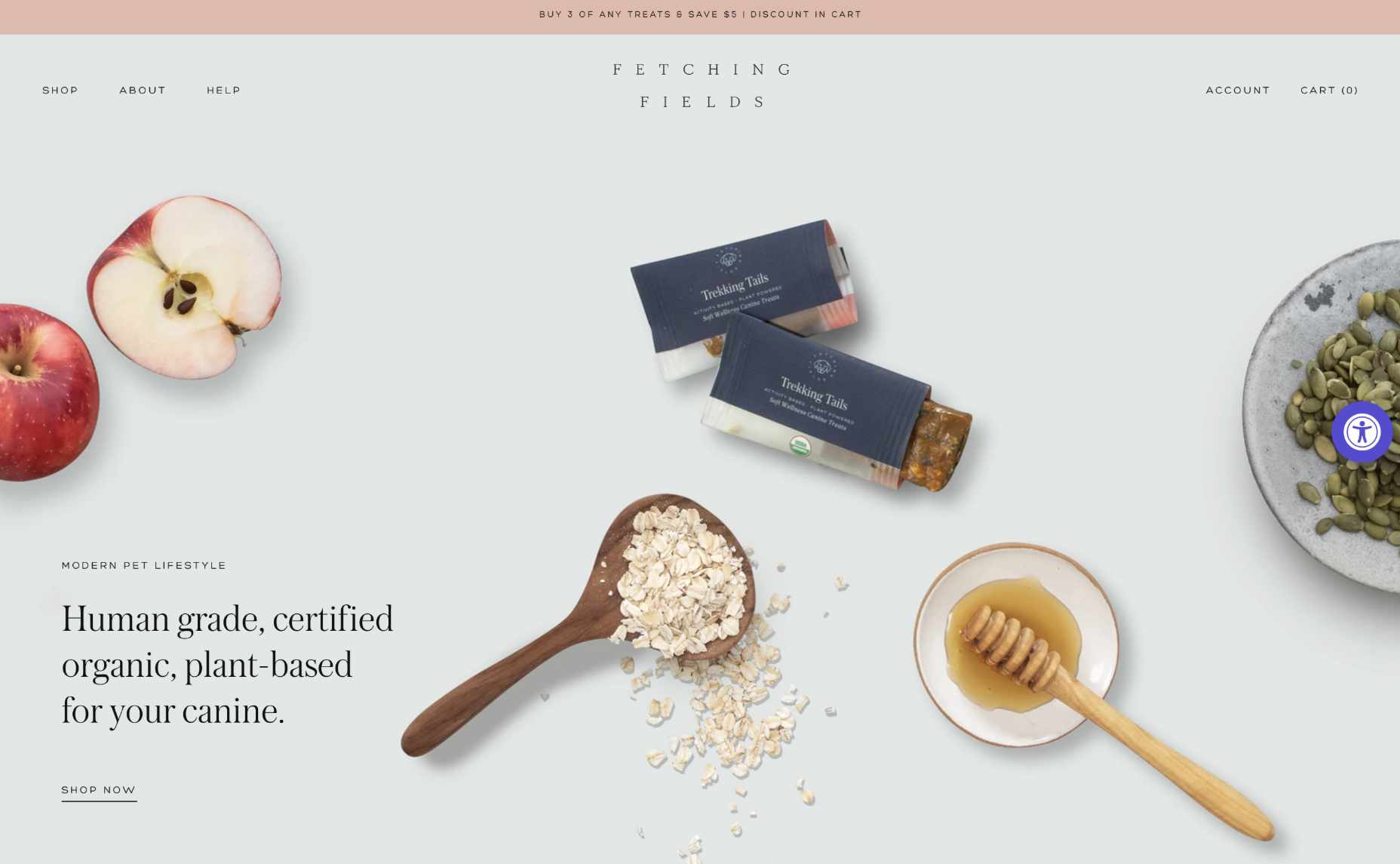
Use your skills to ensure that certain aspects of safety and security stand out for your client. For instance, notice how Fetching Fields instantly pulls attention to the fact that they’re using certified and organic, human-grade wellness solutions.

Other steps you can take include making sure there’s an SSL certificate installed to cement the website’s safety. Additionally, if your customer has any badges or certifications that can highlight their security strategies, it may be a good idea to include those too.

If your customer takes payments online, you can use several secure website seals to boost confidence. For instance, showing that you’re “Verified by Visa” or using Mastercard Secure Code is a wonderful choice. 

Make Sure Visitors Can Find Contact Information

As a website designer, one of the best things you can do for your customer is making sure that they have excellent navigation, complete with easy-to-find information. 

On any website, innovative navigation ensures that an audience can find the pages they need to make sure that they feel as comfortable as possible, making their purchases. 

Make it easy for visitors on a website to track down useful insights about the products they want to buy or the kind of services available from the company in question. Additionally, if your client has any FAQ pages or additional resources, make sure that customers will have no trouble tracking those down. 

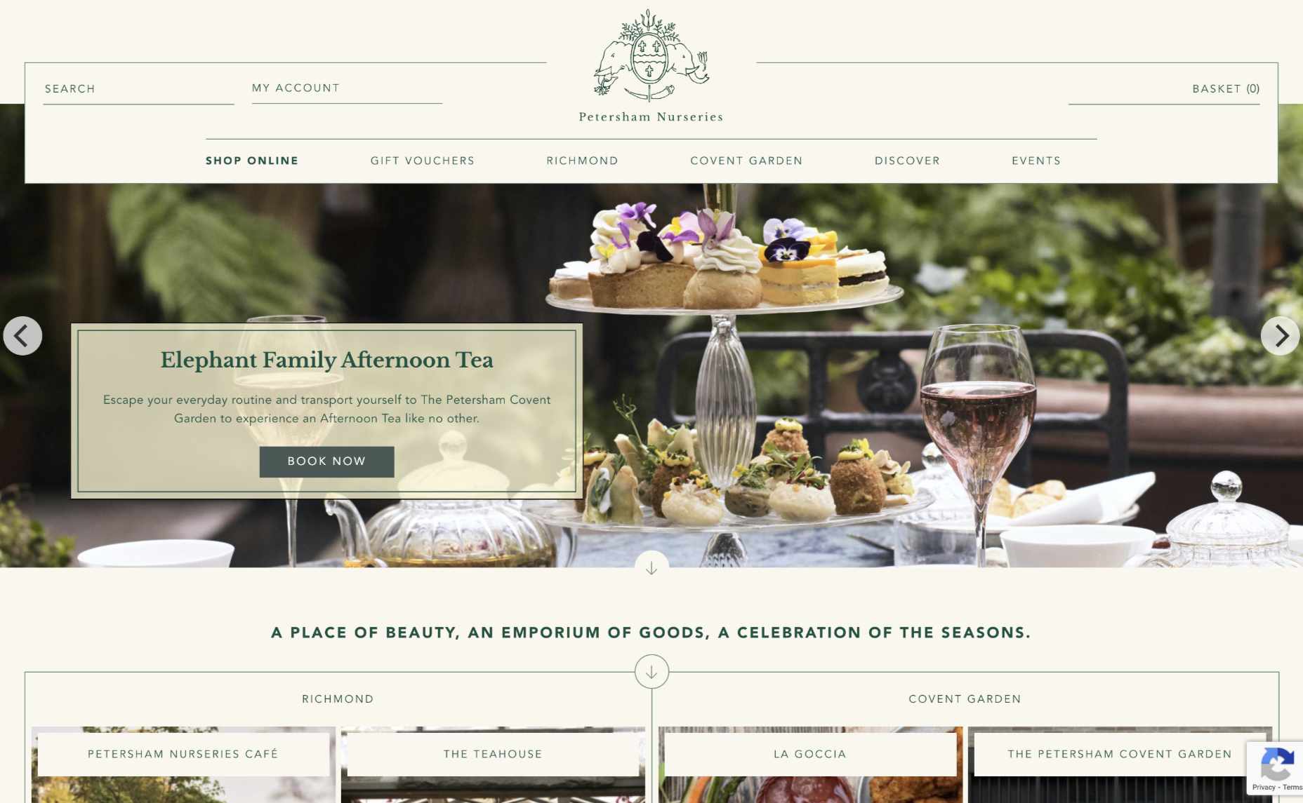
The example above from Petersham Nurseries makes it easy for clients to find everything they need on the website, thanks to a convenient vertical navigation bar. 

Remember, one piece of information that should always be as easy as possible to find for your customers should be the contact page. A contact page shows that the business is willing to answer any questions a client might have via many channels. 

List a physical street address and phone number for the website where possible, or at the very least include an email address where people can get in touch. 

Make Sure Pricing is Clear

Finally, if you want to ensure that visitors can trust your client’s website, you need to avoid hiding any critical information with fine print or content hidden in the website’s footer. When designing product pages or service information, make sure that you’re as transparent as possible about the company’s pricing. 

You don’t want a customer to wait until they click through into the checkout page to discover that they have to spend a fortune on postage and packaging. And, no one purchasing a service wants to wait until they’ve got their credit card out to discover that they’re going to be paying extra for things like set-up fees. 

According to Jakob Nielsen, one of the top mistakes anyone can make on a website is not listing their pricing as clearly as possible. 

As tempting as it may be to hide certain expenses and send customers through to the checkout page faster, avoid any opportunity to hide information about costs. 

Designing for Confidence

Ultimately, many different things can make a website stand out today. 

Designers can experiment with unique strategies like dynamic loading and video-based backgrounds. You might even decide to explore new styles with the right company or adapt certain pages to take advantage of things like 5G and new connectivity options. 

However, before you can begin exploring new opportunities on any website, one of the most important things you can do is ensure that you get the foundations of the website’s credibility right. Take an approach to design that focuses on transparency and trust first, and the rest will naturally fall into place. 

In a world where consumers are less trusting of brands than ever before, people who design for transparency will be sure to stand out from the crowd. Don’t underestimate the power of embracing trust for your clients in 2020. 

Source

The post Cultivating Customer Confidence with UX first appeared on Webdesigner Depot.


Source de l’article sur Webdesignerdepot

Sometimes the designs that make the most impact do a lot of unexpected things and break some of the most tried and true rules of visual theory.

Sometimes these design elements work brilliantly, and other times they are fleeting or fall flat. This month all of the examples here seem to break some conventional design rules. Here’s what’s trending in design this month…

1. Alternative Homepage Image/Video Crops

This trend breaks some traditional standards and is pretty refreshing – alternative homepage crops for images and video.

The full screen or 16:9 aspect ratio is out the window with vertical and square options that prove you can do more with your photo collection.

What’s great about this trend is that it’s super attention-getting because of the interesting use of space and imagery. Almost any design without the full-width hero header will grab your attention because it is different. These examples prove that point, and each design does it differently.

Now here’s the challenge: You have to make sure that this style has a solid fallback for mobile so that the result is equally impressive.

Janmaat Fotografie does a great job accounting for interesting photo shapes and flips the script on mobile. (Rather than what you might expect with text then photos because of the desktop placement, the photo stack uses the same shape and layering and is above the text on mobile.) The result is phenomenal.

N3 uses a very vertical image in an almost split-screen style design. It’s a sharp contrast to many of the other split screens we are accustomed to with an equal divide. The distinct shape of the image is interesting and intriguing. It’s definitely not a shape we see in website design frequently.

Bounce uses a similar split-screen effect in the opposite manner as the example above, with the tall, vertical space as an “empty” area and the right side filled with a square video. The shapes help push and pull your eyes across the screen to look at all of the elements and take in the overall design. It’s one of those ideas that if you only talked about it, you might talk yourself out of it, but here, it’s pretty striking.


2. On-Screen “Stickers”

Stickers are a design trend that has made its way from social media to website design.

These website stickers break design rules because they cover content or seem to be put on the canvas haphazardly. And that’s why they are so attention-getting!

The benefit to these stickers is that they can highlight specific items or content or help focus a call to action.

Friesday uses stickers in conjunction with hover effects to keep users interacting with the design. Multiple stickers can even pop onto the screen in the same location. The animation is simple and fun and feels like a digital sticker book.

August Eighth uses a center sticker as a call to action. It’s a true focal point in the center of the screen with an almost three-dimensional effect that lifts it off the background video. It’s a borderline dark pattern since the only way to get the box off the screen is to click through to the shopping part of the website.

EasyGreen has a bright yellow sticker in the bottom corner that feels almost like the sticker on a piece of fruit. This style and placement work well for the content and product featured. It’s bringing the digital and real-world a little closer with this design element.


3. Breaking Design “Rules”

The third trend this month is kind of a catch-all for general rule-breaking. While the other trends show certain design elements that aren’t the norm, each of these examples really tosses everything you traditionally think about design out the window. (And that’s ok.)

The trick to a rule-breaking design is that it has to be focused and simple enough to keep users interested and provide intuitive elements that tell them how to interact with the design. It’s a delicate balance.

Here’s how these sites do just that.

Supercontinent has a lot going on. At least four typefaces on the screen at a time, movement (using different shapes and aspect ratios), overlapping elements, hidden navigation, and you may even find a few more broken rules if you look closely. And somehow, it still works.

What’s pulling this design together is a key unbroken rule – the chaos is rooted in a grid system that keeps it all somewhat organized. Plus, there’s plenty of white space to keep elements from feeling crowded and overwhelming.

Source of Plastic Waste combines elements in unexpected ways. There’s no real navigation; the site is just a continuous scroll. That’s a big website usability rule broken right out of the gate. There are other design elements as well, from the “header”/logo moving to the top right corner to the almost over-designed transparent box for text elements. There are a lot of scroll elements and actions happening and layers of text on text in some of the screens.

But here’s the thing about this design. As many rules as it breaks, the story is interesting enough to keep you scrolling. The question is, how long and how far do you go without getting lost or confused.

The Debris of Attention is designed to show “bad design” with elements that are frustrating and annoying on websites. The gamified design allows you to hover on each element to remove it and clean up the design.

While this site breaks the rules on purpose, it is still an experiment in how long a user will hang on with so many visual effects happening at once.


Conclusion

While most of the time, people think about “breaking the rules” as a bad thing, that’s not always true in the design space. Sometimes breaking the rules can result in an unexpected delight.

The challenge is to make sure that when you break the rules, the design is still usable, functional, and understandable. If so, you’ve found a winning combination.

Source

The post 3 Essential Design Trends, August 2021 first appeared on Webdesigner Depot.


Source de l’article sur Webdesignerdepot

Looking to give your homepage a well-needed design update in late 2021 or 2022? Not a bad idea; first impressions are crucial when it comes to business websites. But, fixing your homepage and website design is no easy feat.

Web design trends are evolving faster. Blame the ever-decreasing user’s attention span. The average visitor now spends just 0.5 seconds scanning your homepage to form an opinion about your brand and decide whether to click through or bounce.

Increased user expectations and uncertainty in the user’s response, which is highly impacted by the site’s first impression, are other reasons to consider. This is why the designs which were trending in 2019 are no longer viable in 2021 or 2022.

We have curated the ten best examples of homepage designs to inspire your business in 2022, including a rundown of the best strategies and tips.

Let’s start by highlighting why homepage optimization is necessary for 2022:

Why Your Homepage Will Be So Important in 2022

Your website — especially your homepage — is your brand’s first chance to attract, build trust with, and connect with visitors.

According to recent statistics on why website design is important:

  1. 38% of visitors will stop interacting with a website if they think the layout isn’t visually appealing or intuitive. This creates a higher bounce rate and fewer conversions.
  2. 94% of a visitor’s first impression is based on website design (including colors, fonts, layout, navigation menus, etc.).
  3. 46% of people base a business’s credibility on the aesthetics of its website. Brands with less-than-stellar homepage designs are seen as less trustworthy than companies investing in the visitor experience.

Think of it the same way as walking into a brick-and-mortar store. Visitors are more enticed by a carefully curated ambiance of neatly stocked shelves and welcoming employees than a store that’s dark, messy, or seemingly unfriendly.

Using this logic, your homepage’s above-the-fold section is where you’ll greet visitors and reel them in for more.

10 Homepage Design Comparisons (2019 vs. 2021) To Inspire Your Business Website Design in 2022

Homepage design has come a long way since 2019. In this section, you will explore how.

These homepage designs crush it above the fold. Take just a few of these tips to heart, and your website will be poised to attract leads and conversions — no matter which industry you’re in.

1. Netflix – Crafting The Perfect Call To Action That Reduces Friction With An Additional FAQs Section

Most businesses make the mistake of adding a CTA button that first persuades the user to click on it and then asks for the visitor’s email address.

Netflix also did the same in its 2019 design.

However, Netflix combined both steps in its 2021 homepage design.

The new, improved 2021 homepage design asks for the user email address right up front along with the CTA button.

Here is a good comparison of both the designs:

2019 homepage design

vs.

2021 homepage design

Key Takeaways:

  • The design encourages visitors to enter their email address right when they land on the homepage. As a result, form submission is much easier when the user has started the process. Hence, Netflix makes it easier for visitors to move along their conversion funnel nicely by reducing the friction.
  • The 2021 design also has a nice FAQ section that provides quick information about the company’s services and improves the overall user experience.
  • FAQs also help increase the organic presence of the website in the search engines because Google presents snippets from the FAQ section in the form of an answer box in the search results.

2. Spotify – Revamped Color Combinations For Improved CTA Visibility And Using The ‘Rule of Three’ For Heading Text

The older 2019 Spotify homepage design used light pink and orange colors in its home page main area. The CTA color was green, but if you look closely, the CTA lacks visibility.

The new 2021 design uses blue and green colors with a much larger font size for the main heading. The colors are attractive, and the CTA is visible clearly.

Here is the comparison of the Spotify homepage 2019 design vs. 2020 design:

2019 homepage design

Vs.

2021 homepage design

Key Takeaways:

  • Blue is the most versatile color, and green is the perfect choice for the CTA button. Spotify used universally accepted color combinations to redesign its homepage and made the CTA more visible.
  • The main heading is also made larger than it was in the 2019 design, and it follows the rule of three in writing which is effective and satisfying. It uses just three words in the main heading to allow the human brain to process information as a pattern that is more memorable.

3. Hulu – Give Priority To Your Brand Name And Hide Pricing

If you compare the Hulu 2019 vs. 2021 Hulu homepage, the brand name has been prioritized and shown as the main heading.

Moreover, the older homepage had pricing information everywhere, which has been reduced intelligently in the new design.

2019 homepage design

vs.

2021 homepage design

Key Takeaways:

  • The brand name ‘Hulu’ is displayed as the main heading of the homepage, which helps to build audience trust.
  • The older design persuaded the users to pick a paid plan even though they had a free trial option—this discouraged users from trying their service. The new 2021 design encourages users to try the platform for free. In addition, the packages have prominent CTAs that mention “try for $0”. This design move improves conversions on the website.
  • The new design makes it easier for the visitors to select a viewing plan with easy comparison of the three available plans. The best part is, customers can start all the plans for $0. It’s a win-win situation for the users, and they can quickly pick a plan to start watching Hulu.

4. Nextiva – Reduce Visual Noise And Add Pictures In Menu To Improve UX

Nextiva realized the importance of reducing visual noise in its newly designed 2021 homepage. Visual noise happens when you use too many colors to attract user attention. Different colors compete with each other resulting in diluted customer observation.

In the old 2019 homepage, Nextiva used orange, blue, and green as the primary colors, while in the 2021 revamped design, they have used blue as the main color.

Here is a comparison of the two designs:

2019 homepage design

vs.

2021 homepage design

Moreover, the older homepage didn’t have an image in the product menu, but the new 2021 homepage improves the UX further.

Below is a comparison:

2019 homepage design

vs.

2021 homepage design

Key Takeaways:

  • Nextiva used blue as their base color for the homepage design and removed orange and green colors to reduce visual complexity. This is an excellent change to keep the user’s attention focused. Notice the green colored bar at the top of the homepage in the 2019 version now replaced with blue.
  • The 2021 design has a clean look compared to the 2019 design, which looks scattered with too many different elements, including CTAs that confuse the users.
  • The product menu does an excellent job of linking intelligently to service pages such as phone systems and video meetings. The image of a smiling lady attracts users to click on Nextiva’s products to learn more about them. Improving UX is an impressive way to reduce bounce rates and increase time on site.

5. GoToMeeting – Avoid Lengthy Sign Up Form, Educate Users About Your Products, and Add Images That Depict The Current Needs of The Audience

GoToMeeting does a great job educating the users about their product by adding more content on the homepage that comprehensively explains their product features.

Moreover, they have replaced the older hero image with a new picture that portrays the changing needs of their audiences. Nowadays, there is a rise in work from home culture due to Covid-19. Hence, the photo and the heading text clearly target the needs of their users.

Here is a comparison of the 2019 vs. 2020 homepage of GoToMeeting:

2019 homepage design

vs.

2021 homepage design

Key Takeaways:

  • The 2019 homepage design had a sign-up form on the homepage, which GoToMeeting removed in the 2021 design. People hate to fill in so much information right when they land on the home page. Hence, GoToMeeting did the right thing by removing the signup form from their homepage.
  • The hero image steals the show of the 2021 redesign because the picture of a working mom with her kid playing studying in front of her is a great way to portray the current needs of the society when over 60% of the employees are working from home. Audiences can quickly relate their working environment with the hero image leading to more sign-ups.
  • The older 2019 design was confusing, and it made little effort to help the users understand the different features of the product. The new 2021 homepage design has a product features section that explains the different features of the software. When users are educated about the product, they earn the confidence to try the product.

6. Zillow – Apply Hick’s Law To Allow Visitors To Take Faster Decisions

Zillow does an impressive job of applying Hick’s Law in allowing visitors to make faster decisions. Hick’s law states that the more options you present to the users, the faster they will decide. Therefore, it is a major factor in improving website usability.

The old 2019 homepage design of Zillow offered too many options to the users, like they want to buy, rent, or sell a property. The users first select either one of the three options and then enter the zip code to start their search.

The new 2021 homepage design changed that. Now, Zillow offers users a single option. They only need to enter the zip code to get started.

By reducing the number of actions that users need to take to just one, the homepage design eases the overall decision-making process of the site visitors.

2019 homepage design

vs.

2021 homepage design

Key Takeaways:

  • The new homepage design has a simple search bar that persuades visitors to take prompt action.
  • The Hero image is placed smartly behind the search bar to depict the needs of the users accurately.
  • The homepage does have three different panels for buying, renting, or selling a home when the users scroll below. The old design is missing that. The new design removed so many options above the fold and kept just a single option for the users to encourage more users to search properties on the site.

7. Plex – Placement of Prominent Calls-to-Action On Homepage

The CTA is a key element of every website. It helps the users decide on their next action and helps to convert the visitors into leads.

Plex lacked an optimized CTA placement in its 2019 home page design. Hence, the 2021 design received an uplift to better place the CTA for increased visitor engagement.

Take a look at the home page designs of Plex from two different years. If you compare the two home pages of 2019 vs. 2021, the primary difference that will grab your attention is the CTA.

2019 homepage design

vs.

2021 homepage design

Key Takeaways:

  • The call-to-action buttons are more prominent and have actionable texts.
  • The number of CTA buttons is increased to two to encourage users to take action.
  • The additional CTA button is wisely placed at the center to get immediate attention.
  • Note that the color choice for the button is also bright and highly contrasts with the background yet matches the color theme.
  • The old heading text ‘Stream Smarter’ was confusing because it didn’t help the users understand what Plex does. Hence it is now revised to ‘Watch Free Movies and TV on Plex.’ The new text is easy to understand and has the word ‘Free’ to increase the number of visitors clicking on the CTA.

8. Dropbox – More Above The Fold Content And Change of Fonts

Dropbox has significantly worked on its main content, which is clearly visible in the comparison homepage design images of 2019 vs. 2021.

The 2021 homepage is seen fixing faded, minimalistic, and less engaging content in the older homepage.

2019 homepage design

vs.

2021 homepage design

Key Takeaways:

  • Sans serifs, with their clean readability, are included for longer bouts of the homepage.
  • Bold sans text is doing the job of drawing user attention effortlessly.
  • The color contrast of the text with the background is increased, which improves the visibility.
  • The right side image of a laptop is replaced with a screenshot of the software, which intrigues users to know more.

9. Cisco – Moving Blocks To Outsmart Competitor Websites

The homepage design of American technology company Cisco has seen a drastic change in 2021; it deserves to appear on this list. The company website smartly represents an appeal for future development through its killer homepage design.

Here is a comparison of the old 2019 homepage design vs. the new moving block design of 2021:

2019 homepage design

vs.

2021 homepage design

Key Takeaways

  • The home page contains moving blocks with news from the blog. As you hover over the image, it widens up, and a CTA button appears. The blocks represent a design of the future which the competitors might find hard to replicate.
  • Every block has a CTA, which was missing in the 2019 design. Each block represents a specific Cisco service and caters to the different needs of the visitors.
  • The new design is elegant and cleaner with lots of information.

10. Slack – Product Video On Home Page For More Conversions

Slack has made it easier for the users to understand the product well by using a video on the homepage.

The 2019 design has an image, while the 2021 design has a video that helps the visitors understand how the product works.

Here is a comparison of the 2019 design vs. 2021 design:

2019 homepage design

vs.

2021 homepage design

Key Takeaways

  • The inclusion of a product video leaves a great impression in the minds of the visitors and shows them what your product does.
  • Video helps Slack to make its value proposition clear and super fast.
  • Video has a strong correlation to conversions, and they work well as compared to hero images. Slack used a hero image on the homepage in 2019, but they replaced it with a video in 2021.

Final Thoughts on Using These Homepage Designs for Inspiration in 2021

By making it to this point in our guide, you now have plenty of inspiration to run with when upgrading your homepage. You should also have a better understanding of how powerful this tool may become for your brand.

So now it’s time to brainstorm how to use these ideas for your own 2021 homepage design. First, jot down the key points from this guide and honestly assess how your website currently compares.

Accomplish this task, and your brand might see an uptick in website traffic and conversions. It may even earn a spot in a roundup of killer website designs just like this one.

Source

The post 10 Homepage Design Comparisons to Inspire Your Business in 2022 first appeared on Webdesigner Depot.


Source de l’article sur Webdesignerdepot

If you have a WordPress website, you’re obviously aware of the benefits this premier open-source website-building platform brings to the table.

But are you aware of the legion of website and business enhancement tools lying in wait among the thousands of cool WordPress plugins currently on the market; one or more of which could easily take your site or business to the next level?

What’s out there? Quite a bit, obviously. 

Which useful WordPress plugins are “must-haves” for me? It could take you a ton of time to find the answer to that one. 

That’s what we’re here for.

10 essential WordPress plugins are admittedly a small sample size. But these are 10 of the very best, and we’re guessing that one or more of them could be just what you’ve been looking for.

1. Amelia WordPress Booking Plugin

This game-changing booking plugin fully automates your business’s interaction with existing and potential clients and allows you to focus on key business operations instead of having to constantly interrupt your workflow to manage appointments.

  • Installing and configuring Amelia can be done with just a few clicks. You don’t have to know anything about coding.
  • Amelia can manage an unlimited number of appointments for an unlimited number of clients, an unlimited number of employees, and at multiple locations.
  • Clients can book appointments 24/7 and manage their own appointments as well as their profiles from the front end.
  • Amelia accepts deposit payments, sends out appointment reminders, and can charge different rates for different appointments.
  • If you have a global clientele, Amelia takes into account customer time zones as well as manages translated notifications if you have a multilingual site.
  • Amelia also manages event bookings, whether they are recurring or one-time.

In the unlikely event you encounter a problem with Amelia, the customer support team stands ready to help.

2. wpDataTables

The wpDataTables WordPress plugin allows users to quickly and easily create responsive, interactive, and highly customizable tables and charts from large amounts of data.

Key features include:

  • The ability to create tables that allow front-end editing, whether they are created manually or are MySQL-based
  • Advanced filtering capabilities that enable front-end users to filter table data by single or multiple column values
  • Automatic syncing of created and published Google Sheets
  • Simple wpDataTables wizards to access the HighCharts, Chart.js, and Google free charts libraries

wpDataTables’ many other features include:

  • Connection support to MySQL, MS SQL, and PostgreSQL databases
  • Responsive design from any data source
  • Creating tables from CSV, JSON, MySQL, and Excel and Google spreadsheet data
  • Formidable Forms plugin support
  • Sorting by single or multiple columns
  • Data color-coding using conditional formatting

More than 50,000 companies and individuals have placed their trust in wpDataTables.

3. Visual Composer Website Builder

Visual Composer is a new, ReactJS-based intuitive drag and drop website builder that enables you to create a website quickly, easily, and hassle-free.

This website-building popular plugin:

  • Enables business owners to showcase their brand online with its drag and drop editor and professional templates.
  • Its feature-rich design controls enable designers to achieve pixel-perfect perfection as they bring their projects to life.
  • Its top-of-the-line marketing content elements give its users the ability to create high-conversion landing pages, integrate with social platforms, and more.
  • Makes building a beautiful WooCommerce-based online store a piece of cake.
  • Features a library of 500+ content elements and templates that is downloadable from the cloud
  • Offers free and premium versions for business owners to start easily and scale their online presence

Your site will be SEO-friendly, fast, and responsive, and the support is terrific. Free and Premium versions (Starting at $49) are available.

4. Slider Revolution

Slider Revolution can do more than create sliders. A lot more.

  • It can add impressive (read that WOW) effects to an already notable website design.
  • It can give you new and unusual visual editing capabilities without requiring any coding on your part.
  • With its collection of hero blocks, sliders, WooCommerce carousels, and more, it brings beauty to any WordPress website.

5. Logic Hop

Logic Hop lets you customize your site’s content for individual customers or customer types.

  • Logic Hop supports personalizing your site in response to dozens of criteria so you can tailor your content to address a unique audience.
  • Logic Hop works with Gutenberg, Divi, Elementor, Beaver Builder, and every other page builder.

Any design or content element you can customize in WordPress can be customized in Logic Hop in minutes.

6. Stacks

The Stacks drag and drop native mobile app builder offers a full package of features to help you design your website or mobile app without coding.

  • Stacks works perfectly with WooCommerce and WordPress
  • Certificates required for Google Play Store or Apple Appstore are automatically generated
  • It takes but a single click to generate and upload the Android & iOS Application Package (APK & IPA)
  • Notifications to customers are easy to generate and send, and Stacks utilizes WooCommerce payment gateways.

7. Heroic Inbox

The Heroic Inbox plugin enables a business to manage all of its emails in shared inboxes right inside WordPress.

  • Customer data is presented on the sidebar next to your ongoing chat or message.
  • Key performance metrics are tracked so the team and overall company performance can be assessed.
  • Zero Inbox status can be quickly achieved and maintained.

8. Tablesome

This powerful WordPress table plugin allows you to quickly create a table and embed it in a post or page.

  • Tables can be imported from CSV and XLSX files.
  • Types of tables that can be created include large data tables, product catalogs, comparison tables, sports statistics, and more.
  • A shortcode builder for table and table element customizing is included

Tablesome is performance-optimized and SEO friendly and works smoothly with any WordPress theme.

9. Ads Pro Plugin – Multi-Purpose WordPress Advertising Manager

Ads Pro is the best ad manager for WordPress you are likely to come across.

Ads Pro features:

  • An intuitive backend Admin Panel that allows you to manage an unlimited number of ad spaces
  • A frontend User’s Panel from which you can control access to manage ads
  • 25+ user-friendly and responsive Ad Templates in 8 categories
  • 20 ad display options
  • 3 Billing Models (CPC, CPM, CPD) and 4 Payment Methods (PayPal, Stripe, Bank Transfer, WooCommerce)

10. Static Pages

Static pages/sites do not require any web programming or database design.

  • The Static Pages plugin allows you to publish any static page on a WordPress website in a matter of seconds.
  • You can improve sales by adding a beautiful landing page to your existing shop or blog or add a page with a Mailchimp subscribe form.
  • Or use Static Pages as an easy way to test something quickly and easily.

Have you been searching for a top-of-the-line WordPress plugin that will help you take your business to the next level?

There are 58,000+ useful WordPress plugins for you to choose from. That would be good news, except you could easily be overwhelmed trying to find just the right plugin for your website.

This post features a collection of top plugins for WordPress websites. Chances are good, you’ll find something here that will make your day.


[– This is a sponsored post on behalf of BAW media –]

Source

The post 10 Cool WordPress Plugins You Should Check Out first appeared on Webdesigner Depot.


Source de l’article sur Webdesignerdepot