Articles

Smart design choices can help reduce the fatigue and frustration people would otherwise feel when using the web.

There are a lot of ways web designers can minimize distractions, information overload, and analysis paralysis. For instance, designing with abundant white space, shorter snippets of text, and calming color palettes all work.

One-page websites might be another design choice worth exploring.

When done right, a single-page website could be very useful in creating a simpler and more welcoming environment for today’s overwhelmed consumers.

With its diminutive structure, it would leave a unique and memorable impression on visitors. What’s more, a well-crafted one-page website would provide visitors with a clean, narrow, and logical pathway to conversion.

For those of you who use BeTheme’s pre-built sites (or are thinking about adopting them for your next site), there’s good news. In addition to the great selection of traditionally structured sites available, Be also has single-page websites for you to work with.

So, the technical aspects you’d need to master to get the one-page formula right are already taken care of.

Let’s have a look at some of the features that make single-page websites shine and how you can design them:

1. Give Visitors a Succinct Journey Through the Website and Brand’s Story

The typical business websites you design include pages like Home, About, and Contact, as well as pages that explain the company’s services or sell their products. Unless you’re building really long sales landing pages, there’s usually about 400 to 600 words on each page.

That’s still a lot of content for your visitors to get through and it can make perusing a single website an overwhelming experience. Imagine how they feel about reading through all that content when they have to do it multiple times when comparing other websites and options.

In some cases, this multi-page website structure is overkill. The information you’d otherwise fill a full page with can easily be edited down to fit a single pane or block on a one-page website and still be as useful.

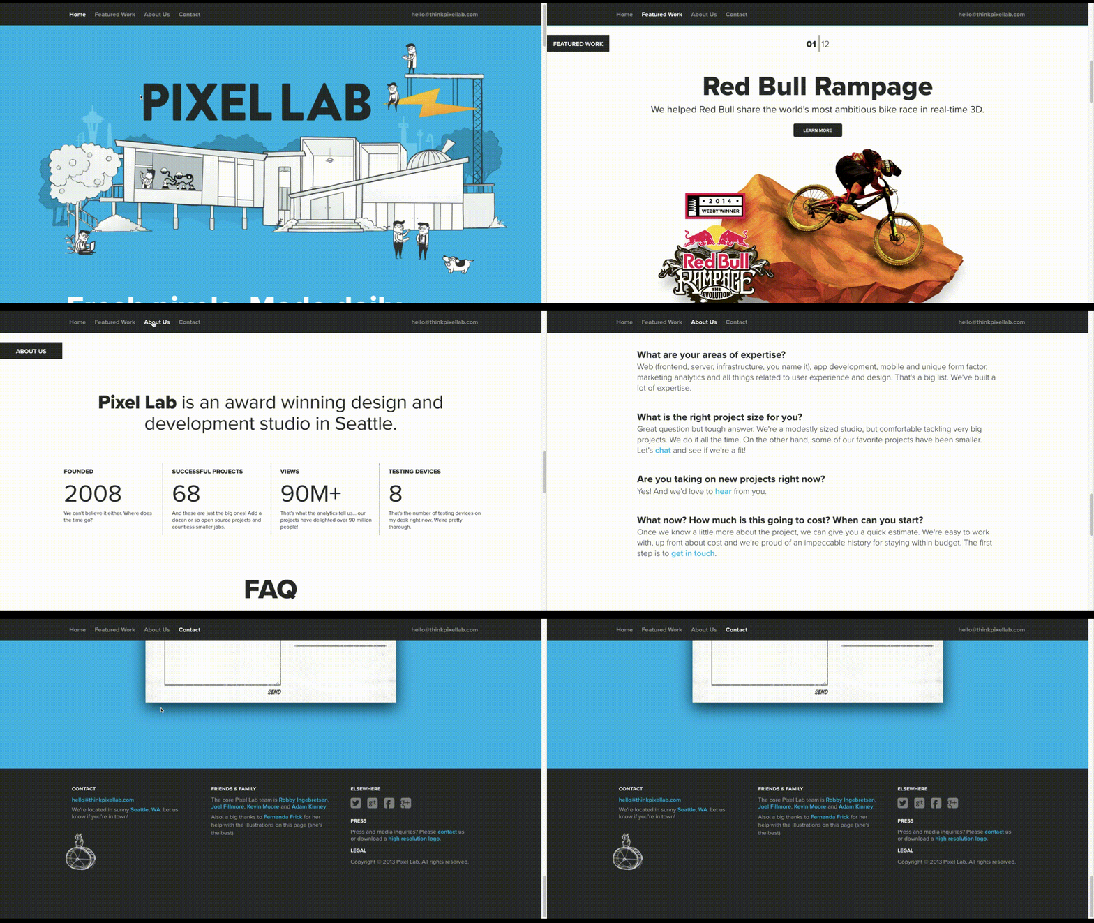
Like how design and development studio Pixel Lab does it:

Pixel Lab

Notice how all the key points are hit in a concise and visually attractive manner:

  • The Featured Work portfolio
  • The About Us introduction
  • The FAQs
  • The contact form

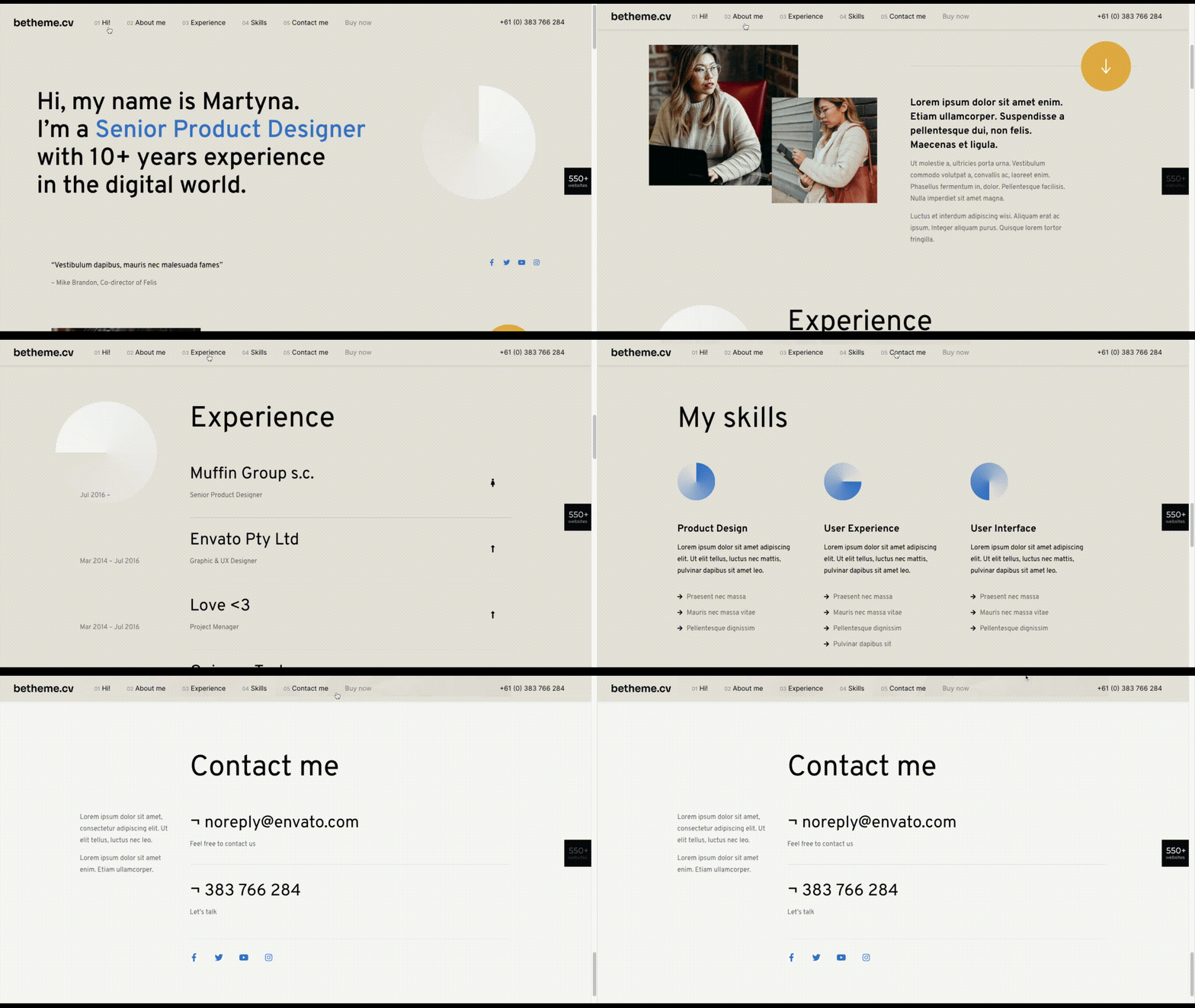
The BeCV pre-built site is built in a similar manner (and for a similar purpose, too):

BeCV

Just remember to keep a sticky navigation bar present at all times so visitors know exactly how much content there is on the page.

2. Opt For a Non-Traditional Navigation for a Uniquely Memorable Experience

Typically, the rule is that website navigation should follow one of two patterns:

  • Logo on the left, navigation links on the right.
  • Logo on the left, hamburger menu storing the navigation on the right (for mobile or desktop).

There are a number of reasons why this layout is beneficial. Ultimately, it comes down to the predictability and comfort of having a navigation be right where visitors expect it, no matter where they end up on your website.

However, with a single-page website, this is one of those rules you can bend, so long as you have a way to keep the navigation ever-present and easy to use.

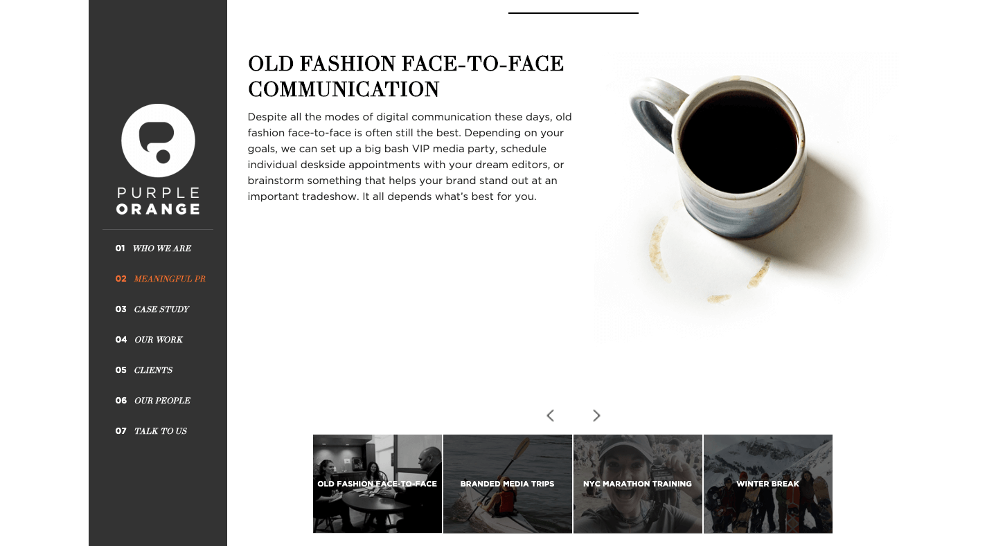
There are some great examples of one-page sites that have done this, usually opting for a stylized left-aligned sidebar that contains links to the various parts of the page. Purple Orange is just one of them:

Purple Orange

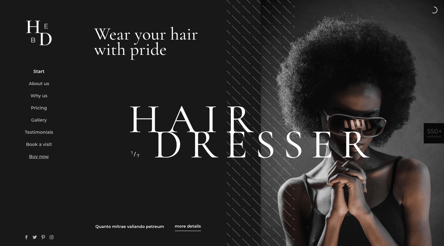
And you can use a Be pre-built site like BeHairdresser to create a similar navigation for your website:

BeHairdresser

If you’re trying to make a bold brand stand out, this is a neat layout option to experiment with.

3. Tell a More Visually Striking Story

One of the problems with building a website with WordPress is that you always have to worry about how your design decisions affect speed. Even once the code is optimized, images are usually the low-hanging fruit that have to be dealt with.

But when your website only contains one page, this means images aren’t as much of a problem (so long as you compress and resize them). It’s only when you continue to add pages, products, and galleries that you have to scale back your visual content.

So, if your brand has a strong visual identity and you want the website to show that off through images, a one-page website is a great place to do it.

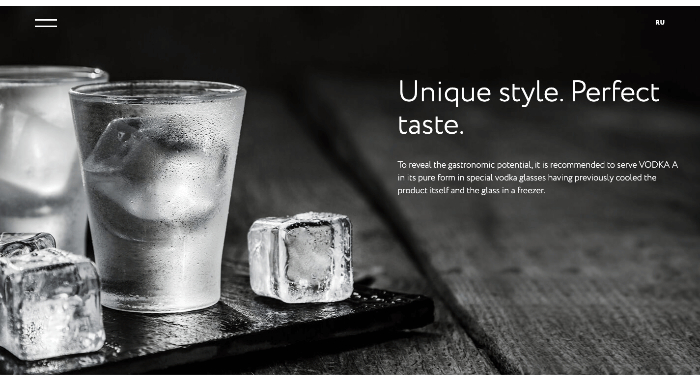
Just remember to keep a good balance between text and images as Vodka A does:

Vodka A

There’s no reason for a liquor distribution company to mince words when the elegant product photos effectively communicate to consumers what it’s all about.

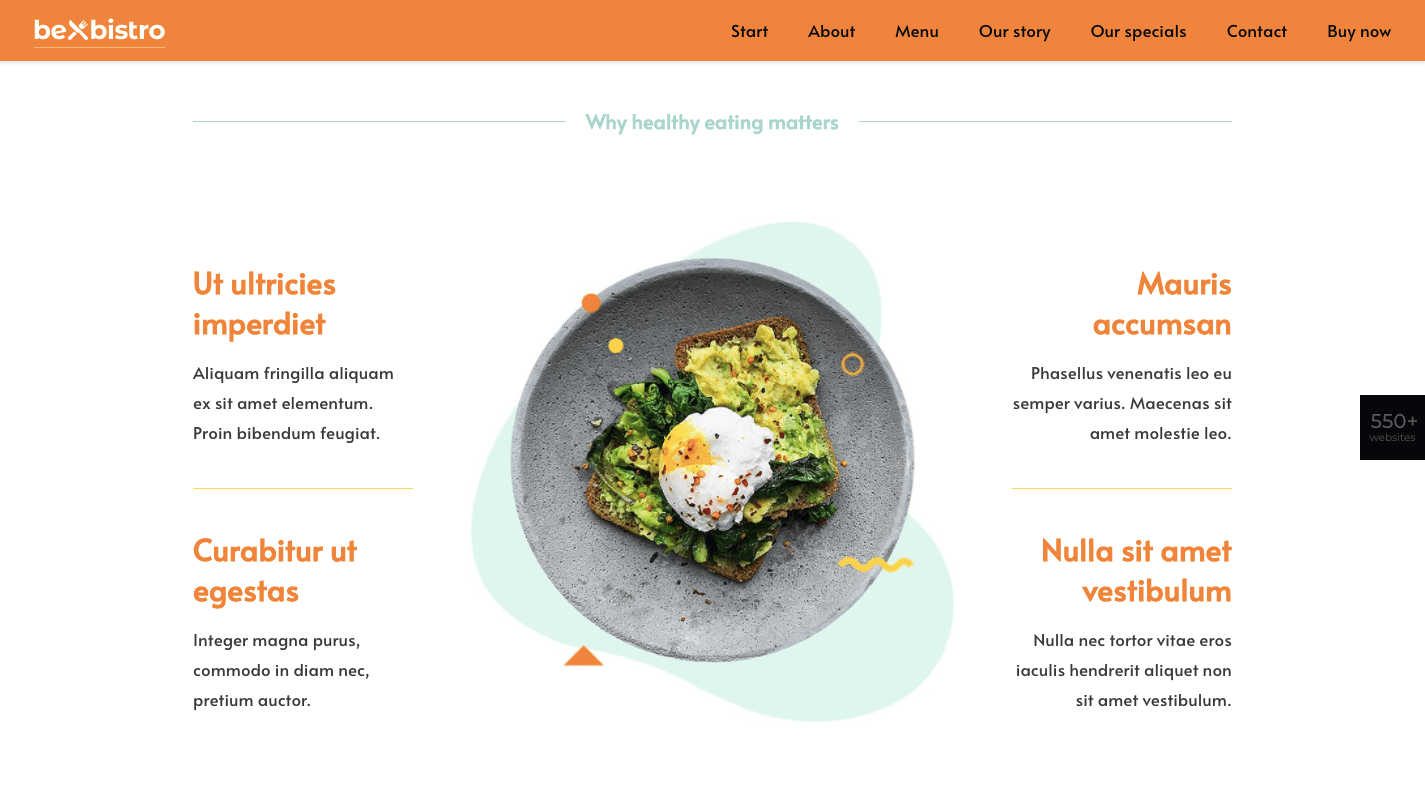
In fact, this image-heavy, single-page style would work well for any vendor selling a small inventory of products: food, beverages, subscription boxes, health and beauty products, etc. And you can use the pre-built BeBistro to carefully craft it:

BeBistro

4. Turn a Complex Business Idea or Offering into Something Simple to Understand

When a company sells a technical or complex solution to consumers, it can be a real struggle to explain what it does and why they should buy it.

But here’s the thing: Consumers don’t really care about all that technical stuff. Even if you were to explain how an app worked or how you use a software like Sketch or WordPress to design a website, their eyes would glaze over.

What matters most to them is that you have an effective and affordable solution that they can trust. So, why bog them down with page after page of technical specs and sales jargon?

A one-page website enables you to simplify even the most complex of solutions.

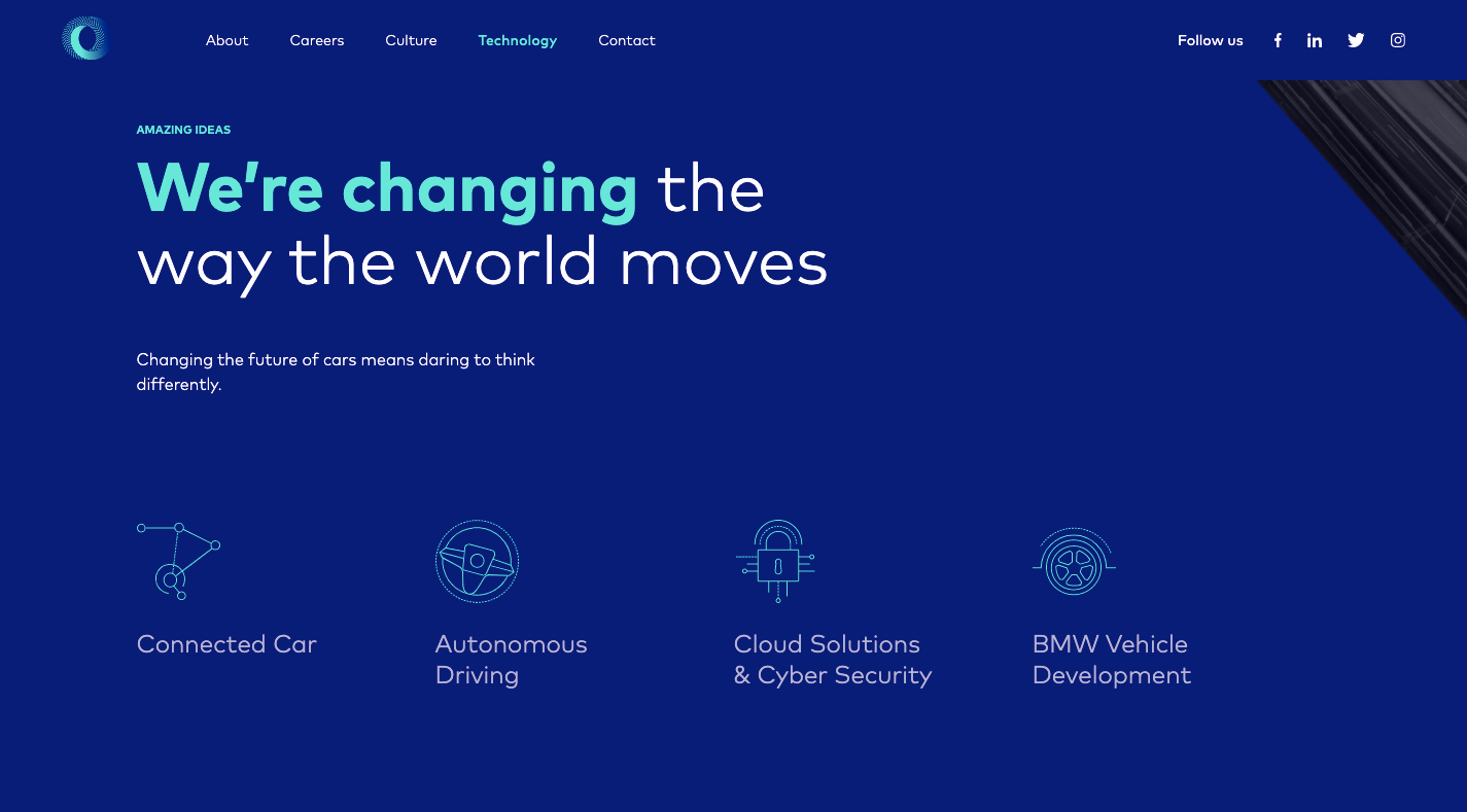
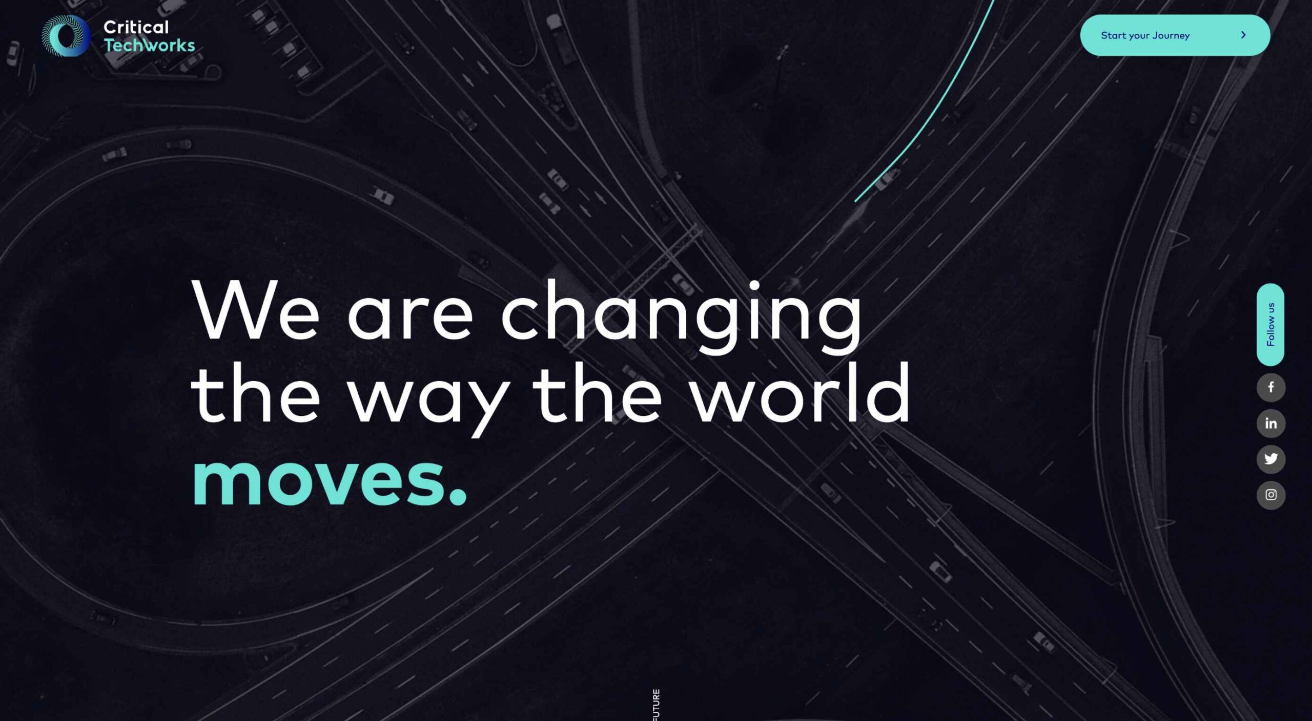
Take Critical TechWorks, for instance. It offers an advanced technological solution for the automobile industry…and, yet, this is all it needs to explain the technology at work:

Critical Techworks

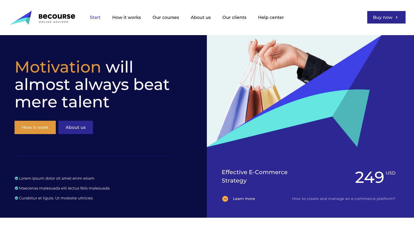
If your website’s visitors are more concerned with the outcomes rather than the “how”, you’d do well to make the website and content as easy to digest as possible. And you can use a pre-built site like BeCourse to do that:

BeCourse

Notice how both of these sites take visitors through a small handful of sections (pages) before delivering them to the main attraction: the contact or sign-up form.

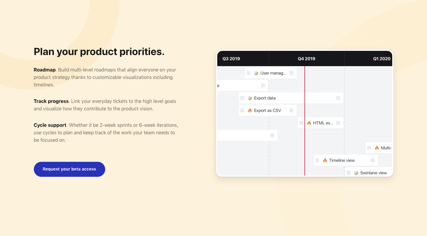
5. Capture Leads and Sales at Different Stages of the Sales Funnel

Some of your visitors will be brand new to the site and need more information before they pull the trigger. Others will already have a good idea of what they’re getting into and just need one small push to get them to take action.

With a single-page website, you can design each section to cater to the different kinds of leads and prospects that arrive there.

The top sections should be introductory in nature, providing new visitors with information they need to decide if this is an option worth pursuing. The sections further below should drill down into the remaining questions or concerns that interested prospects have.

Regardless of which section they’re looking at, your one-page site will have CTA buttons built in along the way that drive them to conversion the second they’re ready.

This will enable your site to always be prepared to convert leads, whether visitors read the first two sections or make their way through all of them until they reach the conversion point (e.g. a contact form, a checkout page, etc.).

You’ll find a nice example of this on the Cycle website, with CTAs strategically placed along the single-page’s design:

Cycle

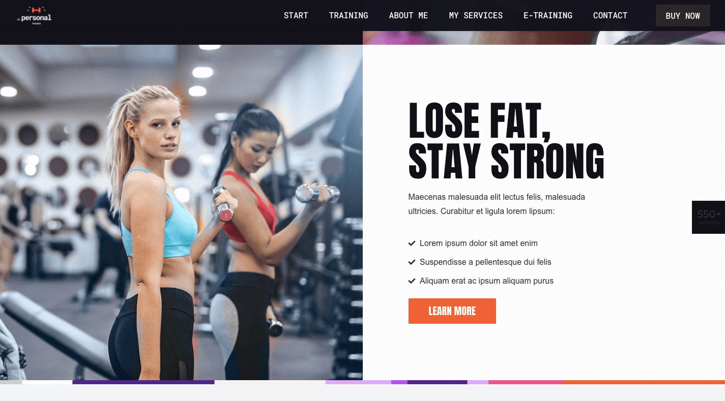
BePersonalTrainer is a good pre-built site option if you want to ensure that you include a CTA button at the perfect stopping points throughout your page:

BePersonalTrainer

You won’t find them at the bottom of every section, but that’s okay. You just need them whenever your visitors are seriously thinking about taking action.

What Should You Build: A Multi-Page or One-Page Website?

Although a single-page website won’t work for larger websites (especially in ecommerce), it could work well for business websites that are on the smaller side to begin with.

By centralizing all of that information into a single page, you’ll create a fresh experience that wows visitors with how succinct yet powerful both the message and offering are.

Just be careful. Many single-page websites are poorly done (which is probably why they fell out of fashion for a while).

Remember: This is not your chance to throw web design rules out the window. In fact, this will be an opportunity to clear out the fluff and the clutter that’s accumulated over the years and to return to a more scaled-back and classic approach to design.

And with the help of Be’s pre-built one-page websites, it won’t require much work on your part to make that happen.


[– This is a sponsored post on behalf of BeTheme –]
Source


Source de l’article sur Webdesignerdepot

Distributed SQL databases combine the resilience and scalability of a NoSQL database with the full functionality of a relational database. In this Refcard, we explore the essentials to building a distributed SQL architecture, including key concepts, techniques, and operational metrics.
Source de l’article sur DZONE

I often see freelancers on social media asking what the secret is to working fewer hours, making more money, and helping new clients to find them. While those things tend to happen the longer you’ve been freelancing, it doesn’t happen without some effort.
If you’re wondering how you can change things so that your business becomes more profitable and easier to manage, education is the key.

But it’s not just mastering new design techniques that will take you to the next level. It’s important to invest your time in a well-rounded education so that you can grow not just as a web designer, but also as a freelancer and business owner.

The good news is that you don’t have to spend a ton of cash on courses or resources. In the following round-up, I’m going to share some of the best free courses to help you level up.

5 Best Free Courses and Resources for Web Designers

Rather than sign up for Udemy, Skillshare and other premium course membership sites, I recommend taking a bootstrapping approach to self-education. I mean, the whole point in learning new skills and strengthening existing ones is so you can run a better business and make more money, right?

Once you have extra funds to throw at premium courses, definitely explore those options. For now, let’s focus on the free courses and resources that’ll help get you to that next level:

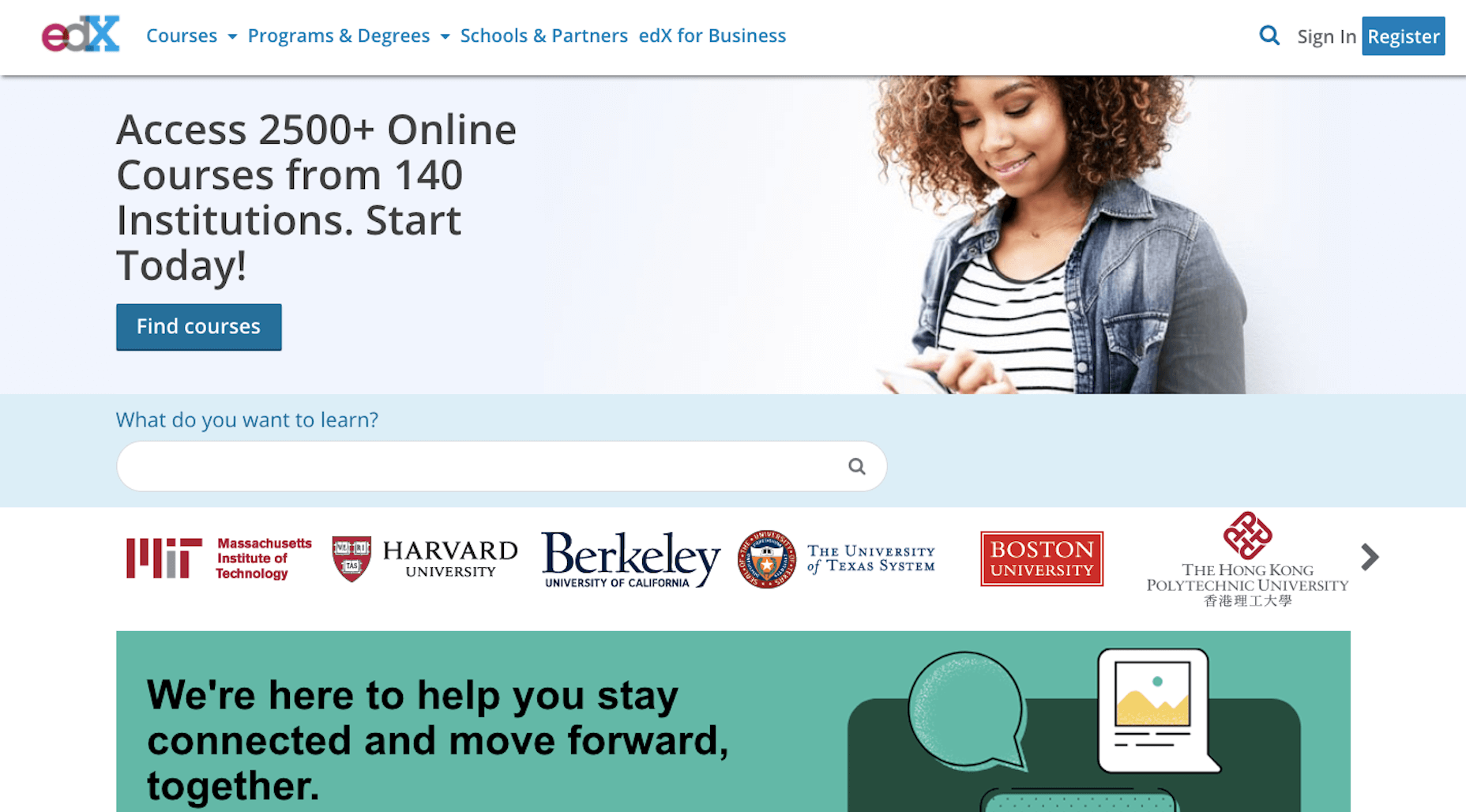
1. edX

edX was created by Harvard and MIT in order to provide university-level training and education to anyone, anywhere. While you can’t get certified without paying a few hundred dollars, you can go through entire courses for free.

Courses are offered over a wide range of categories. As a freelance web designer, you’d do well to focus on the following areas:

Design
Learn more than just how to design beautiful interfaces. Learn about the technical side of it, too — things like AI, IoT, and cybersecurity.

Computer Science
Learn web development and coding.

Business & Management
Learn essential business skills like:

  • Project management
  • Finance management
  • Leadership
  • Marketing and analysis

Communication
Learn things like branding, negotiation, reputation management, and critical thinking.

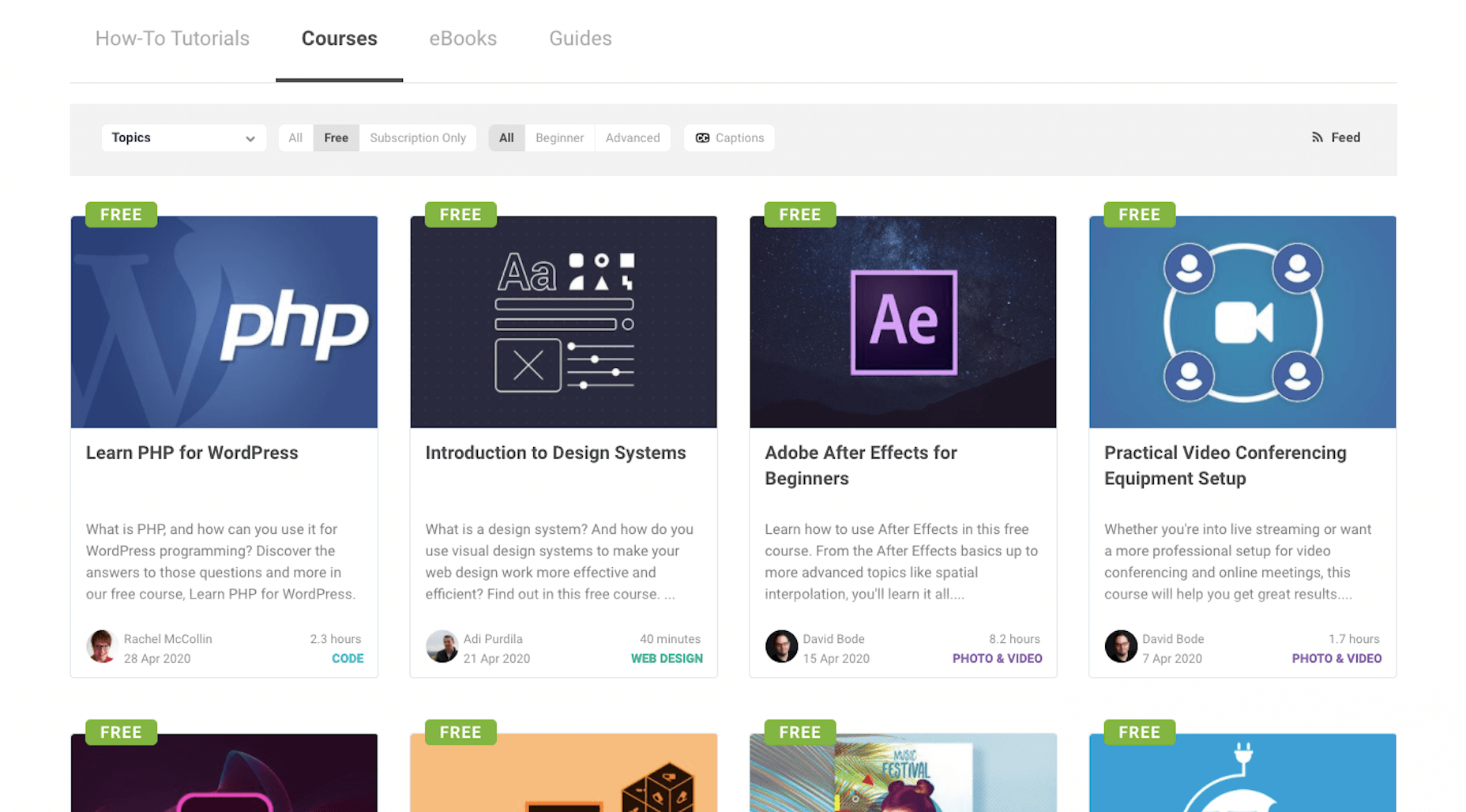
2. Envato Tuts+

Envato Tuts+ might be best known for its succinct step-by-step design and development tutorials. However, it has a new section of free video courses to take advantage of.

Although you won’t learn any soft skills here, this is a great resource if you want to master the tools of your trade.

Free courses give you a deeper look at tools like:

  • HTML, CSS, and JavaScript
  • Adobe’s suite of software
  • Sketch
  • WordPress
  • Video conferencing tools

3. YouTube

YouTube is more than just a place to watch entertaining videos. There are some amazing YouTube channels for web designers at all skill levels.

When choosing a design channel and course to follow, look for ones that are well organized. If they’re just posting videos at random without any rhyme or reason, it’ll be difficult to focus on and master one skill set before moving onto the next.

Here are the channels I recommend you follow:

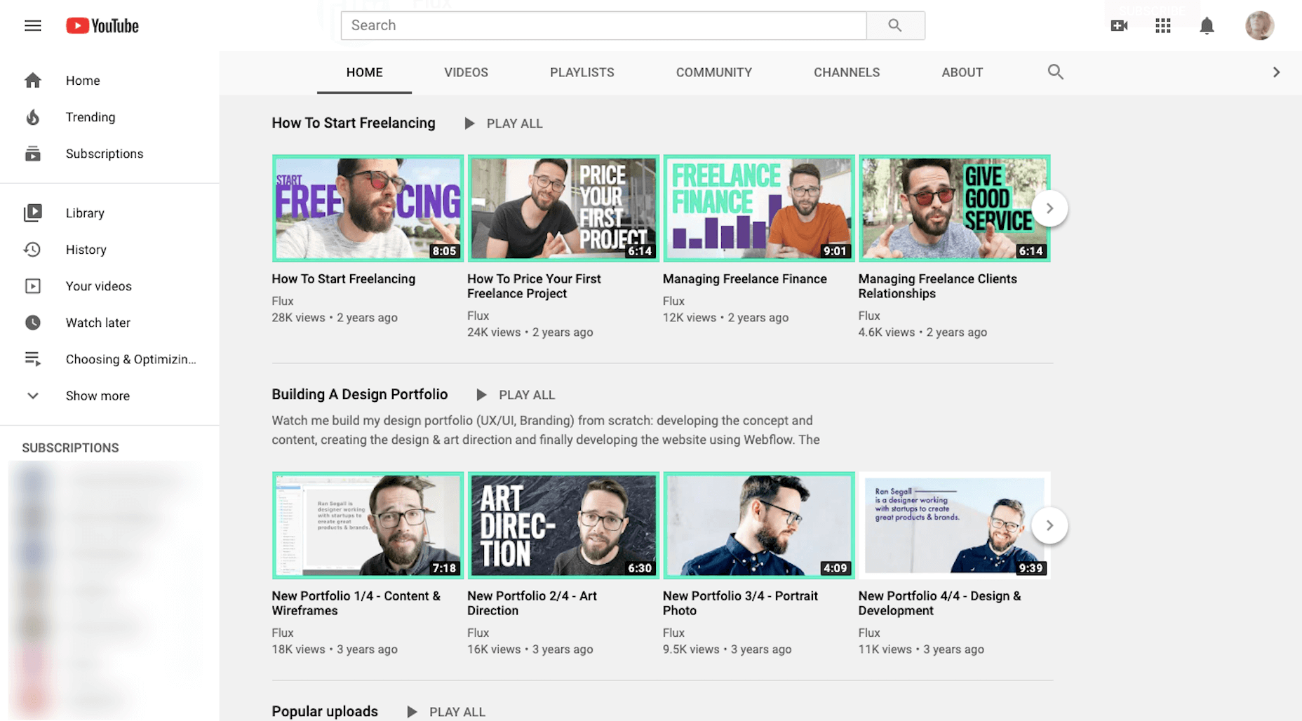
Flux

Learn skills related to:

  • Web design
  • Getting started as a freelancer
  • Strengthening your processes
  • Building your portfolio
  • Design theory and strategy

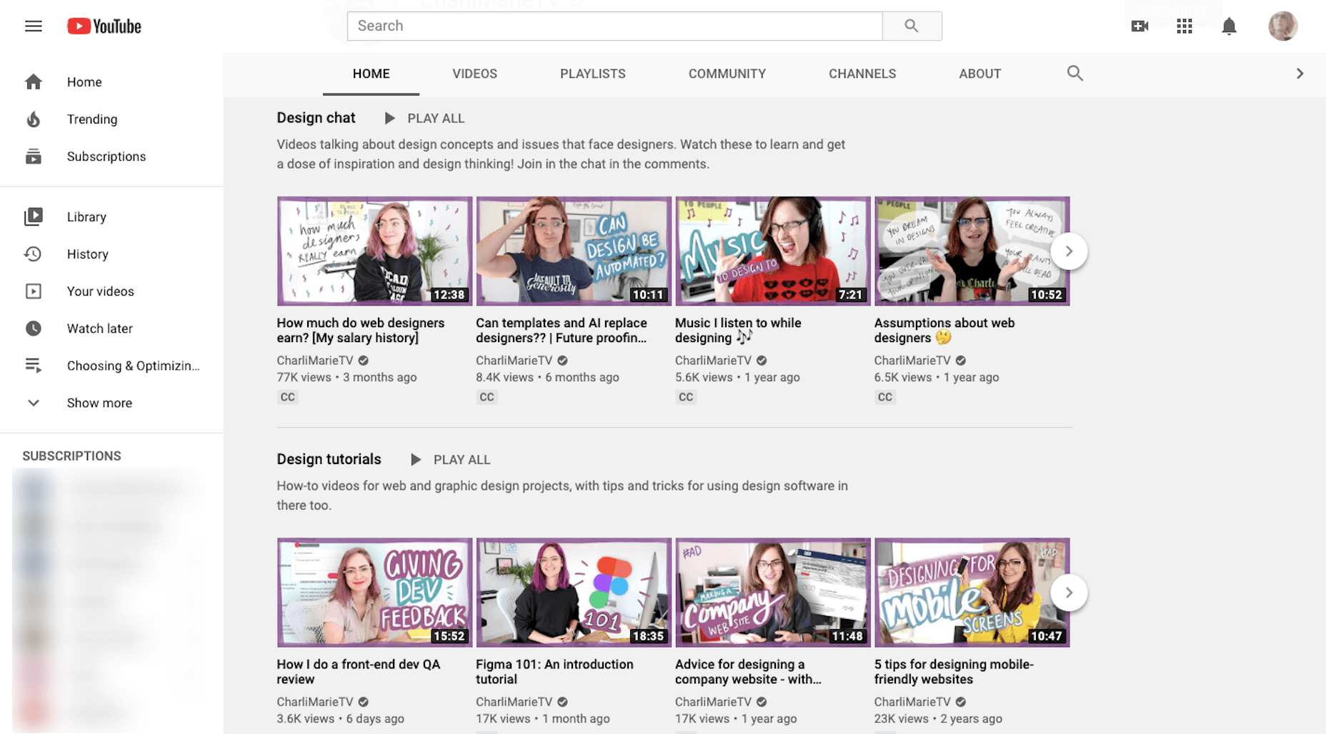
CharliMarieTV

Learn skills related to:

  • Web design
  • Building sites with Figma or Webflow
  • Career paths for designers
  • Productivity hacks

NNgroup

Learn skills related to UX:

  • Web design
  • User psychology
  • Usability testing
  • Design thinking
  • Research and data analysis
  • Journey mapping
  • Get access to UX Conference seminars, too

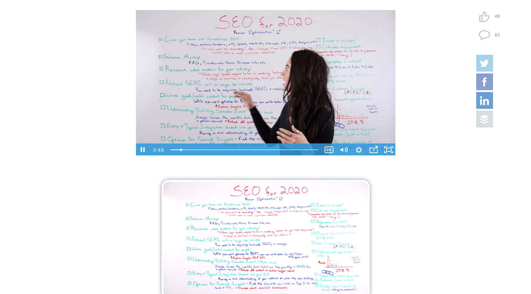
4. Moz Whiteboard Fridays

Even if you don’t offer SEO as a standalone service, it’s important for web designers to understand the role they play in SEO and to stay abreast of the latest and greatest strategies.

If you haven’t tuned in for one of Moz’s Whiteboard Fridays yet, I’d recommend you start now.

Some of the topics might not be relevant to you (like creating a content strategy). However, there are others you’ll get some great tips from, like the one above that talks about creating great visuals, preparing web pages with tags and schema markup, and optimizing for featured snippets.

5. Nir Eyal – Indistractible

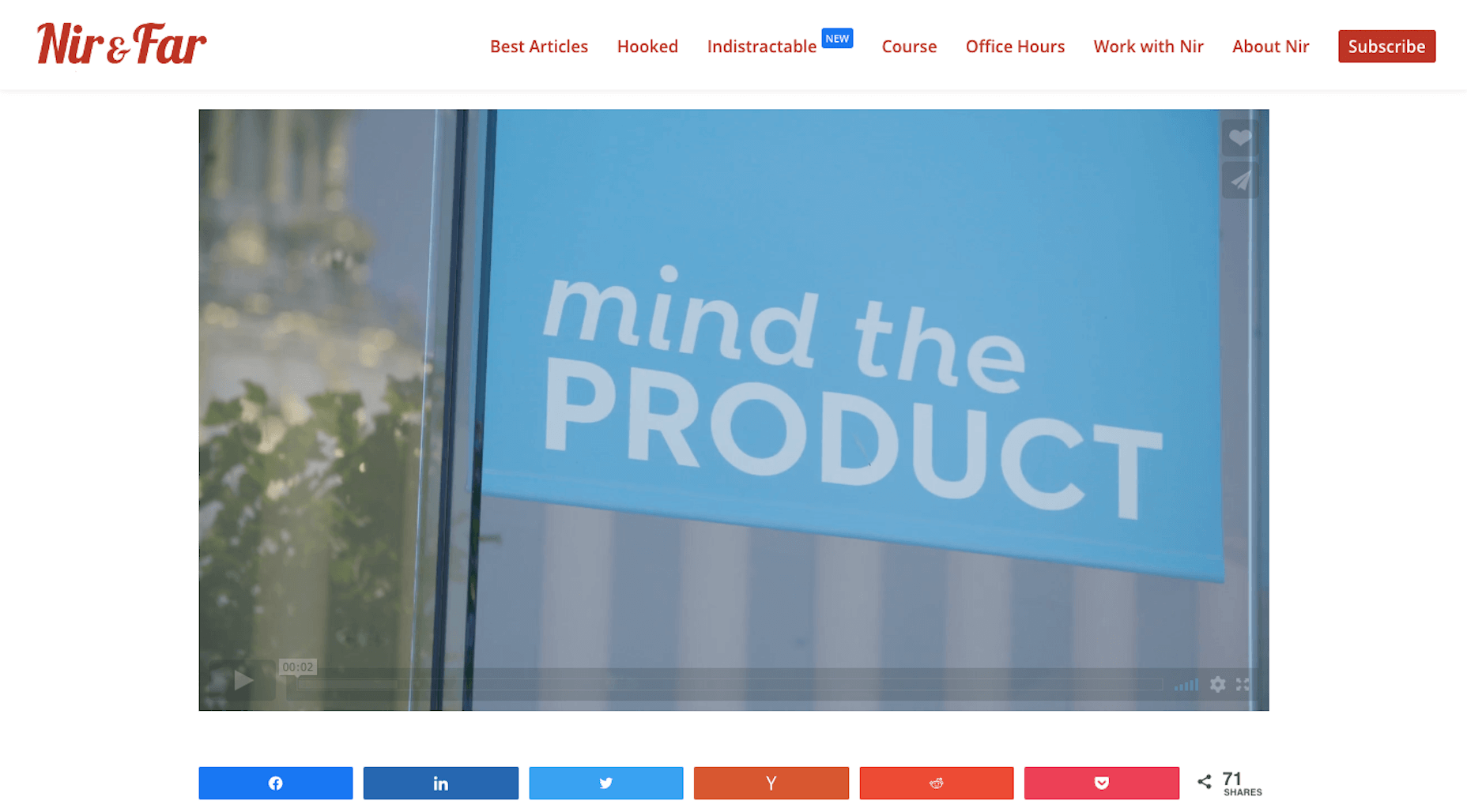
Nir Eyal has made a name for himself over the years as an author and presenter on the subject of human psychology and behavior. His first book (Hooked) examined consumer behavior and how to design around it. His second (Indistractible) turned the focus on us — the doers and creators who build experiences and products for consumers.

The first of his free resources to explore is this 30-minute presentation on why we’re so easily distracted and how to keep those distractions (and ourselves) from getting in the way.

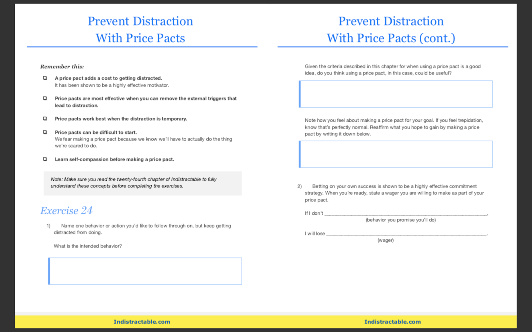
The second free resource to snag up is the 80-page workbook available on the homepage. Here’s a preview of what it looks like:

You’ll learn about common distractions, identify those that are specific to you, and then work through exercises to defeat them.

If this is something you’re struggling with, these resources will empower you to make a much-needed change.

BONUS: WebDesigner Depot

Although WebDesigner Depot doesn’t offer video courses, I consider each of the articles contained within this site to be mini-courses of their own. And you’ll learn everything you’ve ever wanted to know about becoming a web designer and growing your freelance business.


Featured image via Unsplash.

Source


Source de l’article sur Webdesignerdepot

In this time of global economic turmoil, it’s more important than it’s ever been that your financial decisions are based on accurate, up-to-date, market information.
In a world where stock price is a key confidence marker, the businesses that attract attention, secure investment, and grow, are the ones that can demonstrate their value in a wider market.

Up to now, displaying accurate market pricing has been prohibitively expensive, needing direct access to a huge dataset, and the code to mine it. So we’re delighted to introduce marketstack, a real-time market data API that’s reliable, simple to integrate with your site or app, is lightning fast, and includes a free-forever plan.

What is marketstack?

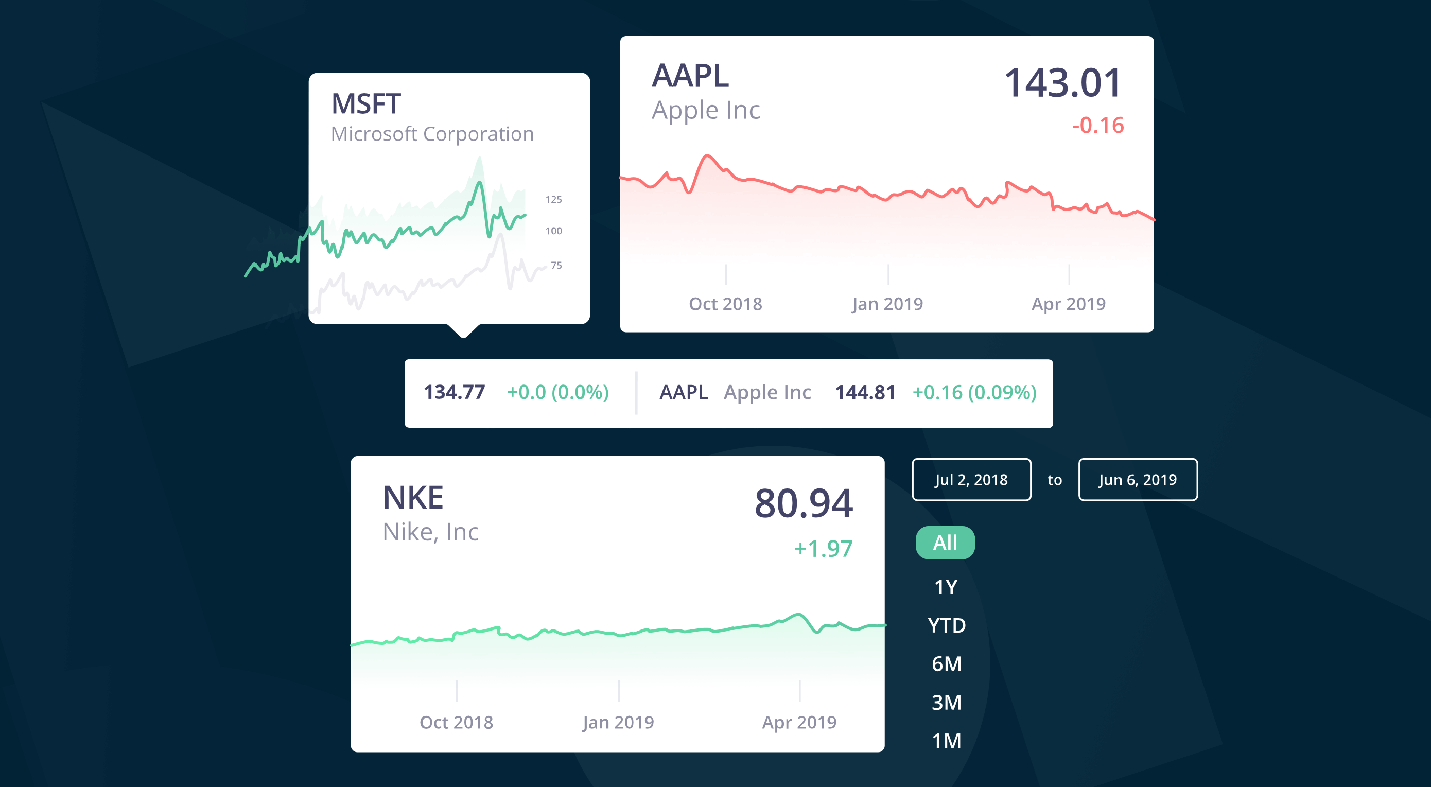
marketstack is a REST API that allows you to access stock data for public companies at 72 global exchanges including the New York Stock Exchange, the Nasdaq, the Tokyo Stock Exchange, and the London Stock Exchange.

marketstack delivers real-time market data, accurate to a single minute, ensuring that the information you base your decisions on, and the information you pass on to your customers, is always up to date.

There are more than 125,000 stock tickers, from over 50 different countries; you can query stocks, or over 75 different market indices; intraday market data is included, meaning you can monitor trades that close at the end of the day; you can even retrieve data about time-zones and international currencies.

Why Choose marketstack

marketstack uses cutting-edge technology to deliver market data in an easy-to-integrate JSON format, which is lightweight and incredibly easy to dig into.

Requests are made via a simple HTTP GET call, and all requests are run through bank-quality 256-bit HTTPS encryption. Whatever code stack you’re using, whether it’s PHP, Python, Node, or plain old JavaScript, marketstack provides comprehensive documentation to get your team up to speed in mere minutes.

The highly reliable cloud infrastructure can handle anything from a few dozen requests per year, all the way up to millions of requests per day. Regardless of the scale of your project, marketstack is robust and flexible enough to handle it.

It’s Not Just About Money

marketstack isn’t just about the bulls and bears of markets, in the tech sector specifically, stock price is an indicator of wider business trends and performance.

When Apple became the first US company to reach a $2 trillion valuation, not only was its stock price central to the story, but it indicated a trend in the tech giant’s dominance that went beyond cold hard cash.

When an eccentric billionaire makes outrageous, and ill-judged comments, and tanks his company’s valuation, the fluctuations in stock price are a big part of the story.

Beyond the spin of politicians, the market index of different exchanges is an indication of what analysts with in-depth knowledge really think during an election campaign.

With over 30 years of historical data, marketstack is a history of business, particularly the burgeoning tech sector, and makes that history available with a simple to use API.

marketstack’s Rock Solid API

marketstack’s API is built on top of apilayer technology, one of the most respected, and trusted API providers in the world, with a huge amount of experience delivering data reliably. Millions of API requests can be run through the API hourly, and it still has almost 100% uptime.

Any API is only as good as the data it supplies, and marketstack’s data is supplied by numerous high-authority providers around the globe, resulting in unprecedented accuracy.

As a result, marketstack is trusted by over 30,000 companies — including Microsoft, Amazon, Uber, and Credit Suisse — and 80+ universities.

Getting Started with marketstack

marketstack is entirely free for up to 1000 requests per month, with access to 1 year of historical data, as well as end-of-day data. No credit card is required to get started, and you’ll never be billed. This is the perfect option for simple integrations, or developers working on proof-of-concept builds. What we really like about marketstack is that the free package is genuinely usable. It’s not just a trial version that presses you into upgrading.

For anyone who needs more comprehensive data, packages that include market indices, technical support, and commercial use permissions, start at $9.99 per month, or just $7.99 per month when billed annually.

Head over the marketstack today to claim your free API key, and get started.


[– This is a sponsored post on behalf of marketstack –]

Source


Source de l’article sur Webdesignerdepot

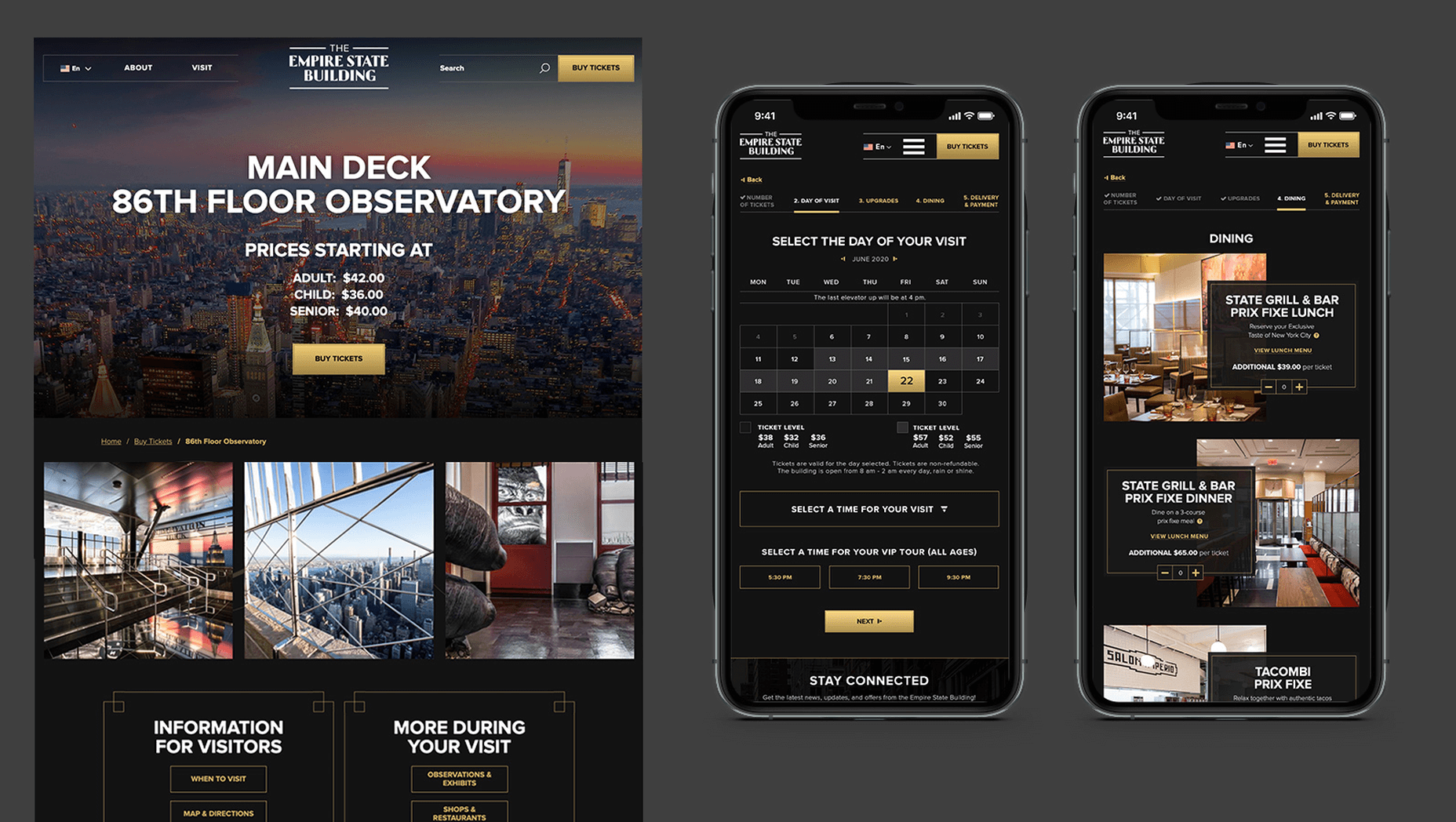
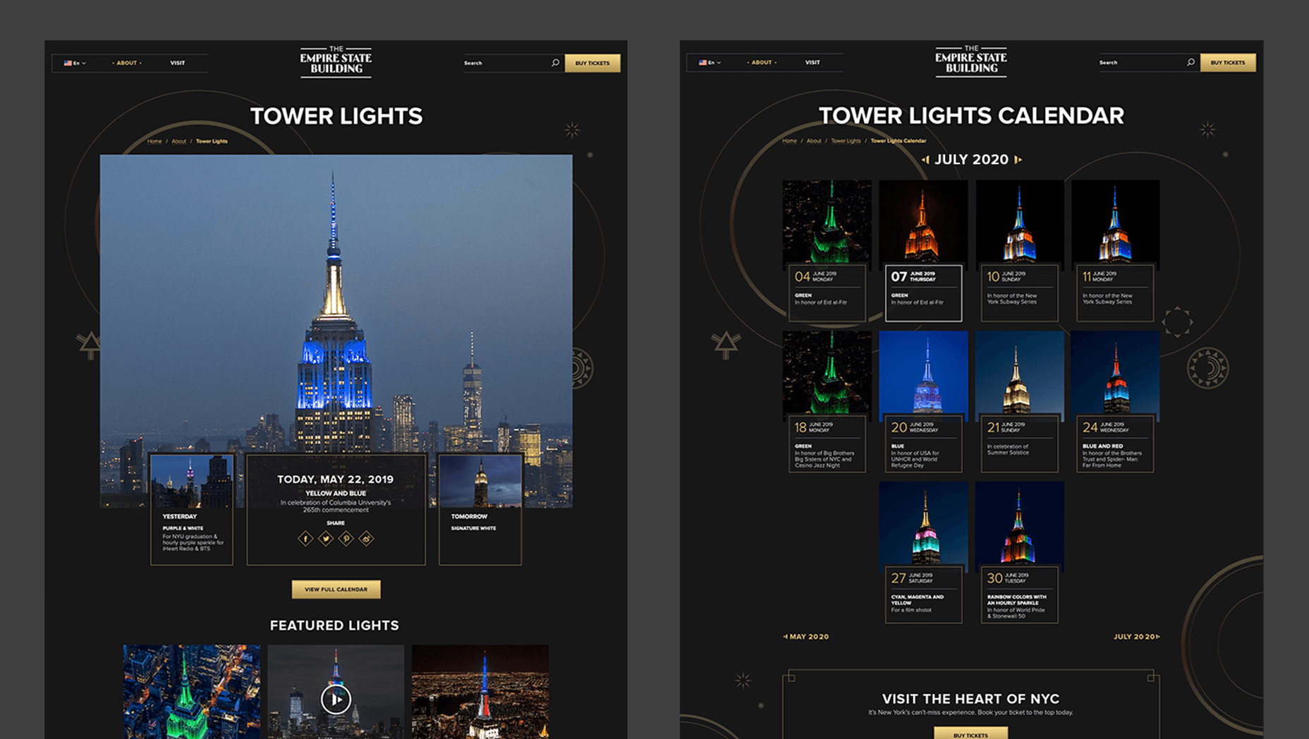
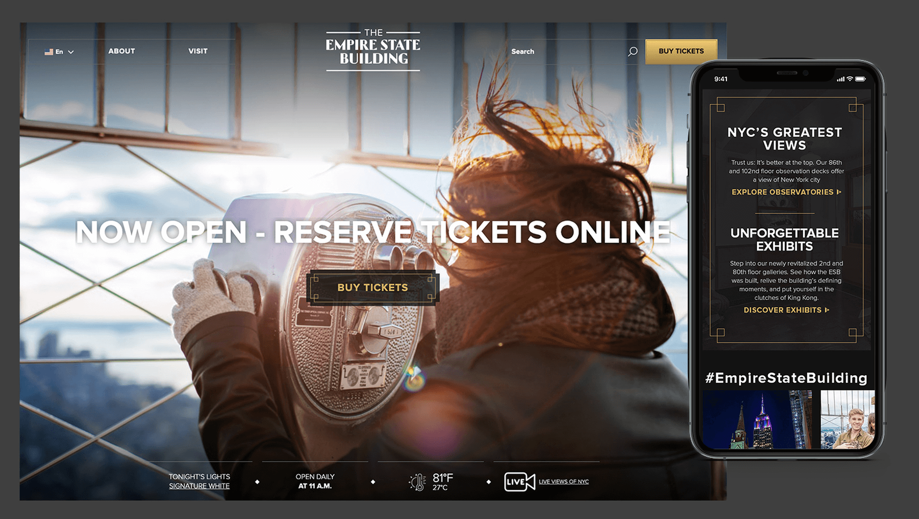
In 2019, to keep pace with an interior redesign of its visitor experience, the Empire State Building decided to redesign its website. Blue Fountain Media were engaged to deliver the project. With the new site launching, we spoke to Head of Design, Tatyana Khamdamova about designing for the world’s most famous building.
Webdesigner Depot: The Empire State Building is probably the most iconic building in America, if not the world. Were there any points at which you thought, “Oh God, this is too much pressure”?

Tatyana Khamdamova: Yes, of course, it was a lot of pressure knowing that people all over the world will be looking at your work. But with the pressure, we also felt excitement and pride that we got to work on such an iconic project. Just thinking that we are doing the site for Empire State Building made us feel proud of all that other work we did during our whole life that gave us the opportunity to be a part of this project.

WD: Blue Fountain Media is a large agency. Did you utilize the whole company, or was there a smaller, dedicated team tasked with creating the site?

TK: On a project like this one, you need the expertise of the team members from all departments in the agency. You want people to work together from the beginning to ensure that their knowledge helps to shape the project and produce the best possible outcome. It’s important for designers and marketers, for example, to be a part of the strategy and UX phase to provide their input which minimizes tunnel vision and generates more ideas. You can only achieve the best results if every single detail from strategy to design to development is done right.

WD: That’s a lot of people to coordinate. Did any roles naturally come to the fore, or is design leadership a quality that varies from person to person?

TK: Some people are natural leaders in their fields. But, sometimes a certain project requires people to take responsibility and show their leadership skills within the team. So I would say that it’s a quality that varies from person to person and doesn’t depend on a role or a title at all.

WD: What were the central aims of the redesign?

TK: ESB’s previous website did not reflect the level of design to match their iconic brand, UX was not user friendly, the content was outdated, and they wanted to grow online individual and group ticket sales. In addition to competing with global and NYC based tourist attractions, ESB was also faced with growing competition in the NYC Observatory market with Top of The Rock, One World Observatory, and Edge at Hudson Yards.

While the building underwent a $165 million renovation, BFM was tasked with creating a best in class website that reclaimed their iconic brand identity while providing an intuitive, and enjoyable user experience for both domestic and international visitors looking to learn about the building, exhibits, and the many ticket experience packages that they offer to visitors.

WD: How do you approach researching a unique project like this?

TK: We went to the source! First, we spoke to visitors of the Empire State Building while they were in line. What was their experience, did they use the website, what made them choose to visit the observatory instead of or in addition to some of the other competing observatories in the city. We then looked at other key tourist towers worldwide to see how they are positioning themselves globally to draw inspiration. We did in-depth stakeholder interviews that included folks working at the building every day and the types of interaction and questions they field from visitors. We conducted surveys of international travelers to understand their motivations and concerns. Finally, we dug into the website itself by testing using various protocols and platforms to understand the visitor paths, what they were able to easily do, and what tasks they may have found challenging. Drawing from all of those insights, we planned and designed the site using an iterative process.

WD: ESB visitors come from all over the world; how did you tackle designing for an international audience?

TK: People across the globe speak different languages, have different cultures and needs. Our goal was to learn about the audience and give them a site that looks and feels like it was created for them. Luckily we were working for the iconic building that is well known internationally and capturing the design aesthetic of the building itself already made the site recognizable across the globe. When working on the project we also were making sure that all users can see the information in their local language when they land on the site and have easy access to the language selector in case they want to change it. When you translate from one language to another the number of words and characters is not always the same. It was important to make sure that the site is designed and developed with an understanding of how the content will be displayed in other languages. With the localization help of our parent company Pactera EDGE we successfully translated the site in several languages and tested it to ensure that it looks right for the local and international audience.

WD: The famous view of the ESB is the external view, but your design feels more in keeping with the experience of the building’s interior. Was that a conscious decision?

TK: It was a conscious decision to create a site that makes you feel like you are visiting the building. Our goal was to make the visitor excited to buy a ticket and see all that beauty with their own eyes. But, if someone doesn’t have an opportunity to come to NY we wanted to make that online experience as close to the real one as possible. We understand that nothing will replace the actual visit to the Empire State Building but we wanted the website to feel real and by using the great photography and amazing Art Deco design elements, we were able to do so.

WD: How did you interpolate such a complex style as Art Deco into a functional site?

TK: Fortunately for us, our office is located a couple blocks away from the building and we had the opportunity to go there and see some of the details. We also had access to the great photos of the renovated hallways, exhibits, and observatory decks, which gave us the idea of how the Art Deco elements were used in the interior design of the building. We all know that interior design and web design have different needs and goals so it was an interesting challenge to design a site that makes you feel like you are inside the building without overwhelming users and that content is easy to read and the ticket purchasing process is simple and clean. We re-created a lot of design elements used on the ceiling, walls, and floor of the building simplified those elements and made them part of the website design. A lot of those elements were used in the background, call to actions, icons, and maps, and combined with the brand colors used in both interior and web designs we were able to give the site the Art Deco look.

WD: There’s been speculation in the design community recently that Art Deco may re-emerge as a trend in the 2020s. Having worked with the style, do you think it could benefit the wider web?

TK: This was a very specific design approach for a very specific project that takes us back to the 1920’s and emphasizes that era through modern twists in web design. I do not see how it can be applied on the web in general unless the client specifically asks for it, for example, architecture website, real estate, or furniture site. Every project is unique and has its own goals and style and there is no one solution that will fit all. As of today, The ESB is Art Deco in a sense and it truly owns that style.

WD: Can you share some details on the technology stack you employed?

TK: The site was built on the Drupal CMS, integrates with Empire’s partner Gateway Ticketing System, and is hosted on Acquia.

WD: Why Drupal? Does it have qualities that suit a project of this scale, or is it simply the case that BFM had the pre-existing expertise of Drupal to facilitate the build?

TK: BFM is a dev-agnostic production team and we always ensure we’re making the best recommendation to our clients. In this case, the previous website was built on Drupal, so in order to decrease the effect of a new platform rollout that would be unfamiliar to the internal ESB teams, we decided to keep the site on the Drupal platform. Luckily, Drupal is an extremely flexible CMS and the needs of the site perfectly align with what Drupal provides.

WD: With visitors from around the world, the range of browsers and devices you had to consider was vastly larger than most projects. Did you draw a line for support? If so, where was it?

TK: BFM constantly updates our list of supported browsers and devices to stay in line with changing technology trends and device usage around the world. We’re extremely lucky that our larger organization, Pactera EDGE, has deep roots in globalization and localization, so we leveraged their team to help us with all aspects of website visitors from the many regions around the world, including translation services and testing. Since this was a complete overhaul, we ensured the baseline standard for all devices was met and will continue to enhance as the future technology needs become apparent.

WD: The Empire State Building gets millions of visits each year, what sort of server resources do you need to throw at it to guarantee uptime?

TK: BFM is a partner of Acquia, and Empire State Building is hosting their new site with them. Acquia is a wonderful ecosystem built specifically for high performing drupal websites and provide many tools for their hosted sites to be able to handle fluctuations in visitors, traffic surges, and with the 24/7 support offered, they can easily manage the changing needs of worldwide visitors.

WD: Now it’s live, how does the new ESB site relate to its real world presence?

TK: The Empire State Building defines the New York City skyline. The world’s most magnificent Art Deco skyscraper, it’s a living piece of New York history and an instantly recognizable symbol of city culture today. The old site did not reflect the amazing interior and exterior design of the building and we had a chance to showcase the redesigned interior and bring more attention to the beautiful Art Deco design elements. We wanted to create the site to make you feel like you are visiting the building. By showcasing the exhibits, renovated halls, and observatories through compelling photography and architectural details, our goal is to make the visitor excited to buy a ticket and see all that beauty with their own eyes.

We’d like to thank Tatyana for taking the time out of her day to talk to us.

Source


Source de l’article sur Webdesignerdepot

You have probably heard about an innovative language model called GPT3. The hype is so overwhelming that we decided to research its core and the consequences for the tech players. Let’s explore whether the language deserves this much attention and what makes it so exceptional.

What Is GPT-3? Key Facts

GPT-3 is a text generating neural network that was released in June 2020 and tested for $14 million. Its creator is the AI research agency OpenAI headed by Sam Altman, Marc Benioff, Elon Musk, and Reid Hoffman.

The language is based on 175 million parameters and is by far more accurate than its predecessors. For example, GPT-2 had only 1.5 billion of parameters, and Microsoft Turing NLG – 17 billion of them. Thus, the power of GPT-3 is significantly surpassing the alternatives.

Source de l’article sur DZONE

It’s no secret that the senior population is growing. By 2030, people over the age of 65 are predicted to make up 20.6% of the population of the US. 
Around the world, people are living longer and remaining more active in the later years of their lives. What’s more, despite what you might have heard in the past, seniors aren’t as wary of the internet as they used to be. In 2019, the Pew Research institute revealed that 73% of people over the age of 65 were connected to the web. 

So, what does that mean for web designers?

your main focus needs to be on ability…people age differently

Well, first of all, it’s time for all of us to start thinking about user experience from different perspectives. We need to stop expecting our audiences to be made up entirely of iPhone-using millennials and start thinking about the needs of seniors too. After all, designing websites for seniors opens you up to a wide selection of potential visitors in the future.

What’s more, according to the US Census Bureau, people over the age of 65 generally have the highest household wealth figures of any age group. That’s a big deal. 

So, how do you adapt UX for seniors?

Creating Senior-Friendly Web Designs

When it comes to designing websites and applications for seniors, your main focus needs to be on ability. Age is just a number, and people age differently. 

That means that one person in their 70s might have no problem browsing through Netflix to watch the latest shows, while someone else wouldn’t be able to tell you what ‘streaming’ means. 

Rather than worrying specifically about age, think about how different people in older age groups might have different requirements when it comes to things like movement control, hearing, vision, and even device bias. 

Get the Visual Elements Right

Vision loss is by far the most common disability reported by elderly individuals in the US. Around one in six people over the age of 70 have some manner of visual impairment. That’s why UI designers need to think carefully about visual accessibility when creating the right websites. 

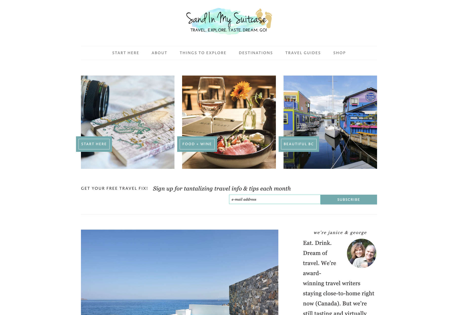
For instance, text and button sizes should always be kept large. Anything that needs to be read or clicked needs to be scaled up, to ensure that everyone can see the information clearly. For instance, on the Sandinmysuitcase.com website, you’ll find clear typography, combined with big buttons that tell you to “Start Here” so you know exactly what to do next.

Remember to stick to icons that are clearly labelled wherever possible. Stay away from anything that your customers might not understand. “Start Here” is easier to read and understand than “Submit”. 

It’s also worth sticking to the color and contrast guidelines laid out by basic UX design when you’re creating something for optimal visibility.  Colors that are too close together might create a nice pastel or gradient effect on a website – but they’ll also make things difficult to read. 

Concentrate on Usability

Over the age of 55, motor skills and coordination can begin to decline for some people. These changes make it harder for people to interact with complex UIs. The mouse on a computer can be a particular problem for people with diminishing motor skills – as can the touchscreen of a tablet or smartphone. 

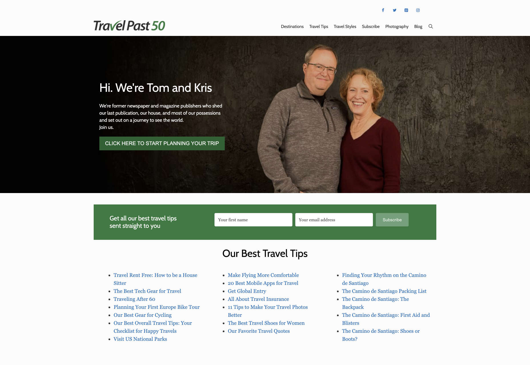
When you’re working on the perfect UX, think about how you can make things as easy to click as possible for people who have a hard time hitting their targets. For instance, in this website for people traveling over the age of 50, you’ll see not only fantastic large font choices but big buttons that are descriptive and easy to understand too: “Click here to start planning your trip”:

The scrollbar can also be a bit of a problem for people with impaired motor skills. Because of this, it’s best to keep your focus on designing above the fold. Make sure that users don’t need to scroll far to find the information that they need and keep scrollbars simple in terms of their look and feel.

While you’re working on usability, remember that it will be important to keep interactions to a minimum wherever possible. Where you can engage younger audiences with double-taps, swiping and scrolling, it’s much easier to connect with seniors through simple one-tap interactions. The less actions your user needs to take to reach their goals, the better. 

Deliver Smooth Navigation 

Navigating from point A to B on your website needs to be as simple as seamless as possible. Remember, crowded pages on your websites and apps are often overwhelming – even for younger browsers. Seniors are generally just searching for “must know” information, so they don’t want anything to get in their way as they navigate through their website. 

As you work on your site or app design, ask yourself if every element on the page absolutely has to be there. If it doesn’t deliver value, then get rid of it. 

Additionally, remember that seniors don’t always have the best memories and concentration levels. That means that they need your navigation experience to be as simple as possible. Basic horizontal menu bars that show everything at once are often a good idea – even if they’re not very exciting.

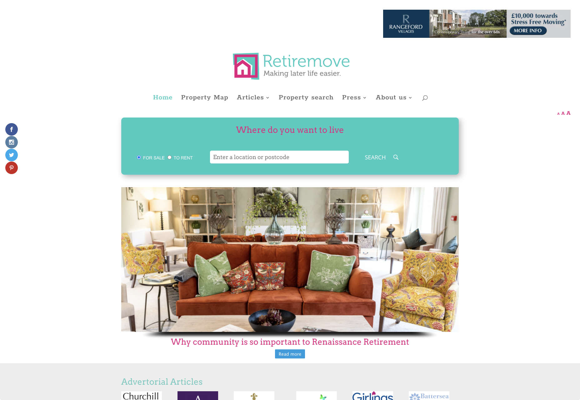
Look at this helpful navigation experience from RetireMove.com, for instance. Everything you need is located at the top of the page, and you can even just enter your postcode to get started:

Cognitive decline happens regularly with age. Although not all older adults will have issues with their memory and concentration, it’s important to be prepared for an audience that might process information a little more slowly. It’s worth double-checking that your viewer’s attention isn’t being diverted to multiple parts of the page at once.

Get to the Point Quickly

While younger generations have quickly implemented technology into every aspect of their lives, older consumers use tech a little differently. These people don’t want to spend forever fiddling around with different parts of your website. They want to get the answers to their questions as quickly and easily as possible. 

Applications that are complicated or difficult to access are usually instantly rejected by seniors. Even if you’ve offered everything that we’ve covered above, from seamless navigation to minimalist design, you still won’t get the interactions you’re looking for if older adults don’t consider your design to be useful. 

Because of this, you need to highlight the point of a website or application to your seniors as quickly as possible. Avoid worrying about things like gifs, animations and gamification. Instead, focus on making sure that your designs are useful and simple. 

For instance, from the moment your senior user arrives on a web page, they should have instant access to clear instructions on how to use the application or service, and what they need to do next. Keep in mind that this is particularly important when you’re creating mobile apps, as apps are still a relatively new concept to older generations. 

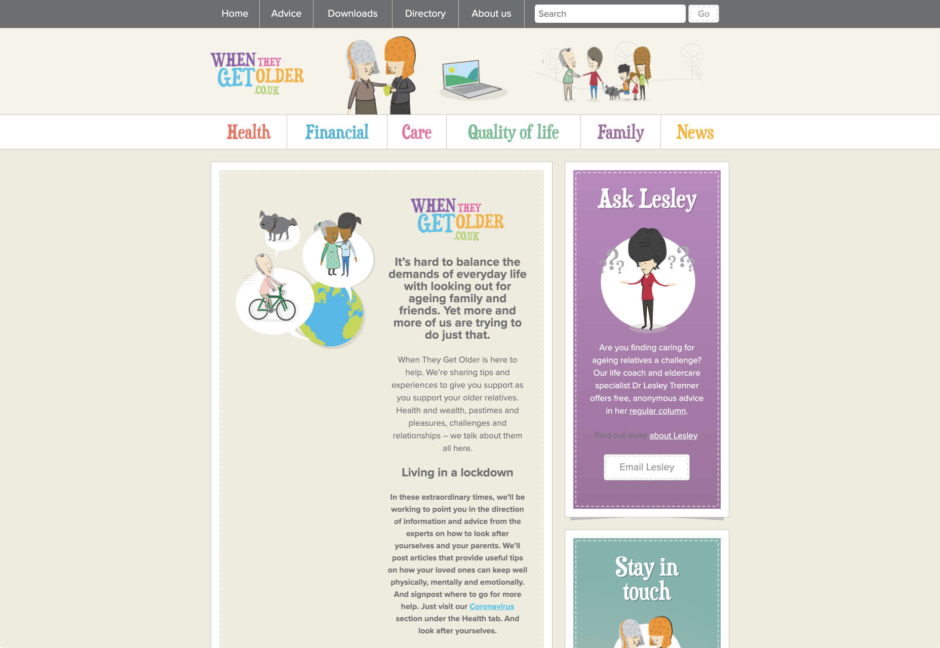
On the “When They Get Older” website, you can instantly find the information you need in a well-organized navigation bar that’s labelled clearly:

A clear interface like this, combined with simple, step-by-step guidance that shows elderly individuals how to get the information that they want is the key to keeping these users coming back for more. 

Bringing a Mature Perspective to Web Design

These days, most designers focus heavily on younger audiences when creating websites and apps. After all, it’s these users that allow us to experiment more with the latest tools and concepts, like augmented reality, artificial intelligence, and robust animations. 

However, there’s still a market out there for the seniors of the world that want more opportunities to get online. This audience often goes ignored and under-served. However, as the value of older consumers grows, and their ability to interact online increases, you’ll find that more businesses begin to search for web designers who can provide immersive experiences for a more mature audience. 

The steps above will give you an excellent insight into how you can start designing for a different kind of customer base. However, remember that the best way to make sure that you’re delivering the right solution for any customer, is to test. User testing will provide you with the exclusive insights that you need to determine whether your senior UX is really working, or whether you’re still struggling to get into the shoes of an older user. 


Featured image via Unsplash.

Source


Source de l’article sur Webdesignerdepot