Articles

If you’re looking for a WordPress theme for your 2022 projects, it never hurts to see what the experts consider to be the best of the bunch. That’s not to say that experts don’t have their favorites. They often do, and we are no different.

We’ve tried, successfully, we believe, to avoid any biases we may have in compiling what we believe to be the 10 top WordPress themes going into 2022.

Working with a WordPress theme has the advantage of giving you a great starting point. It makes it much easier to create an attractive website that will charm any visitors who stop by and convince them to linger awhile.

Another advantage of using a theme can be its cost-effectiveness. Most of the popular WordPress themes are reasonably priced, they save you time, and they can save you money as well.

The main problem you’re apt to encounter is finding the right one since many of them are out there. You could spend hours and hours making comparisons among a host of candidates that appear to be reliable and easily customizable. Or you could select from among the following 10 top WordPress themes, all of which are guaranteed to give you your money’s worth and more. 

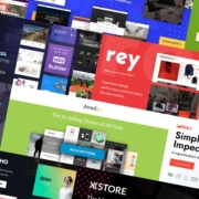
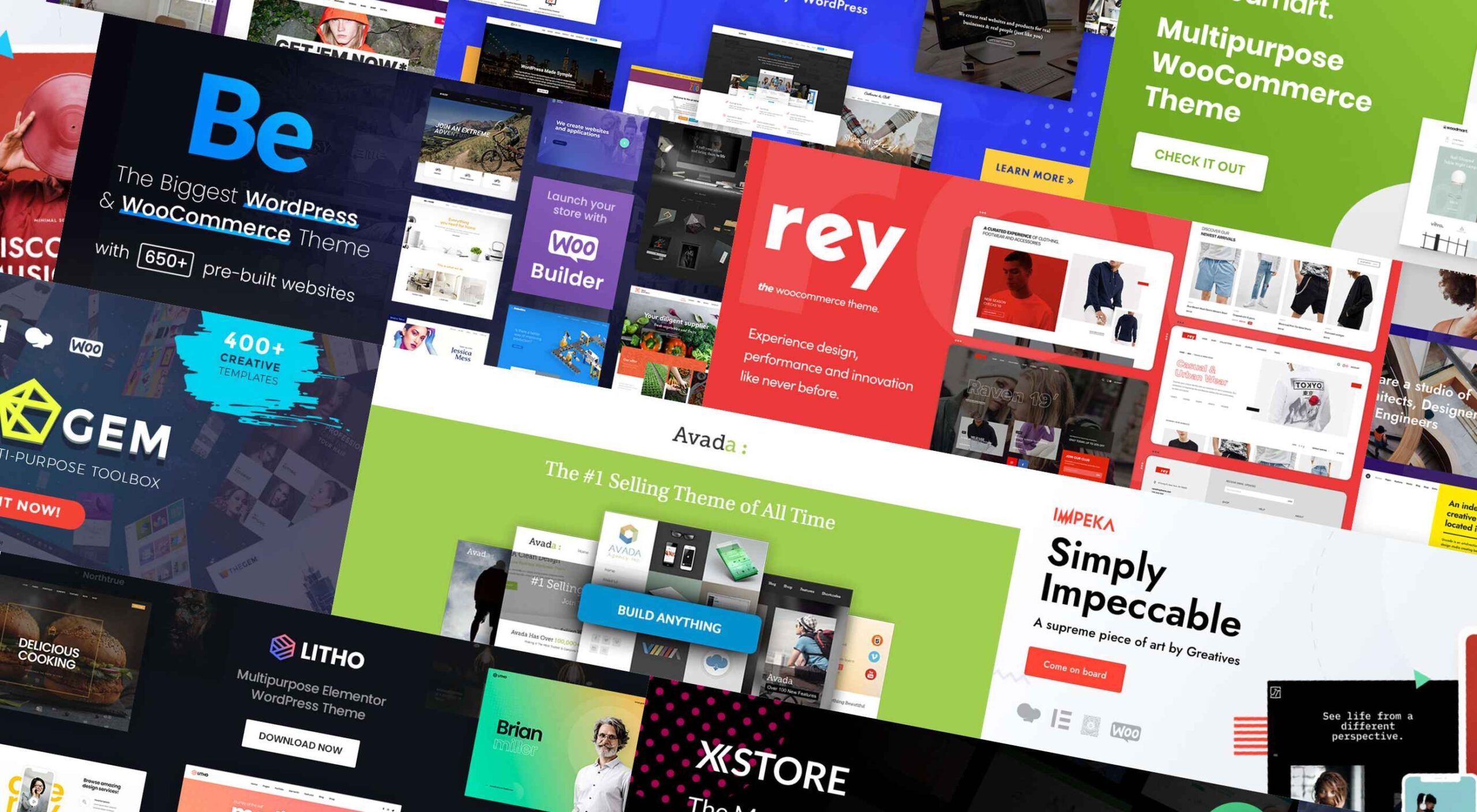
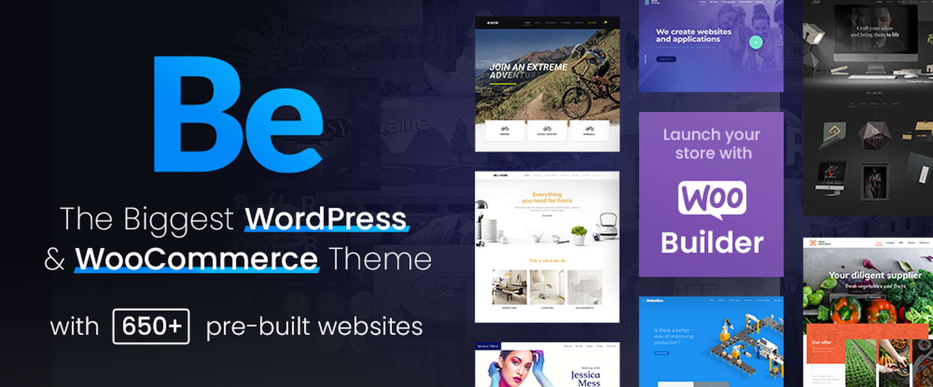
1. BeTheme – The Biggest Multipurpose WordPress Theme with 650+ Pre-Built Websites

BeTheme justifiably lays claim to being the biggest WordPress and WooCommerce theme of all for several reasons.

  • BeTheme’s 40+ core features give its users a complete tool kit to work with that includes 650+ pre-built websites and tons of design elements, aids, and options.
  • A 240,000+ customer base also contributes to making this the biggest WordPress theme of them all.

It’s not just about size, of course. Performance is all-important, and BeTheme has it in spades thanks to:

  • The Muffin Live Builder lets users edit live content visually and create, save, and restore design elements, blocks, and sections.
  • The WooCommerce Builder helps users design engaging shop and single product layouts and is packed with customer-centric features and options.
  • Full Elementor compatibility, with 30+ unique design elements and 120+ dedicated pre-built websites.
  • Assurance that every website is 100% responsive.
  • The Muffin Builder: this old standby is more intuitive than any other page builder on the market.
  • Regular Updates, plus BeTheme purchasers also receive free lifetime updates.

Click on the banner. There’s much, much more to see.

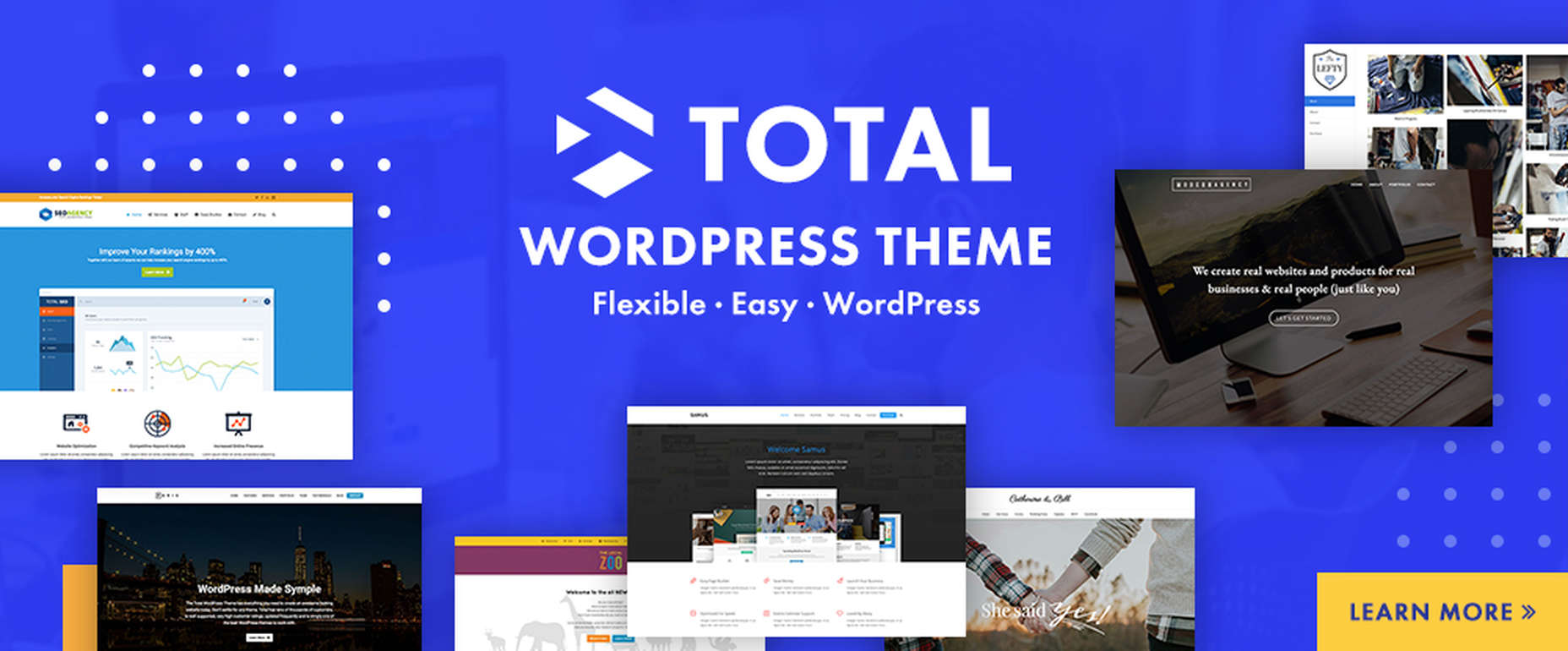
2. Total WordPress Theme

Total is aptly named because of the tools it gives its users; tools that include a premium page builder, demo and template libraries, an assortment of design and layout options, and cool navigation features.

  • The premium page builder is an extended version of the popular WPBakery frontend drag and drop page builder. Slider Revolution, another premium design aide, also comes with the package.
  • Design options include more than 500 live customizer options and 100+ customizable builder blocks, page builder block animation capabilities, custom backgrounds, and custom title backgrounds.
  • Layout options range from boxed and full-width and dynamic layouts to page and post designs and one-page site layouts.
  • Header styles, local scroll menus, and mobile menu styles contribute to website navigation capabilities.

Total is easy to set up and work with, plus it is 100% responsive. Click on the banner to find out more.
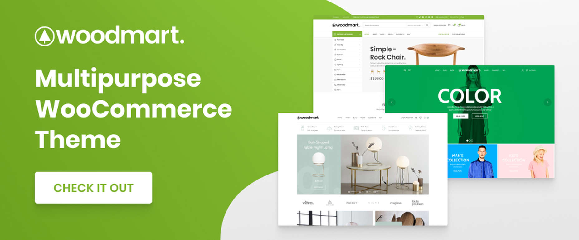
3. WoodMart

WoodMart is a premium WordPress theme that has been designed from the ground up to enable its users to create superlative WooCommerce online stores. WoodMart doesn’t require the use of multiple plugins as the most important tools, and features users simply must have come right out of the box.

They include:

  • For starters, a supply of 70+ demo layouts, 370 premade sections, plus an extensive template library for Elementor and WP Bakery.
  • A powerful Theme Settings Panel with a graphics interface to make changes quickly and easily.
  • AJAX techniques that guarantee the super-fast loading that is so important with multi-product pages and galleries.

WoodMart-built websites are search engine friendly, multilanguage ready, 100% responsive, and RTL and retina ready, and GDPR compliant.

Click on the banner to see what your WooCommerce store could look like.

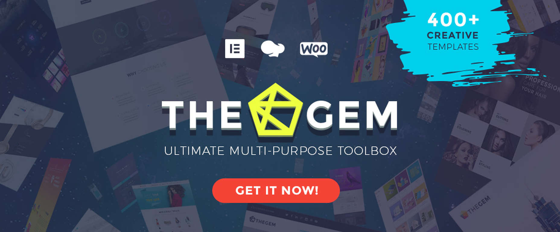
4. TheGem – Creative Multi-Purpose & WooCommerce WordPress Theme

TheGem is the best-selling theme on ThemeForest, which isn’t surprising since its multiplicity of features has led to it being called the Swiss Army Knife of WordPress themes.

Key features include –

  • 400+ beautiful websites and templates for any purpose or niche.
  • TheGem Blocks with its 300+ pre-designed section templates to speed up your workflow – a genuine game-changer.
  • Elementor and WPBakery page builders.
  • An outstanding collection of WooCommerce templates for any shop type.

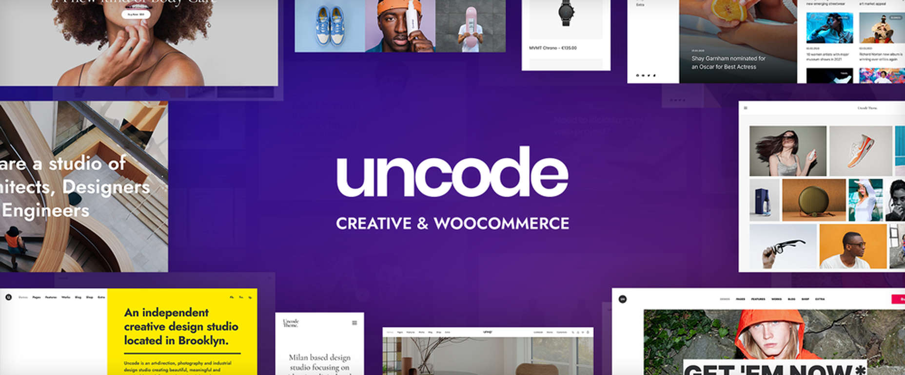
5. Uncode – Creative & WooCommerce WordPress Theme 

Uncode is a pixel-perfect theme packed with dozens of advanced and unique features designed to produce a pixel-perfect website.

These features include:

  • An enhanced Page Builder with a juiced-up Frontend editor
  • A WooCommerce Custom Builder
  • A wireframes plugin for importing 550+ professionally designed section templates

Uncode has sold more than 85,000 copies to date. It is the ideal WordPress theme for building an impressive blog, portfolio, eCommerce, and magazine sites.

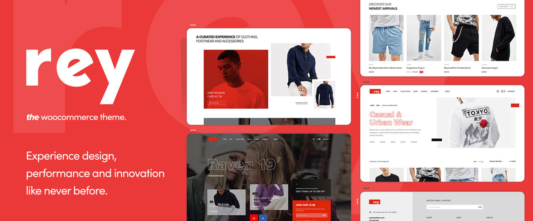
6. Rey Theme for WooCommerce

eCommerce is said to rest on four pillars – filtering, search, navigation, and presentation. This WooCommerce-oriented WordPress theme fully addresses each one. Rey lets you experience design, innovation, and performance in ways you could only dream of before.

There’s:

  • The powerful and popular Elementor page builder with built-in features supplemented with Rey’s extra spices.
  • Ajax navigation, including infinite loading.

Rey is multilanguage-ready, obviously responsive, SEO friendly, developer-friendly, and performance-oriented.
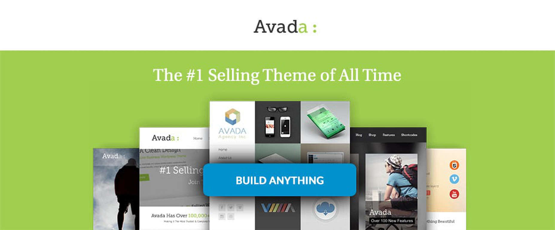
7. Avada Theme

One easy way to know you’ve picked the right theme is to select Avada, the #1 best-selling theme of all time, a popular theme that is loved by 450,000+ happy users.

  • Avada’s Fusion Theme Options, Fusion Page Options, and Fusion Builder will give you more than enough flexibility, while its 40+ free eye-candy demos provide the inspiration.
  • Avada also gives you easy access to some of the most popular premium plugins.

And that’s just the beginning.

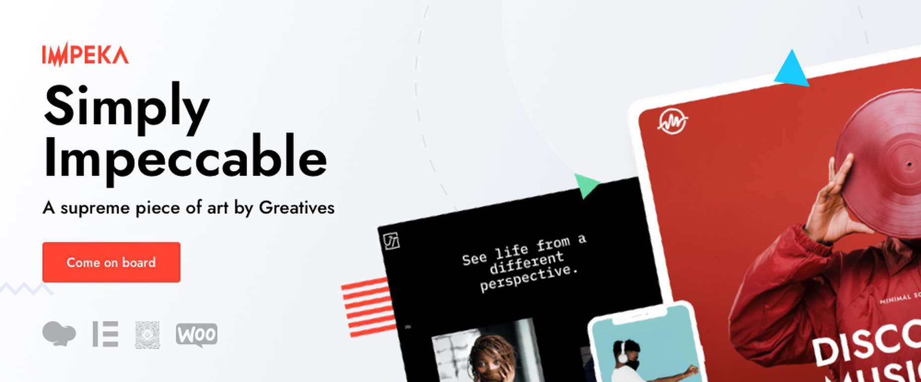
8. Impeka – Creative Multipurpose WordPress Theme

This simply impeccable WordPress theme is filled with potential for the advanced user and, at the same time, easy for a beginner to use. Using Impeka simply involves:

  • Selecting Elementor, Gutenberg, or an enhanced WPBakery as your page builder.
  • Using WooCommerce to build your online shop.
  • Sifting through a multitude of features that include the Mega Menu and Footer and Popup builders.

Your website will be super-attractive, lightning-fast, fully responsive, and SEO perfected.

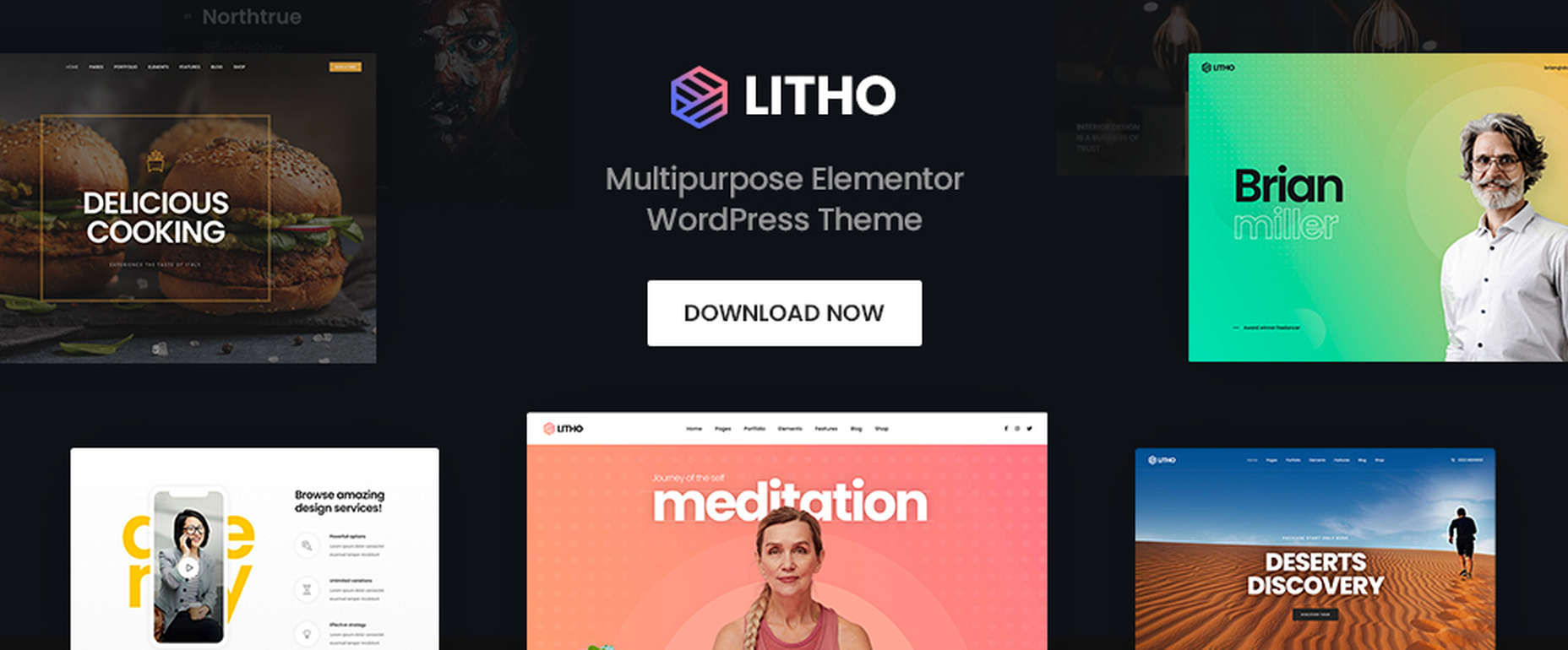
9. Litho – Multipurpose Elementor WordPress Theme

This popular multipurpose WordPress theme is built with Elementor, the world’s #1-page builder.

  • Litho can be used to build websites of any type and for any business niche.
  • It is excellent for building portfolio, blog, and eCommerce websites.
  • There are 37+ home pages, 200+ creative elements, and 300+ templates to get you started and assist you along the way.

Litho-built websites are fast loading and deliver healthy SEO results.

10. XStore – Best Premium WordPress WooCommerce Theme for eCommerce

You can start with one of XStore’s more than 110 amazing pre-built shops, or start from scratch and let Elementor or WPBakery and more than 550 pre-built blocks help you along the way, together with:

  • $559 worth of premium plugins.
  • A Live Ajax theme option.
  • A header builder and a single product page builder.
  • A built-in WooCommerce email builder.

You can get this complete and highly customizable WooCommerce theme for an amazing $39.

One of the benefits of using WordPress is the number of great WordPress themes you can work with. Whatever your niche, your target audience, or your skill level may be, there’s a premium WordPress theme out there that looks and feels as though it was made, especially with you in mind.

If you’re planning to create a fresh and beautiful website for 2022, or you want to completely rebuild an existing one, or simply make some design changes, this roundup of the most popular and the best WordPress themes in the market is meant for you. And we really mean it!


This is a sponsored post.

Source

The post 10 Top WordPress Themes for 2022 first appeared on Webdesigner Depot.

Source de l’article sur Webdesignerdepot

Visual Studio Code is a great code editor that comes with JavaScript and TypeScript features like basic refactoring out of the box. However, its true strength is an outstanding extension marketplace. There are extensions for almost anything you might want to do in an IDE (Integrated Development Environment), and they can make VS Code many times better.

Unfortunately, it can be time-consuming to find the right extensions and configure VS Code. Many developers prefer the out-of-the-box experience that IDEs such as Webstorm provide. This blog post shows how Visual Studio Code extensions can help you enhance the IDE experience for JavaScript. It covers:

Source de l’article sur DZONE

Much like running up bills on your credit card, technical debt can easily get out of hand. To avoid this happening, you need to keep track of how much debt you’re building up.

Technical debt metrics are designed to help you make sense of all the data you collect. There are many different metrics to choose from nowadays, and plenty of tools for recording the data.

Source de l’article sur DZONE

Happy New Year, fabulous new website design trends!

This month’s design trends are a collection of the somewhat unexpected – from NFT website design to large text to illustrations; you won’t see a single photo or video here. Here’s what’s trending in design this month.

NFT Websites

This website design trend has more to do with the greater trends in digital marketplaces and commerce but has value in the design space as well. NFT websites are popping up everywhere.

Marketplaces for non-fungible tokens use modern design effects to draw users in and help them make purchases and view available images. If you haven’t delved into the world of NFTs, they are data units – often in the form of gifs – stored on a blockchain digital ledger. You can buy, sell, and trade these digital nuggets on various marketplaces.

The designs of NFTs could be explained as a trend of their own. Here, we’re focusing on the look and feel of the websites surrounding them. While some designs are relatively primitive, the best marketplaces have a full e-commerce feel with easy-to-use interfaces and a modern design.

Each of these three NFT marketplaces does it a little differently.

Styllar puts a focus on NFT avatars with a minimal aesthetic that gives plenty of room to individual NFTs. Sit on the website too long, though, and hundreds of options begin to cover the screen. Each visual element has a small text element to match that explains each image. It feels like a modern e-commerce experience that instills trust with users because of clean visual patterns. The site itself is just a gateway to a more traditional marketplace, but the calls to action are large, clear, and easy to follow.

OpenSea treats the NFT marketplace more like an art gallery with card-style buttons to look at different elements and images. Everything about the website design is tailored for the mobile user and quick browsing with large areas to click in the card format and easy-to-read headers that help you find your way through the NFT space, whether you want to buy, create, or sell. The site also does one more thing that’s not as common with e-commerce – it explains how to get started in this new digital territory with plenty of resources.

Rarible has an almost social media feel with lots of small blocks showing different NFTs. Digestible content in a grid-based design helps you navigate from images to rankings to what’s trending in NFTs. This site design is set up for high interaction and engagement, also featuring card-style elements and the ability to favorite items before bidding.

The key commonality with NFT website designs is that they are made for mobile users. These sites look good on desktops, but they are highly focused on a mobile, instant gratification user.


Text-Based Hero Headers

A trend in website design from 2021 is bleeding into 2022 with a lot of popularity: Hero headers that are mostly text. These designs have background texture and color, but for the most part, they don’t have a lot of other visuals.

These designs often rely on powerful language or messaging to help get user engagement. A secondary theme is the use of bright colors to help add focus and attention to the typography.

Font choices seem to be fairly neutral, with a lot of thicker sans serifs for the main headline and something a little lighter for secondary text options.
WeTransfer uses a smaller text block with multiple lines to create weight. The off-center placement draws the eye and is interesting even with the neutral background. Stacking elements create a nice focal area that encourages reading.

Halborn Blockchain Security goes with a less traditional font option and flips the color to the text to enhance the visual display. This design also uses an off-center, asymmetrical approach to create focus on the text element. The dark counterweight on the screen is an excellent guide to draw you back to the main hero headline.

FWD goes with giant oversized text elements to create a strong visual focus with this design. Other than the faint animation of the arrows next to “Here’s what they said,” everything is still and static. The color and blocky depth of the background help draw the eye through the text and to clickable elements so that you know what to do next.


Intricate Illustrations

Another trending design element is the use of intricate illustrations on homepages. These highly detailed images can tell a visual story, help add meaning to messaging, or serve as a remarkable visual element when you don’t have a photo or video.

The great thing about this trend is that the only limitation is your imagination.

Once you find someone to create the illustration (if you can’t do it yourself), the world is open to interpretation.

We are seeing three major themes within this trend, as showcased in the examples.

Multi-layer illustrations with hints of animation, such as the one from Highvibe Network. This illustration used lots of colors, layers, unexpected elements within outlines, and a little animation to pull it all together. The effect is rather stunning and provides a lot of interest for the user.

Realistic, painting-style illustrations, such as the one from Healthline, bring the content to life without real people or images. This technique is especially nice for industries where you may want to anonymize people in images. (Perfect for a healthcare website design because you don’t know if the illustrations are of real people or not.)

Detailed geo shapes and lines, such as the design from Radio Meuh Circus Festival. With great color and lines that draw the eye, this design can keep you looking and finding new depth for a long time. Color also helps draw you into the striking imagery.


Conclusion

What’s nice about all these design trends is that they have flexible elements that you can use and replicate across industries and projects. The common factor is that they lack traditional dominant imagery, which works exceptionally well.

These trends are likely a result of the worldwide pandemic as well. With less social contact, creating without conducting photo or video shoots is an ideal situation. Good luck trying some of these trending design elements on your own.

Source

The post 3 Essential Design Trends, January 2022 first appeared on Webdesigner Depot.

Source de l’article sur Webdesignerdepot

If you are a designer and have never dealt with designer’s block, you are probably a superhero. For us mortals, designer’s block is a pretty common problem. There are occasions when we sit in front of our screen, and our creativity just evaporates.

I have spent many hours trying to get rid of this annoying wall. It took some time, but I have found some tactics that work best for me. So, do not panic! In this article, we will share five ways you can overcome designer’s block and get back on track.

From innovative sources of inspiration to the importance of collaboration and food, nothing will be left out. But first, let us analyze what designer’s block is and how common it is among creatives.

What is the Designer’s Block? Can You Force Creativity?

In a few words, designer’s block is nothing but a situation where you are stuck as a designer. In this unpleasant moment, you feel like you are losing your design skills and creativity.

Fortunately, this is not permanent. Of course, you are still a great designer. You should know and embrace that designer’s block happens to almost every creative out there. Even the most experienced of us. So the first thing you should do is to stay calm.

Remember that you can not force creativity. When designer’s block comes knocking on your door, you need some time to recover.

So instead of panicking, take to heart some practical tips that will help you regain your confidence and creativity.

How to Get Rid of Designer’s Block?

1. Take Care of Yourself

In some cases, designer’s block is your own body’s reaction. Think about it. How can you perform well when you are tense with pressure? There are many ways to take care of your mental and physical health. For example, you can take a break and have a snack.

Sleep is also critical when it comes to avoiding designer’s block. Recent research has shown that creative thinking is directly related to our periods of sleep. Lack of concentration, more mistakes, and erratic behavior are just some of the consequences of insufficient sleep.

For this reason, napping is a smart solution to designer’s block. So if you are feeling unproductive, first make sure you are not tired or hungry.

2. Change Your Location, Get Inspired

But what if you’re not hungry or tired? There are situations where we are stuck in front of a project. If that’s the case, you should decide to take an inspirational break.

The first thing you can do is to change your location. If you are working from home, you should get some fresh air. There are numerous sources of inspiration that can help you overcome designer’s block. Personally, I take a break and visit one of the following sources:

  • Parks: Nature will calm you and help you get inspired.  
  • Art Galleries: A designer’s best friend. Visiting an art gallery can help you find the missing elements for your upcoming project. 
  • Coffee shops: Quiet coffee shops are an intelligent way to get inspired. What’s better than a big mug of coffee and relaxing music?

Alternatively, watch a movie or a TV series. This may sound like an unorthodox way to get inspired, but it works perfectly when overcoming designer’s block.

3. Explore the Power of Collaboration

More than 90% of graphic designers in the world are freelancers. Although freelancing is an exciting job, it can be pretty lonely. The next time you are struggling with designer’s block, you might want to ask for some help.

Other UI or UX designers can help you see a project through different eyes and find the missing design elements. For this reason, collaborating with other designers is a great way to overcome designer’s block.

On the other hand, you can also ask your friends or family for ideas and feedback. Remember that inspiration can come from anyone.

4. Plan and Break the Project into Chunks

Most times, I get stuck as a designer, it is entirely my fault. To be precise, there are many cases when we do not plan the project efficiently. When the work is overwhelming, the lack of a well-organized plan can be why.

The best thing you can do is to take a step back. Take a look at the work that needs to be done. Then, you can start breaking your project down into small sections. If you reorganize everything, you can get rid of designer’s block in a matter of minutes.

Try not only to organize your tasks but also to manage the time you will spend on each chunk. This will probably help you understand that you have more time than you think.

5. Apply Some Pressure, Just Start

Unfortunately, few of us have infinite time to find inspiration. Most professional designers work with deadlines. That’s why putting pressure on yourself is not always a bad thing.

After following the above tips, all you have to do is start. Don’t forget that the designer’s block will remain until you start designing.

When I try to apply some pressure, my first drafts are usually bad. But after a while, everything comes back to normal.

Wrap Up

If none of the tactics analyzed above helped, you can always use one (or more) of the following quick tips:

  • Take a short break (5 minutes or so);
  • Start with the most challenging task;
  • Go for a walk or exercise;
  • Ask for more information about the project. Sometimes, the client can help you overcome designer’s block;
  • Think about what is distracting you and solve it.

Remember, every creative out there has faced designer’s block at least once. So there’s no need to panic at all. Of course, not all of us deal with it in the same way. That’s why you should first try out the tips above and find out what works best for you. This will help you overcome designer’s block and regain your skills as a designer.


Featured image via Pexels.

Source

The post 5 Brilliant Ways to Tackle Designer’s Block first appeared on Webdesigner Depot.

Source de l’article sur Webdesignerdepot

There are a lot of factors that contribute to a better user experience on a website. Pages need to load quickly to give users peace of mind and efficiency. Navigation must be clear and straightforward, with direct pathways for visitors to follow when finding your contact pages, blog posts, and products. Your colors need to work seamlessly together while providing just enough contrast in the areas that need it most.

Excellent user experience needs to be considered for every part of your website that acts as a touchpoint with a potential customer or user.

One of the most significant touchpoints of all is your forms.

All websites need some form of interactive content to thrive. Users need to be able to do something with the site, whether it’s looking for information with a search bar, contacting a team for a quote, making a booking, or completing a purchase. Forms power the majority of the interactive activities available on websites.

If you know how to master great UX on a form, you can contribute to more meaningful interactions between your brands and their customers. But not all web forms are the same. Here are some of the top types of forms you need to master and how you can optimize them.

The “Opt-In” Form

The Opt-in Form is probably the best-known form in the digital landscape. It’s essentially a form that asks visitors to “opt-in” to a specific offer. Sometimes, this means signing up for a webinar; other times, it’ll be agreeing to an email newsletter or a regular series of blog updates.

Opt-in forms grab attention quickly and ask for something specific from the audience. For instance, this example from HuffPost encourages visitors to “Subscribe to the Morning Email.”

Opt-in forms are all about generating action.

Sometimes, they’re placed at the bottom of a landing page after a company has had a chance to explain precisely what they’re offering. Other times, you’ll find the opt-in form situated on a sidebar of a website, constantly enticing people to “sign up” if they like what they see on a blog post or article.

It’s also common for opt-in forms to appear as pop-ups and exit pop-ups on modern websites. For example, a brightly colored opt-in form that promises an immediate benefit to a customer could encourage them to hand over their details before they abandon your website.

How to Design a Great Opt-In Form

So what kind of best practices go into an excellent opt-in form?

  • Start with simplicity: If you’re asking your visitors to do something, don’t overwhelm them with too big of a request straight away. Keep the form short and simple, so it doesn’t seem like too much extra work for the visitor. Something like “Subscribe to our newsletter” should ask for nothing more than an email. 
  • Highlight the benefits: Most customers won’t want to give you a place in their inbox or the opportunity to interact with them further unless you can offer something in return. Even if you’re asking for something small, like an email address, let the customer know what’s in it for them. In the HuffPost example above, the company highlights that you can wake up to the day’s “most important news.” 
  • Give the visitor the power: Let your visitor know they’re in control here. They want to see that they’re getting exactly what they need from you in exchange for their contact details. This means reassuring them that their email address won’t be used for spam, like H&B Sensors does here: 

The Contact Form 

The Contact Form is another crucial part of building an effective UX for your website – but it’s also an element that web designers and business owners often overlook. When customers decide they want to learn more about a business, they need a quick and easy way to get in touch.

Contact forms need to be easy to find and use on any website. Usually, your user will expect to see a link to the contact form situated somewhere at the bottom of your webpage. It might be called “Contact Us” or “Customer Support.” Avoid anything that would go over the user’s head.

Aside from being easy to track down, your contact form also needs to reassure an audience that they’re making the right decision by getting in touch. Therefore, the content needs to be short, sweet, and authoritative—highlight why the user might contact your company and how they can do so.

Avoid any unnecessary information in the contact form. For example, you don’t need to know your client’s age and their job to answer a question about where their nearest physical branch is. Keep form fields to the point, or you’ll chase customers away.

How to Design a Great Contact Form

Design something personalized but straightforward to make the most of your contact form. Use features like smart content and conditional logic, if possible, to adapt the page to the user’s needs. Dynamic content is becoming increasingly valuable these days. Other best practices include:

  • Set the right expectations: Let your customers know how active you are and how quickly they can expect to hear back from you. Imagery and the right fonts can also set expectations about the kind of communication your audience can expect. For example, this contact page from the Marvel app is fun and playful, like the company itself:

  • Provide multiple options: If your customer doesn’t want to use your contact form, give them another way to get in touch. Ensure the contact page includes information like where to find you on social media and your professional phone number. 
  • Simplify things on your end: To ensure that you can contact your audience as quickly as possible, allow your customers to choose a specific subject that their query is connected to. Allowing them to choose “Sales” or “Order issues” means you can automatically direct the message to the right team member on the back-end. 

The Online Payment Form 

Sometimes, when your customers have seen what you have to offer and they’ve checked out the competition, they decide to go ahead with their purchase. To facilitate this, you’re going to need an online payment form. Online forms ensure that your customers can safely enter their credit or debit card details to purchase whatever you have to offer.

Most payment processing companies like PayPal, Square, and Stripe come with payment forms included, so you can easily embed them into a website in minutes. However, there’s always the option to customize those payment forms.

For instance, ideally, you’ll need a payment form that keeps your customer on the same page, so they don’t have to log into another browser to make their purchase. The fewer transitions your client has to make, the safer they’ll feel.

How to Design a Great Payment Form

When designing any payment form, simplicity and security are the two most important factors. Your customer should be able to enter their information quickly and easily and get through the transaction process without worrying about their details.

Remember to:

  • Keep it simple: The fewer fields the visitor has to fill out, the better. Customers still feel uncomfortable sharing personal information and payment details online. Make the experience as painless as possible. If your client already has an account with your business, you might create a system that automatically fills some of the fields, such as their email address, name, and billing address. 
  • Offer the right integrations: The proper payment forms will integrate with the payment services your customers prefer to use. Options include PayPal, Stripe, Square, Verified by Visa, and Mastercard. Get a developer to integrate the right APIs with your form to give your customers the broadest range of options. 
  • Ensure security: Give customers peace of mind by providing as much security evidence as possible. An SSL certificate that places the padlock on the top of the browser next to the URL is a great way to make customers feel more secure. Integrating verification options so your customers can avoid fraud issues is another significant step. Sometimes just putting logos from the card types you accept on the page will make a customer feel more secure. 

Support Forms

Some companies bundle the contact form and the support form together. Others have a separate support form to get their queries routed directly to the people most capable of helping them. If you want to take the second route, it might be a good idea to design a “help” section on your website where you can locate the support form.

The “Help” section on a site often appears alongside other links on the footer. For instance, it could appear alongside “About” links and “Contact” options. Here’s an example of Hubspot’s Customer Support options:

The best customer support pages come with various ways for clients to help themselves and find answers to their most pressing questions. For example, you might have a search bar where your audience can search for the answers to their queries or a knowledge base full of helpful blogs.

Hubspot allows users to choose between a blog, knowledge base, academy training center, community forum, developer discussion board, and assistance from a certified partner.

How to Design a Great Customer Support Form

Designing a good customer support form is about getting your audience the information they need as quickly as possible. Once again, you’ll need to stick to as few form fields as possible here to avoid angering an already frustrated customer. Also, remember to:

  • Ask for the right information: Find out what the query is about by giving the customer a drop-box menu full of possible topics to choose from. If you need a product reference number or something similar, ask for that at the top of the form, then allow the customer to provide extra information about their query underneath. 
  • Set expectations: Let your customers know when they can expect to get a response to their concerns and provide them with advice on what to do next. For instance, you could invite them to check out your knowledge base while they wait for a response. 
  • Keep it simple: Avoid using technical jargon on your support request forms. Be direct in your requests for summaries of the issue at hand, contact information, and other supplemental data. 

Customer Feedback Forms

According to Microsoft, around 96% of customers say that customer service is crucial in determining their loyalty to a specific brand. Another 52% of global customers believe that companies need to respond to the feedback provided by customers.

To ensure your customer service strategies are on-par with what your customers expect, you need to get feedback from your audience. That’s where a feedback form comes in. Customer feedback forms often appear after a client has finished purchasing on the “thank you” screen. They may also occur after a customer has completed a service interaction online.

Here’s an example of an Apple feedback form:

How to Design a Great Customer Feedback Form

By leaving you feedback, your customer is doing you a massive favor. They’re giving you a chance to learn from your mistakes and improve the service you can give next time around. Feedback is one of the best tools for any business that wants to grow and thrive.

If you want your customers to use your feedback forms, you’ll need to make them as simple as possible. Your customers don’t have time to waste on a complex form.

  • Don’t make any fields mandatory: Don’t stop your customers from submitting a form unless they’ve completed every field. Allow them to enter the information they consider to be the most important, and that’s it. You can even fill some of the form out for your customer, if possible, by entering their name and email address if they’re already a member of your site.
  • Make it mobile responsive: Remember there are around 3.5 billion smartphone users worldwide. You can’t afford to lose feedback because your form isn’t responsive. Every form should look and feel incredible on any device. 
  • Include a rating option: If your customers don’t have much to say about your service, or they’re not wordsmiths, they might prefer a rating option instead. A one-to-five rating system that allows your customer to judge your product or service on a scale of poor to wonderful is a great way to gain quick information. Check out the Uber Engineering example here:

Though you can pre-enter some information on a feedback form to make your customer’s life easier, don’t overstep your bounds. Adding your customer’s email address to the form is fine if they’re already a customer with you. Pre-selecting the “very satisfied” rating above would look presumptuous.

Top Tips to Improve Every Form Design

The online form is an essential part of any web design project, but it’s also frequently overlooked. Unfortunately, without a good set of forms, your customers will struggle to interact with your company in a meaningful way.

When creating any form, remember:

  • Reduce friction: Reduce the friction for your customers by asking as few questions as possible. The less your customer has to answer, the better. If you can pre-populate forms with information like your customer’s name and email address, this could help. 
  • Keep it simple: Make sure that the form is clean and easy to use. Your customers shouldn’t be confused about where to click or how to submit their information. A single-column design is often better than a multi-column option.
  • Be clear in error messages: Don’t just tell your visitors that something has gone wrong. Let them know what they need to do to submit the form successfully. If possible, use inline validation with real-time feedback to let your audience know that you recognize the information they’ve submitted.
  • Keep data secure: Make sure your audience feels safe by letting them know how you will use this information and why you’re asking for it. If you’re asking for an email address, make the benefits of entering that information clear. 
  • Make fields optional: Allow your audience to add more information to a form if they want to – but don’t demand it. Give some freedom to the visitor. 

The better your forms are, the more effective your interactions with customers will be. Remember, it’s not just the face-to-face interactions that your customers judge when making decisions about your business and whether to trust you. Today’s digital world has prompted a new demand for more meaningful virtual experiences.

Your form could be the first interaction you have with a client, whether it’s a contact form, a booking form, or something else entirely. Get that right, and you can improve your chances of your customers coming back to interact with you again later.


Featured image via Pexels.

Source

The post The Top 5 Form Types to Use in Your Web Design  first appeared on Webdesigner Depot.

Source de l’article sur Webdesignerdepot

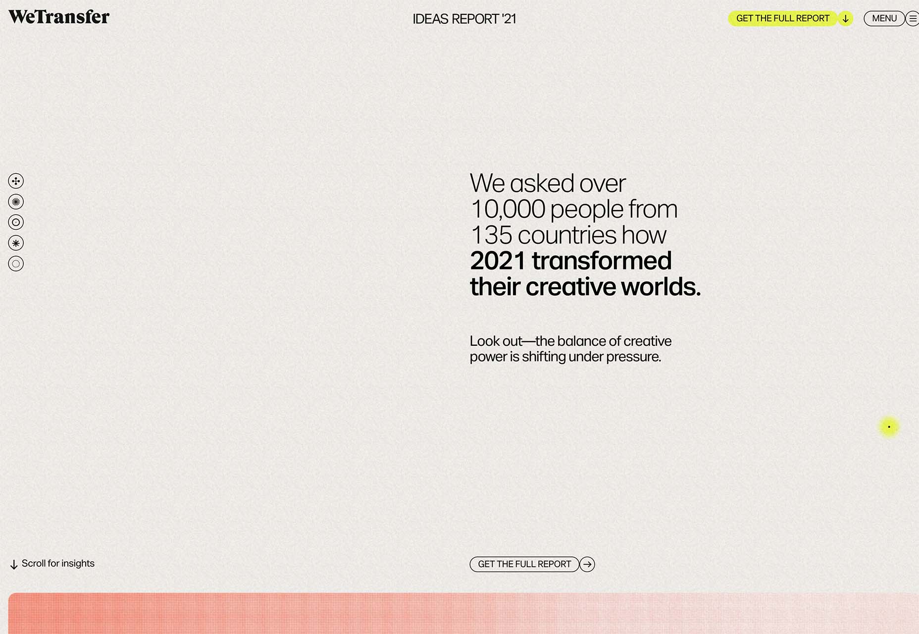
Every year, at this time, blogs like this one like to try and predict what’s going to happen in the year ahead. It’s a way of drawing a line under the archive and starting afresh. A rejuvenation that, as humans, we find life-affirming.

Ten years ago, I would have had high confidence in these predictions — after all I was eventually right about SVG adoption, even if it took a decade. But the last few years have shown that web design is tightly interwoven with the muggle world, and that world is anything but predictable.

So as we look at what might occur in the next year (or five), think of it less as a set of predictions and more as a wishlist.

Last Year’s Predictions

When I write this post every January, I like to keep myself honest by glancing back at the previous year’s predictions to gauge how accurate (or not) my predictions have been.

Last year I predicted the long-term trend for minimalism would end, WordPress would decline, cryptocurrency would go mainstream, and then hedged my bets by saying we’d make both more and fewer video calls.

Gradients, maximalism, and the nineties revival pulled us away from minimalism. It’s still popular, just not as dominant.

WordPress is still the biggest CMS in the world and will continue to be for some time. But the relentless grind of no-code site builders at the low end, and being outperformed by better CMS at the high end, mean that WordPress has passed its peak.

Over-inflated predictions for BitCoin reaching $100k by December 2021 turned out to be a damp squib. In the end, Bitcoin only tripled in value in 2021. However, with micro-tipping and major tech companies moving into the arena, it’s clear digital currency arrived in the public consciousness in 2021.

And how could I be wrong about more but also fewer video calls? So I’m calling that my first clean sweep ever. With that heady boast, let’s take a look at the next twelve months.

What Not to Expect in 2022

Do not expect the Metaverse to be significant in anything but marketing speak. Yes, the hardware is slowly becoming more available, but the Metaverse in 2022 is like playing an MMORPG on PS5: theoretically, great fun, until you discover that absolutely none of your friends can get their hands on a console.

Ignore the blog posts predicting a noughties-era retro trend. All those writers have done is looked at the nineties-era trend and added a decade. Fashions aren’t mathematical; they’re poetic. Retro happens when people find a period that rhymes with present-day hopes and fears. After the last couple of years, if we revisit a decade, it’s likely to be the late-forties.

Finally, don’t expect seismic change. Material design, parallax scrolling, and jQuery are still with us and are still valid choices under the right circumstances. Trends aren’t neat; they don’t start in January and conclude in December.

5 Web Design Predictions for 2022

Predictions tend to be self-fulfilling. So we’ve limited ourselves to five trends that we believe are either positive or, at worst harmless. Of course, there are no guarantees, but if these come to pass, we’ll be in good shape for 2023.

1. The Blockchain is Coming

Underpinning the cryptocurrency industry are blockchains. In simple terms, they’re a set of data that can be appended to but can’t be edited or deleted. Think of it as version control for data.

As with most technology, the first wave has been a way to make a fast buck. However, the exciting development is blockchain technology itself and the transformative nature of the approach. For example, Médecins Sans Frontières reportedly stores refugees’ medical records on the blockchain.

Imagine the Internet as a set of data, editable for a micro-fee, and freely accessed by anyone anywhere. Instead of millions of sites, a single, secure, autonomous source of truth. Someone somewhere’s working on it.

2. Positivity & Playfulness & A11y

Even before world events descended into an endless tirade of grim news, time was running out for dull, corporate, geometric sans-serif design.

We added gradients, we added personality, we embraced humor. And contrary to the established business logic, we still make money. Over the past few years, there have been extraordinary efforts by designers and developers to examine, test, and champion accessibility, and thanks to them, inclusive design is no longer reliant on the lowest common denominator.

In 2022 you can get experimental without obstructing 10%+ of your users.

3. Everything Green

Green is a fascinating color, the primary that isn’t (except in RGB, when it is).

Green has the same visual weight as blue, is substantially more flexible, and yet to date, has been radically underutilized in digital design.

Green has a prominent cultural association with the environment. At a time when tech companies are desperate to emphasize their ethical credentials, marketing companies will inevitably begin promoting a brand color shift to green as a quick fix for all those dumped chemicals, strip mines, and plastic-filled seas.

We’ve already seen earthy hues acquire popular appeal. At the other end of the vibrancy scale, neons are popular. Green spans both approaches with everything from calm sages to acidic neons.

In 2022, if you’re looking for a color to capture the moment, look to green.

4. Hero Text

A picture is supposed to be worth 1000 words, although I’m not sure anyone has actually tried to measure it. The problem is that sites increasingly rely on stock images, so the 1000 words that we’re getting may or may not accurately reflect 100% of our message.

In 2022, a handful of well-chosen words will be worth more than an image, with hero images taking a back seat to large hero text. This is aided by a number of minor trends, the most notable of which is the willingness of businesses to look beyond the geometric sans-serif to a more expressive form of typography.

Reading through the prediction posts on sites other than this, almost everyone agrees on large hero text replacing images, which virtually guarantees it won’t happen. Still, at the start of 2022, this seems to be the direction we’re taking.

5. Bring the Noise

One of the unexpected consequences of the past couple of years has been a renewed connection with nature. The effortless complexity in nature is endlessly engaging.

We’ve already begun to popularise gradients — there are no flat colors in nature — and the next logical step is the addition of noise.

In visual terms, noise is the grainy texture that sits so beautifully in vector illustrations. Noise has dipped in and out of trends for years, hampered a little by the leap in file size it creates. However, with WebP and Avif file types, noise is now usable on production sites.

Designing in 2022, when in doubt, throw some noise at it.


Featured image via Unsplash.

Source

The post 5 Big Web Design Predictions for 2022 first appeared on Webdesigner Depot.

Source de l’article sur Webdesignerdepot

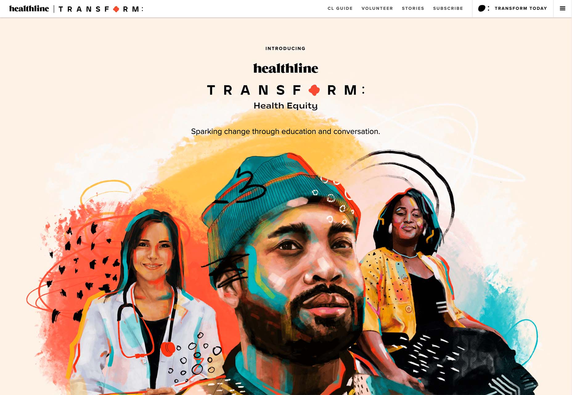
Many people believe that UX design is all about creating slick, engaging images and top-notch user flows. While those things have their merits, UX designers do much more than that.

UX writing is an essential skill in developing an app or solving a UX problem for a client. UX writing is when we craft UI text to communicate with a product/service user. UX writing includes valuable text like instructions, buttons, menus, just-in-time warnings, etc.

This article will analyze what you need to look out for even before you start writing. After that, we will explore ten crucial tips for UX writing that every UX designer should know.

Practical Tips and Tricks to Improve Your UX Writing

As with UX design in general, UX writing is about achieving a goal. Think of a wireframe you have created: The first thing you do when designing is to identify the real problem and set out to find the right solution. The same goes for UX writing.

Accordingly, before you start writing, make sure that you:

  • Have identified the UX problem;
  • Understand the goals of the client’s digital product;
  • Are familiar with the target audience;
  • Know the style and tone of voice you should use.

Once you are familiar with all of the above, you are ready to start writing. Let us explore all the tips and tricks you can follow to improve your UX writing.

1. Be Concise

This is one of the most important tips concerning UX writing. UX designers should always seek the shortest path from point A to point B. This is not only true for UX writing.

So conciseness is all about shortening your sentences and writing only what is necessary. This way, you’ll achieve a better user experience. Remember that most people tend to quickly scan instead of actually reading.

2. Be Clear and Helpful

If you are concise, the text you write will be clear and valuable. Since our goal is a compelling user experience, you should avoid being wordy. Our text needs to be helpful to the reader. What does a user need to know about the product or service?

All you need to do is anticipate what users need and what they are concerned about. Then, by analyzing your target audience, you can easily remove unnecessary text and make your UX text clear and useful.

3. Be Positive

You want the user to have a positive feeling when they first engage with your digital product. Well, for the target audience to be positive, your writing needs to be positive as well. To achieve that, you should avoid negative statements.

Of course, this is not a rule that you must always follow. For example, using “don’t” is not always bad because you can use it for emphasis. Nevertheless, try to avoid such words when describing your product or service.

4. Be Consistent 

Consistency has everything to do with sticking to the guidelines you (or a client) set at the beginning of the UX project. Your UX text must always match the style and tone you have chosen.

Try to pay attention to details. For example, when it comes to numbers, you can write 2,000 follows, 2.000 follows, and 2000 follows. It does not matter which you choose, as long as you remain consistent throughout the project.

5. Use Active Voice

Although it is not always wrong to write in the passive voice, the active voice is generally more helpful for UX writing. Your text will be more precise, tailored to your audience, and more potent with the active voice. And when your written text is clear and powerful, it is also more engaging.

6. Don’t Get Wordy

In most cases, when you are done writing, you believe that your text is clear and valuable. And that’s reasonable. However, it is wise to reread your text and delete all the filler words.

Adjectives and adverbs are usually unnecessary, and you can remove them from your UX text.

7. Choose Strong Verbs

But if you have no adjectives and adverbs, how can you emphasize and strengthen your text? All you need to do is use the correct persuasive verb. Strong verbs help you formulate compelling CTAs without being wordy.

8. Use “You” Words

Now that we have mentioned CTAs, there is nothing more convincing than the word “you.” Words and phrases like “you,” “you will,” “you are,” “you have,” “your,” “yours,” etc., are the best way to connect with your target audience and let them be the leading character on your UX Journey Map.

9. Avoid Articles and Exclamation Points

Although it may sound bizarre, the use of articles is not necessary for people to understand what you are saying. The same goes for exclamation points. Of course, you can use exclamation points for emphasis, but not always. Save them for the most exciting aspects of your project.

10. Don’t Use UX Writing to Point Out UI

This is a widespread mistake made by us UX designers. If you have to point out an interface element of your design with text, there is probably something wrong with the design.

Remember, UX text is not about explaining your user interface; it’s about providing valuable and transparent information about your digital product.

Wrap Up

You should keep in mind that the above tips are only guidelines and not strict rules. For example, there are occasions when the passive voice or an exclamation point should be used in UX writing. In any case, you will be one step closer to your goal if you make sure that your UX text is concise, clear, valuable, and consistent.


Featured image via Unsplash.

Source

The post 10 Tips for Effective UX Writing first appeared on Webdesigner Depot.

Source de l’article sur Webdesignerdepot

Maps are a fascinating method for delivering content. At their best, they can create an intuitive way of presenting information and interacting with it. This is the advantage that digital maps, through mobile apps and websites, have over print maps and images where no interactivity is possible.
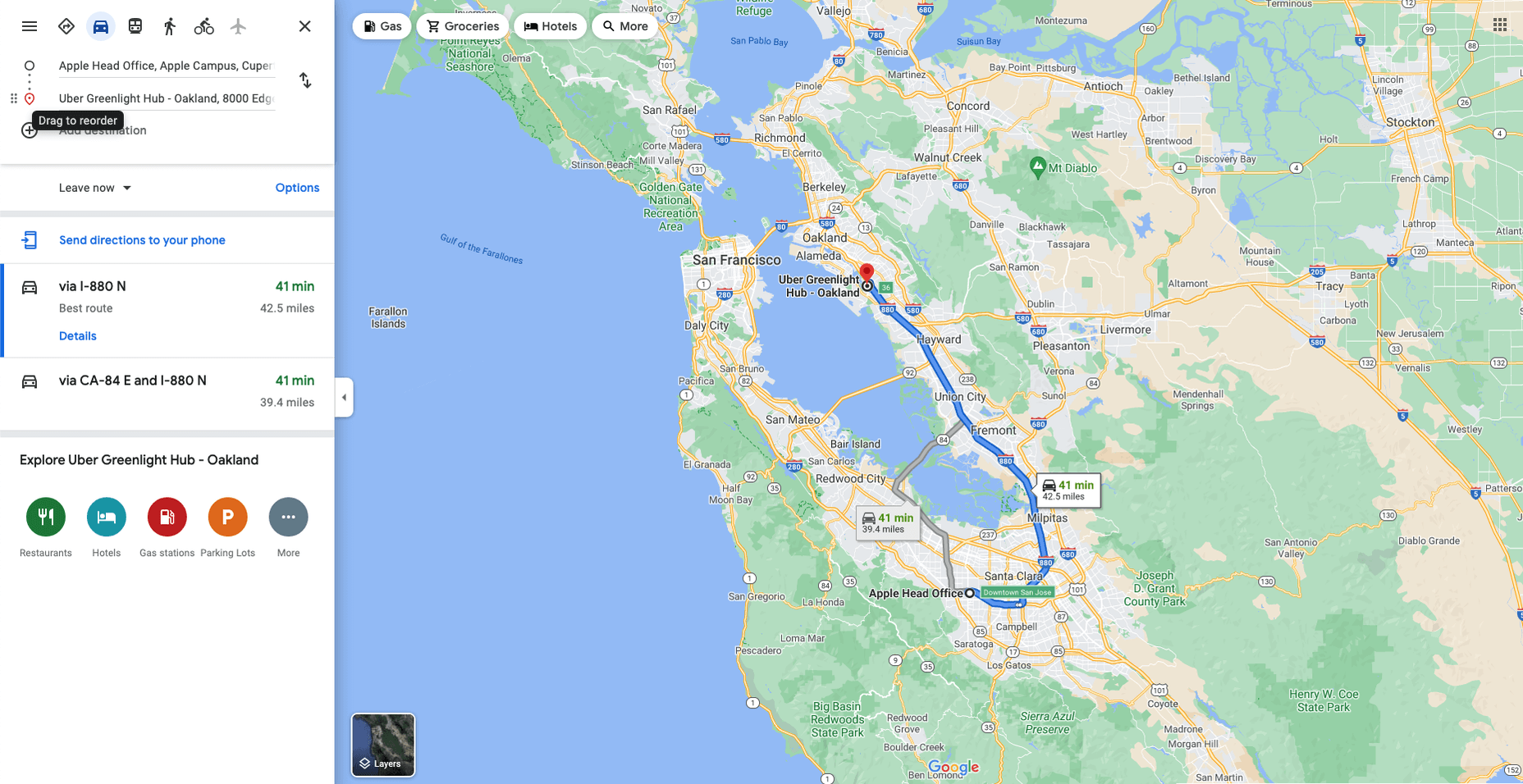
But it’s important to understand that more data ≠ better experiences. We all now have so much data available to us through multiple services that, arguably, the greatest challenge isn’t sourcing information but filtering it out. We can only handle so much information input before we become overloaded. This issue risks being omnipresent with maps. There are so many potential points of interest on a map that it’s essential to be clear about what needs to be exposed to users.

Also, UX design, map design, and user interface are all critical. While maps can be a powerful way of drawing people in, if end-users feel that you didn’t even consider the visual design, they’ll ‘bounce off’ your site or app in moments.

Common Use Cases

When are maps useful, and what problems do they solve? Let’s dive right into the most common use cases for maps used in web design.

Navigation and Direction

Like Google Maps shows, navigation and direction are arguably the classic case study for interactive maps. You are in one place and need to get to another. You can enter your destination, your current location, and the map will present suggestions for getting there. You can select the method of travel and adjust desired departure or arrival times. But you need to understand first what functionality your users need. How these options are exposed to users is a critical piece of UX design.

Also, if users are searching for options such as somewhere to eat, it’s not so straightforward. Then, how your map handles panning in real-time as users swipe around a city is going to be a big issue.

Showing Relationships and Trends Geographically

This is something that you’ll see in every election in any western country. We’re all used to seeing maps that give us a state-of-play for which state or seat is held by which party. Then, we might see projections based on voter intentions and projected voting swings deriving from that. Then, exit poll data can be projected with the map updated on an ongoing basis until the final result is confirmed.

The capability to do this is essential because if a static map were used, it’d be out of date any time a new poll was released. Also, voting intentions can change over a campaign, so such maps need to be dynamic. Of course, such maps are only as accurate as the available data, as the US 2016 election map showed.

Show Points of Interest

As mentioned previously, there’s a lot of data that can be exposed to map users. However, that doesn’t automatically mean that it should be. Usability is key. For example, when you look at a map, you’ll typically first see key points of interest. Which points of interest are going to be presented to you can vary.

One variant is zoom level. If your map is currently showing an entire city, the level of detail the map presents is deliberately limited. You’ll see districts, large roads, or geographic features such as rivers. If more detailed information were presented, users on mobile devices, in particular, would be overwhelmed. Even at this level, you’ll notice typography differences. These can include the city name being in bold or the names of different areas in capital letters. So the level of detail is coupled with the scale of the map. Zooming in a few notches will expose significant points of interest, such as museums. Zooming in to specific districts will reveal restaurants, coffee shops, and universities. This visual hierarchy is a critical way of managing the exposed level of information.

But information is still being abstracted away. It’s not until you tap on the museum that you’ll see information on opening hours and busy times. This is also typically presented with user photos and reviews. Context is also taken into account, so you’ll start to see local hotels and restaurants. So it’s not just individual points of interest that are important, but the connections between them.

6 Tips For Improving Interactive Maps

What are the challenges of creating effective maps, and how do people address the data overload problem? We’ll answer this question and go over the must-know aspects of map creation.

1. Ensure Security and Brand Trust

GDPR or General Data Protection Regulation. This is a critically important European law that extends a wide range of legal protection to European citizens regarding personal data. It’s not possible here to cover the full extent of the law, but here are some quick key points:

  • Consent is required for the processing of personal data; it cannot be assumed
  • You need to have a retention policy for information that’s capable of identifying people

Be aware that the latter doesn’t just cover commercial purposes. Research students have to submit GDPR forms that address what kind of data they’re sourcing and how they’ll be retaining it.

But the most crucial context is commercial. If a business suffers a data breach, it can be fined up to 20 million euros or 4% of annual worldwide turnover in the preceding financial year, whichever is greater. Therefore, any business storing data that could identify their customers will need to assess risk and compliance. Remember: it’s 4% of worldwide turnover, not EU turnover.

Also, anything of your business that you expose to your customers or users is an extension of your brand. Therefore, you need to assess your maps for brand compliance too. If you have primary brand colors and your map doesn’t abide by them, that’s a very poor look. Source the color hex codes directly from your brand team and involve them in design.

2. Use the Appropriate Type of Map

It’s also important to consider what type of map is most appropriate for your use case. Think carefully about what your users need, what you’re trying to communicate, what information you need to present, and how best to present it.

For example, points of interest style maps in a tourist app will be way more helpful than heat maps: people want to know where something is, key data like opening hours, and how to get there. A heat map showing the number of visitors to each attraction or area of a city is unlikely to be useful to tourists. However, it could be useful to the attractions themselves to map their visitors by heat map over time. This could help larger museums chart which exhibits are most popular.

Transport for London is charting passenger movement on the London Underground by detecting when a device with Wi-Fi comes into range and then passes out of range. They’re using this to understand overall user journeys and movements within individual stations to better manage disruptions.

3. Avoid Pop-Ups

It should go without saying by now that auto pop-ups are despised. It doesn’t matter what they’re doing or what they’re offering; an unwanted pop-up can only get in the way. The level of impact is even greater on a phone where pop-ups take up even more screen space.

Given this, many users close them without even reading them. So if you’re using pop-ups, don’t kid yourself. You’re likely just irritating users and increasing the likelihood that they’ll ‘bounce off’ or uninstall.

4. Avoid Auto-Geolocation

Auto-geolocation sounds incredibly convenient but can result in some real problems. For example, if there are any bugs with auto-geolocation, you could get false results. If someone connects through public building Wi-Fi, you could get false results. If they’re connecting through a VPN then, unless you get the user’s IP address and check if it’s the exit portal of a VPN, you could get false results.

The problem is most significant with mobile maps. If a map user is looking at a points of interest map, they likely have a specific and immediate use. This means it’s in their best to get the most accurate results possible. So why not just ask them?

Precision and Accuracy

These terms have specific meanings in geolocation. ‘Precision’ is the exactness of the data. ‘Accuracy’ is how closely the information on a map matches the real world. So you want precision and accuracy to be spot on, or data risks losing value. This applies not just to the gathering of data but to the representation of it. For example, if you have street-level data but your maps don’t present individual streets, then any representation of data on that map is likely to have poor accuracy. That map might succeed in abstracting irrelevant information but presenting an imprecise and inaccurate view.

5. Avoid Map Legends as Much as Possible

In many cases, primarily points-of-interest maps, they’re just not needed anymore. An essential part of user experience design isn’t just visual hierarchy but information hierarchy. You can mouse over on a desktop or laptop to get the essentials of a location, e.g., the museum’s name and its opening hours. On a mobile device, you can tap on that location to get the essentials, and you can tap on another location to move on; you don’t even have to press back. Given that, a legend would get in the way. So this simple piece of information design solves information overload issues.

As with all rules, there are exceptions. A good one is a heat map where a density of what’s being measured needs to be communicated. It doesn’t matter what the data is; it just needs to be something where mapping provides greater insight, especially if it informs decision-making. Sales is an excellent example for a national or multinational company. Of course, weather forecasting can make use of literal heat maps.

6. Accessibility Compliance

Not everyone has perfect eyesight. Even if someone has excellent vision, they could still be colorblind (8% of men and 0.5% of women are). Given that, take the W3C’s accessibility standards into account and treat them as a baseline or minimum barrier to entry for compliance. You shouldn’t feel good about the possibility of excluding 8% of your potential audience or customers. Ensure you keep your UX designers involved and don’t shy away from creating senior-friendly web designs.

Put simply: imagine if you could appeal to a new demographic that’s not catered to. If your competitors ignore them, you could give them a real reason to choose you instead by taking some straightforward steps. If your competitors are catering to them, you also need to. If you don’t, you’re just giving potential customers a big reason to ignore you.

Conclusions

The key takeaway is that there’s far more to creating good maps than just good cartography. That can be critical, too, though this may vary depending on the use case.

This will be a team effort because your map will involve data sets, design decisions, and, yes, cartography. You’re going to need to involve brand and IT too. So think about design principles and development methodologies.

First and foremost, what are your users’ needs? If you haven’t done any user research or taken the time to understand the customer journey, are you adding anything or getting in the way? It’s easy to see the department that requested the map as stakeholders, but you should probably view your users as stakeholders too.

This sounds complex, but as you hopefully now appreciate, a map is probably more complicated than you thought.


Featured image via Pexels.

Source

The post The UX of Maps in Web Design first appeared on Webdesigner Depot.

Source de l’article sur Webdesignerdepot