
 Podcasts are on the rise. In 2020 consumption of podcasts reached 332.2 million internet users, and this number grew to 383.7 in 2021. And it is increasing steadily – with the number of listeners slated to reach about 509.4 in 2024.
Podcasts have moved from a niche market of discussants in their parent’s basements to being spread across the globe into everyone’s earsets.
However, it’s more complex than just creating a decent show and uploading it. First, your website needs to be able to handle the traffic, lest you want your listeners attempting to sign up for your newsletter on a frisbee. But where does one start?
And that’s where podcast hosting sites come into the picture!
You need a podcast hosting service to publish your podcast episodes online and make them available to your audience. Podcasts are called interactive audio content for a reason. Your podcast listeners can get in touch with you through the comments section, emailing you their feedback, sharing your episodes on social media, and more.
It doesn’t matter if you’re looking to become a mega-star or want to solidify your brand; knowing which podcast hosting platform to use is essential to the podcasting process.
In today’s article, we have covered the 15 best podcasting sites. So whether you are looking for free or paid podcast hosting sites, we have covered everything in detail.
1. Podbean
Podbean is a podcast hosting and monetizing platform that lets you publish your podcasts in minutes. Just set up some basic information about your podcast – and you are set to publish your first episode on Podbean. With Podbean’s intuitive user interface, getting started with the service is as easy as pie!
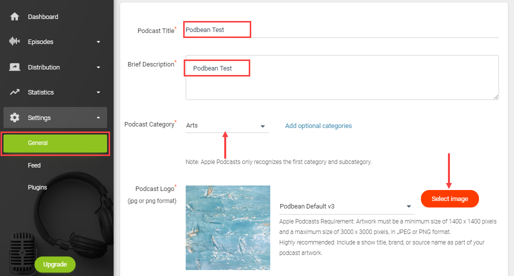
In the above image, you can see how Podbean will ask you to set up your podcast. Podbean makes it easy to create a professional-looking site from title and description to category and podcast logo. Once you upload your episode, you can also pick a theme for your site.
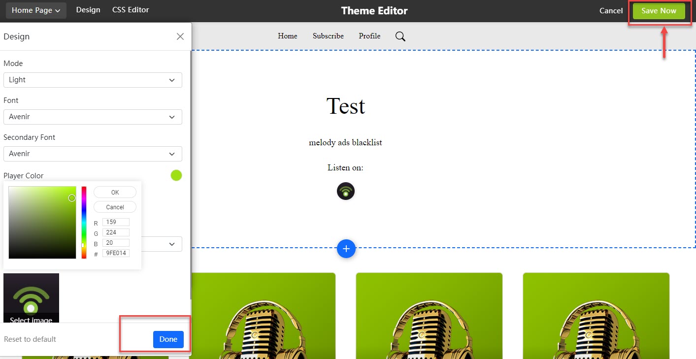
As you see in the below image, you can customize its fonts and colors and test the audio and appearance before it launches.
Podcasts can also be listened to on Apple, Google, Shopify, and other podcast apps. If you want to embed your podcast on your website or blogs, Podbeans Embeddable Players will make that easy for you. The Embeddable player is also customizable and lets you add branded elements, making the design professional.
You can even connect your social media handle with your Podbean account to directly share podcasts on your social pages.
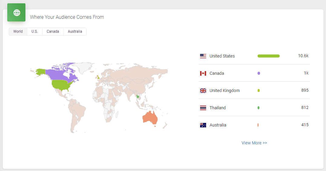
It doesn’t skimp on statistics, either. Podbean statistics will give you all the insights you need to know about your podcast’s audience, including the top 10 episodes, how many downloads there are at a particular time, where your customers come from, and user retention data.
All in all, it’s a great option to get started with your podcasting journey. However, one downside is that the podcast website isn’t as polished as some podcasters might prefer.
Other key features include
- You can host audio and video files without limits on storage and bandwidth.
- You can personalize your podcast with your own domain.
- You can also schedule your podcast episode in advance.
- Once you publish your podcast, users can access it on Alexa devices.
- Its Mailchimp integration will help you collect emails for future distribution.
- You can monetize your podcast using ads.
- Live stream your podcast with a remote co-host or guest.
Pros
- They offer a free plan, which provides iPhone and Android app players with 100GB of monthly bandwidth and their own podcast site.
- Even though the interface is very intuitive, the resources in their knowledge base will be helpful to beginners.
Cons
- You can’t host video podcasts unless you are on their Plus & Business plans.
- The podcasting website should be more professional.
Pricing
It starts at $9/month for unlimited storage space, unmetered bandwidth, distribution on significant podcast apps, customizable themes, and more.
2. Buzzsprout
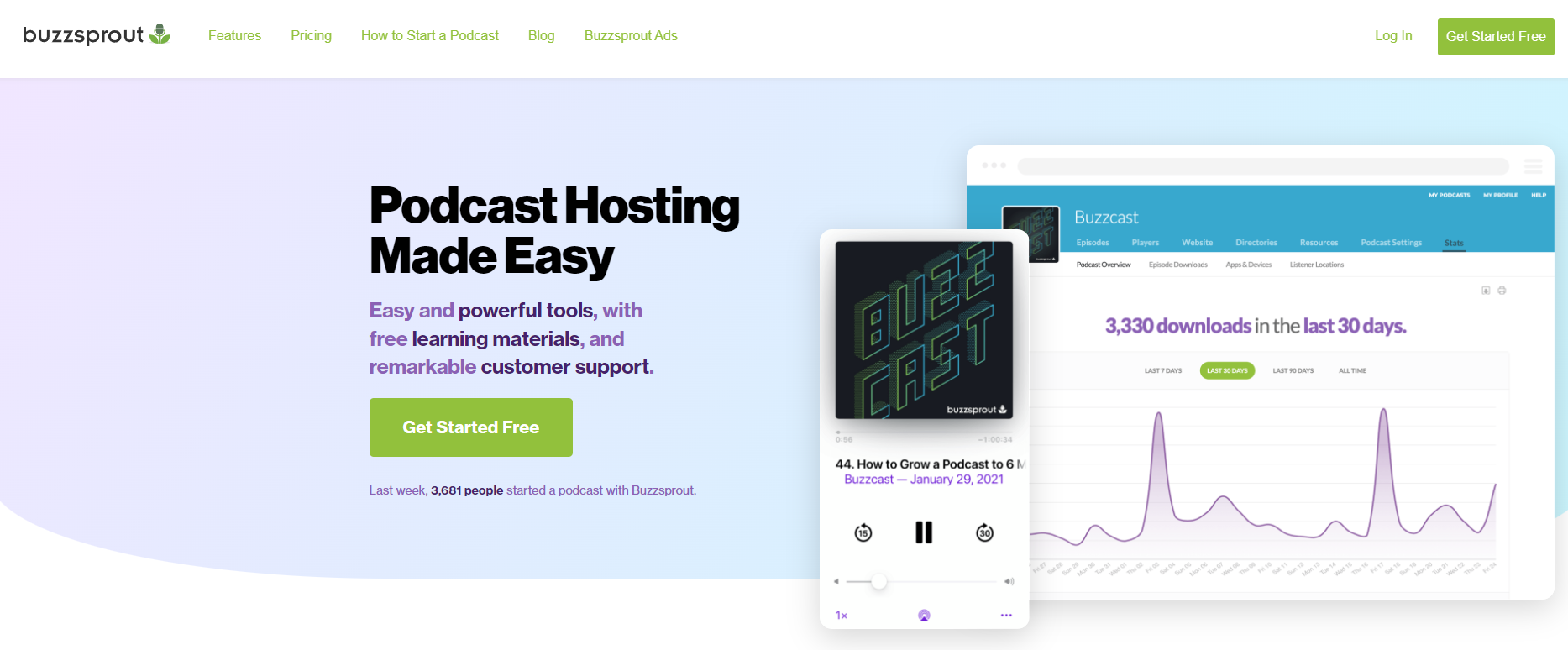
Buzzsprout is a podcasting platform that provides hosting, promotion, and analytics solutions. You can directly distribute your podcast on Google, Apple, Spotify, Stitcher, iHeartRadio, Alexa, Overcast, and more through Buzzsprout.
You can start with easy and free learning material provided by Buzzsprout, including podcasting guides, courses, video tutorials, industry podcasts, and community.
It’s also worth noting that Professional-sounding podcasts don’t come easy. That’s why Buzzsprout’s MagicMastering tool is available for you to use. It’s an audio filter that sweetens your podcast and optimizes it for the best industry standards.
That said, the Magic Mastering feature is only available with the pricier plans, so you’ll have to shell out more money for it.
You don’t have to worry about optimizing your episodes yourself either because Buzzsprout optimizes all episodes in terms of file type, bitrates, ID3 tags, etc.
The best part is that it has dynamic content flexibility, letting you decide whether audio should go at the beginning or end of an episode. It does everything to make your podcast search engine friendly, including transcribing each episode for people with hearing disabilities.
Buzzsprout’s users also usually have good things to say about the platform.
For example, Neil Thacker, founder of Casual Car Guide, who uses Buzzsprout himself, is a big fan of the platform.
Thacker says,
“I have been lucky enough to host a few different podcasts in various industries. Every time, my hosting platform of choice is Buzzsprout. They just get it. Buzzsprout makes it super easy to publish and syndicate your podcast episodes across various mainstream streaming platforms and directories.
If you need a website for your podcast, Buzzsprout gives you the tools to create one. Simply pick a domain and host your podcast there for the world to see. It’s quick and easy to set up and won’t cost you the earth. Go, Buzzsprout!”
Other key features include
- It offers a customizable podcast player that lets you skip to the next track or move backward. You can also share your episode on social media and make the player match your website’s branding.
- One account can hold multiple podcasts and team members.
- You can find all the necessary help through its YouTube channel and Facebook community.
- It integrates with tools such as Chartable, Podtrac, Hindenburg, and more.
- It also offers Visual Soundbites to match your brand colors.
Pros
- It offers competitive pricing and features.
- Clean & easy-to-use UI.
- Plenty of learning resources.
- Free version for 90 days.
Cons
- Limited upload time, even with paid plans.
- Your episodes will be hosted only for 90 days with the basic plan.
- The basic plan does not include Magic Mastering.
Pricing
Starts at $12/month for 3 hours of upload, advanced statistics, unlimited storage, and more.
3. Simplecast
Simplecast is the all-in-one solution for your podcasting needs – including podcast publishing, distribution, analytics, and sharing. Whether you’re a large or small business, it also has similar tool access for all sizes of companies.
Your podcast can be set up anywhere, including Shopify, Google Podcast, Apple Podcast, and other podcast directories. Simplecast gets your podcast on these directories and apps as soon as you publish any episode and then automatically sends it to your listeners.
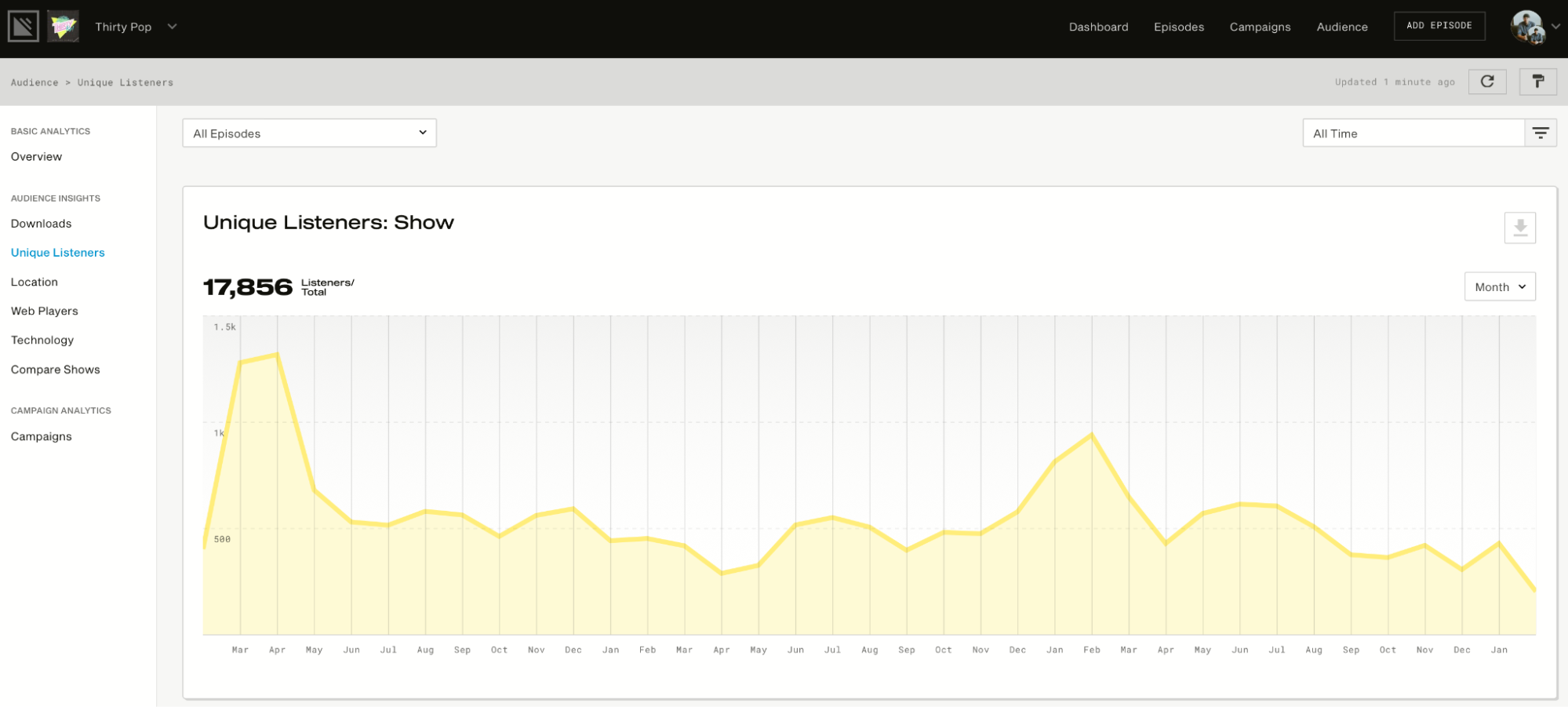
Then it will provide you with advanced analytics to show how many listeners you have, how many downloads you get, your listeners’ locations, and more. See below for a visual representation of how this works:
It also has a website. That’s right; you’ll get your own website.
This website automatically updates as you publish new episodes and is customizable, mobile-friendly, search engine optimized, and Google Podcast optimized. You can even use your own domain names.
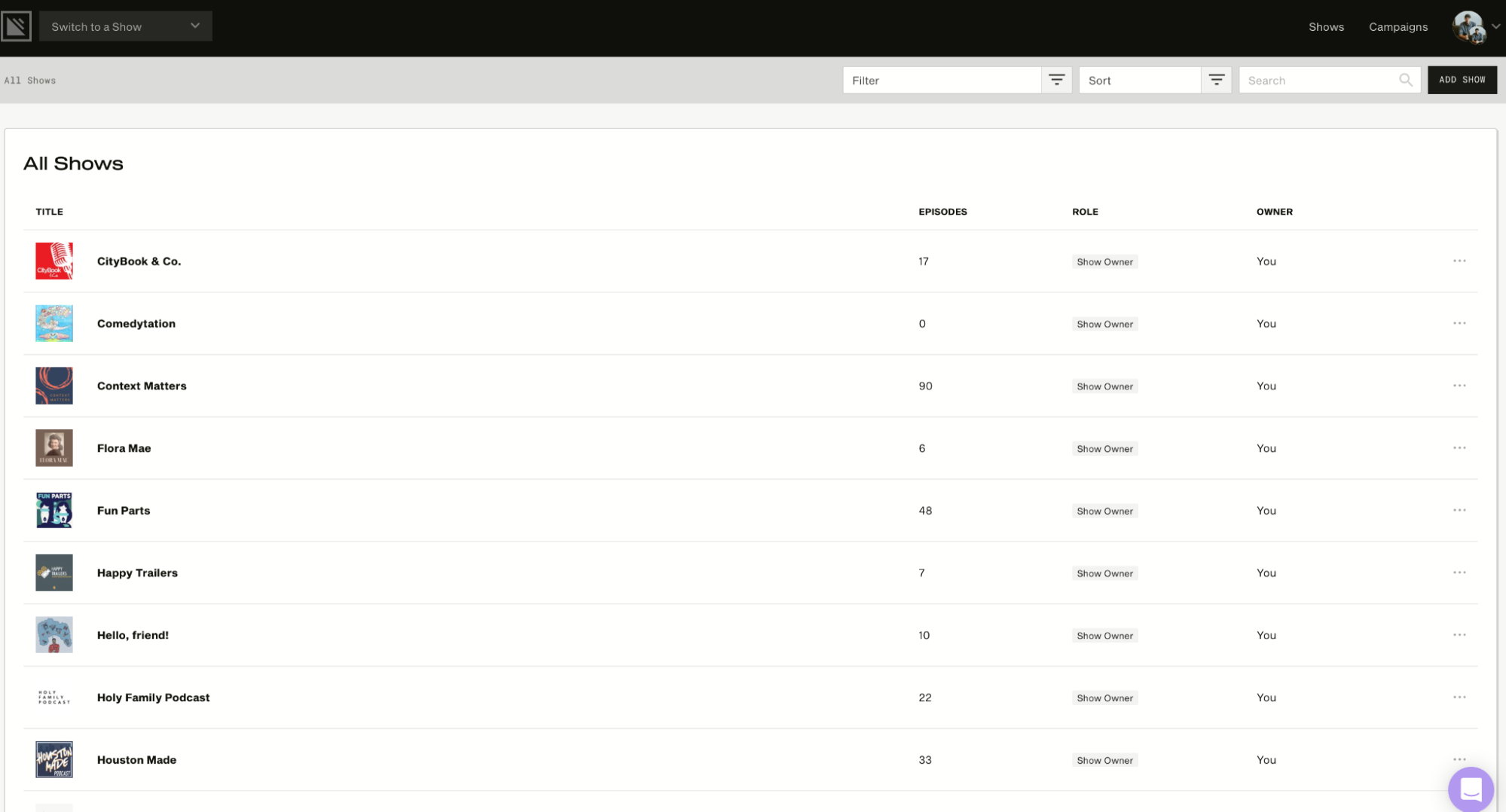
In addition, it allows the user to manage multiple shows in a single account. The image below will show you what the Podcast Dashboard looks like. It displays the number of episodes for each show and other information, such as role and owner.
Other key features include
- Its audio analytics come in easy-to-understand visuals and show you different trends – for example, which device listeners use to listen to your podcasts.
- Simplecast’s framework is a rock-solid, no-nonsense platform that keeps your stream playing 24/7.
- You can import your existing podcast from any platform with just a few clicks.
- You can use its players to embed your podcasts on your web.
Pros
- All of its plans offer unlimited uploads and storage.
Cons
- It does not offer a free version.
- I see users getting frustrated with the limited customization options for website themes.
Pricing
It starts at $15/month for two seats, unlimited storage and uploads, basic analytics, a custom domain, a customizable website, and more.
4. Anchor.fm
Anchor is one of the – if not the best free podcast hosting services by Spotify that takes care of creation, distribution, monetization, analytics, and more.
Creating Music+talk episodes on Anchor is as easy as pie. Choose any song from Spotify’s library, place it in your episode builder, add an audio file that you wish to go with the music file, and then submit your episode for review.
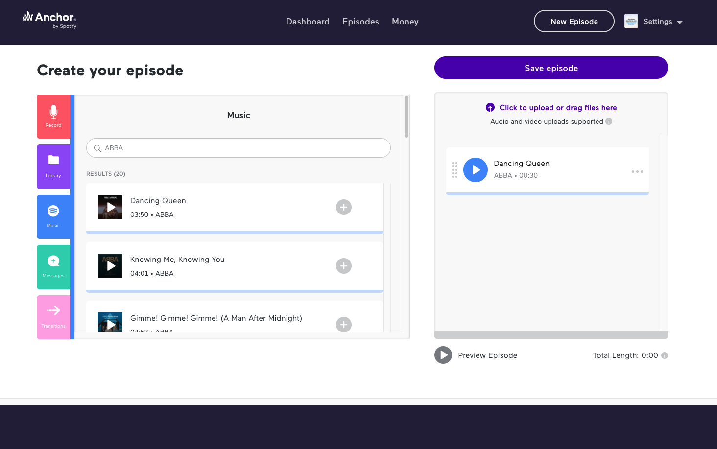
Some of the best ways to make money from your podcast are by building an audience and monetizing that audience. And with Anchor, you can monetize in various ways, including by adding paid advertisements to your podcast or asking for donations from listeners.
In addition, the IAB 2.0-certified metrics from Spotify let you measure your podcast’s performance in detail. For example, you can see where listeners are abandoning you on the track and adjust accordingly by adding content that really matters to them. You can also see what type of listeners interact with your podcasts – how old they are, what gender they identify with, and more.
Luciano Colos, founder and CEO of PitchGrade, who uses Anchor for his own podcast, talks about his experience with the platform.
He believes that the end-to-end control of the whole process is what makes Anchor.fm unique.
Colos further shares,
“Even if you’re not a technical person, the interface is so simple that you’ll be able to learn it in minutes. I’ve been using it since the day I started my podcast, and I’m so glad I found it. It’s also worth mentioning that the support on the platform is great. If you ever have a question, you can contact the staff on their Discord channel and will get an answer within minutes.”
Other key features include
- All the content rights are yours.
- You can distribute your podcast to Google, Apple, Pocket Casts, Spotify, and more.
- You can directly record from your phone, tablet, or computer and sync them to all devices.
- You can create both audio and video podcasts.
- The episode builder has easy-to-visualize building blocks.
Pros
- Anchor offers free and unlimited hosting in all plans.
- Easy monetization options, that too with ads in your own voice.
- You can distribute your podcast to all major podcasting platforms.
Cons
- You can host only one podcast per account.
- Interview features on phone hosting are limited.
- Customer support is limited to online resources.
Pricing
It’s a free platform.
5. SoundCloud
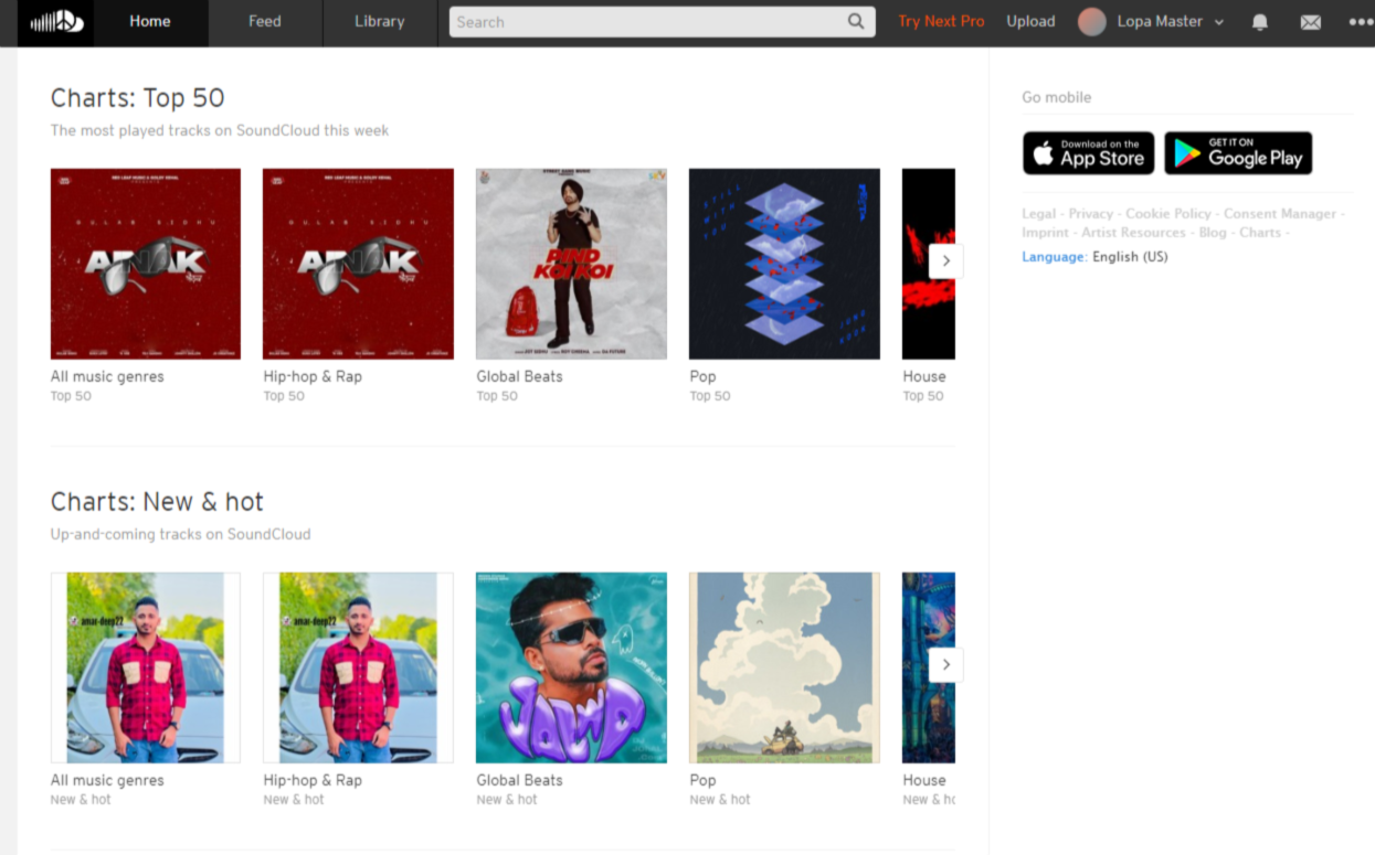
SoundCloud is a platform for both streaming audio and hosting podcasts. Majorly, it’s a popular music-sharing platform, but it also offers a robust podcast-hosting platform used by over 75 million people worldwide.
Creating a SoundCloud profile is also as simple as pie. You can personalize your profile with your own username, profile URL, custom profile image, and header.
SoundCloud is also one of the few podcast-hosting platforms that allow you to create a community around your podcasts. This is handy if you want to grow awareness about your podcast among other users.
Users can comment on specific moments of the track, and other users can see those comments when they reach that moment on the track.
The podcast hosting platform is available for Android and iOS, and you can sign up for free. Of course, there’s an affordable fee for upgrading your account to a creator account.
In addition, SoundCloud lets you distribute your tracks on various channels, including Spotify, YouTube, Apple Music, and more.
Then you have the SoundCloud Analytics dashboard that gives you a quick overview of the number of streams, revenue, and top tracks — but it’s not as detailed as you can get with other podcasting sites. After all, it’s a music streaming platform primarily rather than one specifically for podcasts.
There is little to no knowledge on their website for beginners, which is another disadvantage. That said, it’s pretty easy to use, so anyone without experience in podcasting can easily use the platform.
Other key features include
- SoundCloud allows you to share your music on Apple Music, TikTok, Spotify, and more.
- Except for the free version, SoundCloud offers unlimited upload time.
- If you have collaborators in your profile, you can split the payments with them.
- You can also schedule your podcast releases in advance.
Pros
- It offers a free plan with 3 hours of upload time.
- The hosting fee is affordable.
- Listeners can comment on specific moments from your track.
Cons
- Many users report that it takes a long time to load the track.
Pricing
It starts at $2.50/month for monetization, distribution, promotion, and split payment features.
6. Transistor.fm
Transistor’s like other podcasting platforms – you can create a podcast from scratch or import it from another platform. Just follow the instructions, and you’re good to go.
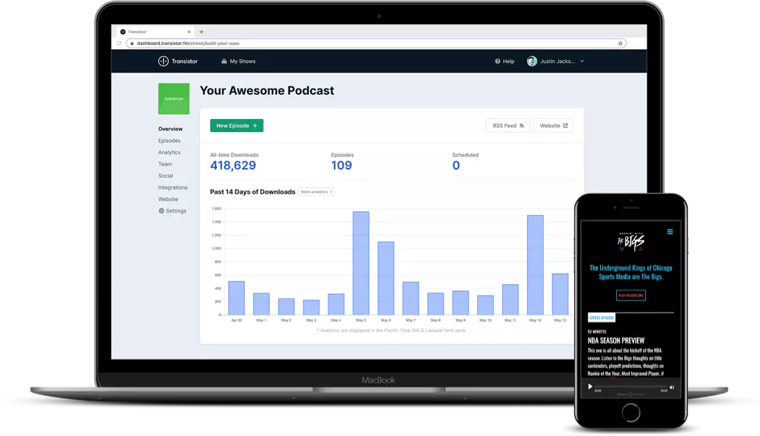
Once your podcast is recorded and ready to go, you can invite multiple members to contribute. Its analytics software provides clean visuals and robust insights into listener trends.
For instance, the below image is an overview of the podcast performance:
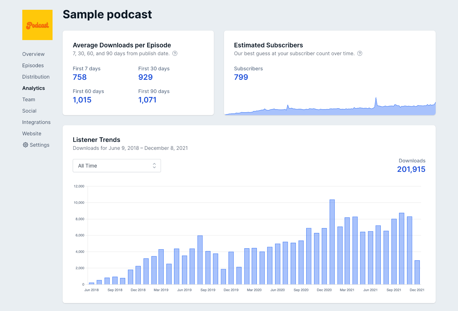
Now observe that the amount of data and clear visuals make this less overwhelming. As you can see, it gives you insights into average downloads per episode for the specific period, estimated subscribers, and total downloads (month-wise visual presentation).
In addition to providing one-click submissions to significant podcast platforms such as Spotify, Google, Apple Podcasts, Podcast Addict, and more, Transistor also offers one-click submissions to search engines like Listen Notes and The Podcast Index. Transistor is one of the few podcasting hosting platforms to provide a service like this.
Corey Haines, Founder of SwipeWell, shares his experience with the platform,
“I’ve been super happy with Transistor.fm for hosting all my podcasts. Instead of paying for each one individually, Transistor allows me to host all the podcasts I want for a single price. This made me feel free to experiment and start as many podcasts as I wanted. They also have great integrations, analytics, and sharing capabilities to embed on a website or newsletter.”
Other key features include
- You can create, import, and host multiple podcasts in a single Transistor account.
- You get a unique RSS feed, advanced analytics, a basic webpage, and collaborator invites for each podcast you create.
- The analytics tool gives you insights like the number of plays, total plays per episode, average download, devices, and more.
- It offers a podcast player that you can embed on your website, landing page, or tweet.
Pros
- Multiple podcast hosting options allow you to test different podcast formats for varied groups of listeners.
- You can host unlimited podcasts in one account.
- It offers a free trial.
Cons
- The starter plan, which is a paid one, does not include dynamic ads. It also does not allow you to automate YouTube posting.
- There are plenty of resources in their knowledge base, but finding what you’re looking for is confusing.
- Only the Business plan allows you to remove Transistor branding from the player.
Pricing
It starts at $19/month for unlimited podcasts, private podcasts, live customer support, a built-in podcast website, and more.
7. Libsyn
Libsyn has the tools to help you get started regardless of your level of podcasting expertise. It assists you in recording, publishing, distributing, and monetizing your podcasts.
The best part? You can host both audio and video podcasts on Libsyn.
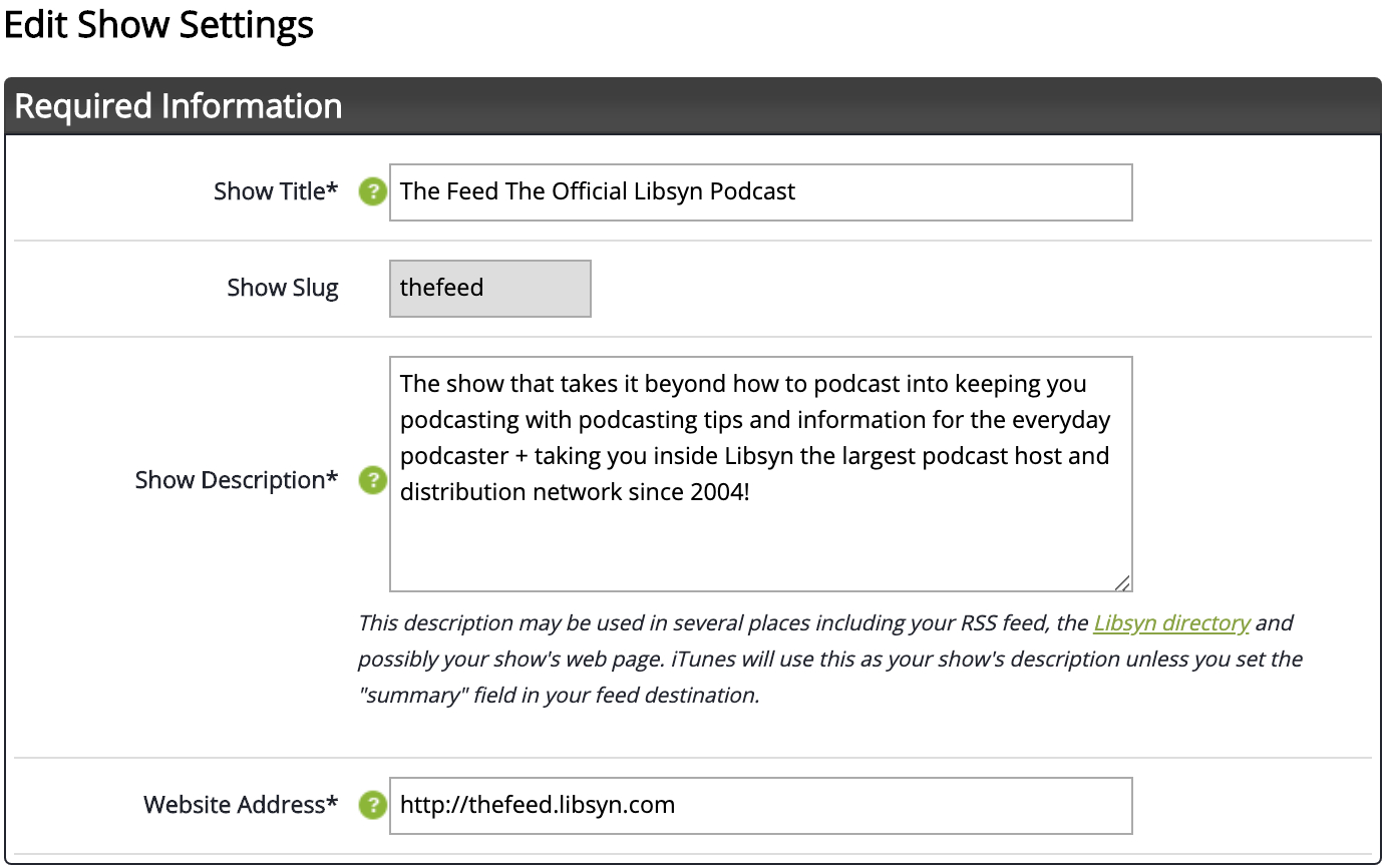
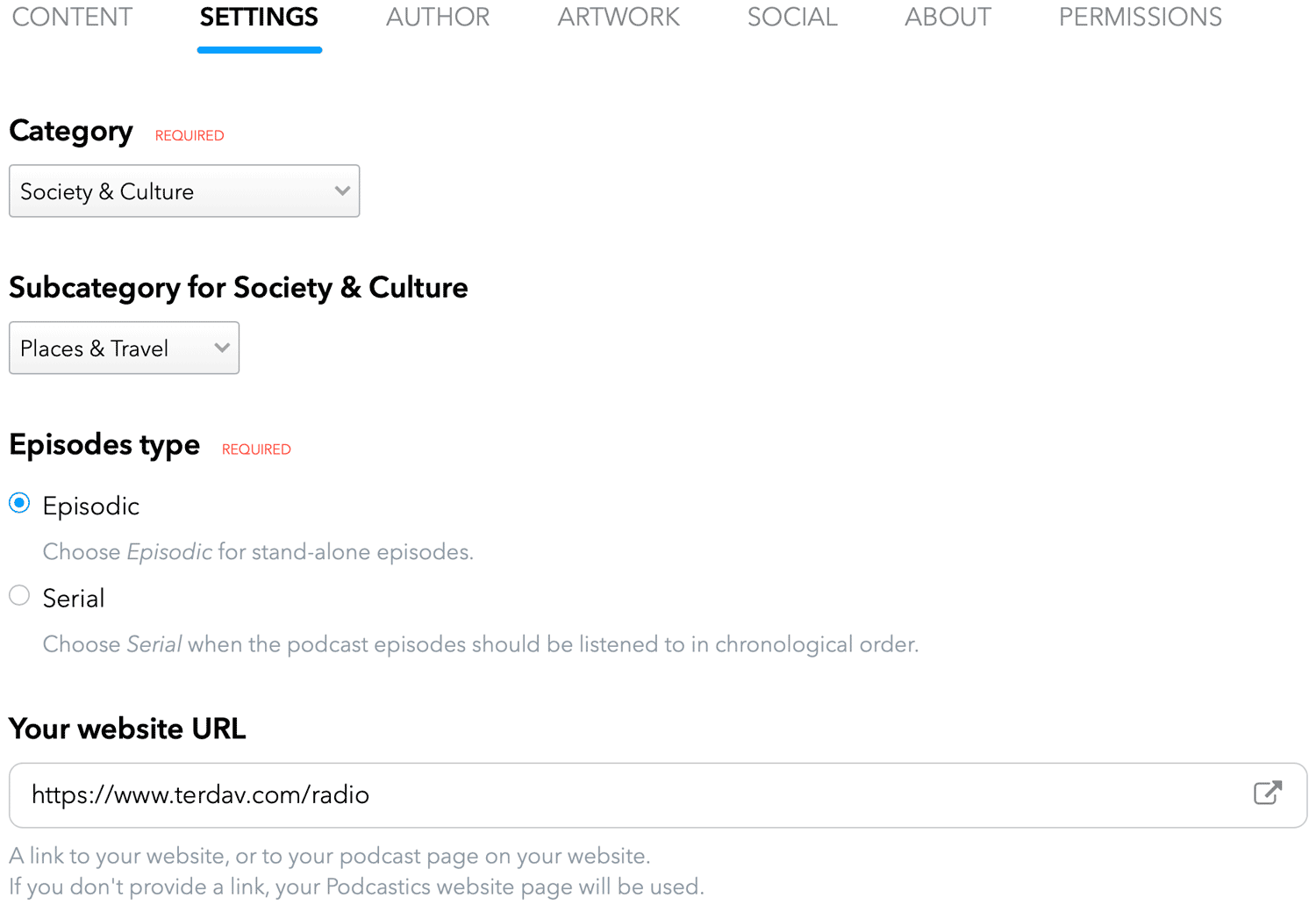
To get started with Libsyn, you’ll have to provide a few details, including podcast title, subtitle, description, category, owner’s name & email, author, website URL, and more.
The below image shows what the Libsyn podcast settings look like:
You can also add your own artwork to your podcast. Click “Add artwork” or drag and drop the images in the upload area. Suppose you don’t have your artwork ready. In that case, you can design one on Canva – Libsyn’s integration with Canva makes creating a professional-looking podcast cover simple without any graphic design experience.
Once you are ready with everything, publish your podcast and distribute it to the platforms where your listeners could be, such as Apple Podcasts, Spotify, and Google Play Music.
Libsyn gives you more ways to make money with your podcast, including advertising and subscriptions. For example, you can pitch to the big advertisers on Libsyn’s AdvertiseCast Marketplace or build a community of members who get exclusive access to your content.
Antreas Koutis, Administrative Manager at Financer, shares his experience with Libsyn,
“When I started podcasting on the side, I wasn’t sure which hosting platform to use. There are a lot of options out there, and it can be overwhelming to try to figure out which one is the best. After trying out a few different platforms, I found that I liked Libsyn the best.
It was easy to use and had all the features that I was looking for. I also liked the fact that they offered unlimited storage and bandwidth, which was important to me since I wanted to be able to grow my podcast without having to worry about running out of space. The only downside is that it can be a bit expensive, but overall I thought it was the best option for me.”
Other key features include
- Its podcast players allow you to drag and drop your uploads, and you can create an episode from any page.
- You can also publish your episodes in batches or pre-schedule them.
- With Snippets, you can create a description for your podcasts just once and reuse it with every post.
- It provides IAB Tech Lab Verified Stats, which means you can trust the accuracy of the data.
- Get access to advanced analytics, including an interactive worldwide map, listener app analytics, demographics, and more.
Pros
- Podcasting can be a cinch for anyone who starts with Libsyn’s in-depth, step-by-step guides and other valuable resources.
- Its integration with Canva helps you design your artwork with ease.
Cons
- The basic plan does not offer unlimited storage or uploading hours.
- For advanced features, the price is quite high.
Pricing
Starts at $5/month for 3 hours of uploading, 162MB storage, stats snapshot, basic social promotion, unlimited bandwidth, ad-free website, and more.
8. Podcastics
Podcastics is a complete suite of tools for hosting, sharing, and monetizing your podcasts. The prime reason to give Podcastics a try is its 1-month free trial – no credit card required! And you don’t even need the training to use this platform. But if you need assistance, there’s plenty of help in the help section.
It takes just a few clicks to get Podcastincs up and running. The editor is clean and self-explanatory, as shown in the image below. Just follow the steps, and your podcast will be ready in minutes.
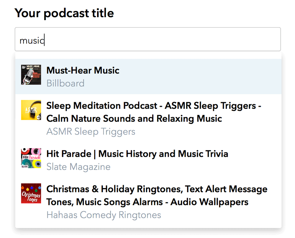
Moreover, if you already have your podcasts on the Apple Podcasts platform, you can easily import all of them into your Podcastics account in just two clicks. Simply type your podcast name in the search box and select yours from the list that appears. This will collect and save all your data, such as titles, descriptions, episodes, etc.
Podcastics is also one of the few podcast hosting platforms that allow you to host multiple podcasts with unlimited episodes under one roof.
Once your podcast is up and ready to be distributed, you can share it with the world on major listening platforms such as Spotify, Google Podcasts, Apple Podcasts, and more. Podcastics makes distribution so much easier by automatically creating an RSS feed for you.
Its magic link never misses redirecting your listeners to the correct platform. You can also add QR codes to your magazines or print flyers to get user subscriptions.
Other key features include
- You can host multiple podcasts in one account.
- It also records heat maps for you with the most and least active time during the week.
- The text editor lets you insert links and lists and style your fonts in episode descriptions.
- If you are using a free version, you can use your own server to upload your podcasts. Paid plans offer to host by Amazon Servers.
- You can also monetize your episodes using Patreon and affiliate programs.
- You can segment your podcasts into sessions and assign episode numbers.
- You can schedule your podcasts for specific dates & times.
Pros
- It saves your time with the duplicate episodes feature; then, you can edit a few details and post another episode in minutes.
- Its description snippets eliminate the redundant task of adding a few same elements for each episode.
Cons
- Although it contains so many advanced features, newbies can quickly become confused by the program for the same reason.
- For the free plan, you have to use your own server.
Pricing
Starts at $8/month for worldwide distribution, easy import, unlimited episodes, private/unlisted episodes, and more.
9. Spreaker
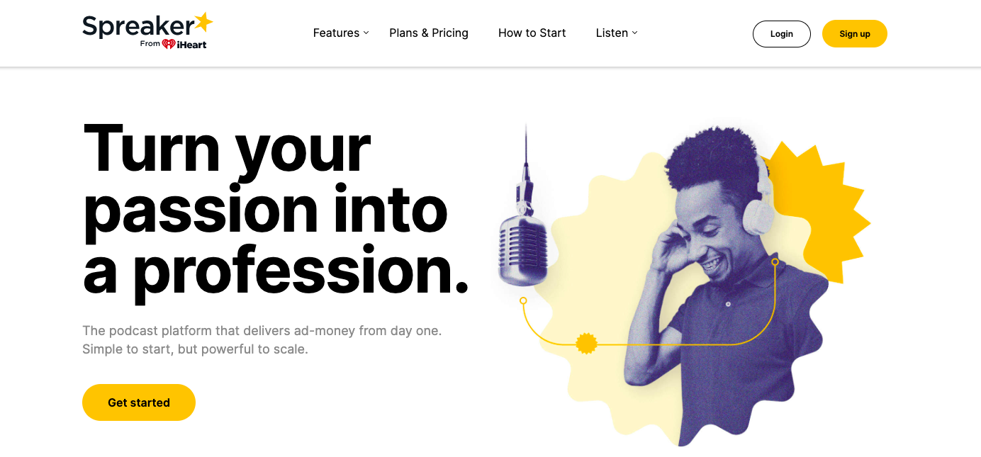
Spreaker comes with a bundle of tools for you to create, distribute, monetize, grow an audience, and track the progress of your podcasts. You can host and monetize your podcasts with programmatic ads from big brands, such as Green Chef, Lego, Swag.com, CareerBuilder, and more.
Spreaker’s how-to guide for podcasting will get you started in no time. Once you have your podcast’s name, length, and format ready, Spreaker Studio will help you record it, add sound effects, and crop or trim your audio. Finally, add the cover art, and you are ready to publish your first podcast on Spreaker.
Martyna Inkielman, Community Manager at PhotoAiD, shares her experience with Spreaker,
“I find Spreaker the best and most reliable platform. My favorite thing about it is that it provides most of the essential features in one place – pretty much everything related to your podcast can be done on Spreaker. It’s also very intuitive, so it’s effortless to use, even for beginner podcasters.”
Martyna mostly has good things to say about Spreaker, but one thing that bothers her – it doesn’t support video podcasting, so she can’t post on YouTube with it.
Other key features include
- With Spreaker, you can share your podcasts on Google Podcasts, Amazon, Apple Podcasts, Spotify, and iHeartRadio.
- For monetizing, Spreaker inserts relevant ads in your podcasts no matter how new your episode is.
- For analytics, you can choose the plan for the level of detail you need about your podcast interactions. From downloads to listeners’ geolocation, Spreaker shows you every statistic vital to you.
- Spreaker Enterprise offers full-stack audio publishing, single-click distribution to various podcast channels, ad campaign manager, and more.
Pros
- You can monetize your podcasts regardless of the size of your audience, the number of downloads, or your account age.
- You can see real-time analytics of your podcasts because of their IAB Tech Lab certification.
Cons
- Users have reported limited options for customer service.
Pricing
It starts at $8/month for 6-months statistics, 100-hours storage, auto-upload to Spotify, iHeartRadio, Apple Podcasts, and more.
10. Podomatic
Podomatic allows you to build your podcasting career in four easy steps: create a free account, record and publish, submit your podcast to big podcast platforms such as Spotify, and keep repeating.
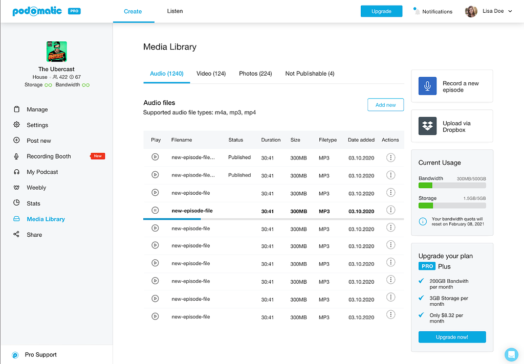
To upload media, you must first add it to Podomatic’s library of supported file formats. It supports file formats including m4a, mp3, mp4, BMP, jpg, png, mp4, m4v, and more.
Podomatic will store your audio and video files in an unpublishable section if they are larger than 350MB, lack an extension, or has an unsupported extension.
To upload a podcast, you only need to determine the title, tagline, cover art, description, category, tags, and language. Then, once published, you can start monetizing it using Patreon, Popcorn, and What For Apparel ads.
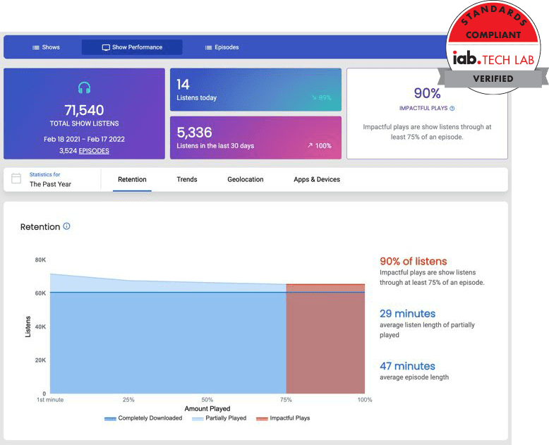
You can also get stats on your podcast, including total plays, mobile plays, embeds, downloads, visits, and more. The service goes further into analytics to show your performance over a selected period of time, the performance of individual episodes, and listeners’ graphs.
Other key features include
- You can store up to 6 hours of recording (free) or 500MB of files.
- It gives you 15GB of bandwidth for a month.
- It also offers free tracking of your podcasts daily.
Pros
- You don’t pay for your first 20 episodes.
- Its premium plans are affordable.
- Premium plans offer unlimited bandwidth and storage.
- Be it a computer or mobile – you can record and publish high-quality episodes.
Cons
- It doesn’t allow the scheduling of episodes.
Pricing
Starts at $2.49/month for 100GB bandwidth, 2GB storage, and more.
11. Blubrry
Blubrry is a podcast hosting platform where you find easy podcast migration from other platforms, live customer support, and in-depth statistics. Blurry is also ready to host your single podcast or a whole slew of them.
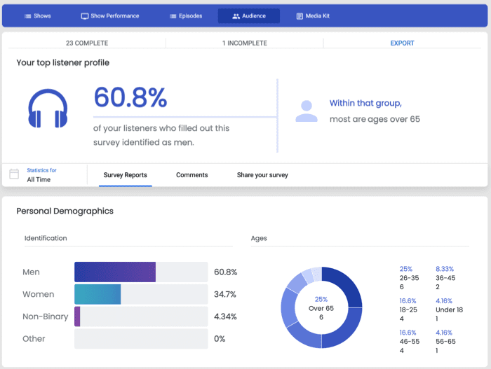
With Blubrry, you can get more than just a podcast hosting service. You can grow your audience and connect with listeners by using Podcast Audience Surveys. These surveys give you valuable information about your audience, allowing you to develop a more robust publishing strategy.
For instance, you can see who completed your surveys and see their entire profile with information like identification, age, employment, education, demographics, audience’s listening habits, feedback, and more.
Once you’ve got all these metrics in place, you can then use them to compare and contrast with one another to come up with a more robust publishing strategy. This is something that no other podcast hosting platform does.
Blubrry also offers a free and optional managed WordPress website – designed with all the necessary modules a podcast website needs. In addition, this site automates podcast publishing on your website by using PowerPress Plugin.
And if you’re not looking to host an entire website, Blubrry offers a podcast landing page with a quick display of the show and listen and subscription module.
Want to further know where your listeners are coming from and which device they’re using? Blubrry Stats can help you analyze all of that!
However, it’s worth noting that Blubrry’s Standard plan is so basic that you can’t even use your own domain with it. It doesn’t come with advanced statistics or additional themes and plugins either – so be prepared to buy a pricier plan if you want all of those features.
Other key features include
- It allows private podcasting for secured delivery of audio and video to any device.
- It comes with a podcast media kit – which gives you an overview of your podcast performance.
- It also lets you choose your own logo, branding, and theme.
- You can also use your own domain with its advanced plan.
Pros
- Additional storage is available for an extra charge.
- Listeners’ survey helps build a closer connection with the audience.
- Its visual reports are detailed and easy to understand.
Cons
- Both paid plans offer minimal storage. The maximum is as little as 400MB.
Pricing
It starts at $10/month for 125MB storage, standard statistics, monetization, email and phone support, unlimited downloads, a custom embedded player, and more.
12. Captivate.fm

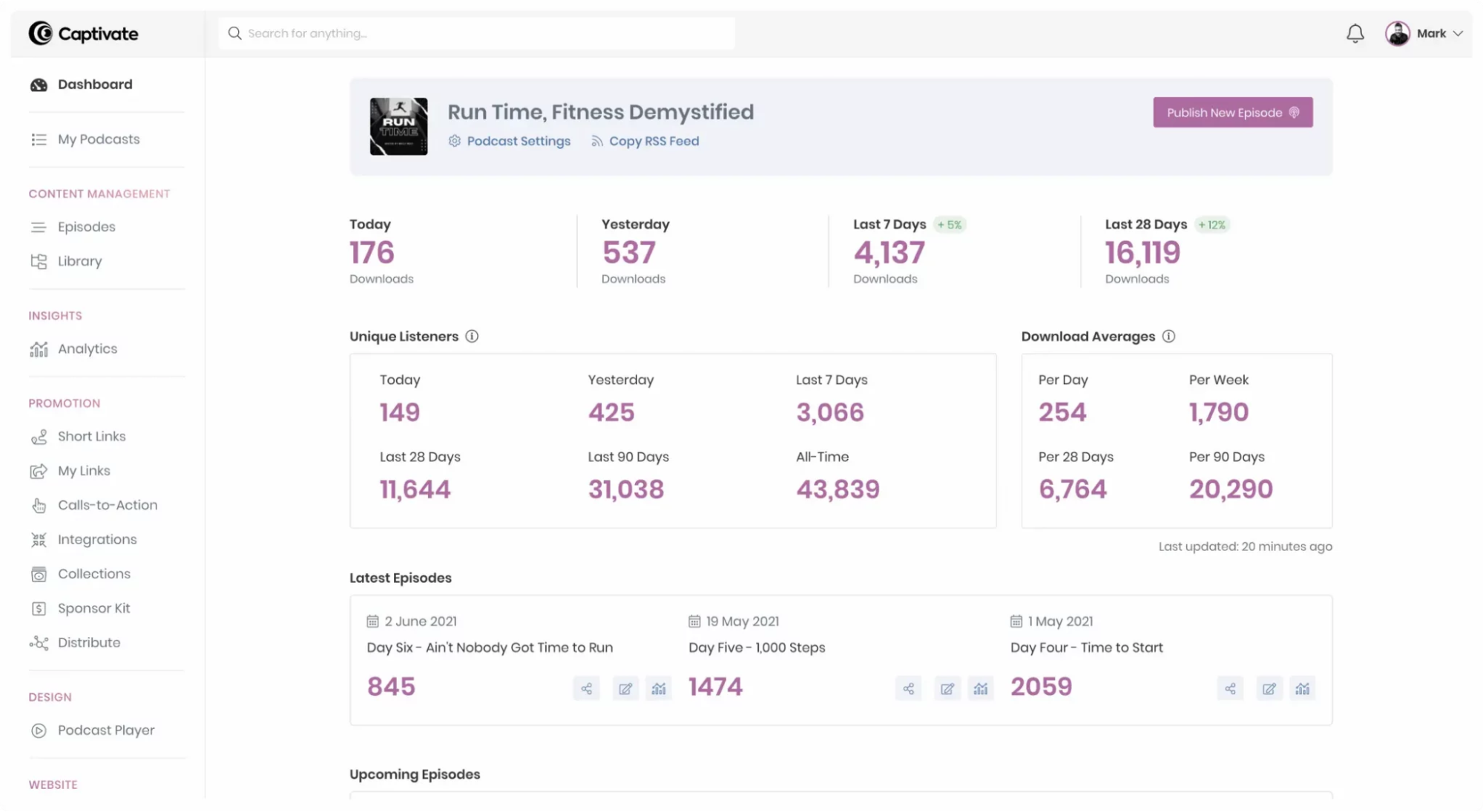
Captivate takes pride in its simple, easy-to-use dashboard that covers all the necessary functions and metrics to create, distribute, monetize, and promote your podcast.
Although it does not come for free, the range of hosting features and storage and upload capacities makes the price worth it. Captivate is designed by podcasters for podcasters, so it knows about their needs.
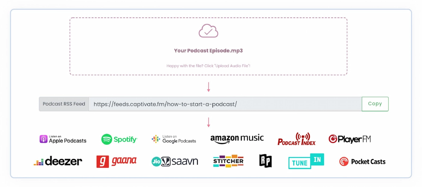
Creating a podcast in Captivate is a 5-step process. First, you’ll need the podcast name, author name, podcast cover art, description, category, directory setting, and more. Once you have all the necessary details, you can start importing your podcast into the Captivate Dashboard.
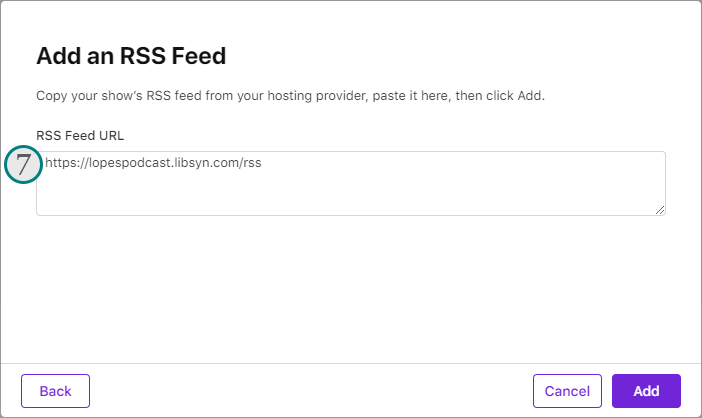
Then copy your current RSS feed into the current feed URL box and choose the current host—and voila! You are ready to go.
As soon as you publish your first episode, your podcast can be listed on one of the directories that Captivate integrates with.
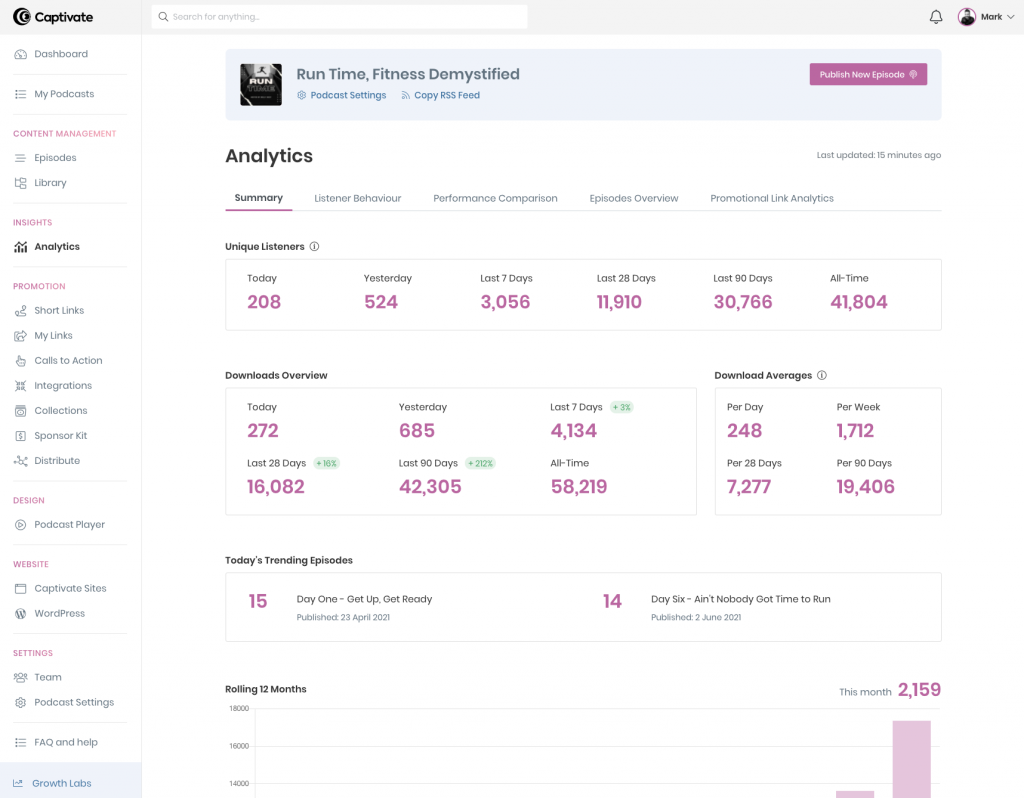
With Captivate Analytics, you can see total downloads, total listeners, unique listeners, website traffic, listener demographic, and more.
It also offers responsive podcast websites where you can select from 3 templates, add bios, sign-up forms, lead generation modules, and more.
Nina Paczka, Community Manager at Resume Now, shares her experience with Captivate.fm,
“What I like the most is their dashboard – minimalistic yet providing everything you need. If you’re experiencing some trouble, Captivate’s team is there to support you. Considering the above, there’s nothing to dislike there. The platform offers a seven-day free trial. All paid plans cover unlimited podcasts and team members, with access to analytics and marketing tools.”
Other key features include
- Each plan offers unlimited podcasts and unlimited storage.
- You can import, add, and edit podcast transcriptions within Captivate thanks to its support of podcasting 2.0.
- It offers an international support team of 11 that covers four time zones, which means no matter where you are, their customer support will always be available.
- It offers Advanced IAB Tech Lab-certified podcast analytics to all podcasters.
Pros
- Their blog section is the source for every little question you could have while you are using this platform.
- Analytics goes deeper with each metric giving you a complete picture of your podcast performance.
- It offers a 7-day trial with all the features.
Cons
- It does not offer a free version.
Pricing
Starts at $17/month for 12K downloads, unlimited podcasts, unlimited uploads & storage, podcasting 2.0 support, and more.
13. Sounder
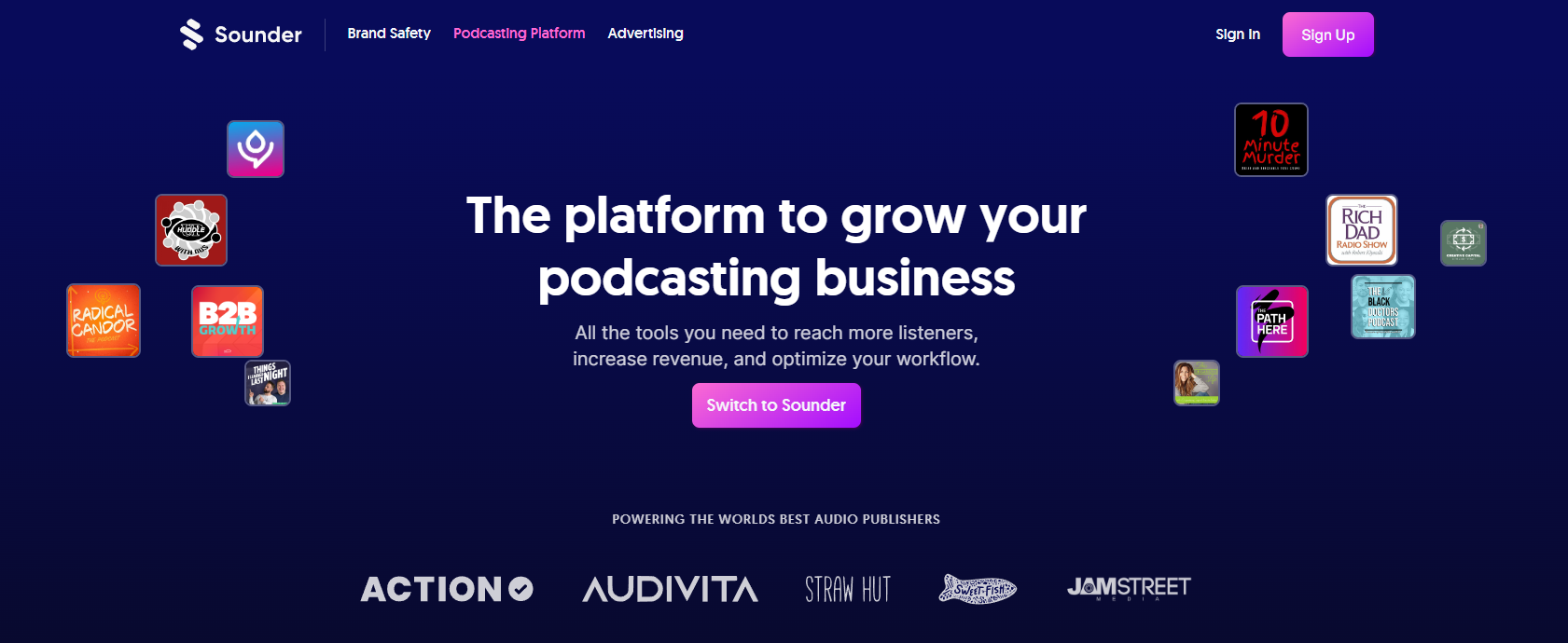
Sounder is another podcast platform on this list that offers tools to monetize, analyze, and promote your podcast across global directories. It follows IAB & GARM industry standards to generate accurate episode ratings, transcripts, keywords, summaries, and more within seconds.
You can create your podcast on Sounder either from scratch or by importing it from an existing platform. Once you sign-up for a free account, you can start with the podcast by entering details such as title, description, category, and artwork.
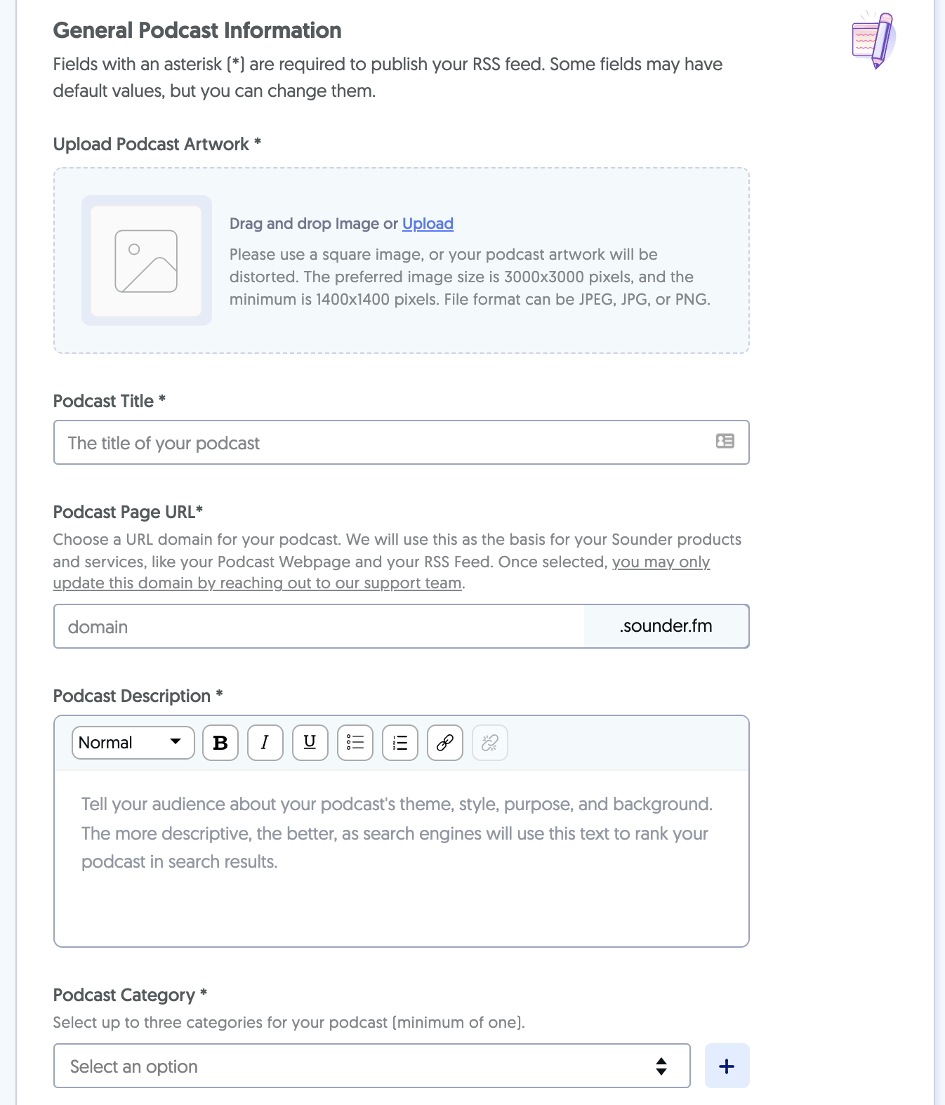
You can tinker with many more details, including your podcast’s name and description, author name, language, timezone, and more. While setting up these details, you can enable monetization by simply clicking on the relevant option. And that’s it!
Now you can create an episode by uploading an audio file and adding its title and description. Here you can set episode numbers, types, and artwork. You can also pre-schedule them.
If you’ve enabled monetization, you can select whether pre or post-rolls ads should go to your show.
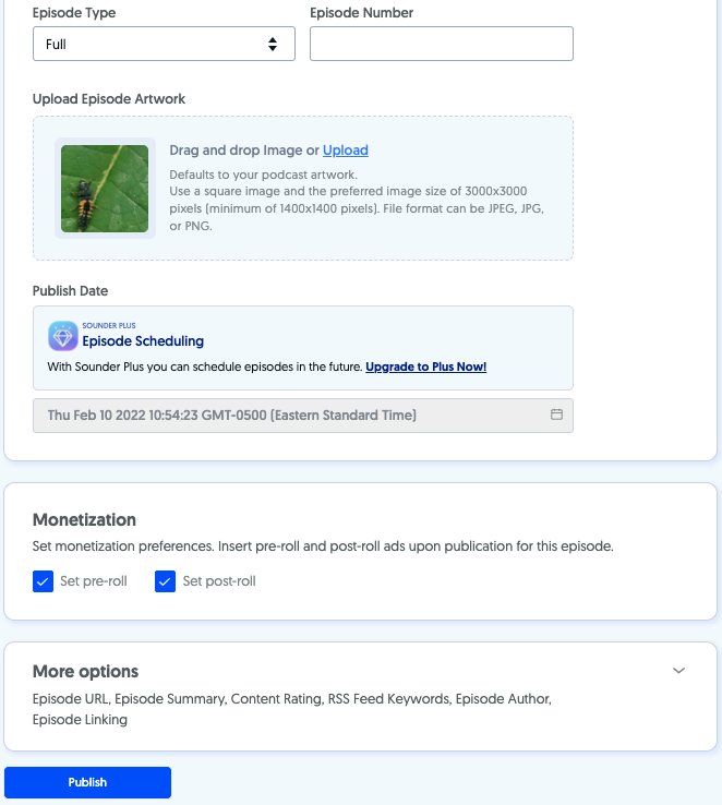
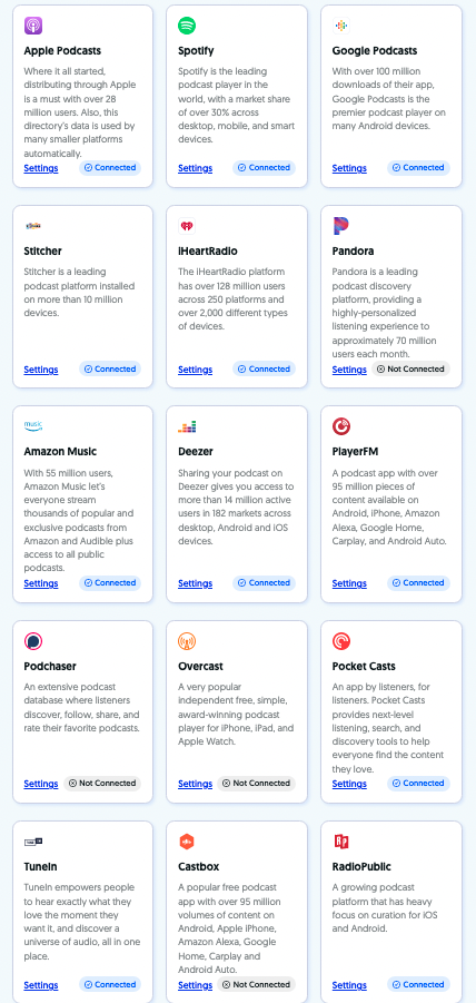
Once you publish your podcast, Sounder will help you distribute it to popular listening apps such as Spotify, Google Podcasts, Apple Podcasts, Stitcher, iHeartRadio, Amazon Music, Pandora, and more.
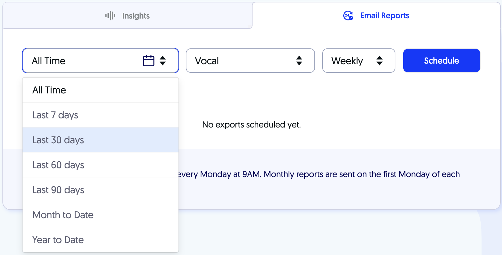
With Sounder Analytics Dashboard, you can get insights into streams, listeners, revenue, listeners’ demographics, keywords, referrals, and more.
Other key features include
- You can have up to four collaborators on your podcast.
- You can publish your podcasts under custom domains.
- It comes with a podcast player with audio search functionality.
- You can host unlimited podcasts in one account.
- If you have 50K+ streams per month, you can get early access to host-read DAI opportunities.
Pros
- Unlimited podcasts.
- Offers a free version for limited features.
- UI is clean and intuitive.
Cons
- Only offers audio podcasting.
- You cannot create membership programs.
Pricing
Available on request.
14. Fusebox
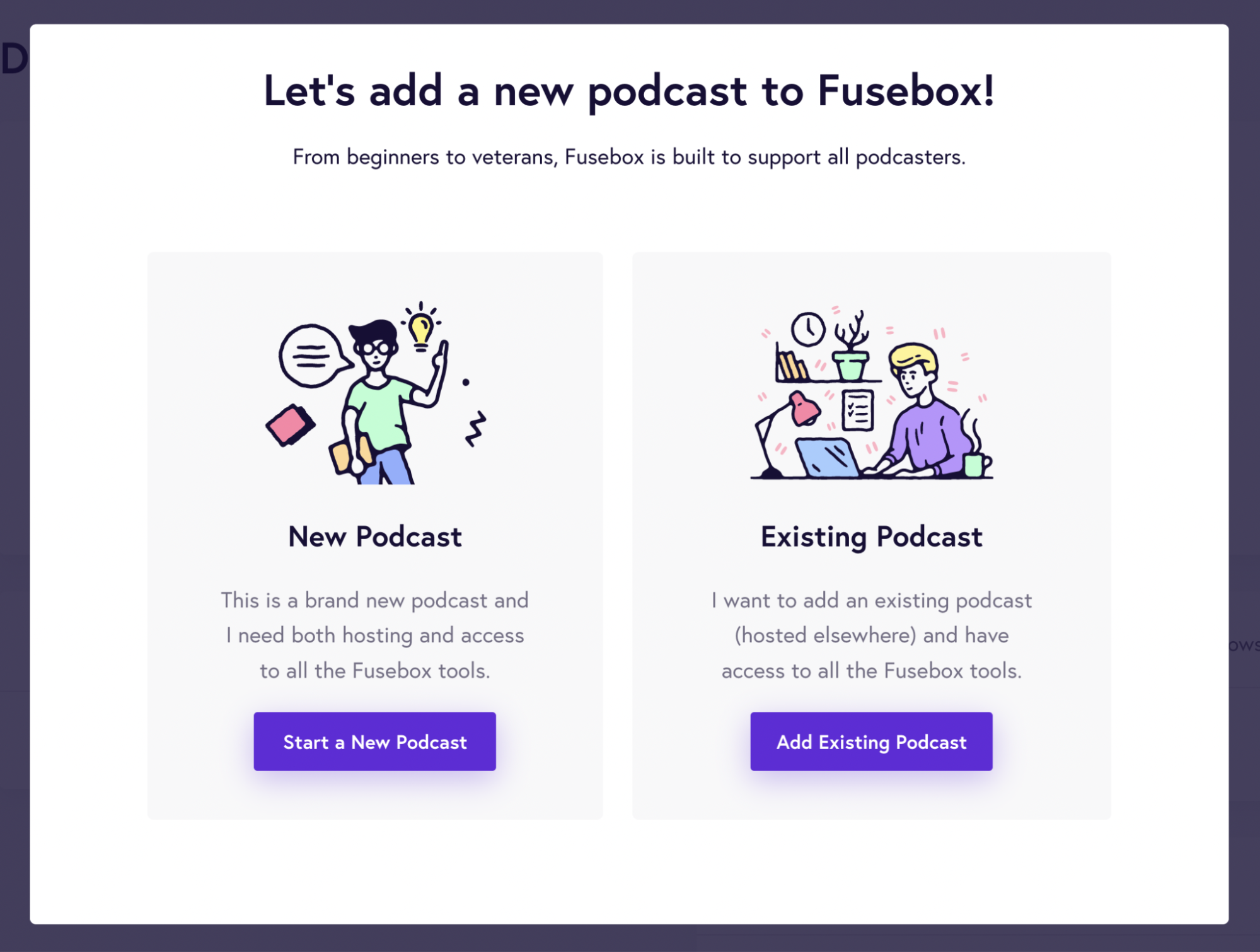
If you’re looking for an affordable podcast hosting platform, then Fusebox is the tool for you! It’s also pretty easy to use and provides a step-by-step guide through the entire process.
To start a podcast using Fusebox, you need to choose whether you’re starting a new podcast or importing from an existing one. In the below image, you can see that the UI is straightforward and easy to follow, even for newbies to podcasting.
If you’re creating your podcast from scratch, you must be ready with the details, such as the podcast title, description, and cover artwork.
Here’s what the form will look like:
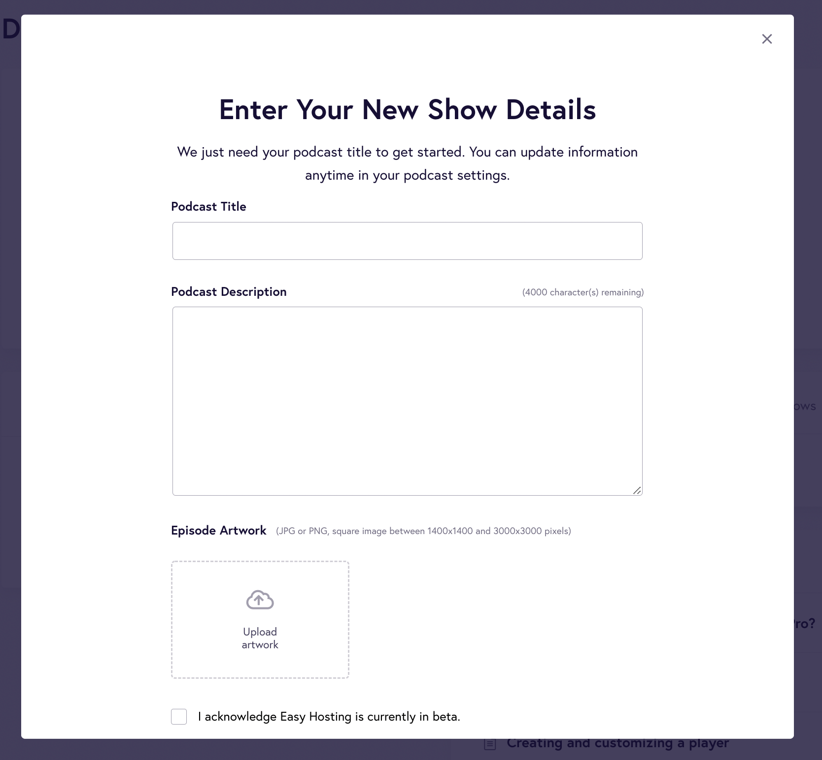
You can also import data from your existing podcast by simply entering your feed RSS URL. It will lead you to the subscription page, where you can select a free or pro plan.
If you’re a new user of Fusebox or creating a podcast for the first time, you should enable Easy Hosting from your dashboard. It comes in every paid subscription.
Here, Fusebox will find your podcast and import all the files and data into your Fusebox account – you can just sit back and relax.
Once you’ve set up podcast information, you can start customizing your podcast player. The Branding page lets you select the brand colors that match your podcast or website branding.
You can also add a call to action – a button that prompts listeners to buy your music or sign up for your mailing list.
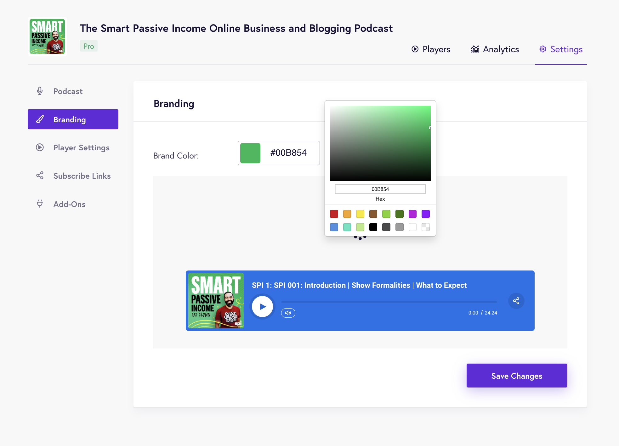
You can further:
- Control the speed of the player
- Add a download button and subscribe button
- Include a custom URL that sends listeners directly to your online store when they click on the cover art in their iTunes library.
Other key features include
- Customizable podcast players will help you stay aligned with your branding.
- Fusebox focuses on the metrics that count, such as downloads, referral sources, and top-performing podcasts and episodes.
- The easy hosting feature comes with step-by-step instructions to create podcasts.
- The built-in mobile player allows you to target listeners on the go.
- The podcast player comes with a download, subscribe, and social sharing buttons.
- It offers three types of podcast players – including sticky player, full player, and single player.
Pros
- Its podcast players are customizable.
- Easy, self-guided UI.
Cons
- The free version forces you to use your own host and gives you a single-track player with limited customization features.
- The starter plan includes only single-track players. To offer the rest of the players to your listeners, you’ll have to upgrade to the Pro plan.
Pricing
Starts at $7.50/month for a single track player, essential analysis, easy hosting, and more.
15. RSS.com
Rss.com is a podcasting app for people on the go. It’s like a Swiss army knife for busy podcasters, with features such as cross-platform analytics, automatic podcast distribution, and unlimited audio storage.
You can start by creating your podcast from scratch or importing it from an existing podcast platform. Both are super easy. To create from scratch, you will need to enter its title, description, language, and more.
Check out the image below to see what you will need:
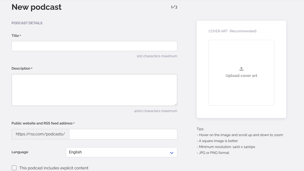
As you can see, the UI is clean, easy to use, and self-explanatory. Every field is explained as you fill it out, and tips appear onscreen if you need more information. Once you create your podcast, you’re ready to upload your first episode.
The good thing about episodes is that they can be assigned season numbers, episode numbers, and types – giving you the flexibility to publish your episodes in the form of different series or trailers.
If you want to monetize your podcast, you’re in luck – RSS has in-built tools for that. The activation process is also easy and just takes one click.
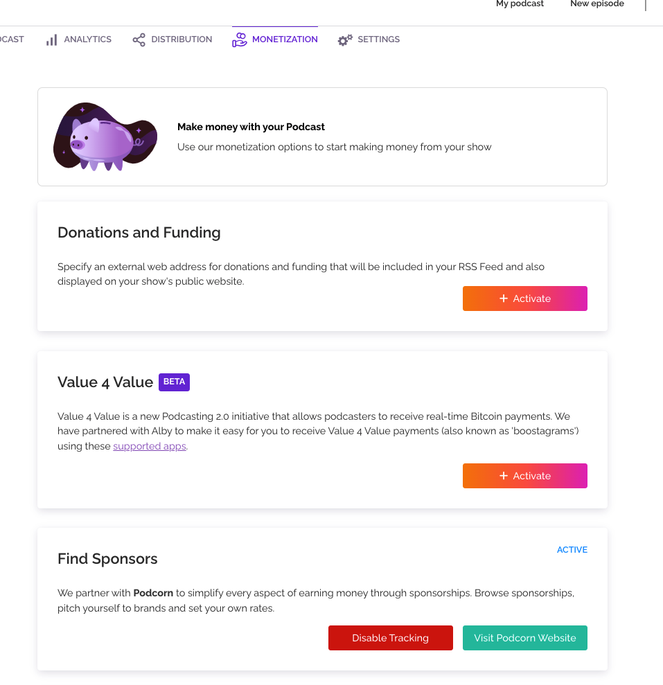
Rss.com offers you three ways to monetize your podcasts: donations, bitcoin payments, and sponsor ads.
You can also distribute your podcast to listening platforms such as Google, Amazon, Spotify, Samsung, Amazon Music, and more.
Other key features include
- Its all-in-one dashboard shows you a complete picture of your podcasts. You can see scheduled episodes and navigate to your podcasts, analytics, distribution, or settings. You can also create a new episode from the dashboard.
- Its cross-platform analytics enables you to compare the metrics from different sources. For example, you can determine which podcast channel gives you more listeners or downloads.
- It uses podcasting 2.0 – which means you can transcribe your audio and use them for SEO purposes.
- From analytics, you can determine the best time to publish your episode and schedule it for the right time.
- With its embedded episode player, you can easily embed your podcast to any third-party website.
- You can get more reach using social share buttons on your podcast players.
Pros
- You can add chapters and soundbites to your episodes.
- You can schedule episodes in advance.
- Your podcasts are automatically distributed to popular podcast platforms.
- It offers a free podcast website.
- Each plan includes a free trial with no credit card.
- Affordable plans.
Cons
- Does not support mobile apps.
- No forever-free plan.
- Does not support any WP plugin.
Pricing
It starts at $4.99/month for unlimited episodes & audio, cross-platform analysis, RSS feed, free website, custom embedded player, and more.
Frequently Asked Questions about Podcast Hosting Platforms
1. What is a podcast hosting platform?
Podcast hosting platforms are the middleman between you and your audience. They’re a necessary part of the podcast ecosystem — they provide the basic infrastructure that makes it possible for you to create and publish your show.
2. How do I choose a podcast hosting platform?
There are many factors to consider when choosing a podcast hosting platform, including:
- Cost – How much does it cost to use the platform? Paid services don’t always offer better features than free ones, but they may come with more support options or other perks.
- Features – What does the platform offer in terms of features? Does it have things like automated episode creation, automatic distribution, social media integration, and more?
- Support – How good is their support team? Can you reach them if you need help?
- Bandwidth – The amount of data that can be transferred from one location to another in a certain amount of time (usually measured in bits per second). The more bandwidth available on your account, the more listeners will be able to download your episodes without having their connection interrupted or experiencing any buffering issues.
- A built-in audio player – This allows listeners to listen to your episodes without having to download an external app or visit another website. You can even add social sharing buttons so people can easily share your episode on Facebook or Twitter.
3. Do I need to use a podcast hosting platform?
If you’re just starting out, then it might be easier for you to use a podcast hosting platform because there are so many options available. However, if you have some experience with WordPress, then you can host your own podcast to avoid paying monthly fees and have more control over your content and website design.
4. How does podcast hosting work?
Podcast hosting services provide a platform to upload your audio files as well as convert them into an MP3 format. After uploading your content, it will be available on their servers so that anyone can access them online.
Most of these services also offer some basic analytics and statistics that help you track how many people have listened to your podcast and where they live.
Some even offer more advanced analytics like ranking charts, number of downloads per episode, etc., which helps you understand what people like about your show and how they listen to it (e.g., through mobile devices).
5. What do you mean by “Hosting?”
Hosting refers to storing your files on the Internet. It’s like storing your files on an external hard drive, except that they’re stored online rather than on a physical device. When you upload an episode to a podcast hosting platform, it will be saved there so that listeners can access it easily.
6. How do I upload my podcast?
You need to sign up for an account with a podcast hosting platform (like Libsyn). Once you have your account set up, there is usually an upload tool that allows you to select the files from your computer and add them to your account.
7. What are the best podcast hosting platforms?
Libsyn, Buzzsprout, Blubrry, and PodBean are all popular options for podcasters. It really comes down to personal preference and what type of features you’re looking for. You can also check out our post on how to choose a podcast host if you need more information on making this decision.
8. Can I use iTunes or Stitcher?
No, those aren’t podcast hosting platforms — they’re directories that people use to find podcasts. You’ll need to host your own MP3 files off-site so that they can be accessed by these directories (and other apps/devices).
9. Do I need a website?
No! Your podcast will be hosted on a website provided by the platform you choose, so you don’t need your own domain name or web hosting account. You may want to create an email address for your show so listeners can contact you directly with questions or feedback, though.
10. What are the different types of podcast hosting?
There are two main types of podcast hosting: free and paid. Free hosts do not give you full control over your episodes, while paid hosts usually offer more features and flexibility.
Ready to start podcasting with a suitable podcast host?
Hopefully, we’ve answered a few of your questions and given you the information you need to help you pick the right podcast host for your needs. Whether you’re looking for the best professional podcast host, the cheapest option for monetizing your podcasts, or something in between, there are podcast hosting sites out there that will help you meet your specific requirements.
We think the best way to choose whichever podcast hosting service is right for you is to check out how they handle certain features and what level of support they offer.
Note that free podcast hosting services are a great way to get your podcast started. The free option is perfect for a hobbyist or someone who is interested in the process of making a podcast. From there, you can upgrade to paid accounts for a more dedicated podcast hosting service with some of these platforms or go with a self-hosted option.
Whichever you choose, make sure you read the fine print, so your podcast isn’t censored for inappropriate content or hurt yourself by not having the proper legal disclaimers in place.
Featured image by Freepik.
The post 15 Best Podcast Hosting Platforms first appeared on Webdesigner Depot.


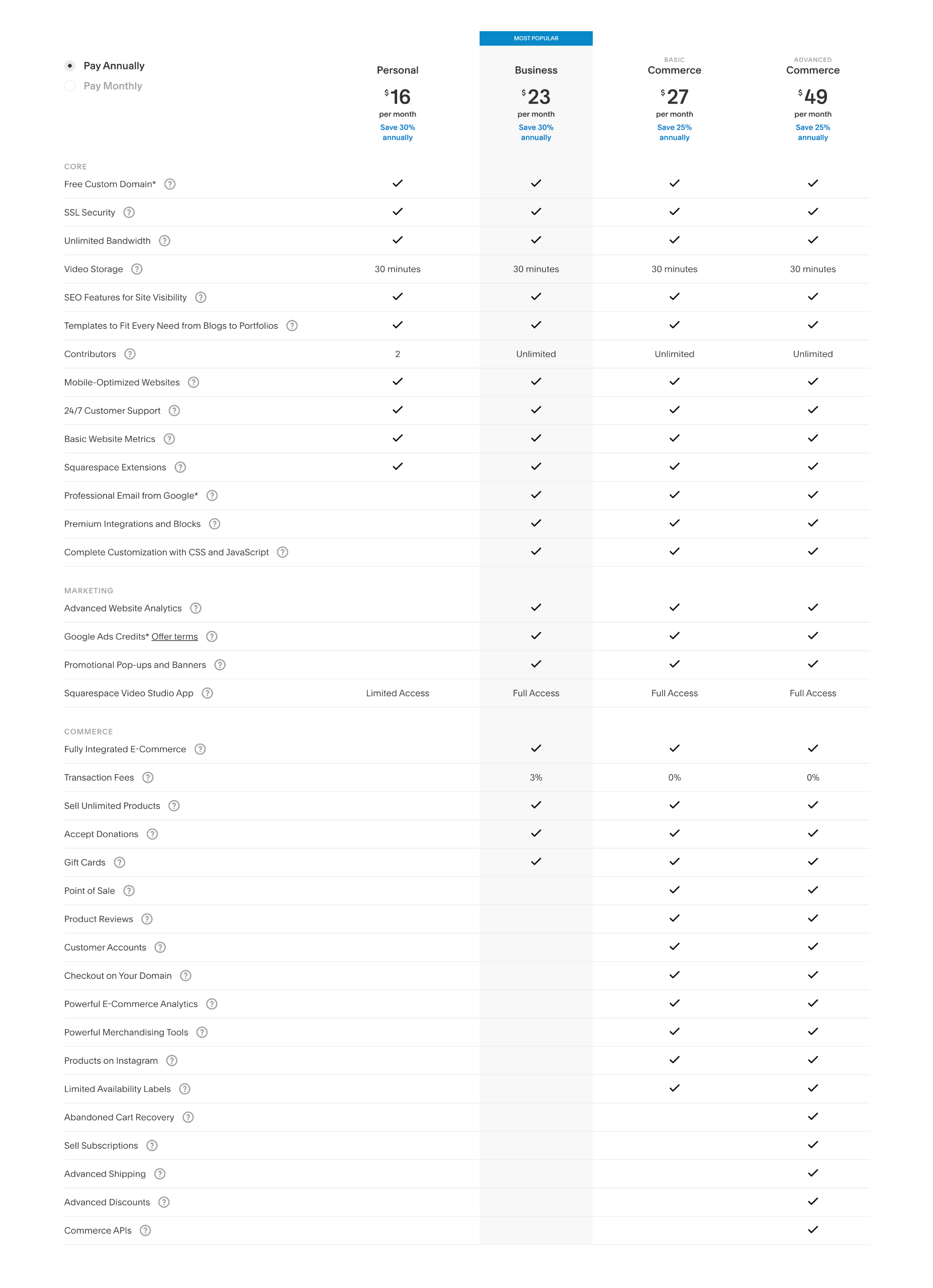
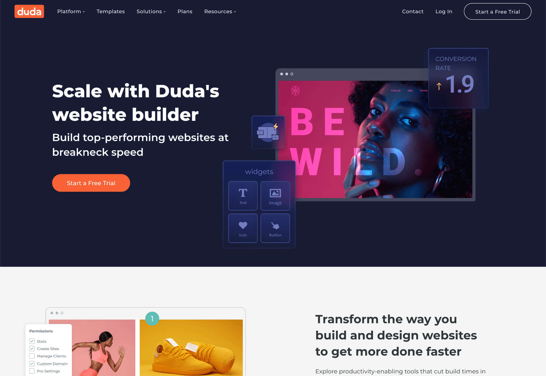
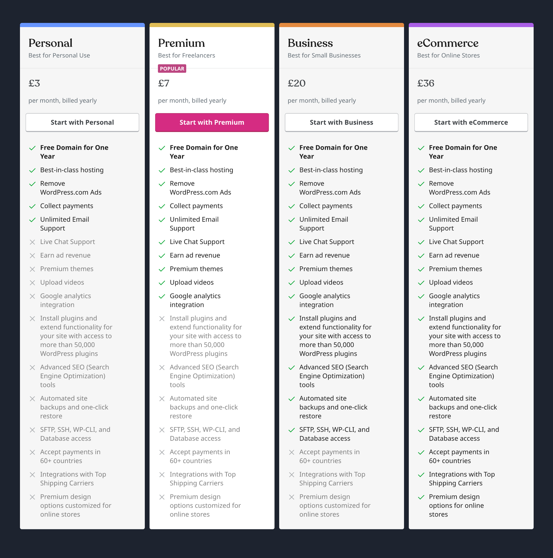
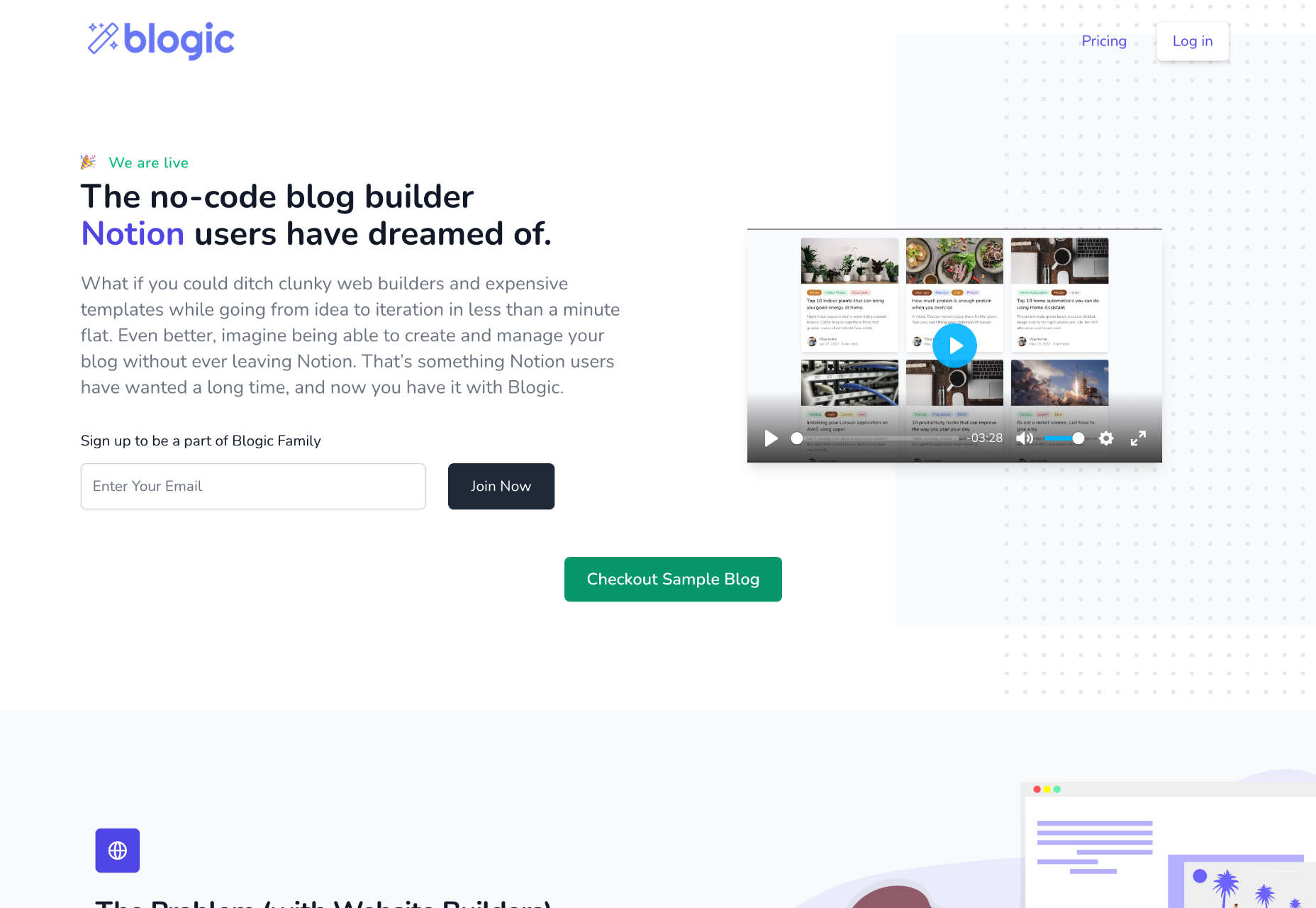
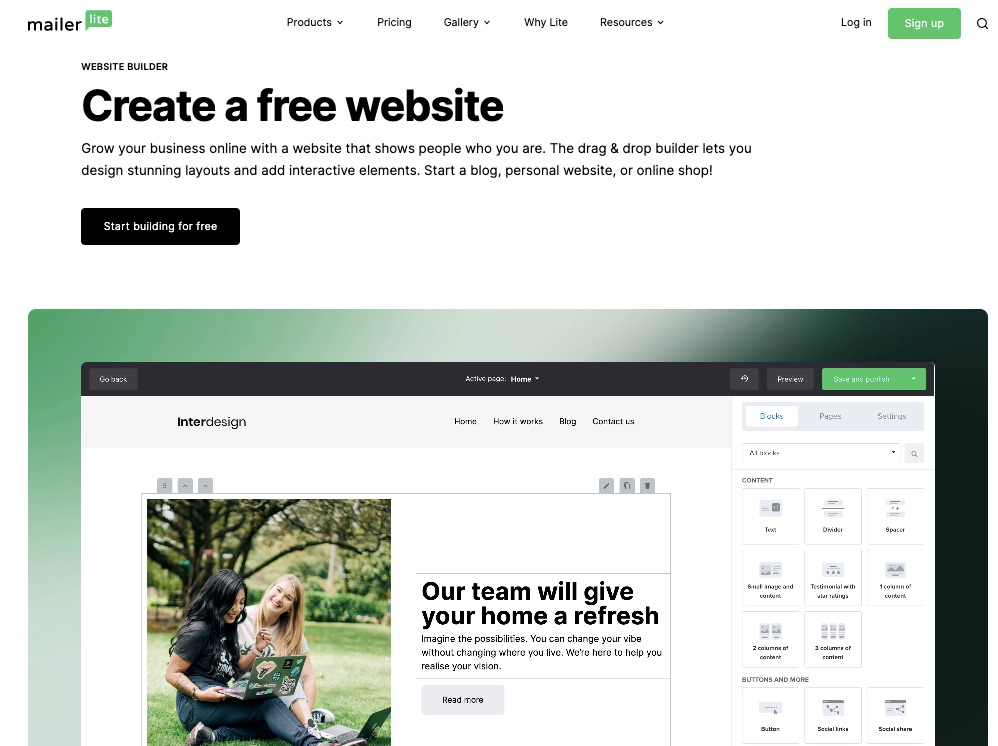
 When you need a website, you have two options, you can hire someone who’s an expert in website building to design it for you, or you can make it yourself.
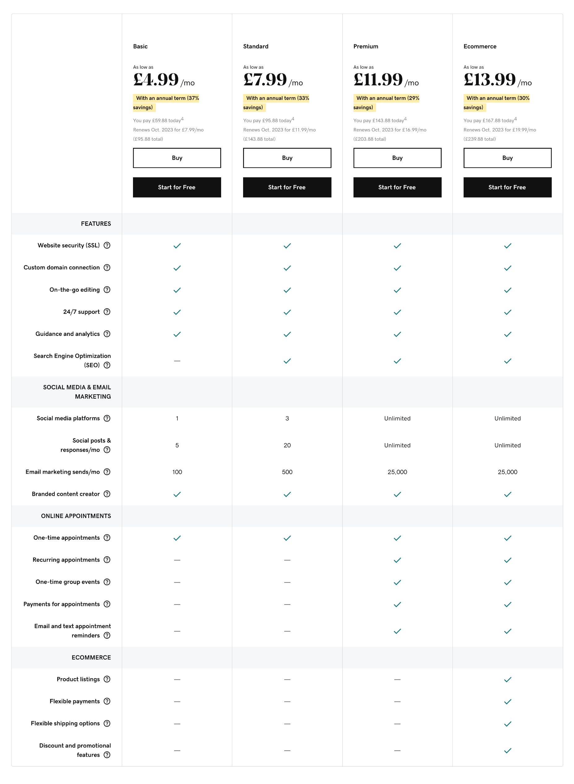
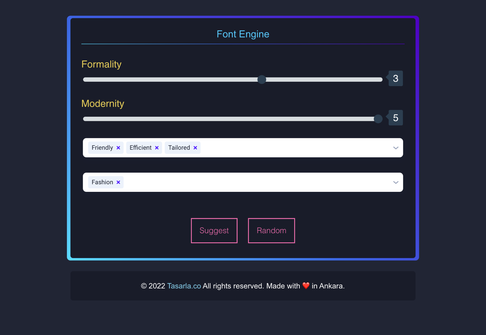
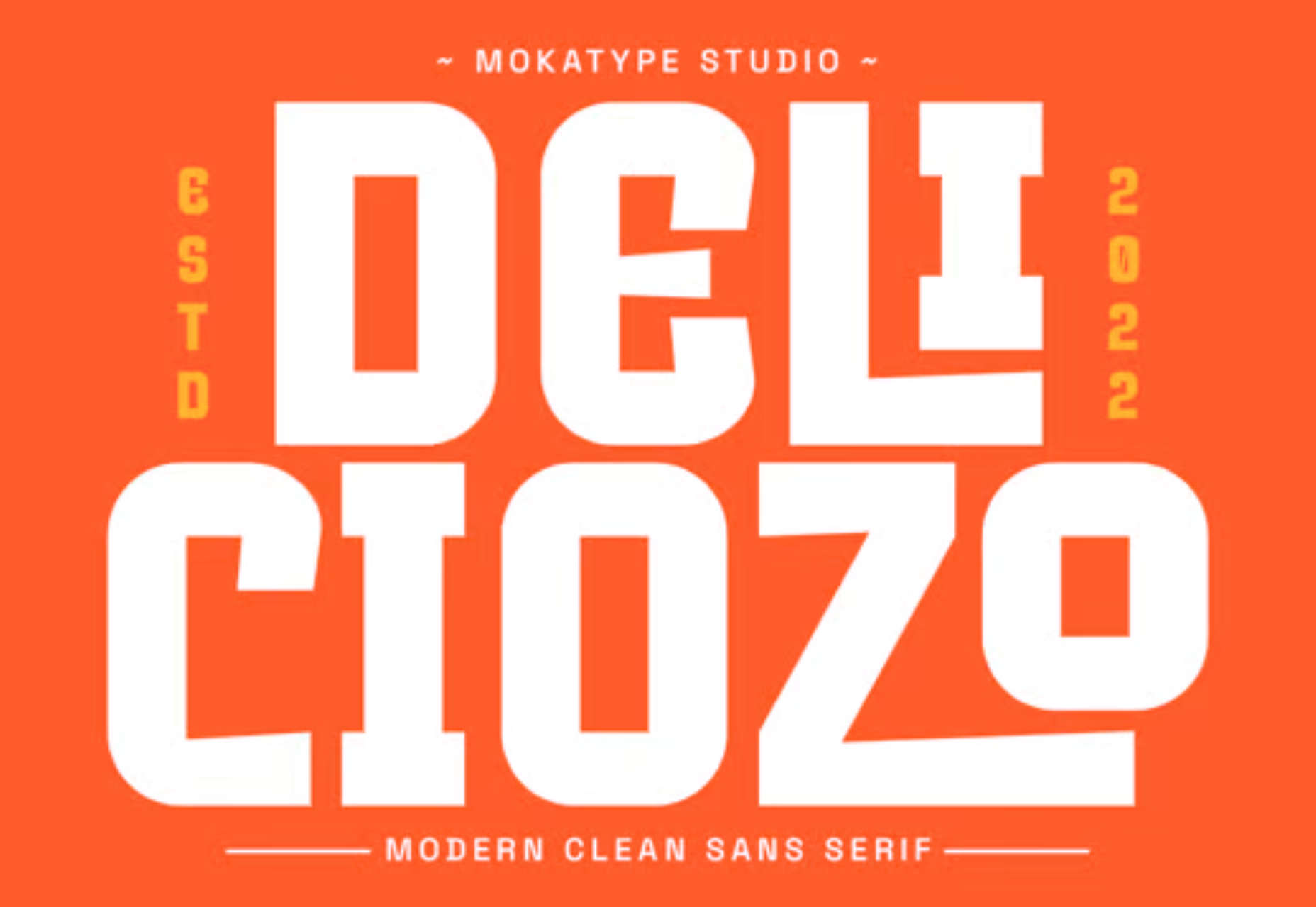
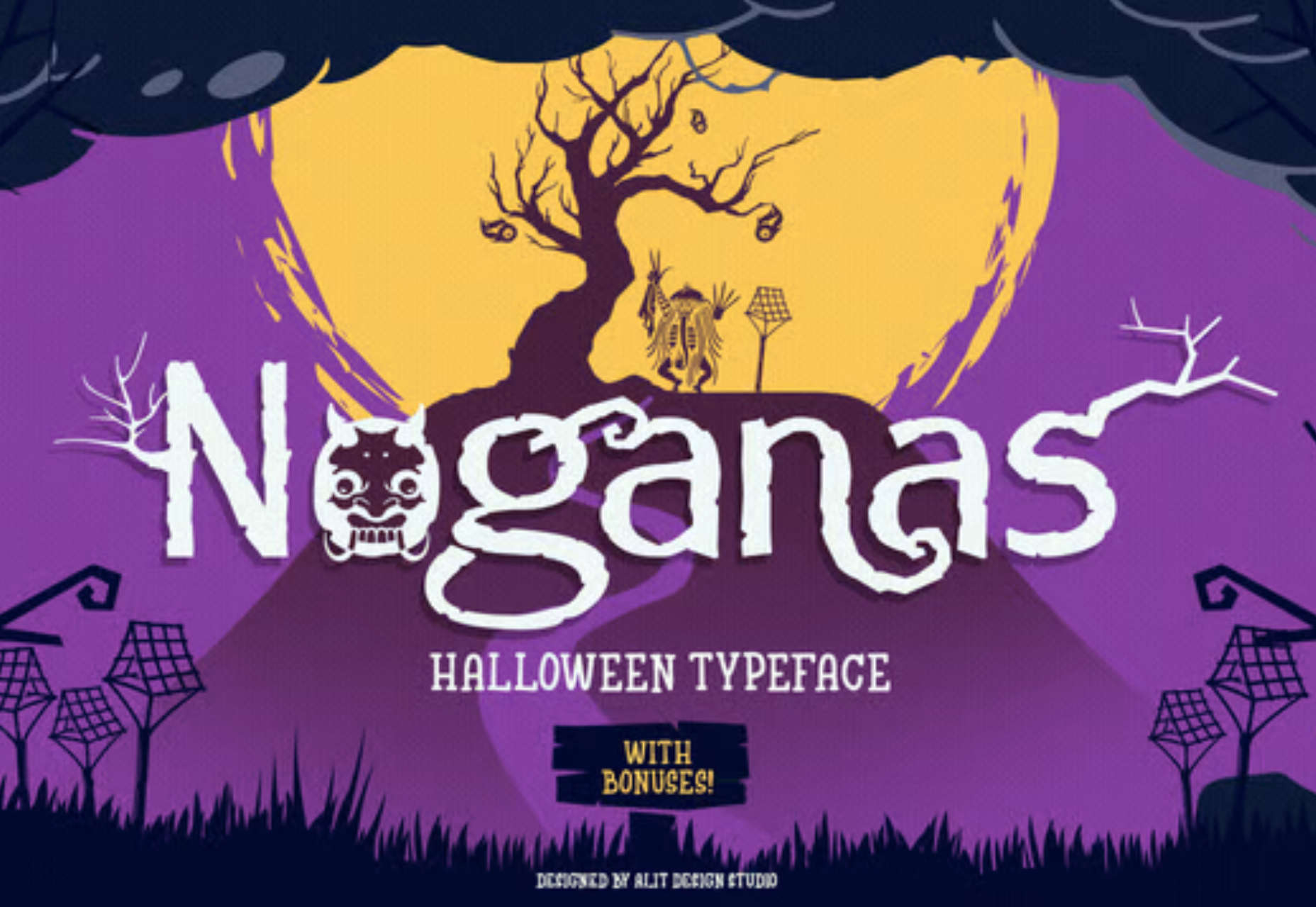
 We write this guide to the best new tools for designers and developers each month. For October, we’ve sought out tools to make you a better website builder, some handy utilities to make you more productive, and a spooky font for the end of the month. Enjoy!


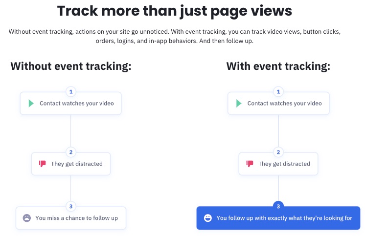
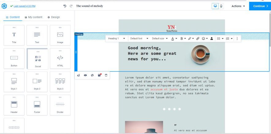
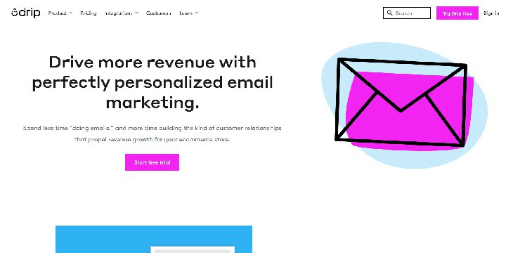
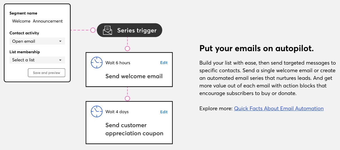
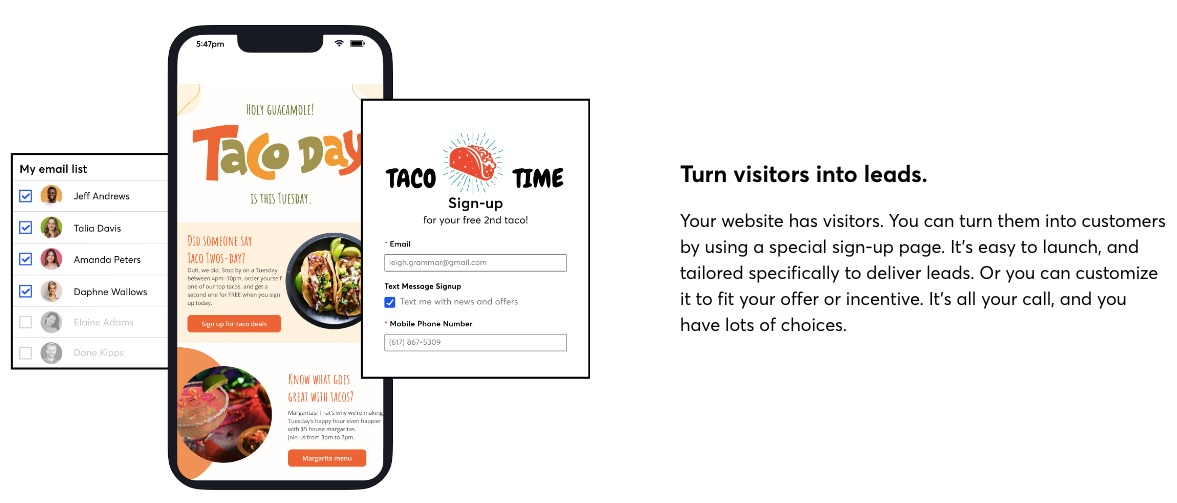
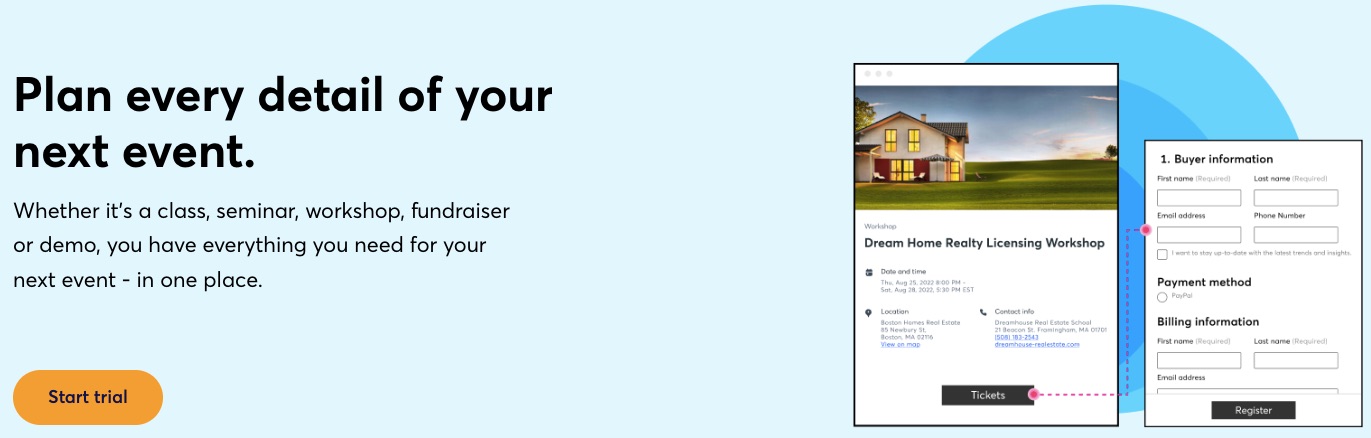
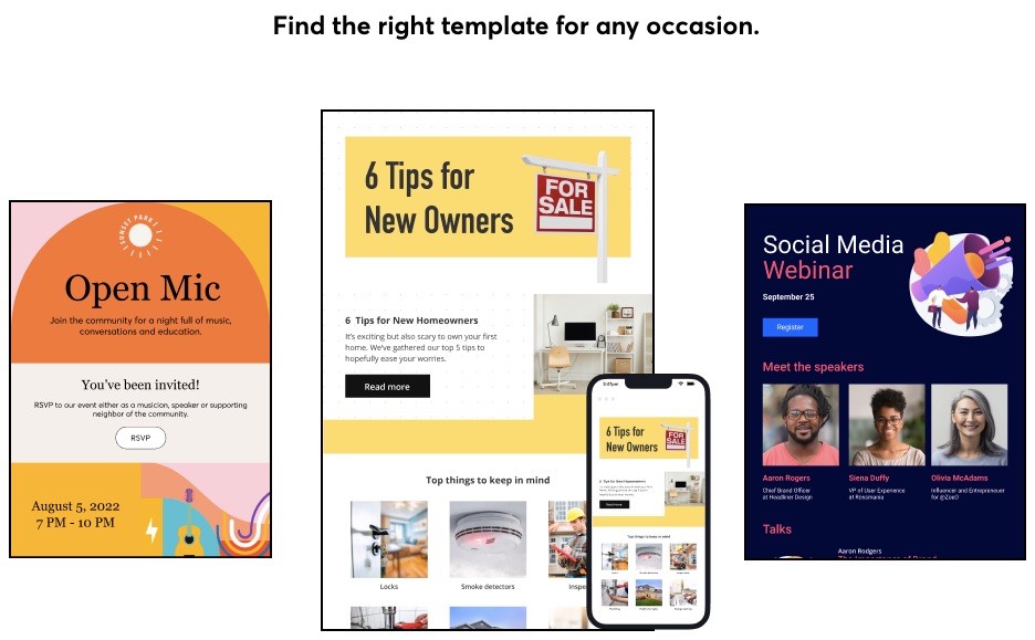
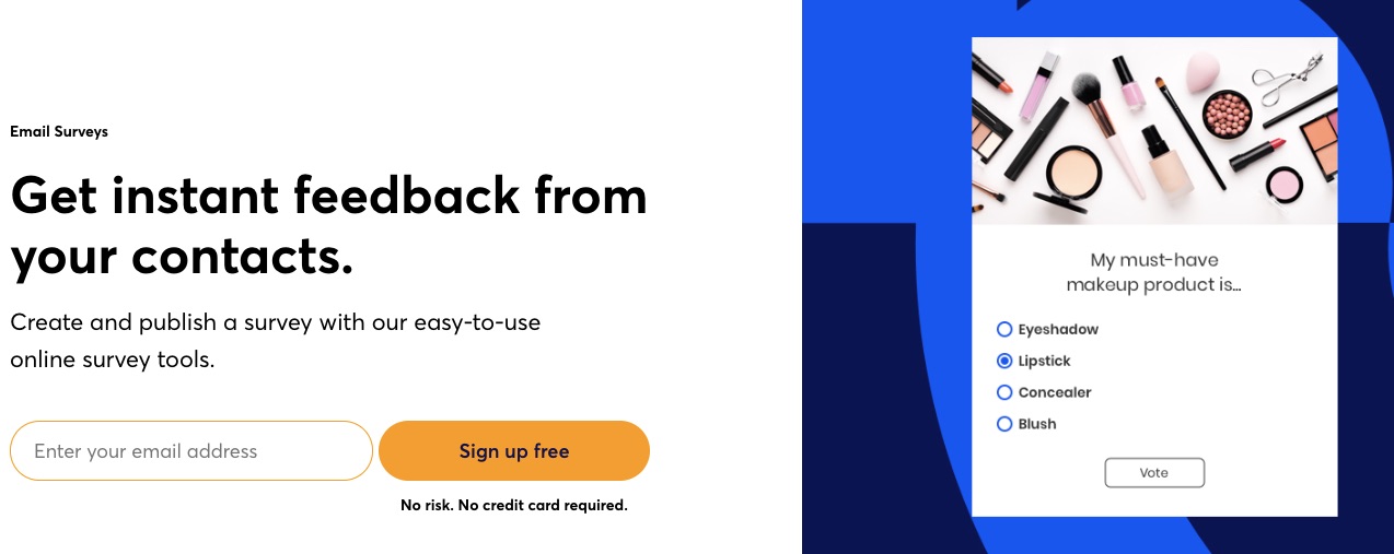
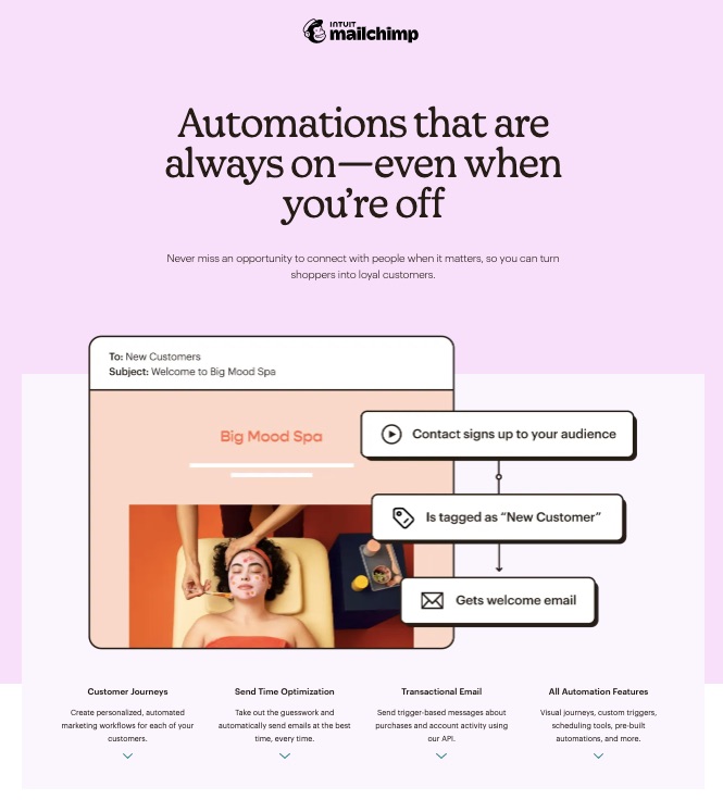
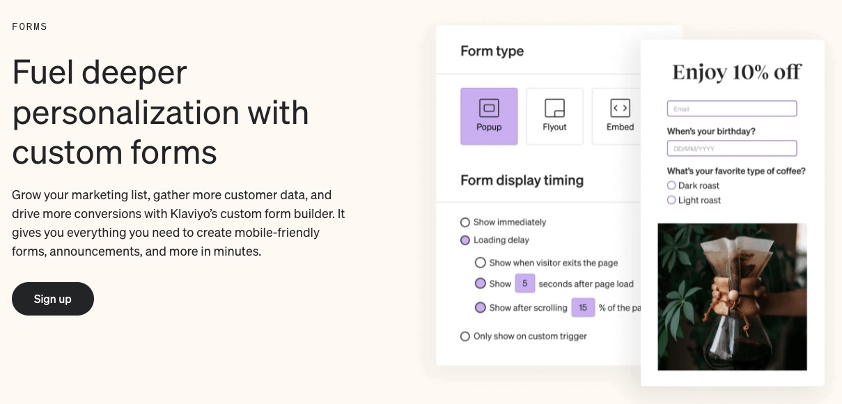
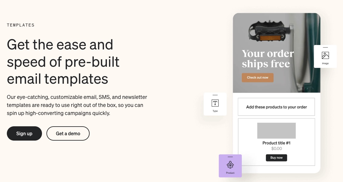
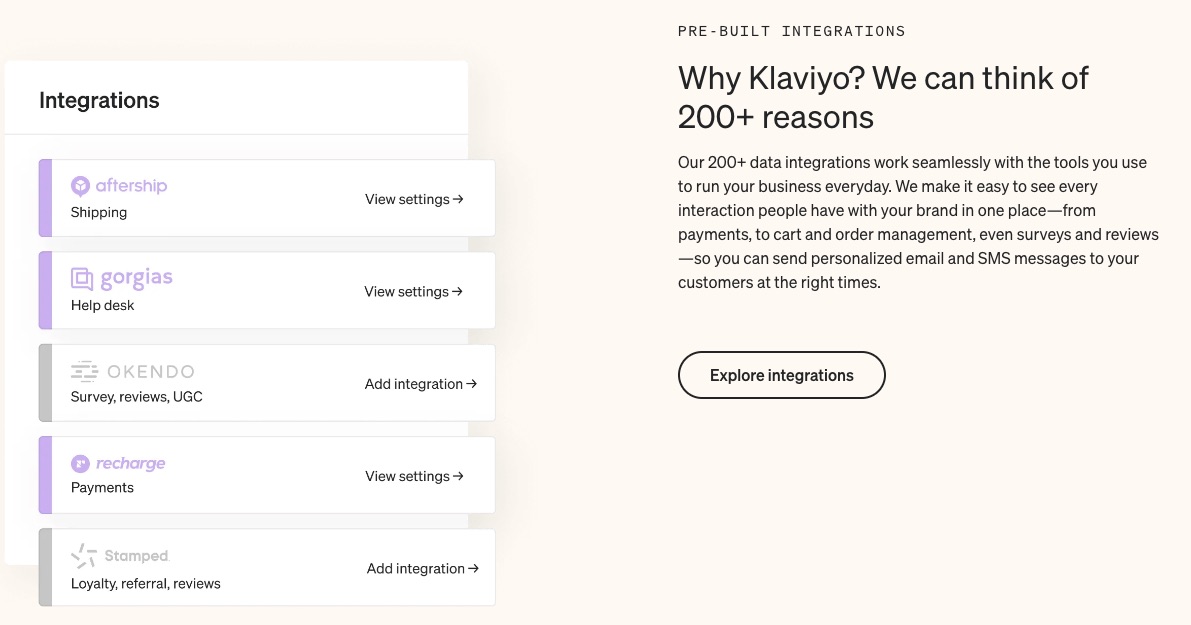
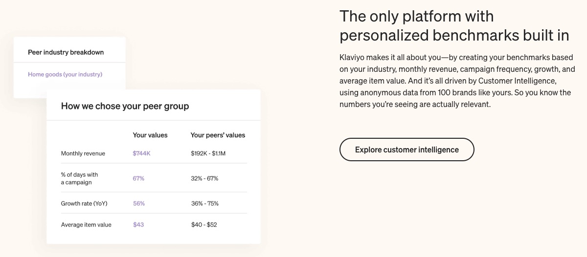
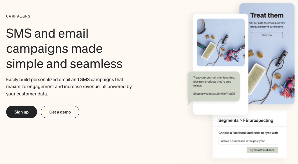
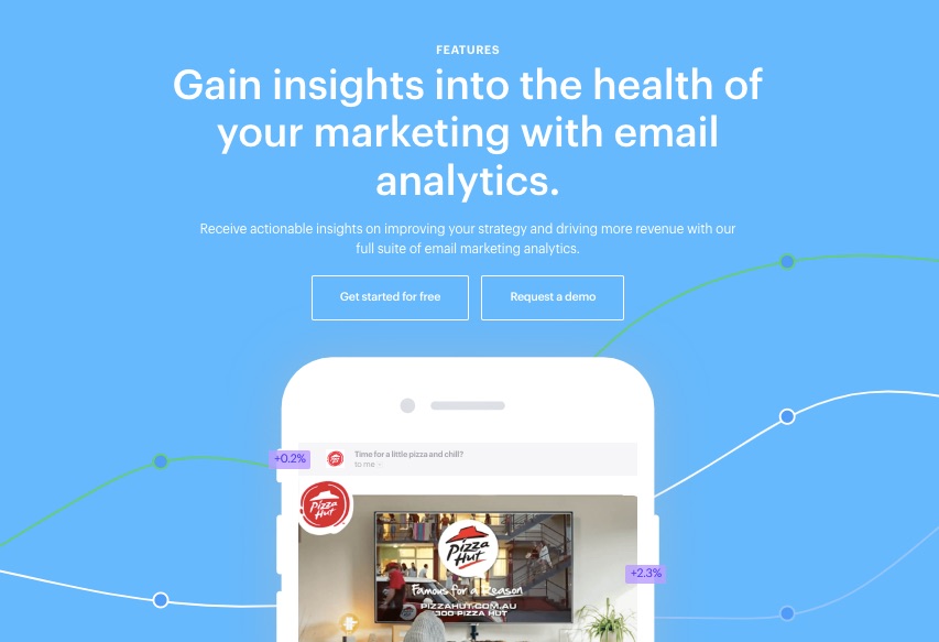
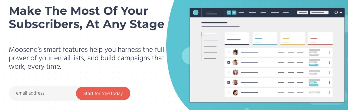
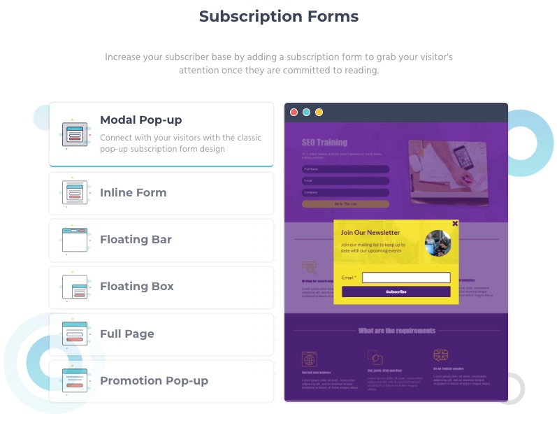
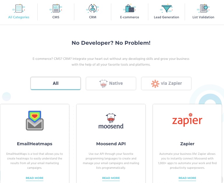
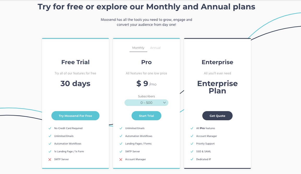
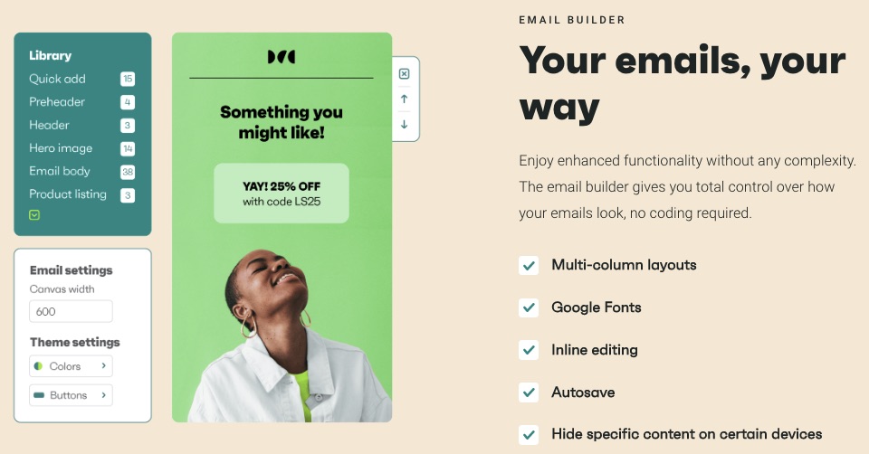
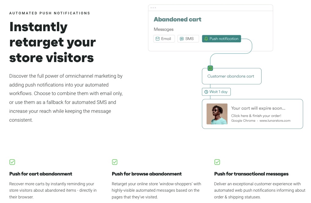
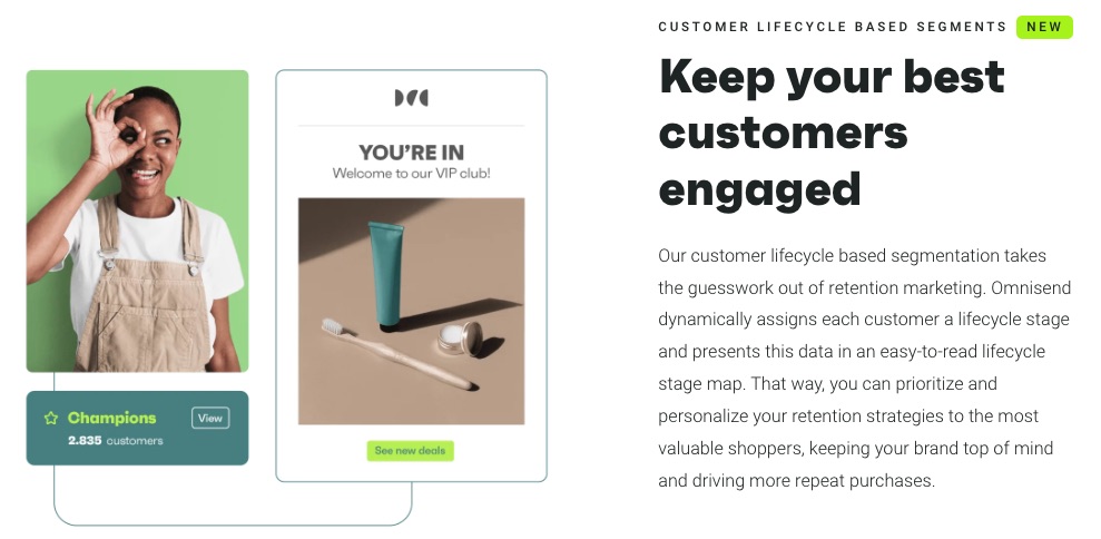
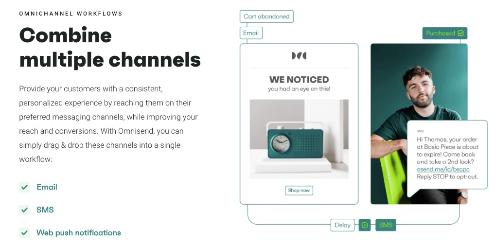
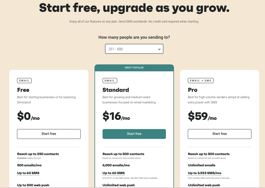
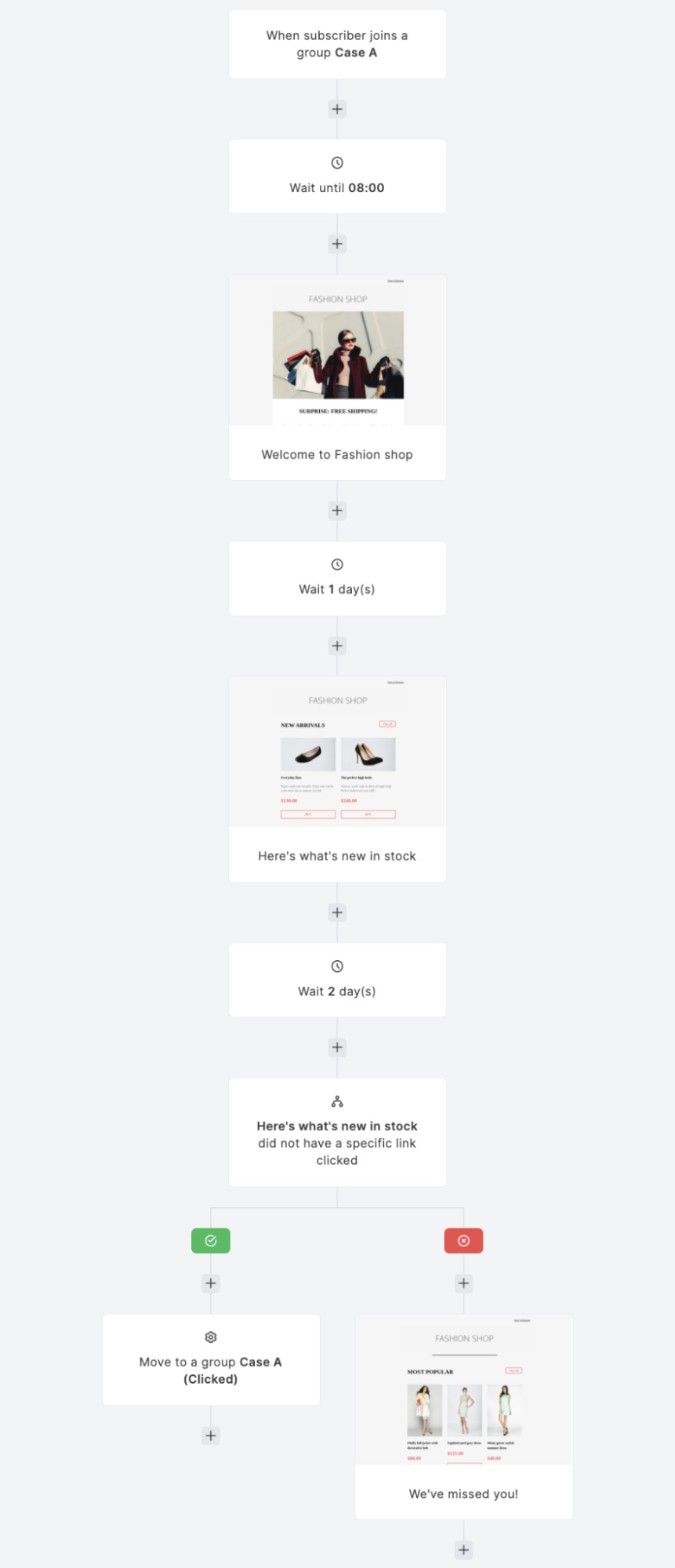
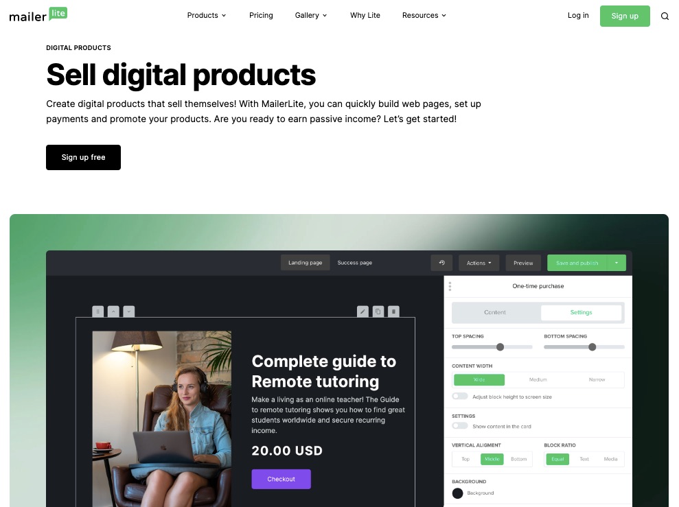
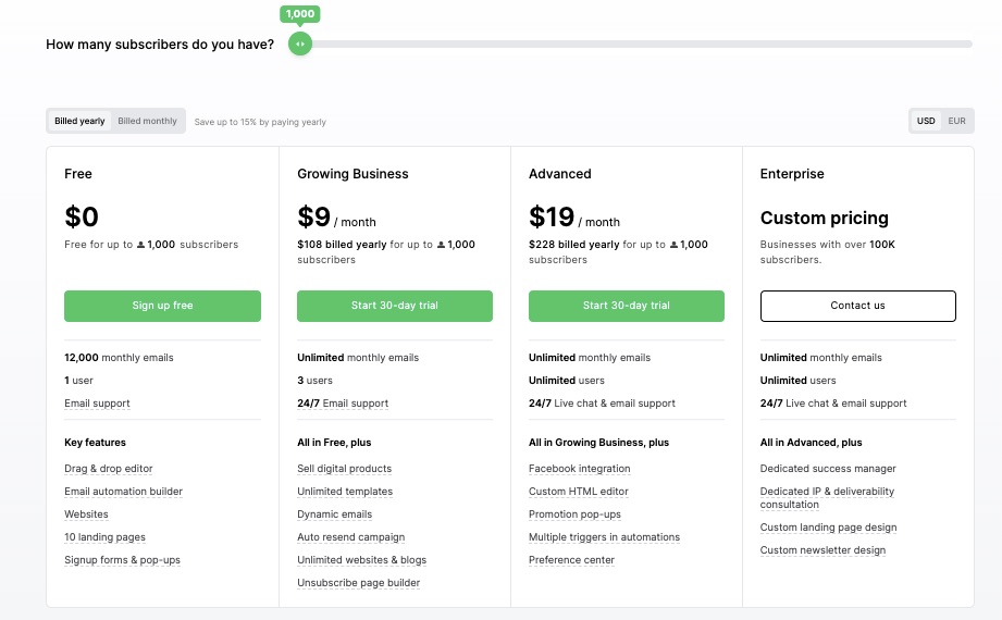
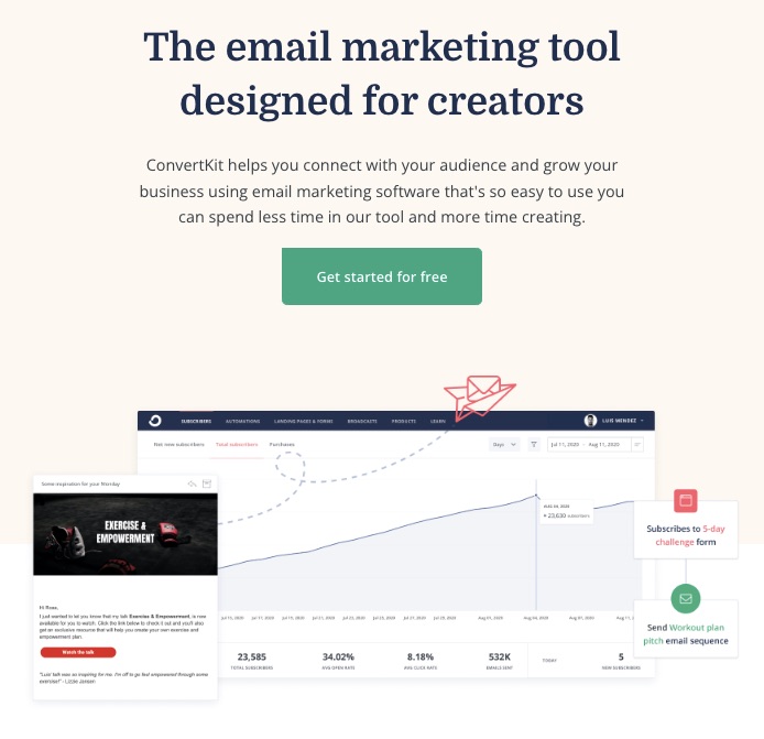
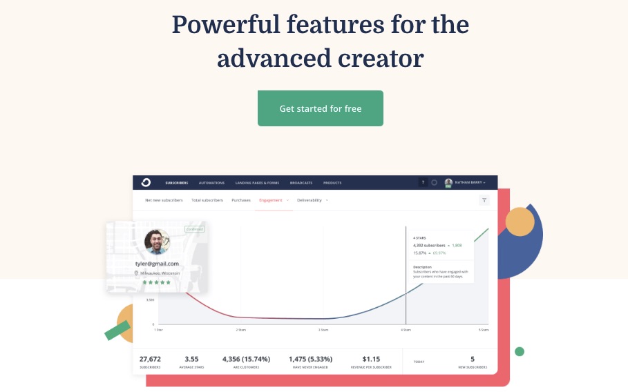
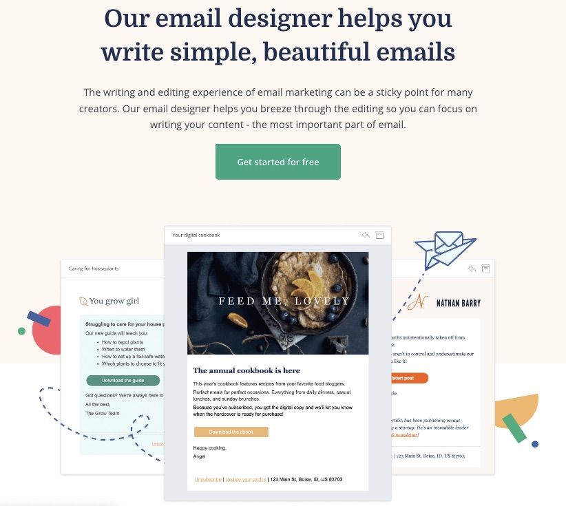
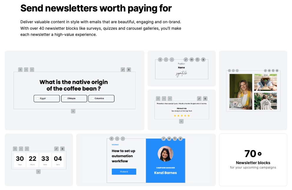
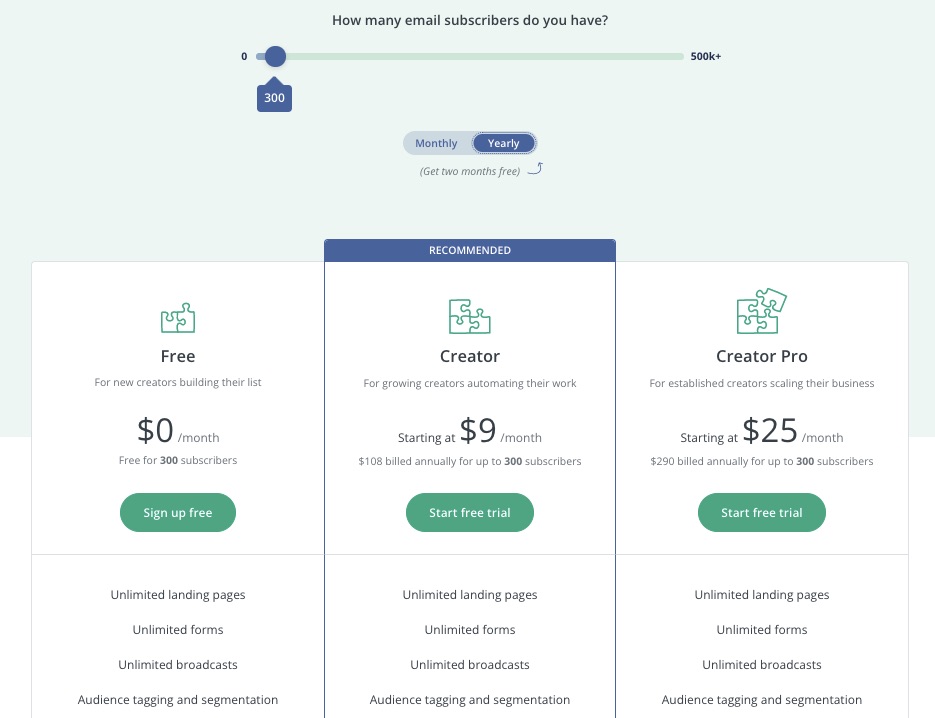
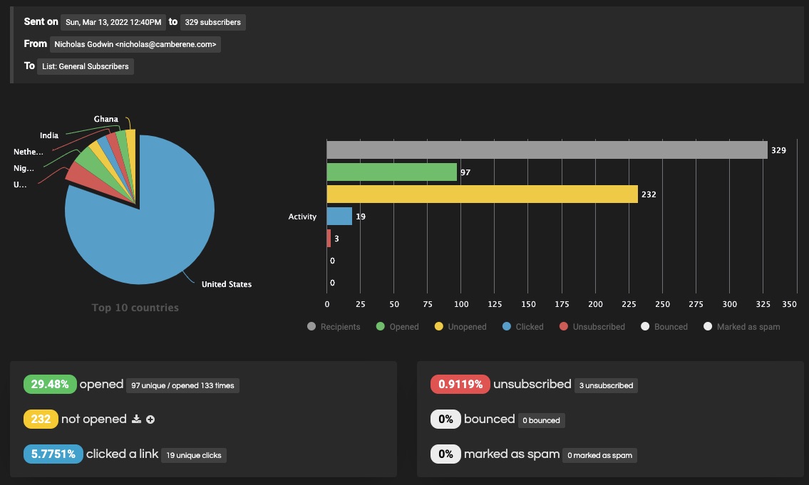
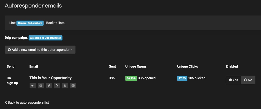
 A robust email marketing strategy is a great way to reach your target audience directly.


 Jakob Nielsen’s

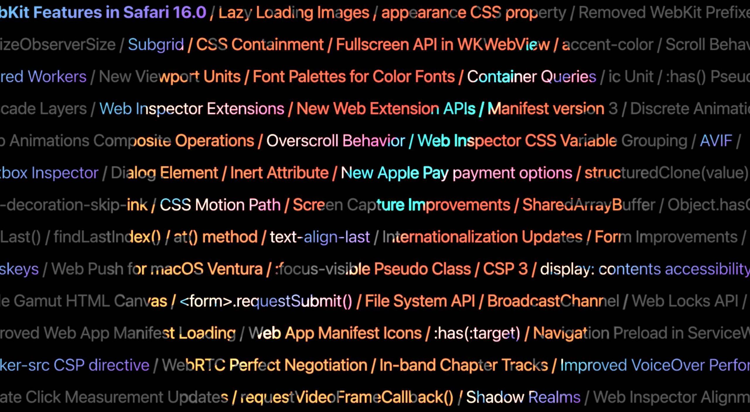 Apple has released an OS update. Packaged in with it is the latest version of Safari, 16.

