In this video tutorial below, we take a closer look at Messaging Design Pattern(MDP) in Java. This tutorial includes an introduction and implementation of a proxy, adapter, and web service. Let’s get started!
In this video tutorial below, we take a closer look at Messaging Design Pattern(MDP) in Java. This tutorial includes an introduction and implementation of a proxy, adapter, and web service. Let’s get started!

 There was a point at which I was very close to losing my business, and I didn’t realize how close.
I wasn’t always a good planner, and I didn’t plan to start an agency. One day I was a freelance graphic designer, my job list grew, I hired some help, and suddenly I was managing a team.
There isn’t a guidebook for new business owners, you have to learn on the job, and there’s no one-size-fits-all approach. We expanded rapidly from two to four people, then seven, and suddenly we hit 16 employees in just 18 months. It was pretty scary and felt like driving on the freeway without brakes. A client shared a story that they were turning over $20m, and the owner was only taking home $30k. It felt like where I was headed. At that point, I could easily have lost it all.
I took a hard look at the numbers and realized that we were barely breaking even, let alone profitable. That needed to change to stabilize the business and regain control of my operations. The change wasn’t easy, and there were some hard lessons, but 11 years later, with a strong local team and 40+ awards for our work, I’m thankful for that wake-up call.
There are other people in my position struggling with the same issues I faced, so I’d like to share the four key things I did that helped turn things around and move us from surviving to thriving.
I wanted to do it all, and as the business owner, it was hard to turn down a new client. Our instincts are to help, and declining opportunities feels wrong. In our industry, digital agencies, especially web design agencies, try to cover all bases from marketing, SEO, adwords, design, photography, and coding. Everyone wants to be a one-stop shop for clients. I used to be that person: I would wash your car and shine your shoes if I could.
Do not give in to that fear.
When you’re a generalist, you spread yourself too thin. I know: a decade ago, we were offering dozens of services outside of the web design realm: packaging, branding, copywriting, sticker design, SEO, hosting, analytics, you name it, we provided it. We used over seven different CMS for our projects. If a client wanted it, we tried to offer it, no matter how unsuitable it was for us.
On the surface, we fulfilled our projects, and our clients were always thrilled with the results. But below the surface, our operations were dissolving into a mess. Our eyes weren’t on the prize; we were always chasing after each little job for cash. It took too much time to learn new skills. When I looked at our timesheets and deducted the unbillable hours, our projects would hardly break even.
What hurt us even further is that with diversifying, we had to manage multiple workflows, software, and systems: Sketch, Illustrator, Photoshop, WordPress, Joomla, Drupal, Google Analytics, Final Cut Pro, etc. It was expensive with minimal return. It was like an Olympic swimmer signing up for a swimming-diving-ice-skating club when their passion is swimming.
So I took a step back. I boiled it down to what we enjoyed and excelled at. Ask yourself: for what do you want to be known? For us, it was psychology-driven, conversion-focused web design. This was the service our team had the most skills in and collectively could give the best value to our clients. Once I’d figured that out, it was easy to eliminate those other services and specialize.
You can niche down by service or industry and be the specialist in what you offer.
The first red flag that my business was in trouble was when I said to my accountant, “I feel like my business is doing great.” He replied, “I don’t care how you feel. The facts are in the numbers. Show me your accounts, and I’ll tell you if you’re actually doing well.” As an intuition-driven guy, it was a real eye-opener; I’d only ever relied on gut instinct.
At one point, we had a ton of work coming in, so I hired a few juniors to help the rest of the team. The team grew to 16, and the vibes in the studio were great, but the numbers weren’t. Instead of increasing efficiency, projects took 40 hours longer than they should have done. Why? The seniors and mid-level designers were taking time out to train the juniors! Reassessing the team showed me I needed to hire experienced staff, so projects ran on time and budget. It was a hard decision but a necessary one to keep us afloat.
The crucial numbers for any design agency are your timesheets, where bottlenecks lie, how much you’re spending, how long a project takes; these determine your actual margins. Setting up quantitative software like Toggl, Gantt, and Asana were a game-changer for us. They gave our project management real purpose and potential. Knowing the average hours our primary type of project took made it easy to give clients realistic deadlines, anticipate the need for fresh hiring, and know when our plates were full. You do not want to bite off more than you can chew.
You can’t please everyone, and frankly, you shouldn’t be trying to. One type of bait won’t attract every kind of fish. First, identify the type of fish you want to catch, the pond where this type of fish lives, and finally, bait your hook with something that type of fish can’t resist.
Your sales team should be able to identify them instantly, and all you then need to do is streamline your team, process, and systems towards being the best fit for them.
There are many different marketing avenues you can go down, but go down too many, and it becomes a tangled web of confused messaging.
Remember, just because your competitors are doing it does not mean it’s the most effective approach for your target market.
There are really only inbound and outbound types of strategies, and it’s a great idea to list out the pros and cons (and the ROI of each) concerning your target market. Or, you can approach marketing based on your existing skillset — for example, if you detest being in front of a camera and don’t want to do video marketing, then just don’t do it.
Identify what works for you, and then be consistent. Consistency is the secret to a successful marketing strategy.
The post How I Saved My Design Agency & Tripled My Profits first appeared on Webdesigner Depot.
 Happy New Year, fabulous new website design trends!
This month’s design trends are a collection of the somewhat unexpected – from NFT website design to large text to illustrations; you won’t see a single photo or video here. Here’s what’s trending in design this month.
This website design trend has more to do with the greater trends in digital marketplaces and commerce but has value in the design space as well. NFT websites are popping up everywhere.
Marketplaces for non-fungible tokens use modern design effects to draw users in and help them make purchases and view available images. If you haven’t delved into the world of NFTs, they are data units – often in the form of gifs – stored on a blockchain digital ledger. You can buy, sell, and trade these digital nuggets on various marketplaces.
The designs of NFTs could be explained as a trend of their own. Here, we’re focusing on the look and feel of the websites surrounding them. While some designs are relatively primitive, the best marketplaces have a full e-commerce feel with easy-to-use interfaces and a modern design.
Each of these three NFT marketplaces does it a little differently.
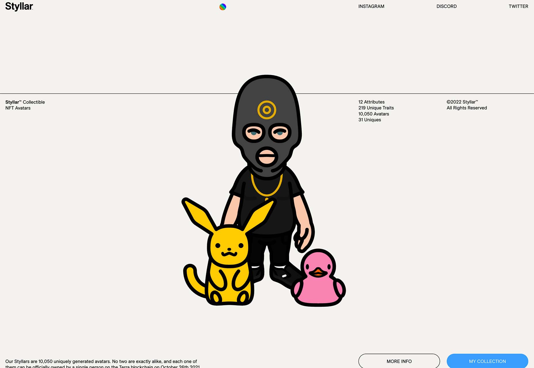
Styllar puts a focus on NFT avatars with a minimal aesthetic that gives plenty of room to individual NFTs. Sit on the website too long, though, and hundreds of options begin to cover the screen. Each visual element has a small text element to match that explains each image. It feels like a modern e-commerce experience that instills trust with users because of clean visual patterns. The site itself is just a gateway to a more traditional marketplace, but the calls to action are large, clear, and easy to follow.
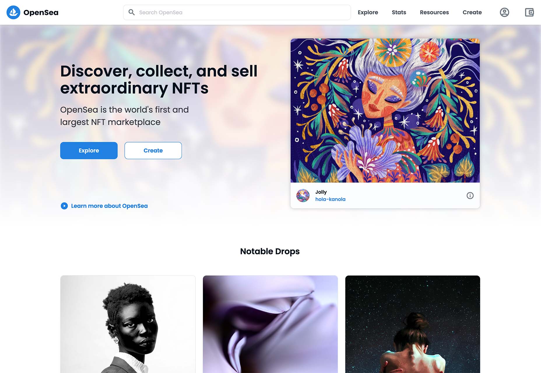
OpenSea treats the NFT marketplace more like an art gallery with card-style buttons to look at different elements and images. Everything about the website design is tailored for the mobile user and quick browsing with large areas to click in the card format and easy-to-read headers that help you find your way through the NFT space, whether you want to buy, create, or sell. The site also does one more thing that’s not as common with e-commerce – it explains how to get started in this new digital territory with plenty of resources.
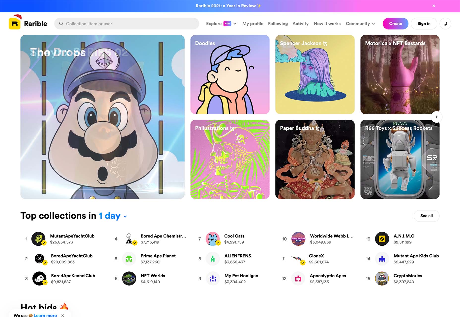
Rarible has an almost social media feel with lots of small blocks showing different NFTs. Digestible content in a grid-based design helps you navigate from images to rankings to what’s trending in NFTs. This site design is set up for high interaction and engagement, also featuring card-style elements and the ability to favorite items before bidding.
The key commonality with NFT website designs is that they are made for mobile users. These sites look good on desktops, but they are highly focused on a mobile, instant gratification user.
A trend in website design from 2021 is bleeding into 2022 with a lot of popularity: Hero headers that are mostly text. These designs have background texture and color, but for the most part, they don’t have a lot of other visuals.
These designs often rely on powerful language or messaging to help get user engagement. A secondary theme is the use of bright colors to help add focus and attention to the typography.
Font choices seem to be fairly neutral, with a lot of thicker sans serifs for the main headline and something a little lighter for secondary text options.
WeTransfer uses a smaller text block with multiple lines to create weight. The off-center placement draws the eye and is interesting even with the neutral background. Stacking elements create a nice focal area that encourages reading.
![]()
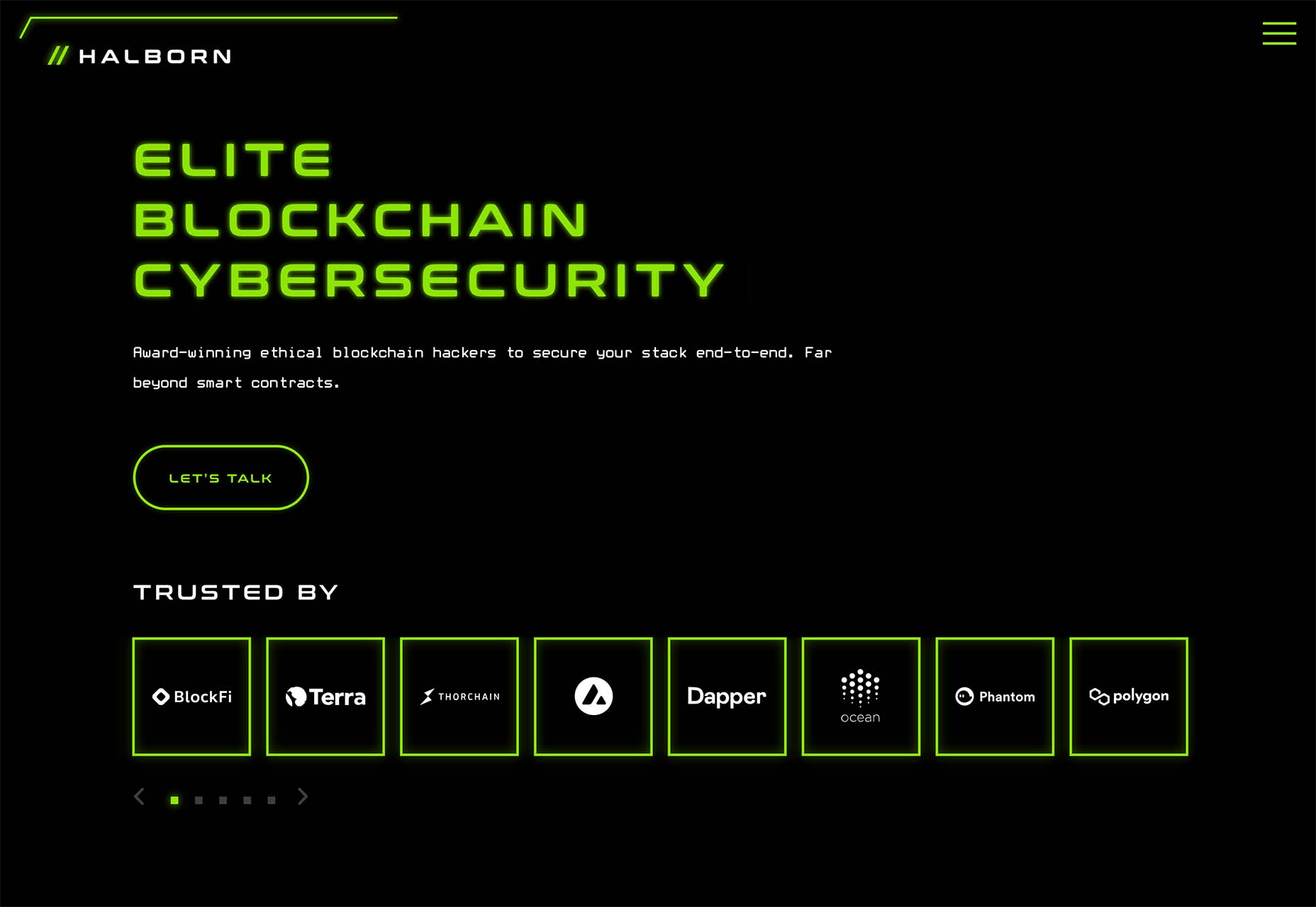
Halborn Blockchain Security goes with a less traditional font option and flips the color to the text to enhance the visual display. This design also uses an off-center, asymmetrical approach to create focus on the text element. The dark counterweight on the screen is an excellent guide to draw you back to the main hero headline.
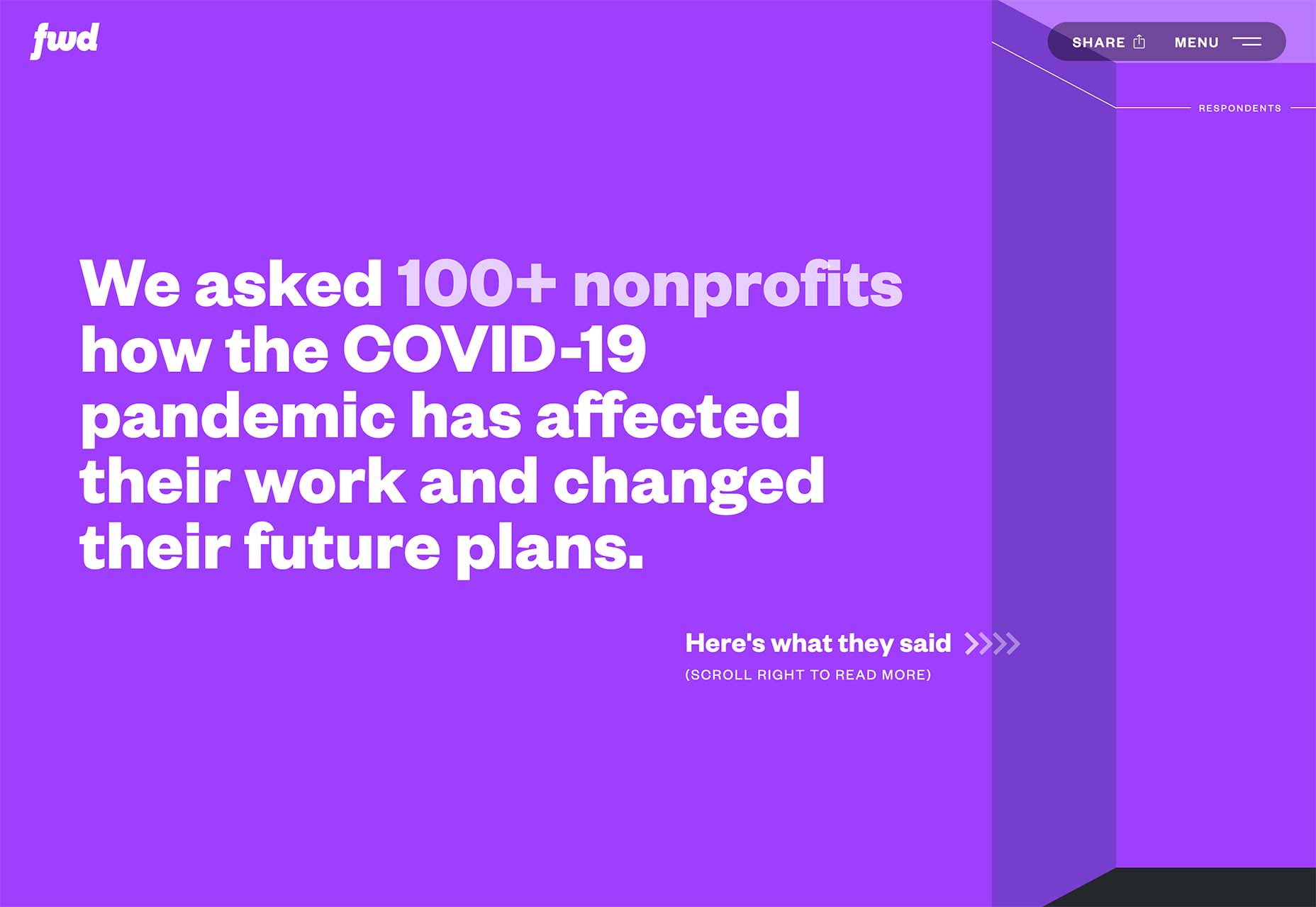
FWD goes with giant oversized text elements to create a strong visual focus with this design. Other than the faint animation of the arrows next to “Here’s what they said,” everything is still and static. The color and blocky depth of the background help draw the eye through the text and to clickable elements so that you know what to do next.
Another trending design element is the use of intricate illustrations on homepages. These highly detailed images can tell a visual story, help add meaning to messaging, or serve as a remarkable visual element when you don’t have a photo or video.
The great thing about this trend is that the only limitation is your imagination.
Once you find someone to create the illustration (if you can’t do it yourself), the world is open to interpretation.
We are seeing three major themes within this trend, as showcased in the examples.
Multi-layer illustrations with hints of animation, such as the one from Highvibe Network. This illustration used lots of colors, layers, unexpected elements within outlines, and a little animation to pull it all together. The effect is rather stunning and provides a lot of interest for the user.
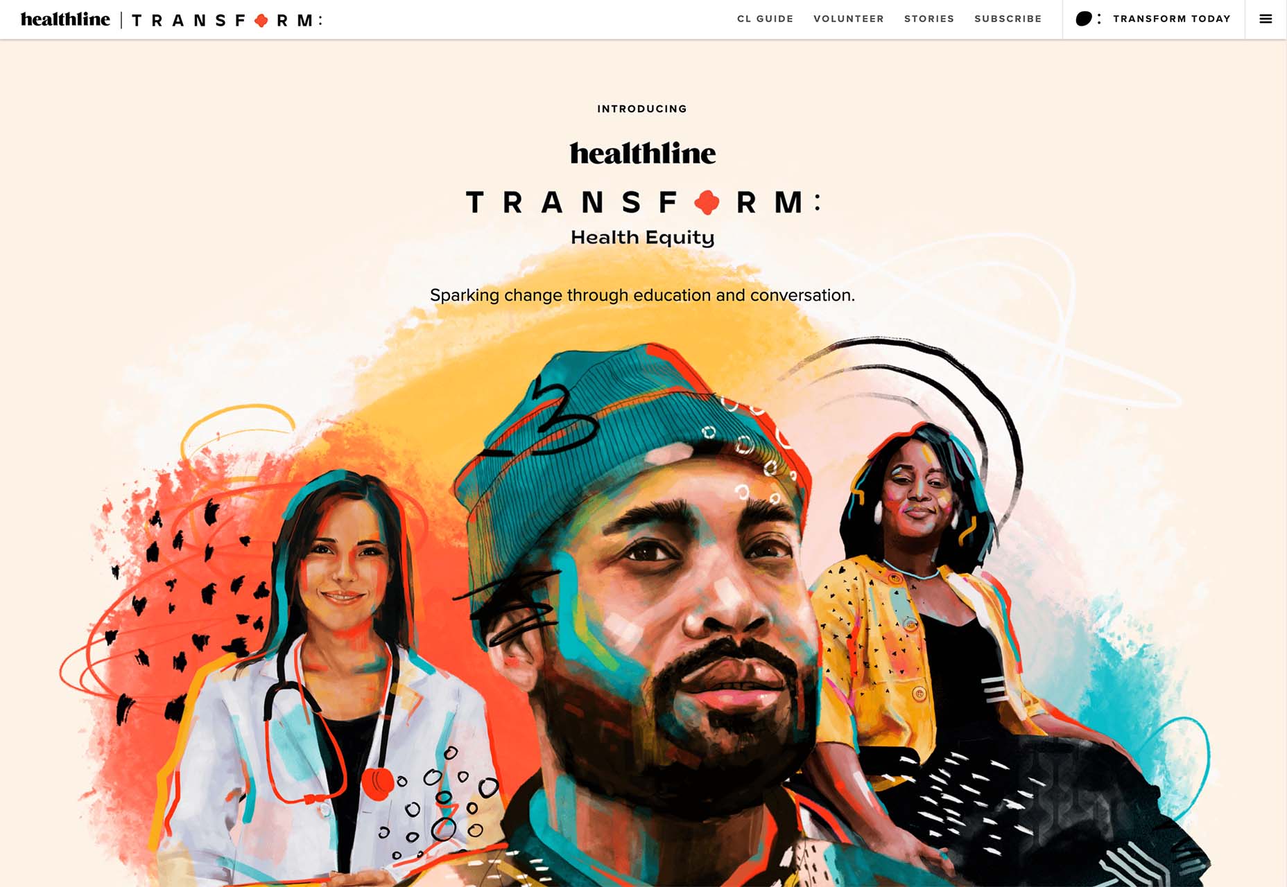
Realistic, painting-style illustrations, such as the one from Healthline, bring the content to life without real people or images. This technique is especially nice for industries where you may want to anonymize people in images. (Perfect for a healthcare website design because you don’t know if the illustrations are of real people or not.)
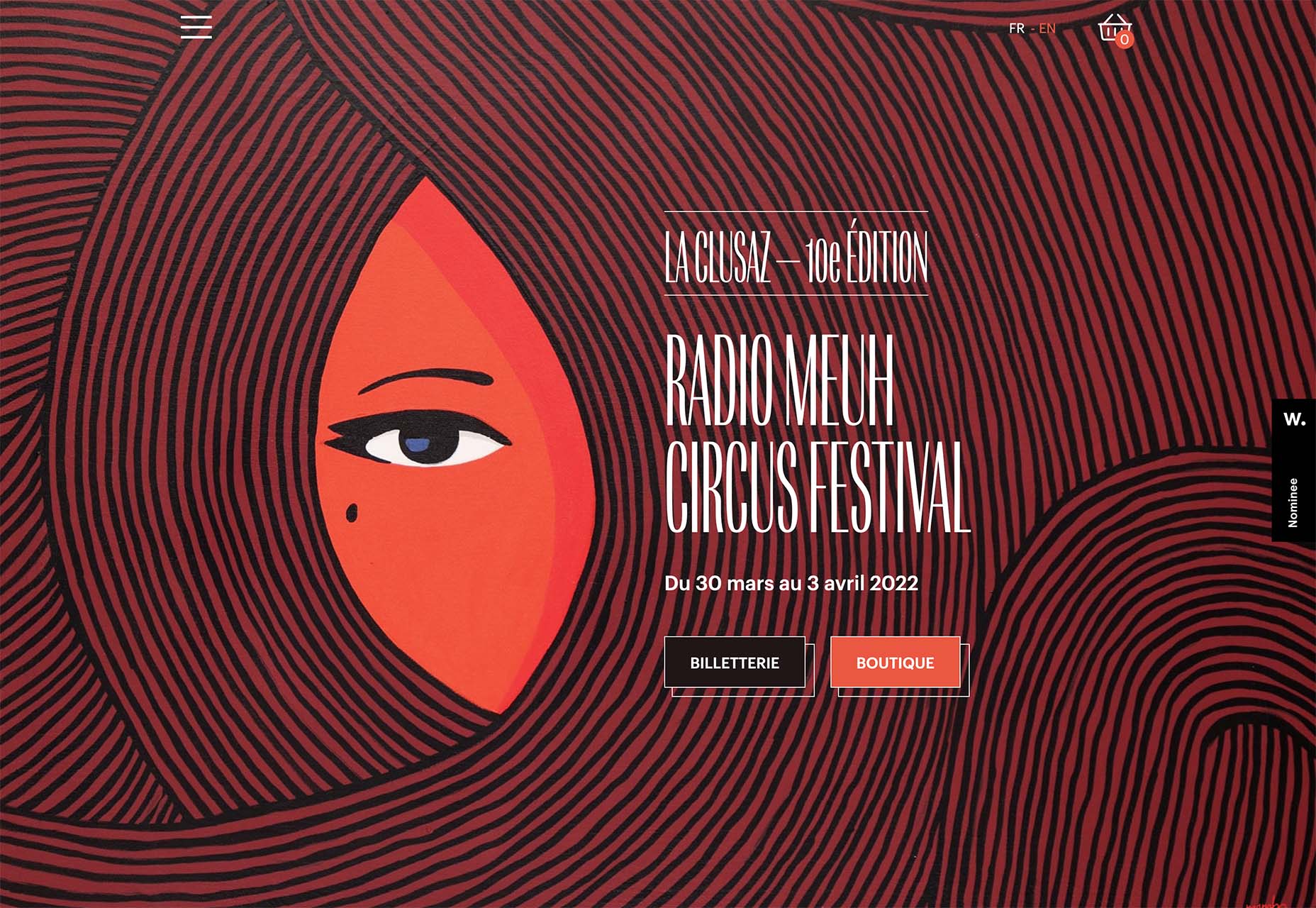
Detailed geo shapes and lines, such as the design from Radio Meuh Circus Festival. With great color and lines that draw the eye, this design can keep you looking and finding new depth for a long time. Color also helps draw you into the striking imagery.
What’s nice about all these design trends is that they have flexible elements that you can use and replicate across industries and projects. The common factor is that they lack traditional dominant imagery, which works exceptionally well.
These trends are likely a result of the worldwide pandemic as well. With less social contact, creating without conducting photo or video shoots is an ideal situation. Good luck trying some of these trending design elements on your own.
The post 3 Essential Design Trends, January 2022 first appeared on Webdesigner Depot.
 With a new year here, it’s time to try out some new fonts.
Whether you’re designing a brand new website or redesigning an existing one, the following list of fonts has you covered. In addition to the dependable serifs and sans serifs we use to create attractive and readable content, this roundup also has some fun additions, including one you can use for websites advertising Valentine’s Day deals next month.
Antona is a geometric sans serif font family with 16 different styles. The solid structures and ample white space within the characters give off a safe and friendly vibe.

Aromanis is a small font family with just two variations: Regular and Shadow. This new font supports nearly 70 languages and has an extensive Latin character set with localized forms. This font works best in branding for youthful companies with a playful vibe — from logos to posters and everything in between.

Black Coopy is an edgy display typeface that would work well for sporty brands. In addition to the standard alpha, numeric, and punctuation sets, the font also comes with a variety of “swash” characters that can be used to frame your bold headlines.

Don’t wait until February to start thinking about how to infuse a little romance into your designs. Cimory Love is a script font that comes in two styles: Regular and Italic. In addition to using it to promote Valentine’s Day sales, this could also be a cute font to use on websites for small gift shops, bakeries, and so on.

Cotford is a contemporary serif font with a ton of flexibility built into it. It comes with eight variations — three text and five display weights. Designers can use one of the many pre-designed styles or they can modify this dynamic font set to make it suit their specific needs.

Digno is a beautiful, informal serif font that’s easy on the eyes. The font family comes with 14 weights covering a wide spectrum — lights, mediums, heavies, and even a couple of “Book” weights are thrown in if you want to add some personality to those text-dense pages of yours.

Dogly Comika is a rounded display font with two styles: Regular and outline. While it’s promoted as a font for animals and pets, you could use it for any type of website hero image, mobile app splash screen, video game, or social media graphic for brands with a fun vibe.

Guzzo is a nostalgic typeface inspired by mid-century grotesques. With 24 styles ranging from Condensed Thin to Extended Black and unexpected character variations (like the random cursives in the italics), you could realistically create interesting font pairings right from within this family.

Idem is a contemporary serif with nine wide-ranging styles that would work well for headers and text alike. Inspired by literary publications and commercial artists from the earlier part of the 20th century, this font family has a highly legible structure with a bold flare.

Jantur Type is a geometric sans font that supports over 200 Latin-based languages. While you could use one of the Thin or Regular weights for editorial content, this font will be most effective in shorter headers and paragraphs where it can make a greater impact on messaging.

Loretta is an elegant serif designed specifically for the body of your web pages. Because of its calligraphic roots, this particular font would work great for high-end digital publications or blogs that promote luxury lifestyles and goods.

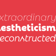
Rebrand is an exciting take on geometric sans. There are two sub-families in Rebrand: Display comes with nine weights as well as alternative characters and dingbats; Text comes with seven weights that cover a broad spectrum of styles. Because of the size and variety of this font family, you could easily make this the go-to font for a company’s branding, headers, and body type.

Royal Grotesque is a resurrection of a 1914 sans serif font called Wotan. Only one version of this font is available (Regular) and it would work great pretty much anywhere on the web with its clean and neutral design.

Selva is an attractive Scotch typeface that has a traditional Roman serif family, an italicized version of each Roman, as well as a script family. If you’re considering using a script font for branding or headlines, the classic and delicate details of this particular font would make for an interesting choice.

Sunset Gothic is a sans serif inspired by signage found near and around Los Angeles. Because this signage was often painted directly onto shop windows and building facades, the letterforms had to be extremely legible for passersby and drivers alike. This font draws upon the hand-painted, vector-based styling of those painted promotions.

The post 15 Best New Fonts, January 2022 first appeared on Webdesigner Depot.

This is the second in a series of blogs on data-driven microservices design mechanisms and transaction patterns with the Oracle converged database. The first blog illustrated how to connect to an Oracle database in Java, JavaScript, Python, .NET, and Go as succinctly as possible. The goal of this second blog is to use that connection to receive and send messages with Oracle AQ (Advanced Queueing) queues and topics and conduct an update and read from the database using all of these same languages.
Advanced Queuing (AQ) is a messaging system that is part of every Oracle database edition and was first released in 2002. AQ sharded queues introduced partitioning in release 12c and is now called Transaction Event Queues (TEQ).

 With the holidays fast approaching, there are plenty of fun gifts for you in this roundup of new tools and resources for web designers. Make sure to share anything you find helpful with others to spread additional holiday cheer.
Here’s what is new for designers this month…
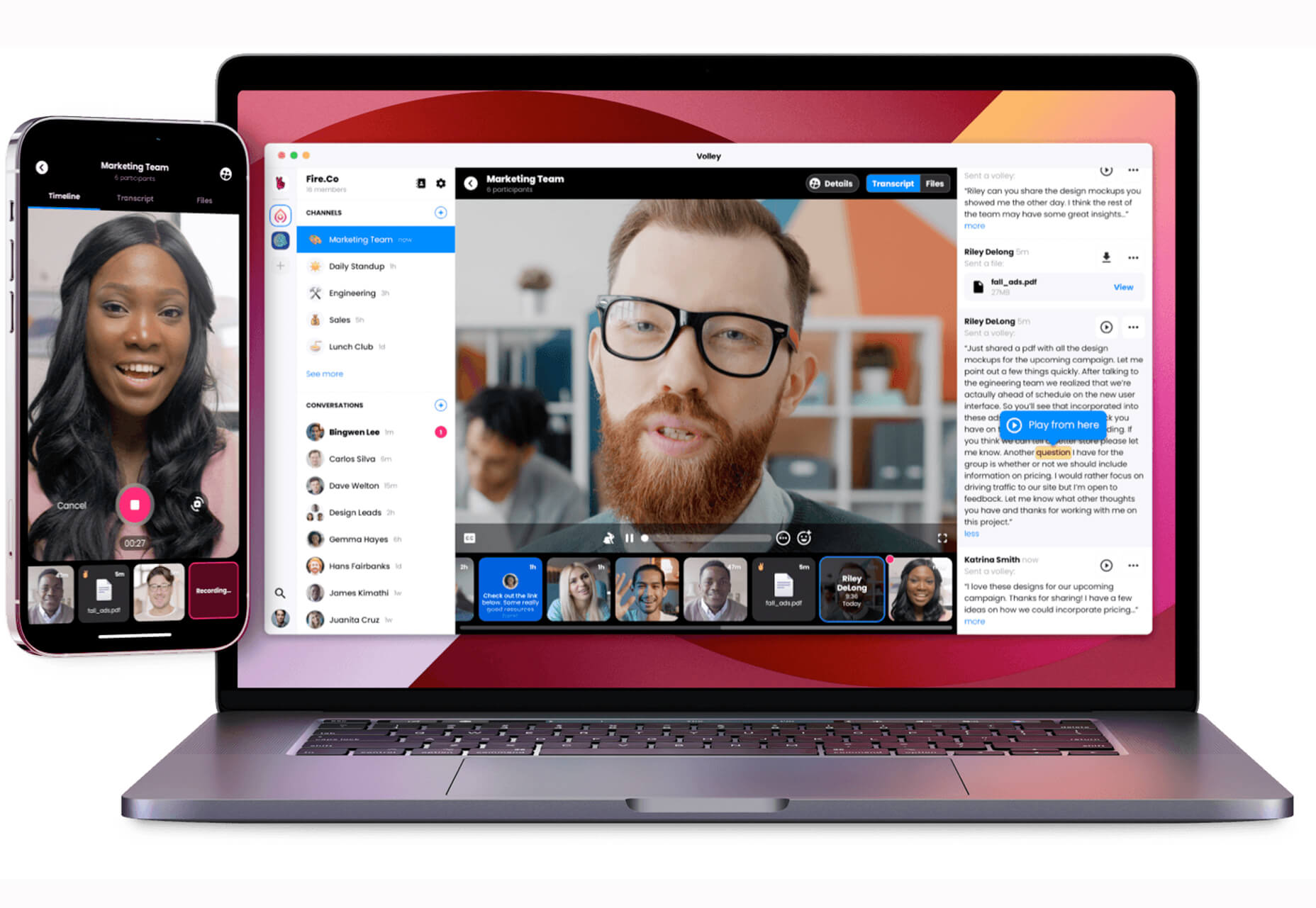
Volley, billing itself as Snapchat for work, is a new way to collaborate with remote teams. The tool addresses the two main problems of remote teams (lack of communication and loneliness) with an async video messaging app with interactive transcriptions neatly organized into workspaces. Volley emphasizes talking over typing (76% of volleys sent are video), doesn’t require you to coordinate schedules (it’s 100% asynchronous), and lives in a threaded conversation with context that’s neatly organized. Plus, the tool is free to use.
Upnext is a new type of reading list. It’s designed to help you save, organize, and focus on fantastic content while expanding your knowledge on your favorite topics. You can create playlists with almost any type of content that you can refer to later and follow “thinkers” that you love. Search and filter content, focus on reading, integrate videos, and even highlight and note specific content in your customized library. This brand-new web app has a waitlist that you can join to get access soon.
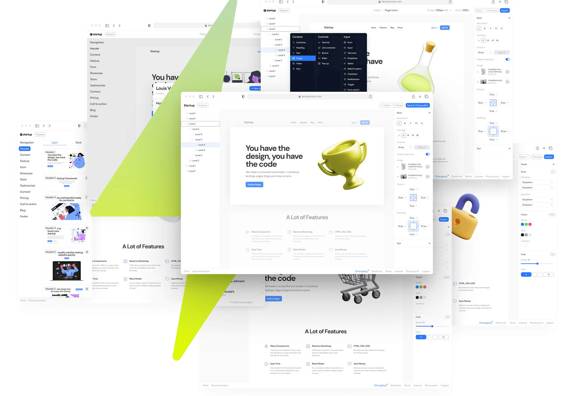
Startup 5 is a new version of the popular website builder, and it’s a perfect tool to create your online presence. With Startup, it’s fast and easy to get your business online with pre-designed blocks. It includes a visual editor with 150+ blocks with pre-designed and pre-coded elements and styles you can easily customize in a drag and drop interface. It’s an easy tool for building a website quickly without a coding background. Most users can publish a website quickly and easily.
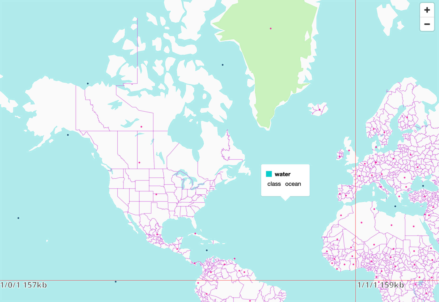
Flatmap generates Mapbox Vector Tiles from geographic data sources like OpenStreetMap. It is memory-efficient so that you can build a map of the world in a few hours on a single machine without any external tools or database. Vector tiles contain raw point, line, and polygon geometries that clients like MapLibre can use to render custom maps in the browser, native apps, or a server. Flatmap packages tiles into an MBTiles (SQLite) file that can be served using tools like TileServer GL or even queried directly from the browser.
Cleanup.Pictures is a web-based tool to remove objects, people, text, or other defects from your images before using them in projects. It’s an AI-based alternative to other photo-editing software.
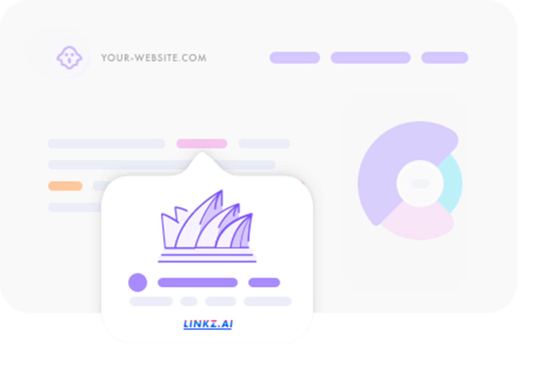
Linkz.ai helps you make smart link preview popups for your website to help encourage greater engagement and interaction for links. It works with a line of code you can install quickly and easily, and then you get smart link previews (in two style options) for every link on your site.
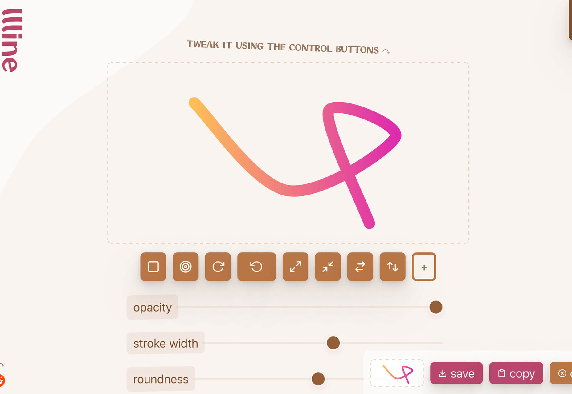
Llline is an SVG generator that helps you create smooth and organic lines and strokes with plenty of customization options for almost any application. This tool helps create graphic elements in just a few clicks, allowing you to add a few points to a canvas and then draw a smooth curve using these points. You can then tweak the resulting SVG graphic by rotating it, changing its color, giving it a gradient, making it a dashed line, and then you can download or copy the SVG markup.
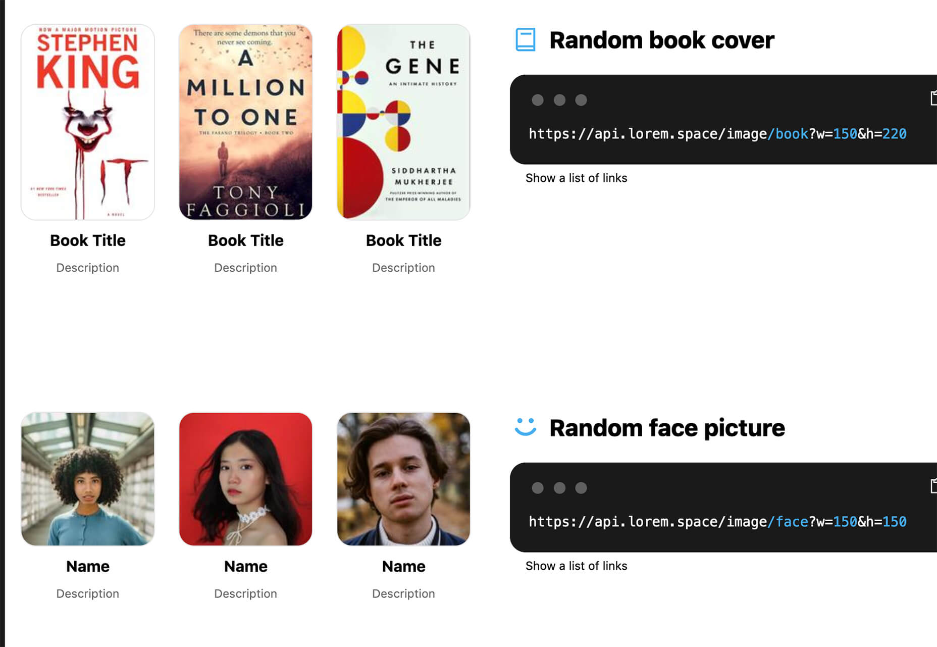
Lorem.Space is a valuable placeholder image tool. With just a little bit of code, you can pop cool placeholder images – from movie posters to shoes – right in your website mockup so that the design is easier to visualize. It’s a great solution that’s fun and keeps you from having to put empty boxes throughout the design. And everything can be randomized, so you don’t spend time looking for placeholders.
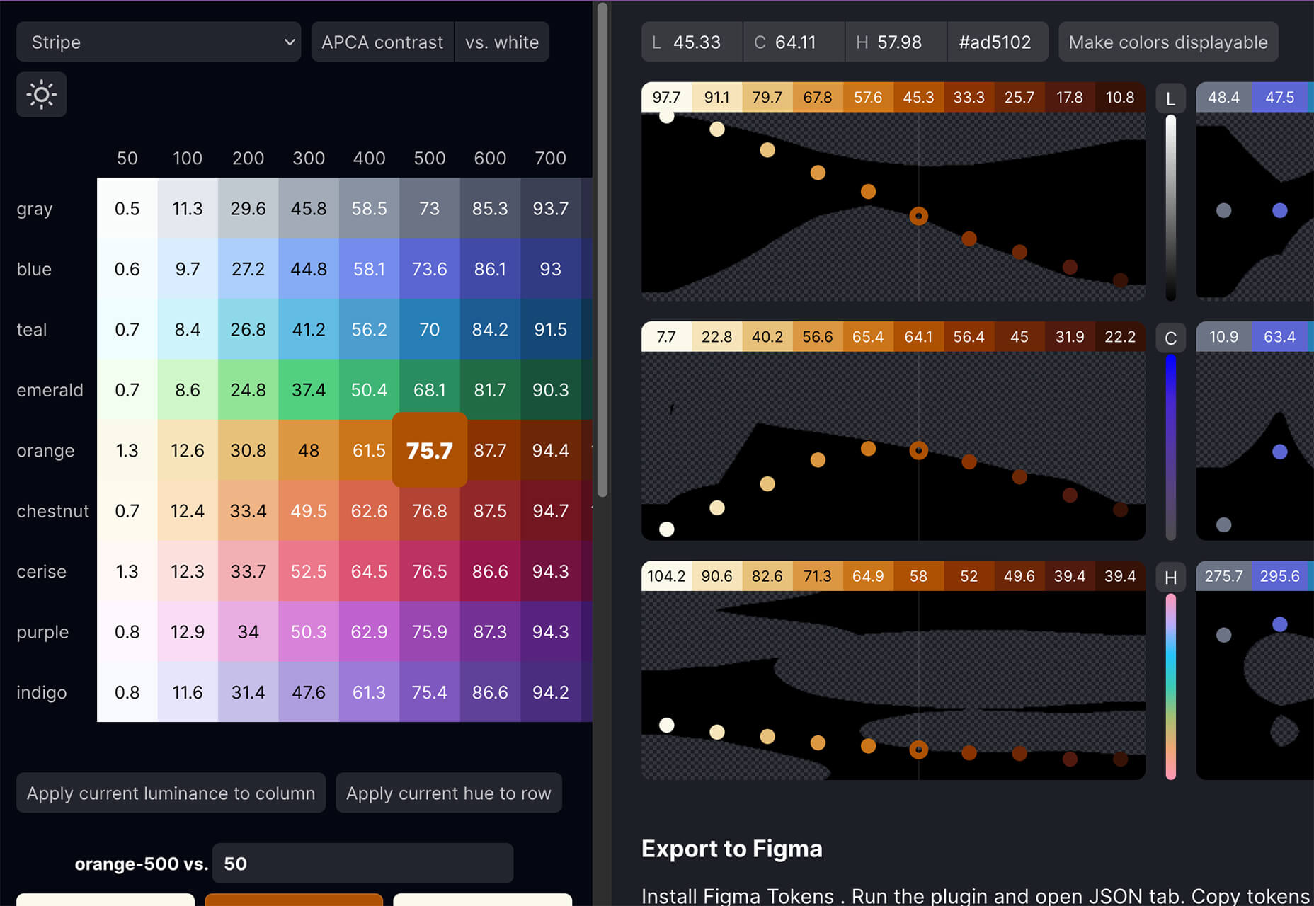
Huetone can help you create more accessible color palettes by making use of the Advanced Perceptual Contrast Algorithm. The contrast ratios and color combinations show on one screen to help you quickly develop palettes and combinations. Plus, the tool has hotkeys that make it easy to change hues, toggle, and adjust quickly. Then you can export everything to Figma.
Rowy is an open-source tool to build on the Google Cloud Platform. You can manage Firestore data in a spreadsheet-style user interface, write Cloud Functions in the browser, and connect to third-party platforms.
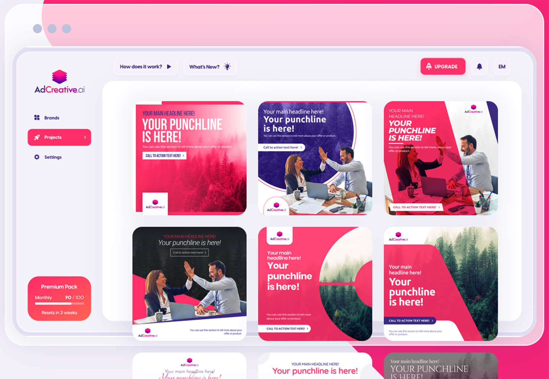
AdCreative.ai uses artificial intelligence to help create better ad creative. To get started, you upload logos and color files, connect social and other accounts, pick the sizes you need, write text, pick a background, and upload product images, and let the AI do the work. Once you have the creative you like, you can connect to your online ad accounts for easy use. This is a premium tool that’s free to try.
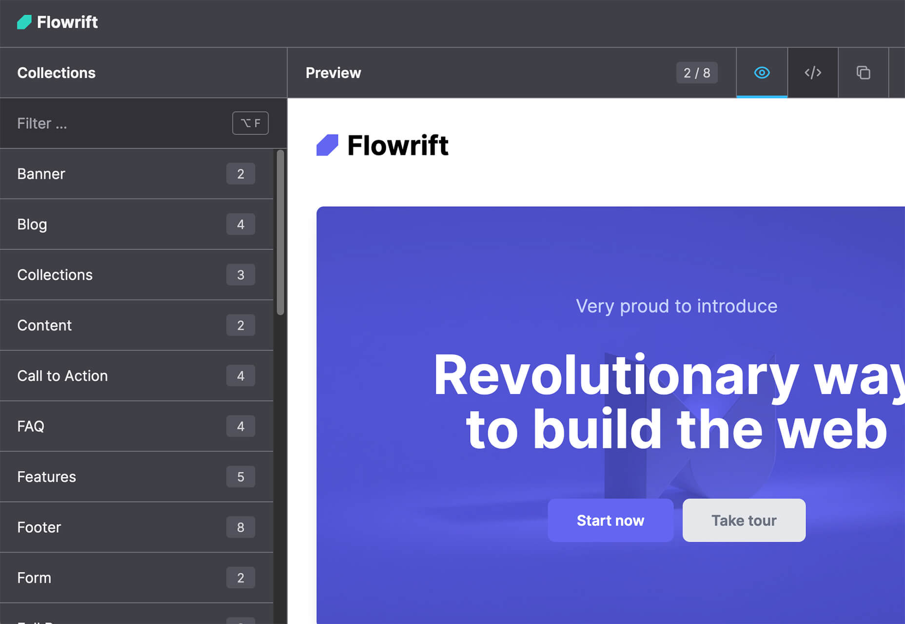
Flowrift is a tool to browse and then copy and customize Tailwind CSS blocks in groups of collections. Filter by block type and then experiment with the options. It even has e-commerce blocks.
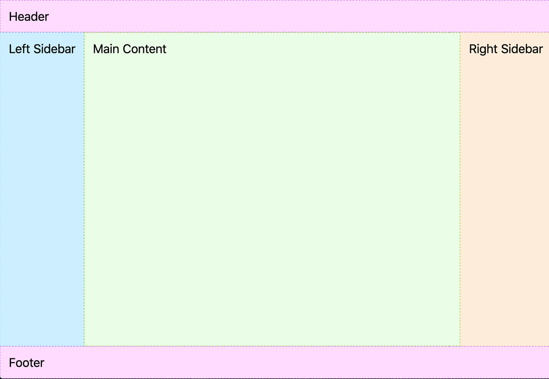
Layout Patterns is a collection of layout patterns built using modern CSS APIs to help you build common interfaces such as cards, dynamic grid areas, and full-page layouts.
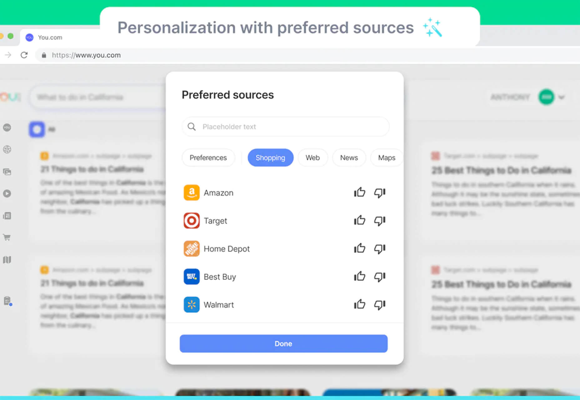
You.com is a new private search engine that summarizes the web. The tool is in open beta and includes superior privacy choices, actionable results, extensible apps, and personalization through preferred sources.
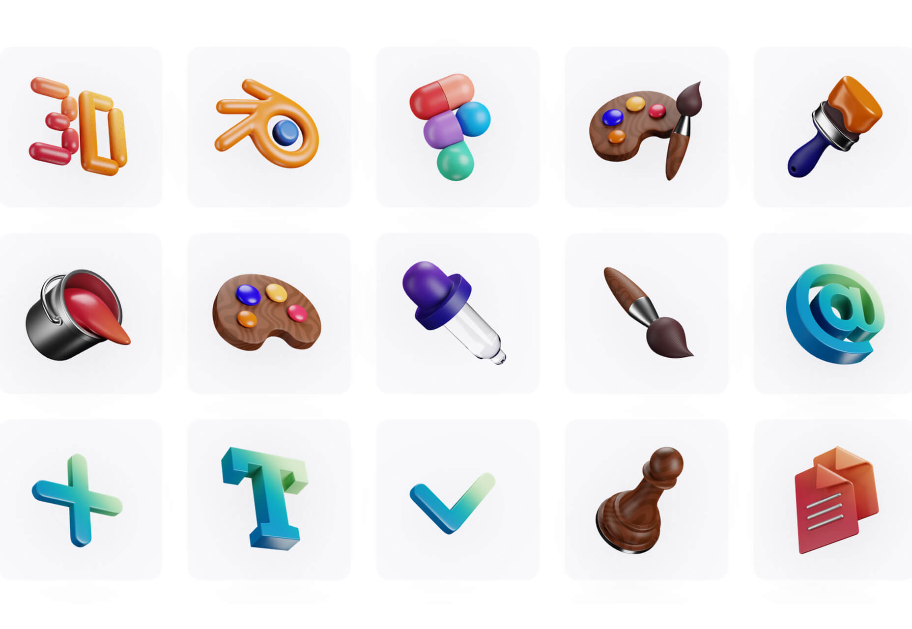
3D Icons is a fun set of three-dimensional, full-color icons that are free for all uses. (Donations are accepted.) They integrate with pretty much any web design tool you are using and come in four color styles – clay, gradient, color, and premium – so you can get just the right look for your project. Each icon also includes three rendering views – dynamic, side, and isometric.
Arco Design is a comprehensive React UI components library based on the Arco Design system. It includes a customizable theme and more than 60 crafted components that you can use out of the box.
Seekvectors.com is a search tool to find free resources in five different formats, PNG, SVG, JPG, EPS, and AI.
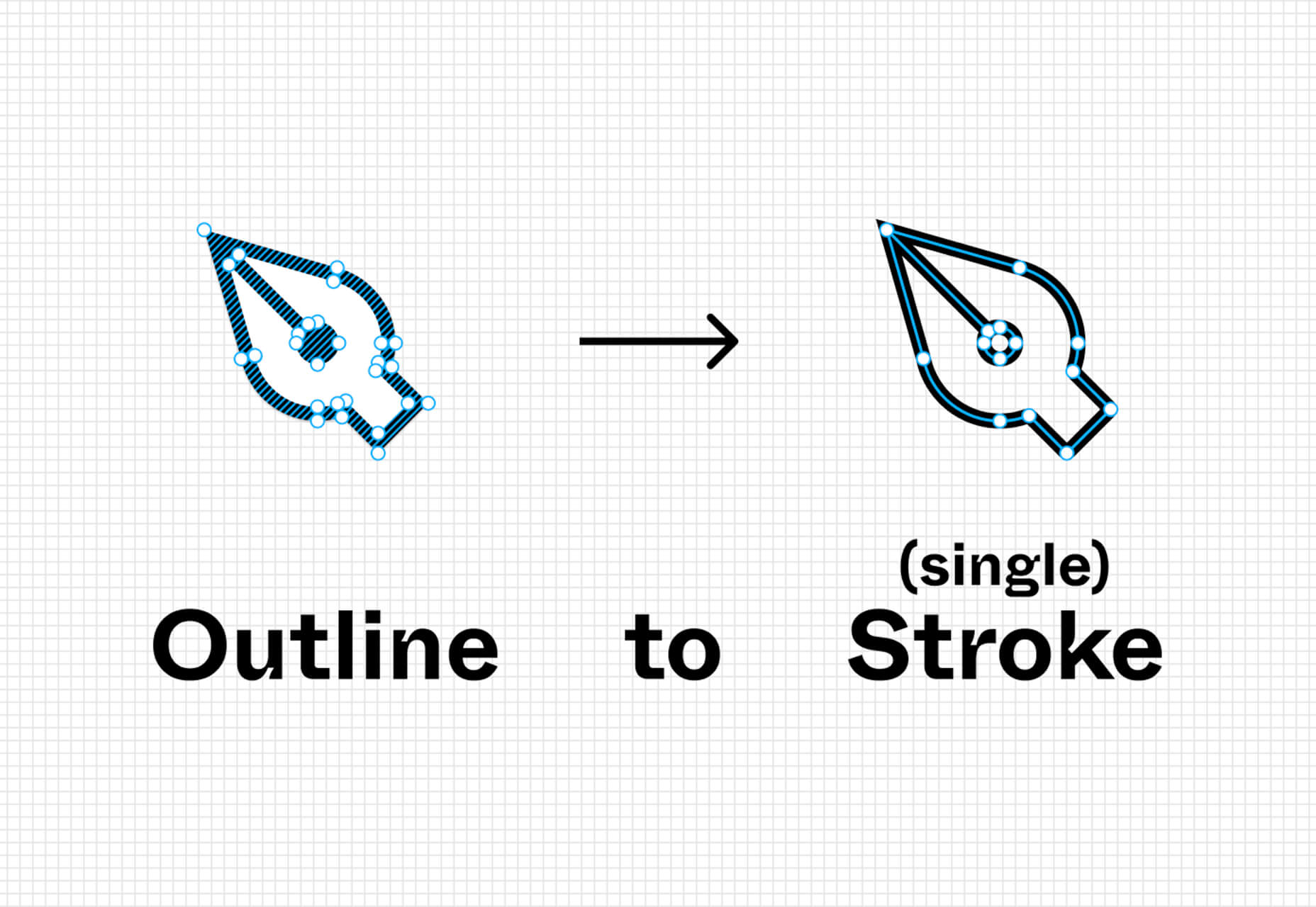
Outline to Single Stroke is a tool in the Figma community that works just like the name implies. Select a filled vector on the canvas, and then you can outline it to a single stroke and adjust the line weight if you like.
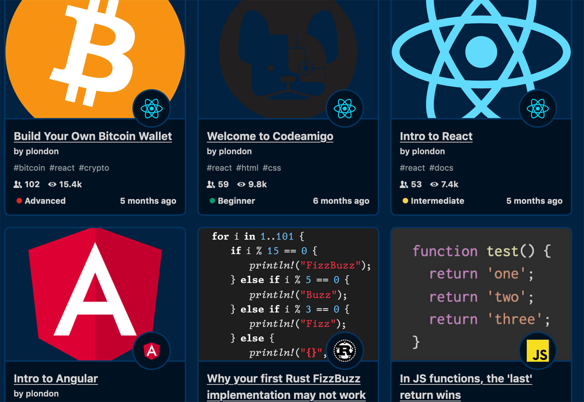
Codeamigo is a new self-paced platform to help you learn coding skills. It’s packed with various lessons for different languages and templates and has something for every level from beginner to advanced.
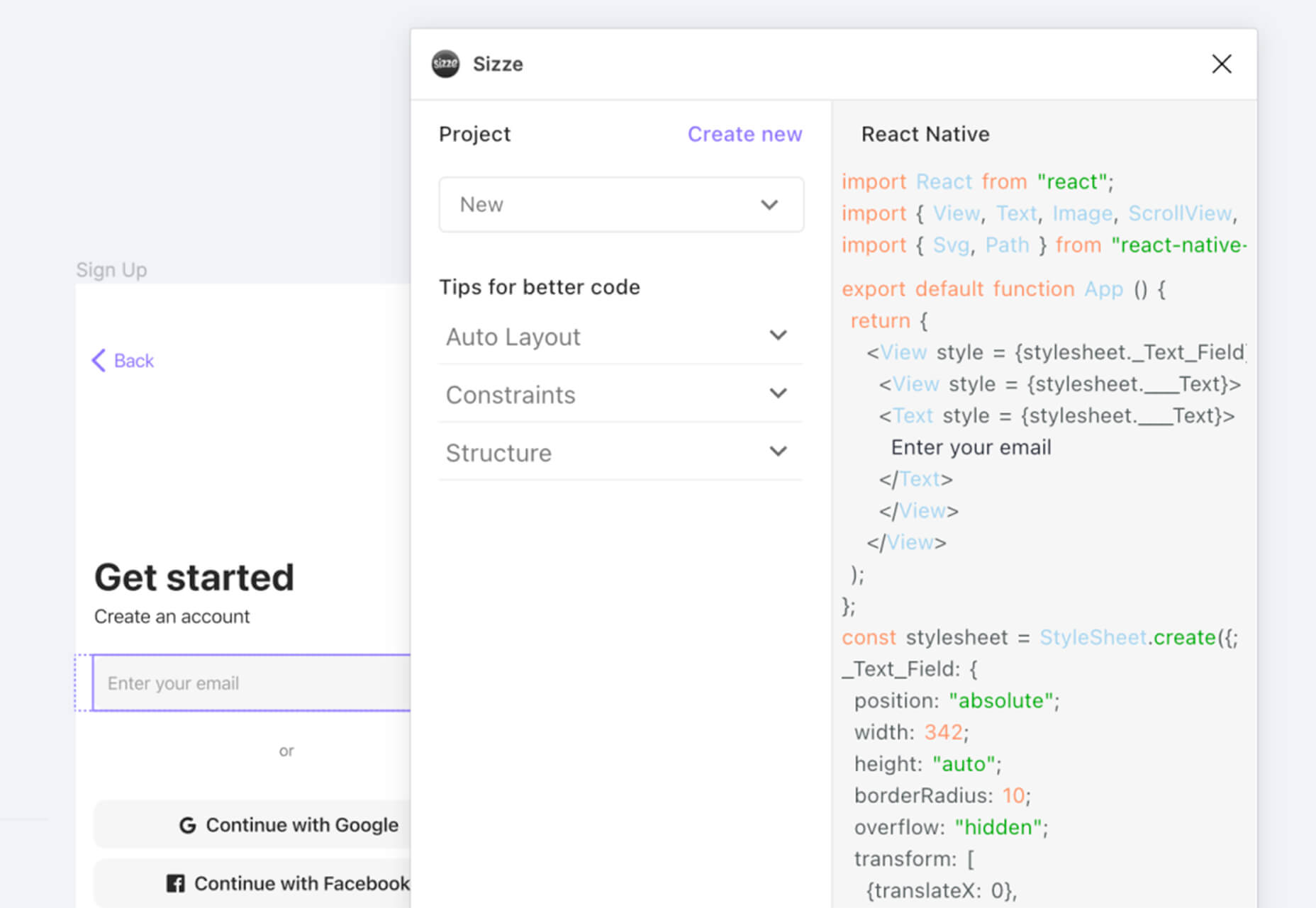
Sizze is a Figma to React Native export tool to create app prototypes and instantly export to code.
CodingFont is an excellent game that can help you pick a font to use for coding that you like! If you spend a lot of time looking at code each day, the right font can help reduce eye strain and make the work a little easier to see.
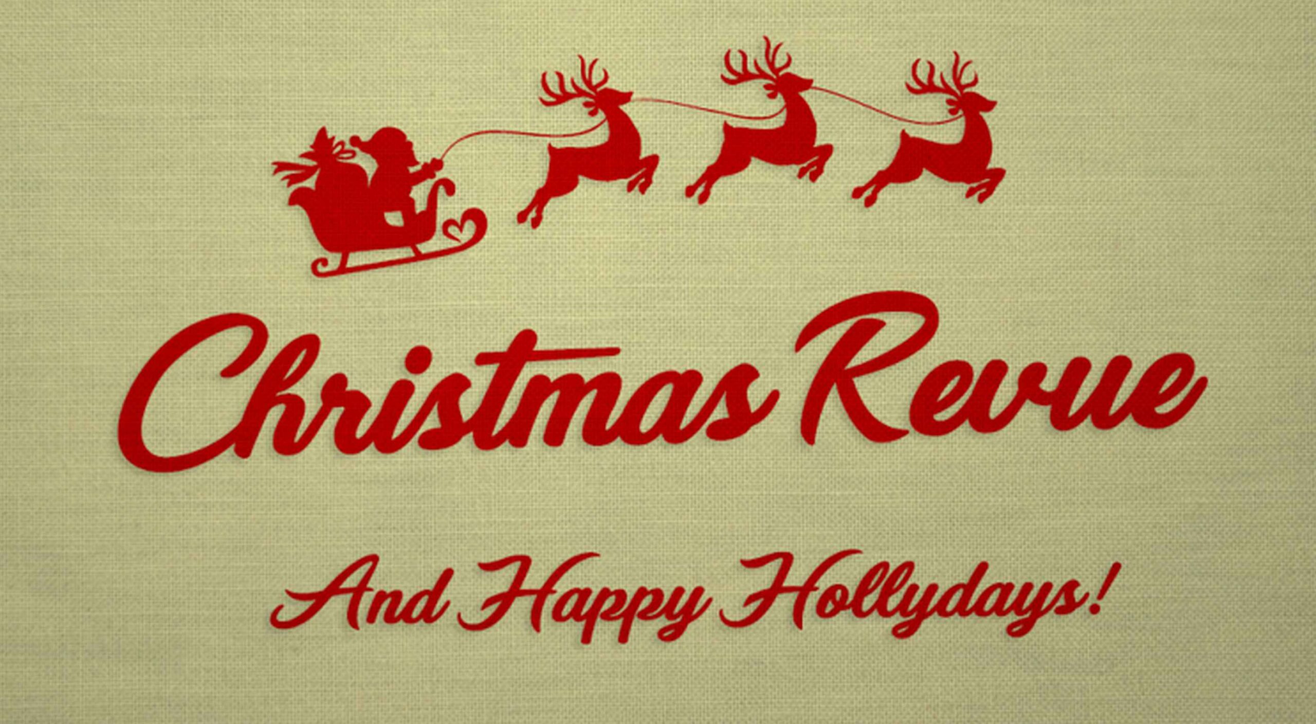
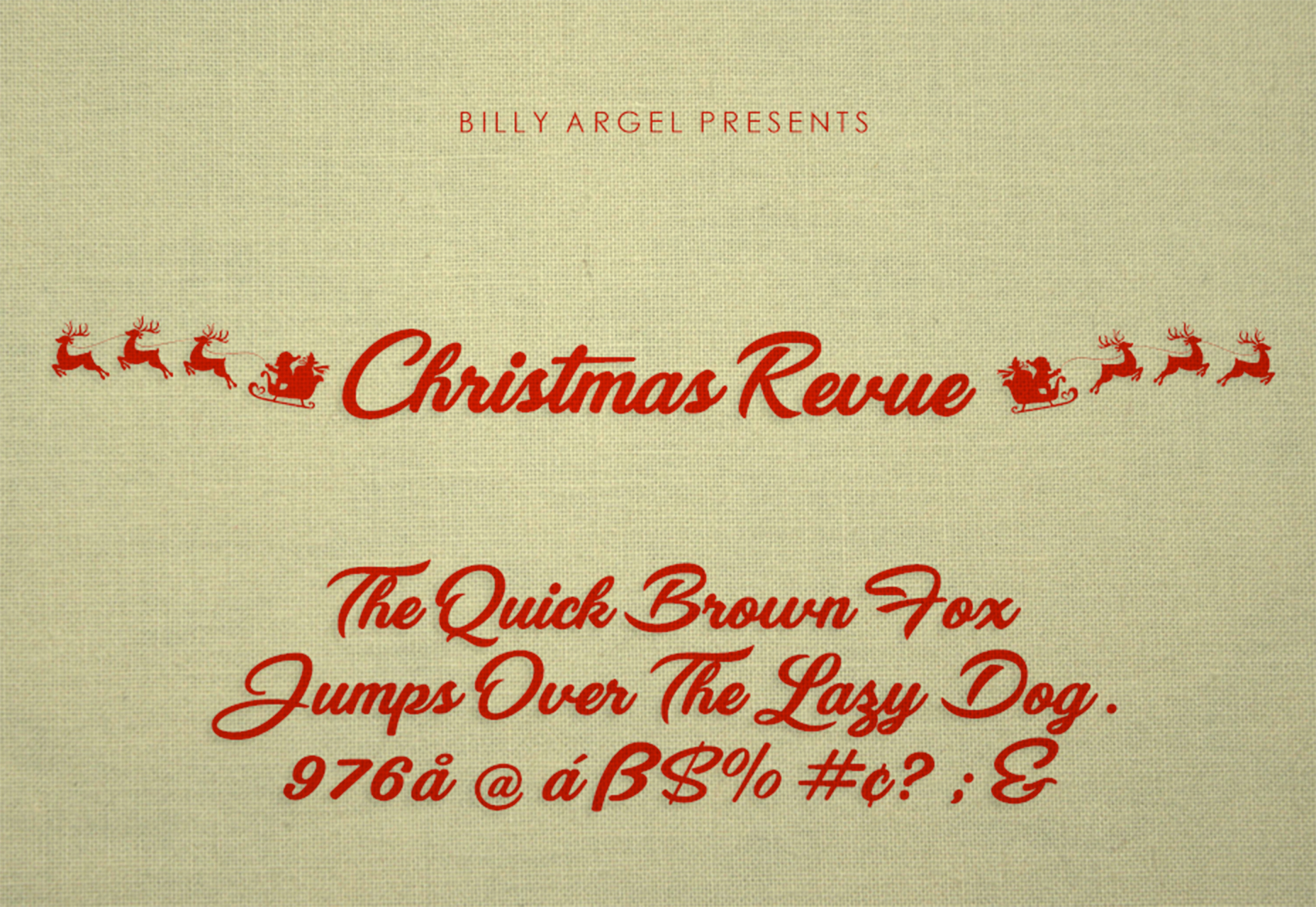
Christmas Revue is the first in a trio of holiday typefaces that you can use this season. This SCG color font is fun and perfect for the holidays with exciting glyphs. It is free for personal use only.
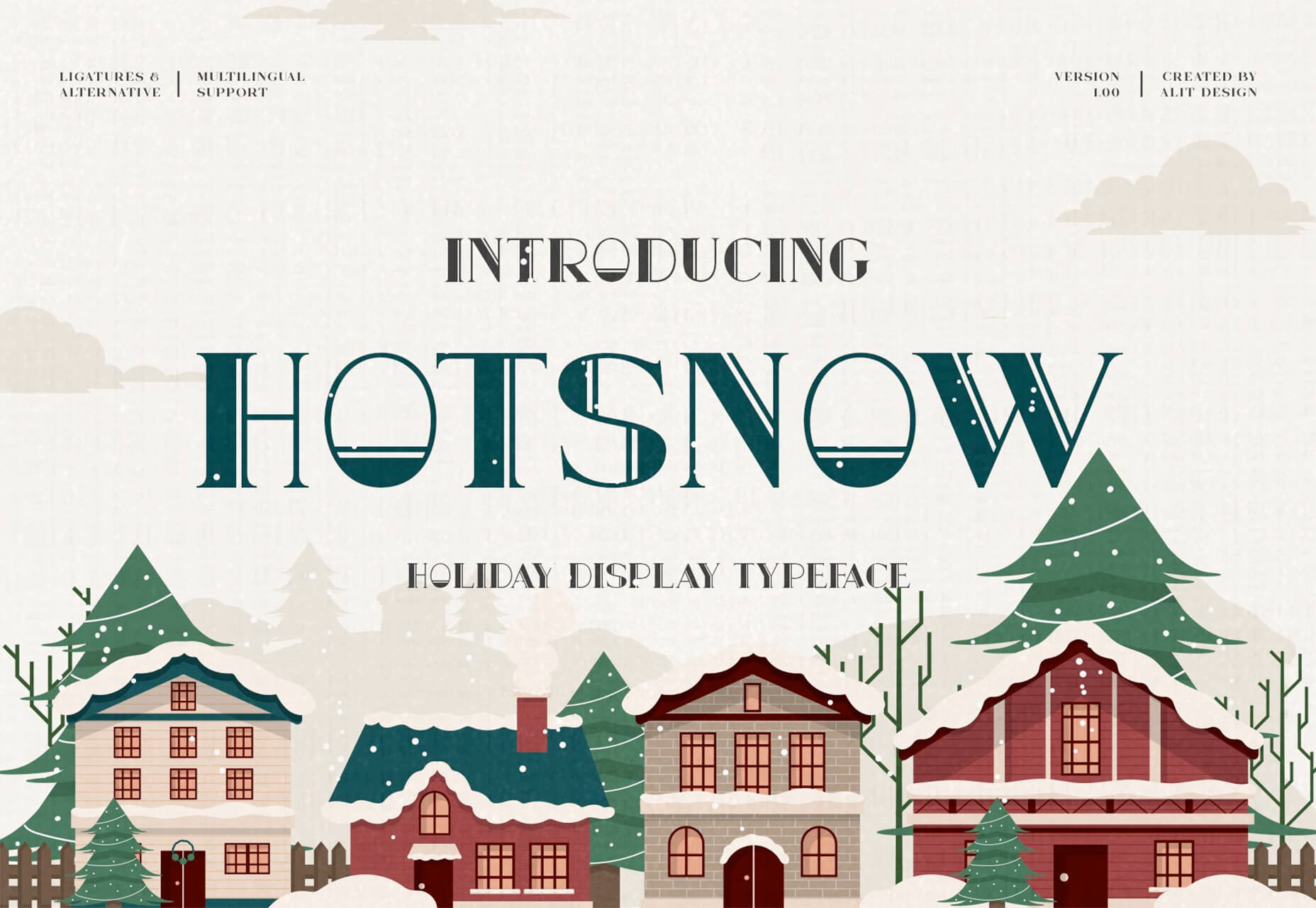
Hotsnow is a fun display font that has interesting fills and shapes in an all-caps character set. It is free for personal use.
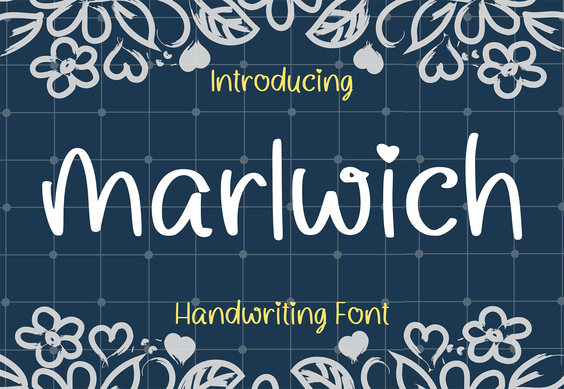
Marlwich is a feminine handwriting-style typeface that has the feel of signing a holiday letter or card. It contains upper- and lower-case characters and is only for non-commercial use for free. (A paid option is available for commercial projects.)
The post Exciting New Tools For Designers, December 2021 first appeared on Webdesigner Depot.

JMS or Java Messaging service is a solution for asynchronous communication using messages (objects). Initially, it was part of JSR (specification used in Java EE).
Let’s assume we have any service that can process only 100 requests per second. Any higher load will freeze service or put it down.

 This month’s new tools and resources collection is a mixed bag of elements for designers and developers. From fun little divots to tools that can speed up development, you are sure to find something usable here.
Here’s what new for designers this month:
Codewell is a service to help you learn, practice, and improve HTML and CSS skills with real templates. The benefit here is pretty obvious. When working with real templates, you can see the result of actions and changes. The tool includes free and premium options with new templates to work on weekly. Everything works in a responsive environment, and free plans have access to free challenges and a Slack community; a paid plan also includes source files and premium challenges. You need a Github login to get started.

LoomSDK is an easy and reliable way to add video messaging to your product – and it’s free. The SDK enables your users to record, embed, and view with Loom videos directly within web apps – adding clarity and context to any workflow.

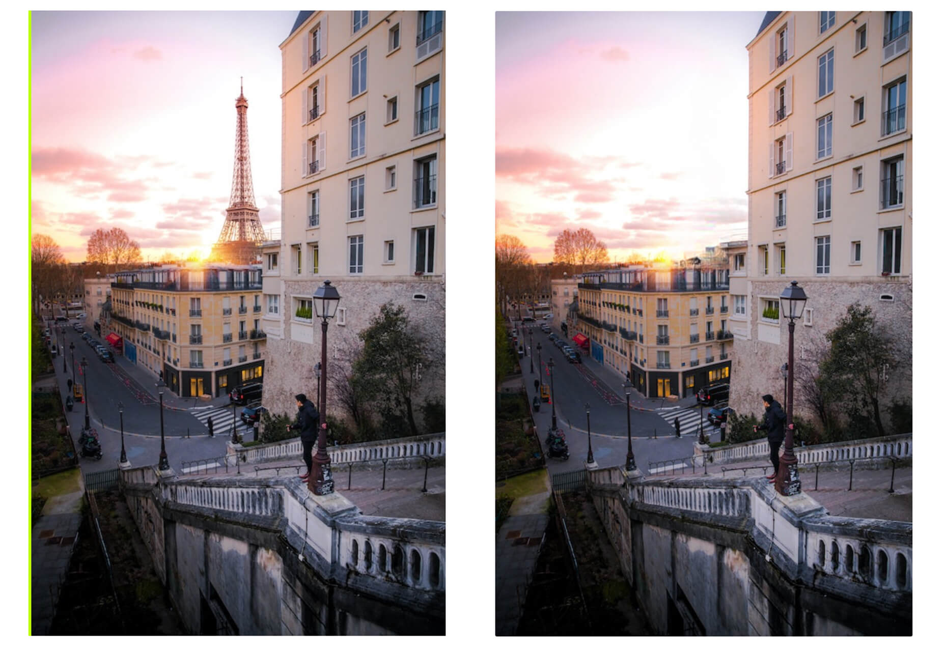
Pinter New Image turns photos into funky and fun line images. Upload an image with plenty of contrast, use the controls to set the look you want to achieve, and download. The new images are available as PNG or SVG. Maybe use it to create your next profile photos for social media or a nifty avatar.

Terms & Conditions Apply is a game that explains all those little pop-ups that you accept to enter and interact with websites. You are tasked with a mission to start the game: Do not accept terms and conditions, say no to notifications, and opt-out of cookies. Can you do it?

Khroma uses artificial intelligence (via personalized algorithm) to learn what colors you love and create palettes for you to discover, search, and save for use in projects. The beta tool is easy to get started with, although you do have a little color-picking homework to get started.

Mmm is a different type of website builder. The tool, which is still in alpha, allows users to create drag and drop websites in a simple manner. It works almost like making a digital collage. Users can get a custom URL, and every page is responsive. The interface is designed so that you can even build yours on a phone. And here’s the other feature – they encourage messy designs.

LightGallery is a lightweight, modular, JavaScript image and video lightbox gallery plugin. It works with React.js, Vue.js, Angular, and TypeScript. It includes plenty of demos and documentation to help you make the most of this gallery tool.

Vandal is a nifty browser extension for Firefox or Chrome that allows you to navigate back in time without changing tabs. The utility of Vandal is to allow quick and easy access to all the archived snapshots for a URL, and it supports navigation to a snapshot as well.

The CSS Layout Generator is a tool for creating the CSS for layout components. It is also a learning tool for teaching what is possible in CSS for positioning elements in the browser. Tweak specifications to see how it impacts the layout, CSS, and HTML.

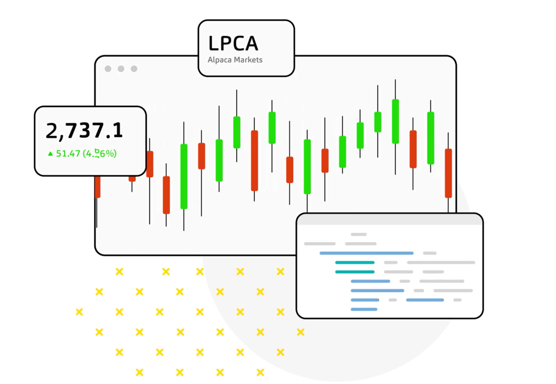
Alpaca Data API is an easy-to-use feed that allows you to bring in stock market data for modeling and backtesting. (it includes free and premium options based on your needs.)
Mobile Palette Generator is a color-picking tool that will help you select the best hues for mobile design projects. It then shows you all the specs for primary, secondary, and accent colors.

Iconoir is an open-source icon repository with more than 900 SVG icons. Search icons, browse by category or poke around for what you are looking for. Everything is ready to use without signups or forms to fill out.

Pmndrs Market has a collection of more than 300 three-dimensional elements and drawings of things for use in projects. Model renders are in a rough style with a realistic feel.

Boring Avatars is a fun collection of semi-customizable avatars without faces, hence the name. It’s a fun playground that puts a new twist on something that you might not expect to do differently.
Spark is a free download with three different website design starters. The hero images are ready to build from and are made for Figma.

Venus Design System is a premium UI kit packed with more than 2,000 components and states that allow you to design fast. There’s also a demo version for you to test before you buy.

ReadyUI contains more than 200 blocks and designs for agencies, developers, startups, and more. Everything is production-ready using Bootstrap and Figma files. Choose from light or dark themes and search for a design that works for your project.

Creative Generative SVG Characters is a marriage of JavaScript and SVG that creates fun characters derived from drawings. Using shapes and a little code, you can see how to draw smooth lines, create polygons, and add other shapes for a fun feel. There’s a full demo on Codepen.

5 Steps to Faster Web Fonts helps you remove some of the bulk from popular typography options. Iain Bean explains a set of methods you can deploy to ensure that load times are quick with some applicable code snippets. Here’s a preview: Tip 1 is to use the most modern file formats (WOFF2).

The Perfect Link walks you through some accessibility checks from the A11Y Collective for linking best practices. Some of the things you think are the “right way” may be challenged here. The information goes through everything from design to semantics and is wonderfully thorough. It’s a must-read.

Readsom is a curated collection of newsletters and emails that you can read online or sign up for. Its catchphrase is to “discover content you’ll want to read.” It is a good way to find newsletters that interest you, including plenty of design and development options that you might not otherwise know about.

Famous First Websites isn’t a tutorial per se, but it does provide a good place to do some visual learning. See what your favorite websites looked like when they launched and the evolution of the designs.

The post 22 Exciting New Tools For Designers, June 2021 first appeared on Webdesigner Depot.

 If you are feeling like me right now, you have mixed emotions about the world in general. And this is translating into a pretty distinct design trend that’s happening almost across the board: Websites aren’t using many images of people right now.
There are just too many questions about what is appropriate (mask, no mask? groups?), so the default answer seems to be using more “artless” options focusing on typography, graphical elements, and small animations.
Here’s what’s trending in design this month.…
As the world works to pull itself out of the pandemic, designers struggle with post-pandemic design elements, mainly photography.
Many brands and companies started to refresh their libraries with new imagery that included smaller groups and masked people. Now some parts of the world are pushing to reopen, making some of these images seem immediately dated.
What is a designer to do? First, you have to weigh keeping a fresh-looking design with a world that’s changing quickly right now.
That’s likely the big reason why so many website designs are launching without photos above the scroll. Instead, the hero areas are dominated by oversized typography, graphical elements, and small animations to grab attention.
There aren’t many images that contain people or real-life scenes.
This middle ground allows designers to create something interesting within some pretty distinct constraints while preventing a design from looking dated if local pandemic health guidelines change. (It’s a fine line to walk that may continue for some time to come.)
Each of these three sites does it differently, but with similar themes.
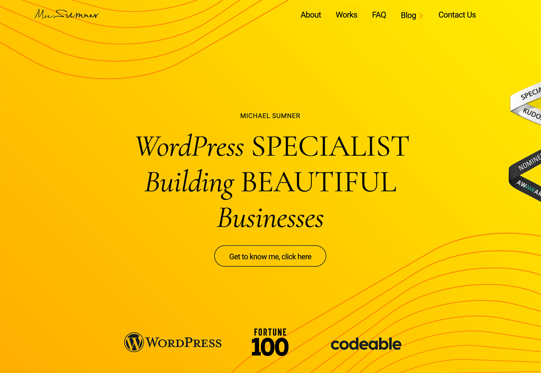
Michael Sumner uses bright color and subtle text animations to keep you look at the design. Clean lines and flowing graphical elements almost seem to counter the in-your-face color choice.
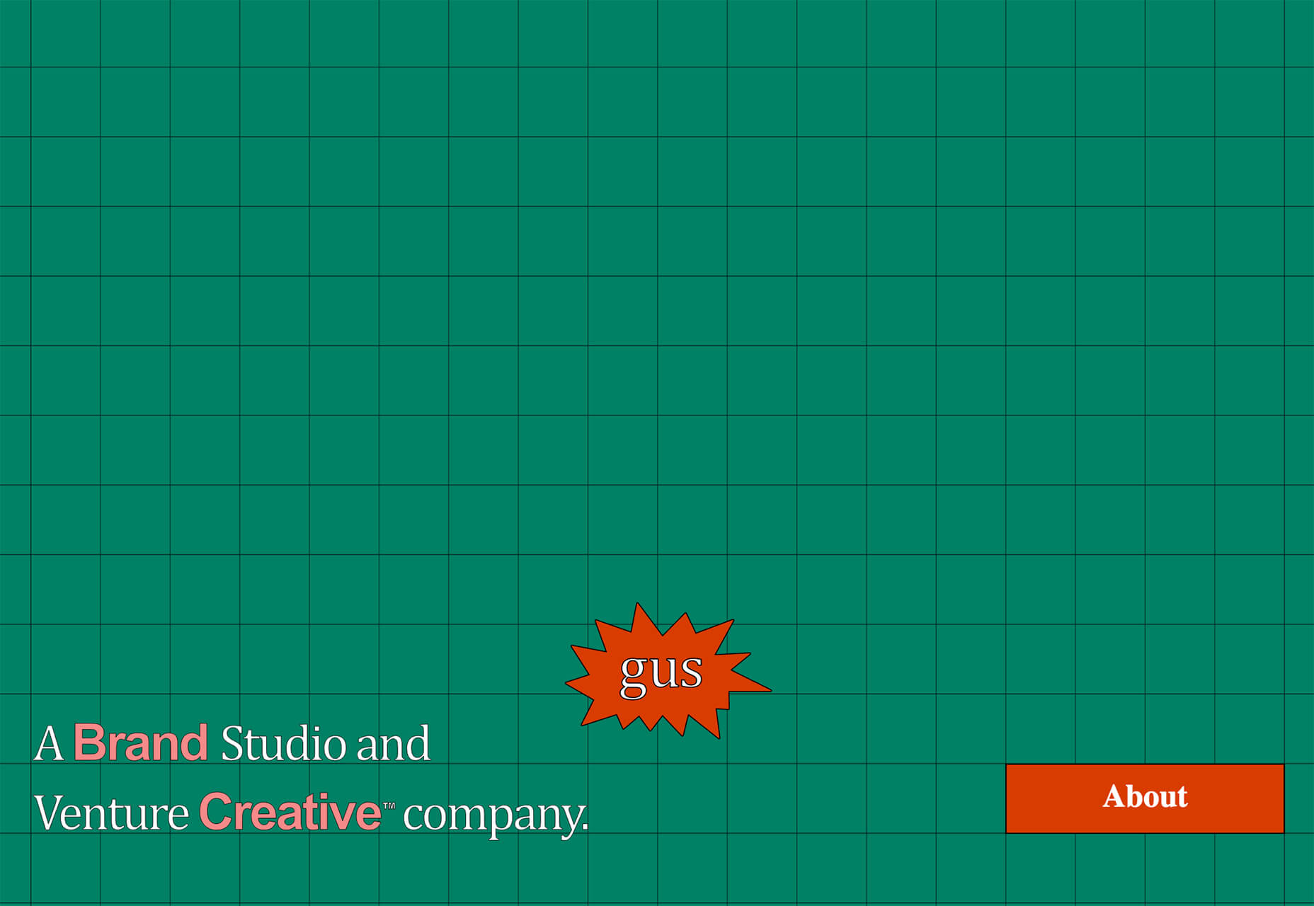
Gus uses a grid background – also with a nontraditional color palette – to draw attention. You keep looking at the design thanks to the animated “gus” on the screen. This small element is just enough to help users click deeper into the design.
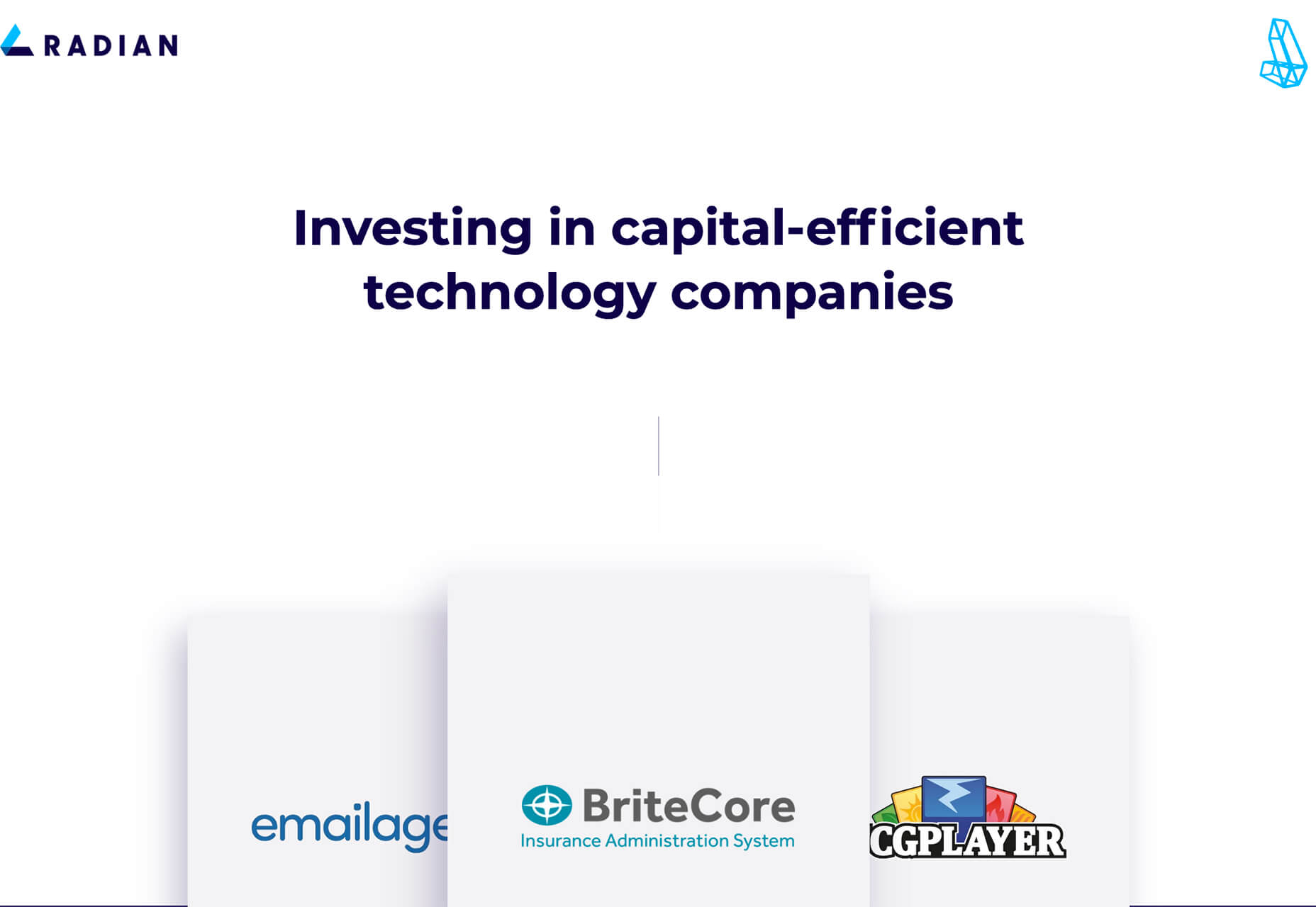
Radian takes a different approach while also embracing the no photos design trend. With a lot of white space and clean fonts, the design uses simple scrolling logo boxes to help tell the company’s story.
This website design trend is a twofer of sorts: There are no photos above the scroll, and the main headlines are aligned left with dominance in the header area.
A left-aligned stack headline can be a striking and dominant element. It can have even more impact with the right words in the headline that entice and engage users to learn more. (If you use this design trend, it is imperative to spend time on the words to ensure that the design says something meaningful.)
Here’s where it gets tricky. To push the eye across the screen, you want the stacked headline not to extend all the way across. Most of the designs using this trend are going half to two-thirds across the screen.
Then the text size needs to be large enough so that the words don’t break awkwardly. (Sizing depends on how many words and letters you have to deal with.)
Finally, you want to stack lines of text to fall nicely into the main, first scroll of the design. If the headline sits too low, it might be distracting. The same is true of a headline that’s too close to the navigation or breaks funny on the scroll.
The lesson here is that stacking text in this manner is a fine art, takes just the right (and highly readable) typeface to pull off, and requires meaningful messaging.
Steadfast Collective does it with a simple headline and “pieces” of images that encourage scrolling.
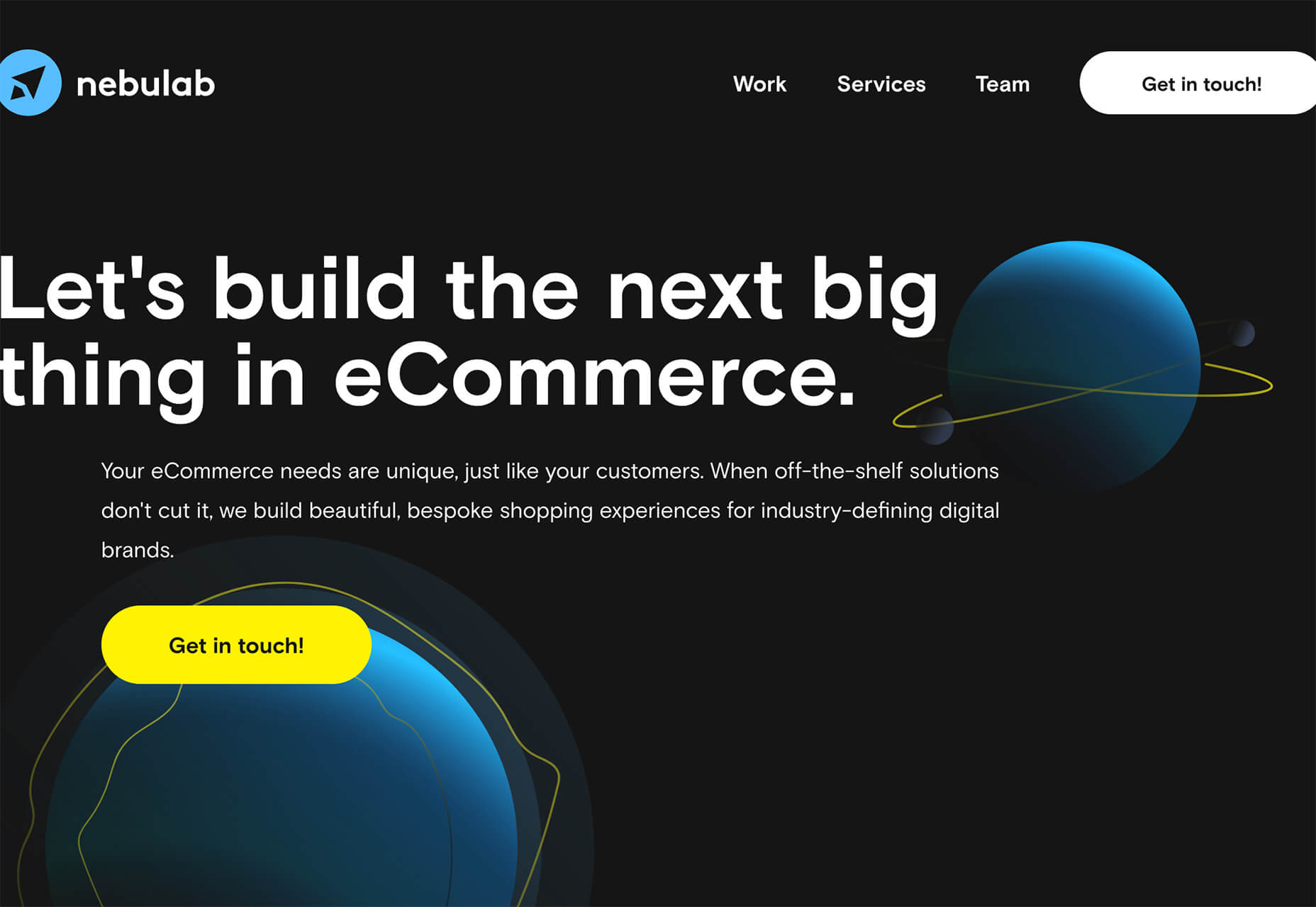
Nebulab uses some imagery, but what you really see is the giant, two-deck headline. Note the clever use of “next big thing” in an oversized typeface.
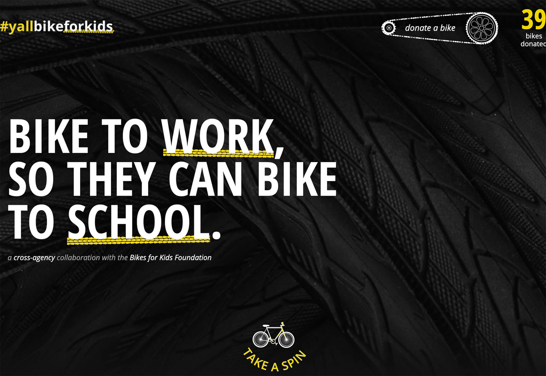
#Yallbikeforkids uses an all-caps configuration with intentional underlines to bring attention to keywords. The stark black and white color palette with yellow accents is a bonus for this design and style.
When you don’t have many images to work with and no faces to show, it leaves more room for typographic creativity.
From experimental typefaces to line styles to interesting weight combinations to completely artistic font treatments, designers are having a lot of fun in this area.
Here are three examples to crush on.
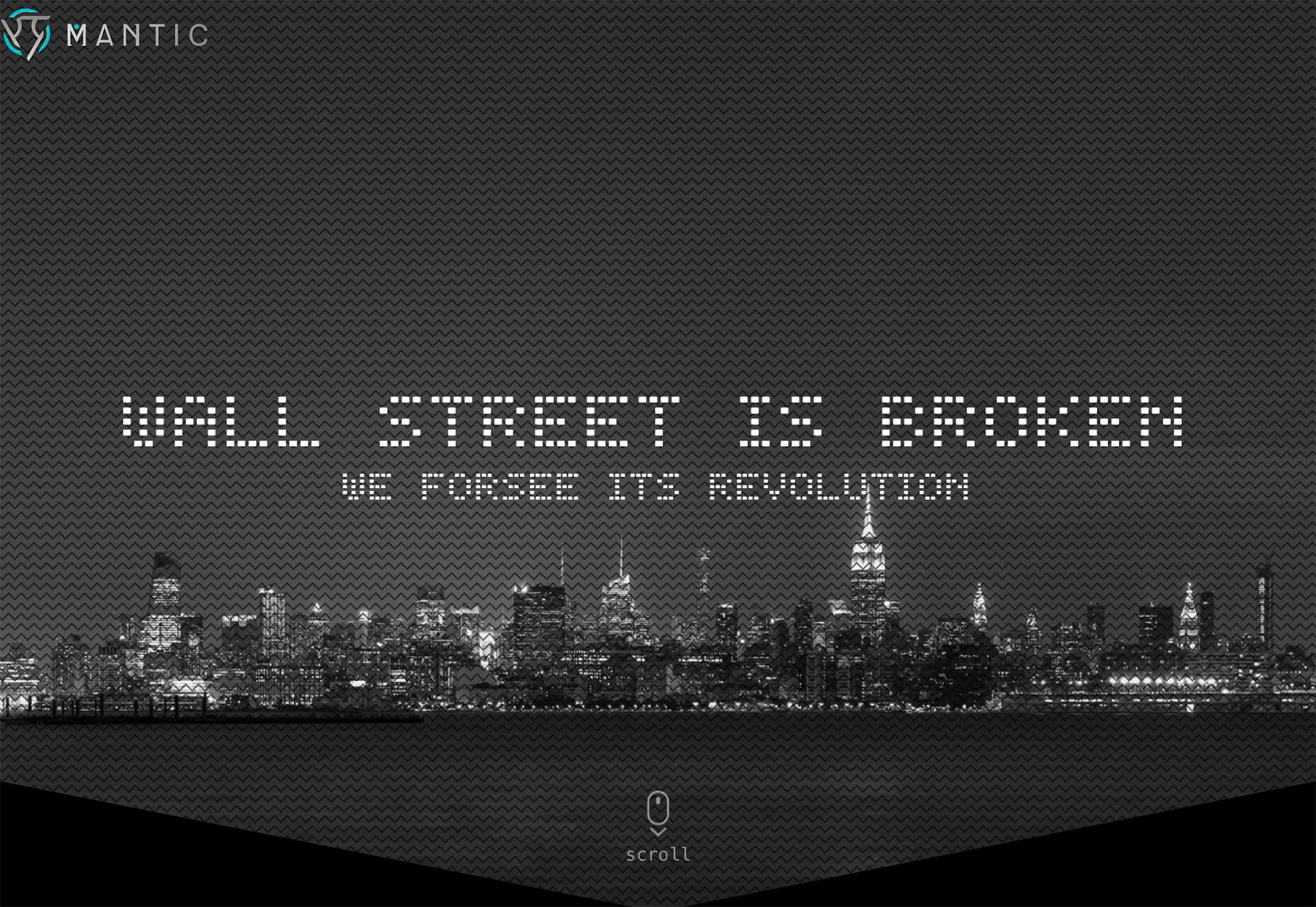
Mantic uses a fun dot-style experimental typeface for an AI tool with a futuristic feel. Using a type style that matches the tone and content of the design is key for making a technique like this really work wonders.
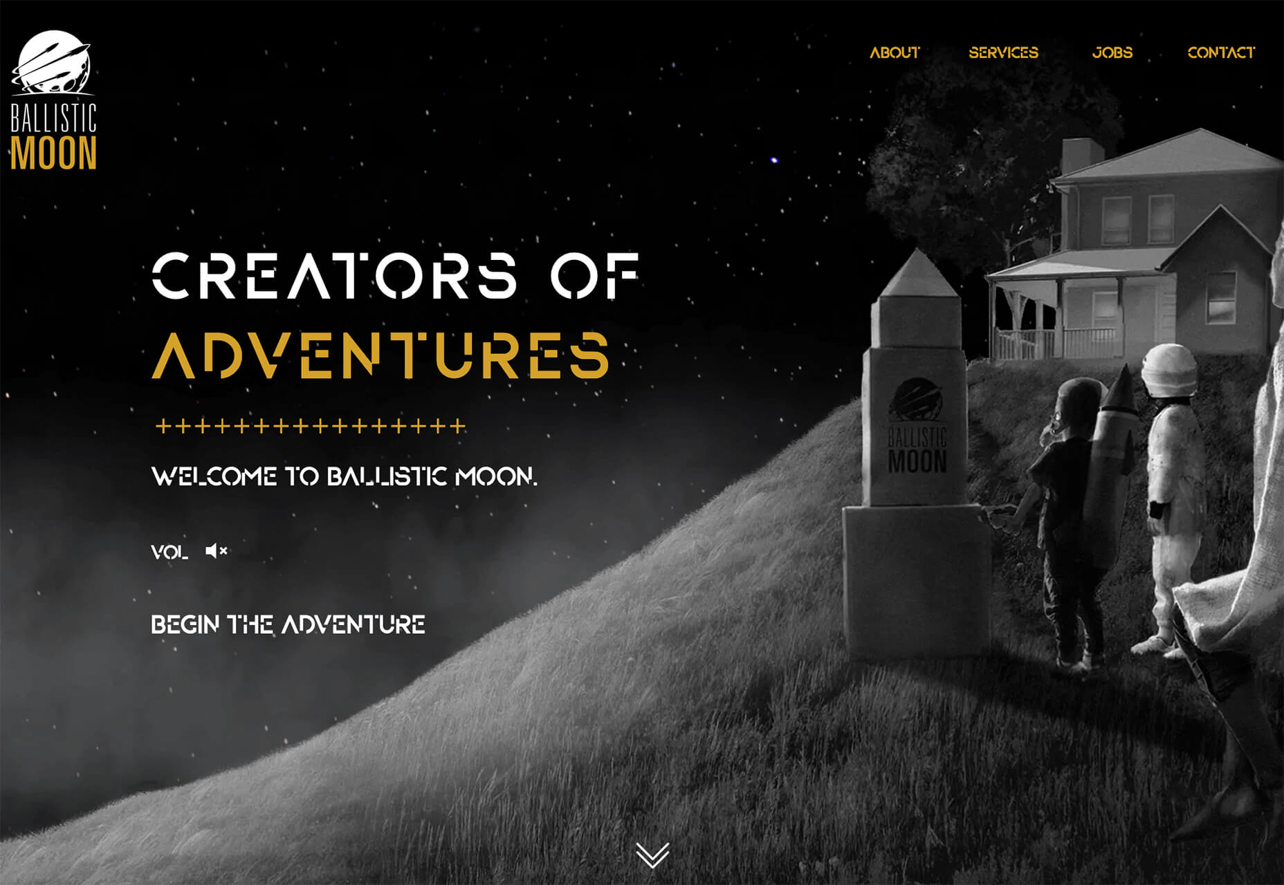
Ballistic Moon also uses a funky, experimental typeface for the intro to the online storybook adventure. What’s really nice about the use of the trend here is that the fun font has a distinct purpose and is used for only that use and is not scattered all over the design.
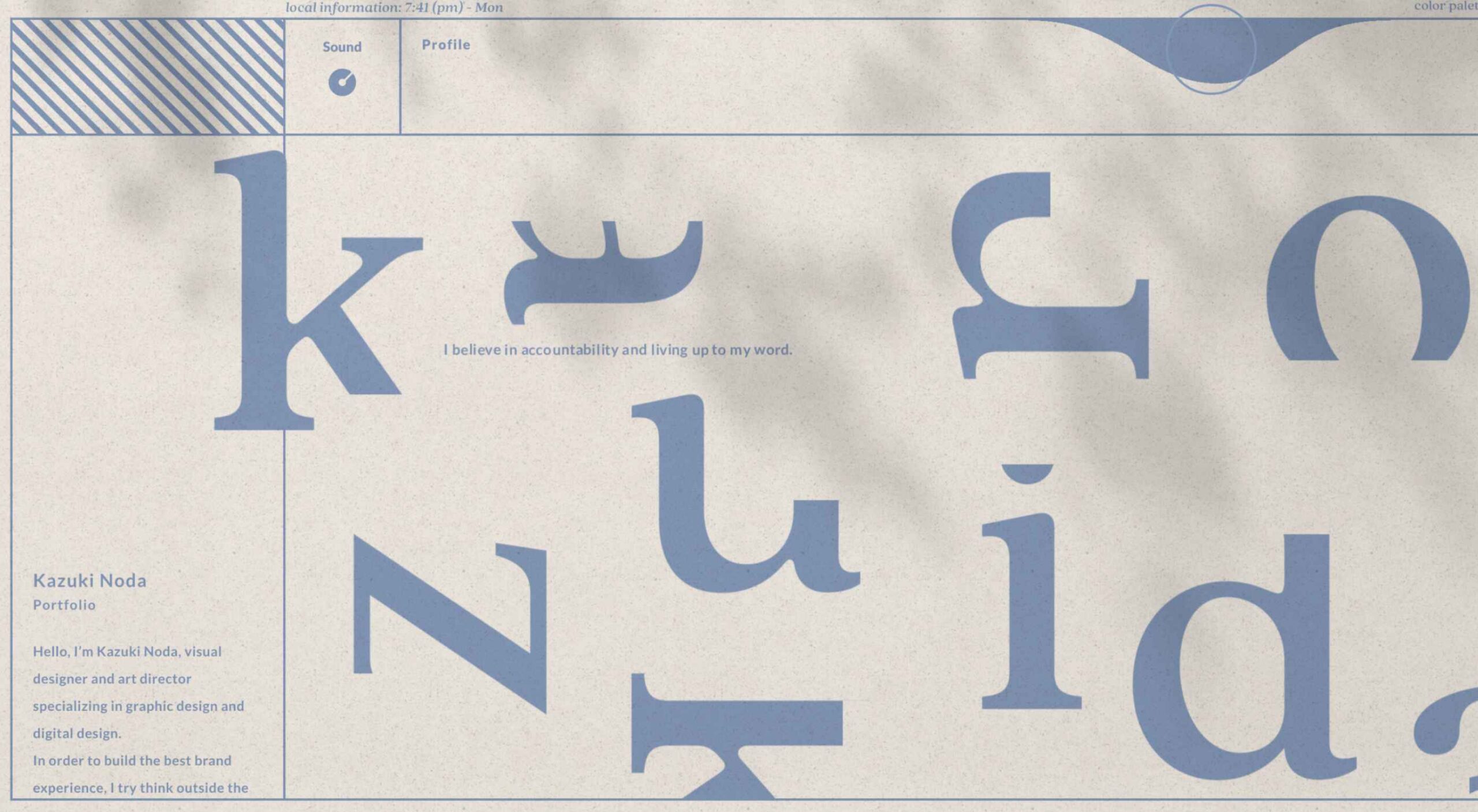
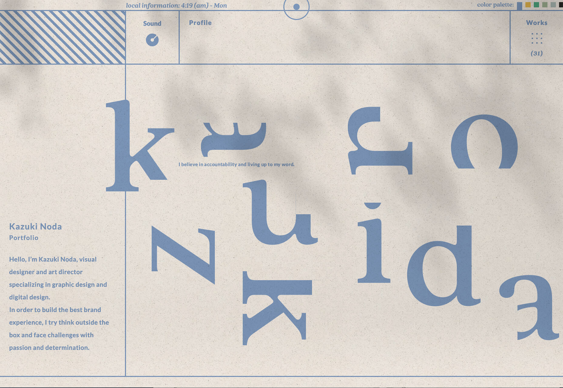
Kazuki Noda has fun with the letters of his name so that the same cool and majestic feel as the rest of the design. Look closely at the uber-blurred video background and phrases that pop into the hero area to describe the portfolio and art direction therein. It’s artful and fun.
There aren’t a lot of pictures to look at with website design projects this month. And that theme is at the heart of what’s trending right now. It will be interesting to see how long this continues in an uncertain world landscape.
What’s nice about these projects that aren’t so photo-heavy is that it forces designers to develop creative solutions and use other tools to help draw attention to the projects.
Designing within these types of constraints can seem a little overwhelming at first, but the best designers can run with this challenge to create something amazing. (And it can even feel freeing in some ways.) Good luck if you are working on one of these projects, and we hope these trends serve as a source of inspiration.
The post 3 Essential Design Trends, June 2021 first appeared on Webdesigner Depot.

The monitoring and alerting stack is a crucial part of the SRE practices. That’s where BotKube helps you monitor your Kubernetes cluster and send notifications to your messaging platform or any other configured sink. In this blog post, we will be configuring BotKube to watch the Kubernetes cert-manager certificates CustomResources.
BotKube is a messaging tool for monitoring and debugging Kubernetes clusters. BotKube can be integrated with multiple messaging platforms like – Slack, Mattermost, or Microsoft Teams to help you monitor your Kubernetes cluster(s), debug critical deployments, and gives recommendations for standard practices by running checks on the Kubernetes resources.