Articles

As a freelance web developer, how many clients do you get from your website? If you’re like most, you’re probably lucky to get one client every 2-3 months. Unfortunately, that’s very common.

These days it’s not enough just to be a web developer if you want to make really good money. You have to be able to differentiate yourself in the marketplace to get more opportunities. If you can do this successfully, I’m 100% sure that it will help you win more projects and charge higher rates.

So today I’d like to share with you a little bit of my own story. In the last 4 months, I was able to position myself as a specialist with my personal site that ultimately helped me win more projects and get better clients.

The Importance of Niching Down

The first thing that I would invite you to do is to shift your thinking a little bit.

If you want to be a high-paid professional (especially if you’re a freelancer), you need to learn how to market and sell yourself. And the first rule of marketing is to identify your target audience and the result that you help them achieve.

I can’t over emphasize the importance of this.

You need to know exactly who you help and the outcome that you provide. That is ultimately what you get paid for. So you need to define your ideal client.

My suggestion is to pick a market segment that you would love to work with, that has the money to afford you and (ideally) those that have already done some projects for. Once you have identified your target market, you need to create your positioning statement. Your positioning statement should immediately tell who you help and what results you help them achieve.

Here is a formula that you can use to create your positioning statement:

I help __ (target audience) __ do (build/achieve/overcome) ___ (problem that you help them solve).

For example: I help startup SaaS companies build highly converting websites. You can go even narrower if you want, but this is already much better than just saying, “I’m a web developer.”

If your positioning statement is “I help startup SaaS companies build highly converting websites” it can still be narrowed down and improved. As you gain more experience and work with more clients, you can refine it to something like: “I help healthcare SaaS companies build highly converting websites.”

Now imagine if a SaaS startup founder from a healthcare niche came to your site and saw that positioning statement vs a very generic one like “I’m a web developer”. How much easier would it be for you to differentiate yourself and gain a huge advantage over your competitors in the marketplace?

4 Elements of a Perfect Landing Page

“I am passionate about coding, I have 10+ years of experience, client satisfaction is my main goal…” 

Have you ever seen statements like that on someone’s portfolio site? Or maybe it even says that on your own site. From my experience, statements like that don’t really help you convert site visitors into customers.

If you personally go to a company’s website, what would you like to see yourself as a visitor? Somebody saying how good they are, or to find out if they can be a good fit to solve your problem? I think that most of the time the latter is what you’re after. That’s what other people usually go to your website for; they want to know how you can help them solve their problems.

For instance, take a look at this section from Tom Hirst’s website:

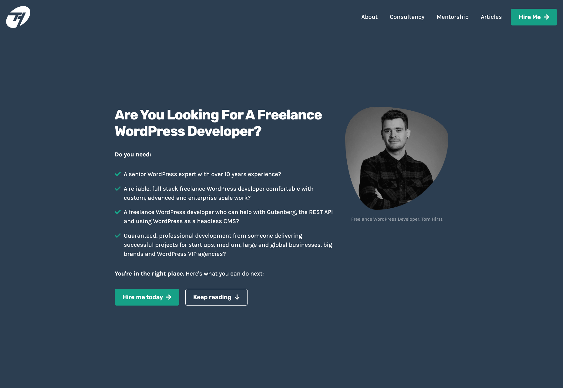
As you can see, this immediately helps the visitors understand if Tom is a good fit for them or not. He doesn’t just boast about how good he is, but rather helps the client understand what problems he can solve for them. Another important part here is that Tom doesn’t use a lot of technical terms. Since a lot of his visitors may be not as tech-savvy as he is, there is no point in confusing them with technical jargon. The more you can speak their language – the easier it will be for you to build trust and connection that will later help you during the sales process.

Let me tell you a bit about the 4 parts of my site that I think have contributed significantly to having me win more projects. The 4 elements are problem, solution, proof, and call to action. Let me go over them 1 by 1 and explain why they’re important.

1. Problem

A good way to start your landing page sales letter is by identifying the problem of the client. If you know their pain points and you mention them, you should be able to hook them into reading your copy. And a well-written copy plays a significant role in persuading your visitors to take the next action.

2. Solution

Once you have mentioned their problem, you need to present them with a solution that you provide. You need to show them how working with you can solve their problems. Whatever their problems are, you have to show them that you understand them and can help solve them.

That’s what UX designer Matt Oplinski is doing on his website is doing. He knows that his clients might need help with 3 types of projects: Digital Products, Marketing Websites or Mobile Apps. For example, the clients who are seeking a redesign of their website may have an issue with their current conversion rates. And that’s exactly what Matthew lists in the middle section under “Custom Marketing Website” headline. I would even argue that he may have been a bit more specific with the solutions that he can offer.

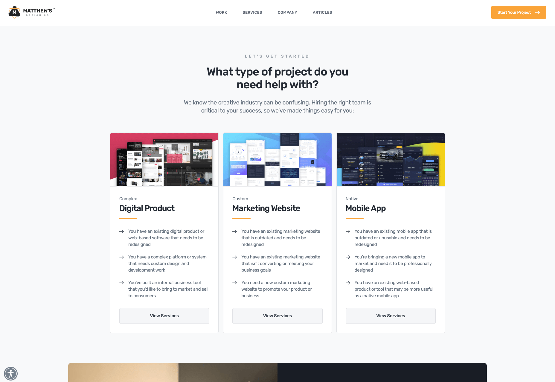
The main takeaway here is that it’s important to be very specific with the result that you can help your clients achieve. The more accurate it is, the better it is going to convert.

3. Social Proof

Social proof plays an extremely important role in converting a lead into a customer. When someone comes to your site, they don’t know if they can trust you. If they were to spend one, two, five, ten or even more thousand dollars – they need to feel comfortable with you. They need to have at least some level of trust. That’s why they want to see as many signs as possible that you’re trustworthy.

Social proof obviously can come in many different forms. The most popular and important ones, in my opinion, are case studies with results that you’ve produced and testimonials. They will be absolutely crucial to persuade your clients and be able to differentiate yourself from others.

Here is a good example from Bill Erickson’s site:

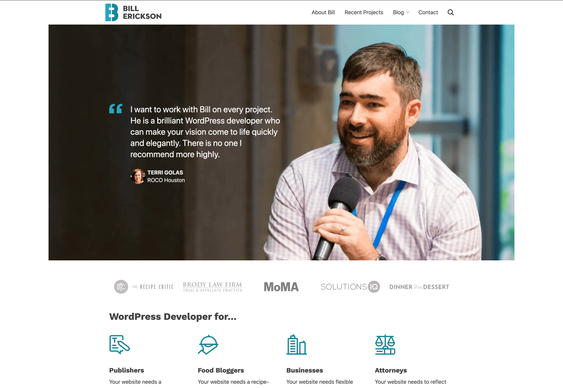
Ideally, your testimonials should showcase a particular business goal that you’ve helped your client to achieve. But even if you don’t have those, you can use ordinary testimonials that your clients give you. That alone is better than no testimonials at all.

4. Call to Action

Last but not least you should have a single call to action on your site. Most likely it will be a button to contact you, or book a call with you.

In my opinion, it’s important to have a single call to action because if you give people too many options they will not be so focused on taking an action that you actually want them to take.

I also suggest that you have a call to action button at least 2-3 times on the page: one on the first screen where you have your positioning statement and/or your offer, and one at the very bottom of the page so that when they finish reading they don’t need to go back to the top to take action. Having another call to action in the middle of your page is also a good idea. My advice would be to add it after you’ve described the problem, your solution and presented yourself as someone who can help your leads with their problems.

Results

I started niching down and created my own website four months ago. Being a member of multiple freelance platforms, I’ve been fortunate enough to get enough leads in my target market to test out my strategy. So far the results are pretty amazing.

It has become a lot easier for me to win projects, get clients that respect my knowledge, and my process. Besides that, I’ve been able to significantly increase my rates for my work. A great thing about working with similar projects every time is that you automate and streamline a lot of things, improve your delivery process and become much more efficient. You can even create a productized service. This is something that is very hard to achieve if you’re constantly working on custom projects that have different requirements and involve different technologies.

To be completely transparent, I’m still in the process of building my authority in the niche, polishing my offer and gaining experience. I still have a long way to go. What I can certainly say today is that it has been one of the best decisions in my professional career.

To become a high paying professional in your industry you have to do things differently. Today I tried to show you one of the ways that you can improve your career or freelancing business fast. It probably won’t happen overnight, but in a matter of a few months you can be so much ahead of your competition if you deploy some of the strategies that I’ve shared with you today.

I really hope that this article has helped you gain some perspective and you will start to consider doing a similar thing that I did to achieve amazing results.


Featured image via Unsplash.

Source


Source de l’article sur Webdesignerdepot

Dear Geek,

I really want to try to add some 3D animations to my iOS and Android mobile app built with Titanium SDK. Specifically, I am trying to recreate the Star Wars intro with the scrolling text for May the 4th. I need it to work on both iOS and Android so any guidance you can give me would be very helpful!

Source de l’article sur DZONE

It’s no secret that the senior population is growing. By 2030, people over the age of 65 are predicted to make up 20.6% of the population of the US. 

Around the world, people are living longer and remaining more active in the later years of their lives. What’s more, despite what you might have heard in the past, seniors aren’t as wary of the internet as they used to be. In 2019, the Pew Research institute revealed that 73% of people over the age of 65 were connected to the web. 

So, what does that mean for web designers?

your main focus needs to be on ability…people age differently

Well, first of all, it’s time for all of us to start thinking about user experience from different perspectives. We need to stop expecting our audiences to be made up entirely of iPhone-using millennials and start thinking about the needs of seniors too. After all, designing websites for seniors opens you up to a wide selection of potential visitors in the future.

What’s more, according to the US Census Bureau, people over the age of 65 generally have the highest household wealth figures of any age group. That’s a big deal. 

So, how do you adapt UX for seniors?

Creating Senior-Friendly Web Designs

When it comes to designing websites and applications for seniors, your main focus needs to be on ability. Age is just a number, and people age differently. 

That means that one person in their 70s might have no problem browsing through Netflix to watch the latest shows, while someone else wouldn’t be able to tell you what ‘streaming’ means. 

Rather than worrying specifically about age, think about how different people in older age groups might have different requirements when it comes to things like movement control, hearing, vision, and even device bias. 

Get the Visual Elements Right

Vision loss is by far the most common disability reported by elderly individuals in the US. Around one in six people over the age of 70 have some manner of visual impairment. That’s why UI designers need to think carefully about visual accessibility when creating the right websites. 

For instance, text and button sizes should always be kept large. Anything that needs to be read or clicked needs to be scaled up, to ensure that everyone can see the information clearly. For instance, on the Sandinmysuitcase.com website, you’ll find clear typography, combined with big buttons that tell you to “Start Here” so you know exactly what to do next.

Remember to stick to icons that are clearly labelled wherever possible. Stay away from anything that your customers might not understand. “Start Here” is easier to read and understand than “Submit”. 

It’s also worth sticking to the color and contrast guidelines laid out by basic UX design when you’re creating something for optimal visibility.  Colors that are too close together might create a nice pastel or gradient effect on a website – but they’ll also make things difficult to read. 

Concentrate on Usability

Over the age of 55, motor skills and coordination can begin to decline for some people. These changes make it harder for people to interact with complex UIs. The mouse on a computer can be a particular problem for people with diminishing motor skills – as can the touchscreen of a tablet or smartphone. 

When you’re working on the perfect UX, think about how you can make things as easy to click as possible for people who have a hard time hitting their targets. For instance, in this website for people traveling over the age of 50, you’ll see not only fantastic large font choices but big buttons that are descriptive and easy to understand too: “Click here to start planning your trip”:

The scrollbar can also be a bit of a problem for people with impaired motor skills. Because of this, it’s best to keep your focus on designing above the fold. Make sure that users don’t need to scroll far to find the information that they need and keep scrollbars simple in terms of their look and feel.

While you’re working on usability, remember that it will be important to keep interactions to a minimum wherever possible. Where you can engage younger audiences with double-taps, swiping and scrolling, it’s much easier to connect with seniors through simple one-tap interactions. The less actions your user needs to take to reach their goals, the better. 

Deliver Smooth Navigation 

Navigating from point A to B on your website needs to be as simple as seamless as possible. Remember, crowded pages on your websites and apps are often overwhelming – even for younger browsers. Seniors are generally just searching for “must know” information, so they don’t want anything to get in their way as they navigate through their website. 

As you work on your site or app design, ask yourself if every element on the page absolutely has to be there. If it doesn’t deliver value, then get rid of it. 

Additionally, remember that seniors don’t always have the best memories and concentration levels. That means that they need your navigation experience to be as simple as possible. Basic horizontal menu bars that show everything at once are often a good idea – even if they’re not very exciting.

Look at this helpful navigation experience from RetireMove.com, for instance. Everything you need is located at the top of the page, and you can even just enter your postcode to get started:

Cognitive decline happens regularly with age. Although not all older adults will have issues with their memory and concentration, it’s important to be prepared for an audience that might process information a little more slowly. It’s worth double-checking that your viewer’s attention isn’t being diverted to multiple parts of the page at once.

Get to the Point Quickly

While younger generations have quickly implemented technology into every aspect of their lives, older consumers use tech a little differently. These people don’t want to spend forever fiddling around with different parts of your website. They want to get the answers to their questions as quickly and easily as possible. 

Applications that are complicated or difficult to access are usually instantly rejected by seniors. Even if you’ve offered everything that we’ve covered above, from seamless navigation to minimalist design, you still won’t get the interactions you’re looking for if older adults don’t consider your design to be useful. 

Because of this, you need to highlight the point of a website or application to your seniors as quickly as possible. Avoid worrying about things like gifs, animations and gamification. Instead, focus on making sure that your designs are useful and simple. 

For instance, from the moment your senior user arrives on a web page, they should have instant access to clear instructions on how to use the application or service, and what they need to do next. Keep in mind that this is particularly important when you’re creating mobile apps, as apps are still a relatively new concept to older generations. 

On the “When They Get Older” website, you can instantly find the information you need in a well-organized navigation bar that’s labelled clearly:

A clear interface like this, combined with simple, step-by-step guidance that shows elderly individuals how to get the information that they want is the key to keeping these users coming back for more. 

Bringing a Mature Perspective to Web Design

These days, most designers focus heavily on younger audiences when creating websites and apps. After all, it’s these users that allow us to experiment more with the latest tools and concepts, like augmented reality, artificial intelligence, and robust animations. 

However, there’s still a market out there for the seniors of the world that want more opportunities to get online. This audience often goes ignored and under-served. However, as the value of older consumers grows, and their ability to interact online increases, you’ll find that more businesses begin to search for web designers who can provide immersive experiences for a more mature audience. 

The steps above will give you an excellent insight into how you can start designing for a different kind of customer base. However, remember that the best way to make sure that you’re delivering the right solution for any customer, is to test. User testing will provide you with the exclusive insights that you need to determine whether your senior UX is really working, or whether you’re still struggling to get into the shoes of an older user. 


Featured image via Unsplash.

Source


Source de l’article sur Webdesignerdepot

As DevSecOps takes hold in organizations, there’s a noticeable difference in the maturity of application security testing practices for mobile apps versus web apps. NowSecure sought to understand the role of DevSecOps in the mobile application development lifecycle by polling IT leaders about their release and testing practices. Consult this infographic to see how your organization stacks up against your peers and the top benefits companies have achieved by incorporating security testing into mobile DevOps.

Source de l’article sur DZONE

For digital marketing enthusiasts, the theory that chatbots will probably overtake mobile apps soon is no shock. It is expected that chatbots will replace mobile apps as a medium of client engagement by 2020. According to a Gartner’s report, 85% of the interactions that happen between companies and their customers will soon be happening without any human intervention.

A chatbot, as we know, is a software program that conducts a conversation through a voice or text medium. Chatbots are a reasonably new phenomenon. Since 2016, chatbots started surfacing as a method of handling customer interactions in an automated manner. As different domains within any organization see the implementation of various automation tools, client servicing, and support has not been left behind either.


Source de l’article sur DZONE (AI)