Articles

A new design trend has emerged in the last year: Soft UI or Neumorphism is everywhere. 

Even Apple is in on the trend; the company introduced a host of changes in both its mobile and desktop operating systems that use the style. The elements of Soft UI introduced by Apple reflect various aspects of the Microsoft Fluent UI design too. 

So, if soft UI is such a huge concept, what do we need to know about it? How does soft UI work, and what are the pros and cons of using it?

What is Soft UI (Neumorphism)?

Soft UI involves using highlights and shadows in design elements to make them look as though they’re layered on the page. 

The term neumorphism is derived from a previous design style — skeuomorphism, where designers create something as close to its real-life counterpart as possible. If you remember the shift between iOS 6 and 7, you’ll remember the switch between skeuomorphic and flat designs. However, neumorphic design isn’t quite as dramatic. 

Neumorphism doesn’t focus excessively on things like contrast or similarities between real and digital elements. Instead, this “soft UI” practice creates a smoother experience for users. 

With neumorphism, you get the sense that buttons and cards are actually part of the background they’re on. This trend removes the flashier aspects of a typical interface and focuses on a softer style that stays consistent throughout the design. 

The Common Features of Soft UI

Soft UI is all about smoothing out the experience by making everything feel more connected. There’s nothing overly harsh in the aesthetic, hence the term “soft.”

So, what kind of features can you expect?

Rounded Corners: Soft UI removes some of the sharper parts of the interface, like the corners on modules and segments. This allows for a more gentle appearance overall. In this experimentation from Iqonic Design, we can see how the round corners tie everything together.

Transparency and Background Blur: Background blur and transparency are more popular today since the infamous iOS 7 solution emerged. Most people hated the appearance of ultra-minimalism, combined with thin fonts. However, the background blur effect was more popular. The blur in soft UI shows that part of the window is connected to the rest of the OS. It seems like parts of the background in the app are pushing through to the surface. 

Unified Symbols: Everything needs to fit perfectly in a soft UI design. Anything that doesn’t look like it’s part of the same entity throws off the experience. In this design experiment by Surja Sen Das Raj, you can see how all the colors, shadows, and gradients tie together consistently. Because everything is more uniform, the experience flows perfectly for the end-user. 

Implementing Soft UI Elements in Your Design

So, what does neumorphism look like in your UI design process?

Ultimately, it’s all about subtle contrast and aligned colors. Every part of your interface needs to look like it’s part of the same form. Your element and background need to be the same color so that you can create a feeling of objects protruding from the background. 

With Soft UI, the keys to success are shadows and highlights. 

Let’s take a look at some key steps. 

Achieving the Soft Look

When you’re designing your interface, remember that sharp edges make the interface more serious and formal. Rounded corners are more playful and friendly. 

What also makes the design look lightweight and delicate is plenty of deep shadows and highlights. When you add shadows to elements, you create a visual hierarchy. The items that cast a larger, deeper shadow are the ones closest to you. That’s why only a few elements need to cast an intense shadow. Everything else should work in the background. 

Take a look at this design by Alexander Plyuto, for instance.

Creating Smooth and Delicate Gradients

Gradients are part of the shadow and highlighting process in Soft UI design. Ideally, you’ll need to choose colors from the same palette, just toned down or brightened, depending on your needs. The gradient needs to be barely visible, but just enough to make the elements stand out. 

For white gradients, like highlights, use a very delicate color somewhere between white and your background shade. For instance, consider this design from Marina Tericheva.

Consider the Little Details

Finally, remember that the neumorphism design principle is all about little details. 

Choosing a font that visually matches the background is an excellent choice. However, you can also choose something more contrasting, as this will help information stand out

Adding a little bit of the background into your fonts might be suitable too. For instance, if you have a green font and a grey background, add a little grey into the mix. 

Extra elements in your design, like allowing a button to shift into a more recessed state after being clicked, are a great way to make the soft UI more engaging. Everything your end-user interacts with needs to feel smooth and perfectly unified. 

The Problems with Soft UI Design

Just because a design process is trending – doesn’t mean it won’t have its issues. 

Neumorphism is a fun way to make apps, operating systems, and websites feel more friendly and informal. However, this softer approach has a weak spot too. 

When you’re dealing with a small margin of contrast and color where neumorphism works well, it’s hard to get the effect right every time. For instance, this all-yellow design for Dtail Studio may be overwhelming for some.

A slight deviation in saturation or a problem with your shadowing could render the entire effect of Neumorphism completely pointless. 

Another major issue is accessibility. The soft UI design looks great for people who have a full visual range. However, visually impaired users might not see the same benefits. Anyone without perfect vision may see crucial objects disappearing into the background.

Your users don’t necessarily need significant vision problems to struggle with neumorphism, either. The design is all about softness that causes elements to almost blend together. People with low-quality screens that don’t have as many pixels to work with won’t see these elements. 

Issues With Buttons and CTAs

Another major issue of neumorphism is that its subtlety can lead to problems with attracting clicks and conversions. Usability is the most important consideration of any UI design. 

Unfortunately, when you focus on subtle elements throughout your entire interface, usability sometimes takes a hit. 

Let’s consider buttons, for instance – they’re essential to any interface. To simplify the customer journey, these buttons need to be noticeable, and they need to shift into different states when your customers interact with them. 

For the button experience to be excellent, users need to notice the design instantly. However, the heart of neumorphism revolves around the idea that nothing stands out too much. 

This isn’t just an accessibility issue; it’s a problem for conversions too. 

Neumorphism is soft on the eyes, with minimal color contrast and few color pops. This means that CTA buttons don’t stand out as much as they should. Buttons almost blend into the background, and the website struggles to pull attention to the areas that demand it most. 

How to Experiment With Soft UI (Free Kits)

The key to unlocking the benefits of soft UI interfaces without getting lost in the negative points – is proper experimentation. Like any new design trends, professionals and artists will need to learn how to merge the elements of soft UI together in a way that doesn’t compromise usability. 

Trends in UI design can’t focus exclusively on aesthetics, as a customer’s comfort will always be an essential part of the process. 

If you want to start exploring, here are some of the best kits and freebies to get you started:

Closing Thoughts on Soft UI

The world of design and the trends that we use are constantly changing. Companies are always searching for the best ways to connect with their users. Often, this means focusing on an interface that really connects with your target audience and delivers the best possible results. 

The soft UI design trend has its benefits and its downsides. On the one hand, the smooth appearance of every element on a combined screen can deliver a delightful aesthetic. Buttons feel less imposing, and elements are friendlier and easier to interact with. 

On the other hand, neumorphism also makes it difficult to truly capture your audience’s attention in the places where it matters most. It suffers from accessibility issues and requires plenty of care and practice.

Source

The post Soft UI: Making Sense of the Latest Design Trend first appeared on Webdesigner Depot.


Source de l’article sur Webdesignerdepot

With the widespread acceptance of web standards, and the resulting deprecation of browser prefixes, there has been a noticeable change in the browser market. Where once browser manufacturers would try to lure users in with promises of feature support, now the focus is on privacy, speed, and developer tools.

When it comes to web development, you should really be testing on every browser and device you can lay your hands on; you’re probably already doing so using an app like LambdaTest, or BrowserStack.

When quality assurance testing, you probably work by market share: starting with Safari on mobile, Chrome on desktop, and working your way down to Opera and (if you’re a glutton for punishment) Yandax; naturally, when testing, it’s the largest number of users that concerns us the most.

But before you reach the QA stage, there are a number of browsers designed to assist development. Browsers that offer tools, especially for front-end developers, that assist with code and speed up development. Here are the best browsers for web development in 2021:

1. LT Browser

LT Browser is an app for web developers from LambdaTest. Like many of the apps in this class, it offers side-by-side comparisons of a site in different viewports. Additionally, LT Browser has a number of features that make it stand out.

As well as previewing web pages, LT Browser offers developer tools to rival Chrome, which is handy if you want to see how changes across different devices affect your Lighthouse scores. LT Browser also supports hot-reloading, which means when you make a change to your code, you don’t have to hit ‘refresh,’ the viewports simply reload — it’s surprising how much of a time-saver that simple addition is.

LT Browser requires a LambdaTest account, there is a free plan, and paid plans start at $15/month.

2. Firefox Developer

The best conventional browser for web development in 2021 is the developer edition of Mozilla’s Firefox.

The standard edition of Firefox is an excellent browser, packed with features, and privacy-focused. The developer edition adds to this with a suite of tools aimed at developers. The CSS and JavaScript debugging tools are superb, and the Grid tools are unparalleled for coding layouts with CSS Grid.

Firefox Developer is free to download.

3. Polypane

Polypane is one of the new generation of web browsers that are firmly intended as development aids rather than browsers. Polypane allows you to compare different viewports and platforms by placing them side by side. Interactions like scrolling are synced.

Polypane takes a step further than many browser apps in this class by showing social media previews. It even has a suite of accessibility tools, including some handy color blindness simulators.

Polypane has a 14-day free trial, and plans start at $8/month.

4. Blisk

Blisk is another browser for developers that allows you to line up a collection of viewports in a single app. URL and scrolling are synced, making testing interactions and animations effortless.

Blisk is awesome fun to play with and delivers a great preview of a responsive design. But be warned, synced viewports can be addictive, and it’s easy to line up browsers and become hypnotized by the synchronized movement; you’ll need a very large screen to get the most out of Blisk.

Blisk plans start at $9.99/month.

5. Sizzy

Sizzy is another app that allows you to view multiple viewports at once. It also has synchronized interactions, and like many competing apps, Sizzy allows you to screenshot different views.

Sizzy also includes a very clever synchronized inspect tool, so you can focus on individual elements across different viewports. It’s an excellent option for debugging, particularly if you’re digging into someone else’s code.

Sizzy has a 14-day free trial, and paid plans start at $7.15/month.

6. Brave

Brave is a privacy-focused browser that runs up to three times faster than Chrome. If you’re someone who balks at rendering speeds on most sites, Brave could be for you.

Brave’s main benefit for developers is that it supports Chrome extensions while maintaining privacy — it can even access the Web using Tor if simple privacy mode isn’t enough for you. There are hundreds of useful Chrome extensions, and if you avoid Chrome due to privacy concerns, then Brave solves your problem.

Brave is also pioneering a new system for monetizing site revenue, allowing viewers to tip sites, and soon, to control how advertising revenue is distributed.

Brave is free to download.

7. Chrome

Boring it may be, but Chrome is still the world’s most popular browser from the US to mainland China. Where once sites were “best viewed in IE,” Chrome is now the Web’s default.

No matter the site you’re designing, it has to work well in Chrome, and no simulator is as good as the real thing.

In addition to being the benchmark for page rendering, Chrome developer tools are the simplest way to access your Lighthouse scores, which helps you track down issues that may be holding you back in Google’s search results.

Chrome is free to download.

Source

The post 7 Best Browsers for Developers in 2021 first appeared on Webdesigner Depot.


Source de l’article sur Webdesignerdepot

It’s fair to say that AMP (Accelerated Mobile Pages) is a controversial topic among web developers.

AMP is a Google-guided technology that strips down web pages to a limited sub-set of tags to serve pages faster. It was developed as a web-based rival to native news apps from vendors like Apple.

The controversy first arose when it was clear how much influence Google had over the conventions, essentially creating a tiered Web overseen by a single entity. The clamor didn’t calm when it became clear that Google prioritized AMP pages for mobile search results. Developers were left in a difficult position: stand by best practices supporting a platform-agnostic Web, or do what’s right for their clients by building the most competitive mobile site possible.

But that was 2015, six years is a lifetime for a web technology, and things are about to change.

Hidden among the announcements about the much-delayed Core Web Vitals update — it’s finally rolling out, a year after originally planned, but don’t expect to see much impact until the end of August — is the news that Google mobile search will no longer prioritize AMP pages.

Beginning immediately (from the 17th June onwards) and completing sometime before the end of August, AMP will cease to be a factor in mobile site ranking. The AMP badge on mobile search results will disappear, and AMP is not required to have your site included on Google’s news app.

This significant move is due to the fact that the Core Web Vitals update from Google will expect the same speed and usability as AMP from non-AMP pages. Google still expects the same optimized user experience; it simply isn’t offering a cheat sheet on how to achieve it.

You can continue to use AMP, but there’s no automatic benefit to doing so, and the housekeeping involved in maintaining multiple front-ends means it’s far simpler to optimize your base site. Without a solid purpose, AMP ceases to fill a need. And just like that, one of the most controversial technologies of recent years slips away.

Featured image via Unsplash.

Source

The post Poll: Is AMP Dead, and Do We Care? first appeared on Webdesigner Depot.


Source de l’article sur Webdesignerdepot

This month’s new tools and resources collection is a mixed bag of elements for designers and developers. From fun little divots to tools that can speed up development, you are sure to find something usable here.

Here’s what new for designers this month:

June’s Top Picks

Codewell

Codewell is a service to help you learn, practice, and improve HTML and CSS skills with real templates. The benefit here is pretty obvious. When working with real templates, you can see the result of actions and changes. The tool includes free and premium options with new templates to work on weekly. Everything works in a responsive environment, and free plans have access to free challenges and a Slack community; a paid plan also includes source files and premium challenges. You need a Github login to get started.

LoomSKD

LoomSDK is an easy and reliable way to add video messaging to your product – and it’s free. The SDK enables your users to record, embed, and view with Loom videos directly within web apps – adding clarity and context to any workflow.

Pintr New Image

Pinter New Image turns photos into funky and fun line images. Upload an image with plenty of contrast, use the controls to set the look you want to achieve, and download. The new images are available as PNG or SVG. Maybe use it to create your next profile photos for social media or a nifty avatar.

Terms & Conditions Apply

Terms & Conditions Apply is a game that explains all those little pop-ups that you accept to enter and interact with websites. You are tasked with a mission to start the game: Do not accept terms and conditions, say no to notifications, and opt-out of cookies. Can you do it?

Khroma

Khroma uses artificial intelligence (via personalized algorithm) to learn what colors you love and create palettes for you to discover, search, and save for use in projects. The beta tool is easy to get started with, although you do have a little color-picking homework to get started.

6 WebTools

Mmm

Mmm is a different type of website builder. The tool, which is still in alpha, allows users to create drag and drop websites in a simple manner. It works almost like making a digital collage. Users can get a custom URL, and every page is responsive. The interface is designed so that you can even build yours on a phone. And here’s the other feature – they encourage messy designs.

LightGallery

LightGallery is a lightweight, modular, JavaScript image and video lightbox gallery plugin. It works with React.js, Vue.js, Angular, and TypeScript. It includes plenty of demos and documentation to help you make the most of this gallery tool.

Vandal

Vandal is a nifty browser extension for Firefox or Chrome that allows you to navigate back in time without changing tabs. The utility of Vandal is to allow quick and easy access to all the archived snapshots for a URL, and it supports navigation to a snapshot as well.

CSS Layout Generator

The CSS Layout Generator is a tool for creating the CSS for layout components. It is also a learning tool for teaching what is possible in CSS for positioning elements in the browser. Tweak specifications to see how it impacts the layout, CSS, and HTML.

Alpaca Data API

Alpaca Data API is an easy-to-use feed that allows you to bring in stock market data for modeling and backtesting. (it includes free and premium options based on your needs.)

Mobile Palette Generator

Mobile Palette Generator is a color-picking tool that will help you select the best hues for mobile design projects. It then shows you all the specs for primary, secondary, and accent colors.

6 Icons and UI Kits

Iconoir

Iconoir is an open-source icon repository with more than 900 SVG icons. Search icons, browse by category or poke around for what you are looking for. Everything is ready to use without signups or forms to fill out.

Pmndrs Market

Pmndrs Market has a collection of more than 300 three-dimensional elements and drawings of things for use in projects. Model renders are in a rough style with a realistic feel.

Boring Avatars

Boring Avatars is a fun collection of semi-customizable avatars without faces, hence the name. It’s a fun playground that puts a new twist on something that you might not expect to do differently.

Spark

Spark is a free download with three different website design starters. The hero images are ready to build from and are made for Figma.

Venus Design System

Venus Design System is a premium UI kit packed with more than 2,000 components and states that allow you to design fast. There’s also a demo version for you to test before you buy.

ReadyUI

ReadyUI contains more than 200 blocks and designs for agencies, developers, startups, and more. Everything is production-ready using Bootstrap and Figma files. Choose from light or dark themes and search for a design that works for your project.

5 Tutorials

Creating Generative SVG Characters

Creative Generative SVG Characters is a marriage of JavaScript and SVG that creates fun characters derived from drawings. Using shapes and a little code, you can see how to draw smooth lines, create polygons, and add other shapes for a fun feel. There’s a full demo on Codepen.

5 Steps to Faster Web Fonts

5 Steps to Faster Web Fonts helps you remove some of the bulk from popular typography options. Iain Bean explains a set of methods you can deploy to ensure that load times are quick with some applicable code snippets. Here’s a preview: Tip 1 is to use the most modern file formats (WOFF2).

The Perfect Link

The Perfect Link walks you through some accessibility checks from the A11Y Collective for linking best practices. Some of the things you think are the “right way” may be challenged here. The information goes through everything from design to semantics and is wonderfully thorough. It’s a must-read.

Readsom

Readsom is a curated collection of newsletters and emails that you can read online or sign up for. Its catchphrase is to “discover content you’ll want to read.” It is a good way to find newsletters that interest you, including plenty of design and development options that you might not otherwise know about.

Famous First Websites

Famous First Websites isn’t a tutorial per se, but it does provide a good place to do some visual learning. See what your favorite websites looked like when they launched and the evolution of the designs.

Source

The post 22 Exciting New Tools For Designers, June 2021 first appeared on Webdesigner Depot.


Source de l’article sur Webdesignerdepot

Every designer has their own preferred strategy for collecting resources. Some pluck brushes, fonts, and templates from different “stock photo sites” and public marketplaces. Others collect graphics from swipe files and forums around the web.

The never-ending desire for themes, visual content, and graphical components has prompted an influx of “design packages” to appear around the web. These all-in-one bundles, ranging from Envato Elements to Elegant Themes, promise a selection of valuable creative content in exchange for a single fee or monthly subscription. 

If you’ve been planning to seek out a few of these high-value subscriptions yourself, you’re in the right place! Today, we’re going to talk about some of the top designer resources available on the market. 

1. Envato Elements

Probably the best-known of all the designer resource marketplaces, Envato Elements advertises itself as the unlimited creative subscription. On this website, you’ll be able to access around 54 million creative assets through a single subscription. There are endless resources to unlock here, ranging from templates for your graphics to video templates, audio, and stock photos. 

Unlike most marketplaces, Envato gives you peace of mind by promising only the highest quality designs and graphics. Your content comes with quality assurance, and there are many PSD elements on the site, too, including stationery and web design templates, mock-ups, and more. Categories for your creative content include:

  • Stock photos
  • Video templates
  • Music
  • Sound effects
  • Graphic templates
  • Graphic designs
  • Presentation templates
  • Fonts
  • Photos
  • Web templates
  • Add-ons
  • CMS templates
  • WordPress resources
  • 3D content

Pricing: Pricing starts at only $16.50 per month, and this gives you unlimited access to everything on the site, including millions of digital assets and stock photos. You’ll also be able to use various courses and tutorials on the website too.

2. Elegant Themes

Elegant Themes is an all-in-one creative resource for website themes. The solution offers you access to some of the most popular WordPress themes worldwide. 

You’ll also get access to a visual page builder as part of the kit. When you sign up for the Elegant Themes subscription, you get access to all of the resources within, including the Divi page builder and WordPress theme, Extra, Monarch, Bloom, and more. If you’re a site builder or work on building pages for clients, this is a must-have subscription. 

Elegant themes are currently the go-to resource for more than 750,000 people. It’s also home to some of the highest-rated themes around. Features include:

  • Divi WordPress page builder
  • Endless WordPress themes
  • Page editing tools
  • Monarch, Bloom, and Extra 
  • Hundreds of website packs
  • Lifetime premium support
  • Unlimited website usage

You can either pay for yearly access with Elegant Themes or pay a one-off price for lifetime access. For most, the lifetime option is likely to be a pretty appealing one. You don’t have to worry about renewing your subscription this way.

3. Template Monster

Template Monster offers the “ONE” web development membership, perfect for creative professionals. The MonsterONE offering is a complete unlimited subscription for all of your creative needs, with access to unlimited downloads, new weekly items, and simple licensing. You also get plenty of support from the Template Monster Team. 

A goldmine for anyone who needs to upgrade their selection of video and photo assets, graphic templates, HTML templates, or anything else, Template Monster is packed full of amazing resources for any project. You can also find new products from fresh contributors all the time, so the value of your membership is constantly increasing. 

Features include:

  • HTML templates
  • Presentation templates
  • CMS templates
  • Graphic templates
  • Video assets
  • 3D models
  • Audio assets
  • WordPress themes and plugins

Pricing starts at a tiny $6.90 per month, with a slight discount if you pay yearly. The lowest-cost package gives you access to all of your graphic and design assets, but you won’t get any eCommerce or WordPress themes. However, if you upgrade to the all-in-one package at $14.95 per month, you get a more extensive range of resources.

4. Creative Market

Creative Market is another one of those amazing all-in-one environments for creatives and designers. This marketplace is supplied by thousands of independent artists from around the globe, each offering a host of top-quality designs and resources. You’ll find photos, graphics, templates, fonts, web themes, and countless other tools on the Creative Market. 

If you’re looking for sheer size, it’s hard to find another company that competes with the Creative Market package. There are literally millions of ready-to-use products available, including Instagram templates, textures, and procreate brushes. 

You’ll have access to 3D content for your immersive website designs and a host of purchasing products. Although there’s no “subscription model” per-se for this marketplace, you can invest in a credit plan that allows you to set how much you spend on your assets each month. 

Features include:

  • Millions of creative products
  • Huge selection of independent designers
  • Brushes, textures, templates 
  • Fonts and web content available
  • Huge selection of stock photos
  • Convenient credit plan

The individual purchasing plan is likely to appeal more to people just beginning to test Creative Market for the first time. However, if you want a subscription experience, we’d recommend using the credit plan to estimate how many credits you’ll need each month.

5. Adobe Stock

All web designers know Adobe. The chances are that no matter what kind of creative work you do, you’ve developed a few skills with an Adobe product, from Photoshop to Lightroom. Adobe Stock is also one of the leading platforms for images on any topic. 

Although Adobe Stock doesn’t compete with other marketplaces in terms of versatility, it still stands out as one of the main resources for designers. There are hundreds of millions of stock images, videos, editorial content, and vectors. You can also access a premium collection of custom content and 3D resources too. The great thing about Adobe stock is that you can easily create your own libraries and download content into your Adobe software. Resources include:

  • Stock photos
  • Premium images
  • 3D content
  • Vectors and brushes
  • Stock video footage
  • Royalty-free templates
  • Vector art and illustrations
  • Stock music and audio
  • Integration with Adobe software

Adobe Stock is a little pricier than some of the other marketplaces available today, but it’s still pretty impressive. You’ll pay around $29.99 per month for 10 assets per month, or you can access a full annual plan at $199.99 per month. The amount you pay will depend on the quality of the resources that you want to download.

6. Motion Elements

If Elegant Themes is the go-to resource for designers searching for WordPress themes and web design solutions, Motion Elements is the top choice for “motion” content. Here, you’ll find videos, SFX content, images, music, 3D solutions, and so much more. 

Though it’s located in Asia, Motion Elements is available worldwide. The marketplace offers a monthly subscription plan wherever you can download unlimited products to suit your needs. There are tons of resources to choose from here, including After Effects elements, tools for Lottie, Premiere Pro, FCPX motion, DaVinci Resolve, and more. 

Features include:

  • After Effects elements
  • Premier Pro resources
  • FCPX Motion
  • DaVinci Resolve
  • Video and audio content
  • Stock images
  • SFX resources
  • 3D content

Pricing starts at $16.50 per month for an unlimited annual plan. This means that you can download as much as you like without having to pay any more. There is a small discount if you pay for a full year of access in one go.

7. Creative Tim

Simple but effective, Creative Tim is an amazing resource for front-end and back-end content bundles. You get fully coded UI tools here that can help you create various mobile and web apps and a huge selection of dashboards and templates. If you’re the kind of designer who likes working on top of things like Bootstrap, React, Angular, Laravel, Node.js, and more, then Creative Tim has you covered. 

This is one of the more technical creative resource packages that we’ve looked at so far, but it has a lot of value to offer. That’s probably why there are already more than 1.5 million people using the service. You can search through administration dashboards, UI kits, premium templates, free content, and design systems. Of course, everything is easy to access too. Features include:

  • Frontend design technologies for endless platforms
  • Soft design, light design, paper design, and more
  • Bootstrap content 
  • Resources and third-party tools
  • Complete design and web kits
  • UI kits and templates
  • Admin and dashboard templates

There’s a free version of Creative Tim available for beginners if you want to keep your costs low, but it’s generally much better to sign up for the premium subscription. You can also purchase kits and templates on a one-off basis if you prefer to start small. However, the best prices generally come from buying the bundles from Creative Tim’s subscription side. 

8. Storyblocks

Similar in style to Motion Elements, Storyblocks is a creative design resource for any designer getting involved with the video world. This website is home to some of the best free-to-use videos around, with simple licensing available at a click. Aside from high-quality videos and templates, you also get audio and sound effects as part of your subscription and images or illustrations. 

The unlimited access pass gives you all the resources you might want, from 4K and HD footage to music and sound effects, After Effects templates, and photos, vectors, or illustrations. You can also export a host of your own video projects with access to the Maker video editor, which allows you to make various changes to your custom video content. Features include:

  • HD and 4K video footage
  • After Effects Templates
  • Sound Effects and Music
  • Photos, Illustrations, and Vectors
  • Unlimited video exports
  • Video editor access
  • Licensing support

The standard all-access plan from Storyblocks starts at a very affordable £39 per month for all of the content you might want. In addition, everything you get here is unlimited, so you don’t have to worry about running out of credits. There’s also an enterprise option available if you want to share access to resources with your team.

9. Motion Array

Motion Array is an all-in-one video creation platform for those with an eye for visual content. This fantastic resource center is packed full of valuable tools, from Da Vinci Resolve templates to Adobe Premier Pro Content. As part of your subscription payment, you’ll get endless presets, audio effects, plugins, video footage, tutorials, and more. 

Though a little more expensive than some of the other premier subscription services on the market, Motion Array does offer a lot of content that you can’t get anywhere else. There’s an unlimited marketplace constantly updating with access to royalty-free footage, stock photos, music, and sound effects. You also get plugins built for Premiere Pro. Features include:

  • Adobe Exchange elements
  • Final Cut Pro and DaVinci resolve templates
  • Royalty-free music and sound effects
  • Stock footage and video
  • Photos and images
  • Time-saving integrations with your favorite apps
  • Portfolio site builder
  • Stock media requests

There’s a free subscription option for Motion Array, which you won’t find from most alternatives. This only gives you access to some basic stock photos and assets, but it’s a nice way to start. When you are ready to upgrade, you can pay $29.99 per month for the full stock media library, as well as requests for custom media assets and exclusive plugins.

Start Stocking Up on Designer Resources

As a designer or creative professional, keeping a constant stack of resources available is crucial to your ongoing productivity. Fortunately, there are tons of premium marketplaces out there today, making it easier to access everything you need. 

Whether you’re looking for full UI kits and templates, or you want some free-to-use images and videos for the website content you’re creating, there’s something for everyone. With most monthly subscription services available at a highly affordable price, you could even sign up for multiple sites at once. 

Source

The post 9 Amazing Design-Resource Package Sites first appeared on Webdesigner Depot.


Source de l’article sur Webdesignerdepot

Alors que la vaccination progresse et que les restrictions COVID-19 s’assouplissent, les entreprises du monde entier revoient leurs politiques internes pour répondre aux demandes de flexibilité des collaborateurs. L’évolution mondiale vers le travail à domicile a conduit à de nouvelles préférences de la part des employés et à une meilleure compréhension de la manière dont la productivité et la collaboration peuvent se poursuivre avec succès, malgré le travail à distance.

Depuis des décennies, SAP a adopté un environnement de travail basé sur l’indépendance, et ce pour toute les localisations. Nous avons ainsi créé une main-d’œuvre véritablement mondiale et soutenu les employés grâce à la technologie mobile, qui permet de travailler partout et à tout moment.

Nos récentes enquêtes auprès des employés sur l’avenir du travail après le COVID montrent que les employés souhaitent continuer à bénéficier de cette flexibilité. Plus de 80 % des employés de SAP déclarent vouloir allier travail à domicile ou à distance et temps passé au bureau.

Aujourd’hui, SAP s’appuie sur les méthodes éprouvées de travail à distance que ses employés apprécient depuis des décennies et dans le monde entier pour créer une nouvelle politique entièrement flexible et basée sur la confiance. Nous continuons à croire en un environnement de travail basé sur la confiance et la responsabilisation, car nos collaborateurs sont  au cœur de ce que nous faisons.

Aujourd’hui, SAP s’engage à fournir une configuration adaptée à chaque poste, chaque style et chaque lieu

  • Un environnement de travail 100 % flexible et basé sur la confiance : la norme, pas l’exception.
  • Un environnement inclusif dans lequel les employés peuvent travailler à domicile, au bureau ou à distance, afin que chacun puisse donner le meilleur de lui-même et contribuer à la réussite des clients de SAP.
  • Des horaires de travail flexibles, pour que les employés puissent décider de leurs horaires de travail en fonction des besoins de l’entreprise.
  • Des bureaux inspirants, conçus pour favoriser la créativité, la collaboration, la vie en communauté ou le travail ciblé, permettant aux employés de trouver l’espace adapté à chaque tâche.
  • Des immeubles de bureaux qui privilégient la durabilité et la santé
  • Une approche qui respecte les réglementations locales dans les nombreuses régions où travaillent nos employés.

Notre engagement en faveur de la flexibilité vise à garantir que nos collaborateurs puissent disposerde tout ce dont ils ont besoin pour être productifs, créatifs et inspirés. Le tout, en gérant l’entreprise de manière responsable et en répondant aux exigences commerciales. Nous avons de plus constaté dans les enquêtes sectorielles que les femmes et les jeunes diplômés souhaitent particulièrement bénéficier d’un  environnement de travail flexible. Grâce à notre engagement, nous espérons et croyons que SAP sera une entreprise de choix pour ces groupes d’employés précieux.

L’une des pièces maîtresses de l’approche flexible du travail de SAP est notre technologie. Le logiciel SAP SuccessFactors offre une solution de gestion de l’expérience des employés (HXM) de bout en bout, de l’accueil des employés jusqu’à l’évolution de leur carrière, améliorant ainsi leur engagement, leur croissance et leur fidélisation, quel que soit leur lieu de travail. Qualtrics nous permet de rester en phase avec le ressenti des employés en offrant une visibilité instantanée de l’expérience vécue par les employés dans le monde entier. Pour permettre une collaboration facile et fluide, quel que soit l’endroit où se trouvent les personnes, nous travaillons à l’intégration de Microsoft Teams dans l’ensemble de notre portefeuille, ce qui permet un choix plus large d’outils d’accès.

Chez SAP, c’est avec honneur et humilité que nous avons été choisis plusieurs fois comme employeur de choix dans les pays où nous sommes implantés. Notre engagement en faveur de la flexibilité est une autre expression de notre profond respect pour nos collaborateurs.

The post Pledge to Flex : L’avenir du travail chez SAP sera 100% flexible et basé sur la confiance appeared first on SAP France News.

Source de l’article sur sap.com

Want to know which of the top blogging platforms you should consider using this year?

Blogging is still one of the best ways to draw attention to your brand, generate thought leadership, and build your credibility. Research suggests that US internet users spend 3x more of their browsing time on blogs than on email. Additionally, people view about 20 billion blog pages on average each month. 

So, how do you join the blogging revolution? You’ll need the right platform. 

Essentially, a blogging platform is a CMS (Content Management System) which supports blog creation. Many come with additional tools like SEO support and integrations with email marketing too. There are tons of great blogging platforms out there, which means knowing where to start searching can be tough. To help you, we’ve put together this list of the leading blogging platforms.

What to Look for in a Blogging Platform

Before we sort through our list of the leading blogging platforms, let’s start with a quick overview of what the best blogging solutions typically include. Notably, depending on what you’re going to be using your blog for, you may have other features to prioritize besides those listed here. These features will act as a starting point for your comparisons:

Ease of Use

Uploading, publishing, and sharing your blog shouldn’t be a headache. 

There are many website builders out there that seem to have blogging tacked on as an “extra” rather than having it built into the foundations of the software. This often leads to a clunky backend experience when you’re building your site. 

If you’re a new blogger or don’t want to spend time messing around with HTML and coding, make sure that your blogging environment is easy to use. The simpler it is to distribute your content, the more likely you’ll stick to your blogging strategy. 

Cost and Revenue Opportunities

Many of the top blogging platforms come with a fee to think about. Even if you use an open-source platform for blogging, you still need to consider domain names, hosting, and security costs. Finding the right balance between spend and return on investment is crucial. 

Remember, just because a blogging platform is cheap doesn’t mean it’s good value. Similarly, expensive software may not be the best for your business. Ideally, you want something that’s going to deliver a good blogging experience, combined with plenty of opportunities to grow your readership for the lowest possible price. 

If you want to get the best return on investment, focus on the kind of monetization options you can access with each platform. Medium, for instance, has a partner program that allows you to earn money on the posts that customers read. Platforms like Wix, WordPress, and Squarespace can all offer earning opportunities too. You can use them to place certain content behind a paywall, create subscriptions, and sell products or services. 

Marketing and Growth Tools

Most blogging platforms will come with at least some tools to help you build your online presence. Wix and WordPress integrate with Google marketing, so you can purchase PPC campaigns and track your organic content through an SEO dashboard. 

The majority of CMS tools equipped with blogging capabilities also come with integrations for your email marketing service. This ensures you can create automated campaigns that inform your audience whenever a new blog post goes live. 

One of the best things about WordPress is how many plugins you can access to boost your readership levels. Access to extra tools like SEO solutions, landing form creators, and pop-ups can all boost your chances of converting and capturing leads. 

Custom Branding

If you’re keen to save money on your blogging platform, you might be tempted to start with a free version of a popular service. This is fine when you’re just testing the waters. However, you will need to spend extra if you want to remove the ads that other website builders put on your site. For instance, Wix’s free version will place ads on your pages and show the Wix identity in your footer. 

To build your own brand identity, you’re going to need to replace that CMS branding with your own. Look for a blogging service where you can buy your own domain name, customize your themes, and add your own colors, images, and logos into the mix. 

While tools like Medium won’t run ads on your campaigns, they also don’t allow you to customize your site to showcase your brand personality. It’s much easier to build a memorable identity when you can control what your site looks like. 

Upkeep and Maintenance

This ties in a little with the “ease of use” factor above. Before you invest in any blogging platform, think about how much work it’s going to require. A hosted blogging platform is pretty easy to manage because you don’t have to worry about security and uptime yourself.

Products like Wix and Squarespace will give you access to SSL certificates, patch security issues on your behalf, and handle other complicated site maintenance issues. WordPress and other open-source solutions require you to take more of a hands-on approach. You’ll need to manage your own web hosting and check the security of your site regularly. 

Flexibility

This feature is often overlooked in some guides to the best blogging platforms, but it’s also growing increasingly more important in today’s digital age. If you want your website to work for years to come, you need to make sure it’s flexible. This could mean that you look for something that allows you to upload different kinds of content, like written blogs and connecting podcasts. 

It could also mean investing in a service that has a lot of integrations and add-on options available. Plugins are fantastic for extending the functionality of your blog without having to move your entire site to another location. 

The right plugins can even allow you to transform your blog into a store if you decide to start selling your services or products later. 

The Best Blogging Platforms for 2021

Now we’ve covered what to look for in a blogging platform, we can begin to explore some of the top platforms on the market today. We’ve chosen these platforms for their ease of use, flexibility, performance, customization options, and value. 
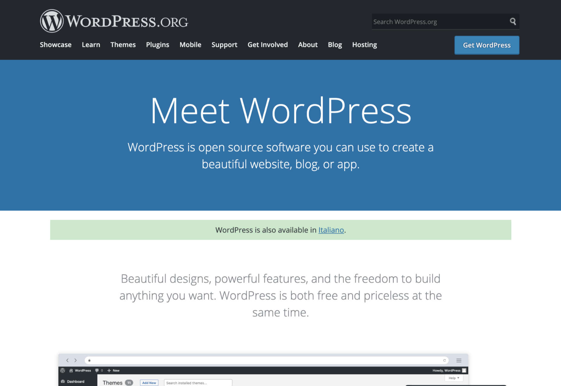
WordPress

The best-known and most popular blogging platform in the world, WordPress is the go-to choice for most bloggers and website creators. Currently, there are around 64 million websites actively using WordPress as their chosen CMS. Usage stats also show that around 400 million people visit WordPress websites every month. 

WordPress powers most of the internet as one of the most flexible and easy-to-use platforms around. The biggest decision most users need to make is between WordPress.com and WordPress.org. 

You can create a blog for free at WordPress.com, and the company will host your site for you. However, you have to use a subdomain (rather than your own domain) with the free version. You’ll also lose control of your ads with the free package until you upgrade to a premium plan. 

A personal plan on WordPress.com starts at about $4 per month, and it removes all ads from your site. The more functionality you need, the more you’ll need to upgrade. WordPress.com is very easy to use and requires minimal initial setup, but it’s not very scalable. There are no custom themes, and you don’t technically “own” your blog this way. 

WordPress.org is a different story. With WordPress.org, you’re accessing an open-source blogging platform that allows you to build your site from scratch. You do need to purchase your own domain name and hosting with this service, but the software is free to use. 

WordPress.org is a lot more appealing to most bloggers because it’s so customizable. Features include:

  • Free and premium themes that you can customize to suit your brand;
  • Thousands of plugins to help with security, SEO, subscriptions, and more;
  • Gutenberg block editors to make creating and publishing blogs easy;
  • Tons of SEO friendly solutions to help you stand out online;
  • Access to a huge community of experts;
  • Infinite control over your design options;
  • Advanced user permissions and roles.

Pricing: WordPress.org is different from most blogging platforms because the foundation technology is free. You just pay for the a-la-carte options, like plugins, hosting, and domain name subscriptions. This means you can choose how expensive your site is going to be.

Pros:

  • Extremely easy to use with lots of community support available;
  • Free platform (though you do need to pay for the domain and hosting);
  • Lots of customization and plugin options to expand site functionality;
  • Search engine friendly as-standard, to help you grow;
  • Plenty of ways to make your brand stand out.

Cons:

  • It can be difficult to control your own website at first;
  • You have to manage your own backup and security;
  • Extra costs can quickly build up.
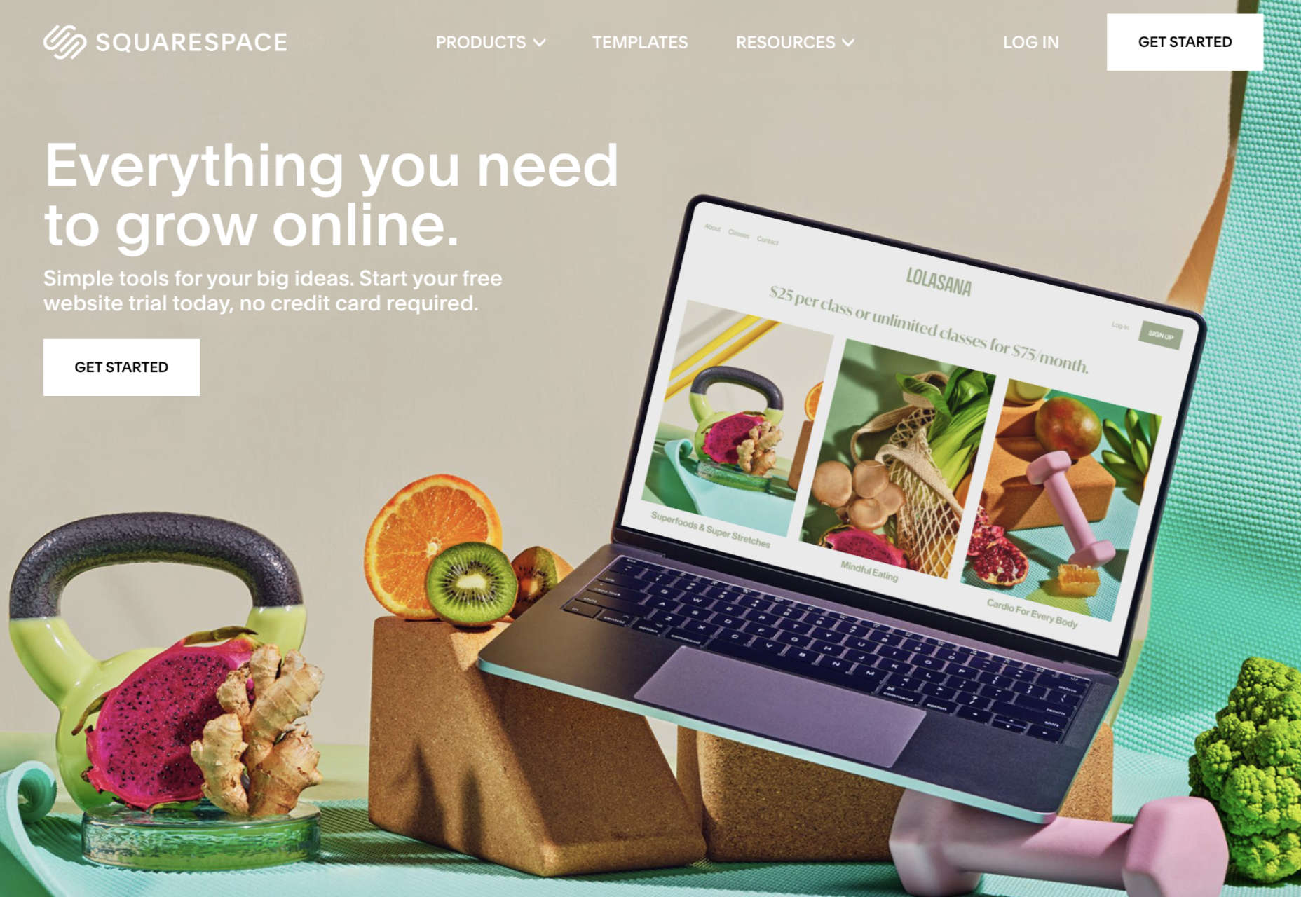
Squarespace

Squarespace is one of the more popular website design and blogging tools for people with a creative streak. Unlike WordPress.org, Squarespace gives you everything you need to build your own website straight out of the box. This includes hosting, the option to purchase your own domain name, and access to a range of beautiful templates. 

Squarespace stands out for its focus on small business owners. You can choose from a range of stunning designs and customize them however you choose with a convenient drag-and-drop builder. There’s also a fantastic customer service experience available from Squarespace, with a team that’s ready to help you with anything you need. 

Like many other hosted blogging platforms, you start on Squarespace by choosing the templates you like and customizing from there. There are some limitations in what you can do here, particularly if you have a lot of coding knowledge, making Squarespace less appealing to growing companies or larger brands. On the plus side, you do get features like:

  • Dedicated blogging templates to get you started;
  • Categories, tags, and featured post options;
  • Built-in scheduling for your blog posts;
  • Contributor roles and permissions;
  • Analytics to track your readers’ favorite posts;
  • Email marketing tools;
  • Social media and SEO solutions built-in;
  • Mobile app access.

Pricing: Compared to some of the other leading blogging solutions on the market, Squarespace is also quite affordable. The personal package at $12 per month will power a website with a stunning blog. You can also upgrade to the Business version for $18 per month, or if you decide to start selling your own products through your blog, you can transition to “Basic Commerce” at $26 per month.

Pros:

  • Squarespace is easy to use for beginners;
  • Fantastic range of stunning templates included;
  • SEO, email marketing, and social media marketing included;
  • SSL and HTTPS support;
  • Access to eCommerce features on some plans;
  • Useful analytics tools.

Cons:

  • Not very scalable for bigger brands;
  • Limited in terms of integrations and customization.
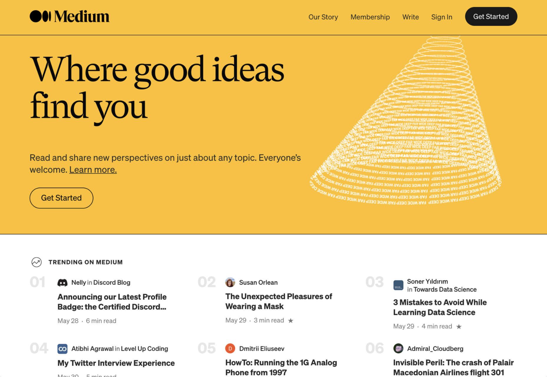
Medium

Medium is a different kind of blogging platform to many of the options mentioned here. This isn’t a tool you can use to build your own websites, like Wix or Squarespace. Instead, it’s a community you join with a monthly membership fee. 

Medium comes with a built-in audience, so you can immediately start speaking to customers and generating results from your content. As mentioned above, there’s also a Partner Program, which is free to join. The Partner Program allows you to earn money if people are reading your blogs regularly. 

For companies or individuals who just want to generate brand awareness but don’t want to invest in an entire blog-ready website yet, Medium can be a powerful choice. You can easily share posts and view what other people are posting. The biggest downside is that you can’t build an entire community and earn a fortune through your website with Medium. 

Medium is more like a social networking site, where you can begin to develop thought leadership than a true space to carve out your piece of the online world. But it does feature things like:

  • An easy-to-use environment for publishing content;
  • Analytics and insights into your campaigns;
  • Some design customization for your blog layout;
  • Access to a pre-existing audience of readers;
  • Support for monetization in the Partner program;
  • Access to picture uploading options;
  • Mobile-responsive blog posts.

Pricing: You don’t have to be a paid member of Medium to sign up for the partner program and start publishing blogs. This does make it a pretty good way to enhance your existing blogging strategy if you’re trying to generate more attention online. 

Pros:

  • Free to use for Partners and creators;
  • Excellent for appealing to already-engaged customers;
  • Easy to use, with no coding required;
  • No requirement to create a website or pay for hosting;
  • Communicate with a team of like-minded people.

Cons:

  • Limited customization options;
  • No ownership over your audience or readership;
  • Limitations to how you can make money (no ads).
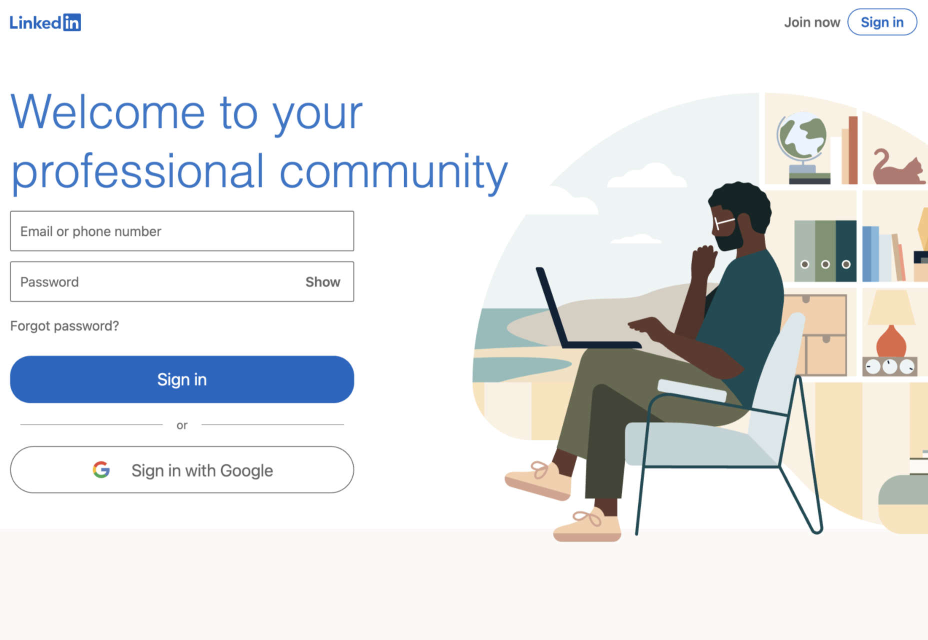
LinkedIn

LinkedIn is among the most popular platforms for professionals in the world. It’s the go-to place for people in search of reliable ways to develop their professional network. Currently, there are around 756 million members on LinkedIn. When they’re not searching for connections with their peers or chatting about work opportunities, they’re checking out the content on the platform. 

If you’re keen to develop your position as a thought leader but prefer social media accounts to full websites, LinkedIn is the perfect choice. The more you publish on LinkedIn, the more you’ll attract new people who might want to work with you, invest in your company, or just work as part of your team. 

LinkedIn is a great place to generate attention if you’re in the B2B marketplace because most professionals already have their own account. You can also earn social proof by getting people to “endorse” your work. Some of the features of LinkedIn for bloggers include:

  • Private messaging for interactions with connections;
  • Notifications to help you keep track of valuable content;
  • A full profile posting section where you can publish your blogs;
  • A convenient network of active B2B professionals;
  • Endorsements for social proof;
  • A resume and blogging platform in one (you can list your skills);
  • Job searching and employee searching features.

Pricing: It’s free to access a basic membership with LinkedIn, but you will be limited on some of the features you can unlock. For instance, you can only send messages to people already in your network, and you’ll have limited analytics. LinkedIn Premium gives you slightly more functionality, with Business accounts starting at around $29.95 per month. 

Pros: 

  • Tons of people ready to read your blogs;
  • Great for building your professional network;
  • Good environment for thought leadership;
  • Access to extra tools like job listings;
  • Notifications to keep you on top of relevant posts;
  • Engagement options like private messaging;
  • Reports and insights.

Cons: 

  • No access to full website branding;
  • Limits to how you can monetize your content;
  • You don’t own the site or your traffic.

Wix

Easily one of the most popular website building solutions for beginners, Wix can help you build both a blog and a fully-featured website. You can even design your own store with Wix and start selling products whenever you choose. 

Wix is a straightforward site builder which you can use to build a site in a matter of minutes. There are hundreds of website themes to choose from, and you can also add as many customizations as you choose with the convenient drag-and-drop editor. The blog manager section of the CMS is also simple and intuitive, with SEO and analytics built in already. 

Wix aims to make jumping into blogging as quick and painless as possible. Elements like comments, social tools, hashtags, and subscriber forms are already available, and you can add further plugins if you choose. There’s also the option to include sharing buttons for social media accounts like Twitter, Facebook, and more. Features of Wix include:

  • An extensive range of blog templates;
  • Drag-and-drop customization (no coding required);
  • Subscriber forms, comments, likes, and categories;
  • Social media connections;
  • Extra features like store access;
  • Analytics and insights;
  • Quick and easy blogging interface.

Pricing: 

The most basic features of the Wix website builder are free to use. With a free Wix account, you’ll get a subdomain where you can’t choose the name of your own website, unfortunately. However, you can add a custom domain for only $4.50 per month. If you want a full premium plan with Wix, costs start at $8.50 per month and extend to $24.50 per month.

Pros:

  • Lots of pre-built blogging themes;
  • Easy customization options with no coding skills required;
  • Quick and easy to load and publish blogs;
  • Connections with social media platforms;
  • Access to various third-party apps and integrations;
  • Free option for beginners.

Cons:

  • Some limitations to the free account;
  • Ecommerce features are limited to paid plans;
  • Not as scalable for bigger companies.
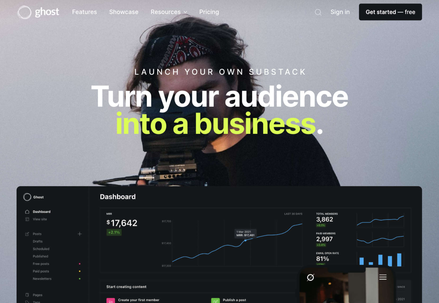
Ghost

Lesser known than some of the options we’ve discussed so far but still brimming with value, Ghost is a minimalist blogging platform that’s all about content creation. Ghost promises a range of ways for you to turn your blogging into a business, with access to customizable templates, newsletter integrations, premium subscriptions, and more. 

The dashboard for Ghost is clean and intuitive, with access to simple sections where you can add tags to your posts, create drafts, track published content, and access valuable insights. You’ll have an easy view of important metrics like email open rates and numbers of paid members at a glance. You can also find integrations to make your Ghost experience even better. 

Ghost works alongside things like Buffer, Stripe, Twitter, Slack, MailChimp, and many other tools so you can take your blog to the next level. There’s no need for any coding knowledge, and because everything is written in JavaScript, it’s ultra-fast too. Features include:

  • Easy-to-use and intuitive interface;
  • Blogging and writing focused;
  • Clean and clutter-free design;
  • Integrations with various powerful tools;
  • Super-fast JavaScript coding;
  • Lots of templates and customizations;
  • Comment, mobile apps, A/B testing, and more;
  • Analytics and reporting.

Pricing: There’s a 14-day free trial to get you started with Ghost, then subscriptions start at $9 per month when billed annually for up to 1,000 members, 1 staff user, 2k views per month, and an SSL and CDN. The same plan is $15 per month billed monthly. Prices go all the way up to $199 per month billed annually, or $249 per month for 1 million views per month, 35,000 members, 15 staff users, and a 99.99% uptime SLA. 

Pros: 

  • Focus on writing and blogging;
  • Clutter-free and clean backend environment;
  • Easy to use and speedy performance;
  • Lots of packages to choose from;
  • Great integration options.

Cons:

  • Some limitations in scalability;
  • Complicated setup when installed;
  • Not a huge number of themes.

Choosing Your Blogging Platform

Whether you’re blogging because you want to build your personal brand or you’re looking for a way to strengthen sales opportunities for your company, you’re going to need the right blogging platform. The options above are just some of the best blogging solutions available right now. 

Remember, do your research and explore the free versions available whenever possible, so you can confidently invest in the software that’s best for you.


Featured image via Unsplash.

Source

The post Top Blogging Platforms Worth Considering in 2021 first appeared on Webdesigner Depot.


Source de l’article sur Webdesignerdepot

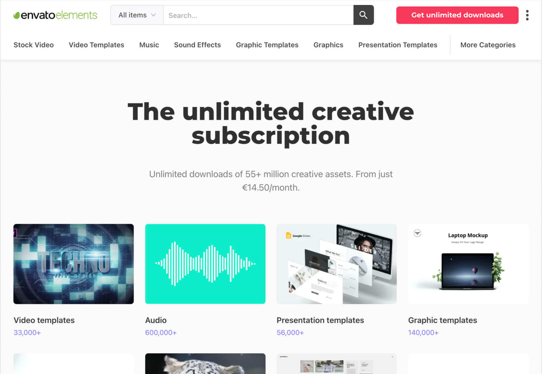
Parallax is a term that is applied loosely and frequently in the world of web design. As a trend, it has been popular and unpopular in equal measures for some time. However, it’s still one of the most valuable tools for animation in the digital world.

Parallax creates an illusion of depth when scrolling, a timeless effect that still has lots of value in the web design world.

Sure, parallax has its issues, from problems with usability, to concerns with mobile responsivity — but it’s also an interesting way to make a website stand out when done correctly.

Let’s take a closer look at some of the ways that parallax scrolling still works in 2021…

1. Parallax Tells A Story

Let’s start simple. 

One of the most effective ways to use parallax scrolling in the modern age is to tell a story. Today’s consumers want to have an emotional connection with the brands they buy from – now more than ever. Five years ago, studies showed that around 80% of customers want brands to tell stories, and that trend remains consistent to this day.

In the age of digital consumerism, where people can’t get to know a company in person through face-to-face interactions with its salespeople, companies need new ways to connect with their clients. Telling brand-driven stories is a way to highlight that your company is more than just a faceless entity – it’s something with real soul. 

Let’s look at the “Recap After Use” website, a portfolio belonging to the innovative Louie Sellers. This website showcases Louie’s skills with attention-grabbing visuals, including a parallax animation that makes it looks like Louie is drawing the page as you scroll through it.

This is the kind of exceptional animation that makes parallax scrolling more compelling. The animation isn’t there to make a visual difference to the page – it tells you something more about the person behind the website and what they can do.

2. Parallax Increases Website Visit Times

If a website effectively tells a story with parallax animation, you can also bet that’s going to keep customers or readers on a page for longer. Reducing bounce rate by increasing engagement is one of the main goals of any web designer. (Bounce rates, of course, refer to the percentage of site visitors that hit the back button after just seeing the first page of your website.)

While some people argue that parallax websites can hurt your SEO rankings if they slow down your site, there’s also the argument that the lack of a visually engaging page can harm SEO. Bounce rates drag down your ranking and make it harder to get audience attention. 

A parallax animation that tells a story and engages your audience through carefully delivered information is a great way to keep people around – even just for a little longer than usual. For instance, if you check out Alex Dram’s portfolio page here, you’ll see several shapes coming together during the parallax scrolling animation.

The shapes merge to tell a story about the visual experiences that Alex can create for customers. It’s a way to draw the eye and connect with the viewer without just writing about what you do through text. 

3. Parallax Develops Credibility

There’s a reason why both examples of parallax scrolling we’ve looked at so far are from creative portfolios. Parallax scrolling, with its excellent storytelling capabilities, is great for demonstrating your credibility as a digital expert. Basically, it’s a version of “showing” and not “telling” customers about your skills. 

You can tell someone that you know how to use tricky techniques like parallax animation correctly, but they’re less likely to believe you that way. If you can show that you have the skills to create something amazing, that’s more engaging. 

The OK Alpha team is a great company to reference when it comes to sensational design. This company seems to always be on the cutting edge of the latest trends, whether it’s bold typography or bright colors. To add to the impact of their website, the company has combined parallax effects into the mix to make everything more immersive as you scroll. 

This is a beautiful example of how companies in the design landscape can use techniques like parallax scrolling to show what they’re capable of. 

4. Parallax Makes Information More Fun

Most of us are naturally visual learners. We like to consume information in a way that’s refreshingly eye-catching and attractive. That’s why visual content generally earns more social shares and attention than written content. With parallax scrolling, companies that want to deliver valuable information and educational content to their audience can do so effectively.

Rather than just scrolling through a page and seeing lots of text, your customers can see images and graphs come to life alongside the blocks of text they’re reading. It’s like adding video demonstrations next to a textbook to help people better understand what they’re reading about. 

Look at the Web Design and Art History microsite from Webflow as an example. The company wants you to understand how web design and art have evolved over the years, but it doesn’t want to deliver that information in a boring format. The bright graphics and parallax animation work together to give you a more contextual, meaningful experience.

5. Parallax Replicates Another Medium

What if you could remind someone of their experience when reading a book or watching a video while telling them about a video or a novel? Parallax scrolling and animation can help with that. It’s a way of making your website feel like a video presentation or slideshow without the added components of implementing video players into your back end. 

Parallax scrolling also has another slight benefit over a standard video-based website. On a website that uses a video for a background, the video often plays automatically. This means that your visitors can’t control how quickly the video plays. 

On the other hand, parallax animations driven by scrolling action allow your customer to collect information at a pace that suits them. Take a look at the Story of the Goonies website, for instance. This stunning parallax site introduces you to the details you need to know about the movie in a way that makes it feel like the intro to a film.

The great thing about the parallax on this site is that the slow video-style design also gives you a dose of nostalgia – which ties in perfectly with the movie. 

6. Parallax Is More Memorable

What’s the main reason any designer does anything special to a website? To make it stand out, of course. Web design is all about conveying the unique essence of a brand, business, or entity in a way that’s going to make that client unforgettable. Although parallax isn’t as novel as it once was, it can still be a way to make your site stand out – if it’s used correctly. 

The key to success with parallax scrolling for memorability is making it smart. The layout needs to feel simple and intuitive. Everything needs to work well together, from the lightly shifting font to the various parallax effects that work together to draw the viewer’s eye (and attention). 

A great example comes from Jomor Design – another designer with a portfolio that really grabs your focus from the first second. The layout is beautifully done, with plenty of mini moments for engagement and interactions throughout. As you scroll through the site, you get a better idea of what the designer is all about. The little moments of animation make the whole experience so much more memorable. 

When your site is more memorable and engaging than that of your competition, you can drive many major benefits for your brand, including an improved bounce rate.

What To Remember When Using Parallax

Parallax is just like any other design technique. There are ways you can do it wonderfully, which engage and delight your audience. However, there are also a lot of areas where you can easily go wrong. When using any design element, the main thing to remember is that the primary focus should always be your users’ experiences. Parallax shouldn’t just be a way to show off your design knowledge. It’s just another feature that you can use to create an amazing website. 

Remember that user experience and visual appeal need to work perfectly together for parallax to work. If scrolling through the page is practically impossible for people on a mobile device, then you’re not going to get the results you want. If it’s difficult to take in the message you’re trying to send because the content is moving too quickly, again, your users will suffer. 

Remember the following tips:

  • Simple is better: Reduce the amount of content and visual elements on your page whenever you can. The less information there is to capture your customer’s attention, the less likely it is that you’re going to end up with a problem. 
  • Compress file sizes: Make sure that you’re not reducing the speed of your website by creating a huge single page with tons of high-quality images. You’re going to need to use the smallest possible file sizes. 
  • Check responsiveness: Make sure that the parallax effect works just as well on your smartphone or tablet as it would on a desktop. As more people move their browsing experiences into their palms, you can’t afford to ignore responsivity. 
  • Find the “wow”: Look at these examples of parallax websites. Every one stands out because it does something special with the scrolling effect. If you’re going to be using this strategy with your website, you need to make sure it’s worth the effort. Don’t just follow the same guidelines as everything else. Find the idea that’s going to make people take notice.

Source

The post 6 Ways Parallax Still Works in 2021  first appeared on Webdesigner Depot.


Source de l’article sur Webdesignerdepot

User experience design is something that most of us associate with websites. But why isn’t it something we extend beyond the website?

Here’s why I ask this:

As a consumer, it’s so rare that your only interaction with a brand is through its website. Take an ecommerce site, for example. You buy a product from it, and then what happens?

  • You get a confirmation email;
  • You get another email when the package ships;
  • You might get another email or SMS notification when the package is delivered;
  • You retrieve the package and open it;
  • You open up your purchase and use it.

These are all an extension of that initial user experience on the site. If there’s just one hiccup along the way, it could easily erode the trust and happiness you felt after quickly finding and buying what you needed on the site.

So, what I’d like to do today is look at 10 areas where UX design should extend beyond the website to ensure that the frictionless experience started there remains untarnished.

Extending UX Design Beyond the Website

As a web designer, you might be thinking that this part of the user experience doesn’t fall under the umbrella of your responsibilities. And you may be right about that.

For brands to truly be successful and profitable, someone needs to carefully examine the bigger picture and ensure that the user experience is flawless no matter how far away from the site it is. At the very least, you should share the UX research and strategy you do for a client’s site so their team can ensure it carries over to other areas of the business.

Here are some things to think about:

1. Mobile App

It’s not uncommon for websites to have mobile app counterparts these days. The layout doesn’t need to be identical since mobile users tend to behave differently than those on desktop.

That said, an app shouldn’t force users accustomed to the desktop experience to re-learn how to navigate or engage with the brand. So, the branding, UI design, speed, security, and navigation all need to be on par with what’s already been established in terms of usability.

2. Email

Most websites have a direct connection to email. For example, blog newsletters, purchase confirmation emails, and lead generation follow-ups all start on the website.

Consumers are well aware that when they hand over their email address, they will receive an email in return. In many cases, those emails are welcomed when they’re done right. But if something feels off, that bridge could easily burn between brand and consumer.

To preserve the UX, emails should come with the following:

  • The same branding and visual style as the website;
  • A personalized subject line, greeting, or offer;
  • Consistent messaging as the site, especially when it comes to the CTA.

Another thing to remember is that email isn’t the time to inject dark patterns into the experience. So, the “Unsubscribe” option should be in an easy-to-spot area and a sharply contrasting font color.

3. Social Media

Social media is another channel that’s commonly connected to a website. While you can’t control the aesthetics of social media websites themselves, the visuals and messaging in posts need to be on-brand.

That means that things like memes and emojis — which are popular means of communication on social — should only be used if they’re normally part of the brand identity. If not, you’ll need to find other ways to communicate engagingly.

Another part of the user experience to think about is customer support. Social media is a lot like going into a store. If someone has an issue with what they bought or the service they received, there will be many people around to witness the complaint. Social media only amplifies that — so the quality of customer care needs to be consistent with how the brand handles it everywhere else.

4. SMS

Not every brand will need to be connected to customers via text messaging. eCommerce companies, news sites, and personal services providers likely will, though.

However a brand uses SMS, the same UX guidelines apply here as they do across all other channels:

  • Keep messages concise;
  • Make sure they’re relevant and valuable;
  • Use branded messaging and design;
  • Don’t abuse the privilege and send too many;
  • Make it easy to opt out.

Basically, if you can’t make it a valuable extension of the brand’s offering, don’t use it.

5. Phone

Any website that publishes its phone number should expect to receive calls from prospects and customers. While there’s nothing to design here visually, the experience of getting on the phone with a company should be consistent with what they experience elsewhere.

One way to do this is to design an easy-to-follow routing system. It should be simple for callers to figure out which number to choose. What’s more, there should be no endless loops. If a caller has exhausted the options, they should be immediately directed to a representative.

Another way to ensure consistency is to adhere to a script — that goes for call centers for enterprises as well as the local lawyer’s office. Every caller should be greeted with the same tone and handled in the same manner (depending on the situation, of course).

6. Ads

There are a lot of places where brands can advertise these days:

  • Google search;
  • Social media;
  • Ad networks;
  • TV;
  • Radio;
  • Podcasts;
  • Blogs;
  • Billboards;
  • Direct mail.

When designing an ad campaign, there should be consistent messaging, aesthetics (when relevant), and CTAs presented. If branding isn’t consistent from ad to ad, there may be a delay in consumers recognizing the brand or its offer. Or, worse, not recognizing it at all.

7. Packaging

For brands that sell products, you have to think about how the packaging will impact the user experience. There are two types of packages to consider, too.

The first is the product’s own packaging. Branding should be clear as day and consistent with the site they bought it from.

It should also be easy to open. There’s nothing more frustrating than finally getting your purchase, only to realize you need tools to get it out of the packaging.

You also have to think about packaging for products that get shipped.

The product should fit well within the packaging. A too-roomy package will feel downright wasteful. So will excessive bubble wrap and paper filler.

Having a shipping label present in the package is also important. If the website makes it easy to make a purchase, the package should offer a convenient way to return the product if they’re not happy.

8. Product

The product itself has to align with the expectations set by the website.

Take the example of a SaaS. You’ve built an awesome landing page and mobile app store page to promote it. It looks great, it loads fast, and it’s easy to get around. But if the SaaS itself is ugly, disorganized, slow, or otherwise just clunky, all of the work you did to market it will end up being just false advertising.

So, make sure the expectations set before and during purchase naturally carry over to the experience with the product.

9. Business Exterior

For brick-and-mortar companies, the business’s exterior matters just as much as what happens inside it.

The most obvious thing to focus on is the aesthetics of the building. Does it look attractive? Is it in a safe area? Is there clear signage around it? Is it easy to find?

But you also have to think about user experiences that take place outside of the building. For example, there’s now a rise in curbside pickup. There are tons of things that can affect how happy the customer is with the experience — like if the pickup area is hard to find, there are never enough spots or the associates who deliver the orders always seem to be in a foul mood.

The business’s exterior should always set a good impression for what takes place inside.

10. Business Interior

Here are some things to think about when it comes to “designing” business interiors for a good UX:

  • Decor;
  • Layout;
  • Signage;
  • Furnishings;
  • Product discoverability;
  • Availability (of products or people);
  • Quality of customer service;
  • Checkout process.

It doesn’t matter what the company does — whether it’s a large retailer like Walmart or your own freelance design business. If a business’s establishment doesn’t look good, operate flawlessly, or provide a good person-to-person experience, it’s going to be very hard to get people to return.

So, all those things you do to design a streamlined website journey should be applied to a bricks-and-mortar business’s interior.

Wrapping Up

Depending on the types of companies you build sites for, some of the channels and suggestions above might not be relevant. Hopefully, this has got you thinking about other ways you (and your clients) can extend the UX design and strategy from the website.

If you can maintain the high-quality user experience from channel to channel, your clients’ brands will get more business, grow their profitability, and see a rise in loyalty, too.


Featured image via Pexels.

Source

The post UX Design Doesn’t End With Your Website first appeared on Webdesigner Depot.


Source de l’article sur Webdesignerdepot

The idea behind building a mobile app has been to offer a faster, easier, and innovative experience on various devices to users, doing away with their need to browse websites. However, in a bid to stay relevant to consumers amidst competition, companies try to bundle up a million features together rather than offer a full-proof and specific solution for a certain user need. Being overwhelmed with numerous unnecessary features and functionalities, an app poses various inhibitions to a great user experience. In this blog, we will take a look at how a micro-app can help enterprises solve this issue.

What is a Micro-App?

It is a web/mobile-based, a customized app built to enable end-users to perform a certain, narrowed-down function. Unlike a conventional mobile app, which is bundled with multiple features and pages, the micro-app is smaller in size, more consumer-oriented, and built to offer certain functionality, has an easy user interface, with a dynamic loading that bypasses the app store. For instance, a Personal Banking app has several functions, such as viewing the balance, getting mini statements, changing the ATM password, money transfers, etc. However, if you build a micro-app for this, it will accomplish only that specific task, such as getting transaction history. 

Source de l’article sur DZONE